SIMPLE DREAM
THE WORLD OF TOMORROW

Unleashing and inBLACK WHITE
Creativity electric brights
GG G&G _ Magazine N°38 – May 2023 &


PREMIUM BOHEMIAN GLASSWARE VISIT EU.KLIMCHI.COM

FOLLOW @KLIMCHISTUDIO

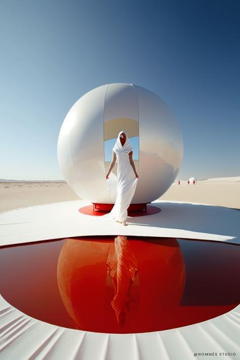

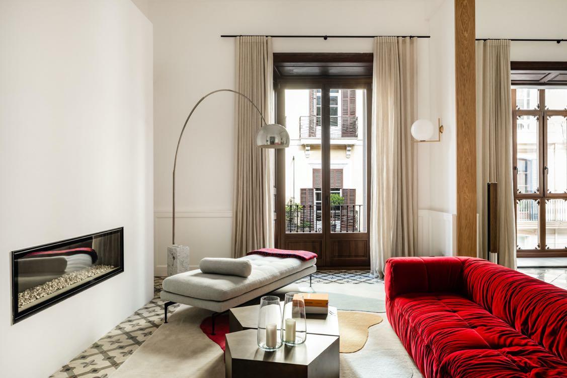



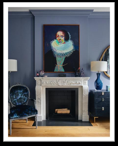
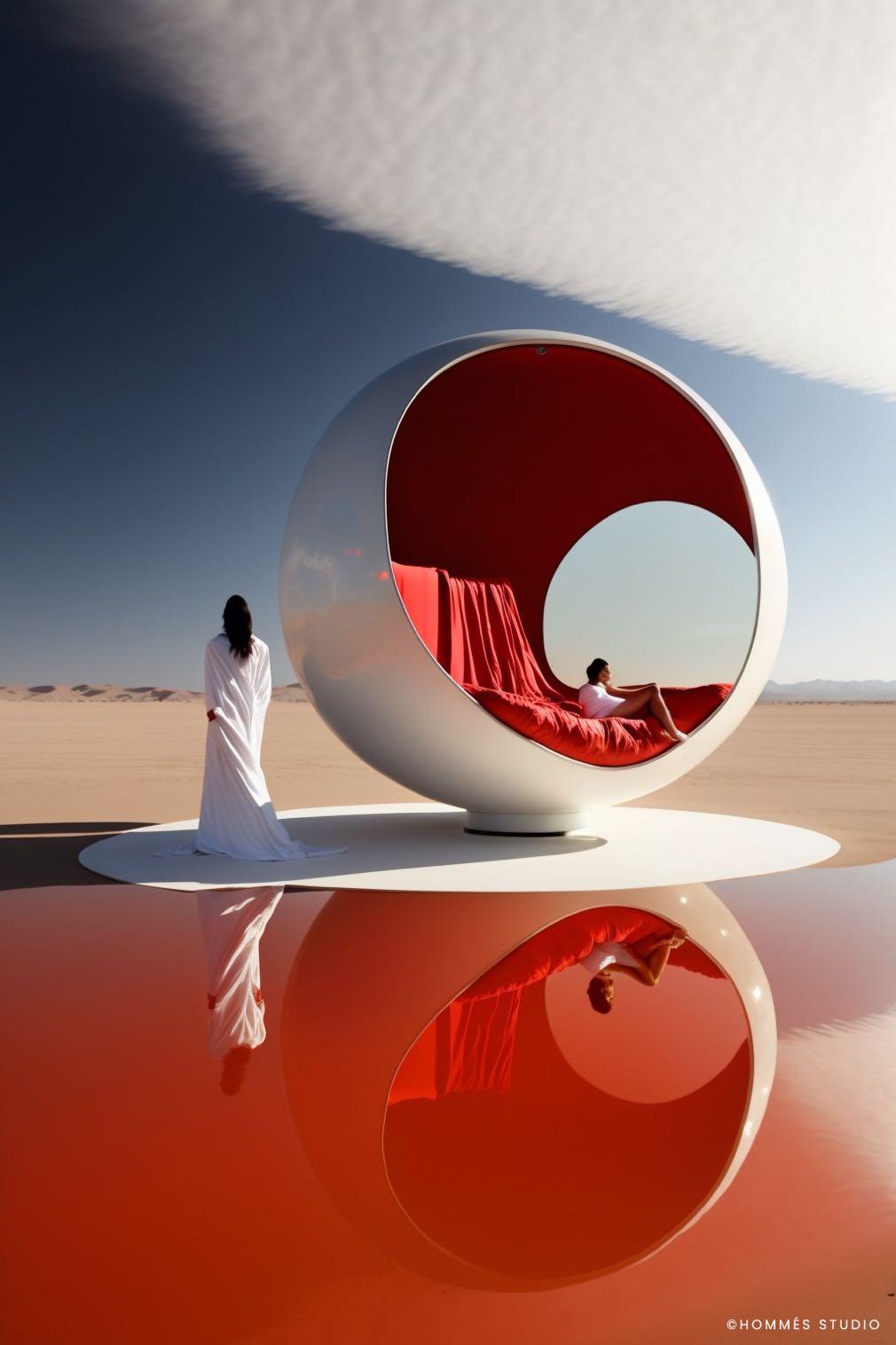
GG G&G Magazine N – May 9 EDITOR’S LETTER TRENDS 15 DESIGN SELECTION THE WORLD OF TOMORROW / SPRING 2023 28 E-SHOP DESIGN PRODUCTS WITH A SIMPLE CLICK INSPIRATION 37 LATEST NEWS FROM DESIGN WORLD INTERIORS 48 MATERIAL REMIX APARTMENT BY MEMOLA ESTUDIO & VITOR PENHA / SÃO PAULO, BRAZIL 56 ELECTRIC BRIGHTS TOWNHOUSE BY APARTMENT 48 / NYC, USA 66 THE CHARM OF THE OLD TOWN APARTMENT BY JAIME SALVÁ / PALMA DE MALLORCA, SPAIN 74 UNLEASHING CREATIVITY FLAT BY MODOSO INTERIORS / WARSAW, POLAND 84 IN BLACK AND WHITE LOFT BY PAOLA MARÉ / TURIN, ITALY 92 SIMPLE DREAM APARTMENT BY ALTA IDEA DESIGN STUDIO / KYIV, UKRAINE 102 EVENTS CALENDAR MAY – JUNE – JULY 110 ALL OFFICIAL SOURCES ON THE COVER The projection of the future by Hommés Studio from The World of Tomorrow design selection Page 15 CONTENTS 66 18

s it possible to generate a completely new world? Today, yes! By now, the era of generative AI has arrived for several years but only recently we can see its results and its true use in our daily life and in various sectors, including that of Interior Design. By bringing exquisite works to life faster than ever before, designers benefit by exploring new ideas and pushing their own creative boundaries. From this comes our latest selection of Trends: a series of projections of the future created by the Portuguese furniture company Hommés Studio (page 15). Large windows and abundant natural light, open spaces and lots of greenery, untreated materials are the must-haves in a home today. And I think these requests will be in vogue for several decades, probably even more so than now. Thanks to a unique perspective on the reality of combined design that artificial intelligence offers us, we can exploit its potential to create living spaces "with a view to the future".



This edition, in addition to proposing designs that can stand the test of time, explores a series of interior projects with different styles and so-called "of the moment" trends. On page 56, the New York apartment realised by Rayman Boozer offers the rich patterns and character pieces that add depth and texture to the ambiance. Instead, Modoso Interiors’ one in Warsaw is characterised by a soft color palette that promote a sense of peace and tranquility (page 74). Anything that entices us to touch is also trending. As well as the furniture and home accessories, we can expect to see this technique introduced in other ways, for example the project by Memola Estudio and Vitor Penha embodies it in a brick wall in São Paulo apartment with a loft look industrial (page 48).
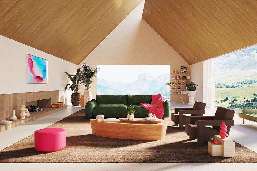
Get inspired by our interior style predictions and start creating your home of the future!


!"#$%&'(%()*&#" I’m always interested in your opinion, send me any feedback or suggestions at zhanna@gandgmagazine.eu
I

WWW.MAISON-OBJET.COM PARIS 07-11 SEPT. 2023
G ANDG MAGAZINE.EU
EVENTS


Pantone chose Ultrafabrics as an expert collaborator to show how the Colour of the Year can be worked into future-forward spaces with a collection of eight fabric colours.
INTERIORS
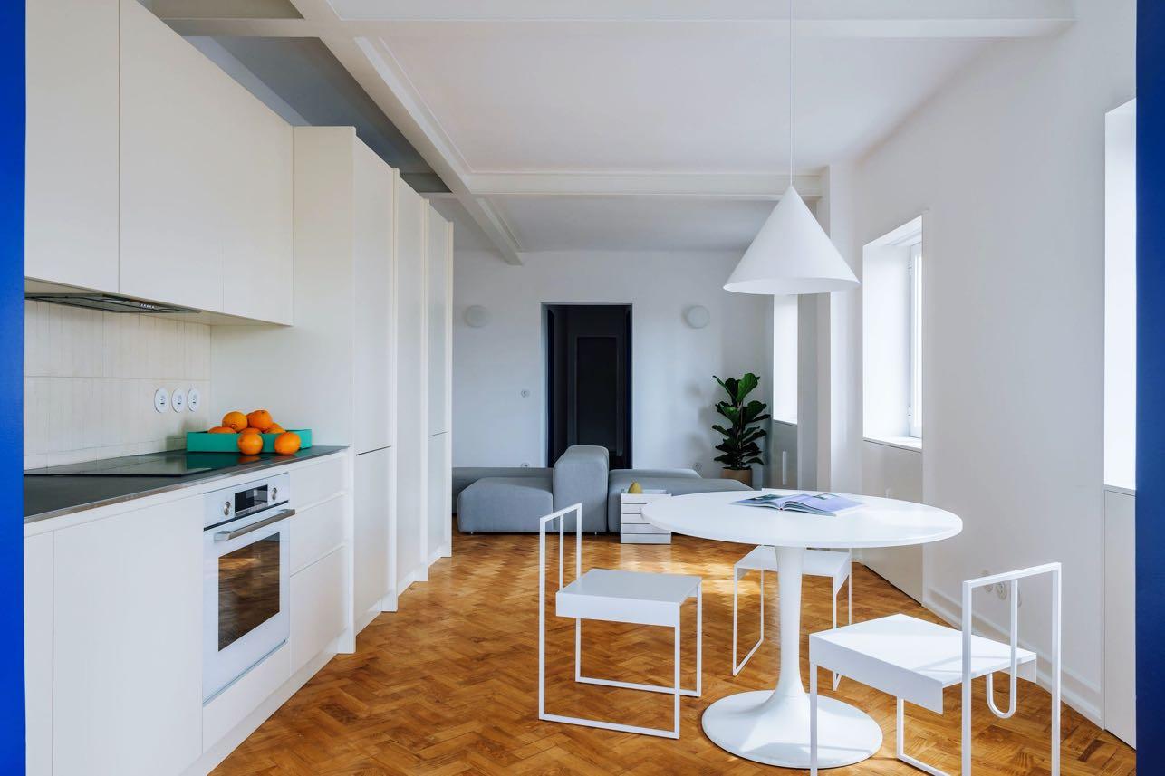
Apartment TM8
DC.AD renovated the interiors of a flat located in the Ajuda neighbourhood of Lisbon, intended for long-term rental for a young family.
ARCHITECTURE
Casa Fly
BEEF architekti projected a house with a beautiful natural landscapes in Mallorca.

!"##$!% &'(#)*+)%")"*,
!"#%-!%
ENQUIRIES info@gandgmagazine.eu
NEWSLETTER
+38099 234 26 27 nerobot@prodan-design.com.ua prodan-design.com.ua Instagram @nelly_prodan

DESIGN TRENDS
THE WORLD OF TOMORROW


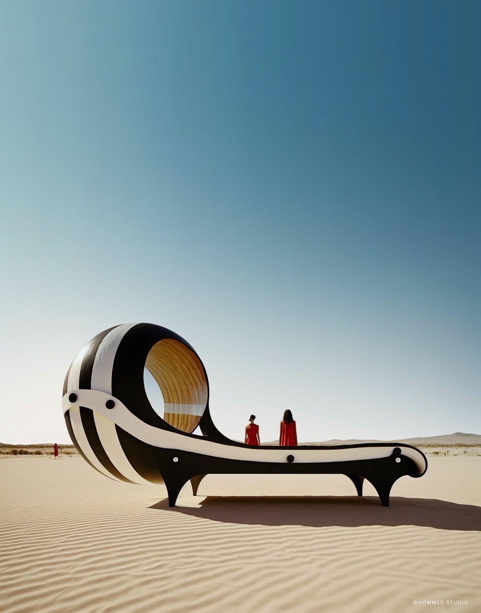
In collaboration with Hommés Studio, G&G _ Magazine presents a selection of Interior Design Trends that is out of this world! In the true meaning the word, given that these are the projections that could await us in the Future.
Hommés Studio, the Portuguese design studio that creates uniquely designed furniture, lighting and home accessories, has created a series of illustrations on global design trends using artificial intelligence, thus offering a unique perspective on the future of design combined with technology and its potential to transform our living spaces. Each illustration on our list is accompanied by a series of already existing products that will most likely be in vogue even in 10, 20 or maybe 50 years. Transformative colors and unusual textures create a deeper connection with nature, seamlessly integrating the outdoors into our daily lives and creating a melodic harmony with spirit.


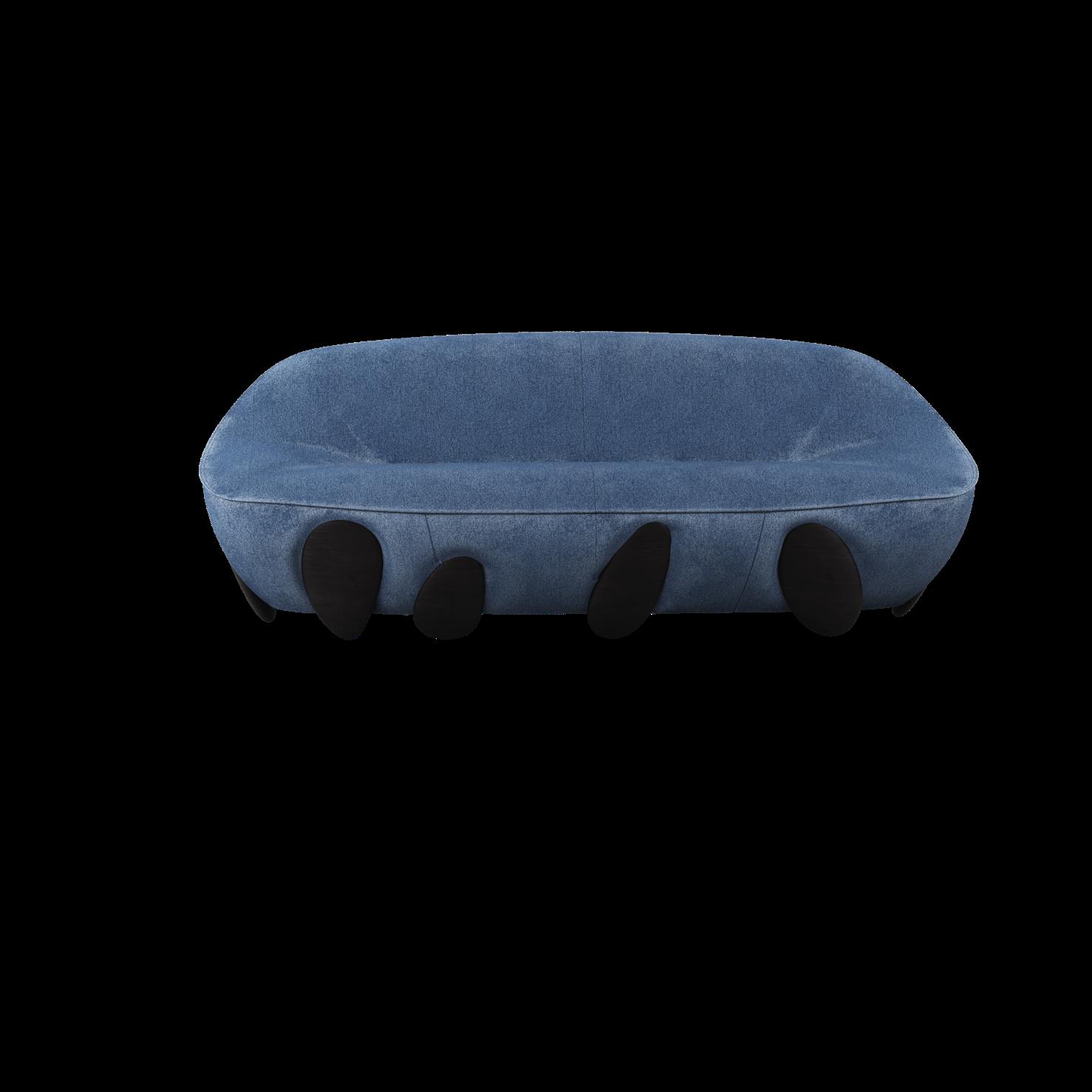
Denim home

JEANS ARE CELEBRATING A GREAT COMEBACK BUT TODAY THE DENIM TREND HAS ALSO ARRIVED IN OUR HOMES. FURNITURE AND HOME ACCESSORIES ARE NOW "DRESSED" ENTIRELY IN JEANS AND ARE EVEN COOLER THAN THE HOLLYWOOD STARS' LOOKS. IN ADDITION, ITS VERSATILITY ALLOWS IT TO BE COMBINED WITH VARIOUS STYLES AND COLORS, FROM MODERN




 Monsilk Upcycling carpet by THE CARPET MAKER
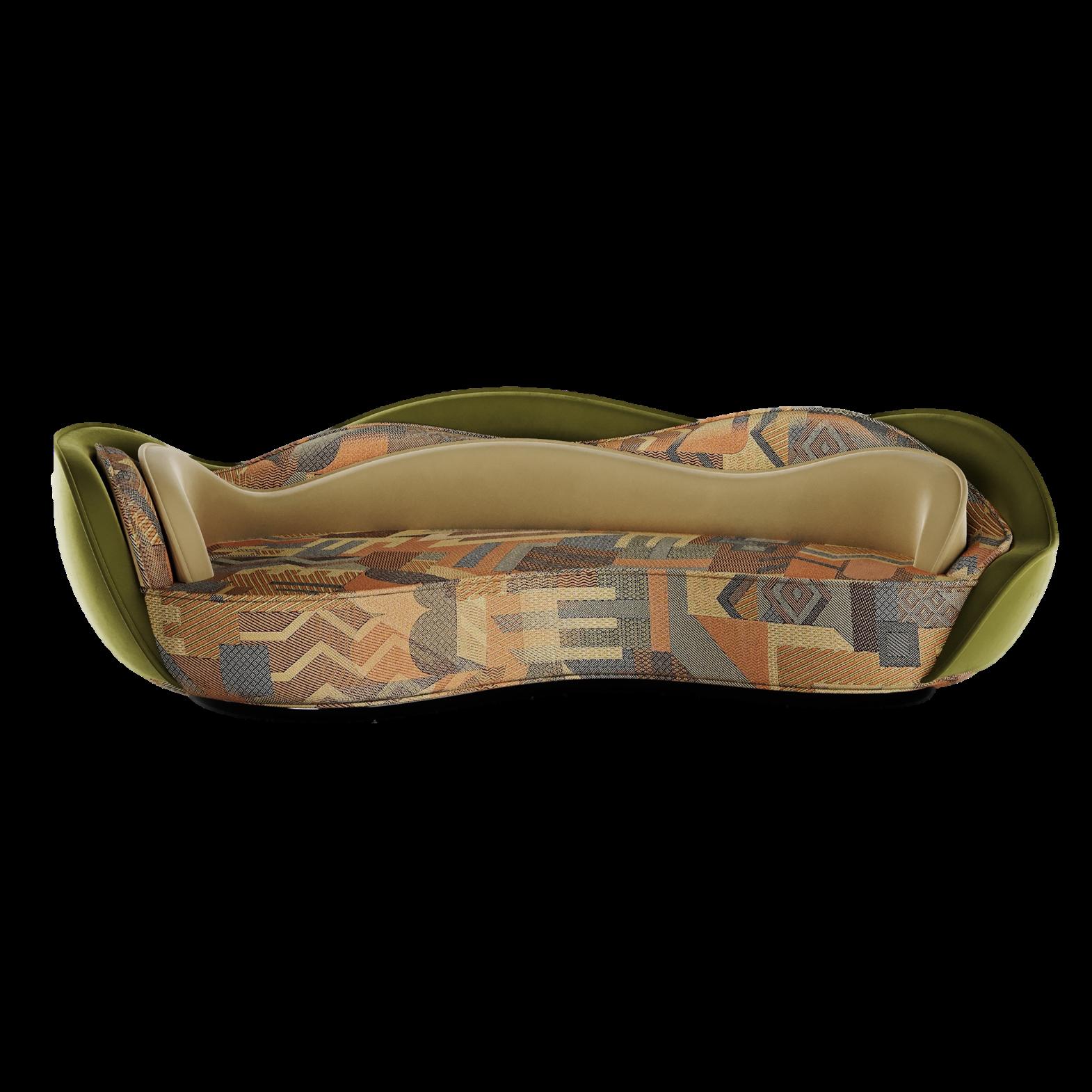
Giulia Sofa by HOMMÉS STUDIO



HOMMÉS STUDIO 18 | G&G _ Magazine


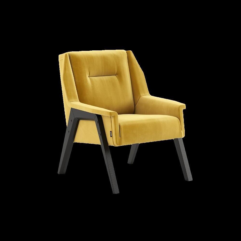
Sunny Yellow


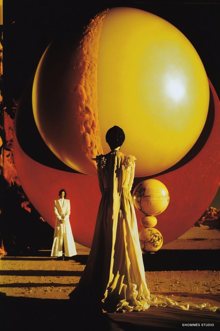

GUARANTEED TO INJECT WARMTH AND OPTIMISM, THIS CHEERY COLOR IS EXPERIENCING A RENAISSANCE IN INTERIORS. THANKS TO ITS VERSATILITY IT CAN BE COMBINED WITH MANY OTHER SHADES; FOR AN ULTIMATE CONTRAST, IT GOES WITH BLACK, IN MODERATION SO AS NOT TO OVERDO IT.
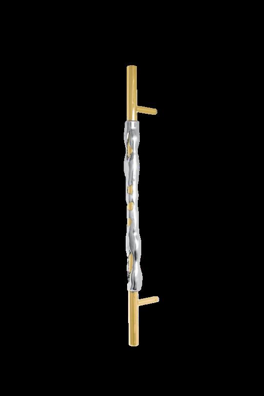

 Cocoon Sconce by HOMMÉS STUDIO
Shaped #059 Rug by TAPIS STUDIO
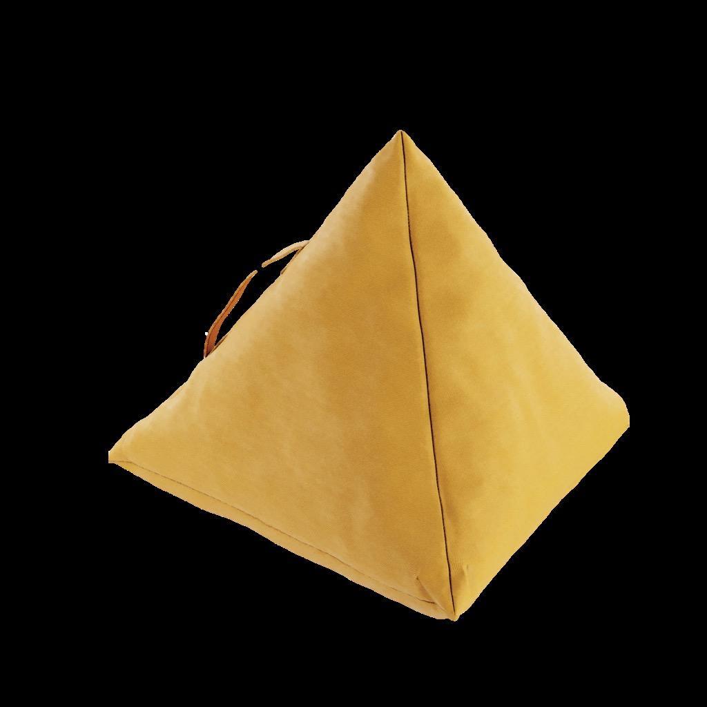
Yellow Triangle Cushion by ACH COLLECTION
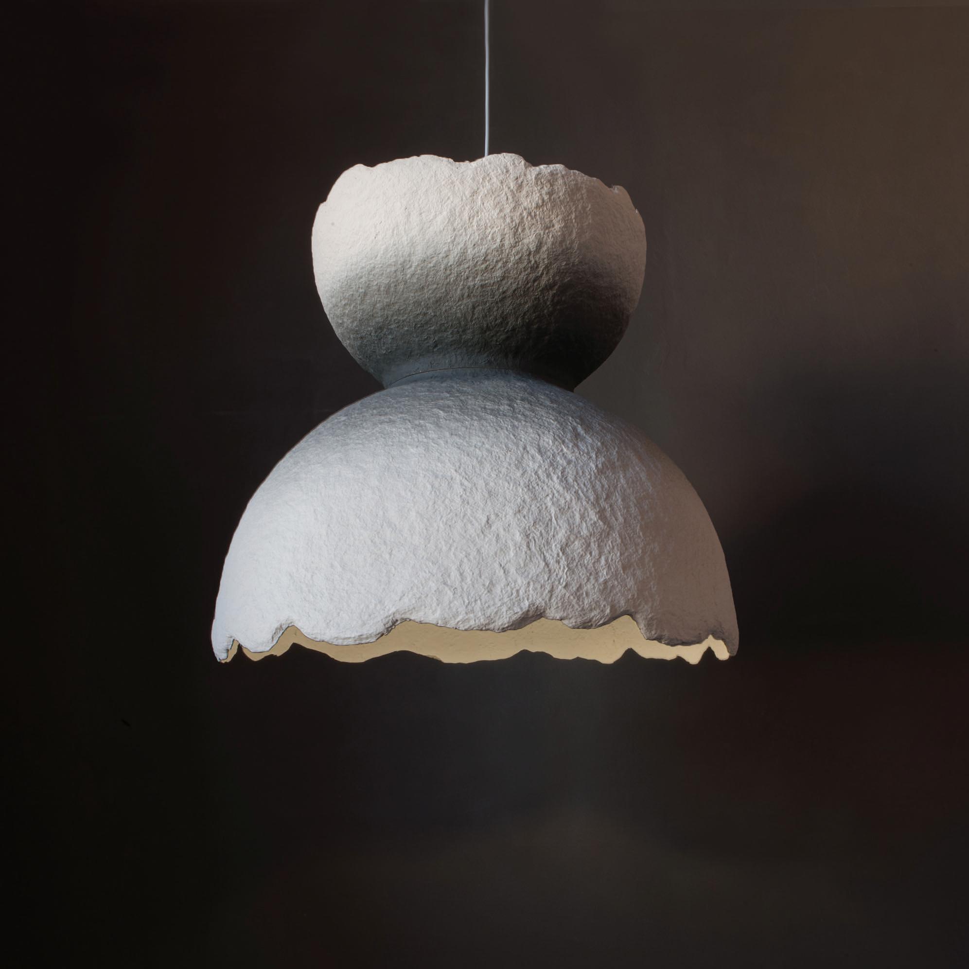
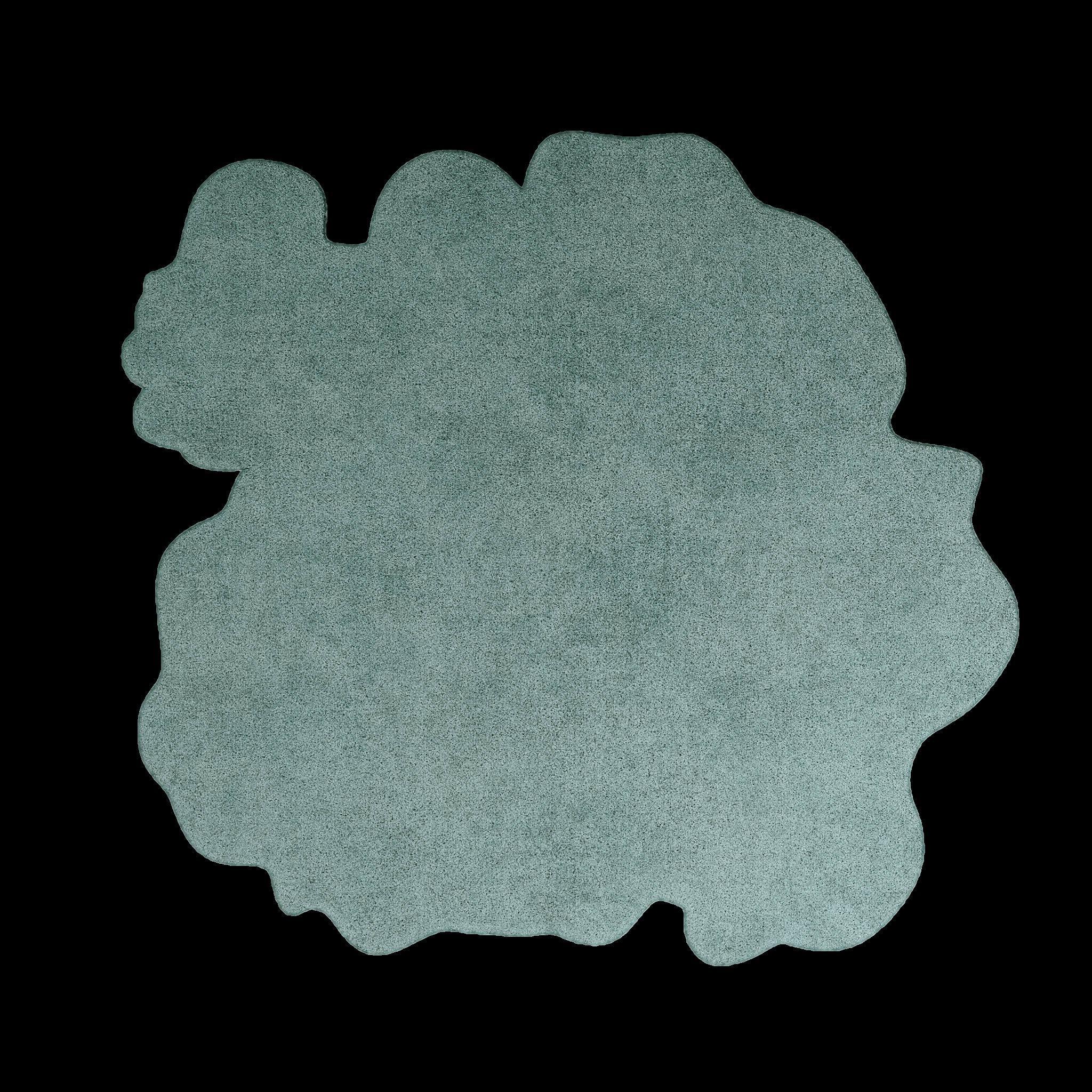
Experimental Shapes



IF YOUR STYLE IS ABOUT SEARCHING AND MIXING DIFFERENT FORMS TO CREATE AN UNUSUAL DESIGN, THIS IS FOR YOU! ASYMMETRY AND PLAYFULNESS WITH UNEXPECTED DETAILS SPUR OUR CREATIVITY TO SPOT NEW SHAPES AND INCORPORATE THEM INTO OUR SPACES, ALLOWING US TO RELOOK AT THE WAY WE DESIGN.

Constellation



#SPRING2023
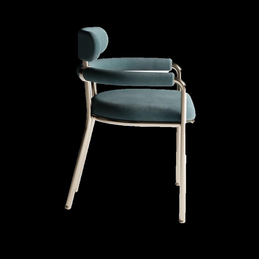
Mason Dining chair by MEZZO COLLECTION
Cassiopeia Ceiling sconce by David Rockwell for LASVIT
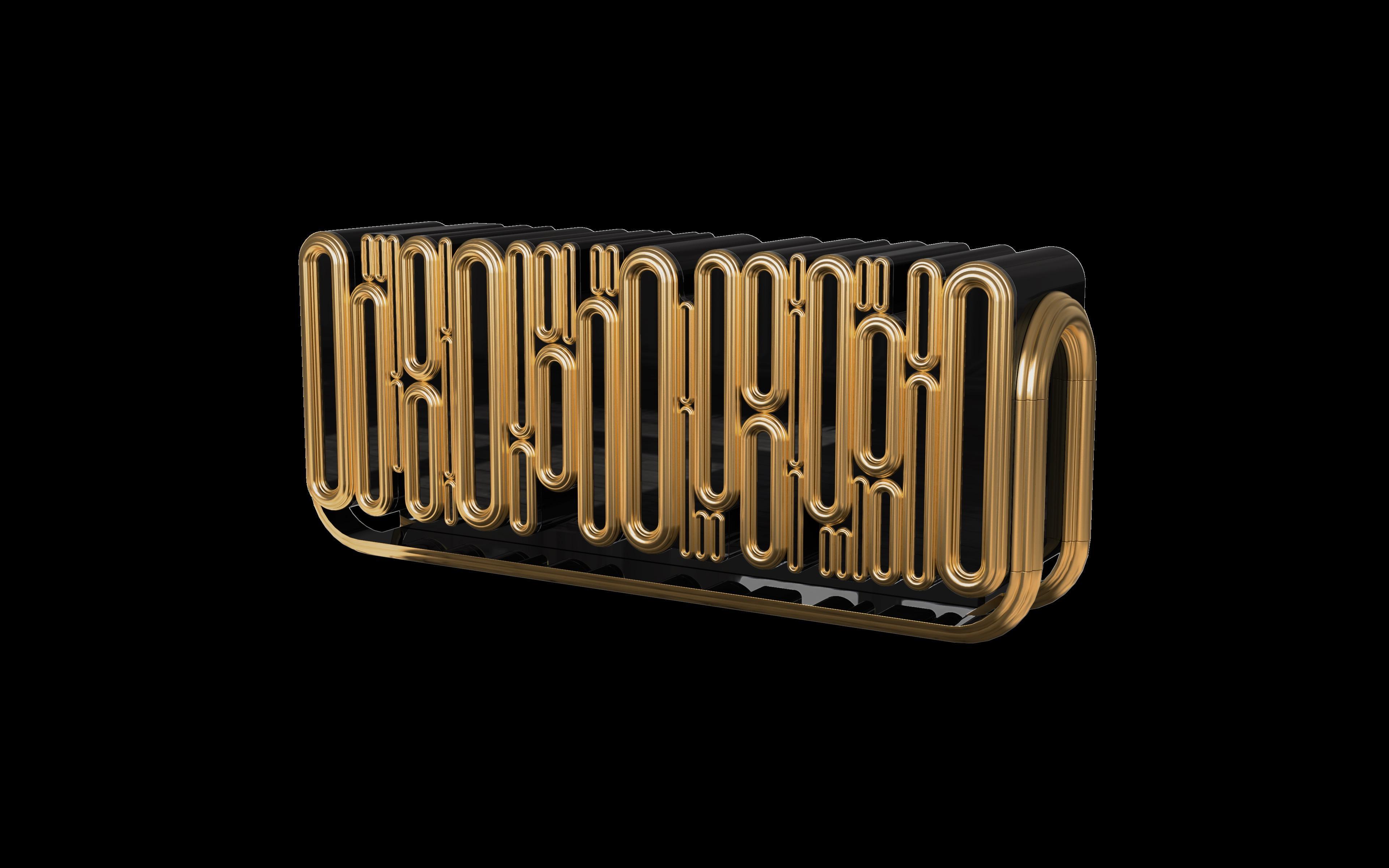
Oblong Gold Sideboard by BOCA DO LOBO
Shaped #004 Rug by TAPIS STUDIO
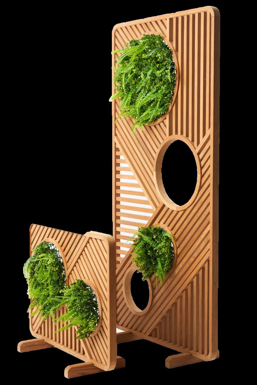
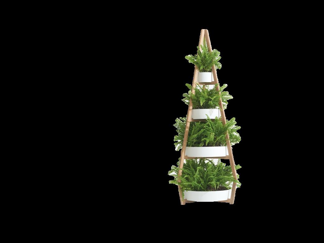
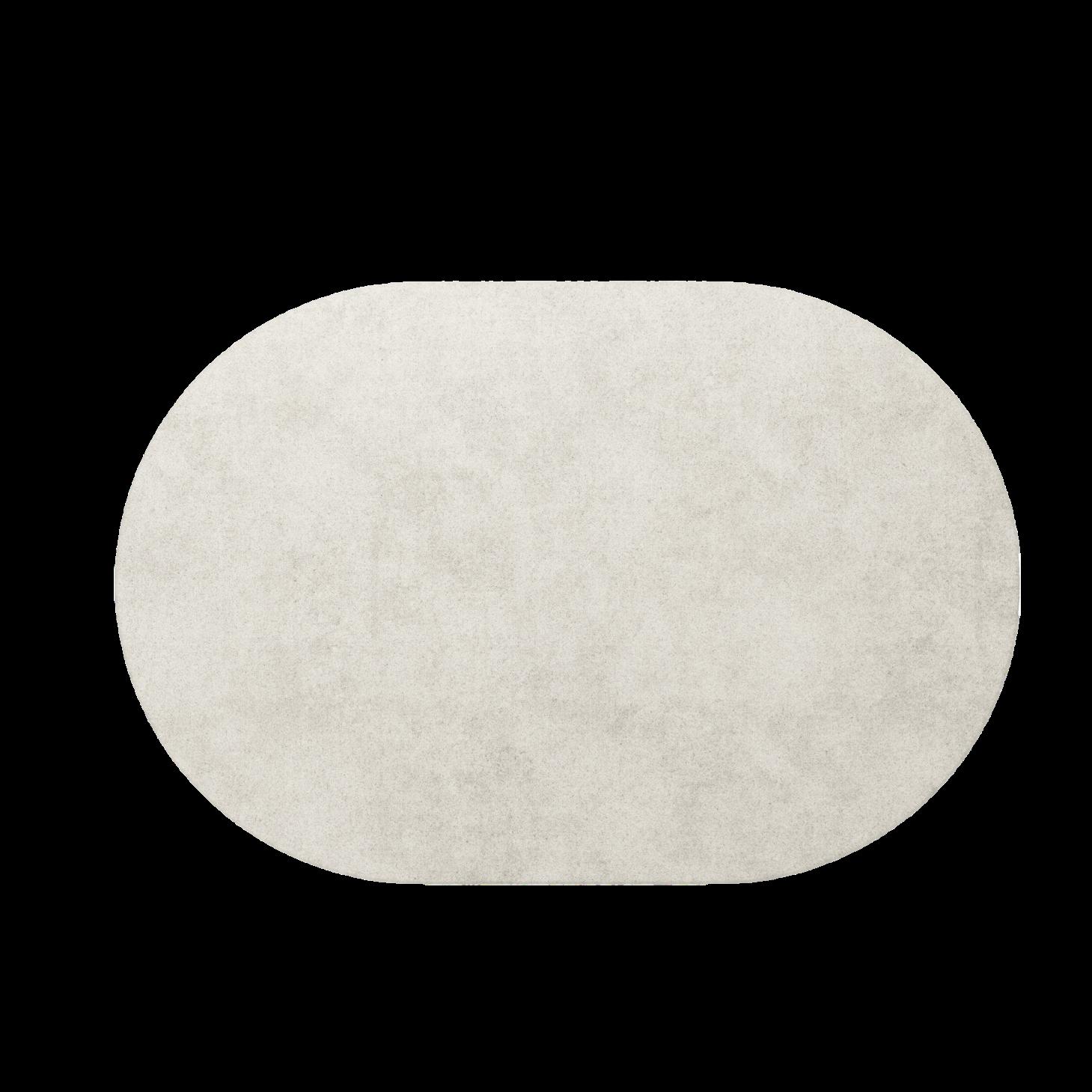
INCORPORATING NATURAL ELEMENTS, LIKE PLANTS, RAW MATERIALS, AND NATURAL LIGHT, IS A HUGELY POPULAR TREND THAT WE'VE SEEN A LOT OF FLAUNTING IN RECENT YEARS. STAYING AND BRINGING NATURE INDOORS CONTINUES TO BE THE PRIORITY IN ANY SPACE, AND BECOMES MORE AND MORE ESSENTIAL FOR OUR WELL-BEING.






#SPRING2023
Luminous Wood floor lamp by HOMMÉS STUDIO
Green Shelf by DEESAWAT
Ivory #001 Rug by TAPIS STUDIO
24 | G&G _ Magazine
Green Partition by DEESAWAT


Download event brochure for more highlights designfairasia.com @finddesignfairasia 21 – 23 September 2023 Marina Bay Sands, Singapore Asia’s Leading Furniture, Interiors and Design Event Join 15,000+ atendees from the regional design and architecture community and discover the most stylish and innovative showcase from 500+ global brands at FIND – Design Fair Asia, an anchor event of the Singapore Design Week.
AND FULL OF PERSONALITY.




#SPRING2023
Shaped #54 Rug by TAPIS STUDIO
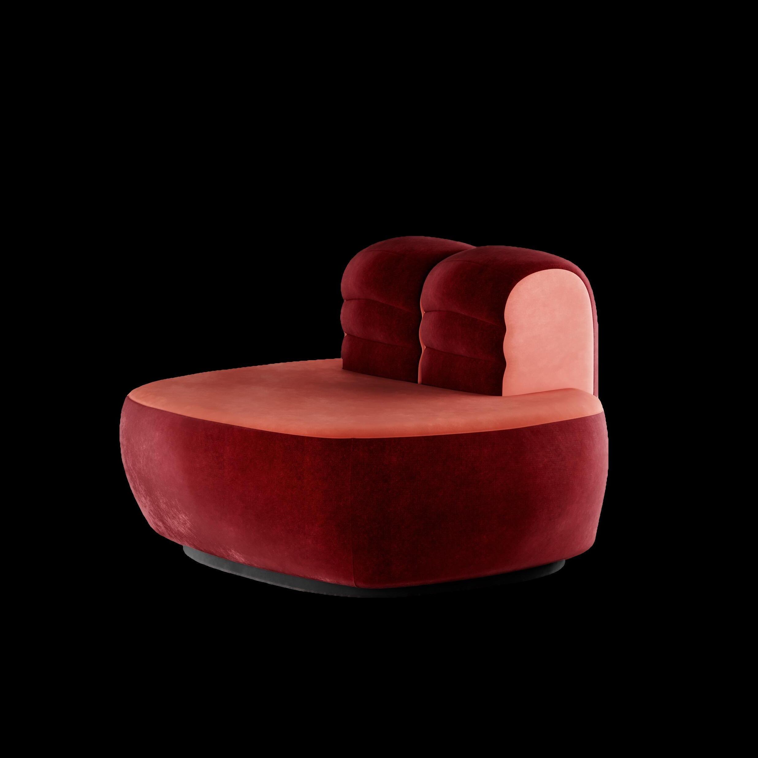
Armchair by HOMMÉS STUDIO
Geisha Chair by KOKET
Valentina Lamp by THDP for ITALAMP
Eco #001 Rug by TAPIS STUDIO
1
Cylinder Chess
Ceramic candle by THANIYA
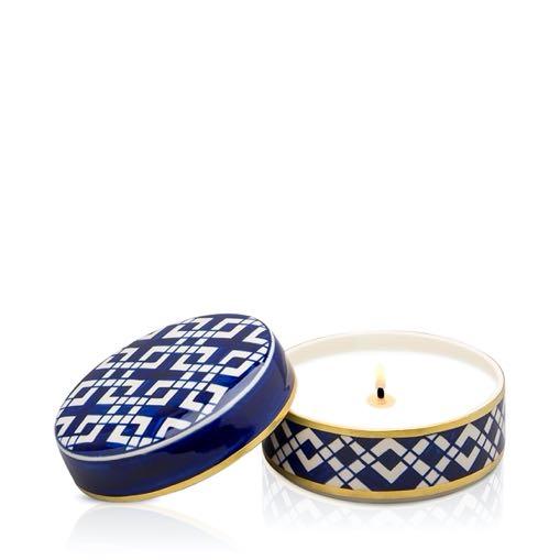
$53,57 – 77,14
E-SHOP
4 Natur Decorative vase by ACH COLLECTION
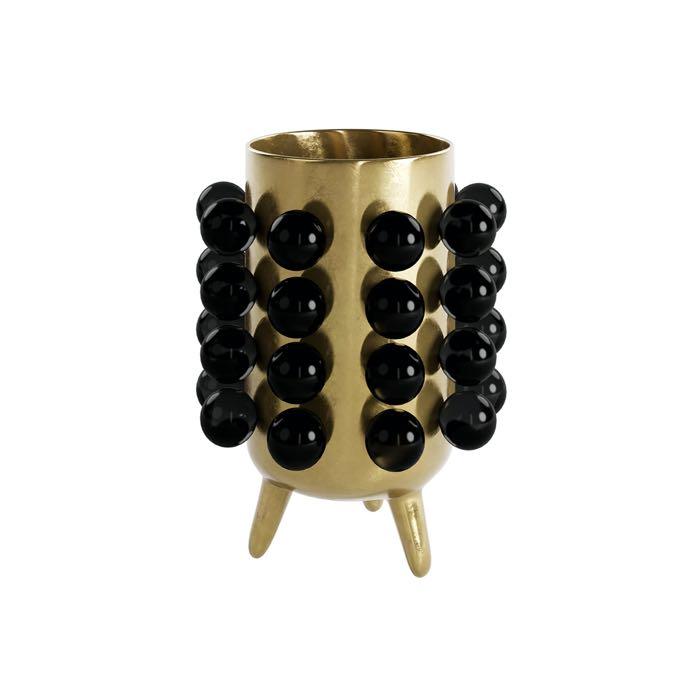
€149,00
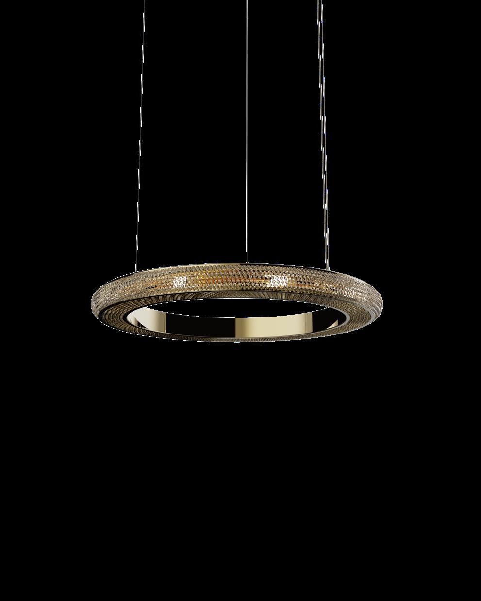
Luna Caleido large Pendant by GABRIEL SCOTT
€6.419,95
Hurry up and buy
Extraordinary Design products for your home with a simple click!

Luna Caleido small (C)
5
Pendant by GABRIEL SCOTT
€4.319,95
28 | G&G _ Magazine


DESIGNMIAMI/BASEL 13–18JUNE,2023 THE GLOBAL FORUM FOR COLLECTIBLE DESIGN/ FURNITURE/ LIGHTING/ OBJETS D’ART/ AND MORE/ PREVIEW DAY JUNE 12/ PUBLIC DAYS JUNE 13–18, 2023/ HALL 1 SÜD, MESSE BASEL, SWITZERLAND/ DISCOVER THE FAIR IN PERSON AND ONLINE AT DESIGNMIAMI.COM DESIGNMIAMI/ @DESIGNMIAMI #DESIGNMIAMI MODULAR BENCH 14 MODULES/ RINO CLAESSENS, 2022/ COURTESY OF GALERIE SCENE OUVERTE, PHOTO BY BASTIEN GOMAZ/ DIABOLO PAIR OF WALL LIGHTS/ MATHIEU MATEGOT, 1955/ COURTESY OF GALERIE MATTHIEU RICHARD/

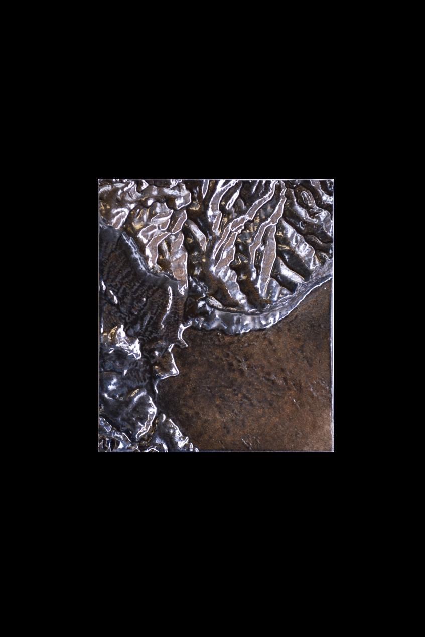


9 #ESHOP 6
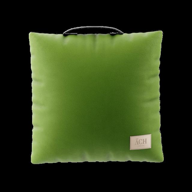
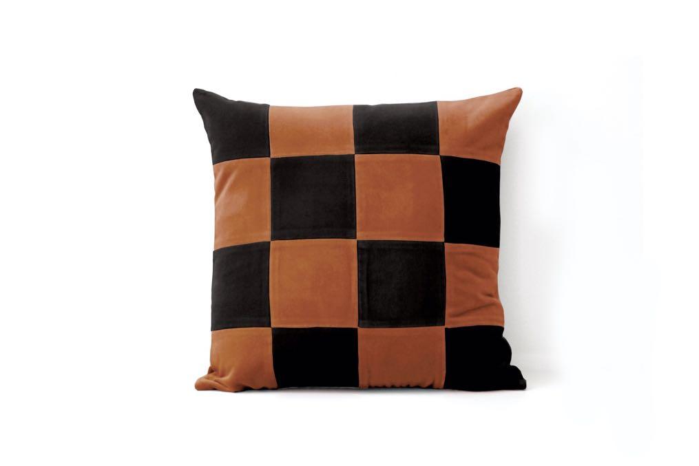
Lima square Cushion by ACH COLLECTION
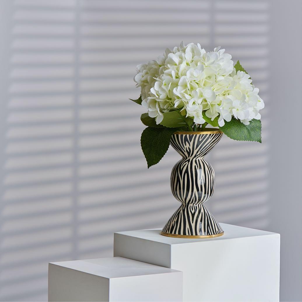
Safari zebra Ceramic hourglass by THANIYA $101,79
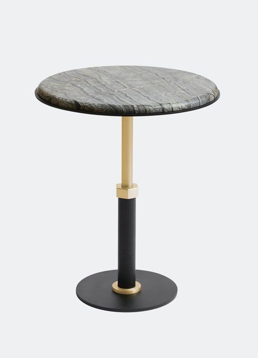
Round side table by GABRIEL SCOTT €3.839,95
8
Petite Baie de Cassis
Artwork by MICKAEL KOSKA €120,00
11
10
Cactus big Lamp by MICKAEL KOSKA €13.000,00
Spirit Art object by ACH COLLECTION €779,00




15 14 #ESHOP
12
Norman Coffee table by NIROH €749,00
Harlow small Chandelier by GABRIEL SCOTT €17.579,95
Topazio
Velvet pillow by MY FRIEND PACO €129,00
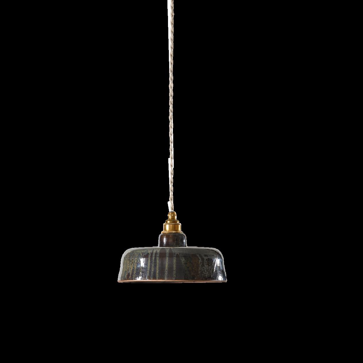
Lisette - Terre cuite rouge
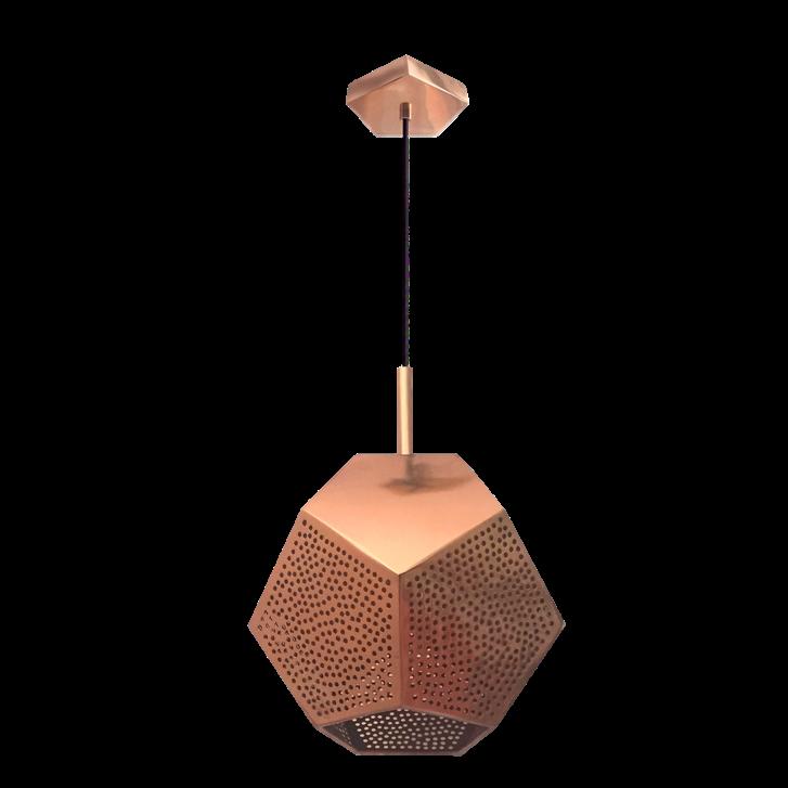
Suspension by ENAMOURA €180,00
17
Decorative vase
COLLECTION
16 32 | G&G _ Magazine
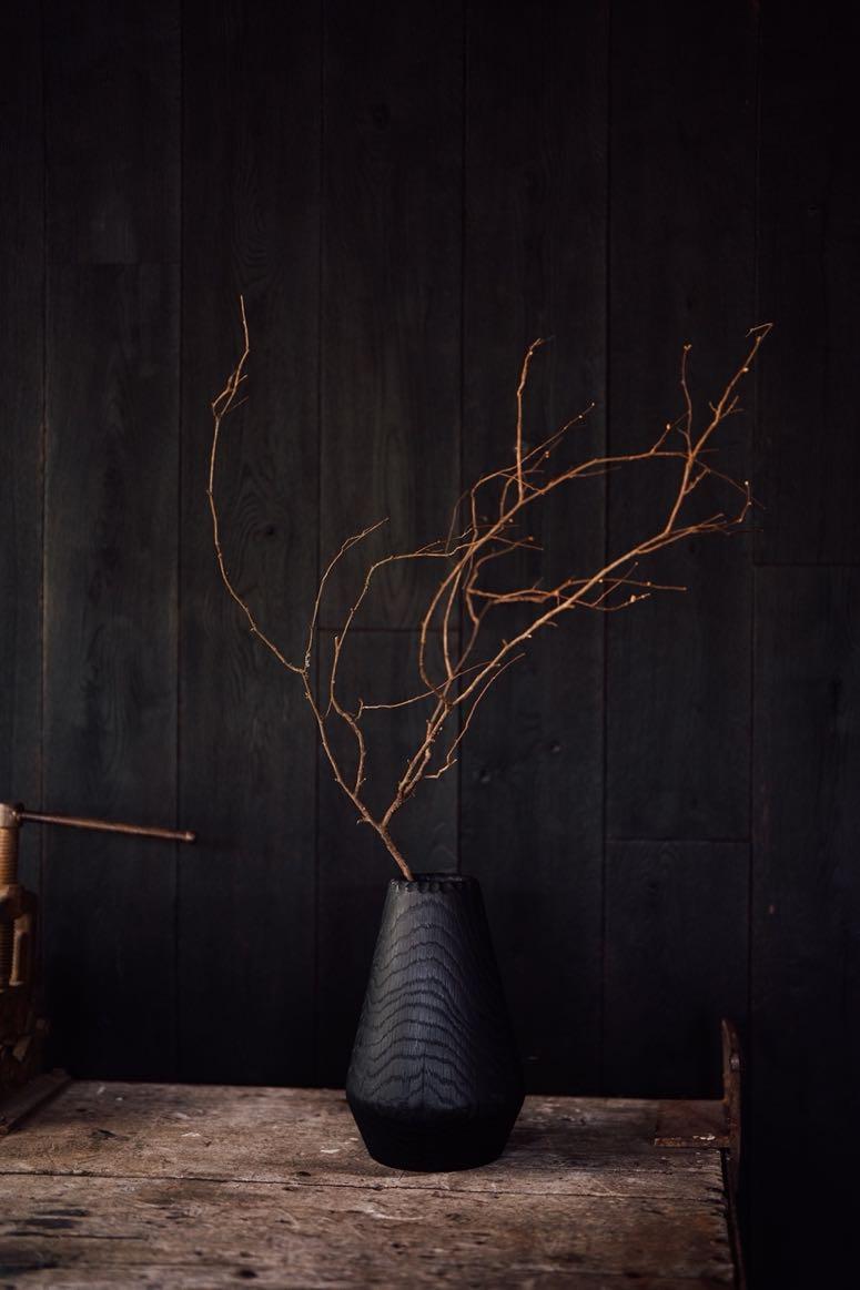
Lou Vase by NIROH €320,00
Pulley
by ACH
€281,00

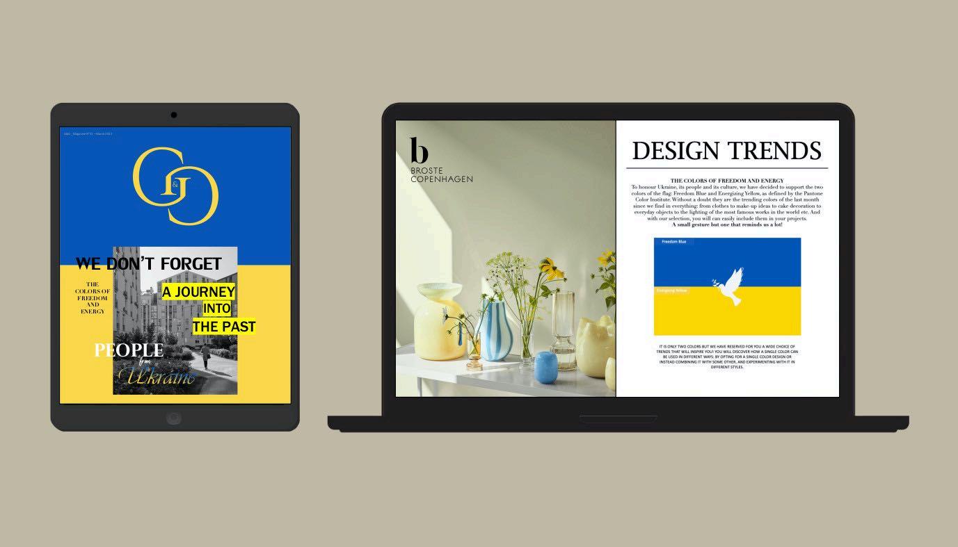
Read & Support
we want to inspire people to create and not be silent, and above all to show our closeness to the Ukrainian people.

DISCOVER
PEOPLE
UKRAINE
EDITION
NOW “
FROM
”

LATEST NEWS
Playful in character
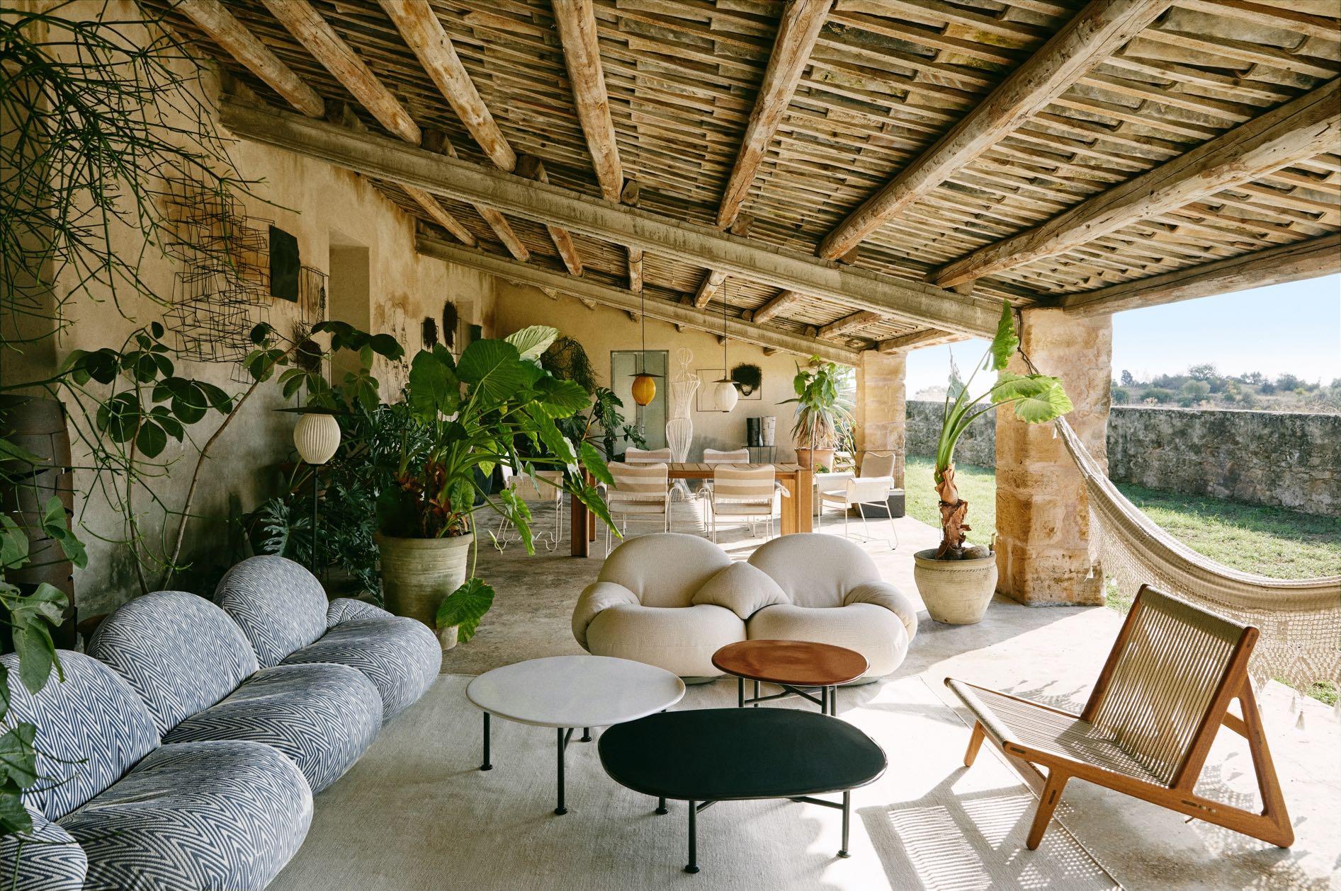
OEO Studio recently developed the Carmel table collection for fellow Danish design house GUBI, introducing the ceramic for the first time. With particular reference to the carefree, easygoing and unconventional lifestyle of the famously bohemian and artistic resort town of Carmel-by-the-Sea (California), OEO studio has created a collection of coffee tables in different heights and sizes, full of colour and personality. Thanks to its material composition, the Carmel Table is a hybrid design, able to enhance interior and exterior settings alike.
www.oeostudio.com


julia.altaidea@gmail.com +44 7493 160648 altaidea.com.ua INTERIOR DESIGN STUDIO
Art Manifest
Rockwell Group's Madrid office has unveiled the design of Jacqueline – a new maximalist restaurant in Barcelona inspired by Picasso’s portraits of his muse, and second wife, Jacqueline Roque whilst paying homage to the artist’s beloved atelier. The three-storey restaurant merges clean Art Nouveau details – a quintessential feature of the city of Barcelona – with the spontaneous and surreal forms of Picasso’s artworks to create an interior atmosphere that reflects the vibrancy of the Catalonian city.


Address: C/ d'Enric Granados 66, 08008 – Barcelona, Spain
www.rockwellgroup.com
A bohemian touch
Ami is the new go-to place for unpretentious French dining in the Dutch capital. Studio Modijefsky was asked to create the interior for this all-day bistro in the popular Amsterdam district of De Pijp. The concept blends the style of a traditional Parisian café with a playful, eclectic modern design. The interior elegantly unites both worlds by mixing glamour with freshness in a palette of soft red tones, vintage orange and crispy blue.
Address: Eerste van der Helststraat 51 – Amsterdam, The Netherlands www.studiomodijefsky.nl
For any mood
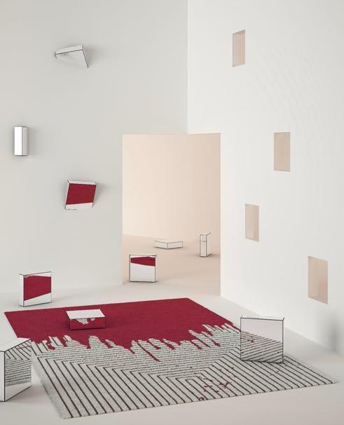
Mola is the Latin word for stone and the new AYTM's rug appears as a visual presentation of just that. The “stones” of Mola are designed in perfect harmony and symbolizes the milestones in our lives. The different levels, materials and structures of the rug are a manifestation of significant moments that we experience and from which we evolve.
www.aytmdesign.com

#LATESTNEWS
register now clerkenwelldesignweek.com cdwfestival clerkenwell.design.week clerkenwelldesignweek #cdw2023 the UK’s leading design festival
Brand to keep an eye
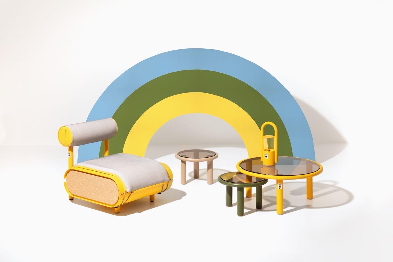
Born from the idea of the entrepreneurs Nicolas Sommereux and Jean-Sébastien Blanc, both committed to is the new brand of garden furniture that is responsible, useful and designed to last over time. All products are designed to be functional with simple shapes and a timeless aesthetic, while remaining current and tackling climatic problems.
Magnificent presence
Laskasas is proud to present the Haia chair, a stunning piece with curvy lines that will gracefully stand in any space, including dining rooms, home offices, and indoor patios.

www.laskasas.com
In a new light
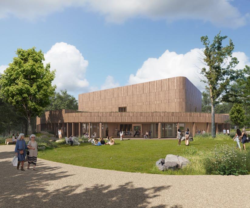
Jacob’s Pillow is excited to announce building plans for the reimagined Doris Duke Theatre, on the site of the original Doris Duke Theatre lost to a fire in 2020. In partnership with Marvel, Mecanoo projected the new building, seeking to create a future-forward dance theatre. Its new design embraces the Pillow’s diverse history to create an accessible and inclusive space for dialogue, collaboration, and education. www.mecanoo.nl
“Learn to consume less to consume better and to produce less to produce better.”
#LATESTNEWS
Visual barrier
Paulo Martins Arquitectura unveiled its latest architectural project: a brand-new house in Madalena, Portugal. Composed of an overlapping of pure volumes, its arrangement corresponds to the desire of creating a visual divider between living spaces and the street, allowing maximum privacy to be achieved. While the inside reveals itself, in opposition to the outside, to be a wide and fluid space with a well-defined program, opening the social areas to the outside through large glass spans.

www.paulomartins.com.pt
Eclectic aesthetic
Fettle has teamed up with Maslow’s, the design-led hospitality group behind Mortimer House, to create the new member’s House - 1 Warwick in London’s vibrant Soho. The thoughtfully renovated 1910 Neo-Baroque building set over eight floors, features Yasmin, a members-only, year-round rooftop bar and restaurant, members lounges, a studio and gym, private and shared workspaces, meeting and event spaces as well as Nessa, a ground-floor restaurant and bar open to the public, all designed by Fettle.

Address: 1 Warwick St – London, UK
Buy now!
Tognana has inaugurated its new flagship store in via Torino in Milan. Source of inspiration for the store concept was undoubtedly the essence of the brand itself: a brand that has always celebrated the home as a living and authentic place.
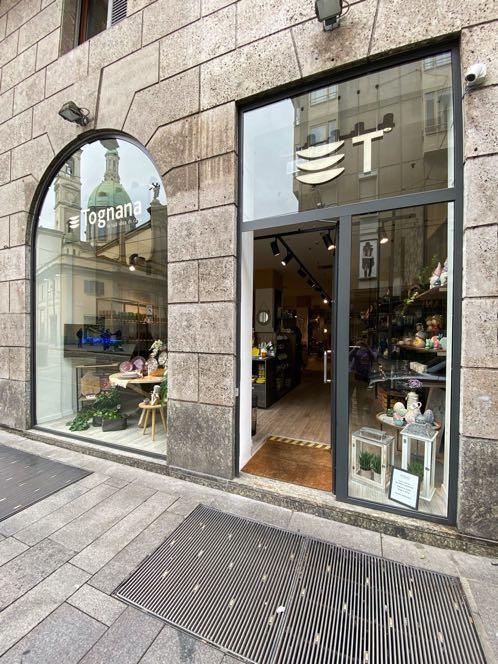
Address: Via Torino 55/N08, 20123 – Milan, Italy
www.tognana.com
www.fettle-design.co.uk
#LATESTNEWS
“The design for 1 Warwick is classically inspired and a reimagined version of the typical details that would have originally been seen. We have taken an honest approach, reusing as many of the original finishes as possible.”
Andy Goodwin, Co-Founder of Fettle
42 | G&G _ Magazine

Understated Luxury
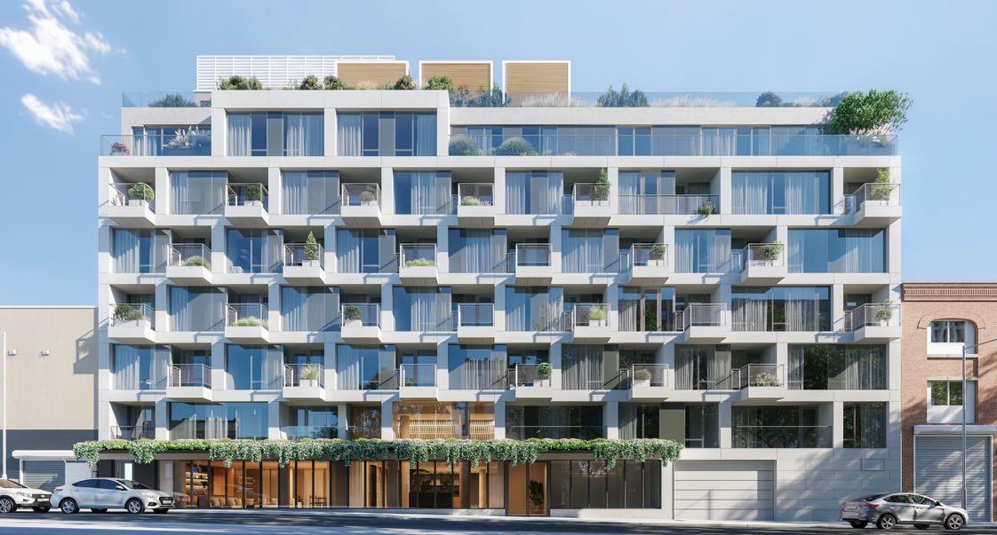
Designed by EDRE Development in collaboration with DXA Studio, the seven-story, 38-unit building development - 110 North 1st in Williamsburg (Brooklyn) offers thoughtfully-designed residences with a suite of amenities focused on health and wellness. The building features a full floor of amenities that include a fully equipped gym, soaking pool, and a full-service spa. Address: 110 North 1st street – NYC, USA www.110north1.com
A slice of tradition
Studio Modijefsky presents the two-storey bar and restaurant Polly Goudvisch in the north of Amsterdam. The interior is a nod to the traditional brown café of the city, with wooden panelling on the walls, brass and copper details, and elaborate woodwork like twisted table legs. Materials and patterns, old and new, are mixed to create a venue that feels like it’s been there forever but has a distinctly contemporary feel.
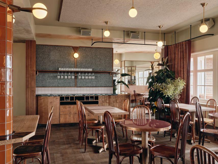
Address: Buiksloterweg 3-5 – Amsterdam, The Netherlands
www.studiomodijefsky.nl
Neon sparkle
Masquespacio designs a techno cyberpunk gym for King Kong Club, the studio’s first project in Salzburg, Austria. Max Schirnhofer, the founder of King Kong Club, had the initial idea to open a new club that was inspired by a mix of 80s techno style and Cyberpunk. In addition to these aesthetics, Masquespacio proposed incorporating more hints of futurism that is oriented to the modern building itself, adding an innovative and sophisticated touch to the space.
www.masquespacio.com

#LATESTNEWS
44 | G&G _ Magazine



48 | G&G _ Magazine
Material
 Memola Estudio and Vitor Penha renovated a 160m² apartment, located in the iconic Saint Honoré residential building on Avenida Paulista, São Paulo.
Remix
Photography by Denilson Machado
The renovation of the apartment has transformed it functionally and visually: the idea was to create a timeless atmosphere inspired by industrialstyle lofts. Rustic materials such as exposed

50 | G&G _ Magazine
concrete and brick, revealed through the complete removal of the stucco and the peeling of the masonry, coexist with the warmth of new wooden surfaces and with furniture and objects, sometimes of


contemporary design, sometimes vintage, which add delicacy to the whole. Furthermore, one of the goals was to create a backdrop for the display of artworks, which was both neutral and expressive.
The social area of the apartment is large, airy and well lit. The light gray tones reverberate in the furnishings of the living room and are "warmed up" by the touches of wood present almost everywhere. A large sofa by a soft design, a concrete coffee table, a wooden bench with visible steel finishes are the main protagonists of this space. A few touches of yellow brightens the environment. The wall behind the sofa remains unnoticeable, strong presence to the space. Above they are delimited by exposed concrete beams and, below, by strips of wooden planks which signal the demolition of the walls, with a different shade from that of the overall beautiful floor of the apartment, designed in the fish scale pattern.
which has been partially demolished and replaced by new halfheight mobile wooden and glass fixtures, with which it is possible to vary from total to partial integration and isolation of the rooms. With their vertical marking of panels, the frames lend rhythm and a

52 | G&G _ Magazine
Without any visual constraints, on the other side of the living room we find the dining area: the round table and the industrial design suspension lamp form a perfect balance with the dining chairs with a lighter and more sophisticated design and the sideboard in the background, both in wood. The wall that separated the kitchen was demolished and replaced with folding doors to improve flows and integrate it with the social area. The industrial universe that participates in the project's concept is present both in the apparent installations, with emphasis on the rigorous distribution of pipes throughout the apartment, and in the stainless-steel elements that make up the worktops and kitchen furniture. In addition, here, the entire flooring has been modified with the installation of ceramic flooring with a rustic look and an earthy tone.


54 | G&G _ Magazine
The guest bedroom has been redesigned in the closets so as to create a complementary alcove facing the corridor. The bedside wall has been completely stripped of its surface cladding, revealing the exposed brickwork. While in the master

In the bathroom of the suite, the neutral background of the ceramic tiles is counterbalanced by the apparent wood of the vanity unit and the delicate design of the mining mirrors, each with its own particular design. suite, the wall next to the bed has been incorporated with acoustic cladding.


56 | G&G _ Magazine
electric brights
RAYMAN BOOZER, THE FOUNDER AND CREATIVE DIRECTOR OF THE AWARD-WINNING INTERIOR DESIGN FIRM APARTMENT 48, UNVEILED ITS NEW PROJECT THAT SHOWCASES HIS UNIQUE STYLE AND CREATIVE VISION: A TOWNHOUSE ON NEW YORKʼS UPPER EAST SIDE .
Photography by Gieves Anderson

58 | G&G _ Magazine
"We took many cues from English houses; including the backdoors, fireplace hearths and painted millwork. Several of the wallcovering, fabrics and art are by English artists and designers."

Located in the bustling heart of New York City, the house is a stunning renovation that features an impressive range of colors and bold
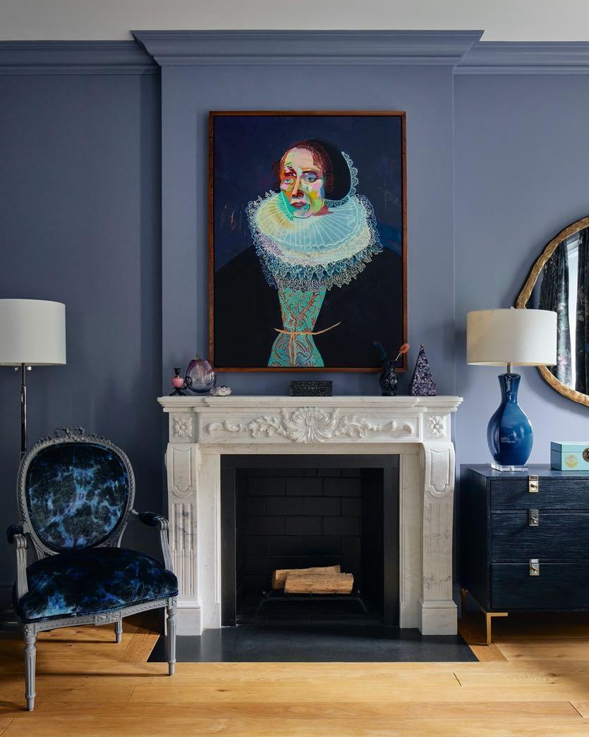
design statements. The space has been completely transformed to provide a luxurious and comfortable living environment for clients - a family of four. Having lived in London, the owners wanted to take inspiration from there. Since the house is over 100 years old and there were landmark restrictions, the designer could not change the facade of the building and the front door, therefore they have been kept as is the entryway arches and moldings. The entire parlor floor has been renovated to make it all an open plan without any walls, allowing an easy flow from the living room to the dining area and to kitchen. On clients' request the walls are painted bright white and all the trim and stairs are painted Benjamin Moore's Midnight Dream. The fireplace does not go unnoticed - it is the only one to be kept original, all the others are new. The chairs and sofa by Interlude give a further sophistication to the space while Arteriors lighting and the carpet by Rug Company tie everything together, highlighting the gold accents in the room.

Continuing in the dining area, the beautiful table by Julian Chichester and the sculptural black chairs from Ethnicraft mark a decisive but, at the same time, very accurate design. In the background is the large colorful art of Irene Maiyeimpossible not to notice!
One major thing that was changed was the kitchen: it was moved to the parlor floor from the garden one, near the dining zone. The homeowner wanted to do this to take
advantage of the natural light. The cabinets is also painted Midnight Dream by Benjamin Moore but has light Calcutta marble countertops and a huge window, so it still feels light and airy. A touch of drama has been obtained from the silver details such as the polished nickel accents of the Worlds Away stools or the structure of the Rejuvenation chandelier, which then these go to mix with the taps and appliances in sight.


The floor below is the one that overlooks the garden. Here the den is characterized by the gray color including all the millwork and ceiling. On one side, we find the custom-made upholstered loveseat made with Susi Bellamy fabric, the colorful cushions, a couple of poufs and the wall covered in Jim Thompson's wallpaper. Visual Comfort's sconces accentuate the blue and dark red colors with its gold finishes, as well as providing a deco touch by showcasing its curved design. While on the other side, a more formal area composed of swivel brown fabric armchairs by Romo and the green coffee table with clean lines from Made Goods. A large carpet in shades of blue and the colorful floor-to-ceiling curtains of Kerrie Brown bring out all the colors in the room.


The master bedroom and dressing room are both unique with the lilac paint from Benjamin Moore called Flower Box and Violet Mist. The light shade of the CB2 sofa creates a perfect balance between the dark colors of the king size double bed and the coffee tables. The bedroom also has blue and grey accent tones, like in the rug to help ground the space. Beautiful curtain fabrics by Création Baumann and Italian bedding by SFERRA harmonize with custom pillows by Designers Guild. The old fireplace has been replaced with the new one in statuary marble. Next to it was included a chair that the customer had for years and upholstered 3-4 times; it has been reupholstered with Designers Guild fabric. Even in the dressing room it was decided to include a few splashes of fuchsia as in the carpet. Instead, the primary bathroom is kept light and white. Shades of light gray are found in

the Breccia Capraia marble vanity top and Tile Bar floor tiles. The centerpiece is the freestanding bathtub by Signature Hardware. Above Visual Comfort's chandelier embellishes the environment providing a shimmering elegance. This project is a testament to Rayman Boozer and its design team's passion and commitment to creating unique, stylish and functional living spaces that reflect the personality and lifestyle of their clients.

64 | G&G _ Magazine


"This particular client loves jewel tones so within the home we added lots of fuchsia and purple accent colors and also kept the furniture dark."
THE CHARM OF the old town
IN COLLABORATION WITH INTERIOR DESIGNER ONDREJ ZDERCIK, JAIME SALVÁ AND HIS DESIGN TEAM HAVE COMPLETELY REFURBISHED A 110 M² APARTMENT IN PALMA DE MALLORCA, MIXING SOPHISTICATED COLORS WITH ORIGINAL MATERIALS.

66 | G&G _ Magazine
Photography by Tomeu Canyellas


68 | G&G _ Magazine
Situated in the historical center of the city, near the Town Hall and the cathedral, the apartment's building is surrounded by narrow winding streets. Its owners
were looking to create a new home in the city, and the old town caught their attention due to the life on the streets of this characteristic neighborhood. The apartment was totally outdated; the
facilities had to be renovated and thermally insulated. In the reform, careful attention was paid to preserving the elements that managed to maintain the essence of the original house, adding other more contemporary ones that could work. The main goal was to achieve a stylish and timeless environment, where the intervention was barely noticeable, and the apartment could be considered current and old at the same time.
The premises that guided the reform were to gain light, open spaces and to preserve original elements. Care was taken to rescue the original materials that were most worthwhile, improving the functionality of the spaces and enhancing the great height of the original ceilings.
Upon entry, a large mirror has been included which projects the adjacent formal living room, creating interplay between spaces. Here the exposed beams have been kept which increase the "historical value" of the house. The sofa and a pair of armchairs by Casamilano, characterised by an extremely refined and enveloping line, become the protagonists of the space. While a couple of tables, completely different from each other, give a modern touch.
Framed by a wooden frame, the kitchen presents itself as a bright and open place. Jaime Salvá's team opened a hole in the load-bearing wall to be able to connect the semi-open kitchen with the other spaces in the apartment. The material chosen for the island and other elements that make up the space is Calacatta marble, which is white and has very distinctive gray veins.

“Knowing the clients and their lifestyle was also a very important point when choosing the fabrics for their optimal use and passage over time.”
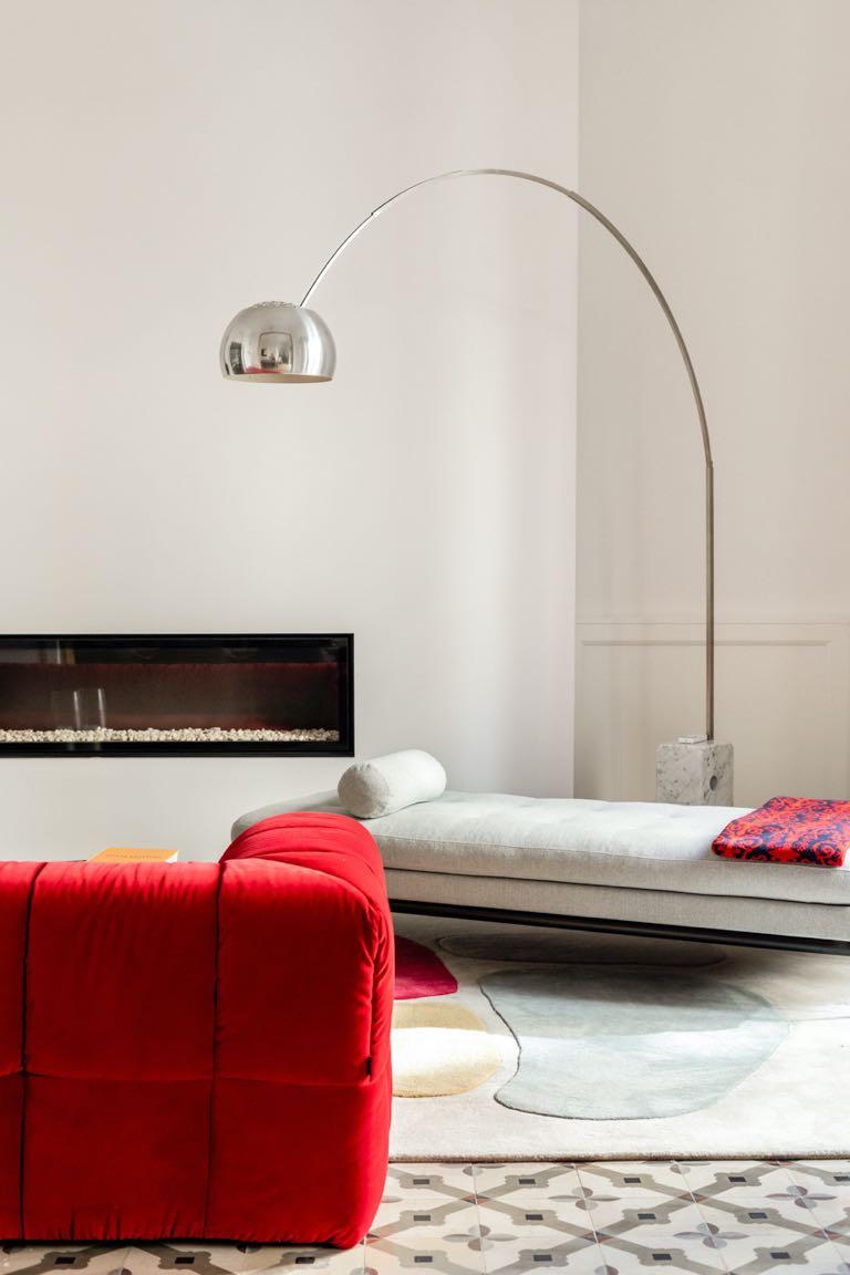
The kitchen leads to the dining room where the exposed walkway has been kept in its original state. A large dining table with an important wooden top is accompanied by the soft seats of MisuraEmme. A pair of large lamps and images by photographer Tomeu Canyellas complete the design. Here too, a wooden frame delimits the second living room. To obtain the soughtafter "chic" effect, the original colors of the house are combined with other bolder tones, such as the red used on the Arflex sofa. Furthermore, the style of the furniture is more modern, such as the composition of the tables by Casamilano or
"Keeping original pieces, such as the large lamps in the dining room, combining them with cheerful colors, curved and natural shapes, makes it a very special and characteristic space, between chic and historical."

70 | G&G _ Magazine
Vitra’s chaise longue. The rug has been made with a completely personalised drawing by Alfombras Peña, as well as its colors, allowing for perfect combination with the other pieces in the living room. The two Ionic columns were already in their original state, and it was decided to keep them to maintain the character. They mark a small space dedicated to the office area. A bookcase was hung on the wall, with large open holes, increasing the feeling of space. The pavement is also worth noting it was decided to keep the original despite having to replace some pieces of hydraulic ceramic tiles. Instead, in some rooms the herringbone oak wood was put on.

The apartment includes three bedrooms, one of which is the master bedroom with attached bathroom; all feature a simple, clean design. Banni was the company chosen to select the furniture, and in close cooperation with Jaime Salvá's team, all the elements were defined trying to understand the idea of the project to capture it and convey it in the best possible way.


The master bedroom, located upstairs, was a major structural challenge. A bathroom was located in the middle of the passage, taking advantage of an unevenness, and in this way, a unique space was achieved where the placement of a bathtub in the center predominates and the presence of a large mirror that occupies the entirety of one of its walls.
The designers decided to hang a large velvet curtain, allowing the separation of the bathroom and the main room with a great light between main walls and maintaining the line of the original hanging beam. With this intervention, not only was the aesthetic defined by the architectural
firm, but comfort was found in every piece. Also, the original wooden beams stand out given their age, which can be seen with the naked eye due to their irregular shape. The shades of light gray recur in the furnishings adding elegance to the environment: the small tables and the bed with its supple design by MisuraEmme, while the minimalist table lamps by Oluce recall the lighting classics of the 1950s.

72 | G&G _ Magazine


"The reform has taken into account the original elements of the house to maintain its essence, achieving a 'chic' atmosphere and maintaining the fusion between the old and the present."
Unleashing Creativity
Led by Przemek Maziarz, Modoso
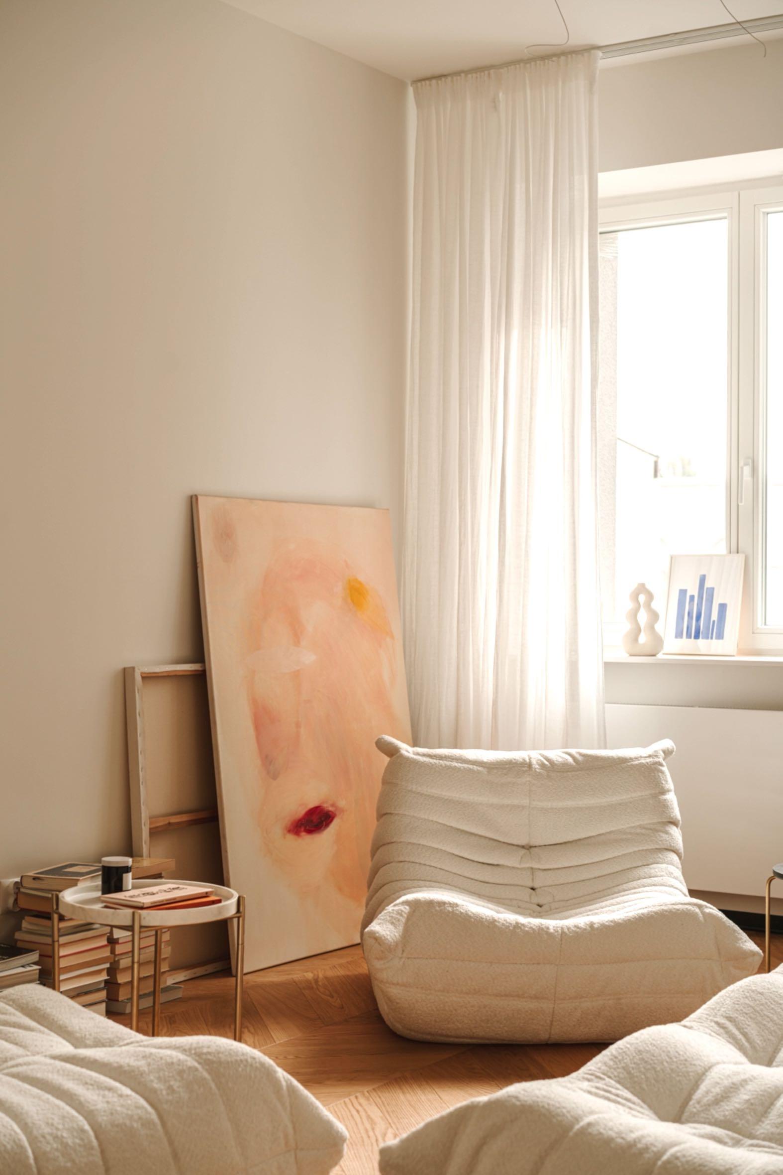
Interiors projected a modernist flat with a playful hide-and-seek design in the expanding Warsaw district of Powiśle.
 Photography by Mood Authors - Paul Marcinkowski
74 | G&G _ Magazine

Acertain color of the floor, a bright interior and specific mobile furniture - these were clearly defined customer requirements. Furthermore, the project involved a small adjustment to the layout of this 50 m² apartment to enlarge the bathroom. The main space of the house is the living area made up of a


lounge area, a small dining area and kitchen which is visually unobtrusive. During the first phase of the project, the designers analyzed how the sun's rays travel in space, with the facade facing eastsouth-east but obstructed by the courtyard. As a solution, the designers decided to play with reflections. A mirror

“We always strive for balance, especially in smaller living spaces. It's important that he kitchen doesn't dominate the living area while maintaining full functionality.”
76 | G&G _ Magazine
wall above the kitchen counter was chosen which not only visually enlarges the living space, but also illuminates it beautifully. The shelves have been hidden behind the mirrors, purposely foregoing the upper cabinets which tend to have a more kitchen-like feel. This shallow space is ideal for storing cups, mugs, and even cereal and
pasta containers. Instead, a large piece of furniture with a built-in oven that takes up the concept of the mirror has been placed on the next wall.
The small dining table and chairs blend perfectly with the Jawor-Parkiet herringbone parquet. &Tradition's iconic Flowerpot pendant completes the design.

“The living area can transform into a cooking space for entertaining friends or a cinema with a projector for movie nights.”

78 | G&G _ Magazine
apartment is in a modernist building, interior is eclectic. The team was particularly interested in the subtle corner characteristic of buildings from that The furniture is a collection that to the needs of the investor. The composition of the sofas from the 70s in with a more than comfortable appearance blends perfectly into the the house; as well as the doors are replicas copied from the grandparents' summer house. A small tables accompany the other pieces of furniture. To avoid an "altar" around the TV, avoiding it in any elaborate structure, a was opted for. Also, it's easy to eye contact with others in the thanks to the kitchen mirror. Finally, Kompała's delicate canvases "Summer is gone" series with its colors and vibrant compositions atmosphere full of non-obvious


The living room leads to the bathroom of the house whose design was a further challenge given that a freestanding 90x190 cm bathtub had to be inserted into the space. The designers had to remove a small part of the space from the living room (but where nothing is noticeable since the custommade kitchen furniture has been inserted). To design all the bespoke furniture Modoso Interiors collaborated with New Line. A local stonemason expertly clad the sink in Calacatta Da Vinci quartzite, adding luxury and blending perfectly with the stone worktop from Iberapol stone and more. A clean and tidy design has been obtained, thanks also to many hidden compartments, everything is at hand: just look in the mirror cube. The close collaboration between the designer and the craftsmen is vital and their contribution has been fundamental to the success of this project. There is no shortage of art here as well. A fantastic work by Grażyna Smalej draws attention to itself. This is the small bright blue painting "Water shape II" 2020.

80 | G&G _ Magazine


bedroom a bespoke wardrobe was made by New Line in a beautiful and with dovetailed drawers. lamp was placed above the bed, while a minimalist one like was chosen on the wall, and window we find a small pendanthas a different type of intensity a unique lighting effect.


82 | G&G _ Magazine


and BLACK
The interior designer Paola Maré has transformed a portion of a building, originally used as a body shop, into a bright loft with a private patio, located in a pleasant courtyard in the city centre of Turin.
Photography by Jana Sebestova

in
84 | G&G _ Magazine
WHITE

The renovation project takes advantage of the typical characteristics of artisanal and industrial buildings: few structural constraints, important internal heights

and lots of light that enters from the windows of the attic ceilings. To obtain a wider and well-proportioned plan, the wall dividing the two long and narrow sections was removed, while three metal carpentry mezzanines were created to take advantage of the height. Under the two larger ones are the walk-in closet, the entrance to the house decorated with wallpaper, the main bathroom and the study with independent entrance. The interior is dominated by white in contrast with black iron, warmed up by birch plywood elements. In the bathroom, we find a very refined design with a perfect balance between two colors, also attenuated by the white tiles with gray circles by Vives Ceramica. The large open space can be visually divided into two parts: the right part is made up of the dining area, the partially visible kitchen and the staircase leading to the bedroom; the opposite side houses the living room and the second staircase. Here, a slatted wooden sliding panel that separates the studio from the rest of the
house was made to order. The minimalist style prefers this space where the Bend sofa by B&B Italia together with the pouf are the only protagonists. Its irregular shape enhances comfort while the light

86 | G&G _ Magazine
contrast stitching defines the design and movement. Behind, we find a load-bearing wall which stands out for its raw state, thus transforming itself into a work of art. Seletti’s Monkey lamp in resin adds a
theatrical touch to the environment. Also, the stairs leading to the mezzanines have different shapes and colors to soften the overall symmetry which otherwise would have had a severe appearance.

In the living area, a portion of the roof was removed to create a private outdoor space. This well of light, which further increases the brightness of the environment, is closed on two sides by large sliding doors that create continuity between inside and outside. The dining area is composed by a table with a wooden structure that can be glimpsed thanks to the glass top and the
black wood chairs. Above, the circle lamps of various sizes and at different heights have been positioned to balance the colors and give continuity. The shapes of the circle continue in the black and white plates hanging on the masonry partition that partially hides the kitchen. Both the divider and the kitchen furnishings were custom made.

88 | G&G _ Magazine


A mezzanine houses the bedroom and small bathroom, while the other two are relaxation areas or spaces for guests. These areas are characterized by a simple and welcoming design, with some touches of pastel green.

In the bedroom, the highlight is the
exposed bathtub by Kaldewei which, thanks to its exceptionally soft interior lines, visually blends into the ambiance. Here, Axolight's lamp with a white fabric covering has been positioned that generates a soft light creating a relaxing atmosphere.
90 | G&G _ Magazine


92 | G&G _ Magazine
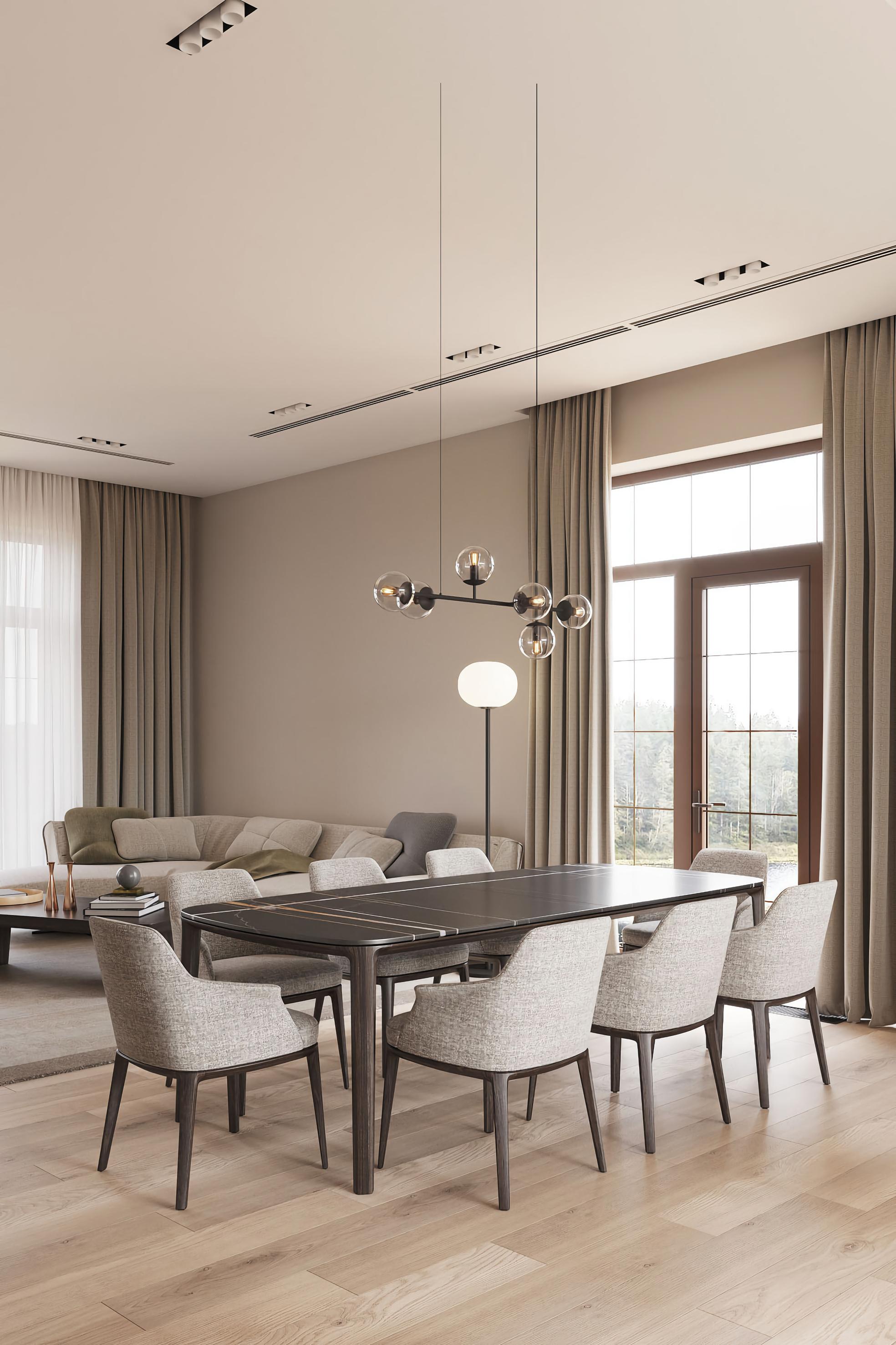
SIMPLE DREAM
THE FOUNDER OF ALTA IDEA DESIGN STUDIO, JULIA BAYDYK AND ITS DESIGN TEAM PROJECTED A FUNCTIONAL 53 M² APARTMENT IN KYIV.

 Photography by Andrey Bezuglov

94 | G&G _ Magazine
On the whole, the interior design for this apartment turned out to be delicate and a little dreamy, yet practical at the same time. Each project reflects the energy and nature of the homeowner. As a rule, the design team received several restrictions and requests from the client, which gave an impetus to the work.


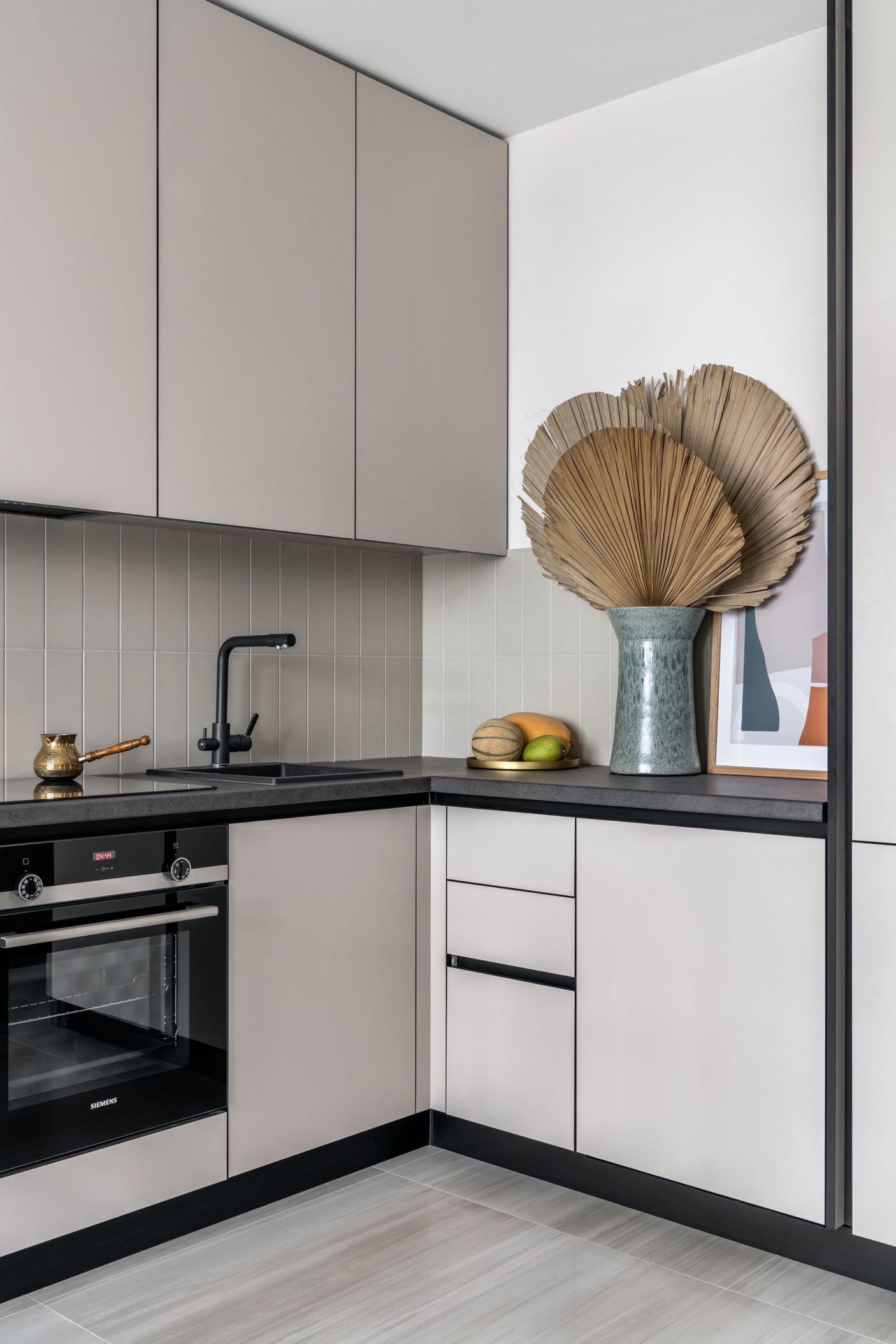
The original layout of the apartment didn't appeal very much to the designers. Therefore, they removed some elements and partition walls in order to arrange reasonable and convenient life scenarios. Having changed the layout, the design team managed to create a large walk-in wardrobe and a spacious common room with huge windows overlooking a picturesque lake.
The common room accommodates a Ushaped kitchen unit that reaches the ceiling, a built-in dishwasher, a fridge, and closets with ample storage space. The designers liked this arrangement a lot: a smart zoning solution, which is both elegant and functional. As a result, we have a common room which is a convenient space for cooking and hanging out with your family and friends. Originally, the designers were thinking of placing a TV set in this room but later turned down this idea moving it in the bedroom. Hopefully, the living room with a wonderful view and incredible sunsets encourages the dwellers to enjoy nature and company. The floor in the common room features beautiful tiles with a smooth transition from beige to mocha color with a pinch of nacre. In addition, all areas laid with tiles have underfloor heating installed to give extra comfort to the homeowners.
On the left as you enter the apartment, we find the bathroom with a gloomy look than the rest of the apartment: gray colors dominate the space. Both on the walls and on the floor, we find large tiles with similar motifs, both in grey. The sink cabinet is also gray. While the finishes and accessories are in black. The mirror with attached lighting makes a difference in this space by creating a dramatic effect in the room.

"This interior, however, was designed for a rental apartment, so it didn't have any particular image. That's why we decided to design a space where we would like to live ourselves.”

96 | G&G _ Magazine

In the master bedroom, a huge wall-to-wall wardrobe in was placed - this is a convenient place for storing clothes and bedding. Some space near the window is left unoccupied: one can do yoga or practice meditation here. If this apartment is rented by a family with a small child, they can put a baby cot here; or a dressing table if the lady who is going to live here is a makeup fan. Here, the bedroom floor is clad with three-layer parquet boards to create a cosy atmosphere.


FOLLOW & LIKE


EVENTS CALENDAR
May – June - July
G&G Magazine accompanies professionals in the design, architecture and innovation sectors in a series of events around the world including conferences, fairs, exhibitions and design weeks.

May 18-21, Melbourne
Curated by the National Gallery of Victoria and delivered in collaboration with the Melbourne Art Foundation, Melbourne Design Fair is an annual platform for designers, commercial galleries, design agencies and organisations to come-together under one roof to promote and sell the best collectible design from Australia and the world, over four days, providing a unique cultural and commercial experience. www.designfair.melbourne
May 21-23, NYC
The International Contemporary Furniture Fair (ICFF) is North America’s leading platform for contemporary furnishing design. With its emphasis on original and sustainable design, ICFF presents a broad range furnishing product for residential, contract and hospitality environments to an audience of 10.000 architects, interior designers, retailers, distributors, developers, and press. ICFF and the co-located WantedDesign Manhattan bring together over 400 established and emerging design brands from more than 25 countries. www.icff.com

102 | G&G _ Magazine


May 23-25, London
Clerkenwell Design Week (CDW) will showcase thousands of cutting-edge products for your upcoming interior design projects. The UK’s leading design festival celebrates London’s creative hub with more than 130 resident showrooms, over 200 exhibitors and new for 2023, 10 design destinations. Explore the world’s leading design brands, undiscovered talent, specially commissioned installations, and brand activations as well as hundreds of design-led events, workshops, talks and more. Design London has now merged with CDW, which means that the UK's leading design festival will have greater impact. www.clerkenwelldesignweek.com www.designlondon.co.uk
May 23-25,
Dubai
Set at the Dubai World Trade Center at the same time, The Hotel Show, Workspace, The Leisure Show and INDEX Dubai present the grandest and most popular industry events in the Middle East. They not only include the fundamentals of a trade exhibition, but an array of intriguing conferences, innovative products and inspiring features. It is a meeting place where the thousands of professionals attend every year to connect with global brands and manufacturers and discover the next big thing in interior design.
www.thehotelshow.com

www.workspaceexhibition.com

www.theleisureshow.com

www.indexexhibition.com


May 25, Berlin
WORKTECH23 Berlin is the conference for all those involved in the future of work and the workplace as well as real estate, technology and innovation. The event brings innovative ideas and inspiration to the workplace community through inter-disciplinary speakers and learning experience to enhance creativity and move thinking forward.
www.worktechevents.com/events/worktech23-berlin

June 4-7, Cologne
The imm cologne is one of the most important furnishing show in the world. In June 2023, it presents the new international furniture and interior trends and surprises visitors with numerous market-ready innovations. The huge depth and breadth of what's on show is combined with high standards of product presentation, providing also an effective platform for up-and-coming designers. www.imm-cologne.com


June 8-11, Shanghai
Design Shanghai, established in 2014, is one of the world's most prestigious international design events and Asia's premier design event. Constantly breaking new ground, it has set a precedent in China's ever-growing design community. Showcasing the best design brands and galleries from across the globe, Design Shanghai provides a unique and exciting platform to network and establish long-term business relations with Asia's top architects, interior designers, property developers, retailers and private buyers.
www.designshanghai.com

June 13-18, Basel
The special 17th edition of Design Miami/ Basel will present 24 galleries, each offering rare and unique displays of collectible design on the ground floor of the fair’s established location, the Basel Messeplatz. The fair offers an array of highlights, with works spanning rare, historical objects to one-of-a-kind, contemporary designs and collaborations. Through this unique selection of works, the fair will offer a rare presentation of the international evolution of the history of collectible design.
www.designmiami.com

June 14-15, London
The Unworking Conference by WORKTECH Events takes place

in Fenchurch St London over 2 days exploring themes around Cities, Placemaking, Sustainable Futures, new Digital technologies, and crafting a Workplace Experience that authentically reflects the Mission, Vision, and Values of the company: creating Memorable, Meaningful, and Purposeful Connections. As hybrid working gathers pace, new working patterns and ideas are developing. The office has shaped the architecture of our cities, the behaviour of our organisations and the everyday movements of millions of people. Hosted in two cutting edge workplaces, this conference aims to examine the latest thinking around these concepts and the changing picture of the future of work and the purpose of the workplace.
www.worktechevents.com/events/the-unworking-conference23
July 19-21, Tokyo
Organised by RX Japan Ltd. Design Tokyo is Japan’s leading trade fair for “marketable” design products. Only the products which pass a screening by a committee are showcased at the show. Every year, thousands of visitors visit the show to catch up with the design trend of the years and source design products yet functional as well.
www.lifestyle-expo.jp


Trade Fair for Gifts, Stationery, Homeware and Fashion SEPTEMBER 27(Wed) - 29 (Fri) JULY 19 (Wed) - 21(Fri) OSAKA SHOW INTEX Osaka TOKYO SHOW Tokyo Big Sight Built by Organised by RX Japan Ltd. https://www.lifestyle-expo.jp/en/ lifestyle-eng.jp@rxglobal.com lifestyle_week.jp lifestyleweekjp


Follow us The
future in motion.
ALL OFFICIAL SOURCES:
Africa
donatoengineeringsystem.com
America
110north1.com
apartment48.com
designmiami.com
gabriel-scott.com
icff.com
luxurylifestyleawards.com
memolaestudio.com
rockwellgroup.com
Asia deesawat.com
designfairasia.com
designshanghai.com
designtokyo.jp
thehotelshow.com
theleisureshow.com
indexexhibition.com
inhometex.ae lifestyle-expo.jp
pixmoving.com
thaniya1988.com
thecarpetmaker.com
workspaceexhibition.com
Europe achcollection.com
allthewaystosay.com
altaidea.com.ua alvamusa.com
amiciburo.com
aytmdesign.com
bocadolobo.com
bykoket.com
castrolighting.com
clerkenwelldesignweek.com
decorex.com
demainjardin.fr designlondon.co.uk domkapa.com
enamoura.com
essentialhome.eu gandgmagazine.eu gornceramics.com
hommes.studio imm-cologne.com
italamp.com
jklabarchitects.com
karchitects.com.ua klimchi.com
kmdesignlab.com
laskasas.com
letsdesign.com.ua livawards.com
llab.design
maison-objet.com
maisonvalentina.net
masquespacio.com
mecanoo.nl mezzocollection.com
mickaelkoska.com
modoso.pl myfriendpaco.com
niroh.de noom-home.com
objects.yalanzhi.com
oeostudio.com
panoptikumcollections.com
paolamare.it paulomartins.com.pt pinik.com.ua pullcast.eu
prodan-design.com.ua rugsociety.eu salvarq.com
studio-donna.com.ua studiomodijefsky.nl tapis-studio.com
tognana.com
workspaceshow.nl worktechevents.com
za-za.com.ua zaditaly.com
zannierhotels.com
zikzakarchitects.com
Oceania designfair.melbourne
110 | G&G _ Magazine


MORE INSPIRATION FOR YOUR HOME WWW.GANDGMAGAZINE.EU Click to our latest issues now to see even more of trend updates, stylish ideas and exciting projects. G&G Magazine N 36 – January 2023 GG & Mirrored REFUGE powerfulVIVA MAGENTA G&G Magazine N 35 – November 2022 GG an oasis of peace in love with CURVES & Villa in the clouds G&G _ Magazine N 37 – March 2023 GG & #SPRING2023 SERENE emotions a splash of LIGHT BLUE softREVIVAL
OCTOBER 2023
CONNECTING THE BENELUX WORKPLACE DESIGN INDUSTRY


Workspace Design Show provides the perfect platform for suppliers and manufacturers to meet and do business with hundreds of buyers across the Benelux region, looking to equip upcoming projects with the most innovative products.


By exhibiting, you get direct access to Architects, Designers, Developers, Contractors, and Heads of Corporate Real Estate, Workplace, Facilities, and HR at end-user occupiers who attend to diversify their supply chains, instantly boosting your brands’ presence in this thriving market.
11 - 12 Ofce Furniture | Furnishing | Lighting Technology | Materials | Interiors | Surface Products Speakers Attendees Talks Sessions www.workspaceshow.nl | sales@workspaceshow.co.uk | +44 7377676881
RAI, AMSTERDAM SECTORS: 300+ 80+ 2,500+ 250+ ENQUIRE TO ATTEND OR EXHIBIT:


 Monsilk Upcycling carpet by THE CARPET MAKER
Giulia Sofa by HOMMÉS STUDIO


 Cocoon Sconce by HOMMÉS STUDIO
Shaped #059 Rug by TAPIS STUDIO
Yellow Triangle Cushion by ACH COLLECTION


 Memola Estudio and Vitor Penha renovated a 160m² apartment, located in the iconic Saint Honoré residential building on Avenida Paulista, São Paulo.


 Photography by Mood Authors - Paul Marcinkowski
