G&G _ Magazine N°36 – January 2023 GG & DIVE INTO ART COLOR SPLASH Mirrored REFUGE powerfulVIVA MAGENTA
Visit us at Maison & Objet – Paris, France 19 – 23 Jan ’23 artisan.ba | info@artisan.ba | @artisanlovewood

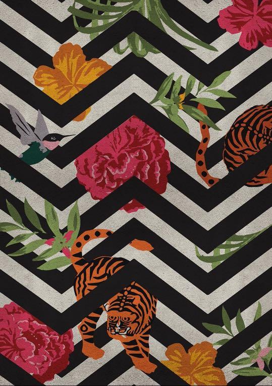
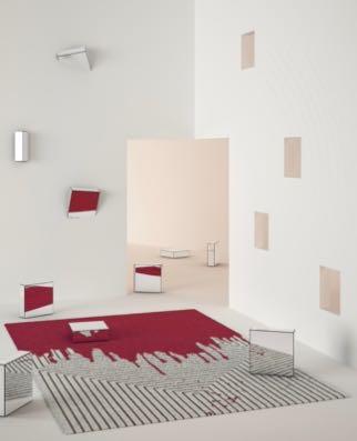

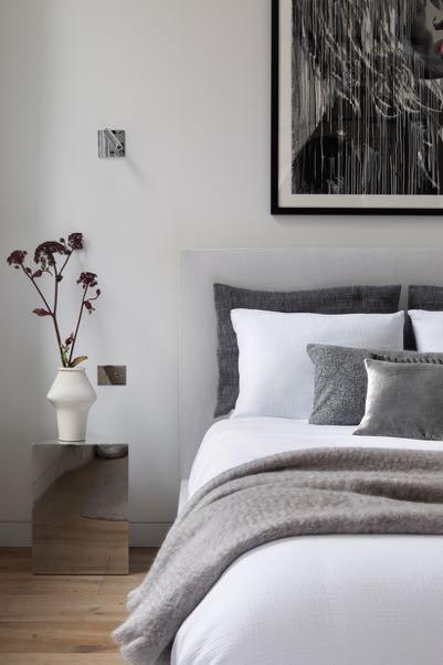

G&G _ Magazine N 36 – January 2023 GG & DIVE INTO ART COLOR SPLASH Mirrored REFUGE powerfulVIVA MAGENTA CONTENTS 7 EDITOR’S LETTER TRENDS 15 DESIGN SELECTION WINTER 2023 28 E-SHOP DESIGN PRODUCTS WITH A SIMPLE CLICK INSPIRATION 35 LATEST NEWS FROM DESIGN WORLD 44 POWERFUL VIVA MAGENTA THE COLOR OF THE YEAR INTERIORS 54 DIVE INTO ART APARTMEBT BY TRIA ARQUITETURA / SÃO PAULO, BRAZIL 64 A CUT ABOVE THE REST PENTHOUSE APARTMENT BY NITZAN HOROWITZ / THE SHARON REGION, ISRAEL 74 COLOR SPLASH RESIDENCE BY YSG STUDIO / SYDNEY, AUSTRALIA 82 MIRRORED REFUGE LOFT BY ANDREA LEUNG / NYC, USA 92 THEATRICAL MOOD APARTMENT BY PRIMO ATELIER / NAPLES, ITALY 104 ALL OFFICIAL SOURCES ON THE COVER Valencia Rug by Rug’ Society from Powerful Viva Magenta selection Page 49 23 70 91 28
e just said goodbye to 2022 and are embracing this New Year with all our good resolutions, hoping it will be serene and joyful for all of us. And what's better to start it as a new Design Trends selection? This time there won't be a color palette - we’ve focused on shapes and materials. From page 15 you will find our proposal of trends for this Winter, and for more inspiration, you can find their use in residential projects. For example, touches of color in the Brazilian apartment designed by TRIA Arquitetura (page 54) and in the house in Sydney renovated by YSG Studio (page 74) will incentivize you to use more bright shades. Instead, if you want to keep the basic colors but still be trendy, focus on quality materials as did designer Nitzan Horowitz in the penthouse in Israel (page 64). While on page 92 a game of shapes, transparencies and lights awaits you in the project signed by Primo Atelier.


But as per tradition, in the January issue we highlight a trend that will accompany you throughout the year - it's the Color of the Year. A pulsating red, fearless, full of vitality and enthusiasm
From surface materials like tiles to furniture to home accessories, discover on page 44 how this color can elevate your interior. A fleeting addition will be enough to transform any banal space into a sanctuary of wonder.
Happy 2023 from all of us at G&G _ Magazine


!"#$%&'(%()*&#" W I’m always interested in your opinion, send me any feedback or suggestions at zhanna@gandgmagazine.eu


Exclusive Interview
G ANDG MAGAZINE.EU ENQUIRIES info@gandgmagazine.eu !"##$!% &'(#)*+)%")"*, NEWSLETTER !"#%-!% PEOPLE Fluid Home Alessandro Isola Studio projected a country home in Friuli region (Italy) where flexible spaces and multifunctional services respond to daily life’s requirements. Apartamento
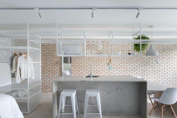
Brasília: Mínimo Arquitetura projected a space with total integration that escapes the traditional logic of division of environments and serves for short-term renting, but also could eventually house its owner (who cooks and loves to receive guests). ARCHITECTURE INTERIORS
Shaikha Al-Sulaiti and Cathrine Dela Cruz, Founders of Casa Lujo Interiors
Tijolinhos

 A proyect by
Principal Supporters
Supporters Escuela O cial
O cial Magazine
Supported by Institutions
Guest city Madrid DesignPRO
French paper & goods
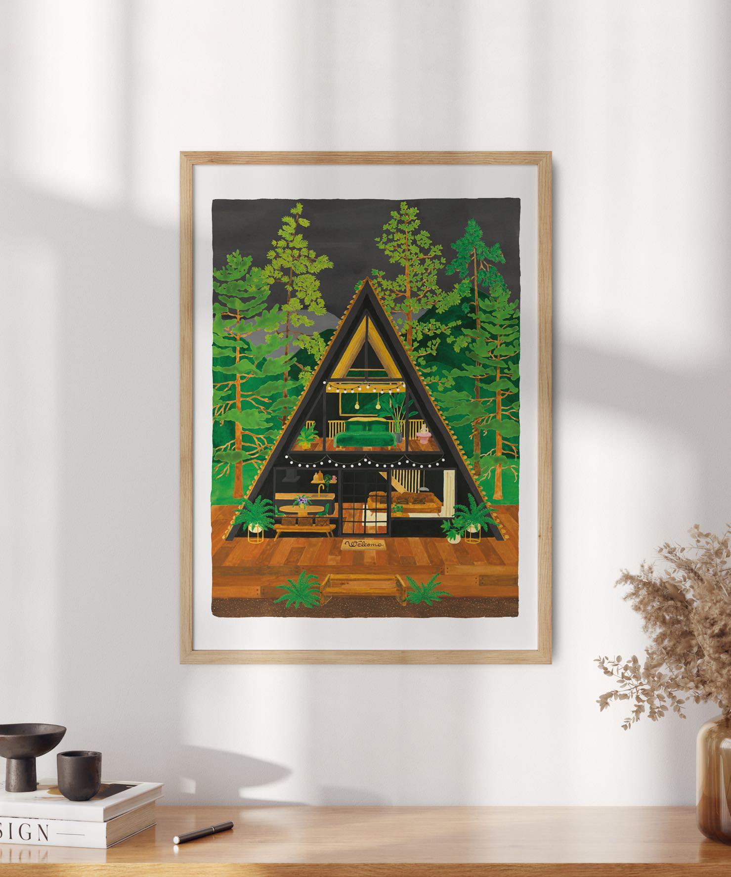
FOR NATURE LOVERS
DESIGN TRENDS

Home Design Trends for the beginning of this Year reflect the needs we look for in a piece of furniture or décor, including the material and its durability over time. Therefore natural materials, bizarre shapes and bright colors will be ideal to offer something beyond the simple object to furnish our homes!
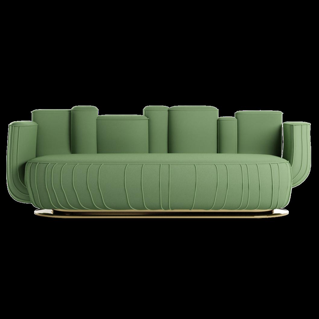
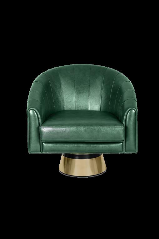
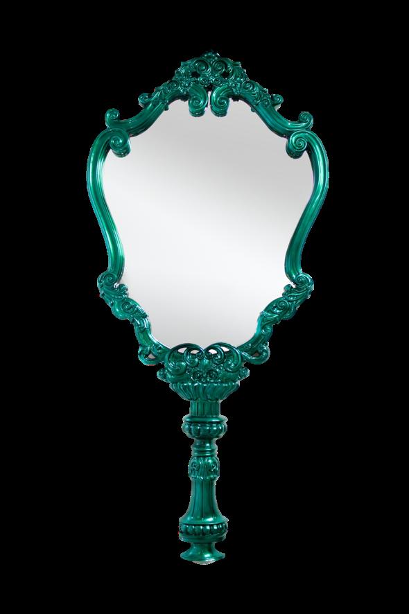
GREEN IS A SURE BET: WHATEVER SHADE IT IS. ITS CALMING CHARM CONNECTS US TO MOTHER NATURE WHILE ITS VERSATILITY HELPS US INTEGRATE INTO ANY ENVIRONMENT: FROM THE BATHROOM TO THE BEDROOM TO THE COMMON SPACES.
 White Garden II Rug by RUG’ SOCIETY
Bogarde
Sofa by HOMMÉS





#WINTER2022
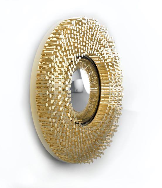
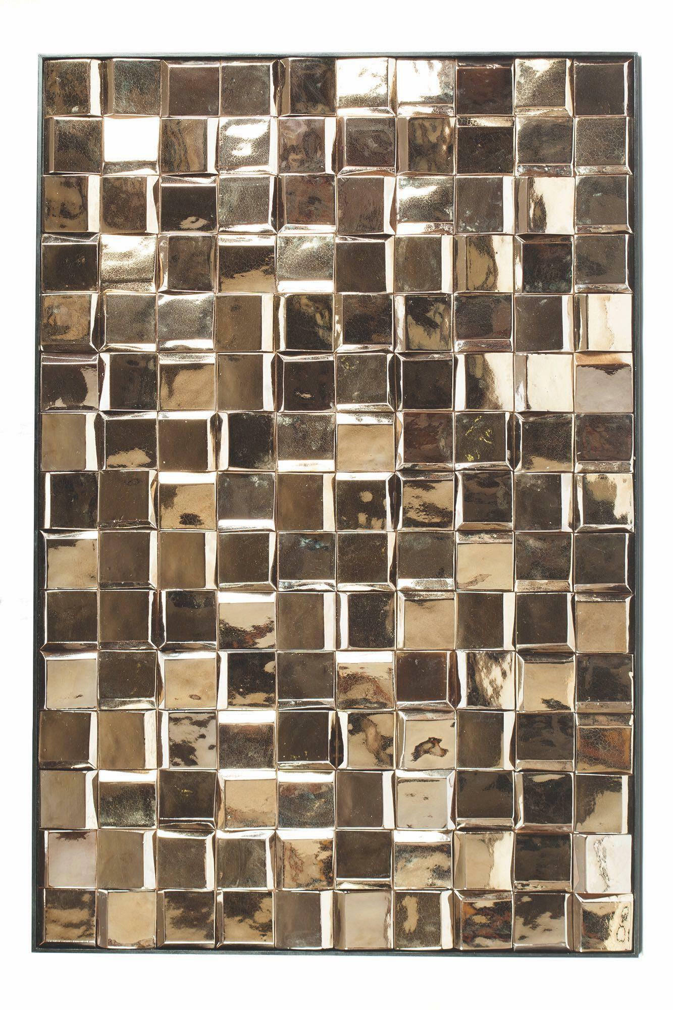
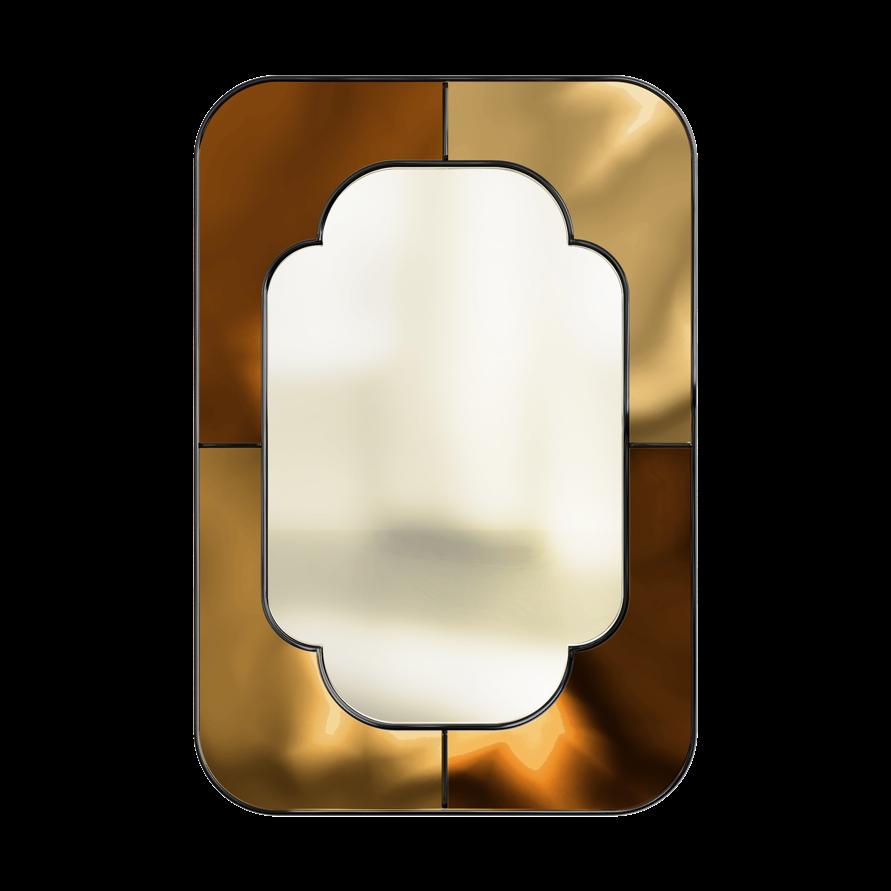
WHO SAID GLITTER IS ONLY FOR PARTIES AND HOLIDAYS?
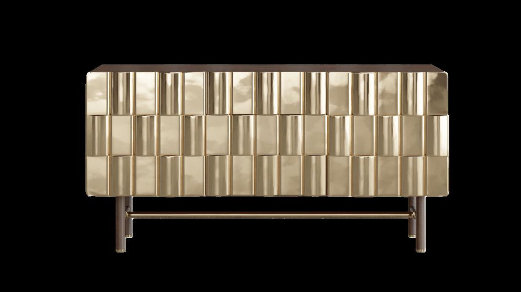
Pandora Sideboard by ALVA MUSA
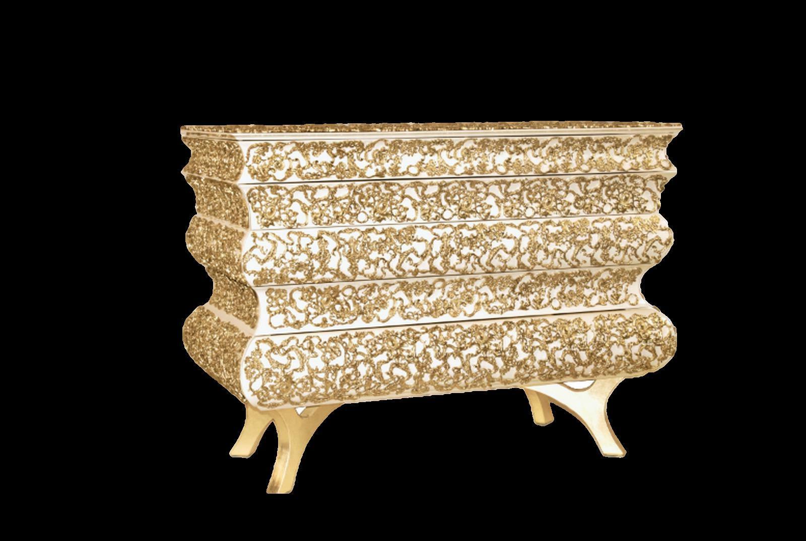
Crochet Nightstand by BOCA DO LOBO
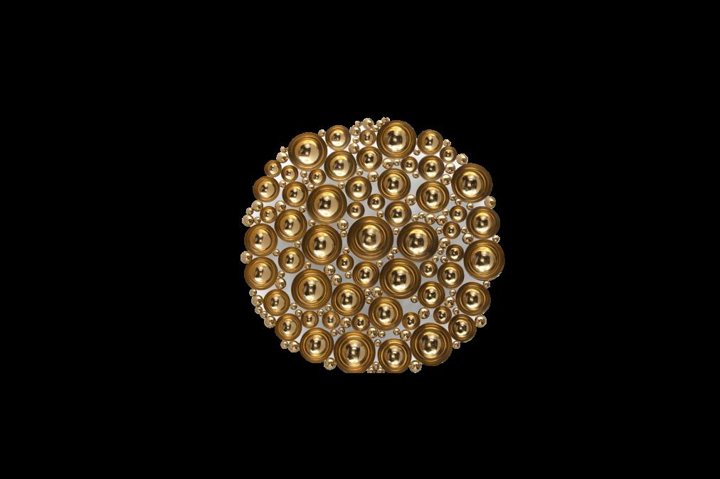
Newton Mirror by BOCA DO LOBO
Mirror by BOCA DO
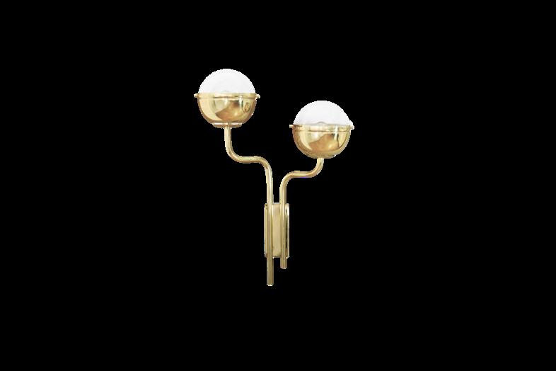
Niku Wall light by BRABBU
Nilo Wall mirror by HOMMÉS STUDIO
Douro Tiles panel by THEIA
16 | G&G _ Magazine
Eternity Sconce by KOKET
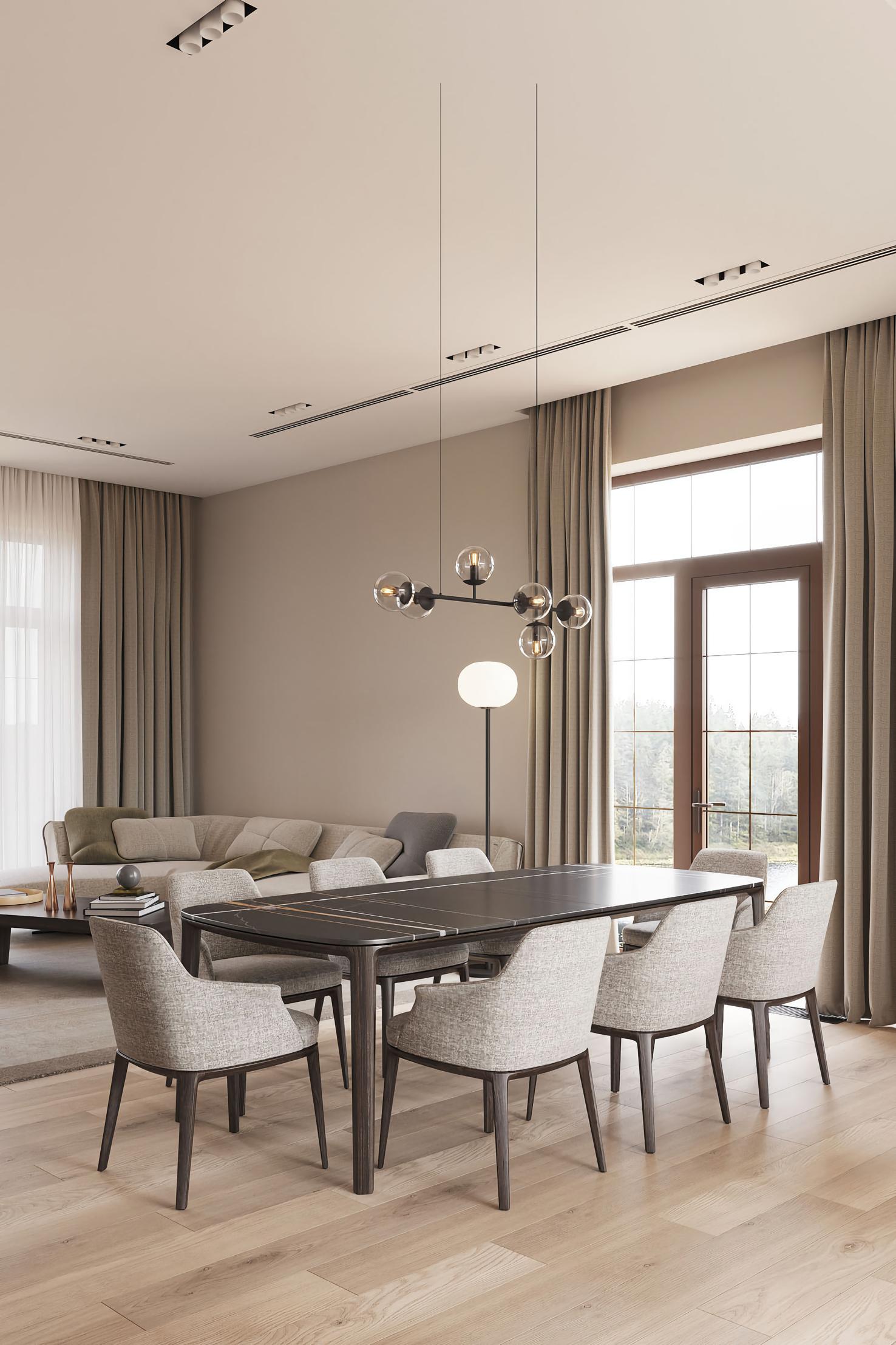
+38099 234 26 27 nerobot@prodan-design.com.ua prodan-design.com.ua Instagram @nelly_prodan
Extraordinary Shapes
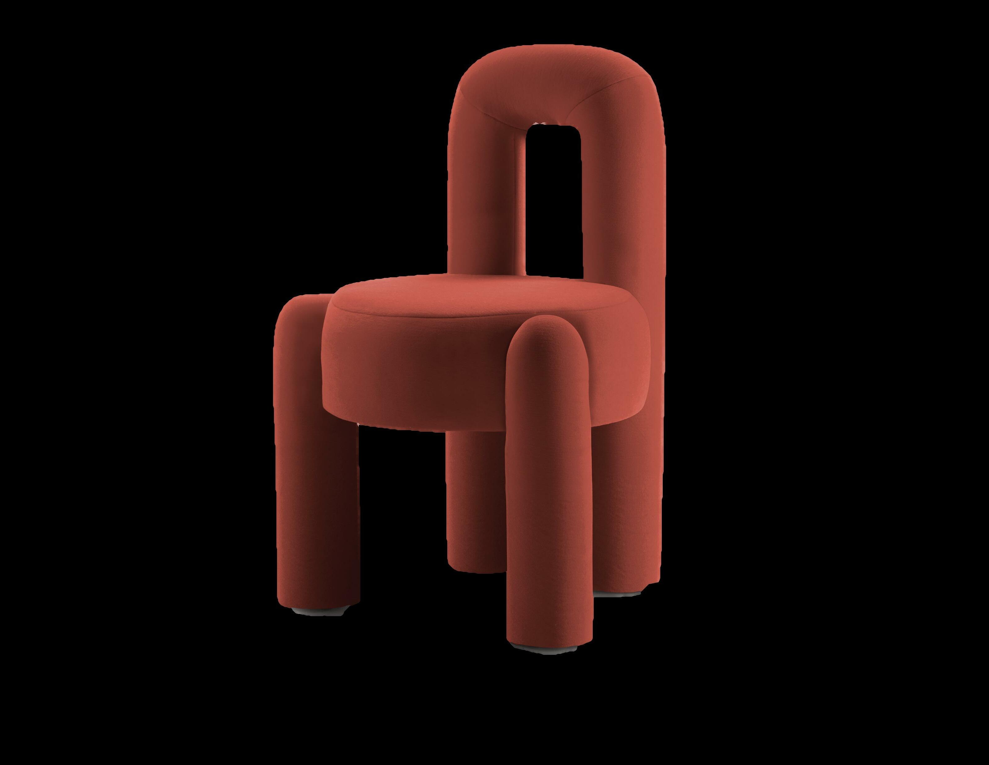



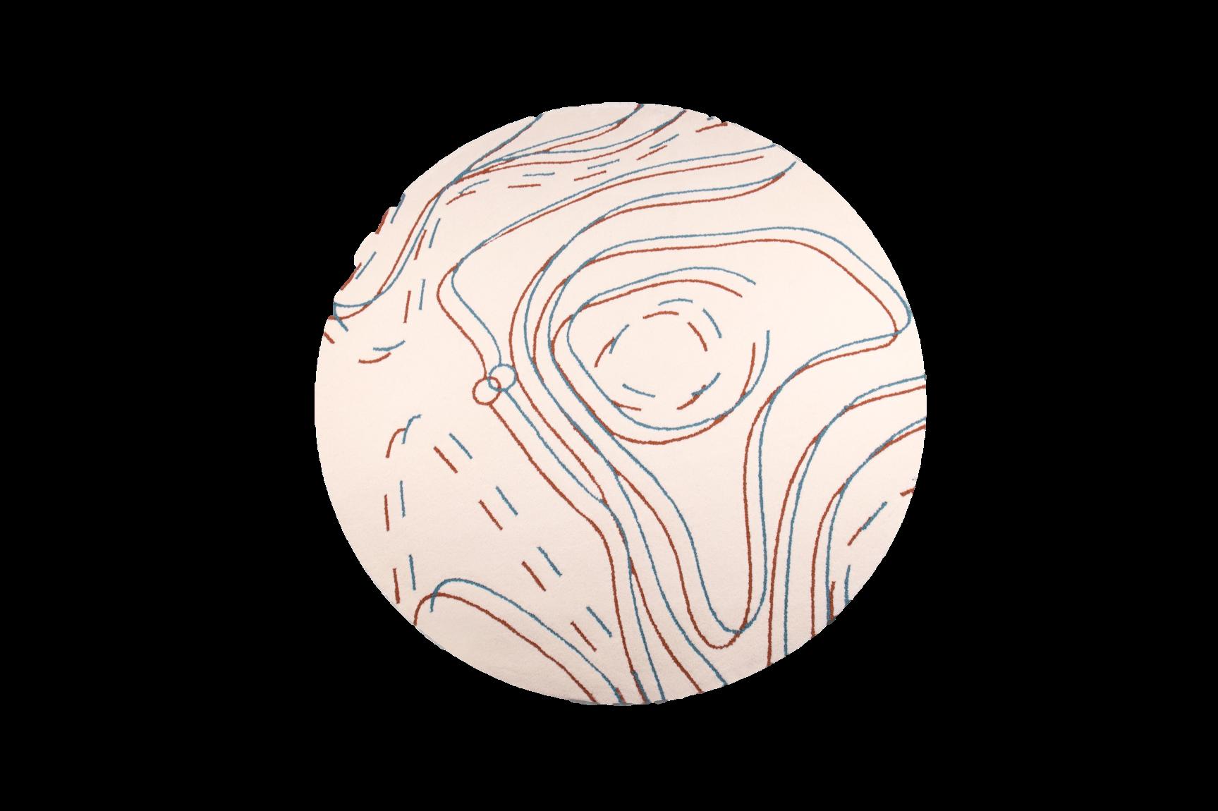


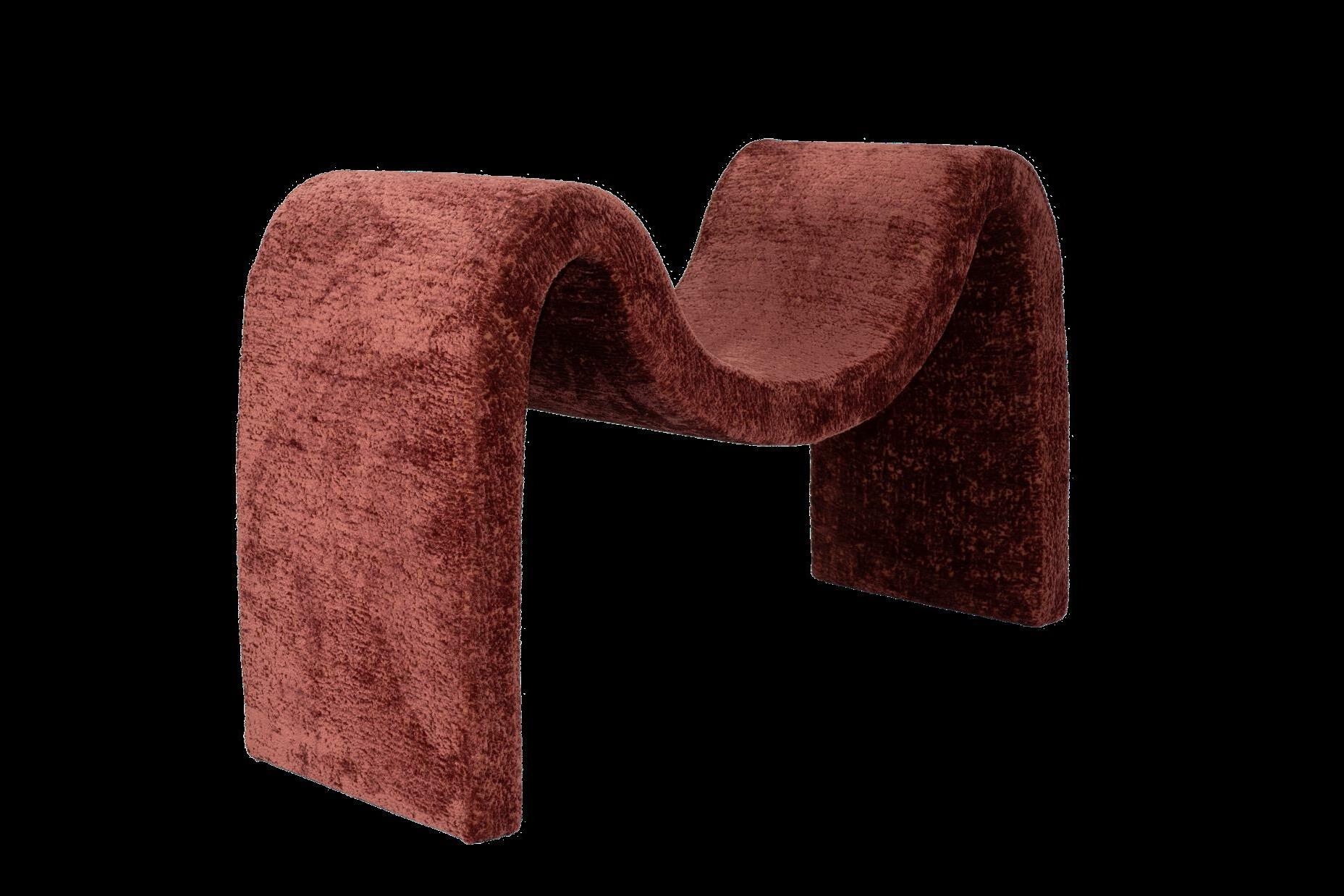
UNUSUAL AND SOFT SHAPES ARE BACK AGAIN FOR THIS SEASON TO HAVE COSY AND AT THE SAME TIME REFINED INTERIORS. EACH FORM IS AUTHENTIC AND OFFERS A SCULPTURAL AND SEDUCTIVE SILHOUETTE - IDEAL FOR ADDING A SURREAL TOUCH TO ANY AMBIANCE. Jarman
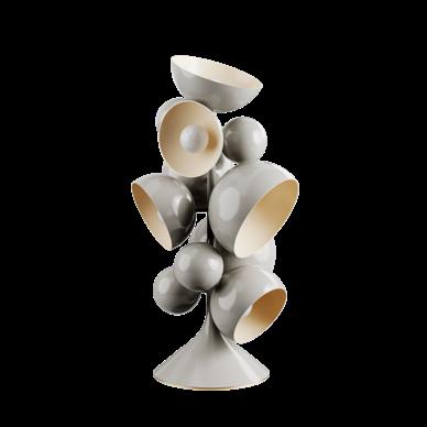
#WINTER2022
Dining
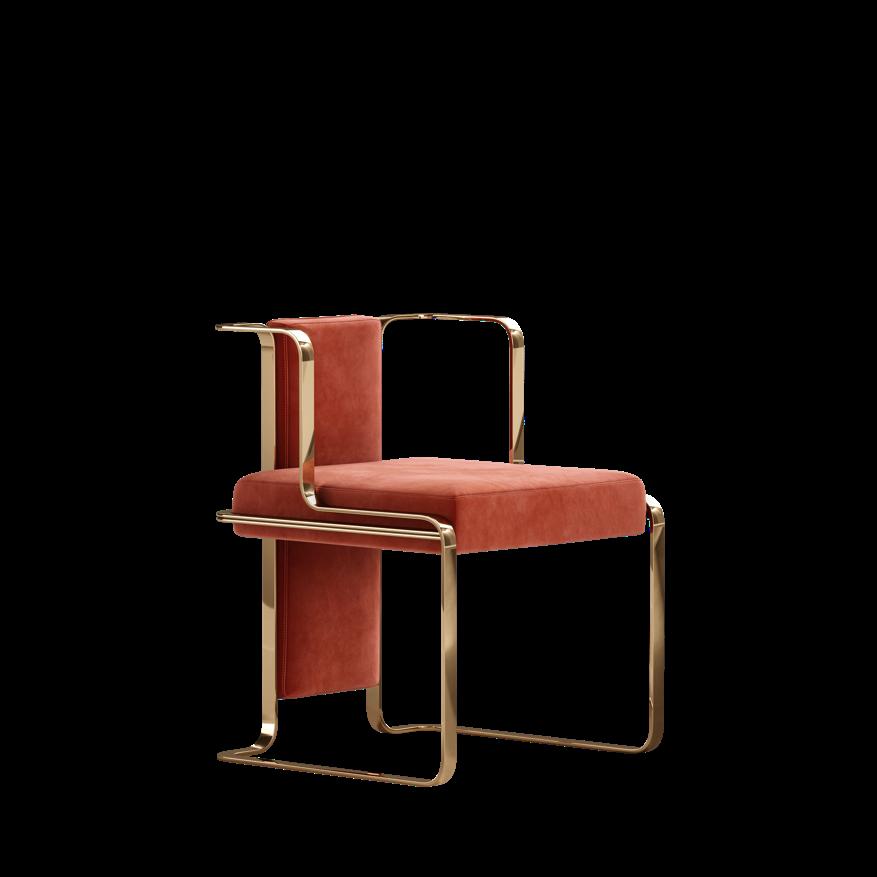
chair by MEZZO COLLECTION
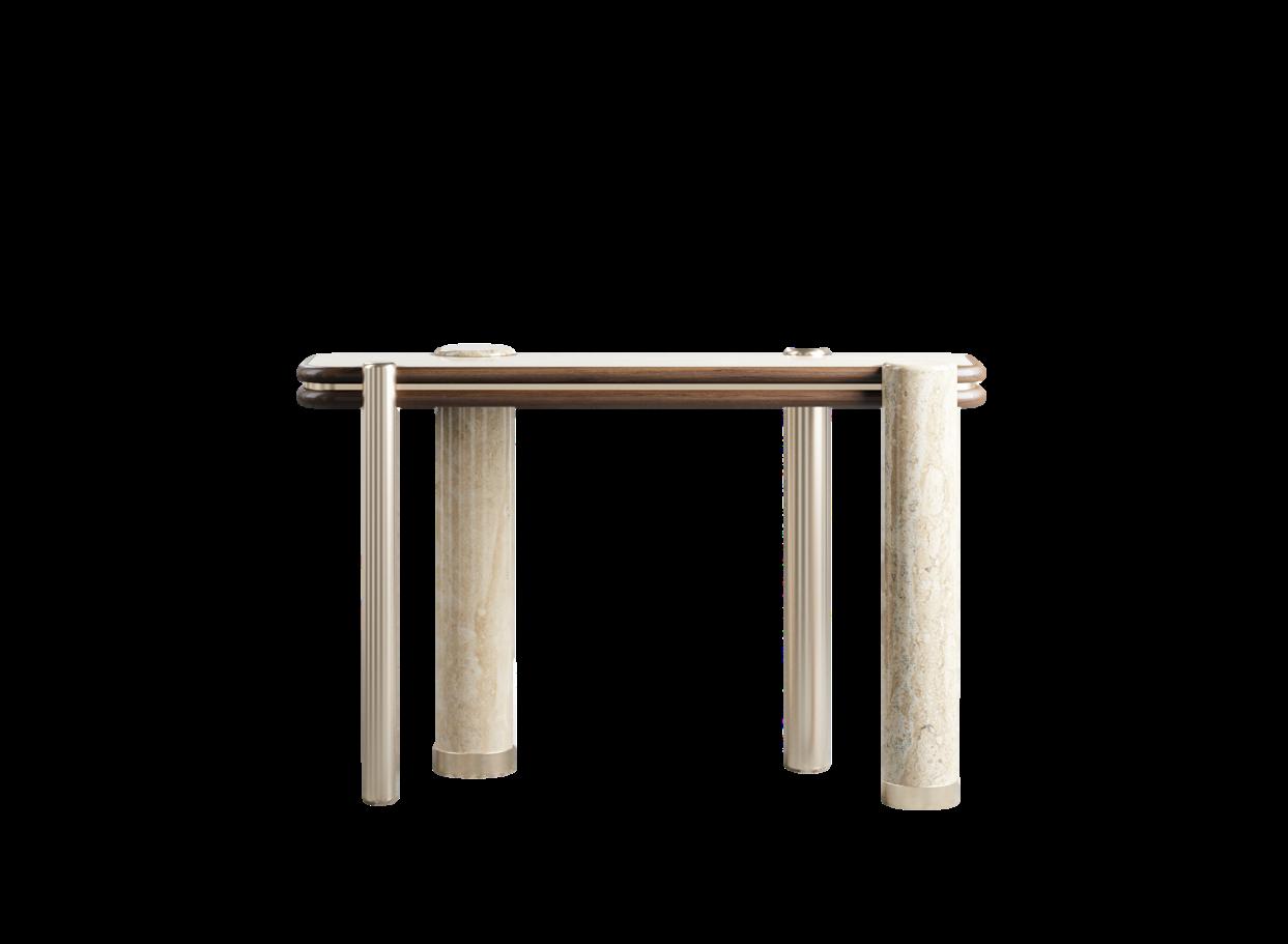
Slab Console by ALVA MUSA
Colleseum Console
by
BRABBU Allen Rug by ESSENTIAL HOME Eternity Sconce by KOKET
Aimee Stool by VICTORIA MARIA 18 | G&G _ Magazine
Miyake
Floor lamp by HOMMÉS STUDIO
Transparent Touches
IT IS A NEW WAVE OF TRENDS THAT HIGHLIGHTS TRANSPARENT PIECES, WITH AN AIRY AND SOMETIMES SLIGHTLY COLORED DESIGN. THEY MAINTAIN A BRIGHT ENVIRONMENT BUT IN THE SAME WAY CREATE A SERIES OF PLAYS OF LIGHT AND SHADOW: AN 'I SEE AND I DON'T SEE'.


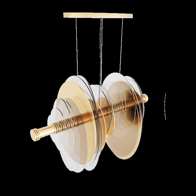
Cher Suspension lamp by HOMMÉS STUDIO
Folding

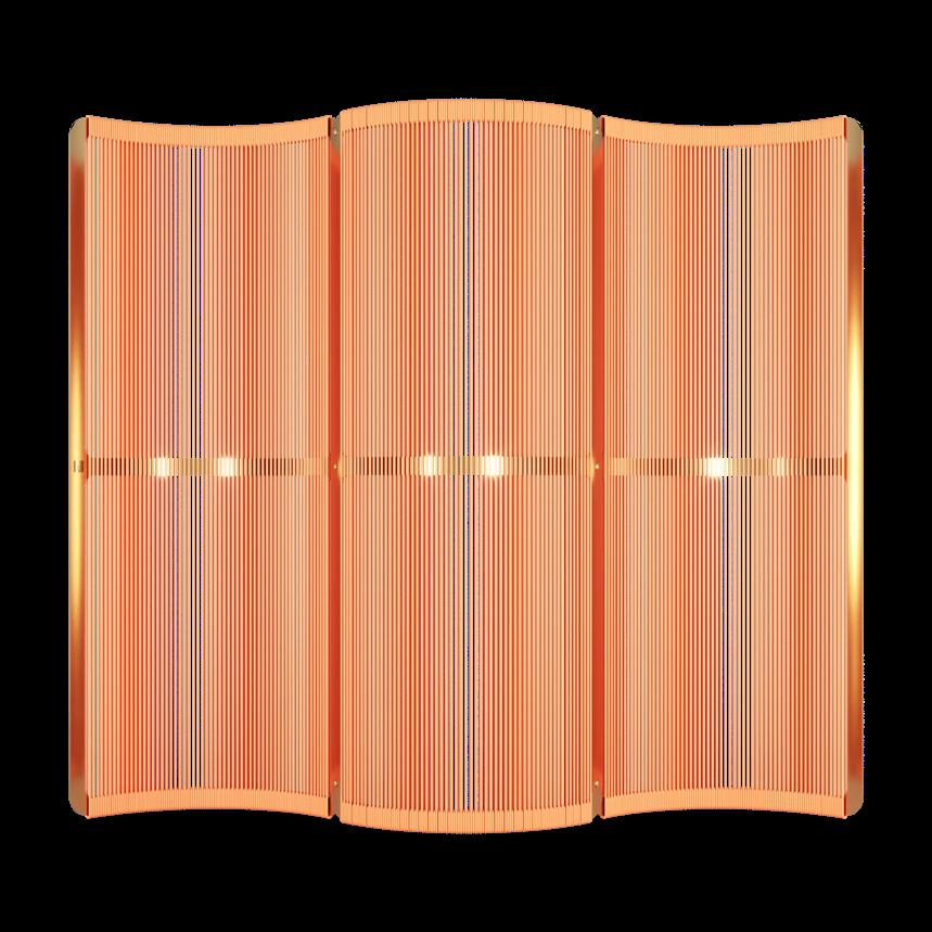
#WINTER2022
Zebra
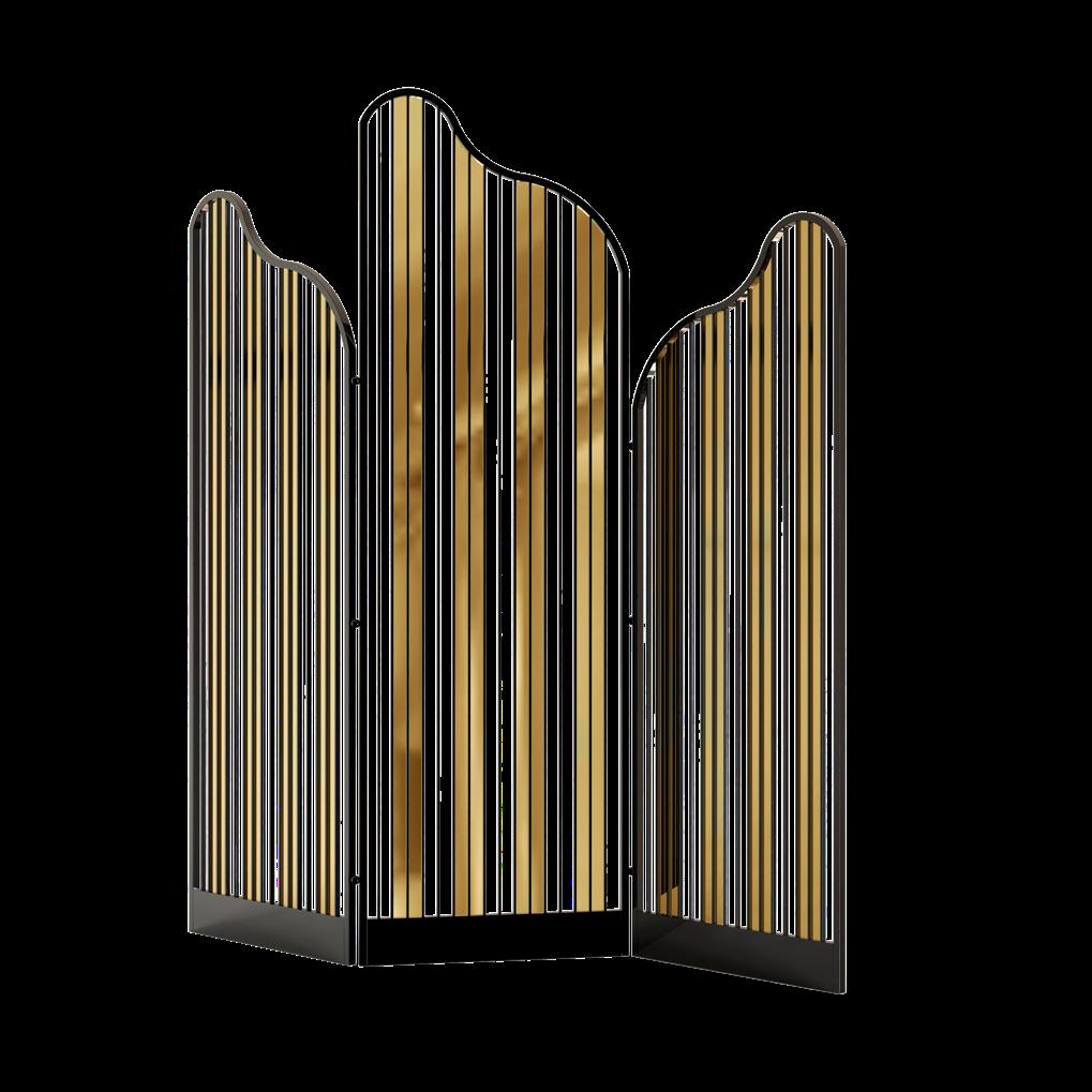
screen by HOMMÉS STUDIO
Manu Folding screen by HOMMÉS STUDIO
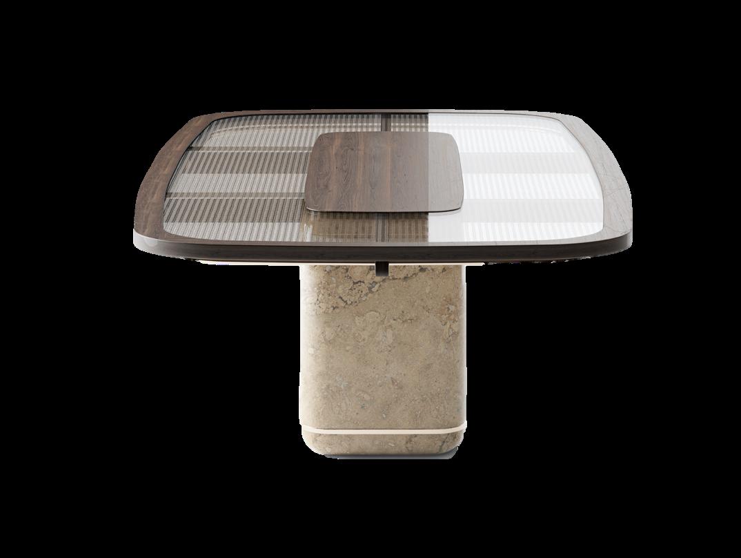
Menhir Dining table by ALVA MUSA
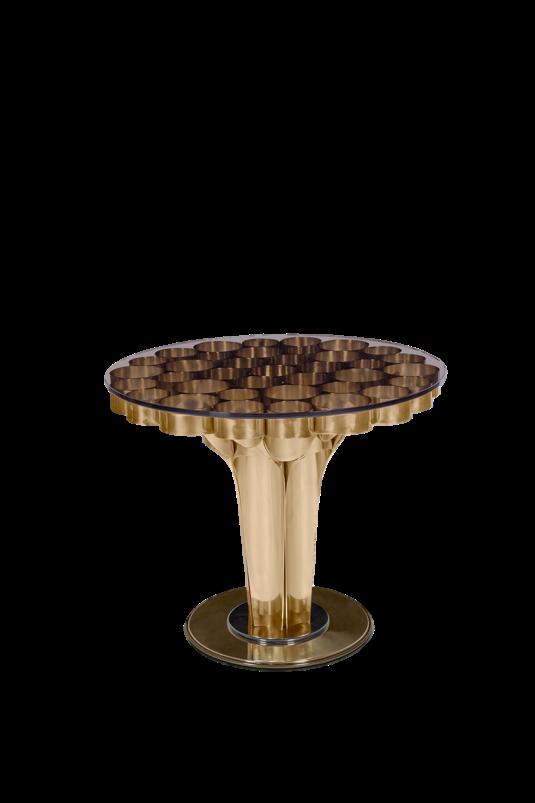
Wormley Side table by ESSENTIAL HOME
20 | G&G _ Magazine
Tabbo Side table by ESSENTIAL HOME
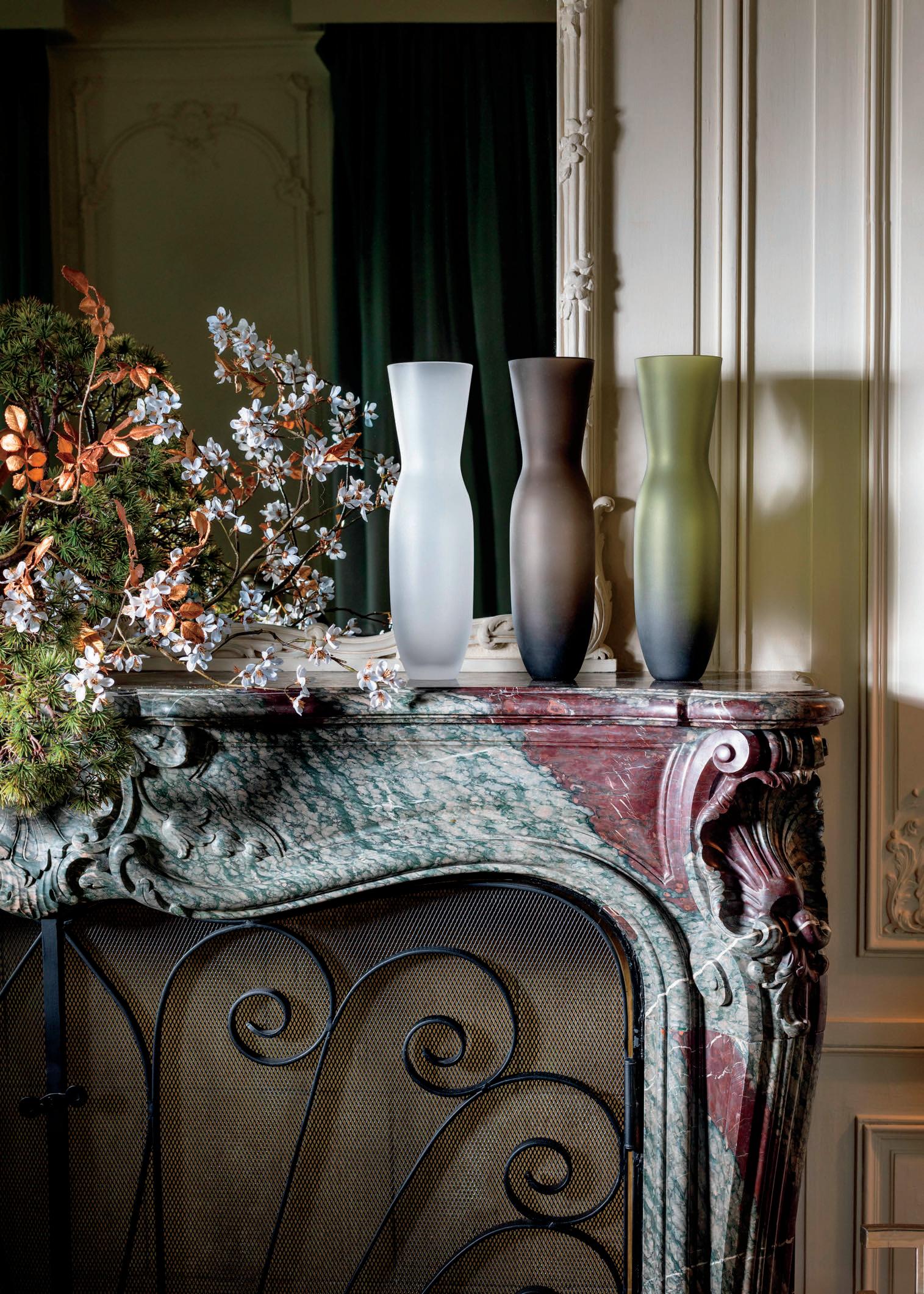


PREMIUM BOHEMIAN GLASSWARE

Hyper-Brights



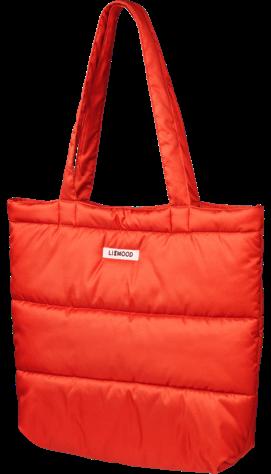



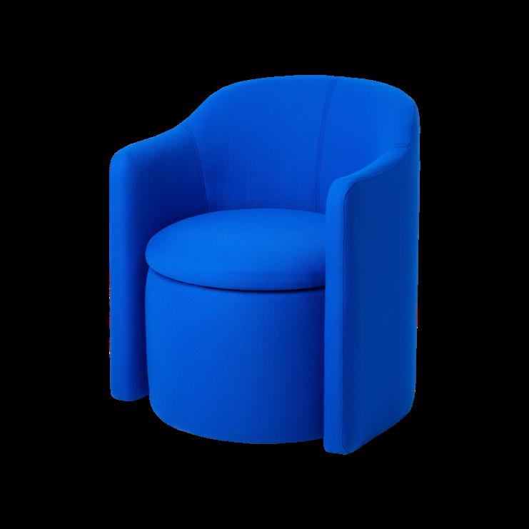
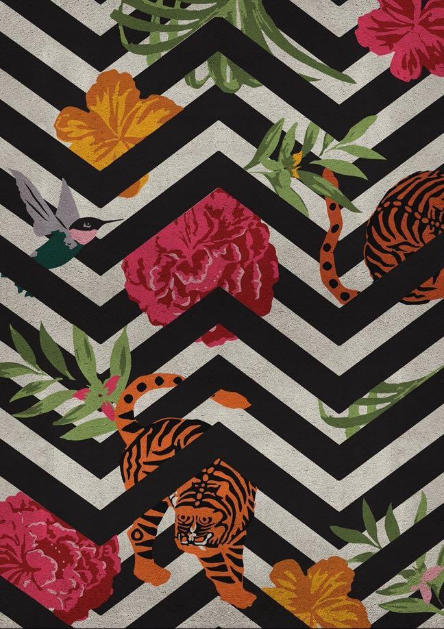
ONE OF THE SURPRISES FOR THIS WINTER SEASON ARE VIVID AND BOLD SHADES. ACCORDING TO COLOR EXPERTS THESE 'OUT OF THIS WORLD' TONES ARE ALSO EMERGING IN THE WORLD OF INTERIOR DESIGN AND REALLY CHALLENGE THE IMAGINATION OF US ALL.
#WINTER2022
Constance Quilted tote bag by LIEWOOD
Savana Rug by RUG’ SOCIETY
Ambroise


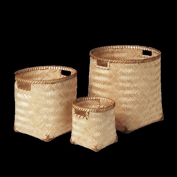
Raw & Natural HOME FURNISHINGS AND ACCESSORIES MADE FROM RAW MATERIALS CONTINUE TO BE


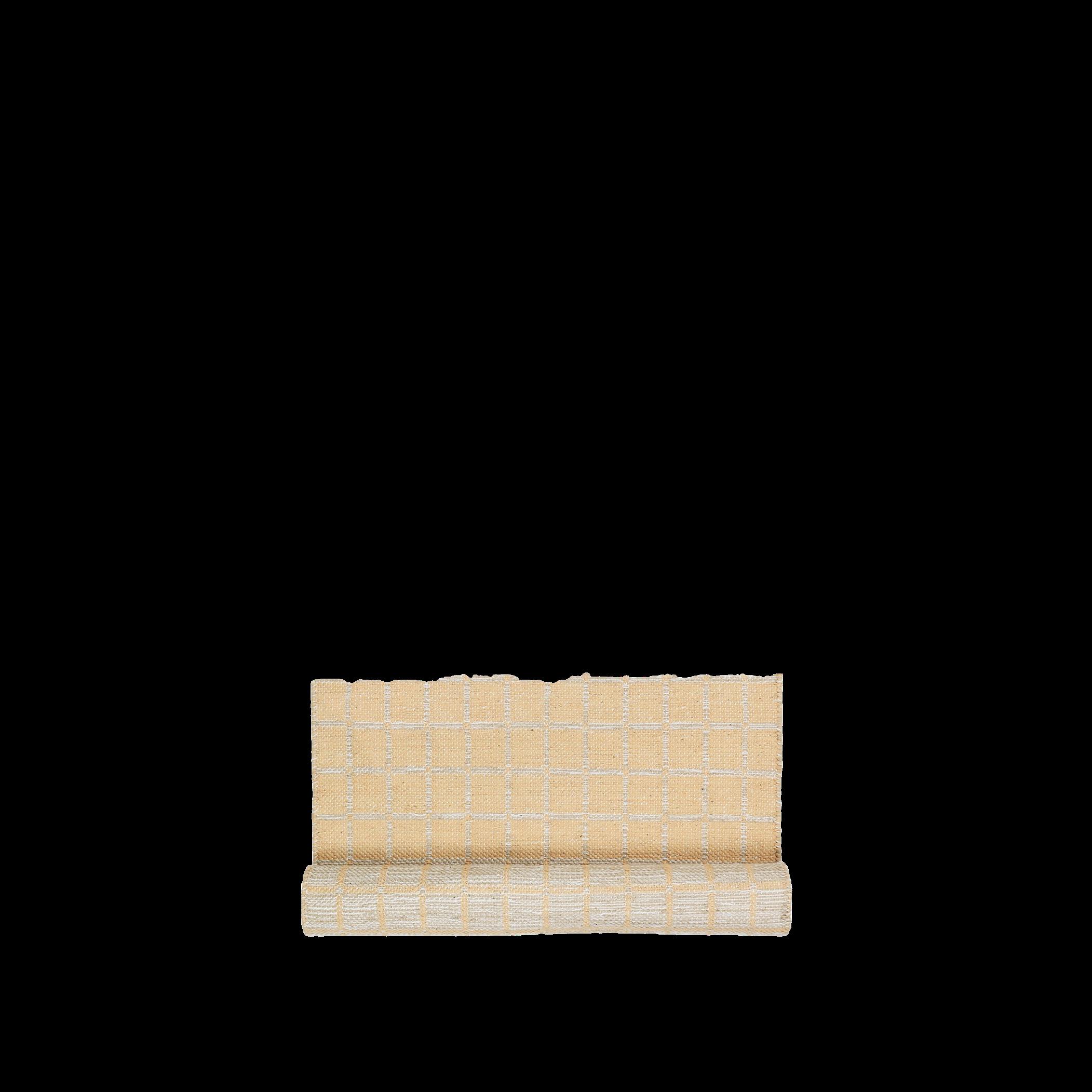
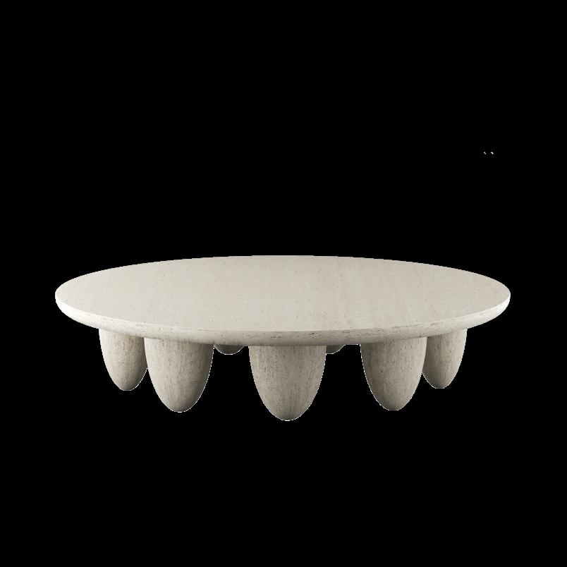
Lunarys Round side table by HOMMÉS STUDIO
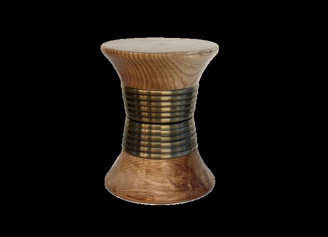 Padaung Stool by
Thompson Stool by BOCA DO LOBO
#WINTER2022
Carambole Suspension by GEORGES
Henny Cotton rug by BROSTE COPENHAGEN
Meli Basket set by BROSTE COPENHAGEN
Coat stand by HARTÔ DESIGN
Monaco Chair by LASKASAS
24 | G&G _ Magazine

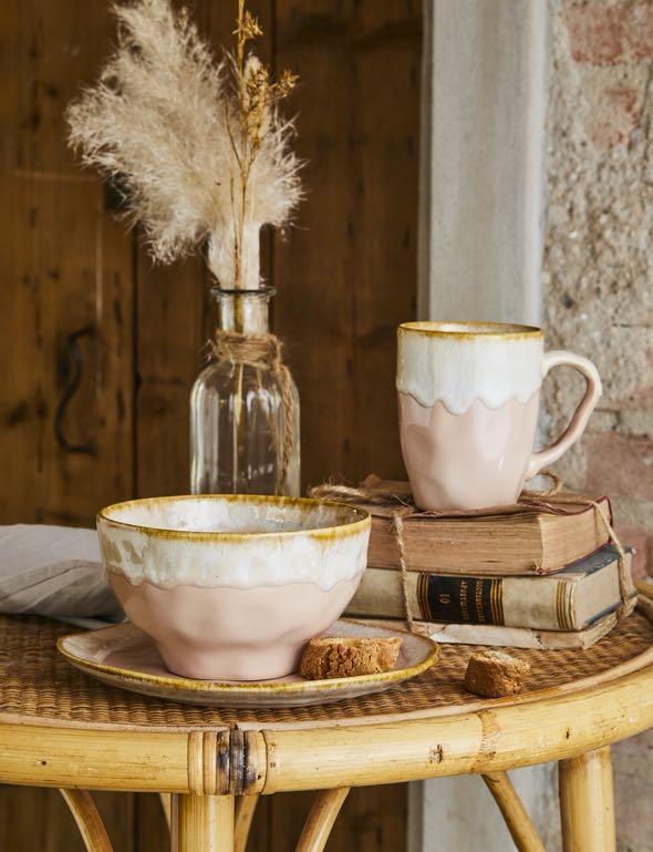


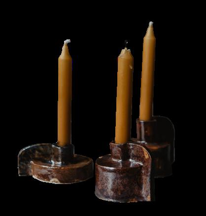

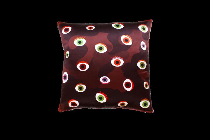
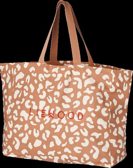
1 E-SHOP Hurry up and buy Extraordinary Design products for your home with a simple click! Aodha Santa Fe Plaid by LE MONDE SAUVAGE 5 2 Sandstone candle holder by GEORGES €27,00 - €30,00 - €40,00 Enzo Vase by MARGAUX KELLER COLLECTIONS Amelie Mug by TOGNANA €7,67 3 EYE Silk pillow by MY FRIEND PACO €95,00 7 Maxi Tote bag by LIEWOOD €17,00 6 4 28 | G&G _ Magazine
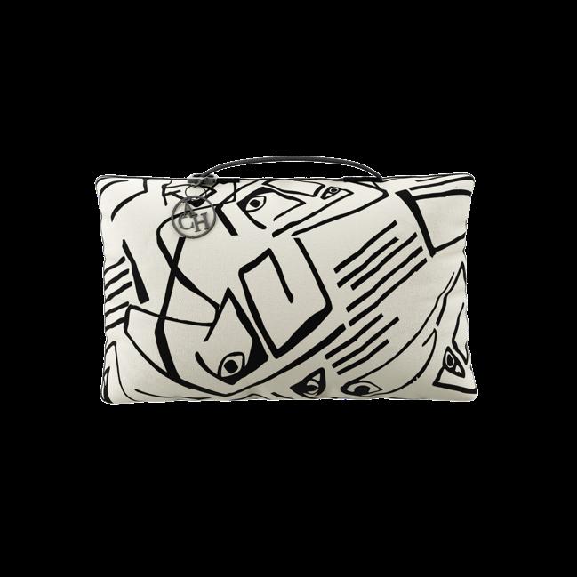
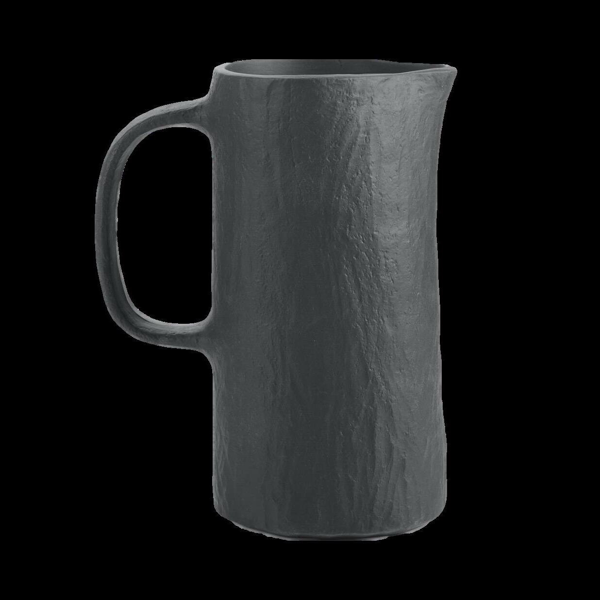



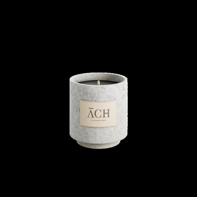
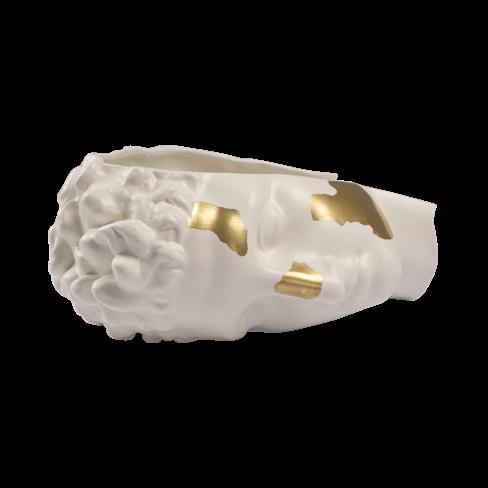
#ESHOP 12 Oskar Round Tray by ACH COLLECTION €152,00 Picasso Rectangle Cushion by ACH COLLECTION €102,00 Pekoë Teapot by REVOL Bowl by ACH COLLECTION 10 9 Jeannette XXL wicker vase by MARGAUX KELLER COLLECTIONS €4.500,00 11 YLI Pitcher 80cl by REVOL €49,00 13 Kriite Candle by ACH COLLECTION €202,00 15 30 | G&G _ Magazine

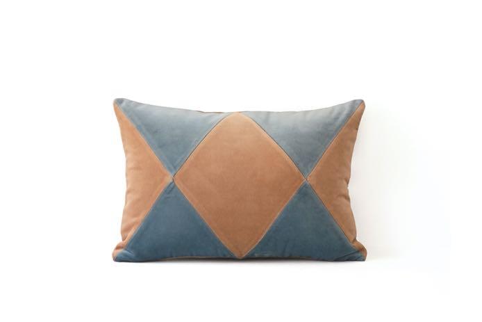
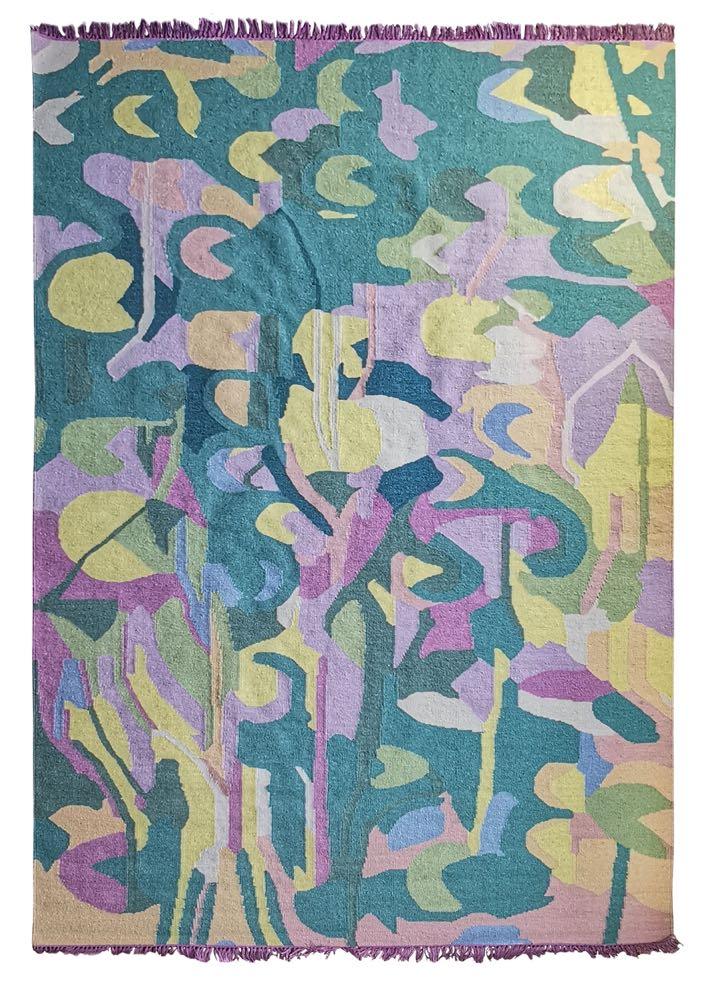
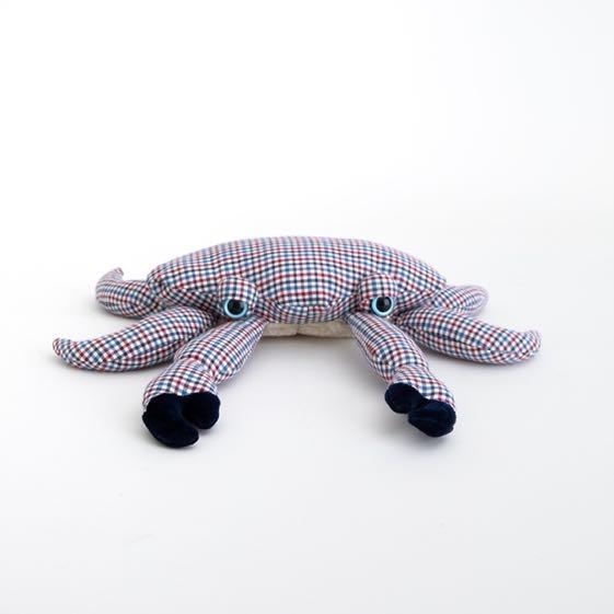
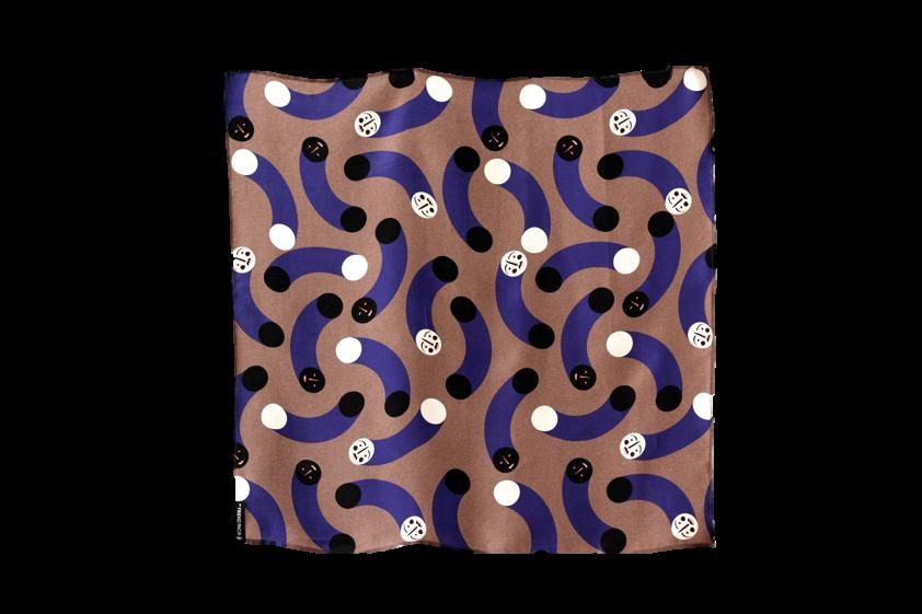
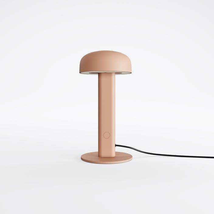

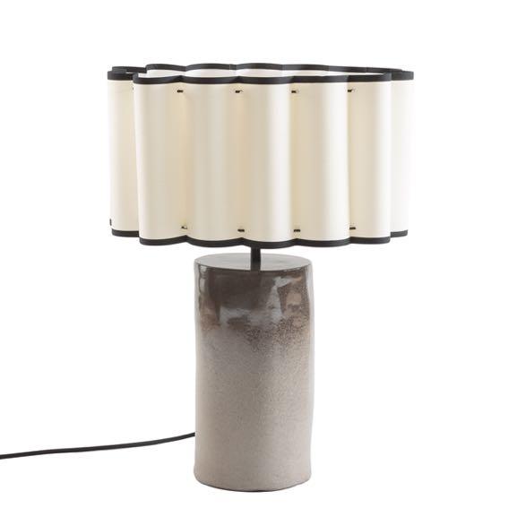
20 #ESHOP 16 The Mini Crab Soft toy by BigStuffed x BONPOINT €115,00 Lillies in the Lake Rug by VOLVER €725,00 Rubelita II Velvet pillow by MY FRIEND PACO €95,00 Nod Table lamp by TIPTOE €199,00 18 19 21 Bolled II Glass vase by ACH COLLECTION €220,00 Mush Mush Silk scarf by MY FRIEND PACO €85,00 32 | G&G _ Magazine


LATEST NEWS
Emotional resonance

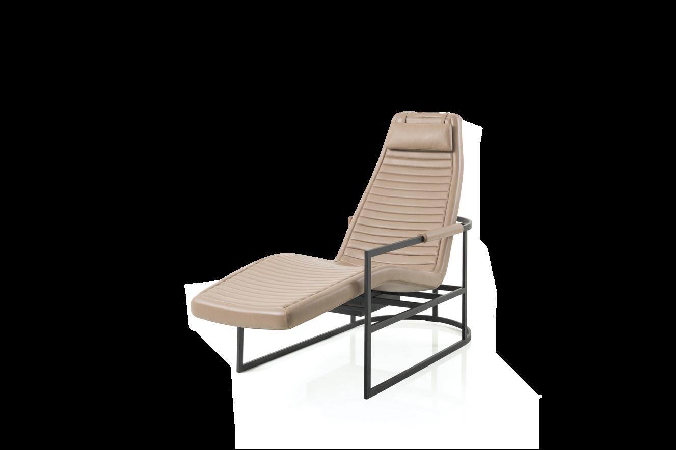
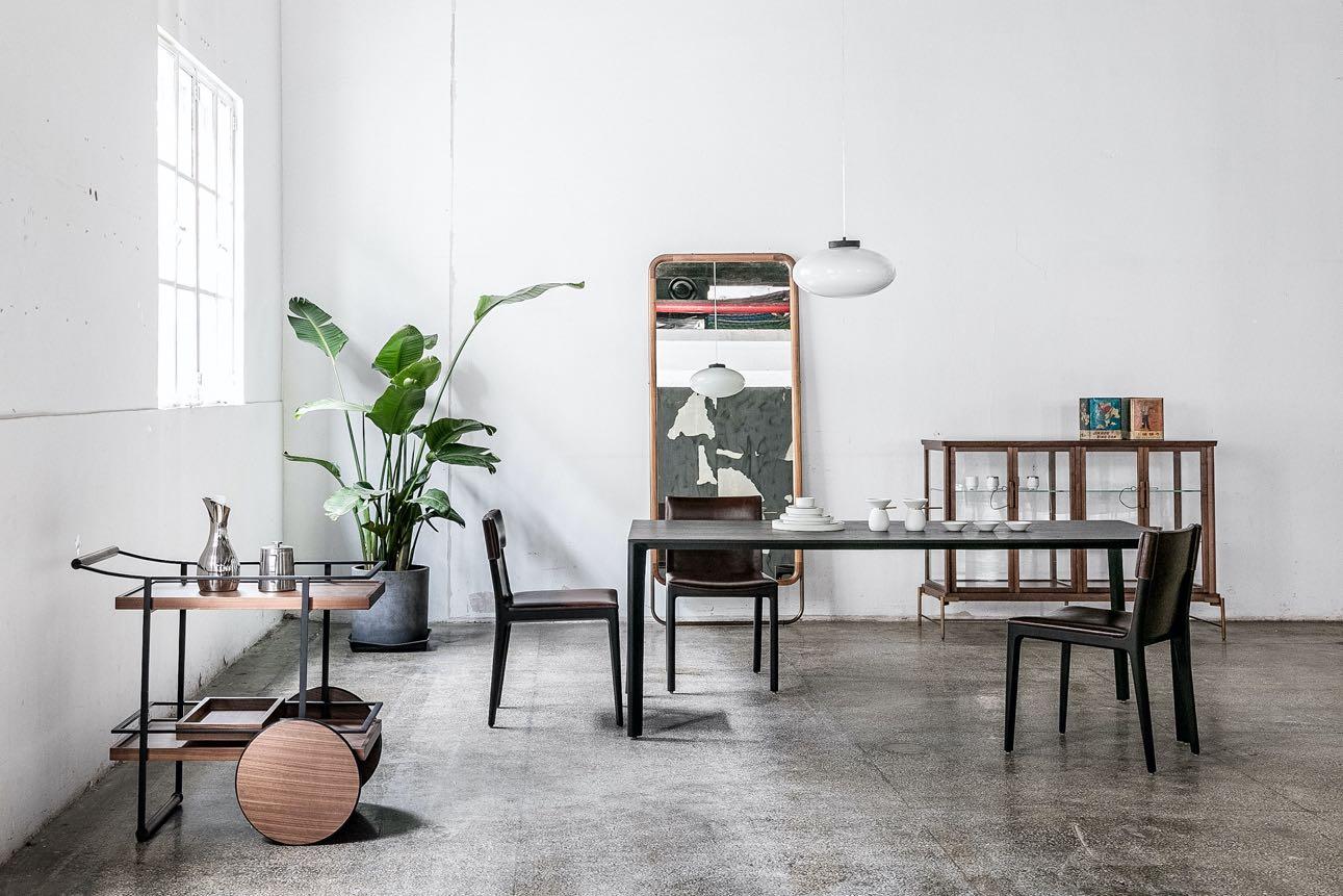
From the collaboration Glenn Pushelberg between George Yabu, the new James collection by Stellar Works: an understated exploration of modern masculinity - at once bold and defined, but also light and elegant. The range includes a chaise, desk, stool and bar trolley, each one meticulously proportioned and ergonomically shaped. All four pieces have been designed to turn negative space into an aesthetic feature, making use of floating planes and wireframes to lend them an air of simplicity. www.stellarworks.com
Historic charm
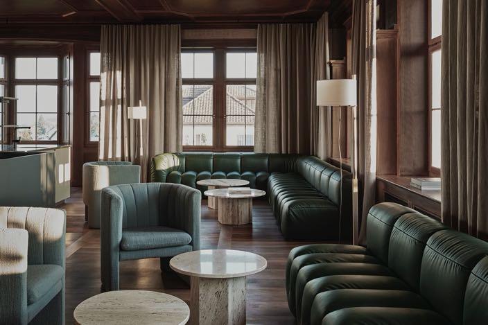
Space Copenhagen has just unveiled the interiors for the Mammertsberg hotel and restaurant in Freidorf, Switzerland. It’s housed within a classic Swiss Villa built in 1911 with direct views of Lake Constance and stretching further out to the magnificent Vorarlberg and the Appenzell Alps. Space Copenhagen has sought to compliment the original chalet architecture of the building with an interiors scheme that juxtaposes the past and future. Address: Bahnhofstrasse 28, 9306 . Freidorf, Swiss www.spacecph.dk
Mass & Shape
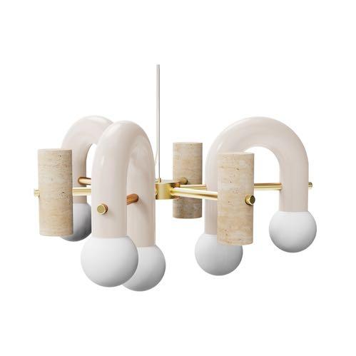
Utu Soulful Lighting unveils the new lighting design - Pyppe. Pairing smooth and rough surfaces that contrast with one another, the lamp collection gives way to a new approach in shape and balance. www.utulamps.com
Connection with the landscape
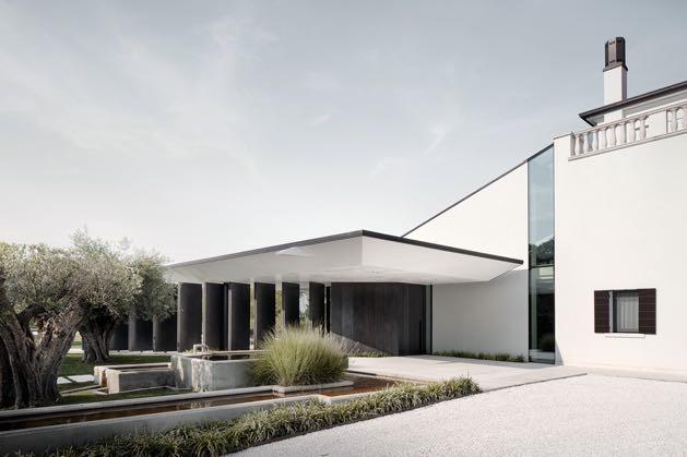
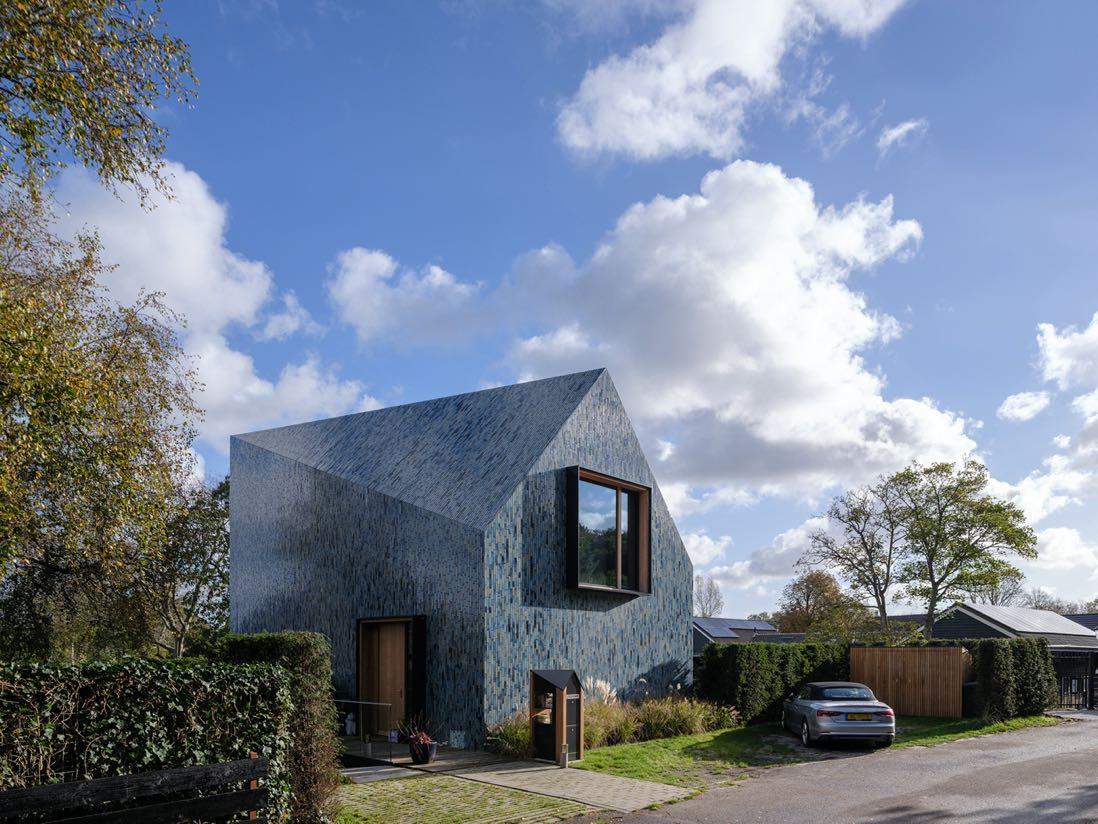
Mecanoo completed Villa BW in the Dutch countryside. The naturally sloping landscape embraces the villa, with a building volume characterised by a double-curved roof coupled with an unmistakable expression of the facade. The twisting roof is created as a result of two overlapping shapes. A gable roof is designed on the dune-side, also characteristic of the street scene on the Oorsprongweg. In contrast, a horizontal roofline is designed for the polder-side. www.mecanoo.com
#LATESTNEWS
36 | G&G _ Magazine
LIV HOSPITALITY DESIGN AWARDS

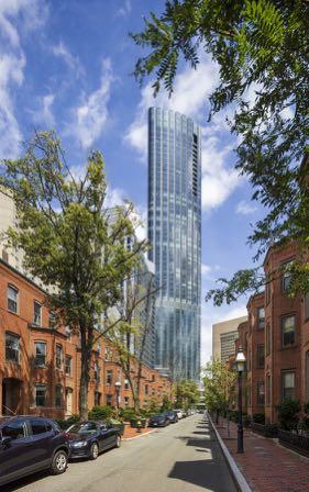
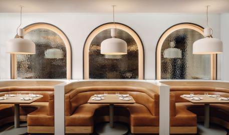
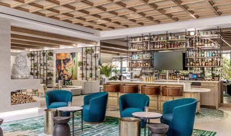
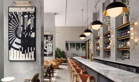
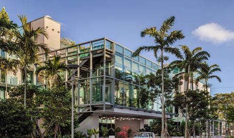
www.livawards.com
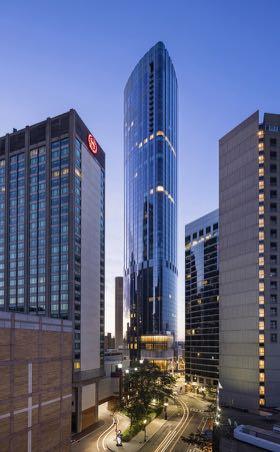
IN ARCHITECTURAL DESIGN HOTEL – LUXURY
Seasons Hotel One Dalton Street, Boston by
IN ARCHITECTURAL DESIGN HOTEL – BOUTIQUE The Ray Hotel
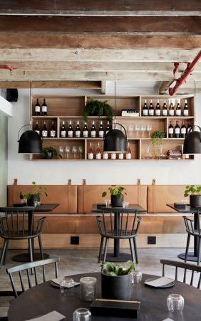
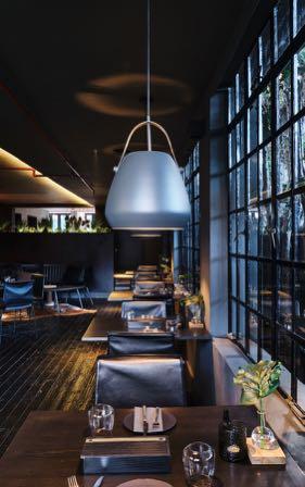
Gonzalez Architects WINNER IN INTERIOR DESIGN RESTAURANT – CASUAL ëlgr Restaurant by Source Interior Brand Architecture
IN INTERIOR DESIGN
LIV Hospitality Design Awards recognize excellence in Hospitality Architecture, Interior Design and Guest Experiences.
WINNER
Four
CambridgeSeven, Pei Cobb Freed & Partners WINNER
by
WINNER
BAR LOUNGE Nearly Ninth at Arlo Midtown by Meyer Davis
Braving challenges
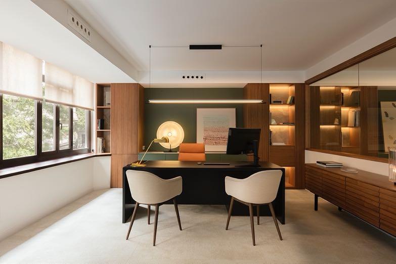
From a totally diaphanous space, without divisions, cold, The Room Studio transformed the Hatria Offices in Barcelona into a very cozy place with different rooms and a lot of warmth. A layout was designed in accordance with these needs. It had to be fluid and harmonious, both in the meeting rooms and in the common areas, office, reception and executive offices. www.theroom studio.com
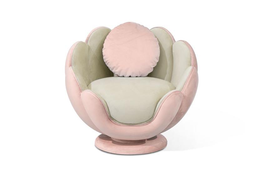
Floral reign
Circu presents the new Lotus armchair of which the design is inspired by the perennially precious and divine flower with its long and illustrious history in the myths of various nations and civilizations. www.circu.net
The Alps meet Asia
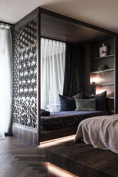
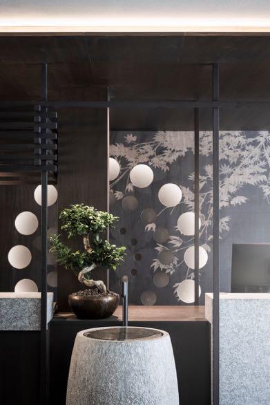
Located at the far end of Valler Tal, Hotel Silena has recently marked a new chapter in its history that bears the signature of noa*. During a long trip through Asia the hotel's owners developed a passion for the customs and rituals and they chose to integrate them as central elements of the hotel design and concept. It was therefore obvious to integrate classic elements and ambiances associated with the Asian world: the entire concept of the interior draws on this imagery, both in terms of material and colour composition. Address: Via Birchwald 10, 39037 - Valles, Italy www.noa.network
#LATESTNEWS
38 | G&G _ Magazine
Embrace the moment
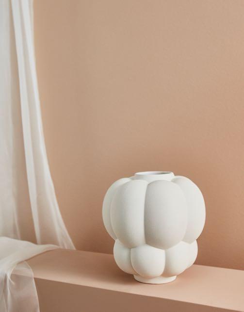
The new AYTM's Uva vase is the essence of voluminous elegance. Like clusters on a vine plant that turns into wonderful wine, this piece embodies joy and renewal in the most stunning and exquisite way. www.aytmdesign.com
Optimising spaces
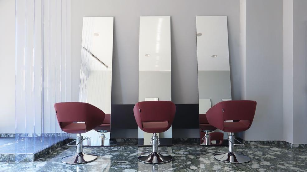
FORO Studio creates a hair salon with minimalist appeal in Milan by taking inspiration from the urban brutalism of Bovisa's neighbourhood. It's a space restyling for the brand Iconic Milano where the goal was to optimize the reception areas and using a contemporary and urban appeal. The space is conceived as a stage upon which the main action takes place: the customer's 'transformation'. The furnishing elements are essential and welldefined: clean lines and monolithic volumes furnish the space to give, from the outside, a sensation of sophisticated organization.
Address: Piazzale Lugano 6, 20158 - Milan, Italy www.forostudio.com
Visual impact
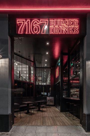
Hitzig Militello
Arquitectos presents its latest work: 7167 Burger, a small hamburger restaurant in Buenos Aires. Due to the limited size of the space, the colors had to achieve an immediate immersion effect. The design strategy is based on the single intervention (folds) of the single material (sheet metal), enriching the sobriety through changes of rhythm, application of textured patinas and lighting design, all of which refers to the hot iron of the baking plates. www.estudiohma.com
#LATESTNEWS
register now clerkenwelldesignweek.com cdwfestival clerkenwelldesignweek #cdw2023 clerkenwell.design.week the UK’s leading design festival
VIVA MAGENTA powerful

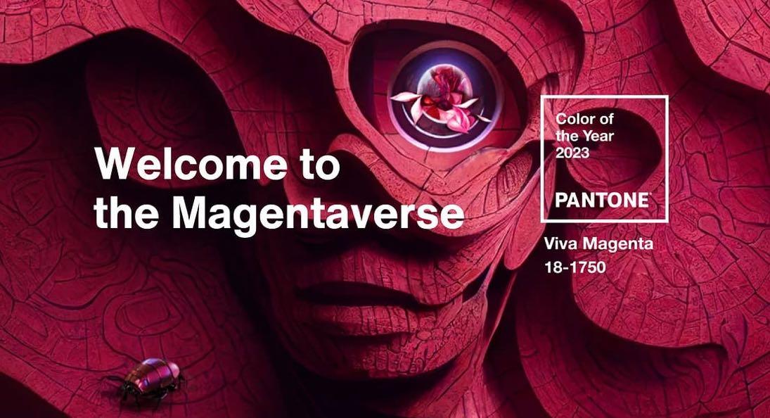
Replacing last year’s periwinkle, the vibrant pinkish-red - Viva Magenta - is officially the Color of the Year 2023 according to the experts of the Pantone Color Institute. Describing it as "a shade rooted in nature descending from the red family and expressive of a new signal of strength", this bold color will encourage all of us to experiment, fearless and in a rebellious way.
“
In this age of technology, we look to draw inspiration from nature and what is real. PANTONE 18-1750 Viva Magenta descends from the red family, and is inspired by the red of cochineal, one of the most precious dyes belonging to the natural dye family as well as one of the strongest and brightest the world has known.
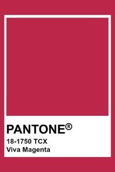
Rooted in the primordial, PANTONE 18-1750 Viva Magenta reconnects us to original matter. Invoking the forces of nature, PANTONE 18-1750 Viva Magenta galvanizes our spirit, helping us to build our inner strength.
Leatrice
Eiseman, Executive Director at the Pantone Color Institute

”
44 | G&G _ Magazine
5.

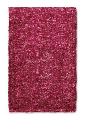
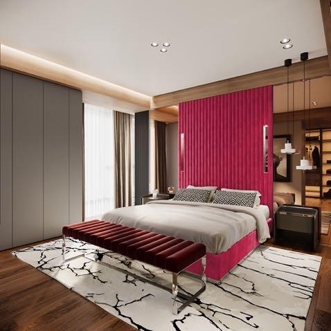
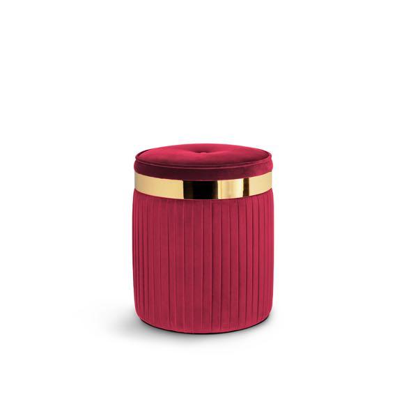
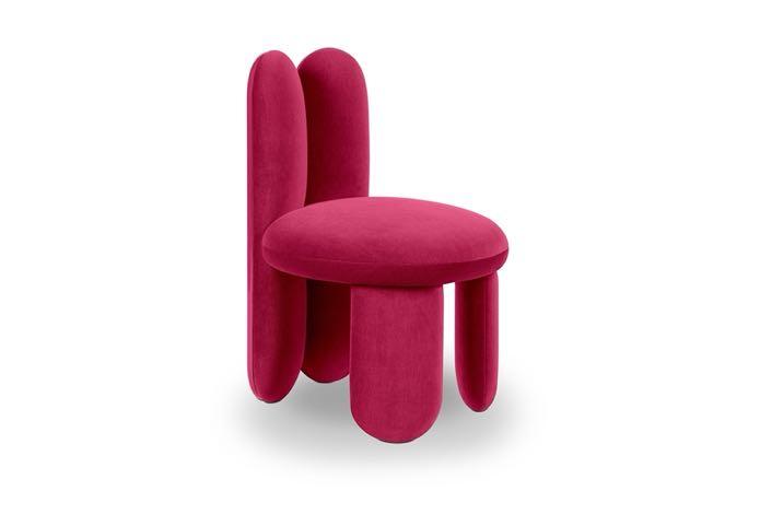
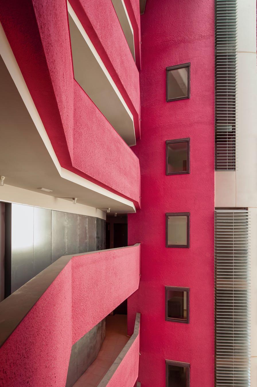 1 Torrebaró Social Housing by MIAS ARCHITECTS 2 Glazy Chair by ROYAL STRANGER 3 Plaza Bed by JETCLASS 4 Next Rug by G DESIGN 5 Barcelona Stool by KOKET
“As we balance our digital and physical lives, we continue to grow our appreciation for the natural world. The Color of the Year 2023 acknowledges our gravitational pull towards natural colors as movements swell around climate change, sustainability, and land protection.
In this year’s Color of the Year selection process, Pantone observed a heightened appreciation and awareness of nature represented by countless lifestyle trends. We’re incorporating more living things into our homes, such as plants, florals, living walls, and restorative outdoor spaces. We’re finding newfound enjoyment in travel, sports, and outdoor recreation after pausing these activities during the pandemic. We’re more careful to protect our bodies as a result of the public health crises we look to apply and ingest trusted, lifegiving ingredients. All of these lifestyle trends speak to the heartiness of natural forces. Viva Magenta’s organic origins hail from the cochineal beetle. This insect produces carmine dye, one of the most precious, strongest, and brightest of the natural dye family. The red tone of Viva Magenta connects us to original matter, imbibing us with a primordial signal of strength.
The Color of the Year 2023 merges the richness, warmth, and strength of natural matters with the rich, open horizons of the digital world. The result is a shade of red that expands our horizons of authenticity. The metaverse creates new opportunities for us to express ourselves, and the raw fortitude of Viva Magenta inspires us to do so with confidence and bravery.”

46 | G&G _ Magazine


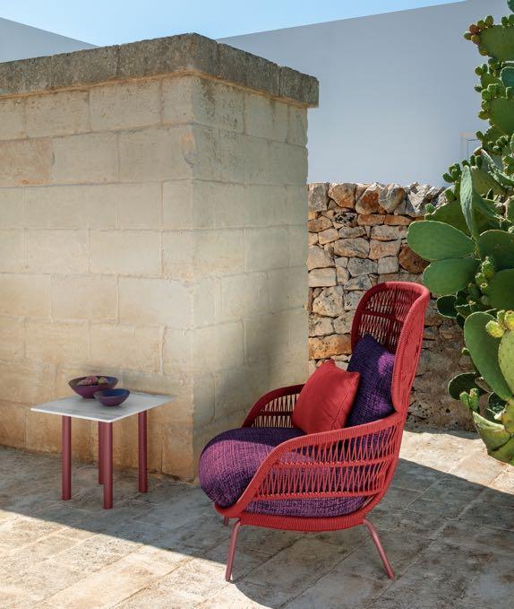


 1 Panama Armchair by TALENTI 2 Notre Dame Mirror by JETCLASS
2. 1.
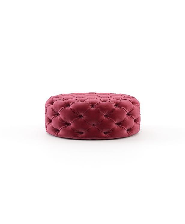
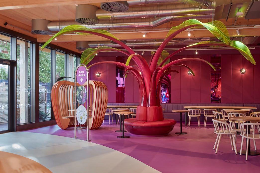
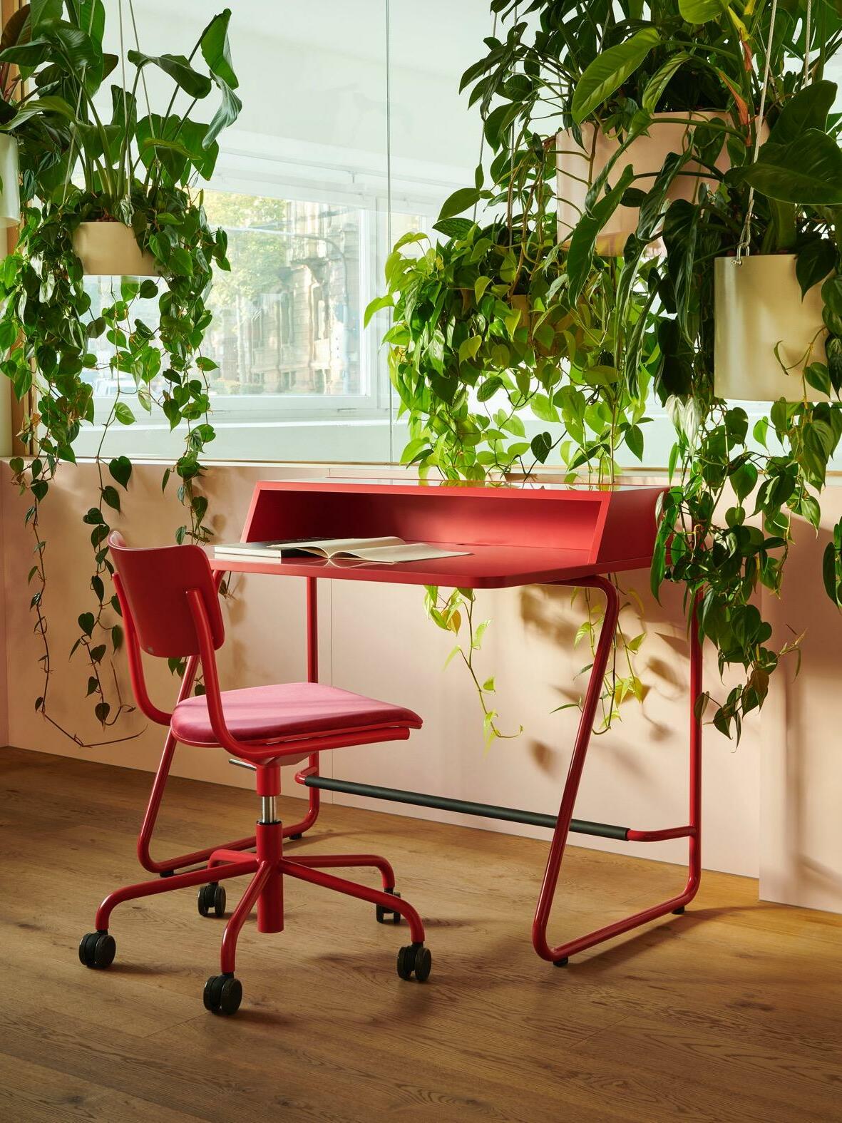
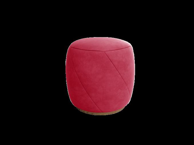
3 Délice Bar stool by KOKET 4 S 43 PVDR Swivel Chair & S 1200 Desk by THONET 5 Tribal big Lamp by TALENTI 6 Family Kitchen & Shop, Kew Gardens by MIZZI STUDIO 7. Bur Pouf by LASKASAS
4.


2
3. 5. 4. 48 | G&G _ Magazine
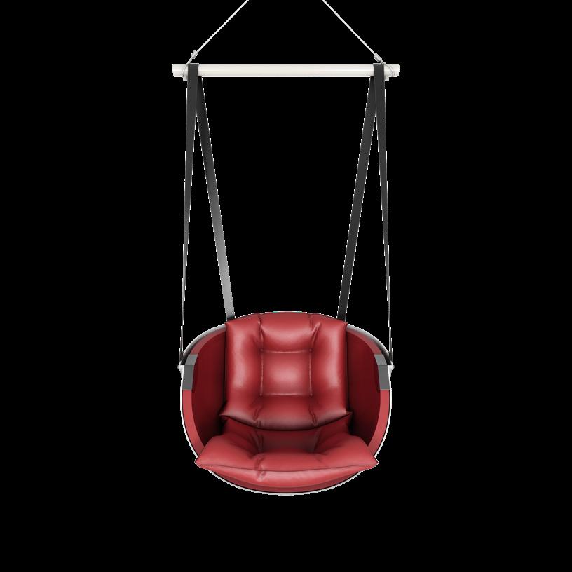
1 Lagom Swing chair by HOMMÉS STUDIO
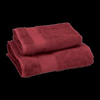
Supra Water dispenser by ZERICA 3. Mille 1+1 set of bath towels by GABEL 1957 4. Swirl Small pouf by JETCLASS 5 Dale Chair by LASKASAS
“What distinguishes this year’s Color of the Year from last year’s — PANTONE 173938 Very Peri, which also married
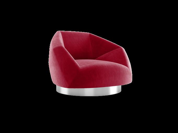

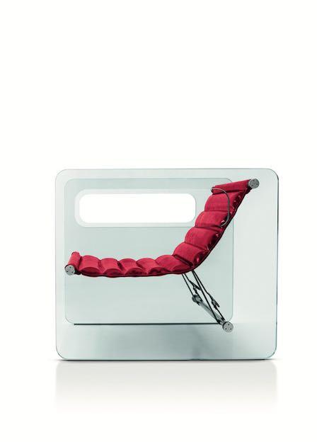


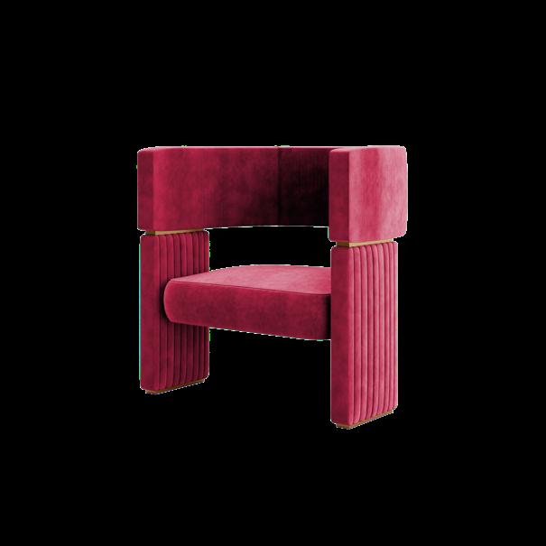
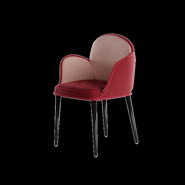 1 Naked Armchair by TONELLI DESIGN 2 Maze Armchair by by JETCLASS 3 Valencia Rug by RUG’ SOCIETY 4 Scille Dining chair by HOMMÉS STUDIO
2.
the
technical
with
nature — is Viva Magenta’s ability to answer our collective need for strength.” 1.
3. 4.
of as lacquered who neutral it a glass striking arrangement punctuating neutral a canvas projection entry Magenta drama
4. 50 | G&G _ Magazine
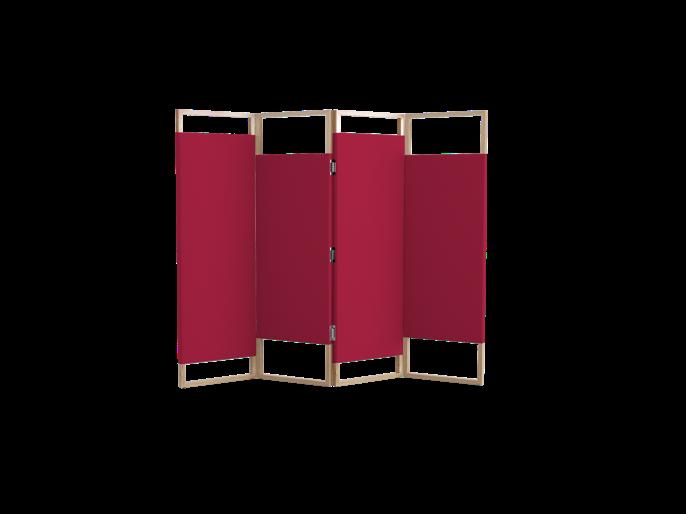
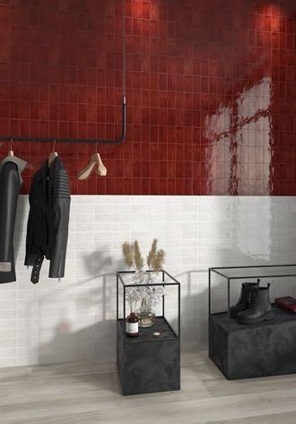
1 Memorie Ceramic tiles by SARTORIA 2 Ombres Folding screen by JETCLASS 3. Deluxe Settee by JETCLASS 4. Columns Chairs by CASTRO LIGHTING

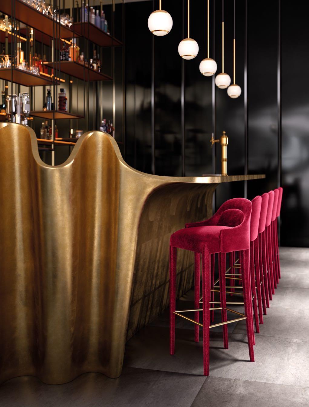
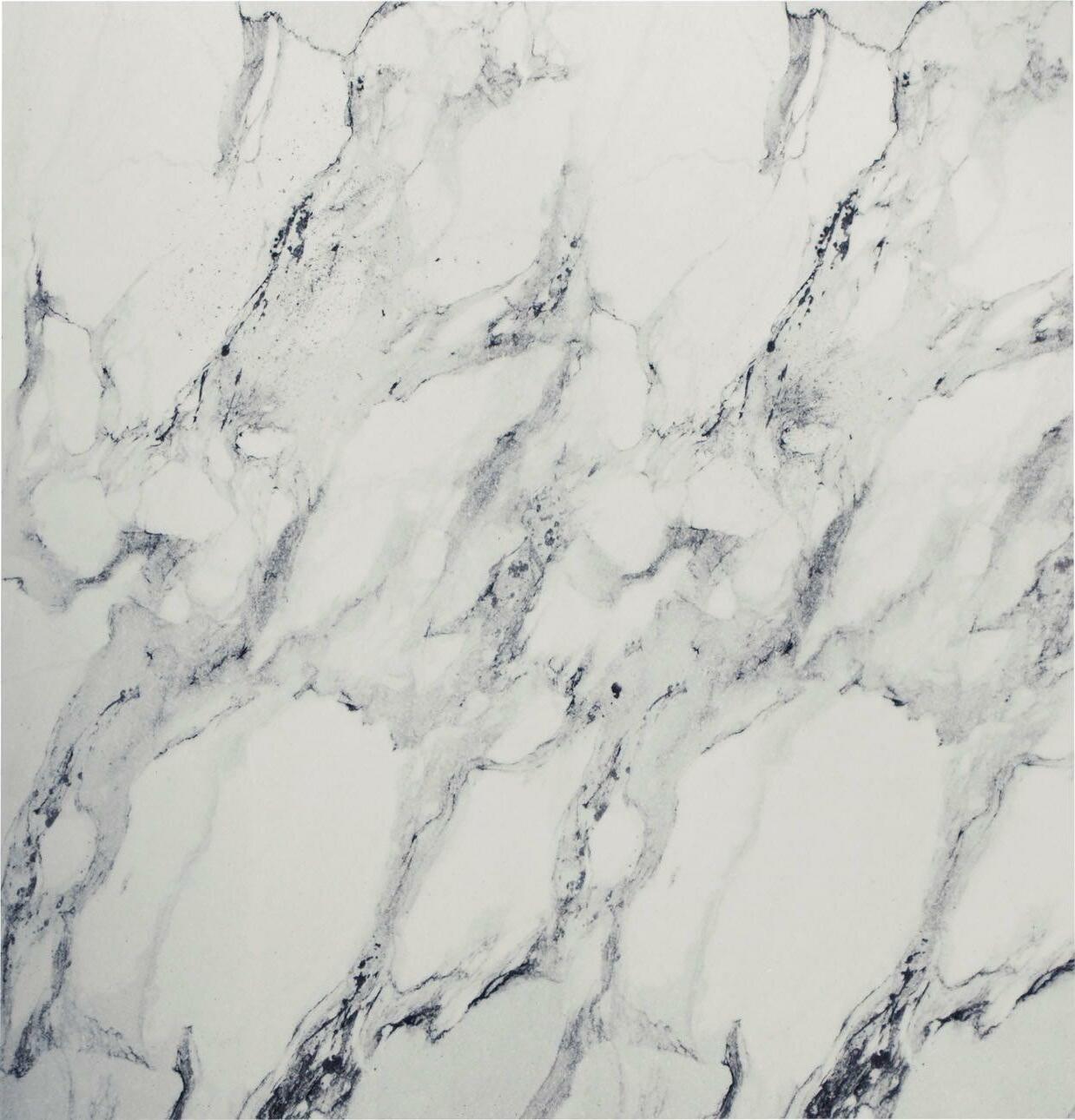
 1 Dixie Bar stool by JETCLASS 2 Metropolis Armchair 3 Artigiana - Le Conchiglie Ceramic tiles by SARTORIA Staircase by FONTANOT 5 Melrose 70 Bathroom 6. Joy Comforter by GABEL 1957


FOLLOW & LIKE @G ANDG MAGAZINEIT - THE NEW OFFICIAL HANDLE -
DIVE INTO ART
TRIA ARQUITETURA
PROJECTED A 960M² APARTMENT IN SÃO PAULO FOR A FOREIGN COUPLE WHO HAVE BEEN LIVING IN BRAZIL FOR A LONG TIME, AVAILING CARLOS FORTES STUDIO FOR THE LIGHTING DESIGN.
 Photography by Fran Parente
54 | G&G _ Magazine

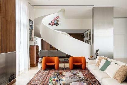
Born travelers and great lovers of works of art, the couple lived in a house and, as they traveled a lot, they chose to move to an apartment for ease of maintenance and security. However, they were looking for a property with a view and high ceilings so that they would not feel so much when leaving the house.
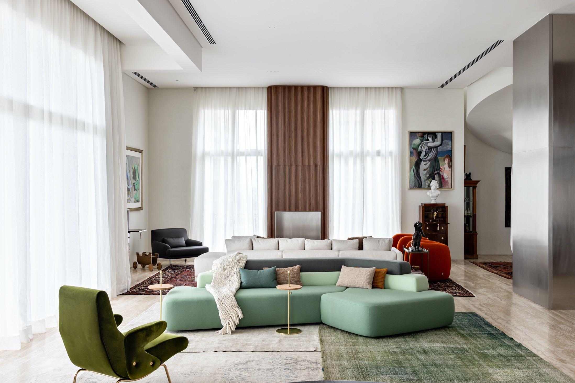
The main concept in the choice of finishes and architectural solutions proposed by Tria Arquitetura was to bring comfort but still leave a big void so that the works could dress the house. The architects team then understood that in the living room there were 3 large main volumes that should

56 | G&G _ Magazine
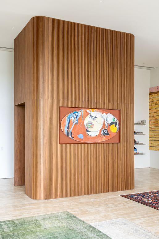
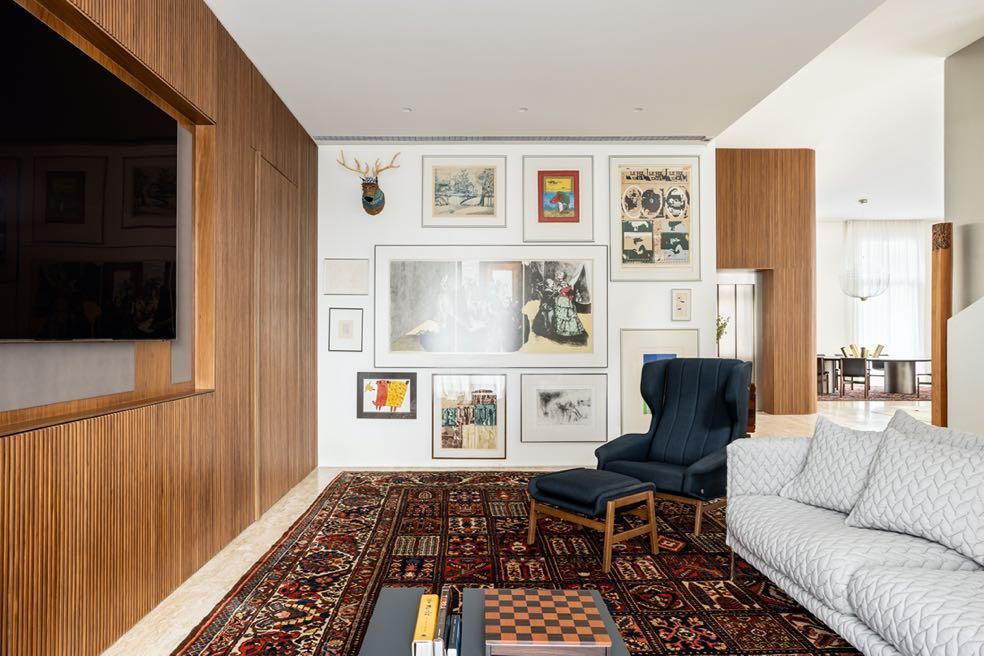
have a highlight and that they would be the ones that would bring a texture and more coziness: the internal elevator block, the fireplace and the wall that divides the room from the guest area. These volumes are covered with a panel of very thin slats veneered in natural wood and glued one by one, with smoothed and slightly rounded edges.
As soon as you exit the lift block, you are presented with a small lounge area composed of a sofa with rounded shapes in
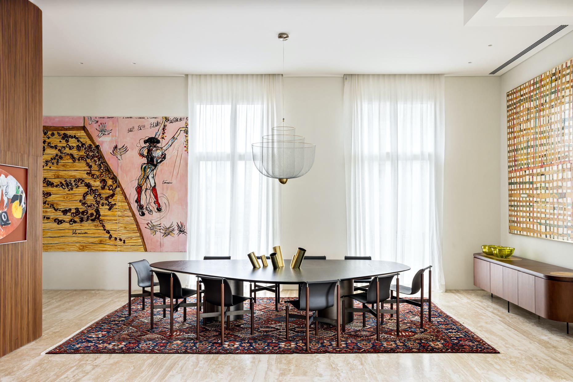
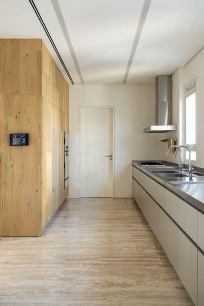
pastel green and the legendary Delfino armchair by Arflex in a lively moss green colour. Next door is the dining area with a more defined character marked by shades of brown present in almost every detail of the space: from the wood (the table and the legs of the dining chairs) to the colourful carpet to the painting hanging above the sideboard by 55 Design (also in wood). Besides, this space leads to the kitchen which, unlike the whole design, is simple and colorless.

58 | G&G _ Magazine
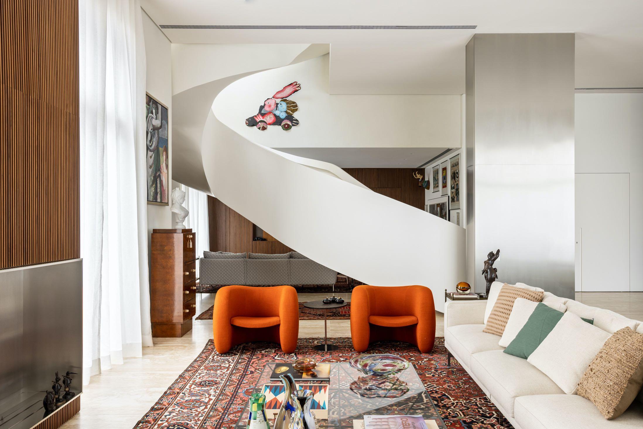
To the right of the lounge area, we find the living area where two fire red Tacchini armchairs stand out more but do not break the color balance. Also, to break with the slatted and wood, a stainless-steel volume with sharp edges stands out from these volumes and creates a counterpoint with the rest, bringing an air of contemporaneity to the solution. The other walls are white and received a subtle texture to give them some movement and help even more in the general comfort. In additional, the couple, with a great repertoire of design and art, values the contemporary a lot and was the main key, together with the architect, in the choice of new furniture and in the curatorship of which works of art would be exhibited in the new home.

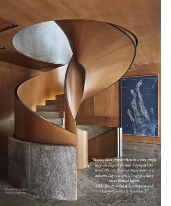
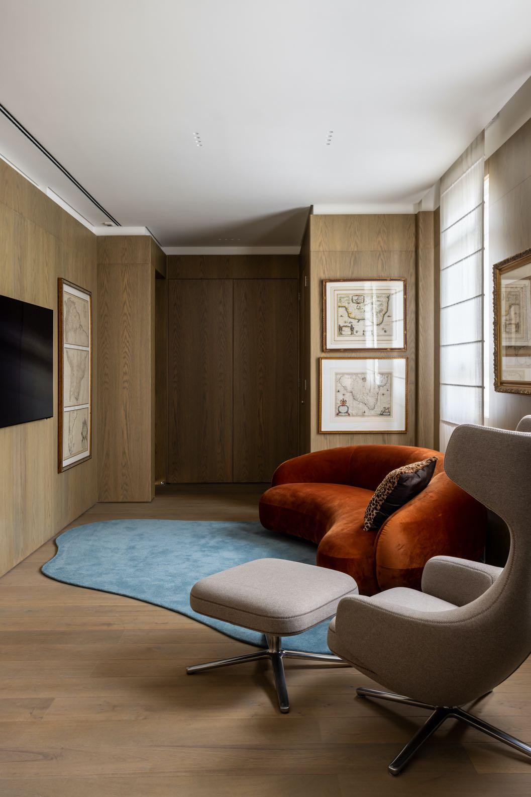
Next to the living room, the majestic spiral staircase gives movement to the space and is in itself an architectural artwork. Behind it, a cinema area has a more intimate touch thanks to an entire wall in wooden slats.
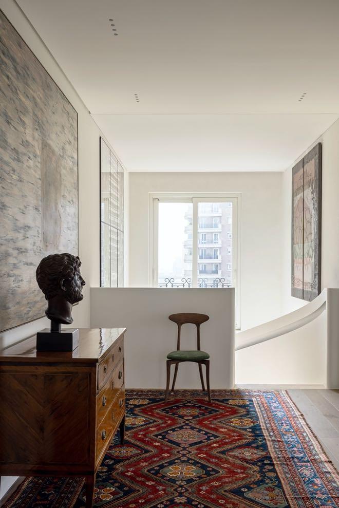
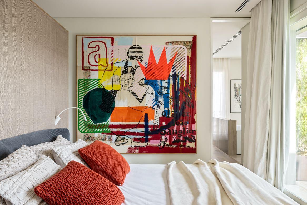
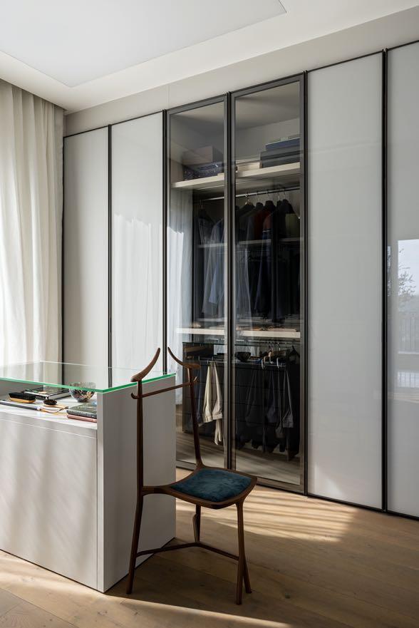
On the upper floor there is a large master suite with dressing room and bathroom for each of the couple and an intimate library, making the entire built area of the secondfloor intimate, leaving only the balcony and social garden area that we find on the left going up the stairs.
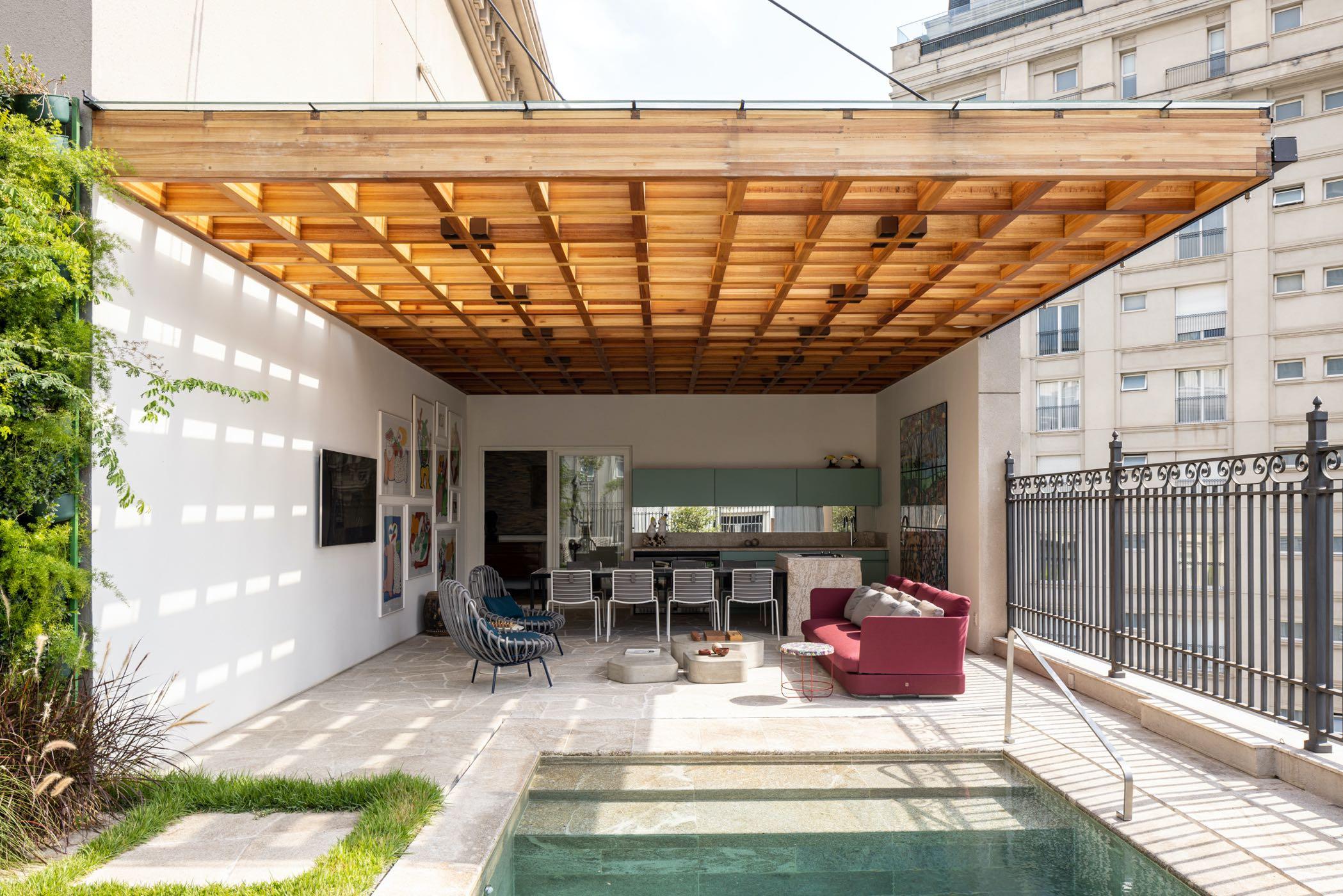
On the balcony, the pool was subtly lowered, and part of the floor intended for landscaping was raised in order to increase the seating and, to unify the environments, a wooden pergola was created in a grid that visually unites the two areas (part covered by slab, part covered only by the pergola with glass) but also bring more coziness and environmental comfort. The floor, in rustic granite chips, is the same as the pool, the island with cooktop and the support bench. The pool has been reduced
and access steps have been created. Its edges were also reformed so that it could enter the social area with more delicacy and elegance.
60 | G&G _ Magazine


62 | G&G _ Magazine
In the intimate area, the wooden floor in wide planks performs the function of coziness while the textured white walls continue to give way to works of art. It was only in the library that the architect chose to cover all the walls with the same wooden floor as the floor to give more seriousness and highlight the environment from the others.


A CUT ABOVE THE
Interior designer
Nitzan Horowitz unveils the design of a 210m² penthouse duplex apartment: a composition of clean straight lines, optimal use of height and space, and a perfect balance of materials and color in the Sharon region, Israel.
 Photography by Oded Smadar
64 | G&G _ Magazine

REST

66 | G&G _ Magazine
“The owners come from the world of construction and entrepreneurship. They live the industry and value quality and detail. I loved the clients from the get-go, and we quickly developed a strong rapport that resulted in very fruitful discussions. After we outlined the program, their needs, and their wishes, they gave me a free hand to create a property that ticked all their boxes. The process was based on trust and mutual inspiration and the results reflect this beautifully.”
Nitzan Horowitz
Nitzan Horowitz is known for his ability to work wonders when it comes to creating dynamic living spaces with a limited palette of colors and materials. This new

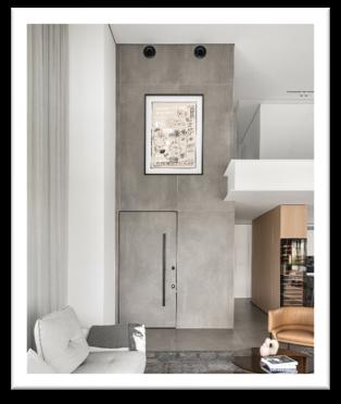
duplex apartment planned and designed for a couple in their 40s’ and their two teenage daughters is no different. According to Horowitz, the property is characterized by impressive architectural features, but the original layout didn't meet the family’s needs. The designer decided to change the floor plan completely to emphasize the dimensions of the double headroom on the first level. The uniqueness of the duplex lies in the fact that one can truly absorb both levels in one glance, and, according to the designer, his wish was to create this powerful experience. Thus, the sloping ceiling, at six and a half meters high, as well as the other high elements, were all an integral part of the concept enabling a holistic view of the entire space.
The entrance level includes an open family space with a lounge, a spacious kitchen, and a separate 60m² master suite that
includes a master bedroom, a walk-in wardrobe, a lounging area, a bathroom, and an office. The design is modern, minimalist, and breathtaking and it is evident that Horowitz was meticulous in his choice of materials throughout the property used in various compositions. These create a design continuum with a focus on gray porcelain, a white color palette that runs through the carpentry pieces and frames, and light oak veneer that adds warmth.
The designer used the entrance and lounge walls to create vertical pieces that emphasize the double headroom. The original entrance door was replaced with a 2.8m high door that is embedded into the wall. The wall was tiled with 1.2x2.8m gray porcelain slabs that emphasize its height and run up to the ceiling of the gallery level. The lounge library is undoubtedly one of the most interesting features in that space, emphasizing the height of the dynamic sloping ceiling: it creates a sense of proportion between an individual and the space itself and beautifully brings together the variety of materials.
All the materials in the lounge run on the same color palette. The idea was not to create a colorful space but rather a serene and harmonious one. A modular sofa system was placed in its center, which can turn into an exceptionally cozy family lounging area in addition to the spacious family area located on the second level. An original wool vintage rug was placed under the sofa, and the curtains, which add another layer of softness to the space, were custom-made on-site due to the challenging ceiling shape & height. The theme doesn't stop there. Horowitz masterfully designed a kitchen element that emphasizes its height, a floor-to-ceiling unit that creates a semi-corridor that separates the kitchen from the guest toilets and the entrance to the master bedroom. This element serves as a focal point for the second level that seems to be floating above it.

Horowitz used three of the unit’s sides - the first as a storage cupboard for crockery and utensils, a second used as a utility and storage cupboard that serves the master bedroom, and the lounge-facing third side was fitted with a wine refrigerator.
The kitchen was divided into areas: along the length of the space, Horowitz designed a white storage unit for all that a modern kitchen needs, with the door to the master bedroom planned further along. A 3.5x1.2m kitchen island abundant in storage was positioned in the center and is used by the family for casual dining. When entertaining guests, the family usually does so on the well-kept balcony. The island is wrapped in a porcelain surface and includes three integral fridges, a professional oven, a warming drawer, and additional functions.
68 | G&G _ Magazine
“The island can comfortably accommodate five diners and allows for dynamic interaction whilst cooking.

Since this is a very large space, with long worktops, the sink and hob were fitted on the low counter space
The artwork displayed around the property and created by local artists was curated to perfectly match each and every space and room in the duplex, all in organic shades of terracotta and Corten steel that blend with the blacks, the whites and the wooden floors.


70 | G&G _ Magazine
From the kitchen, the wooden staircase that leads to the bedroom level was fitted with a glass banister and embedded into the floor creating openness and transparency between the levels. The level includes three bedrooms: one of them serves as a suite, and another as a guest room. The pièce de résistance on this floor is a family area that overlooks the first level
and enjoys the lounge library that extends all the way up. The family corner includes a very comfortable lounging area in a shade of green that livens the space and creates a conceptual balcony on the level. Aluminum coffee tables were placed by the sofa, and the tall library that is erected from the first level is present in this space too, creating movement and interest.


The master bedroom is designed in a more dramatic, intimate and sensual style. Horowitz combined orange and rust elements that can be seen in the artwork, the rug and the sofa. The cupboard, with a mirrored facade, was positioned across from the bed and creates reflection and depth. The walk-in wardrobe was broken down into components, in the same manner as molecular cooking. it embraces the walls and is transparent in parts, thus doubling the space visually. An enclosed area was created where a mirror and tv screen were positioned, and further along, there is a corridor that leads to the office. The light distressed oak parquet in the master bedroom runs through to the ensuite bathroom, which was even more dramatically designed. The designer used a monochrome color palette in shades such as a black veneer cabinet, powerful granite porcelain countertops, and a dark Caesarstone sink.


”The duplex’s story is told from every corner, and each corner is a reminder of a different chapter.”

STUDIO TRANSFORMED A DYSFUNCTIONAL TW0-STOREY HOUSE
STYLISH RESIDENCE FULL OF COLOURS
COASTAL
74 | G&G _ Magazine
Photography by Prue Ruscoe
YSG
IN A
IN A
SUBURB OF CRONULLA, SYDNEY. COLOR
SPLASH


76 | G&G _ Magazine
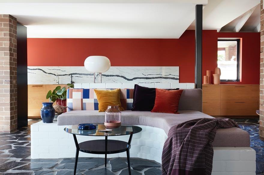
This 200m² house was designed in the 1960’s by Payne & Hunt Architects and retained its original condition: exposed brick and ample mission brown painted timber. The original floorplan was a bit outdated and needed a modification to fit the client's needs: the kitchen was moved from
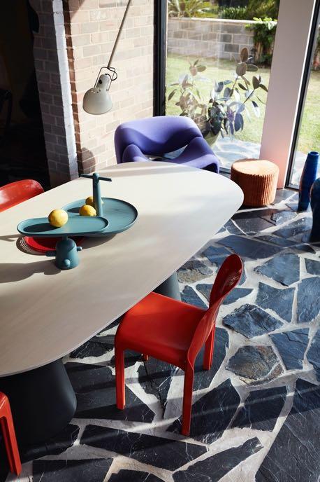
ground floor where a third with study and ensuite remains a celebrated house blossoms into playground bursting reflection of the owners’ ‘joyful living.’ Warm shades pinks - and black are shades holding everything harmony, including flat staircase leading to the first replaced by enclosing . Whilst the brighter draw attention to the modular hero décor items. mustard yellow wall found in the kitchen into the living area. company, Lymesmith, palette to complement walls using bold tones on surfaces, culminating with bricks themselves directly fireplace selected for its vintage appeal. The abstract artwork was inspired by aerial photographs of the property’s coastal location. It simultaneously animates the area and provides a refreshing alternative to installing a large wall-mounted TV screen, whilst complementing the new paving with its angular form. It also does not go unnoticed the curved seating formed by a white brick plinth fitted with plum-hued seating cushions.


78 | G&G _ Magazine
Rejecting a conventional layout, a custom brick plinth, besides serving as the base of sitting, delineates the new kitchen from the living area and serves as an open liquor display. Here, bold tonal highlights include the mustard yellow-tinted open pantry joinery, blue integrated fridge cabinets and the terracotta backdrop to the kitchen. Iconic modular mid-century furniture complements the original build of the sixties. The outcome is a generously playful and welcoming ‘shelter for living’ within an Australian landscape which firmly rejects basing neutral design schemes on bland notions of resale value. This is an ‘all in’ commitment to self expression as the home wholeheartedly embraces a fearless love of colour.


Another request of the clients was an integrated indoor/outdoor retreat space. So, the removal of the existing rear façade and realigning it with the storey above expands the lounge area’s footprint. In addition, bold crazy paving now connects the internal and external living areas. Close

to this area, also upstairs we have a lounge area created by the terrace overlooking the garden. Also, bathroom walls are divided by colorful timber dowels to separate bed from bath, further extending the spatial parameters of the rooms whilst enabling ample natural light to flow freely.

80 | G&G _ Magazine


82 | G&G _ Magazine
INSPIRED BY THE HIDDEN SPACES OF HER GRANDMOTHER’S APARTMENT IN VANCOUVER, NEW YORK-BASED ARCHITECT ANDREA LEUNG HAS RENOVATED A 1.600-SF HISTORIC LOFT FOR HERSELF IN A TRENDY AREA OF TRIBECA, NYC.

Mirrored REFUGE
Photography by Sarah Elliott & Scott Frances
Since she moved to New York in 2013, Leung had envisioned transforming a city apartment into a secluded refuge inspired by the essence of her grandmother’s space, but also
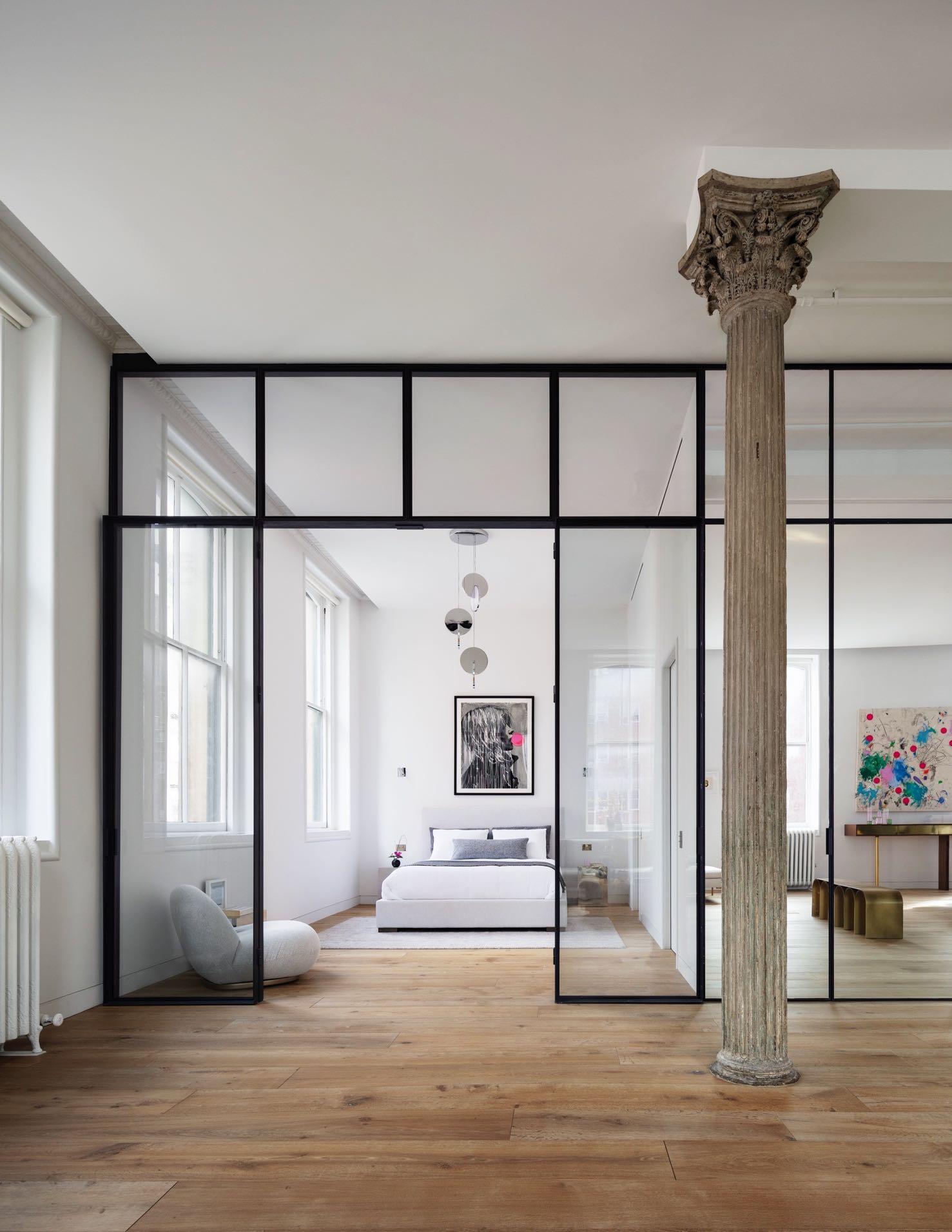
updated to her own tastes. On a quiet corner in Tribeca, she found the ideal site: a sun-drenched loft with soaring antique verdigris tin ceilings held up by three castiron Corinthian columns. Located in a historic building dating to 1864, the apartment is accessed via a flight of lopsided stairs and a passage lined with oversized industrial rolling doors.
Leung began the project with several incisive changes. First and most drastically, she removed a cramped mezzanine that had been suspended over one side of the apartment, as well as the kitchen shoehorned below. She then reorganized the home’s private rooms along the east wall: a bedroom, dressing room, kitchen, and two baths are all hidden behind a long, continuous wall that stretches across the width of the space and shifts almost imperceptibly from a mirrored face across most of the surface, to a glass face in select areas.
The first bathroom is located behind a sliding partition off the entryway, before entering the living area. It is enveloped in veined marble with accents of bright metallics.

“Secret spaces fascinate me. My grandmother’s penthouse pied-à-terre was full of them. Push on the correct mirror, and it opened into a hidden tatami room. Lean on the right bookcase, and a dimly lit hallway led you to her own personal oasis of calm.”
Andrea Leung
84 | G&G _ Magazine

“One look at the raw space, and I knew exactly the sort of refuge I wanted to create. One that unfolds and reveals itself slowly, that wows you initially with its grandeur and then capitalizes on your curiosity.”
The concealed doors of the bedroom, primary bath, and kitchen open onto the loft’s large, bright living and dining area,
which is lined with seven tall windows on two sides. The interplay of this 'wall of mirrors' and the procession of windows, many of which are reflected therein, was essential to Leung’s design. In the main living area, Leung designed several custom pieces whose burnished, glowing surfaces bend light across the space. For example, a custom brass coffee table by Leung and the Arch bench by Pietro Franceschini lend organic curves that complement the architecture’s rectilinearity. While in the dining area, these include a brass and walnut credenza, dining table, and console set, whose irregularly shaped tops, legs, and doors play with concepts of balance and support.

86 | G&G _ Magazine

From the dining room, a mirrored set of doors opens into a kitchen where matte figurative marble and patinated brass millwork play off of the loft’s new wideplank oak floors.

Besides, to the left, a mirrored triple-bifold door opens to reveal the primary bathroom, where a monobloc oval tub is encased in walls of softly-veined stone.

88 | G&G _ Magazine


90 | G&G _ Magazine
Directly from the main bathroom, you can access the bedroom, characterised by light tones. Besides, looking into the bedroom, the reflection of the windows outside and the view of the windows inside collapse on each other, creating a momentary - and whimsically mind-bending - inversion of interior and exterior. So, reflective surfaces and hidden spaces feature across the entire home, adding an ethereal dimensionality throughout. A walnut-lined dressing room nestled behind the bedroom creates a meditative alcove with warm lighting and infinity mirrors.

“As an architect, I thrive on the satisfaction that comes from arriving at elegantly simple design solutions but more importantly, it’s the promise of emotions created by beautiful spaces that drives my architecture. I am always interested in how ostensibly static configurations of materials can evoke poetic tensions that speak to our thoughts and memories, that touch upon aspects of our subconscious and prompt reactions we may not necessarily be able to fully articulate.”

Theatrical mood

PRIMO ATELIER PRESENTS ITS LATEST RESIDENTIAL PROJECT: AN ECLECTIC APARTMENT LOCATED ON THE MOST PRECIOUS HILL IN NAPLES, POSILLIPO.
Photography by Carlo Oriente
92 | G&G _ Magazine

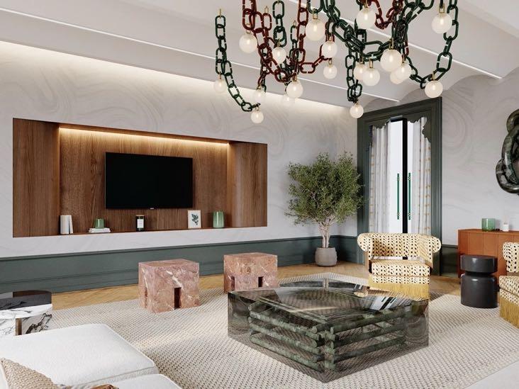
At the entrance, you can immediately glimpse the main volumes that make up this 85m² apartment: they are positioned on opposite sides and are respectively one in Canaletto walnut, soft in shape, and one in pink wood, soft in essence. Continuing we find ourselves in the living area which enjoys a wonderful sea view and is flooded with natural light thanks to the French windows and the use of transparent white curtains along the entire wall.

To the left is the kitchen but of which only a charming island can be seen while all the appliances, furniture and shelves have

94 | G&G _ Magazine
been hidden in the wardrobe system. Delimited by a step, the living room follows the minimalist design. Here, undoubtedly, the protagonist is the iconic Camaleonda sofa by B&B Italia which, thanks to its versatility, adapts perfectly to the environment. The curves of the sofa are taken up in Flos’ Arco floor lamp with the
precious base in white Carrara marble. As e have none except a coffee table; the designers opted to include a ledge along the entire wall, made from the same material as the floor to camouflage it, which serves as a cupboard. Also in the same wall is a hidden door that leads to a small closet.

On the right, a very stylish dining area is made up of the Luxor glass dining table by Fiam Italia and Tom Dixon's black chairs with a witty silhouette that echoes the design of the sofa. A chandelier with white spheres adds a touch of playfulness. In the background is a large illuminated wardrobe, designed and created ad hoc for the project in a tailor-made way according to the customer's needs (as well as all the fixed furnishings and the kitchen island). Inside, there has been recessed a hidden door that leads to the guest bathroom. As in the whole house, the promiscuity of materials and shapes offers a sparkling variety of sensations that the versatility of the lighting manages to mitigate, giving moments of calm, focusing the spotlight on the single main elements, making them the protagonists of this theatrical show


96 | G&G _ Magazine

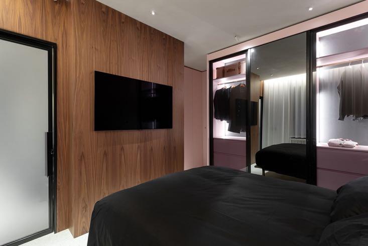
The bedroom with the adjacent bathroom is immediately on the left once you enter the apartment; its door is hidden and incorporated into the pink wood wardrobe system, which then delimits the perimeter of the entire sleeping area. This part of the house is also characterized by a set of elements that vibrate in the light, materials that are warm to the touch and precious natural stones that contain unexpected technological elements.


98 | G&G _ Magazine


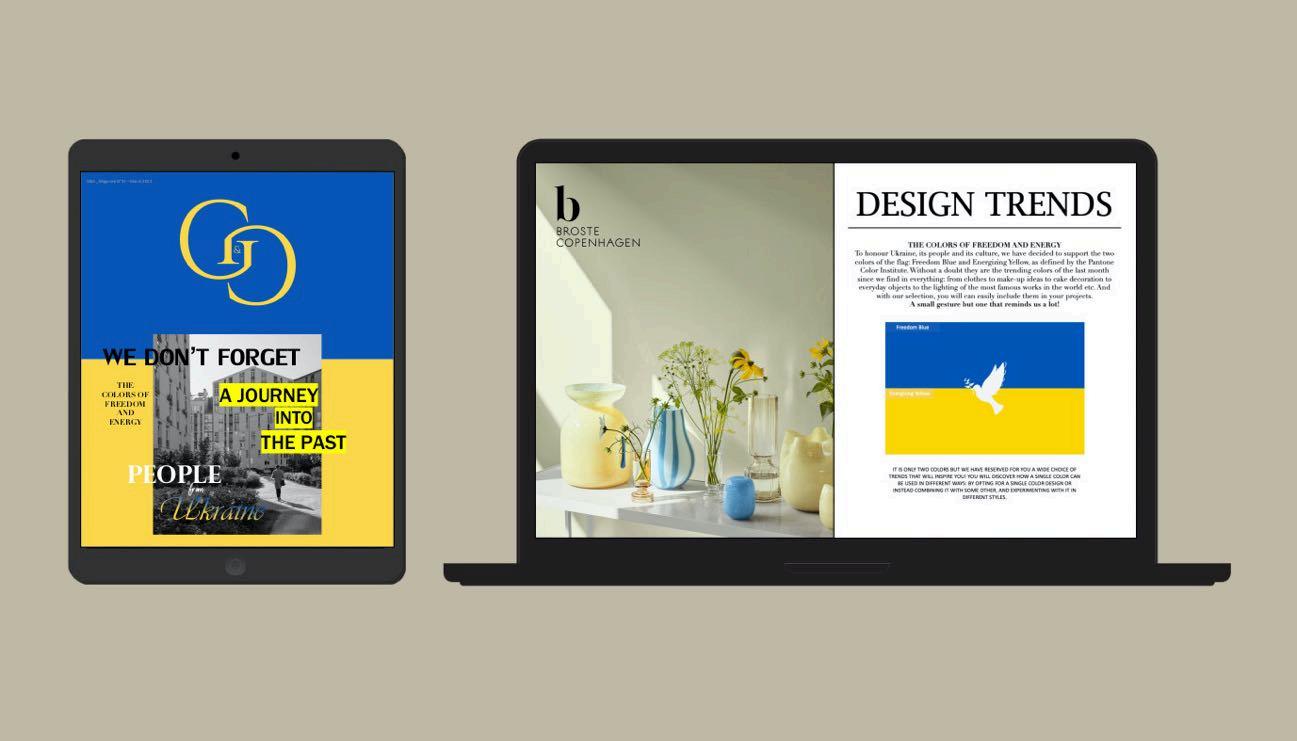
G&G Magazine released an exclusive issue in support of Ukraine that goes beyond the ordinary its issues. It’ s probably more than just pages where you will find design updates and trendy projects. With this edition, we want to inspire people to create and not be silent, and above all to show our closeness to the Ukrainian people.


READ NOW “PEOPLE FROM UKRAINE” EDITION
AUTOMATED
THE FUTURE
MOTION DONATOENGINEERINGSYSTEM.COM
CAR LIFTS AND
PARKING SYSTEMS
IN

ALL OFFICIAL SOURCES:
Africa
donatoengineeringsystem.com
America andrealeungarchitect.com estudiohma.com luxurylifestyleawards.com pantone.com triaarquitetura.com.br Asia designshanghai.com designtokyo.jp carpetscc.com nhdesign.co.il stellarworks.com Europe achcollection.com affettu.com allthewaystosay.com altaidea.com.ua alvamusa.com amiciburo.com artisan.ba aytmdesign.com bigstuffed.com bocadolobo.com brabbu.com brostecopenhagen.com bykoket.com
castrolighting.com circu.net clerkenwelldesignweek.com delightfull.eu dooqdetails.com essentialhome.eu fir-italia.it fontanot.it forostudio.com gabelgroup.it gandgmagazine.eu georgesstore.fr gornceramics.com gtdesign.it hartodesign.fr hommes.studio jetclass.pt jklabarchitects.com karchitects.com.ua klimchi.com kmdesignlab.com lafabrica.com/madriddesignfestival laskasas.com lemondesauvage.com letsdesign.com.ua liewood.com livawards.com maison-objet.com mambounlimitedideas.com margauxkellercollections.com mecanoo.com mezzocollection.com miasarquitectes.com mizzi.co myfriendpaco.com
noa.network noom-home.com objects.yalanzhi.com panoptikumcollections.com pinik.com.ua primoatelier.com prodan-design.com.ua revol1768.com royalstranger.com rugsociety.eu tapis-studio.com tiptoe.fr theroom-studio.com sartoria.design spacecph.dk studio-donna.com.ua talentispa.com theiatiles.com thonet.de tigulliodesigndistrict.com tognana.com tonellidesign.it utulamps.com victoria-maria.com volverstudios.com yudindesign.com za-za.com.ua zaditaly.com zannierhotels.com zerica.com zikzakarchitects.com
Oceania ysg.studio
104 | G&G _ Magazine


G&G _ Magazine N 33 – July 2022 GG & Breath of #SUMMER2022 Fresh Air Dreampools G&G _ Magazine N 35 – November 2022 GG & Villa in the clouds MORE INSPIRATION FOR YOUR HOME WWW.GANDGMAGAZINE.EU Click to our latest issues now to see even more of trend updates, stylish ideas and exciting projects. G&G _ Magazine N 34 – Septembe 2022 GG & museum concept #AUTUMN2022 THE WALL CODE MID-CENTURY CALIFORNIAN MODERNISM EVENTS CALENDAR


 White Garden II Rug by RUG’ SOCIETY
Bogarde
Sofa by HOMMÉS


 Padaung Stool by
Thompson Stool by BOCA DO LOBO


 1 Torrebaró Social Housing by MIAS ARCHITECTS 2 Glazy Chair by ROYAL STRANGER 3 Plaza Bed by JETCLASS 4 Next Rug by G DESIGN 5 Barcelona Stool by KOKET


 1 Panama Armchair by TALENTI 2 Notre Dame Mirror by JETCLASS


 1 Naked Armchair by TONELLI DESIGN 2 Maze Armchair by by JETCLASS 3 Valencia Rug by RUG’ SOCIETY 4 Scille Dining chair by HOMMÉS STUDIO


 1 Dixie Bar stool by JETCLASS 2 Metropolis Armchair 3 Artigiana - Le Conchiglie Ceramic tiles by SARTORIA Staircase by FONTANOT 5 Melrose 70 Bathroom 6. Joy Comforter by GABEL 1957


 Photography by Fran Parente


 Photography by Oded Smadar


