GG G&G _ Magazine N°44 – May 2024
&
Exuberant green JEWEL MOUNTAIN MODERN STYLE classic rewind Opulent VIBES
FULL OF SURPRISES

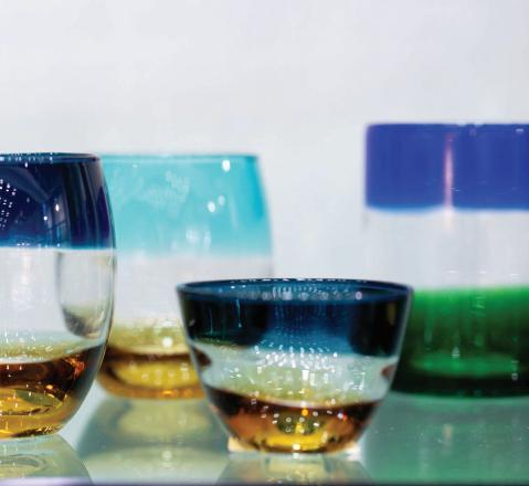
PREMIUM BOHEMIAN GLASSWARE VISIT EU.KLIMCHI.COM FOLLOW @KLIMCHISTUDIO

ZANNIERHOTELS.COM 12 rooms & suites . cocktail & wine bar . concierge wellness center ( under prior booking ) . bespoke activities SUBLIME ALPINE IN MEGÈVE

LUXURY LIFESTYLE AWARDS PRESENTS
L U X U R Y I N T E R I O R D E S I G N E R S O F T H E W O R L D 2 0 2 4
A P P L Y N O W

+39 392 089 8038 www.studio-donna.com.ua/en info.donnafurniture@gmail.com @studio_furniture_donna @donna.furniture.studio


11 EDITOR’S LETTER TRENDS 17 DESIGN SELECTION SPRING 2024 29 E-SHOP DESIGN PRODUCTS WITH A SIMPLE CLICK INSPIRATION 34 LATEST NEWS FROM DESIGN WORLD INTERIORS 48 EXUBERANT GREEN JEWEL TOP-FLOOR APARTMENT BY ESTER BRUZKUS ARCHITEKTEN / BERLIN, GERMANY 56 FULL OF SURPRISES APARTMENT BY TSAI DESIGN / SYDNEY, AUSTRALIA 64 MOUNTAIN MODERN STYLE HOUSE BY CLB ARCHITECTS & HSH INTERIORS / JACKSON HOLE, WYOMING, USA 76 SPATIAL FLUIDITY APARTMENT BY GABRIELLE TOLEDANO / PARIS, FRANCE 86 CLASSIC REWIBD APARTMENT BY MODEKTURA STUDIO / KYIV, UKRAINE 96 OPULENT VIBES TWO-BEDROOM APARTMENT BY KARAN DESAI ARCHITECTURE + DESIGN / MUMBAI, INDIA 108 ALL OFFICIAL SOURCES CONTENTS GG G&G Magazine N – May & FULL OF SURPRISES Exuberant green JEWEL MOUNTAIN MODERN STYLE classic rewind Opulent VIBES 53 45 78 ON THE COVER The lounge room of the house in Wyoming designed by CLB Architects and HSH Interiors Page 64 29











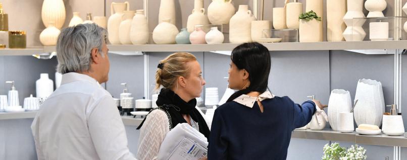


Following the Design Trends that are accompanying us in 2024, this issue opens with them where color contrasts, graphics, blends and mixtures of materials are the protagonists (page 17). It's true that many of the tendencies are already part of the look of our homes but we offer you a further way to integrate them into the interiors. It's not about giving a total restyling but simply an even better aspect and also suitable for embracing the first weeks of Summer. While on the one hand we have strong contrasts and extravagant patterns, on the other there are more subtle options made of calm tones and simple lines. Using products with unusual shapes and bold motifs seems to be an up-to-date trend that everyone likes, and to have an even more extravagant effect we suggest enhancing them with bold tones. Instead, if you are more of a minimalist style, we introduce a 2.0 version - few products but with character, with architectural silhouettes.
Below you will find the interior projects that reconfirm the trends presented; many times, even mixed together. On page 48, Ester Bruzkus Architekten has incorporated a green box around which the living spaces rotate, mixing materials and colors. The same design approach was applied by architect Gabrielle Toledano in the Parisian apartment: a clean design that enhances the careful choice of products (page 76). Immersing ourselves in a bizarre style we see the creative talent of Indian designer Karan Desai showing off in the shelter with the play of tonal shades, curved contours and the avant-garde design features on the moody neutral base (page 96). Ever deeper into that feeling of freshness by showcasing some of the most creative and daring uses of color, this edition rewards the courage to experiment and believe in creating unique and distinctive interiors.
Enjoyable reading,


!"#$%&'(%()*&#" I’m always interested in your opinion, send me any feedback or suggestions
G ANDG MAGAZINE.EU
HOTELS
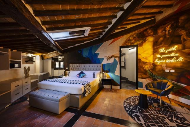
Rizoma Architetture unveils one of its latest project: the new Casual Hoteles Rinascimento Firenze & Spa, located in the heart of the historic center of the city!

INTERIORS
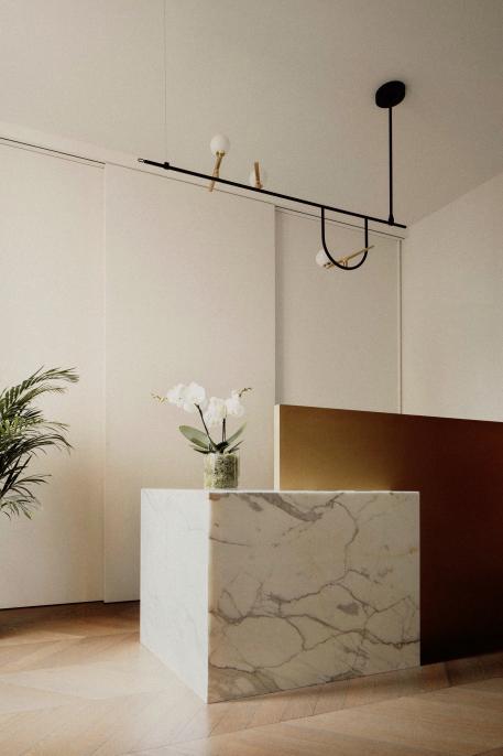
Francesco Meneghello unveils his most recent interior design project where the absolute white and the spaces inspired by Zen aesthetics enter into dialogue with the nineteenth-century bourgeois context and the splendid view of the Castello Sforzesco.
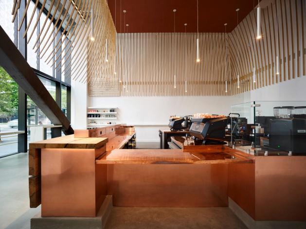
Located in downtown Oakland and inspired by Italian culture, Jones | Haydu designed the new Caffè that reflects the second generation of Bay Area icon Mr. Espresso.


ENQUIRIES info@gandgmagazine.eu !"##$!% &'(#)*+)%")"*, NEWSLETTER !"#%-!%
BARS
ALTA IDEA DESIGN STUDIO

• interior design & project management
• residential and commercial projects
• working worldwide
• based in the UK
altaidea.uk
DESIGN TRENDS
A careful selection of Spring trends destined to also embrace the beginning of Summer is ready for you! The new proposals are all about playfulness and creating a custom home without rules and guidelines. It is enough to dare with more intense colours, texture and shapes.

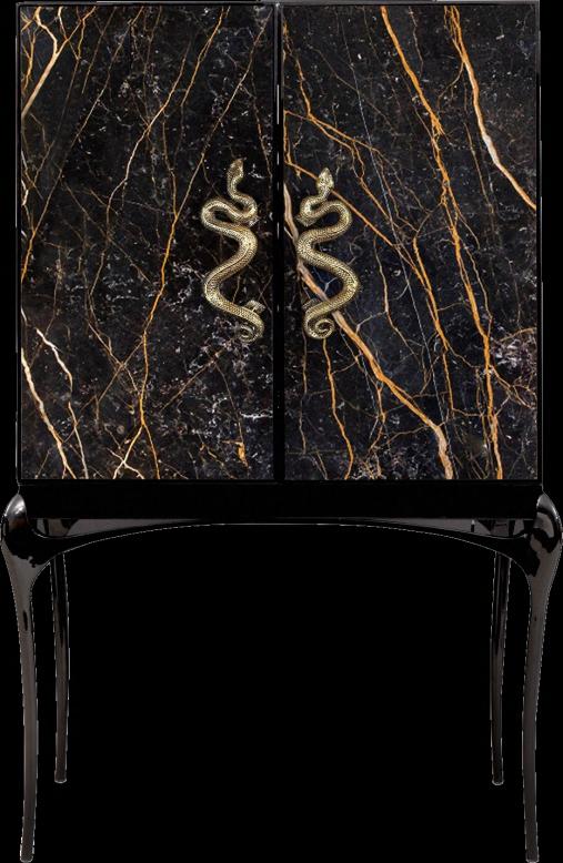
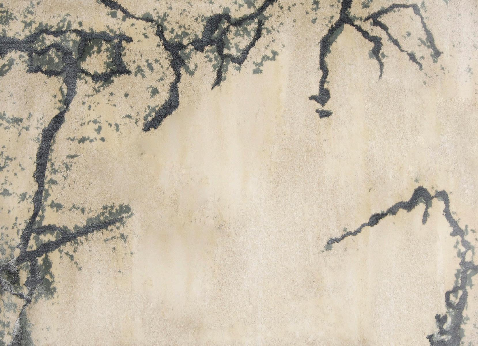
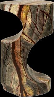
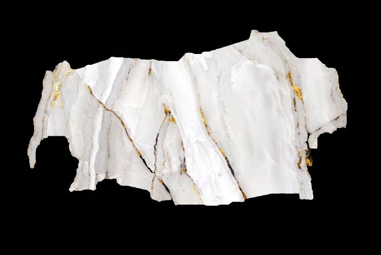
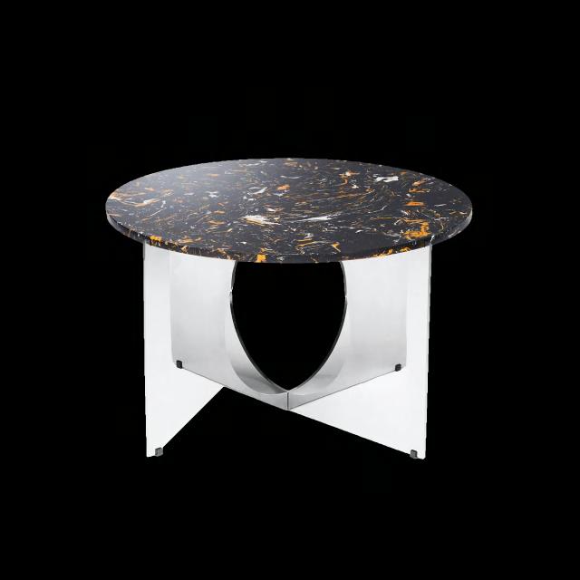
THE LONG AND SINUOUS LINES OF COLOR THAT RUN THROUGH THE NATURAL STONE ARE A REFINED DETAIL IN ANY ENVIRONMENT. BUT ALSO, ALL THOSE DETAILS THAT CAN REMIND US OF THE VEINS OF THE MARBLE ARE WELL SEEN SUCH AS THE MOTIFS OF THE CARPETS, THE ARCHITECTURAL DOOR HANDLES OR LIGHTING.

 Gobi
Rug by BRABBU
Flow Door pull by PULLCAST
India Port Laurent Marble Bar cabinet by
This is Art Coffee table by DESIGN BY US
Bryce II Side table by BRABBU
Dopamine design
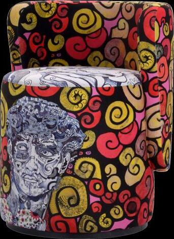
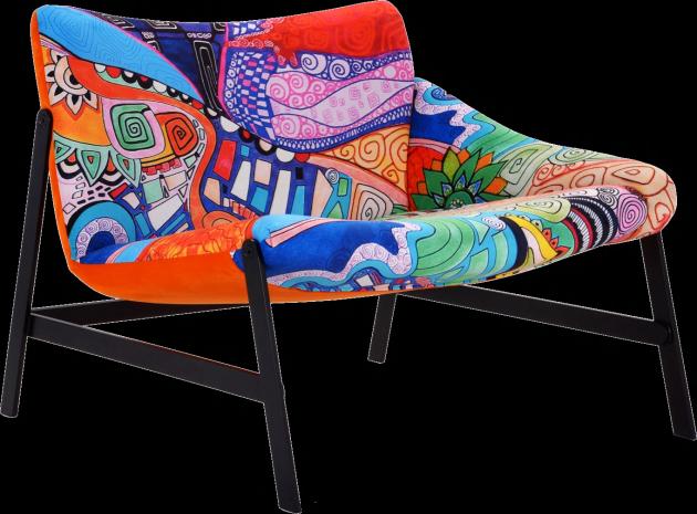
DO YOU LOVE DECORATING WITH COLOR? THIS TREND CHARACTERISED BY INTERIORS WITH BRIGHT COLORS IS FOR YOU! WITH A FOCUS ON GREEN, RED AND ORANGE, THE EYE-CATCHING SHADES MIXED WITH THE MORE EXTRAVAGANT GRAPHICS MAKE US FEEL HAPPIER AND FULL OF ENERGY.



Chandelier by KOKET
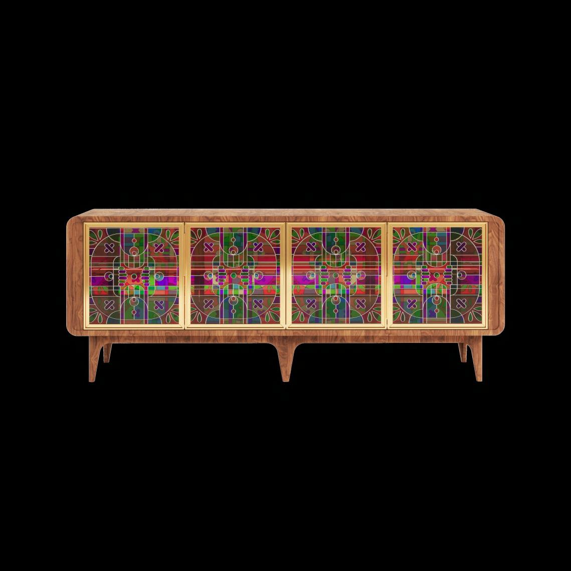
Sideboard by JETCLASS
 Boll Armchair by Le Clochart x ADRENALINA
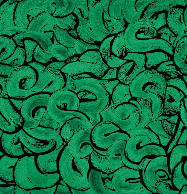
Remous Vert et Noir Wallpaper by L’ATELIER DU MUR
Énigme
#SPRING2024
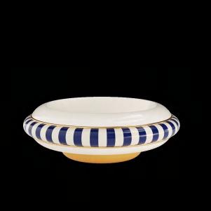
Poppy Bowl by MEZZO DECOR
Hammock Armchair by Le Clochart x ADRENALINA
Letter D
Graphic lamp by DELIGHTFULL
Outburst
18 | G&G _ Magazine





New Minimalism

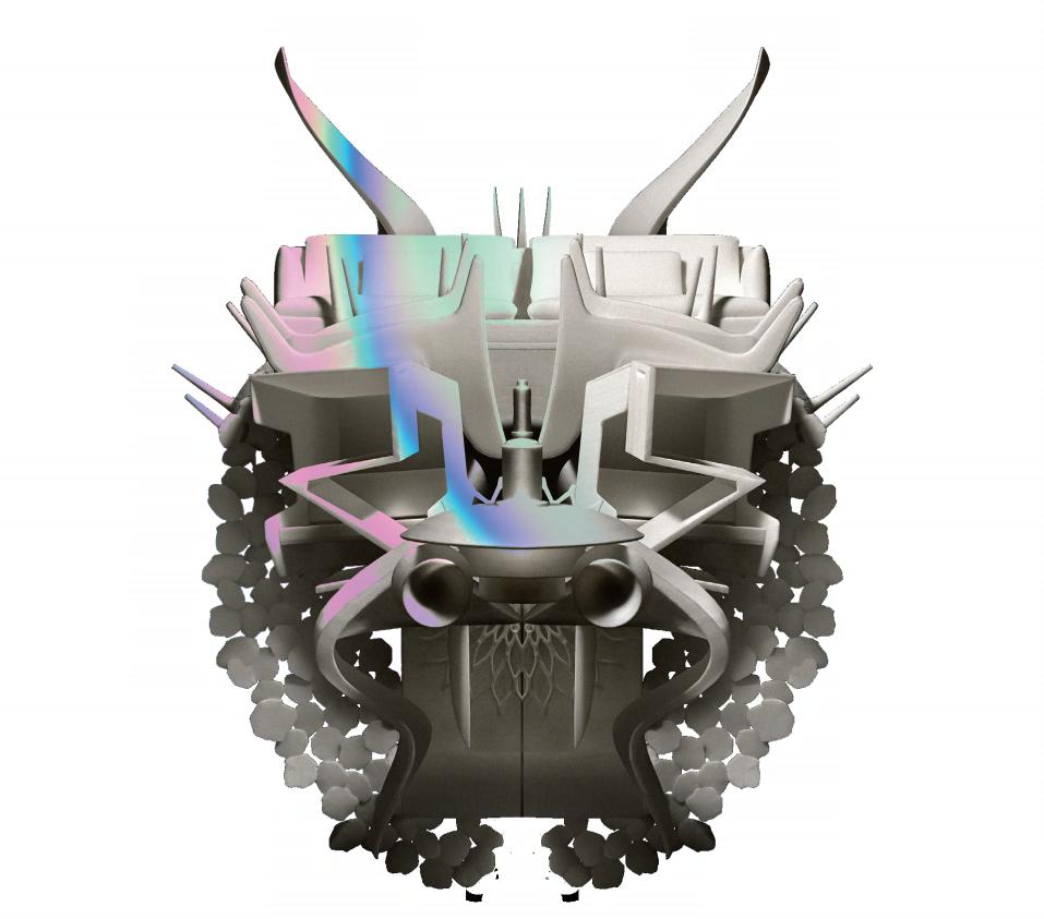
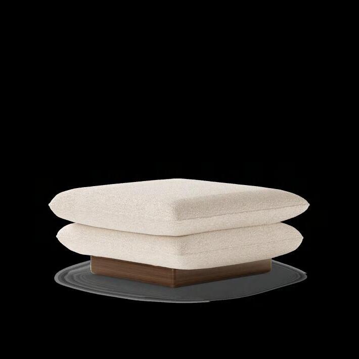
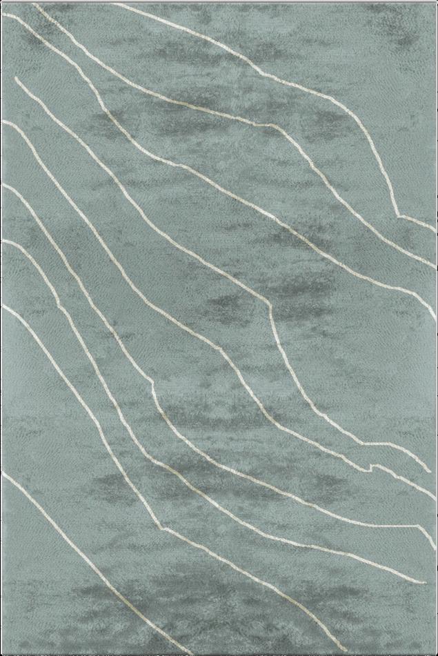
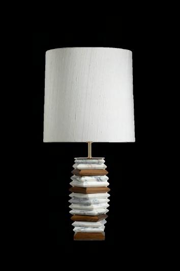
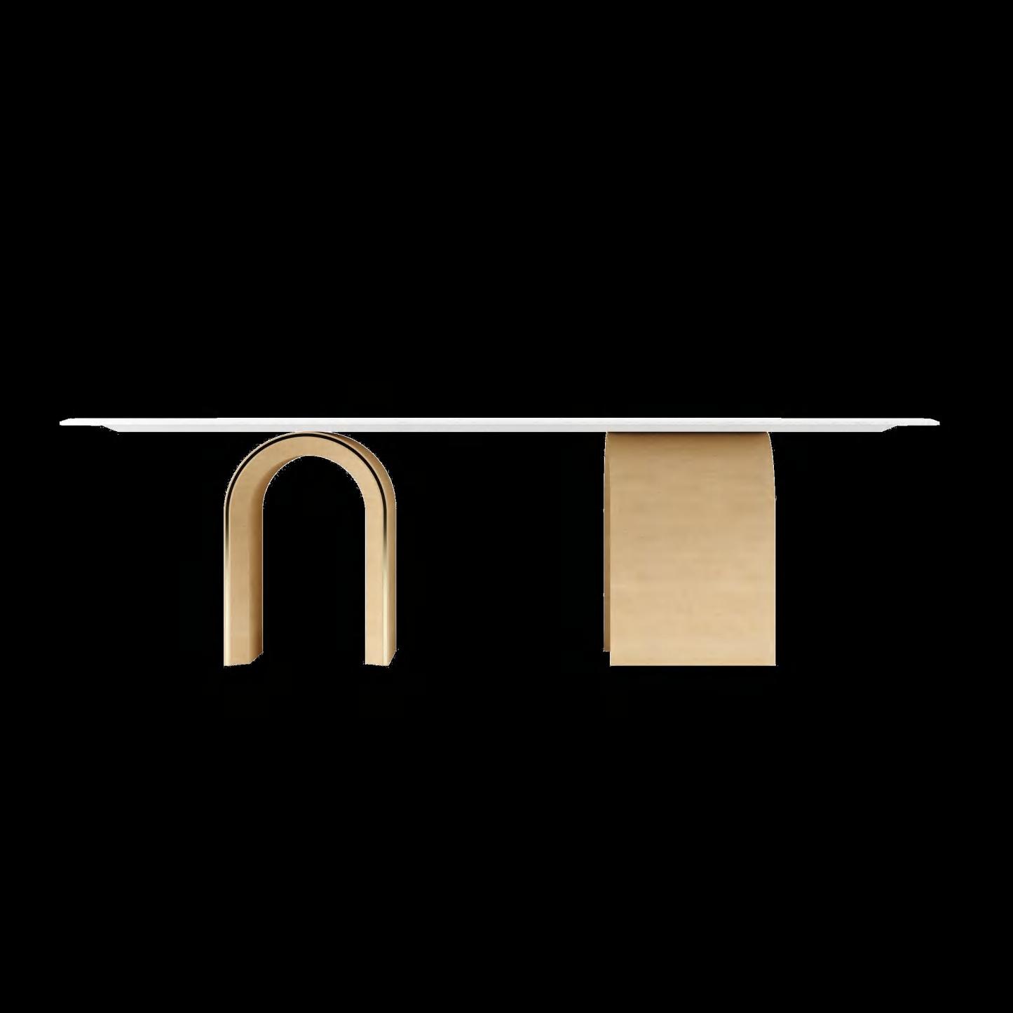
A MODERNISATION OF THE MINIMALISM HAS LED TO THE BIRTH OF ITS NEW VERSION. ALWAYS AIMING TO HAVE A PEACEFUL AND HARMONIOUS SPACE, DESIGNERS ARE APPROACHING THIS STYLE WITH A CONTEMPORARY APPROACH, MAKING IT MORE REFINED AND INDULGENT. IT'S ALWAYS ABOUT FAVORING A FEW PIECES BUT THIS TIME THEY MUST HAVE A VISUAL IMPACT THROUGH THEIR MATERIALS, SHAPES AND DETAILS.


#SPRING2024
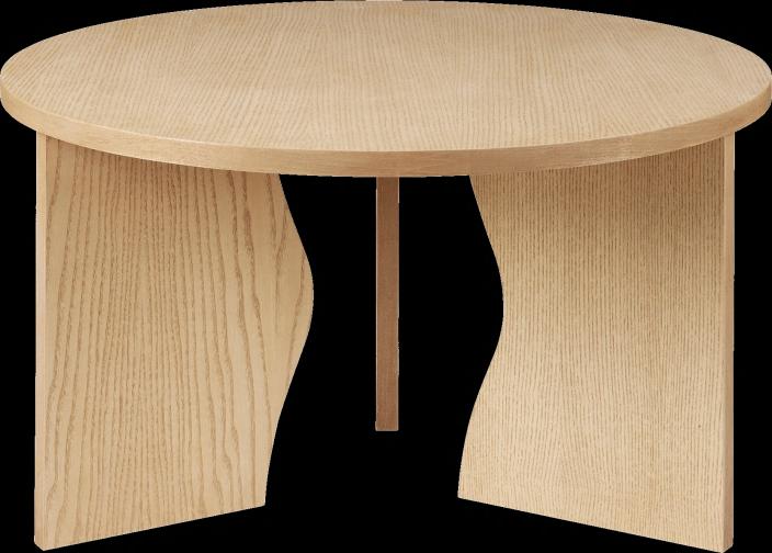
James Stool by MEZZO COLLECTION
Apache Table light by BRABBU
Warao Rug by BRABBU
20 | G&G _ Magazine
Valkie Wall light by BRABBU
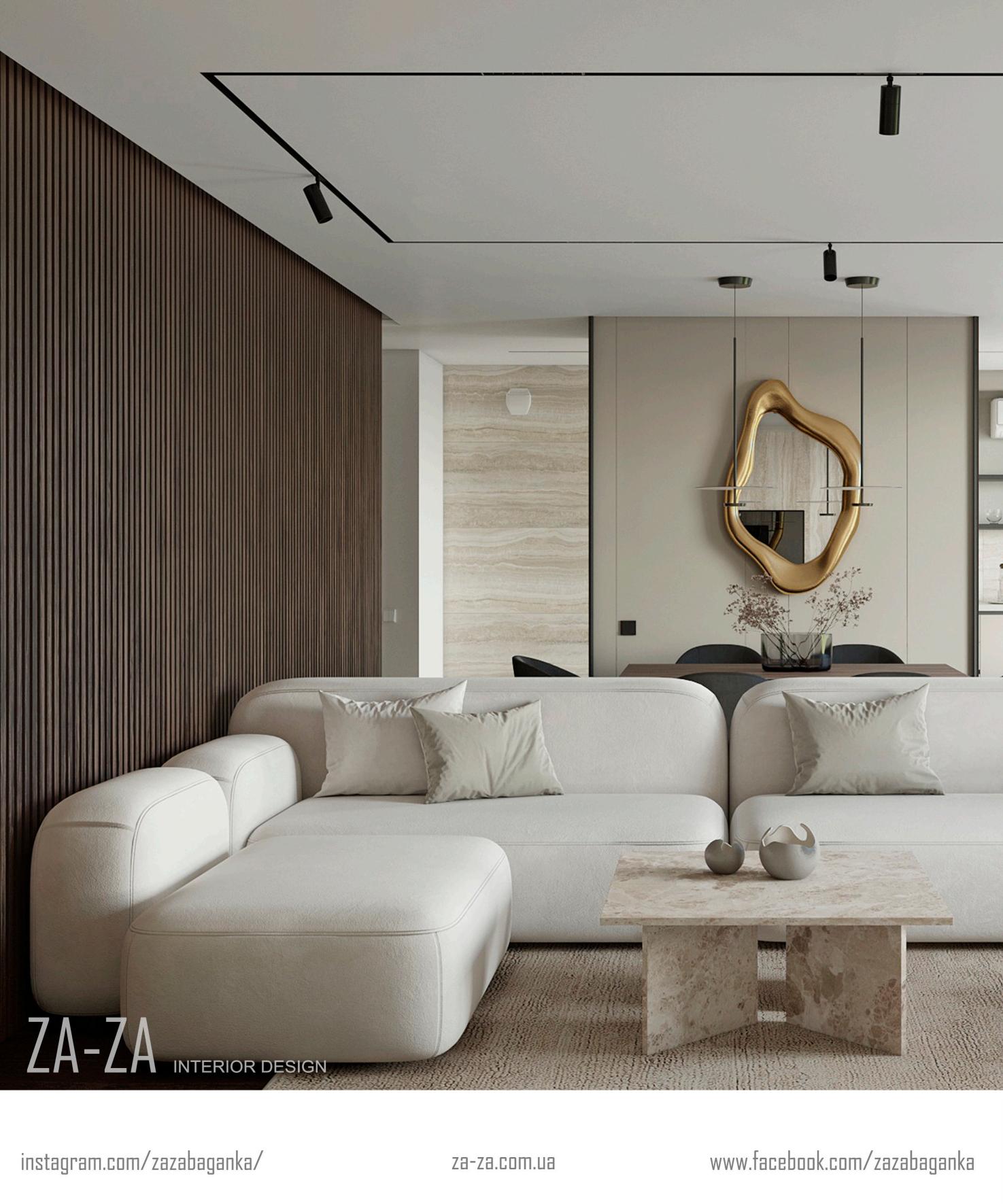
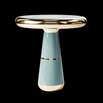

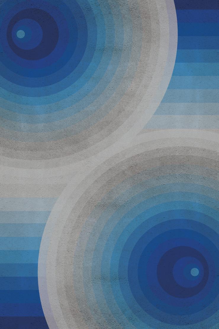
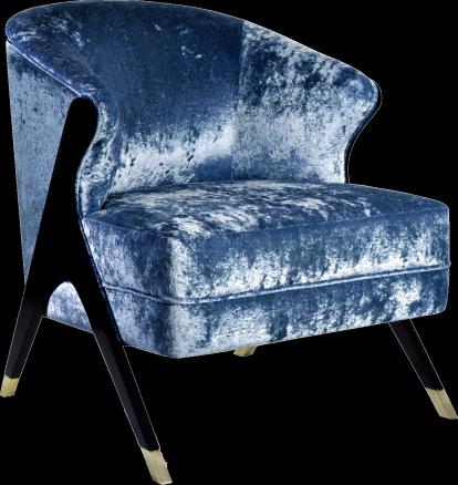
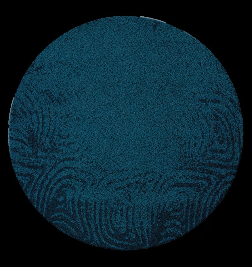
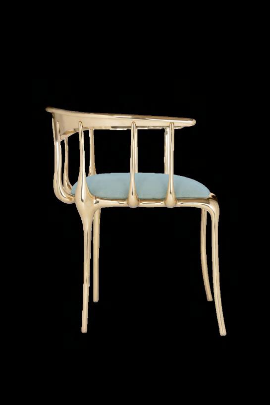
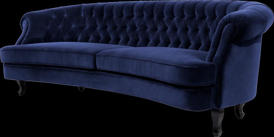
Blue shades FROM PASTEL TONES TO CLASSIC TO MORE INTENSE ONES, BLUE CAN PROVE TO BE A PLEASANT DISCOVERY. IT IS A COLD SHADE BUT THANKS TO ITS VERSATILITY AND USING A LITTLE IMAGINATION WE CAN INTRODUCE IT INTO OUR HOMES FOR A PLAYFUL EFFECT.


 Nº 11
Chair by BOCA DO LOBO
Portobello Coffee table by ALVA MUSA
Maree Sofa by BRABBU
Naomi Chair by KOKET
Surma 2 Rug by RUG’ SOCIETY
#SPRING2024 22 | G&G _ Magazine
Pluto Rug by RUG’ SOCIETY
ARCHITECTURAL STUDIO P I N I K +380 50 451 39 55 іnstagram am pinik www.pinik.com.ua
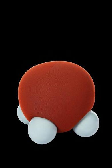
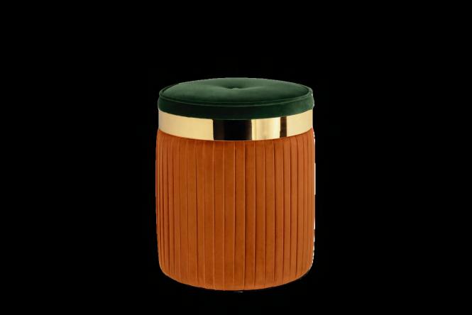


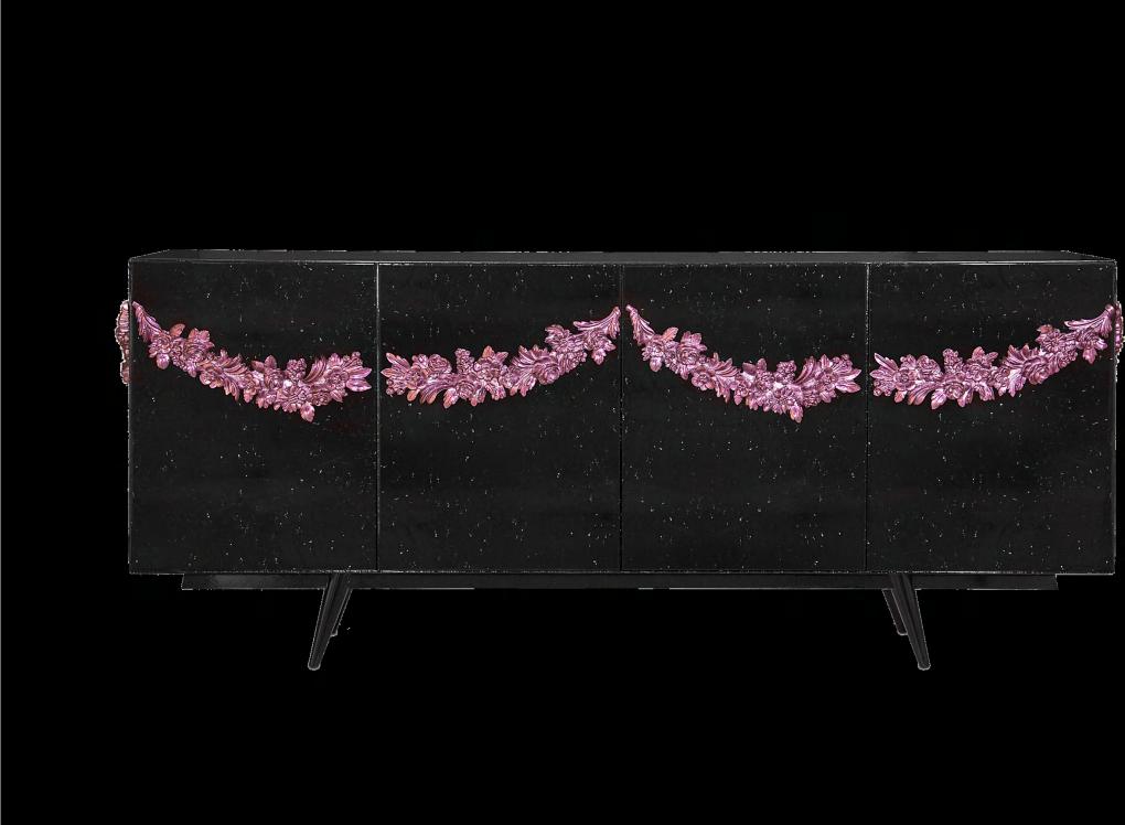


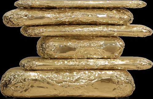
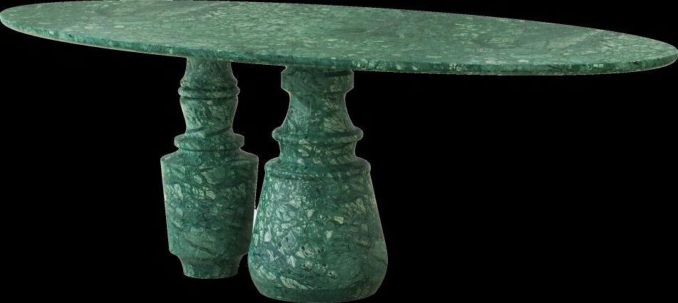
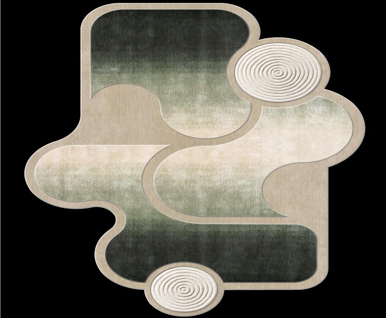
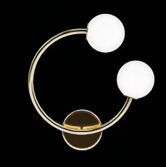
Architectural details DECORATING YOUR HOME WITH EYECATCHING PRODUCTS CONTINUES TO REMAIN A MUST-FOLLOW TREND. A LARGE TABLE WITH A CAPTIVATING DESIGN, A SCULPTURAL LAMP OR A RUG WITH LIVELY SHAPES AND PATTERNS HELP CREATE AN ECLECTIC AND PERSONAL HOME.







#SPRING2024
Magazine holder by AYTM
Gabriela Wall lamp by ROYAL STRANGER
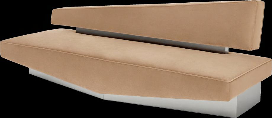
Divergent Sofa by MARTA DELGRADO STUDIO
Goccia Rug by MASSIMO INTERIORS
26 | G&G _ Magazine
Stonehenge Console by BOCA DO LOBO
3 (Wed) - 5 (Fri) Tokyo Big Sight
23 (Wed) - 25 (Fri) INTEX Osaka
Organised by RX Japan Ltd.
WEB: https://www.lifestyle-expo.jp/summer/en-gb.html
E-mail: visitor-eng.lifestyle.jp@rxglobal.com
2024 Trade Fair for All Things Lifestyle TOKYO
SHOW JULY
SHOW OSAKA
SEPTEMBER
Buy products with an extraordinary design for your home with a simple click!
6 4 3 1 E-SHOP
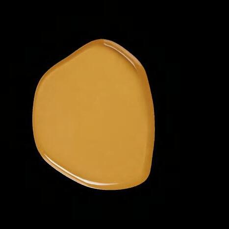
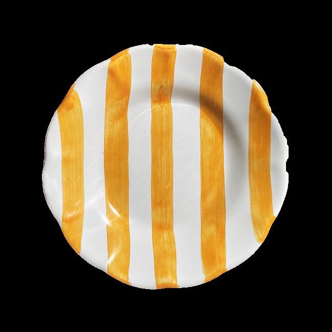
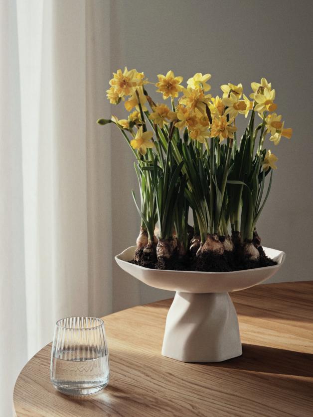
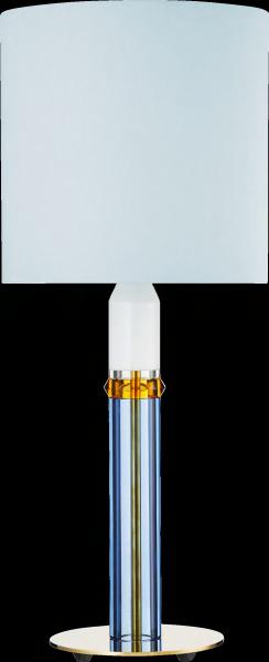
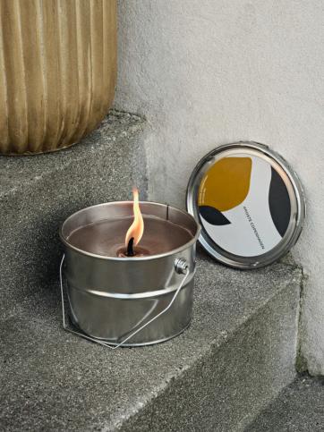
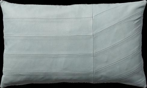
Carnival Table lamp by DESIGN BY US €1.170,00 Coria Cushion by AYTM €79,00 2 Limfjord Centrepiece by BROSTE COPENHAGEN €99,00 Rayure Ocre Plate by POPOLO €18,00 5 Mie M Tray by BROSTE COPENHAGEN €59,00 Bucket Candle by BROSTE COPENHAGEN €42,00

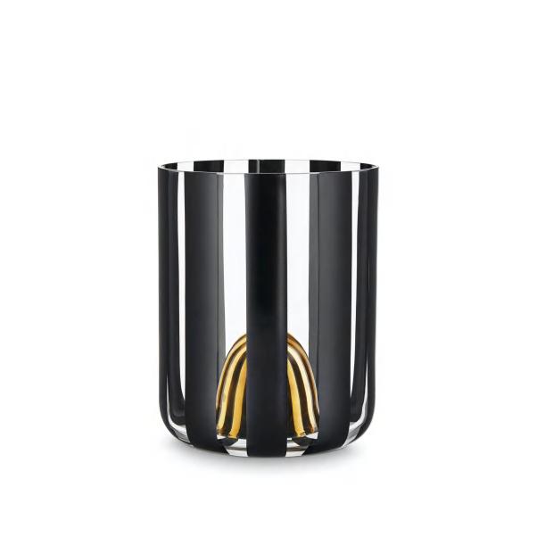
€24,00

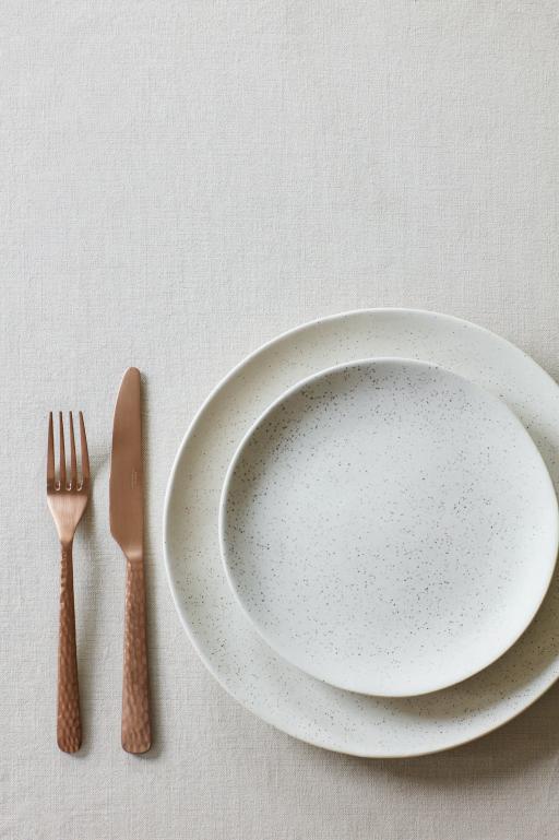
8 Hune hammered Cutlery by BROSTE COPENHAGEN
Festival Vase by DESIGN BY US
#ESHOP
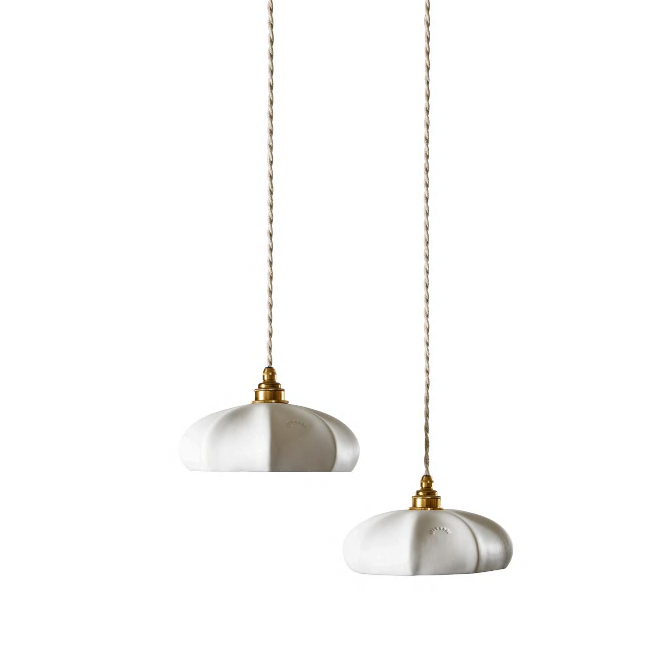
– porcelain biscuit Suspension by ENAMOURA
7 10Aedes Shelf by AYTM
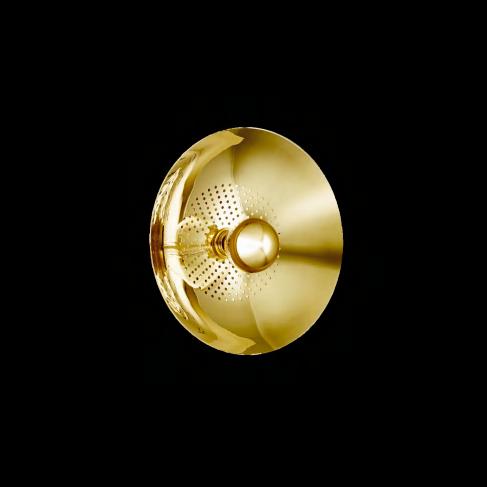
9 11 12 Wanted Wall Lamp by DESIGN BY US
Brook Table by BROSTE COPENHAGEN
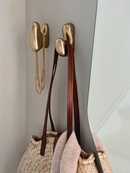
Hook by BROSTE COPENHAGEN
€239,00
€190,00
Maria
€250,00
€135,00
€700,00
€509,00 Roberta
ip@zikzakarchitects.com +357 96 135 446 +380 97 534 7450
specializing
workplace
Our expert designs transform ofces into powerful assets that amplify your brand and foster collaboration. Discover the art transformation! Contact us today!
ZIKZAK Architects commercial interior design Archilecture and design company
in
design and commercial interior
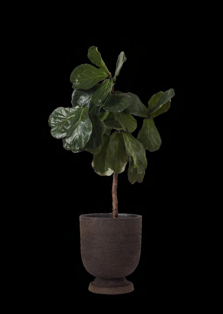

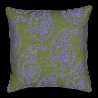
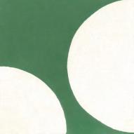
Cushion cover by LA REDOUTE INTERIEURS
€20,99
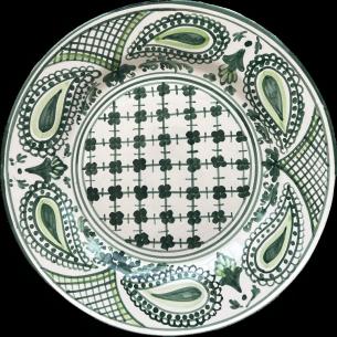
Bandana - green
Plate by POPOLO
€40,00
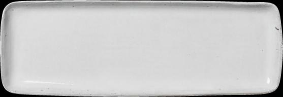
Nordic Sand Square plate by BROSTE COPENHAGEN
€55,00
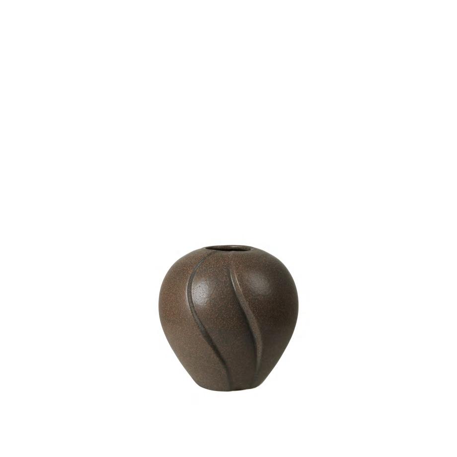
Leda
Vase by BROSTE COPENHAGEN
€69,00
Leda
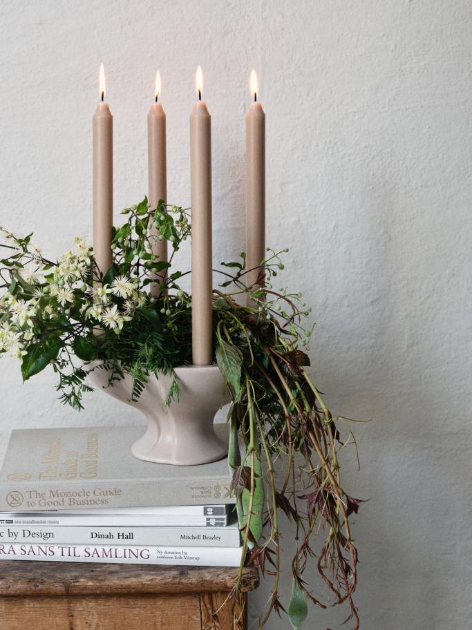
Candle holder by BROSTE COPENHAGEN
€55,00


by
€160,80/m²
18
Congruence Rosemary
Tiles
CAROCIM
20
19
#ESHOP
17
LATEST NEWS
An opulent space
Rockwell Group designed the new fried chicken restaurant COQODAQ in Manhattan, helmed by executive chef Seung Kyu Kim. The design team infused the dark, luxurious dining room with touches of art nouveau, custom furniture and dynamic, highly strategic lighting throughout. The material palette features hunter green leather, dark walnut wood,
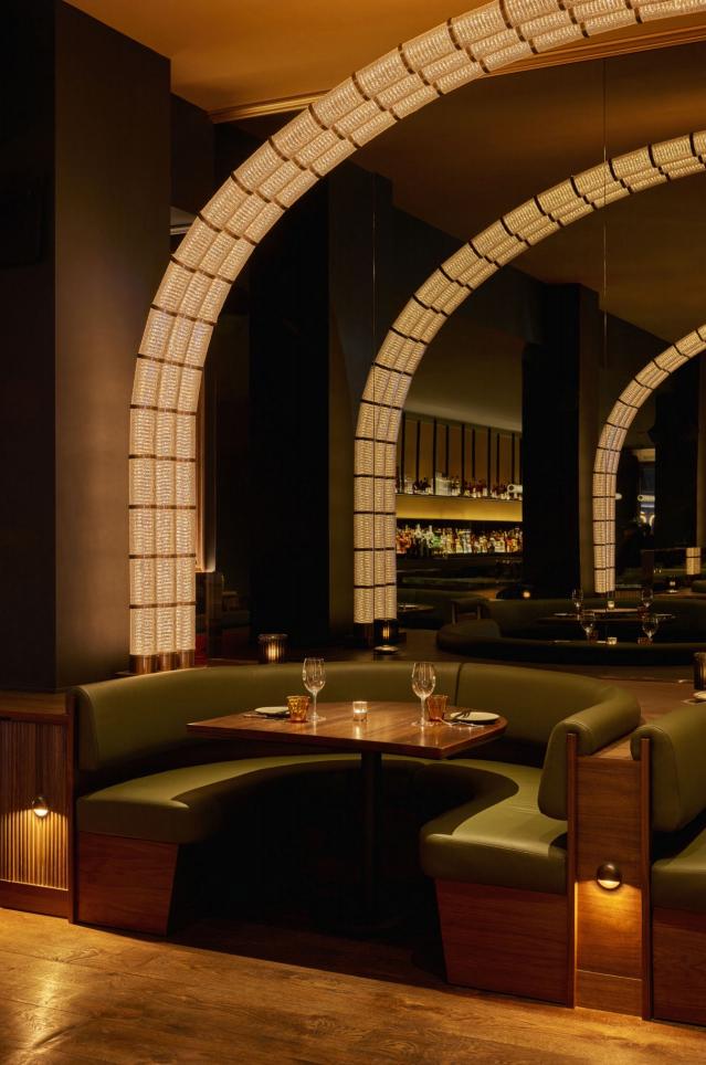
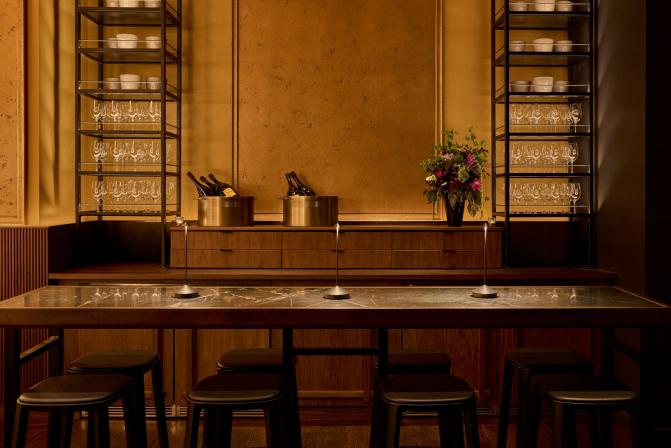
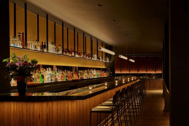
architectural lighting, champagne glass, soapstone, bronze, and glowing lacquered paneling. Light is a material here, layered and choreographed to emphasize the textures and color of the food and the unified organism that is the audience. The palette was driven by a desire to surround guests in an envelope of warmth, creating an inviting environment that changes in tonality and mood from day to night and is a joyful place to be at any time.
Address: 12 East 22nd Street, 10010 – NYC, USA www.rockwellgroup.com
34 | G&G _ Magazine
Sense of fascination
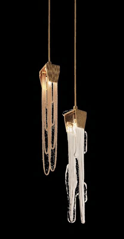
Castro Lighting presents the Collection - a lavish fusion of artistic brilliance and timeless sophistication inspired by the enchanting beauty of stalactites. Crafted with unparalleled precision and infused with a passion for exquisite design, this extraordinary collection epitomizes elegance in its purest form. Meticulously handcrafted from brass and crystal, each detail reflects the splendour of natural formations reminiscent of the majestic stalactites in underground caverns. www.castrolighting.com
Formal rigour
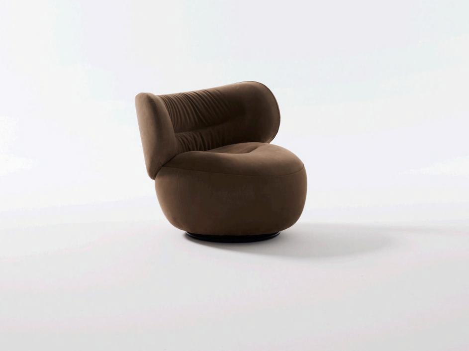
Nube's new Amelie armchair, designed in Spain by the Yonoh Studio, seems almost to wrap the user in a kind of cocoon. Reassuring in its abundant curves, the elongated and slightly reclined backrest offers a warm embrace, intensifying moments of relaxation. www.nubeitalia.com
Secret recipe
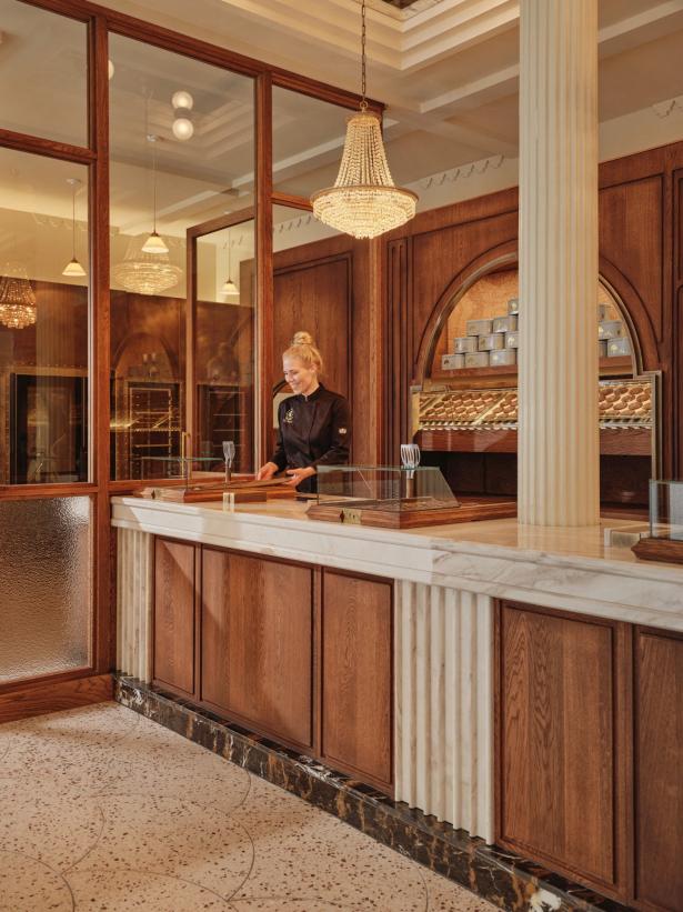
Studio Modijefsky recreates the enchanting atmosphere of a tiny biscuit shop of wonders on a grander scale in the new bakery Van Stapele. Even though it was only ten years old, everything in the original location felt like it had been there much longer. The new design effortlessly captures this timelessness with a carefully considered choice of natural materials in a colour palette of brown shades and cream white colours inspired by the famous cookie. Classic charm meets modern allure in a symphony of warm brown wood, antique brass, and intricate detailing. Elements from the old shop return in new form, like the wallpaper that is now represented in weathered stucco, as well as a curtain in the brand's signature colours, cream white and desaturated mint.
Address: Rokin 17 – Amsterdam, The Netherlands www.studiomodijefsky.nl
#LATESTNEWS 36 | G&G _ Magazine
Elevating design
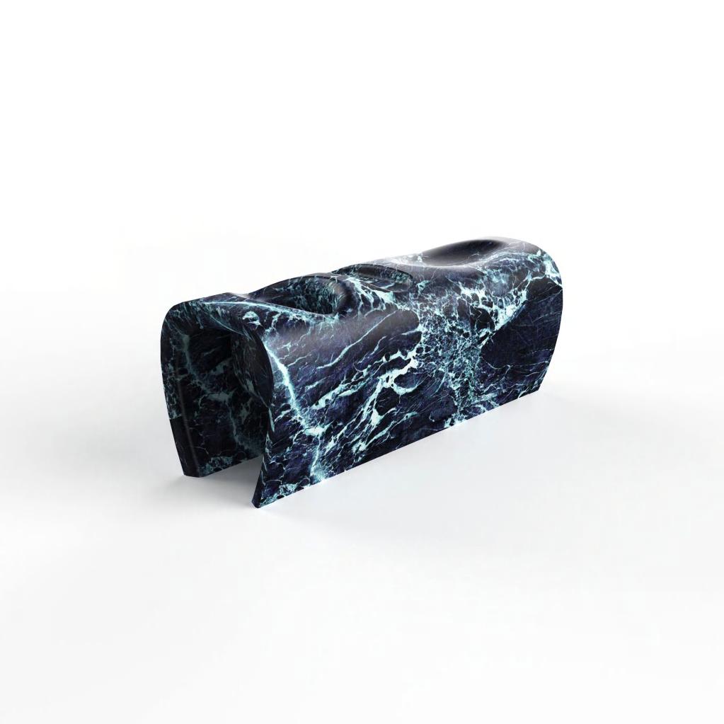
The Indian designer Karan Desai is glad to announce his collaboration with Serafini for an exclusive product debut - the Chaise Lounge. Crafted from luxurious marble, the chaise lounge features three distinct compartments designed with both functionality and aesthetics in mind. From a comfortable seating depression to a flat surface for essentials and a built-in vessel for plants, every detail is added to enhance the user experience. The chaise lounge features a meticulously sculpted contour, ensuring optimal ergonomic support while exuding a sense of timeless sophistication.
Material elegance
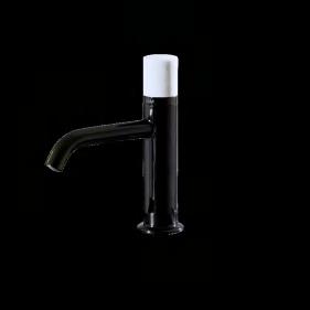

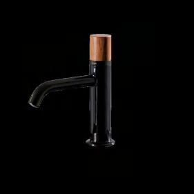
Guglielmi Rubinetterie series that turns the spotlight on deluxe details and finishes, bold combinations and a strong yet versatile taste. Opaque and shiny finishes of the faucet body play with the control covering, amid iridescent reflections and geometric graphisms of Parallel, Oblique or Crossed lines. Minerals and materials taken from nature, handcrafted according to meticulous techniques, define the uniqueness of each tap, together with the tactility of mechanically designed geometries. www.guglielmi.com
Timelessness
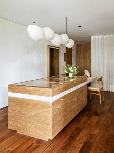
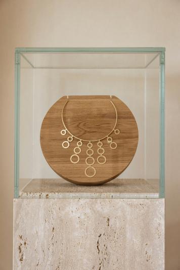
Marina Salles Arquitetura e Interiores completed the new showroom for the minimalist jewelry brand based in Brazil, Daslan. In tribute to the richness of natural materials and the heritage of craftsmanship, the proposal is materialized through clean lines, translating the brand's identity and the personal history of the founder-designer imprinted through the details.
#LATESTNEWS
38 | G&G _ Magazine

Self-expression sanctuary
Dubrovska Studio designed the new yoga and barre studio in central Kyiv: Stan, founded by a professional ballet dancer Mariia Dreihaupt. Designers crafted a significant part of the project around her, intertwining her personality with a broader celebration of women. Stan encapsulates the spirit of feminine strength, elegance, and individuality, inviting to embark on a transformative journey within its carefully curated space.
Address: Strilets'ka St, 4-6 – Kyiv, Ukraine www.dubrovska.studio
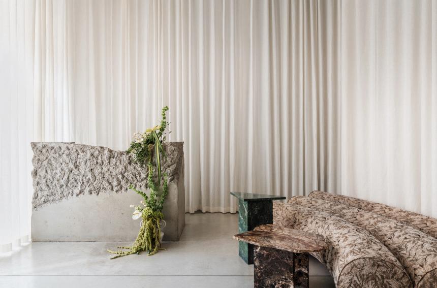
Postcards from Sri Lanka
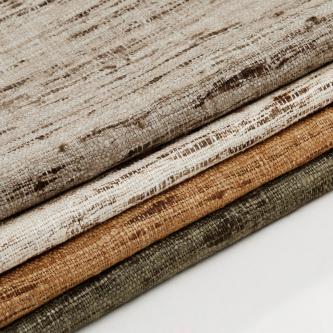
Alix Lawson is delighted to share its new fabric collection inspired by her travels to Sri Lanka. From the rolling tea plantations that cover the hill country in greenery, to the windswept beaches and tangled roots of the banyan trees in Galle: the vibrant textures and rich materials of Sri Lanka are thoughtfully netted throughout this collection, adapted to fit seamlessly into a variety of interiors. www.alixlawson.com
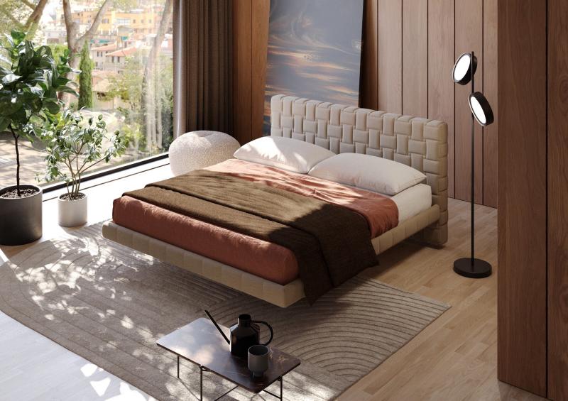
Sleeping comfort
Milano Bedding presents the Cocos upholstered storage bed: a perfect combination of design, functionality and comfort. The model is immediately identifiable by its light and ‘floating’ frame, which hides the storage in the centre; an aesthetic studied in detail to make the inclusion of a bed with this functionality in the bedroom more delicate and simpler. www.milanobedding.it
#LATESTNEWS
40 | G&G _ Magazine
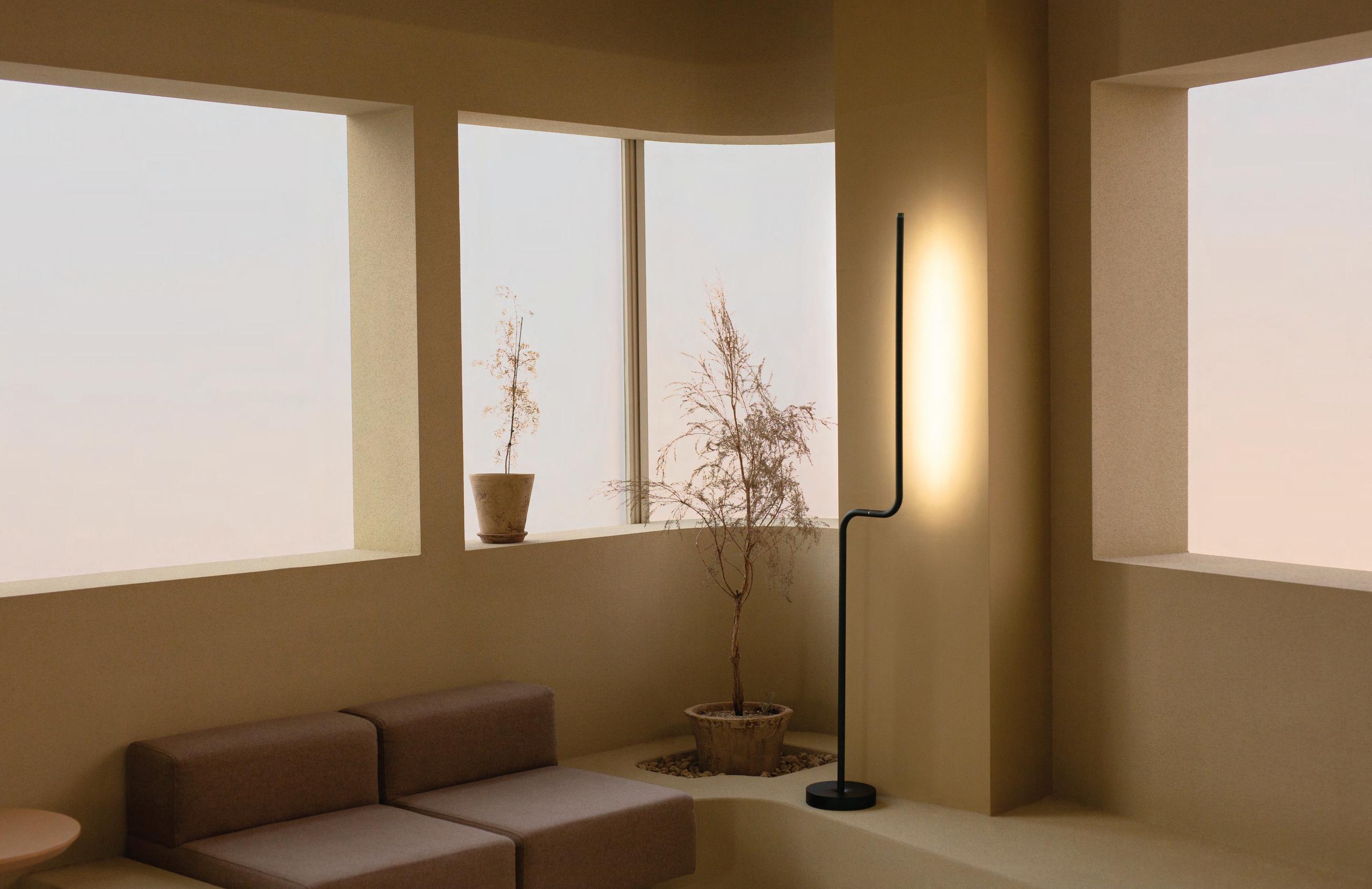
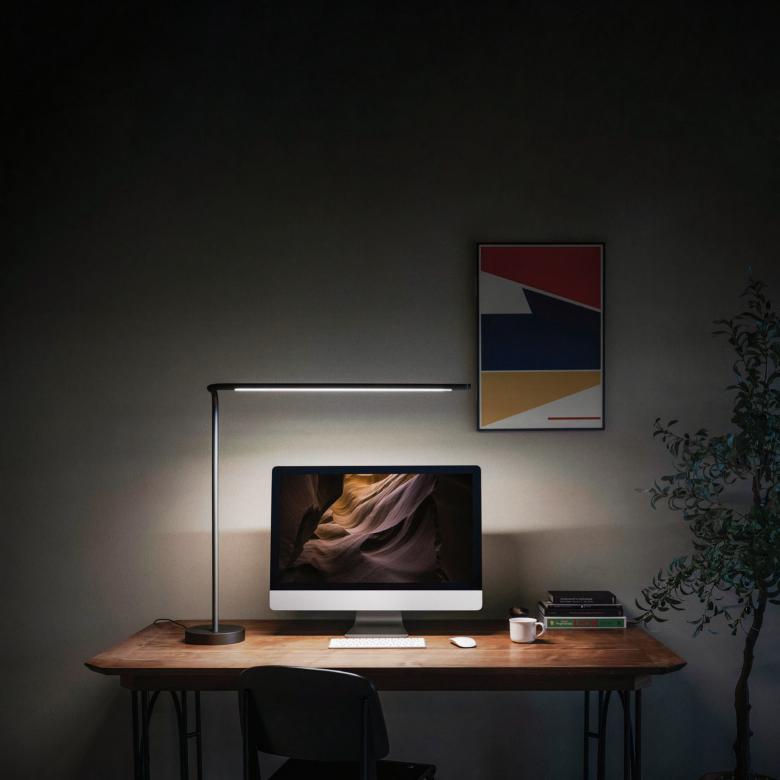
All new motion-control technology From desk lamp to ambiance lighting FILL YOUR SPACE WITH INSPIRATION
Info@tangramfactory.com
Summertime call
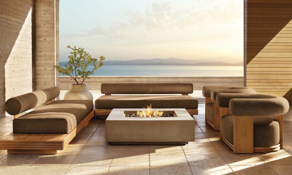
RH has launched its Outdoor collection, featuring exclusive designs in teak, aluminum, wicker and all-weather upholstery. They also include the Bondi series by Harrison and Nicholas Condos of Sydney which combines the soft, elegant curves of contemporary interior furniture with the durability of premium, handcrafted and sustainably harvested solid teak. Constructed with quick-drying reticulated foam technology, fully padded cushions and generously proportioned removable seat cushions provide supportive comfort while the frame's ribbed base adds architectural interest. www.rh.com
Sense of fascination
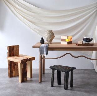
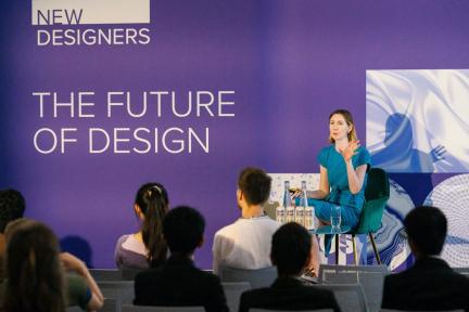
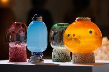
New Designers, in its 39° year, will once again celebrate the best emerging talent by bringing together 3000 design graduates from over 100 several university courses. The show not only provides graduates with a crucial platform to showcase their creativity and the fruits of their labour from the last few years, but it also stands as a real destination for discovering inspiring new talent and ideas, offering an insightful glimpse into the future of design.
Address: Business Design Centre, London, UK www.newdesigners.com
#LATESTNEWS
42 | G&G _ Magazine
26 – 29 June 2024 3 – 6 July 2024
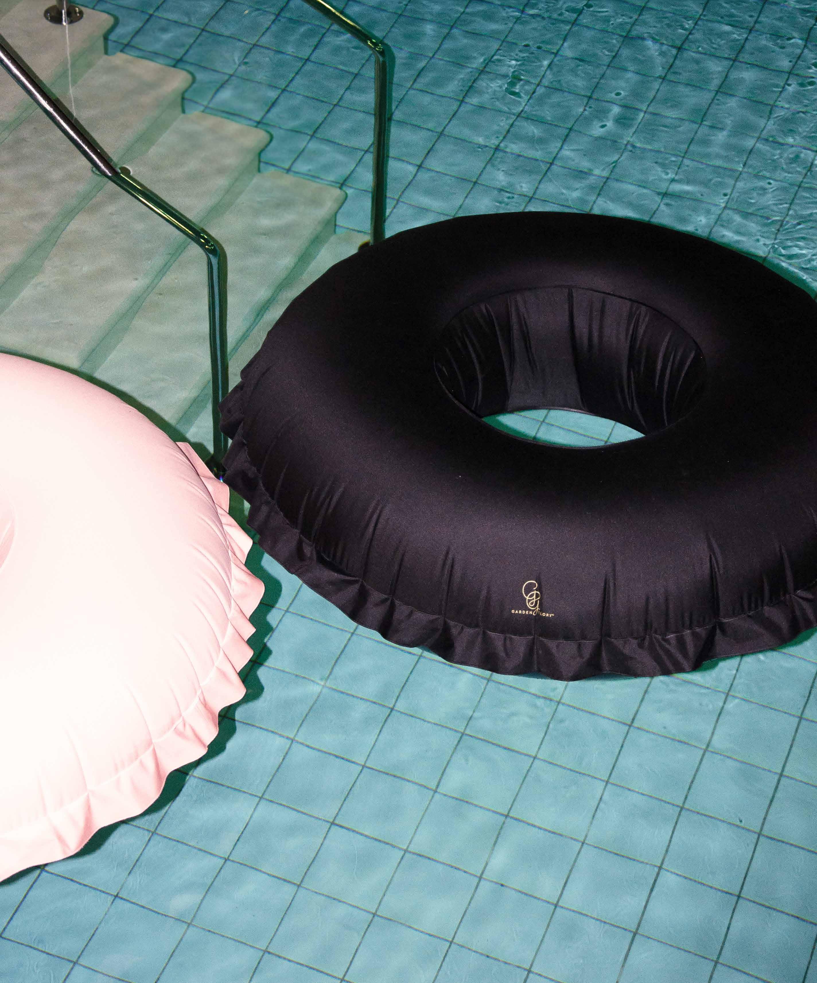
ORDINARY IS BORING. BE BOLD. BE UNIQUE. @MISSGARDENGLORY WWW.GARDENGLORY.COM the collection NEW CANVAS COUTURE POOL FLOAT

Immersive furniture
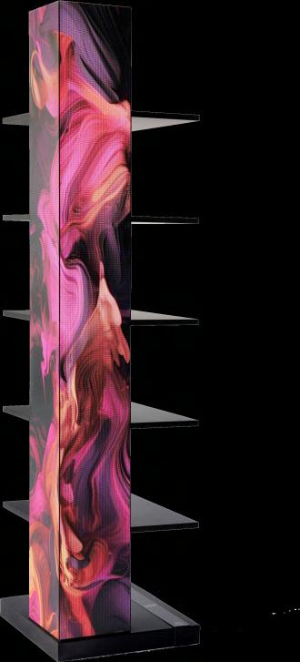
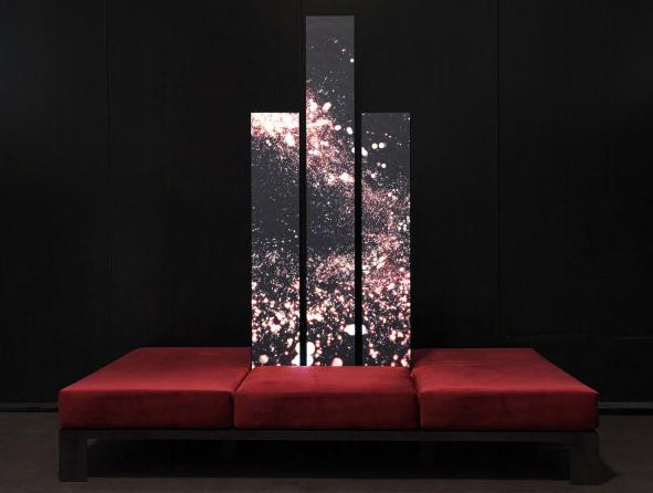
Mixing classic furniture and digital images, LUXIO creates a hybrid style furniture, geometric and essential but chameleon-like and transformist. The furniture changes its skin according to mood and projects us into ever new futuristic atmospheres, to be customized at will. The latest news (among which LX01 bookcase and LX06 sofa) immerse themselves in kaleidoscopic and rigorous graphics, designed by the dArk studio using the know-how and LED Displays of MacroPiX. www.lx-luxio.com
Miami's crown jewel
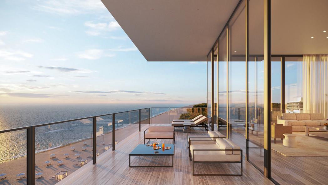
Originally constructed in the 1940’s by famed Miami architect L. Murray Dixon, The Raleigh returns with a highly anticipated revival and restoration by Peter Marino, developed by SHVO. The Raleigh, A Rosewood Hotel and Residences will feature 3 distinct components: a 60-room lounge and suite hotel operated by Rosewood, the new Rosewood Residences Miami Beach, and a private club. www.shvo.com
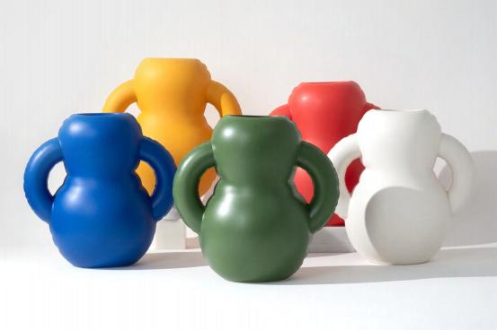
Playful ceramic objects
New Belgian design brand Home Studyo is launching its inaugural collection, Blow Up - a vibrant nod to childhood memories and summer fun, reimagined in ceramic instead of plastic. From inflated vases to carafes and planters, each piece in the collection is handmade in Portugal and crafted to bring joy and infuse everyday life with happiness. www.homestudyo.be
#LATESTNEWS


GG G&G _ Magazine N 38 – May 2023 & THE WORLD OF TOMORROW Creativity electric brights SIMPLE DREAM Unleashing and inBLACK WHITE Follow & Like @gandgmagazineeu


Exuberant green
JEWEL

Ester Bruzkus Architekten transformed a top-floor apartment into a cosy attic for a Berlin couple living a vegan lifestyle.
48 | G&G _ Magazine
Photography by Robert Rieger

Instead of applying a conventional approach by creating a series of rooms, the design team at Ester Bruzkus Architekten opted to place a green millwork box in the center of
this long apartment. Surrounding the stage are rooms that look out on two sides towards the view of the city while, inside, a more private string of bathing rooms. Thanks to the open floor plan, circulation can flow around all sides making the most of existing material conditions such as large floor-to-ceiling windows and exposed concrete walls. Throughout the apartment the rich palette of colors and materials has been used: travertine, marble, limestone, quartzite, glasses of different characters, brass, stainless steel, and rich colored fabrics. Furthermore, since the owners are vegan, no animal products were used. As soon as you enter the house you see the box lacquered in a deep green where one edge of it is a built-in library that anchors the generous living room. It pairs perfectly with warm golds, violets and brown tones to play off the cool concrete ceiling and wall - contrasting materials and colors, and carefully crafted details to make a home that is at once fresh and welcoming. On the opposite side, a hearth made from travertine Sierra ebru stone, red travertine, brass, and thin plates of stainless steel was placed - the design strategy is to create relationships between the boxes. The hand-tufted from botanical silks carpet and the earthy chartreuse sofa take up the colors of the hearth.


50 | G&G _ Magazine

“Mixing cold and warm tones in just the right way is very important.”
Ester Bruzkus, Founder and architect at Ester Bruzkus Architekten
“I thought it would be fun to have a green kitchen. When you expect everything to be one way, it should absolutely be another.”
Ester Bruzkus
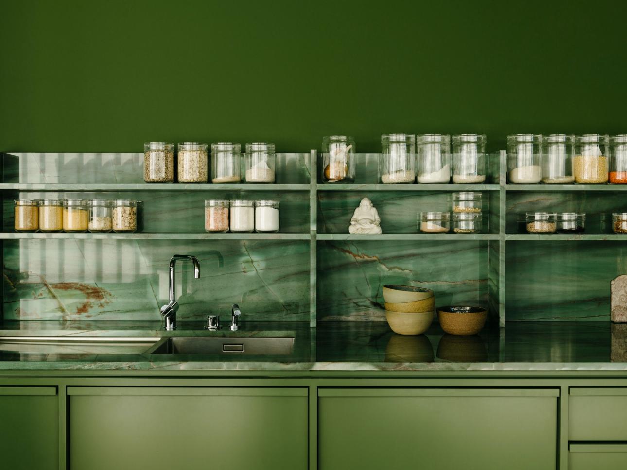
On one of the two glazed sides there is the kitchen which opens onto continuous balconies which allow the space to expand outwards. The kitchen-cabinet occupies one of the long sides of the green box; a roll-out modular sauna is also hidden inside. An important detail is that the ceiling is part of the box and is held away from the concrete ceiling. In this way, the “box” is not just a freestanding object, but it makes rooms. The kitchen counter, backsplash and shelves are made of natural green-andviolet quartzite. The cooking island combines the quartzite and the lacquered wood with black-tinted glass and is covered by a playful and sculptural lighting by
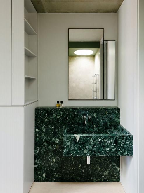
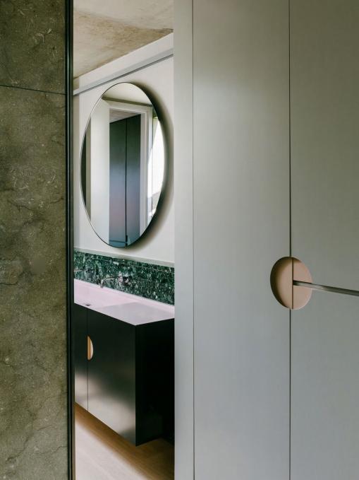
PSLab, who provided all of the lights for the apartment. Ribbed boards form the front of the built-in refrigerator door. On the opposite side there are the two bathrooms, one for the master and one for the guests, united by the use of green marble and custom-made wardrobes in shades of dove gray and purple. In both spaces we find green marble sinks, black steel door fronts and pink Corian basins; the shower and bathtub are made from a pale limestone that harmonizes with the other tones. The design also uses the simple geometry of the circle in a number of ways: in the design of handles for the cabinetry, in an oversized round mirror, and
52 | G&G _ Magazine

in a circular skylight that was built above the shower. All of the materials are brought together with the careful detailing that characterizes the work of Ester Bruzkus Architekten.

54 | G&G _ Magazine
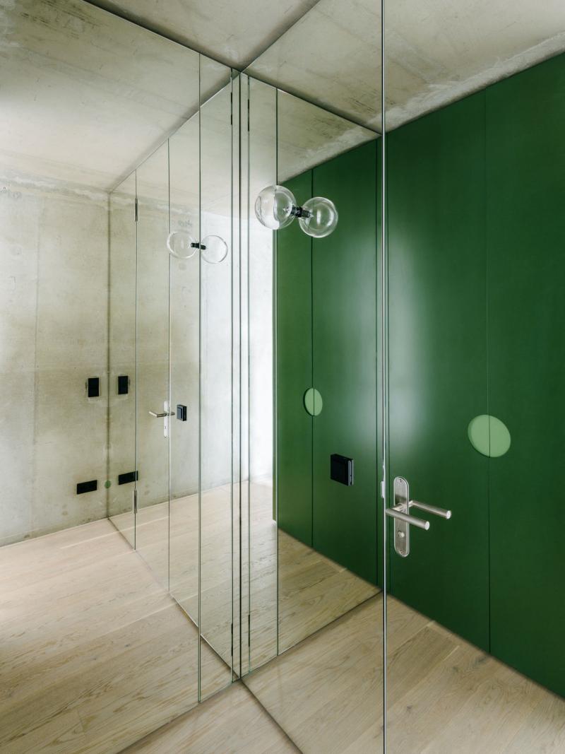
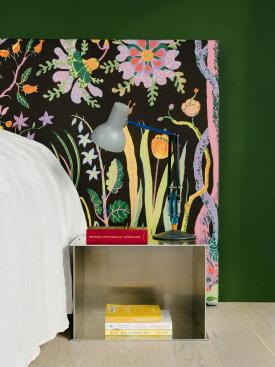
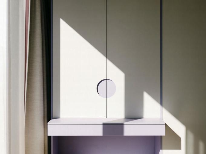
On the fourth side there is a cosy and welllit bedroom. The centerpiece here is the custom headboard upholstered in exuberant fabric by Josef Frank produced by Svenkskt Tenn. An aluminium bedside table by Frama completes the minimalism design. Next to it we find some wardrobes where some mirrored glass walls playfully reflect the green box and the exposed concrete shell. There is also a violet and gray desk integrated with the large circle that acts as a handle (thus recalling a similar detail present in the bathroom).
“To be a good designer, one has to be a good listener: not only to the needs of the clients, but also to the space - the building really tells you what it wants to be. We think good design combines rational and logical planning with playful contrasts of materials and forms.”
Peter Greenberg, Architect at Ester Bruzkus Architekten

56 | G&G _ Magazine
FULL OF SURPRISES
IN COLLABORATION WITH AMANDINE SIMONETTI ARCHITECTURE AND INTERIORS, TSAI DESIGN RENOVATED AN EXISTING APARTMENT IN THE SYDNEY SUBURB OF KIRRIBILLI FOR A COUPLE WHO ARE DOWNSIZING TO ADAPT TO THEIR NEW PHASE OF LIFE.
Photography by Clinton Weaver

Located in one of the most established and affluent suburbs of Sydney, this 70 m² house was purchased many years ago, by a
young married couple. For the past decade, the owners have maintained this apartment as a rental property while residing in their spacious four-bedroom standalone house with a garden and backyard. However, with their daughter moving out, they've made the exciting decision to downsize to this apartment. Their choice was influenced by the unbeatable convenience of the ease of apartment living with no backyard to maintain, and its strategic position, making it an ideal choice for the couple, as both of them work in the city and can now conveniently walk across the Harbour
Bridge to get to their workplaces. The apartment itself, built by Next Level Building in the 1950s, shows signs of age with its outdated kitchen, original floors, and a layout divided into smaller rooms, typical of older constructions. Indeed, its existing plan has a challenging long and narrow layout, with some areas as slim as 3 meters. It is surrounded by neighboring buildings on the western side, necessitating the use of blinds for privacy most of the time. Therefore, the aim of the renovation was to customize the space to the clients' new lifestyle and to enhance its environmental responsiveness. To maximize the functionality of the apartment, Tsai Design divided it into two distinct sections: the front half designed for open living, and the back half serving as the private quarters.
In the front, the goal was to create a welcoming and sunlit open-plan space, perfect for entertaining friends and guests. By removing the walls that once separated the dining area, kitchen, and
corridors, a unique open and continuous area was obtained. The design team opted for blonde timber floorboards to create a light and airy atmosphere.
Entering the house, on the left we find the living room where the full-height mirrors have been installed, running the length of a wall to create a sense of spaciousness. The white sofa without armrests with the attached pouf form perfect seats for relaxing. Double-sided bookshelves create a functional divide between the living space and dining area; the latter is the brightest area of the house as it faces north. Here, Tsai Design has utilised white flooring to enhance light reflection, creating a winter garden ambiance since there is no outdoor space with the apartment.
58 | G&G _ Magazine


60 | G&G _ Magazine
“We experimented and paired the stone with a plywood veneer base, with custom details around the edge to bring plywood up to a high finish level not typically expected.”
The centrepiece of the living open space is a striking triangular kitchen island in Patagonia quartzite, suspended above the floor and adorned with elegant marble, making a bold statement the moment you enter the apartment. This innovative island design seamlessly extends into the
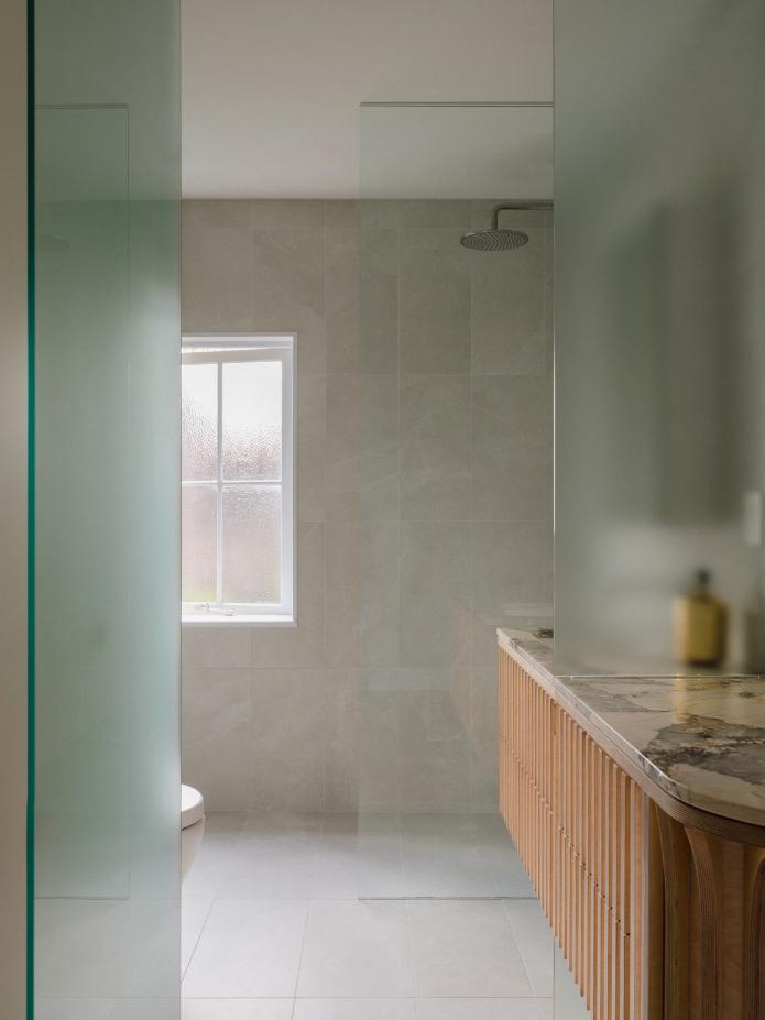
bathroom, where it transforms into a vanity, blurring the boundaries between spaces. To ensure natural light filters throughout, the bathroom wall has been replaced with frosted glass dividers, allowing western sunlight to grace the entire apartment.
The kitchen has the Polytec Legato Bone white cabinetry with gold handles that match perfectly with the fine chandelier suspended above the island.
Like the kitchen, the bathroom also has a very minimalist yet airy design. A full-height transparent glass wall acts as a partition for the floor-level shower and follows the entire design concept of letting natural light pass through.


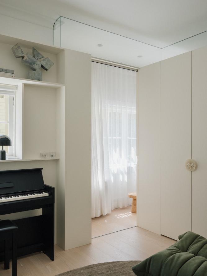
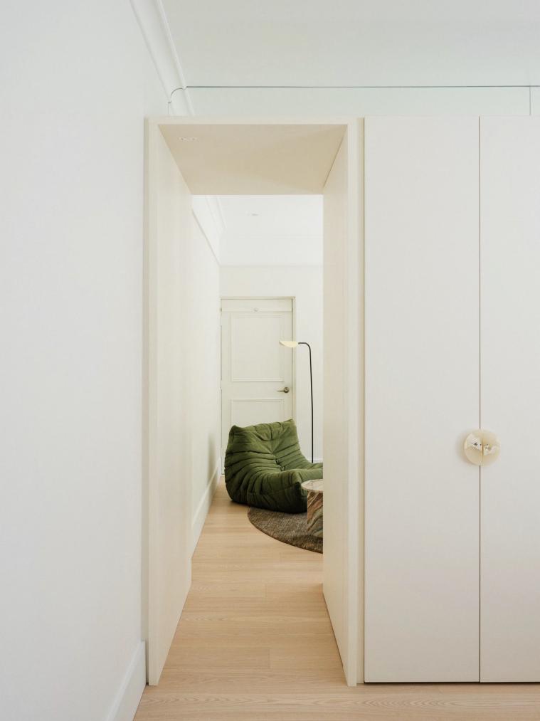
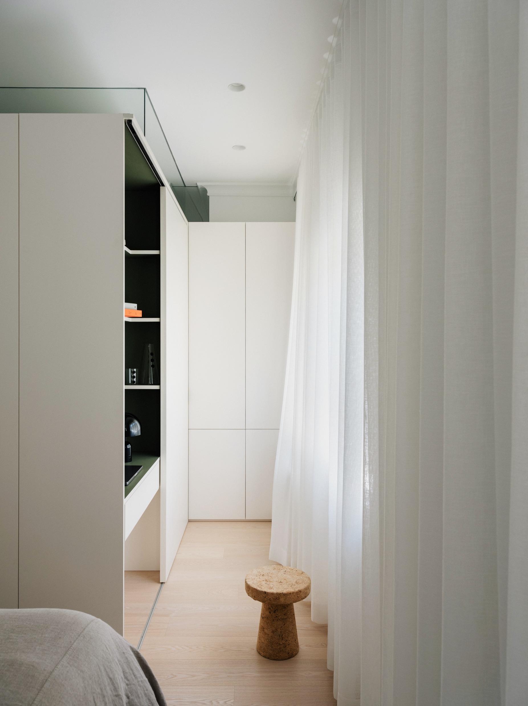
The back half of the apartment is dedicated to private living. What used to be two bedrooms have now been reimagined into a single bedroom, a versatile rumpus room for personal relaxation, and a well-placed study nook (strategically positioned around the perimeter of the private rooms to act as a buffer from nearby prying eyes). In addition, a central wardrobe, dividing these three spaces, conceals the study nook, allowing it to be completely hidden at night when the rooms are used for rest. The rumpus room offers a serene retreat complete with an upright piano and a cozy reading nook or could be transformed into a guest bedroom for visiting family and friends.
62 | G&G _ Magazine
MOUNTAIN MODERN STYLE

CLB Architects and HSH Interiors created a serene retreat for a California based couple and their two Irish Wolfhounds in the mountains of Jackson Hole, Wyoming.
Photography by Matthew Millman & Douglas Friedman
64 | G&G _ Magazine
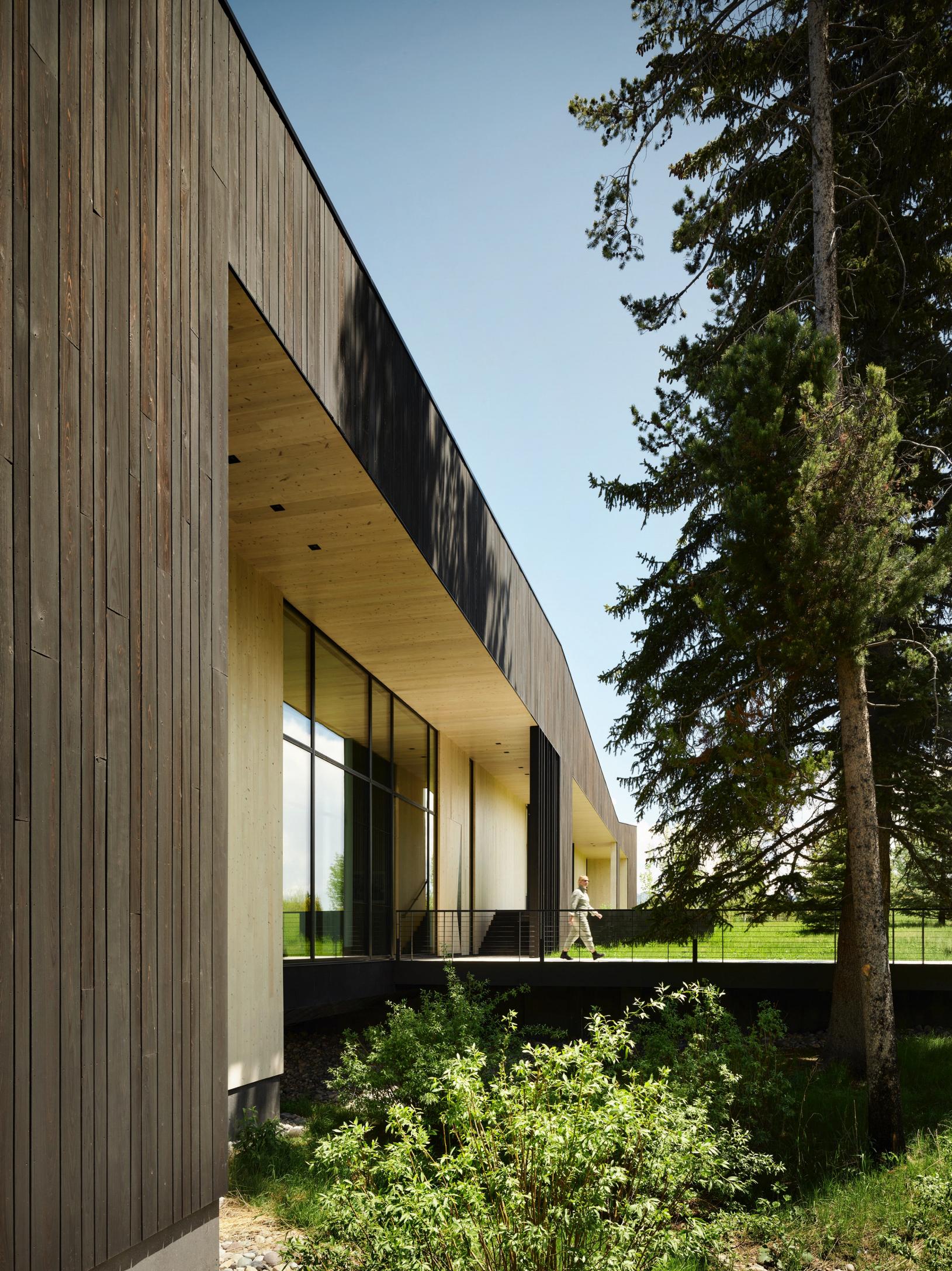

The 35-acre property is set at the base of the Tetons and encompasses several ecosystems, with old-growth forest merging into stands of young pine and aspen trees before transitioning into rolling meadows. The homeowners, authors who also own and manage an independent record label out of Mill Valley, California, were looking for a nature-oriented outpost in Wyoming in which to pursue their writing practice. The projected includes the design of three buildings: main house, guest house, and writer’s studio; each is arranged as a set of simple box-like volumes, each designed in response to its specific location. The 6000 square-foot main house is conceived as a geologic remnant in the landscape, located on the edge between field and forest. The guest house and writer’s studio are nestled more intimately within the wooded environment. A fourth, spiritually focused structure has yet to be built and will be sited further to the south. The architecture is open, with sweeping views to mountain vistas of the Grand Tetons, natural fauna, forests, and meadows. Rectilinear in plan, the main house appears to grab surrounding trees as anchors, sinking in the center, and pulling upward toward the sky at the corners. Working in
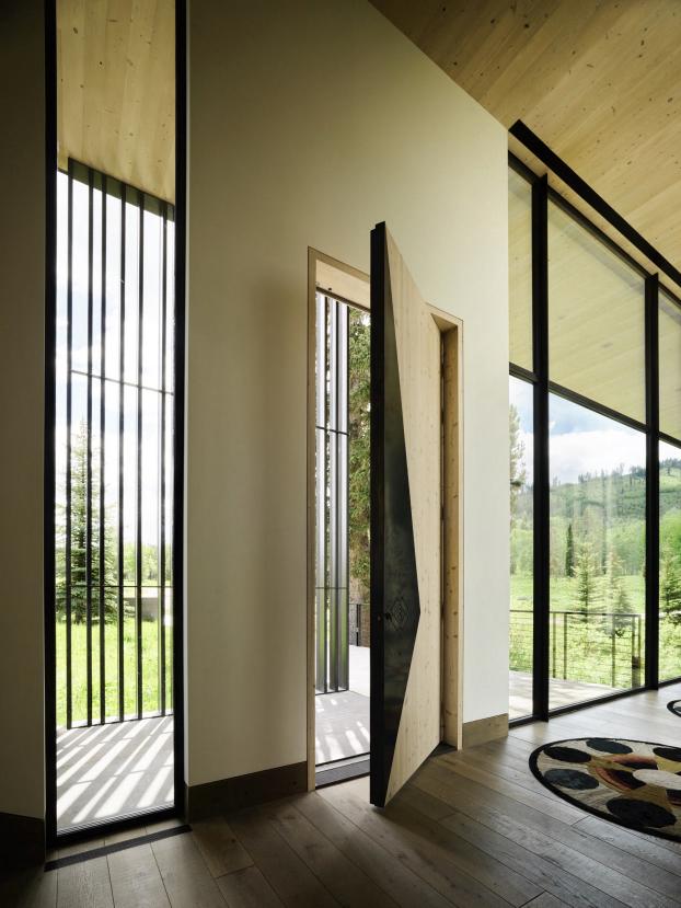
concert with the landscape, this dynamic quality further through the building’s charred shou sugi ban exterior, tugged and carved to create overhangs and openings. The entrance to the home is located where the structure reaches out over a lowland creek, the relationship revealed by a moment of transparency in the floor. The wood exterior wraps into the interior as light Atlantic cedar, which then dissolves into subtle plaster and floor-to-ceiling glass. Once inside, on the right, going down a few steps, a large opening living room has been placed. A modular corner sofa, a pair of armchairs and a glass coffee table were placed on the geometrically shaped rug by Marc Phillips Rugs. An east-facing fireplace provides a counterpoint to the view while an intimate courtyard allows southern light to penetrate the center of the home. The floor sculpture of The Future Perfect takes up the façade of the fireplace.
66 | G&G _ Magazine

“The client’s bohemian lifestyle and love of music, literature and the great outdoors were the inspiration behind the interior design.”
Holly Hollenbeck, Principal designer at HSH Interiors
Behind the living sofa, we find the dining area and the kitchen with a majestic island which also houses a balcony for breakfast. The same wood as the ceiling was used for the wall that includes the kitchen furniture, and by opting for the custom flush-fitting doors, a unique continuity was created. The work area and the black wall units have been set in the middle of the wall, which match the surface of the island and bar stools.

68 | G&G _ Magazine


Accessible both from the living area and from the main entrance, the lounge room has a more sophisticated style with a touch of somber. The walls are covered in Aqualille's custom hand-painted mural wallpaper, designed by HSH Interiors. A series of three-level shelves host various objects and small décor sculptures; below a bar area includes a counter and bar stools. Next to it, a yellow armchair brings a touch of boldness to the ambiance. The famous
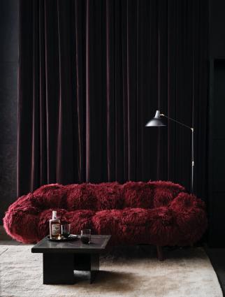
Bolotas sofa by Brazilian furniture designers, Campana Brothers, represents the gem of this space, offering a comfortable and enveloping seat. Its cherry color is played out in the custom-made chandelier by Johanna Grawunder above.
“The clients love comfort, layers and texture, vintage pieces and a home that is inviting to family and friends and laid back enough for their dogs.”
Turning left at the entrance, you walk along a corridor where windows have been installed instead of walls, thus making a connection with nature outside. A series of rugs created by Kyle Bunting in collaboration with photographer Douglas Friedman strikes a perfect balance between minimalism and a playful, lavish aesthetic. Further ahead, Robert Montgomery's LED Word Art installation on the landing has been placed.


On the upper floor there are two guest bedrooms with ensuite bathrooms. Each room offers expansive views of the prairie and Teton Range. As in the rest of the home, every surface has been elevated with handcrafted details and geometric motifs.
The color palette used throughout the design reflects earth tones, with pops of mustard and blush. Wood, steel, bronze, custom cast white concrete, bleached cedar, and oversized slabs of travertine and onyx define the material palette.


74 | G&G _ Magazine

The master bedroom is located beyond the living area and includes an ensuite bathroom and two separate walk-in closets. De La Vega bed is a creative mix of country classic and mid-century modernism. The emerald green quilted upholstery goes perfectly with the turned brass and oiled wood. The bed is accompanied by a majestic headboard which includes bedside tables; above, attached to a white bar, a series of pendants create a slightly theatrical atmosphere.

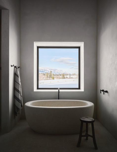
In the master bathroom Italian limestone is highlighted as floors in the primary bath, and is also highlighted for the custom bathtub, which was water jet cut from a single block of limestone to create a striking monolithic and sculptural design element. On the opposite side, a pair of mirrors and stone wall sculpture by Chen Chen & Kai Williams make the room majestic. Ball chandeliers, a custom-made suspended cabinet with double sink and black taps complete the design.

76 | G&G _ Magazine
Spatial fluidity
THE ARCHITECT GABRIELLE TOLEDANO, THE FOUNDER OF TOLEDANO+ARCHITECTS, RENOVATED A 19TH CENTURY APARTMENT IN FRONT OF THE LUXEMBOURG GARDEN IN THE LATIN QUARTER OF PARIS FOR HER FAMILY.
Photography by Romain Ricard

“The idea was to open up the plan in order to have double exposure, east to west and be able to see the sun path from morning to night.”

78 | G&G _ Magazine

Since the apartment is located on the 5th floor, the views are very impressive, and Gabrielle Toledano wanted to highlight that quality. Above all in a dense city like Paris, light is one of the main elements to enhance. The 100 m² apartment is designed for the family of 4: Gabrielle, her husband (also an architect) and two small children.
The original layout was very partitioned, with lots of small mono oriented rooms. To obtain an open space a 50 cm wide bearing wall was broken, and the metal beam was used to reinforce the structure, subsequently it was highlighted in pale green as a reminder of what was there before. The new space is divided in three parts: the main living space, the parents’ suite and the children room, on opposite sides. In terms of materials, all the walls were covered with natural lime, because of its benefits for the quality of the air, the isolation as well as the warm atmosphere it creates.
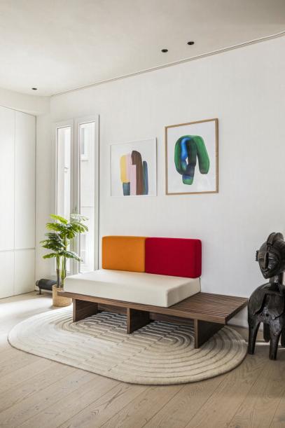
The living social area includes a kitchen, dining room , living room and a home office - all of which can be glimpsed upon entering the house. This area has a very clean design and poor materials with an accent of color given by a series of iconic furniture. The first area to accommodate is the home office. Here a sofa without armrests was placed with a protruding wooden base and rectangular cushions: the base in white and the two backrests in orange and red. A circular felt curtain was inserted to close off the space and, if necessary, also transform it into a third bedroom. Besides, felt helps isolate noise. When opened, the space enables to host large dinner parties.

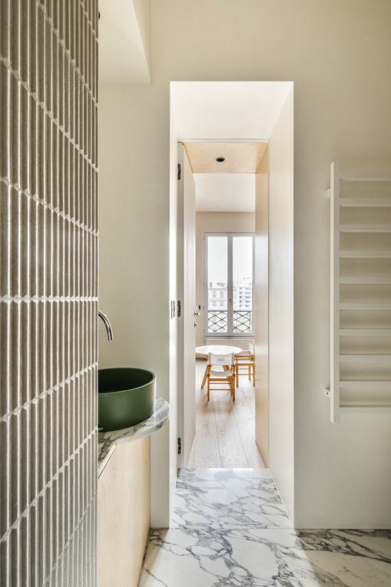
To the left at the entrance behind a door is the powder room characterized by the enveloping green marble covering the floor, the sink and a part of the wall that hides the toilet box (it also doubles as a shelf). A custom-made piece of furniture in walnut wood contrasts the cold of the marble. The day and night spaces are separated with a long continuous walnut wood element from east to west that contains and hides the laundry, storage, the bookcase and a home cinema. Walnut wood and stainless steel were used in the bookcase to bring some warmth into the space.
In the dining area the touch of color is given by the dark petrol blue of Cassina's dining table. It features a cutting-edge structure with three cylindrical slats supporting an original top with a fluid and asymmetrical shape. To enhance the optical effect, chairs

with a "light" design were chosen from the Family Chair collection by Living Divani. The minimalist design suspension lamp by Vibia illuminates the area.
The kitchen was made of vibrated stainless steel to reduce children's footprints and resist over time. The kitchen island is made of travertine, to blend in with the whitened oak wood parquet floor; and also includes a balcony for small breakfasts. To avoid compromising the continuity of the tones, we opted for the Radice stools in natural ash by Mattiazzi.
80 | G&G _ Magazine


82 | G&G _ Magazine

The two-colored armchairs liven up the living room located at the back of the apartment. The sinuous Ribbon armchair in klein blue by Artifort goes well with the orange Utrecht armchair by Cassina with its orthogonal elements. A pair of vaguely contoured tables from Living Divani's Rabbit & the Tortoise collection were placed in between. Also from the same brand, the Extrasoft light gray modular sofa with an informal look offers soft and malleable comfort. The entire space is well lit thanks to the two French windows and the choice of transparent white curtains. Between them a large sculpture in the shape of a face was hung on the wall. Below the Cassina chaise longue completes the look of the space by giving it a touch of sophistication.


The master bedroom is accessed from the living room. It is warm with white, walnut wood and a leather bedhead. The curtains are in beige linen.
On the other wing of the apartment, in the children's bedroom, plywood was used to create the bunkbeds, closets, toys storage and bookcase to bring a playful and young environment. Gabrielle decided to insert some pop and fun elements like French poplar plywood and dinosaurs handles, colorful baskets to store the toys.
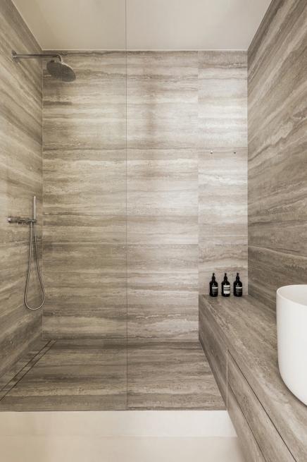
Both bedrooms have an en-suite bathroom. The parents' one has a simpler design: in the enormous shower a bench covered with the same tiles as the shower and the walls extends along the entire wall, transforming itself into the support base for the extra deep sink. In the children's bathroom we find a livelier style with the beautiful integrated tub, a pale green cylindrical Corian sink and white Arabescato marble. Both spaces are embellished with elegant taps from the Spanish company Icónico.
84 | G&G _ Magazine

classic rewind
LED BY MAKSYM DIETKOVSKYI, THE ARCHITECTURE AND INTERIOR DESIGN BUREAU MODEKTURA STUDIO
UNVEILED ITS LATEST RESIDENTIAL PROJECT IN KYIV: AN 83 M² APARTMENT WITH FUSION OF CLASSICAL ELEMENTS WITH MID-CENTURY DESIGN PIECES.
 Photography by Yevhenii Avramenko
86 | G&G _ Magazine

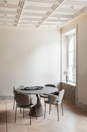
The apartment is situated in the heart of Kyiv, on Bohdana Khmelnytskoho Street, within a residential building dating back to 1900, distinguished by its classical architecture featuring high ceilings. During the project analysis phase, numerous visual distractions were identified, stemming from wall niches, variations in floor height, and exposed utilities. Consequently, during the demolition stage, it was decided to refurbish the flooring and reinforce windows and openings with a metal frame. While to cultivate a sense of stability and tranquility, materials such as toned oak, marble, stainless steel, and brass were meticulously selected. Experimentally, sand was incorporated into the terrazzo flooring, while marble chips were embedded within mineral plaster on the walls, enhancing their texture and visual appeal. The apartment's distinctive features, including the spacious corridor-gallery with its windows and arches, a loggia, and a

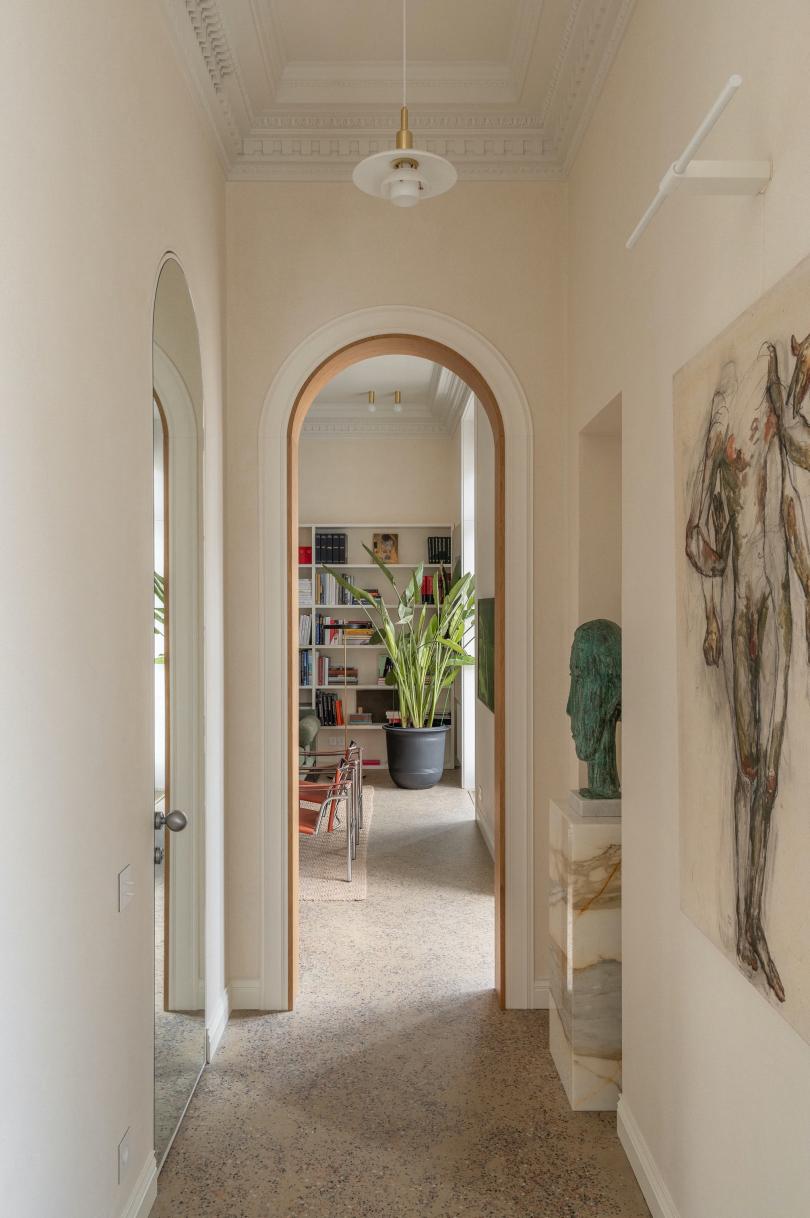
balcony, served as the cornerstone of the project's concept. The corridor, acting as the central artery, extends throughout the entire apartment, seamlessly integrating all areas into a cohesive space. The entrance is highlighted by a green colour, on the left a large round mirror is accompanied by a bench, in front of which an illuminated wooden wardrobe niche has been created. The main door was also painted the same color and features moldings following the style of the house. From here we can glimpse the choice to use arches to delimit each space instead of inserting doors. They have been enhanced to exude sophistication, achieved through the fusion of decorative molding and an inner wooden frame. Paintings and Louis Pulsen's glass pendants adorn the corridor.
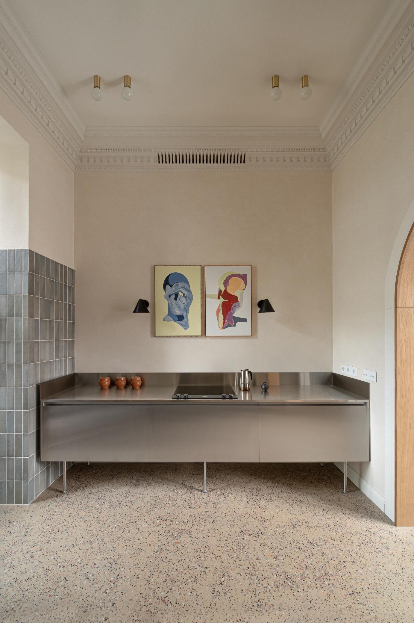
An arch on the left leads to the minimalist industrial kitchen placed on the two opposite sides. On one side, cabinets with high exposed legs containing an induction hob have been inserted; above a diptych by Rostyslav Zavhorodniy is accompanied by a pair of Tratten black wall lamps by Örsjö which guarantee a light pleasant and gentle on the eyes. The rest of the appliances are integrated on the opposite side where more capacious tall furniture with small legs have been used. A space has been created in the middle for the sink with an integrated open wooden wall unit.

88 | G&G _ Magazine


90 | G&G _ Magazine
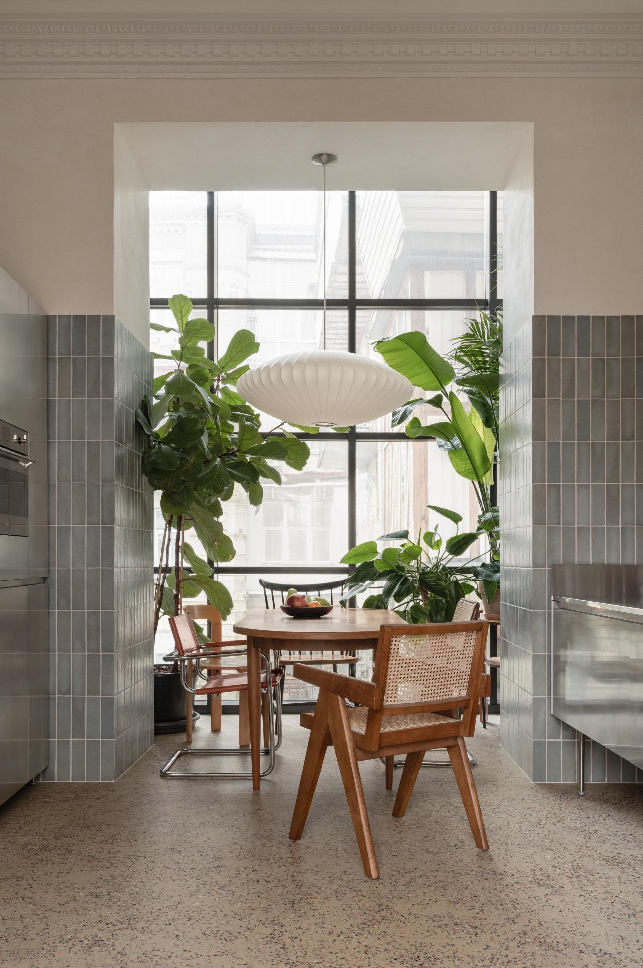
The loggia underwent insulation and was seamlessly incorporated into the kitchen, where a conservatory for plants was thoughtfully placed which illuminates the entire room. A wooden table with rounded edges and several chairs form the dining space. HAY's Nelson pendant lamp with spherical silhouette floats delicately above offering a soft and suggestive light. Continuing along the corridor, always on the left we find the bathroom door; in front a sculpture by Dmytro Hrek has been placed on a pedestal. The bathroom has extended shape with a large shower at the end. It has a very cosy atmosphere, given also thanks to the wood that covers the custom-made piece of furniture on one side.


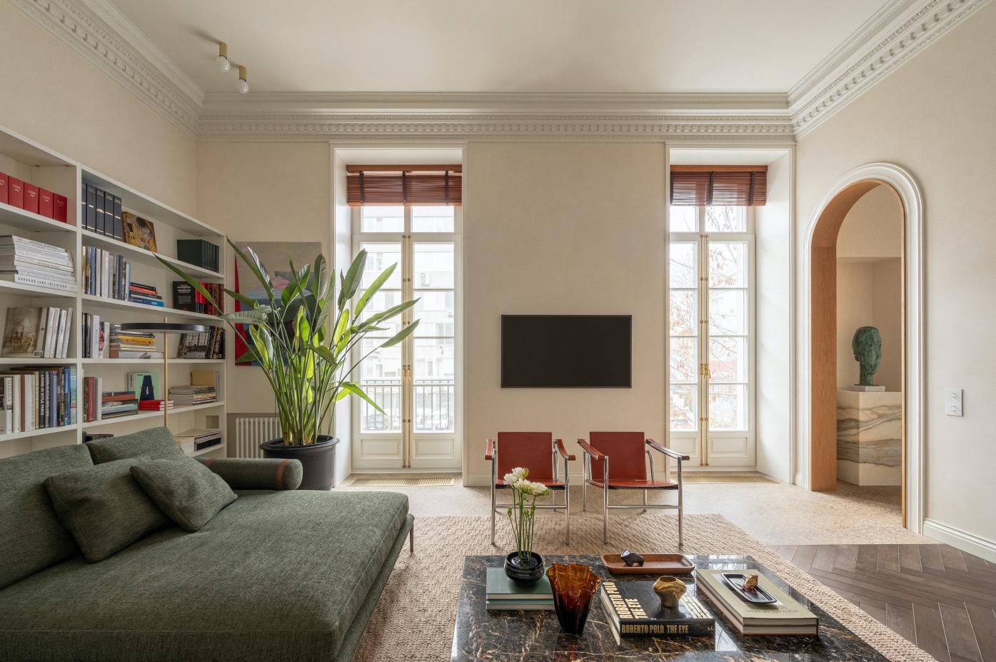
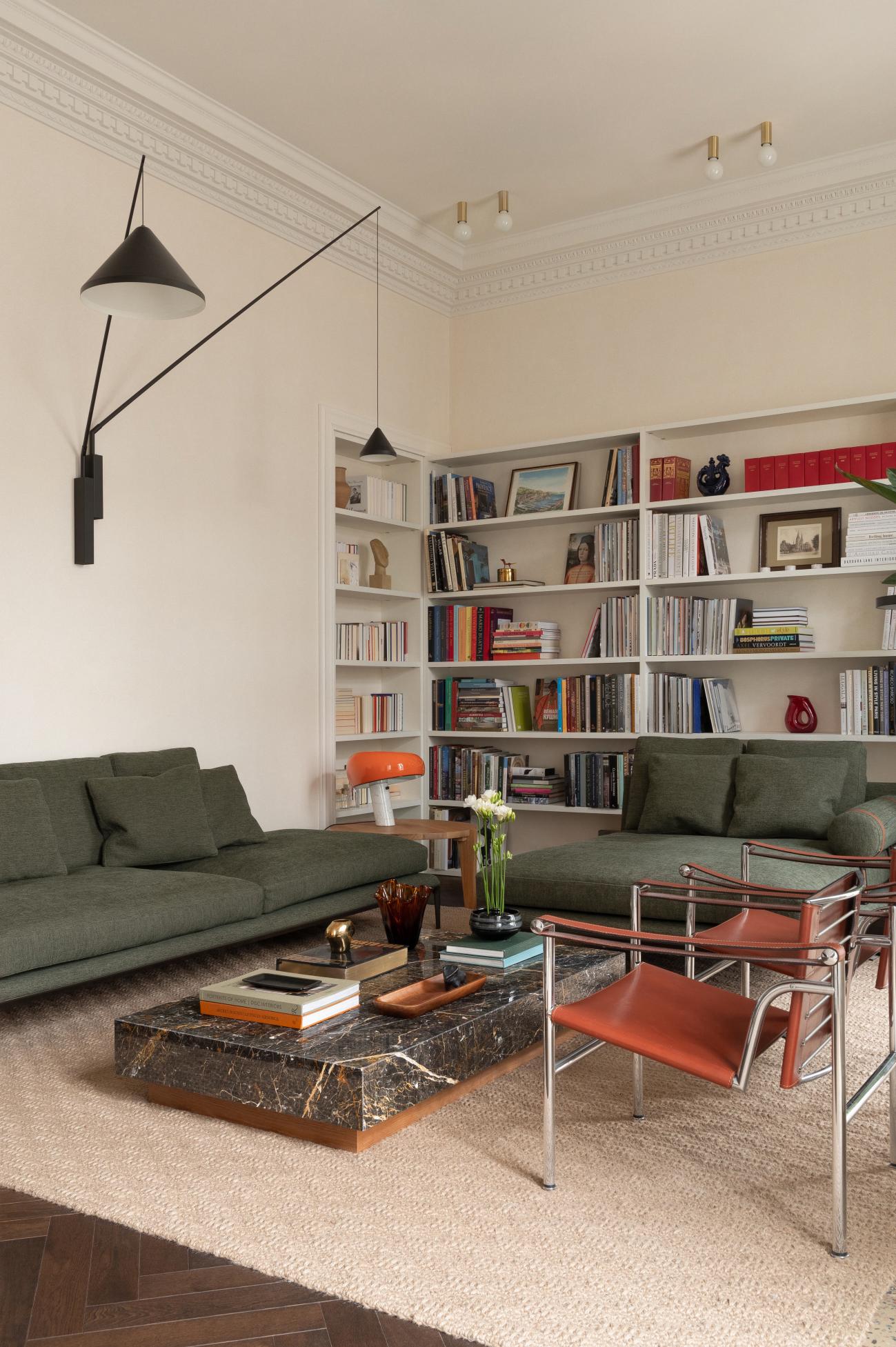
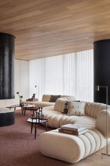
Following extensive consultations with the client, it was agreed to blend classic style details with mid-century furniture from the 1930s to the 1970s, seamlessly integrating them into the apartment's ambiance. In particular, in the living room the design team opted for contemporary Atoll modular sofas in a greenish color by B&B Italia. A pair of reclining back armchairs from Cassina evoke a nostalgic retro atmosphere. A series of coffee tables different in shape and material complete the room. On one side the fireplace has been kept, a vintage, typically classic, mirror has been placed above. On the opposite part, a white bookcase was designed which extends towards a niche in the adjacent

wall. The lighting also features a mix of styles. Vibia's North wall lamp gently walks the line between utilitarian function and sophisticated design. While the iconic Flos' Snoopy table lamp gives a touch of color with its orange enameled metal. For greater lighting, Ideal Lux ceiling lamps with brass finishes were inserted. In addition, the apartment's design seamlessly interacts with art in its various forms. Paintings, small décor objects, sculptures and design objects elegantly complement the interior, enriching its aesthetic depth. Another feature to note is the change of the flooring: the design team inserted the dark herringbone parquet on one part of the floor that then follows into the bedroom.

92 | G&G _ Magazine


94 | G&G _ Magazine

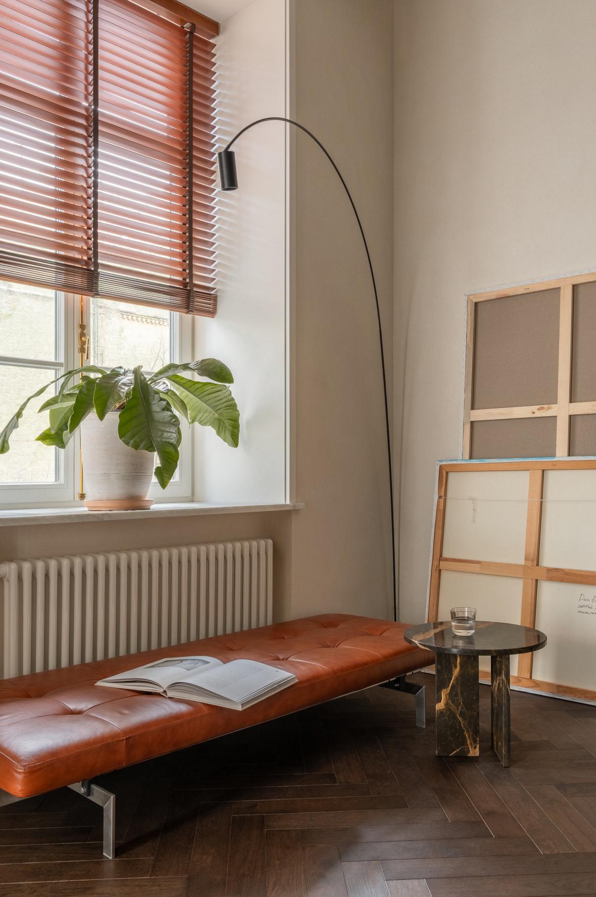
In the bedroom, a bench, a small coffee table and the floor lamp from Nemo Lighting were placed next to the window, thus creating a perfect space for reading or simply enjoying the view outside. Black stained ash, chromo-satinized steel, soft padding: a mix of elements contained in the elegant Shin bed by Porro. Walk-in closet was positioned behind it, separated by a colored glass partition with black finishes.
Opulent VIBES

96 | G&G _ Magazine

KARAN DESAI Architecture + Design designed two-bedroom sea-facing apartment conceived as a bachelor pad in Mumbai.
Photography by Ashish Sahi

“The owner is very much with-it when it comes to a trendy lifestyle; however, he expressed no particular demands visà-vis the interior style. So, it was up to me to envision the interior concept. Going by his dashing personality, it was not difficult to gauge what suits him the best.”
Karan Desai, Founder of KARAN DESAI Architecture + Design
Located in Versova, an upmarket neighbourhood in north-western Mumbai known for its beautiful
beach, this 306 m² apartment was designed to cater to the tastes of a 36-year-old fashion-forward bachelor with a penchant for travel. The goal was to harmonize with his charismatic personality and contemporary lifestyle, resulting in an interior space that radiates the chic ambiance of a Manhattan penthouse, boasting edgy design and sophistication. Carefully curated, top-of-the-line furniture and lights from international brands adorn the highly stylised interiors of this home.
The design plan of Karan Desai, the founder of the studio, came up with was initially a bit radical for the client as it involved major structural changes. However, when he went through Karan’s presentation, with 3D renders bringing alive the snazzy interiors, he could immediately connect with the proposal. The project envisaged that of the four bedrooms, two are kept as the master bedroom and guest room, while the other two have been converted to create a walkin closet attached to the private bathroom, a dining room and a gym, offering a high customization of the space.
One enters the home through a small passage leading to the long living area divided into two parts: one formal and another informal. On the left of the entrance is the guest room.
The USP of the living areas is the ombre effect that carries forward from the flooring

to the walls and then to the ceiling. Marca Corona's tiles in charcoal from Klay Store cover the floor, while a lighter shade taken from that colour is used on the walls which slowly diminishes into the ceiling creating an uber chic environment. The moody neutral base accentuates the play of tonal shades, surprise bursts of accent colours, sculptural furniture and delicate architectural details. Curved contours, smoothened ceiling corners and organically arched doorways imbue the space with a palpable naturalness amid all the avantgarde design features.
On the right, in the informal TV room, the Camaleonda sofa by B&B Italia exudes a relaxed atmosphere with its rounded corners. Vibrant artworks and a sleek Glas Italia mirror adorn the walls. Designed by Karan and manufactured by Jaipur Rugs, the rectangular shaped carpet pays tribute to the late artist S.H. Raza’s famous works. The Monster console designed by Karan, has been placed between the two living areas, commanding much curiosity with its strikingly unusual design.

100 | G&G _ Magazine
On the other side, in the formal living area, eye-catching artworks set a dramatic backdrop, while sculptural Up Chairs from B&B Italia draw immediate attention. From the graceful stem of the Lady Constanza floor lamp to the clean lines of the B&B Italia couch to the unique shape of the Roche Bobois sofa diverse contours are carefully combined to invoke a glamorous vibe. The yellow central bar with a highgloss finish, designed by Karan, has been paired with Moooi bar chairs, offering a focal point. In the absence of curtains, the windows come across as picture-perfect frames enhanced with architectural details. Blinds from Hunter Douglas help evoke a cosy environment whenever needed. From the living room there is access to the deck, overlooking the Arabian ocean, is
imagined to inspire quiet contemplation. Fitted with colour-changing Vondom outdoor furniture, it exudes a minimalist allure, while a vertical garden, created using rare plants, brings a breath of freshness into the space.
“As every detail is fashioned keeping the colourful personality of its owner, the living areas come to reflect a highly individualistic appeal.”


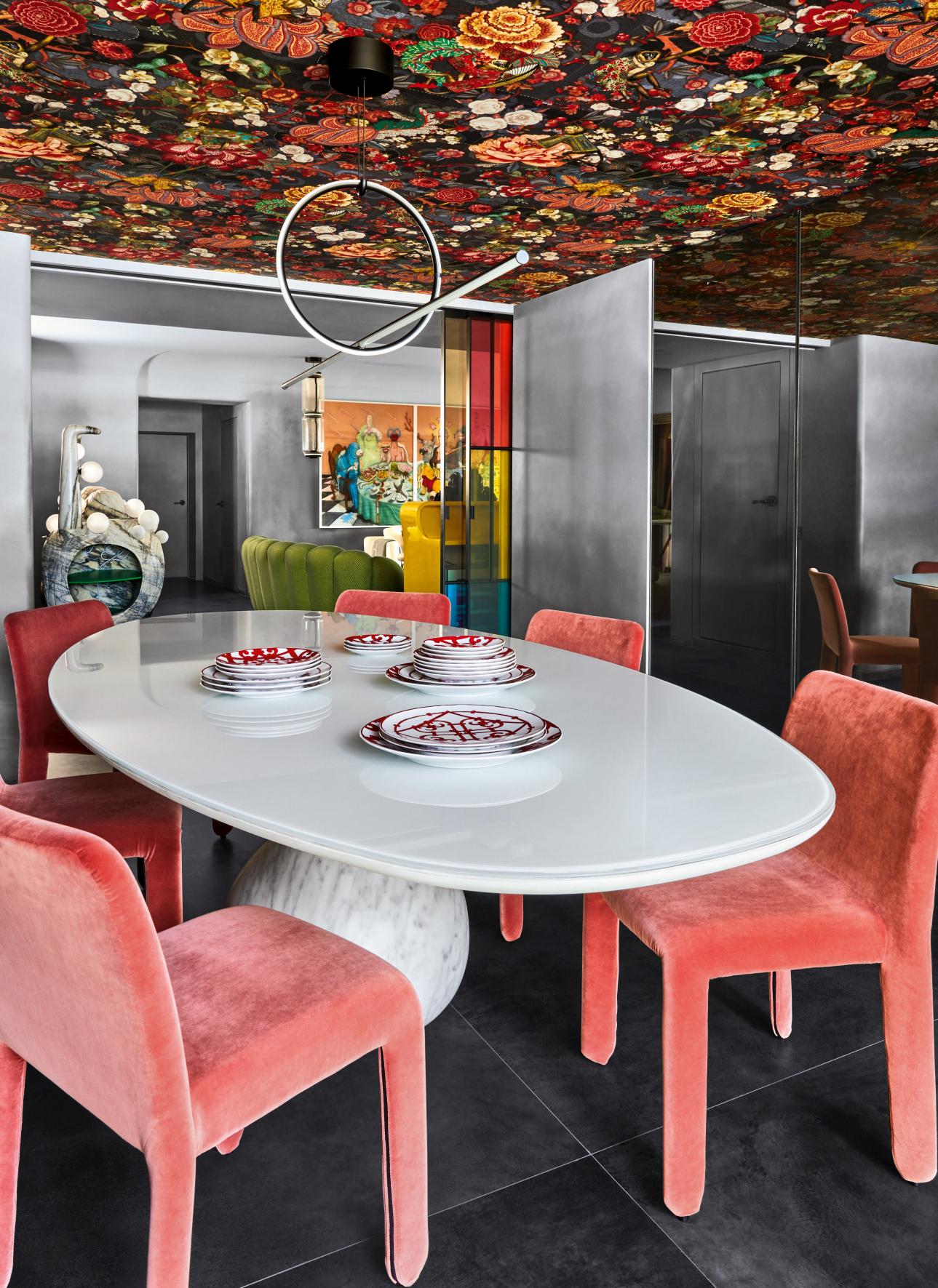
Colour block glass partition from Glas Italia separates the informal living area from the dining room. Thanks to the Moooi wallcovering Menagerie of Extinct Animals used on the ceiling, it seems like immersing into a fantastical world. The riot of colours and prints is balanced by the stunning oval dining table in white from Roche Bobois,
and Poliform’s dining chairs in a complementing bright hue. Also, the architectural pendant by Flos restores a certain balance to the room. At the entrance to the dining, on the right is the powder washroom. Similar glass partition on the left side of the central bar leads one to the gym.

From the dining room you enter the master bedroom. At its entrance, there is a walk-in closet on the left, and en suite bathroom with shower and bathtub by Antonio Lupi on the right. Karan used the elegant shapes of the fittings in a flattering manner against the stark background to create a peaceful, yet charming atmosphere.
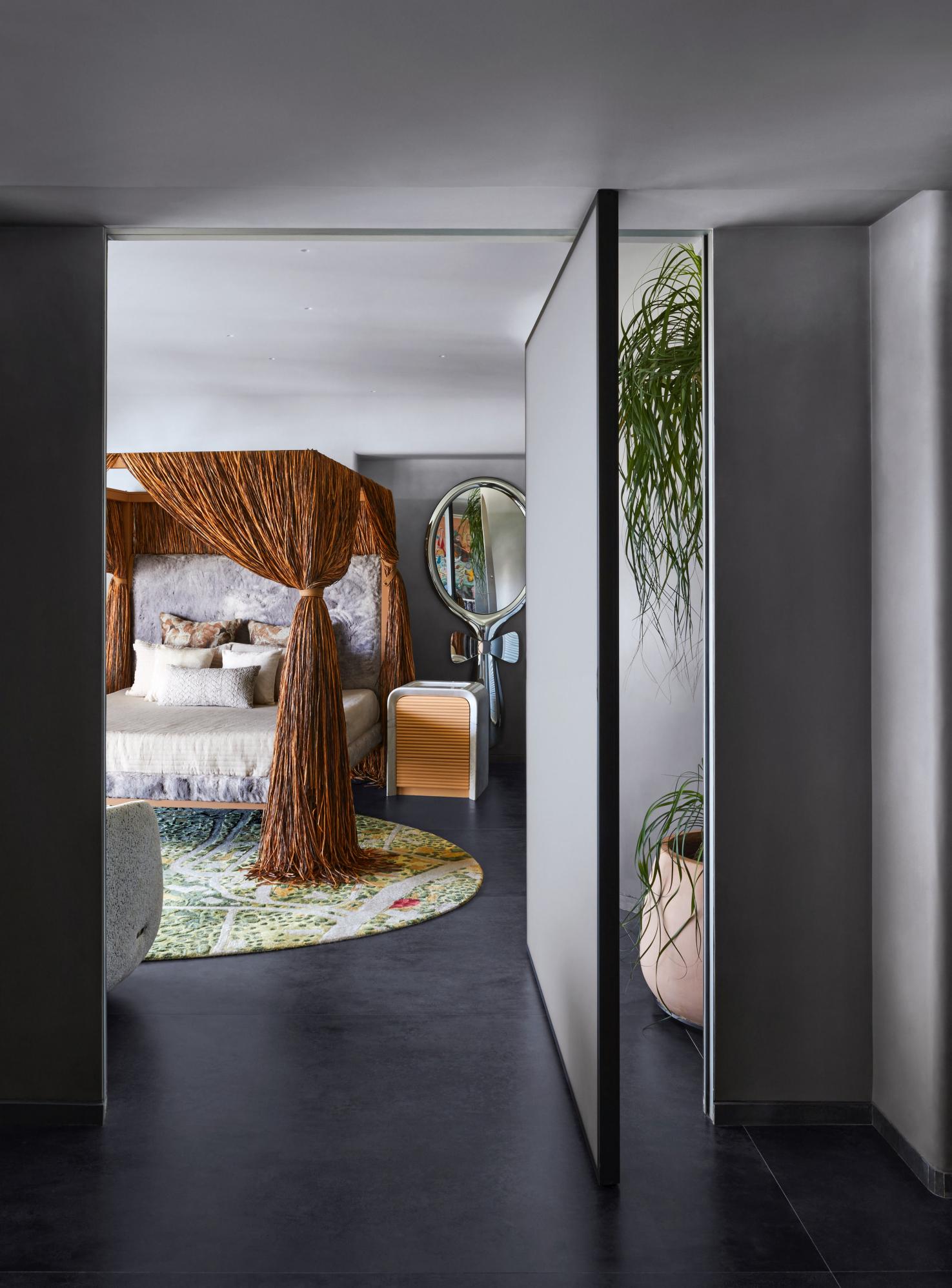
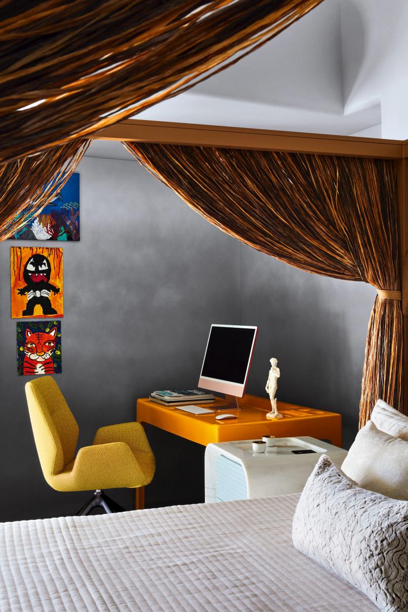
Tucked away in an intimate corner of the home and with its arched entryway and doorway to the bathroom, the bedroom quite literally appears like a man cave. The primitive hut-inspired bed by Edra evokes sensuality and mystery (it was also the first

104 | G&G _ Magazine


time that this bed furnished a home in India). The side tables and the master vanity on the right, both made of marble and fluted wood, have been designed by Karan. The bow-tie mirror from Fiam Italia adds a quirky touch. Roche Bobois' study table and chair in the left corner add a spot of brightness to the otherwise neutral space.


Follow us The future in motion.
Africa
donatoengineeringsystem.com
America clbarchitects.com hsh-interiors.com luxurylifestyleawards.com rockwellgroup.com shvo.com
Asia designshanghai.com karandesai.in kgd-a.org lifestyle-expo.jp megashowbangkok.com tangramfactory.com thestellar.com.hk
Europe agrestis.eu alixlawson.com altaidea.uk alvamusa.com amiciburo.com atelierdumur.fr aura3d.eu aytmdesign.com bocadolobo.com brabbu.com brostecopenhagen.com bykoket.com carocim.com castrolighting.com delightfull.eu design-by-us.com dubrovska.studio enamoura.com
esterbruzkus.com gandgmagazine.eu gardenglory.com gornceramics.com guglielmi.com jetclass.pt jklabarchitects.com karchitects.com.ua klimchi.com kmdesignlab.com laredoute.com livawards.com llab.design lx-luxio.com martadelgadostudio.com mezzocollection.com milanobedding.it modektura.com newdesigners.com noom-home.com nubeitalia.com nuura.com panoptikumcollections.com pinik.com.ua popolo.fr pullcast.eu rh.com royalstranger.com rugsociety.eu studio - donna.com.ua studiomodijefsky.nl toledano -architects.com za-za.com.ua zaditaly.com zannierhotels.com zikzakarchitects.com
Oceania massimointeriors.com.au tsaidesign.com.au
ALL OFFICIAL SOURCES: 108 | G&G _ Magazine


GG G&G _ Magazine N 43 – March 2024 & winning blend BORN OF SERENDIPITY MIXING MATERIALS LIVING ON GG G&G Magazine N 42 – January 2024 & CRISP CHOREOGRAPHY NEW DEFINITION OF LUXURY bespoke approach Peach tender Fuzz #WINTER2024 MORE INSPIRATION FOR YOUR HOME GG G&G Magazine N 41 – November 2023 & DIAMOND THE PURSUIT OF ENJOYMENT Retreat art, mastery and beauty Scandinavian Click to our latest issues now to see even more of trend updates, stylish ideas and exciting projects. WWW.GANDGMAGAZINE.EU


 Gobi
Rug by BRABBU
Flow Door pull by PULLCAST
India Port Laurent Marble Bar cabinet by
This is Art Coffee table by DESIGN BY US
Bryce II Side table by BRABBU


 Boll Armchair by Le Clochart x ADRENALINA
Remous Vert et Noir Wallpaper by L’ATELIER DU MUR
Énigme


 Nº 11
Chair by BOCA DO LOBO
Portobello Coffee table by ALVA MUSA
Maree Sofa by BRABBU
Naomi Chair by KOKET
Surma 2 Rug by RUG’ SOCIETY


 Photography by Yevhenii Avramenko


