

Blends of moisturising vegetable oil and butters, tinted with roots and spices and scented with natural essential oils.


Blends of moisturising vegetable oil and butters, tinted with roots and spices and scented with natural essential oils.



• interior design & project management
• residential and commercial projects
• working worldwide
• based in the UK
altaidea.uk

76
ROMANTIC GLOW
HOME BY SMAC STUDIO / SYDNEY, AUSTRALIA
88 SURPRISING MIX OF CHAOS & WONDER
LOFT BY STUDIOTAMAT / ROME, ITALY
96 NEO ART DECO REVIVAL
HOUSE BY AISEL KONONENKO / KYIV, UKRAINE
106 DESIGNING DREAMS
APARTMENT BY JASON WADHWANI DESIGN / MUMBAI, INDIA
116 COLOR CHOICES
FLAT BY SARA LEONOR / LONDON, UK
124 UNEXPECTED FORMS
TOWNHOUSE BY FREDERICK TANG ARCHITECTURE / NYC, USA
136 REDUCE TO ENLARGE
APARTMENT BY CODA / BRASILIA, BRAZIL
144 EVENTS CALENDAR
SEPTEMBER – OCTOBER - NOVEMBER
150 ALL OFFICIAL SOURCES

LUXURY LIFESTYLE AWARDS PRESENTS
L U X U R Y I N T E R I O R D E S I G N E R S O F T H E W O R L D 2 0 2 4
A P P L Y N O W


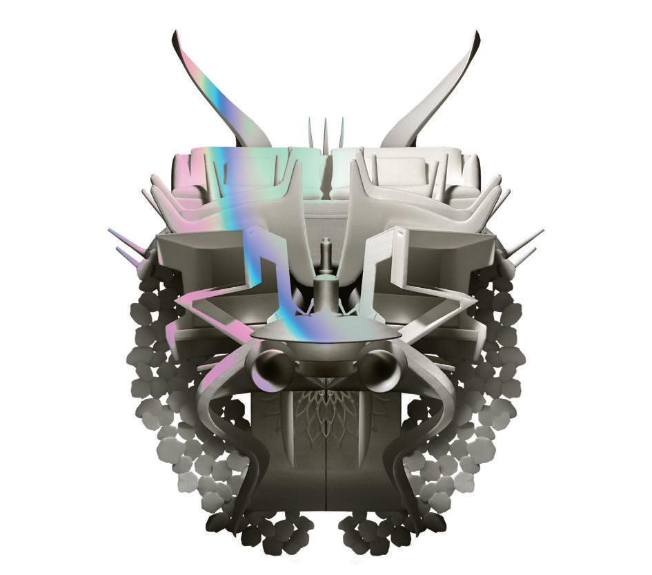


Autumn 2024 takes us on a journey where timeless design classics are reinvented and interior trends embrace playful textures, bold patterns and a palette that invites warmth. As temperatures drop, we all have a natural inclination to seek comfort and cosiness, so the design selection you'll find starting on page 19 are a source of inspiration for creating inviting homes that reflect the changing seasons. This is where the craze for chunky furniture, soft lighting and furniture in autumnal tones comes in - the key trend elements for a retreat home.
Another hot trend with a touch of the unexpected is the mono-rooms: furnishing an ambiance in tone-on-tone. The ability to layer a single shade in a space by playing with different materials and shapes is no child's play. You have to know how to properly combine objects to be able to emphasise them in the right way - otherwise it's a mess around the corner! Matteo Soddu from STUDIOTAMAT designed a loft in Rome for himself where he decided to cover a room (intended to be an office) in an energetic blue (page 88). The intention was to recall the shade of the Sardinian sea that the designer is fond of: the result is a fascinating space that transmits security and joy. While on page 116 the interior designer Sara Leonor managed to demonstrate how with just one color you can create a fun, stylish and also very versatile interior. Her choice to color each room of a London apartment with a different shade was very bold and clever; experimenting with silhouettes and different textures made the interiors functional and full of authenticity. Instead, Shona McElroy reveals the power of dark colors in the Sydney house (page 76). She opted for a very dark gray tone for the home office and cigar room - two formal spaces that exude opulence and elegance at the same time thanks to the depth and intensity of color chosen for the walls.

Interior design can be simple and complex at once but learning to dare is a skill that allows the decor to shine. So, take advantage of the beginning of this season to create an inviting atmosphere that encourages relaxation and conviviality, but also reflects your character.
Enjoy reading, dear design lovers,






A little more love on the table


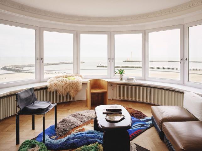
Paradis Apartment
The founders of Club Paradis, Albane Paret and her business and life partner Micha Pycke, projected unveil the interiors of a curated holiday apartment with spectacular sea and harbor views in Ostend, Belgium.
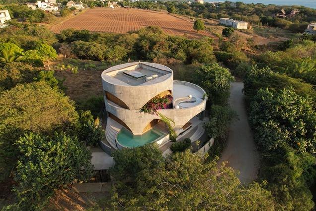
Casa Toro
Estudio Carroll projected a 250 m² house for a couple that longed for their own corner of paradise on the Oaxacan coast, Mexico.

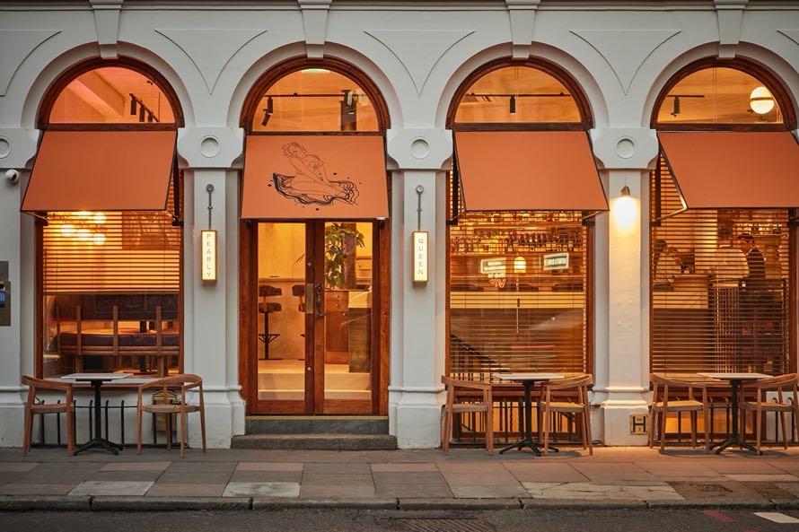
A-nrd Studio has completed the interiors of a new East-London champagne and seafood bar Pearly Queen BARS


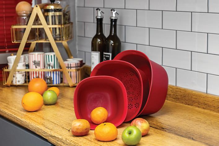


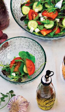


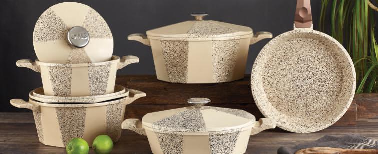


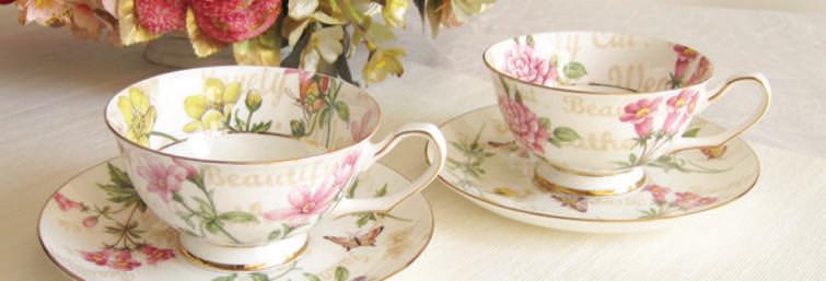


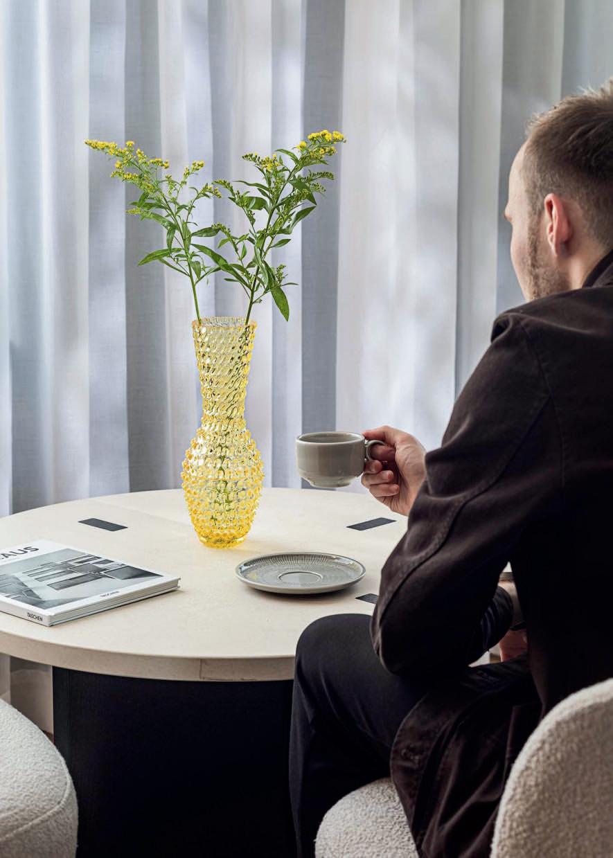

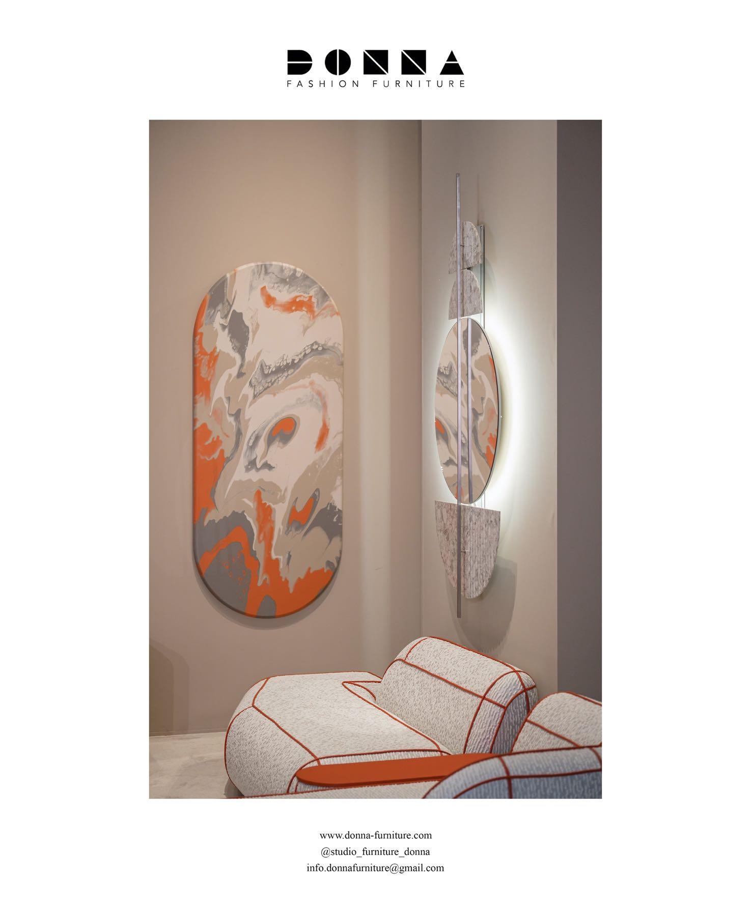
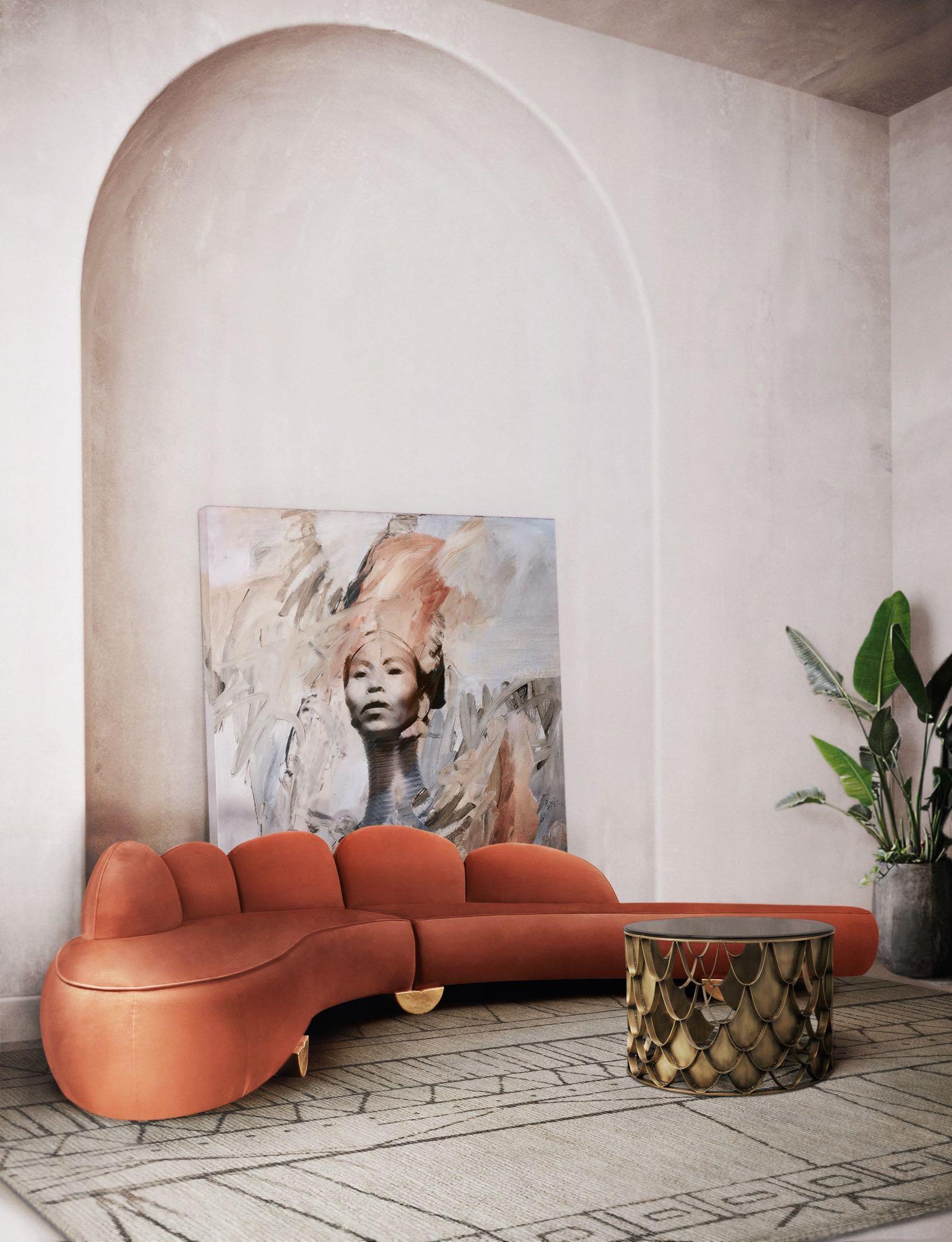
Texture, patterns and curves continue to dominate the trends podium for Autumn 2024! With a refreshing mix of nostalgia and modernity, they bring touches of interest and a dreamy edge - perfect for creating a welcoming atmosphere, full of character and warmth, making your home a haven in the colder months.
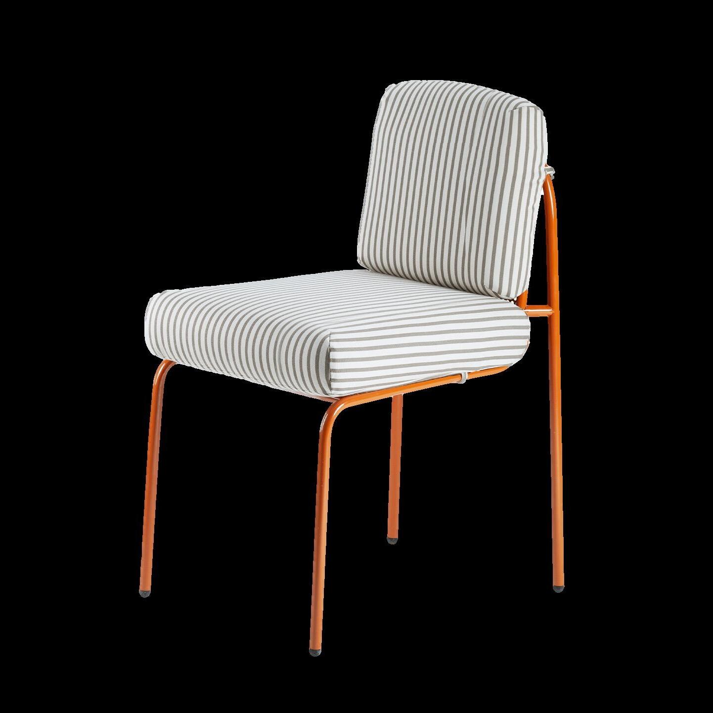
CLASSIC STRIPES AND CHECKS DESIGN REIMAGINED IN BOLD AND UNEXPECTED WAYS BRING A PLAYFUL EDGE TO INTERIORS. WHETHER YOU PREFER A MONOCHROMATIC SCHEME OR AN OVER-THE-TOP WAY, THESE TRENDS CAN BE TAILORED TO SUIT ANY STYLE. THEY’RE TIMELESS, SIMPLE AND VERSATILE.
IDEAS
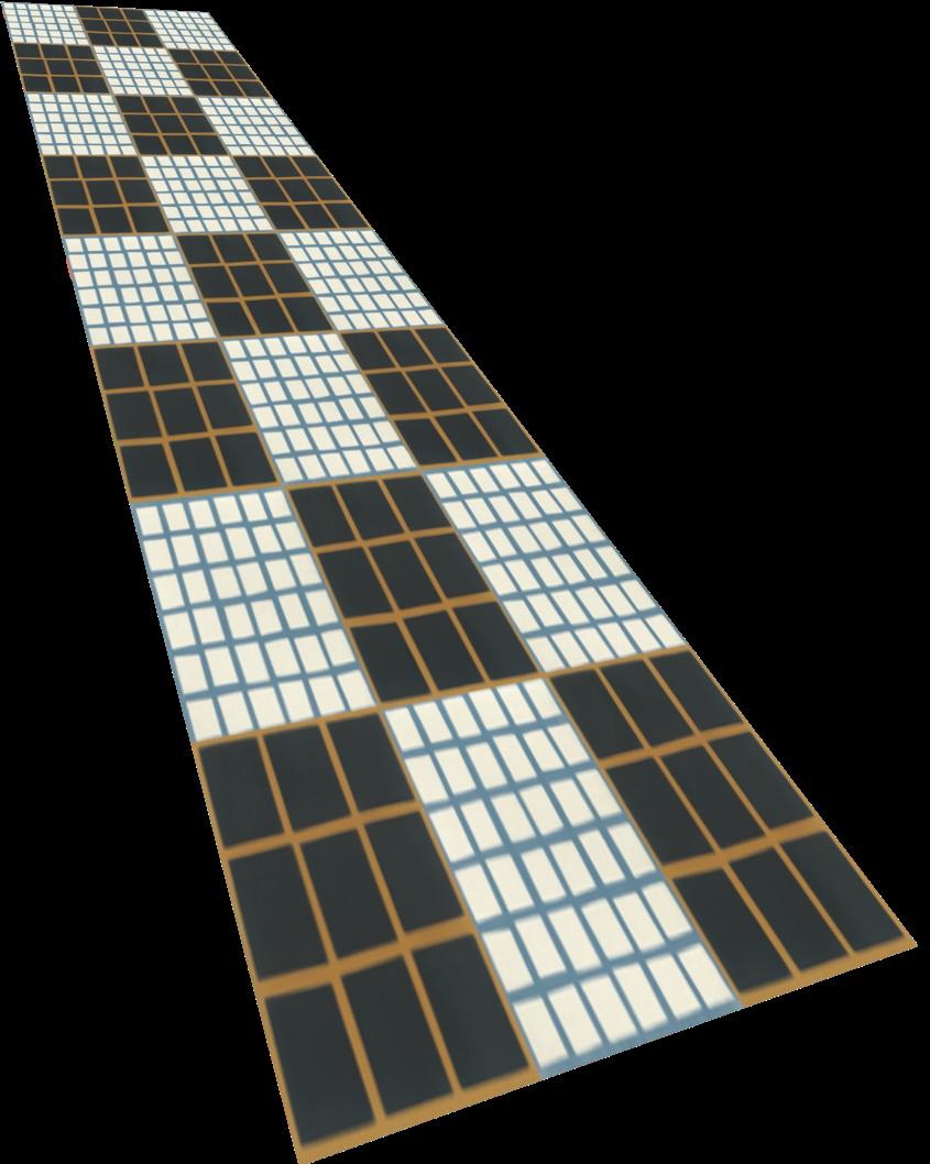
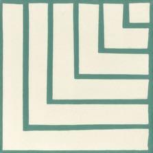
Tesselle 2 Clair
Tesselle




Cement 3les from BEAUREGARD by CAROCIM
IDEAS

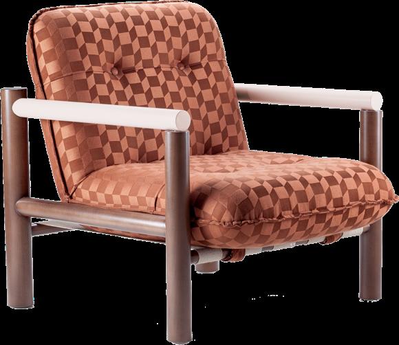
EMBRACING WARM, NATURAL TONES IS ONE OF THE MOST OBVIOUS AND FASTEST WAYS TO EMULATE THIS SEASON'S DESIGN TRENDS. LED BY BROWNS AND GREENS, THE HOME DÉCOR AND CENTURY MODERN WAY ARE PERFECT FOR CREATING A SOOTHING AND WELCOMING


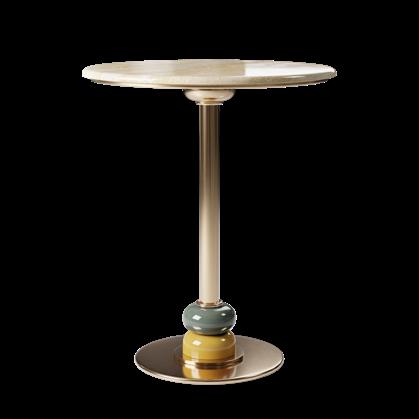

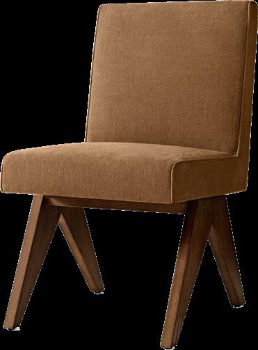
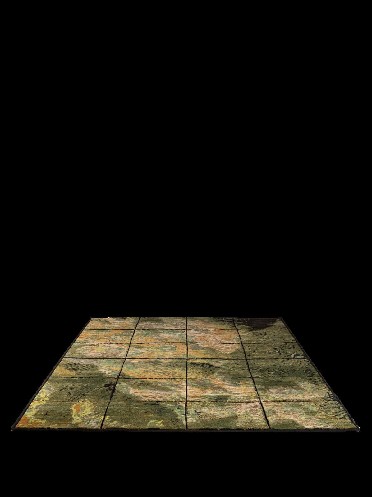
CREATING SOMETHING UNIQUE AND PERSONAL
HAVING A HOME THAT VINTAGE, SECOND OR NEW AND MODERN PIECES, AS LONG AS THEY





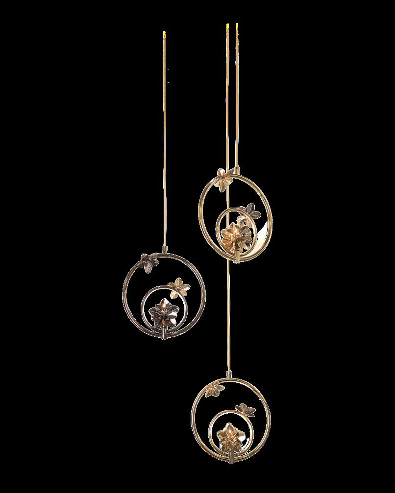
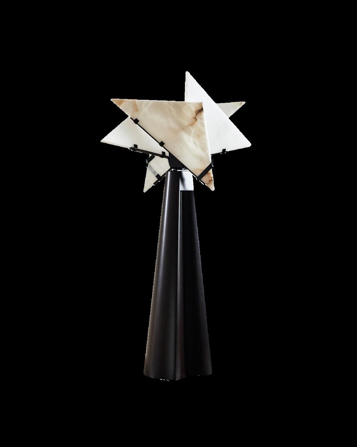
Table lamp by MAISON SARAH LAVOINE x LA REDOUTE INTERIEURS




TO CREATE A RELAXING ATMOSPHERE AND MAKE YOUR HOME A COMFORTABLE AND MAGICAL PLACE, IT'S ENOUGHT TO CHOOSE THE RIGHT ILLUMINATION. OPT FOR WARM GLOW BULBS AND SELECT STRATEGIC POINTS TO CREATE POCKETS OF LIGHT; FOR AN EVEN MORE SUGGESTIVE EFFECT, PAINT THE WALLS WITH DELICATE
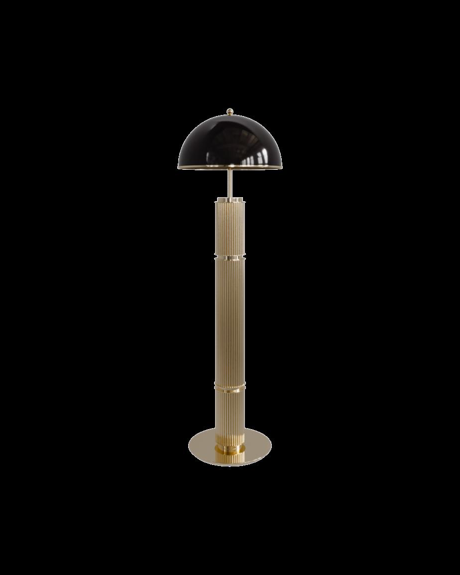

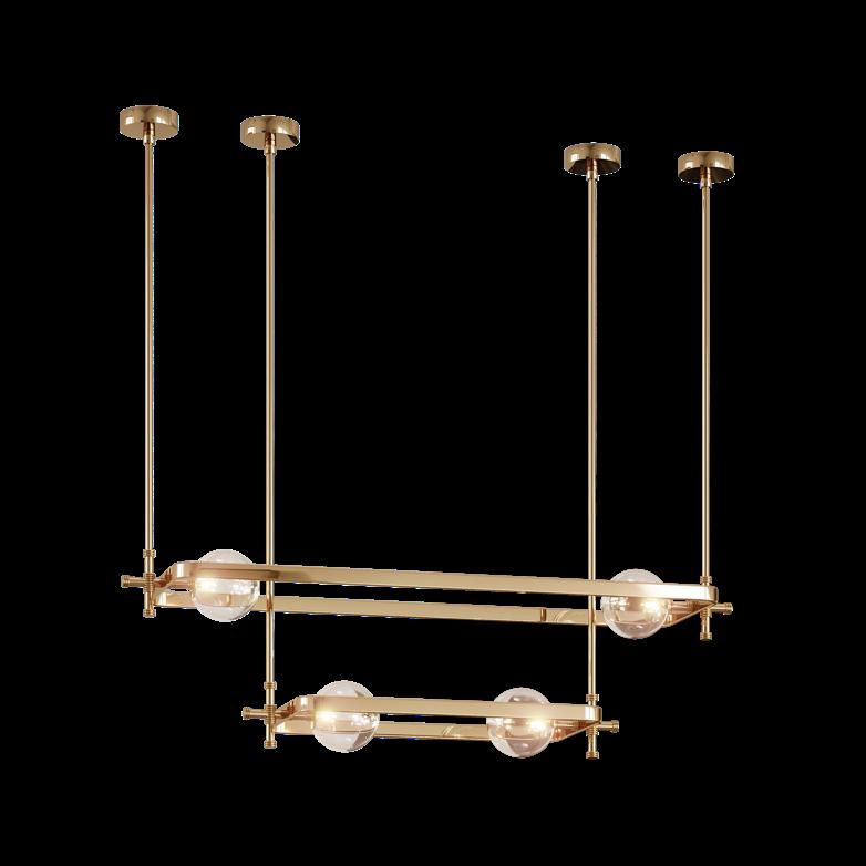
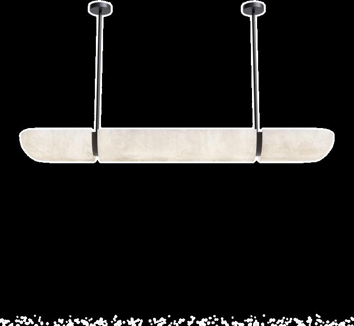
Ceiling lamp
COLLECTION
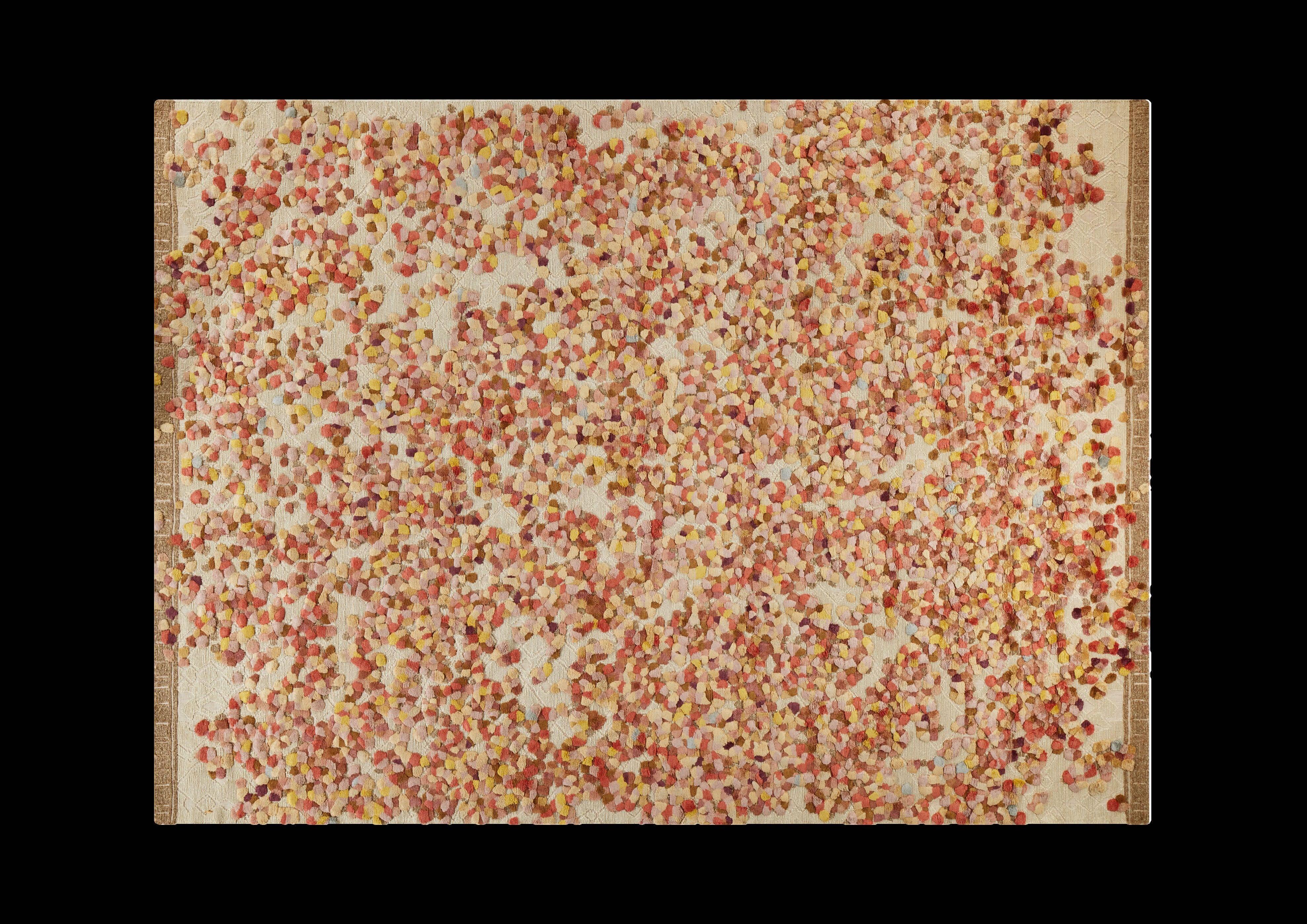
Colchiques


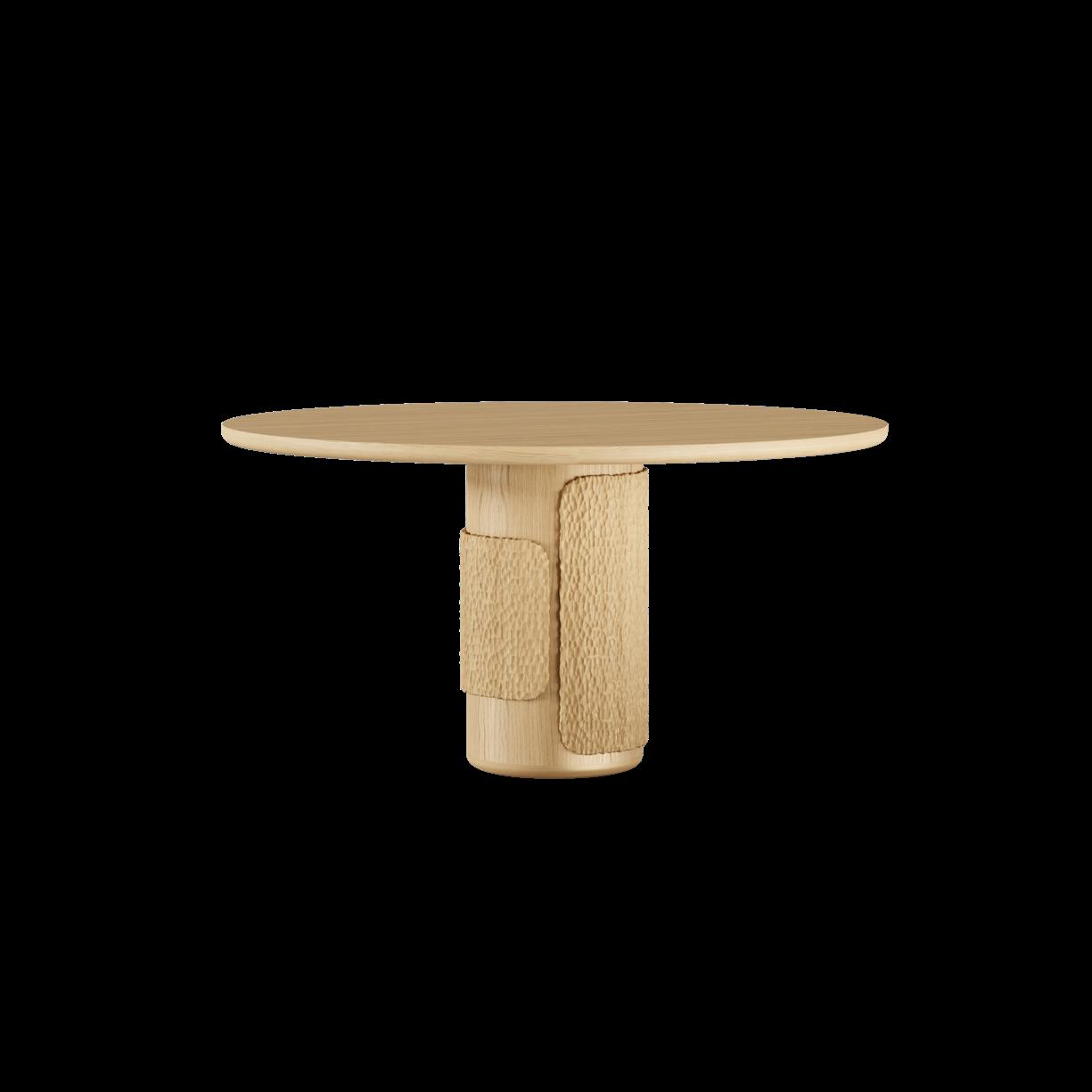


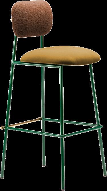
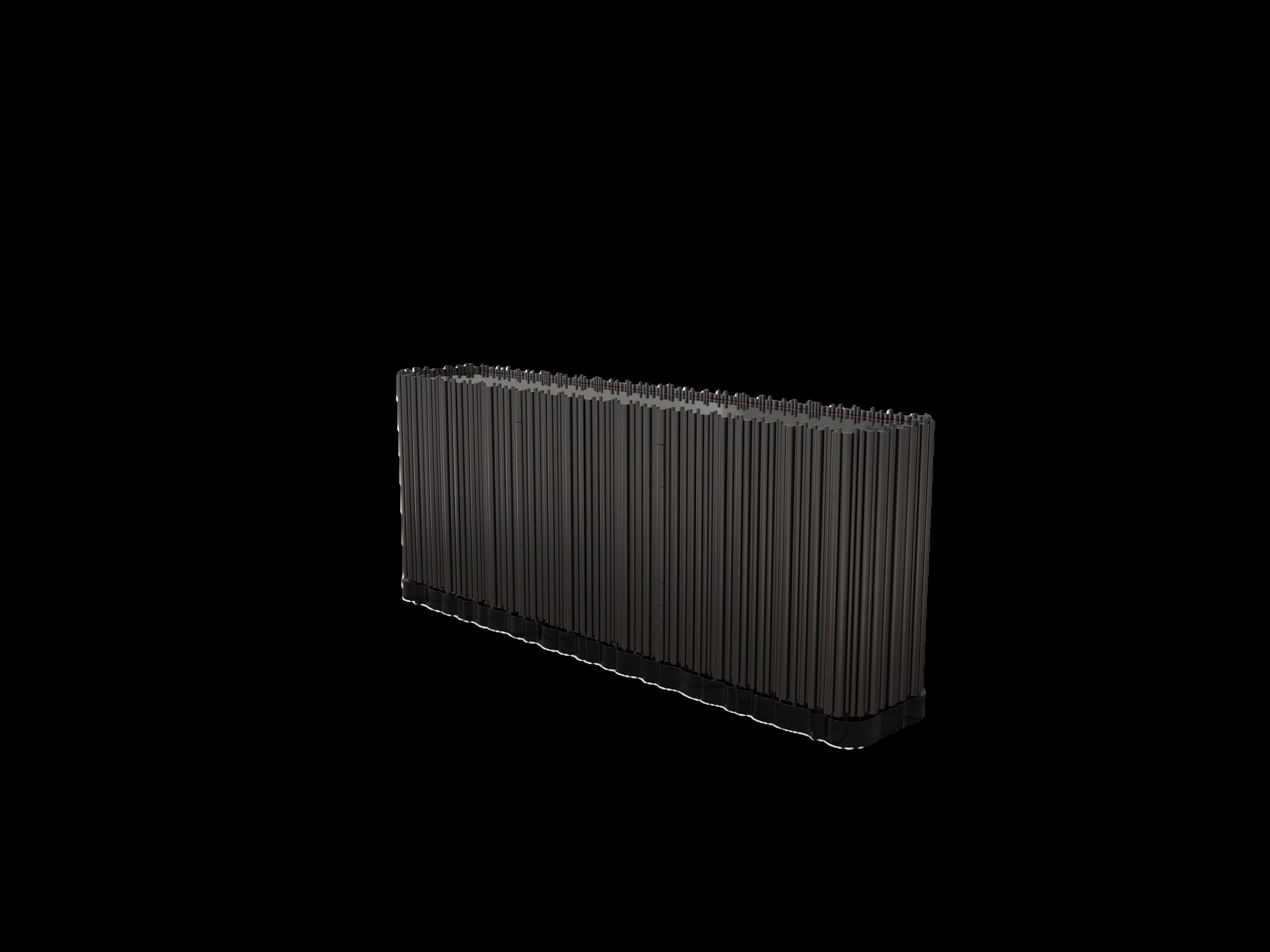
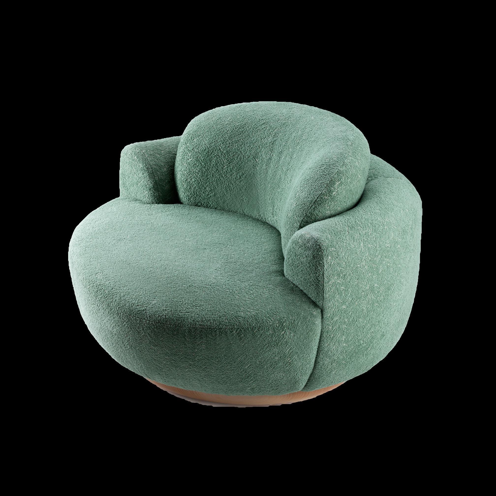
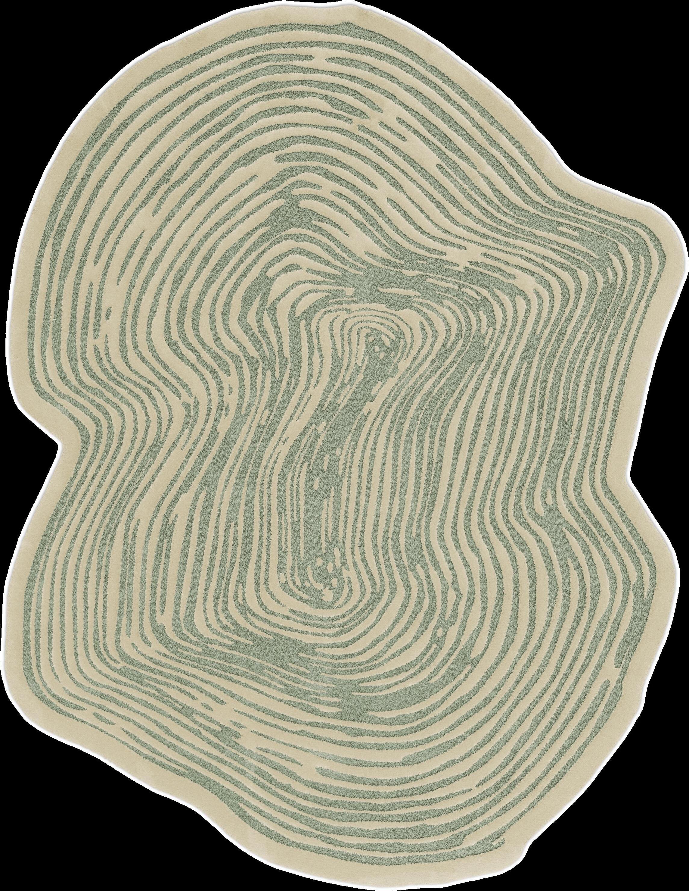
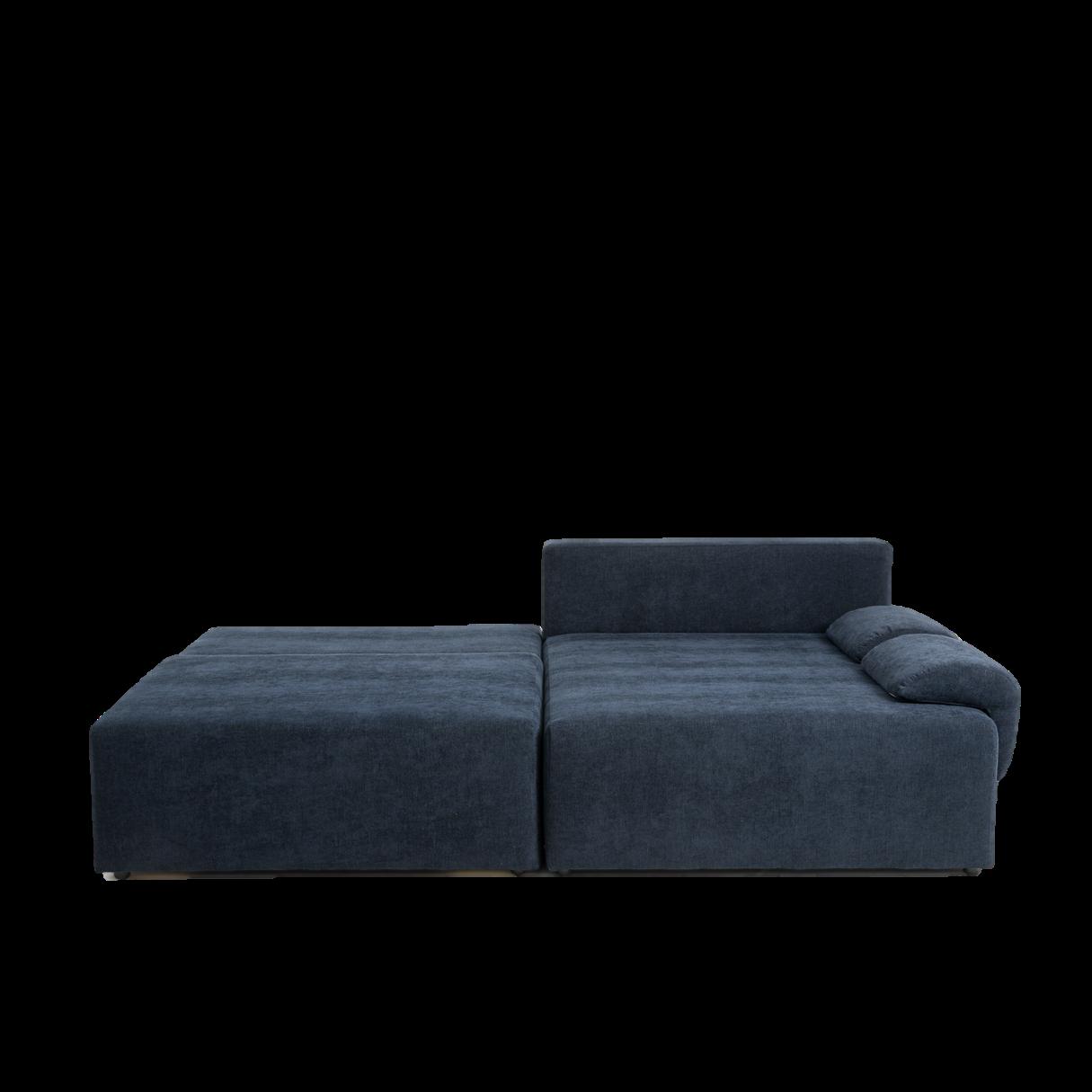
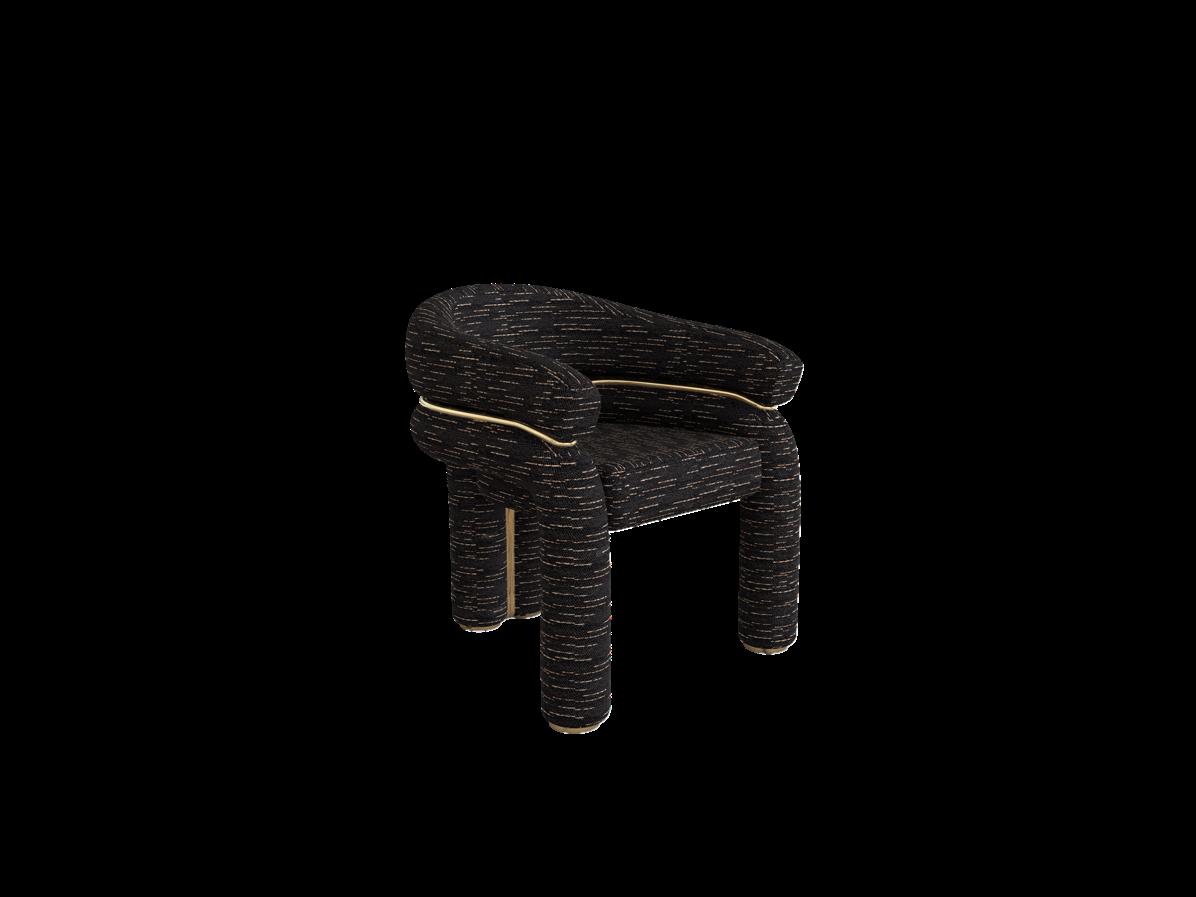
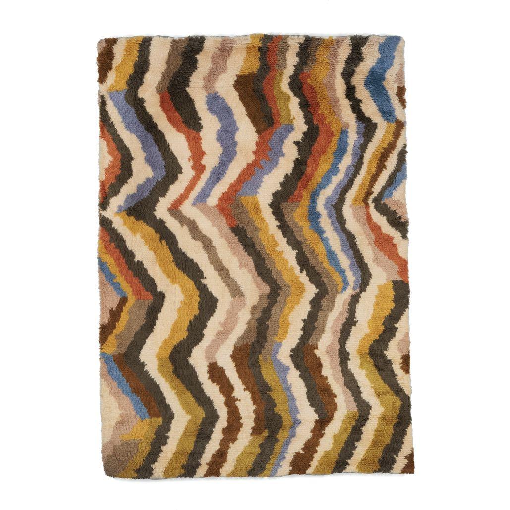
SOFT EDGES, LARGE MODULAR FURNITURE AND CURVED FEATURES ADD A SENSE OF WARMTH TO A SPACE. WHETHER IT’S A THICK, TEXTURED RUG OR AN ENVELOPING SOFA, THESE ELEMENTS ARE ALL ABOUT CREATING AN AMBIENT THAT FEELS BOTH GROUNDED AND COSY.




1
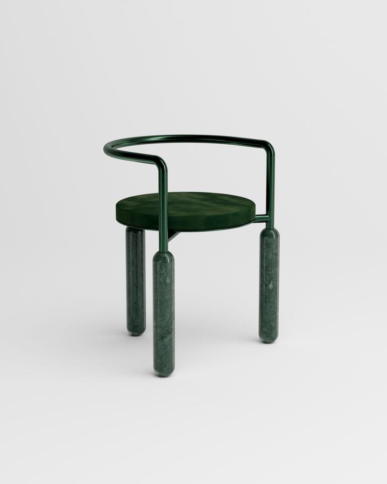
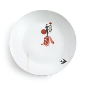
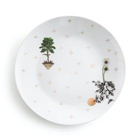
Buy new design products for your home makeover: the best tips and latest arrivals that will make the transition to the new season easy.
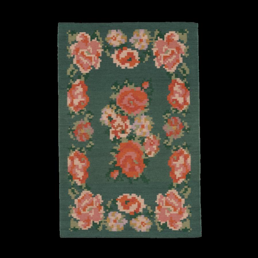
3
2Carnival
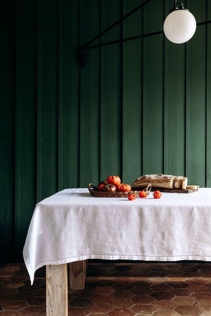
4

Madeleine
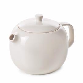
Teapot by REVOL
€59,00
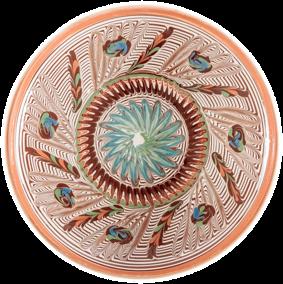
Ardeal
€26,00
Florii
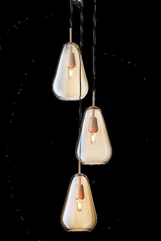
Chandelier by NUURA
€2.149,00
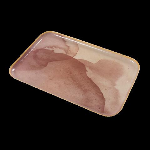

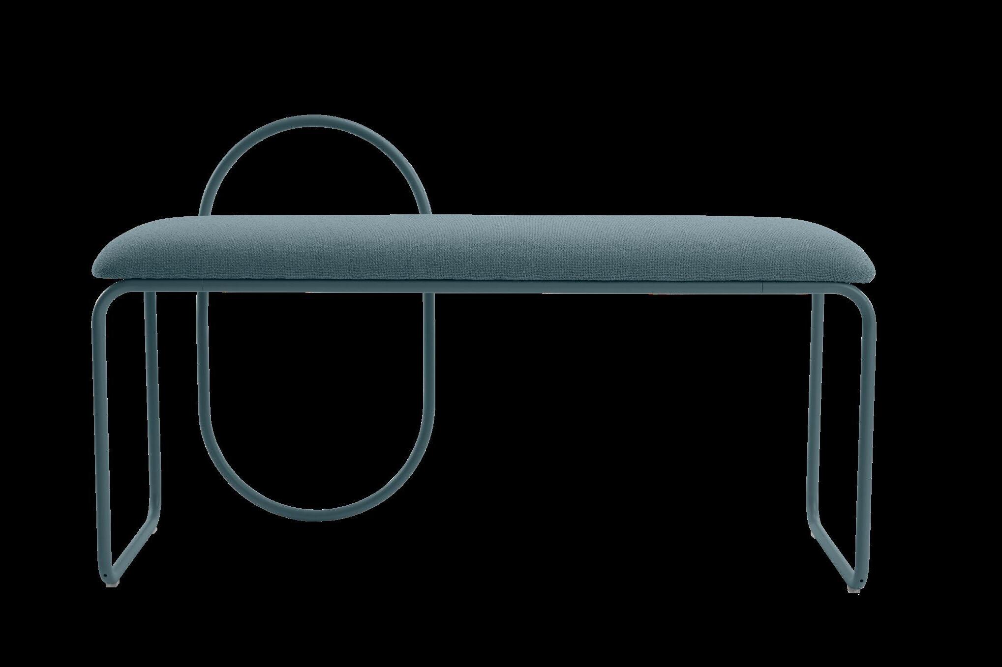
€34,00
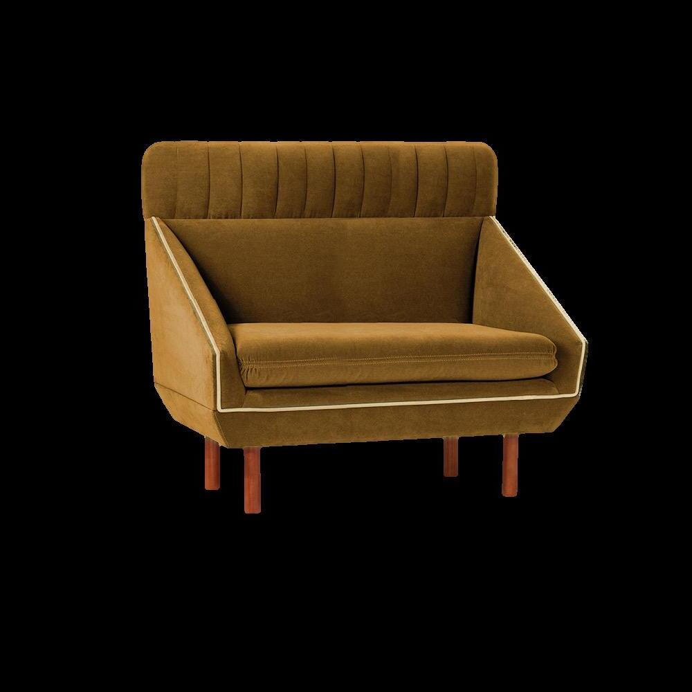
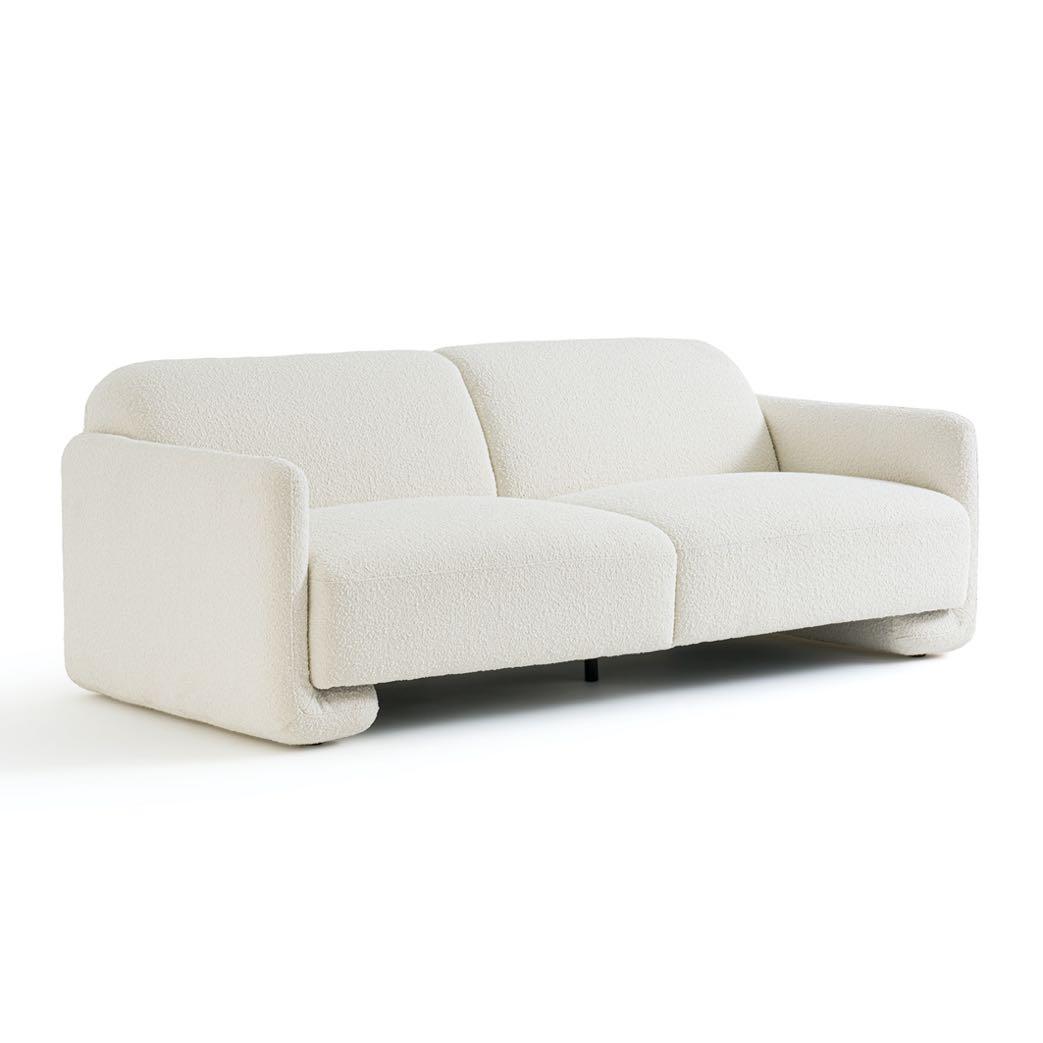
Sofa by BALZAC PARIS x LA REDOUTE INTERIEURS
€1.799,00

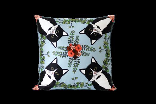
€95,00


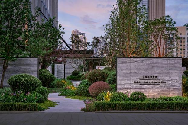
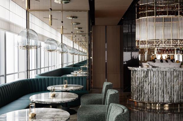
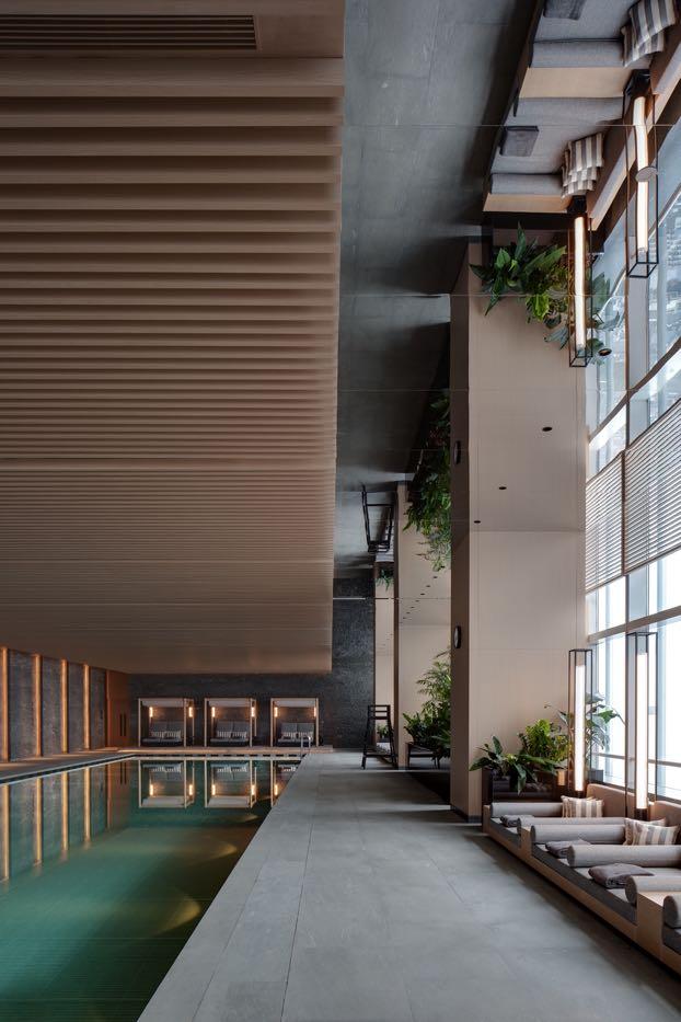
Conran and Partners has completed the design of Park Hyatt Changsha, creating the architectural entrance experience and courtyard pavilions as well as the interiors and for the hotel within a 63-floor tower part of the IFS complex. The hotel occupies the top floors of a tower originally built as office space, and it features 230 guestrooms across 11 different typologies, as well as communal areas including a restaurant, tearoom, bar, library, function rooms and wellness facilities with a 25metre pool perched on the 48th floor. Guests are welcomed via a courtyard sitting on a podium on the fourth floor, where Conran and Partners created a defined boundary that signifies the beginning of the Park Hyatt experience - a natural oasis in the heart of Changsha. Leveraging its extensive experience working across design and architecture, alongside the full interior design, the design team was also tasked with creating new cladding and a canopy for the tower as well as designing an elegant extension connecting the main building to the Garden Room - an external pavilion for indoor and outdoor functions. The architectural elements are tightly interwoven with the landscape developed in collaboration with designers from ADI. Address: Tian Xin Qu, 410006 - Changsha, China www.conranandpartners.com
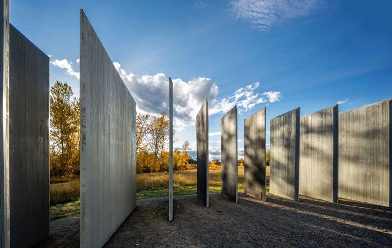
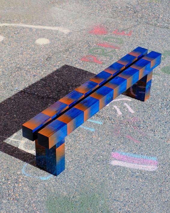
Commissioned by Jackson Hole Public Art with support from the Center for the Arts, Jackson businesses and private donors, CLB Architects designs Town Enclosure, a cross-laminated-timber (CLT) installation in Bozeman, Montana. The design is flexible, always open to the public and capable of being used in a variety of ways -both formal and spontaneous - to foster artistic experiences en plein air. Town Enclosure becomes a place for community engagement and a venue for artistic expression: a place for performance and exhibition, and an armature for creative discovery. www.clbarchitects.com
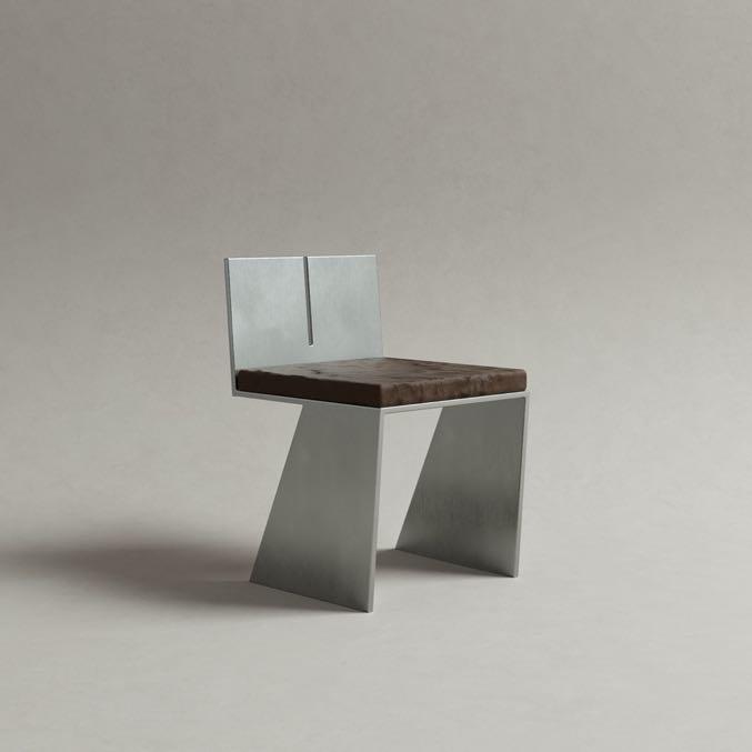
Pietro Franceschini presents the new LV seats made of stainless steel and leather, a custom design for a private loft in Milan. The geometry is sharp and minimal, simply made of cuts and welds on aluminum panels. The leather cushion adds on the overall brutalist spirit of the seat. www.pietro-franceschini.com
The renowned company specialising in coverings Déco introduces the new Moove.Zen collection, consisting of sound-absorbing interior coverings designed to combine aesthetics, design, and sound purity. An innovative solution, perfect for those who want to infuse a space with personality - residential, public, work, or commercial - whilst simultaneously optimising acoustic performance. www.decodecking.it
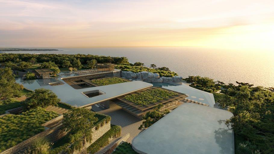
ACPV ARCHITECTS Antonio Citterio Patricia Viel celebrates a significant milestone with the groundbreaking ceremony for the firm’s latest project in Taiwan - the Capella Kenting resort development commissioned by Riant Capital and Capella Hotels and Resorts. Located just north of the scenic Kenting National Park, a pristine locale synonymous with seafront enjoyment – the architects seamlessly integrate more than sixty villas and related amenities within the natural landscape. By mirroring the contours and slopes of the lush green environment, they deliberately optimise views of the sea and sky, ensuring that each villa boasts panoramic vistas of the ocean. www.acpvarchitects.com
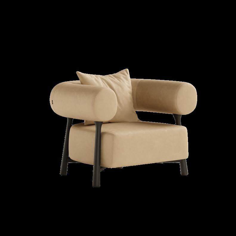
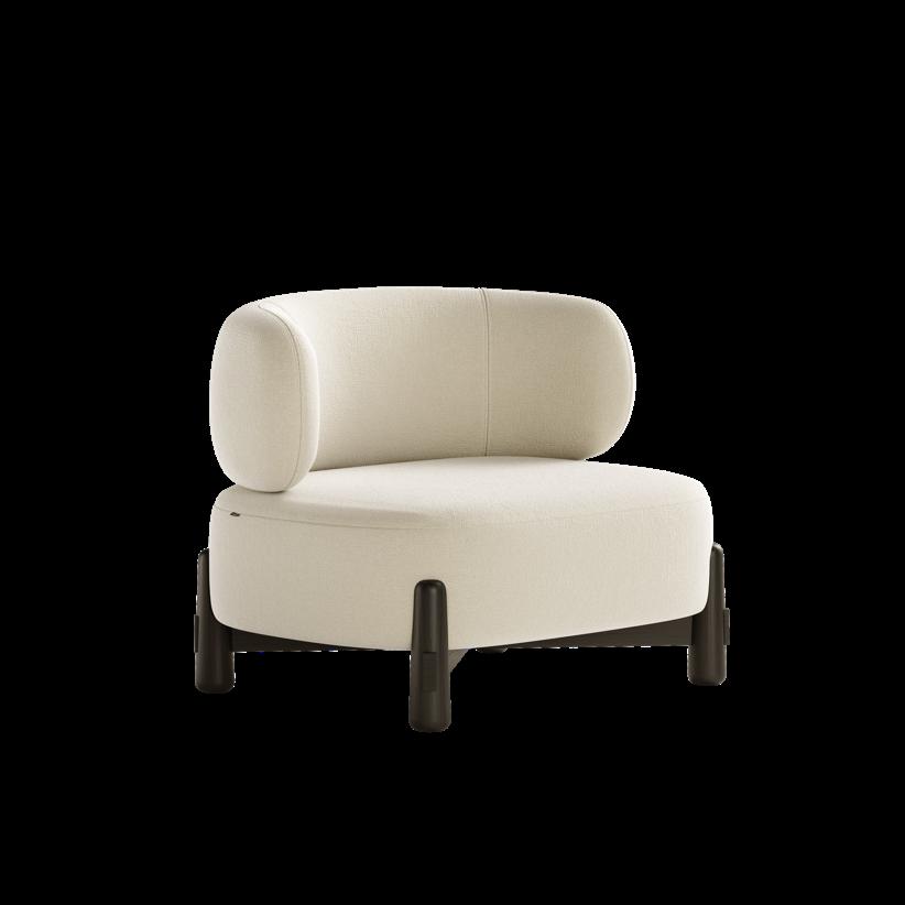
The new Dolmen's Cherry armchair is the result of the marriage of dark oak and a unique design featuring a low, rounded backrest paired with a generously cushioned seat. This armchair combines both form and comfort, making it a standout piece for any living space with a calm and casual look. www.the-dolmen.com
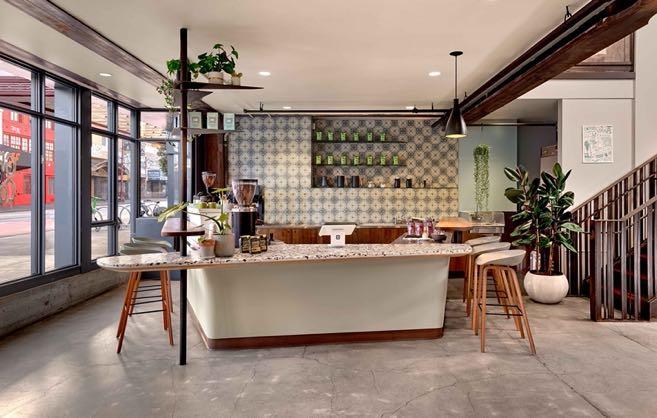
In the heart of San Francisco’s Mission District, Studio VARA projected Grand Coffee Too at El Taller. It's the 2nd outpost of a cafe that began in a former theater ticket booth, and serves as the key activator of El Taller, a combination art gallery and maker. The designers developed a theater-like concept where the central bar serves as a focal point and stage, with baristas transforming their art into a performance of skill. Address: 2544 Mission St, 94110 - San Francisco CA, USA www.studiovara.com

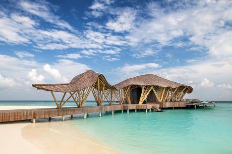
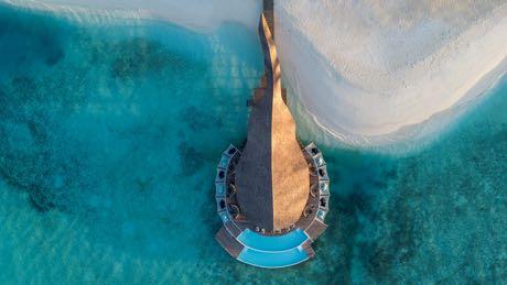
WINNER IN ARCHITECTURAL DESIGN RESTAURANT
HIYAA, OVERWATER RESTAURANT by Nomadic Resorts
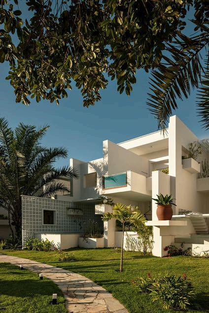
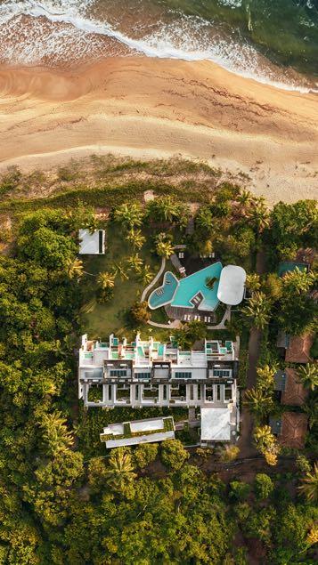
WINNER IN ARCHITECTURAL DESIGN CENTRAL AND SOUTH AMERICA
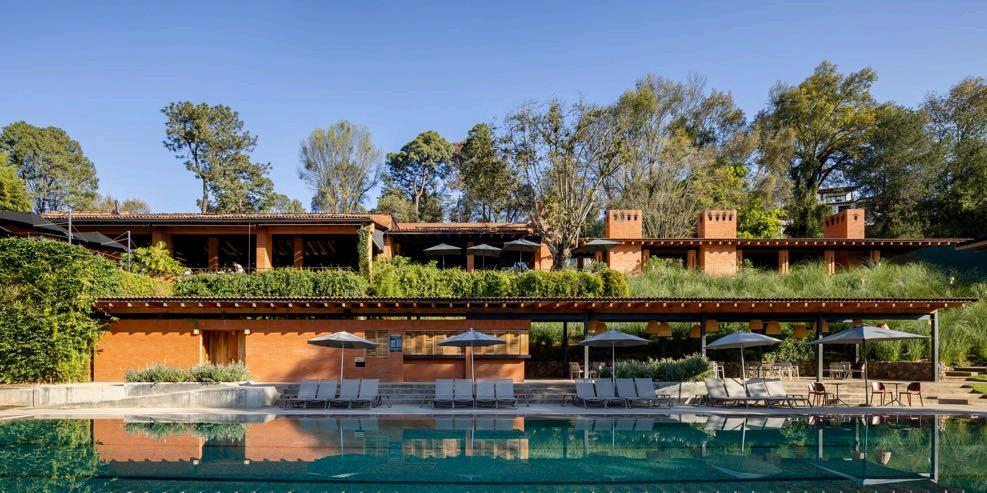
WINNER IN ARCHITECTURAL DESIGN HOTEL –BOUTIQUE HOTEL AVÁNDARO
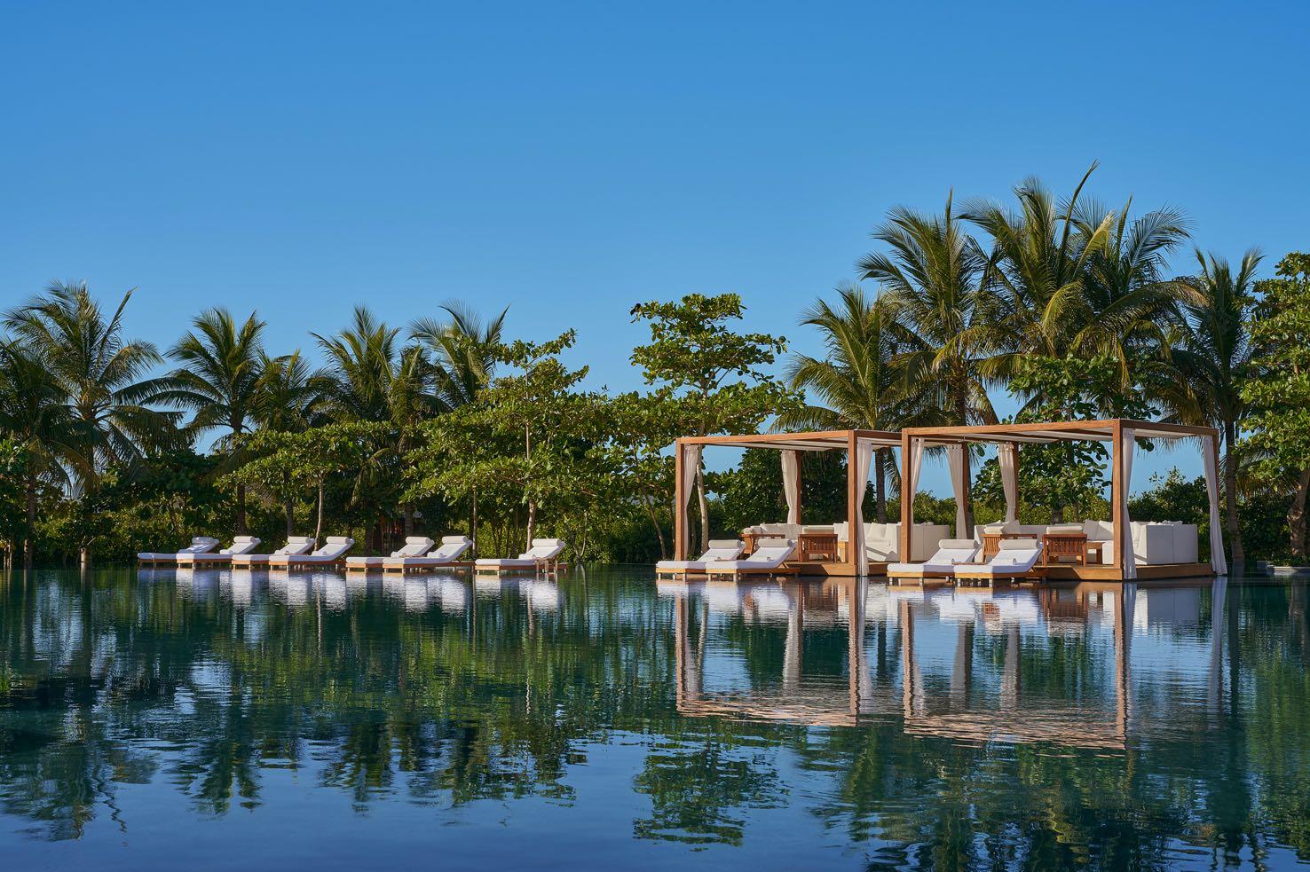
Riviera Maya, renowned for its extraordinary landscape, which includes a 400-year-old mangrove reserve, lagoons, magical cenotes and one of the world’s largest coral reefs, now hosts the newest resort designed by Rockwell Group: the Riviera Maya EDITION at Kanai. The design concept was inspired by the lush environment and the surrounding water; the project team wanted to create the feeling that the resort is a natural extension of the landscape and that its three buildings are an extension of a glowing cenote, with a spa at its nexus. Address: Paseo Kanai 14, Solidaridad, 77730 - Playa del Carmen, Mexico www.rockwellgroup.com
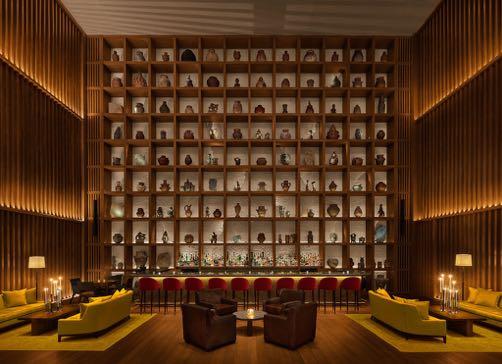
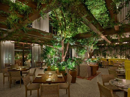
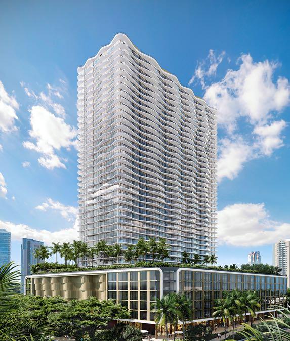
Designed by the Miami-based Arquitectonica, with sophisticated interiors by ODADA and lush landscape architecture by VITA, the latest residential project at Howard Hughes' Ward Village, the Launiu Ward Village, occupies one of the last available pieces of land on the South Shore in Honolulu on the Hawaiian island of O‘ahu. It will rise 40 stories and bring a collection of 486 studio to three-bedroom condominium residences and over 78,000 square feet of amenities to its desirable front-row location, which will offer residents a variety of stunning views, including Hawaii’s iconic Diamond Head to the east and incredible Pacific views to the south and west.
Address: 1240 Ala Moana Boulevard, 96814 - Honolulu, Hawaii, USA www.thelauniuwardvillage.com
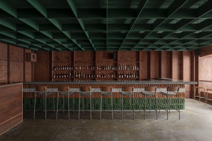
Located in the historical center of Kiev, Nastia Mirzoyan designed Bursa Bar reflecting contemporary Japanese culture. It's a small but cosy music bar that attracts vinyl and live-set lovers every weekend, becoming a reference point for musicians and vinyl collectors from all over the world. Address: Kostiantynivska St 11, 04071 - Kyiv, Ukraine
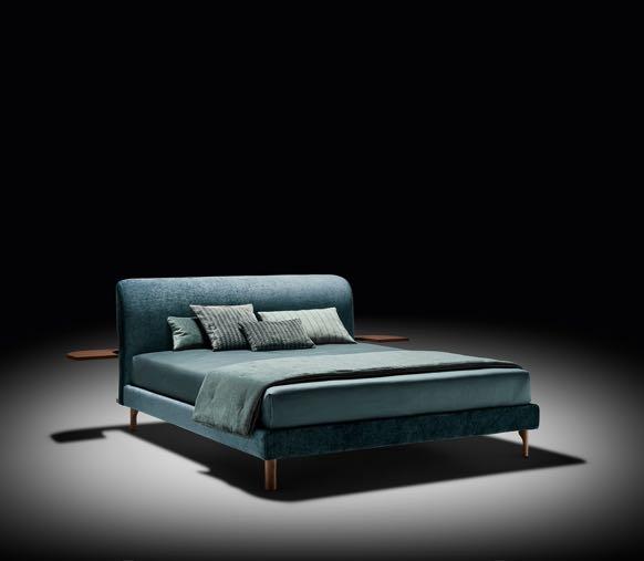
Designed by Matteo Ragni and Tiziano Carnieletto, the new Twils’ Canalgrande bed from Better Dreaming Collection celebrates the lightness of thoughts as of the most beautiful dreams. A headboard as light as a feather, with taut lines that recall the shape of a gondola's iron, an icon so dear to Twils since its debut more than 40 years ago. www.twils.it


FROM SEPTEMBER 5 TO 14, THE FRENCH CAPITAL HOSTS
PARIS DESIGN WEEK: AN OPPORTUNITY FOR EVERYONE TO REINVENT THEMSELVES BY DISCOVERING NEW TRENDS FROM AROUND THE WORLD, VISITING NEW SHOWROOMS, AND PARTICIPATING IN THE MOST ANTICIPATED EVENTS OF THE YEAR, INCLUDING MAISON&OBJET.

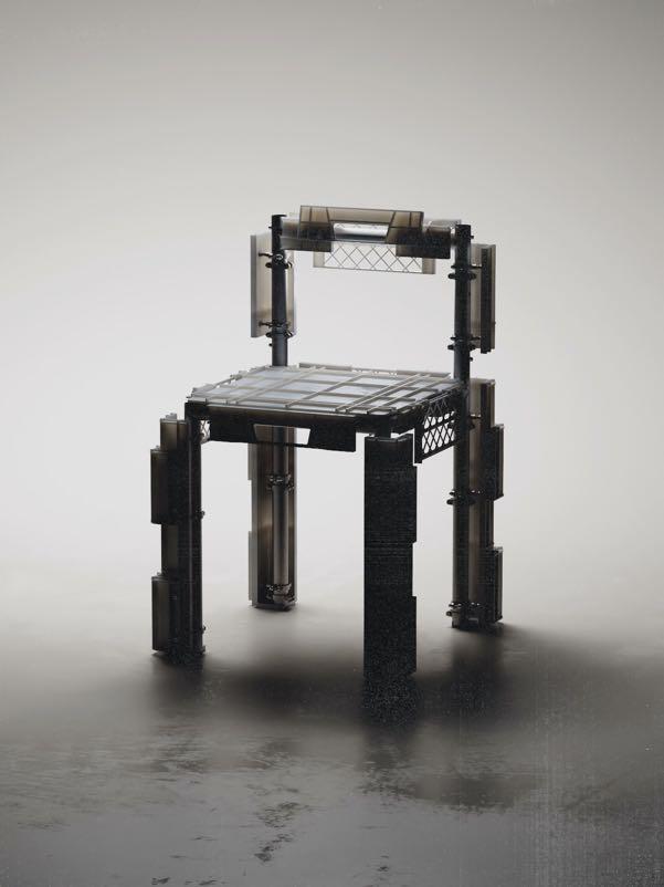
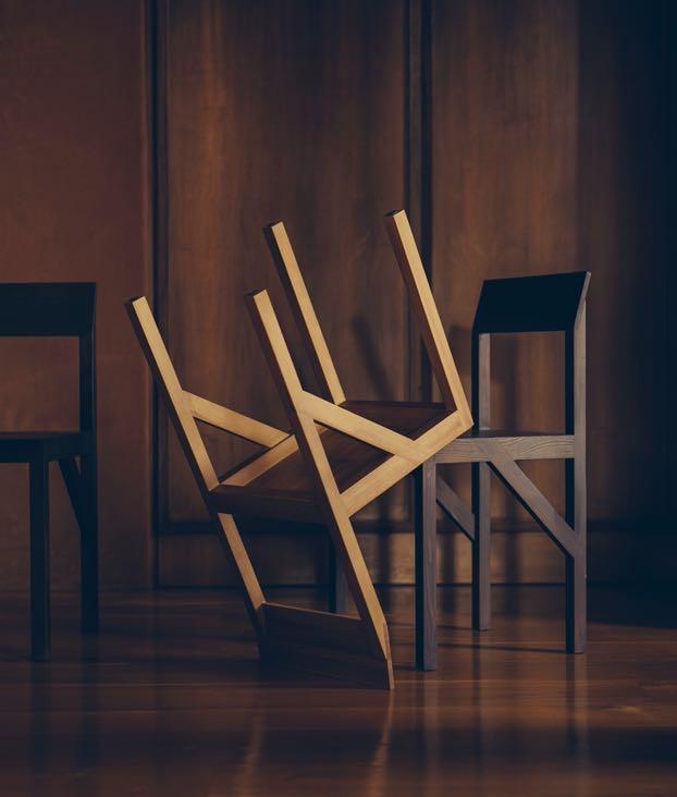
Slurp chairs by WAITING FOR IDEAS waiting-for-ideas.com

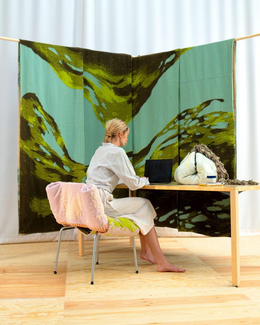
Maëlis Ray maelisray.com
THE COLLECTIBLE DESIGN EMERGING TALENTS
Rue Commines
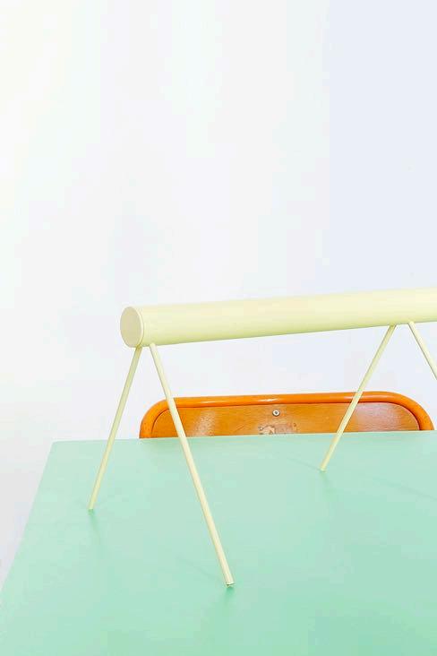
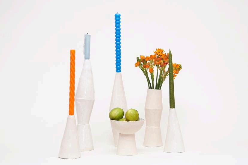
Espace Commines brings together young talents curated this year by Thibault Huguet and Jean- Baptiste Anotin of the collective Meet Met Met. Their collaboration began three years ago when they exhibited side by side at Paris Design Week Factory. Each leading their own design studio, they now pass the baton by
selecting young talents in collectible design. Espace Commines is also the venue for conferences and workshops organized by Formae magazine, a publication specialising in design & architecture knowhow. The workshops are focused on the four inspirations: water, earth, air and fire. commines.com
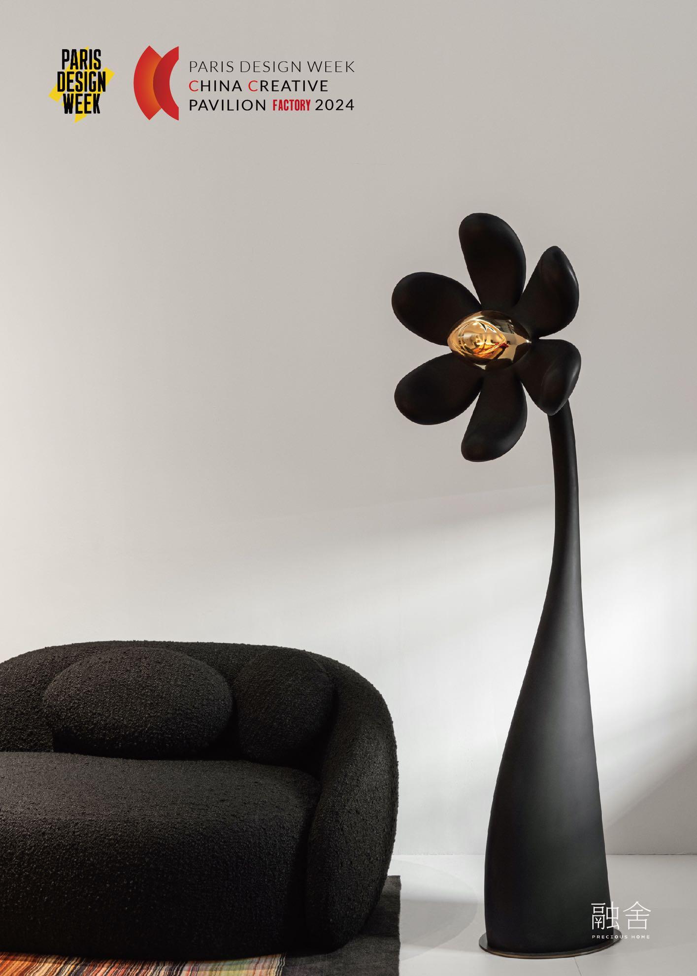
This year, France celebrates the sixtieth anniversary of its diplomatic relationship with China by General de Gaulle. The venue on Rue de Turenne is dedicated to a unique showcase of Chinese talents that brings together fifteen exhibitors representing the new Chinese aesthetic in a 230 m² space. Established or emerging brands, as well as local or foreign designers living in China, the pieces of furniture and objects showcased use both traditional techniques and futuristic new technologies. Each one creates a picture of what ‘Chinese beauty’ can be.
galeriejoseph.com
KRIEF ET THEOPHILE CHATELAIS
BELA JAFFRENOU
THE AVANT-GARDE OF CRAFT DESIGN
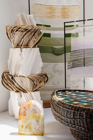
The practice of traditional craftsmanship appeals to an increasing number of young designers who set up their own businesses and produce limited series on demand. The space at 10 Rue de Turenne brings together the avant-garde of Craft Design. Selfproclaimed 'Makers', their design practice aims to be frugal and virtuous, counterbalancing the excesses of a standardized industrial world. They work with glass, ceramics, metal, wood, and textiles, inventing a new craftsmanship; they bring a fresh perspective to often ancient techniques, without hesitating to use cutting-edge tools like computer-aided design and 3D printers. ellia-artgallery.com

The gallery hosts graduates of the last five years who have ventured into making and creating their own brands. These young designers are often meeting the public and professionals for the first time. Paris Design Week offers them their first launch pad - this is where future stars and tomorrow's trends are identified. This year, they're coming from various countries including France, Saudi Arabia, Spain, Eswatini, South Korea, China, Indonesia, and Switzerland.
galeriejoseph.com
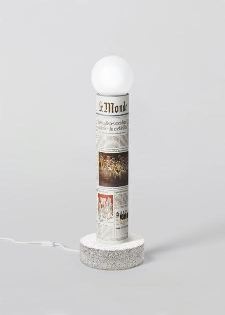
FESTIVAL DU MONDE festival.lemonde.fr
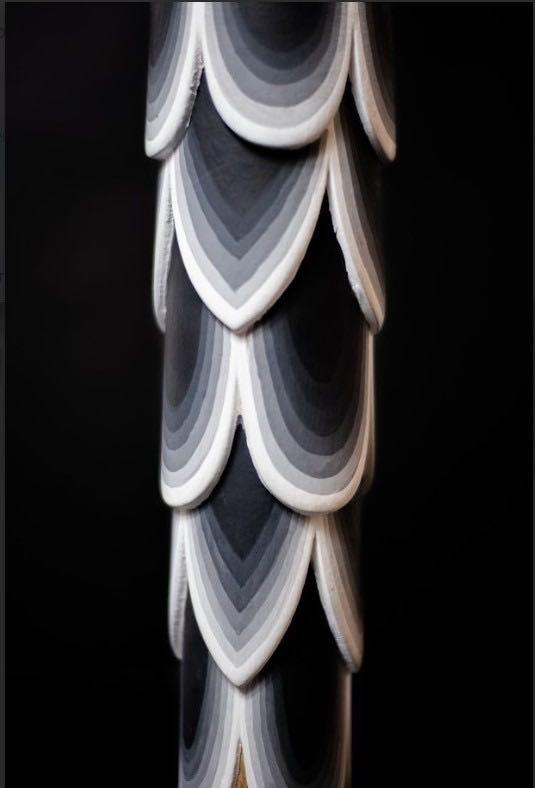
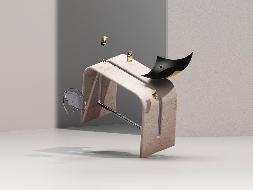
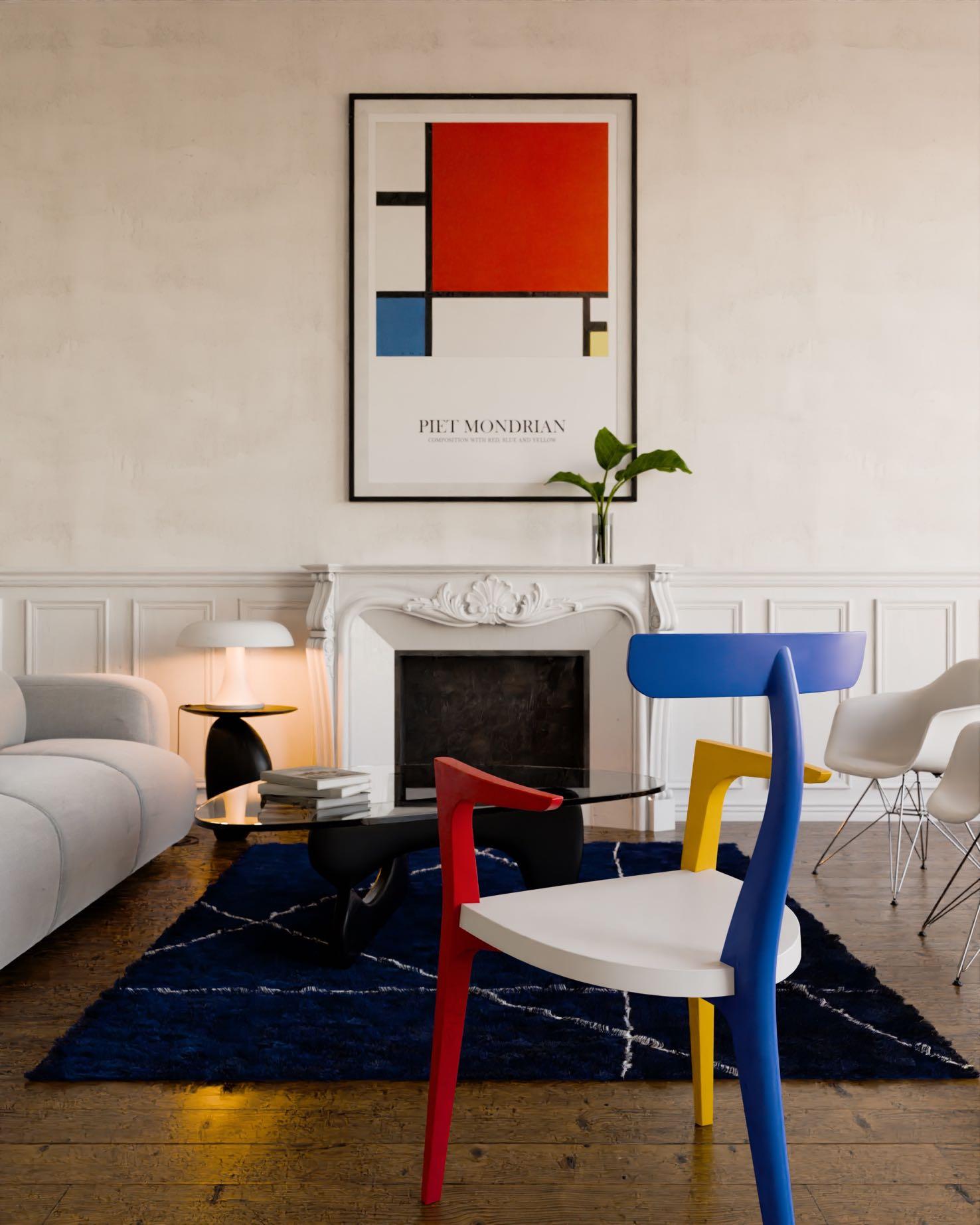
September 5-9, 2024
Paris Nord Villepinte

Maison&Objet and creative strategy consultancy Peclers Paris continue their optimistic, resilient, and stimulating exploration by presenting the new theme of the exhibition: TERRA COSMO. The new topic deciphers the new desires and the expectations of consumers in search of awe-inspiring experiences. Although this cosmic vision of the future remains firmly rooted in the reality of an exhibition that is resolutely focused on novelty, creativity, and innovation.
“In this new approach, it is no longer simply a matter of an extraterrestrial elsewhere. We are part of the cosmos, and this position implies responsibility, as well as resilient and virtuous creations and practices. It imposes a broader, more esoteric, magical vision in which we can imagine ourselves as tourists in zero gravity, choosing to claim the stars or seek beneficial connections with the elements.”
Brune Ouakrat, Strategic Planner in charge of foresight at Peclers Paris
Brutalist or sophisticated, iridescent or transparent, evocative of both the mineral surface of stars and the celestial and stellar expanses - every material is taken into account! The novelty of TERRA COSMOS is crystallized in the intensity of the materials, which reflects the formal explorations of the designers of Objects of Common Interest and their experimental way of working with both metal and glass.
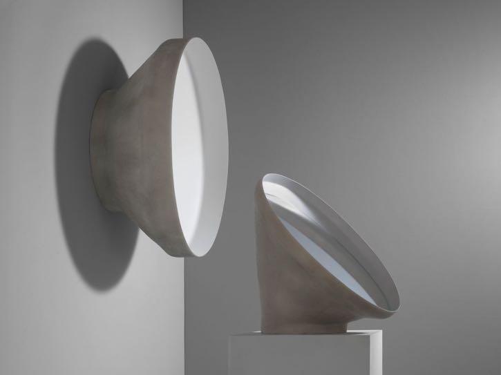

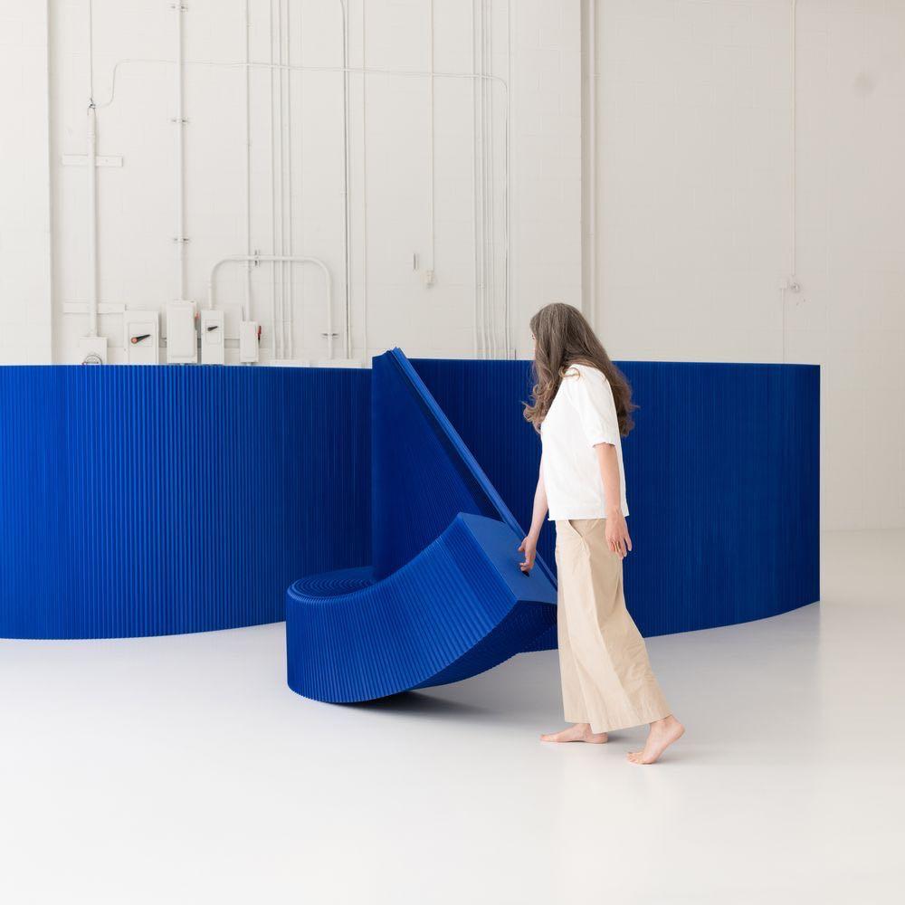

The materials express a sensory futurism that dresses interiors in mineral ruggedness and invests them with constellations of satellite objects. The random shapes, roundness, and ovality accentuate the cosmic aspect as much as they soften its contours. The luminaires produce vibrant halos, diffracting colours into shifting spectra and magical projections.
Charlotte Cazals, Designer & Trend Forecaster at Peclers Paris
Lionel Jadot DESIGNER OF THE YEAR - HOSPITALITY
Thanks to his eminent personality and unique vision, the Belgian national designer, interior designer and artist Lionel Jadot has been nominated as Designer of the Year - Hospitality by Maison&Objet. To mark the occasion, he will have carte blanche for his design of a hospitalityfocused pavilion, thus allowing him to showcase his interior design philosophy.
Lionel was raised in a cabinet-making workshop in a popular neighbourhood in Brussels, where his family had been carving the sleekest of armchairs, sofas, and chairs for six generations. The rest of his tale is a grand adventure in style, fueled by a child's precocious passion for transforming anything he could glean from meagre scraps abandoned to the workbenches. Mastery of recycling is an essential part of the lifeblood of this designer, who was introduced to art and creation as much by his teachers as by the craftsmen and architects with whom he grew up. The randomness of his raw materials, sourced according to availability, increases his creativity tenfold. These materials dictate the beginning of the story, which he then endeavors to project into fantastic universes on the fringes of art. Lionel creates unique works of functional art and collectible design. Instead of catalogues, he prefers durable objects that last long beyond mere paper impressions. When it comes to interior architecture, it is not unusual for him to call on his community of designer-makers to fashion unique
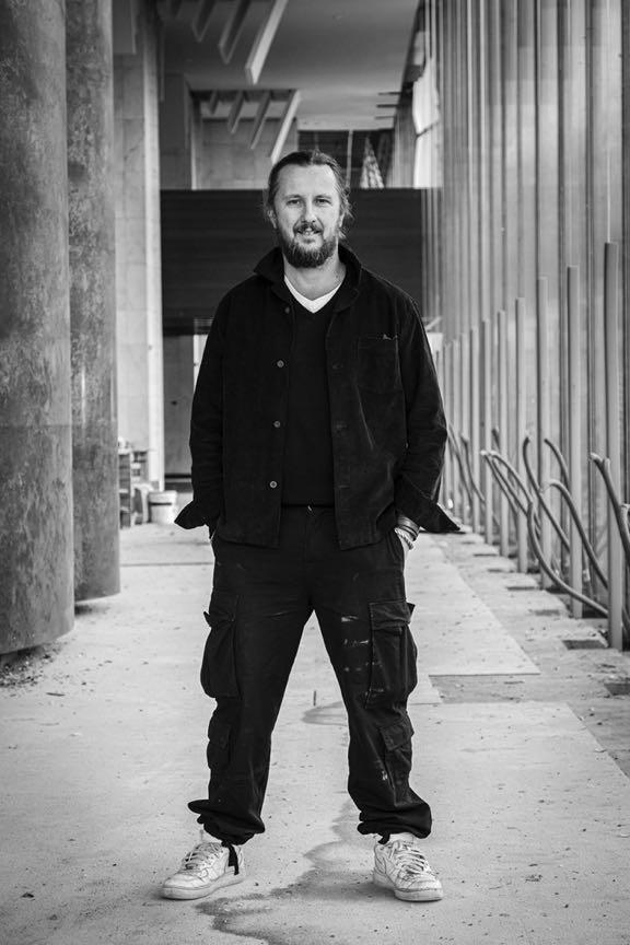
interiors. In his workshops in Zaventem, he welcomes some 30 designer-makers, so that they can work alongside him rather than for him. Selected for their ability to shake up the established order, together, they are paving the way for serene, desirable ecological designs, driven upwards by a love of art and the prowess of high technology. An optimist by nature, the designer is sowing the seeds for a future burgeoning with possibilities.
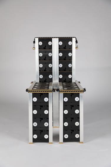
SLV chair from a collection of VHS recorders / Everyday Gallery

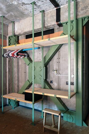
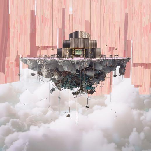

Project illustration of Lionel Jadot for Maison&Objet. There will be a table with a beech base, on which a mushroomshaped top has been grown; this mycelium will be passed through a special oven to kill bacteria and make the material very hard. The bedroom and living room will be housed in a dome inspired by the Kogetsudai moon observation platform, a sand cone-built centuries ago near Kyoto.
Lionel likes to be transported to another place of wonder when he is inside a hotel room. He goes against convention by respecting the constant changes in customer needs. There is a lot of attention to production methods: he tries to transform what at first glance may be seen as unattractive into a distinctive and unique piece of furniture. For his project at Maison&Objet, Lionel
presents a central pavilion that will illustrate his philosophy of hospitality, in a radical and experimental way. A whole series of artists will be involved, each using different techniques for processing recycled materials. The idea is not simply to appreciate the design, but the way in which it was produced with a significant importance to the storytelling and experience.
www.lioneljadot.com
For three years, Future On Stage, Maison&Objet’s flagship showcase for French and international talent, has rewarded companies less than three years old that are at the forefront of innovation, business and creativity in the world of design, decoration and lifestyle. Each year, three young creative start-ups that are true game changers in the market are given an exhibition space at the show and the support of market experts. In line with Maison&Objet’s forward-looking mission to highlight the dynamism of innovative companies to raise their profile and inspire the market, Future On Stage offers visibility and expert support to start-ups in the functional design and design for use sectors that are likely to grow rapidly with an ultra-responsible awareness of the environmental impact of their products. Maison&Objet accelerates the development of these start-ups and Digital Native Vertical Brands that have so much to offer, bringing real added value to retail buyers and architects who wish to assert their uniqueness with differentiating brands.
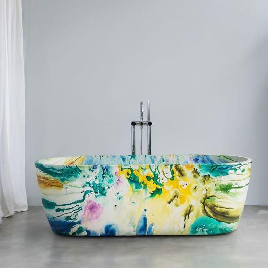
a
fashion consultant who used to change her ideas every six months. This freshness of spirit is reflected in the ever-changing motifs of the artists who now see bathtubs, both inside and out, as blank canvases.
konqrit.com
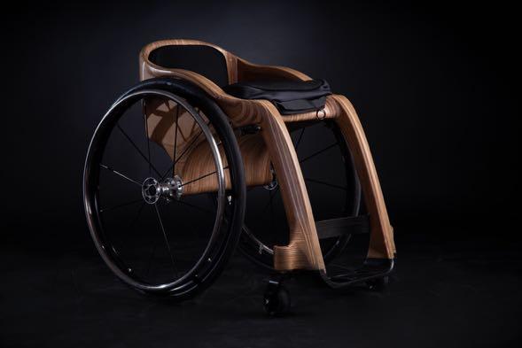

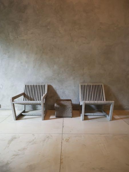
From waste to comfort and function. In a world where we often throw out furniture and buy new, this piece can be re-upholstered to last another generation. sungaidesign.com
This year, the Maison&Objet team has set its compass towards the Arctic Circle to choose the winners of the 2024 Rising Talents Awards. In keeping with tradition, the winners are all under the age of 35 and launched their studios less than five years ago. The geographical area covers the Scandinavian countries of Sweden, Denmark, and Norway, plus Finland and Iceland. The vast glow of the midnight sunbathes the land in a light most fertile for design.
“The Nordic countries as a whole are extremely dynamic and underpinned by a rich history, world-renowned talent, and considerable expertise. Northern Europe has a different relationship with time and natural materials, which are often left in their rawest state. The younger generation is asserting its new language, often close to those of Craft and Collectible Design.”
Dereen O'Sullivan, Head of the Rising Talents Awards
The jury brings together established talents and experts from each country. The FrancoSwedish design duo Färg & Blanche has worked with the Danish designer living in Fontainebleau Gesa Hansen, and Joanna Laajisto, whose Helsinki-based architecture and design studio specialises in hospitality, retail, and workspaces. Iceland's Halla Helgadóttir –consultant, graphic designer, and director of the promotional agency Iceland Design and Architecture, Cecilie Molvær Jørgensen – Senior advisor at Design and Architecture Norway, and David Thulstrup – Danish architect and designer, also took part in the selection process. Stéphane Galerneau, Chairman of Ateliers d’Art de France, has selected the winner of the Rising Talent Award Craft.
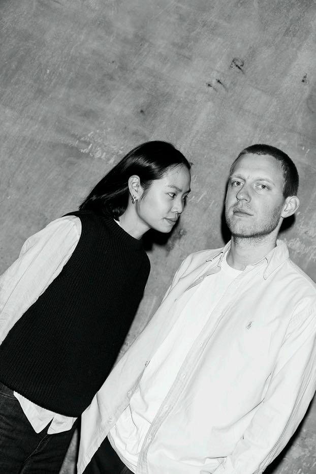
Christian Hammer Juhl, 33, is Danish, and Jade Chan, 29, was born in Singapore. Both studied at the Design Academy Eindhoven in the Netherlands. They founded their studio Christian + Jade together in Copenhagen, Denmark. christianandjade.com
M&O: Aluminium, glass, wood... Why are your objects always made of a single material?
Jade: Instead of combining different materials, we prefer to delve into all the facets of a singular one. All too often, objects are disconnected from their original history. You buy an object, and it tells you nothing about the hands that have handled it or how it came to be. We are committed to rethinking what makes these objects so valuable.
Christian: Where was this piece of wood grown? What are the properties of this variety? That is our starting point.
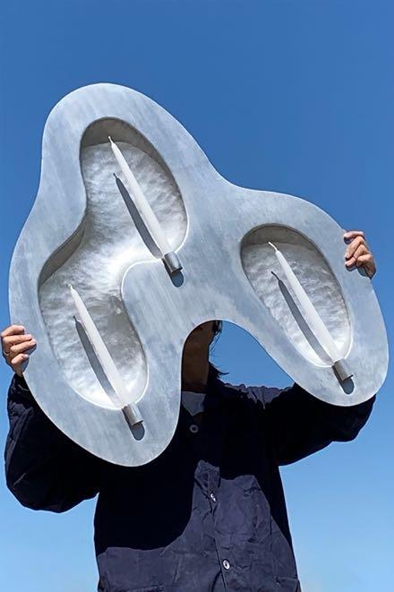
Reflecting Flame. A sculptural wall piece designed for candles. Its form plays on the flickering movement of a flame, creating a backdrop that captures and radiates its light.
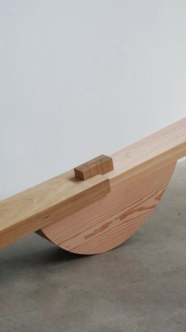
Weight of Wood. An exploration into the life of wood through one of its most defining characteristics - its density.
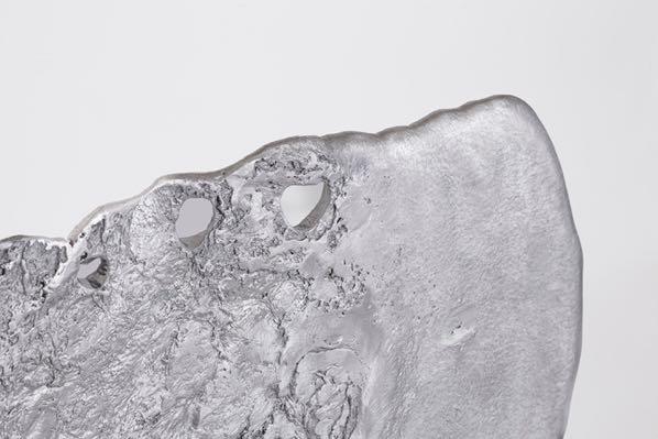
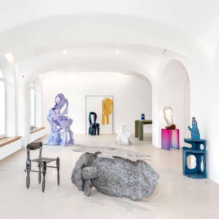
Sandcasted chair
Ali Shah Gallefoss, 35, grew up in Bergen in Norway. He now lives and works in Oslo. He began his career as a buyer of luxury ready-to-wear fashion, which led him to travel from Paris to Milan at an early age. He then went on to study at the Bergen Academy of Art and Design, before obtaining a Master's Degree at the Oslo National Academy of the Arts. aligallefoss.no
M&O: Why opt for a very artistic expression rather than industrial design? Ali: At the time, industrial design just didn't inspire anything in me. It all felt like a rehash of the golden age of the 1960s. Scandinavian design is very well done, and very subtle, but a little tedious. Why shouldn't you be able to feel the rain, see the colours of the weather, experience the ruggedness of the mountains? It's all so beautiful. That's why I went for a slightly more artistic design. I'd like my artistic research to feed into future manufactured series.

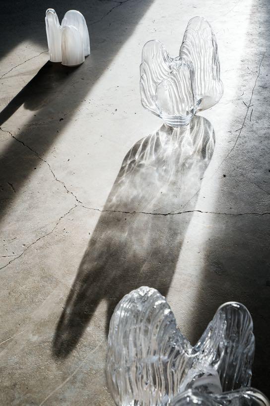
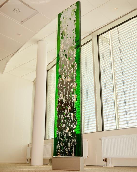
MELT objects. Glass material is transformed into a unique formations. The series has been inspired by metamorphosis of the movement of water. By melting the ice again becomes liquid like rain.
TRACES table explores human-shaped landscape, climate and nature from varying distances.
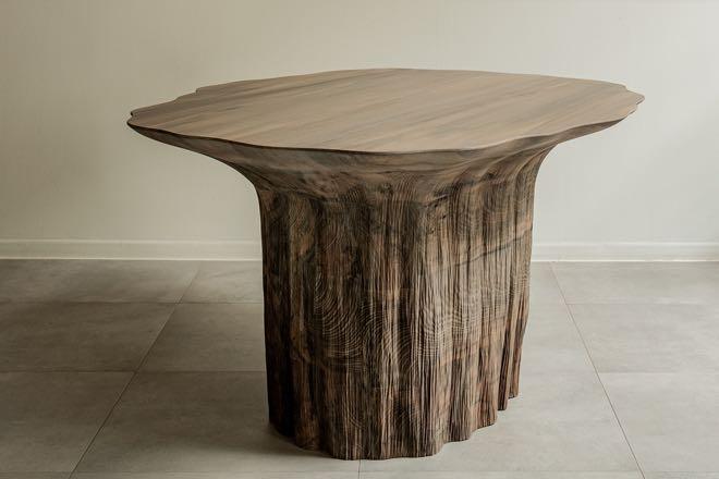
Antrei Hartikainen, born in the village of Outokumpu in eastern Finland, he studied carpentry at secondary school before going on to perfect his woodworking skills at Salpaus Further Education in the town of Lahti. At the age of 32, he has already been named Designer of the Year by Design Forum Finland, and Rising Star of the Year by the Scandinavian Design Awards. antreihartikainen.fi
M&O: What is your working method?
Antrei: When I want to materialise an idea, I look at what has been done before and try to find my own personal expression thereof. I work directly with the material, sculpting and modelling, then returning to my drawing board or computer to hone the proportions. Then I come back to it again. There is a constant back and forth. Then, as is the case for my Melt Tables, I use a CNC robotic arm to reproduce the motion of my hands. I'm always trying to find ways of making a series of original one-off pieces. And I finish my works by hand.

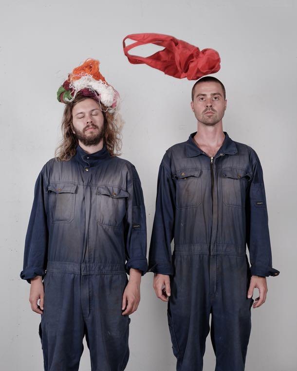
Axel Landström and Victor Isaksson Pirtti are both 31 years old. They met and grew up in the small town of Luleå, on Sweden's Lapland coast. Instantly inseparable, they followed the same school curriculum at the Lorenzo de' Medici Institute of Jewellery Design in Florence, followed by a degree in industrial design in Sweden. They now live and work at Lab La Bla in Malmö. lab-la-bla.com
M&O: How does this process translate into projects?
L.L.B.: Huge steel conglomerates drill into the rocks in order to find mineral deposits. They extract sediment cores from the depths for further analysis, then they store them. For our Prospective Seats project, we took these sample cylinders, which contain the memory of our soil, and turned them into seating. For the Tree Trunk Vases series, we were supposed to produce glass objects in a very short space of time. I saw a dead tree rotting in a garden on my way to the gym, and that inspired me. We returned during the night to steal pieces of hollow trunks, which we then moulded into vases. We played with colour and transparency to highlight the patterns and reliefs.
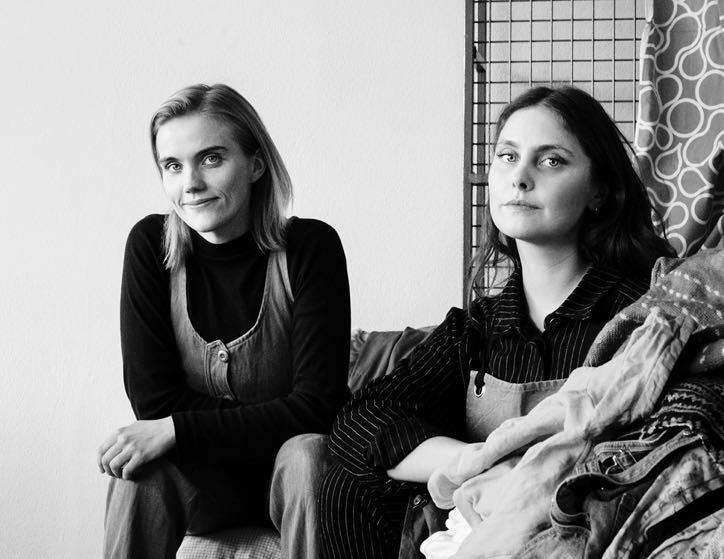
Birta Rós Brynjólfsdóttir and Hrefna Sigurðardóttir are 32 and 34 years old respectively, and live and work in Reykjavik, Iceland. They both studied product design at the Iceland Academy of the Arts, where they met during their studies before founding Studio Flétta in 2018. studiofletta.is
M&O: What is your driving force?
S.F.: Here in Iceland, we import a lot, and then export what needs to be recycled. We strive to find solutions for materials that have no other second lease on life.
We work with companies to teach them about long term sustainability, so they can make objects that can be kept for a long time and repaired. At the same time, we educate consumers by showing them in a simple, understandable, and cheerful way that it is possible to create things that bring happiness using waste. For example, we create cushions using old car airbags...
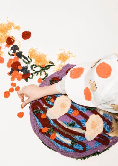
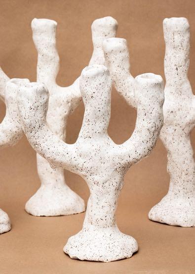
Minute Candle holder, 2018. It is shaped in one minute. The goal with this project is to design and make a unique handmade object in Iceland that can compete with mass production.
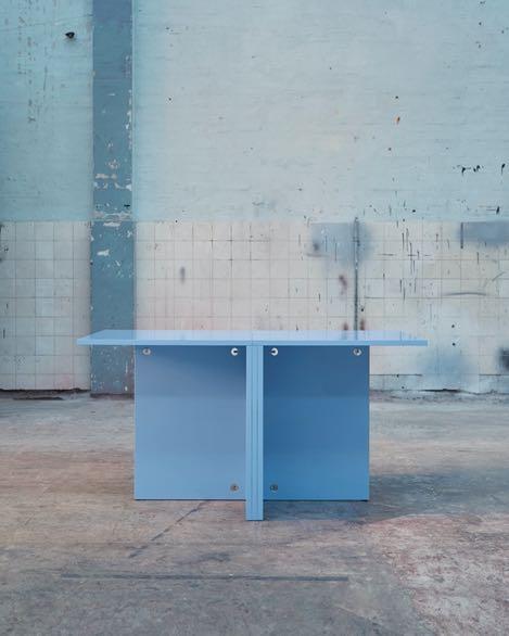
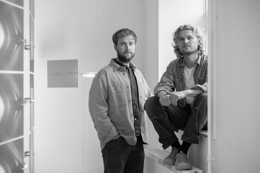
FAB table, designed with a shine and a color that captures the tone of the space and reflects the buildings original function as a central laundry for the Copenhagen hospitals. The project resulted in an extendable table that unites the extension plate with the table frame.
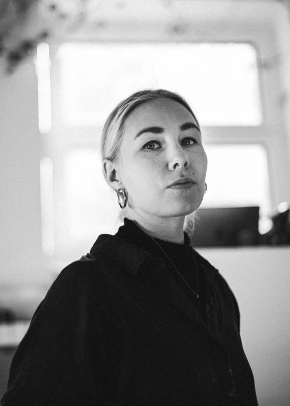
Both 31 years old, Frederik Weber and Gustav Dupont met while studying at the Royal Danish Academy of Fine Arts for Design, where they graduated in furniture design and then space design. They now live and work in Copenhagen, Denmark.
M&O: How exactly does your duo work? Frederik: We are completely inseparable. It all started at school, where we practically slept in the workshop. There was this board where the students could write their orders for materials. Two names always came up together: Frederik. Gustav. People thought it was just one person's first and last names, hence the name of our studio. We are always in constant dialogue.
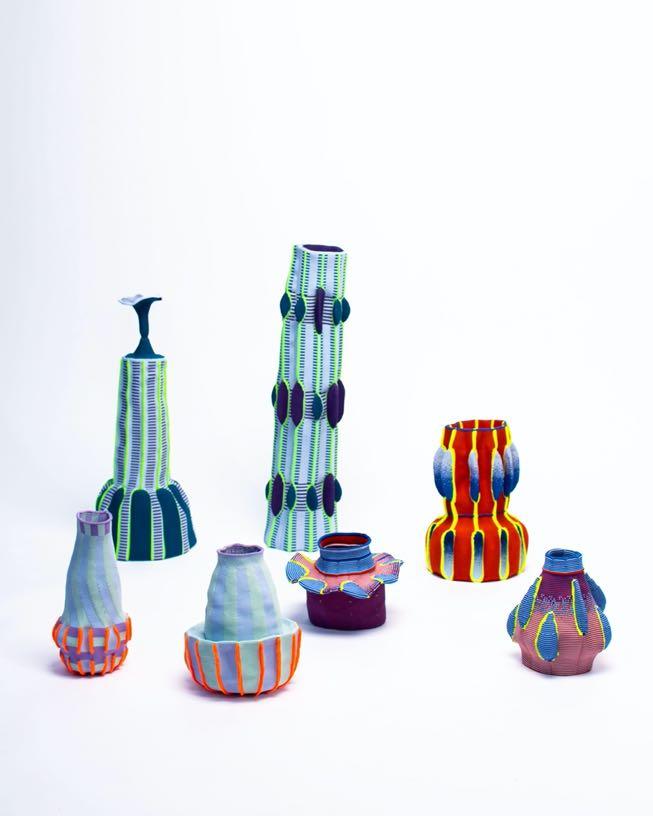
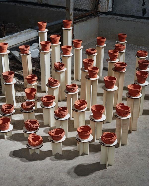
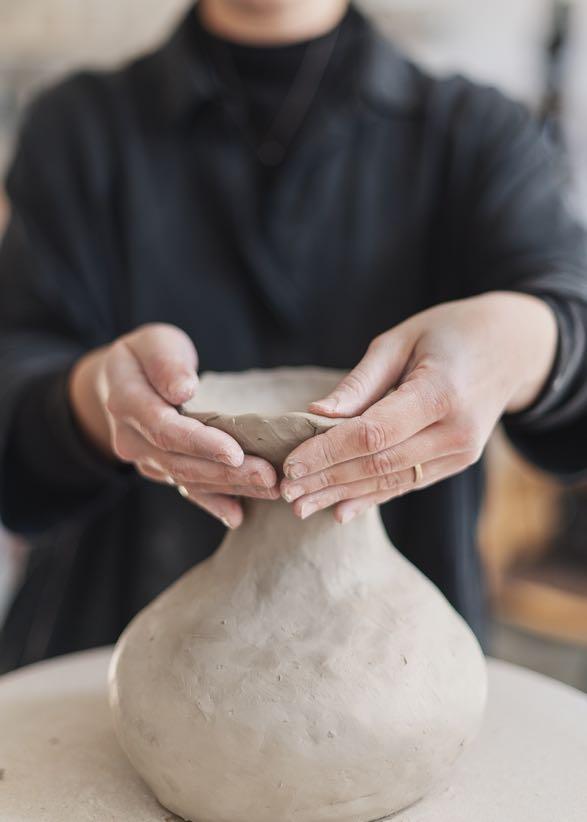
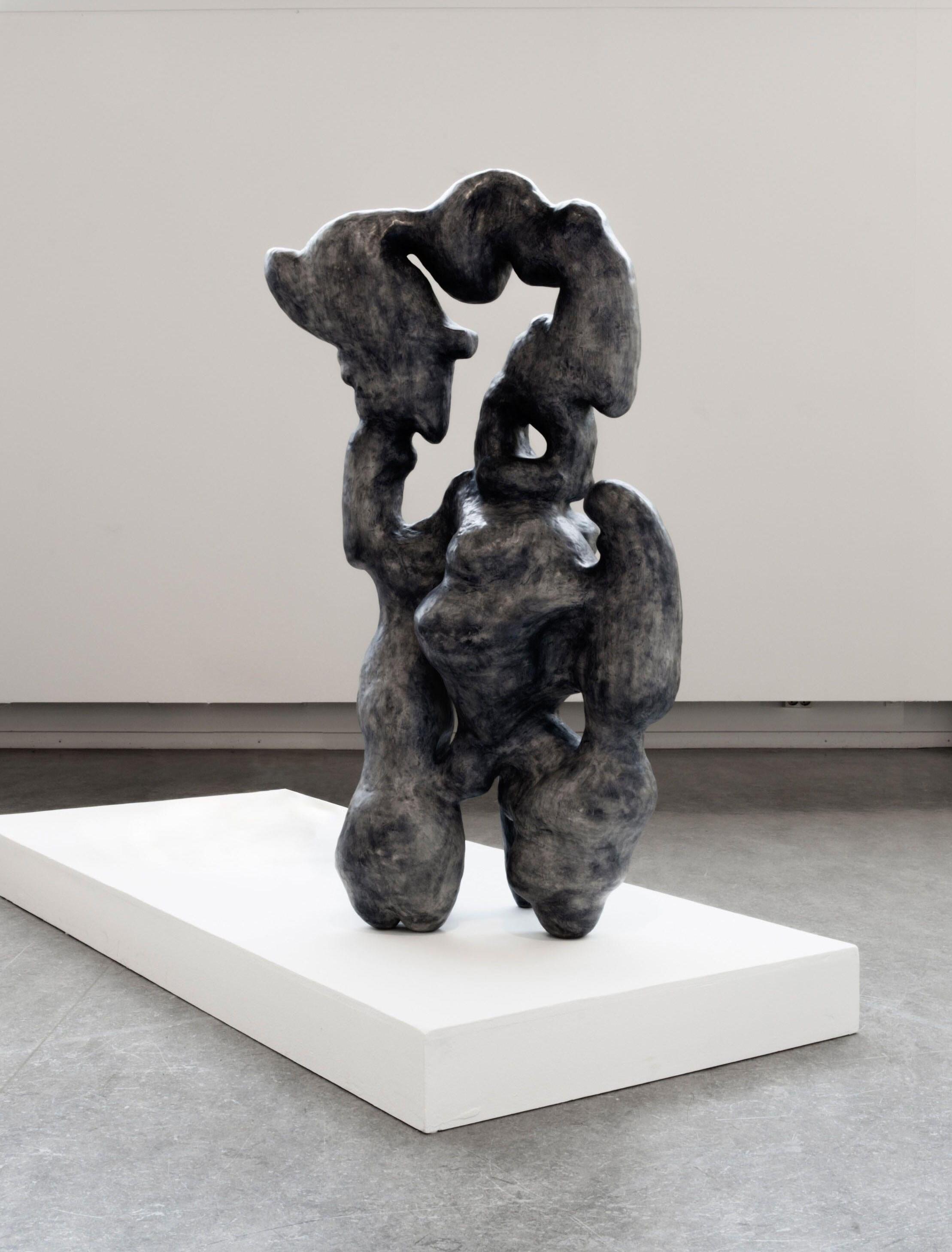
Malin Ida Eriksson is a 31-year-old ceramist Her studio is based in Stockholm, Sweden, in a former porcelain factory where around some 100 artists work side by side. Having studied art at the Universities of Göteborg, Sweden, and Bergen, Norway, she went on to achieve a Master's Degree at the Stockholm University of the Arts, or Konstfack. malinidaeriksson.com
M&O: What would you say is your philosophy?
Malin: My work revolves around the passing of time. When I first started studying art, my grandmother passed away, which opened my eyes to the ticking of the clock and the fact that there is nothing we can do about it. Clay is a good way of expressing this notion –it's malleable, changeable, and if you don't bake it you can still modify it by adding moisture... Once it's in the kiln, it will remain frozen forever, unless it's broken!


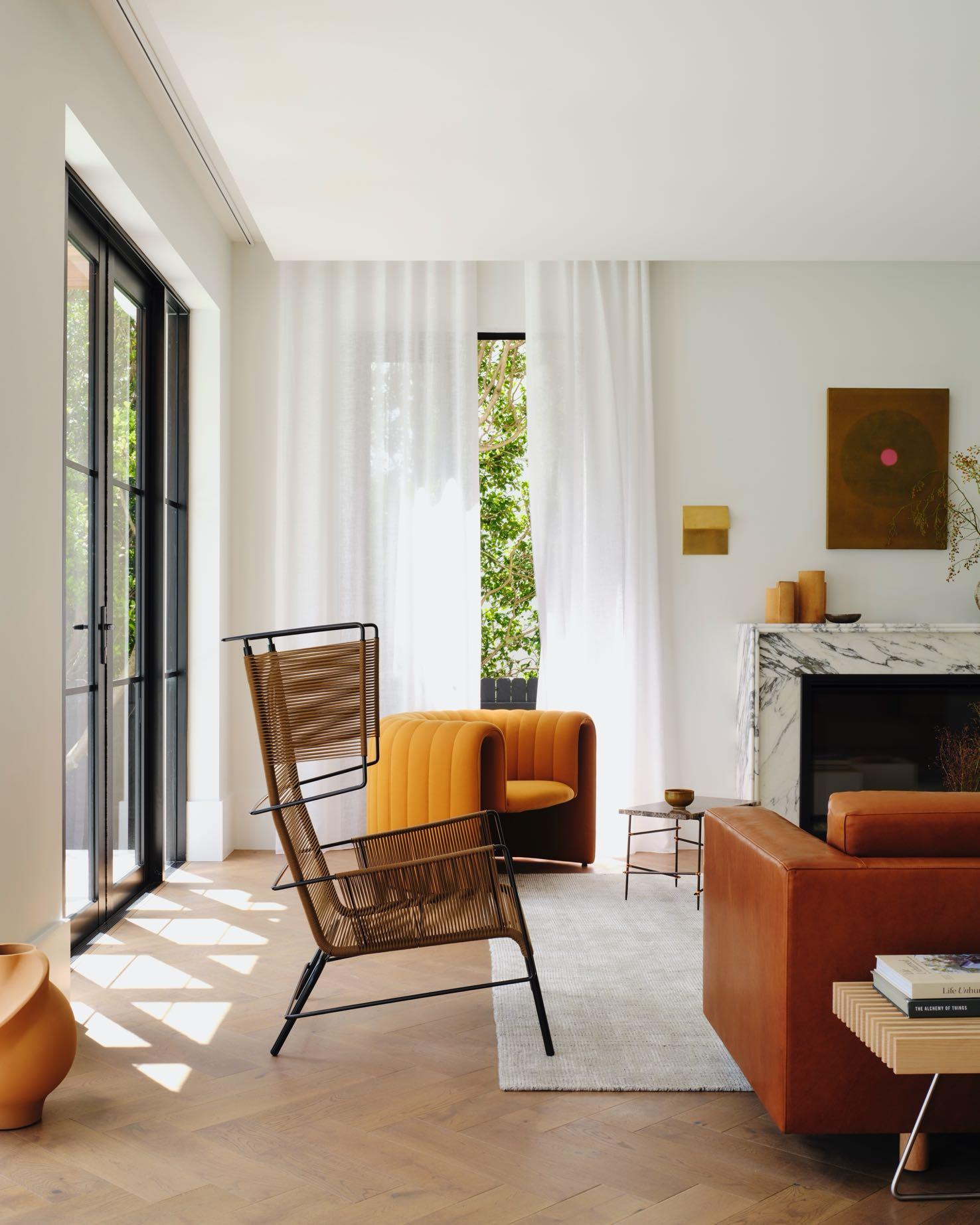
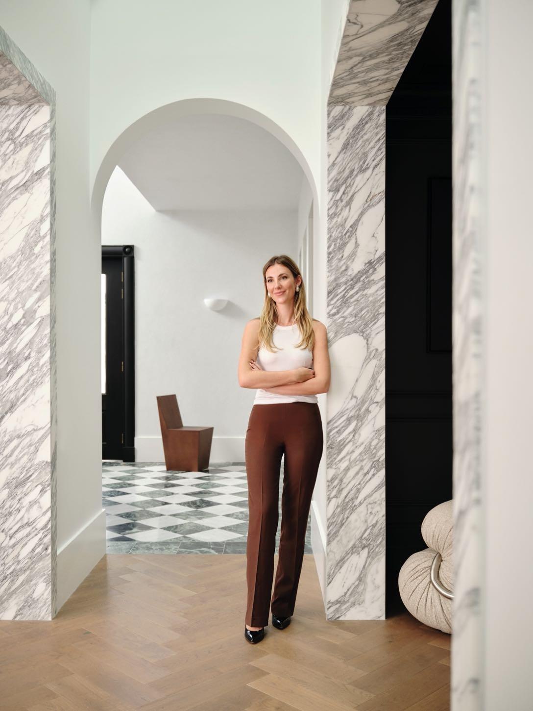
Smac Studio has transformed a fragmented, terracotta-toned 1980s property into an elegant family open-plan home in Sydney.
Located in a coastal suburb of Vaucluse, original arched windows of this 345 m² house look out at Macquarie Lighthouse, the Australia’s
oldest one. The original architect took a trip to Tuscany in the 1980s and when he returned, he built this house, incorporating a lot of traditional Italianate style. It was completed in 1990, and he built it as a family home for himself, his wife and their kids. The new owners wanted light and large spaces suitable for entertainment but, at the same time, classic to blend with existing architecture.
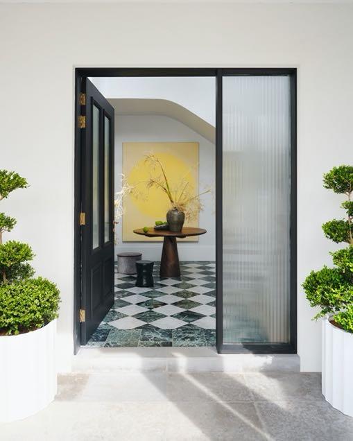
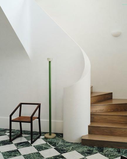
The entrance foyer received a notable update. Previously the floor was a slab of Verde Alpi marble, walls were limewash orange, and the space had a small front door, given the grandness of the staircase. Black steel balustrades carved the staircase at sharp angles. Therefore, Smac Studio smoothed the hard edges into inviting white Venetian plaster curves and created a checkerboard floor from Carrara and Verdi Alpi marble - this design decision is a tribute to the original stone slab. A larger front door has been added with fluted glass to have more natural light and privacy. In the double-height entrance the bubble chandelier floats like a cloud - a kind of a heavenly sense of arrival. The pop of color is added by the artwork ‘Midday Heat, Summer Light’ by Peter Summers. From the entrance, you access the study, the laundry room with an exit, the powder room and a small corridor that leads to the other formal and informal areas.
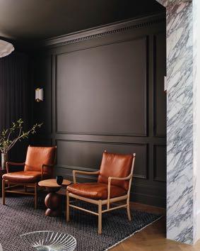
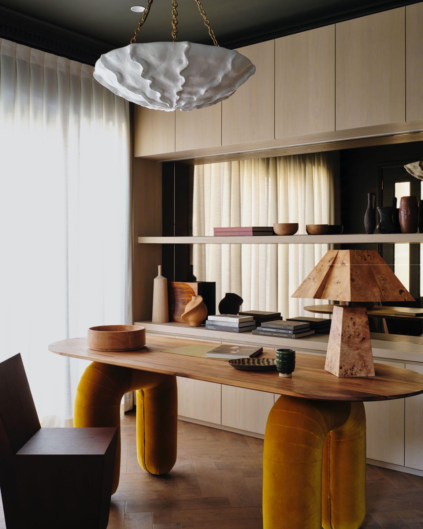
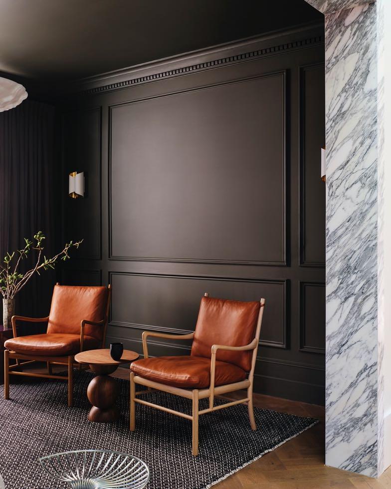
Smac Studio used Ristretto by Porter's Paints, a very dark warm gray color with a hint of green for the walls of the home office. The playful Lavinia desk by Hegi Design designed for Pietro Franceschini is part of a limited edition of only 12 pieces. It is designed in the Ligurian Riviera which
makes it perfect for empathizing with the Italian style of the house. Its soft lines and curved legs covered in Ombra Rubelli Velvet offer fluidity, sensuality and a touch of lively feminine and masculine. Above, Rachel Donath's sculptural burl wood Bohan table lamp plays with form and shadow to challenge perception as it changes shape from different perspectives. The sculptural design of the room is completed with Aerin's sculpted white plaster chandelier: inspired by the surface of a seashell, its stylized shape has a beautiful organic charm that brings the feeling of coastal living.
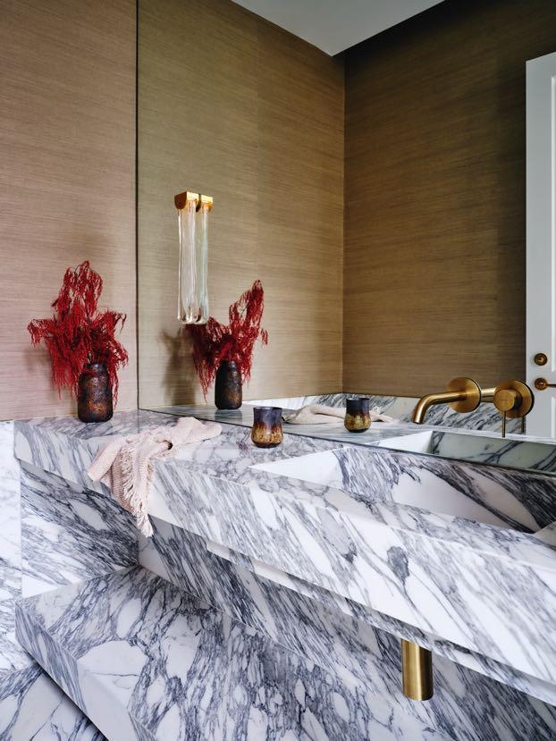
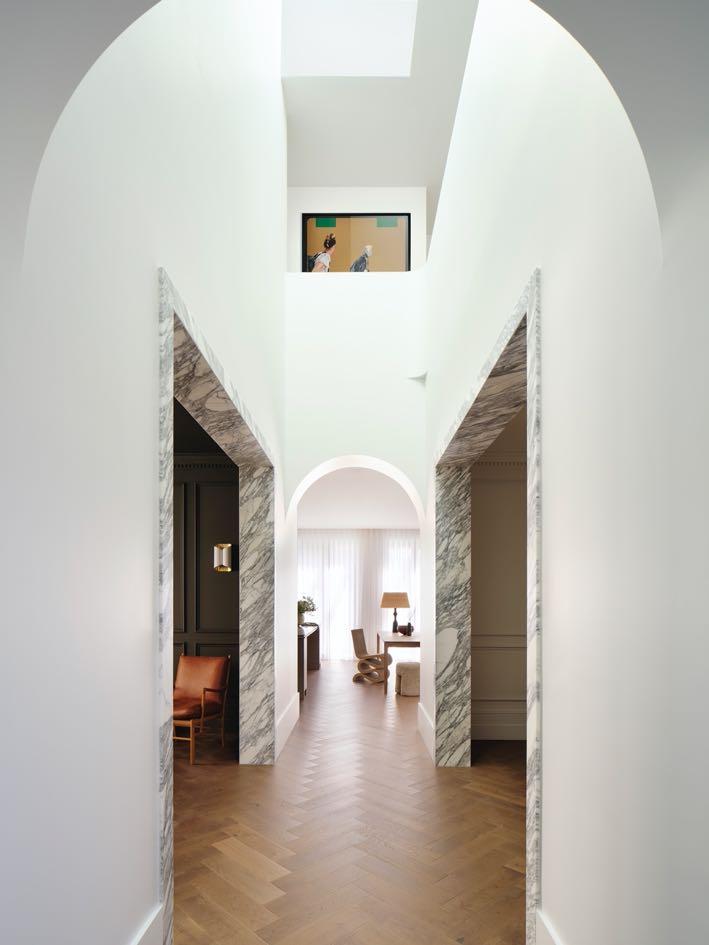
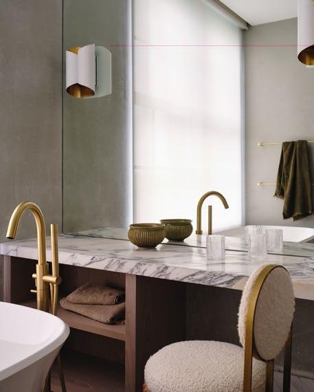
Due to this house being a little more classic, the design team stuck to a theme of gold in the powder room. We have gold grasscloth wallpaper from Porters Paints, Articolo's sconce that looks amazing lit up, and gold Parisi tapware with lots of Arabescato marble on the vanity. Moving on to the corridor, the atmosphere becomes increasingly welcoming thanks to the herringbone floor. While above, we find a soft and enveloping space with a skylight. Here the design team replaced an open metal balustrade with a closed pen wall, thus providing greater privacy and drama. Originally clad in dark wood, symmetrical Arabescato marble doorways along both sides of the corridor lead to the formal dining room and cigar room, creating a special sense of entry into these more formal and traditional spaces.
“In traditional homes you often see studies, libraries and living rooms made of dark, heavy wood and that's what I wanted these rooms to evoke. It's a modern take on this.”
Shona McElroy, Principal of Smac Studio
The cigar room is painted the same moody color as the office. The bar features bronze veneer and a marble backsplash that contrast well with the dark color of the walls; plus, the choice of high-end materials creates a sense of opulence in this formal space. The large pale gray chair by Dimitri
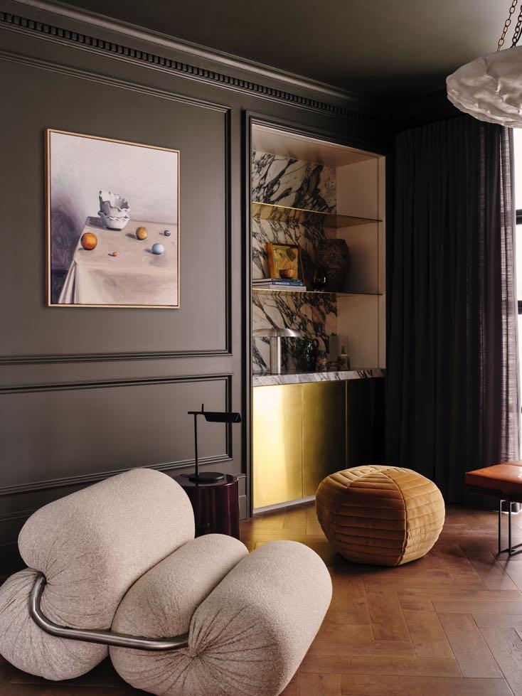
Vargas is elegant and sophisticated despite its large size. A pair of iconic chairs by Carl Hansen & Søn and the Fred International poetically shaped sculptural stool complete the design.
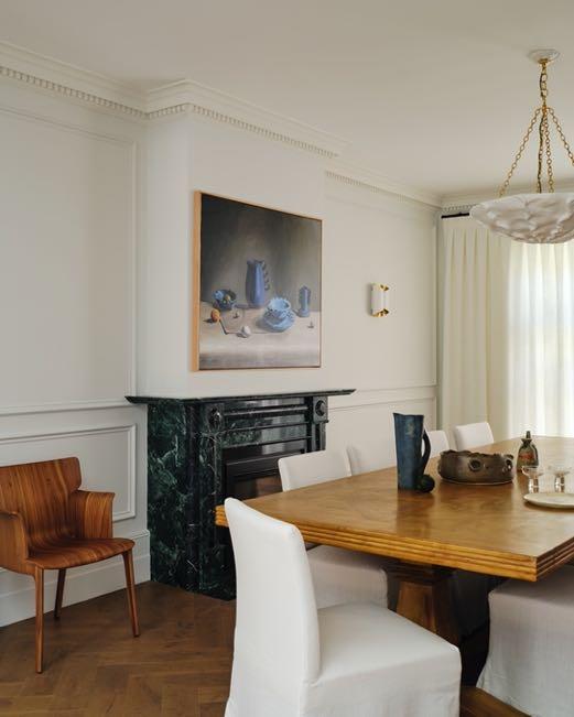
The dining room has the original Verde Alpi marble fireplace, while the cigar room has Arabescato marble shelving. A large wooden table is surrounded by chairs with long white upholstery - a perfect combination to recreate the classic atmosphere. Next to it we find a walnut chair by Andreu World. The design team also added detailed panels, cornices, more conventional pendant lights; as well as more traditional curtains and curtain tracks in these rooms. They needed to work closely with the classic feel of the entrance.
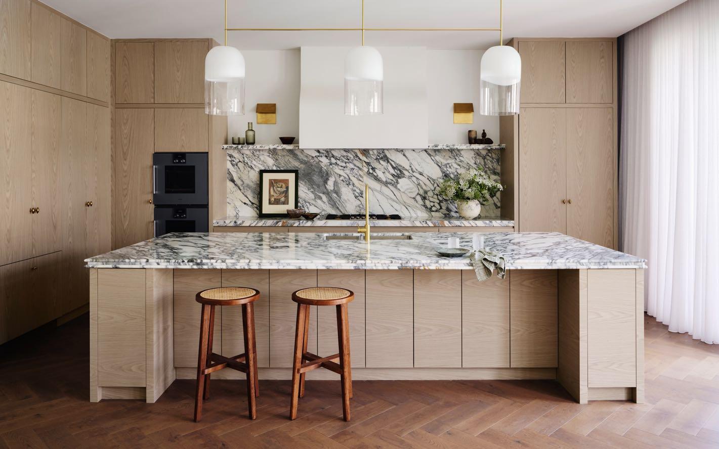
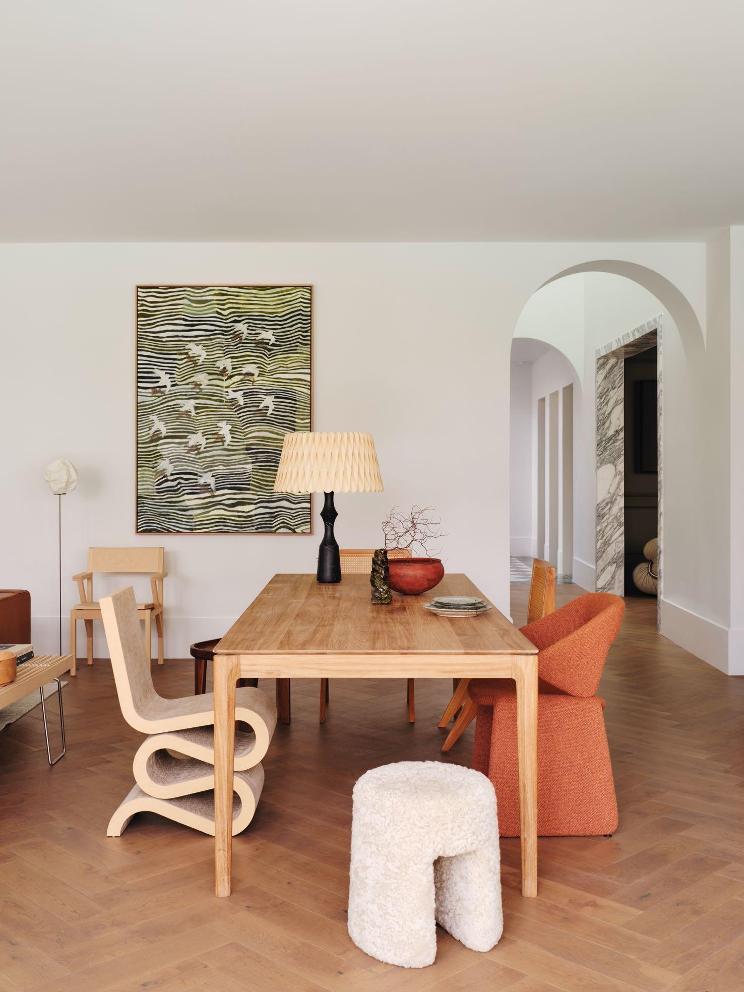
Passing the formal dining room and dark, moody cigar room you enter the bright, open-plan modern space at the rear. This is where the most significant change to the house took place. The existing rear of the house was quite sectioned off into formal and informal living rooms and kitchens, and it had to be transformed into the large living area. In particular, three small rooms have been reconfigured into one expansive space, formed by kitchen, living and dining zone. The whole room opens onto the pool and pergola that makes the house ideal for entertaining. In addition, the rear wall was moved out to create more internal space. On the left, we find a symmetrical kitchen with a huge island in the center and the Articolo lamp above. While on the kitchen
wall, Kelly Wearstler worn lights that look like bent pieces of brass were included. Parisi's tapware echoes the gold accents of the chandelier. The kitchen joinery is custom designed by Smac Studio in Timber Veneer from George Feathers. Luxurious Arabescato marble slabs grace the kitchen island and splashback.
Next to it, an informal dining area composed of a light wood table accompanied by a series of interesting seating pieces. They are all different from each other, from the shapes to the materials, but they match perfectly: Artifort's Suit chair with its elegant open back, Sequoia pouf by Space Copenhagen, the sculptural Wiggle side chair in cardboard by Frank Gehry for Vitra.
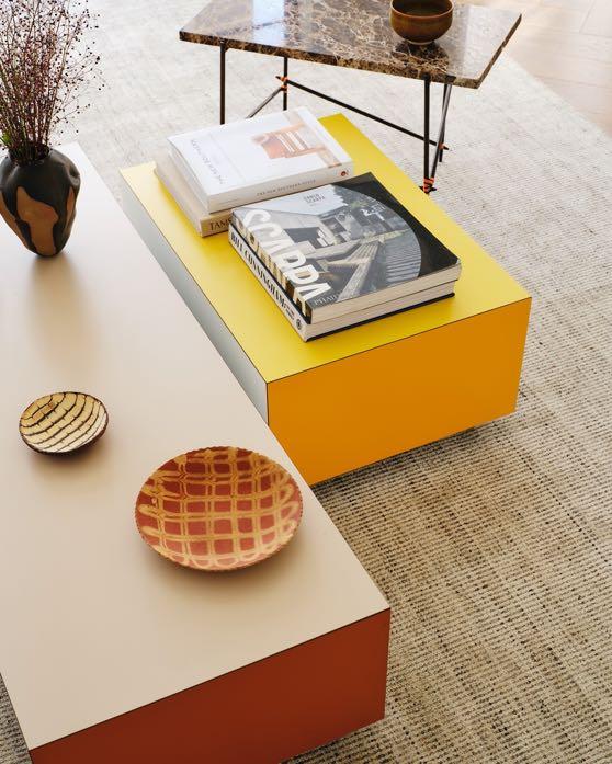
Like the kitchen, the living room on the opposite side offers a certain symmetry and incorporates features. The Arabescato marble fireplace is flanked by bronze fold sconces by Kelly Wearstler, and two French windows have been inserted along the sides. The choice of furniture is also very varied here. Bloc coffee tables in burnt
orange and zinc yellow by Established & Sons take up the corners of the path and the artwork ‘Silence Is Golden, Focus Is Everything’ by Peter Summers. The rest of the furniture follows the trend of curves. The Maggiolina chaise longue by Zanotta goes hand in hand with Sancal’s Remnant armchair: both add a touch of playfulness
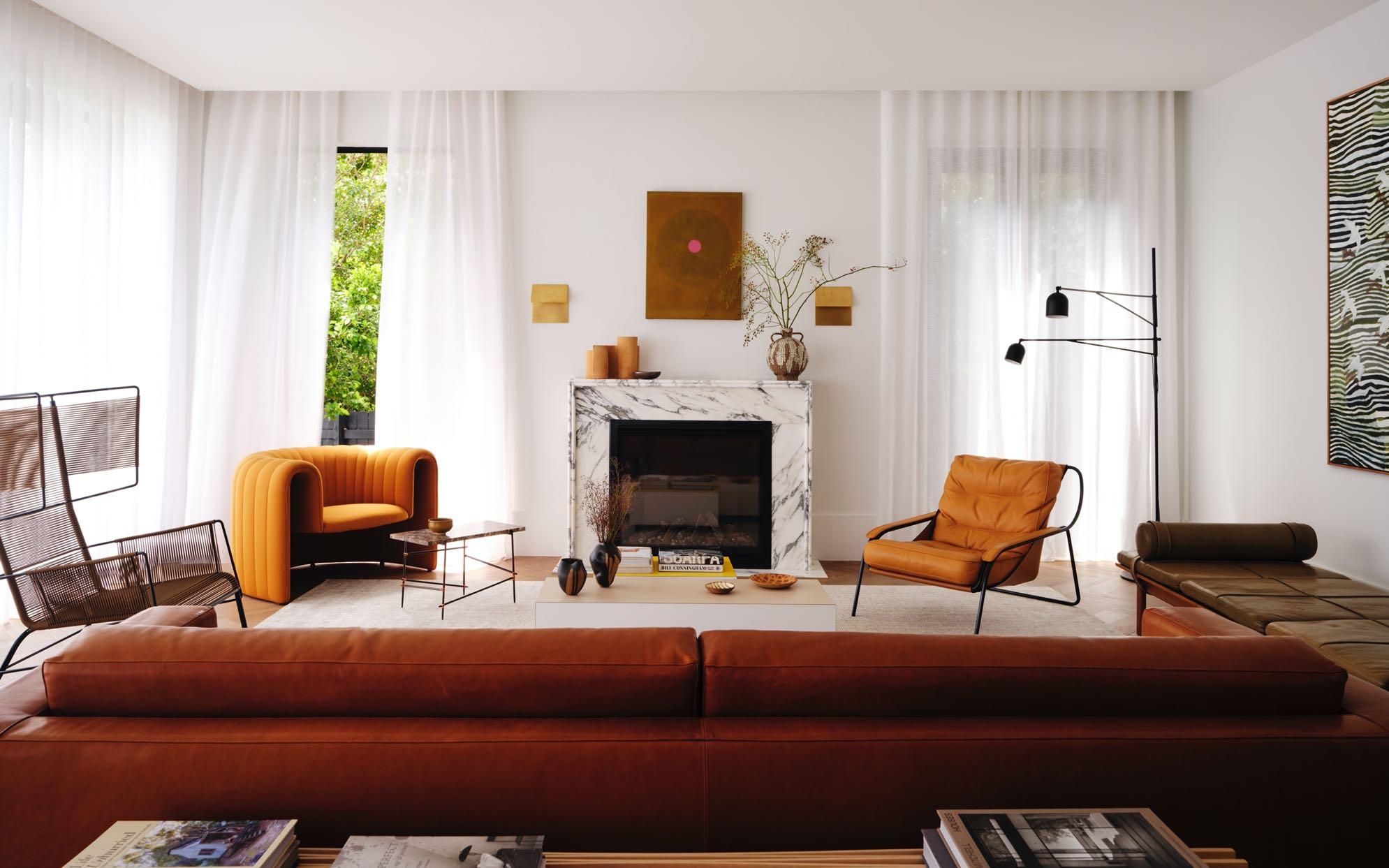
with their visual lightness and apparent simplicity. While brown Bilgola daybed by Nau Design reminds us of the Australian modernist architecture prevalent on Sydney's northern beaches. Warwick Fabrics' white sheer curtains fall from ceiling to floor offering plenty of natural light and privacy at the same time.

“The Arabescato marble is everywhere except for the original Verde Alpi marble fireplace in the dining room. I chose Arabescato because it’s Italian and timeless, with dramatic textured veining. This is quite a big house by Sydney Eastern Suburbs standards, so to have the continual material link of the Arabescato keeps the design consistent. It links the spaces and tells a design story.”
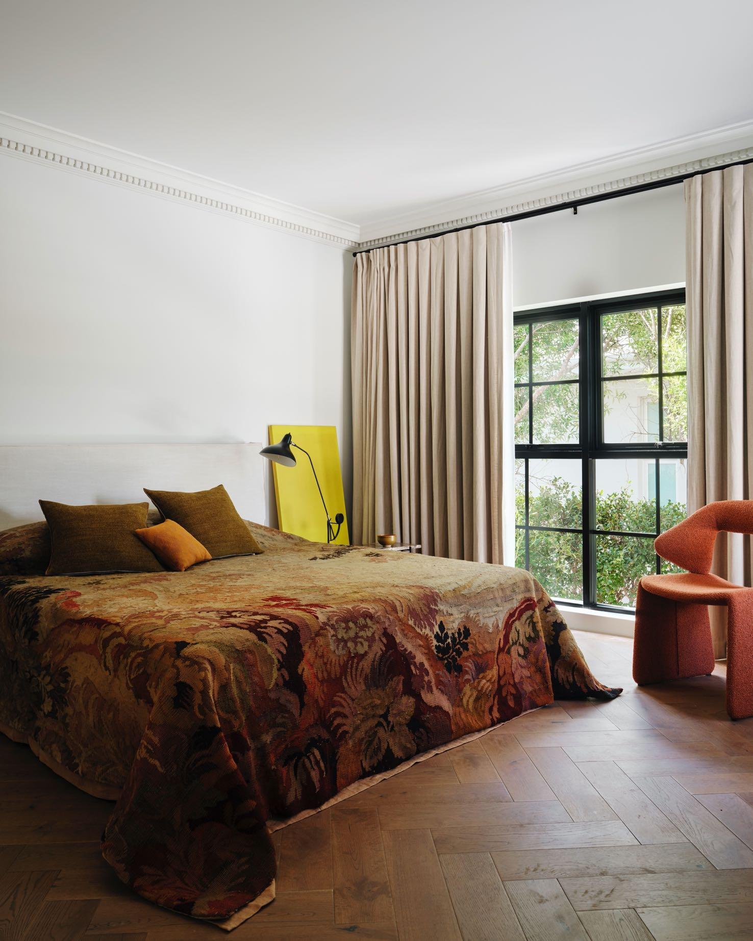
The second floor is reserved for the sleeping area: it includes a master suite with an adjoining bathroom, and three other bedrooms and two bathrooms. In one of the bedrooms, the designers opted for a simple bed with a white keyboard but embellished with 18th century tapestry by Parterre Australia. Instead of the usual bedside tables, the designers opted for a pair of Marlo Lyda side tables created from pieces of stone that are too small or cracked for common use - making them unique pieces. Peters Summer's yellow artwork gives a dash of avant-garde.
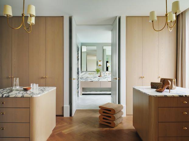
In the master suite, the design team decided to include the double island walkin wardrobe with the Arabescato marble top and cabinetry custom-designed by Smac Studio. The handles on the polished brass drawers recall the Reed Small chandeliers designed by Thomas O'Brien with paper lampshades. From the same Wiggle collection, the iconic Vitra stool gives a strong visual impact to the environment. The floor of the adjacent master bathroom is covered with Herringbone Tiles. Smac
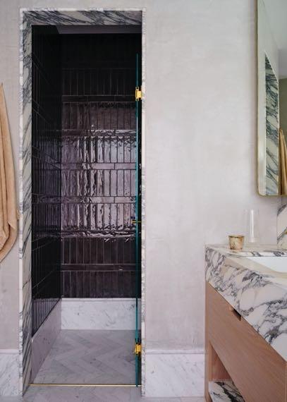
Studio created the custommade joinery cabinet which features a double sink and a shelf in Arrabescato marble as well as the two mirrors. On the opposite side we find another small custommade piece of furniture with a marble top, and above a split extending to the rest of the wall which gives the room a theatrical feel. A freestanding bathtub has been positioned next to the window while on the opposite side we find the shower with a marble portal.
“The master suite came from my personal suite of dreams. So, we channelled symmetry in this project in a few locations, and the master walk-in wardrobe is one of those. The islands are just so luxurious and with that much space, I just had to do it. A double island walk-in wardrobe is every woman’s dream.”
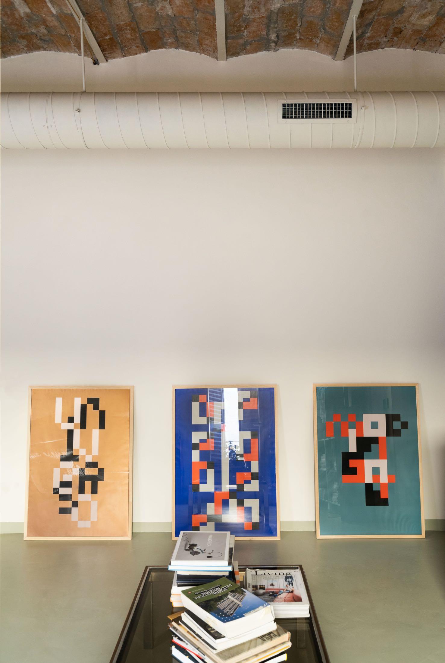
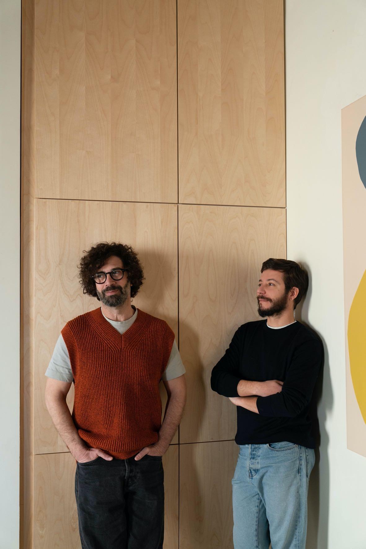
In the vibrant heart of the multi-ethnic Esquilino district in Rome, STUDIOTAMAT designed a brightly colored loft for Matteo Soddu, co-founder of the studio and his partner Sergio Marras.
Photography by Seven H. Zhang
“The overlap of being both the designer and the client, has allowed a 360° design, a perfect combination between the domestic dimension and architecture to be admired.”

With a breathtaking view of the platforms of Termini
Station and a stone's throw from Piazza Vittorio, the 95 m² apartment is located on the second floor of a late 19th century building. The three French windows of the living room and the studio have as their horizon the wall covered in Travertine, which houses the control tower that once regulated the railway traffic, designed in the early 1900s by Angiolo Mazzoni.
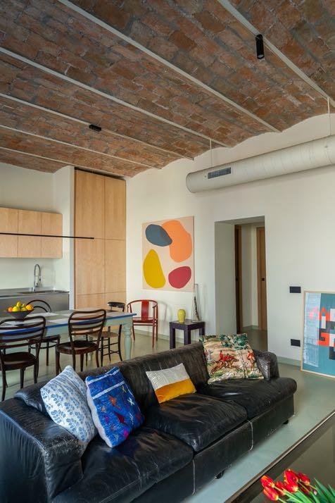
The apartment was dark, cramped, with narrow corridors and excessively low false ceilings. The design started from the need to expand the spaces, creating a central open space dedicated to the living room, restoring the original ceiling with brick vaults and homogenizing the rooms with a neutral texture-free floor. The use of color defines the areas, minimizing the number of doors and giving a feeling of great openness and versatility.
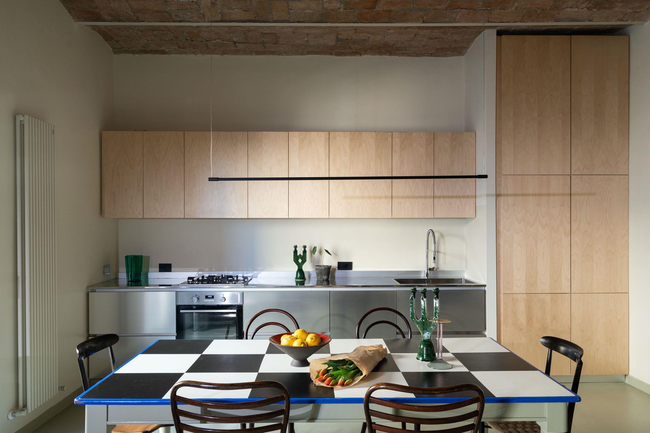
The central nucleus, which in the previous arrangement housed the bedrooms, has been completely emptied, becoming the beating heart of the loft. The customdesigned kitchen is covered with two contrasting materials: the steel of the drawers and the top, and the birch of the wall units, the fridge columns and the pantry. Next to it, a large vintage dining table with a black and white checkered top is perfect for organising dinners with many friends; its electric blue edge gives it a theatrical touch. Above, a minimalist design pendant by Redo Group Italia has been hung.
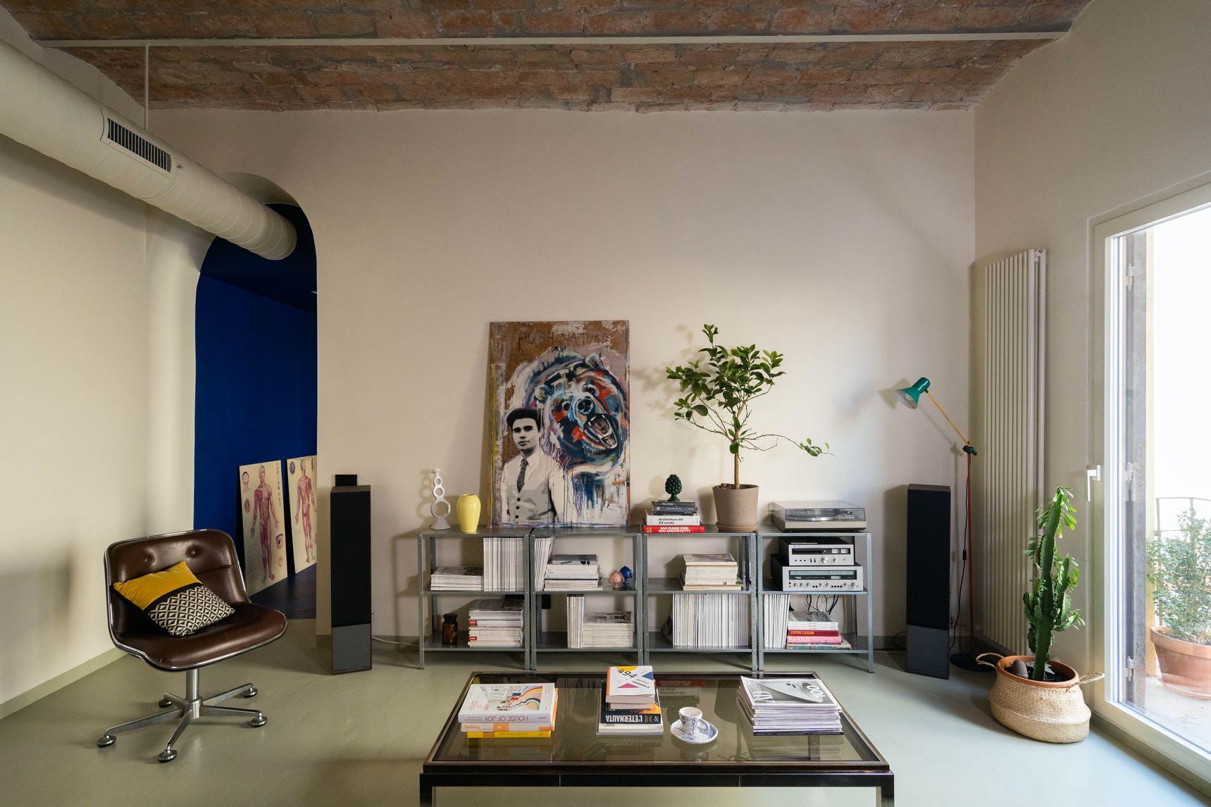
In the whole living area, the neutral color of the walls highlights the brick vaulted ceiling and, at the same time, recalls the reflections of the sun rays on the travertine of the station. While an air diffuser with circular cones and vents unfolds like a fil rouge throughout the apartment. The living area is furnished with a black leather sofa, a coffee table and vintage office armchairs found at a Berlin flea market. It also houses an open metal shelving, framed by walnut-covered audio
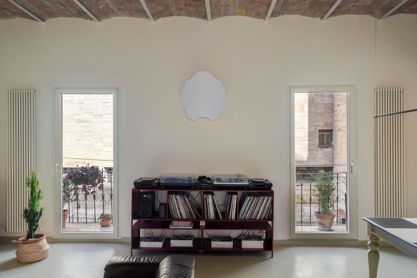
speakers, which show the couple's large vinyl collection. To reveal the owners' background as DJs and event organizers, the console equipped with mixer, plates and CDJ, made of iron and painted in cherry-colored powder, which dominates the longitudinal wall, surmounted by the baroque shape of Servomuto’s applique in pure white linen. Boldly patterned cushions and colorful paintings scattered throughout the home add character and personality to the rooms.

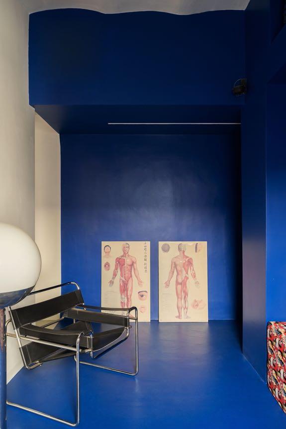
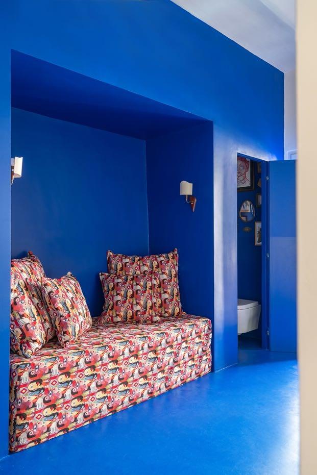
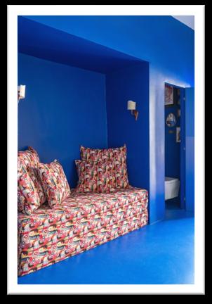
The central open space leads to the study on one side, completely open onto the corridor, which can be transformed into a guest room if necessary. The studio is a volume defined by a shade of blue that recalls the sea of Sardinia, where the couple comes from, and the typical color of the houses in Greece, where they often spend their holidays, and extends as far as the corridor, chromatically interrupting the uniform lime-colored resin that extends over the floor in the rest of the apartment. Inside, there are a desk, the Wassily armchair by Knoll, an equipped wall and a niche with a sofa bed, set between a service bathroom and a wardrobe space. Two vintage lights, positioned on the two opposite corners, aim at the vaulted ceiling, here plastered in a neutral color that amplifies the sculptural effect of the blue that envelops the room.
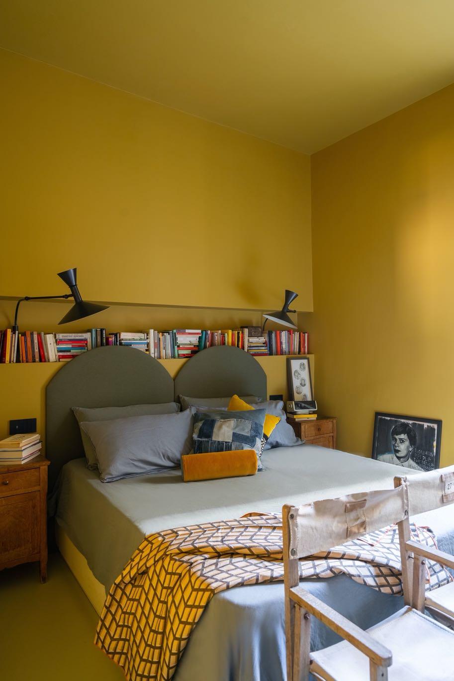
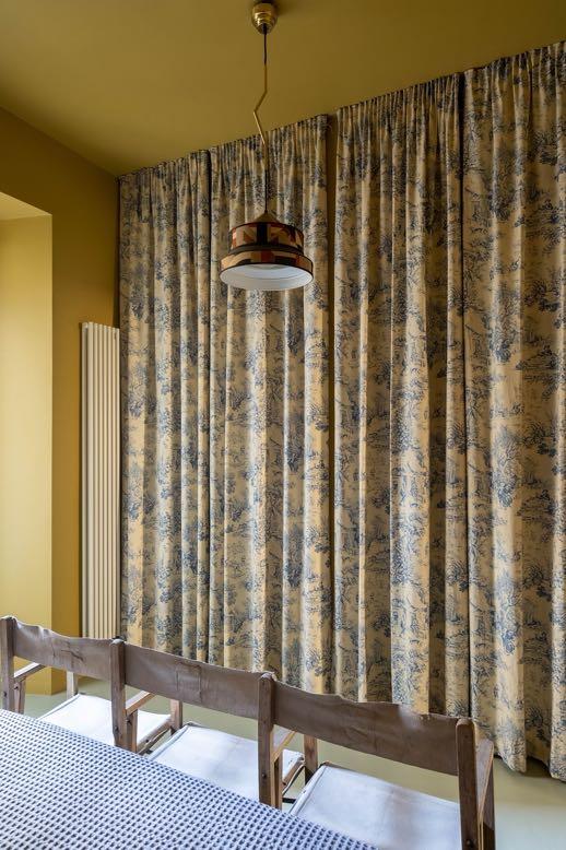
The bedroom with the master bathroom, separated from the living area, find space where the living room once was, and overlook a more private and silent internal courtyard. The bedroom follows the logic of the studio: it is as well a single mustardcolored volume, a box that encourages rest. The wall behind the bed is shaped to house a shelf for books and a pair of Nemo's Lampe de Marseille. While the large wall unit for the open wardrobe is shielded by a full-height curtain with a toile de jouy pattern, in contrast with the suspension lamp by Servomuto, made with Hermès fabrics and brass details.
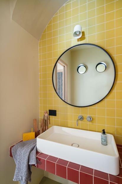
Characterised by a large arch that houses the sink, the bathroom is covered in three
shades - yellow, pink, amaranth - of smallsized tiles, which identify the different functions. Above the mirror is hung the wall lamp by Normann Copenhagen with an attractive design in all its simplicity. The elegant rounded washbasin by Ceramica Flaminia is accompanied by Paffoni's builtin taps. The two portholes on the wall that overlook the bedroom allow for natural lighting.

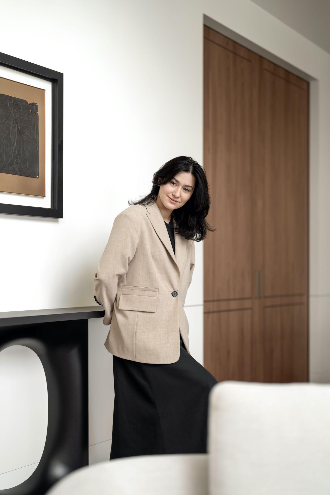
Aisel Kononenko projected a twostory house in a picturesque Kyiv suburb, with a view of the Dnipro Bay for a big family.
The owners are a married couple originally from Lviv that has three adult children who live separately
and often come to visit their parents. The family gathers there on family and religious holidays to share the joy of important events and spend time together. For the past twenty years, they lived in a house with a classic interior. Moving into a new 387 m² home with modern architecture, the couple wanted to create a contemporary space that reflects their character.
The designer Aisel Kononenko was recommended by the clients' eldest daughter, who is into design herself and graduated from an interior design course at the London School of Arts. She had
Thanks to the sliding doors, the space on the ground floor can be united or zoned. When a large family gets together, the hall and dining room can be joined by an entrance hall, kitchen, and indoor and outdoor terraces.
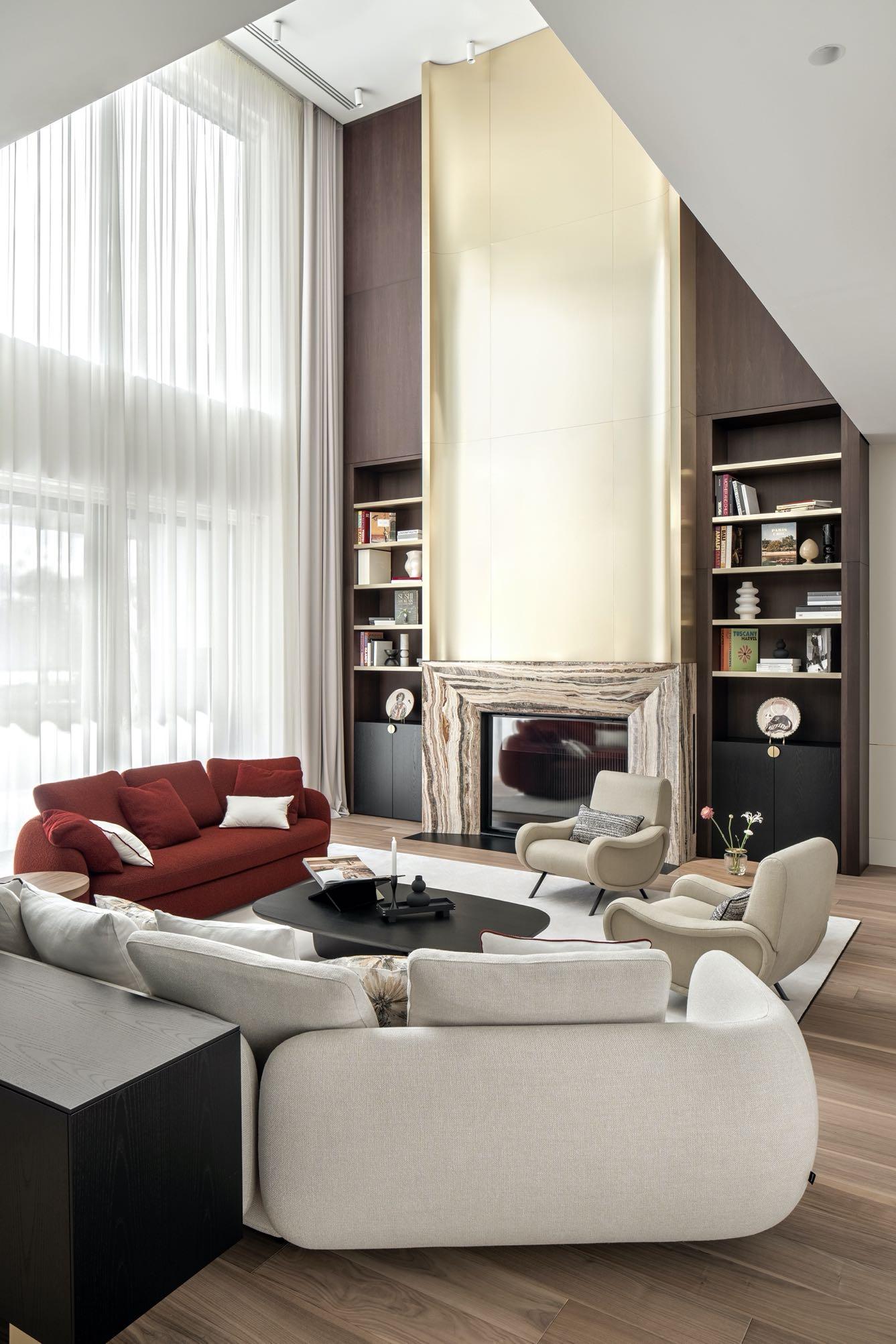
The main living room has a ceiling height of about 7 meters. The main accent of this space is a large fireplace with a marble portal and brass chimney decoration to the full height of the room. That is a custom solution made of sheet brass by the designer's drawings. The shelves on both sides of the fireplace are also made of brass. The designer chose Italian brands for the furniture: a pair of armchairs by Cassina, Poliform’s coffee table and sofas and Kristalia’s console.
The house owners do not like cold gray shades, black, and 'rectangular German minimalism.' They prefer a warm sandy palette and a combination of expressive marble and brass textures against a neutral light background. The couple are art lovers and have a collection of paintings and sculptures by contemporary Ukrainian authors. It
On the house's ground floor, there are public areas and a guest bedroom for the grandmother. The rest of the living quarters, such as the master bedroom and guest rooms with their wardrobes and bathrooms, are on the first floor. previously collaborated with Aisel, particularly when arranging her company’s office. The critical criteria in the choice were an individual approach, and the ability to feel the clients to create interiors in different styles.

was essential to fit these works into the interior.
The through element is a thin brass line. It passes through the wall's surface in the hall, emphasizes the modern geometry of the space, and continues as an inlay on the facade of the sliding doors and kitchen facades. Another detail characteristic of Art Deco is a narrow insert of black marble on the parquet.
"The owner is a bright and charismatic person. I wanted to show her energy and character in the space through accent details and bold combinations. As a result, we came up with a classic palette of materials that fit into the modern geometry of the house. The compromise between tradition and modernity was the interior with art deco elements."
Aisel Kononenko
The primary palette of the project includes natural materials. These are different types of marble with active textures, noble brass, and wood shades. The rounded lines of upholstered furniture and the delicate interspersing of patterns in textiles balance massive elements. The combination of glossy marble and brass shine with matte plaster makes the surfaces visually more complex.
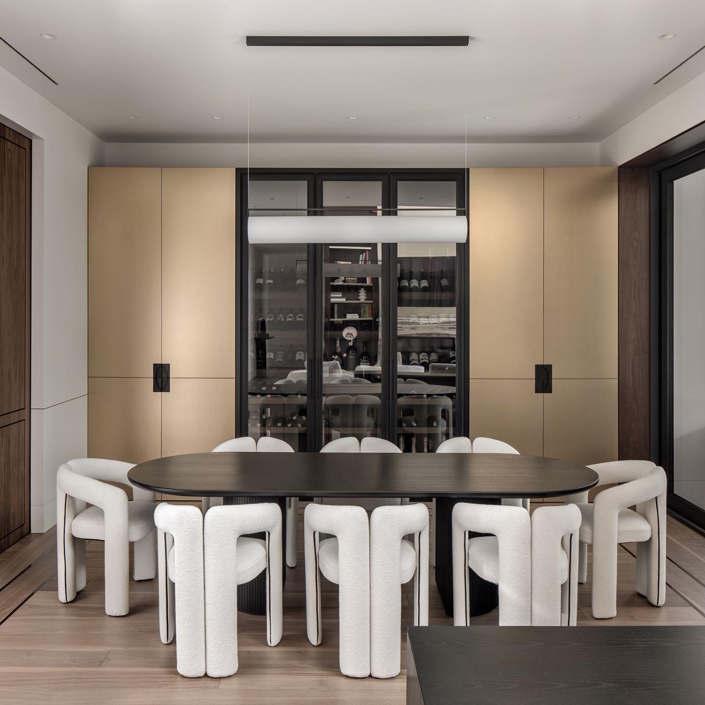
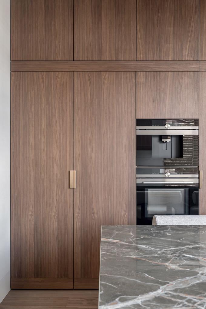
The massive wardrobe in the dining area has a brass facade, which visually supports the tone of the space. The large wine cabinet with an individual design was inserted in the middle. That manifests the hobby of the homeowners' daughter and her husband, who are oenophiles and collect wines. In the center, a black dining table is surrounded by white 562 Dudet armchairs by Cassina, designed by Patricia Urquiola. Strongly referencing the design of the 70s, they give a soft and comfortable look thanks to their welcoming curves. In the kitchen we find an equally clean design where everything is 'hidden' without interfering with minimalism and elegance. Above the marble island was hung a Roche Bobois brass light fixture that matches the handles and trim of the custom Woodsystems kitchen cabinet.
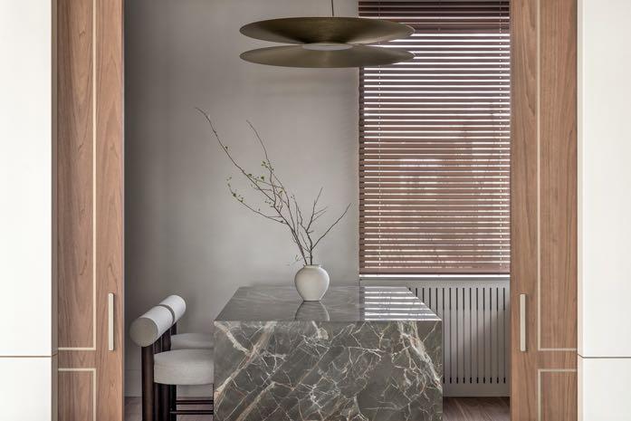
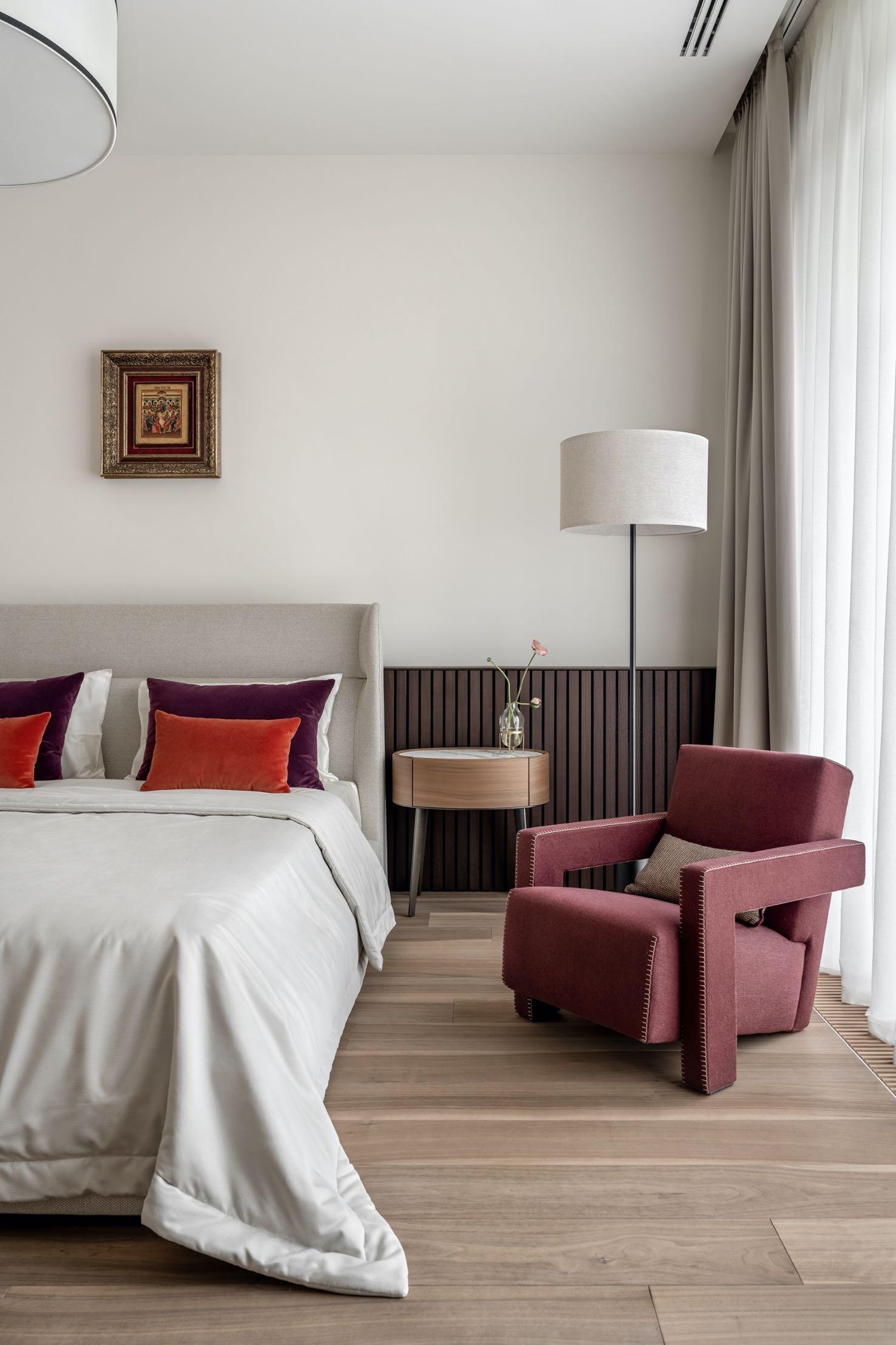
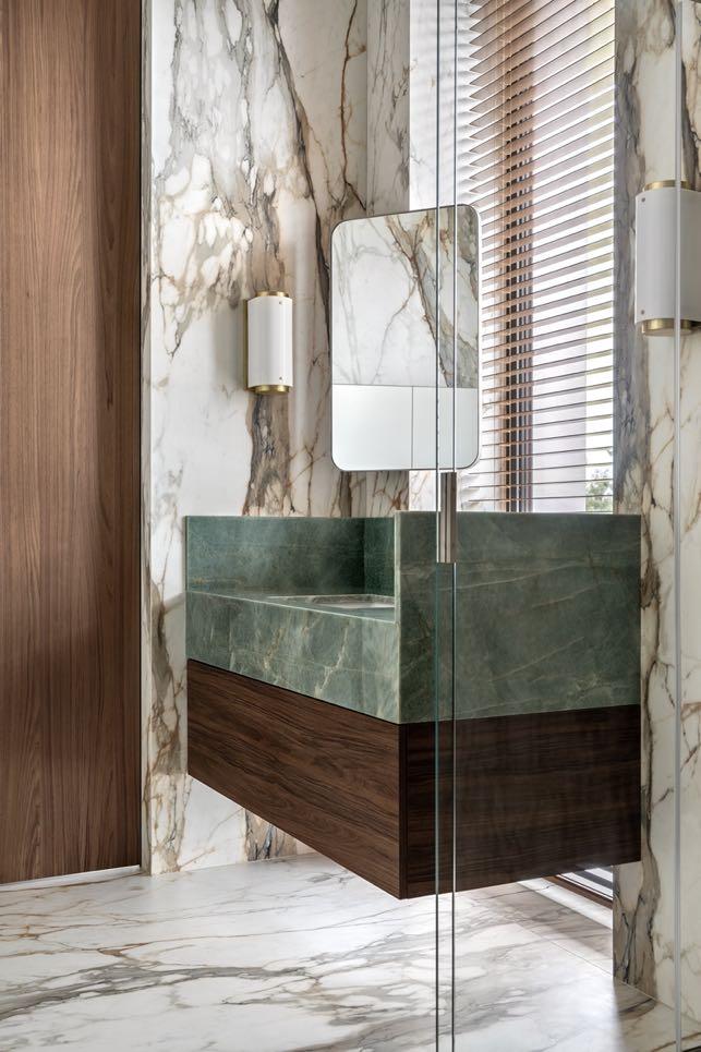
Each room has its accents. Grandma's bedroom on the ground floor is the lightest and most neutral. The antique icon above the bed was brought by the clients from their native Lviv. The shades of red in the upholstery of Cassina’s armchair along with the additional pillows echo the Byzantine palette of the icon. The light marble in the bathroom also has burgundy veins. While the green marble sink contrasts with it,
adding Italian charm to the interior. A shower was included separated by a transparent glass wall that also allows to see the wall-mounted tub - a very interesting choice to give continuity to the environment.
"Our cooperation resulted in the interior itself and a certain transformation of the clients' aesthetic outlook. We moved away from the classics they are used to living towards modern forms and found new solutions that the clients embraced and loved."

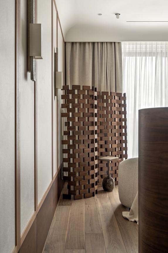
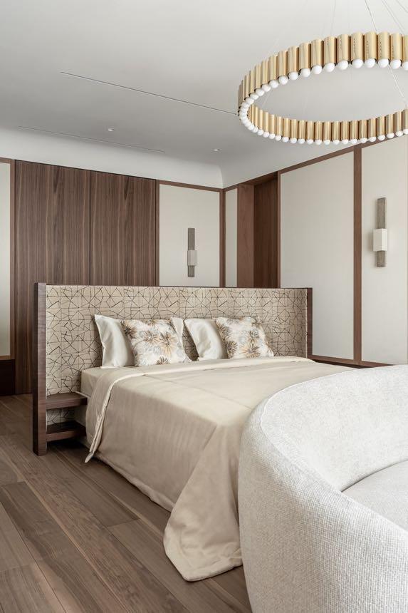
Going up the stairs, on the right we find the wing dedicated to the couple with the master suite, walk-in closets and bathroom. The large custom-made bed in the owners' bedroom combines the geometric ornament on its curved headboard with a floral pattern of pillows. The bed is positioned towards a view of the slopes of the Dnipro Bay. Another exciting element of the room is a wave-shaped openwork screen by Cassina, accompanied by &Tradition’s side table featuring an oval base in Emperador Marble.
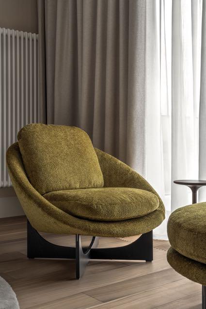
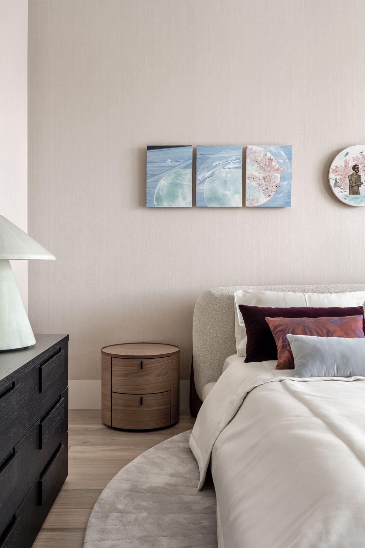
On the opposite side of the floor, we find another bedroom with an adjoining bathroom. The designer has added a few touches of color to the neutral tones. The cushions reflect the pastel shades of blue and pink of the paintings hanging above the bed. The chair and pouf by Minotti in moss green shades integrate perfectly with the interior of the room.
Jason Wadhwani Design projected the interiors of a 213 m² apartment in the heart of Mumbai, blending modern design with timeless appeal.
Amidst the lively streets of Mumbai's Prabhadevi neighbourhood, the apartment emerges as a beacon of
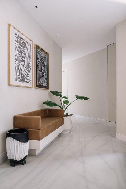
contemporary luxury and refined design. Crafted by Jason Wadhwani, principal architect of Jason Wadhwani Design, the space transcends mere dwellings, blending modern elegance with versatile functionality. It is fulfilling the client's vision of a stylish abode, transforming into an entertainment haven. The client's vision for this home is clear and concise: they are seeking a contemporary living space that exudes both comfort and style, doubling as an inviting venue for social gatherings and events. This directive is providing Jason and his team with an exciting challenge, to create a home that merges practicality with aesthetics, ensuring a warm and welcoming atmosphere for both everyday living and special occasions, with the designer nailing this idea perfectly. As one enters the apartment, they are greeted by a charming cement finish foyer, setting the stage for the contemporary elegance that is awaiting within. Here, a small leather banquette offers a comfortable spot to pause and take in the initial impressions of the home's design aesthetic.
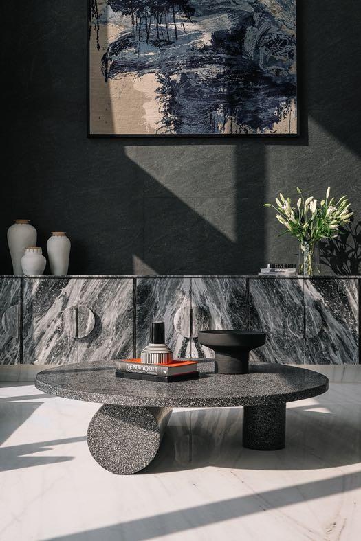
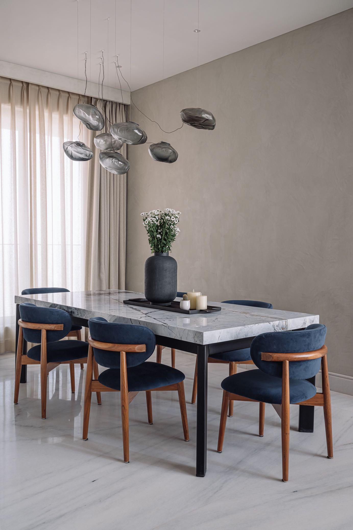
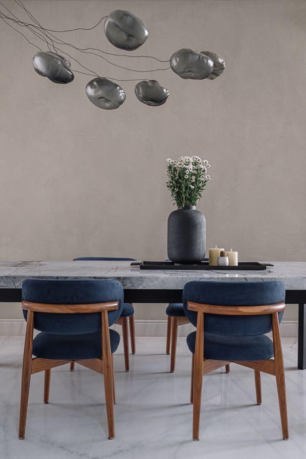
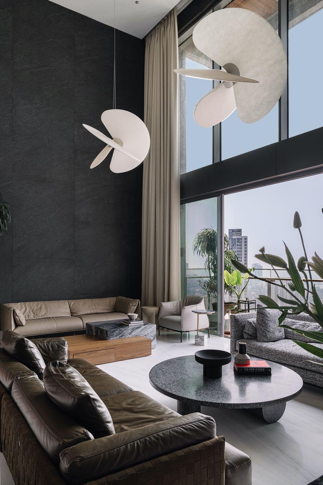
As one progresses through the apartment, they are enveloped by the inviting ambience of the dining room, featuring a striking Blue Mist marble table illuminated by a sculptural Bocci light fixture. Adjacent to the dining area, comes the living room. Undoubtedly the pièce de résistance here is the double-height living space that is commanding attention with its dramatic graphite stone tile-clad walls. This architectural element not only amplifies the room's sense of grandeur but also serves as a blank canvas for curated
“Embarking
on a detailed exploration of this home, we explore how each element contributes to a larger puzzle, forming a stunning and harmonious composition of refined living.”
designer furnishings and bespoke accents. Customised pieces such as the Princess Grey marble sideboard and designer light fittings imbue the space with a sense of curated luxury, making it the perfect setting for both intimate gatherings and sophisticated soirées.


The kitchen merges practicality with sophisticated design, embodying the home's overall theme of contemporary elegance. Crafted with a focus on both aesthetics and usability, this space is as inviting as it is functional. The choice of materials, such as sleek marble countertops and custom cabinetry, ensures durability while exuding a refined charm. High-end appliances are integrated into the design, allowing for a clutter-free environment that encourages both daily use and entertaining. The layout is open yet defined, promoting a natural flow between cooking, dining, and socialising, making it a central hub of activity within the
apartment.
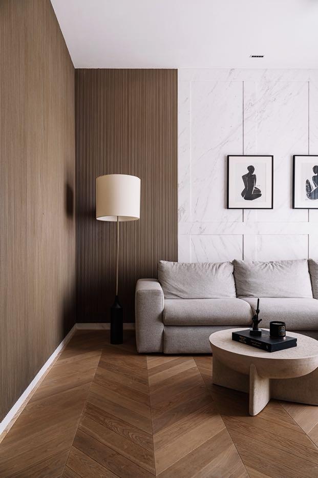
Next up, the den is unfolding as a cosy retreat, boasting rich wooden floors and white marble walls adorned with subtle wooden fluting. Here, warmth and sophistication are converging to create an intimate setting ideal for relaxation and leisure.
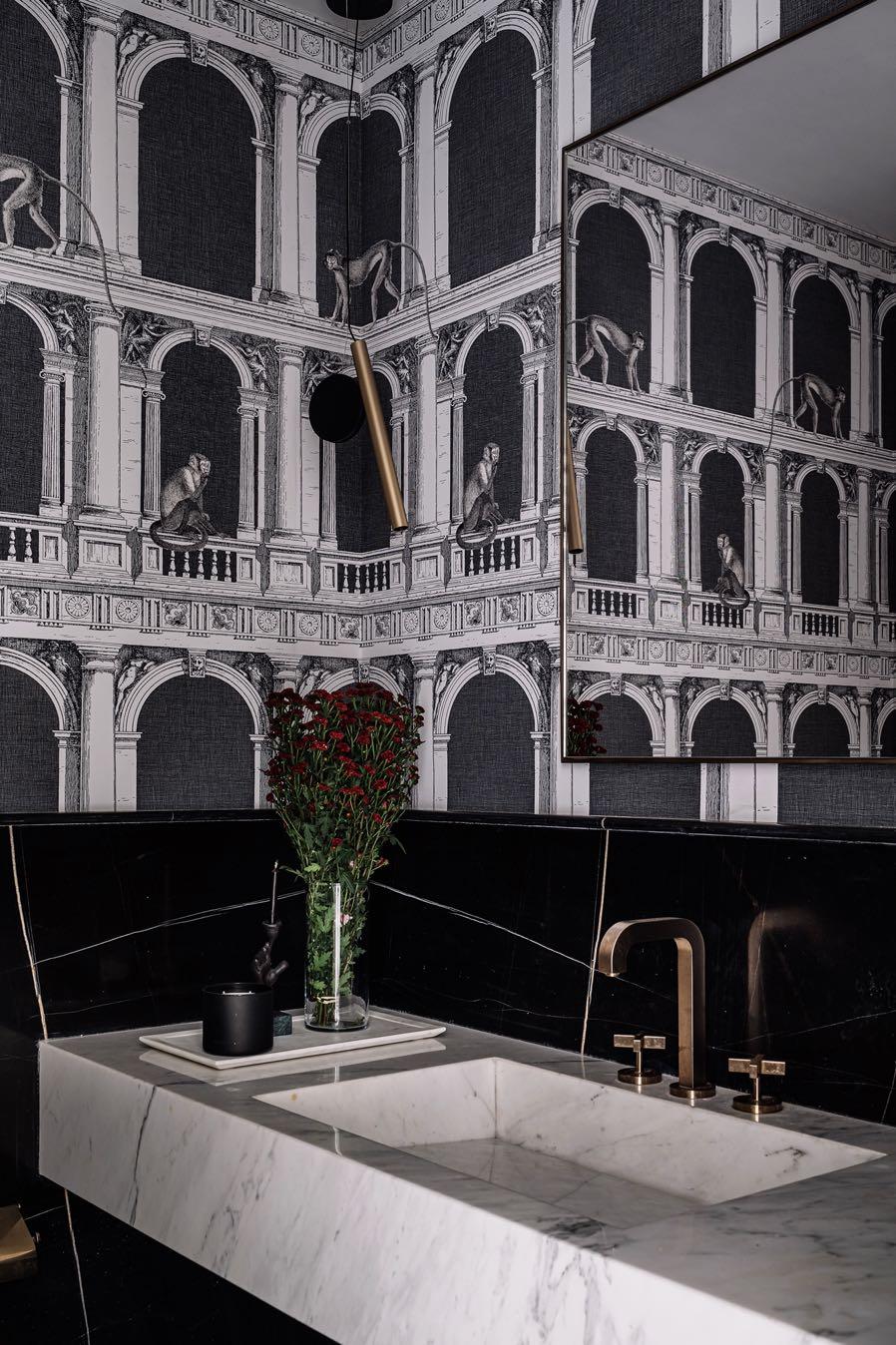
As one of the most dramatic spaces in the house, the powder room is captivating with its bold design choices and whimsical charm. Clad in black St Laurent marble and adorned with a striking Fornasetti wallpaper, this space is a true testament to the designer's flair for creating memorable and visually captivating environments.
“Bold design statements, such as the Fornasetti wallpaper in the powder room, further elevate the space, infusing it with drama and personality.”
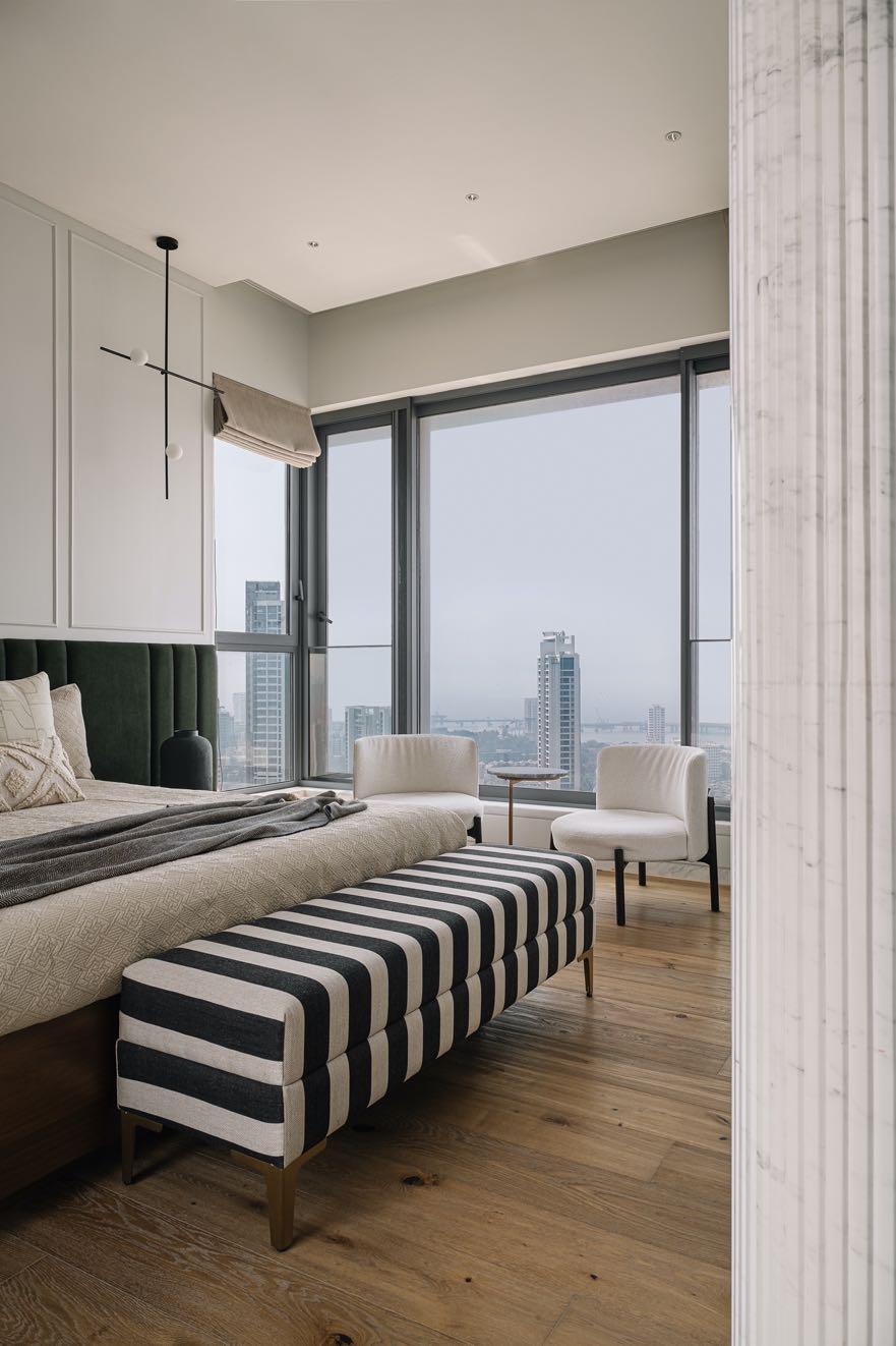
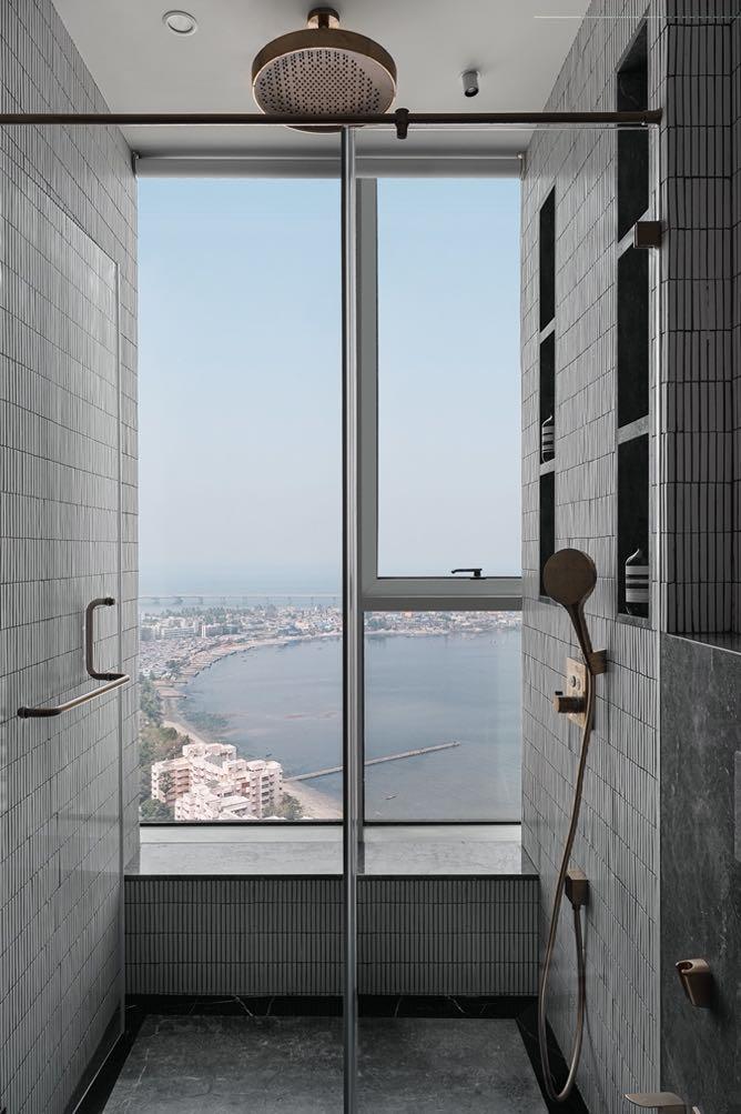
The master bedroom exudes understated luxury and refined elegance, featuring wooden flooring and wainscoting panels that add a touch of traditional charm to the contemporary design. A monochromatic color palette creates a sense of tranquility and sophistication, while plush furnishings and brushed brass fittings evoke a feeling of indulgent comfort. In keeping with the home’s overarching design narrative, the bathrooms are crafted as private sanctuaries, offering a retreat
from the hustle and bustle of urban life. In the master bathroom, the rain shower features a huge window that not only makes the entire room bright, but also offers a breathtaking view of the city. Brushed brass fixtures set the tone for understated luxury.
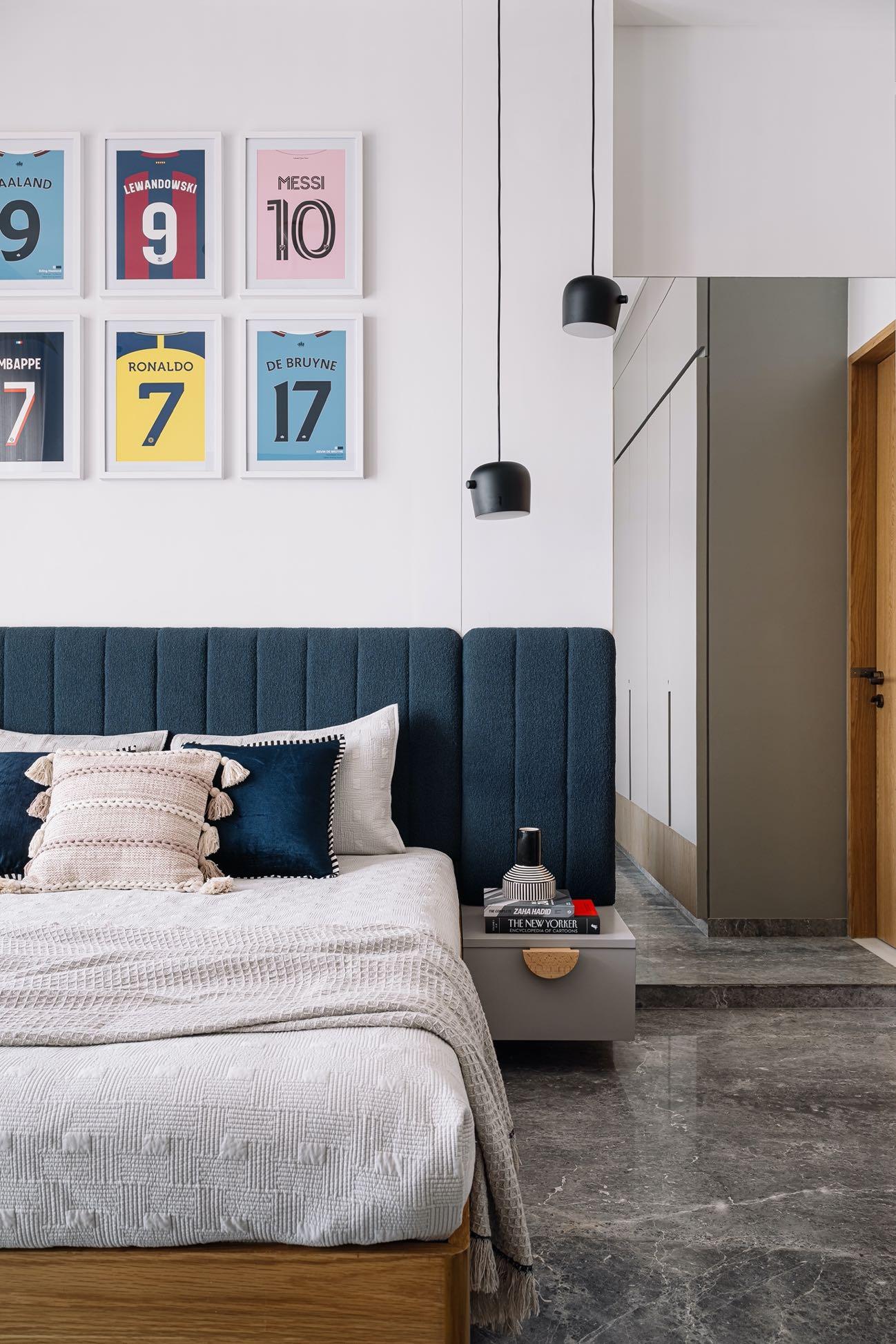
Designed to be growing with its occupant, the son's bedroom strikes a delicate balance between youthful energy and timeless elegance. Fun elements like football jerseys above the bed and whimsical Flos lamps on the side tables infuse the space with personality.


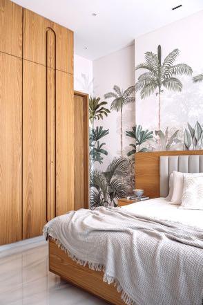
The guest bedroom, adorned with honey oak veneers and pristine white marble flooring, serves as a tranquil sanctuary accentuated by bold tropical-themed wallpaper by Life n Colors. This clever juxtaposition of simplicity and vibrancy is immediately captivating, setting the tone for the rest of the home.
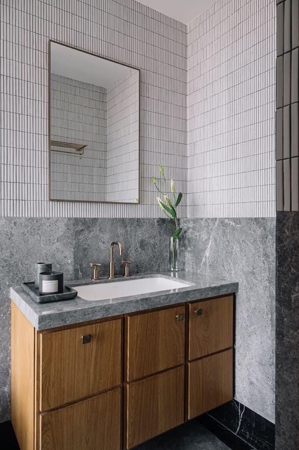
Thoughtfully designed for both functionality and relaxation, the guest bathroom features a spacious layout, stylish home accessories and an indulgent rain shower that create a spa-like experience. Honey oak is repeated in the vanity unit, perfectly pairing the gray of the sink and tiles.
“By
prioritising contemporary elements and a monochromatic palette, the space is transcending temporal limitations, ensuring its relevance and appeal for years to come.”
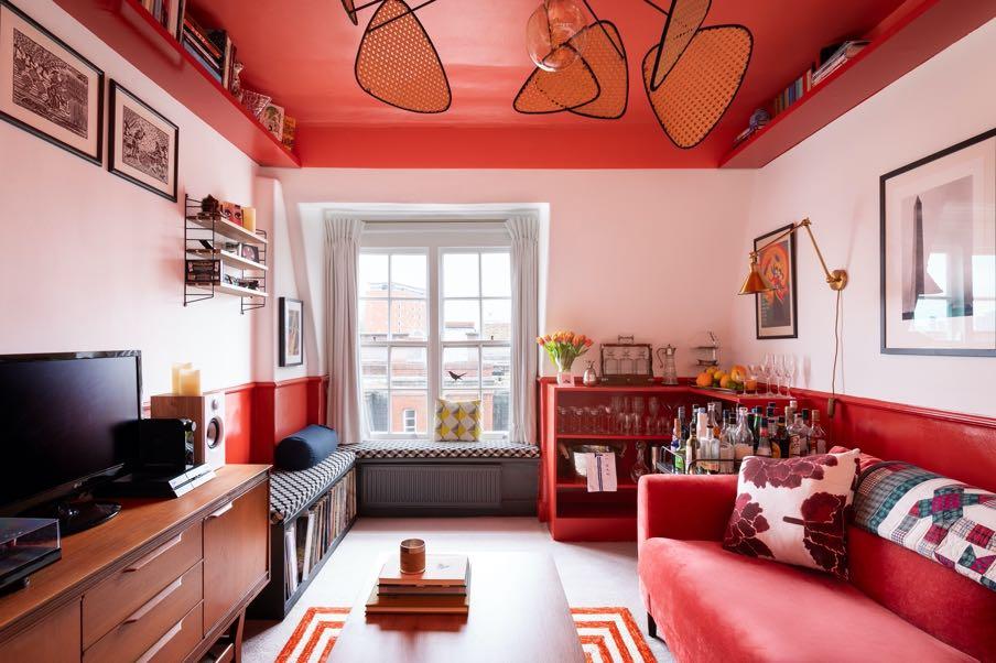
The London-based Spanish interior designer Sara Leonor has renovated an exclusive flat in a century-old Mansion Block in the King's Cross area of the British capital, giving it style, distinctiveness and personality.
Photography by Anna Batchelor

“ALL THE ELEMENTS HAVE A REASON FOR BEING. I AM NOT IN FAVOUR OF INCLUDING OBJECTS THAT ARE MERELY AESTHETIC. THEY MUST FULFIL A FUNCTION IN THE OVERALL INTERIOR DESIGN PROJECT. WE USUALLY DESIGN A LARGE PART OF THE PIECES IN OUR INTERIOR DESIGN PROJECTS TO MEASURE.”
SARA LEONOR
The residence is located in one of the most luxurious blocks in the King's Cross area, dating from 1905. The
owners wanted to update the flat because it was no longer functional. They needed more storage, but the size of the home (42 m²) required creative and efficient solutions that took up as little space as possible. Therefore, the refurbishment maximizes the use of the space and brings functionality to the flat where every detail has been carefully chosen. The special
feature of this apartment is the color: each room is covered with a different tone giving its own identity to each space.
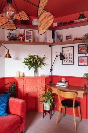
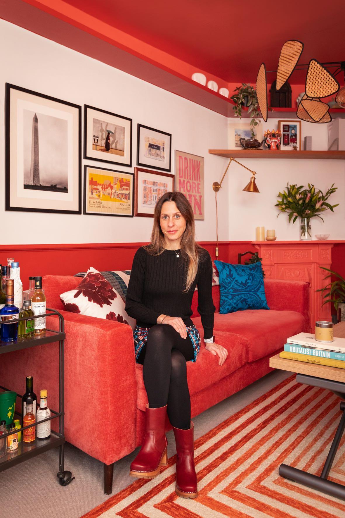
In the living room, a multi-purpose space has been created within an area of less than 15 m² that serves as a lounge, party room and dining room with an extendable and expandable coffee table that can accommodate up to six people. Red defines both the lower and upper areas of the room, while the white of the central strip provides a neutral setting for the decorative objects of the couple, who also wanted to keep the original chest of drawers. An L-shaped bench creates seating for visitors, while also accommodating storage for the record collections and concealing the room's radiator. Next to the door, a workspace has also been created with a desk set against the wall, with a paneling system that conceals the wiring of electronic devices. The bar unit and the metal drinks trolley have been carefully chosen for the space, as has the sofa, which includes a bed inside for visitors.

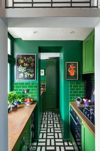
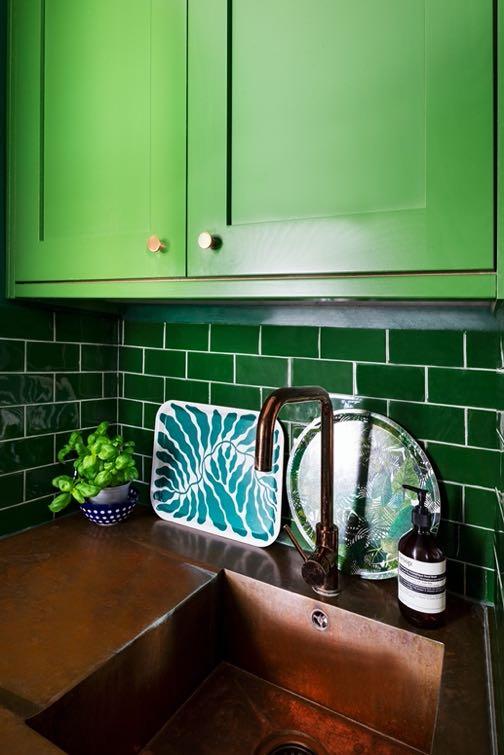
The clients were clear that they wanted to use green in the kitchen. All the appliances have been paneled to generate a continuous, linear image, combining tiles and painted walls, which broadens the visual perception of the room, amplified by the black and white tones of the floor tiles, designed by Nathalie Du Pasquier for Mutina. The worktop in metallic and copper tones is inspired by the traditional industrial aesthetic of London. In the design approach, a broom cupboard was created, and additional space was made for
the freezer, which the couple lacked. In the bathroom, the toilet and custommade concrete washbasin were placed at the back of the room and a rounded bathtub was chosen at the front to make it easier for the owners to walk through. Sara Leonor opted for a mirror with a U-shaped cabinet to provide depth and a transparent curtain that contributes to the same purpose. A sliding door and shelves conceal the fireplace, and, in the upper part, a metal mesh was placed where plants and towels can be placed.
“THE TILES ARE HANDMADE IN MOROCCO AND THEIR GLOSSY TEXTURE SERVES AS A REFLECTION AND CONTRIBUTES TO MAKING THE SPACE APPEAR LARGER. ON THE SIDE WALLS, WE OPTED FOR CONCRETE TILES, AND IN THE REST OF THE SPACE AND THE CEILING, YELLOW PAINT WAS USED.”

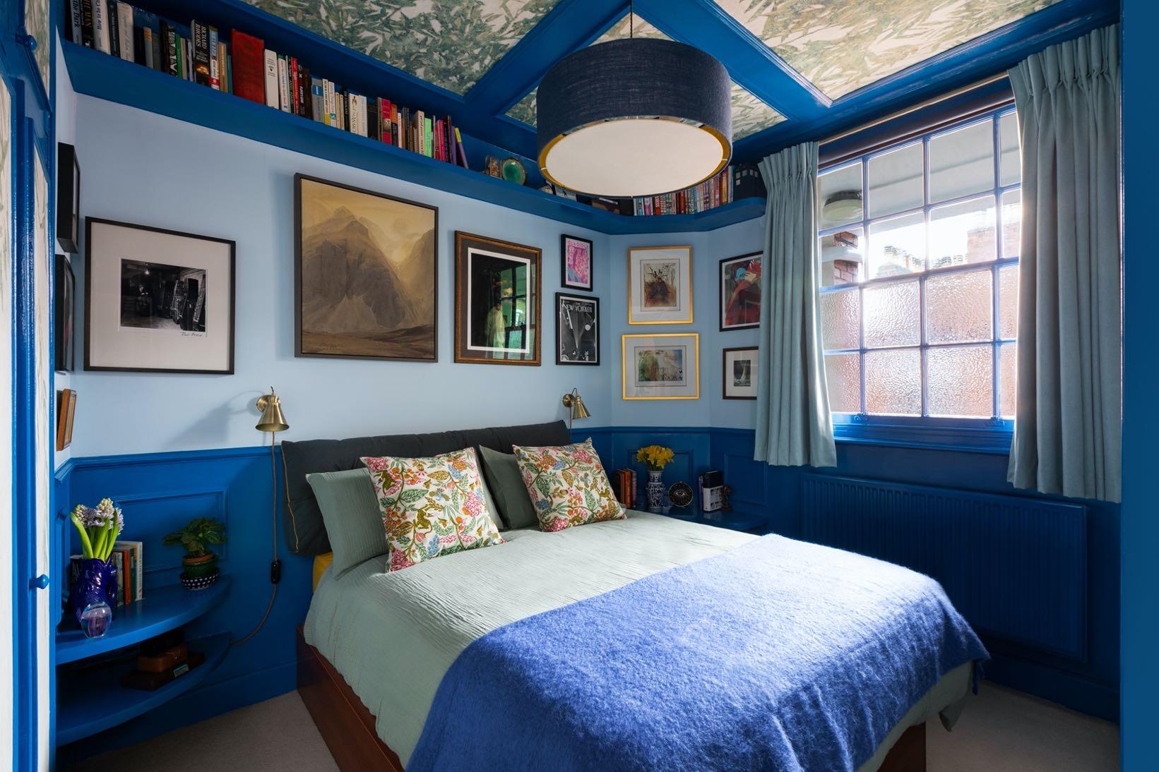
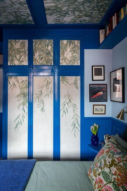
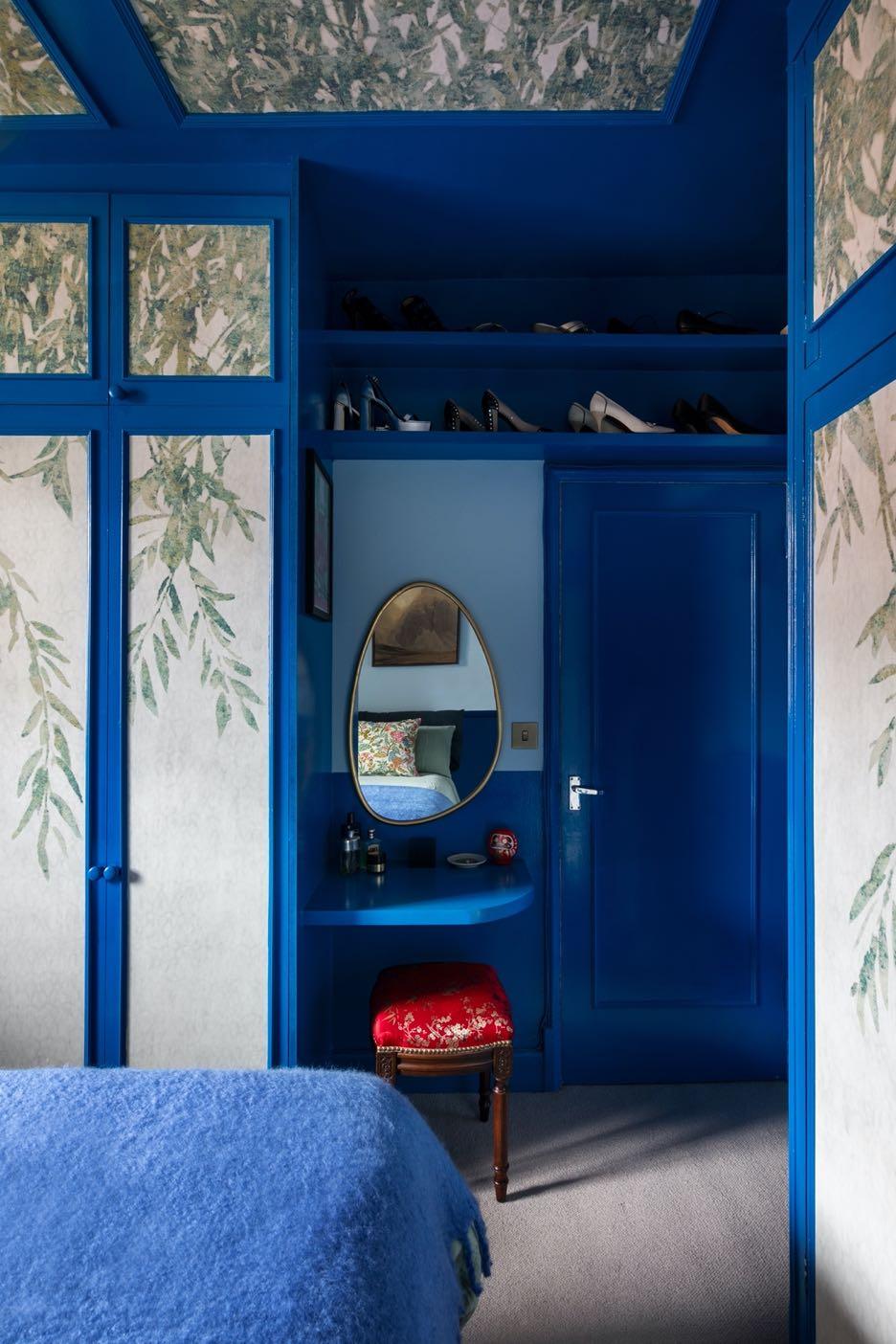
In the master bedroom, the original built-in wardrobe was respected and replicated on the opposite side of the room in the same style. The moldings were dressed in a wallpaper featuring plant motifs, which was also extended on the ceiling adding an
artistic detail. The previous shelves and the headboard were removed to optimise the use of the space, with an ottoman bed, a bookcase in the upper wall area and builtin bedside tables, as well as an integrated dressing table and shoe rack at height.

"OUR
MISSION WAS TO PROVIDE ALL THE COMFORTS OF A LARGE FLAT IN A SMALL SPACE WHILE INFUSING STYLE, DISTINCTIVENESS AND PERSONALITY."
Frederick Tang Architecture designed the architectural renovation and interiors of a newly constructed 325 m² townhouse in the Boerum Hill neighborhood of Brooklyn, for a young family of four.
Photography by Gieves Anderson
Built in a Georgian style, the house is spread across six floors connected by a central, curved plaster staircase with custom reeded glass
and brass stair rails. Frederick Tang Architecture (FTA) has updated and reorganized the interiors to accommodate the owners’ growing family, live-work spaces for both, and visiting guests, all while creating a space that feels intimate but can also expand to accommodate larger gatherings.
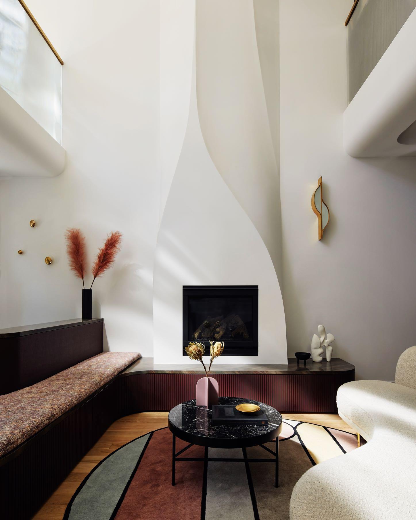
The living area on the ground floor boasts 20-foot ceilings accented by a wall of windows with southern exposure and is anchored by a fireplace that FTA redesigned in a sculptural plaster form inspired by the work of artist and artisan Valentine Schlegel. The hearth was integrated into a custom entry bench with
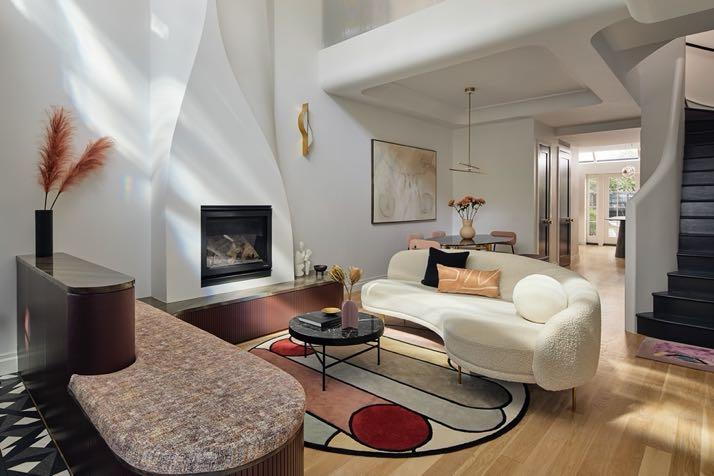
tambour siding and upholstery by Pollack and Maharahm.
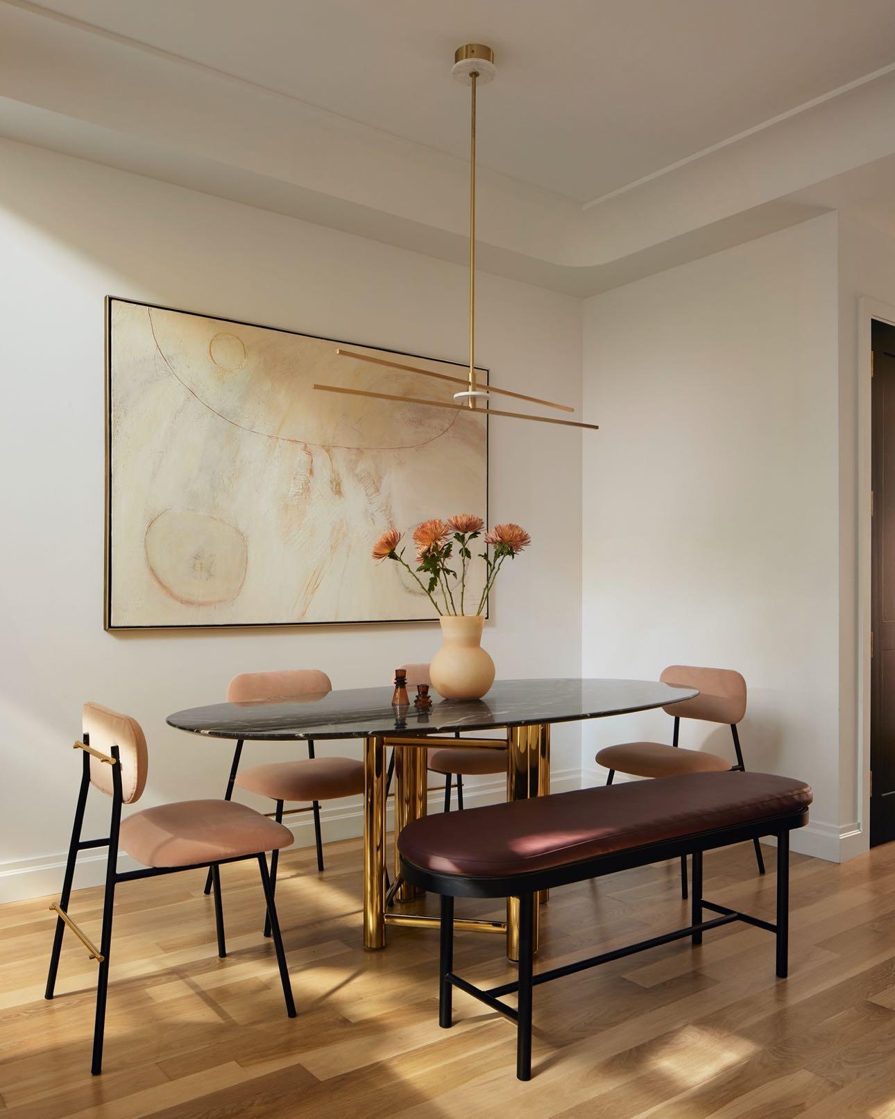
In the adjacent dining room FTA removed the existing faux traditional ceiling and trim detailing and updated it to something more modern and more bespoke. Here, FTA rounded the inset ceiling, forming a curved cove to define the dining area which spotlights a geometric brass and marble chandelier from Cosulich Interiors & Antiques. A large painting from the client’s grandmother became the focal point for the dining area, and all furnishings were chosen by FTA to complement it. An antique black marble and brass dining table by Eunique Space, burgundy bench by Danish Design Store with a custom Maharam fabric, and blush pink dining chairs by Mambo Unlimited round out the space.
“The%re-designed%fireplace%was%a%really% exciting%piece%to%study.%The%entire%house%is% united%by%this%soft%plaster,%and%this%is%the% first%thing%you%see%when%you%enter%the% house,%and%it%anchors%the%dramatic%double% height%space.%This%was%designed%in%3D% software%and%the%contractor%with%the%aid% of%CAD/CAM%software%cut%a%skeleton% structure%that%a%craftsman%then%plastered.” Frederick(Tang,(FTA’s(founder(and(principal
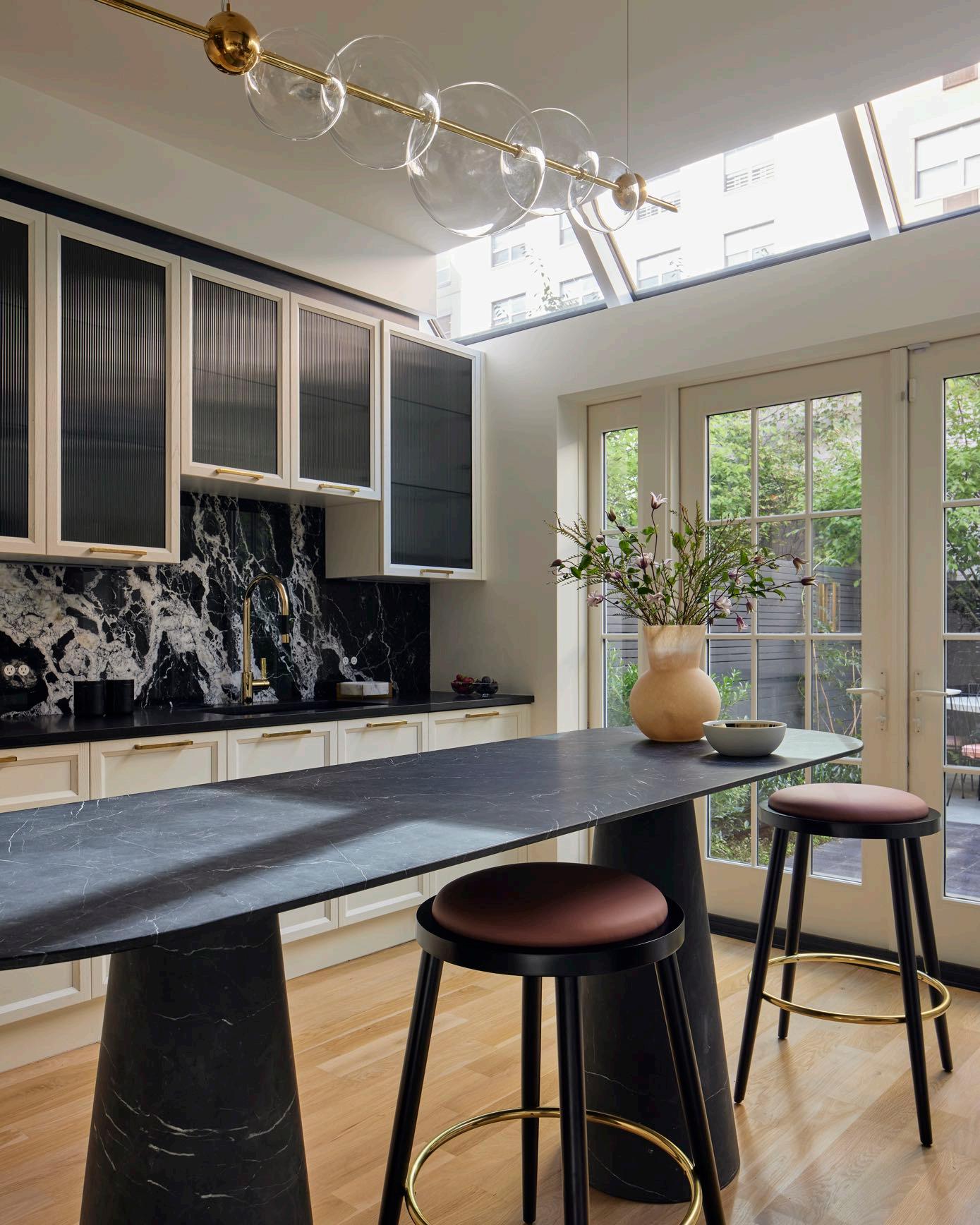
“The heart of the palette is black and cream with integrated jewel tones of peacock blue, rust, oxblood, mulberry, wine and blush. The richness is offset by ‘lots of brass’, a request of the client; and her acceptance of ‘red’ had to be deep enough and not too bright.”
Barbara Reyes, FTA’s Director of Interior Design & Branding
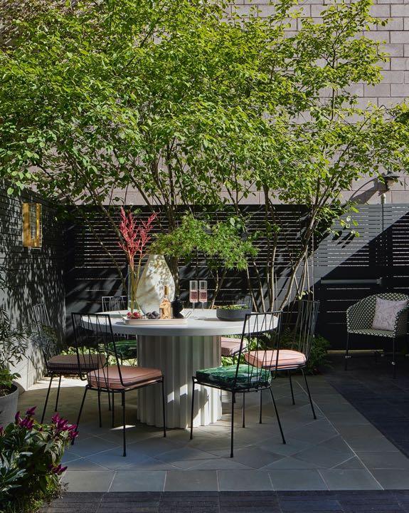
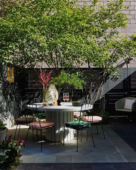
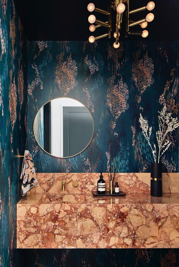
Moving deeper within the ground floor space, the kitchen, located at the rear, was also an area that needed to be reconsidered. FTA left the existing wooden cabinetry and replaced the kitchen island with a custom-fabricated piece by Casa Quieta. The striking black marble island complements the adjacent Hurricane Black marble stone backsplash, AGA range and custom hood also made of black stone. The stone selection carries through the space to the adjacent powder room where Breccia Pernice marble becomes a custom sink/vanity and at the penthouse bar, both offsetting painterly wallpaper by The Pattern Collective. Elegant brown quartzite supplements the entry millwork in oxblood and the plaster sculpture of the fireplace. A lush garden space at the rear designed by Brook Landscape completes the main level.
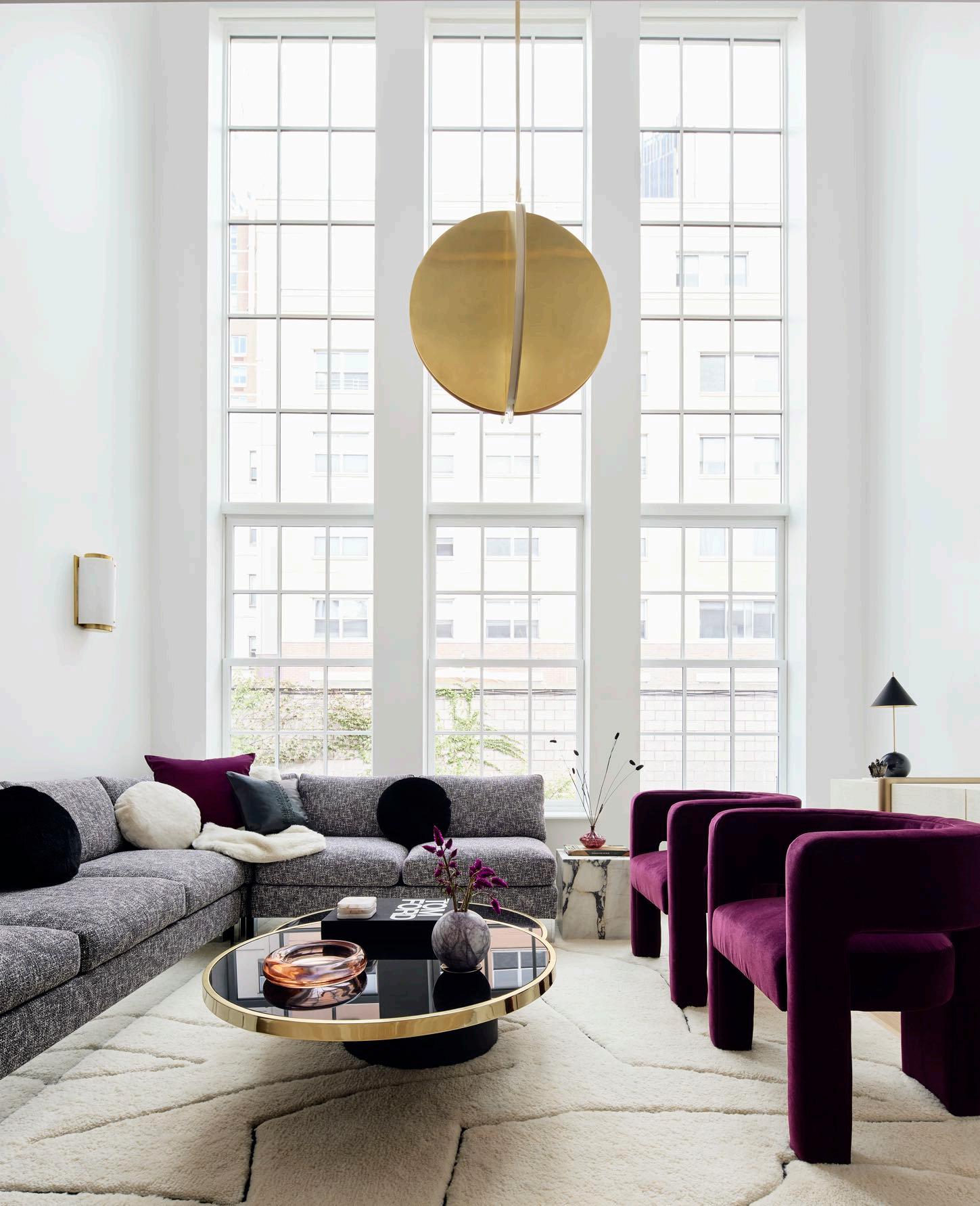
Going up the staircase, the second floor features another dramatic double height living room space accented by a wall of windows, and a bar area. An L-shaped sofa with a chromase base that previously belonged to the owner’s late grandmother is the central furnishing of the space. Reupholstered in Rebel lavender fabric by Knoll, FTA gives the special piece a new life. The sofa is positioned alongside a vintage swivel cocktail table in black glass and brass and a Slash Objects end table made of concrete, rubber and brass. The lighting that brightens the space includes wall sconces by Atelier de Troupe, and the pendant is from Circa Lighting. The second floor also has a narrow hallway space that was previously underutilized.
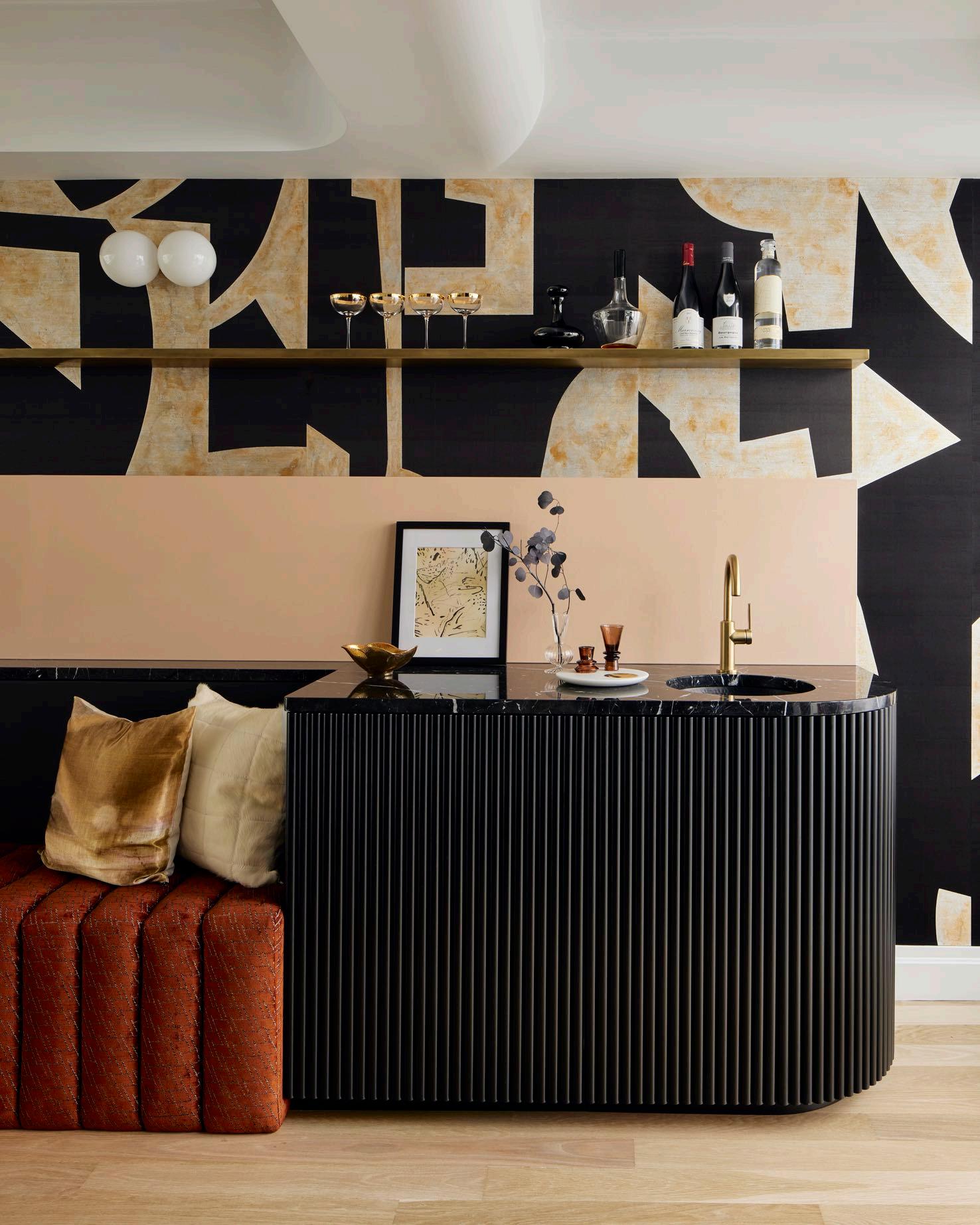
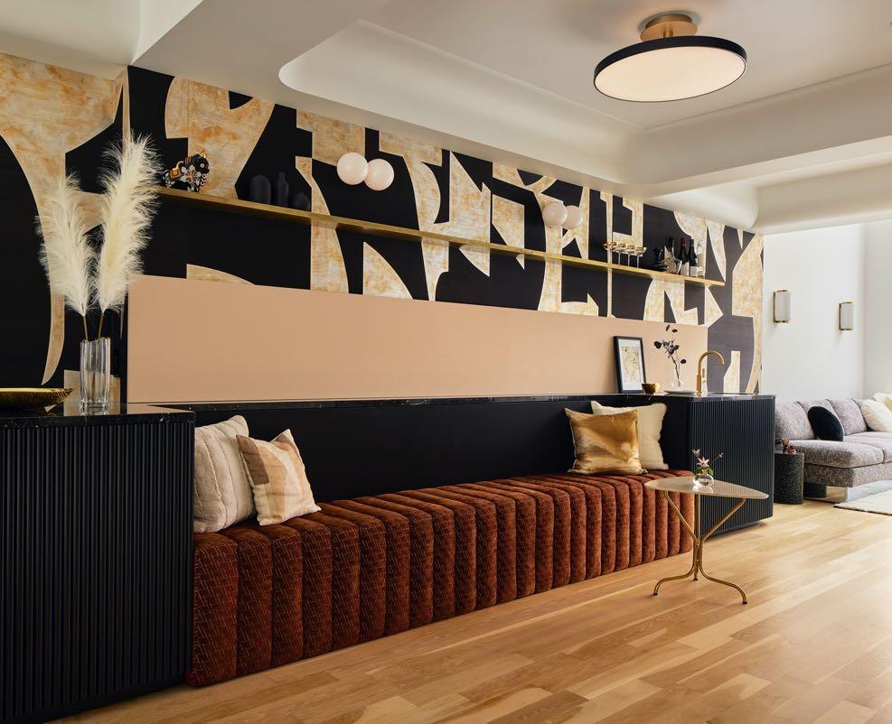
FTA designed this area to be an area for larger dinner parties and gatherings. Here, the design team installed a custom seating bench upholstered with fabric by Maharam and James Dunlop and a wet bar (that also conceals the HVAC unit) with tambour fronted millwork. The graphic mural behind the sofa is a custom-painted wallpaper with bold black, beige and gold colors by De Gournay; it brings sparkle, color and texture to the space. The playful side table is a vintage Italian Brass Travertine table from Judy Frankel Antiques.
“We knew the client wanted a dramatic flair and appreciated a vintage piece if it felt relevant and modern. We opted for an updated art deco style, a less old-fashioned version and a touch of 70s, mixed with an opulent color palette. All lighting would become statement pieces, jewelry-like, draping into the rooms.”
Barbara Reyes,
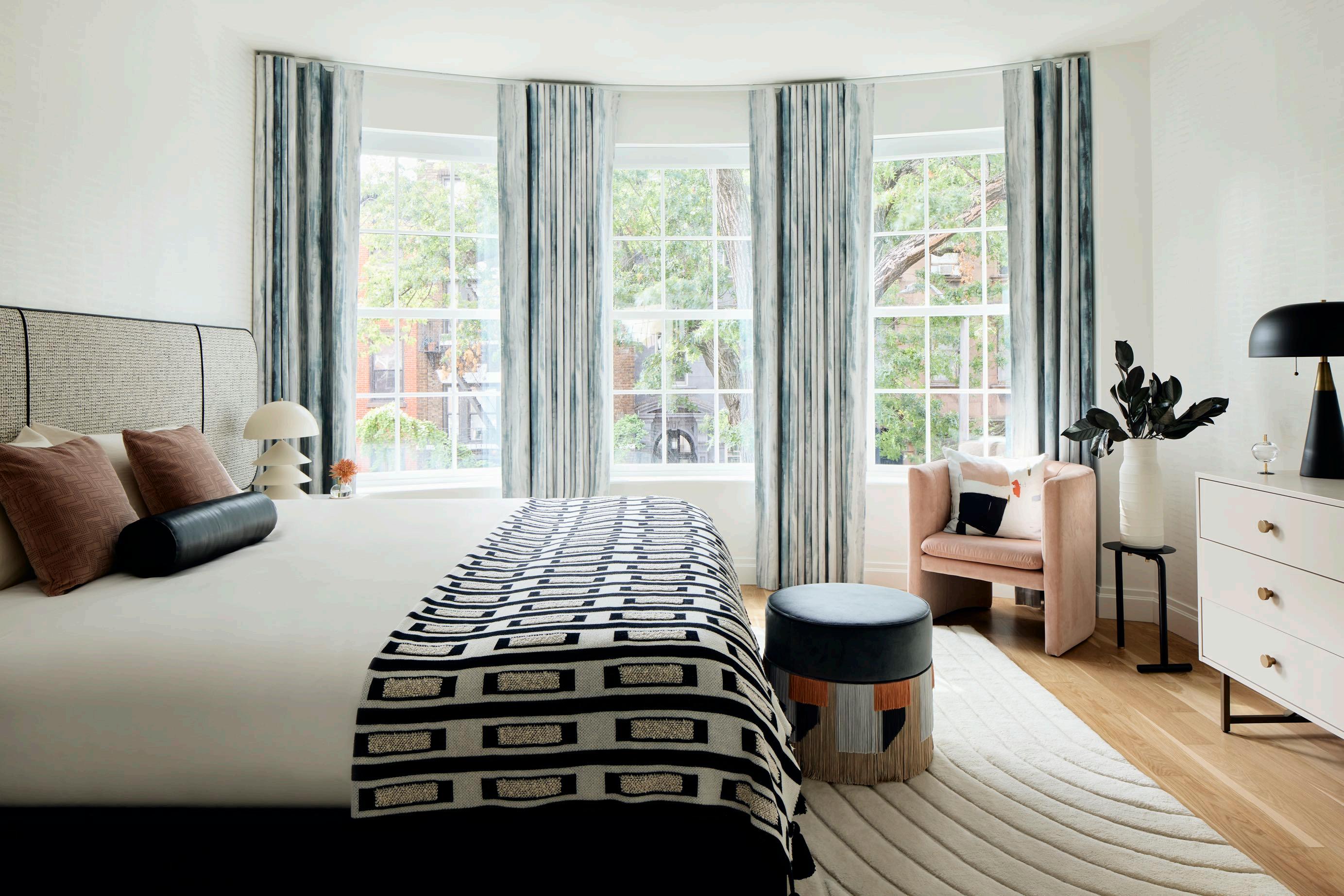
The third floor includes the main bedroom with two walk-in closets and a marble bath. In the bedroom we find custom creamcolored wallpaper by Sarkos, drapery from Eskayel, and a tailor-made headboard upholstered in fabric from Pollack and Holly Hunt. The dresser is from BD studio, and Arvo Ray Studio table lamps flank the bed. Flush mount lighting by Atelier de Troupe bathes the space in a warm light.

“We had so much fun with the sculptural curving forms, and the saturated color palette, and we love working with clients who share our perspective and trust our vision.”
Frederick Tang
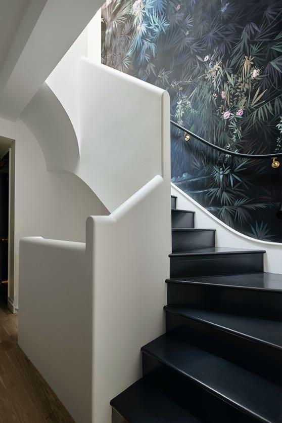
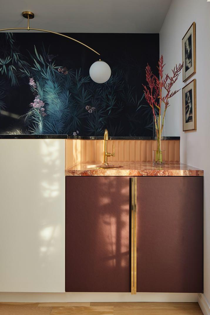
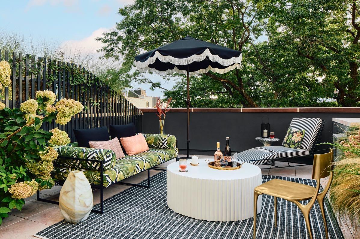
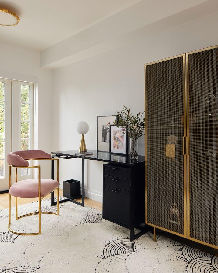
A dramatic hand-painted floral wallpaper by Artemest leads to the top floor and reflects the lush upstairs terrace. Saturated in black, blush and green tones, the wallpaper carries through to the adjacent outdoor spaces that flank the work-fromhome space. A wet bar in Breccia Pernice stone by ABC Stone was also included, complemented by a Biscuit Dune tile backsplash. A touch of exclusivity is added by the Bond Brass faucet and sculptural pendant by Anna Karlin. The black oak wood desk with black marble top is flanked
by the bookcase featuring rich, textured black mesh doors creating a peek-a-boo effect; all from CB2. The brass accents are echoed here in the bookcase frame, 1stDibs chair with pink velvet upholstery, and lighting.
Situated in the bohemian neighborhood of Asa Norte in Brasilia, CoDA designed an apartment for a couple with the main goal of creating a unique and large social space, bright and airy.
Photography by Júlia Tótoli
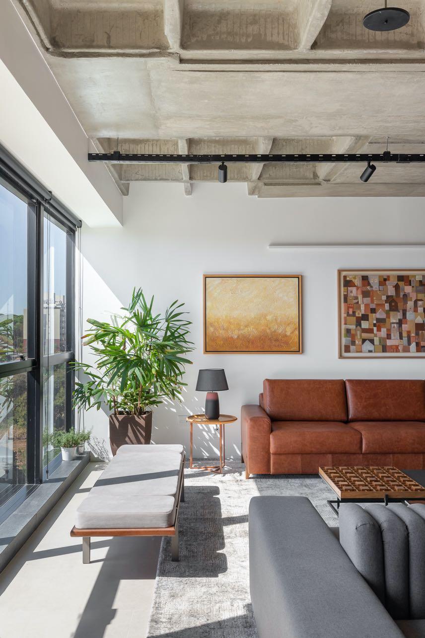
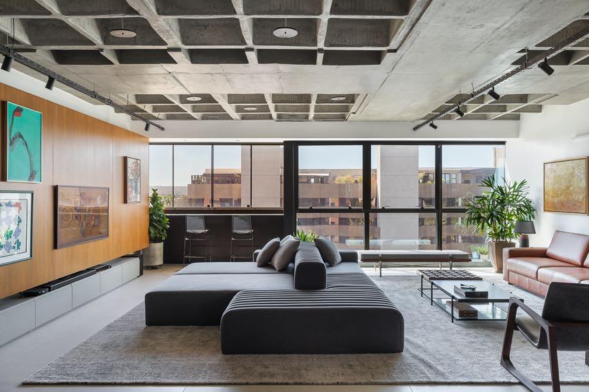

Previously, the couple lived in a duplex whose size was almost
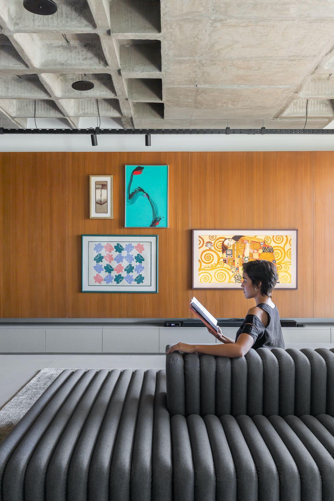
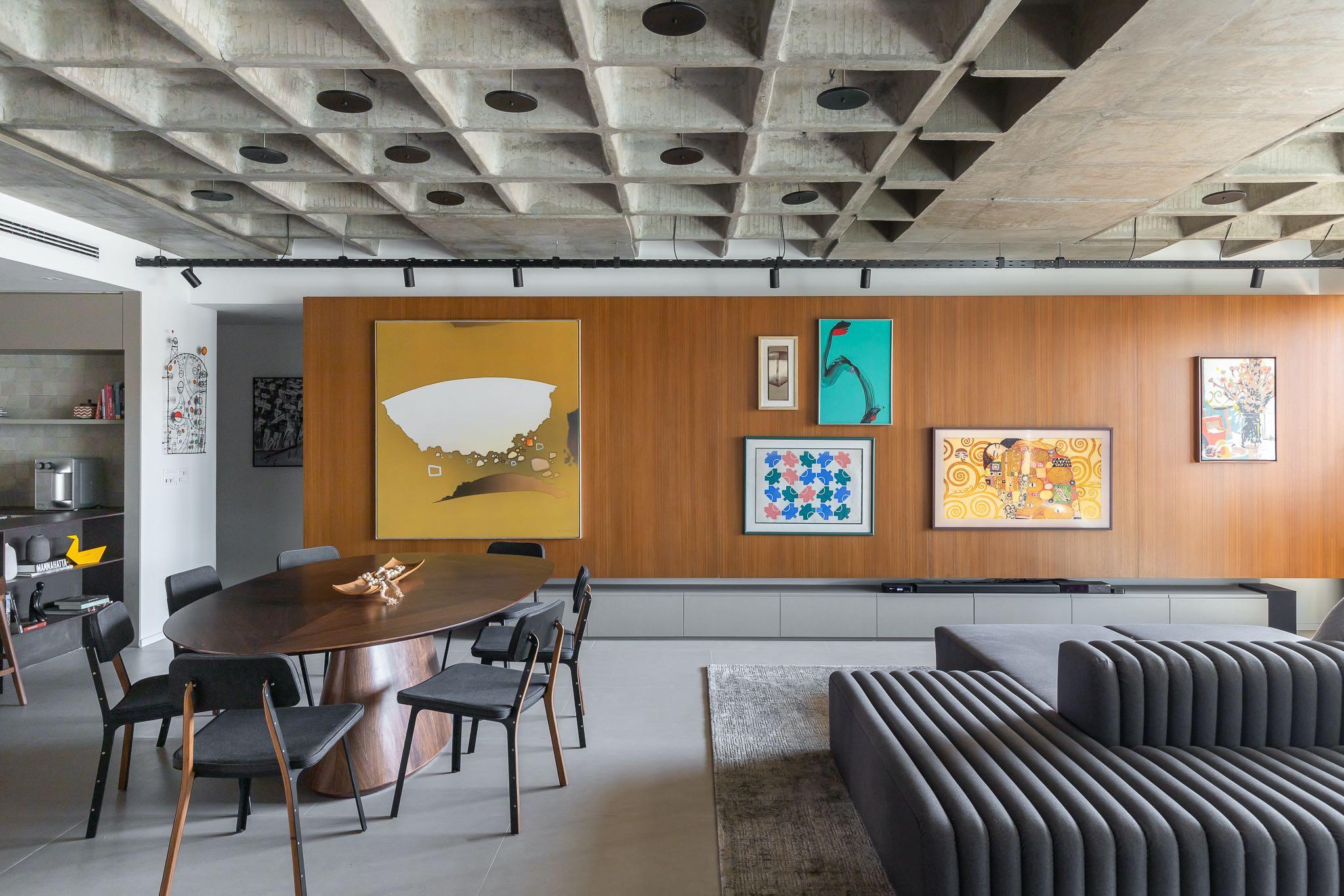
double the current one (which is 163 m²), but with the departure of their children and the desire to travel led them to considerably reduce the size of their new residence. However, the option for practicality should not impact the spacious space they were used to, nor their ability to receive family and friends at home. Therefore, CoDA was committed to create a project in which the main guideline was the construction of integrated environments, with the best use of available space. The project program eliminated one of the existing bedrooms in order to increase the living area that now is a unique open space consisting of living room, dining zone and kitchen. In addition, the expansion of the social area has been reinforced by the removal of the original plaster ceiling, increasing the ceiling height and revealing the existing concrete structure. To emphasize the presence of this element, lighting was proposed using reflective trays designed by the office and installed randomly, providing pleasant indirect light to the entire room. To host the couple's art collection, a large wooden panel has been allocated in the division between living room and bedrooms, slightly suspended from the floor by a metal structure anchored on the slab. This structure also receives the 'home theater' visible from the central piece, a two-sided armless sofa that also configures the living room. A couple of bar stools have been included along the window overlooking to enjoy a privileged view of the Olhos D'água Park and surrounding areas.
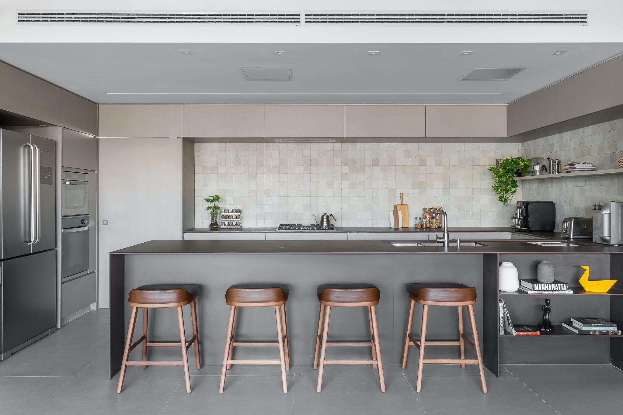
The design team redesigned the kitchen space to allow its open integration to the social area. The new zone benefits from the removal of the original toilet and utility room for a more open and horizontal proposal. A wide ‘U’ shaped countertop receives the main appliances, while a side

wall of cabinets contains the refrigerator, oven tower and pantry. The walls have been covered in natural stone. In addition, in the ceiling it has been possible to recess the lighting and hide the ducted air conditioner that cools the entire living space.
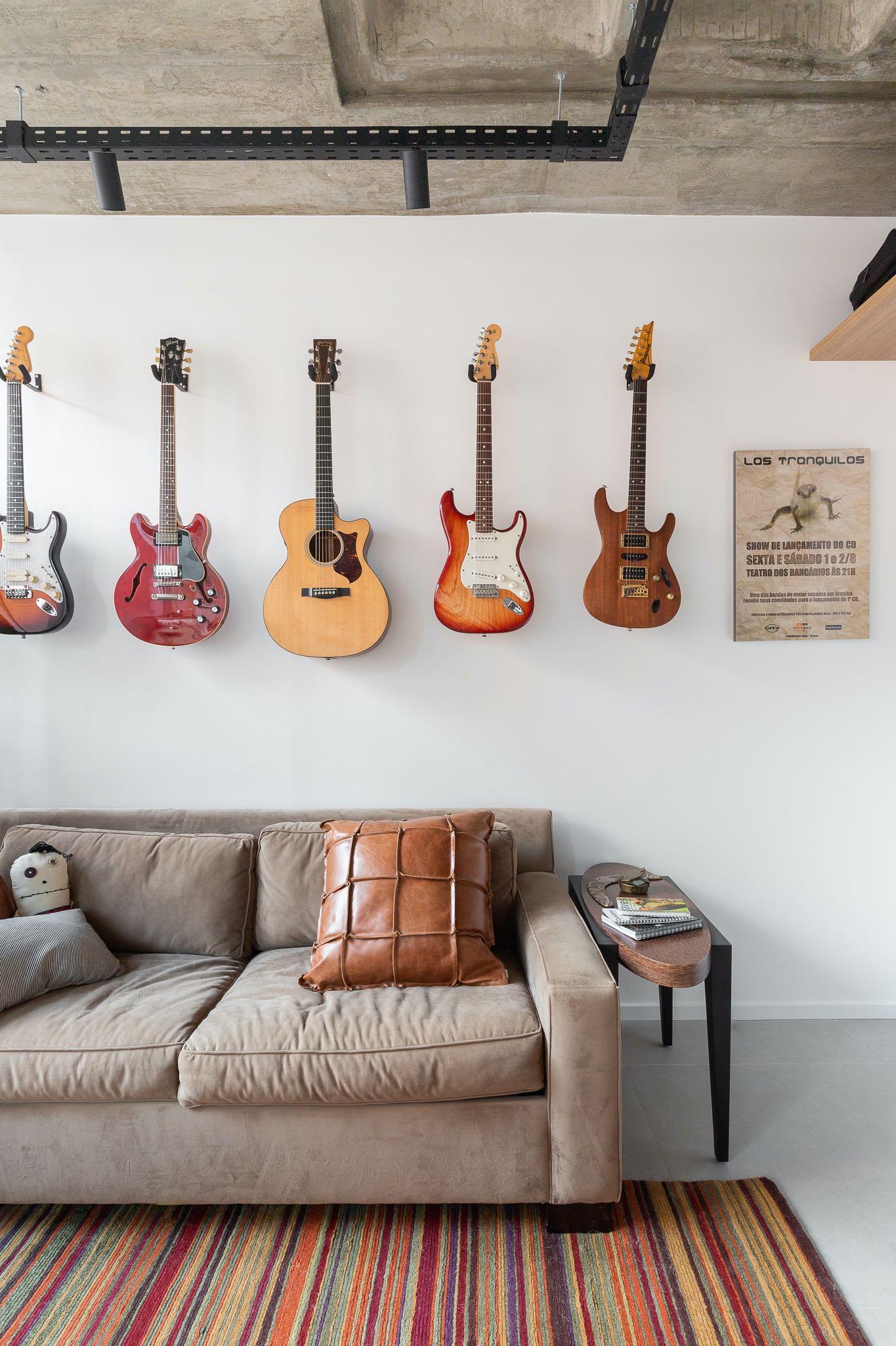
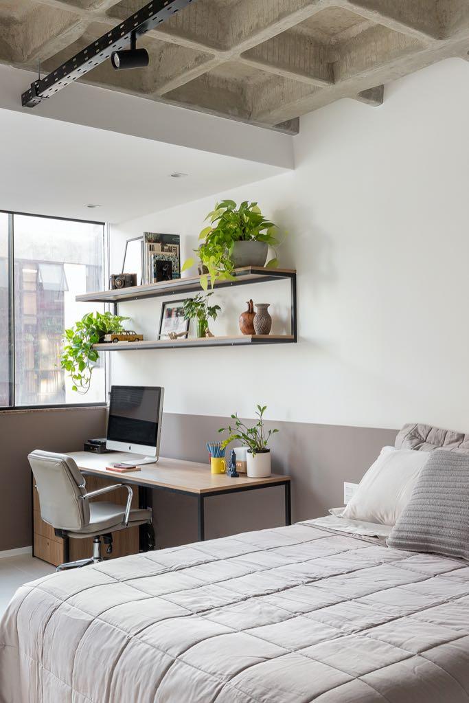
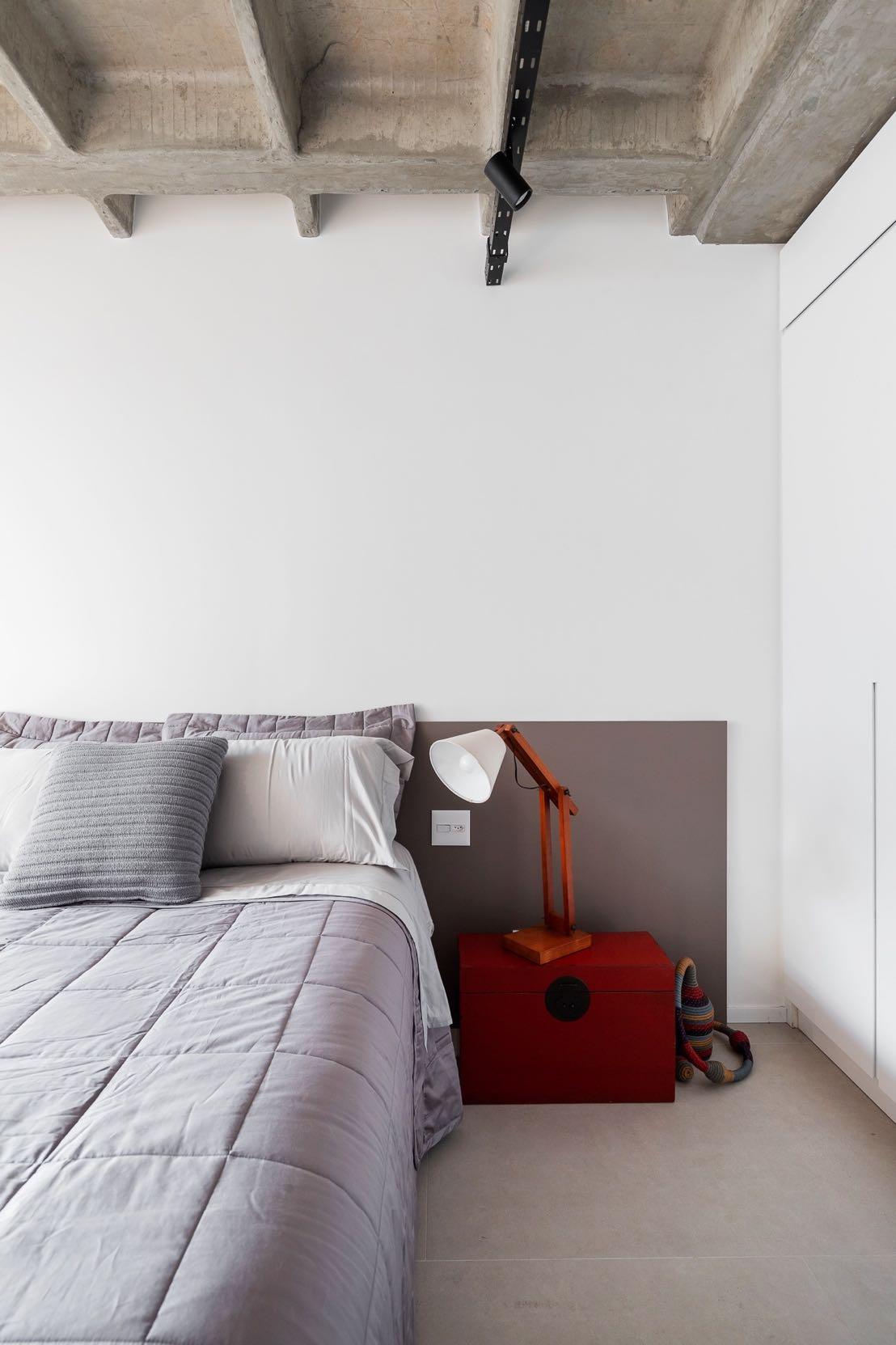
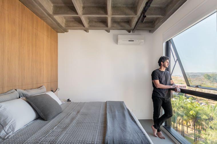
In the intimate portion, the master bedroom and two guest bedrooms were kept, which also serve as offices on a daily basis. In particular, the design of one office follows the style of the living area: a double desk, a comfortable sofa and a series of characterful home décor such as the collection of hanging guitars were chosen. While the other bedroom-office also houses a double bed and has a more sober look, similar to that of the master bedroom. The latter overlooks the park like the living room. Here, the light gray tones are balanced by the warm wood that wraps the walls bordering the master bathroom; in addition, a hidden custom closet was created. The bathroom was expanded to
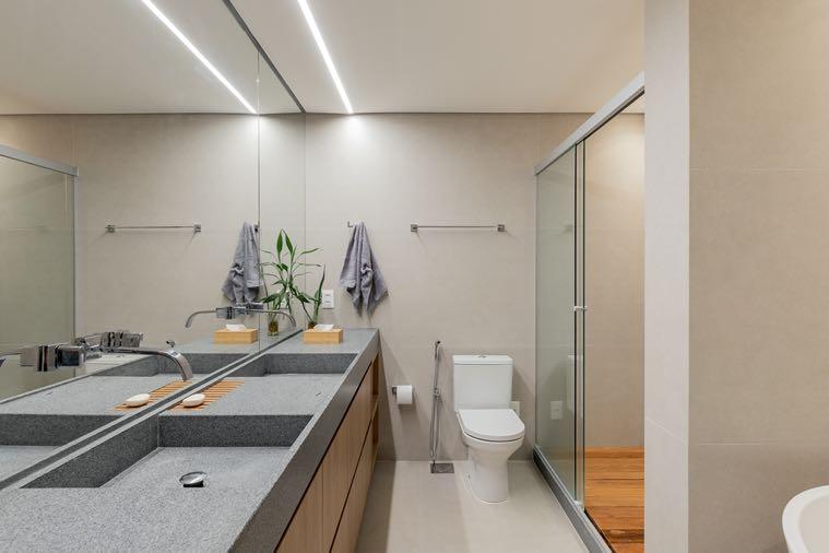
receive a freestanding bathtub and a huge double sink. As there is no window, the design team opted to include a mirror that covers the entire wall to give an optical effect of having a space that is both larger and brighter. The slatted shower tray adds a touch of warmth.
September – October – November
G&G Magazine guides professionals in the design, architecture and innovation sectors to a series of events around the world including conferences, fairs, exhibitions and design weeks.

September 5-14, Paris
Paris Design Week is one of the most important design weeks in the world that promotes creation and young talent. It's an opportunity for some brands to showcase, in their showroom or gallery, their new products to a mixed audience of professionals and general public, without performing at the fairs. www.maison-objet.com/en/paris-design-week

September 5-9, Paris
In synergy with Paris Design Week, Maison&Objet represents a major lifestyle pla\orm, halfway between the worlds of business and crea]vity, showcasing design
solutions to visitors from all over the world in search of originality. For its 30th edition, the fair unveils their optimistic, resilient and inspiring exploration with a new theme: Terra Cosmos, a cosmic vision of the future rooted in the reality of an exhibition focused on novelty and innovation. www.maison-objet.com

Building on the reputation and energy of Design Shanghai, with its unique market leading position and track record of presenting international design of the highest quality, Design Shenzhen is a new regional design event for China. The fair aims to create a focal point for brands and designers within China’s most successful and fast-expanding commercial and geographic region with a focus on technology and innovation in design and interiors. www.designshanghai.com/design-shenzhen
Marmomac is the most important world fair dedicated to the entire stone production chain, from the quarry to the processed product, from technologies and machinery to tools. Born in one of the main Italian districts for the extraction and processing of natural stone, Marmomac is today the main international hub of the sector’s protagonists, an irreplaceable platform where business and professional development meet, becoming a privileged place for innovation and training. www.marmomac.com
25-27,

LIFESTYLE Week OSAKA is Japan's leading trade fair for Gifts, Stationery, Homeware and Fashion. It’s the best sourcing venue for Made-in-Japan & worldwide products as well as finding new OEM/ODM partners. Osaka edition will be a great opportunity to expand business in Japan because Osaka area is the 2nd largest economical market in Japan. www.lifestyle-expo.jp
September 26-28, Singapore
FIND – Design Fair Asia is an opportunity for exchange and inspiration in West meets East, putting Asia firmly on the global design circuit. As part of a joint venture with Fiera Milano, dmg events will bring together the largest carefully selected collection of interior brands, key opinion leaders, designers and content from across the globe. Visitors are invited to draw inspiration, network and trade at this new 3-day event located in Singapore, the gateway to Asia. www.designfairasia.com

September 27-29, Mumbai
India Design ID has consistently set the benchmark for design excellence, bringing together the best of Indian and international names from the fields of architecture, design & decor. With new product launches and exclusive design showcases, signature brand collections, artistic installations, personalised walkthroughs, insightful panel discussions, and exclusive networking opportunities www.indiadesignid.com
The 16th edition of Design Week Mexico presented under the motto “Designing the future” is focused on innovation and efficiency in design, highlighting practical solutions and realistic visions for current and future challenges. From exhibitions showcasing emerging technologies to demonstrations of new creative approaches, the event seeks to inspire design professionals to think pragmatically and adopt strategies that positively impact society and the environment www.designweekmexico.com


The new Lugano Lifestyle fair is an event that brings together the main players in the sector, offering a unique platform for the presentation of the latest trends, the most relevant innovations and future prospects in the field of architecture and design, art and high-quality craftsmanship. www.luganolifestyle.ch

13-15,
INDEX Design Qatar serves as a pivotal platform where interior designers, retailers, distributors, fit-out contractors, and high-profile buyers come together to strike seamless business interactions and gain insight on the latest industry trends. The three-day show will be held at the Doha Exhibition & Convention Center (DECC). www.index-qatar.com

The global forum for collectible design, Design Miami/ has announced the dates and location for its 2nd edition of Design Miami/ Paris. Located in the prestigious district Faubourg Saint-Germain, the show will be held at L’hôtel de Maisons, the 18° century mansion is an
iconic landmark deeply rooted in Parisian history - history -previously home to Karl Lagerfeld and several genera]ons of the Pozzo di Borgo family. www.designmiami.com/fair/paris-2024


The annual Barcelona Design Week will bring together around 40 international events in the field of design and creativity. Under the slogan
Design for Human Future, the 19th edition focuses on water in the wake of the drought crisis and seeks to explore how design can help accelerate the implementation of the Sustainable Development Goals. www.barcelonadesignweek.com

October 20-23 & 27-30,
Hong Kong will again be the meeting place for international buyers and suppliers as MEGA SHOW Hong Kong is set to make a strong come back with over 4200 booths. With a wide array of on-trend products on display, the show is a must-attend event for international buyers looking for their next best seller products. The 1st part from 20 to 23 October will gims & premiums, housewares and kitchen, toys and baby products, fes]ve, Christmas and seasonal, spor]ng goods, tech gims, gadget accessories. While from 27 to 29 October the 2nd part will focus on travel goods, sta]onery & office supplies, as well as bathroom accessories. All shows take place at the downtown venue, Hong Kong Conven]on and Exhibi]on Centre. www.mega-show.com

November 5-10,
Dubai Design Week is the region's largest design festival committed to amplifying talent from the region and presenting the possibilities
of what can be achieved through design. Reflecting Dubai's position as the design capital of the Middle East, Dubai Design Week's varied program includes installations, new commissions, exhibitions, talks, workshops, a marketplace and the leading fair for contemporary design, Downtown Design. www.dubaidesignweek.ae

Design Mumbai is a fresh new international trade show for contemporary designers, architects and interior designers, capturing the creative energy and consumer power of the world’s 5th biggest economy. Leading international and Indian brands and designers are hand-picked and impeccably curated to create a show of the very highest quality and originality. www.design-mumbai.com
Africa
donatoengineeringsystem.com
America
clbarchitects.com coda.com.br designmiami.com designweekmexico.com fredericktang.com konqrit.com luxurylifestyleawards.com rockwellgroup.com studiovara.com thelauniuwardvillage.com
Asia
137pillarshotels.com design-mumbai.com designfairasia.com designshanghai.com dubaidesignweek.ae index-qatar.com indiadesignid.com kgd-a.org lifestyle-expo.jp mega-show.com sungaidesign.com tangramfactory.com thestellar.com.hk
Europe acpvarchitects.com
agrestis.eu altaidea.uk alvamusa.com amiciburo.com apollo.fr atelierdumur.fr aura3d.eu aytmdesign.com barcelonadesignweek.com bocadolobo.com brabbu.com bykoket.com carocim.com castrolighting.com commines.com conranandpartners.com decodecking.it design-by-us.com devinast.com donegalnaturalsoap.ie edition169.com ellia-artgallery.com galeriejoseph.com gandgmagazine.eu gardenglory.com gornceramics.com jklabarchitects.com karchitects.com.ua klimchi.com kmdesignlab.com laredoute.com letsdesign.com.ua lioneljadot.com livawards.com llab.design luganolifestyle.ch
maison-objet.com mambounlimitedideas.com margauxkeller.com marmomac.com martadelgadostudio.com mercoeur-edition.com mezzocollection.com mickaelkoska.com mirzoyan.cc myfriendpaco.com noom-home.com nuura.com panoptikumcollections.com pietro-franceschini.com pinik.com.ua pullcast.eu pureandpaint.com revol1768.com rexadesign.it rh.com saraleonorstudio.com studio-donna.com.ua studiotamat.com the-dolmen.com twils.it za-za.com.ua zaditaly.com zannierhotels.com zikzakarchitects.com Oceania smacstudio.com.au

