JUNE 23 - ISSUE 107
www.redhutmedia.com
REVIVING HISTORY, ELEVATING DESIGN
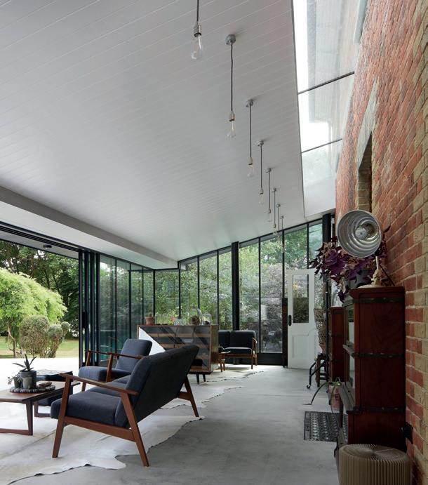
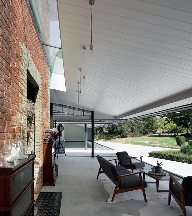
Learn how this early Victorian gem in the heart of the Kent Downs Area of Outstanding Natural Beauty was transformed from a humble farmhouse into a breathtaking dream house
MATERIALS I-DEAS CASE STUDIES
A TIMELESS HAVEN IN THE HEART OF BLOOMSBURY ~
Discover a meticulously refurbished period apartment in vibrant Bloomsbury, London
ADVISORY
BUILDING IN A RURAL PARADISE ~
Uncover the pros and cons of building your dream home amidst nature’s embrace
OPENING NEW POSSIBILITIES ~
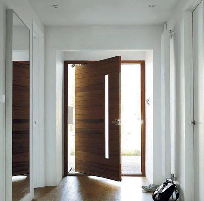
Pivot doors are the epitome of elegance with their sleek designs and seamless integration
PERSONALISE YOUR SLEEP SANCTUARY ~
Unlock the true potential of your bedroom with exclusive tips to transform your space
+ FOCUS: SELF-BUILDS | RENOVATIONS | CONVERSIONS | DIY | EXTENSIONS COVER STORY



 JUNE 2023
EDITORIAL: Rebecca Kemp rebecca@redhutmedia.com
Hannah Woodger hannah@redhutmedia.com
PRINT & DIGITAL ADVERTISING: Sam Ball sam@redhutmedia.com
Jim Moore jim@redhutmedia.com
PRINT DESIGN MANAGER: Jack Witcomb jack@redhutmedia.com
DIGITAL DESIGN MANAGER: Matt Morse matt@redhutmedia.com
ACCOUNTS: Rachel Pike accounts@redhutmedia.com

SALES SUPPORT & STATISTICS: Klare Ball klare@redhutmedia.com
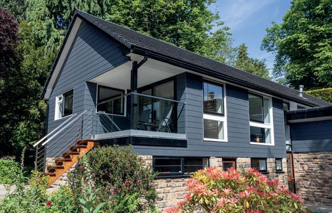
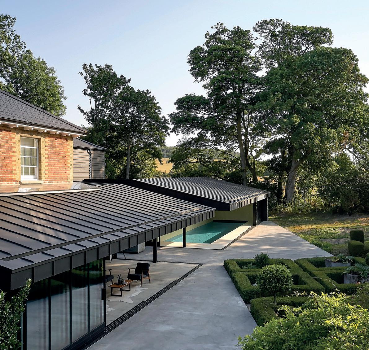
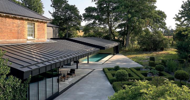
TERMS AND CONDITIONS: Contributions are invited and when not accepted will be returned only if accompanied by a fully stamped and return addressed envelope. No responsibility will be taken for drawings, photographs or literary contributions during transmission or in the editor's hands. In the absence of an agreement, the copyright of all contributions, literary, photographics or artistic belongs to Red Hut Media Ltd. The Publisher accepts no responsibility in respect of advertisements appearing in the magazine and the opinions expressed in editorial material or otherwise do not necessarily represent the view of the publisher. The Publisher does not accept any liability of any loss arising from the late appearance or non publication of any advertisement. Red Hut Media Ltd 5 Mansion Row, Brompton, Kent, ME7 5SE 01622 946150 www.redhutmedia.com Cover story: Take a look around Hollaway Studio's remarkable contemporary extension for Vicarage Farm in the Kent Downs Area of Outstanding Natural Beauty. See page 22.
As we dive into the world of selfbuild and home renovation, we bring you a plethora of exciting articles that will inspire and inform you on your journey to creating your dream living space.

In our Viewpoint feature, Kyle Burns, Customer Success Manager at Trimble SketchUp, shares valuable insights on when it's more sensible to renovate rather than demolish. Discover the factors to consider and the benefits of breathing new life into existing structures on page 10.
F or those considering building in rural areas, Melanie Clear, Founder and Director of Clear Architects, guides us through the pros and cons in her article on building in the countryside. From drainage and utilities to environmental impact and design, gain a comprehensive understanding of the considerations that come with rural construction on page 12.
P repare to be captivated by the 'Urban Sanctuary' we unveil in this issue. Step inside a beautifullyrefurbished period apartment in Bloomsbury, London, expertly designed by LLI Design. This two-bedroom pieda-terre perfectly harmonises modern aesthetics with historic charm, showcasing high ceilings, original features and an eclectic blend of contemporary and inherited furniture. Turn to page 14 to take the full tour.
M eanwhile, our Impressive Innovation feature on page 22 showcases Hollaway Studio's remarkable contemporary extension for Vicarage Farm in the Kent Downs Area of Outstanding Natural Beauty. Shortlisted for the prestigious RIBA 2023 South East Awards, this design seamlessly merges old and new, resulting in an elevated aesthetic that complements its surroundings.
F inally, discover the advantages of pivot doors in Stairways Midlands' article. Not only do they add a stylish touch to your space, but they also offer practicality and accessibility that can enhance your daily life. Turn to page 20 for the full story.
I hope you enjoy this issue. Don’t forget, if you’re coming to the end of your self-build and would like us to feature your home as inspiration for other budding house-builders, then please do not hesitate to get in touch. Alternatively, if you’re about to embark on your self-build journey and would be keen for us to document your progress, do get in contact.
 Rebecca
I-BUILD/JUNE/23 3
Welcome Editor's I-BUILD
Rebecca Kemp Editor @ibuildmagazine @ibuildmagazine ibuildmagazine
PUBLISHER: Sam Ball sam@redhutmedia.com


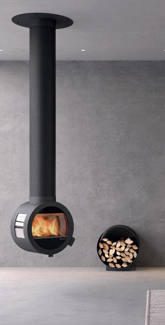
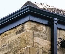
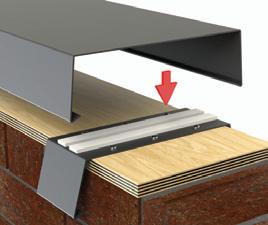
www.nordpeis.co.uk The Norwegian Experience... AWARD WINNER The award-winning Ecodesign Nordpeis ME represents over 30 years of quality Norwegian design and technical expertise, guaranteeing the finest standards in heating technology. ‘BEST STOVE’ Find out more at: nordpeis.co.uk/me WINNER 2019 Best Stove Find Your Retailer You can find your nearest retailer by visiting: www.nordpeis.co.uk/retailers A rainwater system to suit your plans and your budget Traditional and modern gutters, pipes and hoppers come in a comprehensive range of aesthetic styles, materials and colours to suit all buildings and budgets. For more information please call 0113 279 5854 or email info@rainguard.co.uk www.rainguard.co.uk XL ALUMINIUM Squareline ALUMINIUM FASCIA, SOFFITS & COPING
June 2023
INSPIRATION
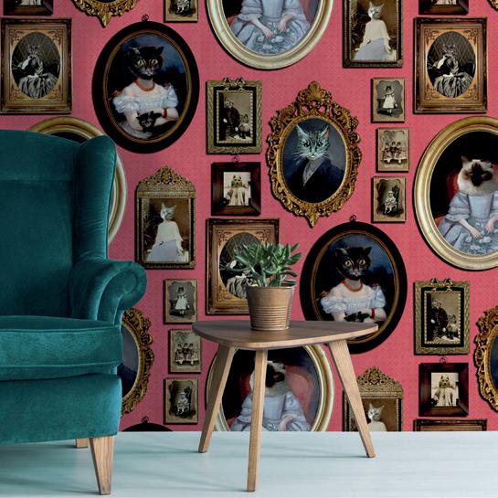
Desired Designs: Feline Fine
Embracing a cat theme in your home decor can add a playful and quirky touch to any interior. The secret to achieving a stylish space is to incorporate accessories and furniture pieces that are subtle yet eye-catching.
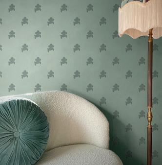
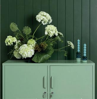
Desired Designs: Verdigris Vibes
Choosing verdigris pieces can transform your interior into a lush, serene oasis. This classic green hue offers timeless elegance and adds a touch of nature to any room. Plus, it’s versatile, complementing many styles, and adds depth and character.
10
Viewpoint
In this article, Kyle Burns, Customer Success Manager at Trimble SketchUp, provides insights into when it makes sense to renovate a building instead of demolishing it.
CASE STUDIES 06 12
14 08 22
Urban Sanctuary
I-DEAS 28
i-Build: Home Extensions
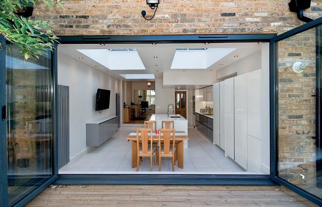
From design and approval to money and time, RIBA-chartered Architect George Omalianakis from GOAStudio shares insights on how to successfully add an extension to your home.
i-Scape: Plants, Trees & Lawn Care
Are you looking to enhance your outdoor space? Look no further than these top landscaping trends curated by House Designer.
i-Nterior: Bedrooms
Transform your bedroom into a personalised sleep sanctuary with Neville Johnson’s bespoke bedroom renovation tips.
Plot Searching
From drainage and utilities to environmental impact and design and planning, Melanie Clear, Founder and Director of Clear Architects, shares the pros and cons of building in rural areas.
We take a look inside a beautifully-refurbished period apartment in Bloomsbury, London, designed by LLI Design. With high ceilings, original features and an eclectic mix of contemporary and inherited furniture, this two-bedroom pied-a-terre perfectly balances modern design with historic charm.
Impressive Innovation
Hollaway Studio’s contemporary extension for Vicarage Farm in the Kent Downs Area of Outstanding Natural Beauty has been shortlisted for the RIBA 2023 South East Awards. The design seamlessly blends old and new, creating a complementary and elevated aesthetic.
MATERIALS
Doors & Windows
Pivot doors aren’t just a stylish addition to your space; they’re also practical and accessible. Discover the advantages of pivot doors in Stairways Midlands’ latest article.
ADVISORY 20 34 30 36 32
NEWS/PRODUCT GUIDE
Southern Homebuilding & Renovating Show
Get ready to take your home to the next level with the Homebuilding & Renovating Show at Sandown Park in Surrey on 1st and 2nd July.
Product Guide
The latest innovative products in the marketplace, designed with your build in mind.
I-BUILD/JUNE/23 5
esired esigns
FELINE FINE


Consider a sleek black cat sculpture on a bookshelf or a statement piece like a feline-shaped lamp. Adding a few playful touches can transform a room from ordinary to extraordinary. Incorporating patterned textiles is another way to add a touch of whimsy to a space. A quirky cat-printed throw, pillow or cosy blanket can inject fun and personality into a room without overwhelming it. For a bolder statement, consider wallpaper, which can create a fun accent wall

in a bedroom or living room. When it comes to furniture, there are endless possibilities for incorporating this theme. A clawfoot chair with a subtle pattern can add charm to a reading nook, while a side table can serve as a functional yet playful piece in a living room. Whether you’re a cat lover or just looking for a playful way to add personality to your home, incorporating such accessories and furniture can be a fun and creative way to achieve a quirky scheme and create the purrfect ambience.

6 I-BUILD/JUNE/23 DESIRED DESIGNS
1. Annabel James, cat plant pot feet, £21.95
2. Desenio, fashion cat poster, £13.95
3. Jimbobart, Coffee Me cat mug, £19
4. Nedgis, cat lamp, €79
5. Jimbobart, ‘Leave’ cat door mat, £45
6. Jimbobart, ‘You Bake It I Eat It’ side plate, £22
7. Fy, Cat Power square art print by Alxndra, from £26
8. The Design Gift Shop, handcarved grey cat wall hook by Wildlife Garden, $46.90
9. Yellow Octopus, cat butt magnets, set of six, $22.99
10. Yellow Octopus, meow cat set of six drink markers, €13.50
YOURS TO BUY
Embracing a cat theme in your home decor can add a playful and quirky touch to any interior. The secret to achieving a stylish space is to incorporate accessories and furniture pieces that are subtle yet eye-catching.
©LIME
LACE
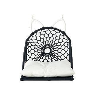
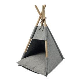
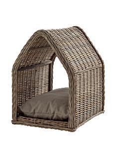
Pawsitively chic cat beds


If you’re a cat owner, consider yourself fortunate! Your feline friend deserves a cosy and stylish place to snooze. When choosing a bed, look for options that complement your interior decor. From sleek and modern designs to playful and colourful options, there are plenty of stylish cat beds to choose from.


F abFunky
Founded by self-taught Artist Kelly Stevens-McLaughlan, interior brand FabFunky specialises in wall art, cushions and lampshades. Often featuring anthropomorphic creatures, every piece in the FabFunky collection is designed by Kelly. What’s more, all products are manufactured in the UK by small, local businesses. All prints and cushions are made in London, and lampshades are handmade in Cornwall. FabFunky is most widely known for the funky illustrations it prints onto antique book pages.
1. Black Cat with Teacups and Blackbird antique book print, £36


2. Cat in Ski Sweater antique book print, £36


3. Puss Daddy antique book print, £36
4. Tabby Cat Cocktails antique book print, £36
Strike a balance between playful and sophisticated?
One way to achieve this is by using a mix of textures and materials, such as velvet or faux fur, to create a luxurious feel. Consider incorporating sleek, modern furniture with subtle cat-inspired details, like a subtle paw print pattern on a chair or lamp base. To complete the look, add accents like framed cat art or a sculptural cat figurine.
I-BUILD/JUNE/23 7 DESIRED DESIGNS HOT PRODUCT
01 03 02 04
TOP TIP
OUR BRAND PICK
YOURS TO BUY
1. Cox & Cox, rattan pet house large, £225
2. Sazy, Bertie hanging cat bed black, £45
3. Fabio the Cat, handmade cat hammock bed grey walnut, £89,
4. Yellow Octopus, pet teepee, $69.99
YOURS TO BUY
esired esigns
VERDIGRIS VIBES
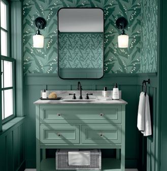
V ibrant patterns
The glorious floral design depicts an abundance of lily of the valley in full bloom. A sign of purity and happiness, this bold design will create a striking contrast with minimalist interiors or complement the mood of an already colourful, vibrant scheme.
www.annikareed.com
G et playful
This dreamlike print is a cheeky twist on a classic polka-dot pattern, with fluffy, tactile dog motifs dancing across a sumptuously-textured base. The Poochi wallpaper brings a playful, luxurious finish to your walls, creating a sensory, cloud-like backdrop.

www.divinesavages.com
S
torage meets style
The Lowdown locker can be used as a TV unit, console or office storage. It’s proportioned to make the most of an alcove as a TV unit but works just as well next to a bed. The holes in the back are perfect for messy cables and chargers, so you can keep them tucked away.
www.mustardmade.com
Quilted comfort
In delicate shades of green, ice blue, silver grey and latte, these luxurious quilted bedspreads add a touch of finesse to the bedroom. Perfect for adding warmth to interiors, they come in both standard and extra-large sizes. www.thefinecotton company.com

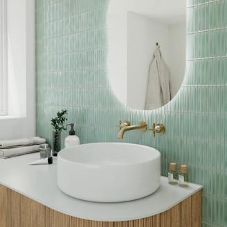
G et your gloss on
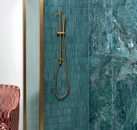
The Dolce Mist tiles hit the high notes in many ways. Firstly, there’s the kit-kit style. Secondly, the tones are perfect for all types of interiors. It’s a delicate blue-green with a glossy finish, the type of colouring that will lift any room.


www.porcelain superstore.co.uk
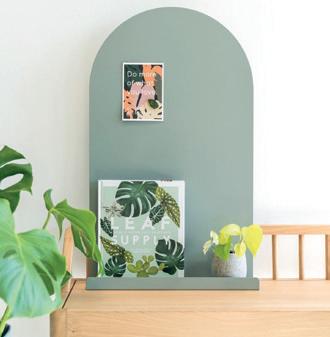
Declutter your space
The Moodyboard is a magnetic and writable surface with a builtin shelf for additional storage and decluttering your desk. Use it to keep your goals and tasks front and centre, as a notice board in the kitchen or as a shelf and styling piece in the bedroom.
www.antipodream.co.uk
8 I-BUILD/JUNE/23
DESIRED DESIGNS
©HYPERION TILES
Choosing verdigris pieces can transform your interior into a lush, serene oasis. This classic green hue offers timeless elegance and adds a touch of nature to any room. Plus, it’s versatile, complementing many styles, and adds depth and character.
https://www.lg.com/uk/heating-awhp


AHEAD OF THE EXPECTED
The UK’s ambitious net-zero targets mean there is a real need to decarbonise both new-build and existing residential properties across the UK. So, as heat pump technology has advanced over the years, it has become clear that they will play a major role in providing a stepping stone to full decarbonisation.
Discover how LG’s innovative Therma V, air-to-water, all-in-one Monobloc Heat Pump can help you meet your low-carbon self-build or renovation plans.


I-BUILD/JUNE/23 9 Lower bills Reduce carbon emissions Comfortable home Renewable technology Remotely control from your mobile
The LG Therma V operates on Fluorinated Greenhouse Gas (R32)
Viewpoint
Tips for moving to renovation over demolition

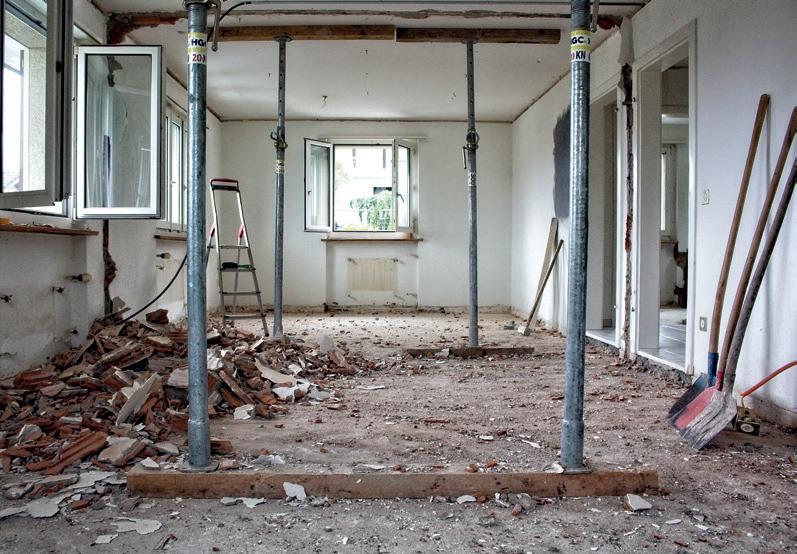
Renovating or rehabilitating a building makes sense for many reasons –cost, time and preservation of characteristic qualities. It might also seem unreasonable to knock an entire building down just to put another new one in its place. So, before grabbing the sledgehammer, hiring the JCB and throwing caution to the wind, here are some considerations and tips from Kyle Burns, Customer Success Manager at Trimble SketchUp.
W hy might someone renovate rather than demolish?
I t’s worth noting that not every building is suitable for renovation. Sometimes, it is better to just demolish it, and if someone wants to do this, they won’t be stopped as long as authorities permit it. It’s also important to note the difference between building renovation and rehabilitation. Renovation entails making an old building look and function like new.
R ehabilitation seeks to preserve the historical characteristics of a building whilst making sure the building meets new use standards. Older, historic buildings need rehabilitation so that historic meaning has new life brought into them in an interesting way.
When thinking about commercial architecture, there are a host of reasons why someone might lean towards renovation over demolition. First, renovation is typically more sustainable than new construction, especially when it comes to demolition waste. While it is not always the case, most often, it is also cheaper and requires fewer tradespeople and project members.

U nique design opportunities can also come with adaptive reuse projects. I have personally worked on projects where old schools were rehabilitated into fantastic apartments. The existing structures were
landmarks to the community, and it was important to maintain that historic character. The juxtaposition of old and new is exciting and unique; everyone likes a great space that has a story. I believe that new buildings simply lack the character that’s easier to find with older buildings.
D evelopers may also choose to renovate a building because of a personal or community tie to it, and they want the tenants to share in their sentiments. For example, renovating a derelict building may serve community improvement, and those leasing the spaces may have invested in them – showing to their clients that they are dedicated to the community and are invested in change and doing local business. Many cities in the US have suffered from flights to suburbs, and with young people moving back to the city, there are many interesting opportunities to bring life back to urban locations.
F inancial incentives may also be a contributing factor for why people may look to renovate and not demolish. In the US, people are able to claim tax credits and Government assistance for keeping an old building, making it more appealing. On the complete end of the spectrum, cities like Paris prioritise maintaining beautiful old city architecture through legislation that prevents demolition.
10 I-BUILD/JUNE/23 VIEWPOINT
K yle Burns is the Customer Success Manager at Trimble SketchUp
Photo by Gene Gallin on Unsplash
T he benefits of renovation
O nce someone has decided to go ahead with a renovation or rehabilitation project, there are many benefits they can experience.
First, the unique and exciting design opportunities presented will make space for innovative creativity. People can be playful with their project and enjoy the process more than they would with, say, a standard and more typical new build.
Second, many architecturally rundown areas breed an environment where crime levels can increase. This leads to people leaving the area, and the community then suffers. Maintaining the historic character of a neighbourhood offers a chance to preserve a wonderful part of history, which, in turn, can spur development and revitalise diminishing communities.
A third benefit of renovating a building over demolishing and rebuilding something new is that doing this greatly reduces the level of embodied carbon that is outputted. It is often said that the most sustainable building is the one that is already built – and by building on what is already there, you’re cutting out the need for more embodied energy which will then have to be offset. In addition, a new building with a more modern mechanical or HVAC system will take a long time to build and even longer to offset in terms of the carbon emission output.
T he challenges of renovation and rehabilitation projects
W hile there are sure benefits of renovating over demolishing a building, there are also challenges that can present themselves in the process. During the renovation

or rehabilitation process, it is not uncommon to uncover unknown building conditions that require additional work. In my history of working as an architect, there have been many occasions where this has happened. For example, I worked on a project where the team was installing a new column into a commercial building and, in the process, discovered that there was an additional level underground. Naturally, discoveries such as these can delay a project for a long time.
Another challenge people face is actually deciding what to keep of the original building and what to sacrifice. Often, this isn’t as easy as it sounds! People must carefully consider where it makes sense to keep something or renovate – both in terms of design and cost. Additionally, in order to do this well, constructors and architects and builders also need good drawings and good data, which must be gathered precisely.
T ips for people looking to begin a renovation project
There are some key tips I would offer to people who are interested in renovating or rehabilitating a building. First, do your research. This can involve bringing in experts to help with the project, delegating tasks where necessary and deferring to sound judgement.

N ext, understand that while renovation may be your passion, not every project needs to be renovated or rehabilitated. Some existing buildings are structurally and visually bad, and you shouldn’t force a renovation or rehabilitation when it doesn’t make sense. Understand the direction in which you want to take your project, and have a strong motivation to
renovate. If it is not meaningful or interesting, people might not care about your project. The renovated building needs to be used in order for it to be successful, not just fixed up.
Finally, use high-quality software to your advantage, as well as tools that make your project easier. For example, using 3D modelling software, such as SketchUp, can mean you can quickly come up with various alternatives for new spaces in existing structures. By modelling the existing conditions, designers can decide what to remove and how to improve the building. You can also verify if your new designs will take away from any of the historic character.
E very building is unique, and every building has a different story. Some buildings in a historic district must maintain a certain percentage of historic elements when renovating, and 3D software can help verify new designs will be approved by local codes and review boards. In addition, renovation and rehabilitation projects are a lot of work and require good teamwork. Using a professional tool can be a great enabler of sharing ideas and expressing alternatives while receiving feedback from community stakeholders.
T here are many fantastic reasons why someone should renovate and not demolish an existing building. If the decision to renovate or rehabilitate works after a thorough weigh up of all factors, people must hold tight to their research, the direction of their project and invest in using tools that will make their project run more smoothly. Then, their creative vision can come to life!
www.sketchup.com
I-BUILD/JUNE/23 11 VIEWPOINT
Photo by Stefan Lehner on Unsplash
Photo by Milivoj Kuhar on Unsplash
Going
rural:
The pros and cons of building in the countryside

Building a rural retreat in the countryside sounds idyllic, and there are certainly many pros to a country lifestyle. Still, it is not without its problems, especially if the land chosen has not been developed in the past. Here, Melanie Clear, Founder and Director of Clear Architects, looks at some of the areas to consider before planning a building project in the countryside.

Drainage
Drainage is a major consideration in any building project, but none more so than in rural areas where access to mains sewers and drainage points may not be possible.
If geological conditions are not suitable, then a soakaway is often an adequate solution to deal with surface rainwater runoff that doesn’t naturally drain away. An infiltration test should be carried out as early as possible to identify if it is feasible.
A soakaway is a cost-effective solution. A buried drain manages surface water which is assimilated into a pit in the ground rather than discharging to a watercourse or sewer. Bear in mind, however, the size of the hole will be relative to the size of the building/s.
There are a few rules in place when considering soakaways; they should be placed 5m from a building’s structure and should be on land lower or sloping away from a building, so ideally situated at the end of a garden. However, they can also be located under a porous driveway, such as resin bound, although there are cost implications to consider due to additional weight requirements from vehicle movement.
For land that has low permeability, an attenuation tank will be required to store excess surface water before directing
it to another place rather than into the ground like a soakaway. This provides a long-term solution to reduce the threat of flooding. The tank will have a flow control chamber or device that slowly releases the water at a pre-agreed rate with the lead local flood authority into a watercourse or mains drainage system.
Foul drainage is more straightforward through traditional methods such as septic tanks or off-the-shelf products, for instance, a Klargester sewage treatment plant, with treated effluent discharged with permission into a soakaway, watercourse or mains drainage system.
Utilities
If the plan is to build on an undeveloped parcel of land, then getting utilities to the site and building/s may be a problem, especially if it is isolated from a public road where existing infrastructure is likely to exist and can be more easily tapped into.
In an ideal world, three-phase electricity should be installed to futureproof the site and help power an all-electric house. However, this may be cost prohibitive if the existing infrastructure needs upgrading, as the utility provider will likely pass the cost on to you. Alternatively, you could speak with neighbouring properties to share the costs.
If single-phase electricity is the only option available, there are solutions to help mitigate against the higher demand an all-electric house will exert on the grid to prevent possible outages. Green technologies, such as a PV solar array with storage batteries which store surplus solar power, result in less reliance on the grid. Storage batteries can also be charged overnight, using off-peak tariffs for use throughout the day, so users with or without solar can benefit from lower bills.
Environmental impact
Under the Environment Act 2021, almost all new developments in England from November 2023 must deliver at least a 10% biodiversity net gain. This essentially means that while developing land, any construction work must contribute to the recovery of nature, ensuring the habitat for wildlife is in a better state than it was before development.
12 I-BUILD/JUNE/23
LIGHTING & ELECTRICALS PLOT SEARCHING
Loss of habitat caused by commercial farming and increased construction has led to the UK losing almost 50% of its biodiversity since the 1970s. For this reason, rural planning applications must now include a Biodiversity Impact Assessment whereby the existing biodiversity values of a site are measured against the likely biodiversity values following development to ensure a bio net gain of at least 10% can be achieved via the mandatory Defra biodiversity metrics.
Site-wide biodiversity enhancements can be done in several ways, including the inclusion of wildflower green roofs, garden ponds, planting of native trees, shrubs and hedgerows, installing tree-mounted or integrated bird and bat boxes and the provision of hedgehog domes and hibernaculum.
Design and planning
Obtaining planning within the country can be tricky, especially if the area falls within the green belt or a conservation area; however, with the right approach, some great properties can be achieved. The key is to work with experienced chartered architects who understand the planning complexities of today; it’s a lot more than just drawings.


Before you begin, have a feasibility study undertaken of your site to see what/if development can be achieved and how. There is no one size fits all.
Providing well-considered designs and highquality application documents can showcase how a proposal will enhance rather than detract from the landscape it sits within. We holistically design, starting with the site itself, threading strong sustainability credentials throughout the build and the wider landscape. Our model brings proven planning success within the green belt and rural locations. It is worthwhile getting the right architects on board to achieve an outstanding design and, ultimately, create that idyllic forever home in the country.
www.cleararchitects.co.uk

I-BUILD/JUNE/23 13
PLOT SEARCHING
An eclectic Edwardian renovation
In the heart of Bloomsbury, London, this two-bedroom apartment offered a blank canvas for a beautiful pied-a-terre. Situated in the historic West End and near the theatres of Covent Garden, the period apartment hadn’t been renovated in many years. LLI Design was commissioned to completely redesign and refurbish the apartment, which is located in a grand mansion block.
The brief was to keep and enhance the period details of the apartment, incorporating the client’s inherited furniture pieces and combining them with new contemporary items to create an eclectic mix that suited the clients' desired aesthetic.

E xisting layout
The layout of the existing apartment was based around a long central corridor with rooms on either side.
All rooms enjoyed high ceilings, original cornices, skirtings, architraves and generously-proportioned windows. The central corridor that joined all the rooms, although in the centre of the apartment, had the benefit of borrowed light via fan lights above most of the room doors.
The two bathrooms were typically proportioned for an Edwardian mansion flat and were small and relatively dark.
On the north side of the apartment, there were two reception rooms and a bedroom. While on the south side, there was a further reception room, the kitchen and another bedroom. Meanwhile, on the west side, there were two bathrooms.
The rooms on the north side overlooked the central courtyard of the grand mansion block, with the nearest adjacent tall building circa 5m away. On the south side, the views were towards the city with the nearest adjacent tall structure some distance away. The effect of this is that
there was a stark contrast in natural light levels between the north and south side of the apartment.
R evised layout
To make the apartment work for the clients and maximise all the available space, it was decided to amend the layout as follows. The two reception rooms on the north-facing courtyard side would be knocked through into one to create a generous open-plan library/ dining room. By combining these two rooms into one larger space, it created a more cohesive feel to the apartment as a whole.
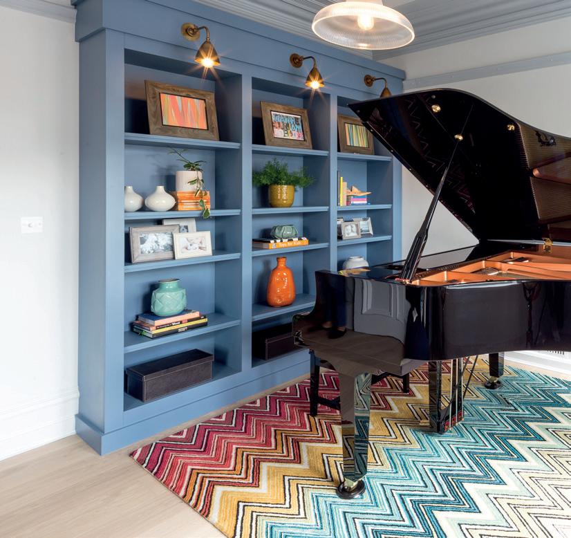
The light-filled southside reception room would become a music room, with a baby grand piano as its centrepiece.
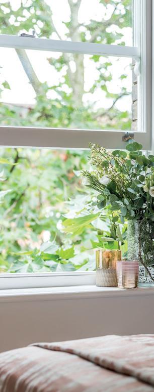
It was decided that the bedroom on the south side would become the master bedroom. It had the advantage of a beautiful, tall tree outside the window, unusual for a fifth-floor apartment. The other bedroom on the north side would become the guest bedroom.
The kitchen would remain largely in its original position, albeit completely reconfigured and redesigned to incorporate a small island and a hidden utility area and a larder space.
The position of the kitchen door was moved so that it would be accessed via the central corridor rather than a small dog leg off the corridor as it was before. The remaining dog leg was incorporated into the new master bedroom.
The guest bedroom remained in its existing position, as did the family bathroom and a small coat cupboard accessed from the central corridor was created from part of the library.
For the majority of the spaces, wide-plank timber flooring in a warm pale grey tone was specified to tie the spaces together visually. The bedrooms were carpeted in a deep-pile soft grey carpet and the bathrooms were tiled, which was complemented with underfloor heating.

T he lighting design for the apartment was challenging as the construction of the ceilings didn’t allow for any recessed lighting, so all luminaires had to be surface mounted or incorporated into the joinery.
C entral corridor
The entrance to the apartment needed to feel warm and welcoming with no clutter. The original layout made no provision for a coat cupboard. As the corridor was relatively narrow, it couldn’t easily accommodate a joinery cupboard. Instead, it was decided to ‘nibble’ a small amount out of the generous library room adjacent to the hall to create storage for coats, shoes, suitcases etc.
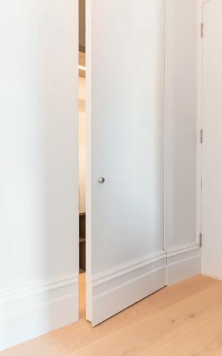
So that the strong lines of the corridor were maintained and the cupboard was as unobtrusive as possible, an ‘invisible’ door was created, with no architrave and the skirting detail included in the door design, so that the whole wall read as one.
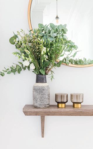
T he high ceilings throughout the property were emphasised with a tonal colour scheme in half tones of grey picking out coving and skirting details. Large dramatic pendant lamps were specified down the corridor to emphasise its length, with a large round mirror and a console shelf creating a visual full stop at the end.

14 I-BUILD/JUNE/23
URBAN SANCTUARY
All images: ©Handover Agency
L ibrary
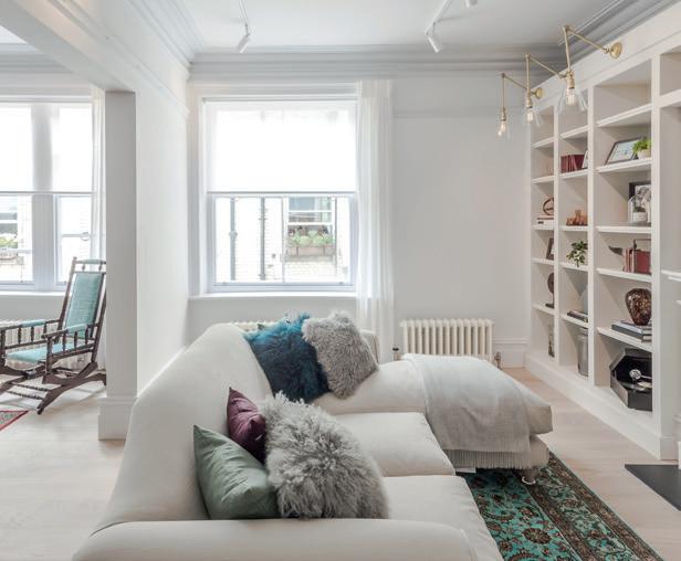
T he two reception rooms on the north side of the property were integrated into one to create a new library room/dining room. This helped natural light flow from one room to another, bringing a light, airy feel to otherwise dark spaces.
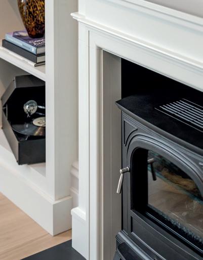
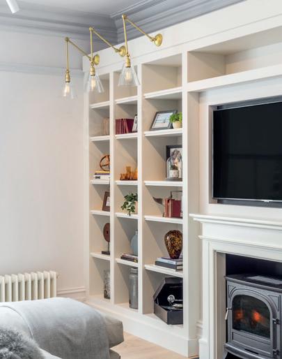
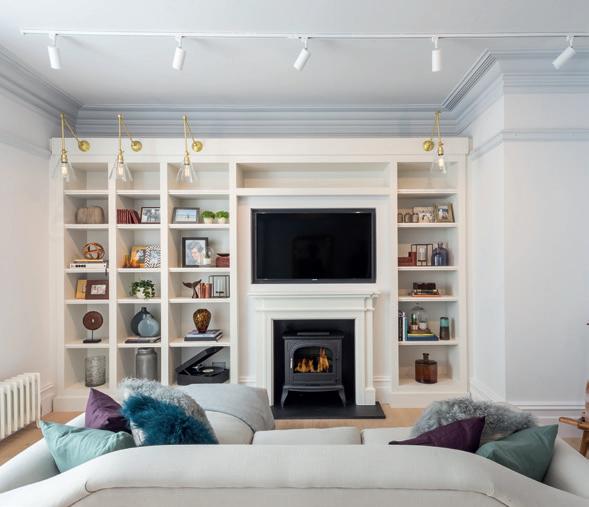
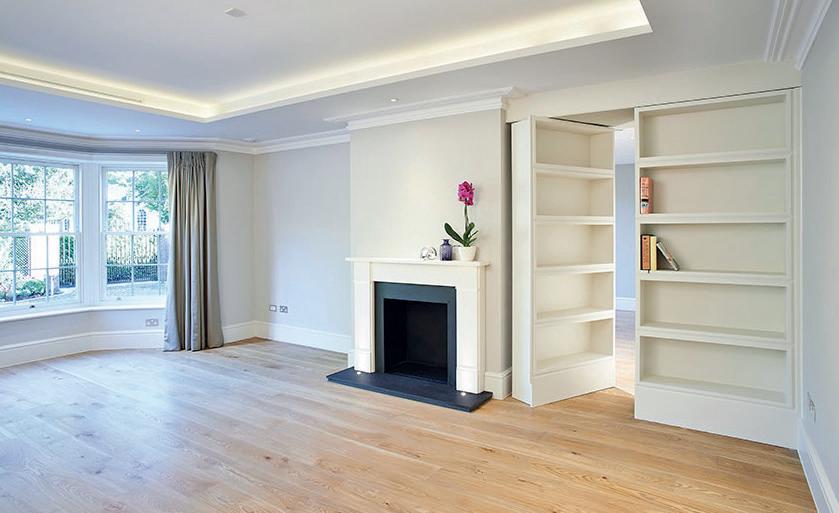
P art of the brief was to install a working fireplace to make the space feel warm and cosy, but because of the confines of the apartment block, it was not practical to install a gas fire and associated flue/chimney. However, a fire surround was designed and integrated into the new bespoke joinery unit. A cast-iron, realistic faux log burner was installed in the new fireplace surround, bringing a sense of cosiness.
A small portion of the existing room that formed the library was partitioned off to create the cloakroom in the central corridor. This made a small return in the library but wasn’t visually intrusive as the coving, skirting and dado detail wrapped seamlessly around the new return. This return was then integrated into the bespoke joinery bookcase, which was designed along the back wall, thus making the whole amendment feel natural and virtually invisible.
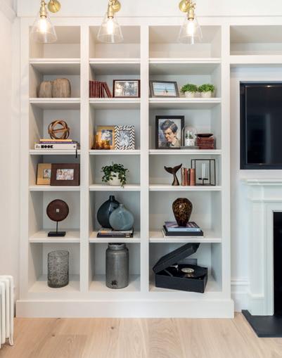
A large TV was integrated into an alcove above the fireplace so that the TV sat flush and did not dominate the space. The bespoke joinery unit along one wall provided much-needed display space for objects, books and collectables, and feature wall lights with brass details completed the joinery unit.


O nce again, period details were picked out in half tones of pale greys to give the space a warm and calm feel.


I-BUILD/JUNE/23 15 URBAN SANCTUARY
K itchen
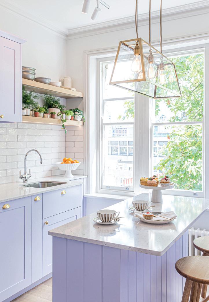
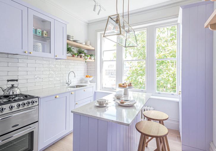
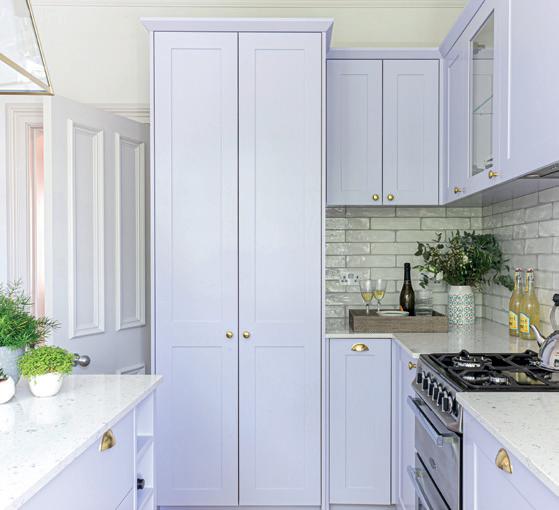
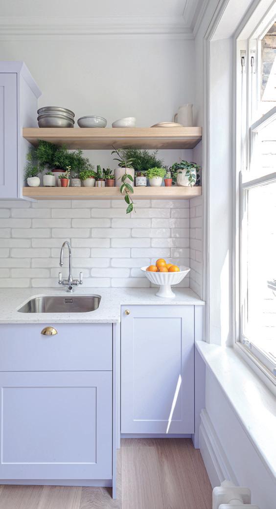
The kitchen benefitted from a window with views of the beautiful, tall tree outside, which it shared with the primary bedroom. For the kitchen, a fresh, bold and refreshing colour palette was selected; pale lilac lacquer, palest dove grey and gold details with bleached wooden shelving created a new and bright modern kitchen with plenty of visual interest.


The bespoke joinery kitchen layout featured a centre island with a pale grey composite worktop and a dramatic gold pendant light. Traditional shaker-style kitchen units, some featuring glass fronts to showcase glassware, added to the visual interest. Cabinetry featured gold cup pull handles and knobs, which helped give the kitchen a contemporary feel.
T he same warm-toned wide plank floor as the rest of the apartment continued into the kitchen; this was repeated in the underlit wooden open shelves for plants and books. The splashback was created by glazed porcelain artisan metro tiles in soft tones with a pale grey border.
D ining room
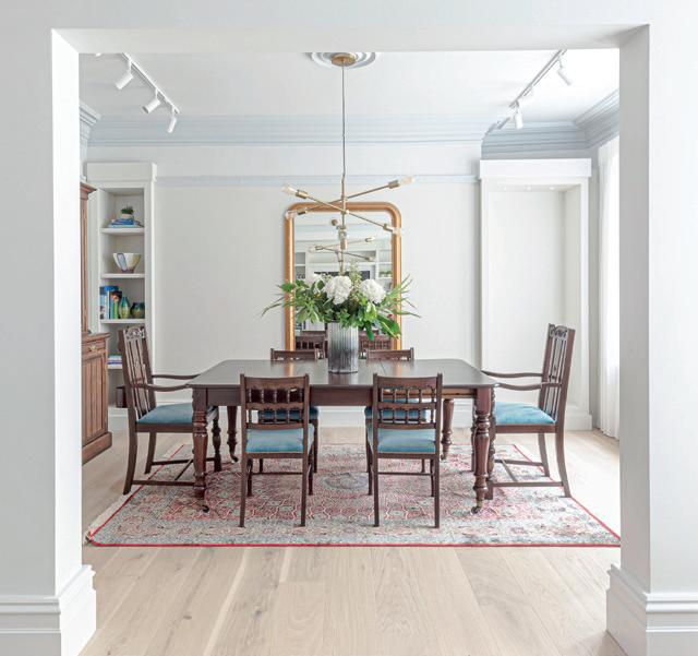
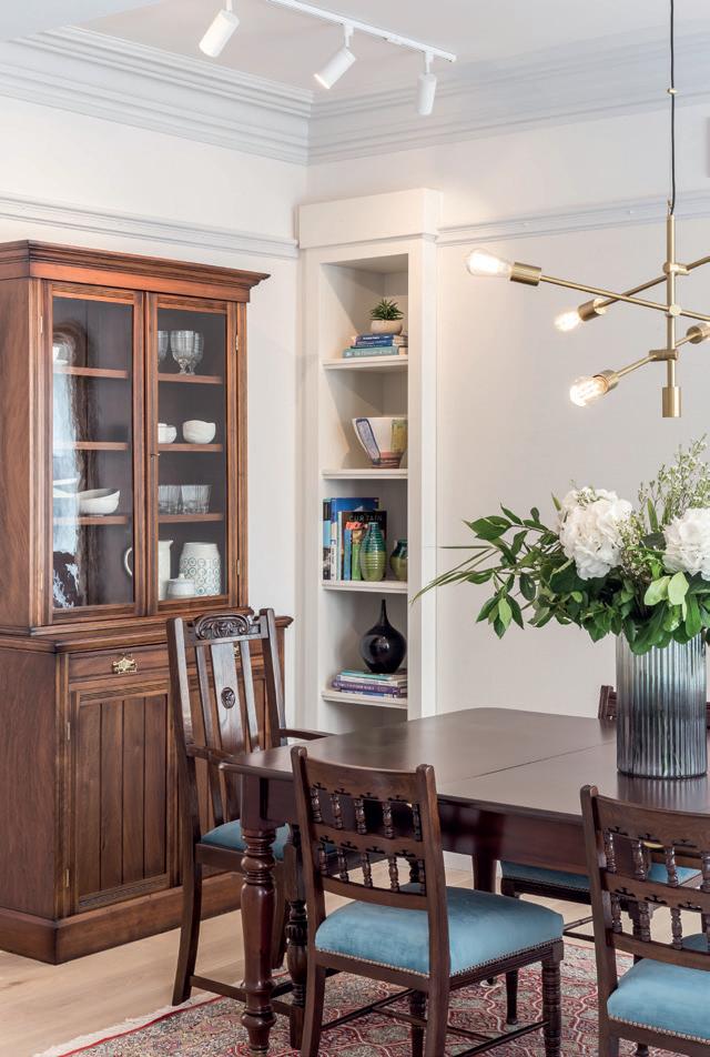
The furniture in the dining room consisted of the clients’ much-loved inherited pieces that were renovated, restored and French polished, bringing them back to their former glory.
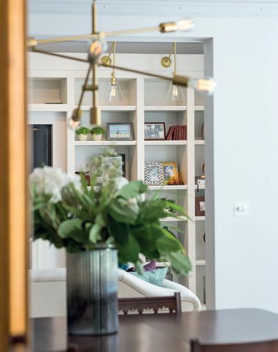
In contrast to the period furniture, the space was contemporised by a large contemporary, brass pendant light with exposed squirrel cage lamps to sit above the dining table. An opulent, oversized, gilt-framed wall mirror bounced light into the room. Bespoke joinery alcoves were positioned on either side of the chimney breast, making the most of all available space. The clients’ richly-patterned Persian carpet helped pull all the visual elements together.
M usic room
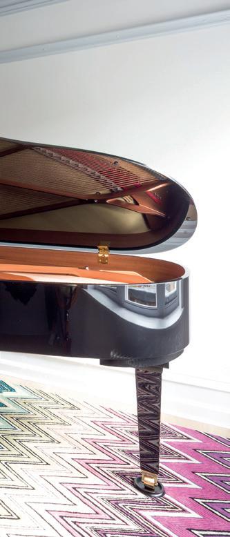
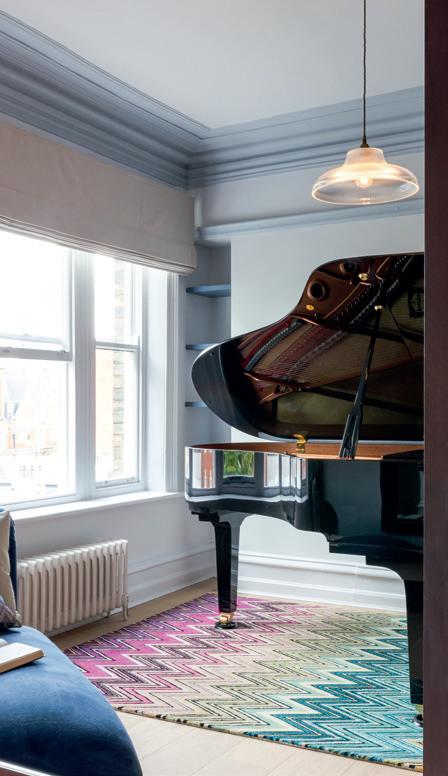
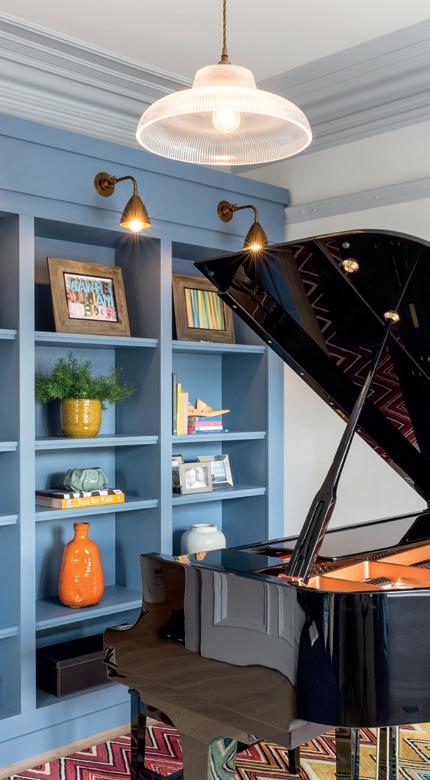
The music room was designed as a bold and dynamic space; bright colours and patterns offset the drama of the polished black baby grand piano that was the centrepiece. To balance the visual presence of the piano, an extra-large, wooden-framed mirror was installed on one wall and a classically-styled chaise lounge added an air of decadence. A bold statement multi-coloured Missoni chevron rug and dramatic mid-blue bespoke joinery unit with brass wall lights above completed the room.
M aster bedroom and en-suite
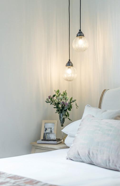
A soft, romantic feel for the master bedroom suite was created with a palette of bruised pinks, greys and taupes, with a mix of tactile fabrics to create a decadent mood. The Frenchstyled bed in natural-coloured grey linen with a bleached wooden frame complemented the elegant classically-styled, bleachedout bedside tables, which had staggered height vintage ribbed globe pendant lights above them. A large vintage metal distressed chandelier was sited above the bed.
A bespoke full-height joinery wardrobe in taupe satin lacquer along one wall hides drawers and hanging items. A gentle and very subtle texture wallcovering was specified to enhance the feeling of calmness and opulence.
16 I-BUILD/JUNE/23
URBAN SANCTUARY


I-BUILD/JUNE/23 17 URBAN SANCTUARY
F amily bathroom
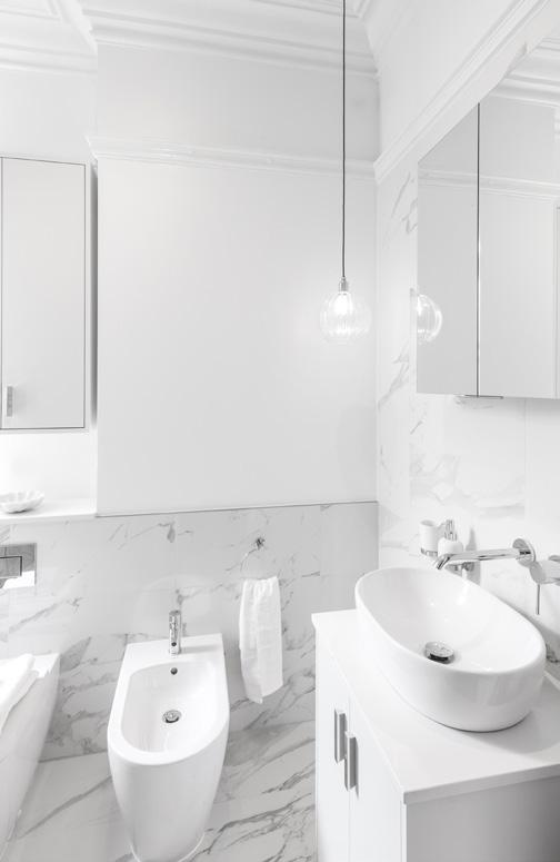
Although small, the family bathroom profits from unusually high ceilings and had the benefit of a window, allowing natural light into the space. A simple, light palette of soft whites and Carrera marble-effect porcelain tiles were selected to make the space feel as big and as light filled as possible.
To add character to this small space, new ceiling coving and picture rails, which matched details found elsewhere in the property, were specified. This helped to bring a period feel to the whole room and emphasise its height whilst also adding texture and visual interest. A simple ribbed globe pendant added accent lighting.
Storage was created through a bespoke white-lacquered cabinet above the WC, a mirror cabinet above the basin and the vanity unit provided a large storage area.
G uest bedroom
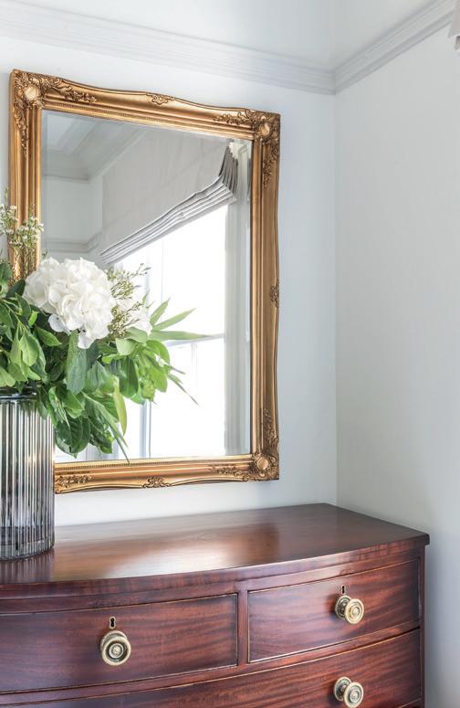
The classical bow-fronted, richlycoloured walnut chest of drawers, inherited by the clients, was the starting point for this room. This was emphasised by a classical gold gilt mirror above and a wall of panelled lacquer wardrobes along one wall. The upholstered bed in blue linen and the contemporary-styled fixed mirror bedside table gave this room a warm and welcoming feel.
L ighting design
The lighting design for the apartment was challenging as the ceilings were concrete, which meant that no recessed lighting could be installed. Accordingly, all ceiling light was provided by a minimalist architectural track lighting system. This supported the feature lighting, which was incorporated by way of pendants and joinery lighting.
S ummary
By way of reconfiguration, clever use of colour and lighting together with bespoke joinery elements throughout, this property was completely transformed from a dark, tired apartment into a light-filled pied-a-terre.

It was essential that the apartment kept its character and atmosphere, and by taking an holistic and sensitive approach to the design and layout, LLI Design created a warm, friendly and practical apartment for the clients whilst staying true to the character of this grand mansion block.
www.llidesign.co.uk


18 I-BUILD/JUNE/23
URBAN SANCTUARY


I-BUILD/JUNE/23 19 URBAN SANCTUARY
Time to pivot? The rise of the pivot door solution
Pivot doors are becoming increasingly popular, especially in public buildings and architect-designed homes. Here, i-Build speaks to Richard Kowalski, Technical Manager of the Doors Division at Stairways Midlands – one of the UK’s leading manufacturers of high-quality, high-volume stairways and doors – about the benefits and applications of this stylish and practical door solution.

Adesign concept. An accessibility consideration. A functionality necessity. There are many reasons why you might consider a pivot door for a residential space.
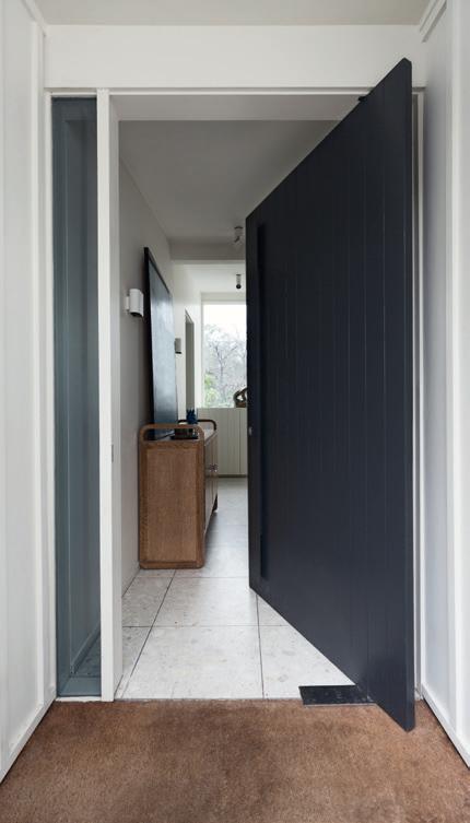
In contrast to a traditional hung door, where the panel is hinged to a frame on one side, a pivot door rotates around a vertical axis within the panel itself. This fundamental change in the mechanics not only means the movement of the door is visually very different, but it also offers a raft of advantages, from greater flexibility around the opening size and door panel materials to the potential for improved accessibility.
A esthetics and design
A pivot door comprises the door panel and the pivot hinge system, mortised inside the bottom of the door, with the top pivot mortised inside the top of the door, fitted into a floor plate and a head plate.
Whilst a traditional hung door is limited by the strength of the hinges and screws attaching it to the frame, pivot hinges are far more robust. They can handle a far broader range of designs, measurements and materials, even cladding with metal and stone – and remain openable with an easy push. As such, they lend themselves to a grand aesthetic and can serve as a design feature in their own right.
The big advantage of the pivot hinge is that it can hold a very heavy door. We’ve used them to hang some ridiculously heavy door panels clad in all sorts of materials, and they can equally be useful for oversized doors – doubled or more in height or width. When you have those kinds of design specifications, a pivoting door is really your only option.
H igh-end architect-designed homes are where we see these types of doors most commonly in terms of residential uses – where the architect is looking for something bold and outside of the norm. Pivot doors, by the way they look and move, can make a real statement.
T he nature of these doors also unlocks a wealth of design possibilities. Pivoting glass panels are an innovative way to open up a room onto a garden or outside space instead of using folding or sliding doors. Pivot doors can be used as room dividers, creating spaces that can be easily opened or closed depending on the need for privacy or flow – especially useful in open-plan homes or commercial settings, where adaptable spaces are required.
T hey are usually a bespoke item – and there are all sorts of weird and wonderful things you can do. We had one customer looking to create a pivoting bookcase between their master bedroom and office. The possibilities are enormous.

20 I-BUILD/JUNE/23 LIGHTING & ELECTRICALS DOORS & WINDOWS
Though a pivot door will usually necessitate a wider opening in the wall than a traditionally-hung door, there are still applications where they can help overcome space constraints or structural barriers. At an entrance to walk-in closets, pantries or other utility spaces, for example, they can provide easy access, still allowing room for storage along the walls and maintaining a sleek and modern aesthetic.


A practical choice
The other key feature of pivot doors is that they open in both directions – making them particularly advantageous for hightraffic areas, such as leisure centres and schools, or even for use in hospitals, where being able to push a door in either direction helps with moving beds, trolleys or wheelchairs.
In many circumstances, especially for someone with limited mobility, it can be far easier to push open a door than to pull it towards you. A properly weighted, well-designed pivot door will open with very little resistance, making it a good choice in terms of accessibility.
W e also commonly install them in disabled WCs, particularly in hospitals. A traditional toilet door opens inwards, and if someone was to collapse while inside, it would make it impossible to open the door. When you install a pivot door, you can open the door outwards and still get to someone in the event of an emergency.
P ivot doors can also be made much wider than your typical door, a real advantage in terms of accessibility, providing easier access to those using wider electric wheelchairs or mobility scooters and making it easier to move equipment or vehicles from one area to another in a commercial setting.
I n schools and nurseries, pivot doors are also finding new applications. Many of our customers are now asking for Safe Hinge doors. These are essentially pivoting doors, but with the pivot axis right at the edge of the panel. A specially-designed aluminium strip at the hinged side of
the door eliminates any gap during the opening and closing of the door – so there is nowhere for fingers to get trapped.
I t is a permanent, maintenance-free solution, which means they no longer need to install finger guards, which are unsightly and subject to wear and damage.
F itting and maintenance
I n general, pivot doors need little maintenance over time. Pivot hinges are much more robust than standard hinges, so you won’t have any problems with screws pulling out or doors dropping over time.
H owever, they are slightly more costly, in terms of ironmongery, which require more specialist installation. You can’t have a door pre-hung in a frame with a pivot door, as the bottom pivot needs to be screwed into the floor, and you must make sure the floor is absolutely level, so it does require a bit more work and know-how on site.
I t is also harder to achieve acoustic standards due to the nature of the door, but with the appropriate seals and materials, pivot doors can easily meet fire and smoke resistance standards up to FD60.
T he future?
S o, given the benefits, will we see pivot doors replacing traditional doors? I don’t think so. I think the added costs, although slight, and the wider opening required in the wall, mean that in large-scale residential developments the standard traditional doorset remains the best option.
T hat being said, there are a host of practical applications in public and commercial spaces where a pivot door can meet certain requirements far better than traditional doors. And, in those one-off architect-designed homes, a pivot door is an incredible choice for a statement look.
www.stairways.co.uk
I-BUILD/JUNE/23 21 DOORS & WINDOWS
From farmhouse to dream house
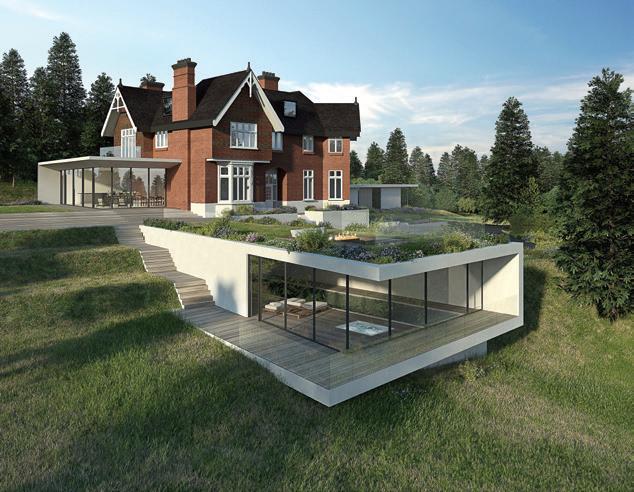
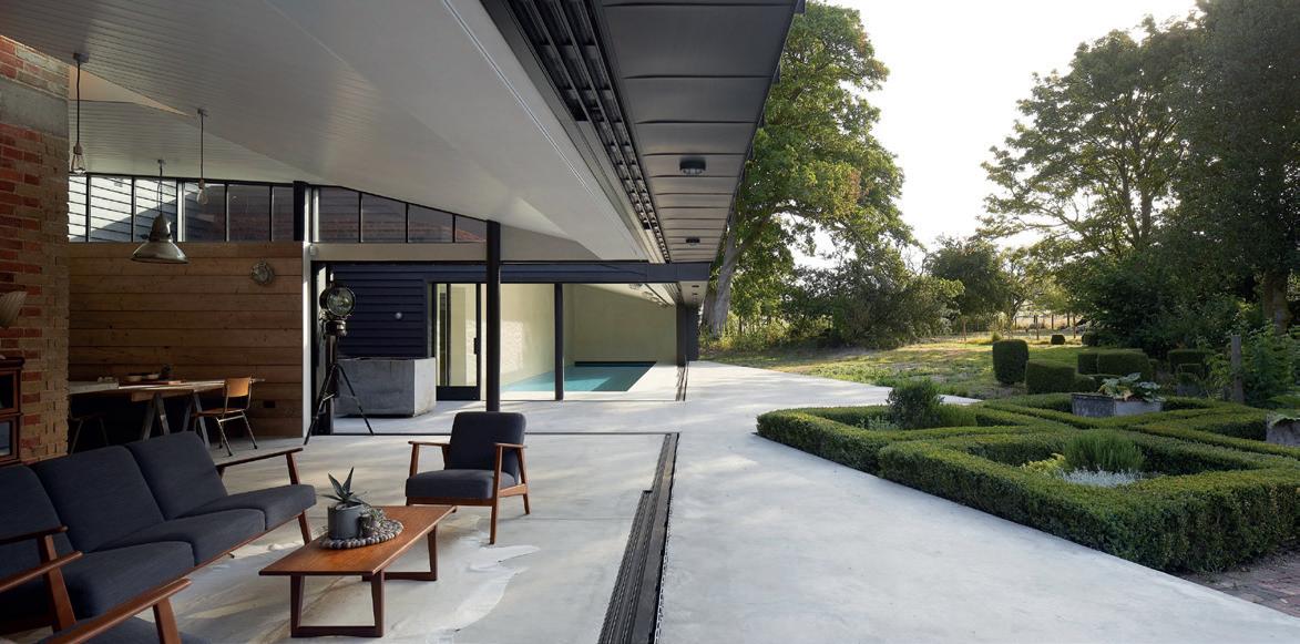
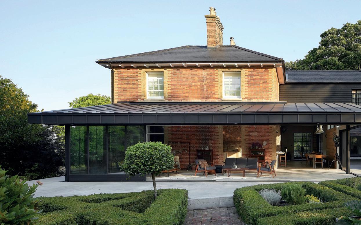
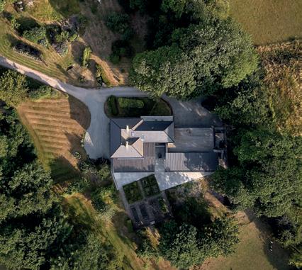
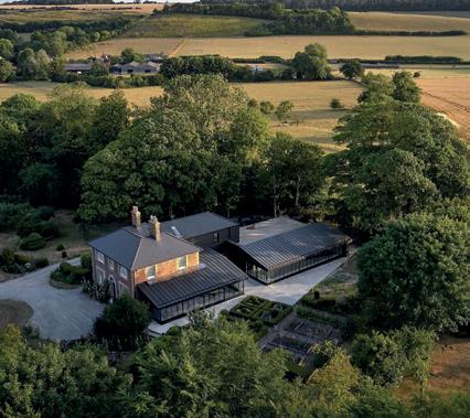
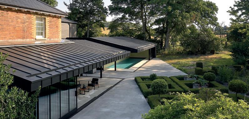
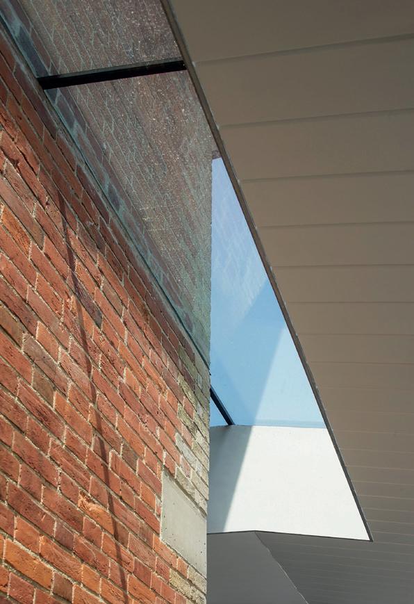
For its design for Vicarage Farm, an early Victorian building in the middle of nine acres in the Kent Downs Area of Outstanding Natural Beauty, Hollaway Studio was tasked with the challenge of creating a substantial extension that was both timeless and sympathetic to the original vicarage, while being of a scale and design dramatic enough to sit within this grand context. The resultant design has now been shortlisted for the RIBA 2023 South East Awards.


22 I-BUILD/JUNE/23
IMPRESSIVE INNOVATION


I-BUILD/JUNE/23 23 IMPRESSIVE INNOVATION
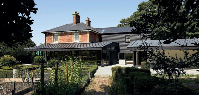
Approached down a long tree-lined driveway, Vicarage Farm is unique as it sits in the middle of its plot, surrounded by fields. As its name suggests, it was formerly a farm with the farmhouse that dates from the 1830s, comprising formal brick walls, a slate roof, generous white sash windows with views across the landscape and original canopied porch, fireplaces and box shutters.
It has had little disruption over time other than a failing single-storey 1990s annexe extension and conservatory, which Hollaway Studio removed and replaced with its double-height wraparound design.

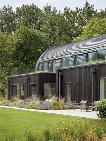
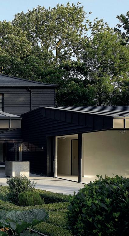
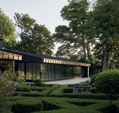
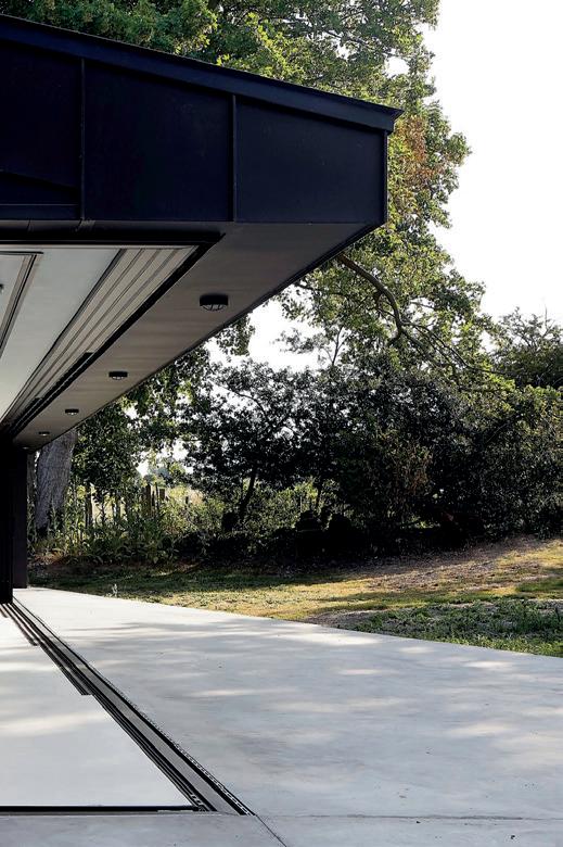
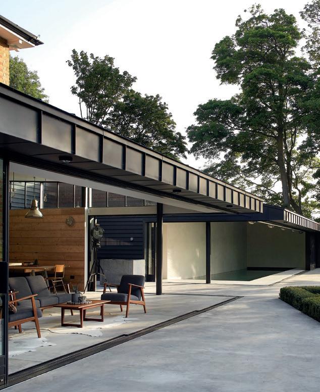
Hollaway Studio’s contemporary extension subtly announces itself on arrival at the property from the driveway. A floating roof sits behind the primary brick facade on one side, with the Crittall-style orangery resting beneath. On following the driveway around, the full extent of the matte black feather-edge, timber-clad extension reveals itself.

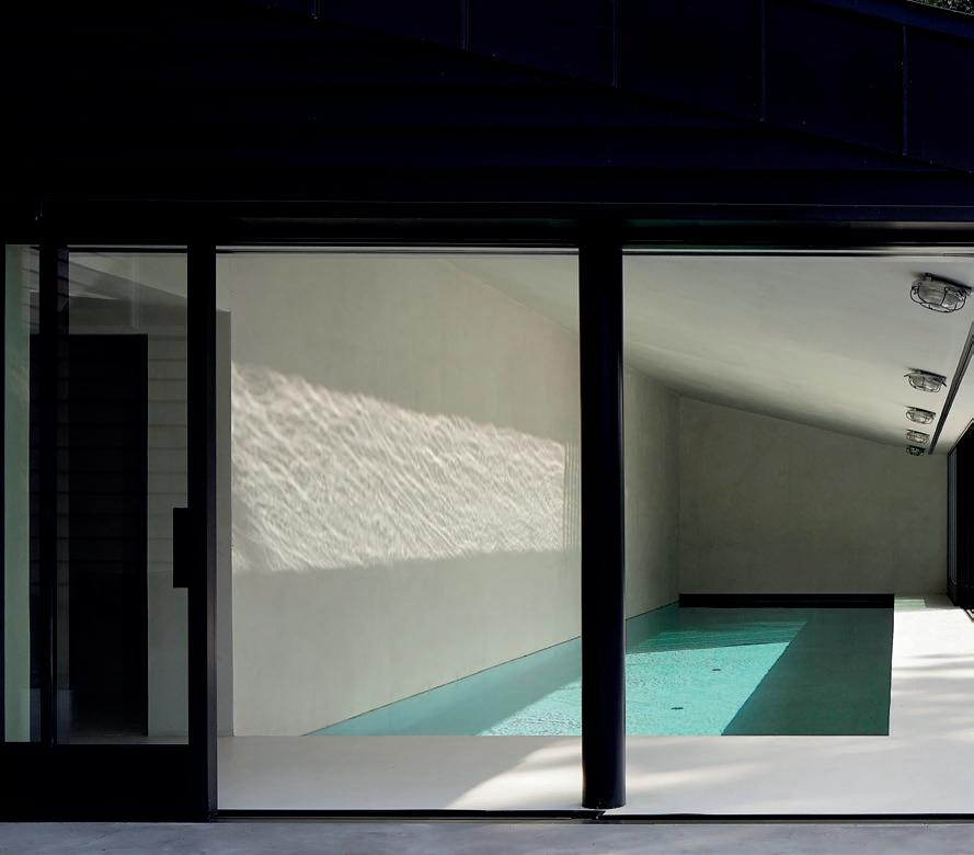
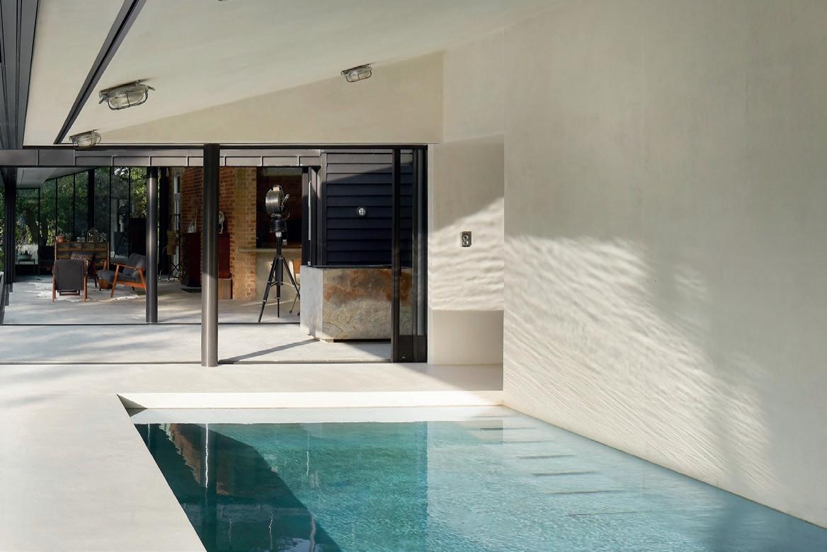
A significant two-storey rear extension folds around the main house, encompassing new living, dining and utility spaces, a swimming pool, a carport and garage, and a master suite on the first floor. The new extension connects with the original building so that it is all joined.
While Hollaway Studio’s addition appears big, it resembles a ‘reverse tardis’ as the interior does not feel so cavernous and remains in keeping with the original building. While the gross internal area (GIA) of the existing house measure 187m2, Hollaway Studio’s first floor and pool extension comes in at 273m2, with the GIA of the garage and carport adding an additional 80m2
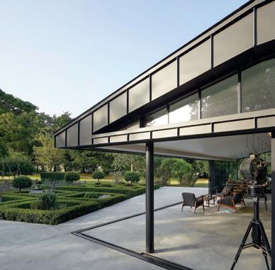
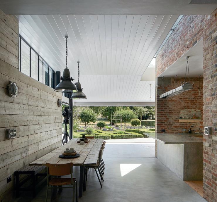
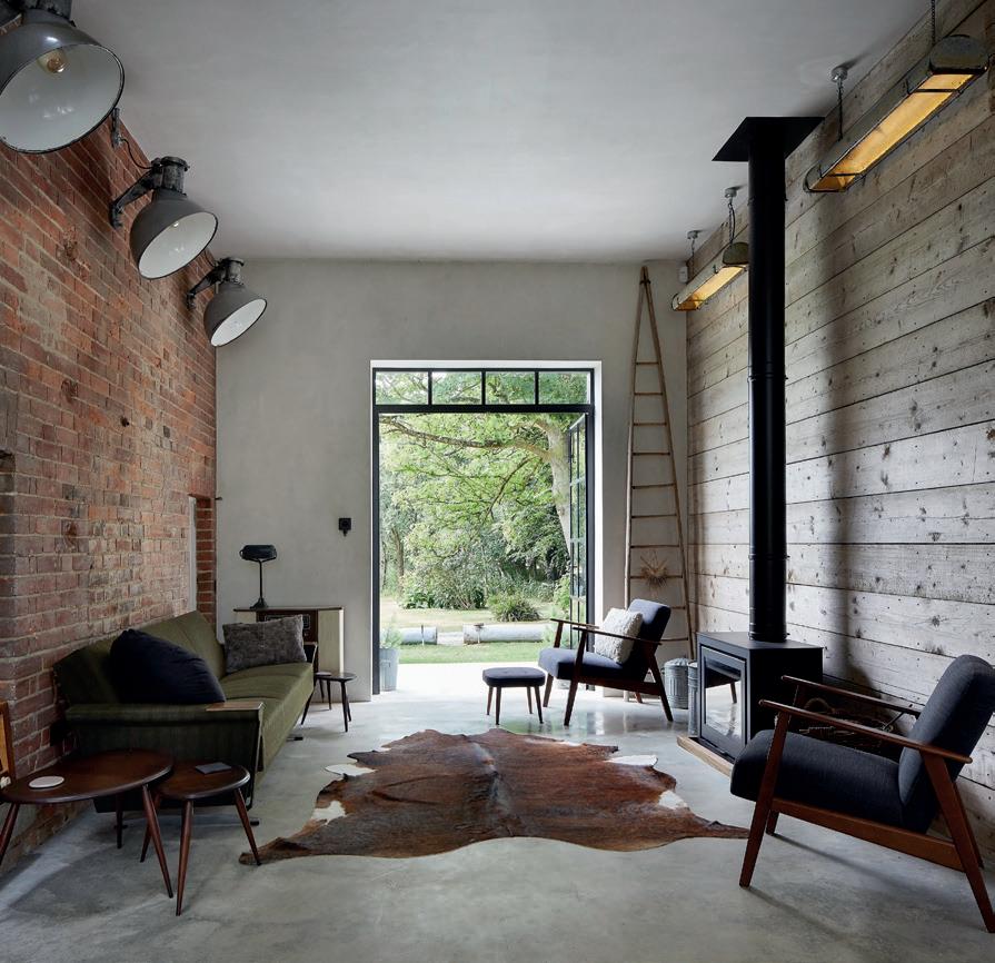
The expanse of the lightabsorbing facade, with its rough deep timber cladding, envelopes the crisp, polished concrete interior. Flashes of scaffold board internal wall cladding, T&G ceilings and a plywood kitchen add to the richness of textures on display internally.
24 I-BUILD/JUNE/23
IMPRESSIVE INNOVATION


I-BUILD/JUNE/23 25 IMPRESSIVE INNOVATION
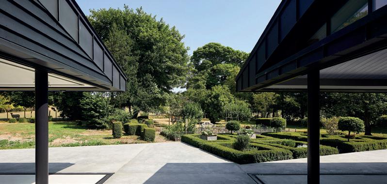
T he glass walls of the new extension disappear away from the corners, allowing for seamless, uninterrupted movement from inside to outside. A large rooflight separates the new from the old, allowing each architectural style to co-exist harmoniously alongside the other and offering a moment of drama in considering Vicarage Farm in its new totality.

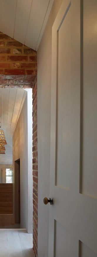
Upstairs, the master bedroom is approached past a lightwell connecting all the way up through the building and sharing light with the hallway. The master suite builds on lessons from the old, with timber shutters to the windows and deep reveals that frame views to strategic locations within the garden and wider landscape.
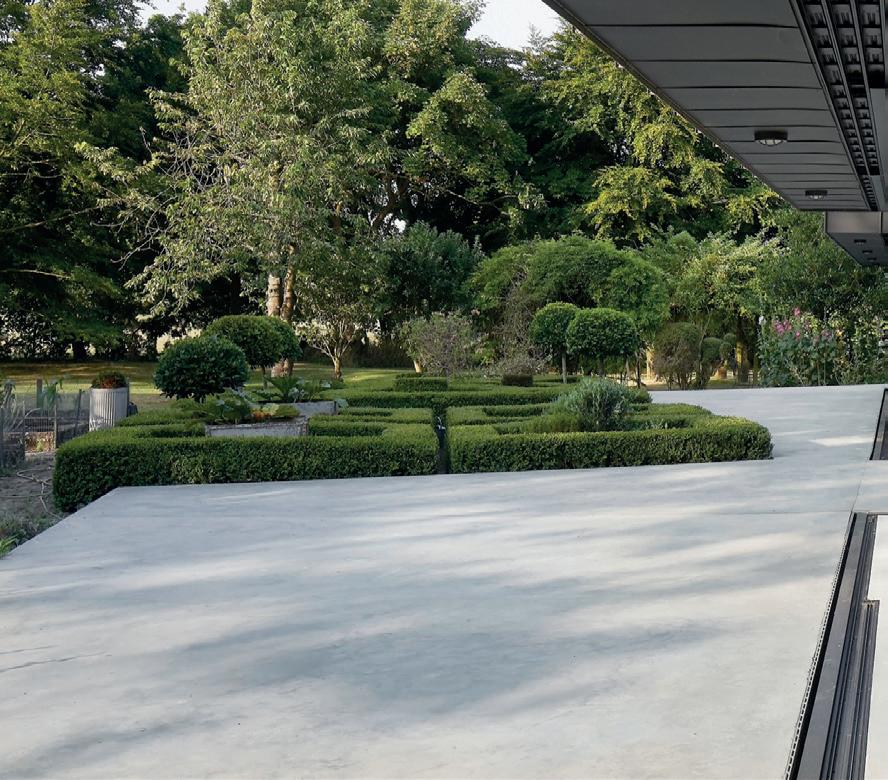
The new facilitates the old. The kitchen noticeably sits within the old structure but willingly opens itself to the new dining and living spaces allowing the uses to blend together. The large external terraces resolve the geometry of the low box hedges and formal gardens, inviting them to interact and spill over the new stark concrete finishes. In painting the matte black extension, it mirrors the original barns, some of which date from the medieval era on the site, further bringing together old and new.


Vicarage Farm marks another example of Hollaway Studio’s dedication in bringing together the contemporary with the traditional to co-exist in both a complementary and elevating aesthetic.
www.hollawaystudio. co.uk

26 I-BUILD/JUNE/23
IMPRESSIVE INNOVATION


I-BUILD/JUNE/23 27 IMPRESSIVE INNOVATION
The dos and don’ts of planning a home extension
Here, RIBA-chartered Architect George Omalianakis from architect firm GOAStudio offers professional advice, tips and key insights to guide you through the process of adding an extension to your home.

Design matters:
What do I want, and how can I achieve it?
Remember, B comes before D but not before A. You need a brief before starting with the design process because you need to know in advance what you hope to achieve and your budget for your home project. However, you will only be able to finalise your brief after you have appointed an architect to advise on the overall feasibility of your project, which will then inform your brief and help you make a final decision on how best to proceed.
Do design from the inside out. Start by thinking of the internal spaces and how they work for you, including the existing spaces next to the new extension. Adding an extension means that everything else changes too, and you will need to tweak things to ensure that everything, new and old, works together in harmony and to your needs. Do think long term with the choice of materials and the associated plumbing, wiring, heating and insulation you can add to your home. You will probably have one opportunity to upgrade the fabric and systems of your home. When planning your extension, consider what other upgrades you would like to do and how your budget could stretch to cover these additional works.
Approval matters: What approval will I need for my home project?
For your home extension project, you are likely to need one or all of the following approvals:

1. Planning: Full planning, a householder application, a permitted development application or listed building consent depending on the type of your property (house or flat), the type of work you would like to carry out and where you are in the country. This is an approval you need to obtain from your local authority and remember that there is a number of different applications under the umbrella name of ‘planning’. Ask your architect and local planning authority to advise you on which application you need to submit for your project.
2. Building Regulations: This approval is in regard to a number of technical and structural standards that need to be met to ensure safety and compliance. This includes fire safety, thermal insulation, sound insulation and structural considerations. You do not need to have detailed knowledge of any of these matters. Still, you do need to make the right appointments (typically an architect, technician or technologist and a structural engineer) for knowledgeable professionals to prepare this information on your behalf.
3. Party walls: If you do works near a shared wall, floor or ceiling, then the Party Walls Act might become relevant to your project. This means that you will need to engage with the neighbours under the act and satisfy them that the works will not affect their property. Do contact a party wall surveyor who will give you all the advice you need.
4. Freeholder approval: If you own the leasehold of the property or a share of the freehold, then you will need this approval from anyone with a freehold interest in your property. Do check the relevant terms in your lease or share of freeholder agreement, and ask a solicitor to advise you on the process you must follow. This process is specific to you and the particulars of your agreement.
5. Water authority: If you do an extension near or over any public drains in your garden, then you will need to obtain the relevant approval from your local water authority. Do appoint a CCTV drain survey company to survey and map the private and public drains around your home. Do send this information to your local water authority, who will advise you on whether you need to apply or not, and how to go about it.
Do apply and do obtain in advance all the approvals you need for your project. Do not take chances because this will cost you later in money and time.
28 I-BUILD/JUNE/23 I-BUILD/NOVEMBER/21 I-BUILD - HOME EXTENSIONS GOASTUDIO
Money matters: How much will it cost, and what can I do with my budget?
You do need a shopping list of project requirements before you can have a realistic and reliable estimate of costs for your home project. No builder, architect or quantity surveyor will be able to tell you how much your extension will cost before they have a list of design, technical and structural information to price.

Do start with a budget, though, and decide how much you are comfortable spending for your project. This is a much better starting point when you start planning your home project. Your budget will determine what you can and can’t do. Ultimately, you will have to cut your cloth accordingly during the design development stage.
B e prepared for the possibility that your project requirements and budget are incompatible and that something has to give in this case. You can set priorities for the budget and then stick to these priorities for your project. Alternatively, you can re-think the budget, decide that some things are too important to leave out and magic something to happen to increase the budget accordingly, if possible.
D o prepare some initial design proposals and do get some rough cost estimates from a builder or quantity surveyor. If the estimates are roughly in line with your budget, then you can further develop the proposals and make the planning submission to the council.
Do the same once you have prepared the required technical and structural information for the Building Regulations submission. Is the new estimate still in line with your budget? If so, you can make your final decisions on finishes and electrical before sending the information to the contractors to tender for detailed quotes.
Time matters: How long will it all take?
B e cautious about how long things might take. The chances are that everything will take a bit longer than expected. Often this is due to the fault of no one in particular. Sometimes, this is due to ‘unknown unknowns’ that you only discover later in the day.
You should always have a contingency plan and be ready when things overrun. You often read that you should have a contingency regarding costs. Similarly, the trick is that at the start of your project you also have a contingency plan when it comes to time, which will take a lot of stress out of the whole process.
Generally speaking, it takes around four to six months to go through the design development phase and to obtain all necessary approvals before your builder can start on site.


Construction matters: What are the key things to know during the construction stage?
Do have a written and robust contract with your builder. In the event of a dispute, you will not be able to rely on the memory of what was said, who said it and when it was said. A lack of a robust contract is an actual recipe for disaster and problems down the line. A fair contract will keep things straightforward during the construction stage. A written contract, and the clarity it provides to all parties, will give you peace of mind.
Do agree on a payment schedule with your builder in advance. Typically, it should include four to five stage payments. The first payment should be no more than around 20% and include a retention fee (typically around 5%) that is not paid until every single piece of work has been completed, including any snagging items.
www.goastudio.co.uk
I-BUILD/JUNE/23 29 I-BUILD/NOVEMBER/21
I-BUILD - HOME EXTENSIONS GOASTUDIO
Top landscaping trends for 2023
With the arrival of spring, we often spend more time relaxing in our outdoor spaces, and it’s the right time to focus on improving the aesthetics and functionality of our outdoor spaces. If your garden looks a little overgrown, outdated or not functioning as you anticipate, this might be the right moment to consider a different landscaping plan.
There are several cool landscaping styles for 2023, many of which focus on environmentally-healthy gardens, natural wildlife gardens, more colours and easy maintenance. House Designer has pulled out a list of the most popular 2023 landscaping trends for you to develop a calming sanctuary to relax, unwind and connect to family and friends.
Get inspired by some of these top gardening trends of 2023 to preserve your yard while making upkeep easier.
Xeriscaping
The theme for 2023 landscaping trends revolves around eco-conscious materials and designs. Many homeowners are becoming more climatechange and environmentally conscious, knowing the importance of conserving water using drought-tolerant plants and conserving techniques, such as mulching, to prevent potential climate crises. It is also a perfect lowmaintenance alternative for homeowners with a busy lifestyle.
T he current climate-change trajectory only means embracing the beauty of native and drought-tolerant plants that can grow with minimal care or irrigation is a trend that we will see everywhere in 2023.

Low-carbon landscaping
Low-carbon everything has become more prevalent in recent years as homeowners are becoming more aware of the danger of a highcarbon environment. Low-carbon landscaping style is about growing local plant varieties, herbs, veggies and fruits in your garden to reduce your carbon footprint.
Alternatives to traditional lawn
While traditional grass lawns can be beautiful, they require a great deal of maintenance which can be costly and even detrimental to the present climate condition. They require a lot of water, making them difficult to maintain during droughts.
They are still widely present, but many homeowners are quickly moving away from the trend to other alternatives. Artificial turf has been on the rise as an easy-to-maintain and environmentallyconscious alternative. The tendency to choose more interesting design variations also contributes to its popularity in 2023.
Cottage-style gardening
T he cottage-style garden is all about whimsy, soft lines and classic blooms characterised by dense planting, colour profusion and a mix of different flowers used in pockets of planting. Since it contains a diversity of plants, delighting all the senses and creating a natural, relaxed atmosphere, many homeowners are becoming glued to the elegant landscape style. It is a fascinating trend to look out for in 2023.
Biodiversity and local wildlife
D evelopment and grazing have taken a toll on wildlife habitats, reducing their number greatly. Incorporating natural wildlife habitats into our gardens is more important than ever before. We expect it to be a prevalent trend in 2023. Designing your landscape for wildlife brings mutual benefits. While you are providing habitat for the beautiful creatures, you enjoy natural pest control, fruit and flower pollination and a much healthier garden. When designing your garden, you should put local wildlife into consideration.
30 I-BUILD/JUNE/23
I-SCAPE - PLANTS, TREES & LAWN CARE HOUSE DESIGNER
Rick, dark colours
Rich, dark colours are taking centre stage in 2023 landscaping designs, making a big, bold statement. The colour is not only manifested in the flowers (Angelica gigas) but also in the foliage choices (phormium ‘Black Velvet’). The classic colour scheme is used in modern ways to add warmth and vibrancy to gardens.
Bringing water into the garden
A garden should be a joyful and fun space where people, plants and wildlife can mutually benefit. Adding a chemical-free pond or swimming pool to your landscape is a great idea. Not only does it enhance the aesthetics of your garden, but makes it healthier. As homeowners are becoming more aware of the importance of a peaceful environment to unwind after a long day at work, bringing water into outdoor spaces is becoming more necessary.

E
ntangled designs for continuity
A s many homeowners are designing their outdoor spaces to be an extension of their homes, entangled landscape design is becoming more popular because it enhances continuity. It allows a more natural way to blend landscapes and hardscapes.
Gravel gardens
We expect an increasing move towards gravel gardens in 2023 because of their ability to thrive in hot, dry conditions. Low maintenance, fast growing and with a profusion of flowers, gravel gardens are one of the fascinating landscaping trends to keep an eye on in 2023.

Conclusion
G ardening styles that promote healthier environments and wildlife habitats are on the leading edge of landscaping in 2023. Many homeowners are becoming more aware of the need to landscape with environmental consciousness. If it is that time to develop a new yard in your home or revamp the existing one for more functionality, these 2023 gardening ideas could help you make the most of your garden.
www.housedesigner.net

I-BUILD/JUNE/23 31 I-SCAPE -
CARE HOUSE DESIGNER
PLANTS, TREES & LAWN
Photo by Jake Nackos on Unsplash
Photo by Khadeeja Yasser on Unsplash
Photo by Jason Leung on Unsplash
Sleep in style
From boosting our mood and mental wellbeing to lowering the risks of health problems, getting the right amount of shut-eye offers a variety of benefits to our everyday lives.
To achieve a calming, peaceful slumber each night, you should invest in your bedroom space through bespoke renovations to ensure it’s an organised haven that is oozing with sumptuous style.
Neville Johnson knows a thing or two about designing trend-setting bedrooms. Boasting over 35 years of experience in bespoke renovation, the brand’s expert knowledge is unmatched when it comes to creating the perfect sleep sanctuary.
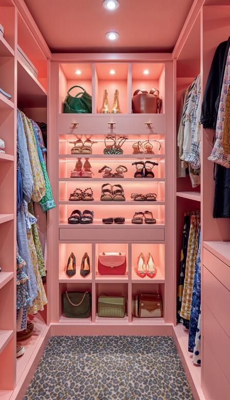
From turning unused rooms into personalised walk-in wardrobes to investing in clever storage solutions above your bed, the premium fitted furniture brand has a variety of expert tips to help homeowners transform their bedrooms.

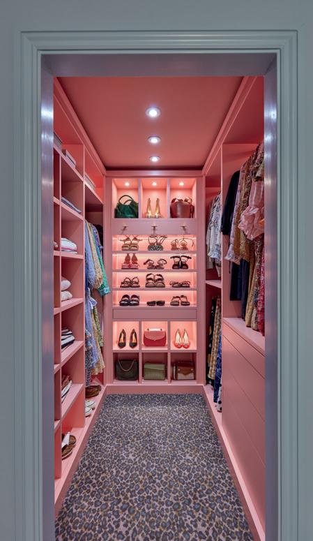
1. Turn an unused space into a glamourous walk-in wardrobe
A bespoke walk-in wardrobe is an example of how rejuvenating a space can provide you with your very own personalised haven. For those who love to take the time to style outfits, a dressing space with bespoke storage is a luxury you never thought you needed.
Floor-to-ceiling shelving can help to elevate a room, fitted with hanging rails to display longer garments and open shelving to showcase your most treasured bags and shoes. Concealed storage and drawers provide optimal space to hide away any clothing. For those who love to complete a look with an abundance of accessories, pull-out draws offer a way to organise your collection of outfit embellishments.
2. Blend your storage into the room with
shaker-style wardrobes
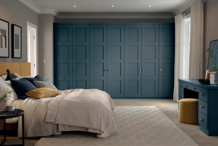
Neville Johnson’s fitted wardrobes, seen above in blue, are a masterclass in how combining a traditional design with a contemporary shade will transform an outdated space into something unrecognisable. The shaker-style wardrobes offer an orderly storage solution for clothing and shoes, paired with a matching vanity unit to ensure your area is fit for all of your morning routine needs.
The deep blue shade in Lithadora creates a wonderfully-dramatic feature within the bedroom, perfect for those who are looking to make a statement.
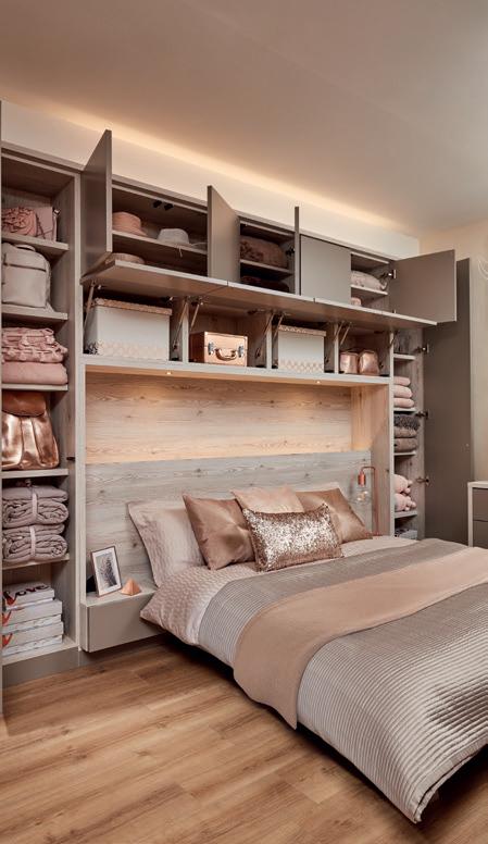
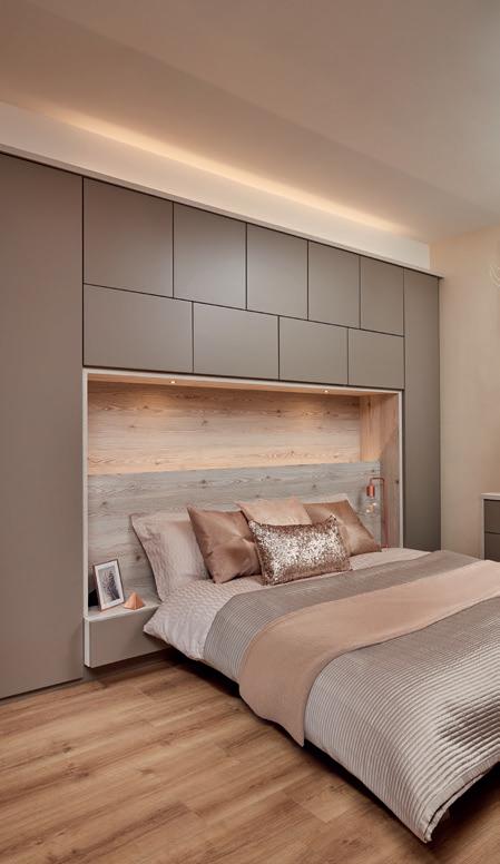
3. Invest in clever storage solutions over your bed Built-in over-bed storage means all empty space is being utilised whilst never compromising on the luxury aesthetics of the area. For example, Neville Johnson’s contemporary willow bedroom offers a vanity-style unit that has been integrated into the wardrobe space, proving that a personal zone can be created in any size or shape of the room.
Cari Bateman, Furniture Designer at Neville Johnson, says: “Bedrooms play such an integral part within our homes as they are a space in which we spend so much time in, even when we are not sleeping. If your space has begun to feel outdated, it is less likely that you will be compelled to spend time in your own room.
“This is why bespoke fitted furniture is the ultimate tip to creating a bedroom that is uniquely yours, and with there being no boundaries to what a renovation can do, the options are limitless.”
www.nevillejohnson.co.uk
32 I-BUILD/JUNE/23 I-NTERIOR - BEDROOMS NEVILLE JOHNSON
Wentworth bedroom


I-BUILD/JUNE/23 33 I-NTERIOR - BEDROOMS NEVILLE JOHNSON
Wig white larch bedroom
Wig white larch bedroom
Manningtree dressing room
Manningtree dressing room
Home energy solutions top Southern Homebuilding & Renovating Show


Upgrading heating systems, ventilation and renewables and turning an old home into an eco home are among visitors’ most-popular sessions at the Homebuilding & Renovating Show.


With the next show taking place at Sandown Park in Surrey on 1st and 2nd July, home energy solutions will dominate the free theatres, masterclasses and seminars being held to help consumers continue to tackle high energy bills and make home improvements.
The Home Energy Hour will stage eco and building specialists from companies such as Heissen and Internorm Windows UK talking about the future of heating solutions and the best options for achieving Future Homes Standard’s Part L. Homebuilding and renovating experts, including Michael Holmes, Tom McSherry and Sally Tagg, will also guide visitors
on building their own home and navigating the planning system.
T he Home Energy Academy will help visitors understand how they can make the most of the energy in their homes, save money on bills and reduce their carbon footprint with free advice from experts in the advice centre.
K itchen design is always a hot topic for show visitors, and BBC’s DIY SOS’ and ITV1’s 60-Minute Makeover Interior Designer Julia Kendell of Kendell & Co will be on hand to offer her practical tips on designing and installing contemporary kitchens using the latest ideas in technology and kitchen design.
www.surrey.homebuildingshow.co.uk

With the largest cast of homebuilding and renovating experts all under one roof, the Southern show will offer a plethora of advice and practical guidance, supported by over 180 exhibitors demonstrating thousands of innovative products to improve homes for visitors to see, touch and compare. Visitors will be able to bring along their own projects to discuss with specialists in the advice centre. They also include design expert Allan Corfield, building expert Bob Branscombe and eco expert David Hilton.
One-day tickets cost £8.00 in advance. Under 16s go free.
V isit the below website for more information.
34 I-BUILD/JUNE/23
LEGAL & BUSINESS NEWS SHOW PREVIEW: SOUTHERN HOMEBUILDING & RENOVATING SHOW


I-BUILD/JUNE/23 35 01708 39 80 22 sales@brundle.com www.fhbrundle.co.uk • Choice of boards & contemporary laser cut screens • Mix & match the different boards to create unique designs • Bolt-down or concrete-in posts • Quick & easy to assemble with our hidden fixing post system • Choice of 4 matt finishes and 2 wood effects • Stocked laser cut screens Marano® Integrated Aluminium Fence System It’s a lifestyle choice... Heavy duty folding ladder for strength & durability (load rating of 250 kg/tread) Highly insulated hatch to keep in the warmth (U value from 0.34 W/m K ) Counter-balanced operation for ease of use w w w.premierlof tladders.co.uk/k limatec 0345 9000 195 | sales@premierloftladders.co.uk 30 minutes
New Earthborn paint swatches
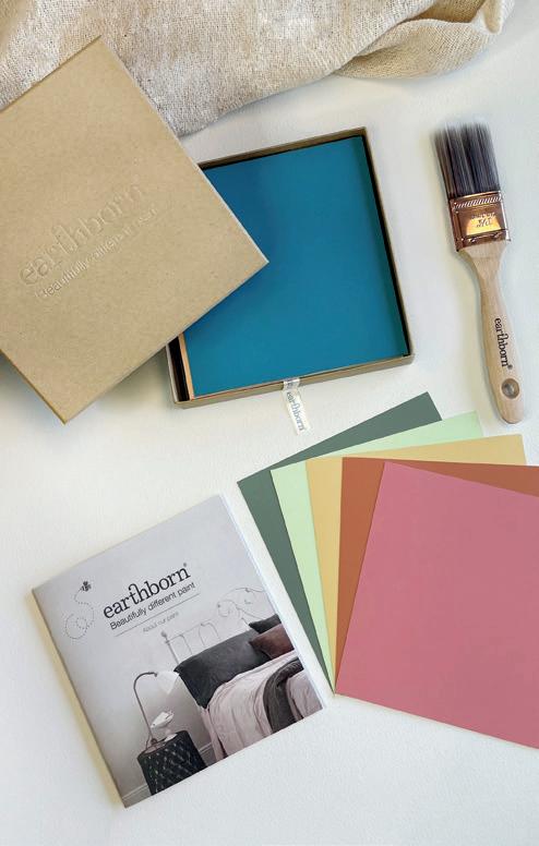
Earthborn is introducing a new approach to paint colour choices. Making major design decisions based on a small colour card chip can be difficult. Now, anyone looking to specify an environmentally-friendly paint will have access to a full range of 84 claypaint swatches, comprising all 72 classic colours and the 12 modern country colours created in collaboration with Country Homes & Interiors.
Ea ch swatch is generously sized at 16 x 15cm and has been individually painted with real Earthborn claypaint so you can see exactly what you’re getting when you order.
Placing the swatches around your chosen space will show how the light affects the colour at different times throughout the day. 100ml sample pots are, of course, also available.
C laypaint is a highly-breathable paint with a luxurious ultra-matte finish for interior walls and ceilings. It goes on like a dream, often requires fewer coats than conventional emulsions, is virtually VOC free and gives off no horrible smells.
Consumers can order colour swatches that come in a lovely protective wallet. Interior designers can order a full set of 84 swatches in a beautiful, eco-friendly display box to keep them safe.

www.earthbornpaints.co.uk
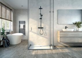
Aq ualisa has extended its popular AQ mixer shower collection with the addition of three new models in a sleek matte black finish. Designed to make a striking statement in any contemporary bathroom setting, the AQ matte black showers are available in a choice of round or square dual-outlet shower column or a round bar valve option with an adjustable handset. Recognised for its quality and reliability, the Aqualisa AQ series combines attractive styling with excellent performance, durability and safety features, including a maximum water temperature setting, with an override button if a hotter shower is desired. Each bar valve is engineered from brass and is equipped with safe touch thermostatic technology. The dual-outlet models come with a telescopic column enabling flexible installation, and all include a push-button handset holder for extra convenience. Smooth turn controls for both flow and temperature allow effortless operation, ensuring precise, dependable and safe showering for the whole family.

4lite unveils new outdoor lighting range

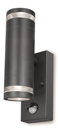
Ti cking all the boxes when it comes to outdoor lighting, Marinus is a brandnew collection of stylish coordinating fittings from leading lighting manufacturer 4lite. A stunning option outside homes, patios and in garden areas, the range includes a trio of directional, bi-directional and spike light fixtures, ideal for illuminating doorways, walls, stairs and other design features. Simplistic and cylindrical in design, Marinus has a modern aesthetic and is available in both stainless-steel and anthracite grey finishes. Marinus features a ‘halo glass’ design, with a ring of glass on the inner edging, which gives a halo effect to the light distribution. What’s more, all products in the collection are manufactured from a marine-grade, corrosion-proof stainless steel, meaning they won’t degrade or rust when exposed to the elements, and all products have been salt spray tested to 96 hours. All the coordinating products within the Marinus range are GU10 compatible, allowing them to be upgraded to smart lighting.
01928 734171
sales@earthbornpaints.co.uk
36 I-BUILD/JUNE/23 LEGAL & PRODUCTBUSINESS GUIDE ADVERTORIAL: EARTHBORN | AQUALISA | 4LITE
Aqualisa adds elegant matte black options to AQ mixer shower collection
www.4liteuk.com sales@4liteuk.com
560010 enquiries@aqualisa.co.uk
www.aqualisa.co.uk 01959
How to make more sustainable product choices
With new trends in building projects reflecting a desire for more sustainable lifestyles, there has been a shift in demand for materials that fit with this growing aspiration.
Planners, architects, developers and homeowners are thinking more about the environmental impact of the products they use and, given their strong credentials, fibre cement cladding and slates have been growing in popularity. Turning away from our throw-away culture, today’s environmentally-aware consumers want products that not only look good but will last for a long time – without the need for expensive maintenance work, upgrades or replacements.
W hy are fibre cement products becoming an increasingly popular choice?

Fibre cement is a strong, versatile and long-lasting material. For example, both Cedral cladding and slates have a substantial life expectancy of a minimum of 50 years.

Fibre cement offers hard-wearing, long-lasting visual appeal that doesn’t need regular replacing, repainting or maintenance. It won’t rot, rust, warp or crack, is insect, bacteria and algae resistant and has an excellent fire classification of A2-s1,d0.

Fibre cement cladding acts like a second skin on a building’s exterior and is frost, mould and water resistant to protect against the elements. A ventilated facade, where the cladding doesn’t sit directly against the insulation, improves energy efficiency, enabling the rapid drying of external walls and reducing condensation and humidity.
Cladding can preserve the life of older buildings by providing a stylish contemporary update for unsightly faded paintwork or render
Using fibre cement cladding or roofing slates is a way to maintain continuity and to provide an appearance of traditional materials, offering technological advances while also satisfying the planning authorities
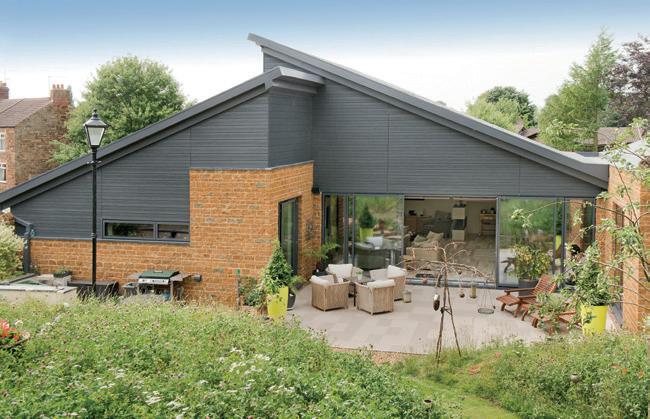
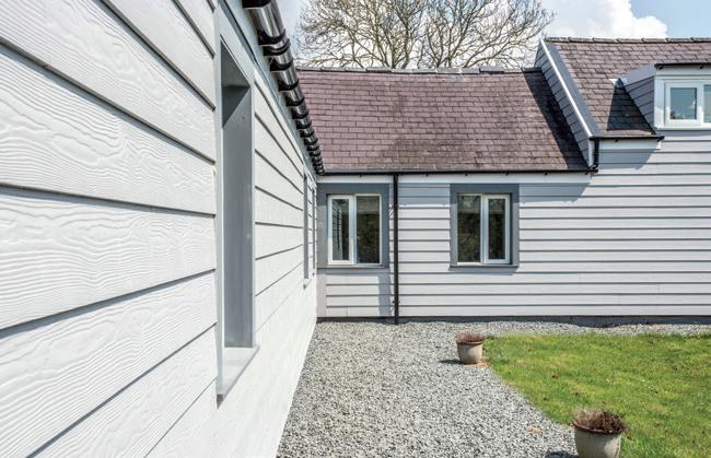
A wide range of finishes and colour choices makes it easy to style an exterior that works with its environment and meets planning requirements. Cedral facades come in a colour palette of 21 factoryapplied shades, with a choice of woodeffect or smooth finishes. Boards can be mounted vertically or horizontally to create a range of looks, from country cottage and New England to bold, contemporary styling.
Fibre cement uses fewer raw materials and less energy in its manufacture, produces less waste than some traditional building materials and is a recyclable material.
I-BUILD/JUNE/23 37 www.cedral.world 01283 501555 infouk@etexgroup.com
PRODUCT GUIDE ADVERTORIAL: CEDRAL
DRU expands the Dik Geurts Vidar Triple range of wood stoves with six new models


Dik Geurts is a name that has been synonymous with wood fires and stoves for over 40 years. Founded in The Netherlands in 1981, the Dik Geurts range is now produced by DRU, established in 1754 and one of Europe’s leading fireplace companies.
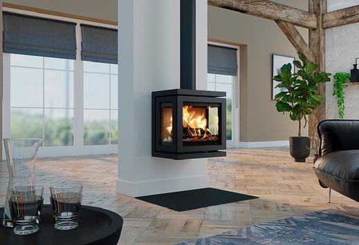
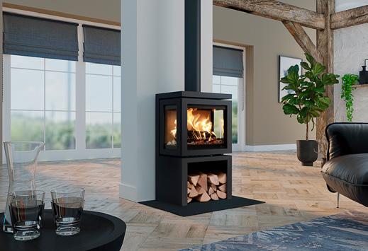
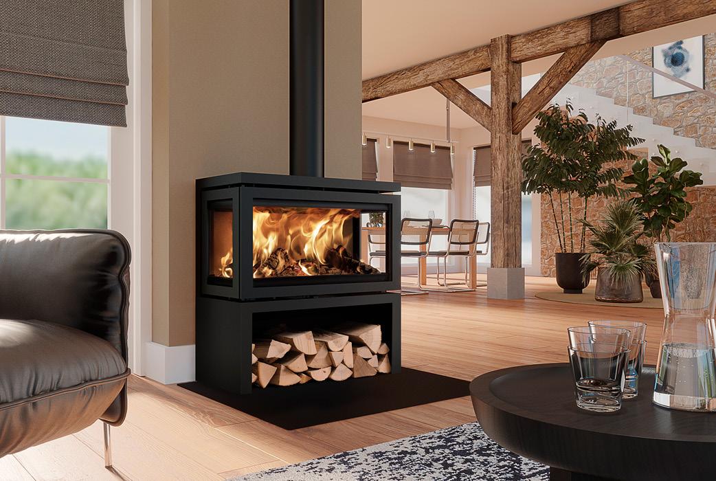
Th e Vidar Triple, with a panoramic, three-sided fire view, is one of the most popular stoves in the Dik Geurts range. It is Ecodesign compliant with an A-rated energy label and easy manual air slide control.
T he Vidar Triple series now includes small, medium and large models,
each with a freestanding or wallmounted option. The freestanding models have ample wood storage capacity, and all models have optional external air connections for clean burning and high efficiency. All versions also have infrared side windows, which enable high flames and comfortable heating.
I n addition, the small Vidar Triple models have an average 4.9kW heat output, which means, under UK regulations, there is no need to install extra ventilation points in the room.
D ik Geurts wood fires and stoves are available from a national UK network of fireplace dealers.
38 I-BUILD/JUNE/23 www.drufire.com info@drufire.co.uk
LEGAL & PRODUCTBUSINESS GUIDE ADVERTORIAL: DRU
Vidar Triple large store
Vidar Triple small store
Vidar Triple small wall


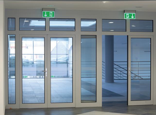
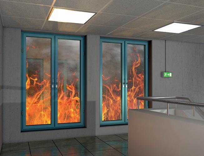
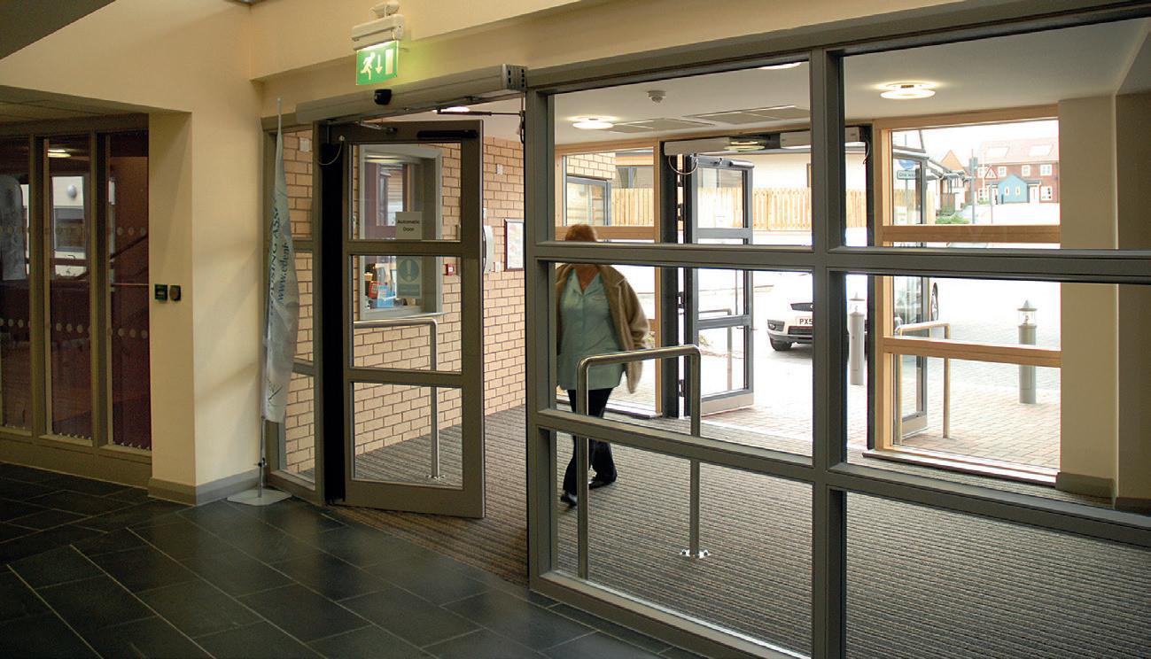
I-BUILD/JUNE/23 39 Firman offer a wide range of fire resistant glass options with varying levels of protection as required by your project. Contact our sales office for further information. www.firmanglass.com Fire Rated Sealed Units 01708 374534 sales@firmanglass.com www.firmanglass.com • Attestation 1 Certified • Rated 30/0 to 60/60 • Certifire compliance • Impact resistance • Sound insulation • Thermal insulation • Integrity only – in stock • Internal / External use • Fire Doors • Partitions


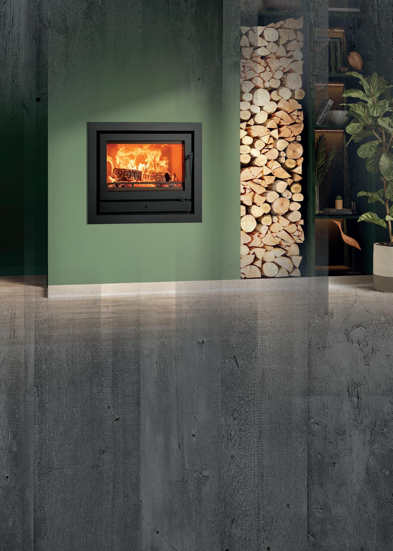
NEW Stovax Riva2 66 Ecodesign fire, with removeable handle in situ, and Profil 4-sided frame. Energy Efficiency Rating: A Fire Your Imagination WOODBURNING | GAS | MULTI-FUEL | ELECTRIC stovax.com • 4 0 Years of B r itish De s i g n • and En g i n eering WINNER 2022 Best Stove Product


 JUNE 2023
EDITORIAL: Rebecca Kemp rebecca@redhutmedia.com


 Rebecca
