Christian
an aggregation of professional architecture works

an aggregation of professional architecture works


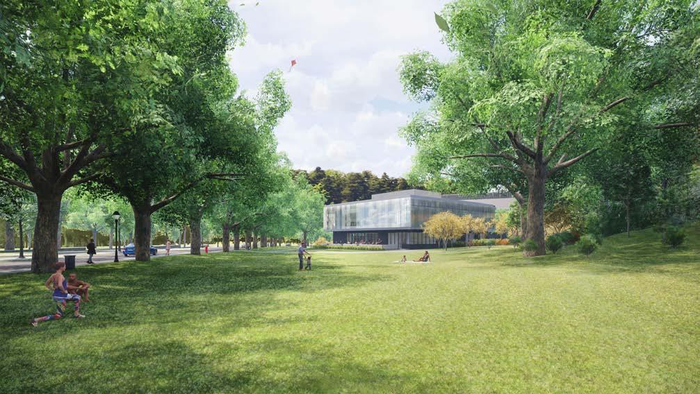
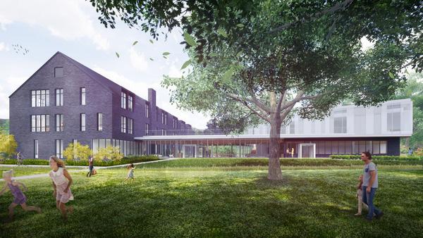
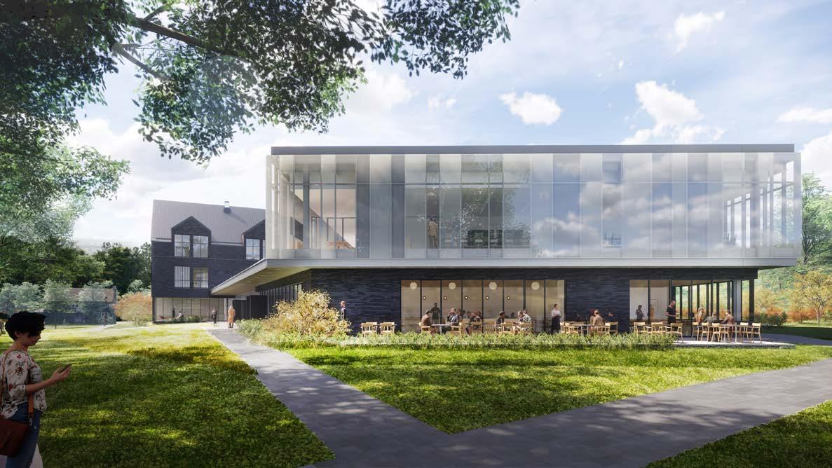
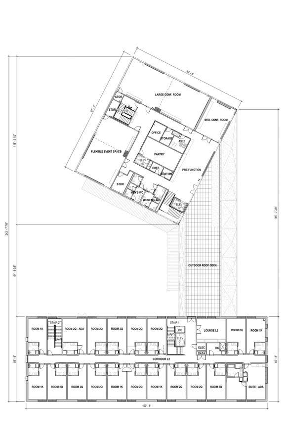
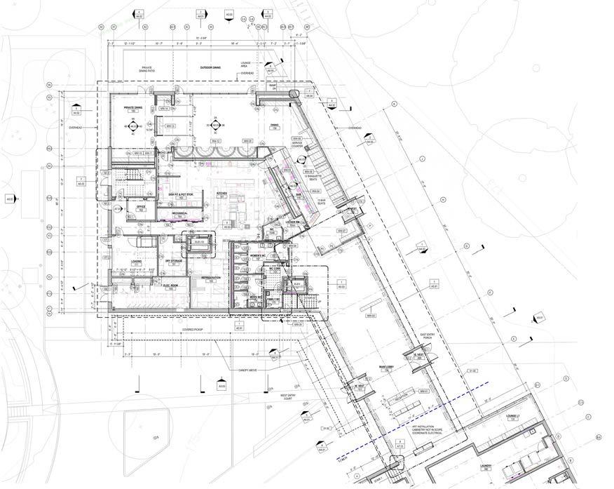
Vassar College sought to establish a dynamic and innovative center adjacent to their cherished Alumni House, with the aim of enhancing their capacity to host conferences, events, and provide accommodations for overnight guests. As part of the FF&P team, we embarked on the design and development of the Vassar Inn & Institute. Our initial conceptual vision for the ‘Inn’ drew inspiration from the Shaker aesthetic, harmonizing with the historical context, while seamlessly integrating with a contemporary conference facility featuring a restaurant on its lower level. The Institute, housing the conference spaces, stands as a luminous beacon of creativity and intellectual exchange, metaphorically illuminating the surroundings.

As the project designer, I assumed a multifaceted role encompassing:
• Program layout development
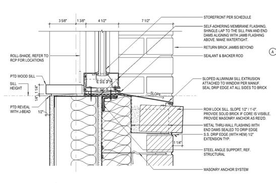
• Exterior materials research and selection
• Interior design and finishes
• Building codes and zoning analysis
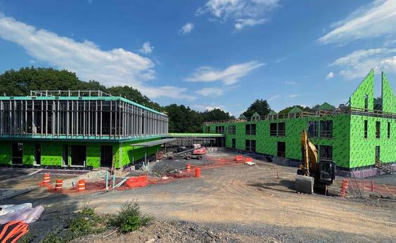
• Design conceptualization for facade patterns
• Artist & Consultant Coordination
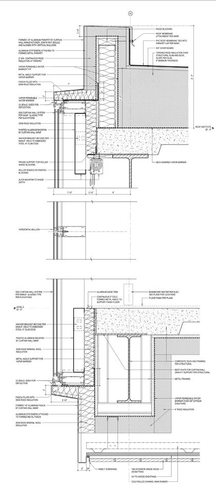
• Production of design and construction documents
• Intricate detailing
• Graphic presentations
• Documentation
These efforts culminated in the successful production of final construction drawings at the 100% completion stage, showcasing my dedication and expertise as the project’s designer.





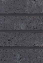
METAL ROOF-01
DUTCH STANDING SEAM
02 BLACK

12” SPACING, 1-1/2” RIB
MASONRY-01
GREENLEAF BRICK
BLACK SPECIAL - BLADE CUT NORMAN (11-5/8” X 2-1/4”)
STONE-01
BELGIAN BLUE STONE

HONED/LEATHER FULL 3/4” SLAB
GLASS-01
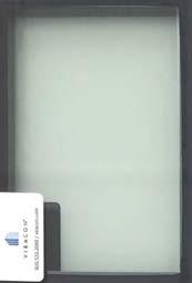
VIRACON VNE24-63
DUAL-GLAZED IGU
GLASS-02 & 03
VIRACON VNE24-63
DUAL-GLAZED IGU CUSTOM FRIT 30% & 50% METAL-02 BLACK
EQUIPMENT PERFORATED ALUMINUM LIGHT GREY
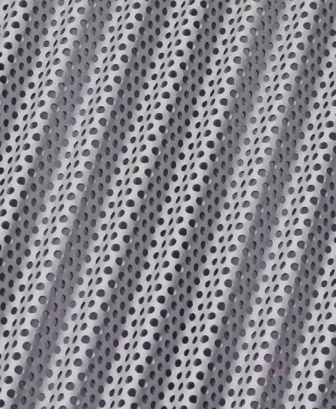
Screen Pattern for Institute Glazing: pattern recalls Tudor 'timbering' forms of Alumnae House
Screen Pattern for Institute Glazing: pattern recalls Tudor 'timbering' forms of Alumnae House
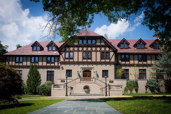



East Elevation & Material Callouts
SLIDE 4
Existing Alumnai House
MASONRY-01

GREENLEAF BRICK
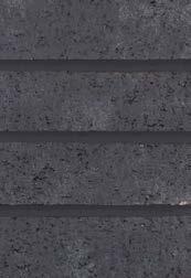
BLACK SPECIAL - BLADE CUT NORMAN (11-5/8” X 2-1/4”)
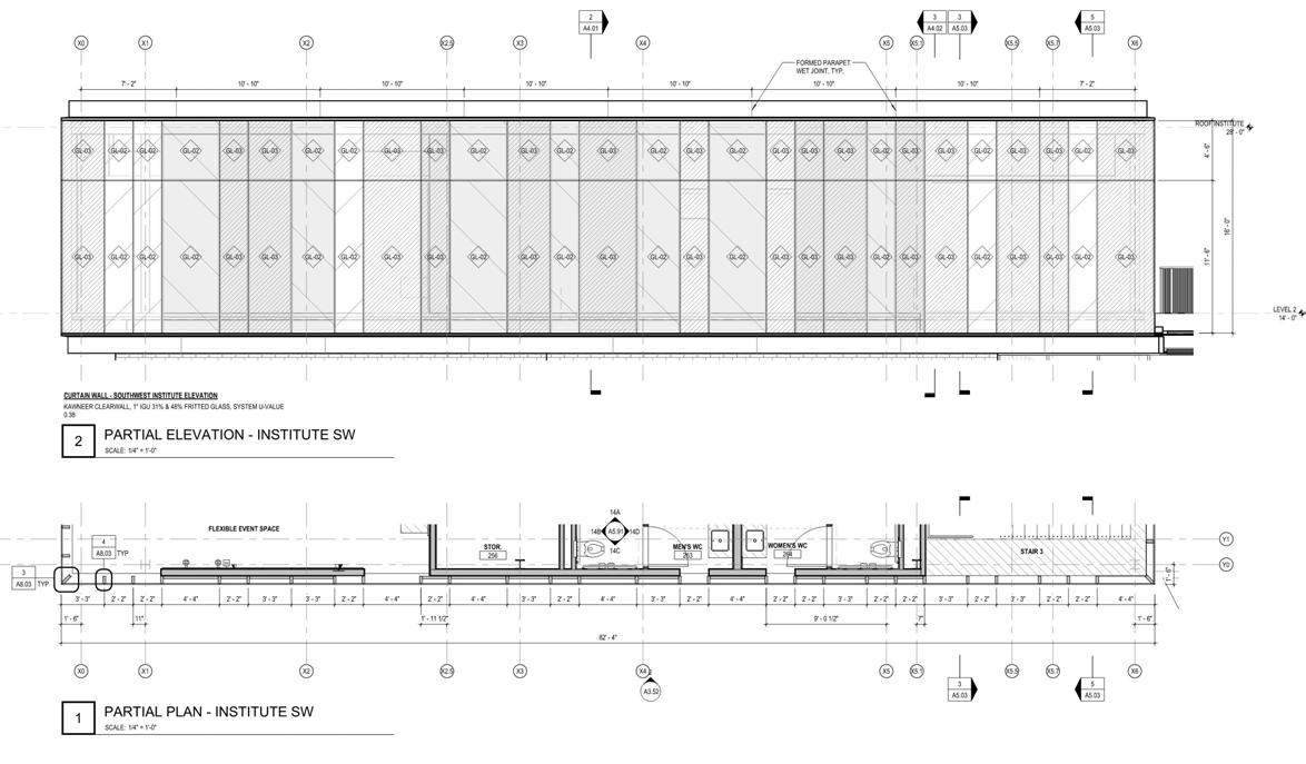
As project designer, I undertook the task of creating a unique frit pattern for the Vassar Inn & Institute, drawing inspiration from the architecture of the existing Alumnae House. In addition to preparing detailed drawings, interior elevations, sections, and plans, I dedicated myself to crafting a bespoke frit pattern for the Institute’s glazing.
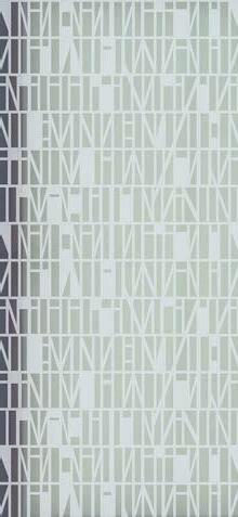
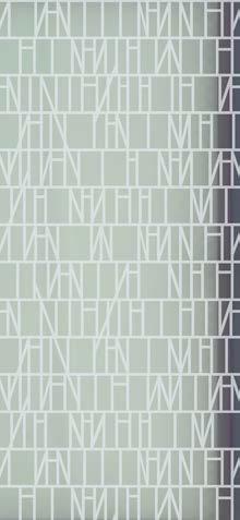

Following meticulous studies and considerations, two distinct patterns were selected, one with a 30% frit coverage and the other with a 50% frit coverage. These frit patterns were artfully inspired by the timber framing found in the original Alumnae House at Vassar, aiming to strike a balance between abstraction and a nod to the Tudor-style architecture prevalent in the surroundings.
Below are the chosen patterns, an image of the frit applied to glass, followed by an enlarged elevation of the glazing on the subsequent page, showcasing the fusion of creativity and design sensibility in this endeavor. An elevation with Material Selection is featured on the left.


 North Patio at Dusk: restaurant and institute glow from within
Park View: allée of trees preserved and the open lawn flows past the institute

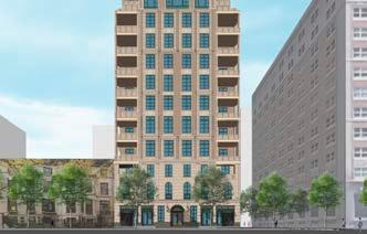
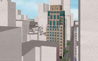

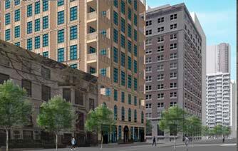
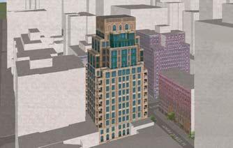

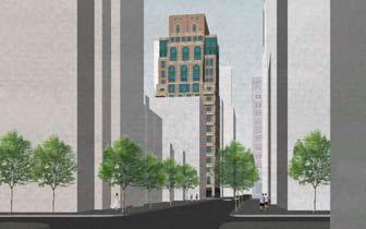
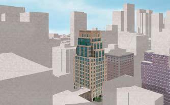
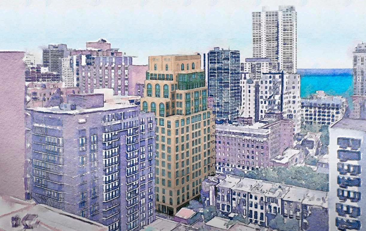
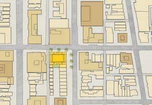
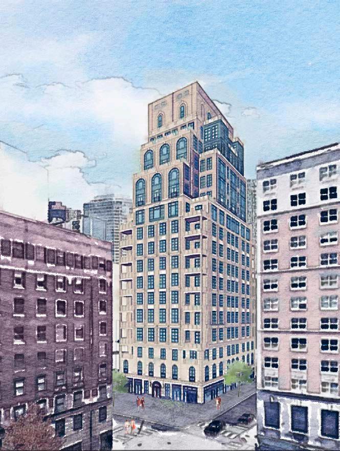
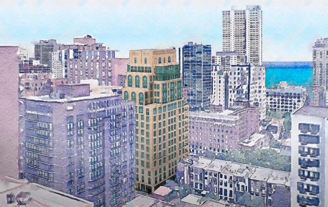
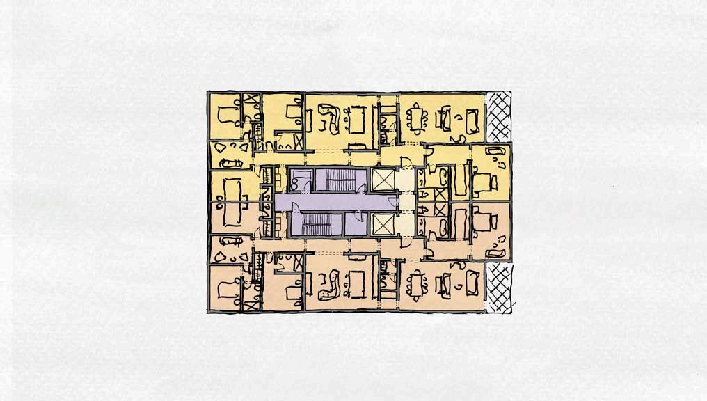
Nestled in the vibrant heart of Chicago, IL, at the prestigious address of 1258 N State Parkway, our client envisioned the creation of a opulent midrise apartment building. This ambitious project was to offer open space and vistas towards Lake Michigan, just a stone’s throw away.


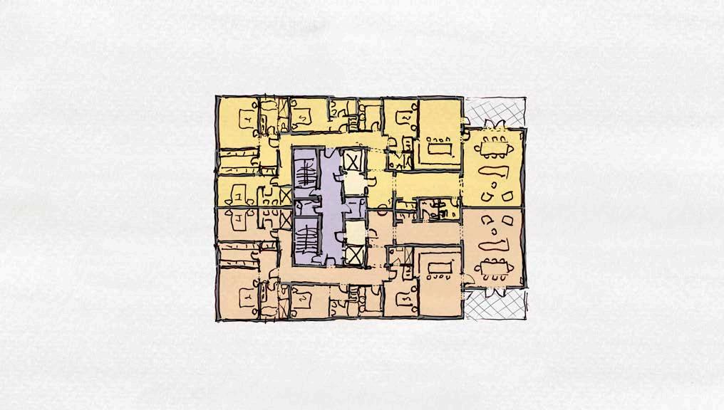
Within our team of accomplished designers, we were individually entrusted with the task of shaping this vision into reality. At the core of my contribution to this endeavor was my role in conceptual design, which included crafting comprehensive studies that spanned massing, ground floor plans, unit layouts, and the design of exterior facades, all while adhering to site zoning ordinances. I embraced the opportunity to exemplify my prowess as a talented designer and after an exhaustive evaluation process, our discerning client ultimately selected my design concept to grace their esteemed site.
With a deft touch, I conceived the exterior facades, infusing them with classical architectural elements that spoke to the project’s grandeur. Simultaneously, I dedicated myself to the thoughtful development of various floor plan options, showcasing my dedication to crafting spaces that harmonized both form and function. My design approach showcased my commitment to transforming a visionary concept into a tangible embodiment of luxury and sophistication.
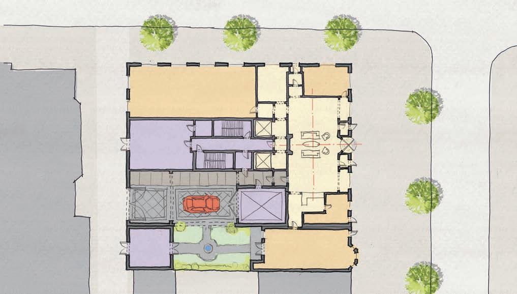

Unit Floor Plans - Option 1
Unit Floor Plans - Option 2
Unit Floor Plans - Option 3

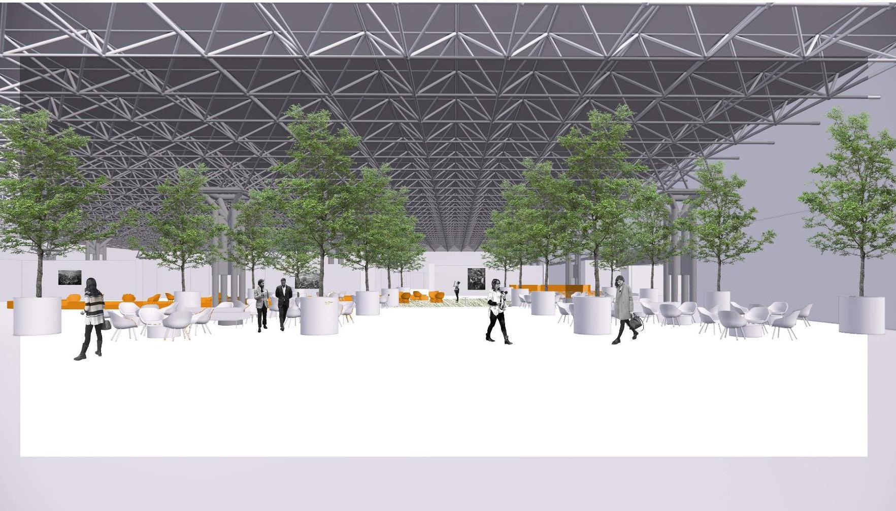
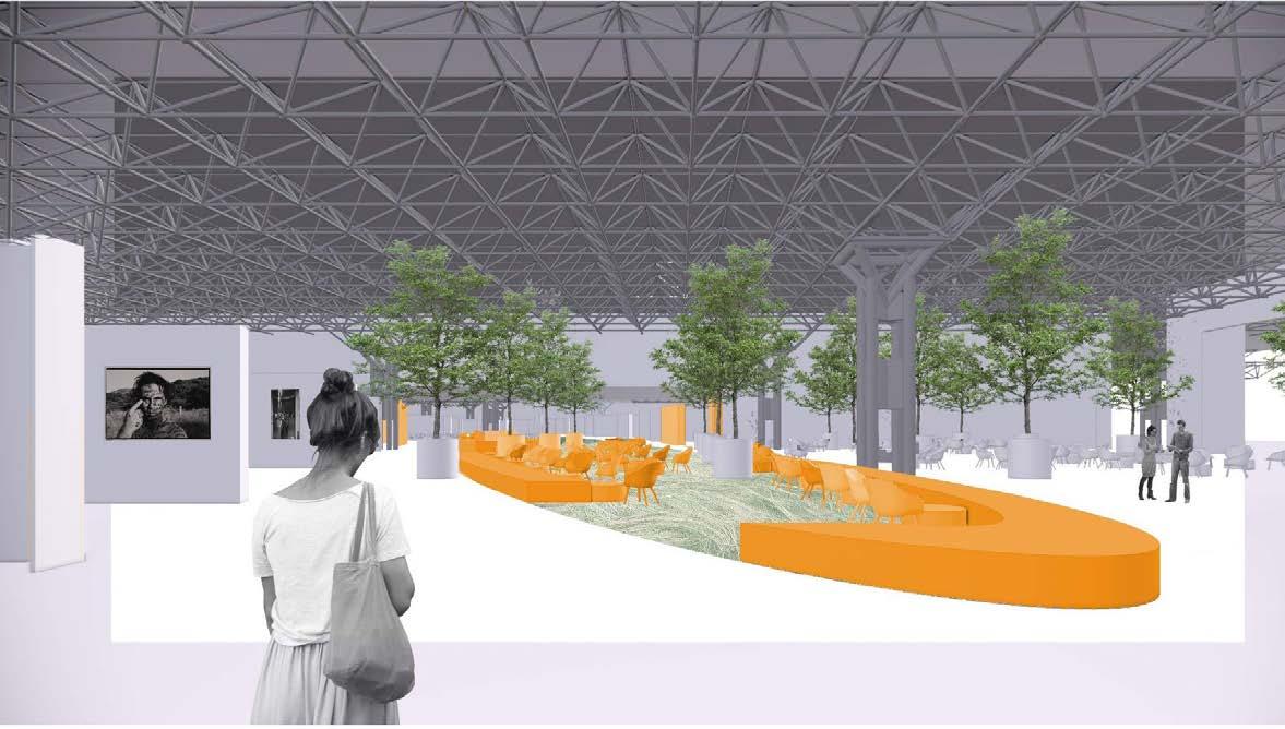
In my role as a project designer for the Armory Show’s 2021 relocation to the Javits Center, I made contributions to adapt and transform the renowned art fair. The Armory Show, a global platform for contemporary art, aimed to enhance accessibility for the public, buyers, sellers, and collectors within this new environment while adhering to safety mandates.

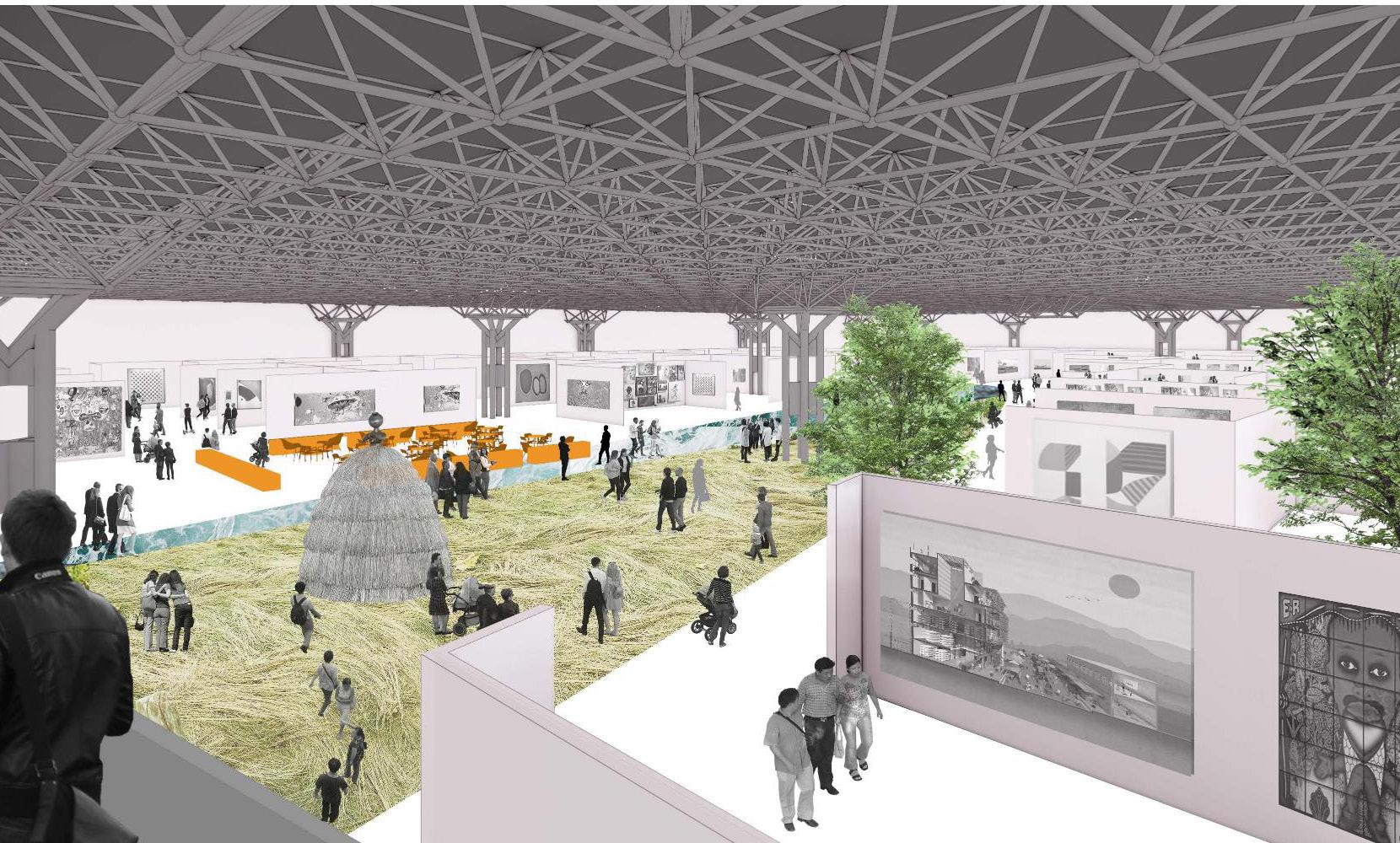

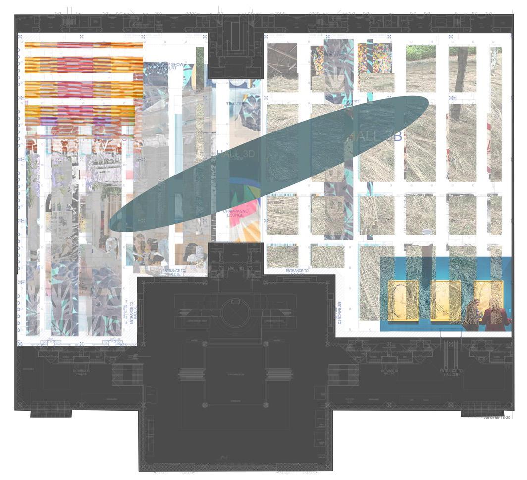
My key contributions involved working closely with our Project Manager and the show’s leadership to develop an open floor plan spanning three halls. This design prioritized open sightlines and the creation of comfortable lounges, inspired conceptually by New York City’s urban grid, with a central open space reminiscent of Central Park—a unifying agora that spanned the expansive Javits Center halls.


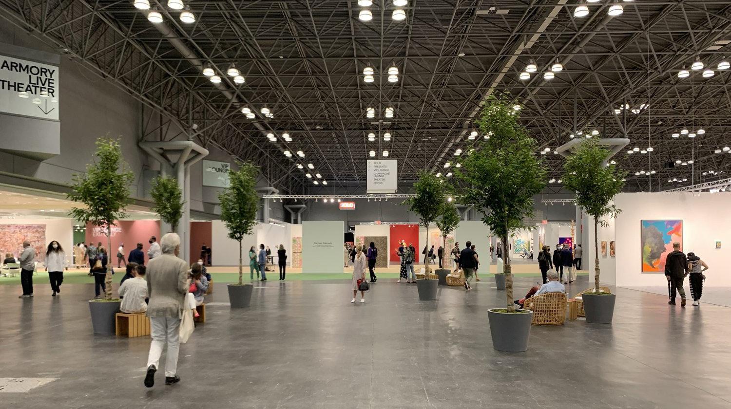
The project drew inspiration from New York’s parks, rivers, and landscapes, integrating distinctive patterns and colors. Throughout the project, I played a pivotal role in developing layouts, renderings, and collages, contributing to the project’s successful completion. Additionally, this project underscored my ability to collaborate effectively with artists, showcasing my versatility and expertise as a project designer in the realm of contemporary art and spatial design.

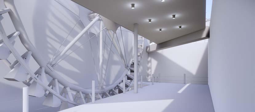
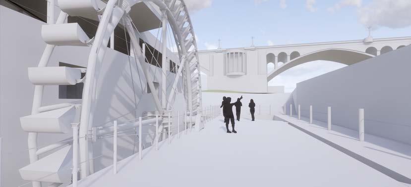
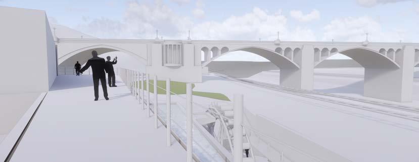
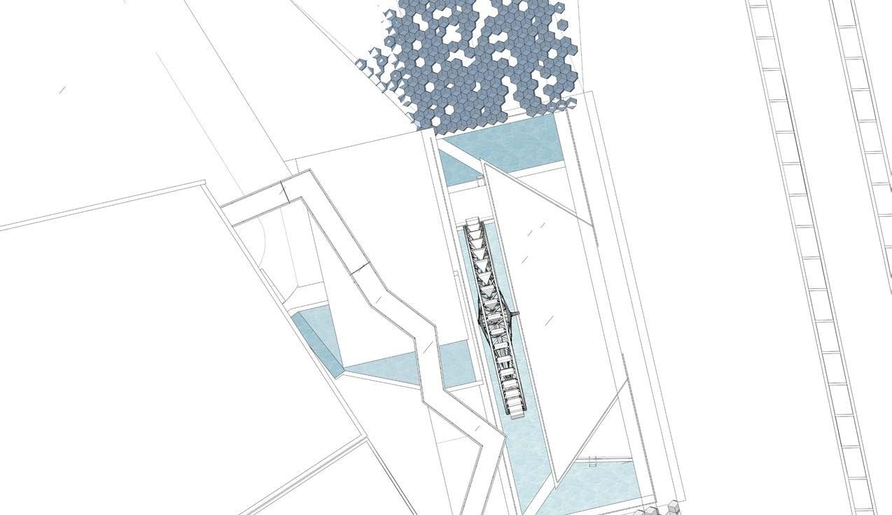
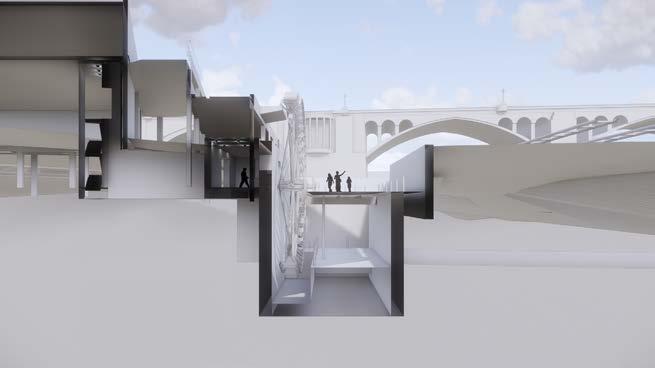
I was loaned out to Metabolic Studio as a project designer for the innovative “Bending the River” project led by artist Lauren Bon. This visionary initiative reimagines LA’s relationship with the LA River to address water needs, resource scarcity, and climate issues. Located on Tongva land, the project involved collaboration with artists, native communities, activists, residents, and government agencies, requiring over 75 permits, including Los Angeles’ first private water right. “Bending the River” prioritizes sustainability, utilizing solar power, gravity, and reclaimed floodplains for ecosystem regeneration. The LA River, previously a concrete wastewater channel, is repurposed with adaptive reuse. Water is redirected to Metabolic Studio for native wetland treatment, benefiting local parks, including the 52-acre LA State Historic Park. This ambitious project stems from the 2005 “Not A Cornfield” initiative and showcases a commitment to sustainable urban planning, with my role contributing to its architectural development.







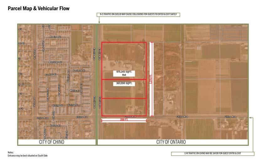
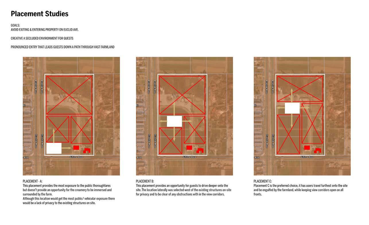
Under the ownership of the Pietersma Family, Heritage Pride Farms was fueled by their passion for travel, cultural engagement, and collaborations with renowned designers. Their global exposure significantly influenced their vision for the project. After years in the Dairy Business & Industry, they allocated a portion of their land for an artisan cheese shop following the successful repopulation of Dutch Belted cows, known for producing authentic Gouda cheese. The site is strategically located at the intersection of Euclid and Chino Avenue, it provided exposure to both Chino and Ontario, blending suburban and agricultural elements. This unique location offered opportunities for outdoor activities, including hosting farmers’ markets and various weekend events, aligning with the client’s intent.
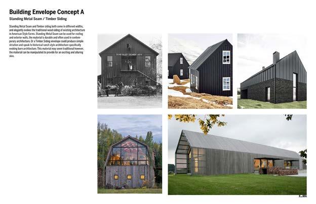
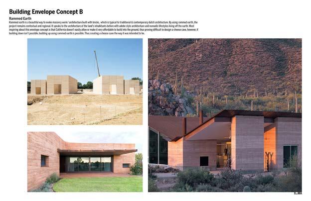
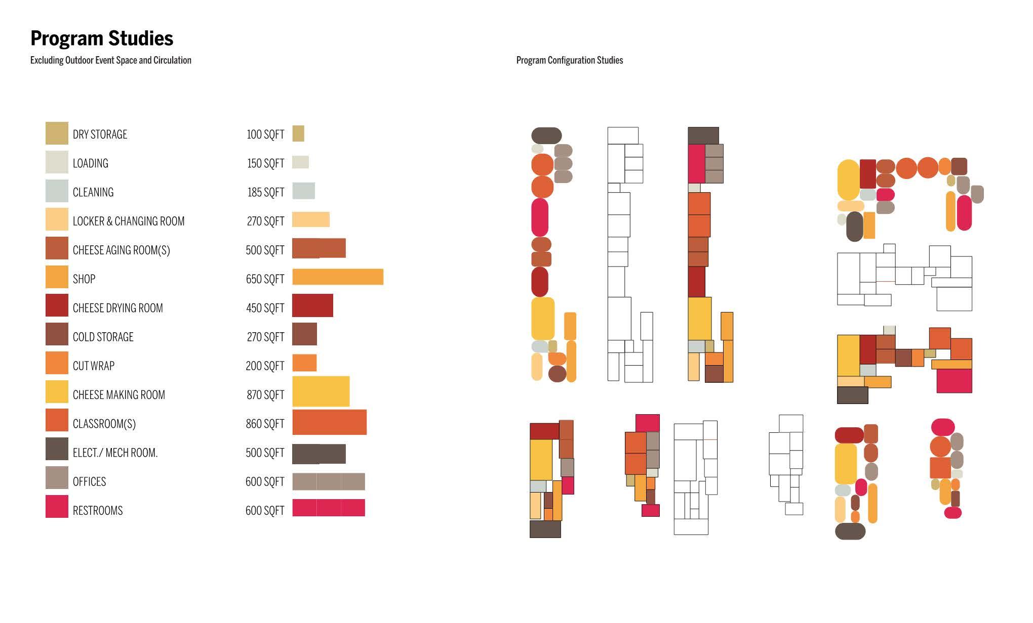
I developed a comprehensive concept package with the aim of designing a space akin to a winery, albeit with a focus on showcasing a variety of onsite-produced cheeses and creams. This involved conducting extensive program analysis, site analysis, architectural research, code analysis, and research into sustainable practices and materials to inform the concept package. To further enhance the project’s vision and narrative, I created a presentation featuring informative yet inspirational images representing the property, architecture, interiors, and building envelope concepts.
The architectural approach for the Artisan Cheese Shop aimed to create a connection between the occupants and the region. I aimed to prioritize natural light, ventilation, and engagement with the outdoors. The design hierarchy positioned the most social spaces either facing the mountains or inward toward the property, depending on the design option selected. The meticulous planning of the building’s orientation and configuration maximized daylight and views for the greatest number of occupants.
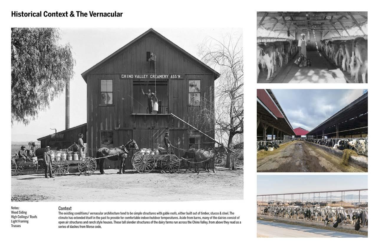
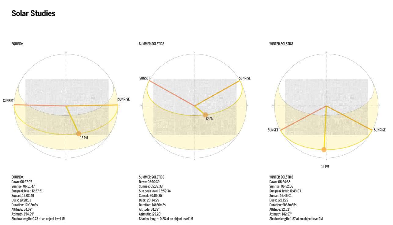


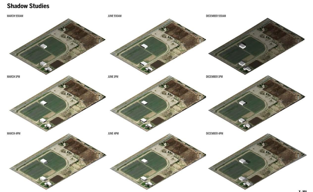
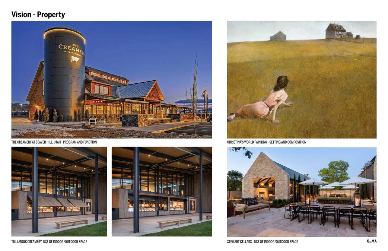
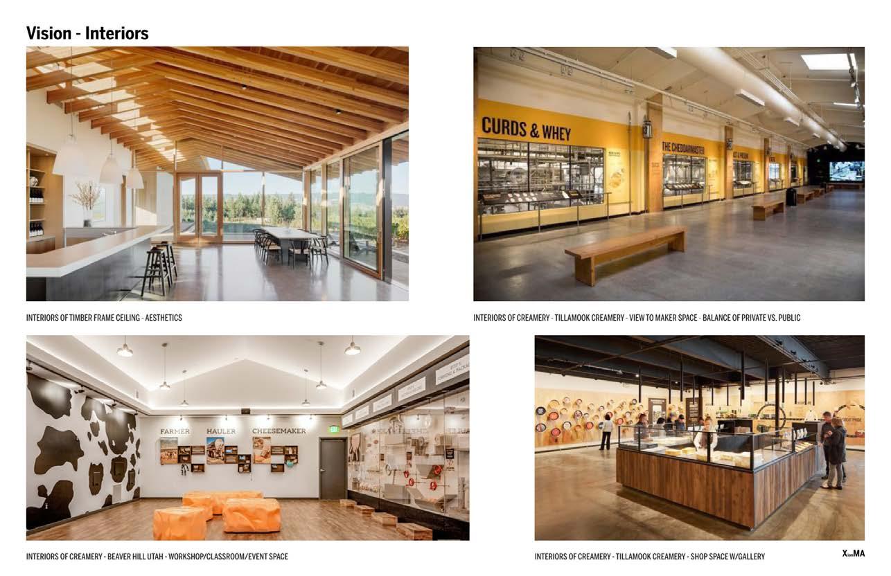


I researched climate-responsive design principles and the seasonal use of operable windows for natural ventilation to provide a unique experience, allowing visitors and users to stay connected to the outdoors, experience fresh air, easily control the indoor temperature, and immerse themselves in the weather and natural surroundings.


Images displayed to the left exemplify the aspirations for the development of the exterior and interior spaces. The project explored various forms and program layouts, three of which are detailed in the following pages, complete with their respective pros and cons. These design options will conclude the professional work portfolio as the project had to be put on pause. For reference, the three design options are summarized below:


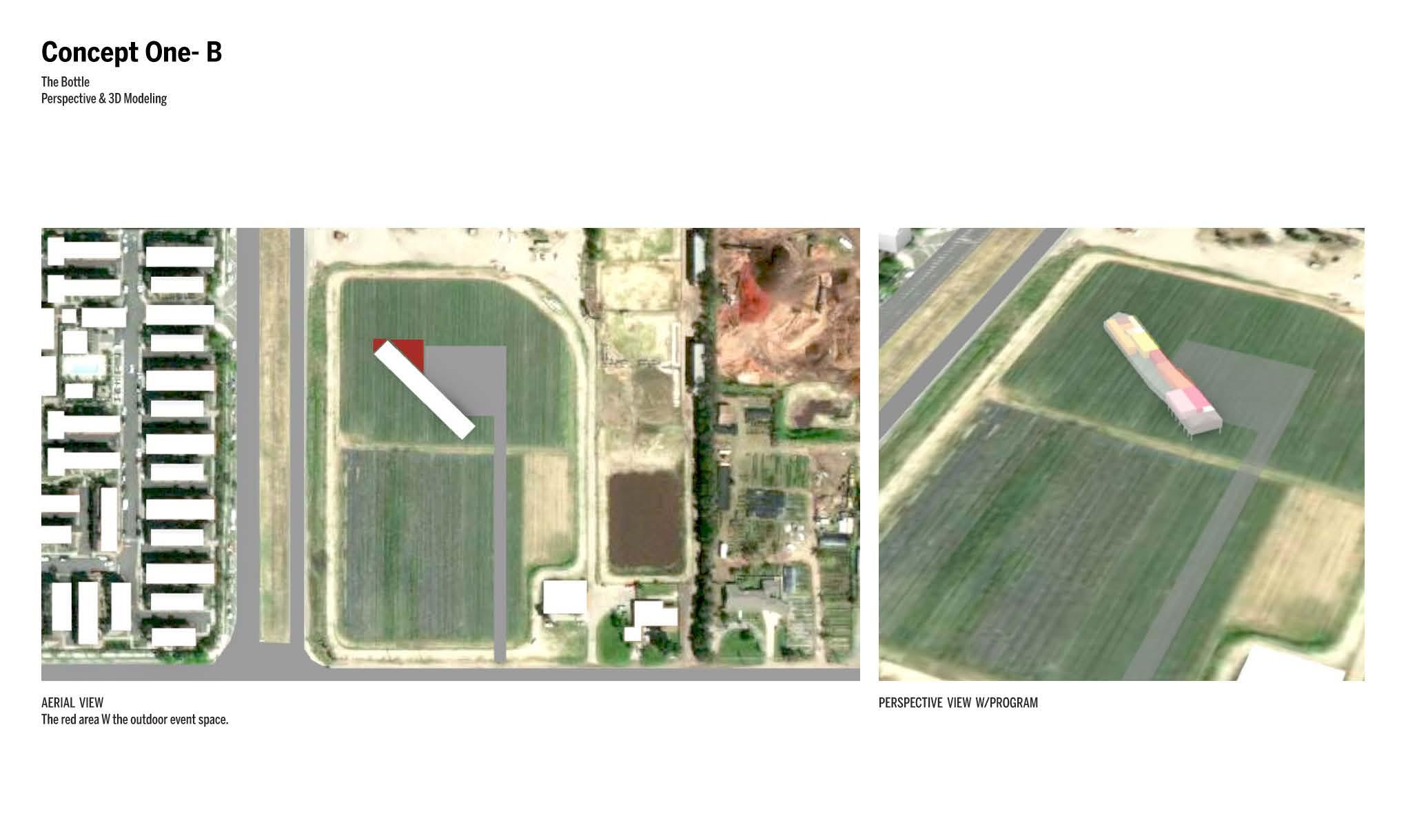
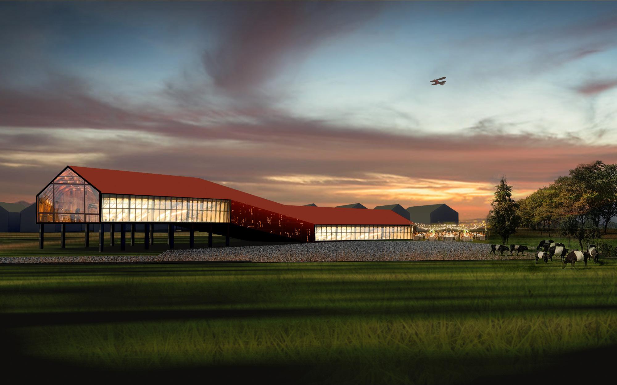
Option 1, “The Bottle,” integrated educational and exhibition spaces within the entry/lobby area, employing a diagonal orientation to optimize solar exposure. This design extended from a barn’s frontal elevation, elevating classrooms and offices to capture scenic farm views. Additionally, it featured a Classroom/Event Space on the northwest end, offering vistas of the mountains and north field.

Option 2, “The Dorp” (Dutch for Village), envisioned a village-like environment with multiple small-scale buildings. These structures created shared outdoor spaces that could extend into the parking lot. The massing aligned with the San Gabriel Mountains and influenced the roof shape.
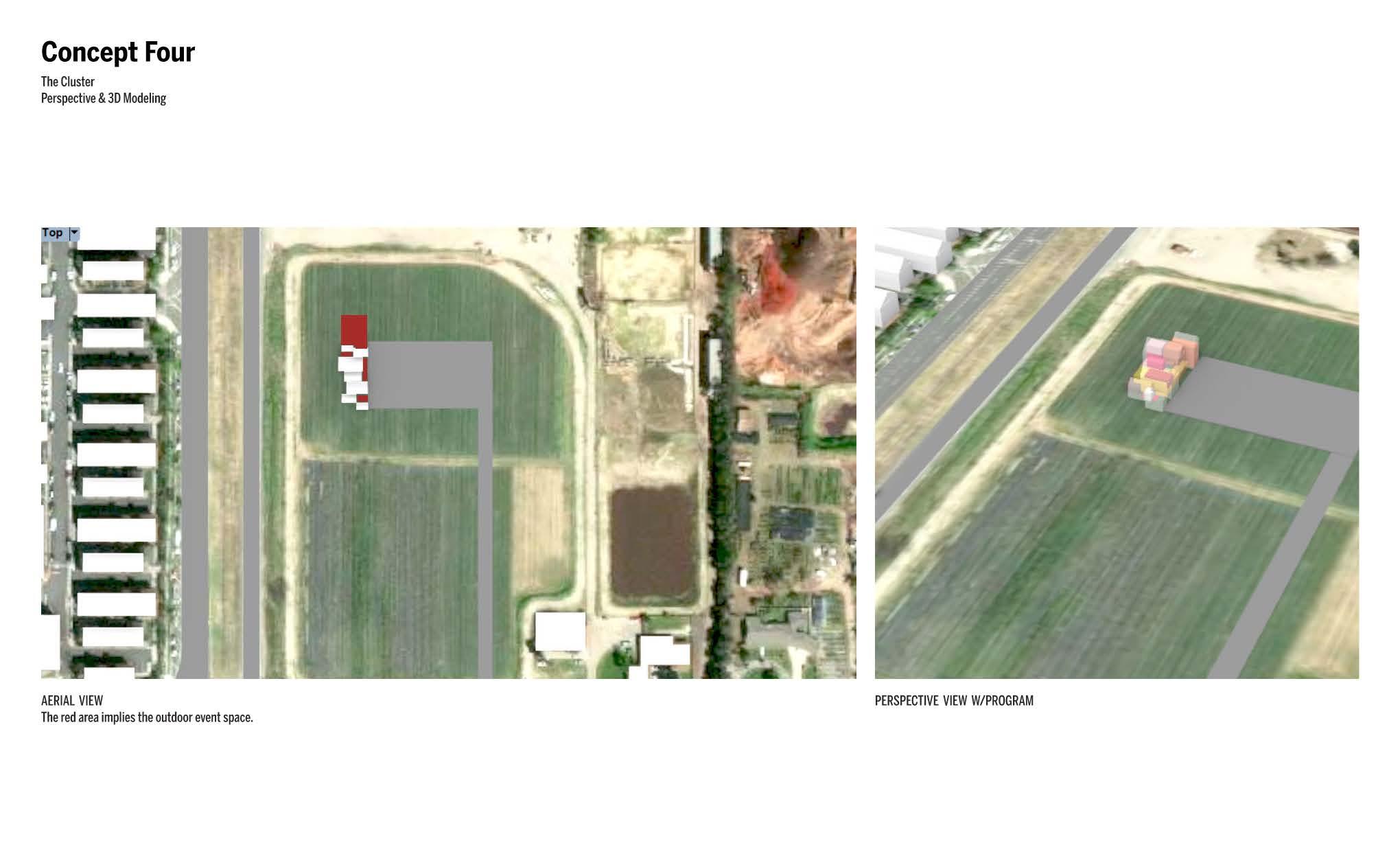
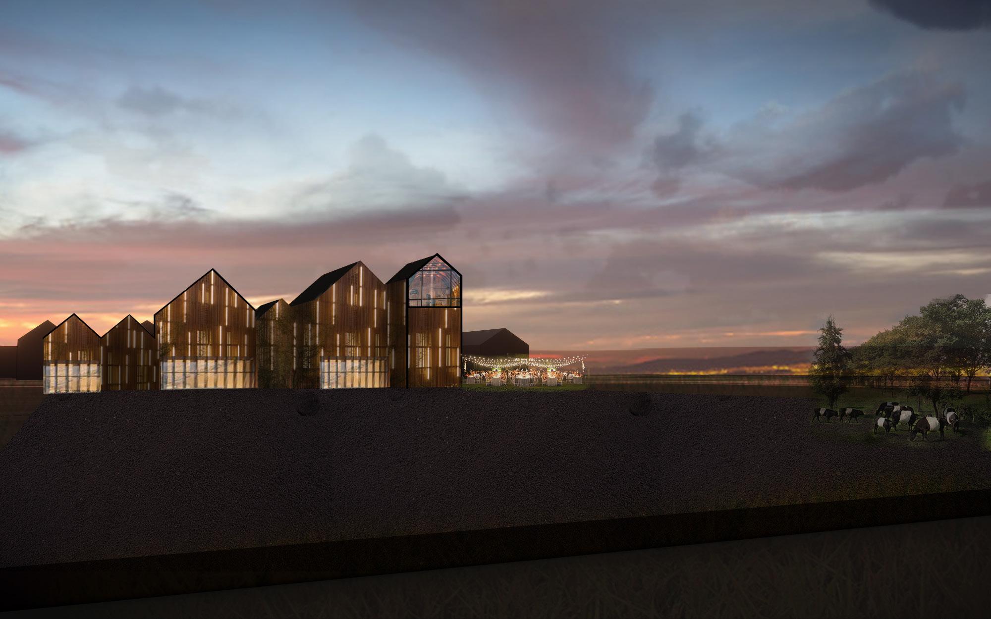
Option 3, “The Cluster,” introduced gable-roofed buildings clustered together, creating a playful and harmonizing design inspired by the existing architecture along Euclid Ave. It aimed to blend seamlessly with the residential buildings running east to west along Euclid.

The Bottle
This concept scheme introduces an educational and exhibition space within the entry/lobby area, extending along the circulation path. Unlike nearby dairy structures, it positions itself diagonally on the site to optimize solar exposure. The design is derived from extruding a typical barn’s frontal elevation to encompass the entire program. It also elevates some classrooms and offices to capture farm views to the south, while a Classroom/Event Space on the northwest end provides vistas of the San Gabriel Mountain range and opens up to the north field.

Pros:
• Elevated classrooms and offices facing the entry promote visual interaction among guests.
• Adjacent to the outdoor event space, another classroom/event area encourages indoor and outdoor activities.
• The combination of the exhibition/gallery/shop with the circulation path offers opportunities for educational displays and local art.
Cons:
The roof orientation is not directly south, but it still allows for diagonal placement of PV panels on the southern roof to capture solar energy.



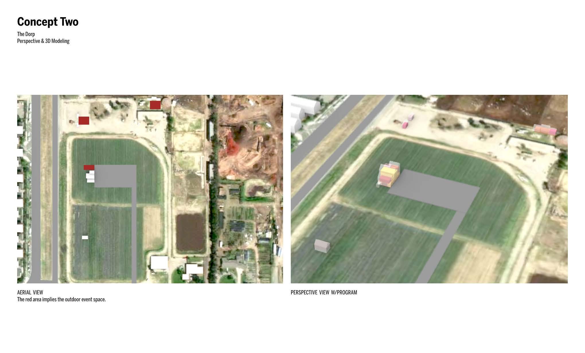
Dorp refers to the Dutch word for Village, this scheme creates an environment with multiple human scale buildings. The shared outdoor space is found on the west end between the structures and is able to flood into the parking lot. The massings run parallel to the San Gabriel Mountains range, which could additionally inform the shape of the roof.
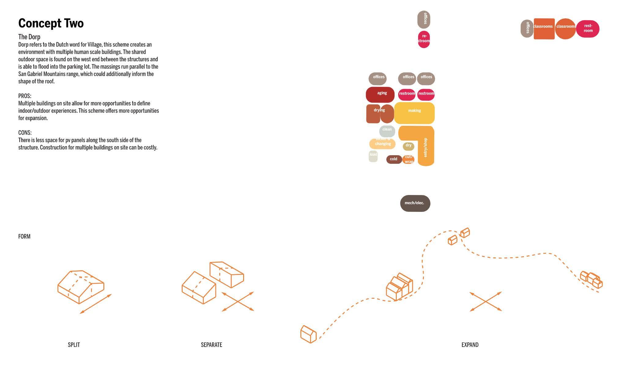
PROS:
Multiple buildings on site allow for more opportunities to define indoor/outdoor experiences. This scheme offers more opportunities for expansion.
CONS:
There is less space for pv panels along the south side of the structure. Construction for multiple buildings on site can be costly.



DESIGN INTENT

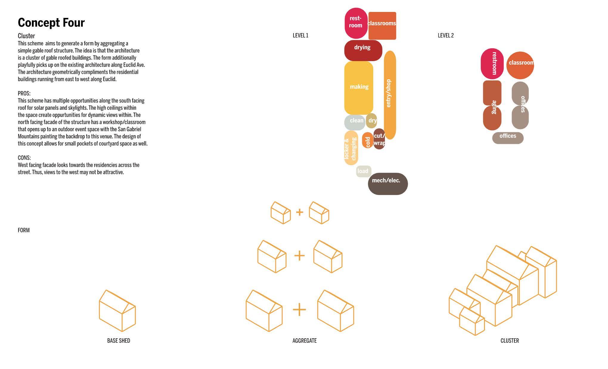
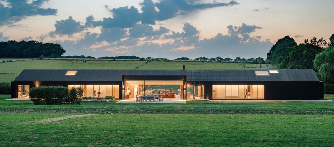
This scheme aims to generate a form by aggregating a simple gable roof structure. The idea is that the architecture is a cluster of gable roofed buildings. The form additionally playfully picks up on the existing architecture along Euclid Ave. The architecture geometrically compliments the residential buildings running from east to west along Euclid.
PROS:
This scheme has multiple opportunities along the south facing roof for solar panels and skylights. The high ceilings within the space create oppurtunities for dynamic views within. The north facing facade of the structure has a workshop/classroom that opens up to an outdoor event space with the San Gabriel Mountains painting the backdrop to this venue. The design of this concept allows for small pockets of courtyard space as well.
CONS:
West facing facade looks towards the residencies across the street. Thus, views to the west may not be attractive.


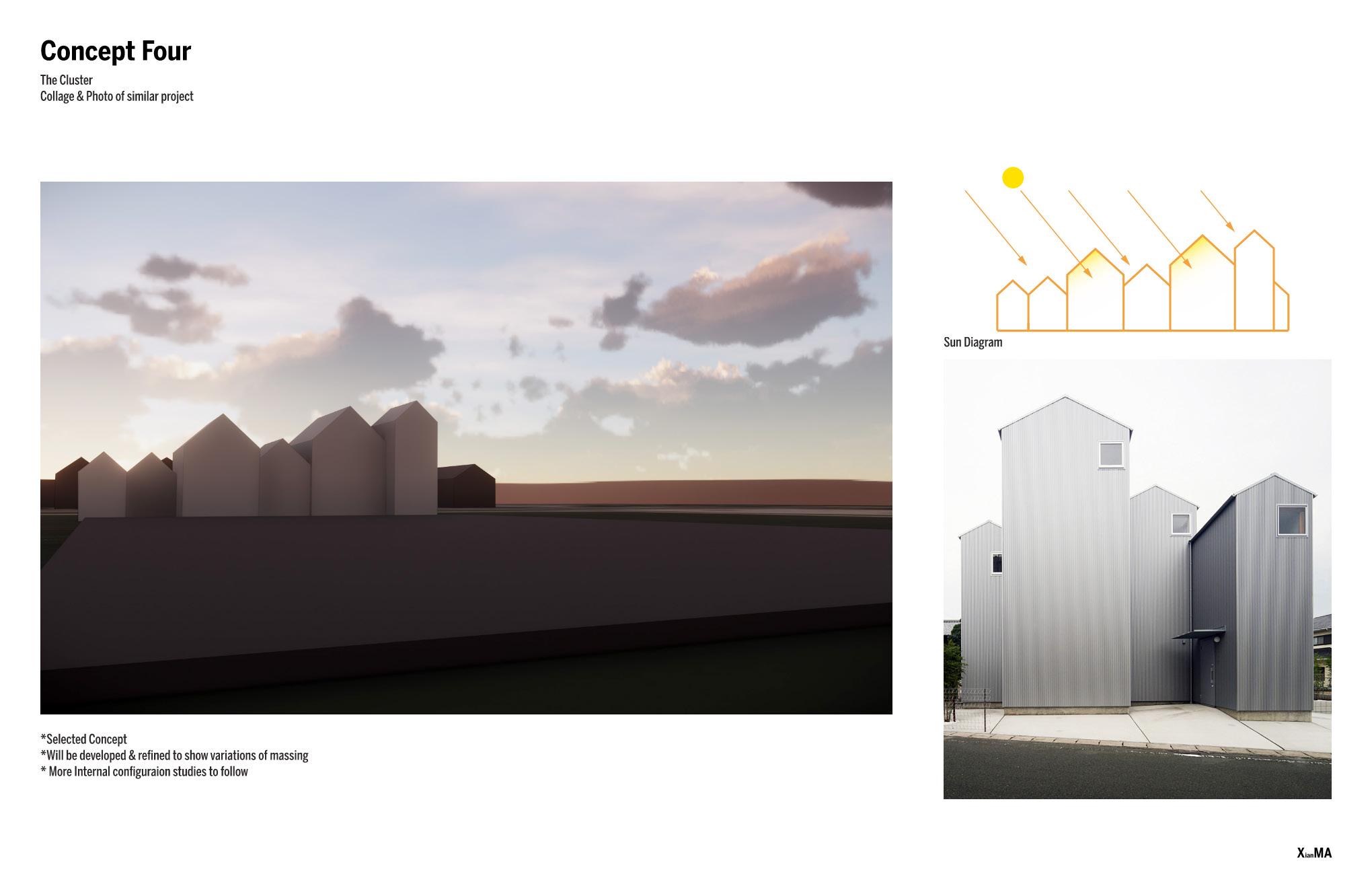 Concept Collage

 PHOTO OF SIMILAR PROJECT HIGHLIGHTING RELEVANCE OF DESIGN INTENT