5 minute read
Retro Ranch Refresh

By Tory Irmeger | Photography by Bekah Berry/Creative Revolver
Tucked behind a row of leafy trees, this unassuming lot unveils stunning valley views the moment guests pull up the drive. The home, redesigned by Michael Bridges and his team at Surface Architecture, was a ranchstyle home elevated to a modern marvel. “We used the bones of the home as a blank canvas to express some mid-century modern detailing meshed with contemporary functionality,” shares Bridges. The result is a design that expertly adapted the existing structure into an open space that guides guests from the entryway to the vista beyond.
Architect and Design: Michael Bridges, Surface Architecture


A ROOM WITH A VIEW
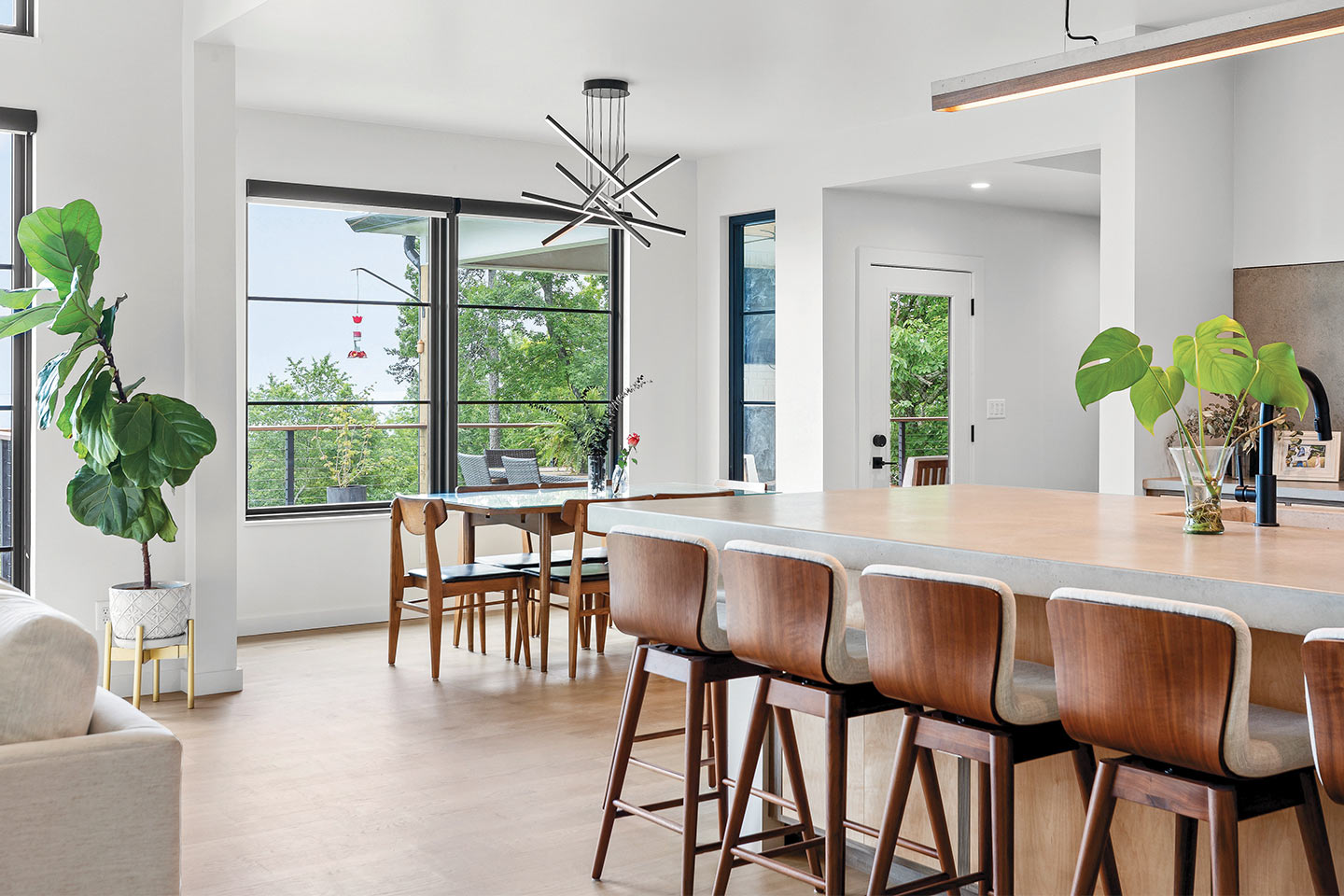
Stepping across the threshold, guests are immediately welcomed into an open space flooded with natural light from a wall of windows. “We really wanted to express the immense views to the east, as well as brighten the space with daylight,” Bridges says. “To accomplish this, we needed to alter the roof in the living room. The window wall went from the original 8-foot to a 12-foot height, offering the added benefit of taller ceilings in the living room.” In addition, the remodel included modernizing the floor plan to allow for better flow in the main living area. The wall between the kitchen and living space was demolished and replaced with a centralized kitchen island where friends and family can gather.
To see more from Surface Architecture, visit surfacearch.com.
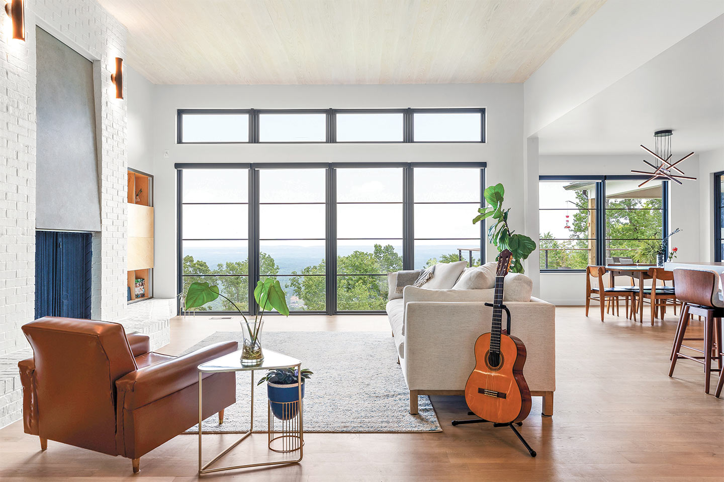

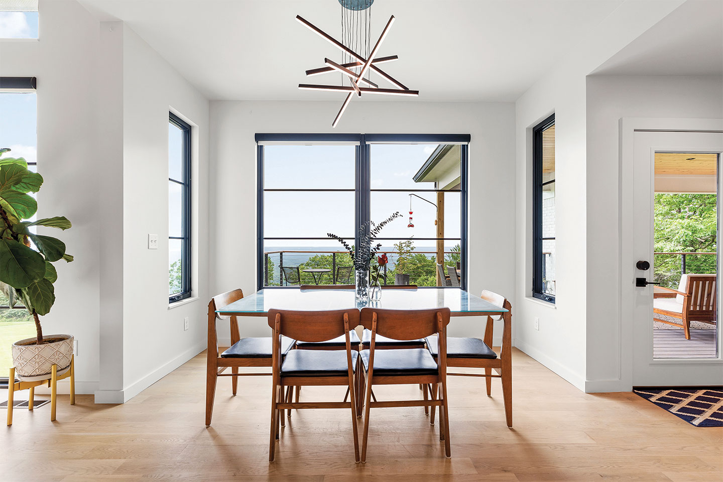
The mid-century structure of the home naturally lent itself to a modern design, from the streamlined furnishings to the eclectic curation of materials used throughout. “We mixed and matched wood tones in this project, stopping short of teetering over into a rustic feel. The client also desired a soft, light color palette, so we worked with whites, grays, and blues to coexist with the warmth of the wood tones,” shares Bridges.
In the living area, a white brick fireplace with a precast concrete panel is a visually striking central element that ties in with the kitchen and exterior of the home. To the right, inset custom shelving offers a fun feature: sliding wood panels open to reveal a hidden TV, thanks to cabinet hardware sourced from Europe. This minimalist approach ensures that attention is always directed to the grand views beyond.


The kitchen is a mid-century dream, featuring floor-to-ceiling slab-style cabinetry in conjunction with a massive concrete backsplash and countertops. This concrete installation was no small feat, but the visual effect is immediate. Smooth surfaces are offset by matte black hardware, and rich wood tones warm the space. Even the industrial pendant light over the island showcases a blend of concrete and wooden textures. In the cabinet wall, two panels open up to reveal a hidden pantry that was originally the home’s dining room, now repurposed for stylish extra storage.
Tile: Louisville Tile
This home design is a good example of a lot of the work we are doing now – expressing retro styling in new forms and in ways that are functional to the standards of today. Very few mid-century era homes come with a pantry, large laundry space, large bathrooms, and walk-in closets. Our challenge is always pairing the aesthetic goals of the home with current space planning expectations.
– Michael Bridges, Surface Architecture
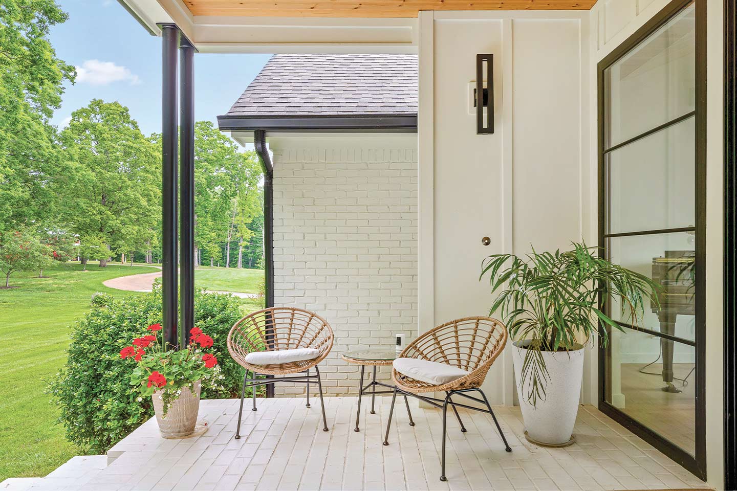
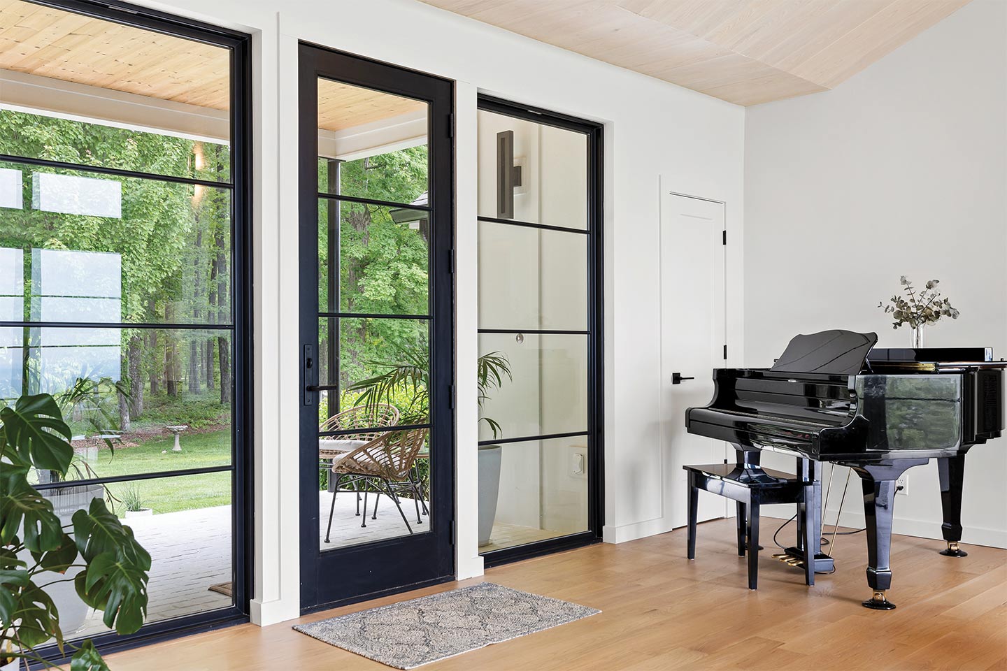
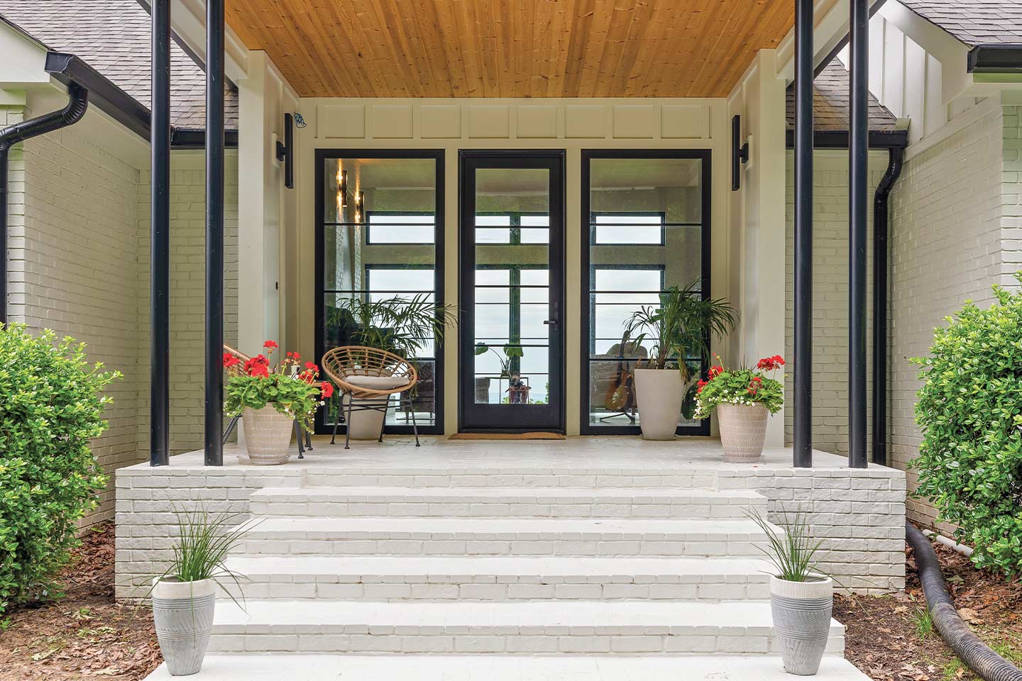
Rounding out the heart of the home is the entryway and front porch addition, which was a crucial element in the redesign. Although the best views are offered at the back of the home, the Surface team wanted to incorporate this feature from the moment guests approach the threshold.
“We wanted a transparent entry so that anyone coming up to the home could immediately be greeted by the views. Privacy, which is typically the concern with this approach, was mitigated due to the thick trees and distance in between the home and the public street,” says Bridges. “Similar to the living room, we expressed the entryway roof as a thin, low slope, and hip-style roof with deep overhangs and minimal structure to give it lightness and emphasize that connection to mid-century styling.”
Interior Doors and Trim: Interior Trim & Supply, Inc.
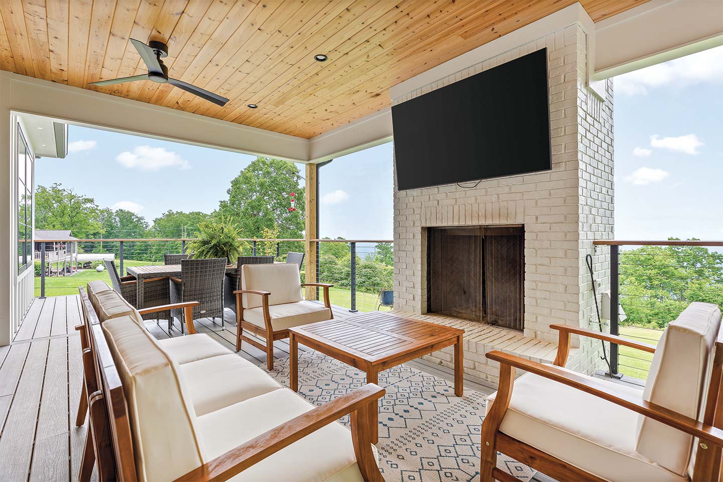

Of course, this home wouldn’t be complete without a back porch. Here, guests can gather around the brick fireplace, watch a game, or take a meal al fresco. The wood tones and soft blues and whites of the interior continue in this space, creating cohesion through the main level.
Highlighting intentionality and minimalism, this project is a masterclass in reviving retro styles in a modern home. From structural changes to carefully curated materials, the design team artfully elevated this home to a contemporary gem.
Brick: General Shale
Other Suppliers
Appliances: Ferguson | Builder: Jonathan Jones, Crown Construction, LLC | Cabinetry: Cornerstone Cabinetry | Countertops: Justin Burd, Nevrest | Custom Installs: Heatherly Custom Interiors | Exterior doors and windows: 84 Lumber Company | Fireplace: Hearthside Hearth & Home | Flooring: Hank’s Carpet & Flooring | Painting: Chattanooga Paint and Decorating | Plumbing Fixtures: Noland


