1 minute read
Project 2 Typefaces

from Process Book
by elladye
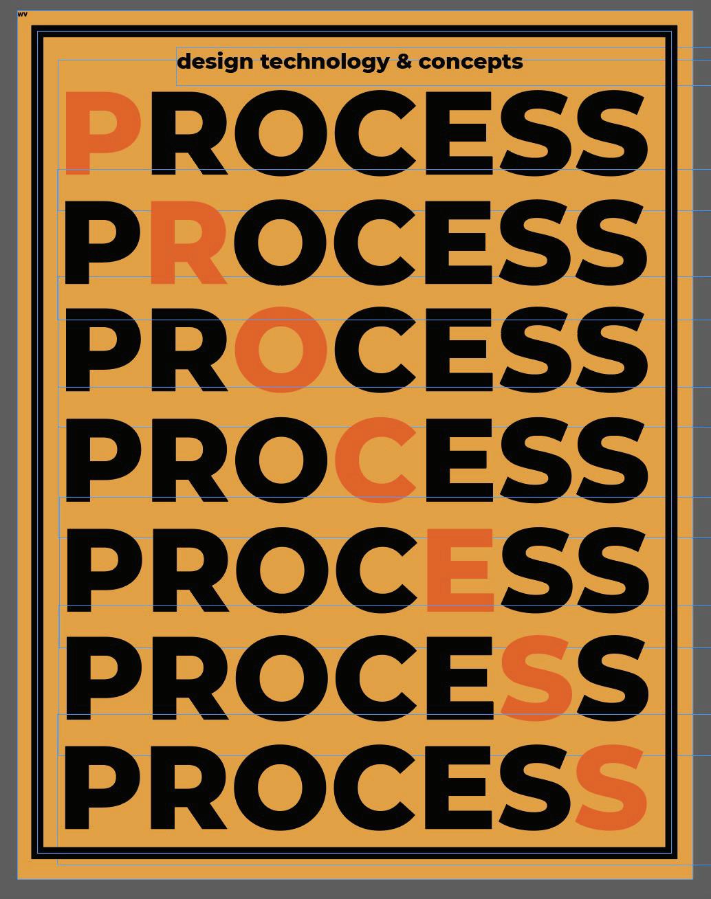
There are millions of typefaces out there. Each one has something unique and different about them. Different typefaces are more appropriate to use than others in various situations. Each one has it’s own personality and message that it sends to the audience, regardless of what the words themselves say. So it is important to pick the perfect typeface to pair with your artwork or message. Project #2 was to use only letters, numbers, and symbols, from one typeface to make a character or face. This is a perfect way to creatively show the style of the font. With this project I wanted to create a face for each typeface I choose that matched the style and energy of it.
The first typeface I chose was a basic serif font, “Lora”. To me this seems sophisticated and clean. The font uses sharp edges and lines. So for this face I kept rearranging the letters and numbers until I had created a face that resembled a businessman with a smug smile, and sharp chin with slicked up hair. I wanted it to seem professional but also confident, because that is what I see with the typeface “Lora.”
Advertisement
The next typeface I chose was a script font, “Sunday morning.” With the more handwritten feel that a script gives off, I wanted this face to seem more like a sketch of a person. I used the letters to give my face a soft smile and eyes, and a bushy beard, then gave him a fluffy beanie. Like the typeface, this face seemed warm and inviting to me.
The last typeface I chose was another serif, “Apple Chancery” yet it was different than the first. This typeface had more curves and a heavier thickness, yet it also was somewhat proper. The idea this gave me for this face started with the eyes I gave it. I used Qs, but the leg of the Qs were extra wavy, and resembled questioning eyebrows. So I decided to make this face a detective, and with a thick mustache and top hat to fit that stereotypical character.