

™
KING, TAMSIN JOHNSON & ISABELLE STANISLAS
the homes of:
KITCHEN CONFIDENTIAL
COLIN
Inside
Preserve masterfully.
Cook precisely.
Live deliciously.
Savour the ingredients that stay fresher longer with Sub-Zero, the food and wine preservation specialist, the meals that are cooked to masterful precision with Wolf, the cooking specialist, and a kitchen appointed with elegantly crafted appliances.

SYDNEY SHOWROOM, Foveaux House. 63 Foveaux Street, Surry Hills.
subzero-wolf.com.au
Re f r ig er at ion. C ook i ng
MELBOURNE SHOWROOM , Bank House. 11-19 Bank Place, Melbourne.


kingliving.com JASPER Become a Trade and Commercial Member to receive dedicated service and exclusive year-round benefits. Join online today.


The Ultimate Indulgence Premium fully integrated appliances. Discover the latest at home.liebherr.com.au Refrigeration and freezing
KITCHEN
This year, Gaggenau is recognising exceptional of the Year Design Contest highlights projects considerations front of mind," Gaggenau Fisherman's House by Sydney-based practice integrated into the kitchen’s bespoke cabinetry.
Submissions for the Gaggenau Kitchen of

8
Design: Studio Prineas
Photography: Gavin Green
KITCHEN DESIGN THAT DEFIES CONVENTION

exceptional Australian kitchen design with the brands Kitchen of the Year Design Contest. “The Gaggenau Kitchen projects that embody design authenticity and originality and at the same time, put performance and end-user Gaggenau senior brand communications manager Olya Yemchenko says. Blending old, new and an exceptional view, the practice Studio Prineas features Gaggenau appliances that enhance the overall experience and aesthetic, cleverly cabinetry.
of the Year Design Contest are open until April 30, with winners shortlisted in July and announced in September.

LEARN MORE >

ISSUE #48

11
MILAN
MAGAZINE
READ OUR 2023 COMPREHENSIVE REPORT ON MILAN DESIGN WEEK AND SALONE DEL MOBILE.

LIVE MAY 19TH
SUBSCRIBE TO RECEIVE THE MILAN ISSUE >
COMING SOON
CONTENTS





13 KITCHEN CONFIDENTIAL
Stockholm furniture fair design highlights
at home with Isabelle Stanislas
an alliance of eras the detail
where architects live film series
back to school kitchen confidential
at home with Tamsin Johnson
my space Colin King
kitchen compendium the library
tree house
EDITOR’S LETTER SOPHIE LEWIS

A kitchen is a fundamental part of the everyday. In this issue, we’re curious about how architects and designers conceptually approach this everyday space, particularly when it comes to designing their own.
‘Kitchen Confidential’ steps inside the homes and minds of Milanese architect Michele Pasini, Paris interior designer Stéphanie Coutas and North American interior designers Jordan Carlyle and Marissa Corvino to see how their kitchen workspace reflects how they live. Beyond their homes, we see designers reveal their eye for detail across 12 standout global kitchen projects.
We’re invited into designer Isabelle Stanislas’ Parisian home, interior stylist Colin King’s Tribeca Loft, and Sydney designer Tamsin Johnson’s recently reimagined home to understand their personal approach to design in our ‘At Home With’ and ‘My Space’ series. Product designer Monica Calderon and architect Ezequiel Farca’s schoolhouse-turned-retreat in Mérida, Mexico remind us of the importance of these everyday spaces for creative respite.
Designer Nikolai Kotlarczyk shares contemporary craftsmanship highlights from Stockholm Design Week, while our Detail pages spotlight handcrafted elements in the kitchen. Don’t forget this digital issue is designed for exploration beyond our pages – with links to our new podcast, film series and products on estliving.com.
I’m excited to announce I’ll also be reporting live on the ground at Milan Design Week and Salone del Mobile next month. Follow our on-the-ground coverage across the est social channels, and in our dedicated digital Milan issue, released on May 19.
est magazine ISSUE #48

architects

where live
est living FILM SERIES
William Smart Smart Design Studio principal


Click here to watch now >
CONTRIBUTORS
ISSUE #48
ELANA CASTLE
Elana is a South African architect, writer and photographer. After spending several years in London and Sydney, she moved to New York, where she now lives in a remodelled classic colonial just outside the city. She enjoys covering design, interviewing influential creatives and pursuing photographic projects while running her interior design practice, STUDIO e*. In this issue, Elana explores the story behind a Brazilian-inspired Sydney home by Luigi Rosselli Architects and Alwill Interiors.

@elanacastle
MATTHIEU SALVAING

Matthieu Salvaing has been travelling the world for more than twenty years to capture people, places and the art of living. The French photographer regularly works with luxury brands, international press titles and publishing houses to highlight the work of artists and designers. Always sensitive to the identity of a place, Matthieu photographs Isabelle Stanislas’ Parisian home in this issue.
@matthieusalaving
SHANNON MCGRATH

Shannon McGrath has photographed architecture and interior design works for nearly two decades. Pre-eminent architects and designers around Australia commission her for the ability to get under the skin of a project and capture its pure essence and her client’s formal design intent. Passionate and professional, Shannon’s images are known for their beautiful portrayal of light and form, with soft realism that celebrates subject matter – as seen through Hecker Guthrie’s Parkville home in our latest issue.
@shannonmcgrath7
NIKOLAI KOTLARCZYK
Nikolai Kotlarczyk is an Australian product and interior designer currently based in Norway. His work is grounded in the context of place as he recontextualises his own experiences into objects and spaces that are contemporary yet nostalgic. Nikolai has collaborated with brands across Europe and Australia and featured in exhibitions in Milan, Stockholm, Paris, Copenhagen and Melbourne. For our March edition, Nikolai reports on highlights from Stockholm Design Fair 2023.
@nikolaikotlarczyk

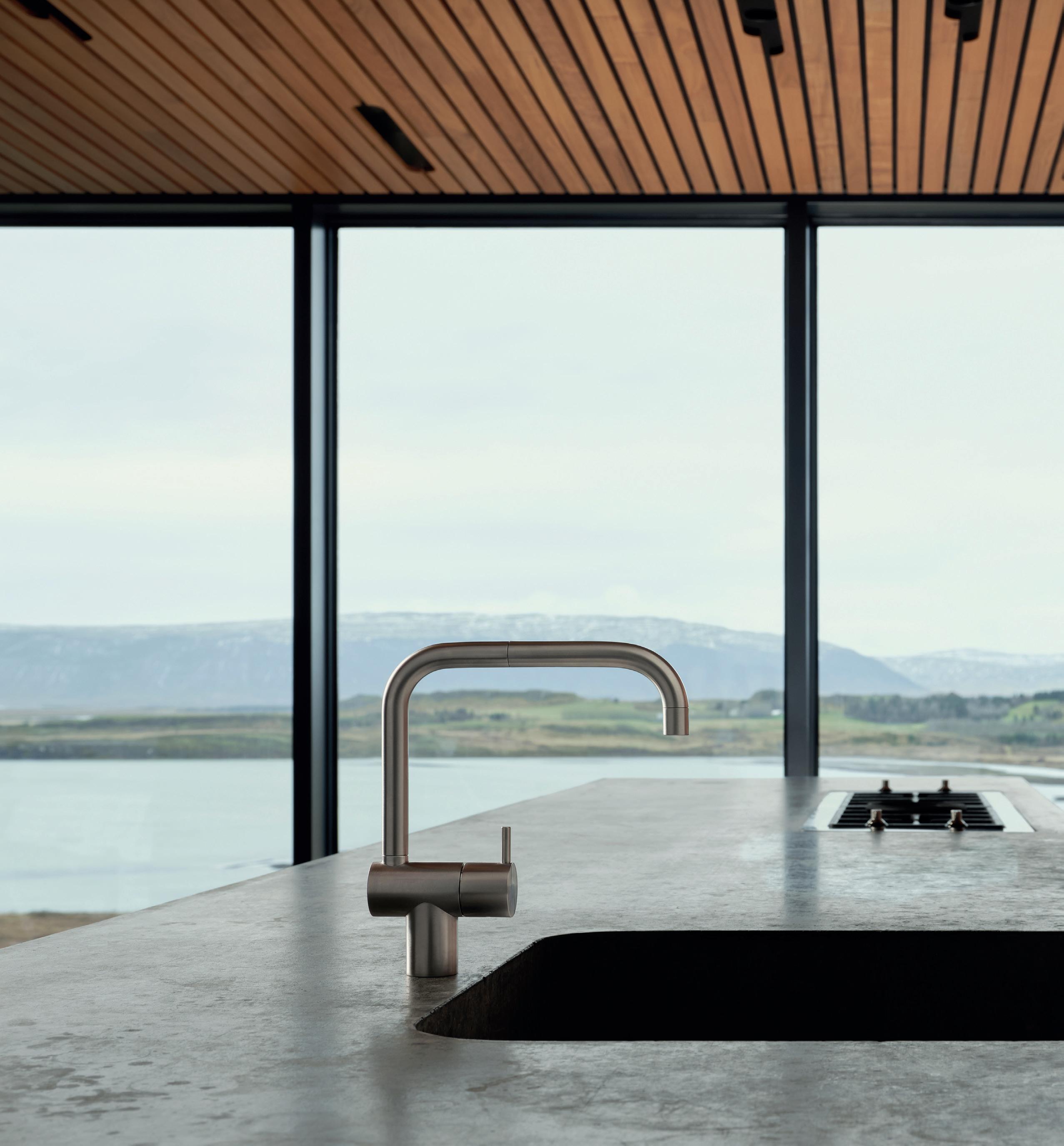


vola.com The original VOLA DESIGN PTY. LTD. 94 Wellington Street | VIC 3066 Collingwood | Phone: +61 402 372 480 | sales@vola.com.au
living VOLA stainless steel, bringing together natural beauty and pure form KV1 One-handle mixer in brushed stainless steel. Explore the Elemental living story vola.com/on-design.
Elemental
THIS MUCH I KNOW
est presents
A DESIGN CONVERSATION WITH KAREN MCCARTNEY

est living PODCAST
Project Queens Park House
Photography Anson Smart
A design dialogue with Arent&Pyke founders and principal designers Juliette Arent & Sarah-Jane Pyke on how they interact with their clients, creating moments of pleasure, inspiring elements and the flow of family life.

Click here to listen now >
Arent&Pyke founders and principal designers Juliette Arent and Sarah Jane Pyke
CREDITS
est TEAM
Editor
Sophie Lewis
Style Editor & Copy
Yvette Caprioglio
Visual Concept Designer
Jack Seedsman
Junior Graphic Designer, Sales & Marketing Coordinator
Emmy Ford
Product Editor
Brigitte Craig
Editorial advisor
Karen McCartney
Partnerships Editor
Megan Rawson
Editorial, Social Media & Video Coordinator
Lidia Boniwell
Editorial & Multi-Media Assistant
India Curtain
Features Writer
Holly Beadle
Managing Director
Miffy Coady
Advertising & Partnerships
Mandy Loftus-Hills | mandy@estliving.com
Astrid Saint-John | astrid@estliving.com
Deb Robertson | deb@estliving.com
ON THE COVER
Design
Hélène Van Marcke Interior
Architecture
Photography
Thomas De Bruyne
Location
Paris, France
CONTACT
editorial@estliving.com
advertising@estliving.com
CONNECT
CONTRIBUTORS
WORDS
Yvette Caprioglio, Holly Beadle, Elana Castle, Alexandra Gordon, Tiffany Jade, Sophie Lewis
PHOTOGRAPHY
Back to School
Fernando Marroquin
Kitchen Confidential
DePasquale+Maffini, Adrian Gaut, Nicole Franzen, Nicolas
Mathéus
At Home With Tamsin Johnson
Anson Smart
My Space: Colin King
Rich Stapleton
Kitchen Compendium

Dave Kulesza, Nicole Franzen, Magnus Mårding, Alan Jensen, Anson Smart, Felix Forest, Thomas De Bruyne, Inger Marie Grini
The Library
Marcello Mariana
At Home With Isabelle Stanislas
Matthieu Salvaing
Tree House
Prue Ruscoe
Stockholm Furniture Fair
Courtesy of Stockholm Furniture Fair, Massproductions, Antrei Hartikainen, Fogia, Lammhults, String furniture, ASPLUND, Motarasu, Bebo Objects, +Kouple & Persona Restaurant
An Alliance Between Eras
Shannon McGrath
The Detail
Sam Frost, Suiyu Studio, eszter+david, Salva Lopez, Verne, Thomas De Bruyne
BACK COVER
Marcello Mariana
est magazine
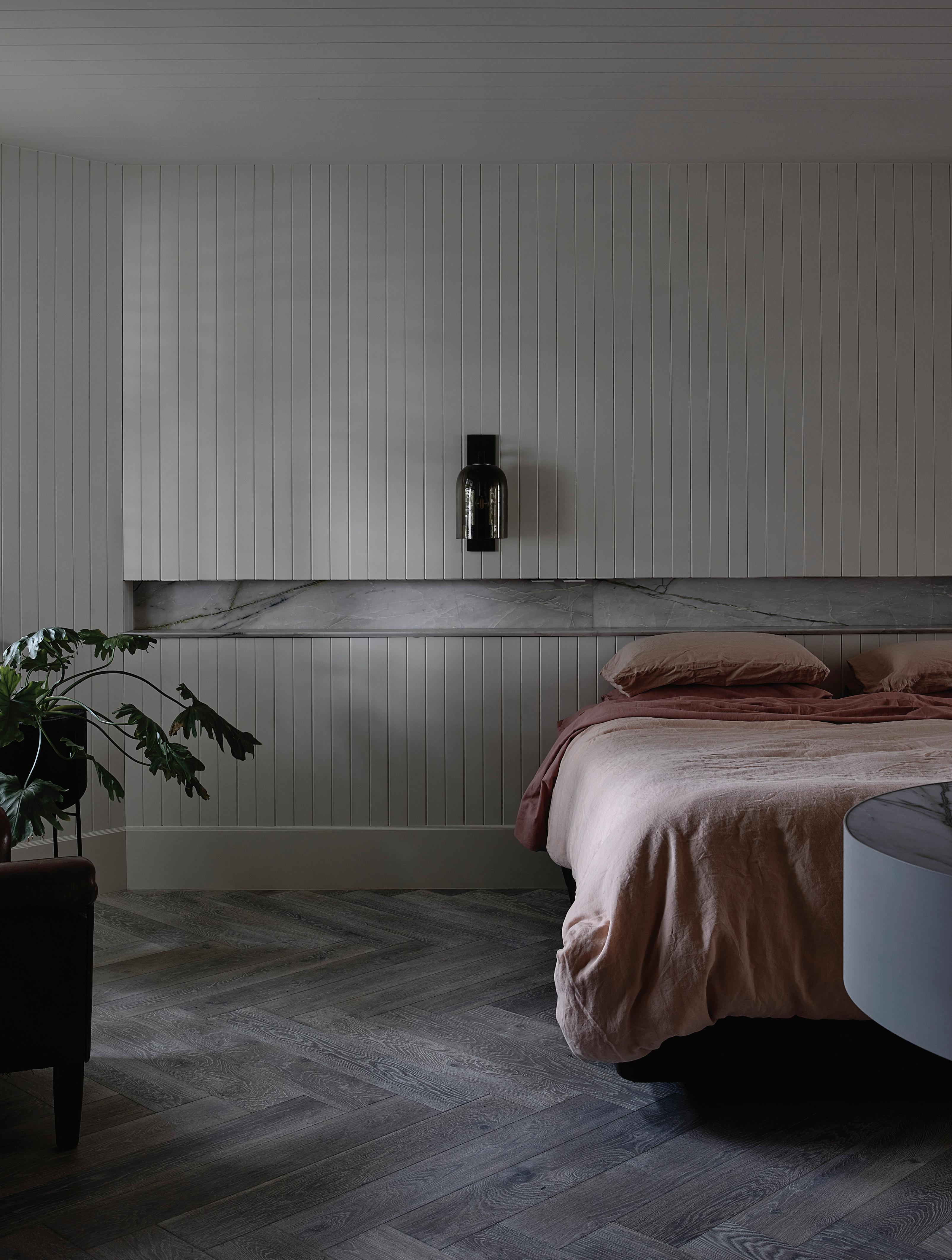
Genius begins from the floor up.

MELBOURNE | SYDNEY
European Oak in Arctic Grey Herringbone Design by Kosloff Architecture.
Elevating The Outdoor Kitchen
The Alfresco Party is the latest addition to Abey Australia’s Alfreso range. Designed for the Australian climate, the Alfresco Party is a complete insulated ice bucket, double bottle holder and Fibre-Rock® covers. The Alfresco collection also comprises marine-grade 316 stainless
 Design Walker Warner Architects
Photography Matthew Millman, Matthew Williams


25
complete ‘prep’ station, featuring a thermally stainless steel sinks and European-designed kitchen mixer. SEE
MORE PRODUCTS >

BACK TO SCHOOL
A VISIONARY CONVERTED SCHOOL IN MÉRIDA, MEXICO, HAS RESULTED IN A FAMILY RETREAT THAT DOUBLES AS A MULTI-DISCIPLINARY CREATIVE SANCTUARY.
LOCATION MÉRIDA, MEXICO
DESIGN MONICA CALDERON & EZEQUIEL FARCA
FERNANDO MARROQUIN
HOLLY
WORDS
BEADLE
PHOTOGRAPHY
 Monica Calderon, Ezequiel Farca and their four sons at Casa Escuela.
In their 13 years of living in California, product designer Monica Calderon and architect Ezequiel Farca have always had one foot back home in Mexico. The creative couple moved to Los Angeles for its close proximity to Mexico and the similarities they share. “Los Angeles is a hub for creativity; it nurtures professions like ours by connecting us with likeminded people,” Monica says. “Mérida is very similar in the way that it brings people together.”
Mérida is the vibrant capital city of Yucatan in Mexico and the setting of Monica and Ezequiel’s recently completed family retreat, Casa Escuela, which is situated inside a former school – Casa Escuela meaning ‘School House’. The family split their time between here and Los Angeles. “We love Los Angeles, but we wanted to give our boys the opportunity to experience their culture on a deeper level,” Monica says.
Beyond just being a family retreat, Casa Escuela is a multidisciplinary residency for artists, designers, yoga instructors, writers, chefs and any other ‘right-brain thinkers’ to go and further their passions, either by teaching or learning from others. “We always had this dream of creating a cultural hub in Mexico, which could serve all different kinds of creative disciplines,” Ezequiel says. Mérida’s rich history of craftsmanship and thriving community of creatives made it the perfect place to do this. “This is our way of reinvesting back into the community,” Ezequiel says.
KITCHEN CONFIDENTIAL


The kitchen’s size and amenities make it ideal for hosting cooking classes. “Food is a huge part of Mexican culture, so we wanted a kitchen that endorsed that,” Monica says. The bright yellow lacquered cabinetry is a reference to mid-century design, which contrasts with weathered stone walls and floors.

The school’s historic features were something the couple were committed to preserving when they first bought it. For this reason, they left most of the structural features exactly as they had found them, including any imperfections and discolourations – anything that showed the building’s age.
In some areas, there is a very clear distinction between old and new. In the kitchen, for example, the patinated walls and ceilings contrast with bright yellow lacquered cabinetry – a homage to mid-century design. Other areas, such as the dining space and outdoor space, are timestamps from when the school was first built in 1919.

The couple sourced pieces from their own personal archives; “25 years of marriage is a long time to collect!” Monica laughs. In keeping with their mission to honour Mexican traditions and celebrate local craftsmanship, they also sourced many pieces from in and around Mérida. The design, as a result, is imbued with a strong Mexican sensibility, proudly conveyed through the region's signature materials and earthen tones.
The couple share their hope for a future where schools are more accommodating to creative minds. “Having a place like Casa Escuela, where the things we are teaching are so important, yet so commonly undermined in education – hopefully, it can have a ripple effect,” Monica says.
33
 A built-in concrete bar and seating area connect onto an alfresco courtyard via steelframed doors.

 The dining table was designed by Monica, who specialises in polyester resin furniture and accessories, while the dining chairs were designed by Ezequiel.
The patio and dining space are timestamps from when the school was first built in 1919, with traditional Mexican tile floors, eroded concrete walls and tall ceilings.

This page: Materials are warm, earthy and imbued with a strong Mexican design sensibility. The beds were designed by
 Ezequiel.
Opposite Page: Raw stone basins and the concretetiled shower evoke a sense of craftsmanship.

39
 The school’s facade has not changed since it was first built.

41
TIGGY PRINTED SILK MAXI DRESS ZIMMERMANN

PIP LEATHER SLIDES CHLOÉ

ROSS
TANGALI MODULAR PHANTOM HANDS



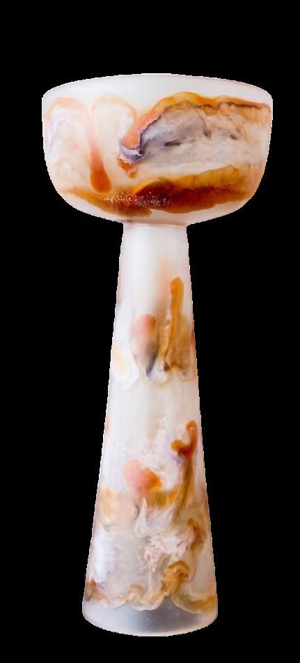
FLORERO COPAL ALTO & FLORERO COPAL MONICA CALDERON STUDIO


ISSUE #48
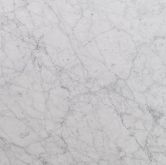
BIANCO CARRARA MARBLE CDK STONE
COTTO BIANCO CLÉ SESAME BAUWERK COLOUR
KITE BREEZE AUSTRAL MASONRY
ACQUA DI PARMA X SAMUEL
COLOGNE 100ML ACQUA DI PARMA


43
SOLFERINO VERDE BISAZZA
STEPS BENI RUGS
STUDIO
BANANA LAMINEX
152 CM DUAL FUEL RANGE WOLF

ISSUE #48

45
KITCHEN CONFIDENTIAL
STEP INSIDE FOUR KITCHENS AND INTO THE MINDS OF ARCHITECTS AND DESIGNERS TO SEE HOW THEY CONCEPTUALISE AND CREATE THEIR OWN FUNCTIONING SPACES.
est magazine ISSUE #48

KITCHEN CONFIDENTIAL
Photography DePasquale+Maffini
Styling: Francesca Santambrogio
PRACTICAL POETIC CONVIVIAL
MICHELE PASINI CO-FOUNDER STORAGEMILANO
Milan, Italy
What are three words that describe your kitchen?
Practical, poetic, convivial.
After working in a space of your own design, what element would you repeat in your next kitchen?
The open doors at the side that lead to another room and the centrality of technical volume in brushed stainless steel. What design considerations had to be made while designing a kitchen within a historic Milan apartment?
Staying detached from the walls and allowing circulation around the elements. Working with furniture and blocks treating them as if they were small architectural elements that play an important role in terms of composition.
Is there a common design element you insist on including when working with clients?
Volumes mainly in metal sheets. That’s a passion of mine.
What detail, in particular, tells the story of your kitchen best?
The blocks and the symmetry, or centrality.
est magazine ISSUE #48

KITCHEN CONFIDENTIAL
Michele’s kitchen features a stainless steel island in a Scotch-Brite finish. A vintage Luci Pala table lamp features on the left, and a custom-designed ceramic-based lamp by Michele is on the right. The painted ceilings are untouched from when the apartment was first built in 1901, contrasting the otherwise bold interiors.
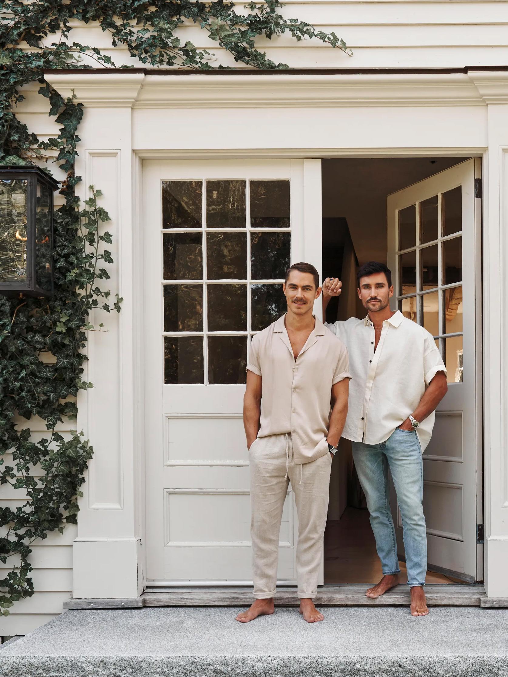 Jordan Carlyle with husband Mario Margelist
TIMELESS RUSTIC REFINED
JORDAN
CARLYLE
PRINCIPAL CARLYLE DESIGNS
East Hampton, North America
What are three words that describe your kitchen?
Timeless, rustic, refined.
After working in a space of your own design, what element would you repeat in your next kitchen?
In terms of elements, I believe that functionality and simplicity are key. From my experience, having ample storage space, efficient workflows, and intuitive design features are critical for a successful kitchen design. I would also prioritse natural light and views.
What design considerations had to be made when designing a kitchen with rustic and natural materials?
While the rustic feel of this type of kitchen can be charming, it's important to balance it with modern convenience and functionality. One way to do this is by incorporating modern appliances and fixtures that are practical and functional, but still fit with the overall aesthetic. Additionally, you may want to consider lighting, colour schemes and storage solutions that can enhance the practicality and visual appeal of the kitchen.
51 KITCHEN CONFIDENTIAL
Photography Adrian Gaut Styling Colin King
Jordan and Mario’s kitchen features reclaimed, natural materials, including 400-year-old bar gris limestone floors and oak cabinetry. These materials contrast with black handles and a custom-designed stainless-steel La Cornue range cooker.

Is there a common design element you insist on including when working with clients?
I like to bring a common design element that involves a mix of old and new. I believe that this combination creates a unique and interesting space that reflects the personal style and tastes of the homeowner. This mix of old and new can include elements such as traditional or vintage pieces with modern and contemporary elements, or using natural and reclaimed materials alongside sleek and modern appliances.
What detail, in particular, tells the story of your kitchen best?
The use of rustic reclaimed beams in combination with natural materials such as 400-year-old bar gris limestone floors and oak wood tells the story of my kitchen. This showcases my appreciation for traditional and timeless design elements, as well as my love for natural beauty and the character that comes with using reclaimed materials. The warmth and character added by these elements creates a welcoming and inviting atmosphere that is both practical and aesthetically pleasing.

53
 Photography Nicolas Mathéus
Pictured: Designer Stéphanie Coutas
VERDANT COSY CHEERFUL
STÉPHANIE COUTAS FOUNDER
SC EDITION
Paris, France
What are three words that describe your kitchen?
Verdant, cosy, cheerful.
After working in a space of your own design, what element would you repeat in your next kitchen?
A cosy sitting area for informal and everyday dining and a functional cooking space.
What design considerations had to be made while designing your own kitchen?
We wanted to ensure we were making the best use of the space, so functionality was key while also ensuring it looked elegant and sophisticated.
Is there a common design element you insist on including when working with clients?
I always adapt my kitchen designs according to the lifestyle of my clients. Some of my clients have a chef, and some love to cook themselves; each project is unique and considers all these elements.
What particular detail tells the story of your kitchen best?
I love how the natural swirling green tones of the White Beauty marble combine with the plants on the windowsill. I like to work with the concept of inside/outside, which means the designs work well day and night with natural and artificial lighting scenarios.
55 KITCHEN CONFIDENTIAL
KITCHEN CONFIDENTIAL
In Stéphanie’s kitchen, countertops in swirling green-and-blue marble contrast with oak cabinetry. Mirrored surfaces add intrigue and dimension to the small space. The enamelled stone stools are by ceramist Marc Albert. A sculpture by
 artist Michel Rico rests on the countertop.

57
MOODY FUNCTIONAL MINIMAL
MARISSA CORVINO PRINCIPAL AND FOUNDER CORVINO DESIGN
Hoboken, North America
What are three words that describe your kitchen? Moody, functional, minimal.
After working in a space of your own design, what element would you repeat in your next kitchen?
I always utilise retractable cabinet doors to conceal the noise of appliances, coffee machines and wet bars. When the doors are shut, the space is elegant and quiet but when the doors are open, the nooks become powerhouse stations of the kitchen.
What design considerations had to be made while designing a kitchen within a near-demolished townhouse in Hoboken, New Jersey?
Typically brownstone kitchens are situated at the rear of the brownstone to capitalise on natural light. I designed the floor plan with a central and oversized kitchen and open plan dining room at the rear. Intentionally I wanted the kitchen to feel powerful and visible from other rooms on the floor.
Is there a common design element you insist on including when working with clients?
I always insist that clients can have delicate design elements like natural stone without sacrificing ease of living.
What detail, in particular, tells the story of your kitchen best?
The burgundy Lacanche range reminds me daily of my 3 passions outside of interiors: cooking, entertaining and red wine.
est magazine ISSUE #48

KITCHEN CONFIDENTIAL
Photography Nicole Franzen
Styling Eve Singer from Broyt

Marrisa’s kitchen features a custom-designed burgundy Lacanche oven, which perfectly matches the veins of the Calacatta Viola island bench while also conveying her passions for cooking, entertaining and red wine. The look is completed by Studio Henry Wilson brass hardware.

61 KITCHEN CONFIDENTIAL
KITCHEN FUNDAMENTALS
Luke Fry Architecture & Interiors breathed new life into a home in Melbourne's Glen Iris by crafting an intelligent kitchen designed with family gatherings in mind. An AEG combi steam and combi microwave oven make a formidable pairing for the retired client and their extended family, where versatility and cooking at the click of a button yield perfect cooking results.
“WHEN IT COMES TO KITCHENS WE ORGANISE FOR OUR CLIENTS TO HAVE A DETAILED TOUR OF THE WINNINGS APPLIANCES SHOWROOM TO GO THROUGH ALL OF THE PRODUCTS AVAILABLE. IT’S SUCH A PERSONAL DECISION AND FUNDAMENTAL TO THE DESIGN OF THE KITCHEN THAT WE KNOW WHAT’S BEING INCLUDED BEFORE STARTING TO DESIGN.”
 – Architect Luke Fry
SHOP THE RANGE >

Design Luke Fry Architecture & Interior Design Products AEG Combi Steam and Combi Microwave Oven Photography Derek Swalwell

AT HOME WITH TAMSIN JOHNSON
The eclectic home of Sydney designer Tamsin Johnson juxtaposes styles and eras, shining a light on her personal design narrative.
Photography Anson Smart
Interior design Tamsin Johnson
Words Alexandra Gordon
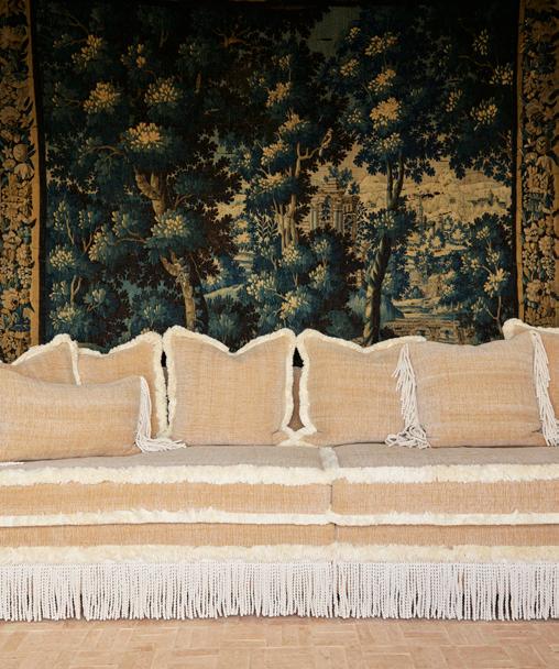
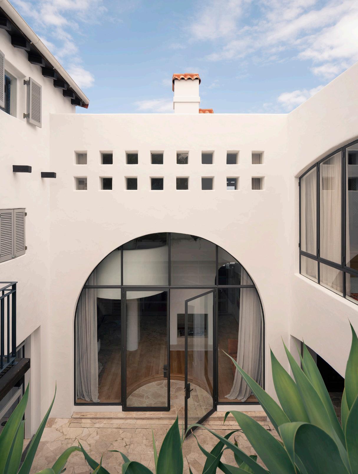
This page: The rumpus room is lavishly furnished with a custom modular lounge setting upholstered in a Maria Flora fabric with bullion and: trim and fringe from South Pacific fabrics and a 1960s lucite & brass cocktail table. The antique 18th Century Flemish verdure landscape silk tapestry with a lush forest setting adds drama to the space. Opposite page:A view through the custom arched steel frame doors to the new pool and Sydney Harbour view beyond.

hen it came to designing her own home, designer Tamsin Johnson saw it as an opportunity to create something truly unique. The property itself is one of a kind; a heritage home with generous proportions built in the 1920s in a sought-after neighbourhood overlooking Sydney Harbour. In Sydney, interiors can often play second fiddle to the view, but in this instance, the designer has woven a narrative of interesting pieces throughout the four-bedroom home. “It’s a great showcase for my furniture business, with ideal settings, scenarios and applications all perfectly laid out,” Tamsin says. “Of course, it’s great for my interior design practice too. People always ask what I would do for myself and my family and here it is.”

The designer immediately recognised the property’s potential. “For me it was largely because it hadn’t suffered a prior destructive renovation.” Original features were painstakingly restored to their former glory using artisans, including the timber flooring and panelling. “The ceiling panelling is also original and the lead-light glass windows were a highly specialised act of restoration,” she says. Any new work has a similar artisanal quality, for example Tamsin commissioned a metal worker to make beautiful bespoke galvanised railings and security grills.
The structural changes that were made over the nine-month renovation have been transformative. An unexpected move was enclosing the two balconies to create a sunroom on the ground level and a master ensuite above. The cellar downstairs was further excavated to allow for a sauna and rumpus room that doubles as a poolside dining area and lounge for the new pool. “The kitchen and bathroom were lightly renovated in the 70s so I changed these too,” Tamsin explains. The new kitchen is a showstopper with an arresting island bench in Bianco Gioia marble composed of layered slabs, while the lower ground powder room is equally unique boasting a reclaimed 19th-century French rosa marble pedestal basin.
Rather than creating vast open spaces, the designer opted to retain a sequence of defined rooms each with their own mood and purpose. “I really wanted a more ‘grown-up’ or traditionally organised home, like houses were built 100 years ago, rather than the contemporary open plan approach which can sometimes lack privacy, comfort and a sense of security and warmth,” Tamsin explains. This has allowed the designer to have fun juxtaposing styles and eras, from the antique 18th-century Flemish verdure landscape silk tapestry to the USM sideboard in the lower ground floor dining room.
While there are dramatic moments throughout, the home is not just for show. “I wanted very elaborate doses of information to keep it exciting, but I wanted to express comfort too - it’s a family home after all,” Tamsin says. She has cleverly managed to upgrade the home to meet all the expectations of modern life while maintaining its essence complete with largely vintage furniture and fittings and hand-crafted finishes that will age beautifully over time.
67

The centrepiece of the bar downstairs is a reclaimed 19th-century French stone basin with a rough chiselled edge atop custom reclaimed timber joinery. Perrin & Rowe tapware completes the picture.

69
The dining room is centred around a 1970s Angelo Mangiarotti red marble dining table and mid-century rush French farmhouse dining chairs. Bluestone modular floor tiles from Eco Outdoor create a strong backdrop for the eclectic furnishings.


ISSUE #48
A corner of the dining room cleverly combines a USM sideboard with 1920s French Art Deco wall sconces, a pair of 1970s Spanish rough-hewn alabaster table lamps, and a 19th-century French still life oil painting.
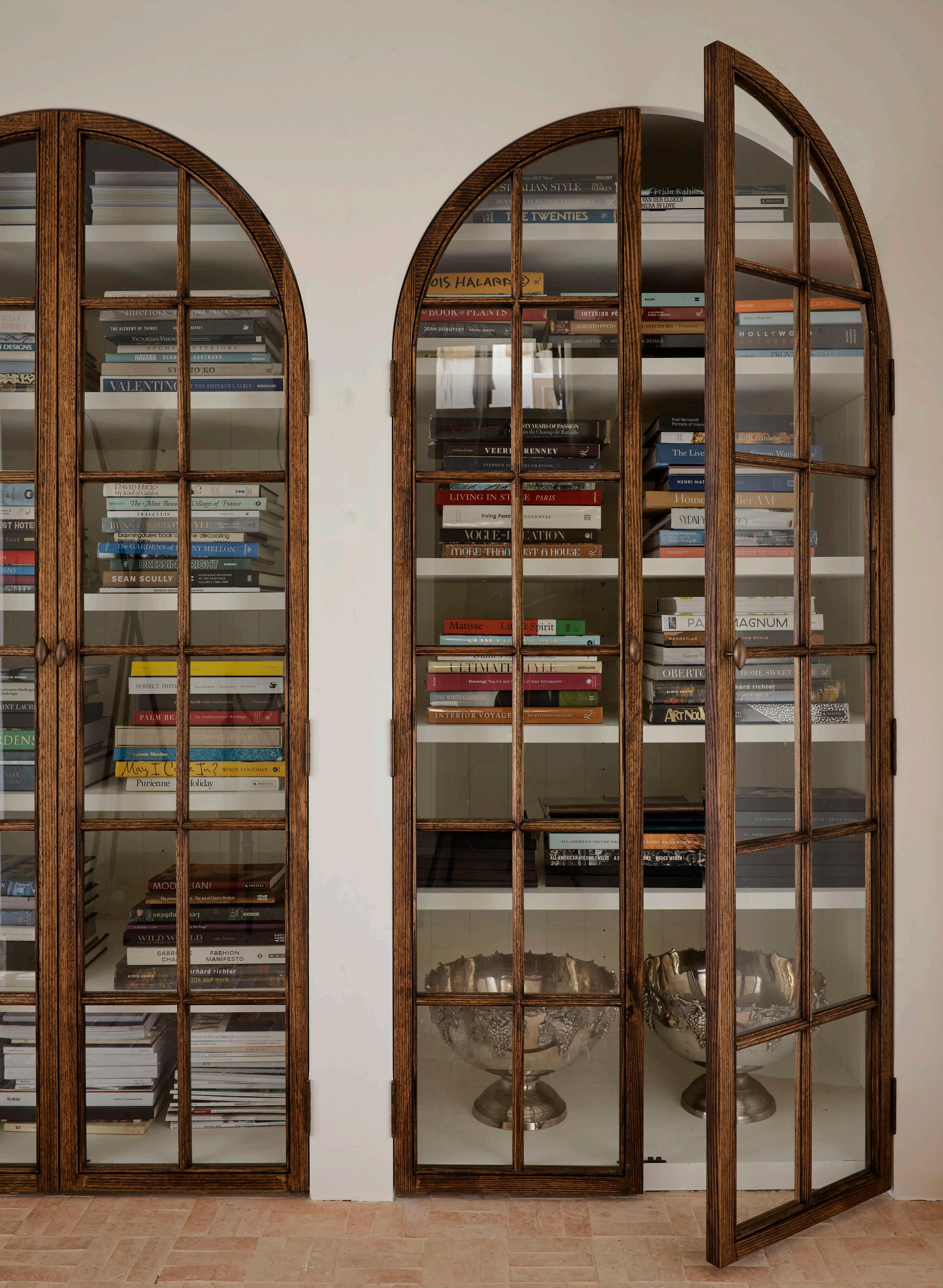
cus ra non re periorem. Ip
The glamourous sauna area features a Water Monopoly ‘Rockwell’ bath, a 1960s Italian lucite and brass cocktail table and Perrin & Rowe tapware.

est magazine
The blush-coloured powder room is simultaneously soft and strong with walls in a custom Venetian plaster finish, a 1970s Fontana Arte mirror, 1960s Murano glass wall sconces, and a reclaimed 19thcentury French rosa marble pedestal basin.


77 KITCHEN CONFIDENTIAL
The new kitchen is a showstopper with an arresting island bench in Bianco Gioia marble composed of a layered slab.




ISSUE #48
HALLER CREDENZA E2 STORAGE SYSTEM USM
ELBA WHITE SIGNORINO
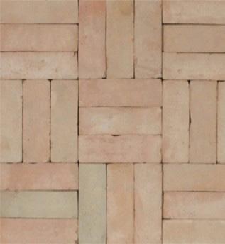
TOULON TUMBLED ROMAN LIMESTONE SURFACE GALLERY
MOROCCAN BEJMAT NATURAL
SINGLE BREASTED CLOTH AND KIDASSIA COAT PRADA
UNKOWN DESIGNER TAMSINJOHNSON Trio of Alabaster Table Lamps, Italy, 1970's
MARIO BELLINI CASSINA “Il Colonnato”Marble Table, Italy 1990.


79 CORNUFE
CORNUE
LA
PIERRE JEANNERET 1ST DIBS PJ-SI-21-A High Stool with Canework from Chandigarh.
HUSEYIN SAMI SOPHIE GANNON GALLERY Untitled (BB), 2021 Acrylic on canvas, 61 x 51 cm
KRISTEN LEATHER BALLET FLATS AYEDE
18TH CENTURY AUBUSSON 1ST DIBS Tapestry - n° 1152


My Space
LOCATION New York City, North America DESIGN & STYLING Colin King PHOTOGRAPHY Rich Stapleton WORDS Holly Beadle
COLIN KING
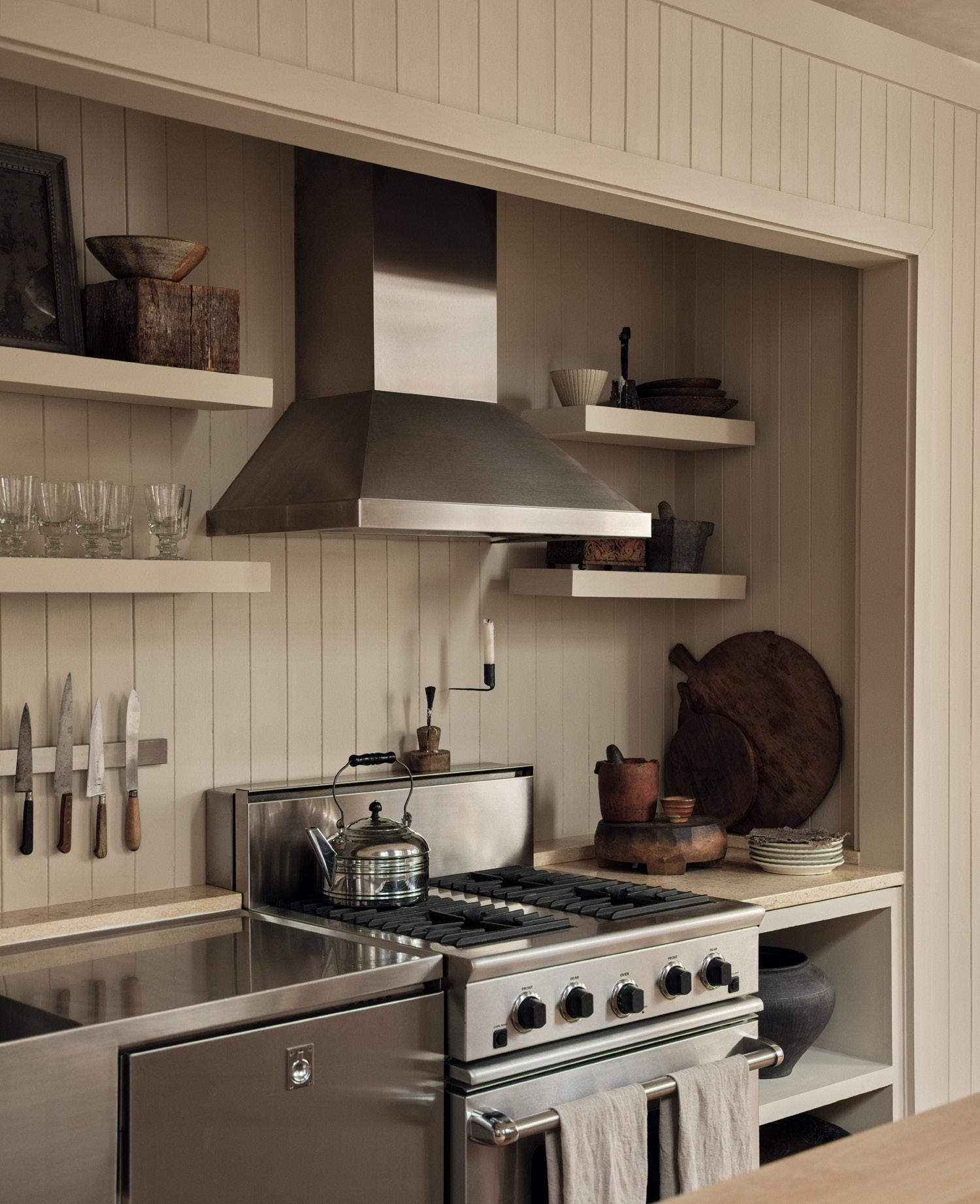
Colin describes his apartment as “a picture of old New York”, with the elevator opening right into the front entrance. To the left as you walk in is his bedroom – the glass doors, he says, means he gets to wake up with the light. Straight ahead is the open-plan kitchen, dining and living space.

New York-based interior stylist Colin King
est
Your home is located in Manhattan’s Tribeca neighbourhood, in a former pre-war factory building. What do you love most about where you live?
I didn’t really have Tribeca on my mind when I was looking for a live-work space, it kind of just found me. I’ve always been really attracted to loft-style apartments – how ‘old New York’ they are – of which Tribeca had many. What I’ve found while living here is the sense of openness; everything isn’t stacked up like you’ll find in other parts of the city, and the buildings aren’t quite as tall.
Could you describe your first encounter with the apartment?
When I first laid eyes on the space, there was soot and dust everywhere, the floors were covered in this dark, over-varnished wood and drab curtains clung to all the windows. My first reaction was “absolutely not” – I wasn’t after a ‘fixer-upper’ job. A month later, this place was still on the market so I decided to go back, this time challenging myself to see it through a different lens. I ended up seeing it more for what it could be and less for what it was, which pushed me to take the leap.
Describe what you had originally envisioned your home to look and feel like. Is the result different in any way to what you had imagined?
Truthfully, it doesn’t look anything like I thought it would. One of the earliest things we did was strip the floors back; I thought it was just going to take the shine off and reveal the dark wood underneath, but it actually ended up taking the stain off as well, revealing these beautiful pale pine floors. That completely transformed my vision for the space as I had to come up with a whole new palette to go with light-toned floors.
KITCHEN CONFIDENTIAL 85
takes
through his live-work space in Manhattan's Tribeca neighbourhood, sharing anecdotes from the design process, learnings from his career so far, and the importance of arranging things.
On the topic of not overthinking a space’s contents, Colin says, “I bought the dining chairs before I knew what the dining table looked like, because I just loved the dining chairs so much.” The ash dining table was custom-designed by Colin and built by J Picken.

est magazine ISSUE #48

87 KITCHEN CONFIDENTIAL
The bathroom features a vintage French gilded mirror, a LUhans Indoor Outdoor sconce and a 1970s Krogenæs Møbler Norway pine stool.

ISSUE #48
The beige colour of the walls Colin had custom made to be able to absorb the red tones of the surrounding buildings. “At certain times of the day, because of how many windows there are, the whole apartment adopts this pink undertone,” he reveals .Arranged in this space is a custom-made daybed by Oliver Westermeier and Luccio Massa, a George Nakashima timber chair and a Cassina 637 Utrecht armchair.

89

ISSUE #48
The living space also features a custommade sofa by Grant Trick, a 1970s travertine coffee table topped with stacks of books, a Cassina 053 Capitol Complex chair and a painting by Milton Resnick.
“You don’t need heaps of things, nor do you need super flashy things, you just need to know how to arrange them in relation to the scale and contents of a space.”
– Colin King
Colin’s work revolves around a lot of trial and error. The kitchen island he redid three times, before landing on what he describes as a “utilitarian box”, with wheels attached to the bottom and ample storage. “As discouraging as this whole process was at the time, it was only after I realised what the space didn’t need that I came to understand what it did need – and you’re always able to laugh about it at the end,” he says
91 KITCHEN CONFIDENTIAL
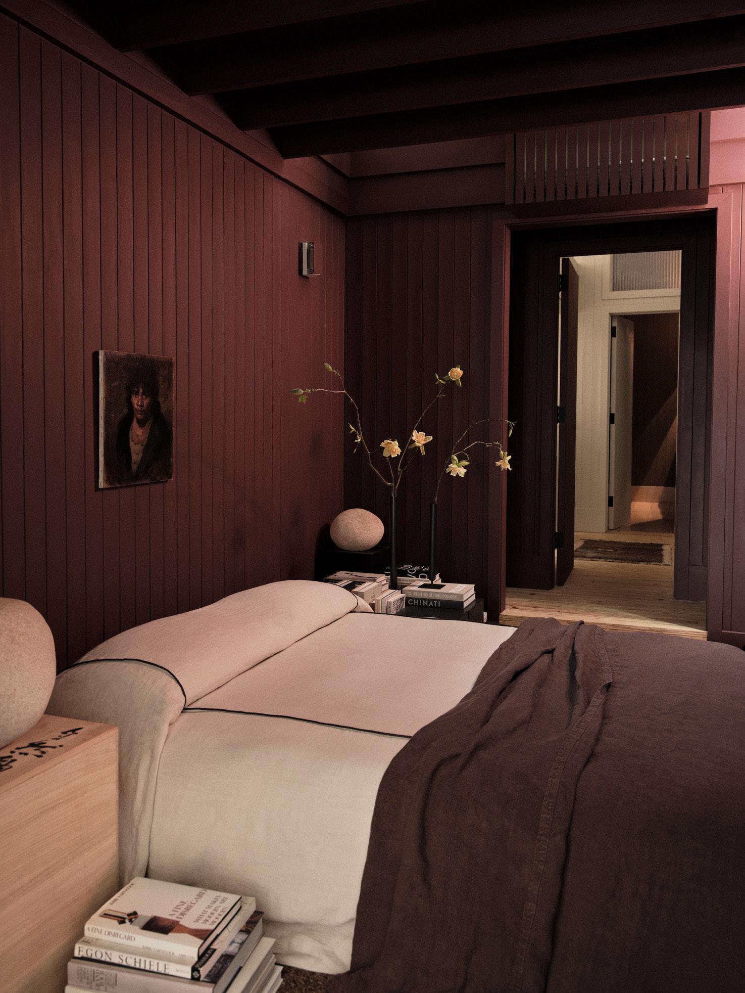
Colin describes the colour of his bedroom walls as a close match to ‘oxblood’, which has a distinctive calming effect. “I chose the colour to be a strong contrast from the rest of the beigetoned interiors, which are calming in a different sense of the word,” he says. The piece hanging above Colin’s bed is by Malcolm T. Liepke; Colin designed the vases on his bedside tables.
Talk us through the palette; how did you go about selecting such a serene line up of materials, textures and colours?
I tried not to spend too much time worrying about whether things were going to go together, and instead just focused on finding things that I loved. I think I have every wood species you could think of in here and be it unconventional, they all work together harmoniously. I’ve had to unlearn the idea that in order for a space to work everything needs to match. My biggest fear now is making a space look too decorated.
How is your space a reflection of you?
A lot of people, when they first visit the apartment, say how calm and serene they feel. In the crazy city that we live in, that’s pretty rare. The elevator opens up and there’s this enveloping warmth that comes from the colours and the textures. Even though it’s taken me a while to acknowledge it, I think that’s how I make other people feel as well; warm and comfortable.
How does light influence your daily movements in your home?
I love seeing the light in the apartment change throughout the day. I have lots of tall buildings around me, so I never actually get to see the sun rise or set, but what I do get is light reflecting off the surrounding windows. I get these long, beautiful shadows as a result, which change size and shape. I think light really brings me into the present moment because it's something I notice throughout the entire day.
Could you tell us about your debut book, Arranging Things?
Being self-taught, I never really thought I had my own process or way of doing things. I worked with this amazing writer on the book who was really able to tease that out of me. He also gave me the vocabulary to share my process with an audience. I’ve tried not to make it too formulaic though because in a world of infinite possibilities, beauty really is in the eye of the beholder.
I also try to stress that the things you’re arranging don’t necessarily need to be new; the book’s about dusting off old favourites, “shopping your own shelves”, and looking at your objects in a new light. It doesn’t really matter what’s in a room – what matters is how those things are arranged.
93 KITCHEN CONFIDENTIAL


ISSUE #48
BLACK FLORENTINE NICKEL AXOLOTL
SIDE TABLE NITRATE PATINA RICK OWENS
COTTON RIB-KNIT LONG-SLEEVE POLO SHIRT BRUNELLO CUCINELLI
DEEP REDDISH BROWN FARROW & BALL
WASHED SUEDE SNEAKERS BRUNELLO CUCINELLI
ARRANGING THINGS COLIN KING, SAM COCHRAN
TRAVERTINE LAMP MICHAËL VERHEYDEN
AKARI 120A VITRA
CONVERGE BOOKENDS MENU
MM REPLICA ON A DATE CANDLE 23

MAISON MARGIELA

REED CANDLESTICKS

REPLETE - OXBLOOD BENI


SILVER TRAVERTINE SIGNORINO


95
ROMAN AND WILLIAMS GUILD
LE BAMBOLE ARMCHAIR B&B ITALIA
RUGS
https://www.neolith.com/en/company/innovation
https://www.neolith.com/en/company/innovation
https://www.neolith.com/en/company/innovation
https://www.neolith.com/en/company/innovation
https://www.neolith.com/en/company/innovation
https://www.neolith.com/en/company/innovation
https://www.neolith.com/en/company/innovation
https://www.neolith.com/en/company/innovation
https://www.neolith.com/en/company/innovation
https://www.neolith.com/en/company/innovation
https://www.neolith.com/en/company/innovation
https://www.neolith.com/en/company/innovation
https://www.neolith.com/en/company/innovation
https://www.neolith.com/en/company/innovation
https://www.neolith.com/en/company/innovation
https://www.neolith.com/en/company/innovation
https://www.neolith.com/en/company/innovation
https://www.neolith.com/en/company/innovation
https://www.neolith.com/en/company/innovation
Neolith surfaces are a practical and sustainable architectural solution, possessing all the beauty of Sintered stone is built to last; unlike natural stone, it is backed by cutting-edge technology that can UV radiation. Equal parts sturdy and luxurious, Neolith surfaces offer unmatched versatility for both stunning and hardwearing facade, to add impact to an alfresco area or outdoor kitchen, to design one-of-a-kind or bathroom – the options are endless.

est magazine ISSUE #48
https://www.neolith.com/en/company/innovation
https://www.neolith.com/en/company/innovation
https://www.neolith.com/en/company/innovation
https://www.neolith.com/en/company/innovation
https://www.neolith.com/en/company/innovation
https://www.neolith.com/en/company/innovation
https://www.neolith.com/en/company/innovation
https://www.neolith.com/en/company/innovation
https://www.neolith.com/en/company/innovation
https://www.neolith.com/en/company/innovation
https://www.neolith.com/en/company/innovation
https://www.neolith.com/en/company/innovation
https://www.neolith.com/en/company/innovation
https://www.neolith.com/en/company/innovation
https://www.neolith.com/en/company/innovation
https://www.neolith.com/en/company/innovation
https://www.neolith.com/en/company/innovation
https://www.neolith.com/en/company/innovation
https://www.neolith.com/en/company/innovation

of natural stone, but none of the limitations. withstand water, heat, scratches, stains and both indoor and outdoor applications; use it to create a one-of-a-kind furniture or to add magic to a kitchen

97 KITCHEN CONFIDENTIAL
 Design: Darren James Interiors
Photography Cathy Schusler
FUTURE-FOCUSED FUNCTIONALITY
Exceptional kitchen design is underpinned by functionality and storage. For Darren James Interiors, consistently specifying Blum drawers and lift systems ensures their kitchens are intuitive to use and experience.
Blum’s cabinet solutions are designed to maximise space without changing the dimensions of a room.

Blum SPACE TOWER, SPACE CORNER, SPACE TWIN and Sink drawer transform hidden or overlooked areas to create valuable storage

99
“I have specified Blum throughout my entire career and have even had the pleasure of visiting their manufacturing plant. I firmly believe Blum has the most superior soft close mechanisms in the world.”
– Interior Designer Darren James
Blum LEGRABOX drawers, Blum AMBIA-LINE inner dividing system and Blum AMBIA-LINE accessories
SEE MORE PRODUCTS >
est magazine ISSUE #48 K
KITCHEN
COMPENDIUM
WE REVEAL A DESIGNER’S EYE FOR DETAILS IN TWELVE EXCEPTIONAL KITCHENS.
101
HÉLÈNE VAN MARCKE
INTERIOR ARCHITECTURE STUDIO
Avenue Marceau Apartment
Paris, France
The Avenue Marceau Apartment in Paris by Hélène Van Marcke Interior Architecture Studio was designed with dinner parties in mind. “We wanted a space that could function as an open and free-flowing part of daily family life, yet able to be closed off for a private chef or caterer on more formal occasions,” Hélène says. The glass partitions segment the kitchen, allowing cooking to be viewed from the dining room, “without the ‘cooking in your living room’ disadvantages,” Hélène adds.
The material palette expands on what has been used elsewhere in the apartment to avoid the kitchen feeling “overly technical”. High cabinetry is the same colour as the walls and oak cabinetry around the central island blends with the Point de Hongrie oak parquet flooring. The marble benchtop and splashback reflect the living room fireplace. “To create a néo-Haussmann atmosphere, we used old materials in a contemporary design,” Hélène says. “The kitchen reflects a modest luxury; free-flowing, casual and quietly sophisticated.”
est magazine ISSUE #48
Photography Thomas De Bruyne
“THE KITCHEN REFLECTS A MODEST LUXURY; FREE-FLOWING, CASUAL AND QUIETLY SOPHISTICATED.”
– Hélène Van Marcke
Glass partitions connect the kitchen and informal dining space. Pictured: an Atelier Nest dining table, Charlotte Perriand Maribel chairs and a first-edition Marcel Wanders Zeppelin chandelier.

KITCHEN COMPENDIUM
 Oak pointe de Hongrie Hardwood floors, Arabescato Vagli marble and a Lacanche oven complete the classic French interior scheme.

 The kitchen’s back wall features painted cabinets with a walnut insert and shutters, underscored by smoked and stained solid oak floors. The blackened steel Eiffel lamp by Frama speaks to the home’s Brutalist nature.
NICEMAKERS
Maastricht Penthouse
Maastricht, The Netherlands
In the Dutch city of Maastricht, Amsterdam-based interior studio Nicemakers have amalgamated the top two levels of a 1960s office building, stripping the interiors back to a Brutalist concrete shell. “The building’s architect had insulated the building from the outside, which meant we could keep the raw concrete exposed,” Nicemakers co-founder Dax Roll says.
Upon entering the penthouse, the kitchen is the first space you see, designed for entertaining. “The client didn’t want a standard kitchen; they wanted something lighter than a kitchen island, more like a table,” Dax says. Collaborating with Amsterdam-based makers Eginstill, they conceived an antique brass and enamelled lava stone custom counter and custom rangehood as the kitchen’s focal point.
Dax says it was the first time they’d used enamelled lava stone – a durable material “seen more in Parisian bars, than in kitchens”. “You almost touch everything in a kitchen; it’s a sensory experience,” Dax says. “Like the enamelled lava stone, we believe everything you touch should have the right texture – the right details.”
– Dax Roll
107 KITCHEN CONFIDENTIAL
Creative Direction Marc Heldens
Photography Alan Jensen
KITCHEN COMPENDIUM
“WE LIKE TO DESIGN THINGS THAT ARE HANDMADE BY SPECIALISTS. WE DON’T USE FAKE MATERIALS, WE USE REAL MATERIALS THAT REQUIRE CRAFTSMANSHIP TO BE USED IN THE RIGHT WAY.”
Nicemakers collaborated with Amsterdam artisans Eginstill to create a brass and Pirolave lava stone table and a custom brass range hood for a client who loves entertaining. The Tumbler pendant by Lee Broom also features above.


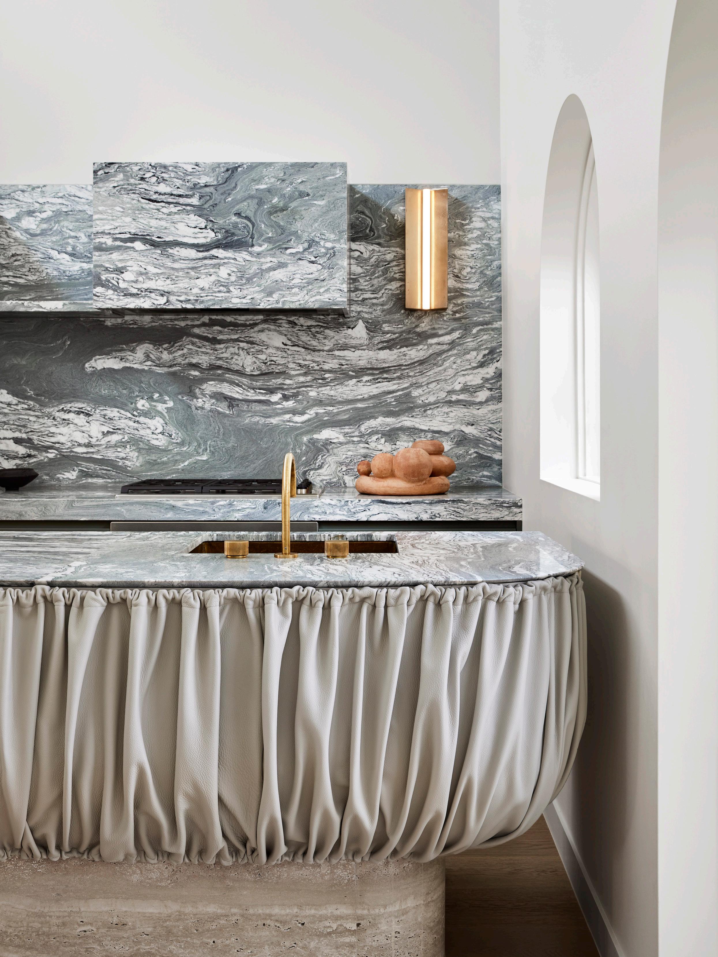
The kitchen island’s ruched taupe leather detail is a focal point in the Hawthorn House, reminiscent of vanity skirting. Vaticano marble clads the benchtop, splashback and rangehood, while unfiled travertine forms the sculpted island. A Volker Haug Anton wall light, brushed brass Brodware mixer and custom sink accent the stone.
FIONA LYNCH OFFICE
Hawthorn House
Melbourne, Australia
Leather is an unlikely material to use in the kitchen, but it defines the unique sculptural island in Fiona Lynch Office’s Hawthorn House. Director Fiona Lynch describes the combination of ruched taupe leather detailing, shark nose Vaticano marble and unfilled travertine as bold but at the same time natural, as the materials play on scale, texture and form. “The wrapped stone rangehood is a wonderful detail to encase a practical element in a beautiful material,” Fiona adds.
The kitchen’s curves reference arched windows overlooking a courtyard garden. A Volker Haug Anton wall light and brushed brass tapware add metallic accents to the material mix, further highlighting Fiona’s belief that craftsmanship underscores the design of every successful kitchen.

111
“THE SPACE IN WHICH THE KITCHEN SITS HAS BEAUTIFULLY ARCHED WINDOWS THAT OVERLOOK A COURTYARD GARDEN. WE TOOK INSPIRATION FROM THESE CURVES AND CREATED A SCULPTURAL FORM.”
– Fiona Lynch
KITCHEN COMPENDIUM
Photography Dave Kulesza
This page: The Mariehill kitchen is a contemporary interpretation of the 1920s original design, inspiring the full-height custom birch cabinets painted in Farrow & Ball Hardwick White and zellige wall tiles. A Transylvania limestone island, Veermakers Strict walnut and leather bar stools, tapware from Dornbracht, and Gaggenau appliances complete the space.

LILJENCRANTZ DESIGN
Mariehill
Stockholm, Sweden
The Mariehill kitchen lies within an Arts and Crafts red-brick apartment in central Stockholm, originally designed by Swedish architect Isak Clason. The architect was an influential figure at the turn of the century in Sweden– a legacy multidisciplinary practice Liljencrantz Design principal Louise Liljencrantz wanted to embrace in the kitchen design process. “Our research started with a box of architectural drawings and family photographs from the apartment’s early days,” she says. “Seeing the original kitchen inspired us to design overhead cupboards with a sliding ladder and to clad an entire wall with hand-glazed zellige tiles.”
A Transylvania limestone island, Dornbracht tapware and Veermakers Strict walnut and leather bar stools designed by Liljencrantz Design, complete the designer’s contemporary take on preserving the home’s old soul.

113 KITCHEN CONFIDENTIAL
KITCHEN COMPENDIUM
Photography Magnus Mårding
The checkerboard mustardand-white floor tiles, off-white splashback tiles and red-wine-tiled island are an ode to the Beaux-Arts building’s mosaic entrance.

GRT ARCHITECTS East Village Apartment New York City, North America
In an early-20th-century apartment in East Village, New York City, GRT Architects have honoured the building’s original idea of a room – where spaces were separated by function – in a contemporary way. Floor transitions mark the separation of the kitchen, and some of the cabinetry is suspended on brass legs to give the kitchen the “unique feeling of being defined as a room and connected to surrounding spaces,” GRT Architects founding partner Tal Schori says. Brass also intersects the ceiling, cabinetry and benchtop to “support the concept without calling detail to themselves”.
Burgundy tiles clad the kitchen island as an ode to the building’s mosaic corridors and lobby, while oversized solid oak pulls are a practical and playful cabinetry detail. “The kitchen can feel like the part of a home that most resembles a product showroom,” Tal says. “I think what we showed with this kitchen is that customised details and foregrounding colour, shape and texture can go a long way to making the kitchen feel more integrated with the rest of the home,” he adds.
115 KITCHEN CONFIDENTIAL KITCHEN COMPENDIUM
Photography Nicole Franzen

“THE DETAILS WHERE THE BRASS INTERSECTS THE CEILING, CABINETRY, COUNTERS AND FLOOR ARE SIMPLE AND WELL-EXECUTED – THEY SUPPORT THE CONCEPT WITHOUT CALLING DETAIL TO THEMSELVES.”
– Tal Schori
The East Village Apartment kitchen was designed around the need to pull natural light further into the space, enhanced by brass legs under the oak cabinetry that create a heightened sense of openness.

This page: The American oak timber joinery remains consistent from one space to the next in the Ultramarine kitchen. Begin Again, 2019 oil on canvas, by Justin Williams, features against the stone splashback.
Opposite page: Curved motifs in the kitchen reference the home’s coastal aspect. A vase by Lia Klugman appears by the window.

Ultramarine
Sydney, Australia
As the heart of a Federation-era home in Sydney’s Mosman, the Ultramarine kitchen by Decus was designed to be “simple with thoughtful details”. Following the client’s brief for a kitchen that wasn’t too formal, the result has accentuated waterfront views through corresponding curves and a coastal-inspired material palette. “We wanted to bring texture to the space without making it feel too heavy,” Decus founder and director Alexandra Donohoe Church says. “Layering materials helped us achieve this; the oak and granite feel warm together while also capturing the coastal context that we wanted the whole home to exude,” she adds.
Bullnose detail across the vertical and horizontal surfaces and the granite’s leather finish soften the design, together with custom-stained American oak joinery that leads into an adjoining scullery. “Beyond its functionality, the kitchen experience is incredibly tactile,” Alexandra says. “It’s one of those spaces you want to run your hand across every surface.”

119
KITCHEN COMPENDIUM Photography Anson Smart
DECUS
“FROM THE BULLNOSE DETAIL TO THE GRANITE’S LEATHER FINISH, IT’S ONE OF THOSE SPACES YOU WANT TO RUN YOUR HAND ACROSS EVERY SURFACE.”
– Alexandra Donohoe Church

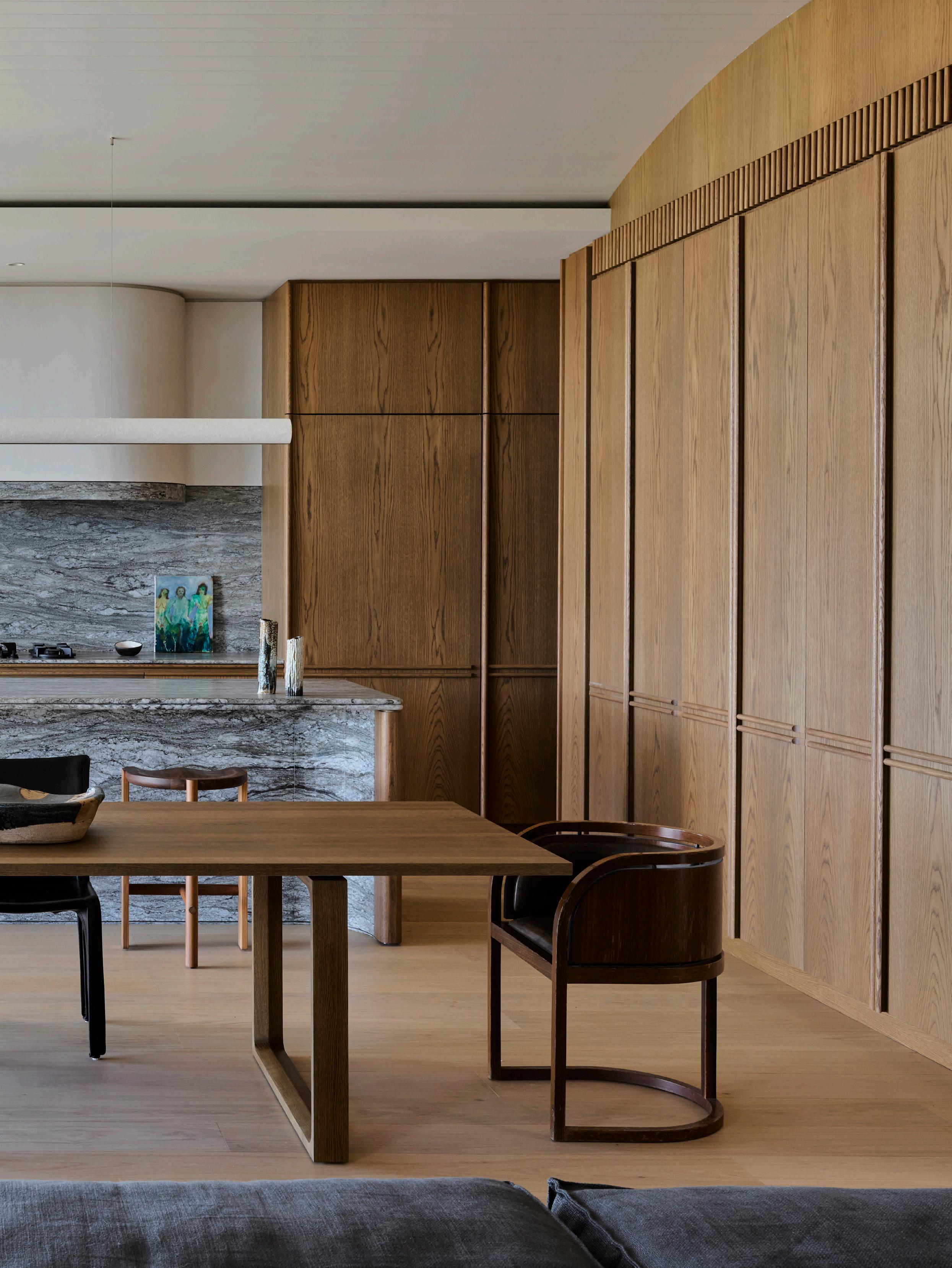 A matt plaster Lutetia pendant by Garnier et Linker features above the island in direct dialogue with the rangehood finished in Venetian Plaster Marmorina. Also pictured: the Hinterland stool by Daniel Boddam, Cassina Cab 421 chairs by Mario Bellini and two vintage dining chairs at the client’s own dining table with a Tenshin Juba piece at the centre.
NATHALIE DEBOEL
Holiday Home
Knokke-Heist, Belgium
A concrete beam was the starting point for the Knokke-Heist kitchen, designed by Nathalie Deboel for a holiday home in the Belgian seaside town. Based on a concept where the soft balances out the hard, the interior designer says they see the kitchen as more of an installation within the industrial setting. “We wanted to integrate the concrete detail into the design, instead of hiding it,” Nathalie says. “For us, it’s a story about contrast and harmony; the concrete beam and the stainless steel, in combination with the softer palette of polished concrete floors and clay wall finish.”
The stainless steel door panels reveal the work of the maker, allowing for the kitchen to feel as much a part of the living area without “taking over the space”.
 Photography Thomas De Bruyne

KITCHEN COMPENDIUM
“FOR US, IT’S A STORY ABOUT CONTRAST AND HARMONY: THE CONCRETE BEAM AND THE STAINLESS STEEL, IN COMBINATION WITH THE SOFTER PALETTE OF POLISHED CONCRETE FLOORS AND CLAY WALL FINISH.”
Nathalie Deboel’s furniture collection Nomad features in the foreground, contrasting the stainless steel single-line kitchen. Shelves are concealed behind sliding cabinetry in a clay finish.
 – Nathalie Deboel

CREATING POSSIBILITIES
As creators of new possibilities
Abey Australia have built an expansive and high quality portfolio of fixtures and finishes empowering you to push the limits of creativity and design in the kitchen, bathroom and laundry. Visit an Abey Showroom today.
Lucia Double Bowl

BNE MEL PER SYD ABEY.COM.AU

The D-tile island’s vertical fronts play on shape and form to appear carved out of one solid block. Tapware by
 Sussex Taps; ceramics by Vanessa Lucas and Mud Australia.
STUDIO DOHERTY Gloss House Melbourne, Australia
For their design of a mid-century-inspired home, Studio Doherty chose to hero the D-tile system in the kitchen. “The versatility of this tile left us in awe, and we were really excited to experiment with its possibilities,” Studio Doherty director Mardi Doherty says. Following the client’s preference for terrazzo floors, the studio selected the 3D tile system to connect the walls, floors, kitchen bench and sculptural island. “Made to order, we built the space tile-by-tile in a 3D model to ensure perfect quantities,” Mardi explains. “It was like one giant mathematical puzzle. It is a testament to the builder and the tiler that this kitchen looks so good.”
As the home’s name suggests, the D-tiles’ glossy finish reflects the northern sun, just as the effect of light and shade on the grey-toned space creates depth and interest. “The kitchen design is also driven by a desire to be very practical, with large amounts of bench space and lots of storage underneath and on the adjacent wall,” Mardi adds.
129 KITCHEN CONFIDENTIAL KITCHEN COMPENDIUM
Photography Anson Smart Styling Sarah Weston
“THE BESPOKE DETAILS ENERGISE THE SPACE, BUT OVERALL THE KITCHEN IS QUITE A CALMING SPACE TO BE IN.”
– Mardi Doherty
 The Flos Splügen Bräu pendant by Achille and Pier Giacomo Castiglioni, Diiva chairs by grazia&co. and the Super Elliptical table by Arne Jacobsen for Fritz Hansen Reference the thread of mid-century design inspiration throughout. The steel staircase was custom designed by Studio Doherty and is finished in Dulux Summer Waters. Ceramic by Jess Graham.

ARENT&PYKE
Salsa Verde
Sydney, Australia
A client’s free reign to embrace colour, pattern, and materials underpinned Sydney interior studio Arent&Pyke’s approach to their Salsa Verde kitchen. Designed for family connection and to be “full of spirit”, the kitchen is composed of Guatemala Verde stone, maple burl, zellige tiles and soft terracotta terrazzo floors inspired by the kitchen’s green outlook. “The textural form in each material challenges the rectilinear configuration of the kitchen,” Arent&Pyke principal designer and director Juliette Arent says, working with format and balance to maximise the long and narrow footprint. “The marble veining, the knotting in the burl timber, and the terrazzo aggregates offset the uniformity of design. The Achille Castiglioni Diabolo pendants create a crisp contrast,” she adds.
For Juliette, the unexpected asymmetry of the island leg provides a glance at the richness the kitchen presents; “materials that are decadent yet timeless and full of character.”
est magazine Photography Anson Smart

KITCHEN COMPENDIUM
Pictured: the Spine bar stool by Fredericia Furniture. Esmerelda Verde marble, Santa Margherita Terrazzo floor tiles and poplar burl timber veneer create a bold material mix.
Zellige handmade tiles, Armac Martin brass cabinet pulls, and Achille Castiglioni Diabolo pendants contrast the rich materials.


ISSUE #48


137 KITCHEN CONFIDENTIAL
JONAS GUNERIUS LARSEN AND HAMRAN
Apartment, St. Hanshaugen Oslo, Norway
The St. Hanshaugen apartment by Jonas Gunerius Larsen is adjacent to a park of the same name, just north of the city centre in Oslo, Norway. The kitchen by bespoke kitchen designer HAMRAN was central to the apartment’s redesign. “Situated in the middle of the home’s traffic, one cannot avoid the kitchen,” Jonas says. “The kitchen island becomes an anchor in the home – or a roundabout, where one side creates a social space, and the other is for pure function,” the architect adds.
The commercial-inspired kitchen comprises white-oiled oak veneer, a burned solid oak island and stone for the benchtop and back wall. The back wall also features pegs and shelving that playfully allow elements to be displayed in the workspace.
 Photography Inger Marie Grini
COMPENDIUM
KITCHEN
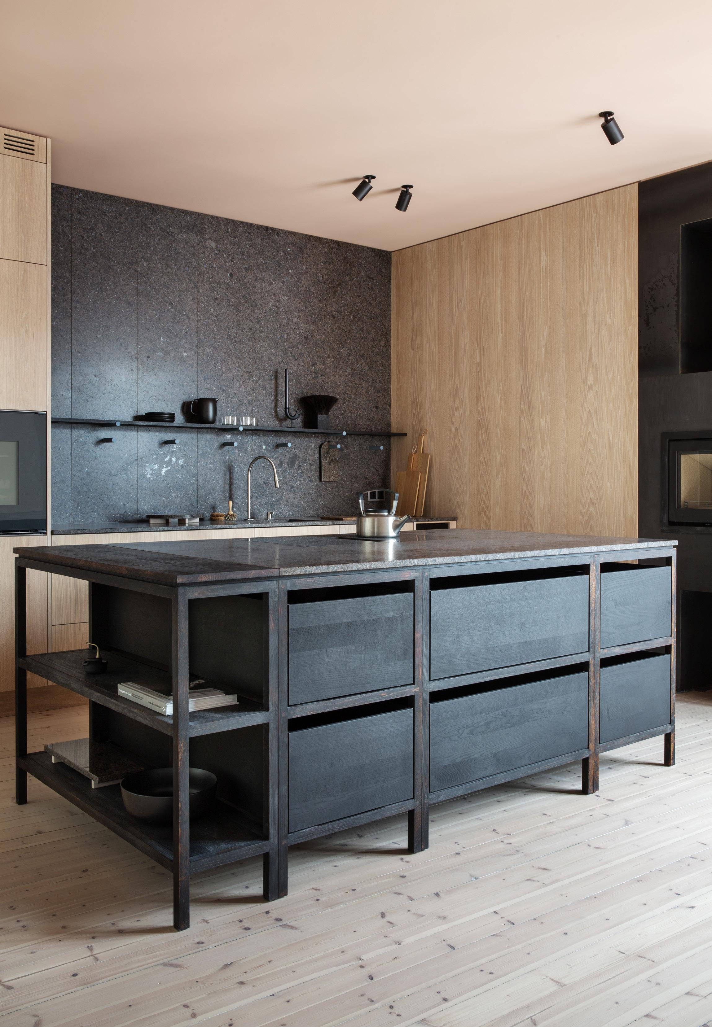 The burned solid oak and stone kitchen island by HAMRAN is the centre of the project’s story, designed to feel more like a piece of furniture within the space.
Solid spotted gum joinery and tactile finishes, including Marrakech wall render and Tadelakt for the kitchen surfaces, were chosen to reflect Sydney’s relaxed coastal lifestyle.

RICHARDS STANISICH
Wunulla Road Sydney, Australia
The Wunulla Road kitchen by architecture and design studio Richards Stanisich reflects its Sydney context while being reminiscent of Mediteranean homes. This design statement is achieved through an organic palette of solid spotted gum joinery, Marrakesh wall render and Tadelakt finishes on gentle curves, such as the kitchen benchtops and cutout shelf detail. “We wanted the raw materiality and tactility to hero the space and naturally coexist with the background of Sydney’s coastline,” Richards Stanisich director Jonathan Richards says. “Continuity was an overriding principle throughout, and the Tadelakt finish was selected to achieve this in a literal sense.”
The scale of the kitchen island deliberately makes it a place for cooking and conversation, revolving around this central form. “The kitchen palette is minimal to let daylight and sculptural forms be the most memorable aspect of the overall experience,” Jonathan says. “The kitchen details have a beautiful handmade quality, and these details continue through every room in the house,” he adds.
141
KITCHEN COMPENDIUM
Photography Felix Forest

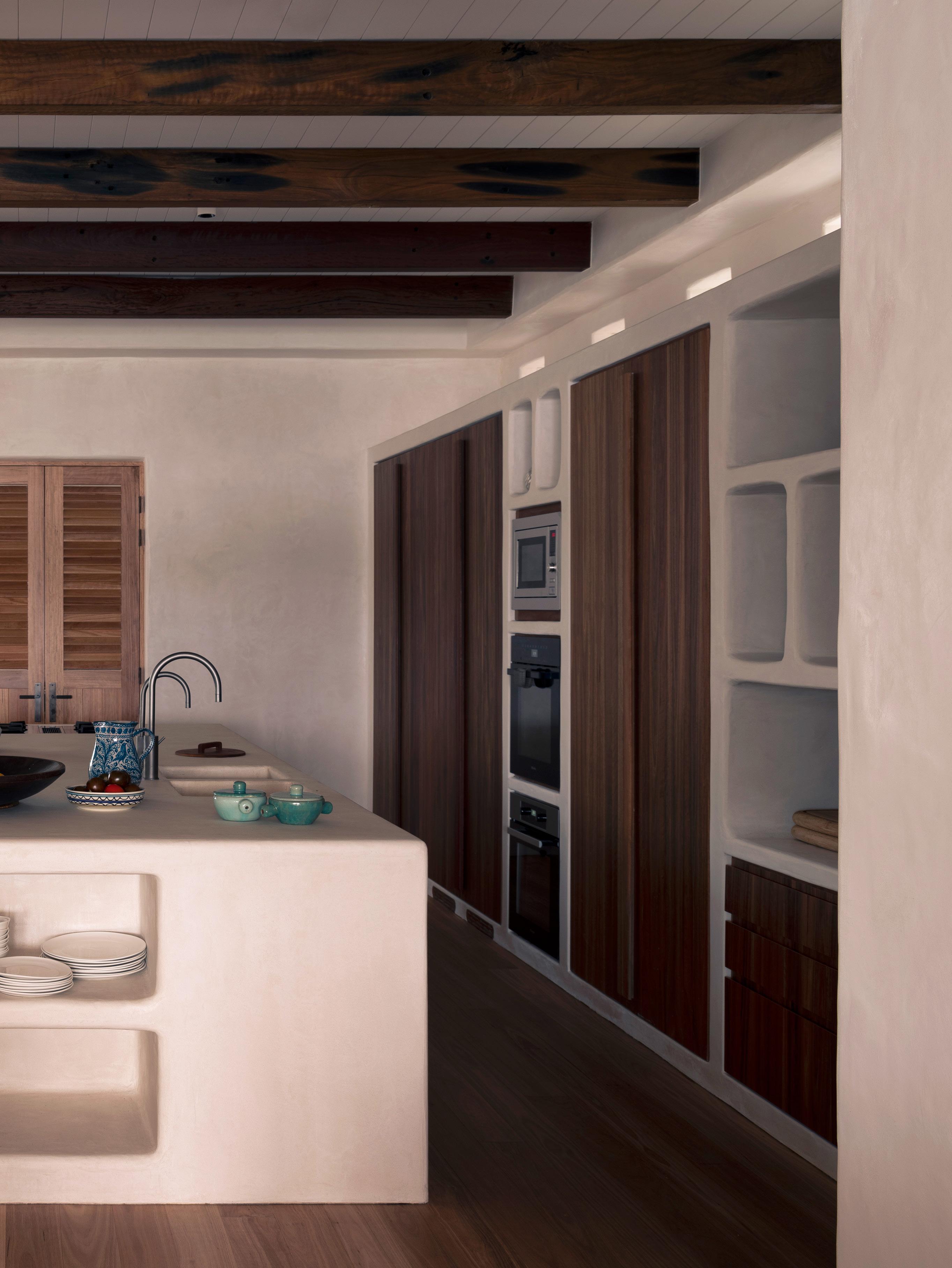
The terracotta floor tiles feature between the cooking and cleaning area, colour-matched as close as possible to the smoked-oak herringbone floors that run through the rest of the home. The Lacanche range cooker is visible, while the V-Zug appliances are concealed behind wide-panelled joinery in a clay finish.

PIETER VANRENTERGHEM
GV Residence De Haan, Belgium
The traditional range cooker is a focal point in the GV Residence by Belgian interior designer Pieter Vanrenterghem. “We created a neutral palette around the Lacanche oven so as to contrast with its black finish,” Pieter Vanrenterghem says. While the homeowners like to cook, they also wanted their kitchen to appear “quite architectural when not used”. “That’s why we ensured everything could recede into the background, the oven being the only visible piece,” Pieter adds.
A travertine island, clay-finish wall joinery, smoked-oak herringbone floors and terracotta tiles fashion this subtle backdrop. “Designing and creating a kitchen is always a big conversation and study between my studio and the craftsmen,” Pieter says. “We sometimes need to push their limits, but we must be certain that what they execute is lasting.”
145 KITCHEN CONFIDENTIAL KITCHEN COMPENDIUM
Photography Thomas De Bruyne

“CRAFTMANSHIP IS ALWAYS ONE OF THE MOST IMPORTANT THINGS YOU NEED TO REALISE IN A KITCHEN, TO CREATE INTERIORS THAT LAST. WITH GOOD CRAFTSMANSHIP, WE CAN CREATE THINGS THAT COMPLETELY OVERRULE INDUSTRIAL PRODUCTS.”
 – Pieter Vanrenterghem

est magazine
Design Rocco Borromini
Photography Marcello Mariana
THE LIBRARY
Even the best cooks need inspiration. Explore our French cookbook edit.


MASTERING THE ART OF FRENCH COOKING
JULIA CHILD, SIMONE BECK, LOUISETTE BERTHOLLE

SEE MORE BOOKS >

149 KITCHEN CONFIDENTIAL
NEW LAROUSSE GASTRONOMIQUE HAMLYN
ANTHONY BOURDAIN’S LES HALLES COOKBOOK ANTHONY BOURDAIN
ESCOFFIER LE GUIDE CULINAIRE H.L. CRACKNELL & R.J. KAUFMAN
MIRAZUR MAURO COLAGERCO
THE FRENCH LAUNDRY, PER SE THOMAS KELLER
PARIS BOULANGERIE PATISSERIE LINDA DANNENBERG
PROVENCE
CAROLINE RIMBERT CRAIG
LUNE KATE REID

Hettich makes living spaces work beautifully through a wide range of German quality hardware fittings.


Follow us @hettichaustralia

151 KITCHEN CONFIDENTIAL
Vertico Mono Sliding System
AvanTech YOU Drawer System with Illumination

ISSUE #48
AT HOME WITH ISABELLE STANISLAS
The home of French designer Isabelle Stanislas in the heart of Paris’ Palais Royal is a testament to her love of materials and commitment to design details.
LOCATION Paris, France
PHOTOGRAPHY Matthieu Salvaing
WORDS Yvette Caprioglio
153 KITCHEN CONFIDENTIAL

est magazine ISSUE #48
Isabelle collects all kinds of seats: armchairs, stools, and chairs – including the Jeanneret chair pictured.

155 KITCHEN CONFIDENTIAL

est magazine ISSUE #48
The rhythm of the Palais Royal’s facades inspired the apartment's strict symmetry where Isabelle joined two floors to create one space and travertine, oak and concrete materials exist cohesively. Pictured: a sofa, armchair and coffee table designed by Isabelle Stanislas Artwork by Ettore Sottsass.

157 KITCHEN CONFIDENTIAL
The fireplace Isabelle designed folds like origami, displaying her passion for twisting raw material.
ISSUE #48

Describe your design and interior style.
It always starts with a conversation. But first and foremost, it’s the history of the building, the space and the light. I don’t like to narrow myself to the word style. I love materials and I use them like an alphabet to create new words each time.
The linear forms of your home’s interior with its attention detail draw the focus to key points, what was your approach to this when designing?
The secret is to draw! And draw again! By drawing you ask questions. I always draw by hand on trace paper – my favourite tool – with layers of lines to keep a single focus.
How is your apartment’s sublime Palais Royal location reflected in the interior?
The rhythm of the Palais Royal’s facades inspired the apartment's strict symmetry.
I played with the existing layout by joining two floors to create one space, and moving my bedroom to the kitchen. I striked a harmony between the interior and exterior, and between lightness and heaviness, creating a space that feels like it always existed. There’s a beautiful tactility and materiality in the interior – is this a common thread and hallmark of your work?
We are suspended in the sky on the fourth floor, and I observed and listened to the softness of the surroundings– the light sand from the garden, the grey stone from the facade and the “ciel de Paris” colour. I played with cashmere furniture, travertine, oak and concrete. I created a special mirror, separated into two horizontal pieces to accentuate the feeling of levitation. The outside becomes inside and vice-versa.
We love the Brutalist form of the fireplace, which blends seamlessly with the minimalist, classical interior – how did you approach this feature?
I have a passion for twisting raw materials. The fireplace I designed is an example of this; folding like origami, it was an extremely technical process.
The table and chairs that surround the kitchen bench are so distinctive. Are you able to tell us more about them?
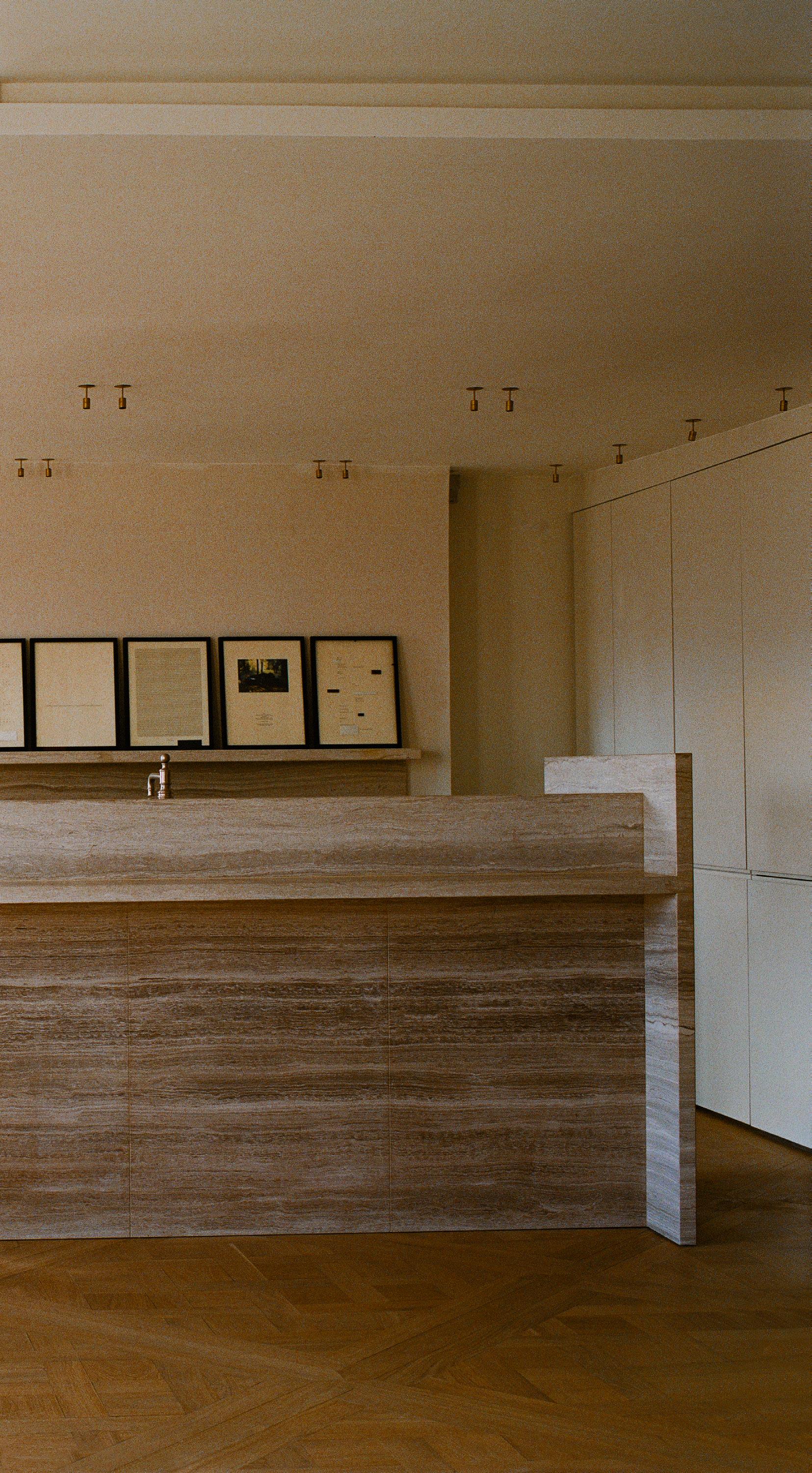
I designed the table for the space. The tabletop looks like a solid travertine block – my kitchen is in Italian travertine – but it is an exotic wood I sourced in Asia.
The very simple four metal legs assembled like play cards are a “clin d’oeil’ of the arcades and bridge. The chairs are from a company that specialises in outdoor folding seating; This version is in a natural vegetal leather and they will develop a patina with time.
There’s a notable mix of found objects and vintage pieces – can you reveal more about some of these?
I love going to flea markets; I found a long bench by an unknown Brazilian designer at a flea market, which now sits in the living room. The construction of the bench is exceptional.
I collect all kinds of seats: armchairs, stools, and chairs. Around my house, you will find Jeanneret, the first chair designed by Rick Owen and works by Donald Judd. The object's temporality disappears to let questions arise: Is it new? Is it old?
Do you have a favourite design detail that you gravitate towards?
The shadow gap is my favourite detail. My work is about perception. This little detail makes a room feel very different. I love to work with invisible lighting as artwork. When night falls, it adds a new dimension to a room as art.
How is your apartment a reflection of you?
I believe my home is a peaceful and joyful space – An environment open to family and friends, but also a well-hidden nest.
159 KITCHEN CONFIDENTIAL

est magazine ISSUE #48
The Italian travertine kitchen features a tabletop in an exotic wood Isabelle designed for the space, with four metal legs that are a “clin d’oeil’ of the arcades and bridge. The chairs are from Lafuma which specialises in outdoor folding seating, in natural vegetal leather that will develop a patina with time.
161 KITCHEN CONFIDENTIAL

ISSUE #48
A “Yeti” armchair by Guillermo Santomà and Lampe Ronan Bouroullec.

163 KITCHEN CONFIDENTIAL
"I observed and listened to the softness of the surroundings; the light sand from the garden, the grey stone from the facade and the 'ciel de Paris' colour."
– Isabelle Stanislas

est magazine ISSUE #48
The bedroom features the classic Loop chair by Swiss industrial designer Willy Guhl.

165 KITCHEN CONFIDENTIAL

est magazine ISSUE #48
Isabelle collected the first chair Rick Owens designed, pictured with a vase by Julien Michaud.

167 KITCHEN CONFIDENTIAL
The light sand from the garden, the grey stone from the facade, the “ciel de Paris” colour all influenced the interiors.
Living

Luxury
Blum’s SPACE TOWER makes optimal use of storage space and ensures that every item is always close at hand with smooth, full extension drawers. The cabinet can be narrow or wide depending on style and storage needs of your client. SPACE TOWER can also be used for bedroom wardrobes, bathrooms and living areas.

169 KITCHEN CONFIDENTIAL
blum.com
TREE HOUSE
A SYDNEY HOME’S GROUNDED AND UNPRETENTIOUS INTERIOR MAKES A STRONG DESIGN STATEMENT THROUGH A NUANCED APPROACH.
171 KITCHEN CONFIDENTIAL
LOCATION Sydney, Australia INTERIORS Alwill Interiors ARCHITECTURE Luigi Rosselli Architects PROJECT ARCHITECT Buck and Simple LANDSCAPE Dangar Barin Smith PHOTOGRAPHY Prue Ruscoe WORDS Elana Castle
 The open-plan kitchen features a combination of robust materials including a pressed concrete ceiling. The dining table is from Matthew Hilton, featured with Gubi Violin chairs and Space Copenhagen Mater High stools.
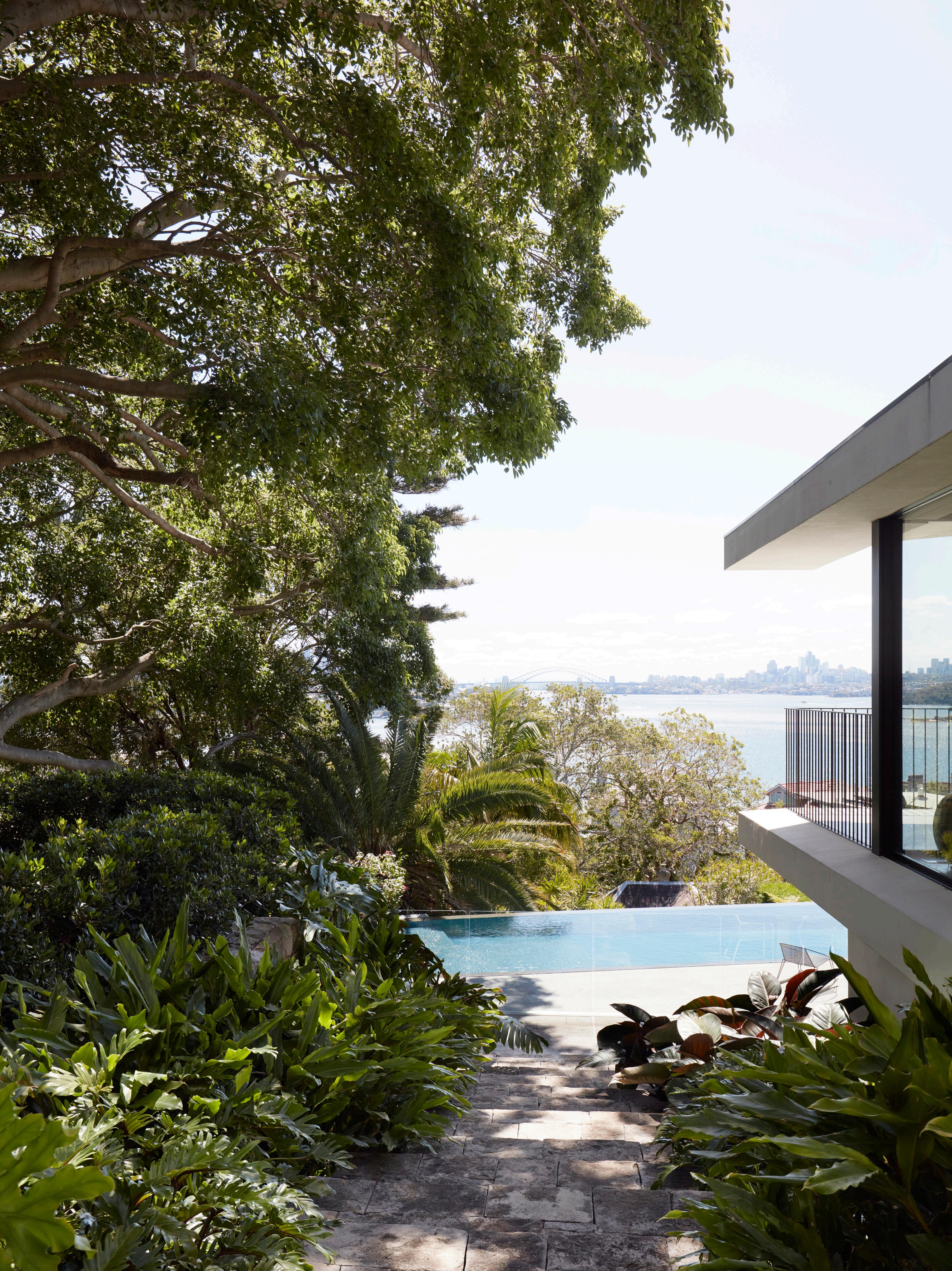
Blessed with gun barrel views of Sydney Harbour and dynamic architecture by Luigi Rosselli Architects, Casa Figueira was the subject of another layer of design intelligence when Alwill Interiors joined the team. Known for their astute attention to detail through texture, scale and the interplay of colour and light, the firm’s contribution to the home’s interiors elevates it beyond striking, to tactile and sophisticated.
The contemporary family home is situated at the end of a cul-de-sac and nestled into a ridge overlooking the water. At the centre of its design is a spectacular, heritage-protected fig tree.
The Alwill team devised an interior strategy that would dovetail seamlessly into the architecture – referencing midcentury Brazilian, pavilion-style architecture, while also responding to the home’s location .“The primary design concept was earth and air,” Alwill Interiors principal Romy Alwill says. “The intention was for the house to feel grounded but open and for the architecture and interiors to blend and flow into one another. We weren’t afraid of using brown but embraced all the nuances of this hue. Other secondary colours of olive and teal came into play primarily as they related back to our concept.”

The team formally set the tone in the entrance where a large, customised bronze door, a polished concrete floor and rammed earth walls define the tonal palette for the home. The stairwell then winds up an open void, its form both sinuous and delicate. This entry, which forms the knuckle of the house, then splits out into an L-shape, with one wing housing the parents’ living room and study, which is enveloped in a palette of caramel and rust tones, defined by timber and rammed earth. Here, the hallway opens to the garden which leads into a private pavilion. “The vaulted roof frames up the arches of the Sydney Harbour bridge, and the uniquelyshaped fireplace create a tone and hierarchy to this space,” Romy explains.
“All of this is elevated further by the Brazilian-inspired furnishings like in the beautiful Presidential armchair by Etel from Mama Casa.”
173 KITCHEN CONFIDENTIAL
The connection between the living space and the garden exemplifies Alwill Interiors’ intentional blurring of the line between architecture and interiors. The custom sunken lounge is crafted from Verona Leather.


 The L-shaped configuration provides protection from the elements and a focus on a heritage-protected fig tree in the centre of the garden.
Despite a long build, Casa Figueira has emerged as a robust and meaningful residence for a Sydney family. Designed to age gracefully, this home values the integrity of materials and client intention above trend. “I’m proud of that when I go to visit the house and I know the clients enjoy living there,” Romy says.

“I love that it is grounded and unpretentious but still makes a strong design statement. That is a paradox that is not easy to achieve. I think that comes through a nuanced approach."
The second half of the L-shaped plan occupied by the living room and kitchen block is wrapped in walnut panels and conceals a timber-lined powder room that continues into the kitchen joinery, with the earthy palette grounding the zone. The notion of seamless living through to the outdoors is further underscored by the large sliding doors which are recessed into the wall cavities to create a sense of living within the landscape. “The home is layered with earthy, organic materiality, but carefully balanced with moments of lightness and refinement such as the stainless steel kitchen bench, delicate dining chairs and feature light over the sunken lounge,” adds Romy. “This contrast brings the space to life in a delicate balance.” The main kitchen and living area have also been furnished so as not to obstruct the view but to add interest to the interiors.
“All the pieces of furniture have some texture to build upon the layering,” Romy says, “I like rattan in the Jeanneret chair, aging leather in the sunken lounge and olive textured fabrics for dining chairs.”
177

 The primary bedroom features a pared-back scheme of blues, browns and neutrals. The custom bedhead is flanked by grazia&co. Sonny bedside tables.
Casa Figueira enjoys spectacular gun barrel views of Sydney Harbour, a view that has been maximized through floor-to-ceiling glazing and broad views.


JOIE DE
Turn

up the volume on our LISTEN
DE VIVRE
our French house playlist. NOW >


185 KITCHEN CONFIDENTIAL


STOCKHOLM FURNITURE FAIR
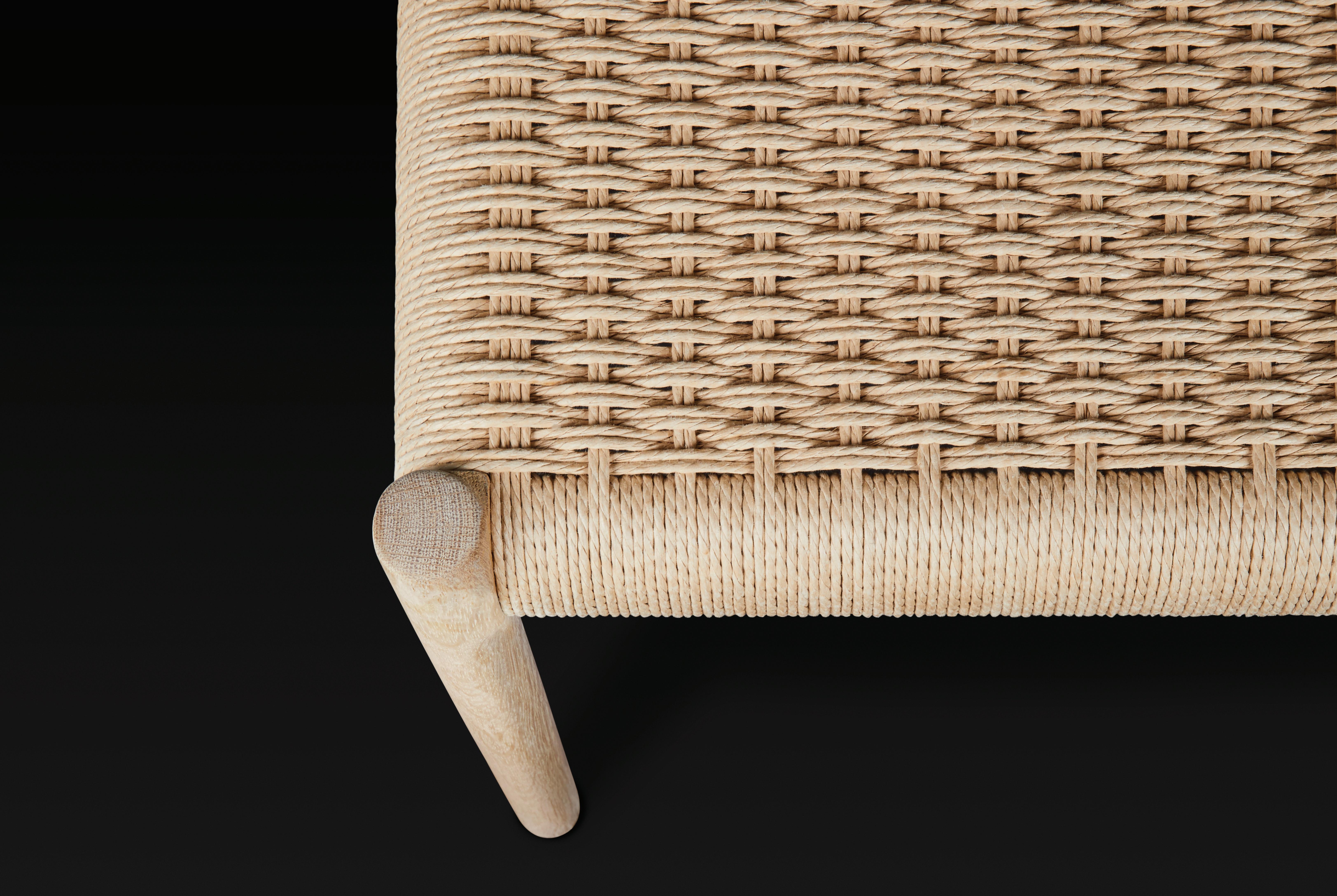
Norway-based Australian designer Nikolai Kotlarczyk shares 10 highlights from Stockholm Design Week and Furniture Fair.

SCULPTURES FROM THE FACTORY MASSPRODUCTIONS AT SVEN-HARRY'S KONSTMUSEUM
A playful insight into the production, detailing and materials behind some of Swedish brand Massproductions’ most iconic pieces. The exhibition, set over three floors, was both theatrical and informative – from their interactive 4 PM Lounge that was named Scandinavian Furniture of the Year to the construction of their Crown chair and Tio collection.

01.
MELT VASE BY ANTREI HARTIKAINEN
Fresh from being named Young Scandinavian Designer of the Year, Finish designer Antrei Hartikainen has brought his expertise with timber into this series of blown glass vases. Produced in Finland by lasismi, the mould for the collection is created from a series of stacked wooden planks; the changing configurations allow each vase to display a unique proportion and form.

BOLLO BARSTOOL BY ANDREAS ENGESVIK FOR FOGIA


Keeping the proportions and character of its lower-sitting siblings, the Bollo barstool takes the mix of thin and fluffy to new heights. The elongated steel frame is topped with the now iconic oversized cushions that seem to push out through the sleek frame.

02.
03.
DESIGN STUDIO FOR LAMMHULTS
We see a return to the retro spirit of the sixties with the almost squashed Bau modular sofa collection by Note Design Studio. Reminiscent of a fluffy bun, the collection is simple, bold and comfortable in all the right places.

est magazine ISSUE #48
04.

PIRA G2 SHELVING SYSTEM BY STRING FURNITURE

When a producer known for a single product line launches a new product, it has to be special. A contemporary interpretation by Anna von Schewen and Björn Dahlstöm of Olle Piras's classic design, the extruded aluminium construction is understated and provides a new take on String's iconic collection of storage furniture.

ISSUE #48
05.
MOCI DINING TABLE BY MOA SJÖBERG FOR ASPLUND


The Moci dining table was simple and sophisticated yet with a beautiful play on proportions and form. The heavy, doublecurved legs contrast with the thin veneer table top.
SEN PENDANT BY TANI
TOSHIYUKI FOR MOTARASU
On show within Asplund's beautifully curated showroom, the Japanese/Danish brand Motarasu presented their collection of refined lighting and furniture. Constructed from 600 intricate bamboo strips, the SEN pendant light is perhaps their best illustration of the delicate nature of their range, combining natural materials with exquisite craftsmanship.
195
06.
07.
TRIFLE TROLLEY BY STINE + TEKLA FOR BEBO OBJECTS

A collaboration between Norwegian designer Aas and Swedish colour queen Tekla, the Trifle Trolley is constructed from stacked simple geometry to create an intuitive and multi-use piece; featuring a striking Alpi veneer and green frame.
BLT-4 PENDANT LIGHT BY +KOUPLE

I was so impressed with the energy, friendliness and professionalism of this small studio based out of Kiev. +kouple are committed to producing their range locally – even through tough times in their homeland. Their entire range was beautifully made and highly functional, with the strap suspended and positioned BLT-4 pendant lamp a particular standout.

08.
09.
ERIK BRATSBERG & FRIENDS AT PERSONA RESTAURANT
Housed within designer Erik Bratsberg's first restaurant interior design project – the warm and welcoming Persona – Erik welcomed his creative friends from Stockholm for a pop-up during Design Week. From Kajsa Melchior’s beautiful ceramics to the wavy drinks cabinet by Niklas Runesson, the entire space was a feast of material and texture.

10.

(310) 620-9990 700 WILSHIRE BLVD, SANTA MONICA, CA 90401 @SANTAMONICAPROPER PROPERHOTEL.COM/SANTA-MONICA


AN ALLIANCE BETWEEN ERAS
UNFOLDING ACROSS ERAS, THIS VICTORIAN TERRACE
FAITHFULLY CARRIES THE NARRATIVE OF ITS ORIGINS WHILE SEAMLESSLY INTEGRATING ELEGANT MODERNITY.
INTERIOR DESIGN Hecker Guthrie ARCHITECTURE Brayshaw Architects BUILD Dome PHOTOGRAPHY Shannon McGrath WORDS Tiffany Jade
itting on the cusp of the city in a locale that dovetails its past and present, Parkville Residence by Melbournebased studio Hecker Guthrie has coaxed a home into contemporary relevance while retaining the details and design gestures that faithfully carry its Victorian era narrative.

Home to a young family of four, Parkville Residence has been thoughtfully resurrected through a process that unfolds from entry to reveal a chronological methodology across three volumes. “The design intent for this home was to create a series of spaces that were a subtle extension of one another,” Hecker Guthrie interior designer Caroline Hedley explains. “It becomes more contemporary as you shift from room to room while retaining the cosy, lived-in sensibility of British homes – complementing the heritage of our clients.”
The first volume is the existing Victorian home which holds the family's bedrooms and bathrooms. “It exudes an innate sense of historical charm,” Caroline says. “While its proportions are grand, the rich use of colour and texture creates a sense of intimacy within the spatial generosity."
ISSUE #48
 Opposite page: A large scale artwork by Lindsay Blamey in the heritage volume instils a connection to nature which is echoed in the new volume by sight-lines onto a Jacaranda tree. The space features the Mass Productions glass table, De Padova armchair and Ligne Roset side tables.
Colour instils a strong connection between the home’s Victorian and modern volumes. In the kitchen, custom joinery in botanical hues reflects garden outlooks, while Cerdomus stone bench tops and splashback bring textural joy to the classic English silhouette of a custom range. Flooring is by Woodcut, and tapware is by Astrawalker.

The second volume comprises the new extension which sits within an existing footprint. Holding the kitchen and living spaces, this zone is the social hub of the home, while reflecting a tangible shift in the visual expression of the surrounding architecture. As if by osmosis, the red brick exterior and green interior hues cultivate distinctive atmospheres according to application and curation. “A bolder expression of colour through joinery and furniture sits comfortably alongside the use of deep colour in the Victorian home,” Caroline says. She adds that this creates “intimacy in contrast to the airiness of the interior architectural elements of the newer extension.”
Parkville Residence’s third volume comprises a garage studio at the rear of the property which provides a break-out space for growing children and guest accommodation. Accessed via both the garden and a cobblestone rear laneway, this volume is embraced by the built environment by virtue of the garden, which sweeps through and around the residence with a central Jacaranda tree as its north star. With a romanticism that evokes a strong English sensibility, the gardens “transition into the architecture in a cohesive way, which translates indoors through palette and texture.”
Through a holistic approach to architecture, interior design and landscape design, Hecker Guthrie have found an alliance between eras and styles – from the bold colours of the new joinery and furniture, to the sonorous hues in the original area of the home. At the same time, they have upheld the nuances of daily life while modulating them precisely for those who live there.
Mediating between formal and informal, an alcove with a Gubi pendant, timber Mass Productions stools, classic custom joinery and a continuation of Cerdomus stone bench tops are a natural extension of the kitchen.

205 KITCHEN CONFIDENTIAL
A cosy, lived-in sensibility akin to British homes has been fostered in the new volume through a preference for tactile materials and classic styling set against a garden backdrop. The living room features the MAKE Nordic Prime Time fabric chair by Tom Stepp, a Jardan sofa, Mark Tuckey side tables, Mattiazzi dining chairs, a Gubi floor lamp and artwork in the fireplace nook by Laura Vahlberg.


A commitment to English design gestures continues in the bathrooms. A Volker Haug light and liberal use of Glux stone temper the heritage notes, retaining a refined opulence while persuading the design language.
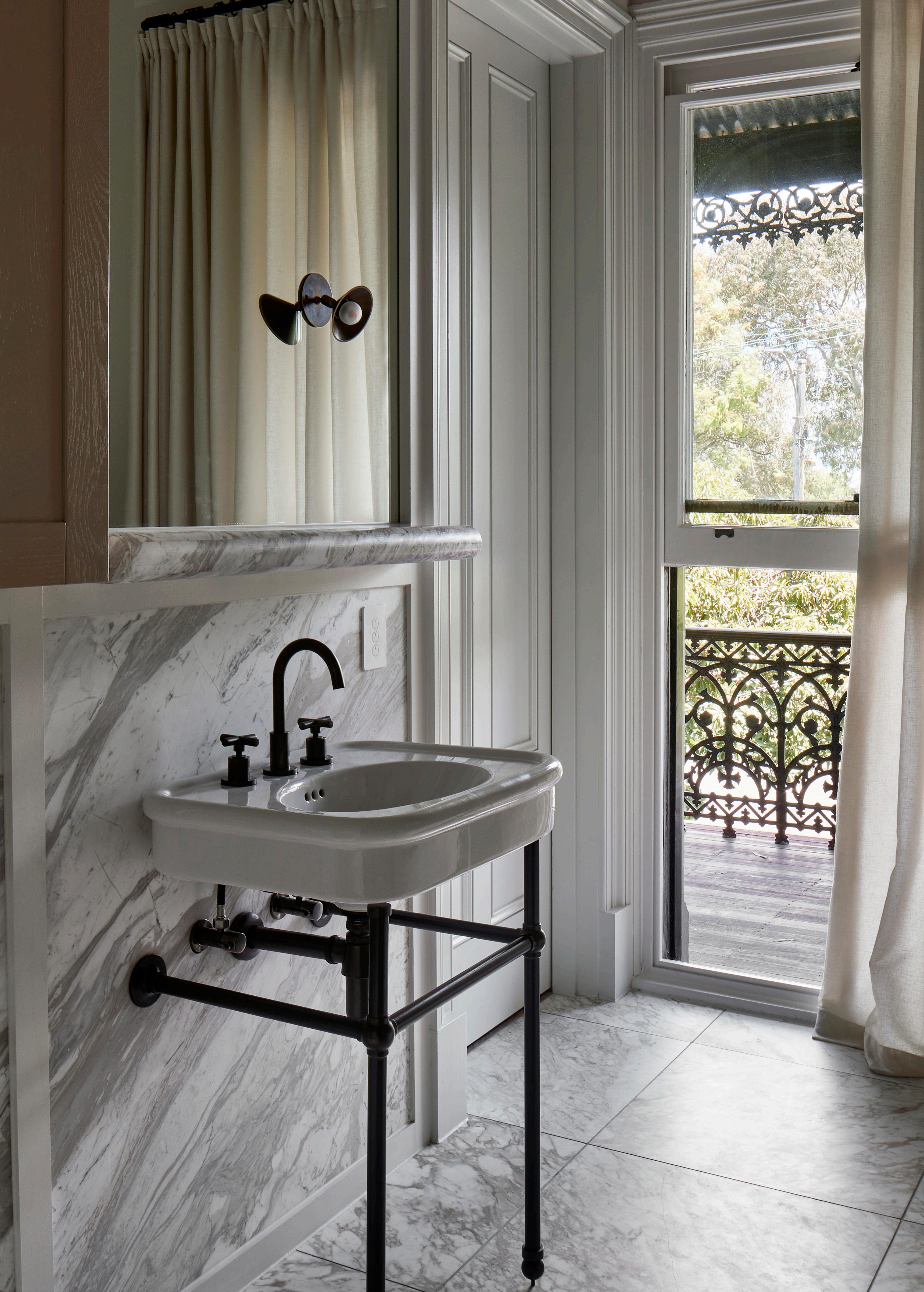


Accessed via both the garden and a cobblestone rear laneway, the garage studio is embraced by the built environment by virtue of the garden, which sweeps through and around the residence with a central Jacaranda tree as its north star.

211
They create furniture collections that are honest in their use of materials & united in their craft.

ISSUE #48
Melbourne studio, Kett, is headed up by leading Australian designer Justin Hutchinson.
Frame Office by Kett
Kett celebrates an Australian way of life; drawing inspiration from our natural landscapes and cosmpolitan cities.

Showroom Locations
Melbourne
Sydney
213
coshliving.com.au
Exclusive to
Brisbane Perth
Silestone®, high performance surfaces with low silica content. Breakthrough in the category.

Less silica. More Sustainable. More Silestone®.
Sustainable revolution: Silestone® HybriQ
A high-performance blend of premium minerals and recycled materials produced through a more sustainable manufacturing process, with 99% recycled water and 100% electric energy from renewable sources. Since 2022, 100% of the portfolio has been produced with HybriQ technology.
performance content. category.
Low Crystalline Silica.
HybriQ results in a reduction of crystalline silica content to less than 40%.
More renewable energy sources.
Use of 100% renewable electrical energy.
Less water consumption.
99% water reused in the production process.
More use of recycled materials.
Minimum 20% recycled glass in the composition of surfaces with HybriQ+ Technology.

Find more information about HybriQ by scanning this QR code


est magazine ISSUE #48
THE DETAIL
The est definitive guide to artisanal kitchen design elements from our go-to Product Library.
KITCHEN CONFIDENTIAL 217
The
Detail is curated by product editor Brigitte Craig
STOOLS


Timber stools introduce inherent craftsmanship to the kitchen counter.


est magazine ISSUE #48
VIEW MORE STOOLS >
ROUND BARSTOOL THONET
KINGSTOWN COUNTER STOOL STUDIO DUNN
TALL FRENCH WOOD TRIPOD STOOL 1ST DIBS
SEMINAR KVBJ1 BAR STOOL NIKARI
HINTERLAND STOOL DANIEL BODDAM
HALF FULL STOOL ROSS GARDAM
NERD BAR STOOL MUUTO PIER STOOL RESIDENT
PUCCIO 712 STOOL BILLIANI
 Project CC
Residence Design ECRU Studio
Photography Suiyu Studio
 Project Hideaway Design Jase Sullivan
Featured Pendants Natalie Page Ceramic Funnel Pendant Light Photography David Matheson
PENDANTS
Hand-crafted pendants transcend shape and materiality.

PLASTER CONE HANGING LIGHT ROSE UNIACKE


ALBERTO SINGLE TIER CHANDELIER JULIE


ANDERS PENDANT LIGHT PINCH


CLASSIC ROUND PENDANT OI
VIEW MORE PENDANTS >
221 KITCHEN CONFIDENTIAL
NEILL
SOI OI
TARAXACUM FLOS
HAT LIGHT MUD AUSTRALIA
POTTER LIGHT ANCHOR CERAMICS
ANEMONE PAOLA PARONETTO
ORION LUSTRE ALEXANDRE LOGÉ
COFFEE MACHINES
Coffee machines to make masterful espresso.


VIEW MORE COFFEE MACHINES >

est magazine ISSUE #48
WHITE ANZA
GS3 HOME PACLAGE LA MARZOCCO
E61 FAEMA
SYNCHRONIKA ECM
ESPERTO ABILE LA PAVONI
BIANCA PL162T V2 LELIT
 Project Hancock Park Architecture Plus Development Design DISC Interiors
Photography Sam Frost
 Project Son Serra Architecture Bernado Oliver & Javier Marquez Design BonVivant Concept Build Consfutur Photography Salva Lopez
VESSELS
Vessels manifest an organic design language through form and finish.


HAN VASE COLLECTION PARTICULIERE


BOS VASES TRAVERTINE COLLECTION PARTICULIERE


SINUOSA SUSAN CHEN
VIEW MORE VESSELS >
225 KITCHEN CONFIDENTIAL
LOTTE BOWL BLOC STUDIOS
VINTAGE MATTE CLAY OIL POTTERY DECORATIVE POT 1ST DIBS
SITULA VASE ROMETTI CHETAN LRNCE
GARDENIAS VASE NO.4 BD BARCELONA
VESSEL ER STUDIO
NICOLAS SCHUYBROEK DARK WOOD SALAD SERVERS WHEN OBJECTS WORK


SALAD SERVERS
Salad servers designed to elevate the everyday.
RESIN SHORT STONE SERVERS DINOSAUR DESIGNS
ARNE JACOBSEN SALAD SERVERS STELTON


OS SALAD SERVERS FERM LIVING


TOSS AROUND SALAD SERVERS MUUTO
KRENIT SALAD SET NORMANN COPENHAGEN
GRAND PRIX SALAD SET KAY BOJESEN
GOA SALAD SERVERS CUTIPOL

VIEW MORE SALAD SERVERS >
VIVIANNA MATTE SERVING SET
GEORG JENSEN

est magazine ISSUE #48

Project Residence Blanke Top Kitchen design Eline Ostyn + Obumex Photography Verne
 Project Hove Design Benoit Viaene
Photography Thomas De Bruyne
GAS COOKTOPS
Gas cooktops with a lens on precision and efficiency.


229 KITCHEN CONFIDENTIAL
VIEW MORE GAS COOKTOPS >
LINEAR GAS COOKTOP SMEG
PROFESSIONAL GAS COOKTOP WOLF
90CM STAINLESS STEEL GAS COOKTOP BELLING
GAS COOKTOP 200 SERIES GAGGENAU
EBEKO PITT COOKING
MOOD 90CM BUILT-IN HOB GLASS BLACK CERAMIC BARAZZA
INDUCTION COOKTOPS
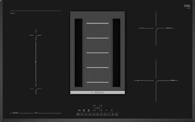
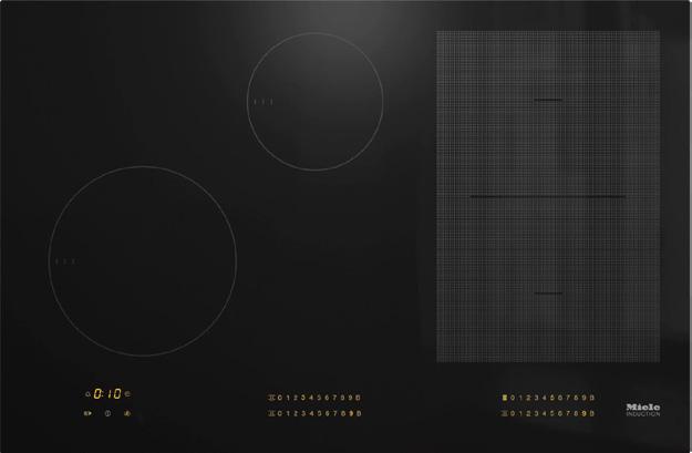

Induction cooktops with a refined focus on function.


VIEW

est magazine ISSUE #48
MORE INDUCTION COOKTOPS >
KM 7574 FL INDUCTION COOKTOP MIELE
80CM INDUCTION COOKTOP WITH DOWNDRAFT VENTILATION NEFF
FULL SURFACE INDUCTION COOKTOP 400 SERIES (FRAMELESS) GAGGENAU
90CM INDUCTION COOKTOP ILVE
SERIES 6 | 2-IN-1 COOKTOP WITH INTEGRATED VENTILATION 80CM BOSCH
90CM V6000 INDUCTION COOKTOP V-ZUG
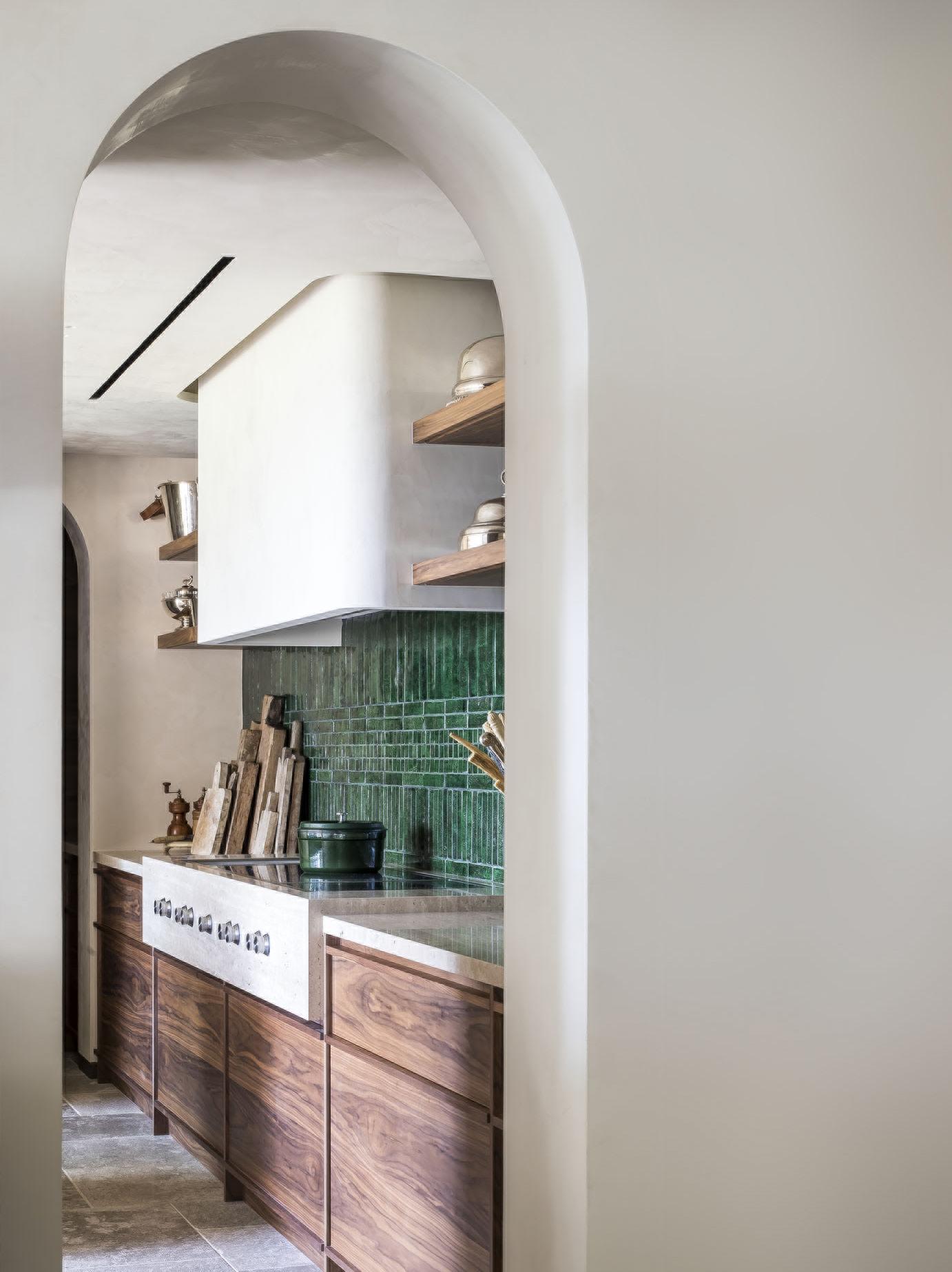 Project Apartment Mariposa Design Caprini Pellerin
Photography Thomas de Bruyne

™ ISSUE #48 estliving.com AUTUMN 2023


 Design Walker Warner Architects
Photography Matthew Millman, Matthew Williams


 Monica Calderon, Ezequiel Farca and their four sons at Casa Escuela.


 A built-in concrete bar and seating area connect onto an alfresco courtyard via steelframed doors.

 The dining table was designed by Monica, who specialises in polyester resin furniture and accessories, while the dining chairs were designed by Ezequiel.

 Ezequiel.
Opposite Page: Raw stone basins and the concretetiled shower evoke a sense of craftsmanship.

 The school’s facade has not changed since it was first built.


 Jordan Carlyle with husband Mario Margelist


 Photography Nicolas Mathéus
Pictured: Designer Stéphanie Coutas
 artist Michel Rico rests on the countertop.


 – Architect Luke Fry


 Design: Darren James Interiors
Photography Cathy Schusler


 Oak pointe de Hongrie Hardwood floors, Arabescato Vagli marble and a Lacanche oven complete the classic French interior scheme.

 The kitchen’s back wall features painted cabinets with a walnut insert and shutters, underscored by smoked and stained solid oak floors. The blackened steel Eiffel lamp by Frama speaks to the home’s Brutalist nature.


 A matt plaster Lutetia pendant by Garnier et Linker features above the island in direct dialogue with the rangehood finished in Venetian Plaster Marmorina. Also pictured: the Hinterland stool by Daniel Boddam, Cassina Cab 421 chairs by Mario Bellini and two vintage dining chairs at the client’s own dining table with a Tenshin Juba piece at the centre.
 Photography Thomas De Bruyne

 – Nathalie Deboel


 Sussex Taps; ceramics by Vanessa Lucas and Mud Australia.
 The Flos Splügen Bräu pendant by Achille and Pier Giacomo Castiglioni, Diiva chairs by grazia&co. and the Super Elliptical table by Arne Jacobsen for Fritz Hansen Reference the thread of mid-century design inspiration throughout. The steel staircase was custom designed by Studio Doherty and is finished in Dulux Summer Waters. Ceramic by Jess Graham.


 Photography Inger Marie Grini
 The burned solid oak and stone kitchen island by HAMRAN is the centre of the project’s story, designed to feel more like a piece of furniture within the space.


 – Pieter Vanrenterghem


 The open-plan kitchen features a combination of robust materials including a pressed concrete ceiling. The dining table is from Matthew Hilton, featured with Gubi Violin chairs and Space Copenhagen Mater High stools.


 The L-shaped configuration provides protection from the elements and a focus on a heritage-protected fig tree in the centre of the garden.


 The primary bedroom features a pared-back scheme of blues, browns and neutrals. The custom bedhead is flanked by grazia&co. Sonny bedside tables.


 Opposite page: A large scale artwork by Lindsay Blamey in the heritage volume instils a connection to nature which is echoed in the new volume by sight-lines onto a Jacaranda tree. The space features the Mass Productions glass table, De Padova armchair and Ligne Roset side tables.


 Project CC
Residence Design ECRU Studio
Photography Suiyu Studio
 Project Hideaway Design Jase Sullivan
Featured Pendants Natalie Page Ceramic Funnel Pendant Light Photography David Matheson


 Project Hancock Park Architecture Plus Development Design DISC Interiors
Photography Sam Frost
 Project Son Serra Architecture Bernado Oliver & Javier Marquez Design BonVivant Concept Build Consfutur Photography Salva Lopez


 Project Hove Design Benoit Viaene
Photography Thomas De Bruyne


 Project Apartment Mariposa Design Caprini Pellerin
Photography Thomas de Bruyne


