S
Kuldiga May 2024
Exploring LATCH in 2 Days May 22-23, 2024 Kuldiga

S
Kuldiga May 2024
Exploring LATCH in 2 Days May 22-23, 2024 Kuldiga


On May 22-23, 2024, we, Besjan, Daiga, Elina, Joshua, Karmen, and Shafaq, formed a group of six during the Information Design course led by MartinFoessleitner.Withacombined expertise of over 150 years, we beganourcollaborativejourney.
After discussing our SDSI 23/25 group's characteristics and deciding to use the LATCH methodology, we held a lottery. Each member wrote one word describing the cohort, and we randomlychose"chaos"tostartworkingwith.
We devised five questions to cover each LATCH segment, created a questionnaire, and gathered data. Inspired by natural materials around us, we experimented with various techniquesandsolutionsusingourenvironment.
On the first day, we chose five questions and invited our colleagues to answer them. All asks were towards proving that we are somewhat of a chaotic group of 30 people.


We started with a team meeting to discuss how to visualize the information better. We decided to rely again on natural resources, this time on stands rather than the ground. We also decided to highlight the LATCH process in our visualizations to ensure that the audience understands the backend process.

Daiga came up with the idea of an exhibition-style presentation, so we used the art easels in the class and started assembling the resources. After spending the first day deciding the characteristics of the class and gathering data, the second day was all about how visualize the data we gathered in a way that is creative appealing, and analogue.
We chose five questions and invited our colleagues to answer. All questions were towards proving that we are somewhat a chaotic group of 30 people.


Where did you have lunch today?
What is the name of the street you live at right now?


What time was your wake-up alarm set this morning?
Is your day planned today?
How would you rate your energy level from 1 to 10?

For the final exhibition, we began by designing cardboard for each letter of LATCH and started putting the data gathered from the first day on it.
For the 1st question, "Where we had lunch," we used the same stones from day 1. For the 2nd question, "Where do we live," we continued with the same approach but with some green leaves this time, plus indicated the names of the streets.
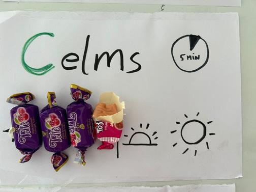
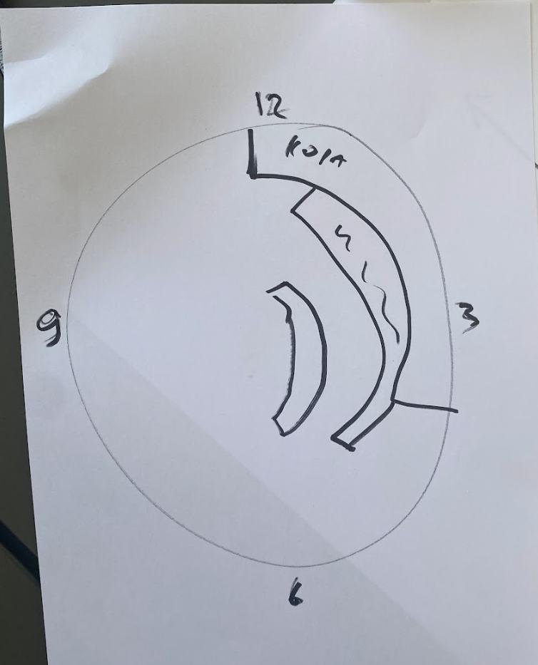
For the 3rd question regarding the "alarm time," we changed our approach and used a half-cut clock to show the alarms set by different classmates from 5 am to 10 am.


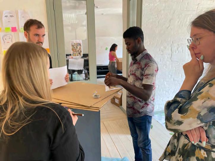
Moving on to the 4th ask about ‘how are we chaotic’, we clustered the data and used green flowers and pink post-its to highlight the clusters.
For the energy level, to show the answers to the 5th question, we used the drawing thermometer approach but this time we titled the measuring instrument to be horizontal, so it does not imply a hierarchy.
The glasses showing answers to the 6th question stayed with us on the second day as well to represent how planned our days are, however, Martin gave us valuable feedback on how we should remove the leaves from the water as the leaves and water levels are showing two different things intensities and frequency. So we put the leaves in front of the glasses.


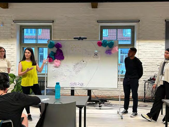
Our concluding presentationtookon the formofan exhibition.We kickeditoffby delving
Next, we proceeded to explain the data displayed on each board and how it relates to the LATCH process. Overall, everyone appreciated our data visualization, and as a team, weweresatisfiedwiththecreativeapproachwedeveloped.


Where did you have lunch today?
Amapwithstoneswhereeach pebblerepresentsoneperson.
What is the name of the street you live at right now?
Analphabetwithflowersshowing how many people live on a street startingwithaparticularletter.


What time was your wake-up alarm set this morning?
Analarmtimelineshowingthe wake-upclockbeingsetfrom 5amto9:45am.
In what way you are chaotic?
Categorising peers' answers in several clusters showing the manywayswearechaotic.


How would you rate your energy level from 1 to 10?
A thermometer shows that most of the class are around 7 in their energylevel.
Is your day planned today?
Full glass with several leaves showing that the day is planned, half-full with more leaves showing that the day is planned partly, and an empty glass showing that fewpeoplehavenotplannedtheirday,yet.


After our group was the first to present, we had the pleasure of viewing and listening to the works of other groups. We were pleasantly surprised by the diversity of topics and the creative visual presentations from the different groups.
One particularly memorable presentation featured small houses displaying statistics about the caring nature of SDSI students. Some of the data surprised us, along with the unique choice of using small stacked houses as a set design – a visually captivating approach.
Another presentation that stood out was the one showcasing SDSI as gourmet specialists, detailing our eating habits and prices. This type of consolidated information would be incredibly useful, especially for newcomers in Kuldiga like myself.


I came into the class with the expectation to learn how to better represent data and information... (i was thinking graphic design wise.)
However, I was pleasantly surprised by the literature we were exposed to, giving us a fundamental knowledge of information design and the accompanying case studies that provided real world applications.


The exercises we played in class were very helpful in understanding the concepts. Admittedly, I was confused through some of the activities but exploring the LATCH methodology taught me that context is key to accurately communicate information for an audience.

I loved the atmosphere starting from entering the room. Martin knew all the students by first name and some additional details, too. That was impressive and unexpected as I felt that everyone was somehow even more special because of this.
Enjoyed that we did not just sit and listen but had a hands-on experience right away. Enjoyed having a take-away small brochure on the topic (LATCH). It was helpful to follow and not to forget some parts.

‘’Brain vs. Gut? Must follow the gut!’’

Coming from a non-designer background, I was eager to learn how design can make data visually appealing. The highlight of the course was that 60% of it focused on a 'learn by doing' approach. Another fantastic aspect was the requirement to analyze visualizations, allowing us to step away from our screens for extended periods.
Additionally, Martin's choice of topic was highly relevant to our class. We had to analyze our own characteristics, which led to fascinating insights into how everyone in our group expressed themselves differently. It was a powerful reminder of our humanity—diverse, chaotic, emotional, and privileged.
One key takeaway was the importance of understanding the process, rather than merely following it for the sake of adherence. Overall, this course was exceptional and came at the perfect time for me.


One key takeaway was the importance of understanding the process,
In these days, I discovered new insights into the concept of information design, a topic I was unfamiliar with until now. Despite having a background in design, information design is a new field for me. What I found most valuable during this period was the opportunity for creative freedom.
Within just a two-day span, we honed our skills in designing and learned to prioritize the user's perspective in the design process. Remember, simplicity is key. As we move forward, I am excited to apply these newfound skills to future projects.


Remember, simplicity is key.
The course was a refreshing experience for me. As someone with no prior design background, I was initially unsure of what to expect, but the positive atmosphere and the professor’s enthusiasm quickly put me at ease.
One of the most enjoyable aspects of the course was the opportunity to work on a group project without a pressure. This allowed us to collaborate effectively and learn from each other’s perspectives. The project itself, which involved visualizing data from a survey, was a great way to apply the principles we were learning in class.
The course content was engaging and relevant, and I found myself becoming increasingly interested in the field of information design. The “LATCH” method, which we discussed in the course, has become a valuable tool that I now when developing reports.
I found myself becoming increasingly interested in the field of information design

I don’t know what I expected to happen for two days in the Information Design course with Martin, but it definitely wasn’t what I experienced. Learning the LATCH method on the spot by all of us moving around the room was the simplest and best way to learn a new thing. The second best thing? Gathering together in an amazing group and practicing it all by hands! I don’t think I have to mention what was third, but YES, it was all the amazing work our coursemates did. I never knew that information design could be so touching.
I think we got very lucky to learn this with Martin because his teaching style and personality were so simple, light, and natural. And I think we somehow took this energy from him while working our magic together.

‘’Ineverknewthat informationdesign couldbeso touching.‘’

“You were working on your projects only a day, and you together bring about 800 years of experience to this task.’’ -
Martin Foessleitner‘’Why did you add this arrow to the poster? People are not stupid, they will understand how to read the text downward.’’ - Martin Foessleitner
‘’Always go with the style that fits your personality; otherwise, you will lack credibility.’’ - Martin Foessleitner

“Remember about the Hippocampus.’’Martin Foessleitner
‘’Looking for a dog vs. Thinking as a lost dog.’’ - Martin Foessleitner
‘’Not more than three options to choose from.’’ - Martin Foessleitner

Thankyoufortakingthetimetoreadthis report.Ifyouhaveanyquestionsorwould liketodiscussourfindingsfurther,please don'thesitatetoreachouttous.
https://www.sdsi.ma/people
SDSI Year 1 23/24A project by
Ginevra Papi
 Linh Dang
Marcela Gomez
Mira Leirimaa
Weronika Ankiewicz
Somshubhra Ray
This project, conducted as part of a two-day Information Design course led by Martin Foessleitner, challenged us to form groups and identify a characteristic applicable to our class cohort. We collected data on this characteristic using creative and analog methods aligned with the LATCH principles. Throughout the process, we iteratively refined our data collection process based on peer and lecturer’s feedback. Finally, drawing on both the LATCH principles and insights from the course, we presented the final results to the class.
Our diverse team of six postgraduate students, with varied ages, ethnicities, and professional backgrounds, formed organically. Centering the voices of fellow SDSI students, we acknowledged the inherent programme diversity, ensuring a well-rounded perspective crucial to the project’s depth.

“Caring” quickly emerged as a defining characteristic of our SDSI cohort. Empathy and care are not only hallmarks of good design, but also core attributes for service designers, as emphasised by our lecturers and The International Service Design Institute. This focus on caring evidently impacts both our student experience and the programme’s overall success. Building on this foundation, we embarked on the project with the understanding that “we are caring individuals”.
We firstly explored the concept of caring and its definition.
A caring person is kind and gives emotional support to others
/’keə.riŋ/ adjective
(Definition of caring from the Cambridge Advanced Learner’s Dictionary & Thesaurus © Cambridge University Press)
/keər/ verb
1. To feel concern (great or little), be concerned, trouble oneself, feel interest.
2. To care for: to take thought for, provide for, look after, take care of.
3. To have regard, fondness, or attachment for (a person).
4. To take care of, guard, preserve with care.
(Definition of care from the The Oxford English Dictionary © Oxford University Press)
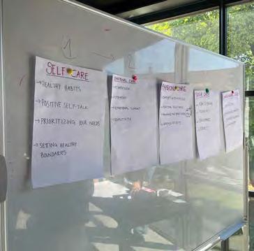
We also identified five key categories: self-care, emotional care, physical care, social care, and environmental care. We then defined each category with relevant keywords.
Our ideation session kicked off with a central question: “How might we collect data on SDSI students’ caring nature in a quick, easy, and engaging way?” We reviewed the LATCH principles, then transitioned to individual brainstorming (“brain dump”) and collaborative idea-building with sketches, culminating in our “aha” moment.
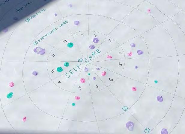
Inspired by the Facilitator Wheel from our firstsemester “Facilitation & Co-creation” course, we drew a “Caring Wheel” with five concentric circles on a flipchart, each representing a different caring category, starting from the most personal level (self-care) to the most collective (environmental care). At the top, we wrote our class attribute and the exercise instructions. To explain the caring categories, we listed keywords on A2 papers.
The 6 of us pilot-tested the tool and made adjustments before approaching other students. Through this visual map, we assumed students could easily self-assess and rate their level of caring based on their past week on a scale of 1-12 (with 1 being the lowest and 12 the highest) for each category. We planned for students to use finger painting to vote, choosing from three different paint colours.
With this prototype, we set out to test three key assumptions: (1) SDSI students are caring, (2) SDSI students will be able to rate their level of caring, and (3) the Caring Wheel is easy to use and enjoyable.


1
5
Categories
A scale of
1-12
20
3
colours
17 23-42 55%
Countries Y/o Females
Our first prototype was tested by two-thirds of our student cohort. To maximise participation, we positioned the “Caring Wheel” on a large table in a high-traffic corridor of Adatu Fabrika. We actively recruited students passing by or working in nearby rooms. The A2 papers explaining the caring categories were displayed on a whiteboard next to the table.


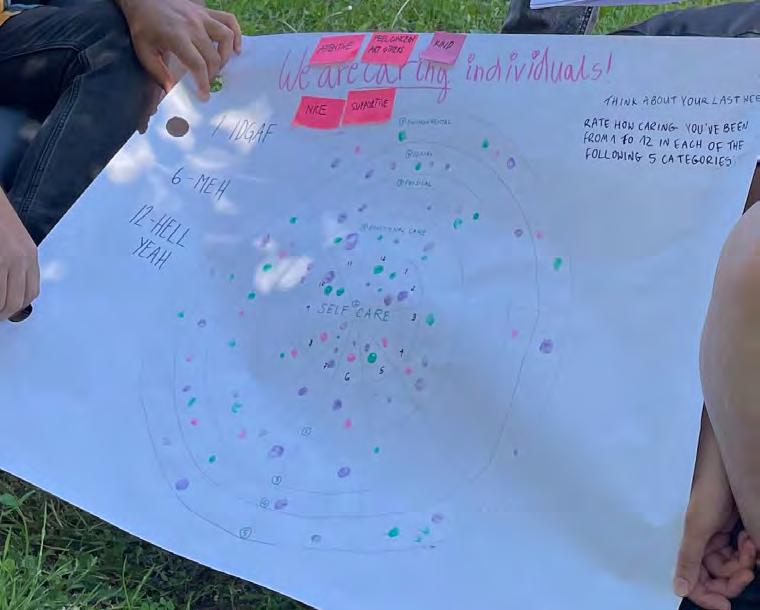
The results from our pilot test were overwhelmingly positive, validating all three key assumptions. All participating students were able to complete the “Caring Wheel” exercise, demonstrating their capacity for “caring”. They readily engaged with the tool, easily and quickly reflecting on and rating their past week’s caring behaviours across all categories.
Furthermore, observations during the exercise revealed a high level of engagement and enjoyment. Students seemed genuinely interested in the process, suggesting the “Caring Wheel” not only facilitated data collection but also served as a welcome prompt for self-reflection
Notably, some participants and the lecturer pointed out that the use of different colours for finger voting caused confusion. They questioned whether the colours had a specific meaning beyond being visually appealing. The lecturer also suggested we delve deeper into the “Time” principle of LATCH to gather data for comparison across different time periods.
In short, the “Caring Wheel” proved to be a successful and versatile tool, functioning effectively for both anonymous quantitative data collection and self-reflection while fostering a positive participant experience. However, the colour coding needed improvement, and the tool lacked the ability to facilitate comparisons.
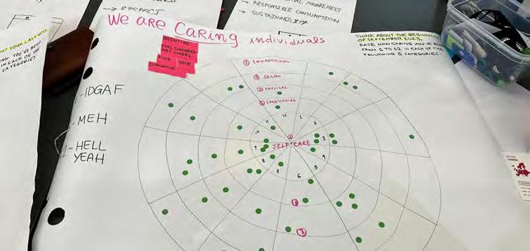
Based on feedback, we addressed the colour coding issue by replacing the preexisting fingerprints with uniform green dot stickers. This eliminated any potential confusion about colour meaning.
To enable comparison across time periods, we created a second “Caring Wheel” and invited the 20 participants to repeat the exercise, reflecting on their caring behaviours just before starting the SDSI programme. This allowed us to compare data from the beginning (September 2023) and the end (May 2024) of their first year in the programme.

Inspired by the readily available cardboard boxes, magazines, and toys at Adatu Fabrika, we opted for a creative data visualisation approach. We constructed puppet-house-like boxes for each of the five caring categories. Each box incorporated symbols, taglines, and artefacts, making the category visually clear and engaging.


To represent the quantitative data collected, we explored various methods (including pie charts, vertical, and horizontal bar graphs), ultimately settling for vertical barometers displaying two key percentages: the higher range (ratings of 6-12) in light green and the lower range (ratings of 1-5) in deep purple.

This approach effectively visualised trends: increases and decreases within specific caring categories before and at the end of SDS, as well as which categories students generally scored higher or lower in. It’s interesting to note that between September and May, there was a significant decrease of over 20% in emotional and environmental care scores. Conversely, physical and social care scores increased during the same period. Notably, social care remained the highest-scoring category throughout both timeframes.
The actionable data gathered through this exercise will be shared with SDSI staff and faculty. SDSI can leverage this data for benchmarking, identifying areas needing improvement, and launching more in-depth surveys into declining caring areas. This, in turn, can improve targeted interventions and resource allocation.
Before September 2023
At the end of May 2024

During the two days of completing the task, we have learned a lot. Learning by doing is very simple and unassuming, but it works every time. Not only did we have lots of fun, but also our project helped us understand how important it is to represent information in a clear and simple way. Feedback in the middle of the project also helped us to get to the right path of understanding LATCH even better and make the needed changes. In Information Design, less is truly more.


“As an aspiring service designer, the skill of organising information meaningfully and effectively is crucial. After this course, I now understand Richard Saul Wurman’s words in his book “Information Anxiety” and agree that “information may be infinite, however… the organisation of information is finite as it can only be organised by L ATCH… I’ve tried a thousand times to find other ways to organise, but I always end up using one of these five.”
“What I took away from this course was to learn that design has to have an effect and provoke discussion, beyond how it looks graphically, it has to be able to express messages, and above all it has to spark and provoke social interaction, this can be achieved with the minimum if it is done right.”

“I think this class really took me back to the first few years of design school where we were always going out, collecting things, playing with different materials, exploring different mediums and most importantly, using our hands to do all of that. In that regard, Martin’s class was really refreshing as he broke the streak of business intensive courses we were having this semester. I also appreciate the information design theory he covered in the short time he was given. Moving forward, I would LATCH while designing anything and it was great to connect with our artistic selves once again.”
“Working analog was a welcomed change for me. It didn’t make me feel like my skills are limited by technology and brought us all back to the same level. Using our hands sparked creativity in new ways, making learning both fun and effective. This is exactly how learning should be.”

The class and everything we did there was inspiring and refreshing. It was a good mixture of lectures and active participation. Even though it was a short course, I am confident I learned a lot. The team project was a pleasure to work on.


I realised that all I need to do is closing my laptop, grabing papers and pens and any materials that I can have, and starting to make “design”. I was having such a handson and playful learning experience that I never thought of before. This class did make me rethink and unlearn about visualing information.
SDSI Year 1 23/24
Information Design Course

From happiness to sadness, from anger to joy, emotions are present throughout our lives. They are what allow us to experience and connect with the world around us. Throughout the last 9 months in Kuldiga, each SDSI student has experienced a rollercoaster of emotions. For many, Kuldiga represented a fresh start, one with high and lows. As a group we wanted to capture this emotional journey and spark a conversation through the visualisation of this journey.
Join us as we unpack these emotions and explore how they influence our shared experiences in Kuldiga.

 TeamFig.1
photo

Emotions are pivotal – they shape our experiences, impact our well-being, and influence the trajectories of our lives. With 32 students from approximately 20 different nations, our classroom is a vibrant blend of cultures, expectations, and perspectives
We started by mapping the town and its most commonly visited places for SDSI students. Kuldiga is quite small! After gathering all the data, we began to process it, turning our collected insights into an analysis.

DrawingFig.2 out the map of Kuldiga


Once the Kuldiga map was ready, we asked our fellow students to identify their emotions and describe how they felt in various locations around the town. As a result, we created a map brimming with data, offering a unique emotional landscape of our shared experiences in Kuldiga.
FeedbackFig.3 whiteboard


FinalFig.5 mapping of emotions over time

Arranging the emotions by hierarchy allowed us to discern patterns and trends, revealing which emotions were most dominant in different areas. We ranked the emotions from the most to least commonly felt.
The results were promising; the most frequently showcased emotions were "happy," "playful," and "loved” - this is a great sign for the community and its spaces!

 Fig.6
Lower staircase

We creatively displayed the hierarchy of emotions using our campus stairs.
The most frequently experienced emotions were placed at the top, reflecting their prominence, while less common ones were lower down. The impact of this information design was clear, people began to discuss the emotions and where it was in the hierarchy. Achieving our goal of sparking a conversation about emotions amongst SDSI students.

 Fig.7
Fig.7

As service designers we need to embrace the uncertainty and provoke change.
This acceptance of uncertainty can be challenging and require us to embrace failure as part of the process. The activity of measuring and communicating emotions forced us to tackle our fear of failure and uncertainty head on. At the start of the activity, we focused on finding the “right” data to collect, the “right” way to display it, however as we progressed through the activity it became more important to just do it, not to overthink. The activity gave a freedom to play and have fun through the learning process (something not always allowed). The lack of computers and clear structure allowed our imagination to run wild and to see information design not just as something on a screen but something we interact with everyday.
Our team includes Agata Kowalska from Poland, Carolina Vaz-Pires from Portugal, Emily O'Connor from Ireland, Julian Nuñez from Venezuela, Tim Schnettker from Germany, and Linda Paulauska from Latvia
This publication was created within the course Information Design in the study programm Service Design Strategies and Innovations (sdsi) 2024
Supervised by: Martin Foessleitner


Emily O’Connor Julian Nuñez Linda Paulauska Tim Schnettker






“ I s n ’ t th a t a
u s tb e a
4 mod e l , f
c las s i c?
“ We willbe p la y in
h e r e , nt t h e c o nc ert.”
E K E N D R O A D A N E W P A T H


