9 minute read
Becoming a News Explorer Studio Cream on Chrome (Martina Huynh & Jonas Althaus
As news consumers, we are constantly keeping up with the news, but by doing so we easily lose sight of the long-term developments that drive current events. By exploring the different updates of a news story through the years, made possible by the Newsslider, we can gain a better understanding of historic developments.
Even though daily news headlines about migration are part of an ongoing global story, we are increasingly confronted with quick-to-consume snippets of ‘news updates’ that present themselves as breaking news every day1 – one headline covering up another instead of contributing to broadening the discourse, or questioning the developments and major causes behind them (in this case, for instance, rising global inequalities of those affected by resource depletion and habitat destruction). Often a result of keeping information short for digital consumption, the inverted pyramid ‘dictates that the most newsworthy information leads, followed by the important details and finally the general information and background’2 – with the latter most likely suffering the most severe cut in words.
Advertisement
Is ‘staying informed’ by ‘keeping up with the news’ the only goal? What could readers gain from a more zoomed out view of those same articles?
Compressing time
US reporter Jeff Gammage highlights the importance of bringing a historic perspective into the journalistic landscape: “Even when I was a young reporter covering city council meetings, I’d think, ‘This didn’t just spring out of thin air. A whole host of things happened to bring us to this moment.’ I try to think of all my stories that way: How did we get here? And what does the past have to say about the present?”3
If fast-paced news stories don’t make it beyond our collective shortterm memory: How can we emphasize historic developments – without getting overwhelmed? As designers intrigued by the way people relate to information and systems, we spent the past two years coming up with new, dynamic news formats – designed to position the most recent articles in the light of previous reporting.
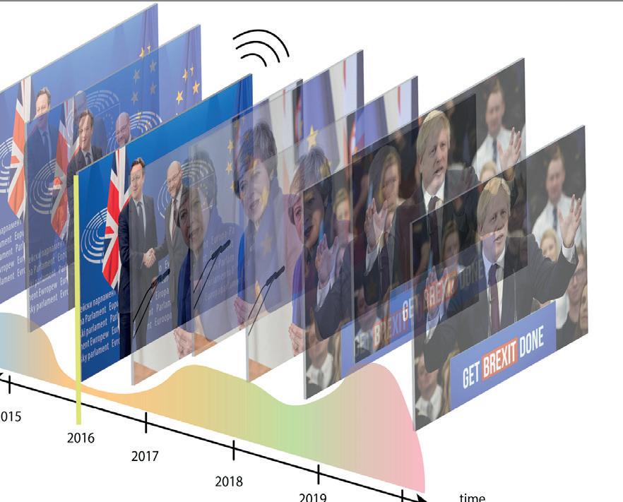
One major outcome is 4-D News: An interactive newsroom that turns news consumers into news explorers by letting them navigate through the layers of time, placing the focus on the developments of major stories, while highlighting subtle changes and recurring patterns over the years.
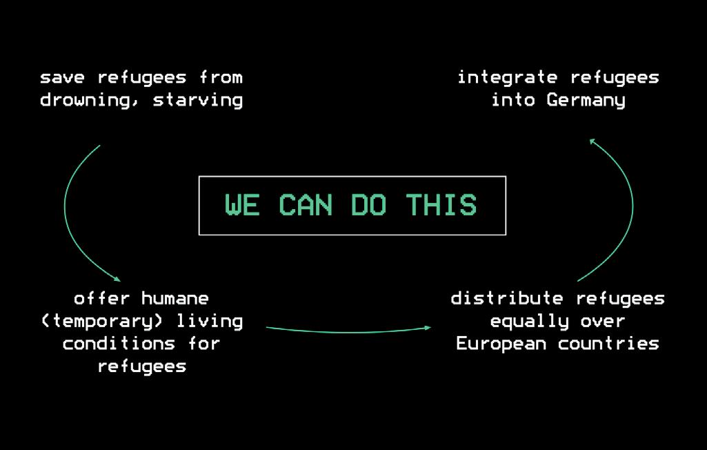
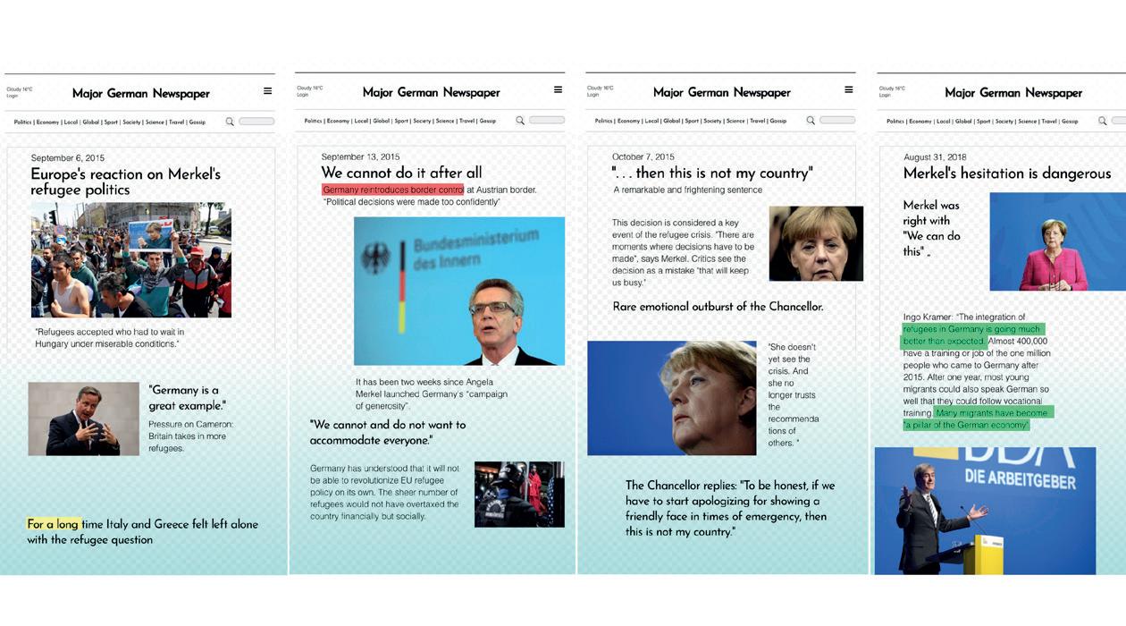
Looking back not at what was reported in the news, but how it was reported, one can observe the tone of voice and framing of a topic shift over time. What were the sentiments on, for example, the climate or the police a few months back? What new context does the story find itself in? What associations does the story evoke now, compared to, for instance, three years ago? One of the stories we researched was how German chancellor Angela Merkel’s much-cited phrase “Wir schaffen das” (“We can do this”) was portrayed in the German newspaper Süddeutsche Zeitung between 2015 and 2018. This sentence became a touchstone for migration politics in German media, with its meaning having shifted fundamentally from
“We (the European Union) can help refugees currently stuck in Hungary” to
“We (German citizens) can help accommodate refugees by making an extra effort” to
The research was translated into an “Updating Article” that dynamically changes as visitors pull up or down a physical scrollbar-timeline in the shape of an arrow – allowing to explore bits and pieces of the original 30 articles that appear, disappear and replace each other, thus revealing different sentiments and framings in different times. In correspondence, a small monitor displays the ever-changing definitions of “WE”, “CAN DO” und “THIS”, systematically revealing shifts in public discourse.
At the time of writing this text, 4-D News was exhibited at z33 House for Contemporary Art, Design & Architecture (BE), BIO26 Design Biennale (SLO), Dutch Design Week (NL) and will be shown at Hamburg Museum of Arts and Crafts (DE) in 2021 to trigger discussions about the current media landscape.
1 Bernstein, Jon. TLDR: so just how short should your online article be? The Guardian. 15 July 2015. https://www.theguardian.com/media-network/2015/jul/15/tldr-quartz-associated-press-article-length Accessed 30 Nov 2020 2 Bernstein, Jon. TLDR: so just how short should your online article be? The Guardian. 15 July 2015. https://www.theguardian.com/media-network/2015/jul/15/tldr-quartz-associated-press-article-length Accessed 30 Nov 2020 3 Morell, Ricki. What Happens to News When Journalists and Historians Join Forces. Nieman Reports. 21 Jan 2020. https://niemanreports.org/articles/what-happens-to-news-when-journalists-and-historians-join-forces/ Accessed 27 Nov 2020


While we were offered to continue our research at Fontys Hogeschool Journalistiek, interestingly our residency period coincided with the advent of the Covid-19 pandemic, which sent both news producers and consumers reeling in the floods of live-updates and number charts. Not getting sucked in the granular information feeds and rather focusing on the bigger changes in narrative became ever more important if one were to ‘stay informed’, given that the information was quite often contradicting on a day-to-day basis. Especially the face mask has taken a rollercoaster ride of shifting public perceptions and associations during the coronavirus pandemic.
To an archaeology of the future
Besides examining a new topic, the time spent at the residency allowed us to reflect on our own research method, which eventually led to the opportunity to team up with the Fontys Readership Journalism and Responsible Innovation, ID Fuse and the Netherlands Institute of Sound and Vision to work on a new project: The Newsslider.
Newsslider is a research tool for journalists and researchers that takes the principles explored in 4-D News and positions them in a more applied, web-based context. With access to the vast television collection at the Netherlands Institute of Sound and Vision and the intent to partner up with more news outlets, the goal is to open up existing archive material by showing the historical developments of any given topic in a clear visual timeline. For example, many news outlets often already categorized their news contents into news dossiers based on countries, or recurring topics like climate change or migration as mentioned in the beginning of this text.
With advances in Natural Language Processing as a means of extracting information and correlations from textual data, we have expanded our initial research method by e.g. being able to compare related keywords in order to track changing terminology over time. Like this, our team was able to trace how ‘climate change’ is surrounded by ‘global warming’, but also words such as ‘greenhouse gases’, ‘mass extinction’ or ‘acid rain’ in different years. Newsslider displays how these terms relate, which of them came up most often during, for instance, the ‘80s and raised the question why no one is talking about ‘acid rain’ in 2020 anymore.
Collaborating with this group of interdisciplinary partners allowed us to dive deeper into the aspect of time and explore new possibilities of looking back into the rich past in order to get a better understanding of both present and future.
Cream on Chrome is a design studio with a strong interest in journalism. Designers Martina Huynh and Jonas Althaus create interactive design applications and physical interfaces with which they explore new forms of journalism. Last year, Studio Cream on Chrome collaborated with Fontys Hogeschool Journalistiek in de Werkplaats on a study into better access to archives and is collaborating with the Lectorate on the study The News Slider.
References:
Bernstein, Jon. TLDR: so just how short should your online article be? The Guardian. 15 July 2015. https://www.theguardian.com/medianetwork/2015/jul/15/tldr-quartz-associated-press-article-length Accessed 30 Nov 2020
Bernstein, Jon. TLDR: so just how short should your online article be? The Guardian. 15 July 2015. https://www.theguardian.com/medianetwork/2015/jul/15/tldr-quartz-associated-press-article-length Accessed 30 Nov 2020
Morell, Ricki. What Happens to News When Journalists and Historians Join Forces. Nieman Reports. 21 Jan 2020. https://niemanreports.org/ articles/what-happens-to-news-when-journalists-and-historians-joinforces/ Accessed 27 Nov 2020


APPENDIX
Manual: Research Method
––– 1. Specify source (context) and search query
In our case, we decided to stick to one internationally recognized news source (The Guardian), in order to compare inconsistencies within the same news organization. We were looking for the occurrence of face masks in relation to the Covid-19 pandemic from January 2020 to August 2020.
For a previous research, we made use of news archiver LexisNexis. The method outlined below focuses on extracting data from the open web with minimal technical knowledge required.
To compile a dataset of articles, we used the below as search queries in google: “site:https://www.theguardian.com/ mask + coronavirus” and “site:https://www.theguardian.com/ intitle:mask coronavirus”
Using the in-built google search functions, split the results in badges by month or year. We grouped the articles by month from January 2020 - August 2020.
––– 2. Organize content
Per month, list the articles relevant to the topic (significant mention of search query) in an excel sheet with link, month and headline.
––– 3. Go through the content
Per month, for each article, read the headline and the lead (first summarizing paragraph). Also use your browser’s search function to highlight every sentence mentioning the query ‘mask’ and read the paragraphs it appears in. Add a short summary of what is talked about most per month. A vague development of the discussion can already be made out at this point. Often there is not only one major topic or focus per time period, or they overlap with other months.
––– 4. Optional filter strategies
a: If mood and tone of voice is what you are looking for, try reducing articles to adjectives only – to get a hint of the changing sentiments in the articles over time. Colour adjectives from green to red to give a visual cue about how positive or negative the articles come across.
b: Put all the lead images of the articles in a chronological overview, do you see something change? Do they look more dramatic during certain months, or do the visuals tell you something about the changing associations around the search topic?
Summarize sentiments / associations around your search topic per month
––– 5. Find interpretation per month
Go over the summaries and highlight telling headlines that seem most representative of the reporting during this month. It can be 2-3 headlines. For each month, ask yourself not what happened in the news, but what did the mask stand for?
Example: In March 2020 we have headlines like
“Medical staff beg for masks on social media amid coronavirus crisis”
“Tests, masks, beds: health workers grapple with shortages as coronavirus crisis grows”
“US hijacking mask shipments in rush for coronavirus protection”
The summary was “Shortage of masks and other medical protective supplies (in Western countries)”.
What did the mask represent? → A scarce resource
For this research, we limited ourselves to one single newspaper, but are fully aware that had we chosen a different one e.g. The Sun, The New York Times, The Financial Times, the storyline extracted might have been a different one. You could also do the same research on other news sources and compare them, which would offer new insights as well.


