YUFAN LIANG
University of California, Berkeley, M.Arch University of Toronto, B.A
Selected Works from 2019-2022
1
yufanliang@berkeley.edu Phone:
Email:
5105616293
Architecture is about gathering.
2
3 Contents 03. Unite Residence/ Large-scale Housing/ Student housing 01. Frame Collective Housing 02. Floating Auditorium Community Theater 09. Twisting Small scale geometry design/ Parametric design 08. The Interstitial Restoration/ Community Center 07. Reallocation Landscape architetcure/ Plantation/ Bryant park 04. Diagonal Living Multi-program/ Small-scale architetcure 05. Boat House Housing 06. Toronto Waterfront Urban Mapping

Frames
Collective Housing
ARCH 201: Architecture Studio 3 (Fall 2022)
Instructor: Rudab eh Pakravan Individual Work, 2022.09-12
The project is a collective housing, which is generated from the observations of Broadway, Oakland, CA. Staring off from the urban experience when standing at the Broadway. The design further developed from a conceptual chunk model of foam. And then it expanded and grown into a collective housing.
The design is a townhouse which consisted of 45 units in the site area of 0.8 acre. It is featured in bringing both sides of views of Broadway together. By providing a unique and vivid living condition, it aims to further challenge the rigid city grid.

5
Interacted Perspectives Housing

2022 Sep.~Dec.

7
Interacted Perspectived Houing
Exterior Render
Kitagata Gifu Unroll Facade Axonometric
Unite d’Habitation Units Axonometric
Unite d’Habitation Unroll Facade Axonometric


Unite d’Habitation Units Axonometric
The project is derived from the observation of Broadway in downtown Oakland.
I am interested in different perspectives shifting at one spot at the same time. And to challenge to the rigid city planning. The two collages illustrate the connection of perspectives after the shearing of grid layouts.

Unite d habitation and gifu housing by SANNA are the two case studies influence the design as well.
‘Inside-out ‘ Ovservation of Broadway St.
The diagrams demonstrate the investigation of connectivity of perspectives from interlocking of two spaces, as well as the folding and unfolding of the façade.


8
2022 Sep.~Dec.


9
Chunk Model Plan
Chunk Model Plan
Chunk Model Section B
Interacted Perspectived Houing
Chunk Model Section A


10
2022 Sep.~Dec.
Ground Floor Plan 1/8” = 1’-0”


11
Second Floor Plan 1/8” = 1’-0”
Third Floor Plan 1/8” = 1’-0”
Interacted Perspectived Houing
Section 1/8” = 1’-0”


Obelique 1/8” = 1’-0”

14 2022 Sep.~Dec.


15 Interacted Perspectived Houing

FloatingCommunityAuditorium Center/Theater
ARCH 200B: Architecture Studio 2 (Spring 2022) Instructor: Mia Zinni Individual Work, 2022.02-05
The form is generated by the Boolean operation of two rectangles. And the main concept is about shifting. One is slightly shifted from the other. Programs are aligned with the shifted grid, and circulation is wrapped around two sides of the auditorium.
By doing that ,The concept is bringing the view around the corner of telegraph and 22 street. Again, stairs are shifted on both sides connecting with the foyers. So two foyers functions as circulation and they provide views as well.

17
Auditorium Theatre


18 2022 Jan.~May.
Massing Model


19 Auditorium Theatre
Plan Level 3
7. Office
8. Rehersal Room
Plan Level 2
3. Restroom
4. Rehersal Room
5. Auditorium
6. Backstage


20 2022 Jan.~May. Section A
Sectional Model


21 Auditorium Theatre Section B
Sectional Model

22 2022 Jan.~May.
Circulation is wrapped around two sides of the auditorium.


23 Auditorium Theatre
Ground Floor Interior
Roof Top

Unite
ARC201: How to design nothing

Instructor: Brian Boigon Individual Redo Work, 2020.09-12
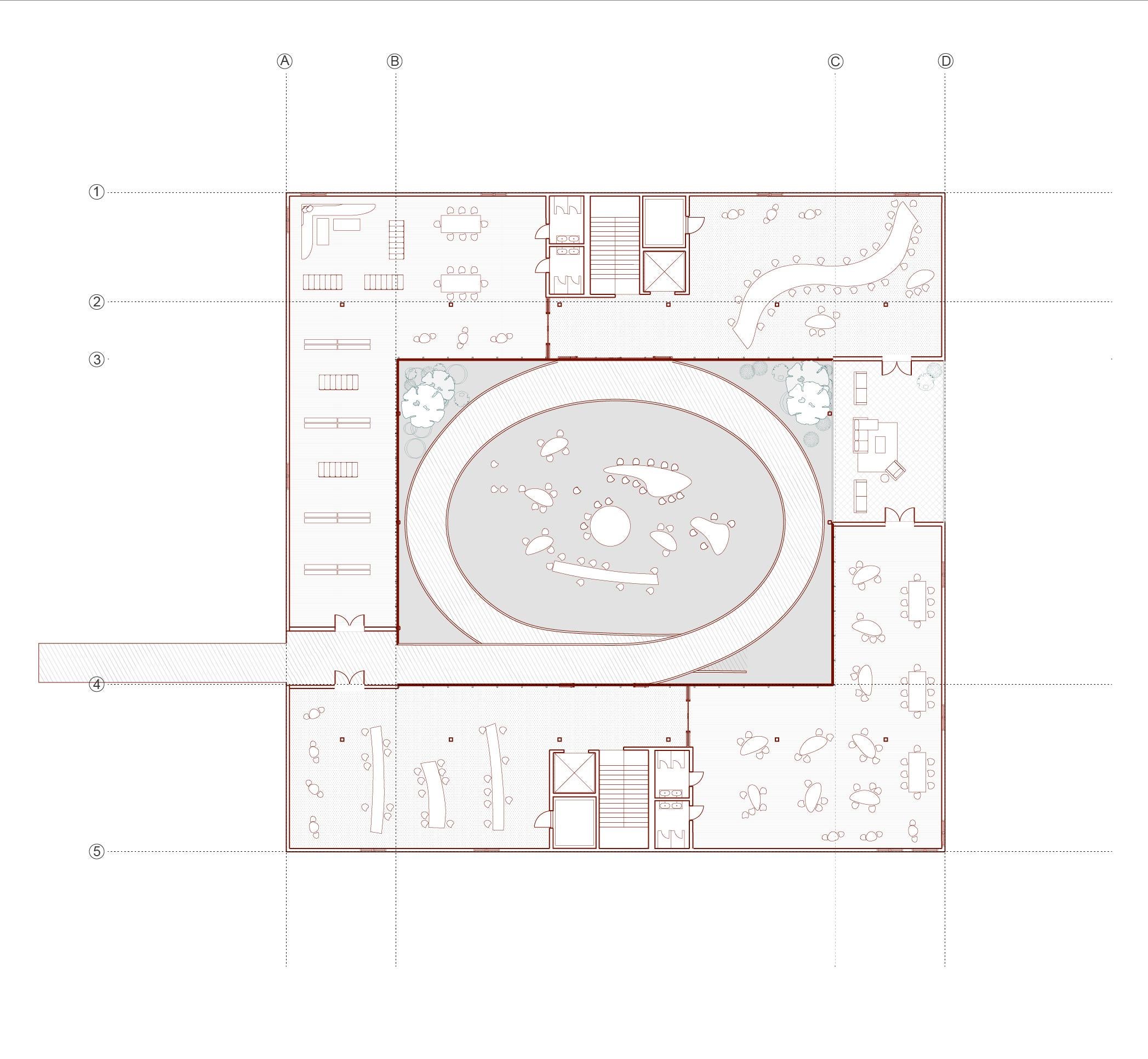
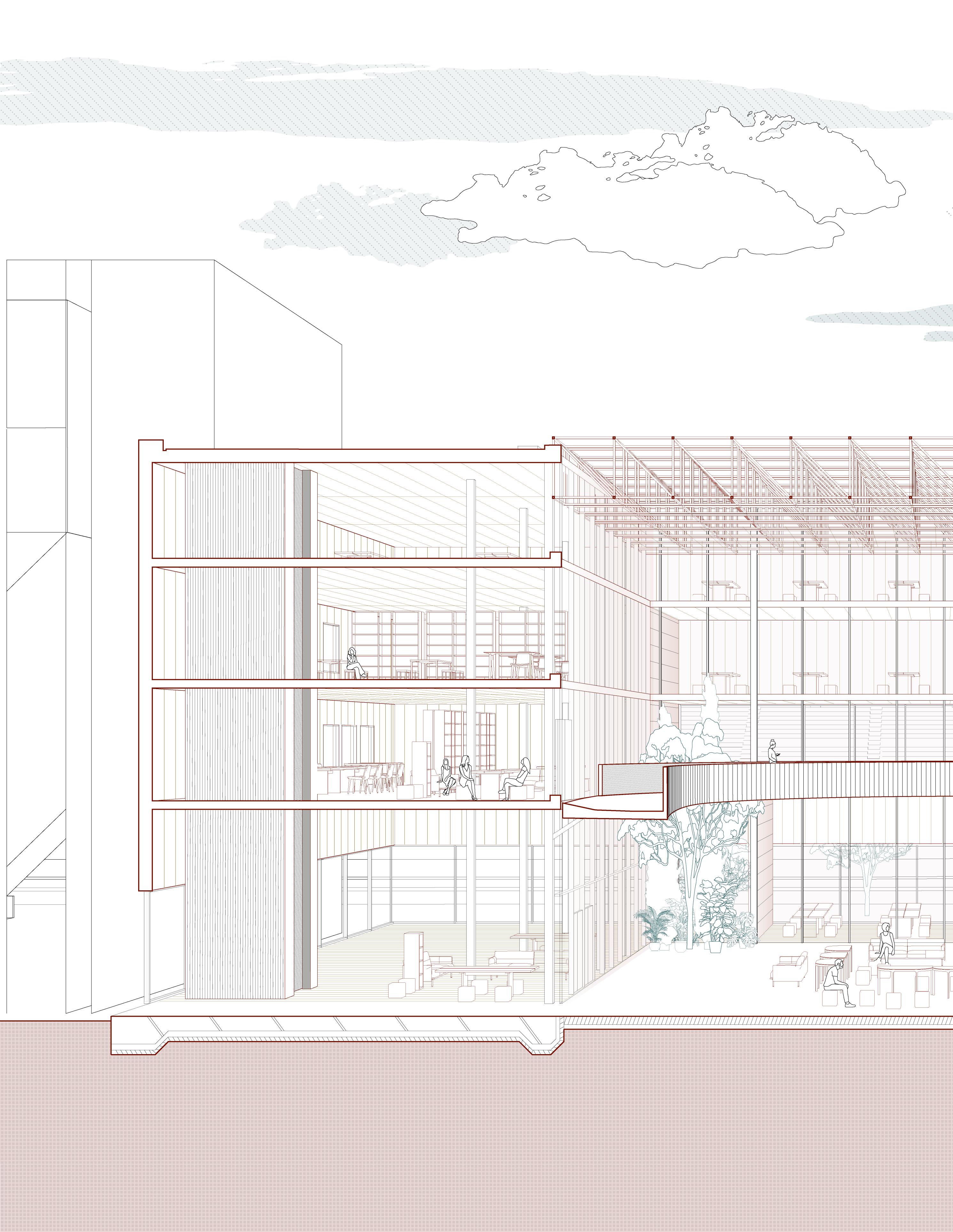
The project explores new approach to unite people together. By adding a new route to connect two roads, the building is featured in dynamic integration and vivid interaction among people. When walking along the ramp, there is a slow ascent through the buildings levels that has a degree of reveal allowing the passerby to peer into the spaces through the separation between the floor planes and the ramp. The space contains an atrium inside to create an open environment for students. In addition, there is a number of plantations on atrium of the ground floor to generate a natural garden inside. Rooftop is made of truss structure that brings natural sunlight into the center of the building. Along with the glass rounded inside, the reflection light and the sunlight together create a bright environment.
25
Unite: Student Center
The ramp in the building connects two parallel roads on each side of the site. It facilitates the circulation in-between the west and the east.

The parallel roads on each side of the site is isolated from each other. The idea is connection, interaction, and facilitation.


Context diagram

26
Exterior Render
2020 Sep.~Dec.
Four floor Area: 1000 sq.m.
Height:11m
Third floor Area: 1000 sq.m.
Height: 8m
Second floor Area: 1000 sq.m.
Height: 5m
Ground floor Area: 1400 sq.m.
Height: 0m
Site Diagram


27
Diagram Retail Reading Area Library Lounge/ Social Area Office Ramp Elevator Circulation Diagram
Program
Public
Private Circulation Unite: Student Center

28 Ground Floor Plan 2020 Sep.~Dec.


29
Top: at entrance
Student Center
Bottom: second floor near ramp
Unite:


30
Floor Plan
Public
6&9: Public reading area 7: Media room 8: Meeting room 10: Library
1 2 3 6 7 8 9 10 4 5
Floor Plan 2020 Sep.~Dec.
Second
1&4:
reading area
2: Balcony 3: Private reading area 5: Library
Third

31
Unite: Student Center
Axonometric View
Truss Parapet
Mullion Glass Ramp Column
Floor Plane Facade

2020 Sep.~Dec.

Sectional Perspective Unite: Student Center

Diagonal Living
ARC362: Architecture Studio IV

Instructor: Johnathan Cummings
Individual Work, 2020. 01-04
The project is the first attempt of designing a large-scale residence. Through the precedent study-Kitagata Housing by SANAA, I referred the single row architectural volume that is as similar as the design of Kitagata Housing. The single row will reduce the chunkiness of architecture and make the whole building light, which I think is an aesthetic representation of the building. It also facilitates the circulation that make the movement smooth and convenient. Residents can simply circulate around by the hallway. The building highlights its lightness in many aspects, not only in construction, but the program design is also innovative and matches the vivid spirit of students of new generations. I combine laundry with circulation together to incorporate a new living habit: laundry is redefined. The design of the building responses energy of students, aiming to design a comfortable living environment as well as stimulating creativity of students at the same time.
35
Stacking: Student Housing

36 2020 Jan.~Apr. Site Plan


37 Stacking: Student Housing Dorm Room Program & Circulation Elevation Terrace Elevator Common Room Laundary Room Kitchen Social Area Historical Building Bridge Circulation


38 1 1 2 2 2020 Jan.~Apr. Typical
Floor Plan

39 Stacking: Student Housing
Exterior Render
Single room1
- Area:20 sq.m.
- Occupation: 1-2 people
Single room2


- Area:20 sq.m.


- Occupation: 1-2 people
Double room
- Area:42 sq.m.
- Occupation: 2-4 people
40
2020 Jan.~Apr.


41 Stacking: Student Housing
01: Vapor barrier with taped joints for air tightness
02: Breather memberane
03: 20mm window glass
04: Folded stainless steel capping

05: 12.5mm Gypsum Gyproc WallBoard plasterboard with taped joints. Expamed plaster beads, skim of plaster
06: 60mm Kingspan rigid insulation
07: Steel frame deck, comprising 152UC 37, 203 UC 60 + 88.9 CHS 8, 150 * 50 mm C24 treated softwood joints
08: Warmcel cellulose fibre insulation min. 250mm between beams
D02: 167 * 18 mm softwood window sill fixed to 25mm plywood
D03: 167 * 18 mm softwood window sill fixed to 25mm plywood
42 Section & Elevation
2020 Jan.~Apr.

43 Axonometric View
Stacking: Student Housing

Boat House
This project is about four quadrants of spaces are aligned along a linear shifted spine, within each quadrant, the ground plane has varying degrees of elevation to allow different experiences of the sculptural interior form and variation of light.
The shifted spine has a rotational quality that organizes the sculptural roofs. It is achieved by different size of spaces rotating around the spine crossing at the central area. The spaces are arranged in different heights to create a sense of spatial complexity and it is a response to the varying heights of the roof, which is represented in this unfolded elevation.

45 Boat House: Dwelling
ARCH 200A: Introduction to Architecture Studio 1 (Fall 2021) Instructor: Kristen Sidell Individual Work, 2021.09-12


46 2021 Sep.~Dec. Unrolled Facade Site Plan


47
Dwelling
Boat House:
Section B
Section
A

48 2021 Sep.~Dec.


49 Boat House: Dwelling Plan
2. Living Room 3. Kitchen 4. Lounge 5. Cafe

2021 Sep.~Dec.


Boat House: Dwelling

Toronto Waterfront
ARC200: Drawing and Representation Instructor: Victor Perez-Amado Individual Work, 2019.01-04

The project focuses on analysis and investigation of accessibility and walkability of pedestrian along waterfront area. Toronto Waterfront area is consisted of industrial factories, tourism amenities, transportation stations and office center. It is an important node in the whole public transportation system of Great Toronto Area (GTA). With the increasing speed of development of technology and industry, the place had been occupied mainly for highway or high-speed transportations. But pedestrians and other slow-speed transportation, such as bicycle, have no space. Such barriers result in low accessibility to waterfront amenities that people have no fun in waterfront area. In order to improve people’s living qualities, this project provides mapping to deep analysis conditions around the area.

53
Toronto Waterfront
Elements of Barrier in Construction Areas

Diagram of pedestrian Streets, transportation and activities Data analysis

Percentage of Traffic Congestion In the morning& evening rush hour

Percentage of Traffic Congestion in Normal Time

54
2019 Jan.~Apr.

55
Toronto Waterfront
Diagram of site investigation- walkability along waterfront area & construction elements
Sections of nodes where have poor traffic conditions

The crossroad is complicated and it makes people confused with the direction.
The bridge is usually not convenient for disabled people.
Comfusing people where the entrances and exits are.
Hard to construct pedestrian-friendly environment.
Resulting of traffic congection easily.

56
Diagram of relationship between public activities, pedestrain walkabiliy and transportation
A-A A B-B B C-C C D-D D E-E E F-F F
Intersection beside Sugar Beach Park. People are blocked by the highway.
Map of nodes 2019 Jan.~Apr.
Beach Park
• Beach
• Sun bath
• Nice view
Water Garden
• Fountain
• Picnic

• Family time
Communes

• Waterfront street view
• Pedestrain
• Walkability


Tree Park

• Green Plants
• Jogging
• Fresh Air
Children’s Garden
• Slide
• Swing
• Child-friendly
Garden Street
• Street view
• Infrastructure & transit
• Convenience facilities

57
Toronto
Diagram of amenity
Waterfront

Reallocation
ARC363: Landscape Architecture Studio III
Instructor: Sonja Vangjeli Individual Work, 2019.09-12
The project is an exploration of public space. It is challenging to construct tangible landscape by using the intangible features of public space. Since the landscape site is continuously generating and changing, people’s habit and activities are logically depending on the history of the site. It is important to understand the history of the site, since the current appearance is a result of changes based on its history. Landscape and people are contemplate that people’s behavior changes the landscape and landscape influences how people’s living experience continuously at the same time. The project is trying to have a conservation with future people in 30 years. It’s conventional that the technology will not change too much of people’s living style. And trying to add a romantic and poetic environment into life. It is suggesting people to slow down and experience what is genuinely precious in life.

59
Reallocation:
Bryant Park Renovation
- Separate walking & sitting space


- Creating new space
- Improving circulation
- Creating new space


- Improving circulation


60
Bifurcation
Zig-zag Corner
2019 Sep.~Dec.
- Little pathway for 1-2 people to walk at the same time


- Improving circulation
- Creating a more private space
- Allowing group activities
- Creating a more private space


- Improving circulation
- Enhancing experience


61
Diagram of details of renovated flower beds
Right angle Hollow Diangnal
Reallocation: Bryant Park Renovation

62 Previous Adding elements New
2019 Sep.~Dec.
Diagram of modification of flower beds

63
Reallocation: Bryant Park Renovation


64 Structural Soil Min 20’ Spacing Pref. 36’ 1’ Drainage Pipe Prepared Subgrade 2019 Sep.~Dec.
Planting Soil Mix as Specified Concrete Planter

Pavement Finish Grade 6”-8” PVC Sleeve
Pref. 36’
Structural Soil Width Varies
Drainage Pipe
Prepared Subgrade
Reallocation: Bryant Park Renovation

65 Section A-A
The circulation diagrm of Bryant Park in 2020:
Original symmetrical circulation makes the park features in the stright vista and a formal sensation.
The circulation diagrm of Bryant Park in 2050:
The modification of circulation from stright to curvey will benifit the capability of occupication of increased population in the futrue. In addition, it also advances the playfulness of the park by increasing spaces for activities.


66 Plan of Renovation
2019 Sep.~Dec.


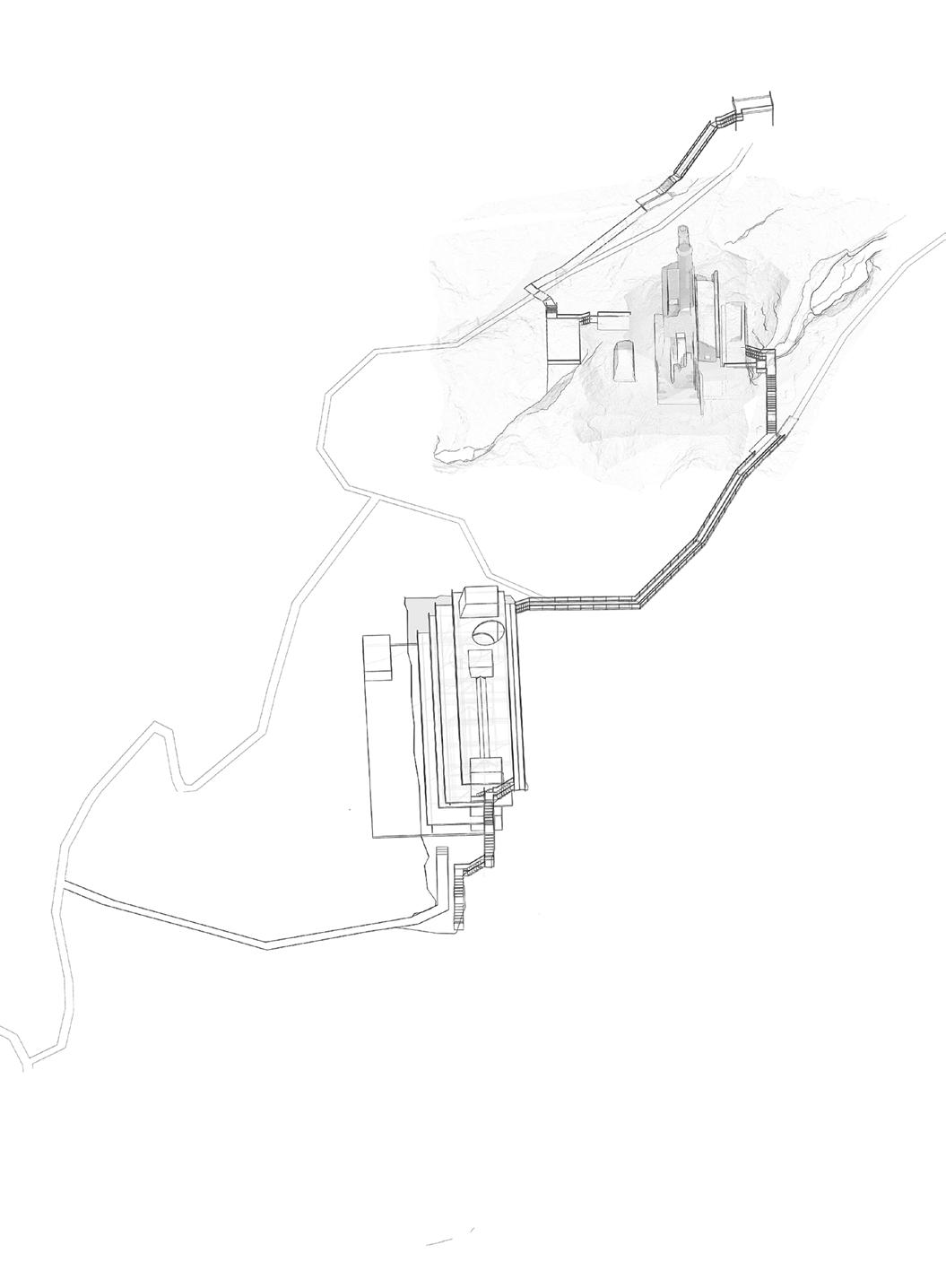
The traII gent|y fo||ows and preserves the topography, connectn the project W|th the town and the road, meanwh|Ie Ieadmg to the best points of view to observe the majestic uins and mystic beauty of f coastal landscape.

The volume of the architecture is hidden in a crevic to minimize footprint and intervention of the surroundings and the ruins. Immersed in the subterranean tranquity between the skylight and the rock formation, the visitors can perform meditation, participate in yoga or enjoy a peaceful meal. With the main volume of the architecture hidden, the spaces function for meditation, healing and relaxing. Creating a tranquil environment, the majority of programs consist of planty of relatively private spaces, which include Yoga Room, Sauna, Bathing, etc. The building also provides public services open to visitors and locals, yet it keeps the private and public space in a balanced condition. The first, the third floor, and the roof are mainly about public spaces whearst the second and fourth floor are private programs. The first floor contains a public theater, some administrative and community rooms. Programs on the second floor are Yoga/Medtation room, and Sauna room. On the third floor, there are Gallery, open Lounge space. The Restaurant and cafe on the fouth floor. And a public walkale space as the rood space for people to view the beautiful scene.

The Interstitial
Y3R Meditation Mine Competition Group Work, 2022.07


Plan Contour Section Geneal Plan 2022 Jul.


71
Corridor Interior
The Interstitial
Skylight

Twisting
This project mainly explores the functionality and materiality of parametric design. Studying tools of parametric design, the process is consisted of three stages. The first stage is to design the fundamental geometry. And the next stage is designing the supporting structure. The first two stages is to be familiarized with fundamental knowledge of parametric software and the fabrication. The final stage is to advance the skill that to design the façade. 3D printing technique was used in this process and the body structure of the tower is fabricated by laser cutting technique.

73 Twisting Tower
ARC280: Modeling and Fabrication in Design Instructor: Nicholas Hoban Individual Work, 2019 .01-04
Stage one: using a parametric tool (grasshopper) to create the tower from basic surface. It is to familiarize with the parametric design for layering the `.


Stage two: Adding supporting structure to the tower. I used the stabs for supporting the weight. To maintain the aesthetic of the tower, the stabs are twisted following the curvy shape of the geometry.


Stage three: To advance parametric skills, this final stage is to design a facade using 3D printing technique. Patterns are projected onto the facade surface by using morph technique.


Study Models

74 2019 Jan.~Apr.

75 Twisting Tower Axonometric View
76 YUFAN LIANG Email: yufanliang@berkeley.edu


