
1 minute read
Logo
The Logo.
Our full logo doesn’t tend to be used as part of the actual designs of products.
Advertisement
Like much else in life, we take a fairly laid back approach to our logo placement, as long as it looks clean and is visible - its pretty much a yes from us.
We have a few different variations of our main logo. Sometimes we also bring out logos for particular ranges for example our L.O collection has it’s own logo.
minimum space
10mm
10mm
(1) Our basic logo - used on website, official documents, gift cards, product labels, our store front etc (The serious stuff).
The Variations.

(2) Our basic logo + the eyes.
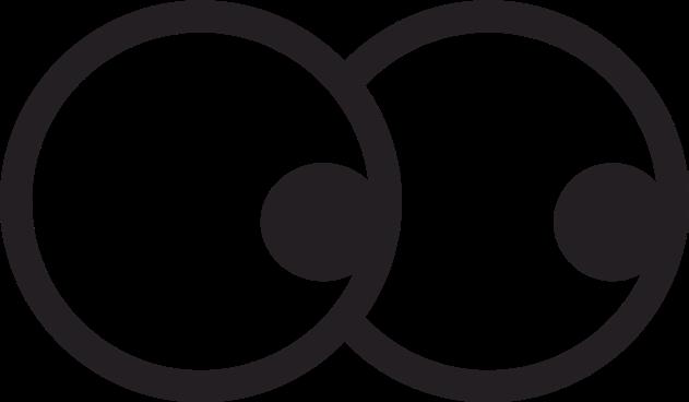
(3) The eyes alone - You will notice on our website ‘the eyes’ follow the movement of your cursor. When using ‘the eyes’ you may change the direction of the pupils if it works in that situation.
(4) Our basic logo + the eyes 2.0 - we use this when we need a nice square logo.
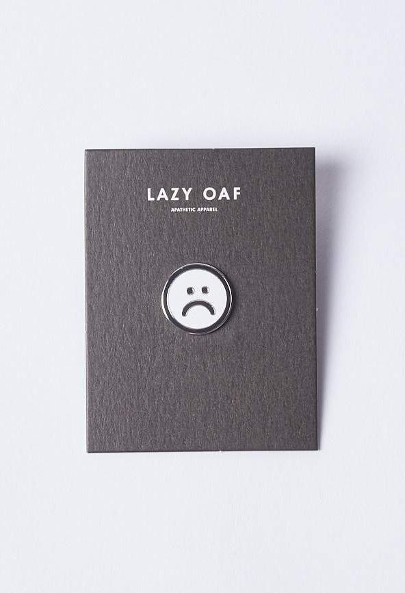
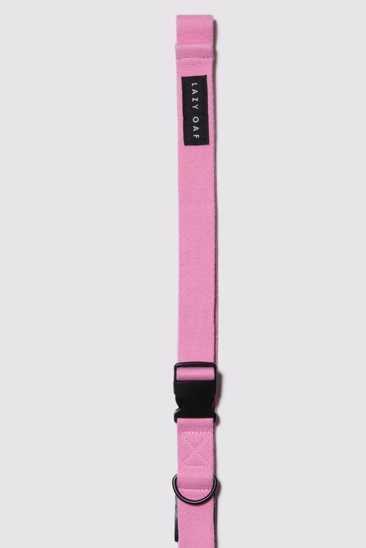
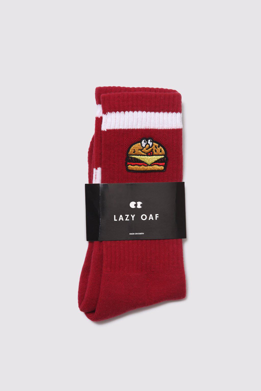
Here you can see how our logos should be placed on backgrounds.

Only use the black logo on light backgrounds and the white version on dark backgrounds.
Ensure that when using the logo it always stands out.


