INTRO
(ABOUT THIS BOOK)
This visual development guide has information about the brand’s history, the history of logo design, how to make a new logo, where to find ideas, and sketches.
We wanted to revitalize NPS with a new brand mission, which we will carry out through our logo and a series of brand identities. In this section, we’ll talk about how the logo was made and how it was changed so that it shows the new mission of the NPS in a very clear way.

{SCOPE: BRAND INTRODUCTION}
This section contains the brand selected from the five brands of the National Park Service. And this brand will be rebranded; I will introduce and research the brand story, brand soul and mission, brand point in time insight, and future insight. This will aid me in the next phase of better visualizing and positioning the brand.

BRAND INTRODUCTION

01:05 BRAND INTRODUCTION
( ABOUT NATIONAL PARK SERVICE )

The National Park Service is an agency of the U.S. federal government, and they serve to manage all national parks, most national monuments, and natural, historic, and recreational properties that hold various designations. They do this to preserve the natural and cultural resources and values of the National Park System for the enjoyment, education, and inspiration of present and future generations.
The national park system is not limited to“parks” but includes all projects under the jurisdiction of the National Park Service. The naming and planning of a project unit need not include the word “park”; in fact, most do not. The system as a whole is considered to be the sum of America’s national treasures, and the relatively famous national parks and museums are sometimes referred to as America’s treasures.
(BRAND SOUL)
To immerse each generation in the beauty of nature and to pass it on.
What a country choos
es to save is what a country chooses to say about itself.
– Mollie Beattie, American conservationist03:05 BRAND TIMELINE
1860s 1870s 1910s
(1864 The birth)
The federal government set aside land in California’s Yosemite National Park, which was the birth of the national park concept.
(1872 The first national park) (1914 The service)
Yellowstone was so epochal as the first national park that it has been called America’s best idea.

Stephen Mather visits and Nevada National Park. He contacted Secretary of the Interior for and environmental upgrades the park.his set the stage for lishment of the bill that followed.
(1916 The service)
President Wilson established framing of the Park Service the “Organic Act”. Thus was National Park Service with a to preserve the natural landscape its heritage.
(1917 The east coast)
Around the same time that National Park Service was created 1916, there was a growing movement preserve Maine’s Acadian landscape of forests and seashore. Eventually it became Acadia National first east coast national park.
coast)
experiences in contacted the equipment upgrades needed in for the estabfollowed. established the by signing was born the a mission landscape and the created in movement to landscape Eventually Park, the park.
1930s 1950s-1970s
(1933 The storyteller)
56 national monuments and military sites were transferred to the National Park Service, which allowed the National Park System to include history, scenery, and science. Became an important player in telling the history of the United States.
(1956 The mission 66)


Mission 66 is a 10-year plan to upgrade facilities, staffing and resource management across the system.
The enactment of the Historic Sites Act provides stronger legal support and meaning to the National Park Service.

(1935 The Preservation Law) (1966 The National Historic Preservation) (1970 The General Authorities Act)
All historic parks are listed on the National Register of Historic Places in accordance with the law. Help redefine the National System to include all areas managed by the National Park Service “for park, monument, historical, parkway, recreational, or other purposes.


04:05
LOGO EVOLUTION
( NPS
LOGO EVOLUTION )
The elements of the emblem symbolize the major facets of the national park system. The Sequoia tree and bison represent vegetation and wildlife, the mountains and water represent scenic and recreational values, and the arrowhead represents historical and archeological values


(1951) (1952) (1968) (2000)


We have developed three key words: conservation, accessible, and contribution. And phrases are the essence of brainstorming based on these three keywords.
This will be the basis and reference for us to start our visual development
(CONSERVATION)
Passing on nature to tomorrow
(ACCESSIBLE)
Delivering nature to people
(CONTRIBUTION)
Developing a vision for the world
preserve our cultural resources
by constantly inspiring people to make resources accessible.
{SECTION INTRO: VISUAL DEVELOPMENT}
In this section, we will create a series of key phrases based on the brand’s three keywords and use them as the foundation for visual development and brand building.


INITIAL SKETCHES R1
This section will demonstrate the process of transitioning from hand sketches to computer sketches. This is centered on the inspiration derived from the three key phrases extracted for the NPS brand’s soul: concern, accessibility,
and contribution. So that we can better develop the brand’s visuals. Each section corresponds to a keyword and key phrase, and the sketches are symbolic, graphical, and textual.
Passing on nature to tomorrow
Delivering nature to people
vision
Developing a
for the world

Passing on nature to tomorrow
(SYMBOLIC MARKS)


This is a customized symbol or graphic mark for the brand that includes meaningful shapes or allusions to the brand’s soul in a variety of directions, such as mythology, animals, culture, the humanities, and so on.


(BEFORE WE START)
I did some “Why?” and “How?” and a series of related words about conservation during the brainstorming session. When people hear NPS, the first thing that comes to mind is protection and guardianship, so we can use words like shield, roof, hand, unity, and so on.


Delivering nature to people
(SYMBOLIC MARKS)


This is a customized symbol or graphic mark for the brand that includes meaningful shapes or allusions to the brand’s soul in a variety of directions, such as mythology, animals, culture, the humanities, and so on.


(BEFORE WE START)
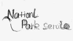
One of the key words in the new branding is “accessible,” and we want the NPS to be more than just parks, with people no longer having to drive five or six hours to experience nature. We want to bring people closer to nature and culture, whether they are in the city or in a national park.


Delivering nature to people


(GROUP 1) (GROUP 2)




(CONTRIBUTION)
Developing a vision for the world
(SYMBOLIC MARKS)


This is a customized symbol or graphic mark for the brand that includes meaningful shapes or allusions to the brand’s soul in a variety of directions, such as mythology, animals, culture, the humanities, and so on.


(ANIMAL )
(OBJECTIVES)
Hands, through hands to touch


(CONTRIBUTION)
Developing a vision for the world
(ABSTRACT)


People working together
1)


People working together

(GRAPHIC) (GROUP 1)


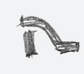


Shield + N


FURTHER EXPLORATION R2
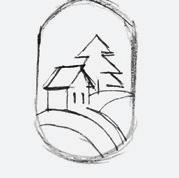
We chose more specific keywords and directions in this section based on the first round of drafts and reflections. Two of them are “conservation” and “accessibility.” This foundation will be expanded with more detailed drafts and explorations.
Passing on nature to tomorrow
(INSIGHT)
Protecting our natural andcultural resources. As well as making our natural resources accessible to all.
Delivering nature to people
(CONTRIBUTION)
Developing a vision for the world

Passing on nature to tomorrow
(GROUP 1) (GROUP 2)




(GROUP 3)


4)


(ACCESSIBLE)


Delivering nature to people
(GROUP 1) (GROUP 2)


INITIAL REFINEMENTS
In the third round of sketch exploration, we have a more detailed direction. We’ll focus on the “shield” graphic and run a series of more creative experiments.
Passing on nature to tomorrow
Delivering nature to people

INITIAL SKETCHES EXPLORATION


DIGITAL FINAL REFINEMENTS
In this section, we have a clearer direction and a final choice. Based on these, we transferred the drafts to the computer and experimented with different negative spatial relationships, element arrangements, and fonts to find the best solution.


(GROUP 1)


(GROUP 3)


{SECTION INTRO: FINAL LOGO}
In this section, we will present the final logo as well as a look-alike logo as a case study.


THE FINAL LOGO
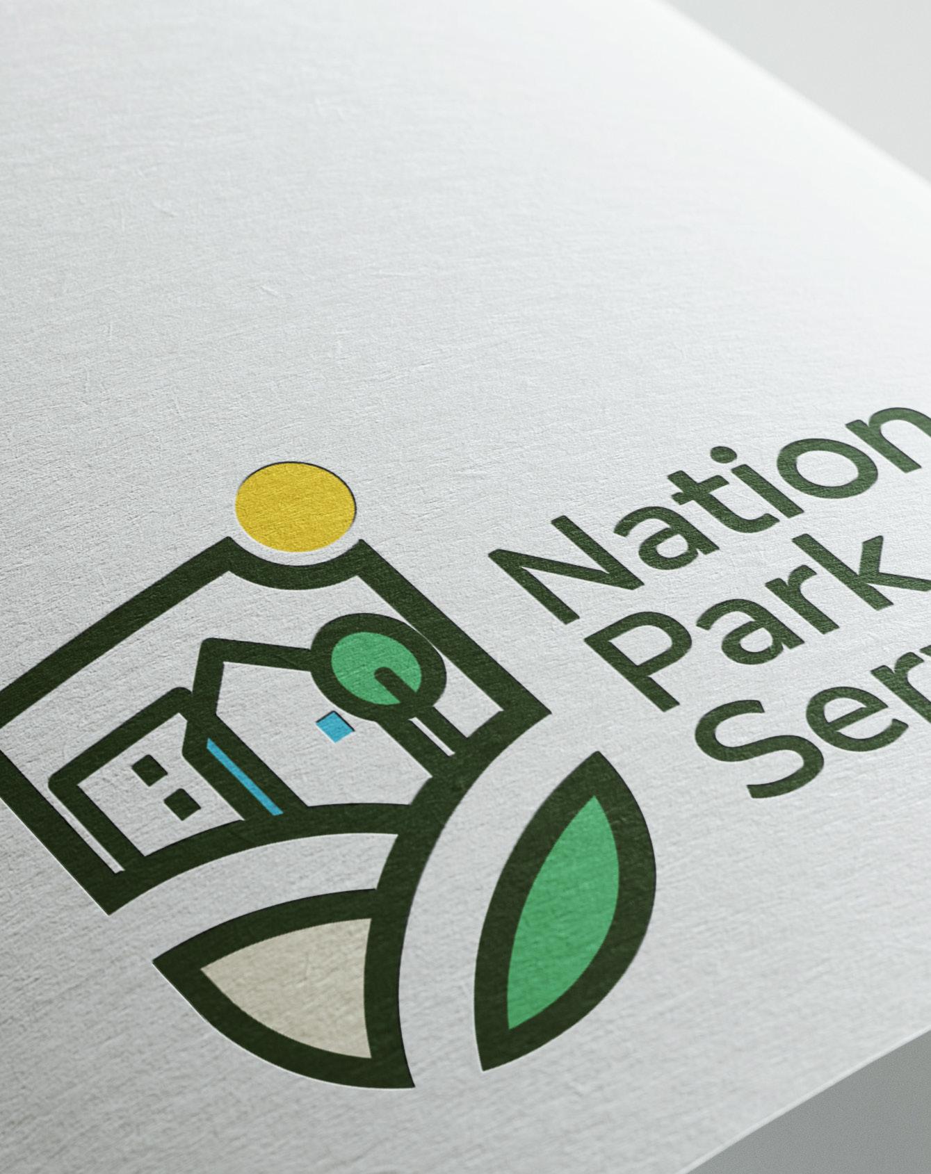
Following extensive exploration and research, we created a new logo and visual system for NPS. This symbolizes the union of city and nature, as well as the NPS’s accessibility to all.



“LOOK A LIKE“ LOGOS


The shield is often used as the most visually appealing solution in logos, and the color, font, and other elements represent different meanings depending on the color, font, and other elements.


We attempted to find as many similar logos as possible in this study in order to gain inspiration and avoid unnecessary misunderstandings. For us, the new NPS logo represents safety, community, and accessibility.


{SECTION INTRO: BRAND INSPIRATION}
In this section, the brand guidelines of different brands are presented as a source of inspiration and research

BRAND INSPIRATION

01:01

LEVERAGE AND ANNOTATE
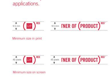
Exploring the various visual criteria and guidelines used by the best brands can teach us how to communicate materials and messages more effectively. After looking into different brands, it’s important
to do a lot of research, figure out what works, and use that as a starting point.
(NEW IDENTITY INTRODUCTION)

When dealing with logos with very simple elements, this is a good way to show the logo itself. The note in the bottom right corner explains the logo’s meaning in detail.


(LOGO ANATOMY)
From the color of the brand logo to the largest to the smallest size, I believe it is a very consistent presentation. The detail arrows indicate the position and details of the logo.



01:01 LEVERAGE AND ANNOTATE
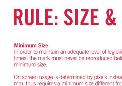
Exploring the various visual criteria and guidelines used by the best brands can teach us how to communicate materials and messages more effectively. After looking into different brands, it’s important
to do a lot of research, figure out what works, and use that as a starting point.
(TYPE SPECS)
The fonts that can be used are clearly displayed and allowed to be used in the brand, as well as the various weights.

(COLOR)
This is a good example because it clearly shows the colors appropriate for the brand and also makes a reference through the display of the logo mark.


(DO NOT USE THE LOGO IN THIS WAY)

Again, the form in which the brand logo should not appear is obvious and provides a more detailed explanation via the text description.

(ALTERNATE VERSIONS OF THE LOGO)
This is a good example that clearly shows the logo’s versatility in different colors and backgrounds.


NEXT PHASE
(NEXT PHASE)
In the following step, the carefully designed brand logo, based on drafts and inspirational research, will be presented, along with the rules for its use. Our goal was to give the National Park Service a visual system that was complete and useful.

This is a fictional re-branding project done as a student project. No parts of this project were used commercially except for academic purposes. This project is in no way intended to represent the parent brand.

