5 minute read
Photoshop Making of Black Bashi - Bazouk

from _feb-mar2008
by Hiba Dweib

Making of Black Bashi - Bazoukby George Patsouras, USA Email: cgaddict@live.com Web: http://cgaddict.blogspot.com
Advertisement
Introduction
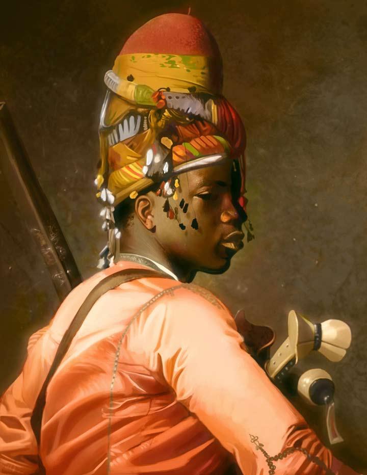
In this tutorial, I will go about how I painted a Master Copy of Gerome Jean Leon’s “Black Bashi-Bazouk”. As an artist, I feel like I can learn a lot by doing studies of the works of Old Masters, especially in terms of color. It’s important to note that when you’re doing Master studies, you shouldn’t just mindlessly copy a painting; Put thought into what you’re doing - ask yourself why did this artist choose this color as opposed to another, and so forth.
Initial Sketch
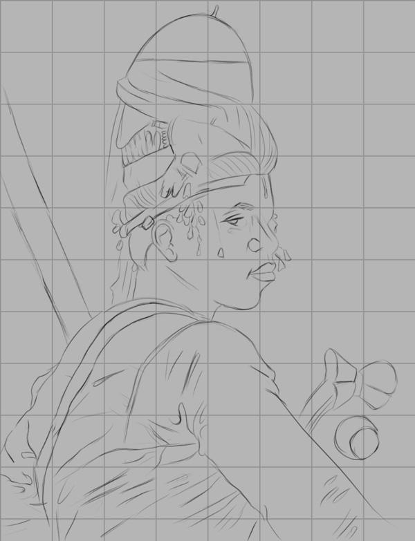
Since we are doing a Master Copy, it’s essential we nail the proportions of the image we’re trying to recreate. To do this, I use a grid to get the proportions as accurate as possible. To do this, create a grid over the reference image. Then re open the file, fill the canvas with a fairly light gray color, and begin sketching box to box. Try to make it as accurate as possible, as this step is crucial. Depending on how you draw, you should get a fairly clean result. If not, lower the opacity of the sketch layer (around 40% should be good), create a new layer, and trace over it for a cleaner look. Here is my result:
Working in Values
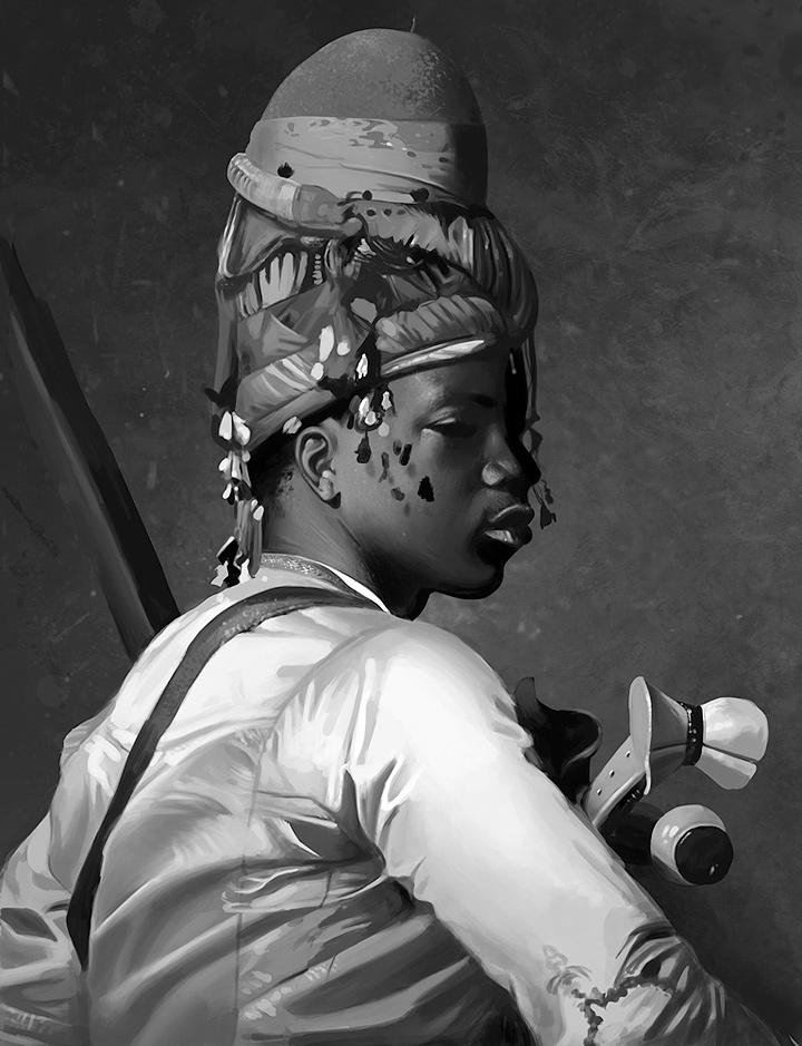
Once that’s done, the next step should be to establish a strong value composition. Working in grayscale allows us to concentrate strictly on values, without worrying about colors.
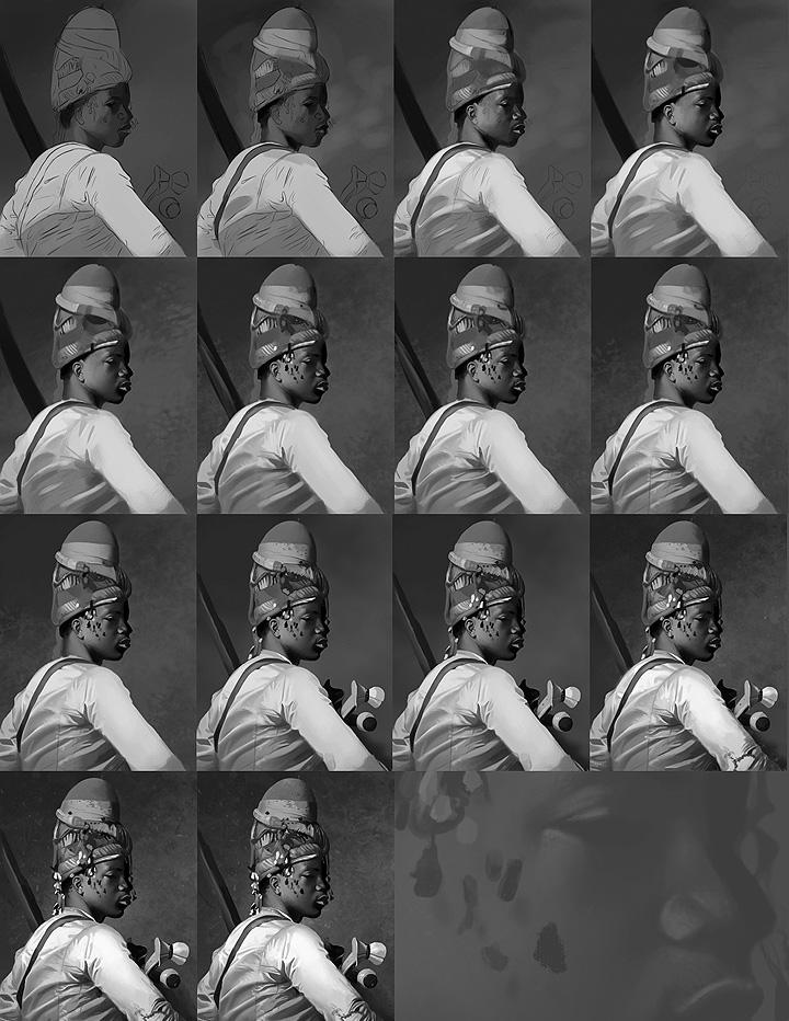
In my opinion, a successful painting needs to have a good value composition. You can use any color scheme you want, but if the values aren’t working, the painting won’t be successful. The first thing we must do is go to Image > Mode > Grayscale. At this point, you should also have your grayscale slider turned on under the ‘colors’ menu (Window > Color). Do all your value work using this slider. Do not sample values from the reference, as you won’t learn anything from this, and could lead to an unwanted crutch as well.
Start off simple first - use relatively large brushes for the early stages to avoid getting caught up in details. Work in the darker values before making your way to the lighter ones. Make sure everything is treated with the same amount of detail at the early stages. Have the Size Jitter turned off under ‘Pen Pressure’ during the initial phase to avoid getting caught up in details. In other words, don’t overwork the face and keep the rest of the image loose, you’re just going to end up struggling at later stages.
For the blending process, I generally use a hard edged brush and speckled one to blend, with lower opacities for smoother transitions (anywhere from 25%-50% under opacity). You don’t need a lot of layers for this stage; One for the background and one for the figure should be fine. Keep things simple. When you’re happy with the values you set up, you can now turn on Size Jitter turned off under ‘Pen Pressure’ and start working in the details. Create new layers and constantly merge them with the base layer to keep things under control.
Here is the finished grayscale painting. Even in grayscale, the painting looks ‘complete’. It’s a good idea to have your painting as refined as possible before adding colors. This will make the color process that much easier.
Adding Colors
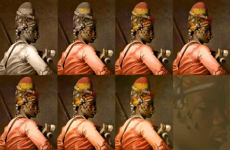
When we have a decent painting in grayscale completed, it’s time to think about colors. Since this is a Master Copy, a good idea is to step back from our painting for a bit and carefully observe the colors in the original painting. Make sure the HSB slider is turned on at this stage, under the colors menu. With the original painting open, select the Eyedropper tool and carefully observe the color transitions throughout the painting. Do this for a couple of minutes and try to process how the artist went about colors.
In this case, the main color scheme is that of a fairly saturated red/orange. The darkest areas are that of a very saturated red, and the lighter tones shift more towards an orange/yellow hue. With that in mind, we’re now ready to start adding color to our painting. Since we’ve worked with the grayscale mode, it’s time to change it to the RGB mode. Select Image > Mode > RGB.
Since we spent the time observing the main color scheme, the first thing we do is create a new layer above the base layer and set it to ‘color’. Select a fairly red/orange mid tone for the base, since this is the main color theme, and merge it. Create another layer, this time for the skin. Observe the shifts in color from the reference photo and try to replicate it. The shadows on the face, for instance, has very saturated red tones, while the highlights are that of an orange/yellow tone. Do your best to replicate that while choosing your colors from the HSB sliders. Now merge. Repeat this process over and over again to build up your colors.
Refinement and Detail
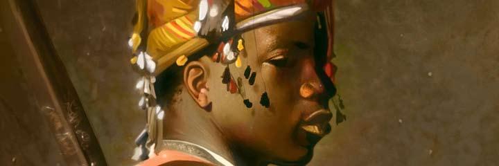
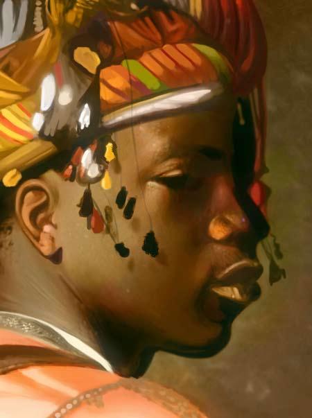
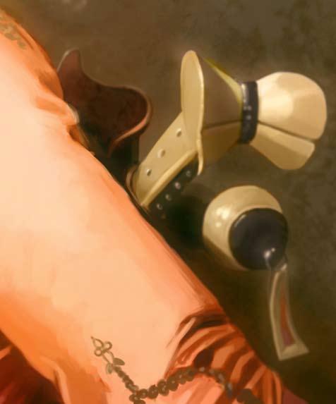
During the color process, don’t be afraid to continue refining the painting; Although you might have a strong base at this point, adding to it will only make your painting that much better. Don’t be afraid of the zoom tool, it can be your friend; Zoom in very closely to bring out further details, especially those located at the focal point. In this case, I want to bring attention to the face, so I make sure that’s the most detailed part of the painting.
Hope you like this making, if you have any critiques and comments then please email me.
George Patsouras
cgaddict@live.com