Wayfinding Stories


About Us
BRAND DESIGN
Identity and Logo Design
Brand Applications
Media Integration
Change Management
Naming and Positioning
PLACEMAKING
Experiential Graphics
Public Art Sponsorship
Donor Recognition
Exhibits
WAYFINDING
Design and Standards Assessments

ADA and Life Safety
Master Plan Strategies
Identification and Numbering
DIGITAL EXPERIENCE
Interactive Content
Immersive Experience
Content Design
VR and AR Visualization
We craft experiences moment by moment. Together with our clients and project partners, we map out the journey and leverage brand strategy, so everyone can visualize your unique personality.
And we recommend a variety of artwork and messaging — seamlessly integrated with interiors and architecture—and intentionally selected for the most effective engagement, flow and impact.
We are rooted in technical excellence, driven by imagination and focused on a solitary goal: to deliver solutions that inspire clients and communities.
KEVIN LYNCH
Urban Planner and Author
“Wayfinding is a consistent use and organization of definite sensory cues from the external environment.”
BRAND DESIGN
We are passionate about experiences and look for inspiration in our everyday encounters. Whether it is refreshing an existing identity, adopting new standards or developing a new identity from the ground up, we look for creative ways to tell your story.
PLACEMAKING
HOK celebrates the culture and the people that make spaces unique. We employ print and pixel, art and artifact, to create experiential environments that are on-brand and of-culture.
WAYFINDING
An effective solution requires visibility, legibility, sensitivity and flexibility—all without sacrificing creativity. From planning through implementation, we help get people where they want to go while presenting a meaningful interpretation of identity
DIGITAL EXPERIENCE
We collaborate with teams across markets and disciplines which enables us to provide project teams with broad exposure to current ideas, styles and sensibilities. We leverage cross-market strategies in the constant evolution of how we tell stories.
#1 Best Brand Experience by Transform Magazine
#1 Graphics & Wayfinding by FX International Interior Design Awards
67 13
3B 25
Years in the EGD Industry Market Sectors
Sq. ft. Wayfinding Programmed Experiential Graphic Designers
 BY THE NUMBERS
HOK 3
SLC Passenger Terminal
LOCATION:
SERVICES:
SALT LAKE CITY, UTAH SIGNAGE & WAYFINDING
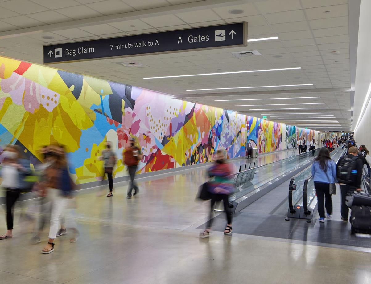
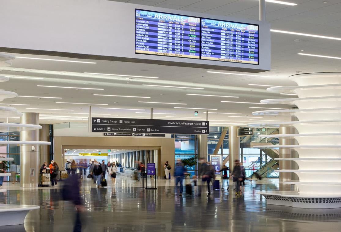
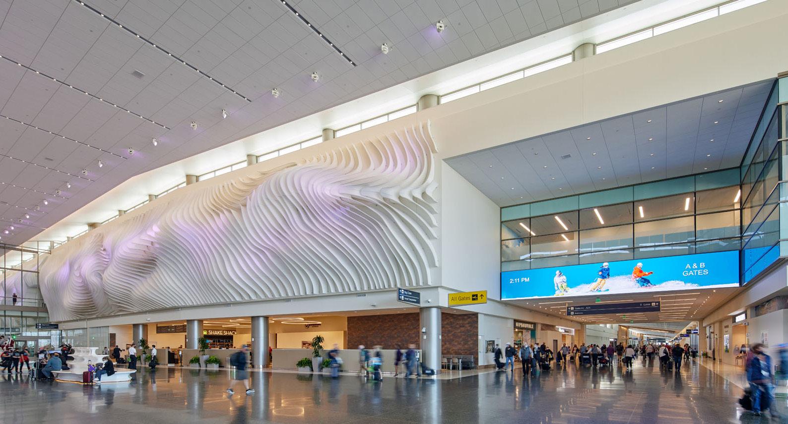
HOK worked with Salt Lake City to create an entirely new airport in Utah’s capital. The project is one of the nation’s largest aviation developments in years and the first completely new airport built in the U.S. in the 21st century.


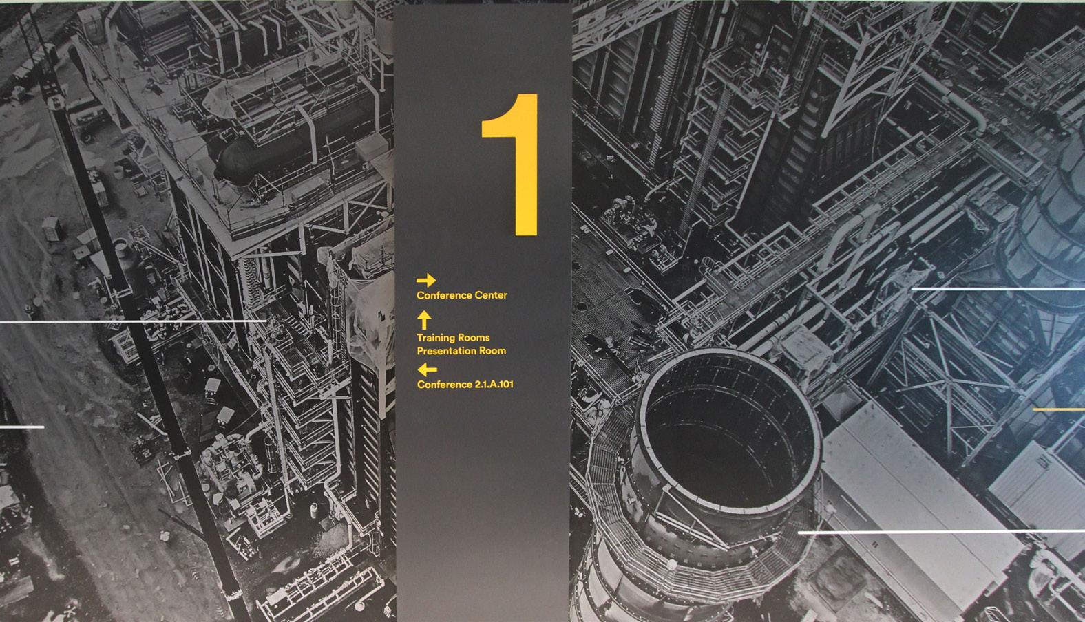
The holistic signage program is integrated with the new terminal’s roadway approach, transit program, exterior architecture, interior space, advertising strategy and art program. The design for each type of wayfinding sign includes a definition of type styles, colors, size and materials. Design considerations included the project budget, maintenance, lighting, ability to easily accommodate future upgrades and cost effectiveness over time.

4 HOK
PDX Signage Master Plan
LOCATION:
PORTLAND, OREGON
SERVICES:
SIGNAGE & WAYFINDING
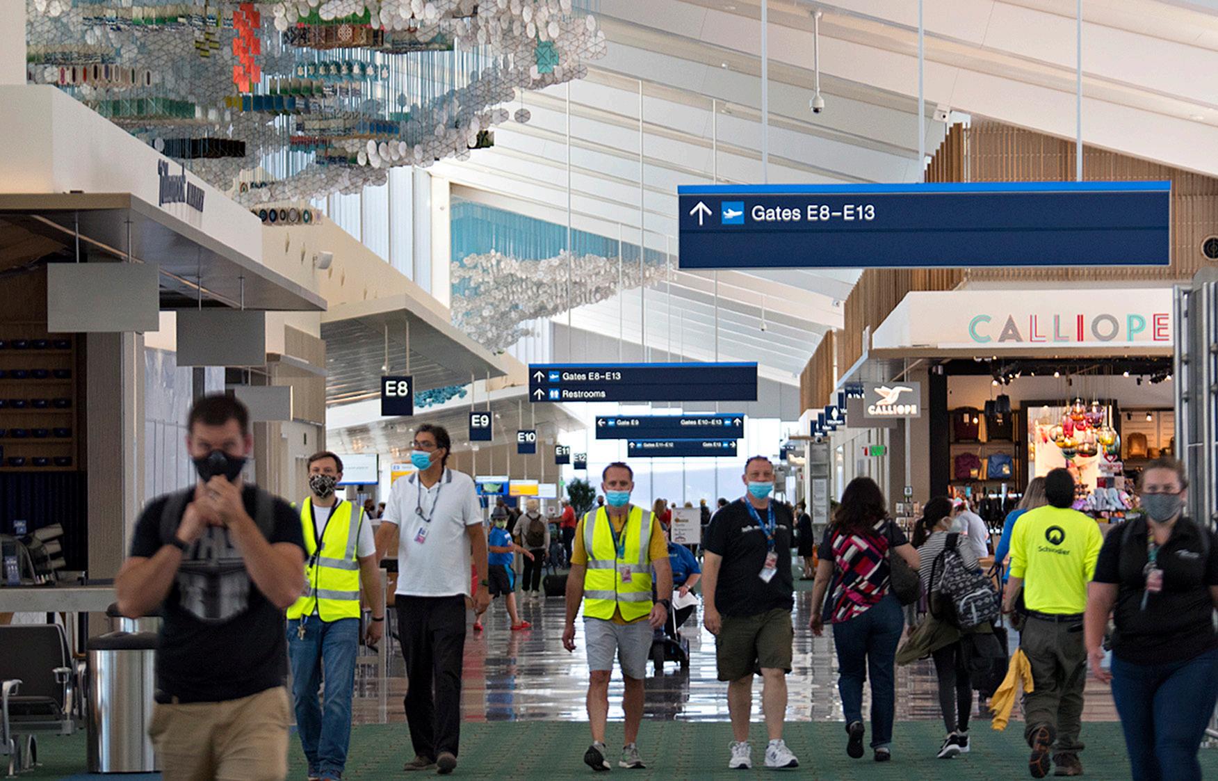
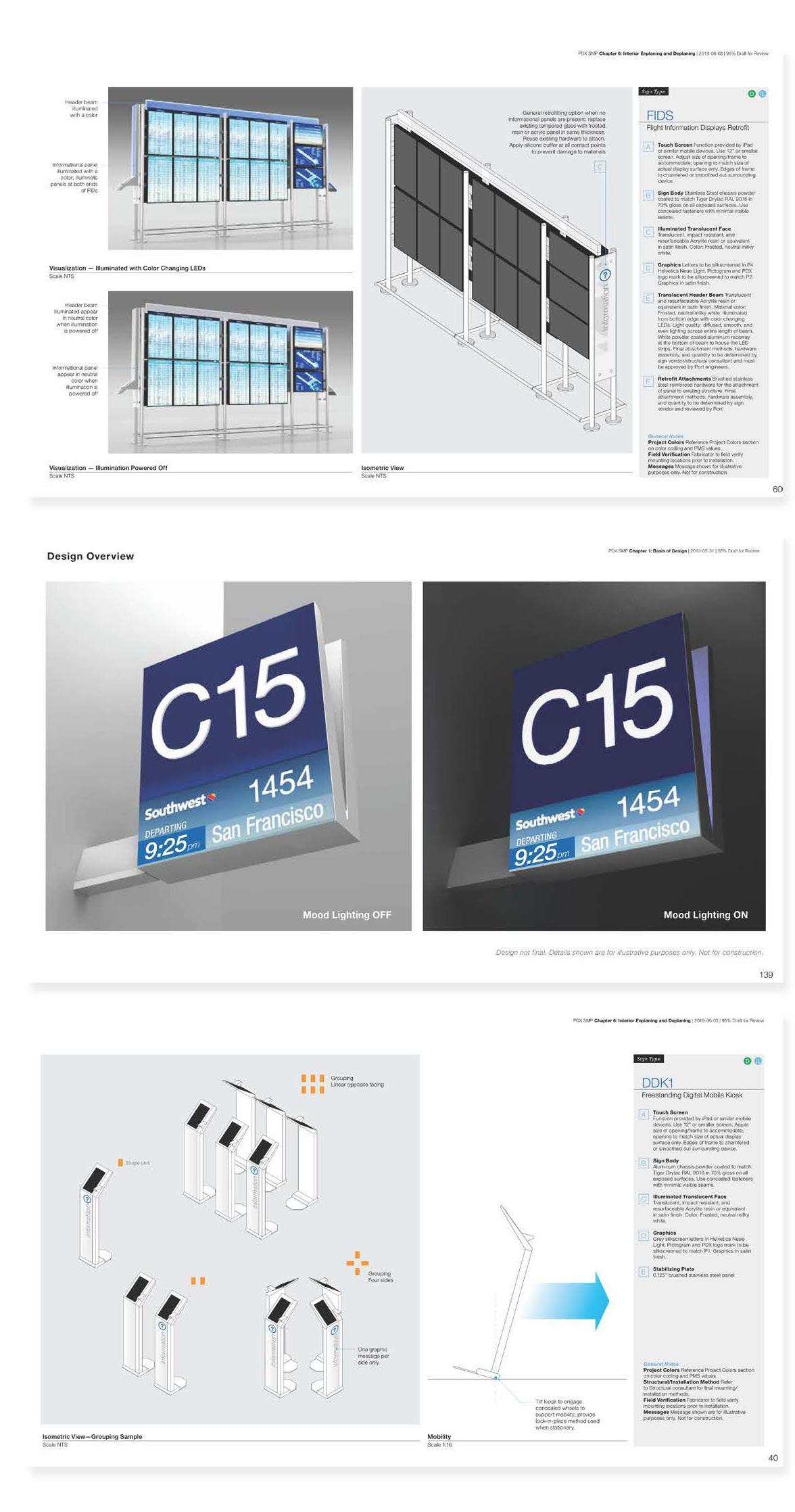
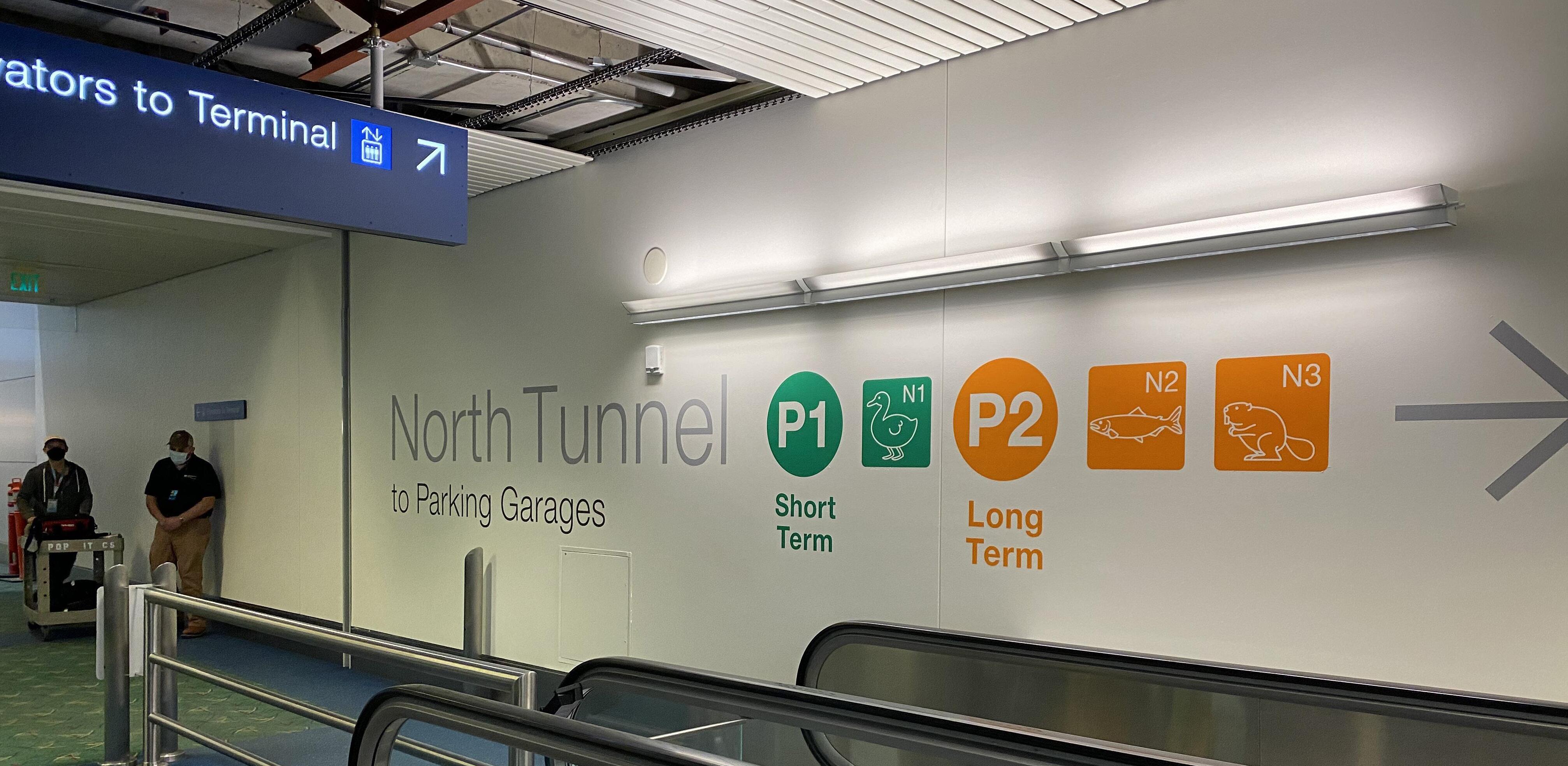
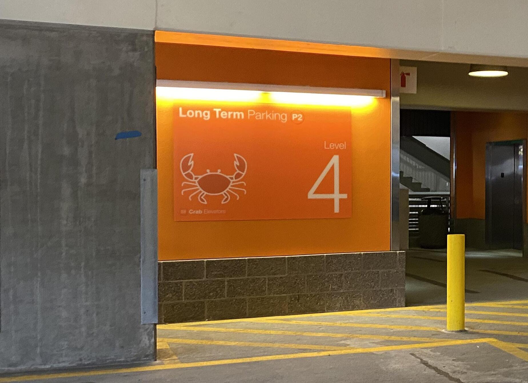
A key component to Portland International Airport (PDX) award-winning success is the newfound ease in which passengers can navigate the facilities. Throughout the years, as PDX has expanded, terminal signage has had many slight modifications resulting in inconsistent signage throughout the facility.

As the design of several large airport capital projects is underway, PDX’s Signage Master Plan sets standards for high quality wayfinding both during construction and for a unified system upon completion. The Master Plan encompasses all aspects of the airport’s interior and exterior signage system. Terminal balancing and renovation, as well as a new concourse, were key aspects of the project. The wayfinding and system standards are documented in 13 design chapters, which will be used as new projects come online.

5 HOK


6 HOK
PDX Airport Signage Design
LOCATION:
PORTLAND, OREGON
SERVICES:
MASTER PLANNING, SIGNAGE & WAYFINDING


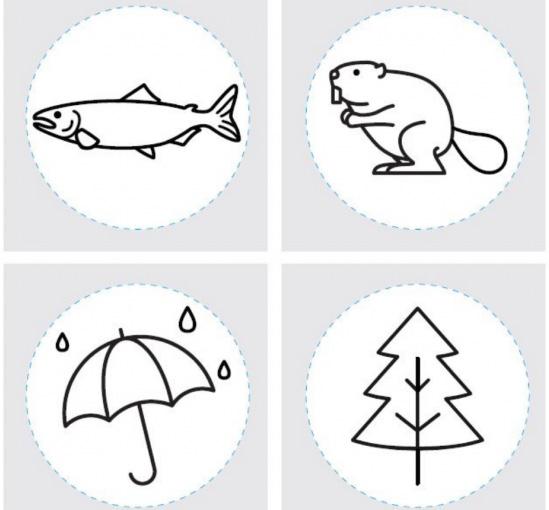
As the design of several large capital airport projects is underway, PDX’s Signage Design Standards outlines a long-term wayfinding strategy for removing, relocating, and adding new and temporary signage. The standards consider interactivity, flexibility, modularity, and the latest and projected future technology. They also address the needs of an aging population and offer inclusive accessibility requirements. The standards provide the right mix of technologies that impacts the passenger experience and the lasting impression of the City of Portland and its region.

7 HOK
Crown Center Wayfinding Strategy
LOCATION:
SERVICES:
KANSAS CITY, MISSOURI PLACEMAKING, SIGNAGE & WAYFINDING
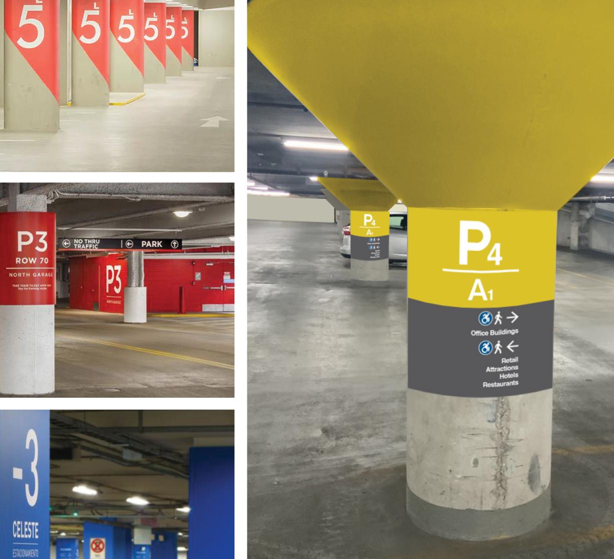
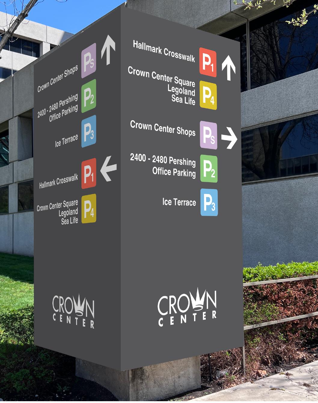
HOK helped develop and refine a new wayfinding strategy for Crown Center in Kansas City, to streamline the user experience and transform the complex from a convoluted to easily navigable environment.


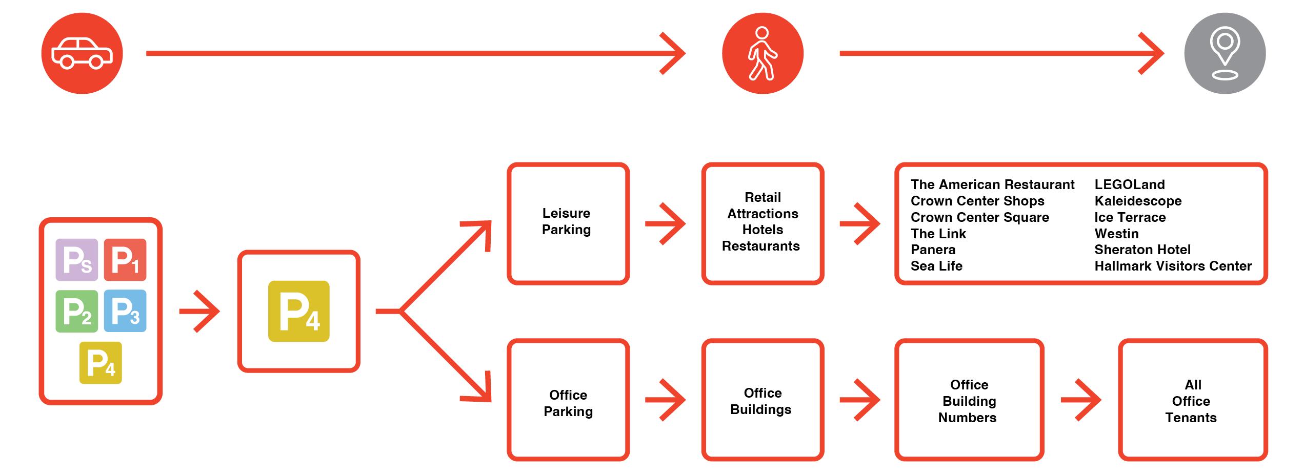
Journey mapping was utilized to imagine the different ways that users might be transitting through the space to make sure the wayfinding solutions were addressing all use cases. Parking levels were color coded to streamline and increase accessibility of the wayfinding solutions, and temporary signage was replaced by static solutions wherever possible.

8 HOK
VA CommunityBased Outpatient Clinic
LOCATION:
PALO ALTO, CALIFORNIA
SERVICES:
SIGNAGE & WAYFINDING

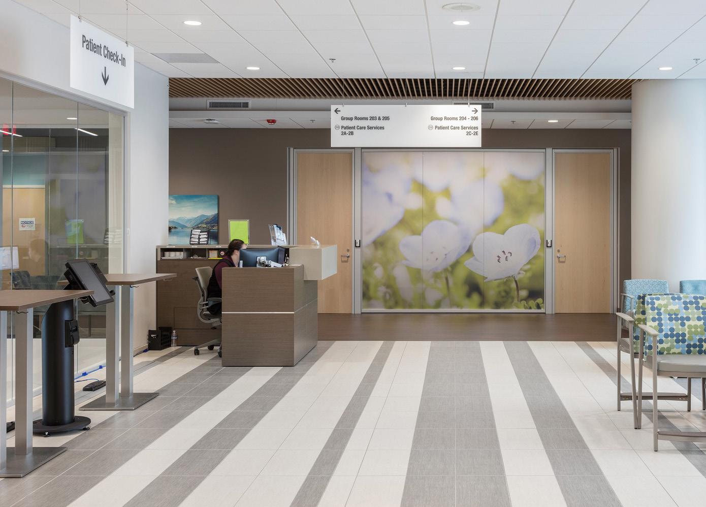
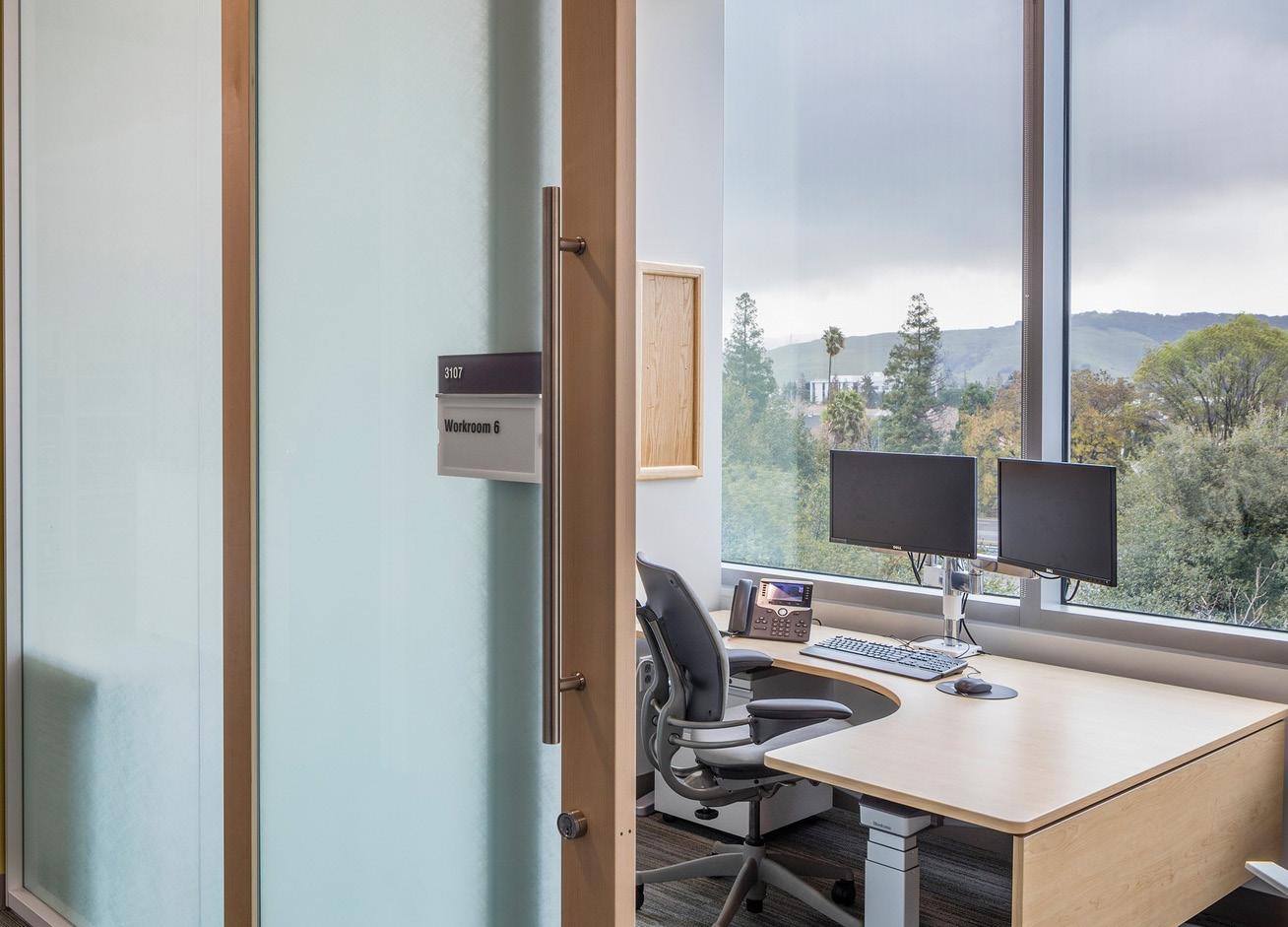
This Outpatient Center for VA Palo Alto Health Care System is designed to support a Veteran-centric model of care, with state-of-the-art training and patient education spaces. The design creates an inclusive, healing environment that connects patients, staff and the community.


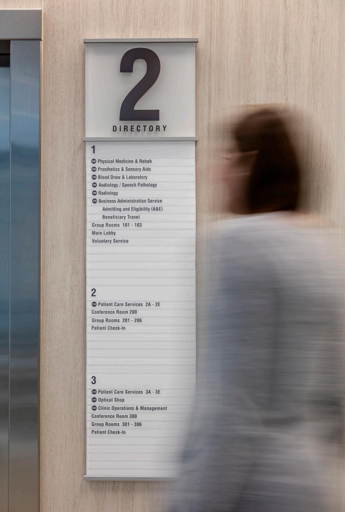
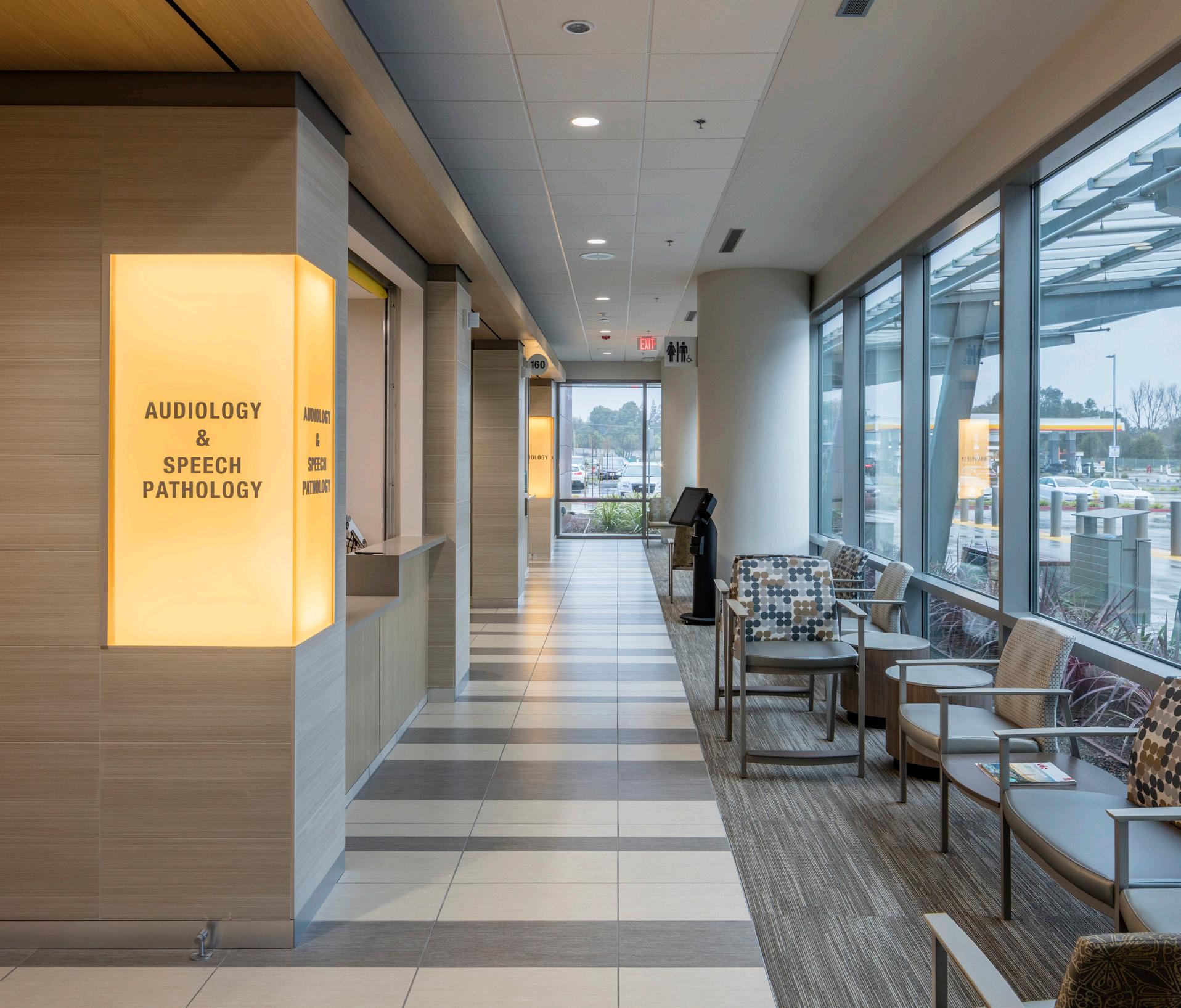
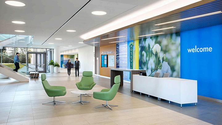
To create a strong sense of arrival, the entry features a memorial plaza and art wall that celebrates Veterans and their service. The wayfinding is simple and provides clear direction using logic that follows the orientation of the building, proximity to the elevators and vertical circulation. The backlit signage panels create an elegant twist on the VA signage standards that also compliments the interiors.

9 HOK
IN ASSOCIATION WITH HOEFER WELKER
Humber Meadows
Long-Term Care Home
LOCATION:
SIZE:
SERVICES:
TORONTO, ONTARIO 239,000 SQ. FT.
EXPERIENTIAL GRAPHICS, SIGNAGE & WAYFINDING

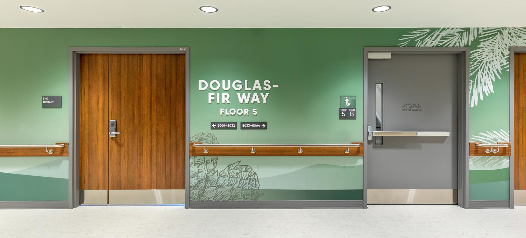
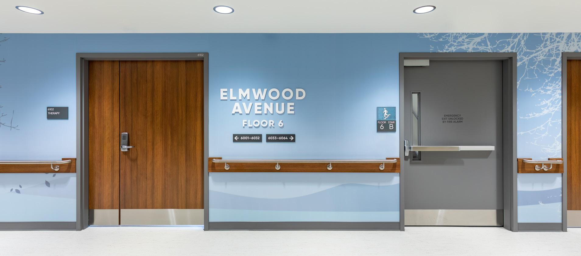
Humber Meadows, a part of the Humber River Hospital Finch Campus, is a long-term care facility that uses experiential graphics to help orient and reinforce wayfinding for patients with memory trouble and language barriers, and to also create a warm, home-like environment.

The concept of a meadow was introduced early in design concepts as a way to organize wayfinding, informing the color palettes and identity of the residential floors. As you progress up the floors, you reach up higher into the trees and sky. Residential street suffixes, like ‘Drive’ and ‘Lane’ reinforce the feeling of home.
The Meadow metaphor was so embraced and successful, the name of the facility was changed to reflect this identity. Other experiential graphic interventions, like gallery walls in the dining areas, bring in warmth, variety and hospitality. Dignity for the residents was of utmost importance.
10 HOK
Wichita State University
LOCATION:
WICHITA, KANSAS
SIZE:
SERVICES:
MASTERPLANNING, SIGNAGE & WAYFINDING
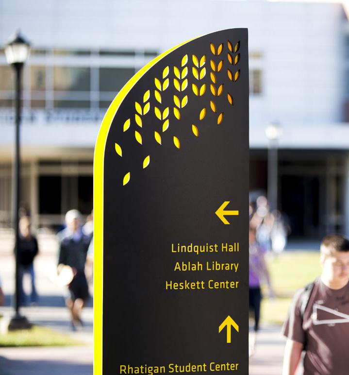
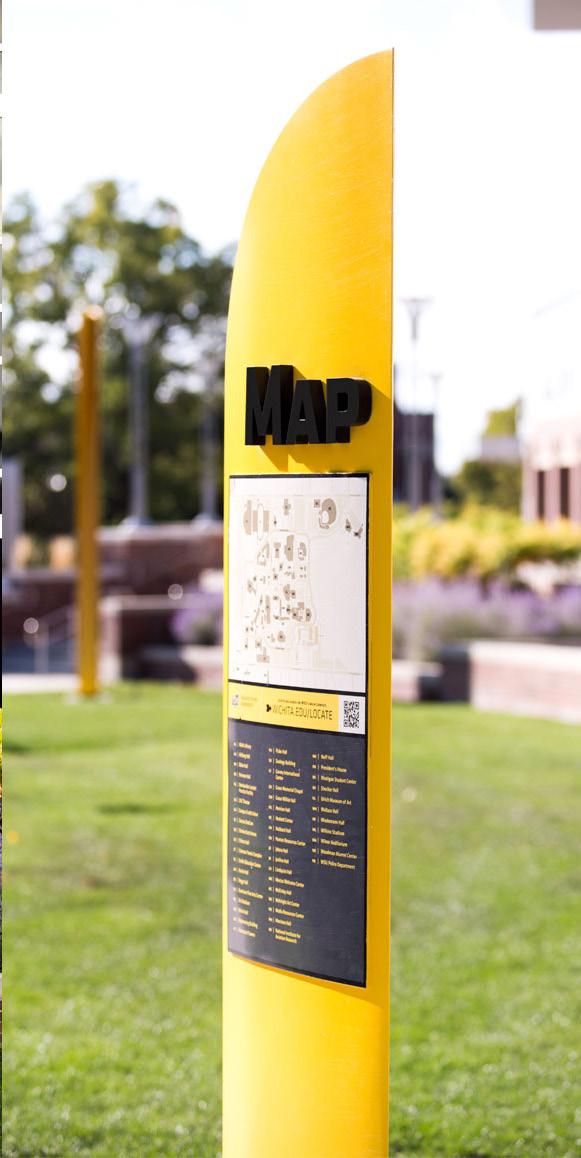
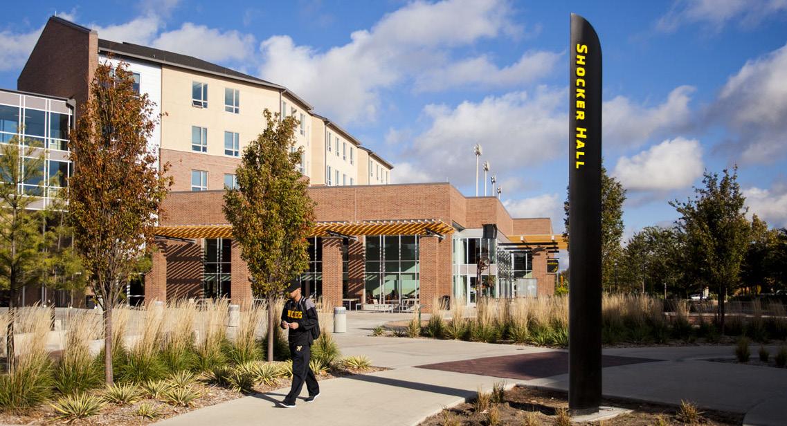
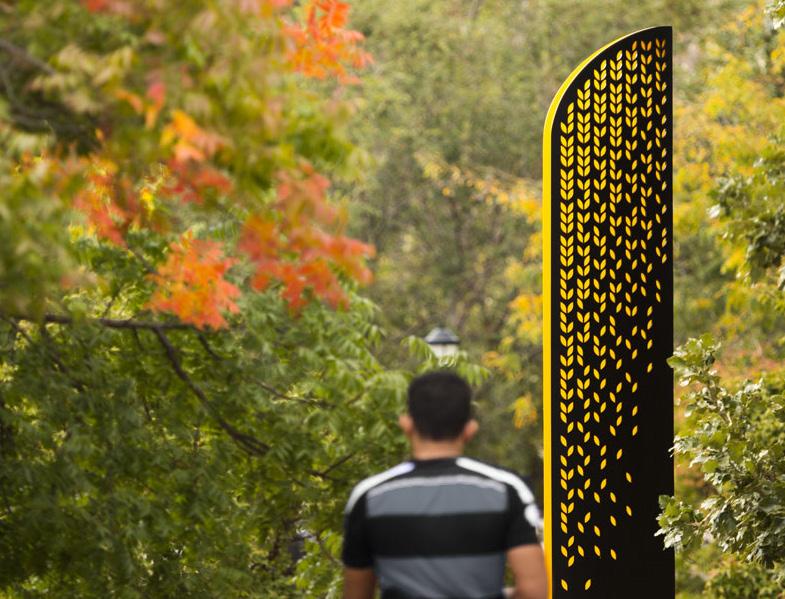
The campus wayfinding at Wichita State University features elegant forms that echo the movement of wheat stalks gently blowing in the wind. The wheat grain pattern is water-jet cut, allowing the yellow accent color of the grains to show through and glow at night, like beacons. The system includes building identification markers, vehicular directional signs, pedestrian directional signs, map artwork and pedestrian kiosks.


11 HOK
330 ACRES
IN ASSOCIATION WITH GARDNER DESIGN
Kentucky International Convention Center
LOCATION:
LOUISVILLE, KENTUCKY
SIZE:
960,000 SQ. FT.
SERVICES:
SIGNAGE & WAYFINDING, NAMING & NUMBERING SYSTEM
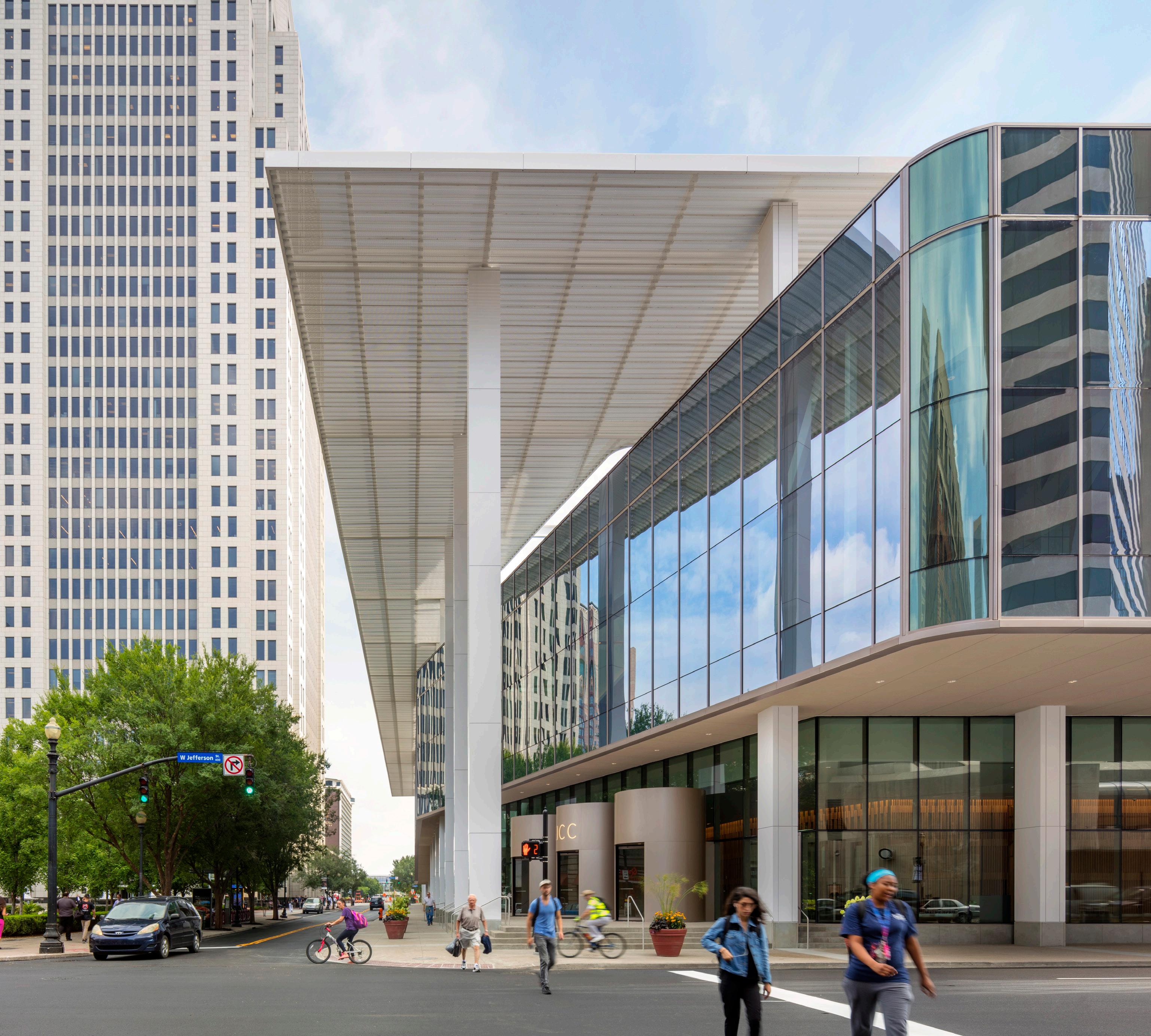
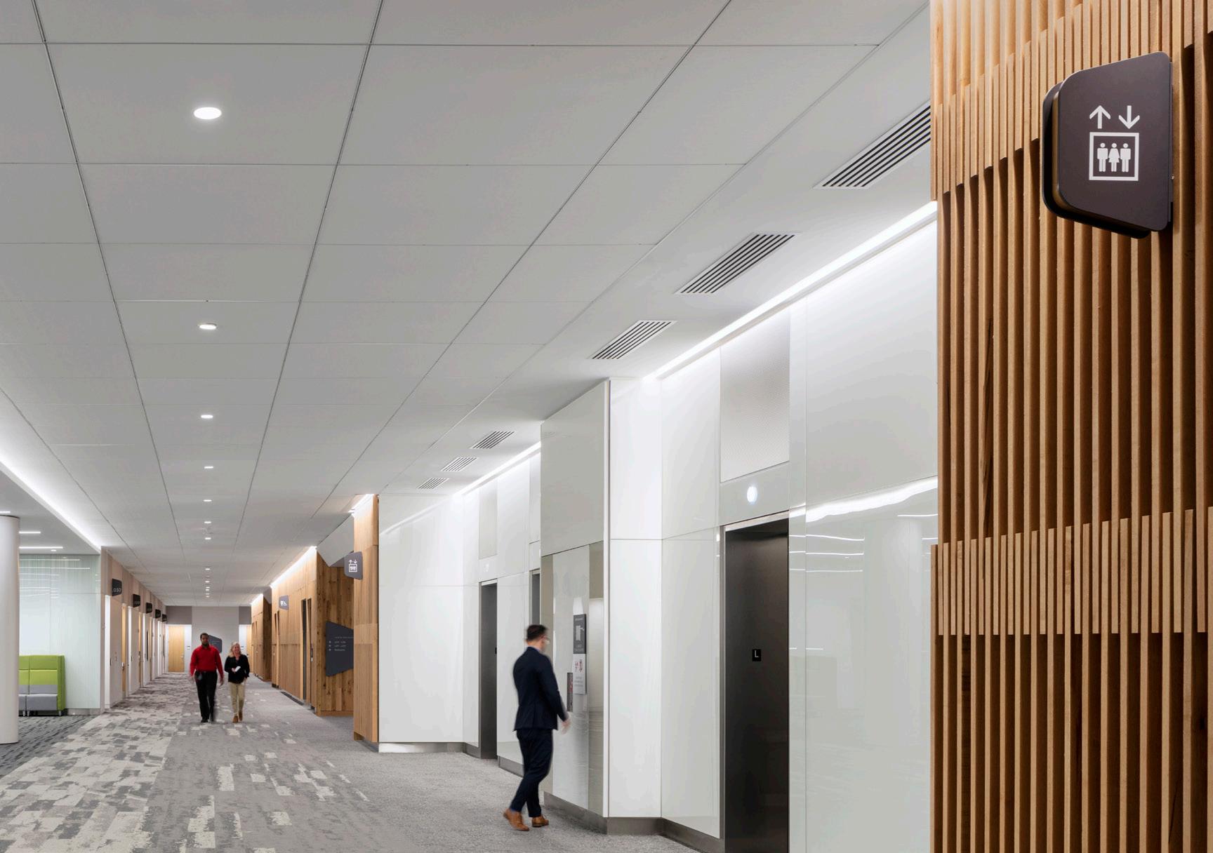
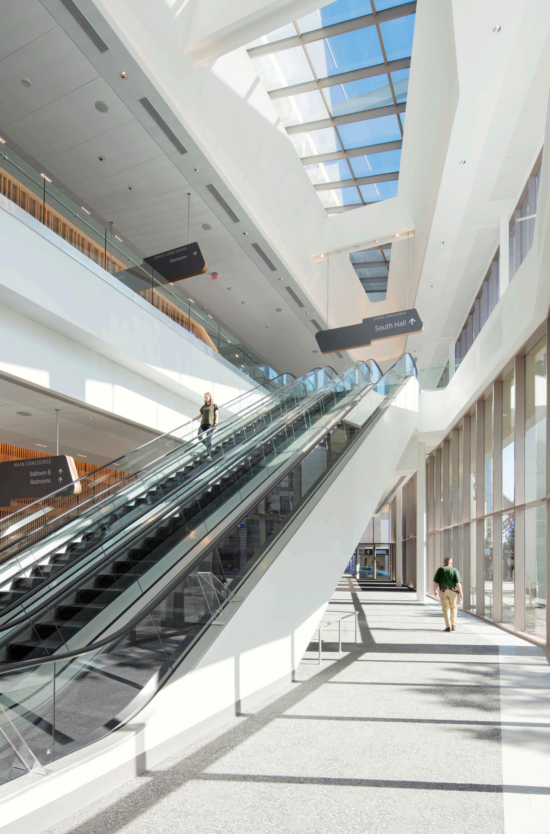
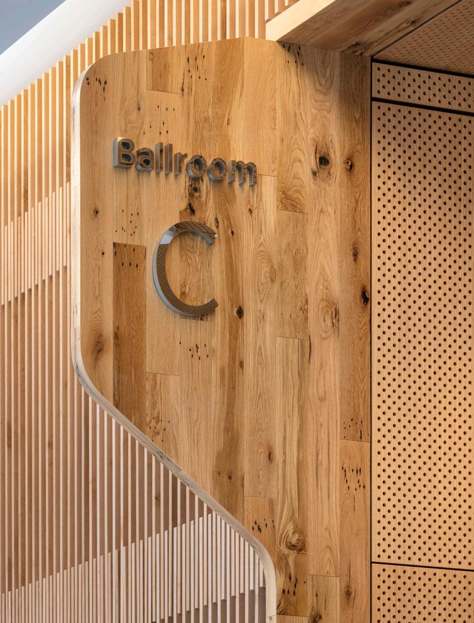
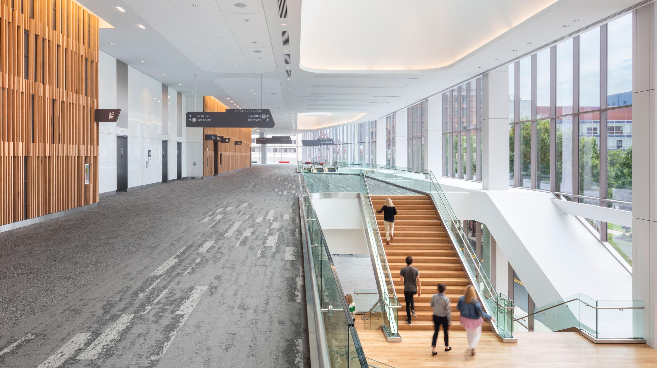
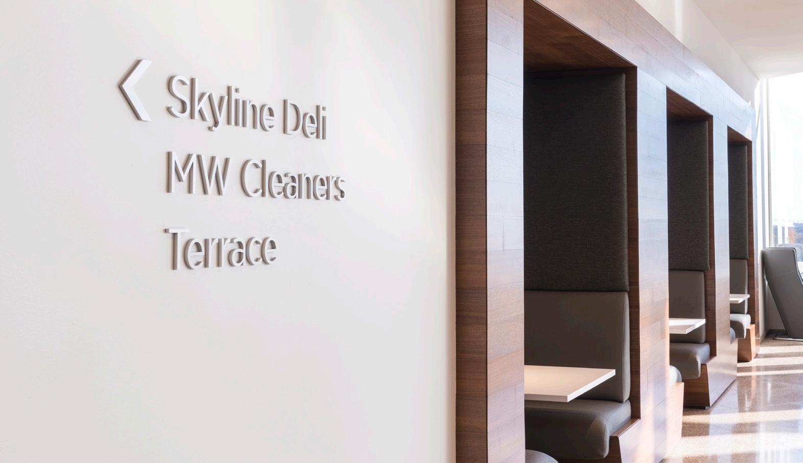
A newly-expanded convention center puts downtown Louisville on display and creates an inviting front porch for the passerby. Convention centers are often difficult to navigate because of their large size and out-of-town guests. The improved wayfinding simplifies circulation paths and connects visitors visually to their surroundings. The sign designs are purposefully organic and relate to the architectural design and form of the skylights.

12 HOK


13 HOK
The Children’s Place
LOCATION:
KANSAS CITY, MISSOURI
SERVICES:
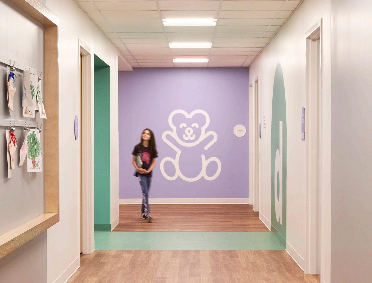
EXPERIENTIAL GRAPHICS, SIGNAGE & WAYFINDING, DONOR RECOGNITION, PLAYGROUND CONCEPTS, TEDDY BEAR SCULPTURE
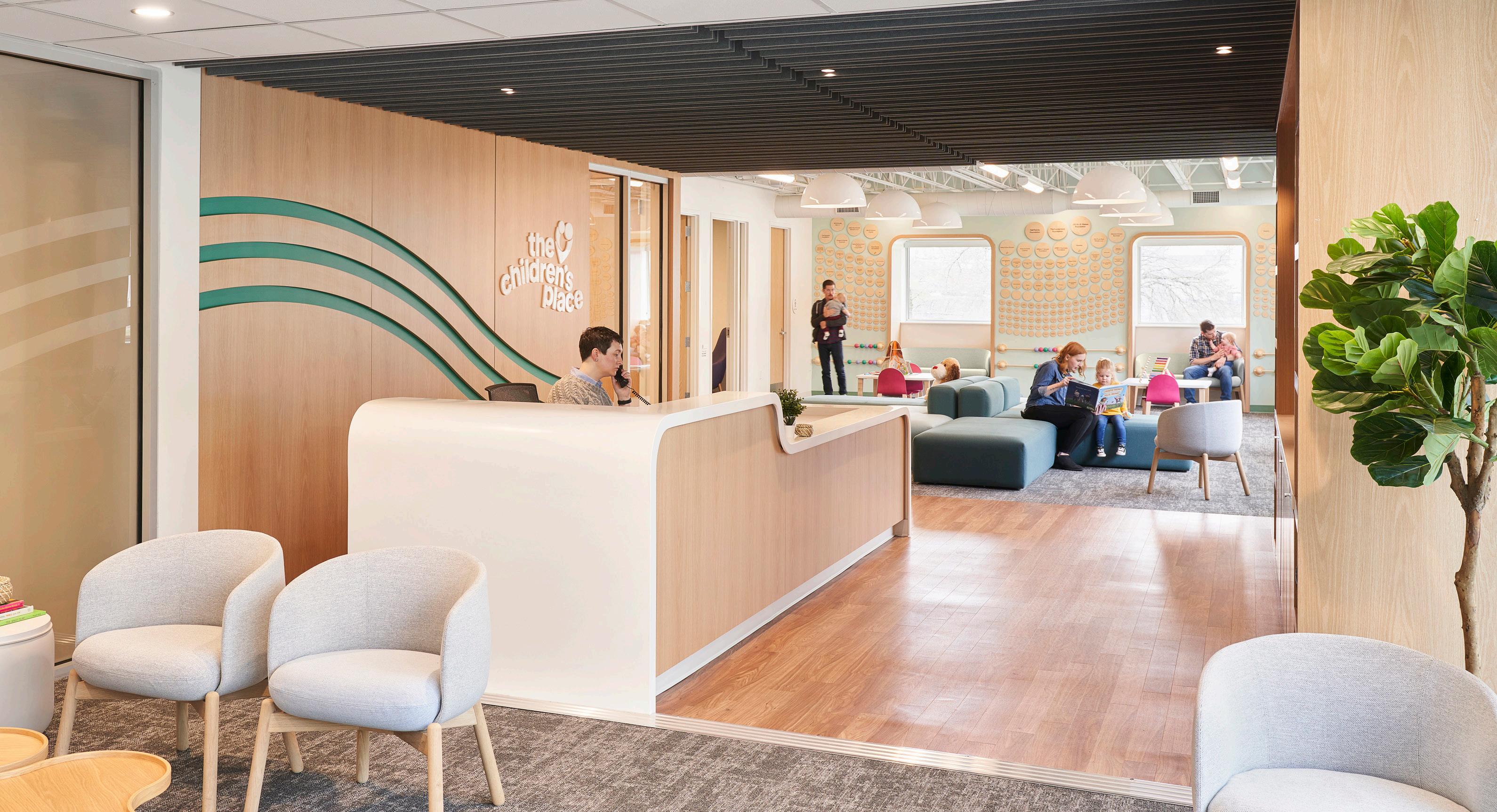
Using the highest levels of evidence-based treatment and four decades of experience, The Children’s Place needed a space that could fulfill a range of services from early childhood education classrooms and clinical counseling to motor rooms and an outdoor playground.


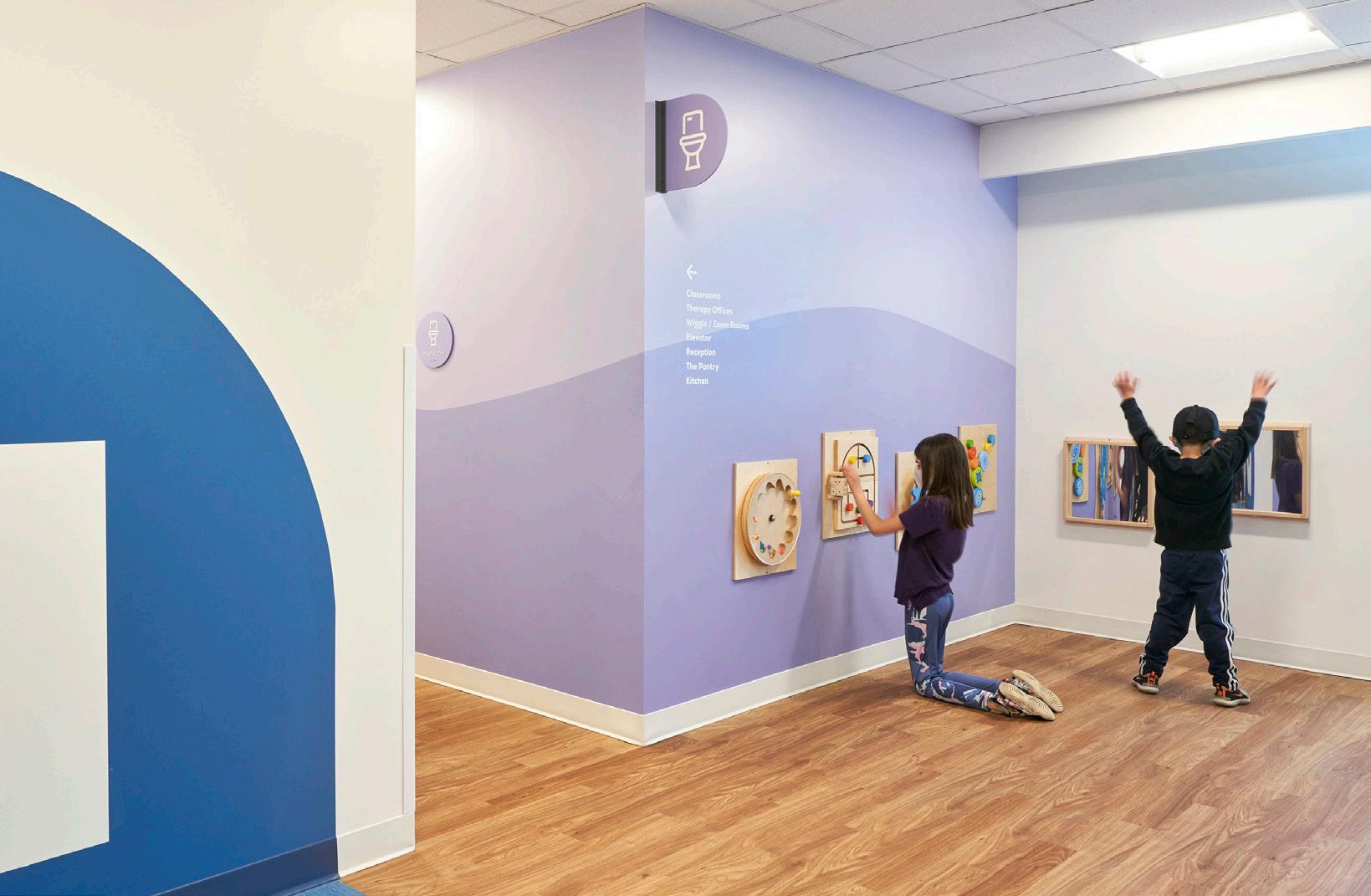
The use of bright brand colors and cheerful graphics were a cost-effective method of creating a fun and meaningful environment for young children. Color coded wayfinding and recognizable icons line the long corridors to create visual interest and aid in spatial orientation within the large, two-level building. The team considered each type of visitor (day treatment, specialized clinic patients, families, staff and volunteers) and how each would move through the building in order to create meaningful touchpoints along their journey from parking lot to destination.

14 HOK
The Experience Design group at HOK creates dynamic environments to build brands, celebrate cultures and tell stories. Our designers are rooted in technical excellence, driven by imagination and focused on a solitary goal:
Deliver
BRAND DESIGN
Identity and Logo Design
Brand Applications
Media Integration
Change Management
Naming and Positioning
PLACEMAKING
Experiential Graphics
Public Art
Sponsorship
Donor Recognition
Exhibits
WAYFINDING
Design and Standards

Assessments
ADA and Life Safety
Master Plan Strategies
Identification and Numbering
DIGITAL EXPERIENCE
Interactive Content
Immersive Environment
Content Design
VR and AR
Visualization
HOK 15
solutions that inspire clients and communities.


t
4633
EMILY
t
816.472.3219 emily.payne@hok.com
t
steve.wllliams@hok.com
We shared our story and we are ready to tell yours.
JEFF LANCASTER Creative Director | Experience Design
+1 424 298
jeff.lancaster@hok.com
PAYNE Director | Experience Design
+1
STEVE WILLIAMS Director of Operations | Experience Design
+1 713.407.7879


 BY THE NUMBERS

