1 minute read
DIGITAL DESIGN URBAN DECAY
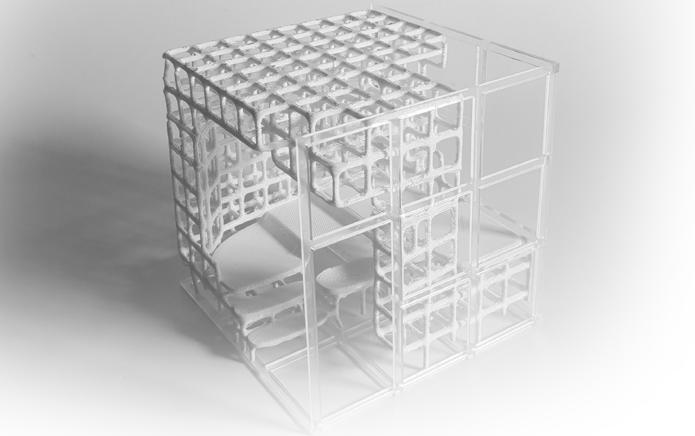
The aim of my pavilion was to create a landmark within the mpavillion site that grew out of the land itself . The brief of 15 people for a seminar and 30 for a concert formed the base massing and programme for the pavilion. The main entry has been situated at the lower slope of the site whereas the rear entry at the higher allowing for late comers to enter without disturbing the concert/seminar. By building into the landscape and sloping the ground plane the seating can be used as stairs. The main entry has been situated off one of the main walking routes to entice the public towards the pavilion. The denser webbing at the rear protects the occupants seated from the elements, whereas the thinner at the front allows for the speaker/concert to be viewed from both inside the pavilion and out. By using a luminescent fi berglass, the pavilion can be utilized in both day and night setting, creating a landmark within the city of Melbourne.
DENSER WEBBING,PROVIDES ENCLOSURE AND PROTECTION FROM THE EXTERNAL
Advertisement
WEBBING STRUCTURE DETAIL 1:25
WEBBING BLURS THE LINE BETWEEN OUTSIDE AND INSIDE TO CREATE AN EPHEMERAL AND AMBIGUOUS SPACE AND THRESHOLD
BACK THRESHOLD ALLOWS ACCESS TO THE PAVILLION FOR LATE ARRIVALS
SEATING DOUBLES AS STAIRS
MAIN THRESHOLD AT LOWEST POINT IN LANDSCAPE. SITUATED TO DIRECT FOOT TRAFFIC FROM MAIN PATHWAY
LUMINESCENT FIBERGLASS FRAME CREATES AN EPHEMERAL AND TRANSIENT SPACE. ACTING AS A BEACON IN THE LANDSCAPE
OPEN FRAMING CREATES LIGHTNESS AND TRANSPERENCY,HIGHLIGHTING THE PERFORMANCE SPACE FROM A VARIETY OF ANGLES
BASE SET INTO THE LANDSCAPE PROVIDING PROTECTION FROM WIND


