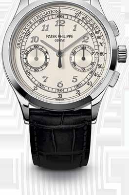


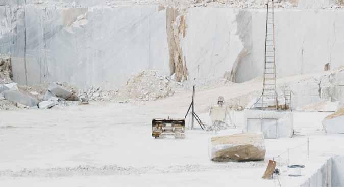







CDK Stone’s natural stone is sourced from the fi nest quarries around the world. Each piece is unique, allowing you to select a stone artwork for your projects. Whether on the exterior of a building, or internally as a feature island bench in the kitchen, natural stone makes a clear statement of classic, enduring beauty and strength.

With branches in Sydney, Melbourne, Gold Coast, Perth and Auckland, it is possible to integrate the elegance of natural stone into virtually any project within Australia and New Zealand.
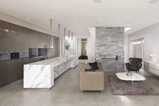


A true collaboration takes place with CDK Stone. Working with the expert team, the creative process extends to the specification of the perfect stone. From analysis of the requirements, to researching the possible options and careful selection of the slab, to stringent quality control in the production and supply, CDK Stone supports your design the whole way through. Since 1982 they have been supplying and processing natural stone to the market, building experience, an impressive track record and with that, the utmost trust within the industry.
 Elba
Savoir
Titanium Travertine
Turco Argento
Portsea
Antique Brown
Carrara Elegant Grey Nero Tempesta
Calacatta
Superwhite
Titanium Gold
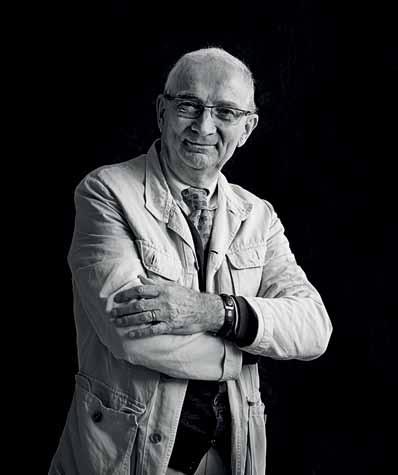
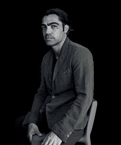
Orchard Piper has curated an international team of designers and artisans for Washington Street: New York lighting designer Lindsey Adelman, Venetian glass house Venini, architect and interior designer Jolson and landscape designer Rick Eckersley.

landscape

Where to look for inspiration? It can be found all around us – in the things we have, the conversations we engage in and new ideas that spark a revolution.
24. DESIGN NEWS
Discover the products we are inspired by: icons in their contemporary forms, objects and furniture with precise linear expressions, bold and beautiful products and something for the outdoors – as well as for the kids.
34. BOOKS
The icon is a somewhat contentious and problematic concept – but we ’ re up to tackling the tough topics. Mandi Keighran compares three titles that talk about icons in different fields – holding them up against a thriceMichelin-starred sushi chef.
It ’s all about adventure this issue and strong, creative women that know what they want – and more importantly, know how to achieve it.
40. CHARLOTTE PERRIAND

Designer, modernist, adventurer: meet Charlotte Perriand. She was the woman behind Le Corbusier ’ s most iconic furniture – yet many don’t know her name. We’re here to remedy this – Stephen Todd charts her journey from eager-eyed graduate to prolific designer up until the age of 98, and a career that involved creating the ‘equipment for living ’ for perhaps the most iconic Modernist project of all – the Villa Savoye.
49. JAPANESE & FINNISH DESIGN
What is it about Japanese and Scandinavian design that appeals so strongly to the international community? We all agree that they punch well above their weight when it comes to fashion and product design. Tess Ritchie sets out to investigate what has made them so successful – and discovers some interesting similarities.
57. ROSSANA ORLANDI
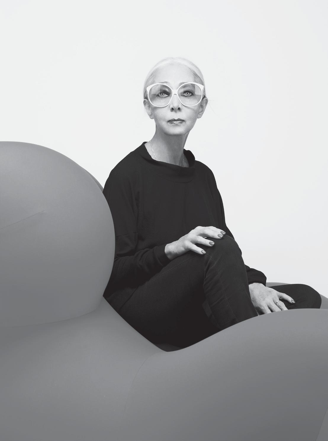
In Milan, there is a lady that knows what she wants when it comes to design. And very often, she gets it. We pay homage to the original Design Hunter®, Rossana Orlandi, whose name, gallery and the designers and products she represents, are instantly recognisable, for all the right reasons.
66. MAKE ME ICONIC
What makes something an icon and when does it become one?
Sophie Davies interrogates the concept, drawing in references from ‘starchitects ’ to the humble bicycle.
75. PALM SPRINGS
Here ’s an example of wellpreserved iconic architecture. But, says Tim Ross, it ’s not all as good-looking as it first appears.
81. 30 X ICONS
People across the Region live in very different ways, but we all have something to learn from each other in an architectural and design sense.

114. CUT PAW PAW HOUSE
When does a house become an design enthusiast excursion destination? When you give a brief for a unique inside-outside home to Andrew Maynard Architects. Alice Blackwood visits an old Victorian in Melbourne with a very new twist.
128. E-TYPE HOUSE
Cascading down a sloped site in Auckland, New Zealand, are three boxes for living with an indoor ‘street’ connecting them. Richard Naish of RTA Studio was both architect and client of this unconventional family home. Andrea Stevens reports.
146. THIRTEENTH BEACH HOUSE
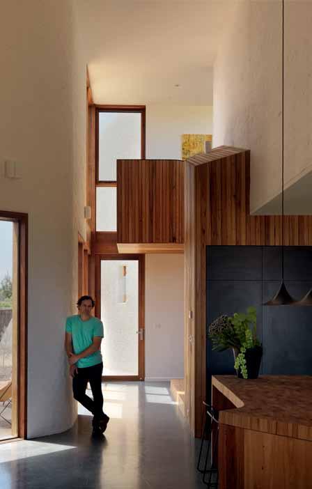
Seemingly arising out of the earth, a series of beautifully interlocking forms create this home on the Bellarine Peninsula in Victoria. Mark Scruby takes a look at this refreshing and clever take on sculptural residential design by Auhaus Architecture.
166. FRANKLIN STUDIO
Two artists and an architect are responsible for this compact, yet impactful, studio in Tasmania. A rigorous and creative design discussion resulted in a beautiful outcome by Room 11 Architects.
178. DOUBLE COURTYARD HOUSE
Enjoy our extended feature on the icons of today. We ask 30 people from the international creative community to nominate what or who they think is an icon and why. The results are far-reaching and wide-ranging – and are sure to inspire. #146
It ’s one thing to visit your family –it ’s quite another to live with them. Michelle Bailey looks at a home in Brisbane that has been updated by Architect, Vokes and Peters, to make it workable for three generations.




“My first thought about Dekton was that it was full of character, an intrinsic character that is as deep as natural stone but with a totally innovative shape and with improved properties in compacting, resistance and also of course, extra big size.”

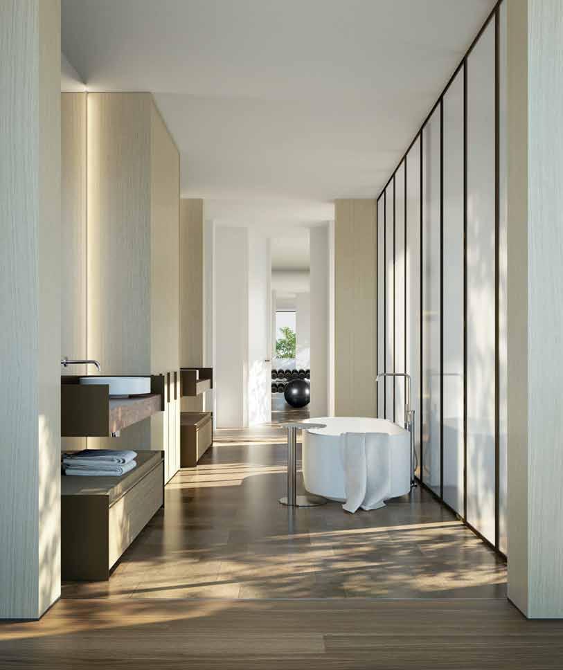
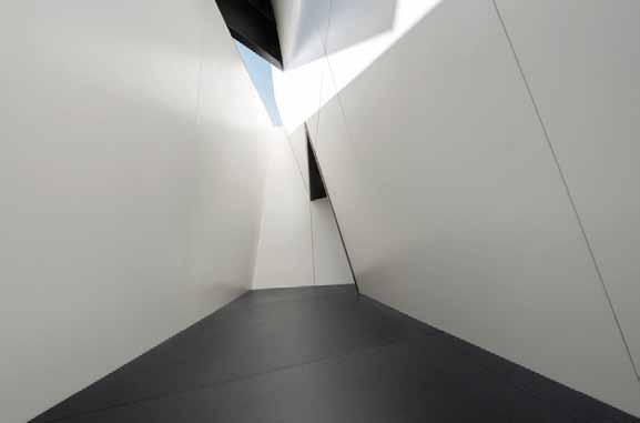
Thanks to the size (up to 3200 x 1440 mm) and the lightness of Dekton (from 8 mm thick), the design possibilities for your kitchen, bathroom, façade, walls or high transit floors are growing exponentially.


9 8 5
7 1 2


Patrick Schumacher, educator, author and company director/ senior designer at Zaha Hadid Architects (ZHA), wrote an essay-length Facebook post earlier this year called ‘In Defense of Stars and Icons’, in which he addressed this condescending attitude towards those we label ‘icons’.
Schumacher argued that the architecture produced by ZHA, which is often deemed iconic (and not always in a positive way), is the result of a pure methodology. He explained that the sweeping forms that are characteristic of many of the practice’s projects are merely a side effect of a functional approach, which aims to adapt the building to complex site conditions.
I am reminded of an interview I did a few years ago with Australian fashion designer Alistair Trung, where he talked about his work being called avant-garde. “It’s actually just common sense,” he told me, “but the whole world is so upside down that anything common sense is avant-garde.”
It’s a fair point they make. We often dismiss things that look different, either because it’s perceived to be too hard to understand, or we don’t have the time to understand it properly. Which leaves us with a tendency to judge on a purely aesthetic or surface level.
However, deeper interrogation takes us to a different plane of thought. Here we can have more meaningful discussion, and critique more intelligently. We may even find that unpacking something that appears complex or unusual reveals something quite simple, something we can understand and relate to.
In this spirit of immersion, we explore the concept of the icon in some depth within this issue. The reason why something or someone is iconic is not just about the aesthetics, although this is the most noticeable aspect (I’ll save the gripe about visual dominance for another day). An icon also represents something larger than itself – an idea, movement or belief.
I’m pleased we are featuring some amazing women who achieve this. On page 40, you’ll meet Charlotte Perriand, the great mind behind Le Corbusier’s best-known furniture, who was incurably modern, practical and authentic. Rossana Orlandi on page 57 is vitally independent, embodying a sense of adventure and discovery.
I’ve also particularly enjoyed putting together – with the help of a great many contacts – the 30 x Icons feature on page 81 to celebrate… our 30th issue! To ask someone what they think is iconic provides a hugely interesting insight into their psyche. As for me? I can’t go past The Beatles – standing for equality, peace and love. I know, I know. I’m a hippy.
It’s easy to dismiss icons. After all, aren’t they just about egoistic statements and big budgets?Nicky Lobo | Editor
DOUBLE COURTYARD HOUSE #178
“I love my home. My studio is home-based and therefore my home plays a multifaceted role in my life,” says Christopher Frederick Jones. “My home means family, time with my dog;, a place to create, to work, enjoyment of good food, wine and music, acreage, wildlife; my sanctuary.” Christopher is an award-winning photographer and works for many of the leading architectural firms in Queensland. He is a regular contributor to architectural media throughout Australia and the world.
M A ndi k eigHr A n
BOOK REVIEW #34
Mandi Keighran is a London-based writer and editor specialising in design, architecture and travel writing. She is currently Deputy Editor of N by Norwegian, the in-flight magazine for Norwegian Air. “Design and architecture reflect the place, time and culture in which it ’s created,” she explains. “The best designers and architects are creating a physical record that will speak to people in years to come of how things are now.”

M A rk scruBy
THIRTEENTH BEACH HOUSE #146
Melbourne-based writer Mark Scruby is interested about “how the same set of challenges/objectives –orientation, light, views, zoning, engagement with context – can be addressed in different residential projects in so many different and surprising ways.” For him, home is not static, “but an ongoing project of controlled metamorphosis for me and my family, moving towards some kind of ideal environment for play, work and life”.


Alice Bl Ackwood
CUT PAW PAW #114
“I think the Australian design community is one of the most talented and entrepreneurial in our region,” says Alice Blackwood. “I’m fascinated by business and brand, the big-thinkers and everyday-doers that make up our creative industry.” Alice is a design editor, journalist and communications strategist. As Melbourne Editor of Indesign Media, she is a passionate supporter of the local design industry, building discussion around design practice and process, and commentary on business and brand – and the role of design within this.


Ben Hosking

FRANKLIN STUDIO #166
For Ben Hosking, “Home can be a tangible reflection of who we are, but more importantly, provide a sense of place and belonging.” Ben is an architectural photographer based in Melbourne, and is particularly interested in design’s “capacity to serve and enhance the human condition.” He studied photography at RMIT, and has worked as a freelance photographer since 2008. His work has been published by renowned local and international publishing houses such as Taschen, Gestalten and Thames & Hudson.
MicHelle BA iley
DOUBLE COURTYARD HOUSE #178
“For me, ‘home’ is the place where the most ordinary and extraordinary family memories are made,” says Michelle Bailey. Her thoughts on the home tie in with her sentiments about architecture more broadly. “The interesting thing about architecture is the intangible qualities that shape our experience and memory of a place,” she says. Michelle is a Brisbanebased writer and graduate of architecture from the University of Queensland. She writes regularly for local and national publications about architecture and design.
pAtrick r eynolds
E-TYPE HOUSE #128
“There is always a tension in architecture between building as practicality and building as imagined ideal, and it is to the latter that photography most powerfully and usefully addresses itself,” explains Patrick Reynolds. “Practically of course each building precedes its photography, but then architecture, in as much as images inform its imaginative construction, relies on the more ethereal world of the image too.” The architectural photographer believes that, “no building, in all seriousness, is completed until it is photographed.”
Stephen todd

CHARLOTTE PERRIAND #40
After 20 years living and working in Paris, where he launched Numéro magazine and contributed to titles such as The New York Times, The Guardian, Le Monde and several international editions of Vogue, Stephen Todd returned to Australia in 2010. He is the Design Editor of the Australian Financial Review magazine and a regular contributor to Habitus and other Indesign Media titles. “Writing about architecture and design is my way of dancing through the culture,” he says.
teSS Ritchie
JAPANESE & FINNISH DESIGN #49
London-based writer Tess Ritchie is intrigued by the way architecture and design “can create a particular environment and affect our experience of a place – how it sparks feelings.” Tess studied English literature at the university of Otago in Dunedin, New Zealand, where she grew up. While living in Sydney, Tess began writing for a number of design blogs before becoming Editorial Assistant for Habitus and later Online Editor for Indesign Live and Habitus Living.
tim RoSS
PALM SPRINGS #75
“Considered design and architecture moves me like music, art or literature. It inspires, it excites and it challenges me,” explains Tim Ross. “The core strength of architecture is that it adapts with time and circumstance.” Tim is a comedian with a strong interest in design. He is currently making a documentary series on the evolution of our suburbs called Streets of Our Town. In 2014 his live performances in iconic Modernist homes and buildings won the National Trust Preservation Award.
tR evoR mein
THIRTEENTH BEACH HOUSE #144
“The most interesting thing about architecture and design,” says Trevor Mein, “is that the responses vary so dramatically with cultural and personal moods.” After studying architecture at RMIT University in Melbourne, Trevor turned his hand to photography. Over the past 20 years, he has established himself as a leading architectural, commercial and art photographer, regularly contributing to a host of both Australian and international publications.


3D VISUALISER
ACCOUNT MANAGER
ADMINISTRATION
AGENT/DISTRIBUTOR
FIND
BLOGGER
BUSINESS DEVELOPMENT
CAD DESIGNER
CAMPAIGN MANAGEMENT
CUSTOMER SERVICE
DESIGN MANAGER
DESIGNERS
EDITOR
EVENTS CO-ORDINATOR
GRAPHIC DESIGNER
INDUSTRIAL DESIGNER
INTERIOR DESIGNER
LECTURER
LIGHTING SALES
PERFECT
MEDIA ExECUTIVE
NATIONAL SALES MANAGER
OPERATIONS MANAGER
PA / SALES SUPPORT
PHP DEVELOPER
PR ACCOUNT MANAGER
PRODUCTION MANAGER
PROJECT MANAGER
SPECIFICATION
RETAIL INTERIOR DESIGNER
SALES
SHOwROOM MANAGER
SHOwROOM SALES CONSULTANT
STATE MANAGER
STUDIO LEADER
TECHNICAL OFFICER
wAYFINDING DESIGNER
wEB DESIGNER / DEVELOPER
careersindesign.com.au careersindesign.asia
ARCHITECTURE
DESIGN
INTERIORS
MEDIA
AGENCY
ADVERTISING
RETAIL COMMERCIAL FURNITURE
LIGHTING
TEx TILES
YOUR RESIDENTIAL
ARCHITECTURE
DESIGN
INTERIORS
MEDIA
AGENCY
PUBLISHING
RETAIL
COMMERCIAL
FURNITURE
LIGHTING
TEx TILES
PRODUCT
RESIDENTIAL
JOB
EDUCATION
DESIGN
INTERIORS
MEDIA
ADVERTISING
RETAIL COMMERCIAL
FURNITURE
LIGHTING
TEx TILES
PRODUCT
Editor Nicky Lobo nicky@indesign.com.au
original dE sign tEmplatE one8one7.com
Cr E ati VE dir ECtor
Christopher Holt christopher@holtdesign.com.au
dE sign Ers
Michelle Byrnes michelle@indesign.com.au
Sophie Taylor s.taylor@indesign.com.au
James McLaughlin james@indesign.com.au
digital Editor
Ashley Tucker ashley@indesign.com.au
Contributing WritErs
Michelle Bailey, Alice Blackwood, Sophie Davies, Mandi Keighran, Andrew McDonald, Tess Ritchie, Tim Ross, Mark Scruby, Andrea Stevens, Jane Burton Taylor, Stephen Todd
Contributing photograph Ers
Peter Bennetts, Angie Boustred, Peter Clarke, Giovanni Gastel, Giuseppe Greco, Natasha Harth, Hufton + Crow, Takashi Hatakeyama, Gary Heery, Ben Hosking, Christopher Frederick Jones, Thom Kerr, John Leeming Duccio
Malagamba, Matthew McWilliams, Trevor Mein, Marko Priske, Patrick Reynolds, Tom Roschi, Ezra Stoller, Fiona Susanto, Tatiana Uzlova, Wouter
Van der Hallen
Contributing illustrator
Matt Canning
Contributing sub-Editors
Carolin Wun
CEo / publish Er
Raj Nandan raj@indesign.com.au
pa to publish Er
Elizabeth Davy-Hou liz@indesign.com.au
produCtion m anagEr
Victoria Kovacs victoria@indesign.com.au
assistant produCtion m anagEr
Tina Fluerty tina@indesign.com.au
FinanCial dir ECtor Kavita Lala kavita@indesign.com.au
aCCounts
Gabrielle Regan gabrielle@indesign.com.au
busin E ss managEr Vivia Felice vivia@indesign.com.au
onlin E CommuniCations
Radu Enache radu@indesign.com.au
Ryan Sumners ryan@indesign.com.au
E VEnts & mark Eting Tegan Schwarz tegan@indesign.com.au
busin E ss dEVElopm Ent managEr Colleen Black colleen@indesign.com.au (61) 422 169 218
m Edia Coordinator Alex Kwak alex@indesign.com.au
CoVEr imagE
Rossana Orlandi (p.57)
Photography by Hataguchi Kazunori
Head Office
Level 1, 50 Marshall Street, Surry Hills NSW 2010 (61 2) 9368 0150 | (61 2) 9368 0289 (fax)


MelbOurne
Suite 11, Level 1, 95 Victoria Street, Fitzroy VIC 3065 | (61) 402 955 538

SingapOre
4 Leng Kee Road, #06–08 SIS Building, Singapore 159088 (65) 6475 5228 | (65) 6475 5238 (fax)
HOng KOng
Unit 12, 21st Floor, Wayson Commercial Building, 28 Connaught Road West, Sheung Wan, Hong Kong
indesign.com.au

the publisher or the publication. Contributions
submitted
the sender’s risk, and Indesign Media Asia Pacific cannot accept any loss or damage. Please retain duplicates of text and images. Habitus magazine is a wholly owned Australian publication, which is designed and published in Australia. Habitus is published quarterly and is available through subscription, at major newsagencies and bookshops throughout Australia, New Zealand, South-East Asia and the United States of America. This issue of Habitus magazine may contain offers or surveys which may require you to provide information about yourself. If you provide such information to us we may use the information to provide you with products or services we have. We may also provide this information to parties who provide the products or services on our behalf (such as fulfilment organisations). We do not sell your information to third parties under any circumstances, however, these parties may retain the information we provide for future activities of their own, including direct marketing. We may retain your information and use it to inform you of other promotions and publications from time to time. If you would like to know what information Indesign Media Asia Pacific holds about you please contact Nilesh Nandan (61 2) 9368 0150, (61 2) 9368 0289 (fax), info@indesign.com.au. Habitus magazine is published under licence by Indesign Media Asia Pacific. ISSN 1836-0556



Originally designed in 1954, the DELFINO armchair is now being re-released by Arflex The chair is a significant example of the ‘organic ’ furniture developed in the 50s, which drew inspiration from nature, in this case, the form of a dolphin with its distinctive flipperlike arms and harmonious body.

arflex.it / poliform.com.au
15 years after debut for Arper, the Duna silhouette still stands as a modern design classic. The new DUNA 02 features an improved polypropylene shell, allowing for a thinner, sleeker profile with a more delicate curvature, as well as a more sumptuous finish, which is available in a new colour palette.

arper.com / stylecraft.com.au
As a part of their 35 th anniversary, Arthur G have released an anniversary design in the STANLEY SOFA . Upholstered in luxurious Bottle Green Velvet, the sofa’s subtle curves exude a charm and character synonymous with the brand. More than just a reminder of the brand’s history, the sofa is a great item unto itself.
arthurg.com.au

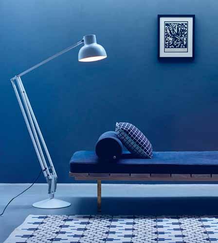
Anglepoise has release the TYPE 75 MAXI COLLECTION, a range designed by industrial product designer Sir Kenneth Grange and available through Cult. Comprising a floor lamp and coordinating pendant, the collection offers adjustability, fluidity of movement and perfect balance.

cultdesign.com.au
Renowned street artist Charles Uzzell-Edwards, aka Pure Evil, has built a global fan base through innovative art pieces, and working with Royal Doulton brings the release of a new limited edition BUNNY figure collection. Sinister, yet oddly cute, the three-legged bunny comes to life as a 3D figurine in the Royal Doulton 200 Years Collection.

royaldoulton.com.au
The Masters’ Pieces Collection by Artemide assembles timeless masterpieces and updates them with modern LED technology. Inspired by the cross between design, light, technology and architecture allows each of the designs, including the ALFA lamp, to continue Artemide’s long-term design requirement to develop products that can be continuously updated to meet new technological advancements.
In a celebration of 90 years of great design, Bang & Olufsen has released the BEOLAB 90, a state-of-the-art loudspeaker for the uncompromising sound enthusiast. The speaker features Beam Width Control, which allows the user to change the width of the sound beam to suit different listening situations. This makes for an easily customisable listening experience; switching from a dedicated sweet spot to an all-over-the-room party mode is as simple as pressing a button. The landmark intelligent loudspeaker delivers the ultimate sound experience no matter what the circumstances and celebrates the timeless design philosophy of the distinctive Danish brand.
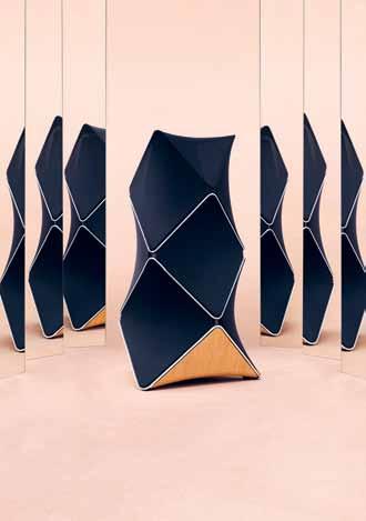
bang-olufsen.com
artemide.com.au

Since 1934, Molteni & C has been one of the principal Italian furniture groups in operation. The company’s new Wardrobe Systems are an aesthetically avant-garde release, offering the perfect solution for residential and commercial wardrobe projects.

molteni.it / hubfurniture.com.au
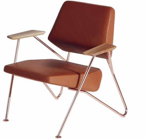
The POLYGON chair from Croatia’s Prostoria and newly available through Stylecraft , is an armchair steeped in classical modernist design. Fulfilling the functional parameters of a chair, but not usurping space, each change in perspective transforms the base’s triangles into hexagons and other complex polygons.
prostoria.com / stylecraft.com.au
Cosentino Group offers a limited edition Silestone 25 th anniversary colour, ACQUA FRACCAROLI . Designed in collaboration with renowned Brazilian interior designer Brunete Fraccaroli, the surface matches aesthetic elegance with strong technical properties such as high resistance to scratches, stains and impact, and low fluid absorption.
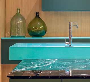
cosentino.com
Melbourne-based maestro Rugs Carpet and Design (RC+D) has expanded its range with the launch of a hand-knotted collection of rugs inspired by a rich, painterly sensibility. The DREAM TIME rug is a lilac offering made of 100 percent bamboo silk, which gives it an antique finish, while maintaining a modern aesthetic, to suit contemporary environments with character.
rc-d.com.au

The clean lines, simplicity and functionality of Japanese design are what inspired the TANA S hel F Japanese in nature and in name – tana being Japanese for shelf – the piece combines a striking visual profile with complete versatility, and can be custom made in multiple sections, and in a variety of configurations to suit a wide range of applications. Designed by Melbourne-based Tide Design , Tana is available in both Tasmanian and American oak with a natural and hard wax oil finish. The shelf comes in standard sizes, however it can be made up to three-metres long, with either five or six shelve segments.
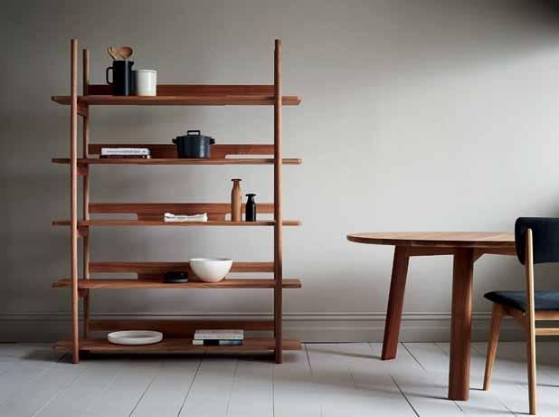
tidedesign.com.au
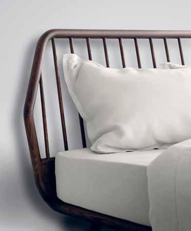
Designed by Pianca ’s in-house design team, the TRAMA bed focuses on a sleek form with angled legs, delicately minimal base and a hexagonal inspired headboard. Designed and manufactured in Italy, Trama combines creativity with advanced technology to make for an item of functional and elegant modern furniture. Available in three styles, the stripped composition of the Trama makes it a piece that is easily matched in the bedroom.
pianca.com / meizai.com.au
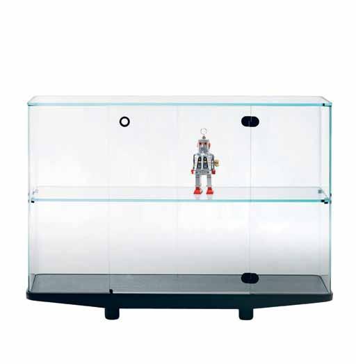
People love to collect. The Colle CT oR series of cabinets from Glas Italia has been designed to display the items of collections. Comprised of two low glass tables and three taller glass cases and made from UV bonded curved glass, with the base constructed in black stained solid wood, the cabinets are an elegant and tasteful way to display the special things in one ’s life. Feed your obsession – or at least house it beautifully.
barberosgerby.com / glasitalia.com / spacefurniture.com.au
Combining top quality sound reproduction and elegant Danish design, the compact KREAFUNK speaker sprung from the idea that simplicity and functionality can be implemented into all product designs. With broad appeal, the speakers are available in Australia through Luumo luumodesign.com

Designed by Australian design team Lepaar, the GARDENLUST HOSE is made from agricultural-grade, UVprotected material and high-tensile reinforced yarn. The solid brass universal tap connectors are vertically crimped with a hydraulic machine for extra durability, and add an industrial charm to the item.

lepaar.com / madebytait.com.au
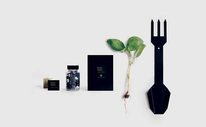
Expanding on the concept and importance of daily rituals, Page Thirty
Three have introduced the SEED PILLS + MIXED HERBS seeds. The tongue-in-cheek Herb Pills are visually captivating, artistic, and also perfectly functional! Simply plant your seeds and watch your garden grow. These have been released alongside the GARDEN SPORK , a funky yet charming gardening apparatus. A play on the dining spork, the tool has been specifically designed for the small scale gardener, fulfilling all basic needs of gardening with one simple and eyecatching implement.
pagethirtythree.com
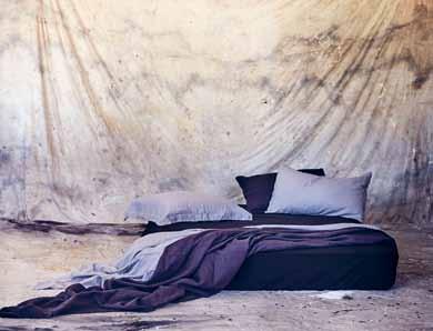
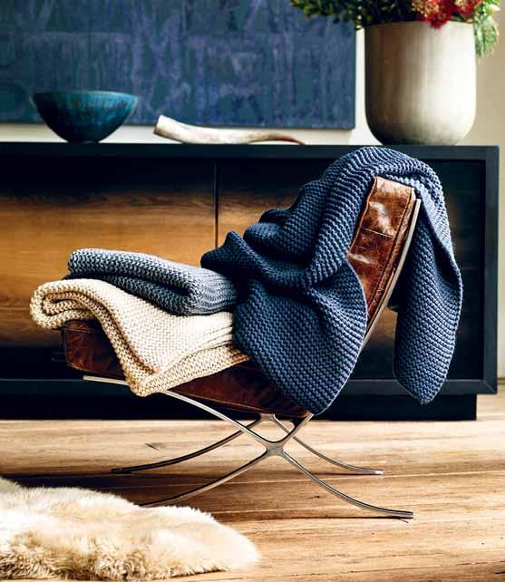
Inspired by the comfort of a favourite sweater, Ugg ’s SNOW CREEK throw and pillow ranges offer comfort with an uncompromised style. Specifically designed to add dimension to a setting, the softly textured wool blend exudes a casual and cosy elegance, adding warmth and comfort to any space.
uggaustralia.com.au
Siblings Andrea Tan and Joen King come together to launch the ANDREA & JOEN French linen collection. Bringing mixed design principles together, the duo’s inspirations and details are seen in resulting collection with Joen’s bold eye for colour and shape working with Andrea’s knowledge of unique details and trends.
andreaandjoen.com
Introducing the new BLIX FLEXIBLE HOSE SINK MIXER by the Australian design team at Phoenix Tapware . This sink mixer will feel right at home in any modern or contemporary kitchen and features a stylish, velvet touch, matte black rubber hose which detaches from its cradle for added flexibility when washing large pots.
phoenixtapware.com.au
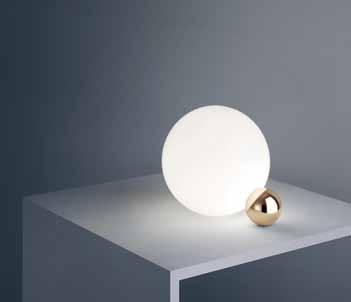
From designer Michael Anastassiades comes the COPYCAT table lamp from Flos, available through Euroluce. A beacon to provide diffused light, the lamp is made of two touching spheres that hold each other up in a delicate and poetic balance. The smaller sphere hides an LED source that radiates the lighting beam inside the glass sphere.
flos.com / euroluce.com.au


issue #30 habitusliving.com
e15 , available through Living Edge , is celebrating the 20 th anniversary of its iconic table BigFoot with a new wooden accessory, the European oak plaything, MR B . Designed by David Weeks Studio, this sturdy piece re-imagines the legendary mythological creature BigFoot as a moveable and playful toy.

e15.com / livingedge.com.au
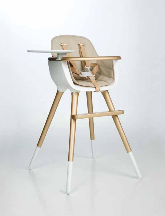
Great design should be a thing experienced from as early as possible. It’s this philosophy that lead to the creation of the OVO highchair. Refined in form and made with a contemporary materials palette of natural beech and white polyethylene, the practical wipe-friendly shape is future-proofed in design, and converts easily into a children’s chair.
missfitz.com.au
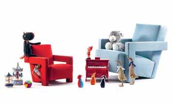
Released in time for Christmas from Cassina is the BABY UTRECHT armchair. Designed for the smaller family members, the armchair is a remix of the iconic Utrecht armchair, designed in 1935 by architect Gerrit T. Rietveld. The item conserves the same characteristics as the original armchair, yet has been ergonomically adapted for very lucky children from approximately three-to-eight years old.
cassina.com / cult.com.au
TOGO MINI is a miniaturised version of Michel Ducaroy’s Togo collection. Known as much for its comfort as it is its style, the mini sofa features ergonomic designs with multiple density foam constructions and quilted covers, making each piece both visually attractive and physically inviting.

ligne-roset.com / domo.com.au
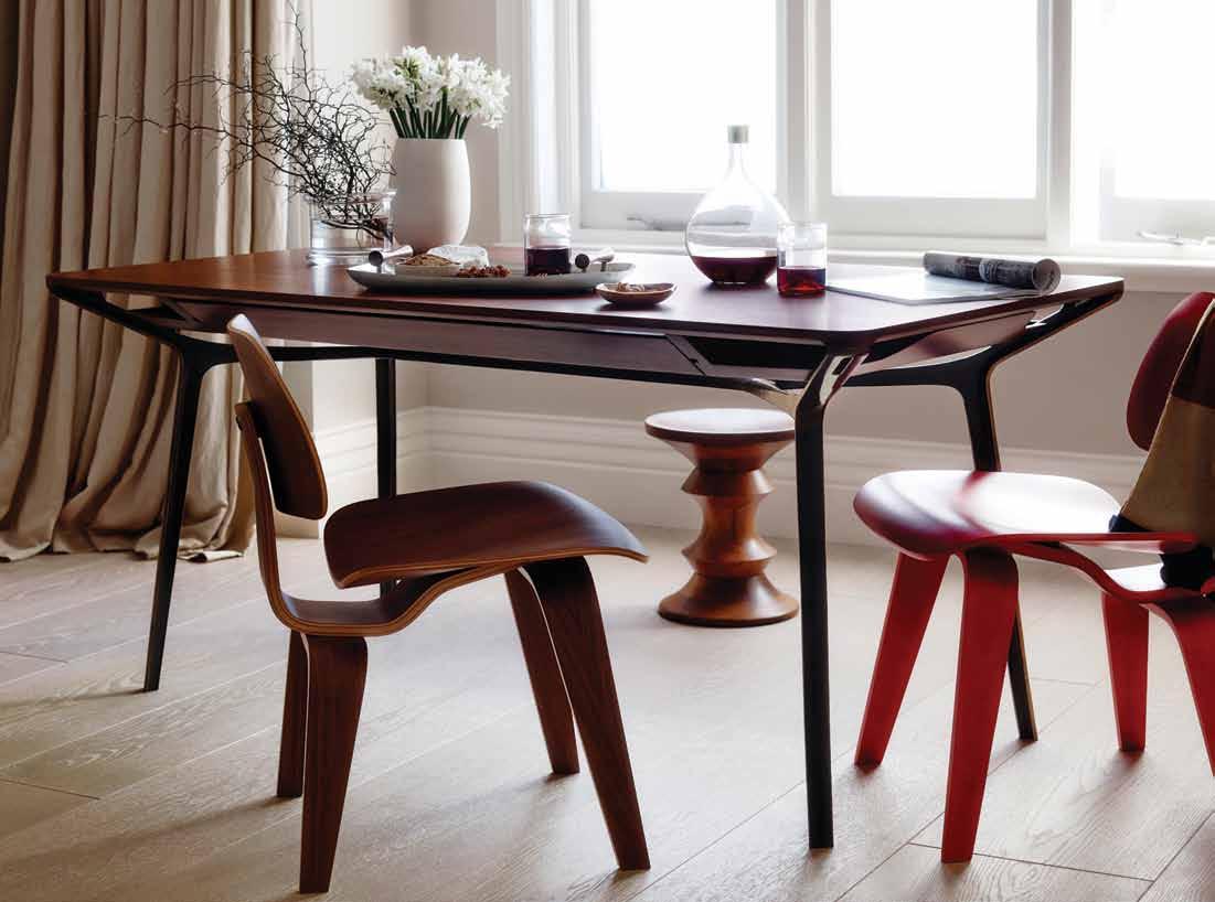
Introducing the Carafe table designed by Charles Wilson for Herman Miller. Whether you’re dining, working or creating, the Carafe table adapts to the demands of urban life. An elegant and sleek design with subtle storage options that provide discreet cable connectivity. Carafe is designed for contemporary living.
 ©2015 Herman Miller, Inc.

Practice doesn’t always make perfect. Mandi Keighran asks what is it that makes a master – whether they are architect, industrial designer… or even a chef.

Ayoung apprentice chef twists a burning hot towel with his bare hands. He drops it, winces with the knowledge of failure, and then starts over with a freshly boiled one. It’s a scene familiar to anyone who has seen the award-winning 2011 documentary film Jiro Dreams of Sushi, which focuses on renowned 85-year-old sushi master, Jiro Ono, and his relationship with his son and eventual heir, Yoshikazu. There’s no doubting Ono’s status as a master of his chosen craft – his restaurant Sukiyabashi Jiro has had three Michelin stars since 2008 and his contemporaries regard him as the world’s greatest sushi chef. But, how did he become the icon he is today? “I do the same thing over and over, improving bit by bit,” he says in the film.
The road to becoming a master sushi chef in Japan – especially under Ono – is a gruelling one. At Sukiyabashi Jiro, the first – painful –step is mastering the squeezing of the boiling towels that are given to diners. Then, the apprentice is able to start handling the fish (amongst other skills, learning to massage octopus for 40 minutes to tenderise it). After approximately a decade of training, the apprentice is allowed to cook eggs. The message is clear: practice makes perfect, and the road to becoming a master is one of constant repetition of increasingly complex tasks.
This idea, that practice makes perfect, was popularised by best-selling author Malcolm Gladwell in his 2008 book Outliers: The Story of Success. In the book, Gladwell proposes that anyone, regardless of natural aptitude, can become a master of anything with 10,000 hours of guided practice – “the magic number of greatness,” he calls it. The claim, based on research suggesting that practice is the essence of genius, caught on in the popular imagination. Arguably, the proposition was embraced because it’s comforting to think that mastery is not inherent, but rather something that is equally available to all – it’s just a matter of putting in the time.
Psychologists, however, weren’t so quick to buy into the idea. Last year, Gladwell’s claims were all but dismissed based on research that analysed the performance of musicians and chess players. The study found that for musicians, only 30 percent of their performance could be attributed to practice, while for chess players it accounted for only 34 percent.
These results are hardly surprising. A true master – an icon, if you will – is not just one who is practised, but one who introduces innovation to their craft and is widely recognised. Then, also, there are the cases of those who are masterful despite their apparent lack of experience. Take Irish Modernist, Eileen Gray, whose Villa E.1027 in Roquebrune-
Cap-Martin is considered one of the first and greatest examples of residential modernism – so great, in fact, that a reputedly jealous Le Corbusier felt the need to put his mark on it and vandalised its stark walls with a series of eight sexually explicit murals. Gray had never trained as an architect, and this was her first attempt at designing a building.
So, if it’s not a matter of time and practice, what is it that leads to mastery? And, more specifically, what does it take to become or create an icon within design or architecture?
Perhaps part of the answer can be found in the sheer number of iconic designers and designs that sprung forth from the mid-20 th Century. As Dominic Bradbury’s beautifully produced, and – at 544 pages –comprehensive tome Mid-Century Modern Complete demonstrates, the latter half of the 20 th Century was a particularly prolific period for design. And, many of those practitioners are considered icons today – among the nearly-100 designers and craftspeople featured in Bradbury’s book are Charles and Ray Eames, Dieter Rams, Saul Bass, and Isamu Noguchi.
The period, writes Bradbury, was a “world of dreams and optimism… for designers and architects especially, it was an extraordinary time to be at work, and the opportunities for creativity and originality were widespread and welcome.” It was an era of unprecedented consumerism, and there was demand for new kinds of products and services. Pair this with fast-developing technologies, new materials and manufacturing methods, and a receptive industry that largely nurtured designers and their creativity, and you have the perfect conditions for designers to be innovative, and create products that truly speak of their time.
In other words, while exceptional natural aptitude is obviously a necessity when considering what makes a master, a part of it also seemingly comes down to circumstance.
As David Robson writes of Sri Lankan architect Geoffrey Bawa in his 2007 book, Beyond Bawa, which successfully explores the continuing legacy of the architect who defined tropical Modernism through the inspired framework of contemporary architects working across Asia: “[Bawa’s] career was shaped by accidents of birth, time, and place”. Indeed, according to Robson, Bawa possessed few of the skills or talents usually associated with the practice of architecture – he did, however, have vision, and through a sequence of happy coincidences and what Robson calls “conjunctions” he was able to realise his vision and, in the process, redefine
The latter half of the 20th Century was a particularly prolific period for design.
a nation’s architectural style so thoroughly that many of his innovations are considered to be features of a long-standing vernacular.
The time in which Bawa was working – described by Robson in a remarkably similar way to Bradbury writing of the mid20 th Century as one of “great optimism and experimentation… when people were receptive to new ideas… [and] anything seemed possible” – was just one of the fortuitous circumstances that nurtured his career. His introduction to landscape design by way of his older brother’s garden, his education in law, and even the fact that the first monograph on the architect (now known at the “White Book”) was published in Singapore in 1986 instead of the following year in the UK as planned, all contributed to Bawa’s development as an architect, and his reputation as a master. “These conjunctions… were in no small measure responsible for establishing his reputation outside his native Sri Lanka”, writes Robson. And, without that reputation Bawa – although his work would have remained as it is – would not have contributed to the ongoing process of inspiration and influence that Robson so clearly shows – and, surely that contribution is also part of what being considered a master is.
Another conjunction – and arguably the most important – was the people with which Bawa surrounded himself, including Australian artist Donald Friend and a multitude of talented builders and craftspeople. Bawa, writes Robson was “someone who operated within a circle of sympathetic friends and collaborators and at the centre of an ever-changing group of talented associates and assistants”.
It’s a recurring theme when looking at the lives and works of designers who are considered to be iconic. In Less and More – a beautifully designed book originally released in conjunction with a 2008 exhibition of iconic German designer Dieter Rams’ work at the Suntory Museum in Osaka, and which has recently been re-released – the curators stress the importance both Rams’ colleagues and the companies he worked for in incubating his mastery.
“Rams and his design team were as important to the company as it was to them, and without each other it is unlikely that either would have achieved the quality and quantity of work that they did.”
Perhaps the mark of a true master is one who doesn’t see their accomplishments as having achieved some kind of end-goal. Consider Charles and Ray Eames – arguably the most famous designers of the 20 th Century and the subject of a recent exhibition at London’s Barbican museum. In the exhibition catalogue – which includes essays by Barbican curator Catherine Ince and Eames Demetrios (Charles’ grandson) amongst others, and is, unfortunately, rather cluttered in its design and approach – Demetrios writes that the Eames “treasured [their] labour more than its compensations”.
As Jiro Ono says in Jiro Dreams of Sushi: “There is always a yearning to achieve more. I’ll continue to climb, trying to reach the top, but no one knows where the top is… even at my age, after decades of work, I don’t think I have achieved perfection. But, I feel ecstatic all day. I love making sushi.” And, this attitude of passion and constantly striving for something more is the essential ingredient to the making of a master.
MID-CENTURY MODERN COMPLETE
Dominic Bradbury
Thames & Hudson 544pp hardcover, $125.00
LESS AND MORE
Klaus Klemp & Keiko Ueki-Polet
Gestalten 808pp hardcover, $78.00
BEYOND BAWA
David Robson
Thames & Hudson 264pp hardcover, $80.00

Everyone knows Le Corbusier ’s name – his architecture, his Modernist philosophies, his furniture designs… or were they? stephen todd introduces us to CharLotte perriand, the woman behind some of his most famous products.


The story is the stu of legends. In 1927, at the age of 24, a very beautiful Charlotte Perriand turned up at Le Corbusier’s atelier on the rue de Sèvres in the 6th arrondissement of Paris. She’d read a few of his books – Towards an Architecture of 1923, The Decorative Art of Today of 1925 – and was excited by the idea of working alongside a mastermind of the newlyminted Modernism. Le Corbusier carefully considered her portfolio, but dismissed her with “Madame, we don’t embroider cushions here”.
Charlotte had recently graduated from the prestigious Ecole de l’Union Central des arts décoratifs, and unfortunately for her, the decorative arts were all that Le Corbusier abhorred. But Perriand was no embroiderer. Despite a conservative syllabus at the Ecole, she had recently converted her own garret flat into a shining ode to the new era. Influenced by automobile construction (the Model T Ford had recently been invented) she constructed her sparkling nickel dining room around an extensible table and pivoting metal chairs. Lighting was provided by car headlights. Chrome, leather and tubular steel (also recently invented and showcased by Marcel Breuer at the Bauhaus) made for one of the most avantgarde interiors of the time.
Charlotte invited Le Corbusier to come see her ‘bar under the roof’, exhibited at the Salon des Artistes décorateurs. What he saw impressed him, but what impressed him even more was that clearly she knew how to get her ideas into production.






That’s something he’d, to date, been unable to do, therefore unable to equip his otherwise groundbreaking private houses, such as the Villa Lipschitz, Villa Le Lac or the one he was then working on – the famous Villa Savoye –with interiors worthy of the structures.
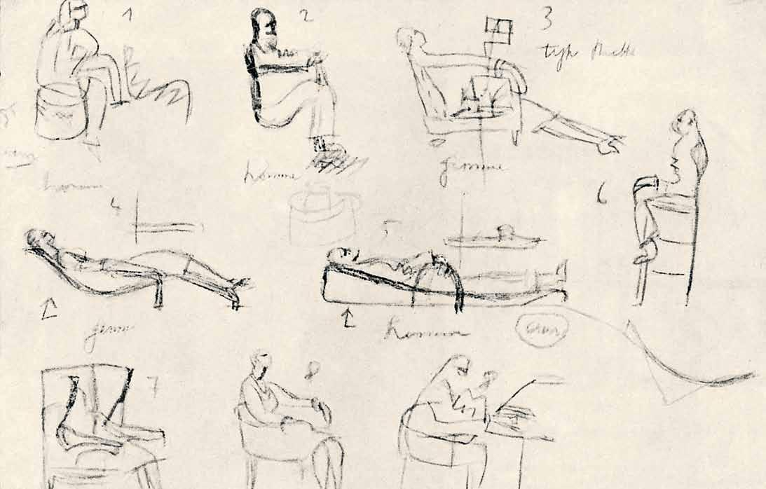
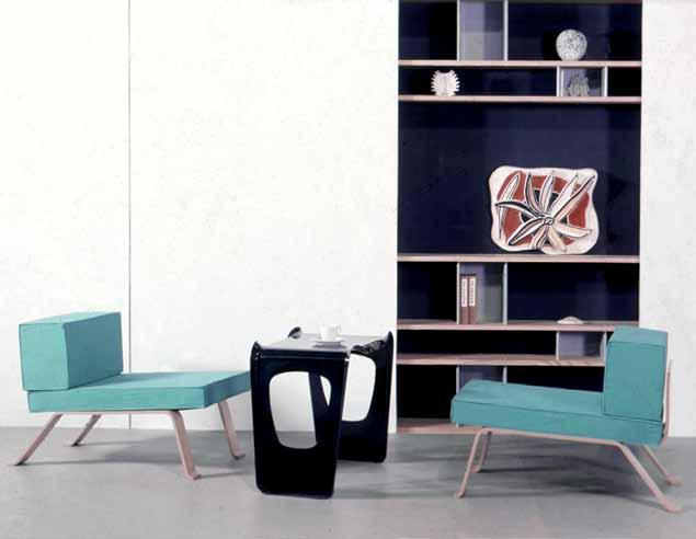
And so, for 10 years Charlotte was charged with developing and producing all the équipement d’habitation (‘dwelling equipment’, Corbusier’s term for the domestic furniture that would be the cogs in his ‘machines for living’). The iconic LC2 Chaise à grand confort (club chair) of 1929, the slinky LC1 slingback chair, the serpentine LC4 chaise longue all leapt from Charlotte’s sketchpad. As did all the other furniture designs Le Corbusier’s atelier would produce over a decade.
What I’ve always found curious is that despite Le Corbusier’s unequivocal affirmation that Charlotte was his “associate, most particularly responsible for toute l’équipement de la vie domestique, the equipment of domestic life”, Charlotte is so rarely acknowledged.
That, despite the fact that every piece that was produced bears on the underside the signatures of Charlotte Perriand, Le Corbusier and Pierre Jeanneret, the majority still refers to these extraordinary pieces as the work of Le Corbusier alone. That, even though Le Corbusier wrote in 1932, “it’s Madame Perriand… who has the entire responsibility for the realisation of our domestic equipment,” only the connoisseur allows Charlotte Perriand her proper place in the pantheon of Modernist design.
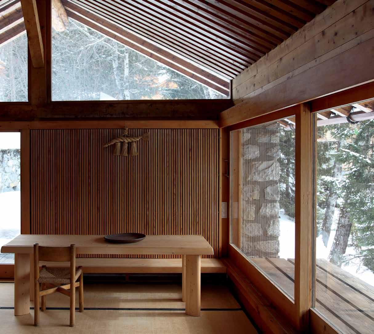
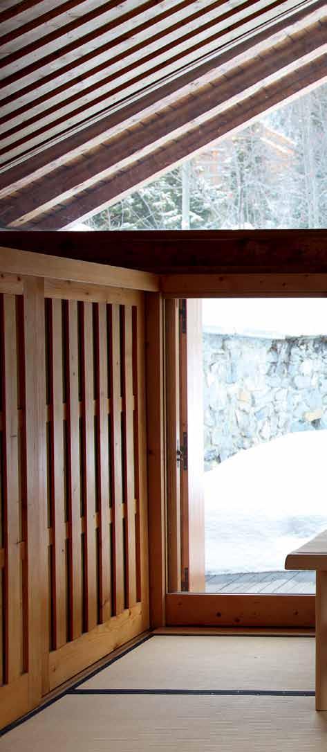
I’ve pondered this conundrum for years now, ever since I first met Charlotte in Paris, in 1995. I’d been commissioned by a visionary British magazine editor to write a piece on “the unknown designer”. Charlotte lived in a duplex apartment on the rue Montalembert, just off the Boulevard Saint-Germain. The penthouse of a 1940s building, it was a light-filled aerie she had designed along Japanese lines, with sliding panels, raw floors and a narrow cantilevered staircase leading to a rooftop terrace with views out west to the Bois de Boulogne. At 94 years old, she still retained all her allure, dressed in a snappy white lab coat, fine grey hair up in a tidy chignon. She was charming, but in a no-nonsense way. Entertaining, though unlikely to indulge in mundanities. She worked until the end of her life, four years later.
In the interim, I was lucky enough to be invited on several occasions to take tisane on her terrace, or visit at her chalet in Méribel. We’d chat about Modernism and what it meant to her. It was more than just a design aesthetic, it was an ethic – her way of being in the world. As a young woman, working with Le Corbusier, every chance she got she would leave Paris and go hiking – often accompanied by Pierre Jeanneret – in the Alps. She was originally from the Haute-Savoie, and the mountains were her life force. “The best bed I ever designed,” she told me, “was a sleeping bag laid over some sheep droppings.”
opposite above | Le Corbusier’s ‘ study for different seating’ (1927) shows he and Perriand were thinking aLong the same Lines. opposite b elow | Perriand’s CLoud sheLving system, made in the 1950’s with Jean Prouvé were insPired by a visit to the imPeriaL viLL a shugakuin. above | an instaLL ation from Perriand’s synthèse des arts instaLL ation in 1955 shows the infLuenCe JaPanese aesthetiC s had on her L ater work.In many ways, she was a proto-feminist; independent, sporty, adventurous – infamous photos from the 1930s show her topless in the mountains, arms flung high above her head, shoes in her hands, the very incarnation of a new period of freedom.

When asked how she felt about her name being generally disassociated from her creations, Charlotte responded, “Je m’en fou! ” (“I couldn’t care less!”) Why it happened, she explained, was simply that, “from a commercial point of view, three names don’t have the same resonance as one – and Le Corbusier was the star.” Yet the labels on the Cassina edition in production since 1965 do say ‘Creation 1929, Le Corbusier, Jeanneret, Perriand’.
And still the myth of Le Corbusier as sole creator persists. It seems the collective imagination is still configured to privilege the image of the solitary genius, rather than accept the reality of collaborative creation. As for Charlotte, she kept her head down at the atelier on the rue de Sèvres. In her free time she was too busy, off hiking in the mountains to worry about asserting her professional ascendance.
“Charlotte was always joyful, high on life,” says her daughter, Pernette, the woman responsible – along with husband Jacques Barsac – for the Perriand Archives.
“But one thing is clear; whenever she had problems, people or experiences that were negative, she moved on. And once she turned a page, it was turned forever. That said, she always respected Le Corbusier, and always defended him against naysayers.” Which, of course, were legion.
Charlotte quit Le Corbusier’s atelier in 1937. She went on to create exemplary furniture and interiors, under her own name, until her death in 1999.
Cult
One thing is clear… once Charlotte turned a page, it was turned forever.
Pernette | daughter
ALWAYS THE BEST POSSIBLE TASTE

THE SMEG CLASSIC COLLECTION • SETTING THE STANDARD IN VISUAL AND CULINARY TASTE FOR 30 YEARS


smeg.com.au





Relative to their size, some nations have a high ratio of iconic brands with an international appeal. Tess RiTchie takes a look at some fine Finnish and Japanese design, to tease out their shared characteristics, and nature of their iconic status.
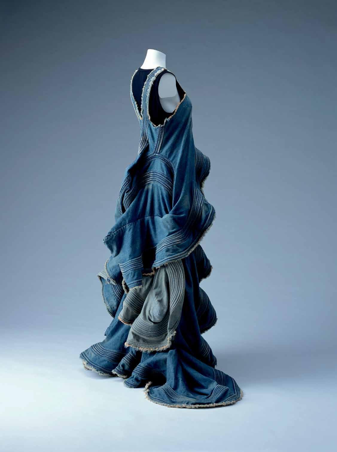
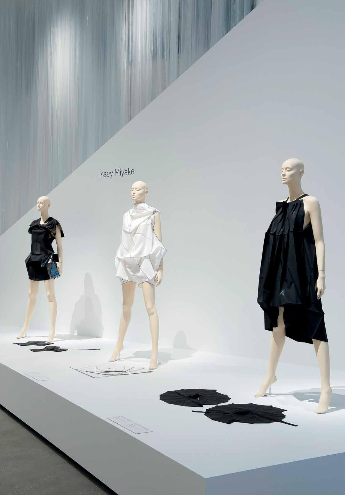
the discussion of the icon is problematic in many ways – who decides what is iconic? Are brands iconic or just their products? As complex as it is, however, there are some that have undeniable status – Marimekko, Issey Miyake and Alvar Aalto just to name a few. Though quite different in aesthetic, when we begin to delve into what makes them iconic, similarities can be found. Function, quality, simplicity and innovation seems to be the superfecta that these Japanese and Finnish brands all have in spades.
Bestowing something with iconic status can seem decorative or even frivolous, but everyday function is a key driver in these brands, grounding the term in something quite tangible. For example, Finnish fashion and homewares label Marimekko was “born in 1950s Finland at a time when people had a lot of functional needs, but were also craving some energy in everyday life,” as current COO Tiina Alahuhta-Kasko points out. Marimekko was designer Armi Ratia’s way of addressing that – “injecting energy, beauty and positivity into life through timeless, functional products”. Practical designs and classic silhouettes that transcend ‘trends’ appealed to – and felt good on – a wide range of wearers, and so increased the brand’s iconic status.
Similarly grounded in function are the designs of Japanese fashion designer Issey Miyake.

While fashion in the west – and much of the fashion we see – is so often “about the glamourised, sexualised, obviously expensive woman,” as collector of Japanese fashion and Executive Director of Sherman Contemporary Art Foundation Gene Sherman points out, Miyake’s designs are “about the progressive, non high-maintenance, often working woman.”
‘Pleats Please’ for example, one of Miyake’s most iconic lines, is “accessible, no-worry, maintenance-free,” as Sherman describes. “You can roll these garments into a ball and travel with them and they spring back to shape. You don’t need to worry that they’ll be ruined or need to have someone waiting on the other side to press them.” It might seem like common sense, but as the saying goes – it’s not all that common, so those that do possess this particular quality and remain committed to function are often perceived, strangely, as avant-garde.
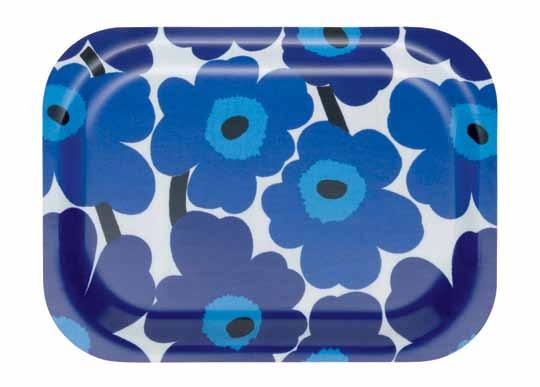
Bound up in this affinity towards everyday function is quality – perhaps best summed up by the Finnish saying: “If you’re poor, you can’t afford anything else but good quality.” By extension, longevity becomes one of the great pillars of the icon. Unlike modern throwaway culture, iconic pieces are made to last. As Alahuhta-Kasko reminds us, longevity “is not only about long-lasting quality, it’s also about aesthetic timelessness.” Marimekko’s Poppy print turned 50 last year, and yet alongside
their more recent designs, like Erja Hirvi’s Lumimarja, “you wouldn’t be able to tell which one dates back to when”. Similarly, Pleats Please was created in the 1980s and is still manufactured and worn today; Sori Yanagi’s Butterfly stool for Vitra (1956) is in continuous production; and the furniture of Alvar Aalto, as Alex Lance of Anibou points out, is “as relevant today as the day it was designed.”
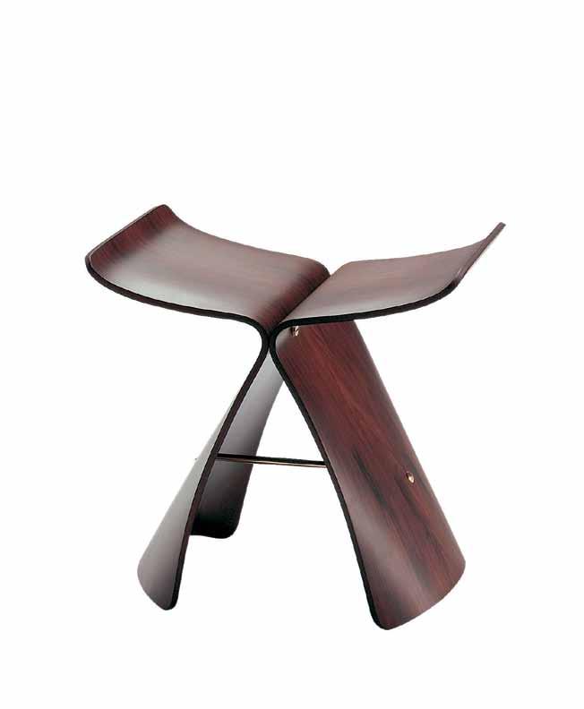
Timelessness is a quality often aspired to, but it goes against many designs that set out to capture a particular place and time. While our icons might also aim for timelessness, it is also inevitable because they have little to do with trends. On the contrary, their preoccupations are process, function, material and human needs – qualities of enduring relevance.
Also speaking to the idea of enduring appeal, simplicity of materials and form are a common feature in our selected brands. Alvar Aalto’s Stool 60 – or really any of Artek’s furniture –is characteristically blonde (usually birch) timber and with simple form. Maruni’s Hiroshima series is ‘imbued with that
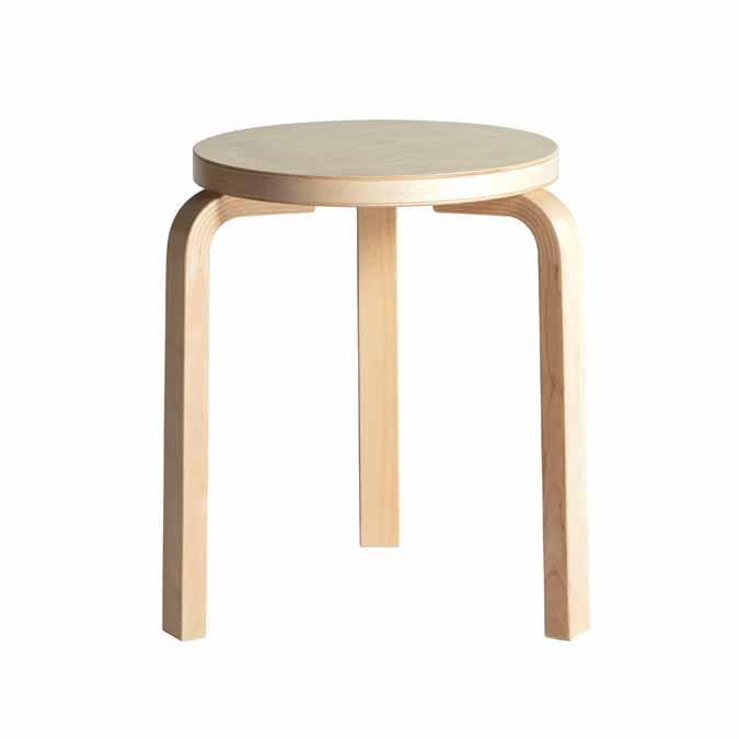
Simplicity is about a practical, unfussy approach and the tendency to use context and environment as a guide. It is said that Japanese designers “maximise what’s around them”, and similarly Alvar Aalto took advantage –and made a feature of – plywood, an abundant resource in Finland.
The sense of simplicity in these designs, however, disguises the technical difficulty that is required to make them so. As Director of Seeho Su (exclusive stockists of Maruni in Australia), Joyce Seeho reminds us, “clean lines can be complicated to achieve.” The L-leg, for example, saw Alvar Aalto inventing “entirely new methods for bending and splicing wood,”; Pleats Please was made with a revolutionary method of pleating, in which the fabric is cut and sewn first, then pleated after –the fabric’s ‘memory’ holding the folds in place; Marimekko’s Poppy presented floral as it had never been seen before. These designs might be simple in the sense they are subtle, but they are also especially innovative.

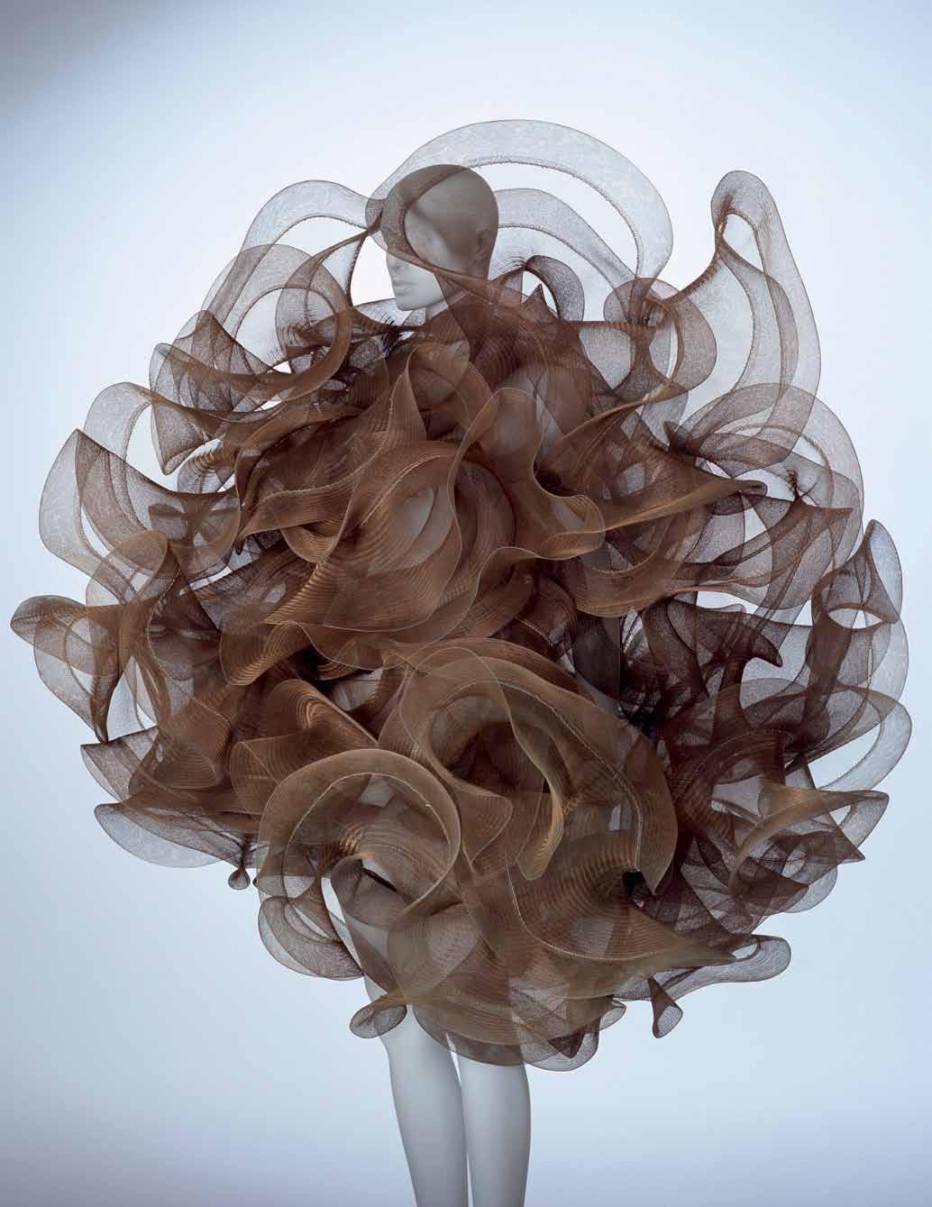
Along with a strong sense of tradition in both Japanese and Finnish design, innovation is central. In Future Beauty: 30 years of Japanese Fashion (an exhibition at the Gallery of Modern Art in Brisbane last year), it is this particular combination that was one of the key themes. One example was the work of Yohji Yamamoto and Rei Kawakubo of Comme des Garçons in their 1983 Paris show – which “caused a radical shift in the fashion world because they were offering such new and different styles and really approaching fashion from a different angle,” as Tarun Nagesh, Associate Curator, Asian Art at the Gallery of Modern Art in Brisbane says. The garments also drew directly from Japanese tradition – the kimono, just one example.
“If you think about it,” says Nagesh, “there is a strong sense of history and tradition [in Japan] but they’re also seen as having the most advanced technology.”
Similarly, Marimekko always aims to “marry heritage with the new” – continuing to bring in young designers and at the same time ensure Marimekko’s core values remain. Erja Hirvi’s 2004 Lumimarja design for example, is completely unique to the collection but still within Ratia’s original vision – a strong, distinctive print, taking its inspiration straight from Finland’s native flora.
Although we can certainly draw some common threads between the examples here, what defines an icon is something less tangible; a different way of looking at the world, a new and consistent paradigm that resonates with diverse people through time. And so this, too, is a characteristic of the icon, and one which allows it to retain its magic.
Becoming an icon is an art, not a science, and we can never dissect them completely or replicate them. Thankfully.
Artek | artek.fi
Anibou | anibou.com.au
Comme des Garcons | comme-des-garcons.com
Issey Miyake | isseymiyake.com
Marimekko | marimekko.com.au
Maruni | maruni.com
SeehoSu | seehosu.com.au
Vitra | vitra.com
above | marimekko’s unniko print designed by maija i sola in 1964, the first u nikkos were printed in red, blue and black. these classic colourways rode with the first wave of 1960’s pop culture, when a ndy warhol, swinging fashion designers and the b eatles, gave form to a new visual dynamic. below | tableware ranges complement the iconic marimekko prints.


Gessi. The iSpa Bathroom Collection is inspired by an idea of extreme customisation of the modern bathroom. Spanning from taps, accessories, wellness systems, ceramic-ware and a first for Gessi with a bathtub and toilet, Gessi lead the way in design and innovation. –

She has been described as a ‘fairy godmother’, and says her designers are like family. If so, Rossana oRlandi is the undisputed matriarch of the clan. We marvel at the inimitable first lady of design .
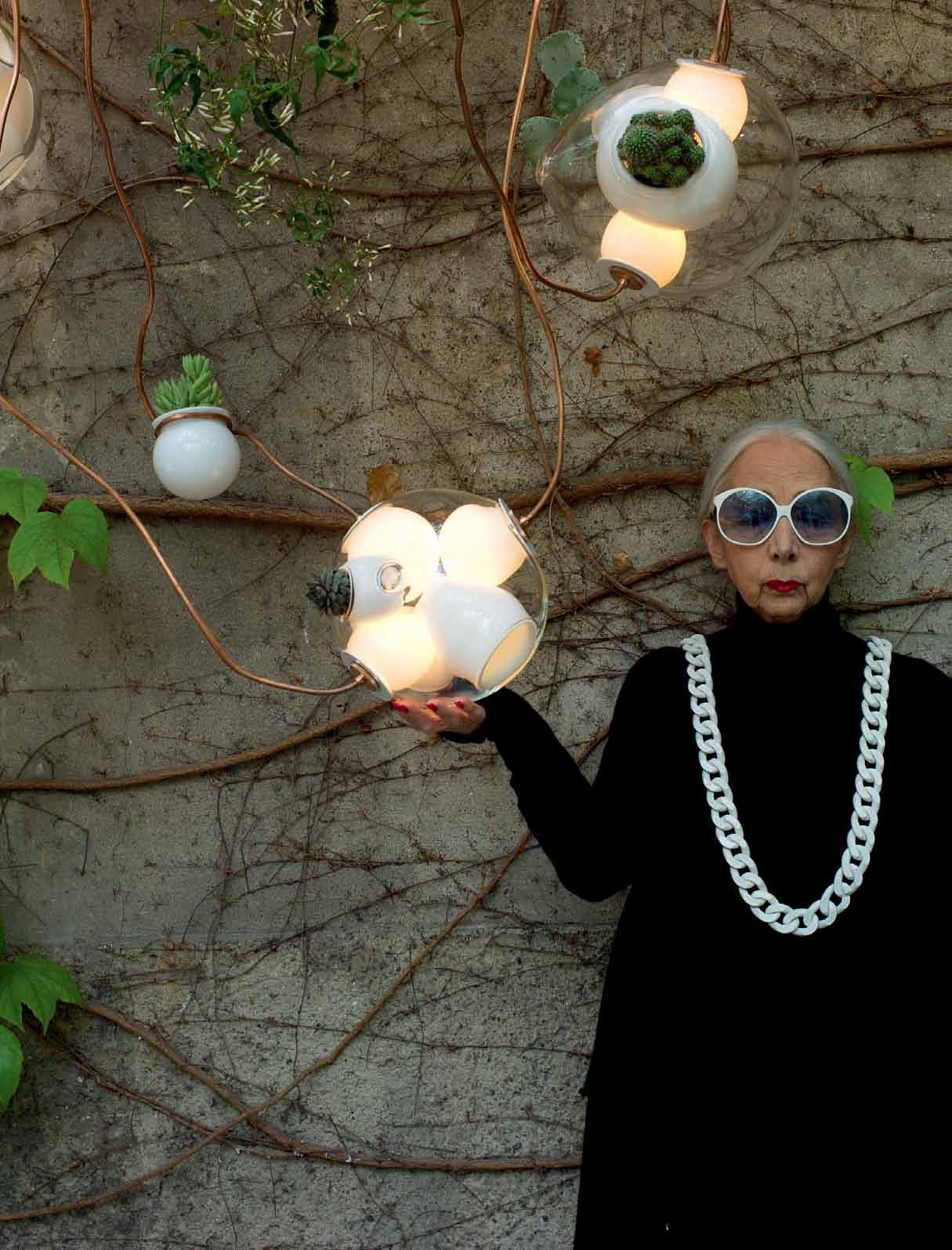
Rossana Orlandi is the woman behind many of the biggest names in contemporary design. In fact, she ‘discovered’ many of them. Piet Hein Eek, Nacho Carbonell, Maarten Baas, Scholten & Baijings, Front Design, Nika Zupanc; they can all attest their entry into the highest echelon of global design to this tiny Italian lady.
Rossana came to the design world via fashion, where she worked for more than 20 years as a spin yarn consultant for high-end labels such as Giorgio Armani and Donna Karan, as well as her own family’s company. Developing her own private collection of furniture, object and lighting design over some years, she decided in 2002 to share it with the world. And she has continued ever since, with up to 35 designers presented through her brand each year. Their products make up the highly curated collection and the sum equals more than the individual parts. Together, they represent Rossana’s personal idea of how incredible design and art can be integrated into a way of life. The collection – and the designers who are responsible for them – are the family who give her own brand and identity meaning.
In sourcing, curating and presenting new creative talent, Rossana has become a design icon herself, the image bolstered by her trademark white-rimmed, tinted glasses (which are available through the shop). But her status as the “authority on cuttingedge design” is much more than an ocular accessory and a knack for buying things. Her relentless research for the ever-changing collection is akin to the passionate explorer. Intrepidly, she has charted countries and continents, in search for that greatest
treasure – undiscovered design talent whom she might present.
Rossana’s eye is impeccable, seeking out designers and pieces that are truly innovative and not in the ubiquitous use of the word, which is used to describe so many run-ofthe-mill – and frankly boring – products. Rossana’s pieces are unequivocally revolutionary in concept, process and finish. Walking through her gallery is like walking through Alice’s Wonderland or Willy Wonka’s chocolate factory – a mixture of whimsy and delight. Take Nacho Carbonell’s Diversity exhibit from 2010 for example, explored a broad array of fi nishes. Twenty iterations of a slender-legged chair attached to a narrow, covered desk included hair fi laments that can be combed and groomed, another in shards of broken glass from used wine bottles, another in a granular concrete coating, thorns, resins and many more.
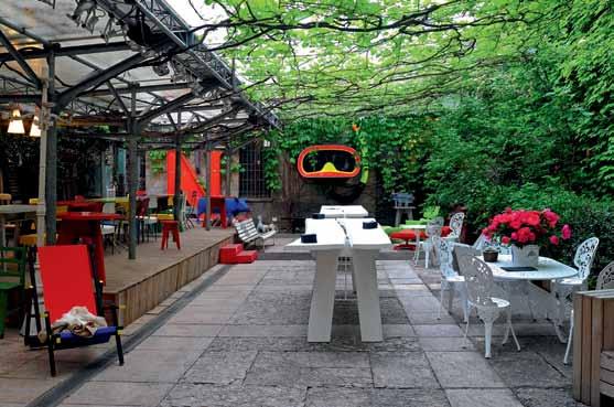
Spazio Rossana Orlandi, or ‘Rossana Orlandi Space’, has become a representation of the woman herself. Translated, it is not ‘the space of Rossana Orlandi’, rather the space that is Rossana Orlandi. The statement is as strong as her opinion and as specific as her keen eye for design. Opening in 2002 in a former tie factory in the Magenta neighbourhood of Milan, Rossana revolutionised the presentation of the design art pieces for sale and on exhibition. Rather than a typically ostentatious, sterile showroom, the space is set up like rooms of a house, which wrap around a picturesque courtyard.
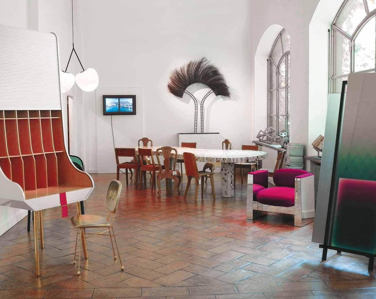
All at once a showroom, retail store and offices, with the courtyard used for events and meetings, it cannot be defined or pigeonholed. The activities blend seamlessly without boundary or need for definition.

Young designers I exposed years ago, now are famous…That’s my main aim, that’s what I want to do. That’s my life.
Rossana | founde R
Spazio Rossana Orlandi is a philosophy, an attitude – not just a physical location.
This is perhaps why it has become the site of so much fruitful creative exchange at the Salone Internazionale del Mobile in Milan each year. As well as presenting designers’ works – many of those exhibiting for their first time – it is a place for meeting, conversation and pure inspiration. Here (unlike at the Fiera Milano fairground), everything is artfully selected, business is second to pleasure and the designers relax, away from the harrowing and relentless pace of ‘the fair’. Here, in this textured house and its foliage-covered courtyard, design becomes an artform and a way of life.
Importantly, as Spanish designer Alvaro Catalán de Ocón points out: “This space offers designers the chance to self-produce their projects. It’s a space that allows us to take direction; not just work as a consultant, but also offer something that is ready to go.”
It’s an irresistible proposition, with a lure that pulls thousands through the space each year and young designers itching to get their products in front of Rossana.
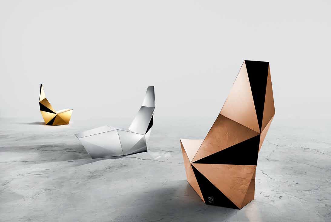
Brisbane-based Alexander Lotersztain was one such designer, who struck gold when he was introduced to the lady herself this year in Milan through a mutual acquaintance. After showing her pictures of his QTZ range, inspired by the geometric forms of quartz, Alex recounts: “She immediately said, ‘Why you didn’t bring it to me?’ ” He replied: “Because I was showing in Ventura Lambrate [an exhibition in another area of Milan].
“She says, ‘You should have brought it to me. Where is it?’ And literally within a couple of minutes and a couple of phone calls, she was buying the collection and getting it transferred to her store.”
As a designer who has worked across many brands – local and international – Alex is a seasoned collaborator in the design industry. But he was both charmed and impressed. “I’ve seen her in action,” he says. “I think she’s a gutsy little Italian woman, she’s built a lot of respect. There are not many people in the world who have a natural instinct to see talent before it even happens.
“I think what these people see is the spirit of the entrepreneur,” he muses. “If you have what it takes to establish a conversation with them – they know that’s the key to success. It’s not just what you produce. You could be an amazing designer and have really clever ideas, but if you don’t know how to communicate them, socialise, get on with people – that’s what Rossana is as well. She’s an amazing, a very giving person. But at the same time, she knows what she wants. She’s super sharp, super independent,” Alex admires.
“She has struck a point of genius because she has the personality and the strength to convey what’s good and what’s bad. And this elite [clientele that] she caters for, trust her. It’s on the back of an acute sense of style and understanding of trends – almost like a sixth sense – but it really comes down to her personality.”
She’s a personality to be reckoned with, but Rossana’s focus is outwards. “What I love about this exhibition is that young designers I exposed years ago, now are famous,” she says. “That’s my main aim, that’s what I want to do. That’s my life.”
This is one family tree that will continue to grow. Watch this spazio
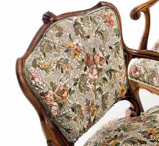
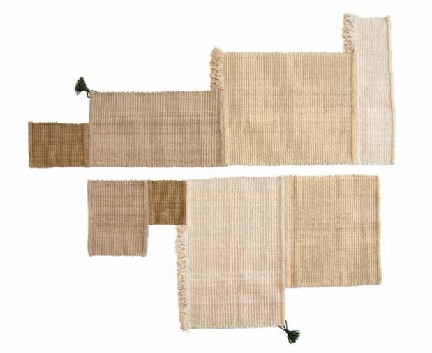
Rossana Orlandi | rossanaorlandi.com opposite AB oVe | QTZ by alexander loTersZTain, manufacTured in sTainless sTeel, available in a range of finishes. opposite B elow | polTrone gemelle by yukiko nagai in anTiQ ue frame and seaT in handmade mosaic. AB oVe | origin parT ii: balance collecTion by bcxsy in collaboraTion wiTh sidreh and women weavers in lakiya, israel. made from wool of The local deserT sheep.What are the characteristics of an icon? An icon is timeless.
What are the problems associated with describing someone as an icon? For those still living, being an icon can be dangerous and sometimes boring.

What is the thing that excites you most? To play with my four nephews.
What was the piece of design that inspired you to do what you do today?
The Spun light by Sebastian Wrong. It was the first piece of design that I bought for my gallery and produced later on by Flos with huge success.
What keeps you inspired? Enthusiasm and curiosity.
What are you bored with in relation to design and why?
To see again a ‘new’ chair!
What is your perception of Australian design? Apart from the handsome, charming and genial Marc Newson, there are several interesting young designers in Australia such as Alexander Lotersztain with his exciting chair.

Is there any point in discussing national design identities? Why or why not? Absolutely not. As an example, once Li Edelkoort curated an exhibition titled North Meets South to show how close and contaminated the works of designers were from North Europe and from Africa.
What is your view on design in South-East Asia – Singapore, Malaysia, Thailand, Indonesia, India, Sri Lanka? The whole design scene is growing and evolving fast. I am really interested in it.
Where do you see the future of design going? The whole design market is changing fast due to the new possibilities given by new media and social media, also changing the role of the design galleries and stores.



What is an icon? How does something become iconic? And why do we care so much?
Celebrity culture is at an all-time high and a multitude of voices vie for our attention. As a result, the word ‘ icon’ prompts incredulity, eye-rolling and bored dismissal. However, we still need to believe that positive change is possible. And that is what icons represent – a new idea, a new zeitgeist, a shift in paradigm, which will take us forward and upward. An icon stands for something. The important question is not what or who is an icon, but why. In the following pages, we examine what it means to be an icon, drop in on an iconic city with Tim Ross, and ask 30 creative individuals to nominate their idea of an icon, whether building, product, person, artwork or object. The results are both intriguing and revealing.
Together, we can restore the true value of an icon. If our discussions around the concept are more meaningful, then they will have to be, too.
In a media-saturated world, the discussion of what and who is important is a complex one.
WHAT DEFINES ICONIC DESIGN? And what are the pros and cons of putting respected designers, products, brands and buildings on a pedestal? SOpHIE DAv IES explores our love affair with making things iconic…

Imagine the faces of contemporary starchitects Frank Gehry and Zaha Hadid cheekily blended with traditional religious icons. During a talk entitled Longevity & Icons at August’s Sydney Indesign event , architect Luigi Rosselli showed a slide of the world-famous duo photoshopped so their images morphed into spiritual art. The modern icons were made iconic, literally.

“An icon can be an item of consumption,” said Rosselli, “or in the case of a building or [a piece of] furniture, it can be something that will last much longer and resist the weathering of time. Icons should be more permanent and add to the lives of everyone.” However, Rosselli warned that “employing a starchitect can be a marketing tool for good or bad. This is where icons are changing from a positive sense.” We often look to design to provide inspiration, gurus even, and near-sacred creations, but no one wants to see major names commissioned reductively by rote, like snapping up luxury handbags. Worse still is slavish adoration of work that parodies greatness – copycat furniture, we’re looking at you!
What makes an icon?

Authenticity is key to defining a true furniture icon, with Australian artist Ken Done stating, “I wouldn’t buy a knock-off. I have to have one of the originals. It’s a fine line – something influenced by icons is different to a complete knock-off. That’s just bizarre.” When replica design stores such as Australia’s Matt Blatt were mentioned, Done exclaimed, “I’m surprised you can do that!” Rip-offs may be a backhanded compliment – the first sign that a design has become iconic is when it is being routinely copied – but the integrity, quality, individuality and craftsmanship of the original cannot be bettered by a fake.
Longevity is important too, with good designs only truly becoming iconic when they pass the acid-test of time.
Meryl Hare, of Sydney interior designers Hare + Klein, asks pertinently, “Will Starck and Urquiola be iconic in years to come?” It’s true of architecture, too. Jørn Utzon may now be a legendary name, but the Sydney Opera


House’s controversial passage from budget-busting zero to architectural hero took years, with much painful critique. As Frank Gehry noted, “It has been an icon that’s paid off.” Good looks help when it comes to bagging iconic status – Alberto Korda’s iconic photo of Che Guevara launched a million T-shirts, thanks in no small part to the Cuban revolutionary’s striking face. The Sydney Opera House, too, radiates nautical-chic charisma, but even the ugly – buildings such as Sydney’s Brutalist UTS Tower or London’s Centre Point – can become urban icons, often loved and hated in equal measure. Much of Sydney’s Darling Harbour development, though, is simply bland, boring and underwhelming, a veritable icon-free zone. Head-turning exteriors aside though, surely a true icon needs to work well too, when you’re living in it or using it? Philippe Starck’s Juicy Salif lemon squeezer for Alessi is a megastar design icon, but some users find its ergonomics frustrating.
So why do we want that marble-icious Eero Saarinen table, curvy Hans J Wegner chair or come-hither Charlotte Perriand chaise-longue? Is it the tactile materials, sensual lines or sculptural forms? The timeless soul of the best design? Or is it just a status symbol of culturally sanctioned good taste? While it’s impossible to pinpoint exactly what tips a great design into being an iconic one, our desire for icons risks typecasting design. We may adore Tom Dixon’s or Moooi’s pendant lights, but when you’ve seen them in a thousand restaurant refits they can suffer from overuse.
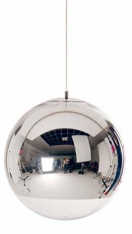
It’s not their fault that their designs are so ubiquitous, but familiarity can breed contempt. How do we rate our icons without being reductive?
With everything from online fashion brands (The Iconic) to design stores (Melbourne’s Make Me Iconic) tapping into the idea of turning items into cult icons, are we in danger of overusing the word? Artist Ken Done reckons we’re doing the same with talent. “It’s a bit of a counter to the tall poppy syndrome, where for a long time we wanted everybody in Australia to be equal and all the same. Maybe we’ve gone a bit too far now, when you can have an iconic footballer. Maybe you’ll have an iconic plumber soon, too!”
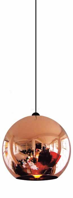
Architecture also suffers from our urge to embrace big-hitters. Daniel Libeskind’s Jewish Museum Berlin is a powerful icon, but equally – if not more – moving is the less well known Holocaust Memorial by architect Peter Eisenman nearby, a field of abstract concrete stelae. By making icons of headline-grabbing buildings, we may miss out on more subtle spaces elsewhere. Just call it the ‘Gehry Effect’.
Interiors editor and curator Karen McCartney knows a thing or two about iconic architecture, having authored influential tomes 50/60/70 Iconic Australian Houses and 70/80/90 Iconic Australian Houses. “I started working on the Iconic books in 2006 and even back then I realised the term was in danger of being overplayed. It did heighten my awareness of the choices in residential architecture I made for the books and ensured that the architects featured were significant, and this was just one example of their body of work.” McCartney found it a helpful way to draw together stellar examples of Australian architecture. Almost 10 years on, though, she says, “The word has become devalued as it is now even applied to replica Eames furniture. But we tend to do that with some words – we stretch their application until they become a parody of themselves. I still think it is a great descriptor. It just needs to be retired for a while and brought back as and when truly appropriate.”
“ While it’s impossible to pinpoint exactly what tips a great design into being an iconic one, our desire for icons risks typecasting design.”
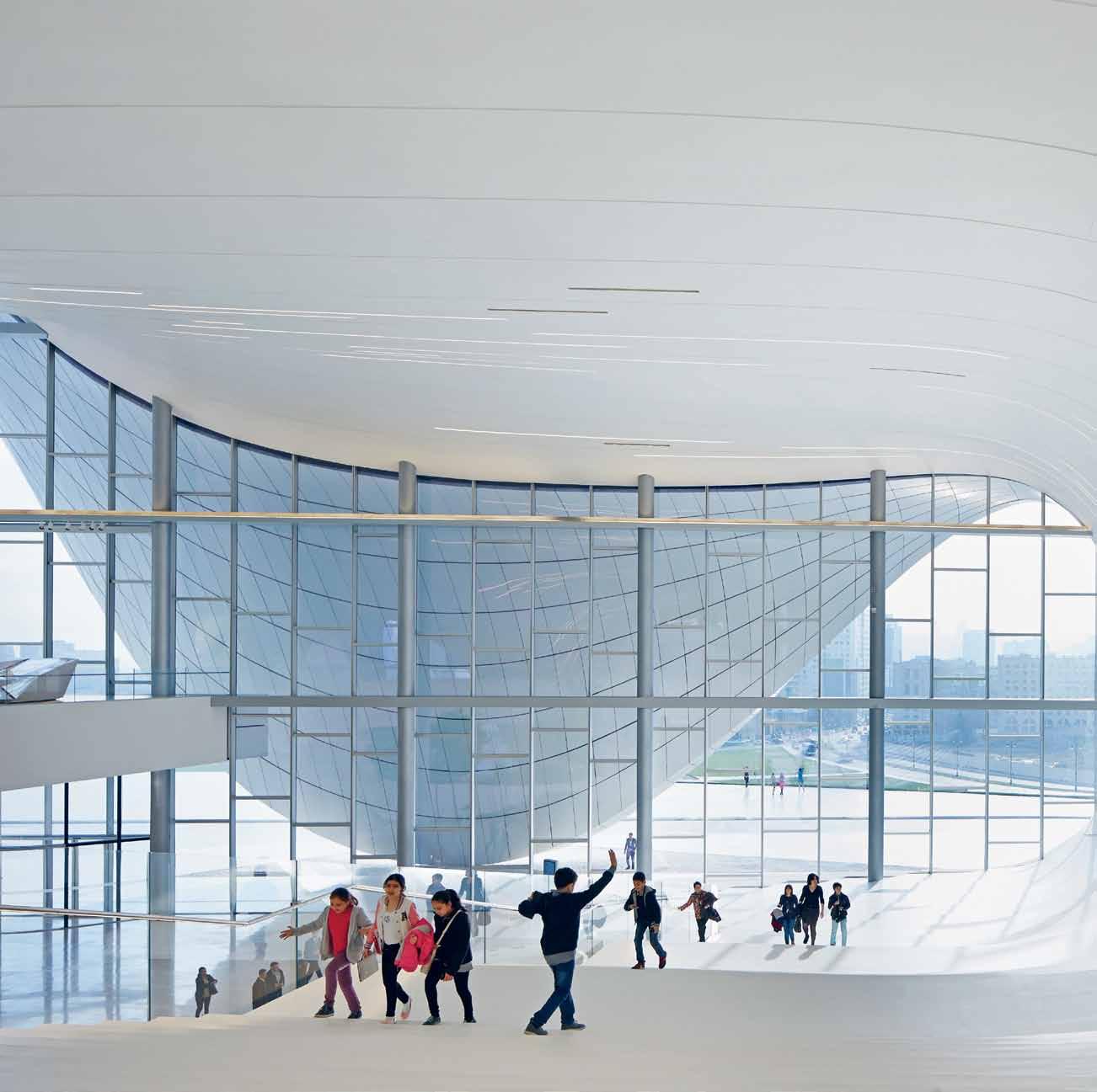
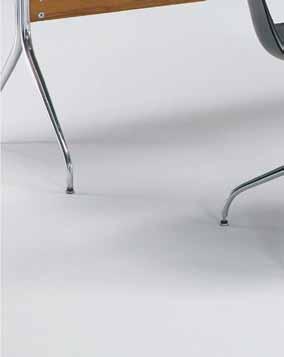
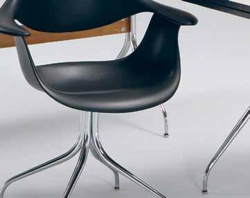
previous | ZAHA HADID’S HEYDAR ALIYEV CENTER IS FAST BECOMING ICONIC (PHOTO HUFTON + CROW). STARCHITECT DUO FRANK GEHRY AND HADID ARE GIVEN THE RELIGIOUS ICON TREATMENT (CREATED BY CARL RUTHERFOORD OF LUIGI ROSSELLI ARCHITECTS). opposite | TOM DIXON’S ICONIC COPPER SHADE AND MIRROR BALL PENDANT LIGHTS. above | PETER EISENMAN’S POWERFUL HOLOCAUST MEMORIAL IN BERLIN (© STIFTUNG DENKMAL, PHOTO BY MARKO PRISKE). below | WISHBONE CHAIR DESIGNED BY HANS j. WEGNER FOR CARL HANSEN & SONS WITH A HAND -WOVEN SEAT CONSISTING OF MORE THAN 120 METRES OF PAPER CORD



In the 21 st Century’s fast-churn social media whirl, the nature of what makes design iconic is changing rapidly. Increasingly, favourite designs, hot buildings and new creative talents are posted, tweeted, pinned and liked, with Instagram becoming the go-to media for reporting from the world’s design fairs. Images of new products are shared instantly, often while still at prototype stage, along with architectural works-in-progress.
On the plus side, we can now access exciting global design more easily, celebrating quality and democratising the design hunting process. However, with visual impact championed above all else, are we at risk of losing a sense of the other aspects that make design inspiring? The tactile feel of a rug, the comfort of an embracing chair or the experience of inhabiting a space? If social media could deliver touch, smell, sound and taste perhaps then it could really help determine iconic status.
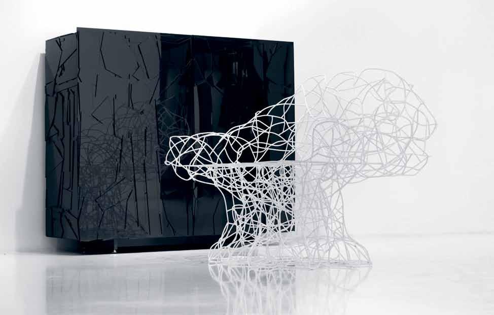
When the Brazilian Campana brothers’ wiggly, wirey orange Corallo armchair for Italian brand Edra launched at the Milan Furniture Fair in 2004 it looked visually amazing (Instagram would have gone into meltdown had it been around). The experience of sitting on it though didn’t exactly put the ‘lounge’ into chair. As Sydney architect Koichi Takada says, “There’s so much emphasis on looks today but feeling is very important. I want to add temperature too – cold and hot materials. Interiors need to look good, but then feeling comes afterwards.”
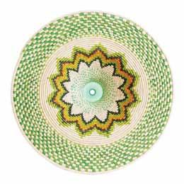


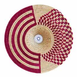
While we all love a stylish sofa, should a design’s ethical impact be the true arbiter of an iconic piece? Kicking off in 2007, the One Laptop per Child project – a robust, low-cost, self-powered computer intended to educate children in the developing world – surely deserves iconic status. Designed by San Francisco-based Yves Béhar and his fuseproject studio, the OLPC XO, also dubbed the $100 Laptop, has the potential to be a social game-changer. The recent PET Lamp project, employing craftspeople in poorer countries to weave pendants partly formed from recycled plastic bottles, also ticks the eco/ethical design icon box.
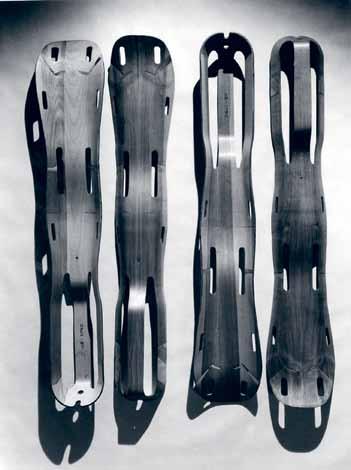
Charles and Ray Eames’ chairs may be ultra-iconic, but the molded plywood leg splints developed by the duo for World War II combat zones are just as worthy of icon billing. In 1942, when the U.S. Navy reported a need for lightweight, inexpensive emergency transport splints for injured soldiers, the Eames responded by designing splints from wood veneers, bonded together with a resin glue and shaped into compound curves using heat and pressure.
Ergonomic and innovative, the functional yet sculptural splints were a key cornerstone in developing the Eames’ subsequent, influential plywood furniture.
“ While we all love a stylish sofa, should a design’s ethical impact be the true arbiter of an iconic piece?”
Alessi alessi.com/en
Apple apple.com
B&B Italia bebitalia.com
Carl Hansen & Søn carlhansen.com
Cassina cassina.com/en cult cultdesign.com.au
DesignByThem designbythem.com
Eames O ce eameso ce.com
Edra edra.com Fuseproject fuseproject.com
Great Dane Furniture greatdanefurniture.com
Knoll knoll.com
Living Edge livingedge.com.au
Maruni maruni.com/en
Moooi moooi.com
Muji muji.com/au

One Laptop per Child one.laptop.org
Pet Lamp petlamp.org
Tom Dixon tomdixon.net/uk
Vitsoe vitsoe.com/rw
habitus
Buy less, but better
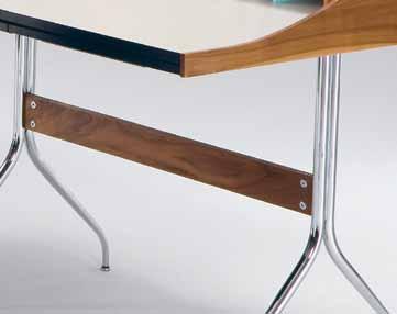
Iconic design can also walk hand-in-hand with sustainable consumption when we buy less, but better. It’s worth saving up for a gorgeous B&B Italia sofa or George Nelson desk if they outlast cheaper but poorly made alternatives. With much of today’s technology and white goods designed deliberately around built-in obsolescence, so you have to keep shopping and swapping to get the latest version, enduring classics that outlast trends are interiors’ eco warriors. We may love Topshop for its super-speedy catwalk-to-high street fashion turnaround, but the best product design and architecture needs to outlast the seasons, inspiring us over generations.
Savvy architects and designers are increasingly custom-crafting bespoke interior details and furniture, rather than using iconic but clichéd existing designs that will date faster. As Brenton Smith from Australian architects Bates Smart says, ‘If you design to trends it’s like built-in obsolescence.’ Nick Karlovasitis, co-founder of Sydney furniture makers DesignByThem, agrees: “We try to picture whether in 30 or 40 years’ time people will still like our product.”
Loud versus quiet
A lot of the buzz around iconic designs is generated by the noisier, more charismatic designers, such as eccentric Frenchman Philippe Starck, US showman Karim Rashid and Dutch extrovert Marcel Wanders (his superbrand Moooi has used photos of naked people to promote its head-turning designs). The hype is often deserved, but in our rush to crown the next icon let’s not forget the quieter talents. Naoto Fukasawa is the creative force behind many of Japanese no-logo brand Muji’s simple, utilitarian homewares, as well as understated furniture classics for other brands (witness his sensual ‘Hiroshima’ chair for Japan’s Maruni). The UK’s low-key Jasper Morrison is also universally acclaimed for his less-is-more style. Even minimalist magician Jonathan Ive isn’t really a household name, despite being Apple’s design mastermind. When it comes to iconic pieces, less is often more, too, with simpler, less decorative pieces better able to withstand the ravages of changing tastes. Muji’s design aesthetic is inspired by the mantra: ‘Simplicity and emptiness yield the ultimate universality, embracing the feelings and thoughts of all people’. Or as industrial designer Dieter Rams (creator of the fuss-free Vitsoe shelving system), has said, “Good design is as little design as possible.”
Everyday heroes
Finally, we should pay homage to the no-name anonymous designs that make our world sing. From the bicycle to the paperclip, we use ‘iconic’ designs all the time often without knowing who fi rst invented them. Let’s hear it for the everyday design heroes…
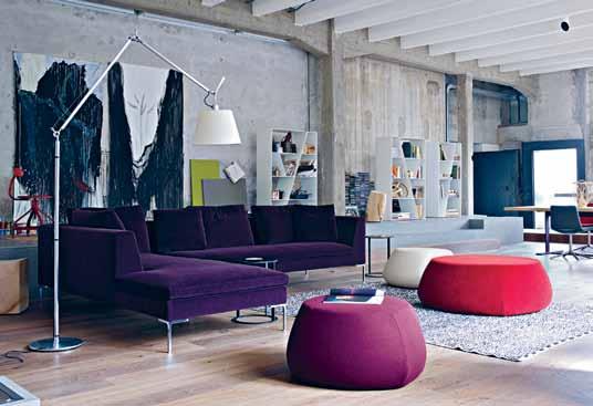
ABOVE | (CLOCKWISE FROM TOP) U.S MODERNIST GEORGE NELSON’S TIMELESS COMPACT SWAG LEG DESK DESIGNED IN 1958 FOR HERMAN MILLER; NAOTO FUKASAWA’S SHAPELY HIROSHIMA ARMCHAIR FOR JAPAN’S MARUNI; B&B ITALIA’S ENDURING CLASSIC, THE CHARLES SOFA DESIGNED BY ANTONIO CITTERIO.





TAPWARE FOR A NEW ERA - Designed for the Berkeley Penthouse Apartments in Ebury Square, London, the Perrin & Rowe Deco Collection of faceted tapware is now available in Australia exclusively through The English Tapware Company.

The Deco Collection features a geometry represented by sleek, clean lines, giving each piece a sophisticated elegance. While reflecting the Art Deco period’s admiration for the inherent design qualities of machine-made objects including symmetry
and consistency, these fittings are hand finished to give the refined quality essential to a luxury product.
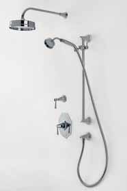

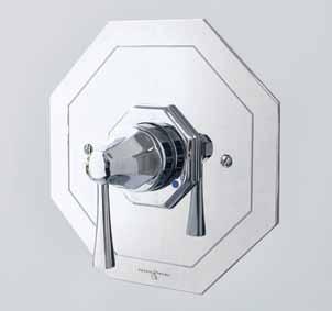
Magnificent in chrome, the Deco Collection is also available in six alternative finishes.

Tim Ross shares his not-so-secret hankering for authentic mid-CenTuRy modeR nism, his passion for Palm springs and his distaste for the empty trickery of ‘trends’.


“
This house has had a series of owners, including Barry Manilow who managed to put his destructive stamp all over it and then left it in a sorry state, much like his showgirl Lola.”
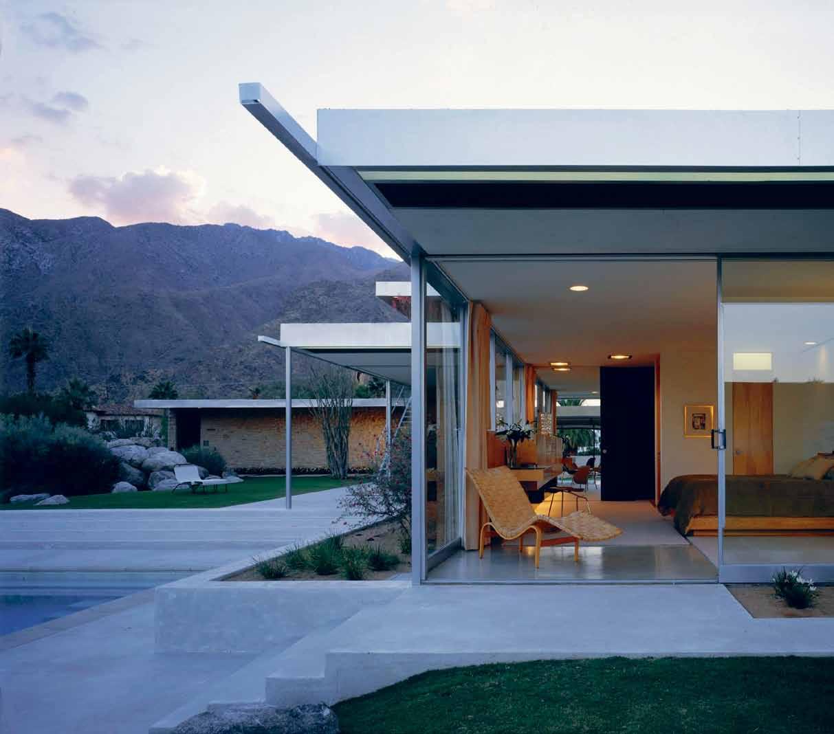
before the advent of Instagram I thought I was relatively alone in my nerdy hobby of m id- c entury Modern home stalking. I was like a trainspotter who didn’t know that other train spotters existed. My wife had put up with my annoying habit of slowing down through the suburbs of Sydney whenever my tragic architecture senses started to tingle at the prospect of a wonderfully original , perfectly designed 1960s home.
“Look out!” she’d scream as I’d dangerously back up muttering to myself, “I think it’s a 1963, Ken Woolleydesigned Lowline for Pettit + Sevitt…” – one of the many classic architect-designed project homes that popped up across the Australian suburbs in the 1960s and 70s.
Thankfully, today I’ve found many design geeks through the popular social media site and I can spare my wife the nutty dialogue. The ability to share this love is a wonderful extension of the original desire of the Modernists to create a better world through design. More than a style, it continues to be a movement and this utilitarian and democratic approach to how we live is very much echoed through the posts of my Instagram friends across the world. We can assess each other’s ideas and photos for free and without discrimination.

When design enthusiasts make the pilgrimage to the mod Mecca of Palm Springs, one of the most common photos they share is themselves perched on a rock outside the iconic Richard Neutra-designed Kaufmann House. Designed in 1946 for the department store tycoon Edgar Kaufmann, this house has had a series of owners, including Barry Manilow who managed to put his destructive stamp all over it and then left it in a sorry state, much like his showgirl Lola.
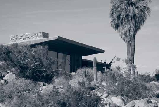

In 1992 new owners, Brent and Beth Harris stepped in and with the aid of Marmol Radziner + Associates they brought it back to life and made it a beacon of the Modernism rival and a coffee table book favorite. With this newfound fame came the pesky tourists and their cameras and, as anyone who has tried to get up close and personal to this house can attest, the owners aren’t big fans of the rubberneckers and their security guard is fastidious at sending you away. Its startling beauty and fame has turned the house stalkers into design paparazzi.
Australian actress and architecture fan Rachel Griffiths famously bribed the maid with a $100 dollar bill to let her have a look around. She then took it to the next level when she jumped the fence to have a peek at the nearby Frey House, a simple one bedroom that was the last home of an architect who made Palm Springs his own. The preservation of the Modernist homes and buildings of Palm Springs should be universally applauded. Its status as a city with the highest concentration of midcentury Modern buildings in the world has seen not only an influx of tourists soaking up the 1950s and 60s style but also people flocking in to buy and restore hundreds of the original homes.
Alongside the Neutra House the other most instagrammed image is the ‘ drugs ’ sign in the foyer of the Jonathan Adler-designed Parker Palm Springs hotel. This makeover, with its bold 1970s Hollywood glam vibe, has been incredibly influential. Adler’s reinterpretation of the best of the late 20 th Century is very well done, visually compelling and, over 10 years later, still passing the cool test. It’s legacy, however, is much more worrying from a heritage point of view.
The original revivalists in the U.S. drew heavily from their own memories and created a textbook restoration of their homes in the mold of the magazines of the 50s and 60s. Nostalgia and the visual representations of homes like the famous Los Angeles case study homes captured by the legendary photographer Julius Shulman were the design cues for bringing these unloved homes back to the life after they spend the 80s decaying and hiding from Magnum PI.
Preservation was pure and within reasonable historically correctness. It was in this environment that the Neutra-designed Kauffman house led the way. But postParker Palm Springs, people have not been able to resist feeding off this style and a new legion of ‘preservationists’ are taking 1950s and 60s homes and ‘restoring’ them in a dreadful pastiche of retro clichés. Walls and windows are knocked down, original kitchens ripped out and shag pile rugs are shipped in.
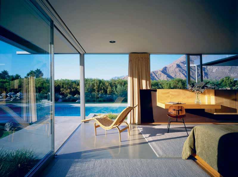
This rise of these restored homes renovated in a Jonathan Adler ‘lite’ style – although the sentiment is in the right place – are doing the preservation movement a disservice. Although the end product isn’t as severe as the wholesale demolition of mid-century Modern buildings, the severe and unsympathetic changes in the name of style shouldn’t be praised but judged as the molestations they are.
Being on trend has never been the friend of conservation.
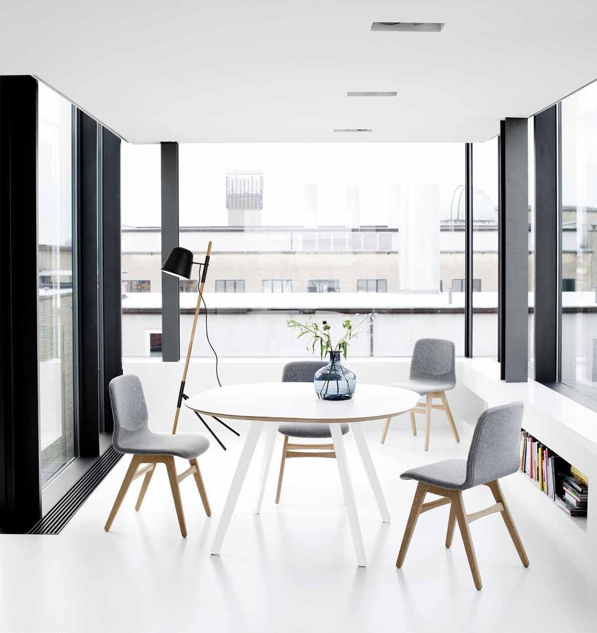

WHAT
A place, a person, an object? Thirty global creatives nominate their favourite icon and share their thoughts on what makes it so, and the significant role it plays in our everyday lives.
Icon

Trans World Airlines (TWA)
Flight Centre
Eero Saarinen
New York City
1962
My first encounter with this architectural gem was more than 20 years ago when I had to check in for a flight to Paris. I still remember how breathtaking it was to be in this space made of ribbons of elements, all whisking themselves in from the exterior, so that ceilings continuously run into walls and those walls become floors.
When Saarinen was commissioned in 1956, the client wanted this building to capture the ‘spirit of flight ’, so the architect used curves to create spaces that flowed into one another. Even today, I can vividly remember every arc and line coming together to form this massive and timeless bird-like structure.
The TWA Flight Centre represents a moment of optimism and ambition in the American economy and in architectural history, as well as a creative fusion of engineering and architecture. Just a few months ago, I was glad to learn that this structure will now be converted to a 505-room LEED-certified hotel – proof that a timeless structure will always find a purpose.
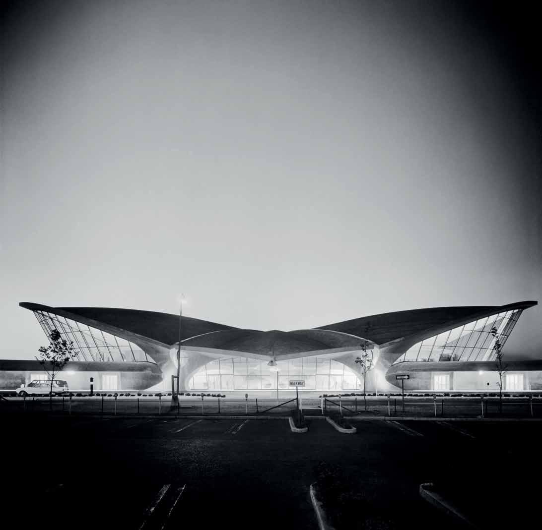 Kenneth Cobonpue Designer, Hive Cebu, Philippines
Icon
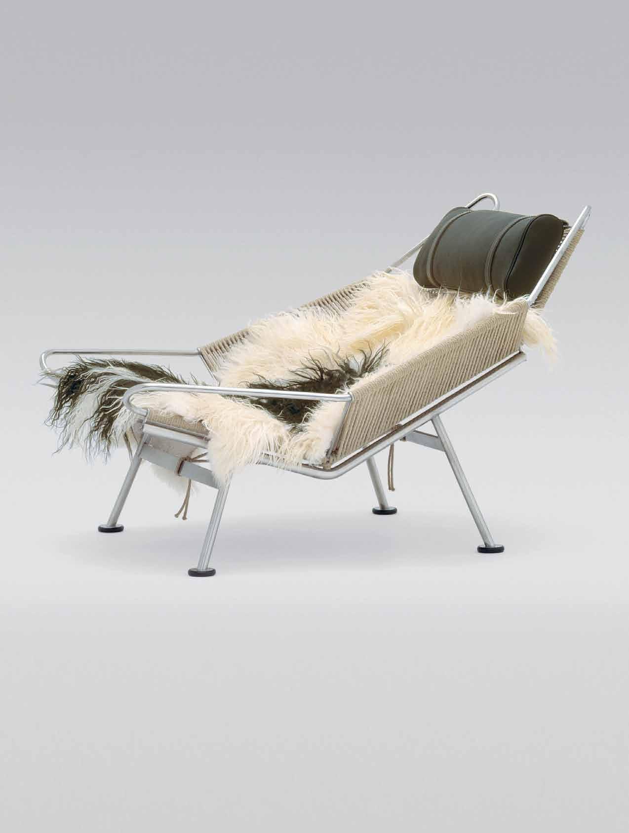
Casa Malaparte

Adalberto Libera
Capri, Italy, 1942
The piece of architecture that excites me the most is Casa Malaparte in Capri. Desigbed by Adalberto Libera, the well-known rationalist architect during the first half of 20 century, and the owner, Roman writer Curzio Malaparte, designed the house. How they succeeded in building it in a wild and protected part of the coast of the island – where even at that time it was forbidden to build anything – it still is a mystery.
I like so much the building because of its modernity and freshness; it has a clear authorship while also being a simple house – perfectly integrated into the surrounding nature and a symbol of the easiness of living. Some people say that Libera was only a kind of cover and the actual design was due to Malaparte himself (a genial and opportunist guy I never liked). Being a mountain man I would never be able to live there in face of the sea, but apart from that I have a great feeling for Casa Malaparte.
Icon Flag Hal yard Chair PP225
Hans J. Wegner
(produced by PP Mobler)
1950
When I think of what, or who, deserves the term ‘iconic’ several criteria come to mind – inventive, groundbreaking, enduring, exciting. That is why I ultimately choose Danish furniture designer Hans J. Wegner (19142007) who designed over 500 chairs during his lifetime. We are all familiar with his crafted timber chairs – the structurally inventive three-legged CH07 and the much indemand CH24 dining chair. Both chairs feature heavily in the stockrooms of replica furniture businesses and so are bought by people who do not even know the Wegner name.
The work of his I want to highlight is the Flag-Halyard chair because it demonstrates Wegner’s ability to step outside his comfort zone and, inspired by a trip to the beach, create something in solid stainless steel, rope and long-haired sheep skin that is a nod to the Modernists. “ We must be careful that everything doesn’t get so dreadfully serious. We must play but we must play in a serious way!” he said.

I live surrounded by native bushland that is frequently ravaged by fires. After fire, waratahs are like flames exploding into bloom from their bed of ashes, big crimson hearts opening to the sun. I am always astonished that such beauty can spring from devastation. I see waratahs as the essence of fire; from the destruction comes rebirth. From personal tragedy I have been reborn through creating art –transforming pain into joyous beauty. That is the waratah.

 Jenny Kee Fashion designer Sydney, Australia
Icon Waratah (Telopea)
“ I have chosen this to share my passion for the waratah, this 40-million-year-old flower, which has become my totem, the symbol of my fiery emotions.”
Icon
The Osmosi collection
Emmanuel Babled 2013-14
I’ve know Emmanuel for almost 10 years, He has worked a lot with master crafters in Murano, Venice and this new collection explores how craft and technology can work together to produce stunning iconic work, In particular I love the Carrara Quark marble collection and Osmosi where Carrara and Murano glass meet in perfect symmetry.
By combining new technology with traditional craftsmanship in an entirely innovative way, a virtual fusion is made between marble and hand-blown glass. These materials are put together with a precision that is only possible thanks to high-level digital technology.
The process involves 3D scanning the hand-blown Murano vases and then applying that reading into the CNC cutting of the marble, making it so accurate that it feels connected… absolutely stunning, I ’m still saving to own one of my own!
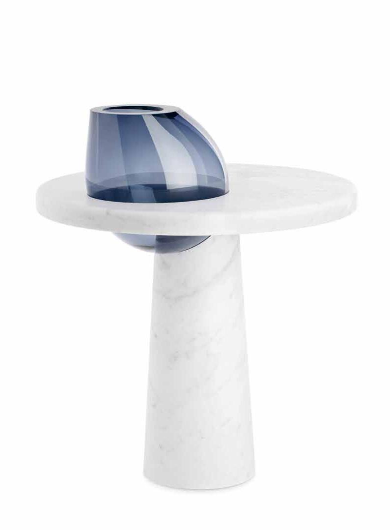 Koichi Takada Architect Sydney, Australia
Icon Rem Koolhaas The Netherlands 1944–

I first met Rem Koolhaas back in 1995, during my study at AA school in London. I still keep a vivid memory, or perhaps the moment felt more like a shock to me. Koolhaas had made a big impact on my career ever since and changed the way I looked at cities and architecture forever. Koolhaas’ wit and attitude towards design taught me to think outside the box and push boundaries of architecture.
The importance of landscape in a design approach was one important influence I remembered when Koolhaas spoke. I was fascinated to get to know a new possibility in design and creating a much richer journey and experience through architecture as a landscape, rather than the ‘copypaste’ mediocre buildings that all look the same in global cities, and what Koolhaas once called such a monotonous experience as “the death of architecture”.
Peter Zumthor Graubünden, Switzerland 1996
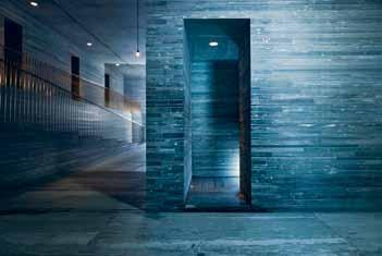

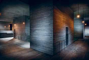
These thermal baths transformed the way I had always perceived architecture and opened up more possibilities on how to approach it. Before, I was interested in architecture as ‘ a manifestation of conceptual thought ’, where the idea was more essential then the outcome. After visiting the baths, I discovered architecture that surpassed the intellect. Architecture could be ‘ pure experience’, engaging the body and senses, phenomenologically grounded, eliciting a response that was almost primal.

I see this as the perfect church for the 20 th century. What [the architect] has tried to do is create a church without crosses – being symbolic but not in the traditional way. Because when we think about secular society, religion is a personal thing. People have different religions, for different purposes; I think there is a place for a church as a building type in the world – one that can be used for weddings, christenings, funerals, but without a cross, without pictures.
Portuguese architect Alvaro Siza has done this in a very interesting way. It ’ s an appropriate symbol, but also in terms of the architecture – everything is in counterpoint. The walls bulge into the space, light comes through a tiny slot. At the entrance, you approach through spires which are truncated at the top. When you enter, it ’s like a modern cathedral – ceremonial, but also demonstrating juxtaposition
It ’s also a great addition to Portuguese architecture. The fluting on the corners, a restrained flamboyance, moves it from straight modernism. It ’s a unique piece of work; a beautiful, sculpted space.
 William Smart Architect, Smart Design Studio Sydney, Australia
Icon
Santa Maria Church
Alvaro Siza
Marco de Canaveses, Portugal 1996
Sydney, Australia
Icon Bellerby & Co.
Globemakers
London, UK
I am a big believer in the handmade, in supporting artisans to keep iconic design alive that is often overlooked. One such company is Bellerby & Co. Globemakers who produce a range of what think are the coolest globes in the world at different sizes, to all specifications. As one of only two traditional globe makers in the world the level of detail and precision on each globe really is astonishing.

Based in Stoke Newington, London, specially trained artists are employed to make the incredible globes. Roughly 200 are made each year. The globe spheres are made from solid granite to resin, which is then covered in paper and then hand-painted. Owned by Peter Bellerby, he and his small staff hand-make everything – they use
Formula 1 fabricators to build the moulds, helping to reduce tolerance and errors. The most difficult part in making the globes is applying the pieces of map to the globe shape – this papering and painting process is the skill that takes the longest to learn. Bellerby globe-making skills are so top secret that Peter decided not to apply for copyright or patents, because he believes that would give away the methods that took him and his team so long to learn.

 Lola Greeno


Artist


1946 –
Indigenous icon, Lola Greeno, is one of Australia’s most significant artists of our time. With a distinguished career spanning over thirty years, Greeno continues the traditions of shell-work, harvesting and preparing necklaces specific to the customs of Tasmanian Aboriginal women. Whilst guided by ancestral traditions, Greeno introduces new materials and techniques into her work, adorning her jewellery pieces with feathers, echidna quills, kangaroo vertebrae and kelp.


In 2014, the Australian Design Centre acknowledged Greeno as our eighth Living Treasure in the Masters of Australian Craft series. This honour combines a major survey show, currently touring to 18 national venues, with a published monograph. This exhibition, Lola Greeno: Cultural Jewels, marked her fi rst ever solo exhibition, commencing at the Queen Victoria Museum and Art Gallery, Launceston. Greeno is also an inaugural honouree in our Australian Design Honours program that pays homage to local icons who have contributed significantly to Australian design and the arts. Greeno has recently been named among 26 new entries to the Tasmanian Honour Roll of Women.
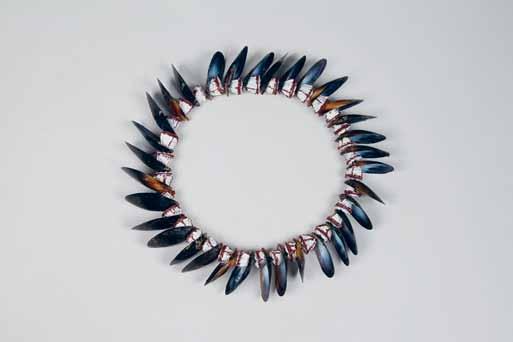

“
By sharing her process, she ensures that family and cultural histories remain intact for future generations.”
Sydney/London
Icon Place de la République
Paris, France
Rossana Orlandi Gallerist Milan, Italy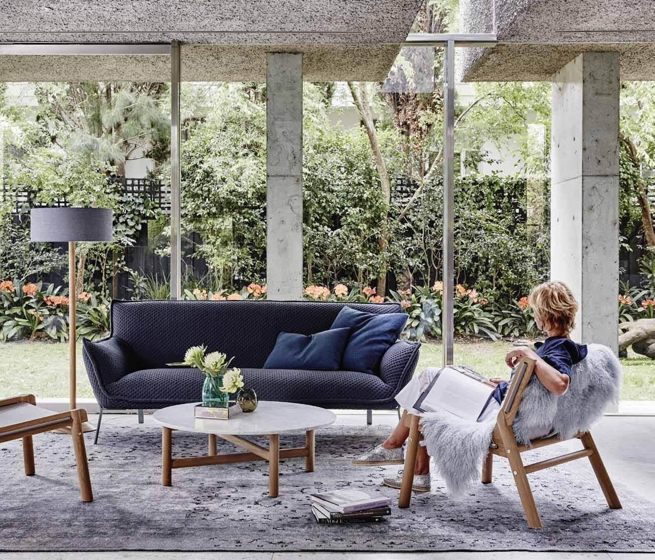 Icon Leonardo da Vinci 1452 –
This is an iconic and monumental place. It is a space, a sculpture and a group of people that all add up to an atmosphere that I find exhilarating. I went to République a few times as a tourist many years ago but since the recent renovations, it has become one of my favourite places in Paris. The smooth dark tiles laid down during the renovations made this square very attractive for skateboarders. Its where I go to glide around. It ’s also where I recorded one scene from my new video that will feature in a forthcoming show.
But République is truly the people ’s palace. Since the Charlie Hebdo shooting and the solidarity march that congregated in République thereafter, the square has taken

on new significance for Parisians. It has also been the a space for posters and graffiti. The city has decided not to erase the graffiti but to leave the entire square as a space for free expression. A cafe that was installed during the renovation recently burned down and the walls that board the cafe on the Boulevard Magenta end have also become a sanctioned graffiti wall along with the posters, tags and slogans that cover the monument. Young graffiti artists come and paint the walls whilst others watch or rehearse contemporary dance pieces or just float around and absorb the energy of this place. It ’s old revolutionary territory that is now a wonderful and grungy yet open and dynamic arena for civic freedom of expression.
1519
“ Painter, architect, engineer, inventor, philosopher, scientist, astrologist. Who is better than him to define an icon? ”Shaun Gladwell Artist (represented by Anna Schwartz Gallery)
Jardan is an Australian family company that has designed and handcrafted furniture in Melbourne for over 25 years. Jardan furniture is built to last a lifetime and captures the essence of a stylish and relaxed contemporary Australian lifestyle.

Icon Le Corbusier (born CharlesEdoaurd Jenneret-Gris) Designer, architect, artist Paris, France 1887-1965

To my mind an icon is someone whose uniqueness and strength of vision, combined with their depth of reach, changes or changed thinking forever.


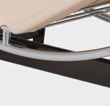





The world of design and architecture was never the same again once Le Corbusier hit the scene. He was a philosopher, architect, designer, artist, urbanist and a key influencer of his time and forevermore.
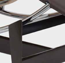

From his houses, which brought the revolution of open plan living and concrete slabs suspended on fi ne columns, to his cubist paintings, a masterplan for Chandigahr in India, his LC range of furniture, and his housing building ‘ Unite d’Habitation’, to his prolific writings and of course his many glamorous a airs!


 Nick Tobias Architect, Tobias Partners Sydney, Australia
Icon

Braun Wandanlage TG 60 TS 45 L450
Dieter Rams


1964-65

This piece is a great example of overt and intuitive User Interface which happens to also be very beautiful. Dieter Rams ’ design, for me, represents a considered and smart use of graphical volumes – as much a piece of art hanging on your wall as audio equipment. The understated styling communicates high performance with a classic and timeless design language.
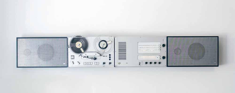
For me, the most mind-blowing icon this century is Apple. As a brand that specialises in gadgets and tools for work, it demonstrates complexity in simplicity. The visual graphics are stunning, and the presence of Apple has changed the way we have lived and worked for years, and still does so today.


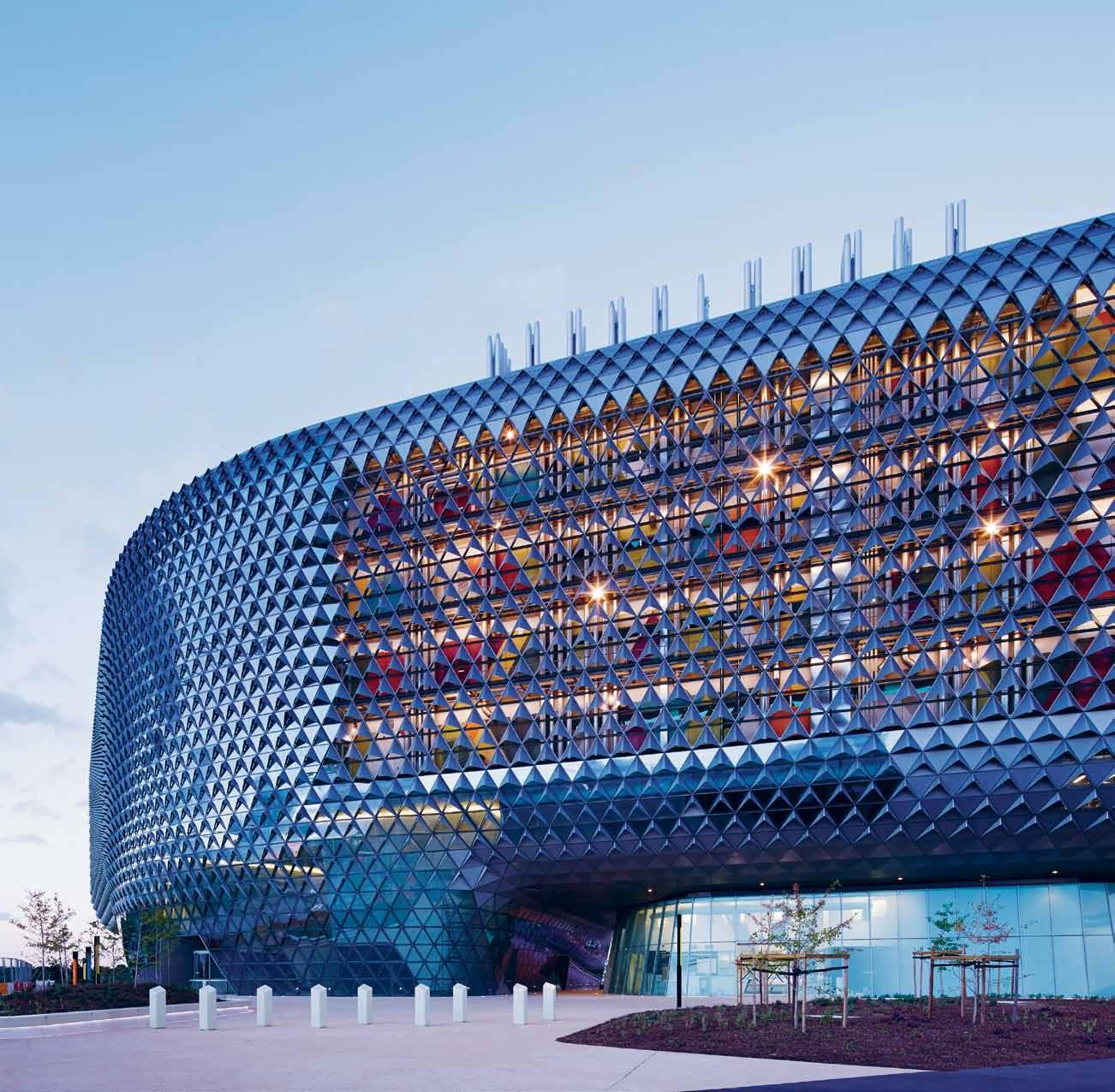


Icon
South Australian Health and Medical Research Institute (SAHMRI)

Woods Bagot Architects 2014
Some things become icons through use and familiarity; others through their sheer popularity. The icon I have selected was specifically designed to be an icon. I witnessed its construction and am seeing its transformative effect on the west end of the Adelaide CBD, where I work.
The South Australian Health and Medical Research Institute (SAHMRI) is a $200 million Commonwealthfunded research facility providing a 25,000-square-metre flagship for world-class health and medical research. The architecture and interiors, both designed by Woods Bagot (the iconic architecture firm that was established in Adelaide in 1869), aim to inspire and promote the building’s function. The central proposition for the design was to create a new and liberating laboratory typology that would promote collaboration and medical discovery, and attract the best researchers from around the world – and it’s doing just that.
The transparency of the unique triangulated glass facade allows views from outside into the internal workings of the building, promoting the importance of the activities within.

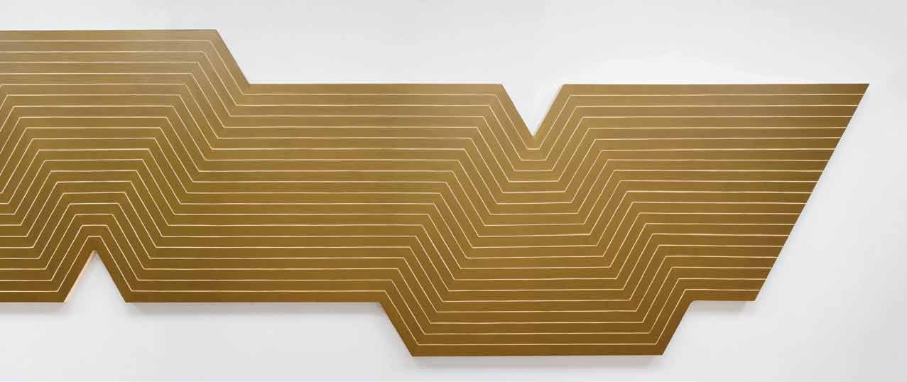
Jørn Utzon
1957 – 73
To live in a country that years ago was symbolised by harsh weather conditions and rough, tough people, it ’s amazing now that Australia should be symbolised by an opera house. I think the building has had a profound e ect on the Australian population, whether you‘re fortunate enough to live in Sydney or some outback Northern Territory cattle station – we all feel something for that building. So not only is it a wonderful and inventive piece of architecture, it shows that a building can have an e ect on an entire nation.
When I was a young art student, I took the ferry past the old tram depot at Bennelong Point every day of the week. Then, to see the building emerge from that location was a great joy. I’ve drawn it straight. I’ve painted it in white, yellow, blue, pink, magenta, emerald, turquoise, purple and black. I’ve painted it soft, hard edged, ethereal, misty, blatant and bold, upside-down, sideways and inside out – and it never fails to bring me joy. Every day I walk from the car park to my gallery, and there is one of the great icons of the world.

“ Not only is it a wonderful and inventive piece of architecture, it shows that a building can have an effect on an entire nation.”
Luigi Rosselli Architect, Luigi Rosselli Architects
Sydney, Australia
Icon Glebe Island Bridge

Percy Allan
London, UK
Icon

‘De la nada vida a la nada muerte ’ (artwork on canvas)
Frank Stella 1965


Bridges are iconic structures by defi nition, they are unifying structures that connect separate shores; often they rise tall above the waters to allow the passage of ships.
I have always had an attraction to bridges, in my childhood I emulated my father’s ponti engineering designs and read his structural magazines. Later I designed a paper cut-out book to construct the Sydney Harbour Bridge, and a mobile floating bridge to span the Grand Canal in Venice, which was exhibited at the 1985 Architecture Biennale of Venice. I am seduced by the nostalgic feel of the Glebe Island Bridge, being overshadowed by the imposing Anzac Bridge that made our cantilevered steel pivoting girders redundant. Years ago it was part of the daily life of commuters converging on Sydney city, loved by most but dreaded when it stood open to allow tall ships to transit the bay. The iconic status of this structure is what is needed for its survival, and it fully deserves it.
This is one of our favourite paintings by the artist Frank Stella which is in the Art Institute of Chicago. Stella’s early work has been an influence on our design, both for its strong graphic quality but also for its vivid colour composition. In 2011 we were fortunate enough to have an exhibition at Haunch of Venison Gallery in London alongside a large Stella retrospective, which has been one of the highlights of our career so far.
Discover beautiful products
Meet inspiring people
Indulge in architecture and design
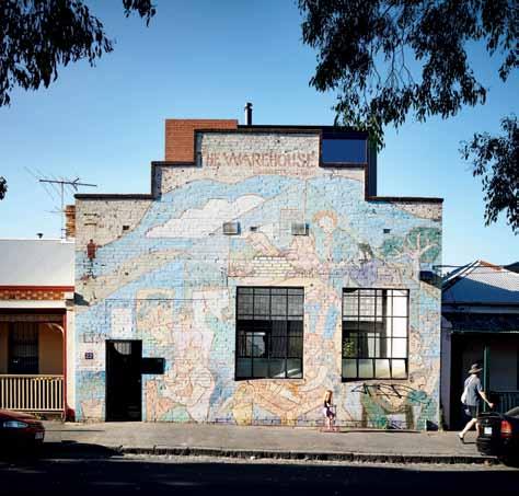
Across Australia, New Zealand, South and South-East Asia
The online community for the Design Hunter®
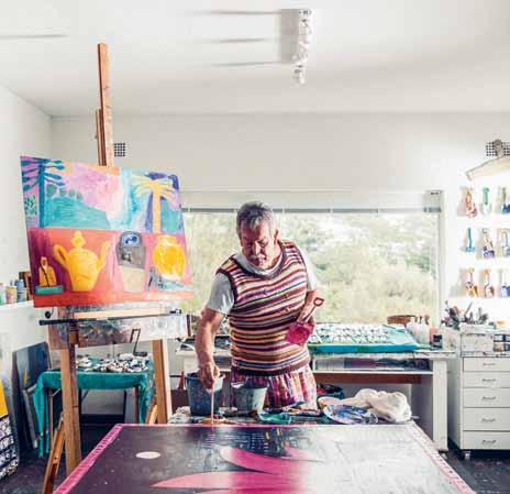
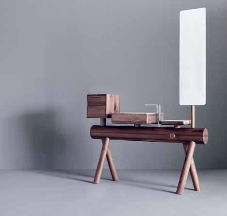
Website | habitusliving.com
Facebook | habitusliving
Pinterest | habitusliving
Instagram | @habitusliving
Twitter | @habitusliving
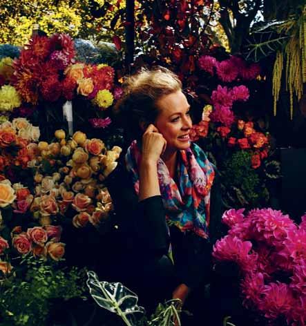 Icon Flowers (book)
Irving Penn 1980
Irving Penn and his iconic photographs of flowers in decay have always inspired. Across the world, these images from Penn’s Flowers book have shone a torch into the many interpretations of the lifespan, mood and ephemeral quality of blooms. His relationship with blooms – particularly fully-blown natural organic garden roses – is an intimate one, which resonates with a large audience.
Christopher Boots
Lighting designer Melbourne, Australia
Icon Stanley Kubrick Film director USA
1928 – 1999
Kubrick altered the way that we perceive space and objects through framing and timing; he broke ground like no other director. Prior to the Internet Age (rapid and dramatic image consumption), we had movies to tell stories, show us what we could only imagine, take us to the far reaches of the universe (2001: A Space Odyssey), scare us with the unknown (The Shining), or expose us to the dark human side (A Clockwork Orange, Eyes Wide Shut). For me, Kubrick nailed the human experience. He inspired me to consider human emotions through the experience of space and how we are influenced by our environment, creating our emotional/human boundaries. Hence, being a designer, he provided a pivotal education on ergonomics and the human experience.

“ He inspired me to consider human emotions through the experience of space and how we are influenced by our environment, creating our emotional/human boundaries.”
I have selected these three iconic architects to represent the field of past and present women making significant architectural contributions internationally. All three are inspirational as innovative choreographers of space, light, colour, and detailing.”
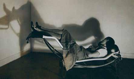
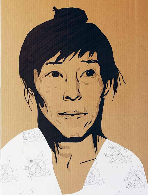
Their work challenges the way people experience buildings, the way in which people relate to one another within a building, and the way in which a building can contribute socially and contextually.
The result being: architecture that transcends time.
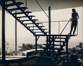 Miriam Green Architect, Tribe Studio Sydney, Australia Icon Charlotte Perriand, Lina Bo Bardi, Kazuyo Sejima
“
All three are inspirational as innovative choreographers of space, light, colour, and detailing.”
Del Kathryn Barton Artist
Sydney, Australia
Icon
‘Maman ’ (sculpture)
Louise Bourgeois
Bilbao, Spain 1999
I had a weak-at-the-knees, tingle-all-over moment when I saw Louise Bourgeois’ work for the first time about 17 years ago in Los Angeles. Yes, I am a CRAZY fan. And, yes it ’s true I lay under her big spider in Tokyo and cried These are the releases I hope for in our vast world of art. Encounters when the artwork is somehow so inexplicably intimate, so beyond, so seemingly effortless that there can be no defence. In these moments there is an opening-up within the body, the mind, within all the senses… an experience of recognition, relief and awe that informs one’s deeper creative make-up.
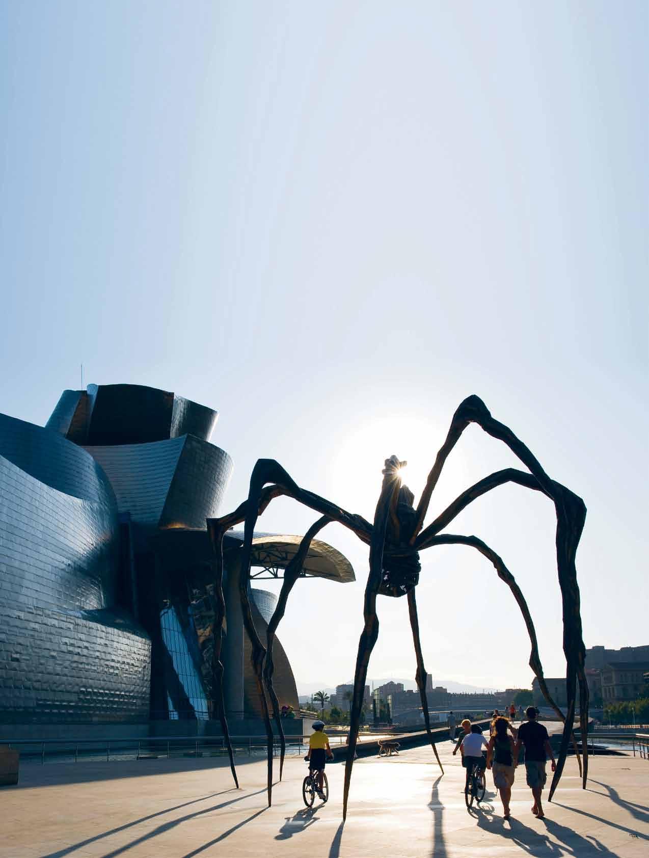
Cabinetmaker Michael Thonet revolutionised the furniture industry in the 1840s, devising a way to bend wood into sinuous shapes using hot steam. This breakthrough technique allowed Thonet to become the godfather of flat-pack furniture.
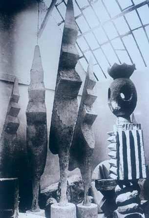
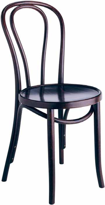
The No. 14 Chair consists of only six pieces and 36 of these chairs can be disassembled and packaged into a onemetre square packing crate. It is said that over 50 million of the chairs have been produced and distributed in the last two centuries and production of the chairs continues to flourish to this day – eat your heart out IKEA.
The No. 18 was developed after Thonet’s death when the company was in the hands of his son. It is the perfect redux of the original No. 14. Adding only one piece to the construction, in terms of function, the chair improves enormously by providing the ergonomic support for the back that the No. 14 lacked.
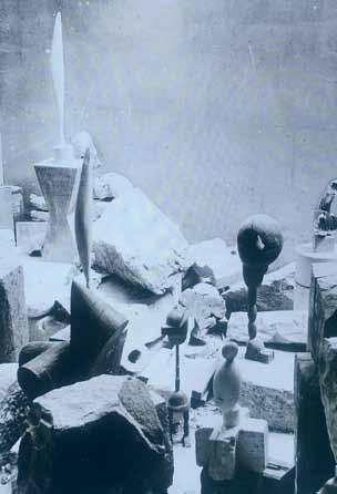
For me the No. 18 Thonet chair is the quintessential chair design: comfortable, elegant, and timeless.


 Catherine Martin Film, stage and interior designer Sydney, Australia
Icon No. 18 Chair Michael Thonet 1876
Alistair Trung Fashion designer Sydney, Australia
Melbourne, Australia
Icon Walsh St House
Robin Boyd
Melbourne, Australia
1958
Brancusi ’s life and work was influenced by the teachings of Plato, Chinese poet/philosopher Lao-Tzu and Tibetan monk Milarepa. These influences amounted to the belief that what is real is not the external form, but the essence of things. Branscusi did not cast or mould his forms, but instead preferred to hand-carve and cut into the actual material of stone, marble and wood, in order to extract the spirit and soul within the matter .
I discovered Atelier Brancusi in Paris 20 years ago. Upon my very first encounter of this space, I understood deeply and innately this abstract, distilled language. This unequivocal reaction is identical to my first experience of African and Oceanic tribal art.
This space allows me to expand my imagination with every single visit. It has the power of renewal and deepens in time with my own growth as a person. I often revert to
We have been to Robin Boyd ’s Walsh St house a number of times and love it for the imagination and intrepid nature of Boyd to change the way people lived through design.

It features open plan living – where living rooms turned into bedrooms when the guests went home. Classic, elegant, yet purposeful with just the right amount of quirk –our favourite mix.
Truly finding imagination in the everyday.
Brancusi ’s own photographs of his own studio. The way he juxtaposed and positioned forms in relationship to light and shadow in this space gives us an insight into Brancusi ’ s communion with the spiritual dimension of working with light, form and space .
Brancusi ’s work is a bridge between earthly matter and the spiritual world beyond. To me he is a metaphysical artist, a great quality I appreciate in the works of my other heroes, Isamu Noguchi and Bill Viola. Brancusi ’s legacy is beyond being the ‘ father of modern art ’ .
For me, his most meaningful quality is the connection to the eternal, which I feel is deeply transformative.
Icon
‘Night Cries: A Rural Tragedy ’ (still)
Tracey Moffatt1990
Tracey Moffatt welcomes you into a nightmare, a strange gift to offer a viewer and she does delivers it with her hugely seductive powers. Few Australian artists, or any artists in the world practicing today, are as brilliant at taking the dreams of a country and presenting them as the nightmare of a marginalised group within it.
Having been a refugee migrant to Australia I can associate with the deep sense of alienation and night sweats caused by memories of the past invading dreams. My business is the vessel through which I remember and memorialise my past (cultural, political, family) whilst also using the success of my business as a way of distancing myself from that past.
It feels like there are two fairytales being played out. The first one by Jimmy Little is the one promised by Christian missionaries to Aboriginal Australia. The second is the dystopia fairytale lived out in a simple theatrical set, overwhelmed by harsh industrial sounds, experienced by Marcia Langton – whose eyes are so strong and unwavering and yet show the marks of unrelenting stress.
Tracey Moffatt is truly one of the greatest Australian artists of all time. This film stirs me every time I watch it.
I also find Tracey Moffatt ’s other film montages fascinating from a copyright and graffiti context. There are many film montages Tracey is famous for and one such example is Doomed.
I used the term ‘graffiti ’ to describe some of Moffatt ’ s video artwork, because the best graffiti takes private property – one of the cornerstones of capitalism – and turns it into a billboard for subversive comment, the opposite of what it intended to be. Banksy is the obvious genius of our generation at achieving this subversion on city buildings.
Tracey Moffatt does this to media. She takes commercial cinema and subverts it by focusing on a persistent portrayal of, let ’s say, the destruction of cities in the work Doomed. We become aware of our simple desire to destroy cities; that throughout time, going back to Sodom and Gomorrah the city has been a bad place that needs to be destroyed to be purified.
When art is great no one worries about the copyright. Banksy ’s work is no longer erased by building owners but viciously protected. Likewise no one comes running after Tracey Moffatt for breach of copyright because the meaning of her reworking outweighs the commercial origins of the clips. This to me is genius at work.
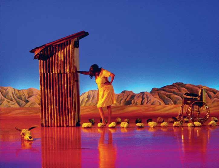
Sherman Contemporary Art Foundation

Sydney, Australia
Icon
Nelson Mandela

South Africa
1918 – 2013
Nelson Mandela represents the power of forgiveness, associated previously – in the Western world at least –most universally with Jesus Christ. Almost three decades of incarceration in a tiny cell on a bleak island did not suppress his innate spirit. He emerged dignified, energetic and deeply compassionate, to forge the disparate strands of his divided ‘rainbow nation’, South Africa, into a fragile but nonetheless coherent whole. Who could possibly deny Mandela iconic status ?
Gene Sherman“ I’m always enthralled by the simplicity of his ideas, the raw abandon of his execution and yet the sophistication of the outcome.”Craig Bassam Designer, bassamfellows Connecticut/New York, USA
Citröen CX


1974
When I think of designs that influence beyond sales figures, designs that have been the most popular with a lasting impact, I can’t help but think of the CX. Perhaps it’s all the hype surrounding the Tesla as the current representation of supremely modern automotive elegance. The Tesla design wouldn’t exist without the CX – its fastback, three-side window shape, its suspension and, perhaps more importantly, the way it completely breaks the rules.
Cars represent the most complex objects that we use in our daily lives and, like architecture, they elicit an emotional response beyond function and safety. The CX came from an unapologetically modern time before post-Modernism and the retro design fashion. It was an era when everything seemed fresh and modern.
The CX hit the mark of this time of innovation perfectly. Carved in a wind tunnel (CX refers to the aerodynamic coefficient of drag), its technical edge was both visual and under the skin, with world-dominating hydraulic suspension that was magic-carpet smooth. However along with its function, it was its lines, every surface seemingly considered by a sculptor, that is truly captivating. The interior was equally thought-out without regard to convention.
Automotive design is quick to become outdated and obsolete, which makes it extremely difficult to have any lasting effect beyond the nostalgic. The CX represents something much more than modern functionalism. Its artful design has ensured that 41 years later it is relevant and unforgettable.
“ Designs that influence beyond sales figures, designs that have been the most popular with a lasting impact.”
Oslo Parquet featuring a textured grain with a slight grey hue, delivering the natural quality of fine European Oak for The Porter By Gensler.
Tongue n Groove TM floorboards are designed with three solid layers of fine European Oak for optimal finish, longevity and structural integrity.
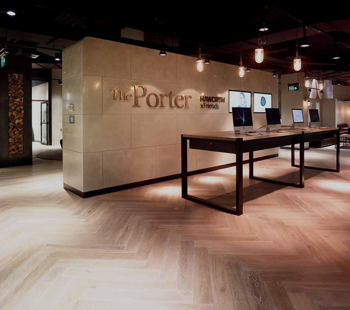
The Caroline Simpson Library & Research Collection (CSL&RC), part of Sydney Living Museums, answers this question both by collecting historic materials connected to the home and also by commissioning photographic recordings of present-day houses and gardens in New South Wales.
The CSL&RC has photographically recorded homes since 1989. These recordings were often made at a point of change in the life of a house –for example, when it was about to be renovated or sold, sometimes after a long period of singlefamily ownership. Some of the houses recorded were designed by well-known architects, others are simple suburban homes that represent a particular period or style and often just part of the house or even only one room or space has been photographed.
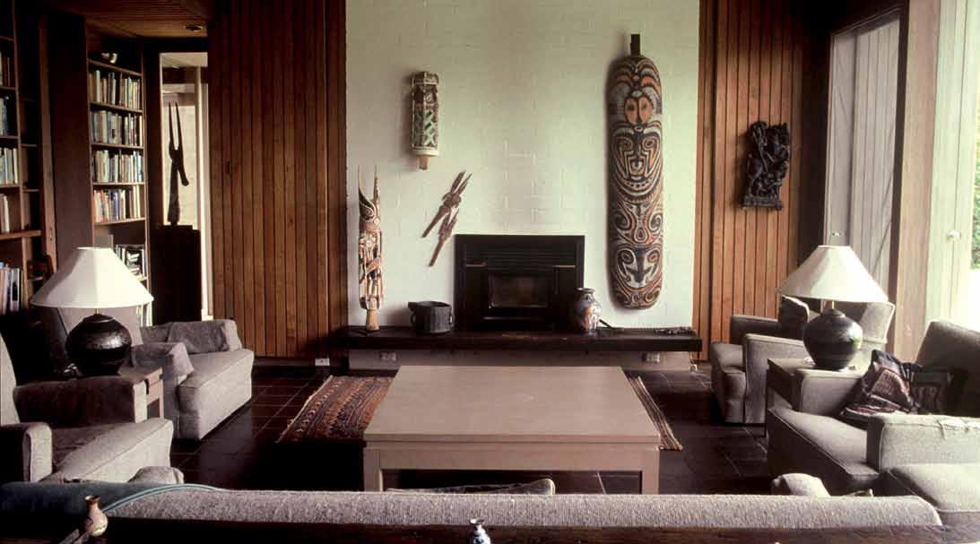
Many of the original recordings were done in the pre-digital age and a selection has subsequently been digitised for this project. All of the photographs together with supporting documentation and research are held in the Caroline Simpson Library & Research Collection.
Sydney Living Museums sydneylivingmuseums.com.au/documenting-nsw-homes
Built in 1957, the Jack house was designed by architects Russell C. Jack and John Allen, in collaboration with architect Pamela Jack, for Russell and Pamela’s own family. It won the prestigious Sir John Sulman Medal for domestic architecture in 1957, the chairman of the judging panel, GHB McDonnell, describing the house as: “… in the best tradition of architecture, but essentially of today, exploiting admirably its hilly site, and the spirit, material and techniques of our people, and a worthy contribution to our domestic architecture.”
The Jack house proved to be an influential contributor to the Sydney School of architecture. Built on a difficult, sloping site and using exposed natural materials, the house consisted of a series of interconnecting rooms orientated away from the street and toward the bush. The house was constructed on a limited budget and is modest in size, though additional bedrooms were added by Jack as his family expanded and a verandah was converted to a sitting room in the early 1970s. In his entry on Russell and Pamela Jack for the Encyclopedia of Australian Architecture, Scott Robertson has written that “the Jacks considered the logical expansion of structure to be very important but also felt a strong need for a richness of embellishment and decoration. Controversially they had feature walls of stock wallpaper, which added a richness to the modernist interior of the house.”
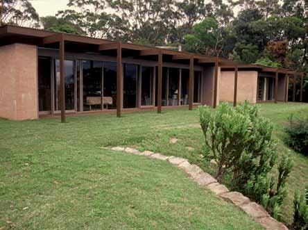
The Jack House is listed as an item of State significance on the NSW Heritage Register. It was photographed in November 2008 shortly before Russell Jack sold the house.
Bouddi Farm, Killcare Heights NSW Bouddi Farm was the home of Australian artist Russell Drysdale (1912-1981) and his wife Maisie. The property, which adjoins the Bouddi National Park on the New South Wales Central Coast, was bought by the Drysdales in December 1964. They commissioned their architect friend Guilford Bell to design the house. It was completed by 1966, sited at the top of a ridge to take advantage of the natural environment. From the north-facing living room, the Drysdales could admire the sweeping views across Brisbane Water. When considering the design of the house, Bell recalled standing on the land and saying ‘Everything should face that view [north] which must be framed and punctuated by verticals to ensure against familiarity breeding disinterest.’
The house was designed to sit discreetly in the landscape: low rise with a roof plane that seemed to float over the walls, typical of Bell’s work. In its layout it comprised three distinct pavilions – one each for sleeping, living and work. The latter space was originally Drysdale’s studio but became a library study for Maisie when Drysdale had another studio built separate from the house. Some of the furniture was designed by Bell and some items were Drysdale family pieces from the 19th century. In addition to the walls of books and paintings by various artists and friends, another feature were the Pacific and African tribal artefacts and Inuit hardstone carvings collected by Maisie.
The house was photographed shortly after Maisie Drysdale died in June 2001 but while still in family hands. Some of the contents of the house were sold at auction in April 2002.
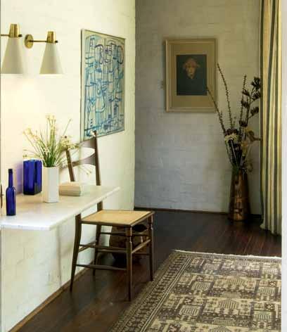
Living Edge is a place of worship dedicated to classic and contemporary design.
Twentieth century classics by Jacobsen, Eames, Noguchi and Henningsen established the canon almost 100 years ago.
Living designers like Marc Newson, Konstantin Grcic, Aric Levy, Jaime Hayon, Nendo, Neri & Hu, the Bouroullecs and Brodie Neill have kept the faith ever since.
What they and the many other designers stocked by Living Edge have in common is a will to create in a better world. A world in which good design acts to the benefit of mankind. In which ethics of authenticity, integrity and responsibility are as important as incredible aesthetics. A world where furniture is for life.
All Living Edge designers are engaged with the culture, creating premium pieces of inherent excellence. To acquire their work is to invest in perfection, to add beauty and grace to any space.
International in scope, Living Edge also nurtures local talent in the belief that supporting young designers fosters the wellbeing of an industry. These, after all, are the classics of the future.
The Living Edge motto is ‘furniture for life’ – in the double sense of, Furniture to enhance life, and Furniture to last a lifetime. Each product in their very savvy lineup is enlisted for its superlative design credentials, and its distinguished provenance.
Living Edge: Worth a pilgrimage.
Explore the Living Edge range on their newly refreshed site, which now enables you to purchase and order nearly 1000 pieces of design history right from your mobile or desktop.
Wooden Dolls
Alexander Girard Vitra
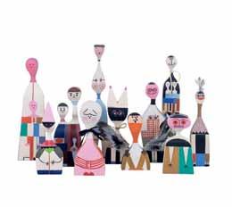
1953
CH04 Houdini
Stefan Diez e15
2009
Tembo Stool
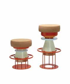
Note Design Studio
La Chance 2012
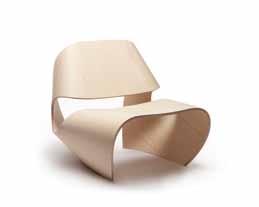
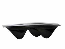


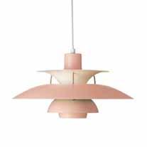


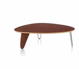


Your chance to win the iconic Angelina Fire Pit with three sleeper stools. Like her namesakes this fire pit will be the focal point at any party and will always attract a crowd of admirers. Constructed from 12mm mild steel, this versatile garden accessory can be used for open fires or as a planter throughout the changing seasons of the year. Set up around the campfire with the Sleeper Stools, constructed using recycled Australian hardwood with routed handles.
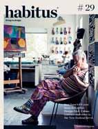
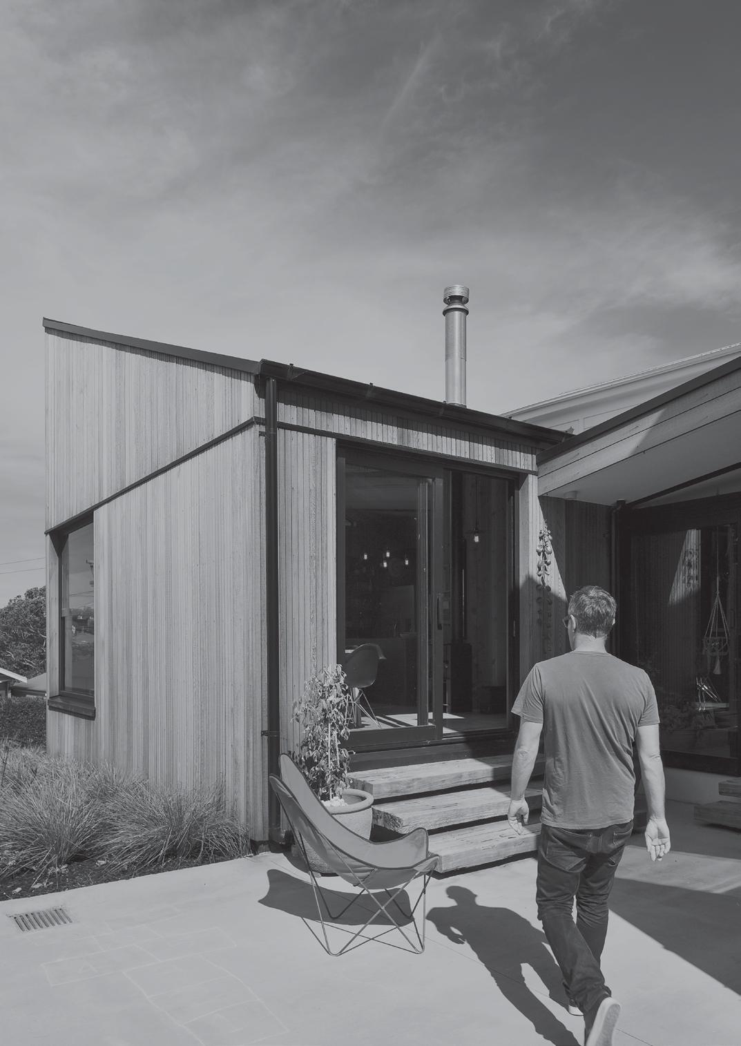
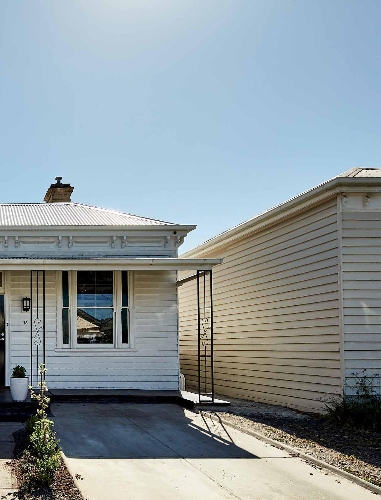
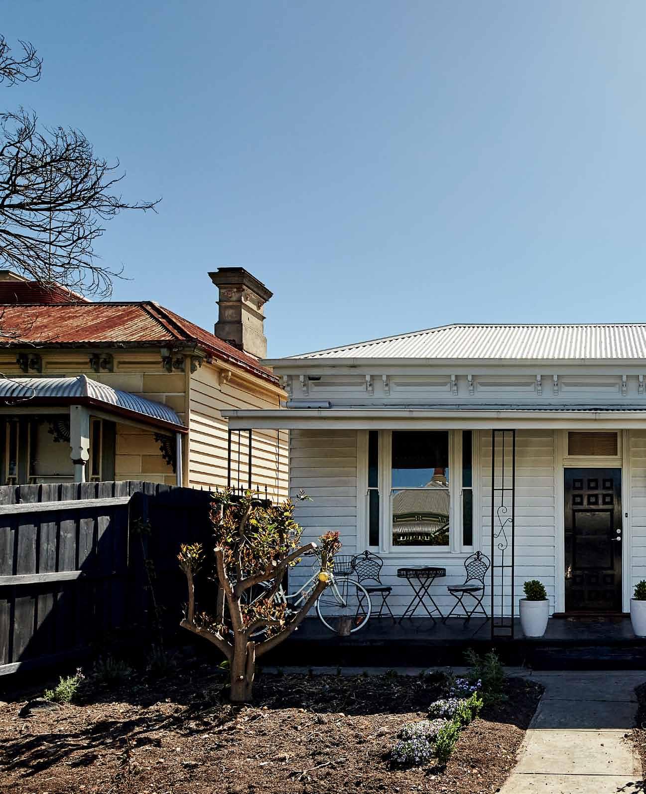
Most homes designed and built by a client and their architect are havens of privacy. Not so with this project designed by Andrew M Ayn A rd Architects . Alice Bl Ackwood reports.


Rather than the private realm of the owner-occupier, carefully shielded from the prying eyes of the curious and voyeuristic, Derek and Michelle’s relationship with their home in Seddon, Melbourne, is one of custodianship. They are the carers of a great piece of architecture, and have graciously shared this with all who have shown interest. Design and daily media, architecture tours, curious clients – they’ve all eagerly tread down the house’s side path, eager to see first-hand the skeletal shed structure that stretches the length of Cut Paw Paw’s long, narrow block. A strippedback expression of inside-out form, a shelter sculpture that is raw in its materiality and yet benevolent to the creeping curling greenery at its feet.


“We’re grateful,” says Derek. “The way we look at it, it’s about [directors] Andrew [Maynard], Mark [Austin] and their consultancy. We just happen to live here. One of the nice things about having a place that’s lovely, is to share it.”
A beautiful blending of old Victorian with new Victorian, Cut Paw Paw reveals the architects’ sublime skill in both responding to an ambitious brief – to design a house that is “ridiculously inside-outside” – while also dealing with the shortcomings of a “hellish” block, (as Derek describes it).


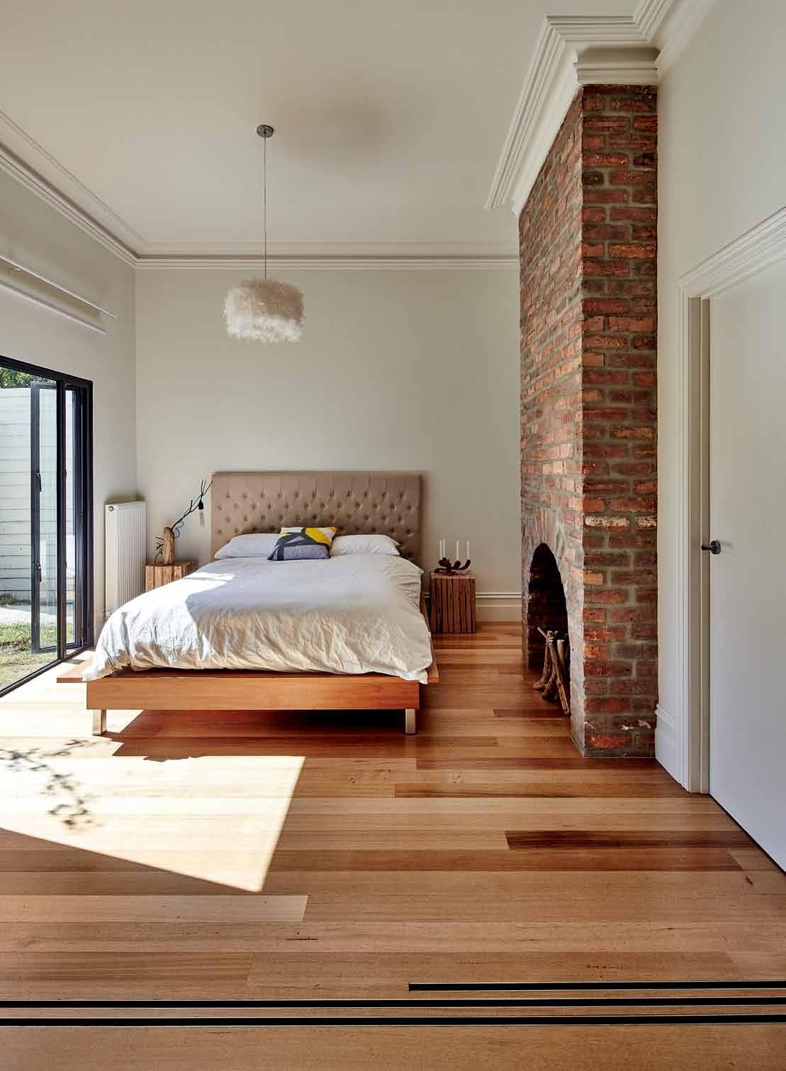
Derek and Michelle are no strangers to the block. In 1987 they embarked on their first house, in Winslow, Victoria, where the pair worked as teachers. They’d aspired to what every affluent couple might have out there – a western red cedar on a hill overlooking a lake. The two found the dream block – purchasing it from a local farmer who used the land for sheep grazing – and constructed their dream vision from LEGO, before taking it to an architectural draftsman to complete the design process.
Years later the pair moved back to Melbourne where they lived in a three-storey warehouse. It was the ultimate cool space –“but one we had to fill with a lot of stuff,” notes Derek. “It was too large – for months we’d didn’t go downstairs at all.”
Looking to push back from the “concrete block” and bring in a strong element of garden – not to mention less living space, Derek and Michelle embarked on the antithesis of their warehouse home, with Cut Paw Paw.
The 100-year-old house they’d bought was, by everyone’s account, a ‘squat’. “It needed a lot of love and attention to bring it up to scratch,” says Maynard.
Rather than go ‘up’, which was the original intention, he advised that they go ‘back’ with the house – a creative and pragmatic choice which would turn out to be cheaper, and less intrusive from an architectural perspective.
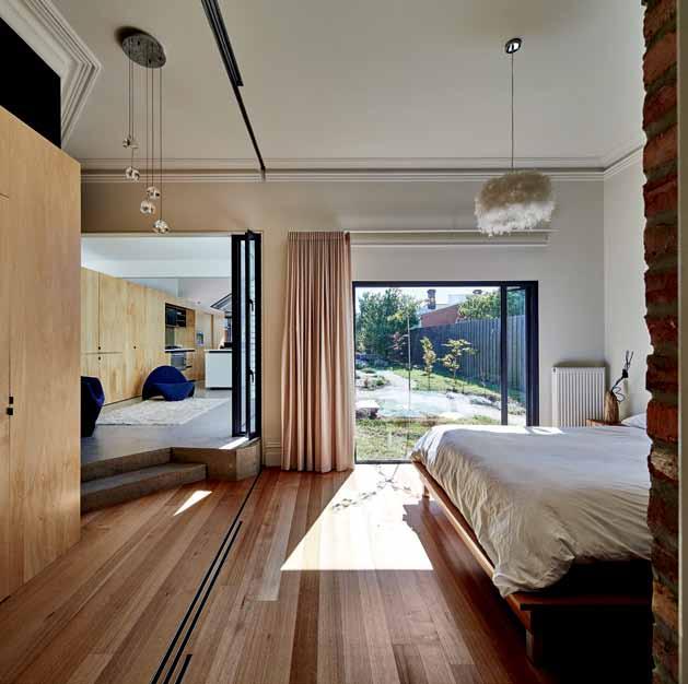
It was an ‘optimal thinking’ approach that appealed to Derek. “Optimal thinking suggests that perfection doesn’t exist but what sits under perfection is the ‘optimal solution’ given the situation as it currently stands. The quest for perfection is glass-half-empty thinking – because it’s not possible. It’s a detachment from reality.”
True reality, as it turns out, is much more appealing anyway.
Cut Paw Paw’s original structure consists of a central hallway, with a main bedroom and study falling off to either side. Maynard has then ‘cut’ from the second room back, carefully blending the old with the new through a layering of materiality. Derek points out the wood panelled wall which tucks in under the original eaves of the house before snaking down the length of the house, through the lounge and down into the kitchen. The wall not only creates visual continuity but conceals the clutter of television, fridge and pantry behind a seamless timber façade.
Derek also points out a tall, floor-toceiling sliding door that rolls back to reveal a second bedroom, and the twitching ears of a disgruntled cat disturbed from his cosy corner. The bedroom adjoins the living area, the sliding door – another “feathering of the old with the new”, opening the living area out for extended gatherings of friends and family.

We needed it to feel ridiculously inside-outside so we said, ‘Push the hell out of it.’
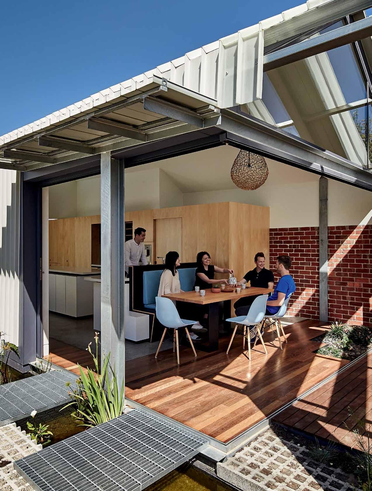
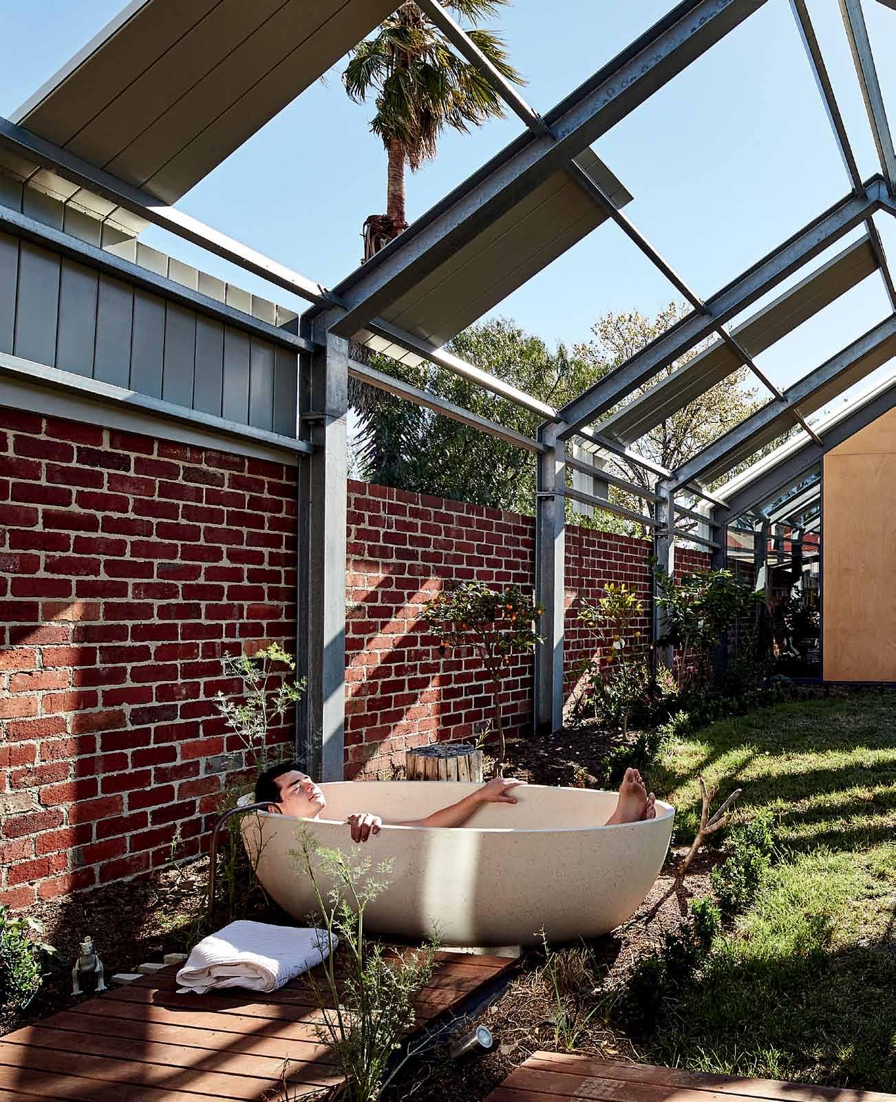
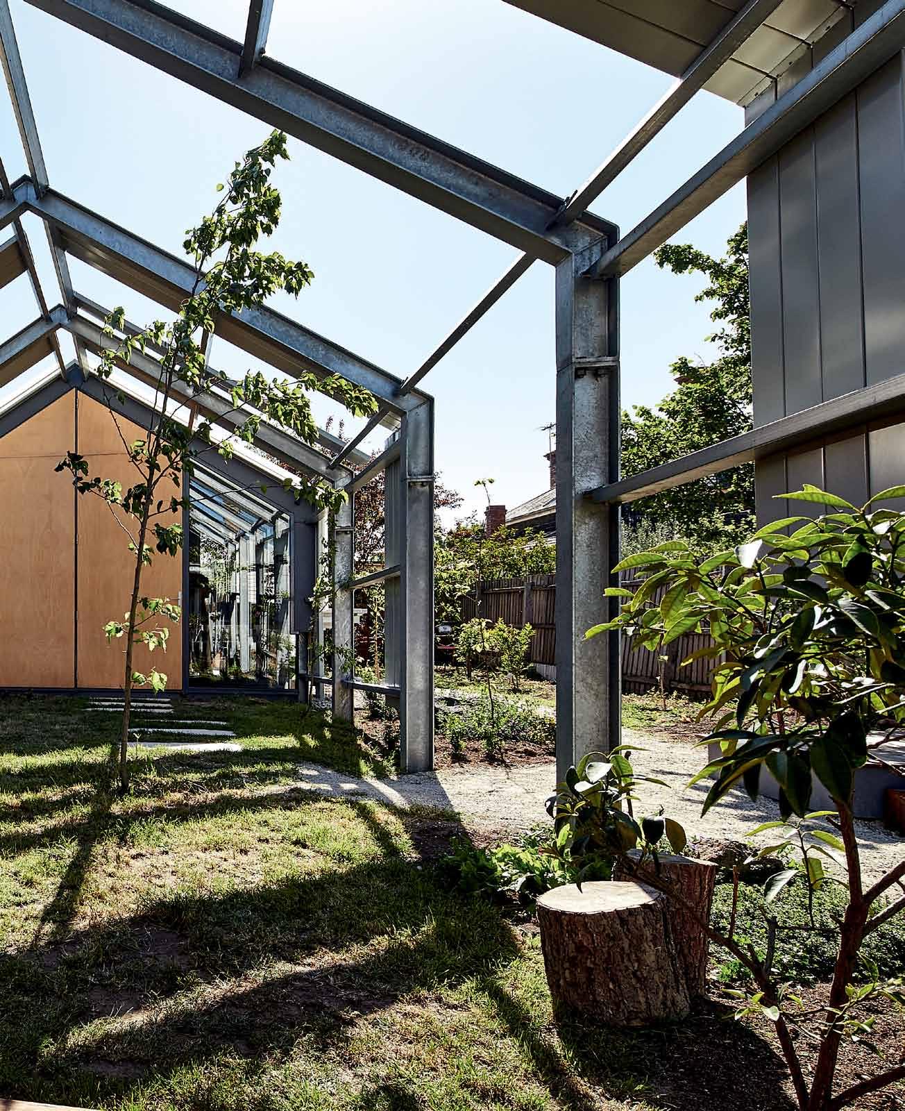


Losing a metre’s width of the house to a “tiny council bi-law”, Maynard and team decided to extend the house even further. Compensating for the loss of space, they have encased the north arm of the house in glass. This stretches from the lounge area right down to dining, before wrapping around in a beautiful piece of engineering to encase the back end of the house.
A musician and consultant, Derek had always intended on adding a studio/granny flat to the back of the house, at some later point. Maynard, however, advised against this. “He said, ‘Don’t make the building in the back of the yard a granny flat, make it completely integrated’,” Derek recounts. “[But] we needed it to feel ridiculously inside-outside so we said, ‘Push the hell out of it.’
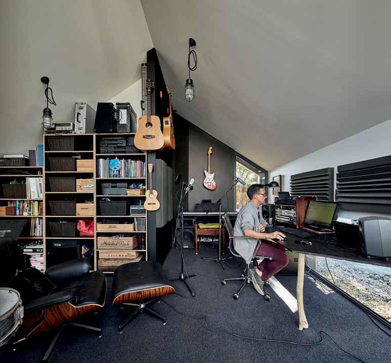
“We were sort of saying, don’t play it safe,” he reflects, leading the way beneath the toothy roofing towards his studio, at the end of this architectural exclamation. “But I don’t think it’s an unsafe solution. There’s an elegance and simplicity to it...”
“We deliberately wanted to keep that back structure low, something lightweight seemed to work much better, more than big, aggressive
masonry,” says Maynard. The idea of the metal shed and skeletal steel frame is in direct response to Derek and Michelle’s “ridiculously inside outside” brief.
The result is a beautiful ruin, the toothed sheets of tin, seeming almost to have blown off in the wind. The riot of greenery at its feet is a gorgeous mess of plant life. “I like the idea of this being an immediate ruin, gets better and better as the garden grows,” says Maynard.
“I think it’s counterintuitive for a lot of people. [We] look at Victorian houses with their small windows and solid [structures] and [wonder], ‘Why, when building a new structure was it deliberately left unbuilt?’ I think for a lot of people they are intrigued and confused by it.”
Awe-inspiring architecture aside, Derek and Michelle still live here. “It’s so nice that it disappears,” says Derek. “You feel comfortable in your own space – which is what we want.” And the reality is this: “We do live here. We have arguments here, we have toast and Vegemite here. Things that are not tszuj-y or wow.” They are the most optimal they can be in a near-perfection home.
drop box
arcHitect Andrew Maynard Architects
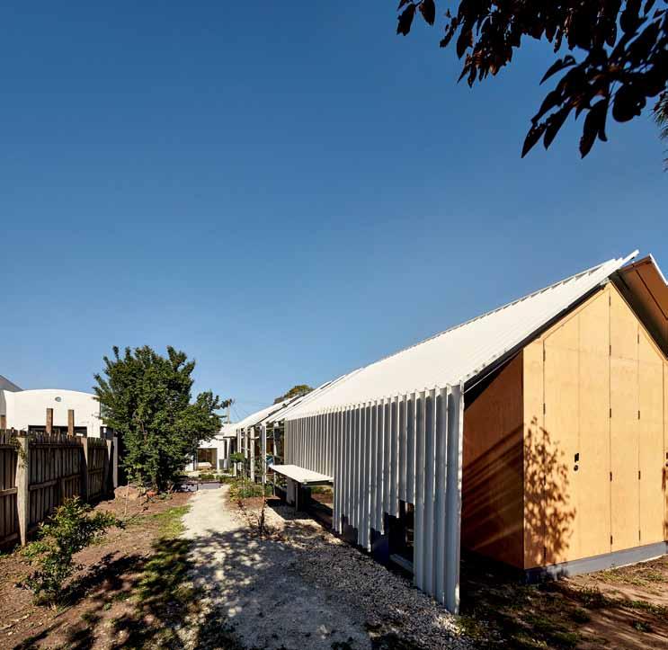
design arcHitect Andrew Maynard
proJect arcHitect Mark Austin
builder Marcus Hamilton, Mark Projects
engineer Maurice Farrugia & Associates
Andrew M AynA rd Architects (61 3) 9481 5110 MaynardarcHitects.coM
furniture
Dining chairs and table commissioned from Tom Jordan.
finisHes
Dulux Black, Whisper White and Charcoal low VOC paint to windows and doors. Solid core timber doors with hardwood edging and hoop pine veneer. Bio Paints natural timber sealer and water based concrete sealer. External cladding includes recycled brick from Paddy’s Bricks. Hoop pine plywood sheets and
plasterboard to internal walls. Lysaght Longline 305 roof and external wall cladding in Colorbond Surfmist and Ampelite polycarbonate sheeting. Clear sealed concrete floor slab and kiln dried Victorian ash and spotted gum timber floors. Stone Italiana Super White reconstituted stone to kitchen benchtop. Hoop pine plywood to kitchen cabinets.
ligHting
LED gimble downlights. Hive Kris-Kros hanging lamp from Hermon & Hermon above dining table. Orion lights from Thomas Gannan in kitchen.
fixed & fitted
Hydronic heating, DeLonghi panels, Baxi boiler and Siemens thermostat. Earthwool thermal insulation. Steel framed double glazed doors and windows fabricated by Skyrange Engineering. Colorbond slimline water tanks. Seascapes bathtub from Apaiser in garden. Bosch cooktop, Ariston oven, Samsung refrigerator, Ilve dishwasher and coffee machine.
above | “My ideas are observations of Japanese work and s candinavian work as well,” says Maynard. Here tH e delicacy of tH e s H ed structure is offset by tH e solidity of steel M ateriality.
With dozens of colour and finish options available, Astra Walker tapware seamlessly integrates into a wide range of interior schemes. The only limit is your imagination. Be inspired. Visit astrawalker.com.au/finishes
astrawalker.com.au
TAPWARE
SANITARYWARE ACCESSORIES
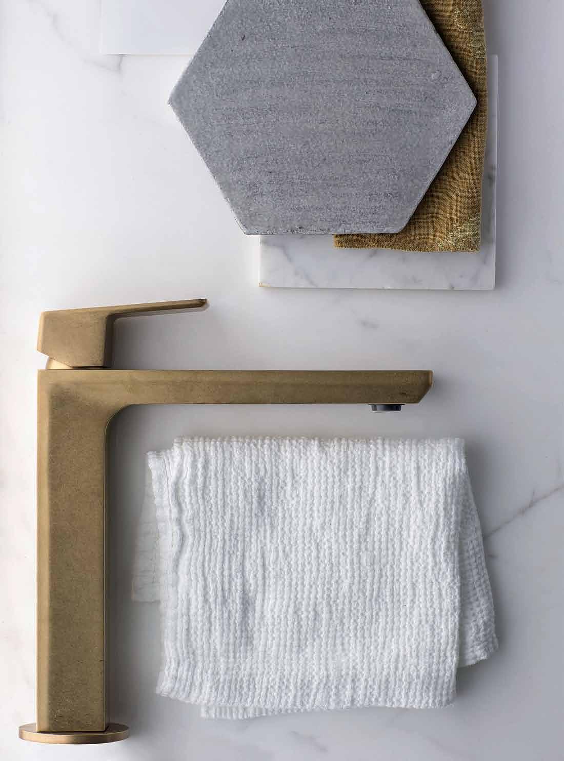
ASTRA WALKER ARCHITECTURAL BATHWARE

Auckland architect RichaRd Naish has made designing for context an art, fashioning urban projects and, here, his family home. aNdRea steveNs visits the E-Type House to find a house fit for the city.

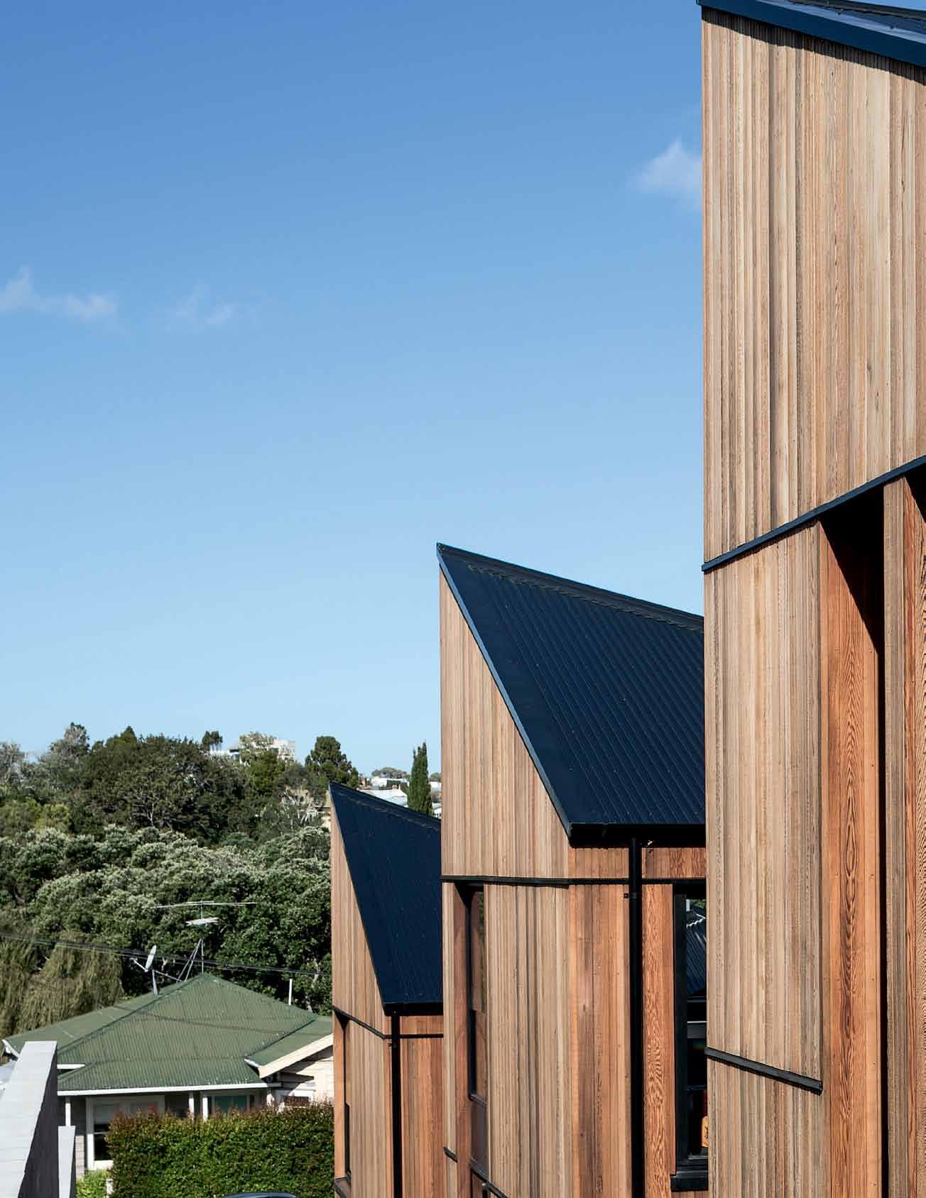


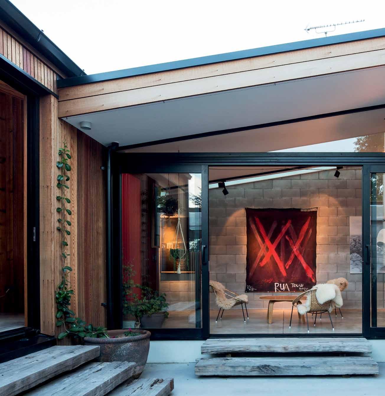
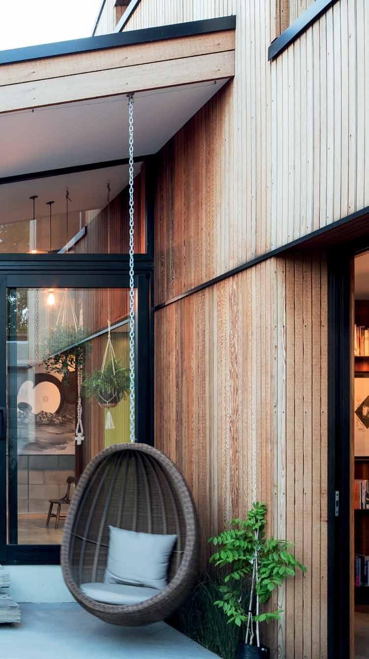
Auckland’s Grey Lynn is a city-fringe suburb dominated by 100-yearold timber villas. Their soft paint colours, simple box forms and decorative fretwork set a uniform character, maintained by council heritage rules. When local residents Rich Naish and Andrea Hotere bought a vacant lot overlooking Grey Lynn Park, they knew there would be a lot of interest in the design. But far from building something alien, they’ve gone for understatement and deference to the scale and proportion of the street.
Naish is an architect and director of RTA Studio, a boutique architectural practice wellknown in the area for its work on heritage commercial buildings. Over the years, he has developed a unique design language, translating and combining old with new, often contrasting a bold material aesthetic with the existing Victorian and Edwardian buildings.
With the opportunity of a bare residential site within the heritage area – a suburb he and his wife have lived in for 20 years – Naish naturally opted to design a house that worked within its context. It would be a house of its time, but also a house of its place – cognisant of the existing architectural grain.

Buildings of the Victorian and Edwardian era have a fine scale due to the technology of the day. In New Zealand this was based on the maximum span of a timber beam, four to five metres or so. By respecting this scale, the architect has designed the new house to sit comfortably within the streetscape and

on the wider hillside. So, while its design and materials are very contemporary, its form and size are sympathetic.


The 290-square-metre house is made of three discrete two-storey volumes – like small living towers. These simple box forms have a square plan with a steeply-pitched roof. It is as though a villa, with its pyramid roof, has been cut into pieces, with three of the quadrants then stacked up the site. Thus the closed, protected form of the villa has been turned inside out for more open and outward facing rooms. Each tower faces north-east, making the most of the sun and park view afforded by the site’s slope and orientation. The overall effect is a house of small parts that uses its site intensively, while retaining the villa scale.
To tie the three parts of the house together, a 35-metre-long corridor steps along and up almost the full length of the site along the southern boundary. Modelled as an indoor street, its concrete block wall and skylight create a wall for art, and robust finishes that take the knocks of a growing family. The corridor grants access into each tower and to two garden rooms and courtyards in the spaces between.
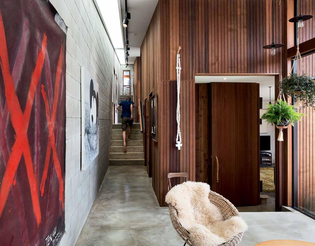


It would be a house of its time, but also a house of its place – cognisant of the existing architectural grain.


Wrapped in cedar, the towers read as discrete and separate elements inside as well as out. They connect visually and spatially with each other across the sunny courtyards, but from the corridor they seem private and are reached via small stairways and doors. The indoor garden rooms – hung with potted plants like a conservatory – act as informal common spaces, like rest points or ante rooms off the long, stepping corridor. In plan, this layout makes a capital E, which is where it gets its name – the E-Type House.
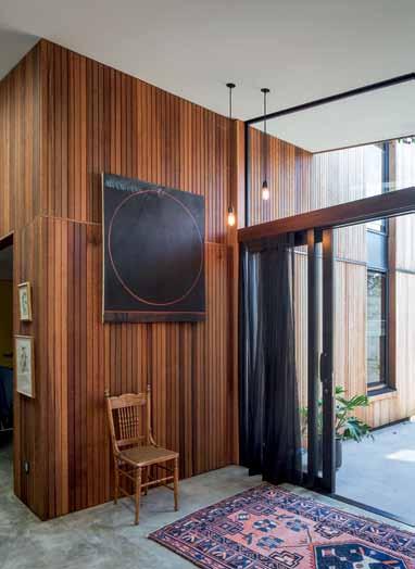
The site can be seen as a series of interlinked platforms, indoors and out. At street level, the garage takes up the ground floor of the first tower with the kitchen/dining above. The dining links across the first courtyard to the living room in the second tower, which has the main bedroom and ensuite above that. In turn, the main bedroom links across the second courtyard to the third tower, which has four bedrooms – two below and two above, one a guest bedroom with study. And finally, the second floor of the third tower links with a small garden at the very top of the site. The house and garden literally step up the hill.
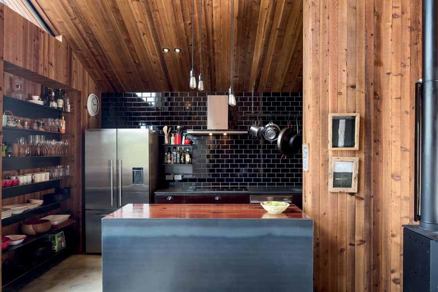
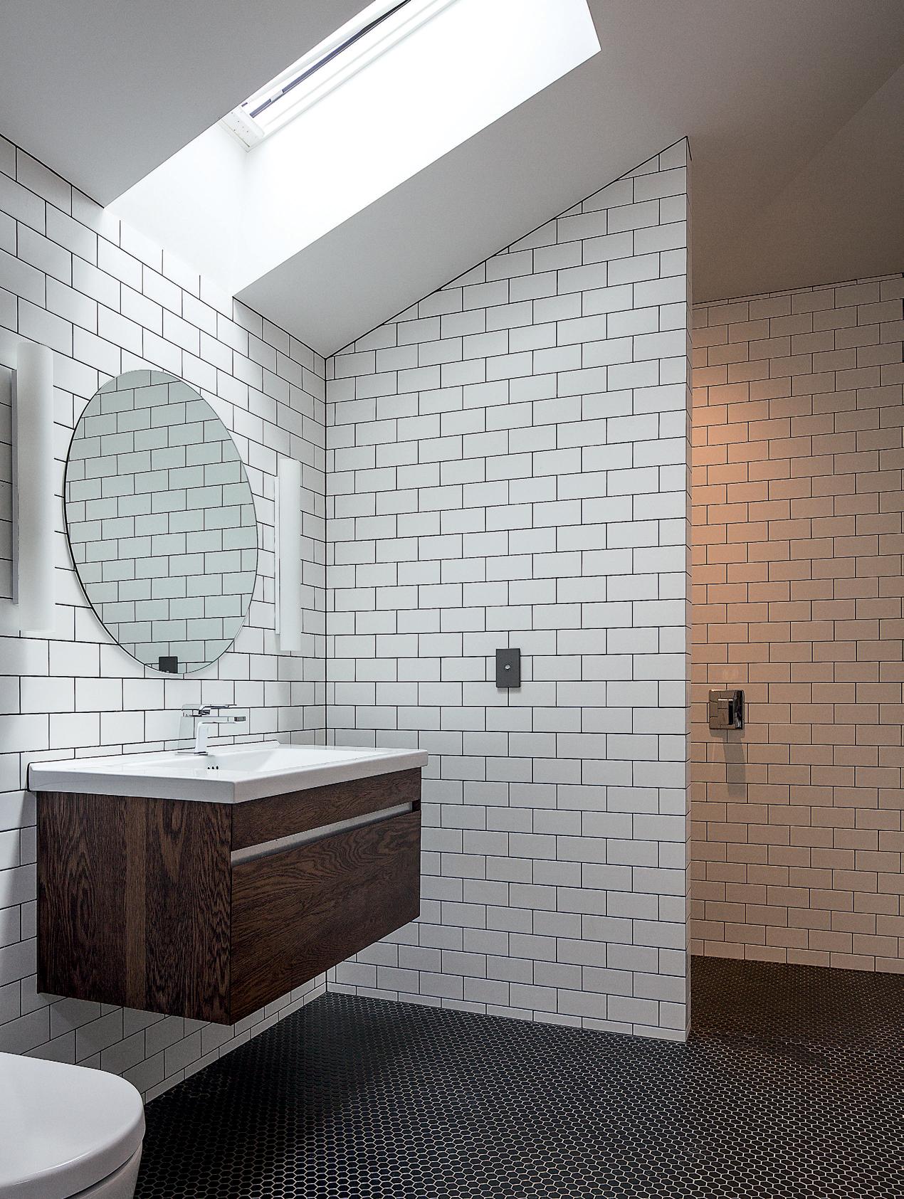
1 2 3 4
ENTRY
GARAGE
HALLWAY
LAUNDRY
5 6 7 8
BATHROOM
LIVING
GARDEN
COURTYARD
9 0 q e
DINING
KITCHEN
GARDEN ROOM
STORAGE
BEDROOM POOL
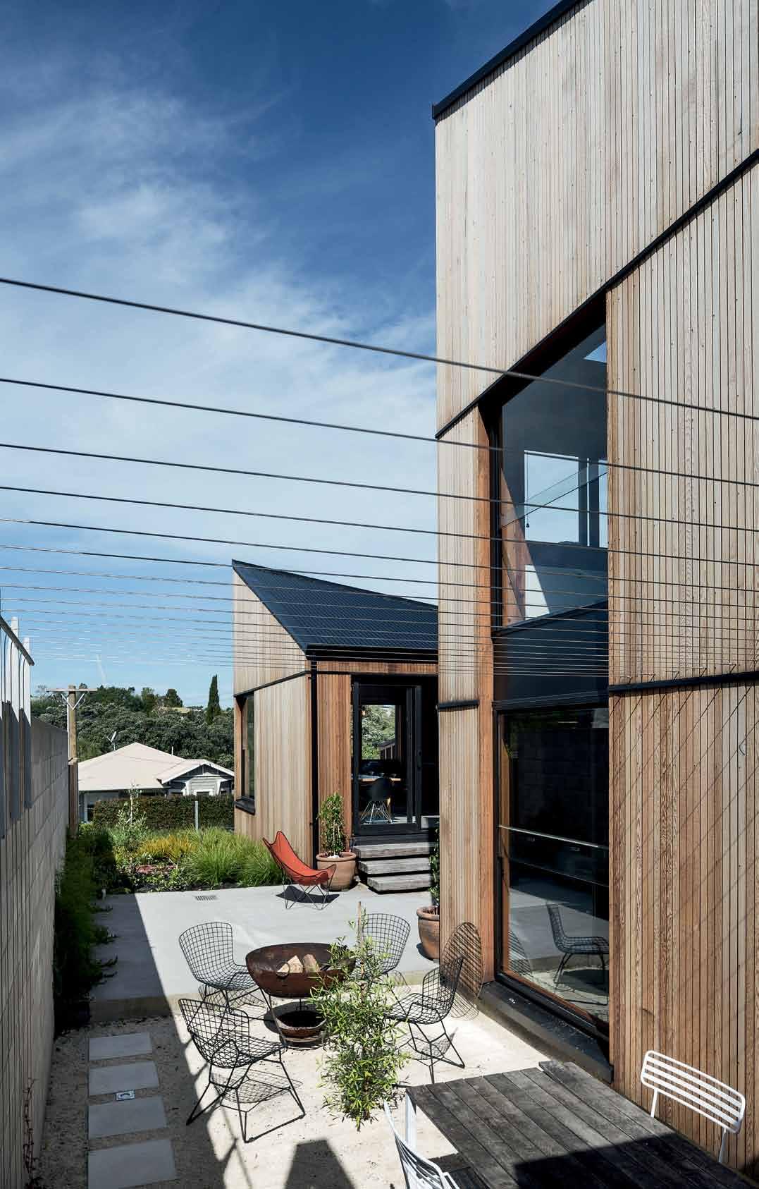
Due to the small footprints of each tower –they each measure six-by-six metres – sun and light filter into every room, and each has views outside to the courtyards, terraced northern garden or Grey Lynn Park across the road. Bedrooms feel private and detached, accessed as they are by small stairwells off the indoor street. Like a timber castle with hidden doors, small niches and secret rooms, the house feels like an adventure.
While the bedrooms are tucked away and located the furthest from the front door, the kitchen and dining are closest to the street. This combined room is entirely lined in cedar with a raw steel kitchen, firebox, large dining table and window seat. It’s a warm, social, family space, and with the park opposite, it can also become a vibrant room that is wellconnected to its city-fringe suburb.
From the dining room, three steps link down to a courtyard and across to the lounge. The lounge is really snug with a wall of floating steel bookshelves and bespoke steel pendant lights. Together with cowhides, sheepskins and black leather couches, the interior design fits with the robust architecture, further layering natural textures and materials.
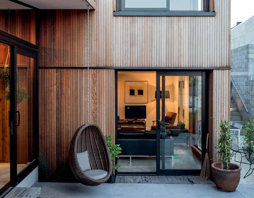
Like a timber castle with hidden doors, small niches and secret rooms, the house feels like an adventure.
Architect RTA Studio
d esign d irector Richard Naish project Architect Tim Sargisson structur A l/ciV il consultA nt
Harris Foster Consulting
c ontr Actor Peter Kirkbride
RTA S T udio (64) 9360 3313 rtastudio.co.nz
furniture
Dining table from Simon James. Dining
The couple have avoided the ubiquitous open-plan kitchen/dining/living for a more idiosyncratic spatial experience. As the seasons change, the experience of the house changes – the courtyards act as extra rooms in the summer’s heat, and then, in winter, the house is more closed down and inward.
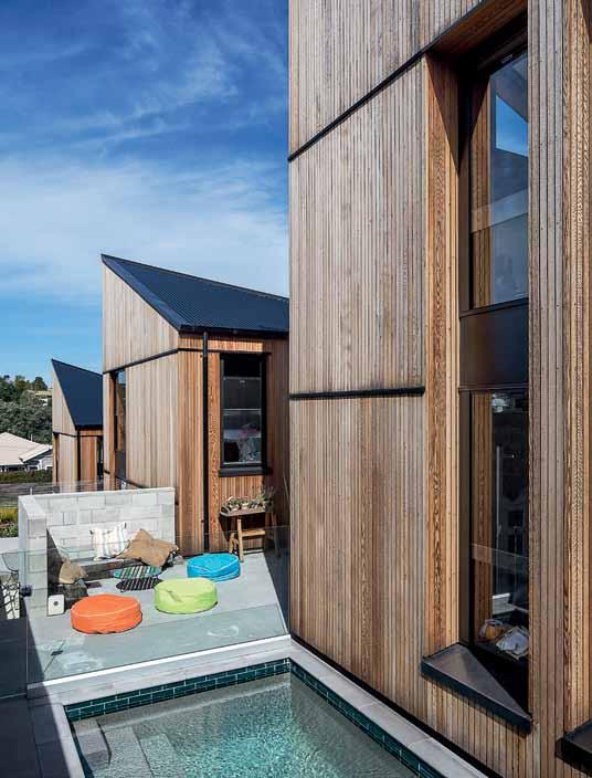
There is a real sense of the city inside the house. The character of the common spaces –the indoor street with its concrete and cedar, and the garden rooms with their hanging plants – don’t feel like typical residential spaces. They feel more like a covered laneway before you enter the house itself, like some of the spaces you find in Naish’s commercial designs. This aspect makes the rooms within each tower feel quite separated, as though you have moved through several layers to reach them.
With all the concrete, cedar and raw steel, the character is rustic and industrial, unpretentious and fit for a busy family life. But despite its robust finishes, it has a delicate scale with many nooks and crannies making for a fun, private and adaptable home.
finishes
Colorsteel roof. Tiles from Artedomus.
lighting
Custom designed from RTA Studio. fixed & fitted
Fisher & Paykel appliances. Sanitaryware from Fowler. APL Metro series joinery, installed by Alitech. Hewi hardware supplied by Sopers.
Now leasing, Paramount by The Office Space is Sydney’s boldest new share workplace offering. Set within the upper level of the iconic Art Deco Paramount House in Surry Hills, it is the ideal headquarters for those seeking a prestigious and inspiring work environment positioned amongst the city’s most creative and progressive thinkers.
The custom built fit-out and styling channels a period of glamorous high-end corporate office design reminiscent of New York in the 1960s. No attention to detail has been overlooked in this exclusive, yet inclusive boutique workplace. Celebrated mid-century furniture pieces tie in with the era of the building, while accents of leather, marble, stone and lustrous brass and bronze add elegance and distinction.
The notion of privacy and discreet luxury is integral to Paramount’s overall design and the impeccable business support services provided by the concierge team. It comprises 22 private office suites (for one to five people) with walls
made from softly curved timber tapering towards high vaulted ceilings, a spectacular rounded glass cove for intimate meetings, and an impressive boardroom with state-of-the-art support technology comfortably seating up to eight people. A monumental bronze bar glistens in the central atrium, supporting a collegial atmosphere where residents mingle over lunch and evening whisky tastings.
Paramount offers fully flexible residencies to accommodate established businesses and professionals seeking a breakaway office and/or a private place to work and conduct meetings. Created with the discerning business owner in mind, it appeals to local and international audiences for whom design, service and a first-class experience are both a reflection of their brand and an extension of their personal style. It is best suited to company figureheads seeking a breakaway office, CEOs completing side projects and executives requiring an intimate sanctuary.
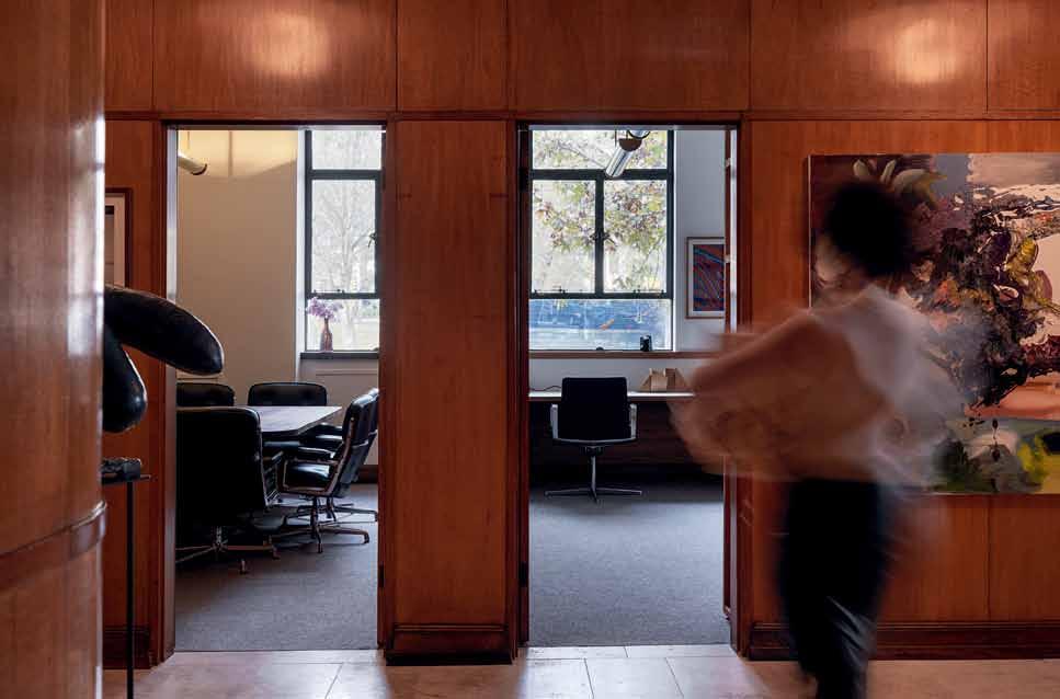
A cohesive narrative of discreet luxury works in harmony with defining architecture and modernist ideals in this shared office building.
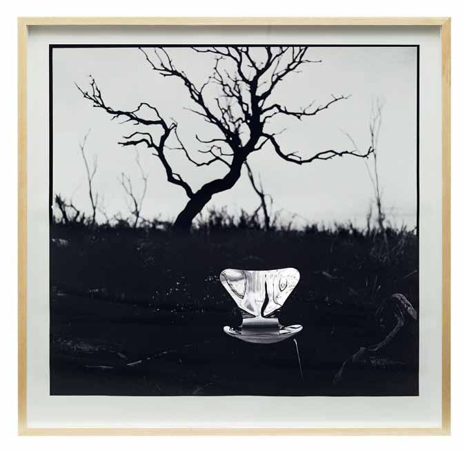
One of the most enduring silhouettes in the design world is Fritz Hansen’s Series 7 chair designed by Arne Jacobsen in 1955. The sensuous curve of the chair’s back – calling to mind a woman’s shapely figure – has graced hundreds/thousands of projects all over the world, from residential to commercial, hospitality and public spaces.
With an intriguing initiative, CULT has brought a new twist on this universally renowned classic, which is celebrating its 60th anniversary this year. The Chairity Project invites leading Australian and New Zealand creatives to reinterpret the iconic chair, and the resulting pieces – ranging between functional items and artworks – are then auctioned off to raise money for a charity of the creatives’ choosing.
The inaugural edition last year proved a huge success. This year, the program expanded to collaborate with 20 creatives from industrial designers, architects and artists, as well as floral and jewellery designers. The results are as varied as the creatives themselves, each bringing a unique flavour and approach to the iconic Series 7. Dinosaur Designs, Akira Isogawa and David Trubridge are just some of the personalities involved this year.
The 20 chairs became a travelling exhibition that was displayed nationally through CULT showrooms in Sydney, Melbourne and Brisbane in November, before making their way to the winning bidders. And with 20 different charities benefitting, the Chairity Project is a creative initiative with a deep and rippling impact.
– as
text Nicky Lobo | photography courtesy of cu Lt
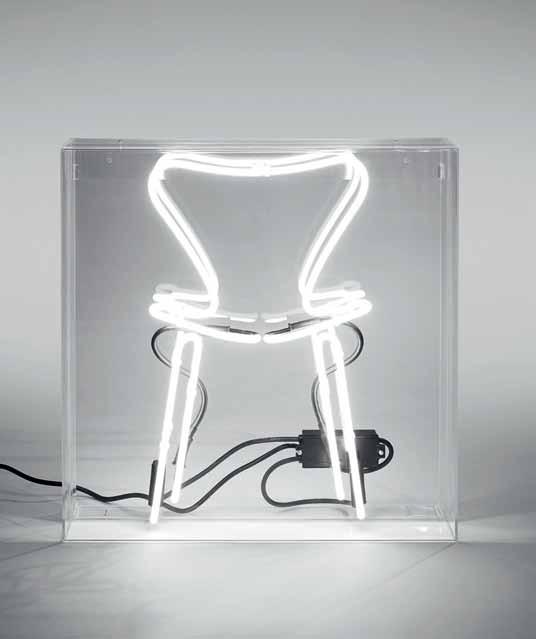


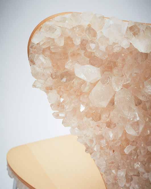
Within the relative banality of Victorian coastal quietness, a surprising, yet subtle statement by Auh Aus Architecture is uncovered. M
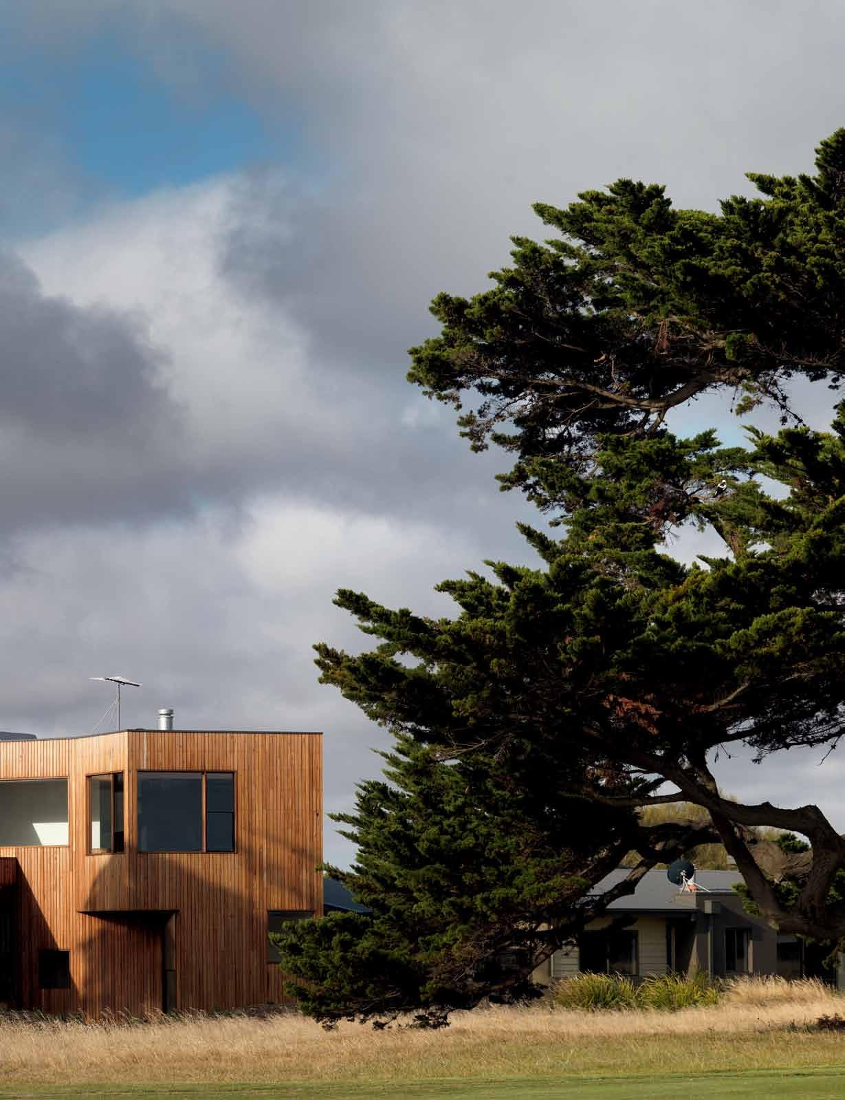
tour.
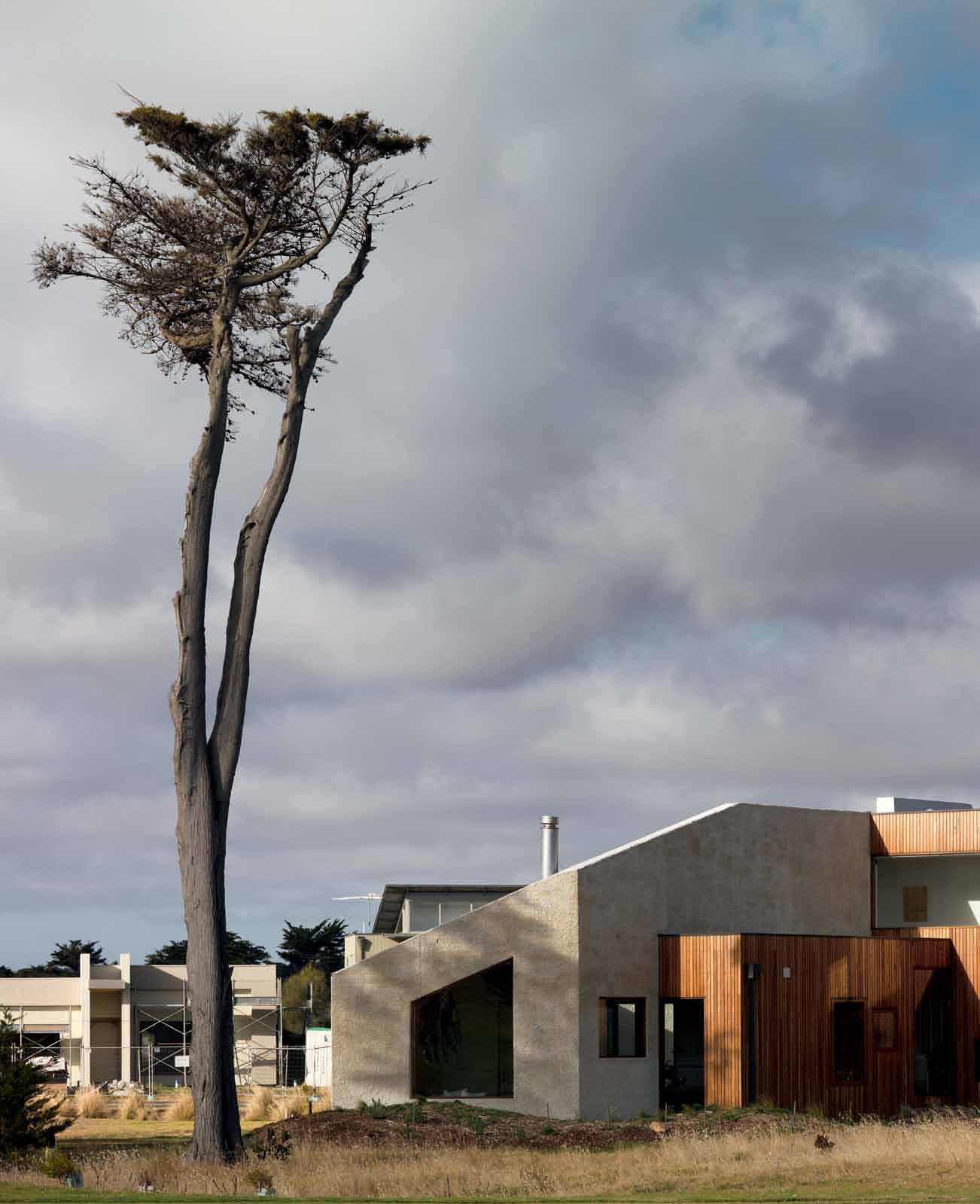 text Mark Scruby | photography trevor Mein


Design enthusiasts outside of Victoria might not be familiar with the Bellarine Peninsula – a shame for them, but probably just the way Bellarine locals would like it to stay. The peninsula juts eastwards from Geelong to form the southwestern boundary of Port Philip Bay, and its idyllic mix of farmland and small seaside towns presents Melburnian holidaymakers with a lower-profile yin to the Mornington Peninsula’s flashy, fake-tanned yang. Change is happening, but even in Barwon Heads, the once-sleepy village made famous in the ABC television show SeaChange, it’s at a measured pace. Case in point: on the day Habitus visited – a Sunday that turned out to be the first beach-warm day of spring – Barwon Heads’ biggest fish and chip shop didn’t bother to open its doors, and the other one went perilously close to running out of fish!
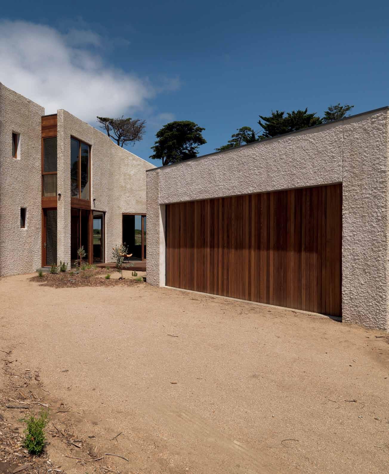
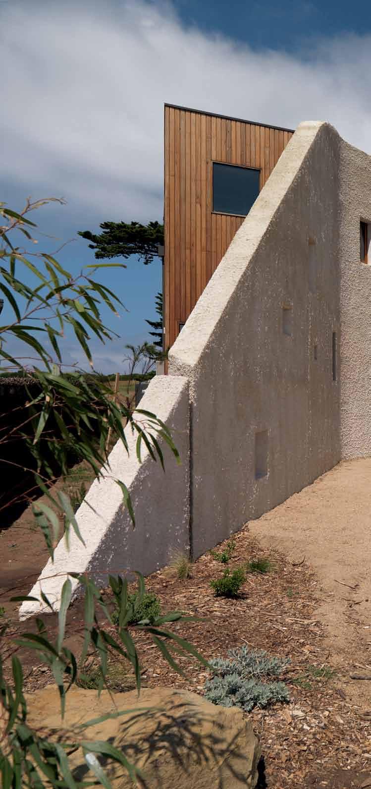
A few kilometres along the coast to the west of the town, at Thirteenth Beach Golf Links, the vibe is just as laid back. Behind a grand entrance gate, the central driveway curls and curves between fairways and practice greens on the left, and rows of neat, Truman-Showbland houses on the right, in a rhythm designed to lull even the most uptight city slicker into a half-awake holidaze. Like it or loathe it, it’s not the first place you’d think to visit on the search for bold residential architecture.
Yet, look hard enough and that is exactly what you’ll find. Situated between another tastefully toned, rendered-board box and


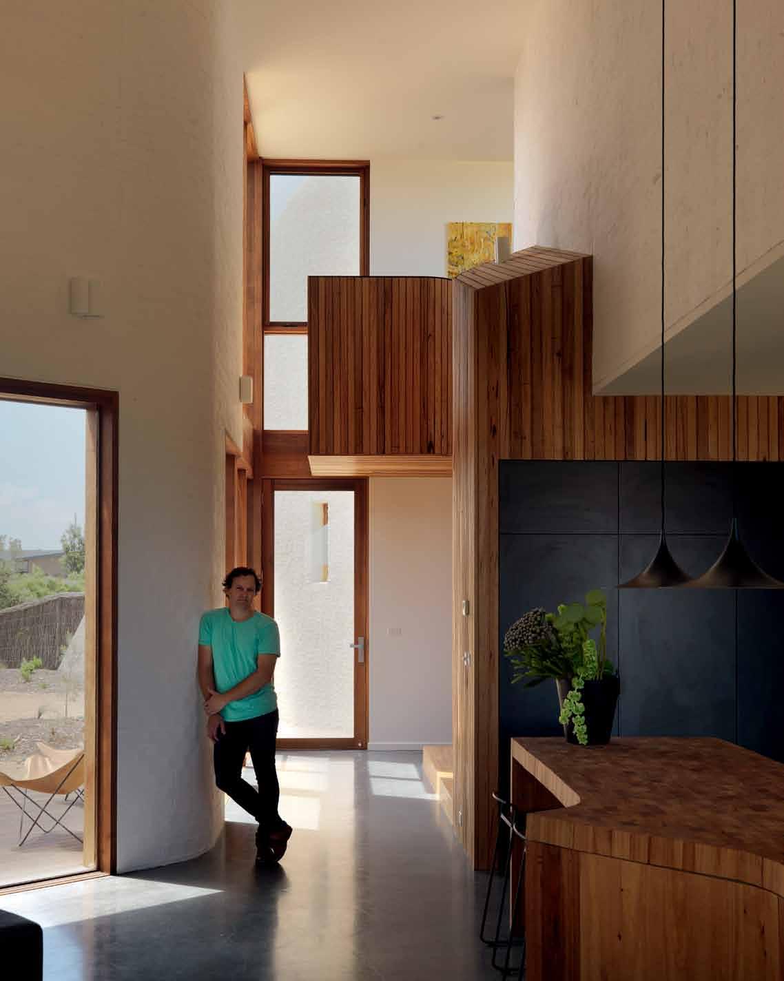
an as-yet unoccupied block, a wave of what looks at first glance to be rough-hewn rock rises dramatically from the street. This new house, by local practice Auhaus Architecture, is simultaneously very Australian – the sandy colour and texture, the stylised-dune shape, and the fantastic garden of native flora out the front – and somehow exotic; its curved form and small rectangular windows and openings bringing to mind the Star Wars-inspiring fortified granaries, or ksar of North Africa. As it turns out, the wall is constructed from recycled bricks, and, although Benjamin Stibbard and Kate Fitzpatrick from Auhaus lament the fact that the development’s design guidelines precluded them from leaving the mottled brick patchwork uncovered, the effect of the sandy spray-on render, left lumpy and naturalistic, is defining and disarming.
The wall is the signature visual element of the project, but it also provides the structural backbone around which the house’s internal spaces are oriented. Visitors enter through a glass door, and the act of passing from the outside to inside is experienced as penetrating the seemingly monolithic wall, moving behind a masonry curtain. Immediately, multiple sightlines open up. To the left, stairs lead past
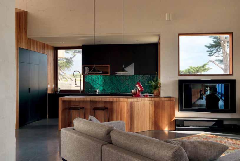
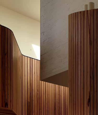 opener | Viewed from the golf course, the house appears as a geometrical composition. previous | a drought-tolerant garden of natiV e flora proV ides a contrast to the green of the fairways. opposite | the parapet aboV e the entrance creates a small study area. above | picture windows in the heart of the home proV ide V iews of trees, sky and the distant dunes. bottom | the interior presents an array of textured surfaces, including silV ertop ash lining and roughly rendered brick.
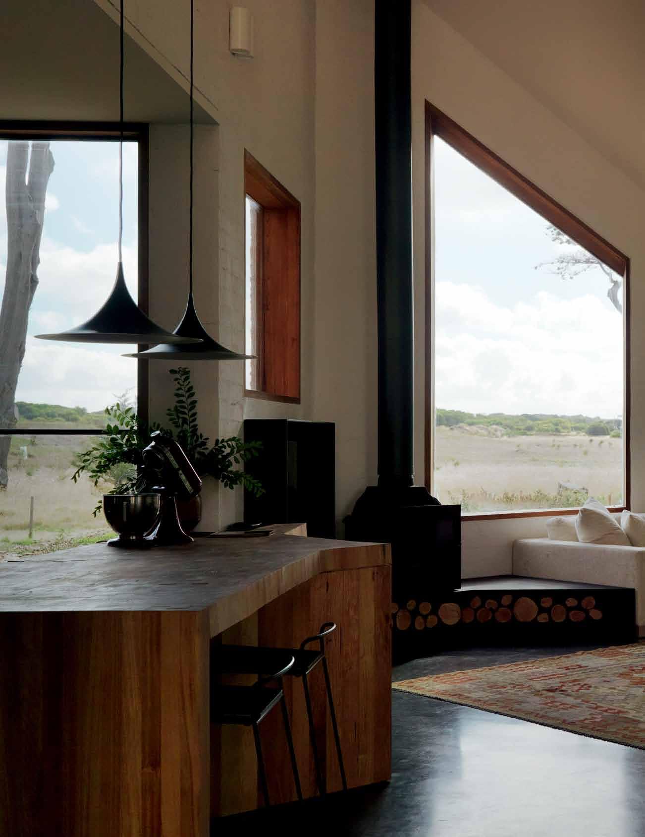

The interior spaces have been carefully arranged to frame trees and grass, blue sky, clouds and distant dunes…


a small landing to an upstairs bedroom, living space and study, and there are views through windows on both levels, across the windswept adjacent fairways to a wonderfully craggy old pine tree, and beyond, to the scrubby, wind-whipped dunes of Thirteenth Beach. To the right, an open-plan kitchen/dining/ living space is very clearly the heart of the home, and it also offers a range of views, from the expansive panorama of a tall picture window, to the curated snippets seen through a collection of rectangular portholes like the ones on the front wall. The owners’ brief was for a house that they could withdraw into; a quiet, peaceful place that offered seclusion from their neighbours and that, as much as possible, hid other people and other houses from view. As a result, the wall and interior spaces have been carefully arranged to frame trees and grass, blue sky, clouds and distant dunes, but not other buildings or other people.
Following the curve of the wall further around to the right, a smaller living space looks out onto a decked courtyard at the centre of the site. A door leads into a double garage, which has been designed as part of the main building
and positioned to act as a buffer between the outside world and the inner sanctum. Back in the other direction, past the entrance, there are two small guest rooms, the second of which offers a view through a window to a tiny garden hidden behind the part of the wall that pushes outside the building envelope. The feeling in these guest rooms is quite different, and it takes a moment to understand why: apart from bathrooms, these are the only internal spaces that are closed off and fully private. From the upstairs sleeping quarters, study and living space, down the stairs to the main internal room, and around to the sitting area, the house comprises a single flowing internal volume. Separation and functional zoning are created by the positioning of spaces around the curve, and by the change in levels, but a sense of connection remains. As a result, walking through the house provides many opportunities for discovery and surprise, but also a feeling of openness and generosity.
In amongst all of this, the owners can choose from myriad places to perch or nestle, depending on their mood, the time of day and the task at hand, staying in contact with each

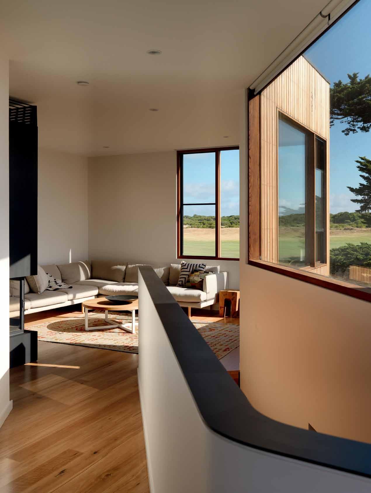
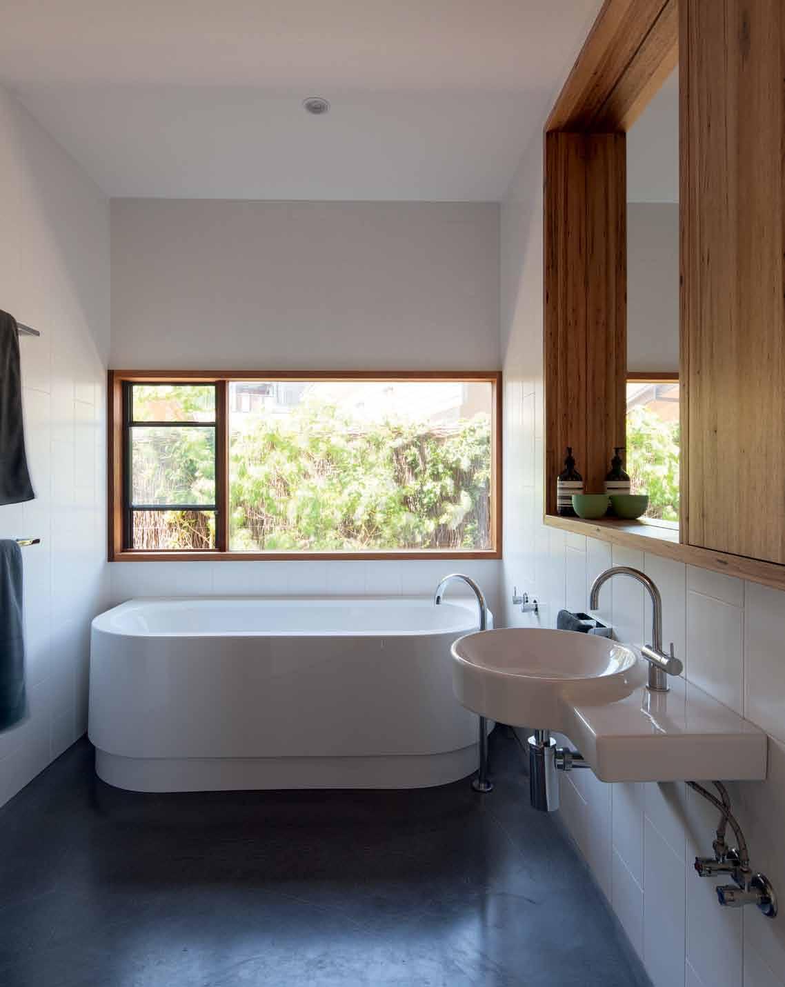
drop box
Architect Auhaus Architecture
Project teAm Benjamin Stibbard, Kate Fitzpatrick, Lance Van Maanen, Finley Myers
Builder Jasada with Ben Jolley Carpentry
Structur Al engineer Ardam Services
joiner Leopald Kitchens
Auh Aus Architecture (61 3) 5254 3335 auhaus-arch.com
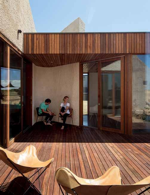
Artwork By Anna Fitzpatrick in dining room.
Furniture
Jardan Enzo sofas and Cadrys Kilim rug in ground floor living room.
other but with the freedom to withdraw and focus, or to look out and ponder the idyllic surrounds. The many windows, the vaulting ceiling and the lack of internal walls make for an interior flooded with diffuse natural light, so that being inside – safe, secluded, comfortable –feels almost like being outside, anyway. And this in turn highlights the value of the golf course location. No, it might not be the natural habitat for progressive residential architecture, but with the street and neighbours blocked from view, and the fairways at the back of the house preventing any more development between the site and the sea, the owners can enjoy their seclusion and the beautiful outlook forever more. Apart from the odd errant golfer who has to hunt for a lost ball in the garden, and perhaps the occasional golf-and-design enthusiast pausing between strokes for a sticky-beak, they’re on their own in a wonderful home by the sea.
Transit bar stools in kitchen. Mark Tuckey Oak table and Eames DAW chairs in dining room. Jardan Nook sofa, Mark Tuckey coffee table and Cadrys Kilim rug in first floor living room. Jardan Archie chair and Douglas & Bec Cross brass side table in stair reading nook.
FiniSheS Cavity brick wall with natural roughcast render finish. Silvertop ash vertical lining board with Cutek oil finish. Western red cedar windows with Cutek oil finish. Roof, gutters and downpipes in Colorbond Woodlands Grey. Spotted gum decking board. Polished concrete Ecoflor to ground floor by Concrete Services Group. Solid blackbutt floorboards with waterbourne finish to first floor and stairs. Brazilian black slate tiles to first
floor ensuite. Silvertop ash walls and ceiling timber lining. Lime whitewashed internal brickwork. Dulux Natural White paint finish to plasterboard ceilings and walls. Mule Matte white porcelain tiles by Onsite to ensuite and bathroom walls.
lighting Gubi Semi Pendants in kitchen. Toss B disc pendants in staircase and dining room. Custom double barrel steel uplighters by Auhaus Architecture as wall uplights throughout. LED downlights through bedrooms.
Fixed & Fitted
Black concrete benchtop to kitchen by Concrete Architecture. Kitchen island benchtop in solid blackbutt. Laminex matte black laminate to
kitchen cabinets. Custom glazed tiles to kitchen splashback. Black painted plate steel TV joinery unit and fireplace to living room. Black painted plate steel stringer and white painted steel rod balustrade to staircase. Solid blackbutt mirror surround and veneer cabinet in bathroom. In kitchen, Gessi Oxygene mixer, Reece Axa sink, Siemens induction cooktop and ovens, Electrolux integrated fridge & freezer, Asko integrated dishwasher and Sirius concealed rangehood. In powder room, Omvivo Lilli wall basin, Parisi Ellisse toilet, Scala wall-mounted tap set. In bathroom, Parisi Flow 04 basin, Hoesch Happy D bath, Hansgrohe Randance shower, Reece Scala mini gooseneck mixer tap and bathspout, Reece Mizu Soothe towel rails. Fireplaces from Cheminee.
Your design. The right grate selection, with Stormtech. Match the perfect drain to your requirements with Stormtech’s superb range of linear, designer drainage systems.
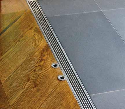
Manufactured in Australia from marine grade stainless steel, Stormtech systems bring the perfect balance of style, durability and sustainability to both indoor and outdoor environments.
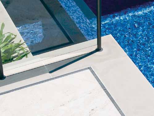
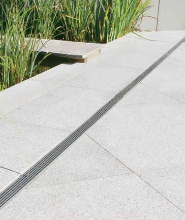
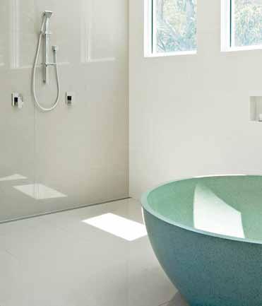

View our complete selection of drainage systems and product applications on the Stormtech website, or call for more details.
Phone 1300 653 403

Website stormtech.com.au
ARCHITECTURAL GRATES + DRAINS
Bathrooms + Showers

Pools + Surrounds
Thresholds + Doortracks


Special Needs Access

Not content with presenting the best of international designers, Stylecraft seeks out and supports the local crop of talent.
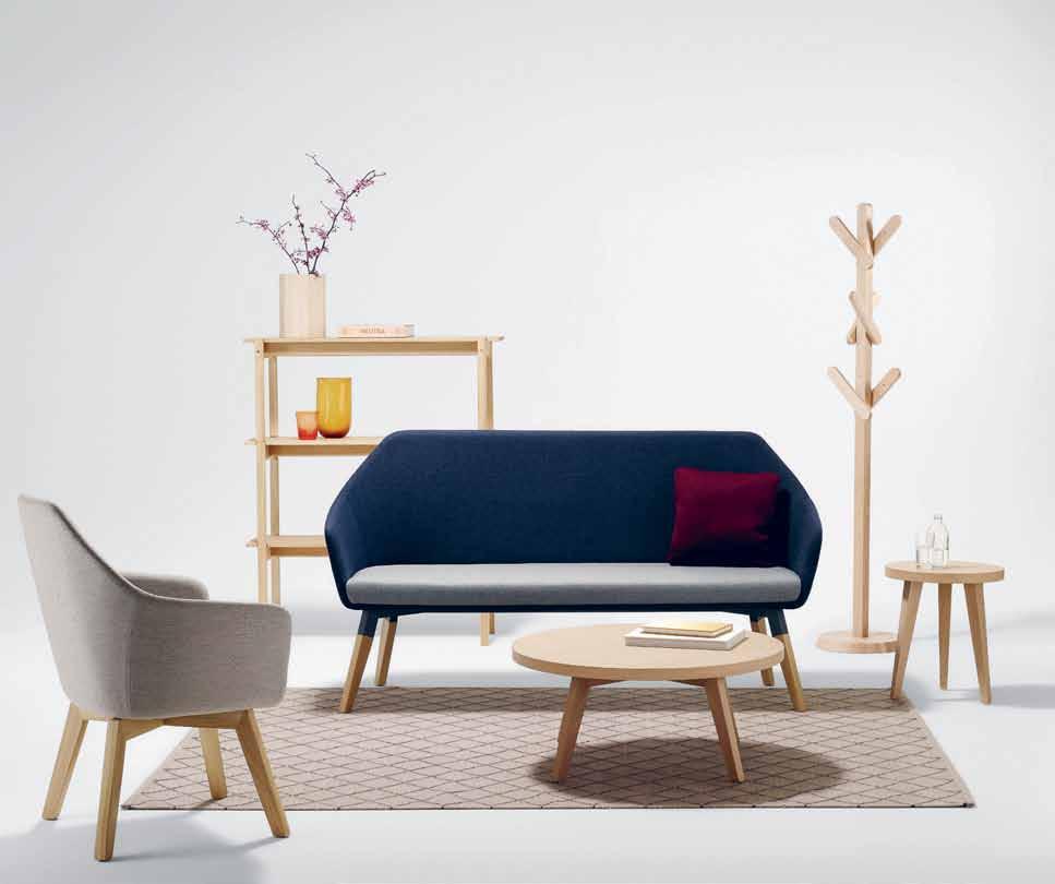
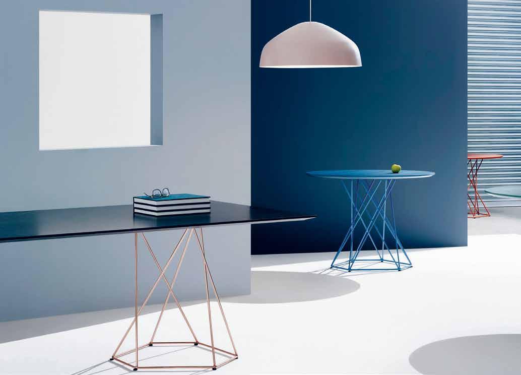
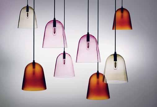
‘
the Wise Australian Buys Australian’. It’s a long-lost slogan from the 1970s that’s finding new resonance today. And yet, when it comes to furniture, how many homes are still scattered with mid-century pieces of international provenance – or, even worse, cheap copies thereof?

In this context, Stylecraft is a game-changer. With over 60 years in the industry, the distributor now has showrooms around the nation, and an office in Singapore to spread the message into South-East Asia. A large part of that message is that Australian design, making and manufacturing is now a force to be reckoned with.
The Stylecraft stable of Australian designers is chosen with care to represent a range of aesthetics, linked by a singular ethic: to create and manufacture credible, directional and responsible furniture and product, locally with integrity. The collection ranges across the foci of form & function, sensitive craftsmanship and bold pattern and colour.
Helen Kontouris is a conceptual sensualist, her designs the result of a rigorous interrogation of purpose, and intense lateral thinking. The Softscape collection of seating is eminently modular, allowing for engaging communal or private experiences. With a menu of optional accessories including lamps, planter boxes and coat stands, each Softscape environment can be configured as totally bespoke. Paul Hecker, a founding Director of Melbourne’s Hecker-Guthrie designs with a similar sense of engagement and elegance. His work is typified by style and a touch of whimsy. You can see it in his Box Collection, a nod to an era of Mad Men, their
indented arms adding new kick to an old classic, while his Home wingback armchairs with ESO add a radical blockiness to a familiar typology. ESO, another Australian design brand, has also brought the Rix range to the market, with subtle curves and recycled post-consumer plastic used in the shell, making interiors both look and feel good.
Newcomers are just as important to Stylecraft’s stable, and they are constantly seeking new collaborators to bring a contemporary sense of iconic to Australian design. Industrial designer Tom Skeehan takes a material-driven approach, creating furniture and products that consider the longevity of a design as well as its environmental impact. His Hoshi range of lounge furniture is a new addition to the Stylecraft catalogue. Another exciting inclusion to their Australian design resume is Justin Hutchinson, Design Director of Urban Commons, a Melbourne studio dedicated to reviving the spirit of shared space. His Raft collection of modular outdoor lounging components is a reflection of this ethos.
Inspired by the wilderness of his home state, Stuart Williams works in Tasmanian oak to create pieces in an ode to technique and craft. Pieces like the robust, articulated Georgette table lamp and its mate, the George floor lamp, echo modernist classics but push them into an ecologically responsible future. Another designer-maker bringing a regional flavour to the Stylecraft scene is Jon Goulder, Creative Director of Furniture of JamFactory, Adelaide. His Splay series by the One Third collective is a collection of armchairs, rockers and side tables that testify to a fine eye for line and finish.
Melbourne designers Ross Gardam and Keith Melbourne add their intensely finely tuned skills and products to this category. Ross Gardam marries traditional craft technique to sophisticated manufacturing technology to create striking furniture and lighting such as the Asymmetric and Aura ranges in a pop of pretty colour. Keith Melbourne’s background in aerospatial and automotive industries are a counterpoint to his deep respect for craft and this duality is apparent in his Bloom Circlet of modular seating for meeting or break out activities; a finely-honed piece of fit for purpose engineering, its upholstering a result of the most exacting of craft techniques.
Under the aegis of Brisbane’s Derlot Editions, Alexander Lotersztain creates bold, colourful shapes in space. Pieces like his graphically fantastic Prisma range respond to the needs of the modern agile workplace, with flexible options for modular arrangements. Meanwhile, on the more decorative end of the scale, interior designer Greg Natale is renowned for his bold use of colour and pattern. A precise and considered approach to design has led him to collaborations with soft furnishing and surface material providers, and also to the launch of his Chest lounge and occasional table collection at Stylecraft.
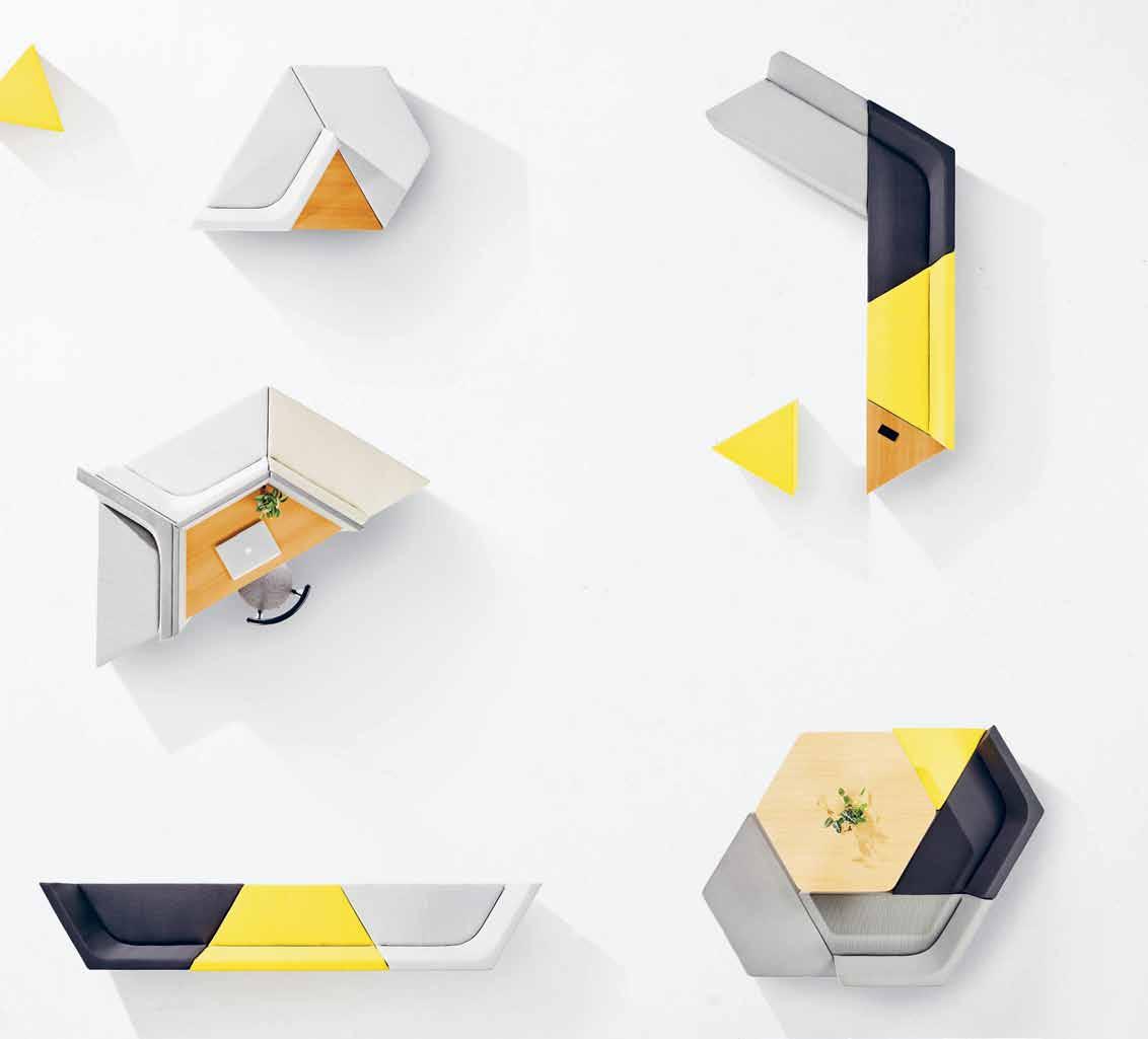
As well as distributing a savvy lineup of local designers, Stylecraft actively encourages new talent to become established players via the recently launched Australian Furniture Design Award (AFDA), in collaboration with JamFactory, Adelaide. Comprising a cash prize of $20,000, a mentored residency at the JamFactory and the acquisition of prototype by the Art Gallery of South Australia, AFDA is one of the most prestigious design prizes in the country, dedicated to identifying, supporting and promoting rising stars. Selected by a panel of esteemed industry judges, the winner has the opportunity to develop a product range for distribution through Stylecraft’s network of seven showrooms across the country. Through this initiative, Stylecraft is ensuring the continuation of Australian design talent, a group that remains a core part of their mission today.
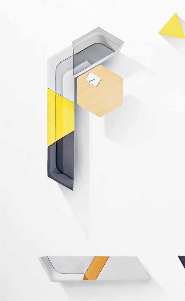


“ Pieces like the graphically fantastic Prisma range respond to the needs of the modern agile workplace.”
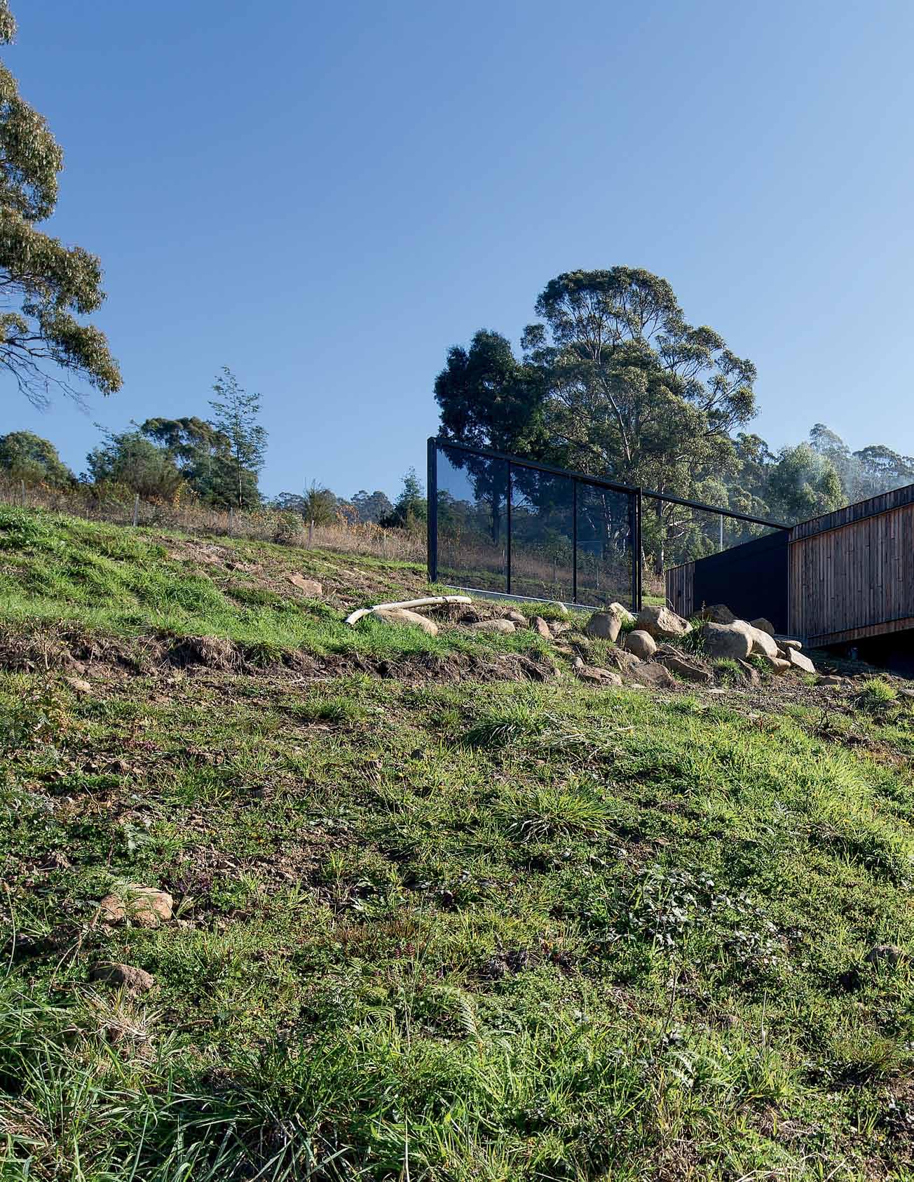
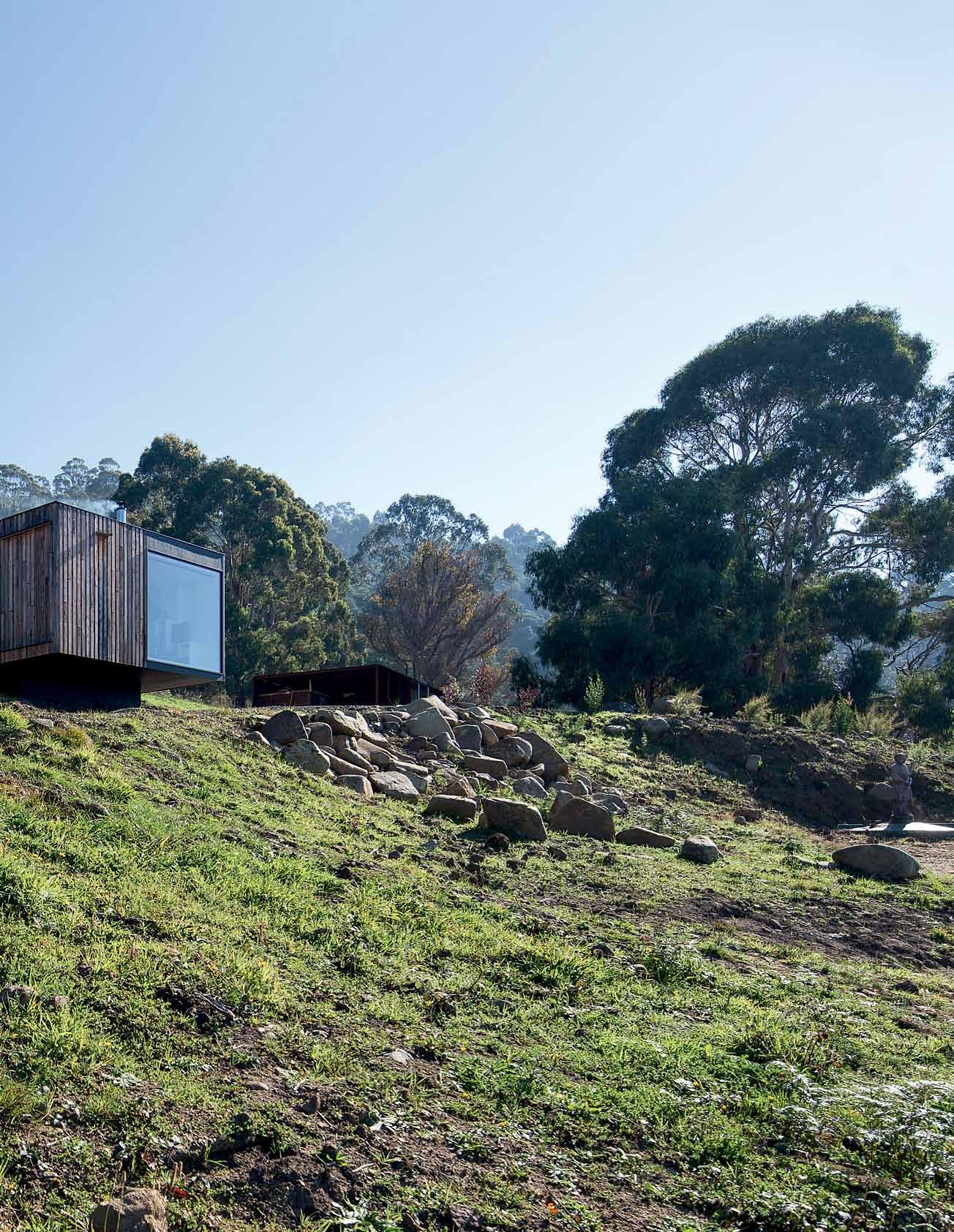
Art, architecture and landscape – an irresistible trio of creative endeavours that come together beautifully in this studio with a view, designed by room 11 JANE BUrToN TAYLor takes a look.

 Tex T Jane BurTon Taylor | PhoTogra Phy BenJamin hosking


Each aspect of the building had to have purpose in terms of emotional meaning.
When two artists approached Room 11’s Thomas Bailey to design their new Tasmanian home, the architect took it as a complement. “We approach our architecture from an artistic disposition,” he says, “so we particularly appreciate when someone who is an established artist appreciates our work.”
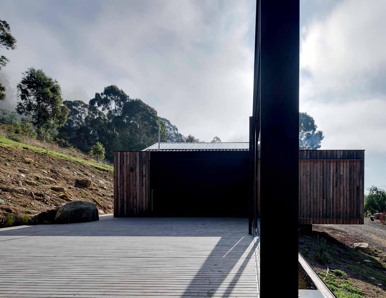
It meant the design process was an organic one, a long creative conversation. The couple, Linda Chee and Imants Krumins, had done their research and chosen the Hobart-based practice of Room 11 because of their portfolio of lean dwellings tailor-made for site and client. Everyone was on the same philosophical page when the conversation began.
“While Thomas designed, we had to come up with [our own] plan about why and how and what does this mean about why we moved to Tasmania. Each aspect of the building had to have purpose in terms of emotional meaning,” Linda says.


Linda, a textile artist, and Imants, a multimedia artist, were at a watershed: relocating from Sydney to Tasmania. After years searching, they found a site at Franklin, an hour’s drive south of Hobart. The land had a classic Tasmanian outlook down over the Huon River. The couple planned first to build a studio, then a house; in order to establish themselves locally. “They were really focused on having this facility, on setting up the vision for their art studio,” Bailey says.
The owners didn’t want the studio to be an add-on but rather a considered building, one that might also inform the design of the house. “Most architects don’t get the chance to design a studio,” Imants says. “This way, Thomas could think about the studio in terms of space and size, and how it sits in the landscape.”
The land is on an east-facing slope with a 180-degree view. On Bailey’s initial visit, his first input was to change the location his clients had chosen for the build. Bailey opted for higher on the hillside, to give a broader aspect, and proposed excavating, to ground the studio (and later the house) securely into the slope. “The view is what it is all about,” Bailey says. “We really respected their choice of site, such a beautiful place, and we were keen to make a piece of work that fitted that site.”
Visiting the studio for the first time, one’s first impression is of the elegant play of rectangles: the deep side deck bounded by a massive black rectangular steel portal on its eastern edge, and the studio itself, a compact structure with a large glass window overlooking the river valley. “A big driver for me was looking up [at] the building and having a very simple, huge panel of glass looking out,” Bailey says. “I almost wanted it to look like another shed, a simple pragmatic building, very direct.”
It is a sophisticated take on a shed. Though modest in scale, it has a carefully considered design finished with characteristic Room 11 use of local materials and detailing. It incorporates working spaces for both artists, plus a bathroom and kitchenette. “It has a rational layout for services. Amenities are to the rear of the site, where there is a less commanding aspect,” Bailey says.
In form, it is a rectangular timber-clad building, cantilevered at the eastern view end, and extending into a deep side deck to make an L-shaped plan. The rear roof lifts up to the
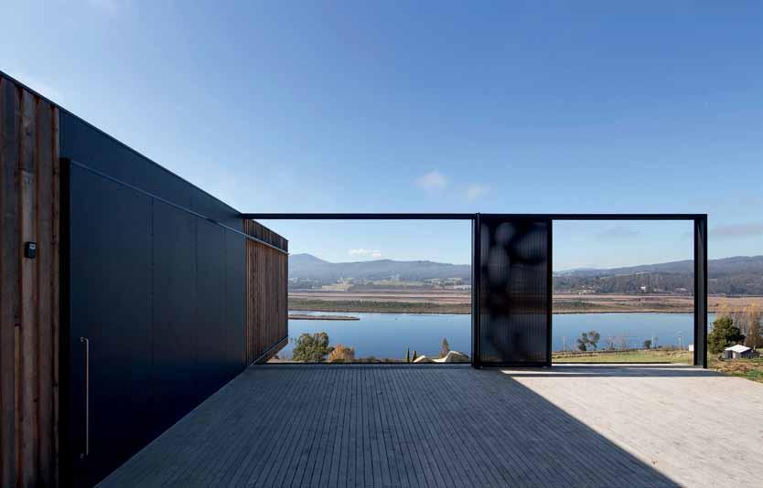
south, letting in gentle light, and supporting north-facing solar panels.
Internally, it is essentially one large white space with diffused light from the southern skylight and the large east-facing view window. “The entire building is focused towards that window; it is frameless and we have used lowiron glass that doesn’t colour the light, so it is like being outside,” Bailey says. “The southern light is softer,” Linda adds. “Imants works with digital media, so he needs the right kind of light to regulate what he is doing.”
For Linda’s work, which involves eco-dyeing textiles, connection to the landscape was the inspiration for the big solid sliding door that links the interior with the deck. “There is more floor plate outside the building than inside,”
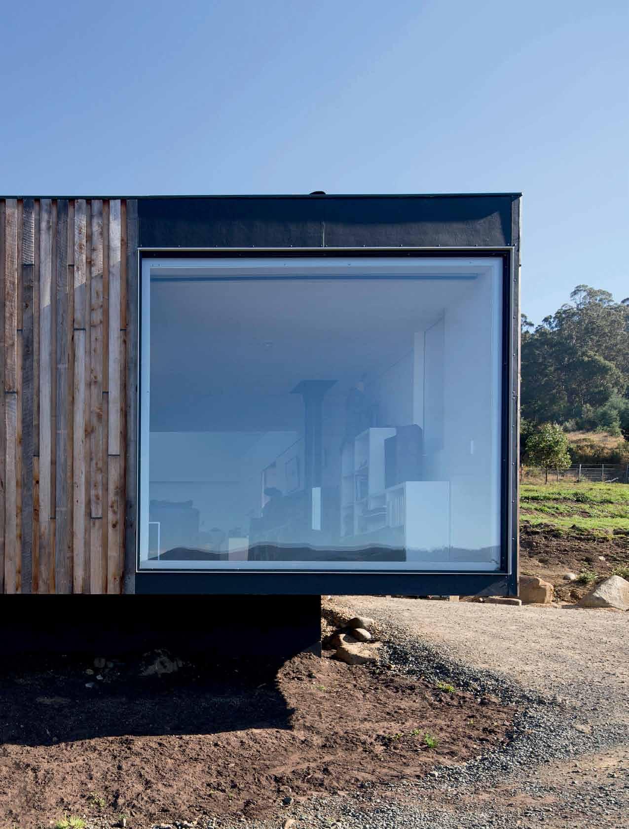
The rear roof lifts up to the south, letting in gentle light, and supporting northfacing solar panels.
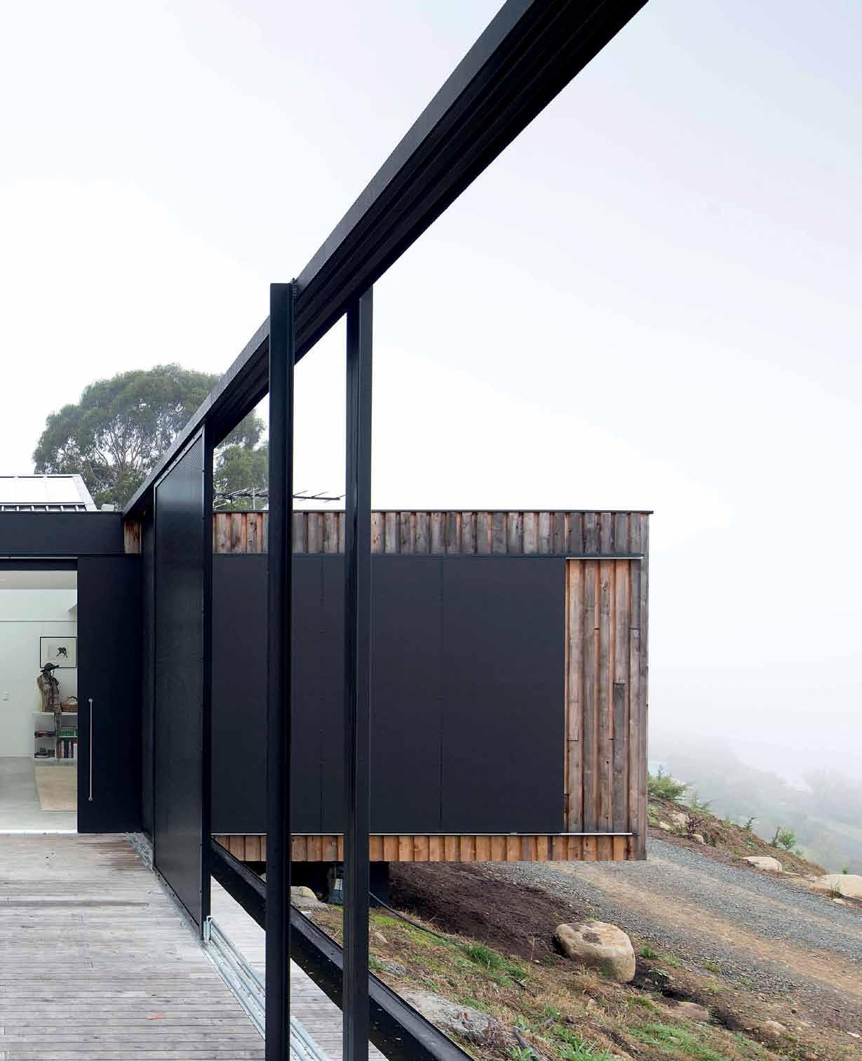
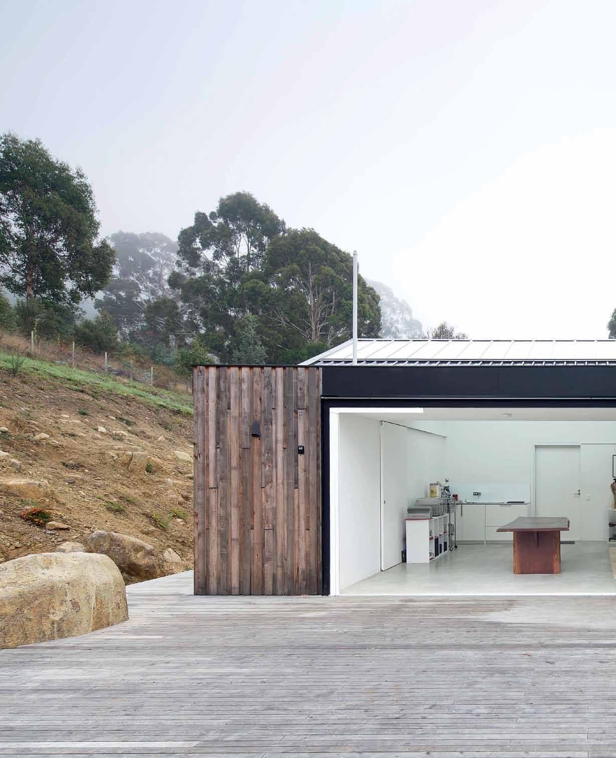


archiTecT Room 11 Architects
lead archiTecT Thomas Bailey
projecT Team Nathan Crump
builder Rory and Joel Wright, South Coast Builders
glazier South Coast Builders, Greg Sheedy Tasman Windows
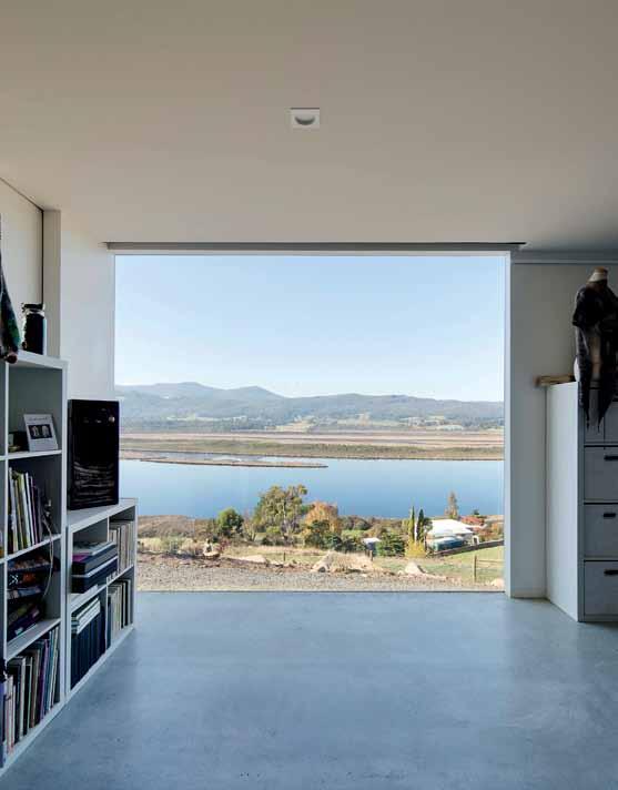
Room 11
(61 3) 6224 8642 room11.com.au
furniTure
By client.
finishes
Plasterboard sheet in Dulux (White on White). Burnished concrete flooring with Tas Paint Paving sealer. Celery top pine decking and cladding.
lighTing
Recessed LED fittings. Skylights are custom designed by Room 11 Architects in double-glazed frosted IGU
fixed & fiTTed
Specification and installation of fireplace by client. Large sliding door custom designed by Room 11 Architects. Door handles are Madinoz MDZ L40R with matching escutcheon with mortise locks. Kitchen and bathroom fittings are Nickles suite. Joinery is custom designed by Room 11 Architects.
Bailey comments. “That is about their passion for entertaining [the deck will eventually be the spatial link between studio and home] and their wanting to feel a part of the landscape.” Another critical element of the deck, one that adds to its poetry, is its screening. It is made up of sliding panels of perforated black aluminium that sit within the steel portal on the deck’s edge. “They are a nice theatrical element that abstract the view. If you pull a mesh across a view, you lose your ability to perceive the depth,” Bailey explains. “Also, they wanted to manipulate their appreciation of the view, to view it anew.”
When she is working, Linda plans to leave the door and screens open, in order to connect her with the land. At least, that is the plan for the summer. The couple have just spent their first winter here and so far it has been all they had planned, and more. With the double-glazed window at the front and gentle southern light, they were happy to bunker down. The whole winter they were “very, very comfortable”. The studio, too, has provided ideas for fine-tuning the house, and, as Linda says, “This is just the beginning of a bigger story.” The conversation continues.




A design professional from Singapore, his Australian wife and their children look for sanctuary in a home in brisbane, where three generations will reside. Architect, vokes and peters, were called in to make it work.
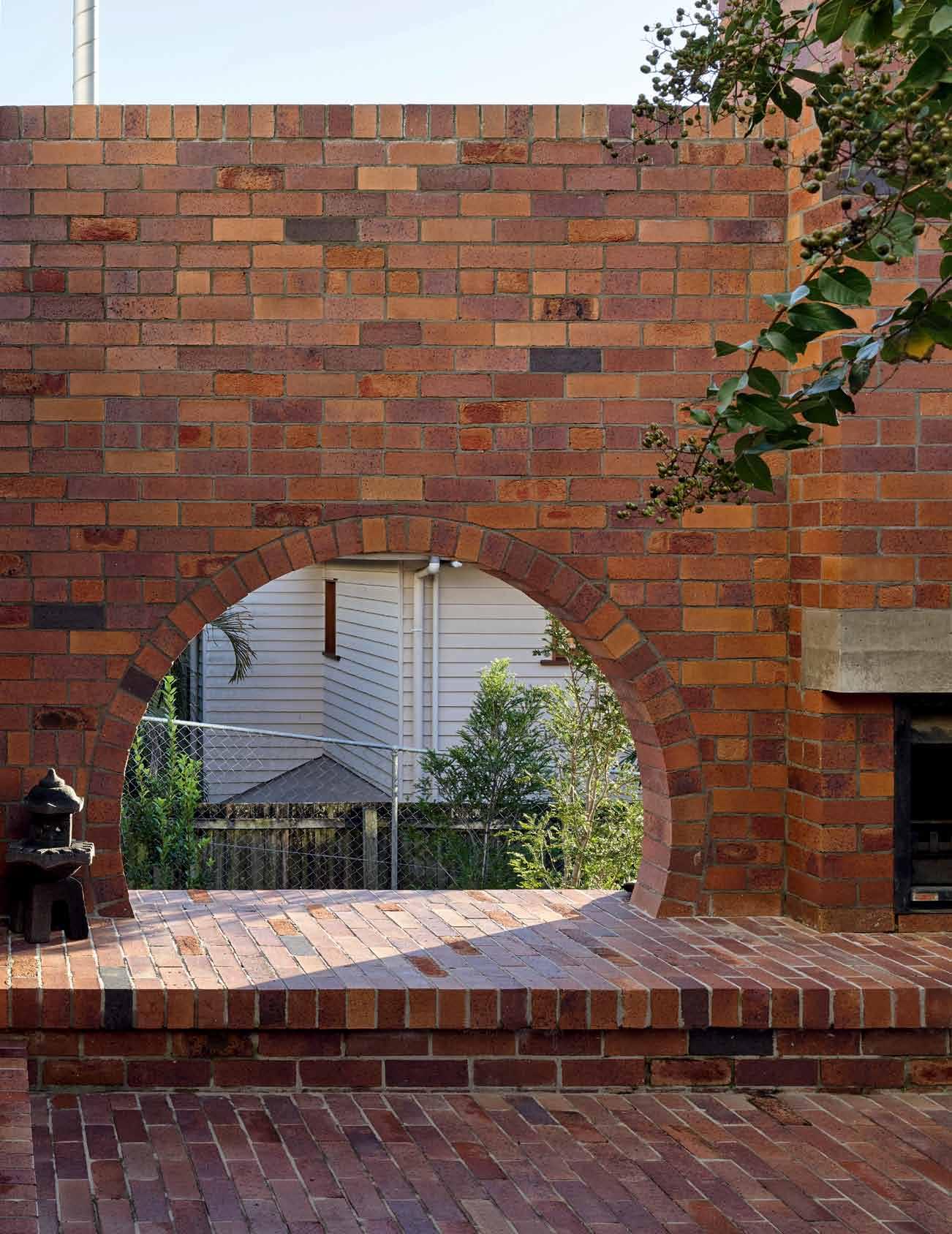
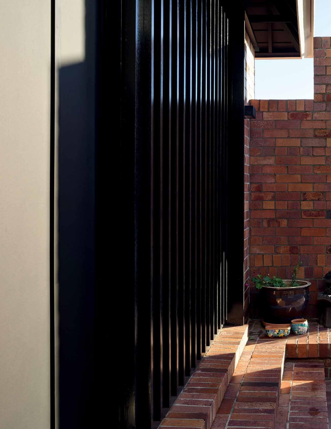 Tex T Michelle Bailey | PhoTogra Phy chrisToPher Frederick Jones


Retreat ing from bustling lives in Singapore brings Ken Yuktasevi (Director, Ong & Ong, Singapore), wife Jade and children Oliver, four and Jessica, two to a quiet pocket of Brisbane, Australia. Their ‘family sanctuary’ here is a handsome cottage on the northern face of Bulimba Ridge, overlooking the Hamilton reach of the Brisbane River. It’s a place which connects Jade to her Australian roots and unites three generations of her family in a peaceful garden setting.
Ken and Jade acquired the property from the family who built it more than 60 years ago. The house was testament to a lifetime of loyal service, characterised by worn timber weatherboards, a hipped tin roof and a suite of flamboyant plaster ceilings. The garden was a simple, manicured lawn with a steep fall from top to bottom. As a design professional himself, Ken’s vision for the property was clear: “to build something beautiful, sustainable, respectful and giving to its surroundings, and hopefully set the tone for the Bulimba neighbourhood”.
The commissioning of architects, Vokes and Peters, transpired as Ken and Jade came to recognise the value and authenticity of their work.
“We knew that we wanted to contribute to Brisbane’s story by being respectful to the local vernacular and culture,” Ken says. “Vokes and Peters are clear about what is important to them as architects, to simply create the most humane living spaces they can.”
Architect Stuart Vokes approached the project with considered ‘diagnosis’ and trademark sensitivity for the nuances of family life. Early discussion focused on how best to reoccupy the existing house and what opportunities new work would offer in connecting building with nature. These were typical dilemmas in architecture, but added to this was the requirement for a multigenerational home (a type less common in Australia than Singapore), which further enriched the design process and outcome.
“The story of the house is that it’s designed to accommodate everyone at different stages of their lives, crossing continents and cultures,” Vokes says. Since Jade’s Australian mother, Mia and brother, Thomas reside there permanently, two family units combine when Ken, Jade and children are in residence.
A desire to ‘cluster’ bedrooms resulted in the neat conversion of the original house to a four-
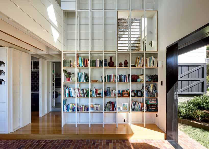
bedroom dormitory, with Ken and Jade’s room occupying the north-east corner and Mia’s the north-west. Protecting the cottage (intricate plaster ceilings included) was indisputable for all parties for reasons pertaining to sustainable practice and a shared appreciation for vernacular housing and character streetscape.
Supporting the renovated ‘sleeping house’ is the new addition known as the ‘garden/ verandah house’ where “the social aspect of family life can flourish”. This building is a two-storey, gabled structure, oriented east-west and connected by its upper floor to the back of the original cottage. Clear ambitions for living with nature translated to introducing rooms at ground level, so that indoor territory could open directly to the outdoors. The architect was steadfast in this approach, rejecting the temptation many would have to saturate the program higher off the ground to take in more view.
“The biggest architectural move is arranging the masonry walls. This is key to the whole architectural diagram,” Vokes says. “They arrange indoor and outdoor space and private space; they also idealise the setting.”
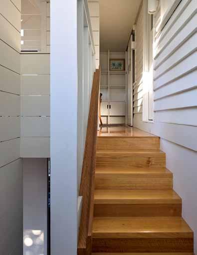


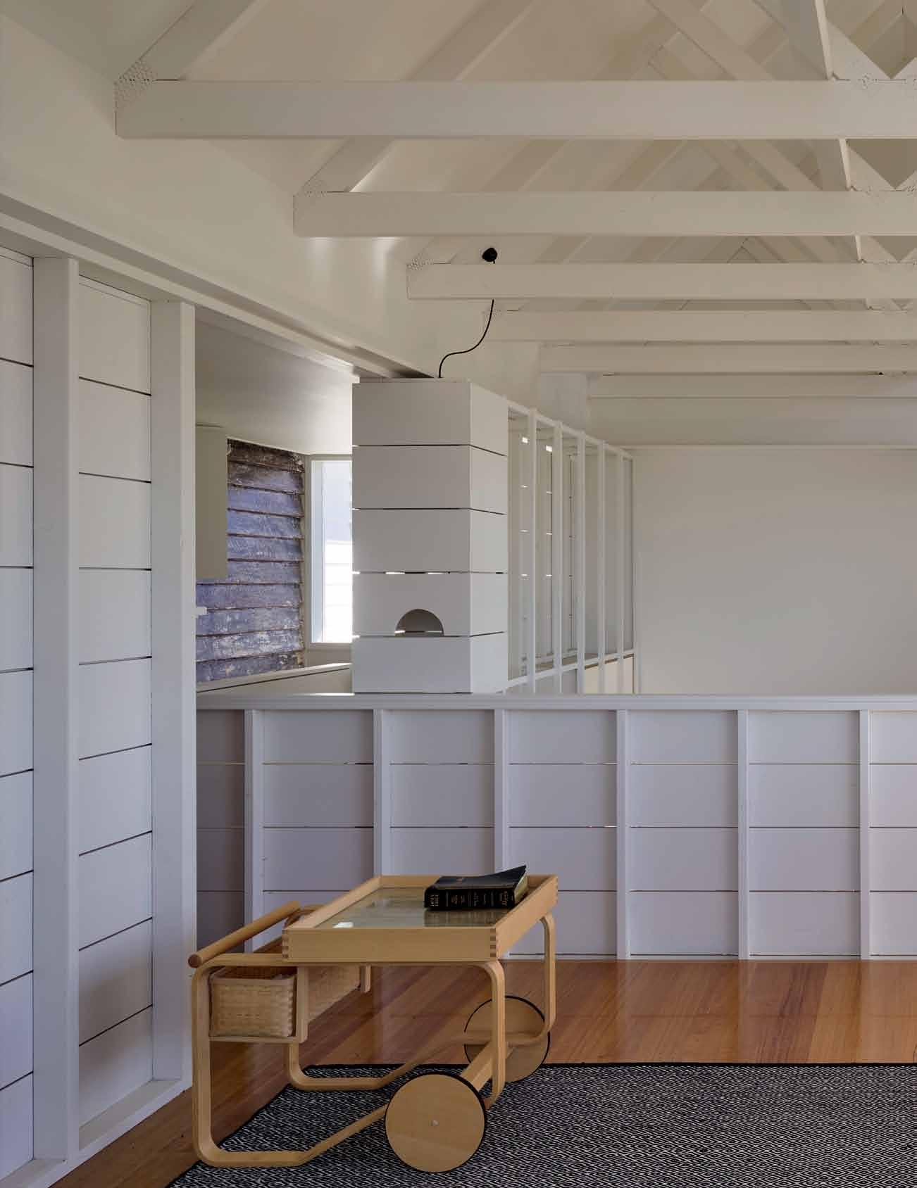


The meditative mood of the space is enhanced by integrated light boxes...
GRASS COURTYARD
DAYTIME ROOM
BRICK COURTYARD
KITCHEN
LAUNDRY & LARDER
BATHROOM
BEDROOM
VOID
NIGHTTIME ROOM
STUDIO
ENTRY VESTIBULE
STREET GARDEN
CARPORT
Ground floor masonry walls form both the façade to the addition and the enclosure of garden courtyards flanking the east and west of the house. The wall defines family life on one side, and a cultivated “wilderness” on the other. Articulations made along its length edit views out and balance light and shade within.
The moon gate arch in the eastern courtyard is designed to deliver low winter sun to the brick plinth and floor as well as focus gaze towards the ground. The tall, narrow opening beside the brick chimney casts long views east and captures the morning sun. In the western courtyard, a narrow threshold frames a brick staircase connecting the lower garden terrace. These opposing courtyards – east and west –are designed for contrast: a brick floor versus green lawn; and a ceremonial fireplace versus informal garden, supporting few or many in programmed or impromptu activity.
The double courtyards are the lungs to the home’s heart; the brick-floored interior of the combined kitchen, dining and living room. The day-to-day goings on of the house take
place here, grounded by earth and bound by garden. An architectural language of exposed timber framing strengthens the sensation of being ‘under the house’ and speaks of the informal nature of this space, designed as a flexible hall supported by fixed seating along its length. The lounge area coincides with a bay window, supporting a moment of refuge that is counterpoint to the verticality of the double height space around it.
Just as the morning sun invites the family to descend to the garden, the setting sun gathers them back upstairs to the comfort of the verandah room. This sitting room (conceived as an enclosed verandah) is complementary to other living spaces, making a formal setting for social gatherings or prayer. The meditative mood of the space is enhanced by integrated light boxes and generous raked ceilings exposing timber roof trusses. Evening views from here to Hamilton Hill and around to the Gateway Bridge are a glittering panorama.
The centrepiece of the verandah room is the tremendous northern aperture which
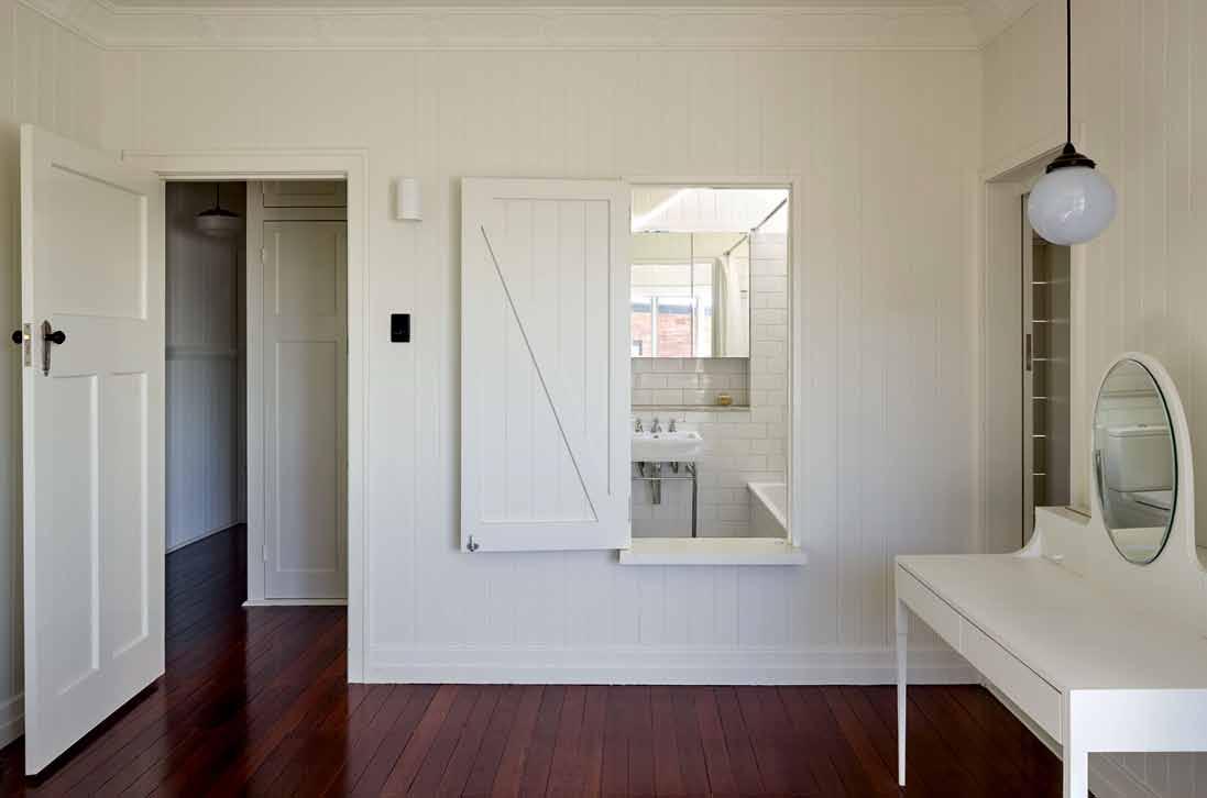
drop box
a rchitects Vokes and Peters (with Owen and Vokes and Peters)
vo K es and peters team
Stuart Vokes, Aaron Peters, Nicholas Skepper, Michael Lineburg
structural engineer
Greg Killen
hY draulic engineer
Greg Hamilton
l andscape Owen Thompson
Builder John Wales
Vokes and Peters (61 7) 3846 2044 vokesandpeters.com
finishes
Blackbutt decking with Feast Watson Smokey Ash stain. Off-white concrete.
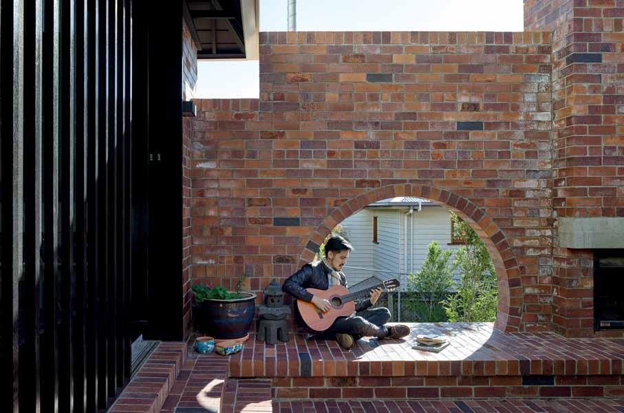
Extruded and dry-pressed bricks from PGH to brickwork floors and stairs.
Weatherboard cladding finished in Dulux Whisper White and Black. External walls in painted FC cladding, brickwork and blockwork. Lysaght Custom Orb metal roof sheeting. Internal walls are existing
timber and painted plasterboard, Radiate Pine timber lining, Ceramica Vogue glazed ceramic wall tiles in TR Chiaccio and Bisello TR Nero.
Floors are timber (existing + new Tasmanian Oak to floor and staircase), polished concrete and brickwork, Calacatta marble tiles from Project Stone Australia and Winckelmans Rose vitrified floor tile. Mokum Fabrics upholstered cushion to timber seat.
lighting Pendant lights made with Clipsal lamp and lamp holder, modular Nude wall mounted and ceiling mounted lamps.
fixed & fitted Jetmaster Universal Firebox. Joinery in marble from Project Stone Australia, stainless steel, Boral plywood sheeting. Hettich Innotech waste bin to kitchen. Abe Stratus sink, Duravit Vero washbasin, Kaldewei Ambiente bath, Duravit Starck toilet suite, Abey The Hunter laundry tub. Tapware by Perrin & Rowe, sanitaryware from Madinoz, Barben and Rogerseller. Ceiling fan from Hunter Pacific Concept. Smeg cooktop and chimney, Miele dishwasher and washing machine and Fisher & Paykel fridge.
modulates air, light and outlook by means of a sliding mesh screen and moveable bank of openable shutters. The window system epitomises the care with which the exterior is tuned for the enjoyment of Brisbane’s riparian context and subtropical climate. Floor level hopper windows positioned to coincide with the ‘skirt’ of the façade facilitate glimpses to the garden below in the most delightful and unexpected of ways.
Speaking of his son and daughter at play, barefoot in the courtyard gardens, Ken muses, “I can see them come alive in a different way when they are experiencing life in those areas… For a family, if living is about creating the most beautiful memories for you and your children to carry you through life, then the spaces you design have to have this vision in mind. These spaces will impact your children for the rest of their lives.” With this place as setting; nature imbued and spatial and material quality virtuous, memories made here will be rich and bountiful.
The diverse show brings exhibitors and visitors from around the world, to showcase decoration, design, furniture, accessories and textiles to name a few. This year in particular celebrates Maison & Objet’s 20 th year anniversary in Paris, and to celebrate it has re-invented itself through reorganising its traditional layout. This layout allows visitors to keep up with the latest trends through three different sections.
The first section Maison, showcases furniture; the second Objet, features smart gadgets, kitchen utensils, fragrances and fashion accessories; and the third section is Luxury, Design and Interior Architecture, which explores creativity, innovations and technical solutions.
Although, there were plenty of unique ideas showcased, the Floating Flower Garden space by teamLab was a particular highlight, allowing visitors to be fully immersed in the installation. Over 2,300 suspended flowers were anchored overhead, which floated in a vivid white bubble.
Another stand out for the show was the innovative exhibition Precious by Elizabeth Leriche, which showcased and revisited the codes of luxury. Leriche, explored this through a pop-up bookstore and conference space that engaged the viewer to deepen their knowledge by pondering on the question of the ultimate luxury, ‘what is truly valuable’?
The overall Maison & Objet event is not only an inspirational source for market trends, but a vital teaching ground for inspiring interior students. The Dawson School of Design has collaborated with Maison & Objet to offer students the opportunity to partake in this unique event through an international study trip. “I believe the students will gain a deeper understanding about the industry, and they will leave with an international perspective on design,” says Dawson School of Design founder, James Dawson. Enrol before the 30 November 2015 and receive free accommodation, flights and badges to the Maison & Objet event 2016.*
We ’ve been having a LOT of Design Hunter® conversations lately (and a lot of fun having them!). First up – Sydney Indesign where our Habitus lounge hosted guests for six intimate meals in partnership with V-ZUG and Cosentino, with interiors by James Dawson.
Then we took to the showrooms, bringing some of the creative community ’s biggest names to talk about the issues affecting the way we live.
From icons, to the intersection of creativity and the future of the home, a dialogue was started that we hope continues on through the year.
We were also pleased to partner for the first time with Sydney Contemporary 15, Australasia’s international art fair for the industry and art-loving members of the public. We hosted two panel discussions at Carriageworks amongst some of the best contemporary art around – very inspiring!

Finally, we launched our last issue, Habitus #29 with a fun-filled event at Hub Furniture in Sydney. Guests enjoyed refreshments and design conversations with the Habitus team before taking a copy of the issue home.
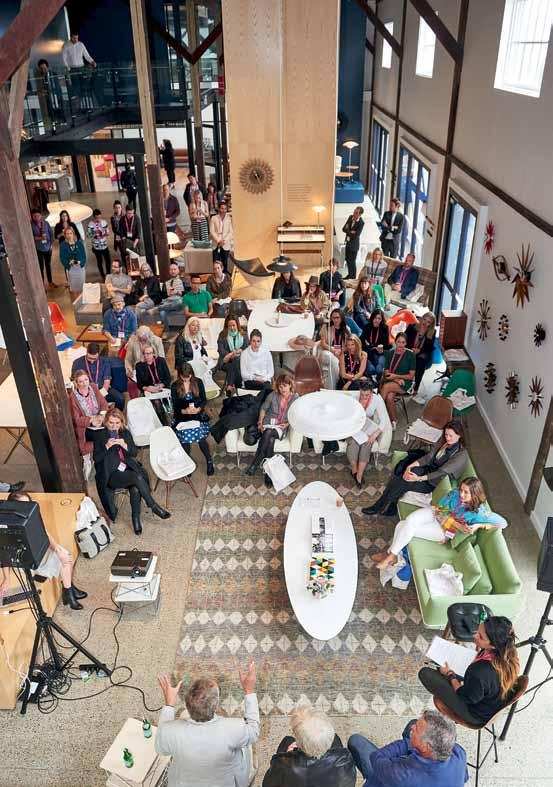
Sydney Indesign sydneyindesign.com.au
Sydney Contemporary sydneycontemporary.com.au
photography by fiona susanto anD angie boustreDThe T eam aT Habitus magazine T hank our adverT isers for T heir supporT use T he direcTory To see whaT page a specific adverT isemen T is on, and visiT T heir websiT e To learn abou T The producTs and services They provide.

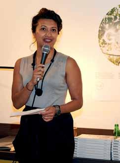
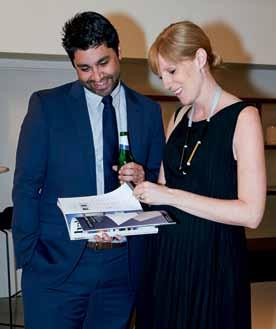

Habitus magazine is available at newsagents and bookstores across Australasia, South-East Asia, the USA, Canada, Europe, South America and the Middle East. Habitus is published quarterly in March, June, September and December. To subscribe securely online visit habitusliving.com/magazine or email subscriptions@indesign.com.au to subscribe or request a full list of locations where Habitus magazine is available.
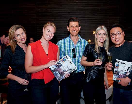
Your map to where the stories in this issue come from where is available
Brisbane #178
Port Philip Bay #146

Auckland #128

“A building has at least two lives – the one imagined by its maker, and the life it lives afterwords...”
rem koolhaas


