The Working Capitol Robinson Road Singapore, HASSELL
INDESIGNLIVE.COM
professional
for the
A
resource
design curious.
Bendigo Hospital, Bates Smart & Silver Thomas Hanley
Jackalope Hotel Mornington Peninsula, Carr
William Smart, Smart Design Studio
Nik Karalis, Woods Bagot
TVNZ Auckland, Warren and Mahoney
Issue #71 / Australia $16.50 / New Zealand $17.50 / Singapore $12.95 / U.S. $21.99 71 9 77144387000 0
The ‘design pharmacy’ issue.
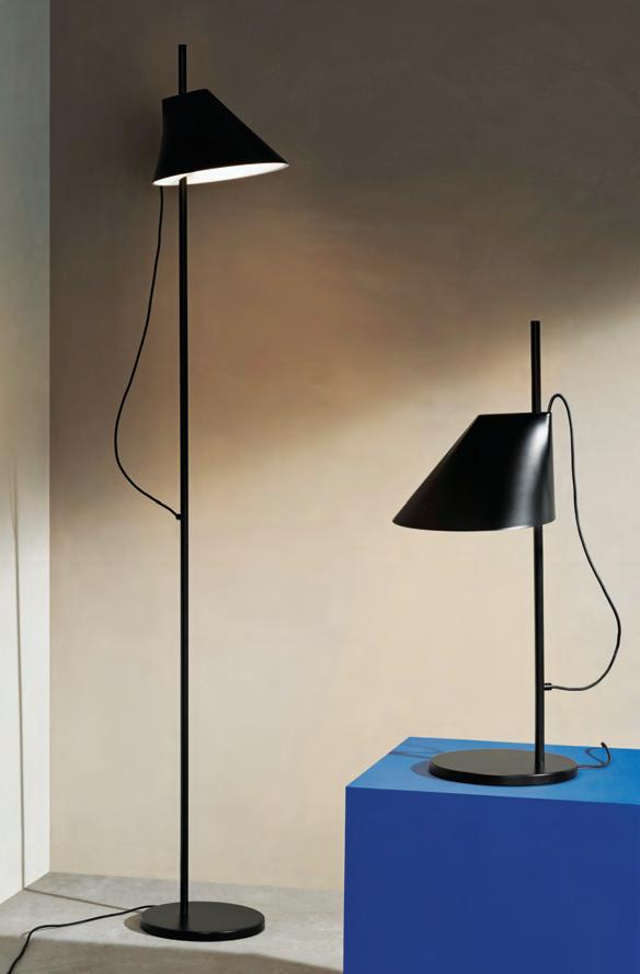
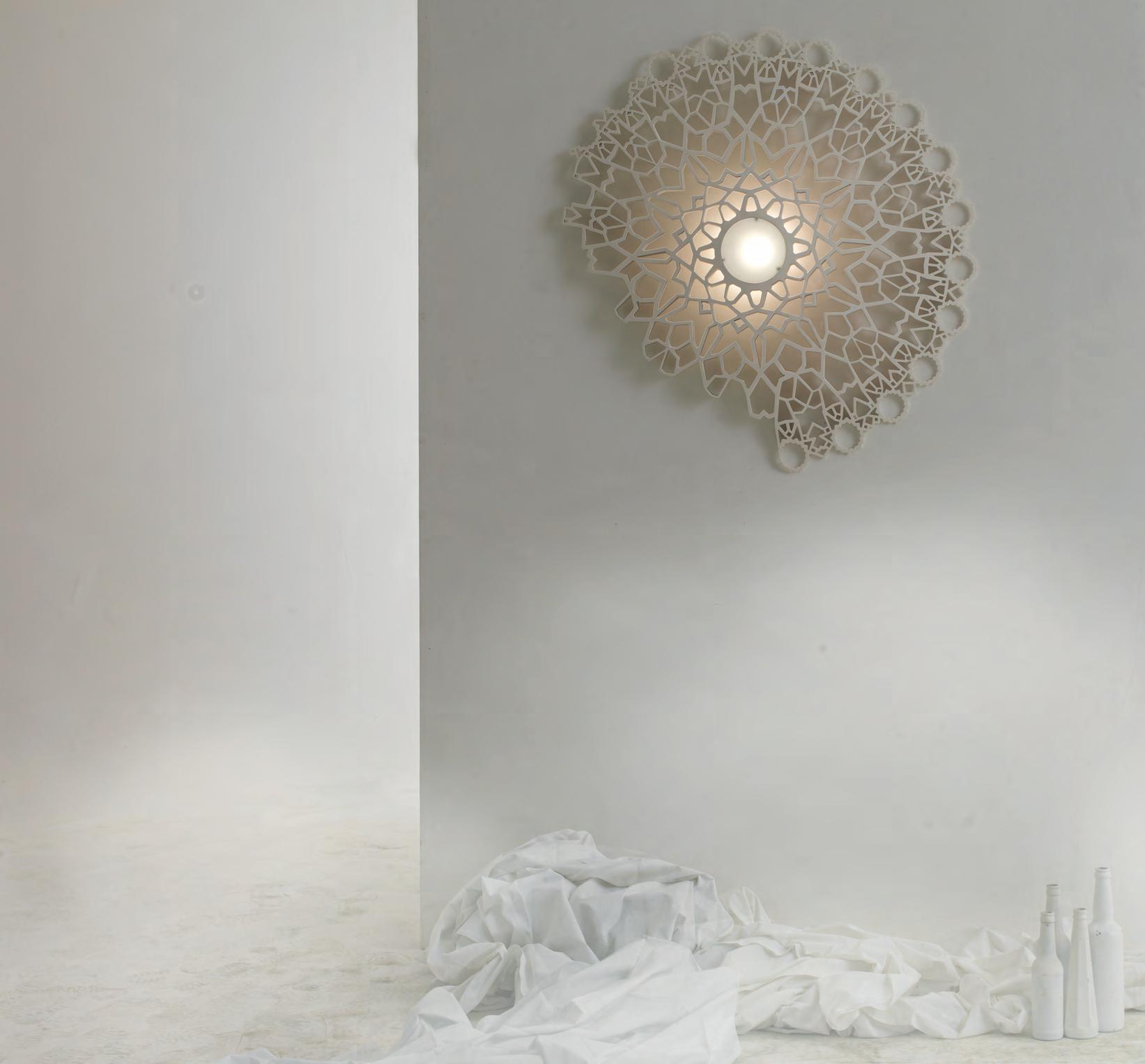
UNIVERSAL LIGHT

We believe in light as an extension of every surface, every structure. Enriching everyday experiences through light.


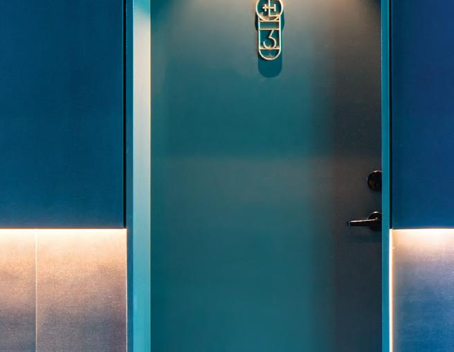
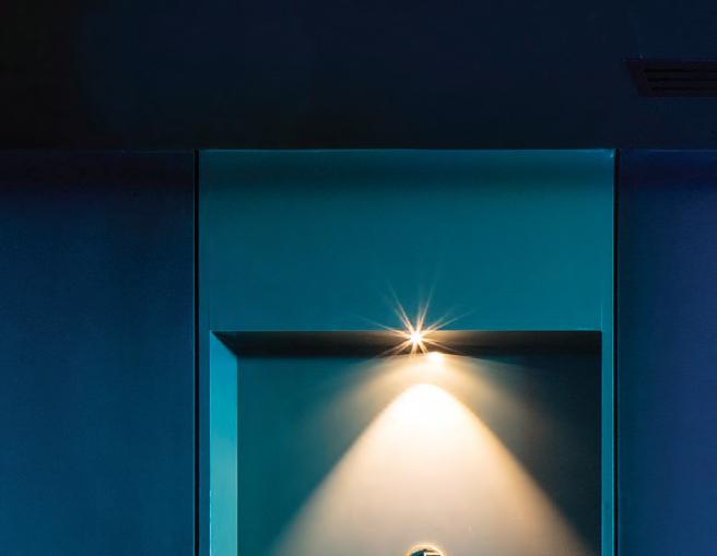
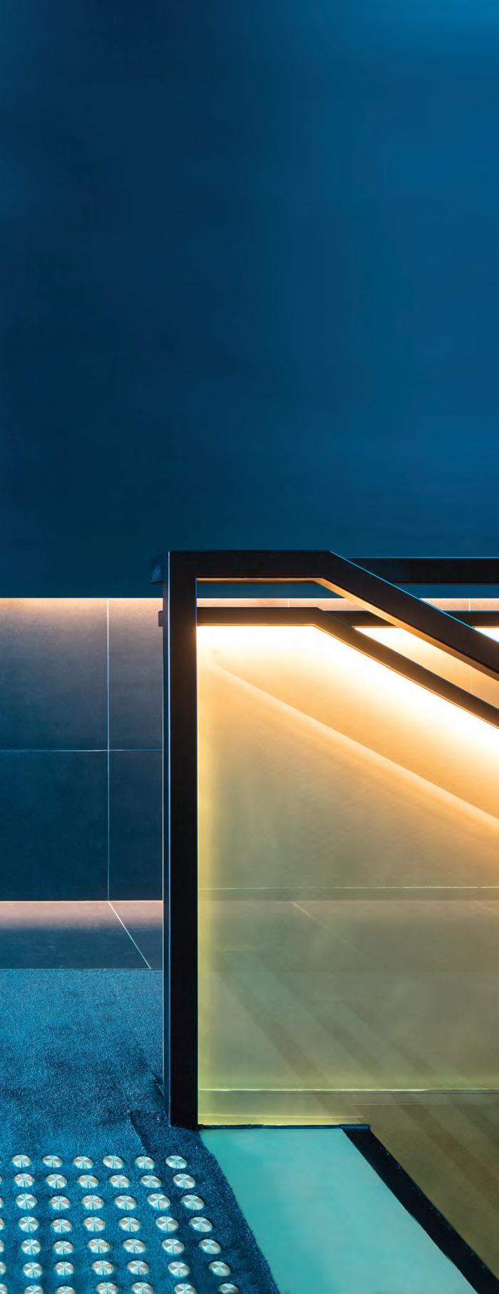
Awarded Australia’s Best Hotel in 2017, Jackalope encapsulates our lighting ethos. – one light, infinite applications. The one luminaire design accentuates every architectural detail from the individual suites to the exterior facades. We call it universal light.
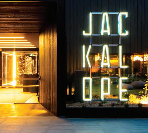 Designed by Carr Design Group / Lighing supplied by Lights & Tracks


ADD
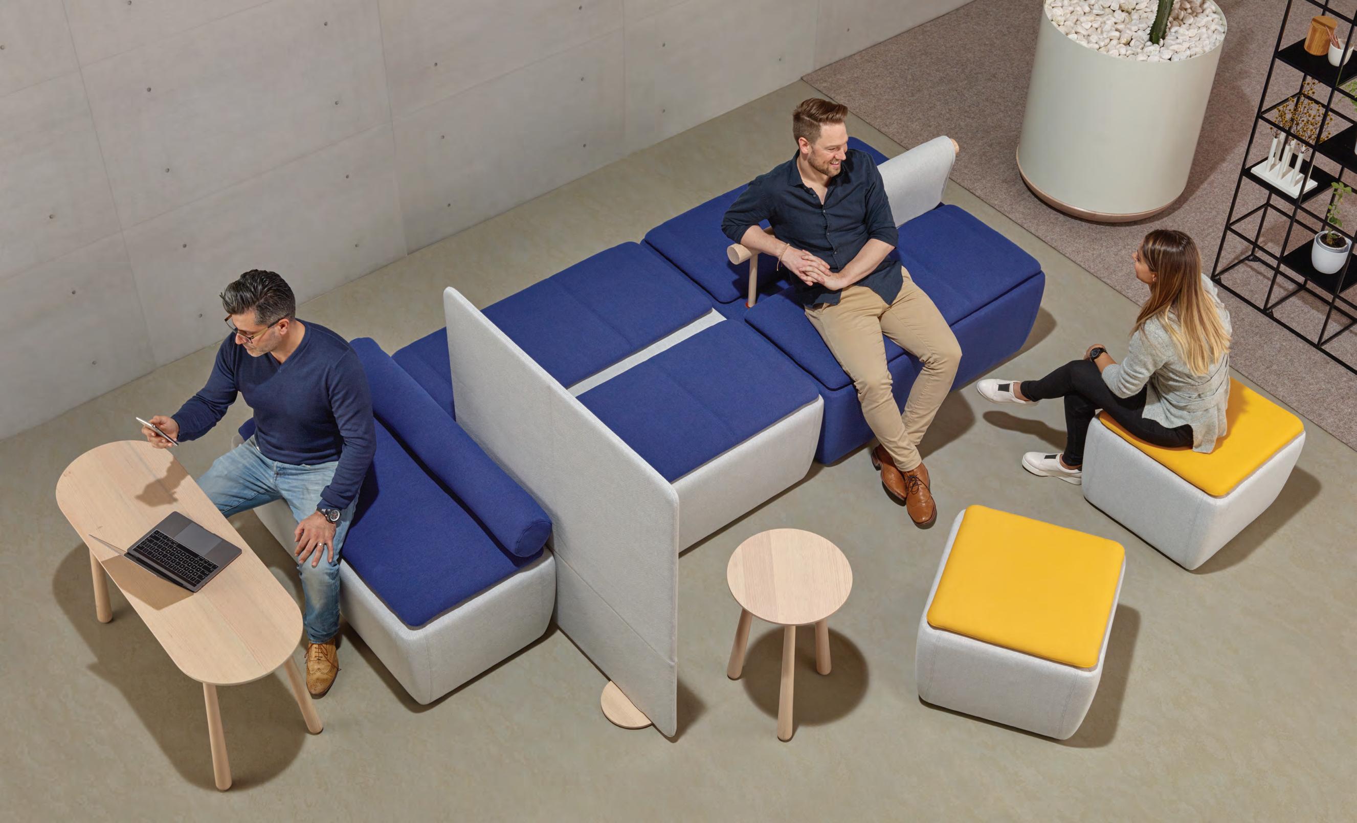
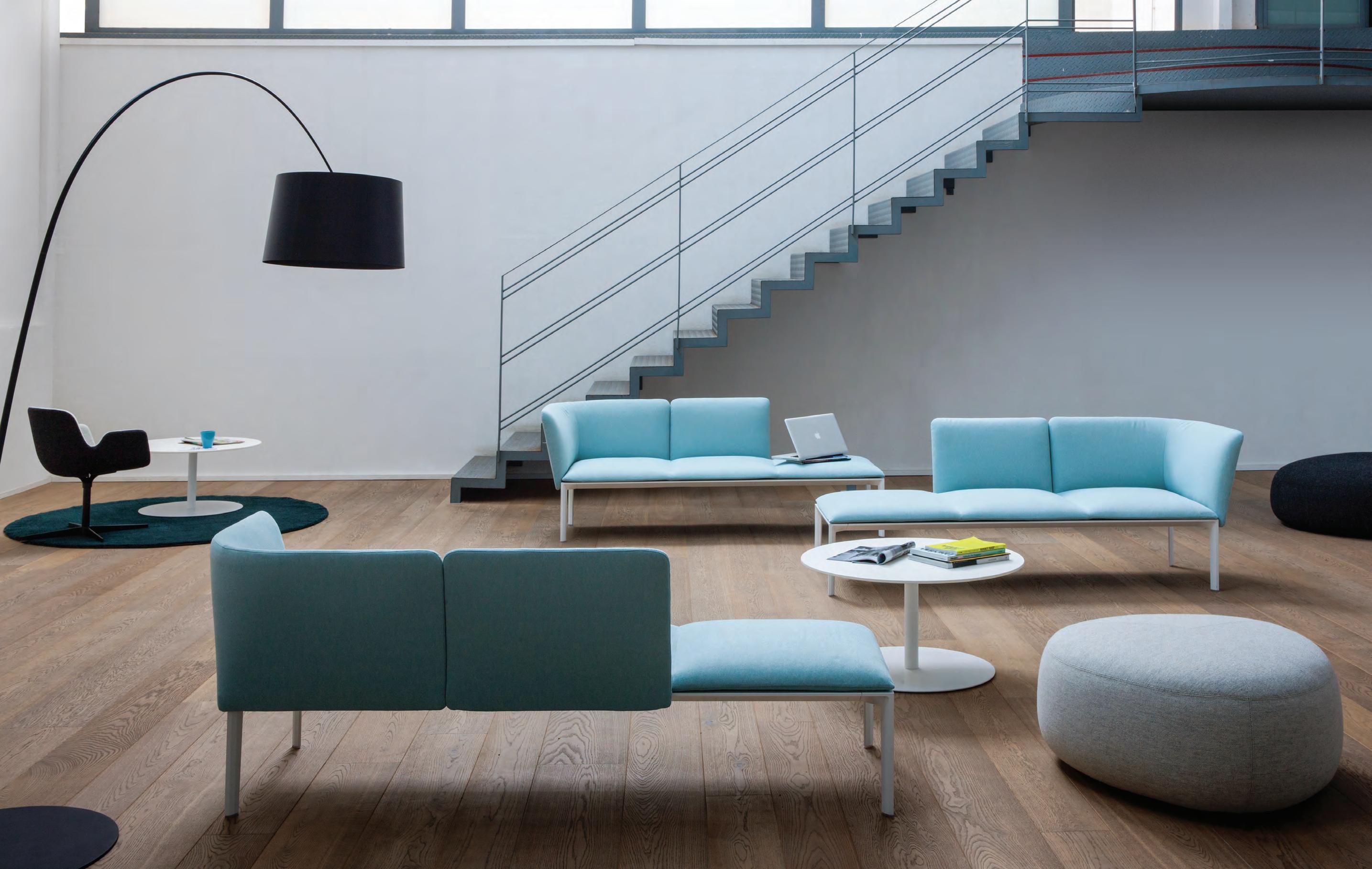
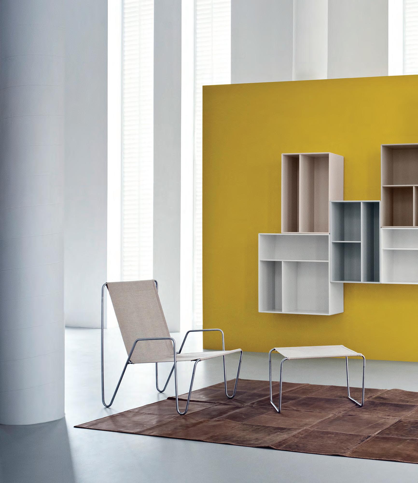
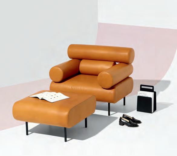
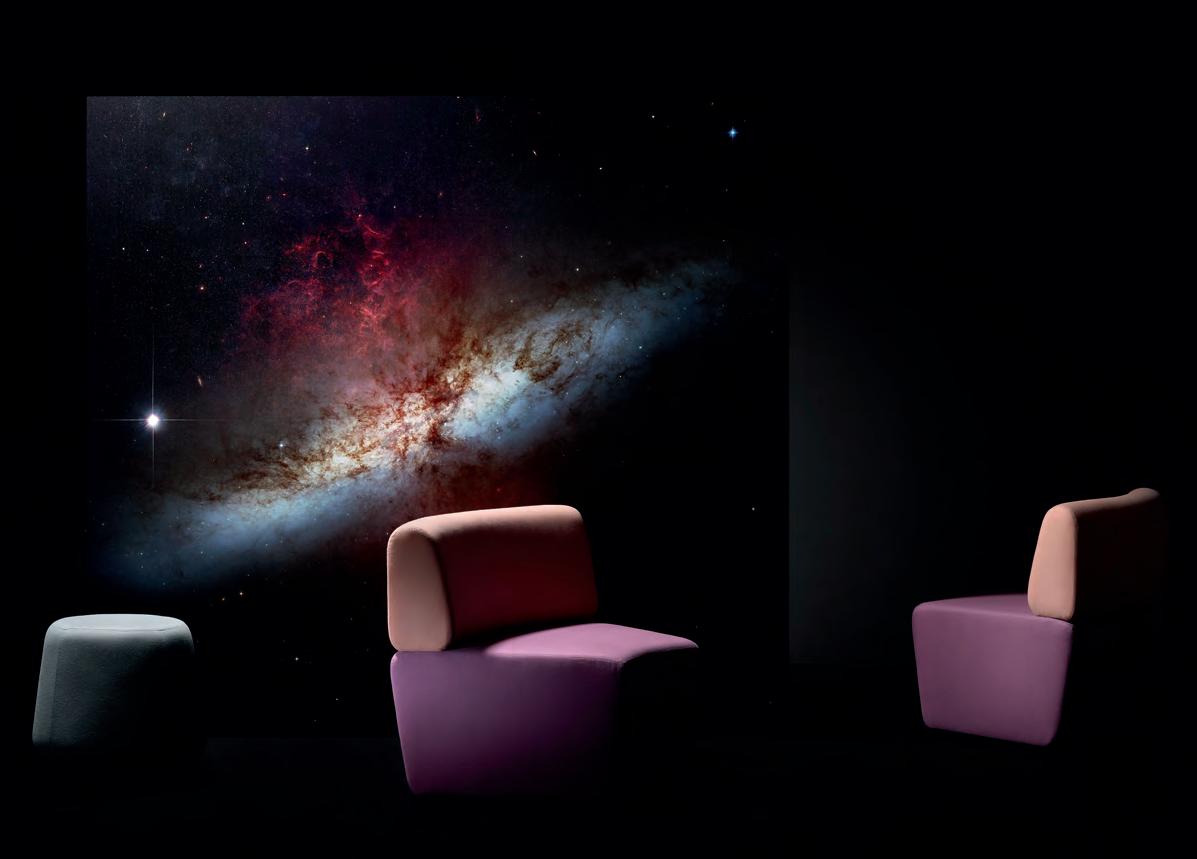
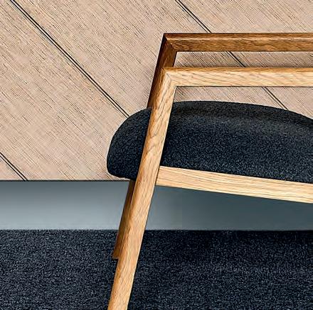
Also pictured is Brio tables, Pass chair and Kipu ottomans.
The perfect synthesis of the modular system
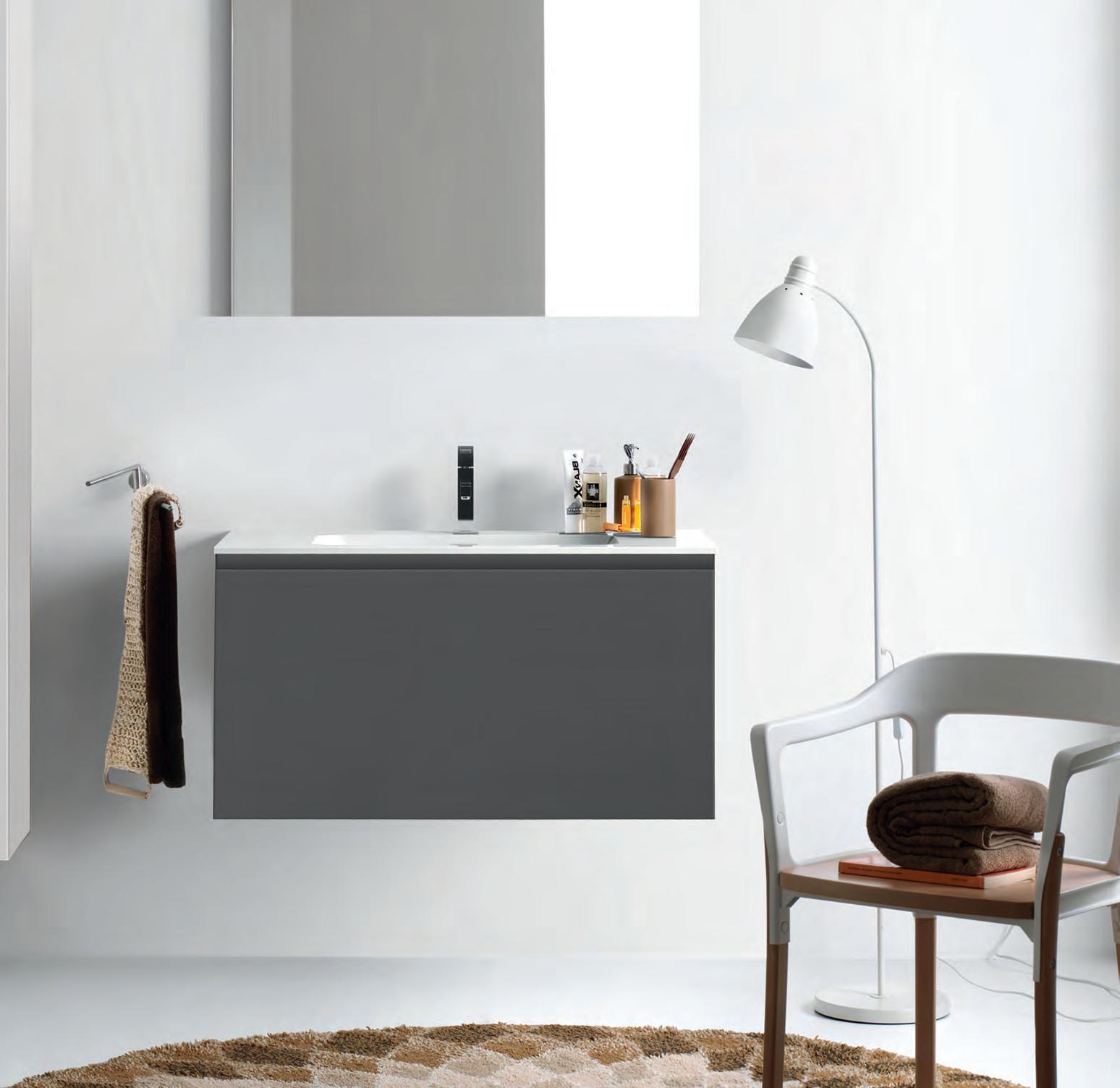
Sabha Collaborative Seating™ Collaborate,
Naturally
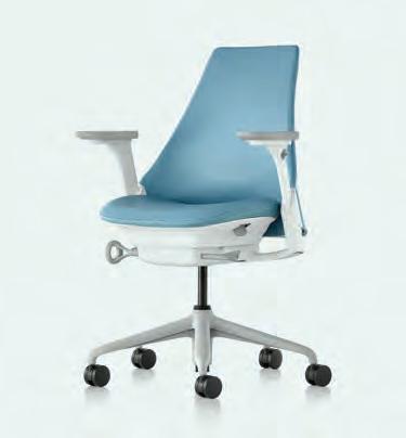
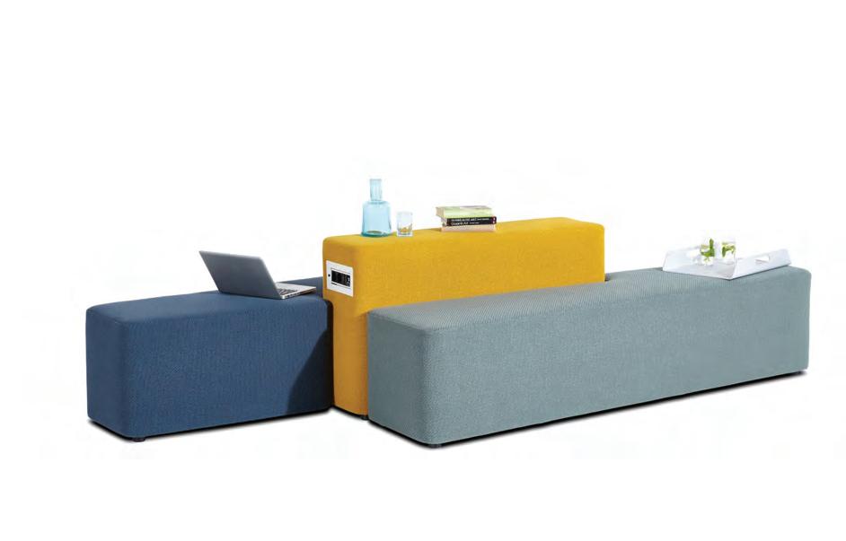
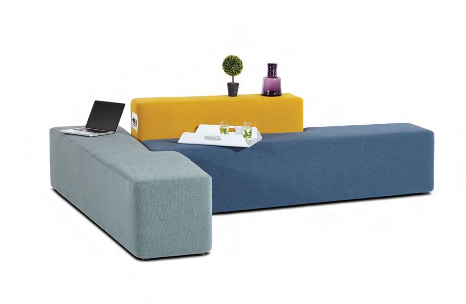
Introducing Sabha Collaborative Seating by Herman Miller Asia Pacific.
The more people connect, the better they work. Sabha is the ultimate soft-seating system that enables natural collaboration.
Its modular design is lightweight, low and open. It can be configured in myriad ways with a variety of seat options, built-in surfaces, power and lighting and functional occasional items that come together to create the ideal counterbalance to personal workstations.
Sabha — supporting collaboration, naturally.
hermanmiller.com.au | hermanmiller.com/asia Foll0w us on | HermanMillerAsiaPacific


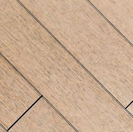
FOR LOVERS OF FINE OAK
level
Robertson Street
Valley, QLD 4006
| +617 3216 1551
Danks St
NSW 2017
| +612 9699 1131
Church Street
VIC 3121
| +613 9427 7000
Mezzanine
171
Fortitude
P
1f
Waterloo,
P
575
Richmond,
P
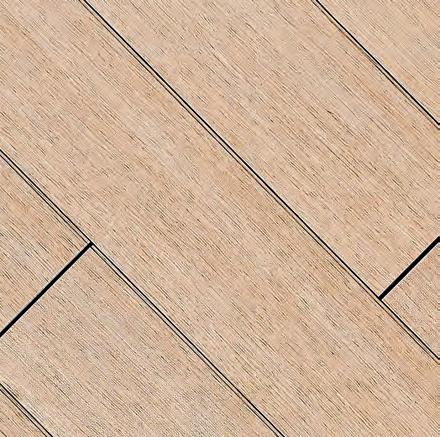
Graupa Colour
The most natural of all the finishes, Graupa’s cool tones and soft cream undertones will set the ambiance in any home.
Tongue n Groove™ floorboards are designed with three solid layers of fine European Oak for a premium level of finish, longevity and structural integrity.
tngflooring.com.au
SYDNEY 5/50 Stanley Street Darlinghurst +61 2 9358 1155 MELBOURNE 11 Stanley Street Collingwood +61 3 9416 4822 MEMBERS OF
Shaw Contract’s latest collection A Walk in the Garden is inspired by the harmony of man-made surfaces in nature. Cradle to Cradle visionary William McDonough has captured moments from a garden in China, that inspired the way we make products to this day.
Chairman/Publisher
Raj Nandan raj@indesign.com.au
Managing Director

Kavita Lala kavita@indesign.com.au
Co-Editors
Sophia Watson sophia@indesign.com.au
Alice Blackwood alice@indesign.com.au
Editorial Assistant Andrew McDonald andrew@indesign.com.au
Brand Directors
Dana Ciaccia dana@indesign.com.au
Colleen Black colleen@indesign.com.au
Sales Support & Reporting
Genevieve Muratore genevieve@indesign.com.au
Group Operations O cer Sheree Bryant sheree@indesign.com.au
Production Manager
Natasha Jara natasha@indesign.com.au
Accounts
Ting Zhang ting@indesign.com.au
Cassie Zeng cassie@indesign.com.au
Senior Designer Michelle Byrnes michelle@indesign.com.au
Designers
Camille Malloch camille@indesign.com.au
Tracey Hein tracey@indesign.com.au
Online Manager Radu Enache radu@indesign.com.au
Web Developer Ryan Sumners ryan@indesign.com.au
Events
Tegan Schwarz teagn@indesign.com.au
Julie Seong julie@indesign.com.au
Indesign Correspondents
Stephen Cra i (Melbourne) Andrea Stevens (New Zealand) Mandi Keighran (London)
Contributing Writers
Andrea Stevens, Annie Reid, Asih Jenie, Ben Morgan, David Congram, Holly Cunneen, Leanne Amodeo, Mandi Keighran, Paul McGillick, Rebecca Gross
Contributing Photographers Alina Gozin’a, Charles Dennington, Christine Francis, Earl Carter, EK Yap, John Gollings, Owen Ragget, Patrick Reynolds, Peter Benne s, Peter Clarke, Rachael Dere, Rebecca Rowlands, Richard Boll, Robert Firth, Shannon McGrath, Sharyn Cairns, Steve Ryan, Tyrone Branigan
Head O ce Level 1, 50 Marshall Street Surry Hills NSW 2010 (61 2) 9368 0150, (61 2) 9368 0289 (fax) indesignlive.com
Melbourne 1/200 Smith St, Collingwood VIC 3066
Singapore 4 Leng Kee Road, #06–08,SIS Building, Singapore 159088 (65) 6475 5228, (65) 6475 5238 (fax) indesignlive.sg
Hong Kong Unit 12, 21st Floor Wayson Commercial Building, 28 Connaught Road West, Sheung Wan, Hong Kong indesignlive.hk

Join the global design collective, become an Indesign subscriber!
To Subscribe (61 2) 9368 0150 subscriptions@indesign.com.au indesignlive.com/subscribe
Yearly subscription: Australia $55 (incl. GST) International AUD $110
Printed in Singapore
Indesign is printed with ENVIRO Soy-Based Process Black ink, UV Solventless Varnish and on paper which is awarded an Environmental Management Certificate to the level ISO14001:2004 GBT24001-2004 and Eskaboard and Eskapuzzle produced from 100 per cent recycled fibres (post consumer).
CAREERSINDESIGN

1800 556 302 | www.shawcontract.com.au
Shaw_half page.indd 1 5/23/17 11:27 AM
All rights reserved. No part of this publication may be reproduced, stored in a retrieval system, transmi ed in any form or by any other means, electronic, mechanical, photocopying, recording or otherwise. While every e ort has been made to ensure the accuracy of the information in this publication, the publishers assume no responsibility for errors or omissions or any consequences of reliance on this publication. The opinions expressed in this publication do not necessarily represent the views of the editor, the publisher or the publication. Contributions are submi ed at the sender’s risk, and Indesign Publishing cannot accept any loss or damage. Please retain duplicates of text and images. Indesign magazine is a wholly owned Australian publication, which is designed and published in Australia. Indesign is published quarterly and is available through subscription, at major newsagencies and bookshops throughout Australia, New Zealand, South East Asia and the United States of America. This issue of Indesign magazine may contain o ers or surveys which may require you to provide information about yourself. If you provide such information to us we may use the information to provide you with products or services you have. We may also provide this information to parties who provide the products or services on our behalf (such as fulfillment organisations). We do not sell your information to third parties under any circumstances, however these parties may retain the information we provide for future activities of their own, including direct marketing. We may retain your information and use it to inform you of other promotions and publications from time to time. If you would like to know what information Indesign Media Asia Pacific holds about you please contact Nilesh Nandan (61 2) 9368 0150, (61 2) 9368 0289 (fax), subscriptions@indesign.com.au, indesignlive.com Digital Print Events Strategic Partners MILANINDESIGN INDESIGNLIVE.COM 22 THE PEOPLE WHO GET INDESIGN DONE
ONLY ZIP TECHNOLOGY


TRANSFORMS WATER INTO A FORM YOU’LL INSTANTLY LOVE.


As world leaders in instant drinking water appliances, Zip invented the innovative HydroTap, the smart and essential addition for every kitchen. Our integrated Australian-made appliance combines patented PowerPulse™ boiling and Direct DryChilling with MicroPurity filtration technologies to create pure-tasting boiling, chilled and sparkling water you will love in an instant.


When water is this convenient and irresistible you’ll love drinking more of it. We call this the Zip Effect. To improve your hydration and your family’s well-being, discover more at zipwater.com

On The Cover
Kaleidoscopic
In the political playground that is commercial design, the health and aged-care sector has been too-often dismissed for its lack of creativity, imagination and resistance to change. Seen as the quiet, studious kid in a classroom of colourful extroverts, the sector has come under criticism for always towing the line, where its counterparts of workplace, hospitality and education revel in stepping over it.
In this issue of Indesign, the design pharmacy issue, we reject the idea that health and aged-care is all medicalonly thinking and look at its blossoming relationship with evidence-based design and, most importantly, pure creativity. In so doing we unearth the people, projects and revolutionary ideas that are re-writing the future of health and aged-care. From aging to ageless, the Australian design sector is repositioning the aged-care industry to better cater to the 70-going-on-40 phenomenon. No longer defined as the baby-boomer, this increasingly agile generation is precipitating a tidal-wave of change in retirement facility design. The result? A burgeoning ‘wellness economy’ shaped by retail, hospitality, workplace – and even precinct – design thinking. Bringing a bold and revitalised perspective to health and aged-care design is sector expert and associate director at Billard Leece Partnerships, Tonya Hinde. Tonya rejects the idea that creativity takes a back seat to science and hard facts, revealing just how healthcare design has allowed her to produce the most imaginative and rebellious work of her career, page 163. Clashing design typologies in a new and radical way, we journey into the blended world of ‘health tourism’. It’s the luxury travel industry’s next big movement, taking the modern traveller on a transformative journey – en route to their dream destination. Here, we touch down in the ultimate ‘in-transit’ wellness facility where the modern health tourist can work, relax or play.
100,000+
indesignlive.com
/indesignlive @indesignlive
@indesignlive
This issue, we invite you to ‘get’ well – to really understand and consider what this newly defined ‘health economy’ means for us, and how we can look beyond the fluorescent lights and grey linoleum to discover the vast opportunities this sector can offer us. Enjoy the issue!
Indesign Co-Editors, Sophia Watson & Alice Blackwood
INDESIGNLIVE.COM 24 FROMCONTENTS THE EDITORS
readers engaged across print, digital & social...
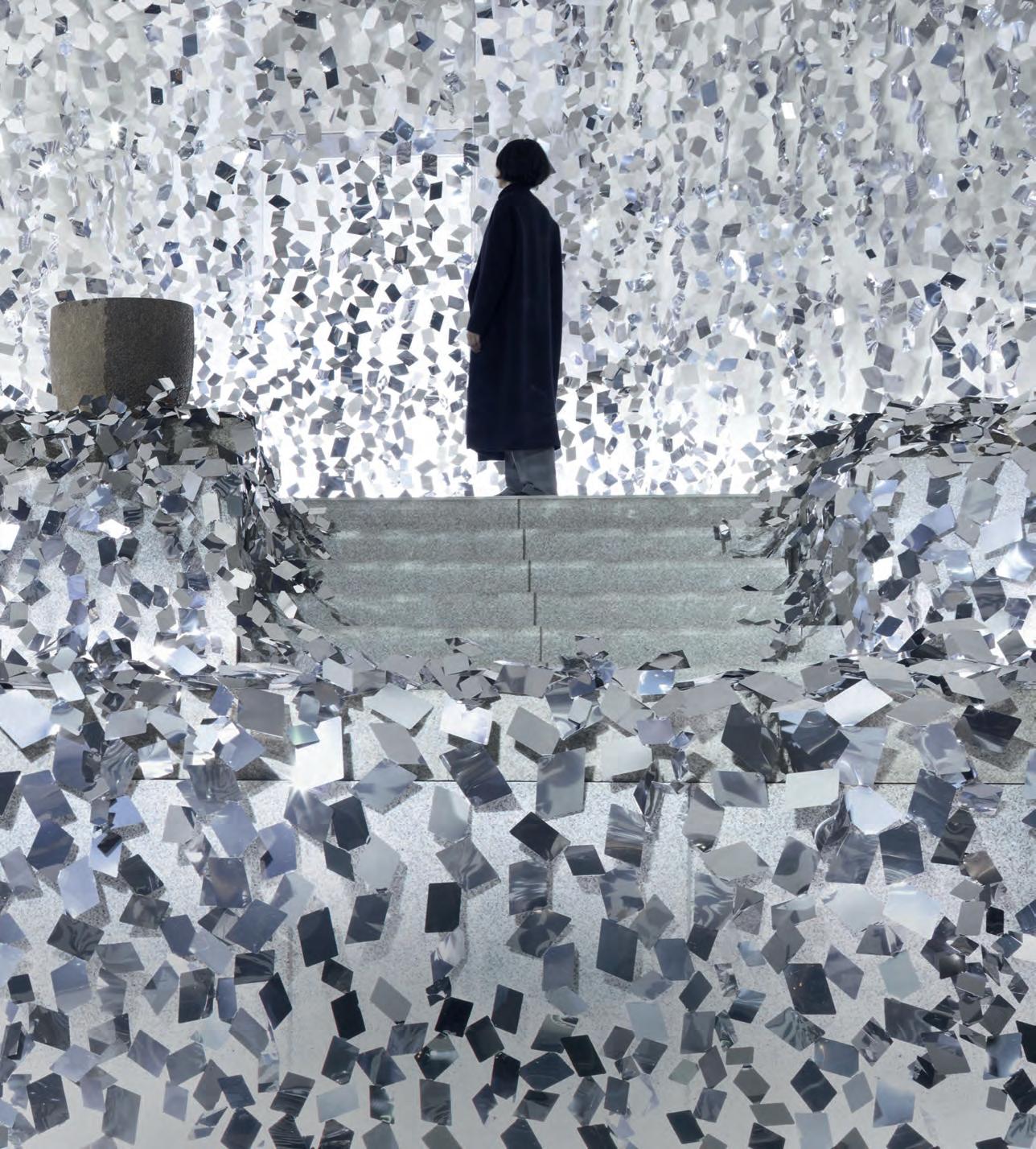
Ivy by famed Japanese design house, nendo, was designed by Oki Sato and his team as an immersive installation for the Hana So exhibition for the Sogetsu School of Ikebana, to commemorate its 90 th anniversary. A tiered stone garden created by Isamu Noguchi served as the exhibition venue, which was drenched in a waterfall of 0.5mm-thick stainless steel mirrored sheets, cut into rhombuses. This “ivy” diffused reflections of the colours and outlines of the exhibited ikebana flowers which produced a kaleidoscopic effect. Photography by Akihiro Yoshida. We hope you enjoy it!
parisi.com.au IKS Collection
INDE.Awards official winners 2017. 31-43
The ultimate industry cheat sheet.
Big thinkers and creative gurus.
William Smart, Nik Karalis, Paul Hecker and Hamish Guthrie, Mark Trotter
Provocative, radical and energising design. 103-159
The Working Capitol, Robinson Road Singapore by HASSELL
Bendigo Hospital by Bates Smart & Silver Thomas Hanley
Jackalope Mornington Peninsula by Carr
Willinga Park Equestrian Centre by Cox Architecture & Sally Heiatt Interiors
TVNZ Television Centre Refurbishment, Auckland by Warren and Mahoney
Karratha Central Healthcare by CODA Studio
TRIBE Hotel Perth by Travis Walton Architecture
Cockburn ARC Central Wesr Regional Activity & Education Centre by dwp & Sandover Pinder
Who are the designers re-writing the future of health & aged-care?
What can design learn from The Bob?
187-190
InDE.AWARDS
Sho R t
47-75 In f A m ou S
In
79-101
SI t u
In
-
-
-
-
-
-
-
I n D E p th
tERES
161-184 In
t
INDESIGNLIVE.COM 26 CONTENTS

Discover more at uci.com.au Sydney | Melbourne | Canberra | Brisbane | Adelaide | Hobart | Perth | Ulverstone
Culinary art starts with the first course.

Culinary culture starts sooner than that.
The difference is Gaggenau.
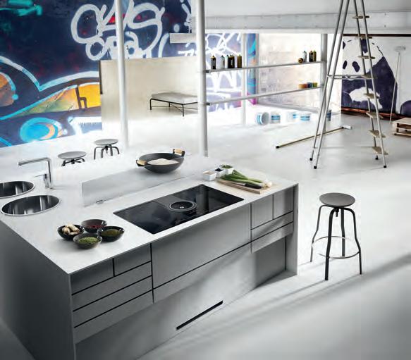
The ambitious kitchen is a place of exacting demands for equipment, ingredients and techniques. The Vario cooktops 400 series have been meeting these demands from the beginning, with appliances developed to meet any challenge. Energy efficient, our steel-framed induction cooktops direct heat quickly to the pan with the power to sear as well as the control for long, gentle simmering. These cooktops free the imagination; a tribute to boundless cuisine. Whatever combination you choose, you can look forward to exceptional freedom for decades to come.
For more information, please visit www.gaggenau.com/au


Discover more at silestone.com | Follow Us F T A product designed by Cosentino ® Colour Eternal Marquina Cindy Crawford on Silestone Countertop TOPS ON TOP COSENTINO AUSTRALIA e-mail: infoaustralia@cosentino.com On Top Feel the new velvety texture
INDE.AWARDS OFFICIAL WINNERS 2017
INDESIGN 31 INDE.Aw A r D s Aw A rd s IN d E.
Original Illustrations James McLaughlin
Official 2017 iNDE . awarDs Jury
Stephen Burks, Stephen Burks Man Made (USA)
Sue Carr, Carr Design (Australia)
Chan Ee Mun, WOHA (Singapore)
Lyndon Neri & Rossana Hu, Neri&Hu (China)
Paul McGillick , Design Author (Australia)
Jan Utzon, Utzon Architects (Denmark)
Adele Winteridge, Foolscap Studio (Australia)
Tim Ross, Design Enthusiast & Entertainer (Australia)
Raj Nandan, Indesign Media Asia Pacific (Singapore)
Stephen Todd, AFR Design Editor (Australia)
INDEawar D s .COM INDE. a w ar D s 32
Winner, The Building & Best of the Best Indigo Slam, Smart Design Studio
INDESIGN 33 INDE.Aw A r D s
INDE.Awards Official Jury 2017 Brought to you by Cult
“Exceptionally grand and rich in detail”
Winner, The Design Studio Austin Maynard Architects
INDEawar D s .COM INDE. a w ar D s 34
INDE.Awards Official Jury 2017
to you by Denovo Recruitment
“An acerbic intellect combined with a great big heart”
Brought
Winner, The Influencer
Central Seat & Drinking Fountain, Steendijk for Embassy Living
INDE.Awards
INDESIGN 35 INDE.Aw A r D s
“Creatively intelligent”
Official Jury 2017
to
by Interface
Brought
you
Winner, The Work Space
Slack Melbourne Office, Breathe Architecture
“A
natural place for human interaction” INDE.Awards Official Jury 2017 Brought to you by Shaw Contract INDEawar D s .COM INDE. a w ar D s 36
Winner, The Living Space
Cornwall Gardens, CHANG Architects
of nature and
INDE.Awards Official Jury 2017 Brought to you by Gaggenau INDESIGN 37 INDE.Aw A r D s
“A wonderful blend
architecture”
Winner, The Social Space
Humming Puppy, Karen Abernethy Architects
“Human-responsive design at its best” INDE.Awards Official Jury 2017 Brought to you by Living Edge INDEawar D s .COM INDE. a w ar D s 38
Winner, The Object
HUP HUP Chair, SKEEHAN Studio
“A beautifully resolved and thoughtful piece”
INDE.Awards Official Jury 2017 Brought to you by Neolith
INDESIGN 39 INDE.Aw A r D s
William Smart
Winner, The Luminary
“A genuine, deserving icon” INDE.Awards Official Jury 2017 Brought to you by Wilkhahn INDEawar D s .COM INDE. a w ar D s 40
Winner, The Prodigy
Caroline Choker & Vince Alafaci
talents to be watched” INDE.Awards Official Jury 2017 Brought to you by Cosentino INDESIGN 41 INDE.Aw A r D s
“Formidable
Winner, Launch Pad Australia PLICO, Dora Ferenczi
“Intensley relevant for the future of the workplace” INDE.Awards Official Jury 2017 Brought to you by Schiavello INDEawar D s .COM INDE. a w ar D s 42
Winner, Launch Pad Asia
Never Mind Tableware Series, Jonathan Saphiro Salim
and
Official Jury 2017 Brought to you by Schiavello INDESIGN 43 INDE.Aw A r D s
“Sophistication, maturity,
intuitive sensitivity”
INDE.Awards
INDESIGN X
SCHIAVELLO
Enter PwC’s new Sydney office in the coveted Barangaroo Tower One, and you could almost confuse yourself for being in the lobby of a five star hotel, when you’re greeted by PwC’s Welcome Crew who are standing near modern white pods. Walk further down the corridor towards a media fountain, where you can locate directions to your meeting or locate facilities, and this time, you might just wonder if you’re in one of Sydney’s latest luxury retail centres. Walk past an open kitchen on level 16 and this time you might just ask if you’re in a sophisticated airport lounge.
“It was all about making sure we design something that supports the variety and diversity of the clients we have by looking outside of our industry to create a new benchmark in experience,” says Debra Eckersley, PwC’s New Ways of Working Partner. This innovative approach has also been applied to their offices in Melbourne and Brisbane. While each space differs in size and has its own identity – for example, in Melbourne, exit the lifts and you’re immersed in colour and movement straight away – open collaboration remains the core principle.
After extensive research, which included the likes of client interviews, floor space data assessments and investigation of other leading organisations from around the world, the client experience design brief for Melbourne and Sydney was handed over to Futurespace, while people floors and the Brisbane office, EGO Group. The client experience – Melbourne & Sydney “The brief clearly wanted to showcase PwC differently. It asked us to explore the ‘day-in-the-life’ journey of a client, and work out what was going to trigger working together in a more agile way,” says Futurespace Design Director, Gavin Harris. In Sydney, four levels are dedicated to working with clients, while in Melbourne, five. Clients enter to
more formal surroundings and as levels descend, the atmosphere becomes more open and relaxed, both physically and in the ways of working. What starts with more closed meeting spaces and a café lounge, three floors down evolves into a Lego room, music room and conversation pit. “As you go down, spaces become more fluid and fun; you see more interactions and innovation happening, but these spaces aren’t about taking a break, it’s about changing ways in thinking,” says Futurespace Managing Director, Angela Ferguson. A sensory lens applied at every turn, in Sydney, there’s digital wallpaper that can change colour to support events such as International Women’s Day or business launches, there’s the touch of leather clad balustrades, healthy food offerings on each level, visual art, and acoustically-treated furniture for private conversations. At the front line of each open and collaborative space is a range of furniture settings, each with its own unique co-creation encouraging attributes. “For us, it was about offering highly mobile product that enables idea generation,” says Tim Dodd from Schiavello’s Global Workplace Services team.
Already clients are using the highly mobile Henge whiteboards to create visual shields in an informal manner; Kush floor cushions are offering a playful retreat; while standing-height Bene Timba tables are at the centre of tech zones and a graphics shop front.
But what really brings the space together is technology. As Hilda Clune, PwC’s Business Transformation Leader & CIO explains, “In order for us to truly differentiate the technology it needed to be embedded as part of the journey and to be thought of as part of the experience.” From motion – sensitive interactive screens to a self check-in app (which ensures business partners are waiting for their clients in a welcome lounge – due to launch in late 2017), clients are
44 SCHIAVELLO S CHIAVELLO CO m
Words Jessica Capolupo Photography Nicole England
immersed in technology from the get go. In Sydney, one of the first spaces to encounter is an Innovation Pool – a sci-fi lab showcasing some of the emerging technologies that support solving important problems for our nation.
In Sydney and Melbourne there are digital waterfalls that cascade down four floors that let visitors dive into a wealth of digital insights such as white papers, videos, information graphics and details on subject expert matters. In Melbourne, there’s also a digital artwork, ‘The Flame Tree’ by Bruce Ramus, and let’s not forget the recording studio, complete with green screen.
Furniture plays its technological part, too. Sparked by Gavin Harris, and in collaboration with Schiavello, a number of new products were developed specifically for the project including the Agile Wall whiteboard, the Power Tower recharge station, and a freestanding booking station, called the Space Identification Panel (SIP) unit. “Consultants are on the go all day, and Wi-Fi is great, but eventually you run out of power.Built into either a coffee table or taller training table, the Power Tower allows you to recharge directly via a USB port or power outlet,” says Gavin.
Brisbane & People floors With PwC fit-outs in Adelaide, Canberra, Newcastle and Perth already under their belt, EGO Group was engaged to take on the people floors in Sydney and Melbourne along with the Brisbane fit-out. As PwC were embarking on their fifth installment of activity-based working, this new way of working was definitely going to extend to their staff community and work patterns as well. “In an attempt to bring everyone on-board and encourage a sense of ownership of the workplace, PwC and EGO embarked on an extensive collaborative process in which we discussed with people what they wanted from their workplace and what it is about their city
that makes it unique,” says Jacqui Collingwood, EGO Group Project Architect. This then formed the basis of themes for each city, which in turn informed planning, finishes and furniture concepts.
In spite of the 11 different floor designs, and regardless of the different themes, one thing remains constant across all three sites: the Schiavello furniture selection. “We obviously had to change the finishes to reflect the different themes, but ultimately the furniture was selected for its ergonomic attributes, quality, longevity and because it truly promoted the new way of working,” says Jacqui.
The Bene Parcs Wing chair forms an essential element to each floor, by providing a moment of individual privacy in what is otherwise a busy and buzzing workplace. And the inclusion of Vecos smart lockers not only supports a more dynamic approach to personal storage, but the system highlights Schiavello’s end-to-end solution capabilities. “When dealing with other locker suppliers, locker management systems, locker carcasses and system integration is handled by different providers and requires more coordination. We acted as a one-stop-shop, which aided immensely in consistent delivery across all three locations,” says Tim. In total, Schiavello delivered furniture that encourages the new way of working for close to 6,000 people across three locations in just nine months. “That is a rare and enormous task and something I don’t believe we could have achieved had we not been Australian manufacturers. We are extremely proud of the end result,” says Tim.
Sometimes the most valuable tools are the simplest ones. The highly mobile Henge whiteboards create visual shields in an informal manner, as well as a blank slate for ideas.
schiavello.com 45 SCHIAVELLO
AndreaSullivan,Artist
Colourissoimportanttome,itisthe foundationandinspiration formyart.Withayoung family, ourhomehastonurtureus, ithastobepracticalandadaptand change as we evolve -andithas tomakeusall feelhappy. It reallyisthatsimple. spacefurniture.com
the ultimate industry cheat sheet
IN SHORT INDESIGN 47 SHORT IN
Totally Washed Up
Laundromats have always had this kind of strangely editorial, romantic feel to them. Maybe it’s because they’ve been so lovingly adopted by the New York fashion scene (case in point – the recent Hermès-matic pop-ups, or any campaign by Vetements).
Maybe it’s because cinema and music videos have cast a romantic glow upon these humble service-centres; the promise of meeting one’s soulmate between wash cycles. Whatever the reason, the laundromat has always had this built-in, but wellconcealed allure, and some designers (obviously in Melbourne) are peeling back these traditionally unpolished interiors to give the modern inner-city dweller that touch of je ne sais quoi
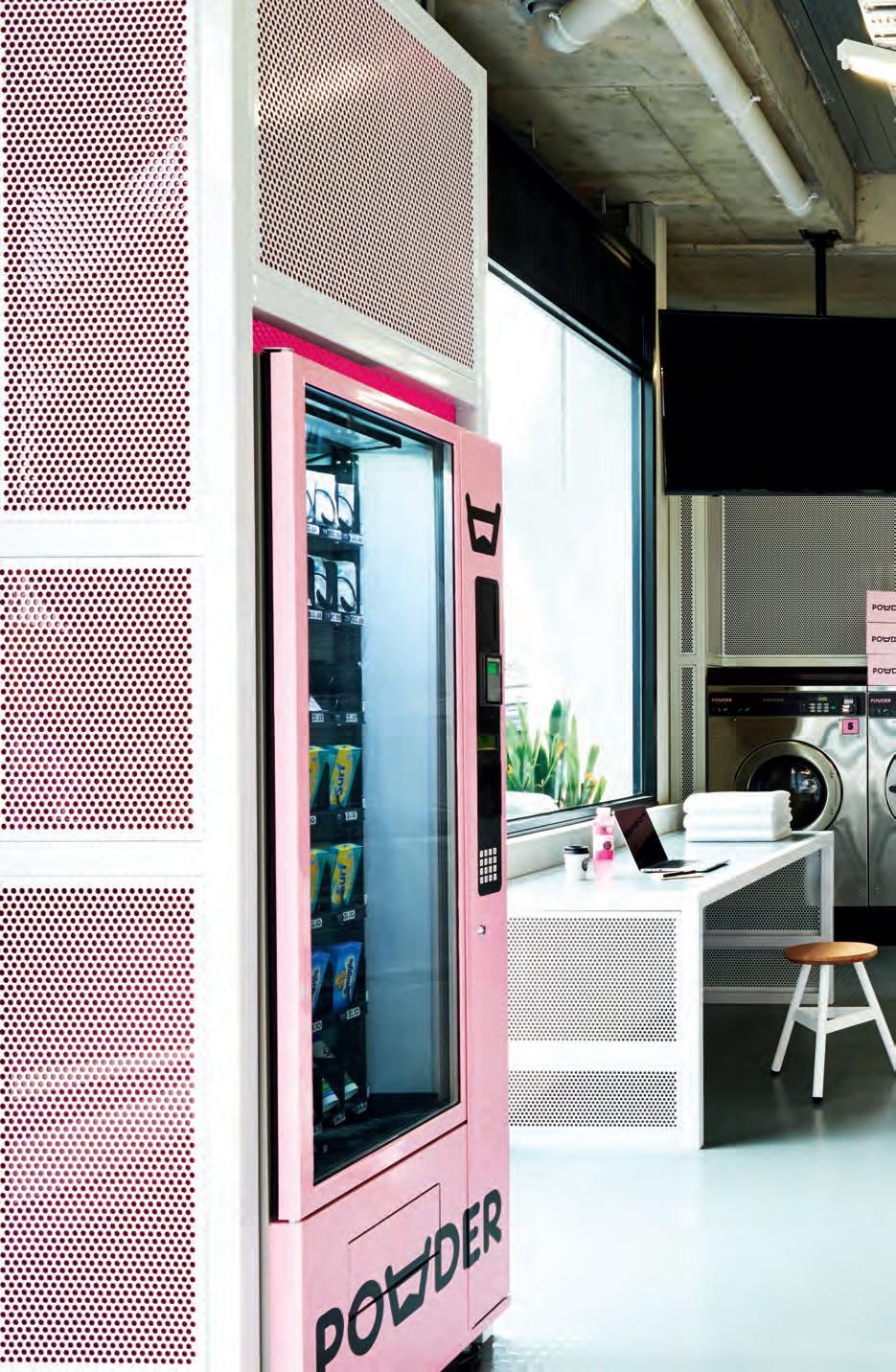
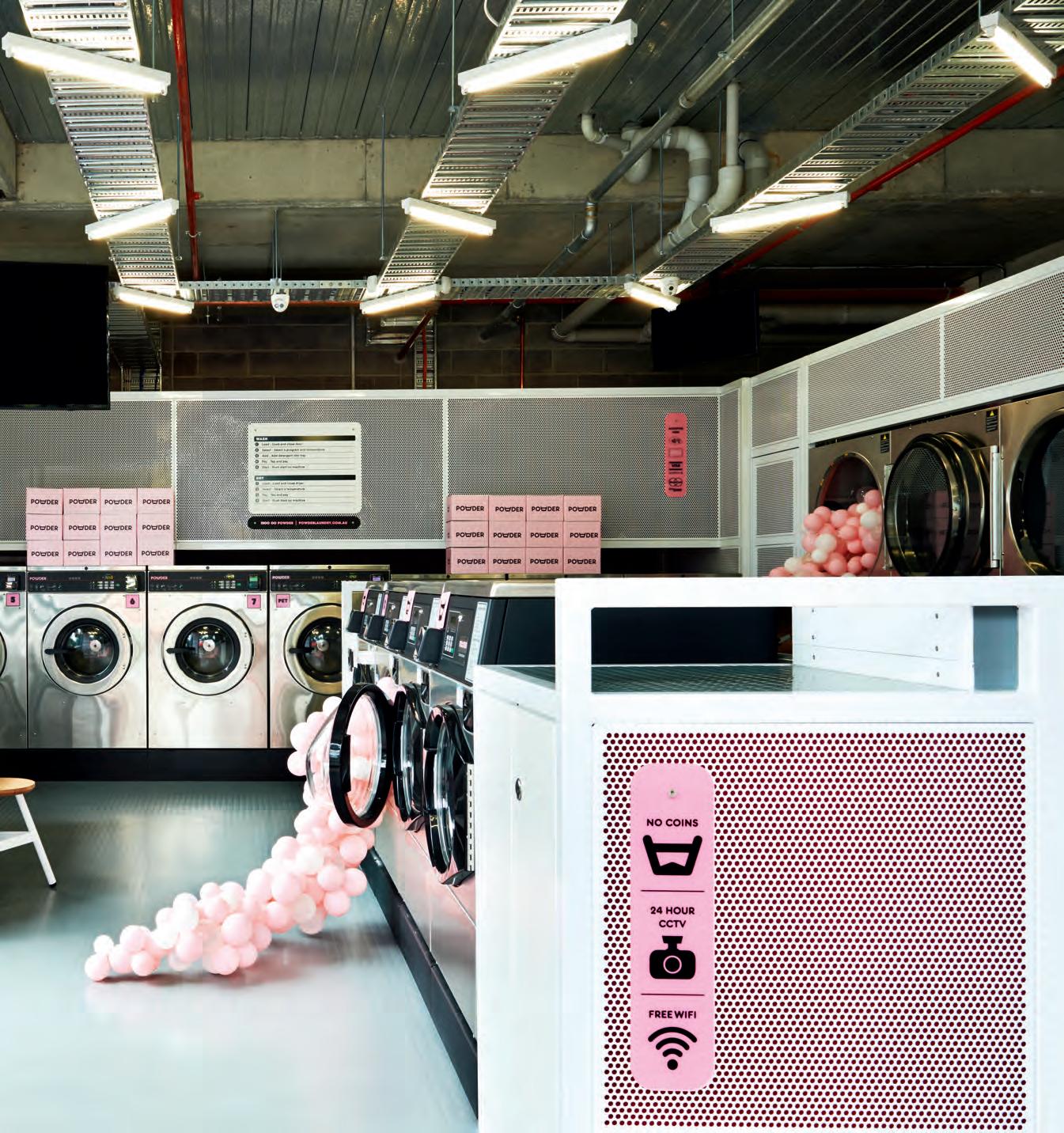
Working with the brief to “define a new generation of laundromats”, Studio Tate was tasked with delivering the country’s first cash-free laundry. It was to reflect “Powder Laundry’s innovative brand philosophy while maintaining some of the original material and aesthetic charm these environments are known for,” says Alex Hopkins, principle interior designer of Studio Tate.
The design language here is used intelligently to communicate and reinforce the brand’s ethos. Its soft pink palette, for example, is a reference to that stray red sock that makes it into your load of whites. Retrostyle bar stools are provided, positioned just close enough to ‘accidentally’ bump into your neighbour. Power outlets and USB chargers fitted into the joinery mean that you can distract yourself with work or catch up on emails. The circular port-hole of the washing machines become a recurring motif, with joinery created from overlaying multiple circles, and material selections such as white perforated metal backed with a signature ‘Millennial pink’.
“From a design perspective, Powder Laundry exemplifies the future of the sector,” notes Hopkins, “particularly its opportunities for designers who are beginning to infiltrate often overlooked service environments and experiences like this one offers.”
IN SHORT INDESIGNLIVE.COM 48
IN SHORT INDESIGN 49
Feeling The Cabin Fever
For their latest collection, Sydney-based designers Sarah Gibson and Nick Karlovasitis of DesignByThem (otherwise known by their cool portmanteau: GibsonKarlo) wanted to develop something that moved away from lounges becoming commoditised in form and lacking in personality. Based around the concept of the seat being ‘built’, the design began to naturally reference log cabins. In wanting the Cabin range to be modular and adaptable, GibsonKarlo designed a system of construction that allowed for the components to be stacked on top of each other, so that it could be easily adapted for different lengths, depths and heights as demand required and with stocked components. “It all began with a series of cylinders. We then deconstructed the cabin arrangement into a lounge and armchair, experimenting with various diameters until we found a size that was comfortable for both the back and armrests,” Gibson explains.
“The inspiration for the design came from the simple intersecting patterns found in log cabin construction. We wanted to reference this and apply the cylindrical geometries to create a playful range that was welcoming, flexible, distinctive and had a sense of character.”
–
Linehouse pinpoint that spot between a poetic idea and pragmatic solution, combining architecture, interiors, product and graphic design to emphasise the qualities of construction, detail, materials and light.
1 Minute With... Linehouse
Having launched in 2013, Shanghai-based design studio Linehouse – led by Alex Mok (Chinese-Swedish) and Briar Hickling (from New Zealand) – has been catapulted into the spotlight with their highly-polished, totally Instagrammable interior work.
“We operate as a platform to investigate the rituals of inhabitation,” say Mok and Hickling, “and how these daily moments can be celebrated through design, transforming the mundane into performative acts.”
Working across a broad spectrum of sectors, scales and typologies, Linehouse’s unique spatial experiences reflect a strong narrative and an element of whimsy and voyeurism – all thanks to a thoroughly researched foundation of data covering their clients’ sites, histories and contexts. Keep your eyes on these two, they are definitely ones to watch!
IN SHORT INDESIGNLIVE.COM 50
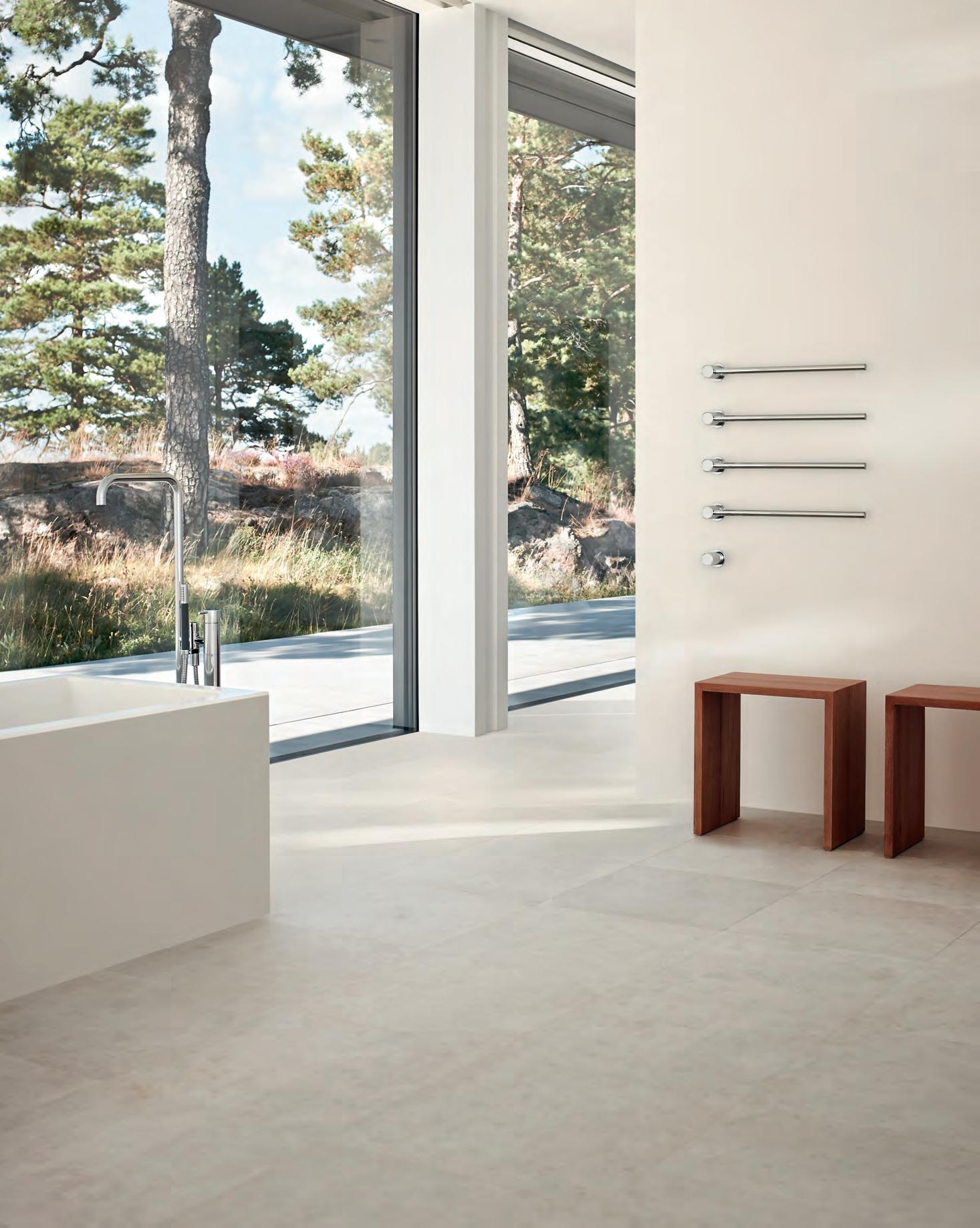
–
Modular by design
VOLA commitment to sculptural modularity is epitomised by the T39 Towel Rail. The system features minimalist cantilevered bars which can be configured in any quantity and spaced to suit any bathroom design.
T39 is the perfect accompaniment to VOLA award-winning range.
VOLA Showroom Shanghai Tel.: +86
sales@vola.cn www.vola.com VOLA Design Pty. Ltd. Tel.: +61 402 372 480 sales@vola.com.au www.vola.com VOLA Hong Kong Tel.: +852 6388 9520 joc@vola.com www.vola.com
183 0190 6509
Palace Of Purchase
It’s been an interesting ride watching retail spaces jump through the hoops of theatricality and the avant-garde – just to keep the punters interested. Part store, part installation, part gallery, the latest in this quest for retail relevance is Acne’s new Milan flagship space in the Brera district – an area of the city known for its designer shops and galleries. Designed by the internal Acne creative team, led by creative director Jonny Johansson, the flagship is set inside an existing building with high, arched windows across its front and side façades. Looking to reference the value and importance Acne places on materiality as a brand, the design team sourced organic granite from a local quarry in the Baveno region of Italy, that was used for the flooring furniture and most impressively, the walls. The brand also commissioned a custom-made lighting system specifically for the store, named ‘The Mega’. Fixed to the pink ceiling, The Mega has multiple fixtures each made from polished aluminium. While the expansive windows allow natural light to flood the store during the day, the lighting retains the same level of cool-toned glow at night. Acne to a T.
Ecoustic Blade
Indesign Instyle

While we all love the positive effects of the agile workplace, the one downfall seems to be the noise factor created by openplan spaces. Though many have created acoustic solutions, specifiers still struggle with the limited material variety of these products. Here, Instyle’s Ecoustic ® Timber Blade combines the warmth and texture of natural solid timber in a highly modular acoustic system.
The sophisticated sound-absorbing timber blades are designed for use as ceiling and wall applications, requiring minimal onsite labour. Ecoustic ® Timber Blade is made from PEFC-certified solid timber sourced from sustainably-managed forests. Available in seven solid timber finishes and a wide range of profile and spacing options.
Work
Smarter
Indesign Haworth
“There was a very open attitude to understanding the spaces where we work and the items we use in them.” says design luminary Patricia Urquiola. “ Penumbra is simple where it can be, and very complex where it needs to be.” Penumbra – the winning design for Haworth’s Celebrating Great Design contest – has been rightly applauded for its dynamic design and ability to meet the more functional requirements for collaboration in an increasingly agile professional culture. Across seating, desking, breakout, intelligent upholstery and fabric finishes that assist acoustical attuning, Pemumbra’s landscape of textures and forms particularly caught the eye of Urquiola during the collection’s development. This coup in contemporary workplace design is a solid reinforcement of the agile model and the typical behaviours within it. And when you get the nod from Patricia Urquiola, you know you’ve done something right.
IN SHORT INDESIGNLIVE.COM 52
Made Of Stone
Indesign Cosentino
Let’s talk about our love affair with marble. Considered to be one of the most luxurious materials in existence, we admire its elegance, natural beauty, honesty and prestige.
In fact, we are so enamoured with this magical material that we often forget its limitations – until it’s too late. For all its beauty, marble is one of the softest natural stones, highly porous and prone to damage and staining, resulting in arduous (not to mention greatly expensive) maintenance.
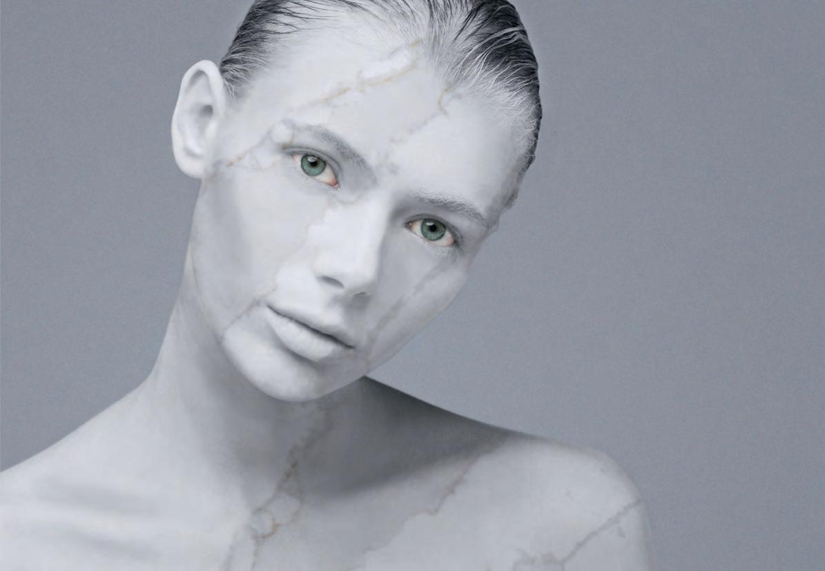
Thankfully, not all stones are created equal and Silestone’s dazzling new Eternal Collection has been developed to counter the inherent limitations of marble by providing an equally luxurious and elegant quartz surface that showcases the essence of marble in an extraordinarily resilient engineered material. As expected from one of the world’s leading quartz surface brands, the Silestone Eternal Collection pays homage to the most sought-after and exotic of marbles, combining them with the performance and functionality of technologically-advanced materiality.
The collection’s colourways are the first Silestone colours manufactured with N-Boost technology. N-Boost is a Cosentino innovation that makes the cleaning and maintenance of the surfaces easier and quicker than before, and also achieves a greater intensity of colour and surface brightness.
Thanks to the tireless work of the design team at Cosentino’s R&D department, Silestone Eternal has a visually arresting style upon examination, yet a natural and unobtrusive aesthetic within spaces. The brand’s innovation has seen Cosentino design with flourishing patterns of highlights, visible from the surface right through to the depths of the slab – even at intersections and edges.
Furthermore, the patterns of highlights are faithfully repeated with each round of production, so as not to lose one iota of the original essence of the design.
In our industry’s ongoing quest for materiality while working within the prescribed budgets of our clients, the Eternal Collection offers an elegant solution to both of these – at times, opposing – challanges.
IN SHORT INDESIGN 53
The Re-Love Project
Feast Watson celebrates resourceful design for a fifth consecutive year with the Re-Love Project, inviting six local creatives to up-cycle second-hand furniture to be auctioned for The Salvation Army.
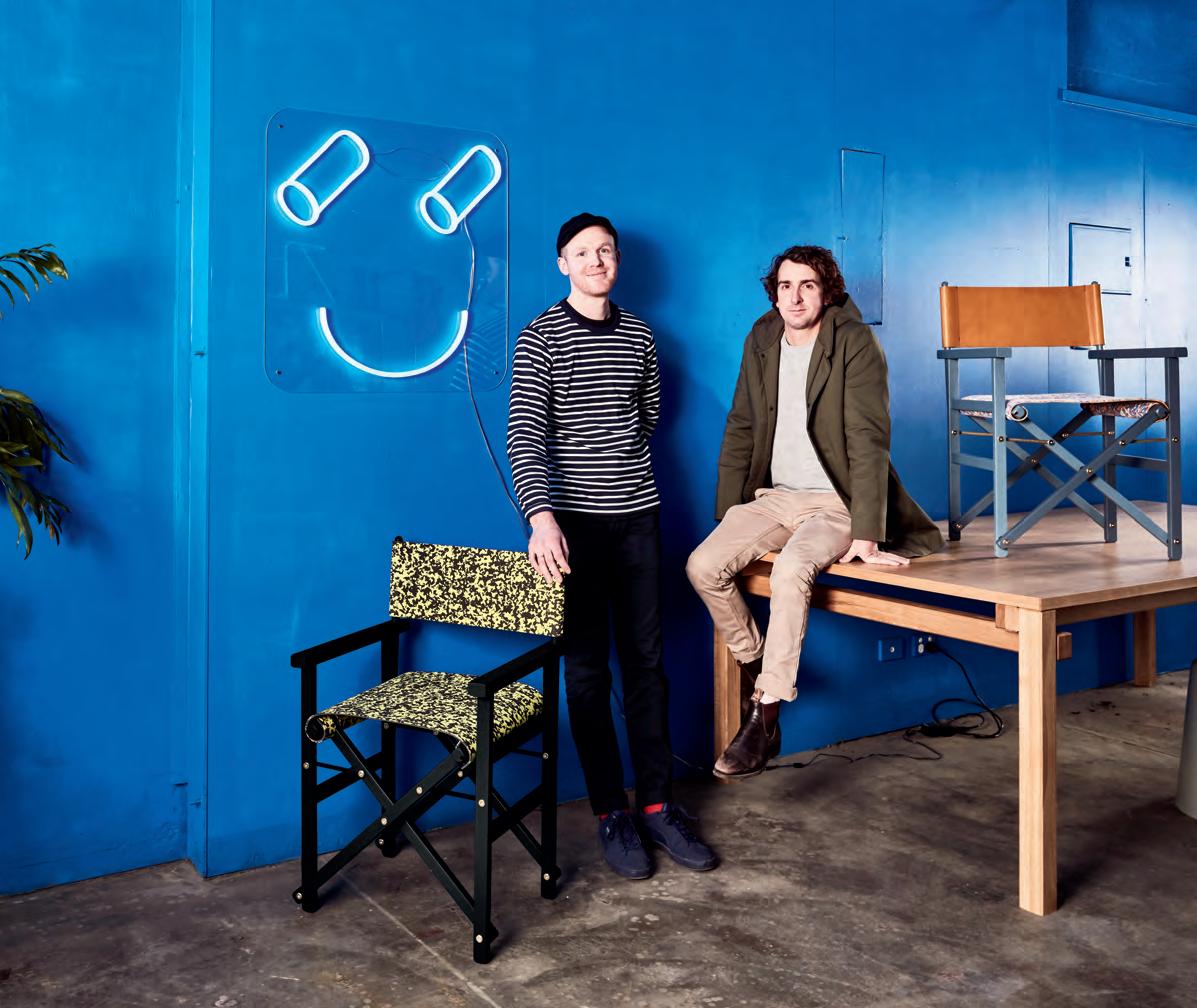
This year’s participants are Scandinavian design retailers Norsu Interiors, stylist Aimee Tarulli, furniture house Mark Tuckey, style curator Gina Ciancio, interior decorator Kristine Franklin and design studio Dowel Jones.
Intrigued by a pair of worn director’s chairs sourced from their local Salvos, Dowel Jones’ Adam Lynch and Dale Hardiman uncovered a largely unattributed design, dating back to the late 1800s. “For something so ubiquitous, no one’s name is attached to it,
Up-cycling or ‘re-love’ is the journey of numerous Australian designers. Using a range of Feast Watson woodcare products, Dowel Jones transforms a worn piece of timber furniture into a stunning, unique statement item.
but millions of companies have produced the same kind of object,” says Hardiman. “Which was great for us, because it meant that we wouldn’t be up against a long history of interpretations.”
Dowel Jones applied their playfully pun-filled style of nomenclature to the project, combining the world of cinema and the Feast Watson brand to christen the chairs ‘Clint Feastwood’ and ‘Naomi Watson’.
“You can give so much life and personality to an object just by changing its name to something unique, so that’s what we try to do,” says Hardiman. Last year, the Re-Love Project raised AUD$5,000 for The Salvos Stores, an impressive sum that Feast Watson hopes to outdo for their 2017 effort.
IN SHORT INDESIGNLIVE.COM 54
–
–
Made In The Shade
Indesign Sunbrella
The Future of Shade is an annual global competition co-sponsored by Sunbrella® and ArchitizerTM that challenges architects and designers to explore the integral role of fabric in shade and building design. This year, three unique categories created distinct challenges where shade played a critical role in the response: Building Shade, Humanitarian, and Wellbeing. This principle inspired the Wellbeing category, where entrants were challenged to design a shaded outdoor space using natural light, landscaping and seating to promote the wellness of those who use them.
Workplace Workout
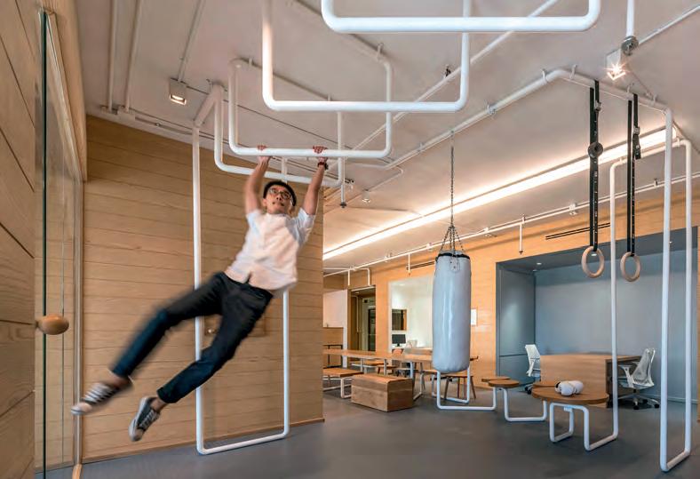
Renovated by Bangkok-based design firm Onion, the new headquarters for IT consultancy Inteltion, is unique in that employees are only present at the office while waiting for a new project or assignment. This meant that Onion could do away with individual desks and workstations and instead offer each employee a highly mobile design, where they can work from anywhere with only a laptop. Here, Onion took this characteristic of mobility and ran with it, first by studying the simple exercise machines common in playgrounds and public parks throughout Asia Pacific.
The firm then developed a range of simple tools for easy exercises, from spinning chairs to blocks that stretch and work the fingers, as well as more high-intensity activities such as monkey bars, gymnast rings, and a punching bag. The need for rest and relaxation has also been considered, where the designers have provided a nap area above the filing cabinets – a raised platform filled with pillows for sleep-deprived IT technicians to catch a quick and professional snooze.
Wonders Of The Cosmos
Indesign Casf Corian®
Combining technology with lush design is so very de rigueur. But while many have tried, few have found the exact recipe to bring these elements to life. As bold as the universe, the rich black background of Corian Cosmo Prima is alight with streams and particles of grey and white that hint at the cosmos. And here, a new dimension emerges with the Corian Prima collection.
This exclusive aesthetic celebrates of-themoment design aesthetics and materiality alongside the inherent technologies that allow the designs to emerge. On the technological side, the collection is GreenTag Certified, stain-resistant, fungaland-bacterial-resistant and exceptionally hygienic in its ease to clean.
IN SHORT INDESIGNLIVE.COM 56
Out Of This World
 Indesign Zenith
Almost two decades ago the world’s brightest managerial minds detected the beginnings of a commercial famine. In the years that would lie ahead, it was rightly believed that for organisations to remain solvent, continued success would depend upon how well they could attract, develop and retain talented employees. A new demand for intelligent design systems that are purposedriven to empower their varied and numerous end-users speaks volumes – and especially so in the commercial sector – about a shift in where we place the value of design. Where previously the design community was sought after to add the polish of prominence to organisations, current interest lies in design’s potential to elevate the status of the individual and their particular needs. And here, collaboration is key. Essential, modular, multifunctional and highly versatile, Zenith Design Studio’s latest offering to the commercial sector – SOL-MIX – has hit the market and generated mass excitement for one very important reason: this is design-thinking perfectly tailored to the increased demand for talent retention.
Having intimately collaborated with some of our region’s most influential corporations, Zenith Design Studio celebrates the capacity for user-centred design to elevate all manner of endusers and their constantly changing needs. SOL-MIX’s mobile and reconfigurable design system is expertly curated for a variety of contemporary commercial spaces: for those of desk sharers, mobile workers and agile teams who all require equally adaptable designs to facilitate collaboration and creative collision.
Bringing people, processes, technology and design intelligence into conversation with attracting and retaining key talent, SOL-MIX creates environments for employees to access the material totality of ‘their’ work.
According to Zenith Design Studio’s director of research and development, Bob Stewart: “Australia is really at the cutting-edge of workplace change. By working with leading companies here, Zenith has access to valuable insights into the current and continually changing needs of the working world of tomorrow.”
IN SHORT INDESIGN 57
Hot Mesh
As part of a royal event in Abu Dhabi, Italian artist Edoardo Tresoldi in collaboration with Dubai-based studio Designlab Experience, was tasked with the creation of an immense environment of architectural elements built from wire in just three months. The variety of objects completely encompass the event space, creating elegant partitions and environments within the 7,000 squaremetre environment. Classical typologies, including colossal columns and dramatic domes, interact with modernist geometries, blending two worlds that exist in both harmony and contrast. The scenography for example, is envisioned as a garden where architecture and nature meet.
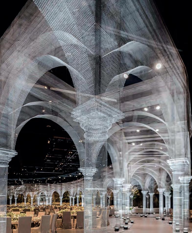
Using the transparency of the wire as a ‘filter’, Tresoldi cuts the classical sculptures with geometric elements, such as spheres, cubes, and planes. This fusion of classical and modernist languages generates a series of spatial volumes, each creating a continuous evolution of architectural abstractions and ephemeral distortions.
Built entirely from wire, sections of the installation are scheduled to be re-installed separately in universities, parks, and museums across the UAE.
Bondi House By Redgen Methieson
Indesign Vola
This four-level house occupies a narrow infill site, and has been purposefully designed to maximise every inch of its compact area. A particularly clever mechanism here is the ground level kitchen, which opens up at the edge of the marble clad stairs. At each end, three massive glass panels slide up and down to access light, ventilation and views. In keeping with the project’s pared-back mentality, a limited palette of high quality fixtures, fittings and finishes are used throughout: white terrazzo, Calacatta marble, American walnut timber, dark bronze and Vola tapware. The addition of Vola in the space adds a kind of restrained flourish to the largely bare interiors, drawing attention to the kitchen and its tapware centrepieces as the heart of the modernist setting, perched gently atop the strong monolithic island.
IN SHORT INDESIGNLIVE.COM 58
–
–

walterknoll.com.au Walter Knoll Australia info@walterknoll.com.au T +61 8 8182 3925 My clean lines come with a soft side. LEADCHAIR MANAGEMENT. Design: EOOS
Temple Of Wonder
Camille Walala
You might remember London-based graphic artist Camille Walala from her collaboration with quirky Australian fashion house Gorman and their wildly successful Walala Collection for SS16. More recently, Walala was engaged by London’s NOW Gallery to create a signature installation for their summer 2017 program.
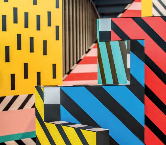
The Temple of Wonder invites visitors to unleash their inner child and lose themselves in colour and pattern. With walls of different heights, passageways of different widths, enclosed spaces and zigzag paths, the installation foregrounds the idea of ‘human scale’, giving visitors both a lasting visual impression and an extraordinary physical experience as they pass through it. Mirrored panels reflect the space back on itself; suspended shapes introduce a feeling of lightness and playful disorientation. At the heart of the installation however, is a puzzle – a giant three-dimensional game of spot the difference. Stepping into the installation, visitors are confronted with a challenge: enter the space and explore its colours, patterns, shapes and scales to locate all the differences; a comment on our ability to digest excessive environmental stimulus.
On The Map!
Indesign Schiavello
MAP (Makers of Australian Products) r ecently relaunched by Schiavello, comes at a critical moment in the world of Australia’s local manufacturing, where like Schiavello, brands have become invested in elevating our local prowess back to the lofty heights it once enjoyed. MAP’s range of ultra chic and simplified designs currently grace the permanent collections of New York’s MOMA, and Australia’s Museum of Arts and Sciences as well as the National Gallery of Victoria. This much-lauded portfolio recently returned to Australian shores after impressing the international design world in Milan, Bremen, Los Angeles and New York.
More Privacy
Less Noise
Indesign CFS Furniture
With the need for more flexible work environments and open-plan commercial spaces continuing to grow, the problem of noise pollution is a consistently present, yet unwanted side effect. The second challenge designers face in this area is that no workplace is the same, each requiring a different – sometimes completely custom – set of solutions. CFS’s Ekous acoustic products are designed specifically to solve this ever-growing roadblock for modern workplaces. From wall-panelling to ceiling baffles, there is an Ekous product for every office format.
Additionally, the Ekous range of stand-alone, loose pods promote acoustic comfort for employee wellbeing, as well as individual productivity as an alternative to the built-in panels. Available in various configurations, from phone booths to collaboration areas, Ekous is customisable, demountable and easily reconfigured.
IN SHORT INDESIGNLIVE.COM 60


Celebrating her studio’s five year milestone, Adele Bates reflects on her triumphs, challenges and lessons.
1 Minute With Adele Bates
“Once I’d taken the plunge to launch my own practice, the business took off at a pretty rapid pace.
So I had to learn very fast about exactly what was missing from the structure I’d created and how to best add to it without being to reactive or hasty. What I quickly discovered was important to me, was for the studio team to be truly collaborative.
Sometimes I meet a person or company prior to a project and I instantly feel that we have to work with them on something. As our body of work has grown over the years, the projects have evolved
in scale and signature, allowing our team to grow organically. For example, we are currently working on some amazing product collaborations which I can’t wait to see come to life. I’ve become very attuned to what the team needs from working under this very collaborative approach.
For instance, sometimes I meet someone that I feel would be a great fit without there being a set position available. My instincts for the needs of the business as well as the needs of our clients has become very strong.”
IN SHORT INDESIGNLIVE.COM 62
–
–
Meet Freak
Indesign Krost
One of the most common frustrations in the agile workplace is the lack of flexibility for mobile technology. This presents a particular challenge during on-screen boardroom presentations, where laptop connectivity and device-to-device pairing is key. Though we are moving toward a wireless world, we certainly aren’t there yet, and many mobile technologies, including laptops, iPads and so on, require some type of power, audio or visual cabling.
Boasting black or white oblique steel legs, Krost’s Keywork table is a stylish solution to this very problem. Keywork is striking with its contemporary lines, and offers a fully integrated cable management system to perfectly dissimulate any cables required in your meeting room, allowing unimpeded movement and clean aesthetics.
With the possibility to choose from a wide range of Melamine tops and sizes, Keywork meets all the requirements of a busy agile board or meeting room.
Casting A Light On Yuh
Indesign Louis Poulsen
“It is extremely sculptural, but also very geometric. It is a piece of architecture,” says designer Enrico Fratesi of GamFratesi.
Having caused quite the stir at the Milan Furniture Fair earlier this year, Louis Poulsen’s Yuh lamp is a family of small lighting objects with plenty of flexibility and plenty more power than their petite form might otherwise suggest.
From the highly vaunted Gamfratesi studio, Yuh is a celebration of lighting performance, very in keeping with the Poulsen lighting design signature. With just a few simple adjustments, Yuh can be reconfigured to directly suit the specific needs of any user.
Whether in table, floor or wall lamp form, Yuh’s elegant and streamlined componentry remains universal to best suit your many task, mood or statement lighting purposes.
IN SHORT INDESIGN 63
New Breed Of Vet
In the Suwon District of South Korea, this 2001: A Space Odysseystyle veterinary clinic, believe it or not, puts animals before aesthetic form. You might think from looking at this space that it’s the work of a form-obsessed designer gone mad! But actually, this is one of the most user-sensitive and responsive spaces we’ve ever encountered. Designed by Korean practice Betwin Space Design, the Oasis Vet is driven by a concern for the animals’ wellbeing and particular requirements, with the belief that ‘simplicity’ is the most efficient of methods. But putting function first does not necessarily mean leaving design behind: this dedication to simplicity breeds distinctive visuals that give the centre a spacecraft-like allure. Couldn’t you just picture this as the setting for a Stanley Kubrick film?
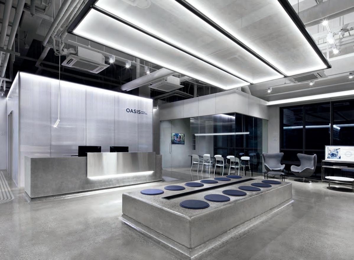
For maintenance and sanitary purposes, the studio chose tempered concrete for the flooring, and included round corners that make it easier to clean doggy accidents. While the same materials are used everywhere, Betwin changed things up from one area to another with different spatial compositions. The clinic’s
various spaces have also been designed with the animals’ different physiological characteristics in mind. For instance, the ward designated for bigger dogs is larger, with features that diffuse loud barks and maximise mobility. As Oasis is a clinic that specialises in nervous diseases, it requires a calming environment where stimuli is kept to a minimum to avoid stressing out the pets – which goes hand-in-hand with Betwin’s focus on efficiency and functionality rather than eccentric visuals. Additionally, open spaces and transparent materials were chosen over traditional metal cages, which soothe not only the pets, but also the owners’ anxieties, as all procedures and interventions are made visible to the public.
Betwin Space Design’s work for Oasis is a strong reminder that while function should always lead form, form doesn’t necessarily have to be sacrificed. In fact, when functionality is the focus of the design approach, the opportunities to become more creative actually increases. After all, limitations breed the most intelligent solutions – and that’s good design.
IN SHORT INDESIGNLIVE.COM 64
Kitschy Catch
Having recently participated in one of Sydney Indesign’s WorkLife discussions, The Bold Collective duo, Ali McShane and Monika Branagan, shared their ideas about value and current approach to ‘kitsch’ in design. The Bold Collective is widely known for their highly conceptual, visually dynamic spaces that amost always have a sense of fun or kitsch about them.
The defining characteristic however, is that these choices are never “kitsch for kitsch’s sake”, the pair note, but rather driven by “seeing creative opportunities to interpret the brief in ways that no one else might have considered, but still very much guided by what the client wants and needs.”
A perfect example of this mission is one of the studio’s more recent projects for pet insurance company, PetSure. The Bold Collective were appointed to design PetSure’s new pet-friendly Sydney workplace on the North Shore.
The brief included an interconnecting stair to create greater connectivity across the business units. “We saw this as an opportunity to design a collaborative tiered-seating amphitheatre for all staff presentations and informal meetings,” the duo says. Other fun elements include kennel-inspired meeting spaces, oversized environmental pet graphics and locker fronts, cat enclosures and even a pet lounge area.
Real Air-chitecture
Indesign Resedentia
The air inside every house can be designed. With its cooker hoods, new products for air purification and fragrance diffusion, Elica is its first ‘Air-chitect’. Elica’s domestic appliances, with their technology, innovation and uniquely distinctive design, analyse, measure and create “new air” for the kitchen and every room in the house. For almost four decades, Elica has combined meticulous care in design, judicious choice of material and cutting-edge technology to guarantee maximum efficiency and reduce energy consumption that makes them a prominent market figure. The Group has revolutionised the traditional image of the rangehood: it is no longer seen as a kitchen accessory but as a design object which improves the quality of life. Designed by Elica’s ‘Airchitects’ the brand is driven by the concept of “Aria Nuova”: the perfect synthesis of a corporate culture increasingly directed towards innovation. Passion, innovative thinking, sharing, energy channelled into constantly achieving new goals – these are the factors that make up the Elica experience.
IN SHORT INDESIGNLIVE.COM 66
A spiritual inner glow emanates from the heart of this exquisite wall light.
The Notredame range is inspired by Gothic Cathedral rose windows and the way light spreads out through them.
Designed and lovingly crafted by Italian lighting brand Karman from the nest powdered marble and hi-tech wizardry, the Notredame range is uniquely classic and modern at the same time!
Designers Luca De Bona & Dario De Meo
DHO
lightco.com.au enquiries & showroom 1300 795 548
Open 6 days at 100 Collins St, Alexandria, NSW 2015, Sydney 6359
Out On †op!
The Grid
Indesign Shaw Contract Design Awards
Since 2006, the Shaw Contract Design Awards have served our industry as a vehicle to champion the leading achievements of the global A+D community. Now in its eleventh iteration, the awards have just announced 2017’s five global winners hailing from USA, Thailand and Australia that, according to one of the judges – architectus’ Andrew Schunke – “each stood out for different reasons, but with a clarity of design thought and experience with a focused outcome.”
Among the illustrious winners are: FJMT’s Frank Bartlett Library and Service Centre; The Summit at University City by Sixthriver Architects; BKM HQ and Showroom by Hollander Design Group; HR&A Advisors by CHA:COL; and the People’s Choice winner, Ground Floor Reid Library Refurbishment by SCHIN Architects.
From over 497 entries across 32 countries, the winners demonstrate that, in the words of Shaw Contract itself, “if we are going to improve life for the better, we need to honour the people who rethink the very notion of what design is.” We, simply, couldn’t have put it better ourselves!
Art Café
By Mim Design
A former auto repair garage in Abbotsford has been transformed by Mim Design into Au79 – a contemporary hospitality space in the guise of a sprawling indoor botanical garden – featuring a café, bakery, patisserie and coffee roaster, with a variety of event spaces both large and small. Inspired by the periodic table, the name Au79 represents gold, and this element is of course interwoven through design. In fact, ‘As good as gold’ was the vision, and Mim Design was invited to deliver a statement space. “It was important to create a contemporary functional venue filled with natural light, lush planting and soft welcoming spaces.
Inspiration was gathered from a variety of places from the venue’s new focus on roasting, to the curved rubber marks the old tyres made on the walls, which referenced the building; a previous car repair garage,” says Mim Design creative director, Emma Mahlook. “The walls and furnishings incorporate the vibrant green and organic earthy tones of the coffee plant, while soft blush tones and custom furnishings add a touch of femininity.”
Design and functionality come together at Au79, where space planning and adjacencies have been carefully considered to create an easy flow and divide the huge space into more intimate zones within the café all whilst still maintaining an aesthetically appealing venue, that gently references the previous life of the building.
IN SHORT INDESIGNLIVE.COM 68


Elevating the human experience of care.

Herman Miller Healthcare addresses human needs in health and wellness environments across the entire continuum of care, with designs that consider patients, families and caregivers.
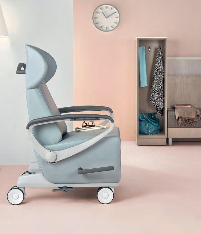
The innovative performance and superior construction of our products results in spaces that function better, while our holistic, human-centred design approach means they feel better too.
+ Sleepover 1.2.3
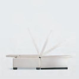
Transforms from an arm chair to a single sleep surface – no mechanisms needed.
Ava
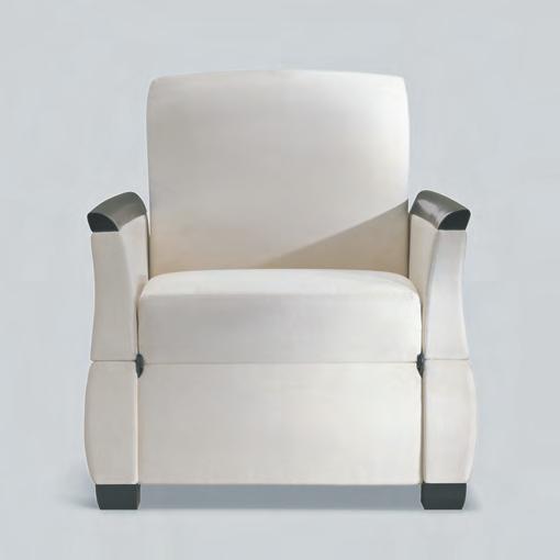
Comfort for long periods of sitting, with lay-flat recline position and controllable footrest.

+ Now with optional MicrobeCare ™
Herman Miller Healthcare’s patented antimicrobial treatment provides added protection against bacteria, fungi, algae, and yeast. Environmentally safe and continually active, it kills 99.99% of microbes and prevents microbe mutation.
+
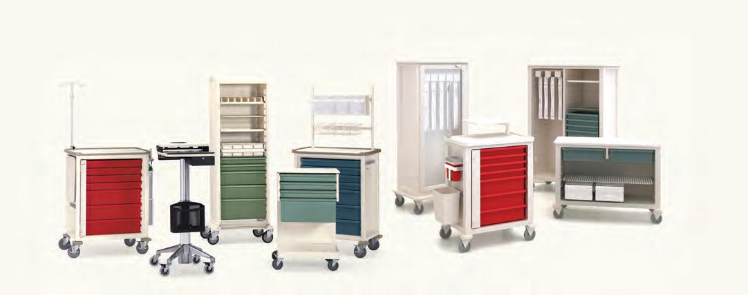
+ Procedure + Supply Carts
Modular system with universal sizes and easily interchangeable drawers and accessories.
+ Florabella
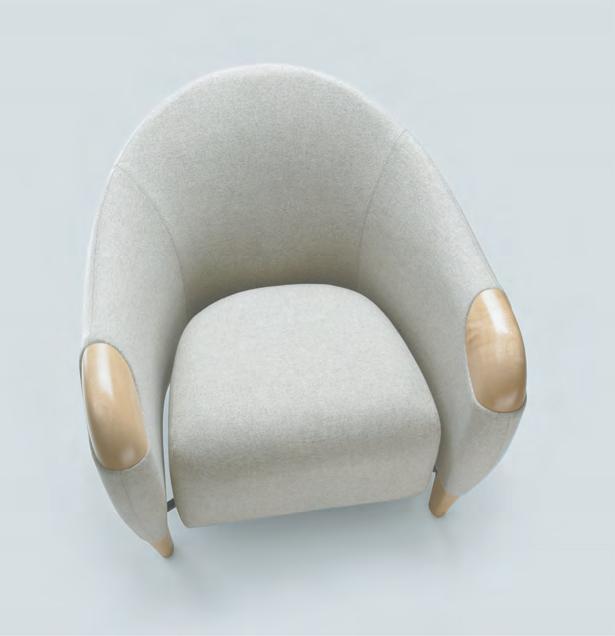
Innovative floating seat lets potential contaminates flow to the floor, preventing build up of germs and bacteria.
+ Sayl Chair
Fewer parts, less material, and still everything a good chair should be. Choose Healthful seating.
For more information and our full product range, please visit hermanmiller.com.au or email us at info_au@hermanmiller.com.
Our products come with our peace-of-mind 12-year, 3 shift warranty, (excluding some fabrics, mechanisms and MicrobeCare).
Fronds Forever
Indesign Haworth
German design studio, ITO Design, recently collaborated with Haworth to produce the new, innovative Fern chair – unconventionally designed to draw emphasis to both visual aesthetics and ergonomic performance. Playfully interpreting its namesake, the centred structure of the chair comprises a concealed suspension system (Stem) that when coupled with the central loop spine support (Fronds) delicately delineates the fern-like structure we see in the organic world.
Each element has been conscientiously devised to holistically respond to the spinal requirements of its end-user: total back support is achieved for the thoracic, lumbar and pelvic areas, bringing some much-needed attention to the chiropractic wellbeing of the contemporary agile worker.
Rattan Revival
Indesign Abalos
Abalos understands that timeless design needs to be a constant work in progress rather than a backward glance. Uniting traditional design processes with contemporary technological finesse, Abalos’ Jacaranda Lamp is a circular hanging pendant that riffs on the romance of antique rattan and cane furniture of yore. By bringing modern low voltage LED strip light technology into negotiation with the handmade steam bent rattan body, Jacaranda lovingly evokes the seed pods dropped in early spring by its eponymous tree species. A stunning revival of the traditional craftsmanship processes.
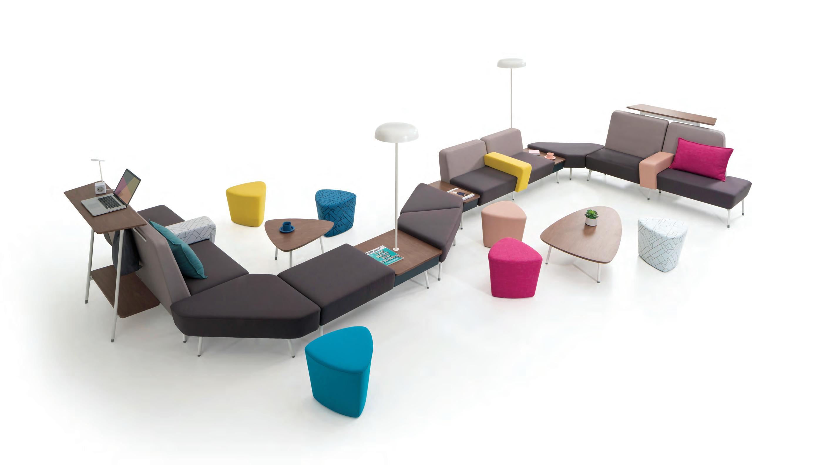
Collaborate, Naturally
Indesign Herman Miller
The design industry has known for some time now, that the more people connect, the better they work. Though the agile workplace is certainly being adopted en masse, intelligent industrial design thinking is critical in facilitating these new behaviours.
Sabha Collaborative Seating™ is the ultimate soft-seating system, which enables ‘natural collaboration’. Its modular design is lightweight, low and open, and can be configured in number of ways. And that’s the key difference, because collaborative spaces need to be flexible in accommodating all types of interactions. They should also be equipped with the right tools, which means power, connectivity and light sources. Sabha Collaborative Seating™ was born out of the realisation that teamwork and collaborative events are intrinsic to the success of an organisation. And here, this new range has been designed to facilitate collaboration, adapt with ease to people using it in different ways and to a variety of interior environments. Additionally, Sabha Collaborative Seating™ offers unprecedented compatibility with Herman Miller’s famed Living Office settings.
IN SHORT INDESIGNLIVE.COM 72
Richard Mosse still from Incoming 2015–16 (detail) three channel black and white high definition video, surround sound, 52 min 10 sec (looped) Co-commissioned by the National Gallery of Victoria, Melbourne and the Barbican Art Gallery, London. National Gallery of Victoria, Melbourne. Purchased with funds donated by Christopher Thomas AM and Cheryl Thomas, Jane and Stephen Hains, Vivien Knowles, Michael and Emily Tong and 2016 NGV Curatorial Tour donors, 2017 © Richard Mosse A MAJOR PRESENTATION OF GLOBAL ART AND DESIGN ONLY AT THE NATIONAL GALLERY OF VICTORIA MELBOURNE, AUSTRALIA

DEC 15 – APR 15 2018 NGV.MELBOURNE
PRINCIPAL PARTNER
PRESENTED BY MAJOR PARTNERS
Mirror Mirror
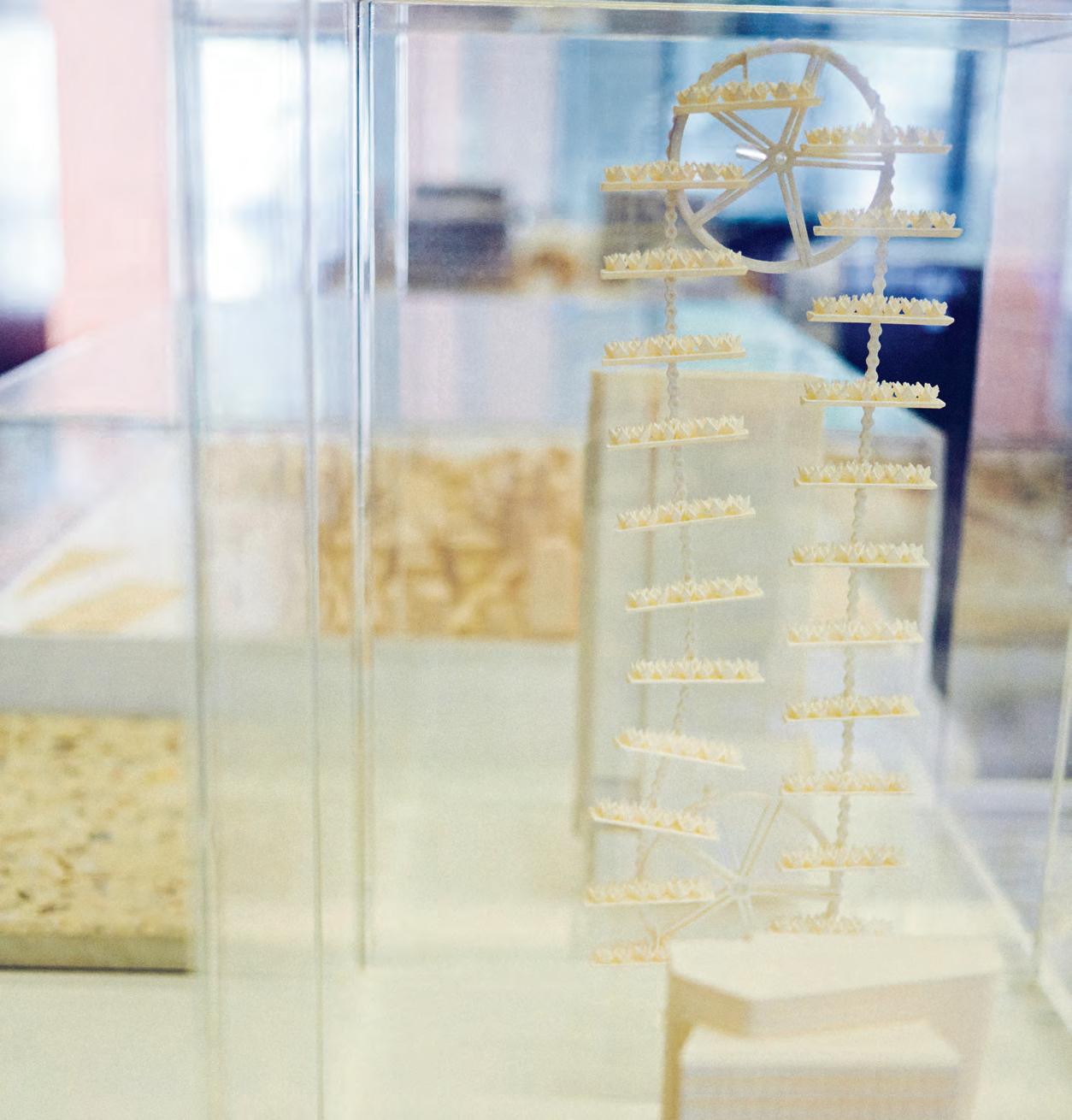
For a seasonal installtion at the Sogetsu School of Ikebana (the japanese craft of flower art) to commemorate their 90 th anniversary, Nendo has created a kaleidoscopic waterfall to cascade down the school’s main exhibition venue.
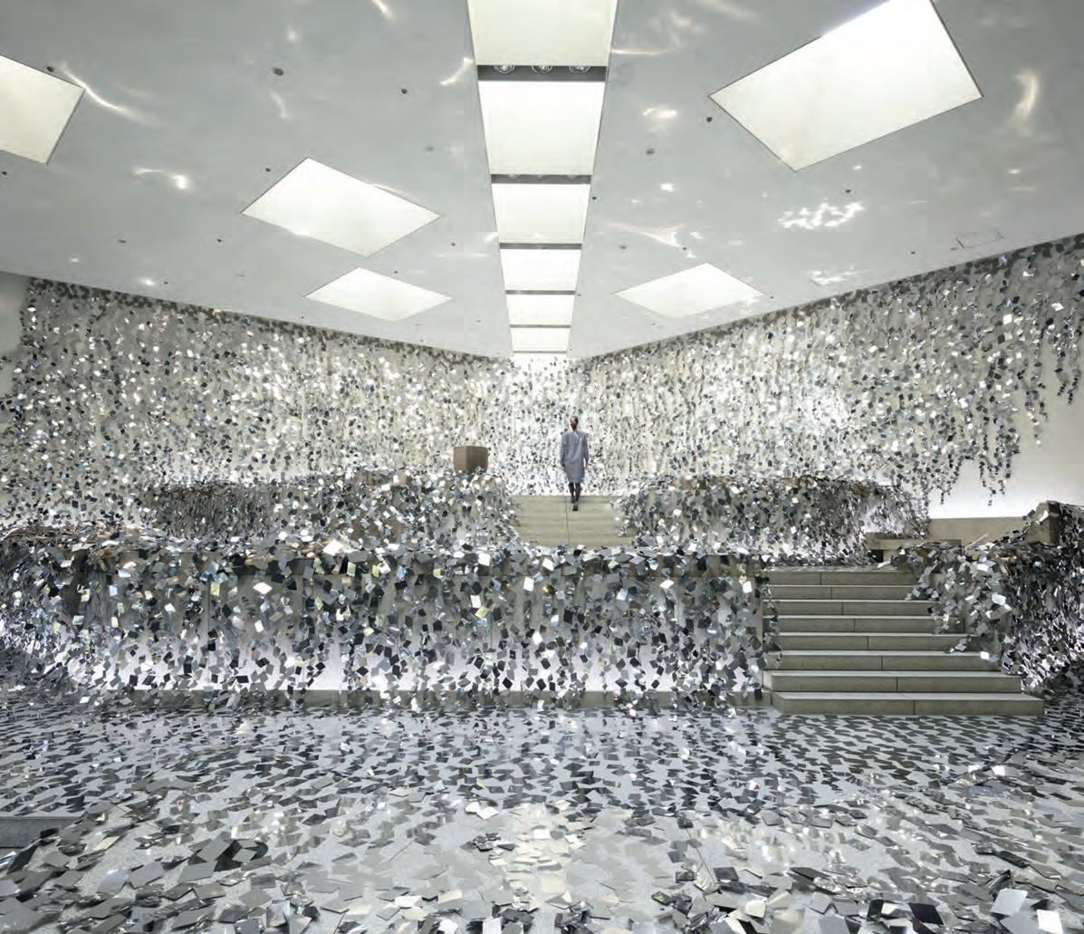
Titled Ivy of Mirrors, the sweeping installation of reflective elements were placed across a layered stone garden created by architect Isamu Noguchi for the school.
In order to highlight this unique space, Nendo cut a thin, stainless steel sheet with a mirror finish into 2,000 rhomboid-shaped pieces. Each element was then individually overlaid across the stone garden,
creating a reflective tableau that echoes the appearance of wildly overgrown ivy. The mirrored installation reflects the surrounding stone garden while also revealing subtle glimpses of its texture, form, and layered architectural configuration.
Refractions of diffused colors and silhouettes of the exhibited ‘ikebana’ flowers and botanical arrangements produce a kaleidoscopic visual effect when entered and engaged with. The addition of this mirrored layer between the ikebana and the interior garden creates a harmonious interaction, seemingly intertwining the flowers within the vast stone space.
IN SHORT INDESIGNLIVE.COM 74
Add To Cart! Top Product Finds From...


IN SHORT INDESIGN 75
The For Collection Wing Back Brand Luxxbox
Wallie Seating & Storage Brand Luxxbox
Slab Standup Table Brand Luxxbox
ThoughtWalls Brand Luxxbox
Birdcage Acoustic Pendant Brand Luxxbox
Shingle Acoustic Pendant Brand Luxxbox
Luxxbox
Indesign
Big thinkers and C r eati V e gU rUs
INDESIGN 79 IN Famous FAMOUS IN
Get Smart
Words Holly Cunneen Photography Charles Dennington
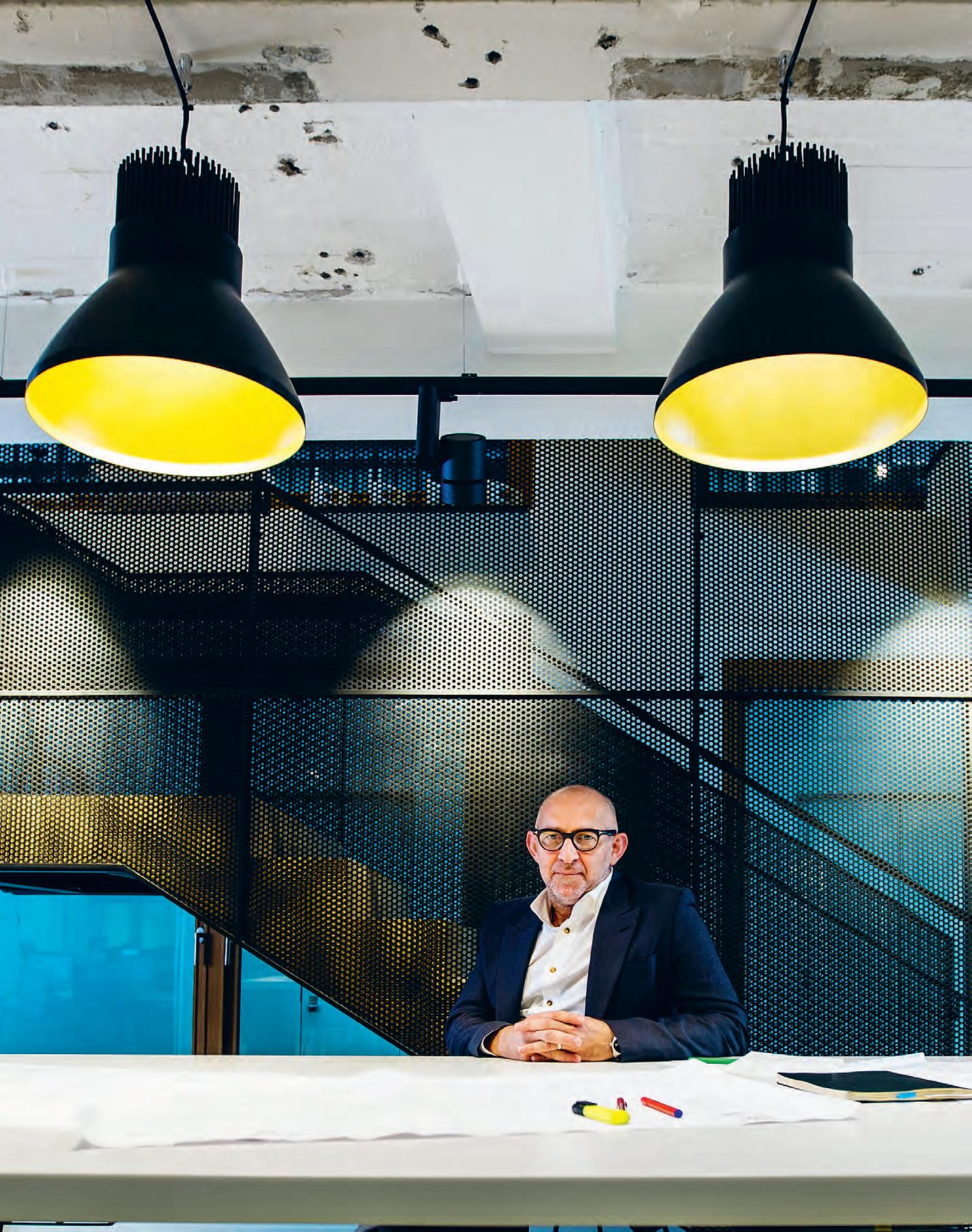
Since Indigo Slam hit the media waves, Smart Design Studio has been the name on everyone’s lips. But it was more than just this project-gone-viral that saw William Smart named The People’s Choice Luminary at the INDE.Awards – it was his entire trajectory of work.

INDESIGNLIVE.COM IN Fa M O u S 80
William Smart is a man who, by his own admission, has become an overnight success – despite the fact that he’s been in the business of architecture for 20 years now. It was a passing comment he made whilst accepting an impressive line-up of awards at the inaugural INDE.Awards (June 2017). That night he accepted two awards on behalf of his practice, Smart Design Studio, for the famed Indigo Slam residence in Sydney’s Central Park precinct. The third, The Luminary award, celebrated his own personal accomplishments in the field. But according to Smart, it’s taken every project he has ever worked on, big, small, or budgeted, to get to where he is today. Everything he’s done in the past informs the work of his future.
“I moved to Sydney because I liked the city, I didn’t have an extraordinary lineage that brought a great series of clients my way, and I didn’t have a business plan,” says Smart. “I just started because I felt like I had a voice that I didn’t understand. I wanted to learn about it and go on a journey of finding out project by project.”
Smart grew up in country Western Australia and studied architecture at Curtin University of Technology in Perth. Indulging an urge to travel, work and explore abroad he bought a one-way ticket to Europe once he’d finished his studies. After stretches working in France and London, it was the opportunity to work on projects, such as the railway station for the Sydney Olympics in 2000, that saw him return to Australian shores. That was when he made the decision to begin his own practice, which has been steadily growing ever since.
Ebbing and flowing between 40-45 staff, Smart Design Studio is exactly where it’s meant to be. The “little company” once envisioned is edging on medium. But this is where numbers will stay. Since taking the world by storm with Indigo Slam, the critically-acclaimed – and much awarded – residential project commissioned by art curator and philanthropist Judith Neilson, the studio has been in

hot demand. But further growth isn’t on the cards. Any larger and Smart wouldn’t be able to maintain the high level of involvement he currently has in all of their projects. As it stands he’s already quite selective in the projects he takes on.
“It’s at the point where if we take on [one project] we can’t take on something else,” says Smart. “So we have to choose carefully, based on our opportunity to be creative, our clients’ investment in architecture with interiors together as one, and their willingness to embrace our attention to detail – we love things that are exquisitely and finely detailed.”
For all the intricacies, diligence, and subtle yet impressive design cues becoming the calling card of his studio, he is notably strict in ensuring functionality in the end product. If a concept isn’t going to be amazing then it’s thrown away. “It’s driven by the big idea, and it’s tested to the most critical detail in order to move forward.”
Smart is a Luminary. He’s a talented, well-respected, admirable architect of great standing and stature. Yet his humble nature and desire to lead his team, “helping everyone get over the line”, is perhaps influenced by his own teachers and mentors, helping him get over the line. “I remember in primary school [my teacher] grabbed me and said, ‘I’m going to give you a set of pencils. I want you to draw, you’re good at drawing’. His attention on me took my grades from being a mediocre student to top of the class,” says Smart. Later, a university lecturer paid extra attention to him as a struggling first year student, taking Smart under his wing. “I just thrived in those conditions.” Luckily so, the wider architecture and design community is certainly better for it.
The Luminary Award was sponsored in 2017 by Wilkhahn.
smartdesignstudio.com
INDESIGN 83 IN Famous
Trust Isn’t Built In A Day
“What has changed since Indigo Slam is that we’ve had more trust and control,” says William Smart. “I once had a client call me and say, ‘I think three-quarters of your work is really boring, but one-quarter of it really captures my imagination –can I have that work?’ I understand that, because 10 years ago [clients] were far more controlling. They would say, ‘I want you to design this house just like the last one you published.’ [Now] people are coming to us and saying, ‘Can you make me something great? What do you think we should do?’ There’s a level of trust that’s come with time.”
INDESIGNLIVE.COM IN Fa M O u S 84
–
CALDER Modular Seating System
The ideas are endless!
Studio Kairos
JEB Interior Solutions Pty Ltd.
Level 3, 80 Wentworth Ave, Surry Hills NSW 2010 australia@jebgroup.com www.jebgroup.com
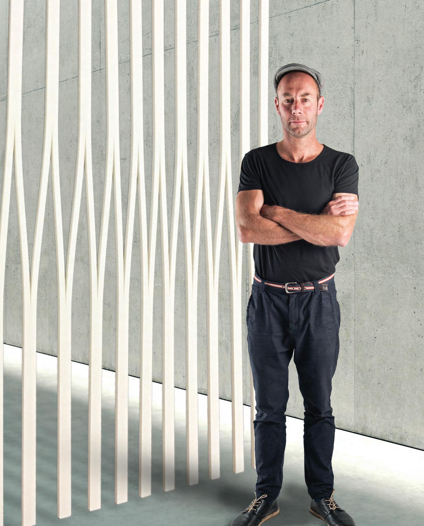
The Boy From Adelaide
“I grew up in Adelaide and initially studied mechanical engineering at the South Australia Institute of Technology. I found Physics and Chemistry fascinating as the subjects allow you to discover how the world functions, down to its fundamental elements and governing laws. During my studies, I worked as a house painter to fund my education. In doing so, I found I was attracted to architecture because of a deprivation of spatial and environmental sensitivities at an early age; I suppose you could say it was a form of escapism. I spent 10 years as an interior designer and then went back to night school to complete my studies in architecture.
Now that I can look back on the last 30-odd years, there was not a single person who influenced my early career – there were many. The first practice I actually worked for was Carr Design; together we invented minimalism in Melbourne. At that time, Melbourne did not have the design culture that you see today. After that, I moved on to work with Nonda Katsalidis. He was the opposite of minimalism, so I was able to be quite dextrous and occupy a lot of that design territory between the two scales. Then, I joined Woods Bagot in Melbourne 27 years ago around 1990. And here I am. Various worldly artists and authors were also significant along the way. What I search for in literature is authors who connect with your thoughts and the way you see the world, so you try and find semblances of those influences, to inspire ones perceptive qualities: Gerhard Richter, Salman Rushdie, Haruki Murakami, they all deal with magical realism – a territory that great architecture always responds to. Currently under construction for example, is 405 Bourke Street Tower, which is inspired by Richter’s glass sculpture, which I saw recently at the Tate Modern.
All of this experience taught me the power of combining interiors, architecture and global knowledge. My education really began in this realm of apprenticeship. It was an addiction and I’ve never really recovered, and though I’m well past my formal education years, I’m certainly still learning. And that’s really because my design approach is about the search for meaning, which is inherently about discovery and self-education.
Every project needs a description of why it exists, not what exemplar it came from. We need to understand project relevance and how this really contributes to the ongoing discourse of design and society. Many designers will probably find this the hardest question to answer: ‘What is the purpose of the design for this specific issue? Why have you approached this project in this way? What is its conceptual
response to site or programmatic references? What is the response to a brief and how is it explained as a narrative or story? If it is just about appearance then you should say that. Aestheticism could be a form of meaning. And meaning is valuable.
NAB HQ at 700 Bourke Street for example, is saturated in meaning. Every time I visit this space I am transformed. I believe this to be one of our great interior volumes of the world, and this is recognised by many locals and visitors from overseas. A whole organisation exposed to the community, a building that designs itself around the structure of an organisation, a building that is built at market construction rate. It transforms workplace activity based on continual learning; it creates micro-climates for human wellbeing. It an idealised kind of Corbusian vision.
But this quest for meaning doesn’t just start and end with the projects we work on. It’s a philosophy that permeates our entire network and organisation. In my role as CEO, I have spent the last year transforming every business interface away from management leadership toward a creatively-lead organisation with management acumen. We need to value our profession and ensure we are rewarded for our gargantuan efforts, late nights and everchanging deadlines. There has been a total focus on empowering and career-developing all of our employees. We have expanded our ownership model and associate programme. We have shifted reward more evenly through the organisation and made transparent all our governing entities towards a representational body based on competencies and away from the hierarchical entitlement model, that most architects and designers believe is their right.
Outside of the world of Woods Bagot, (is there such a place?) general further industry involvement occurs with social time spent with affiliated creatives, chefs, artists, developers, builders, graphic designers and other dreamers. My preference is to be refuelled by solitary and normalcy.
We used to spend a lot of time at St Andrews on the Mornington Peninsula (Victoria) surrounded by the inspiring and dramatic landscape. Now in the UK, it is simply walking the streets, digesting the richness of history and the ever stimulating megalopolises. Two directly opposed landscapes; the landscape of nature versus the landscape of the city.”
The Luminary Award was sponsored in 2017 by Wilkhahn. woodsbagot.com
INDESIGNLIVE.COM IN Fa M O u S 86
London-based Woods Bagot CEO and Indesign Luminary Nik Karalis is still that curious boy from South Australia – always looking to qualify his understanding of design’s purpose and intent, and ultimately, search for its meaning in the most unlikely of places.
Interview Mandi Keighran Photography Richard Boll
“I have spent the last year transforming every business interface away from management leadership toward a creatively lead organisation with management acumen. We need to value our profession and ensure we are rewarded for our gargantuan efforts and late nights and ever-changing deadlines. "
 Nik Karalis, CEO, Woods Bagot.
INDESIGN X
DIDIER
Established in 2000, Didier is an Australian design brand striving to produce meaningful furniture and lighting with smart personality and utilitarian charm. Founder and designer Ross Didier shares why responsive R&D is critical in implementing his future-focused vision for the output of his eponymous studio.
“For me, design should always be underpinned by a strong philosophy that ideas, manufacturing and design are interwoven –an ‘engineered craft’. We started the studio in 2000 under the unified principle that our designs must be saleable, innovative, sculptural and most importantly useful. It takes a long time to be genuine to your own creative voice and I have made an eclectic range of designs since starting, so it’s pleasingly that our Didier designs are increasingly being specified into important projects both here in Australia and overseas.
Interestingly I find the process is becoming less about the product and more about the people who will use the designs, and through this the designs are becoming more eloquent while becoming more unique. And that’s why our R&D is completely different for each project – with some starting simply from the heart and others starting from a specific design brief.
The ones from the heart are more intuitive where an idea or form might simply inspire the creative impulse – a design brief involves a more formal structure to resolve the solution, but what I am finding after 20 years of practice is the two are gradually blending together, creating a more authentic design language from our Didier brand.
A good example is the recent Gelava chair starting as a design brief I set ourselves for a compact lounge sofa that was versatile, sculptural and ergonomically advanced. We didn’t want to design another Scandinavian inspired product and we certainly didn’t want to be retro. I have always admired the great reductionist sculptors
like Brancusi and Moore and I wanted to use my skills of foam carving that I was employed doing in British Theatre during the mid-1990’s. The process started in 3D, making scaled clay models, simple models made in the hand to resolve a form. From these small models, I constructed basic chicken wire structures and layered these with papier-mâché to fill the shape. Polystyrene models were then carved and made, and then computer models were constructed for building the tooling. It was a nerve-racking process, as no one knew exactly how the solid form would mould, and how the shape would shrink. It was a case of putting my money (a large amount of money) where my mouth was because there was no one else putting their hand up to pay. We actually made dough models to bake in the oven to guess how the form would distort.
The intension was to manufacture the chair in full integrated polyurethane foam without any internal rigid framework, so a complex 4-part tool was then locally manufactured by hand for the sculptural moulding.
We then developed sophisticated upholstery patterns that are more aligned to garment fitting in the fashion industry because each piece needs to fit so precisely.
R&D is precious time because the DNA for new product is embedded with how well the design is resolved for future production, so the balance of manufacturing capacity becomes just as important as the product’s aesthetic.
I spend a lot of time rationalizing the development of new products - justifying if a new product will be meaningful and worthy in the market. I also invest a lot of time making sure the balance of design character, engineering, price and production supply is correct before we launch a new product range, and this can all be tricky while remaining a small, boutique company.”
90 DIDIER DI DIER com.au
Interview Sophia Watson Photography Courtesy of Didier
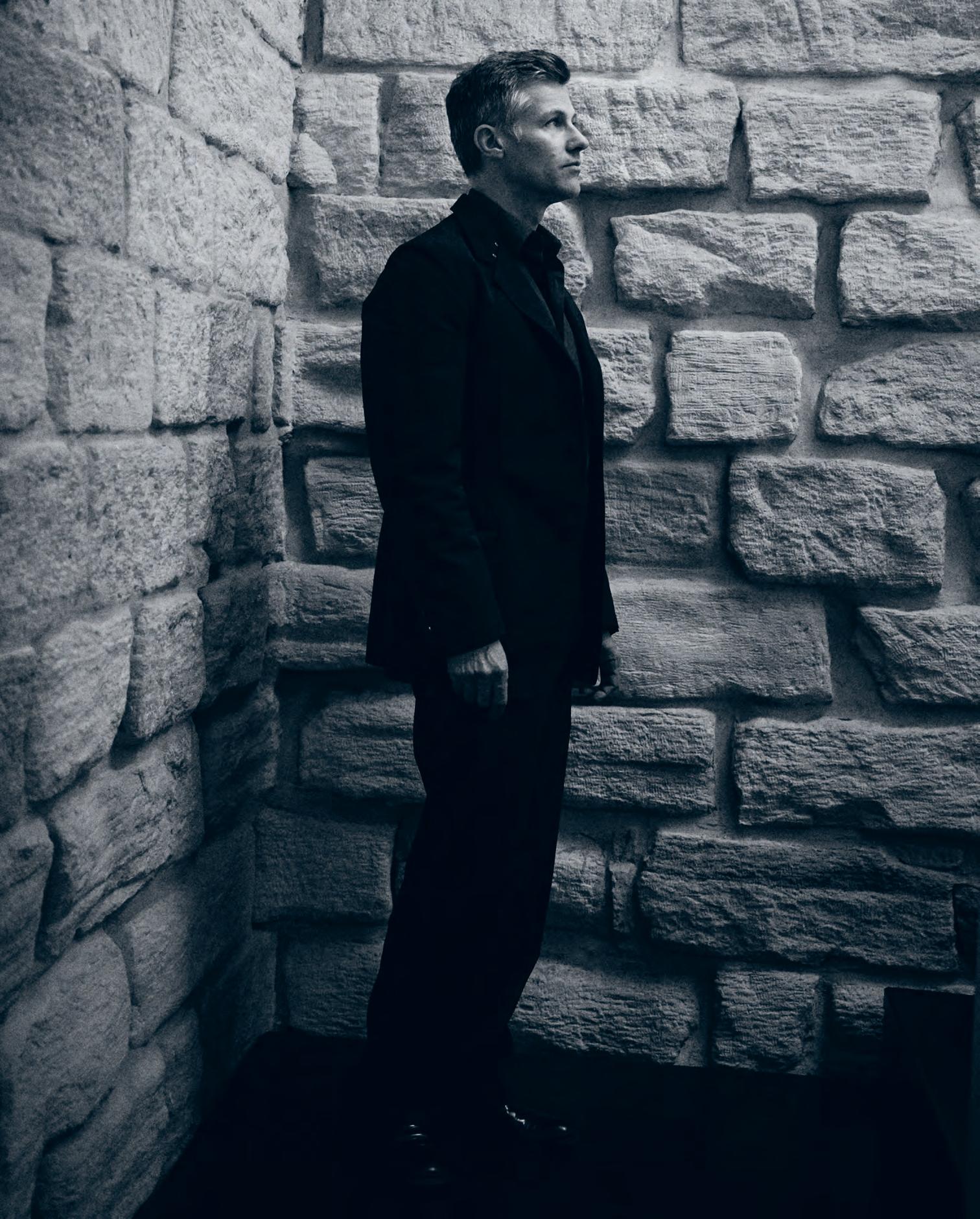
Opposite: Australian designer Ross Didier, founder and designer of Didier.
Design Royalty
Awarded The Luminary title for the 2017 INDE.Awards, founders of the eponymous studio Hecker Guthrie, Paul Hecker and Hamish Guthrie, are considered design royalty within their sector. Their sensitive and considered design approach has already left an indelible mark upon Australian interiors.
Eight years ago Paul Hecker and Hamish Guthrie (HG) drew a line in the sand. They were already in an established partnership, but the goal-posts had recently changed. “It was important for us to use that moment to take stock and clarify the kind of work we wanted to do; how we wanted to be perceived as a practice,” says Guthrie.
Together they had almost 40 years design experience. The body of work was there and the moment ripe with possibility. But Hecker and Guthrie were keen to put some definition around their practice. “We wanted to keep the work close, and maintain a sense of doing good work, which we felt connected to,” says Guthrie.
In that workshop – a rare opportunity for the duo to step back from the practice and take time to reflect – they were asked to bring a single object that they felt represented the HG approach.
Hecker brought a Tom Dixon Offcut Stool, speaking to its materiality, simplicity and connection to heritage, (the piece being a modern take on the traditional milking stool). Guthrie brought a spinning top, handmade in natural timber, which he’d bought from a Venetian wood turner on a trip to Italy. “The spirit of that object lay in its craftsmanship, its beautiful sculptural form, and the sense of play and whimsy about it,” he says.
These were all qualities that spoke to the design values for which HG has become known: authenticity, consideration, emotional connection through design, and rigorous refinement.
“We always wanted to be considered and relevant. From our perspective a successful interior is where you make someone feel a certain way intentionally,” says Hecker. “While our aesthetic may not be unique, it’s the subtleties borne from long experience that make the difference,” he says.
Eight years on, HG are on the cusp of new development. “We’re reassessing, reconnecting with our team. Challenging
ourselves to articulate the fundamental ideas underpinning what we do. It’s cathartic,” says Hecker. When Hecker and Guthrie started out some 30 years ago, the Australian design industry was a very different place. “There were literally five design firms and it was very defined, very corporate,” says Hecker. “There was little in the way of domestic design.” Since then the industry has developed into a diverse and pluralist culture. “You have to work harder to define yourself,” he says.
This new period of ‘refinement’ for HG sees them re-examine the process in which they work: “How to keep our people engaged and motivate them, give them the tools they need to exceed, and be engaged in the design process.” Forefront in their minds, too, is the legacy they leave behind. While everything they do is of an awardwinning or print-worthy standard, the question remains: “Have we created our legacy? Hecker Guthrie’s body of work is a legacy, whether you love it or not. But more and more we’re striving towards a legacy we can feel proud of, that also excites us.”
In a world where reinvention is often treated as the solution to survival, Hecker and Guthrie firmly believe in the power of refinement. “The problem with reinvention is that it’s a prototype –you reinvent at your own risk,” says Hecker. To constantly hone – to question the norms and critique one’s own concepts, processes and outcomes – “it takes guts”. And a brave client, willing to join them on the journey.
Guthrie returns to the Offcut Stool, Tom Dixon’s homage to the traditional milking stool: symbolic of heritage, design pedigree and modern refinement. Symbolic of the Hecker Guthrie approach. Really a legacy in its own right.
The Luminary Award was sponsored in 2017 by Wilkhahn.
heckerguthrie.com
INDESIGNLIVE.COM IN Fa M O u S 92
Words Alice Blackwood Photography Christine Francis
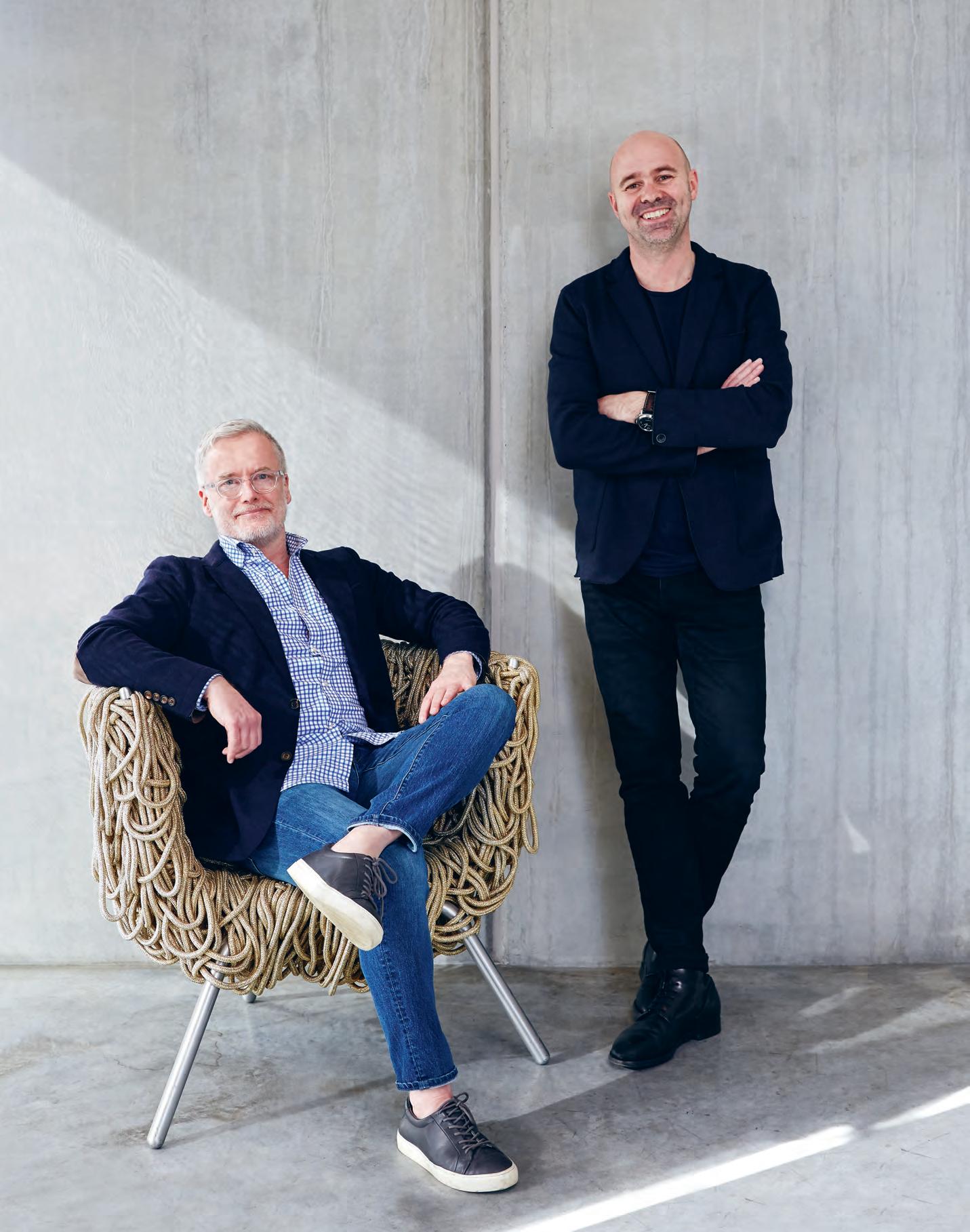
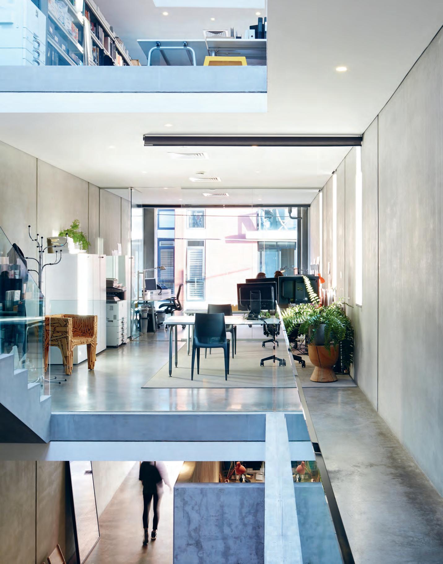
“We always wanted to be considered and relevant. From our perspective a successful interior is where you make someone feel a certain way intentionally. While our aesthetic may not be unique, it’s the subtleties borne from long experience that make the difference.”
Hamish Guthrie, co-founder, Hecker Guthrie.
INDESIGN X BSH
Words Sophia Watson
Not everyone is the same. What’s right for one isn’t right for another and brands need to be smarter in anticipating who we all are, and what it is we need. Here, the BSH family features four formidable brands, each unique in their own right, but driven by one uniting value – improving our quality of living.
96 BSH B o S c H - H ome .com.au

97 bosch-home.com.au bsh

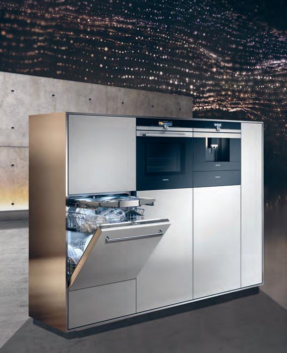
98 BSH B o S c H - H ome .com.au
The alarm clock rings. Time to get up, prepare the coffee and make breakfast: warm the bread rolls in the oven, and fetch the chilled orange juice, butter and jam from the refrigerator. Mix a smoothie, prepare scrambled eggs, all while quickly throwing the dirty laundry in the wash. Scenes such as this unfold everyday in households – no matter where you are in the world. Home appliances should help make everyday life easier for us all.
The demands on these helpers have grown – these days it’s no longer enough for the refrigerator to chill or the oven to heat. It’s about the changing requirements of our everyday lives, about forward-looking technologies, and about aspects that impact buying decisions such as design and material, and especially about energy efficiency and sustainability.
This is exactly where BSH comes in. There are four children in the BSH family of brands; each characterised by a set of principles and beliefs as unique as their users. There’s Bosch – the classic one; Siemens – the smart one; NEFF – the social one; and Gaggenau –the luxurious one.
Bosch (the classic one) for example, is a brand that would “rather lose money than trust,” as founder Robert Bosch once famously said. Bosch is the one who helps you turn your home into the place where everything goes according to plan. Where you can leave the complexity of the world behind and just enjoy simple sophisticated solutions. Where everyday life is made easier by appliances that are intuitive to use. This 130-year old is nothing if not reliable, and has won more than 300 international design awards in the past five years – more than any other appliance brand in history.
Siemens on the other hand (the smart one) is best known for its exciting possibilities through technological advancement. This highly intelligent, progressive brand is your best friend for smart cities and their modern living spaces.
Siemens excites its discerning users with technologically pioneered, architecturally designed appliances that enhance life experiences. Imagine – touch controls that anticipate your every
need, automatic meals with a few simple touches, ovens that cook 50 per cent faster, responsive self-thinking rangehoods, pre-loaded dosing for 26 washes. If this is you, you should get to know Siemens –I think you guys might hit it off.
While NEFF (the social one) is not technically the eldest of the BSH siblings, it is the longest standing brand with a primary focus on cooking. NEFF is a brand dedicated to those who simply love cooking. Born in 1877, NEFF is a major cookaholic, who wants nothing but to bring together people and food. This 140-year old socialite is inspired by intuitive design that delivers features you won’t find anywhere else to make cooking, baking and washing up easier, to ensure that other passionate foodies enjoy their kitchens even more.
Innovations such as the : Slide&Hide ® – the disappearing oven door, CircoTherm® – NEFF’s special hot air system and TwistPad® –the removable, magnetic control knob for your cooktop, for example, all demonstrate NEFF’s love of creating great food together with family and friends.
Finally, we have the eldest BSH child, Gaggenau (the luxurious one). 334 years young, Gaggenau is known for one key thing: bringing professional culinary culture into the high-end, luxurious domestic environment. Gaggenau is an avant-garde aspiration. Part artist, part engineer, Gaggenau is known for being authentic, sculptural, present and generous with its users. Born in the Black Forest in 1683, Gaggenau is a global luxury brand inspired by the requirements of leading professionals and top chefs, designed with originality and hand-finished to give its products a sense of soul. It is the world’s most exclusive, luxurious and valuable cooking experience you will ever encounter.
Though they each have their own distinctive identities, the BSH siblings each share three key commonalities that the BSH family is well-known for: simplicity, clarity and reliability. And while they might approach this in different ways, the BSH family goal is always the same: to give rise to innovations that invigorate and ensure better quality of life – whatever that might mean for you.
99 bosch-home.com.au bsh
Opposite (from top, left to right): Bosch Series 8 Home Appliances; Gaggenau 400 Series Oven and Combi Steam and Vacuum Drawer; Siemens iQ700 Home Appliances; NEFF Home Appliances.
“There are four children in the BSH family of brands; each characterised by a set of principles and beliefs as unique as their users.”
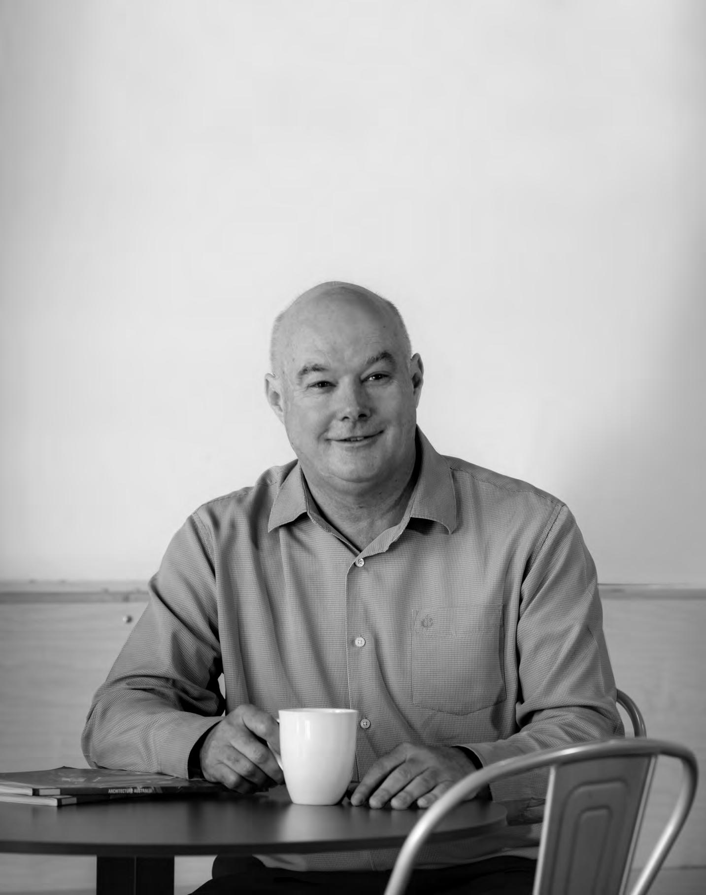
Practice What You Preach
The ‘workplace revolution’ only dates back a little over 20 years. And the focus has been almost exclusively on the commercial office. But attention is shifting to other kinds of workplaces which are less to do with office space and more about the coal face – hospitals, schools and aged care facilities, intense environments where the efficiency, productivity and well-being of the workforce are even more crucial.
Queensland architects, Fulton Trotter, are 70 years old and still basically a family practice. They specialise in education, health and aged care, especially in regional settings. They have a reputation for place-making, identity-building and fit-for-purpose buildings.
Director, Mark Trotter, comments: “We’ve always concentrated on a very collaborative process with clients, the project being unique to that client and that place. When you look at our projects there will always be a reason for that thing being what it is – to do with the client, the site, the client’s ethics or particular stories.”
He points out, there are practices which concentrate on finetuning a building model over many years, but Fulton Trotter’s work is “more idiosyncratic to time and place”. At the design level, he says, they actively discourage the idea there is a “Fulton Trotter way”.
So what is it about Fulton Trotter’s own workplace culture which enables it to so successfully create workplace cultures elsewhere?
For one thing, there is cultural continuity. People tend to stay on and the idea of a family practice has evolved over time, married now to a very modern approach to management.
“It’s a culture,” says Trotter, “which is about believing in the core idea of architecture – that it’s not just about design. We want to produce good design work, but we want to do it in a way that provides both good value and good ethics.” He points out that architecture is a profession – not a business – and ethics ought to be at the heart of
any profession. It is not a case of ‘Let the buyer beware’, but ‘Let the buyer trust’. The architect’s office must reflect that. Hence, Fulton Trotter offers a collegial environment with sensible working hours, sensible expectations and good relations between people.
Decision-making follows a consensus model, not a majority-rules model. One person can stop something happening. “You don’t have the autonomy to lead the practice into weird places,” says Trotter, “but you have the autonomy to do anything you like design-wise.”
Once they struggled whenever someone left, always replaced by someone at the same level who brought in ideas that upset existing staff. So, instead, they now simply move everyone up – new responsibilities, better salary – and bring in an entry-level architect. “Everyone can see a career path,” says Trotter.
They don’t use recruitment agencies. New staff come through family and connections. Their latest recruit Trotter met working in the local pet shop! It is a diverse practice with perfect gender equality. It is team-based, the teams formed around the directors. They are quite autonomous and, hence, quite competitive. One of the benefits of this is that “they don’t slavishly copy, but continue to re-invent”.
“We don’t,” says Trotter, “get guns from the university to bolster the practice – we try to build that from within.” And because of the way the practice is structured, “the learning cascades down”.
Similarly, the performance appraisal process also cascades down. “We don’t,” he says, “get very many people in the office who are passengers because the people around them won’t let them be.”
fultontrotter.com.au
INDESIGN 101 IN Famous
Architects help drive workplace culture, but Queensland firm Fulton Trotter represent how the efficiency, productivity and well-being of their designed environments is applied to their own internal workplace culture.
Words Paul McGillick Photography Steve Ryan

Abey Australia’s diverse range of sinks includes a hand-picked colour selection of quality German engineered sinkware from SCHOCK. Visit an Abey Selection Gallery to browse the range. SCHOCK Signus 1 & 3/4 Bowl in Rouge Red VICTORIA Selection Gallery 335 Ferrars St Albert Park Ph: 03 8696 4000 NEW SOUTH WALES Selection Gallery 1E Danks St Waterloo Ph: 02 8572 8500 QUEENSLAND Selection Gallery 94 Petrie Tce Brisbane Ph: 07 3369 4777 *NEWLY OPENED* WESTERN AUSTRALIA Selection Gallery 12 Sundercombe St Osborne Park Ph: 08 9208 4500
BE SCHOCKED.
Provocative, radical & e N er G i S i N G de S i GN
INDESIGN 103 IN SITU Situ i N
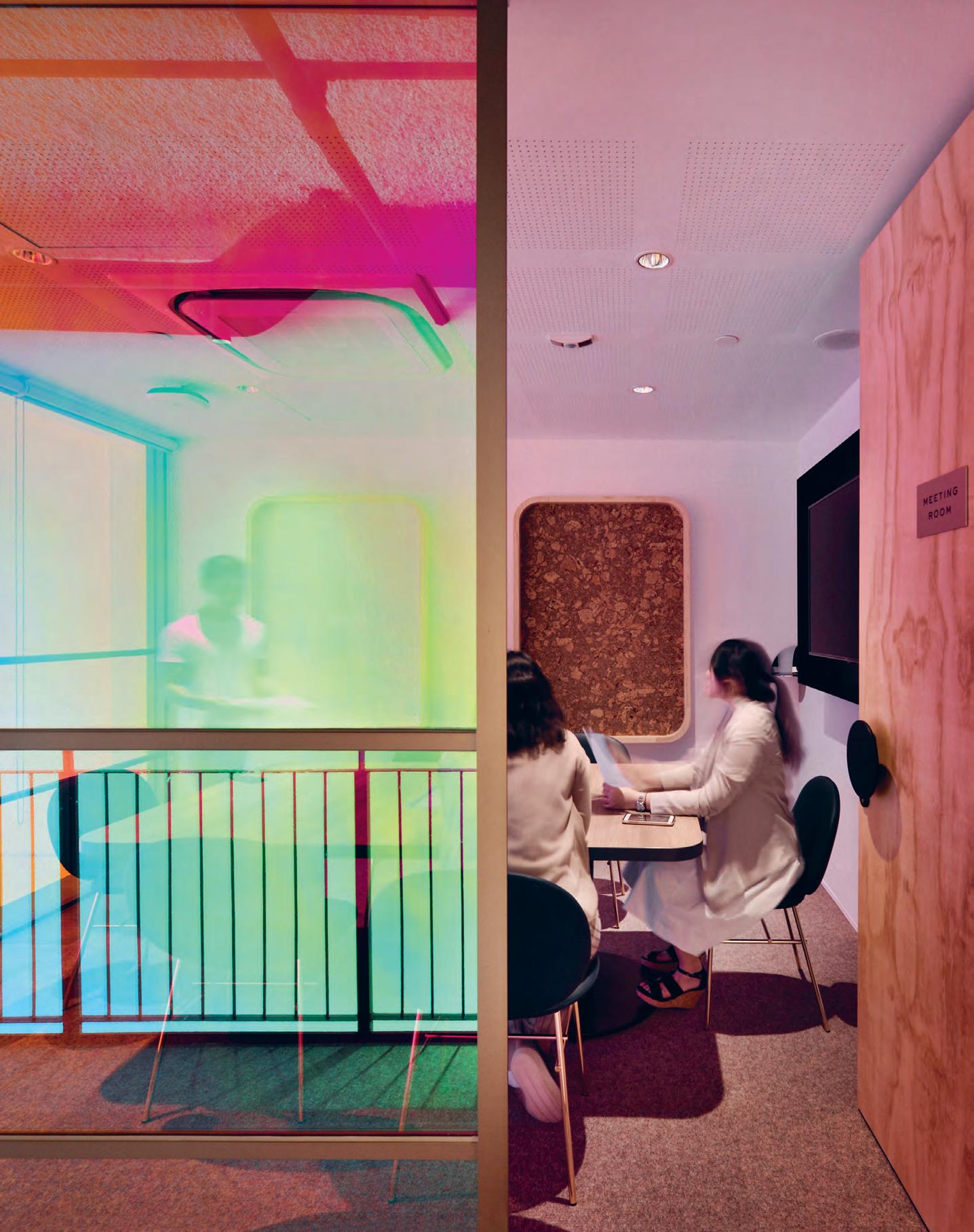
Has co-working been up-staged by the pervading popularity of an out-of-office culture? The answer is, not quite yet!
Working On It
In their latest design for The Working Capitol Robinson Road Singapore, HASSELL expertly subverts pop culture tropes to re-envisage co-working as a progressive yet playful model that speaks the language of the Millennial workforce.
INDESIGN 105 IN SITU
The Working Capitol, Robinson Road Singapore by HASSELL Words Asih Jenie Photography EK Yap
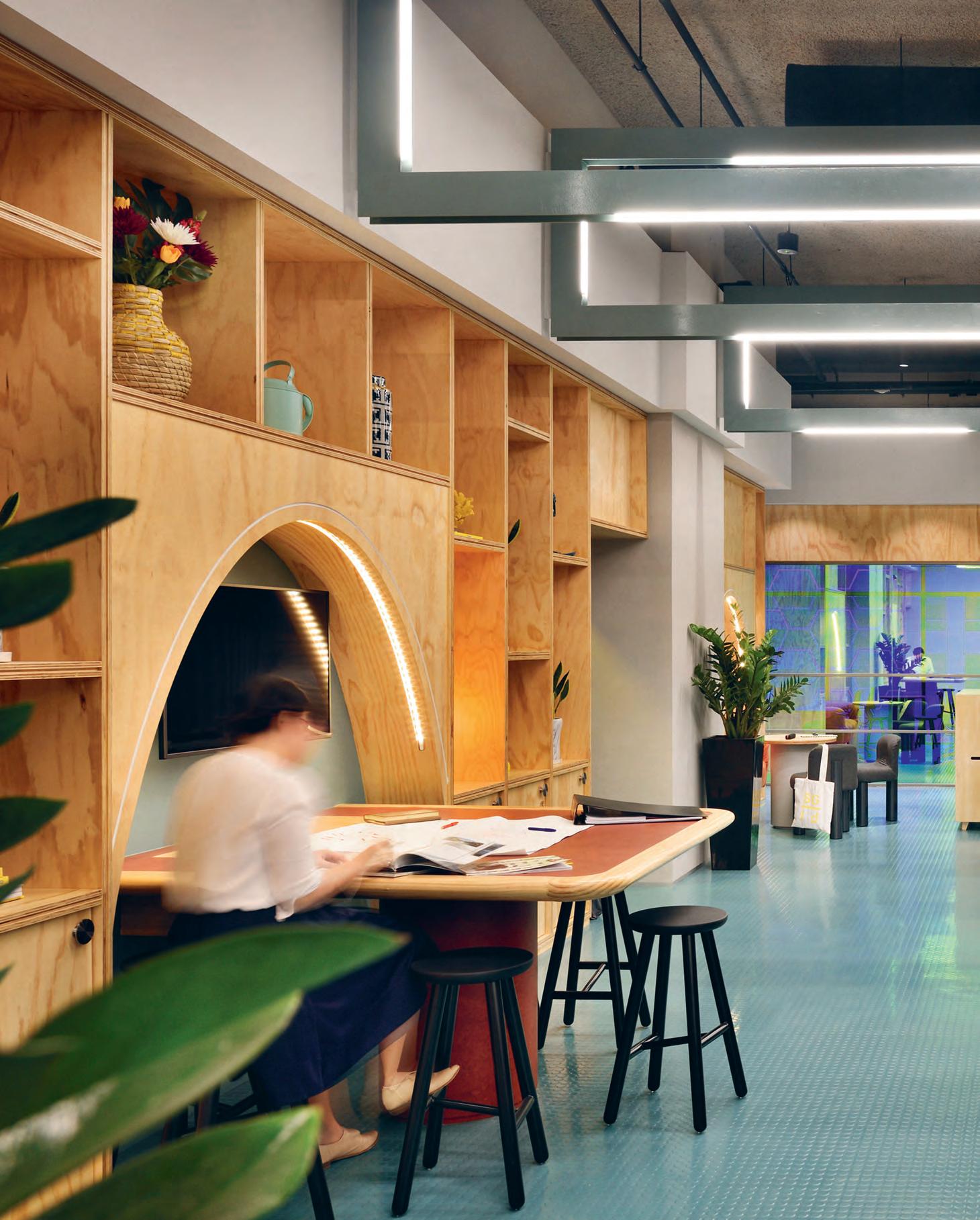
We’re All In This Together
The plywood workstations in the space are the result of a collaboration between The Working Capitol (TWC), HASSELL, UK platform Opendesk, and Singapore-based design and fabrication studio Woodfix. The base design for the workstations was downloaded from Opendesk, tweaked by HASSELL to suit the site, and fabricated by Woodfix. “It’s an affordable way to obtain custom-made products,” says HASSELL’s Joel Sampson. “It also reduced the carbon footprint and supported local makers.”
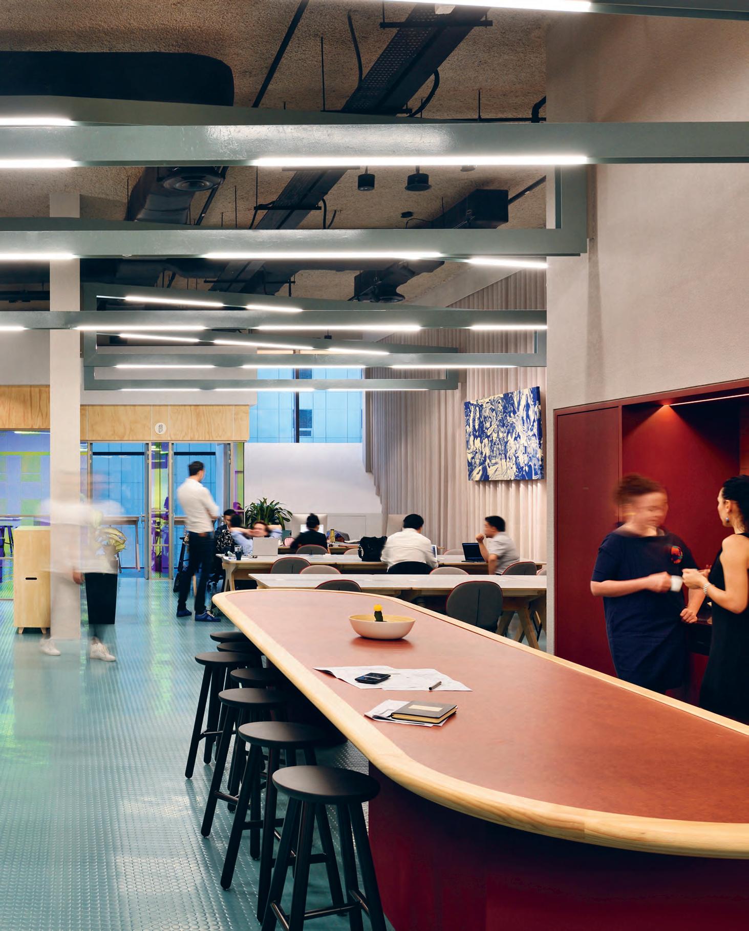
–
Imagine that Friday night overtime crunch: you’re hunched down at your desk, a lonely figure lost in the open-plan of just another high-rise tower office. And then you hear curious, excitable sounds coming from a nearby fellow occupant. Not something you expect to hear from your isolated office space. Looking out towards a neighbouring office tower, you spy a party of people milling in a double-height open space carved from the tower façade. Decked with greenery and a pool with giant animal floats, the scene seems like a mirage, conjured by your fatigued Friday night. But it’s not.
‘That office’ is The Working Capitol at Robinson Road, Singapore’s latest and hottest co-working address in the Little Red Dot. The party: a scene from their opening night. Designed by HASSELL, TWC at Robinson Road occupies 11 out of 19 floors of the Crown at Robinson, a newly built Neo-Artdeco commercial building designed by Ong & Ong. The premise is TWC’s second outpost on the island.
TWC entered Singapore’s commercial scene in 2015, where coworking wasn’t regarded as a progressive lifestyle choice so much as it was a necessity for start-ups to offset Singapore’s premium rental. The first TWC took over five shophouses along the city’s historic Keong Saik Road and (in collaboration with Takenouchi Webb, FARM and Foreign Policy Design) turned them into an exciting co-working space that has fostered a vibrant and equally exciting community. It was one of the key institutions that made co-working cool in the Little Red Dot.
A great sequel is hard to make, and it is especially challenging after a stellar debut. TWC at Robinson Road could have easily followed that all-too-familiar Hollywood narrative: small Indie productionturned-cult classic receives huge capital only to spawn a soulless sequel. Thankfully, HASSELL has expertly subverted this trope by not only staying true to the character of the original TWC, but also cultivating a compelling character development.
“Keong Saik is the spiritual home of The Working Capitol while Robinson is a more grown-up, city version of it,” says Joel Sampson, HASSELL’s project lead. “There’s a polished edge to the raw.”
A big part of TWC’s appeal is the way the space makes you feel at home. The main question that HASSELL needed to answer for TWC at Robinson Road, says Sampson, was how to bring over this intangible element – its soul, if you will – from the shophouses of Keong Saik to the concrete shells at Robinson Road, without it
becoming a pastiche of the original. With more than twice the real estate of its first branch, five-metre height between floorplates, and amenities including a 20-metre outdoor lap pool, a gym run by a boutique fitness operator, and a lounge and event space incorporating a bar, TWC at Robinson Road is every bit the picture of a Millennial CBD establishment. Yet, upon entering, one can immediately feel the friendly, almost residential feel of the space. “We wanted to create a sense of domesticity through the materials and the layout,” says Sampson.
HASSELL organised the large floor spaces into the more humanscaled rooms and zones using a distinct geometric language of plywood arches and framing. This went a long way toward recalling the scale and architectural details of the shophouses at Keong Saik. The material palette uses plywood and paper to soften the interior, and pairs them with fresh solid colours and dichroic film on glass for a dose of fun and richness.
The floor stacking alternates between collaborative floors and quiet floors, topped by penthouse floors offering duplex units. On the collaborative floors, visitors are welcomed in breakout areas, flanked by communal work benches. Workspaces in varying capacities line the corridors. High above the rubber flooring, the ceiling is brought down to a more intimate scale by trusses fitted with custom LED lighting.
Dubbed ‘The Pindrop’, the quiet floors sport a similar layout but vary in the details to create a more muted-style of ambience. In place of breakout areas there are cosy nooks with single sofas.
The colour palette is noticeably cooler and the rubber flooring is swapped out for carpet. Entry is discrete – through the side doors. And in a rather cute display of kitsch and personality, both floor types have unisex toilets. But like everything ‘fun’ in the space, it also serves a purpose: “It’s both a way to save space and to foster another kind of collaboration. Remember the unisex toilets in Ally McBeal?” quips Sampson.
All in all, The Working Capitol at Robinson Road is a strong sequel that has cultivated the comfort of familiarity, while owning a distinct, compelling character that is very much needed in a competitive co-working context. Definitely a cult-classic.
hassellstudio.com
INDESIGNLIVE.COM 108 IN SITU
Page 104: Private meeting studio on the second floor mezzanine, adjacent to the central atrium. Page 106-107: Central collaboration hubs become areas for activity, conversation and chance encounters. Opposite: Quite areas for focused work alongside a communal kitchen, positioned beneath the second floor’s private meeting rooms. Page 110: Collaboration floor hallway with adjacent meeting rooms and communal work areas.
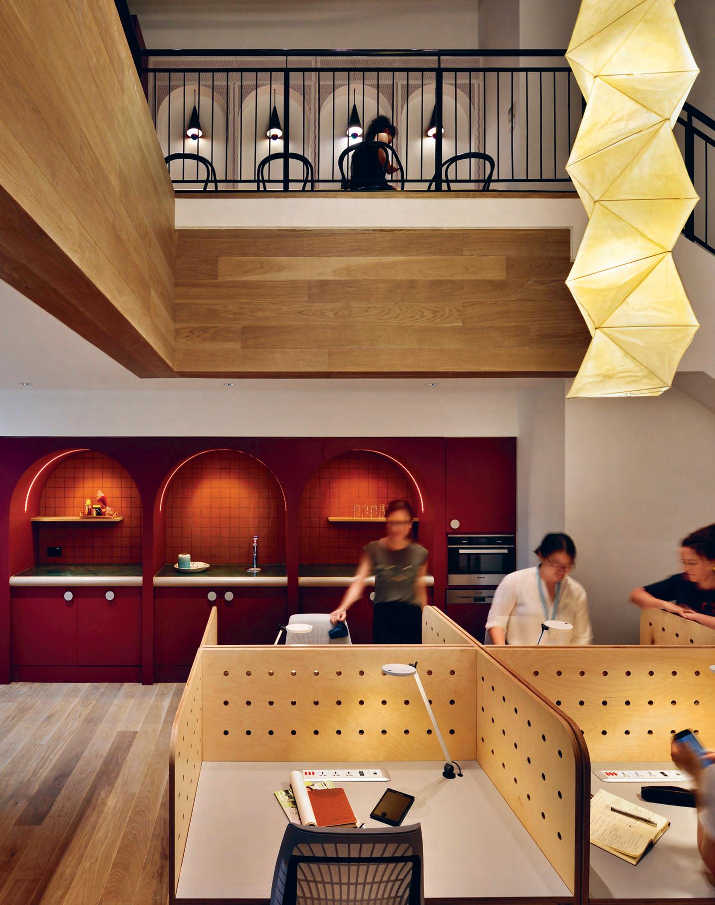
is hard
make, especially after a stellar debut. TWC at Robinson Road could have easily followed that all-too-familiar Hollywood narrative... thankfully, HASSELL has subverted this trope by not only staying true to the character of the original TWC, but also cultivating a compelling character development.”
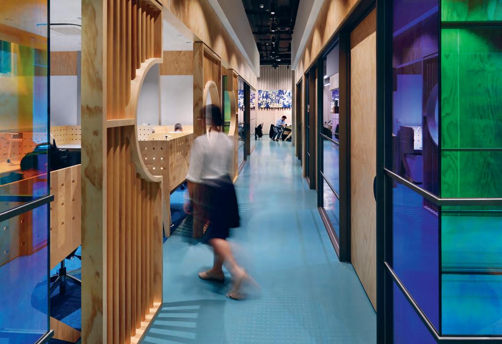
INDESIGNLIVE.COM 110 IN SITU
“A g reat sequel
to

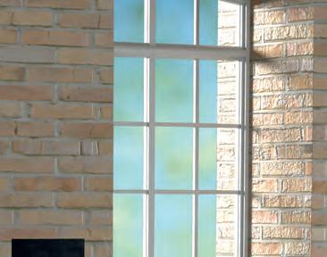

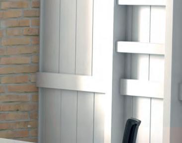
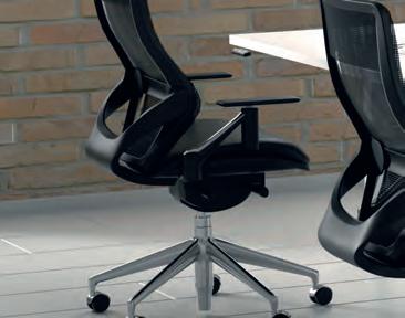

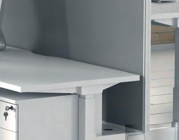
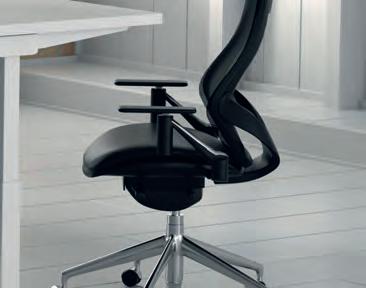
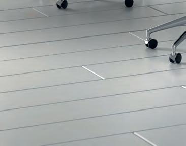
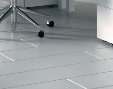
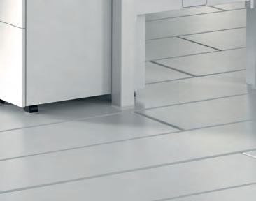


Officeworks has developed a furniture system to deliver high-quality commercial furniture solutions to businesses seeking value without compromise. The Stilford Professional Furniture System is contemporary, functional and flexible, with a variety of configurations to suit the changing needs of the modern workplace. For more information, contact an Officeworks Workspace Solutions Specialist by emailing officefitout@officeworks.com.au Printed for 02/11/2017. Furniture on this page comes fl at-packed, ready to assemble. Display accessories not included. OWO2802_ID We’re here to help you fit-out contemporary workspaces.
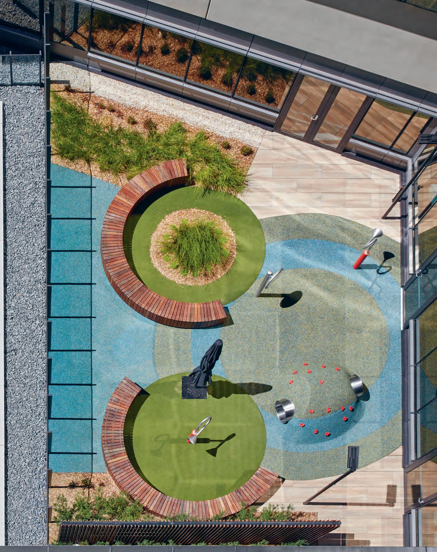
The oft-opposing principles of medical-based thinking and evidencebased design have long been a sticking point for healthcare designers. The new Bendigo Hospital by Bates Smart and Silver Thomas Hanley shows us they need not be mutually exclusive. There is a sweet-spot to be found. It just takes an intelligent and intuitive design touch.
In Good Health
Bendigo Hospital by Bates Smart & Silver Thomas Hanley Words Marg Hearn Photography Peter Clarke
“It was about softening the architecture, giving it multiple visual layers to appeal to people moving through the space. So the built form becomes the restorative environment that replenishes them and takes a load off their shoulders,” says Bates Smart director, Kristen Whittle.
INDESIGN 113 IN SITU
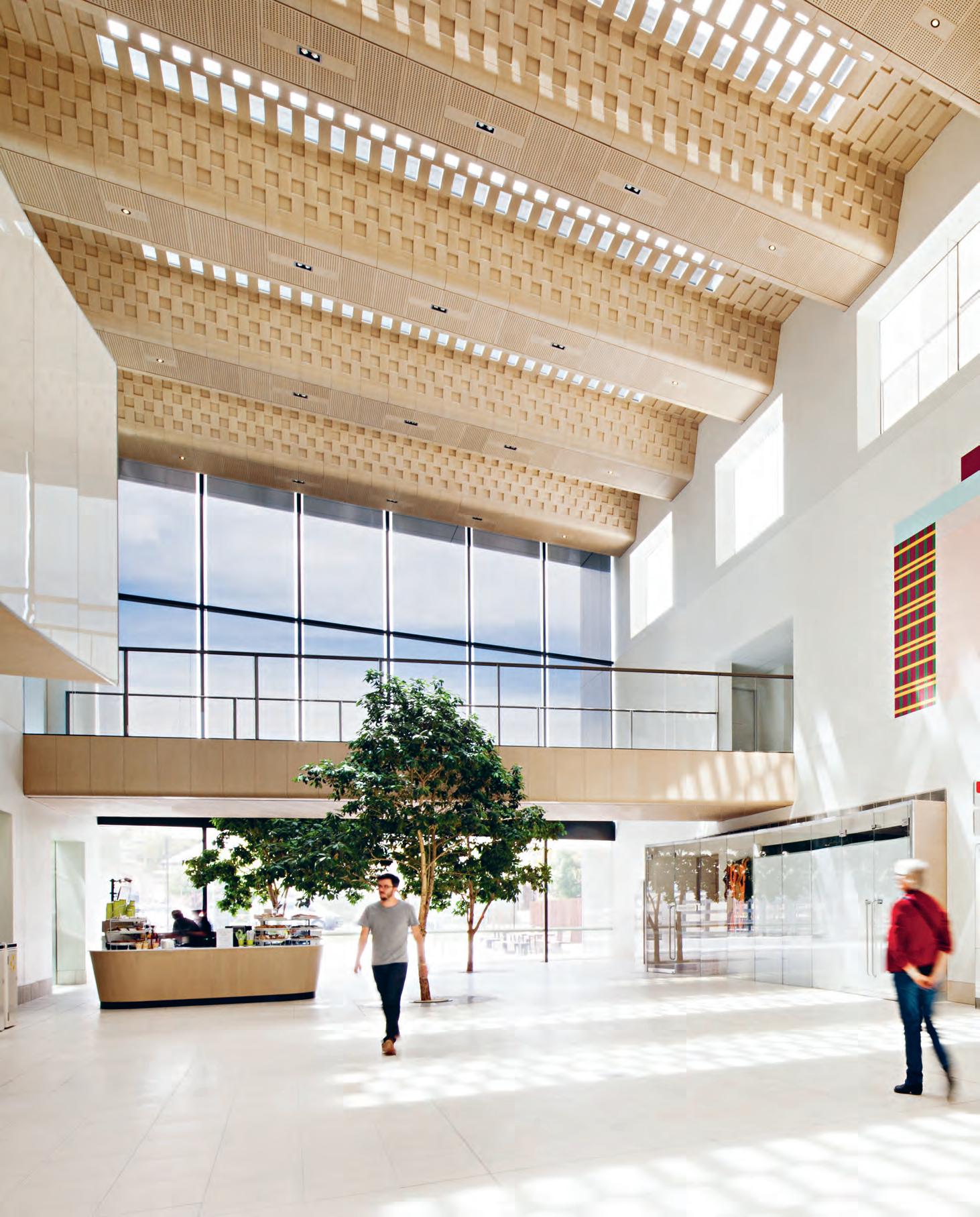
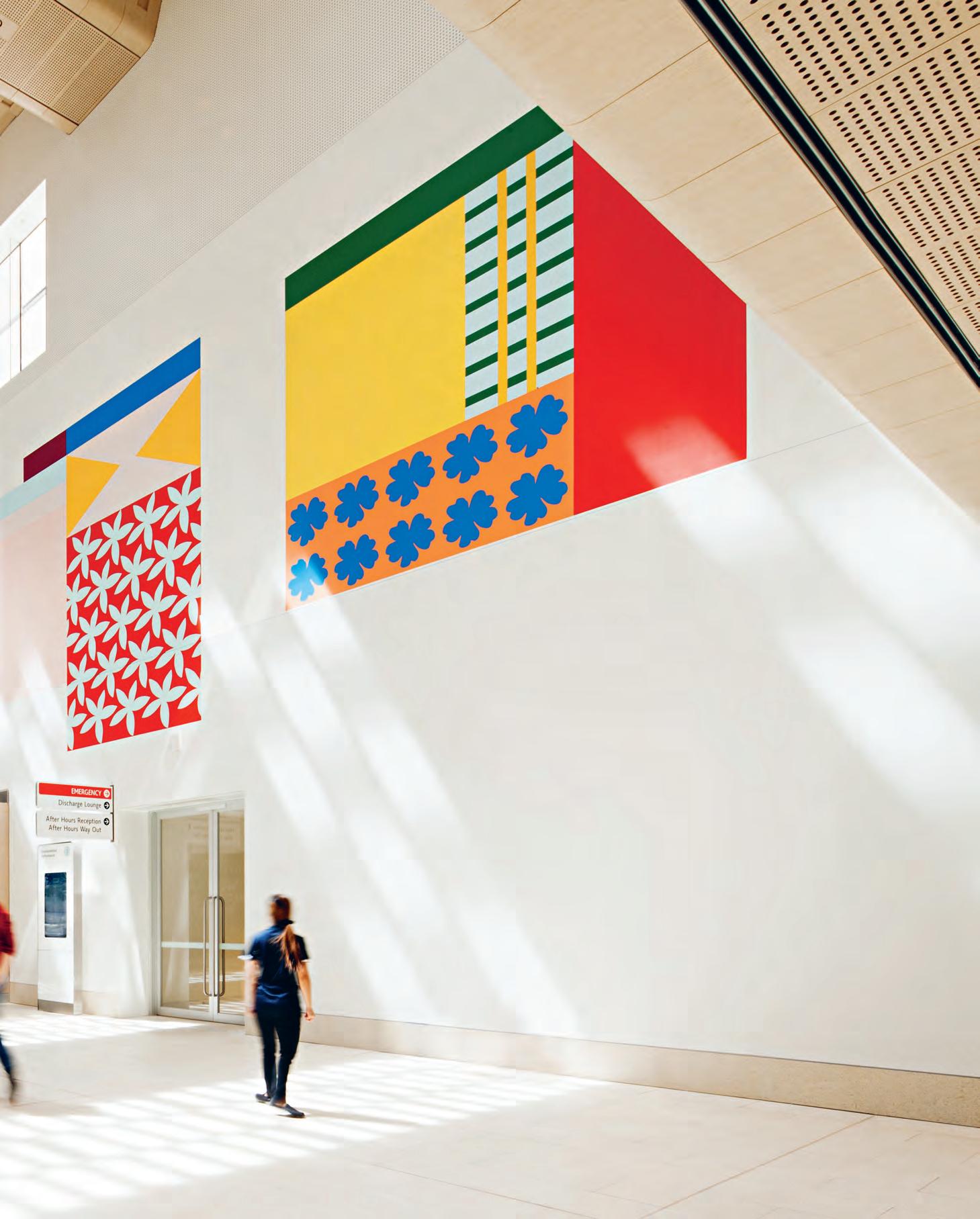
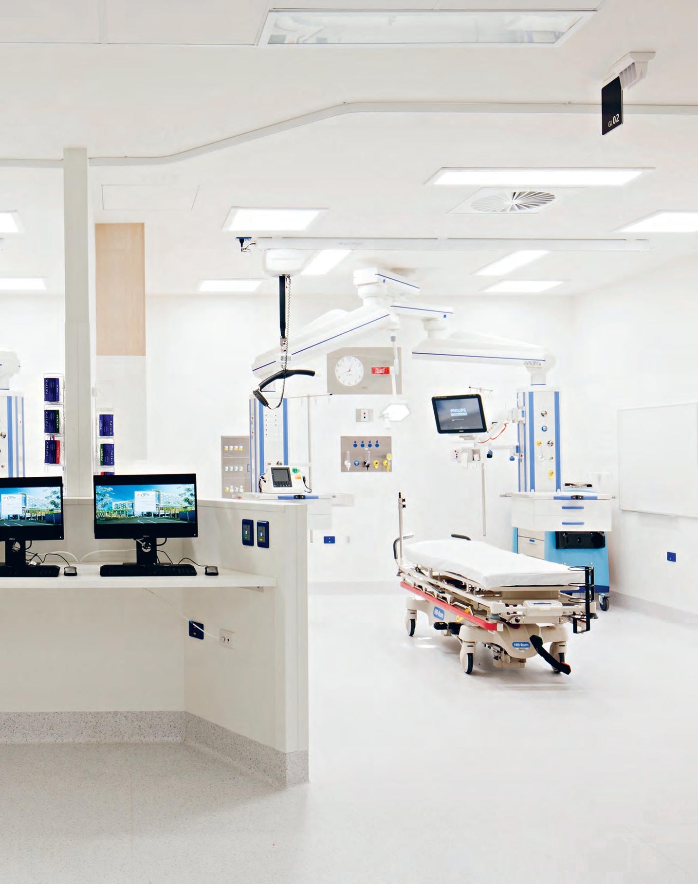
As one of the practices responsible for delivering the multi-awardwinning Royal Children’s Hospital Melbourne, Bates Smart is a pioneer in healthcare design. That project is over five years old now, yet remains a benchmark in how to create a normalised environment within a setting that’s often riddled with complex levels of criticality. The practice has since designed a number of other major hospitals, all the while continuing to embrace a patient-centric approach, underpinned with evidence-based design principles.
In the recently completed $AUD630million Bendigo Hospital, which at an impressive 95,000 square-metres is the largest regional hospital development in Victoria, Silver Thomas Hanley in collaboration with Bates Smart makes the necessary integration of these principles with medical-based thinking look effortless. Reconciling potential conflict between the two traditionally opposed methodologies involved implementing positive choices that distil the hospital experience, by ultimately de-institutional-ising the building.
It’s particularly evident in the main public areas (designed by Bates Smart), where the internal street, which forms part of the precinct’s external road network, is key to organising the interior’s overall design concept. Not just a hospital foyer, this north-south running thoroughfare is treated as a new civic space for the people of Bendigo that supports the architects’ intuitive wayfinding strategy. “We wanted to create an entry that’s clear, visible and
highly efficient,” says Melbourne-based studio director at Bates Smart, Mark Healey. “It’s important that people can immediately understand where the critical building circulation paths are, enabling them to easily get where they need to go.”
A simple layout, with minimal reliance on signage, generates intuitive, stress-free circulation, underscored by a sense of efficiency and the required level of safety. It’s a friendly proposition reinforced by the design’s strong materiality, a resounding feature that defines the welcoming ambience of these public areas. Incorporating tactile elements into the scheme is a result of Bates Smart’s ongoing research into ‘salutogenesis’, a holistic theory where the focus remains squarely on supporting healing and wellness, rather than focusing on the disease. Functionality could have very easily been compromised here, but refreshingly – it isn’t.
As Bates Smart director, Kristen Whittle, also based in Melbourne, explains: “It was about softening the architecture, giving it multiple visual layers to appeal to people moving through the space. So the built form becomes the restorative environment that replenishes them and takes a load off their shoulders.” Handcrafted elements in the public areas induce the desired level of comfort and calm, while also referencing the craft culture of Bendigo, instilling community connection.
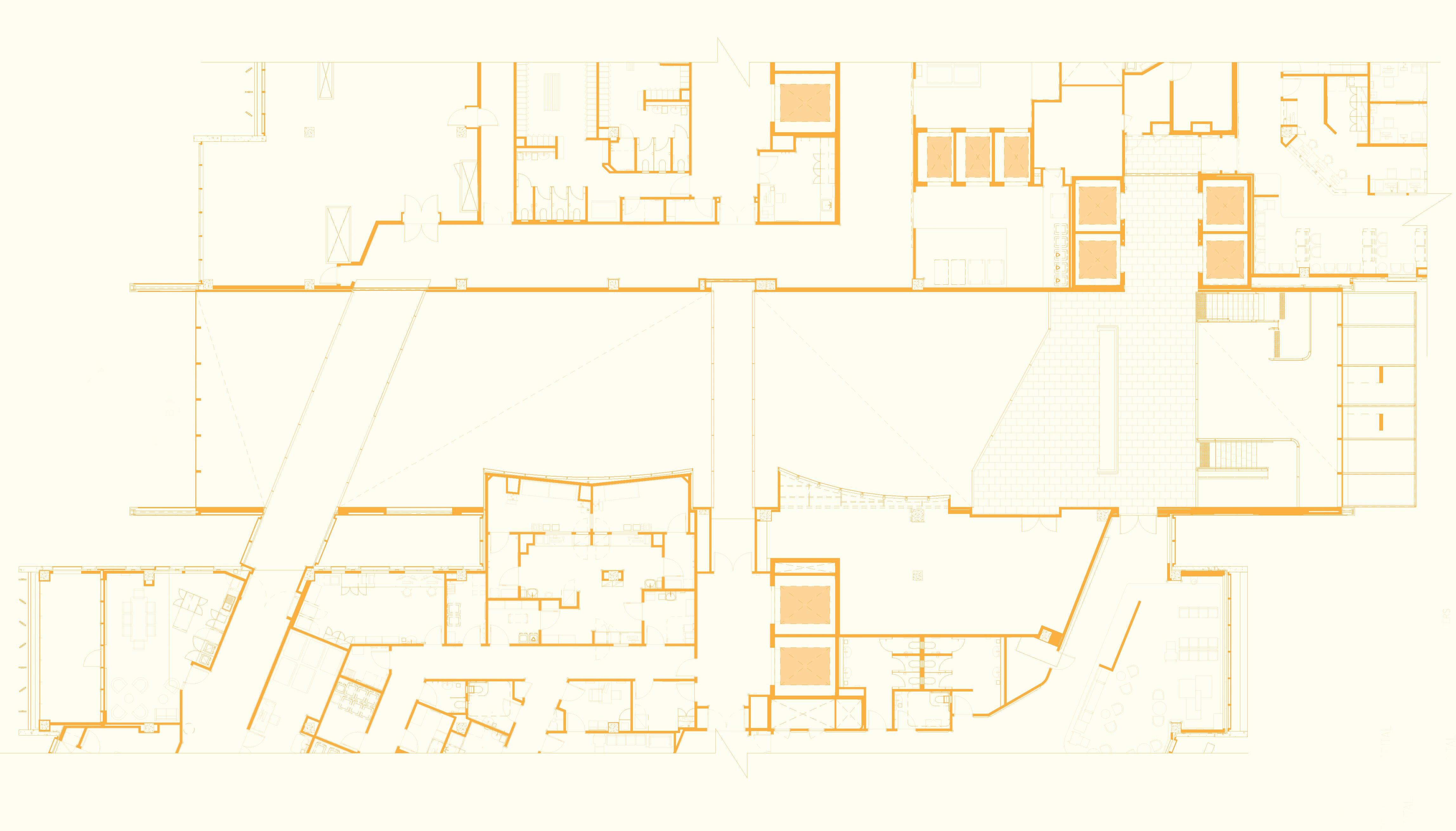
INDESIGN 117 IN SITU Bendigo Hospital, Site Floor Plan 1 M echanical Plant Room 2 S taff Change Rooms 3 S taff Lobby 4 B io-Medical Room 5 D irty Linen Dispatch 6 Public Waiting Area 7 G eneral Reception 8 Interview Rooms 9 M ezzanine Bridges (x2) 10 C entral Ground Floor Atrium & Lobby 11 Public Lift Lobby 12 Internal Street Void 13 S taff Lounge 14 Trolley Storage 15 Clinical Trial Rooms 16 S taff Workstations 17 Public Lift Lobby 18 B athrooms 19 R etail Mall 20 G eneral Waiting Lounge 3 2 1 4 5 6 7 9 10 8
9 11 12 13 14 15 16 17 18 19 20
Page 112: The rooftop garden is easily accessible to all occupants, and visible from inside the mental health ward to provide a visual and therapeutic connection to nature. Page 114-115: A bespoke and intimately woven timber ceiling runs between the hospital’s two entrances. The woven pattern filters daylight from the skylights above, providing warmth and dappled light to increase occupants’ wellbeing.
Pattern and colour in two Esther Stewart murals on either side of a central footbridge add energy and vitality, although it’s the honey-coloured timber screen installed at roof level that completely transforms the internal street space.
This undulating woven structure acts as a canopy that creates dappled light, producing an environment as close to being outdoors and surrounded by nature as possible. At ground level, it actually echoes the experience of walking along a tree-lined street, with retail offerings and coffee shops on either side. While the joinery’s detailing is exquisite and contributes beautifully to the interior’s craft-based expression, the structure also improves the overall quality of light. Achieving an inviting glow in the main public areas is a highly desirable outcome; both Healey and Whittle are acutely aware of the healing properties of natural light and understandably manoeuvre it to the design’s advantage.
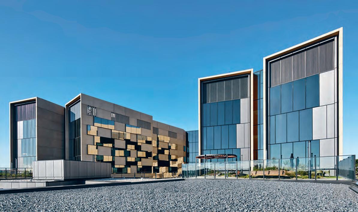
“People intrinsically feel more comfortable when they can see outside and are surrounded by natural light, which is why our planning is largely about light, views and orientation. It also addresses comprehensibility and the understanding that wherever you are in this deep plan building, you’re always close to natural light,” notes Whittle. The architects have taken this connection to the outside one step further as well, by bringing the outdoors inside.
Three native trees punctuate the street, reinforcing the building’s biophilic design ethos, and a series of courtyards and decks provide greenspace across all eight floors. These accessible gardens directly engage with each clinical department to provide staff and patients with much-needed areas of respite. The mental health department, for example, is positioned on the hospital’s second level so it’s accessible to specific courtyards and has views of the rooftop garden, promoting increased levels of comfort.
Bendigo Hospital’s success lies in a happy marriage of form and function, in realising clinical performance criteria via inclusive, joyful design. A simple thing like avoiding unnecessary clutter ensures the internal street is hygienic and easy-to-clean or adjusting the balustrade height from a standard 1,800 millimetres to 2,400 millimetres on certain footbridges incorporates a higher level of safety without concession. “It’s about creating an environment totally focused on healing,” says Healey. “The level of stress people are under has to be managed carefully and so understanding the human condition is crucial to providing uplifting spaces, giving patients and their families the opportunity to exist in a state of mental and physical normality.”
batessmart.com, sth.com.au
INDESIGNLIVE.COM 118 IN SITU
Page 116: State-of-the-art medical technologies are cohesively integrated into the spaces, rather than simply filling the rooms with equipment. This page: The building’s façade is distinguished by a pattern of glass panels with high reflectivity. These windows glisten and mirror the surrounding natural landscape, blending the building into its surrounds in a natural and inviting way.
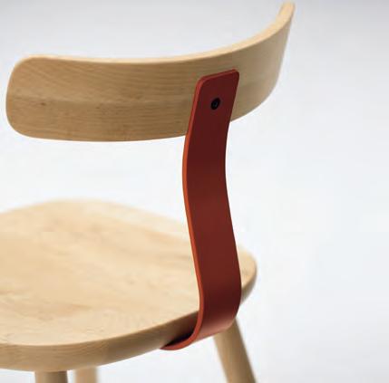
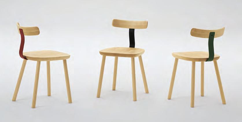
Luxury used to mean the consumption of precious objects and items. Then it became the consumption of exclusive services. Now, it’s all about “transformative experiences” – this is luxury 3.0. And Carr is pioneering this outrageous new archetype with one of 2017’s most Instagrammed projects. But here’s what your social feed might not have told you about the Jackalope Hotel…
The Odyssey
Jackalope Hotel Mornington Peninsula, by
Carr
Words Sophia Watson Photography Sharyn Cairns
I hosted a talk recently at Sydney Indesign around the idea of experimentation, extreme creativity and kitsch. The consensus seemed to be that design could certainly stand to be more fearless especially when it comes to next-gen luxury. Burn the birch, crush the conservative and muffle the minimal was the basic sentiment. But hold it right there, cowboy. As it turns out, the weird-andwonderful design approach of the 80s and 90s (you know, specifying anything fluoro or floor-to-ceiling resin, just because) is no longer cutting it. If we’ve learned anything from the last two decades of design, it’s that authenticity and meaning count, and we need to be more considered and responsive to how we create spaces.
The demand for ‘transformative experiences’ in the luxury travel market for instance, requires the ability to transport and excite. They need to communicate, mesmorise, delight and surprise guests, whether they are a first-time punter or a seasoned traveller. These environments not only need to tell a story – but invite you to actively participate within that story, too.
In one of the most daring and avant-garde moves in the hotel industry to date, the Carr-designed Jackalope Hotel on Victoria’s Mornington Peninsula wine region, provides an otherworldly experience rich with narrative and imagination – and oh my goodness, it’s damn extraordinary. But how exactly has Carr built-in this ability to offer guests a ‘transformative experience’? From head to toe, the project is guided by the theme of ‘alchemy’ – a nod to its 18th Century heritage as a working vineyard.
The theme is beautifully stitched into every facet of the space, from the greater architectural elements down to its fixtures and fittings, all working harmoniously to lead guests further and further down the rabbit hole of this distinct sensory wonderland. Upon arrival, imposing black pyramid sculptures sit either side
of the entry – certainly the last thing you’d expect to see in that landscape. A simple, almost agricultural driveway winds its way through rows of vines and century-old native trees, concealing the structure from view until a single point atop a small rise reveals the unexpected and dramatic monolith-like exterior.
Nestled within a matrix of indigenous and non-indigenous mass planting, the hotel’s black, standing-seam metal clad form, charred timber detailing and dramatic saw cut roof deliberately reference the historical form of the adjacent restored agricultural and barrel room barns, but with a more hyperbolic take on the traditional architecture, designed to confuse and even somewhat disorient. It’s almost asif it shouldn’t be there, but also like it’s been there since the beginning of time. Carr’s director of architecture, Chris McCue notes: “The architecture here is unprecedented and unconventional with a simplicity and form that belies what lies within. Its monolithic, blackened structure provides a vivid juxtaposition to the rich green, red and silver foliage of the landscape and adjacent vines yet integrates seamlessly with its surrounds.”
Atop the winding dusty trail, guests are greeted by a striking seven-and-a-half metre high Jackalope sculpture by local artist Emily Floyd, alluding immediately to the whimsical, even mythical qualities of the hotel beyond. Once inside, the dramatically illuminated black glass box is greatly effective in further defining the hotels’ sense of purpose and place. This centrepiece immediately connects and adds context to the ethereal guest experience, while also serving the more functional purpose of housing and displaying the local wine from the adjoining vinyard. And that’s really the point – no part of Jackalope is designed, just for the sake of it. Every inch of this project – though initially bold – is a considered moving part of something much larger and cohesive.
INDESIGNLIVE.COM 120 IN SITU
Opposite: A geometric cut-away of Jackalope’s Rare Hare barn wall reveals panoramic views into the local vineyard and surrounding bush. Page 122-123: Beaker vessels line the walls behind the ‘alchemist’s workbench’ in the bar and lounge – a very physical manifestation of the hotel’s alchemy theme. This particular area of Jackalope is home to statement furniture pieces including Edra’s gold Leather Works armchair and an electric blue billiard table.
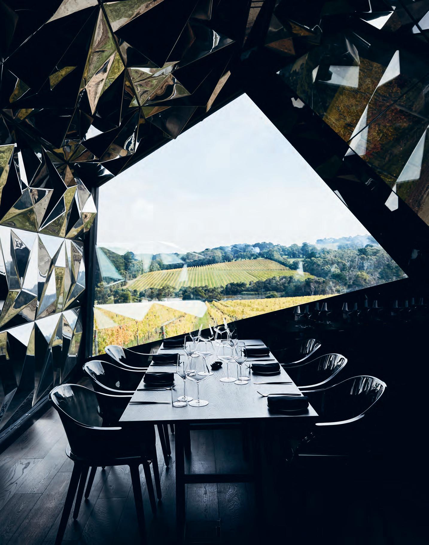
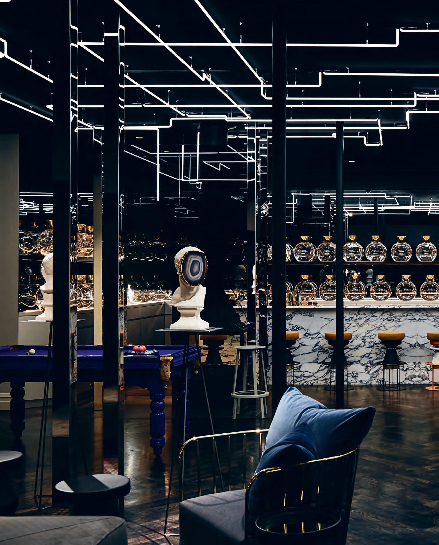
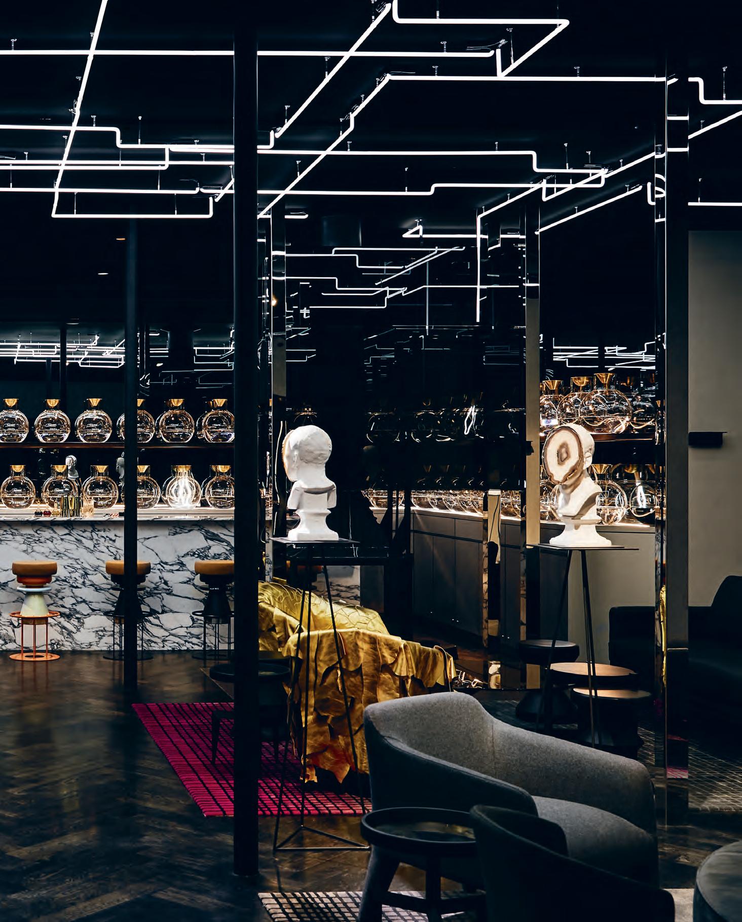
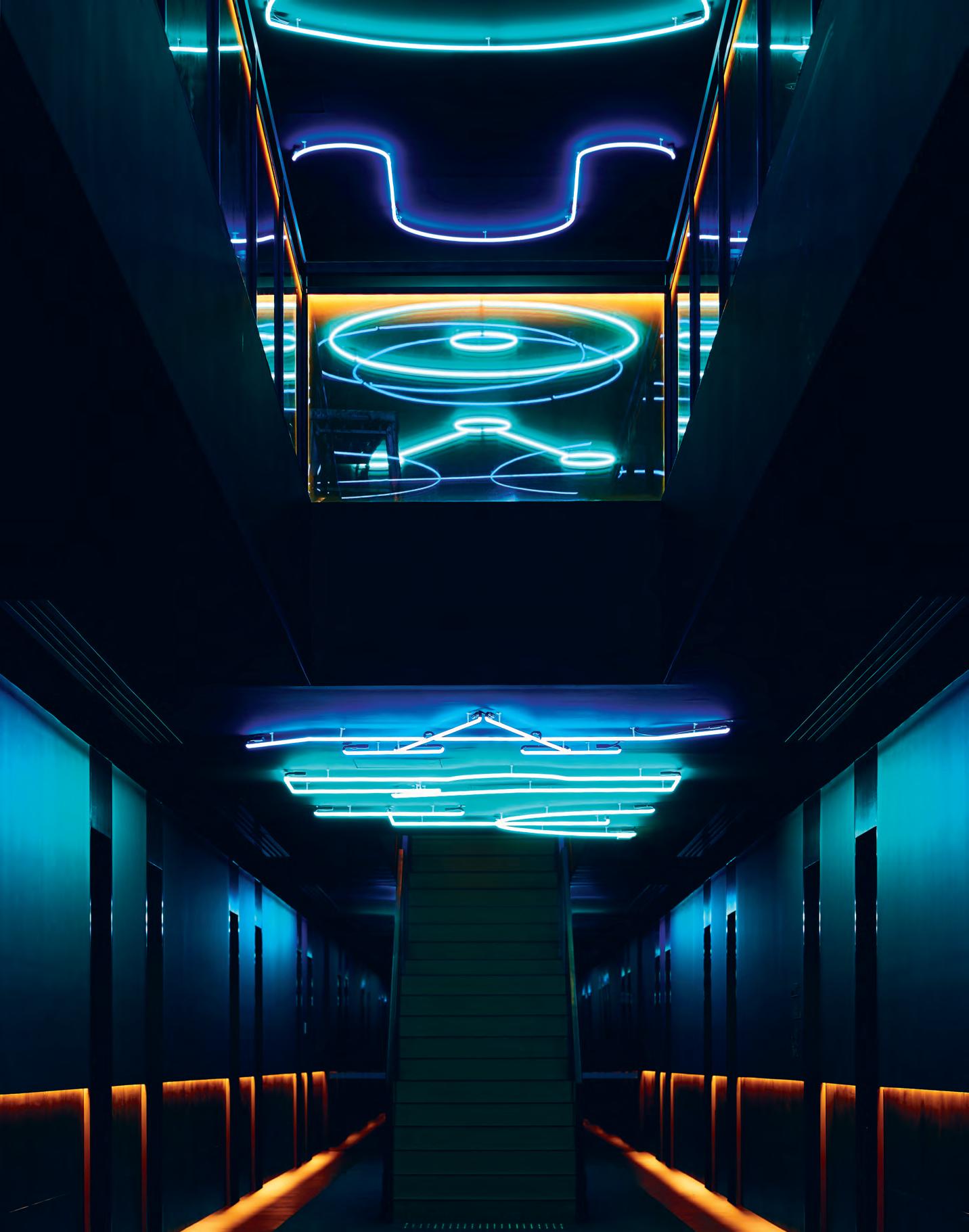
“Once over the pavilion threshold, guests are confronted with a dramatic illuminated glass box devoted to the display of wine. Part object, part installation, the wine display represents the beginning of the journey and gives a taste of the narrative to follow.”
Even the display of something as simple as wine has been elevated to exist in this highly-stylised, obtuse environment. And that’s what makes it so transformative. Wherever you are, internally or externally, you just can’t escape the story. These elements are purposefully and meticulously designed-in to completely immerse the guest at every imaginable touchpoint.
Nowhere is this technique more prevalent than the hotel’s bar, lounge and fine-dining restaurant Doot Doot Doot. Celebrating the hotels origins, the signature bar, Flagggerdoot is housed within the original 18 th Century Federation cottage, its architecture having been thoroughly and sensitively restored.
However, in a marked departure from the conservatism of the heritage-listed house (and in a nod to experimentation, defiance and flamboyance), the lounge interiors are dominated by test tube glass vessels lining the walls, a marble clad bar acting as the alchemist’s workbench, as well as precious objects and iconic, statement furniture pieces, including Edra’s gold Leather Works armchair and an electric blue billiard table. It’s all unashamedly luxurious, opulent, and further sets the stage for the alchemy theme prevalent throughout the entire hotel.
One thing I’m willing to bet you’ve definitely seen while scrolling through Instagram is the spectacular light installation on the restaurant’s ceiling, collaboratively designed by Carr and Fabio Ongarato Design (FOD). Jewel like in form, what you might not know is that the installation references fermentation and bubbling (again, another comment on the theme of alchemy) while celebrating the hotel’s own working winery and vinyard providing an immersive, interactive and tactile wine experience for guests.
This journey ultimately leads guests to the accommodation wing, where tonal themes around planetary and astrological metals of gold, silver, copper or bronze – reflected in the metallic coloured mosaics, furnishings and accessories – further reinforce this otherworldly, almost Australian-take-on-Twin-Peaks style setting. Blackened timber accent walls, deep-soak black resin custom designed baths, integrated joinery, feature lighting that is at once subtle but exciting, and sharp detailing throughout provides a sense of indulgence and comfort, while floor-toceiling windows and private terraces connect occupants to the surrounding natural landscape.
“The interiors celebrate the mystery and whimsy of alchemy and the art of transformation, throughout,” says Carr director of interiors, Dan Cox. “The collection of spaces reflect and embrace the idea of the ‘alchemists workshop’; eclectic, experimental and contemporary in detailing; forming something truly unique and rare.”
Empowering the guest to continually expand their immediate world, the Jackalope Hotel will redefine the future of luxury on an international scale. Carr’s work here is a marvel of technique and skill, successfully transporting guests on a wonderfully rich and inescapable journey.
Ultimately, this sense of magic and theatre, which in my opinion completely reinvents the luxury hotel stay for the modern traveller, has more than earned its place as legitimate design approach moving into the coming market for more experimental design. In fact,I’m already clambering to see more.
carr.net.au
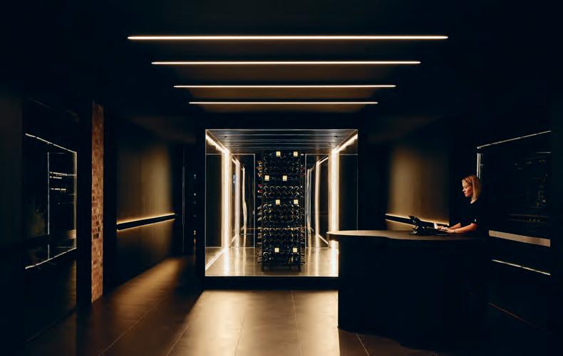
INDESIGN 125 IN SITU
Opposite: Corridors are defined by lighting installations and wayfinding devices that represent alchemical formulas and astrological constellations.
Above: The dramatically backlit fine wine display at the reception and concierge point. Page 126-127: Fine dining restaurant, Doot Doot Doot, features a spectacular light installation designed by Carr with Fabio Ongarato Design. Page 128: The hotel’s monolithic architectural exterior, planted into the rich Australian landscape .
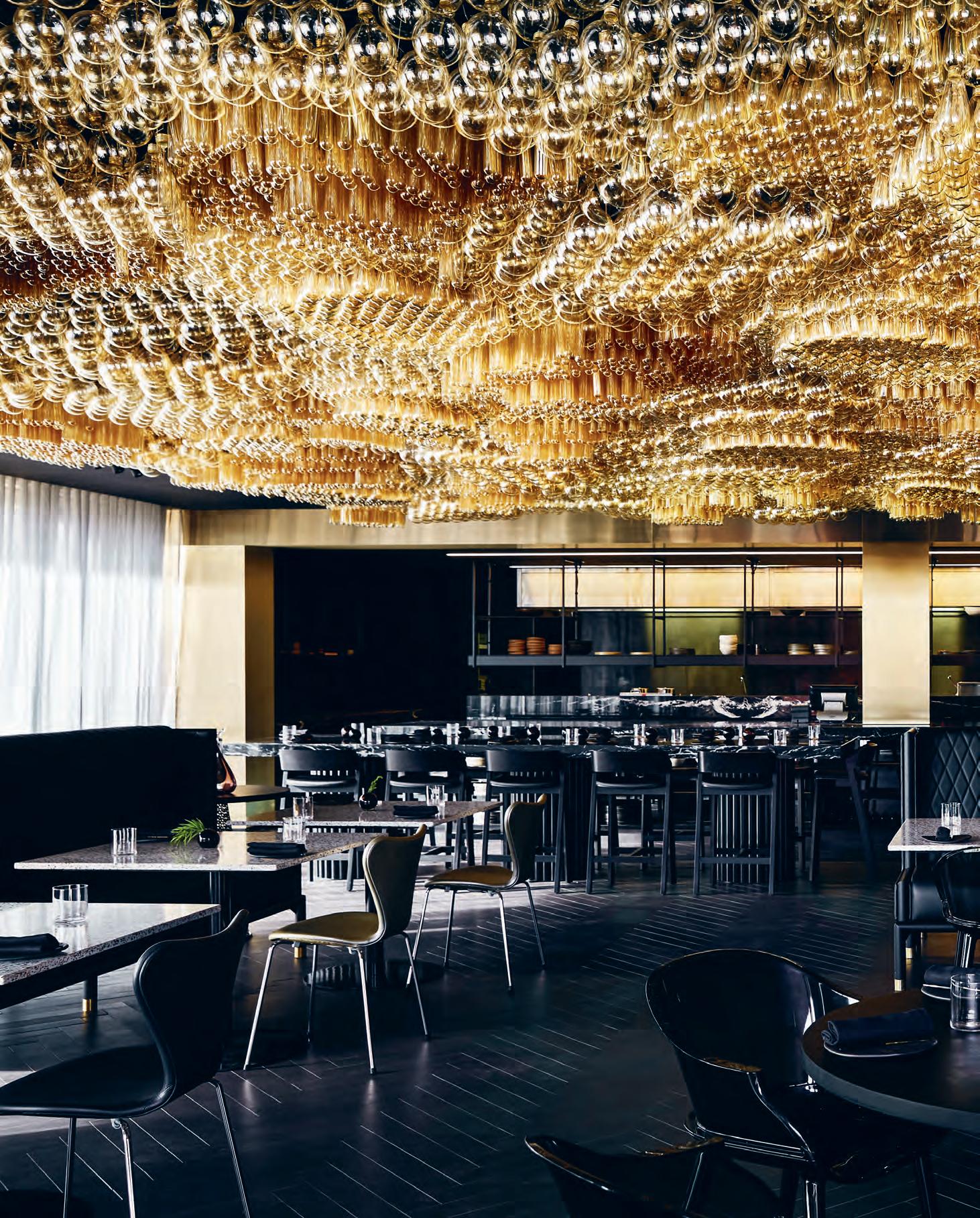
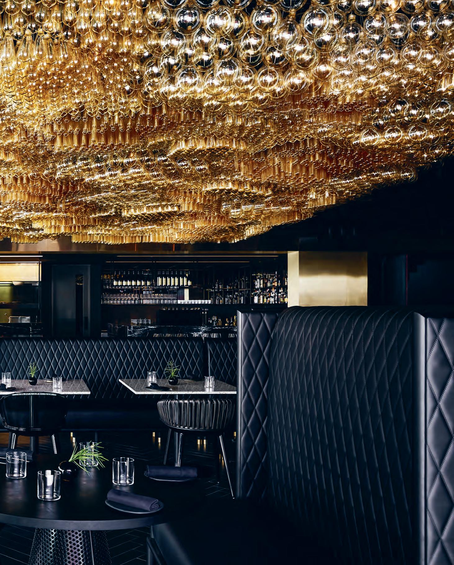
Tall Tales
The Jackalope narrative begins on first approach, before you’ve even set foot inside. Making a whimsical first impression is a pair of black, monolithic pyramid sculptures which sit either side of the entry. The hotel’s black and angular structure is dug into the soil as if it were an extraterrestrial vehicle having just landed on earth. The architectural language that Carr has created here is symbolic of worlds colliding; heritage and future – taking parts of each other to form something never before seen
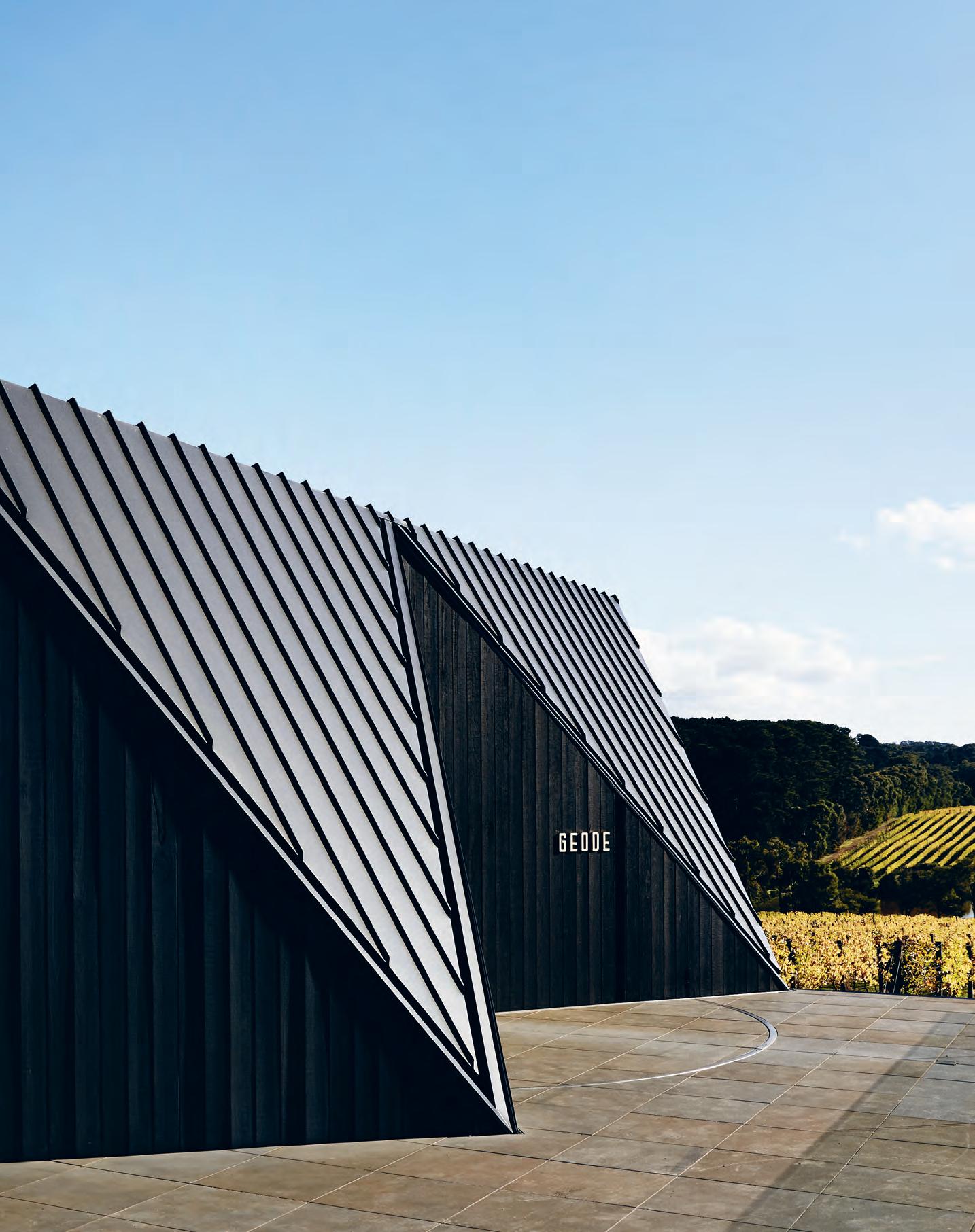
–
Be

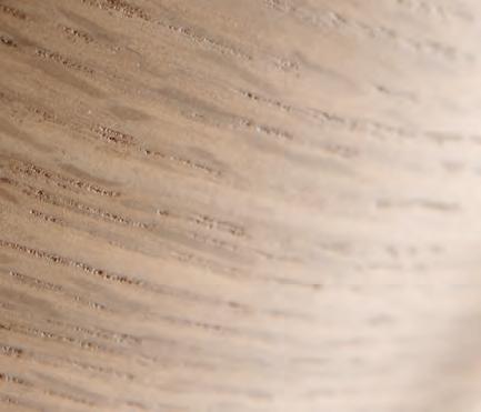
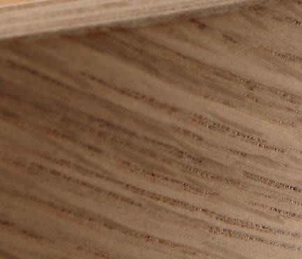


businessinteriors.com.au | businessinteriors.co.nz
Inspired, discover the new Inspire range. Including our new stocked range from design leading brands Dauphin, Jonas Ihreborn, Pedrali, Midj and Actiu.
Place-specific design is so very de rigueur. But beyond the obvious, how is place-driven design being strategically integrated across both macro and micro aspects of a mega development? This was Terry Snow’s objective for his best-in-class Willinga Park Equestrian Centre – and Cox Architecture have delivered.
The Local Charmer
Words Paul McGillick Photography Alina Gozina
Property developer, Terry Snow, already had the DA for an equestrian centre on his sprawling 860-hectare property at Bawley Point on the NSW south coast. According to Chris Millman, Cox’s design director for the project, this ticked all the boxes. But then Snow, inspired by Hobart’s MoNA, realised it could be much more – not just an equestrian facility, but a destination. He had already established a sculpture park and native gardens, so he told the architects, “open your shoulders” and make something for the world stage, the very best and most comprehensive equestrian centre in Australia and capable of hosting international competitions – but with added value from the architecture, the landscaping and the built-in amenities.
In addition, it was to be a celebration of its place. The result is an extraordinary complex over 8,500 square-metres, which seems to grow out of its unique landscape. The architecture, its interiors and the expansive, hilly property seem to merge into one. Yet the architecture also remains distinct. Like the surrounding sculptures, the concrete, steel, copper and timber buildings with their soaring faceted roof structures and overhangs assert their own character, but in a constant dialogue with the land itself.
Given less than a week to prepare a proposal, Millman says that the architects’ “original response was one of total fear because we had never done an equestrian park before and the expectations were very high.” He adds that: “our initial response was that it had to be something of a scale which wasn’t going to get lost in the landscape,
but which could be part of it.” This led them to reference land art, especially the work of Richard Serra and Andy Goldsworthy, generating the idea of the buildings as sculptural forms in the landscape – but forms, which were also informed by the landscape, while still fulfilling their functional requirements.
Millman explains that the architecture is all about how the buildings relate to the ground. They are literally grounded – almost the opposite, says Millman, of ‘touch the earth lightly’. Although they are clearly separate, the aim was to make it hard to tell where the building ended and where the landscape began. Each of the three main buildings has its own distinctive form, driven by its purpose. However, they also form a family, linked by a similar quality of expression, a common palette of materials and the linking in situ concrete walls, some exceeding 100 metres in length and sometimes forming massive portals (like the entry gates) which you can drive through. These walls are continued internally, creating further cohesion to the complex and a seamless connection between the interiors and the outside landscape. The extensive use of timber –Blackbutt and unfinished marine ply (there were only a few finishes) – sets up a conversation with the concrete and contributes to the overarching coherence of the buildings.
The complex offers facilities for all kinds of dressage (including three dressage arenas, one under cover), showjumping, three-day eventing, campdrafting and vaulting, polocrosse, horse breeding, auctions and entertainment. In fact, it is still a work-in-progress
INDESIGNLIVE.COM 130 IN SITU
Willinga Park Equestrian Centre by Cox Architecture & Sally Heiatt Interiors
Opposite: The primary Equestrian Centre Facilities, featuring stables and a hydrotherapy pool.
Page 132-133: The Equestrian Centre’s official Reception Building, designed to not only blend the site with its locality, but almost invite it into the space.
Page 134: The official Covered Arena, which can accommodate 1,000 spectators and offers VIP and media boxes for competition events.
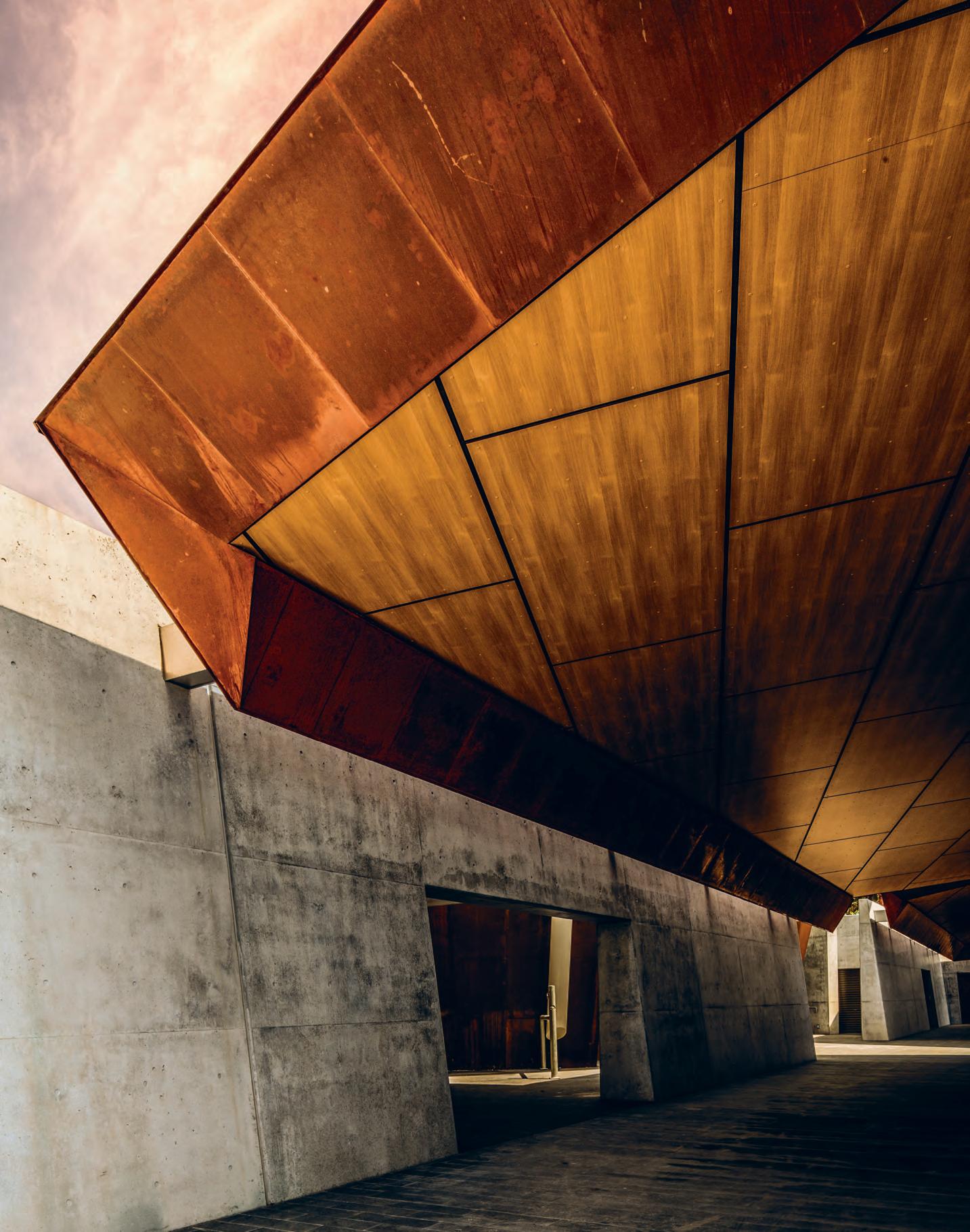
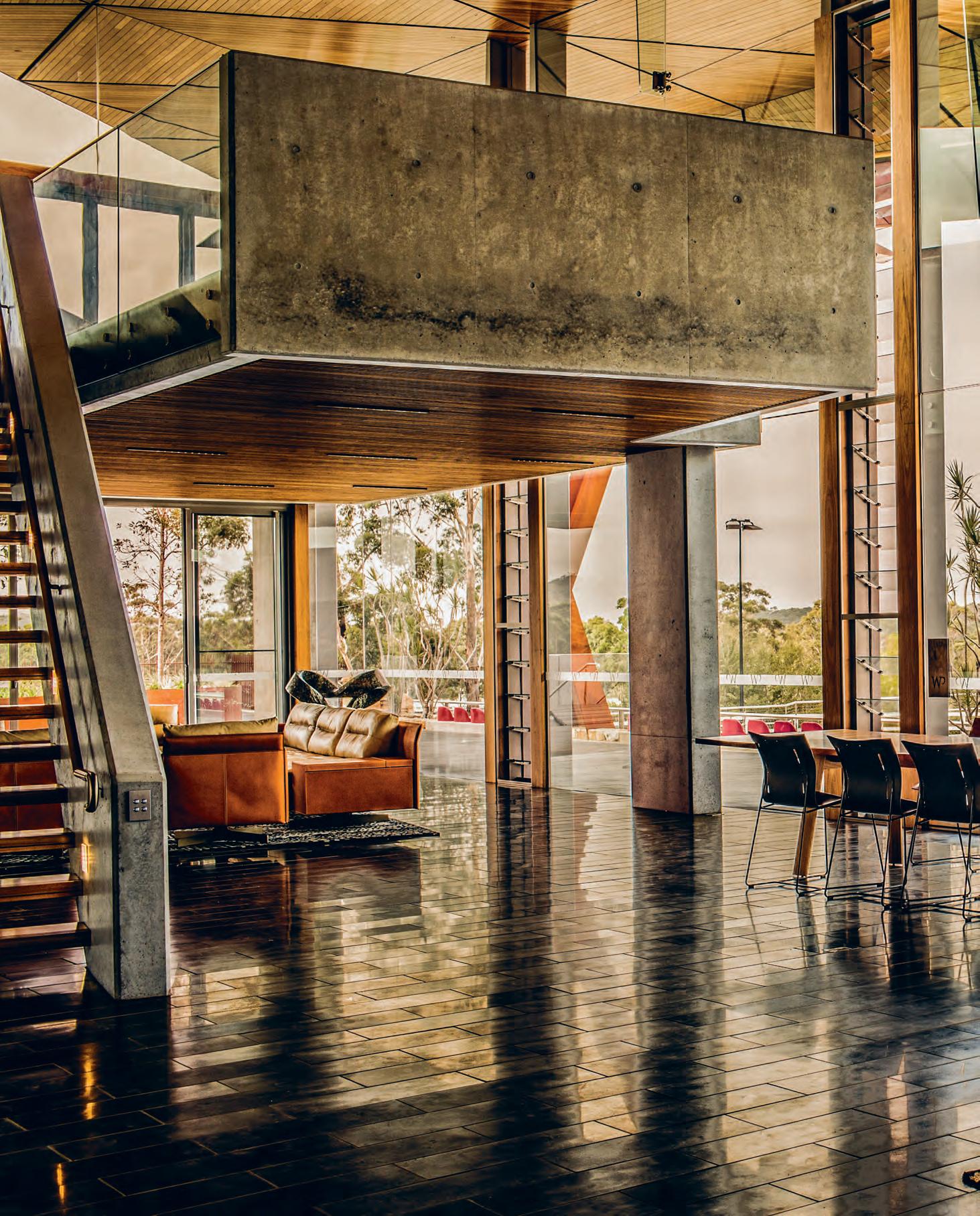
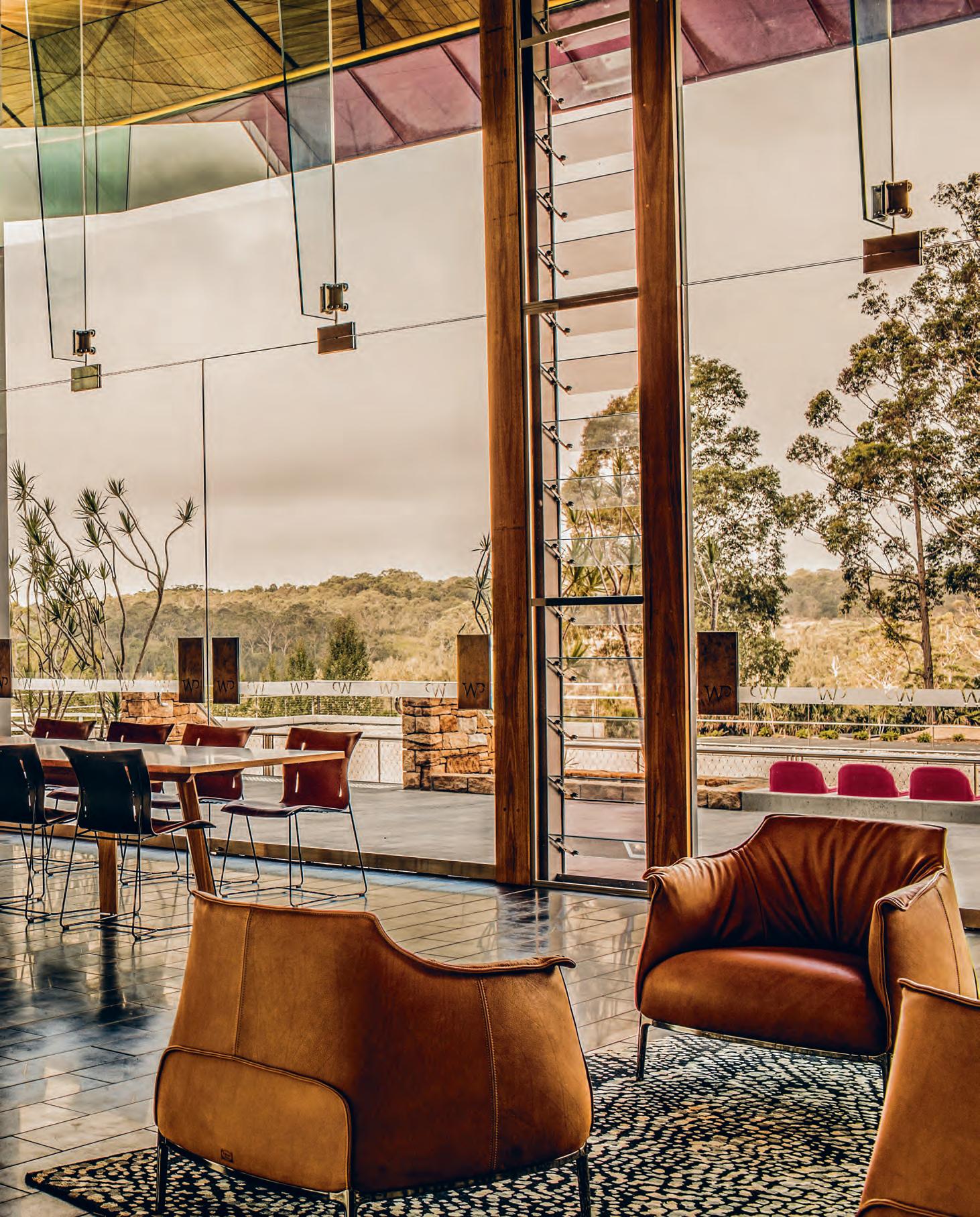
“Connection with the outside is supported not just by the use of concrete, but by the Blackbutt-ceiling cladding, which extends from the inside out and a consistency of loose furnishings inside and out.”
because 160 extra adjustments (stables) will be added, along with accommodation and a small information pavilion. The key buildings are the Equestrian Centre (containing stables, hydrotherapy pool, dressage venues etc.), the Covered Arena (which can accommodate 1,000 spectators and offers VIP and media boxes for competition events) and the Reception Building where the imposing concrete walls offered the opportunity for a monumental and vibrant, specially commissioned, painting by Michael Johnson.
Design Architect, Ngroho Utomo, points out that light was a major consideration, especially in the covered arena with its massive 90x40- metre roof span. “There is a stark contrast,” he says, “between the light underneath the canopy and the light which is around it.”
Hence, the architects introduced another source of light through the clerestory windows of this somewhat industrial building with its sawtooth profile. This mitigated the contrast and glare. It was important that the light be indirect since direct light reflecting off surfaces can disorient the horses when training or competing. So, the openings are oriented to produce either a reflected light or a diffuse southern light.
Sally Hieatt designed the interiors, consulting to Terry Snow but working closely with Cox. She had worked with Snow for over 22 years and designed the interiors for his own house at Willinga Park six years prior. Given their lengthy collaboration, Hieatt says she
didn’t need a detailed brief because she already knew what Snow liked. Nonetheless, knowing how much he liked colour, the designers went to Snow with a very understated palette of materials with an emphasis on quality furnishings, what Hieatt terms: “understated elegance”. “It’s a very architectural interior,” she says, “and there isn’t any obvious boundary as the light comes in from the outside.”
Connection with the outside is supported not just by the use of concrete, but by the Blackbutt-ceiling cladding, which extends from the inside out and a consistency of loose furnishings inside and out. Like the handling of external light, the interior lighting was crucial. Lighting consultant, LDP, was retained precisely because of their preference for subtle lighting. Their approach to lighting, says Hieatt, “is that you don’t see it.” Hence, one rarely sees a light fitting and, if you do, it’s a feature or a lamp.
Place-responsive design is often discussed but rarely executed effectively, and as a result we are left with superficial references to locality. The creative-thinking around place-driven design for the Willinga Park Equestrian Centre is a stellar demonstration of ‘place’ done well for one primary reason – scale. Rather than a secondary ‘slap-on’ approach, the location and its cultural character has been considered and integrated thouroughly from the very beginning.
coxarchitecture.com.au, sallyhieatt.com
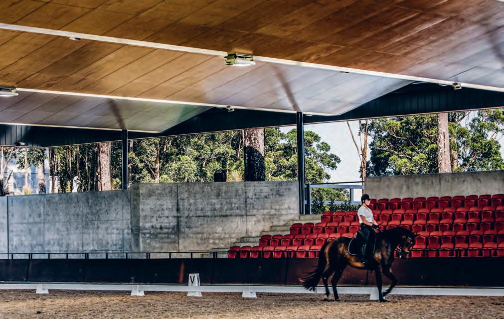
INDESIGNLIVE.COM 134 IN SITU
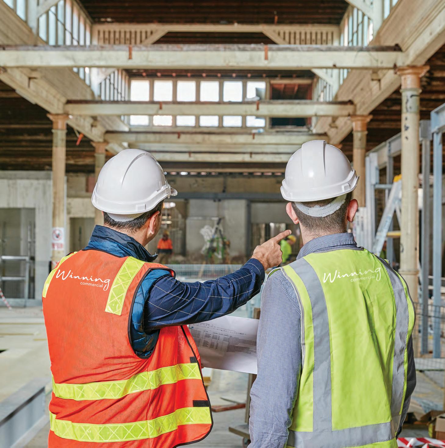

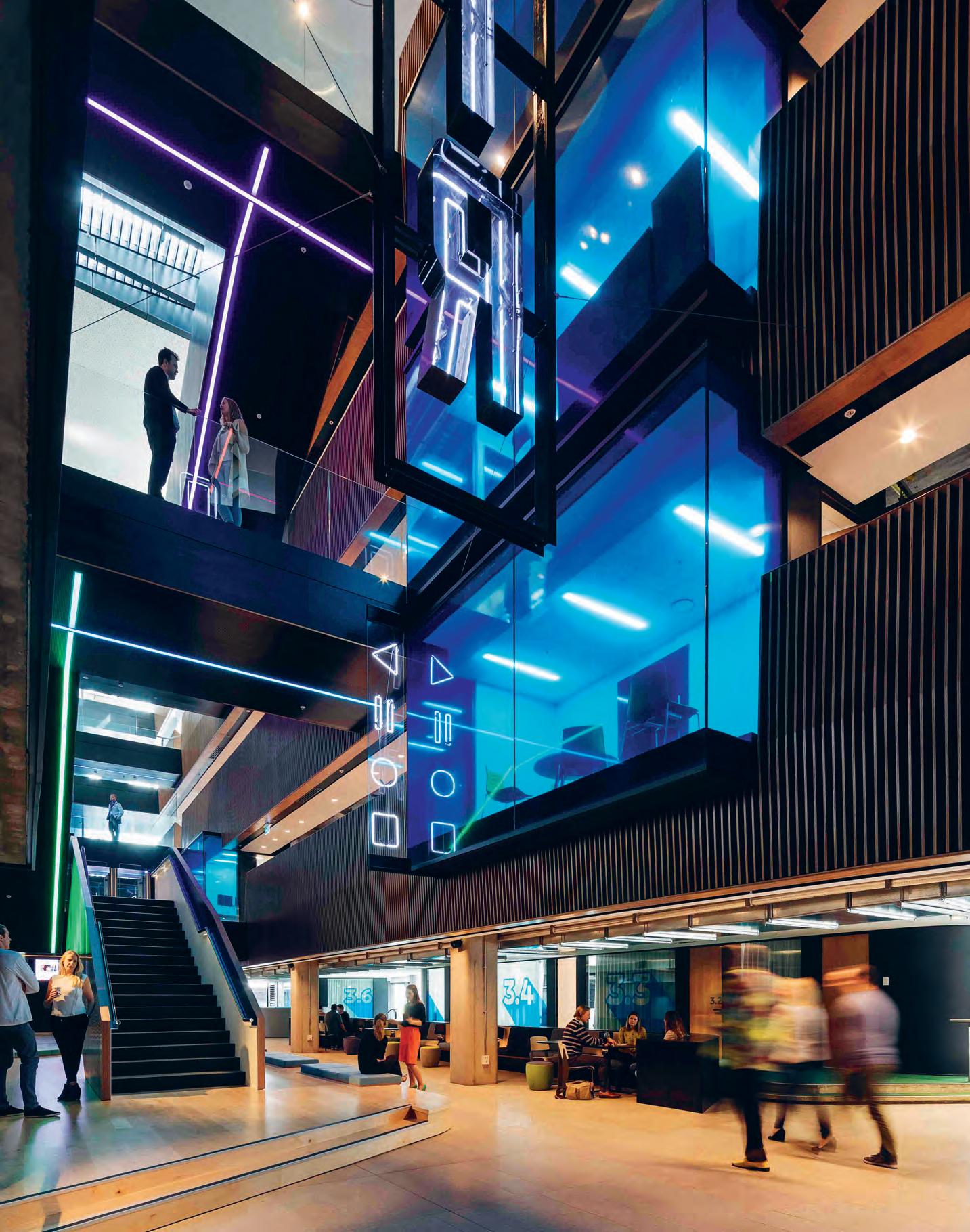
With all this buzz around ‘human-focused’ design, architects and designers are having to think far more creatively around how to best integrate ‘responsiveness’ into workplaces –especially if your client is a rapid live news outlet.
In Real Time
For New Zealand firm Warren and Mahoney, the design of Television New Zealand’s new Auckland headquarters was driven by their interest in the ‘power of people’ and the translation of their collective behaviours into the built form.
INDESIGN 137 IN SITU
TVNZ Television Centre refurbishment, Auckland by Warren and Mahoney Words Andrea Stevens Photography Patrick Reynolds
Stairway To (Workplace) Heaven
Blue-tinted glass seals off meeting rooms, like private apartments overlooking a lane. New bridges, stairs, and landings fly overhead. Neon signs hang off the walls with in-jokes such as ‘On Air’, and stop-playpause icons. And lobby screens flicker like Times Square billboards. It draws on the adrenaline of the city at night, of a live media environment, and the ‘other worldliness’ of the movies.
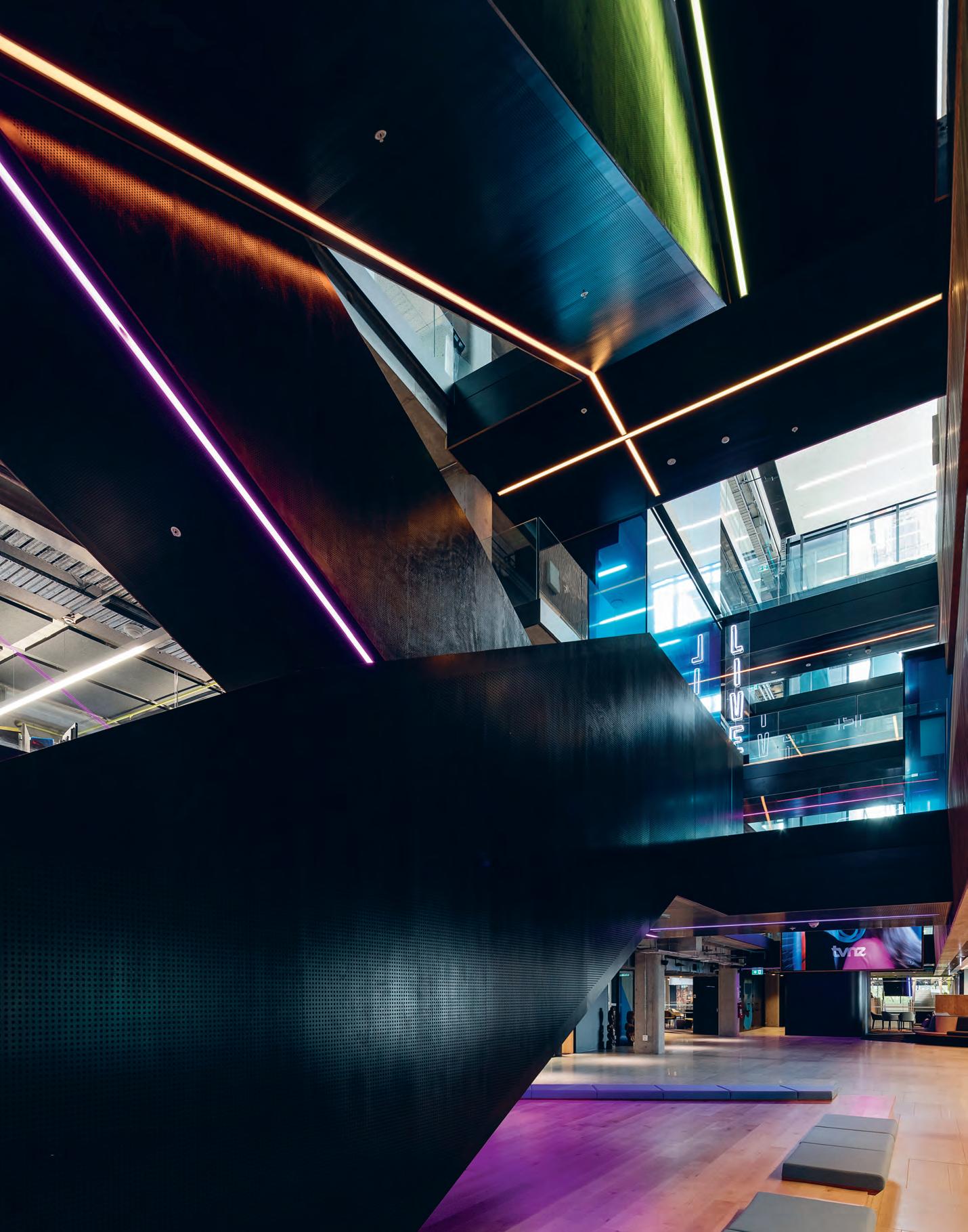
–
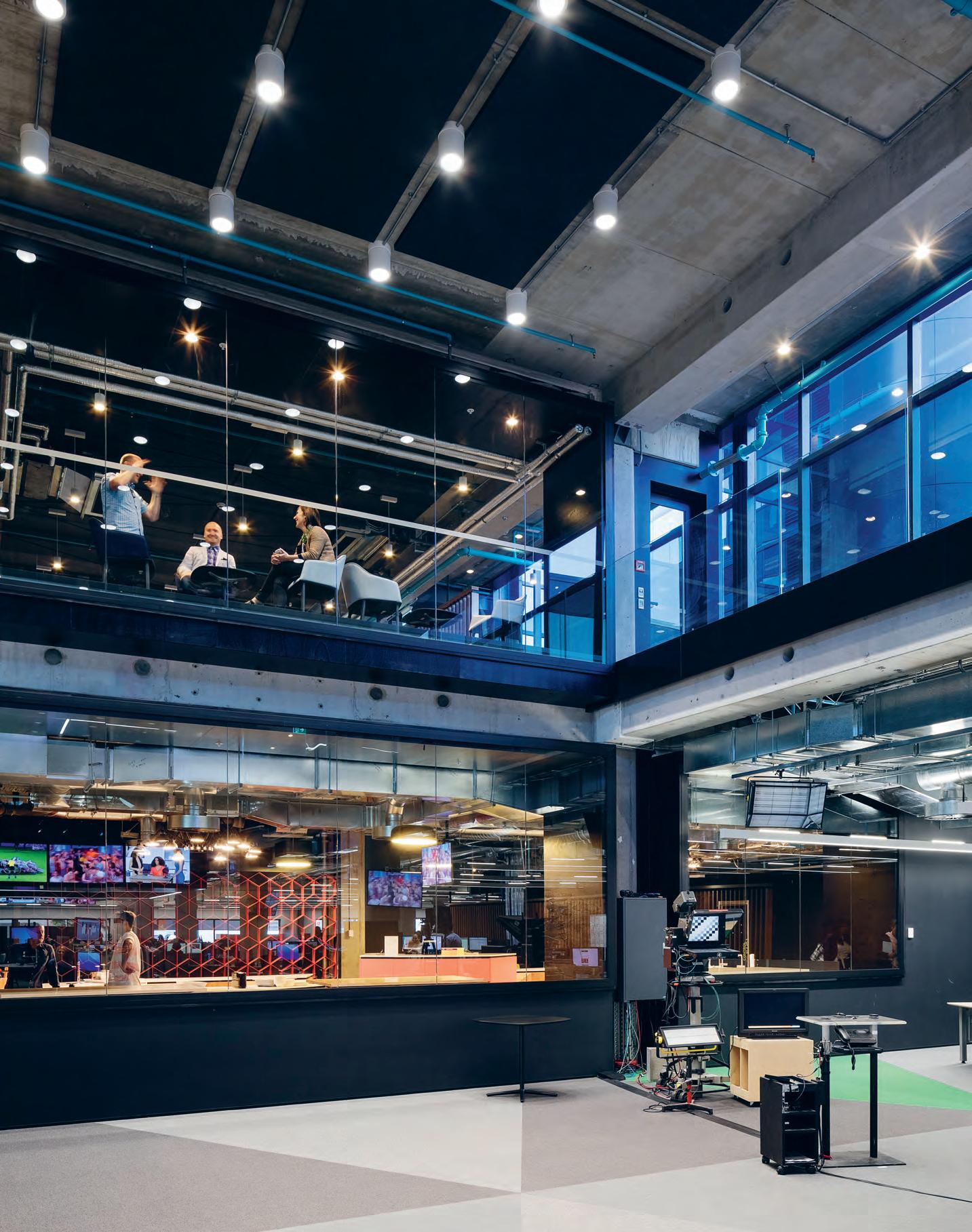
Sited on an unforgiving thoroughfare in Auckland’s CBD, the TVNZ Television Centre was originally designed by Warren and Mahoney in 1989 – a concrete-framed building, clad in reflective glass and granite. 25 years later, TVNZ asked the architects to remodel and refit the 17,000-square-metre building to meet the new demands of digital content production and broadcast.
The former cream and grey corporate interior has been stripped right back to its frame. As little new fabric has been added back as possible, liberating more volume for each floor. Exposed structure, exposed services and open-plan have transformed the interior into a more edgy and dynamic work environment. The power suit of the 1980s has given way to the sneakers of the modern media profession, where tech, collaboration, and agility are the new norm.
Taking a human-centred approach to design, the architects have created spaces, services and settings for this workplace culture to operate at its best: where staff can film and broadcast from anywhere in the building; which supports collaboration and debate; where hierarchies and department silos are broken down. Swipe left, and you’re in the media centre. Swipe right, and you’re in production. Scroll down, and you’re in the newsroom. And, it’s all in 3D.
“The diversity of work within the building is huge,” says interior design principal Scott Compton. “From film crews to producers to presenters and admin, the building has to cater for it all.”
The design concept is for an ‘Open and Live’ environment. Teams are now co-located to embrace the innovative campus-style of the original building. Planning and aesthetics support the mobility of today’s work life. And along with greater transparency and volume, comes more natural light with the replacement of the perimeter black spandrel glass to clear glass. The ceiling height and window head have both been lifted, creating a very different experience of the interior. The new arrangement is structured around three key design and operational strategies. Firstly, to locate the news hub at
the heart of the plan. Then activate the atrium and connect floors vertically and horizontally. And finally, to open up the ground floor as a central communal space for clients and employees.
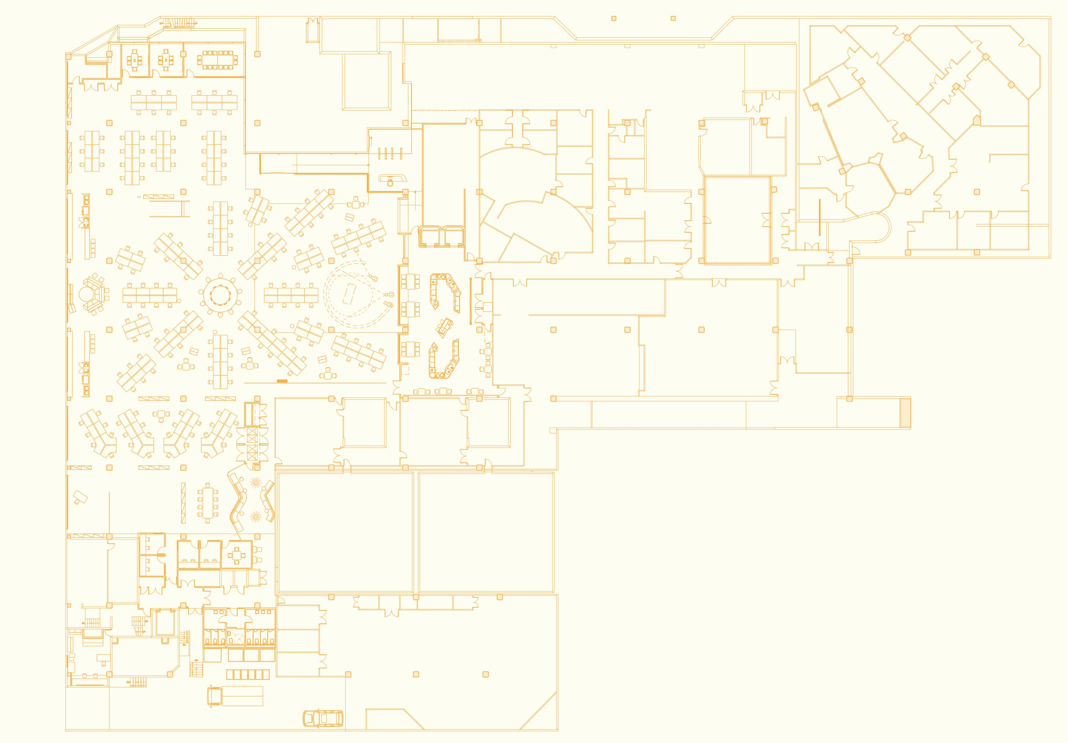
The news hub, on the technical floor, is one storey below the atrium and has been placed right on axis with it. To connect the two spaces, a large hole has been cut in the inter-floor slab. Previously veiled in secrecy, the newsroom is now celebrated as the dynamic heart of the organisation. Overlooked by balconies, stairs and a large floating meeting room, it feels like a digital ‘colosseum’ where content is wrangled, aggregated, and broadcast to local and international audiences. It’s a high energy, quick response environment, where people can work quickly and collaboratively.
Right above the news hub is the lineal six-storey atrium with office floors each side. Previously painted cream and flood-lit with skylights, the architects have inverted this to create a moody, dark interior for events and the ability to film any time of day. Inspired by Ridley Scott’s 1982 classic film noir Blade Runner, the atrium has been dressed as a futuristic cityscape. The atrium joins into the main foyer and café. And as the third key strategy of the redesign, the whole area – atrium floor and foyer – have become a more ‘public’ and useful space. This central laneway through the building is used for events and a meeting place for clients and employees. It is dressed in city-scale murals, built-in seating, coffee leaners, and a line of meeting rooms. Meeting room numbers are painted like the old Superman graphics, about to fly off the wall. And rabbit lampshades a reference to Alice in Wonderland – are dotted around the seating areas. The design is idiosyncratic and playful, and delightfully intriguing for visitors. It embodies the immediacy and adrenaline of the live media organisation, and its openness and transparency help to visually and physically engage the imagination.
warrenandmahoney.com
INDESIGNLIVE.COM 140 IN SITU TVNZ Auckland, Site Floor Plan 1 G eneral Staff Work Area 2 Library 3 N ews Floor 4 N ews Editor Stations 5 N ews Hub 6 V ictoria Street Forecourt 7 L ive News Studio 8 Security 9 M edia Centre 10 S ocial Hub 11 C ontrol Rooms 12 Green Zone 13 S tudios One and Two 14 Editing Suites 15 H air, Makeup and Wardrobe 3 1 4 6 7 9 8 10
2 5 11 12 13 14 15
Page 136 & 138: The ‘feature staircase’ connects every level of the space, including the focused-workstation floors, private meeting rooms which extend from the atriums walls and the main newsfloor and studio. Page 139: The news hub, on the technical floor, is one storey below the atrium and has been placed right on axis with it. To connect the two spaces, a large hole has been cut in the inter-floor slab to celebrate its new dynamic as the heart of the organisation.
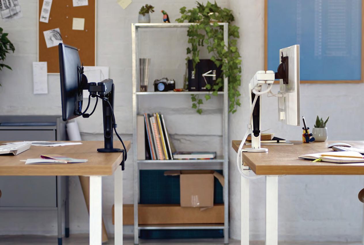
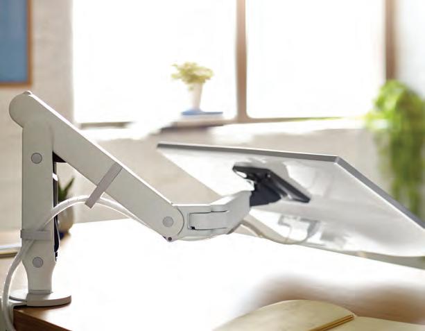

info@cbsproducts.com.au AU: +61 1300 931 927 / NZ: +64 27 492 9544 www.colebrookbossonsaunders.com Future proof your business.
I NDESIGN X
W ilkhahn
Is the mindset of designing for convenience destroying the human body? Commercial furniture makers, Wilkhahn dissect the problems of modern office culture, and propose solutions in three key areas on how design can take a commanding role in this seismic commercial shift.
From a biological perspective, we humans are still hunters and gatherers, driven by our instincts and our “natural blueprint”. Our bodies are designed to move, especially to walk; and here, the culture of modern offices and it’s underlying emphasis on “convenience” is killing us. Designing for convenience has created some dangerous side effects including: metabolic disorders, cardiac and circulatory problems, headaches, muscular and skeletal complications, issues with digestion, diabetes, obesity and even cancer and depression related mental illness.
A number of design houses are already jumping on this call to action; no doubt you’ve heard the recent adage that ‘sitting is the new smoking’ – to which Burkhard Remmers, Wilkhahn’s international communication director, responds that: “It is a remarkable statement, but also much too simplistic. This is a challenge for our understanding of ergonomics, of organisational and architectural concepts and of our culture.”
While some are only beginning to cotton on to the role design can play in improving the human condition within commercial settings, Wilkhahn has devoted decades to making people less desk-bound and invested a great amount of time and research into this area as early as the 1970s. “Back in the 70s, designer Nick Roericht – who was a student and later a teacher at the legendary Ulm University
of Design – carried out a major study for Wilkhahn entitled ‘From a posture-driven to a movement-driven seat’. His radical concept of a leaning aid instead of a chair later became part of the Wilkhahn range (Stitz 2). But the results also led to the groundbreaking FSLine office chair and allowed the principle of dynamic sitting to gain widespread acceptance.
In 2005, we gave a critical rethink to the development of chair ergonomics using original research from medical sports and science. The results confirmed that two-dimensional movements are not sufficient to stimulate the complex interrelations of our body. The challenge became ‘to teach sitting to walk’.”
In response to the problems created by the modern “convenient” office, Wilkhahn focuses on three key areas: firstly, diverse collections of office chairs that offer natural ranges of motion to stimulate both body and mind when long periods of time are spent in front of computers. Secondly, solutions for conference, seminar and project spaces that encourage learning and developing ideas as a team. And thirdly: attractive breakout areas that encourage people to meet and talk. Inspiring people to contribute to a team effort is an ideal way of paving the way for the future.
For their task seating objectives, Wilkhahn developed and launched the ON chair in 2015 – a product that was five years in the making. This was the first chair with patented Trimension, a new kinematical principle stimulating natural three-dimensional movements. It stimulates and activates the body without tiring or overtaxing it.
142 Wilkhahn W il khahn.com. a U
Words Sophia Watson Photography Courtesy of Wilkhahn
In a more recent move to contribute to getting people to move more, Wilkhahn introduced the 2016 Orgatec crowd-favourite: the IN chair. Also developed off the back of some serious R+D, specifically the ‘From a posture-driven to a movement-driven seat’ study, the IN chair continues teaching sitting to walk. “After years of exhaustive research and development,” says Remmers, “we came up with a patented world first called Trimension ® . This is a new international standard that was used for the first time in our ON ® office chair. And in response to its popular reception, our engineers have succeeded in adapting this pioneering kinematics for an office chair in the mid-range price segment. The IN chair represents an office chair that ensures previously unparalleled sitting dynamics, follows the body in perfect synchronisation and keeps its centre of gravity whatever the posture. This doesn’t just benefit our health, but also increases powers of concentration and our ability to relax.”
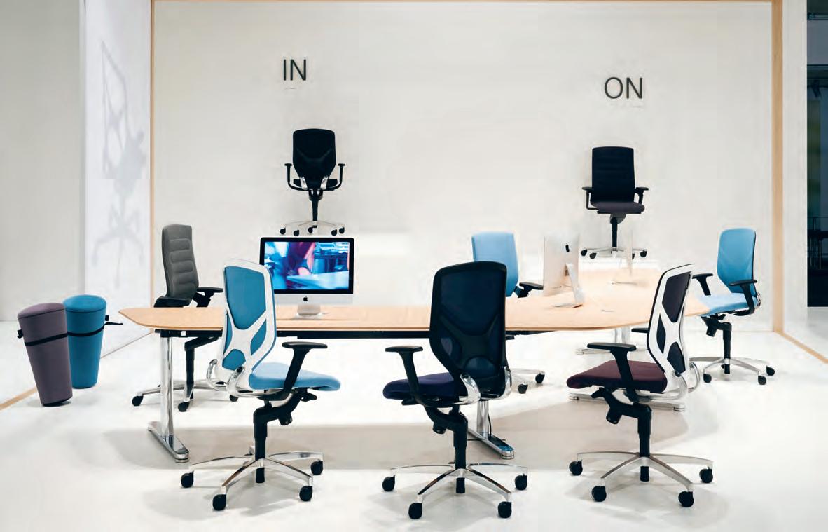
In the way of conferences, seminars, meeting and breakout spaces, Wilkhahn have similarly been quite clever in their product responses. Launched recently at last year’s Orgatec, the new mAx conference table, designed by Milan-based German designer and long-time Wilkhahn collaborator Andreas Störiko, breaks new ground in terms of being incredibly people friendly. mAx features an intuitive self-stabilising folding mechanism that one can, literally, handle single handedly. The folding table is a versatile typology and an obvious choice for the flexibleworkspace. “You can’t beat the square metres that you can stack into a certain volume with a folding table,” says Störiko. “You could stack something
like 20 square metres of tables into your Volvo if you wanted to!” Likewise, the Confair folding table (also designed by Andreas Störiko) seeks to enable users to have access to opportunities for learning, developing ideas and meet and talk with their teams. Here, Wilkhahn identified that flexible teamwork and short-term integration of freelancers into project groups have become an integral part of our daily work routine.
Confair can be simply linked with other tables to form a conference table configuration, and can be folded up in no time at all and rolled to the side of the room. Everyone can therefore be as creative as the environment allows. The Confair folding table provides users with optimal conditions for free personal development. Only one person is needed to set up and rearrange the moveable folding tables – without any tools, releasing or unlocking procedures or special skills involved.
It should clear by now that design, as an industry, needs to start looking at how to positively impact on human behaviour – and product alone isn’t enough. Companies such as Wilkhahn are trailblazing this sector by focusing on solving problems ‘with’ product, investing in intensive, science-based R+D to inform their output, rather than product alone and the colours it comes in. And that is the critical difference.
Wilkhahn 143 wilkhahn.com. a U
Wilkhahn stand at Orgatec 2016, featuring the Stand Up Stool, IN Chair, and ON Chair.
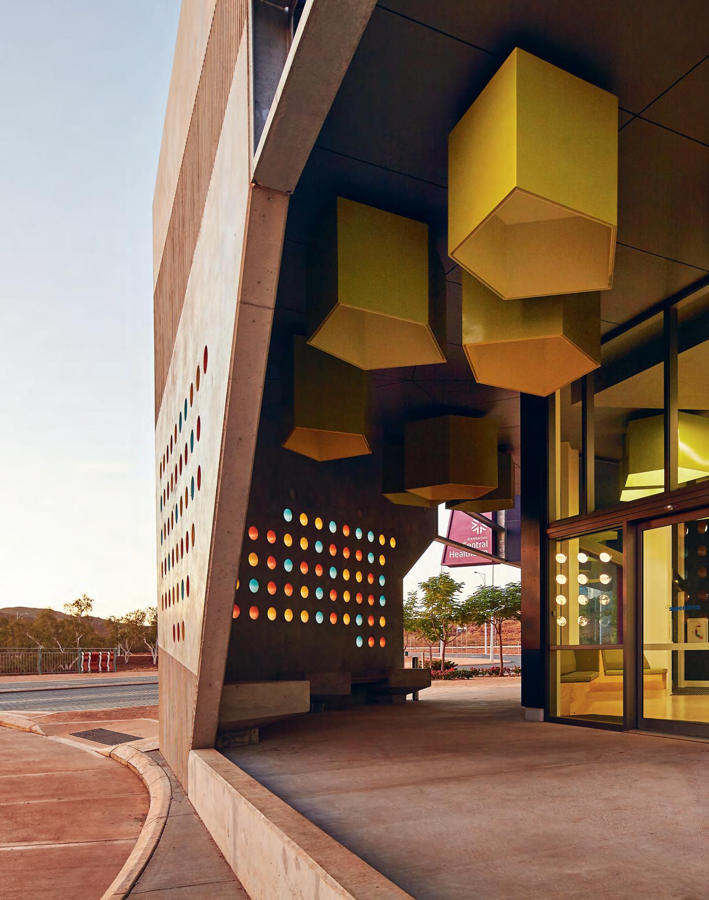
Designers are working in an exciting health and aged-care climate where the very definitions of the sectors are being questioned, challenged and redefined. Cox Architecture’s (formerly CODA Studios) joyous and uplifting design of Karratha Central Healthcare is a strong example of a multi-dimensional health facility providing medical services and training opportunities that contribute to the improved health and wellbeing of the regional community.
Health, Redefined
The World Health Organisation defines health as a state of complete physical, mental and social wellbeing. In the Pilbara in Western Australia, Karratha Central Healthcare is not only working to improve the health and wellbeing of those who live and work in the region, but it is helping to foster a stronger society and community identity. The organisation’s bright and colourful new facility has been so well received by the local population that it is actually serving the community in unanticipated ways.
Pilbara Health Network engaged architecture firm CODA Studio in 2013 to design the purpose-built facility. Originally realised as a GP Super Clinic, Karratha Central Healthcare provides general practitioner, allied health, mental health and ancillary health services for the region, as well as serving as a management hubof or remote clinics and providing educational programs and clinical training. The building is located at the entrance to the isolated town, and its design is influenced by the intense climate, distinctive landscape and cultural values of its primarily indigenous clients. “Buildings in the Pilbara need to be incredibly robust to handle the heat, dust and cyclonic conditions and we were keen to explore a robust building that also connects to the landscape and community,” says Kieran Wong, director of Cox Architecture, formerly of CODA Studio.
Wrapping around three sides of a central car park, the building’s low-lying and undulating form is inspired by local rock formations and the profile of the Karratha Hills. The precast-concrete façade has bands of linear patterning like rock striations, and large concrete blades shade the building and shield external waiting areas from direct sunlight. Blue, yellow and orange glass circles reference
the seasonal colours of flowering plants in the landscape and enliven the building and outdoor waiting areas. Large pentagonal shades suspended from the ceiling recall crystalline rock forms.
The interior of the building has been designed with consideration to the cultural preferences of indigenous clients. “It’s very important for people to have privacy and to feel comfortable about moving inside the building,” Kieran says. Passageways are designed with a constant visual connection to the reception areas and surrounding landscape, and double corridors cater for cultural obligations around avoidance.
A vibrant colour palette helps to create a fun, friendly and calming environment, and the colour-coded wayfinding system (blue for general practitioner rooms, green for allied health and yellow for reception) contributes to clients’ understanding and experience of the space, while appealing to children and fostering greater engagement with the building and services provided.
Karratha Central Healthcare’s new facility has been designed to feel positive and uplifting and to alleviate stress. Colourful, joyous and welcoming, the building has been so strongly accepted and embraced by the community that it is now being used for more than health-related purposes.
It has become a meeting point for young people and the local police have even taken to using the counselling rooms. Indeed the building is not only helping to improve the physical, mental and social wellbeing of its clients, but also the strength and identity of the community as a whole.
coda-studio.com, coxarchitecture.com.au
INDESIGN 145 IN SITU
Karratha Central Healthcare, CODA Studio / Cox Architecture
Words Rebecca Gross Photography Peter Bennetts
Opposite: Karratha Central Care exterior, inspired by local rock formations in the Karratha Hills and designed to withstand heat, dust and cyclones. Page 146: Two local Indigenous children playing in the clinic’s covered outdoor structure which, through a series of colours and shapes, was created to elicit a sense of fun and friendliness .
Putting The ‘Fun’ In Functional
A vibrant colour palette helps to create a fun, friendly and calming environment, and the colour-coded wayfinding system (blue for general practitioner rooms, green for allied health and yellow for reception) contributes to clients’ understanding and experience of the space, while appealing to children and fostering greater engagement with the building and services provided.
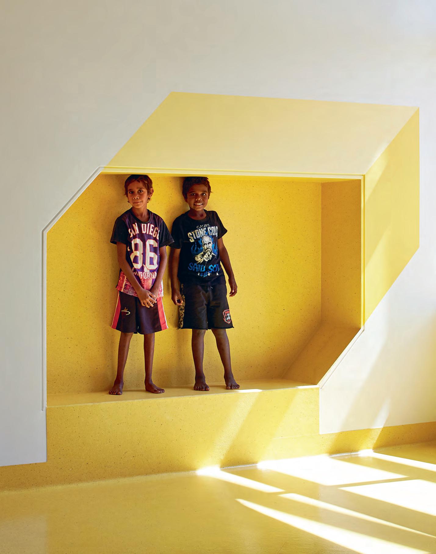
–
Bosch Design: setting the standards
300 international Design Awards in the past 5 years
“
Tribe Hotel Group – an artfully curated guest-centric and refreshingly affordable design hotel alternative, created for the modern business traveller, the it nomad and the free agent – has launched its first hotel, Tribe Perth. Designed by Travis Walton Architeture, the space is an experiment in the role of the designer o “edit luxury” – and provide everything the modern traveller needs – and nothing they don’t.
Edited Luxury
W hat was challenging, was trying to create an identity for a brand solely in an isolated hotel room, because i think typically that the guest experience is always going to be the arrival, reception, lounge, lift lobby then the final destination is the room,” says designer and architect, Travis Walton.
INDESIGNLIVE.COM 148 IN SITU
Tribe Hotel Perth by Travis Walton Architecture
Words Ben Morgan Photography Earl Carter
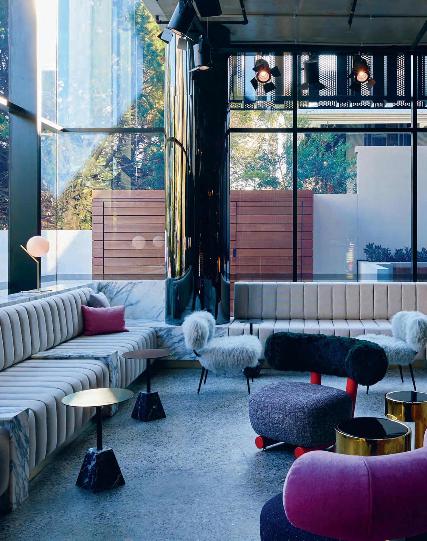
“When you travel, unless you’re in a remote destination where you’re literally staring at crystal clear water, most of the time, you’re maintaining your everyday routine. A hotel should support that.”
The modern traveller isn’t a particular age. They don’t buy a particular brand of suitcase, or subscribe to a specific magazine. They can’t be defined by the places they travel, or by the people they meet. The modern traveller, however, consistently seeks one thing — connection.
This is something that architect and designer Travis Walton appreciates. “I travel a lot for work,” he says. “So I’m in hotels all the time, and I’ve started to really focus on what I want.” When his multi-disciplinary practice Travis Walton Architecture (TWA) was approached by TRIBE hotels to launch its first location, Walton knew it was an opportunity to re-define the Australian hotel typology, based on his own wide range of travel experiences.
The project, right at the edge of West Perth’s expansive Kings Park, is a modular construction. Each room was completely assembled off site — finishes, fit ings and all — and craned into position. “We got involved about three years ago,” Walton explains. “They’d done various prototypes of the modular construction and various iterations of the actual room modules.” Whereas a traditional approach would see designers start from the arrival spaces and communal areas and work back to the rooms, this method required Walton and his team to start from the rooms and move out. “So it was actually the inverse, which had its challenges in trying to create an identity for a brand solely in the room in isolation, when the guest experience is always going to be the arrival, reception, lounge, lift lobby then the final destination is the room.”
Becoming involved at this early stage allowed TWA to re-imagine the standard hotel room layout. Space was at a premium, as the modules needed to remain small, relatively lightweight and affordable — ultimately reducing the room rates. Re-working the layouts, the team moved the bulkhead, with air-conditioning and services, away from the entry hall, ensuring a full-height experience from door to window. The desk was placed away from the outer walls, meaning the peripheral vision enjoys more than a blank wall. But it’s the clever storage solutions that show Walton understands the modern
traveller. The beds have been customised to create recesses for two full-sized suitcases at the end and two pairs of shoes on either side. Plenty of storage space has also been carved out in the bathroom for those travel items that never seem to have a place in traditional hotel rooms. These are the subtle, yet important things that you might not appreciate if you weren’t a regular traveller.
At TRIBE, you won’t need to waste time typing in that wifi password, it’s an open network. Just a couple of clicks and you’re on. For Walton, these are the moments that make all the difference. “When you travel, unless you’re in a remote destination where you’re literally staring at crystal clear water, most of the time, you’re maintaining your everyday routine. A hotel should support that.”
The communal areas are designed as social spaces and co-working spaces, where travellers can open up their laptop and feel comfortable working away, or can share a drink or a coffee with their fellow travellers. Rather than being transient spaces, they’re designed to be inhabited and enjoyed in a connected way. A curated library of art, design and cultural books are accompanied by customised Moroso Pipe chairs and generous sofas. The lobby, reception and bar and dining areas are far from boring, with an amazing collection of lighting — from hanging pendants and theatre spotlights to gorgeous floor lights — wall finishes and furniture. Walton has approached them much more as Food and Beverage spaces than a conventional hotel lobby. It takes a deft touch to marry so many bold pieces and details into large open-plan spaces such as these, TWA makes it work.
TRIBE Hotel Perth, with its exciting modular room design and focus on sociable, connected spaces, is a genuine innovator in the market. “I think it does focus on what people are trying to get from a hotel experience. We’re in a mobile world. We spend most of our time on our phones, on email. We’re not bound to a desk. We’re moving around. As an approach to design and an approach to the hotel experience, it’s going to be quite disruptive.”
traviswalton.com.au
INDESIGN 151 IN SITU
Page 149: Guest rooms feature soft material palettes which TRIBE describes as ‘accessible luxury’. Opposite: The plush lobby and seating area adjacent to the hotel’s café and dining space. Page 152: The restaurant, café and bar areas are rich in monochromatic, moody materials such as brass, marble and custom-made houndstooth ceramic tiles.
“If you ask any hotel operator ‘Who do you appeal to?’, they’ll say ‘Oh we appeal to everybody’. But appealing to everybody appeals to no one. Rather than being guided by an age or a stereotype, TRIBE hotel is going to appeal to those people who are coming in to do business, but it’s also going to attract those who are looking at Perth as a holiday destination.”
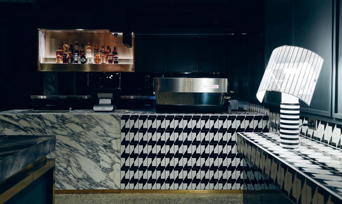
INDESIGNLIVE.COM 152 IN SITU
INDESIGN X ALKI
Less Isn’t Less
The contemporary trend of minimalist workspaces has gotten a bad rap lately, with most experts declaring that “sometimes less is just less.” However, that’s not to say minimalism as a design approach should be immediately tossed out the window.
There’s a lot of stuff floating around the media circuit about why a minimalist living space might aid slow living, a clutter-free life and a general ease and wellbeing. But while our working environments are becoming increasingly paperless, spare and fuss-free, comparatively little has been written about what effect this move toward minimalism might have for the individuals who populate these areas.
In general, it is believed that while an employee’s ability to take ownership of their workspace has been attributed to increasing productivity and happiness, architects and designers need to be careful about crossing a line from ‘lean and clean’ to garish and kitsch. Too often, minimalism is equated with anti-materialism. And while this might be the consensus (for better or worse), it is important to keep in mind that an anti-materialism standpoint and the addition of personal touches or greenery to an office are not mutually exclusive.
You see, understanding where and when to pare back design is a valuable skill to nourish, and one that some contemporary brands are increasingly promoting as central to their design ethos. A definite front-runner in this is the French design powerhouse Alki. Originating in the small town of Itsasu in Basque Country, France,
the brand has succeeded in bringing the design language of the Basque region onto the global stage. Since its inception in 1981, Alki now holds a leading position in the contemporary furniture market –a pointedly influential brand which many a competitive design house set their watches to.
Featuring a bold set of pastel colours that are often complemented with a more neutral timber, their range of immaculately crafted, contemporary furniture has been making waves since it was debuted in 2007. Representing a new direction for the company, Alki has since consolidated their masterful efforts. Not only does their furniture help complete contemporary homes and traditional apartments around the world, but also the European offices of Quiksilver, and the headquarters of big-name brands Hermès and Levis Strauss.
Their products are not restricted solely to timber either, although it is their design material element of choice. Leather, felt, wool and even hand-plaited straw all feature extensively across the Alki portfolio. Whether you’re looking for a personal touch or clean, minimal design, there’s bound to be something for everyone.
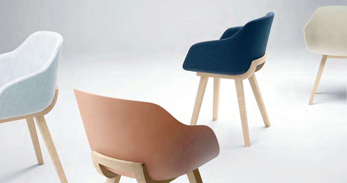
Maybe sometimes less is just less. But not in this case.
So while a trip to Basque Country to indulge in contemporary furniture would certainly be nice, it isn’t necessary. Alki is readily available through Cafe Culture + Insitu – the widely-renowned Australian supplier celebrated for helping international designs reach the global stage.
livingedge.com.au living edge 153 cafecultureinsitu.com.au cafe culture + insitu
Above: Alki’s KUSKOA BI Chair. Alki’s range is available throughout Australia at Cafe Culture + Insitu.
Where
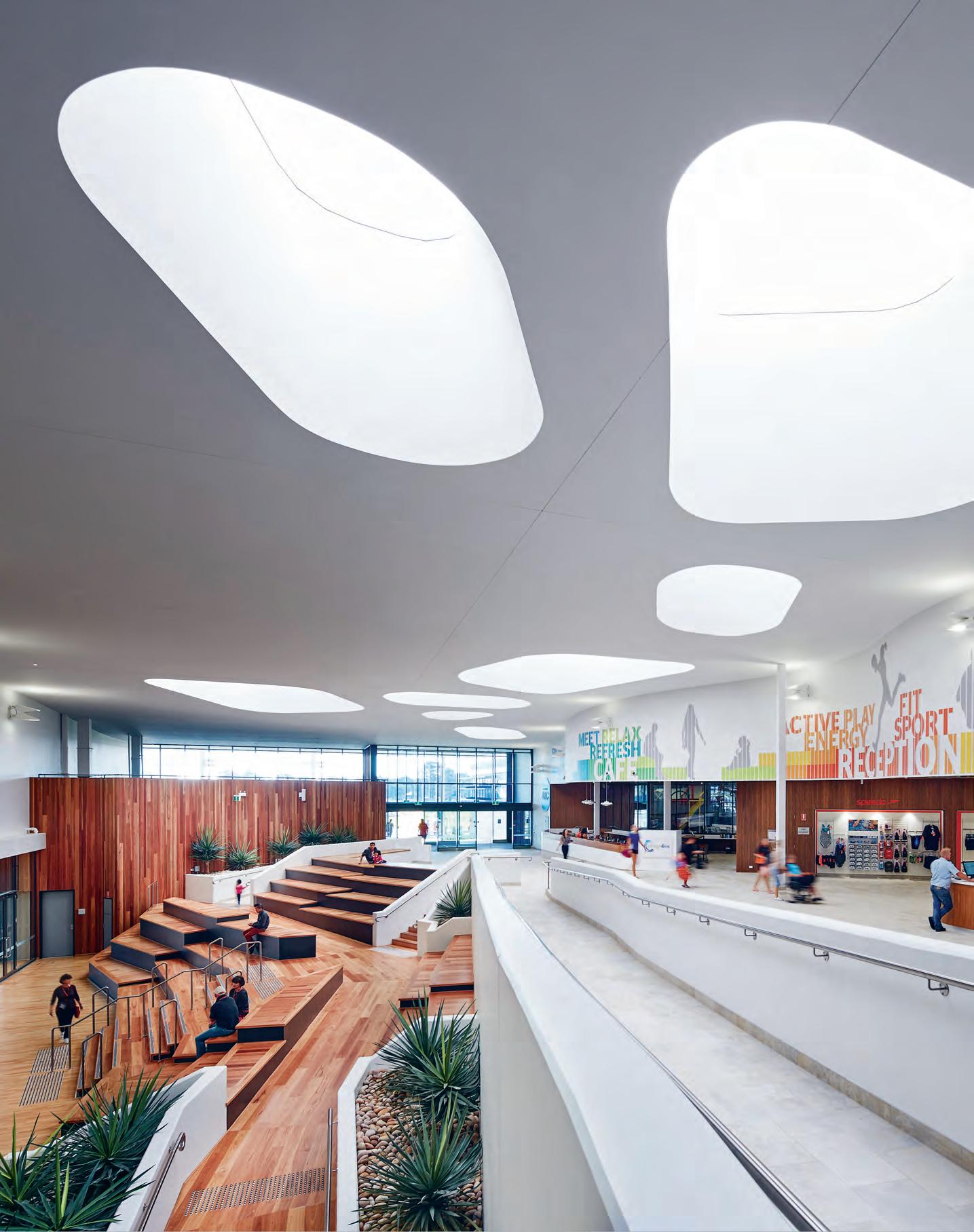
How can a single space simultaneously serve the needs of healthcare, education and community at all levels? In their most recent project for Cockburn ARC, dwp create the ultimate cross-sector blueprint for a hybrid health, fitness, education, community and culture centre for professional, intermediate and beginner users.
One Size Fits All
A community recreation centre. A high-end health club. An aquatic centre and water park. An elite football training and administration facility. An education and research centre. A health and rehabilitation facility. It reads like a long list of separate buildings, but in fact this was the brief for a single complex given to the dream team of sports and community design, Sandover Pinder + dwp.
“While there was only one contractual client, which is the City of Cockburn, there were really three other entities involved; the Fremantle Dockers, which was the main partner of City of Cockburn, and then there was Curtin University,” explains project director, Sandover Pinder managing director, David Karotkin. “So that’s one of the main characteristics of the project, that partnering philosophy, which enabled each of the parties to leverage their funding commitment to the project and get a little bit more from it in the process.” With a range of competing and complementary requirements, the complexity of this project extended well beyond the plethora of equipment, resources and technologies involved. It’s a facility that combines the needs of the elderly and disabled with the needs of the country’s top athletes. Achieving this balance was certainly no mean feat.
However, when it came to untangling the uses across the physical space, Sandover Pinder + dwp looked to a clever design solution. “We created what we’ve called an ‘internal street’ that goes from from the main public entry all the way through the centre of the development to the oval side,” says Karotkin. “From this internal street you’ve got access to the indoor courts, to the aquatic centre, to the health and fitness areas, and to the football club,” says dwp senior associate and sport + leisure leader, Mike McGrath. Where the site slopes slightly
down from front to back, the internal street slopes up, meaning the football club facilities on the lower level maintain a certain degree of privacy. Additionally, the different levels allow the control of sightlines, where the recovery pools, for example, are located on an upper level where a large automated sliding screen provides further privacy for players who may be recovering from injury — important for an elite club such as The Dockers. “We really worked hard to use those levels to create a unique design solution. We put the basketball stadium down on lower level so that the football club can go out of their main training areas at grade,” says Karotkin. “They can go out onto the oval and then come back into the basketball stadium without having to go up or down,” allowing room for a 100-metre running track spanning the basketball courts, indoor gym and out to the playing fields.
What’s really great here though, is that users of all skill levels can take advantage of multiple components. Amateurs can mix it with the professional AFL players on the highball courts, while the University can research everything from aged-fitness and community health, through to the elite athletes — with access to running tracks with force plate sensors, to high-altitude training chambers and to the recovery pools. “The intention was that the health professionals who work in the allied health suite might also be massage therapists for the football club,” says McGrath. This is where the partnering clients get most value from working together, meaning they can have larger, more complex and hi-tech solutions to their needs than they could have individually afforded.
dwp.com, sanpin.com.au
INDESIGN 155 IN SITU
Cockburn ARC Central West Regional Activity & Education Centre by dwp & Sandover Pinder
Words Ben Morgan Photography Robert Firth
Opposite: The central reception and lobby area with cascading stairways leading down to the basketball court facilities. Page 156: Cockburn’s fully-equipped health club gymnasium is intersected by a 100-metre running track which spans the basketball courts and runs through the indoor gym and out to the external playing fields.
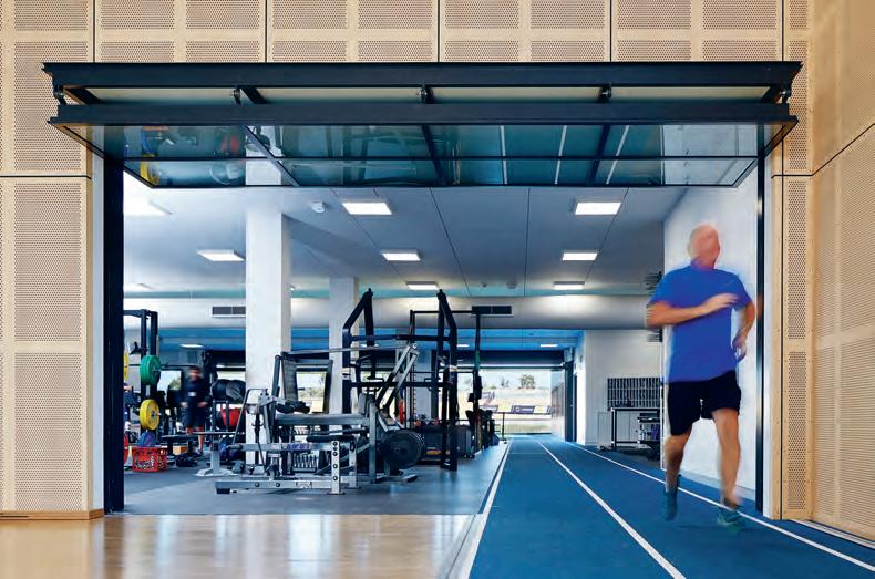
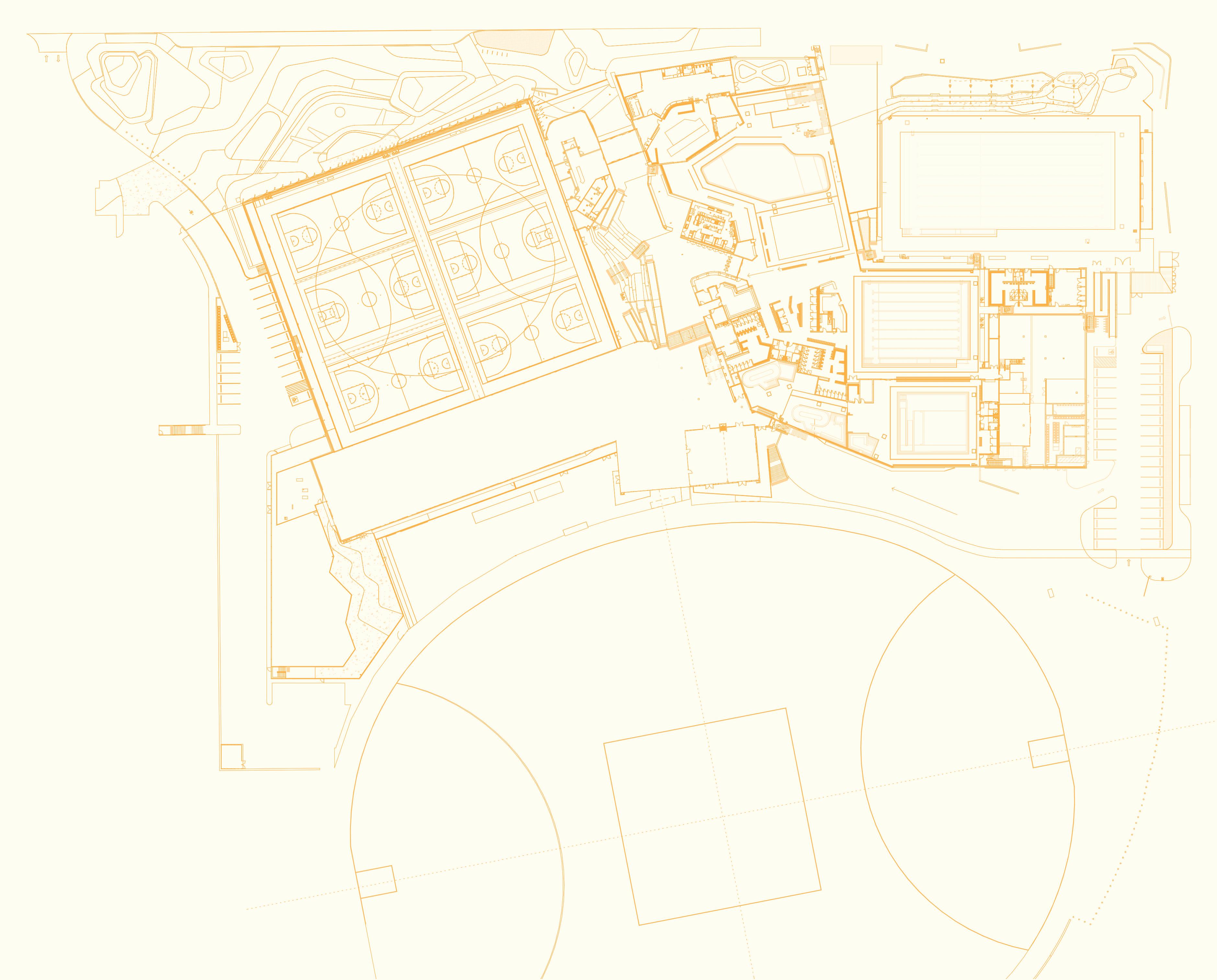
INDESIGNLIVE.COM 156 IN SITU Cockburn ARC, Site Floor Plan 1 Entrance and Lobby 2 Indoor Courts 3 Football Club 4 A llied Health Suites 5 Ampitheatre 6 Reception 7 Function Space 8 Indoor Play Area 9 Café 10 L eisure Pool Hall 11 25 -Metre Pool 12 Warm-Water Pool, S pa and Sauna 13 R ecovery Facility 14 Aquatic Change Area 15 5 0-Metre Pool 16 Water Slides 17 Pool Room 18 Training Oval 3 2 14 5 6 7 9 8 10 11 12 13 14 15 16 17 18
INDESIGN X FLOKK
HÅG thinks freely, designs freely and moves freely: all of HÅG’s chairs are produced with these ideas in mind. The Scandi design brand helps you to sit with freedom to move, rest and change to the next posture, all without having to think about it. The entire HÅG SoFi range has been designed to meet the changing needs of the modern workplace, without sacrificing aesthetic beauty.
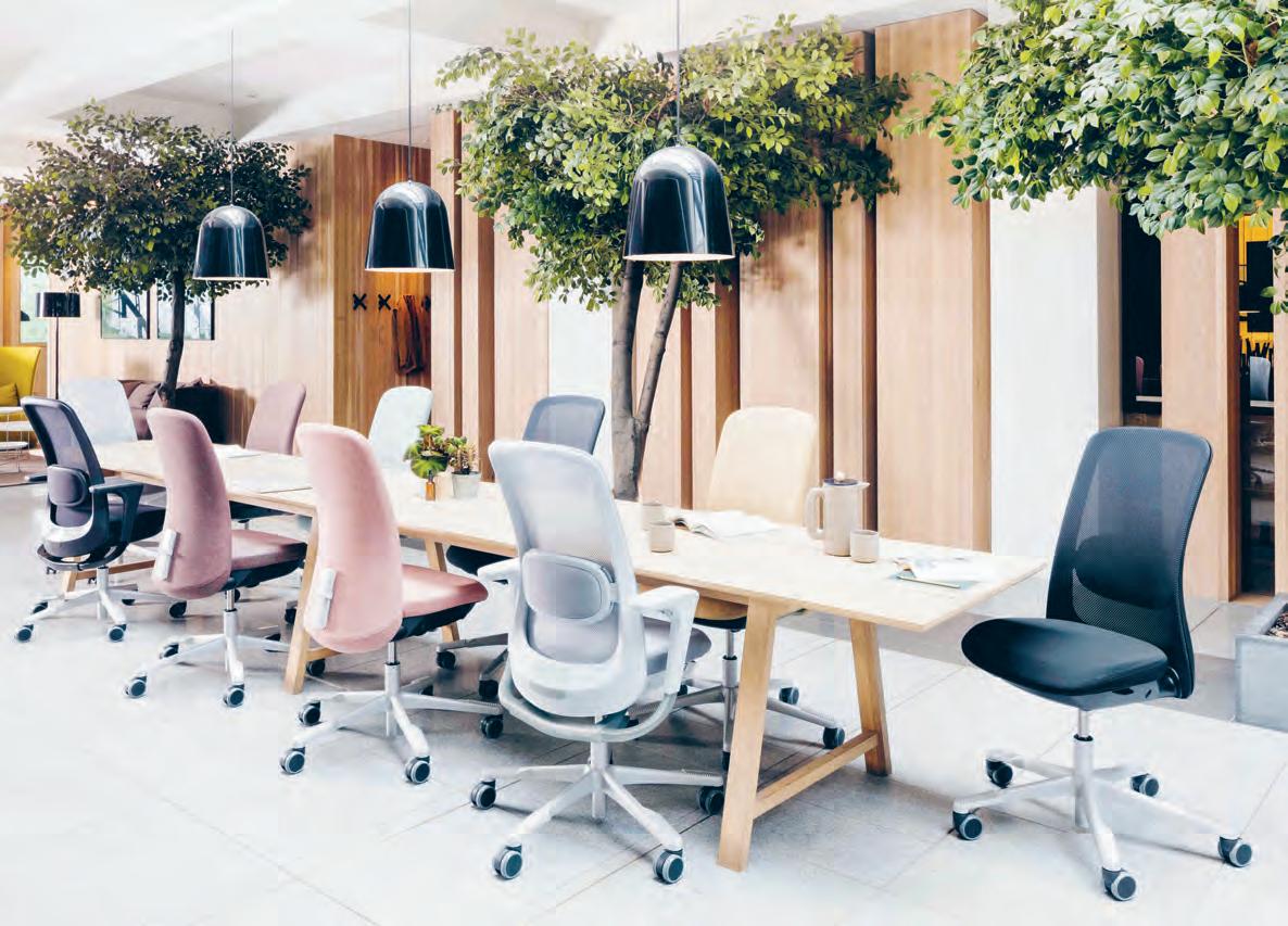
The latest addition to the HÅG SoFi collection was made in collaboration with design houses Frost Produkt and Power Design. The result is the fusion of aesthetics and function which has produced a beautiful and user-friendly seating solution for any office space.
As the commercial sector continues to fight the war on talent, HÅG SoFi’s user-centric and highly ergonomic design is a powerful weapon in the corporate arsenal. “The major challenge for us was to create a beautiful object from something that is in fact a
highly advanced machine,” says Aleksander Borgenhov of Power Design. “With HÅG SoFi we managed to ensure all features and mechanisms are compact and hidden away, by repeating similar visual keys in all parts of the chair, creating a coherent and harmonious design.”
The updated HÅG SoFi, with a mesh back, incorporates marketleading technologies and naturally clean lines to provide a seating solution for the modern workplace, offering great design and supreme comfort.
Every detail in the design has been considered to not only suit the user’s needs but to complement any interior with a vast range of fabrics and configurations from which to choose.
The new HÅG SoFi mesh model continues the HÅG tradition of supreme mobility to make life less ordinary. The range is now available from Flokk.
livingedge.com.au living edge 157 FLOKK.c O m F LOKK
Above: The HAG SoFi range is available through Flokk, formerly known as Scandinavian Business Seating.
Bringing Beauty To The Office Chair
Fixed, Fitted & Furnished
The Working Capitol, Robinson Road Singapore
Architect & Interior Designer
HASSELL
Project Manager
Facility Asia
Builder Tarkus
Services Engineer Aurecon
Quantity Surveyor
PTD Consultants
Duration 14 months
HASSELL hassellstudio.com
Furniture
Arflex ‘Pecorelle’ armchairs and lounges, ‘GTV’ breakout chairs, Space Furniture. Tacchini
‘Kelly’ meeting room chair, Derlot ‘Picket’ stools, custom tables, Stylecraft ‘Quadrant’ flexible lounges, Koskela
Lighting
‘IC’ wall ball lights, Space Furniture . Akari ‘1AD’ table lamp.
Finishes ‘Chilli’ radiant dichroic film, 3M . Goats hair carpet, Tretford . ‘Coda 2’ fabrics, Kvadrat . ‘Waxed Melville’ marble like cork, pine plywood, Panelogue ‘LS’ rubber flooring, Deco Expression . Timber flooring, Mafi
Fixed & Fitted
‘X Series’ glazed partition system, JEB ‘Opendesk’ workstation system, Woodfix
Bendigo Hospital
Architect
Silver Thomas Hanley
Interior Designer
Bates Smart
Builder Lendlease
Structural Engineer
Irwinconsult
Services Engineer
Norman Disney & Young
Acoustic Engineer
Acoustic Logic
Landscape Architect
Oculus
Building Surveyor PLP
Wind Assessment
MEL Consultants Wayfinding/Signage ID Laboratory
Budget $630 million
Duration 3.5 years
Bates Smart batessmart.com
Silver Thomas Hanely sth.com.au
Furniture
‘Physix’ conference task chair, Vitra . ‘Nola’ city walk bench, KFive Customised round bench seat, Schiavello
Lighting
‘Waldmann’ PARA MI task luminaire, Living Edge ‘Progetti Luce’ downlights, Inlite
Finishes
‘Shellgrit’ timber veneer, Ventech . ‘Stratopanel’ acoustic plasterboard, ‘Mastashield’, Knauf Plasterboard . ‘Electro scintillation’ paint, ‘Ghosting’ half finish, Dulux . Salt colour finish on reception desk, CASF ‘Concrete Paver’ flooring, Urban Stone . Artwork, Esther Stewart, Noel Skrzypczak.
Jackalope Mornington

Peninsula
Architect & Interior Designer
Carr
Project Manager
Medley Property Group
Builder VCON
Structural Engineer
Wood & Grieve Engineers
Landscape Designer
Taylor & Cullity Lethlean
Branding Consultant
Fabio Ongarato Design
Light Designer
Jan Flook Lighting
Restaurant and F & B
Consultant Pascale GomesMcNabb Design
Exclusive Furniture Zuster
Hotel Amenities Hunter Lab
Building Surveyor
Gardner Group
Pool Consultant Aloha Spa Consultant Spa Sessions
Budget $25-26 million
Duration 3 years
Carr carr.net.au
Furniture
‘Tembo’ barstools, ‘Salute’ side table, La Chance, Living Edge . ‘Hay – Revolver’ stool, ‘Cassina – Cicognino’ side table, Cult . Custom pool table, Harry Evans & Sons . Edra ‘Leather Works’ feature armchair, Moooi chair extension, Space
Furniture . ‘Brides Veil’ armchair, Phase Design. Hasegawa ‘Lucano’ step ladder, Crate & Barrel
‘Autoban’ nest chair, Luke
Furniture . ‘Sabrina’ stools and leather sofas, glass bar table, ‘Tribute’ coffee and lamp tables, ‘Husk’ chairs and bar stools, ‘Stick
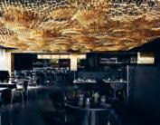
Insect’ table and restaurant tables, ‘New Embellish’ round and trestle dining tables, custom ‘Scalloped
Unit’ buffet, banquette seating, custom stone top table, custom screens, ‘Halo Cabinet’ storage, ‘Willow Creek’ collapsible table, ‘praying mantis’ side table and bedside tables, vinyl armchair, ‘pyramid’ coffee table, ‘Jade’ ottoman, tub style armchair, new design dressing stool, ‘Square Timber’ armchair, sheepskin armchair, guest room coffee tables, custom ‘Duyfken’ console sofa table, custom ottomans, café tables, pool tables, Zuster
Willinga Park
Equestrian Centre
Architect Cox Architecture
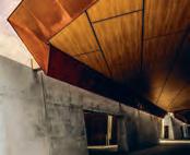
Interior Designer
Sally Hieatt Interiors
Project Manager
Construction Control
Australia
Builder Construction Control Australia
Structural Engineer
AWT Consulting Engineers
Services Engineer
Norman Disney & Young
Lighting Design LDP
Hydraulic Engineer
Vital Design
Landscape Architect
Oxigen/DZ Design
Civil Engineer Robert Bird
Duration 3 years
Cox Architecture coxarchitecture.com.au
Sally Hieatt Interiors sallyhieatt.com
Furniture Poltrona Frau ‘Archibald’ and ‘Grantorino’ chairs and lounge, B&B Italia ‘Fat-Fat’ coffee tables, Cassina ‘Maralunga’ lounge, Cult Fritz Hansen easy chair, Walter Knoll ‘Cuoio’ chair and lounge, Poltrona Faru ‘Don’do’ rocking chair, Carl Hanson ‘CH20 Elbow’ dining chair, Tait ‘Kink’ lounge, ‘Hee’ dining chair and stool, custom dining tables, Designcraft ‘Alpha’ stadium seating, Camatic . ‘Phoenix’ side table, Jardan . ‘Reel’ coffee table, Space Furniture
INDESIGNLIVE.COM 158 IN SITU
Want to know what made the spec’ schedule for our featured projects?
Don’t worry, we’ve got you covered...
Finishes
Off form concrete, Holcim Blackbutt timber panelling, ‘Concept Click’ dowels, Woodform . ‘Corten’ weathered steel, Bluescope
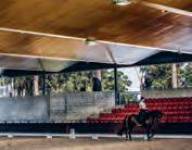
Emilceramica ‘Stonebox’ bathroom ceramics, bluestone paving, ‘Pietra
Grey’ stone joinery, ‘Omega Black’ stone basins, ‘Calacutta Oro’ joinery, PDA Marble and Granite
Leather panelling, Designcraft , Instyle , Contemporary Leathers
Equestrian and VIP area
metal cladding, ARC
‘Ariaply’ covered area
ceiling lining, Austral
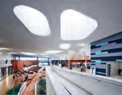
Plywood . Natural sandstone
finish, JVS Sandstone and Masonry. Office area
timber, Jim McConnell
Feature floor rugs, Tappetti Rugs . Artwork, Michael Johnson
Fixed & Fitted
Natural gas fireplace, Real
Flame . ‘City Stik’ tapware and accessories, Brodware
‘Subway’ wall-face pan, Villeroy & Boch . Boiling and chilled water units, Billi
TVNZ Television Centre
Architect Warren and Mahoney Architects
Project Manager Beca
Builder Fletcher
Construction
Structural Engineer Harrison & Grierson
Services Engineer
22 Degrees
Duration 3.5 years
Warren and Mahoney Architects warrenandmaheoney.com
Furniture
Workstations, Vidak
Furniture generally throughout, Cult , Unison , IMO , UFL , Fletcher
Systems , Aspect
Lighting
Lighting throughout, Targetti
Finishes
Joinery throughout, Sage Joinery. External walls, floor tiling, Tile
People . Lourves and windows, Thermosash
Paint throughout, Resene
Blinds, NZ Window
Treatments . Ceiling finish, Asona . Flooring, Inzide , Heritage Carpets . Glass throughout, Woods Glass
Hardware, Chant
Acoustic panelling, Autex Laminates throughout, acoustic panelling, Prime Panels . Rugs, Cult
Karratha Central
Healthcare
Architect Cox Architecture
Project Manager NS Projects
Builder Doric
Structural Engineer
Capital House Australia
Mechanical Engineer
Geoff Hesford
Hydraulic Engineer
Norman Disney & Young
Electrical Engineer
Best Consultants
Acoustic Engineer Gabriels
Building Code Assessor
Milestone
Quantity Surveyor Davson + Ward
Landscape Designer Cox Architecture
Duration 2 years
Cox Architecture coxarchitecture.com.au
Finishes
‘Almondbury’ midland
brick paving, Boral
‘Semco Prestain’ decorative concrete, Alternative Surfaces , Artisan Finishes
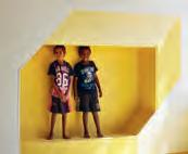
‘Kiplok Classic’ shale grey roofing, Bluescope
‘Meteon’ cladding panels, Trespa . ‘Spandek’ sheet metal, Colourbond ‘Versilux’ soffit linings, James Hardie . Laminates throughout, Laminex . ’4020’ timber ceiling, Screenwood ‘Durastone’ ceramic tiling throughout, Myaree Ceramics . ‘Walkeasy’ surface flooring, Comcork ‘Syncopation’ carpet throughout, Interface . Paint throughout, Dulux
Fixed & Fitted
Aluminium windows and doors, AWS . Door hardware, Assa Abloy Australia Joinery hardware, Häfele
T R IB e Hotel Perth
Interior Designer Travis
Walton Architecture
Architect Idle
Architecture Studio
Project Manager Salta
Properties
Builder Pro Build
Structural Engineer Bonacci Group Services Engineer Wood and Grieve Engineers
Duration 3 years
Travis Walton Architecture traviswalton.com.au
Furniture
Moroso ‘Pipe’ armchairs, Hub Furniture . Blue sofa in Febrik fabric, Travis Walton
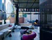
Lighting
Custom pendants, Giffin Design . Oluce and Flos table lamps, e u roluce Tom Dixon ‘Stone Wall’ pendants, Dedece
Finishes
Custom b/w tiles, 21-19 Studio . Wall art, Marsha Golemac
Cockburn ARC Central West Regional Activity & e d ucation Centre
Architect dwp and Sandover Pinder
Project Manager NS Projects
Builder Multiplex
Structural Engineer Aecom Services Engineers Calibre, Norman Disney & Young, WSP | Parsons Brinckerhoff, Aecom, Gabriels Hearne Farrell
Landscape Designer Emerge Building Surveyor JMG
Pools and Filtration
Commercial Aquatics Australia
Budget $109 million
Duration 3 years
dwp dwp.com
Sandover Pinder sanpin.com.au
Furniture
Furniture throughout –Okamura and Diemmebi, UCI
Lighting
Philips ‘GreenUp’ stadium lighting, ‘Klik’ gym lighting, ‘Digilin’ LED, ‘Glamox’ crèche lighting, ‘Lumenline’ panel lighting, Hi L ighting
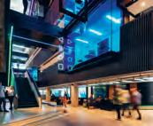
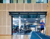
Finishes
‘Sparkling white’ joinery, Corian . Laminated joinery, Laminex . Solid surface joinery, HiMacs Blackbutt timber flooring, e m bleton . ‘Everroll Core/ Intensity’ rubber flooring, Regupol . ‘Marmoleum’, ‘Flotex’ floor finishes, Forbo . ‘Metz’, ‘Etch’ and ‘Janolan’ flooring, Metz Safety flooring, Monotek Haro ‘Helsinki’ flooring, Aura Sports Flooring Carpet throughout, Interface . Bolon flooring, The Andrews Group Spotted Gum timber walls, Timbeck Architectural Reconstituted wood wall and ceiling cladding, Biowood . ‘Marmorino Naturale’ venetian plaster, Plasterwise Plaster finish, Dulux Hoop Pine perforated plywood, AustralPly. ‘E610’ external walls, e ve rbright ‘Rockwool’ flameguard, Bondor. Honed concrete, Delta Corporation . ‘ExoTec’ cladding, James Hardie Fixed & Fitted Fittings throughout, Caroma , Bradley, Clark
INDESIGN 159 IN SITU
INDESIGN X HOWE
Howe Furniture was established nearly 90 years ago, yet the brand has never been so relevant or in mode as it is today. As the boundaries between disciplines continue to blur (from residential and hospitality to education and commercial) demand for versatile, multi-functional pieces continues to soar. After all, this is what the Danish brand is famed for, with a philosophy rooted in the Bauhaus tradition of combining design, simplicity, quality and functionality. What’s more, all of Howe’s streamlined furniture solutions have been designed to fold or stack with ease to ensure spaces can be used in myriad different ways.
The company’s famous 40/4 stackable side chair showcases this flexibility beautifully. Regarded as one of the most important designs of the 20th century, it is ideal for a range of industries and, within them, an array of settings: From cultural sites such as museums, concert halls and community centres to education institutions for learning, eating and lounging and all manner of hospitality environments. Or even churches and cathedrals, which often double as concert, seminar or yoga-class venues these days.
Designed by David Rowland, the 40/4 Chair has featured in design collections and museums all over the world in recognition of its elegant lines, excellent ergonomics, unsurpassed stacking
and handling and also its space-saving benefits. What’s more, this classic design - along with many of Howe’s other collections – is used every day in world-famous venues including London’s St Paul’s Cathedral, the Sofitel Hotel Paris, Scottish Parliament, Le Grand Louvre and Olso Opera House.
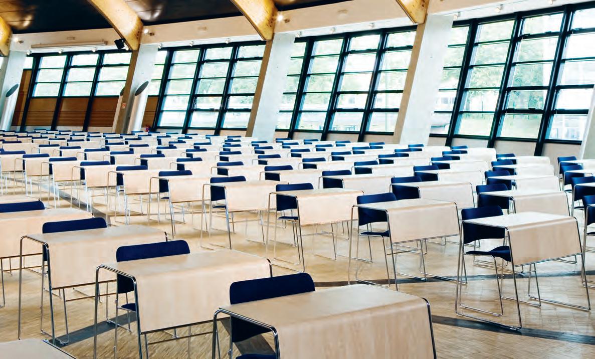
Howe’s designs are always characterised by a spare aesthetic line and whilst this creates a sleek, contemporary look for projects, the company’s intention is also to promote wellbeing and freedom of thought. Howe wants to have an effect on how people think and it aims to do this by liberating the space in interior environments. As it states in its company vision, “freedom from restrictions, we believe, creates the conditions for freedom of thought.”
It is widely acknowledged that simplicity and minimalism in design can promote a profound sense of calm and tranquillity; that by reducing physical clutter or embellishment we also decrease mental clutter. And Howe’s understated designs certainly prove this true. From the elegant Arne Jacobsen Tongue chairs to its simple yet stylish SixE chair or wonderfully pared-back Usu table, Howe is making all of our lives more simplified, flexible, comfortable and stylish. The brand is available in Australia through Living Edge.
livingedge.com.au living edge 160
Above: : Howe Furniture’s 40/4 Chair and Tutor Table in ESSEC Business School, France.
Clever design that simplifies modern-day life.
WHO ARE THE DESIGNERS RE-WRITING THE FUTURE OF HEALTH AND AGED-CARE?
INDESIGN 161 IN DEPTH
IN
DEPTH
The CreaT ivi T y

INDESIGNLIVE.COM 162 IN DEPTH
Caring
Of
The healthcare landscape is ever changing in Australia, and the well-versed writings of Bernard Tschumi – “There is no architecture without events, without actions, without activities” –are just as relevant today as they were when taught at design school, according to Tonya Hinde, associate director and Victorian interior design leader at Billard Leece Partnership (BLP).
“Health includes your emotions and health is all around us. It isn’t just about what the medicine does, it’s also about the space we inhabit,” she says, referring to Esther Sternberg’s publication Healing Spaces (2009).
This is a key focus for Hinde. Over her 26-year career, Hinde’s work has often reflected a personal sense of storytelling and scale regardless of size, sector or typology, which: “goes beyond the flippant in design and gets to the heart of things that make you feel ok.” Her focus in Australian healthcare design was put on the map in 2011 through her work on the landmark Royal Children’s Hospital (RCH) in Melbourne, by BLP and Bates Smart.
A significant, world-leading facility with many stakeholders, RCH represented a ground-breaking opportunity to bring together research, administration, labs, theatres and wards, connected by the story of ‘the hospital in the park’, based on an evidence-based design principle that outside views shorten recovery times. “It was pretty unique in the world to have a park the whole way around the hospital, and it was one of the first in Australia to address this entirely,” Hinde says.
The ‘nature:nurture’ storytelling informs the hospital’s design at every step, but it is subtle, rather than literal: from the meerkat enclosure backing onto the zoo, to the wards named after transitions from underwater to earth and sky, and the 7.5 metre-deep aquarium rising up two floors.
At the time, RCH kickstarted more funding and design opportunities in healthcare than ever before, and it’s in these newer health projects that Hinde feels the most fulfilled, offering more creativity to explore than in any other sector she works in. “By starting these projects, everyone’s research expands expectations and creativity expands too,” she says. “It pushes the sector, and goes beyond the ordinary.”
She did exactly that at the Ballarat Regional Integrated Cancer Centre (by BLP), drawing on her own diagnosis and successful treatment for breast cancer 12 years before. “My own experience of receiving radiotherapy treatment was pretty horrible,” she recalls. “I remember lying there and [seeing] all these masks of other
people’s treatment, like you’re in a back storage room.” Rather than focus on solely a public façade and lobby space, she delved deeper into the centre’s treatment areas to try to create a more positive experience for patients. She created quite beautiful radiotherapy bunkers reminiscent of a day spa, where patients lay down in a dimmed room, and look up to a perforated wildflower pattern in the timber, softly lit from behind.
A similar patient experience informed the design for the Albury Wodonga Regional Cancer Centre (by BLP), which won a 2017 Australian Institute of Architects NSW award for Public Architecture.
In this highly sensitive and collaborative facility, the interior shapes the exterior envelope. The building plan stretches along the façade with 30 chairs set up for day treatment patients, which each face a different view of the mountain landscape opposite.
“These picture windows pop out and it’s unconventional looking,” Hinde says. But as much as her work reflects a very personal experience, she also finds creativity in stepping back, releasing the control required to manage many stakeholders and budget constraints, and then embracing the chaos.
“Healthcare design teaches you that you are just one person, and in fact it’s not about you,” she says. “The more designers that can get out of their own headspace and into others’, the better life will be. We can use our skills to help others a lot more.”
To help her creative process, she uses film-thinking as a design tool. On large projects, she considers space, scenarios and interactions from everybody’s point of view, and then applies site, context and characters to the scene. “I like seeing people interact with the space where it’s full of activity, or even activities you didn’t expect. It’s like interpreting your work in a different way, and that’s something that takes a while for designers to get into.”
For example, Hinde is currently drawing on agile and activitybased workspaces, creating access for all. In hospital design, she brings clinics together so that they don’t belong to a specific department. Play spaces are integrated and connections are created to the outside environment, while the traditional large waiting room is broken up into smaller waiting rooms.
“They are hospitals but they’re actually exciting buildings in our architectural landscape and that’s something to be proud of as Australians,” Hinde says.
blp.com.au
INDESIGN 163 IN DEPTH
Words Annie Reid Photography Various
You might assume that creativity takes a back seat to science and hard facts in the design of health and aged-care spaces, but according to Tonya Hinde, it’s the most creative sector she’s worked in. Here’s why.
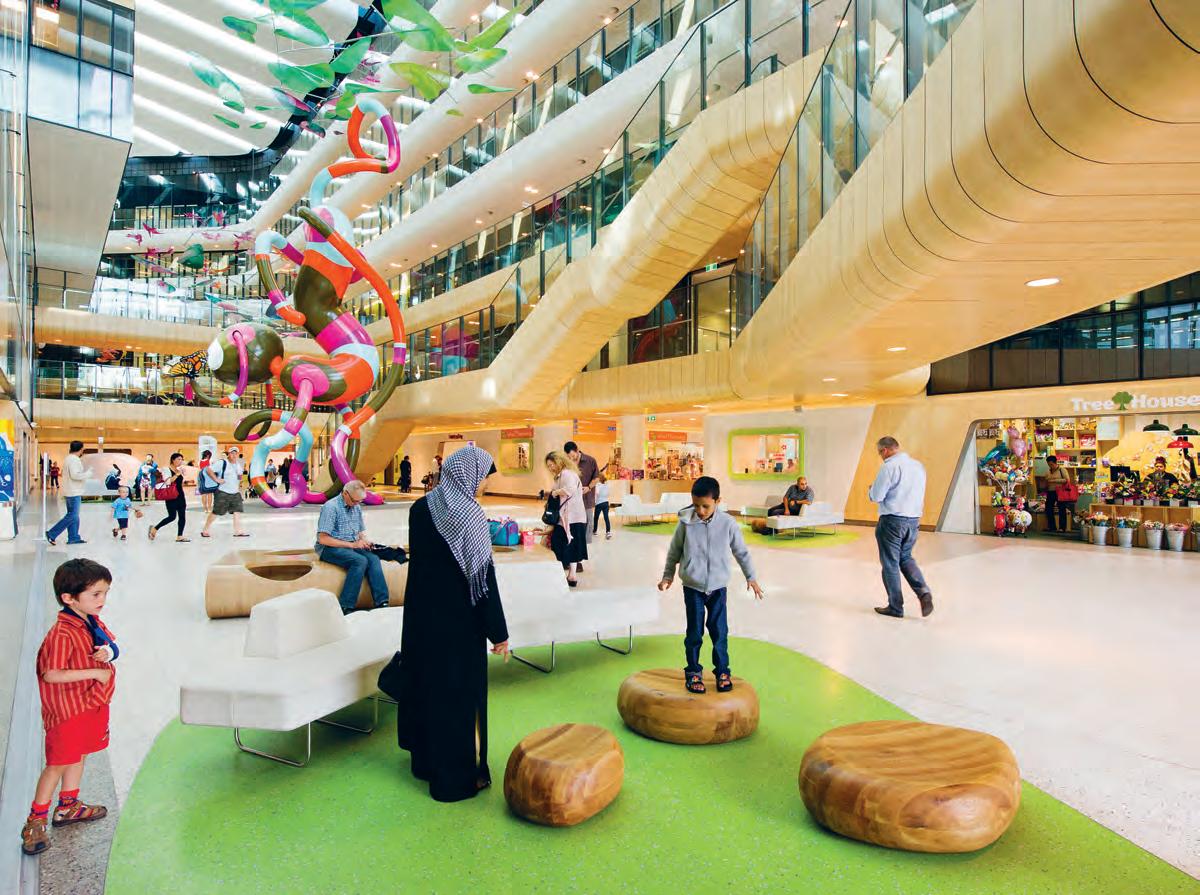
INDESIGNLIVE.COM 164 IN DEPTH
Page 162: Tonya Hinde, associate director of Billard Leece Partnership (BLP), Photo: Rebecca Rowlands. This page: The Royal Children’s Hospital Melbourne by BLP and Bates Smart (2011)
Photo: John Gollings. Opposite & pages 166-167: Albury Wodonga Regional Cancer Centre by BLP (2016) Photo: Shannon McGrath.
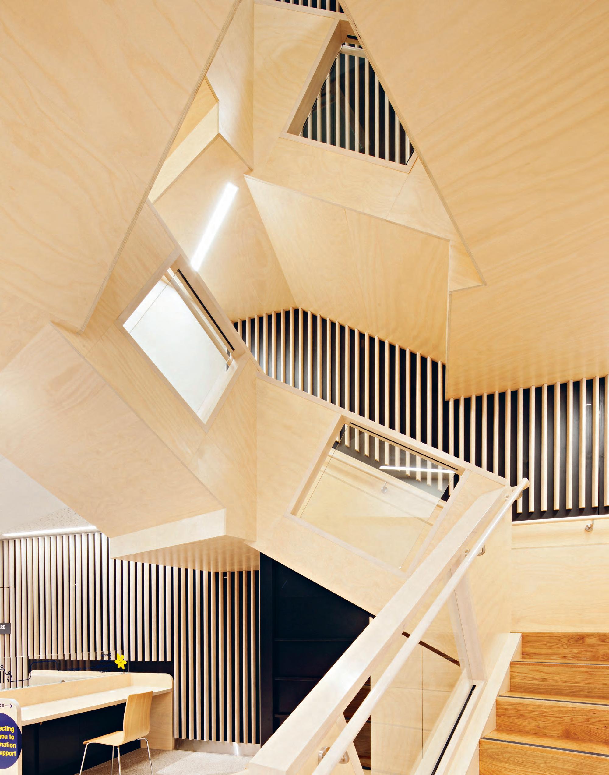
Healthcare That Multi-Tasks
The Albury Wodonga Regional Cancer Centre’s design resolves the need for a highly collaborative integrated working environment in a large complex building. It also addresses the contrasting demand for a tranquil de-institutionalised space for patients in times of stress, fostering optimism and wellbeing through sensitive and considered design.
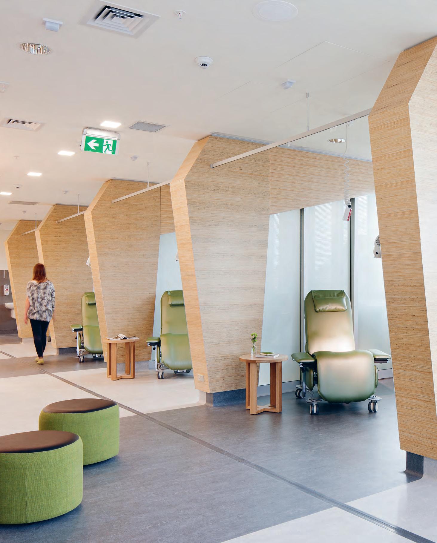
–
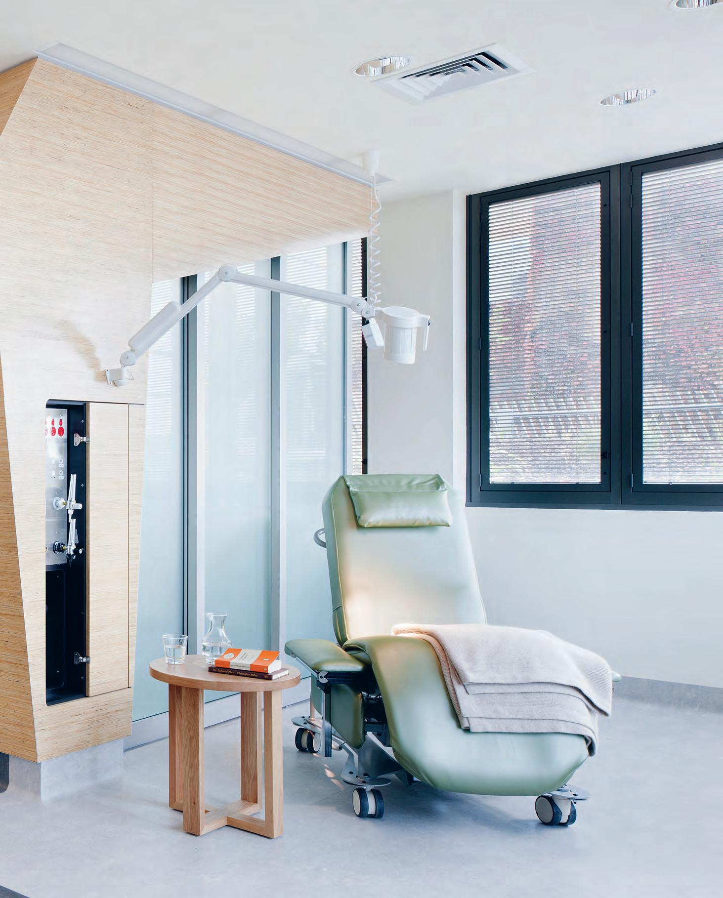
the age of health tourism
While most travellers search for the ultimate destination, others search of the ultimate journey. In one of Bangkok’s busiest transport hubs, Orbit Design Studio augments the experience of being ‘in-transit’ with a premium mind-body fitness centre. Transience has never felt so good.
INDESIGNLIVE.COM 168 IN DEPTH
Words Sophia Watson Photography Owen Ragget
Opposite: The café and lounge features the typical gym and spa refreshments alongside a series of co-working pods with an internet touch-down alcove for the nomadic professional Page 170: The VASD swimming pool and aqua lounge is reminiscent of an ice cave – the perfect antidote to Thailand’s hot weather. Page 171: Overlooking the cardio and free weights area is an impressive feature climbing wall. Page 172: The Himalayan salt chamber, which helps develop the breathing system and restore respiratory health.
Yes, you’ve read correctly – health tourism. It’s the latest in what is a multiplicity of movements currently directing the luxury travel genre. ‘Health’ or ‘wellness tourism’ is essentially characterised as travel for the purpose of promoting health and wellbeing through physical, psychological, and/or spiritual activities.
As far as luxe travel destinations go – hotels, resorts, spas and so on – this approach is already well-established. But can we say the same about the journey? It’s no secret that travel can be strenuous – punishing even – and here, designers have a major opportunity to drastically reimagine how a traveller or tourist might experience their journey from A to B.
Located in one of central Bangkok’s busiest transportation hubs, the Virgin Active Siam Discovery by Orbit Design Studio (ODS) has been purpose-built to augment our in-transit experience, equipped with everything a traveller might need to feel ‘well’.

After being greeted at the reception desk, users ascend through a double-height opening via a pair of escalators. Encircling these escalators is a galaxy of health, wellness and working facilities; among them group exercise, boxing and yoga studios, an activewear boutique, café/lounge, co-working pods, internet touch-down alcove, and sleeping pods.
But ODS hasn’t stopped there. Just one level above lies a whole new stratosphere of feel-good services to cater to almost every fit-freak niche imaginable. A climbing wall looms over the escalator void; neighbouring this is a cardio/free weights area, and a pool and hydro spa. Flanking the pool, a three-dimensional active grid structure for functional and high intensity training. To finish, a hypoxic, lowoxygen altitude studio.
For those looking to sweat it out, the changing suites are the final frontier in stress-less tourism. Here, steam, ice and salt rooms complete the mental and physical defrag. “Rather than representing a purely function-driven arrangement of fitness equipment,
we have created unique and personal experiences, which excite and activate all the senses in the mind and body,” says ODS’s head of design, Simon Drogemuller. “The space is meant to be playful, social, energetic and calming, and encourage experimentation: a laboratory for health and fitness.”
Though the health and fitness services are beautifully integrated into the space, the industrial, interior and product undertaking by ODS uses each facet within the built environment to further reinforce the organic connectivity concept of the space.
“The design concept for the club was ‘the cut section,’” says Drogemuller, “which emphasises the connectivity of the floors, walls and ceiling, just like a section drawing that reveals the connections at a glance. From this point, we extruded and extended the boundaries to create spaces, resulting in all club floors being interconnected, which brings a great feeling of unity to the space.”
On the upper floor, the most striking feature is the looming feature-climbing wall. The design of the climbing wall; its shape, materials and lighting-effects; are all inspired by an iceberg, “a concept which is also carried through to the adjacent swimming pool and Aqua Lounge,” Drogemuller explains. “The irregularly folded white ceiling and perimeter ice blue lighting create an ice-cave-like atmosphere, the perfect antidote to Thailand’s hot weather.” Also of note is the Mind & Body Studio, which uses rear projection to create a fully immersive and interactive environment. Here, travellers can truly find respite – in whatever form they fancy, and within a truly dynamic transitory environment. The Virgin Active Siam Discovery space really does achieve that perfect equilibrium between mind and body – an ellusive zen state that seems to be the ultimate destination in the health tourist’s journey.
INDESIGN 169 IN DEPTH
orbitdesignstudio.com
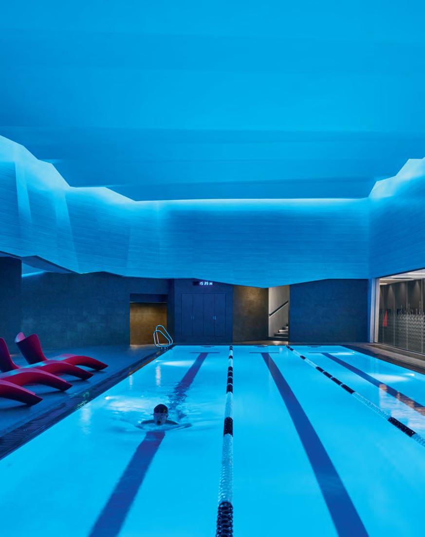
INDESIGNLIVE.COM 170 IN DEPTH
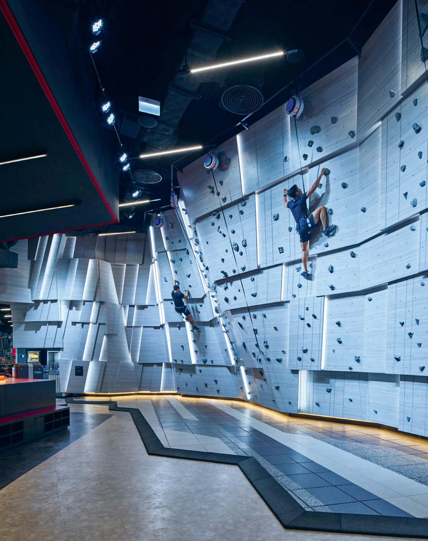
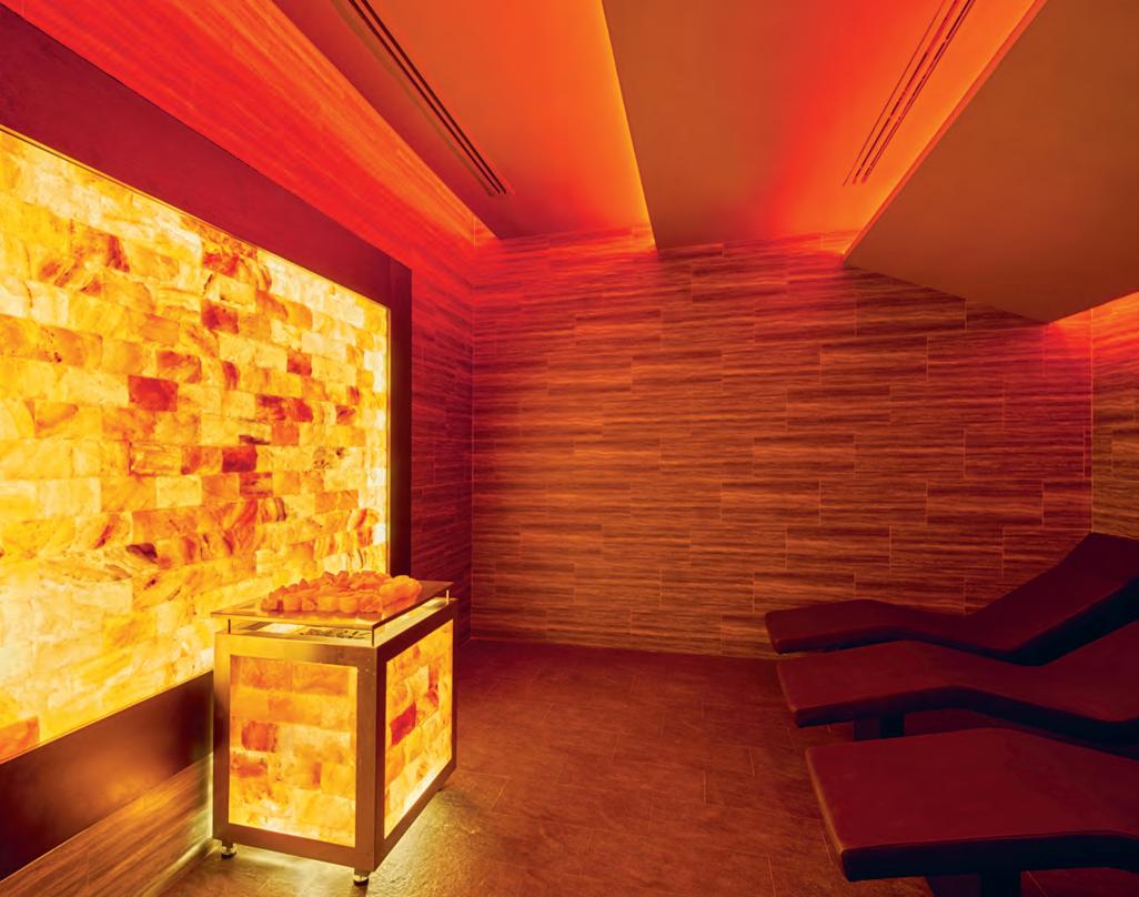
INDESIGNLIVE.COM 172 IN DEPTH
“R ather than representing a purely function-driven arrangement of fitness equipment, we have created unique and personal experiences, which excite and activate all the senses in the mind and body. The space is meant to be playful, social, energetic and calming...”
INDESIGN X CULT
You’d be hard-pressed to find a designer or design enthusiast who hasn’t heard of Louis Poulsen – and with good reason! There are many explanations for their notoriety, including: imagination, experimentation and leadership. For example, In 1924 Poul Henningsen created his wildly influential Paris Lamp for Louis Poulsen, and the origin of how we still design to shape light can be directly traced back to his views on the dualities of design and illumination. Not bad for a 143-year-old design house.
It all began in 1874 with the eponymous Louis Poulsen, a Danish lighting manufacturer born out of the Scandinavian design tradition where form follows function. The function and design of their products have always been tailored to reflect and support the rhythm of natural light. Every detail in the design has a purpose. Every design starts and ends with light.
Since its inception, Louis Poulsen has cultivated exceptional feats in lighting design from some of the world’s greatest designer thinkers including: Poul Henningsen, Arne Jacobsen, Verner Panton, Øivind Slaatto, Alfred Homann, Oki Sato and Louise Campbell. Having established themselves as one of the key global suppliers of architectural and decorative lighting, Louis Poulsen and their enviable club of leading designers, continue to defy
traditional product categories and typologies to serve and span the professional and private lighting markets for both indoor and outdoor applications.
Though the brand’s iconic classics remain as key staples in the design community, Louis Poulsen continues to invest heavily in new design collaborations and a more contemporary creative identity. This can be seen in product collaborations with GamFratesi for Yuh, Nendo for NJP and Mads Odgård for Above.
Maintaining their approach to lighting with a very strict and uncompromising product philosophy based on function, comfort and ambience, Louis Poulsen continues to revolutionise while staying true to their origins and legacy.
The functional aspect of any fixture for instance – the quality of the light itself – has to be resolved before addressing the shape and beauty of the lamp’s form. This philosophy continues to this day guiding the product design with a focus on human wellbeing and perception of artificial light to create unique lighting environments.
As a result, Louis Poulsen lighting is stylistically both simple and refined, and blends seamlessly into most interior designs, modern and classic alike.
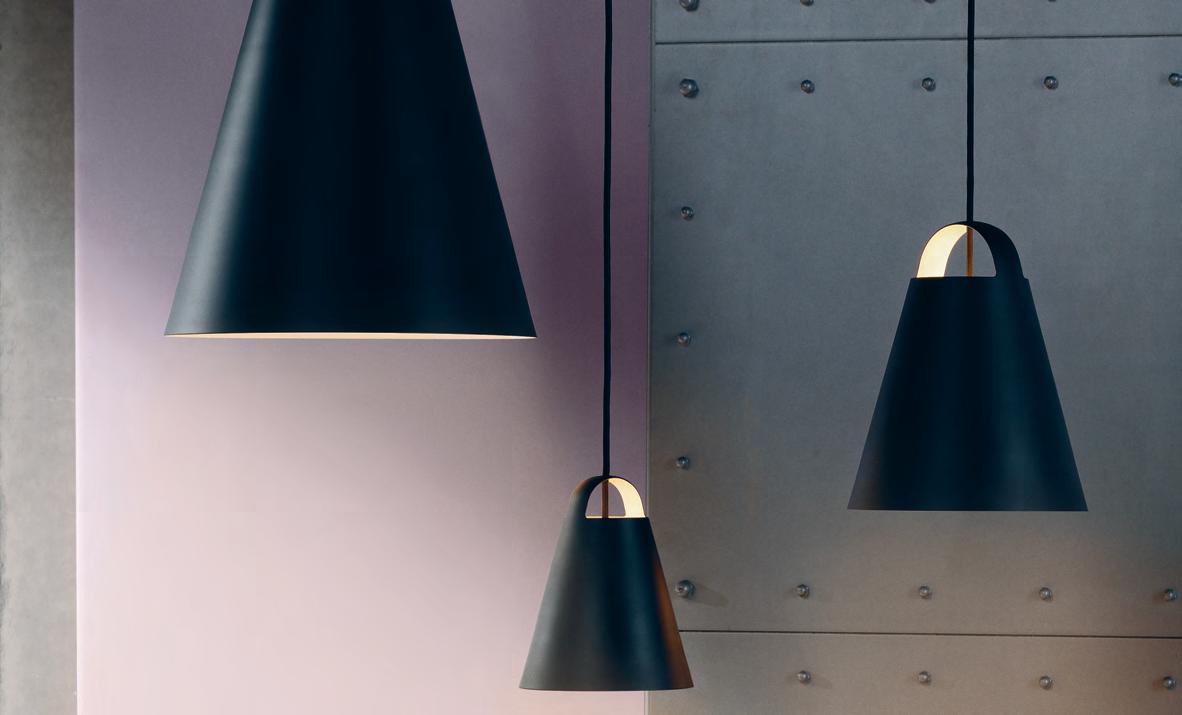
livingedge.com.au living edge 173 cultdesign.com.au c ult
This page: ‘Above’ a new pendant by Danish designer Mads Odgård for Louis Poulsen. Available from Cult.
Louis Poulsen, Design To Shape Light
Today’s retirees are anything but retired. They are sociallyempowered, work-a-happy, lovers of all things lifestyle. It’s up to designers to offer these ‘seniors living’ a new aged-care proposition that is about choice and opportunity.
Words Leanne Amodeo Photography Courtesy of Plus Architecture
seventy going on forty
INDESIGNLIVE.COM 174 IN
DEPTH
Whoever subscribes to the idea ‘life as we once knew it ends when you hit 70’ hasn’t checked out the Instagram page of Baddie Winkle (@baddiewinkle). Nothing bursts senior citizen stereotypes quicker than a browse through the account of this sartorially fabulous great grandmother, who at 85 became an internet sensation. Of course, sequins and tie-dye isn’t for everyone (retiree or no), but what this hugely popular social influencer’s online profile suggests is the attitude of an older generation, and indeed attitudes towards aging in general, have changed considerably.
These shifts in social norms are being embraced worldwide and rightly so. In Australia alone, according to the government’s Australian Institute of Health and Welfare (AIHW), 15 per cent of Australians were aged 65 and over in 2014, compared to 8 per cent in 1964. The AIHW also reports that based on population projections by the Australian Bureau of Statistics, by 2064 there will be 23 per cent of people aged 65 and over, and 5 per cent aged 85 and over. It’s impossible to ignore that Australia’s population is aging and our life expectancy is increasing, which is why creative industries such as design are responding. So what behaviours have resulted from these shifts to make designers and architects change the way they currently design for retirement living?
The seniors living and aged-care sector is a rapidly expanding one and practices specialising in this area are working hard to innovate and adapt. Plus Architecture stands out for recently distilling its thinking on the subject to identify seven key shifts in the retirement living sector, with a view to achieving more effective design outcomes. Unsurprisingly, attitudes towards higher density living, health philosophies and working patterns are amongst them. But the main driver in the recent revitalisation of retirement facilities is a change in lifestyle expectations.
As Plus Architecture’s head of Senior Living, Nick Antoniou, explains: “Seniors today are much more discerning and if operators and developers want to capture that market, they need to provide for it with a much more tailored product.” Just like shopping centres have upped their game and made the user-experience more appealing, so too have retirement living providers.
This newly minted ‘ageless generation’ – where 70 is the new 40 and some people are still doing some type of work well into their 80s – is no longer content with the cookie-cutter offerings of yesteryear because they have more choice now. While there’s a minimum standard of provision, seniors are looking beyond this for an experience that promises something extra. Technology isn’t even a deal-breaker anymore. It’s a given that senior living and aged-care facilities come with inbuilt technologies, although advancements in medical and wearable technology will certainly
push design boundaries in the next 20 years. Exoskeletons could replace handrails and wheelchairs, for example, and eventually socalled ‘retirement villages’ won’t be discernible from regular multiresidential complexes.
While seniors can request a one-or-two-bedroom apartment that comes with or without a study nook, what makes them choose one facility over another goes well beyond four walls. “It’s the add-ons that make the difference,” says head of aged-care innovation at Plus Architecture, Ingrid Williams. “Seniors don’t want to move into a facility and feel like this is all they’ve got. They want to feel part of a community, rather than feeling socially isolated or disconnected. And they still want a quality life experience, particularly as their mobility is likely to decline over time, which means going out to a restaurant with their family – it just so happens the restaurant is two floors down from where they live.”
In this sector’s wellness economy, the integration of retail, hospitality and other commercial typologies is crucial to providing holistic care, encompassing social connection (whether incidental or deliberate), as well as encouraging a sense of empowerment and independence. And seniors don’t have to feel like they’ve sacrificed anything because they haven’t; shops, cafés and a day spa are now on their doorstep.
New developments that incorporate multiple typologies essentially function as mini cities, offering a shopping-centre-style experience where everything is conveniently located. Australia has the landmass to support both high-rise and low-rise options and planning can be tailored to a specific tribe, or particular market. More importantly, these mini cities accommodate the families of senior residents in an environment that promotes intergenerational activity.
Antoniou is currently involved with three vertical senior living and aged-care developments across Australia. They include retail and commercial propositions, but the thing he’s most excited about is the possibility of incorporating a primary school, making each development truly inter-generational. “Seniorcare and childcare works well together,” he says. “The concept is that families are much more involved in each other’s everyday lives so their senior members aren’t isolated.” It’s a community-focused model that’s not only a nice idea, but also progressive in its interpretation of social interaction. Understanding the human condition is at the core of these newly integrated facilities and what ultimately allows for such compelling, highly functional design outcomes.
plusarchitecture.com.au
INDESIGN 175 IN DEPTH
INDESIGNLIVE.COM 176 IN DEPTH
Above & page 174: Independent Living Apartments located in New South Wales (above) and Queensland (page 174), comprise a combination of independent living apartments and a residential aged-care component.
“T his newly minted ‘ageless generation’ – where 70 is the new 40 and some people are still doing some type of work well into their 80s – is no longer content with the cookie-cutter offerings of yesteryear because they have more choice now.”
INDESIGN X ZIP WATER
Since its inception in 2001, Indesign: The Event has made a point of celebrating the exhibition space as much as its exhibitors, allowing the industry’s top creatives to transform gallerias, popups and showrooms into interactive and immersive spaces for the purpose of surprise and spectacle. For almost a decade, the event has featured The Project: a people’s choice award dedicated to the most impressive and most inspirational installation featured across the event’s running period.
Aside from a keyword in place each year to guide design decisions, the scope of each installation is limited only to the imaginations of each respective exhibitor and a partnered architecture team. Perhaps inevitably and much to our enjoyment, this can often lead to some wild designs.The keyword for 2017 was CLICK, celebrating the power of instant connections. And the winner – deservedly so – was Zip Water, working in collaboration with renowned architecture firm SJB. The Zip Water installation featured a myriad of cascading nylon threads, suspended from the ceiling so as to enclose the exhibition space without boxing it in with any static or impenetrable elements. The purpose of the nylon in the installation was twofold – the first reason, as suggested, was to create an ephemeral threshold, reminiscent of cascading water and redolent of the sinuous sculptural form of the products within. Moving in time to any gentle breeze or an accidental brush, viewers on the outside were afforded glimpses of seemingly floating tapware, as their mirrored plinths remained largely camouflaged.
The second reason, however, may not have been as evident – save for only the most investigative guests. Made from recycled plastic, the nylon threads invoke the exact cause that Zip Water seeks to embody. Zip Water not only makes water look and taste good, but investing in high quality tapware also removes the need to replace, replace, replace, and reduces our unhealthy obsession with bottled water and the plastic nightmare that comes with it.
What can I say? Some things simply click.
The installation served as the backdrop to Zip Water’s latest product launch, the new All-In-One Celsius ARC, which delivers all home water needs imaginable from a single tap. The All-InOne Celsius ARC combines instant filtered boiling, chilled and sparkling water with a regular mixer tap for unfiltered hot and coldwater options, de-cluttering the kitchen sink without sacrificing functionality. This much has been a design trend for some time now, as the contemporary kitchen adopts more of the functionality of the dining room – demanding a sleeker aesthetic to compensate. However, that’s not to say Zip Water’s latest offering is all looks and no substance, showing off advanced energy efficiency and top-tier cooling technology.
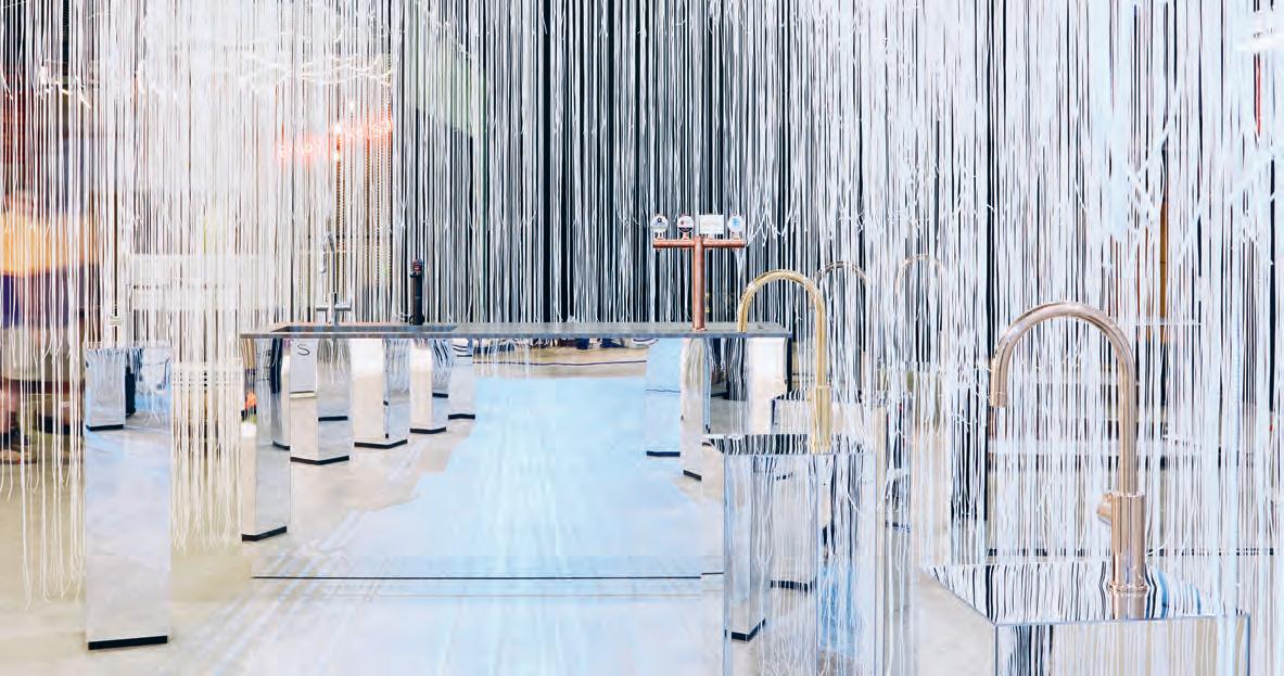
Of course, we expected no less. You’ll just have to forgive us for craving our very own customised sparkling water inspired Cocktail Tasting Station that was featured on the day.
Team Indesign wishes to congratulate Zip Water and SJB on winning Sydney Indesign 2017’s people’s choice Project Award!
livingedge.com.au living edge 177 ZIPwater.com ZIP water
Above: In collaboration with architecture firm SJB, Zip Water won Sydney Indesign 2017 ’s coveted people’s choice award for The Project.
Zip Water + SJB Win Big At Sydney Indesign!
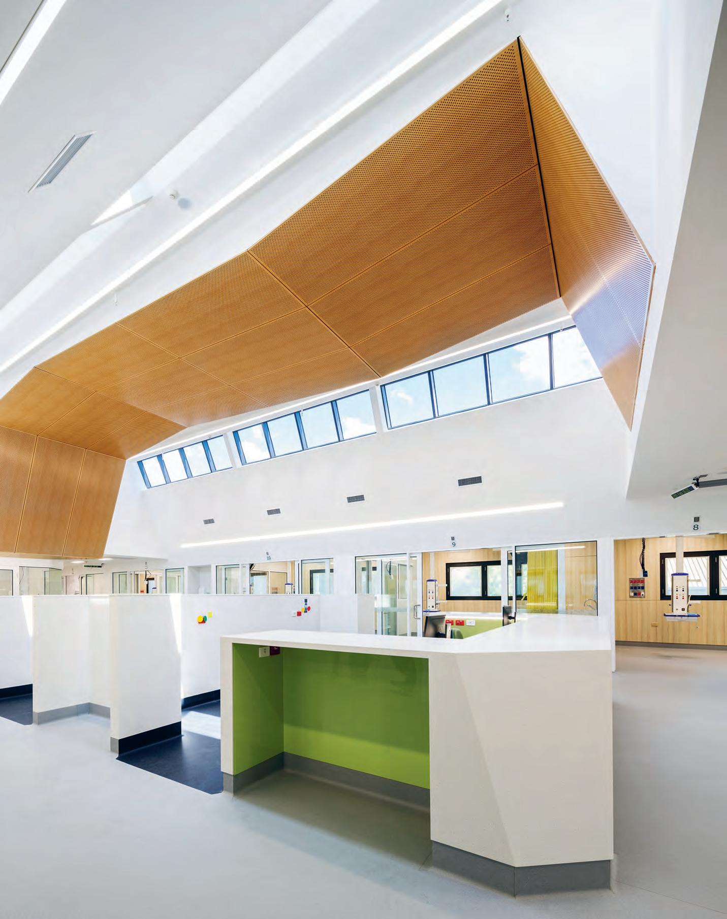
The Care r evolu T i on
There’s a damn good reason for our collective aversion to health and aged-care spaces. For decades, our hospital visits have been tinged with the shudder-inducing blue-grey linoleum hue, a colour that reminds us of white lights, disinfectant smells, cold impersonal rooms and some dreadful motel-grade art.
These sector stereotypes exist for a reason, where apart from designing-in technological upgrades and the occasional pastel feature-wall in triage, little has actually changed in our design strategies for hospital and senior living facilities.
Recently however, these deep-rooted typologies have been recast as major opportunities for radical, design-led change. And the results are already creating tectonic shifts in design thinking around health and aged-care typologies.
In their recent efforts for the St John of God Hospital (SJOG) in Geelong, for example, ClarkeHopkinsClarke (CHC) has delivered a new 12-bed Intensive Care Unit (ICU), separating it from the Critical Care Unit (CCU) where the departments were previously combined. The team was also charged with delivering a multi-purpose medical education centre within the same facility, and the expansion of the existing theatre department, which includes an additional catheterisation lab and operating theatre.
Traditionally speaking, the ICU is a high-pressure, emergency environment, built more for the benefit of the staff and medical practitioners than the patients themselves. And while the needs of the staff are undoubtedly critical, the emotional and physical needs of the patient should also be considered equally throughout the design process. And it’s here that CHC’s approach departs from the traditionally ‘utility-only’ rigid format.
“We wanted to streamline patient flows within the existing facility to minimise crossover with the public to ensure patient recovery would be paramount,” says CHC associate, Jonathan Curran.
“All elements of the design reflect an intimate understanding of the potentially confronting and scary experience that the ICU environment can represent for vulnerable, critically-ill patients and their families.”
CHC accomplished this objective by designing-in a series of emotionally and physically responsive intelligent strategies to ease anxiety and provide comfort for people during these periods of vulnerability. Curran explains: “The design features an abundance of natural light and views of the outdoors from patients’ beds, delivered via dual-facing skylights running through the centre of the unit. This approach aims to create an uplifting sense of connection to the outside world, helping to nurture healthier outcomes for patients and their families. As part of this logic, the patient rooms were designed to minimise intimidating clinical features, with medical services accessible via ceiling-mounted pendants that can easily be retracted from the line of sight of non-staff occupants.”
In a further move to mute the impact of the clinical, sterile ICU, CHC felt it important to maintain a strong connection to the more homely, residential feel of SJOG’s location. “The building was designed to maintain the link between the facilities and the local residential setting, so to create a stronger sense of comfort through a more domestic familiarity,” says Curran. “Additionally, the new hospital wing features a nature-based theme throughout, with a bright tree motif inspired by a much-loved local tree, natural-look finishes and a sculptural timber ceiling that wraps along the centre of the unit.”
One of the more ‘revolutionary’ aspects of this project is the implementation of UMU ‘smart glass’ with switchable glazing within the ICU isolation room. This technical solution maintains patient privacy by removing the need for curtains within the patient care environment, while also helping to minimise potential infection
INDESIGN 179 IN DEPTH
No sector in design has been more immune to radical change than health and aged-care. For decades, the basic structure of these spaces has remained rigidly templated. Breaking with tradition, ClarkeHopkinsClarke and GroupGSA are reforming these environments through multi-user-oriented design.
Words Sophia Watson Photography Rachael Dere (St John of God) & Tyrone Branigan (Clemton Park BUPA Care)
Healthcare Is Hybrid Now
Using terminology such as ‘campus’ to define the space and a thoughtful material palette to match, CHC have borrowed some key characteristics from the architectural language of education, workplace and hospitality typologies to better communicate the character of the new facility. This hybrid format provides a strong sense of identity for patients, staff and visitors alike, celebrating the evolution of the hospital campus into something beyond the expected.
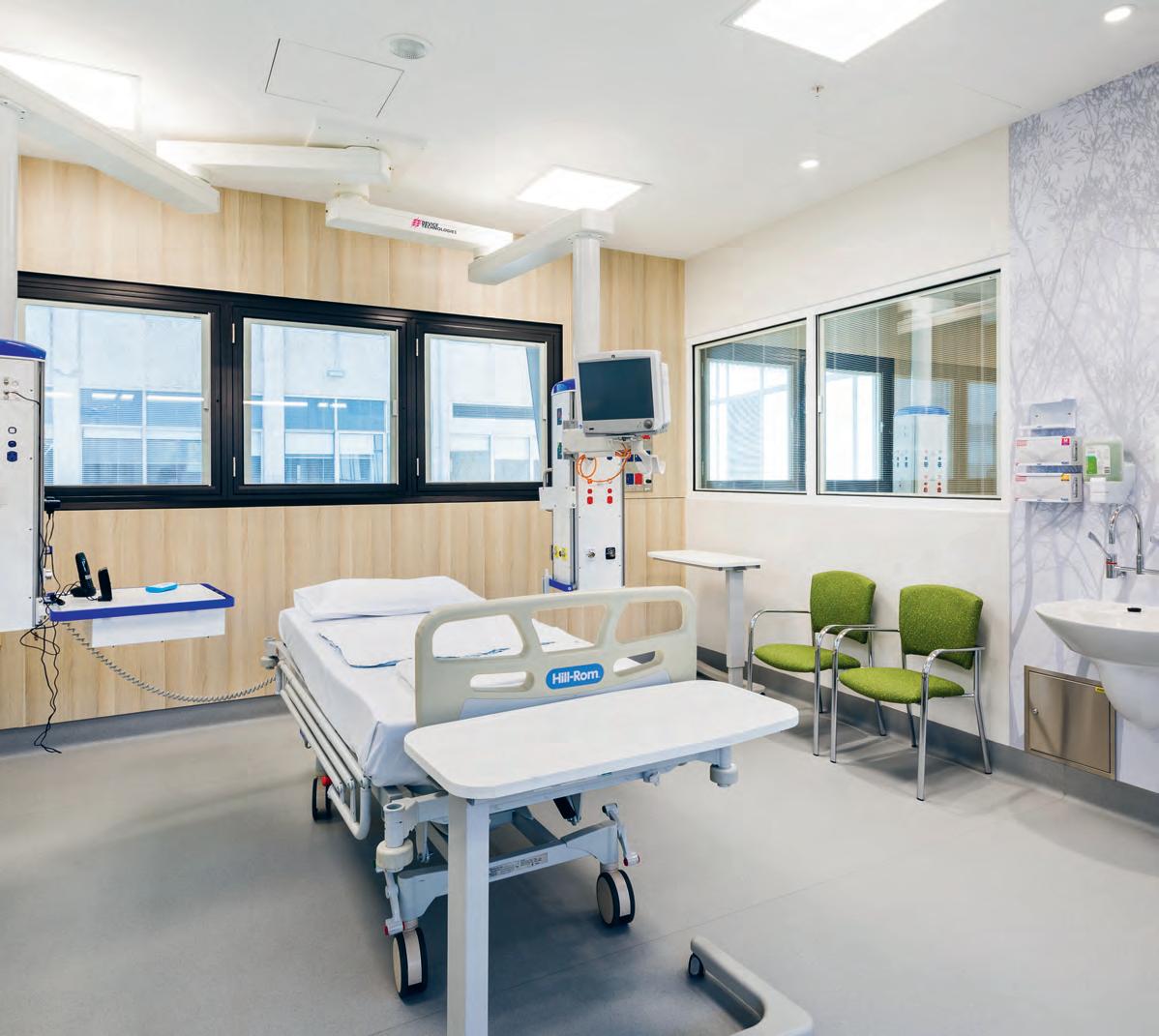
INDESIGNLIVE.COM 180 IN DEPTH
–
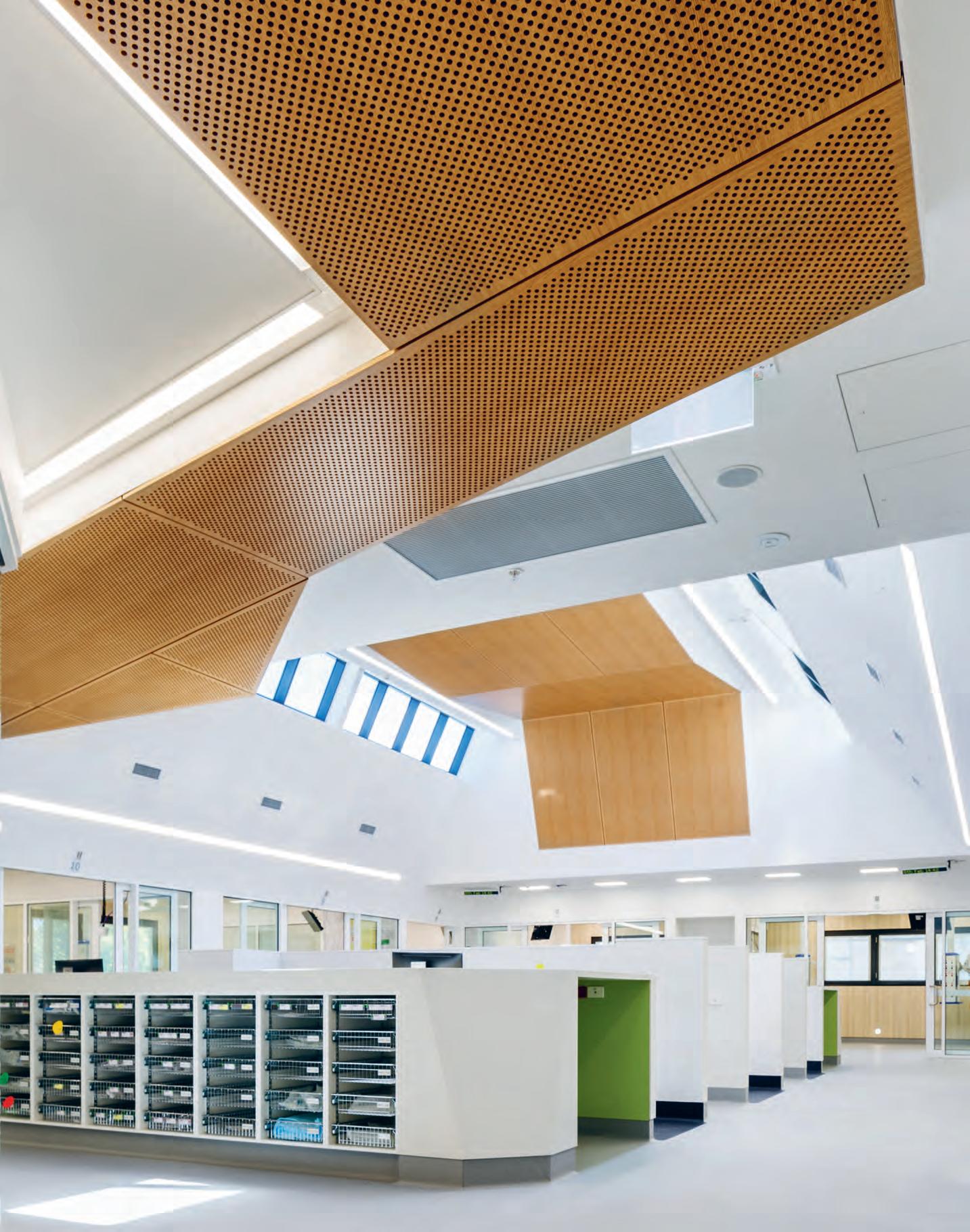
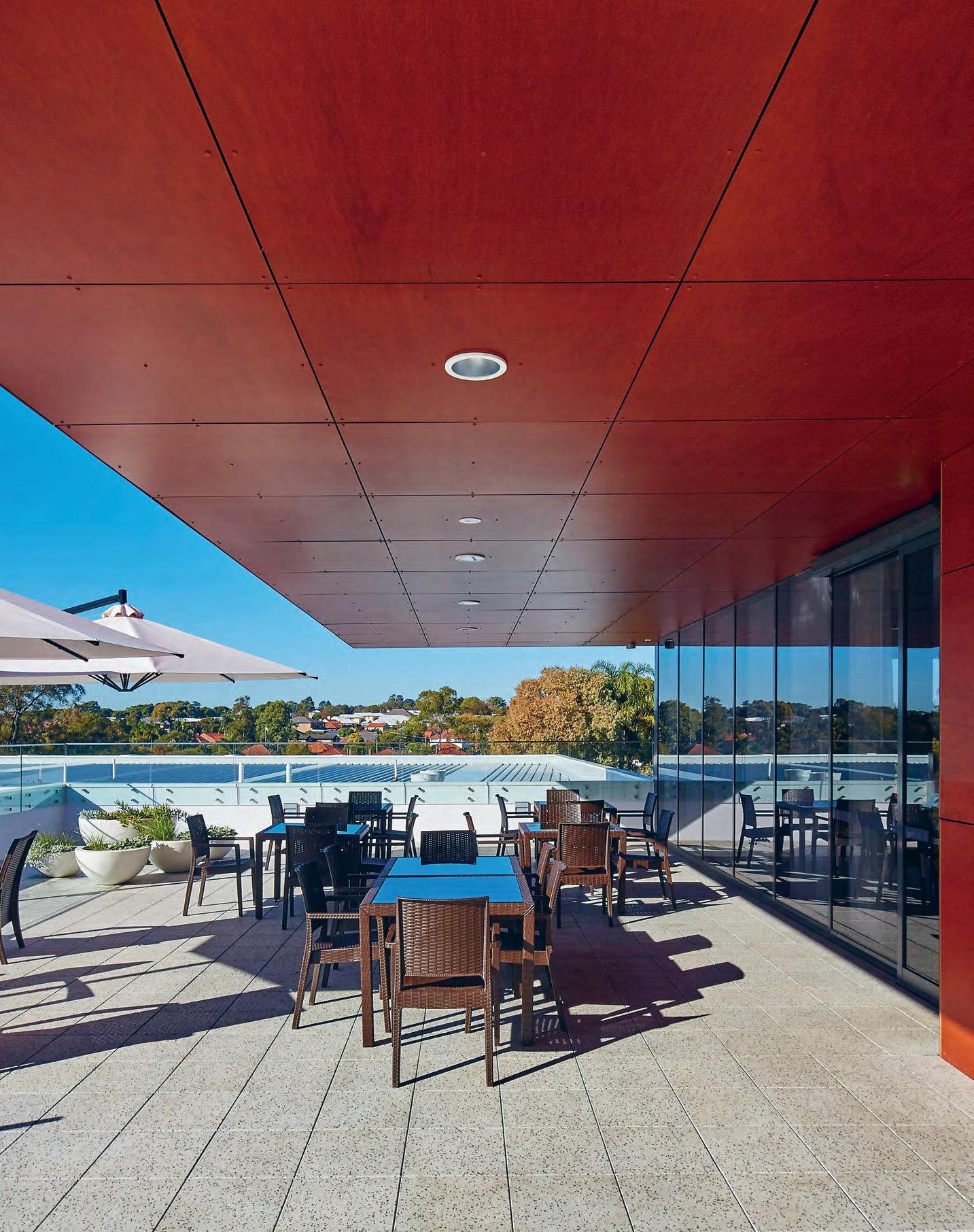
risks. It’s an elegant solution that rather cleverly meets the patient’s need for privacy, while also meeting the requirements of medicalgrade sterility and also enabling the staff to perform their duties unencumbered. The second game-changer to consider here is the delivery of a seamless and non-intrusive medical education facility, where “students and staff are provided with a safe environment that mimics the actual in-patient bedrooms, allowing them to develop their skills without impacting on actual patient care levels.”
And that’s what really sticks out for me – the emphasis on enhancing skills without jeopardising the patients’ comfort or wellbeing. The future of healthcare has never been more important and the sector is constantly crying out for skilled nurses, doctors and medical professionals. As with SJOG, the Australian design sector has a responsibility to design-in opportunities that can allow us to produce an exceptionally well-trained medical workforce – but not at the expense of the users’ mental and physical wellbeing.
A similar philosophy has been applied to the senior living typology, where GroupGSA is breaking stereotypes with its most recent national roll-out for Bupa Aged-Care facilities. One common complaint within these facilities is the lack of focus on lifestyle as much as physical care. For the Clemton Park stage of the Bupa development in particular, GroupGSA was driven more by the design thinking of a hotel than a standard aged-care facility.
The Bupa Care development at Clemton Park provides for residential, town centre and assisted-living facilities. The brief was to deliver 144 beds across dementia and assisted-living, located across two-and-a-half floors.
From an overall facility point of view however, Bupa’s brief was to provide a benchmark of care, with an integrated professional suite of offerings to the wider community to support closer integration and visitation. The brief also focused on increased residential amenity and communal spaces for the residents, with an emphasis on daylight, natural ventilation and aspect diversity. The main objective, says GroupGSA director, Lisa-Maree Carrigan, was to: “create a contemporary aged-care development that reflected the character of the new community as well as blend well into the established surrounding residential community.”
To achieve this, GroupGSA worked closely with Bupa to create a series of outdoor spaces, outdoor rooms and terraces that provide a higher than normal degree of weather protection and provided seasonal options for outdoor experiences for the residents to engage with the natural environment. “The sensory and cognitive benefits for the residents are considerable,” notes Carrigan, “so underlying every design decision was the philosophical position of wanting to improve and enhance the residents life.
“We as a team tested our choices and direction against this key driver; did the design as it was evolving provide enough diversity in character, materiality, location, orientation, seasonality, how were we supporting choice and independence for the residents; these were paramount in our considerations.”
Here, Carrigan and her team used the Clemton Park facility to test boundaries and experiment with fresh thinking, particularly “the importance of design in residential care environments, and the blurring of the boundaries between inside and outside
INDESIGN 183 IN DEPTH
“There is a lot of intelligence being taken from hotels in the best of design thinking going forward. Not necessarily in the aesthetics (although some projects do) but in the core provision of providing the best of seamless service / care without it being obvious.”
as a new perspective on the traditional model.” Key to this and to the development of the overarching design character is that the project’s residential elements were based on lifestyle rather than clinically-focused spaces for care. This was a deliberate choice, says Carrigan, “to support the individual’s dignity, ultimately providing residents the best of care within the best of design that doesn’t look or feel like the traditional aged-care model.” Having said that, there are some real innovations regarding care and choice for the Bupa Care Facility, that borrow from the hospitality model, including an integrated retail/wellness offering, a diversity of outdoor spaces and rooms, partially covered outdoor rooms, covered outdoor areas, smaller courtyards, large dining balconies, enormous roof terraces with Chi gardens and communal barbecue areas.
When asked about the future of the sector and where designers should focus their energy, Carrigan is a strong advocate for “the resident being at the centre of the care provision, where operational functionality is key, but doesn’t dominate the design, and the visual manifestations of the services are subtly dealt with.”
So where should we be looking to develop and deliver best-inclass solutions?
“There is a lot of intelligence being taken from hotels in the best of design thinking going forward,” says Carrigan. “Not necessarily in the aesthetics (although some projects do) but in the core provision of providing the best of seamless service/care without it being obvious. Hotels have a clear back of house/front of house approach,
with the guest experience at the forefront. Some of the recent developments in smart technologies that support the resident to be freer in choice are also revolutionising the way in which design is evolving. And then of course the constant headway being made in research with regard to our understanding of cognitive impairment in the ageing realm (the best ways to support, challenge, stimulate and ease) are also changing what is current best practice.”
Whether it’s a hospital, senior living facility, or something in-between, the care revolution seems to point to one inevitable conclusion: balancing the requirements of the users (staff, residents and patients) to find that sweet-spot between medical-based thinking (the physiological needs of people) and evidence-based design (the pragmatic demands on particular environments).
What is most outrageous – and even radical – about these spaces is their defiance of accepted sector formats. What we’re seeing is the delivery of a more holistic typology that considers how design can better serve users’ mental wellbeing as much as physical.
This of course flies in the face of the cold, clinical (bodily-health focused) setting with which we are all-too familiar. It’s exciting to see Australian practices such as CHC and GroupGSA rejecting fusty typologies and leading the charge towards a more positive and satisfying health and aged-care standard. A design revolution well worth caring about.
chc.com.au, groupgsa.com
INDESIGNLIVE.COM 184 IN DEPTH
Page 178 & 180-181: St John of God Hospital, Geelong, by ClarkeHopkinsClarke, Photos: Rachael Dere. Page 182: The Bupa Care development, Clemton Park, by GroupGSA, Photo: Tyrone Branigan.
Be our region’s talent on the global stage.
The INDE.Awards from Indesign Media is the new benchmark for design awards across the Asia Pacific region. This is a diverse and dynamic corner of the world. The INDE.Awards recognise the region’s best and most creative design on its own terms.
Enter Now indeawards.com


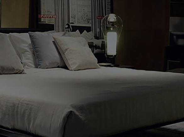


WHAT CAN DESIGN LEARN FROM THE BOB?
INDESIGN 187 IN Teres T Teres T IN

INDESIGNLIVE.COM IN T E r EST 188
The Rachael. The Jackie O. The Louise Brooks. The Anna Wintour. The Posh Spice. The Uma
The
A quick piece of trivia to get us started: The first ever-recorded bob was in 1890 – 127 years ago. During that milestone year, in an act of pure feminist defiance, French actress Polaire made huge waves by cropping her luscious locks into a short, bob style that was considered – for that time – highly unrespectable. And it remained taboo right up until the 20 th Century’s First World War when, out of necessity, women ditched the inconvenience of long hair so that they could more effectively enter and serve the workforce while the men fought overseas.
As time went on, people began to appreciate the empowering qualities of the hairstyle, and through celebrity figures such as 1920s film stars Colleen Moore and Louise Brooks, ‘the bob’ offered young women a new and radical way to assert their independence.
In a nutshell, the bob represents a global rebellion that has the power to revolutionise our lives for the better, to incite and deliver radical change, and to propel us forward. And in many ways, it’s not unlike design. Good design, much like the bob, exists outside of popular trends. And its main purpose exists beyond its aesthetics. Not totally convinced? Let’s consider the history behind it.
Despite the majority of fashion correspondents at the time suggesting that bobbed hair was passé, by the mid-1920s the style (in various versions, often worn with a side-parting, curled or waved, and with the hair at the nape of the neck “shingled” short) was the dominant female hairstyle in the Western world. The style was spreading even beyond the West as women who rejected traditional roles adopted the bob cut as a sign of modernity.
Likewise, the living rooms of the West were experiencing a similar rebellion, which swept traditionalist views under the carpet to incite drastic, unprecedented change. This of course, was the Bauhaus movement. Founded in 1919 by Walter Gropius, Bauhaus was the brutal antithesis of the widely accepted Art Deco school of design. Much like the bob represented a challenge to the patriarchy of the 20s, the Bauhaus movement shook the establishment and led drastic changes in design technique, aesthetic and politics. The design innovations commonly associated with Gropius and the Bauhaus – radically simplified forms, rationality and functionality, and the
idea that mass production was reconcilable with the individual artistic spirit – gave the people access to design (which had until then, only been available to the wealthy) as a tool to improve their quality of life.
Since the advent of modernism, the bob has remained a constant staple for women seeking individuality and objectivity. In the early 1980s, for example, legendary punk rock front woman, Siouxsie Sioux (lead singer of Siouxsie and the Banshees) adopted an electrocuted bob style as her defining affectation. In the late 80s, pop-star Cyndi Lauper changed things up by rocking a vividly coloured asymmetrical bob. Soon afterwards, the cut became a cult style for any teenage girl wanting to express originality and defiance of the (particularly British) conservative culture.
The purpose of Siouxsie and Lauper’s bobs were to shock and antagonise; to take what was ugly and make it beautiful. These values were echoed by another iconic design movement that still to this day is one of the most divisive subjects in the industry –Memphis Milano.
Memphis was born in Milan at the hands of eccentric architect, Ettore Sottsass. The group designed Post-Modern furniture, fabrics, ceramics, glass and metal objects from 1981 to 1987, often incorporating plastic laminate characterised by ephemeral design featuring colourful decoration and asymmetrical shapes, sometimes arbitrarily alluding to exotic or earlier styles (sounding familiar?) Memphis represented a haven for a disruptive clique of young revolutionaries, where it very brazenly flew in the face of the muted minimalist style of the 60s and 70s. In fact, the group’s colourful furniture had been described as “bizarre”, “misunderstood”, “loathed” – and a personal favourite, “a shotgun wedding between Bauhaus and Fisher-Price”. And not unlike the bob-wearing punk rockers of the 80s, Memphis fans proudly embraced these insults as a badge of honour.
Similarly to Memphis, Siouxsie and Lauper’s hair became the centre of great debate. The critics utterly despised the looks, condemning them (much like the Memphis oponents did) as “dangerous” and “repulsive”. This is no way discouraged their loyal
INDESIGN 189 IN Teres T
Thurman.
Buffy. The humble bob has managed to maintain relevance for more than a century. It has survived two world wars, two great depressions, countless fads, trends and cultural movements – and yet, the bob is more fashionable and functional than it ever was. Here’s how design can do the same…
Words Sophia Watson Photography Various
fan base, however, and a global movement of copy-cat cuts proceeded to shape the youth culture of that era. What’s common with each of these examples is the presence of power. The wearer – or in this case, the architect or designer – is giving users the opportunity to have some authority over their own lives.
This particular narrative has maintained its notoriety through its continued use in art, literature and cinema, where strong, defiant female characters such as Mia Wallace (played by Uma Thurman in Quentin Tarantino’s 1994 film Pulp Fiction) or even IRL famed Vogue editor-in-chief, Anna Wintour, have been painted as wild, ruthless femme fatales with razor-sharp bobs, in positions of great power, ultimately in charge of their own destiny.


This certainly rings a few bells for agile workplace design, where the users – who not unlike women, have traditionally had no authority over their workplace agility – are given total control of their environment, its functionality and output. Not unlike our cinematic and pop-culture bob babes, the agile workplace is crafted specifically to give power back to the user – imbuing them with the opportunity to choose their own professional adventure; fixed at
a desk for focused work, collaborating with colleagues, socialising with clients, delivering presentations, working remotely – the choice is entirely theirs.

Where the bob imbues its wearer with empowerment and control, a well designed space offers users flexibility and autonomy. Design’s ability to imagine and augment that same sense of control in fresh and unique ways holds a level of social influence that is, in my view, equal to the cultural influence of hairstyles like the bob.
To this end, the bob has undergone some serious re-inventions in its 127 years. ‘The Rachael’ for example, is leagues apart from the ‘Jackie-O’, and by the same token, the design for a financial headquarters will be very different from the workplace design of a creative agency.
But beyond their stylistic differences, they all have a few key things in common: they make a statement, they serve a specific set of needs, they can be customised and tailored to suit everyone, and they communicate something important to the world about who we are. And when you get down to it, isn’t that what good design – and a good bob – really is?
INDESIGNLIVE.COM IN T E r EST 190
Page 188: One of the Nine Jackies (former US First Lady Jackie Onassis-Kennedy) by American artist Andy Warhol, 1964. This Page, clockwise from top left: Mia Wallace played by Uma Thurman in the 1994 film Pulp fiction; Tahiti Table Lamps and Carlton Room Divider by Ettore Sottsass for Memphis Milano, 1981; Design for kiosk and display boards by Bauhaus teacher Herbert Bayer, 1924; Émilie Marie Bouchaud, aka Polaire, French singer and actress, 1890.
Well, you outdid yourself.
Hmmm, I guess we did too. You know what, though? When you’re so cutting edge, who can blame us for wanting just a little something to take the edge o ? Just a little. And Sydney Indesign was just that – top shelf. 2017: a fine vintage. Pure, undiluted design genius, straight-up. But we served up SID17 with a twist. We hit the streets throughout the day, raising the bar of A+D across four major design districts. We


Cheers.
shook, stirred, and mixed it up with an immaculately curated program of debates, talks, demonstrations and installations. Sydney bubbled and popped with all the latest and greatest in regional design. And, it was all because of you – you big shot! So, now that the biggest party of the calendar is over for another year, A+D you deserve some R+R.
We were such ballers – highballers! You got inspired. Got engaged. Got results.
I guess that’s because there’s nothing old fashioned about us. It’s why we get you.
So just remember, that hangover is for today. Last night is forever.
Gold Sponsor Platinum Sponsor Strategic Partners Diamond Sponsor Media Partners Car Partners Wrap Party Silver Sponsors
Be INspired
153 Cafe Culture + Insitu cafecultureinsitu.com.au
096-099 Gaggenau gaggenau.com
5 for 4
Subscribe to Indesign and get 5 issues for the price of 4! (AUS$55). Join the global design gang at www.indesignlive.com/subscribe
Indesign looks for the point and purpose of everything in design – exploring what we do, how we do it, and why. Indesign is the only place you’ll find conversations on the design industry that are clever, provocative, insightful, and just a bit cheeky.
Indesign is for creative professionals – aspiring and established – hungry to continue the ideas that inform the best projects, products and people.
indeawards.com
Interstudio interstudio.com.au
Instyle instyle.com.au
UCI uci.com.au 064-065 Unios unios.com
Vola vola.com

Walter Knoll walterknoll.com.au
Wilkhahn wilkhahn.com 135 Winning Commercial winningcommercial.com.au 061 Woven Image wovenimage.com
020-021 Zenith Interiors zenithinteriors.com 023, 177 Zip zip.com
Indesign BFFs
Without the support of our industry BFFs (advertisers, to the laymen) we wouldn’t have this amazing resource! This symbol throughout the magazine and online represents our valued partners we work with closely, and who continue to support us and our industry. We them and you should too!

INDESIGNLIVE.COM IN TEREST 200
186
065,
008-009
028-029,
078
010-011,
004
185 INDE.Awards
193
069
085
076-077
067
160
073 NGV
111 O ce
018-019 Own
025 Parisi
055 Pedrali
057 Precisionflooring
090-091 Ross Didier didier.com.au 157 Flokk flokk.com 039, 044-045 Schiavello schiavello.com 119 SeehoSu seehosu.com.au 022 Shaw Conract shawcontract.com.au 191 SID indesigntheevent.com/sydney 046 Space Furniture spacefurniture.com OBC Stylecra stylecra .com.au 016-017 tongue n groove tonguengrooveflooring.com.au
051
059
102 Abey abey.com.au
Architonic architonic.vom 147 BOSCH bosch-home.com.au 012-013 Caesarstone caesarstone.com.au
141 CBS Products colebrookbossonsaunders.com 030 Cosentino cosentino.com 014-015, 173 Cult cultdesign.com.au
Domayne domayne.com.au
Haworth haworth.com/ap
070-071 Herman Miller hermanmiller.com.au
- 005 Ilve ilve.com.au
JEB jebgroup.com
Krost krost.com.au
LightCo lightco.com.au
Living Edge livingedge.com.au
ngv.vic.gov.au
Works o ceworks.com.au
World ownworld.com.au
parisi.com.au
pedrali.it
precisionflooring.com.au
027
142-143
006-007,
JOIN THE GLOBAL DESIGN GANG...SUBSCRIPTIONS OFFER OUR BFFS...ADVERTISERS DIRECTORY
INTERSTUDIO Melbourne / Sydney 1300 785 199 / info@interstudio.com.au www.interstudio.com.au OVERLAP Designed by TAF Architects for Skagerak
Duna 02 Chair, Blade Table & Polar Wall Lights
 By
By
Australia 1300 306 960 Stylecraft Perth
Arper, Thinking Works & Ross Gardam
Showroom |
Singapore +65 6511 9328 stylecraft.com.au
Photography by Dion Robeson
