A professional resource for the design curious.
INDE.Awards Winners 2018

I N DEsIgN Luminary Mark Landini
Mercedes Me, Jackson Clements Burrows
Chin Chin, george Livissianis sa lamanca House, fjmt The ‘Design Relish’ Issue.
INDESIGNLIVE.COM
74 9 77144387000 0
Issue #74 / Australia $16.50 / New Zealand $17.50 / s i ngapore $12.95 / U. s . $ 21.99

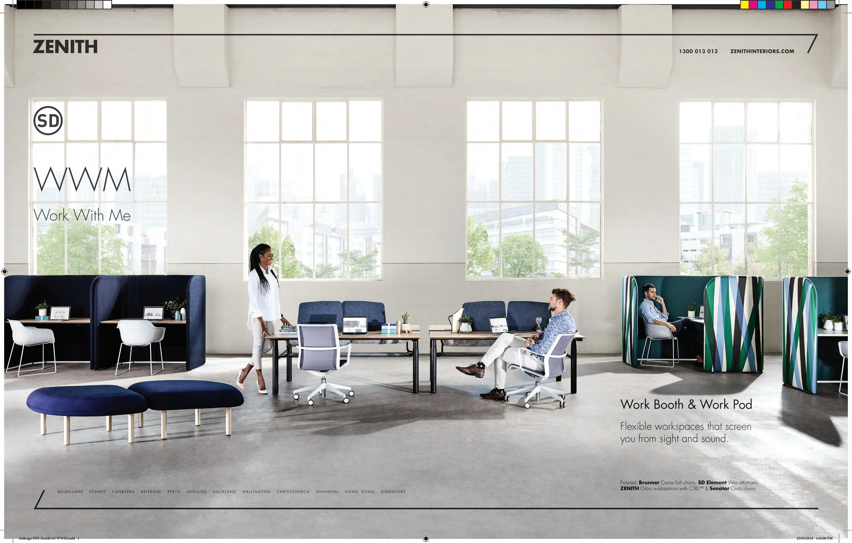
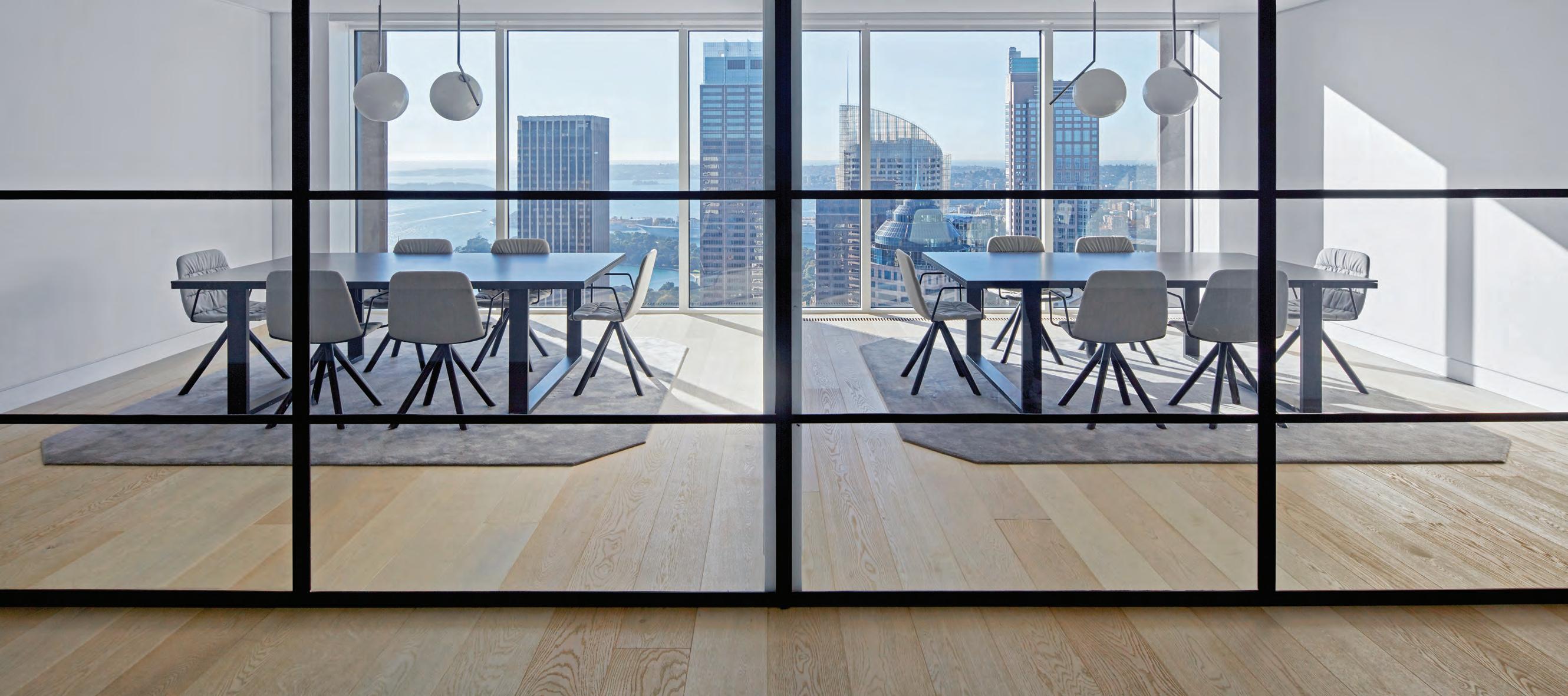
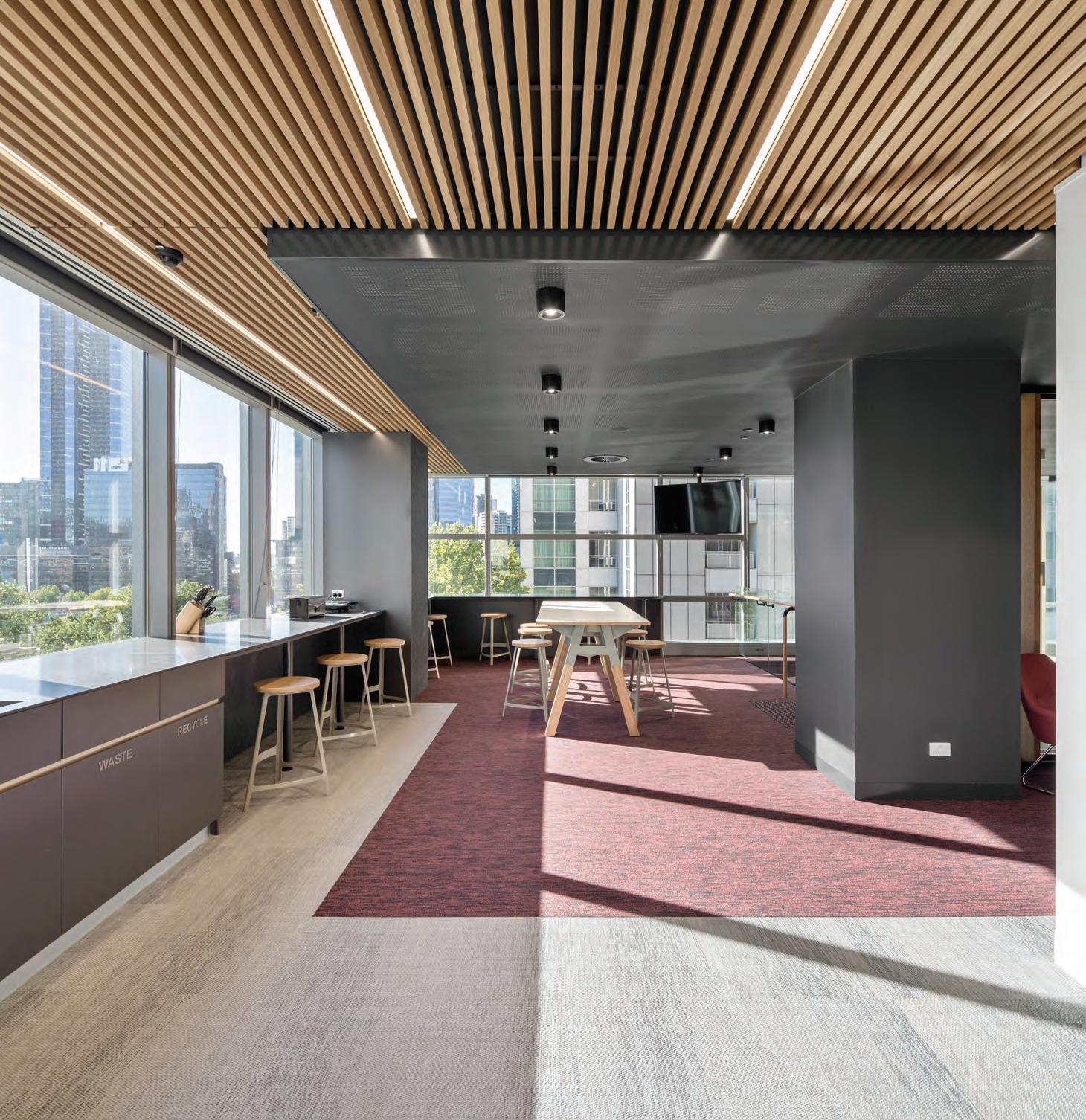
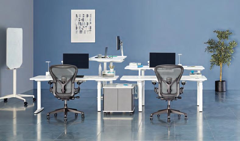
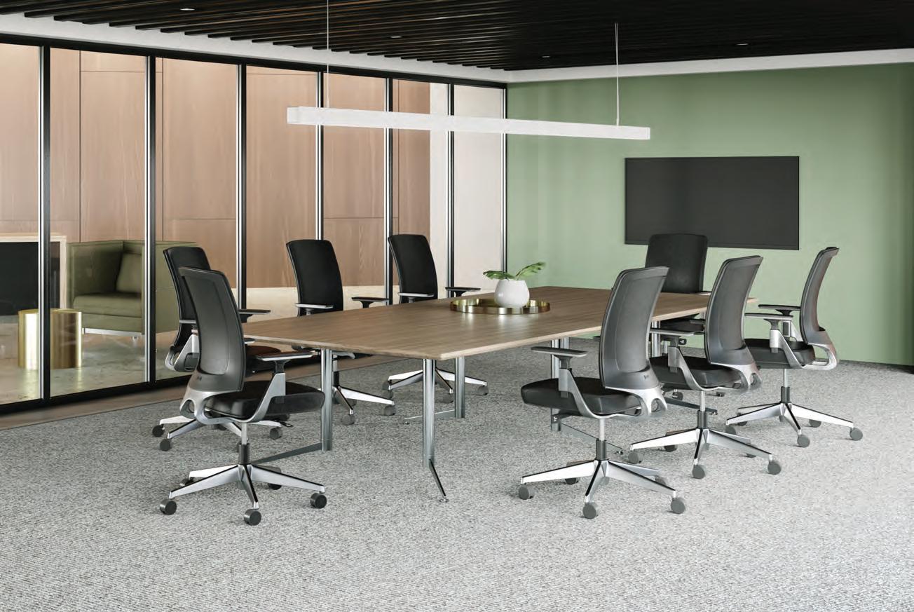
Atlas Office Landscape
Different by Design
Designed by Tim Wallace
Atlas Office Landscape is a work system which brings together heightadjustability and collaborative working in one elegant solution. Combine desks, screens, tables and storage elements to create spaces that invite collaboration, zones for focused activity or impromptu meetings.
hermanmiller.com.au | hermanmiller.com/asia Foll0w us on | HermanMillerAsiaPacific
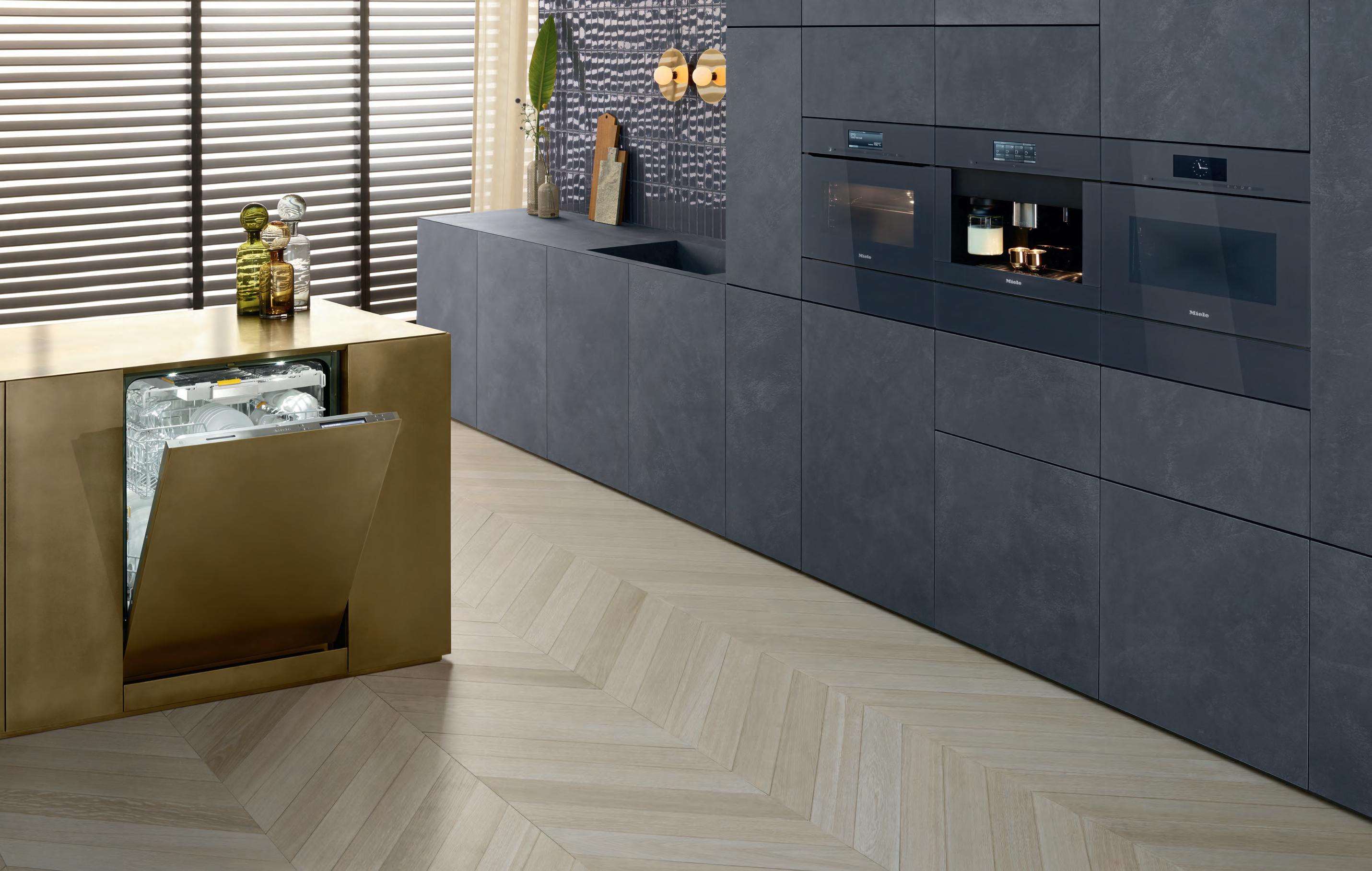
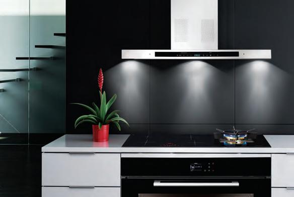
TRP MI 7534 Be inspired at miele-project-business.com.au VIC 9765 7436 NSW 8977 4235 QLD 3632 2471 SA 8352 9532 WA 9286 7835 NZ 573 1269
The Miele Kitchen Experience. Visionary. Extraordinary. Perfect.
Impeccable quality. Liberating technology. Effortless elegance. Extraordinary Miele appliances come together to create visionary kitchen perfection. And our specialist building industry team can make it easy and seamless. Contact our Project Division direct or call into any Miele Experience Centre.
Miele. Immer Besser.
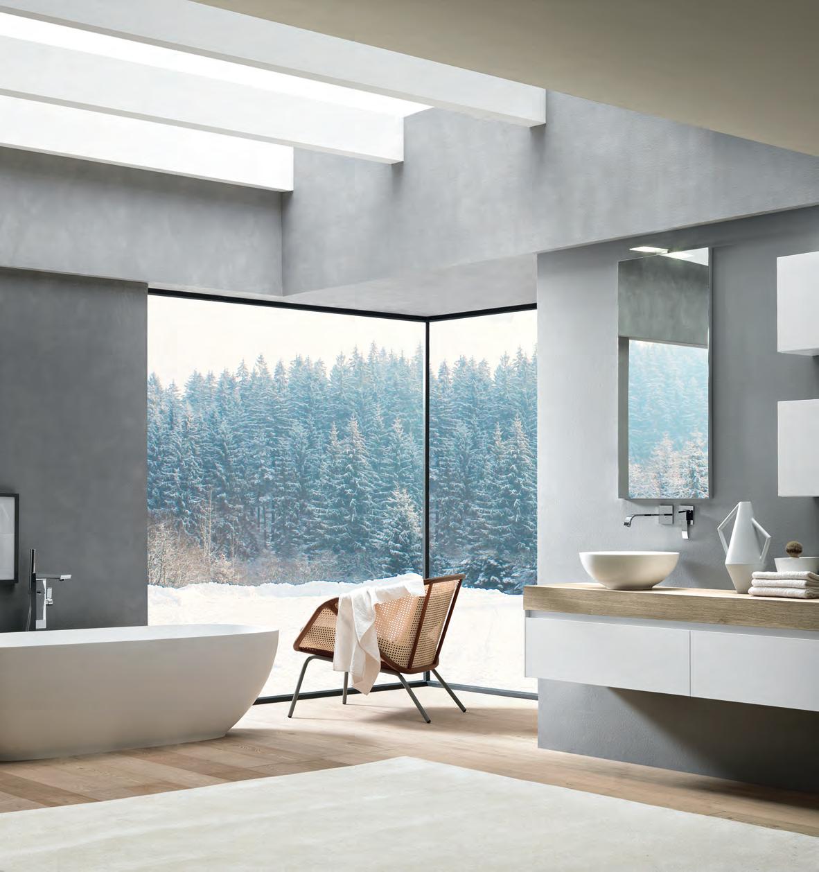
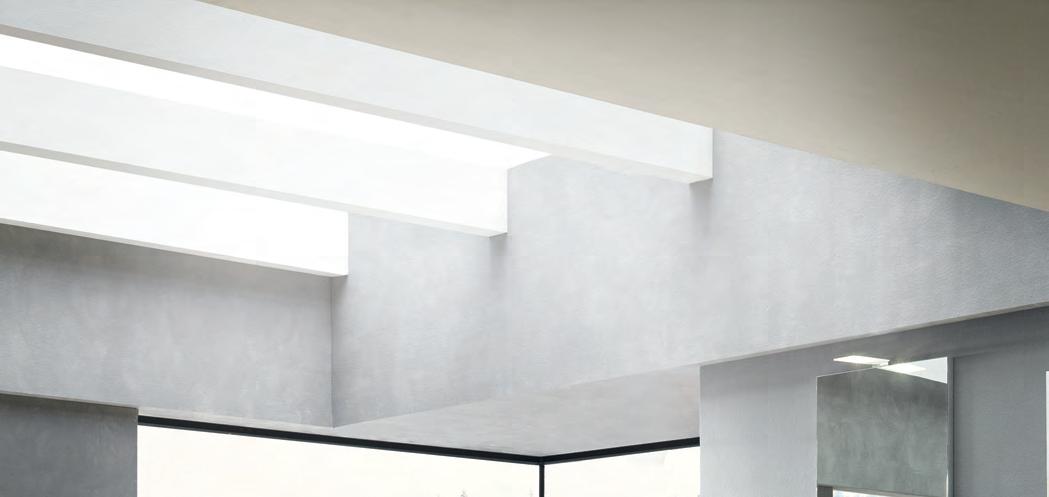
William Smart wins awards blending brilliant architecture and interior design. He has transformed this space with the ultimate in comfort and function from the iconic Living Edge range.
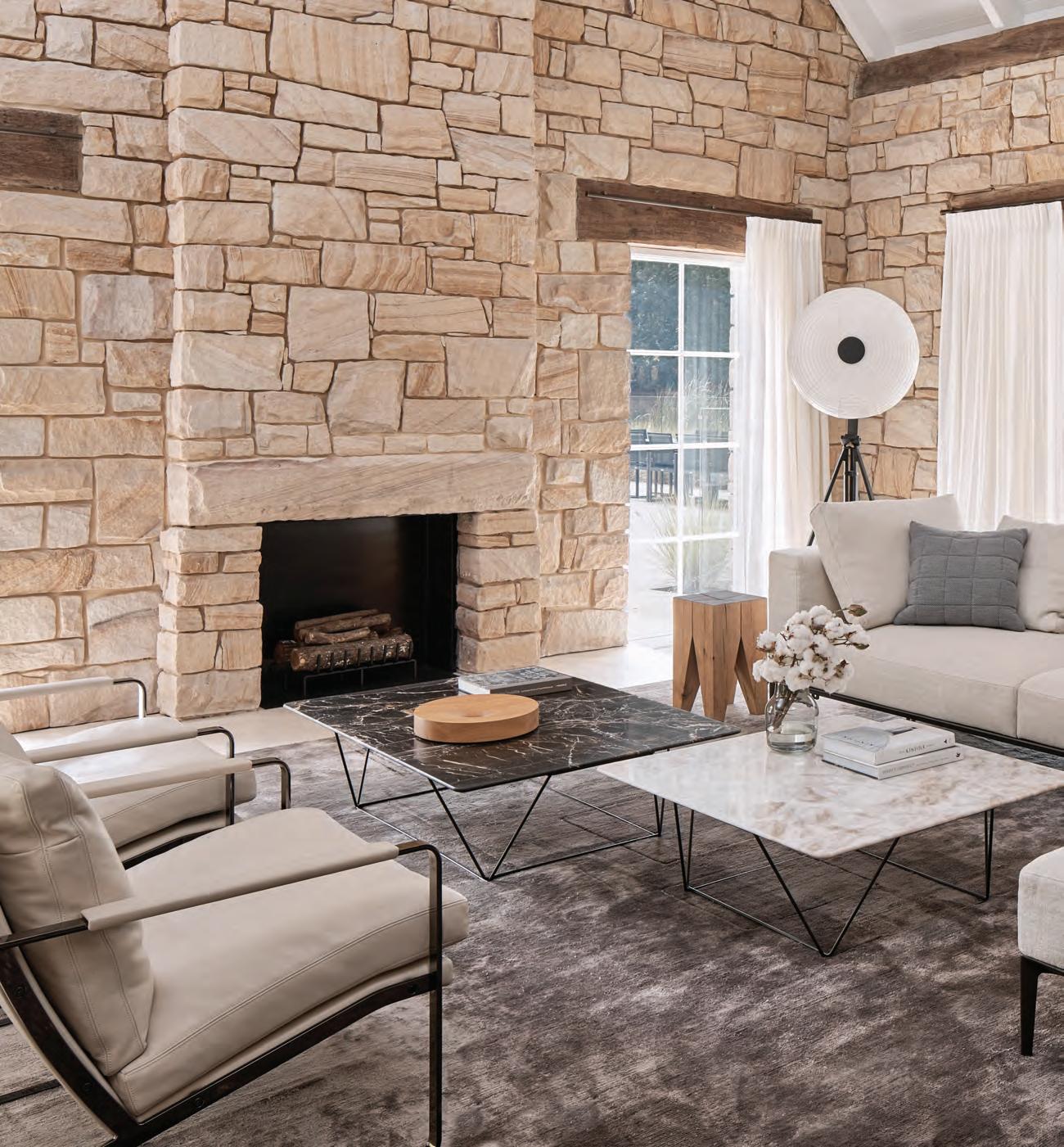
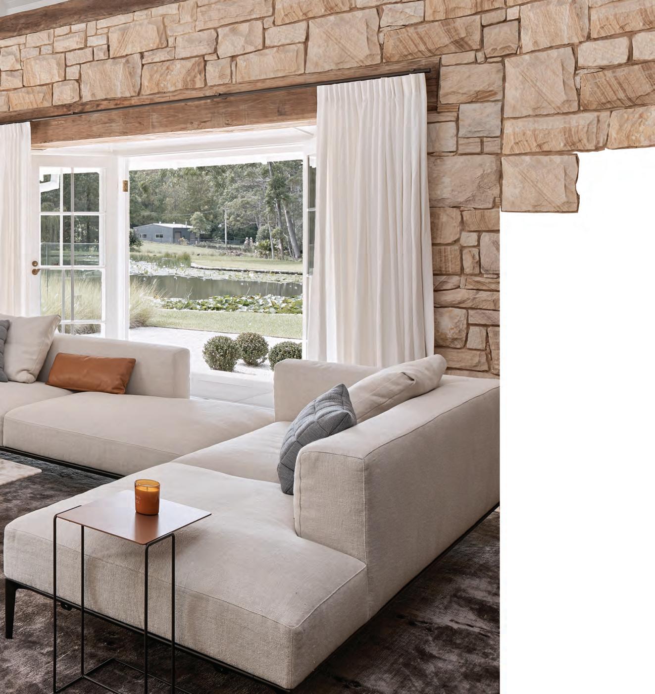
livingedge.com.au

 William Smart
The Oak Residence
William Smart – Founder & Creative Director, Smart Design Studio
William Smart
The Oak Residence
William Smart – Founder & Creative Director, Smart Design Studio
W illiam S mart Furniture for Retreat life. 7
Discover the Metropolitan Collection | New Excava™ Cutting edge urban designs for a lifetime of experiences. Uniquely yours. www.caesarstone.com.au


The difference is Gaggenau.


Unifying apparently contradictory elements is an art we have perfectly mastered. Our iconic design exudes an irresistible charisma even in its uncompromising minimalism. Demonstrated by our 200 series above including oven, coffee machine, Combi-steam oven and warming drawers; the stunning composition in Gaggenau Anthracite or Metallic elegantly blends into every interior design. Far from being opposites, statement and understatement are united in perfect harmony. For more information, please visit www.gaggenau.com/au
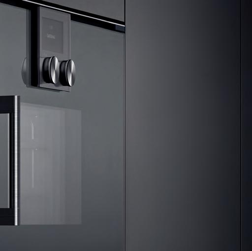 Mastering the art of understatement.


Chairman/Publisher
Raj Nandan raj@indesign.com.au
Managing Director Kavita Lala kavita@indesign.com.au
Editor Alice Blackwood alice@indesign.com.au
Special Edition Editor
Caroline Clements
Indesignlive Editor Aleesha Callahan aleesha@indesign.com.au
Editorial Assistant Andrew McDonald andrew@indesign.com.au

Content Editor & Client Manager David Congram david@indesign.com.au
Brand Director
Colleen Black colleen@indesign.com.au
Business Development Managers
Danielle Nichols danielle@indesign.com.au
Kim Hider kim@indesign.com.au
Client Liaison Dana Ciaccia dana@indesign.com.au
Client Success Executive

Brydie Shephard brydie@indesign.com.au
Accounts
Ting Zhang ting@indesign.com.au

Cassie Zeng cassie@indesign.com.au
Designers
Julia Gee julia@indesign.com.au
Tracey Hein tracey@indesign.com.au
Louis Wayment louis@indesign.com.au
Online Manager Radu Enache radu@indesign.com.au
Web Developer Ryan Sumners ryan@indesign.com.au
Indesign Correspondents
Andrea Stevens (New Zealand)
Mandi Keighran (London)
Stephen Cra i (Melbourne)
Contributing Writers
Aleesha Callahan, Kirsty Sier, Leanne Amodeo, Narelle Yabuka, Neha Kale, Patricia Arcilla, Paul McGillick, Sandra Tan, Sophia Watson
Featured Photographers
Adam Gibson, Carole Bellaiche, Casper Sejersen, Earl Carter, Elizabeth Bull, Felix Forest, François Lacour, Harvard Wang, Jason Loucas, James Morgan, Jesse Hunniford, John Gollings, Kristo er Paulsen, Michele Aboud, Patrick Schü ler, Peter Clarke, Sharyn Cairns, Sco Newe , Tom Ferguson, Tom Ross, Tim Grey, Trevor Mein
Head O ce
Level 1, 50 Marshall Street Surry Hills NSW 2010 (61 2) 9368 0150, (61 2) 9368 0289 (fax) indesignlive.com
Melbourne 1/200 Smith Street, Collingwood VIC 3066
Singapore 4 Leng Kee Road, #06–08,SIS Building, Singapore 159088 (65) 6475 5228, (65) 6475 5238 (fax) indesignlive.sg
Hong Kong
Unit 12, 21st Floor Wayson Commercial Building, 28 Connaught Road West, Sheung Wan, Hong Kong indesignlive.hk
Join the global design collective, become an Indesign subscriber!
To Subscribe (61 2) 9368 0150 subscriptions@indesign.com.au indesignlive.com/subscriptions
Yearly subscription: Australia $55 (incl. GST) International AUD $110

Printed in Singapore
Indesign is printed with ENVIRO Soy-Based Process Black ink, UV Solventless Varnish and on paper which is awarded an Environmental Management Certificate to the level ISO14001:2004 GBT24001-2004 and Eskaboard and Eskapuzzle produced from 100 per cent recycled fi bres (post consumer).

All rights reserved. No part of this publication may be reproduced, stored in a retrieval system, transmi ed in any form or by any other means, electronic, mechanical, photocopying, recording or otherwise. While every e ort has been made to ensure the accuracy of the information in this publication, the publishers assume no responsibility for errors or omissions or any consequences of reliance on this publication. The opinions expressed in this publication do not necessarily represent the views of the editor, the publisher or the publication. Contributions are submi ed at the sender’s risk, and Indesign Publishing cannot accept any loss or damage. Please retain duplicates of text and images. Indesign magazine is a wholly owned Australian publication, which is designed and published in Australia. Indesign is published quarterly and is available through subscription, at major newsagencies and bookshops throughout Australia, New Zealand, South East Asia and the United States of America. This issue of Indesign magazine may contain o ers or surveys which may require you to provide information about yourself. If you provide such information to us we may use the information to provide you with products or services you have. We may also provide this information to parties who provide the products or services on our behalf (such as fulfillment organisations). We do not sell your information to third parties under any circumstances, however these parties may retain the information we provide for future activities of their own, including direct marketing. We may retain your information and use it to inform you of other promotions and publications from time to time. If you would like to know what information Indesign Media Asia Pacific holds about you please contact Nilesh Nandan (61 2) 9368 0150, (61 2) 9368 0289 (fax), subscriptions@indesign.com.au, indesignlive.com Digital Print Events Strategic Partners CAREERSINDESIGN MILANINDESIGN PROUDLY PLATINUM SPONSOR OF Sydney’s Carriageworks 9-10 August 2018 zipwater.com INDESIGNLIVE.COM 20 INDESIGN IS BROUGHT TO YOU BY
80% OF ZIP HYDROTAP OWNERS DRINK MORE WATER*


We are all aware of the benefits associated with drinking enough water, but despite this, many of us go about our daily lives dehydrated to some degree.


As world leaders in instant drinking water appliances, Zip invented the innovative HydroTap, the smart and essential addition for every kitchen. Our integrated Australian-made appliance combines patented PowerPulse™ boiling and Direct DryChilling with MicroPurity filtration technologies to create pure-tasting boiling, chilled and sparkling water you will love in an instant.
When water is this convenient and irresistible you’ll love drinking more of it. To improve your hydration and your family’s well-being, discover more at zipwater.com Zip HydroTap. Now available in 8 new premium finishes.

*Statistic based on a survey of 354 owners of residential-installed Zip HydroTaps.


THE WORLD’S MOST ADVANCED DRINKING WATER APPLIANCE ZIP HYDROTAP | PURE TASTING | INSTANT | BOILING | CHILLED | SPARKLING
Just how important is a hospitality scene to a community? I’d go so far as saying that, like work, it’s part and sum of our daily lives. It facilitates livelihoods and cultivates local culture. From a designer’s perspective, hospitality spaces must address a mix of complex functions – to host and serve, consume and experience, connect and exchange, work and relax. Are we nailing the equation? Or does it require an entire re-imagining? In this issue, The ‘Design Relish’ Issue, we’re joined by special edition editor, Caroline Clements (page 24), who offers us a fresh take on the hospitality design paradigm.
Meanwhile the Indesign team is excited to welcome you to our inaugural FRONT event, 9–10 August. Taking place at Carriageworks in Eveleigh, Sydney, FRONT puts the emphasis on connecting and socialising through business. With a particular focus on workplace and hospitality sectors, FRONT cuts back on the frills to present you with the essentials: a place to meet, greet and build your working relationships. Our show space with its ‘activated aisles’ is designed to facilitate bump-ins and key conversations. We have numerous meeting touch-points, including the Dyson Business Lounge, supported by Living Edge, where you can pull up a seat, grab a complimentary coffee or snack, and use your time to reach out and talk business with the people who matter. There will also be plenty of thoughtleadership, debate and knowledge-sharing taking place at the FRONT Design Forum, which runs over the two days. Register your attendance at www.front.design and read more, page 71.
Finally, I’ve saved the best for last. A loud and resounding Congratulations! goes to the winners of INDE.Awards 2018, (page 29). Together, our winners offer an exciting vision of what Asia Pacific has to offer. Judging by the depth of talent represented here, I can confidently say that ours is one of the most exciting design regions in the world. Bring on the INDEs 2019!
Indesign Editor, Alice Blackwood
INDESIGNLIVE.COM 22 FROM THE EDITOR
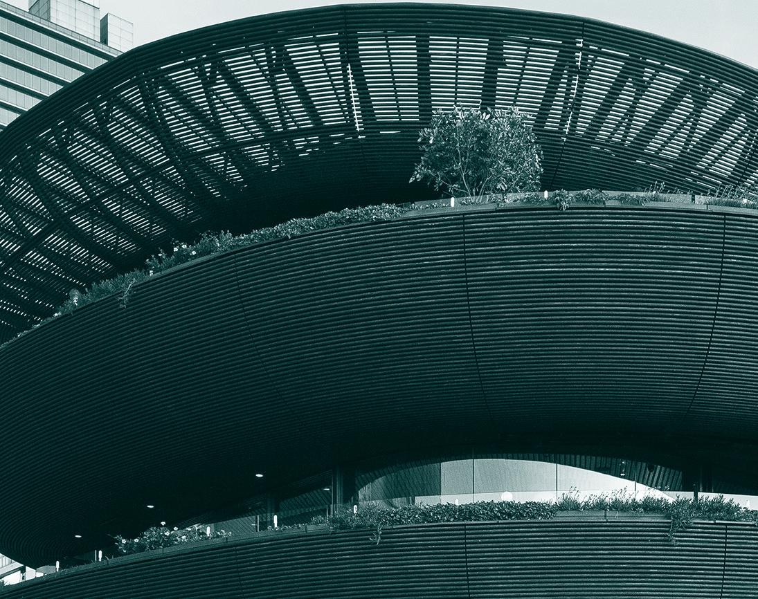
indesignlive.com /indesignlive @indesignlive @indesignlive 250,950+ readers engaged across print, digital & social... On The Cover INDE.Awards
2018 winner of The Social Space category, Barangaroo House (Architecture) by Collins and Turner, photo: Rory Gardiner. Turn to page 29 to see all the category winners in this year’s INDE.Awards.
Australia 1300 306 960
stylecraft.com.au Singapore +65 6511 9328
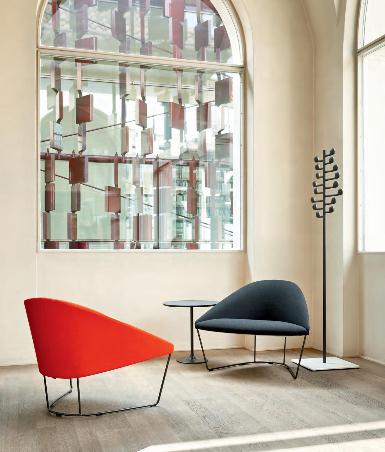
Featured | Colina Armchairs, Dizzie Side Table & Song Coat Stand for Arper - www.arper.com
Trends in design come and go, almost as quickly as they do in food. In a time where a unique experience is celebrated, more often than not, I find I really just want something familiar, comfortable and relaxed.
After recently returning to Sydney to live, I’ve felt a nostalgia for past times spent here. In a city that is constantly changing, where new eateries pop up almost weekly, I’m still going back to dine at the places I know and love. Is that a sign of my dwindling adventurous self, or a refinement of my taste?
A few years ago there was this cookie cutter look that was stylish, cool and easy to produce (sparse, exposed bricks, steel beams, etcetera.) But it feels like there’s a shift towards making the places we eat and drink feel more homey (not homely), warm and imbued with a sense of character. The best venues feel comfortable, laid-back and reflect the people behind the business, giving the customer experience a human touch.
These ideas beg the question, how do you design something that feels ‘local’? Which is to say, how do you design a place which is an extension of your home, and to which you want to return to on a regular basis?
In this hospitality themed issue, The ‘Design Relish’ Issue, we chat to two front-of-house pros about designing for staff and patron satisfaction, page 158. We also profile three exceptional designers who are lighting up the hospitality design sector, page 172. These are interior architects who have established their own practices in the last few years, and are designing striking new venues across the country – from Melbourne to Perth.

We also look at two highly anticipated restaurants that have recently opened in boutique hotels, page 165. They are bringing hyper-local chefs to visitors, but are also making these hotels feel like places in which locals want to hang out. It’s a new approach that filters down into the design of the spaces. They’re championing an idea that the ultimate comfort starts (and maybe ends) at home, even if it is a luxurious hotel version of it.
This issue is about design that comforts, rather than challenges, and we think that is something to relish.
INDESIGNLIVE.COM 24 FROM THE Sp E ci al Edi T i O n E di T OR
#74 The ‘Hospitality’ Issue – Special Edition Editor, Caroline Clements
The customer experience needs a human touch.
parisi.com.au TWENTY Collection
The ultimate industry cheat sheet. 49-70
Big thinkers and creative gurus.
79-99
Karen Webster and Leonard Hamersfeld of Buzz, INDESIGN Luminary Mark Landini, Cecilie Manz, Hélène Dubrule of Hermès Maison
Provocative, radical and energising design.
103-150
Chin Chin, Sydney by George Livissianis -
Mercedes Me, Melbourne by Jackson Clements Burrows -
Salamanca Building, Hobart by fjmt -
Red Energy, Melbourne by Carr -
Kingsleys, Sydney by SJB -
Ningaloo Centre, Western Australia by SITE Architecture Studio I
The Indesign round table review on hospitality design in 2018.
157-178 In
What can we learn from the #LadyDoritos debacle?
181-183
Inde.awards
s h ort
Official Winners 2018. 29-45 In
famous
In
s I t u
In
n d e pth
t e rest
INDESIGNLIVE.COM 26 CONTENTS
SYDNEY 5/50 Stanley Street Darlinghurst +61 2 9358 1155 MELBOURNE 11 Stanley Street Collingwood +61 3 9416 4822 MEMBERS OF

AUSTRALIA | NEW ZEALAND | HONG KONG CHINA | JAPAN | SINGAPORE | INDIA www.colebrookbossonsaunders.com

INDE.Awards Winners 2018
On 22 June, the winners of the INDE.Awards 2018 were announced in Singapore. Selected by our esteemed jury from over 400 entries, they manifest the progressive attitude that is making Asia Pacific one of the world’s most innovative regions for design.
We celebrate and congratulate your 2018 winners. Our region’s design on the global stage.
Official INDE.Awards 2018 Jury
Abbie Galvin, BVN (Australia)
Aric Chen, M+ (Hong Kong)
Chan Ee Mun, WOHA (Singapore)
Eleena Jamil, Eleena Jamil Architect (Malaysia)
James Calder, Calder Consultants (Australia)
Jan Utzon, Utzon Architects (Denmark)
Joshua Comaroff, Lekker Architects (Singapore)
Luke Pearson and Tom Lloyd, PearsonLloyd (UK)
Luke Yeung, Architectkidd (Thailand)
Lyndon Neri and Rossana Hu, Neri & Hu (China)
Paul McGillick, McGillick Consulting (Australia)
Raj Nandan, Indesign Media (Australia/Singapore)
Shashi Caan, SC Collective (USA/UK)
Stephen Burks, Stephen Burks Man Made (USA)
William Smart, Smart Design Studio (Australia)
Platinum Partner Category Partners Launch Pad Partners Principal PartnerFounding Partner Trophy Partner Gold Partner Industry Partner
Winner | The Building & Best of the Best krakani-lumi, Taylor and Hinds Architects


Official Jury 2018


Honourable Mention | Marina One, Singapore, Ingenhoven Architects with Architects 61
“A revelatory experience of landscape and culture”
INDE.Awards
Partner:
Photography: Adam Gibson


genuine prototype for quality, affordable inner-suburban living” INDE.Awards Official Jury 2018 Honourable Mention | M3565 Main Beach Apartments, Virginia Kerridge Architects Photography: Peter Clarke
| The Multi-Residential Building Nightingale 1, Breathe Architecture Partner:
“A
Winner
Winner | The Living Space Room Without Roof, HYLA Architects


INDE.Awards Official Jury 2018


“Breathes new life into the traditional courtyard typology”
Honourable Mention | Artist Retreat at Pittugala, Palinda Kannangara Architects
Photography: Derek Swalwell
Partner:


INDE.Awards Official
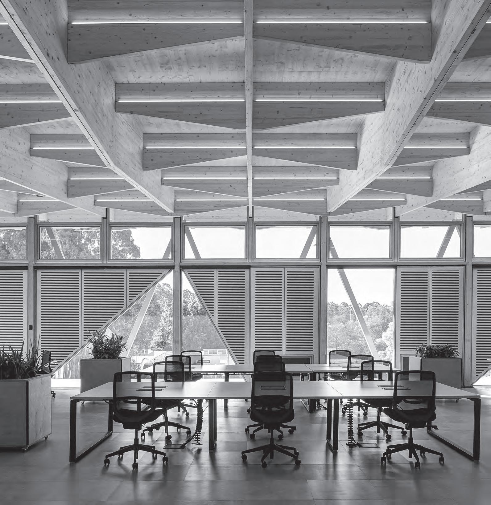
2018 Honourable Mention | PwC Melbourne, Futurespace Photography: John Gollings
|
Partner:
“The science sector brings a new vision to
the
workplace revolution”
Jury
Winner
The Work Space Synergy Building, CSIRO, BVN
Winner | The Social Space
Barangaroo House (Architecture), Collins and Turner


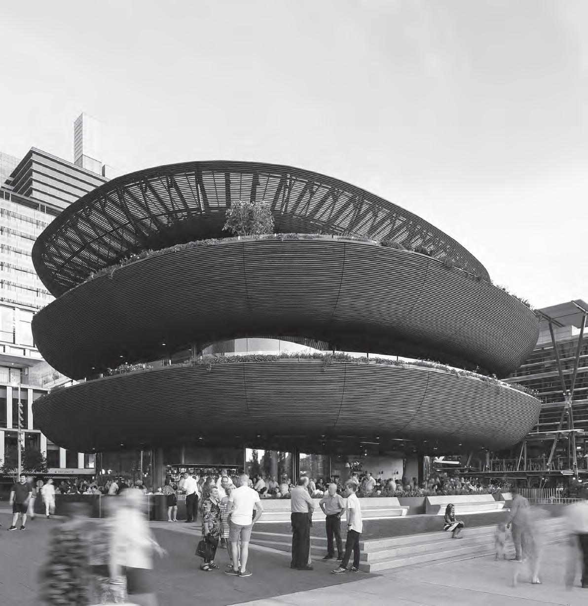
“An
Photography:

extraordinary statement and a new dimension for Sydney’s Barangaroo precinct” INDE.Awards Official Jury 2018
Mention | BE Friendly Space, H&P Architects
Rory Gardiner
Honourable
Partner:
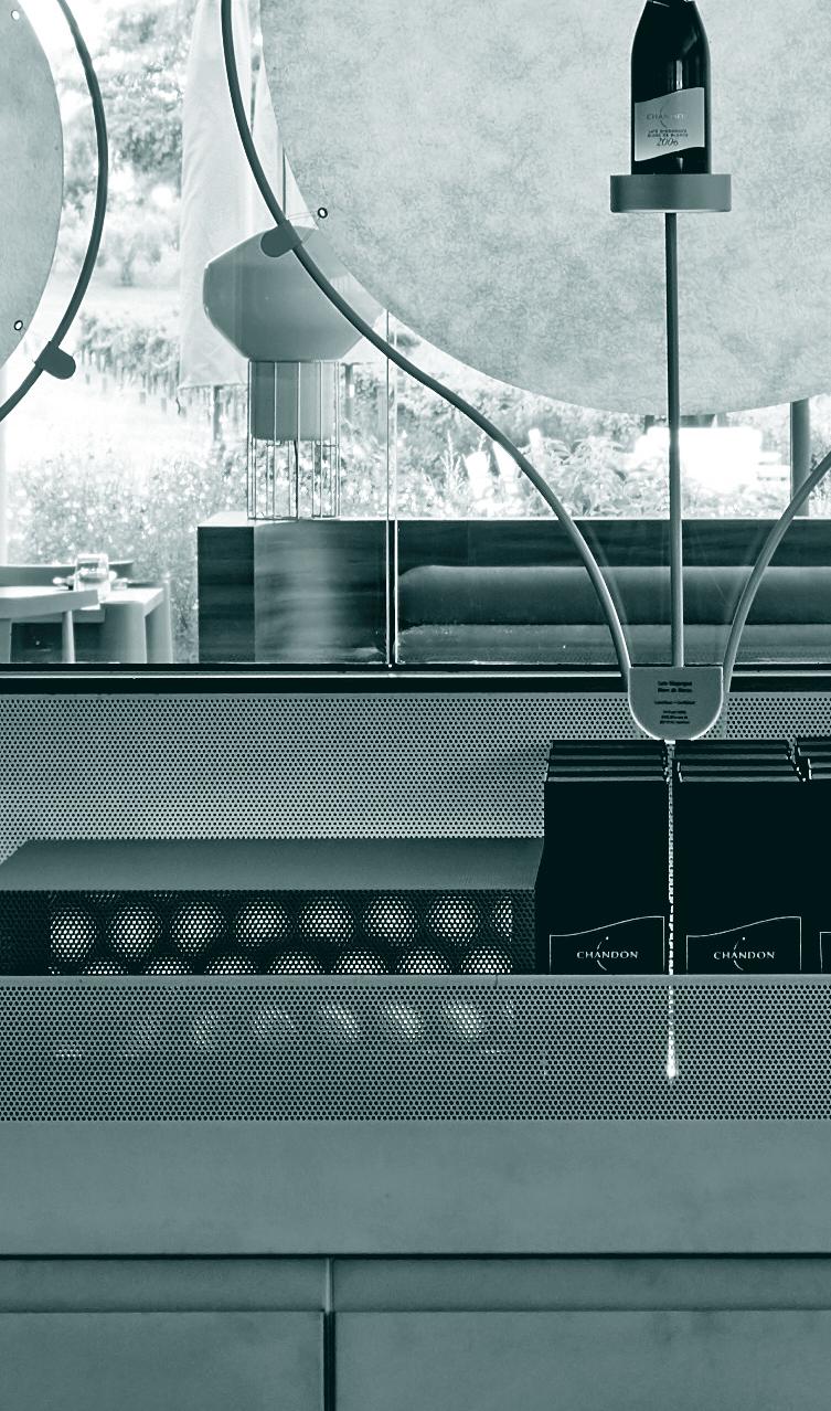
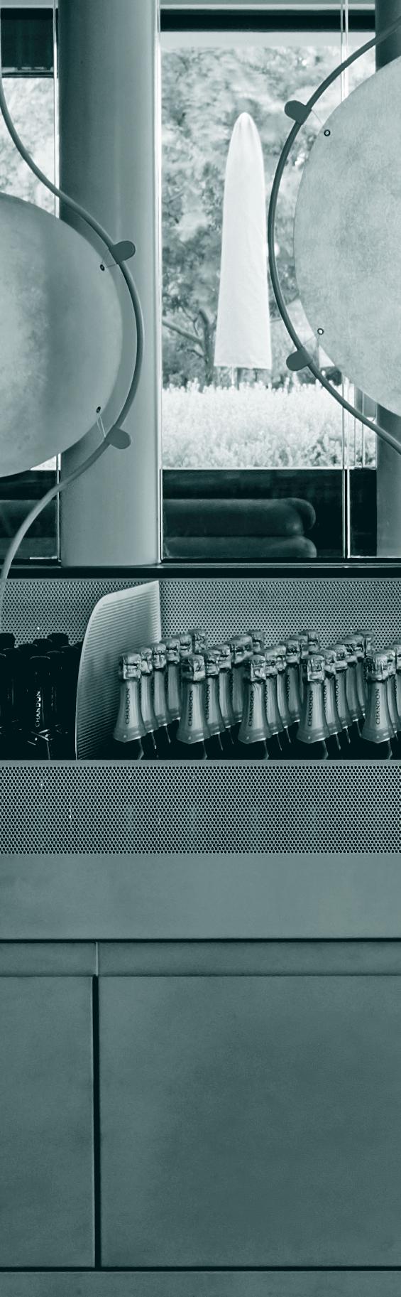
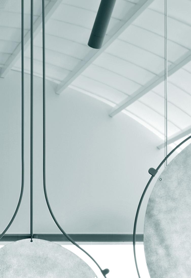
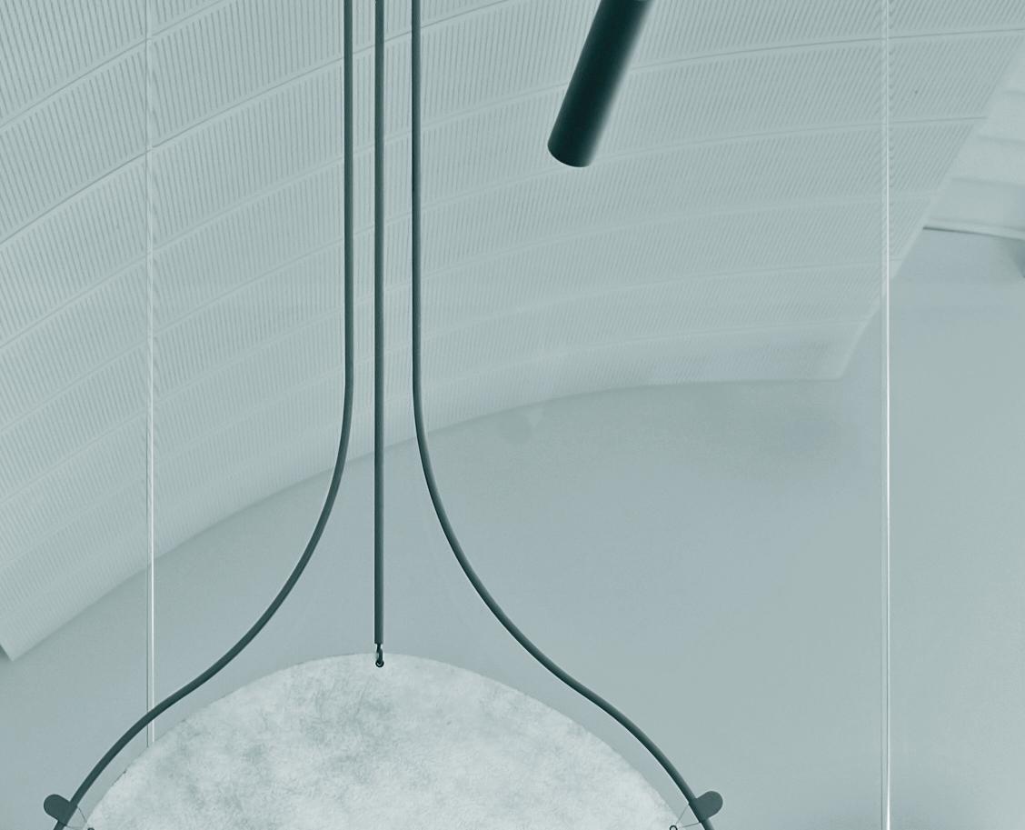
Winner | The Shopping Space Domaine Chandon, Foolscap Studio

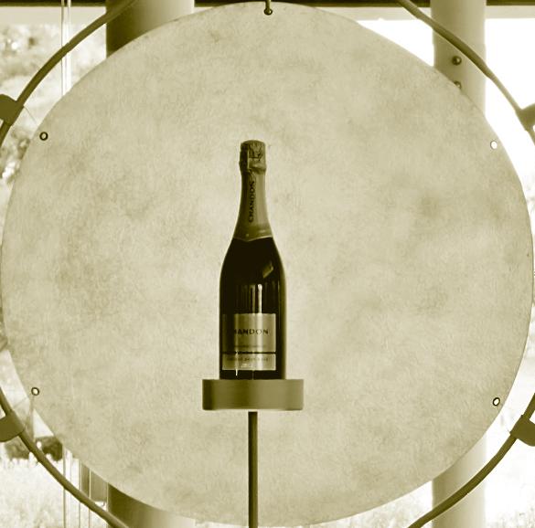
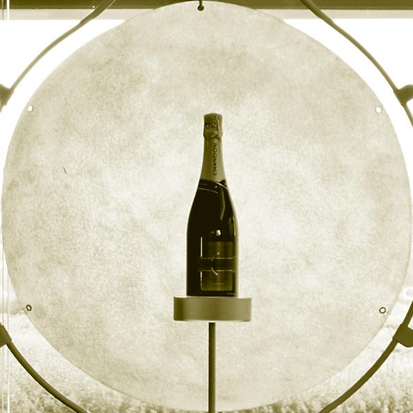
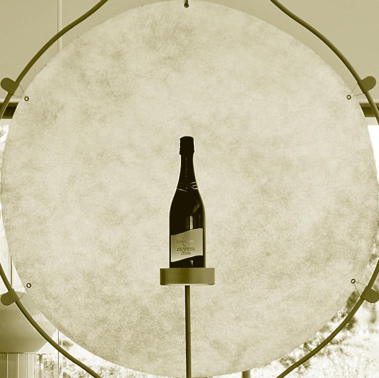


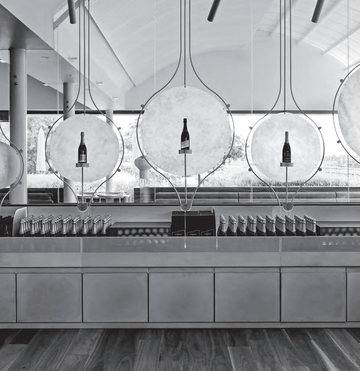
of the
experience” INDE.Awards Official Jury 2018 Honourable Mention | The Daily Edited Melbourne Flagship, Pattern Studio Photography: Tom Blachford
“An exquisite reinvention
cellar door
Partner:


INDE.Awards Official
2018 Honourable Mention | A Journey of Self-Exploration, Bukit Panjang Public Library, Grey Canopy
Brett
“A light-filled gesture that that stands out among the concrete buildings of Macquarie University”
Jury
Photography:
Boardman
Partner:
Winner | The Learning Space Macquarie University Incubator, Architectus

INDE.Awards Official
Honourable Mention | Artemis Centre, Melbourne Girls Grammar, BVN Photography: Shannon McGrath
“A broadminded approach
to
wellbeing, anchored to its place”
Jury 2018
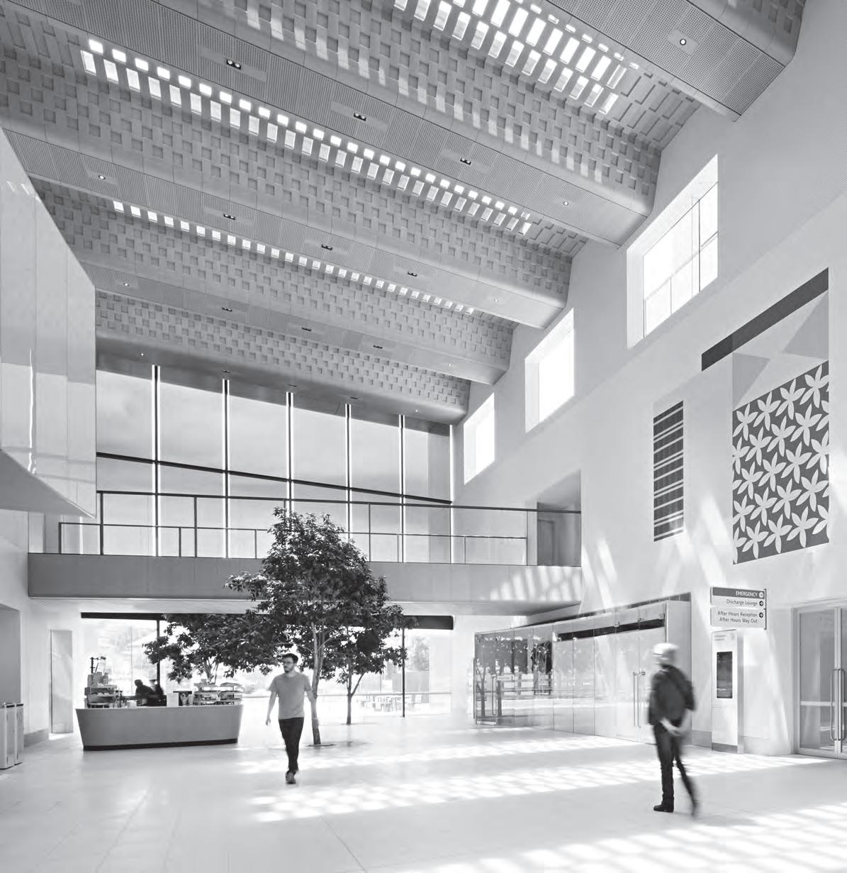
Winner | The Wellness Space Bendigo Hospital, Silver Thomas Hanley with Bates Smart
Partner:


remarkable and ingenious model for the South-East Asian design studio” INDE.Awards Official Jury 2018 Honourable Mention | H&P Architects Photography: Studiomake
Studiomake Partner:
“A
Winner | The Design Studio


INDE.Awards Official Jury 2018 Honourable Mention | The Nightingale Model, Breathe Architecture and Nightingale Housing Photography: Sanrok Studio Winner | The Influencer Microlibraries, SHAU Partner:
“Brings imagination and innovation to
a
crucial educational challenge”
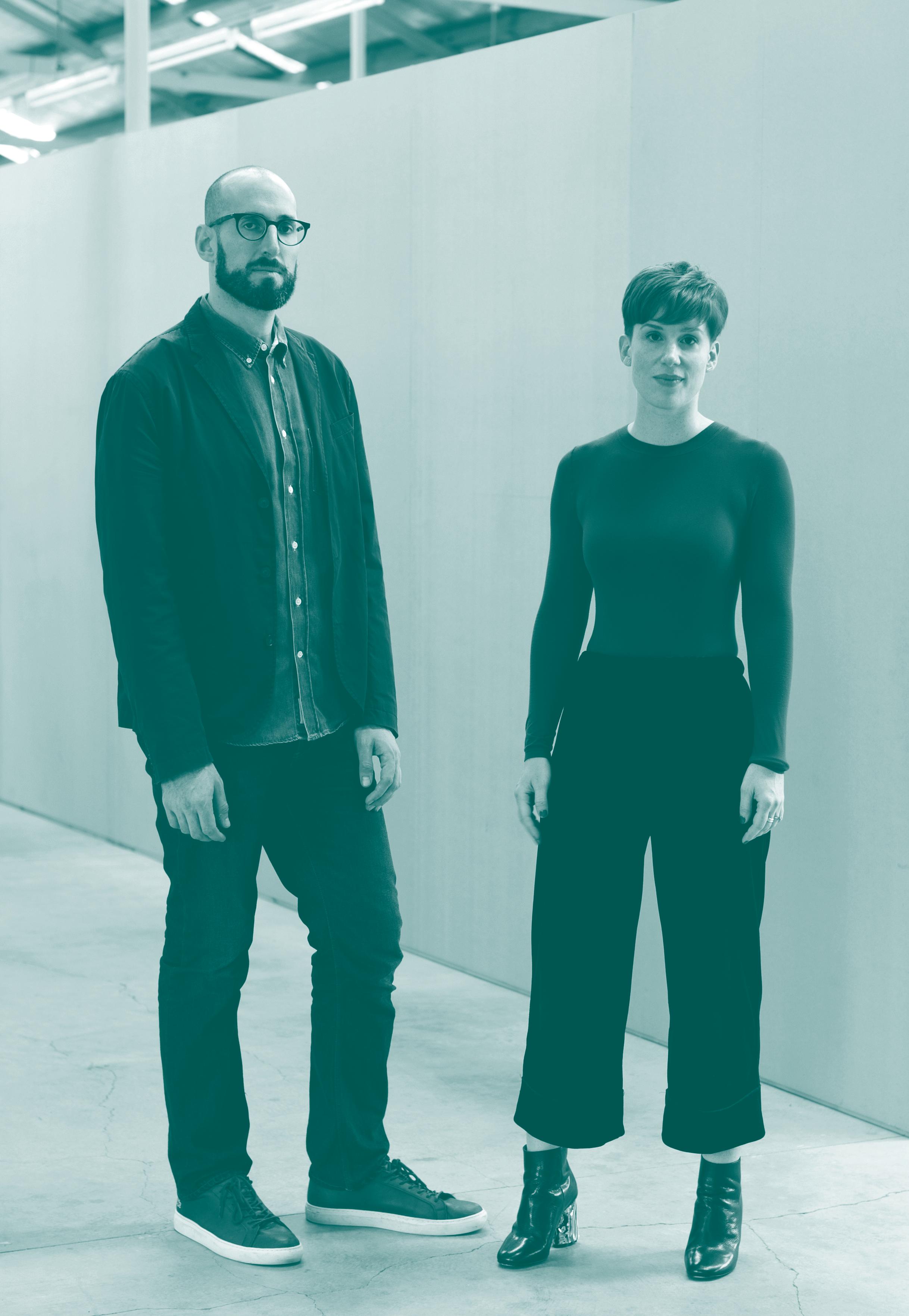
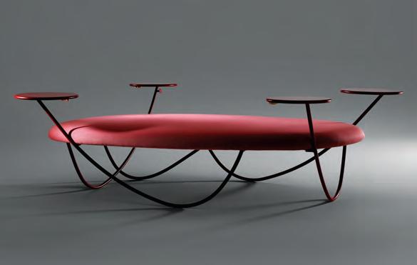
Winner | The Object The Remnants Table Series, Josh Carmody Studio


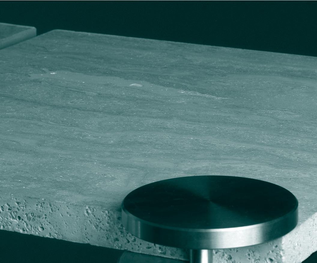
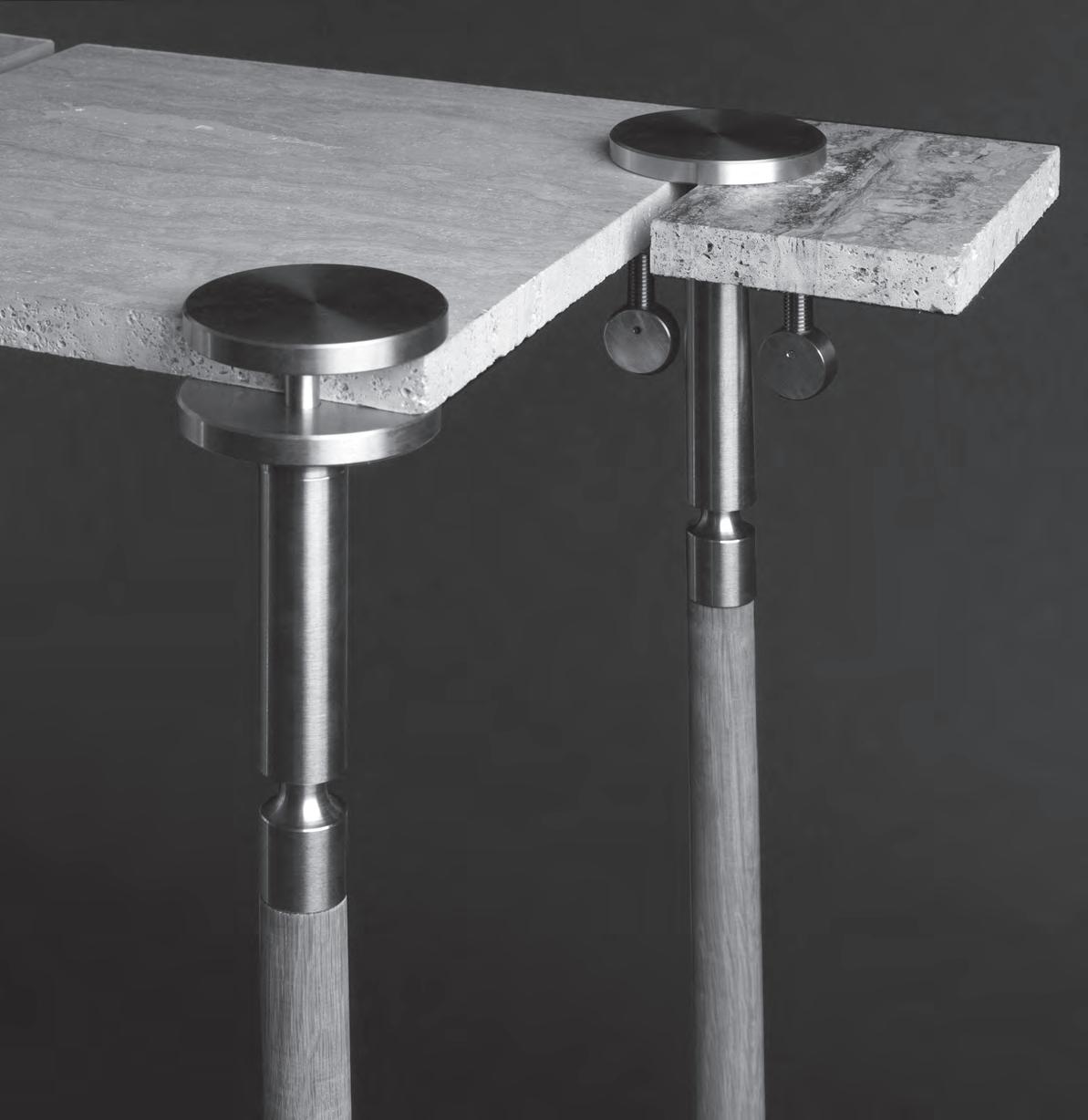
“Sustainability has a new standard of elegance” INDE.Awards Official Jury 2018


Honourable Mention | Strand Chair, Adam Cornish for NAU Photography: Andrew Walsh

Partner:
Winner | The Prodigy
David Neustein and Grace Mortlock, Other Architects / Otherothers
the role of the architect”
Official Jury 2018
INDE.Awards
People’s Choice
“Re-writing
Photography: Kasia Werstak
Partner:
Winner | The Luminary Mia Feasy, Siren Design Group


Official
People’s Choice Photography: Teresa Sargent
“Not just a role model for women, but for everyone in the design profession”
INDE.Awards
Jury 2018
Partner:
Launch Pad Ultimate Winner
Empathy, Yeo Yiliang
“Comes from a place of pure consideration” INDE.Awards Official Jury 2018
Partner:
Runner Up | DLC-01, Dan Layden
Photography: Yeo Yiliang
We wish to thank all of our INDE.Awards Partners for helping to foster a brighter future for design in our region.
As we look ahead to the 2019 INDE.Awards, we invite the design and architecture community of Asia Pacific to unite again with the submission of our region’s best projects, people, products and ideas.

www.indeawards.com
 Powered by Strategic Partners

the ultimate industry cheat sheet
INDESIGN 49 IN SHORT SHORT IN
Serving Up
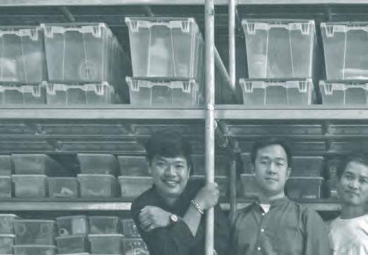
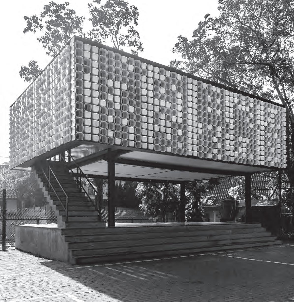
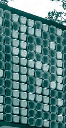
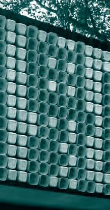
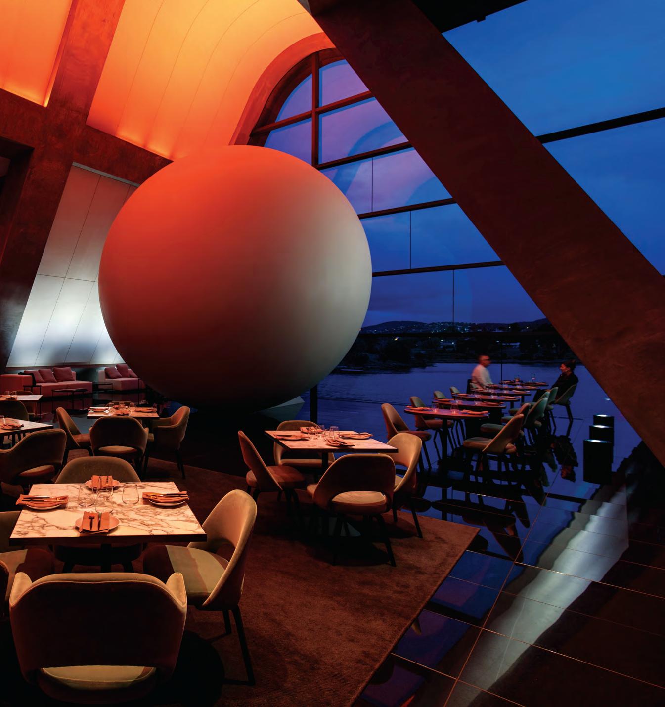
Ordered Chaos
The pressure to over-deliver on high expectations is a daily reality for hospitality venues. Always committed to doing the unexpected and slightly offensive, MONA chose Boxing Day of 2017 to open its new AUD$30 million Pharos wing. It was the busiest day of the year, and, according to hospitality director, Pip Anderson: “It was a classic opening just like the others. We had no heating, no lighting, no WiFi or music set up, it was amazing.”
Designed by Fender Katsalidis, this mindbending building houses three James Turrell artworks including Unseen Seen (the six metre sphere), and new restaurant, Faro, meaning lighthouse in Spanish.
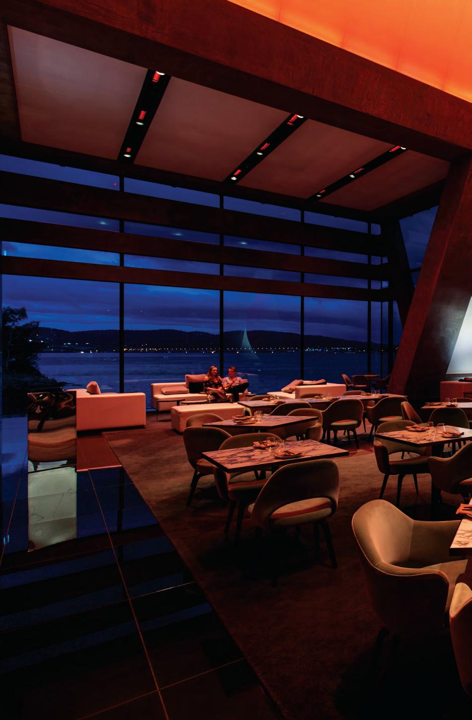
David Walsh’s wife Kirsha Kaechele worked closely with interior designer Kathy Hall on Faro, which is all about natural light during the day, and artificial light at night. Details include rose quartz tables, green velveteen chairs, gold cutlery, and handblown Jacobson glassware inspired by spiky sea urchins (which you can’t actually set down on the table).
There is zero trash on site, so no takeaway cups, no takeaway plates or napkins; straws are made from glass. “People steal our [objects] all the time. The straws are probably our most stolen item, we take it as a compliment, but it’s quite annoying,” comments Anderson.
At Faro, “a chaotic lunch service turns into a cool, calm, collected dinner service,” she says. This experience includes being taken through artworks at an unexpected moment during your meal, leaving diners feeling slightly discombobulated.
Intending to confuse its patrons even further, MONA is in the midst of building a tunnel that will take guests from the museum straight to the restaurant, without having to battle the temperamental Tasmanian weather. “For the moment the tunnel is yet to find its path. We think things through, but we also like to make things hard for people,” says Anderson.
INDESIGNLIVE.COM IN SHORT 50
INDESIGN 51 IN SHORT
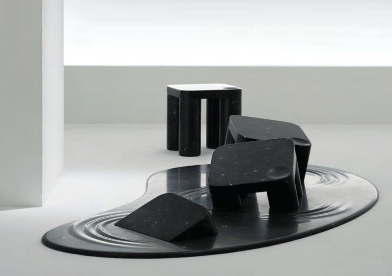
Soft As Stone
Soft marble is not really an oxymoron. Or at least, not in the hands of Nendo. This year at the Milan Furniture Fair, the Japanese design studio teamed up with Marsotto to explore the sculptural properties of marble in the most atypical of fashions. To look at the collection, called ‘Into Marble’, you’d think it was made of water, wind and quicksand rather than the hard surfaces and harsh edges so typically associated with the material.
“The edges were softened and ripples were added to accentuate the soft appearance,” says Nendo. “Puddle-like stands [create] an ambiguous expression that can either look as if the objects are melting into liquid or emerging from it.” By rethinking one of our most readily identifiable materials, Nendo reminds us that design possibilities are never set in stone.
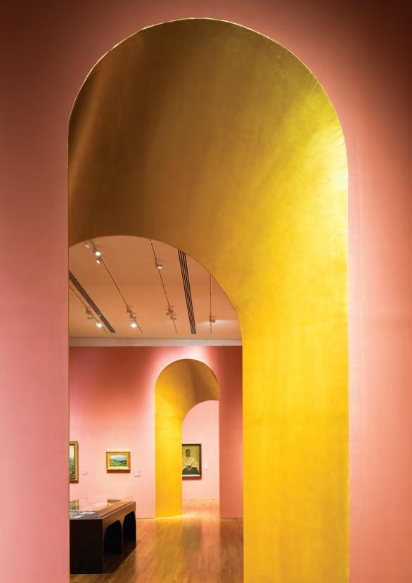
FARM In The City
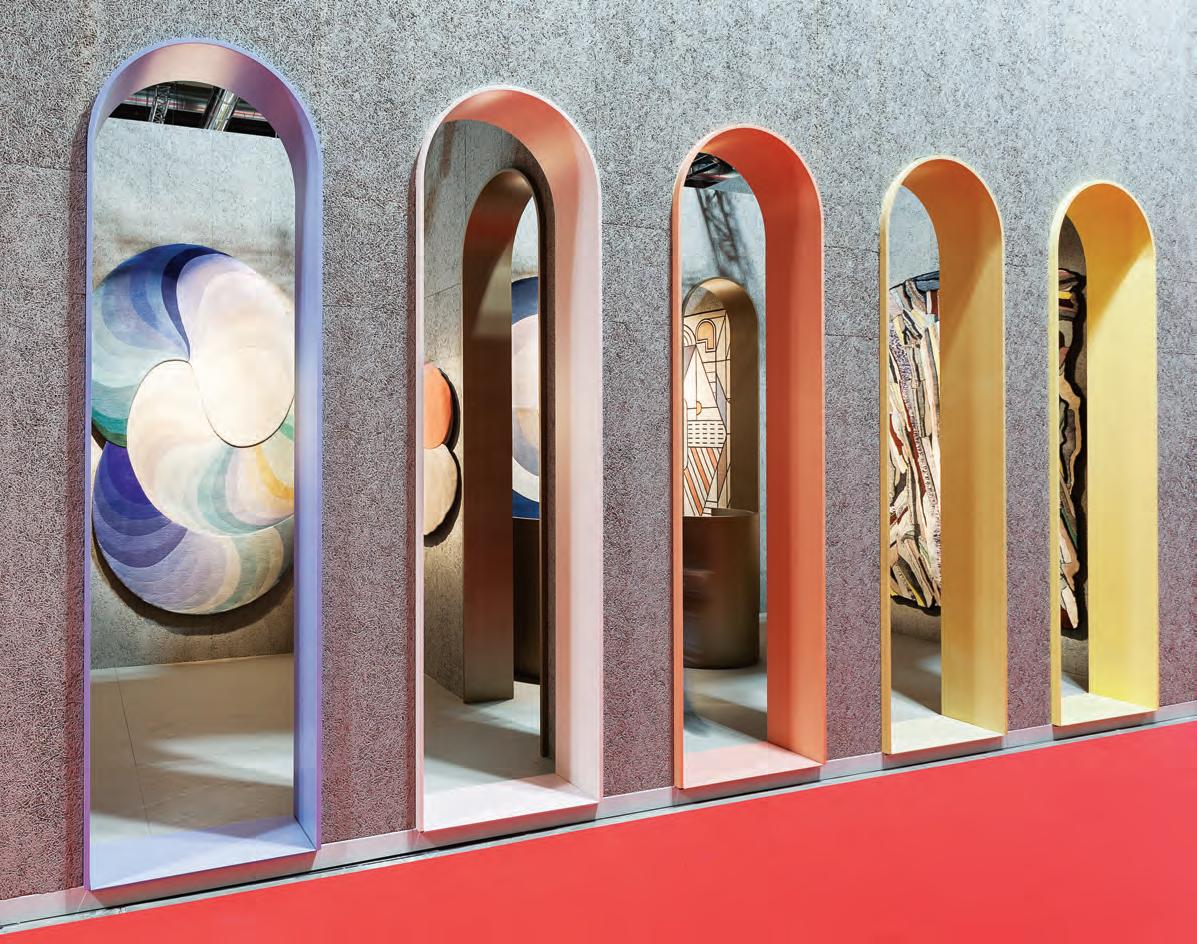
When you visit an art gallery, it’s likely that your primary focus will be on the art adorning the walls rather than the walls themselves. Similarly, when you think of curation, you’re more likely to think of the thematic and visual groupings of works than you are about the rooms in which this is done. The aim of Century of Light, conceived by architectural practice FARM for National Gallery Singapore in 2017, was to undermine this thinking. A quasi-exhibition behind an exhibition, the sprawling project uses colour and geometry to make the gallery itself as worthy of attention as its contents.
FARM’s brief was to create a landscape that would act as a link –both physical and aesthetic – between two adjoining exhibitions. “To capture the essence and spirit of the two shows, we [envisioned] a series of huge rooms, similar to drawing rooms of old, interlinked by arches and openings that play upon the transition from one space to the next,” states FARM. “The arches are also intentionally skewed and carefully positioned to constantly frame and re-frame key artworks and guide the visitors’ orientation. Using the simple archetypal archway, we warped and skewed its geometry and form to create something unfamiliar, yet refreshing.”
Colour was also crucial to FARM’s concept. Each archway and room is meant to prepare the viewer for what they’ll see. The different components of the exhibitions are allocated distinct hues and, as the exhibition progresses, wall colours bleed and transition to accommodate the narrative. In this way, Century of Light becomes an exhibition all on its own.
INDESIGNLIVE.COM IN SHORT 52
Chef’s Special
When DesignO ce’s Mark Simpson and Cantilever’s Travis Dean collaborated on a multi-residential project in 2014, they realised there was nothing that existed on the market between completely tailored and pre-con gured kitchens. So, they decided to ll that middle ground with Tableau, a customisable kitchen solution that’s somewhere between bespoke and ready-made. “We liked the idea of something that sat between a standardised set of parts and a custom- tted kitchen,” says Simpson. “We got down to looking at all the di erent scenarios we might come across and distilled them down to some core elements. We realised that, if these core elements were designed in a certain way, they could meet the needs of an awful lot of kitchen designs.” Tableau is divided into four self-explanatory components: Block, Bench, Store and Shelf, with a selection of materials and colours available for each. “It’s the luxury of a completely designed solution with the security of testing and prototyping,” says Simpson.


How Do You Like Your Eggs?
In the case of Schiavello’s new Agile Table, the answeris ‘fried’. Designed with Woods Bagot’s Amanda Stanaway, the Agile Table takes a ne-grain approach to movement in corporate spaces. While workers enthusiastically embrace agile working, most executives nd themselves at desks in meetings all day. Not with the Agile Table.


Stanaway uses the analogy of “a fried egg” when describing the original design concept, referring to the wide, weighted base that was required for a cantilevered height of 1.5 metres. The gentle curves of the table top itself are a nod to the “so er and more homelike” aesthetic that commercial design is moving towards. Elegant and super simple, this place-speci c, height-adjustable table is “one of those static, really stable pieces that is used to anchor the planning of a workplace,” says Stanaway.

Building A Brains Trust
Indesign VOLA


With many organisations contemplating their ‘legacy value’, we’re seeing a renewed emphasis on the role of knowledge, innovation and people in business. Looking to engage with its contemporaries in a meaningful and substantial way, VOLA has established the VOLA Academy in Denmark. Designed by LINK Arkitektur, the academy hosts gatherings for international architects and interior designers, providing an architectural think-tank in which industry professionals can share ideas, opinions and inspiration.
The building re ects the minimalist and timeless aesthetic of VOLA’s products through a lean and stylish architectural approach. Materials are few and simple. The building consists of an open steel frame, with glass gables resting on a concrete base below. At the entrance, two free-standing frames create a visual interplay of light and shade, while internally, raw concrete is o set by glass and wood nishes.
All-in-all, it’s a building that perfectly represents the uniquely international and exclusive feel characteristic of the VOLA range.


INDESIGNLIVE.COM IN SHORT 54
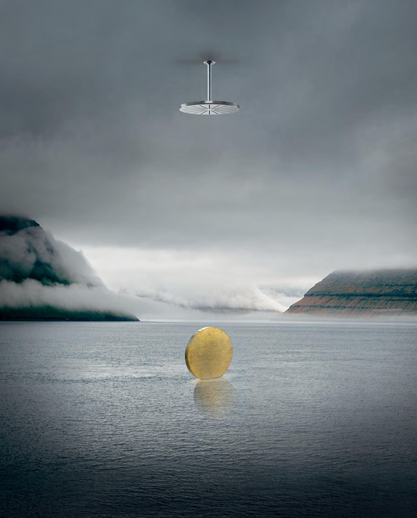
Pure materials. 100% recycled. 060 Round head shower Celebrating 50 years and beyond Watch our original stories at vola.com VOLA Design Pty. Ltd. - Tel.: +61 402 372 480 - sales@vola.com.au - www.vola.com
Super Real With CC-Tapis
Rugs do not have to be rectangular! Rugs do not have to be round! This is the lesson we learn from looking at the collections of CC-Tapis, the French-born, Italian-designed, Nepalese-made rug company that is shaking up the long-abided geometric formula. An antidote to mass-produced designs, each CC-Tapis rug has a three-month production time – a reflection of a high-end product that is hand-woven by artisans. Over the years, CC-Tapis has become known for its careful approach to collaborations, to which its stand at Milan Furniture Fair attested.
The kaleidoscopic display brought together the diverse creative inspirations that CC-Tapis has embraced, in addition to the various artisanal approaches it has adopted. For instance, there’s the Super Fake collection by Bethan Laura Wood, which looks more like it was excavated from ancient geology than woven from high-quality fibres.
Each design eschews any kind of contained geometry, instead incorporating the jagged protrusions that are to be found in natural rock and crystal formations. The visual landscape that results from this merging of creative practices is an homage to what Wood calls, “The post-Instagram and post-Snapchat world, where the fleeting two-dimensional image [collides] with a physical and tactile reality [and] the hyper- and super-fake spill into our daily lives.”
In each of CC-Tapis’ collections, this hyper- and super- exaggeration of themes is apparent. Taking themes as diverse as digitisation, travel memories and childhood toys, the brand explodes them into whole woven universes. Always thinking outside the proverbial square, CC-Tapis is proof that no concept is too large to be stitched into a rug collaboration – and no shape is too bizarre to make an underfoot appearance.
INDESIGNLIVE.COM IN SHORT 56
Feet
First“Call it an armchair and watch them try to sit on it.” This quote sums up the wit and absurdity of Gaetano Pesce, the Italian architect whose approach to design is distinctly anti-disciplinary. Enter the Up Series’ Up7 Foot, a hybrid of product design and abstract objet d’art by Pesce for B&B Italia. Although marketed as an armchair, the fact that it’s fashioned into the shape of a giant, plush foot makes its furniture credentials almost impossible to pin down. Its Pop Art playfulness quali es it as an irreverent, sculptural installation, but David Hartikainen, the NSW showroom manager for Australian supplier Space Furniture, has some di erent ideas for use: “I would even use it as a table. It’s absurd [and] slightly ridiculous with the right amount of humour.” Whatever way you look at it, it’s still a perfect, functional leg-up for your living room.
Shifting The Conversation
Indesign Space Furniture
What de nes Australian design in the international landscape? With so many Australian designers showcasing their work at Milan Furniture Fair, it’s a question only now entering our collective consciousness. Two steps ahead of us is SP01, the Australian design brand which launched in 2016. Its collections, which feature pieces by Australian designer, Tom Fereday, and Italian studio, Metrica, have established the brand as a sophisticated new-comer. Its aesthetic captures the spirit of the Australian lifestyle but, importantly, marries it with a global respect for cra smanship.
Showcased at Milan Furniture Fair was new work by Londonbased designer, Tim Rundle. Including armchairs, mirrors and tables de ned by a rich palette and luxe materiality, the range applies elements of marble, luxurious fabrics and metallic nishes in a highly re ned way. Ready for indoor and outdoor use alike, the collection is a true international marriage of design ideas, channelled into a distinctly Australian visual aesthetic.
INDESIGN 57 IN SHORT
–
–
The Up7 Foot by Gaetano Pesce stomps through predefi ned design disciplines to merge whimsical furniture with abstract objets d’arts.
This 16-seat basement diner celebrates the Japanese Kaiseki tradition of haute cuisine dining, but with a uniquely Australian take.
Ishizuka
By Russell & George
The obvious solution is seldom exciting. When the Japanese restaurant Ishizuka opened in Melbourne, the easiest design conceit would have been to pump it full of tradition – a direct visual link to the Kaiseki-style menu. But the team at Russell & George preferred a more distinctive point of view, opting instead for a playful, hybrid setting for a decidedly non-hybrid menu. “As the Melbourne context is a global one, we [knew] mock tradition wouldn’t work because a savvy diner can just go to Tokyo for that experience,” says Ryan Russell, director at Russell & George. “Evoking a memory of Japan was the starting point, but one that would be more atmospheric than literal.”
A large, egg-shaped lantern greets diners and cocoons the space with its encompassing scale, back-lighting a pattern of floral shadows. Beneath this, a subtly raised floor provides an important function – unusual in Kaiseki dining – of allowing guests to sit on chairs rather than raised bar stools. Throughout the darkly lit space, reimagined Japanese motifs are overlaid with references to more natural Australian landscapes. Traditional details are tempered with the relaxed dining overtures of the local context. The result of this precise yet abstracted pairing of cultures is an unexpected, unique and complete ode to not one, but two types of richness.
INDESIGNLIVE.COM IN SHORT 58 –
–
Italian for style.


The new STILE tapware collection from Gareth Ashton encapsulates the definition of style across five high-end metallic finishes for the bathroom. Made in Italy, STILE is now available in Australia. Visit an Abey Australia Selection Gallery to immerse yourself in the collection.


VICTORIA Selection Gallery 335 Ferrars St Albert Park Ph: 03 8696 4000 *NEWLY OPENED* WESTERN AUSTRALIA Selection Gallery 12 Sundercombe St Osborne Park Ph: 08 9208 4500 NEW SOUTH WALES Selection Gallery 1E Danks St Waterloo Ph: 02 8572 8500 QUEENSLAND Selection Gallery 94 Petrie Tce Brisbane Ph: 07 3369 4777
Niminy Piminy is a direct response to our growing demand for products that can perform more than one task within our home spaces.
Flipping The Tables
Niminy Piminy is a hard collection to define. The brainchild of K2LD Architects, it is both object and technology; furniture and surface; table and shelf. Ostensibly, the range comprises two “super matte” tables made from interlocking nanotech surfaces. But, when flipped 90-degrees, these tables become geometric shelving units. “We wanted to create an object of dual use and character, and one that was easy to assemble,” explains K2LD’s Shiou Hee Ko. Rather than using screws or glue, the different planes are supported simply by interlocked pieces of material. By combining two functions into a single furniture object, the table-shelf hybrid addresses a broader hunger in the consumer market for furniture pieces that effectively multi-task with us. It’s yet another example of how shrinking floorplans are driving ever-more creative solutions.
Vale Judith Sutton Textile Pioneer

It is with great sadness that we note the passing of Judith Sutton, founder of Woven Image. An extraordinary women by all accounts, Judith launched Woven Image when she was in her late 40s, during the 1980s when our interior design industry was still in its infancy. In those early days, the textile industry was hampered by a lack of understanding around commercial-grade textiles. Judith was instrumental in opening designers’ eyes to another way of thinking about fabric.
From matching textile performance with design requirement, to expressing design vision through pattern and colour, Judith specialised in presenting products so unique that they struck a chord with her clients. “Judith really did things differently,” says Tony Sutton, Judith’s son and managing director of Woven Image. “She was forthright, passionate and incredibly positive.” Her legacy lives on through Woven Image’s strong company culture, and its highly respected role within the global specification market.
INDESIGNLIVE.COM IN SHORT 60
–
–
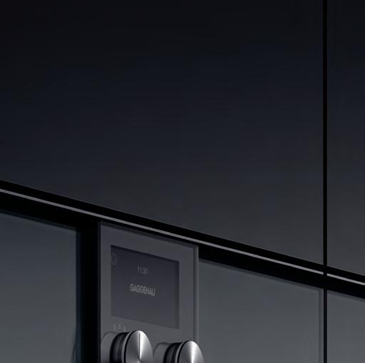
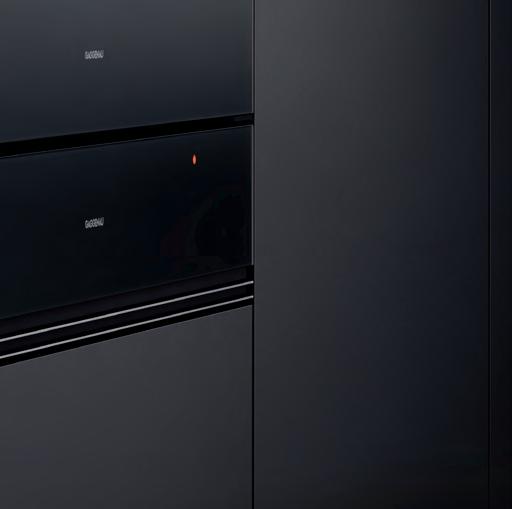
Top Cooling Finds From... Gaggenau Vario 400 Series

Indesign

INDESIGN 61 IN SHORT
Add To Cart!
Gaggenau
Vario Cooling 400 Fully integrated, built-in and modular series RY 492 504 Vario fridge-freezer combination 400: ice maker
RW 404 261 Vario wine climate cabinet 400: 2 climate zones
RW 466 364 Vario wine cabinet 400: 3 climate zones
RF 462 505 Vario freezer 400: ice and water dispenser
RC 462 504 Vario refrigeration 400: ice and water dispenser
City Scenter
London artist Michael Pinsky is subverting the association between bubbles and sheltered world views with his project Pollution Pods, a series of geodesic domes that reinforce concerns surrounding pollution through a complex combination of art and science. Each of the five pods replicates the air quality of a major city –London, New Delhi, Beijing, São Paulo and Tautra in Norway – to give visitors a tangible sense of what it’s like to live there. “People don’t change their behaviours or attitudes towards something unless they experience the effects of it,” says Pinsky.
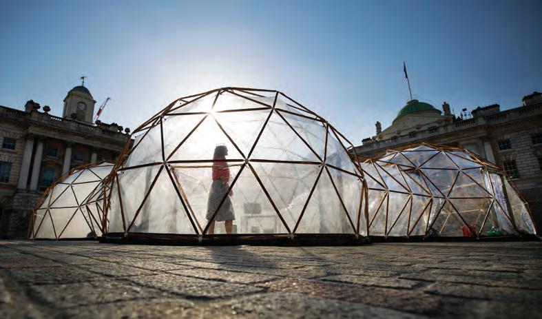
But the question still remains, is smell strong enough to change public sentiment?
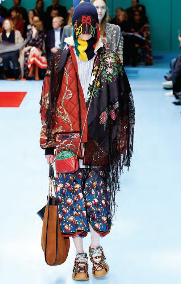
Is Compassion In Fashion?
Beyond the glitz and glam of product showcases, this year’s Milan Furniture Fair revealed a growing appetite for social responsibility among specifying designers and consumers alike. Ethical consumption was the question everyone was asking of the big design brands, and many were being judged harshly on their lack of transparency in this quarter.
But the ripples of dissension are only now washing over the interiors sector in any real way. The fashion sector has been in the firing line for some months now, the movement manifesting in a mass rejection of fur by couture houses Gucci (pictured left), John Galliano, Versace, Furla, DKNY, Michael Kors and Jimmy Choo. In the last 12 months, all have publicly announced they are going fur-free.
While some of this can be attributed to a domino effect, the first domino always tips for a reason and, considering the historically high yields for such materials, brands would not be making this shift if they didn’t think public sentiment would make it profitable.
As Gucci’s creative director, Alessandro Michele, told Business of Fashion in late 2017: “Fashion has always been about trends and emotions and anticipating the wishes and desires of consumers.”
Twitter’s response to Gucci’s announcement reveals just how doggedly we’re insisting on compassion as the new fashion, in turn reflecting wider hunger in the design industry for more transparent ethical practices.
INDESIGNLIVE.COM IN SHORT 62
Volume Control
Indesign Screenwood
When it comes to social spaces, acoustics can be the make or break of a well-functioning space. As such, acoustic performance came top of the list for the design of the Joondalup Resort Function Centre. Speci ers Christou Design looked to create a warm atmosphere which o ered the all-invisible acoustic comfort. Here they opted for Screenwood’s 3040 Western Red Cedar, a so yet stable species of wood that is ideal for complex custom panelling needs.
Supplying linear timber ceiling panels for the project, Screenwood also delivered its iconic acoustic backing for added sound control and performance. This trademark of Screenwood panels makes it a popular solution for hospitality situations as well as large function rooms like those at Joondalup.


Screenwood is made to order and supplied in pre nished, assembled modules, ready for a swi installation by any quali ed builder. Timbers are all PEFC certi ed and manufactured without adhesives, so that at the end of their long life, each component can be recycled for the future.
Kitchen Confidential
Indesign Smeg

Oasis In The O ce
Indesign Flokk
Notably delicate in form yet impressively sturdy in structure –these are the de ning qualities of O ecct’s Dune workplace seating solution by design studio, FRONT. The curving legs sprout upwards to support the asymmetrical seat, nishing in a lily pad-like formation of four table-tops. Looking to keep it fresh for the ever-changing dynamics of the modern workplace, O ecct likens this new seating solution to an oasis coming to life when used.
It was rst previewed in Milan in 2017 where it became a hot spot for relaxing, meeting and charging devices. Despite its seemingly light-weight modelling it can seat up to eight individuals, making it suitable for informal meetings and relaxed seating. A perfect ‘touch-down’ for some quality face-time.

As hospitality spaces open outwards to encompass more open plan layouts, commercial kitchen appliances must evolve to o er superior aesthetics as well as high level functionality. Smeg may be well known for world-class domestic kitchen appliances, but it has also forged an enviable reputation in professional catering equipment that’s equally noncompromising with regards to design, performance and aesthetics. Its range of professional dishwashers and cooking equipment is recognised worldwide for e ciency, reliability and style. It’s a direct re ection of just how invested Smeg is, in the design, engineering and manufacture of kitchen appliances for commercial use.
INDESIGN 63 IN SHORT
Stroke Of Genius
Indesign Polytec
Reaching Viral Heights
Bold, vibrant and daring, the Tehran-born designer India Mahdavi has been decades in practice, but shot to the viral heights of social media fame with Gallery at Sketch (aka: the most Instagrammed restaurant in London). Years on, we look back at Mahdavi’s project which both preceded and transcended the ‘Millennial Pink’ craze. It opened two years before Pantone named Rose Quartz 13-520 Colour of the Year. That same year it called the drunk-pink hue “a persuasive yet gentle tone that conveys passion and a sense of composure”. This is the exact sensibility that Mahdavi brings to all her projects (Chez Nina, Milan, pictured here). She chooses to forego passing fads like minimalism in favour of the more comforting, human potential of design. Her work stands out for its cocooning richness of colour and its plush, mollifying tangibility. And people are still talking about the now Insta-famous Gallery at Sketch. The New Yorker ’s Lauren Collins wrote in March: “In addition to inspiring imitators – in Seoul, in Doha, in Paris – it has become a stop on the style internet’s equivalent of the Camino de Santiago.” Have you made the pilgrimage yet?
India Mahdavi’s work reminds us that beyond our digital devices there’s always a place for colourful tangibility.
David Rockwell Talks Tapware
Indesign Abey Australia
When it comes to panelling, just how creative can you get? With solutions like STECCAWOOD, design vision knows no limits. This specially developed nish provides a warm and rich textural appearance for wall and ceiling applications in either a vertical or horizontal arrangement. Thanks to an array of pre nished decorative options, the creative application of directional lines can be used to striking e ect in commercial interiors. Made from E–Zero MDF and wrapped in decorative overlay, the battens conjure the realism, warmth and character of timber.
“Let me start by saying the true secret to most design is a great client. And so we worked with Gessi on the Inciso Collection. It essentially starts with the notion that the act of touching a piece of hardware is in fact an act of engagement. What intrigued me was that tapware engages the senses. We spend so much time on our phones and in virtual communities that the real world takes on less importance. So we found ways to take the product you expect to be fully round and create an incision (hence Inciso), that has a texture that is surprising to the touch and, to the eye, has a magic quality.” – David Rockwell at Gessi, Milan Furniture Fair 2018.
INDESIGNLIVE.COM IN SHORT 64
–
–
Architectural
Modular Design: Certified Timbers: Acoustic Solutions

Colliers
Email info@screenwood.com.au

Web www.screenwood.com.au
Tel 02 9521 7200
and Acoustic Linear Timber Systems
Specifier:
International |
Photo: Gallant Lee
Photography
Nice Threads!
Indesign Tait
The Phantom Thread principle of clean lines and hidden details might not be immediately reconcilable with the hard and more rigid world of furniture construction, but these two divergent disciplines are exactly what Australian designer Adam Cornish has combined in his rst collection for Tait, called Seam. “Although fabric and sheet metal seem worlds apart, the process used to construct shapes is surprisingly similar,” says Cornish.
The dining chair, for instance, has a shell formed and folded from a single sheet of aluminium, whose ends meet at the spine to form a single, elegant ‘seam’. Interestingly, that detail also allows for a natural drainage point – perfect for outdoor applications –and doubles as a handle for moving the chair.


The restrained, Modernist lines of this collection are accentuated by the steel construction. Perfectly pressed and moulded contours harmoniously blend into any space, and match comfortably with an expanded material palette that encompasses a timber leg option across chairs, stools and tables.
Informing Cornish’s design methodology is his fascination with the natural world where evolution and adaptation manifest through simpli cation and improvement. To this end, Seam comes in a rich, earthy colour palette that recalls Australian coastlines, terrains and ora.
Cooking Futures
Indesign ILVE


As kitchens become smarter and ever-more streamlined we see technology drawn into the functionality of almost every aspect of food preparation. Induction cooking is gaining in popularity thanks to the power and precision of its technology. Acknowledging this, ILVE has integrated both cooking functions into one clever appliance. ILVE’s VERSA cooktop is a clever combination of its Brass ‘in nity’ wok burner with a four zone induction cooktop. Using VERSA, cooks can now segue from low simmers, to the quick boils of induction, and high intensity heat of gas. It hits all the important points in terms of kitchen intelligence, versatile cooking, and a growing demand for greater functionality in single appliances.
INDESIGNLIVE.COM IN SHORT 66


A product designed by Cosentino ® On Top
TOPS ON TOP Feel the new velvety texture n Discover more at silestone.com | Follow Us F T VISIT OUR SHOWROOMS IN Adelaide | Brisbane | Melbourne | Perth | Sydney
Cindy Crawford on Silestone Eternal Calacatta Gold
Bethan Gray On Materialism
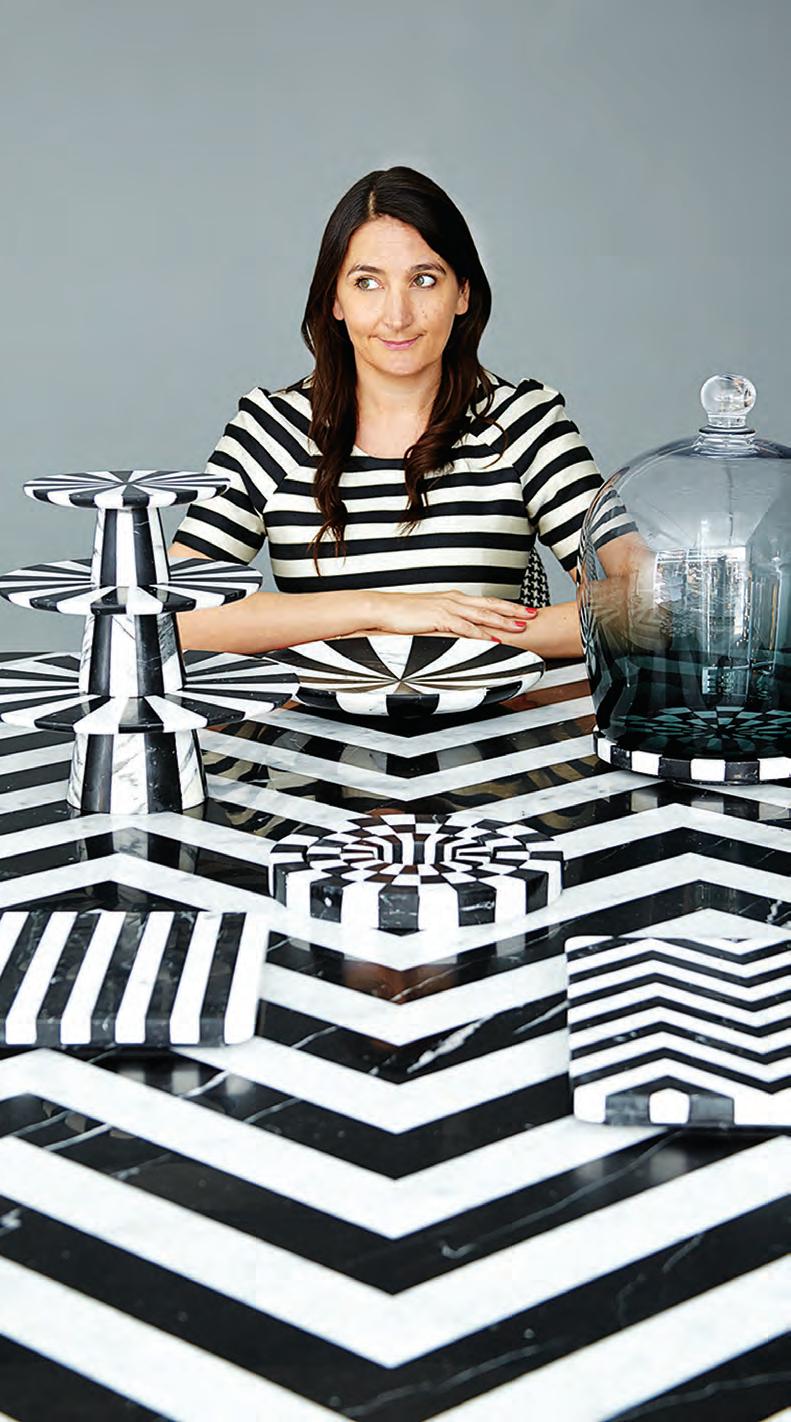
Bethan Gray is a self described materialist. Welsh-born and based in the UK, she first started out as a design director with furnishings retailer, Habitat. “I learned so much by working with craftspeople and small workshops, as well as huge factories,” she says. In setting up her own studio in 2008, Gray looked to “explore the feminine side” of her design practice. And while she doesn’t identify as a craftsperson specifically, she finds deep enjoyment in working with extraordinary makers and pushing the boundaries of their well-honed techniques.
Gray, whose designs are available in Australia through Living Edge, is drawn to the beauty of irregularity, inherent in handmade work. She points to the finegrained ribbing on her Victoria Tea Set, produced with Italian design connoisseurs Editions Milano. Here an interplay of thick and thin edging is created through hand carving. And thanks to its natural marble materiality, even without the intervention of the hand, no two pieces would ever be the same.
Deeply embedded within Gray’s materialist approach is her love of stories – the telling of which unfolds through her object design. The jaunty chevron of the Alice Collection for Editions Milano belie the intelligent engineering of spliced marble and impressively thin surfacing. The collection pays homage to the blackand-white stone configurations of the 9 th century Amalfi Cathedral located in Italy, and Switzerland’s 20 th century San Giovanni Battista.
In fusing materiality with highly technical craftsmanship and complex storytelling, Gray has found her creative calling.
INDESIGNLIVE.COM IN SHORT 68
Life Behind Bars
Imagine if, instead of buying whiskey from the refrigerated aisles of a liquor store, you could do it from the comfort of someone’s couch. HASSELL’s concept for The Proof Flat in Singapore was exactly this: a residential space that just happened to sell spirits. The ‘client’ was an imaginary character, EC Proof, the ctional ambassador of company Proof & Co. At every step, HASSELL principal Paul Semple says he was thinking about “what this guy was into, the kind of art he collected, what he liked to drink [and] how he liked to live”. The warmly lit, furniturelled apartment-slash-store is more than what you’d expect from either typology. Instead of putting products on display, HASSELL designed a hidden library, opened by pushing a secret button. As consumers come to expect the unexpected from everyday retail experiences, The Proof Flat exempli es the kinds of trumping surprises bricks-and-mortar can still achieve.

When An Icon Is Made


New designs come and go, but the making of an icon is a unique occurrence. The Airblade Wash + Dry tap-slash-hand dryer by Dyson may just be the next-in-line for life-altering designs. It stakes its claim on 21st century iconicism through the unprecedented merging of bathroom technologies.


Combining both tap and hand dryer in one sleek design, the Airblade Wash + Dry is more than just a lumping together of old bathroom xtures. The design uses digital pulse technology that spins up to three times faster than a conventional motor, e ectively ‘scraping’ water from hands in a gentle air motion.


“Dyson’s philosophy is to invent technology to solve problems that others seem to ignore,” says Dyson design manager, Will Darvill. “With the tap-format Dyson Airblade hand dryers, we wanted to take the product even further to solve the problems of water ending up on the oor, and the extra space needed for having separate handwashing and hand drying areas.”

INDESIGN 69 IN SHORT –
–
A plush apartment that also sells spirits. Can this be the new face of retail in Asia Pacific?
Add To Cart!
Top Product Finds From... Gibbon Group


INDESIGNLIVE.COM IN SHORT 70
Indesign Gibbon Group
Vision Brand Modulyss
Patchwork Brand Modulyss
Velvet& Brand Modulyss
Silver Birch Brand Tretford
Motion Brand Modulyss
On-Line 1 Brand Modulyss
Conversation Starters
Begin your event on the front foot. We’ve put together the top insider tips on the people, products and services on show at FRONT.
FRONT – desig N p R O duc T s . k N O w ledge
9-10 AUGUST 2018 CARRIAGEWORKS, SYDNEY www.front.design
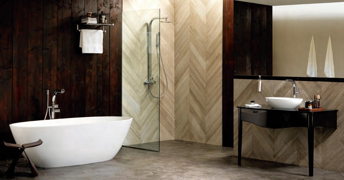
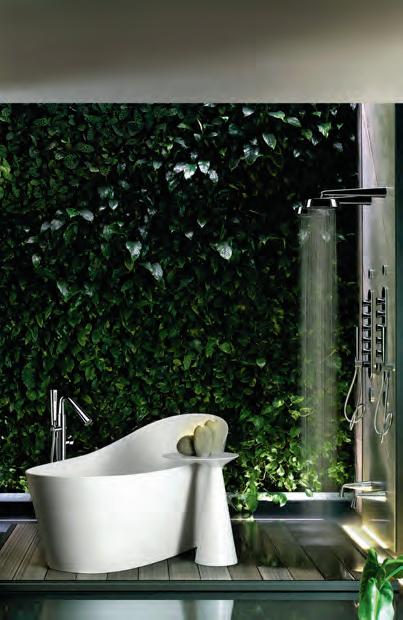
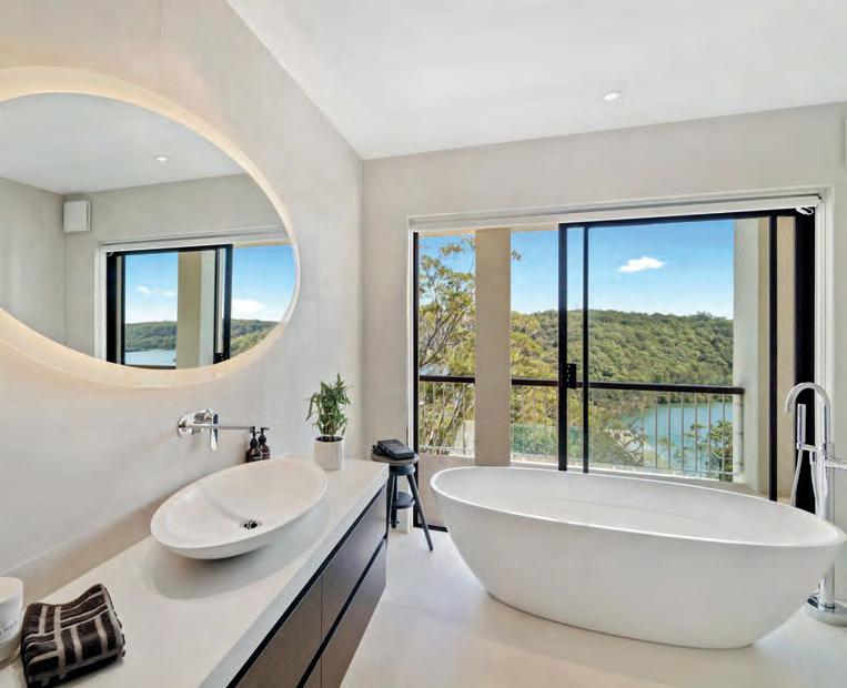
Bathing i n lu xury
FRONT x apaiser
Internationally recognised for the design and manufacture of luxurious bathware, apaiser works with leading A&D to enhance hotels, resorts, residential developments and private residences across the globe. apaiser takes a three-tiered approach to design with collections which encompass carefully curated pieces; made-to-measure pieces drawn from its collections; and bath couture which involves original, bespoke designs. With offices in Melbourne, Singapore, New York, London and Dubai, apaiser has supplied bathware for high-end and boutique hotels worldwide. Using revolutionary apaiserMARBLE® enriched with Australian minerals, each apaiser piece is hand-finished in specialised atelier workshops by its master people.
s weet li ght
FRONT x CBS
Specialists in ergonomic IT products, CBS presents Lolly, a personal desk light which gives power to the user through integrated USB ports. Lolly breaks new territory with USB-C charging capabilities, providing 50,000 hours of illumination. The lamp head can be angled to illuminate areas of focus, with a four-stage dimmer enabling variation in brightness. Easy to secure to any desk surface and fully recyclable.

Fast Flooring Facts
FRONT x Mafi
One of the most effective ways to address wellbeing, comfort and aesthetics within any space, is through the timber flooring you choose. Designed to subtly enhance your interiors, Mafi Natural Wood Flooring takes a healthful approach, offering improved indoor air quality thanks to its 100 per cent chemical-free, naturally oiled wood. Meanwhile, Kebony Decking and Cladding is a sustainable, durable outdoor wood finish that requires no maintenance beyond normal cleaning.
FRONT – desig N p R O duc T s . k N O w ledge.
72
3- d d e sign Vision

FRONT x Walter Knoll
Modern technology has changed the way we design. With graphic architecture software now the norm across the industry, the race to have the easiest yet most robust platform is on. At FRONT, Living Edge with Walter Knoll will be presenting the latest pCon suite of software that allows for intuitive, in depth 3-D room planning. pCon allows you to instantly create straightforward and detailed three dimensional floor plans. Regardless of whether you’re starting a new project from scratch or loading an existing plan, the intuitive software simply allows you to quickly edit and continue a project, and share with others.
Providing you with the ability to configure, plan, present and sell, pCon allows you to do everything from insert CAD furniture models, to producing final professional images of your project. 3-D planning just got interesting!
Beautiful And i n telligent
FRONT x Bolon
You don’t have to compromise on beauty to achieve a durable, healthy, sustainable flooring solution. For flooring design and manufacturer, Bolon, beauty in design doesn’t just relate to what’s on the surface. Complex functionalities are woven into the very essence of Bolon’s designer high-performance flooring. Underpinning this is Bolon’s firm belief that flooring is never truly beautiful unless it works perfectly. And it can never be totally functional, unless every detail is considered. Durable and designed to last, Bolon flooring is ideal for high intensity environments that see a lot of traffic. As opposed to traditional pile flooring that can trap in dust mites, mould and debris, Bolon is inherently hypoallergenic and antimicrobial, providing the perfect floor covering for healthy environments. Easy to clean and impervious to liquid and staining, Bolon flooring will remain for the life of the finish. Just as important is Bolon’s Environmental Stewardship Program which captures all manufacturing waste material to create a zerowaste product that is 100 per cent recyclable.
FRONT – desig N p R O duc T s . k N O w ledge.
9-10 AUGUST 2018 CARRIAGEWORKS, SYDNEY www.front.design
73
Future Vision For work ing
FRONT x TCW
What does the future of the workplace hold for us in 2019? TCW firmly believes in the power of furniture to influence workplace culture and enable better productivity and happiness among employees. “Despite technology being the primary focus of the future workplace, you still need a human centric environment with social connectivity and collaboration facilitated through great, industry-leading design,” says TCW director, Kasim Ali-Khan.
On show at FRONT, TCW offers us a fascinating insight into how technology, people and space will come together to shape new ways of working. Check out the exclusive launch of the Bosse Human Space Cube, the Allora range from Dauphin (pictured below), Teknion Zones Collection, and quirky products from LoOok Industries.
Fine Floor Art
FRONT x Tappeti
At Tappeti, a wealth of design expertise and artisanship underpins every beautiful rug it produces. As leading designers in textile rug design, Tappeti specialises in custom pieces manufactured for commercial, workplace and residential fit-outs.
More than just a flooring finish, Tappeti sees its rugs as superior handcrafted pieces of floor art that are fit-to-purpose. Connect with Tappeti at FRONT, where you can take a walk down the Tappeti runway. There will be plenty of fresh inspiration to be had in Tappeti’s custom designed display of global trends and textures.
Office workscape
FRONT x Herman Miller
Atlas Office Landscape heralds new heightadjustable horizons in working. Bringing imagination and intelligence to modern office planning, Atlas is the brainchild of Tim Wallace, who envisioned a heightadjustable solution that reflected the desking requirements of the 21st century. “The first issue is that so many sit-stand desks look like a piece of machinery rather than a piece of furniture,” says Wallace. “Whatever we came up with had to be something people would be happy to live with.” Designed with aesthetic and function in unison, Atlas desks can be easily configured and tuned to fit different spaces and different ways of working.
FRONT – desig N p R O duc T s . k N O w ledge. 74
d i ve i n to The d e tails
FRONT x Business Interiors
Specialists in the provision of complete furniture fit-outs, Business Interiors (BI) works closely with end users and design industry clients to deliver custom solutions that answer complex needs. Through extensive research and investigation, BI has acquired a groundswell of knowledge that feeds directly back into its clients. For those in professional services, BI can talk shop on space rationalisation and employee engagement and retention. Government sector clients can discuss issues of mobility, wellbeing and flexible workspaces; while industrial industry specialists can go in-depth on details of cost, delivery, ergonomics and longevity in rigorous environments. BI also caters to the education sector with consideration given to impacts of furniture fit-outs on teaching and technology integration.
New c oncepts For c ommercial Fit-Outs
FRONT x Designer Rugs
With over 30 years’ experience in quality, custom-made rugs and carpet, Designer Rugs is always eager to try new ideas and concepts. “Our ability to adapt to client expectations and work within commercial requirements is second to none,” says managing director, Yosi Tal. Recent projects include PwC Sydney by Futurespace. Here, rugs were crucial to defining spaces. Colour, scale, materials and pile heights all came into play. Pictured below, a large circular rug has been used to mirror the striking overhead architectural feature. “We understand that design can add strength and support businesses, and our designers excel at fitting to the brand language of our clients through unique design,” says Tal.
s e nsory s ho wering
FRONT x Methven
Explore new evolutions in modern showering with designer-manufacturer Methven. Among its new releases is the Turoa VJet which uses cleverly hidden channels to create spirals of water, precisely released through individual nozzles. A smooth slider allows for a seamless transition from a firm, invigorating spray to a gentle, enveloping warmth.
The Aio Aurajet, with its stunning fan of luxuriously dense droplets, delivers a highly efficient shower with 20 per cent more spray force and two times the water coverage. Continuing the unique halo shaped design is the Rua Aurajet, a soft geometric styled Aurajet. Like the Aio, the Rua Aurajet offers a more invigorating and luxurious showering experience, while providing high water efficiency, thanks to its 4 Star WELS rating.

FRONT – desig N p R O duc T s . k N O w ledge. 9-10 AUGUST 2018 CARRIAGEWORKS, SYDNEY www.front.design 75
Best inclass
FRONT x Own World
“We spend half our lives waiting,” says designer Carlos Tiscar. “It is said that waiting times can amount to a couple of years out of our entire lives.” If this is the case, why not wait in style and comfort? The Lapse from Inclass is a comprehensive modular seating system of numerous elements and accessories. Endless configurations transform waiting areas into spaces for interaction and thought exchange.
i lluminating Tapware
FRONT x Sussex
In a globally connected world, local design and manufacturing has never been more important to Australia’s design scene. Sussex’s creative director, Vanessa Katsanevakis, with husband and managing director, George Katsanevakis, know this and channel it into their brand philosophy. Sussex designs and manufactures its range of high-end tapware from its very own workshop in Melbourne, where every step of the production process is performed by local workers. “We are the only Australian tapware manufacturer still making all its products in Australia, giving us a much greater ability to embed sustainability at every step of the process,” says Vanessa. For Sussex today, customisation and the expression of individual tastes are exciting motivators for continued innovation.
New ways To wo rk
FRONT x SeehoSu
Since launching in 2010, SeehoSu has been a beloved part of the local design community. Now eight years on, SeehoSu expands its portfolio of elegant and discerning products to launch SeehoSu Worklife – a curated range of furniture and solutions representing the latest in technology and sustainability. Continuing SeehoSu’s passion for craftsmanship and design pedigree, Worklife encapsulates a deep understanding of the workplace and how best to navigate it. View the locally made HOST workstation system, which intuitively incorporates intelligent software and technology for modern work environments.
FRONT – desig N p R O duc T s . k N O w ledge. 9-10 AUGUST 2018 CARRIAGEWORKS, SYDNEY www.front.design
76
BY CHRISTINE SCHWARZER

FLOWER G2/197 YOUNG STREET WATERLOO 02 7900 9431 I trade@cubencircle.com.au cubencircle.com.au MADE IN SWEDEN PRODUCT BY SWEDESE
A BIG THANK YOU TO EVERYONE WHO SUPPORTED DANCE FOR LIFE 2018 — CIRCUS.
Every time we put this event on we are overwhelmed with the support we receive from our amazing sponsors, our favourite charity ReachOut and the rest of the industry who jump on board.
And to all the phenomenal designers who are already so time poor yet take this challenge head on with the choreography, crazy costumes, social media competitions and all the fundraising that goes along with it — thank you.
We have started to work on DFL 2020 which we will launch next year. It is going to be big and we will need all of you once again to pull it off.
—
Drop us a line if you would like to be a part of DFL 2020 info@dfl-danceforlife.com
www.dfl-danceforlife.com
Big thinkers and C r eati V e gU rUs
INDESIGN 79 IN Famous FAMOUS IN
Head In The Clouds
Itsy bitsy airplane luxury – why do we love it so much? Buzz takes the essence of high end brands and reimagines it into a ‘signature moment’ that only happens when you’re 30,000 feet above earth.
INDESIGN 81 IN Famous
Words Aleesha Callahan Portrait Photography Elizabeth Bull
Opposite and page 85: Design director, Karen Webster, and co-founder, Leonard Hamersfeld, at Buzz’s Abbotsford studio in Melbourne. Page 82-84: The Alessi for Delta project, photos: Scott Newett, courtesy of Buzz.
Same Same But Different
One of the challenges of adapting a brand’s products for the airline industry is maintaining its essence while still meeting strict size and weight requirements. For the Alessi for Delta Airlines project, this meant producing the heart-shaped teaspoon in plastic, while the glassware needed to fit perfectly on the trays. It still looks and feels like Alessi, but it is cleverly modified for a new purpose.
–
When travelling first and business class, extra details are added to make that experience even more delightful. For most, the extra legroom is enough. But beyond just being able to lie horizontally, business and first class passengers are treated to a selection of specially designed products to elevate the aviation experience.
Service ware, cutlery, pyjamas and amenity kits – these are the finishing touches that divide the classes in airline travel. And depending on which airline you choose to travel, you will see a variety of luxury brands collaborating on those products. What you may not realise is that behind the scenes there is an Australian company that designs and manufactures those products. Enter Buzz.
Founded by Leonard Hamersfeld and Barry Gold over 19 years ago, Buzz has been quietly transforming the travel industry. Some of the recent stand-out examples of the company’s work include Alessi for Delta’s serving-ware, an injection-moulded amenity kit with Swedish cult favourite Byredo for Emirates, and the ongoing Qantas Curates kits, which feature a cache of Australian artists.
Elaborating on the role of being a ‘middleman’ between a design house and an airline, Hamersfeld explains, “Airline products have traditionally been commodities, and we’re bringing design thinking to the skies. We find the most amazing design houses that fit for the airline we’re working with and we bring them together.”
It’s not a matter of just doing a quick-slap logo, or dodgy replica. To get the most authentic outcome requires true collaboration. “We work hand-in-hand with the design company and we collaborate on the product designs, the process… everything. We make it fit–for-purpose for the airline space. For example, we make sure that the products’ weight, strength and size is right, so that it fits on the tray, in the trolleys and is stackable. There are a million things to consider. One of our guys actually spent a month travelling on planes just to do the testing for the Alessi range,” explains Hamersfeld.
Karen Webster, design director at Buzz, reiterates the importance of these considerations: “We have to make sure we don’t, in any way, sacrifice the design or the quality when adapting a product. But for an airline, weight is absolutely vital.”
Aside from the technical requirements, part of Buzz’s role is to add something unexpected to the travel experience. Considering that airline travel is now commonplace, it could be argued that
the glamour is all but gone. Rather than its disappearance though, Webster and Hamersfeld consider it a new kind of glamour. It’s luxury for the 21 st century.
“We hope that when people get on the plane and see this little bag it takes their breath away. And if they actually say, ‘I didn’t expect that’ or ‘It’s more than I expected’, then we’ve done a great job. We’ve added a touch of magic,” says Webster.
For Hamersfeld, it’s about offering a modern type of luxury, which isn’t bound by scale or even price, but is shaped by narrative. “Luxury takes many forms and it’s not just about the product. I think it’s about the story you’re telling. I think modern luxury is really about something that is limited edition, inaccessible. And at the end of the day, it’s about how it makes you feel.”
The limited edition nature of the kits automatically makes them collectible. And in many cases the miniature products are unique, in that they’ve been developed with travel in mind – think crease release sprays for your clothes, pillow mists, sleep oils and hydrating eye creams. “We do special edition skin care products that you don’t get at retail so they become very aspirational,” says Webster.
When talking about the hospitality ecosystem around travel, Hamersfeld says: “We don’t drive the service, more the product around the service, so I wouldn’t describe us as being in the hospitality sector. But we do add little bits of delight into all the touch points of travel, of which hospitality and food are a part. But it’s really about adding something to the whole travel journey.”
For a company that’s headquartered in a country which many would deem too isolated, Buzz has proven that distance knows no bounds.
“Actually one of the interesting things is that we’re so far away but we’re the largest supplier to the three main American airlines. Which has a message there for designers, that we’re not isolated anymore, in fact, in a sense we can operate as part of China,” says Hamersfeld.
And Buzz’s investment in design is helping to fuel Australia as a creative hub: “I don’t know many Australian companies that have more than 20 people in the design team. I come from a fashion background and even the really large-scale groups aren’t investing in design like [Buzz] is,” says Webster.
buzzproducts.com
INDESIGN 85 IN Famous
The Lateral Thinker
Words Paul McGillick Portrait Photography Michele Aboud
INDESIGN Luminary
Mark Landini is not a man to mince his words. His relationship with retail design is one of practicality and inventiveness. Because there’s no room for ‘experiential’ and ‘fashionable’ design when you’re faced with fickle consumers and a booming e-retail economy.
You might have a sentimental attachment to the 19 th century Paris arcade, but retail design – the mix of interior and graphic design – is, says Mark Landini, a relatively new phenomenon. He should know because he’s been there almost since the beginning.
Italian in origin but English by upbringing, Landini became a musician after graduating from Middlesex Polytechnic. But when that “went up in flames” he took a job with Fitch and Co. Rodney Fitch had only recently parted ways with Terence Conran to set up his own business and it was Fitch, says Landini, “who invented retail design as we know it today”.
When Landini joined the company in 1980 at age 22 there were just 15 people. When he left at the end of 1989 he was creative director of retail globally and there were 600 staff with the company, which was on the way to being the biggest design firm in the world.
Ironically, Landini then joined Terence Conran. “I admired Conran because he had invented Habitat and he was a lover of simplicity which was my thing as well. He said he would give me the job of creative director which was interesting to me because it meant I could get involved in things beyond retail. At that time they were designing airports, shopping centres, corporate identity, packaging, print, even the product they sold from the shops,” says Landini
Landini only accepted the job on the basis that he could be a designer and run his own team within the group. The problem, however, was that he found himself working 20-hour days for
nearly three years. Then almost overnight the mid-90s economic crash arrived. The company was bleeding money. It was sold twice before Landini was offered, and accepted, the CEO position. He turned the business around, “but what I learned was that I didn’t want to work on a company, just in a company”.
These early influences, including exposure to the Pentagram model, shape Landini’s approach to this day. “I’ve never been interested in having a large business. The lesson I learned was that I don’t want to work 20 hours a day. I want to work eight. So, our business has never grown beyond me being able to work eight hours a day. It has never grown beyond me being able to work on every single project and never being interested in anything other than quality. We’re not interested in turn-over. Turnover is vanity, profit, sanity. We’re not interested in growth for growth’s sake. We reached this size (20-25 people), quite quickly and we’ve never wanted to grow beyond it.”
The legendary Pentagram confirmed Landini’s belief in teams, none bigger than 10 and with a mix of senior and junior staff, retail, interior and graphic designers with each team responsible for projects from the beginning to the end. Senior partners ran the groups supported by a very lean back-of-house. “It meant,” says Landini, “that people in their sixties could still be leading the design. I was impressed by the efficiency with senior people actually running and working in the business as opposed to on the business.” He adds that he has people on his staff now who have been at Landini Associates for over 20 years.
INDESIGNLIVE.COM IN Fa M O u S 86

“Retail Is Not About Fashion”
Mark Landini dislikes fashion and anyone who calls themselves an experiential designer. Describing himself as an inventor and re-inventor of retail brands, he has been in retail design almost since its inception. He likes to keep things small, simple and work an eight-hour day – none of which has stopped him building an impressive international profile.
–
In late 1992, his contract with Conran was coming to an end and he came to Australia looking to buy a design company. This ultimately fell through and one night he found himself waist-deep in the water in front the Bathers Pavilion at Sydney’s Balmoral Beach at 1am in the morning. “I got my brick of a mobile phone,” he says, “and phoned my wife and said I had discovered paradise.”
From convincing Liquorland to re-brand its retail outlets in 1993, creating Vintage Cellars, Landini Associates has built a stunning portfolio “inventing and re-inventing retail brands”; a business which extends beyond Australia to include projects such as the award-winning Loblaws in Toronto, Canada where the brief had been to design the world’s best supermarket. This experience also led to The Kitchens at Robina on the Sunshine Coast, and David Jones’ food hall at Bondi Junction in Sydney, highlighting how food can drive customers to large retail centres.
The internet era has thrown up new challenges. “In the past,” says Landini, “you would look at what had been done and try to improve on it. But the internet has changed everything. There are no rules. You actually have to invent new forms of bricks and mortar retailing that complement what’s happening on the internet.” He cites the recent make-over of mass market women’s clothing retailer, Glassons. People, he says, describe it as very easy to use, very ordered – like being online. “In the age of the internet most designers will talk about pop-up shops and experiential design. I hate anyone who calls themselves an experiential designer – as if the Sistine Chapel isn’t an experience and as if what Mr Selfridge did 100 years ago wasn’t an experience. How did we survive all these years without experiential designers?”
It is, he says, about combining naïveté, information, the ability to think laterally, to be fresh all the time and wanting to do things new.
Landini describes the company as being very operationally driven, very practical. “We don’t do stuff that’s fashionable – we hate fashion.” Retail design, he says, is about making things work, a lesson learned from Conran, pointing out that few designers ever actually work in retail as he does.
“If you ever want a fashion shop designed,” he says, “never employ a designer [whose portfolio] has photographs of their work without any clothes in the shop. And why is that? Because the shop they have designed is more important than the merchandise they sell or because it looks [awful] when you put the merchandise in it.
“We’re very practical people. Very brave, I think. We’re logical and we don’t do things that are fashionable – because fashion isn’t a thing we sell. Glassons’ shop isn’t fashionable. It’s a neutral backdrop, but it’s very recognisably neutral.”
Final thoughts?
“Too many people take themselves too seriously in design. I take the job of design very seriously, but I don’t take myself too seriously. Nor am I scared to ask questions I think may be stupid. I’ve always been intolerant of mediocrity, laziness and lazy thinking.”
And keeping the company fresh?
“We have something called the barbecue test: only work with people you would have a barbecue with because the work requires you to open yourself up in the way that you would over a barbecue. So, we only employ people who pass the barbecue test. Often their portfolio [may not be] that great, but their approach is right.”
landiniassociates.com
INDESIGNLIVE.COM IN Fa M O u S 90
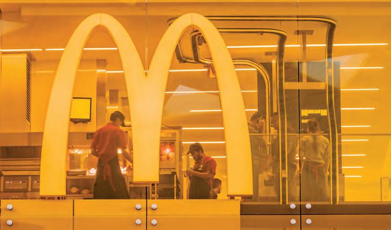
Page 87: “I take the job of design very seriously, but I don’t take myself too seriously,” says Mark Landini. Page 88-89: Food is instrumental in driving customers to large retail centres, says Landini. Here, the David Jones Food Hall by Landini Associates, photo: Trevor Mein.
Above: Retail design isn’t about fashion, it’s about making things work – McDonald’s at Sydney Airport by Landini Associates, photo: Trevor Mein.
IF WOOD FOLDED LIKE PAPER ... STUDIO FLOC Studio Showroom 4 Shorts Place, Geelong VIC 3220 | 03 9088 3389 | www.flocstudio.com.au MONO BAR STOOL
Cecilie Manz
“Design is not just colours and texture and how it looks – the flashy outside. It’s about what comes from within, the technical detail that is so clever... and showing the process and hardwork behind the design.”
Designer and founder, Cecilie Manz Studio.
 In conversation with Indesign at Bang & Olufsen, Milan Furniture Fair 2018,
photo: Casper Sejersen
In conversation with Indesign at Bang & Olufsen, Milan Furniture Fair 2018,
photo: Casper Sejersen
in D ES i G n X W I l k HAHN
People expect a lot from Wilkhahn. And having just celebrated its 111th anniversary, it’s not hard to see why. Wilkhahn remains one of contemporary design’s most unflappable brands, continuing to innovate year upon year for more than a century. As a leader in the global commercial furniture industry, the brand welcomes two new additions to its exhaustive portfolio: the mAx Table and the Aula Chair.
Designed by Wolfgang C.R. Mezger, Wilkhahn’s Aula Chair is a stackable, multi-purpose addition to the Australian commercial sector’s demand for flexible design solutions. Taking plastics to a new horizon of functional and aesthetic profiles, Aula’s delicate lines and precise sculptural form offers designers an immensely movable and space-conscious alternative to generally monopurpose ergonomic seating. Available in up to six colourways and four upholstered options, Aula’s seamless structure offers a high degree of sacral and lumbar support to ensure that Australia’s workforce is as healthy as it is productive.
Meanwhile the brand’s mAx Table – designed by Andreas Störiko – reinterprets the relationship between users and their tools. No longer seeking to fit the body to the workstation, mAx’s
self-stabilising functionality responds to user movement and need intuitively. As a folding table system, mAx’s vital, essential form offers the commercial sector a truly flexible and multi-purpose option to a variety of worker needs and behaviours. In response to local demands for more amenable furniture to break out zones, end of trip facilities and impromptu collaboration hubs, mAx’s T-shaped foot section ensures sturdiness and durability across a mix of applications. When coupled with with mAx’s variety of table depths and forms, the system can be arranged in loose configurations or linked together for more uniform continuity.
Thanks to the establishment of Wilkhahn Asia Pacific – the brand’s full-scale operation responsible for locally manufacturing Wilkhahn products for the Asia market, initially developed in Germany – an approximate eighty per cent of Wilkhahn product supplied to the region is hails from their state-of-the-art facilities in Riverwood, Australia. Having achieved this significant milestone, Wilkhahn now looks forward to operating its complete network of service centres in Asia Pacific – realising new methods for lead time reduction and a truly responsive service model to all local markets throughout the region.
livingedge.com.au living edge 94 wilkhahn.com.au w il khahn 94
Stackable Aula Chairs and foldable mAx Tables offer a greater degree of flexibility in space.
Wilkhahn Asia Pacific bring us a new frontier of flexibility.
Dream Catcher, Memory Maker
Words Narella Yabuka Photography Various
Hélène Dubrule is the orchestrator of impeccably designed objects, and the alchemist of installations that host visitors with encounters of detail and immersion. With Hermès Maison as her platform, she has established a highly personal relationship with consumers.

There are experiences that leave a fleeting impression, being quickly dissolved from the memory. And there are those that resonate within you for extended periods, forged from impressions with the power to deeply affect. This is the holy grail of brands at events such as Milan Design Week, in which the eyes and bodies but also the minds and hearts of multitudes of design seekers are the prize in an increasingly crowded, competitive and Instagrammed Salone and Fuorisalone landscape.
Hermès resonated well above this year’s noise with characteristic precision and wit. The colourful Hermès Collections for the Home 2018-2019 were unveiled at the Museo della Permanente in one of the most remarkable and discussed presentations of the week. Visitors were hosted – like travellers through a watercolour dreamscape – in a cluster of seven pavilions, each bearing a supple
skin of handcrafted Moroccan zellige tiles of glazed clay in singular colour applications. Light brought the undulating tile surfaces to life with shimmering reflections that caused colours to bleed and blend. Objects were presented in dialogue with the monumental architecture through theatrical plinths and reflections.
The objects themselves took the overriding theme of colour, being rendered in blues, reds, yellows and greens – and mixtures thereof – and in designs drawn from elements from the urban and natural landscape. Contemplative, dream-like text from artist and poet Jean-Luc Parant accompanied the collections with contemplation of encounters of the eyes and body, and the experience of the world.
Chief alchemist in this mesmerising scenario was Hélène Dubrule, the general manager of Hermès Maison since 2009, and the orchestrator of the brand’s thoroughly revitalised
INDESIGN 95 IN Famous
Swimming In Colour
The Hermès pavilions at the Museo della Permanente absorbed and immersed you in overlapping microcosms of colour, light and reflection. They captured a contemplative, engaged, dream-like and very personal state-of-mind with an architecture and scenography that immersed thoughts and bodies.
–
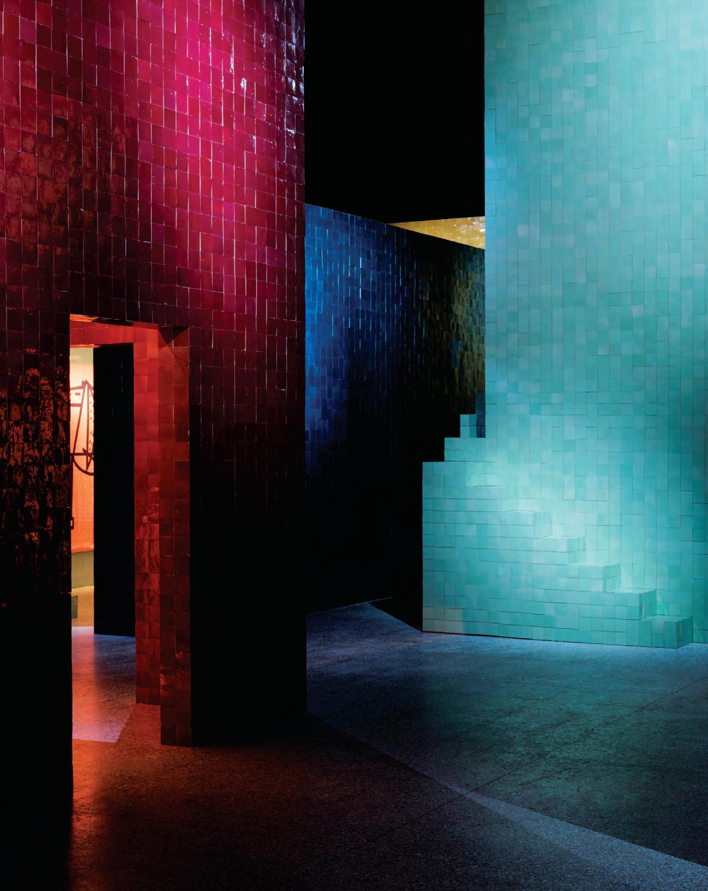
“At Hermès, we want to show fantasy, sensation and emotion –and emotion is a matter of experience, of storytelling, of imagination.”
Hélène Dubrule, general manager, Hermès Maison.
furniture and furnishing fabric collections. “I hope visitors to the pavilion will feel immersed,” she said during a media preview at La Permanente, zeroing in on the quality that gave the installation its affective power. “At Hermès, we want to show fantasy, sensation and emotion – and emotion is a matter of experience, of storytelling, of imagination.”
Dubrule entered the house of Hermès in 2002 as international marketing director of the perfume division, but in 2006 she was nominated general manager of the historical silk métiers (business). There, pre-empting the influence she would later have on the furniture, object, textile and wallpaper collections, she stimulated a fresh creativity and brought new ideas to the image and communication of the iconic Hermès carrés (squares, or scarves) and ties.
In 2010, her influence on Hermès Maison began to emerge with the reissue of a furniture range, designed for the brand by French modernist interior designer Jean-Michel Frank back in the 1920s. “We came back to the source and then we launched contemporary collections,” explains Dubrule. “We also brought a new vision to a collection that was launched in the 1980s, and renewed our overall artistic direction with the appointment of deputy artistic directors Charlotte Macaux Perelman and Alexis Fabry. We launched a new collection of furnishing fabrics and wallpapers, and we renewed all the objects of art de vivre.”
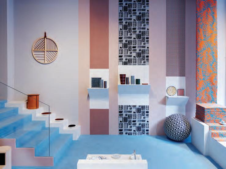
Collaborations with well-known names (such as Shigeru Ban, Antonio Citterio, Alvaro Siza, Philippe Nigro and Barber & Osgerby) since 2011 have contributed to the transformative spirit set in place
by Dubrule for the Hermès Maison universe, which has expanded extraordinarily in scope each year. “The complexity of my job arises with the diversity of our universe. So collective intelligence is crucial,” she acknowledges. “The key is to surround ourselves with the best team, whether it is in creation, sourcing or production. Human talent is what counts most.”
What has consistently emerged in the object collections since 2010, and what has become a staple of Hermès’ appearance in Milan, is a jolting intimacy within the Design Week rush – a human-focused experience that demands pause, contemplation and an investment of time. These presentations create the conditions for encounters that are highly personal, and in so doing, are deeply affecting. “Every year we like to host and display our objects in a home – in the idea of a home. It’s not a real home, it’s a dream home – an allegory of the house,” Dubrule explains of the unique approach that she leads for spatially driven brand experience in response to what is an increasingly a heady week in Milan.
It is an approach that has grown from a thorough understanding of the very essence of the brand. “Hermès is not only a fashion house and a maker of objects. It is not simply about look and style. It is a way of being; a way of life,” she says. “We step into the most intimate spaces in the lives of our clients. It is a special relationship related to hosting, to wellbeing, and to time.”
hermes.com
INDESIGN 99 IN Famous
Page 95: Hélène Dubrule of Hermès Maison, photo: © Carole Bellaiche. Page 96-98: The 2018 Hermès pavilions in Milan designed by Charlotte Macau Perelman with Alexis Fabry, with scenography designed by Hervé Sauvage, photos: © François Lacour/Hermès 2018. Above: The collection was also presented in the brand’s Milan showroom, photo: © François Lacour/Hermès 2018.
Pure LooP Maxi
DesigneD by CLaus breinhoLt for infiniti Design.
www.infinitidesign.it info@infiniti-design.com.au
I n D es I G n X C A Es A r sT on E
The three new designs from Caesarstone are a part of the Metropolitan Collection – a first of its kind range for quartz surfaces. With authentic, robust, industrial-inspired designs, the collection is rough, tough and unpolished, giving a uniquely weathered pattern that is equally at home in residential and commercial spaces.
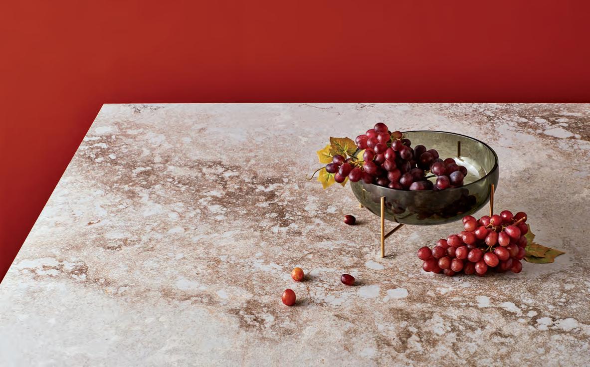
Airy Concrete, the first of the three finishes, is designed to respond to today’s trend for a versatile light colour that is rich in its tonality. Minimalist yet bold, the airy textures of the surface are enriched by dark grey and white tones. An authentic rough concrete finish has been refined for the home, providing the true feel of concrete while maintaining the easy care synonymous with all Caesarstone products.
Airy Concrete is versatile enough to accompany all shades of timber, tiles or slate. Black oiled oak can introduce a very contemporary perspective to flooring. Matte brass fitt i ngs will further elevate the benchtop with an element of style, often in brushed or hammered finishes.
Inspired by topological strata, the Topus Concrete finish
combines mineral formations found in nature with the rugged patinas of industrial materials. With a gentle hint of warm pink, its blush undertones echo the pastel hues popular in the interiors market today.
Topus Concrete is ideal for use with neutral or off-white walls, and paired with stained parquet or grey tiles. Cabinets can be made to complement with plain creams and putty hues or contrasted with dark timbers and black elements.
Excava is a premium finish characterized by the intriguing patinas of casting and oxidising, combining the authentic features of rust and concrete. Its beauty reflects t he geological decay of stone, weathered by time and nature. This material’s dramatic visual presence makes it especially impressive for use in hospitality, or for residential kitchens with an urban edge.
“The new 2018 colours are created with a view towards upcoming trends and our vision of consistently meeting and anticipating different interior design schemes and palates,” says Eli Feiglin, Caesarstone’s vice president of marketing. “They represent our steadily evolving journey as leaders in premium surfaces.”
livingedge.com.au living edge 102 caesarstone.com.au c aes arstone 102
Continuing and new lines for the Metropolitan Collection are available throughout Australia thanks to Caesarstone, photo: New 2018 Design - Excava™ 4046, courtesy of Caesarstone.
Caesarstone has launched three new surface finishes for 2018 that feel enticingly textural and raw yet highly refined.
Provocative, radical & e N er G i S i N G de S i GN
INDESIGN 103 IN SITU Situ i N
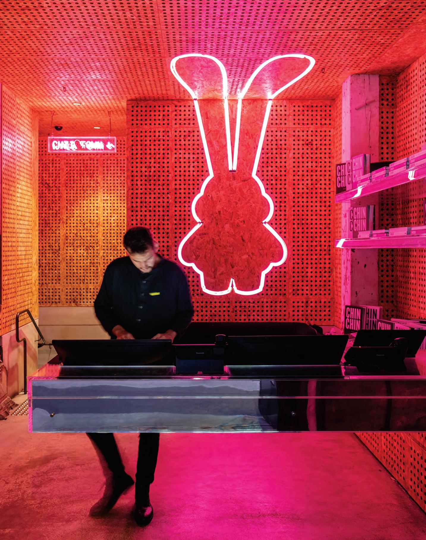
With millions of restaurants quite literally at diners’ fingertips, the hospitality stakes are high. So, how do you stand out in the crowd? Chin Chin shows us that a little attitude can go a long way.
Punk On A Plate
Chin Chin, Sydney by George Livissianis
Words David Congram Photography Tom Ferguson
Opposite: Neon cartoons and untreated chipboard pack a punch. Page 106: Kitchens are proudly on display, adding to the atmosphere. Page 107: Roof sarking anyone? Chin Chin reinterprets the chrome and pink leitmotif throughout its various spaces. Page 108-109: Indulgence takes a naughty turn in the moody cocktail bar, featuring artworks by Simon Bernhardt. Page 110: Heritage architectural details are showcased alongside custom furniture to communicate the nuance and complexity of the Chin Chin brand.
INDESIGN 105 IN SITU
“Having already established a following and a great asset in Melbourne, it’s clear that Chin Chin has an appeal that stretches beyond food or service, branching out into a cultural arena where it now creates entirely new bonds with consumers.”
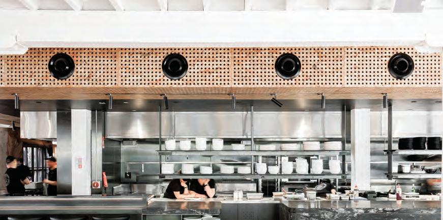
Personal disclaimer: I was stared down by a gimp in a gas mask during one of the best meals I have ever tasted. For many, such defiant ogling does wonders to kill an appetite. And for many more, digestion is the last thing on the mind when met with all the leather and whips of Tom Of Finland fame. But for thousands – myself included – a brief ‘qu’est ce que c’est? ’ (what is it?) is immediately fastened to ‘menu please!’
And Chin Chin, one of the country’s most successful restaurant brands, wouldn’t have it any other way. This very quality – the clash –is not just a playlist staple, but the be-all and end-all of the Chin Chin ethos itself. It’s a world where portraits of gimps and dominatrices are hung like family portraits; a world where New Order’s brooding dark-wave synths stand in stark contrast to blush-toned furniture upholstered with duck feathers; where roof sarking is anywhere but the roof; and where a curry draws inspiration (and a name) from Soviet ballistic missiles.
“Chin Chin has always been a bit of a bad-boy-bad-girl – and is proud of it!” says interior architect George Livissianis. True to word, Chin Chin is more an attitude than a place, and since first opening doors in Melbourne in 2011 this attitude has triggered a watershed moment for Thai cuisine in Australia. Queues have not abated since.
Now the restaurant has a new set of digs in Sydney, located in the iconic Griffiths Teas flatiron. As the creative behind this pinkpunk blowout, Livissianis regales me with the trials and triumphs of designing spaces for a newly emerging hospitality culture where punters demand more than food from a menu. “Having already established a following and a great asset in Melbourne, it’s clear that Chin Chin has an appeal that stretches beyond food or service, branching out into a cultural arena where it now creates entirely new bonds with consumers,” he says.
Livissianis speaks of Chin Chin in ways not dissimilar to directors speaking of their films. His attention to drama, narrative and detail play out through every facet: “It’s not just the dishes themselves, but
the graphic treatment of the printed menus, the atmosphere of the room at lunch time as opposed to dinner, it’s the cartoon cookbook, the pink neon mascot, it’s the mirror-polished bar, the feathers and leathers. It’s about designing the conditions for a unique experience. And in this, the food is the hero.”
Earlier that morning, Chin Chin’s social media channels hinted at what I’d be in for: fetish wear and rabbits, drag queens and tattoos – an intensely choreographed imaginarium – a party not a meal. “As a designer, these influences are fantastic things to work with as part of a brief,” says Livissianis. “They influence every aspect of the procurement of furniture, surfaces, fixtures and beyond. For instance, that BDSM portrait is referenced through one of the chair’s mix of leathers, fabric, feathers and chrome.”
And like all good brands, Chin Chin has conquered the art of storytelling. Backed by the masters of stealing a scene with a good plot twist – restaurateurs Chris Lucas and John Kanis of The Lucas Group – one would expect nothing less. From the point of entry, the eye is coerced in various directions and the feet can’t help but follow. From a dark and naughty cocktail bar of exposed brick, timber and a symphony of velvets you soon find yourself in a whitewashed and rosy dining room baring its heritage masonry veneer with prideful abandon. Follow Debbie Harry’s voice bouncing off the perforated chipboard panelling in the restaurant interior, down the stairs, and you arrive in Chin Chin’s intimate function space where you’ll find two fingers being given to typical curtains and a thumbs-up to yards of thermoseal roof insulation instead.
“I think that even just putting the ply chipboard or roof sarking on display makes it fairly clear that Chin Chin isn’t interested in trends. We’re instead invested in authenticity.” Perhaps that’s Chin Chin’s greatest lesson – when there’s anarchy in the UX, only the inauthentic are the damned.
georgelivissianis.com
INDESIGNLIVE.COM 106 IN SITU
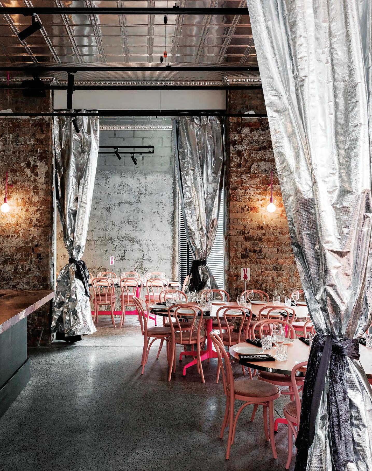
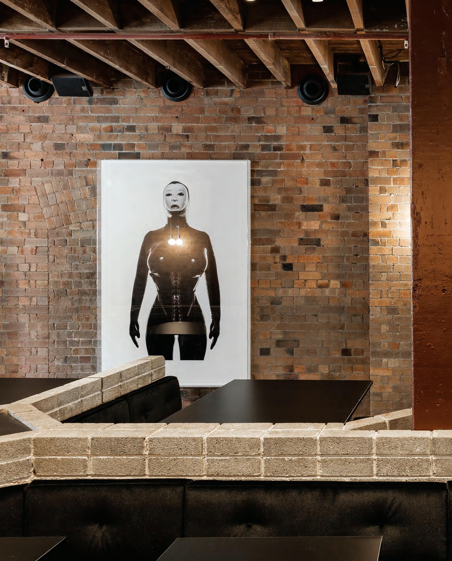
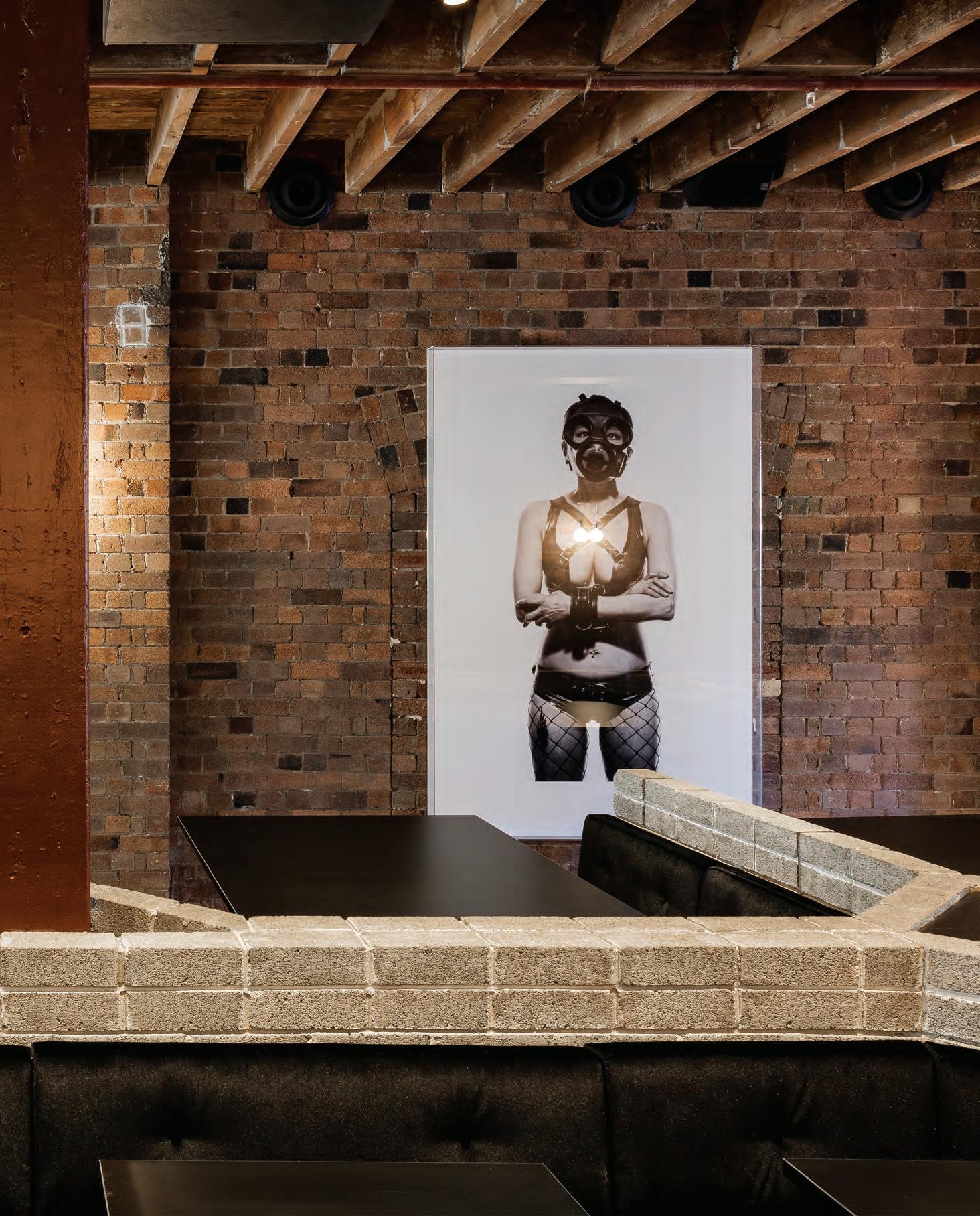
Invested In Authenticity
“The curation of tactile experiences here positions everything,” says interior architect, George Livissianis. “I wouldn’t say that the design is the biggest influence on the dining experience, but it is certainly the way we can take inspiration from the food and use it to create a whole world.”
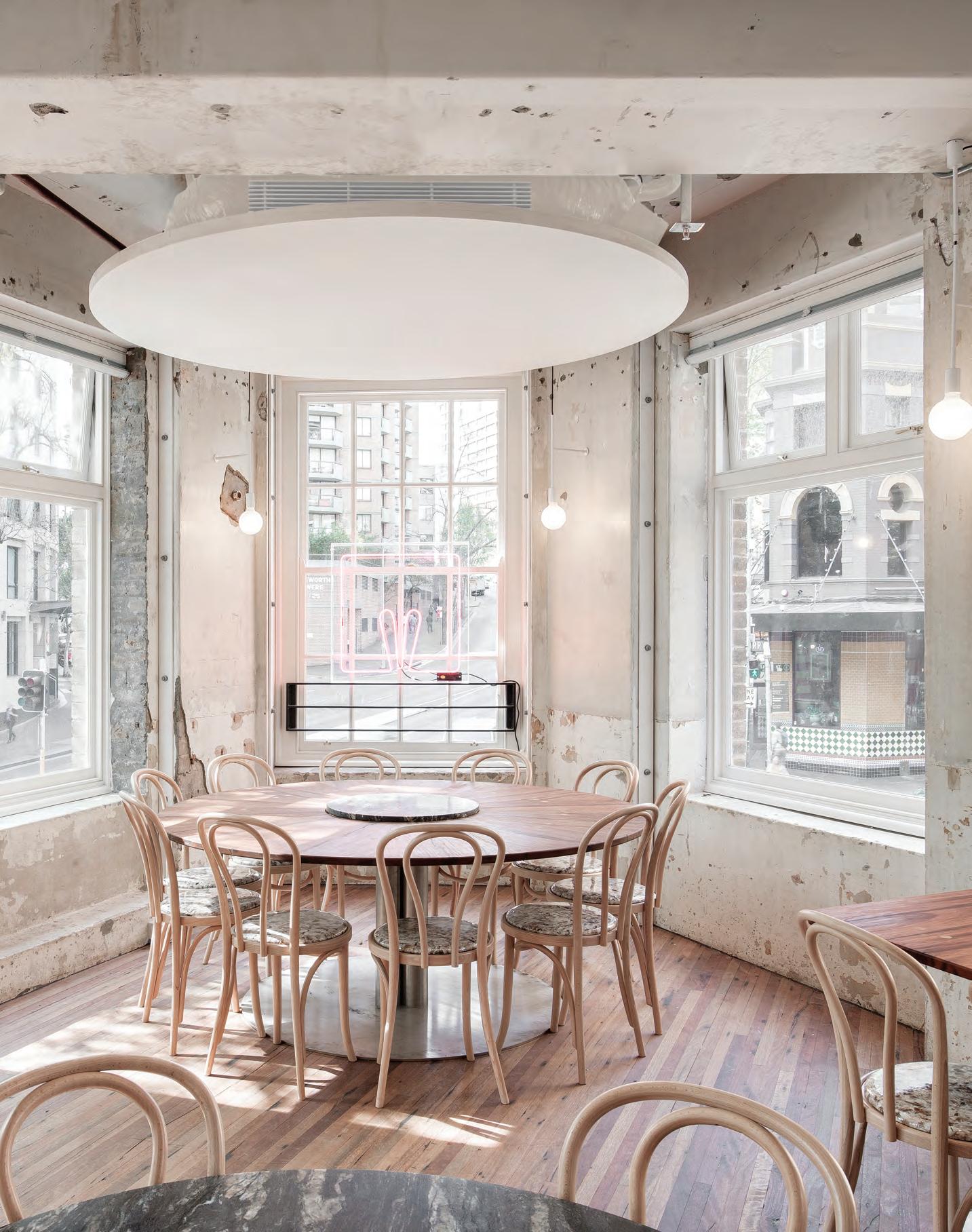
–
D es i G n X Bi LL i A N i
Well-formed and classic but with a cheeky twist, the newly launched My Chair by Billiani throws out the rule book. Previewed at the world’s biggest design fair, the Milan Furniture Fair, My Chair adds to Billiani’s ever-growing chair collection, while still managing to serve up something completely new and unexpected.
The designer who brought us the versatile Doll Chair, among many others in the Billiani collection, is behind My Chair – Emilio Nanni. As an architect, artist and designer, Nanni brings a unique perspective to his products, always gathering inspiration outside of the usual design tropes. And over many fruitful years, Nanni’s relationship with Billiani has continued to blossom, resulting in dozens of products.
As is to be expected from a cross-disciplinary designer, My Chair brings something completely new to the table through its quirky detailing. Rounded, turned timber legs feel playful and soft, while the thinly curved seat base, which can also be upholstered, adds to the delicate finesse overall. The most eye-catching element, however, is the connecting detail of the seat back to the round chair legs. “You can’t help but notice those characteristic sprouting ‘ears’! ”exclaims Nanni. Rather than trimming down the seat back sides, they have come to form the personality of the chair, along with a visible timber pin detail.
My Chair is unique and expertly detailed while its open back and stackability ensure that it’s perfect in both workplace and hospitality settings. The materiality is kept minimal and functional, with the original version made in Ash timber. Variations can then be made with either the seat base or back upholstered, or perhaps even both.
Celebrating the launch of My Chair in Milan this year, Billiani made it a centrepiece of an unexpected installation staged on its furniture stand.
Traditionally known for its vibrant colour palette, Billiani eschewed the typical eye-catching hues and instead created a dark, moody environment.
Every piece of furniture on display was shown in black and placed upon a podium. These tilted ‘islands’ of varying heights created a stage for the furniture, which was then washed in bright, white LED lighting, while stringed curtains hung around the podium bases. The effect added a subtle movement to the stand. Overall the design was reminiscent of the glamour of a bygone era.
By creating a Milan showcase that was completely unexpected, while exhibiting new furniture pieces with a playful twist, Billiani continues to keep the industry on its toes.
livingedge.com.au living edge 111 Billiani.it cafecultureinsitu.com.au Billiani 111
in
The My Chair by Billiani is available throughout Australia thanks to Cafe Culture + Insitu.
With My Chair, Billiani proves there is plenty of room for playfulness in innovation.
When is a showroom not a showroom? When it doesn’t feel like you’re shopping for a car. Jackson Clements Burrows digs deep into the customer psyche to design a hospitality-slash-retail space for Mercedes-Benz.
Escaping The Daily Grind
“Prior to the opening, we did wonder how Melbourne might receive it. It’s such an unusual concept,” says JCB’s Simon Topliss of Mercedes Me. “But the experience makes sense here, a lot like streetside dining.”
INDESIGNLIVE.COM 112 IN SITU
Mercedes Me, Melbourne by Jackson Clements Burrows
Words Sandra Tan Photography Peter Clarke
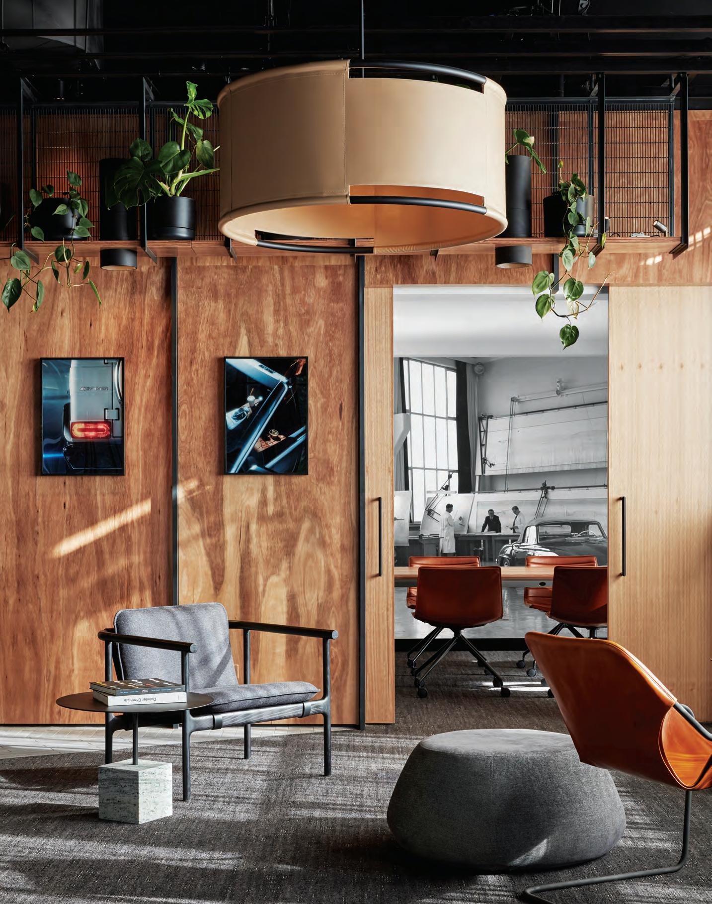
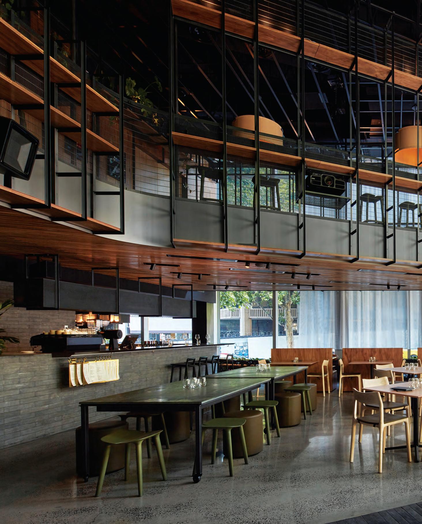
Hide And Seek
The sheer white curtain running almost the full height of the space can be drawn to screen the Mercedes Me facade from its busy street corner, enabling the venue to transition swiftly from everyday dining to a theatrical event space.
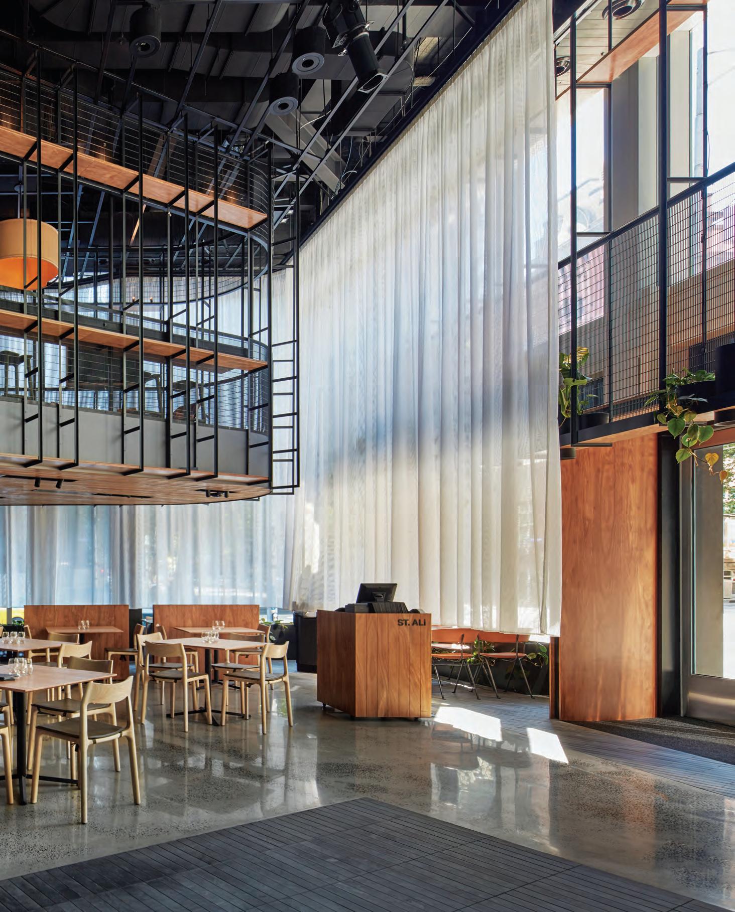
–
Below, the space is designed to transform seamlessly from relaxed dining to open-plan party venue, while above, a mezzanine of a more intimate scale comes complete with reading lounge and barista.
Car commercials: a glossy display of precision engineering and sophistication, condensed into a 30-second montage. A vehicle glides through picturesque surrounds – rugged natural terrain, or perhaps a metropolis full of model types. The effect is emotive, and aspirational. You want that car.
But new wheels are a major investment, and for most, the road between that first flash of desire and committing to buy is a lengthy one. So, how can luxury brands maintain consumer interest over the long term?
By giving motor enthusiasts and casual diners alike an immersive branded experience outside of the showroom, the Mercedes Me concept stores go some way to making the high-end approachable. Since establishing the first in Hamburg in 2014, Mercedes-Benz has subsequently opened in Munich, Moscow, Tokyo, Beijing, Hong Kong and now Australia’s first, in Melbourne – each iteration a totally unique, site-specific expression.
Mercedes Me Melbourne inhabits a shell by Woods Bagot, as part of the Rialto Towers street level refurbishment. In consultation with Mercedes-Benz Australia/Pacific’s CEO and managing director, Horst von Sanden, and St.Ali director, Salvatore Malatesta, Jackson Clements Burrows (JCB) developed a nuanced design for the landmark corner tenancy.
“We held some really great workshops to find out how everyone wanted it to feel, more than work,” says Simon Topliss, senior associate at JCB. “Fundamentally, it needed not to feel like a showroom, while still having a car on show.”
JCB approached the project with the notion of creating a super home for the Mercedes-Benz customer. This resulted in a series of interconnected spaces representing the domestic sphere: living room, garden, kitchen and most importantly, garage. For the opening, a replica of one of the first Mercedes cars – one of only a
handful in the world – was flown over from Germany to take pride of place in the ground floor restaurant.
“Prior to the opening, we did wonder how Melbourne might receive it. It’s such an unusual concept. Every week it’s a new car in the middle of a café, how is that going to feel? How do we treat that?” says Topliss. “But the experience makes sense here, a lot like streetside dining.”
Against a strong material palette of concrete, timber and stone, the split-level formation of the interior is defined by an expressed steel framework, alluding to the suspended manufacturing frames observed in archival photography of an original Mercedes-Benz factory floor. This structure neatly wraps the bulk of the first floor overhead, and provides storage options with inbuilt shelving throughout the rhythmic linear pattern.
The two floors are distinct in purpose, giving the locally revered St.Ali crew double the stage to demonstrate their coffee and culinary prowess. “Sal was keen to have a grab-and-go espresso bar upstairs, and for the lower level to have more of a restaurant feel,” says Topliss.
Below, the space is designed to transform seamlessly from relaxed dining to open-plan party venue, while above, a mezzanine of a more intimate scale comes complete with reading lounge and barista. The levels are connected by a stairway of tiered upholstered booths, with one powered up to convert into a DJ booth, as required. As befitting a brand at the forefront of technological development, the car showcase area comprises a wall of individually programmable digital displays, including an operable door fitted with switch glass.
“The store had to be able to convert from a café to an event space, have a sense of St.Ali, and speak the language of Mercedes-Benz –all of those things were crucial to the overall design,” says Topliss. “But most importantly, it had to be part of the fabric of Melbourne.”
jcba.com.au
INDESIGNLIVE.COM 116 IN SITU
Pages 113: Raw timber panels reference the ply surfaces of the original St.Ali. Page 114-115: Booth seats at the perimeter are freestanding, allowing for fluid seating configurations. Opposite: The mezzanine extends to provide an intimate reading nook for patrons. Page 118: Upstairs, the curvilinear barista station serves as an express coffee stop.
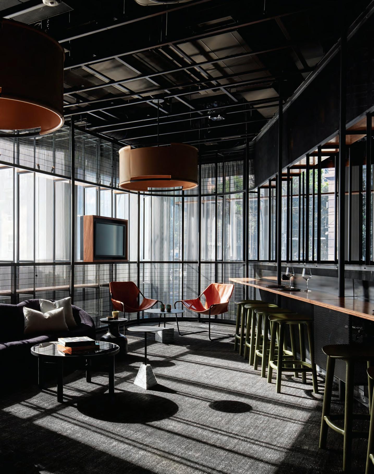
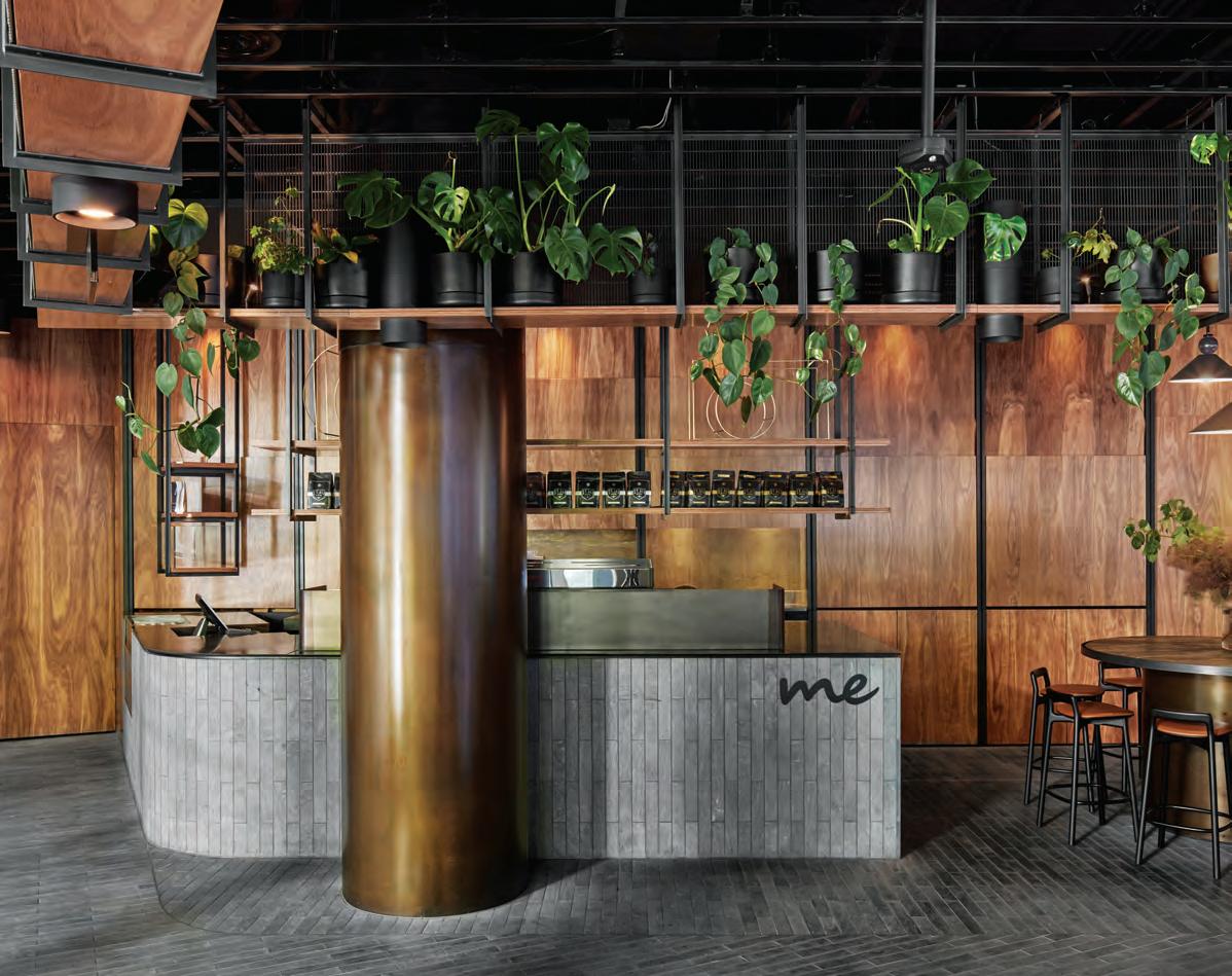
INDESIGNLIVE.COM 118 IN SITU
“T he store had to be able to convert from a café to an event space, have a sense of St.Ali, and speak the language of Mercedes-Benz.” Simon Topliss
WOODMATT
Pre-finished Board. High Pressure Laminate. Decorative Battens. AFS/01-31-145


Available in 14 stunning new colours, WOODMATT is a next generation product innovation from polytec, combining the best of natural timber with technology advancements, the matt finished subtle woodgrain embossing is designed to match perceptions of authentic timber veneer – in look, feel and warmth.


To order your free colour samples visit www.polytec.com.au.


www.polytec.com.au p 1300 300 547
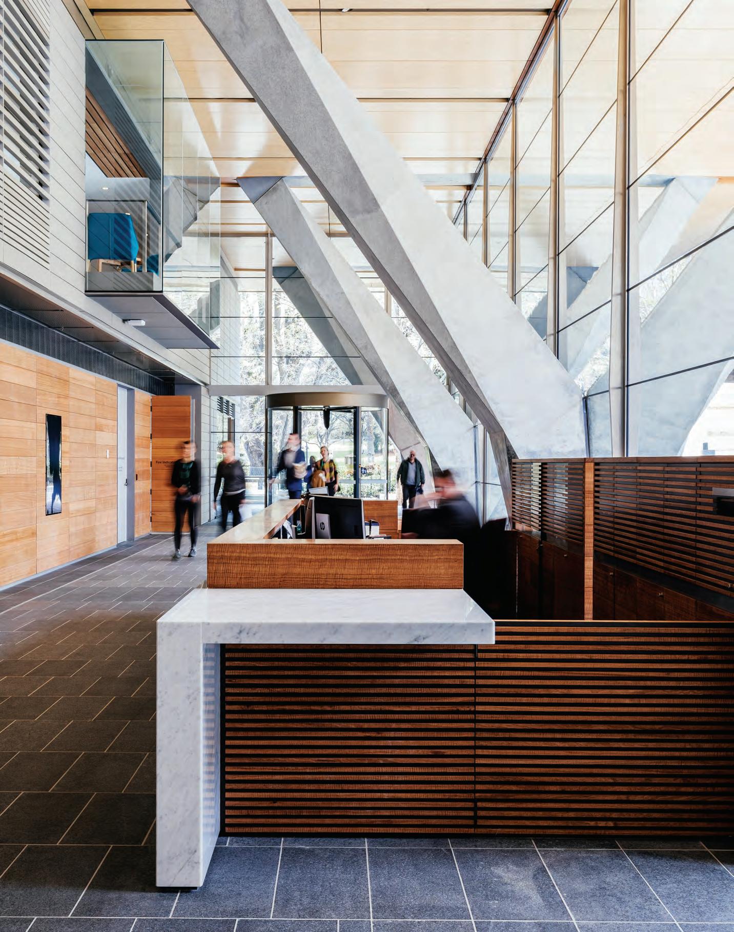
When the politics of a project involve Parliament itself, the architectural facilitator must be expert in multi-party negotiation. fjmt brings the design conversation back to the land and its people with Salamanca Building at Parliament Square, Hobart.
Ministry
By Design
Salamanca Building, Hobart by fjmt
Words Paul McGillick Photography Adam Gibson
INDESIGN 121 IN SITU
Opposite: In the lobby, the bespoke timber reception desk sits between the angled concrete support columns. Page 122-123: The glazed three-storey link which connects Parliament House to the new building. Page 125: Each committee room pays homage to a Tasmanian mountain range. Page: 126-127: The elliptical meeting rooms feature local timbers and balance out the orthogonal nature of the building.
Layers Of History
Originally Customs House, Parliament shared the building with Customs until 1904. Now a new level of history is added with a glazed link connecting Parliament House to the new building which contains a variety of parliamentary services and also private businesses.
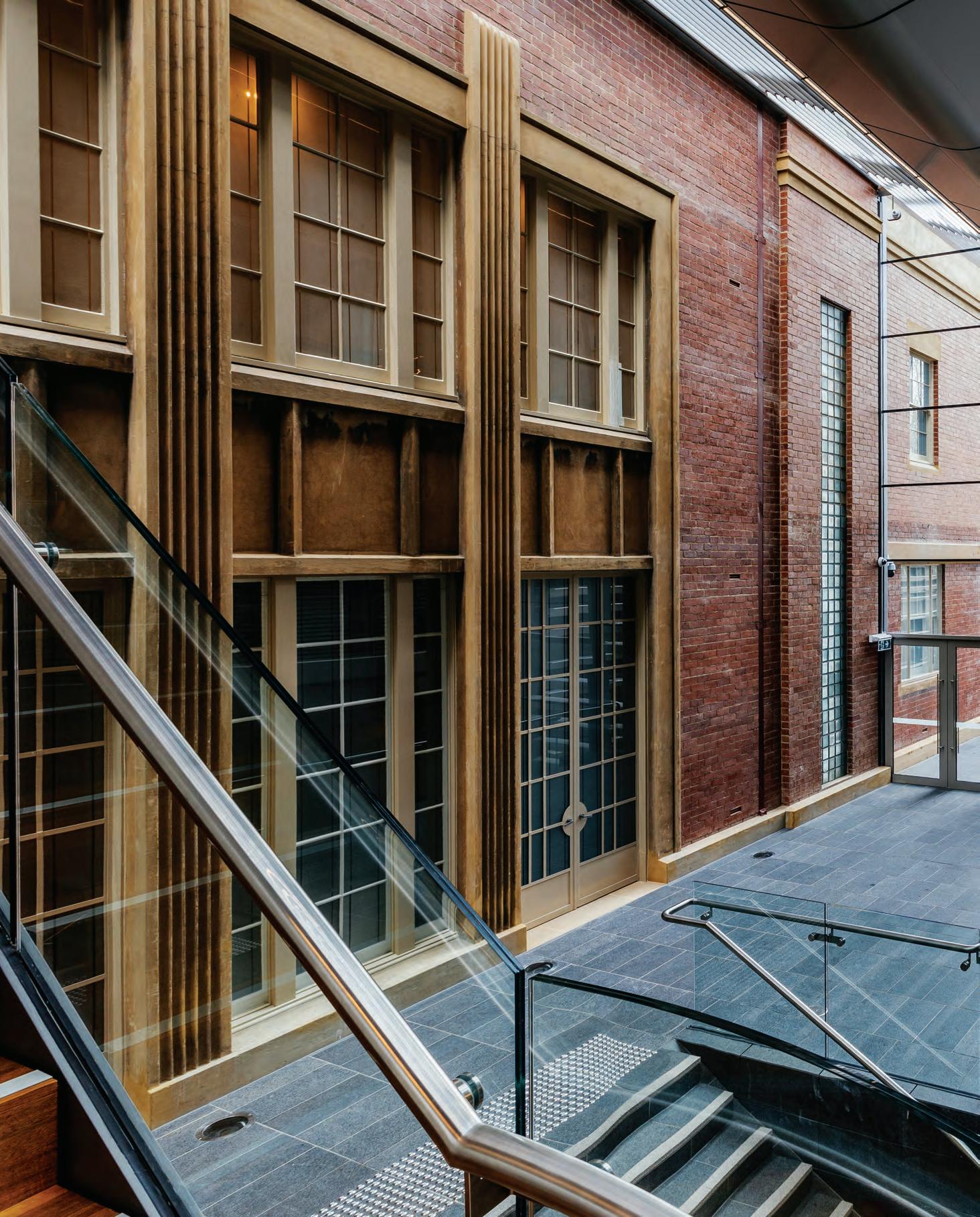
–
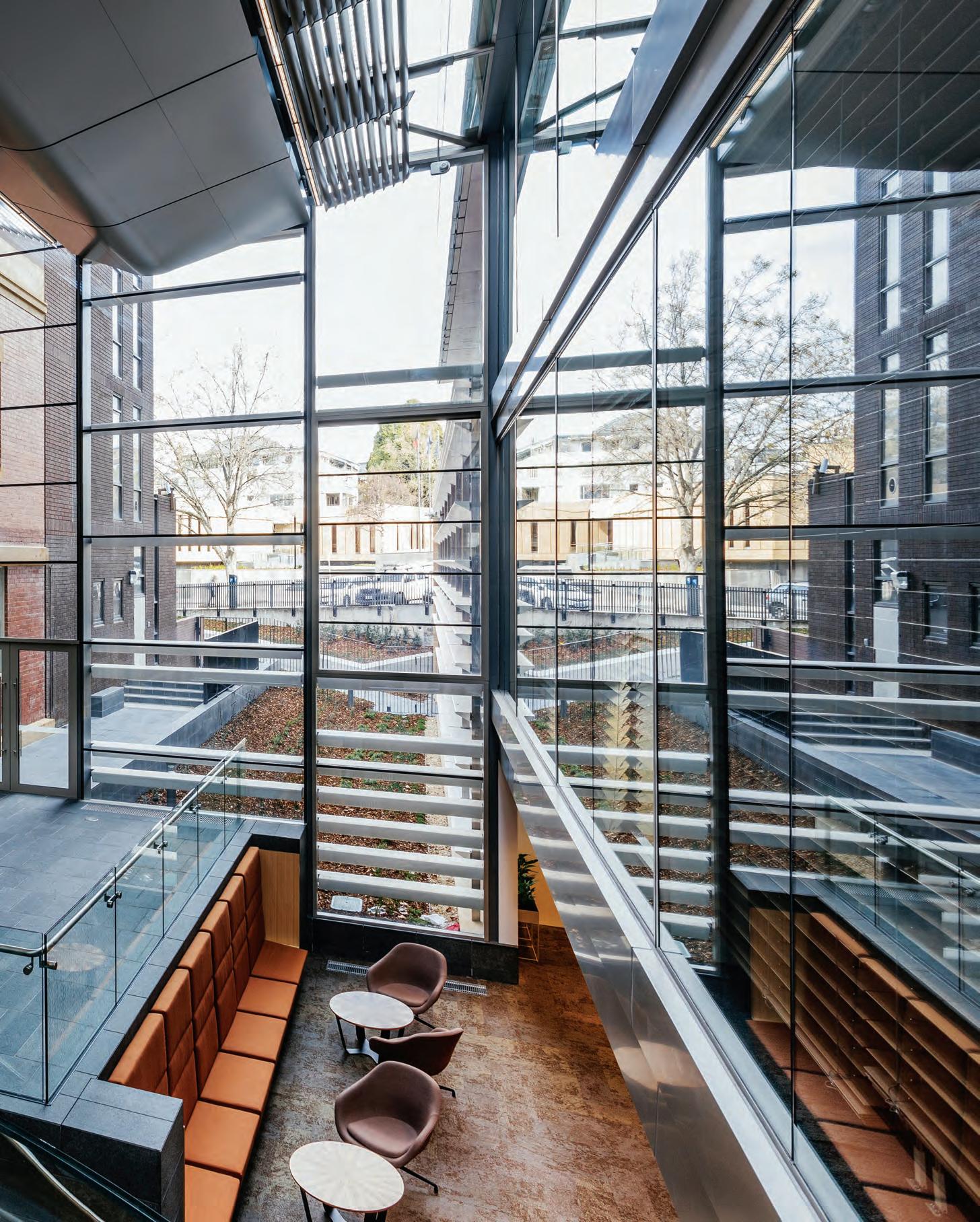
Designing any workplace – especially one providing amenity and space for a modern Parliament and its Parliamentarians – is never a one-size-fits-all solution. It’s always a case of horses for courses. Naturally, if the horse is designed by a committee it may prove ungainly, so the challenge is always to ensure that the end result is fit for purpose.
Designed by fjmt, the 11-storey Salamanca Building is Hobart’s latest office tower, offering the opportunity for state-of-the-art office design. The building steps back on the upper levels with smaller floorplates to preserve city view corridors. It sits behind Parliament House, the two now connected by a three-level glass link. The building accommodates both Executive Government and the Parliament.
In terms of the Parliament it brings together staff previously spread over multiple locations. There are two new levels annexed to the 1841 Parliamentary building which provides offices for Hansard, research and other joint services to both Houses of Parliament, offers contemporary Parliamentary committee rooms and accommodates the offices of Members of Parliament.
Separately, the building also accommodates the Ministerial office and various government agencies such as Revenue, Liquor and Gaming (on the publicly accessible ground floor from Salamanca Square), the Department of State Growth as the major tenant over 4 levels, and the Department of Education on levels 7 and 8. There is one café and a plan to incorporate more retail, food and beverage services into the site.
The entry is opposite the lovely St David’s Park through a doubleheight portico distinguished by powerful angled concrete supporting columns which are replicated inside the surprisingly intimate, fully glazed lobby. The building is part of the Parliament Square development which will eventually see a public plaza defined by the Salamanca Building, Parliament House and a heritage hotel.
The Parliament of Tasmania was originally a customs house designed by James Lee Archer and built in 1840. Parliament shared the building with customs from 1841 until 1904 before taking over the entire building. So, there is a lot of history to this beautifully scaled, sandstone neo-Palladian building. And that’s only part of the cultural overlay which made designing this building, particularly the interiors, such a challenge.
Given the plethora of stakeholders – and bear in mind the hierarchical and traditionalist nature of the operation of Parliament, not to mention party politics and bureaucratic conservatism – it is easy to see why there isn’t a consistent interior design strategy beyond a general push towards open plan, restricting the number of enclosed offices and locating general work areas on the perimeter, thus ensuring plenty of natural light and general access to the views. The views are sensational – to the River Derwent then back across St David’s Park to Mount Wellington. But the architects resist the
temptation to over-indulge, often using vertical slot windows to edit the views.
Notwithstanding various constraints, there are some striking and significant design initiatives which give this building a strong sense of unity and a lot of character.
These begin with the way the architects have provided a very modern building which nevertheless respects the history and importance of Parliament. In subtle ways the new building responds to the old building – by visual inclusion, by acknowledging its brick and sandstone textures and in the way it respects the historic building by not being in any way overbearing.
Then the architects have generated a conversation between the orthogonal nature of the new building’s form with curvilinear or organic elements throughout. This is especially evident in the elliptical meeting room pods with their Spotted Gum external battens and Spotted Gum and Tasmanian Oak internal battens for ceilings. Indeed, timber finishes greatly soften this otherwise concrete and glass building, as in the use of perforated veneers wall linings and the tonally restrained automated timber louvres. There is a consistent strategy to connect the interiors to the Tasmanian context. The committee rooms, for example, each reference – through imagery and palette – a mountain range of Tasmania: Mt Wellington, Cradle Mountain and the Hazards. Similarly, the stakeholders were all given a choice of landscape reference through materials and palette: the turquoise and blues of the Freycinet, the rich, deep greens of the Tarkine rainforest, the multifarious colours of the Bay of Fires, or the soft sandstone of the Painted Cliffs at Maria Island.
Just as significantly, the generally high quality furnishings favour not just Australian designers, but specifically Tasmanian designers. There are, for example, Cowrie chairs by expatriate Tasmanian, Brodie Neill. Meanwhile Launceston-based designers, Simon Ancher and Matthew Prince, have produced three astonishingly beautiful, grand and elliptical boardroom tables from Hydrowood (Huon Pine, Blackwood, Myrtle and Tasmanian Oak) salvaged from Lake Pieman. Three of these tables are in the committee rooms while the fourth – its elliptical form replicating the elliptical meeting room itself – is on the level 5 Ministerial level.
In an important respect, this building will not become fully itself until the plaza is completed. This is because it is very much a contextual building. Already it connects seamlessly with Parliament House with its security lines remaining subtle and discreet. Likewise, its visual connection with the city, the water and the mountain is generous, if quietly edited. But the ground floor entry lobby will really come alive with the light and openness of the plaza and the contrasting heritage edge of the renovated hotel.
fjmtstudio.com
INDESIGNLIVE.COM 124 IN SITU
Notwithstanding various constraints, there are some striking and significant design initiatives which give this building a strong sense of unity and a lot of character.

INDESIGN 125 IN SITU
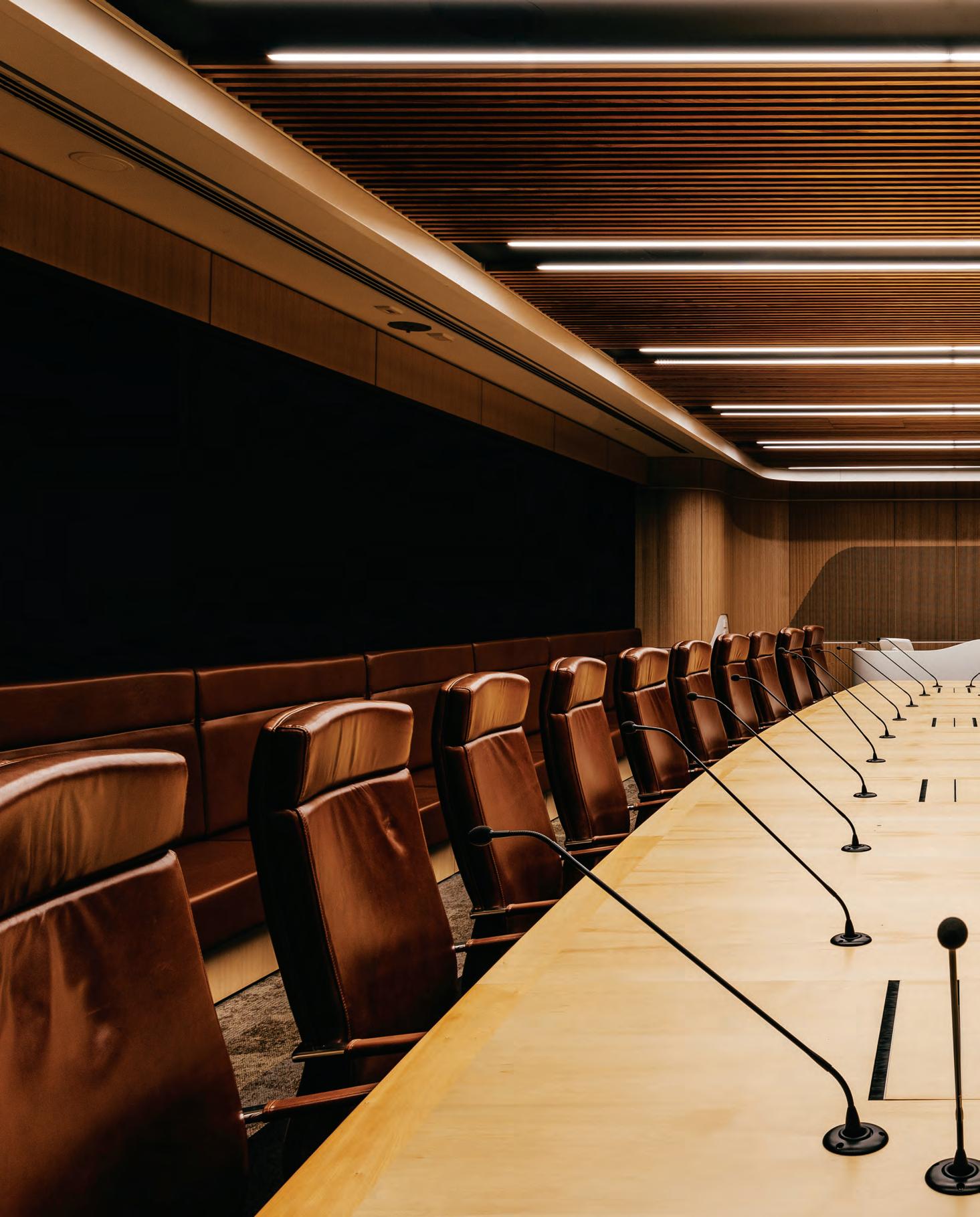
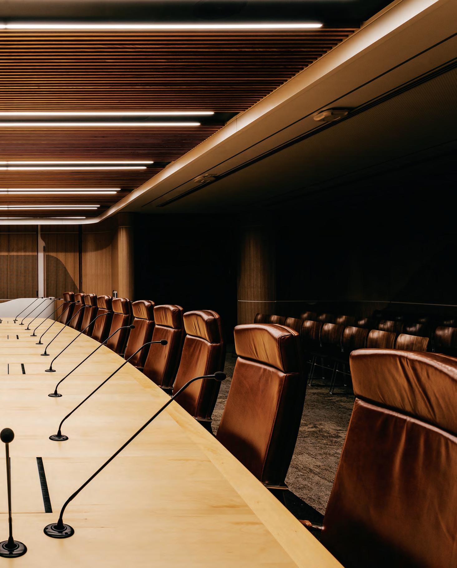
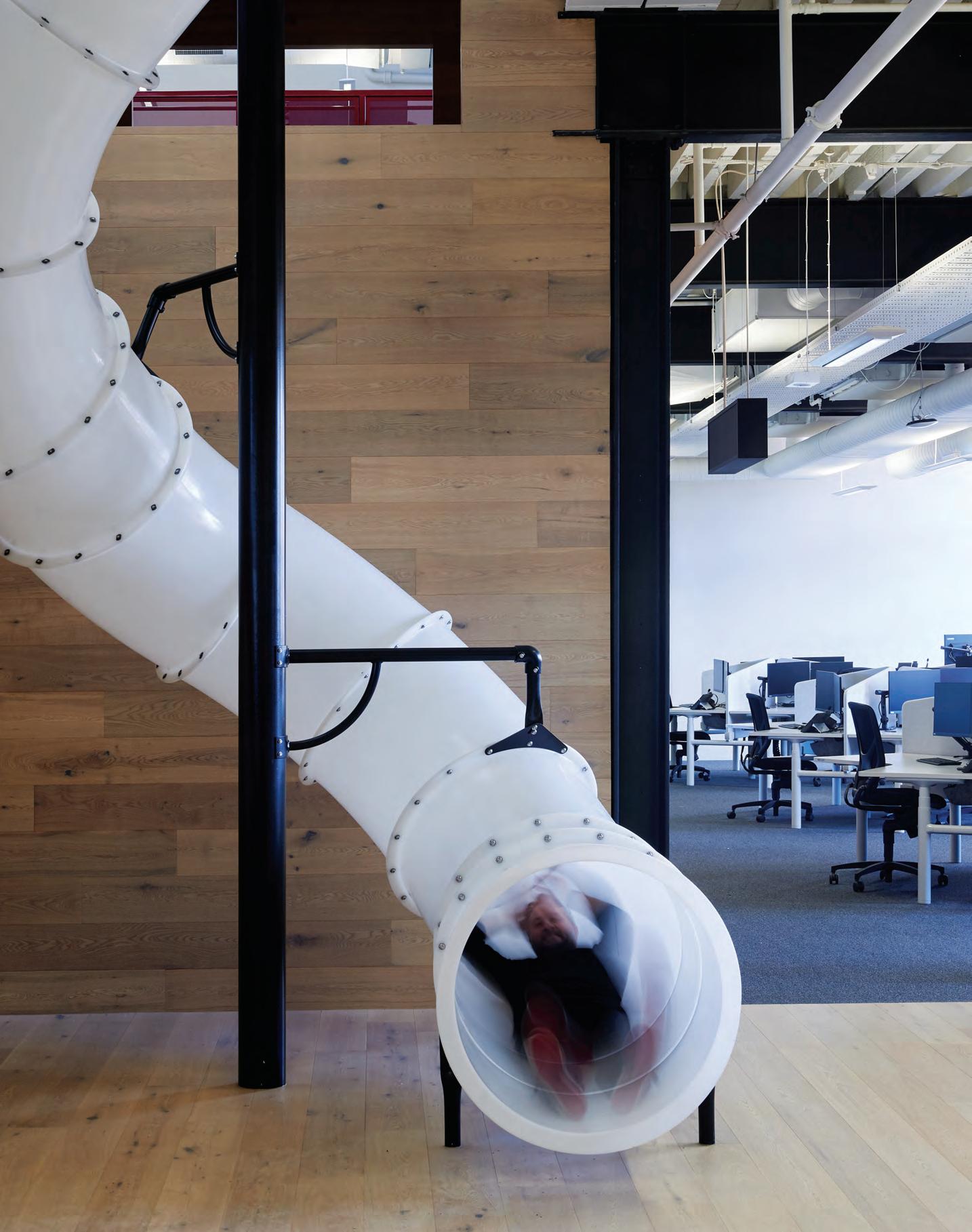
Pavilions, hubs and neighbourhoods have become the building blocks of the agile workplace. But do these democratic spaces speak to the individual? At Red Energy, Carr applies these spatial concepts as a personalisation device, enabling users to claw back a sense of ownership in their transient work space.
Squatters Rights
“I find that these types of settings are a reaction against the digitisation of workplaces,” says Carr director, Dan Cox. “The ‘linear line’, ‘straight line’ workplace is such a designer thing –but the client doesn’t necessarily want everything lined up, they’re more interested in [creating] curiosity and a sense of discovery – the ‘bump-into factor’ – and this is the result of creating spaces that aren’t so rigid. The reality is that the future is actually more about ‘human-ness’ and personalisation as a means to balance out the over-saturation of technology.”
Flexible and varied formats are the kale and activated almonds of the workplace – we know they’re really good for us, we just don’t know why. The evolution of our working environments continues to head in exciting directions – but this time, it’s about far more than increasing productivity or finding a cool spot to plug in your laptop. For Carr, these types of agile settings are tools to bring human-ness back into the workplace, focusing not just on how the spaces would be used, but how the users would feel when they did.
Nowhere is this more evident than in Red Energy’s new four level workplace in Richmond, Melbourne. The brief was to create a highly progressive and dynamic hub within the heritage-listed framework of the Bryant & May former Redheads matchsticks factory. All, of course, while finding a common narrative thread between the heritage of the site, the history of the various companies within the organisation, and the quirky, devil-may-care culture of the team.
Working from a raw workplace strategy by the Veldhoen + Company, Carr was given a comprehensive breakdown of the types of spaces that Red Energy wanted, and was tasked with distilling those spaces into a blend of Red’s personality and history.
This emphasis on preserving the culture of the organisation however presented team Carr with some unique obstacles. “One of the biggest challenges was responding to Red Energy’s desire
to maintain the ability for personalisation at the desk and within the team area,” says Carr associate, Nicole Coutts. “Red Energy’s previous workplace presented itself with a vibrancy in colour, noise, and decorations. It was important to the client that this personality and vibrant culture to be incorporated within the design of its new workplace,” she says.
To achieve this confluence of needs, Carr began by treating the fit-out as an almost sculptural insert with all internal built forms detached from the building’s perimeter. This would allow them to respect the existing exposed truss ceiling, original factory bay windows and important heritage details. “The building was quite unusual,” says Cox. “It had very high windows because it was a factory and therefore did not traditionally need for the workers to look out of the windows. We [added] a series of platforms to elevate you up high enough so that you can then see out into the Richmond area, while also respecting the heritage shell of the building.”
Logistically speaking, the workspace had to work hard to consolidate and accommodate over 1000 ‘business support’ and ‘customer interaction’ staff requiring very different space typologies and environments – from highly flexible to fixed, diverse to similar, intuitive to responsive, inventive to focused.
Ultimately, Carr developed an intelligent design response comprising a series of free standing pavilions, neighbourhoods and hubs. These typologies feature a range of fit-for-purpose work settings and a deliberately unique circulation path to promote curiosity and exploration via a clever set of design devices. These include signage and graphics, colour palettes, materials, textures, patterns, built forms and amenities.
To begin with, a sense of place is established in the vivid red of the new steel mesh stair. Purposeful in its reference to the red brick tones of the Bryant & May Edwardian architecture and the
INDESIGN 129 IN SITU
Red Energy, Melbourne by Carr
Words Sophia Watson Photography Earl Carter
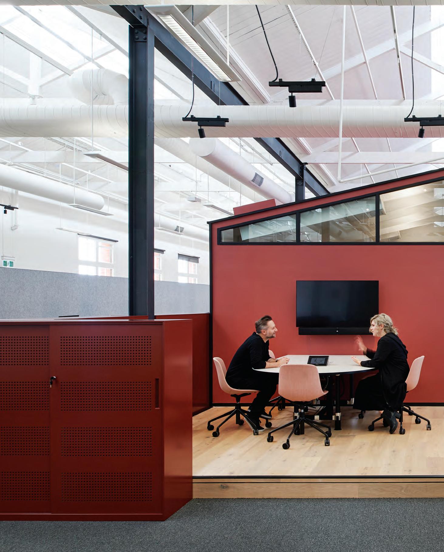
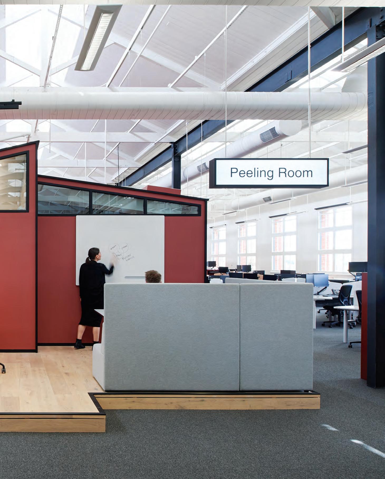
namesake of its tenants, the stair acts to link the tenancy floors and provide expected, interesting space typologies for breakout, interaction and collision. Each of the four levels embodies a unique aesthetic pale e paying tribute to the pivotal importance of the key project stakeholders: Red Energy, Lumo, Snowy Hydro, and the Bryant & May factory.
What is arguably the most notable demonstration of the original concept is the pavilions themselves. “The pavilion pods and their pitched roofs reference the architectural fl avour of Richmond,” says Cou s, “providing us the opportunity to expose the heritage features of the building. Additionally, in response to the grandeur of the Bryant & May building itself, the ‘houses’ with their li le pitched roofs bring the space back to a human scale. The pavilions were then positioned to create di erent sized neighbourhoods allowing the teams to feel a sense of connection, and not feel lost in a sea of workstations.” As a fi nal piece of thematic intelligence, Carr designed these pavilions to mimic the original internal foreman o ces that featured in the old Redheads factory.
This of course all comes back to Carr’s thinking on how people were going to use the spaces, but more importantly – how they would feel when they did. Cox notes that formats like pavilions,


neighbourhoods and hubs are so significant because, “the personalisation of work spaces is such a key concern, especially in the removing of ownership from a fi xed desk or o ce”.
He says: “The Red Energy employees were given so many more things – relaxation pods, mini bleacher areas in each zone with li le sunken bunkers adjacent to the large windows, cubbies and forts, a central ‘neighbourhood totem’ where messages can be wri en to one another, a bowls pitch, and shaded cabana area on the roof. They have pool tables and massage chairs and so much more. The absence of their former ‘territory’ doesn’t ma er so much because the space is so intrinsically responsive to how they work, and to the fact that they’re human.

“It’s giving them that visual stimulation, as well as the personal and emotional factor. Every space looks and feels a bit di erent, every level looks and feels a bit di erent, and making that choice based on behaviour and emotion is where the future of the workplace lies for us.”
Page 128: The slide o ers a sense of playfulness and creativity grounded by context and heritage


INDESIGNLIVE.COM 132 IN SITU
Page 130-132: Free-standing pavilions reference a sense of place and urban character. Opposite: Graphic elements punctuate the spaces illustrating a narrative for each oor. Page 134: Break-out spaces providing connectivity for a vibrant, dynamic team.
Red Energy Level 1 Floor plan 1 Intertenancy stair with ‘cubbies and forts’ 2 ‘Mini hub’ teapoint with bleachers and banquette seating 3 Hydration station 4 Lockers and utility zones 5 Void – visual connection across the oors 6 Games room 7 Library/Case team room 8 Boardroom 9 Quiet focus room 10 Open meetings on raised platforms 11 Team huddle 3 3 10 10 11 9 99 9 9 9 1 1 4 4 7 4 4 2 5 6 8
carr.net.au
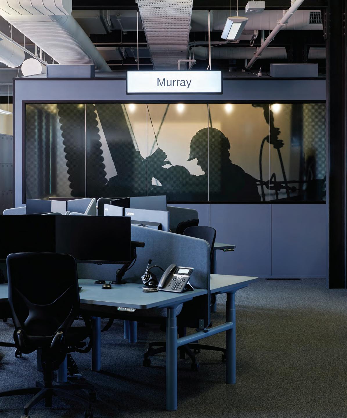
INDESIGN 133 IN SITU
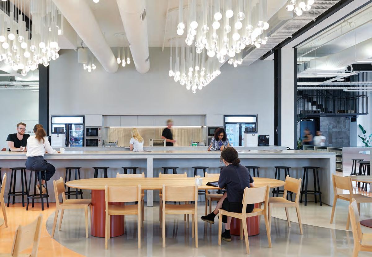
INDESIGNLIVE.COM 134 IN SITU
“The personalisation of work spaces is such a key concern, especially in the removing of ownership from a fixed desk or office.” Dan Cox
D e S i gn X ZG oN iC
Commercial environments across the world are increasingly adopting activity-based working (ABW) models to foster greater interpersonal engagement amongst end-users. And what’s more, they appear to be doing this en masse.
greater productivity through desgin
According to Telsyte’s 2015 landmark study, ABW-optimised workplace design holds the potential to increase end user productivity by an approximate 16 per cent. As such, it is little wonder more than one third of Australia’s commercial employers have incorporated ABW design thinking into their workplaces. Giving greater control back to workers to determine how they work best according to any given task at hand, such corporations have noted that with more daily roving, as well as a variety of different spaces and tools at hand, the benchmarks for their duty of care have shifted. Now tasked with ensuring that no matter what space an individual will select for completing a task, workplaces must deliver design schemes that guarantee end user wellbeing and efficiency holistically.
This is where zgonic is uniquely positioned to help.
Understanding these pressures, Zgonic’s approach to mobile working solutions puts the end user’s wellbeing at the forefront of the design process. Zgonic’s award-winning monitor arms adopt a simplified, intuitive approach that are not only adjustable for optimal viewing,
but are also an absolute cinch to install. The brand’s entire portfolio of products offer workers the opportunity to integrate all mobile and workstation devices into one system, allowing them to plug-in and work from anywhere, anytime, and in any way they prefer.
Spatial and ergonomic Awareness: zbridge
Whether as an additional tool for individual workstation systems or for shared collaborative set ups, Zgonic’s Zbridge monitor arms lift laptops and monitors above the desk surface to permit additional working space. While its adjustable features ensure that end users can avert poor physiological postures, Zbridge’s improved viewing angles offer supreme ergonomic support coupled with a promise for greater efficiency.
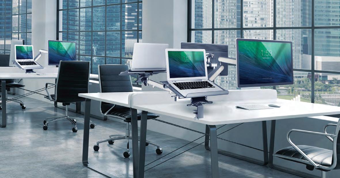
A new Form of Functionality: z1
E lsewhere, the brand’s latest offering, Z1, combines all the highperformance characteristics, technology and functionality of Zgonic’s proprietary Zgo Monitor Arm, in a newly intuitive and lightweight form.
Seeking to restructure to a point of absolute streamlining, Z1 takes design thinking to a new frontier that will not compromise on functionality. With responsive counterbalancing technology to offset variable equipment weights, Z1’s compact form, accessories and maximum capabilities ensure that we are all empowered to customise our place of work to our personal quirks and strengths.
livingedge.com.au living edge 135 en.zgonic.com zgonic 135
Welcoming the activity-based working revolution, Zgonic’s portfolio gives individuals more control over wellbeing and productivity at work.
in
Zgonic proves that monitor arm technologies support the rising demand for mobile workplaces.
If your business was a person, who would it be? Kingsleys in Sydney had already workshopped its brand strategy and came to SJB with an intriguing brief: to personify Liam Neeson.
Masculine Charm
Kingsleys, Sydney by SJB
Words Leanne Amodeo Photography Felix Forest
Looking beyond the Hollywood glamour, SJB has translated this quirky concept into a fit-out that speaks to both its locality and Liam using an interior palette filled with character quirks.
INDESIGNLIVE.COM 136 IN SITU
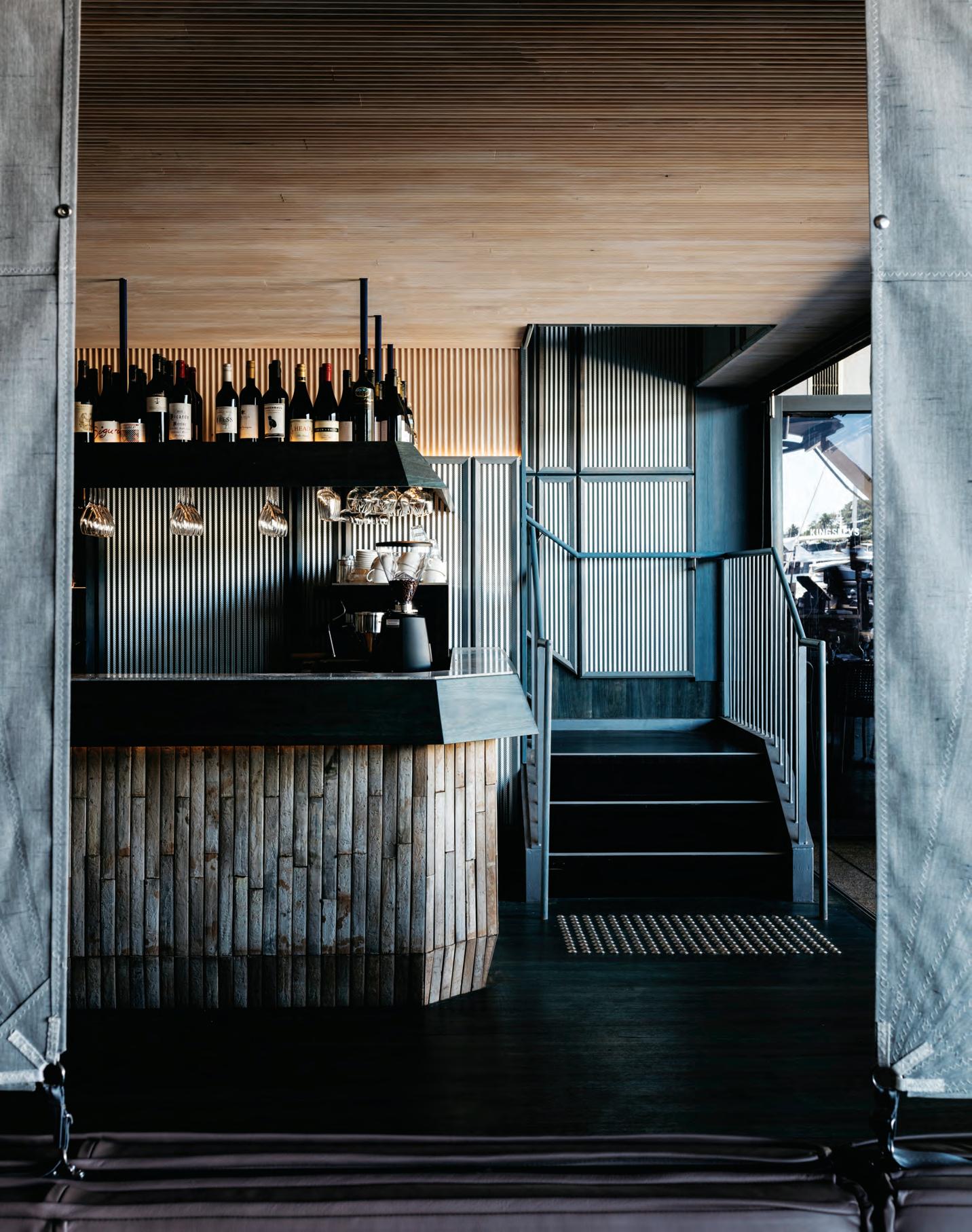
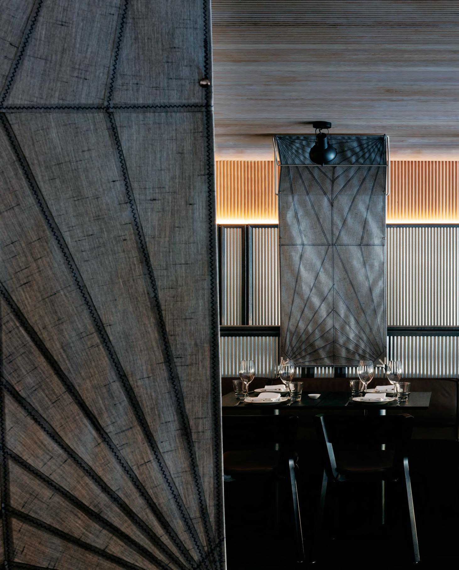
Sailing Through Lunch
The ground level’s room dividers roll down to provide visual separation and privacy between groups of diners. Each divider is made from Sunbrella sail cloth and stitched by a sail maker using the exact same pattern they would for a boat.
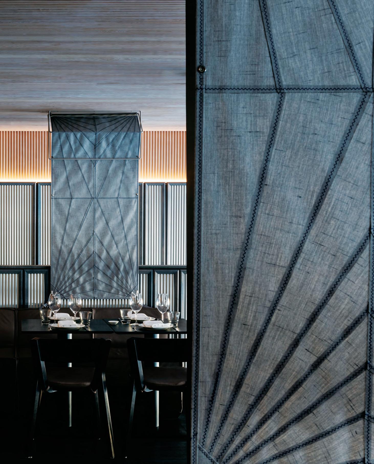
–
If you ask most people to describe Liam Neeson, chances are they’d use words like rugged, handsome, reliable, thoughtful and intelligent. His public persona is undeniably appealing. So much so, that when Australian Venue Co approached SJB to renovate Kingsleys – a much-loved, highly regarded Woolloomooloo institution – they asked the practice’s Sydney-based team to designa new interior that personifies the Hollywood actor.
It’s a fun, open brief, but it required a very serious outcome and rigorous thinking around how to translate it. The challenge was distilling those qualities associated with Neeson to deliver an on-brand identity that didn’t resemble a themed restaurant. For SJB’s Kirsten Stanisich, director of interior design, Sydney, it was important to not take the client’s direction too literally. Rather, use it as a conceptual spring board for exploring ideas around character and personality with a view to creating an experiential design that’s memorable.
The starting point was materiality as robust as it is elegant and a colour palette that’s nothing short of delicious in its degree of sophistication. “There’s a great masculine quality to Liam Neeson, as well as a fairness and charm and I can imagine him being a very practical person too,” says Stanisich. “Based on that we decided to use woody blue tones throughout the interior and utilitarian finishes that can still evoke a sense of softness.”
Kingsleys has long been popular with businessmen for lunch time meetings and the design respects that, while being totally inclusive and not alienating any other demographic. Timber frames, supports and recesses are stained different shades of blue, a thoughtfully nuanced gesture that complements the dusty mauve leather upholstery and dove grey fabric room dividers. These details all work particularly well against the perforated Mini Orb that’s applied to the walls across both levels of the restaurant as a base finish.
Selecting an exterior grade product for an internal application may seem curious, but it resounds strongly within the overall scheme as a deliberate placemaking device. “As with all SJB interiors, it was essential Kingsleys had a really good connection to place so there’s some sort of grounding behind all our design decisions,” explains Stanisich. “In this instance, the restaurant’s building sits on a heritage wharf that has a real industrial warehouse feel to it. So, by using a technically refined modern version of corrugated iron, we ensured the interior is visually connected to the waterfront building that houses it.”
Understated nautical references also abound, from the room dividers, which are actually made from sail cloth, to ribbed timber that wraps the tops of the walls and ceilings. It feels reminiscent of a boat’s cabin, especially because the restaurant’s ceiling height is relatively low. Interestingly, the ribbed timber extends the profile of both the Mini Orb and the private dining room’s glass doors, making the fit-out all the more cohesive and smart.
It’s highly unlikely anyone would walk into Kingsleys and think, ‘Oh my goodness, Liam Neeson!’ The more probable scenario is that people would feel comfortable in the space because they respond positively to the handsome detailing, thoughtful colour palette and intelligent use of materials. If they found out the design was inspired by the Hollywood actor, it might raise a smile or an eyebrow, but wouldn’t necessarily change their experience, which was Stanisich’s intention. This project’s deftly rationalised concept manifests as an exquisitely beautiful interior design and therein lies its success.
sjb.com
INDESIGNLIVE.COM 140 IN SITU
Page 137: The ground level bar is clad in an earthy brown clay tile, a perfect complement to the stained Blackbutt flooring.
Page 138-139: A meditation on materiality, room dividers are made from sail cloth. Opposite: An intersection of materials including leather, stained timber, sail cloth and Mini Orb, is made all the more interesting by the colourful base of Vico Magistretti’s round table. Page 142: SJB takes a subtle approach to the waiters’ station.
“There’s a great masculine quality to Liam Neeson, as well as a fairness and charm... Based on that we decided to use woody blue tones throughout the interior and utilitarian finishes that can still evoke a sense of softness.”
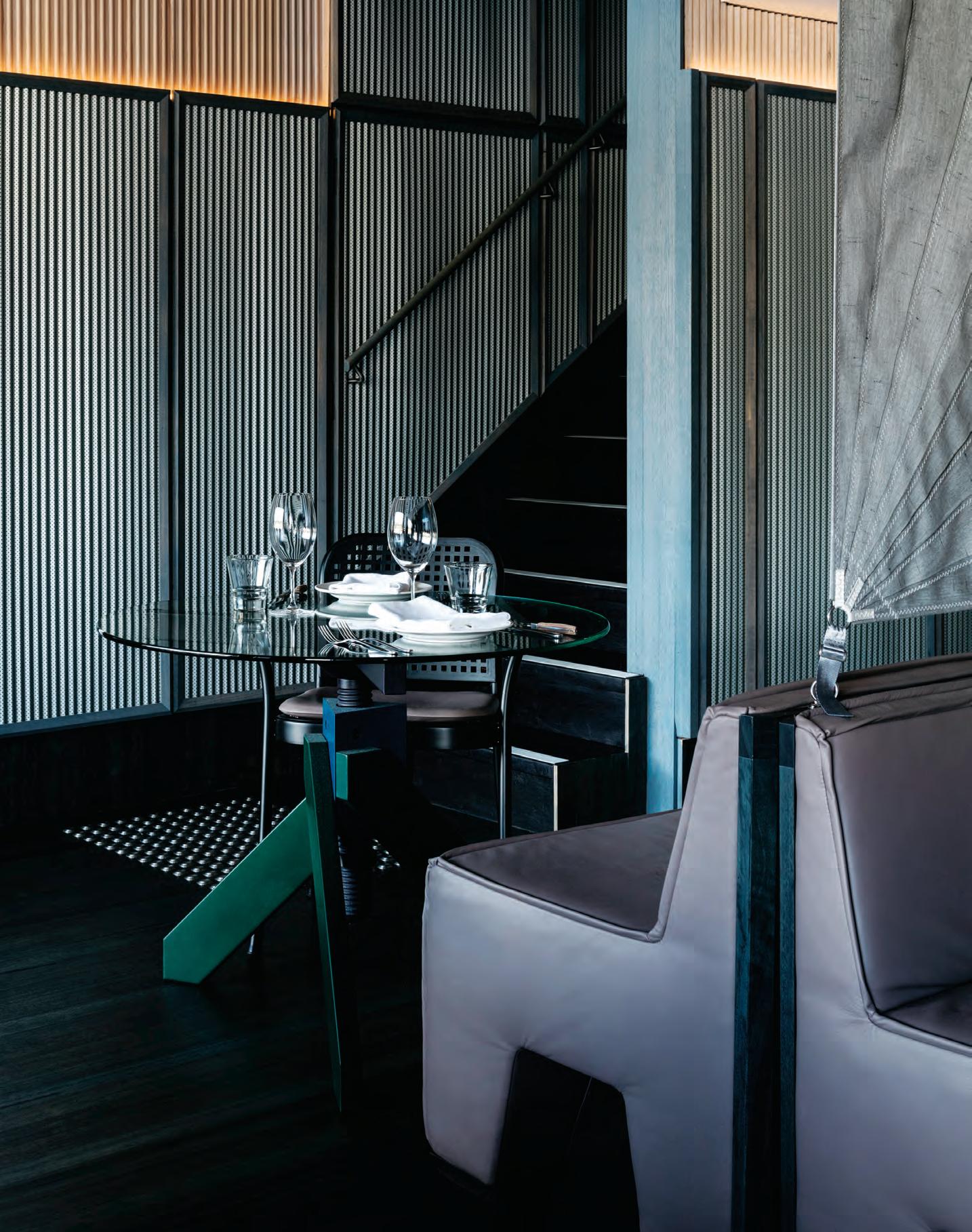
Service With Flair
This waiters’ station is clad in the same perforated Mini Orb that covers the walls, making it feel very much like part of that detail. Visually, this ensures the station doesn’t take up too much room or clutter in an interior relatively modest in its spatial proportions.
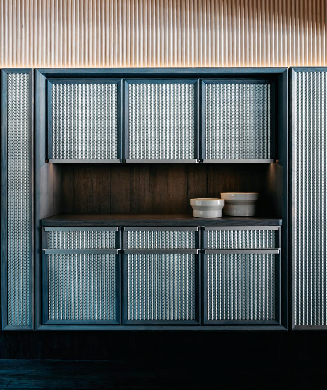
INDESIGNLIVE.COM 142 IN SITU
–
in D ES i gn X GIBBon GRoup
In an inspired attempt to combat the often-exploitative nature of our working culture and provide our clients with the sustained and singular attention they require, many design professionals are turning to the time-saving potential of outsourcing. Calling upon the advanced skill of specialist designers, manufacturers and supply houses, these custom solutions are specifically positioned to add value back to the client’s brief. Additionally, they also offer outstanding design solutions minutely tailored to any client’s and any user’s exacting needs.
With the mission to “bring you flooring products of quality that have a point of difference”, the team at Gibbon Group Architectural understands that unique and tailored design processes are central to the success of the final result.
Through understanding the singular challenges creative practitioners face, Gibbon Group has formed a new design team with Celia Harmon (pictured) at the helm of its Tretford Custom Rug division. Harmon, who has a background in graphic design and media, also happens to be part of the Gibbon Group family, and is working to assist designers in fulfilling their creative brief.
Committed to supporting designers through the creation of outstanding pieces with a fully consultative service, the inhouse Gibbon Group team has reformulated its design process to support their clients’ core brand identities in a commercial landscape. After initial briefing, and preliminary analysis for spatial attuning, the in-house Gibbon Group design team can work off anything from completed design work on CAD files, to rough sketches, or a quick conversation, to determine custom requirements.
But as a custom solution, this is only half the story behind the project’s success. After all, custom design solutions require custom design processes, and Tretford Custom Rugs is constructed quite unlike any other. As a complete custom service, Tretford Rugs allows for absolutely bespoke design outcomes where the scale, shape, and colour combinations offer almost endless possibilities.
For over four generations, the Gibbon Group family has built a tradition of meeting the needs of interior architects, designers and end users with sustainable high performance carpet solutions across the full spectrum of contemporary design.

livingedge.com.au living edge 143 143 gibbongroup.com.au g ibbon g roup
Celia Harmon of Gibbon Group’s in-house custom design team works in collaboration with the industry’s most active practictioners.
Gibbon Group has refined its process of customisation for commercial clientele, to show us the true power of possibility in design.
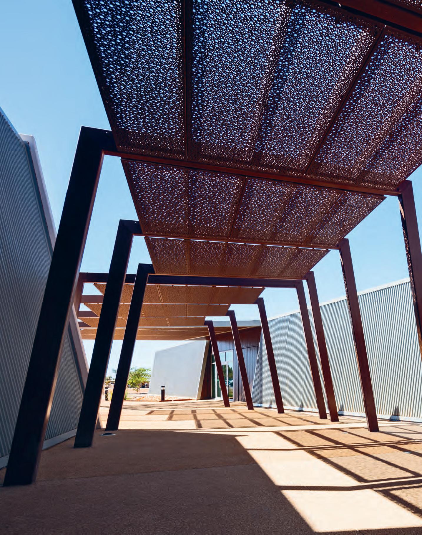
In the rugged outback town of Ningaloo Reef, SITE Architecture Studio has designed a visitors centre that captures the rawness and the romance of its region, through an interplay of materiality and structure.
Outback Spirit
More than 1000 kilometres north of Perth, Ningaloo Reef is one of the natural wonders of the world. The small town has a permanent population of 2200, which swells to 7500 during the tourist season. This is in the Australian winter when the heat and humidity of summer abate allowing visitors to explore the reef and delight in the passing parade of extraordinary marine life.
The Ningaloo Centre, which opened in February 2018, is much more than a visitors centre. The project was initiated by the Shire of Exmouth with the aim of boosting visitor numbers and connecting tourists with the local population. SITE Architecture Studio responded with a return brief outlining potential benefits.
Following the shortlisting process, a concept evolved in response to the needs of a variety of stakeholders – TAFE (Ningaloo Reef Research and Training), Exmouth Library, the cultural and arts community, toy library, Parks and Wildlife, and the Visitors Centre. Having won the job (with Freeman Ryan as exhibition designers), SITE’s Paul Edwards says that the question was: “How do we create that reef-to-range experience?”
The building, which is a cluster of connected pods, is bunkered into the ground to stabilise temperature variation and minimise wear and tear, cleaning and energy consumption. The north-west of Western Australia is, of course, iron ore territory. So, the building uses weathered steel – notably the perforated steel external screens – to resonate with the colours and industrial activity of the region. At the same time, robust forms reflect the rugged Cape Ranges nearby.
What emerged was not just a building which responds in form and internal detailing to its physical context, but an experience of the total character of Ningaloo. It is, says Edwards, “an experience of the reef and the ranges without getting your feet wet.”
So, they created the concept of a journey consisting basically of two linked exhibition spaces. The first replicates the experience of going down into the water before moving into a space like a limestone cave which provides an insight into the animal life of the area before moving on to the indigenous story. The upper level ‘terrestrial’ space enables visitors to look back down into the exhibition spaces while slot windows provide views out to the town and the former telecommunications centre which originally led to the establishment of the town after World War II.
At 5062 square metres, the AUD$34 million multi-purpose building is a large building for a small town. Its facilities include play areas, WiFi stations, function centre and café, an associated wet and dry laboratory, preparation area and aquaculture workshop for TAFE, and the University of WA’s reef research training. But in manifold ways, the building makes sure it connects with the town and the surrounding marine and terrestrial landscape. Furniture and custom lighting add to the experience, along with the carpet tiles and wall colours. Deft use of colour helps to identify zones and assist wayfinding.
sitearchitecture.com.au
INDESIGN 145 IN SITU
Ningaloo Centre, Ningaloo Reef, Western Australia by SITE Architecture Studio
Words Paul McGillick Photography John Gollings
Opposite: Perforated steel external screens resonate with the landscape and reference the region’s industrial activity. Page 146: The building, like its region, is a place of contrasts.
Reef To Range
There are four dimensions to the Ningaloo experience: the Cape Range, the water, the coastal plain and the Spinifex grasslands. “It’s a place of contrasts,” says SITE Architecture Studio’s Paul Edwards, “the reef, the water and the ranges which are like a mini-Grand Canyon.”
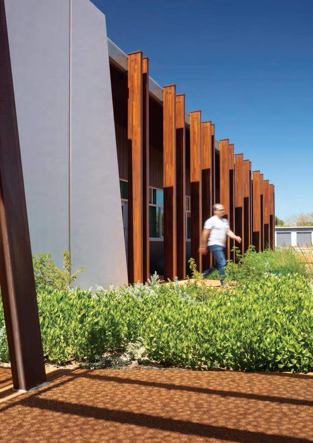
INDESIGNLIVE.COM 146 IN SITU
–
i ND e S i G N X GeBeR IT
As the bathroom space becomes ever more refined in its detailing, the finer elements of a bathroom fit-out come into play. Key touch points, such as flush plates, become a key facet through which considered form and superior functionality speak to design vision, while also enabling a new level of personalisation in the bathroom.
Renowned for its innovative approach to bathroom design, Geberit has been enthusiastically embraced by the local design community since launching in Australia some 15 years ago. An expert in its trade, Geberit developed the world’s first concealed cistern 50 years ago and has continued to pioneer new solutions, expanding into a diverse range of high-performance products that incorporate common elements for maximum compatibility. Addressing those finer, more intuitive details within the bathroom is the Geberit flush plate family of round buttons, which welcomes the new Sigma21 in 2018.
Available in three glass colours, or natural material slate, the Sigma21 flush plates are based on the look of the already popular Sigma20 Series, with upgraded finishes and options. A straightforward visual metaphor – small button for liquids,
large button for solids – makes Sigma21 aesthetically pleasing and easy to use, even if you’ve never seen a flush plate before.
The launch of the Geberit Sigma21 flush buttons sees the roll-out of the highest-quality flush plate with round buttons to date, with the versions made of glass (in black, white or sand) impressing thanks to a precise cut that gleams with refracted light.
The slate version represents the first time in Geberit’s range of flush plates features a natural material. Thanks to the chromecoloured rings, the flush buttons stylishly contrast against either glass cover finish.
With a rich history of innovative thinking, Geberit is a market leader in bathroom engineering and design. Incorporating Swiss design intelligence into an advanced range of hidden cisterns and buttons, Geberit enables clean, sophisticated and sustainable bathrooms. With more than 60 million units installed worldwide, designers and users alike can be sure that the Geberit range delivers discreet performance, efficiency, and sustainability in bathrooms of all sizes and designs. Because doesn’t every design need a little luxury?
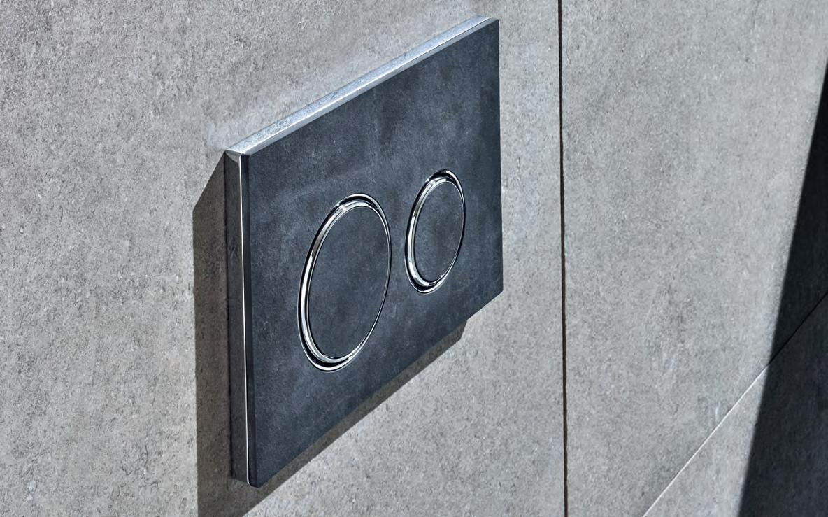
livingedge.com.au living edge 147 Geberit.com.au G eb erit 147
Backed by extensive research and testing, Switzerland’s acclaimed Geberit bathroom range has been available in Australia since 2002.
Swiss bathroom brand, Geberit, welcomes the arrival of the high performance Sigma21 flush plate.
Chin Chin, Sydney
Interior Architect
George Livissianis
George Livissianis georgelivissianis.com
Furniture
Chin Chin: Thonet No.18
natural wash dining chair with custom goose feather clear cushion seat, Thonet Australia . Stools all custom designed. Go Go: Thonet B9 black stained dining chair with custom black dyed goose feather clear cushion seat, Thonet Australia
Tom Fereday ‘Wes’ sofa upholstered in Warwick
‘Entice Nero’ black velvet, Zenith . Stools all custom designed. Chi Town: Thonet No.18 blush toned chairs with pink velvet cushions, Thonet Australia. Eames Aluminium tables in custom neon pink finish with custom made top in Abet Laminati ‘1101’ soft colour with chrome edge.
Lighting
All lighting, Volker Haug Studio
Finishes
Chin Chin: Flooring recycled from Ironbark building joists. Table tops recycled from Ironbark building posts and beams. Walls and panels, OSB chipboard. Go Go: Flooring in burnished concrete. Table tops in black desk linoleum with chrome trim. Bar tops in mirror polished stainless steel. Booth fabric in Warwick ‘Entice Nero’ black velvet. Chi Town: Flooring in burnished concrete. Curtains in foil reflective insulation. Bar top in pink onyx.
Mercedes Me, Melbourne
Architect and Interior Designer
Jackson Clements Burrows
Project Management
Mercedes-Benz
Australia Pacific
Builder Harris HMC
Structural, and Services
Engineer Wood & Grieves
Surveyor De Chateau Chun
Lighting & AV Designer Point of View
Duration: 24 months
Jackson Clements Burrows jcba.com.au
Furniture
Café furniture by Adam Goodrum for NAU, ‘Officina’ café furniture by Ronan & Erwan Bouroullec for Magis, Cult. Café and library furniture by Ronan & Erwan Bouroullec for Mattiazzi, Meet The Maker Table and Bar furniture by Sam Hecht for Mattiazzi, café furniture by Simon James Design, ‘DING3000’ chair from Hem, District Library furniture from Ligne Roset, Domo . Library furniture from Objekto, Hub . Library furniture by Patricia Urquiola for B&B
Italia, Space Furniture ‘Bandy’ and ‘Sidney’ library furniture, Jardan
Library furniture by Friends & Founders, Fred
International . Library furniture by Skeehan Studio, Stylecraft
Lighting
‘Aggregato’ light, Artemide

Custom JCB leather drum pendants, Light Project
Finishes ‘Zaapiel’ natural stone, ‘Mykonos’ wall tiles, Signorino . ‘Insax Sugie’ mosaic wall tiles, Artedomus . ‘Roda limestone’ natural stone, Eco Outdoor. ‘Surestep’ vinyl flooring, Forbo Flooring . ‘Modern Edit’ carpet, Shaw Contract Group . ‘ArmourPanel’ timber panel, Big River Group . Perforated metal, Locker Group . Wire mesh, Australian Steel & Wire . ‘DesignerPly’ black powdercoated plywood, Gunnersen . ‘Ascona’ leather, Pelle Leathers
Fixed & Fitted
‘City Plus Bib’ tap, ‘City Stik & Yokato’ hob mixer Brodware . Motorised curtain, Clearview.
INDESIGNLIVE.COM 148 IN SITU
Want to know what made the spec’ schedule for our featured projects? Don’t worry, we have you covered...
F ixed, Fitted & Furnished
–
Salamanca Building, Hobart
Architect and Interior Designer fjmt
Contractor HY
Structural Engineer Taylor Thomson Whitting
Accessibility Engineer Morris Goding
Acoustic, Lighting, ESD, Mechanical and Fire Engineer Arup
Electrical, Communications, Hydraulic, Fire Services and Security GHD
Ergonomics Working Armour
Heritage Design 5 Architects
Quantity Surveyor
WT Partnership
Duration: 26 months
fjmt fjmtstudio.com
Furniture
Form Us With Love ‘Noor’ seat pad and sled base chair, upholstered chair and 4 leg poly chair, Interstudio
ESO ‘Ivy Timber’ chair, ‘Rix Armchair’, Derlot Editions stump stool, Ross Gardam
‘Tailored’ lounge, Keith
Melbourne ‘Blue’ lounge, ‘Seta’ soft executive chair, Stylecraft. Alexander
Lotersztain solid stool and table, Jon Goulder ‘Splay’ lounge chair from One Third, Designs in Timber
‘Plum’ chair, Ross Didier lounge, ‘About a Lounge’ chair, ‘About a Chair’ chair, Cult . Brodie Neill ‘Cowrie’ chair, Luc Design . ‘Lottus’ office chair, ‘Reverse’ table, Ke-Zu . Herman Miller
‘Eaemes Moulded fibreglass’ side chair, ‘Sayl’ chair, ‘40/4’ side chair, Living Edge
Umbria kitchen bar stool, ‘I.AM’ tables, ‘Holt’ coat rack, ‘Apollo’ high back task chair, Bentley Workspaces
‘Curvy’ chair, ‘801’ armchair, ‘Eona’ table, UCI Tasmania
‘Hive’ seating system, workstations, tambour and planter box units, Aspect Furniture . Committee room tables, Southern Design Co

‘Dowel’ tables, Matt Prince Design . Racked table, Rye Dunsmuir. ‘Miura’ round table, Café Culture + Insitu ‘Sunburst’ coffee table, Simon Ancher Studio. ‘Capella’ executive chair, Kfive
Lighting ‘Birdy’ table and floor lamp, Light Co . ‘Scrappy’ lamp, ‘Bill Standing’ lamp, Touching Space
Finishes
‘Lagoon’ rug, Tappeti Pinboards, Forbo Bulletin Board . ‘Ecoustic Matrix’ acoustic wall panels, Instyle
Fixed & Fitted
Ground floor bespoke joinery, Thurstons . Bespoke joinery, Kingston Joinery, Halton Joinery
Red Energy, Melbourne Interior Designer Carr
Project Manager Montlaur
Builder Shape
Structural Engineer WSP
Services Engineer Arup
Quantity Surveyor
Altus Group
Building Surveyor Philip Chun
Duration: 23 months
Carr carr.net.au
Furniture
‘Navigate’ low back sofa, Foundation 90 sofa, District ‘Plum easy chair’ armchairs, Hay ‘Revolver’ stool and ‘About a Chair’ chairs, Cult . ‘Fable’ stool, Café Culture + Insitu
‘Peggy Chair’, Interior Base ‘Tipo’ stacking chair, disc base table, ‘Belite’ drafting stool, workstations Zenith Custom pedestal base tables , LifeSpaceJourney. ‘Nash’ side table, ‘MAC’ outdoor chair and sofa, ‘BO’ side table, Jardan ‘I.AM’ meeting tables, TCW ‘Linea’ sliding door cabinets, Planex . Outdoor table and bench seat, Tait . ‘Cascando’ whiteboard, Stylecraft ‘Toguna Circle’ meeting pods, Schiavello. Plants throughout, Frenchams
Finishes
‘Maham mode’ screen fabric, upholstery throughout, wall covering, Kvadrat
Maharam . Lamitak ‘Elodie’, ‘Cello’, ‘Ferra’, ‘Oceanic’, Laminex ‘Bayleaf’, Surteco Grey smooth set cement, Rockcote . Carpet tile
throughout, Interface
Reeded glass, MS Glass
Graphic film, Image Box
Stainless steel, Rimex
Paint throughout, Dulux
Rubber flooring, Rephouse
Acoustic panels and tiles
throughout, Woven Image
Terrazzo tile, Signorino
Timber floor, Royal Oak
Floors
Fixed & Fitted
Smeg dishwashers, Fisher & Paykel dishdrawer, electric oven, FrankeSingle undermount sinks, Haier vertical and bar refrigerators, Blanco microwave, Husky undercounter cooler, Harvey Norman Commercial ‘BilliQuandraPlus’ boiling, chilled and sparkling water taps, Billi
INDESIGN 149 IN SITU
–
Kingsleys, Sydney
Architect and Interior Designer SJB
Builder Next
Structural Engineer
CW Hemstoc and Associates
Services Engineer
Advanced Aircon
Duration: 8 weeks
SJB sjb.com.au –
Furniture
De Padova indoor and outdoor dining chairs, ‘Vidun’ table base, custom made toughened glass top, Boffi Studio . Andreu World ‘Plaza’ dining tables, Ke-Zu . ‘Pieman’ dining chair, ‘Parawood’ dining chair, Dessein Furniture
Lighting
‘Le Corbusier Projecteur’ wall/ceiling lights, Mondoluce
Finishes
‘Narrowling’ glass glazing, Spectrum Art Glass . ‘Ripple
Iron’ metal sheet, Ripple
Iron . ‘Lysaght Mini Orb’ metal sheet panelling, The Roofing Supermarket
Paint throughout, Dulux
‘Storm Grey’ granite stone, bespoke grey brick tile, Worldstone . ‘Panorama’ leather upholstery, Pelle
Leathers . Fabric for
screens, Redback Sails
Cedar ceiling throughout, Cedar Sales . Timber wall panelling throughout, Botany Bay Productions
Ningaloo Centre, Ningaloo Reef, Western Australia

Architect and Interior Designer
SITE Architecture Studio
Project Manager
NS Projects
Builder FIRM Construction
Structural/Civil Engineer
Calibre Consulting
Fire and Hydraulic Engineer Construction
Hydraulic Design
Electrical Engineer
Electrical Design Consultants
Mechanical Engineer Stevens McGanna
Willcock & Copping
Landscape Designer
UDLA
Quality Surveyor
Donald Cant Watts Corke
Building Surveyor & Access
JMG Building Surveyors
Exhibition Design Freeman Ryan Design
Acoustic Design Gabriel’s
Environmental Design
Thermal Design
SUHO
Traffic Porter Consulting Engineers
Door Hardware Parker Black & Forrest
Kitchen Equipment Western Red
Duration: 4 years
SITE Architecture Studio sitearchitecture.com.au
Furniture Schamburg + Alvisse armless lounge and modular lounge with ottomans, Bang Design ‘Plusmore’ single armchair, Allemuir ‘Conic’ table and lounge chair, Sean Dix ‘Factory’ stool, Zenith Keith Melbourne coffee table, Alexander Lotersztain for Derlot Edition modular system, Ichiro Iwasaki for Arper ‘Pix’ ottoman, Ben McCarthy for Go Home ‘Launch’ table and stool set, ‘B5’ task armchair, Eso ‘Rix’ armchair, James Irvine for Arper ‘Juno’ chair, Stylecraft . Custom folding tables, ‘5000 ‘chair, Adage Furniture . Library shelving, Raeco . Pedrali tables, Eero Aarnio for Magis ‘Trioli’ children’s rocker, Simon James Design ‘Link’ side table, District Parkway ‘No-Rock’ table, Paged Meble ‘Saba’ side chair, Furniture Options
Lighting
Various light fitting, Think Lighting . ‘Estiluz Siso’ pendant, Alti Lighting Advance LED suspended and recessed extrusions, M-Light . Custom curved LED profile extrusions, Pro-Lamps
Finishes
‘Quietspace’ acoustic panel, Autex . ‘Activity’ sprung floor, Harlequin
Marazzi SistemC tiles, Guocera ‘Uptown’ tiles, European Ceramics
Laminate generally throughout, Laminex
‘Safetread’ universal vinyl flooring, Forbo Flooring
Homogenous compact vinyl, ID Inspiration loose lay vinyl plank, Tarkett . ‘Desso Fuse’, ‘Fields’, ‘Pebble’ and ‘Salt’ carpet tiles, ‘Instyle Think’, ‘Zone’ and ‘Muse’ upholstery fabric, Covrd Interior Coverings
Corian solid surface, CASF Australia . Rubber flooring, Novaproducts Global , Rephouse . White birch plywood, Top-End Ceilings
Paint generally throughout, Dulux . Concrete floor, exposed external concrete, Hanson . Upholstery generally throughout, Kvadrat Maharam, Warwick Fabrics
‘Aluminium Shadow’ cladding system, Stryum
‘Magna Merbau Glu-Lam’ beams, Austim . ‘Spandek’ custom orb sheeting, Revolution Roofing
Perforated metal panels, Metrix Group
Fixed & Fitted
Hunter Douglas roller blinds, Sun Solutions
Sanitary fixtures, Caroma , Galvins . Toilet partitions, Aqualoo
Artworks
Jelly Fish, Aly de Groot
Whale Shark, Simon Gilby
INDESIGNLIVE.COM 150 IN SITU


Workspace. Your Choice.
Your
QuickStand Eco by Humanscale Design Studio
Function. Simplicity. Longevity.
while giving a
and mood.
Eco merges ergonomics with height-adjustable
you can
and efortlessly
NEXT GENERATION IN SIT/STAND ENDORSED BY: To order or find out more call 1300 HUMANSCALE or visit www.humanscale.com
Alternating between sitting and standing while working can help reduce the negative effects of sedentary behavior
boost to energy, focus
QuickStand
functionality so
comfortably
transition from sitting to standing. THE
INDESIGN X
Sub-zero & Wolf
With the eu roCucina at the Salone del Mobile
Milan having just rolled around, Sub-z ero and Wolf offers up insight into new technologies in the kitchen and the extensive array of design possibilities.
sub-zero & Wolf Au.subzero- W ol f.com Au.subzero-wolf.com 152 w ol f
Words Aleesha Callahan Photography Courtesy of Sub Zero & Wolf
Page 153: The ‘Australia’ themed kitchen included Sub-Zero’s ICBBW-30 wine storage and a side-by-side refrigerator/freezer, along with the Wolf M Series transitional convection steam oven and single oven. Page 154: In the ‘Asia’ inspired kitchen there was Sub-Zero ICBIW-24 wine storage, Wolf module gas cooktops and sealed burner rangetop.
Picture this: cavernous halls, droves of people and gleaming, shiny kitchen appliances at every turn. For anyone with a passion for design, the Milan Furniture Fair is the holy grail of new products and innovation. And within that gigantic ecosystem sits the EuroCucina – the world’s most comprehensive kitchen design fair. Taking place every two years, it brings together a global audience and showcases the widest array of new products and technology. As a designer, specifier or kitchen aficionado, you know what you spot at EuroCucina will filter its way into Australia, where you will then be specifying it for your clients.
This year, Sub-Zero and Wolf was on the ground presenting the latest in luxury kitchen appliances. For a brand that sits at the juncture of luxury design sophistication and leading technology, Sub-Zero and Wolf didn’t miss the opportunity to tantalise at this year’s kitchen fair.
endless Possibilities
Rather than presenting the showcase through a single design, the brand offered a range of three kitchens, distinctly different and all inspired by various geographical regions. It’s no surprise that each one offered up something new. And Australia was even featured among the contemporary kitchens.
This approach typifies the ethos behind Sub-Zero and Wolf, which is built on the idea of ‘design possibilities’. “Design possibility speaks to the uniqueness of each kitchen. We recognise that every kitchen design and every household is different and we need to be at the forefront of design possibilities. That means more options and choices for refrigerators and ovens that are seamlessly integrated,” says Edmund Schorr, Sub-Zero and Wolf’s director of sales for Asia Pacific.
Executing the concept of design possibilities on the stand, visitors were able to experience not only the products on show, but the varying design outcomes developed for their respective region. In the ‘Australia’ showcase, this meant vibrant blues, representative of the oceans, paired with greenery. For the appliances, a stand-out wine preservation unit was complemented by a stainless steel double refrigerator and double ovens – while oak timber rounded out the warmly modern look.
Not exclusively part of the Australian-inspired kitchen, but something that will no doubt become a much-lauded product when it lands down under, is the new outdoor range. It’s common knowledge that Australians are known for an outdoor lifestyle.
The perfect accompaniment to this and something that is often positioned in pride of place for many in the outdoor entertaining area is, of course, the barbecue. A complete range of appliances, which are set to launch in Australia by end of 2018, will mean that designers can create the ultimate in outdoor kitchens – for both residential and commercial clients.
“We have solutions for your barbecue or grill, along with warming drawers and complete outdoor refrigeration systems,” notes Schorr.
Technology in motion
The EuroCucina is the veritable testing ground for the latest kitchen innovations. For Sub-Zero and Wolf, this means being able to showcase brand new products to a hungry market. It also means educating the design industry on how the newest products are feeding into upcoming design trends. As technology continues to permeate all facets of life, it’s influence on kitchen appliances is gaining in strength. “Technology is at the heart of what we do at Sub-Zero and Wolf. We build luxury products with purpose,” confirms Schorr.
Clean lines and refined details are often cited as desirable design elements. And products are continuing to integrate ever more seamlessly into our lives. Already one step ahead, Sub-Zero and Wolf presented an all-new, built-in convection steam oven. Its main feature? It is handless. At a simple touch, the handle slowly and elegantly drops down. And with another simple touch, it retreats again, gliding smoothly back into its pocket.
This new handleless range was positioned in the Asian-inspired kitchen, surrounded by glossy, saturated red and black finishes. The palette helped to create a moody space that was also accompanied by a built-in slimline wine preservation system. The holistic experience of the space reiterated both the new products featured but also its cutting-edge technology.
“If you look at our refrigerators, it’s dual refrigeration, with air quality purification,” says Schorr. “On the Wolf side, it’s dual convection fans, dual stack burners. These are all leading industry performance and function in design, we want to build products that perform to the highest global standards. It’s luxury with purpose and design.”
The EuroCucina offered a unique opportunity for Sub-Zero and Wolf to showcase its sheer flexibility of design possibilities, along with the latest in technological innovations. As a brand with exceptional heritage and world-class luxury in its details, Sub-Zero and Wolf continues its commitment to refined design aesthetics.
sub-zero & Wolf Au.subzero-wolf.com 155
“Technology is at the heart of what we do at Sub-Zero and Wolf. We build luxury products with purpose.”
– Edmund Schorr, director of sales, Asia Pacific
surfaces fordesign


The latest HI-MACS range has the appearance of concrete yet may be thermoformed into curving and geometric solid shapes that capture your imagination. At once industrial and extravagant.


WWW.HIMACS.COM.AU / FREECALL 1300 088 066
FEATURES EASY-TO-CLEAN / SEAMLESS JOINS / RENEWABLE NON POROUS & HYGIENIC / GREENGUARD CERTIFIED 10 YEAR LIMITED WARRANTY APPLICATIONS KITCHEN BENCHTOPS & SPLASHBACKS BATHROOM SURFACES / LAUNDRY BENCHTOPS / WALL CLADDING EBONY CONCRETE SHADOW CONCRETE CHIC CONCRETE STEEL CONCRETE URBAN CONCRETE
the indesign Round table R e view on hospitality design in 2018.
INDESIGN 157 IN DEPTH
DEPTH IN
Words Neha Kale Photography Various
raising the bar
If Andrew Joy had to choose a memorable dining experience, there’s a good chance it would involve La Coupole. The Paris brasserie, where the light from oblong, Art Deco lampshades spills over elegant, olivegreen banquettes, has hosted the likes of Man Ray and Picasso since it opened on the Boulevard du Montparnasse in the late 1920s. It also sums up the powerful relationship between hospitality and design.
“At La Coupole, the classic design makes you instantly comfortable and even though it’s a big space, its softness makes you feel at ease,” says Joy. “You want to sit down, order a bottle of wine, eat as much food as you possibly can. Right now, design has this obsession with sparseness, with trying to create spaces that are almost sterile. But there’s a point at which minimalism becomes jarring to comfort. Yes, it’s great to have a sleek space but you have to ask yourself if a customer is going to find it inviting. It also puts staff on edge. When everything is too fancy, you can’t relax and let your personality shine through.”
Joy, along with Travis Howe and John Paul Twomey, recently took over Carlton Wine Room, a neighbourhood wine bar housed in a 19th century building with a historic bluestone cellar. He’s also an acclaimed front-of-house manager who’s spent the last decade working at chef Andrew McConnell’s stable of restaurants. These venues — Cumulus Inc, Cumulus Up and Marion — are among Melbourne’s defining examples of hospitality. They combine a pared-back aesthetic and a warm, inviting, atmosphere that’s more interested in breaking down the barriers between staff members
and diners than it is in slavishly following trends. Joy believes that a restaurant’s design features should make the dining experience as democratic and inclusive as possible.
“I love open kitchens – if you’re sitting at the marble bar at Cumulus Inc, you’re close enough to see a chef get burnt!” he laughs. “Sometimes, I’d tell my customer that the chef got married the other week and the guy, who may have worked a 60-hour week and was looking miserable would crack a smile. Encouraging customers to engage with staff on a personal level is part of the designed environment as well.”
For Joy, elements such as an island-style bar can foster these interactions between diners and bar staff, sparking the convivial spirit that can turn a one-off visit into a weekly event.
“Customers could walk around the bar at Marion, joke with us and become part of the working unit of the restaurant,” he says. “It’s all about the idea that you’re at my place and I’m taking care of you. There is no ‘us and them’. ”
Kate Christensen is the sommelier at celebrated Hobart restaurant, Franklin. Here, clean lines and polished concrete floors nod to the building’s former life as a Ford showroom while a 10-tonne Scotch Oven and open Scandinavian fireplace hints at a culinary philosophy that embraces chilly southern Tasmanian winters. Diners perch at a long bar that overlooks an open kitchen, where chef Analiese Gregory serves dishes like Bruny Island wallaby with sorrel and pickled
INDESIGNLIVE.COM 158 IN DEPTH
We often talk about the customer experience in hospitality design, but is this conversation inclusive of a venue’s service staff? Two front-of-house pros offer their take on what makes a well-designed restaurant really work.
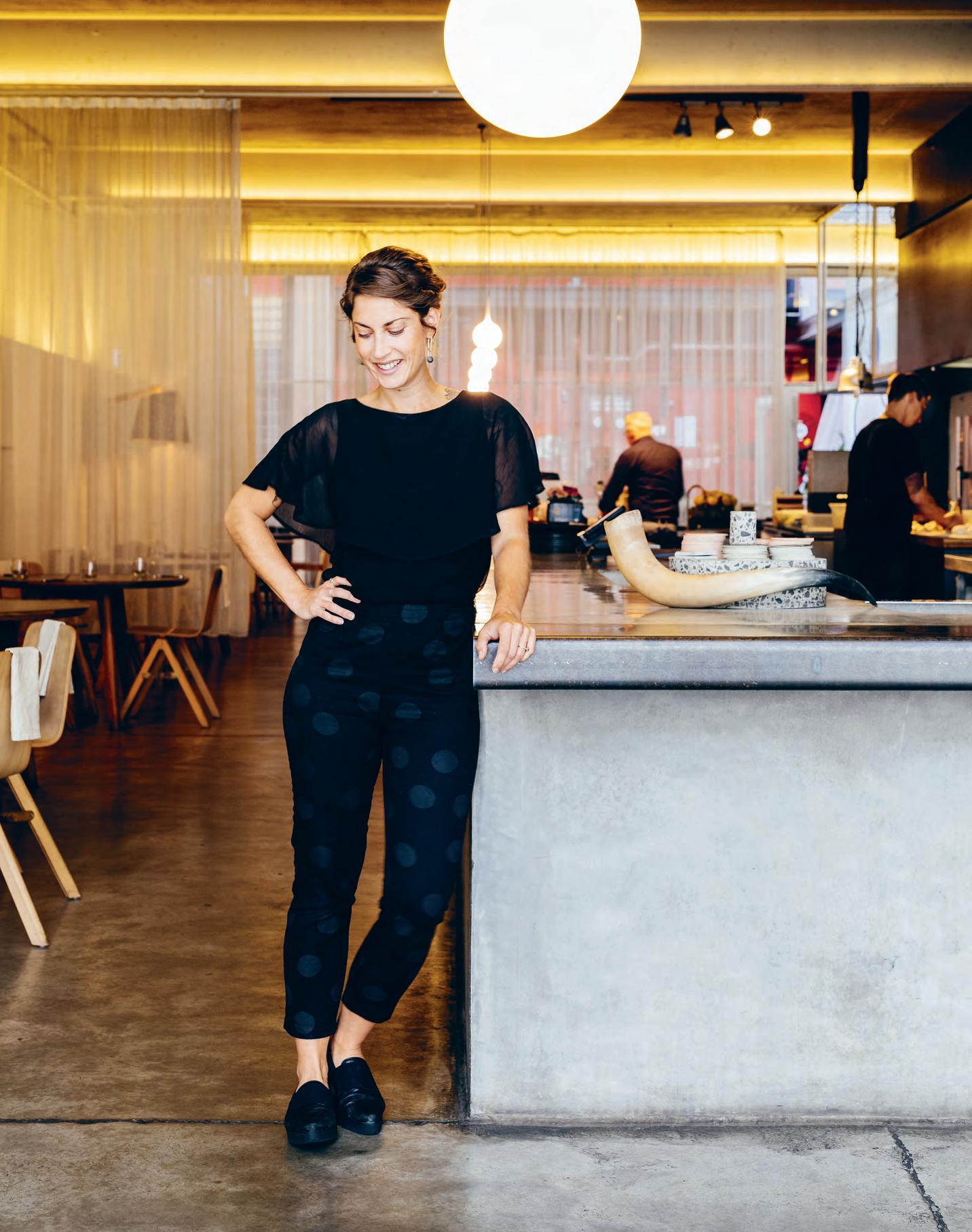
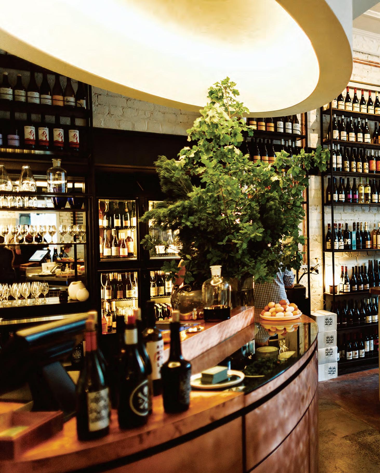
My House Is Your House
Elements such as an island bar can foster better interactions between diners and bar staff, and create that electric vibe that turns a one-off visit into a weekly event. At chef Andrew McConnell’s Melbourne wine bar, Marion, this very design element has proved integral to the venue’s widespread popularity. As Andrew Joy, hospitality business owner and front-of-house pro, says: “It’s all about the idea that you’re at my place and I’m taking care of you.”
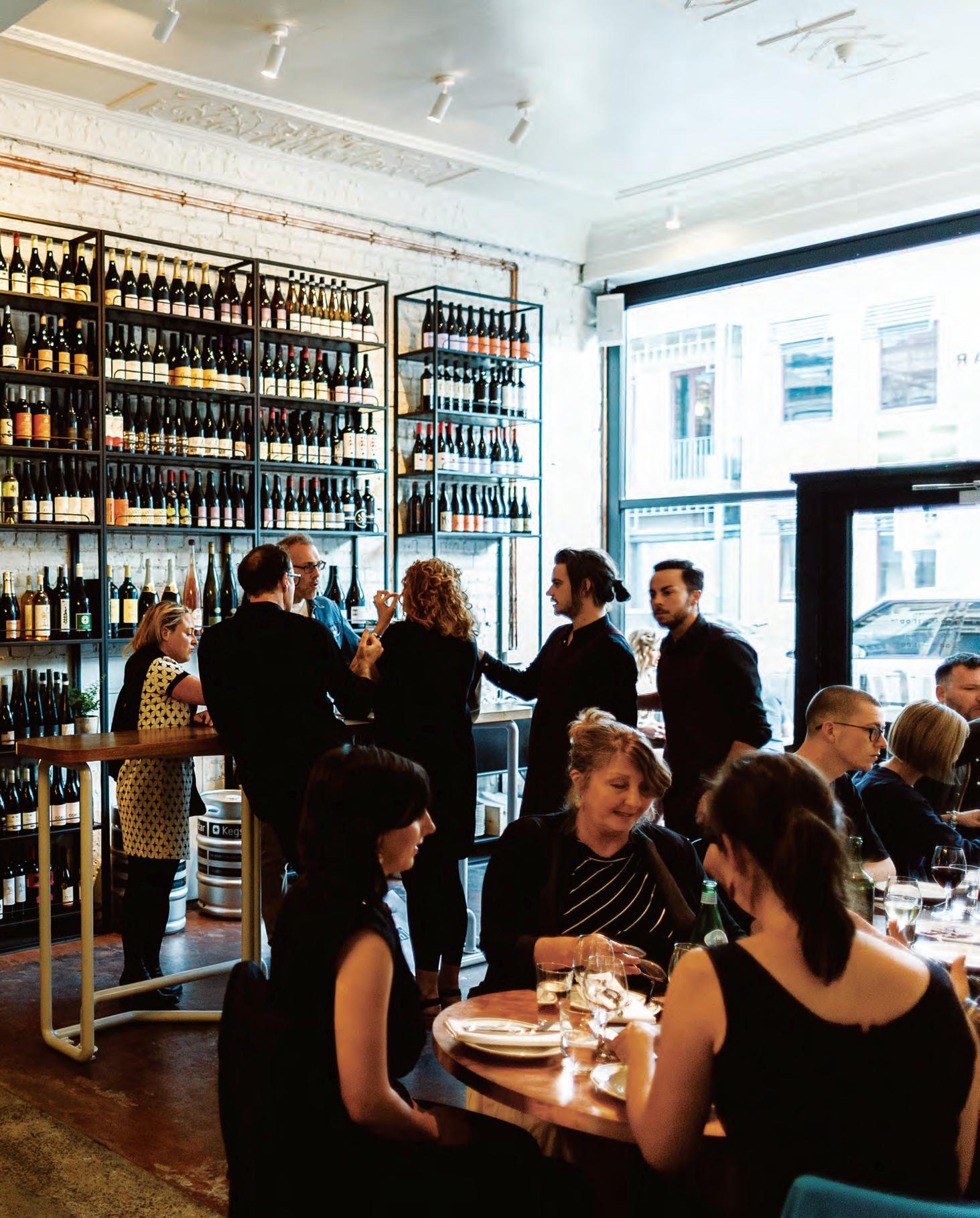
–
mulberries. Christensen will spend service gliding between tables and topping up wine glasses, anticipating the desires of her guests.
“I never walk into any space without a purpose — it’s all about making the most out of every journey and never being empty-handed,” says Christensen, who previously worked at Melbourne eatery Coda and ultramodern Indian restaurant Tonka. “Time is essential and it’s critical to be as efficient as you can with almost every step you take.
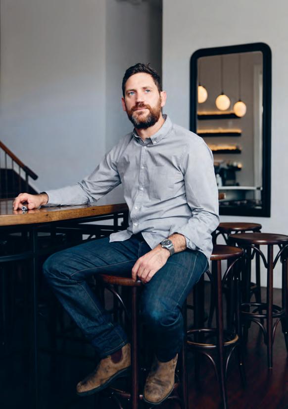
At Tonka, [owner] Kate [Bartholomew] understood the position of waiter stations and the way staff would naturally move through the restaurant. You can see when a restaurant has been designed by a person who’s never worked in it. You take one step forward, then you find yourself stepping in another direction. There’s no fluidity.”
Christensen, who thinks negative space is an underrated design element, says that lighting and surfaces — essential to creating ambience — can inhibit her ability to do her job well.
“When I left Melbourne, it was very fashionable to have super dark restaurants,” she says. “My eyes are good but dim lighting strains
them and makes it difficult to interact with the customer, who would sometimes get their flashlights out! And although I love the interior [effect], concrete floors can be tough. Hard floors take a toll on the people who spend time on them every day.”
For Joy, the design features that work best in a restaurant are those that actively create a hospitable experience — even if they seem small at first glance. “Hooks under the counter are such a beautiful touch, it’s considering the needs of guests in their utmost form,” he says. “At Carlton Wine Room, we think about every detail — from the weight of the cutlery, to how glassware feels when you pick it up. We’ve also used softer tones, colours that comfort rather than challenge. As a restaurateur, I love the idea that someone feels at home in a space that I’ve created for them. Ego shouldn’t get in the way of your job, which is to take care of people.”
franklinhobart.com.au, thecarltonwineroom.com.au, marionwine.com.au
INDESIGNLIVE.COM 162 IN DEPTH
Page 159: Franklin sommelier, Kate Christensen pictured standing at the central service and dining bar in Franklin, Hobart, photo: Adam Gibson. Page 160-161: Marion wine bar in Melbourne has a permeable atmosphere where staff and patrons can mingle and easily interact, photo: Harvard Wang. Above: Andrew Joy of Carlton Wine Room in Melbourne, photo: Elizabeth Bull.
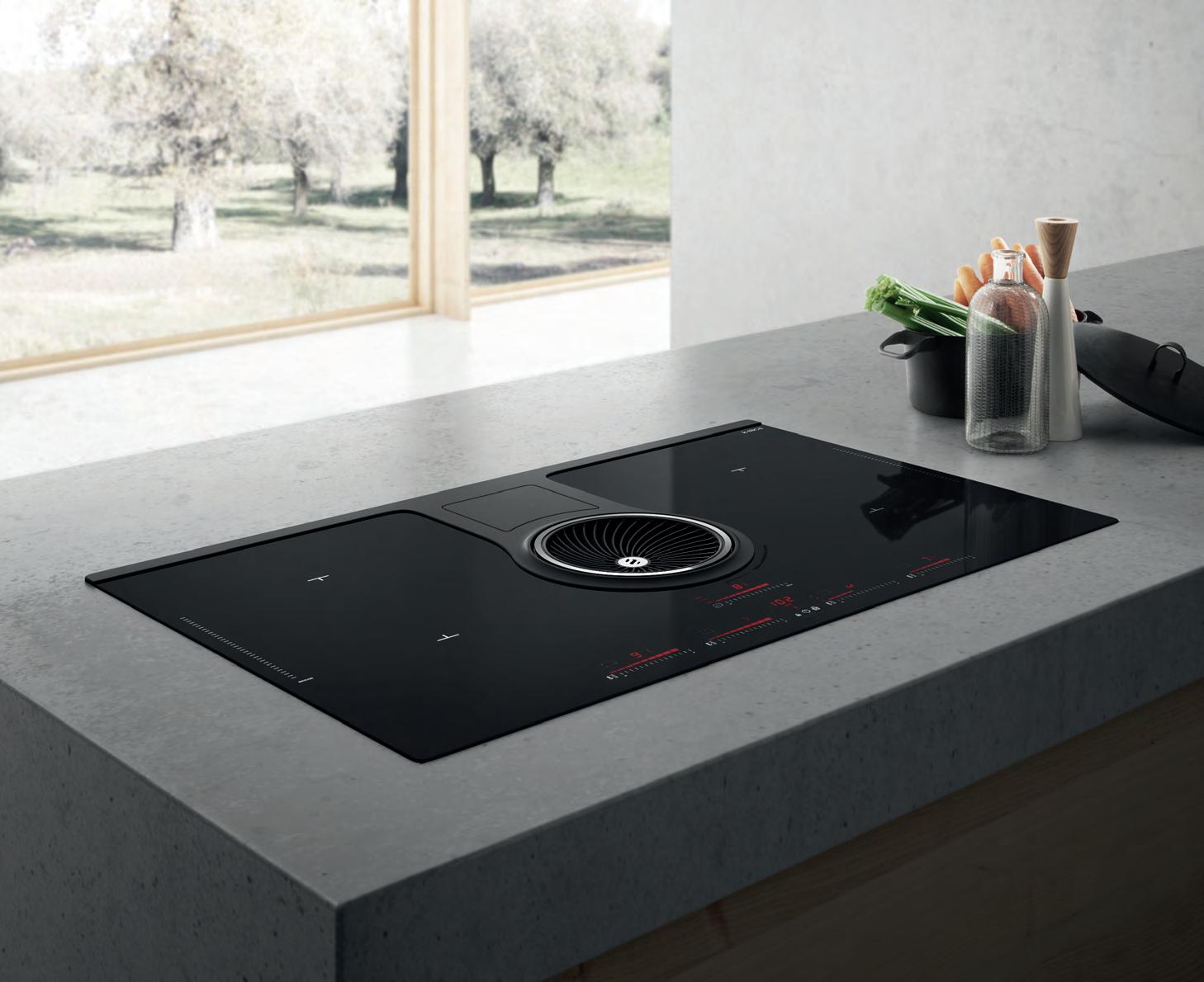
in D es i G n X COse N TINO
Cosentino has introduced three new colours to Dekton® Industrial Collection to accompany the award-winning Trilium, launched in 2016 to worldwide acclaim. The revolutionary surfaces evoke the look of aged metals with rich, complex and beautiful imperfections that develop from oxidisation.
Cosentino collaborated with Argentinian architect and designer Daniel Germani, who is creative director and founder of Daniel Germani Designs, to develop the new colours. Germani first partnered with Cosentino in 2015 to explore the use of Dekton® in custom furniture production. The result of the latest collaboration is three new coloured surfaces: Radium, Nilium and Orix.
“The Dekton® Industrial Collection was created to contemplate the beauty of metals and cement at every stage of its life,” says Germani. “It pays homage to the beautiful imperfections of the oxidation and degradation processes undergone by certain materials,” he says.
The newest Dekton® colours, Radium and Nilium, capture the visual texture and colour variation of rusted metals. Radium is a dark surface that evokes acid-degraded steel plate with warm earth tones and cool blue and green tints.
Nilium is inspired by metal at the beginning of the oxidisation process. The light, minimalist surface is a subtle blend of silver and white with a delicate warm appearance.
Reminiscent of oxidised stainless steel, another new Dekton® addition, Trilium, is a mix of volcanic shades of deep grey, black and rusty tones. While Dekton® Orix suggests aged cement with an eroded, fragmented appearance and tones of steely grey, blue and green.
Cosentino is committed to using advanced and sustainable manufacturing processes and both Dekton® Trilium and Radium are made with up to 80 per cent of their content recycled from excess materials, such as offcuts and discontinued stock.
Dekton® is a sophisticated blend of the raw materials used to produce an extremely nonporous and multifunctional surface. Dekton® is resistant to scratches, stains, UV rays, fire and heat. Its ultra-durable performance makes it an ideal solution for indoor and outdoor applications, including kitchen and bathroom benchtops, splashbacks, flooring and cladding. Its large-format sizes also allow for continuous surfaces without cuts or joins, creating seamless spaces.
livingedge.com.au living edge 164 cosentino.com cosentino 164
Dekton® Industrial’s inaugural and new collections are available throughout Asia Pacific thanks to Cosentino.
Inspired by aged and oxidised metals, stones and cement, Dekton® Industrial Collection offers surfaces with a rich and expressive urban aesthetic.
room service
INDESIGN 165 IN DEPTH
Above and page 168: Paramount House Hotel by Breathe Architecture, awarded Hotel of the Year 2018 in Gourmet Traveller ’s annual Australian Hotel Guide Awards, photos: Tom Ross and Sharyn Cairns. Page 167: The newly opened Matilda, designed by Projects of Imagination and set within United Places, photos: Tim Grey. Page 170: Clayton Wells’ Automata restaurant is housed within The Old Clare Hotel in Sydney, photo: Jason Loucas.
Hotel dining isn’t usually something we seek out. In fact, buffet breakfasts aside, we never would have considered eating at a hotel restaurant. That is, until recently.
When visiting a new city, we inherently feel like foreigners, and most of us want to get out and explore the neighbourhood, discover something new and eat where the locals eat. But lately there’s been a shift in the design direction of hotel precincts which not only keep their guests close, but also offer a dining ‘staycation’ for locals, too. This new approach to hotel amenity offers much more than an impressive lobby, a nice bathroom, and club sandwiches on the room service menu. Some of our cities’ best chefs are opening establishments in boutique hotels, bringing neighbourhood eateries to locals and travellers alike.
Scott Pickett and Mat Lindsay aren’t two names you’d usually associate with hotel restaurants. Both are celebrated chefs in their respective cities (Melbourne and Sydney), both with iconic restaurants to their names – Pickett with the Estelle Bistro, ESP and St Crispin, and Lindsay with Ester. Both have also recently opened new restaurants which happen to be in hotels.
“Buildings need energy, people, movement, noise, that was main reason for having a restaurant as a significant element of the hotel,” says Darren Rubenstein of United Places in Melbourne. In June, property developer Rubenstein, with his father-in-law Richard Roberts, opened their first hotel – a 12-suite boutique hotel opposite Melbourne’s Royal Botanic Gardens in South Yarra. United Places has been designed by architects Carr, with spacious one- and twobedroom luxury apartment-style suites. Interior features include
rendered walls, timber floors and opulent details like glass pod bathrooms, and velvet curtains that open onto leafy garden vistas. Downstairs, Pickett’s restaurant, Matilda, is an 80-seater brasserie designed by Projects of Imagination, with a menu that focuses on wood-fire cooking.
“Whether you are travelling for business or leisure, when you get back into your room, you don’t want to rush out. You want things to feel comfortable and convenient, you want to be spoilt,” says Rubenstein. “Rarely is there an opportunity to have a nice meal.”
On the ground floor of United Places, Pickett has opened his first southside restaurant, creating a space Rubenstein describes as the entry point to the hotel, where guests can get a taste of what the hotel is about.
“Matilda is very earthy, very warm, very homey, very authentic, and that translates back into what the hotel is.” There’s a lot of wood and natural tones, blackwood tables, clay plates by Andre Davidoff, hand-blown glass pieces by Mark Douglas, and life-sized images by Bill Henson of the Botanical Gardens.
“There is a very natural synergy between us and the hotel,” says Pickett. “It’s a place that sort-of encapsulates the local area, from the rooms to the restaurant.”
As well as servicing the eatery and basement bar, Matilda is providing room service or “glamour comfort food” such as chicken cooked over coals with a side salad, or a piece of grass-fed beef with a peppercorn sauce. The restaurant will also be making the turndown treats and mini bar items like housemade gin and mixers, which can be ordered from the on-call butler.
INDESIGNLIVE.COM 166 IN DEPTH
The country’s best chefs are teaming up with top hoteliers to offer travellers and locals a unique in-hotel dining experience. It’s the ultimate ‘staycation’ – with all the trimmings. We track the trend.
Words Caroline Clements Photography Various
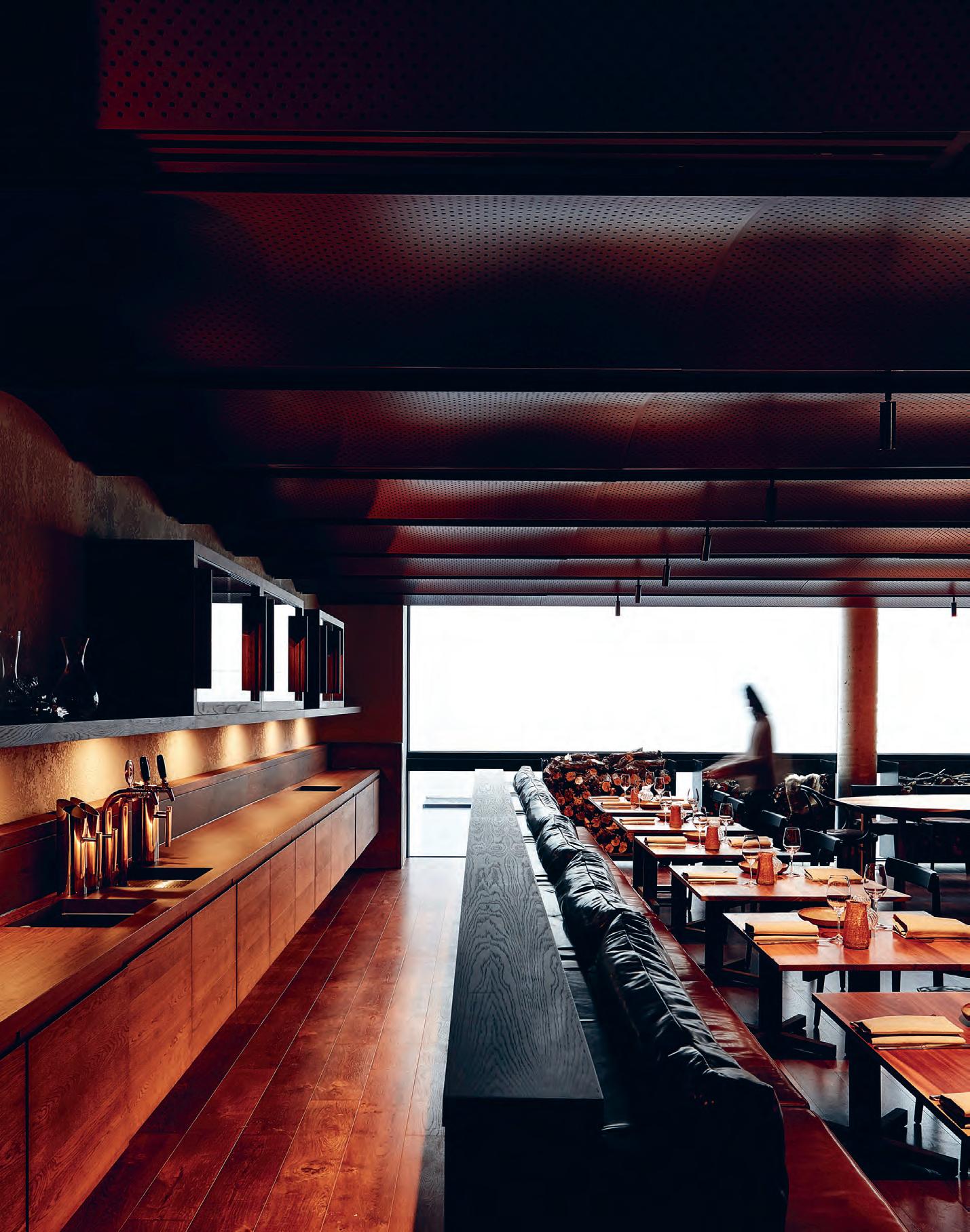
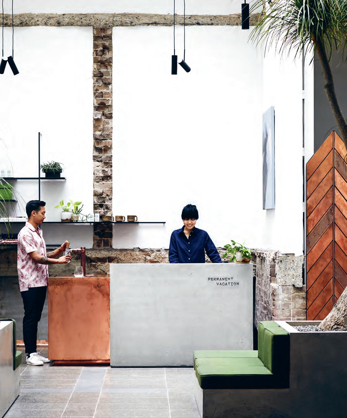
INDESIGNLIVE.COM 168 IN DEPTH
At Paramount House Hotel in Sydney, the space transitions from a slick coffee shop (Paramount Coffee Project) into a communal hotel lobby within a couple of steps. In April, Russell Beard, Ping Jin Ng and Mark Dundon (of Reuben Hills, Paramount Coffee Project, Seven Seeds and Bondi Hall between them) opened their first hotel in the backstreets of Surry Hills. The 29-room site has been designed by Breathe Architecture with a mix of concrete, terrazzo, timber and greenery across various rooms from the Everyday to the Mack Daddy. Some with colourful shag rugs by Jardan and timber baths by Wood and Water, all with access to the rooftop Recreation Club, the basement Golden Age Cinema, and Mat Lindsay’s new restaurant, Poly.
“We wanted to have a space where you could get a great coffee in your room or downstairs in the café. Where you could have a break, a snack and glass of wine at night, and also where you could hang out in the lobby and feel like you were part of a community,” says Beard.
In the bottom corner of the complex on Commonwealth Street, Lindsay has opened Poly, a dark, moody bar (previously a furniture showroom) with Ester sommelier Julian Dromgool. Also an 80-seater space, Poly has been designed by architect, Anthony Gill, who worked on Ester and other local venues Vini and Berta.
Lindsay says Poly is more a wine bar than Ester, like an izakaya (but not Japanese), serving lots of snacky things you can eat with your hands, a larger wine list and some cocktails. “You’ll see a little DNA of Ester, but we’re quite conscious of keeping Poly it’s own thing. We want it to be more casual, a nice, easy neighbourhood place that people can drop into, or come down from the hotel.” Like Matilda, Poly will be providing special in-room dining for hotel guests.
What is so defining about these resident eateries is that they are restaurants in the hotel, but are not hotel restaurants (in the way we have previously known them). Both Poly and Matilda are standalone experiences – available to non-hotel diners – that create energy and atmosphere, complementing and enhancing the offer at the hotel. By bringing in these chefs, they are creating places that locals want to dine in, as well.
Whether you’re eating in the restaurant or putting your feet up and dialing down for room service, recruiting the city’s best chefs is part of the ultimate vision to host, indulge and make guests feel even at home at these hotels. Even if it’s a very fancy version of home.
INDESIGN 169 IN DEPTH
paramounthousehotel.com, unitedplaces.com.au
“We wanted to have a space where you could get a great coffee in your room or downstairs in the café... where you could hang out in the lobby and feel like you were part of a community.”
Fine Dining The Old Clare Way
Housed on the ground floor of boutique warehouse hotel, The Old Claire, in Sydney is Clayton Wells’ (Momofuku Seiōbo, Quay) restaurant, Automata. This elegant, industrial dining space designed with Matt Machine serves a five-course degustation with wine matched by Tim Watkins (Ester, Monopole).
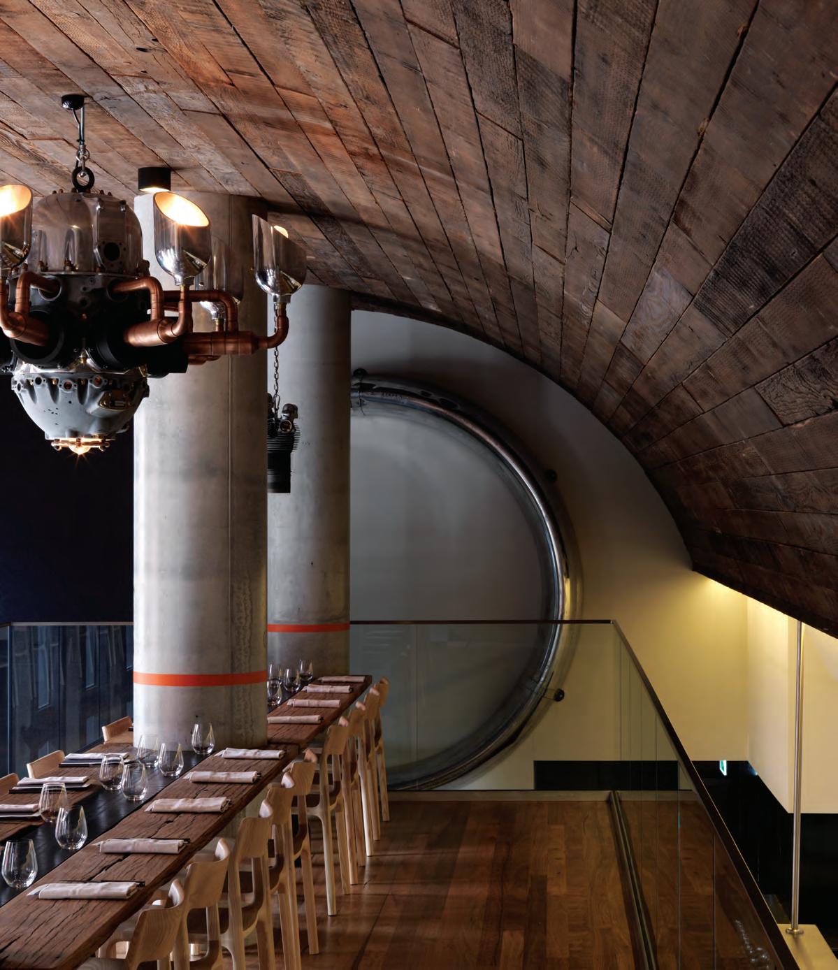
INDESIGNLIVE.COM 170 IN DEPTH
–
PIANO — A porcelain tile collection, designed by Ronan & Erwan Bouroullec for Mutina DI LORENZO TILES Pty Ltd Tile Merchants | www.dilorenzo.com.au Castle Hill 02 8818 2999 | Waterloo 02 8818 2950 | Newcastle 02 8860 0720 | Caringbah 02 8818 2970 | Willoughby 02 8602 1470 Inkredible 1855-58
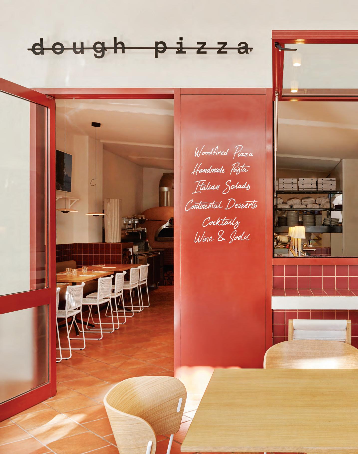
hunger and ambition
Words Leanne Amodeo Photography Various
Ohlo Studio Indesign Designpreneur
Ohlo Studio has been hard to ignore since interior architect and artist Jen Lowe established her practice in Freemantle, Western Australia in 2015. Lowe and team’s work is on-trend and energetic, teeming with an inspired use of colour, well considered spatial planning and fine attention to detail. While the projects may be modest in size, all are compelling for their strong material selections and singular design vision.
For Lowe, good hospitality design is about uncovering the unique identity inherent in each project. “Every material has an origin and various associations and we use this to create emotive environments that connect people to places,” she explains. “We like working with clients that have a strong sense of who they are and what they want to achieve, so we can use their stories to seed the design’s concept.” Among recent projects is Dough Pizza which, with its rustic yet sophisticated minimalism, evokes all the liveliness of Italy’s best
small cafés. The 160 square-metre space features a central bar that demarcates two dining experiences; one defined by the theatre of an open kitchen and pizza oven, and the other offering an intimate zone for quiet conversation.
An emphasis on experiential design is a big part of Ohlo’s ethos, as is using visual cues and narratives to engage the end user in a language relevant to the particular project. The practice is currently working on two cafés, one of which is on the outskirts of Perth and involves designing the interior as well as the branding.
It signals a new direction for Lowe, who’s interested in the relationship between hospitality venues and the local environment, where placemaking and community engagement can be celebrated.
ohlostudio.com
INDESIGN 173 IN DEPTH
Setting up your own studio is no small challenge, but Australia’s growing hospitality industry is proving lucrative for a new generation of Designpreneurs. Meet three design studios which are shaking up the hospitality game.
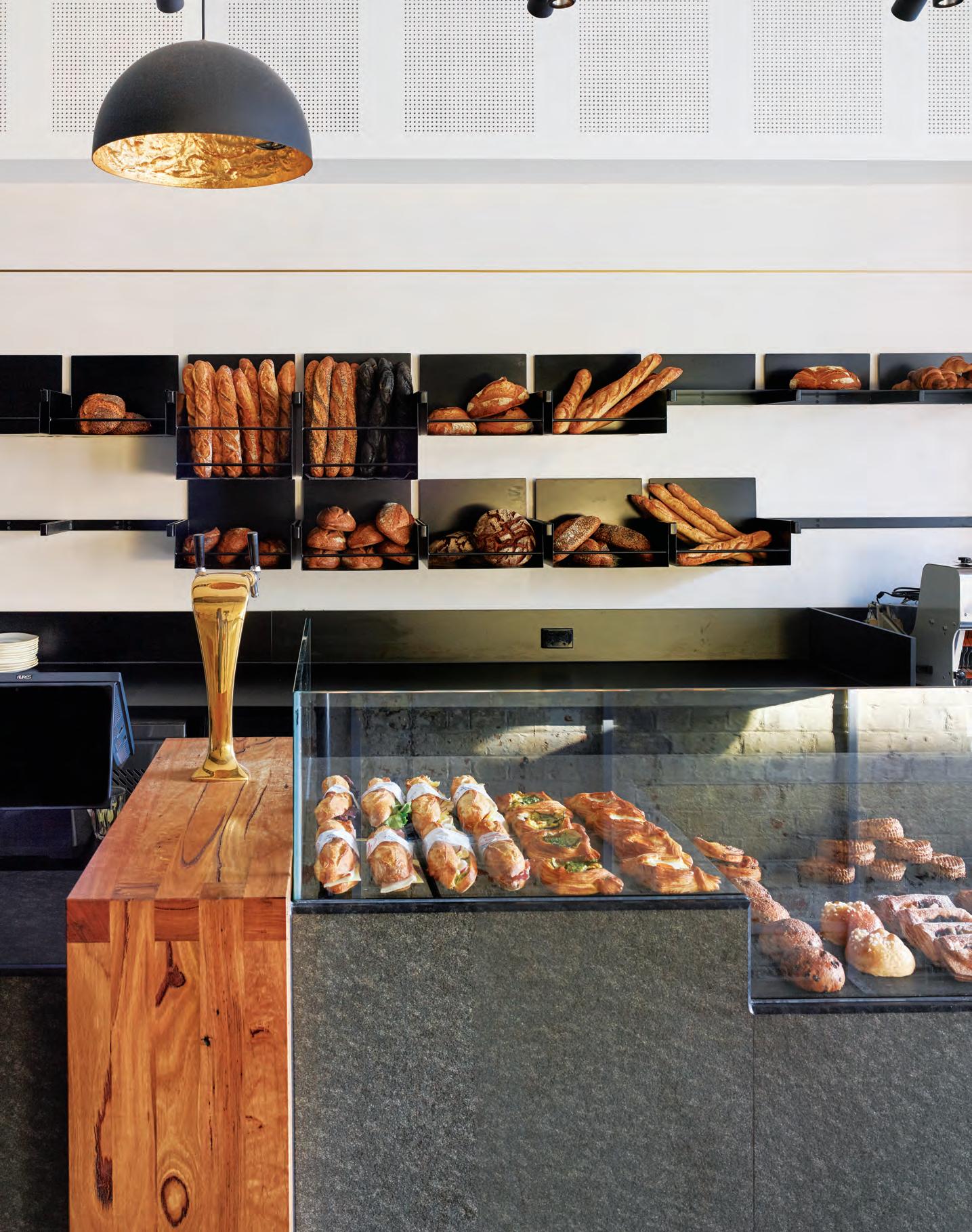
Olaver Architecture’s hospitality projects are remarkable for their material contrasts. Vignettes of light and dark, old and new, and soft and hard have become the Melbourne-based practice’s signature, lending each new project a sort of visual poetry that evokes an immediate emotive response. It comes as no surprise that founder and director Emlyn Olaver studied film and cinema before architecture. He has a knack for creating atmospheric spaces full of elegant restraint and enveloping warmth.
A University of Melbourne alumnus, Olaver often refers to his collection of cinema studies books for inspiration and always puts himself in the picture when formulating initial concepts and sketches. “I think it’s important to design an interior with consideration for how people will experience the space – customers as well as staff. And I’m always happiest when I see everyone enjoying what we’ve created,” he says.
Experiential aspects of his seven-strong team’s designs translate as highly textured surfaces, plush finishes and a quality of light
that’s memorable. For Gontran Cherrier in Hawthorn, Melbourne, Olaver and team played in to the exposed original brick walls and pressed tin ceiling. These textural elements have come to define the 70 square-metre boulangerie, creating a perfect backdrop for the artisanal breads and pastries on display. Olaver has kept the scheme simple, with the only concession being a sculptural granite counter that anchors the space and perfectly contrasts the overall lightness of the interior.
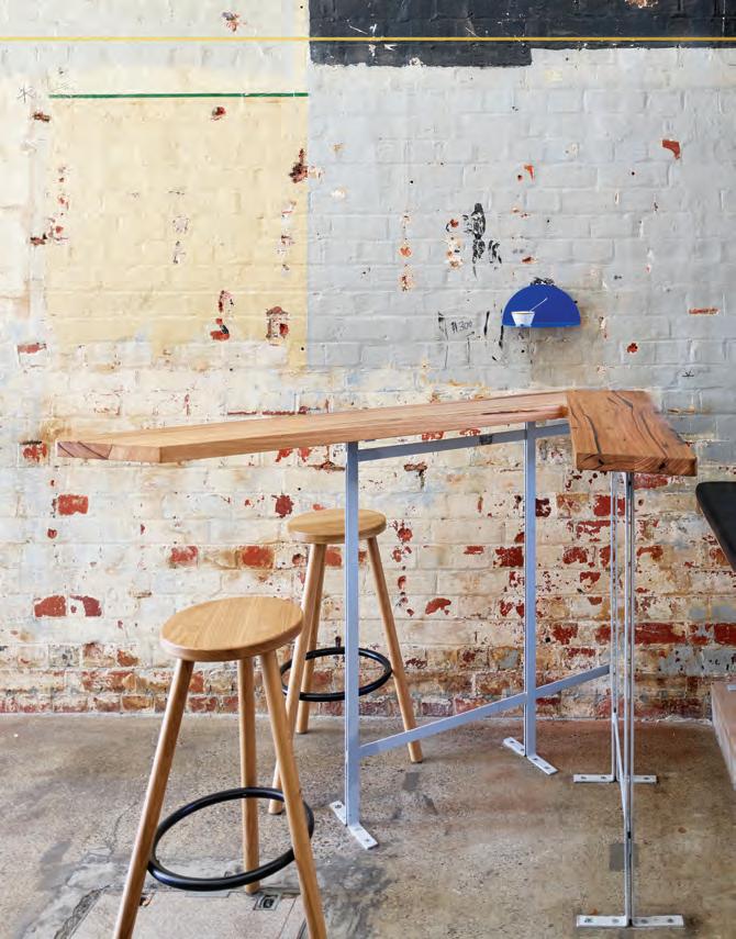
The practice has plenty on its plate, with current hospitality work including two Japanese restaurants, one of which is situated in an existing red brick building in Richmond. Its scheme plays with the idea of wabi sabi , further exploring the theme of old and new via multiple stylistic and material layerings. Watch this space.
olaver.com.au
INDESIGN 175 IN DEPTH
Olaver Architecture
Indesign Designpreneur
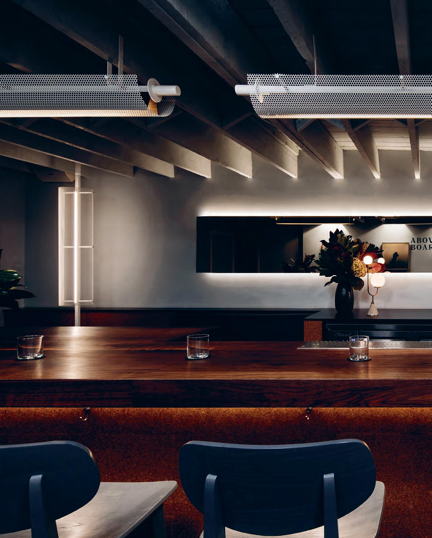
Keeping It Above Board
This 14-seat cocktail bar in Collingwood is an eloquent study in designing smart for a small venue with a low ceiling. Designed by Chris James Studio, the material palette of locally sourced cork tile, walnut timber, midnight blue leather and off-white perforated mesh is used judiciously, lending the space a balance of upmarket appeal and a reassuring sense of order.
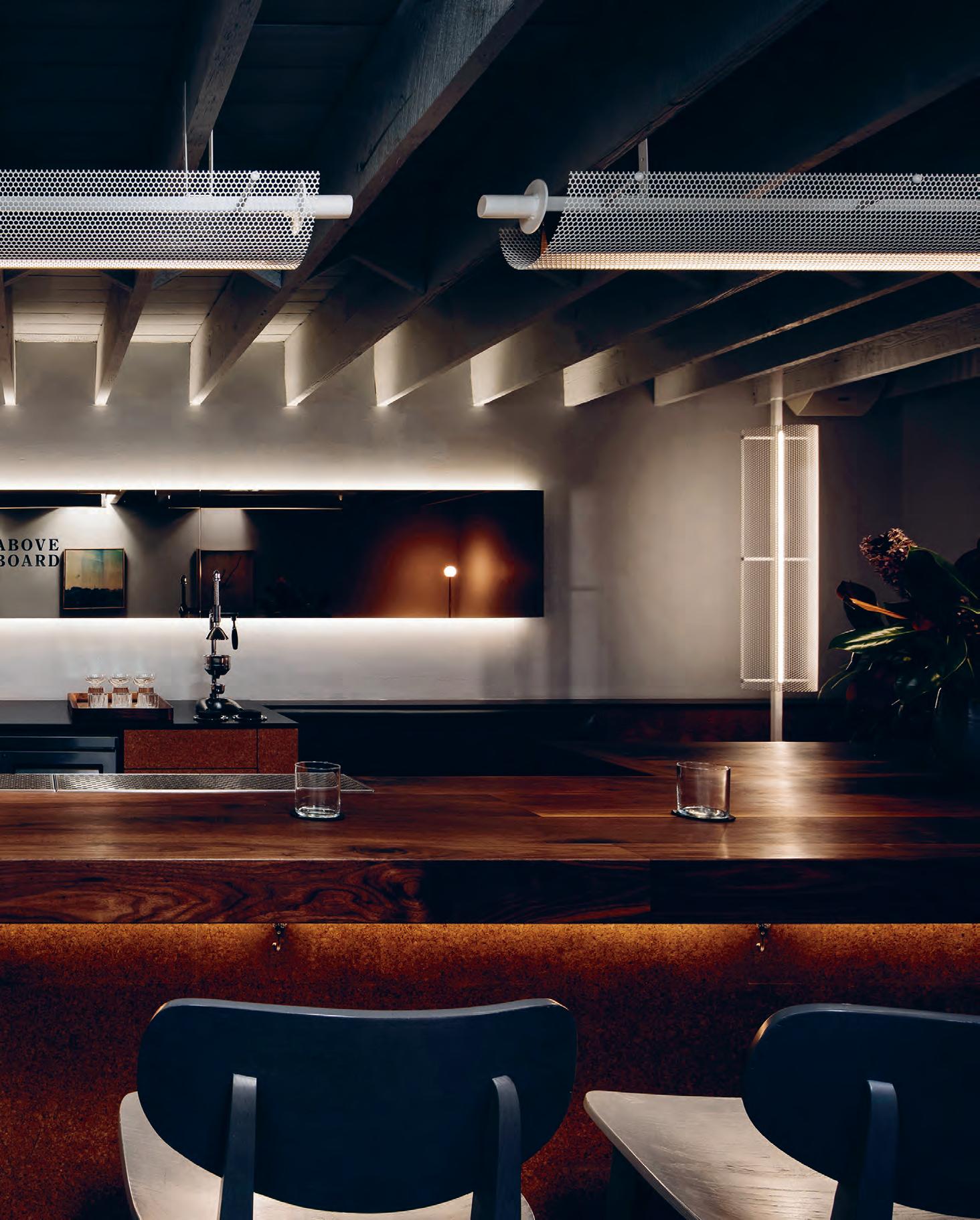
–
Chris James Studio Indesign Designpreneur
Since graduating with a degree in architecture and construction management from Deakin University in 2013, Chris James has been focused on one thing. “I’m always thinking about this idea of what an Australian design identity is,” says the Melbourne-based founder and sole practitioner of Chris James Studio. “Trends come and go, but how do we create a concrete aesthetic that’s immediately recognisable? I want to explore what that might be over the course of my career.”
Fresh from graduation, James landed a plum job at Technē where non-traditional ways of looking at design are both encouraged and appreciated. It’s a way of working that underscores his own practice today and as he continues to build his portfolio, every project is
approached with this in mind. Challenging the status quo and pushing boundaries with a view to move his design forward are priorities.
James’ current hospitality work, including a restaurant in Melbourne’s CBD and a number of wine bars, is about creating an experience for the end user. He’s inspired by his passion for Balearic beat and the way this eclectic blend of DJ dance music elicits different responses from people. James doesn’t necessarily want to control what the end user’s response will be, just that it be something – even the most fleeting feeling.
chris-james.studio
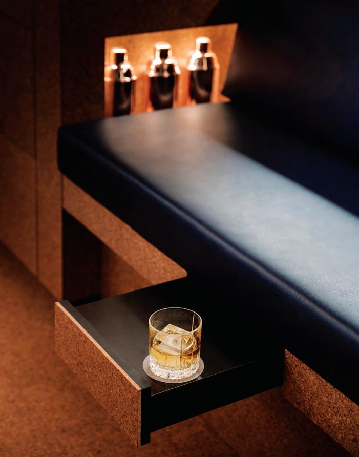
INDESIGNLIVE.COM 178 IN DEPTH
Page 172: Dough Pizza combines a rustic appeal with plenty of theatre, photo: Patrick Schüttler. Page 174-175: Gontran Cherrier, Hawthorn, Melbourne by Olaver Architecture, photo: Kristoffer Paulsen. Page 176-178: Above Board in Melbourne by Chris James Studio, photos: James Morgan.
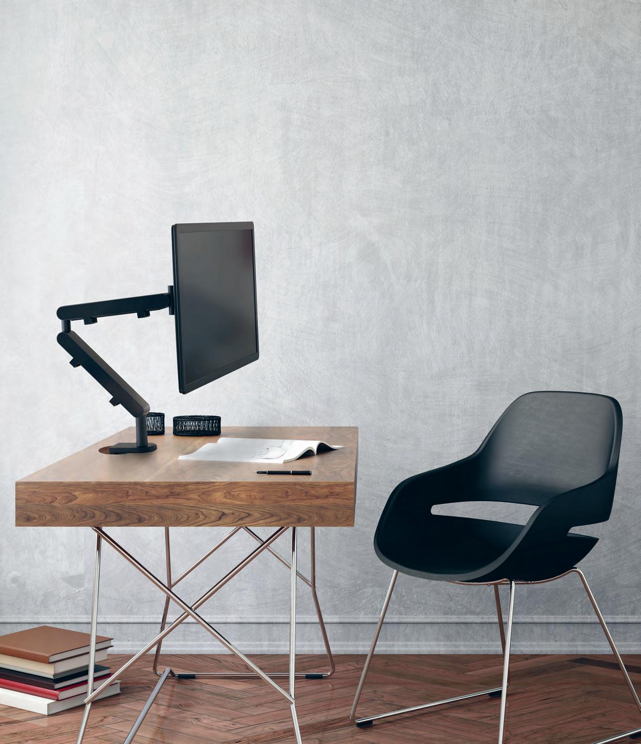


get work clarity www.zgonic.com The Zgo Monitor Arm: Gold (2012 Australian International Design Awards). Z1 Monitor Arm
in D es ign X ELS LIGh TI nG
In galleries and museums, depth of visual experience is paramount to allowing people to fully step into the mind and world of the artist. For designers, great importance lies in the representation of the artwork on display and how people interact with and experience the work. Colour, light, shadow, texture and transparency all play crucial roles in designing these experiences, and choices when it comes to lighting can make or break this experience for everyone.
Galleries and museums have specific needs when it comes to artificial illumination. Great importance lies in the colour quality, consistency and performance of light sources, along with deep, smooth, and flicker free dimming. One of the main products that designed with these aspects in mind, is ELS Lighting’s Iconic series. This attention to detail in lighting for gallery and museum work has been combined with ease of use and flexibility, to provide the highest quality lighting for peak natural colour representation. The Iconic series of lighting offers perfect saturation across all colours, and showcases a particular prowess for reds and pinkish skin tones that often appear dull and lifeless under poor
lighting conditions. With ease of use, a simple installation, and customisation of luminaires paramount to gallery and museum lighting, all these factors have been priorities to the ELS team throughout the research and design phases of each luminaire.
ELS Lighting has been able to achieve extremely high levels of quality in its gallery and museum lighting range by focusing its attention on superior luminaire design and the use of Xicato’s new XIM Gen4 BLE smart LED module.
The Xicato XIM Gen4 BLE is an intelligent LED module with integrated driver, and Bluetooth control support. The luminaire delivers perfectly choreographed dimming, unmatched colour consistency, remarkable colour rendering and a duet of source sizes that make any space, including museums and galleries, perform to their fullest.
With smoother and deeper dimming, the XIM out-performs systems with high-end standalone LED drivers. Combined with best in the industry colour consistency and purposely-engineered light spectra, XIM provides simply the most beautiful lit effect out there – because isn’t good art worth shining a light on?
livingedge.com.au living edge 180 elslighting.com.au els lighting 180
ELS Lighting presents the Iconic series of high-performance, high-quality lighting for the museum and gallery sector. Featured artwork - Kevin’s Cornflowers (1993) by Margaret Olley.
The art of illumination.
INDESIGN 181 IN Teres T Teres T IN
L earn From the #Lady d or itos deba C L e?
What Can W e


INDESIGNLIVE.COM IN TEREST 182
In the great haemorrhaging of publicity that’s so characteristic of our age, the happenings of 4 February 2018 stand apart. Amid headlines covering school shootings in Los Angeles, Taliban bombings in North Pakistan and the Sibanye Gold incident, the New York Post picked up a story initially run in UK tabloid The Sun: ‘CRUNCH DECISION: Doritos fi rm to launch crisps for WOMEN because they don’t like crunching loudly or licking their fi ngers, boss reveals’. Within minutes of publication, #LadyDoritos trumped even the US President in Twi er’s trending topics. While for some it was a news item too trivial to ma er, for a teeth-gnashing majority #LadyDoritos sounded the death knell for gender equality.
Kick-started by a podcast interview (31 January 2018) between PepsiCo CEO, Indra Nooyi, and Freakonomics author, Stephen Dubner, the resulting social media maelstrom is only a fragment of this saga. When asked over the airwaves about PepsiCo’s approach to line extension across its many verticals, Nooyi referenced a significant gendered divide in the Doritos consumer profi le. Within this data set, a majority of female respondents declared preference for a competing product which was low on crunch – so quieter to consume; cleaner to eat in terms of fi ngertip residue; and smaller per mouthful to suit the commonly narrower mandibular silhoue e of the female skull.
From this skimpy kindling, fl ames of indignation burst forth. On Twi er @Doro_Doro: “#LadyDoritos are literally designed to make women conform to there [sic] gender stereotypes. To be less messy and noisy and less distracting”. On television: Piers Morgan repeatedly punched a packet of Doritos while roaring, “Indra, shame on you!” In academic commentary: a famous gastrophysicist weighed in on the gendered phenomenology of corn chip consumption for The Journal Of Sensory Studies. A litany of comments prefaced with “As a woman […]” still decorates more than 510,000 accredited articles recognised by Google. The witch-hunt has not subsided.
Meanwhile in Australian AECO industrial relations, a somewhat related conversation has taken a recent, promising turn. The 79 th and standing president of the Australian Institute of Architects is a woman. A 2015 Parlour study notes the number of female architects in our market had increased by an average of 16 per cent. Additionally, these hubs of advocacy have tirelessly promoted cultures of transparency, support and discussion. Significant and measurable progress has been achieved, bringing improvements for the greater equitability of the Australian AECO supply chain. Nonetheless, our industry’s female professionals still face a multitude of daily struggles to achieve true equity with male peers. How can the #LadyDoritos case possibly enlighten us, here?
From a casual aside on a podcast, to hack journalism and fi nally the social media furore, the to-do surrounding ‘Doritos for women’ seems not a question pertaining to the chips themselves, but PepsiCo’s understanding of what ‘for women’ should entail. Irrespective of the fact that #LadyDoritos responds to market research – and in so doing, follows the logic of market liberalism –the landslide of critiques suggests that PepsiCo’s wish to diversify the value chain of crisps is crucially lacking in intersectionality.
In fact, the rhetoric of gender diversification in the value chain of our AECO professions also falls short in terms of understanding the nuance and complexity of intersectional identification. We are not alone in this. In the United Kingdom, for instance, the Commission for Architecture and the Built Environment (CABE) found the number of female registered architects was greatly coloured by (and in some cases directly competed against) the industry’s ethnic makeup.
According to their 2004 study Architecture and Race, only two per cent of female registered architects identified as non-white, drawing focus to lack of social support networks, advocacy groups, and placement di culties for the otherwise 16 per cent of graduate, non-white female architects. In the United States, a breakdown of salaries in the AECO professions noted that a er 15 years’ experience, white women on average earned 76 per cent of their male counterparts’ salaries, compared to the lesser 70 per cent earnings of women of colour.
“As a woman […]”, then, should be understood in this light: #LadyDoritos’ target audience a rmed (quite vehemently) that “I am not that woman”. The episode verifies that discussions of equity are not, by their very nature, zero-sum games. Once it had hit social media, #LadyDoritos had quashed other topical debates surrounding equity, not solely related to gender alone. Both #WhyBlackPantherMa ersToMe and #BlackLivesMa er indexed lower on Twi er in favour of greater traction and distribution of #LadyDoritos within 24 hours of its fi rst iteration.
That the needs of di erent minority groups can and will compete is no longer a point of contention. Drawing a ention to gender over and above other achievements and signifying factors of identity only creates a culture wherein some minorities are more equal than others.
A more equitable AECO industrial relations landscape requires a challenge to the logic of market liberalism and the logic of market virtue to create collective empowerment. We know all too well that in the world of ceilings, those made of glass are not the only ones. We are all at risk and complicit when minorities beyond our own are not visible in the room – let alone audible in the conversation.
INDESIGN 183 IN TEREST
The cautionary and enlightening case of #LadyDoritos reveals the complexities of gender equality across two very disparate worlds of snack foods and architecture.
Words David Congram Graphic Art Julia Gee
Be INspired
5 for 4
Subscribe to Indesign and get 5 issues for the price of 4! (AUS$55). Join the global design gang at www.indesignlive.com/subscribe

Indesign looks for the point and purpose of everything in design – exploring what we do, how we do it, and why. Indesign is the only place you’ll find conversations on the design industry that are clever, provocative, insightful, and just a bit cheeky.
Indesign is for creative professionals – aspiring and established – hungry to continue the ideas that inform the best projects, products and people.
Indesign BFFs
Without the support of our industry BFFs (advertisers, to the laymen) we wouldn’t have this amazing resource!
This symbol throughout the magazine and online represents our valued partners we work with closely, and who continue to support us and our industry. We them and you should too!
INDESIGNLIVE.COM 184 059 Abey abey.com.au 053, 111 Billiani cafecultureinsitu.com.au 006-007, 102 Caesarstone caesarstone.com.au 028 CBS colebrookbossonsaunders.com 067, 164 Cosentino silestone.com 077 Cube + Circle cubencircle.com.au 010-011 Cult cultdesign.com.au 078 Dance For Life dfl-danceforlife.com 171 Di Lorenzo dilorenzo.com.au 012-013 Domayne domayne.com.au 180 ELS Lighting elslighting.com.au 092 Floc flocstudio.com.au 071-076 FRONT front.design 008-009, 061 Gaggenau gaggenau.com/au 147 Geberit geberit.com.au 070, 143 Gibbon Group gibbongroup.com.au 156 Gunnersen himacs.com.au IFC-001 Herman Miller hermanmiller.com.au 151 Humanscale humanscale.com/QSE 018-019 Ilve ilve.com.au 029-045 INDE.Awards indeawards.com 100-101 Infiniti infinitidesign.it 046-047 Konfurb konfurb.com 091 Krost krost.com.au 004-005 Living Edge livingedge.com.au 002-003 Miele miele-project-business.com.au 027 Own World ownworld.com.au 025 Parisi parisi.com.au 119 Polytec polytec.com.au 163 Residentia residentia.group 065 Screenwood screenwood.com.au OBC Smeg smeg.com.au 048 Space Furniture spacefurniture.com 023 Stylecra stylecra .com.au 152-155 Sub-Zero and Wolf au.subzero-wolf.com IBC Tait madebytait.com.au 016-017 Tongue n Groove tngflooring.com.au 055 Vola vola.com 094 Wilkhahn wilkhahn.com.au 014-015 Zenith zenithinteriors.com 135, 179 Zgonic en.zgonic.com 020, 021 Zip zipwater.com
JOIN THE GLOBAL DESIGN GANG...SUBSCRIPTIONS OFFER OUR BFFS...ADVERTISERS DIRECTORY
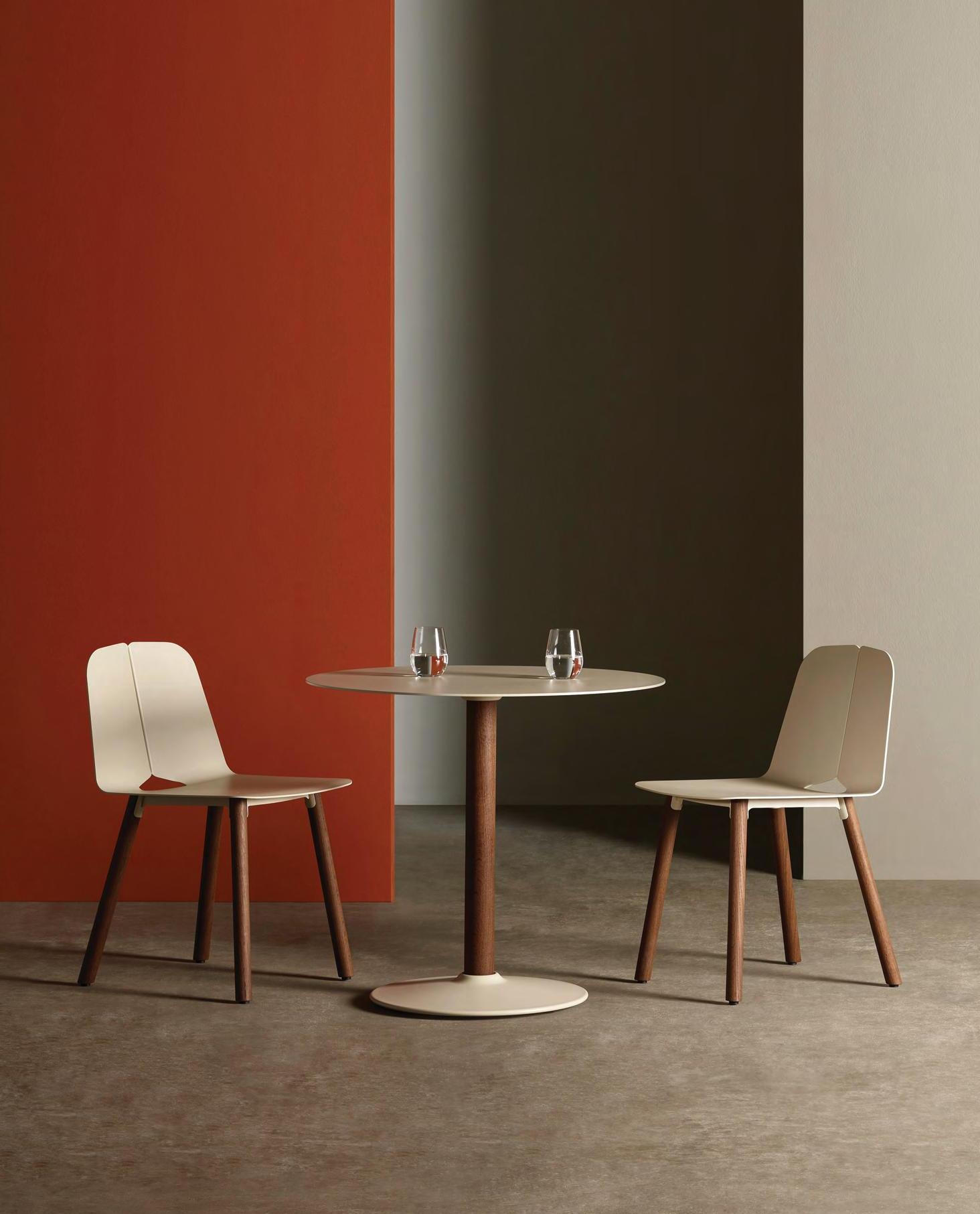

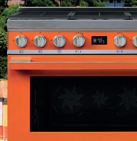


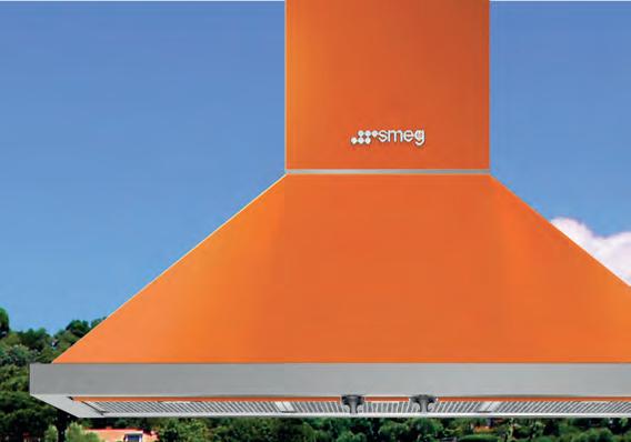

SMA18851-1 smeg.com.au UNRIVALLED TRIPLE-FAN FREESTANDING COOKER IN CHOICE OF 8 COLOURS
THE RICH FLAVOURS OF THE ITALIAN COAST INTO YOUR HOME
BRINGING
