1 minute read
Ð Packaging Design
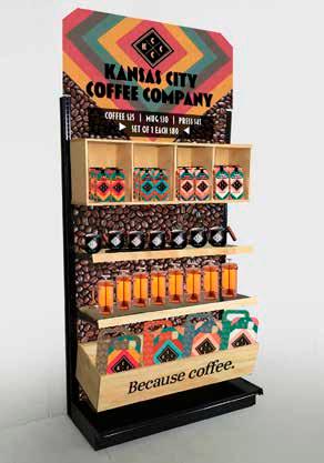
Kansas City Coffee Company may not be an actual company, but their creative brief presented real design needs. The visual message of my package design was congruent with Kansas City Coffee Company’s message. That is, diversity brings possibilities, ethical choices reaps reward, & you are an integral part of our community. The package designs coexist as the brand identity. The use of color, pattern, & texture achieves this communication, addressing the target audience of hip, energetic, busy, creative, Kansas-City-enthusiast coffee-lovers identified by the creative brief.

Advertisement
The repeating diamond shape has each layer brightly colored to give the subtle impression of vibrant & energetic pulsating. Giving the pattern a modicum of transparency allows the earthy brown tone of the paper substrate to show through. The logo is 100% opaque & the details are negative space so that the brown paper shows through.
The two go together in unison to create KCCC’s visual identity. Each of the four coffee roast flavors has a lively color scheme. These colors can be rotated in & out with other palettes for potential promotional purposes.


