







TheFrenchDispatchisa2021Americananthology comedydramafilmwritten,directed,and producedbyWesAnderson.Itsamovieaboutalove lettertojournalistssetinanoutpostofan Americannewspaperinafictional20th-century Frenchcitythatbringstolifeacollectionof storiespublishedin"TheFrenchDispatch."


EdwardScissorhandsisa1990Americanfantasy romancefilmdirectedbyTimBurton. Itsabout Edwardplayedby(JohnnyDepp)isanartificial humanoid,anunfinishedcreationwhohas scissorbladesinsteadofhands.Hewastakenin byasuburbanfamilyandfallsinlovewiththeir teenagedaughter,Kim(WinonaRyder).






 BY JESSIE CHEN VERNERN 0339153


 M Y O D D L Y G R E E N F E E L I N G S E X P L O R A T I O N 1 E X P L O R A T I O N 1


 F I N D I N G B E A U T Y I N F L A W S
E X P L O R A T I O N 2 E X P L O R A T I O N 2


After attempting the previous exploration, I wanted to see if I could capture a different image so I used magnifying glass and I also did another layer of epoxy resin with different colors.


 S H A D E S O F B E A U T Y E X P L O R A T I O N 3


Firstly,Idrippedamultipledropletsof differentcolorsontheplasticwrapthenI folditintohalfcanpresstheplastictolet thecolorsflowintodifferentwavestocreate anewcolorandanewpattern.

Droplets of Ink Colours on Plastic Wrap


 R A I N B O W O F C H A O S E X P L O R A T I O N 5


Forthisweek'slecturesession,Iwasabletolearndiffer interestingsubjects,eventheweirdest&oddeststuffc uniquepieceofphotography.Ms.Aishahhadalsoshownus shedidandalsosomeofthepaststudent'sworks.Itwasve whatisthephotographaboutandthatisnotall,Ilikedit aboutotherelementslikehowwasthisbeingcaptured? photographysettingisneeded? So,forthisweek'stask,Itriedtolookaroundmystudytab timethereandseewhatIcouldtaketoexploreitstexture lighting,angles,compositions,etc.Itrulyenjoyedtryingoutallthelittle experiments&beingabletocapturespecialshotsalongtheexplorationwasan eye-openingexperienceforme.
Thistaskhastaughtmethateventhesimplestobjectonyourdeskcouldturn intoaninspiringandmeaningfulpieceofart,sostarttolookaroundyour surroundingsclosely&whoknowsifyouwillfindatreasurewithin.


A mixture of varies elements to compose & capture this cynotype image :


I wanted to compose an image of a bird inside a tree, so I played with the layers as well, some of the leaves are in the front and some in the back with a blurry shadow.


ves ncil-Alphabet meric & Vinegar


ure of varies elements to e & capture this cynotype ed to compose a personal typography card with my initial along side with a variety of different leaves and to capture their unique silhouette with using turmeric & vinegar to create a special effect.


A mixture of varies elements to compose & capture this cynotype image :


Leaves


Fruit Net Wrap
Bubble Wrap
I wanted to explore different materials layering on each other and to see how the sun print could capture the transparency of the material & also the pattern of it.


of varies elements to capture this cynotype


r Stripes Fruit wrap, bubble wrap, Cling wrap
Can Opener & Bread Tag
I wanted to create a random expressive piece, so I took some of the stuff I collected like the can opener and play with arrangements & layering.


This week's workshop, was something new to me because I have never heard of cyanotype or sun print art before, I did see some of the artworks that look something like cyanotype before but I did not know how it was made. I truly enjoyed the session with Ms.Balqis as she explained and guided us step by step through the whole process of cyanotype. It was like a mixture of science & art which was super fun to be able to work with all these chemicals and create art with it, it sounded complicated at first but it was a very enjoyable and easy process. The workshop taught me to be free & explore different objects around us as they could be used as art. I find cyanotype interesting because it is very cool that we could just use the sun to capture the outlines and patterns of the object we placed on the paper. In the beginning, I did have a few failed tries but after a few tries and errors, I was able to create a few successful pieces. For my last few pieces, I just tried to place my objects freely and choose very random materials without thinking too much and compose it together so I could explore different outcomes. Ms.Balqis mentioned that the beauty of art is different in everyone's eyes so just do what you want and be free to explore all possibilities.


Cupy-D is an outgoing tiny traditional tea cup, despite it being a traditional tea cup, Cupy-D have a little modern twist and love dressing up.


Flo-Z is a very cheeky teen. He has multiple personality. His hobby are listening to rap music and love tattoo art.


For this week's task, we were asked to design our character. I am not good at drawing characters or any human figure so it was kind of hard for me. I needed to look for some inspiration and learn how people custom their characters first like the shape of the character, eyes, nose, mouth, hands, legs, the emotions/mood of the character, the color of the character, the movement, etc. There are so many tiny details that are put into consideration while designing a character.
For me as this is my very first time designing a character so I wanted to keep it simple and try out what can I design, and came up with an idea to draw a teacup & flower-inspired character. I then explore how to draw it and select colors that will pop up a little more as I notice most characters need to have a certain color to make it pop out from the background. Overall, this was a challenging yet fun project as it is something new for me. It was also my first time digitally drawing something as I prefer the old fashion paper and pencil drawing style, so for this week's task, I wanted to try and explore more things that were fun. It is not as bad as I thought it will be so I would say in the future I will try to learn more methods or graphic styles to create a custom character.


This week's workshop was about crating stop motion video using Adobe Premium Pro. We had a guest lecture by Ms. Hafsa to give us a brief tutorial on how to use Adobe Premium Pro and ways to create a stop motion video. Then, we were asked to create a 1 minute long stop motion video that is closely related to our AIAD project.
For my AIAD project, I used Tea as my main subject matter, so in this stop motion video I used Photoshop to draw some simple illustrations to convey my story of tea & Penang. After drawing a few different scenes, I then use Adobe Premium Pro to create all my scenes into a stop motion video by playing with the video speed, adjusting each frames accordingly and also adding some background music. This task has taught me a lot about stop motion video especially on a 1 minute stop motion video looks short but there are so many process behind it. This task also made me thing in detail all the scenes I want to portray and how I should arrange it. I would say this task wasn't as easy as I thought but it was a good experience as I also learn a new software which is Adobe Premium Pro.


2nd painting for weekly exploration


This weeks task was by far one of the task I really enjoyed very much as I gotten the chance to let my feelings and instincts guide me throughout the painting without even stressing about composition, scale, proportion etc. For this weeks task we were asked to prepare some art supplies like acrylic paint, paint brushes, watercolour paper and many other tools you could think of. Then, we can randomly find a song and paint while listening to it. This is a very spontaneous painting and I literally painted without any ideas on what I am going to paint but eventually using the beats of the song, the lyrics and the mood of the song to guide my hands into a painting.

For my 2nd attempt, I actually listen to Breakaway by Kelly Clarkson . It's one of my childhood song that I truly enjoyed but I have never used it as an inspiration for my art before so I wanted to try it out and see how it goes. The song is about breaking away from an old life and trying new things. Some may even consider it a song about growing up, and that could be true in some ways, but it is mostly about shedding your past and becoming a new person. So while I was painting, I selected colors that are bright like yellow to show represent the positive side, red to show the struggle that I am facing while trying to make a change in life and blue about the past life or old me that is trying to break free from the negative past. I also used curvy and scribbly strokes to represents cracks and struggle as well.
This task by Ms.Victoria was really fun and its good to be able to learn different ways to express ourselves in a form of paintings.


1st painting from workshop


 byJohnnyChiu


For this week exploration its slightly different as it is a lecture session. The lecture is given by Mr.Johnny Chiu, founder of JC Architects. His session was really personal and meaningful. He had shared briefly about his journey on finding his identity and how he explore and grow throughout the years while travelling around the world. His projects was really special as even though he is an architect, he venture into different type of projects like interior design works, furniture design, exhibition design, transportation design as well. It's interesting how he use his works to tell stories and how he use his knowledge that he gained from different countries & find the balance between western and eastern design. I also learned a lot on material usage based on his projects, some really cool materials that I have yet explore in my projects are paper rolls to make furniture, leather to make chair, and aluminum sheets to make lighting.
One of his project that left a huge impression was the Taiwan Railway Railcar Project- The Moving Kitchen. This was the first time knowing that architects, ID or IA could actually design the interior of transportations. This was seriously my first time to heard it and I find it super cool as he showed his design development and what he envision.

I truly enjoyed his sharing session and I have learned a lot from him especially on how I view things & how I develop my design ideas from personal past experience, culture aspects, stories etc.


 byMr.Vikram
Bottom


Left

Right
Top
Front

Top


Left


Bottom
Right
This process is just an extra exploration on how it will look like if I combined the 2 models that I made using the 2 different techniques. Surprisingly the top view looks like a heart, not sure if its because of the color or its just the shape.


Front
After combining, there are many different outlook of this model according to different l d it i l l I t t th


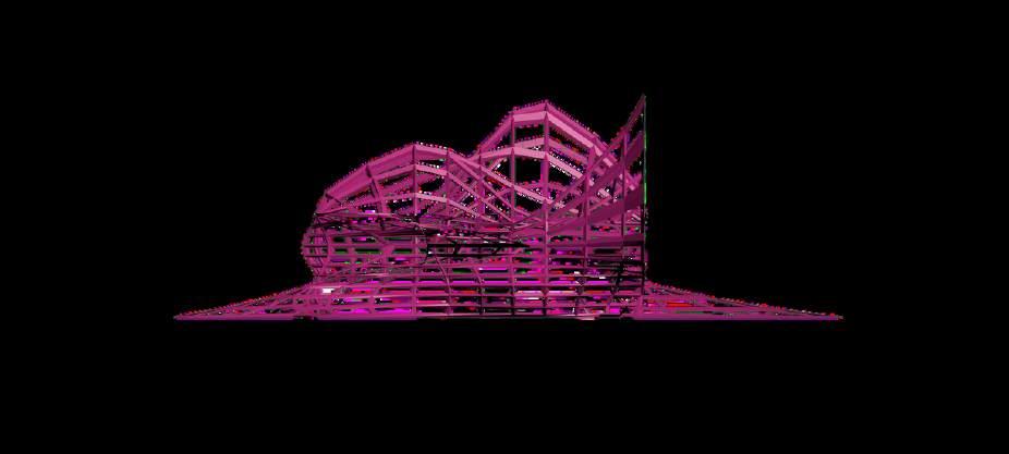
RefFor this week exploration its about exploring digital modelling using 3Ds Max. The session was given by Mr.Vikram and he guided all of us on ways to make Zaha Hadid styled lookalike models, something a little organic & complex. Personally I had tried using 3Ds Max before but didn't really like it as if I were to compare it with Sketch Up, it is more complicated. But during the whole session with Mr.Vikram & Ms.Aishah guidance I found out that it is actually not as complicated as it is, maybe there are extra few steps when creating a model but it is actually quite fun as I am able to build something that I couldn't do in Sketch Up.


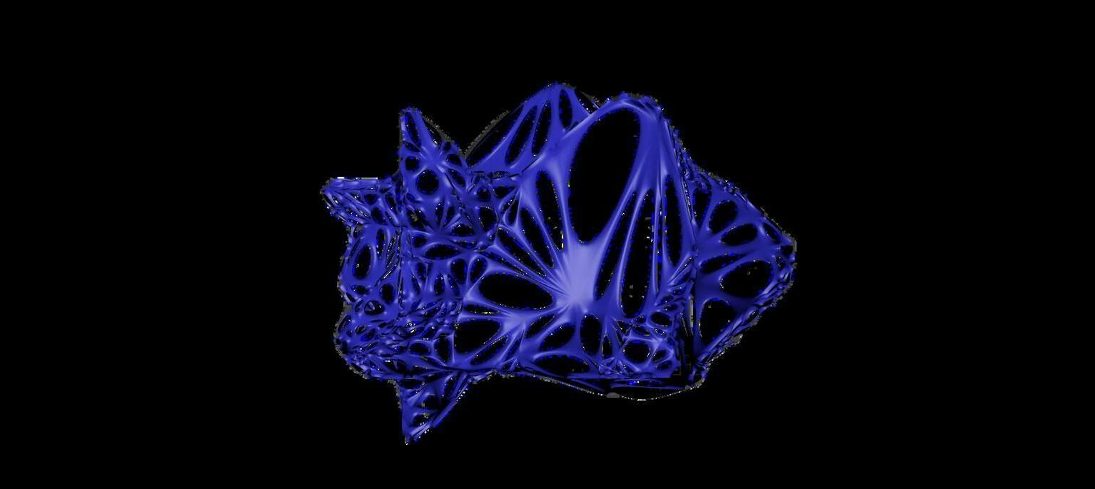

For my exploration I actually tried 2 different styles which is the 1-Segment>Lattice technique and also 2-Polygon>Vertex>Soft Selection technique. For the 1st tecnique, its to create a model or shape that is slightly more structured as the lattice tool is able to create lines like the whole structure frame. For the 2nd technique, its to create a more organic and soft shape. So, for my 3rd exploration I just wanted to see how it looks like if I combine the both model together to see how it will look like and it looks super cool as it creates a new shape.


It was fun having a proper learning session to explore 3Ds Max and all these different techniques to create model. I would try to improve my 3Ds Max skills so I could apply in my future project so I could create different shapes and models using different software.



For this week's lecture topic- Book Publication. What do I know about Book Publication? 1- Design a nice cover that could attract someone's attention, 2- Font style, 3- Arrangements of context & story flow, 4Publication, these are the 4 points I could think of when figuring out the process of book publication. After listening to Ms.Naadiya's talk regarding her experiences with book production throughout her years, I know that my knowledge of book production is not exactly what I thought it is. Some of the key points to take note of are Texture, Structure, Surface, Scale, Rhythm, and Colour. These few words are a few factors we need to consider to produce a proper book and if you notice, the keywords related to our practice in architecture & design.
To understand further all the keywords. Firstly- Texture, what do we want people to feel when they are holding our book or flipping through the pages, what kind of paper texture or any materials we are going to use to create a book that relates to its context?


Secondly- Structure, How the outlook of the book is like? Could be as big as an A4 size or could it be a pocket-sized book and how are you going to bind the book together as there are many methods.




Thirdly- Surface, what method are we going to use to print the book? There is Offset print & Digital print which gives out a different feel to the book, for offset print the ink sips into the pages and the color of the book will slightly be greyish or brownish depending on the paper meanwhile for digital print, the ink will be printed on the paper so it gives out a glossy finish and a vibrant color look to it. Forth- Scale, What is the scale of the font? Is it in a linear and uniform styled font or are there keywords to highlight that is needed to be bigger?
Fifth- Rhythm, What do I want my reader to experience throughout my book? How is the context being written and arranged? Sixth- Colour, Do I want my book to be monochrome or colored? And if color, what is the color scheme?


Lastly will be the printing production of the book, where and how am I going to print the book? So, these are the new points Ms. Naadiya taught me through the lecture session. As we will need to prepare for our final assignment which is our own book production, I will try my best to apply each and every process that was taught and reflect back onto my book.






Part 1


Part 2

For my first exploration for this Bonus Part which is related to my AIAD module, I use week 10's Exploration which is Explorative Digitally Modelling. I use my AIAD Final Project Model which is in Sketch Up & export it in DXF File to view the AR model using my phone. It was really cool to be able to see my model in a close up manner physically as if its coming out from my phone. This exploration is an exploration I will be doing frequently to view my future models & I can't wait to explore more about VR too.


This is actually a staircase leading to the 2nd floor, something special about this stairs is that there will be tubes of tea leaves and flower here for you to select your own tea
SeeThe floating platforms above the stairs is for users to experience how tea is being planted and how does different kind of tea leaves or flower grow before being dried to make tea


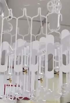

Inside all this sags will be tea leaves & flower for users to smell & to explore tea around the world & to select their ideal scent
To feel the texture of the fabric that is being dyed with tea and to experience the process of it




For exploration 2, I wanted to apply the same technique as Week 1's Visual Motion Diary where I highlight different movements in Penang but for my model I would like to highlight the few senses users get to experience in my space. It is a link to my VR video so that viewers could understand the whole programming of the model that is being viewed previously. And so, this is the reason I selected this technique to break down my model into the 4 main senses and provide a brief explanation for each senses.


For the 3rd Exploration, I wanted to try something personal & something more abstract which is using Week 7's Abstract Intuitive Art. Throughout this painting, I wanted to use the shapes I had in my AIAD model which is all the continuous curves & arcs. So throughout my painting I do not have any sharp angles and its all organic shapes only. For colors, I took my assignment 2 AIAD color pallet which is the 3 primary colors, RED, BLUE & YELLOW.
For the painting I also played with layering where I overlay some colors so there are some transparency of the layers to view the color below or to create a new color. Besides that, I wanted to make the drawing itself to be edgeless so I cut the paper according to my painting to create that organic shaped paper outline.


An exploration art journal throughout my semester. A book to challenge oneself creatively and critically. Throughout this book, you will be able to explore and learn more than 10 types of techniques to approach different kind of art and to change your perspective of viewing art.


