1 minute read
Final Iterations


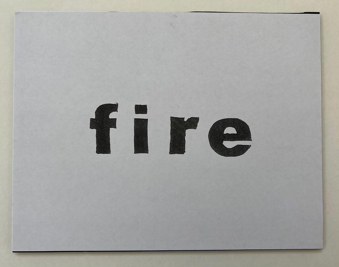
Normal iteration -
Edited so the character leading was even and so the font sat on a flat edge. I think the reason I chose this word, was due to the range of meanings and cultural signifcance this word takes on.
Advertisement
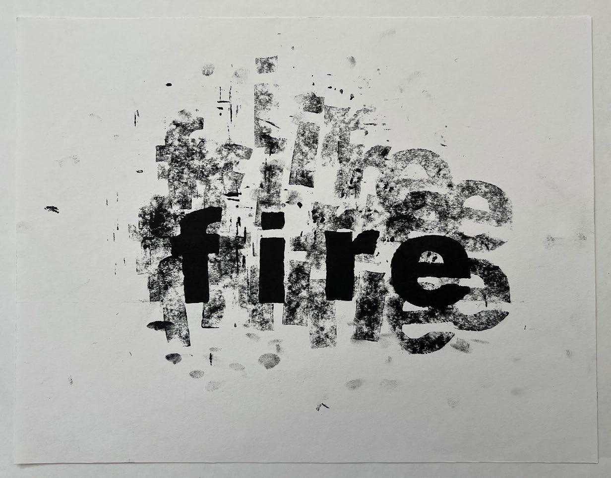
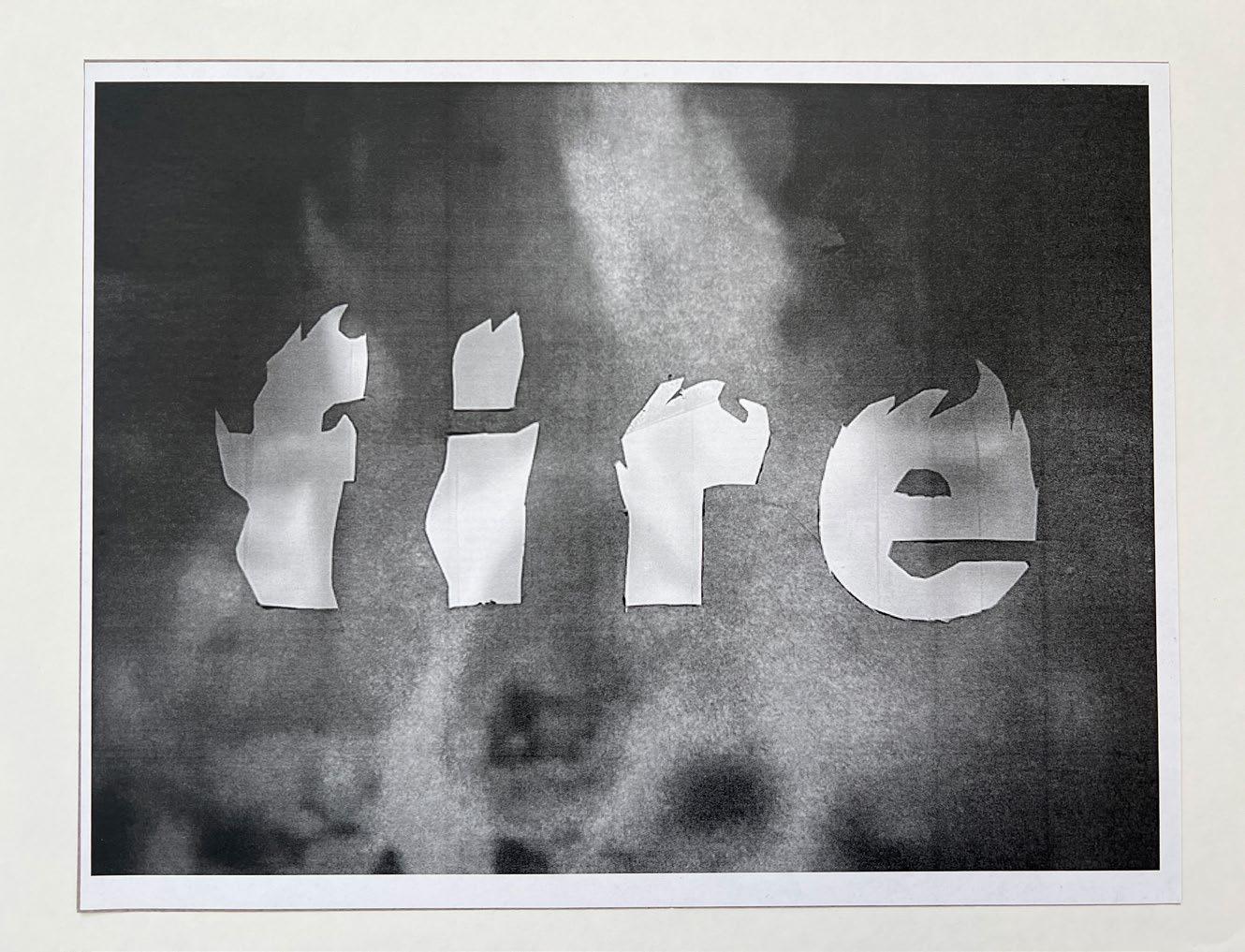
Varied iteration #2 - This iteration was the only one of my compositions that was unedited, meaning that I created this without the use of a photocopying machine. This is partially due to how this one got made and when it got made. I made this one last minute, and my idea for it felt vague at the time, but I remember that I wanted to try and give it a “smoky” feel, so I did just that. I was surprised that it got received well. This was an unnatural case for me. I wouldn’t recommend doing this for a project ever.
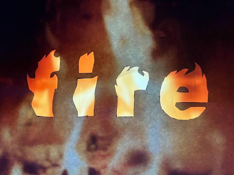
Modified iteration - I decided to take an earlier concept I had where I wanted to burn the lettering on actual paper. Instead, I cut out the letters and slapped the cutout onto my desktop monitor. Because the paper was so thin, the entire image bled through anyway, which was not my intention, but I think the image would not have been clear enough.
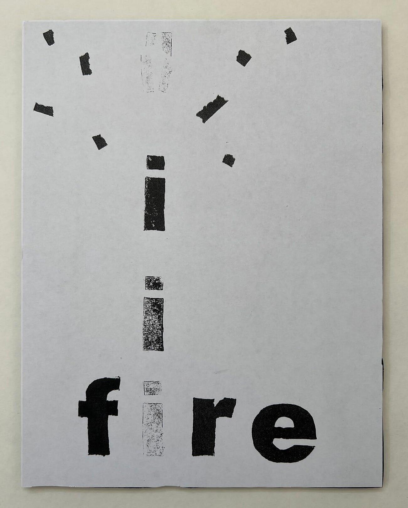
Varied iteration #1This one resulted from a reworked in-process design, and I like it much better than that one. First off, having a vertical framework is much better for the kind of image I am creating. Secondly, I think this iteration could have multiple meanings to it, which I think makes it all the better.