Type How to choose your Type hierarchy
Quotes and other type in secondary coverage modules are set in 8-point in the same type face used for Titlescaptions.for secondary coverage modules are necessary to tell readers about the modules’s content and how it relates to the topic covered on the spread. These titles should be set no larger than half the size of the main headline on the spread.
Selecting typography
Study magazine designs for ideas. Typically, secondary headlines are 14 or 18 point. Often, designers use Sans Serif type for secondary headlines.
Book • 6 Designing the
• Captions and copy
Choose 8-point Sans Serif type for captions
When planning your spread, keep the main focus on the story and accompanying photos.Therefore, type for the primary headline must be the largest type on the spread. Titles for secondary modules should be no greater than one-half the size of the primary headline. Place secondary modules to the outside of the design.
Set quotes and infographics in 8-point type
To maintain a “whole book look,” establish style rules for all typographical components. (See pages 10-11 for examples of type groups).
There is little difference between the thin and thick portions of the letters. Those two characteristics make Oldstyle Roman type faces easier to read than those faces in other type groups.
The copy/story is set in 10-point type, usually in Oldstyle Roman type. Type faces such as Palatino, Garamond or Goudy Oldstyle have serifs, or little “feet” on the letters.
Captions are shorter than stories. The standard caption size in the printing industry is 8-point, and usually set in a type face that contrasts with the type used for body copy. Most yearbook staffs use a Sans Serif type face (without “feet” on the letters) for captions.To“dress up” your designs, consider adding a headline (in 12 or 14-point) for each caption. This will add an element of repetion to your double-page spread. It will also add “pizzazz” to your design.
• Secondary headline Secondary headlines should be no greater than one-half the size of the primary headline and lighter in weight. Use them to lead the reader into the primary headline or out of it and into the story. Placement of the secondary headline is a part of the design.
Also important is knowing how to select type faces, sizes and weights for captions, headlines, informational graphics and copy. Some type faces work well for theme logos, but they might not be good choices for “readable” stories.
• Primary headline Design the primary headline with the most important words in large, bold type. Other methods of emphasis include italics or a different font or color. Type sizes for primary headlines can be as small as 36point and as large as 400-point, depending on the design and font used.
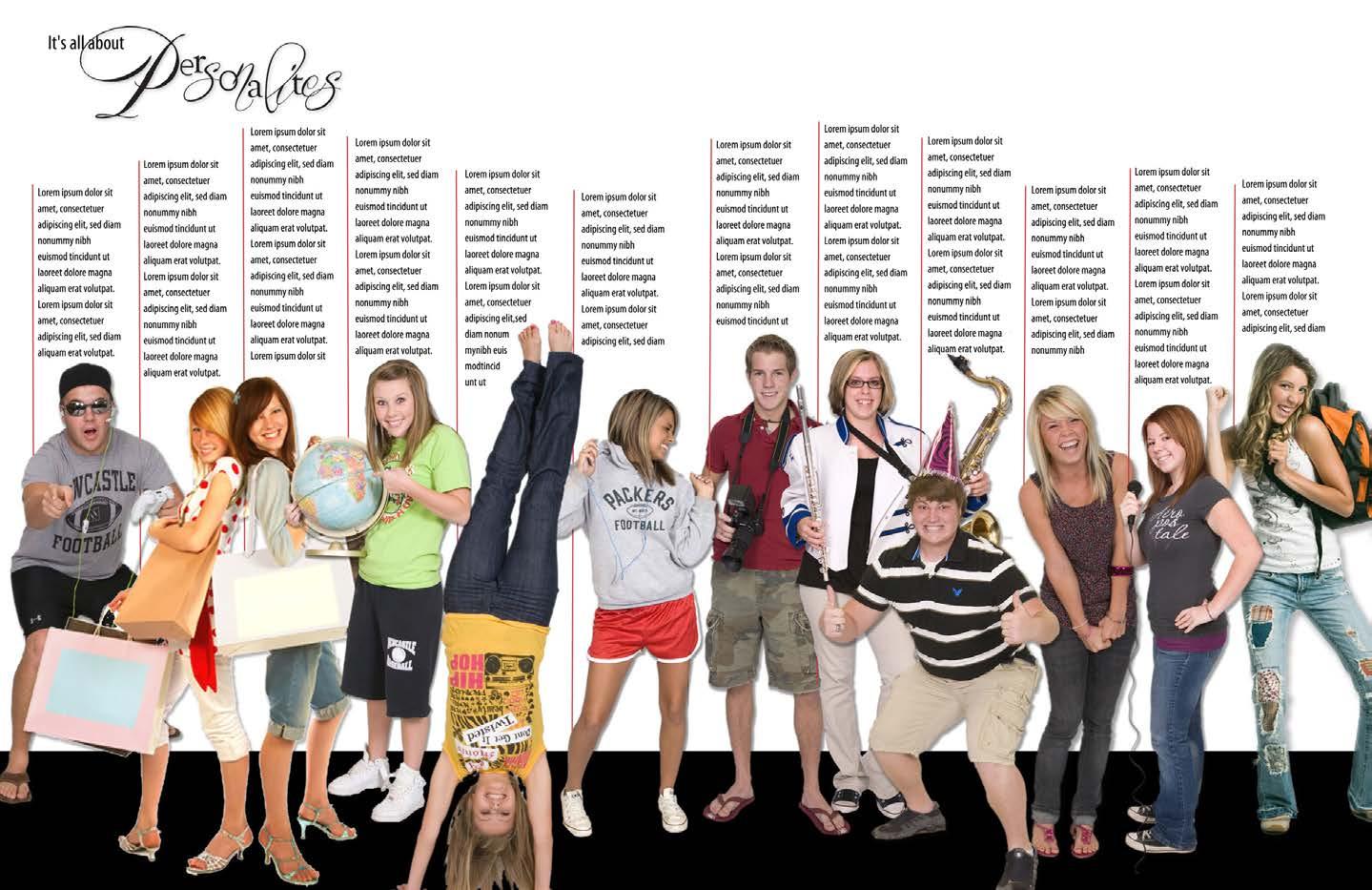
Different type faces in the headlineprimaryreflectthevarietyofpersonalitiescoveredonthespread.
The part of the letter rising abovex-heightthe Descender
The part of the letter that extends below the baseline Ear Found on the lowercase, stacked “g,” a decorative flourish on the upper right side of the bowl Meanline The imaginary line that falls at the tops of lowercase letters X-Height The approximate height of the main portions of lowercase letters, typically exemplified by the lowercase x. Baseline An imaginary line upon which lowercase letters rest Cap-Height
The primary diagonal line of a capital A and the vertical line of a capital B; also referred to as the “body” of the letter
Ascender
When selecting the type for your book, consider the various type families available to you. It’s important to look at all aspects of the type, including readability, designs of the uppercase and lowercase characters, numerals and punctuation.
The distance from the baseline to the tops of uppercase letters Crossbar Horizontal stroke across the middle of capital A and H Stem
Counter The enclosed or almost enclosed space within letters such as lowercase d, e, o and p Serifs Decorative strokes at the ends of letters, sometimes referred to as “feet”; featured in some type families.
AnatomyLettersof
Study the anatomy of type
A dpgx
Book • 7 Designing the
Any Oldstyle Roman type face used for body copy or headlines will look good with a contrasting Sans Serif type face used in captions and secondary modules.
(Consider using compatible type faces for copy, captions, quotes and modules to unify your book.)
Minion body copy Myriad Pro Condensed captions
Baskerville copy Arial Narrow captions
Big Caslon copy Helvetica Regular captions
Compatible Type Faces
A Sans Serif headline type matches the type family used in captions and quotes. The body copy is set in an Oldstyle Roman type face, providing contrast for readers.
Oldstyle Roman is the easiest type group to read. Therefore, if you want people to read your stories, choose one family from the Oldstyle Roman group for stories.Select a type family that includes regular, bold, italic and bold italic styles to add visual variety to your book. Oldstyle Roman families include Palatino, Times, Caslon, Cheltenham, Garamond, Minion, Georgia, Goudy Oldstyle and many others. Create prototypes Before choosing your body copy typeface, you may want to create several prototypes of your designs using varying type faces for the body copy and ask non-journalism students to indicate which type face they prefer. You can use the Oldstyle Roman family for body copy, headlines and caption headlines. Some designers prefer Oldstyle Roman faces for the text portion of captions. Choose a Sans Serif type family that has a wide variety of widths and weights, eveything from light condensed to extra bold heavy. Sans Serif can be used for a variety of elements, including headlines, secondary headlines, captions, quotes and secondary modules.
ChoosingTypepublication.your
Goudy Oldstyle copy Helvetica Neue captions
Oldstyle Roman Copy Sans Serif Captions
Georgia copy Futura Medium captions
Book • 8 Designing the
Remember
Sans Serif type families include Helvetica, Arial, Myriad Pro, Futura and many others. Look at the variety of styles in the type family you select to see which one allows a variety of design ideas throughout the book, while still giving the publication that “whole book look.”
Why we use certain type groups When choosing type families for your entire yearbook, first study the type groups on the next two pages.There you’ll find characteristics of each group and how to use type groups effectively in your book. typography authorities’ recommendations when selecting type for a
Symbolize theme with type
ChoosingTypeyour
If your theme warrants inclusion of another type family, select one more type face that reflects your theme’s mood or personality. If it’s a “fun” theme, look for a Novelty family that conveys that feeling. If it’s a “formal anniversary,” find a script or cursive family that symbolizes that occasion. Use that family sparingly. Include it in your theme logo and in one or two words in theme-page headlines. You might also use it to introduce copy or captions with large initial letters, or mini-headlines. Use two to four type families in the entire book
Book • 9 Designing the
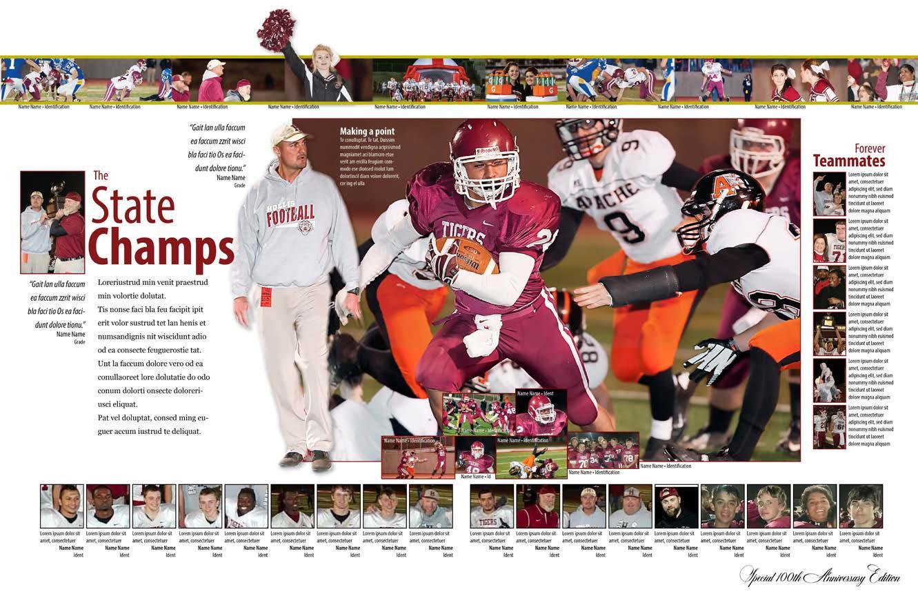
Remember, type can make or break the look of your yearbook. Choosing the right type will give your book a professional look while inviting readers to spend more time with it. A decorative script type face used in the headline symbolizes the theme and the school’s 100th anniversary edition of the yearbook.
Most yearbook staffs will want to use two or four type families throughout their yearbook. Some staffs may need to use more families if the theme warrants that decision. Others may want to use just one family with varying widths and weights. Use only one family from one type group Use only one family from a particular type group. Using two Sans Serifs or two Scripts or Cursives can cause confusion. Avoid using more than one “decorative type” (i.e., Scripts, Cursives, Text/Olde English or Novelty). The look may be too chaotic for mostIt’sreaders.important to understand how to use the various styles within a type family. Use bold and italic type to emphasize words. For example, your staff may want to use bold type for all names of students and faculty mentioned within a story. They may want to use italic for feature quotes or quotes pulled from a story. Use bold, italic and decorative type sparingly Never use bold, italic or decorative type for body copy or captions, as it is too difficult to read. Avoid using all caps in headlines, copy or captions, as all caps are difficult to read.

• Rectangular-shaped “feet”on letters
• Low readability factor when used for stories and how to use them
Book • 10 Designing
Ai Vu Da Mb Oldstyle Roman • Features roughly hewn, rounded serifs • Very little difference between the thin and thick portions of the letters • Easiest type group to read • Excellent to use for stories/copy • Recommended type size for stories: •10-pointSetitno wider than 20 picas • Recommended leading: 12 to14-point for stories 10 to 15 picas wide; 14 to 18-point for stories 16 to 20 picas wide Modern Roman • Precisely attached serifs • Dramatic difference between the thin and thick portions of the letters • Excellent for theme logos and display type in ads • Symbolic of contemporary fashion and lifestyles • If used for theme logo, consider using it for key words in theme-related designs (i.e., theme page headlines, theme-related secondary coverage headline designs) • Low readability factor when used in captions and copy • Never use for body copy, as parts of the letters disappear when type size is reduced
• Excellent for mixing with novelty, serif or script/cursive families
• It’s the “little black dress/khaki pants” type family. It goes with everything
If we took all the type in the world and sorted it into buckets with “like” characteristics, we would have eight type groups. the typography and the descriptions and recommendations on the next two pages before choosing the type faces you will use in your yearbook. the
• Used for strong, no-nonsense messages
• Choose a family with a variety of weights and widths to give your designs visual variety
• Low readability factor when used in stories
• Excellent for theme logos headlines, secondary headlines and caption headlines
Type Groups
Study
• Excellent for headlines, secondary headlines, captions and short copy areas in informational graphics
Sans Serif • No “feet”on letters
• If used for captions, recommended type size: 12 or 14-point for caption headlines; 8-point regular or light for caption text and quotes Square Serif/Slab Serif
TypeandGroupshowtousethem Use one decorative group, if needed, to enhance theme or echo a concept. Never use decorative type in all caps or for body copy, as it is too difficult to read. Decorative type groups include Scripts, Cursives, Text/Olde English and Novelty. Sew Qu Not Rv Scripts • Resemble handwriting • Mostly connected • Ornate; often used for wedding invitations and formal events • Excellent for use in key words in theme logos and theme headlines • Never use for stories, copy or captions • Never use in all caps • Use for theme logos that need a look of formality; use sparingly, like spices in a pie Text or Olde English • Looks very formal and communicates a sense of history • Difficult to read • Used for wedding and graduation invitations, some newspaper nameplates, and theme logos that need to reflect an historical feel • Never use for body copy • Never use in all-caps Cursives • Resemble handwriting • Mostly unconnected • Use for less formal theme logos and theme page designs that need a more “casual” look • Never use for body copy • Never use in all caps • Use sparingly, like spices in a pie Novelty • Helps designers establish a mood, tone or “personality” for the design • Used sparingly for certain theme logos and key words in theme page designs • Never use for body copy • Never use in all-caps • Use for theme headline/logo designs if it truly reflects the concept you’re wanting to convey to your readers (continued from previous page) Book • 11 Designing the
Look at numerals and punctuation marks Also consider the numerals your type families feature. Do you want oldstyle figures with some of the numbers extending below the baseline, or regular figures with all numbers resting on the baseline?
& A AW jA H6y3M Book • 12
Look for opportunities to use contrast in type. For example, if you use 10-point Palatino (Oldstyle Roman serif type) for body copy, consider using an 8-point Sans Serif type for captions. Add a 14-point bold Sans Serif type to headline your captions. Those three variations will provide excellent contrast in your design.Establish style rules for your entire book and keep type sizes and fonts consistent throughout your publication. (Fill out style sheet near the end of this chapter).
Think about how you might use those in your headline designs and secondary-coverage module headlines. Other considerations Avoid reversing small Sans Serif type on dark backgrounds (white letters on dark backgrounds). It can be difficult to read. If you must use reverse type on a dark background, use an Old Style Roman face, bump up the type size to 12-point and increase the leading to 16. Using that suggestion will maintain the readability of the reversed type. When placing type on a photo, place it on a semi-transparent box to keep the type readable and allow the photo to show, as well. Designing the
!
In addition, look at all punctuation marks, including the ampersands, quotation marks, commas, question marks and exclamation points.
Type Study all aspects of your Study weights, sizes and styles
Use extra leading (space between lines) when setting type 16-20 picas wide. Avoid setting 10-point type wider than 20 picas. Using a width wider than 20 picas in body copy distract readers’ concentration.
Recommended leading - body copy
will
• Caption headline - 14-point bold condensed
• Body copy - Leading for narrow-set copy - use 10-point body copy on a 12-point leading Headline Add a 14-point headline for your caption and set caption text in 8-point. Use Sans Serif type for captions and Oldstyle Roman for body copy. This will add c ontrast to your design and allow readers to differentiate between captions and copy. Use “auto” or 12-point leading when setting copy 10-14 picas wide. Set 10-point body copy in an Oldstyle Roman type face to encourage your audience to read stories. Maintain type face and size throughout the yearbook to unify the publication. 10-pica width = 12-point leading
Light Light Italic Regular Italic Semi-Bold Semi-Bold Italic Bold Bold Italic Black Black Italic
• Caption text - 8-point light condensed Recommended type size - body copy
123456789 123456789 “,.*!?&%$ “,.*!?&%$ “,.*!?&%$
• Body copy - Leading for wide-set copy - use 10-point body copy on an 18-point leading 20-pica width needs extra leading
(P22(Arial)(Modern(Baseline)(Baseline)216)Zaner)
Examine the examples below to better understand the appearance of various type styles, weights, numbers and punctuation marks. Also note the recommended leading for both narrow-set copy (10-pica minimum width = 10-point type on a 12-point leading) vs. wide-set copy (20-pica maximum width = 10-point type on an 18-point leading). Book • 13 Designing the
Recommended sizes for captions
• Body copy - 10-point Oldstyle Roman Recommended leading - body copy
{ TypeSizes, weights, styles and terminology { Light Condensed Light Condensed Italic Condensed Condensed Italic Semi-Bold Condensed Semi-Bold Condensed Bold Condensed Bold Condensed Italic Black Condensed Black Condensed Italic Type weights and styles • Light Condensed works well for the text portion of captions • Light vs Bold or Black provides interesting contrast for readers • Condensed works well for text in small copy areas • Light Condensed is excellent for quote areas in modules Oldstyle figures • Some of the figures extend below the baseline Regular numbers • All figures rest on the baseline Punctuation • Study the type families available to you. Consider the punctuation marks, letter widths and other unique characteristics before making your final selections.
Object placed on right: Yes!
Avoid placing art or photos in the middle a paragraph. This causes the reader’s eyes to “jump across” the image, thus destroying read ability. Avoid placing art or photos in the middle of a para graph. This causes the reader’s eyes to “jump across” the image, thus destroying readability. Avoid placing art or photos in the middle of a paragraph. This causes the reader’s eyes to “jump across” the image, thus destroying readability. Text wrap options Wrap text around object. Keep object to the right or left. Avoid putting object in the middle of the text, forcing the reader to jump over the object.
• 14
words.Sometimes
Object placed on left: Yes! Type justified to the left and ragged on the right is the easiest justification to read. Readers like to return to the same spot each time they look at a line of type. Avoid using type justified on both sides, as this practice creates rivers of space through the type and often causes spacing to look wide between it’s interesting to justify type on the right side and maintain a ragged look on the left side. This justification is a little more difficult to read, but in some short copy areas it can be effective visually. Avoid centering body copy, as it is difficult for readers to peruse. Readers like to return to the left side when viewing each line. Centered copy causes readers to leave the story and look for something else to view. If using graphics or photos with copy, place art on the right side and sculpt the copy around it. Justify type to the left to improve readability. If including graphics or photos with copy, consider placing the art on the right side and sculpting the copy around it.
TypeSizes, weights, styles and terminology Justifications • Justified left Justifications • Justified Justifications • Justified right Justifications • Centered
If using graphics or photos with copy, place art on the right side and sculpt the copy around it. Justify type to the left to improve readability. If including graphics or photos with copy, consider placing the art on the right side sculptingand the copy around it. If using graphics or photos with copy, place art on the right side and sculpt the copy around it.
Object placed in middle of solid paragraph: No! (continued from previous page) Book Designing the


Sometimes designers add one photo and a quote related to the story to the headline design. (See examples on the following page).Other designers might add several photos in a series, with names and identifications to show readers how these photos relate to the story featured on the page. Adding color Using color to emphasize words within a headline is another way to call the reader’s attention to a story. Designers may choose to use a “color echo” effect, sampling a color common to several photos on a spread and using that color in a key word within a headline. Including lines Sometimes designers use lines to tie headlines to other content, particularly the story. (See headline ideas below for more ideas.)
Headline and caption designs
Designers may want to experiment with placement of secondary headlines. Some work well when placed to lead readers into primary headlines. Also try placing the secondary headline so it leads the reader out of the primary headline and into the copy. Justifying primary headlines to the left and secondary headlines to the right also can add visual interest to your headline designs.
Embedded photos
Placement and justification
One method of expanding coverage in your book is to include photos in your headline design.
Remember the elements of designs when creating headlines for story packages, secondary coverage modules and captions. Contrast Create contrast with heavy vs. light type, outline vs. bold, large vs. small, regular vs. italic and font variations.
UsingTypeinyour design
Designing the
Book • 15

to head toeDressedimpressto and bigger better Senior class is It’s as easy123 as 10 E xcellence Years of0 Through hobbiescreative Making LifeFun! We are Alive with spiritBriscoeRoyGeorgeSally GraysonJoeyClass president Cheerleader Quarterback JohnsonJackie BrownRicky AppellCorrie Hall decorator Mascot Dress-up winner NightA to Remember Hilarious stories, magical moments were all a part of the junior prom UsingType &googlegogglesgigglesstudentsChemistryconductexperiments,researchwhileenjoyingclassactivities in your design Designing eye-catching headlines Design every title in your book with eye-catching primary and contrasting secondary headlines. Avoid using label headlines (i.e., soccer, cheerleaders, FBLA, etc.). Play with the type. Use contrast in type sizes, weights, type faces and styles to create visually interesting designs. Keep type faces consistent throughout the book to maintain the “whole book look.” Avoid hyphenating words from one line to the next in primary and secondary headlines Book • 16 Designing the