RIFFS ON CANVAS


The iconic artist and rockstar on his vibrant canvases, true authenticity and what makes great art
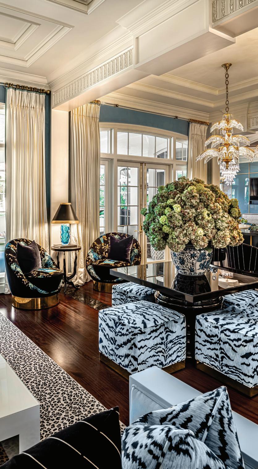
Opulence, grandeur and style, courtesy of designer extraordinaire, Lori Morris
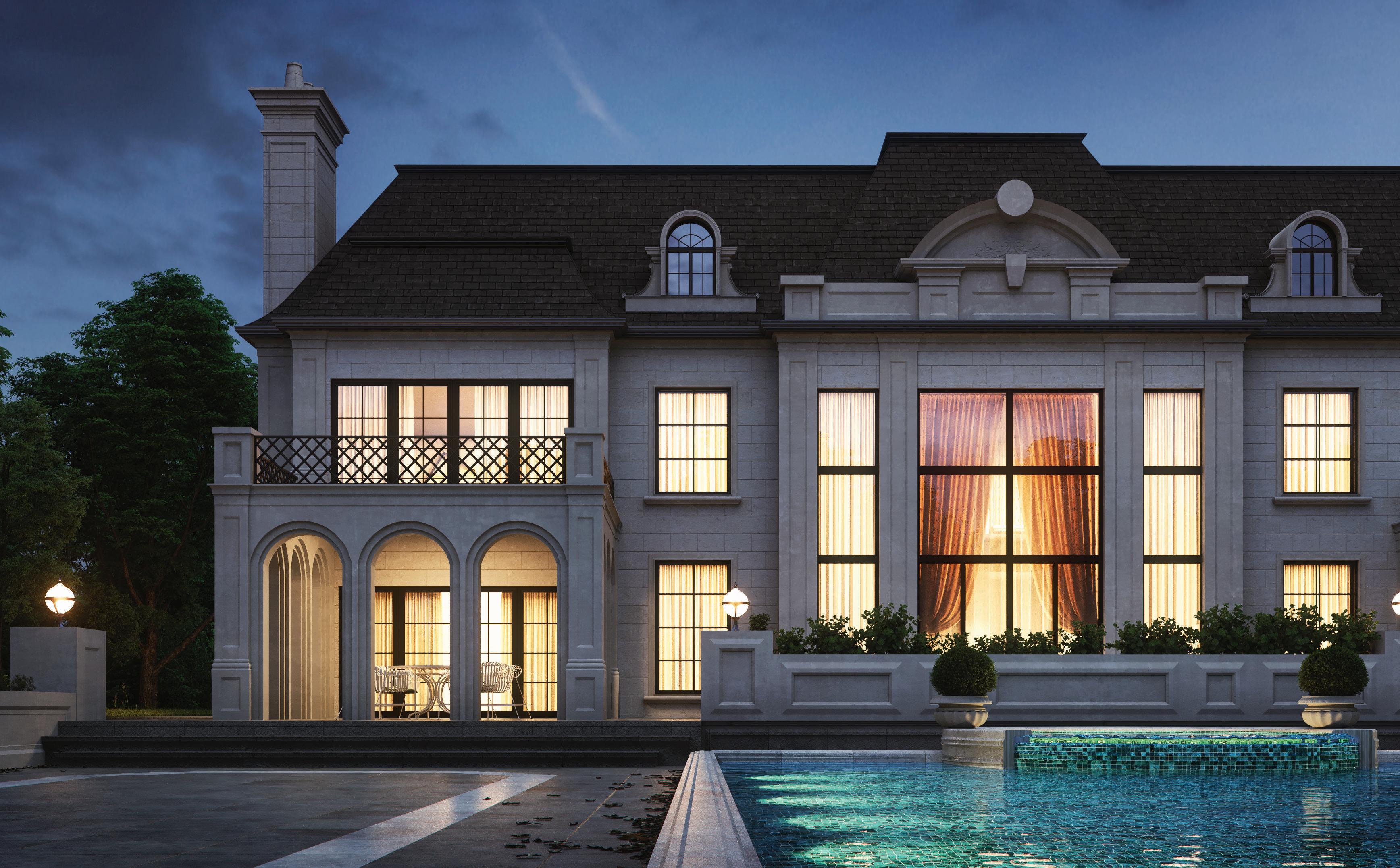
An English country estate is the inspiration behind a refined-yet-rustic bungalow
“Make your living space the topic of conversation with a weavers art...”
– Michael Pourvakil
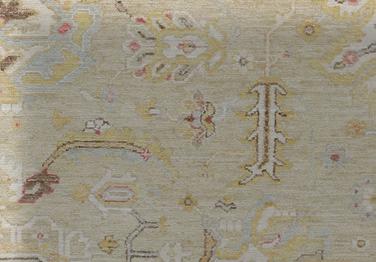
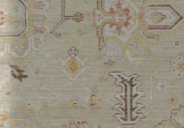
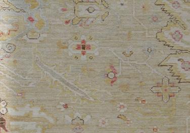
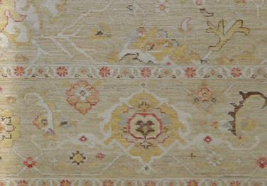


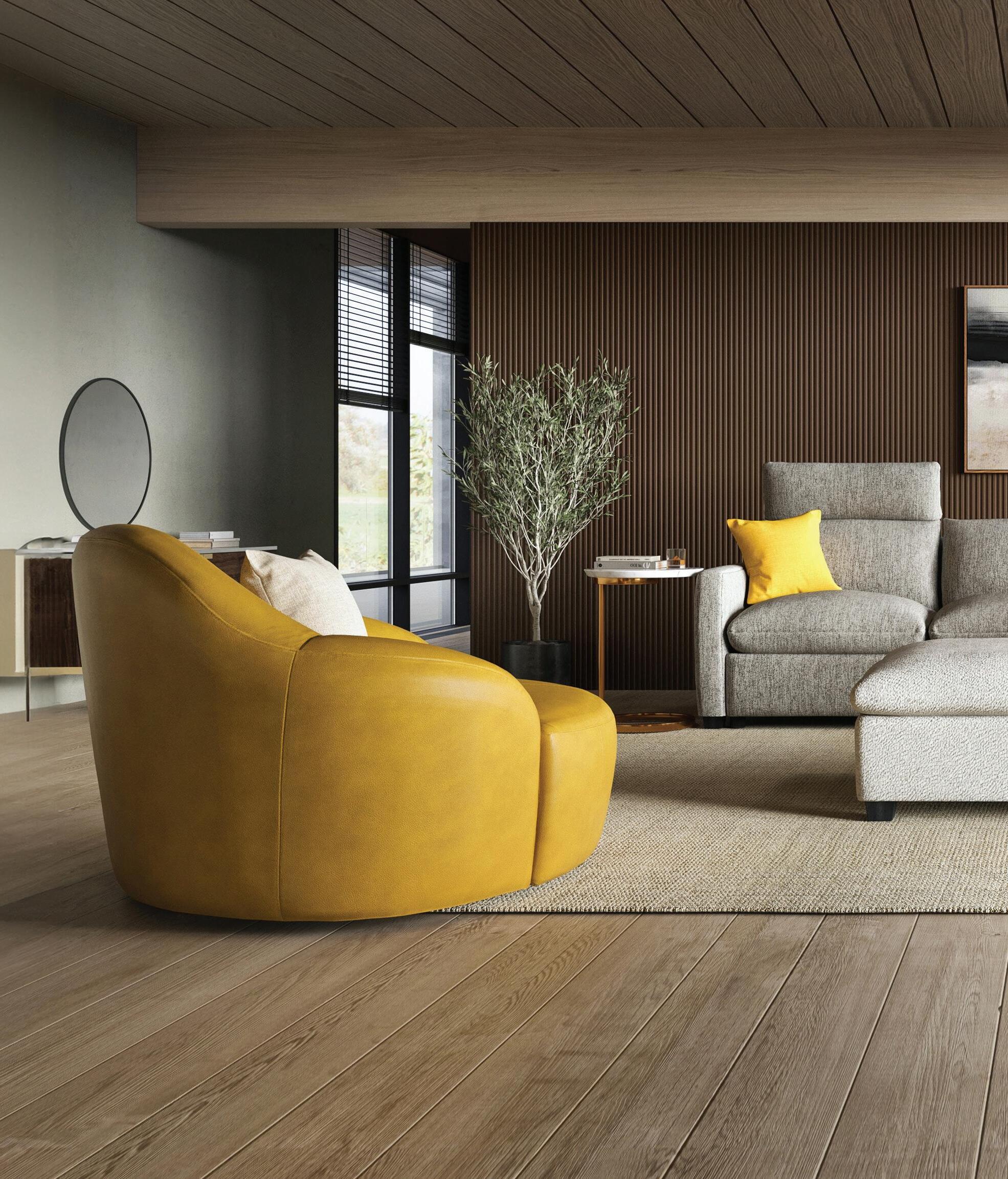
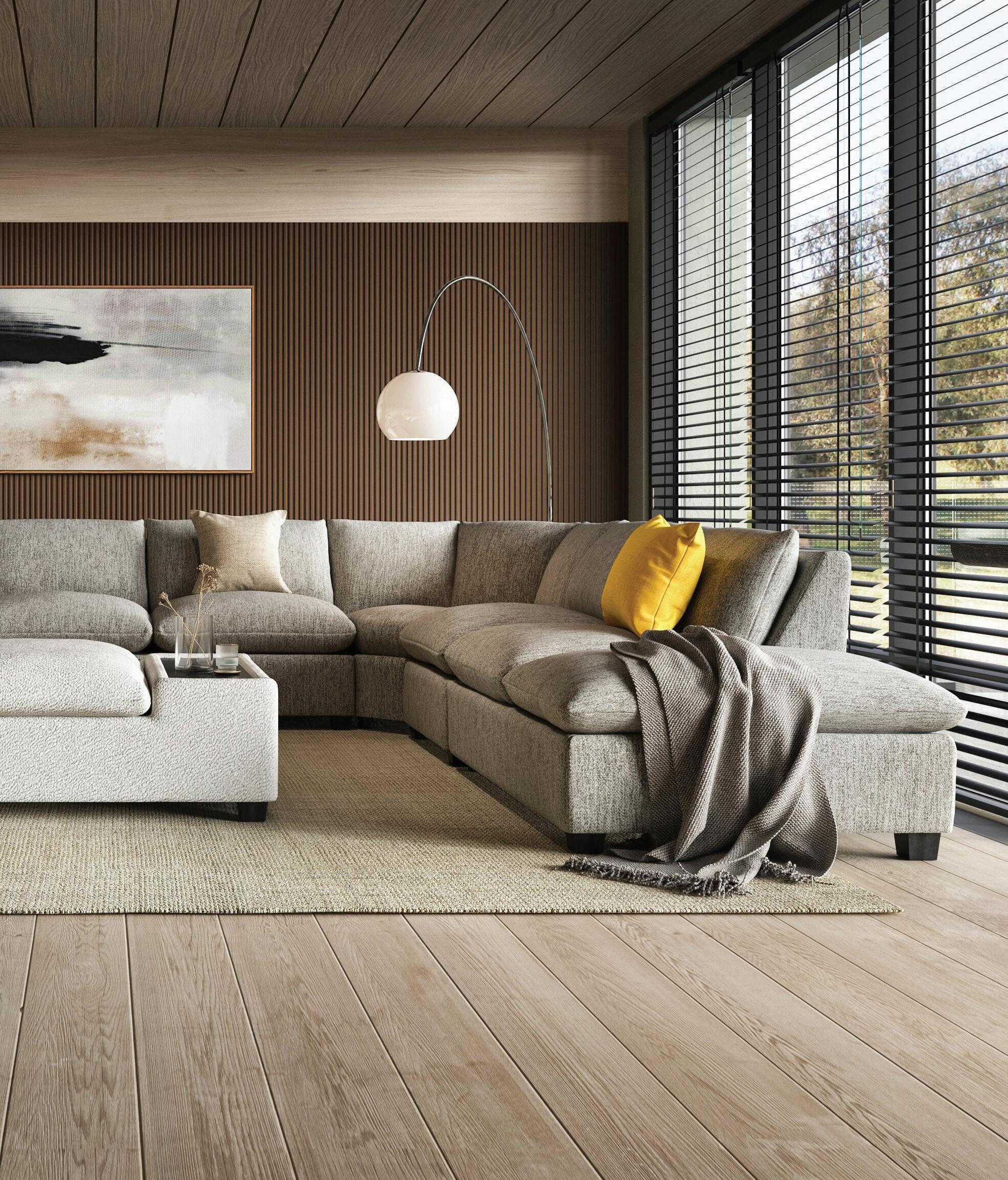
Step into a world where the rich heritage of traditional craftsmanship meets the vibrant pulse of modern design. Our collection of traditional rugs seamlessly blends classic motifs with innovative styles, offering you the perfect blend of old-world charm and contemporary chic.
Whether adorning your living room, bedroom, or office, these rugs effortlessly complement any décor style, adding warmth, character, and sophistication to your environment.
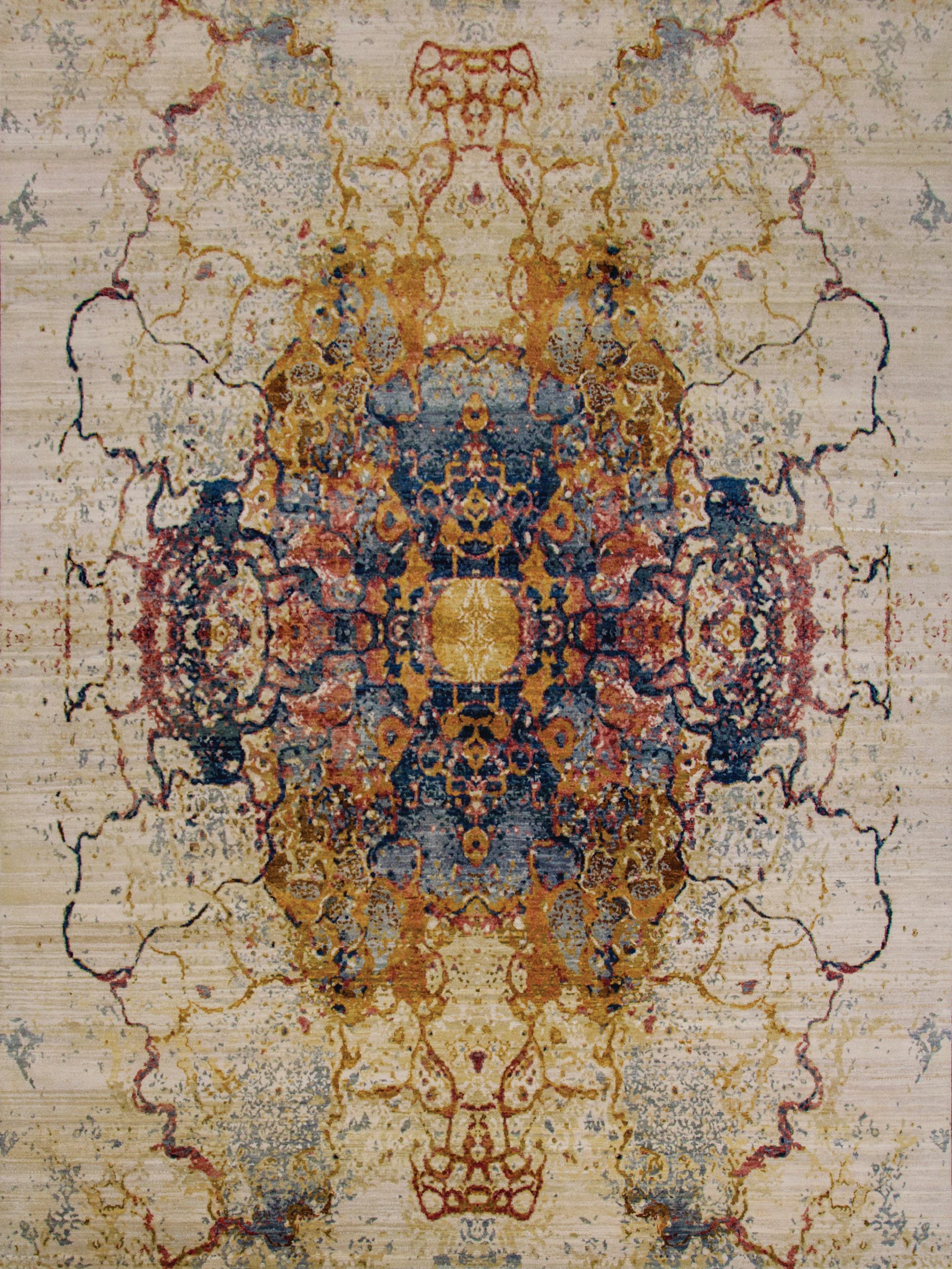


Explore our diverse selection of tailor-made
Immerse yourself in our



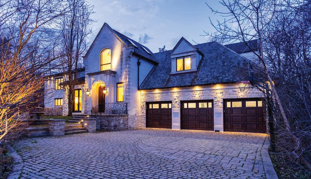



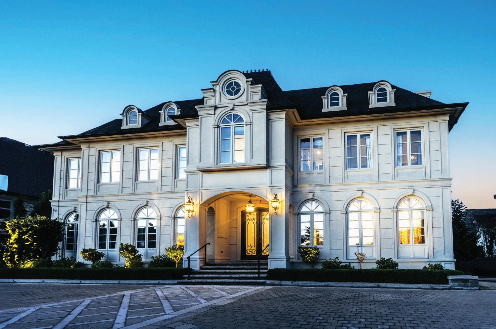
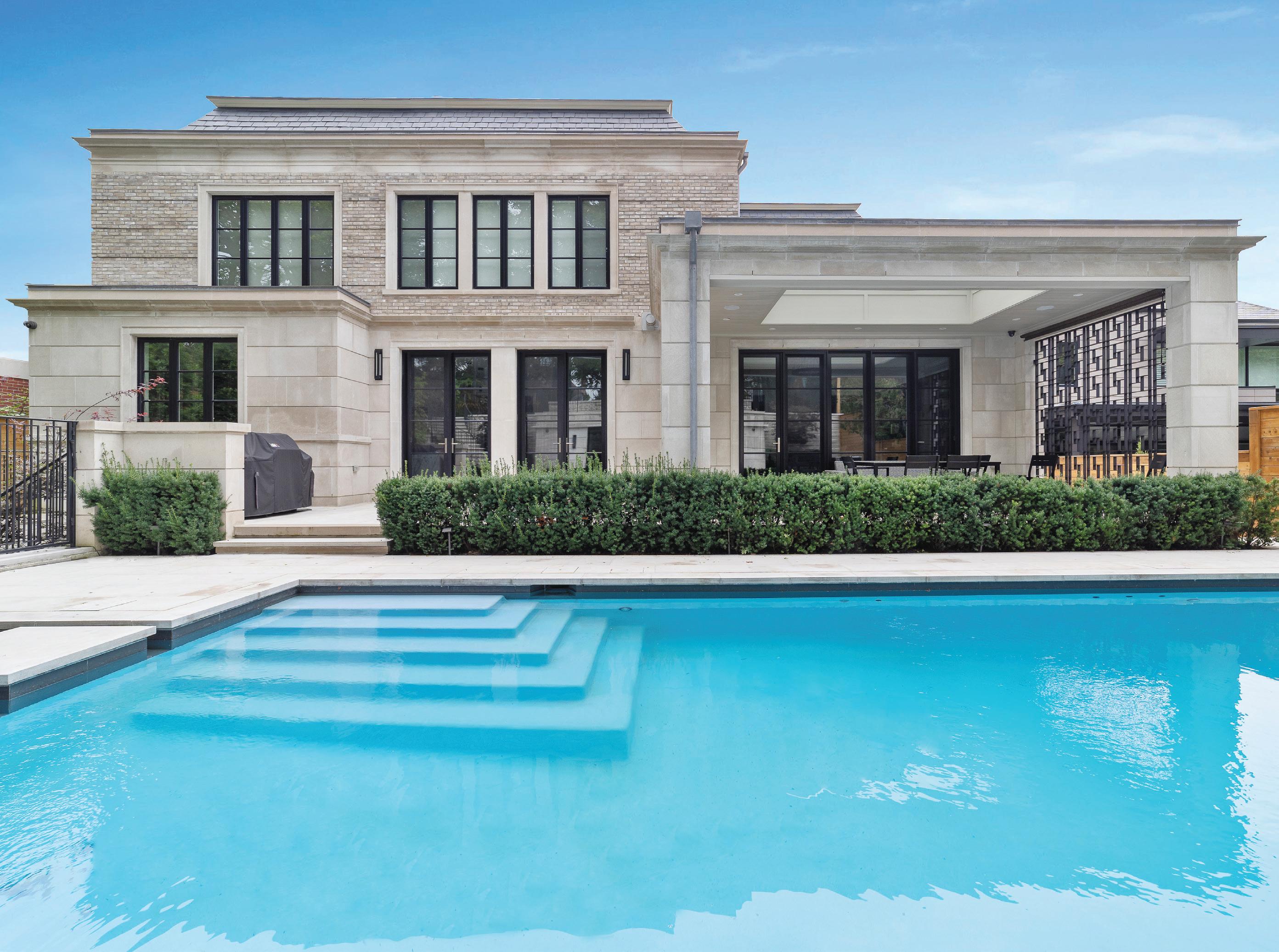
“A Ralph Lauren Inspiration” – The most desirable location, Burbank Estates presents a lifestyle reserved for only a select few.
It is prominently positioned atop the Thornhill Golf and Country Club and Uplands Golf Course with panoramic vistas, surrounded by natural beauty, impeccable landscaping, and a private gatehouse.
Savour precious time together with friends and family in a home made for sharing moments and creating memories, beautifully positioned in Burbank Estates – one of Canada’s most luxurious communities! This home is masterfully designed, with interiors by a world-renowned designer. It reflects great success, visionary design, passionate attention to detail, and unique artistic touches, creating a pièce de résistance. The majestic estate redefines the concept of privacy.
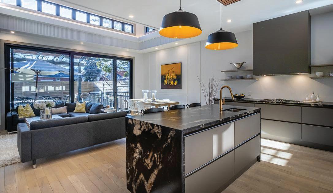
With a gated entrance and circular motor court, the façade is introduced by a magnificent entry and dramatic cathedral entrance. The living room is embellished with grandeur, while the dining room is designed for large soirées. A chef’s dream haven, the gourmet kitchen offers professional appliances and is lined with windows and a walkout to a terrace overlooking the garden, pool, and golf course vistas. Among the endless array of inimitable offerings are a home theatre, wet bar, sports court, games room, a panelled library with a refrigerated wine/cigar room, and a wellness gym.
Dr. Philip Solomon OTOLARYNGOLOGISTHEAD & NECK SURGEON PRACTICING IN FACIAL PLASTIC SURGERY




#1 in Toronto For Homes Sold $3,000,000 - 35,000,000, since 2008*
No one has sold more luxury real estate in this decade than Barry Cohen Estates. * The reason is obvious. In addition to our unmatched negotiation skills, we provide the greatest exposure for your home. By utilizing the very latest in print and online marketing strategies, enhanced by our exclusive international affiliations, more local and foreign buyers see our homes. Simply put, we do more for our clients than our competition. The proof is in the numbers.


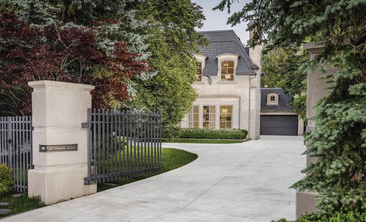


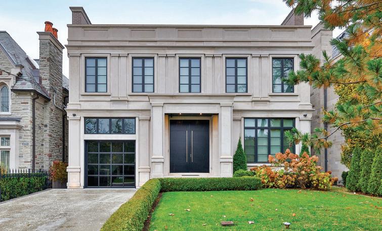
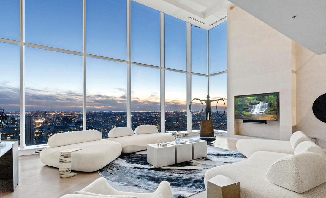



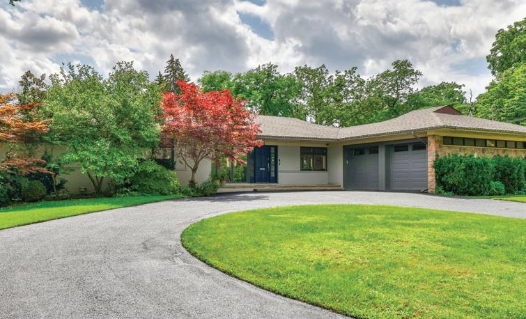


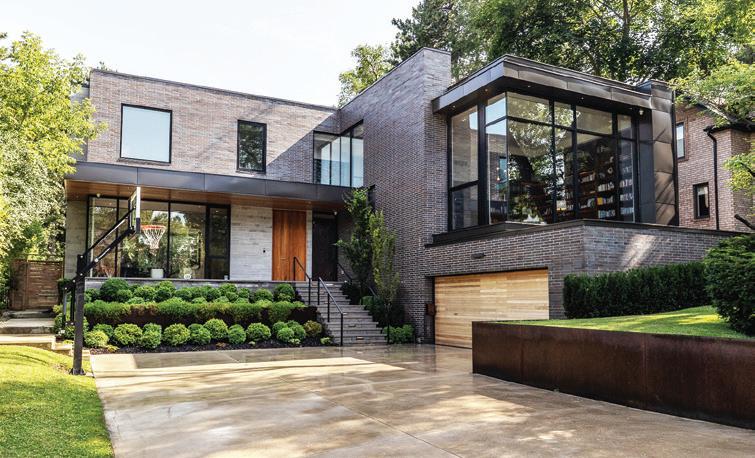


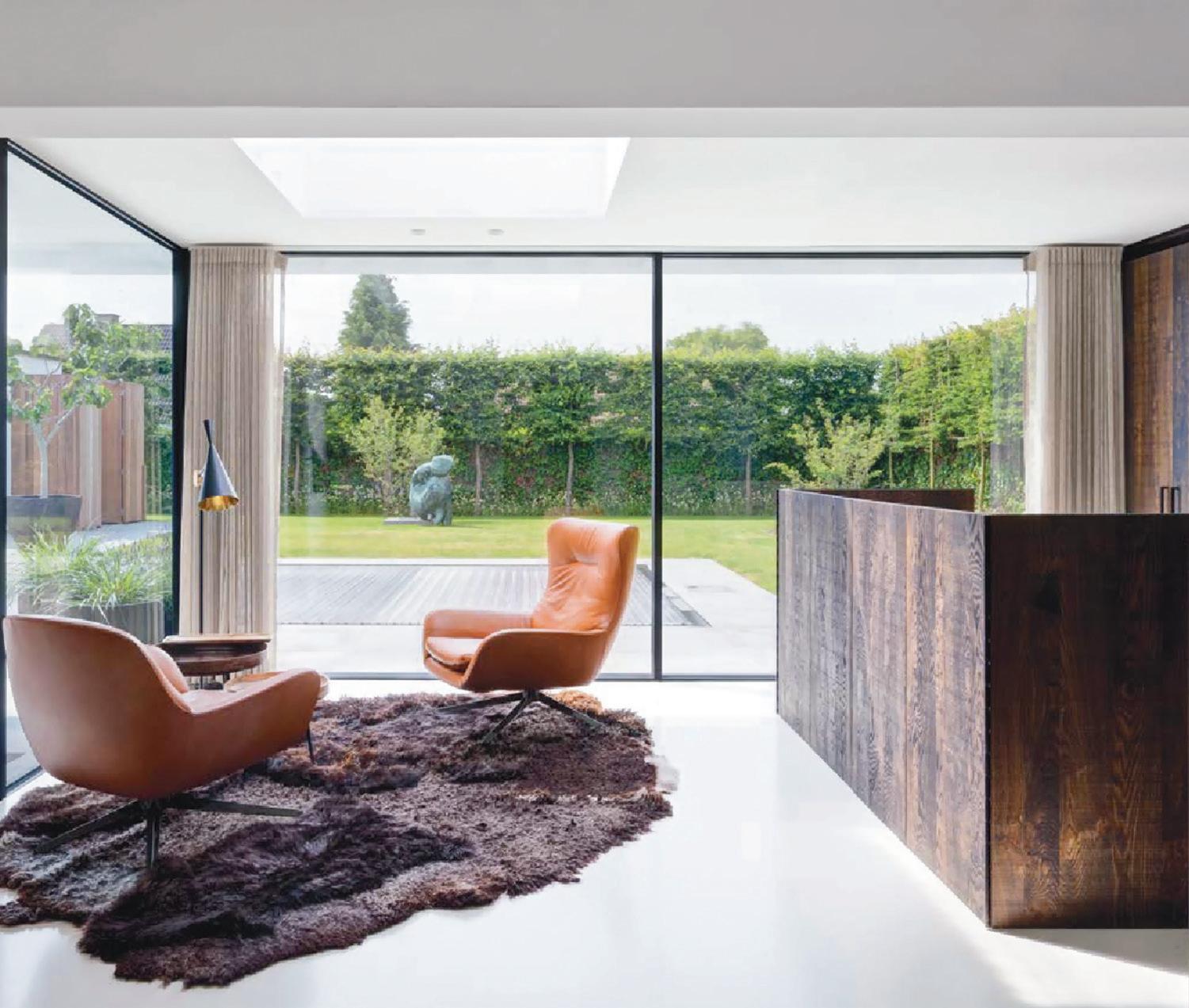
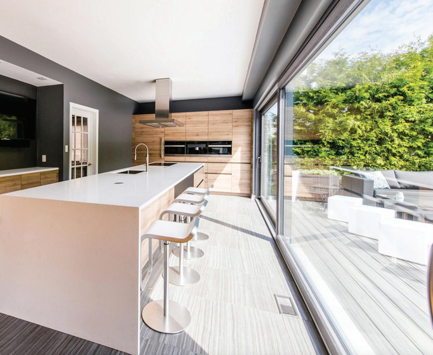
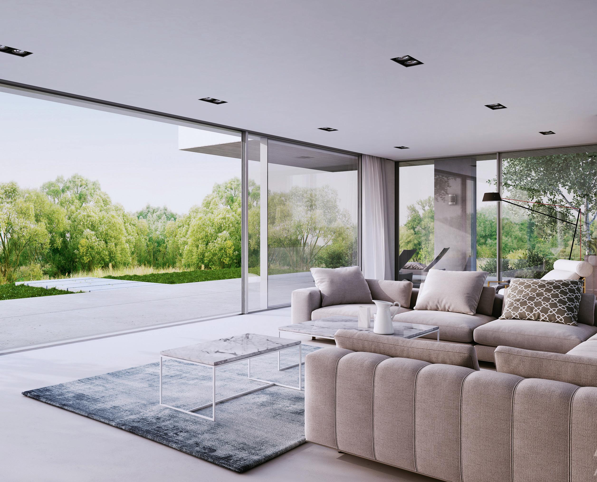







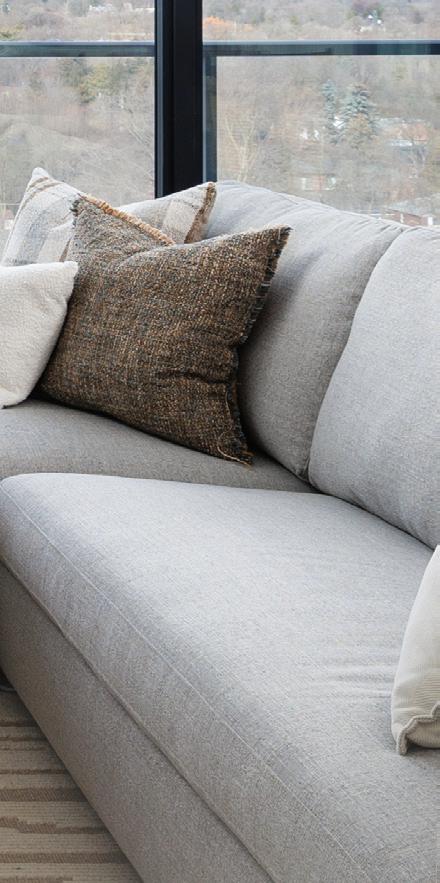



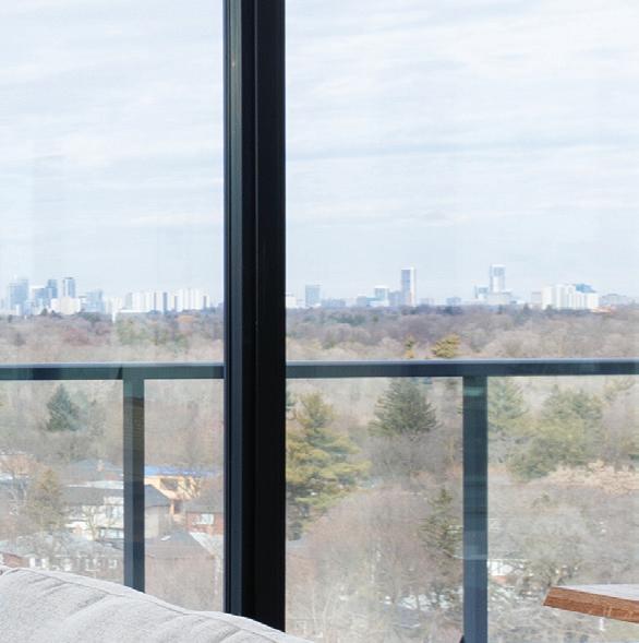


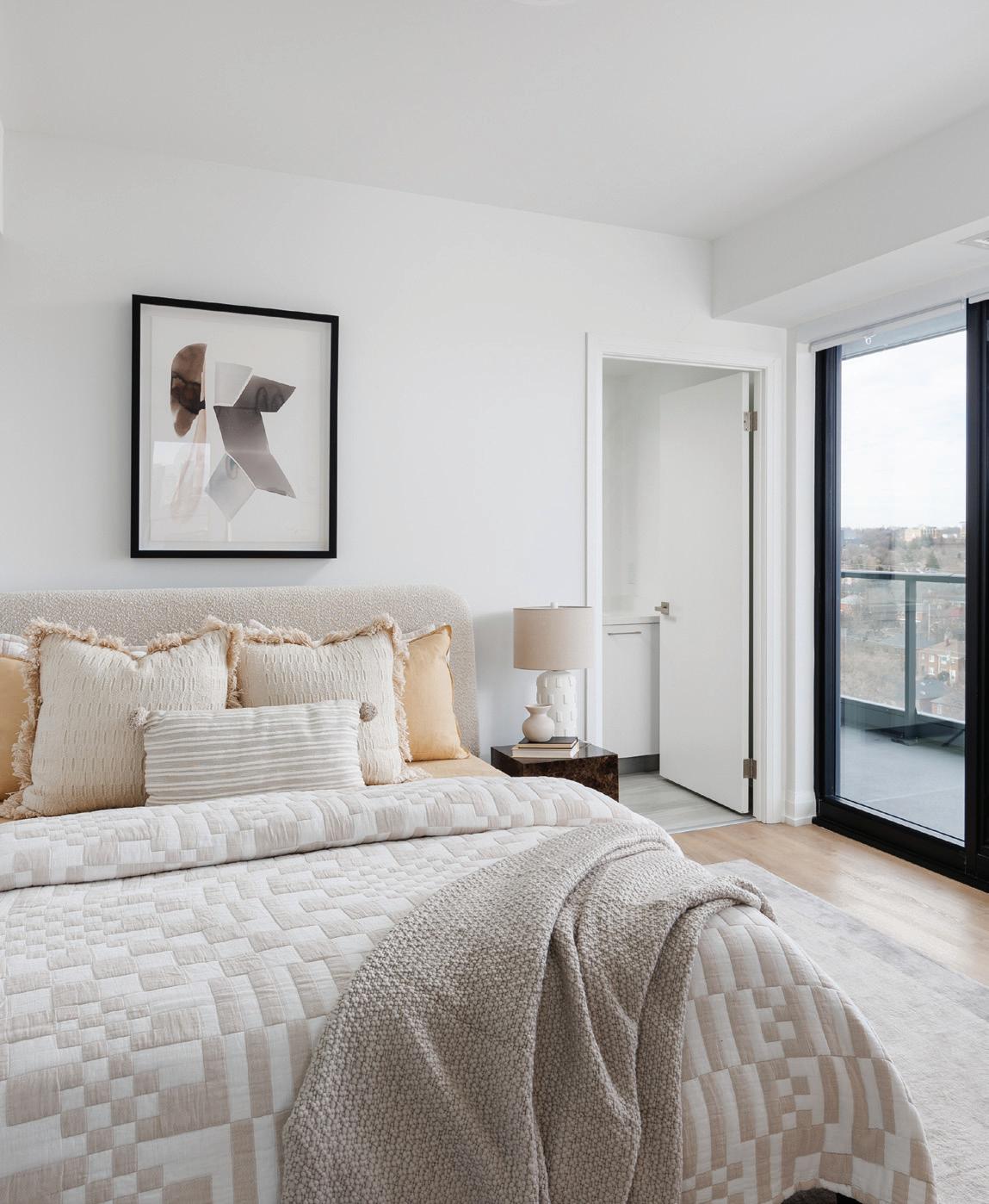
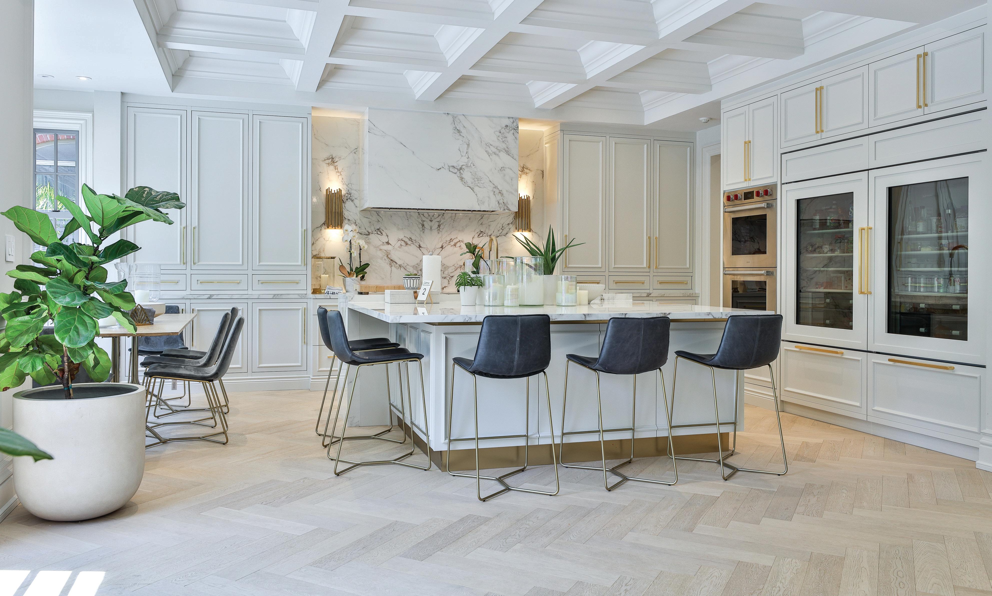

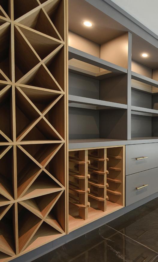
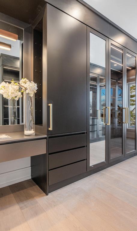

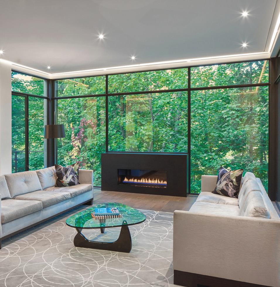
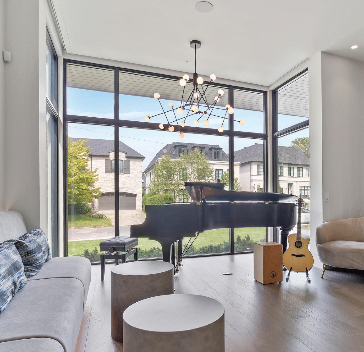

We are inspired by the unique vision of each client for their dream home. With the convergence of polished design and optimal performance, you will find what you need with us.






































“How do you use your outdoor living space during the summer?”



DESIGNER AND OWNER, ADM DESIGN
During the summer, my lakeside patio is a cherished gathering spot for friends and family. Essential to this space is my comfortable, stylish outdoor furniture from Protégé; it’s a cozy seating area perfect for relaxing and enjoying meals from the outdoor kitchen.
CO-FOUNDER AND BOARD CHAIR, WATERSTONE FOUNDATION
My outdoor space reflects my numerous years living in the U.K. It is a lush, peaceful environment where I garden, relax, and gather with family and friends.


Volume 6, Number 3, Summer 2024
PUBLISHER
Jennifer Lipkowitz
CHIEF OPERATING OFFICER
Anthony Sirianni
ASSISTANT TO THE PUBLISHER
Hana Rakovski
EXECUTIVE ASSISTANT
Zoe Teufel
DIGITAL SPECIALIST
Eugene Leiderman
VIDEOGRAPHER
Frazier de Mesa
WRITER/EDITOR
We love our shady front porch in summer where we can chat with neighbours walking by and enjoy the parade of bikes, kids and dogs.
DESIGNER AND OWNER, TAPESTRY DÉCOR
My outdoor is transformed into a sanctuary, becoming an extension of our living space, where we relax, entertain and enjoy life with family and friends.

CONTRIBUTORS
Jenna Bitove-Naumovich, Kim Du y, Adriana Ermter
Julie Gedeon, Nancie Heiber, Susan Kelly, Natasha Koifman
Catherine MacIntosh, Tracey MacKenzie, Phillipa Rispin, Susan Semenak
Valerie Simmons, Dr. Philip Solomon
CREATIVE
CREATIVE DIRECTOR
Jennifer Douglas
EDITORIAL
EDITOR-IN-CHIEF
Stephanie Whittaker
LIFESTYLE EDITOR
Jeanne Beker


I want to start this letter by giving a heartfelt “thank you” to every supporter, collaborator, and Living Luxe reader. We have achieved so much this year, and it’s only just begun.
One of the standout events this year was the Living Luxe Design Show, presented by JennAir. Seeing our magazine come to life was truly incredible. From creative fashion shows to insightful speaker talks, innovative booths, and so much more, it exceeded all expectations. Witnessing an idea and vision materialize on such a grand scale brought us a sense of accomplishment and pride that I hope everyone involved felt.
With such a spectacular turnout and a successful event in its second year, my show partners, Anthony Sirianni and Diana Pires, and I are already planning big things for next year. I am thrilled to announce that the dates for next year’s event are set: April 24 to 27, 2025. I won’t spoil too much, but I can assure you that we will expand to new heights in 2025. And as the Living Luxe Design Show continues to grow, my team and I are preparing to make it an even more opulent experience for attendees. I look forward to seeing you all there.
A significant achievement this year was City Couture, presented by Rogers in support of SickKids Foundation. This event was a resounding success, surpassing our goal and raising more than $100,000 for SickKids. We welcomed an inspiring speaker, Emily Strike, who shared her experience as a cystic fibrosis patient at SickKids Hospital. Hearing her story and learning about the impact SickKids had on her life was moving, and it’s wonderful to know that our donation will help support children like Emily in achieving great things. The generosity and support from our donors, community, and attendees was overwhelming, and we are incredibly grateful. We look forward to hosting this event again next year with an even higher donation goal in mind.
Another highlight this year was the inaugural Living Luxe Awards Gala, created to recognize outstanding Canadian talent across various fields, including design, fashion, architecture, real estate, and more. With a live band, luxurious decor, and a stunning venue at Liberty Grand Entertainment Complex, the event was everything we’d imagined. Congratulations to all the finalists and winners. Your awards were well deserved, and we look forward to celebrating your continued successes.
I won’t lie; with so much happening in April, it was exhausting. That’s why I’m especially excited to take some time this summer to unwind with my children. We’re planning a vacation, and choosing a destination is a pleasant challenge. While I may prefer a relaxing resort near a beach, they might prefer something a little more adventurous. Whatever we decide, I will be happy because I’ve recently realized how crucial it is to take time to recharge and reflect so that we can be at our best to prepare for all the exciting times ahead.
Thank you once again for your continued support and enthusiasm. Here’s to more achievements and memorable moments yet to come.
Jennifer Lipkowitz Publisher


While I love the summer months, I also know that this time of year brings with it a couple of hours each day of extra work…hard physical work, in the garden. When I began gardening, I wanted to learn as much as I could. So, I read my way through the horticulture section at our local library. It prepared me theoretically to understand how to design and cultivate a garden, but as with so many other pursuits, the only way we can experience them is through practice.
Over the years, I have practised, practised, practised. I’ve had a few successes (my magnolia is spectacular) and many failures: Last summer, for instance, I planted a Blue Angel hosta that is yet to reappear following its winter dormancy.
I’d like to report that I have an aesthetic, painterly garden, but something happened about a decade ago that prevented that possibility: I discovered the joy of raising food. Gradually, I stripped the ornamentals out of my sweeping perennial borders and replaced them with vegetables and fruit. Once again, I endured year after year of trial and error. Some things grow well in my garden, others do not. Arugula is easy to grow; carrots are not. The grapes, blueberries, raspberries and strawberries often get eaten by birds long before I get to them. And those cute little eastern cottontail rabbits that hop through my yard munch on just about anything they choose.
One of the things I love about life is learning new things. And in the garden, I’ve learned so much; to wit, I’ve discovered how to skillfully deploy chicken wire and mesh to protect certain crops from predation by rabbits, marmots, raccoons, skunks and marauding birds. Another excellent lesson came last summer when we installed raised garden boxes. They resulted in the best crops ever. This year, we’ll install two more in warm, sunny spots.
One thing that gardening has taught me is to have hope for the future. The old saying “too soon old, too late smart” doesn’t apply to gardening because there is always next year’s growing season. No carrots this year? Never mind. There’s always next year.
Summer is a blissfully beautiful season in Canada. Whether you spend it in the city, cultivating tomatoes in pots on a balcony, in the ’burbs growing a cutting garden for your dining table, or in the country simply basking in the beauty of Mother Nature, may the warm embrace of this season fill you with joy and an appreciation for everything that grows out of our beloved Earth.
Stephanie Whittaker Editor-in-Chief
DESIGN | RENOVATE | DECORATE | STAGE | RETAIL

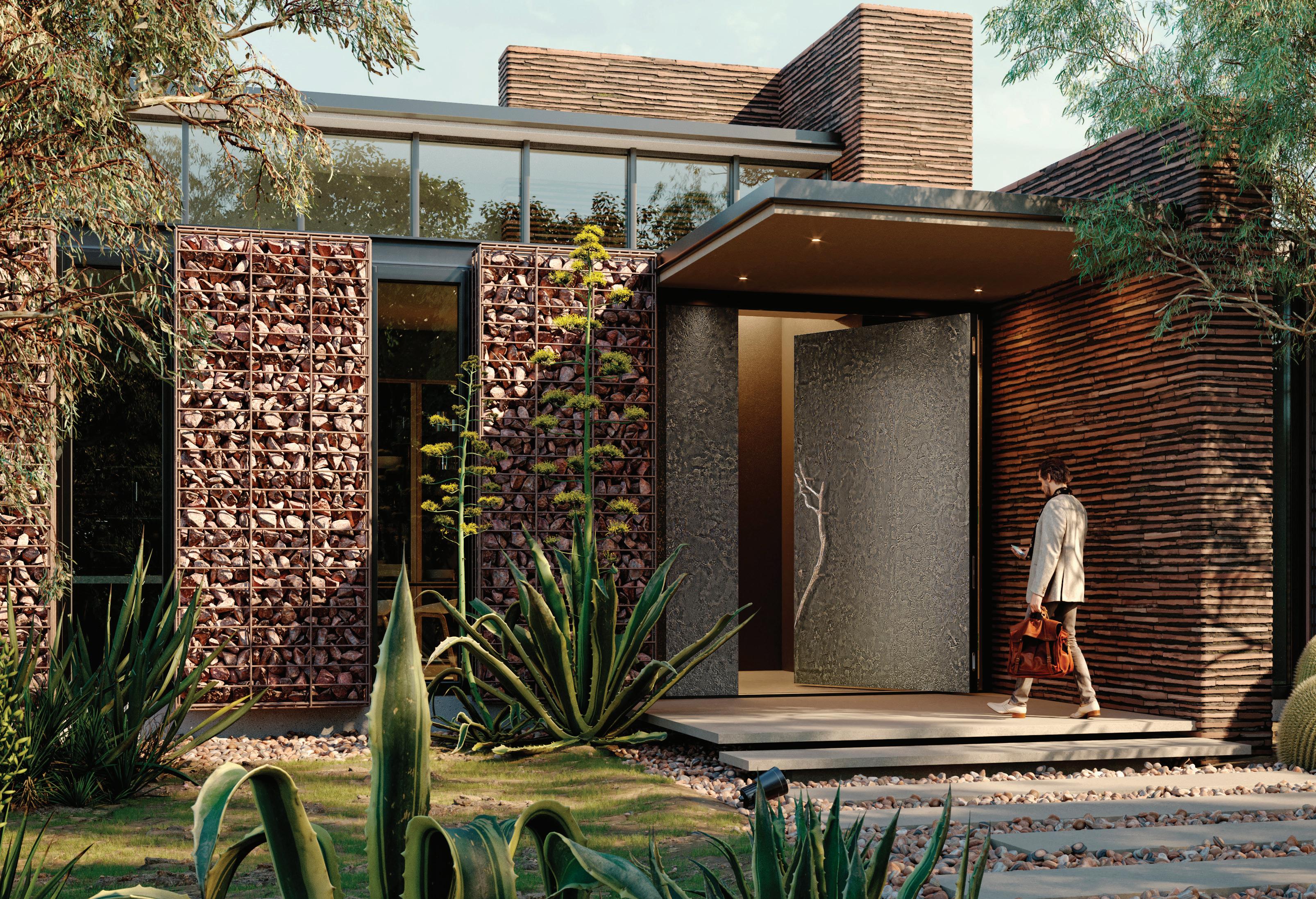


“Opulence” is the name of these luxurious windows and doors, available from Opulence Architectural Systems. Massive pivot doors clad in liquid metal, ceramic, natural stone, or artisan glass, as well as windows and sliding doors, are as expansive as your imagination. Discover what is possible with Opulence Architectural Systems.
opulencesystems.ca 416- 704-4703
By Tracey MacKenzie
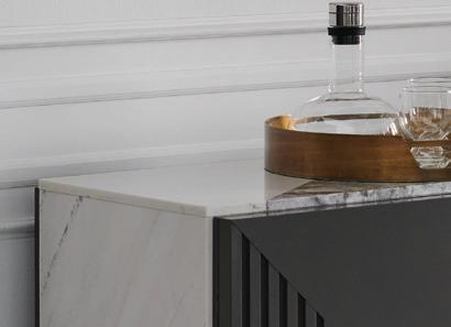
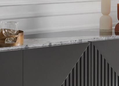
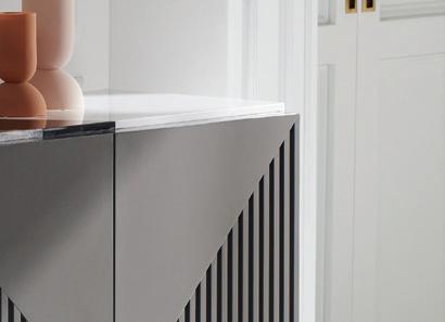
Perfect for hosting, the versatile Ayaz sideboard will complement any dining area with its ample space for cocktails and nibbles. Generous storage that comprises two drawers, adjustable shelves and open space, neatly concealed by touch-latch doors, makes it the perfect addition for your living room, hall, or entryway as well. decorium.com




The Pro Line Series electric kettle from KitchenAid with its high-gloss red finish is as hot as they come. Built for speed, this 1,440-watt kettle boils water in minutes, has a dual wall construction, and comes with a temperature control gauge to select the exact temperature you desire, all while keeping the outside of the kettle cool to the touch. kitchenaid.ca
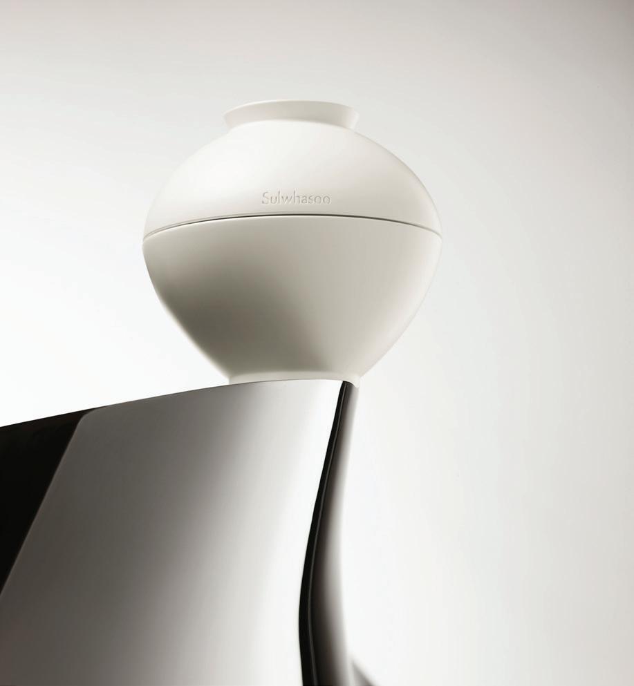
Sulwhasoo’s Ultimate S Line is a marriage of ancient wisdom and modern luxury. This ground-breaking collection highlights the power of ginseng berry SR encapsulated in a traditional Korean moon jar. Comprised of Ginsenomics, bioflavonoid and rare ginseng berry, The Ultimate S Cream leaves skin smoother and more radiant than ever. sulwhasoo.com.

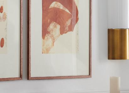


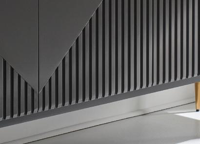


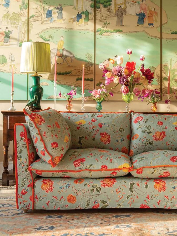
Sophie Conran’s new sofa collection is now being manufactured in the U.S., making them available in Canada. Made by hand using sustainable materials, these sofas have a solid birch hardwood frame, steel springs and duck down cushions. The standard lead time is eight to 12 weeks, depending on the design and location. For information, email sofas@sophieconran.com sophieconran.com/ catalogrequest.
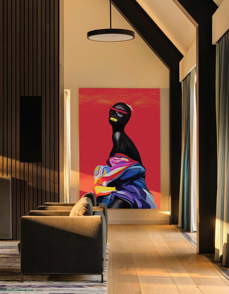
Titled Sahhara, this mixed-media piece by Toronto artist Joshua Hy incorporates such elements as 24K gold leaf, diamond dust, crystal resin and Preciosa Bohemian crystal caviar. “This piece expresses the process of cultures melting into one,” says the artist. “As you look at this piece, imagine the horizon as being the red that radiates the heat of the Sahara sands. The female figure represents those who’ve recently crossed the ocean, their bodies wrapped in the things that help define them as the fabric finds its shape.” The artwork measures 36 by 48 inches. thedezinr.com


FREED HOTEL + RESIDENCES COMING SOON TO ADELAIDE & DUNCAN.
Experience the epitome of luxury and convenience at the corner of Adelaide and Duncan. Featuring a one-of-a-kind art integration by world renowned artist Takashi Murakami, “Together with the Flower Parent and Child,” inside the lobby of the first-ever Freed Hotel and Residences.


TOGETHER WITH THE FLOWER PARENT AND CHILD, 2021-2022


©2021-2022 Takashi Murakami/ Kaikai Kiki Co., Ltd. All Rights Reserved. Courtesy Perrotin




Natasha
President, NKPR
From stylish Italian-designed appliances to modern summer fashion and wellness, the sun season beckons.
By Natasha Koifman
I love Canadian summers—a time when the warmth of the sun and the spirit of community bring us together, filling us with renewed energy. It’s also the time of year when we get the most out of fashion, beauty and luxury living. For this summer’s trend report we explore the epitome of style, sophistication, and adventure. From SOREL’s chic footwear to a fashion-forward collaboration between SMEG and Dolce & Gabbana, and La Mer’s transformative skincare, we’ve curated the best of summer indulgence and self-care. Discover the elegance of Melanie Lyne’s fashion essentials and get inspired by the allure of European travel. If you have a product you would like to submit for consideration in our Market Trends roundup, please DM me on Instagram at @natashankpr.

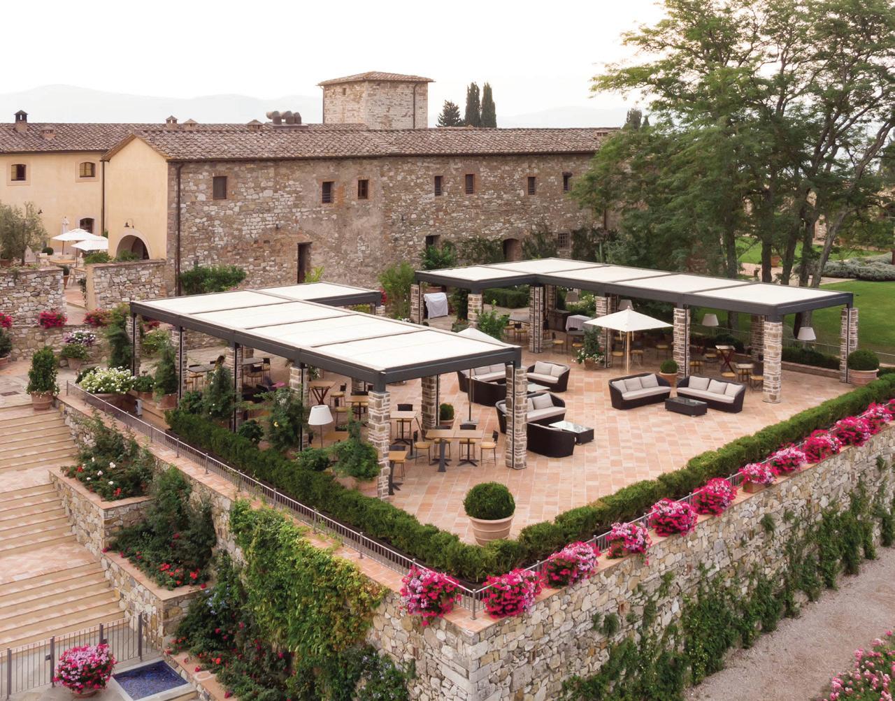
This summer, my husband and I are twirling off to Europe for destination weddings, charmed by Italy’s whimsical embrace. We’ll toast to love in Tuscany while basking in the magic of Castello di Casole, a Belmond Hotel that whispers romance at every corner. Then, we’ll create our own love story in Florence while cozying up at The St. Regis Florence. Our Italian journey concludes with a stay at the vibrant Hotel de Russie in Rome, where luxury, hospitality and sublime Italian cuisine entwine perfectly.

TRENDS WWW.NKPR.NET

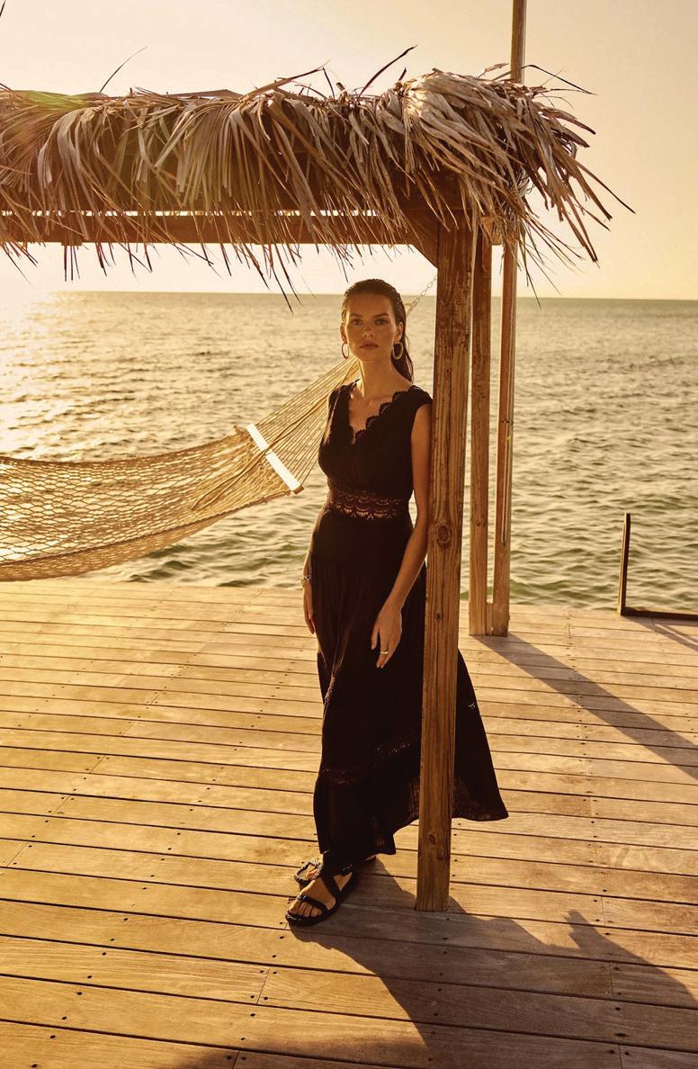
MELANIE LYNE
I adore the new Melanie Lyne summer campaign. It’s a celebration of effortless elegance, featuring warm, tropical tones and head-to-toe monochromatic styling. And the suiting options— crafted from natural fibres—are perfect for office wear or casual outings. The blouses embrace a sophisticated yet easygoing vibe, while tees, denim, and lightweight
bottoms deliver playful texture and on-trend flair. This new collection embodies the ultimate summer wardrobe, combining two of my favourite words: chic and comfort. melanielyne.com


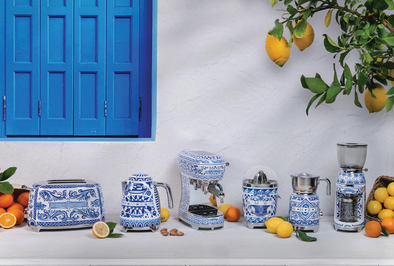
SMEG and Dolce&Gabbana seem to always be trending. This time, it’s with the latest renewal of their partnership to celebrate Made in Italy with the stunning Blu Mediterraneo collection. Inspired by the sea, these gorgeous pieces take you on an immersive journey from pure whites to serene blues, blending the shades of the waves with the elegance of majolica prints. The Blu Mediterraneo collection features SMEG’s signature small appliances, such as toasters, kettles, and juicers, now joined by a coffee grinder, espresso machine, and milk frother. All are adorned with Dolce&Gabbana’s creativity and SMEG’s unmistakable design. I love them so much I’m running out of counter space. smegshop.ca.
LA MER
Ladies (and gents), to protect those beautiful faces, La Mer’s Broad Spectrum SPF 50 UV Protecting Fluid is your summer bestie. Shield your skin from daily ultraviolet exposure while infusing it with the rejuvenating energy of its Miracle Broth. Wear this lightweight lotion over your moisturizer or under makeup for soothing protection, ensuring your skin remains beautiful and protected on the sunniest days. It’s summertime; let’s get out there, but keep the skin radiant and healthy cremedelamer.ca

For its Spring ‘24 collection, SOREL reimagines its iconic Pac boots for fashionable city life, and I love them. The new line redefines spring and summer footwear, incorporating unexpected details that convey the seamless blend of style and function. My favourites are the trendsetting ONA Streetworks Slide Women’s Heel Sandal and the VIIBE Crisscross Slide Women’s Flat Sandal: cute and comfy summer shoes for this summer girl. sorelfootwear.ca.

Jenna Bitove-Naumovich, contributing fashion editor, shows us how Scarlett Gasque’s lingerie recalls vintage glamour.
By Jenna Bitove-Naumovich
Portrait by Natasha Gerschon
Hair by Tony Pham
Makeup by Jessica Savedra
Silky satins, bows, pearls, embroidered lace, and boning. Oh my! With corsetry and lingerie fashions still on trend, look no further than the lavish and sultry designs from Scarlett Gasque. Inspired by burlesque dancers and 1950s glamour, and designed mostly in the U.K. by Canadian designer Chloe Rogers, these seductive lingerie items are crafted of carefully selected, highquality textiles. The embroidered corsets are made of fine satin with spiral boning. True to corsetry form, this is steel boning, which is flexible and easy to move in, but it helps to contour the body and cinch the waistline, so one feels one’s best. These corsets are topped with strings of glossy white pearls that can be detached, and satin bows with crystals for a glamorous feel.
Faux-fur trims in cotton-candy colours grace the cuffs, collars and hemlines of Scarlett Gasque‘s robes. These robes can be worn at home or on a special occasion for a night on the town. Most important, Scarlett Gasque’s collection allows you to be yourself while expressing your sensual freedom.


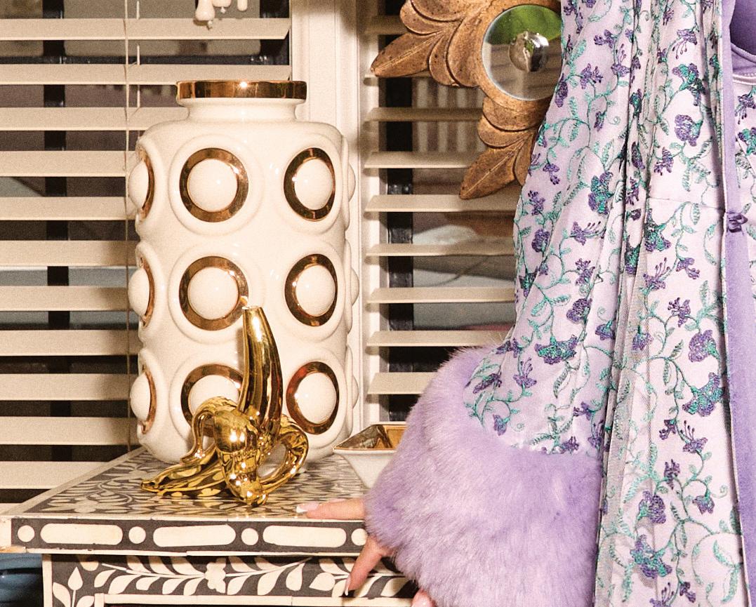


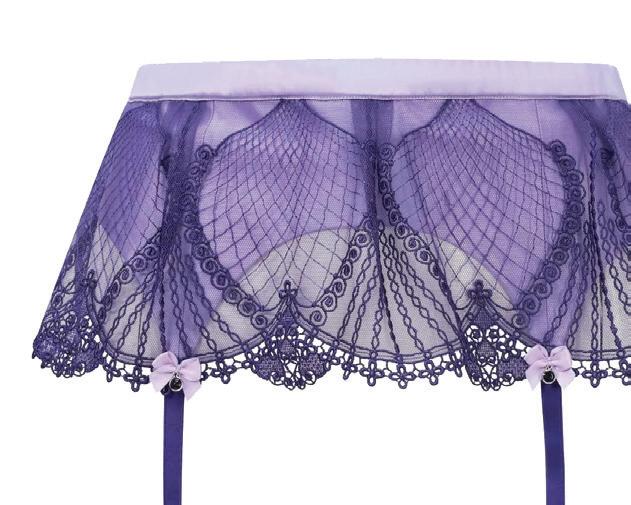
BELOW: One of the most beautiful attributes of Scarlett Gasque’s craft is the cut of the creations. This purple lace suspender with lilac bows sits beautifully over the hips, exposing the perfect amount of your cheeky behind.
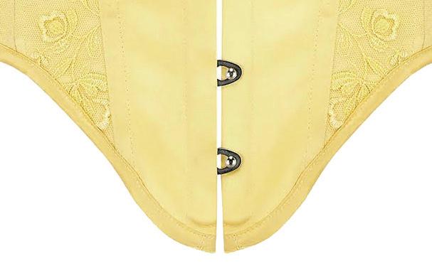
LEFT: Get a sweet sensual look with this beautiful yellow lace corset. The dipped-V waist front allows for extra coverage and hold. It’s finished with strings of white pearls that sit delicately on the hips. The straps are also removable for a strapless look.
RIGHT: The sensual and soft Mon Cheri robe in baby-doll pink drapes effortlessly over every curve. The contrasting soft pink faux-fur cuffs and trim ooze femininity. This robe is enhanced with embroidered lace hearts around the waistline and a large satin belt.


BELOW: This gorgeously cut bra matches Scarlett Gasque’s purple and lavender Forget-Me-Not robe and suspender. The lace-scalloped design forms perfectly over the bust.



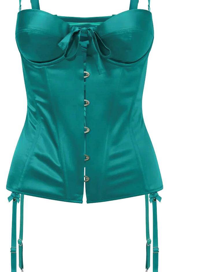
RIGHT: The Emerald Garden Corset looks beautiful on all skin tones. True to the art of corsetry, it incorporates a busk front closure, with real metal boning shaping the waistline, and a lace-up back, allowing for extra cinching.


RIGHT: Complete the look of Scarlett Gasque’s Forget Me Not collection with this purple thong. The lace embroidery front attaches to sheer side panels. It fits beautifully over the body and is perfect on any curvy form.


BELOW: A pink embroidered lace bra from Scarlett Gasque’s Sweetheart Collection feels like a hit from Cupid’s arrow. The Kiss Me Quick bra, made of soft sheer mesh, is adorned with embroidered pink hearts.




is wearing Be Mine: the Mon Chéri robe, Kiss-Me-Quick bra and Kiss-MeQuick waspie corset in the Sweetheart Collection.


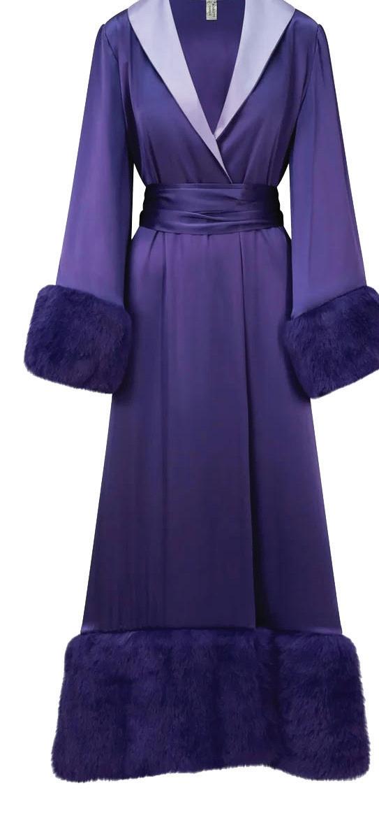
RIGHT: Elevate your wardrobe by donning the Forget Me Not robe, which is deep purple with a contrasting collar in soft lilac and matching lining. The faux-fur cuffs and train are reminiscent of a vintage Hollywood

RIGHT: your donning Me is contrasting soft lining. cuffs reminiscent vintage look.
BELOW: The Kiss Me Quick pink thong completes the look of the Sweetheart collection. A sheer front with satin embroidered hearts flows into stretchy side straps that don’t cut into the hips, allowing for a beautiful fit.


LEFT: Scarlett Gasque’s waspie waist corset offers the look of a corset without the commitment to full-on corsetry with bust. Want to spice up an outfit? Jenna suggests one of the waspie belts, worn over a shirt and jeans for an elevated fashion look.




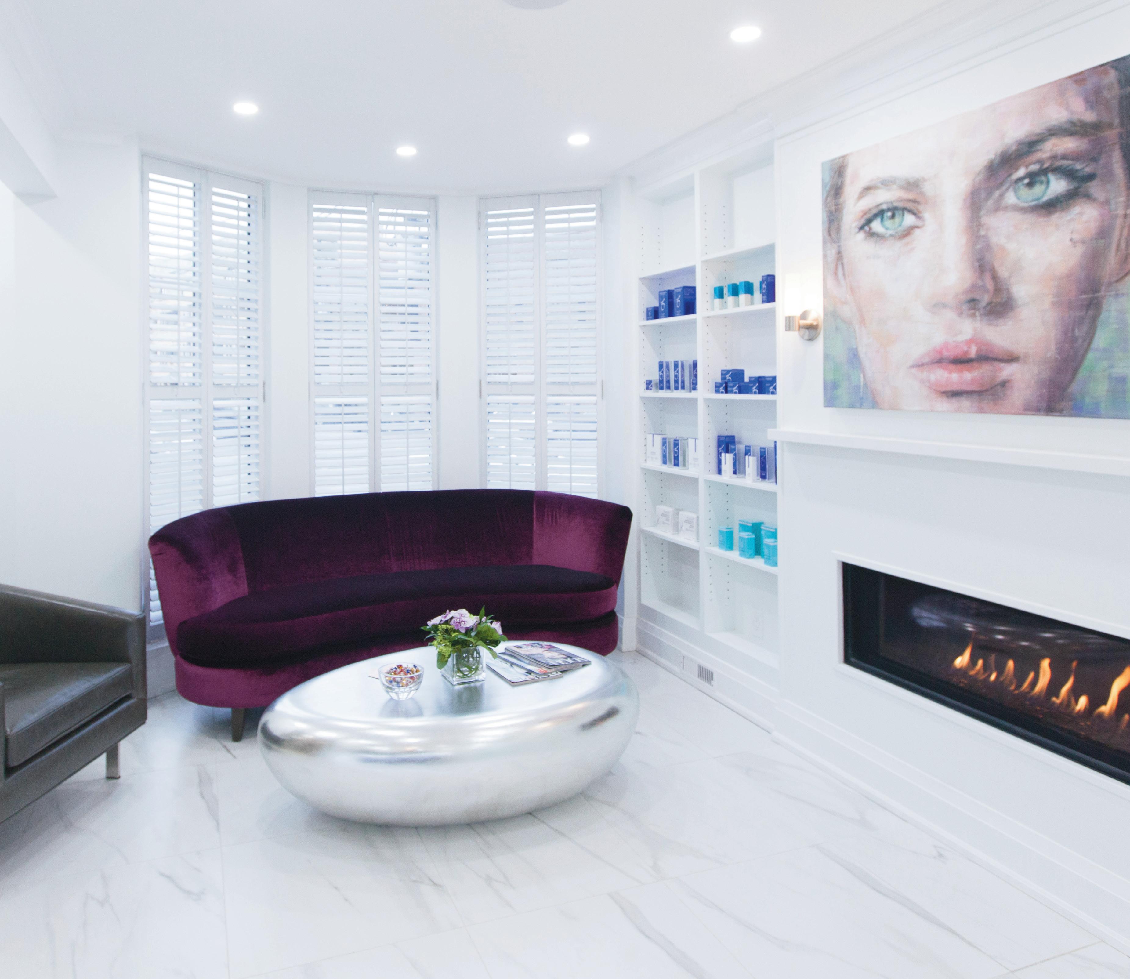
The warm season o ers time to relax and recover a er facial plastic surgery.


Summer is a time to slow down and go on vacation, making it an excellent time to book cosmetic surgery. Hunkering down at a cottage or in our backyards o ers us privacy for healing. Dr. Philip Solomon, MD, FRCSC, Otolaryngology, Head and Neck Surgeon, practising Facial Plastic Surgery in Toronto, explains.
By Dr. Philip Solomon & Nancie Heiber
Living Luxe: Dr. Solomon, how much time is normally needed for recovery after a facelift?


On average, patients need two weeks at home. Recovery time can vary among patients depending on their tissue and age, but generally, patients usually feel comfortable socializing three to four weeks post-op. In the first week following surgery, we see patients quite regularly for post-op appointments to closely monitor their healing. During the second week, it’s just a matter of resting and letting the body do its job of healing.


What many patients find nice about having facelift surgery in the summer is that they’re able to enjoy the outdoors while at home healing rather than being holed up and isolated indoors in the winter months. We also have many patients who are teachers or snowbirds, who choose the summer for surgery so they can relax at home or at their cottage while still being able to enjoy time with family.
LL: What is the recovery time for rhinoplasty surgery and are there other surgeries that also require downtime?
Rhinoplasty surgery often requires a cast on the nose for seven to 10 days, so most people typically take that length of time away from work or school. Summer is our busiest time for rhinoplasty surgery as students (high school and university), professors and seasonal workers have time off to recover.
To optimize healing, we recommend patients refrain from strenuous exercise for the first four weeks as it can delay healing. However, we encourage enjoyment of the outdoors and nice weather with a casual walk in the first few weeks. Wearing SFP sunscreen is very important at this stage as well because the nose can still be numb in the early weeks and could be susceptible to burning and additional inflammation.
Most facial plastic surgical procedures do require some downtime. Eyelid surgery, facial implants and brow procedures typically require the same post-operative protocol for the first seven to 10 days with regard to resting and post-operative care.
LL: What advice do you give your patients that helps them to heal well and quickly? How do diet and exercise contribute to recovery?
Prior to surgery and two weeks following, we ask that they avoid smoking, vaping, alcohol and blood-thinning medication and supplements, all of which can impact recovery. Sleeping slightly elevated and avoiding salty food can help. Patients can also take a herbal supplement called arnica as well as drink pure pineapple juice, both of which have anti-inflammatory properties. With regard to exercise, it’s best to take it easy for the first few weeks. However, a nice outdoor walk is fine; vigorous exercise can be resumed four weeks following surgery.
Oxygen therapy can also be helpful with wound healing, and many of our facelift patients visit nearby hyperbaric oxygen-chamber facilities. Any patient who wants to expedite or optimize healing can certainly seek this out as well. Then, once an incision heals—usually two weeks following surgery—patients can apply a silicone scar gel at home to help improve the appearance of surgical scars.
“THE
AND POSITIVE
LL: What do you advise your post-surgical patients vis-a-vis exposure to sunlight?
It’s a must to avoid excess sun exposure, especially after laser resurfacing. So, we prefer patients do laser resurfacing off-season. We recommend all our surgical patients wear a hat, sunglasses and sunscreen when outdoors, which is best for anyone, regardless of surgery. It’s one of the best anti-aging practices.
LL: In your practice, is summer the season in which patients are more likely to book surgeries?
Our practice is busy all year ’round. However, the busier seasons tend to reflect work and school vacation opportunities. The spring and summer months, as well as the pre-Christmas period, are quite busy as people take time away from their responsibilities and take advantage of seasonal holidays. We often hear from patients that it was a great decision to have surgery in the summer: The warm temperatures made for an uplifting and positive experience.


Yonge City Square is a new condominium development in Hoggs Hollow that promises resort amenities for urban dwellers.
By Phillipa Rispin
When The Gupta Group breaks ground at the intersection of Yonge Street and York Mills Road, it will mark the first new condo development in Hoggs Hollow in more than 20 years. Yonge City Square’s two residential towers will comprise approximately 697 luxurious dwelling units at a desirable address in an established neighbourhood. Retail businesses, cafés and restaurants, and commercial office space will be provided; there will be entrances to a revamped York Mills subway station. The excellent siting means that residents will have quick access to shopping, entertainment, dining and leisure activities in such prestigious neighbourhoods as Bayview Village and the Bridle Path.
The site will offer much more beyond that, however: Steve Gupta, founder and chairman of The Gupta Group, says that he’s “redefining excellence” with Yonge City Square, and that it will become its own
luxurious resort-like community. His vision for the development takes inspiration from its surroundings. “The complex backs onto the Don Valley Golf Course,” Gupta notes. “Besides the golf course, there is a conservation area and numerous parks and green spaces in the vicinity with opportunities for running, biking and hiking. It’s almost like a 280acre backyard.”
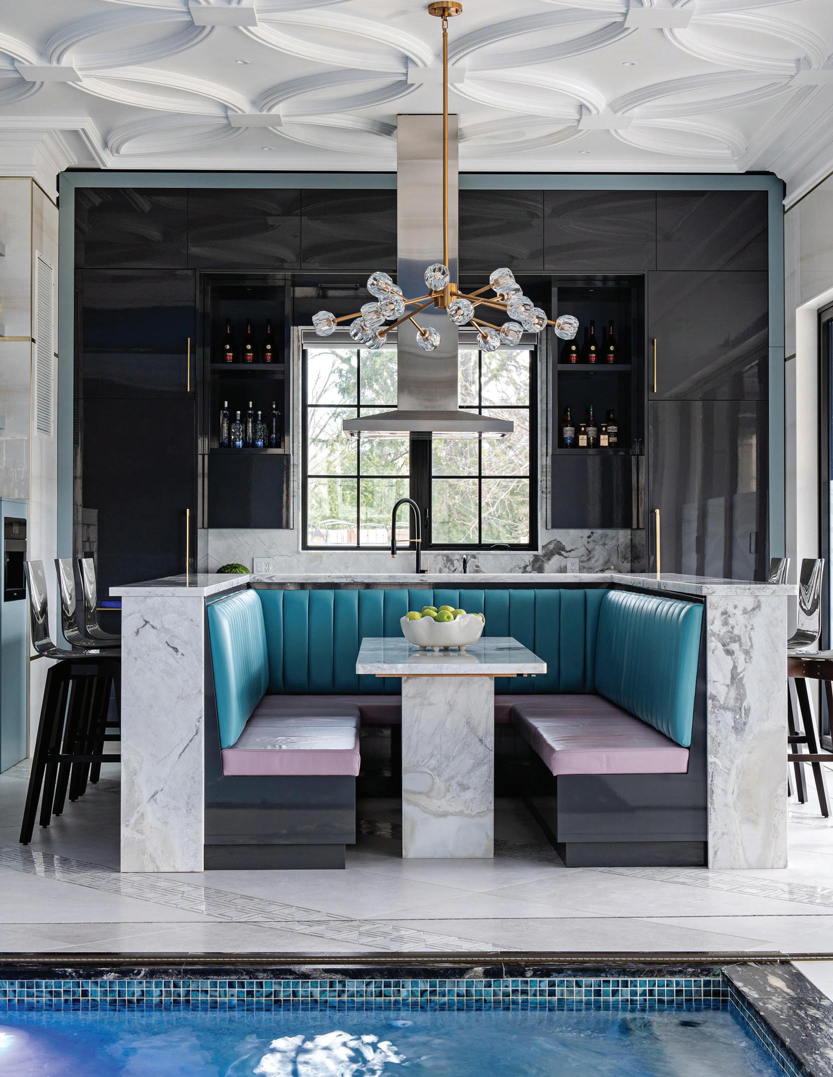
But residents won’t even have to step off the grounds to begin their resort-in-the-city experience. The complex itself will offer more than enough amenities for people who want recreation to be active or leisurely. An outdoor swimming pool will be situated between the two towers of the complex, surrounded by several levels of sunny or shady lounging spots, seating for small groups, private cabanas, a firepit and quiet areas for those looking forward to quiet reading or simply contemplating the surrounding greenery.
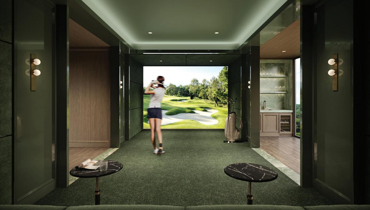
Residents will also be able to practise indoors with two golf simulators, work out in the fitness centre, stretch in the yoga room, or play a round or two on the mini-golf course. If they want to host a social event, they’ll have access to a party room with a gourmet kitchen.
Other amenities will include an infrared sauna, salt treatment room, indoor and outdoor children’s playgrounds, mahjong room, theatre,


steam room and pet spa. Some 36,000 square feet of space will be dedicated to amenities.
“Yonge City Square will offer resort-style living in the middle of the city,” says Gupta of his vision. The man to materialize that vision is Mansoor Kazerouni, an architect with the global design and consultancy organization Arcadis. The two men have had a long and productive working relationship that Gupta describes as “I explain an idea; he has a unique ability to understand it.”
Kazerouni describes the process of designing Yonge City Square as “a thoughtful journey,” saying that “the development had to mediate between the city and the conservation area. There is the natural environment on one side of the site and the Yonge corridor on the other.” He says that the site lent itself to two towers of different but moderate heights, rather than a monolithic block, and there will be a low connecting structure between them. His design is for a development sympathetic to its context. “The area between the two buildings is a unique opportunity for an amazing outdoor amenity space,” Kazerouni says. It’s also an excellent approach to providing that resort experience.


Canadians are discovering the joys of full-ownership condominiums at the historic Crane Resort.
By Valerie Simmons
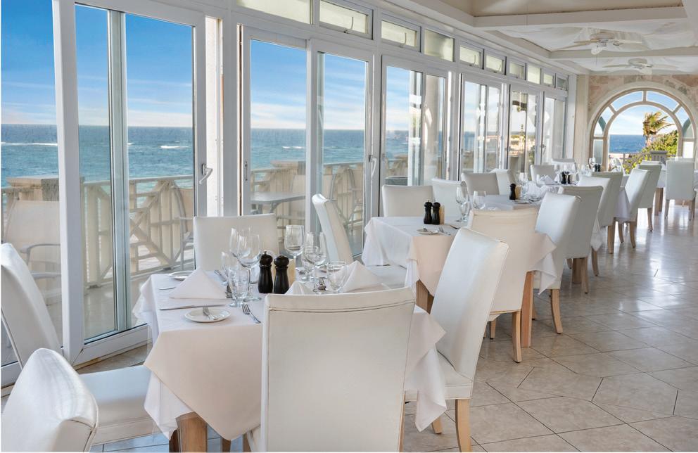
Arriving at the iconic Crane Resort in Barbados, the first thing we notice is the breeze. Heavenly, warm and hibiscus-scented, the breeze comes straight from distant Africa after weeks of being purified by the Atlantic Ocean. The position of the hotel is no accident: it was carefully planned by the Victorians who came here seeking the healing powers of this exceptionally clean air. They were clearly on to something. After just a few days at The Crane—days spent with windows wide open to the sea, wandering along the powdery white-sand beaches and enjoying the views from its famous cliffside pool—you cannot help but notice that you feel just…better.
Today, The Crane Resort has grown from its historic roots in the 1880s to become a


vibrant resort with 318 rooms, suites and private residences spread over 40 acres. Owner Paul Doyle, a Canadian who came in the late 1980s, had a vision for what the little 18-room hotel could become. And he never left. As a result, the oldest continually operating hotel in the Caribbean is now a community where residents mix with visitors, local performers entertain at the aptly named Bar 1887 (the year the hotel was founded) and guests have a choice of international cuisines at five onsite restaurants.
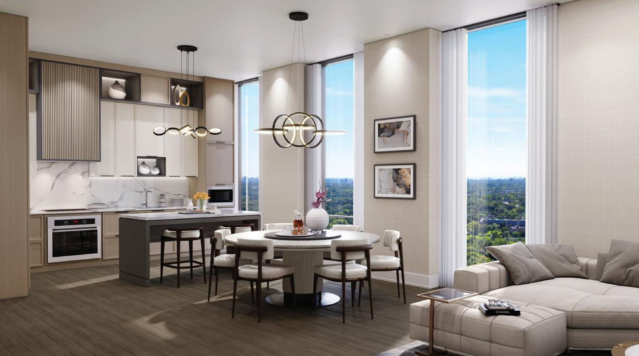
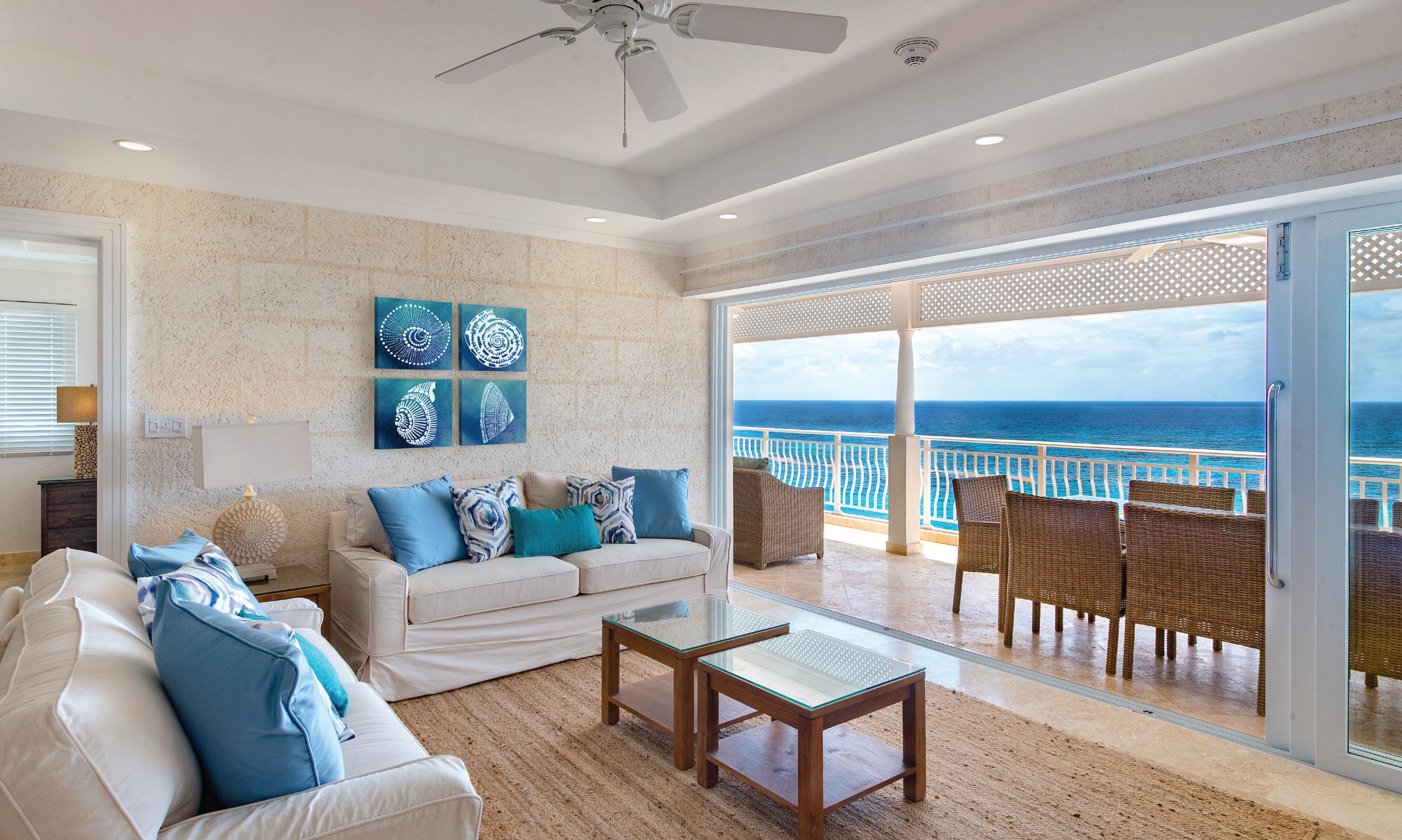
The newest and most exciting additions at The Crane are the luxurious full-ownership condominiums. Noticing that more than half his interval-ownership buyers were repeat guests who were buying more time at The Crane—far higher than industry norms— Doyle was inspired to design a product for guests looking to escape winter for half the year or simply move to a new locale. In contrast to the design of the hotel suites, which boast coral stone walls and mahogany furniture, the condos are contemporary, light-filled and spacious, with coastal accents and white, soft furnishings.
Many have private swimming pools with large terraces. Elevators take guests from underground parking (good for protecting cars from salt air) directly to their residences, which range in size from 497 to 2,337 square feet, and offer up to three bedrooms for multigeneration families.
The ownership residences offer guests total flexibility. They can keep their units purely for personal use (called lock and leave), knowing that their space will be maintained in their absence. Or they can choose to put the unit into the successful Crane rental program to offset costs with rental income. Prices are extremely reasonable for Barbados, with units in the lush tropical gardens of the park starting at $399,000 US all the way to a three-bedroom penthouse with ocean views at $1.7 million US. The Crane is unique in the sometimes-intimidating world of Caribbean real estate in that pricing is transparent. The Crane owners pride themselves on offering a product that is not only welcoming but highly competitive.


For now, we are just here on vacation, escaping Canadian winter. We take morning walks on the beach and listen to waves crashing on the sand. We wander down to the coffee shop for a cappuccino with delicious coconut cake and have a flying-fish sandwich in the beach restaurant beneath swaying palms. We might play tennis or do some surfing or spend a day at the spa. Or, we might just stay in, enjoy our suite and our four-poster bed and the magnificent views from our terrace. Maybe one day we will come back as owners. For now, we are just loving the breeze.
The WaterStone Foundation helps people who are battling eating disorders by providing free-of-charge mental-health services, extending its caring reach into four post-secondary schools in Ontario.
By Kim Duffy
I bet that at some point in your life, you’ve known someone who has struggled with an eating disorder. It is a brutally cruel mental illness that can have devastating consequences mentally and physically. Approximately 2.9 million Canadians have an eating disorder, and it can affect anyone at any age.
I started the WaterStone Foundation for Eating Disorders in 2014. My family has been entrenched in the eating disorders community since our eldest daughter was diagnosed with anorexia when she was 15 years old. It is the most complex of all mental health illnesses that no one wants to talk about, and yet it is a rapidly increasing concern in our society. But the societal norms consider it a young, white girl’s illness, which is far from the reality. Hospitalizations for teenage boys and younger children have increased by 400 per cent in the past 17 years. Eating disorders have the highest mortality of any mental health disorder among women aged 17 to 24.
Treating an eating disorder is not a quick fix. It can take years, if not decades, of individual and family therapy. The earlier an eating disorder is diagnosed and treatment is started, the better the outcomes. While early intervention is critical, wait times at publicly funded institutions can be up to a year. Alternatively, a surge in private psychology
clinics has emerged in the past five years, which is an option, but accessibility remains a privilege reserved for those who can afford it.
The WaterStone Foundation was started to respond to the lack of services for individuals and their families who are faced with an eating disorder. Our family was motivated to act and make a difference for other families. I couldn’t ignore it because of the challenges we faced while witnessing the mental and physical destruction and the impact on the entire family.
Over the past decade, the WaterStone Foundation has raised $1.7 million, which has enabled us to invest in education, financial aid, and the expansion of hospital programs. True to our mission, we invest where the need is greatest and the impact is most profound. In June 2022, after extensive consultation with community leaders, schools and individuals with lived experience, WaterStone Foundation launched its Student Support Program at four post-secondary schools in Ontario. The pandemic highlighted the growing need for mental health services for our youth, and WaterStone rose to the challenge for
those struggling with an eating disorder. The WaterStone Foundation’s Student Support Program provides an expert eatingdisorder therapist on campus in the mental health and counselling centres; students can access the service free of charge. Our goal with this program is to see eating-disorder therapists in every post-secondary school in Canada.
For me, I could not be prouder and happier to report that my daughter has recovered from her six-year battle with her eating disorder. At 31, she is pursuing a PhD in psychology, specializing in eating disorders. She hopes that through her lived experience, she understands what individuals and families are enduring and can give back.
If you would like to support WaterStone Foundation, please visit waterstonefoundation. ca to donate or contact Kim Duffy at kim. duffy@waterstonefoundation.ca. If you or someone you know needs help, the NEDIC helpline at 1-866-NEDIC-20 (toll-free) or 416-340-4156 (Toronto) may be an excellent place to start.
Don’t wait; recovery is possible.
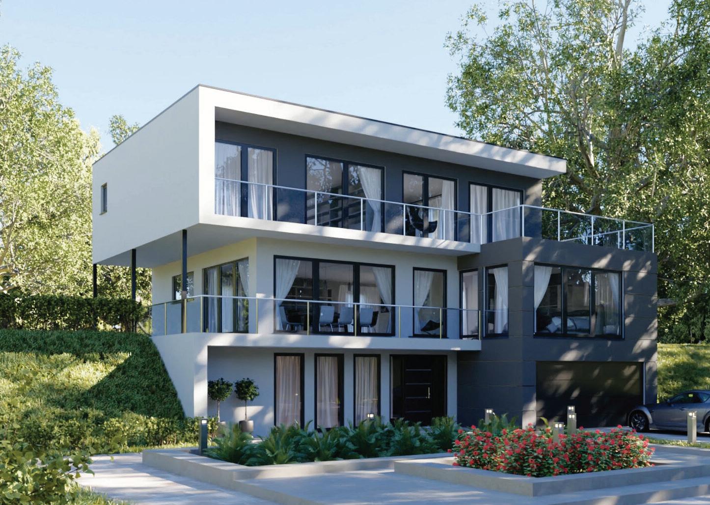
In addition to offering the best imported European products, Eurostar Windows and Doors has a reputation for its amiable service, making the purchase of windows a pleasant experience.
By Susan Semenak
“A pleasant and professional company to do business with.” It’s not often that businesses express their good nature, but that is how Eurostar Windows and Doors describes itself on its website. The 30-year-old company, based in Toronto, Burlington and Ottawa, is well-known among its clients, and among builders of custom luxury homes for its broad range of high-end European-made
windows and doors and expert installation services. But it is equally renowned for its extraordinarily helpful customer service and its team of informed and collegial staff.
“After all these years in business, we have an endless supply of product knowledge,” says Joseph Gerofsky, Eurostar’s director of sales. “We take the time to educate our clients to be sure that they have the information they need to make the right decisions. This is a consultative process with zero high-pressure sales tactics.”
Gerofsky says his boss, Eurostar principal Norm Shubat, is known in the business for his friendliness and he has put together a team that prides itself on being “respectful, approachable and well-educated.” Shubat started his career as an installer and then became a manufacturer of doors and windows before deciding in 2003 to focus on European imports, which he says can’t be beaten in terms of technological innovation, security, quality and what in the industry is called “fit and finish.”


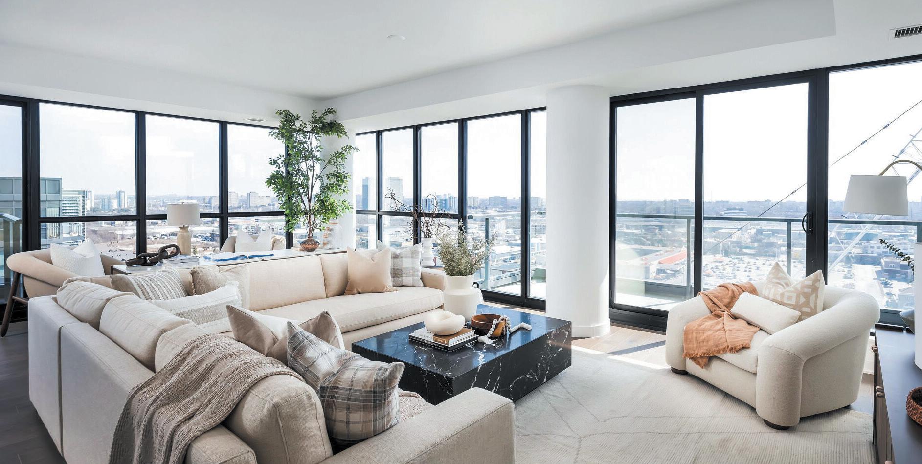


Featuring 2 bedrooms, a den that can be converted into a third bedroom, and a large great room, suite #1801 is made for expansive living, while providing the space and privacy of a full-sized home. Only a few suites remain at 33 Frederick Todd Way at Upper East Village - get into this award-winning master-planned community now!
• Over 1750 sq. ft. of living space
• Lots of outdoor space: three balconies, including one off the primary bedroom
• Primary bedroom features large ensuite and walk-in closet
• Second bedroom features ensuite and walk-in closet
• Great room connected to kitchen, featuring peninsula seating
• Upper East Village amenities include rooftop firepit lounge, indoor pool, and fitness centre with yoga studio
“WE TAKE THE TIME TO EDUCATE OUR CLIENTS TO BE SURE THAT THEY HAVE THE INFORMATION THEY NEED TO MAKE THE RIGHT DECISIONS. THIS IS A CONSULTATIVE PROCESS WITH ZERO HIGH-PRESSURE SALES TACTICS.


Shubat and his team travel regularly to Europe, forging partnerships with manufacturers in Italy, Germany, Austria and Poland, and scouting the latest trends and innovations. “Fitting a house with windows and doors is not a small investment,” he says. “People really need to have faith in who they are dealing with. That’s why they keep coming back to us.”
Shubat and Gerofsky are seeing growing interest among their clients in emerging European trends. For instance, jet-black windows and doors, after more than a decade of ubiquity, are beginning to yield to a wider range of colours, most notably greys, among them blue-grey anthracite, lighter graphite grey and even paler grey.
The other seismic industry shift they’ve noticed is the move away from vinyl and toward aluminum windows. “Aluminum windows are more durable and they have a thinner frame,” Gerofsky explains. “People want a sleeker profile: more glass and less frame.”
He says the new “thermally broken” aluminum windows are also more efficient than ever before, designed with a thermal break that separates the interior and exterior components of the window, preventing the inside of the window from feeling hot or cold. They


also have a lifespan of 50 to 60 years, more than two or three times that of vinyl. That and the fact that aluminum is recyclable makes them an eco-friendly option.
Security is another concern among buyers. With rising rates of home break-ins, Shubat says consumers are looking for highsecurity certified windows and doors that are as burglar-proof as possible. “As soon as robbers try to force their way in, they quickly realize that it will be virtually impossible; the glass is laminated with multiple layers. Doors have hinges but also latches and hooks to lock the unit in place.”
And what’s the latest trend from Europe that’s about to arrive? Shubat and Gerofsky say the curved-glass window is poised to make its appearance, perhaps replacing the popular corner glass window. “What we’ve been seeing around Europe,” says Shubat, “is curved glass windows that seem to wrap around the corner of the house without an angle.”





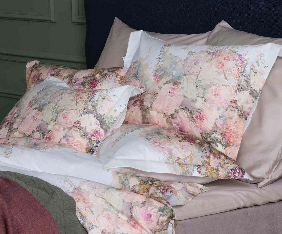
David’s Fine Linens can instantly turn a bedroom into a delightful summer escape.
By Julie Gedeon
Summertime and the linen’s easy, if we switch to lighter bedding for the season. “Beautiful sheets and coverings that stay cooler and comfortable immediately make our bedrooms more inviting and relaxing,” says David Saini, founder and owner of David’s Fine Linens. “They create
our retreat from the world for a while and help us to sleep better.”
This year’s array of pastels and light florals is a refreshing change from the dark accents that emboldened us for some time. “I’ve been in the bedding industry for almost 47 years, and I can tell you that white, ivory and grey never go out of style,” Saini adds. “A colourful throw instantly changes their seasonal look.”
Saini delights in discussing quality bedding. “I take a lot of pride in the European selection that we feature in our stores,” he says. “We regularly visit France, Italy, Portugal, as well as Lithuania and Romania, to directly import quality products to offer our customers at


significantly lower prices.”
Options abound for summer, and Saini advises learning about the specifics of each fabric.
Cotton sateen is popular. The satin-like finish provides a lustrous appearance with a smooth feel. “It’s the sateen weave—typically with one thread down and two or three threads up—that makes this cotton so soft,” Saini says.
If you break into a sweat in summer (or any time of year), try micromodal bedding. Saini imports it from the Austrian-based Lenzing AG, which sustainably turns beechwood cellulose into a rayon with a texture similar to silk. “It’s softer, has superior breathability compared with cotton and linen, and has strong wicking qualities,” he says. Natural bamboo is another good eco-conscious choice with notable cooling and wicking properties. “It’s soft and silky.”
While thread count should be in the 300 to 400 range, it’s not the
only element to consider. “Look for the higher grades of cotton, bamboo or modal,” Saini advises. “If you buy the higher quality single-ply yarns, or a long-staple cotton, the sheets will be softer, and become less wrinkled with every wash, but maintain their wear for years.” In fact, good-quality sheets last through a few hundred washes. “If you invest in multiple sets and rotate their use, you’ll have them for decades,” he adds.
A summer duvet is nice, but to be light, it must be 100 per cent down-filled. No feathers whatsoever, as they increase weight and reduce breathability. “Higher quality duvets come in Summer, Classic or Winter levels of weight,” Saini explains. “For cottagers, the Summer level is best, but for city folks with air conditioning, the Classic works year-round.”
With good quality bedding, you’re less likely to spend time counting sheep.

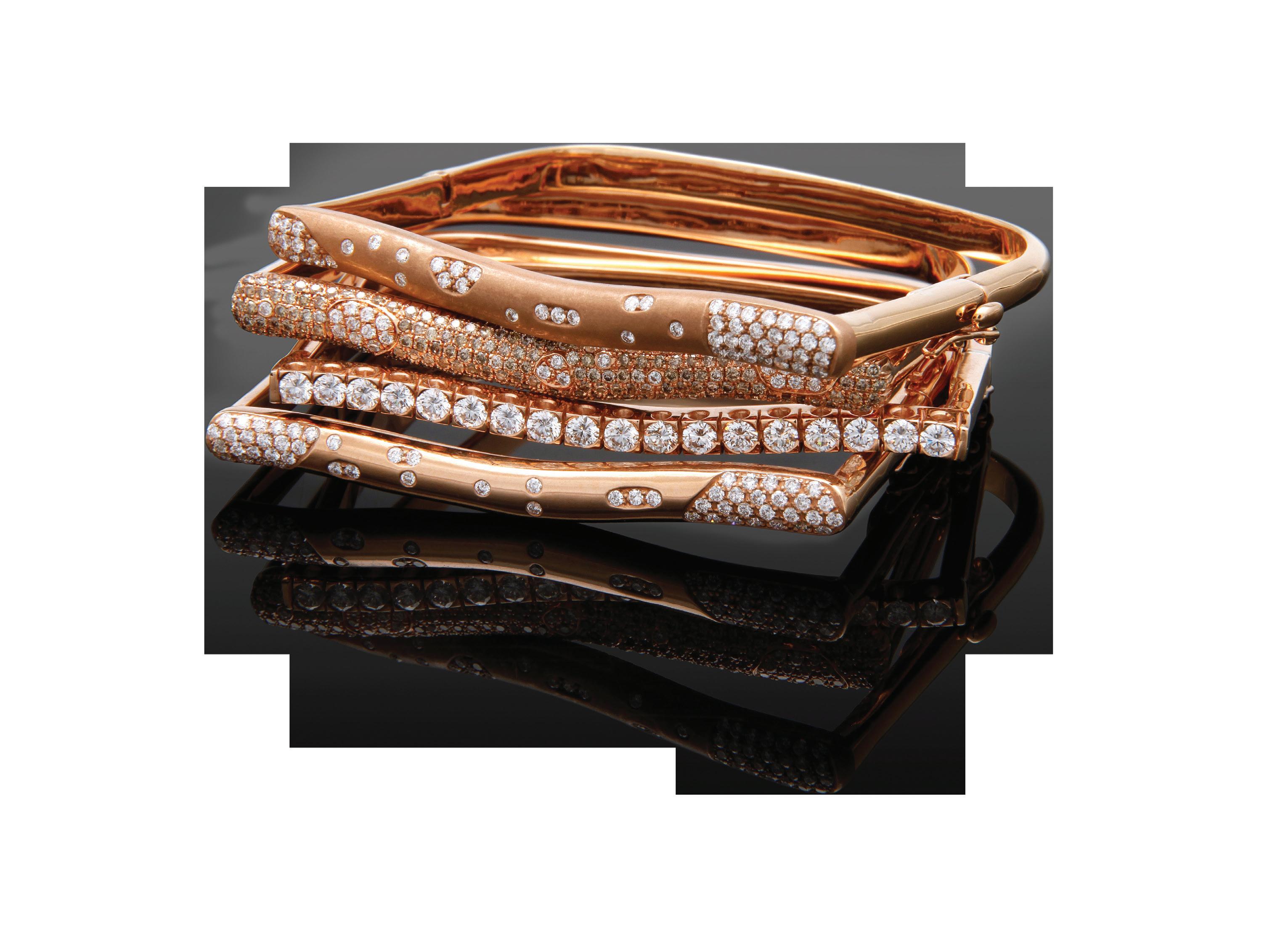
FRIDA Fine Jewellery evolved from its creator’s life of building artistic strengths.
By Valerie Simmons

Based in Halifax, Nova Scotia, FRIDA is an independent luxury fine jewellery brand. Owner and designer Carrie Lamb dedicated the name FRIDA, meaning “beautiful and beloved” in ancient Norse, to her daughter, Emma. “As an advocate for the empowerment of women, FRIDA is a vehicle through which to effect change, piece by glorious piece,” Lamb says. “Effecting change begins with a story. We all have one: I simply tell mine through my art.”
Initially inspired by the rugged landscape of her home in the Caribou region of Nova Scotia, Lamb reinvented her life by reinterpreting nature through a complex synergy of passion, precious stones and metals. “With no other means of support over 20 years ago, I returned to a passion that began when I was six: reinventing








my grandmother’s jewellery and then selling it on the school playground,” Lamb says. That playground is now an international market with a discerning clientele from around the world.
CARIBOU, Lamb’s first creations of statement neck pieces, led to a cohesive collection of wearable art. “Creating beautiful jewellery is a journey, it begins with a vision, a vision through which we celebrate innovative design and every facet of the process to create treasures that transcend trends,” Lamb says. “Be your own brand.”
OCEAN collection is reflective of a deeply introspective period; it consists of pieces embracing the rhythmic patterns of the sea. SHIELD collection explores the fusion of male and female energy through the intricate use of metal. Through exquisite gemstones and diamonds, stories are told. STRATA is a highly coveted collection of layered luxury. “It’s not only representative of ancient rock formations, but also speaks to



our evolution as women, to our history, our visions, our voices, layered over time,” Lamb says.
Today, FRIDA is not only a brand; it’s a destination boutique, recognized for distinctive signature collections and beautiful one-of-a-kind fine jewellery creations, having graced the pages of renowned British Vogue.
Pieces are meticulously handcrafted in Canada using 18kt gold and only the finest of gemstones and diamonds.
“Every gem, diamond and pearl is selected for its inherent beauty and quality,” Lamb says. “Every piece is an expression, and without exception, harbours a soul, a voice and a story.” Master goldsmiths and diamond setters allow Lamb the creative freedom to custom design in any genre.
Celebrating the art of superb craftsmanship, she offers a bespoke design service, allowing clients to interpret their dreams.
“From engagement rings to a bespoke jewel of choice, anything is possible,” Lamb says. “Luxury is about choice, experience and quality.”
The concept of creating a luxury brand has grown to the point where Lamb’s daughter, Emma, is not only the face of FRIDA, but also the creative director, helping her mother define and differentiate the brand within the glittering landscape of designer jewellery. Together, they’re a force of nature. “I design for the many amazing women who have inspired my journey,” Lamb says, “for the daughter in all of us.”

416.929.5858 | wisenadeldesign.com

Foamcore Architectural Elements creates eye-catching mouldings and other installations that beautify buildings — both historic and contemporary.
By Susan Semenak
Matt Arnold is always looking up, especially when he travels. It’s the architectural details at the tops of buildings that most capture his attention: corbels, brackets, trims and cornices. He photographs, sketches, researches them. “Architectural details are what make a space, inside and out,” says Arnold, president of Niagara Falls-based Foamcore Architectural Elements, which designs and manufactures foam-coated and polyurethane mouldings and architectural elements in a myriad of styles. “With the right details, you can take
a flat, plain-looking box of a building and make it into something else altogether, inside and out.”
Arnold started the business in 2012 with his father, a contractor, to find mouldings for a house he was building. They were looking for decently priced mouldings that were long-lasting, lightweight, strong, and easy to install. But what existed was expensive, heavy and not quite right.
Arnold was a machinist working for Brock University when he began working part-time out of his father’s garage, designing and building the machines and processes that would give rise to a new generation of architectural mouldings and embellishments with mesh-reinforced foam cores and two layers of cement coating. These offer a modern take on architectural detailing that doesn’t crack or warp or rot the way wood, plaster or precast concrete do, and they’re lightweight and easy to install.



“WITH THE RIGHT DETAILS, YOU CAN TAKE
FLAT,
OF A BUILDING AND MAKE IT INTO SOMETHING ELSE ALTOGETHER, INSIDE AND OUT.”
Soon, Foamcore’s products were in high demand among local home builders and renovators as well as architects and designers designing bars, restaurants and commercial projects. Arnold quit his day job, moved his nascent business out of his father’s garage and built a 20,000-square-foot manufacturing facility. But his business was growing so fast that it was soon time to move again. The company is now a leader in foamcore architectural detail. It employs 35 employees in a 55,000-square-foot factory, where it manufactures a range of products, from coffered ceilings and faux wood beams to pillars, crown mouldings, louvres, medallions, wall panels, corbels and faux bricks.
Arnold says demand is driven by restoration projects and also
by a renewed interest in architectural detailing in modern projects. His company can recreate architectural elements that have rotted and degraded, as they did recently for a century-old downtown Montreal building which had been stripped of its ugly siding to reveal original mouldings that were rotted. The contractors shipped a section of the damaged wood to Foamcore, which mimicked the old pattern and created an identical replacement.
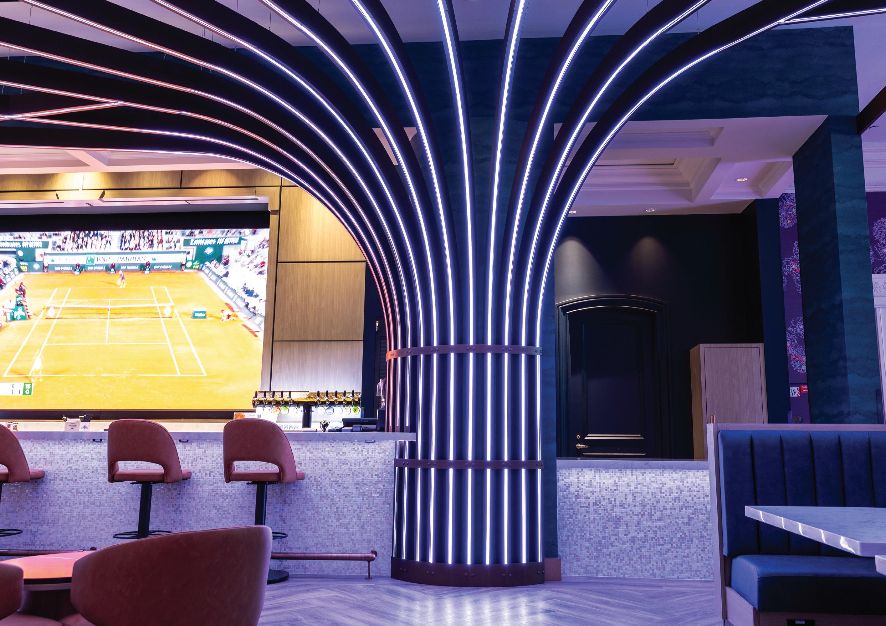
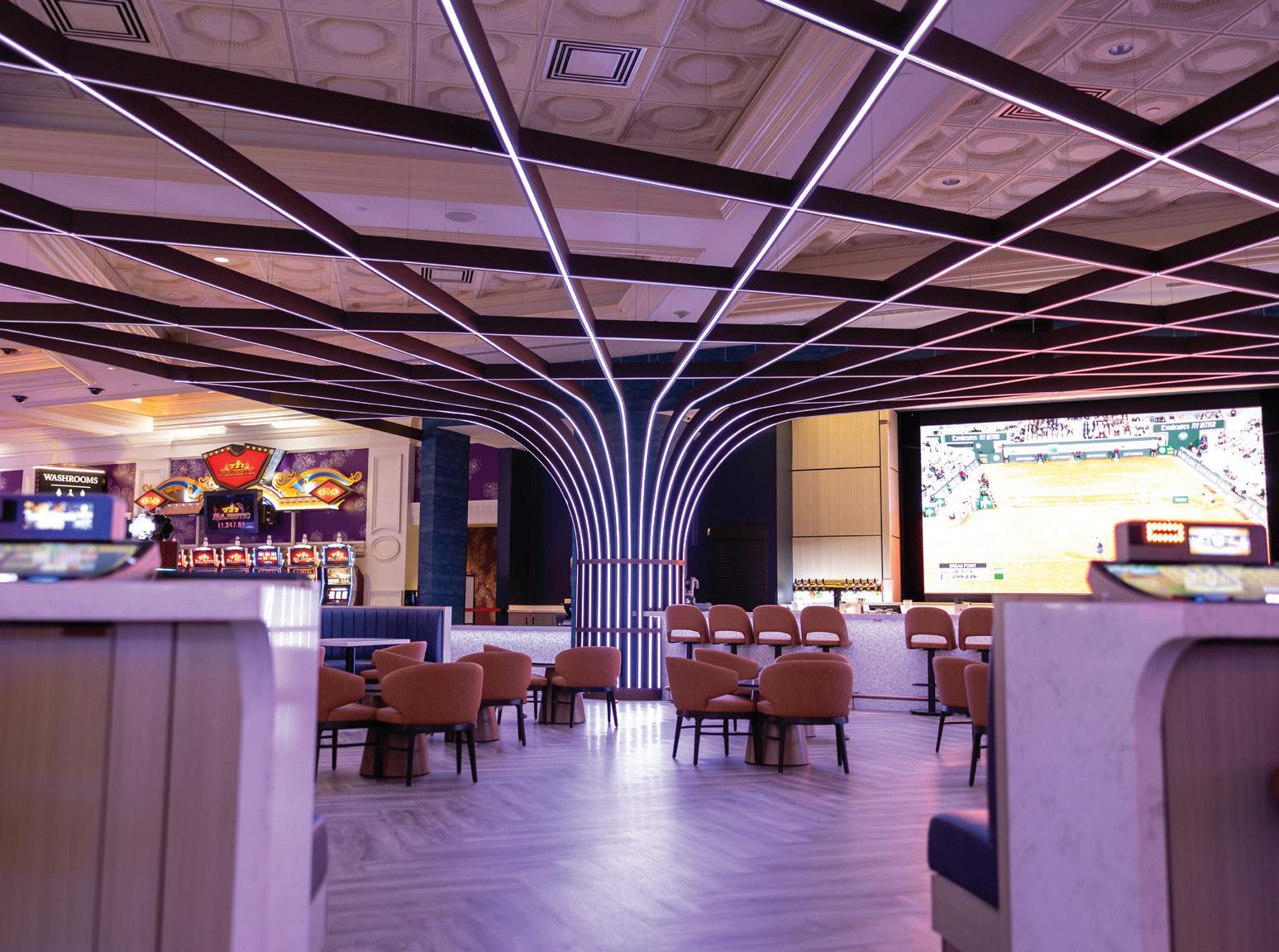
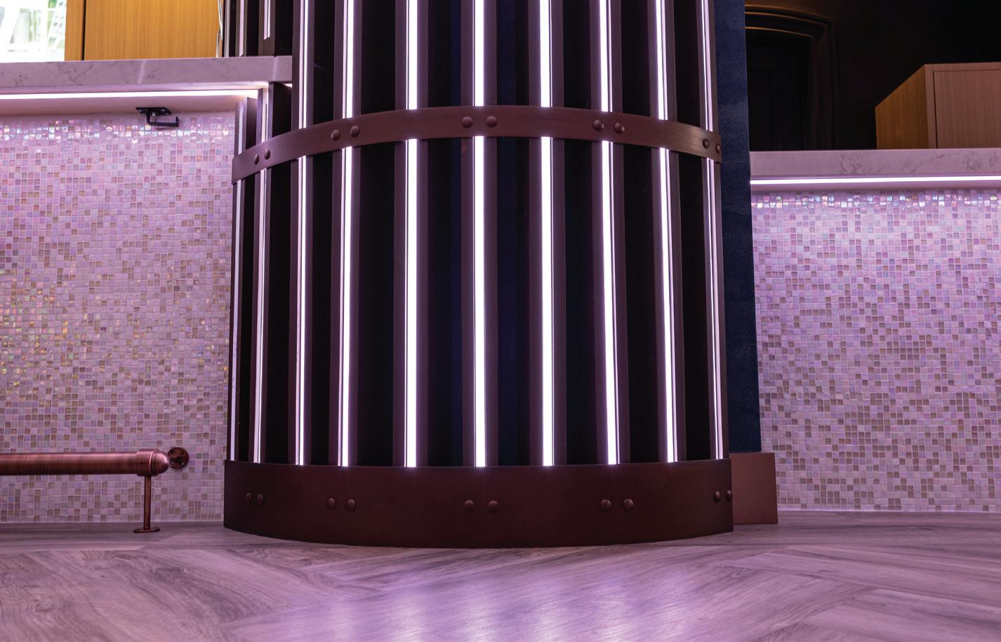
For Casino Niagara’s new Splash Bar, Foamcore produced mahogany textured ceiling beams, which curved up the columns with incorporated LED lighting. They were produced using Design Agency’s 3D model to form the dramatic ceiling in a series of pieces that came together onsite in 10-foot panels, like a giant jigsaw puzzle, installed by the project’s drywallers.
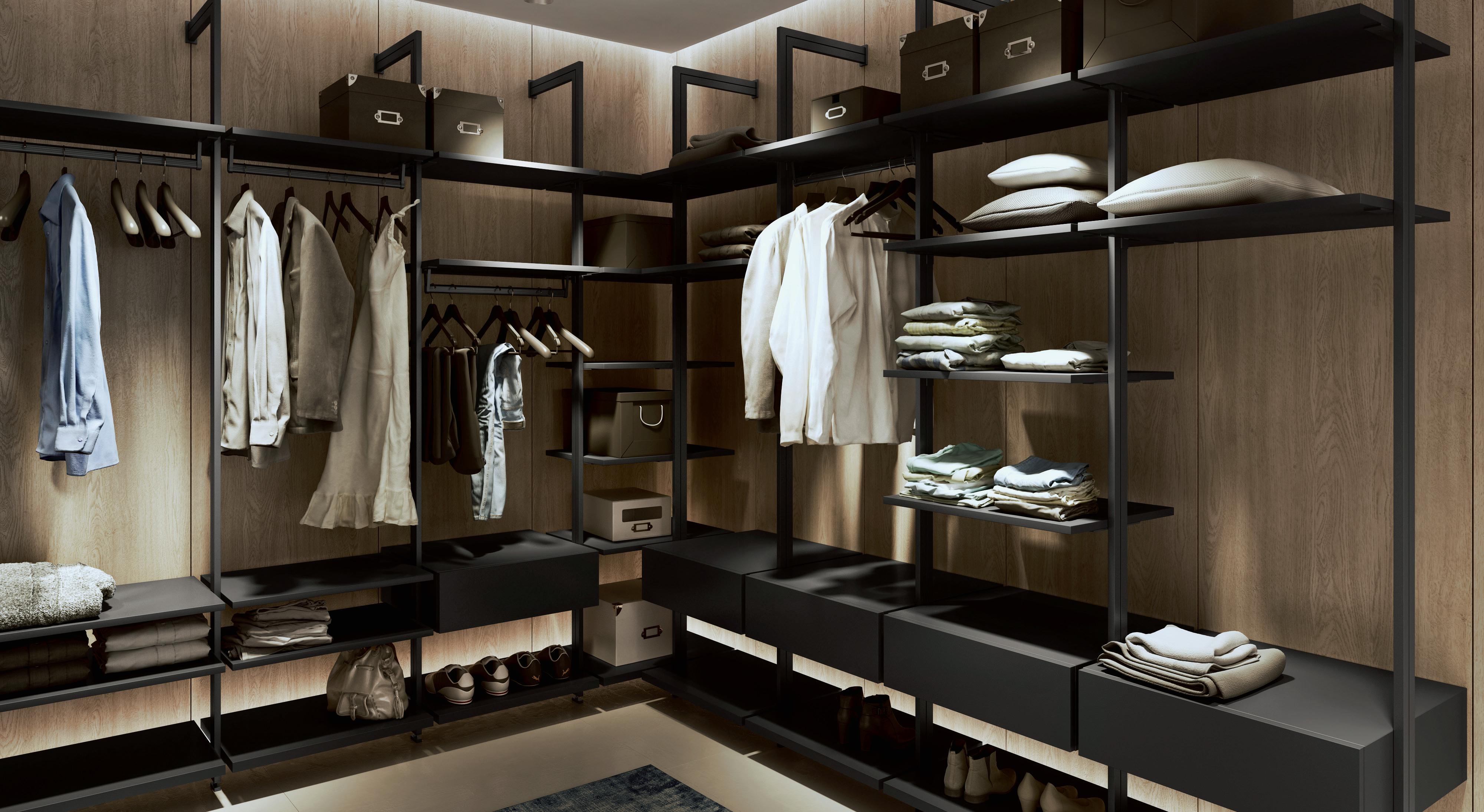
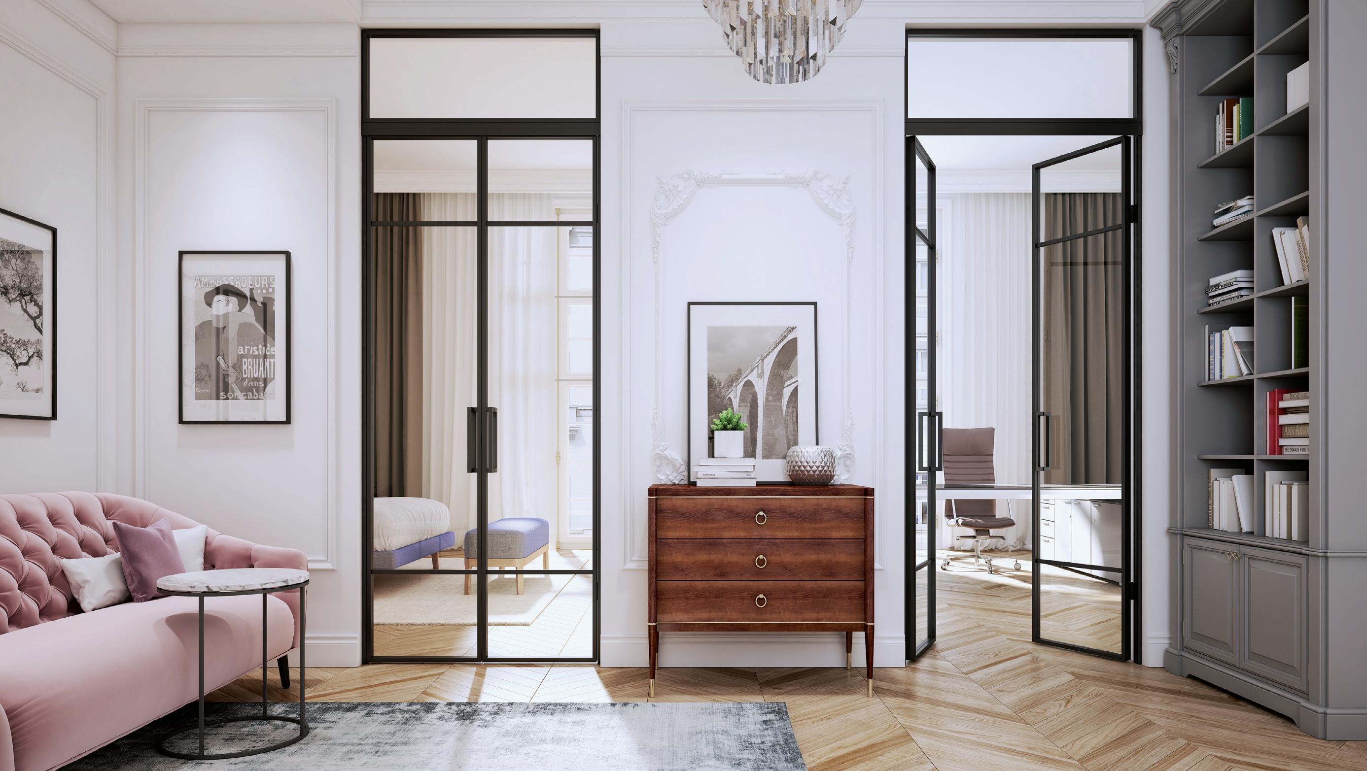
But Foamcore doesn’t just hew to the historic. It also creates modern architectural elements, such as embossed wall panels and contemporary coffered ceilings like the one the company recently provided for Todd Snyder’s new Los Angeles clothing boutique. “I especially love a mix of old and new, ornate and streamlined contemporary. It makes for a really interesting aesthetic,” says Arnold. “It’s really great to see so many different styles stand out.”
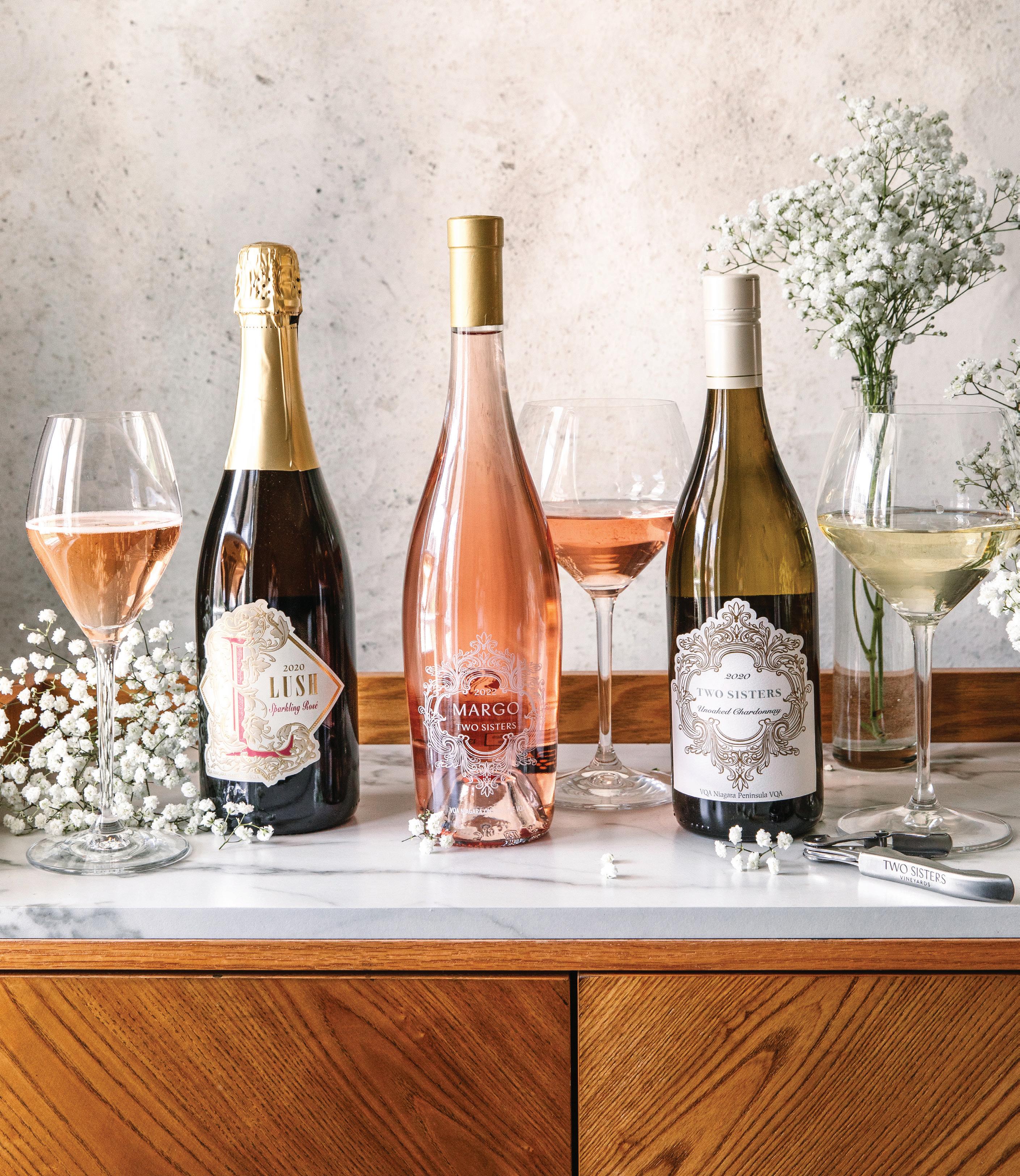
From dining and wine pairings to touring, tastings and marriage proposals, there’s a lot happening this season at Two Sisters Vineyards.
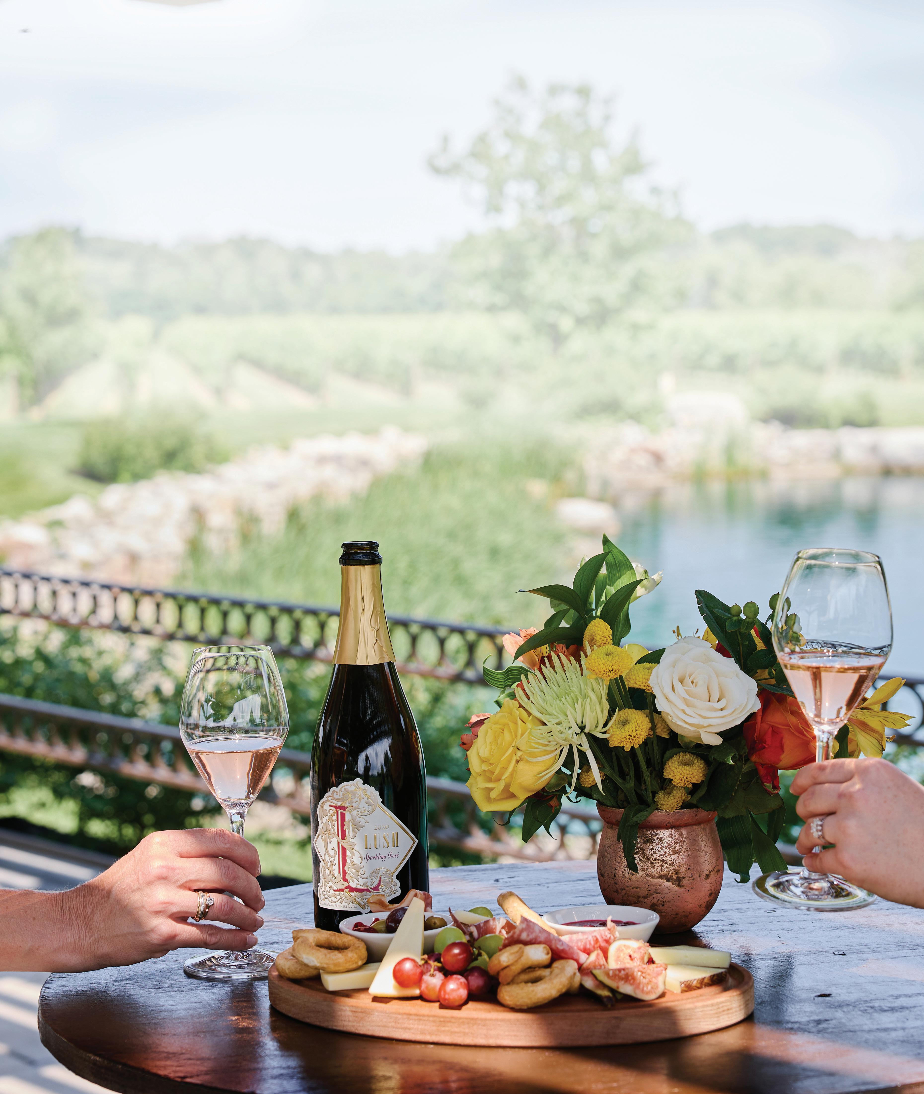
Welcome to summer. We’ve waited months for the arrival of warm weather, and now is the perfect time for a visit to the Two Sisters Vineyards in Niagara-on-the-Lake to enjoy fine wines and excellent dining. We asked Melissa Marotta-Paolicelli and Angela Marotta, co-proprietors of Two Sisters Vineyards, to discuss what’s planned for the season ahead.
Living Luxe: Two Sisters Vineyards has an on-site restaurant—Kitchen76—as well at its new restaurant, 11th POST on Queen, affording wonderful opportunities for food and wine pairing. What is on offer this summer?
Two Sisters: Located within Two Sisters Vineyards, Kitchen76 offers guests carefully curated Italian-inspired dishes paired with our award-winning Bordeauxstyle wines. In the summer, our terrace overlooks exquisite vineyard views where guests may join us for beautiful wine and food pairings that showcase culinary and winemaking excellence.




Our restaurant, 11th POST on Queen—located at 135 Queen Street in Niagara-on-the-Lake—just celebrated its first anniversary. The best way to describe the menu at 11th POST is “elevated comfort food.” Many components of the dishes are made in-house from scratch. Two Sisters Vineyards wines and Stone Eagle wines are exclusively offered at 11th POST as we strongly believe that our array of wines complements the menu beautifully. Our patio is right on Queen St. and is the perfect spot to watch the busy and beautiful action happening in Niagara-on-the-Lake.
LL: Are there menus specifically developed for summer dining and wine pairings? And can visitors dine al fresco during the warm months?
TSV: We pride ourselves in being inspired at Kitchen76 by the seasons. We have a farm on our property, where we grow many of our own fruits, vegetables and herbs, and are constantly updating our menu to reflect the bounty that Niagara farming offers. Every dish is carefully paired with our wines to ensure the ultimate dining experience. 11th POST on Queen also uses local produce, offering special features, including our Thursday burgers, which change each month, to daily soups that our chef crafts from scratch.
LL: There are many opportunities at Two Sisters for wine-tastings. Please tell us about this wide range of offerings.
TSV: We carefully curate wine tours and tastings that allow guests to experience all areas of the winery, from the barrel cellar to the outdoor terraces and verandas. Each space allows us to share the stories behind the wine with those who enjoy and appreciate them. We focus on ensuring each guest receives a thorough education on the wines so they leave with an understanding of the wine principles of TSV and what sets us apart.
LL: The vines are in full growth during the summer season. Are there opportunities to walk among them and learn more about viticulture?
TSV: We offer our Vine to Wine Tour in the spring and summer months, which begins with a sparkling toast on our veranda. This walking tour allows guests to get up-close and personal with the vines to see just how important their care and growth are to the impact they have on our wine. They venture among the Merlot vines until they come to our pond pergola where the tasting experience continues before they head back to the winery for a final tasting within our stunning Barrel Room.
We also offer our Between the Vines Tasting Experience, where visitors sit between the stunning vineyard rows to enjoy a tasting of five of our exceptional wines along with a charcuterie board while taking in the ambience of the evening sun.
LL: Popping the big question is always magical when it happens in a beautiful setting. And summer is the ideal time for it. The Proposal Experience at Two Sisters Vineyards makes that moment very special indeed. Tell us about this unusual and enchanting opportunity.
TSV: It is a pleasure to be involved in such special moments as proposals. Our Proposal Experience offers a private tour and tasting with one of our senior wine consultants before the couple is escorted to a beautiful location on the estate to pop the question. A toast of our Lush Sparkling Rosé brings the whole moment together. We offer several additional options including a reservation at Kitchen76, a horse-drawn carriage ride, professional photographer and an exquisite floral bouquet.



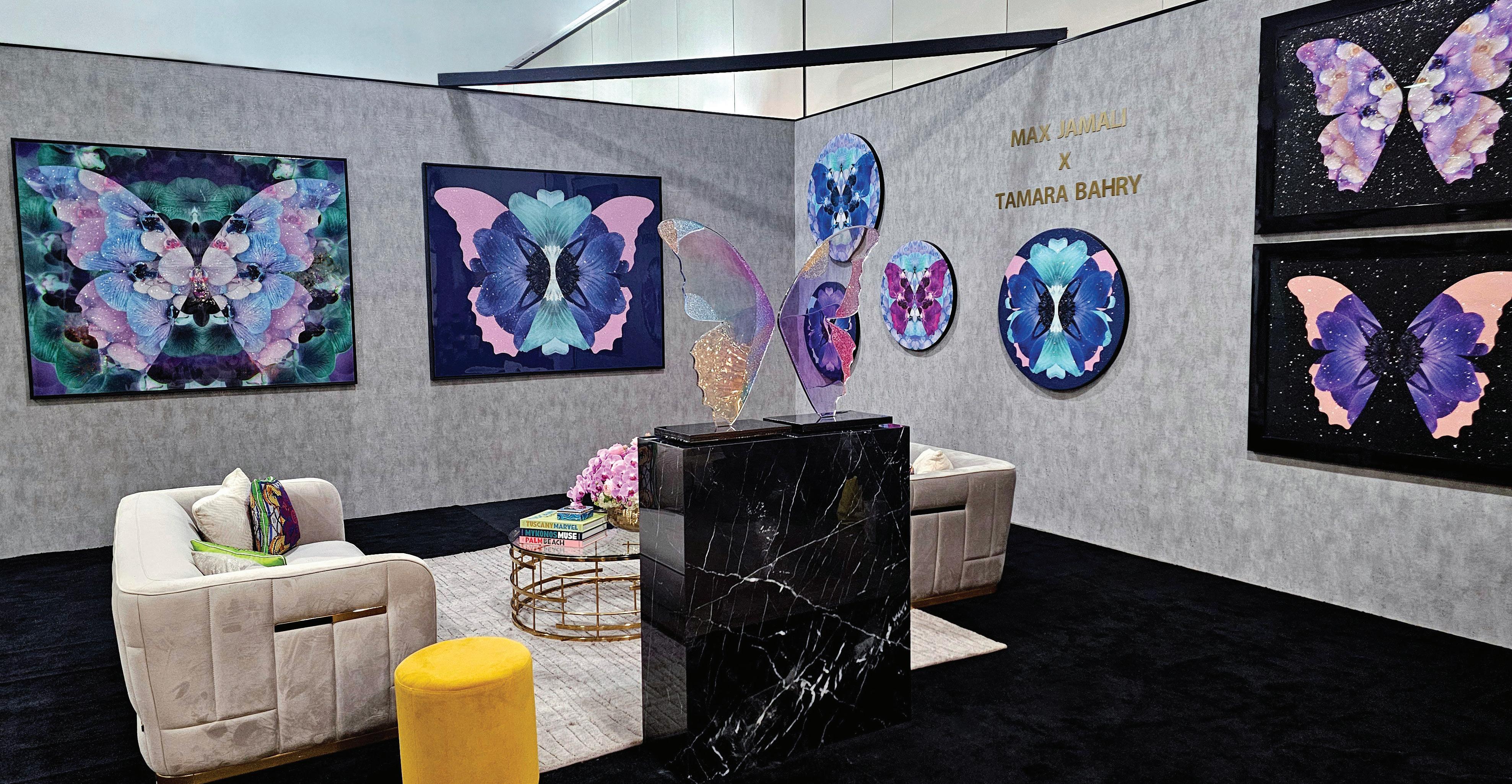
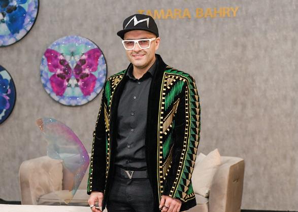
Photographer Tamara Bahry and artist Max Jamali teamed up to create a series of mixed-media artworks that combine the beauty of florals and butterflies.
What happens when two creative people— one a photographer, the other a mixed-media artist—combine their considerable talents? They create magic. Witness the collaborative work of Tamara Bahry and Max Jamali, displayed at the recent Living Luxe Design Show. Bahry is the photographer, Jamali the artist.
Together, they created Ethereal, a series of mixed-media works that combine floral images with butterflies in joyful, colourful unions. The pieces—rectangular ones as large as 60-by-72 inches and spherical ones that are as large as 40 inches ’round—were created through a complex process that began with photographs. Bahry started the process by photographing orchids in crystal bowls from above. “I would seek out specific colour patterns in them,” she says. “I used a kaleidoscope lens that would
distort the images to create a mandala effect.”
An orchid aficionado, Bahry says she grew up with orchids in her childhood home thanks to her floraphile parents.
Once she had captured each image, it was Jamali’s turn to perform his particular magic. Known for his mixed-media works that feature butterflies, Jamali overlaid Bahry’s floral images with butterfly wings. “The outline of wings of the butterflies are created by inverting the background image, which symbolizes transformation,” he says. The images were printed on canvas and enhanced with diamond dust, another hallmark of Jamali’s art. Next came resin to coat the piece. Some works were framed with art glass. “Collaborating with Tamara on this fineart series has been a wonderfully enriching experience,” says Jamali, “intertwining both the profound elements of nature and themes of transformation.”
Bahry cites the somewhat paradoxical union of such earthy elements as diamonds that come from the ground, juxtaposed against airborne diaphanous butterflies that pollinate flowers. “Our work celebrates the
harmony between the stillness of flowers and the grace of flight,” she says. “To me, each piece is a dance of light and colour, where petals bloom with the elegance of butterfly wings, and every sparkle embodies nature’s eternal beauty.”
Each piece took many laborious hours of work. But the result is a collection of joyful tableaux, designed to bestow upbeat warmth on any environment in which they’re displayed.

MATINA CHASIOTI Managing Director & Partner
Director of Service, Installation & Support
Despite the ubiquity of mobile phones, watches will always be around.
By Phillipa Rispin

It used to be that, when we needed to know the time, we would check the position of the sun, consult a sundial, haul out a pocket watch, or raise a wrist and shoot back a cuff to look at a wristwatch. Watch, timepiece, chronometer—whatever you call it, for most people it was a necessary object that was

“I LIKE WORKING ON VINTAGE WATCHES. YOU ARE BASICALLY PRESERVING THE HISTORY AND LEGACY OF THESE TIMEPIECES THROUGH DIFFERENT GENERATIONS. “

occasionally also a fashion item. Mobile phones have largely made timepieces unnecessary, but some people still respond to the lure of the watch. Its charms can be many: some people love watches for their aesthetic value, some for their mechanical intricacies, some for their history, and some for their value as a luxury product.
Humbertown Jewellers in Etobicoke is well acquainted with connoisseurs of haute horlogerie. “We’ve been selling and repairing high-end watches for almost four decades,” says Vivian Huynh, the company’s operations manager. “We’re a destination store for people who love watches. We carry luxury brands, and our team of excellent watchmakers covers all aspects of maintenance and repair.”
Theren Wang is the store’s senior watchmaker. He trained in Switzerland at the renowned K&H Watchmaking Competence Centre (KHWCC) in Le Locle. He loves the intricacy of watches, saying that “it’s fascinating that something so small has so many moving parts.”
After several years of experience working in the industry, he was invited to join Humbertown Jewellers. “I like working here in a store that is oriented toward luxury brands,” he says. “Every component, down to the smallest screw, is crafted to exacting standards. Each brand has an extremely high demand for perfection, and challenges me to pay attention to small details.” Luxury watches are true testaments to the highest levels of craftsmanship, from intricate engravings, hand-polished cases and the beautifully decorated movements, all reflecting the dedication and skills of artisans who pour their hearts into every piece. Renowned brands often balance a fine line between innovation and tradition to introduce groundbreaking technologies while respecting and preserving traditional watchmaking techniques.
Both Wang and fellow watchmaker Vadim Matveev meet with customers as well as maintain and repair watches at the store.










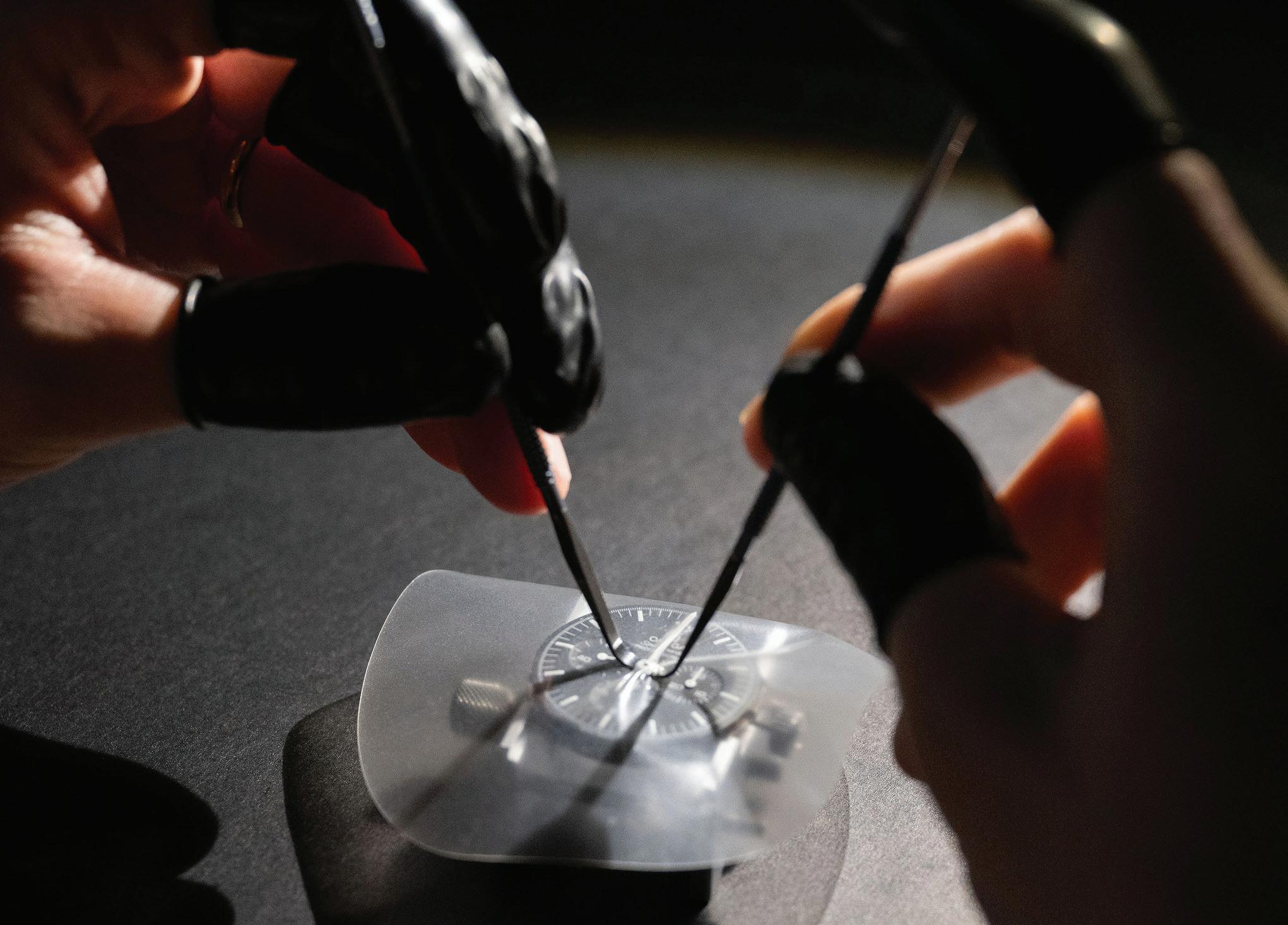
Matveev enjoys the variety of tasks. “I’m always learning something,” he says. “I like working on vintage watches. You are basically preserving the history and legacy of these timepieces through different generations. They tend to be more challenging since they often require more care and troubleshooting.”
Tomas Jambor is a recent addition to the company’s team. He was destined to be a watchmaker, it seems: “Both my parents are jewellers and sold watches,” he says. “Ever since I was little, I played around with watches. I eventually had my own workshop in my father’s store in Slovakia.” He, too, studied at the KHWCC and he revels in working on watch mechanisms, saying that “it’s fascinating that a watch moves the way it does.” A luxury watch can be a thing of both beauty and supreme technical sophistication. Staff at Humbertown Jewellers enjoy meeting with those who appreciate a fine timepiece, developing relationships with both new and repeat customers who like discussing

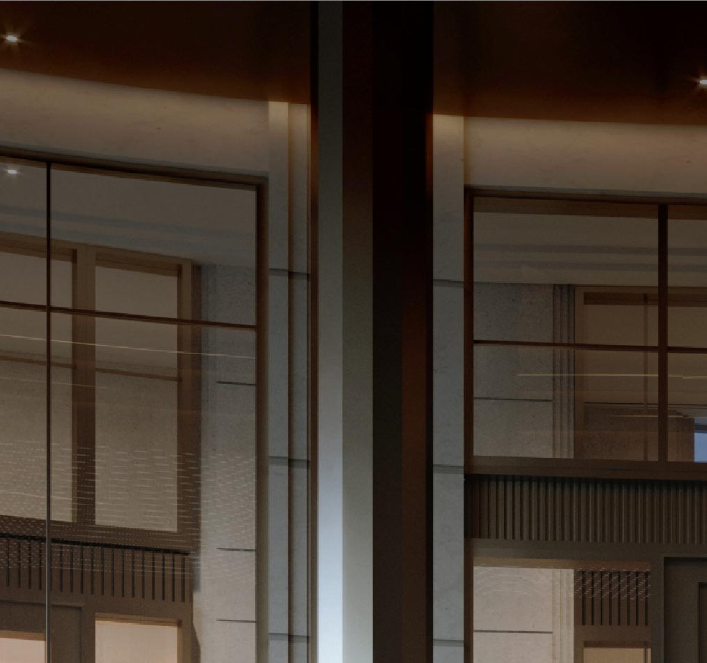
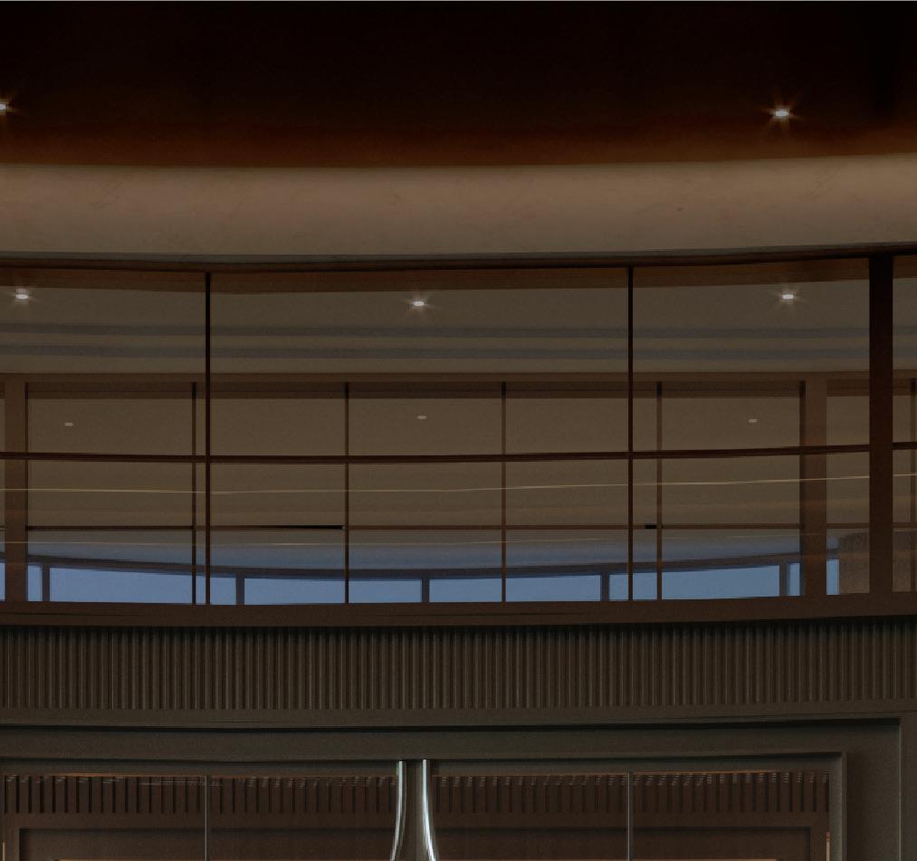

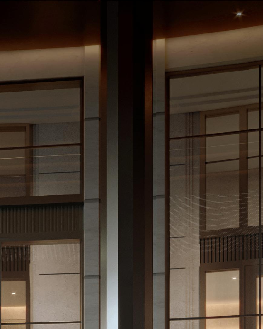
Condominiums nestled amongst the most prestigious neighbourhoods, with direct access to the York Mills subway station, and minutes to downtown Toronto and North York, from the low $700,000s*.



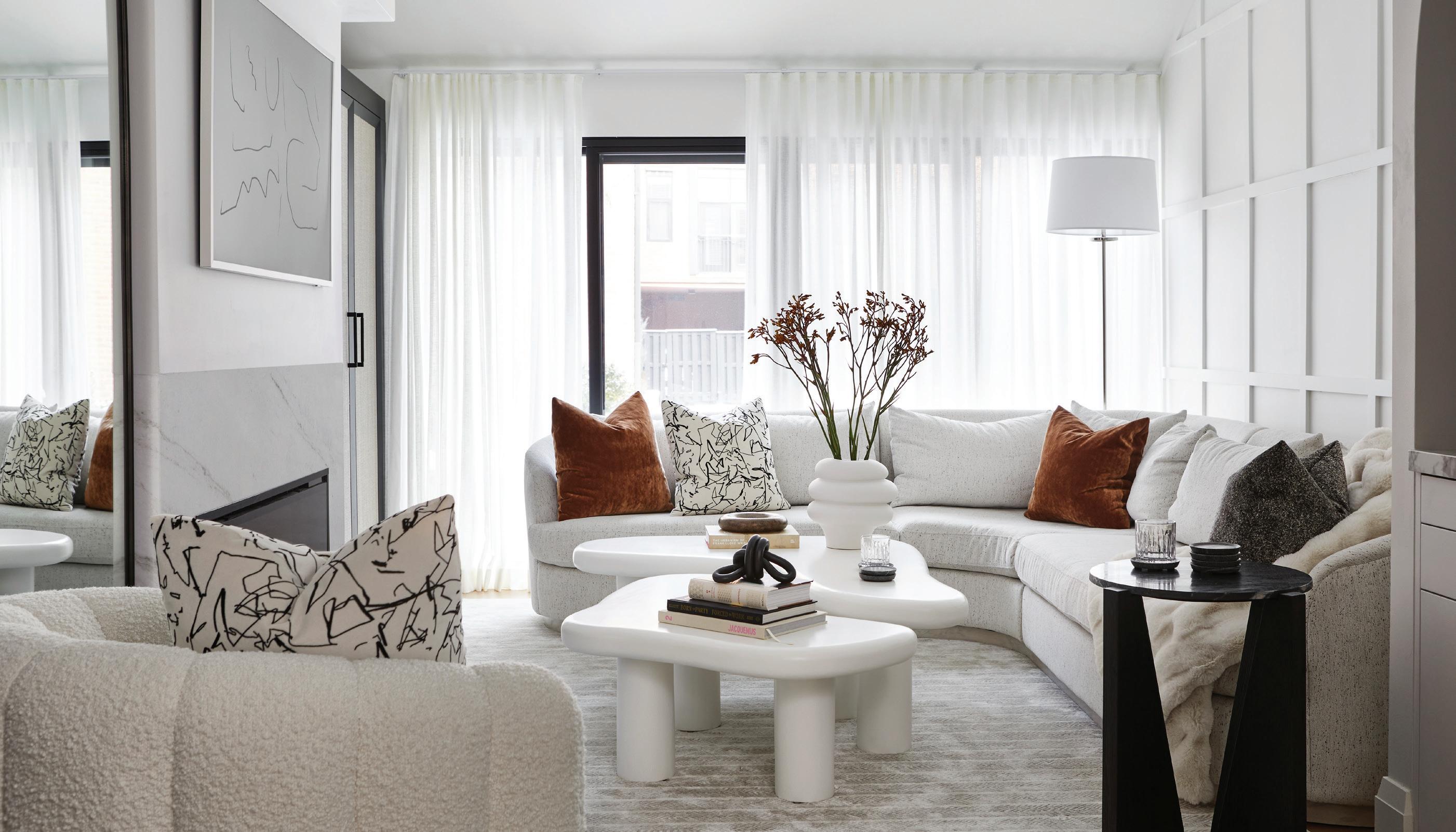
Stacey Cohen Design specializes in taking care of every aspect of a design job for her clients.
By Julie Gedeon
Photography by Valerie Wilcox
We all know when it’s time for a major update or at least a refresh of our living spaces— be it a kitchen/bathroom reno, office upgrade, or hotel refurbishment—but the mere idea of handling everything involved can stress us straight into procrastination.
Not so when you call on Stacey Cohen Design. This luxury design firm looks after every aspect from the get-go. “Our firm takes every client through a highly organized, systematic process to fully understand each client’s personality, lifestyle, functionality requirements, as well as how that client imagines the space being,” says the firm’s owner and lead designer Stacey Cohen. “Budget is established from the outset so there are no unpleasant surprises.”
The result is tailored decor that reflects each owner’s unique style while optimizing natural light, furniture proportions, integrated storage, vertical interest, and ensuring that every wall socket is ideally located.
All this starts with an initial space-planning phase, involving everything from electrical requirements to window placements to sofa sizing. This is also when clients are asked if they want a smart home setup, a second dishwasher, additional soundproofing or other requirements.
“We create detailed renderings so our clients envision the space,” Cohen explains.
Once the design is finalized, the sourcing phase begins with the firm’s experienced team exploring the ideal options from a valued network of tradespeople and vendors. “Many clients find our designer fees paid by the preferential pricing we can obtain for crafted quality,” Cohen adds.
The final execution phase involves the firm ordering everything, overseeing deliveries and onsite work, and managing any issues. “We make sure everything is executed with
total precision,” Cohen says. “And we only work with people we can depend on who find solutions with us if problems arise.”
It’s this dependability that has led to Stacey Cohen Design to be called upon for projects of various scales in New York, Miami, and Los Angeles in addition to the Greater Toronto area.


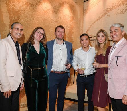
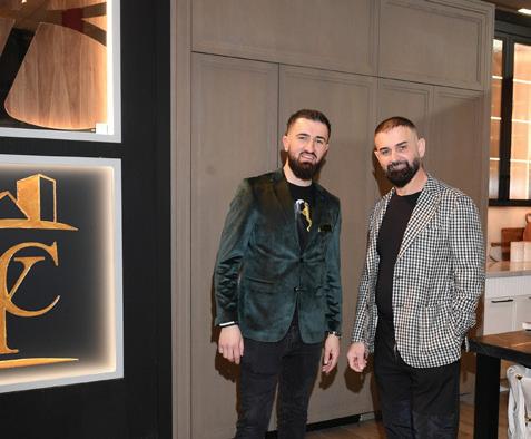
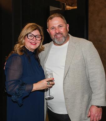
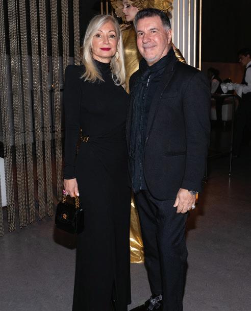
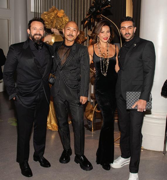
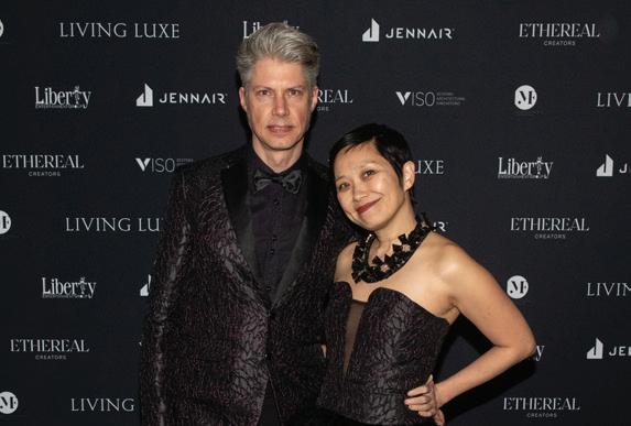
A glittering and glamorous opening-night party launched the Living Luxe Design Show weekend.
Photography By George Pimentel
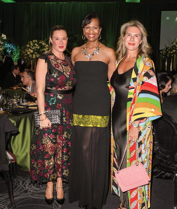
The Living Luxe Design Show presented by JennAir was inaugurated with a spectacular opening night party at the Toronto Congress Centre. Like the show, which took place over three days in April, the party was a celebration that honoured the best in interior design, architecture, fashion, and real estate. Attended by those who are reshaping their industries through dedication and innovation, this was an opportunity for great networking in a glamorous setting. More than merely a gathering, it was also a celebration to recognize the visionaries who are reshaping their industries and setting new standards of excellence.






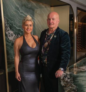
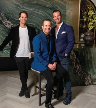


strides along the runway at the City Couture extravaganza raised more than $100,000 for SickKids Foundation.
Photography By
George Pimentel
Jennifer Lipkowitz: Dressed by The Fitzroy Jewelry by Heili Rocks Purse by Rita Tesolin

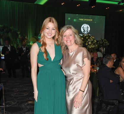
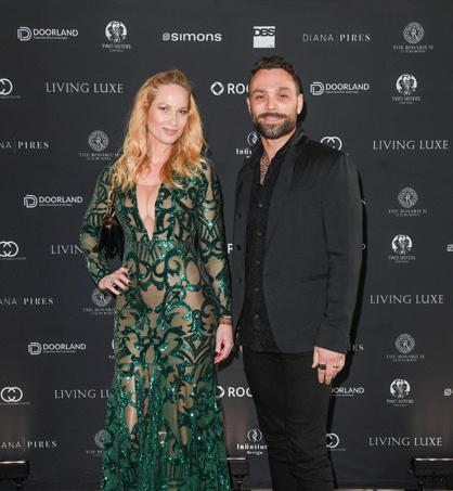
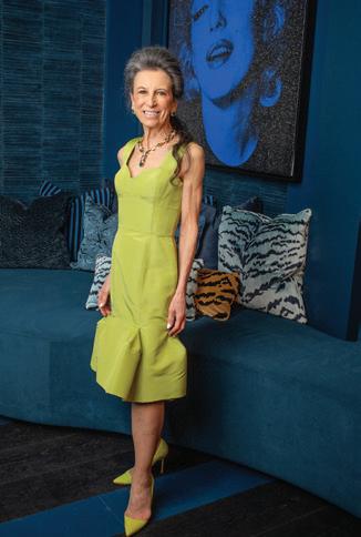
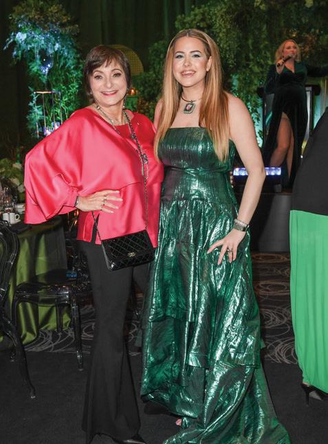
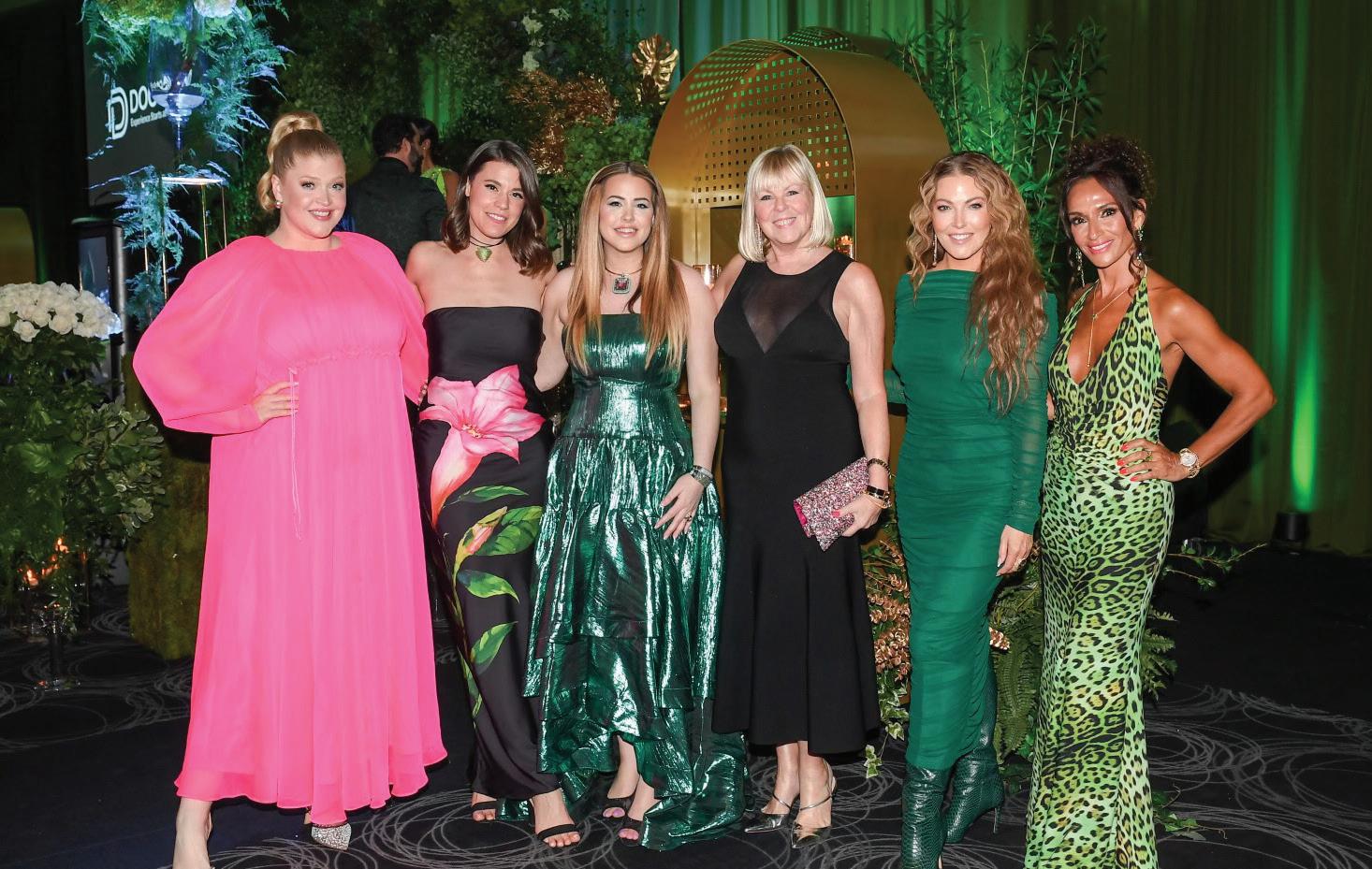
City Couture—presented by Rogers—the eagerly awaited fashion event held during the Living Luxe Design Show, featured the latest creations of Toronto’s amazing fashion designers, and raised funds for SickKids Foundation. Titled Glamour in Eden, the show’s design was reminiscent of a lovely garden, which informed the fresh fashion worn by guests and the creations on the runway. The evening held at the Toronto Congress Centre produced by Diana Pires Events, attracted the who’s who of the city’s glitterati to view the work of talented designers and to give generously to the foundation that helps children battling serious illness.
The Canadian designers and design houses displaying their gorgeous work on the runway included Buona Fortuna, Heili Rocks, Israella Kobla, Mark Belford, The Mayer Official, Narces Official, Rita Tesolin, RVNG Couture, Vanessa Vinces and Jaclyn Whyte.
A live and silent auction raised more than $100,000 for SickKids Foundation, double the amount of last year’s City Couture event. Sponsors included Rogers, JennAir, events planner Diana Pires, Doorland, Masters Insurance, Simons, Two Sisters Vineyards, Infinitude Design, DBS Developments, The Rosarium Luxury Roses, Toronto Congress Centre, BluSoul Live Entertainment, and, of course, Living Luxe.

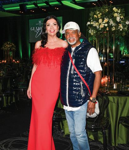







“ THEY ARE THE TRUE HEROES WHO SAVE THE LIVES OF SO MANY CHILDREN.”
Living Luxe publisher Jennifer Lipkowitz says she’s thrilled that the event raised needed funds for SickKids Foundation. “This incredible achievement would not have been possible without the community’s dedication and commitment to making a difference in the lives of children and families,” she says. “I started City Couture because my son did a project called ‘project giveback,’ and he chose SickKids as his charity of choice. As a result, I chose SickKids Foundation because it speaks to my heart as a mother. This foundation helps children locally but also all over the world. They are the true heroes who save the lives of so many children.”









The Tournament of Stars puts basketball in the spotlight to raise funds for West Park Healthcare Centre.



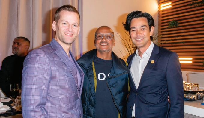

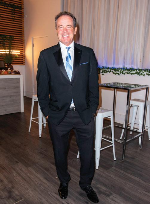
The 5th Annual Tournament of Stars raised an impressive $650,000 to support West Park Healthcare Centre’s mission to help patients recover. The event began with the Celebrity Draft Party in Toronto, hosted by LiUNA Local 183. Seventeen teams chose their celebrity players, with sponsor Mortgage Company of Canada choosing Jamario Moon as the first draft pick. The next day, teams competed for the coveted trophy. During the midday break, children participated in the Trophy Foods Kids’ Clinic and Global Furniture’s Skillz & Drillz session, featuring coaching from basketball luminary Jerome “Junkyard Dog” Williams. The Scotiabank Change Makers and their celebrity teammate Corey Maggette won the championship. Scotiabank also sponsored the Tournament Day. West Park is grateful to all the players, donors, sponsors, and volunteers whose support has raised almost $3 million in five tournaments.




The Living Luxe Design Show Awards recognized the city’s crème de la crème in the design world.
Photography By Ryan Emberley
Jennifer Lipkowitz: Dressed by The Fitzroy Jewelry and purse by Rita Tesolin
Anthony Sirianni Jewelry by Rita Tesolin
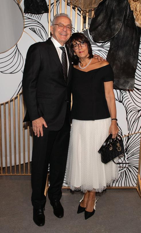
The inaugural Living Luxe Awards event was one of many highlights of the Living Luxe Design Show, held in April. This event celebrated illustrious talent in fashion, interior design, real estate, and architecture. The winners: Product Innovation Award: Igne Ferro (Igne Ferro Inc.); Indigenous Artistry Award: Helen Oro (Helen Oro Designs); Cutting-Edge Black Designer Award: Michael London (Michael London Design); the LLDS Outstanding Booth Design Award: Wise Nadel Design; the Living Luxe Award: Lori Morris (Lori Morris Design); Luxury Condominium Development Award: The Gupta Group; Emerging Talent Award: Jack Creasy (Jack Creasy Design); Fashion Icon Award: Sebastian Guarin (Atelier Guarin); Inspirational Showroom Award: Union Lighting & Furnishings; Architectural Innovator Award: Audax Architecture Inc.; Mastermind Builder Award: Title Building Group; Brokerage Excellence Award: Barry Cohen Homes; and Woman Entrepreneur of the Year Award: Brenda Danso (BD Interior Design).
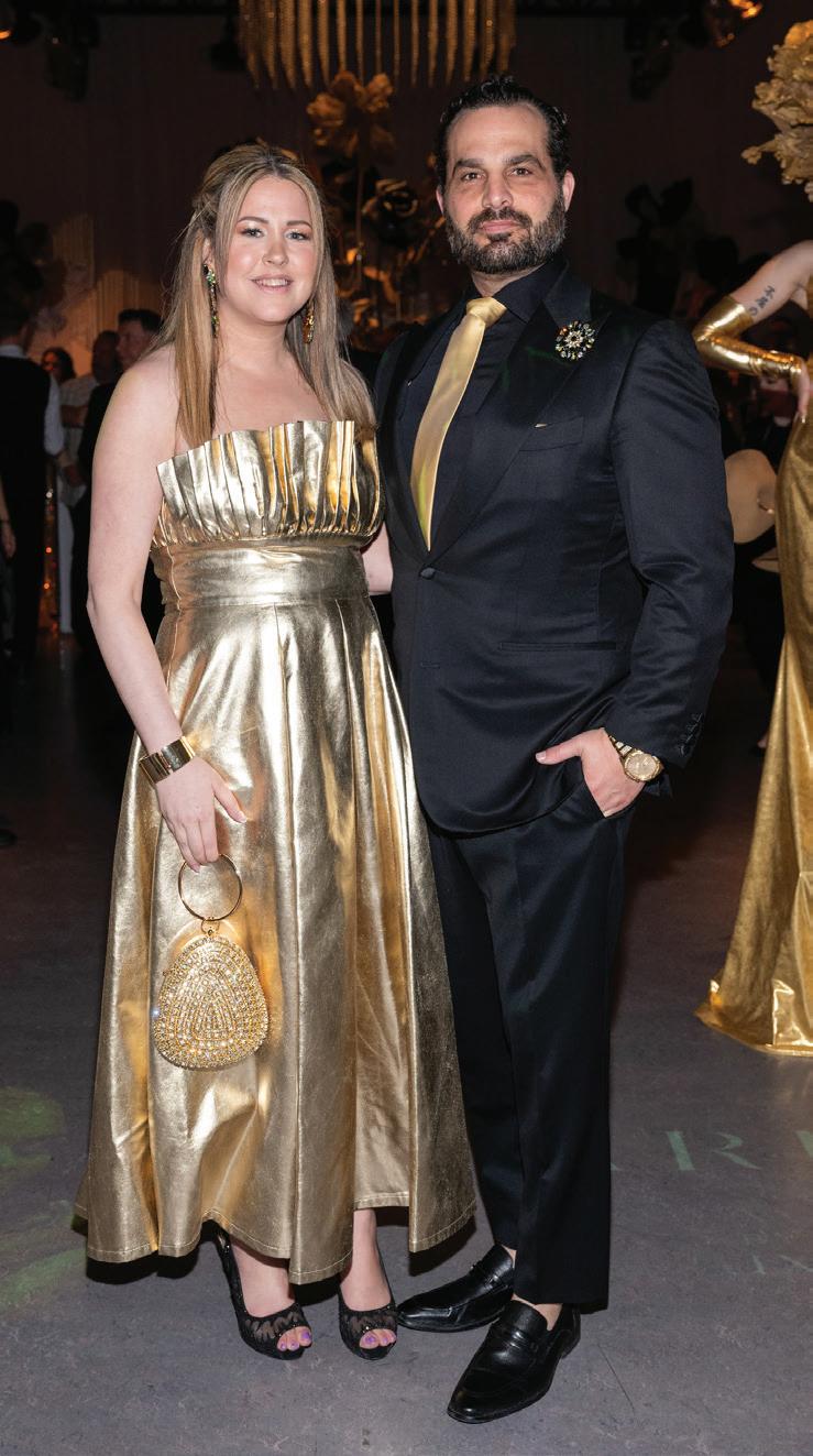




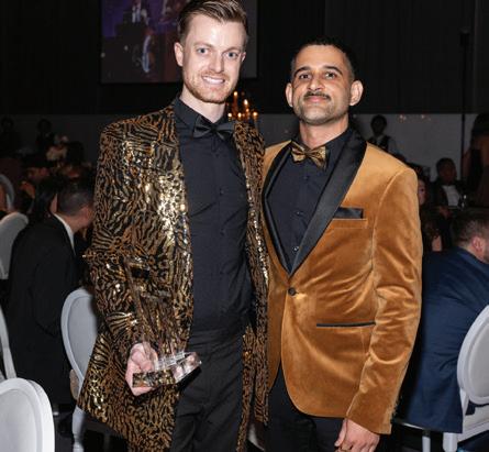






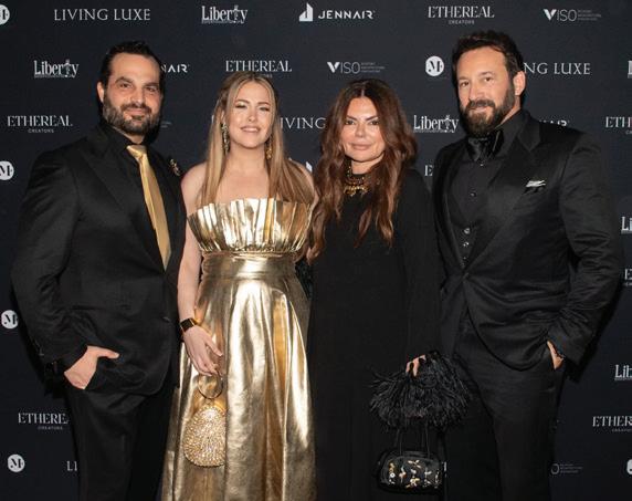


The judges—accomplished and talented in their own right—were Natasha Koifman, founder and principal at NKPR, a full-service public relations, advertising, talent, marketing and digital agency; Nadia Di Donato, vice-president and creative director of the Liberty Entertainment Group; Jeanne Beker, seasoned journalist who hosted Fashion Television from 1985 to 2012; Shelli Oh, Toronto designer of womenswear and menswear whose creations are designed as wearable art; George Sully, award-winning fashion entrepreneur, footwear and accessories designer based in Toronto; and Richard Wengle, architect and founder of the eponymous firm Richard Wengle Architect Inc.









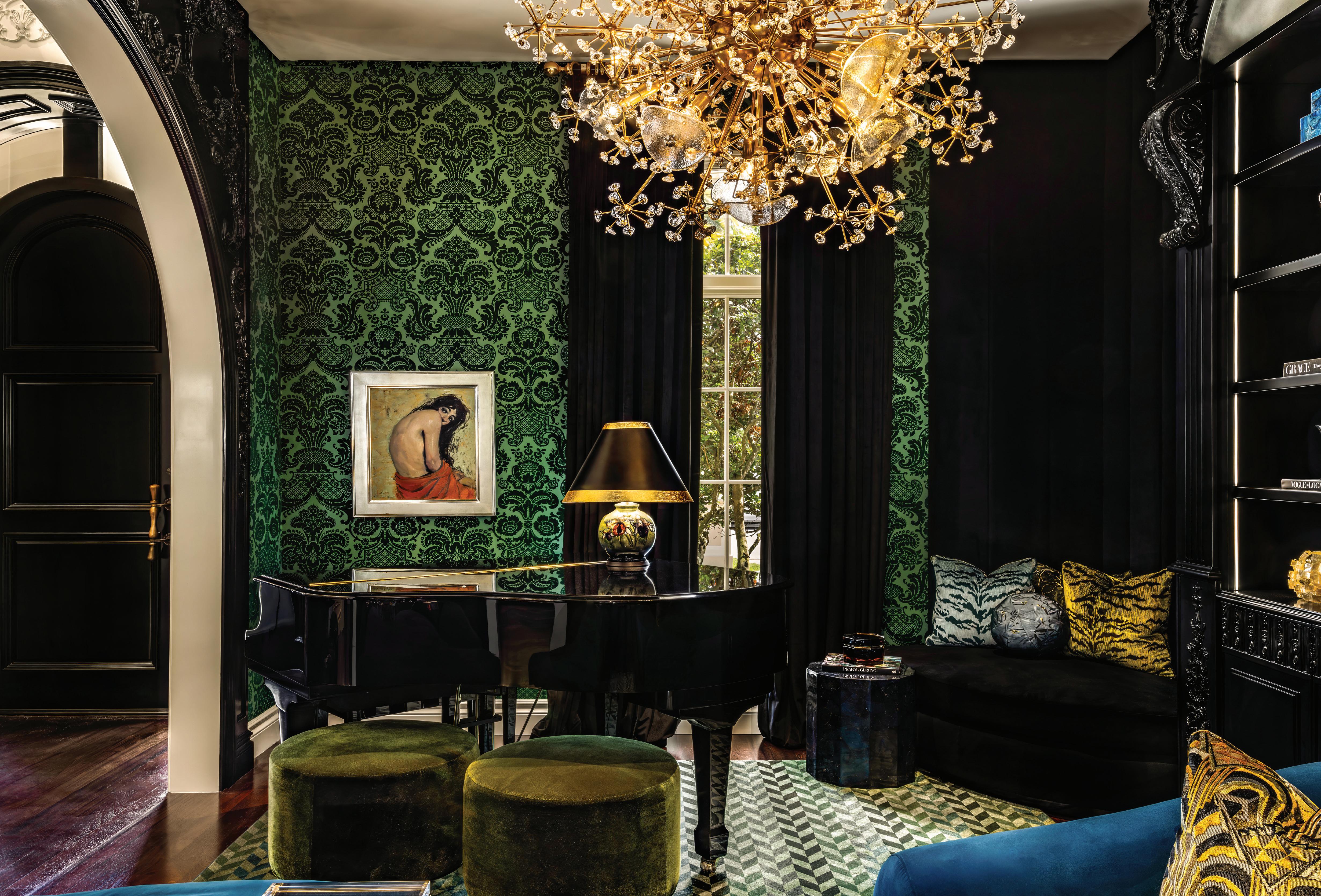


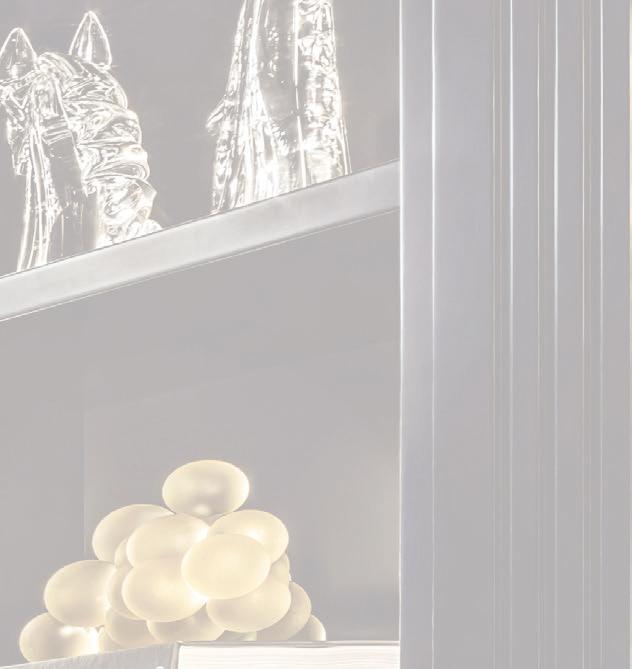
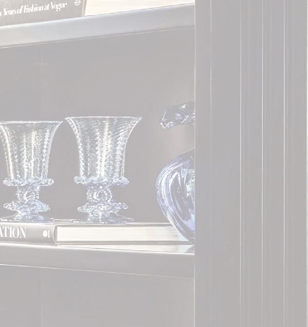

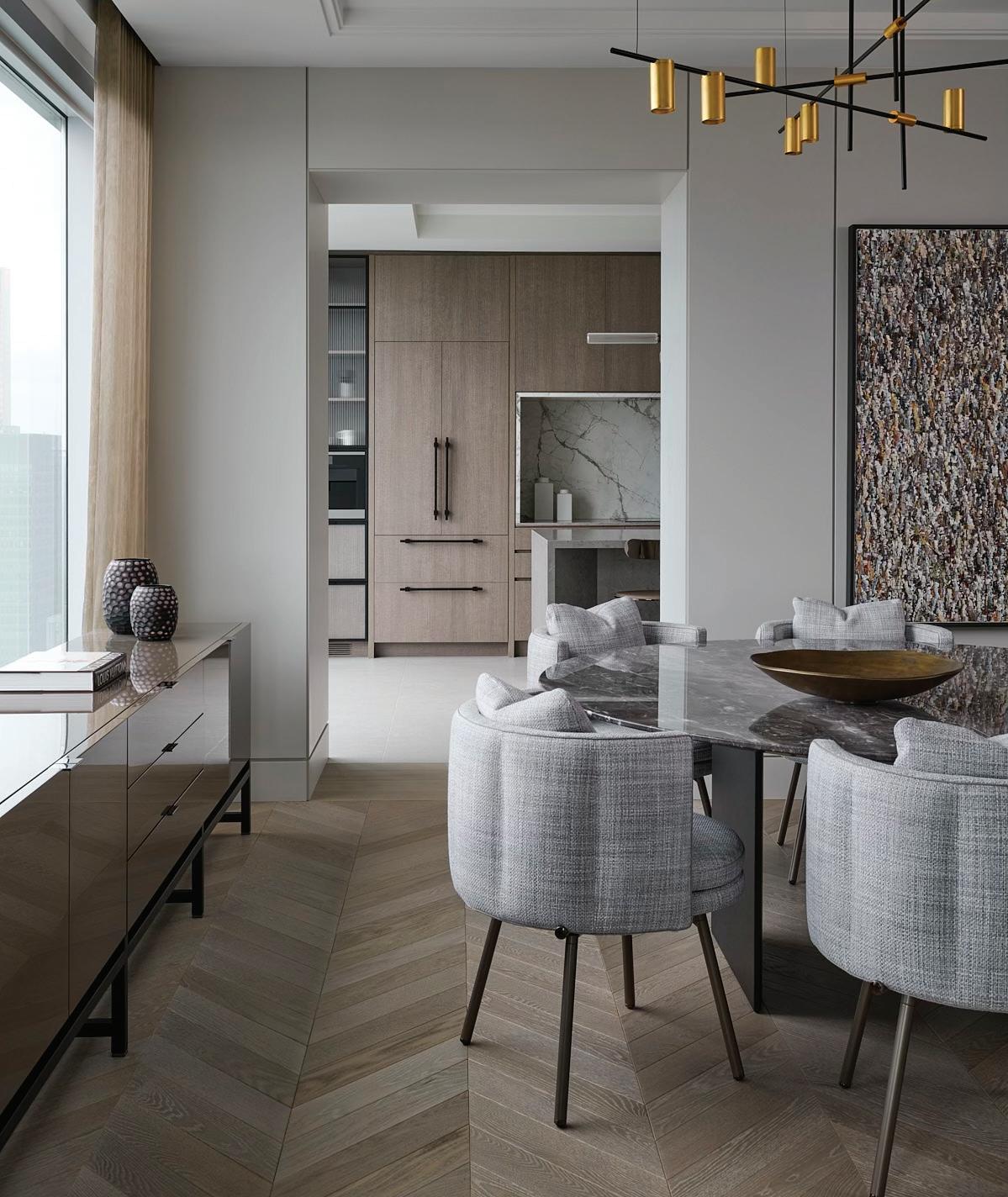
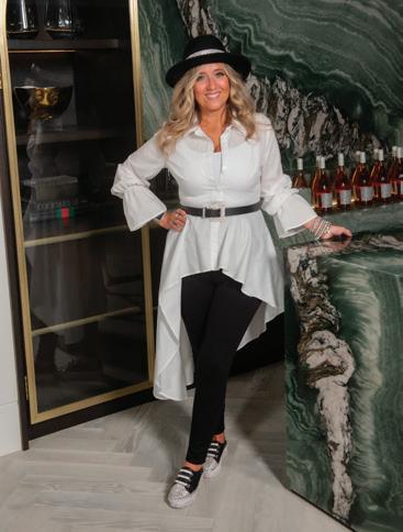
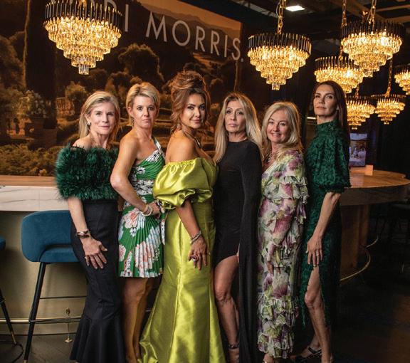
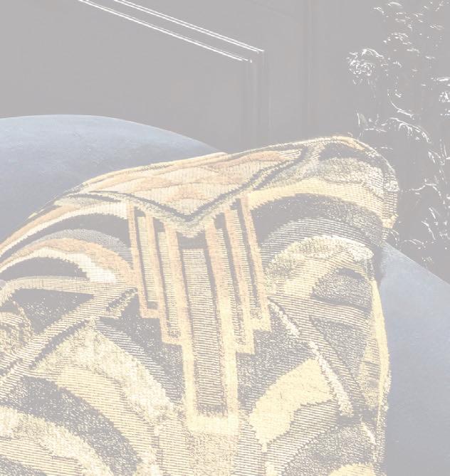
With saturated colours and sumptuous textures, designer Lori Morris creates opulent interiors that warmly embrace her clients. Read about her outstanding Boca Raton project on page 110.

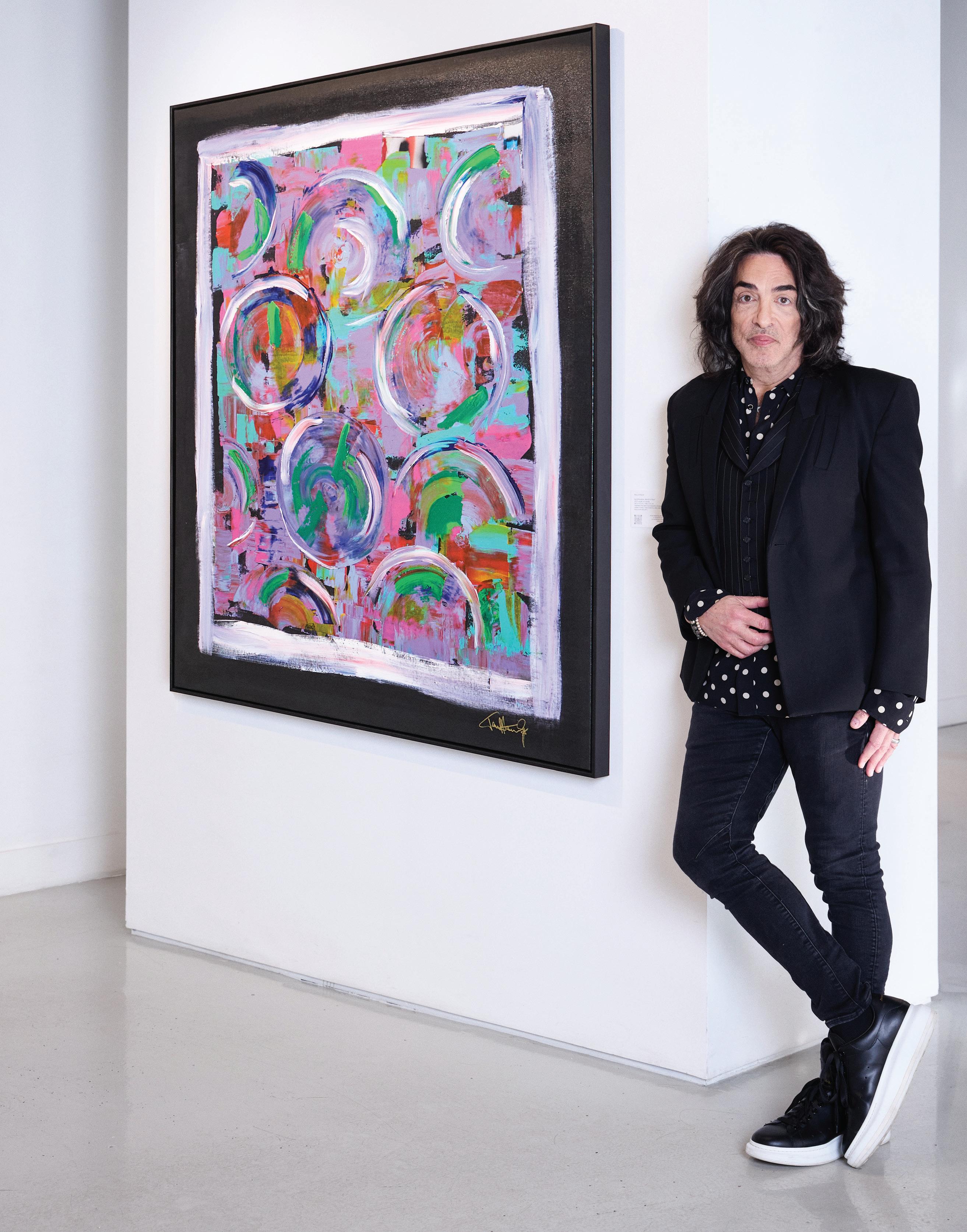
ARTWORK: JOY & REBELLION: CHOICES "What you see here, where you would go and what you would do is up to you. I know where my destination would be." - Paul

By Catherine MacIntosh
Photography by Natasha Gerschon
For five decades, Paul Stanley has brilliantly used paint as his trademark. As frontman for the rock band KISS, Stanley is renowned for the iconic painted star over his right eye, which gave him the nickname “The Starchild.” These days, paint is figuring differently in Stanley’s life, and creating as much international celebrity as that stage makeup. Stanley is an accomplished artist and the paint he uses now is on canvases—large, splashy, vibrant tableaux that run the gamut from abstract to figurative art.
Living Luxe recently met with Stanley to discuss his work at Toronto’s Peter Triantos Gallery, where his paintings were exhibited in a solo show, the first ever in Canada. It came on the heels of KISS’s final tour, 50 years since the group first set out to “rock and roll all night and party every day.” Their four-year End of the Road World Tour cemented their place in the hearts of rock fans of all ages: For 250 shows over four years, the KISS army came out in droves to fill venues across the globe.
Grooming by Victoria De Sousa
Location: Peter Triantos Art Gallery
While Stanley’s foray into visual art—which began more than 20 years ago—may seem like an abrupt volte-face from rock and roll, it’s actually part of a creative continuum. His artistic pursuits expand well beyond the platform boots, face makeup and rock anthems for which the band is known. The artistry that was KISS was, in large part, due to Stanley’s creative genius. Having an innate artistic bent, he’d attended the High School of Music and Art in New York City during the 1960s. And it was Stanley who took a nascent sketch of a logo by bandmate Ace Frehley and transformed it into the well-known KISS icon we’ve known for the past half-century. Stanley’s visual side has also been at work designing album covers, apparel, and stages for KISS. In addition, he designs guitars, which are still sold. As a solo musician, Stanley has put out two albums, and he currently has a 15-piece ensemble band called Soul Station that pays homage to the greats of R&B and soul music.
The exhibit at the Peter Triantos Gallery was spearheaded by Triantos, a fellow artist who has been a KISS fan since 1976 when he bought the band’s fourth album Destroyer. “It was an avant garde album and it was cutting edge in many ways,” says Triantos. Such songs as Shout it Out Loud, Beth,
and Detroit Rock City rang out from his turntable decades before he would meet Paul Stanley.
The bold exhibit tracked Stanley’s evolution as an artist, with some works clearly related to each other and some showing a beautiful progression of process and approach. The abstracts hold immense presence for their size and playful use of colour. Many pieces measure as large as fiveby-six feet. Neon colours, gestural brush strokes, and layered texture lure the viewer in. Each piece has its own special quality, but a sense of joy is omnipresent.
“Paintings for me are a depiction of life. And the reason I use so much colour is because I think life is vibrant,” Stanley told Living Luxe during an interview at the gallery. “I can recall that artist Mark Rothko, over a period of time as his psychological health and emotional health deteriorated, went from colour to monochromatic and black and white. For me, it’s an affirmation of how I see life. Life is a miracle; it is to be lived, to be joyous and colourful.” That feeling is contagious, he adds. People respond viscerally to his work and are willing to pay to own a bit of his star power. He’s sold 26 million dollars’ worth of art. “People’s emotions and mine are in
alignment with each other,” he says. Gallery owner Triantos was thrilled by the public’s reaction to the show. “Paul is a thinking man,” he says. “He takes things in slowly and is a great listener, but certainly he is a leader. He was like a best friend and everyone who met him resonated the same as me. Paul is wonderful to be so humble, especially with so much that he has achieved. I think that tells you everything. Paul Stanley is simply authentic. Period.”
Paintings for me are a depiction of life. And the reason I use so much colour is because I think life is vibrant.
The exhibition was a huge success for the artist and the gallery; many pieces found homes right away. “Paul is not only a major rockstar, but his character is even greater than that. He is authentic, real as can be, genuinely a wonderful human being. We all loved having him,” says Triantos.
One could easily surmise that Stanley approaches his art as he did his music career: by merging talent, drive and business savvy. KISS released 20 studio albums, 13 live albums and 60 singles, and has stayed relevant for decades, which is certainly not the story for most rock bands. “There is no mystery to art,” Stanley says. “Good art is what you like. What someone else likes is completely irrelevant. That’s why the idea of critics is something I have an issue with. The critic’s job is


LEFT ARTWORK: JOY & REBELLION: THE LIBERATION "Remove the barriers. Art should be experienced by everyone without there being a sense of intimidation or need to validate the emotions elicited." - Paul Stanley
RIGHT ARTWORK: JOY & REBELLION: WORLD IN CHAOS "Elements that were once beautiful, converge and collide in chaos. Chaos leads to a new order, restructure and calm." - Paul Stanley
There is no mystery to art. Good art is what you like. What someone else likes is completely irrelevant.
"Van
wrote to his brother Theo: 'I am no longer content to be the painter…I want to be the paint.' My goal is to have my immersion into my work create that same experience for you." - Paul Stanley
to tell you that you need them because that’s job security. I much prefer that we demystify the arts and allow people to have an opinion without feeling they have to justify it. It’s justified because it’s their opinion.”
Stanley, 72, who was born Stanley Bert Eisen and raised in New York city, was influenced by his parents’ love of classical music and opera. He cites the differences in the processes that create music and art. “Music and art are very different. Music has to have structure. It has a chord progression, a melody on top, and a lyric on top of that which rhymes. I believe that art—at least the way I see it—has no boundaries. I’m not interested in colour relationships. For me, the purest way to translate what I am and who I am is to do it instinctively. The fact that I don’t really understand colour relationships is a conscious decision. I want to pick colours based on how it makes me feel, rather than balancing. Balancing will happen because it’s innate. It doesn’t need to be intellectualized,” he says.
Thematically, Stanley goes with his gut, but there is a connecting thread in his abstract works, from repeated shapes to favourite tones. “I love circles because circles are a continuum,” he says. “They have no beginning and no end. It’s almost like a pulse of energy. There is something Zen about that, something very calming. And, then when you add colour to it, it balances out.”
The artist, who also does portraits, isn’t interested in working within any one style or genre. He chooses instead to infuse his own persona into the works, which changes with time. “The idea that you have one style, for me, it means that you aren’t growing. I’m not trying to re-create anything; I’m trying to create,” he says.
Stanley is also vocal about challenging the status quo in the art world. “I’d like my art to let people know that anything is possible. I want to demystify the whole idea that if you paint a bottle and it doesn’t look like a bottle, it doesn’t mean it’s not good. You work within the boundaries that you set for yourself and there should be no boundaries. That’s what life is about. Life is about giving yourself licence to do things without judgment.”
Stanley has a special history with Toronto: In 1999, he played the title role in The Phantom of the Opera to nightly standing ovations. While here, he connected with the Canadian organization
About Face, which works to improve the lives of children with facial differences, something Stanley knows about personally as he was born with a birth defect, which caused deformity of one ear, including hearing loss. At the age of 30, he had reconstructive surgery for the microtia of his right ear, which he described as lifechanging.
His philanthropic work also extends to veterans and other causes. While on the road with KISS, Stanley often spoke of the need to support soldiers returning from war, and donated a dollar of every ticket sold from the band’s Sonic Boom Tour to the Wounded Warrior Project. His charitable focus continues with his work as ambassador for House Institute Foundation, which educates people on the dangers of exposure to loud noise. And the restaurant chain he co-founded—Rock & Brews—contributes to veteran organizations and local school programs.
Stanley is the opposite of the shock-rock persona you might expect. Looking back at the theatrical glam-metal KISS concerts, one might imagine a different sort of personality. But this kind, soft-spoken man, a married father of four, values family most. “I think the things you should want to be remembered for are the simplest,” he says. “It’s great to think of yourself as an artist or a musician, but I think we make the biggest impact in what we do as parents, what we do in the sense of family.” His openness to others and generosity of spirit are felt, not only in his presence, but in his multi-layered works.
Being at ease with people and wearing his heart on his sleeve comes easily to Paul Stanley after five decades of dazzling performances to millions of fans. He was inducted into the Rock & Roll Hall of Fame in 2014 along with original KISS bandmates Gene Simmons, Peter Criss and Ace Frehley. And the impact of his artwork continues to unfold. Judging by his prolific output and pure spark of talent, Stanley will surely surprise us many times over as the years go on. “Perhaps what art can do is open people to the possibilities in life,” he says. “That life isn’t that narrow and … anything is possible.”
Peter Triantos senses that there is more to come in Stanley’s evolving style. “I think Paul is a great artist and I see this as just the beginning,” he says. “He is an extremely talented individual.”
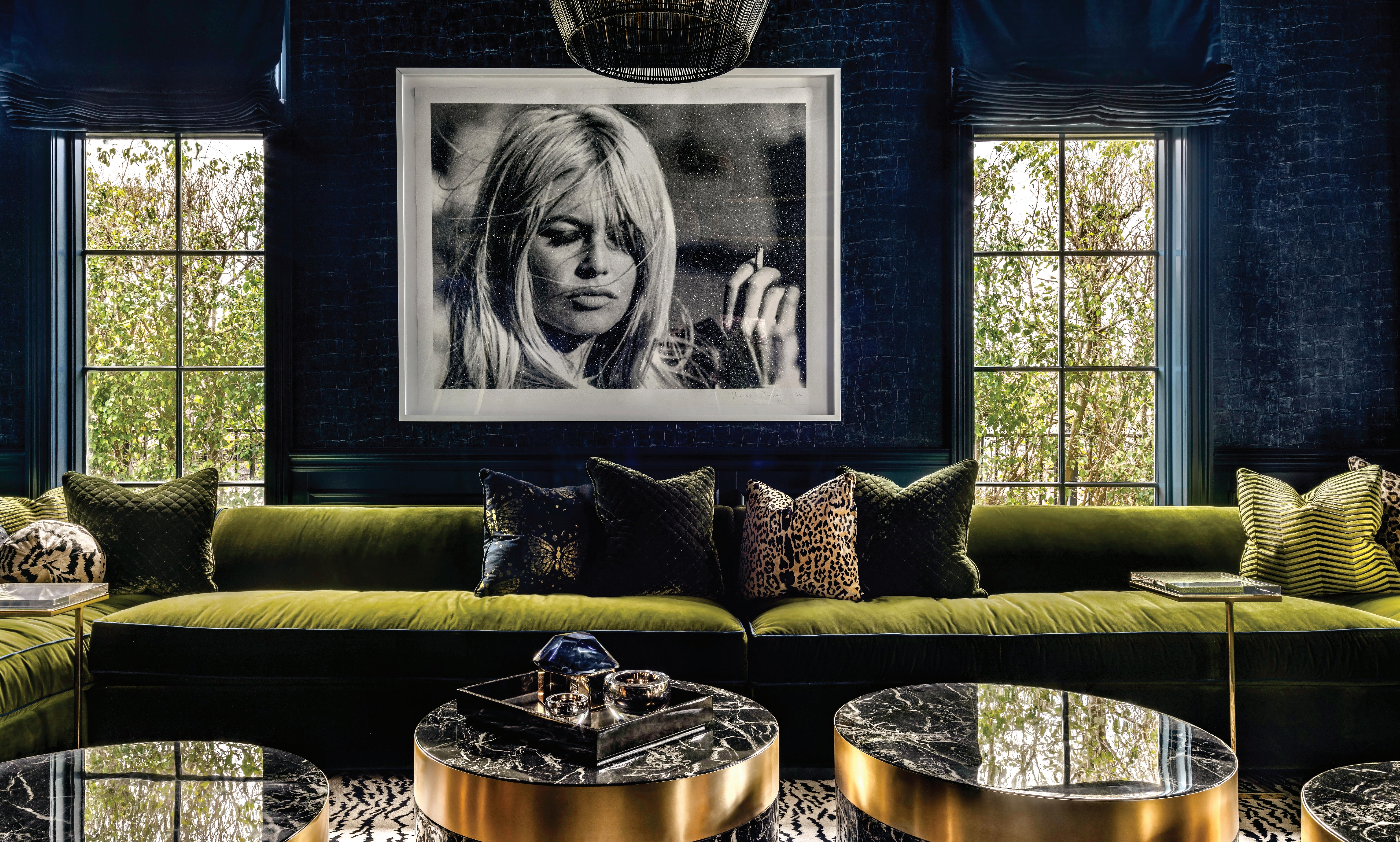




Designer extraordinaire Lori Morris gives an insider’s look into how her inimitable, multi-award-winning style transformed a Boca Raton mansion into a magnifi cent Art Deco-inspired masterpiece.
By Susan Kelly


Toronto-based powerhouse designer Lori Morris dazzled at the podium when she accepted the coveted Living Luxe Award at the glittering Living Luxe Design Show Awards Gala in April. To that honour, the blond dynamo and her design firm The House of LMD, or Lori Morris Design, has won many awards for interior design excellence—seven in 2023 alone. What does it take to maintain such a stratospheric level of award-winning style? Morris—recently named a top-100 designer in the world by the highly prestigious Andrew Martin Awards in London five years in a row—graciously shares her insights. As a shining example, she points to this recent complete transformation of a fivebedroom mansion in Boca Raton, Florida into a boldly sensual, sumptuous and sophisticated home with the incomparable Lori Morris signature.
As with every project, she approached this one as a true artist and free spirit who manages to make opulent luxury user-friendly. “There is no mould or template when I create,” she says, “nor are there any rules, which makes me daring as a designer.” And although she sees every space through a very colourful and unique lens, each client’s needs and wish list always remain top of mind. “And this was a fabulous client, someone with a true passion for design and architecture, and superb taste,” she says. “It helped create a wonderful synergy and made the process that much more exciting.”
A hallmark of LMD style is a fashionably fearless
colour palette, often containing rich jewel tones that evoke Old World opulence. This time, Morris took inspiration from the home’s soughtafter upscale neighbourhood on the Intracoastal Waterway. The intense blues of surrounding sea and sky translate into walls painted a velvety deep ultramarine or serene cerulean. Against this perfect backdrop, crisp linen white or ebony black accents add impact. And as in Nature, in some areas such as the club room, used for watching games, unexpected bursts of deep green erupt, as lush and inviting as tropical vegetation.
The home’s South Florida locale also is renowned as a mecca for Art Deco design. Morris, with a penchant for classical French architecture and modern art, here effortlessly creates a design devoid of cliché and infused with ultimate glamour. And with some eccentrically refined and sensual details, one can easily imagine the divine Josephine Baker descending the dramatic grand staircase with snakeskin-pattern carpet, for one. “The overall feel I was going for is very elegant, sexy and LMD-inspired,” Morris says, “with absolute authenticity in the architectural details and colour palette.”
The original cavernous 9,500-square-foot mansion was stripped to the studs, retaining only the burnished hardwood floors and main staircase railing. It was up to the designer’s boundless ingenuity to add architectural interest. Through a device common in Art Deco architecture, gracefully curving arches appear in sequence, exquisitely framing breathtaking
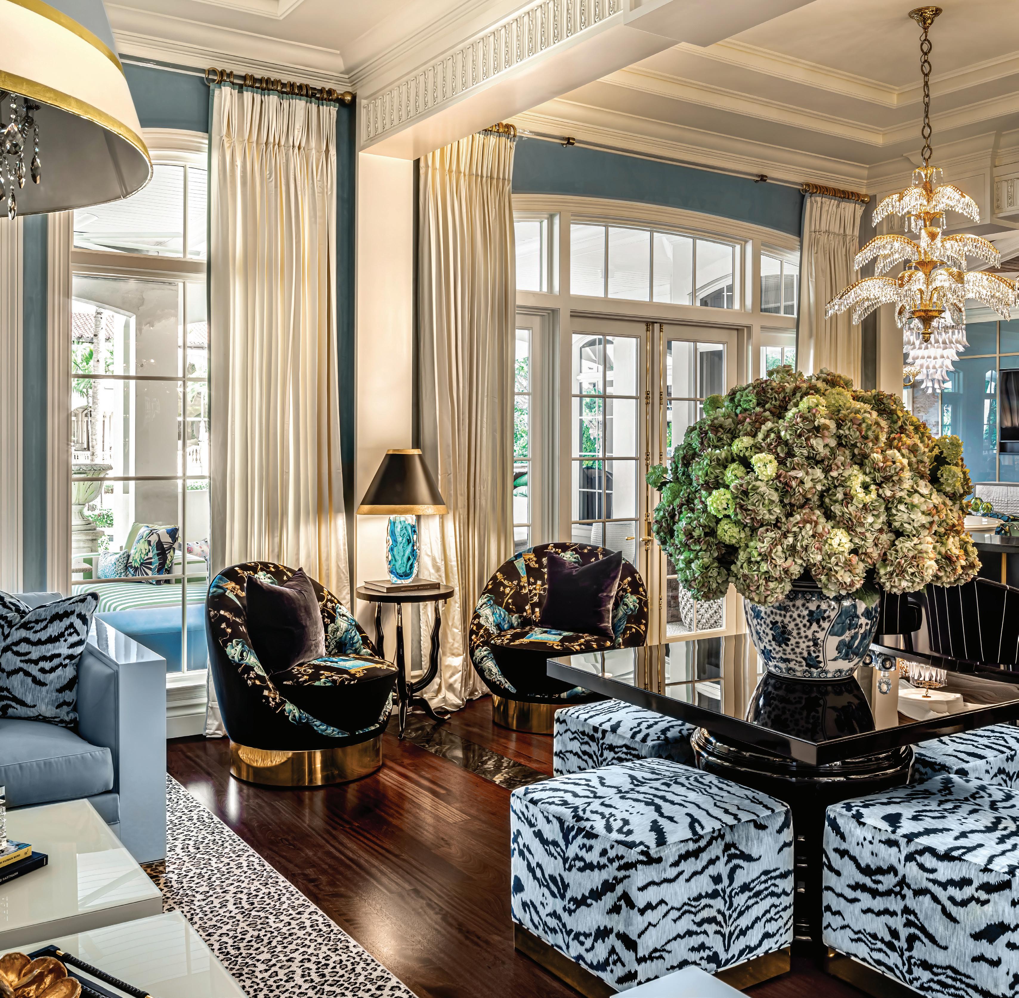

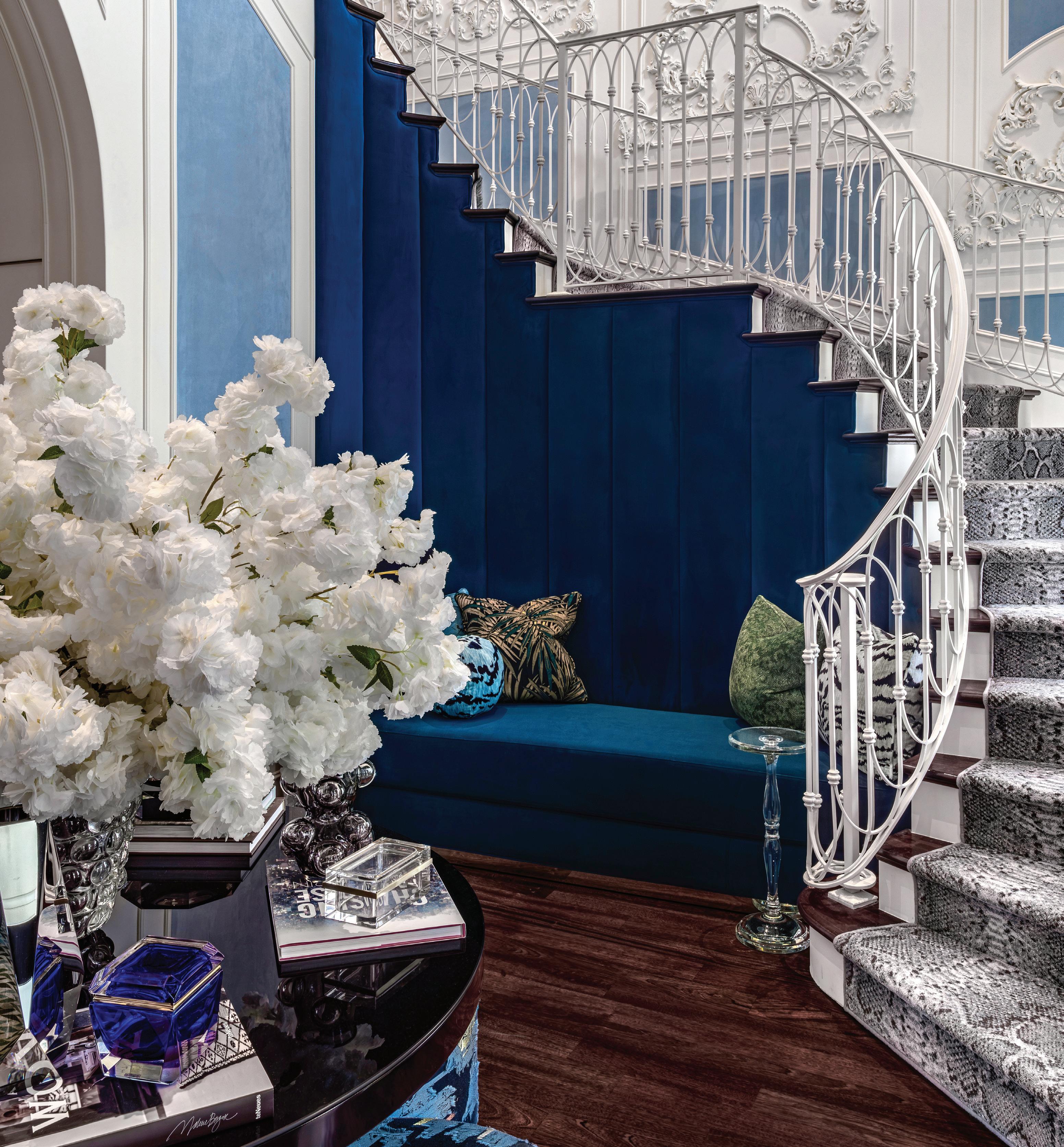

The intense blues of surrounding sea and sky translate into walls painted a velvety deep ultramarine or serene cerulean. Against this perfect backdrop, crisp linen white or ebony black accents add impact.
interior vignettes and giving a sense of procession through the home. Dramatic ceiling treatments using beams and moulding draw the eye upward and help define different areas, while ornate plaster wall appliques inject historical whimsy. Etched glass panels, mirrors and marble further enhance the sense of timeless elegance.
Walls were removed on the main floor to create a true living room lounge. Bright, palatial and posh, with ample seating, it invites conversation and flows seamlessly into a sophisticated piano lounge and bar area. “It was important for the owner to have space to entertain in a big way,” Morris explains, “and I provided the unique and stylish option of a virtual living lounge, drawing inspiration from grand hotels. You can sit by the fireplace or at the bar for a drink, for instance.” The bar area makes a bold and unforgettable statement with black counter and panelling and with a wall inset of blue-and-goldveined pure onyx slab, backlit to make the colours pop. Overhead, wonderfully whimsical gold-and-crystal chandeliers sparkle to evoke palm trees. There is also a
catering kitchen in the area.
The same elegant effervescence carries over into the second-floor bedrooms. There is no default to the more expected neutral colour palette. Instead, each sleeping area receives a variation on the blue theme. In one, walls are covered in richly textured midnight-hue damask and velvet, in another a striking black four-poster bed stands out against a pale blue backdrop. Each bedroom has its own unique character, further defined by a deft layering of luxe details.
The true magic of Lori Morris design lies in how myriad details, one upon the other, conspire to create an overall curated cohesion. The full magnificence of this layer upon layer approach, the designer feels, is best appreciated in person, immersed in the authenticity and elegance. “You really have to experience for yourself the home’s regal charm and how beautifully one area flows into the other,” she says. “I think this home is really elegant and exciting, and beautifully represents LMD’s design savvy with an Art Deco twist and overall sumptuous sex appeal.”
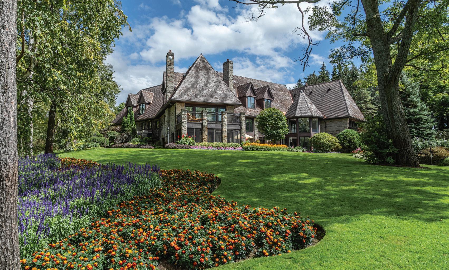

This baronial home in King Township just might be the ultimate in country estates, especially for anyone who loves horses. Here, the owner offers a privileged glimpse into the rare lifestyle and sumptuous charm it offers.
By Susan Kelly
YOU WILL GAIN AN EXCLUSIVE PASS INTO AN EXCEPTIONAL RURAL LIFESTYLE TO LIVE OUT YOUR EQUESTRIAN DREAMS AND HOBBIES.
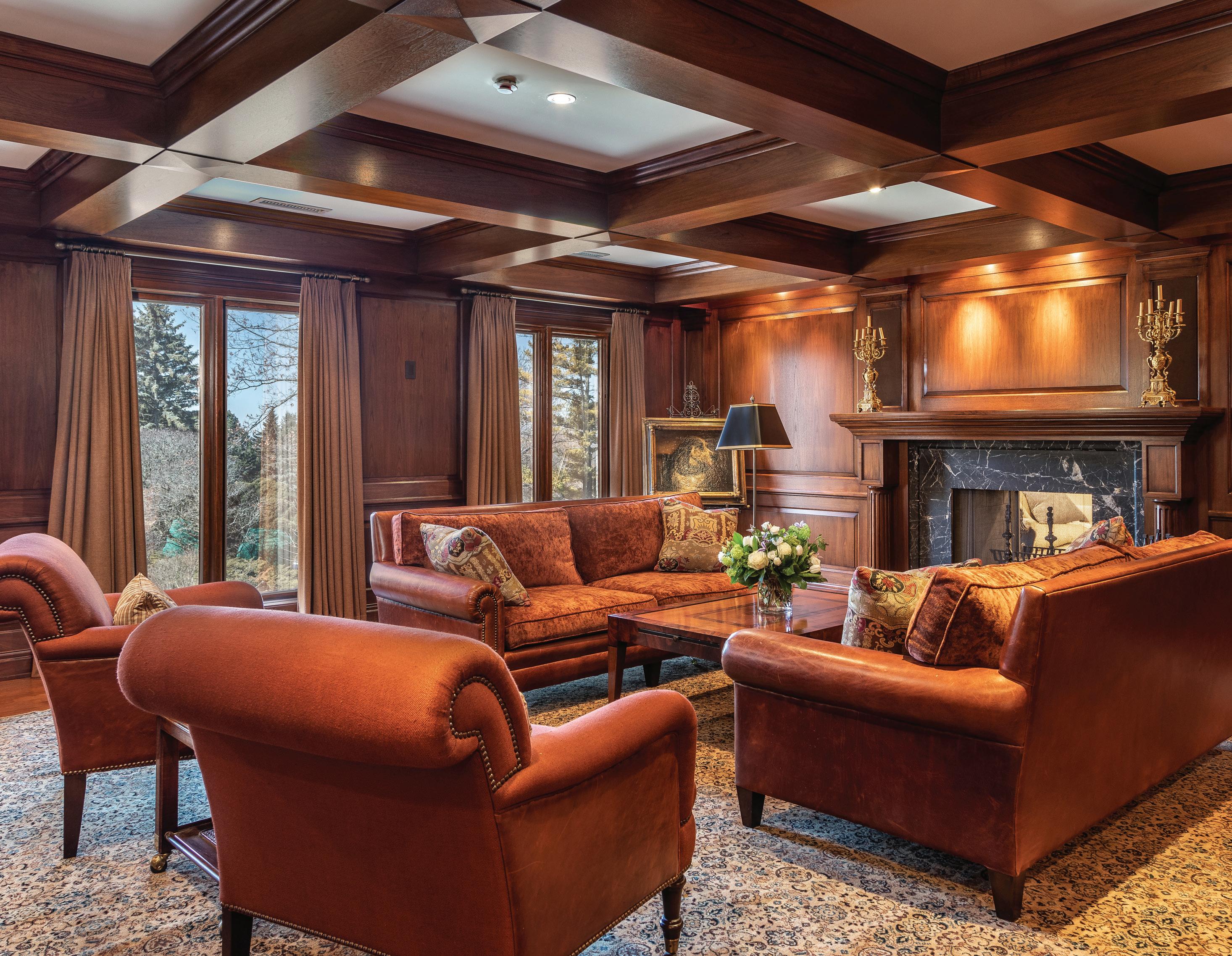
Ashort30-minute drive north of Toronto lies King Township, where horses reign supreme: the area is home to 273 farms, more than 5,000 horses and 15 Olympic equestrians. In it nestles this eight-bedroom, 14-bathroom luxury estate at 14900 7th Concession Road, listed for $16.8 million, on 76 acres of land beautifully appointed for all things equine.
“My wife Gloria was the equestrian; she used to compete,” says owner Seymour Epstein, eminent Toronto businessman and philanthropist. “But for several years I enjoyed hunting and hosted several hunt club events at the estate. It’s a wonderful area and community for both of our interests.”
Gloria Epstein, esteemed jurist and former judge of the Court of Appeal for Ontario, began riding in 1986. She went on to win
numerous equestrian competitions over the years in the hunter class, which involves horse and rider negotiating a complex series of jumps. For 35 years, the estate was a second home for the couple and their five children, who also enjoyed riding. But, notes Seymour, “The kids are grown, and we no longer ride, so we can no longer make full use of it.”
Anyone looking to breed or show horses will appreciate the estate’s highly reputed, state-of-the-art equestrian complex: more than 30 stalls, the setup for a variety of equestrian disciplines with an exercise ring, office, tack room, wash stall and more. In addition to multiple paddocks on the property, there is an arena with a retractable roof and a viewing area complete with a wood-beamed ceiling, designer decor, wainscoting and wet bar. A non-equestrian

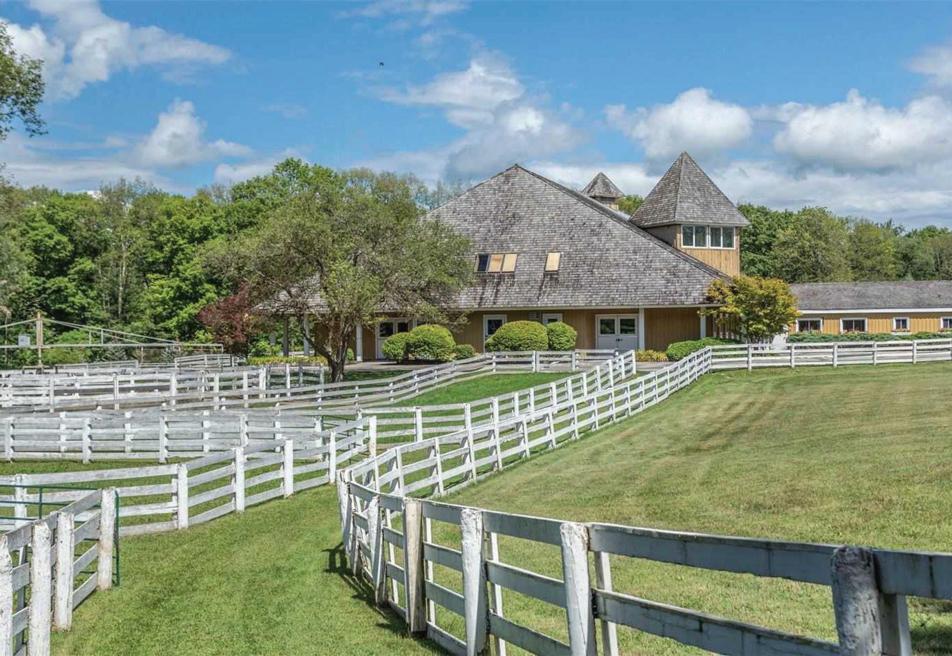
buyer could have the option to transform it into an indoor hockey rink.
And the estate offers much more than riding, Seymour says. “Whenever the kids came up, there was always something for them and their friends to do, things they didn't do in the city.” Activities included visiting the chicken coop to gather fresh eggs and indulging in friendly competitions on the spacious tennis, basketball or bocci courts. For water lovers, there are indoor and outdoor pools, and a sizeable spring-fed pond with good fishing to be had. And, since the estate lies on a slight elevation at the end of a serene cul-de-sac and adjoins a preserved nature area, there are miles of picturesque trails to explore that offer captivating ravine and valley views.
Inside the stately and sprawling main house, mostly all on one level, the new owners will have a choice of luxurious primary suites, for there are two: one on the main floor, the other on the second. The remaining bedrooms are arranged into two wings, providing spacious accommodations for both residents and guests. Seymour fondly remembers a Christmas when 23 people slept over with no crowding. There also is an apartment accessed by stairs off the main foyer.
As well, multiple elegant living spaces grace the manor, providing endless opportunities for both rest and recreation, so everyone can find a haven within the grandeur. “We used to have really big birthday parties,” he says. “It’s a great house for entertaining.” On rainy days, folks made use of the indoor pool and adjoining sauna and exercise room, full recreation room with custom media facilities
and billiard table, or a serene sunroom overlooking the estate’s lovely gardens.
Much of the home’s interior design has the stately baronial beauty you’d expect of such an estate, says Barry Cohen, broker and owner of Cohen Homes and Estates in Toronto, the listing brokerage. “There is a highly sophisticated mix of traditional and transitional elegance with unique details to keep it interesting,” he notes. “But it’s also a very comfortable, liveable home.”
Formal rooms include a woodpanelled library and living room with elegant double-sided marble fireplace and wood waffle ceiling. Many walls in the home feature Venetian plaster, and intricate beamed and vaulted or coffered ceilings. Among the unexpected touches, the ceiling in one of the principal bedrooms has a coved inset feature, clad in striated stained wood, a motif repeated throughout the home. The dining room wainscoting has a distinctive wave-patterned detail for design interest.
A mix of hardwood flooring laid in a herringbone pattern and soft broadloom runs throughout the home. Tastefully appointed fireplaces add rustic warmth to many rooms, including the gourmet kitchen fitted with top-of-the-line appliances, open to an adjoining breakfast area with windows that overlook the ravine.
“You won’t just be buying a grand and impressive home in which rustic sophistication meets modern comfort,” says Cohen, a broker with a proven track record in handling multi-million-dollar properties. “You will gain an exclusive pass into an exceptional rural lifestyle to live out your equestrian dreams and hobbies.”

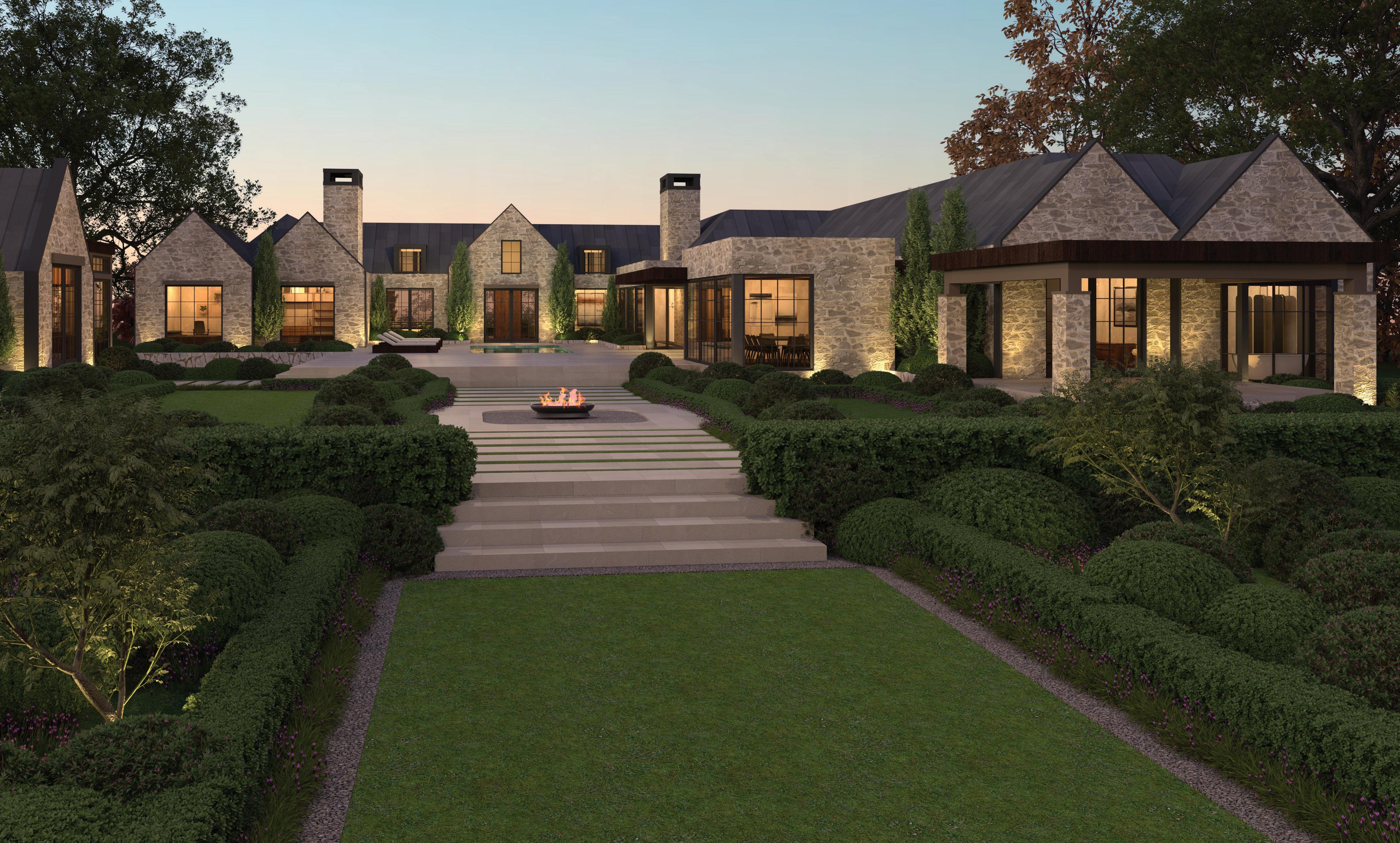
Can you really have the best of both worlds? Sensus Design Studio says yes when it comes to this elegantly rustic contemporary bungalow, inspired by historic English country estates and reinterpreted through a New World lens. The result is a masterpiece of modern design.
By Susan Kelly Photography by Sensus Design Studio
The striking impression of this timeless home starts at the front walk: Clean lines, with a use of noble materials; a chic, rustic mix of Ontario limestone and fieldstone, topped by a zinc roof with an old-metal patina. The result is a fresh new take on the English manor house, inspired by this classic style and rooted in place using locally sourced materials.

The renderings shown here showcase the quaint design of the four-bedroom, yet-to-be-built home that was designed to serve as a lifestyle-focused compound. Jesse’s design process is allencompassing, bringing together all areas of custom home design, interior design and landscape design right down to the interior furnishing plans. By designing every element in the home, he is able to treat each project as a body of his work, creating a cohesively luxurious environment where exterior spaces are designed with interior impact in mind and vice versa, achieving visual harmony between the various elements while perfecting proportions.
When asked where he gleaned inspiration for this home, Jesse
“This project is an incredible example of Jesse’s vision in taking a historically entrenched design style and interpreting it through his own highly recognizable lens,” says John-Luke Sahlani as he refers to the work of his brother, business partner, and lead designer Jesse Sahlani. The two are co-founders of Sensus Design Studio in North York. “This home serves as a great example of the impact of employing the use of sun studies, sketching, and a multi-disciplinary design process that allows Jesse to master-plan each private residence our clients commission.”
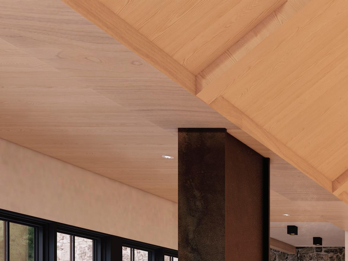
We approach the design of every private residence as a passion project.
references his recent European travels. Off duty, the Sahlani brothers place great value on travel together with their families, as it exposes them to a new pool of design details and formats that have been shaped by history. During a trip to the English countryside, Jesse was struck by the aesthetic of the rambling yet elegant historic homes. And he was inspired to create this 4,500-square-foot contemporary home with equally timeless appeal. “These homes traditionally feature unique footprints, shaped by the many renovations and additions they would go through as they changed hands throughout the centuries, and were subject to the architectural tastes of the new owners,” JohnLuke says. “However, these homes would often be clad in the same material throughout, creating a rambling yet cohesive design that feels so traditionally authentic.”
With that in mind, Jesse designed an H-shape footprint enfolding a central courtyard where architecturally significant exterior facades offer a consistent character no matter where one stands throughout the exterior amenity or garden spaces. In virtually any room, one can look through a window and enjoy a direct view into the garden or outdoor entertaining area, or of the architecture of another wing.
Floor-to-ceiling windows topped with dormers is a stylish motif that characterizes the exterior of the home where the placement of every window and door is highly intentional. As he does with every project, Jesse first conducts a meticulous study to track the sun’s path. Once complete, he sketches the site plan, working to determine the home’s footprint and its proportions through perspective sketching. Sketching is a pillar of Jesse’s design process that speaks to the authenticity of his approach, serving as the equivalent of the artist's fingerprint. From there, his skilled team works to translate his perspective sketches into 3D models, effectively pre-building the home virtually, offering clients and working partners a clear understanding of the design vision.
For this home, the initial sun study determined the optimal placement of the windows and alignment of outdoor amenities, all with an eye to enhancing residents’ enjoyment of them, whether they’re working out, relaxing, or entertaining. They include a pool house, complete with a covered loggia and a dining area that opens onto the pool area, as well as an English garden. The pool was strategically placed based on the sun study to reflect as much light as possible onto three faces of the interior courtyard and on into the home’s interiors. “It’s a little-known historic


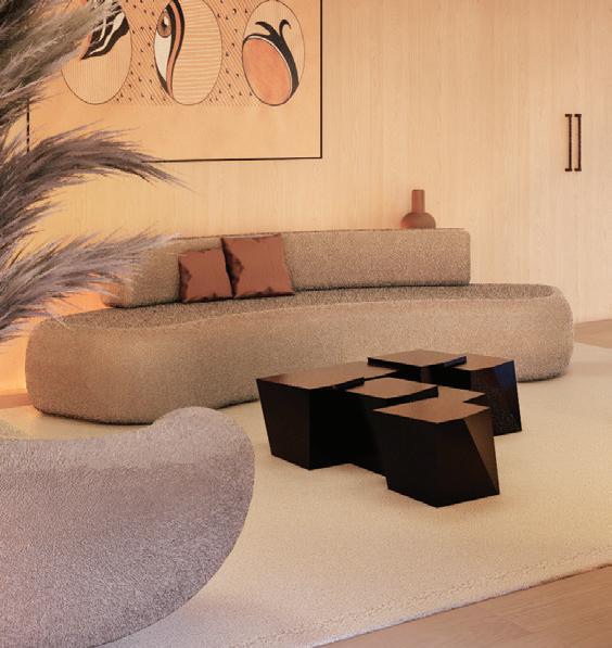
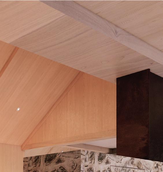
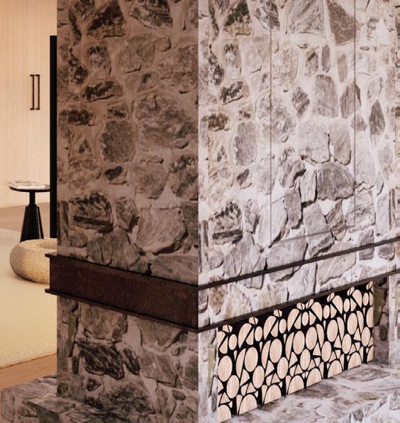
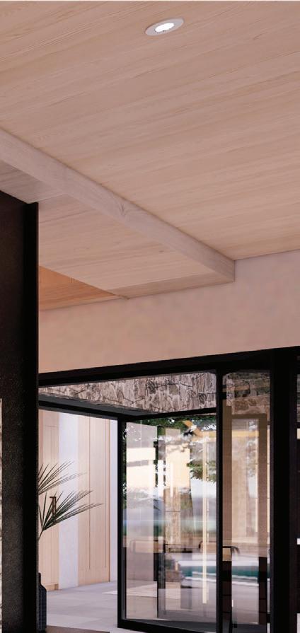
technique, though not English,” John-Luke says. “Jesse actually first discovered it when we visited the Palace of Versailles a few years back, where the pools reflect light into the hall of mirrors.”
In the home’s interior, Jesse created a warm environment using a natural palette of white shades. They provide a calming and sophisticated backdrop, accented by white oak panelling, strategically placed on not only wall surfaces but ceilings as well. The theme carries throughout the common areas, helping to create a sense of flow and of refined and rustic luxury. “When light plays off white oak, it creates an invitingly warm ambience,” John-Luke says. “Examples like this of layered lighting that includes both direct and ambient sources is an essential part of the creation of an environment.”
To compound these efforts, furnishings in artistic, organic shapes that contrast with the hardwood and stone surfaces were selected to characterize the space further.
Sculptural in effect, they add the perfect artistic finishing touch to the interiors. This home is a shining example of Sensus Design Studio’s distinctive multi-disciplinary approach, the “secret sauce” of their renowned private residences. “We approach the design of every private residence as a passion project,” John-Luke Sahlani says. “It requires a lot of creativity, thought, and agonizing over the minor details in the best way possible. We see this as a requirement when creating a unique luxury experience that is centred around the seamless connection between these four design elements.”

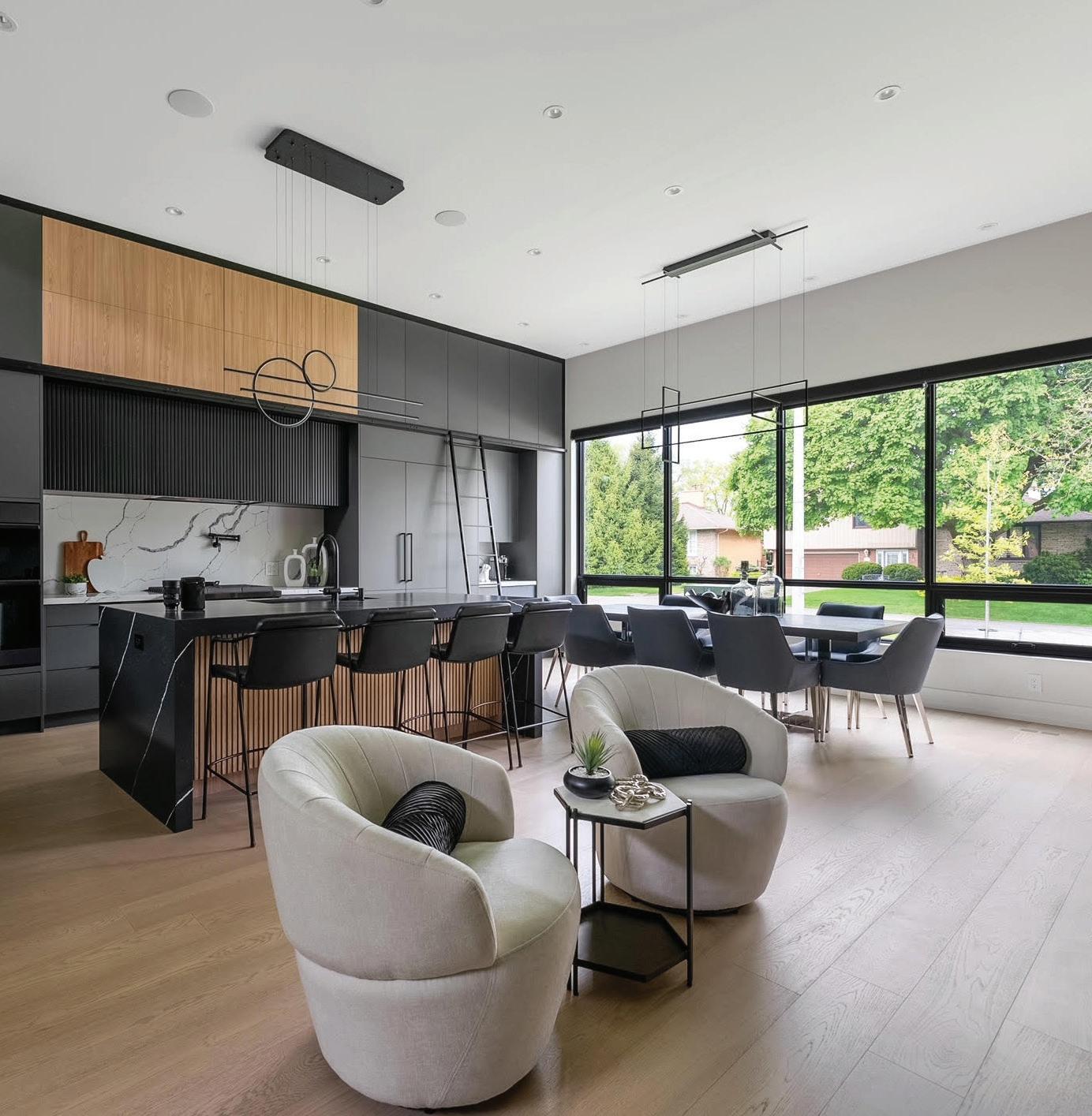

designer Rosalia Fazzari creates harmony in this sleek, open-concept Etobicoke
By Adriana Ermter
Photography by Pranav Photography
Rosalia Fazzari, an acclaimed interior designer and owner of Tapestry
Décor, knows how to create peace in the interiors she designs. It’s a talent she tapped into when designing a client’s home in Etobicoke’s tony, treed Princess-Rosethorn neighbourhood. By incorporating neutral tones and natural elements into the design, Fazzari was able to match the home’s interior to its tranquil surroundings. “The owners wanted big, bright spaces,” Fazzari explains. “Giving them a consistent and unified look throughout the entire home created this flow and gave it a sense of harmony."
After determining the owners’ preference for open-concept living and contemporary modern design, Fazzari took the 1960s back-split-style house down to the studs. She kept 40 per cent of the wall structure and rebuilt the
rest. This extensive process allowed her to reimagine the 3,000-square-foot layout to convey a new, seamless look—from the kitchen, living, family and powder rooms, to the primary and three guest bedrooms and their ensuite bathrooms. “Everywhere you look, you’ll see the same palette of dark grey with white and black,” Fazzari says. “I also used lots of glass and some wood to give them a beautifully spacious, but cozy aesthetic.”
Beyond the entryway floor’s grey terrazzo porcelain tile, the main floor’s kitchen and adjoining living area share Scandinavian-like features: simple lines, engineered hardwood floors, crisp white walls, black metal accents, natural oak shelving, and light from multiple windows and two unique chandeliers. Clean and fresh, the ambience is inviting.
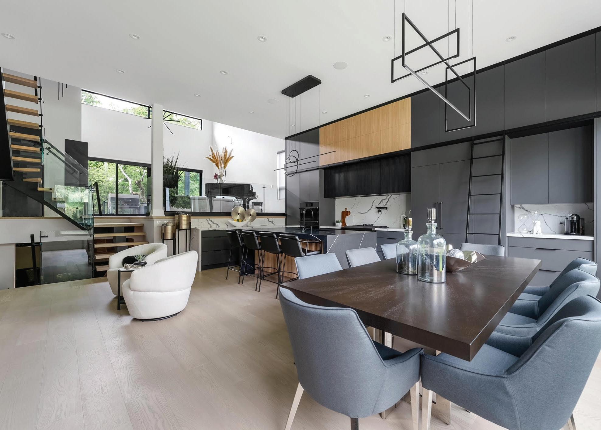
"NO MATTER WHERE YOU ARE IN THE HOME, YOUR EYES FLOAT FROM ONE ROOM TO THE NEXT EASILY."
The airy, open-plan kitchen boasts unobstructed views into the living and dining areas. The 12-foot-high walls feature floor-to-ceiling grey cabinetry. “You can never have enough storage, so I took advantage of the height and built all the way up,” says Fazzari. “I added a functional ladder system too, so that there is easy access to the cabinets.”
High-end Dacor appliances, including a gas range and panelled refrigerator, add functionality. The kitchen’s waterfall island—with its white-veined black quartz top and fluted-wood sides—adds a touch of glamour. White quartz with dark veining provides
contrast on the backsplash. “The mix of light with dark is very effective,” says Fazzari. “It’s why I purposefully designed a beautiful, oakwood shelving unit as a contrasting feature wall between the front entryway of the house and the kitchen and dining area. It serves as both a closet on the entryway side and a wine cabinet on the other side. It’s a great design moment, and I attached a metal ladder to it. It looks very grand but is also functional.”
A tastefully designed full bathroom on the main level features an expansive shower that’s hidden behind thick, black glass. The mirrors and cabinets are underlit and the walls
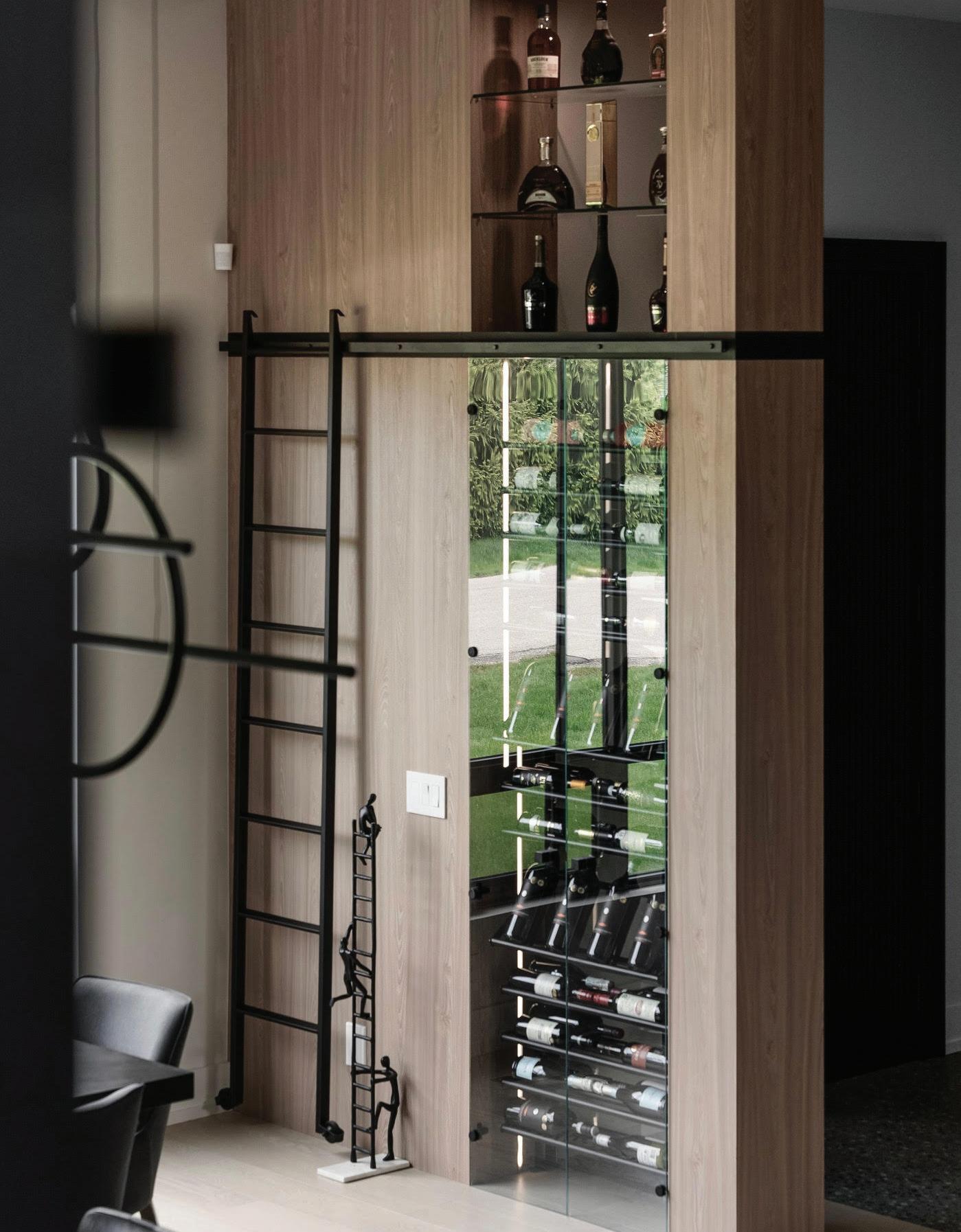
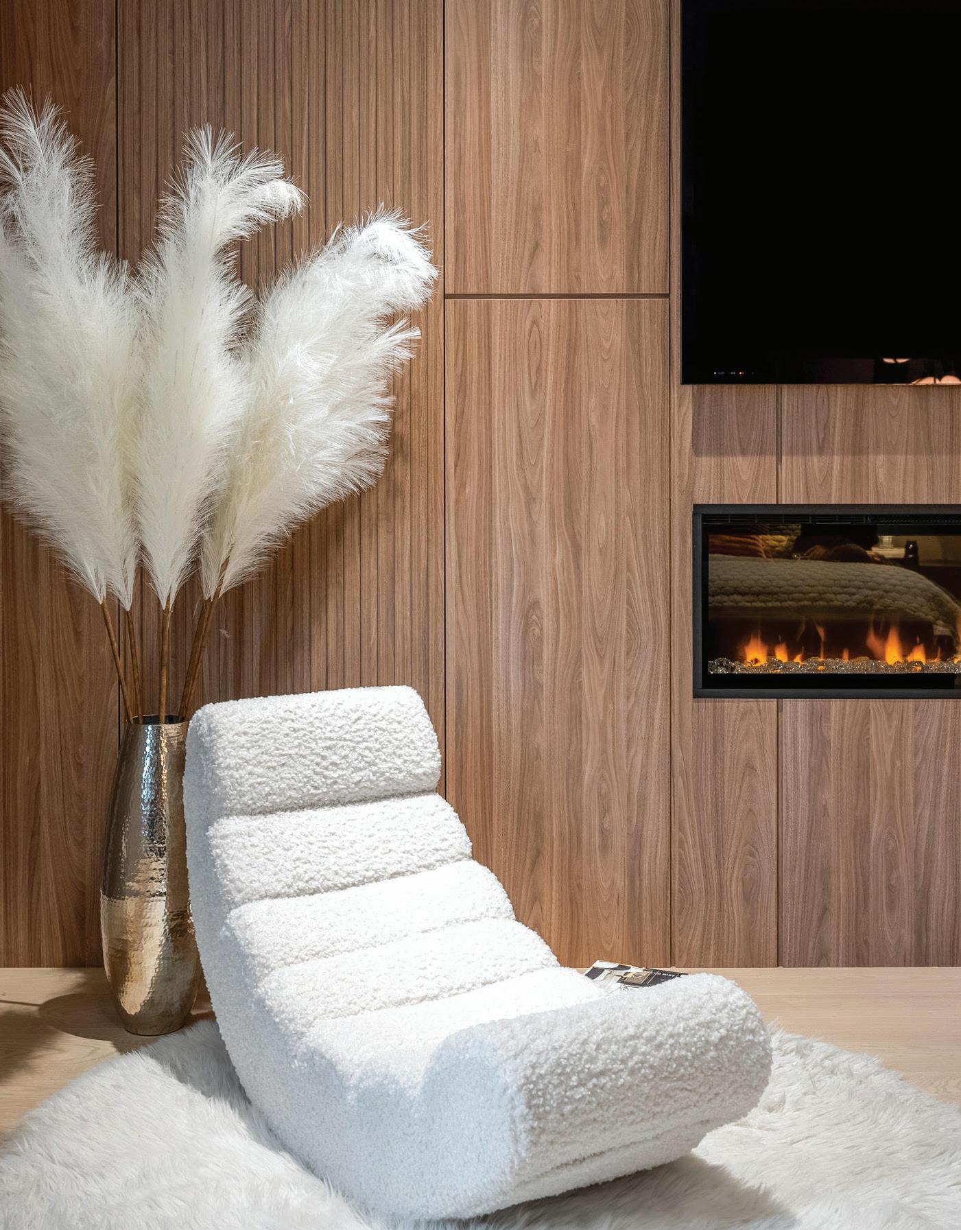

"EVERYTHING JUST FEELS LIKE IT'S SO NATURAL, IT FLOWS. IT FEELS GOOD, BECAUSE IT MAKES SENSE."
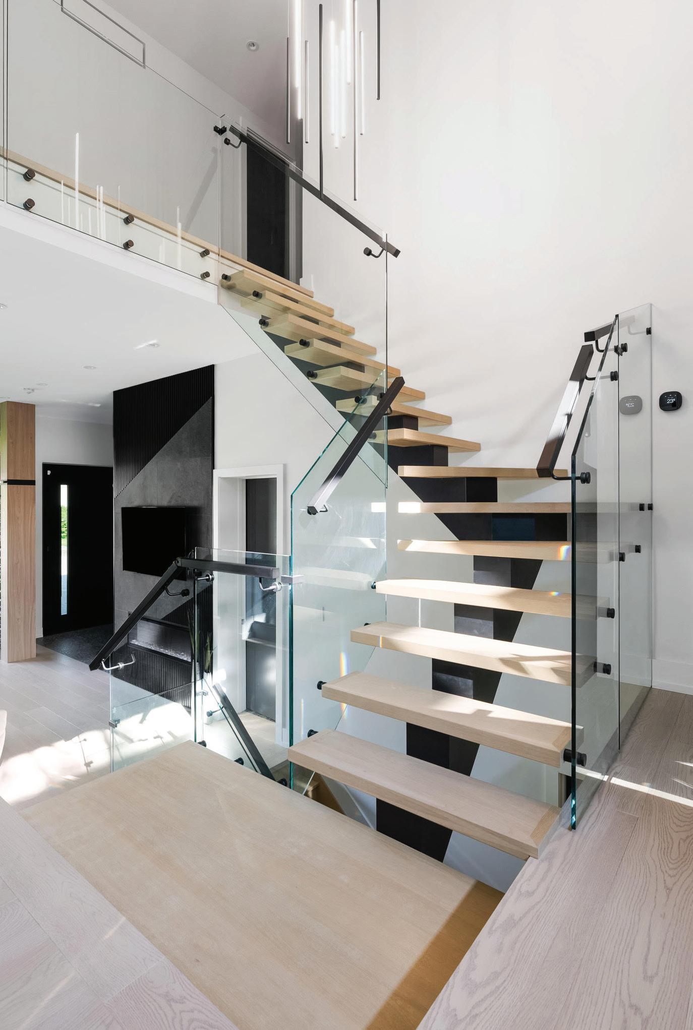
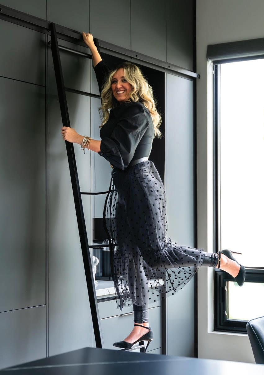
are painted a deep eggplant colour. Additionally, the home features two distinct living rooms—one on the main floor and one on the upper level. Fazzari created visual cohesion between the two spaces by using glass railings, an open U-shaped wooden staircase and twin design elements. "The glass railing provides a clear view from one space to the next, enhancing the flow," she explains. Similarly, the main living room’s electric fireplace with grey porcelain tile complements the kitchen cabinetry. Upstairs, the family room is a cozy space for TV viewing; it boasts a dramatic feature wall with a gas fireplace ensconced in the same grey porcelain tile.
The adjacent primary suite acts as a sanctuary within the home. Designed with earth tones and soft textures, it boasts an oak-panelled feature wall that hides a secret locked door, which opens into a hidden purse room. An electric fireplace, walk-in closet leading to the laundry room and a spacious ensuite bathroom all exude luxury and comfort. The integration of beech-hued wood flooring ties the suite, as well as all three of the guest bedrooms and bathrooms, to the rest of the home, reinforcing the sense of fluidity. “No matter where you are in the home, your eyes float from one room to the next easily,” says Fazzari. “Everything just feels like it's so natural, it flows. It feels good, because it makes sense.”
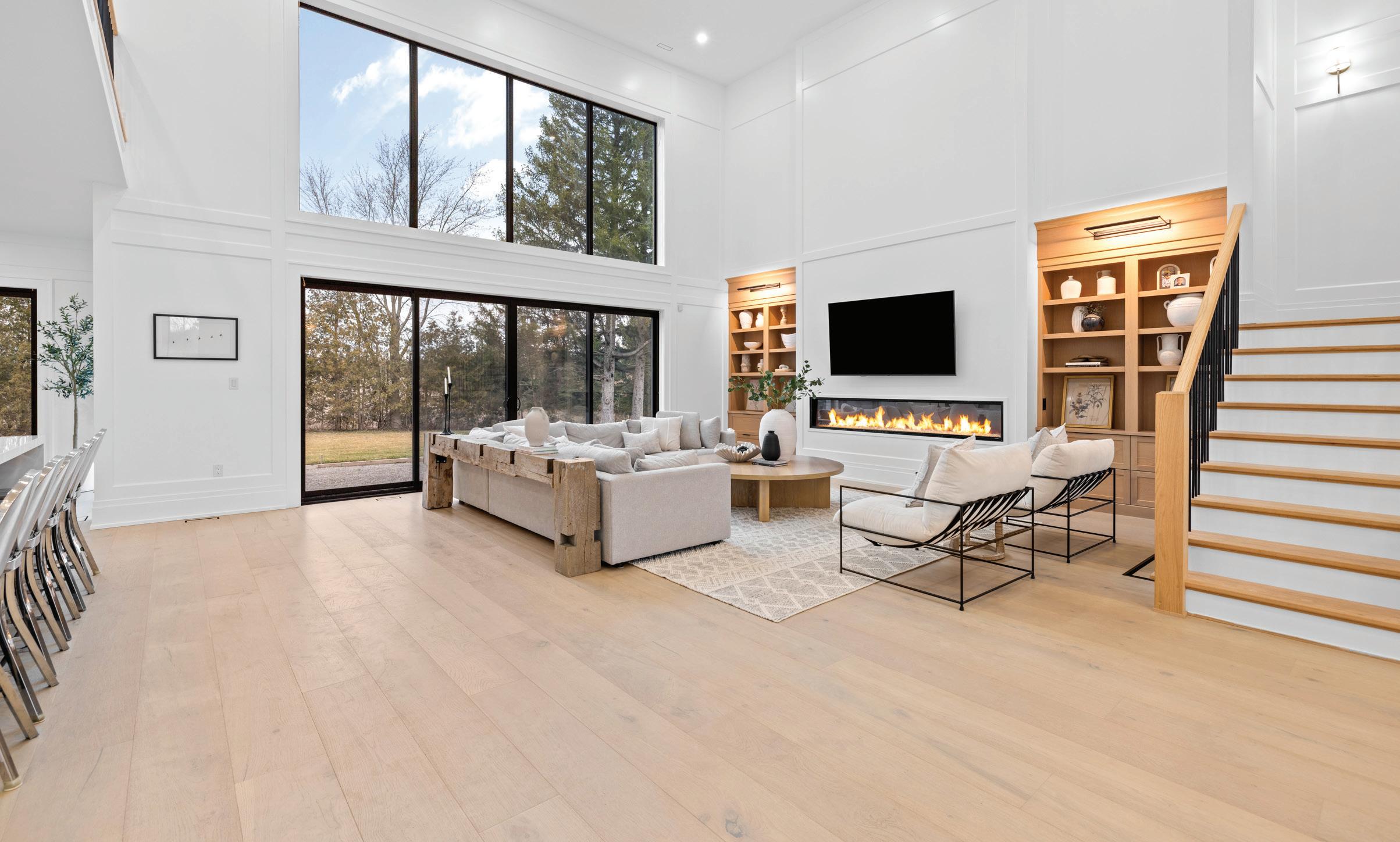

Designing this superb contemporary estate in rural Hamilton—now listed with The Agency Waterloo Region—was a labour of love for the current homeowner. Here, she shares some of what it promises the next residents, including wide-open spaces perfect for multigenerational living.
By Susan Kelly
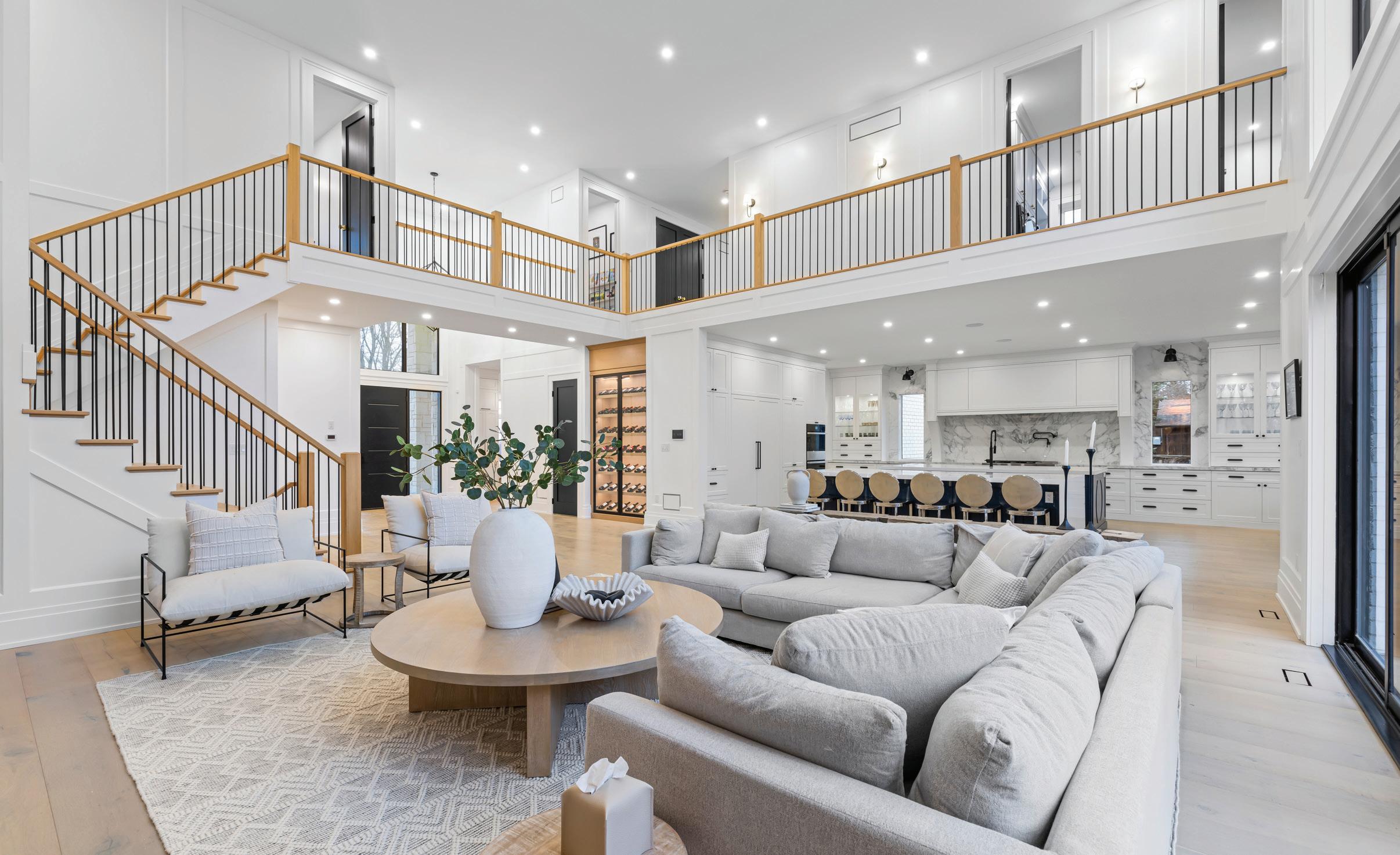
Thiscountry estate in the Flamborough district of Hamilton exudes serene sophistication in its modern architecture, combining chic simplicity, clean lines, and highest-quality materials. Realizing the custombuilt dream home was very much a family affair and a passion project for current owner Leanna DiCecca. “I’ve always loved home design and decor, but this was the first time I had a chance to design an entire home from the ground up,” says the development officer for a local college. “My husband Alexander, a landscaper, and I did the initial drawings and then turned them over to the architect who made our vision come to life.”
The chosen site, a one-acre lot with mature trees at 1131 Concession 6, opens onto breathtaking views of surrounding farmland. Their plans called for an impressive residence with a generous amount of interior living space, nearly 7,000 square feet of it. Also high on the wish list: many large windows and glass doors to admit as much natural light as possible, framed with crisp black aluminum to beautifully punctuate the all-white interior colour scheme. DiCecca’s father, who worked in the industry for many years, contributed his expertise.
The couple and their two sons, ages three and seven, share a main residence. An additional bedroom and two bathrooms are found in the attached 1,300-square-foot “in-law suite.” With its own kitchen, and living, dining and study areas plus garage, it functions as a fully autonomous unit.
“We designed it for my parents as a separate home unto itself, connected to the main house via a light, airy breezeway that lies off my office,” DiCecca says. “It is soundproofed so they can’t hear the boys’ racket, and they have a separate entrance and access to the backyard.”
In the main house, an open-concept layout was a must for the family. A grand foyer brings visitors first into an even grander 400-square-foot living room with a soaring 20-foot cathedral ceiling and patio doors that flood the area with light. It leads into a kitchen, spacious enough to provide more than 30 feet of counter space and accommodate two five-by-10-foot islands. “One has a sink and is intended for prep work and storage,” the homeowner says.
“The other is a place where people can sit. I tried to think of every detail, including how well it flows and works for both daily use and entertaining.”
To that end, there is also a separate butler’s kitchen and walk-in pantry, and

This home is a standout not only for its design, but the great care the owner took with details that contribute to easy living in the day-to-day.
adjacent dining area.
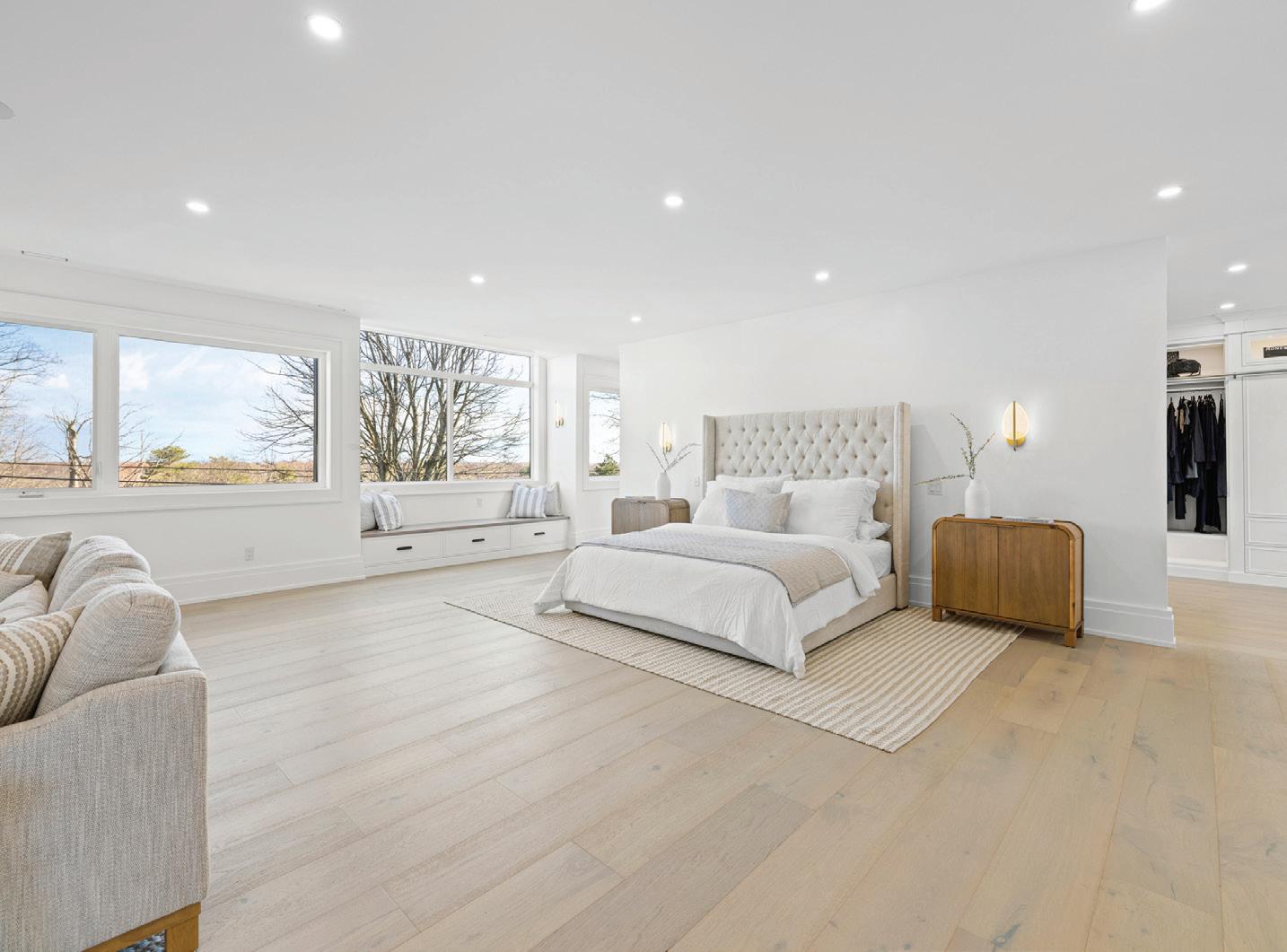
A sweeping staircase off the living room leads to the second floor and an open mezzanine hallway overlooking the room below, giving a loft-like feel. Here there are three secondary bedrooms and the primary: an airy, sunlit, open retreat, roomy enough to hold a spacious seating area. Its luxe ensuite bathroom provides a spa-like retreat with marble-look tile adding to the serenity. Off of it lies a “dream come true” walk-in closet, measuring a massive 27 by 38 feet.
DiCecca’s design shows a keen eye for what is both current and timeless in contemporary design. To add warmth and a subtly rustic touch, white oak hardwood flooring in 10-inch planks runs throughout the home. “And every room features custom white oak cabinetry crafted by Mennonite woodworkers in St. George,” she says. “I tried to reference rural Ontario style without being too literal.” In the living room, it takes the form of imposing built-in bookcases flanking the sleekly linear contemporary fireplace; in the kitchen, a striking range hood.
This stunning property that so effortlessly blends sophistication with function, contemporary with country, is now on the market at an asking price of $5.95 million. Much as DiCecca loves living there, she is eager to tackle the next design project. “This was our first taste of rural life,” she adds. “Now the entire family would like to move to an even bigger property.”
“The exceptional property’s location is also a big draw for prospective purchasers,” says the listing agent, Steve Bailey, broker and managing partner of The Agency, an international real estate firm for the Waterloo region, with offices owned by Bailey in Waterloo Region, Oakville, Muskoka, Brantford, Toronto, King City, Halifax and Niagara on the Lake.
Now enjoying rapid growth, the Flamborough village’s historic downtown is home to shops, restaurants and artisan breweries, and other great amenities. And it’s within a 35-minute commute to surrounding cities such as Hamilton or Oakville, and very close to some excellent golf courses.
This home is a standout not only for its design, but the great care the owner took with details that contribute to easy living in the day-to-day, Bailey says. “And though ideal for multi-generational living, the added space also could be used to provide luxury private accommodations for guests or income-generating opportunities.”
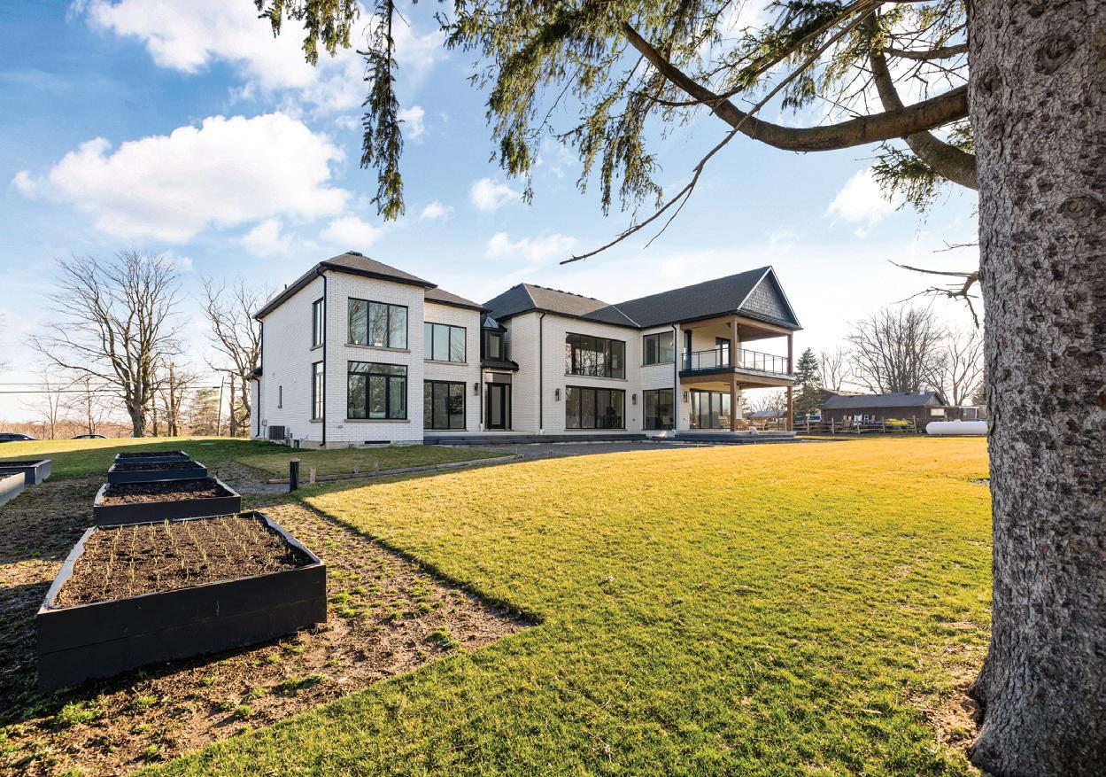

After three decades of success, Newmarket-based ADM Design continues to dazzle with artistic flair, now offering its exceptional luxury products and design services in cottage and resort country.
By Susan Kelly
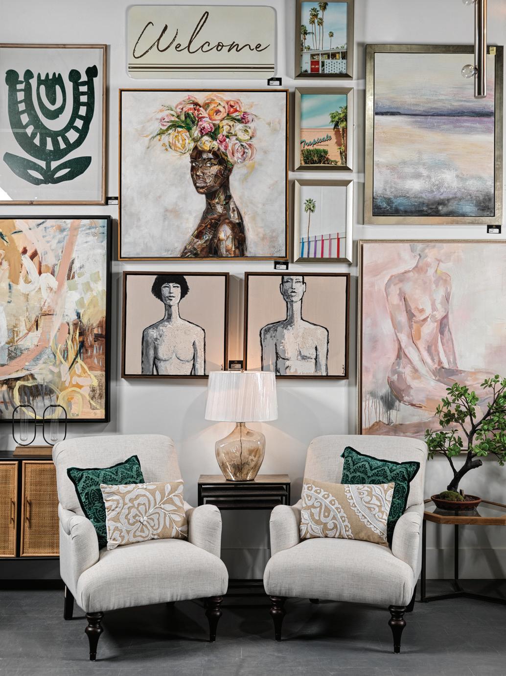
and fine artist Andrea McMullen kicked off summer 2024 at the ultra-luxe Friday Harbour Resort in Innisfil. But rather than lolling lakeside, the vivacious design dynamo and owner of ADM Design Inc., a leading design firm headquartered in Newmarket, was there working on final touches toward unveiling her firm’s latest project: the stunning ADM Design Model Home.
Now a permanent installation, to be open to the public in August 2024 by appointment or invitation, the sublimely chic three-storey townhouse expands on the showstopping construction elements, furniture, and decor that the company displayed at April’s Living Luxe Design Show. “People were so excited by what they saw at our booth,” McMullen explains, “but many had trouble imagining what it would look like in a real home with their family living in it. Now they can immerse themselves in our unique approach to luxury design, experiencing how we can make a home beautifully liveable while adding so much value.”
To date, McMullen and her team also have designed more than 50 upscale condominiums and lakefront townhomes in the Friday Harbour community and have a boutique-style retail store on the resort boardwalk. In 2023, ADM also opened a store in scenic
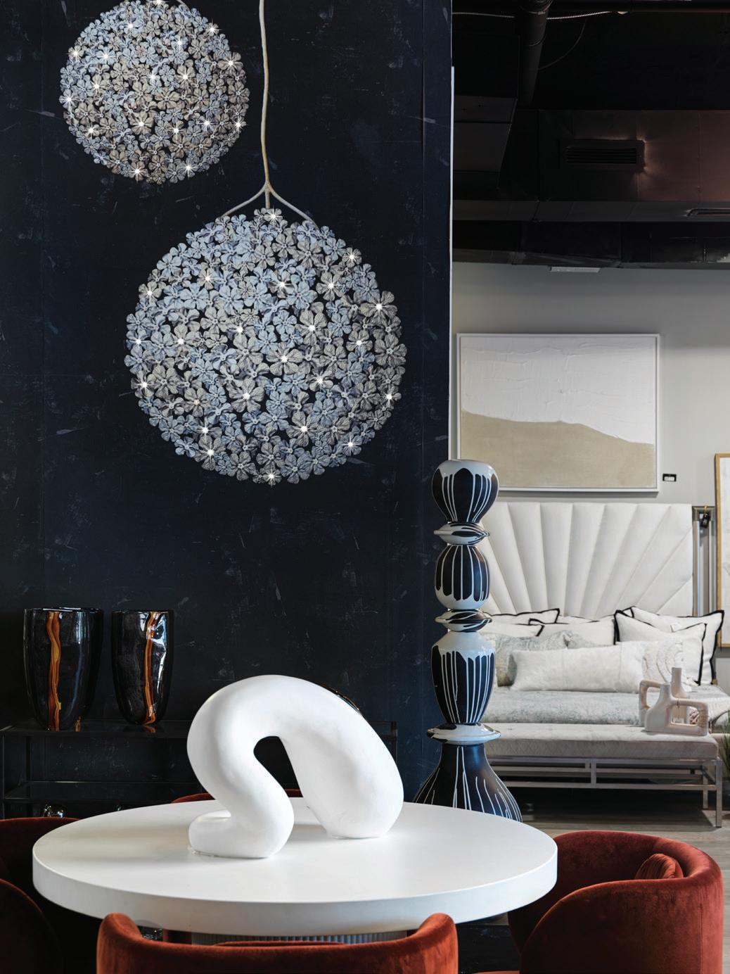
Port Carling, known as the “Hub of the Lakes,” an ideal place from which to serve the Muskoka region. Both satellite boutiques offer the perfect place for shoppers to meet and select furniture, lighting, artwork and accessories to please the most discerning cottage owner.
It is a full-circle moment for the designer, an award-winning muralist before embracing her real passions: interior design and architecture. The idea to open her now-flourishing business came to her 33 years ago when she was relaxing at her own family cottage. “I couldn’t decide between opening a gallery, design centre or retail store,” she says. “The aha moment came one day by the lake: by combining all three—including a construction division—I could provide a totally unique experience for my clients.”
Today, clients from across the GTA continue to seek that exceptional and luxurious experience at the original Newmarket showroom, design centre and warehouse. McMullen’s passion and verve infuse every inch of its 6,000 square feet. Upstairs is where the design magic happens, in the offices shared with her expert team of interior designers, home stagers, tradespeople and support workers. Her son, Taylor, is on board as head of the


WE WILL HANDLE EVERY DETAIL DOWN TO HANGING THE ARTWORK AS WE MAKE THEIR DREAMS A REALITY.
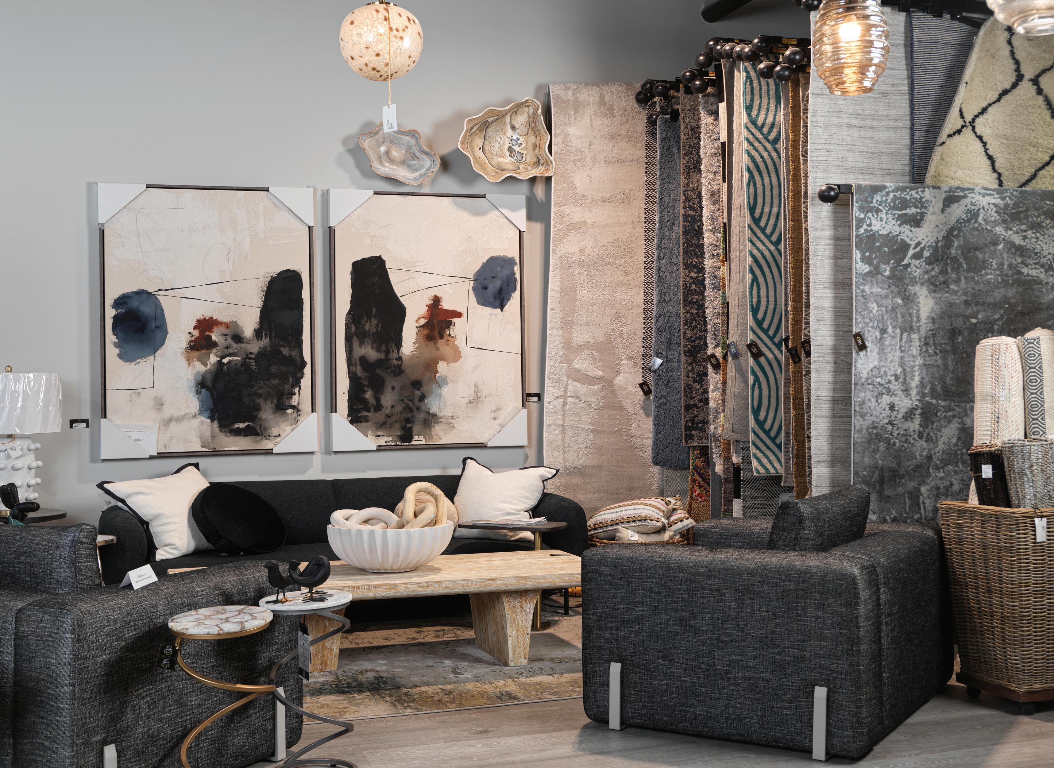
condominium and construction divisions. Together, the team tackles all aspects of commercial and residential projects, always upholding the founder’s commitment to provide the most stylish and unique design solutions.
The main level also houses the artfully appointed Newmarket Lounge, where McMullen frequently hosts art vernissages, parties and other special events. “People love being on my mailing list so they can be the first to know about them,” she says. “Many say
coming here is an event in itself, more like visiting a gallery for a special event than just a shopping trip. And they’re inspired to rent the space for their own events.”
The ground floor showroom houses a treasure trove for aficionados of good design, who include outside designers. All come for innovative products on the leading edge of international trends, for which McMullen passionately scours the planet. Vibrant vignettes showcase both innovative and classic design in


WHAT REALLY SETS ADM DESIGN APART IS OUR COMMITMENT TO OUR FABULOUS CLIENTS. THEY KNOW THEY WILL RECEIVE WHITE-GLOVE SERVICE FROM US.
furniture, art, home decor, rugs and bedding. Many products are exclusive, such as British company Meystyle’s wallpaper, ingeniously embedded with LED lights and crystals that can transform any wall into an art installation. So will mirrors crafted by renowned Ukrainian architect and designer Sergey Gotvyansky that expertly merge technology with style from Deki Home. There also is an entire wall devoted to artwork by internationally known and rising-star local talents.
The same commitment to a unique product offer extends to the luxury cottage and condo owners, and includes the outdoor
spaces. “Al fresco living has become so important, and the spaces from patio to boathouse have to be just as beautiful as the interior,” McMullen says. Among the exclusive lines here are the sleek haute modern outdoor furnishings from Los Angeles-based Tesoro. ADM will be the first in the province to offer a European innovation, a “magic” barn door with no visible hardware that seems to float as it adds the ideal chicly rustic touch.
Unique products, unique services, unique vision. “What really sets ADM Design apart is our commitment to our fabulous clients,” McMullen says. “They know they will receive white-glove service from us. We will handle every detail down to hanging the artwork as we make their dreams a reality.”
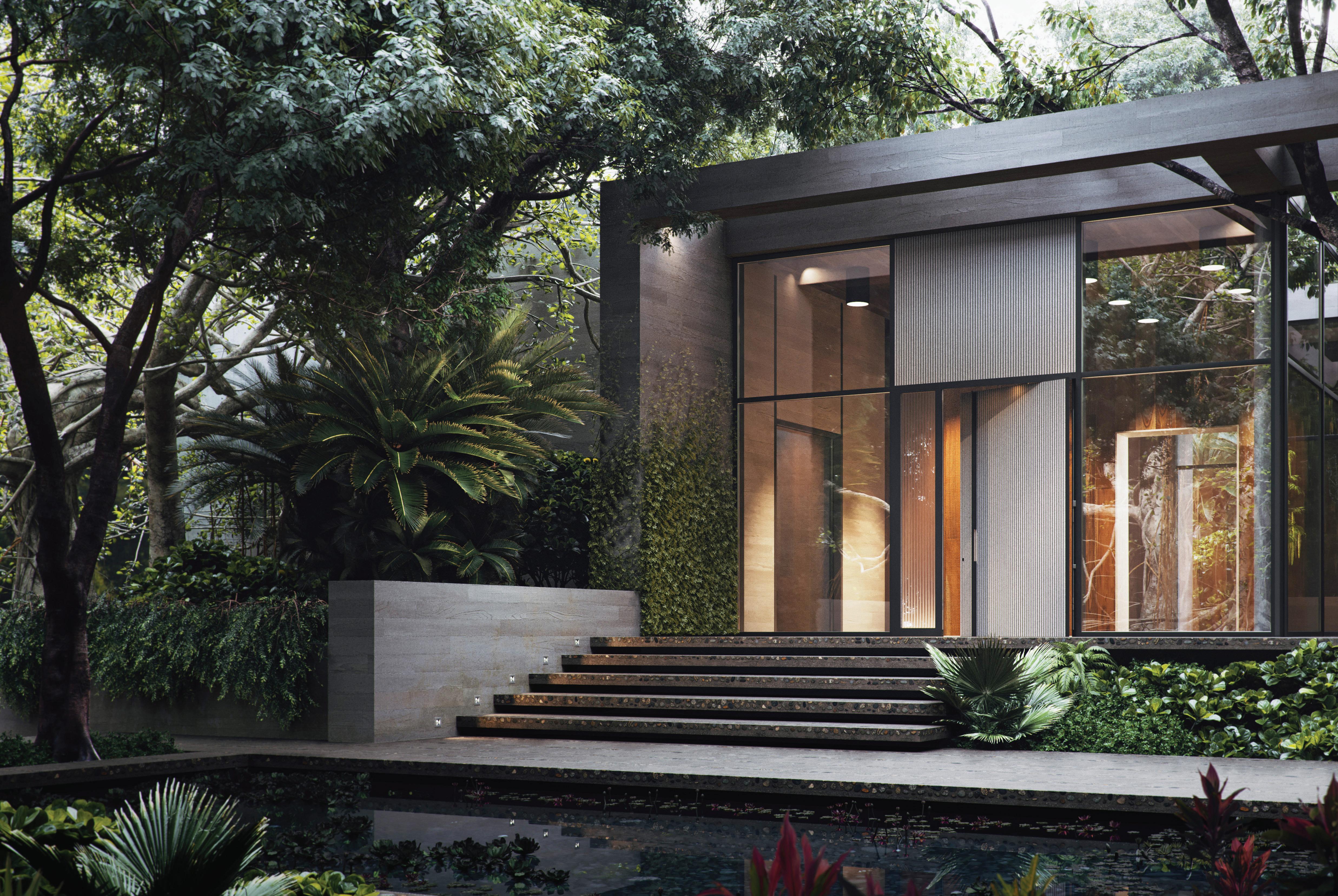


These aptly named “Opulence” doors and windows offer a magnificent view on the world. The massive pivot doors are clad in liquid metal, ceramic, natural stone, or artisan glass. The windows and sliding doors are expansive, like the view. Discover Opulence Architectural Systems.
OPULENCE ARCHITECTURAL SYSTEMS
176 Tycos Dr., North York M6B 1W8 opulencesystems.ca 416- 704-4703

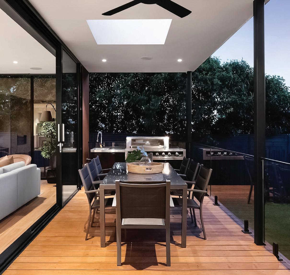
Our custom full floor-to-ceiling windows and sliding doors seamlessly blend your indoor and outdoor worlds, making every view a cherished memory. Create your own picturesque views with us today.
EUROSTAR WINDOWS & DOORS
55 Administration Road, Unit 22-24, Concord eurostarwindows.ca 416-633-5921
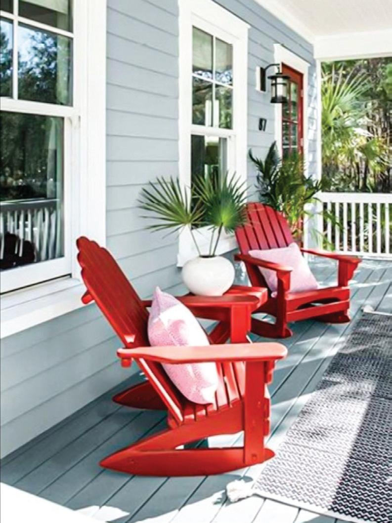
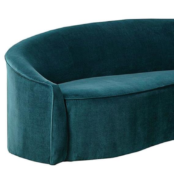
Get the party started with this glamorous cocktail bar. Lined with custom velvet, wrapped in black leather-look PVC, and on casters, it will add character to your space. Dimensions: 22.83” x 22.83” x 44.88” H.
DARLENE JANEIRO DESIGN
92A Dunn Street, Oakville darlenejaneirodesign.com 905-339-8118
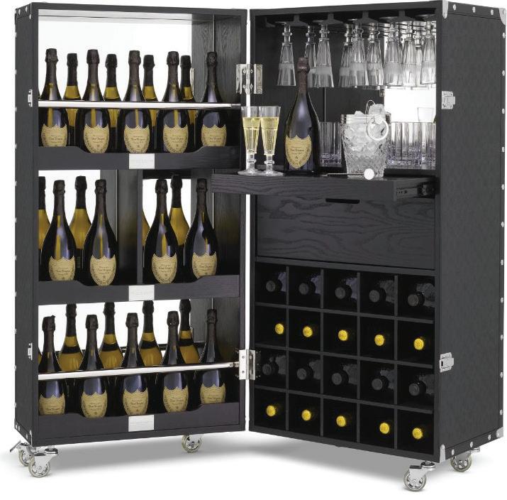
Versatility redefined: Lumi doors are not just another design element; they are versatile room transformers. Whether you want to partition a space, create a walk-in closet, or design a unique entryway, Komandor’s Lumi doors are the perfect choice. Contact us to learn more.
KOMANDOR
863 Rangeview Road, Mississauga komandor.ca 416-251-0880
Looking to revamp your outdoor living space? You can easily repaint or stain your existing outdoor patio furniture in a weekend. Come check us out in-store for more information.
VILLAGE PAINT & WALLPAPER
4949 Dundas Street West, Etobicoke villagepaintwindowcoverings.ca 416-231-2831
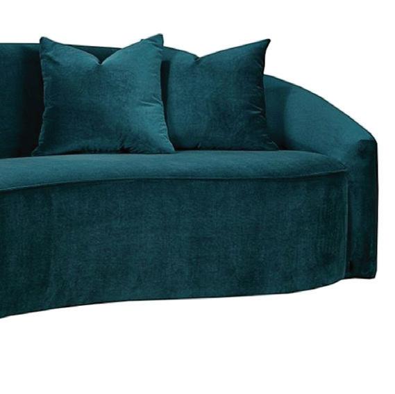
The Macmillan sofa is an elegant addition to any interior with its graceful curves and luxurious glamour. Its beautiful design is sure to add a touch of sophistication to any room. Choose from an array of fabric choices. Quality design. Made in Canada.
DECORIUM
363 Supertest Road North York decorium.com 416-736-6120
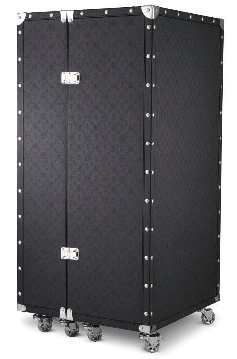
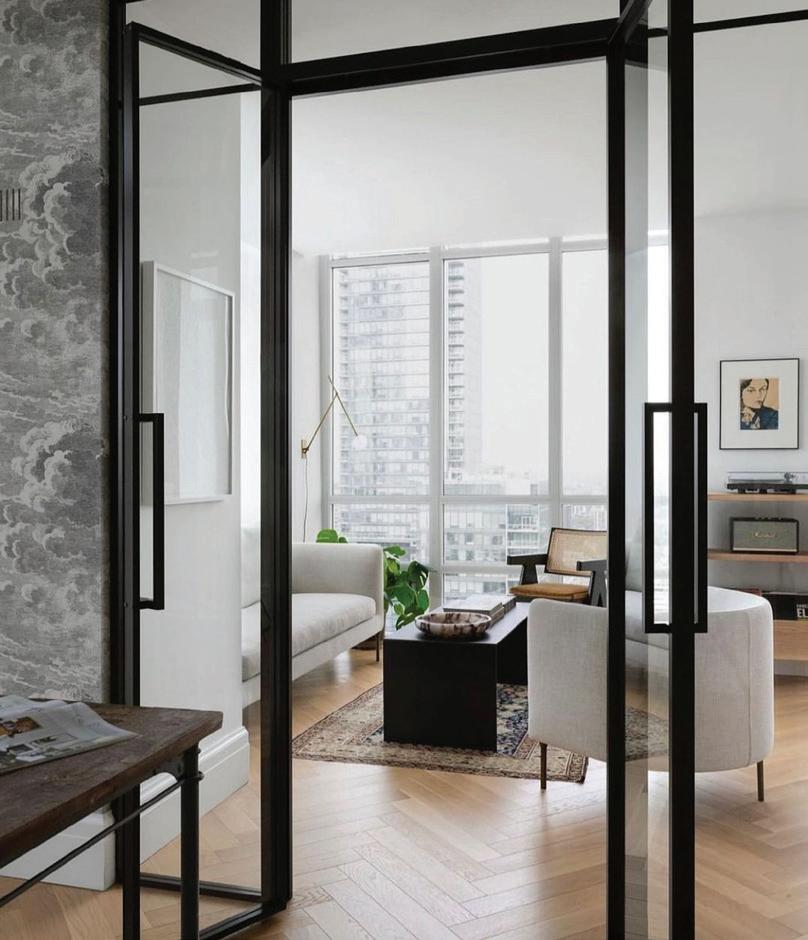


The Stressless Emily power-reclining sectional offers luxury and boldness. Stressless sofa design is perfectly suited to your home’s desired atmosphere. Customization options include materials, fabric choices and custom configurations. Functionality and comfort for an optimal seating experience.


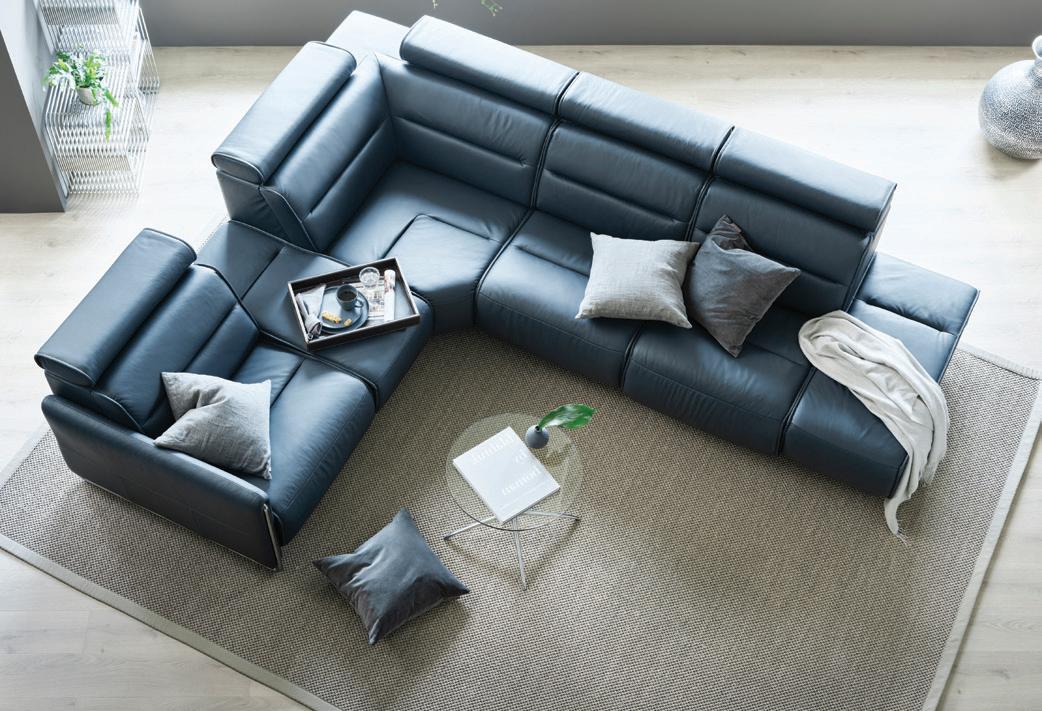
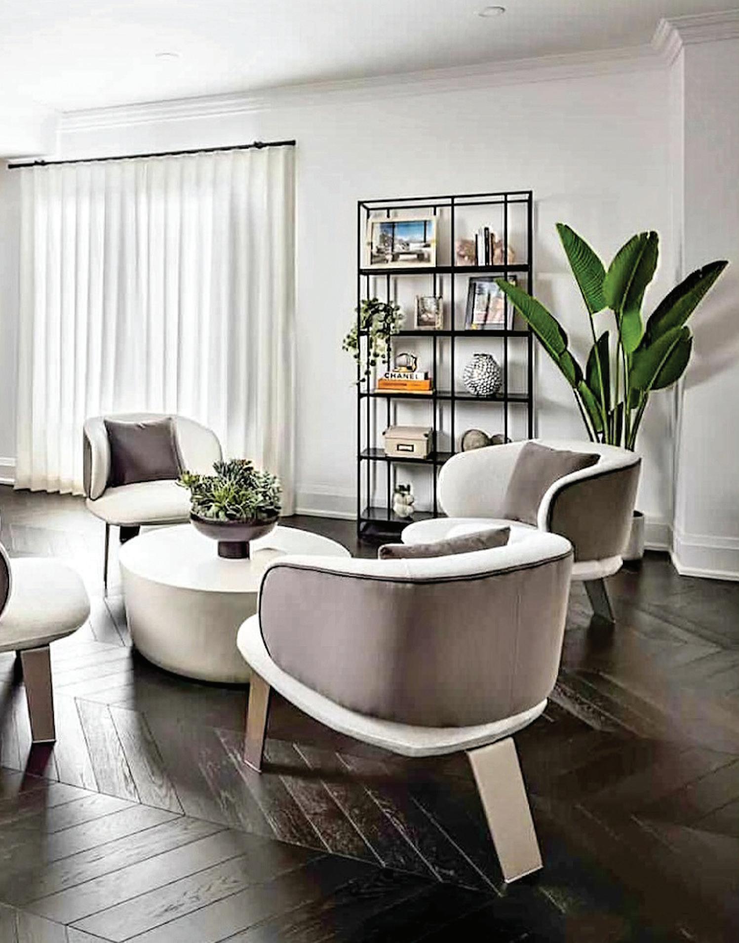
The New Z10: With the touch of a button, prepare authentic and trendy coffee drinks such as espresso, latte macchiato and flat white. Say hello to your personal barista. Coffee pleasure — freshly ground, not capsuled. Jura is the leader in producing super-automatic specialty coffee machines.
JURA
115 Matheson Boulevard East, Mississauga ca.jura.com/en 905-501-8600


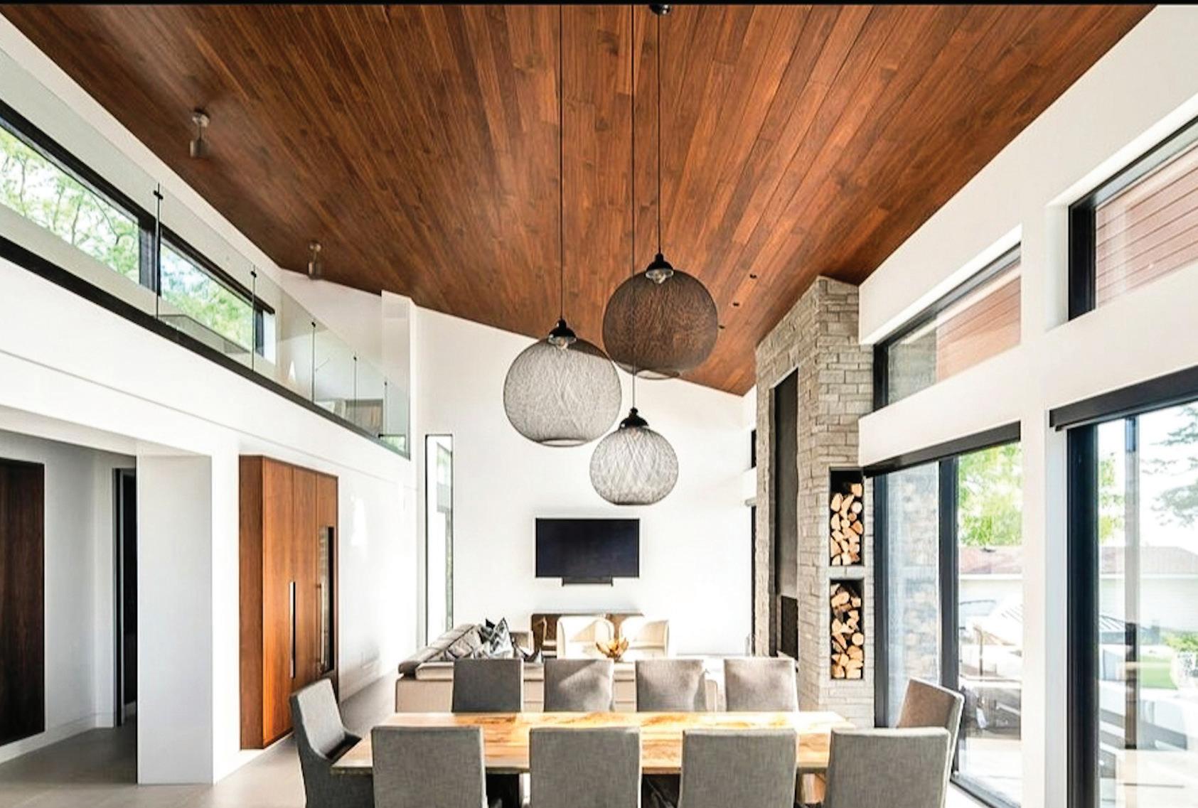


Contemporary design with clean lines: The all-aluminum windows and doors blend with stone and wood accents to create a beautiful living space. We are excited to announce that we have moved. Come check out our new showroom; book your appointment today!
CHATEAU WINDOW & DOOR SYSTEMS
170 Tycos Drive, North York chateauwindows.com 416-783-3916


Inspired by abstract paintings, these timeless designs will be the star of any contemporary/modern space for years to come. Made with hand-spun, hand-carded wool and natural silk fibres, they are bound to be future heirlooms.


WEAVERS ART
2 - 120 Tycos Drive, North York weaversart.com 416-929-7929
Espresso Herring Bone:
First Class Flooring is a retailer in Etobicoke that specializes in unique hardwood flooring typically sought out by custom builders and designers. We have a 10,000-square-foot showroom, a designer lounge and conference room, and installed virtual room kiosks to help customers with their flooring decisions. We have knowledgeable staff on hand who are qualified to answer your questions.
FIRST CLASS FLOORING
10 Marmac Drive, Etobicoke firstclassflooring.ca 416-740-6183


