meg.koglin@gmail.com
646.385.2183
www.megkoglin.com

meg.koglin@gmail.com
646.385.2183
www.megkoglin.com
BRAND:
Eileen FisherYEAR:
Designed 2014, Produced Spring 2015
Contribution:
Line plan, leather sourcing, color, product design, tech approvals
Description:
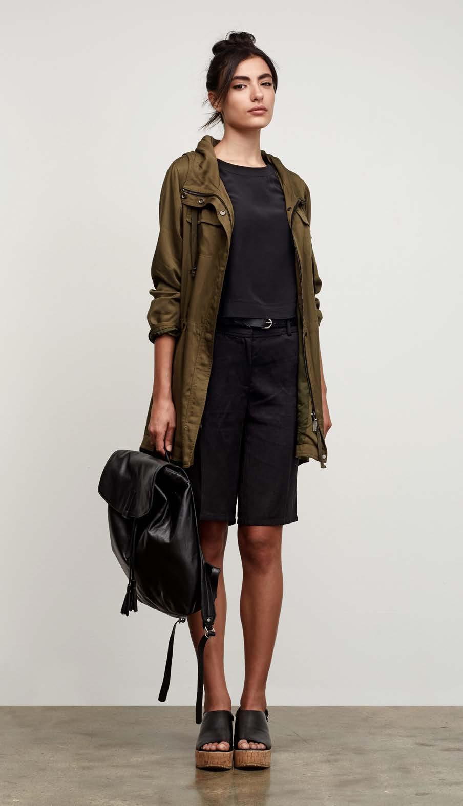
I designed this accessory collection to reflect Eileen Fisher’s understated elegance. It’s unfussy, contemporary, and easy to wear. I sourced supple, full-grain Italian leather and designed soft bodies to merchandise back to the brand’s fluid apparel.
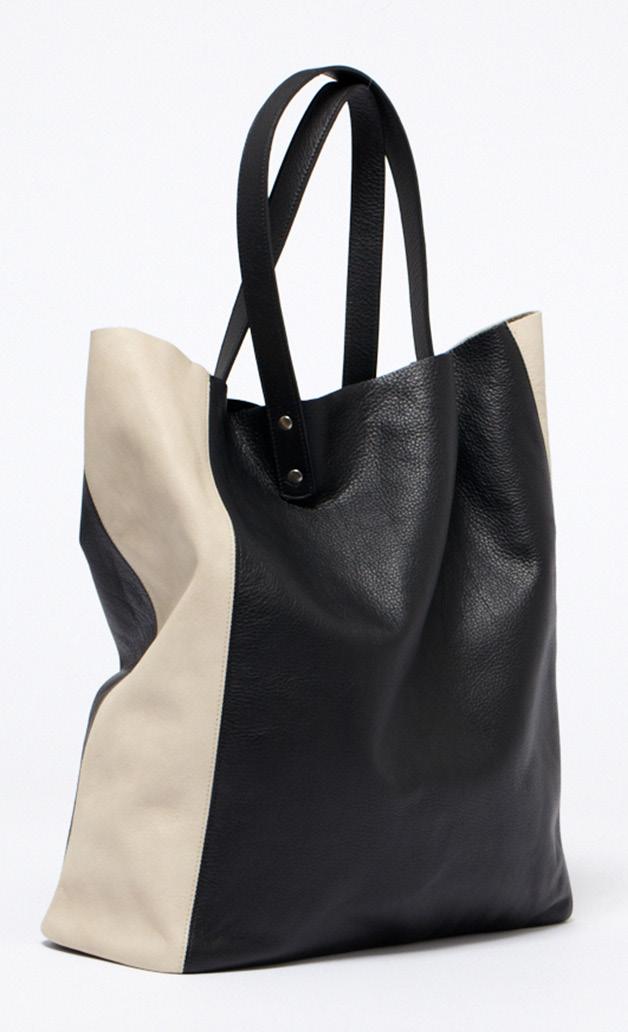
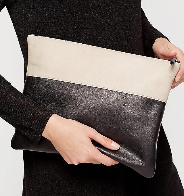
The black and bone color story reflects the minimalist appeal of the brand, yet creates a bold contrast when blocked on a single style.
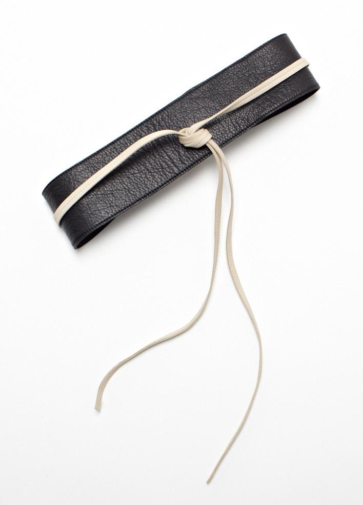
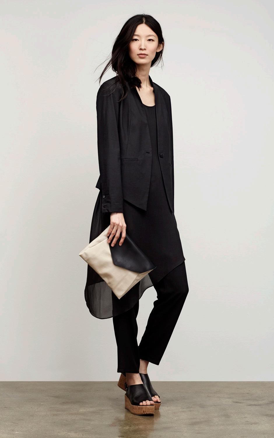
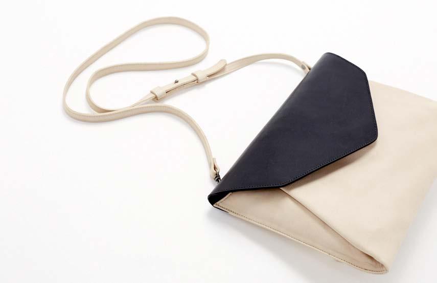
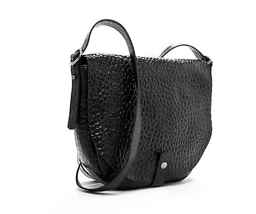
I added pleats to the supple leather body to add volume in a way that created a round softness better than a dart or seam. The soft envelope body contrasts the structure of the firm vachetta flap.
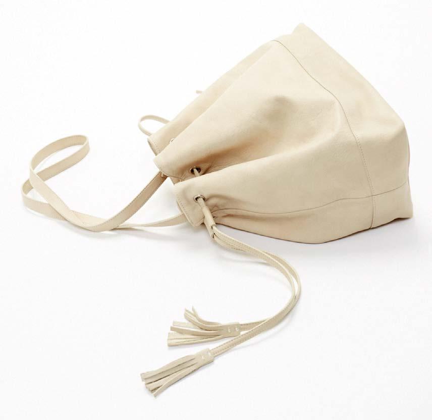
I included simple tassels throughout the collection. They add playful dimension and movement to an outfit or store floorset, while keeping the look simple enough to pair with a variety of outfits.
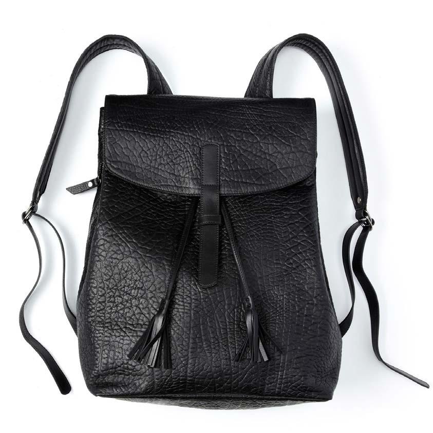
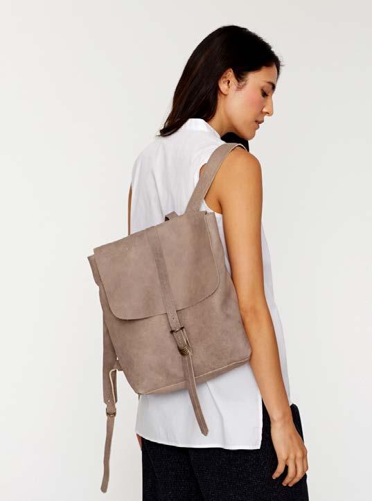
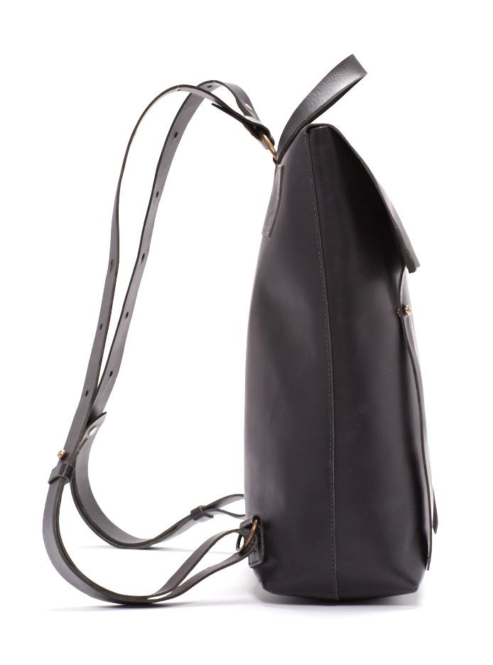
This backpack was a best-seller and staff favorite. My first version of it was in this embossed leather that I sourced from the annual leather tradeshow in Italy. I added a tumbled finish treatment to reduce stiffness and create a pliable lived-in handfeel.
YEAR:
Designed 2014, Produced Fall 2015
Contribution:
Line plan, leather sourcing & development, product design, tech approvals
Description:
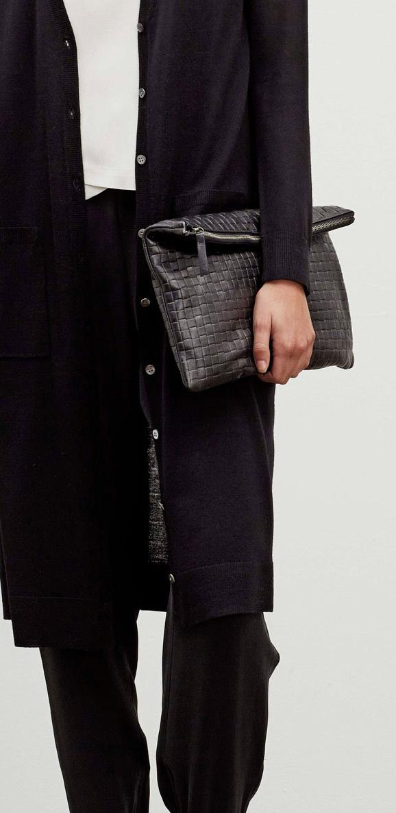
These are a few of the textured styles from my Fall 15 leathergoods collection. To add interest to retail stores while remaining true to brand minimalism, I approached it like surface interest in a sweater knit or jacquard fabric. The texture improved floor displays, not unlike textural elements in a floral arrangement or interior design.
I combed through Italy’s leather tradeshow to source high-quality embossed leather that would hold its imprint on soft full-grain leather. Stamped textures hold better on firm leathers and plastics, while they are prone to disappearing on soft leather as it stretches. I sought softness because it would sit better with the rest of my collection and the draping brand apparel; I was also avoiding the tawdry feel of many embossed hard leathers. Through relationship-building and development with expert Italian finishers, we achieved the right finish.
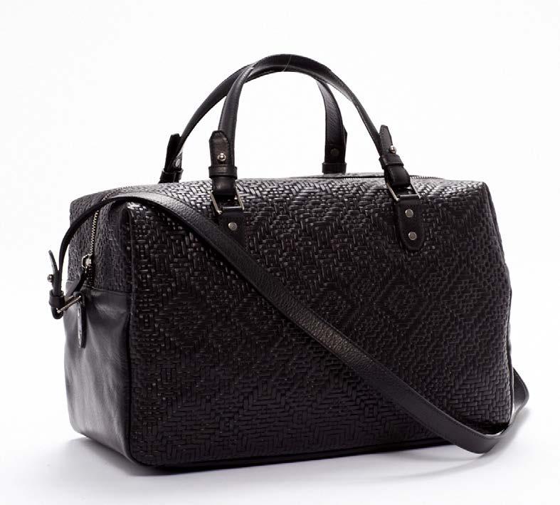
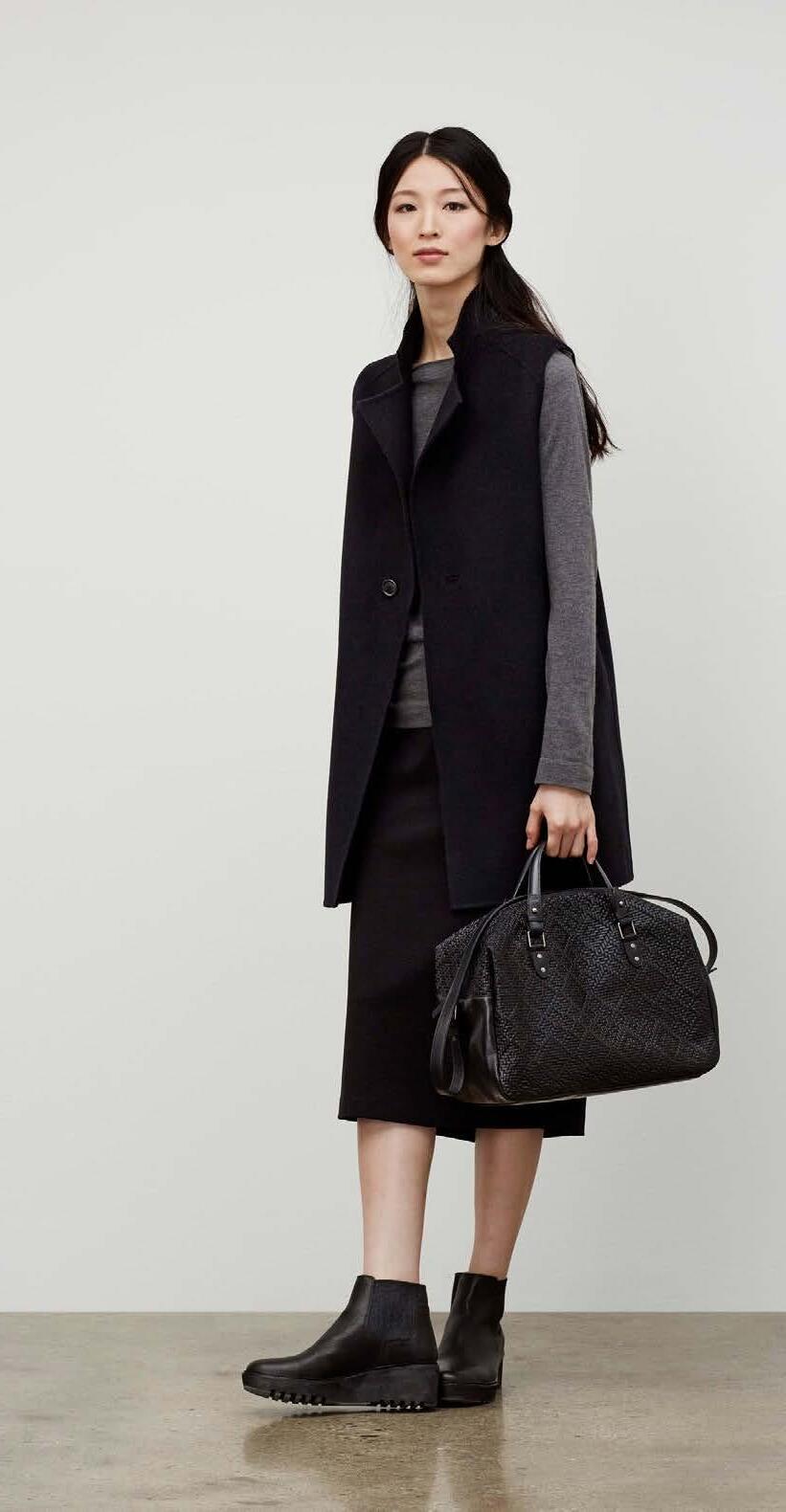
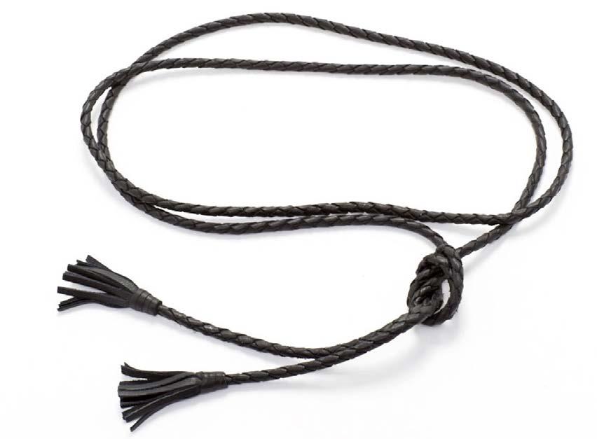
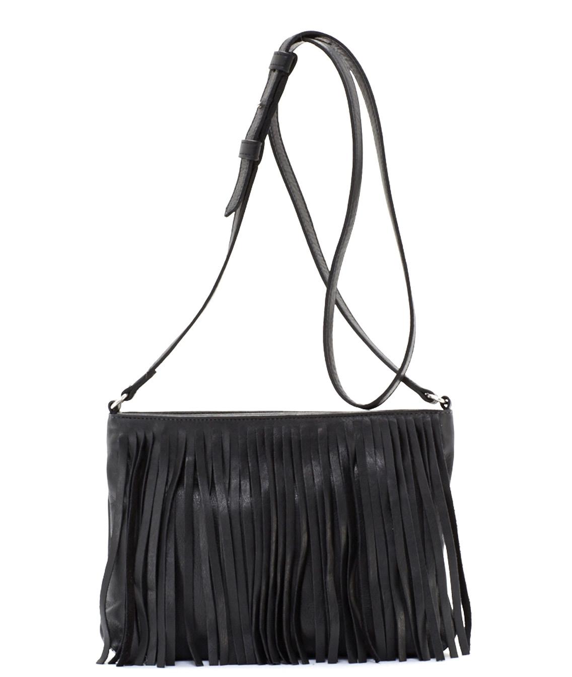
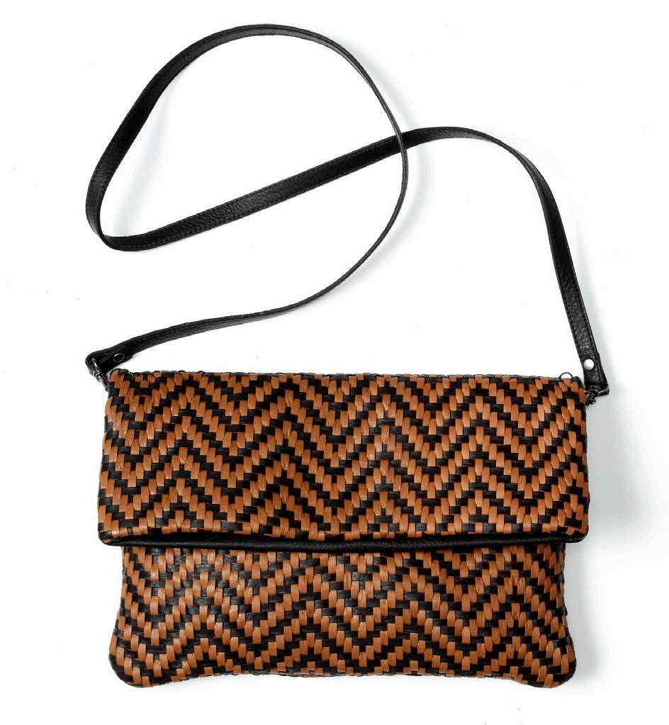
I also added texture to each collection with elements like fringe, weaving, hand-pressed hardware and braiding. This way, I could match color and handfeel to solid collection materials. It worked for aesthetics as well as cost-efficient production planning, because I could make a variety of interesting styles from one leather article.
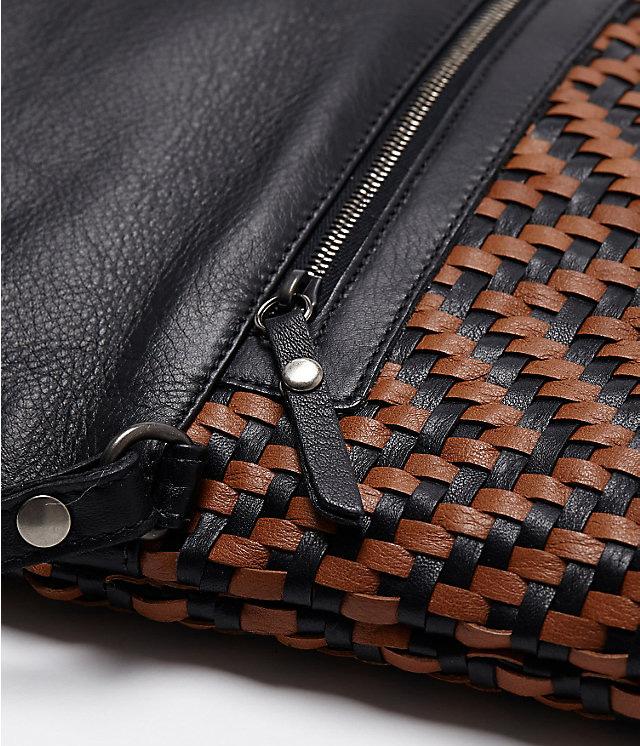
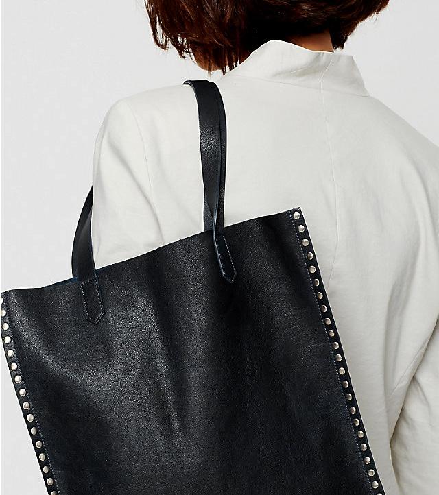
BRAND: Eileen Fisher DATE: 2014
Contribution: product design, material sourcing, sketch, specs

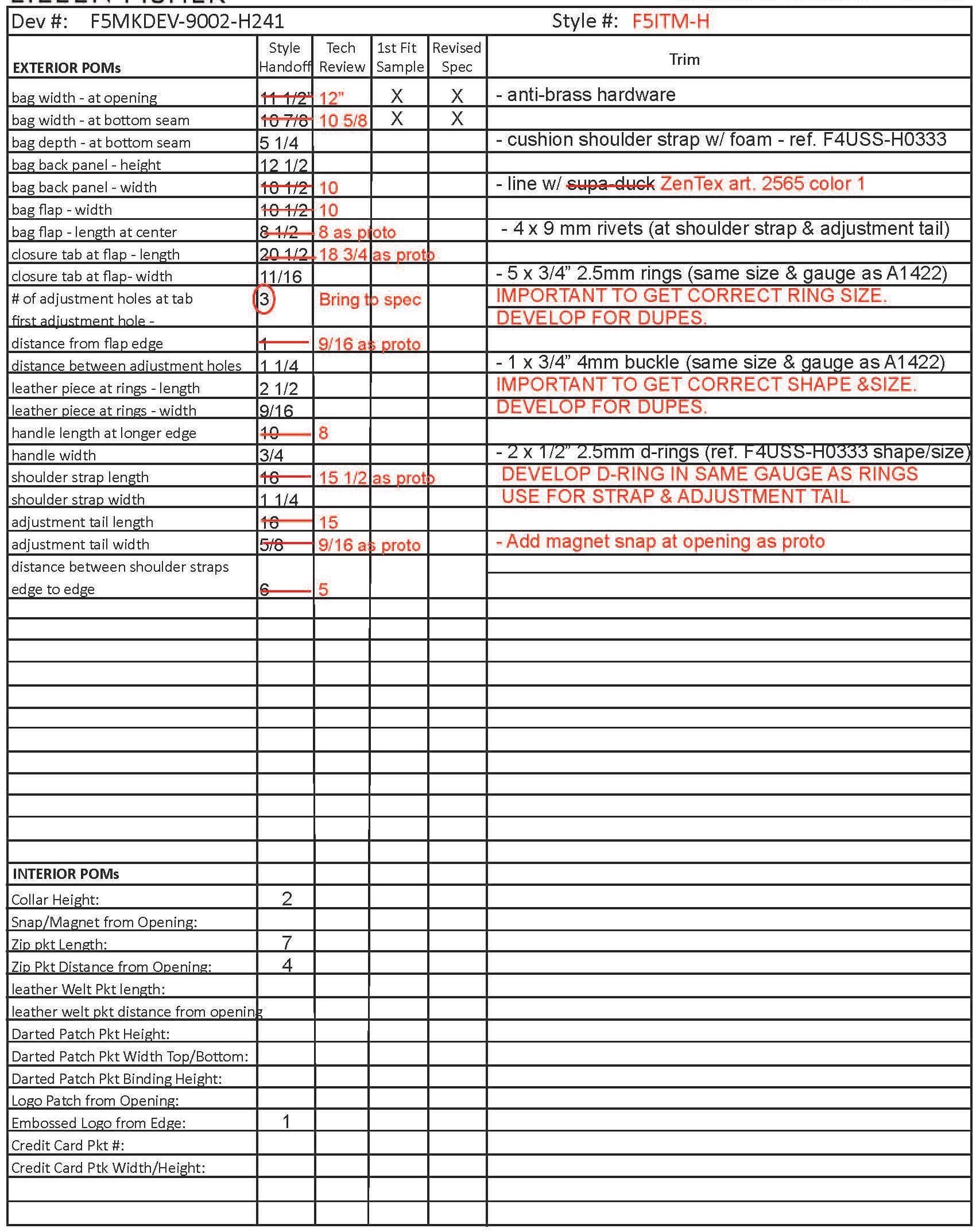
BRAND:
Eileen FisherYEAR:
Designed 2013, Produced Fall 2014
Contribution:
Line plan; leather, hardware and thread sourcing; color palette; product design; production tech approvals
Description:
The process of creating leather with plant tannins is thought to date back 3,000 years. Nowadays, it is much less common than industrialized chrometanned leathers because of the time, expense and expertise to make it.
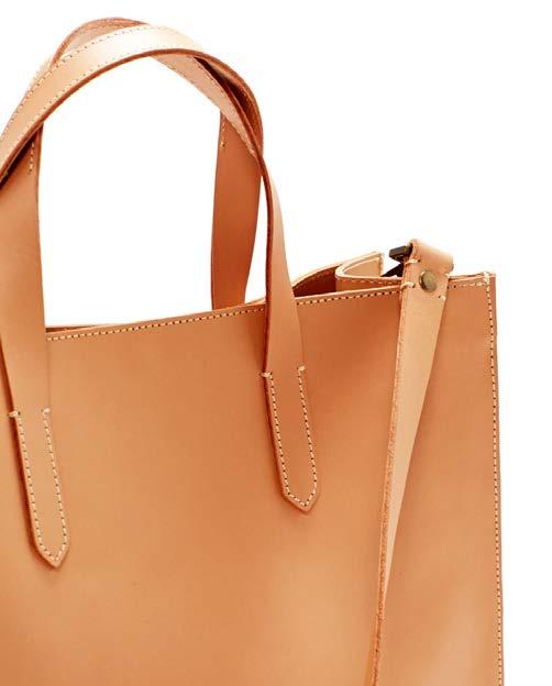
Material is the focus of my vachetta collection, avoiding distracting elements. I designed simple shapes with raw edges to enhance the natural mood, allowing the leather to take center stage as it develops a patina, pliability and unique character with use.
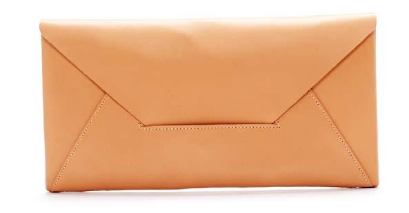

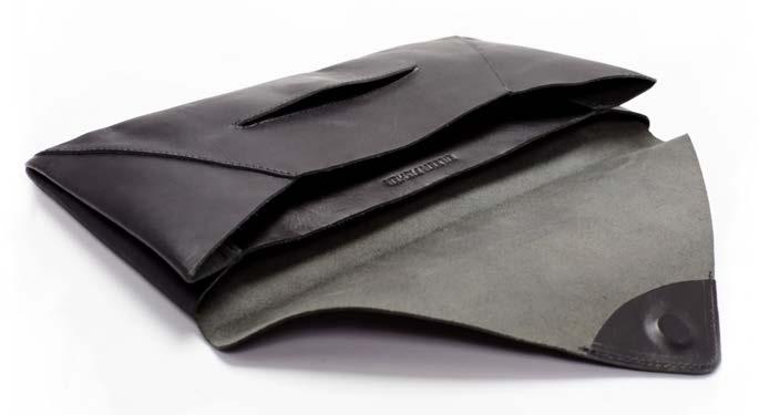
I added a magnet to the flap for security, but I didn’t want the hardware to detract from the clean lines and material. I worked through a few iterations so the magnet wouldn’t show through to the front, and did a wear test to be sure the closure wouldn’t come loose when the bag was full.
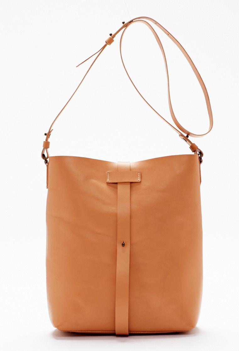
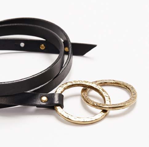
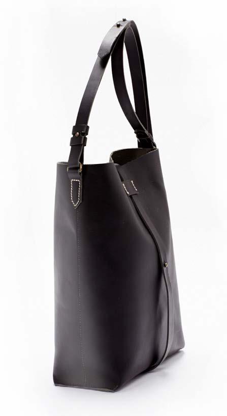
To highlight the heritage craftsmanship of this leather, I designed pressed brass rivets and thick handstitch details throughout. I developed these textured hardware rings to reflect the worn aesthetic that this leather will acquire.
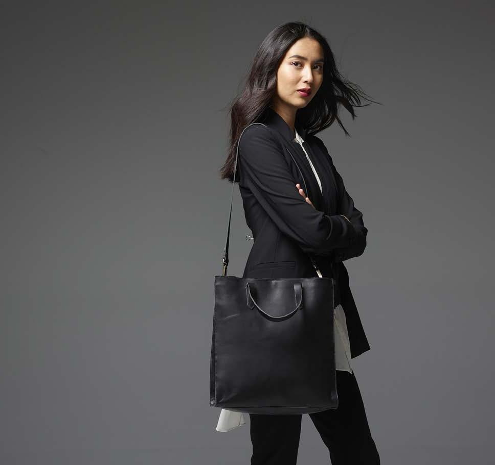
black color is derived from vegetable tannins, which occur naturally in plants and bark.
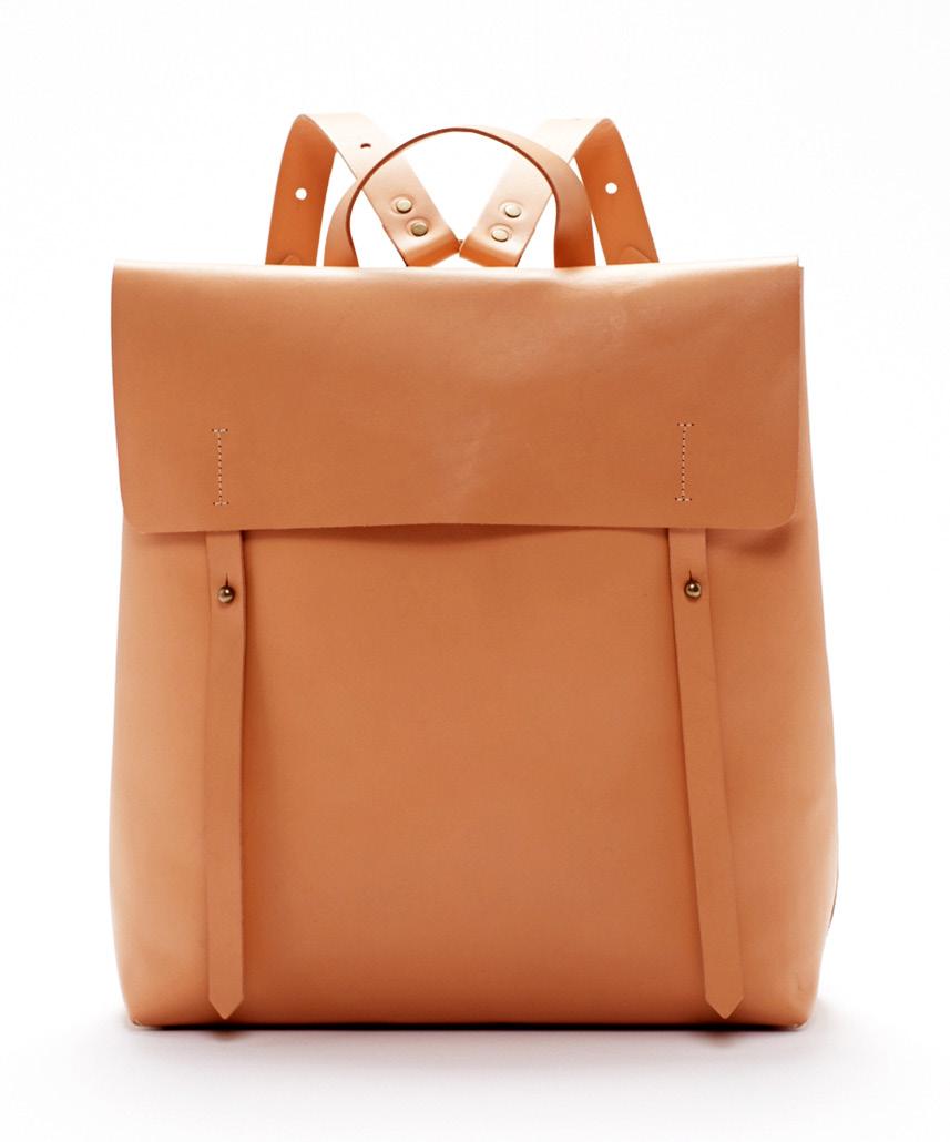
This classic undyed color will undergo the most changes from sun and use. The hue will darken over time, acquiring a coveted sheen and color depth.
BRAND:
Eileen FisherYEAR:
Designed 2015
Produced Spring 2016
Contribution:
Garment design, sketch, specs, fitting approval
Description:
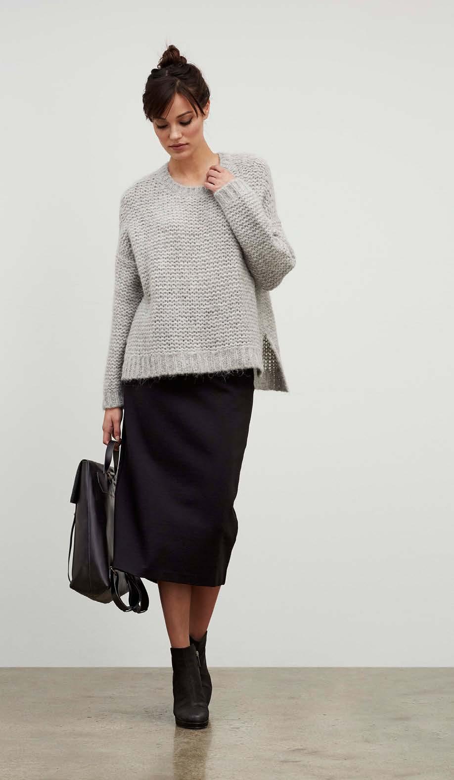
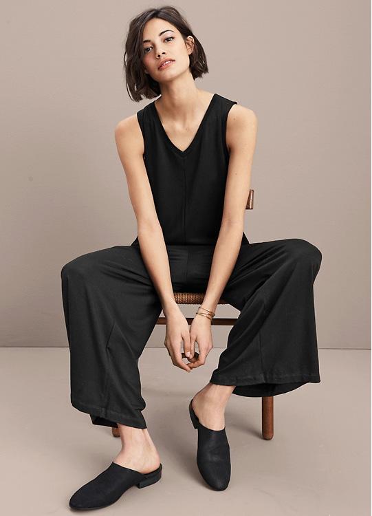
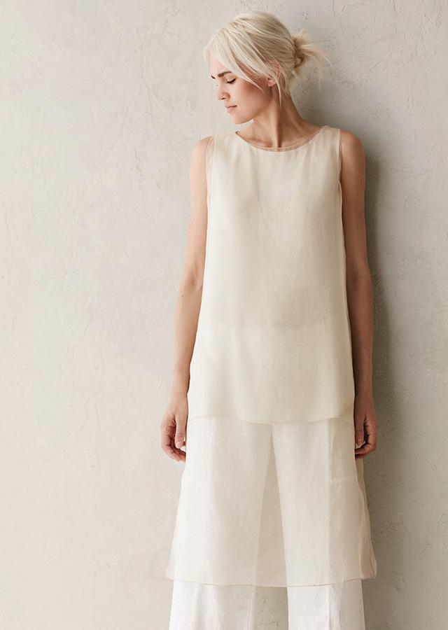
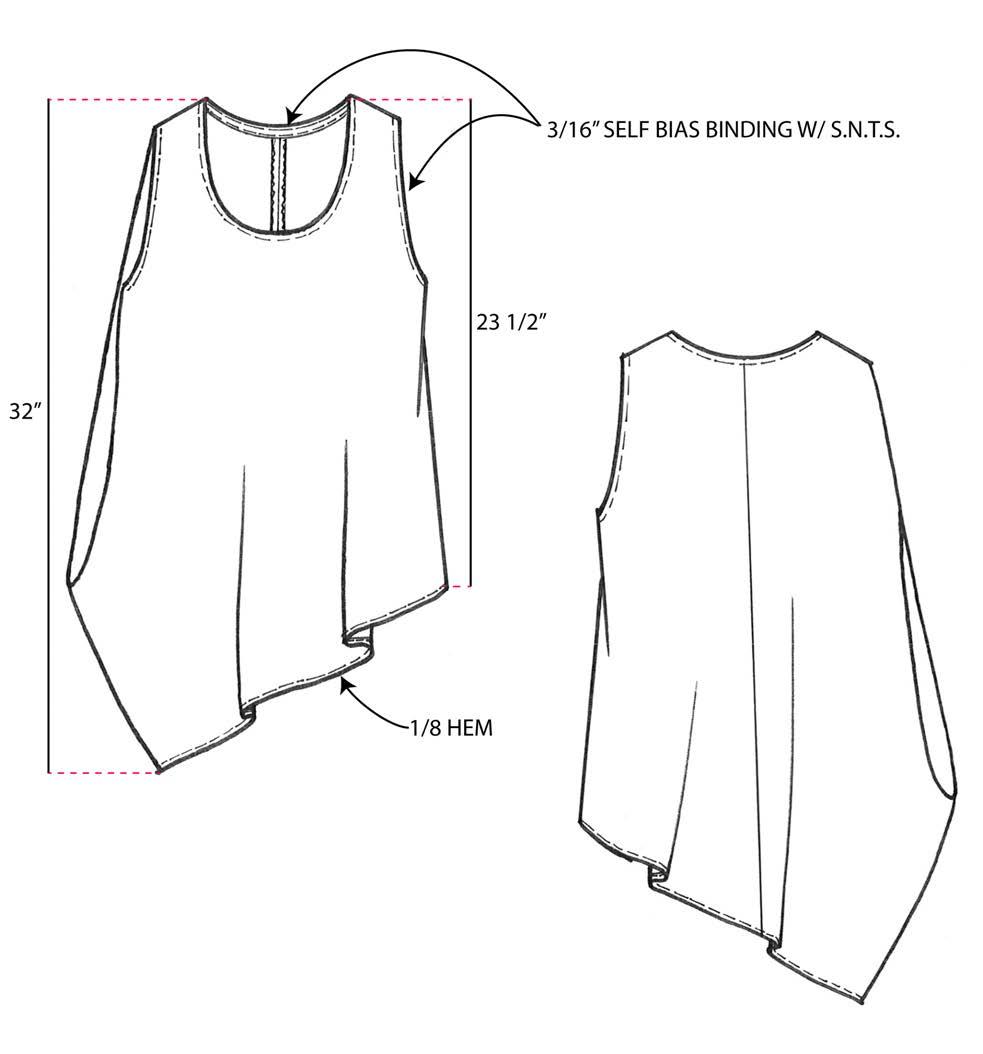
Eileen Fisher clothing is about loose shapes, modern minimalism, and luxurious materials.
Silk has exceptional drape, luster and ability to take rich color. It is the strongest natural fiber and has low density, creating light and comfortable fabric. It has resilient elasticity to maintain garment shape, and a smooth surface that resists dirt. Like linen, silk regulates temperature; it keeps you cool in warm weather, and provides insulating warmth in cool weather.
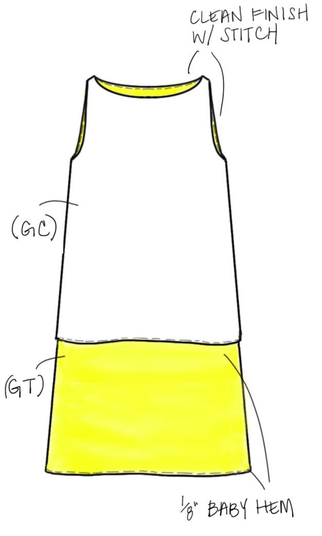
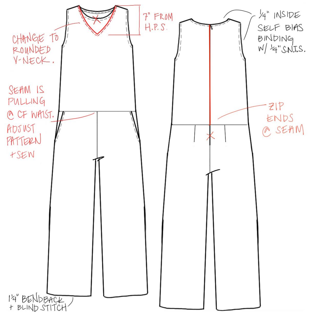
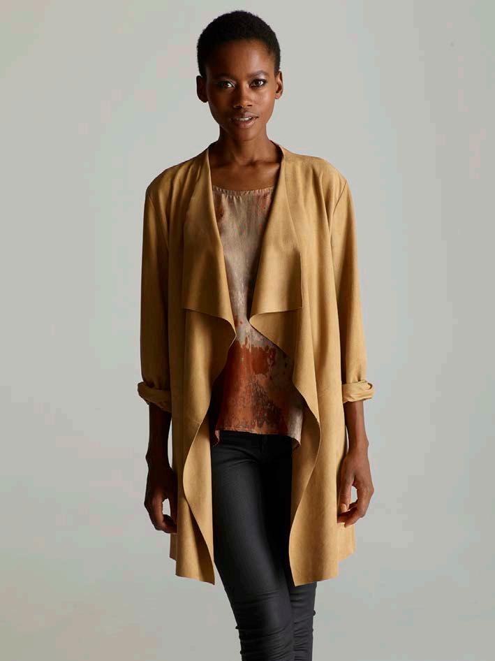
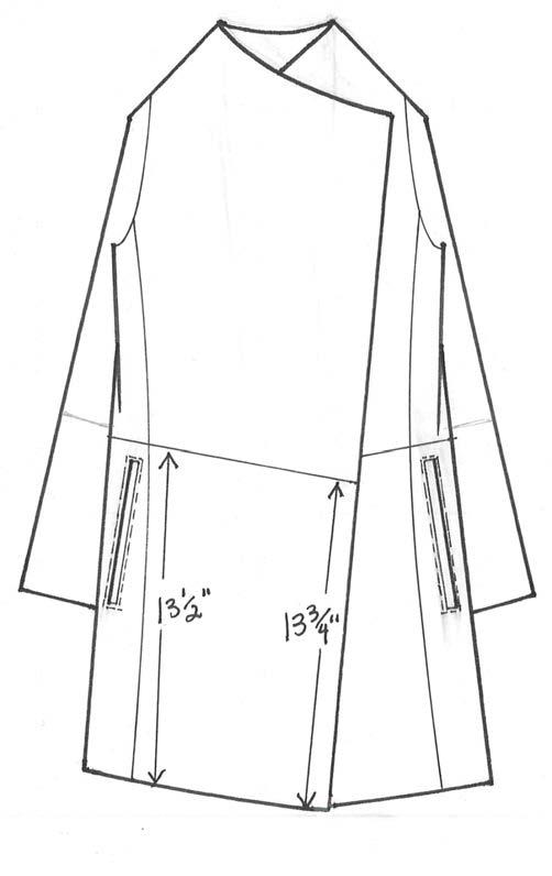
I’ve shown my sketch communication to factory beside the brand’s final garment photos.
BRAND:
Eileen FisherYEAR:
Wool/leather jacket designed 2012
Produced Winter 2013
Silk top designed 2013
Produced Spring 2014
Contribution:
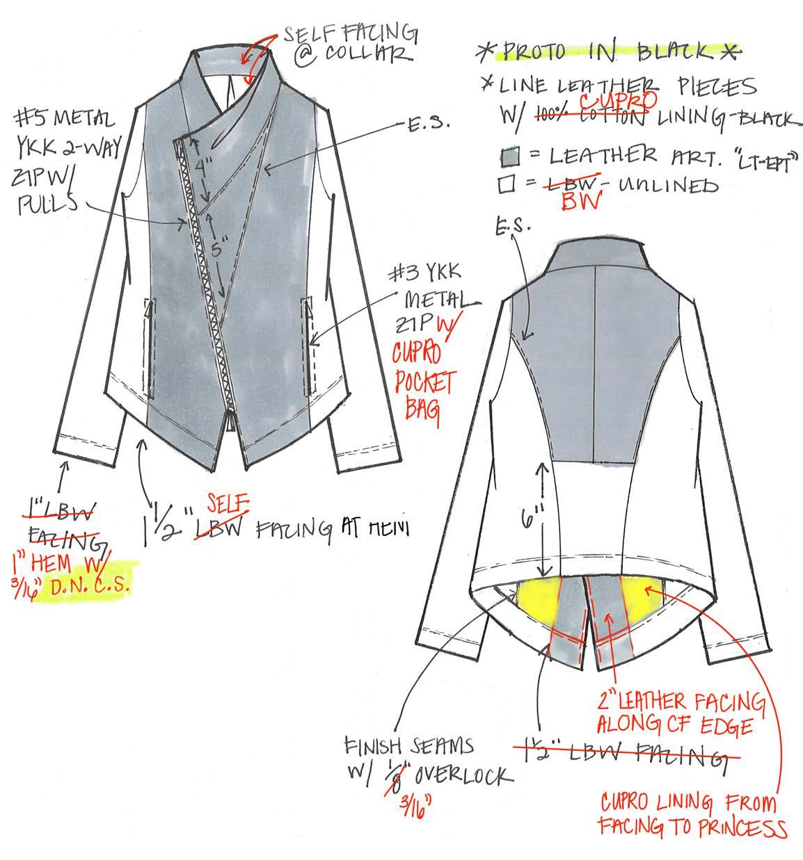
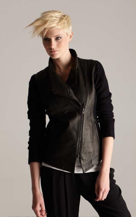
Leather sourcing, garment design, sketch, specs, fitting approval
Description:
In clothing, I generally prefer natural materials because of their performance attributes and the potential that some have for a sustainable lifecycle. Wool provides warmth by trapping heat in its crimped fibers, while simultaneously transporting moisture away from the body so skin stays dry. It is naturally antimicrobial, so it resists odor and rarely needs washing. Its exceptional durability promotes a long garment lifespan, and it can biodegrade when designed and disposed of thoughtfully.

YEAR: Designed 2012, Produced 2013
Contribution:
Garment design; technical sketch and specs; fitting approval
Description:
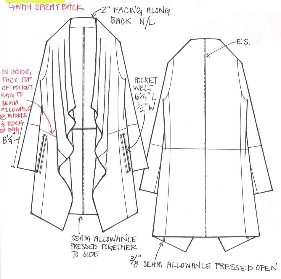
Goat suede is a soft leather that is split from the underside of the hide, creating a velvety napped finish. It is lightweight and flexible, making it a comfortable leather choice for apparel.
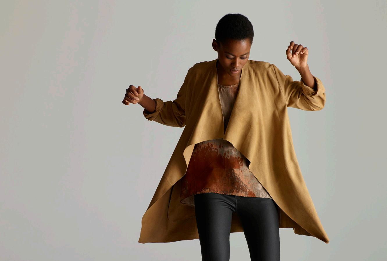 Cascade Jacket
BRAND: Eileen Fisher
BRAND: Mercado Global
YEAR:
Designed 2018, Produced Fall 2019
Contribution: Line plan, color palette, silhouette design, patternmaking instruction, fabric and surface design, photography art direction and styling, team leadership, technique training
Description:
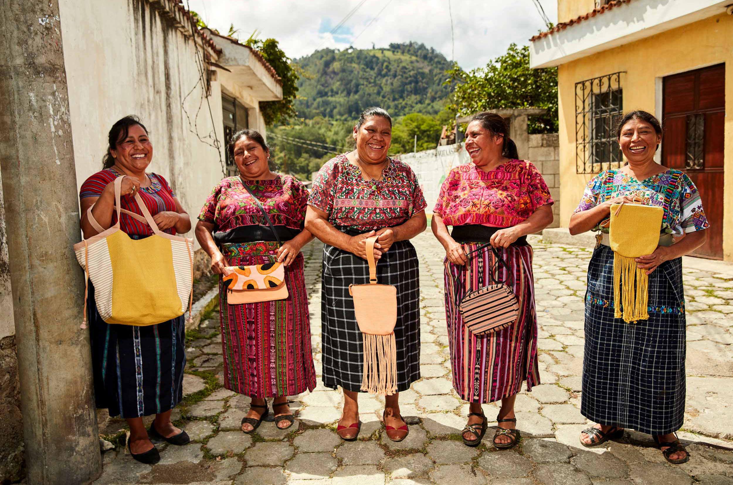
Mercado Global is an accessory brand and non-profit that creates international sales opportunity for rural, indigenous, Guatemalan weavers. The organization builds rural co-operatives of women in extreme poverty, and provides trainings in technical skills, financial management, women’s health and family nutrition.
In the dual-revenue model, donors fund the technical trainings and equipment loans, such as sewing machines and weaving looms, while product sales provide income-generating opportunity. In my role as Creative Director, I built and led the market access program, designing 15 collections and increasing work opportunity through acquiring volume orders at large international retailers.
I grew the brand through tiered priorities. First, I taught foundations, like patternmaking and handbag sewing construction, because product quality needed overhaul to gain sales traction. I set up organizational systems, like pattern labeling for illiterate staff. I taught the assistant designer how to make tech packs, which we created uniquely for artisans who typically hadn’t had the chance to go to school and learn to read either. I countersourced leather and hardware to adapt to changes in import law, establishing a relationship to piggyback off of a large factory’s orders because we didn’t have cashflow or projection capacity to meet minimums.
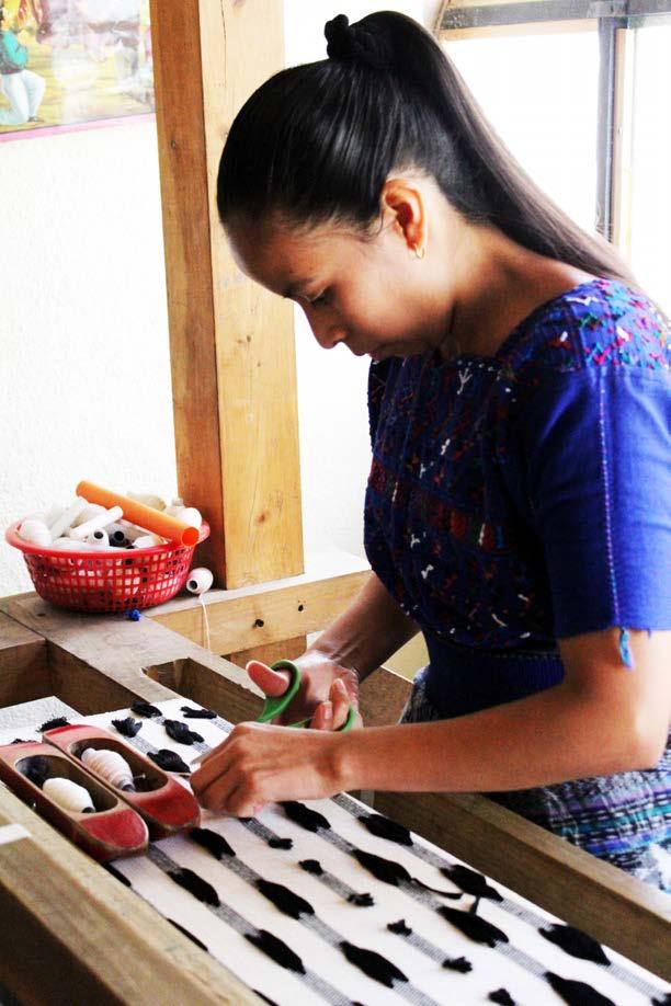
I also had a great learning curve myself: The local teams and artisans were incredibly patient as I spoke Spanish for the first time in a decade, helping me through their gracious teaching and lack of judgement. They taught me about footloom weaving too.
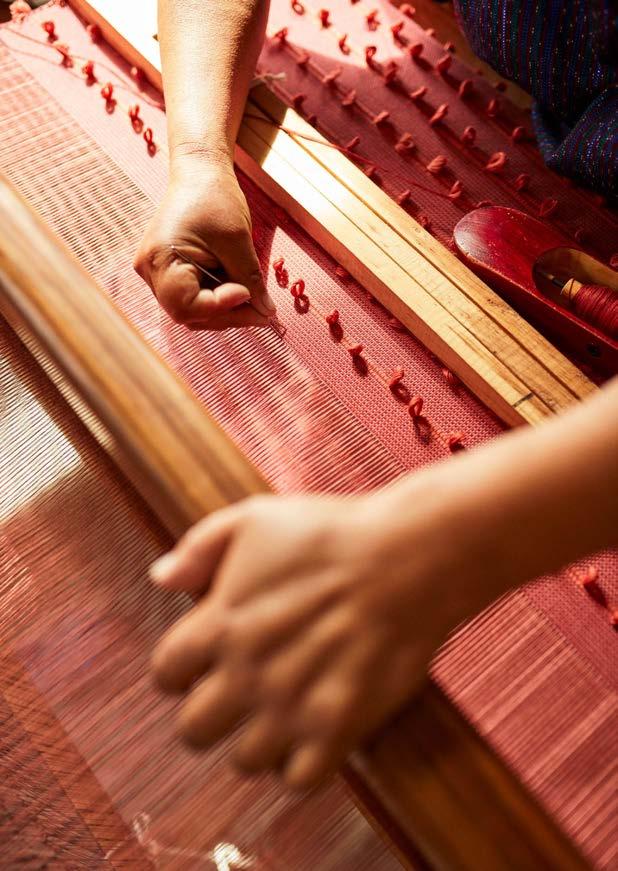
Eventually, I had learned enough about weaving to innovate. I designed fabrics that had higher perceived value and sales traction than traditional brocades, but were simultaneously easier to weave and much better for for margin. I did this to expand work opportunity to more women, using a train-the-trainer model to teach new fabric skills and provide leadership opportunity to expert artisans who could teach.
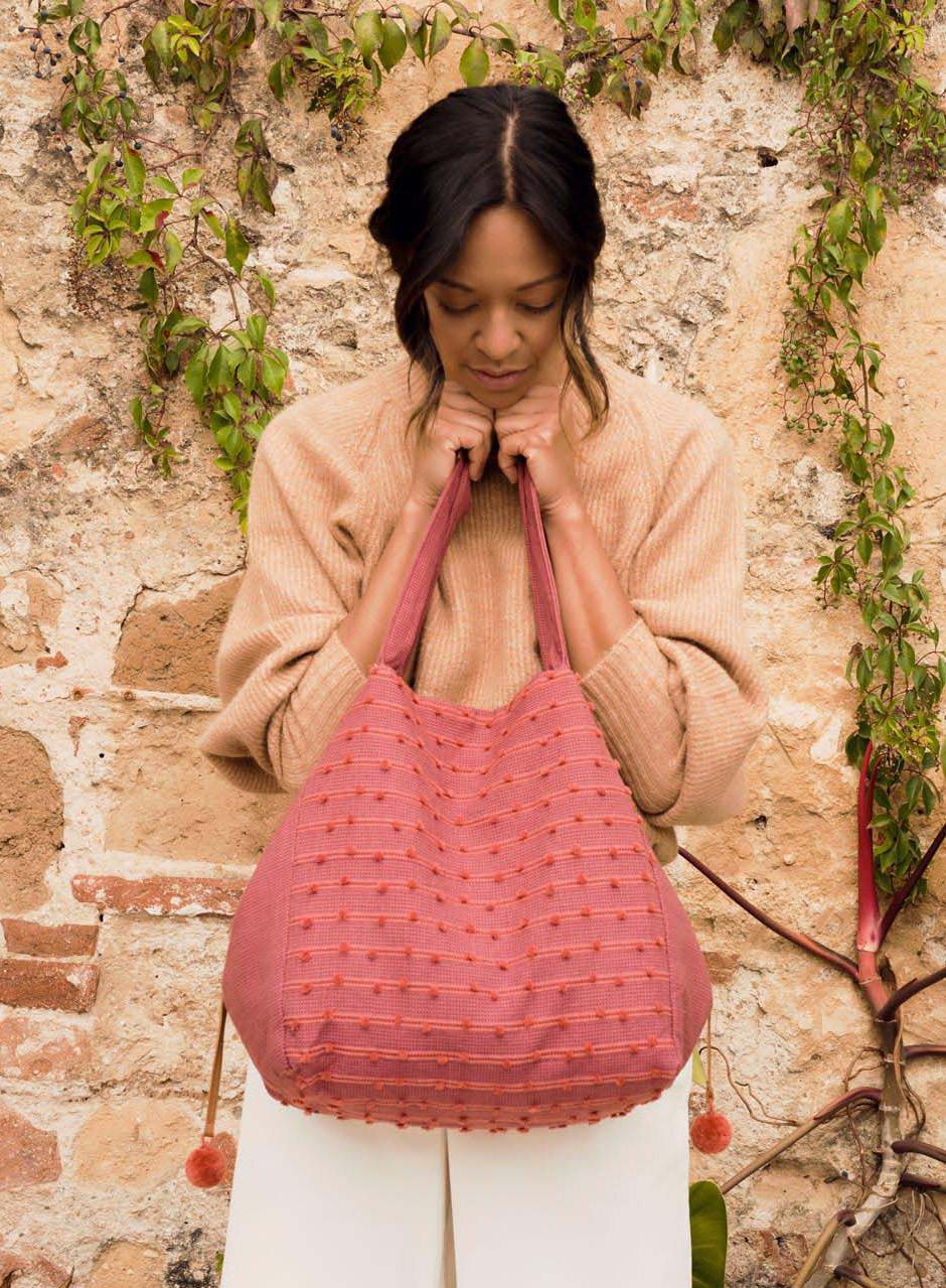
The following is my Fall 2019 collection for Mercado Global, with a mood inspired by the romantic ruins of Antigua, Guatemala.
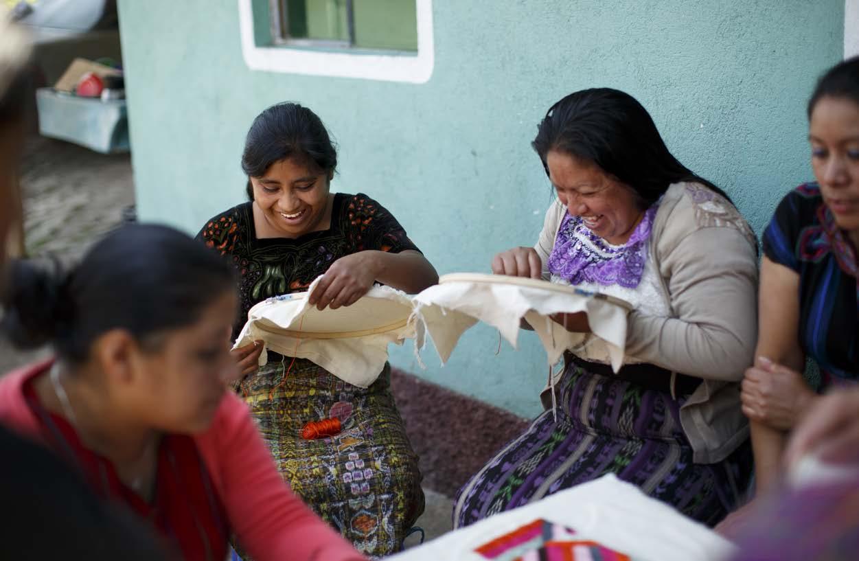


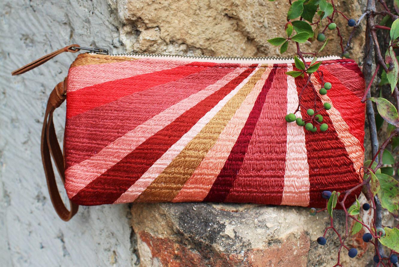
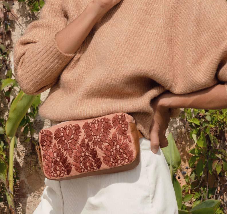
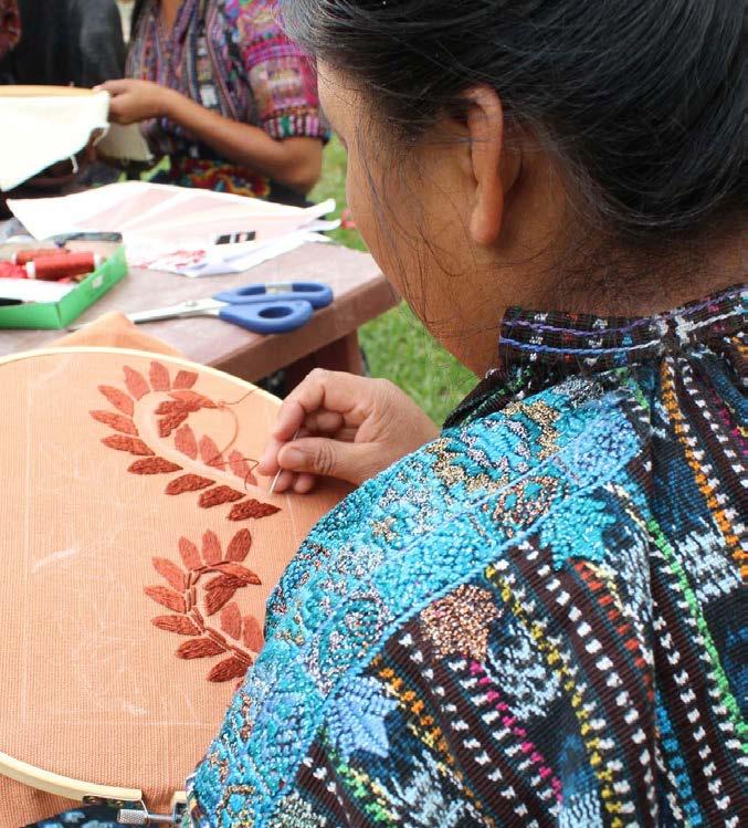
Many artisans were phenomenally skilled in intricate surface work, as seen on their huipil blouses, but they weren’t getting work because they weren’t as skilled in weaving and didn’t own floor looms. By incorporating embroidery and beading into this collection, I further expanded job opportunity.
My surface design at left was inspired by “Rainbow Mountain,” a majestic layered landscape I hiked in the highlands of Peru.

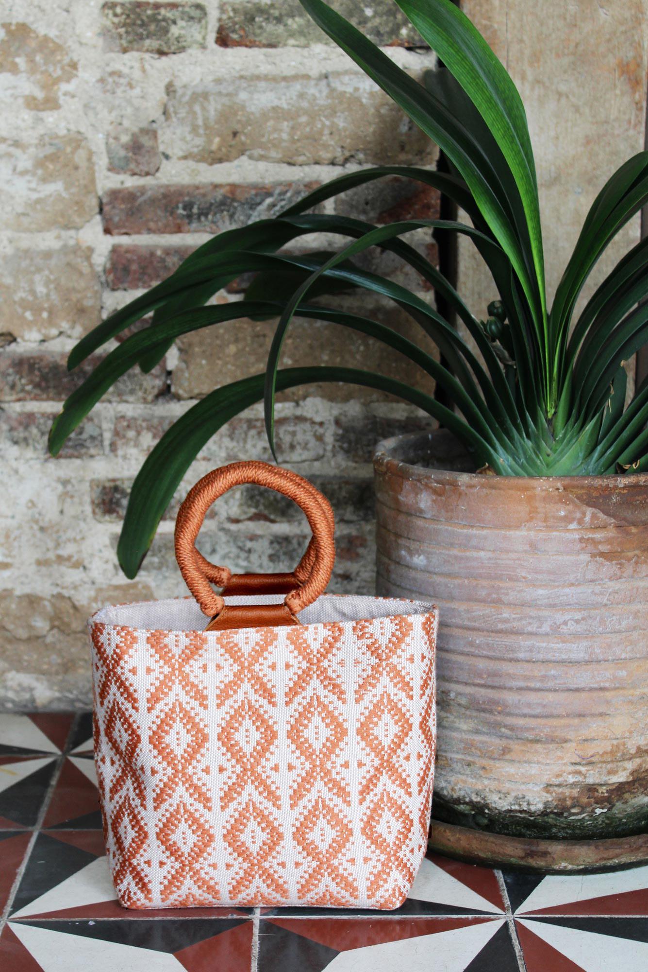
This tote also has a hidden long strap for function. I developed the coiled handle to showcase the handmade nature of the product. When merchandising the collection as a whole, the handle connects back to the circular handles and twisted cotton fringe.
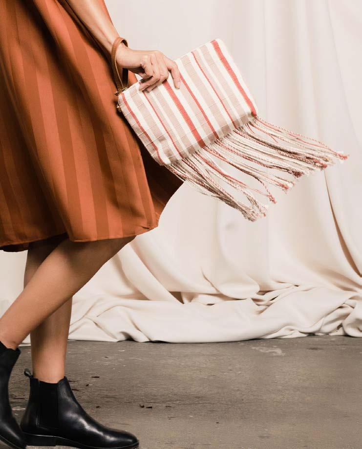
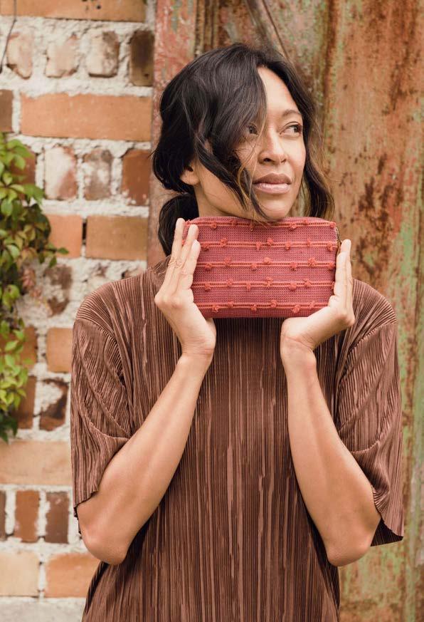
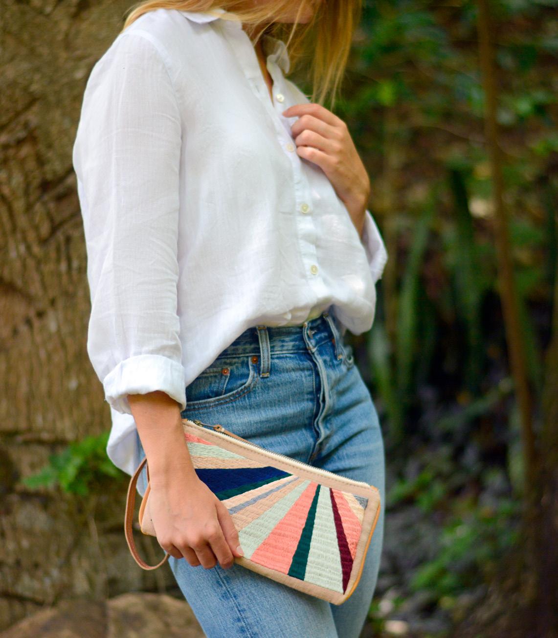
This clutch is zero-waste. I made a pattern to fit 3 pieces across the fabric width, and designed open thread into the fabric yardage repeat so it could later be twisted into fringe.
Thinking about how mock-french seams are constructed, I tried the same theory to flip the fringe to the outside after the seam was sewn. It worked, creating a clean finish and sturdy seam above the playful twisted fringe.
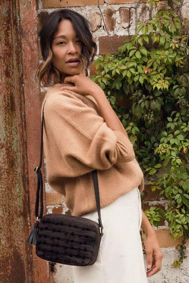
With the circular handle dominating 2019 trend, I designed this unique version using only the cotton available in rural Guatemala supply chain. A chunky twist of yarn is coiled around a thicker braid, making this cushioned yet structured statement handle.
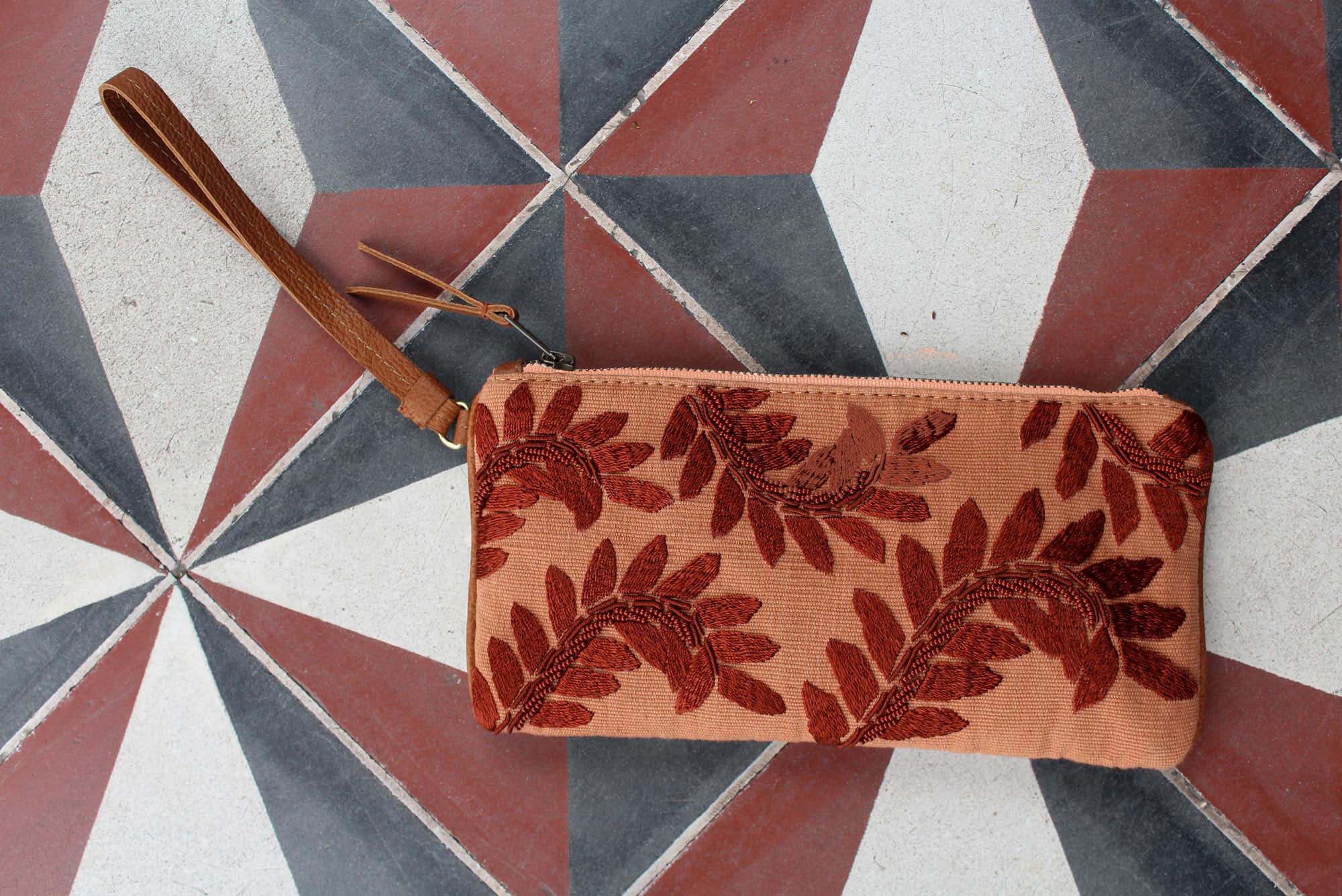
I introduced surface design in this collection to create employment for artisans who aren’t skilled in weaving, but have other exceptional handcraft skills, like the embroidery and beading above.
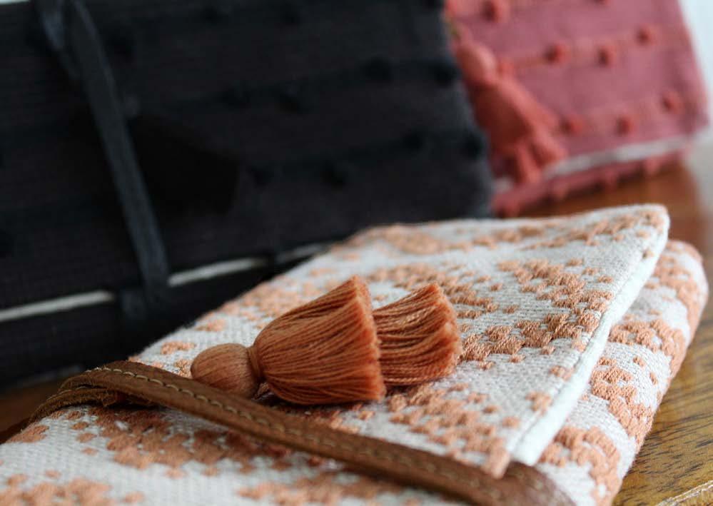
All fabrics at Mercado Global are original and handwoven, including this brocade. I directed closeups for marketing photography so buyers could see that the fabrics are more special than a print.
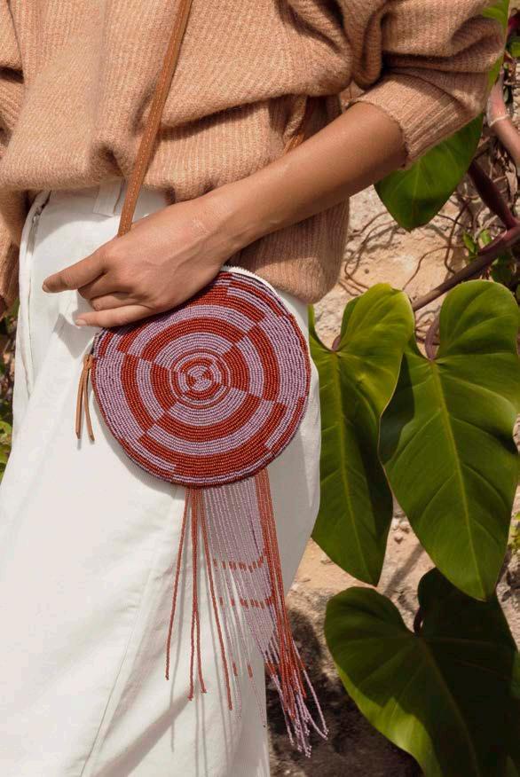
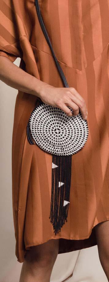
I designed this beaded amulet bag to meet the sale opportunity for trendy circular shape as well as to entice people into the brand in brick and mortar space. The beads invite an innate human desire for tactile pleasure and movement.
BRAND:
Mercado Global x Pamela Love
YEAR:
Designed 2015, Produced 2016
Contribution:
Leather sourcing; knot and tassel design; teaching artisans how to skive leather
Description:
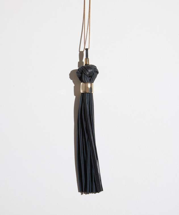
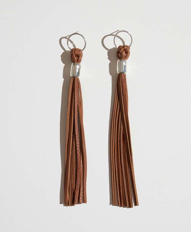
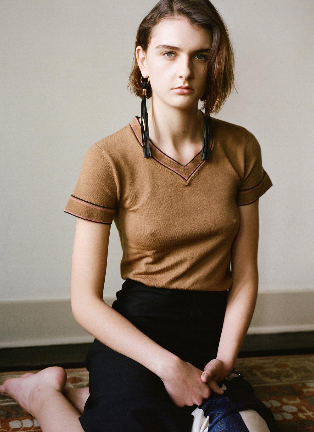
In this collaboration, Pamela Love designed the brass and sterling silver components and I developed the leather knots and tassels produced by Mercado Global artisans. I designed them to be delicate enough for jewelry aesthetic, but not so thin that the leather would fray and break during the handcraft or wear.

BRAND:
Designed 2018, Produced Spring 2019
Contribution:
Color palette, inspiration photography, collection line plan and silhouette design, patternmaking instruction, fabric and surface design, lifestyle photography art direction
Description:
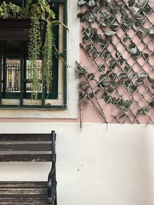
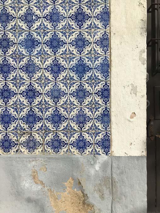
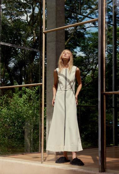
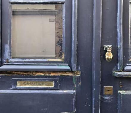
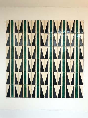
In early 2018, I began a two-year journey as a digital nomad while working remotely full-time. I spent two months in Portugal, where the building colors and tiles are a feast for the eyes.
Lisbon’s buildings influenced my seasonal color palette and fabric designs, as shown through my photos at the right and fabric designs on the following pages.

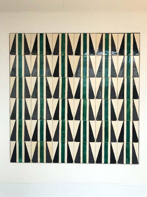

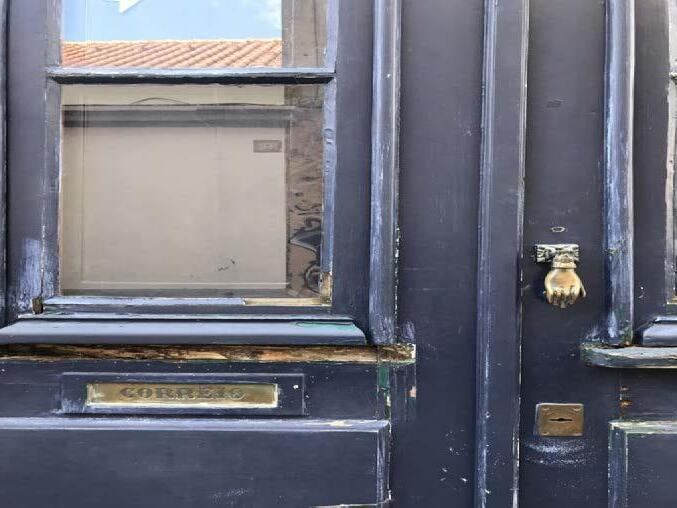

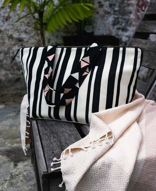

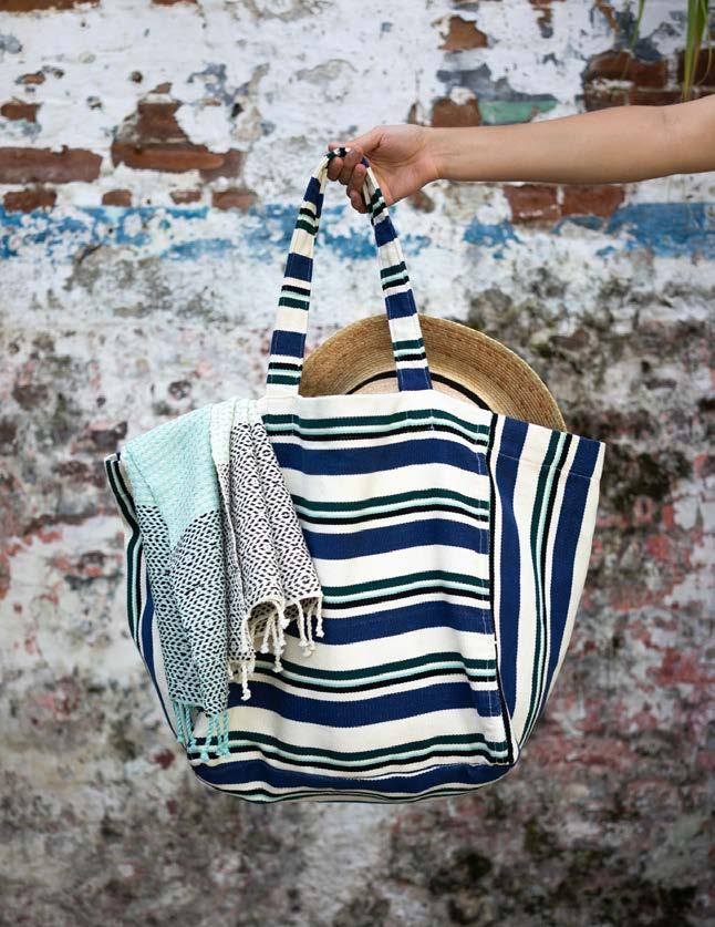
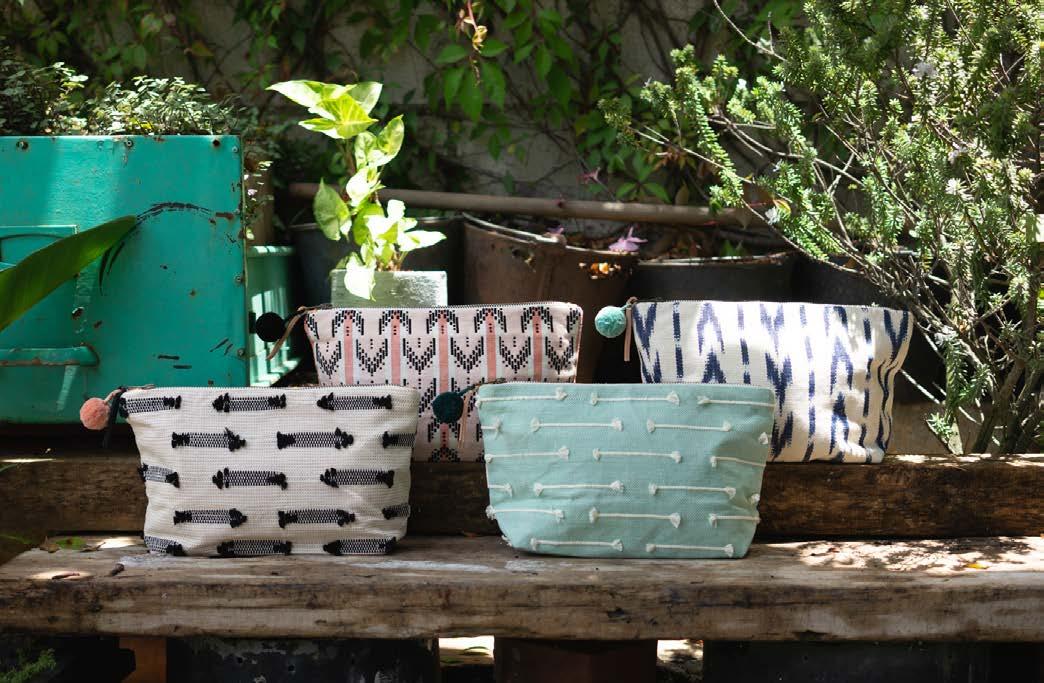
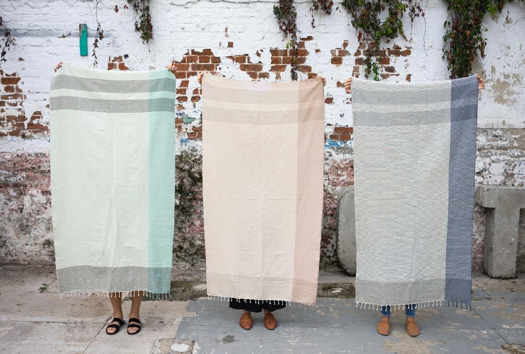
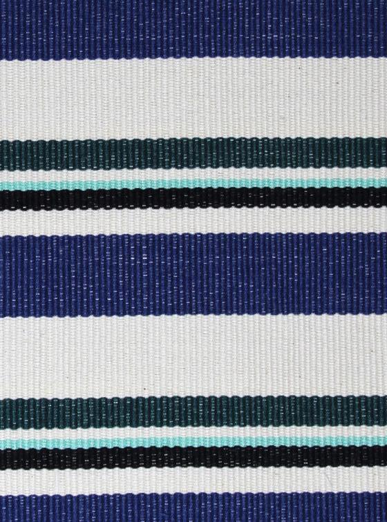
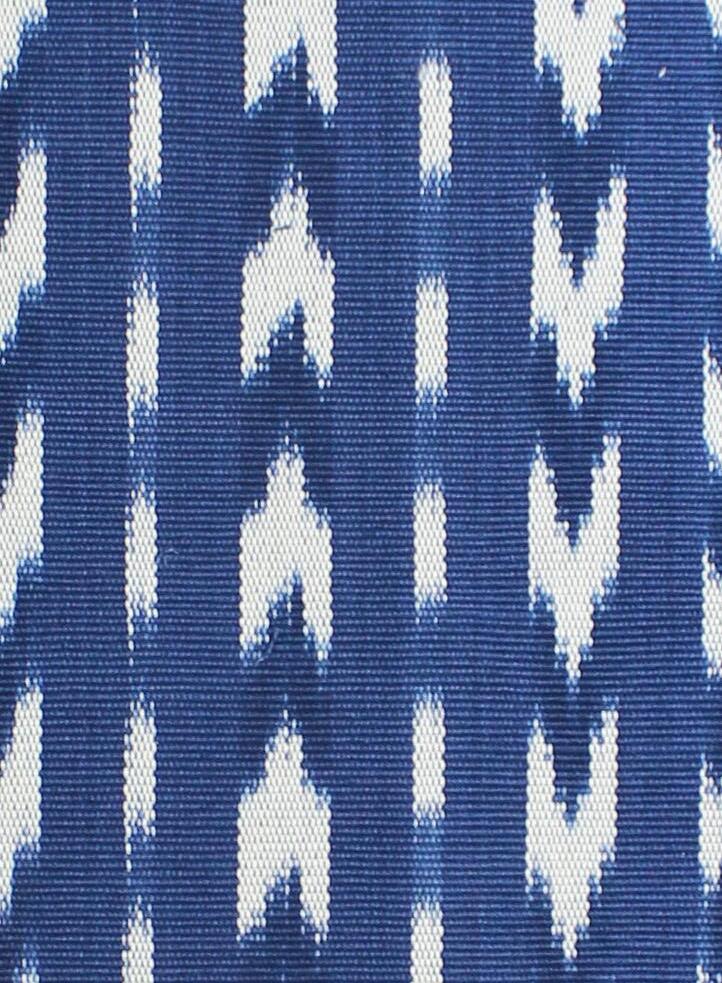
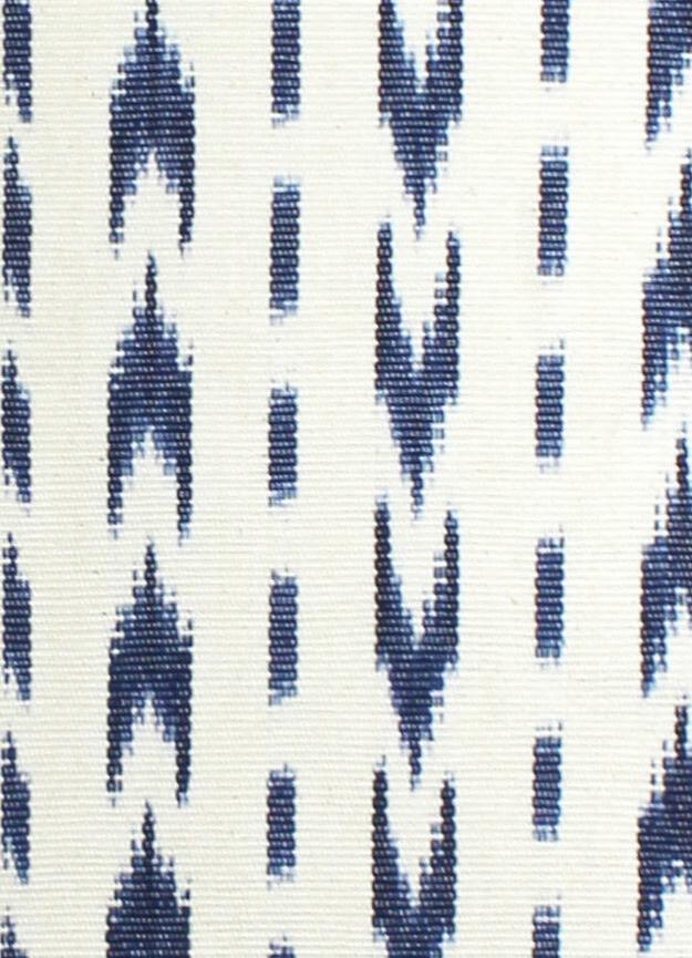
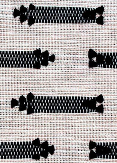
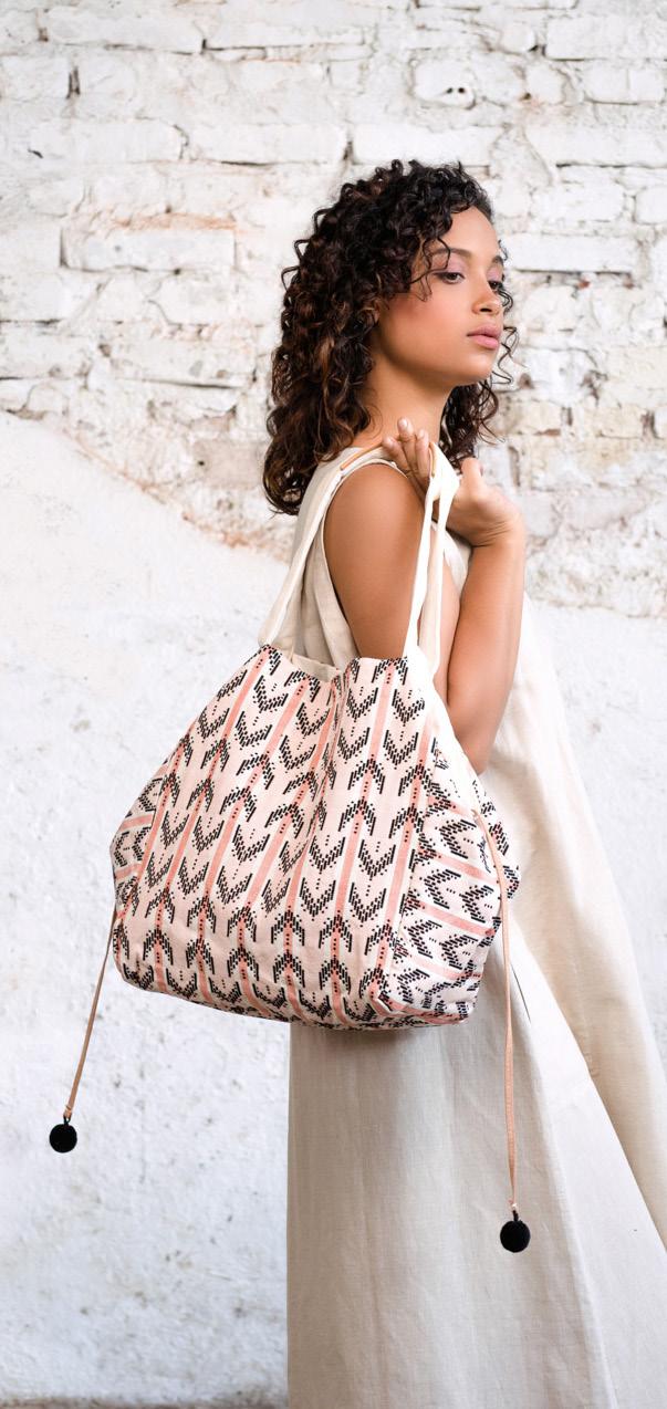
These are the fabrics and some of the accessories I designed for my Lisbon-inspired collection.



MercadoGlobal SS19
PlanilladeTejido-WeadingDraft
Código:FSS19-106
Fecha:06.22.18

Urdida:NaturalJR401,PapayaJR041,AdobeJR072
(Upper left) My photos of Lisbon inspired the palette and motifs on my Blushing Arrows fabric design. (Lower left) Weaving draft for sampling (Right) Finished fabric
Medidasparalaspuntadasdebrocado
1/8”-1ladepuntadas
1/4”-2lasdepuntadas
3/8”-3lasdepuntadas
1/2”-4lasdepuntadas
5/8”-5lasdepuntadas
3/4”-6lasdepuntadas
7/8”-7lasdepuntadas
1”-8lasdepuntadas
Contribution:
Description:
I did a brand positioning for this dual-revenue non-profit and accessory brand. Throughout the process, I connected with the fundraising director and sales manager so I could hear their department needs before I created brand guidelines. I also led a new website build without budget or extra staff. I directed the website content and art, and my dedicated graphic designer implemented the site build.
The brand style guide was the first for the organization. My goal was to create consistent and effective messaging across all teams, especially with the high turnover rate of international staff based in rural Guatemala. I’ve included two pages of my style guide here. The rest of my rebrand and style guide included the following:
• (revised) brand statement
• (revised) logo and logo use
• (new) color palette
• (new) voice
• (new) written storytelling
• (new) visual storytelling and instagram grid
• (revised) font and font use
• (new) e-blast format
• (new) community photography art direction
• (revised) hangtags
• (revised) business cards
• (revised) letterhead
• (new) email signature
Brand voice is the consistent word choice and prose style used to convey brand personality and to connect with audience.
We position our voice so that readers will engage in our community, respond to calls of action, and feel inspired to act as brand ambassadors.
While the voice is consistent across the organization, the tone will vary depending on content, formality and audience. For example, an annual appeal or annual report will have a more serious tone and an event or sales e-blast will have a more casual tone.
The Mercado Global voice is accessible, approachable, reliable, honest, warm, thoughtful and helpful.
Through this brand personality, we foster connection between the consumers, the donors and the artisan.
Our voice is:
Informative but not didactic
Intelligent but not academic
Confident but not arrogant
Strong but not forceful
Feminine but not girlish
Inspiring but not preaching
Encouraging but not pestering
Uplifting but not bubbly
Personable but not chummy
Relatable but not sugarcoated
Compassionate but not pitying Brand Voice & Copy Style
Focus your message, leading with the most important information. Use paragraphs and sections to organize content so that it is easy to digest.
Give readers an assist. Some people will read marketing content word for word, while others will skim. Help them by using descriptive headers and subheaders, and grouping related ideas together.
Be concise. Avoid unnecessary modifers.
Be optimistic and friendly, but not overly enthusiastic or juvenile. Avoid excessive superlatives and exclamation points in order to portray poise, dignity and aptitude.
Shorter sentences are more persuasive. When used with longer sentences or paragraphs, they create impact.
Calls to action (CTA) must also match brand voice, even though the tone is a bit more direct and assertive. This is so that we maintain our personality while also guiding a specific action to fulfill a specific need.
Contractions are okay in sales and event marketing. Words like “we’re” and “it’s” show that our brand personality is friendly, relatable and approachable.
We never use abbreviations, except for commonplace words like “info” instead of “information”.
We write out numbers in a sentence. For example, it is “five artisans who are experts in ikat”, not “5 artisans…”.
Using our brand voice as our style , we apply it to our storytelling content
We weave together stories that show the depth of our product and how it can transform both the artisans’ lives and our consumers’ lives.
Our purposeful storytelling is cohesive across our website, social media, newsletters, eblasts and collection copy. We deploy images to support our storytelling and voice. Direction for image use can be found in the photography section of this style guide.
Copy that communicates a tangible impact is more influential than ambiguous impact. Tell how many hours of school the income could provide, how many children were fed, etc.
When highlighting stories about our process, such as on a brand postcard or website, they must relate to impact. Do not say “This bag took ten pounds of yarn and thirty hours to make,” because it doesn’t tell the reader anything useful. There is no context to know how long it takes to make conventional bags or why that is important informatoin. Instead, say “The thirty hours of work to make one bag provides a mother income to send three children to school for one month.”
Our storytelling themes include:
Personable stories of individual artisans and how their participation in Mercado Global had an impact in their lives and their families’ lives
Information about the challenges faced by indigenous Guatemalan women and children
Our holistic model – what we’re doing to create a solution and opportunity
How our greater community can participate in the solution
The people and process behind our product
How handmade processes and techniques mean quality
How customers can envision products in their own lifestyle
Remember to also include the audience in our storytelling. The consumers and donors are agents of change to make our model work. Empower the consumer and donor just like we empower the artisan. We do this by showing how they can participate. Engage audiences who want to contribute to women’s equality and are looking for a way. Inform and enable the consumer who wants to learn how to buy more ethically.
We also connect to consumers by showing how they can use the products in their lives and how they can relate to our brand, because it’s hard for many people in our audience to connect to this extreme level of poverty or part of the world they have not experienced first hand. We are not hiding the challenges our artisans face, but instead we are creating means of connection and relatability between the women who wear the product and the women who weave it.
It’s important to know that most consumers buy product because they like its style and function more than because its ethical. Ethics alone does not drive sales. Without sales, we our mission doesn’t work. Therefore, we strive to show fashion, function, craftsmanship and aspirational style in addition to ethics. Show the high quality and thoughtful design of our product by communicating stories of people and process. Speak to the care and detail involved in handmade goods, which conveys the high quality and special nature of our products.
meg.koglin@gmail.com
646.385.2183
www.megkoglin.com