EXPLORE THE INTERSECTION
m.s.aad Degree book
Master of Science May 2023
Mengyao Lin
@ 2023
Mengyao Lin Copyright
This book investigates and explores architectural thinking and interdisciplinary approaches to device design, graphic design, and building technologies, highlighting the importance of interdisciplinary approaches in creating an innovative and productive world, and identify the new role of architect in logos, pathos, and ethos.
The first chapter discusses the designs in organ scales, facing the most pressing fatigue issues that caused car accidents. With EEG technologies, the new device aims to help truck drivers have safer rides. In this project, what I, as an architect have seen through is the revision of the human body as a delicate working machine, and dig into muscles and brain waves to do the design, and work towards a better life.
Then the book explores the role of architect in the scale of logo design, where it fundamentally shares similar design strategies, like parti. Along with the class Visual Ideology class and Business as Second Language, designing a logo contains both the graphic, social, and economical meaning. Architectural projects are always deep, thorough and comprehensive in multiple meanings. Likewise, logos are also like this, where each detail matters even more.
Finally, the conclusion reflects on the value of engineering techniques in creating meaningful and sustainable designs. It highlights the skills and knowledge gained through the Master of Science in Advanced Architectural Design program and how these can be applied to future projects and collaborations. One project explores the reuse of scaffoldding as the structure, and the other project explores the 3d printing technique efficiencies in printing concrete houses.
Overall, this book aims to provide an interdisciplinary exploration of the possibility of an architect, and how the architectural design logic could be applied to different scales, showcasing the benefits of interdisciplinary design and inspiring future generations of designers to think beyond traditional disciplinary boundaries.
Abstract
eXLORING THE INTERSECTION
Architecture is a discipline that involves the creation of physical spaces that meet the functional and aesthetic needs of society. It is a system of representations that are used both academically and professionally. In academic settings, architects use conceptual diagrams, drawings, renderings, and other visual aids to present their design ideas to critics and peers. This approach provides architects with the freedom to explore their creativity and present their ideas in a visually compelling manner. On the other hand, in professional settings, architects rely on rigorous visual communication with colleagues and contractors to discuss the feasibility and practicality of their designs. In this context, every brush stroke represents a measure that will impact the users of the building. Architects have the ultimate responsibility for the drawings up to a 0.1mm scale, requiring them to train their eyes to precisely and quickly illustrate visual representations.
What contributed to my academic works in Cornell is from a learning of historical evolution of building aesthetics and techniques to the modern technologies. The study of architecture involves the exploration of the historical and theoretical frameworks that have informed the design of buildings throughout history. From ancient civilizations to modern-day construction techniques, architecture has always been a reflection of the social, cultural, and economic context in which it was created. Architecture is a discipline that has evolved over time and has been influenced by many factors, including advances in technology, changes in social norms, and shifts in aesthetic preferences.
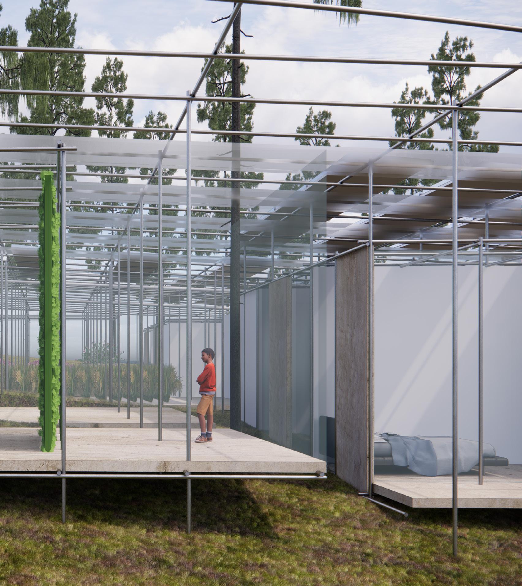
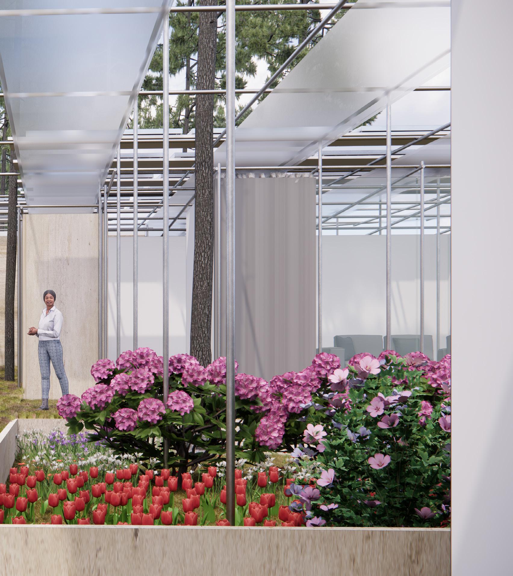
The two studio works reflect the changing trends in architecture. The first project focuses on the circular economy, which is an emerging concept that seeks to create a sustainable and regenerative economy. The project explores the possible relationship between infrastructure materials and affordable residential buildings, highlighting the importance of using sustainable materials and construction techniques to create buildings that are environmentally friendly and socially responsible. One of the key principles of the circular economy is the design for longevity and durability. In the context of sustainable housing design, this principle means that buildings should be designed to last for a long time and be adaptable to changing needs. By designing buildings that can be easily modified or adapted, we can reduce the need for new construction and extend the life of existing structures. In my exploration of the circular economy and sustainable housing design, I have found that modular design and the use of reused scaffolding can be effective strategies for creating durable and adaptable housing structures. By using modular design, we can create flexible and adaptable housing units that can be easily reconfigured to meet the changing needs of the occupants. Additionally, the use of reused scaffolding can significantly reduce the environmental impact of construction and save costs by eliminating the need for new building materials.
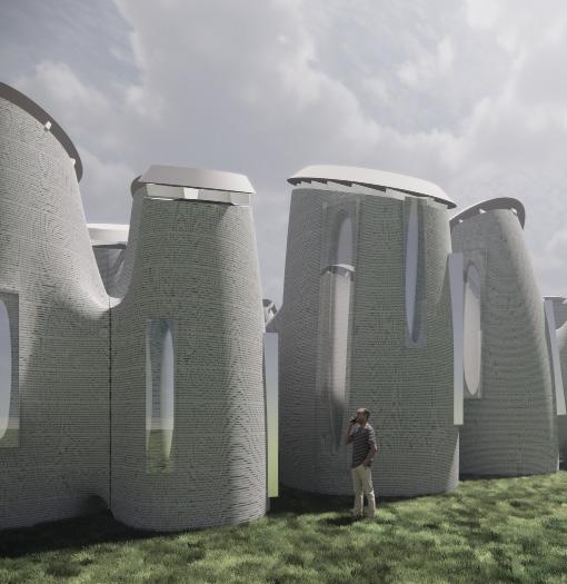
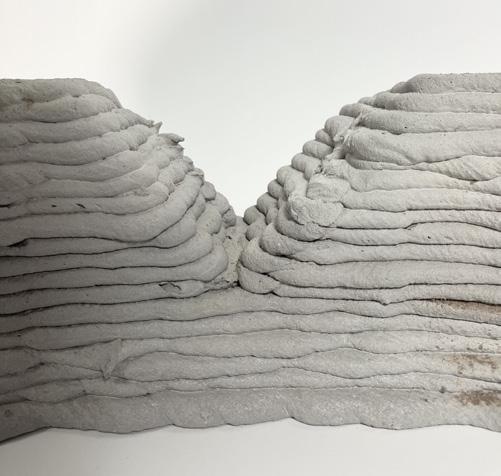
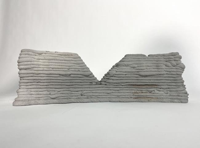
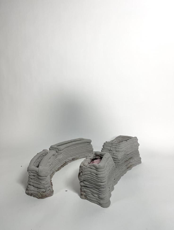
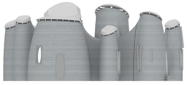
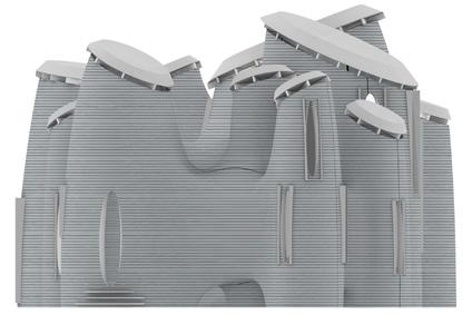
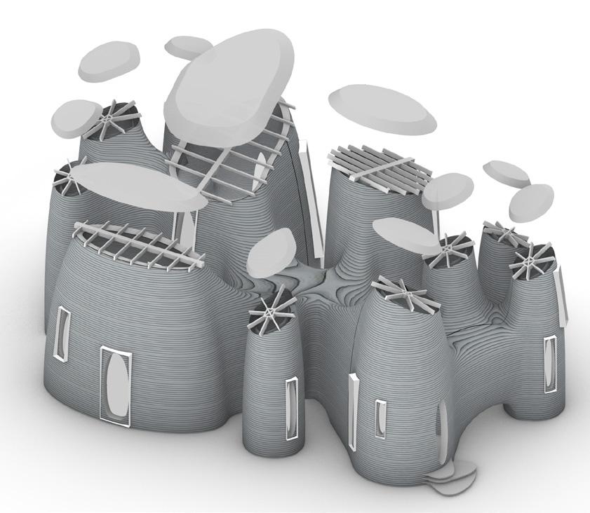
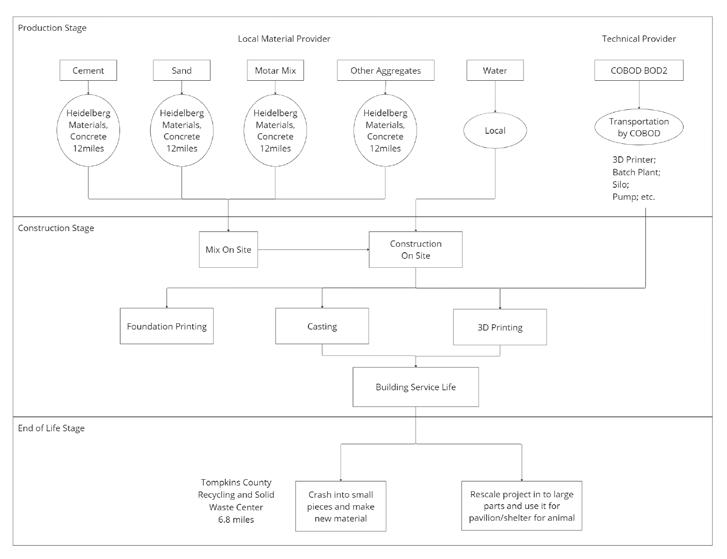
The second studio project focuses on the relationship between printing machines and human activities. This project explores the use of 3D concrete printing techniques to create buildings that are efficient and functional. The project highlights the importance of using technology to create buildings that meet the needs of society while also being environmentally sustainable. In my exploration of the circular economy and sustainable housing design, I have found that the use of 3D concrete printing technology can be an effective strategy for creating sustainable and efficient housing structures. By using 3D printing, we can create structures that are highly efficient in their use of materials, reducing waste and minimizing environmental impact, which also allows for the creation of highly complex and intricate structures that would be difficult or impossible to build using traditional construction methods. This opens up new possibilities for sustainable housing design, enabling designers to create structures that are not only efficient but also aesthetically pleasing.
Another advantage of 3D concrete printing technology is that it allows for the creation of highly efficient structures that use minimal material and generate minimal waste. The precision of the printing process means that the concrete is deposited only where it is needed, reducing the amount of excess material and minimizing waste. Additionally, 3D concrete printing can significantly reduce the time and cost of construction, making it an attractive solution for creating affordable and sustainable housing structures.
Beyond designing buildings, architecture is the name of the process of formulating ideas that solve actual problems. Grateful for the Cornell classes selection policy, I have the eligibility to select classes from a wide range of subjects from Human Ecology to Business Schools. It is such uniqueness of M.S.AAD that allows me to test the design ability as an architect in all the fields I am interested in. From a small head device design to the product design and logo design for a start-up company, I am fed with knowledge that is out of my comfort zone that I couldn’t be more appreciative of. And this Degree book will examine in two parts: my architectural studio works and my outof-field design approaches, which summarize my academic probation before stepping into a junior architect position.
In the School of Human Ecology’s course “Ambient Environment”, taught by Professor Kalantari, a previous architect, it emphasizes the idea that architects are trained to think creatively and to develop solutions that meet the functional and aesthetic needs of society. Our team chose to focus on the environment in cars, where fatigue may occur to cause unpreventable accidents. This device design contains several key components, including advanced sensors, data processing algorithms, and an alert system. The sensors used in the headset would be capable of detecting even the slightest movements of the blinking muscles, which can be used to determine whether the driver is experiencing fatigue or drowsiness. The data collected by the sensors would then be processed by preset algorithms to detect and study the patterns and provide real-time alerts to the driver if there are signs of fatigue.
While it may seem like architects and logo designers have very different focuses in their work, there are actually many similarities in the strategies they use to achieve their goals. As an architect, I have found that some of the techniques I use in designing buildings and spaces can be applied to logo design as well. For example, understanding the needs and preferences of the target audience is critical in both fields, and designing with this in mind can result in more effective and successful outcomes. I have had the opportunity to explore this connection further in my elective courses, where I was able to work with a start-up company to create a logo that accurately represented their brand and mission. Through this experience, I discovered that many of the design principles I use in architecture, such as balance and proportion, can also be applied to logo design. I also found that the collaborative approach that is essential in architecture is equally important in logo design, as working closely with clients and other professionals can result in a more successful outcome.
One of the most interesting aspects of logo design for me is the idea of a “parti,” which is a concept that architects use to convey the essence of a building or space in a simple and concise way. In logo design, the same principle applies - the logo should be able to quickly convey the idea of the company or brand to the viewer. Aesthetics are important in both fields, as they can convey the brand philosophy and personality. Just as architects carefully select materials for their designs, the same can be said for logo designers. Choosing the right colors, typography, and imagery is crucial in creating a logo that accurately represents the brand. The skill of representation is also important in both fields, as architects use drawings and models to convey their designs, while logo designers use digital tools to create mockups and prototypes.
As an architect, throughout the two valuable semesters, I have found that my skills and experiences in designing buildings and spaces have translated well into the world of different design problems, and I look forward to exploring this connection further in my future work beyond my final academic year at Cornell.
HCI Device Design: The Vive Headset
Logo Designs
Visual Studies
Reuse/Rescale - The Grid Assembly
3D Printing Concrete - The Seamless House
CONTENT
hci Device Design: The vive headset
Fall 2023 - DEA 6520
Ambient Environment
Prof. Saleh Kalantari
Group: Dina Lin, Nina Yang, Caroline Jiang
This project presents the motivation, design, and user testing methods of a wearable device, the VIVE headset, that detects drowsiness through eyeblink patterns and awakes the user by vibration stimulations on the skin. The headset’s high portability allows users to wear it in a variety of settings that may induce fatigue, including driving, studying, and working. The device has an ergonomic design with the intention to hug the human head without blocking vision or causing wearing discomfort. Focusing on the product ergonomics and the effectiveness of vibration for alert, the user testing consists of two rounds using a 3D printed headset prototype (to test the device shape) and a remote-controlled vibration device (to test the vibration and its location). The testing of drowsy eyeblink patterns is omitted due to substantial existing evidence and time limitation. Overall, the user testing shows that vibration alerts are more effective in the un-stressing or constantly repeated learning scenarios, like lectures and long-time driving where distraction easily happens, rather than in stressful scenarios, like exams, that depend more on the users’ intellectual ability.

Introduction and Background
Drowsy driving, or sleep-deprived driving, is a major cause of motor vehicle accidents. According to the National Highway Traffic Safety Administration (2018), drowsy driving is a factor in more than 100,000 crashes, resulting in 6,000 deaths and 80,000 injuries annually in the USA. When fatigued, the driver experiences multiple performance and psychological changes. He or she needs longer reaction times, has difficulty focusing, and more dangerously, can fall asleep unconsciously on the road. The driver may not notice the fatigue, especially during long or overnight trips, when their body can no longer safely operate the vehicle, and accidents often happen in these situations, causing serious consequences. There are multiple studies proposing vehicle-based drowsy driving detection systems. Biswal et al. (2021) have developed an IoT (internet of things) system consisting of a car camera for fatigue detection, crash and force-sensitive sensors for collision detection, and car speakers for drowsy alerts. The car camera uses facial expressions and eye movements to track the driver’s fatigue level, and the vehicle plays alert sounds or auto-pilots to the street side. Arimitsu et al. (2006) use the video camera and the lane deviation sensor on the vehicle to monitor driver drowsiness, and they create a seatbelt motor, which vibrates the seatbelt when fatigue is detected, to stimulate the driver. Both proposals effectively awaken the driver without causing discomfort, and new vehicles are adopting such systems through hardware and software updates. A few vehicle manufacturers, including Ford, Toyota, Volkswagen, and Volvo also have drowsiness detection technologies with eye and head-tracking cameras and steering wheel movement sensors. However, not all owners can afford a major upgrade on the car since the existing anti-drowsy systems are embedded in the vehicle itself. Therefore, we are motivated to design a wearable device, the VIVE headset, that is easy to carry around, detects drowsiness, and keeps the user awake. Due to the device’s high portability, the user context can be expanded to more situations that require concentration but may induce fatigue, such as listening to lectures, working night shifts, or attending long meetings. The VIVE headset has a simple design concept. We aim to use an intervention (independent variable) to decrease drowsiness (dependent variable), which will further improve concentration, performance, and driving safety. The level of drowsiness is measured through suitable physiological indicators, which will be discussed in the next paragraph.
Figure 1. Conceptual Framework
We decide to locate the device on the head for two reasons. First, for drowsiness measurement, substantial evidence has suggested that eyeblink patterns accurately indicate fatigue and drowsiness, with data collection methods much easier than ECG (heart and respiration rate) and EEG (brain activity). Danisman et al. (2010) report that their database, trained using a 320x240 resolution webcam, detects drowsiness with 94% accuracy and a 1% positive rate by monitoring the eyeblink duration changes. Chowdhury et al. (2015) also find that blink frequency, duration, amplitude, and the proportion of time in a minute that eyes are 80% closed (PERCLOS), effectively indicate drowsiness with p < 0.01 among 138 participants. Though most existing studies use cameras to monitor eyeblinks, due to client privacy issues, we plan to use a sensor on the device instead. Located on the upper head, the device is in close proximity to the eyes and can detect eye movements through lightweight infrared, noise, or muscle (EMG) sensors. An algorithm will be trained to recognize different users’ drowsy and non-drowsy blink patterns, setting an appropriate threshold between the two.

Second, for the intervention that awakes the user, thermal stimulation (temperature change) and tactile stimulation (vibration or air-blowing to the skin) have been found to reduce drowsiness without inducing discomfort. Goto et al. (2022) developed an anti-drowsy system with cold and warm skin stimulations, which could change the participants’ autonomic nervous system activity and reveal an improvement in alertness and concentration. Saket et al. (2013) mark that vibrations with 200-600ms gaps, widely used for phone and smartwatch notifications, give users a sense of urgency and alertness while not disrupting others by sound. Since vibration can be simply achieved by small and lightweight electric motors, we decide to provide vibration through multiple areas on the headset that directly touch the skin on the back of the user’s ears, neck, and scalp, which is very sensitive and can cause the best results.

To summarize the device mechanism, it has two main components: the blink detector and the vibrator. The embedded algorithm in the detector keeps monitoring and determines the user’s fatigue level. If it is above the threshold, the vibration will be activated, which alerts the user and decreases drowsiness until below the threshold. Then, the vibration will stop until drowsiness is detected again, creating a feedback loop. In the next section, we provide a method to test this hypothesis: the vibration intervention will decrease drowsiness and change the user’s cognitive status.
Material and Technology
The VIVE headset comprises three technical units: the muscle detector, the vibration generator, and a chip for analyzing the data. The muscle detector is located near the outer side area of the eyes, detecting mainly the orbicularis oculi muscles’ movements when the user blinks. The data is transmitted to the chip using machine learning to analyze the user’s blinking frequency and characteristics. After studying the user’s abilities, the vibration generator will be therefore activated accordingly when it receives the signal of fatigue. The vibration generator sends strong and concise motions directly to the user’s skin to alert the user without loud sounds and annoyance. The sensibility of the user’s skin and their consequential reaction may vary, therefore we have chosen three different vibration locations to test the adaptations: one above the ears, one under the ears, and the other one on the back head area. The three locations are incorporated into the existing design with enough space for placing the generators as well as structurally hold the weight and stable the wearing. The charging location is on the headset’s inner side, designed to be wireless charging. The battery will be located along with the vibration generator to provide stable electricity to the motor. It will use fewer electrical wires inside the device to avoid redundancy of wires. The material of the shell is selected to be carbon fiber because it has high stiffness, high tensile strength, low thermal expansion, and is lightweight. Thus it could hold the delicacy of the chips inside nicely, and when the overheating of technical components occurs, it will not deform very easily.
Geometry Design Principles
The overall aesthetics of VIVE is inspired by the brain waves chart, especially the Theta wave shape, the one for drowsiness. In the design of the VIVE headset, our team uses one universal head size for the basic dimension: 59 cm in circumference, with two radii of 11.1 cm and 8.2 cm. Along with this dimension, the shape of the device is designed to be aligned with the head geometry, to provide a more comfortable and productive form for the users. Longitudinally, the overall thickness and weight of the headset descend from the back to the front. The weight of the device is expected to be loaded on the backhead area and the area upon the ears. Horizontally, the device is designed in a symmetrical geometry, to structurally balance the weight on both sides and stabilize the wearing. On the upfront area, this device is bridged by the thin tube above the eye area. It is designed to balance the horizontal shearing and avoid blocking the eyesight.


White Carbon Fiber

Carbon fibers are about 5 to 10 micrometers in diameter and composed mostly of carbon atoms. Carbon fibers have several advantages: high stiffness, high tensile strength, high strength to weight ratio, high chemical resistance, high-temperature tolerance, and low thermal expansion.
Muscle Sensor for Detecting Eye Blinks

Arduino-powered, electromyography (EMG) sensor kit

It acts by measuring the filtered and rectified electrical activity of a muscle; outputting 0-Vs Volts depending on the amount of activity in the selected muscle, where Vs signifies the voltage of the power source.
Methods
Due to technology and time limitations, the relationship between blinking patterns and drowsiness will not be our focus. This experiment only aims to test if our intervention with the VIVE headset is able to decrease participants’ drowsiness and aids them in retaining attentiveness.
The experiment is divided into two stages. Stage I focuses on finding the most effective location for the vibration, and Stage II focuses on finding if the device actually impacts one’s performance for tasks requiring continuous attention. Stage II is also separated into two rounds: Round 1 studies the form of the device, and Round 2 studies the vibration function of the device.
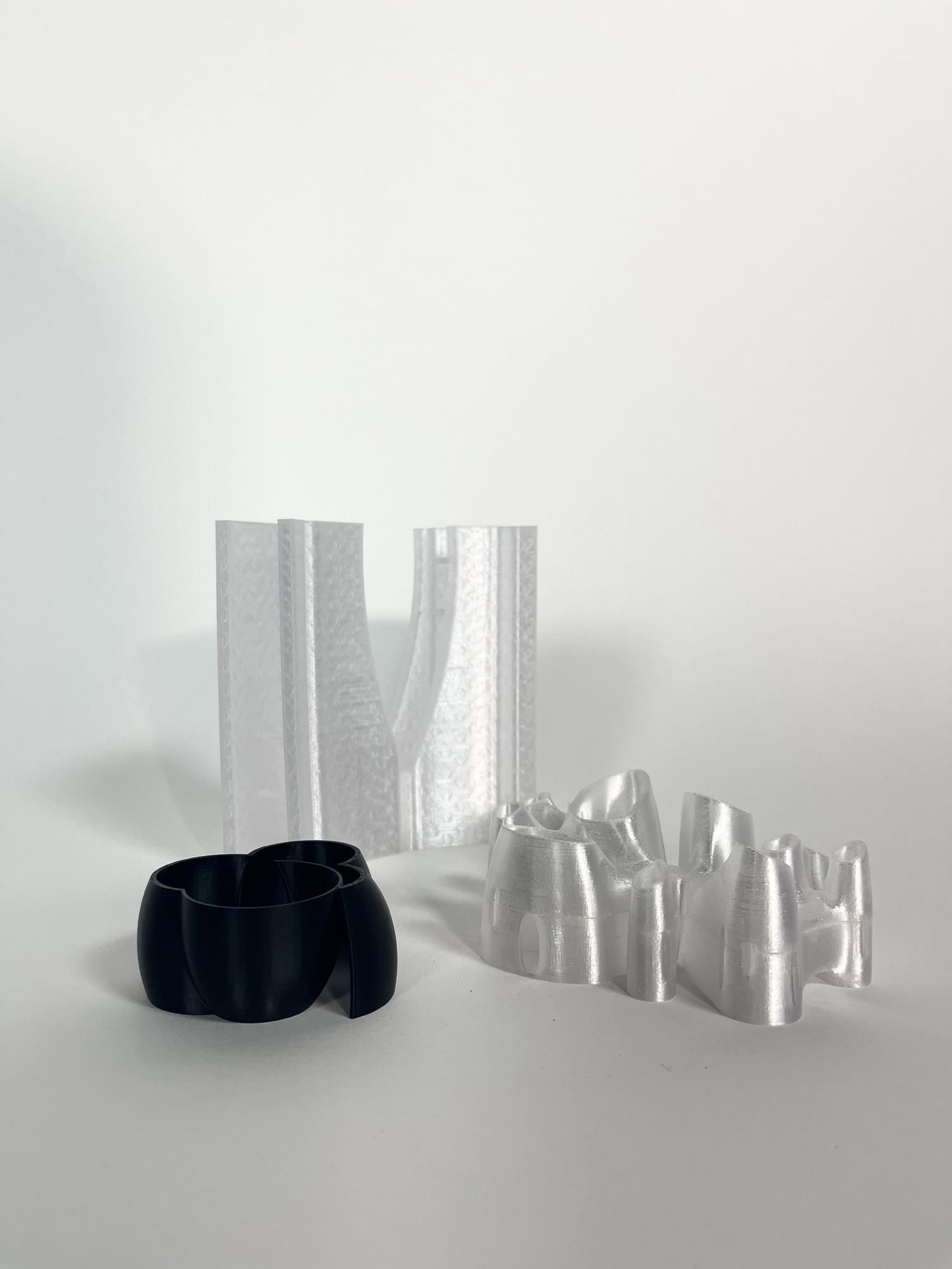
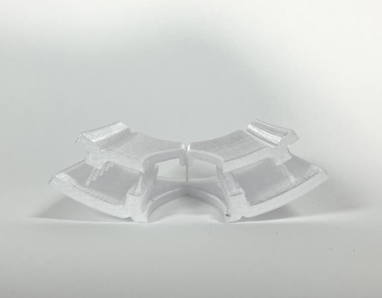
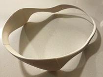
Two prototypes are used for this experiment: the shape prototype (Figure 3) and the vibration prototype (Figure 4). The shape prototype is a 3D-printed form of the actual device but without all other functions. The vibration prototype is a vibration device that can be attached to one’s head and can be controlled by the researchers using a remote control from a distance.
Stage I requires 6 participants. We aim to find out the location on the device where the vibration is the most effective for the participants to retain alertness and attentiveness. Therefore, this stage is conducted only with the vibration device. The vibration device will be attached to 3 different locations on each participant’s head/ neck area (Figure 5), and vibration will be activated in each location one by one. After the participant has experienced vibration in all listed locations, the participant shall rank the effectiveness of vibration in the locations based on their own opinion.
Only quantitative data is collected in this stage: the order of the ranking is converted into points, the first place gets 3 points, and the third place gets 1 point. Among all 6 participants, the location with the most points will become the location of vibration for the experiments that use the vibration prototype in Stage II.
Stage II requires nine participants. Since we aim to find out if the device can alter the participants’ performance on certain tasks requiring continuous attention, we set up three different task scenarios for the participants. The participants are divided into three groups, with 3 per each task.
Task 1 requires the participants to recall information from two ten-minute-long TED Talks (one for each round). The TED Talks are provided by us and will be the same for all participants. Participants will be allowed to take notes. At the end of each round, the participants will be asked to summarize the TED Talk in a few sentences.
The impact of the form of our VIVE headset and the vibration function are studied separately: for Round 1, participants are asked to watch TED Talk A while wearing only the shape prototype; for Round 2, participants are asked to watch TED Talk B while wearing only the vibration prototype. The frequency of vibration would be the same for all participants, controlled by us, and the participants would not know exactly when the vibration would be activated.

A special note on this task is that the participant’s performance on the summarization will not be evaluated –the only purpose is to simulate a setting that expects one’s continuous attention, but this information will not be revealed to the participants until they have finished the experiment.
Task 2 requires the participants to work on ACT English question sets for two ten-minute-long intervals (one for each round). The question set is chosen by us and would be the same for all participants, and we would keep track of time and tell the participant to stop when they reach the 10-minute mark.
Similar to Task 1, the participants wear only the shape prototype for Round 1 and the vibration prototype for Round 2. The frequency of vibration is still the same for all participants, controlled by us, and they would not know exactly when the vibration will be activated.
Same with Task 1, the participant’s performance on the question set will not be evaluated – the only purpose is to simulate a setting that expects one’s continuous attention, but this information will not be revealed to the participants until they have finished the experiment.
Task 3 requires the participants to drive a vehicle on a route of their choice for two ten-minute-long intervals (one for each round). We let the participants choose the route because we want to minimize possible safety issues throughout the experiment. Although it does not perfectly match our product’s scenario with drowsy driving, we are aware that wearing an unfamiliar device while driving on a route that one is unfamiliar with might increase the risk of traffic accidents. Same with Task 2, we would keep track of time and tell the participant to stop when they reach the 10-minute mark, and the participants would only wear the shape prototype for Round 1 and the vibration prototype for Round 2. The frequency of vibration is still the same for all participants, controlled by us, and they would not know exactly when the vibration will be activated.
Both quantitative and qualitative data are collected for Stage II. For quantitative data, the participant’s current level of drowsiness is collected three times throughout the experiment: prior to the experiment, after Round 1, and after Round 2. The participants will self-rate their current level of drowsiness at that moment, on a numeric scale of 1-10, with 1 being very awake and 10 being falling asleep at any moment. This data is the main evidence to determine whether our intervention with the device has an impact on one’s performance for tasks that require continuous attention.
For qualitative data, we would conduct a post-experiment interview focusing on questions such as:
How do you feel about wearing the shape prototype? Does the shape of the device bother you in any way?
How effective is the vibration on your level of attentiveness? Does the intervention of this device distract you in any way?
These qualitative data would also aid the design of the VIVE headset and the configuration of the vibration function of the device.

Limitations
As stated in the previous sections, we adjusted our experiment proposal and the prototypes due to various time and technology constraints. Along with those, there are also some other limitations that may affect the feedback we get for our device throughout this experiment.
First of all, our most important data that directly indicates the effectiveness of our device, the participant’s current level of drowsiness, is self-rated data. Based on individuals’ own interpretation of the scale, it is likely that each participant has their own standard of how tired/sleepy they are currently experiencing. This can be solved by analyzing this data vertically, only among the individual themselves, and comparing the change in the level of drowsiness for this one person.

Another issue related to the “self-rated level of drowsiness” is that the way we collect this data requires the participants to become conscious of their current drowsiness level, which has a chance of affecting their actual level of drowsiness. Even the act of asking the participants this question may alert them and affect this data. Considering this even further, the ten-minute intervals for all of the task rounds in Stage II may not be long enough for one to become evidently tired. One way to solve this problem would be to increase the task time and use other methods to track the participants’ level of drowsiness, such as observing their body language (such as blinking frequency) or even using an EEG device.
One last issue is that after the participants in Stage II finish Round 1, they might have an expectation of what will happen in Round 2. Although this influence may not be very significant, there is still a chance for this issue to affect the participants’ response to our device, especially since the participants would be completing the exact same task. One way to prevent this is to alternate the different task groups between the rounds, e.g., having Task 1 Round 1 group do Task 2 Round 2; having Task 2 Round 1 group do Task 3 Round 2; having Task 3 Round 1 group do Task 1 Round 2, etc. In this way, the participants will not be doing the same tasks for both rounds, therefore more likely to obtain an unbiased response for the data.
Results and Discussion
Stage 0. Product Assessments:
Due to time limitations, we converted part of the post-experiment interview into another set of quantitative assessments of the wearability of our VIVE headset. After testing real users, we have received the results as follows. We aim to use this test to see if the user could wear the headset with simple instructions and if there are any design flaws. The scale of the results ranges from 0 to 10, rating the wearing from four perspectives: wearable level, comfortable level, eyesight blocking level, and alignment level. The first two categories study if this product is stable and comfortable. And the second two categories study the malfunction of our designated purposes: if the device blocks the users' eyesight, and if the device does not align/fit with the head of the user.


In these results we can conclude that the device has a form that is designed quite successfully----it is very wearable, falls directly to the users’ ears, and does not block the user’s eyesight. However, the alignment levels are not good. Many of the users reported that their head shape does not fit with the headset, some say it is too tight and stiff, and some say the longitudinal length is too long. Some users suggested that the device could be softer to wear, or it could be designed in different sizes, like small, medium, large, extra large, etc.
Stage I. Location Assessments:
The users are tested with the vibration generators activated in 3 locations on their heads. They are asked to rank the locations after they have experienced vibration in each location. Location 1 is the area above both ears, location 2 is the area under both ears, and location 3 is the back head area (Location indicated in Figure 5).
From this assessment, we discovered that location 1 and location 2 had very similar feelings to the participants in terms of sensitivity to vibrations, and location 3 is the least sensitive spot, where many users have thick hair on that area that may block the vibration, especially for female users who have different hairstyles. Therefore, location 3 could be excluded from further prototypes. Furthermore, even though locations 1 and 2 only had 1 point in difference, some users reported that they felt that the up

per ear area (location 1) was better than the lower ear area (location 2) because it is near the bone, and bone conduction is easier to transmit the waves of the vibration. Based on this result, location 1 will become the vibration location for Stage 2 and future prototypes.
Stage II. Tasks Assessments:
From this task, we can see a pattern that the user tends to gain drowsiness through the task without the interference of the vibration device, and lose drowsiness after activating the vibration. The users all report the vibration alert helps them to focus in the middle of the talk, where they are starting to lose focus. One user reported that he was feeling really sleepy in the middle and the vibration alerted him in time. Critically speaking, what happens if the user is more comfortable with learning from audio with closed eyes? This is the question we gained from the participant.

Different from Task 1, all participants tend to lose/stay in a same level of drowsiness through the task even without the interference of the vibration. Therefore, even though the drowsiness level continues to decrease in Round 2, we cannot simply conclude that the vibration is the mere cause of decreasing one’s drowsiness level in this case. We figured that this might be because the users are taking the task more seriously because the contents are exam based. Thus, the users are paying more attention and focusing on every question.
The driving task has the most significant result among all tasks that every user reports himself to be effectively alerted and awakened from the tiredness of driving for a while. One user said when driving, his eyes easily stay in one position for a long time and he would feel tired very soon. But the vibration can directly interrupt this sterile period and activate his brain successfully. And statistically speaking, all users were even more awake than the time before driving. Thus the vibration alert is very useful in this scenario.
Conclusion
In conclusion, the VIVE headset had the strongest effect in Task 3 (driving), waking all users in the ten-minute route. It also showed a strong effect in Task 2 (TED Talk) as well since all users reported being alerted by the vibration. But for Task 2 (ACT Test), since the users’ drowsiness level continued to decrease without the vibration device's interference, we cannot draw a causal relationship between the vibration and the level of drowsiness here. However, the overall response of the participants was “Effective,” indicating that the VIVE headset would interfere with the users’ concentration level in a positive direction. Hopefully, with further design and tests, it will help decrease the danger associated with drowsy driving.


Bibliography
- Biswal, A. K., Singh, D., Pattanayak, B. K., Samanta, D., and Yang, M. 2021. IoT-based smart alert system for drowsy driver detection. Wireless Communications and Mobile Computing 2021(1), 1-13.
- Chowdhury, A., Shankaran, R., Kavakli, M., and Haque, M. M. 2018. Sensor applications and physiological features in drivers’ drowsiness detection: a review. IEEE Sensors Journal 18(8), 3055-3067.
- Danisman, T., Bilasco, I. M., Djeraba C., and Ihaddadene, N. 2010. Drowsy driver detection system using eye blink patterns. In 2010 International Conference on Machine and Web Intelligence. Algiers, Algeria, 230-233.
- Drowsy Driving. NHTSA. U.S. Department of Transportation. Retrieved Jan 18, 2023.
- Saket, B., Prasojo, C., Huang, Y., and Zhao. S. 2013. Designing an effective vibration-based notification interface for mobile phones. In Proceedings of the 2013 Conference on Computer Supported Cooperative Work (CSCW '13). Association for Computing Machinery, New York, NY, USA, 149-1504.
- Arimitsu, S., Sasaki, K., Hosaka, H, Itoh, M., Ishida, K., and Ito, A. 2006. Vibration stimulus of seat belt motor retractor for keeping drivers awake. In 2006 2nd IEEE/ASME International Conference on Mechatronics and Embedded Systems and Applications, Beijing, China, 1-6.

- Goto, K., Asano, H., Kajiwara, Y., Bando, S., Mizuno, T., and Nozawa, A. 2016. Comparison of cool and warm thermal stimulations to reduce driver's drowsiness. IEEJ Transactions on Electronics, Information, and Systems, 136 (12), 1815-1820.

Logo designs
Fall 2022 - NBA 5640
Designing New Ventures
Prof. Kenneth Rother and Prof. Greyory Ray
The Sool Lab is a taproom style brewery that will produce traditional Korean rice wine or makgeolli. (Mock up Start up in MBA5640 Designing New Ventures)

Logo Design for Syracuse University Chinese Basketball Association

Logo Design for Cago Auto Group
Address: 1918 Erie Blvd E, Syracuse, NY 13210

visual studies
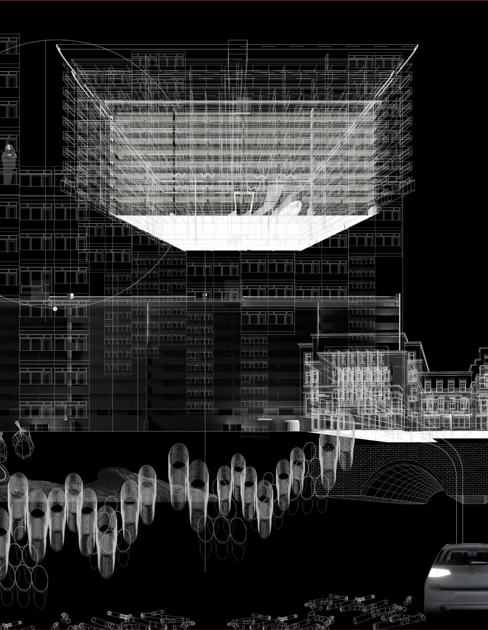
Fall 2022 - NBA 6509 (re)Kwil’t(d) Enclave (re)Line(d)
Prof. Nathan Williams
existing strategy
reuse/rescale the grid assembly
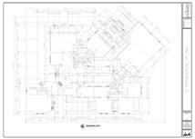
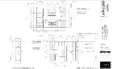
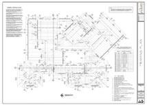
TYPICAL HOUSE CONSTRUCTION
Fundation Plan
INTEGRATED SYSTEMS
Fall 2022 - ARCH 7112
Scales of Reuse
Prof. Felix Heisel
Notational Plan
Dimensional Plan
Framing Plan



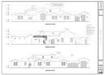
Shear Wall Plan

Framing Details Electrical Plan

PROBLEM STATEMENT
The existing design strategy of constructing different systems in houses runs quite separated in a fixed sequence. For the real construction period, more than 10 types of drawings will be needed to complete one house, and it needs experitse in different categories like architects, interior designer, civil engineering, mechanical engineering, HVAC specialist, plumming specialist, or even sustainable specialist to examine the work. The construction time is usually long since it is counted separatedly for each system, and the construction cost is usually high as well. More importantly, the building system usually couldn’t be reused to the new floor plan directly, because the MEP are always designed after the architectural plan is done.
EXTISTING DESIGN PROCESS CYCLE
Plumming Plan

Mechanical Plan
Interior
Architectural Pre-Construction Structural Construction MEP Construction Interior Exhaust Exterior Structural Engineering Interior Exterior
Finishes Exterior Designs
bedroom1 garage porch porch bedroom2 bedroom3 bathroom bathroom bathroom closet utility living room dinning kitchen Column Plumming Lighting Fixture Large Lighting Fixture Medium Lighting Fixture Small HVAC
DINA LIN
DESCRIPTION NEW INTEGRATED SYSTEM
Taking off with the existing super complicated building systems that bleed out everywhere inside the house, the new spatial arrangement aims to solve the messiness of the overlayed systems and make the space functional easier, and more flexible for residents.
Higly Engineered Core Simplified Elements Flexibility in Design and Maintenance
The new strategy will not only free up the plans and designs with the superengineered core, but also save the construction time, and decrease the potential of containing left VOCs in the materials, increasing the indoor air quality.
NEW DESIGN PROCESS CYCLE

EXPANDABLE STRUCTURE WITH IMPLEMENTING MORE CORES
Higly Engineered Core - 10% Simplified Walls - 90%
EXPANDABLE STRUCTURE WITH IMPLEMENTING MORE CORES
Light Controller
HVAC Controller
HAVC Wind Ducts Reclaimed Wood Columns Electrical Circuit Breakers
Electrical Sockets

New Plan + + = bedroom1 KITCHEN + dinning garage
bedroom2 living room
BATHROOM BATHROOM
Air Outlet Core Dimension: 12’ by 2’ Column Grid: 4’ Column Size: 8’’ by 8’’ Beam Span: 2’ Beam Size: 4’’ by 8’’ Bath tub Connection Toilet Connection Sink Connection Main Stack (Hot & Cold) Drain Line Vent Connected to the distribution lines
SUPER-ENGINEERED CORE
THE
proposed strategy
Material Selection


Flexibility in Facade Design










Connections
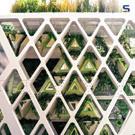
The super-engineered core is strucutrally connected to the rest of the strucutral system with the columns inside the core as well as the HDPE board as partially load bearing functions.


The selected material for the core is a collection of multi-colored plastic panels. They are primarily made from post-consumer recycled polyethylene. And it is made from HDPE which stands for High-Density Polyethylene. It appears in plastic product like plastic container of milk, detergent or shampoo bottle, etc. It used to help keep the resin from becoming contaminated with other plastic resin types. Origins may also contain LDPE (Low-Density Polyethylene), PP (Polypropylene) #5 and sometimes virgin polyethylene, all of which are compatible with HDPE.
The new system will feature a great flexibility of the facade deisgn. It could change along with time or different residents’ preferrences, and the overall elevation will looks like a material collage.
Expandable Structure

Because the core already solve the majority of the functional problems of the entire house, the rest of the space is left free for designs, which could expand, shrink, or change in levels according to the different weathers, seasons, sunlight, wind, landscape designs, etc. Since the simplified elements are all in modular dimensions, the construction process will be easy to install and good for reuse.

SPACIAL FORMATION
CONCEPT DIAGRAM

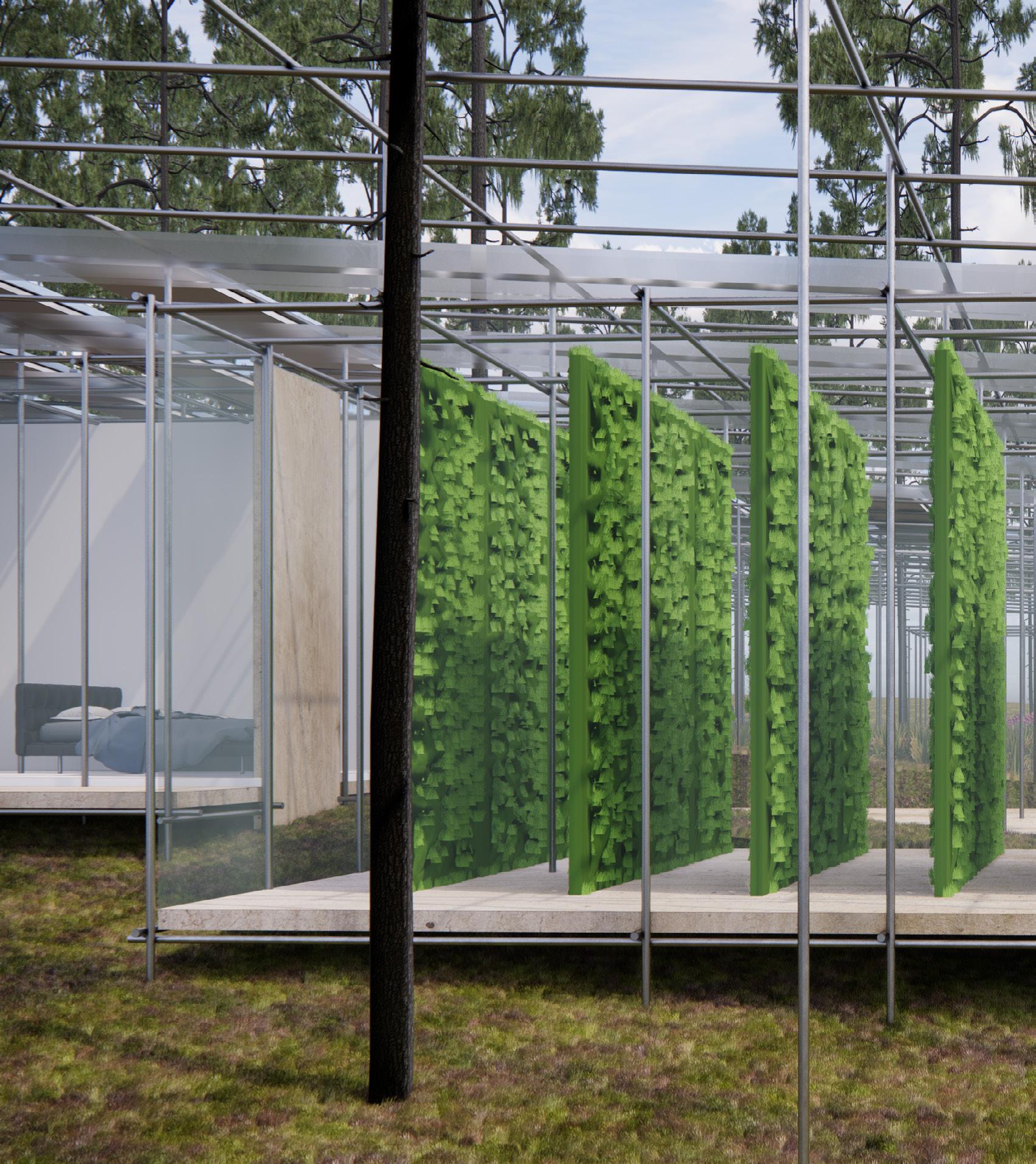
USED SCADFFOLDING
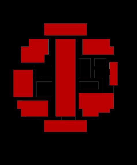
OPEN SPACE v.s. ENCLOSED SPACE

Enclosed Space
Open Space
PROGRAMS
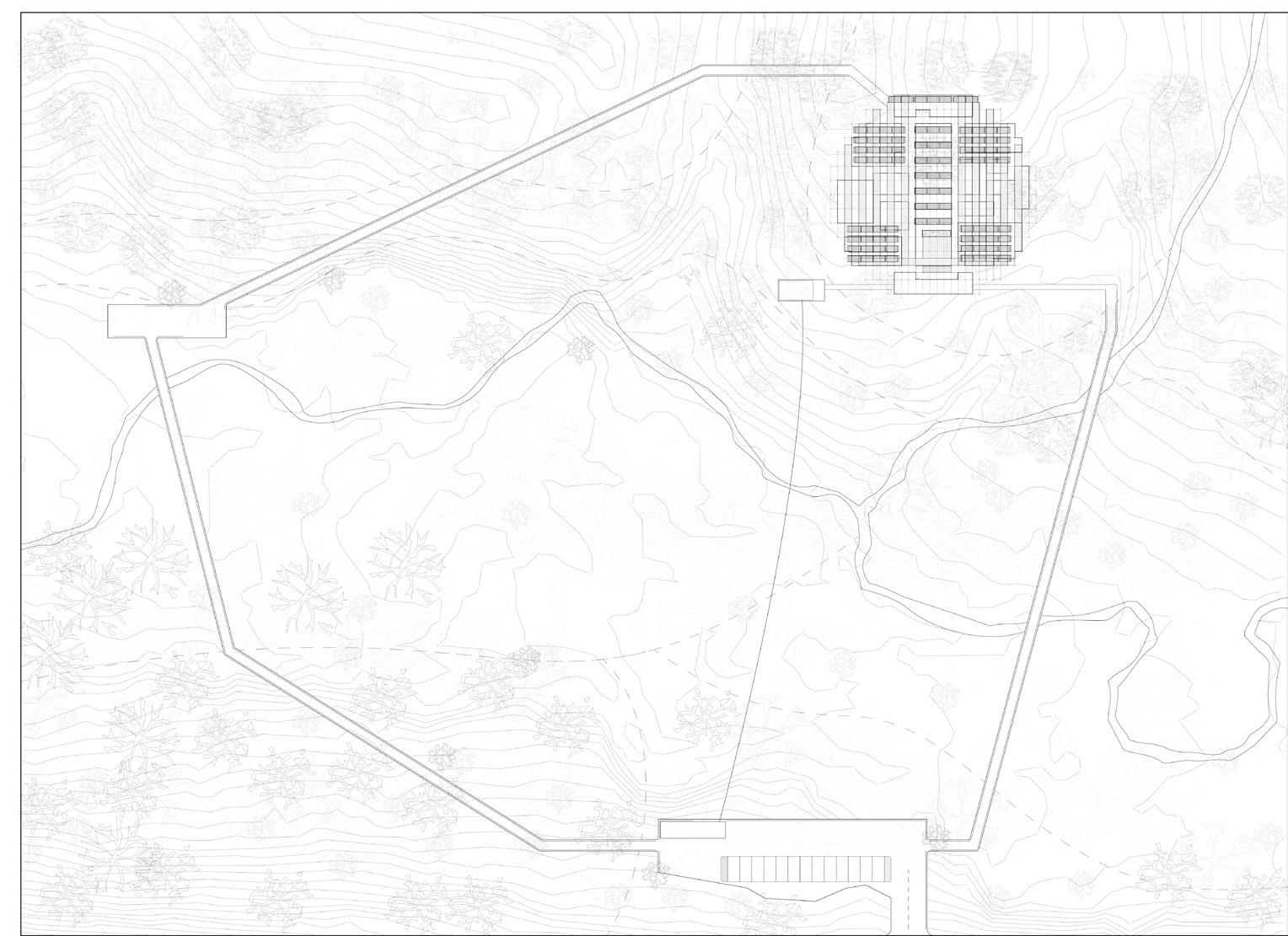
SITE PLAN



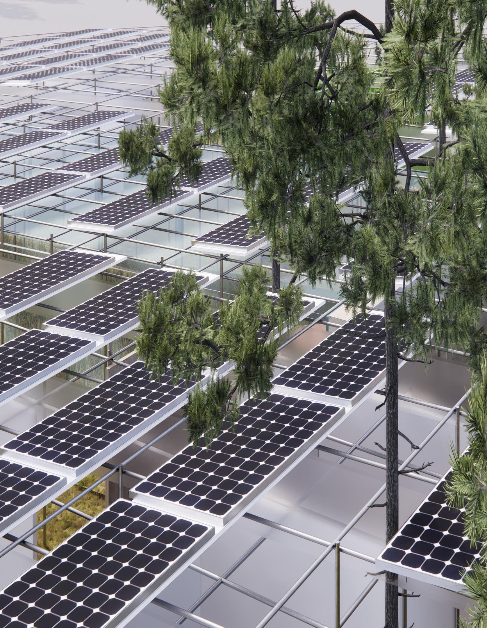
PROPOSED SELF-SUSTAINING GRID
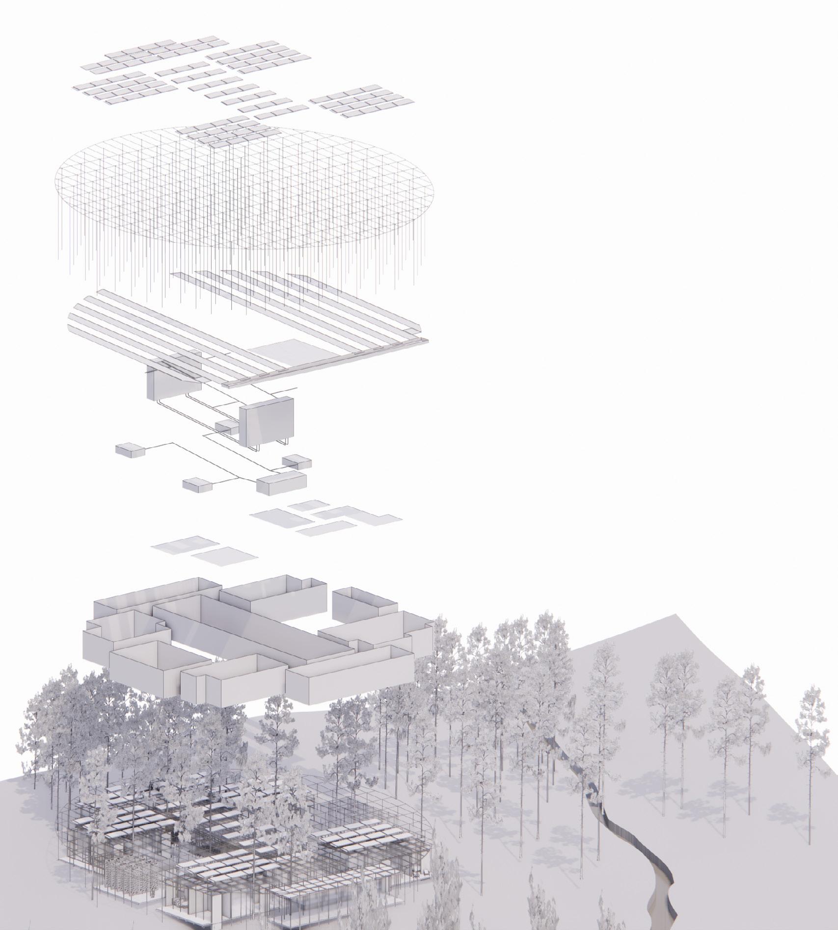
ENERGY FLOWS

CLIENT ANALYSIS
Systems
Solar Panels Scadffolding Structure
Rainwater Harvesting System
Water Filtration and Dispense
Disposal Collecting
Open Space
Enclosed Space


FLOOR PLAN
PROGRAMS
Residential Houses
Green House
Algea Farm
Aquaponics
Livestocks
Guest/Community Space
Seasonal Floral Farm/Farm
Water Filtration
Disposal Soil
Electrical Room
Open Event Space
SEPARATE TEMPERATURE CONTROL
22~24 Degree Celcius
20~30 Degree Celcius
0~15 Degree Celsius
WATER FLOWS
Program Blocks


SECTION B-B’
SECTION A-A’

3d printing concrete - the seamless house
Spring 2023 - ARCH 5101
Print Better!
Professor Sasa Zivkovic
Reseach Associate Lawson Spencer
Arching - Openings
Printing Openings Diagrams
Arching - Openings

E D 1 2 3 4 5 A B F C 30° 29° 28° 27° 26° 25° 24° 23° 22° 21° 20° 19° 18° 17° 16° 15° 14° 13° 12° 11° 10° 9°
C D E F 4 5 6


E D 10% date last revised: February 14, 2023 4:36 PM 2023-02-15 3:00 AM date: drawing notes deadline description tN Project Address 42°26'58.83"N, 76°29'4.92"W 2022.05.02 ## write all drawing additional notes:-1 2 3 4 5 Contex Plan A B F C A1.01 drawing deadline Project A B C D E F 2022.05.02 ## Children Playground Chicken Coops Context Plan
SITE PLAN



date last revised: February 14, 2023 4:36 PM 2023-02-15 3:00 AM date: B D additional notes:-1 2 3 6 South Elevation North Elevation date last revised: February 14, 2023 4:36 PM 2023-02-15 3:00 AM date: C D E additional notes:-East Elevation West Elevation - 3FT - 3FT - 3FT - 5FT - 4FT - 3FT - 3FT E D 10% schematic design (SD) drawing notes deadline description Studio Consultant Lawson Spencer Assistant Professor Sasa Zivkovic ARCH 5101 - PB! tN Project Address 42°26'58.83"N, 76°29'4.92"W (project location) 2022.05.02 ## write all drawing notes here 1 2 3 4 5 6 Floor Plan A B F C A2.02 Dina Lin The Seamless House Combined Mechanical and Electrical Room 290 sqf Storage Storage Storage Storage Storage Floor Plan - Underground Level UP UP UP UP UP UP UP E D 10% schematic design (SD) drawing notes deadline description Studio Consultant Lawson Spencer Assistant Professor Sasa Zivkovic ARCH 5101 - PB! tN Project Address 42°26'58.83"N, 76°29'4.92"W (project location) A B C D E 2022.05.02 ## write all drawing notes here 1 2 4 5 6 Floor Plan A B C A2.01 Dina Lin The Seamless House Wall Details Floor Plan - Ground Level Guest Bedroom 152 sqf Main Bedroom 188 sqf Living Room 302 sqf Shower 40 sqf Hot Tub 55 sqf Toilet 40 sqf Sauna 175 sqf Gathering 115 sqf Laundry Room 40 sqf W/D - 3FT - 3FT - 3FT - 5FT - 4FT - 3FT - 3FT E D 10% schematic design (SD) drawing notes deadline description Studio Consultant Lawson Spencer Assistant Professor Sasa Zivkovic ARCH 5101 - PB! tN Project Address 42°26'58.83"N, 76°29'4.92"W (project location) A B C D E F write all drawing notes here Floor Plan A B F C A2.02 Dina Lin The Seamless House Combined Mechanical and Electrical Room 290 sqf Storage Storage Storage Storage Storage Floor Plan - Underground Level
- Set up the printer
- Put dirt on the site (All Covered) - Use the 3d printer to excavate the dirt on the exact locations of fooings

- Put the foundation piers set in the designated locations as shown above
(X, Y, Z) from the site origin point
Three:
- Print the foundations
- Cast the oors between the 3d printed walls
Keep Printing
Step Four:
- Print the walls
- Put insulation between the double layer walls - Put steel reinforcement along the printing process
Step Five:
- Print the walls and openings
- Cast the Floors
Step Six:
- Keep prining until the house if nished
- Wait until the concrete is cured
Step Seven:
- Add roof structures and base layer of insulation
Step Eight:
- Add window frames and glazings
- Add roof insulation and metal covering
10% schematic design (SD) drawing notes Lawson Spencer Assistant Professor Sasa Zivkovic ARCH 5101 - PB! tN Project Address A write all drawing notes here Elevations A1.03 Dina Lin The Seamless House (19.2', 20.6', -8') (34.3', 24.7', -5') (35.7', 17.5', -5') (22.6', 8.5', -3') (15.3', 4.4', -3') (11', 6', -3') (34.6', 34.4', -5') (12.7', 37.5', -7') (30.8', 50.5', -6') (19', 50', -3') (9.7', 50.3', -3') (15.5', 57.5', -3') Ø<4.5ft> Ø<2.5ft> Ø<2.5ft, 15°> Ø<2.5ft, 13.5°> Ø<3ft, 13.5°> Ø<2.5ft, 14°> Ø<2.5ft, 13.5°> Ø<2.5ft, 15°> Ø<5.6ft, 3ft> Ø<4.8ft, 3.7ft> Ø<6.4ft, 5.5ft> Ø<5.7ft, 5.6ft> Ø<6.2ft, 4.4ft> (11.8', 22.9', -8') 10% schematic design (SD) date last revised: February 14, 2023 4:36 PM 2023-02-15 3:00 AM date: drawing notes deadline description Studio Lawson Assistant Sasa ARCH 5101Project Address 42°26'58.83"N, 76°29'4.92"W (project location) 2022.05.02 ## write all drawing notes here additional notes:-1 2 3 4 5 6 Roof Plan and Foundation Plan A1.04 House 10% schematic date last revised: February 14, 2023 4:36 PM 2023-02-15 3:00 AM drawing notes deadline description ARCH tN Project Address 42°26'58.83"N, 76°29'4.92"W A B C D E F 2022.05.02 ## write all drawing additional notes:-1 2 3 4 5 6 Construction Sequence The Seamless House (11.8',22.9',-8') (19.2',20.6',-8') (34.3',24.7',-5') (35.7',17.5',-5') (22.6',8.5',-3') (15.3',4.4',-3') (11',6',-3') (34.6',34.4',-5') (12.7',37.5',-7') (30.8',50.5',-6') (19',50',-3') (9.7',50.3',-3') (15.5',57.5',-3') (11.8',22.9',-8') (19.2',20.6',-8') (34.3',24.7',-5') (35.7',17.5',-5') (22.6',8.5',-3') (15.3',4.4',-3') (11',6',-3') (34.6',34.4',-5') (12.7',37.5',-7') (30.8',50.5',-6') (19',50',-3') (9.7',50.3',-3') (15.5',57.5',-3')
Step One:
Step Two:
-
Step
-
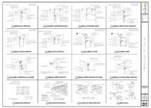
E D A B C D E F A B F C MEP Storage Floor Heating System Roof Detail Window Detail Foundation Detail Section


 Lawson Spencer
tN Project Address 42°26'58.83"N, 76°29'4.92"W Section A3.01
Assistant
Professor Sasa Zivkovic ARCH 5101 - PB!
E D date last revised: February 14, 2023 4:36 PM 2023-02-15 3:00 AM date: A B C D E F additional notes:-1 2 3 4 5 6 A B F C Initial Life Cycle Analysis Structure Isometric Structure Analysis
Dina
Lin The Seamless House
Wall Section
Window Details
E D B C D E F 1 2 3 4 5 6 B F C
Rigid Insulation Flashing CLT Frame Angled Steel Operatable Window (15 degree) 3/16 inch Low-E Glazing 1/2 inch Air Cavity Silicon Bead
Roof Detail
Standing Seam Metal Roof
5/8’’ Standing Seam Water Proo ng Sheating
2’’ Rigid Insulation
5/8’’ Vapor Sheating
2’’x10’’ CLT Beam
10’’ Batt Insulation
1’’ Gypson Board
Foundation Detail
3D Concrete Printing Layers
Foam Insulation
3D Concrete Printing Layers
Cast Concrete Floor Vapor Barrier
Rigid Insulation
E D A B C D E A B C


A B Window Elevation Insulation Steel Window Frame Steel Anchors


2022-2023
ml2494@cornell.edu
mengyaodinalin@gmail.com


 Lawson Spencer

