
01 Defining our brand
Here we outline the building blocks of the Mercy House Global brand, including what we stand for, what sets us apart, and how we've decided to show up in the world.
Every touchpoint of our brand should be anchored by our foundational brand strategy, captured here.
At Mercy House Global we create opportunities that provide hope.
Our mission
When others move on, we dig deep. We stay. We fight. We trust God for the impossible. We are scrappy.
At Mercy House Global, we stay. We are called to the Bible's 3's three most vulnerable people groups: orphans, widows, and refugees.
We are more focused, more prepared, more enthusiastic, more determined to continue this Gospel-driven work among the vulnerable.
Sometimes referred to as our core values, our ethos speak of Mercy House Global’s character, shared values, and culture.
It ensures we stay sailing in the same direction when communicating.
Faith-based, Prayerful, Steadfast, Loyal
Lift others, Educational, Positive, Approachable
Engaging, Caring, Supportive, Hopeful
Hardworking, Flexible, Resourceful, Sustainable
Creative, Forward thinking, Transformative
Missional, High-quality, Truth & Grace, Authentic
Global, Compassionate, Empowering, Kind
Persona and personality
Mercy House Global embodies character and creativity. We believe that the way we communicate is just as important as the message itself. Our goal is to present our ideas clearly and with purpose, while still maintaining an enjoyable experience for all involved. Ultimately, it's about striking a balance between substance and style.
We are faithful, loving, empowering, passionate and purposeful; we are creative, compassionate, humble and hardworking.
Our mission and culture turned inward creates our Ministry and products. Our culture turned outward creates our brand.
Our brand is a reflection of who we are as a company. We are real people working for real people.
God weaves stories of hope & hopelessness together. If nothing else, our outward-facing brand should represent the best of what we bring to our work, our values and whom we help.
One way we create empowering content and communication is by being aware of our voice and our tone. This section explains the difference between voice and tone, and lays out the elements of each as they apply to Mercy House Global.
What is the difference between voice and tone? Voice remains consistent, while tone changes based on the situation and emotional state of the person you're communicating with. It's important to adjust our tone accordingly.
The same is true for Mercy House Global. Our voice doesn’t change much from day to day, but our tone can change all the time.
The key to Mercy House Global's voice is to communicate in a way that resonates with our audience and is easily identifiable. We should speak directly to our audience, in a voice that they can hear and recognize.
At Mercy House Global, we are Gospel-driven and grounded in the grace of Jesus. We don't count success by the hundreds. We number them one by one. Every girl welcomed home and every baby born, serves as a reminder of how much God cares for each of us. They stand as a testimony of how far Jesus went for one. Jesus came for all. Jesus goes after the one.
We are humans, speaking to humans. We are authentic. We like the people we are talking to and are proud of what we are talking about. That sets us apart.
Mercy House Global’s tone is usually sincere and hopefully — yet fun. That being said, it’s always more important to be clear than entertaining. We try to consider the audience’s state of mind. Are they raving fans of our mission? Are they seeking insight or need help? Once we have an idea of their emotional state, we can adjust our tone accordingly.
Global language
Our global language is how we exercise our voice and tone in communication. Here are some samples of what we should strive sound like.
Instead of ...
- Evangelism, sharing the gospel
- The lost
- Bitter, broken
- Fruit
- Hearts were softened
- Shepherding
- Living in darkness
- Planted seeds
- God's flock
Let’s try ...
- Telling people about Jesus
- People who don't follow Jesus
- Depressed, dismayed, worn down by poverty
- Outcomes, positive results, growth
- People began to listen and understand
- Guiding, leading
- Missing the comfort of God's love
- Arrived in Kenya, started a conversation, began to build relationships
- God's people
Our audience
It's important to identify our ideal client so that we can speak to them effectively in all our communications, whether it's related to our mission or marketing goals. This will help us stay on track and ensure clarity.
Our ideal client
Female Location Suburbs, USA
Family Demographics 3 kids ages 12-15, open to foster/adopt
Education Level Bachelor's Degree
Interests Faith, Parenting Resources, Home Decor, Daily Devotionals, Shops local Average
02 Logo
The globe icon
The globe icon represents our global commitments. Its organic and hand-drawn design perfectly captures our tenacious and determined nature.
The workmark
The workmark is set in a bold classic & timeless serif. It displays strength and confidence while staying very approachable.
The Mercy House Global logo has numerous possible uses — to cover a large variety of digital and physical landscapes of the modern world. The horizontal logo is the primary logo and should be used in most instances.
The logo may be displayed in it’s full lockup as well as stand in alone elements when appropriate. Always use the logo files provided. Do not re-create.
The approved options are as follows:


Full lockup
clear space
When using the Mercy House Global logo, ensure the following “exclusion zones”. These image-free zones give the logo and icon space to breathe and maintain visual impact.
Full lockup exclusion zone
This exclusion zone is equal to the height of the globe icon (marked as × in the diagram).
Logo clear space continued
When using the Mercy House Global logo, ensure the following “exclusion zones”. These image-free zones give the logo and icon space to breathe and maintain visual impact.
Wordmark only exclusion zone
This exclusion zone is equal to the height of the wordmark (marked as × in the diagram).
Icon only exclusion zone
This exclusion zone is equal to the height of the icon (marked as × in the diagram).
Usage on backgrounds
The Our Beautiful Family full logo can hold it’s own in almost endless color combinations, but must always be featured with high contrast at all times. This treatment will add visual interest and a bold, premium feel to our communications.
Usage on photographs
Avoid using the logos on photographs unless the logo sits on a high contrast dark or light area of the image.


Logo misuse
Do not rearrange or manipulate the logo.
Do not scale the separate elements independently.
Do not use different colors.
Do not outline logotype
Do not use drop shadows or any other effects.
Do not rotate any part of the logo
Do not distort the logo
Do not re-create using any other typeface
MERCY HOUSE GLOBAL
03 Colors
Color is one of the most powerful visual elements in our toolbox. With its correct and consistent use we have the ability to build instant recognition and consumer rapport for our brand.
Our color palette is comprised of of two groupings: The primary palette and the secondary palette and Plant Butter palette.
Primary palette Colors & tints
The colors within our primary palette, demonstrated here, should be used for the majority of brand-focused communications.
Always use high contrast text color combinations to ensure sufficient accessibility.
colors & tints
Secondary palette Colors & tints
When using color to create any communication for our brand, always respect the proper ratio of primary to secondary.
Consistent use of typography helps to further identify our brand and create our distinct visual language.
04 Typography
Our typography has a personal touch. Showing process, and connection to something made not manufactured. It is proudly bold and personable both serif & sans-serif combined.
Lorem ipsum dolor sit amet consectetur at tincidunt tincidunt neque.
AaBbCcDdEeFfGgHh
IiJjKkLlMmNnOoPpQq
RrSsTtUuVvWwXxYyZz
1234567890
AaBbCcDdEeFfGgHh
IiJjKkLlMmNnOoPpQq
RrSsTtUuVvWwXxYyZz
1234567890
AaBbCcDdEeFfGgHh IiJjKkLlMmNnOoPpQq
RrSsTtUuVvWwXxYyZz
1234567890
Adobe Caslon (Regular)
Adobe Caslon (Bold)
Adobe Caslon (Bold Italic)
Adobe Caslon
Adobe Caslon
AaBbCcDdEeFfGgHh
IiJjKkLlMmNnOoPpQq
RrSsTtUuVvWwXxYyZz
1234567890
AaBbCcDdEeFfGgHh
IiJjKkLlMmNnOoPpQq
RrSsTtUuVvWwXxYyZz
1234567890
AaBbCcDdEeFfGgHh
IiJjKkLlMmNnOoPpQq
RrSsTtUuVvWwXxYyZz
1234567890
AaBbCcDdEeFfGgHh IiJjKkLlMmNnOoPpQq
RrSsTtUuVvWwXxYyZz 1234567890
AaBbCcDdEeFfGgHh IiJjKkLlMmNnOoPpQq
RrSsTtUuVvWwXxYyZz 1234567890
San Clemente (Script)
San Clemente (Print)
San Clemente
San Clemente
Headline Typography
Adobe Caslon is a designated headline typefaces for us and can be used on all brand communications in Regular, Bold, & Bold Italic.
Sample uses


We focus on the Bible’s most vulnerable: orphans, widows, refugees.

Meet the Makers
Create a visual emphasis by pairing Adobe Caslon Regular & Bold Italic.
Multifunctional Typography Europa is used throughout communications for its versatility and modernity. It can be displayed in Light, Regular, and Bold.
Sample uses

Used in all caps with 25% letter spacing.
new babies in Kenya at Rehema House in the first six months of the year.

Used in different sizes and weights together.
Meet the Makers
Together, with local Kenyan partners, we have developed empowering solutions that support women and children.
Used in simple sub headlines.
SPRING COLLECTION 2023
Callout Typography
San Clemente (Script & Print) is used to emphasize small words or phrases. It should be used sparingly for maximum impact.


turkish
Made in Turkey
Fallbacks for Web, email, etc.
When our brand designated typefaces are not usable due to browser rendering, software restrictions, or other limitations these fonts can be used in their place.
Use Adobe Caslon as fallback = = Montserrat
AaBbCcDdEeFfGgHh
IiJjKkLlMmNnOoPpQq
RrSsTtUuVvWwXxYyZz
1234567890
Europa
Use Montserrat as fallback
San Clemente (Script & Print)
Set type treatment as an image. There is no fallback for this font.
AaBbCcDdEeFfGgHh
IiJjKkLlMmNnOoPpQq RrSsTtUuVvWwXxYyZz
1234567890
Adobe Caslon
05
Visual elements
The door shape can be used as a framing device for imagery, as a solid color, or as a pattern.
It can be used at any size, but must be scaled proportionately. It can be used in full or as a partial element, but it should never be skewed or changed in shape.
Used as full shape.

Used as half shape.
Our illustration style is bold, flat, and with a hand drawn feel. It should always be defined by the use of negative space. It distinctly captures our brand and is used across a range of communications.
The illustrations we use are pulled directly from our Sanaa Collection. Sanaa means art in Swahili. This collection is created by rescued teen mothers in Kenya during art camps held several times a year. The illustrations showcase the dignified and empowering work these girls are able to put out into the world.
Sanaa Illustration Samples
06 Photography
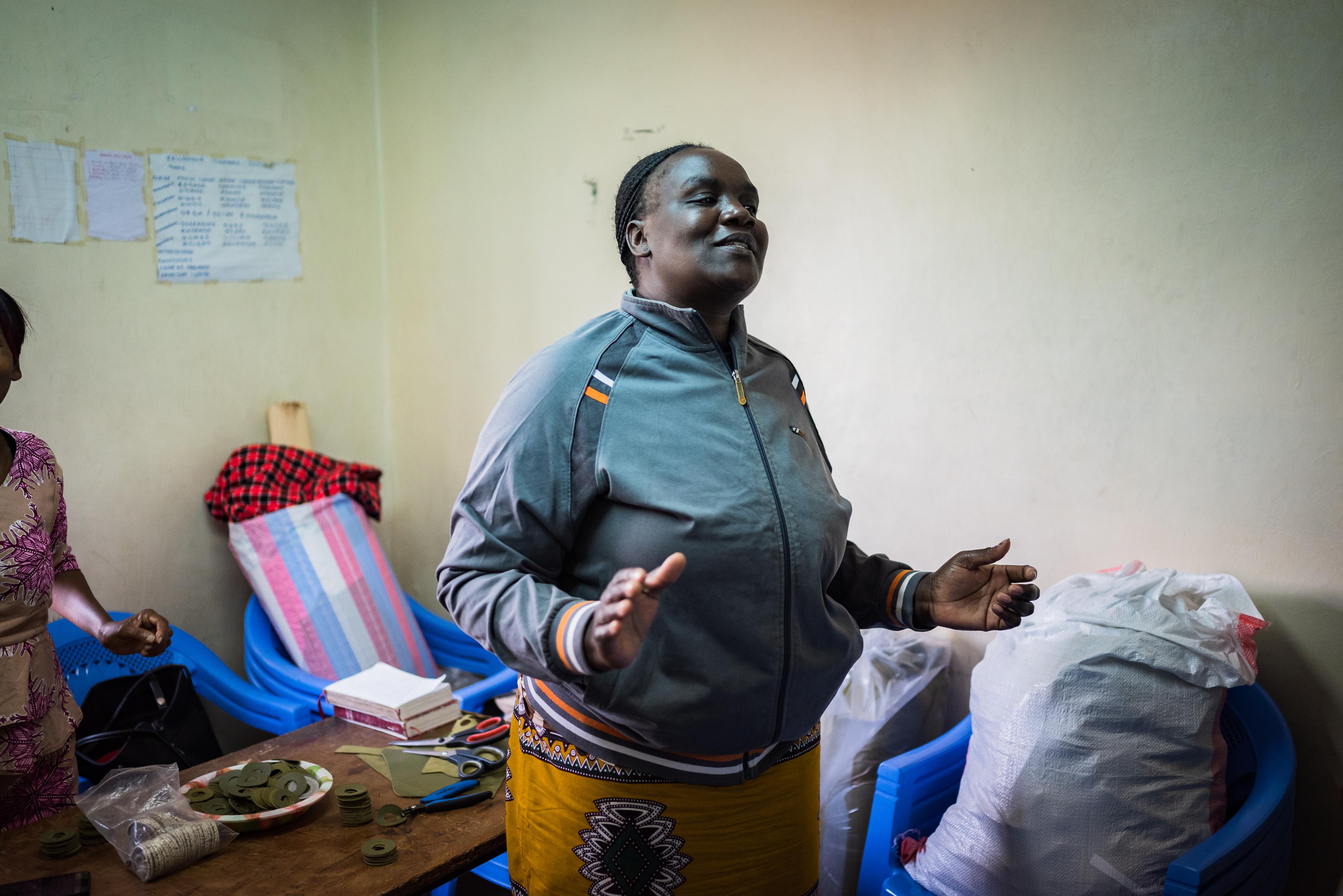
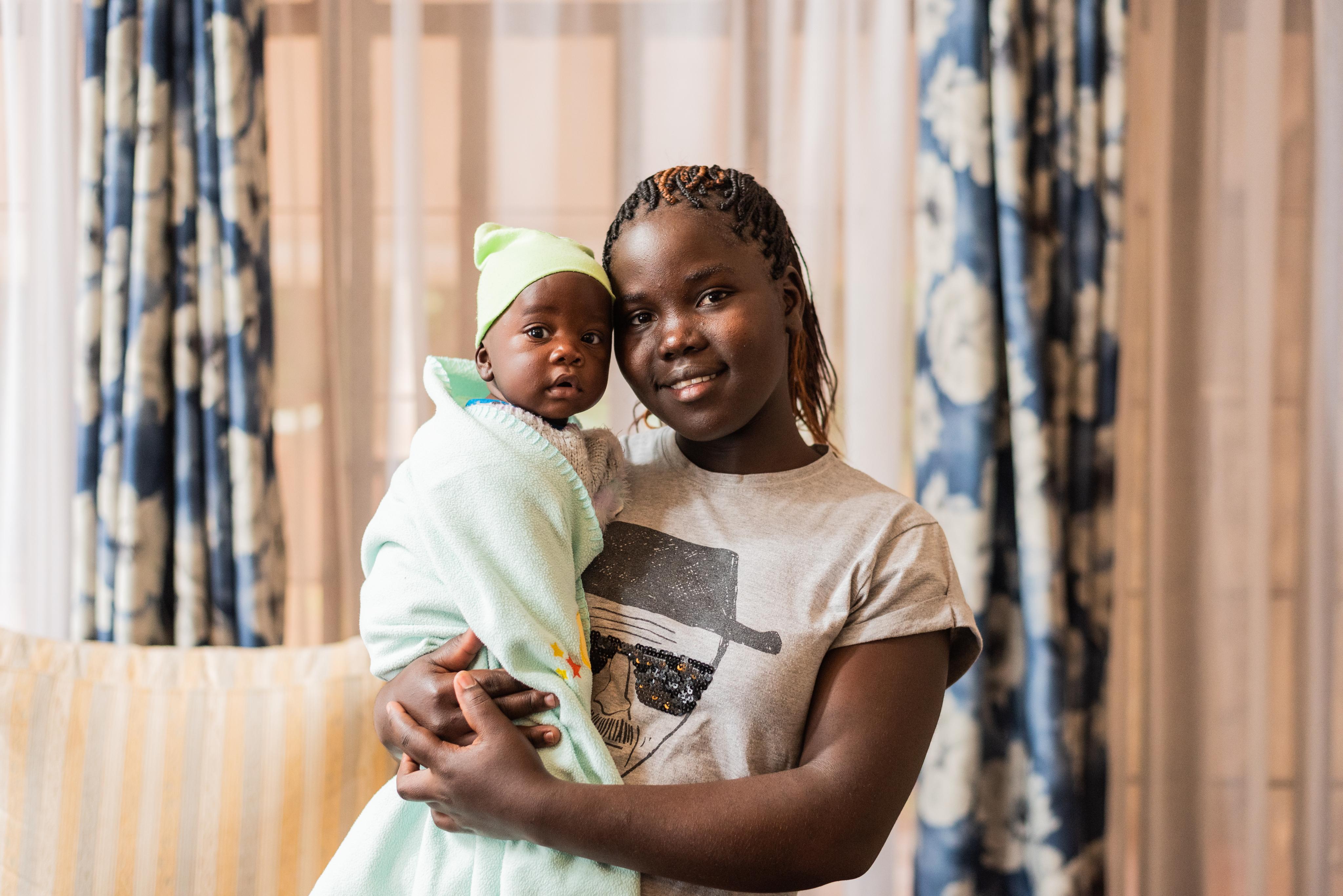
It's true - a picture really can say a thousand words. So it's no surprise that photography is a very important ingredient in our visual language.
The exhibits on the pages that follow demonstrate how our brand comes to life through images of the people, places, spaces and concepts that make us truly and uniquely Mercy House Global.
What to look for
Natural lighting
Bright & sunny
Optimistic feel
What to Avoid
Obvious studio light
Overly dark environments
Cold, Quiet feel
Forced
Artisans Photograph Samples
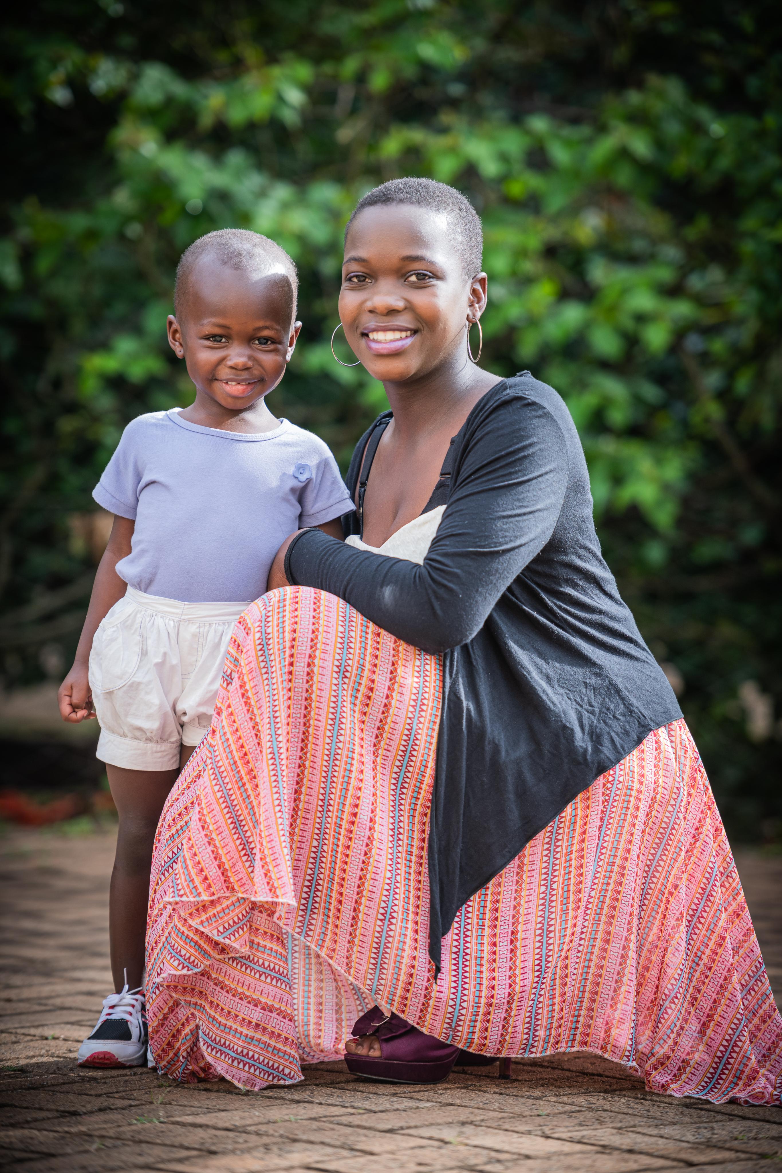


Candid
What to look for
Natural lighting
Bright & sunny
Optimistic feel
What to Avoid
Obvious studio light
Overly dark environments
Cold, Quiet feel
Forced
Product Photograph Samples


Candid