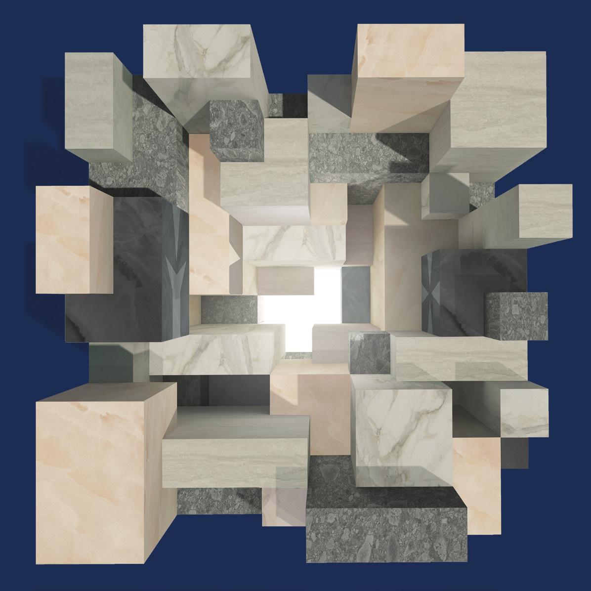
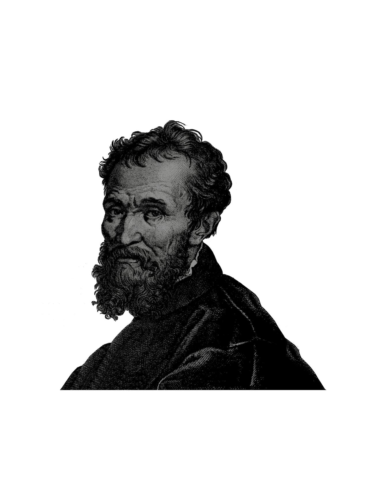
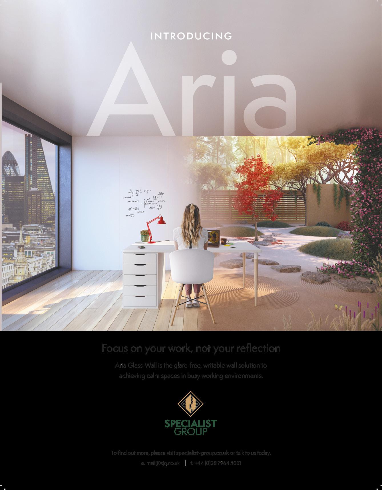
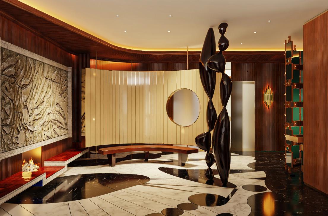
Seeking the perfect marble, Michelangelo visits the ancient Carrara quarry.
Captivated by its brilliant white hue and grey and gold veining, he selects his piece.
To this day, Calacatta marble is renowned for its beauty, rarity and exceptional price.
Following in his footsteps, we have combined the exquisite allure of this exclusive marble with the durability and versatility of Karndean.
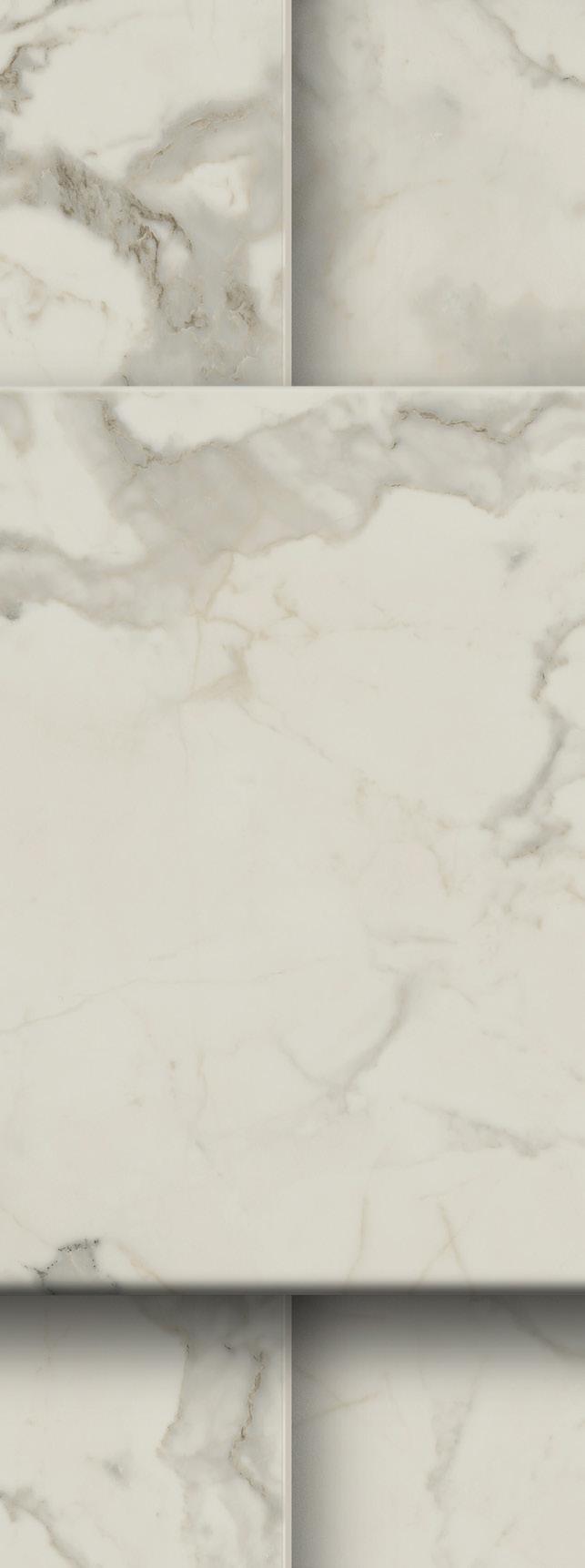
A bright, creamy marble with a regal gold and cool grey veining.
Its opulence makes a confident statement.
Embodying sophistication and elegance within an artistically inspired interior.
Get to know the new designs at karndeancommercial.com/whatsnew
IT BEGINS
IN 1517
Art Select: Calacatta d’Oro
233
50 28 56
12 Upfront Projects, products and people through a futurecentric lens.
22 Things I’ve learnt Yasmin Al-Ani Spence, director at WilkinsonEyre, shares her insights on personal growth and creating productive, effective workspaces.
24 Height of design Giles Tettey Nartey – architect, artist and associate professor at the Bartlett School of Architecture –reveals the item he sees as the pinnacle of design.
26 Colour story Colour designer and forecaster Laura Perryman (author of The Colour Bible) explores the concept of neuroaesthetics and the invisible influence of colour.
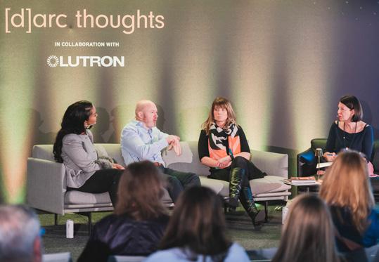
28 In conversation with: Toni Black Blacksheep’s interior director and partner to discusses lightbulb moments, creating magic and why design should always involve a little fun.
34 In conversation with: Orms Architects With Orms Architects director John McRae, we explore how to create spaces with soul and the nature of designing in an accelerated age.
40 Living Better Practicing architect, researcher and multidisciplinary artist Itai Palti examines the role of spatial kindness in creating place attachment.
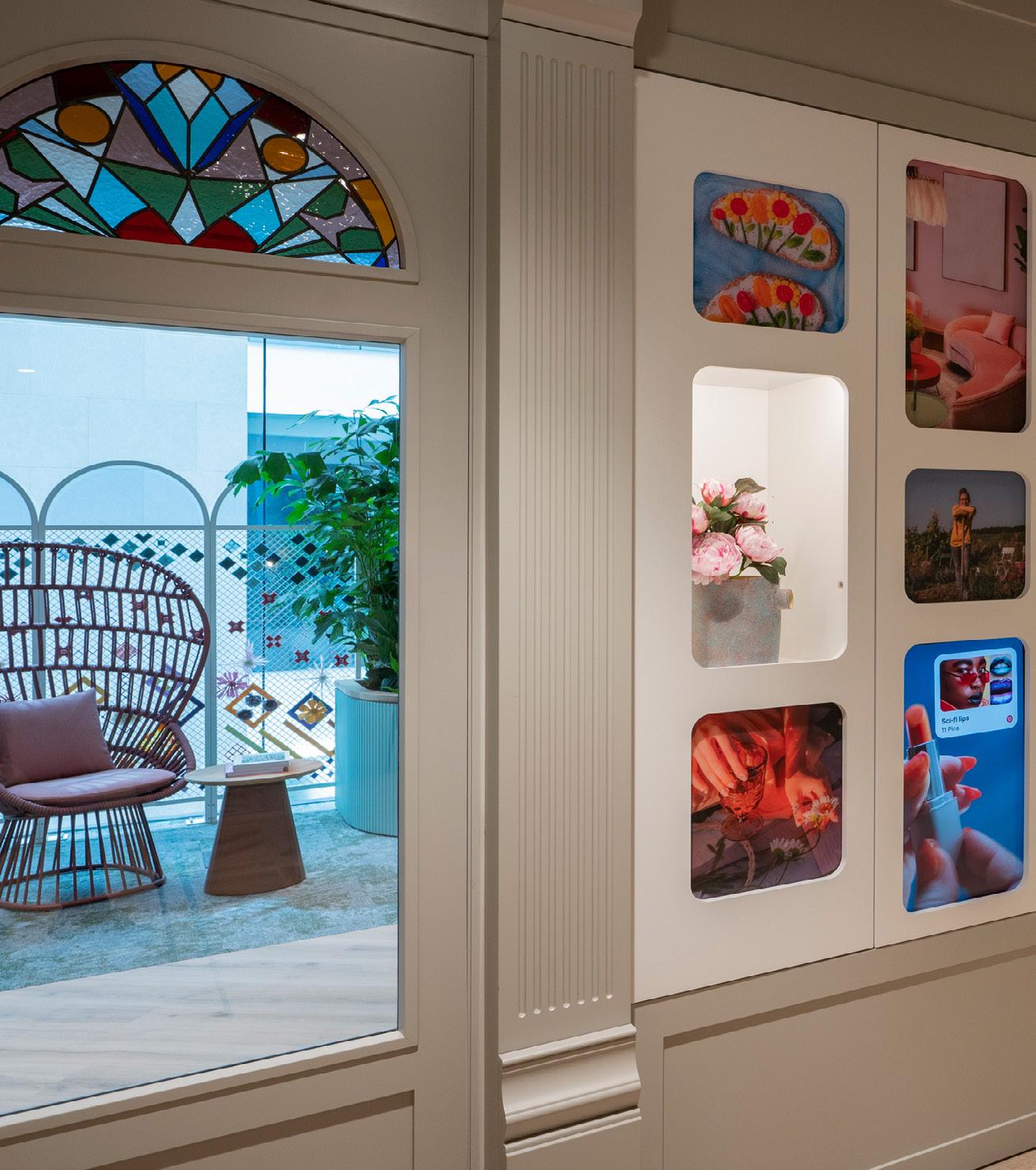
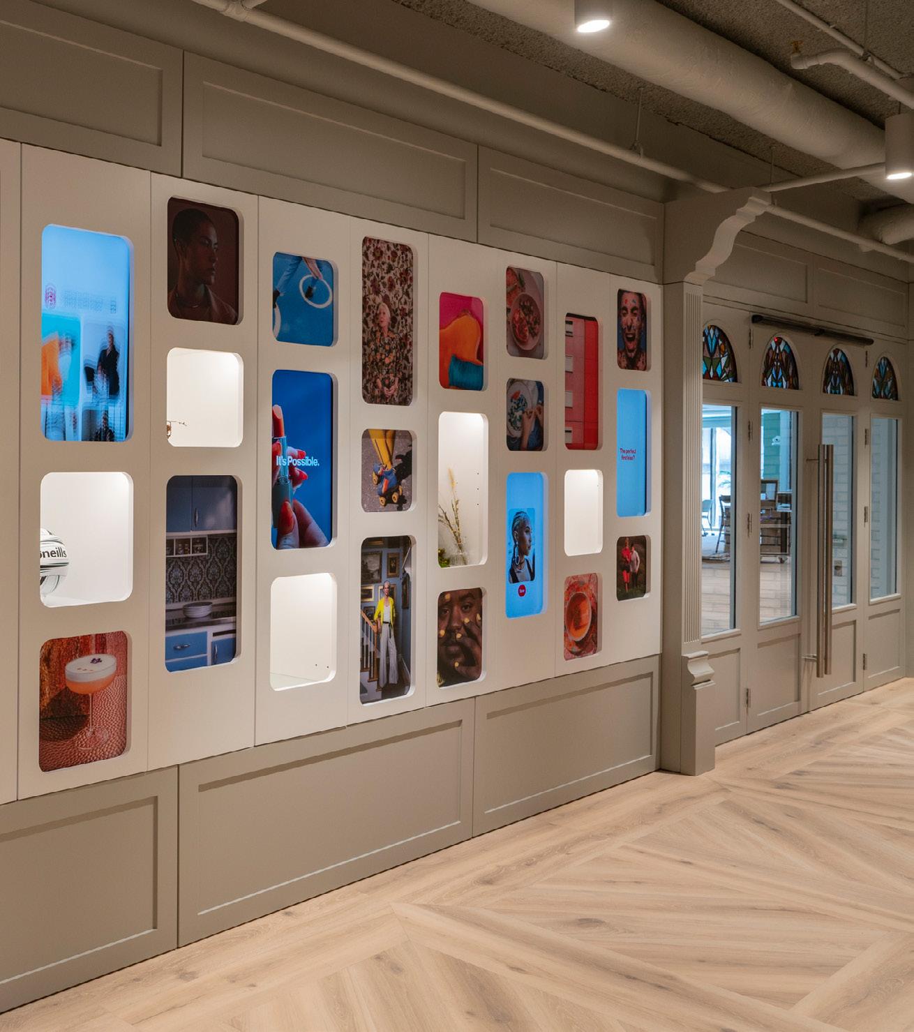
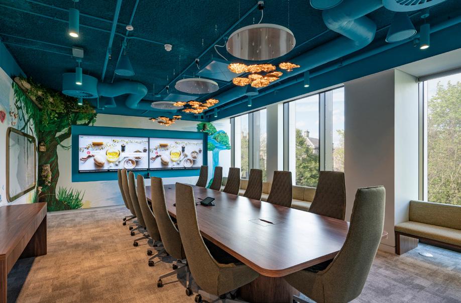
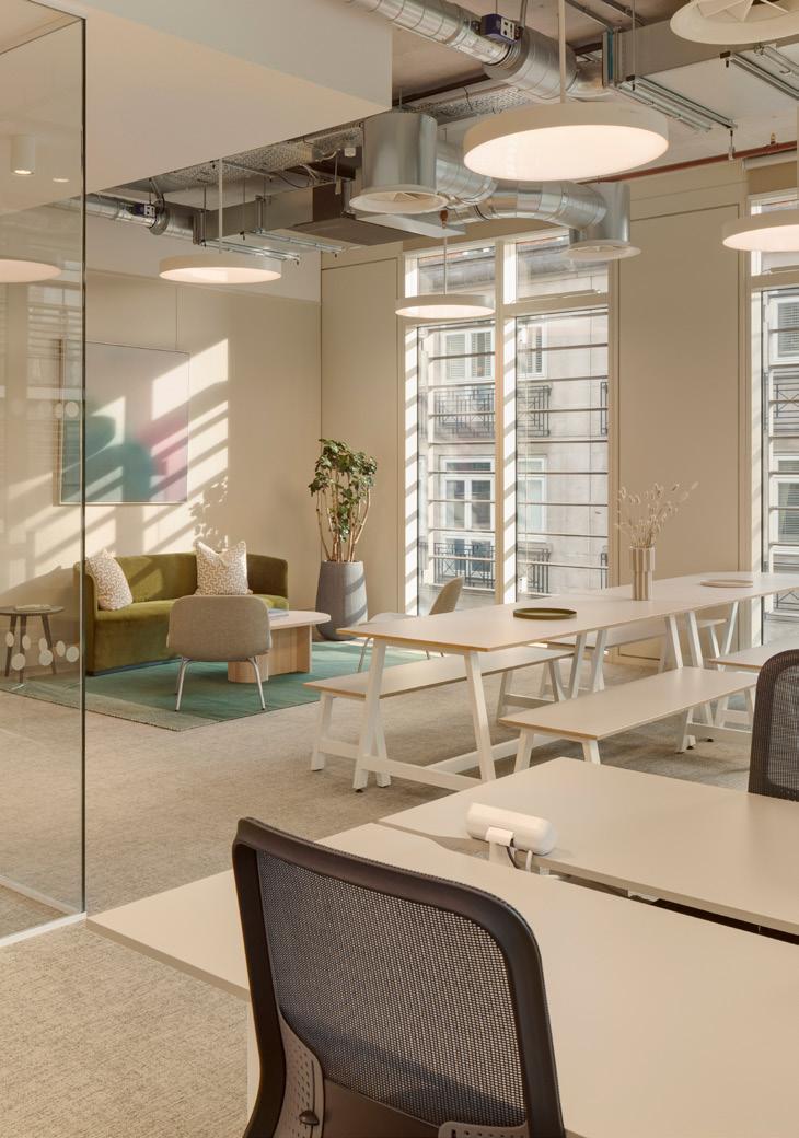
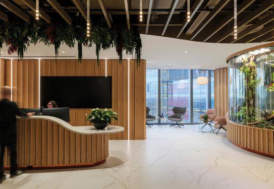
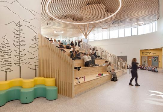
42 Case study: Pinterest, Dublin With surprises around every corner, Pinterest’s
eclectic new workspace –designed by MOLA Architects – is a joyful homage to its Dublin home.
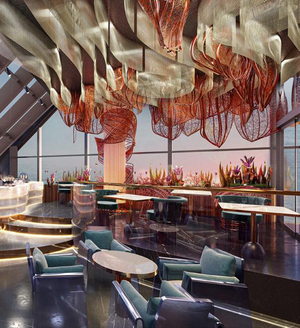
50 Case study: Mandarin Oriental Mayfair Curiosity and Studio Indigo blend British and Asian design languages to tell one compelling story.
56 Case study: Potterrow, Edinburgh
Just a stone’s throw from the Russell Group university, Jasper Sanders + Partners channel quintessential Edinburgh for a new generation of student living.
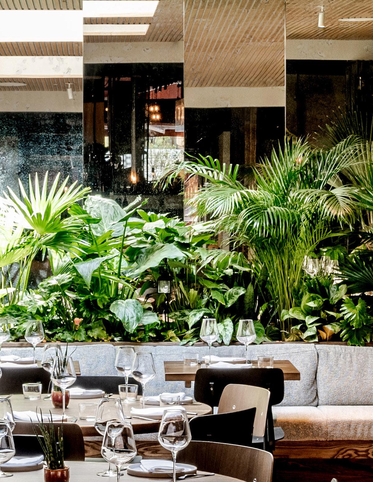
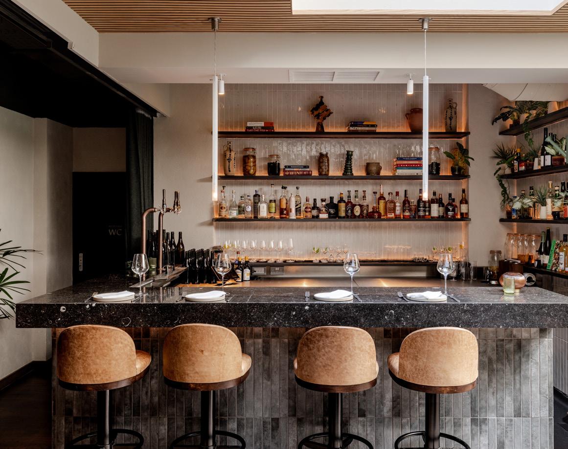
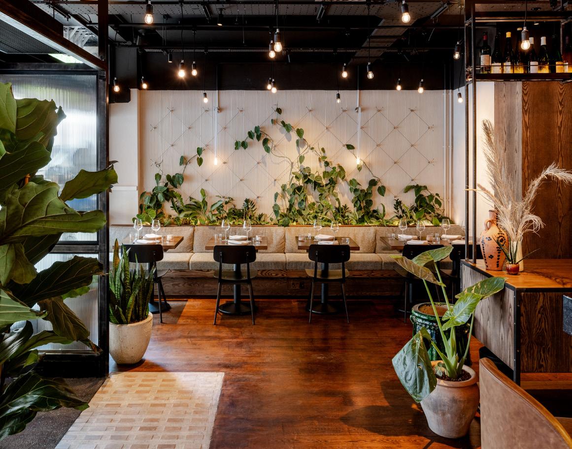
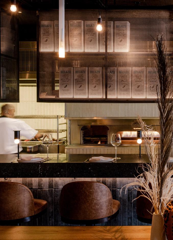
62 Case study: Carmel Fitzrovia Tel Aviv provides the inspiration for London’s latest dining destination, with interiors helmed by Mata Architects.
68 Case study: Myo New Street Square dMFK takes inspiration from the external architecture at flexible workspace provider Myo’s latest London offering.
74 Building Narrative
Patrick McCrae, CEO and co-founder of London-based art agency Artiq, explores how even the smallest details can forge cultural connections.
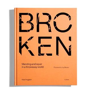
76 Positive Impact Katie Treggiden – author of Broken: Mending and Repair in a Throwaway World –explores how craft can be used as a form of activism.
80 Fast Forward PLP Architecture explore the future of research-led workspaces.
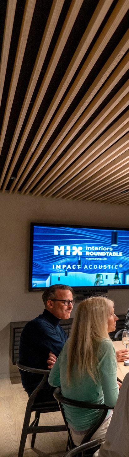
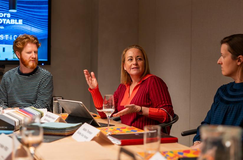
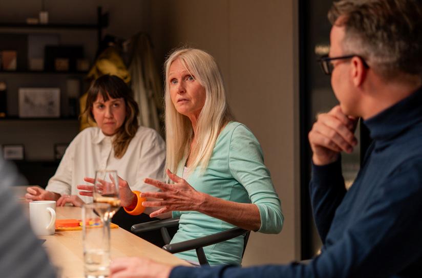
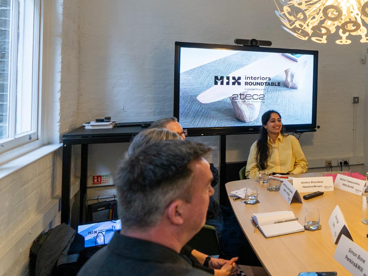
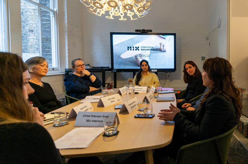
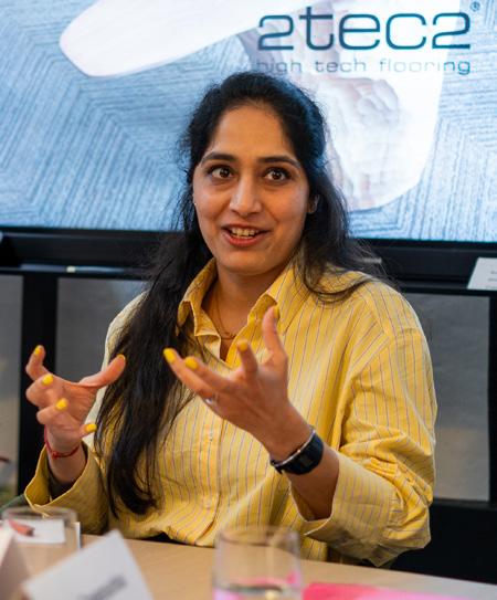
84 Mix Roundtable with Impact Acoustic Is colour a designer’s most important tool?
92 Mix Roundtable with 2tec2 Are honest conversations central to sustainable design?
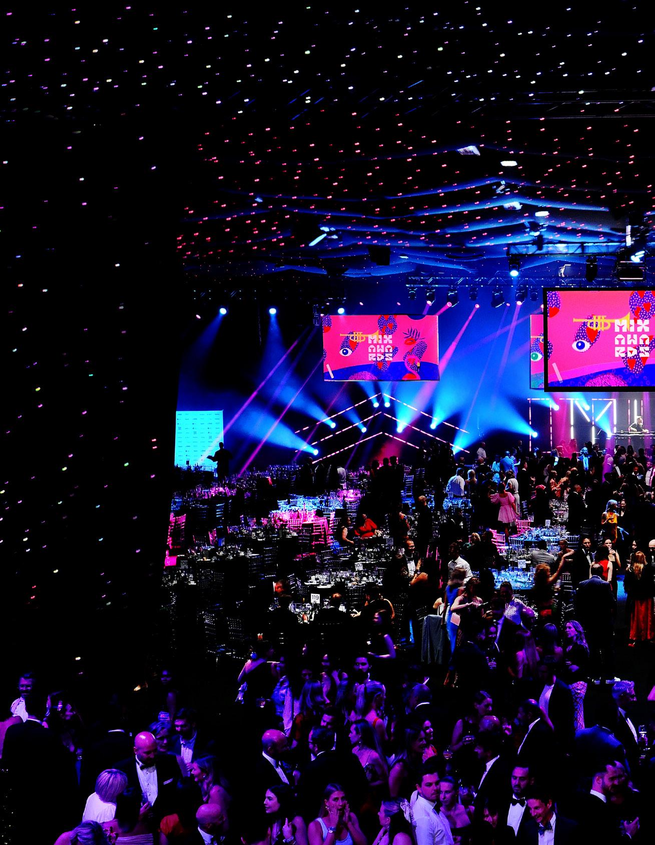
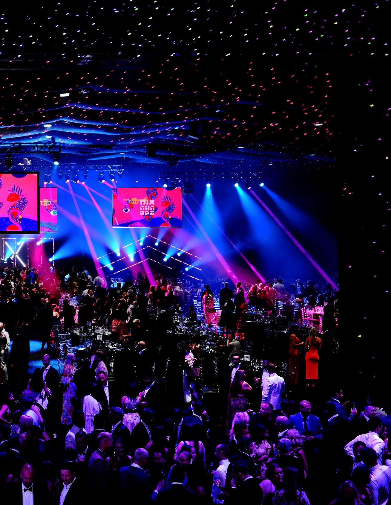
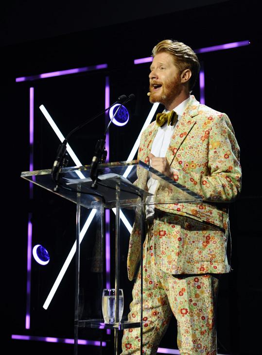
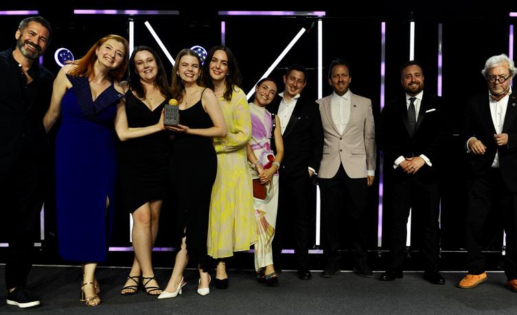
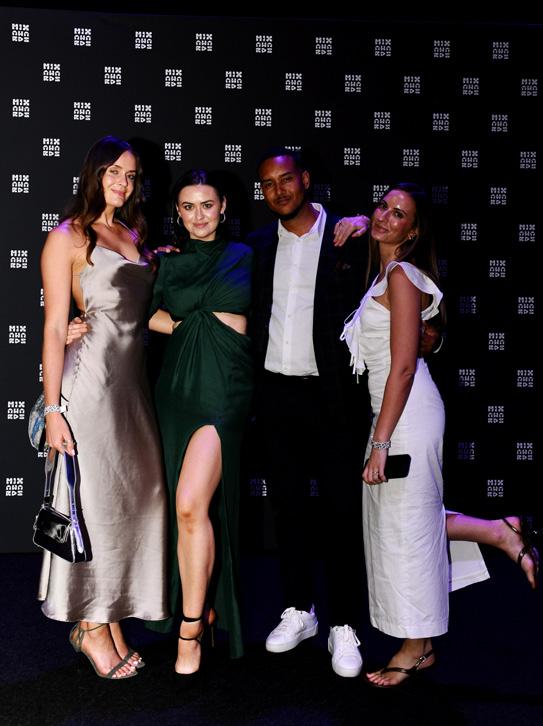
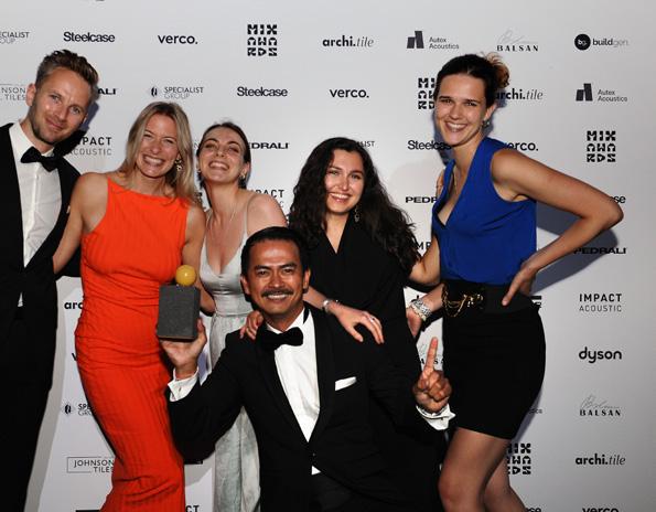
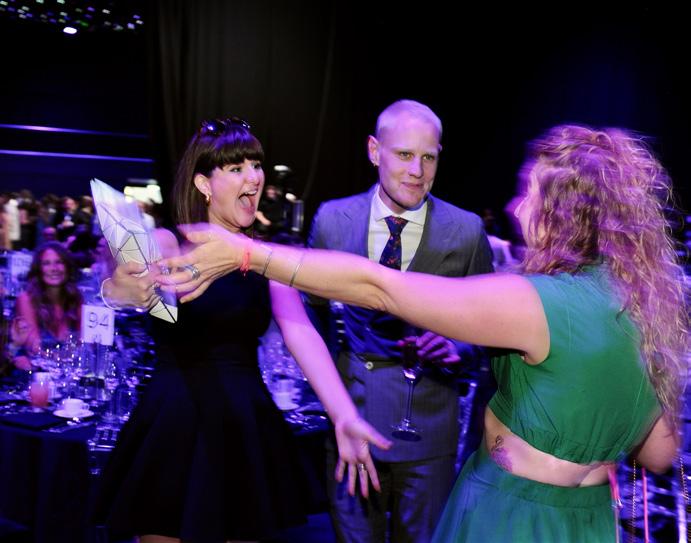
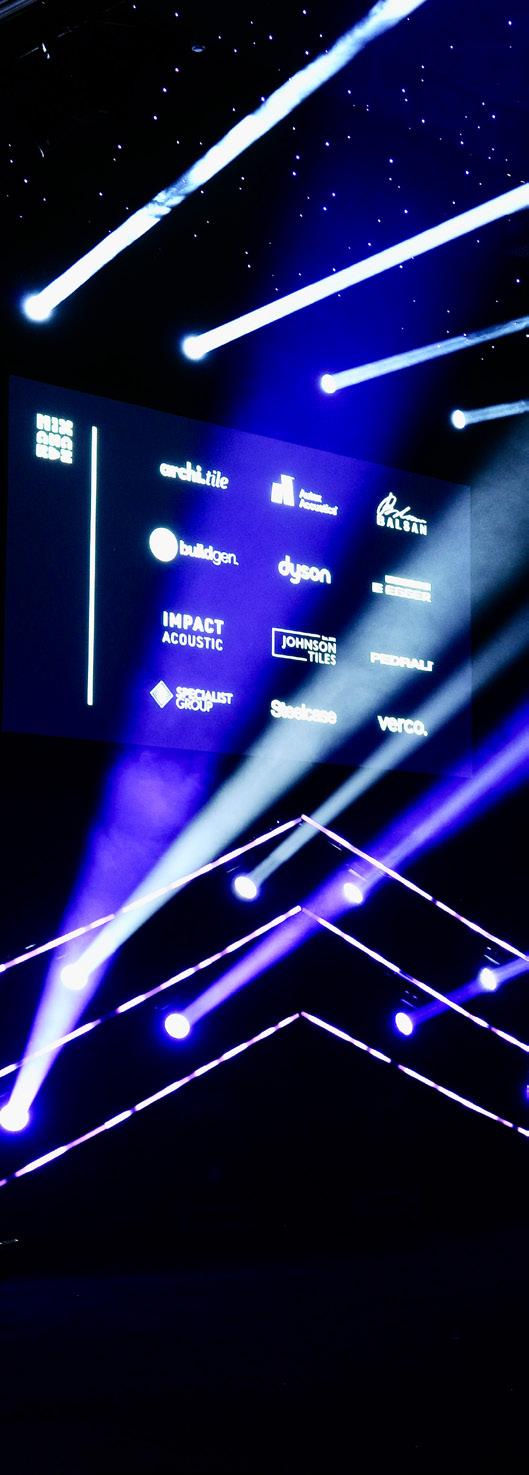
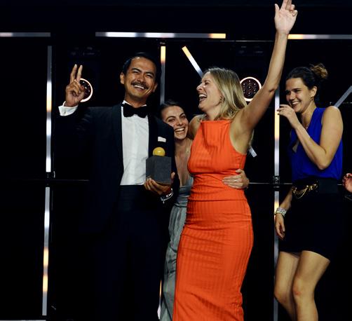
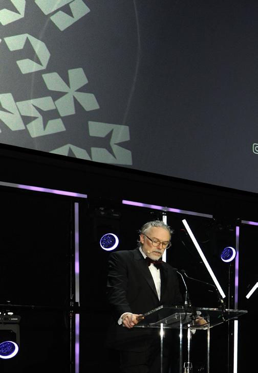
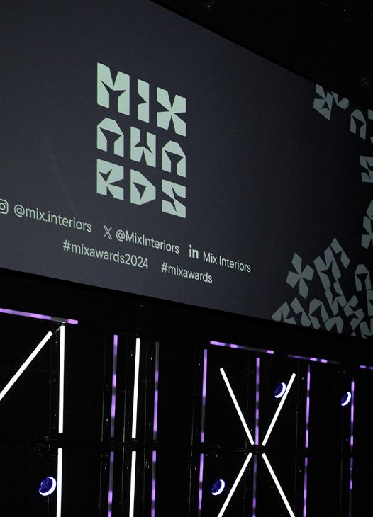
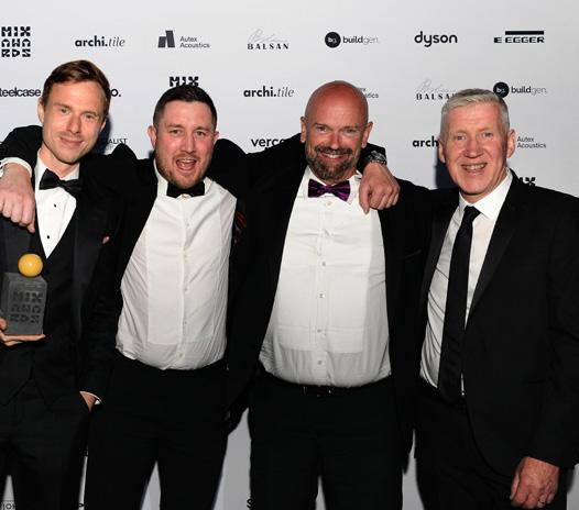
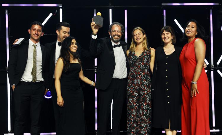
100 Mix Awards 2024
Following the 20th edition of Mix Awards, we share the highlights from this year’s unmissable event and our list of winners and category finalists.
126 Mix Talking Point
Have women been written out of design history? We explore the role gender has played in shaping creative credit and what that means for today.
130 Material Matters
Jordan Cluroe and Russell Whitehead – co-founders of 2LG Studio – share the products they return to when designing with the environment in mind.
131 Material Innovation
Swedish researchers at PaperShell reverse engineer paper back into 3D wood components, in a process they call ‘structural origami’.
132 Innovative Thinking
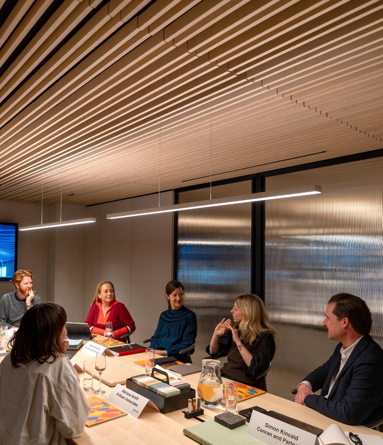
Steve Gale, head of strategy at M Moser Associates, explores agency and choice in the age of the smart workplace.
Colophon
The cover
Get in touch
Managing Editor
Harry McKinley harry@mixinteriors.com
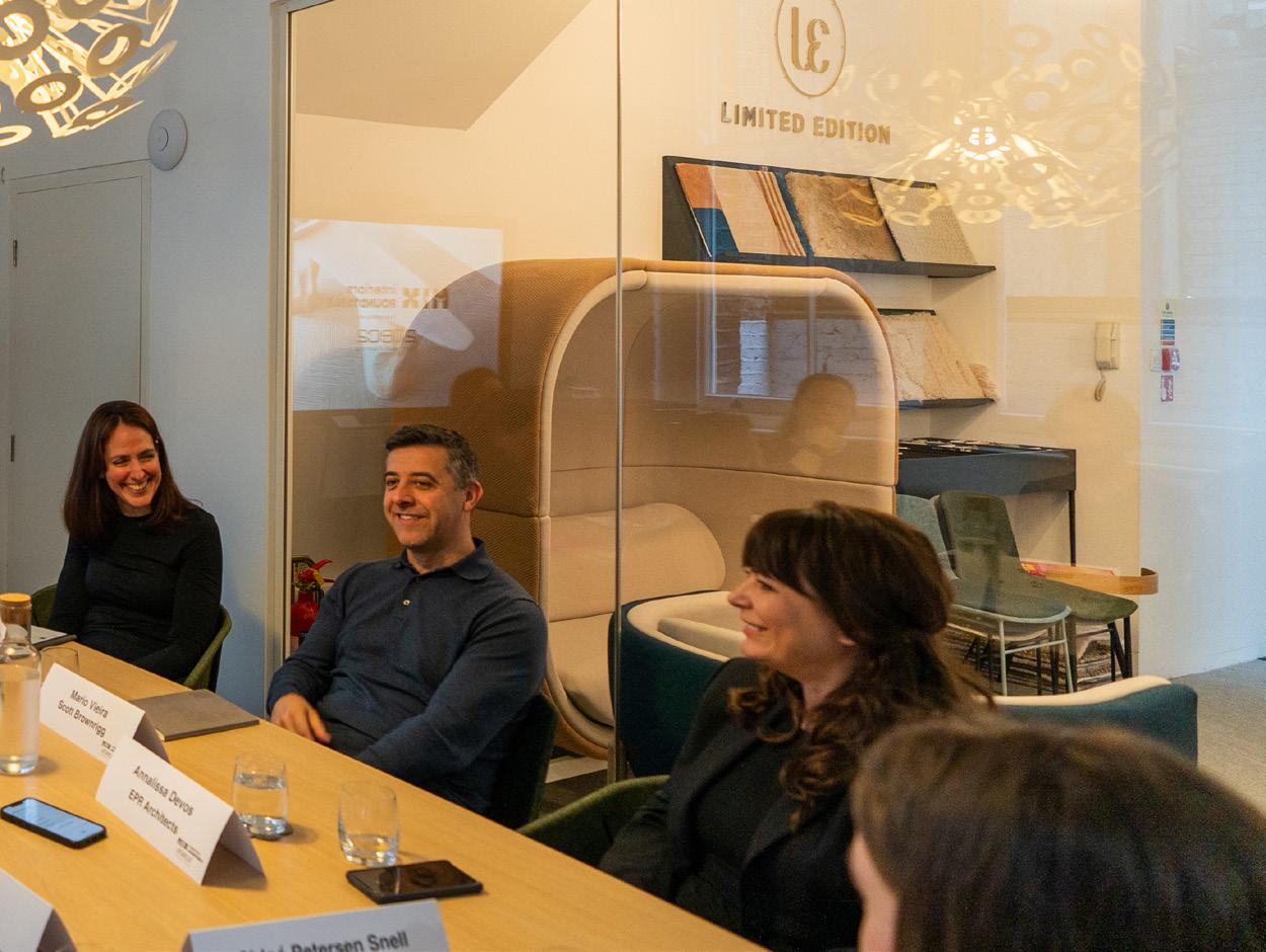
Deputy Editor
Chloé Petersen Snell chloe@mixinteriors.com
Editorial Assistant
Charlotte Slinger charlotte@mixinteriors.com
Managing Director
Leon March leon@mixinteriors.com
Account Manager
Stuart Sinclair stuart@mixinteriors.com
Account Manager
Patrick Bowley patrick@mixinteriors.com
Marketing Manager
Paul Appleby paul@mixinteriors.com
Head of Operations
Lisa Jackson lisa@mixinteriors.com
Art Director
Marçal Prats marcal@mixinteriors.com
Founding publisher
Henry Pugh
Columnists
Patrick McCrae
Steve Gale
Itai Palti
Laura Perryman
Contributors
Clare Dowdy
Natasha Levy
Dominic Lutyens
Katie Treggiden
Designer
Bluebottle’s designs have an element of discovery and we wanted to bring this to the cover design. As interior architects we’re given a defined space to work within. To evolve a design that reaches beyond those limitations is one of our challenges. Our spaces are built up as a layering of materials and colours and we enjoy finding the contrast that shows off a material. Karndean’s collection is designed to give a timeless look and sense of quality – we wanted to nod to its origin: stone quarries and their illusion of scale.
bluebottle.co.uk
Subscription
To ensure that a regular copy of Mix Interiors reaches you or to request back issues, call 0161 519 4850 or email lisa@mixinteriors.com
Manufacturer
Karndean has introduced its finest collection of statement stone and wood designs. Elevating flooring to an artform, the new Art Select range features 39 brand new designs, inspired by some of the most exclusive materials from around the world including marble onyx, Ceppo di Gré, oak and ash. As seen on the front cover of this issue of Mix magazine, onyx is unsuitable for flooring in its natural state but we have reinterpreted the pearlescent magic of this semi-precious stone into three luxurious designs; Rose, Pearl and Black Onyx.
karndean.com
Contact
Unit 2 Abito, 85 Greengate, Manchester M3 7NA
Telephone 0161 519 4850
editorial@mixinteriors.com www.mixinteriors.com
Twitter @mixinteriors
Instagram @mix.interiors
LinkedIn Mix Interiors
Harry McKinley
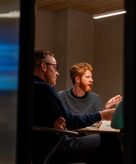
Welcome
We all see the world through a unique prism, our views and perspectives shaped by a combination of personal identities and lived experiences. It’s why diversity and inclusion are so crucial – not necessarily within the organised framework of controversial DEI programmes, but in their purest sense, positively acknowledging our differences and ensuring everyone has access to a seat at the table.
In the design industry, the result of greater diversity is the development of spaces and products that cater to a wider range of needs and desires. It opens up the potential of creating a fairer, more accessible world. It creates additional pathways to opportunity and it ensures more people feel seen, heard and represented – both in working practice and in the realisation of built environments.
At Mix Interiors, diversity of perspective and experience is central to our content ethos: be it providing a platform for emerging talent, alongside established leaders or in balancing gender, geography and disciplines to avoid becoming myopic; offering a range of thought-provoking, inspiring and foundationally uplifting design features.
While that is always our goal, this issue I wanted to spotlight what this means in practice. In our interview with Blacksheep’s Toni Black (p28), we hear about how ‘not looking the right way’ can prove a barrier to success in the design world. In our recurring Mix Talking Point (p126) Dominic Lutyens explores whether women have been written out of design history, and how this shapes the way we still credit creativity today. Our Fast Forward feature (p80) meanwhile, by sustainability afficionado Katie Treggiden, looks at ‘craftivism’, charting how what we make and how we make it can be used to address social issues, and in his Building Narrative column (p74), Patrick McCrae posits that even the smallest design details can be used to build connections with communities and help us access new cultures.
Of course, the wonderful thing about difference is that we don’t always have to agree and more often than not, there’s as much value in posing questions as delivering answers. I hope then, that amongst our swish case studies, discourse-encouraging Mix Roundtables and insightful thought-pieces, there’s something that opens a door onto a new way of considering or approaching design. Maybe even something that helps you see design through someone else’s eyes. Enjoy.
Harry McKinley Managing Editor
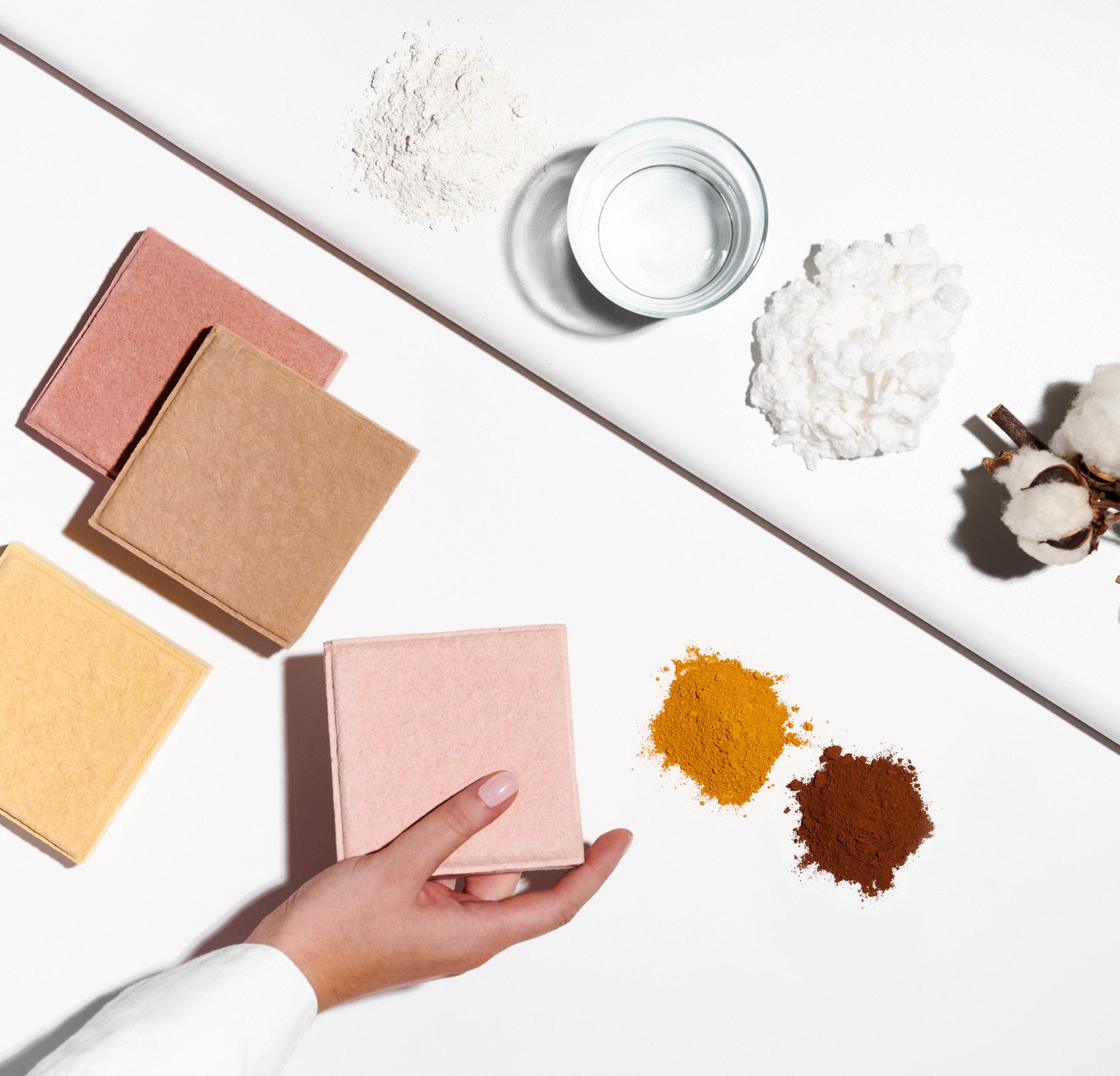
Circular acoustic solutions
All our acoustic products are made from waste materials such as discarded cotton linters or upcycled PET bottles.
Manufactured in Europe to your specific needs. Now available in UK and Ireland.
Visit impactacoustic.com or contact us today at uk@impactacoustic.com to learn more.
ARCHISONIC® Cotton is a natural product solution that solves the problem of sound absorption while being fully circular. The tiles are completely reusable and 100% of the sound absorbers can be returned to the production process at the end of their life.
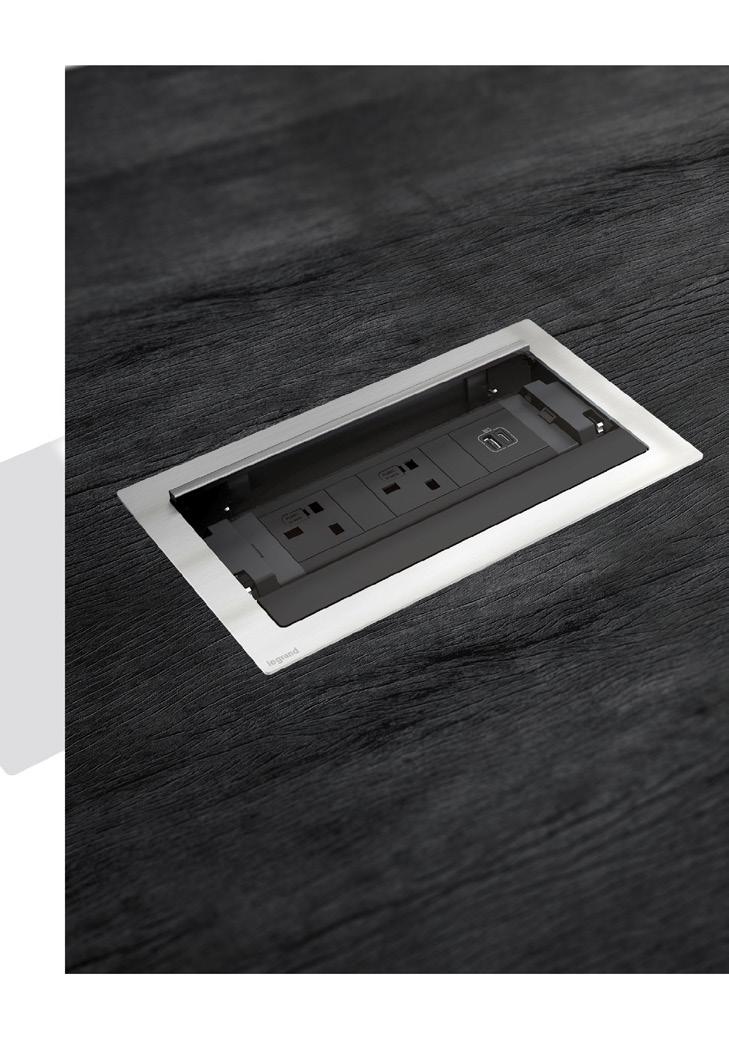
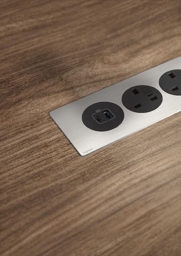
Incara is a range of functional, ergonomic wiring devices dedicated to any modern, flexible workspace, from office to hotel, café, airport or any other shared working environment.
INCARA™
A new standard
With hospitality destinations in seven different countries, Standard International has unveiled its latest hotel concept, The Manner. Set to arrive in New York this autumn, the interiors were led by Italian architect and designer Hannes Peer in collaboration with Standard International’s in-house design studio, and the hotel will find its home in one of Manhattan’s most stylish neighbourhoods: SoHo. The vision of executive chairman Amar Lalvani, The Manner pursues a laidback yet sophisticated residential feel, an elusive quality the hospitality group describes as “the generosity, discretion and effortlessness of staying with friends.”
The 97-key stay marks the hotel group’s first step into luxury hospitality, and is set to boast layered, textured interiors and top-tier amenities including integrated audio systems, marble bathrooms and chandeliers designed by Peer. The Manner is also Peer’s first hotel project, and as a result the architect has infused his signature residential style into the concept through details such as carefully selected sculptures and custom artwork. And while guests will find a host of luxury finishing touches, including Costa Brazil toiletries and linens by Anim, what they won’t find is a television set, these purposefully excluded from the design scheme.
Alongside its 97 guestrooms, The Manner will also be home to three different destinations for elevated food and drink. These have been revealed as Sloane’s, a chic cocktail bar on the second floor; Otter, a restaurant specialising in highquality seafood; and the Apartment, an exclusive lounge reserved for guests and their friends, developed with New York chef and restaurant owner Alex Stupak. stndintl.com
Blind endeavour
As global warming continues to impact our daily lives, the effects are often felt most keenly in the Global South. In particular, heatwaves have been occurring at an alarming rate in India, where temperatures have been reaching – or even exceeding – 40°C during the summer. Growing up in Udaipur, a
craft hub in northwest India, Central Saint Martins graduate Saima Fateh experienced first-hand how these rising temperatures are impacting local households and, in response, has developed a smart window blind system designed for a warmer future.
Fateh created and prototyped TranSense Screens during the final year of her Industrial Design MA at the London’s arts school. Aiming to make smart living simpler and more accessible, the screens react to a change in temperature and sunlight levels, keeping indoor temperatures as low as possible without the need for energy-consuming electrical components. Instead, the acrylic panels are moved manually by a spring made of a shape memory alloy called nitinol, which compresses when temperatures reach 30°C and pulls the vertical blinds into a closed position.
Photochromic pigments applied to the panels also change from white to orange when UV levels are high, a function Fateh added to increase awareness of UV exposure and help residents to plan their days accordingly and avoid peak times. “Engaging in a dialogue, the changing colours convey the invisible threats of UV radiation exposure, forming a sensory relationship between indoors and outdoors,” explains Fateh. “The design addresses the emotional cost of disconnecting from the natural elements during extreme weather conditions.”
behance.net/saimafateh
In with the new
Heritage England, the government’s heritage watchdog, has voted for a second time not to grant Foster + Partners’ City Hall building listed status. Despite causing some controversy among campaign groups such as the Twentieth Century Society, this decision (made on the grounds that the building is less than 30 years old) has cleared the way for global architecture and design firm Gensler, which is proposing to partially demolish and rejuvenate the London landmark on behalf of Kuwaiti developer St Martins Property.
First designed by Foster + Partners in 2002, the Thameside building – renamed 110 The Queen's Walk – has been vacant since the Greater London Authority moved to the Royal Docks’ Crystal building in 2021. Gensler’s proposed design concept would see the glazed façade partially removed, opening up the slanted, helmet-like structure with external terraces and planted balconies. Landscape architects LDA Design are also said to be overhauling the site’s adjoining public realm space, including a nearby garage space and the Scoop, an 800-seat outdoor amphitheatre.
Inside, plans include extending the building’s floors to incorporate new office space, as well as introducing retail attractions such as cafés, shops and restaurants to the ground floor – turning the former government building into what St Martins Property describes as “a forward-looking mixed-use destination”. Set on maximising the retention of embodied carbon, Gensler has already refined its original proposals from November 2023 to reduce steel use by 27%, a move that will reportedly save 812 tonnes of carbon dioxide.
gensler.com
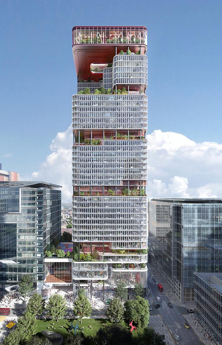
Mixed-use metropolis
Global architecture firm KPF (Kohn Pedersen Fox) has revealed its plans for 8 Canada Square, an expansive 1.1 million sq ft building in the heart of London’s commercial district. Currently the global headquarters for HSBC, the 45-storey skyscraper in Canary Wharf was originally designed by Foster + Partners in 2002, before being purchased by the Qatar Investment Authority (QIA). Alongside development partner Canary Wharf Group, the QIA held an international competition to design what they described as “one of the world’s largest redevelopment projects” – of which KPF was declared the winner.
The winning design concept gives the building new life as a sustainable, multiuse hub. Planning to cut multiple terraces into the tower’s façade, KPF is set to build best-in-class workspaces as well as leisure, entertainment, education and cultural destinations. These set-back terraces – accompanied by lush greenery – will reportedly act as breakout spaces, while at the pinnacle of the building, design renders show the 45th floor (a glazed, panoramic terrace) almost ‘floating’ above on slim structural pillars. Newly released images also show plans for a colourful spiral staircase in the external courtyard, connecting the array of offices, restaurants, bars and event spaces set to transform the site.
The scheme promises to provide green transport links in the form of an accessible route between the nearby Elizabeth line station and Canada Square Park, as well offer the public coveted views across London from Canary Wharf for the first time. Work is slated to begin in 2027, upon the expiry of HSBC’s lease on the building.
kpf.com
Lights on wall
MARVEL 3D
Atlas Concorde Park Studio | Via del Canaletto, 141 - Fiorano Modenese
Atlas Concorde Studio Milano | Via San Marco, 12 - Milano
MARVEL 3D
Atlas Concorde London Studio | 20 St John’s Lane – Clerkenwell – EC1M 4NB – London
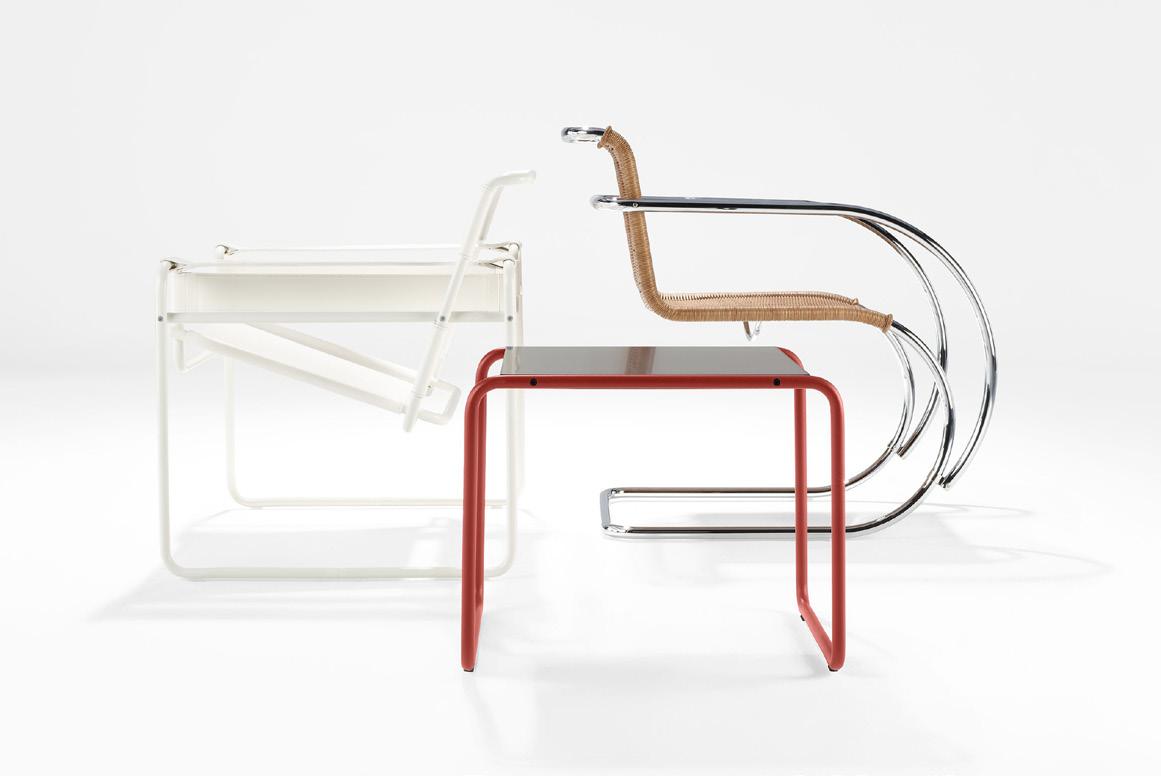
Retro revival
Breathing new life into an early 20thcentury classic, American furniture designer Knoll has introduced three new colourways for a selected number of its Bauhaus-era collections. Debuting new shades of white, onyx and an archival dark red, this marks the first time that the tubular steel pieces – first introduced when modernist designers Ludwig Mies van der Rohe and Marcel Breuer were attending the Bauhaus school – are being commercially produced in ultra-matte colours.
The new shades have been introduced for four of Knoll’s Bauhaus-era ranges: the MR Chair and MR Tables by Mies van der Rohe, the Wassily Chair, the Cesca Chairs and Stools, and the Laccio Tables by Breuer. Not just a modern interpretation of a classic, these newly launched colours have symbolic ties to the lauded arts institution. The dark red ultra-matte finish was inspired by a colour originally
offered on the MR Chair (a shade Mies van der Rohe favoured for his furniture frames), while the white and onyx were highly valued by Bauhaus designers for how they reflected or absorbed light, enhanced geometric forms and defined the edges of their work.
Collaborating with photographer and director Adam Jason Cohen, Knoll’s refreshed collections have been shot across a handful of significant locations in Los Angeles, including Venice Beach Skatepark. “The industrial materials connect with those emphasized in Bauhaus architecture,” explains Creative Director Suzanne Michaels, speaking to the backdrop of concrete, steel and glass. “The slabs, curves, and planes reflect the silhouettes of the products as well as the core geometries of that era.”
knoll.com
ADVANTAGES
• Comprehensive connectivity with USB-A & C fast charging
• Quick recharge within 3 hours
• User-friendly
• Energy efficient
Don’t
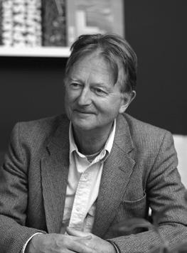
Things I've learnt
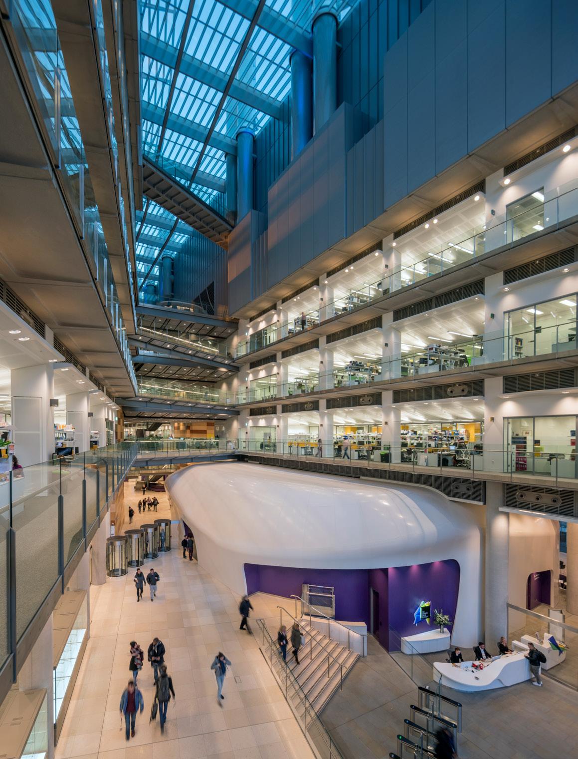
Yasmin Al-Ani Spence is director at WilkinsonEyre, focusing on modern methods of working and creating productive, effective workspaces; recently leading the retrofit of the Citi Bank Building in Canary Wharf, one of the largest workplace refurbishment projects in Europe that aims to set a benchmark in healthy, sustainable and balanced ways of working.
wilkinsoneyre.com @wilkinsoneyre
Always be bigger than the problem.
Before joining WilkinsonEyre I was desperate to find work, and with three kids to support, not working was not an option. I confided in a colleague how worried I was about the situation, and he simply said, “be bigger than the problem.” Being bigger means being proactive and never letting the problem overwhelm you. This is something that has really stayed with me.
We often get overwhelmed by problems or issues and can hold ourselves back. So, step back and give yourself time to think. Reach out to people who might be able to help and advise you. Don’t feel pressurised to make decisions on the spot. With so many means of immediate contact, we often think that we have to do it now. However, it is important to always take the necessary time to gather the relevant information.
Do more than you dare.
It’s a very simple lesson, but very much worth taking on board. Always try to do more and don’t get too comfortable in your comfort zone. Broaden your horizons, whether at work or at home, and always be ready to learn and do more.
People,
people, people.
Be kind to people, respect people, listen to people. Appreciate those that you work for and with. Empower and support people where you can and always nurture a positive and collaborative attitude at work. I truly believe that the most valuable asset we have is our relationships with people. Professionally, most of our projects are designed to be used by people, so it is important to always keep the end user in mind and how they will experience the building.
Keep an open mind.
I have said before, “I don’t like that” or “I wouldn’t do that.” But often enough it turns out that in the end, I do like it and, more than that, I have repeated materials and details that I initially did not support. Never say never.
Preparation.
Always be well prepared and on time. Manage your time well. I make a conscious effort to be aware of my diary and not to cancel my meetings. Keeping people waiting or cancelling at the very last minute is not a good a thing. I remember when I was starting out, project architects would leave me waiting only to be asked to catch up at the very end of the day. I promised myself that I wouldn’t do that and, so far, so good.
ALTO CANOPY HIGH & LOW BENCH
Giles Tettey Nartey
The height of design
Giles Tettey Nartey is an architect, artist and associate professor at the Bartlett School of Architecture. His work has been showcased at London Design Festival and Seoul Biennale.
gilestetteynartey.com
@gilestetteynartey
The item
Isamu Noguchi's Akari Light Sculptures
Why does this item represent the ‘height of design’ for you?
Isamu Noguchi's Akari light sculptures epitomise the beauty of simplicity and cultural craftsmanship. They do not rely on complicated materials, intricate processes or elaborate designs. Instead, they’re handmade using traditional Gifu lantern-making methods from central Japan, employing bamboo and washi paper crafted from the inner bark of the mulberry tree. They celebrate the elegance of simple materials and traditional craft techniques, embodying a poetic and ephemeral approach to design.
Creating an Akari sculpture requires a delicate hand and a sensitive disposition, which translates to how we handle the piece, inviting us to engage differently and be mindful of the pressure within our fingers; a gentler interaction with the world around us.
How does it inspire you or your work?
This item highlights the importance of engaging with and reimagining traditional craft techniques. The sculptures blur the line between art and design, which resonates deeply with my own practice. This intersection also extends to the idea of the material and immaterial, prompting questions about how people should engage with the work and what ideas have been embedded within it. Lastly, they celebrate the simple, mundane and everyday aspects of life, representing beauty in the ordinary.
What do you think has been the impact of this item?
Isamu Noguchi utilised traditional Japanese materials to introduce modern design into the home. His Akari
light sculptures became ubiquitous in interiors, blending seamlessly into everyday life and transforming our perception of sculpture. However, this success also led to a proliferation of commercial copycats, which have diluted the originality of Noguchi's designs. They often overshadow the authentic pieces, making them seem ordinary and reducing the appreciation for the artistry behind Noguchi's work.
The
personal connection
My personal relationship with this item is deeply rooted in the fundamental inspiration I draw from Noguchi's work. His interdisciplinary approach, blending art, design and landscape, has profoundly influenced my practice. I have been particularly drawn to his awe-inspiring poetic form-making and his use of materials to achieve a composition and balance that always straddles the material and immaterial – functional and nonfunctional. Noguchi referred to Akari as sculpture for the everyday. This philosophy continues to shape my understanding and creation of art and design.
If these last few years have taught us anything, it’s that offices are not simply four walls and some desks. When done right, they become vibrant hubs for collaboration, creativity, and connection, fuelling conversation and challenging ideas.
Workplaces are the lifeblood of our cities and towns, injecting energy into local businesses. We feel they are underrated, so we’ve launched the ‘Let’s Go to Work’ campaign to celebrate all the benefits of in-person collaboration at the office. Get in touch to learn more about what this campaign means to us.
Neuroaesthetics: colour’s invisible influence
Laura Perryman is a colour designer and forecaster with over 18 years of experience in CMF design across multiple industries. The author of The Colour Bible, she is interested in material and sensorial experiences of colour. She directs Colour of Saying, a UK-based colour and material futures consultancy.
colourofsaying.com
@colour_of_saying
Have you ever noticed how a colour tickles your senses? Does it give you goosebumps, an instant smile, or a feeling of warmth and familiarity as you walk into a space? As we process that colour visually, through touch and even taste, millions of neurons light up and activate our brains, sending signals and shaping our behaviours and responses. Colour and aesthetics are more than we see, fast becoming a full-body experience.
Colour choices are so significant to humans that the first question I usually get asked when I tell people what I do is: what colours should I paint my favourite spaces? It’s a conversation starter but also an accessible subject. My responses lean close as always to my philosophy. Far from it being a top-down process – of saying what colours are ‘on trend’ – I try to instead understand what people or communities genuinely need from the space and I couple that with the knowledge and deeper understanding of the emotional, psychological and even physiological power of colour. These aspects highlight well that colour is a multifaceted and collaborative topic, and I argue when linked
with textures and materiality, one of the most important sensory design tools we have.
If we take a moment to go beyond what just big brands need from colour, to what we as humans benefit from on many levels – from tactility to aesthetics – the new world of neuroaesthetics moves colour psychology into a sciencebacked, multi-sensory design approach. In the past, we’ve seen the impact of aesthetics with positive mood-enhancing benefits, which are vital for healthcare spaces through homes and public spaces. As we become more in tune with our emotional responses to physical spaces and their colours, neuroaesthetics is the measurable impact of aesthetic experiences on our brains, bodies and behaviours. In truth, and through proof, it can spell new ways to nuance spaces and design for belonging, transformation and social wellbeing. Design’s role is pivotal in transforming these science-based insights into beneficial design innovations.
Designers are taking up designing for ambience and momentum is growing. Google, Samsung and Moooi, consciously or unconsciously,
designed ambient effects, through colour, light and sound to influence our state of mind or behaviour at this year’s Milan Design Week. Previously, at Milan Design Week 2019, Google collaborated with Johns Hopkins University, Muuto and Reddymade Architecture on an installation exploring design’s impact on our biology and wellbeing. Individuals’ responses to texture, form, colour and scent were measured using screenless wristbands as they explored rooms with different aesthetic moods. Visitors were then given artfully designed representations of their data to help them make sense of the relationship between what they experienced and how it made them feel. In architecture, Thomas Heatherwick launched ‘Humanise’ in 2023, an initiative that calls for the end of “boring” buildings and instead advocated for public spaces to be more inspiring, with intentional uses of colours and materials that promote social interaction and have positive effects on local communities. It’s clear collaboration with science, design and communities is critical, but colour is one of the connective threads.
Blacksheep’s
interior director and partner,
Toni Black, discusses lightbulb moments, creating magic and why design should always involve a little fun.
Everything different
Words: Natasha Levy
On the morning that I meet Toni Black, partner and interior director of Blacksheep, I get lost. The branding, interiors and architecture studio is based inside The Leather Market: a sprawling Grade II-listed building close to London Bridge station that traded animal hides during the 19th century, but now home to offices. After navigating my way past a confusing door buzzer, several flights of stairs and a winding corridor, I eventually locate Black, who greets me with a hug and reassuringly admits she often finds it tricky getting into the building herself. Warm and down to earth, Black is far from the pretentious, too-cool-for-school types who are easy to come by in the creative industries. “For me, design shouldn't be snooty – at Blacksheep we don't turn our noses up at things, we're here to learn, develop and understand,” Black says after we settle in at the onsite cafe. “Taking away that level of formality to understand a client and have
conversations is key. We haven't got egos over here. It's not about what we want, it's about working together to create something magical.”
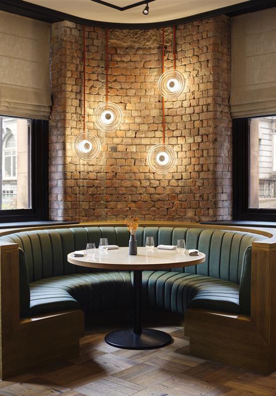
Adopting this relaxed, open-minded approach to design has allowed Blacksheep to work on an impressively rich variety of projects since its founding in 2002 by hospitality savant Tim Mutton. This includes creating an opulent marblelined restaurant for a Kazakhstan outpost of the Ritz-Carlton; refining the fit-out of over 200 branches of burger chain Five Guys; giving a rustic revamp to Quattro Passi al Pescatore, a revered seafood spot in Sardinia; and developing a cartoonishly playful visual identity for the Cardo Brussels Hotel. Most recently the studio has overhauled an Edwardianera drapery warehouse in Manchester to form Skof, an understatedly upscale eatery featuring bare-brick walls and comfy leather seating.
“Every single one of our projects feels completely different,” confirms Black. “There's some designers out there that have a set style, but we don't; everything is about that individual narrative. We question, we challenge, and we try to get clients to open their minds; I think that's why they come to us.”
It’s rather fitting that Black has ended up at a design studio with such a multifaceted portfolio, given that her own creative background is diverse. “I grew up in a concrete jungle, in the heart of London: my family and I lived in between Lambeth and Vauxhall Bridge,” she reflects. “My sister studied art, so she always used to go to galleries. Once she took me to Tate Britain and I just fell in love – as a child it felt like such a grand space, seeing those high ceilings and all the amazing paintings.” She also found joy in singing, dancing and acting, so much so that she ended up being one of the first people to be offered a place at BRIT School – the esteemed performing arts institution in Croydon, known for birthing stars such as Adele, Tom Holland, Raye and FKA Twigs. Her fondness for the stage remained constant throughout her studies, yet Black found that she was increasingly drawn to spending time in the school’s art and design technology studios.
She would go on to do an art foundation course at Camberwell College of Arts, which she fondly remembers as being “the best year of her life”. The 12-month study period allowed Black to engage with, and broaden her understanding of, different creative practices, particularly interior design: “It was a lightbulb moment – I realised it wasn’t just about choosing fabric and cushions”.
By 2002 Black had graduated with a BA in interior and spatial design from Chelsea School of Arts, but finding a job after university proved harder than expected. The design industry’s lack of diversity and subsequent prejudices also added another layer of complexity. “It was very cliquey,” she says. “I would leave interviews and say to my husband ‘I didn’t get that [job]...I didn’t look like the right person’”.
Left: St. Regis, Rome
Below: Noxe, Barcelona
Right: Akira Back, Prince De Galles
“We don't set a style; everything is about individual narrative.”
Black eventually secured a junior lighting designer post at surveyors GIA, a deeply informative role which she held for nearly four years. “I'm happy my journey went that way because I think that's one thing that I didn't study in university: the lighting aspect of projects,” she explains. “We brushed over it, but there wasn’t a module that helped you understand how lights can change someone's mood, or how we communicate; I learned so much.” Why did she decide to move on? “I was looking at other interior designers’ work and thinking ‘I could have done that’,” she chuckles.
Black’s next step was an interior designer role at international firm Areen Design, where she spent a decade, before arriving at Blacksheep as a design associate in 2019. The studio’s holistic work method was unlike what Black had experienced in her professional past – rather than solely designing a space, Blacksheep starts by doing a deep-dive on each client’s brand and audience, and then uses these insights to guide their architecture and interiors plans. “I guess it's in Blacksheep’s name. There's just something different about their processes,” says Black. “At first I didn't get it, but when they explained
that everything is led by brand, I thought it was a super cool angle; I wanted to be part of it.” Within a year Black was promoted to interior director and asked to steer the studio’s growing number of luxury hotel and lifestyle projects.
The latest spearheaded by Black’s team includes Linn House: a guest retreat established by Scottish whisky distillers Chivas Brothers on the banks of the River Isla. Designed to embrace the concept of còsagach (a Gaelic term that purportedly means snug or sheltered, once billed as Scotland’s equivalent to hygge) the venue has been decked out with earth tones derived from the surrounding rural landscape, brass fixtures and a plush, tartan-print fabric scheme. There’s also Akira Back, a Michelin-starred JapaneseKorean restaurant set within Paris’ grand Prince de Galles hotel. The building’s listed status meant the Blacksheep team were restricted in terms of how much change they could execute but, with the help of smoked-glass panels and dark wood furnishings, they were able to give the interior a sumptuous feel.
“We couldn't screw anything into the walls and we had to keep the floor,” recalls Black. “We thought, how are we going to transform this space into something that looks as sexy as it does now? But I like challenges. An amazing project to me is when we take an existing space and we have to reimagine it, especially when there's a lot of constraints – because now we have to think outside the box.” Blacksheep has additionally been commissioned to design the Akira Back location inside The St. Regis Rome, which Black gleefully tells me has a “maze-like” layout. Doors will open in September of this year.
It’s clear that Blacksheep delight in designing for the giants of the hospitality sector, but going forward Black is also keen to work with more independent boutique hotels, especially if she and her
team can be involved from the ground up. “The beauty about creating something completely new is that you're making your own parameters,” she says. “When someone comes to us and says ‘I've got an idea for a hotel, can I work with you?’ and we get to define that vision, that's the dream.” And it seems this dream is already becoming a reality. As we wrap up, Black tells me of the studio’s next project taking shape in the US: a 12-bed hotel in small-town Virginia, the interiors of which will take inspiration from the aesthetic of old-school passenger trains (owing to the owner’s past as a railroad engineer). “This is what made me fall in love with Blacksheep: we're not just targeting corporate or high-end, we're targeting creativity,” she adds. “We always get to have a little fun.”
Left, above: Montcalm, London
Left below: Skof, Manchester
Above: Bar 1920, Prince de Galles
Building stories Building storeys
Orms Architects’ John McRae on creating spaces with soul and designing in an accelerated age.
Words: Chloé Petersen Snell
Photography: Courtesy of Orms
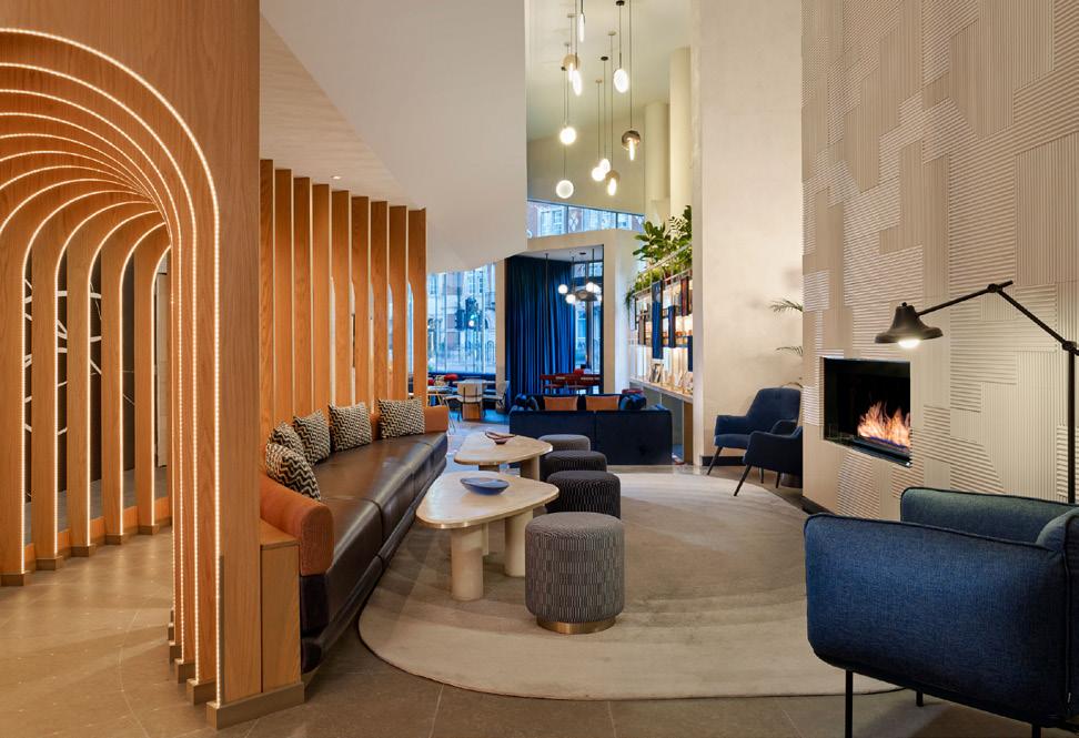
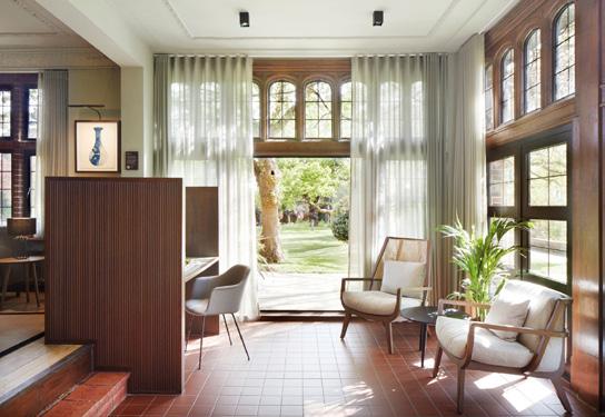
After 10 years at Oliver’s Yard, Orms has moved to 160 Old Street – a refurbishment project the studio completed in 2018 – doubling its occupational footprint and providing a ‘shop window’ for the practice’s people – and planet – focused way of working. Display shelving in warm, natural wood lines the entrance, detailing upcoming projects and acting as a working material library. The shelves guide guests to a welcoming brown sofa system set against oxide red walls, dotted with large format shots of celebrated projects. It’s here I meet director John McRae; a warm and enthusiastic person with a soft Scottish accent. “[The library] was a gentle way of introducing people
to the practice, whether you know us or not,” he details. “It will refresh as projects move on, with different samples and models, investigations that we've done, materials that we're looking at and CGIs.”
The interiors were designed in collaboration with Tutto Bene, a partnership formed after working together on The Standard, King’s Cross. A variety of working environments are provided for a fast-growing team, jumping from 65 to 105 in the past 12 months. A large meeting room transforms to host weekly whole-team meetings, with a moveable screen that opens up to a wider café space.
Typical for an Orms project, reuse is rife – furniture from the old office has been reupholstered and re-stained, and carpet tiles and lighting from the old office were sold for reconditioning. Lighting has been a significant consideration, avoiding any CAT A fixtures and instead utilising demountable fittings alongside quieter spotlights and lamps. “We’ve done it in a way that’s much softer and gives a sense of calmness,” McRae notes, “but more importantly, we can disassemble it. There are 100,000 light fittings a week stripped out from buildings across the UK and only 7% were recycled. That's absolutely frightening. We’ve aligned ourselves with a working group called End CAT A Waste, asking: can you reuse it? Can you remanufacture it? ‘Recycle’ is actually at the bottom of the triangle – if you absolutely can’t do anything else then yes, recycle.”
Originally from oil-rich Aberdeen, McRae recalls his English teacher as the first to set him on his current path, recognising his talent for art and design and guiding him to a trainee architectural technician position straight after school. “One day [the director] sat me down and said, you're going
to get really bored being an architectural technician; you've got an interview at Scott Sutherland School of Architecture in two weeks. Nobody in my family had ever gone to university, so there was a lot of the unknown. I put my portfolio together, was offered a place and suddenly I was on this architectural journey.”
At the time, there was a shift in the way architecture was approached at the school – moving away from the technical to the intellectual and the importance of people. He remembers Charles Rattray and Graeme Hutton, the two tutors who made the biggest impact on the way he works today – responsible for his appreciation of the experiential and who, ultimately, led him to Orms.
“The thing that Charles [Rattray] brought to architecture was the experience of the building from when you approach it. The thing that always stuck with me, is that he did it with humour. You find that architecture can be quite demanding and quite serious, but if you're able to cut it with some humour, it helps a hell of a lot.”
During university McRae visited London on a class trip, buoyed by the city and its possibilities, returning later to interview at Foster + Partners for his year out. “I remember the trip so vividly, standing on Southwark bridge and thinking, I'm going to live here one day. I just had this sense that I wanted to be in this city that is so vibrant. Graeme [Hutton] heard that I was going to see Fosters, and he said, well, let me speak to one of my friends at Orms. An hour after the meeting, I had a job offer.”
26 years later and McRae is a trustee and a director of the practice alongside Colin McColl, Simon Whittaker and founder Oliver Richards. “It's been a really interesting journey – of course, there have been moments where you think, have I been here too long? Am I being pushed enough? The beauty of being at Orms is that I've always been afforded opportunities to push new boundaries, look at new things, become a leader within the practice. To me, that idea of people, including the people that you work with, is really important.”
The studio’s projects span workplace, hospitality and public sector – most notably in recent years the muchlauded The Standard hotel in King’s Cross, which saw Orms mastermind the transformation of the 1974 Brutalist Camden Town Hall Annexe into the hotel group’s first UK property. The conversion of the former office block to modern hotel played to Orms’ strengths as masters of refurbishment and renovation, and opened the practice’s eyes and mind to
Image on previous page: John McRae
Below left: Orms' office at 160 Old Street
Left: The Standard, photography David Cleveland
Below right: 160 Old Street
“proper interior design”, as McRae attests, working alongside interior designer Shawn Hausman Design.
Centre: One New Oxford Street.
Image: Timothy Soar
Right: The Standard.
Image: Timothy Soar
“Seeing [the interiors] brought together and witnessing the lighting and the choice of colours and materials to create that theatrical backdrop was really fascinating. It’s something that stuck with me – whilst we did interiors and interior architecture, it’s very different to interior design when it's done really well. Since then, we’ve done a lot of collaborations – the idea that you can work together to create the right thing for people to experience and enjoy.”
Other landmark projects include the practice’s award-winning work at Teenage Cancer Trust in Cardiff; developed in collaboration with teenagers, their families and staff and offering a range of clinical treatment areas and private areas. Social spaces provide relaxation and relief for those struggling to come to terms with their condition and bedrooms are personalised to allow patients to select their preferred lighting, temperature and even curtain settings. Woodland imagery features heavily, with sensitive choices of colours and materials – muted and calming darker tones selected by patients.
“[I sat down next to] a young patient in the corner of the ward, just looking around,” McRae recalls. “He said, ‘I'm just absorbing what you've done, because this is going to be really amazing for how I engage in my treatment and how it might help me get better.’ That was one of those big moments where you’re reminded that what you do can have a positive impact.”
In front of me sits a copy of ‘Ultrapractical – architecture for an accelerated age,’ a handbook published by Orms and developed with Sven Muendner and Rory Olcayto of Beispiel. Spurred by the pandemic, the book was an opportunity to explore and summarise what is important to the practice, which celebrates 40 years in 2024. Through interviews and workshops five principles were established – urging constant reflection on whether one’s work aligns with them across all activities, from design to client presentations.
“The principles are intentionally open ended,” McRae notes, “so you can dip in and dip out, just like design. Things change. I think it encompasses our characteristics, our principles, our goals. ‘Ultra’ is going above and beyond, and that's what's important to us. One
Left: Teenage Cancer Trust.
Image: James Brittain
“You find that architecture can be quite demanding and quite serious, but if you're able to cut it with some humour, it helps a hell of a lot.”
of the words we focus on is ‘custodian’. Custodian is not in any brief – it's a responsibility as an architect, asking how you respect and understand the past to then inform the future. Research and understanding the context is really important to us – which is key in refurbishing buildings. We like to understand how a site has evolved, what the original intention was and how it can help inform how we retune it.”
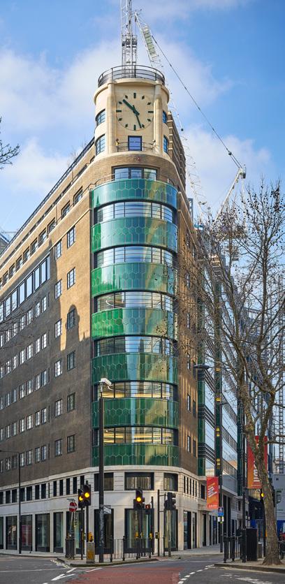
At No1 New Oxford Street, this meant the refurbishment and extension of a 1939 building originally designed by Henry Philip Cart De Lafontaine, blending historic Art Moderne elements with modern functionality. The team found the original marketing brochure for the building in a library in Paris, with La Fontaine’s initial plans featuring hexagonal green tiles – not permitted by Giles Gilbert Scott, who was the advisor to the Crown and considered the tiles ‘an innovation’. Orms restored the building’s distinctive prow with the tiles, honouring Lafontaine nearly 100 years later.
“It added the soul and the character to the building, which is one of the big challenges, especially within workplace,” McRae says. “How do you turn something that is seen to be unloved into something that everybody desires? It has to make money; it has to be efficient. But that doesn't mean it can't be generous in its giving, and I think that's something that we also feel quite strongly about.”
Our time together has run considerably over and talk turns to future plans. Another hotel on the drawing board – a renovated listed building on the Thamesand plenty more exciting refurbishments, as well as plans to welcome two new directors later in the year. “The process of design is as important as the outcome of that process,” McRae muses. “We call it our garden – working with the best people, working with the best clients, working with the best contractors that we possibly can, it makes a big difference. Because ultimately, you're only as good as your last project. We’re always asking, where do we step up from here?”
A little spatial kindness goes a long way
and place.
and urban design practice.
A few years ago I was on my first grocery run in a new part of town. The closest store was closed so I crossed the street to the next one where the cashier, with a warm, kind smile saw me off with a cheery “welcome to the neighbourhood!”. In the four years I lived on that street, I always walked a little farther than needed for groceries.
We all have a story of an act of kindness that affected our loyalty to something, and they’re most often based on deeds that went beyond the expected; gestures unrelated to the nature of an exchange.
This, of course, hasn’t escaped the attention of smart marketing strategists.
A brand’s ultimate goal is to create meaningful emotional connections with customers. Some have been more successful than others, but a society well versed in the language of capitalism will inevitably look at acts of kindness from corporations with a healthy dose of distrust.
Multinational brands are unlikely to have a genuine interest in our personal wellbeing, or that of our community. For this reason, they have more success in
projecting values that might resonate. Yet many fail, and we often ‘don’t buy’ corporate signalling – for example, the LGBT community collectively rolls its eyes every June when brand logos briefly adorn rainbow colours.
In contrast, commercial property owners could have a much easier time genuinely connecting with people and communities, though they’ve largely ignored the prospect. The basis for this unique opportunity is a simple logic: it pays to be generous to your geographic surroundings because local ecosystems thrive from collective synergy. Local comradery is common sense, not a cynical ploy.
The idea is straightforward yet profound: spatial kindness, to create environments that invite people to linger, explore, and connect without the pressure of constant commercial transactions. In an era when urban spaces are relentlessly commodified, this gesture can foster deeper place attachment, key to the longterm vitality of places.
Place attachment, a concept well-explored in environmental psychology, refers to the
emotional bond between individuals and specific places. Research suggests that environments that facilitate positive experiences and social interactions enhance this attachment. Designing spaces that feel open, welcoming and accommodating, rather than projecting solely economic interests is key.
While the immediate benefits of spatial kindness are evident in the enhanced experiences of visitors, the long-term advantages for property owners are significant. Places that foster place attachment are more likely to see repeat visitors, as well as proenvironmental behaviour – a desire to protect a place and see it thrive. Property owners who prioritise return visits over short-term transactions will likely see sustained engagement and loyalty, contributing to the long-term relevance and resilience of their spaces.
I’m not suggesting spatial kindness as philanthropy, or a purely commercial interest. It is the junction where profits meet collective wellbeing without the usual cynicism. These are the places we’d walk a little farther to visit.
Itai Palti is a practicing architect, researcher, and multidisciplinary artist focusing on the relationship between people
He is Director of Hume, a science-informed architecture
IMAGINE YOUR SPACE
Imagine a space where inspiration can run free. A world that tells your own story, every single day. At RAK Ceramics we help create the perfect living space, for you and your loved ones. Imagine your space.
Words: Chloé Petersen Snell
Photography: Joel Galang and Donal Murphy
Delira and excira
With showstopping surprises around every corner, Pinterest’s new workspace is a joyful homage to its Dublin home.
Dublin occupies a unique spot in Irish history, with a ubiquitous warmth and humour that has charmed prominent literary figures for hundreds of years, from Oscar Wilde to James Joyce. In more recent times the city has attracted a different type of enterprise – as part of the EU and with English as one of its main languages (alongside the lowest corporation tax in Europe), many international companies have found their home in the Irish capital, from LinkedIn and HubSpot to Microsoft and Google. Joining this roster
is American image-sharing platform Pinterest’s EMEA HQ – writing its own story in the heart of the city.
It's within this backdrop that MOLA Architects and contractors T&I fitouts were challenged with creating a living, breathing version of a Pinterest board for Ireland, and in particular Dublin. The brief, developed in collaboration with Pinterest’s design and construction team, included the need for complete flexibility, aligned with the company’s unique
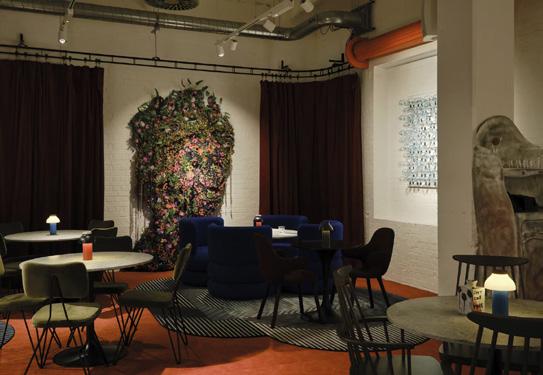
Below left: Secret Garden room in All Hands area
Below right: Aran jumper meeting room
we design silence
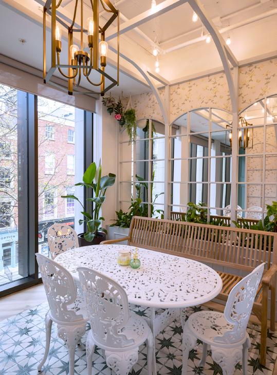
‘Pinflex’ model that provides employees the autonomy to live and work flexibly. Catering for just under 300 employees with only 60 traditional desks, the new workplace was built for functionality and new ways of working, yes, but also celebrates the sheer joy of design –creating something truly fitting to the spirit of Pinterest. This new chapter is a journey through the landscape, culture and mythology of Ireland, beginning with the urban cityscapes in the reception (complete with bespoke stained glass in the imitation shop windows) through to Trinity college and onwards, through a myriad of Irish landscapes brought to life by MOLA through carefully chosen finishes, textures and bespoke design elements.
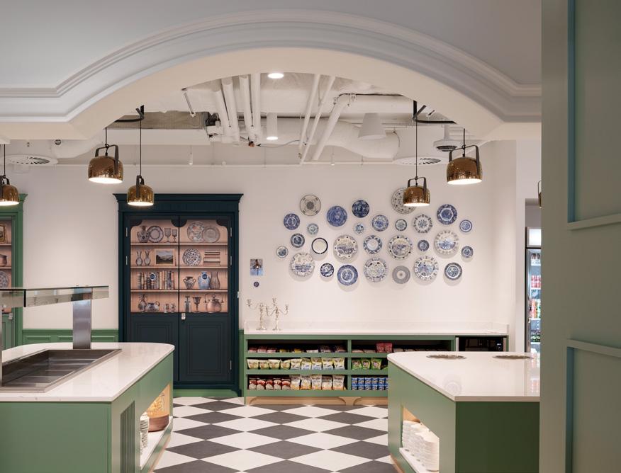
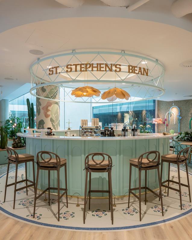
Welcoming guests and staff, a barista coffee bar with bespoke mosaic flooring sits at the opening of the ‘All-Hands’
“Given the location, the inclusion of a pub was almost inevitable.”
cafeteria and events space, providing a space to welcome guests and provide chance encounters between colleagues over a morning brew. Inspired by the manor houses of the Irish countryside, the All-Hands space features an eclectic mix of flexible furniture, including bespoke soft seating that slots into place with an innovative magnet system. A large audio and visual wall holds attention at the front of the room, adorned with a gilded frame that resembles a painting ‘hung above a fireplace in a home.’
Left: Celtic Forest
Above right: Síbín
Below right: The Snug
Around the corner, the ‘Celtic Forest’ provides a space for collaboration and focus – where employees can immerse themselves in nature and music with various soft seating and workstations. An abundance of plants lines the main working area, and employees can meet to work or catch up in booths that line the circular ceiling-to-floor windows; perfect for people watching, MOLA’s Ela Walkowiak notes, as we look down on a bustling Trinity College. Underfoot, tiny countryside dioramas sit beneath glass cut out from the raised access floor tiles and mushroom lights line the walls, covered in bespoke wallpaper. At the centre of the space, a giant wooden tree seems to hold up the colour-drenched ceiling, meticulously crafted alongside the booths and seating by BSG Joinery. To create a truly sensory experience, the scents of planted pines, wildflower wallpaper and cedar shingles fill the air, and ambient sounds in the space are synced to the weather outside, from soft rain to bird songs on a sunny morning. “First it was set to sync and change every two hours,” Walkowiak laughs, “until we realized that it doesn't work in Ireland because the weather changes so much –so it was changed to every 20 minutes!”
From the Celtic Forest we swing back to the quiet workspace – an homage to Trinity College’s Long Room. A ‘heads down’ working space, elaborate shelving in dark wood and marble busts line the walls and a rare Irish Connemara marble table makes a centrepiece. Additional meeting and smaller focused rooms of varying sizes sit in the centre of the floorplate, allowing desking and communal spaces to benefit from natural light. Naturally, each room has its own theme – from woven wallpaper in ode to Aran jumpers to Dún Laoghaire’s famous Teddy’s ice cream shop, complete with colourful sprinkles woven into the carpet. In each room, QR codes reveal the inspirational Pinterest board behind the room.
Of course, every office needs a pub, in this case 'An Síbín’ – named for the unlicensed premises that sold alcohol in the 18th century – opens with another mosaic floor. With Guinness on tap, the space is adorned with items from the multiple design teams, taking on a nautical theme to represent the ‘stormy seas’ of Ireland. In the corner, a traditional panelled snug offers a space for employees to unwind and play games.
“Given the location, the inclusion of a pub was almost inevitable,” says MOLA’s Dara Murphy, “but with dozens of excellent pubs close by, we needed to bring something special. While it acts as a social hub and event space, the main strength of the ‘Síbín’ is as a collaboration space. It allows individual or group working in an informal environment, while it is suffused with local touches such as the beautiful hand-painted signage and the intimate snug area with its carved wood and glass panels.”
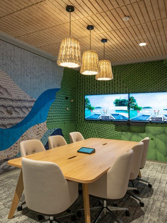
Two larger meetings rooms, or Team Rooms, sit on either side of the floorplan, both designed in collaboration with Media Objectives, an experiential graphic design team that regularly works with Pinterest across the globe. Next to the Celtic Forest, the first of these rooms continues the theme of ancient Ireland, inspired by the story of Oisín and Niamh and the Celtic otherworld, Tír na nÓg – one of Ireland’s most ancient tales about love, loss and eternal youth. Bespoke wall graphics by Media Objectives cover the walls, printed without seams on one long roll of special fabric and embellished with tiny, handcrafted fairy houses, mushrooms and carefully placed tufts of moss. The second
Below: Tír na nÓg team room
Right above: All Hands cafe
Right below: St. Stephen's Bean barista bar
Team Room celebrates the Dublin Area Rapid Transit (DART), Dublin’s commuter railway network that serves the city and its coastline, complete with seating and wall acoustics upholstered in real DART moquette fabric and signature yellow metal bars used as a graphic feature on the walls.
For the three design teams, the partnership and collaboration has been the highlight of the project. With over 118 different parties supplying elements of the project and the variety of spaces and functions, the principal challenge was the sheer complexity of the scheme –and one the team faced enthusiastically, turning challenges into opportunities with specialist designers, subcontractors, craftspeople and artists.
“There was a spirit of openness and cooperation that allowed everyone to learn from each other’s experience and work together to create an incredible end result,” explains Murphy. “My favourite aspect of Pinterest Dublin is the journey through space; little points of whimsy and humour light up the journey, whether it’s the miniature farmyard scenes beneath glass floor tiles or the nautical nods in the pub. We hope that the Pinterest employees will keep making their own little discoveries as they get to know their new home.”
Furniture & Styling Inside Source
Environmental Graphics & Signage Design Media Objectives
Graphics & Signage Supplier
Vision Branding Solution
Joinery
BSG Design
Planting
Universal Floral
Mosaics
Mosaic Assemblers
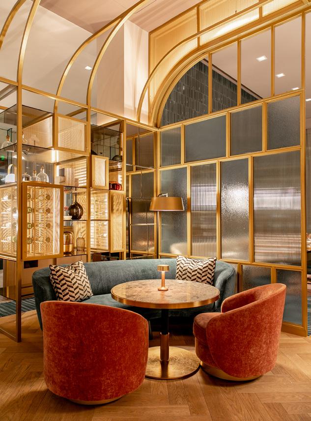
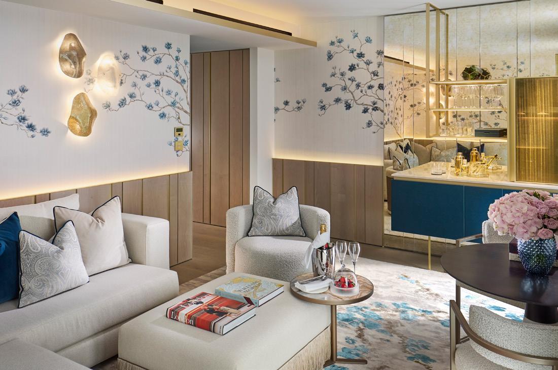
Smaller, but perfectly formed
At Mandarin Oriental Mayfair, Curiosity and Studio Indigo use both British and Asian design languages to tell one compelling story.
Words: Harry McKinley
Mandarin Oriental Mayfair Case Study
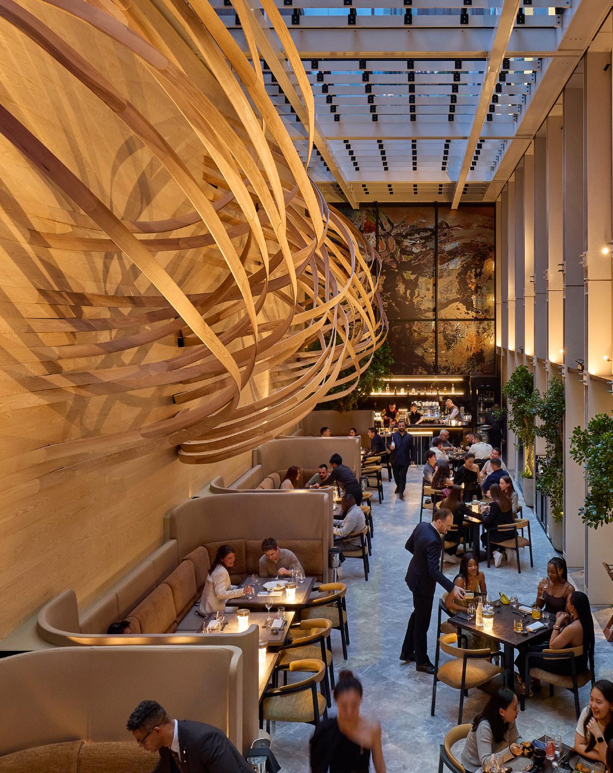
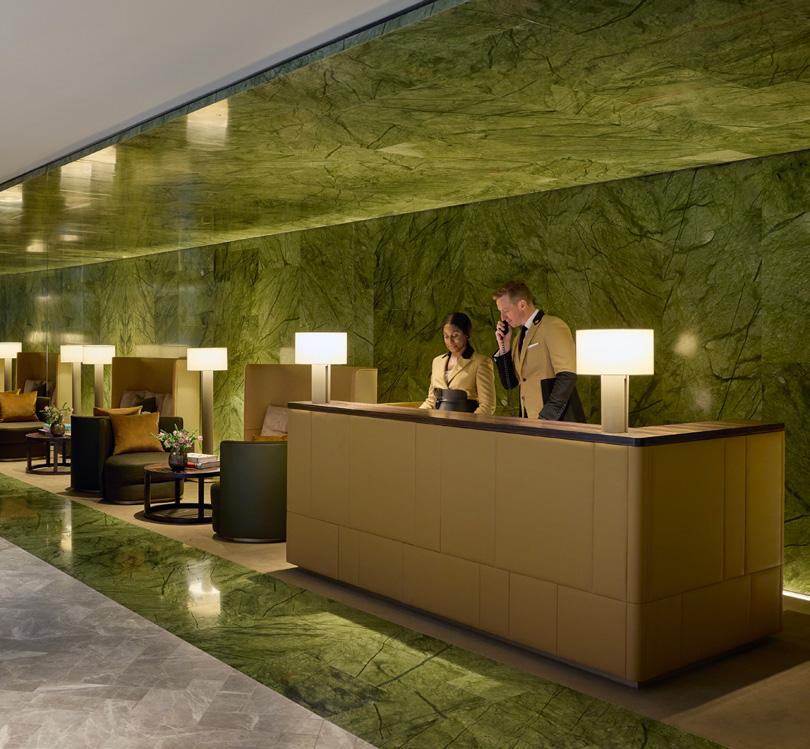
“We see ourselves as the young, cool sibling,” jokes a member of the Mandarin Oriental Mayfair team, contrasting the 50key property to the illustrious Mandarin Oriental Hyde Park. With 168 guestrooms and 26 suites, MO Hyde Park is one of the capital’s grandest stays, occupying a landmark building that dates to the late 1800s; the brand’s European flagship.
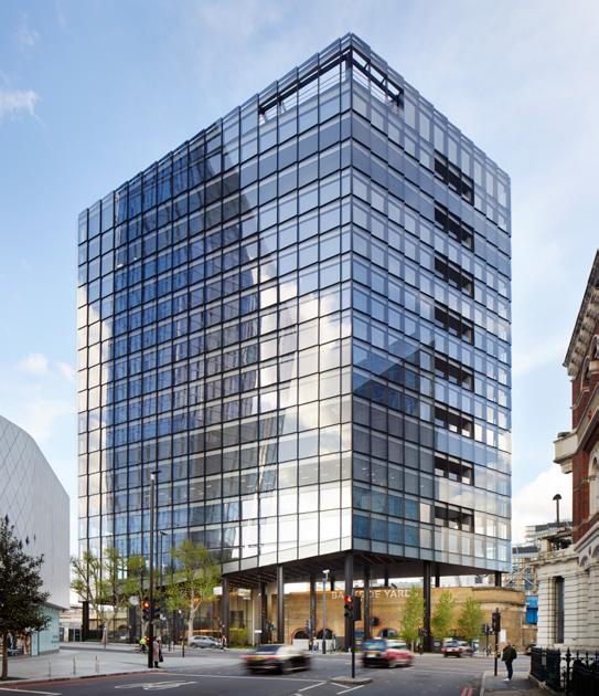
Mayfair then, is positively boutique by comparison, and a stylistic departure. Set on Hanover Square, it is the first new build in the neighbourhood in over a decade. RSHP led on the architectural front, creating an aesthetic and technical marvel – one of the first buildings in the UK to deploy the Vierendeel technique. This sees a steel exoskeleton wrapped around the development, infilled with red brick ‘baguettes’ (the longest in the UK) that nod to the surrounding Georgian terraces. It is unashamedly contemporary but, as RSHP explain, “a townscape response” that takes account of the square’s “historic urban grain”.
Inside, the first impression is one of quiet splendour, a leather-lined concierge desk framed by luminous green stone; the dramatic, triple-height space that houses the restaurant and bar, only revealed when venturing beyond the darkly rendered lobby. The main reception is accessed via a bridge that hovers aside the atrium, again offering only a glimpse of the dining areas – intended to feel as though one is stepping through a lantern, enveloped by light and shade. Tokyo-based practice Curiosity designed the public spaces and describe this interplay of the revealed and the concealed as a game of ‘hide and seek’, a foundational element of the interiors concept.
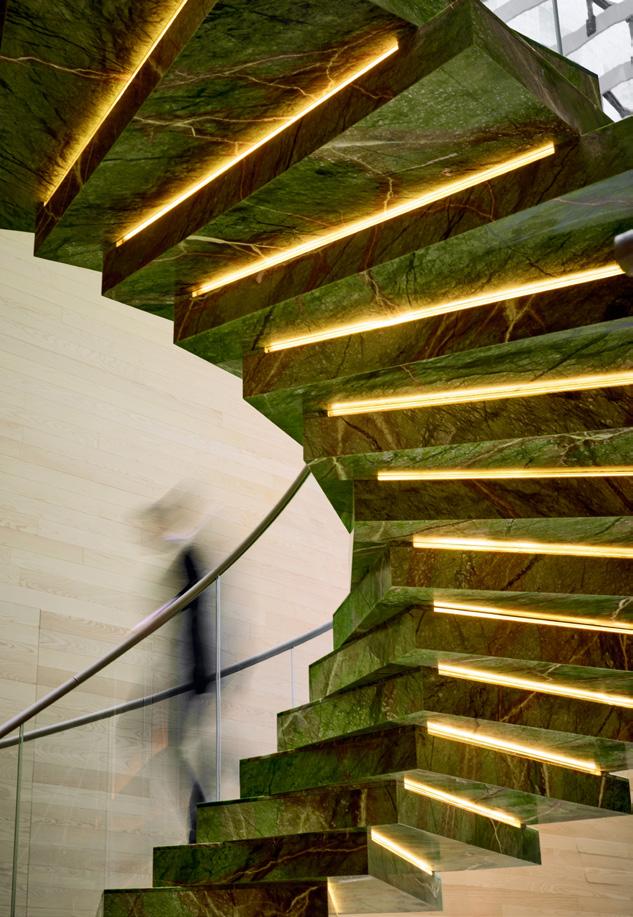
A spectacular moss-green marble spiral staircase leads guests into the Akira Back restaurant, the first opening for the much-vaunted South Korean chef in the UK. Set below street level, the space soars upwards across three storeys to a glass ‘sky roof’, affording views of the hotel’s façade and allowing natural light
Image on previous page:
The triple-height space housing
Below: The Mayfair Suite
Right: The stone-backed concierge desk
to flood in by day. For a property with a tight footprint, sandwiched amidst a dense central London location, it’s an astonishingly noble space; one that will certainly provide a pull for locals, as well as hotel residents.
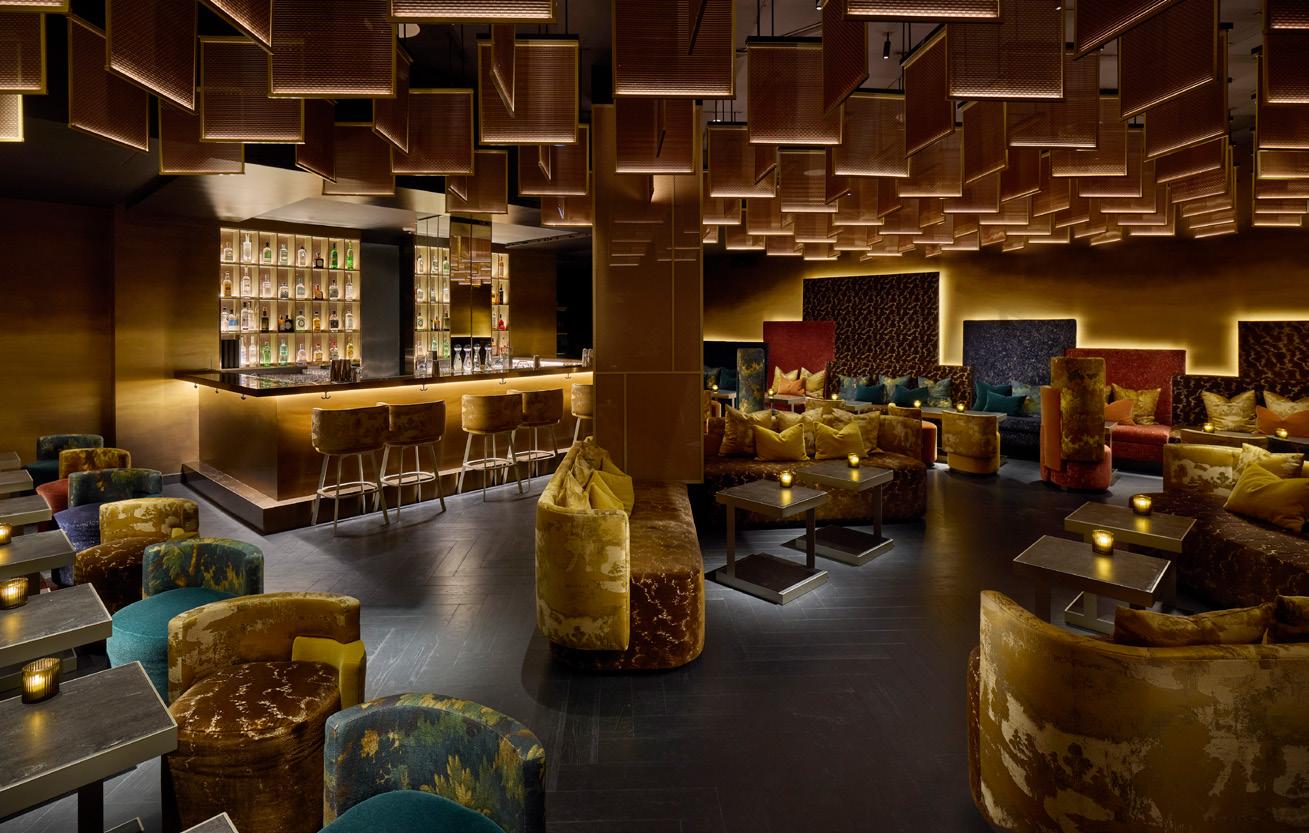
Curiosity settled on an ‘elemental’ narrative for the interiors, conjuring ‘wind, fire, water and salt’ across both Akira Back and the adjacent ABar Lounge. In the restaurant a wooden vortex sculpture spills from the wall, “embracing the generosity of the space and creating an environment that varies from every point of view, with shadow, transparency, movement and tension,” explains the studio’s president, Gwenael Nicolas. “The wood counter and open kitchen area, where the chefs perform, is also highlighted by a large sculptural piece, a transparent light feature suspended from the ceiling in the shape of a waterfall, created by layers of fabrics. The theme of fire is expressed in the bar then, where the space opens up under a ceiling of shimmering bronze.”
The clarity of the design language, which balances drama with restraint, is undoubtedly informed by the East, but Mandarin Oriental Mayfair is also far from a microcosm of Asia. Through bespoke, one-off furniture pieces and ‘warm’ application of materials, it also speaks to its London surroundings.
“The whole design pays homage to Mayfair's unique charm and heritage while embracing its vibrant urban context,” continues Nicolas. “The use of natural materials reflects the timeless beauty found in London's historic buildings and parks, while the incorporation of local artworks celebrates the city's diversity. By blending these elements, we aimed to evoke a sense of place that is distinctly Mayfair: sophisticated, cosmopolitan, rooted in tradition and yet open to modern influences.”
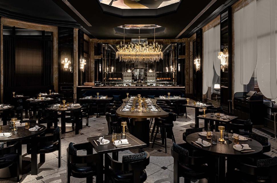
Akira Back
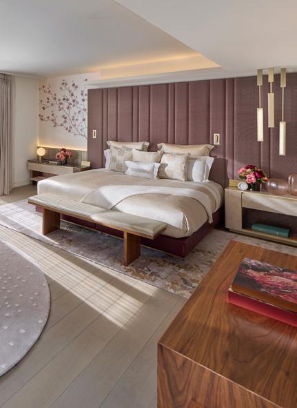
Left: A guestroom
“We aimed to evoke a sense of place that is distinctly Mayfair.”
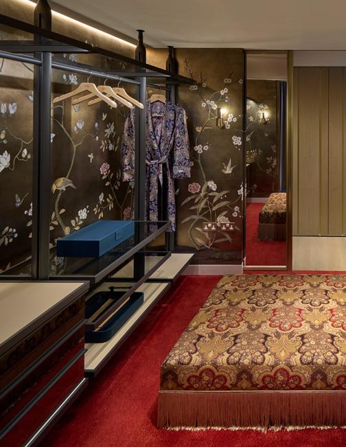
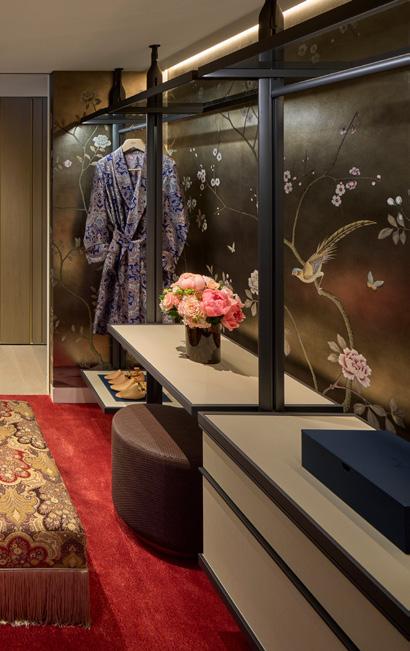
The guestrooms and suites, designed by Studio Indigo, weave a similarly dual tale – but it would be disingenuous to simply label them East-meets-West. How, where and to what degree this meeting of influences would manifest was a source of meticulous concern for Studio Indigo, who have adeptly avoided pastiche at every turn.
The colour palette, for instance, was curated with a resolutely ‘Northern European’ eye – shades of emerald-green, maroon and turquoise intended to build ‘character and add identity’. “We wanted every room to feel like you’re inside an intimate, luxurious jewellery box,” says the studio’s founder, Mike Fisher.
Honing in more locally, it was crucial – indeed, part of the brief – that the guestrooms and suites say something about modern British aesthetics and, in particular, native craftmanship. Here materiality and detail come to the fore, with splendid wood veneers (treated with skill and care), sitting alongside thick wool carpets, hand-woven silks and robust leather.
With just 50 keys, it’s little wonder that next to none of the design feels off-the-shelf, instead deeply curated and tailored. Studio Indigo worked with Hospitality Projects to collect over 3500 items of bespoke furniture while the sculptural lighting pieces are also custom; decorative rugs were crafted by Alarwool and the exquisite de Gournay silk wallpapers were developed with personalised colourways for each room, featuring intricately hand-painted floral motifs that respond to the feng shui of each space. In the palatial Mayfair Suite, these florals are even hand-embroidered.
“These elegant details not only enhance the aesthetic but also honour Mandarin Oriental’s Anglo-Asian heritage,” notes Fisher, “beautifully blending British and Far Eastern influences to create a cocooning, luxurious environments that are memorable.”
Left: The spiral staircase connecting floors Centre: The Mayfair Suite dressing room
Right: ABar Lounge
Best in class
Jasper Sanders + Partners channel quintessential Edinburgh to compete in a new generation of premium student living.
Words: Charlotte Slinger
Photography: Gunner Gu
Jasper Sanders + Partners
Potterrow, Edinburgh Case Study
Image on previous page:
Reception area
Below: Private dining room
At home among the cobbled streets of Scotland’s capital, 16–18 Potterrow occupies an enviable corner just a stone’s throw from the University of Edinburgh and a 10-minute jaunt from Edinburgh Waverley station. The student living project was designed by Jasper Sanders –founder and director of eponymous studio Jasper Sanders + Partners.
Designing Potterrow’s original interiors back in 2016 – part of a longstanding relationship with property developer Curlew Capital – Sanders sought to elevate the previous scheme and deliver
a more ‘mature’ interpretation of the city. Still drawing from the cultural and creative influence of the Edinburgh Fringe Festival, the concept (completed with ADP Architecture for student living operator Fresh) now channels the drama of the theatre in a less literal, more subliminal way – an approach he describes as “playful, without being patronising or remedial.”
Surfaces are no longer clad in bold swathes of black and theatre-curtain red, but instead in a sophisticated palette of ultra-violet, grey and whisky tones for a more ‘grown-up’ feel; apt, as Potterrow’s target demographic consists mostly of international postgraduates, travelling predominantly from China to study at one of the UK’s top Russell Group universities. Similarly, colourful Fringe posters from decades past have been replaced by shelves of chic coffee table books on everything from artisanal coffee-making to Bansky and Basquiat, styled alongside potted houseplants, ceramic vases and rugged stones from the Highlands. The ultra-violet hues throughout evoke the thistle, Scotland’s national flower, while Tom Dixon lights in amber blown glass offer a nod to the country’s worldrenowned whisky industry.
“Colour is life, and we’ve got to be more playful.”
Jasper Sanders + Partners
Following a CPD exercise with his team, Sanders recently explored his own relationship with colour and sensory design over the last 20 years. Recalling the vibrant wayfinding his studio implemented at Culcheth High School back in 2010, Sanders muses: “What I found was, subconsciously, I was colouring things by function. I was trying to accentuate how something would feel by how it would work.” A believer in the modernist tenet of form follows function, the same approach is evident throughout Potterrow, with colour serving a practical function as well as aiding the design narrative. “People talk about contemporary design as being a reflection of the mood of the time, which is why I think the last 10 years have been dominated by greige and minimalism. But colour is life, and we’ve got to be more playful than this.”
Above: Kitchen
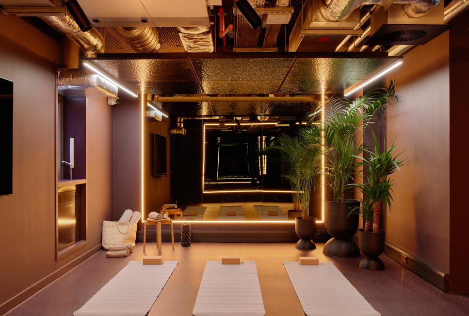
Below left: Yoga studio
“Design is not humanistic if it’s not sustainable – they are one and the same.”
Jasper Sanders + Partners
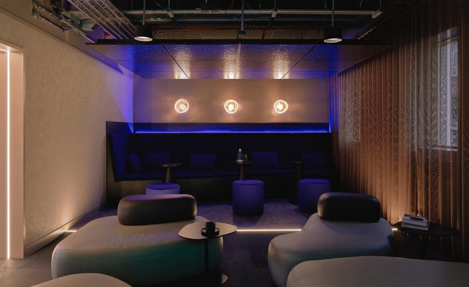
Cultivating a dramatic, hotel-like atmosphere, lighting throughout corridors and shared amenity spaces is purposefully low, with dark alcoves illuminated by ambient task lighting. Violet wayfinding signs identifying each studio are also individually spotlit, while the integrated desk in every bedroom receives a warm glow from tube lights nestled within storage shelves above. Reflecting an upward swing in the student living sector, Potterrow is accordingly rich with onsite amenities, including an equally moody, velvet-clad screening room, games area, gym and yoga studio. Catering to the postgraduates’ workload, meeting pods and a coworking space can also be found on the ground floor, all operated by the onsite residents’ team.
Touring the building during graduation season, we encounter a family making use of the bookable private dining room, delighted by a chance encounter with the building’s designer. Central to the space is a large table with a recycled statement tabletop by Smile Plastics, while in the galley kitchen, bespoke countertops and cabinets offer residents a sleek, ergonomic space to cook for loved ones visiting from abroad. Believing problem solving to be the testament of good
design, this room is indicative of Sanders’ goal for a human-centric concept that students would actually use. “Good design is irrespective of being ‘premium’,” he explains. “Is it playful? Is it ergonomic? Is it doing the right thing, for the right cost?”
Speaking to the competitive world of student accommodation, Sanders also acknowledges the important balance to be struck between premium aesthetics and conscious design. “Design is not humanistic if it’s not sustainable – they are one and the same,” he says. “So, we’ve got to give sustainable luxury; we’ve got to be kind to the planet whilst creating something that's still achieving commercial success.” Where possible, Potterrow is therefore furnished with durable, locally sourced materials suited
to a steady turnover of residents. This includes Forbo’s Marmoleum flooring, manufactured just 30 miles away in Kirkcaldy using raw, natural materials such as linseed, wood flour and jute.
The key to the often elusive ‘sustainable luxury’, he argues, is designing for longevity. “That is a sustainability credential: don't design for churn. You can't expect interiors to last dozens and dozens of years like architecture does, but you’ve got to have a design that works for the long term.” Avoiding the allure of trend cycles, Sanders admits to weaning his team off the likes of Pinterest in favour of creating timeless schemes that still have personality, concluding: “If something is interesting, it doesn’t have to be fashionable.”
Left above:
Cinema room
Left below:
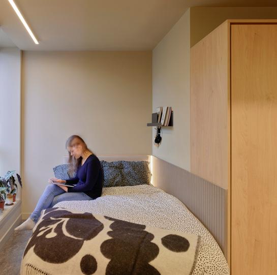
Studio bedroom
Right: Dining room
Client Curlew Capital
Flooring
Forbo
Tessera Cloudscape
Marmoleum
Surstep
Bolon
Furniture
Pedrali
Hitch Mylius
Ferm Living
Frovi
Surfaces
Egger
Homapal
Ultra fabrics
Kvadrat
Valcromat
Allgood Ironmongery
Tektura
Silent Gliss
Kvadrat
Hay Design
Muuto
Audo Copenhagen
George Jenson
Normann Copenhagen
Arket
Ferm Living
Lighting
Tom Dixon &Tradition
Best left unfinished
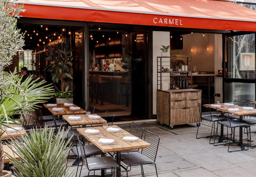
Words: Harry McKinley
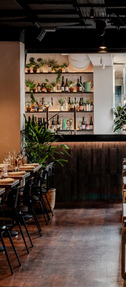
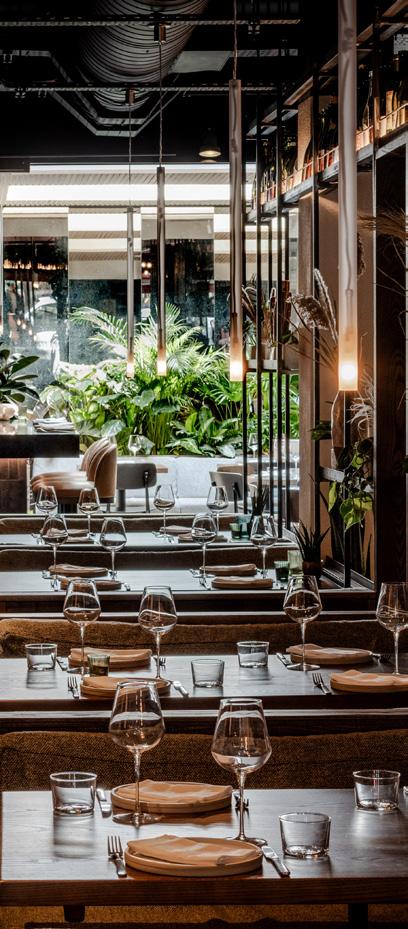
Tel Aviv provides the inspiration for Carmel Fitzrovia, the latest London dining destination designed by Mata Architects.
On a rainy summer’s day, the pavements sodden and skies grey, London would seem to have little in common with Tel Aviv, sometimes coined the Miami of the Middle East. More than a mere difference of climate, they are cities set radically apart in design and character – Tel Aviv most lauded for its gleaming Bauhaus architecture, all crisp lines and bright white or artfully crumbling and blanketed in foliage.
“In places it feels raw and a bit rickety,” says Mata Architects founding director, Dan Marks, of the city that inspired
Carmel Fitzrovia – the studio’s latest hospitality project. It’s the second location for the seedling Carmel brand, which deals in the ‘flavours of the eastern Mediterranean’. Mata similarly led on the design of the Queen’s Park original, a compact all-day neighbourhood eatery, in what was once a minicab office – a 19th century industrial warehouse, with exposed brick walls and timeworn wooden floorboards. Building on good bones, there the design was less integrated, albeit still nodding to Tel Aviv with the addition of hanging plants, in the tiling and in the restrained use of colour.
“There wasn’t such a comprehensive brief for Queen’s Park,” recollects Marks, “but for Fitzrovia there was more of an opportunity to build the design from the ground up. The owners wanted some recognisable elements, but left it up to us to determine what those would be; it didn’t have to be a copy, with the first restaurant very much a response to the building.”
Fitzrovia by contrast was something of a clean slate: a modern site close to Oxford Circus, previously occupied by Cuban concept La Rampa and architecturally unexciting. Brought onboard from the outset, Mata was able take some of the foundational inspiration points for Queen’s Park and realise them more vividly.
With 95 covers inside and 28 out, Fitzrovia is also a markedly larger beast, with Mata developing all new frontage, with bi-fold doors to better integrate the terrace with the interior. The Central London location also necessitated a little more polish, what Marks describes as, “keeping the rickety, but making it more refined.”
Inside, the restaurant is a tale of three complementary environments. To the rear is the 30-cover Garden Room, a vaguely self-contained space into which natural light billows from an atrium. A bijou bar is flanked by porcelain terracotta-lined walls and those finished with consciously loose trowel marks –driven into Arditex to evoke the essence of
Image on previous page: The Garden Room Above
a quintessentially Tel Avivian street scene, where diners cluster close to peeling façades under the Mediterranean sky.
There’s a wealth of greenery, with longleaved planting dancing in front of a glass wall, which further serves to express an al fresco-inspired openness and breadth. For this, Mata worked with Plants By Dan, which specialises in thoughtful, bespoke, living installations.
Where Queen’s Park had a baked-in personality, by virtue of the historic building, at Fitzrovia Marks notes it fell on Mata to develop and introduce character – while avoiding anything that read as overly contrived or artificial. It’s
why the introduction of natural elements was so crucial, both softening the design and rooting it in place, literally as well as figuratively. There is, thankfully, no plastic shrubbery to be found.
With the Garden Room the brightest of the spaces, in the mid-section, which houses the majority of the seating, the atmosphere becomes darker and more ambient – with pendant and wall lights by ltalian manufacturer Nemo, alongside reclaimed pieces. A steel partition snakes through, its narrow shelves dressed with eclectic ceramics and bottles from the restaurant’s wine stocks. As well as generating a grid effect that summons the Crittall-style windows and partitions
“Telling that Tel Aviv story isn’t just about the intention of the design – introducing ‘age’ and rawness –it’s really about a vibe.”
Left: The stone bar and open kitchen
Centre: The main dining space
Right: The exterior terrace
popular in Tel Aviv, it works to create a service corridor for wait staff floating in and out of the kitchen – separate from the primary dining area.
Throughout, joinery and metalwork is bespoke, realised so as to appear ever-so-gently unfinished – offering the impression of history layered. Booths and banquettes are upholstered in a sturdy, mottled grey Kvadrat fabric, while freestanding Hay chairs were chosen for their Bauhaus sensibility.
“It couldn’t feel too perfect,” explains Marks. “In thinking about the source material, we wanted it to still capture the feeling of a Tel Aviv ‘hole in the wall’, but also be elevated and speak to the fact we’re in London, and in Fitzrovia in particular.”
The front section, with its Belgian Fossil bar and window seating, is where the greatest connection to the street is felt –the restaurant south facing and so lapping up whatever daylight there is, despite the UK weather. Here Mata wanted to seize a pacier energy – frenetic even, with the teeming pavement in full view in one direction and the pizza oven, with its swaying flames, in the other.
“Carmel most comes to life when it's animated, in particular at night when it’s busy and full. Telling that Tel Aviv story isn’t just about the intention of the design – introducing ‘age’ and rawness – it’s really about a vibe, which I think we’ve captured.”
Good bones
dMFK’s design for Myo New Street Square leans into the architecture of the building, using it to inspire a new aesthetic for the interiors.
Words: Clare Dowdy
Interior photography: Ed Reeve
On the day of our visit, in the square in front of the latest Myo office, City types were lounging in decks chairs under parasols, watching Wimbledon on a big screen. New Street Square behind London’s Fleet Street is bordered by Landsec buildings, one of which houses the 6,500 sqm Myo.
Landsec’s ‘flexible workspace’ offering sits in a 2008 building by Bennetts Associates, who were the masterplanners of the new square and 100,000 sqm of space across five buildings. This Myo, designed by Fitzrovia-based dMFK Architects, follows on from St Paul’s Myo by Basha-Franklin. Unlike that one in Jean Nouvel’s One New Change, Myo New Street Square occupies the entire building, which dMFK took back to its shell.
On a site visit during the COVID pandemic, the team from the firm, which was established in 2000 by Julian de Metz, Paul Forbes and Ben Knight, looked for ways to connect the interiors to the outdoors. “This building was fully sealed,” says associate Hollie Welch. When they got out on the roof, “we thought, this is a fantastic location and has almost panoramic views.” So they proposed adding a pavilion with an events space and landscaped terrace. That proved an easy sell to the client, and because most of the surrounding buildings are Landsec the planning process was less of a headache. Below the new intervention are four floors of offices, each with a kitchen set-up, and communal and breakout areas. They sit atop a reconfigured ground-floor, which houses the reception, more communal space and an events room.
As Welch points out “the bones [of Bennetts’ building] are robust.” The team’s aim was to “lean into” the design of the existing structure, to inform the interior’s aesthetic. But unlike some previous dMFK projects – a 1970s Derwent London building in Fitzrovia, for example – this one’s vibe was less characterful and more anonymous. Welch describes it as ‘sleepy’. So instead, they drew on the façade’s rigorous geometric gridding. Hence the look of the joinery, the mesh curtaining and the panels of cross-reeded glass used as screens in front of some booths. They complemented the stone cladding with hardwood midtoned oak for a softening effect, along with rugs, carpeting, upholstery (such as dark green corduroy), and a lot of house plants. It was about “creating material cohesion with the exterior and interior,” says Welch. “Sometimes the fit-out can feel alien to the exterior, and that can feel jarring.” For example, she’s carried travertine stone into the worktops, making a “nice contrast with the cold timber”.
“We’ve designed for longevity,” dMFK director Joshua Scott says, “it can be wasteful going on a cycle of regular fitouts, every five years or so." To that end, the services spine on each floor has been repositioned to allow for many different
Image on previous page: Reception lounge
Right: Lounge furniture and décor
Above: Geometric façade
Below:
Communal space with screened booths
floorplate configurations. And the materials – wood, stone, stainless steel – have been chosen for their durability, because in Scott’s experience, “tenants don’t treat buildings well.” He went for “things that scratch the same colour,” unlike paint. He also specified Fenix’s matt tabletop surface, which doesn’t show greasy finger marks, terrazzo, and the timber fluting on the kitchen doors, “which will get scratched but will wear in.” The fluted joinery also doubles as an acoustic aid.
From New Street Square, Myo visitors arrive at ground-floor level. Before, the reception area was a confined box with a low ceiling. It now has a high ceiling and a wall to the right has been removed to extend the space into an L-shape with a big table and low seating. Around the corner, there’s also a dual aspect meeting room, whose obscured glazing has been replaced with clear glass.
On the four office floors above, the corridors are a generous 1.5m or 1.8m (compared with the regulation 1.1m). Along these, art is hung from grid trims in the plasterboard. DMFK has punched glazed panels at the end of many corridors, to bring in natural light, and to give views to the windows and beyond. By exposing the ceilings around the outer
“We’ve designed for longevity, it can be wasteful going on a cycle of regular fit-outs.”
edges of the offices, those parts of the workspace have bigger ceiling heights. This makes the spaces feel more generous. And by respraying the curtain walling system from anthracite to off-white, the spaces also felt lighter. The floorplates are further broken up with lots of planting.
The new sixth-floor pavilion sits on the existing structure’s post-tension concrete frame, and its crenellated façade aligns with the original building’s grid work.
Previously unused by office workers, the roof was dominated by plants, which has now been condensed at the back, making room for a wide terrace whose landscaping was handled by Spacehub.
Alongside New Street Square and St Paul’s, Myo’s other four locations are Bankside, Liverpool Street, and Victoria. Myo Piccadilly is due to open later this year, followed by Myo King’s Cross in 2025.
Left image: Workbenches in breakout space
Right image: New Street Square exterior, photography Jack Hobhouse
Furniture
Fredericia
Zeitraum
Norr11
Devorm Hale
Andreu World
Friends & Founders
Rawside
Hay
Textiles
Kvadrat
Nordic Knots
Lighting
Atrium
Pholc
Verner
Marset
Utzon
Joinery
European crown cut oak oiled finish
Flooring
Tarkett
Domus
Solus
Embracing culture through tiny details
In our quest to understand and connect with different cultures, it is often the tiny details that provide the most profound insights. These seemingly insignificant elements can weave together to create a rich tapestry of meaning, offering a gateway to deeper intellectual and emotional engagement with a place, a community, or an organisation. Through art, these details come to life, helping us to access and appreciate the culture around us.
the tricolour cockade was a small rosette worn by revolutionaries that symbolised liberty, equality, and fraternity, reflecting the core values of the movement. In the 1960s, the peace sign, originally designed for the British nuclear disarmament movement, became an iconic symbol of counterculture and the quest for global peace.
A prime example of this occurred on a recent weekend when I saw the most British thing ever by one of Artiq’s public sculptures: a long line of people politely queuing for a photograph with a humansized teacup.
artiq.com
During a recent trip to Stromboli in Italy, I encountered a recurring smoke motif that initially seemed like a simple design choice. However, it wasn’t until the island’s volcano literally exploded that I truly understood its significance. The smoke motif, found tattooed on locals, emblazoned on t-shirts, and hanging from keychains, was more than just aesthetics. It symbolised the ever-present threat of the volcano, shaping the islanders' existential perspective on life. This tiny detail encapsulated a broader cultural narrative.
Historically, tiny details have also provided huge context. For instance, during the French Revolution,
Art is a powerful conduit for cultural narratives. It allows us to explore and share the stories that define our identities and our communities. When we consider what stories we want to tell, we must think about how we, as storytellers, can help people access a culture — whether it’s the culture of an organisation or that of a new country.
This applies to design too: what stories do you want to tell? By thoughtfully incorporating elements that resonate with diverse audiences, we can communicate that our spaces are welcoming. Art plays a pivotal role in this process, as it reflects society and tells the stories of those within it. Through elegant storytelling, art can capture the nuances of cultures, making them relatable.
In Berlin, MM:NT, an innovative new hotel concept, shows that collaboration can combine art with sustainability. This Berlinbased lab uses artistic approaches to address environmental issues, illustrating how art can intersect with other fields to create meaningful cultural dialogue. The tiny detail of art is not just about aesthetic appreciation but can also drive important conversations about our world.
Paying attention to tiny details and understanding their broader significance allows us to engage with culture on both an emotional and intellectual level. Through art, we can access these details and the stories they tell, gaining insights into the values, beliefs and experiences that shape different cultures. By embracing the small elements, we can build a rich narrative that connects us more deeply with the world around us, and the different cultures within it.
Patrick McCrae is the co-founder and CEO of Artiq, a London-based art agency that puts art to work in settings outside of the gallery; from workplaces to hospitality.
Take a stand through craft
Highly Strung, 2021, Guggenheim Collection by Aya Haidar at Cromwell Place. Photography Lucy Emms
We explore how craft –specifically mending and repair – can be used as a form of activism.
Words: Katie Treggiden
‘Craft’ and ‘activism’ sound like they belong on opposite ends of any spectrum: feminine to masculine, introversion to extroversion, quiet and seated to shouting and marching. And yet here they are, squished together in the portmanteau ‘craftivism’ coined by writer and maker Betsy Greer in 2003. Her explanation of the term is broad: ‘Craftivism is a way of looking at life where voicing opinions through creativity makes your voice stronger, your compassion deeper and your quest for justice more infinite,’ she says. The Cambridge Dictionary offers a more precise definition: ‘the activity of using crafts to try to achieve political or social change’.
Using craft for activism pre-dates both. From banners and brooches to a handkerchief embroidered with the signatures of hunger-striking imprisoned
protestors, craft played a vital part in the early 20th century suffragette movement. Hand-stitched ‘arpilleras’ (brightly coloured patchwork pictures) made by women in Chile during the military dictatorship 1973–1990 were used to build public and political pressure to help bring down Pinochet. And the NAMES Project AIDS Memorial Quilt – believed to be the largest piece of community folk art in the world – comprises approximately 50,000 gravestone-sized memorial panels, each embroidered in honour of someone who died due to AIDS. The connection between intimate, personal actions and large-scale social, cultural and political impact is what gives craftivism its power.
Whereas craftivism has overtly political aims, mending is often merely pragmatic, but nevertheless takes a stand. ‘Repair has
its own form and language of activism,’ wrote artist and academic Bridget Harvey in her PhD thesis. ‘Repair-makers stand against accepted consumption practices and educational hierarchies.’ Repair as resistance is perhaps most obviously traced to the British Make Do & Mend initiative of the Second World War, during which every darned stocking freed up silk for parachutes. But while this was a mainstream government-led effort that (largely) united a country against a common enemy, it was in the 1980s that repair emerged as a counter-cultural form of protest.
In an anti-fashion statement, punks appropriated safety pins from their domestic context to ‘repair’ intentionally ripped clothes. The punk movement was awash with symbolism,
Paulo Goldstein – Chair that formed part of Repair is Beautiful Project, London, 2012. Photograph by Weiche Wu
MEND MORE Jumper by Bridget Harvey
Cumbrian Blue(s), New American Scenery, Fracked No: 02/21 (01/12/11/21) by Paul Scott. Photography Paul Scott
often seemingly for no reason other than to offend, but intentionally torn clothes ‘repaired’ with safety pins challenged the idea that garments (and people) in their perfect, undamaged state were natural and that damage and repair were somehow unnatural.
In the 40-odd years since the height of punk, the needle has once again superseded the safety pin and activism in the form of repair feels gentler than the shock tactics of the 1980s. To quote artist Louise Bourgeois: ‘The needle is used to repair damage. It’s a claim to forgiveness. It is never aggressive, it’s not a pin.’ A quieter form of activism is emerging – one that is inclusive of the feminine, the introverted, and the quiet and seated – and is arguably just as effective at bringing about change. ‘We need to
stop seeing protest as only being about shouting in a crowd and start having the kind of smaller conversations that actually connect fellow human beings and help to influence them gently,’ says author of How to be a Craftivist, Sarah Corbett.
Bridget Harvey’s ‘MEND MORE’ placard –made from a repaired jumper – is a literal example of repair as protest. The purple sweater is embellished with hand-stitched yellow letters that spell out ‘mend more bin less’ on one side and ‘mend more buy less’ on the other – Harvey carried the jumper on a pole during the Global Climate March in London in 2015. The jumper ‘asks people to use repair skills for practicality, resilience and resistance, and to protect the planet.’ she says. ‘But it also carries a second order message. It was something else before and now it is
new; more than its graphics, its material supports its message.’
But not all craftivism is so literal. Paolo Goldstein offers thought-provoking Heath Robinson-esque alternatives to consumerism. Claudia Clare’s broken and reassembled pots tell stories of sexual violence against women and the ways in which they have rebuilt their lives. All these acts of repair are also forms of activism – and if we let them, they might just make our voices stronger and our compassion deeper.
This article has been adapted from an excerpt of Broken: Mending and Repair in a Throwaway World (Ludion, 2023) by Katie Treggiden.
Available to buy at ludion.be.
I’m Not The Criminal, 2019, by Claudia Clare. Photography Sylvain Deleu
Broken: Mending and Repair in a Throwaway World (Ludion, 2023) by Katie Treggiden
New spaces for a new time
Words:
HaenSuk Yi, Director at PLP Architecture
With studios in both Japan and Singapore, PLP Architecture is no stranger to East Asia. Informed by the work of its in-house design research collaborative, PLP Labs, the practice has been developing a string of new projects in South Korea that blend the latest global workplace trends with a deep understanding of local culture and geography.
Image on previous page:
Francis Crick Institute, photography
Paul Grundy
Above: Arbor, London
Centre: National Meteorological Center, Korea
Left:
65 Davies Street, London
Following global shifts to working patterns and fast-changing social and environmental contexts, workplaces around the world are seeking new ways to prioritise the health and wellbeing of both people and planet. PLP Labs has been experimenting at the frontiers of workplace design over a number of years, engaging leading experts in exciting, interdisciplinary research. Its Wearables in the Workplace study investigated how wearable technologies can transform health and wellbeing in offices. Its Reap What You Sow research put forward the business case for biophilia, highlighting the social and environmental value of nature connection in architectural design. And its Designing for Neurodiversity report focused on creating office environments for a diverse range of users.
A number of these ideas have already been piloted in London: at the Bankside Yards masterplan, workplaces have direct access to semi-outdoor terraces, protected from the wind and with their own microclimates. As with The Francis Crick Institute, exhibition spaces, lecture halls and an open design transformed the research facility into a public-facing institution. In 22 Bishopsgate, the tallest building in the City of London, 100,000 sq ft was dedicated to amenities with a focus on health and wellbeing.
On top of this, the research group carries out bespoke workplace guidance for global businesses, taking a deep dive into a company’s culture, working arrangements, physical space requirements and future aspirations. The practice’s team of Korean and international designers have been applying these insights to new Asian contexts, including the Korean government’s first net-zero building, the National Meteorological Center, and a people-oriented office in Seoul’s Seong-Su district.
Designing new types of spaces: The National Meteorological Center
The National Meteorological Center in Daejeon, just south of Seoul, will be the Korean government’s first ever netzero building and features a series of innovative spaces. At the heart of the design is the ‘box in a box’ concept, where the main office spaces and control centre sit within an enclosed timber massing, that itself sits within a larger outer structure. The space created between the two aids thermal efficiency and natural ventilation, whilst also providing space for a range of functions, spaces and atmospheres. Here, a four-
seasons garden will flourish year-round in its own microclimate, providing a place for flexible work, relaxation and social interaction, and aiding occupants’ wellness through biophilia.
The Center wants to showcase environmental stewardship and improve the public’s understanding of climate issues, so the building was not only designed to be a leading national model for sustainability, but to break down barriers between government organisations and the public, with spaces for exhibitions, public talks and educational programmes.
Evolving the design process: Seong-Su District Offices
In Seoul’s Seong-Su district, a hub for new creative industries, a former gas station is being transformed into a state-of-theart, people-oriented workplace, with an extensive body of PLP Labs research underpinning the design.
The research not only helped the client to understand general global trends in workplace design such as emerging working habits like co-working or wider issues including responses to a changing climate, but very specific issues related
to them as an organisation and their site – including requirements for different types of amenities, quality standards for spaces and social responsibility priorities. This created a strong foundation to evolve the architectural design process, where the exploration of global workplace issues resulted in relevant new concepts appropriate to the site and its users.
Successful design needs research, context and foresight
These two projects are the latest in an evolution of many years of research by PLP Architecture, which has created workplaces that are home to some of the world’s most influential companies, including TikTok, Apple, Burberry, Sky Media, CBRE IM and more.
The practice’s success has largely been down to this combination of understanding local context and basing all design on a strong foundation of research and development. This approach offers foresight into what the world might be like when a building completes and – recognising that we need to design resilient, adaptable buildings that respond to the needs of today as well as tomorrow – also allows for elements of the unknown.
65 Davies Street was designed sixteen years before it completed due to the development of a Crossrail site underneath, yet an understanding of future trends and flexibility meant the final product was still an industry leader upon opening, with the entire building fully pre-let.
As workplaces continue to evolve in Asia, PLP looks forward to the opportunities that designing in this exciting market will bring and how what we learn here, can influence our work around the world.
plparchitecture.com
Is colour a designer’s most important tool?
In this Mix Roundtable with Impact Acoustic, we explore the power of colour, chart how it can be deployed strategically and purposefully, and ask: how can colour in design shape how we experience spaces?
Words and moderated by:
Harry McKinley
Colour speaks to culture and identity
“I'm from Venezuela, so I feel like I see colour completely differently,” opened M Moser’s Mariana Anelli, neatly spotlighting the role that culture and even geography can play in the way we individually respond to, and understand, colour. For Anelli, her South American origin means a propensity for brighter, more joyful hues – emblematic of Venezuela’s rich design landscape, which fuses Spanish, African and indigenous influences.
For Rachel Basha-Franklin, founder and principal director of the eponymous design studio, the same ethos is evidenced in her own antipodean
background. “Being from Australia, I see how place plays an important role in defining colour in design: I think of Melbourne as a more Scandinavian colour palette, then get to Sydney and it's a little brighter; in Queensland, it's floral shirts all around. It’s partly culture and partly informed by surroundings, where the quality of light plays a role. It’s why we see such a massive difference in colour use between countries; tropical countries fairly universally using bright colours, for example.”
Exploring colour through the context of national borders may, on the surface, seem simplistic, but this opening gambit highlighted colour’s immense power to weave stories and root projects in their surroundings – when deployed thoughtfully and effectively.
Simon Kincaid Partner Conran and Partners
Karen Haller FRSA
Harry McKinley Mix Interiors Managing Editor
Rachel Basha-Franklin Founder and Principal Director Basha-Franklin
“This understanding is crucial because it’s how we build narrative and we use colour a lot this way as a studio,” continued Basha-Franklin, citing a recent project in which colour was used to evoke the history of the space and connect to the community, including integrating the tones of a nearby market – its stalls and bags. “It creates a logic and meaning that resonates with those using the spaces; building a story that they will remember.”
“The good thing about understanding these cultural markers,” continued Conran and Partners’s Simon Kincaid, “is that it allows us to sidestep the clichés. Knowing that red is lucky in China doesn’t mean we should do everything in that
colour. That knowledge also allows us to also challenge preconceptions, test the culture a bit and do something different as designers.”
Deploying colour effectively requires bravery
As with all design, personal taste is an inescapable factor that studios, clients and manufacturers must grapple with, in creating spaces that are fit for purpose and which ultimately appeal to their users. But our assembled experts agree that the ‘safe’ path is rarely best – the ostensibly inoffensive likely to translate into the forgettable and
unaffecting. Designers, then, must muster some bravery in using colour purposefully and boldly.
“For us, every project is as vibrant and bright as we can make it,” noted SODA Studio’s Charlotte Conroy, “but that does require pushing clients; it means rationalising those choices, in terms of how we conceive spaces for them individually.”
“Yet not every client wants to be challenged,” continued Anelli, emphasising the tussle between creative ambition and the realities and hierarchies of project decision making. “We try to push where we can, but it’s also about picking your battles.”
Sven Erni CEO and founder Impact Acoustic
Charlotte Conroy Senior Interior Designer SODA Studio
Mariana Anelli Senior Associate M Moser Associates
Natalie Thomson Director of Strategy Buckley Gray Yeoman
It's here there’s room to educate on colour use as pragmatic and objective-driven, more than merely aesthetic. As BGY’s Natalie Thomson attested, “there's marketability and commerciality that we have to be sensitive of. We have to think about somebody walking into a space and being able to see themselves in that space. So colour has to be chosen in a way that is readable or relatable. Colour might divide or it might conquer, but if a space looks like every other space, then it isn’t memorable and it lacks identity; if a space doesn’t evoke emotion, then it’s also less marketable.” It’s this framing of colour application that can often lead to more meaningful and productive conversations with clients,
the table agreed. In a competitive landscape, it’s commercially reasonable to suggest that appealing more innately to a smaller group is more viable than running the risk of mass indifference.
But risk is not a term, regardless of context, that many clients respond positively to, and there was also consensus that in the cut and thrust world of commercial interiors –faced with tight deadlines and the need to maintain constructive relationships – many studios will opt for the tried-and-tested – the comfortable. The solution?
Working processes that allow for experimentation and ‘play’, while mitigating said risk. AI was flagged
as potentially revolutionary in this respect, offering the opportunity to visualise easily adaptable, hyperrealistic environments using only carefully selected inputs – a chance to see what works and what doesn’t without a significant outlay in time or cost.
“Although I don’t agree that AI is the answer,” countered Conroy. “Every single project is different and every client is different. We need to be challenging ourselves as designers to source inspiration from further afield and make time for the creative process if we want genuine authenticity. That’s good design and good design will always show through.”
Colour is nuanced, it isn’t just about brights
“There’s no such thing as ‘neutral’ colour,” opined colour expert Karen Haller, noting that when we discuss how colour is used in spaces, we invariably focus on the audacious. “Every colour will evoke an emotional reaction. Sometimes colour is softer or not as noticeable, like turning the radio down from a design perspective. Other times it’s bright and, on the other end of the spectrum then, like turning the radio right up. But if we can see it, it's a colour, and often our response to it, be it stimulating or soothing, is based on saturation.”
The table rallied around the notion that understanding colour beyond the ‘brights’ – in all of its mild to wild variations – is central to successful design, as it allows for variation of purpose and experience.
Kincaid nodded to a recent BTR project in London’s King’s Cross, where colour was central to signposting how different spaces were to be used. “In the common areas we used a lot of natural finishes with an intentional lack of vibrancy, which encourages residents to spend a lot of time there – working or relaxing. The colour isn’t intrusive. But in areas where those residents might be spending less time – the gym, the
screening room, the dining room –we used really saturated colours to bring a very curated sense of energy.
“Colour has to be chosen in a way that is readable or relatable.”
That’s really a theme in our work: a controlled use of colour, tone and materiality to denote something, to communicate how to behave in certain environments.”
Applying colour psychology is good design business
“A lot of the time designers feel that colour is selected intuitively,” expressed Haller. “But increasingly clients are asking for more than that, and it’s the piece of the puzzle that I frequently see is still missing. Colour is emotion and it will always create a behaviour – it’s psychological and it’s measurably physiological. So it's not just about picking colour, it's picking the right colours, in the right combination and proportion, to elicit the behaviours that you're looking
for. To suggest it’s only intuitive or aesthetic as designers isn’t giving clients enough of what they need anymore, as a rationale.”
As testament, Thomson highlighted her work on the UK’s largest homelessness resource centre, where she worked with colour, by necessity, in a psychologically informed way. “It was a really interesting way of researching and applying colours that enabled us to present them to the client and say, ‘we chose this colour for this tangible reason’ and to put forward the case, because those choices were informed by something the client could understand.”
Colour can speak to design values such as inclusivity
and sustainability
Throughout the discussion, talk regularly coalesced around the principal that colour and materiality walk hand-in-hand – that our perception of colour is undoubtedly informed by tactility and texture. But more than that, that colour plays an increasingly crucial role in translating values into design practice, from inclusivity to sustainability.
“As we get older, we lose our ability to see colour quite as strongly,” explained Impact
“Colour is emotion and it will always create a behaviour.”
Acoustic’s Sven Erni, “with our visual range dropping by 30 to 40 percent according to some studies. Choosing brighter colours in the context of care
homes, for example, actually allows residents to better engage with and find a connection to their environment. We know that colour plays an outsized role when it comes to neurodiversity, also. So considering colour allows designers to create with more empathy and devise spaces built around diverse needs.”
“Which also speaks to longevity,” continued Kincaid. “Colour within materiality equally relates to a kind of permanence, especially if drawn from context and location – classic or historic combinations something that will last. We just need these to be developed in a sustainable,
recyclable or reusable way.”
With these requirements in mind, Impact Acoustic worked with a colour specialist on the development of its recent Cotton product, Erni noted – a palette conceived so that any combination of pieces can work harmoniously together, milled in Verona and using natural earth pigments.
“In the end what this discussion has shown us,” Anelli concluded, “is just how much colour ties all of the elements of design together: creating purposeful spaces, commercial spaces, inclusive spaces and long lasting, sustainable spaces. It’s at the heart of conscious design.”
Are honest conversations central to sustainable design?
We gather at 2tec2’s Clerkenwell studio to explore the importance of authentic narratives, broach the gap between promises and practice and ask: how can we walk the talk when it comes to sustainability?
Words and moderated by: Chloé Petersen Snell
Tailored education and engagement are crucial to real progression.
For many years, our industry has grappled with the sustainability ‘say-do’ gap – many claims and less meaningful actions or decisions made to hit the ambitious goals we set for ourselves. Is there a clash in how designers are expected to talk about projects, versus the reality? Instead of trying to address everything superficially, our table of experts advocated for a focus on meaningful and impactful sustainability measures – within each projects’ context, but also at
different paces. For Perkins&Will’s Simon Bone, there's always an opportunity to push for deeper authenticity in each project.
“[Sustainability] is at the forefront of a lot of messaging right now – we need to cut through the noise and find out what is authentic. Each client is going to have a unique perspective in terms of what they're focused on, and then it’s about working out what we can achieve within the confines of the project. Not every programme and every budget is going to be able to tick every box, but there's always something that you can push that little bit further – go a little bit deeper.”
Simon Bone Associate Principal, Workplace Perkins&Will
Jennifer de Vere Hopkins Associate Director Jestico + Whiles
Shikha Bhardwaj Lead Sustainability Designer Hawkins\Brown
Chloé Petersen Snell Deputy Editor Mix Interiors
In partnership with
For Hawkins\Brown’s Shikha Bhardwaj, the key to this type of engagement is discussing the project's purpose and what the client aims to achieve early on, including their stance on sustainability, and establishing a methodology that aligns with this – ultimately creating a sense of ownership and accountability towards the project’s sustainability strategy.
“We need to make sure you bring the client and all the other consultants in a room to understand what really matters to them early on. So, what's the purpose of this project? What are you trying to achieve out of it? Where do you associate yourself with sustainability? Is it about gathering badges, or is it about really delivering a building that
actually works and attracts tenants?
Once you have the methodology set, you have people linked with a purpose – and when they say it, they get attached to it and want to see what happened to their strategy.”
That only comes through trust, honesty and building an authentic
“Sustainability is at the forefront of a lot of messaging right now – we need to cut through the noise and find out what is authentic.”
relationship in the first place, said Scott Brownrigg’s Mario Vieira. “That’s maybe why the certification ‘tick box’ exercise was so popular –it took away the personal part. You tick a few boxes and then you get a badge. But to dig deeper takes a greater investment.”
Annalissa Devos, EPR, agreed. “You need to figure out what everyone's emotional drivers are, and then figure out how to tailor that narrative with your end goal only being to have the project be more sustainable. I don’t think all clients want to hear that, but that doesn’t mean you can’t do it. If you go in and you're just hard lined with blinkers on saying everything needs to be sustainable, they will react to that: ‘you're just costing me money.’
Annalissa Devos Head of Interior Design EPR
Athiná Trapezountiou Associate Director and Senior Designer Savills
Mario Vieira Head of Sustainability Scott Brownrigg
Grace Agar Director Agar Stone Agencies on behalf of 2tec2
But if you figure out how you sell that story or help them sell that story to their target audience, it's more effective and beneficial.”
“Clients may not always prioritise sustainability, but as their architect or designer, it's our duty to guide
“Clients may not always prioritise sustainability, but as their architect or designer, it's our duty to guide them.”
them,” continued Savills’ Athiná Trapezountiou. “They rely on our expertise to integrate sustainable practices, even if it's challenging or costly, to achieve solutions that are long-lasting and beneficial. What can we do to make it less expensive, and still do something better?”
Ambiguity vs authenticity: embracing honesty is always the best policy.
We all acknowledge the seriousness of this issue, but should we also allow for some leeway – recognising
change and that people are trying, even if not perfect? Do our guests believe there's a lack of tolerance for unsustainable practices, even if they represent a step in the right direction? It depends on the intention – when it comes to manufacturers in particular, Vieira suggested. “Be honest about your journey. Talk about the things that are difficult, that you are really are trying to do, but can't do yet. But –these are the things you are doing. If they balance that narrative, then I think we can give people a break. It’s very different if the intention is to gloss over – for instance, a company excluding its huge gas furnaces from their carbon calculation marketing slides.”
“We've got to start talking and sharing the challenges we're having as an industry and being very open about what we're doing to move forward,” said Perkins&Will’s Bone, “so people understand we are making an improvement and moving towards that goal. I’m not fully behind certifications like LEED and BREEAM, but there is a rigour and an authenticity to them; you’ve got data that you can share and improve upon.”
“And [honest conversations] open up collaboration – particularly with manufacturers, because we all have very similar problems,” continued 2tec2’s Grace Agar.
“One of the issues with greenwashing is that it breaks down trust.”
"2tec2 have made great advances in producing sustainably; for the last 5 years we have been building our own recycling plant. It’s now operational, using all of our manufacturing waste. The next phase currently being built is for the takeback scheme. However, to conform to our EPD,
we need to know exactly what is in the mix created from our recycling process. The problem’s the glue. This can’t be included in the recycled material, so our challenge is how to remove the glue in a way that’s environmentally sensitive – and then what to do with the waste afterwards? Sharing that information and working together means that eventually those products will be cheaper. It doesn't necessarily mean that if it's a sustainable product, it's going to be more expensive – we’re using less energy, we're using less water, spending less to make our product. So, honesty and collaboration are important.”
“One of the issues with greenwashing is that it breaks down trust,” added Vieira. “If you can't evidence what you claim, you just need one person to dig into it and highlight it. From a practice point of view, we’re trying to be a lot more rigorous about sustainability buzz words. You could say I’m being ‘difficult,’ but it’s protecting the brand and the limitation of the company. Everyone's interested in that, right?”
Certifications, certifications, certifications: is there an easier way to clarify and compare?
We’ve heard what some of the challenges are as designers –what is it that they need from manufacturers that they’re not being given? Unsurprisingly, clarity and simplification of certifications came top of the list, designers grappling with the complexity of evaluating and comparing different materials, finishes and products due to lack of standardisation.
Gathering and comparing information from various sources is difficult, commented Trapezountiou. “We are often given so many different pieces of information when specifying products and materials – we struggle to bring them together to compare. How can we make things easier?”
“In terms of information from manufacturers, it goes down to that life cycle,” continued Vieira. “If you do have things that get stripped out more often, I'd like to know what happens to that at the end of life –what's your plan? As a manufacturer, if you’re responsible for bringing something into the world you should be responsible for dealing with it afterwards; maybe the only way to deal with it is regulation. At some point, someone's got to say, right, this is mandatory.”
“We forget to talk about people who are involved in the process as well,” added Bhardwaj. “I think it should be important for manufacturers to start looking at that aspect and declaring it – an EPD is very focused on carbon of certain stages and it
“We are often given so many different pieces of information, we struggle to bring them together. How can we make things easier?”
doesn't give you a complete picture. For example, how much water is being used, because that's another challenge we're going to be facing very soon. What's happening to the people who are involved? Have they been fairly treated? What’s the biodiversity impact? Of course it’s important to think about carbon and compare apples with apples in a clearer and quicker way, but also to look at the other ecosystems that we are interfering with when we are procuring materials.”
Designers shouldn’t forget they have a significant influence on product choice and ultimately, market change – leveraging abundance to drive better options, commented Jennifer de Vere Hopkins, Jestico + Whiles. “It’s a powerful thing to say, I won’t use your product unless ‘X’. There are hundreds of suppliers on the markets. All being equal in terms of cost, a client will trust our recommendation – it can make a huge difference, especially for large projects and commissions, and designers should continuously remind themselves of this capability to affect change.’
Mix Awards 2024
This summer we hosted the 20th edition of Mix Awards, making a triumphant return to Evolution Battersea on 27 June alongside by a bevy of showstopping entertainment. Under a thankfully sunny sky, the infectious London Brass Allstars welcomed the best and brightest of the commercial interiors industry back once again for an unforgettable night of celebrations. Inside, the vocals of the inimitable House Gospel Choir were joined by La Discotheque dancers, while our special guest, legendary DJ and producer Erol Alkan, kept us all on the dancefloor well into the small hours.
Our panel of eighteen industry experts picked through a record-breaking number of entries, which raised the bar yet again, representing outstanding ambition, quality and innovation. After much consideration, the judges selected a winner for each of our 21 categories – including the coveted Design Practice of the Year – with victory celebrations abounding onstage, in the Mix photobooth and, of course, on the dancefloor.
For full event photography visit mixinteriors.com
50 and Under Employees
Sponsored by Impact Acoustic
Winner
dMFK Architects
dMFK Architects prioritises people-centric design and studio culture, focusing on workplace, residential and contemporary heritage sectors. Recent highlights include redefining office spaces with high-quality retrofits like 45 Whitfield Street for Derwent London, Chancery House with Norm Architects for The Office Group and Myo 3 New Street Square for Landsec. The studio also collaborates with industry partners to support young people pursuing architecture careers.
What the judges said
“Demonstrated commitment to cutting-edge sustainable technology and internal and external outreach projects, with clear growth across the commercial sector.”
Over 50 Employees
Winner
Buckley Gray Yeoman
Buckley Gray Yeoman, an architecture and interior design firm based in London, Bristol and Madrid, was named AJ100 Practice of the Year in 2023 and ranked 25th in AJ’s top 100 UK practices. The studio champions sustainable design with a dedicated team of 12, including a new Sustainability Specialist and part-time Head of Sustainability. Shoreditch Arts Club, an extension of the London office, hosts community events and features cinema and meeting rooms.
What the judges said
“Strong revenue growth year on year, impressive sustainability credentials and champions of adaptive reuse and Passivhaus design. The investment in staff communication and wellbeing is clear.”
Finalists
Anomaly
A-nrd Studio
Blacksheep buildgen.
Concorde BGW
HLW
JOLIE
LOM architecture + design
Mailen Design
MoreySmith
Finalists
Area
Gensler UK
ID:SR Sheppard Robson
M Moser Associates
Morgan Lovell
Oktra
tp bennett
Universal Design Studio
Sponsored by Dyson
Manufacturer of the Year
Specialist Group
Specialist Group is a family business delivering bespoke joinery, glass and metal for interiors projects globally. The company uses 100% sustainably sourced power with a fossil-free manufacturing facility that harnesses its waste energy. The company's commitment to Corporate Social Responsibility was evident in a record-breaking year of philanthropy, raising over £250,000 for charitable causes, reinforcing values of community impact and sustainable business practices.
What the judges said
“Consistently demonstrates a commitment to environmental stewardship and industry leadership. Exemplary commitment to social responsibility and community engagement.”
Bathroom
Winner Winner Finalists
Amtico
Autex Acoustics
Bisley
Camira Fabrics
Dyson EGGER
Icons of Denmark
Impact Acoustic
Lammhults Pedrali Tarkett
The Good Plastic Company
TMJ Interiors Limited
Woodio
Soft60 Table Top
Woodio®'s wood composite material is waterproof and impact resistant, whilst its soothing and harmonious tones create a fresh and relaxing atmosphere for all washroom interiors. The Soft60 Table Top basin highlights this tactile and organic material, created for hotels, bars and workplaces and manufactured at Woodio’s own factory in Helsinki, Finland.
What the judges said
“The world's first 100% waterproof wood composite – pioneering material and aesthetic that stands out from the crowd.”
Finalists
Altro – Altro Walls ShowerKit
Clearwater Interiors – A/W23 Bathroom Collection
Crosswater – Foile
Duravit – Vitrium Colour
Duravit – Bento Starck Box Bathroom Series
Johnson Tiles – Dakota
KEUCO – Axess
Flooring Furniture
Sponsored by Specialist Group
Sponsored by buildgen
Winner Winner
Tarkett
DESSO AirMaster®
The DESSO Airmaster range has been refreshed: AirMaster Classic, Earth, and Sphere are now available in nine neutral and nine rich colours. With patented technology, AirMaster structured loop pile carpet tiles reduce fine dust in the air four times more effectively than regular carpet and eight times more than smooth floors. The tiles consist of two main parts: yarn and DESSO EcoBase backing, which can be separated post-use.
What the judges said
“Collaborative work with other companies to ensure design is as sustainable as possible, taking into consideration every single part of the product.”
Solidwool
Hembury Side Table Colours
A unique composite material, made in the UK using British wool and bio-resin: think fibreglass, but with wool. Seven colours have been added to the Solidwool palette, broadening out the offering to complement the original Herdwick and Welsh Mountain colours. The palette is achieved using hardy British fleece from ancient breeds, combined with colour and recycled wool.
What the judges said
“Wonderful use of this biodegradable and renewable material. Exciting material innovation, beautifully unique and full of character.”
Finalists Finalists
Amtico – Signature Collection
Bjelin – Contrasts
Ege Carpets – SHE by Laura Bilde & Linnea Blæhr
FLOOR_STORY in collaboration with Gill Thorpe – CURB
Forbo Flooring Systems – Marmoleum Solid
GERFLOR – Taralay Impression Collection
Interface – Past Forward
Karndean Commercial – Van Gogh Collection
Milliken – Painted Garden
Modulyss – Modus
Mohawk Group – Pattern
Abstracta – Acunok
Frem Group – Creator Block Outdoor
Fritz Hansen in collaboration with Jaime Hayon –Plenum Cabin
Kabin – Kabin
Lammhults – Tension
Max Furniture – Max Calma Z
NARBUTAS – ZooZoo
Noho – Dine Table
Bene and Pearson Lloyd – POINTS
Lighting Seating
Winner Winner
BACHMANN
Current
Current, designed by Jones & Partners, is a configurable shared task light with integrated power and storage solutions in a compact form. It serves as a central interaction point for users to adjust ambience and access connectivity, created when the designers noticed a space in the market for a configurable, adaptable and stylish light and power solution built into task furniture.
What the judges said
“Such an elegant and versatile product balancing form and function. Seamless integration allows for effortless upgrades and replacements, demonstrating forwardthinking flexibility and adaptability.”
Normann Copenhagen
Mat Chair
After years of extensive research, prototyping and testing, Normann Copenhagen introduces Mat – a chair collection that leverages the highly renewable materials of hemp and eelgrass, a type of seaweed, as superior alternatives to traditional shell chair materials.
What the judges said
“Great design, great concept – top marks. An exciting and innovative material and a fantastic alternative to plastic.”
Finalists Finalists
Abstracta - Vika
BuzziSpace – BuzziPebl Light
Crosswater – Tranquil
ERCO – Axis
Impact Acoustic – Oloïd
Luceplan – Millimetro
Mullan Lighting – Rivale
Wästberg – w241 Faro
Andreu World – Bolete Lounge BIO
Arper – Lepal
Brunner – ray work
Fora Form – BUD chair
MARK Product – Flow modular sofa
NaughtOne – Percy Lounge Chair
Noho – Lightly Chairs
Orangebox – Beyond the Desk
Pedrali – Lamorisse Wood
Solidwool – Hembury Chair Colours
Verco Office Furniture – Emma
Surfaces Technology & Accessories
Impact Acoustic
ARCHISONIC® Cotton
Winner Winner Impact Acoustic's ARCHISONIC® Cotton is a sustainable innovation that uses waste materials to create a fully circular acoustic absorber. This ecofriendly material is made from cellulose derived from cotton linters, a by-product of the cotton industry, emphasising the use of natural, renewable resources and minimising waste through a circular production process.
What the judges said
“Incredibly refreshing to see a bio-based acoustic product with a compelling sustainability story and simple, elegant design aesthetic.”
Workstories
Laines
Laines takes its inspiration from the lively Brighton Laines, where it was designed by Jones and Partners studio. The aim of this new product development was to design a central channel with electrification that can be placed on any surface. Modular accessories empower users to shape their surroundings, providing a versatile canvas for customisation.
What the judges said
“Great story, beautiful modularity, nice colourways – enables multiple solutions for one product and environment with its evolving eco-system of parts and customisability. UK-based manufacturing too.”
Finalists Finalists
Diespeker & Co - Rubblazzo
EGGER – ST76 Mineral Rough Matt
Erthly Ltd. – Hemp on Hemp
Gabriel A/S – Renewed Loop
MF Design Studio x AllSfär – Rejuvenate Range
Re.Wrap – Re.Wrap
Squire & Partners – Stone Tapestry: Beyond the Surface
Stansons – Daydream Mellows
StoneCycling x Circular Matters – CornWall
Studio Agne – Ignorance is Bliss Ceramic Tiles
Studio Niruk for Hartis – CORCRETE
Atdec – Ora Monitor Arm
Fellowes – Rising™ Monitor Arms
Humanscale – M/Connect 3 Pro Dock
OE ELECTRICS – PIP2 & 3
Workbench – Air Atoll
Bar & Leisure Interiors
Winner
Fettle
San Carlo Liverpool
Fettle transformed San Carlo Liverpool into an opulent, all-day dining restaurant inspired by Grand Milanese villas and Piero Portaluppi's architecture. The elegant interiors feature bespoke furniture, including marble and timber tables, and nod to Northern Italy with a coastal palette and mid-century finishes.
What the judges said
“Talk about wow factor. Every detail has been considered – the design is a feast for the senses.”
Finalists
A-nrd Studio – Akara, London
b3 Designers – Brasserie Des Prés, Paris
DesignLSM – The Alchemist, Victoria Faber and Company – Finch, London
Finkernagel Ross – EAT Grill & Bar, London
Holland Harvey – Corner at Tate Modern, London
Red Deer Architects – Arcade Food Hall, Battersea
Studio Found – 64 Goodge Street, London
Studio Two – Bora Bora, York
Design & Build
AIS Interiors
Project of the Year
Hotel Interiors
Sponsored by Balsan
Lamington Group
Hoxton Farms Laboratories and Workspace, London
Winner Hoxton Farms’ new Shoreditch space addresses the UK’s shortage of life sciences and biotech facilities. Partnering with AIS, the company transformed a vacant commercial area into labs and workspace, balancing industrial design with homely lounge areas. The space supports sustainable research and development, optimising external views and maintaining an open, transparent attitude.
What the judges said
“A uniquely individual and interesting project with a number of challenges. To combat these and still end up with a modern and exciting design takes commitment which clearly shows.”
Finalists
CDS Wilman – Unity Sky Lounge Bar, Milton Keynes
Concorde BGW – Gozney HQ, Bournemouth
Habit Action – Technology House, Hertfordshire
HOP – Stride.VC, London
Ikon – Alpha Group, London
Modus Workspace – Bentley Systems, London
Peldon Rose – XTX Markets, London
room2 hometel, Belfast
Winner room2 Belfast opened its doors to the public in October 2023. The eclectic hometel, designed by Lamington Group, was envisioned as a space where guests can integrate the comforts of being at home with all the benefits expected from a hotel – in the rooms, kitchenettes make stays feel flexible, from couples’ city breaks to families and regular business travellers.
What the judges said
“An eclectic and joyful space with a clear connection to its location and surrounding community.”
Finalists
A-nrd Studio – Birch Selsdon, London
Atelier Ochre x House of Dré – Ember Locke, London
Goddard Littlefair – Raffles London at The OWO Spa and Wellness, London
Koncept ID – The Municipal, Liverpool
MBDS – Broadwick Soho, London
Muza Lab – One&Only Aesthesis, Greece
WATG & Wimberly Interiors – Four Seasons The Pearl, Qatar
Woods Bagot – Minthis, Cyprus
Living Interiors
Sponsored by Johnson Tiles
Tigg + Coll Architects
Enclave, Croydon
Winner Enclave Croydon is a new build 50-storey BTR project and the tallest modular residential building in Europe. Designed by Tigg + Coll Architects, the new amenity offering for the 815 apartments spans across six floors and features flexible solutions such as bespoke joinery housing concealed kitchens within meeting rooms, coworking and social space throughout.
What the judges said
“Highlights the importance of community and communal spaces. A beautiful blend of colour, materials and moods.”
Finalists
Cast Living – Corkfield, Birmingham
DWN – Cavesson House, London
Ekho Studio – Enso PBSA, Essex
EPR Architects – King’s Road Park Residents’ Facilities, London
Kibre – Arbour, Milton Keynes
Studio Mackereth – Mount Row Gallery and Apartment Building, Mayfair, London
Studio Two – Springwell Gardens, Leeds
The Manser Practice – Repton Gardens Residential Amenities, London
Positive Impact
Sponsored by Egger
Winner
IA Interior Architects
Confidential Tech Client, Iași, Romania
With a focus on supporting retail businesses, IA Interior Architects’ new office for a global technology client consolidates its 4,000-strong workforce under one roof in Iași, Romania. Each campus block is inspired by different regions of the city – the Old Town, Industrial District, Seven Hills and University District – resulting in a campus equally as diverse and vibrant.
What the judges said
“The dedication to wellbeing is evident, as well as supporting and fostering cultural enrichment and community engagement. The challenge of occupying 4,000 people in a city-like environment has been met with charm, functionality and beauty.”
Finalists
AIS Interiors – Hoxton Farms Laboratories and Workspace, London
Area – Lenovo, Hampshire
Barr Gazetas x Artiq – Fivefields, London
ID:SR – BBC London Broadcasting House, London
Manalo & White – TACO!, London
Modus Workspace and Two – Joseph Joseph, London
Public Sector & Cultural Interiors
Workplace Interiors under 5,000 sq ft
Sponsored by Archi.tile
Winner
BDP Newmains & St Brigid's Community Hub, North Lanarkshire
Winner Newmains and St Brigid’s Community Hub brings together two primary schools, a preschool family learning centre and a range of community focused facilities into a unified, sustainable and welcoming campus. The concept was informed by feedback from pupils, staff, parents and the wider community, while photovoltaic panels were introduced to harness solar energy.
What the judges said
“I cannot fault this project: environment, social, innovation and functionality are at the heart, with the data to back it up.”
Finalists
BDP – Oak Cancer Centre, London
BGY ID – Apparatus, London
Gensler – First Love Foundation, London
Levitt Bernstein – Bristol Beacon, Bristol
Manalo & White – TACO!, London
NBBJ – Ohana Campus, USA
Nissen Richards Studio – The National Portrait Gallery, London
Stride Treglown – London Metropolitan University
Skills and Simulation Centre
The Artistry House Interiors – Manchester Museum's Hello Future Project
White Arkitekter
77 Bastwick Street, London
Facing office expansion, White Arkitekter’s London office opted for a circular design approach when moving to a new workspace. Co-designing with staff, the new concept adapts to post-pandemic working and prioritises low carbon materials, maximises reuse and favours timber for new elements. White Arkitekter also focused on light, ventilation and air quality for a holistic, eco-friendly and adaptable workspace.
What the judges said
“An outstanding example of sustainable practices. A design firm that practices what they preach –amazing consideration towards circularity and employee wellbeing.”
Finalists
buildgen. – Berkeley Square House, London
MCM and EC1 Build – MCM Studio, London
HOP – Stride.VC, London
M Moser Associates – Amsterdam Living Lab
SCENE – No1 King Street, Manchester
Tigg + Coll Architects – Addison Studios, London
Trellik Design Studio – One and a Half Studios, London
Workplace Interiors
5,000 – 15,000 sq ft
Workplace Interiors
15,000 – 30,000 sq ft
Winner Winner
Basha-Franklin
Velonetic, The Lloyd's Building, London
Basha-Franklin transformed 8,000 sq ft of London’s
Grade I listed Lloyd’s building, delivering an agile mix of education, work and hospitality settings for insurance firm
Velonetic. The fully modular, ‘reversible’ design combines sustainability and longevity for a one-of-a-kind workplace.
Inspired by the existing building, the concept enhances the strong architectural features while embracing the cutting edge of circularity.
What the judges said
“An excellent understanding of sustainable, innovative design, elegant sculptural detailing and a future-forward aesthetic. A brilliant example of what can be achieved on a more modest budget when artistic vision and sustainable ethics are given the lead on the design process.”
Finalists
Align Design and Architecture – City of London
Insurance Firm
dMFK Architects – 45 Whitfield Street, London
JOLIE – 60 Fountain Street, Manchester
Modus Workspace – Private Equity Fund, London
Oktra – Entain, London
Raw Clay – The Boathouse, Surrey
SPACE – NICE, 88 Wood Street, London
The Bon Collective – Burford Capital, London
Thirdway – Chief, London
Woodalls Design – WeTransfer, Amsterdam
Universal Design Studio
Copper, London
The design for Copper’s new HQ departs from traditional financial settings whilst reimagining Richard Rogers’ iconic Broadwick House. Designed to reflect Copper’s role in digital asset technology, the interiors balance banking design archetypes with modernity. Through surveys with the young, growing company, Universal Design Studio shaped the design process to create a functional, adaptable and human-centric HQ.
What the judges said
“A striking balance of history and modernity with an impressive approach to sustainability and staff wellness. The ‘Copper Curtain’ is a standout bit of tech.”
Finalists
AECOM ID+S – Confidential Commercial Headquarters
Chapman Taylor – One Arlington Square, Berkshire
K2 Space – Criteo, Global Transformation Project, New York
Lorenc Design – Providence Equity PLC, London
M Moser Associates – Condé Nast, Paris
Maris x JTI – JT International, London
MF Design Studio – Dorchester Collection, London
Morgan Lovell – GPE New Look, London
Perkins&Will – 150 Holborn, London
SpaceInvader – Nest at Glasshouse, Cheshire
Studio Sutton – Spaces Lilla Nygatan, Sweden
Sponsored by Verco
Sponsored by Steelcase
Workplace Interiors
30,000 – 70,000 sq ft
Gensler
Edelman, London
Winner On behalf of Edelman PR, Gensler created an innovative workspace with a thriving culture centred on people, community and purpose. Francis House, a repurposed 45,000 sq ft, warehouse was designed as a vibrant village where creativity, collaboration and client engagement converge. The renovation showcases a commitment to sustainability, blending the building’s historic charm with modern, biophilicinspired design elements.
What the judges said
“Impressive commitment to heritage principles – down to the rugs. Retrofitting with options for customisation allows for longevity of design, adaptability and supports sustainability.”
Finalists
Barr Gazetas – Grainhouse, London
Basha-Franklin – Myo St Paul's, London
BDG architecture + design – WPP Manchester
Hassell – Fora, Blue Fin Building, London
HLW – Julius Baer, London
LOM architecture + design – x+why Unity Place,
Milton Keynes
Modus Workspace – Sapient, London
Spacelab – Bauer Media, London Headquarters
TateHindle – The Salvation Army Territorial Headquarters, London
tp bennett – William Blair, London
TSK Group – Oliver Wyman, Manchester
Workplace Interiors over 70,000 sq ft
Chancery House, London Winner
dMFK Architects and Norm Architects
The transformed Chancery House is flexible workspace provider Fora’s largest building to date. dMFK Architects refurbished and extended the 127,000 sq ft building with Norm Architects, delivering a sector-redefining workplace. Red bricks, sandstone, concrete and stainless steel all refer back to the London Silver Vaults, while the retrofit opened up poorly connected spaces to create a brighter and more flexible building.
What the judges said
“An outstanding project that moves the dial, presenting a bold new vision of the workplace that balances sustainability, wellbeing and user experience with an effortless beauty.”
Finalists
Gensler – 1 Soho Place, London
Hassell – Baker McKenzie, London
ID:SR Sheppard Robson – BT, Bristol
K2 Space – Criteo Global Transformation Project, Paris
LOM architecture + design – Unity Place for Santander UK, London
Scott Brownrigg – Global Financial Firm, London
Sheppard Robson – TTP Campus, Cambridgeshire
tp bennett – Capital Group, London
Universal Design Studio – Pressehaus Podium, Germany
Sponsored by Autex Acoustics
Sponsored by Pedrali
Henry Pugh Outstanding Contribution Award
As an acknowledgement of her tangible impact on the industry, this year’s Henry Pugh Outstanding Contribution Award was posthumously awarded to former Mix Media owner and board director, Marcie Incarico. In May 2024 Incarico passed away after a two-year battle with cancer.
Starting her own corporate events business in 2001 after a successful career in commercial radio, Incarico met former Mix Media and Mixology (now Mix Awards) owner, Henry Pugh in 2007, helping him to launch sister event Mixology North in Manchester. Described by those who knew her as a “force of nature” with the “ability to light up a room,” she subsequently took over the running of both Mixology events in London and Manchester, transforming them into the largest commercial interior design awards programme in the UK.
Mix Awards North 2024
This November, Mix Awards North will return to Manchester Central to celebrate the very best in commercial interior design from the north of the UK and the island of Ireland. To qualify, projects or studios must be based in the north of England, Scotland, Wales and the island of Ireland, and products must be developed and/or specified in these regions.
Entries for this year's Mix Awards North are now officially open, so submit your work and book tickets today to secure your spot at one of the industry’s most important nights on 28th November 2024.
Mixinteriors.com
•
•
•
•
•
•
•
planters eve space
• bringing the outside inside
• mobile with lockable castors
• acoustic panel options
• whiteboard/teaching option
• unlimited biophilia options
• decorative wooden panels
• bespoke options available
LiGHT 24
20-21 November 2024, Business Design Centre, London
Launched in 2022, the UK’s only dedicated exhibition for lighting specification returns this autumn. Held annually at the Business Design Centre in Islington, London, the two-day exhibition invites designers and specifiers from across all areas of the industry to be inspired, educated and network. Last year, LiGHT 23 welcomed just under 5,000 architects, interior designers, lighting designers, engineers and specifiers who gathered to see the latest product innovations and launches from over 150 international exhibitors.
LiGHT 24 is set to offer attendees a host of networking opportunities, including latenight welcome drinks and the popular LiGHT LUNCH on day two. This year, LiGHT LUNCH will be centred around a Women in Industry networking event. Featuring representatives from Women in Lighting, Women Lighting Professionals, Women in Office Design, Women in Architecture and the Women in Furniture Design Network, LiGHT LUNCH will provide attendees with in-person insights and an opportunity to learn more about how to get involved with these empowering initiatives.
Another networking opportunity on the LiGHT 24 agenda is the Silhouette Awards. The event will feature advice from the programme's mentors and mentees, education insights, presentations, discussions and all-important photo opportunities. LiGHT WORK will make a welcome return to the exhibition schedule, offering visitors a dedicated workspace area to network, hold meetings or complete office tasks with dedicated wi-fi, free coffee and charging points – so there’s no need to leave the show floor.
LiGHT24 will also bring back the highly regarded [d]arc thoughts talks programme, including a session in partnership with Mix Interiors. The talks will delve deeper into the latest topics and trends affecting lighting and design, ranging from the circular economy and sustainability to designing for wellness and diversity.
The 2024 edition of LiGHT will take place on 20 and 21 November and is free to attend. For more information, including an exhibitor list and talks programme schedule, visit lightexpo.london.
Mix 30 under 30 Class of 2024
Returning for its ninth year, our annual Mix 30 Under 30 event shines a spotlight on a new wave of standout designers redefining the world of commercial interiors. As the landscape of commercial design continues to shift – with concepts such as AI rapidly reshaping the industry – we’re celebrating the young innovators at the forefront, those pushing boundaries with their unique vision and expertise.
This year’s Mix 30 under 30 event will be held in Clerkenwell, London on Thursday 5 September. Scan the QR code below to see the Class of 2024 and meet this year’s cohort of rising stars from across commercial interior design and architecture.
Have women been written out of design history?
We look at the role gender has
played
in shaping creative credit and ask what that means for today.
Words: Dominic Lutyens
Anyone reasonably well acquainted with French modernist architect and designer Charlotte Perriand may well have heard an anecdote with which she’s closely associated. In 1927, filled with admiration for Le Corbusier, Perriand applied for a job at his studio only to be rebuffed with the condescending words: “We don’t embroider cushions here.”
Le Corbusier had to eat his words later, upon discovering that Perriand had the know-how to design furniture he had long yearned to produce. On spotting Perriand’s tubular-steel, nickel-coated copper bar stool and Fauteuil Tournant armchair at prestigious Paris fairs, he promptly hired Perriand, putting her in charge of furniture development and interior design.
Le Corbusier, Perriand and his cousin Pierre Jeanneret then developed their iconic Chaise Longue Basculante, Fauteuil Grand Confort and Siège a Dossier Basculant, all originally attributed solely to Le Corbusier. Only when Cassina
acquired the licence to manufacture these in 1965 was Perriand credited for her input. Her first brush with Le Corbusier is also cited as an example of sexism in the design world, although major exhibitions on Perriand have since considerably raised her profile.
According to Libby Sellers, design curator and author of the book Women Design (Frances Lincoln), such discrimination is highly prevalent in the design industry today. “Women make up nearly threequarters of the design student population yet this figure drops to less than onequarter in the actual industry. Gender pay gaps, stereotyping and discrimination persist.” This is perhaps surprising as you might think adult women would have greater agency to carve out careers. Ironically, this disparity is at odds with an industry predicated on progressive and democratic ideals, as Sellers notes.
“This systemic bias also reveals itself in how design history has been documented,” she continues. Written from a predominantly male, Western perspective, early 20th century accounts restricted their definitions of design to architecture or industrial production. Many tactile arts were downgraded or disregarded by historians eager to emphasise modernism’s love affair with machine-manufacturing, functionality and technology, she believes. “Consequently, we need to rewrite design history, focusing in particular on nonEuropean / American nationals.”
Modernism had a fraught relationship to gender, as evidenced by the Bauhaus. Only six out of 45 teachers at its Weimar location were women. Much was written about discrimination against women designers at the Bauhaus following a highprofile exhibition on weaving supremo Anni Albers at Tate Modern in 2018.
This gender bias was only acknowledged and challenged by a wave of feminist design historians in the 1980s. “It’s a tribute to their efforts that so many once ignored or undocumented names have been restored to their rightful place, and once devalued disciplines rewritten
back into the canon,” says Sellers. “A growing number of women designers are now recognised as leaders in their fields including Patricia Urquiola in industrial design and Kazuyo Sejima in architecture.”
“Gender pay gaps, stereotyping and discrimination persist.”
Women designers have also been overshadowed by their association with their husbands. Charles and Ray Eames are often mentioned in the same breath. But according to Sellers, Ray should take the credit for the organic modernism the couple are renowned for: "Ray Eames [née Kaiser] was a celebrated artist before she met Charles. When they met, his work changed overnight into the organic modernism we celebrate today.” Another design duo, Robin and Lucienne Day –tellingly his name is always mentioned
first – seem to have had a more equal footing: her 1951 Calyx textile design was outstandingly successful commercially. Sometimes design brands can promote gender parity as is the case with Artek, the company Alvar Aalto co-founded with his first wife, Aino, in 1935. “Making her work available to customers may be the most impactful way to give Aino credit,” says Marianne Goebl, managing director of Artek. The company produces several of Aino’s designs; last June it launched a bedlinen collection based on one of her textiles. "Finland was among the first countries in Europe where women were admitted to study architecture and Aino was one of three women students in her year,” adds Goebl. “Even so, in 2023, Finland ranked eighth in the EU’s gender equality index which means the situation is above average, but we still have a long way to go towards gender equality.”
The need to include women designers in the persistently male-dominated narrative of design history appears to be as pressing as ever.
Dominic Lutyens is the author of Perriand, a monograph on Charlotte Perriand (Welbeck Publishing/ Headline).
Above right: Aino Aalto, courtesy Alvar & Aino Aalto Estate
Founded in 2014 by Jordan Cluroe and Russell Whitehead – partners in business and in life – 2LG Studio is a creative design consultancy based in Southeast London. 2LG’s award-winning designs have made the studio an influential voice in design – including conceptual installations at London Design Fair and Clerkenwell Design Week. With work seen in Paris, London and New York, the duo is currently working on a series of installations and new product launches to celebrate 10 years as 2LG.
2lgstudio.com
@2lgstudio
Material Matters
Recycled extruded plastics
Bringing together three of our favourite things, waste material, wood and bespoke colours, Foresso is a joy to use. We recently designed a table from bespoke pink foresso with a mix of oak and walnut chips in the surface and it really is a talking point for the dining space. It is versatile and truly beautiful and offers a colourful twist to natural materials. It needs to be handled with love, as do many wonderful things in life.
foresso.co.uk
When it comes to 3D printing, we have loved following the work of Arthur Mamou Mani, Audrey Large and now Sheyn, who we have collaborated with on a new collection of vases. We fell in love with the possibilities offered by PLA filament, an ecological compound based on corn. With 3D printing, we can achieve (almost) zero waste production: only the material actually needed for the vase is used and it allows for such detailed pieces in endless colour combinations. It can be opaque, transparent or metallic in appearance, strong but lightweight.
Dirk van der Kooij and James Shaw are two great examples of designers working at the cutting edge of waste materiality. Kooij in particular has been at the forefront of utilising recycled plastics in design, creating truly beautiful furniture pieces and objects with an approach that makes his pieces truly one of a kind. Taking a humble waste material and making it something so finely crafted is a way forward for the future of many waste materials and no one exemplifies this better.
dirkvanderkooij.com
Vegan ‘leather’
As long-term vegans, we have been so excited to see lots of new leather alternatives come onto the market over the past few years. Leading the way are Ultrafabrics, Kirkby Design and Pinatex with a wide variety of uses for upholstery and product design, with so many colour options including bolder, metallic choices. These products feel truly beautiful and we want to banish any ideas that they are a ‘lesser’ alternative – they are a go-to material for us, not as a compromise.
ultrafabricsinc.com
Foresso
PLA filament
With labs based in Tibro and Stockholm, a team of Swedish material researchers are reverse engineering paper back into 3D wood components – a process they call ‘structural origami’.
PaperShell
Co-founding PaperShell in 2021, Anders Breitholtz and Mathieu Gustafsson conceived of the revolutionary idea behind the company three years prior, in 2018. Using patented technology, the material research team has devised a way to build paper back into a fibre-hardened composite, made with wood by-products including sawdust and branch offcuts. The resulting product is more durable than traditional wood, lighter than aluminium and stronger than plastic and sheet metal.
Working closely with EU scientists and the Research Institute of Sweden (RISE), PaperShell looks to nature and the planet’s ‘bio-intelligence’ as the solution to the climate crisis, with the mission statement of replacing single-use, fossilbased materials (such as artificial veneer) with long-lasting, bio-carbon alternatives. As well as being hydrophobic and heat resistant (lending itself to outdoor furniture or high-traffic commercial environments), PaperShell also offers specifiers a wealth of design opportunities due to its double curvature potential and mouldable quality. Demonstrating
how to operate a truly circular, closedloop model, at the end of a PaperShell product’s lifecycle it can in turn be reduced to biochar, finding a third and final purpose improving soil health within the agriculture industry.
Made according to a highly automated yet flexible production process, Breitholtz and Gustafsson see PaperShell as offering a scalable model with the potential to radically overhaul the furniture industry. And sure enough, the innovative company is making its way into the mainstream commercial market, with leading brands such as Arper opting to upgrade its iconic Catifa Carta chair (originally designed in 2001) with a re-engineered outer by PaperShell – a design that made its debut at both Milan Design Week and Clerkenwell Design Week 2024. Growing fast, the team now operates from a production facility in Tibro – a region known for its long history of furniture design – as well as a circular design lab recently established in central Stockholm. papershell.se
Image:
Arper X Papershell, Catifa Carta
Agency and choice in the workplace
The power of digital data will help us design better workplaces if we combine it with our tried and tested intuition and experience, now that the climate crisis needs a legal and moral response, and hybrid working carries new expectations. We need technology to help us design smart workplaces.
There are already some buildings that exploit data in new ways, but workplaces are different, with their own set of stakeholders and technology constraints. What can we learn from these building examples to apply to workplaces?
The Edge development in Amsterdam is one. A large office building that employs data driven engineering systems to squeeze out efficiencies while maintaining occupant comfort. Its main tenant (Deloitte) is working on internal systems to promote its journey into the digital age. In the middle of an exciting experiment, they do not claim to have all the answers.
This is where it gets interesting because workplace technology interfaces with humans, whereas building technology deals with the inert systems of real estate.
A recent Bloomberg review of the Edge opens with the slightly scary statement: ‘It knows where you live. It knows what car you drive. It knows who you’re meeting with today and how much sugar you take in your coffee.’ Is this what we want?
It’s easy to accept the clever use of building data when it appeals to the common good. Who doesn’t want to reduce energy consumption and carbon emissions, and save money at the same time? But for processes that modify our behaviour and make decisions on our behalf… maybe we should look more carefully at these.
Take booking systems, or personal assistants as they have been called. They can use stored information about you and your plans for the day to direct you to a parking spot, find the right sized meeting room and in some cases set up your audiovisual communications – all mundane things that simply have to be done. But allocating a desk, and delivering your ‘preferred’ light levels, temperature and coffee is getting personal, removing your precious ability to choose, and worse, doing something you can do better.
Using personal data like this might not be intrusive, after all you have willingly given it up, the question is whether it is effective. Intelligent people would rather be engaged than treated like commodities; we are more agile than our stored profile and we value agency more than almost anything else. Systems using profiles are disliked and ignored by a surprising number of people and we have to ask why.
Evolutionary psychologist Nigel Oseland describes how humans are conditioned to thrive in a dynamic environment, making decisions on the hoof, responding to changes all the time, which fits with our own experience. We are hard-wired for variety.
The design implications are clear, maximum choice, a wide variety of settings, changes of ambience – probably less design standards. This sounds like workplace heresy and will be painted as inefficient and costly, but maybe it’s just a reallocation of resources. We know we need less space in the future and data modelling will drive that. The benefit will be in a happy empowered workforce which is actually where the big money is. Surely a common good.
Steve Gale is head of strategy at M Moser Associates mmoser.com
Outline - the frame that lets you design the details
Transform your interior with Outline, a sleek, minimalist frame crafted from hand-welded steel for a seamless finish. Choose our new Natural Canvas finish for a tranquil, welcoming environment, or select from our palette of 37 shades to make your space truly unique.
Caplet
A neat and vibrant on-desk power module with a UK socket and a dual port USB Type C adaptive fast charger, with a maximum 65W, for charging high powered laptops, tablets and smart phones.
on desk power module puts all your charging needs within arm’s reach.