


u pfront
News and highlights from the world of commercial interior design

D esert I slan D D esks
Featuring Modus Workspace’s Vidhi Sharma


p ara D ox I cally s peak I ng Neil Usher on the importance of workplace acoustics
I n conversat I on w I th : ID:sr’s helen BerresforD
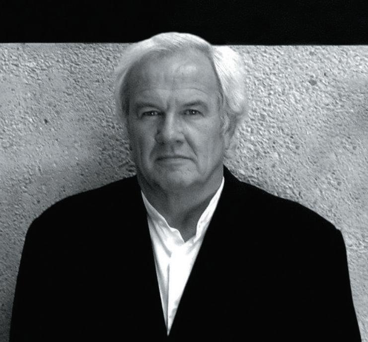
The industry leader discusses shaping the way we see the BBC and creating spaces from the inside out
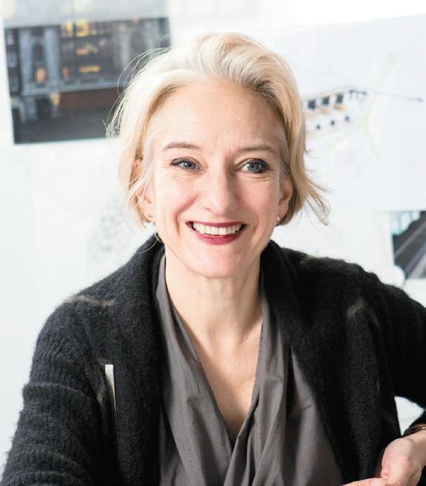
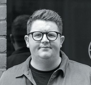

I n conversat I on w I th : pask I n & a ssoc I ates Layo and Zoe Paskin on taking Gleneagles from the Perthshire countryside to Edinburgh

t he a sk Tina Norden ponders if hotels are too homely –and what that even means
c ase s tu Dy : c lockw I se , s outhampton
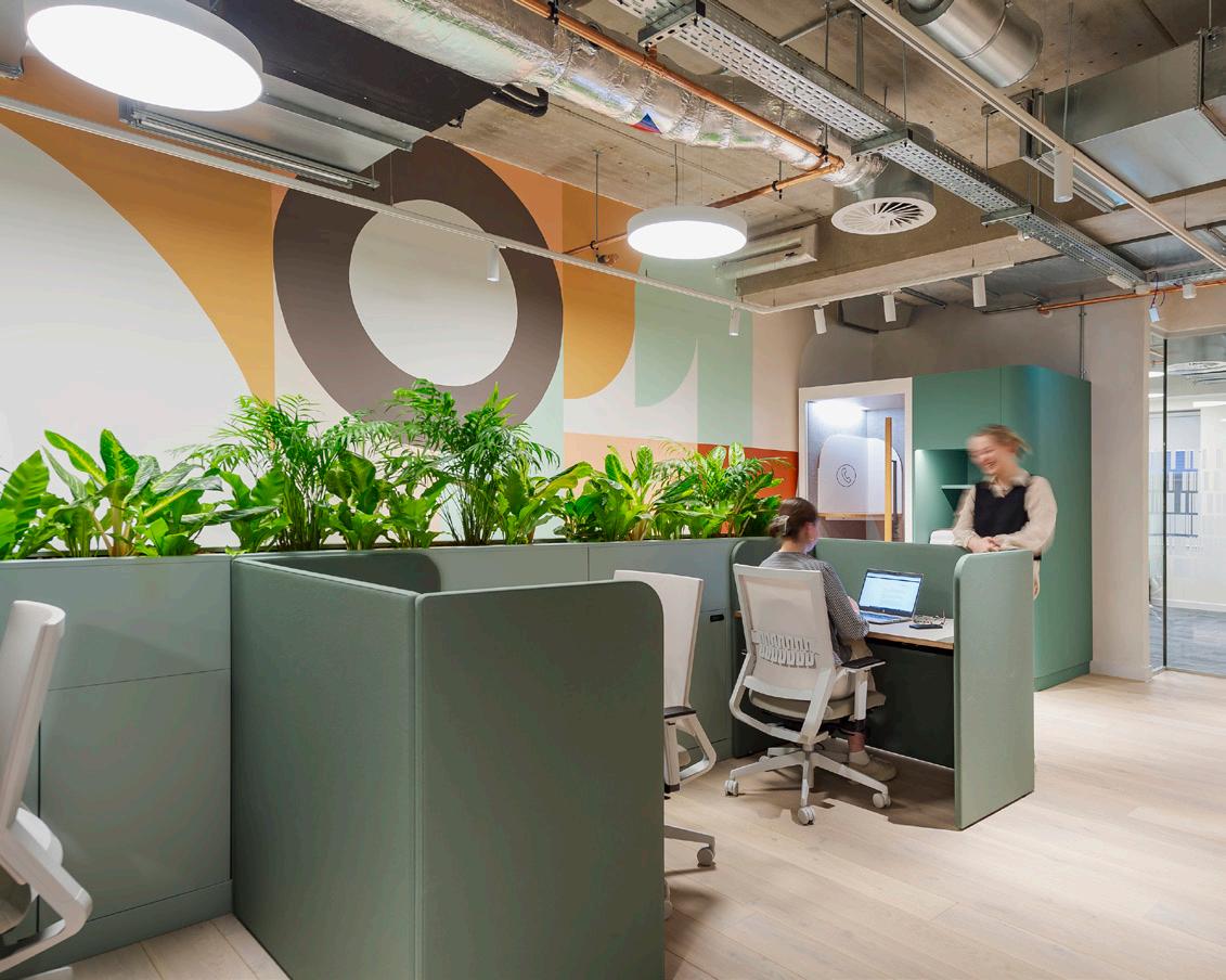
The latest Clockwise workplace aims to reinvigorate the city’s co-working offer
c ase s tu Dy : BB c B r I stol
An inclusive and sustainable new office for the broadcaster’s Southeast outpost
c ase s tu Dy : k I tesgrove , l on D on In Mayfair, a new collection of offices is inspired by residential interiors
c ase s tu Dy : t wenty t wo , l on D on The Natalia Miyar-designed hotel aims to ensnare the capital’s creatives
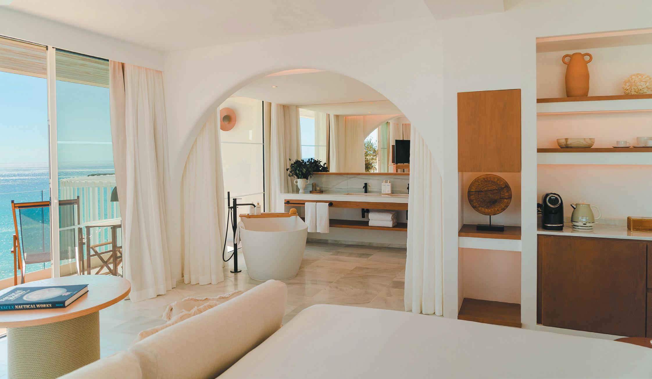
c ase s tu Dy : v I lla l e B lanc , m enorca
Style and sustainability meet at Gran Melia’s new carbon-neutral hotel
p os I t I ve I mpact : f oster + p artners
Head of industrial design Mike Holland discusses the practice’s pioneering approach to sustainability and its vision for the future





I n
Associate’s Steve Gale
ng : how
pan D em
I
way we use spaces is changing.
agency
discusses navigating
ev I
Domino Risch on Unf*cking Work
the mIxology north22 JuDges
the influential industry figures taking on this year’s Mixology North Awards judging challenge
I x r oun D ta B le I n partnersh I p
I th I vc c ommerc I al
homeification of the office: positive or problem?
e vents : l on D on D es I gn f est I val
from the 20th anniversary edition of London’s favourite design festival
vents : o rgatec
not to miss in Cologne this October
uman I ns I ght Chiara Vascotti on the dance between strange and familiar
t he g lo Bal p erspect I ve Why embracing what you have is the foundation of meaningful design culture
roperty
developers might (or might not) want to cut some corners
m ater I al m atters
architecture + design offers up four go-to materials
nnovat I ve m ater I als
GdB on pushing the boundaries of tile design
he f I nal w or D
Mike Walley on expectation vs reality
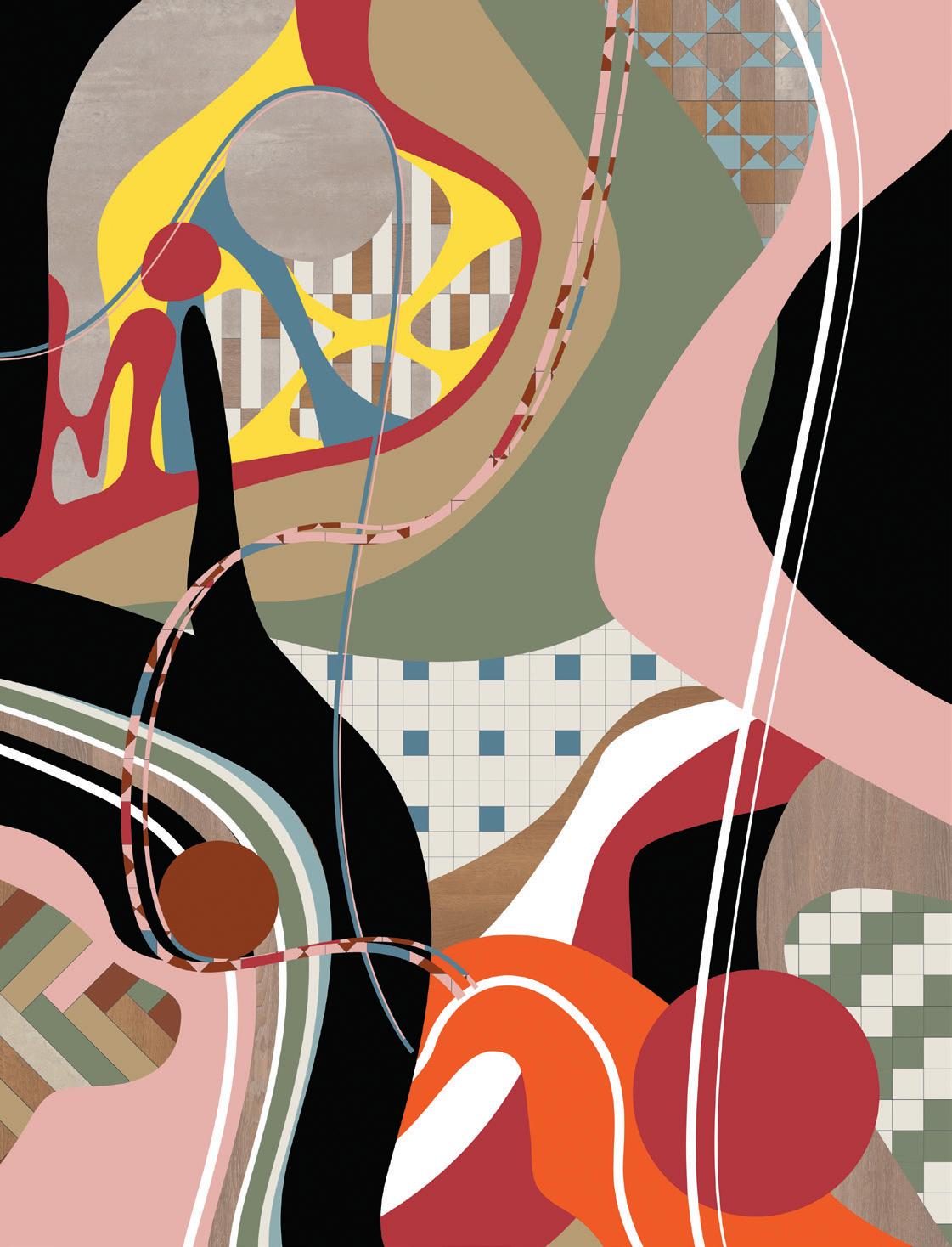
“We were thrilled to be involved in this edition’s cover with Karndean, which is a bold and different feel to some of the more muted colour trends to date. Influenced by the 70’s aesthetic and the fluidity of liquid lava lamps to create a fun, colourful and ‘groovy’ design to inspire use of colour.”
ekho.studio
cover Image
Inspired by the post-pandemic ‘creative reset’, Karndean Designflooring have reflected the trend ‘random chaos’ through the use of abstract shapes, disjoined patterns and clashing colours. Intended to instil a sense of happiness and optimism, the random and abstract nature of the front cover further reflects that flooring designs has no bounds, promoting individuality and endless possibilities.
karndean.com

To ensure that a regular copy of Mix Interiors reaches you or to request back issues, call 0161 519 4850 or email lisa@mixinteriors.com

AnnuAl SubScription chArgeS
UK single 45.50, Europe 135 (airmail), Outside Europe 165 (airmail)
MAnAging editor Harry McKinley harry@mixinteriors.com
deputy editor
Chloé Petersen Snell chloe@mixinteriors.com
MAnAging director
Marcie Incarico marcie@mixinteriors.com
director Leon March leon@mixinteriors.com
buSineSS developMent
MAnAger Kate Borastero kate@mixinteriors.com
Account MAnAger Stuart Sinclair stuart@mixinteriors.com
heAd of operAtionS Lisa Jackson lisa@mixinteriors.com
MArketing & coMMS executive Neve McDermott neve@mixinteriors.com
deSigner
Tamzin Bell
founding publiSher Henry Pugh
colu M ni S t S
Steve Gale, David Thame Tina Norden, Mike Walley, Neil Usher, Chiara Vascotti
contributor S Clare Dowdy, Dominic Lutyens
AddreSS Unit 2 Abito, 85 Greengate, Manchester M3 7NA Telephone 0161 519 4850
eMAil editorial@mixinteriors.com
WebSite www.mixinteriors.com
tWitter @mixinteriors inStAgrAM @mix.interiors linkedin Mix Interiors
Printed by S&G Print ISSN 1757-2371
What does home look like? The answer will be different for most of us. Perhaps it’s a country pile with chintz curtains and Belfast sinks; a bijou inner-city flat with Dieter Rams shelving and cantilevered chairs; or a suburban semi with a shagpile carpet and affirmationemblazoned driftwood – no judgement. It could be these or an infinite number of other iterations. Our homes, after all, are as idiosyncratic as we are.
So let’s try another: what does home feel like? It’s here I’d hazard we may find more common ground: home as a place of comfort and ease; of familiarity and flexibility; of security and belonging. When viewed this way, it’s little wonder that the nebulous notion of ‘home’ has become the jumping off point for everything from workplaces to hotels. But is it a solid one? In this issue, that’s ripe for debate – both in Tina Norden’s column, where she explores ‘homely’ hotel design, and in our roundtable with IVC, where we ask if the ‘homefication’ of the office is a positive or a problem. It’s also visible in action in our case studies, with an office that looks like a private residence and a boutique hotel and members’ club with interiors helmed by a residential designer.
But the difficulty isn’t just in aligning the two wildly divergent ideas of what home looks like and what it feels like (in a way that works for lots of us at least), but is instead exposed in my third question: what is home not?
Well, home isn’t particularly inspiring, challenging or exciting. In short, it’s arguably none of the things that drive innovation or arouse big ideas – like those seen in our Positive Impact feature with Foster + Partners, or championed by interviewees Helen Beresford, of ID:SR, and Zoe and Layo Paskin of Paskin & Associates, who recently unveiled a bold vision for an iconic brand at Gleneagles Townhouse in Edinburgh.
I’ll leave you with something to mull over then: if we’re going from a position of ‘no place like home’ to ‘everywhere’s like home’, will it still ultimately be where the heart is? My final question, but perhaps the golden one.




Coinciding with lonDon DesIgn festIval 2022, Swiss design company vItra unveils a new flagship UK showroom at Shoreditch’s listed Tramshed building – alongside an installation celebrating its ongoing collaboration with the family of iconic French designer, Jean prouvé
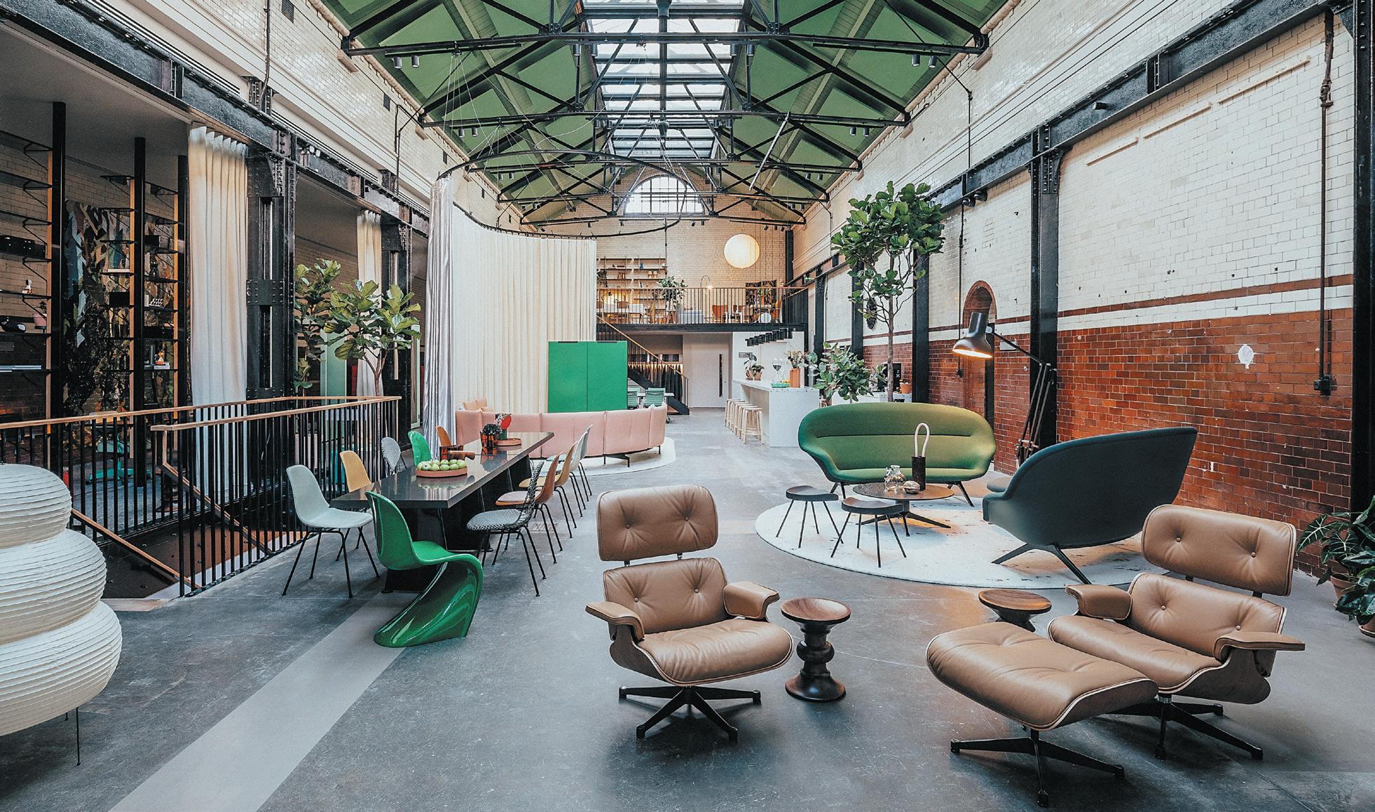
Built as a power station for the East London Tramway in 1905, Vitra has thoughtfully renovated the Tramshed’s interior to bind old and new across three floors. Original features, including the aged cement floor, glazed brick walls and black metal beam structure have been preserved within the new space on Rivington Street.
On the ground floor, office installation ‘The Club’ is tailored to the post-pandemic needs of people and companies. Echoing the first implemented and tested
Club Office at its Switzerland headquarters, The Club at the Tramshed features a large bar and varied zones, demonstrating how the inspirational concept can be adapted to spatial conditions. The floor’s mezzanine includes a collage-like display of products from the Vitra Home Collection.
In Tramshed’s basement, ‘The Gallery’ accommodates an inspiring presentation of Vitra’s product portfolio and curated spaces dedicated to various themes. The showroom’s launch spotlighted an installation showcasing Vitra’s range of Prouvé furniture and lighting, while debuting new additions, including a limited edition of the Fauteuil Kangourou, first designed in 1948.
On the first floor, events and meetings space ‘The Loft’ is due to open in 2023.
London-based furniture designer Jan henDzel stuDIo has partnered with town hall hotel in Bethnal Green, artistically reimagining two suites to create a tactile, gallery-cum-living space which stimulates creative interaction.
Renowned for its signature textural and sculptural flair, Hendzel blends functional pieces, sculptural form and unexpected spatial design throughout the suites in the Grade II listed building, which will be bookable from mid-October. Smooth curved edges on coffee tables, ageing cracks in green wooden sculptures and handcarved scallops on mounted mirrors invite visitors to interact with pieces from its new furniture collection during their stay at the hotel.
Using reclaimed London Plane timber and street trees sourced from Denmark Hill - neighbouring Hendzel’s workshop in Woolwich - the studio aligns with Town Hall Hotel’s predilection to source locally and sustainably. Continuing the principle, a selection of British brands have also supported the project to accompany pieces from Hendzel’s own collection. This includes a custom-made paint shade, East End Clay, from Pickleson Paint, and crinoid marble kitchen countertops sourced from Mandel quarry in Derby to incorporate unique local touches.
The project sees Town Hall Hotel maintain its reputation for supporting local brands, eventually planning further collaboration to develop an eclectic range of suites – each with their own unique story.
m moser assocIates has designed a new sustainability-focused workplace for world-class alcohol beverage company, DIageo. The space features all the key amenities of a modern workspace, including a specialty bar that celebrates Diageo’s valued heritage and its motto “celebrating life, every day, everywhere.”
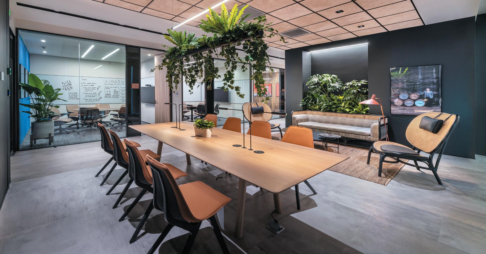
The office is an agile environment, enabling staff to work on their own or in a team and features an adjustable lighting system that expresses different moods based on user needs. All the meeting rooms are named after Diageo’s classic brands. Softwood panels on the wall in the Johnnie Walker room explore the brand history of this Scotch whisky, and how it arrived in Shanghai.
In every Diageo office, there is a bar, and the new Shanghai space is no exception, offering the largest of its kind in the Asia-Pacific region that accommodates up to 100 people.
Expressing Diageo’s goal to hit net-zero by 2030, M Moser Associates used energy-efficient, recyclable or recycled materials. An independent air purification system ensures clean air throughout the space and an LED sensor lighting system lights up spacious rooms. The materials specified in the workplace are carbon-neutral and green label, bought from companies with ethical practices - adding to the overall sustainability of the space.
In its first project built entirely from scratch, designled workspace specialist tog (the offIce group) unveils The Black & White Building in Shoreditch, a mass-timber office structure which sets a new industry benchmark for sustainable commercial construction.
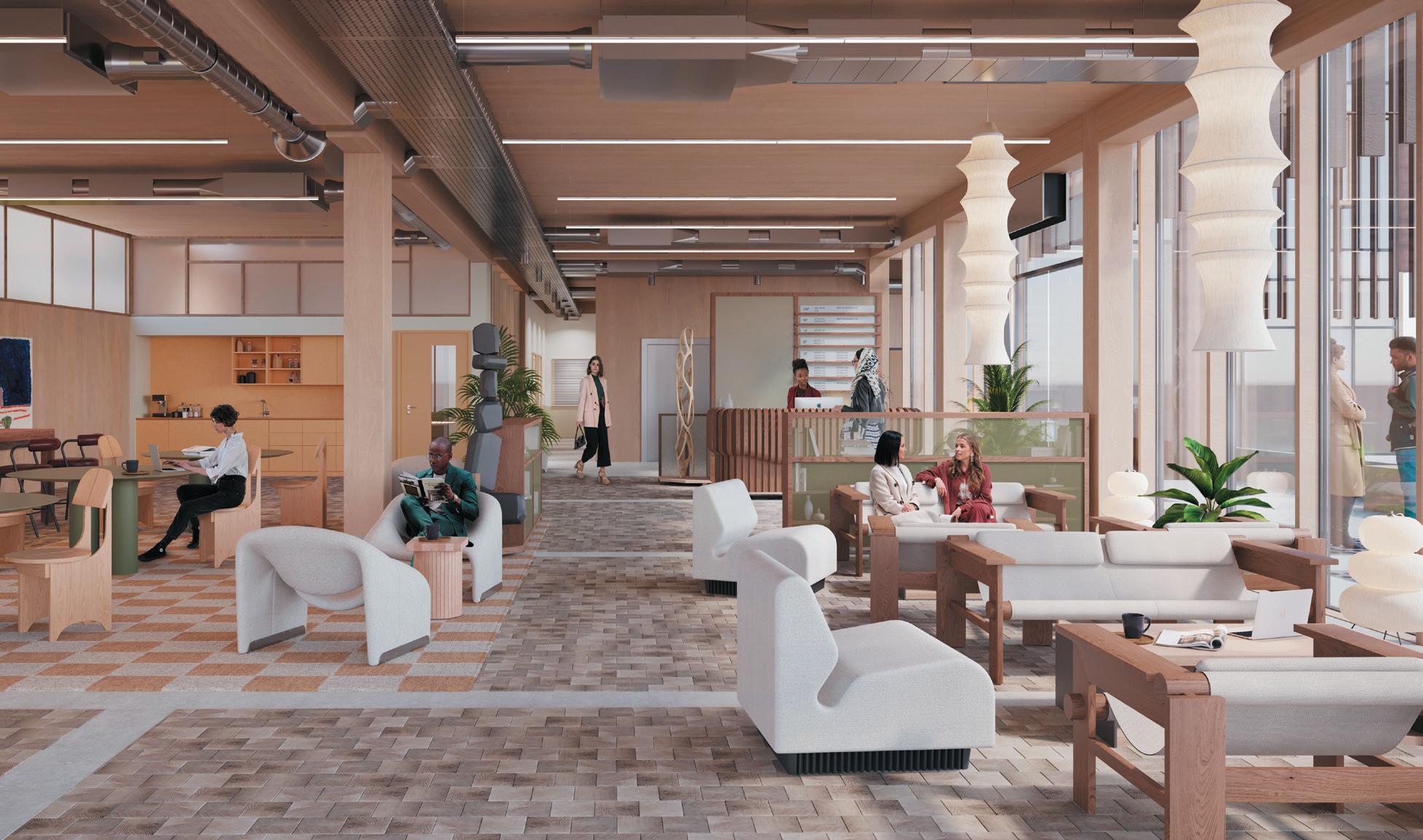
Constructed in partnership with sustainable design experts Waugh Thistleton Architects, The Black & White Building is made from cross-laminated timber (CLT) and laminated veneer lumber (LVL) – innovative, high-performance wooden materials that are rapidly renewable, highly durable, easily recyclable and less waste-generating than more common building materials such as iron, steel and cement.
“The Black & White Building represents a major step forward for us, and – I hope – the wider industry too,” says TOG co-founder and co-CEO, Charlie Green. “It’s
a statement of who we are and how we will approach sustainability; we don’t need to build the traditional way with concrete and steel anymore. When we do new builds or extensions, we’ll build this way.”
Timber louvres provide natural shade, reducing solar gain on the façade and boosting the natural light reaching the interior, in which sustainability is embedded throughout. Designed by local practice, Daytrip Studio, recycled and locally sourced materials feature in abundancy – including kitchen surfaces in Richlite composite boards, and corridors lined with dappled ochre Viroc particle board. A palette of honest materials including exposed timbers and deep-pile fabrics creates an atmosphere of warmth, comfort and rich texture.


herman mIller has collaborated with Danish design brand hay to unveil a modern reinterpretation of eight Eames classics. Featuring new colour palettes and updated materials, the collaboration includes the Eames Molded Plastic Chair, the Universal Base Round Table and the Wire Base Low Table.

The collection features seven joyful colourways meant for endless combination, including Toffee, Iron Red and Powder Yellow - HAY consulting the Herman Miller archives for references that could help modernise the company’s approach to colour, without recreating it directly. “Being very familiar with the existing colour range, my intention was to focus on looking ahead, instead of looking too far back,” says HAY co-founder Mette Hay.
As part of MillerKnoll’s commitment to reducing its environmental impact, the Molded Plastic Shell Chairs, both with and without arms, contain 100% postindustrial recycled plastic available in the HAY-designed palette; and the Eames Wire Chairs are powder-coated for outdoor use with optional cushions upholstered in outdoor fabric.
For now, the collection is only available in North America, South America, Asia, Australia, and Africa, but with an update on European distribution likely on the horizon.
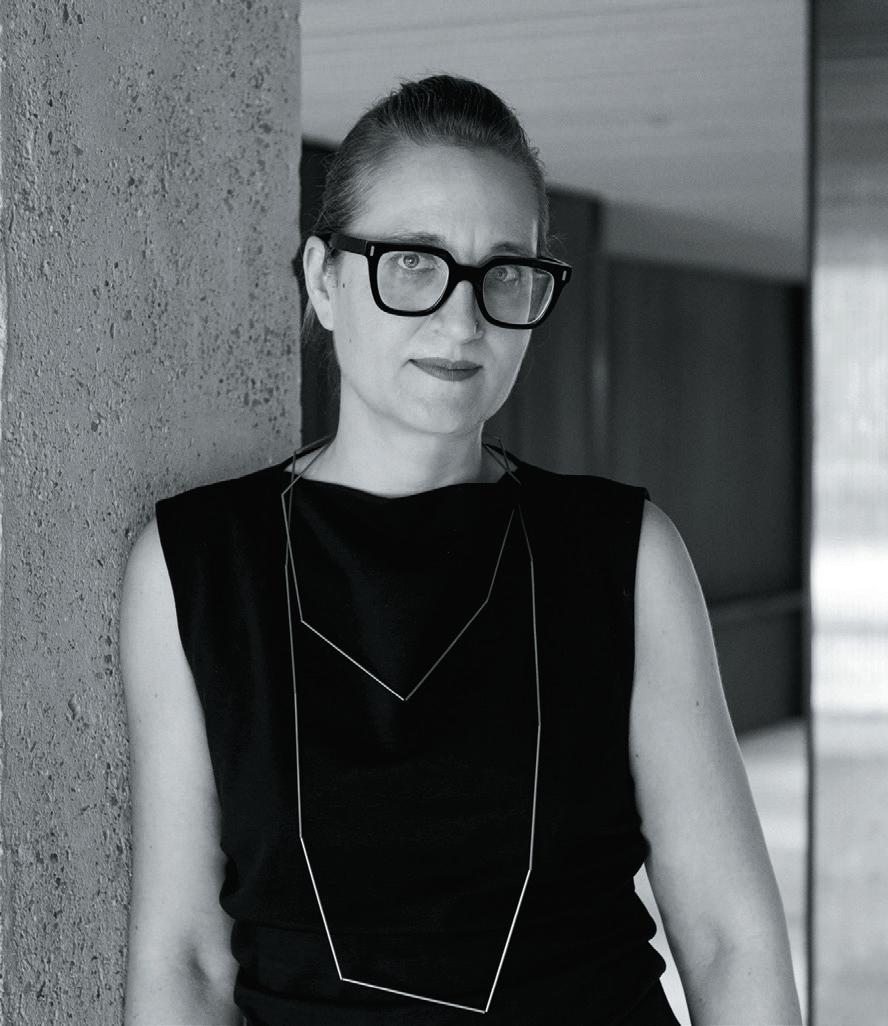
 v ID h I s harma Creative Director Modus Workspace
sharma has worked across the design and build industry for 11 years, working on myriad projects across all fields of commerce. She loves texture and colour, and has been the lead designer on some of ModuS’s most creative projects in London, including Alpha FX’s new headquarters, Tag Worldwide’s relocation to Aldgate Tower and SLG’s office in Cheltenham’s Brewery Quarter.

01 Cocktail set and limitless booze
I’d like to think of my desert island experience as being one big holiday, with this in mind the need for a cocktail set and limitless booze speaks for itself.

Bailey is a Red Nose Pitbull and would, without a doubt, be an essential companion on the island. Endless cuddles and entertainment, what more could you want?
03 Paints (acrylics specifically) and an easel
I have always wanted to start painting, so being stranded on a desert island seems like the perfect opportunity to start.
04 The Wind Up Bird Chronicle by Haruki Murakami
This is my current read, which I have only just started –so naturally would have to take with me. It’s also already confusing, so I think I would need to read it three times.
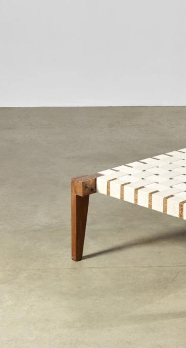
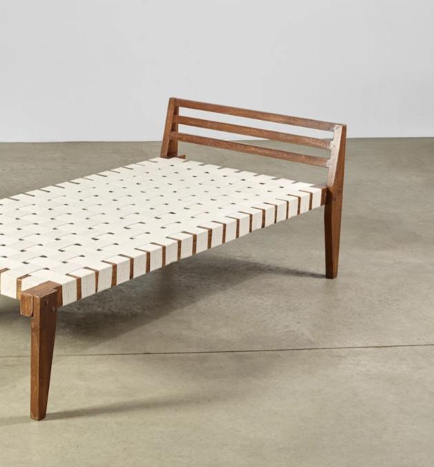
05 Indian daybed
This would be my designer version of a sun lounger and would ideally have a woven cotton bed and a timber teak frame –think a Pierre Jeanneret daybed.
Fairy lights have the power to add a touch of magic to any space and therefore are an essential item for my time on the desert island.



It’s easy to forget how ridiculously noisy the office used to be. If you were born before 1980, that is. Let’s imagine phones tethered to the desk with a single, fitted-as-standard full-volume ringtone that could wake the very deadest of the dead. Add to that the chugging telex; beeping and grinding fax; the churn of analogue copiers; staccato staplers and hole punches; the metallic screech and crash of filing cabinet drawers and the freejazz hammering of typewriters. Let’s also assume that acoustic consultants didn’t exist or that anyone even thought about noise.
It’s easy to get into ‘wasn’t like that in my day’ here, but really, it wasn’t. Essentially, in the Days Before Technology, in staking its claim to indispensability everything in the office was designed to be heard above everything else. Loudest in, quietest out. LIQO. Yet now, apart from Kevin in Accounts for whom a solution has yet to be found, smooth and silent operation is the badge of honour. As to where the tipping point occurred, I’ll hazard a guess as to the rollout of the first BlackBerry around 2002. It was the meteor to the dinosaurs. Now it’s quietest in, who knows if it’s still here.
Strangely, the quieter the potential for the office the more we’ve become fixated on acoustics. Yet we’ve been chasing the problem as it’s cheerily left of its own accord, rather than driving it away. Phones on vibrate or silent, soft-touch keyboards, call pods, acoustic panels, slab-to-slab walls, triple glazing. Barely any printing,
barely any paper with its medieval armoury of puncture. So now, if we are to believe every quoted CEO wondering what on earth to do with all their lease commitments, the office is all about working together: co-ordination, co-operation, collaboration. Interaction that, while associated with work, is fundamentally social. The amazing thing about ‘social’ is that it’s noisy. It might not be Born Slippy at the sunset pool party, but it’s conversation, at least; not the steely noise of the office of yore, but a level above cryogenically frozen librarian, at least.
Our paradox becomes: for the office as a hub of interaction, acoustics are vital. We have to wonder whether we missed the late running train. We expect those at the office to be visible, to interrupt and be interrupted. We’re not trying to hide anymore. We can do that at home. We may need to step away from the hubbub occasionally, in which case a quieter zone is necessary. And we do need to consider my absolute bête noir – the design 101 no-no of adjacent interactive spaces that nullify one another.
It could simply be that workplace acoustics has become far more a group than an individual consideration. But I’m thinking of assembling all the old gadgets, loading them on a trailer with a generator and taking them on a roadshow. Kevin from Accounts is up for it. He’s just been on holiday and he’s dying to tell you all about it.
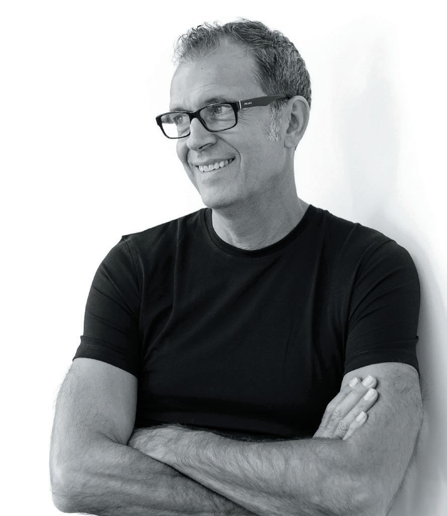
n e I l u sher is Chief Workplace & Change Strategist at gospace aI and author of The Elemental Workplace and Elemental Change

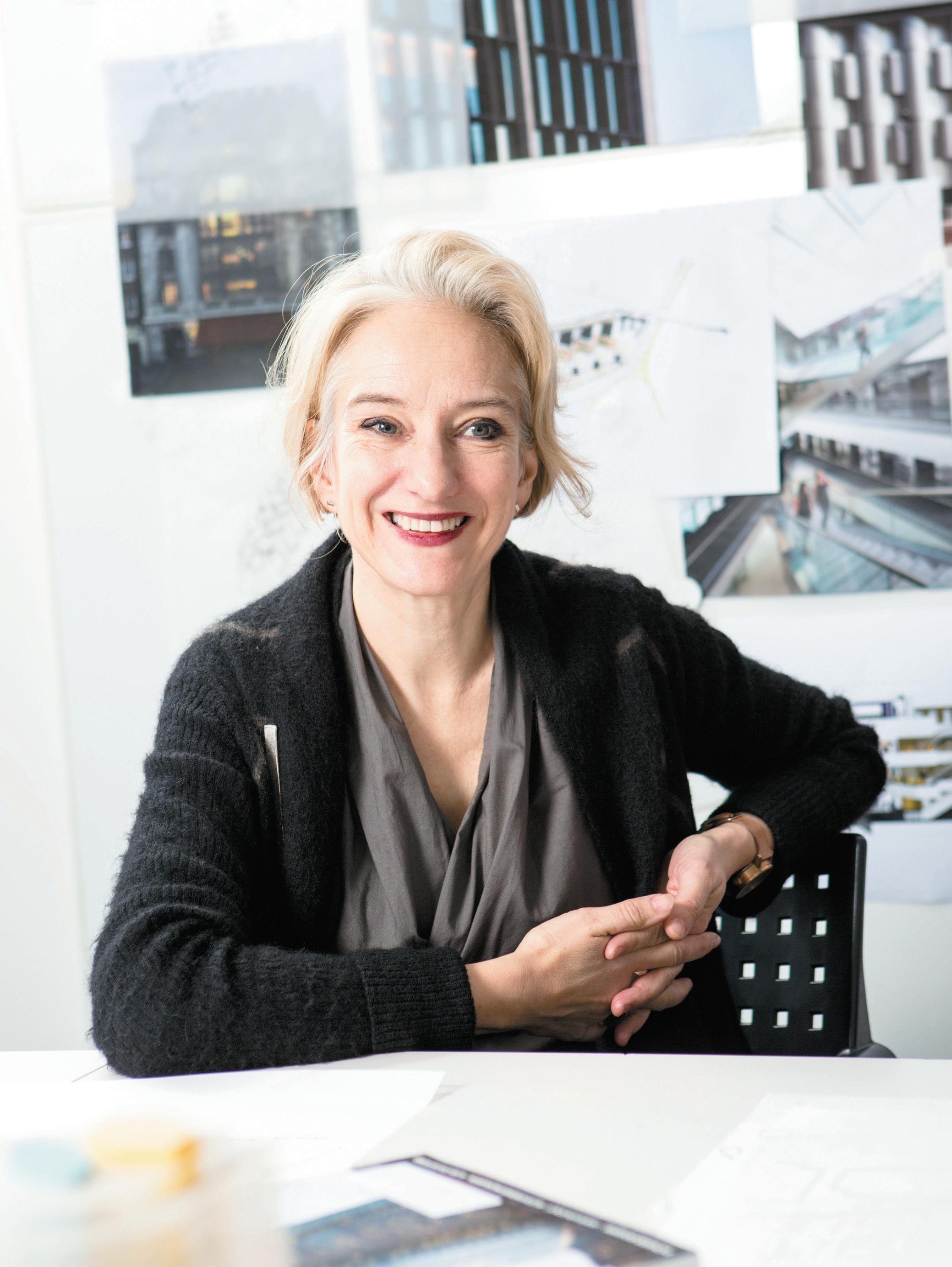
s heppar D r o B son ’s Partner and Head of ID: sr h elen b erre S ford discusses shaping the way we see the BBC and creating spaces from the inside out.
Set back from the chaos and colour of Camden’s high street, Sheppard Robson is based in a courtyard of yellowbricked buildings and dichroic glass. Previously a piano factory, the studio has made this peaceful spot its home for over 40 years, developing and renovating the building alongside the growth of the practice
Dressed head-to-toe in monochromatic red, Berresford cuts an effortlessly creative figure. Describing her childhood as ‘hearts and minds’, thanks to a ceramicist mother and modernist architect father, she cultivated a diverse appreciation of beauty and craft from an early age – eventually attending the Royal College of Art to study architecture, where fellow students included the Chapman brothers and designer Philip Treacy. After getting involved in more mainstream architecture, she describes the ‘real education’ that came from her position at David Chipperfield Architects.
“Working with Chipperfield was brilliant, because it was an education in sculpting space from the inside out,” Berresford notes. “Every detail counted – he was as interested in the door handles, the furniture and the pottery as much as he was the façade.”
Berresford eventually returned to Sheppard Robson –where she had previously interned –and soon took the helm of the practice’s award-winning interior design arm. She now looks after a growing 70-strong team, with projects ranging from education, workplace and, more recently, residential.
“My journey began from the outside in and I felt restless in a way, until that was combined with the inside out. Coming to Sheppard Robson was all about fascination with people and occupiers, and has allowed me to help create something much more integrated. My career has really focused on people and the understanding that even the most beautiful spaces and details are only relevant when you add people,” she continues. “People are at the heart of design.”
Most notably then, is the practice’s unwavering relationship with the BBC, which Berresford has worked with for over 20 years – softly joking that her team knows more about the BBC than the BBC do. At the BCO award-winning BBC Cymru project, 1000 employees were relocated from its former building in Llandaff, north of Cardiff. The project started by working in partnership with the BBC teams on an assessment of the former facilities. “This revolved around the fundamental question: should they stay, or should they go?’” Berresford explains. “It was more expensive to refurbish lots of technical, heavy studios than to design new, super digital studios. The digital age is so fundamentally different.”
Working with BBC’s Director of Workplace and Corporate Real Estate, Alain Bainbridge, the 10-year long process eventually resulted in a diverse range of working and production spaces, designed to thoughtfully reflect its home of Wales, support major investment in Welsh broadcasting and, most importantly, shape the future of the broadcaster in such dynamic and shifting times.
Thanks to the interior architecture and clever acoustics, filming can now take place in open rooms, revealing the magic of creating content to the public. The team struggled to source Welsh wool for the ceiling’s 50% acoustic requirements, eventually working with a local mill to reintroduce Welsh wool into the local supply chain and quite literally weave it into the fabric of the workplace. A romantic addition, Berresford describes, but one that is functional and typical of the BBC and ID:SR’s relationship.
“Every time we work with BBC, the result must be useful and local, but not clichéd. Using Welsh wool to do something very functional - and to affect the local supply chain - that is the best of the BBC. We all have a vested interest in the BBC and they have that sense of corporate social responsibility with their approach.”
The design language is inherently Welsh while avoiding the usual tropes of leeks and red dragons, and ID:SR worked with Welsh design studios and universities to help design the furniture and fabrics. “Again, the idea was that we could affect local income,” says Berresford, “so instead of taking things off the shelf, it really was made in Wales – with excellence. That was key. As a result, there’s fabric in the building that’s on furniture and the ceilings that is inspired by the students. They got to work with commercial organisations to help evolve their career and the organisations got some interesting new ideas!”
Sheppard Robson has been shoulder-to-shoulder with the BBC throughout some of its most challenging and interesting times, says Berresford, starting with the rethinking of W1 (a project the practice is still working on), its biggest ever people-move for BBC North, and embracing agile working throughout the pandemic – for 22,000 employees no less.
Indeed, the landmark arrival of BBC at MediaCity, Salford, was a serious game-changer for both the corporation and the once derelict dockland it now stands on. Marking 10 years in situ in 2021, the move marked the start of a substantial transformation of Manchester’s – and more broadly, the north of England’s – socioeconomic landscape, at a time when how we consumed media was rapidly changing from analogue to digital. Berresford describes a politician visiting the site and being dumbstruck at tweet booths within the collaborative spaces – once a private social pastime, now a platform on which many could argue elections are won and lost.
“There was a huge change in how broadcasting was going to work and stay relevant,” she explains passionately. “It was the ultimate sort of purpose driven building in many respects. Our society has absolutely transformed, and it was all about building digital into the space.”
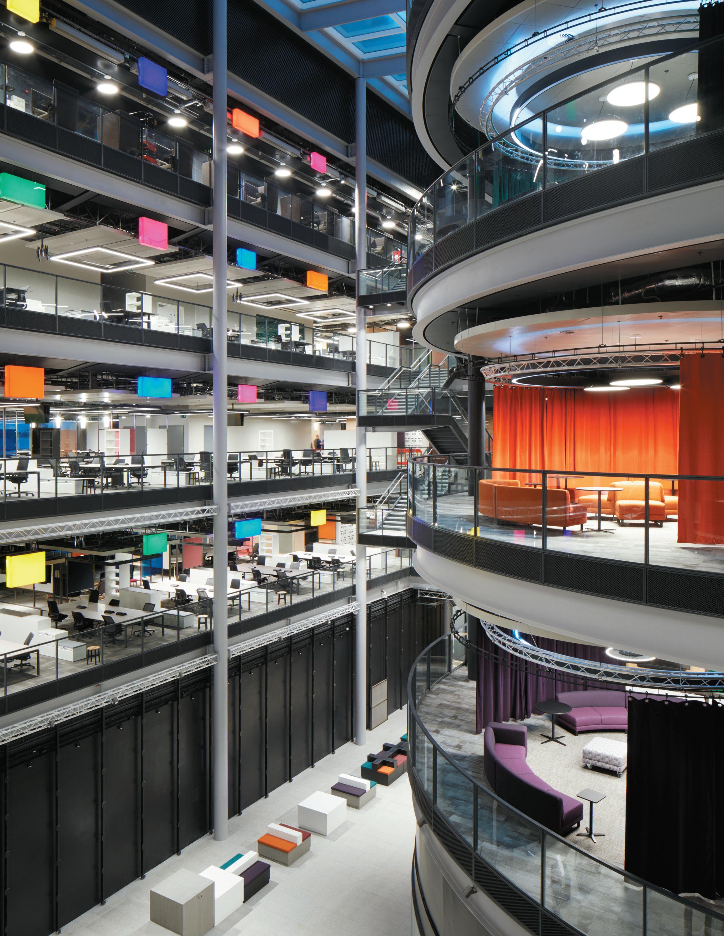
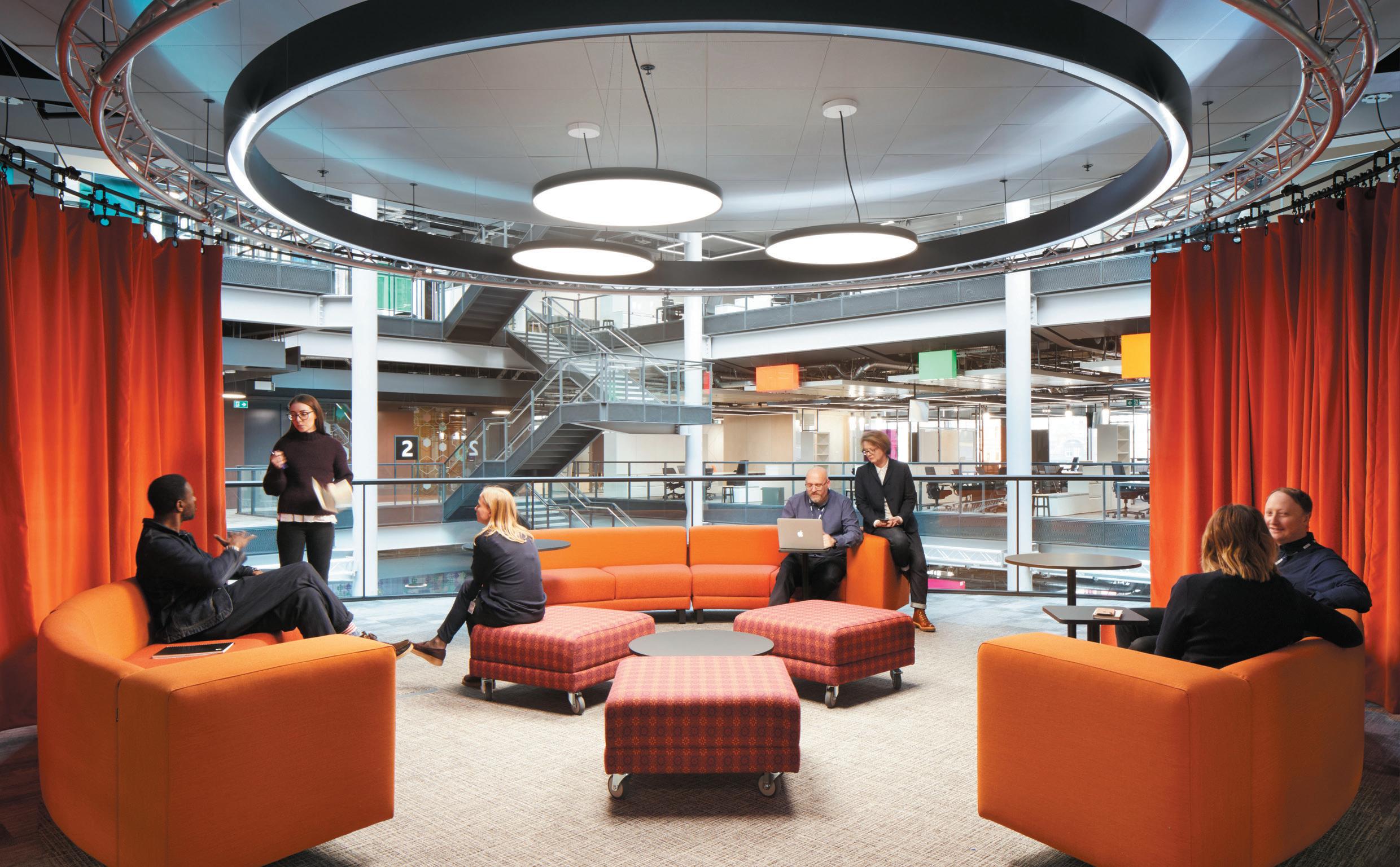
The BBC North workplace captures the vibrancy of shared spaces and amenities, offering more choice in less space than its London equivalent. Amenity-centric rather than desk-centric, the workplace supports agile working across a variety of desirable work settings, tailored to a range of activities, whether holding a team meeting, making a phone call, editing content, having an informal catch up, tweeting or blogging. It even doubles as a studio space, providing the backdrop to a variety of broadcasts, then replicated at the Wales site.
Berresford describes large office projects, like the practice’s work for BBC Wales and MediaCity, as a microcosm of a city, and that projects of this scale need masterplanning. “After all, it’s about weaving the right mix of places together, bringing together civic spaces, alongside private technical spaces. Bringing together spaces to live work and play – just like all the cities you love do.”
Another British institution radically rethinking its estate and ways of working, BT’s ‘Better Workplace Programme’ aims to create a new generation of people-focused workspaces, with agility and wellness design principles at their core. Consolidating BT Group’s UK footprint from more than 300 locations to around 30 was no easy task, especially designing throughout a pandemic. Despite the obvious changes the pandemic turbocharged, for Berresford and her team, the way in which they designed the space didn’t change. Organisations realised they could work digitally – a process which the BBC had been working on for nearly a decade.
aBove Image: BT London offices
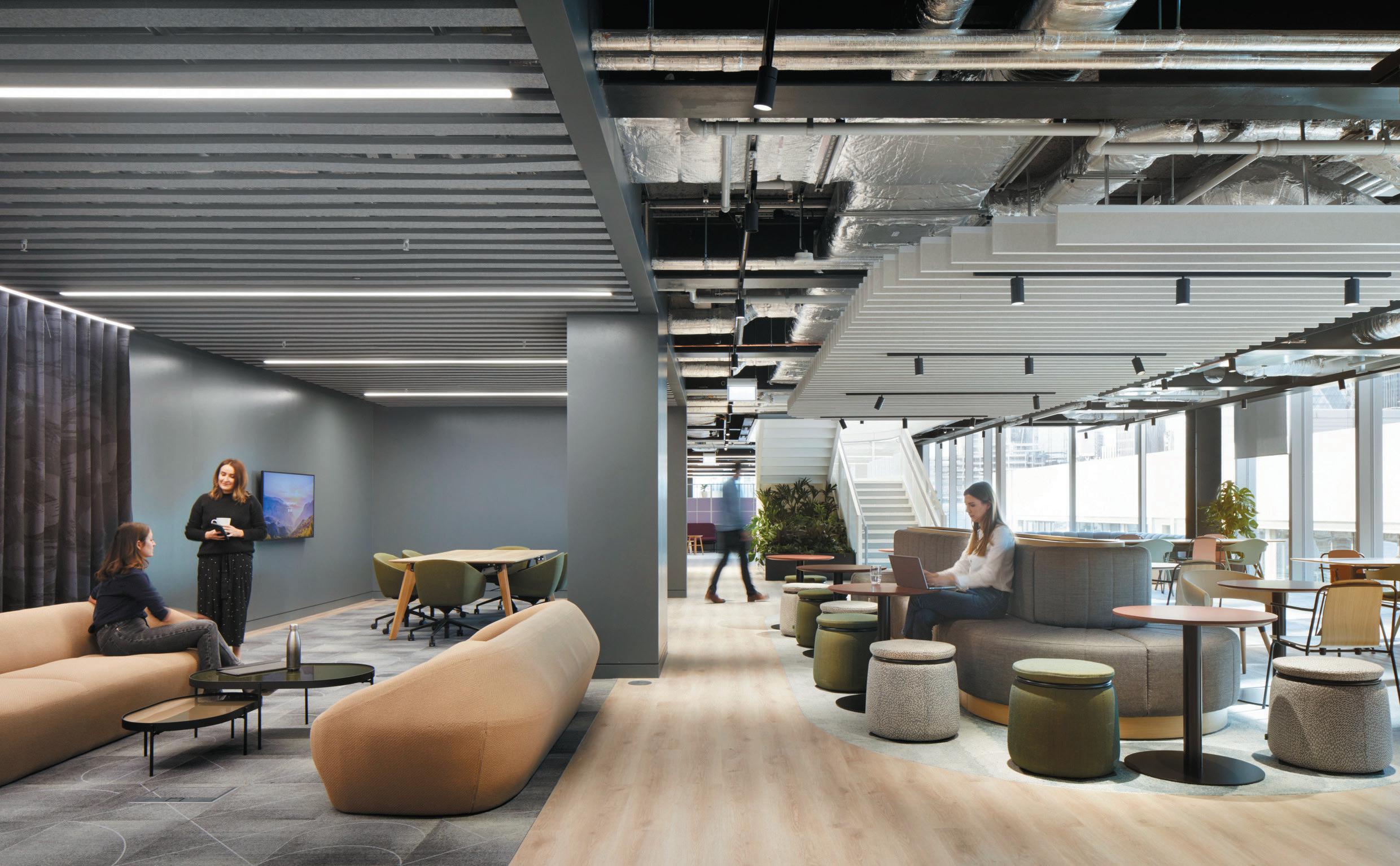
“In a way, a lot of the learnings we found from BBC masterplanning. It was quite comparable process, taking an organisation that really needs to reinvent itself in the digital world and making it relevant - but also bringing the people along during that process, because it’s quite a transformational change.” ID:SR created a flexible ‘toolkit’ for a full range of work, amenity and collaborative requirements, which can be used in different ways, aligned to people’s day-to-day requirements. These can contract or expand as and when BT need them, evolving with the potential changes in hybrid working that are still to come.
“We’ve rejected seas of desks and workplaces inspired by Taylorism, with its ideas of surveillance (a precursor to presenteeism) and clear hierarchy, looking even more antiquated.”
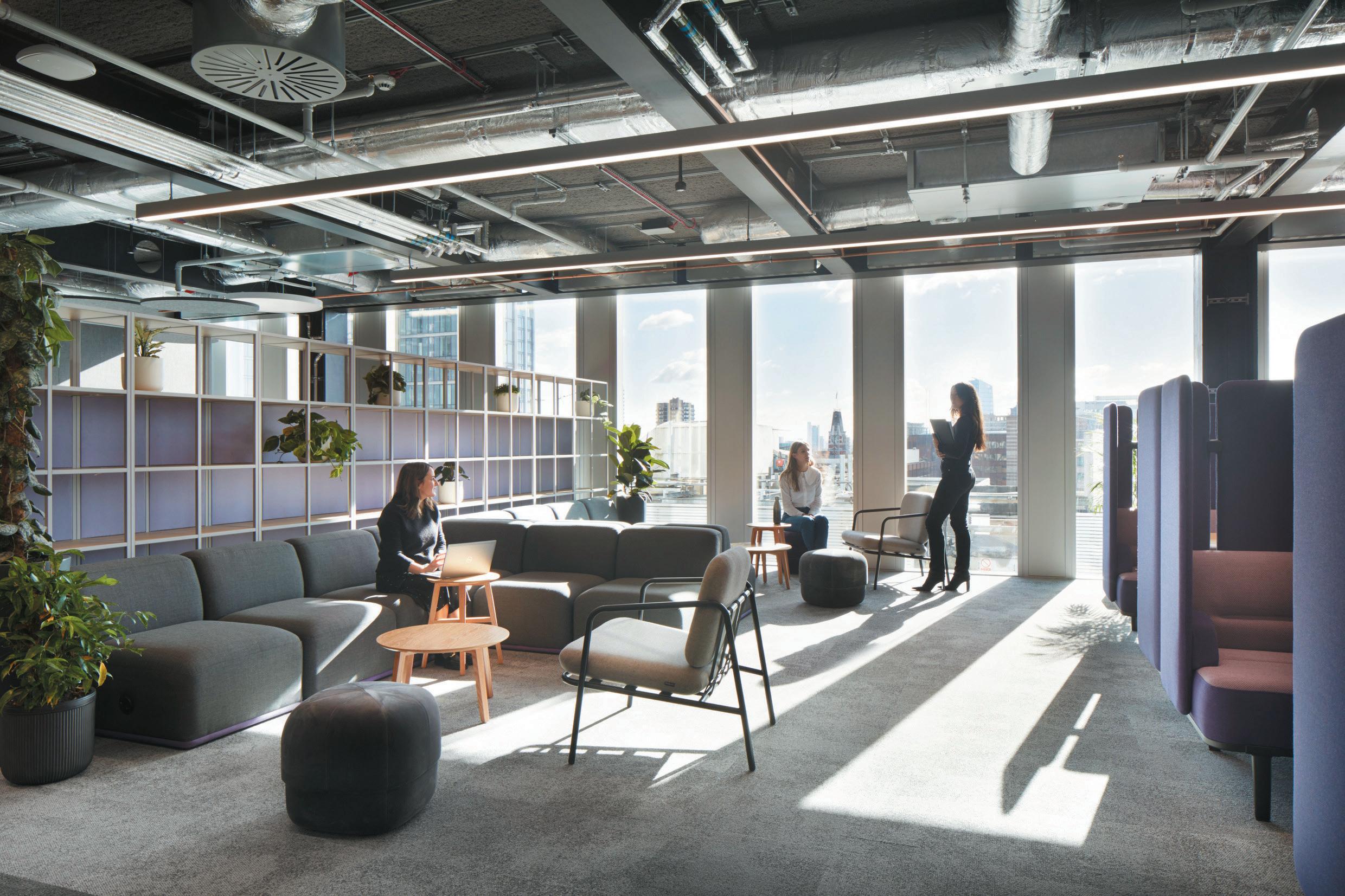
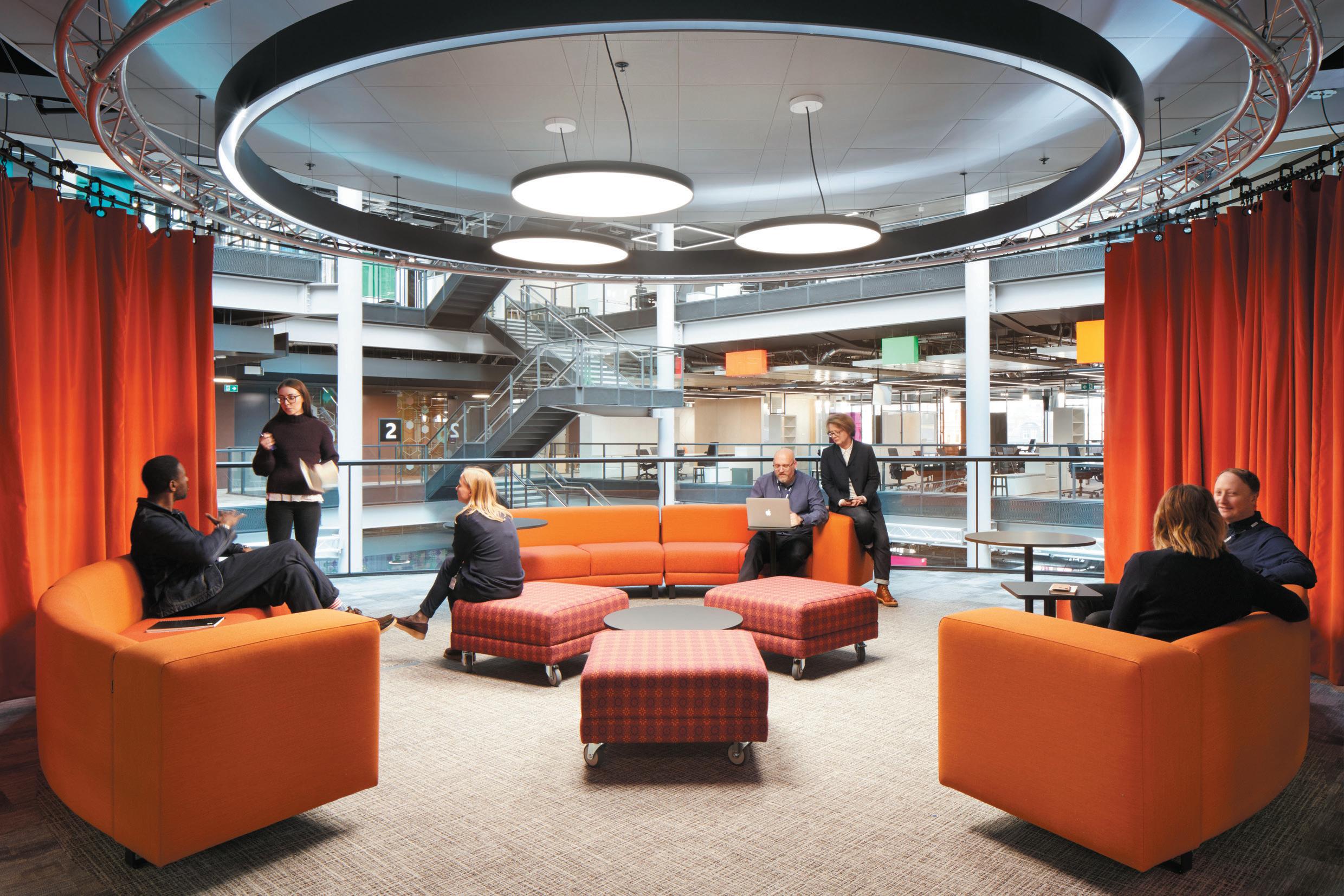
Next for Berresford and her team is growing its residential and hospitality presence, but she already has an eye on the future beyond and the challenges
it may hold. “It’s been a turbulent couple of years, but office design has never been so interesting and important to people’s lives,” she ponders. “Environmental responsibility is obviously top of the agenda and being efficient and doing more with less is fundamental to this. It’s not just about specifying sustainable products, but also important to work with clients to ensure they are efficient with their space and that they use what they have in a sophisticated and thoughtful way.
“For me it always comes back to our team – how we solve problems together and create a culture to deliver excellence.” The latter is clear as we’re given a tour of the studio after our conversation, which features stripped timber beams, flexible work settings and a giant and inviting purple modular sofa ready for brainstorming. “It doesn’t matter if you are a blue chip or SME, we always want to understand the culture of an organisation and what people need to do their best work, as well as enhance their life. After all, people really are at the heart of design.”
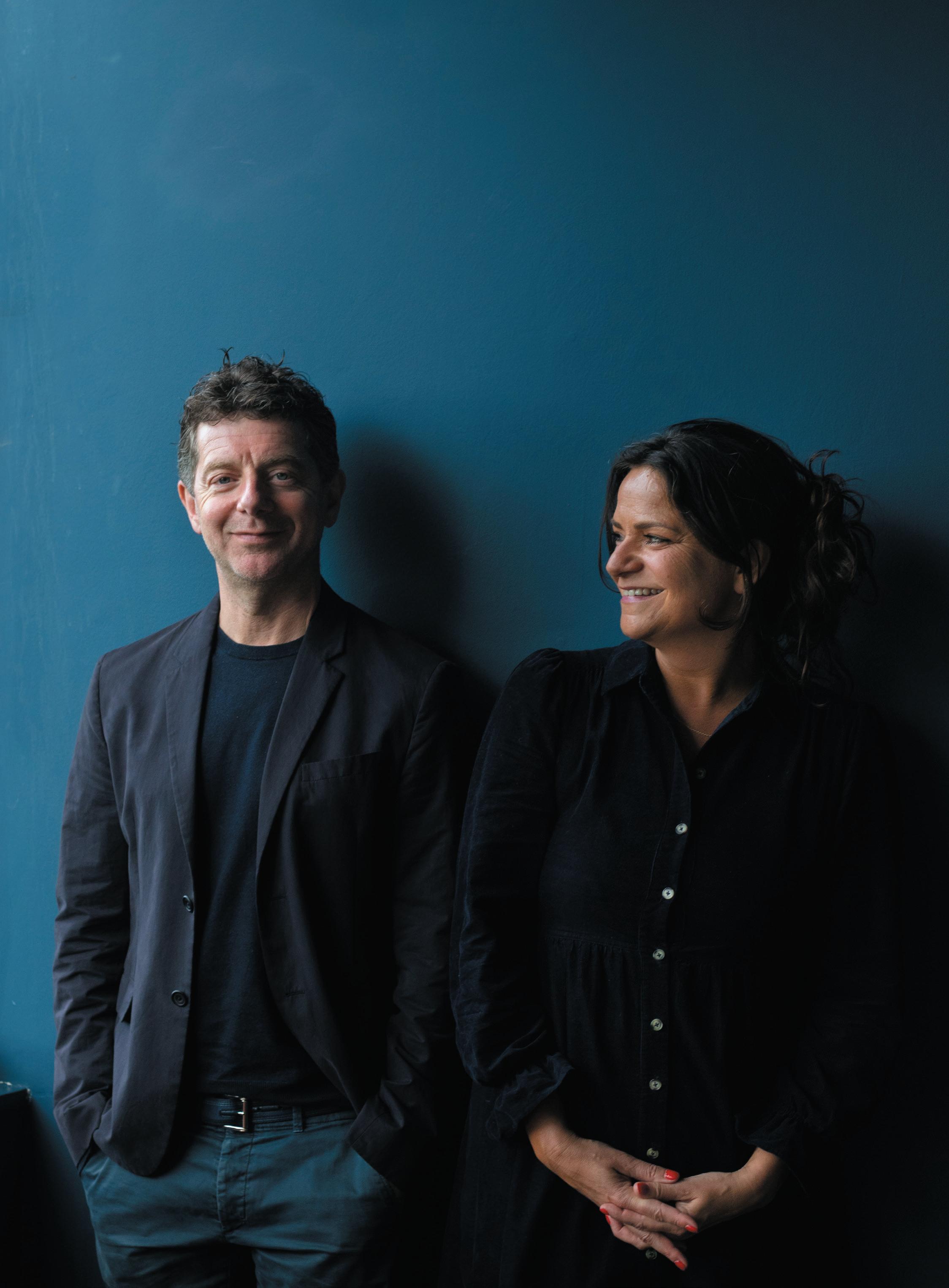
l ayo and z oe p ask I n discuss the launch of their own creative-collab studio and taking Gleneagles from the Perthshire countryside to Edinburgh.
Zoe and Layo Paskin know hospitality. Both siblings and professional partners, they’ve developed some of London’s most fêted dining destinations. Their Israelicentric restaurant Palomar opened in 2014, was named Restaurant of the Year by Tatler and has been drawing queues ever since. Others, such The Barbary and Evelyn’s have garnered equally high praise and accolades – the latter this year earning a Michelin star.
They’ve just launched PASKIN & Associates, a studio that will allow the duo to take their knack for creating killer concepts and work collaboratively with others – both at home in the UK and internationally. Its first project was Gleneagles Townhouse in Edinburgh, where the pair were tasked with translating the iconic brand for the city.
It’s early autumn when we meet, virtually at least. A tour of the Camden HQ has been canned, as the capital descends into train strike catastrophe. There are already reports that bars and restaurants stand to
cumulatively lose millions in cancelled bookings – yet another challenge for the already challenged industry the Paskins have made their business.
We converse then on Zoom, the shelves behind them peppered with a couple of awards. Nothing flashy or contrived, but evidence of their popularity and success nonetheless.
“You can come and be yourself at our places,” says Layo, when quizzed on what it is about their venues that resonates with guests. “You can kick back and enjoy yourself. Generally, they make people feel good and hospitality is all about how something makes you feel.”
For Zoe, there’s something visceral in it. “It’s an emotional experience,” she explains. “That’s true whether it’s the ritual of the coffee shop you chose or a special occasion. It’s why our teams don’t have a script, because the exchanges they have should be unique and personal.”
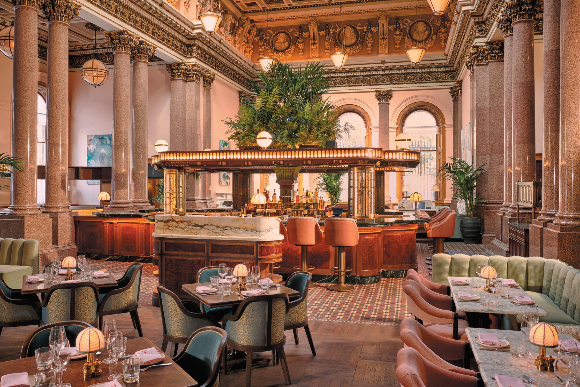
aBove Image:
The grand dining room at Gleneagles Townhouse, Edinburgh
Beyond their own portfolio, the Paskins list spots such as Scott’s, Barrafina, Bistrotheque and River Café as among their favourites – all classically celebrated destinations that have nailed the food and, just as importantly, the atmosphere, however different they may be. But what of design? Sure, the Paskins’ restaurants are beautiful to behold, but they don’t have the flamboyance and conspicuousness of the likes of a Big Mamma Group joint or a Sexy Fish; places engineered for the Instagram generation or those who want their pricey sushi served with a side of Damien Hirst.
“It’s about authenticity,” explains Layo. “Design is really important to us, and not thinking about anywhere in particular, but there’s a cynicism to some places, where it feels that there’s big money behind creating something to be marketed on Instagram; a feeling of image over substance.”
“When it has to start with the story and come from there,” continues Zoe. “Our ventures start with the concept and then it’s about building layers – from how it looks and feels, to the menu and the service style.”
The children of an architect, both place great emphasis on use of space. Clever design is, for them, often the stuff guests don’t notice: how a room is navigated, how interiors are oriented to make the most of light, the placement of an open kitchen or where the host greets. As they stress, these things might not feel tangible to the average diner, but when they’re off, they jar.
This nuanced understanding of what it takes to create and deliver great hospitality is perhaps what drew Ennismore to the duo, for the landmark Gleneagles Townhouse project in Edinburgh. The 33-room hotel and members’ club features a vast all-day restaurant on the ground floor and a ritzy rooftop bar. It’s a very different beast to the original rural retreat in Perthshire – one of those hotels so renowned, it has become shorthand for a certain mode of open-fired, tartanaccented Scottish luxury.
But the Townhouse has been a long time in the making. Zoe and Layo were approached years before lift-off, but it was only in a meeting between both national lockdowns that their involvement took shape.
“The timing was just right,” explains Zoe. “They were quite far into the build by this stage and had the framework, but even though we were open to it all along, we then had the headspace to really get stuck in.”
And get stuck in they did. Although it carries a level of polish and is realised in a certain traditional but playful style that regulars to Edinburgh will understand, the project is unlike anything else in the Scottish capital. It speaks to the vibrancy of the city, versus the staid grandeur of the Highlands countryside. While the bedrooms had already been designed, The Paskins helmed F&B, developing the branding, identity and concepts – each of which feel younger and more vigorous than at the first.
“On the design front, we wanted it to be a strong reaction to the building itself,” Layo says, referencing the stately former bank the hotel calls home. “It reminds me of something like The Wolseley in London and we wanted it to sit in there comfortably, and not fight with this grand setting. In some ways it’s very feminine.”
“And we also recognised that though Gleneagles is this huge, 100-year-old heritage brand,” Zoe explains, “the audience for Edinburgh was going to naturally be more youthful and diverse. So we considered how Gleneagles Townhouse could be the city dweller, as opposed to the country squire.”
Visually the spaces are a treat, all elaborate columns, jaunty colours and plush fabrics. There’s a sense of splendour but, equally, comfort and an air of accessibility. It was vital for Zoe and Layo that, while it’s clearly a luxury property, it shouldn’t feel overwhelming or – worse – off putting, to those who might want only to sip a drink at the bar or grab a morning coffee in the lobby. In concept, they looked to some of the city’s most progressive and contemporary dining destinations for cues.
“We know what people need and expect of a hotel, but we probably leaned more towards places like Timberyard as a reference,” Layo says, of the acclaimed restaurant set in a former warehouse, where hipsters, the well-heeled and the just-passing-through rub along together. “The restaurant at Gleneagles Townhouse had to be, for us, somewhere that if you were up in Edinburgh for five days, it’s one of the places that you must visit. And that’s not only the same person kind of person who otherwise is just visiting The Balmoral, for example.”
As Zoe continues, it meant looking at how the hotel worked for visitors and locals throughout an average week, as well as for special occasions; while also considering how all of the conventional hotel touchpoints, from pastries to breakfast could be modernised.
“We started by asking ourselves: what would we want of Gleneagles Townhouse? What would make us happy? In
opposIte page
top left: Bar dining at The Palomar
top rIght:
The bijou Palomar is inspired by the eateries of Jerusalem
Bottom:
The rooftop bar at Gleneagles Townhouse


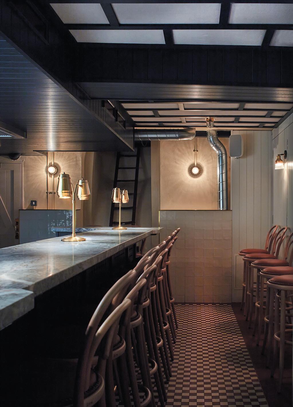
the end it has to appeal to different people at different times, whether they’re price conscious and want a midweek burger, or it’s an important evening and they want to be taken on a journey. That’s true of the menu and how the spaces are designed and conceived; to be welcoming.”
Gleneagles Townhouse is the first project that officially falls under the banner of PASKIN & Associates, the new creative collaboration and consultancy studio launched by the pair. Having primarily captained their own projects, it’s a change of tack; one that will see them working more closely with others in developing, nurturing and realising concepts, but without the daily grind of operating them.
“Intimacy appeals to us quite a lot,” says Zoe. “We like to do new and creative things, and so collaboration gives us an enormous amount of potential to be involved in the side of the industry we enjoy. We can stretch ourselves to running restaurants and obviously we do, but if we were to continue to grow as a restaurant company it becomes only about managing people and that isn’t what motivates us.”
As Layo, concluding, echoes: “We wouldn’t have suddenly decided to open in Edinburgh ourselves, but then an opportunity arrives that challenges us to learn about the city, the culture, the people and a brand. And then the most exciting question is, what are we going to do with it?”
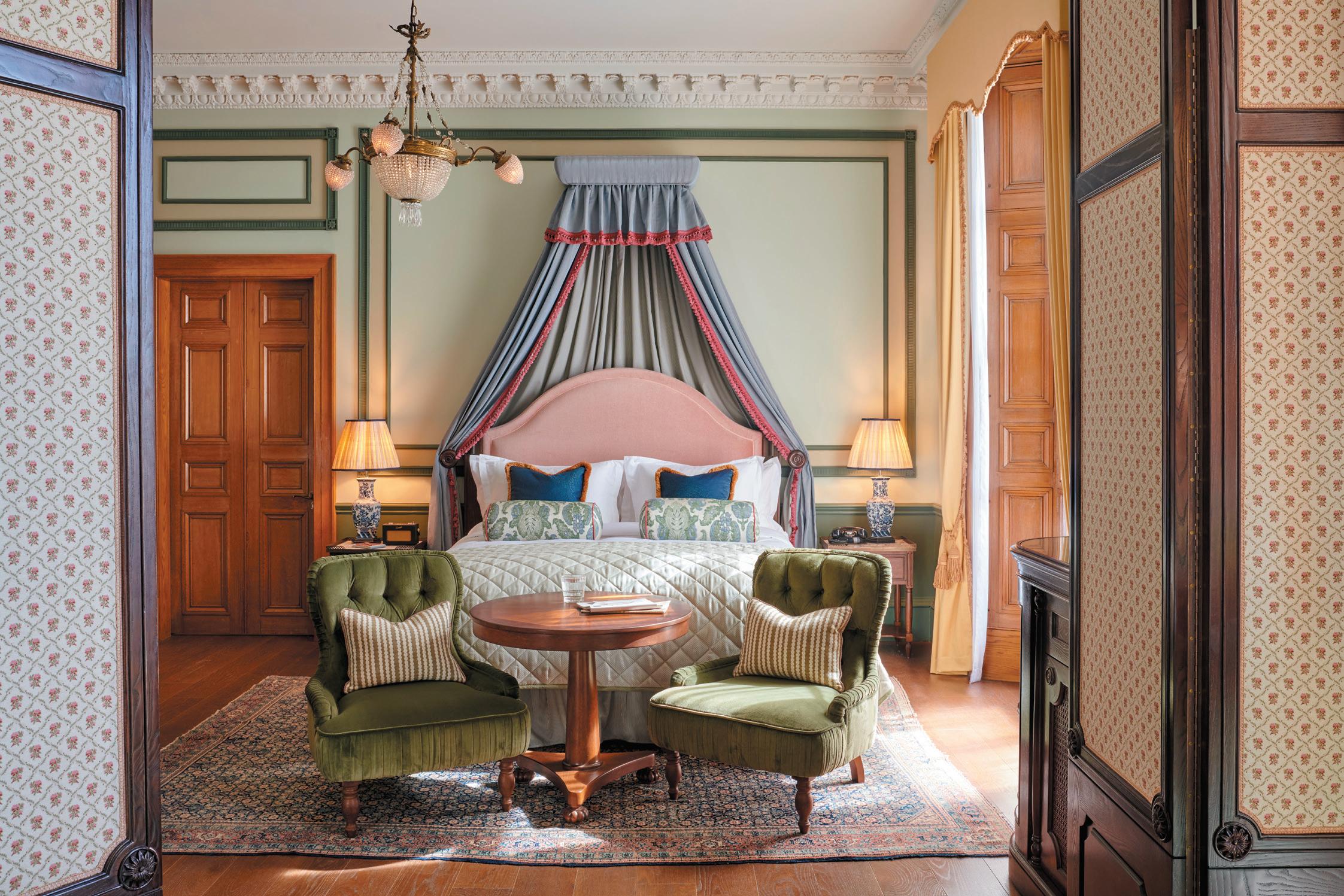
aBove: Guestroom at Gleneagles Townhouse, Edinburgh
Ultra-homely hotels have become a huge trend, particularly in Europe but equally worldwide. Certainly the description ‘residential’ seems to be on everyone’s lips when talking about hotels. But what does it mean when a residential development is designed like a boutique hotel and vice versa? Is there really a difference or are we simply designing spaces for people to use?
The rise of Airbnb and its successors emphasises the need to consider this point. Are we not looking for an escape and something aspirational – something that distinctly doesn’t feel like home; or certainly not like our own home? My dream home would be designed by Donald Judd and probably contain little in terms of decoration.
As a result, the ongoing trend for interiors to feel like a ‘home away from home’ carries particular aesthetic implications for me – which differs quite significantly from the ‘homely’ style so prevalent now.
Arguably started by Soho House and continued as a reliable and successful formula, the style can probably be summarised as ‘glamourous (country) home’, varied by the affluence and taste of the respective ‘resident’. But clearly there is a wide range of interpretations as to what ‘residential’ or ‘homely’ means.
The definition is in the eye of the beholder, but seems to relate to something unique, bespoke, often eclectic and importantly personal – as far from bland and corporate as possible.
the ask wIth tIna norDenIt feels as though this notion of homely hotel design has become something of a recipe.True innovation in the multi-faceted hospitality sector is actually very difficult after all, so anything successful will always inspire imitators – who at times end up doing it even better.
The rise of ‘residential’ or ‘homely’ hotels may well also point to the fact that we use hotels very differently now, further accelerated by the last couple of years.
The whole sector of long-stay hotels is growing exponentially and is becoming aspirational in its own right.
We are happy to go to a hotel to work, to eat and drink – even if we are not staying. We bring our laptops, friends, colleagues and hold meetings or just work with a cup of coffee. We have a place outside the city and stay for three nights during the week. We use hotel rooms as offices just when desks were supposedly obsolete.
Considering this, it is not a surprise that there is a drive towards making hotels feel like homes – but that doesn’t need to dictate the look and feel. It means we really need to analyse and understand our target audience –what they need and aspire to, their aesthetic viewpoint and what excites and comforts them. From this we can build hotels that are diverse, eclectic and carefully considered to make their guests feel like they are in a home – only much better.
And maybe, just maybe, one might look like it was designed by Donald Judd.
t I na n or D en is a partner at conran anD partners, where she has been a member of the board since 2016
Maritime references are rife at clockwIse’s southampton opening – a project that aims to reinvigorate the city’s co-working offer.
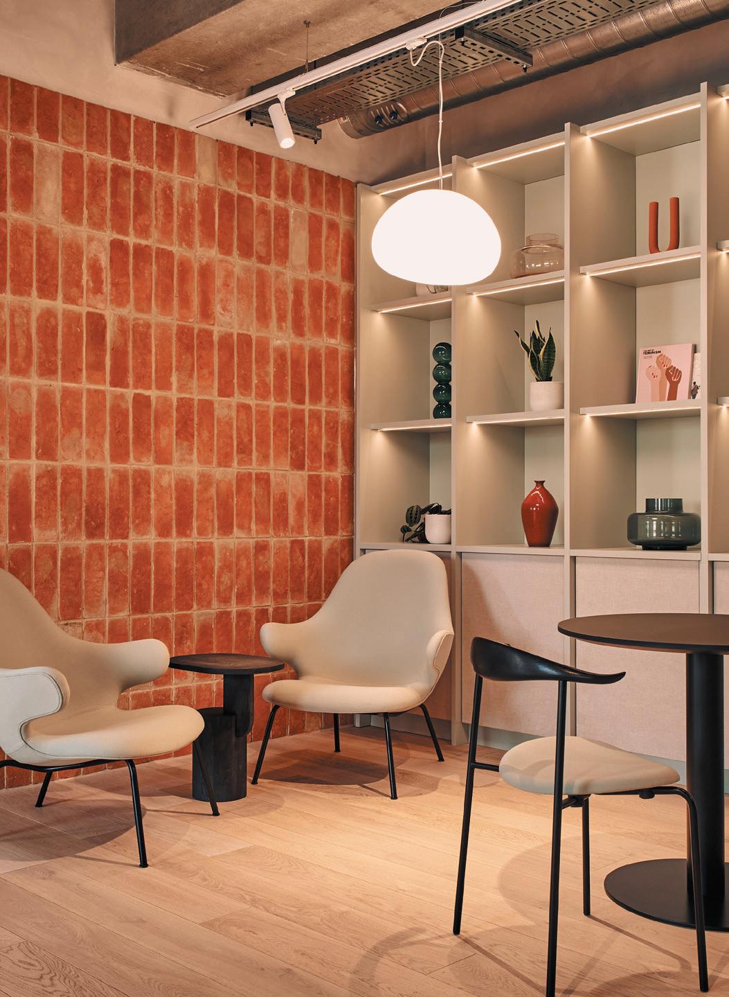
Anchoring the interior of co-working office company Clockwise’s new Southampton location to its context was paramount – the word anchoring being aptly maritime since the context in question is the city’s marine heritage. We’re specifically talking here about Southampton’s coastline and beaches which, some believe, have largely been lost due to their gradual transformation into a commercial port.
“The project aims to make people experience the colours, shapes and textures on the beach in Southampton and reconnect them with the natural environment,” says Massimo Tepedino of Hawkins Brown, lead architect on the project. This is being undertaken in two phases: phase one was completed in January this year, phase two is scheduled to be completed in December. The colours chosen for it are predominantly natural – sandy tones, a richer cinnamon shade and soft sage green.
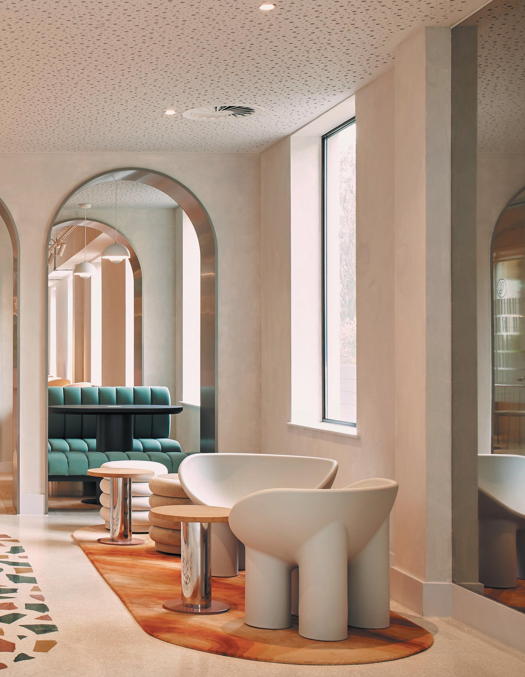
Mountbatten House is a 1990s, late postmodernist building that stands opposite some wedding-cake Regency houses. Its interior nods to Regency architecture, says Tepedino, although this is more of a “sub-theme”. Fluted surfaces – on a wall in the entrance hall and on several Pillar coffee tables by HK Living –allude to the Neoclassical columns of Regency buildings.
“The building hadn’t been upgraded for a while,” says Tepedino. “Vinyl manifestations [frosted vinyl film] on the windows made the building look unwelcoming.” A new canopy has been added to the façade to make it more approachable. A new outdoor terrace with tables and seating, installed over a lightwell, provides extra space and conceals an unsightly car park. The latter is on the same level as a cycle store, showers and changing rooms.
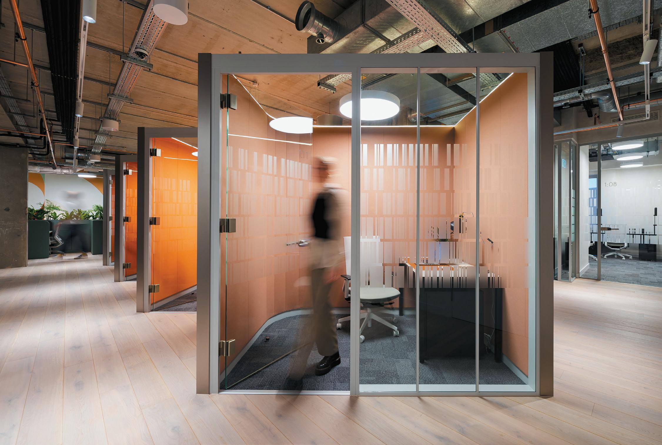
Mountbatten House offers a smorgasbord of workplace options for co-workers. “It provides settings – in
Image on prevIous page: The colours, shapes and textures of the coastline inspired the interiors
Below Image: Comfortable, collaborative spaces are central to the scheme
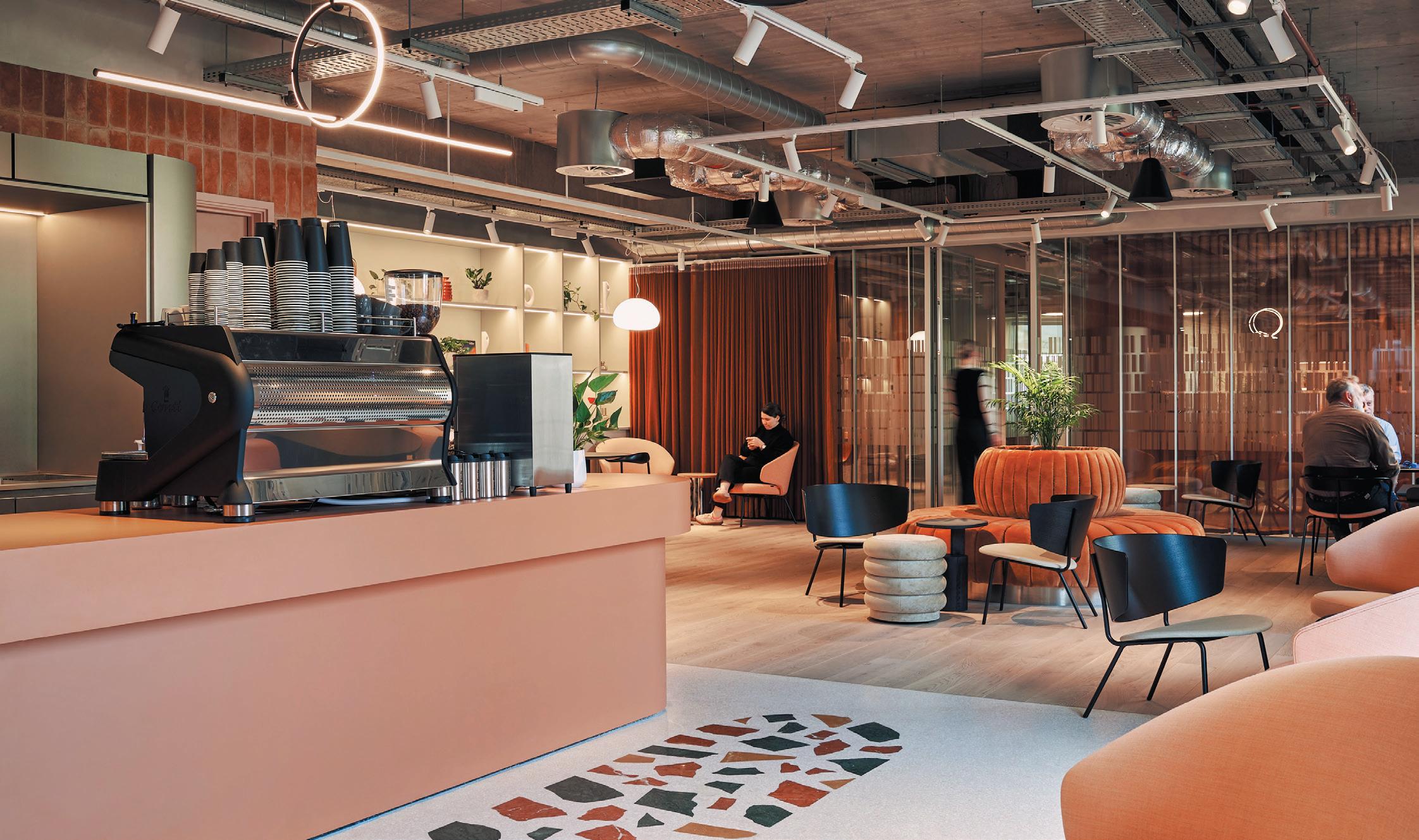
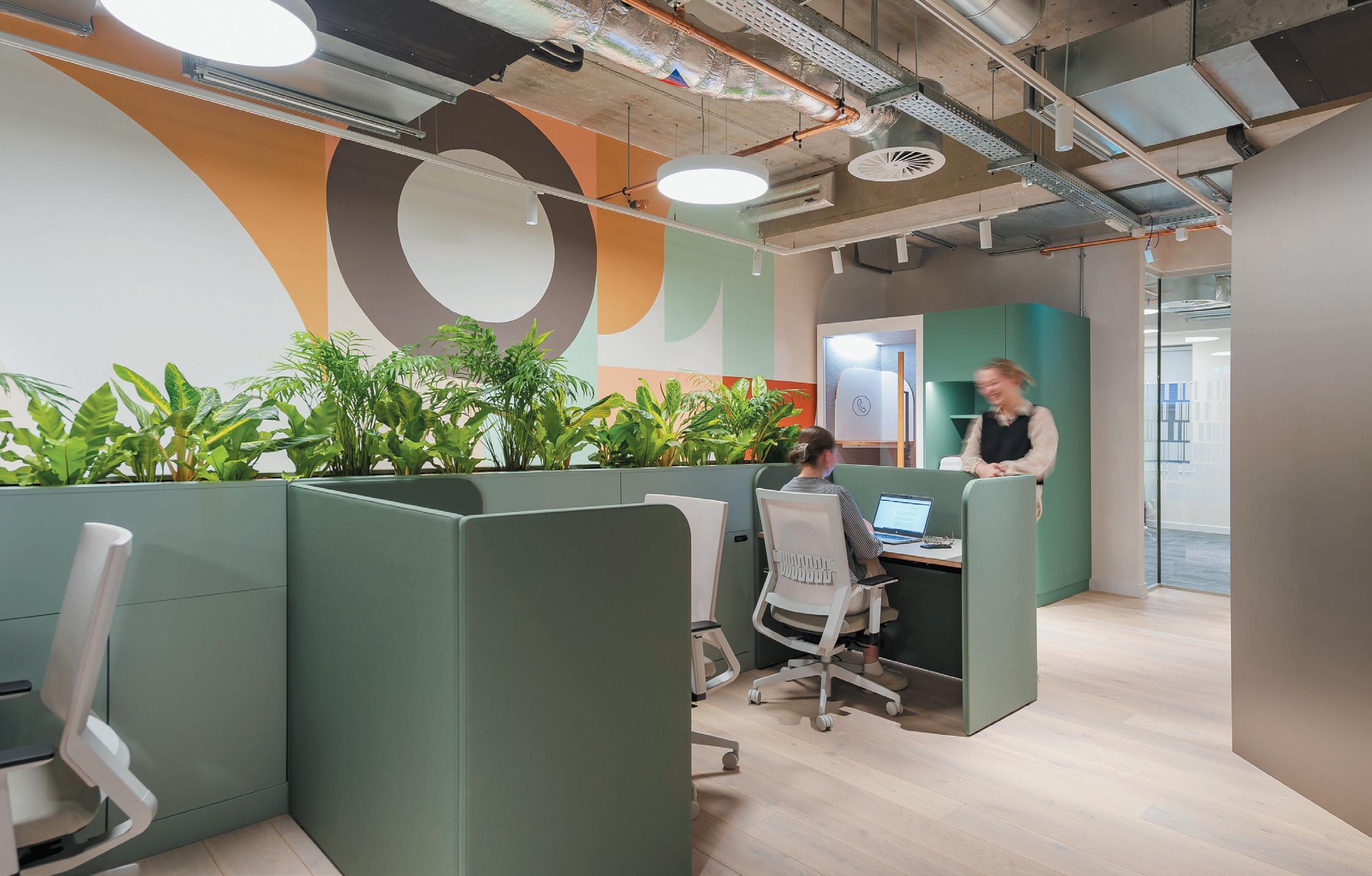
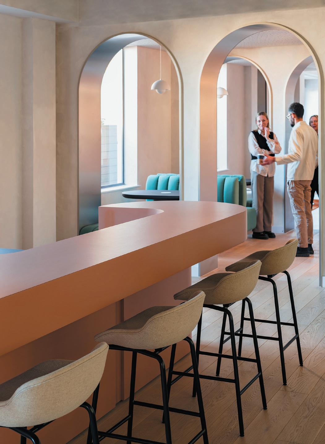
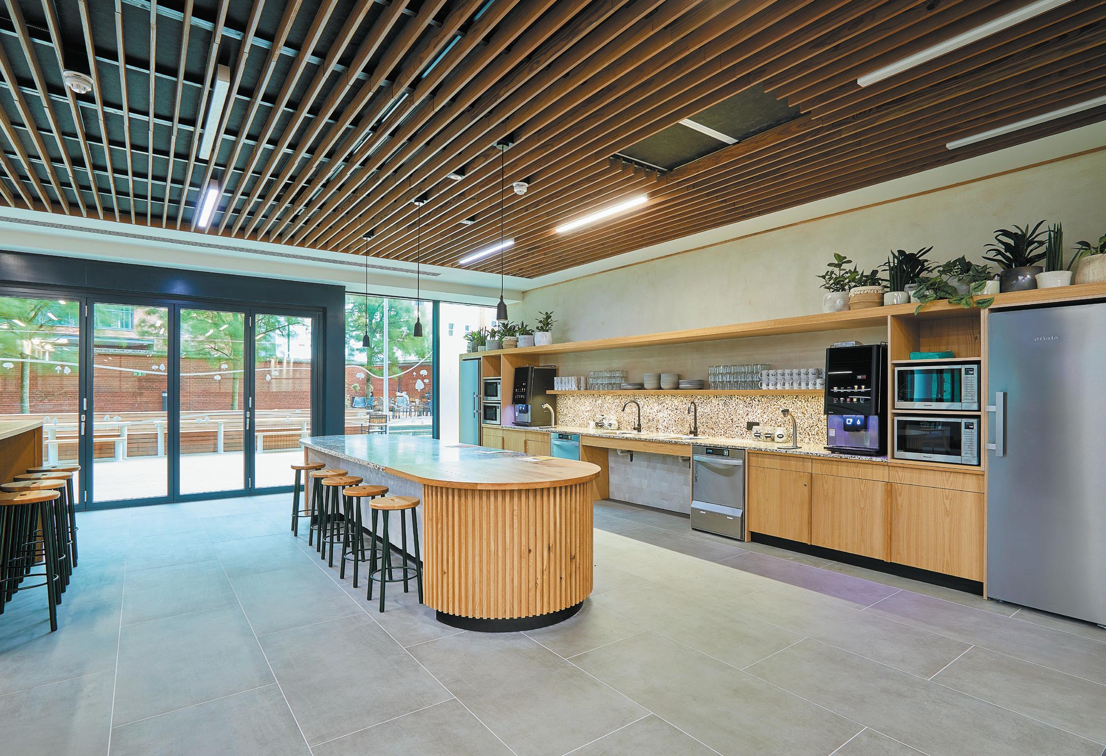
addition to office spaces – to suit different work styles,” says Tepedino. “There are sofas with tables, armchairs, shared tables, Zoom rooms and tea points [spaces with chairs and tables by kitchenettes equipped with storage, a fridge, dishwasher and microwave]. The redesigned spaces are intended to encourage interaction.”
Flexibility was another major concern. In the café are several Spade chairs – their backrests are shaped like a spade’s handle, so the chairs can be easily lifted and moved – designed by Faye Toogood. A curtain in the café informally divides the space, providing an area behind it for meetings or workshops – for example, watercolour workshops.
There are three membership levels at Mountbatten House: a basic one gives access to the café and amenities; a second offers permanent desks and the third private offices accommodating from one to 16 people.
Clockwise has several outposts around the UK and one in Brussels. The Southampton project is owned by property investment firm Castleforge. “Clockwise doesn’t have a formula repeated at all its locations,” says Tepedino. “It wants all its buildings to respond to their context.”
Mountbatten House – a mainly T-shaped building with another block attached to the base of the T, as it were – houses co-workers and other tenants. The ground, first and fourth floors are occupied by co-workers. At present, one-third of the occupants are co-workers and two-thirds employees of companies. “The ultimate aim is for the building to be occupied by co-workers if the co-working model succeeds,” says Tepedino.
clIent Castleforge
archItect & InterIor DesIgner Hawkins\Brown floorIng Havwoods furnIture
Viasit, Interstuhl, Rawside, CMD, &Tradition, Driade, Ferm Living, Andreu World, Tacchini, HK Living, Hay, Please Wait to Be Seated, Lapalma, Gubi, Arper, Johanson, Muuto, Frem, Your Workspace, Silverline other Muuto, Floor Story, Bike Accessories
opposIte page
top Image
Cubicles provide an oppor tunity for focused working Bottom left Bar seating close to a relaxed coffee station
Bottom rIght
An informal meeting point
He acknowledges that Clockwise’s Southampton outpost – which was already a risky enterprise since it was initiated at the start of the pandemic when no one could predict its outcome – is an experiment. “It’s a way to gauge how successful co-working can be here.” Castleforge undertook market research into existing co-working places in Southampton which revealed there was a dearth of good ones in the area – and suggested there might be a demand for the Clockwise venue.
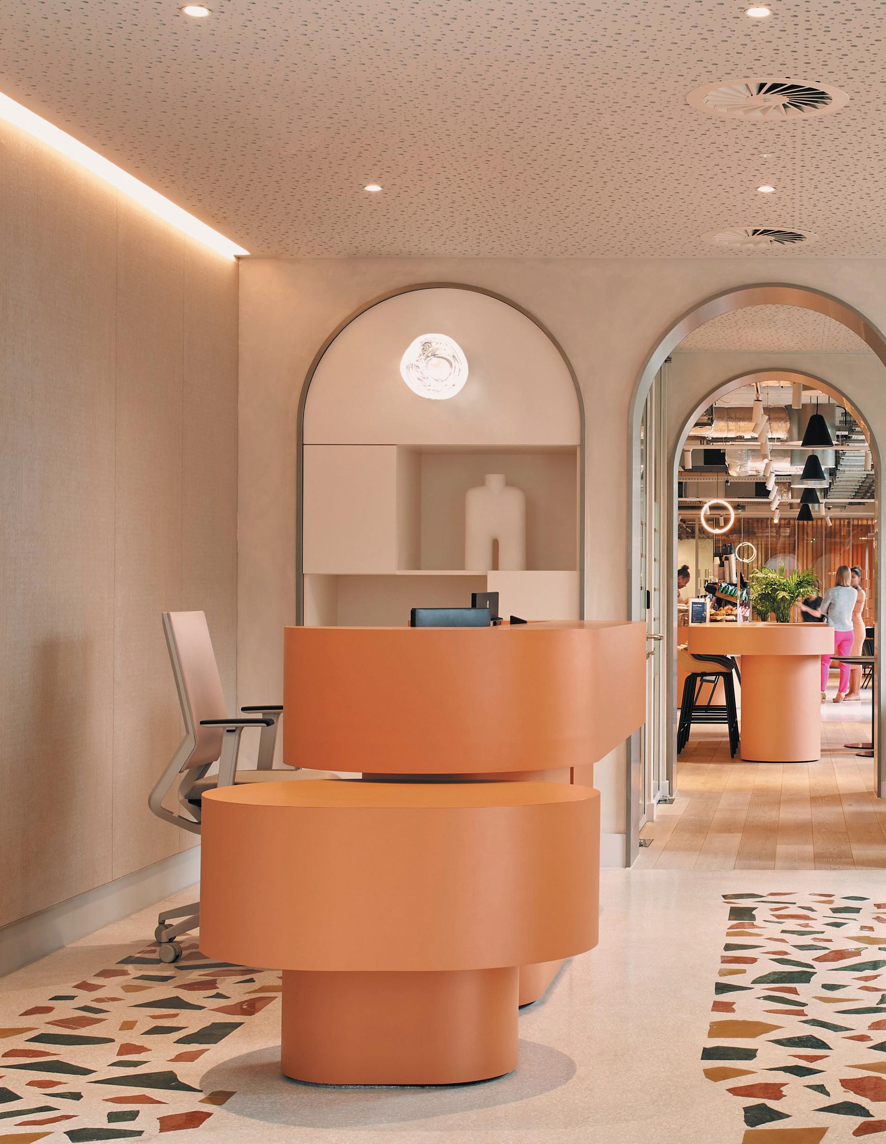
The nature-inspired premise of Mountbatten House’s redesign is romantic but the references to nature are abstract not literal. Terrazzo incorporated into the flooring comprises large chunks of green and brown marble and stone redolent of sand, pebbles and the sea – a fresh alternative to the more artificial terrazzo with itsy-bitsy patterns that’s been fashionable for some time but now looks clichéd. The terrazzo here provides accents of colour and subtly demarcates different zones, such as the reception desk and tea points. And limewash-painted walls in neutral shades – forming an uneven, fresco-like finish – enhance the natural quality of the interior. Several rugs from Floor Story feature wavy patterns evocative of sand dunes.
The project makes liberal use of curves, for example on a bespoke reception desk and arched doorways – a nod to Southampton’s boats. Such large-scale, curved forms bring to mind the playful, pop style of Italian designer Ettore Sottsass. And, as Tepedino acknowledges, these reflect the current vogue in interiors for graceful curves. “Other pieces of furniture as well as light fittings have organic shapes inspired by shapes found on the beach,” he says.
A glass partition between the café and a meeting room features motifs that he says are “an abstraction of reflections on the sea’s surface”. Several artworks by artist Laurie Maun and murals by Bud Studio feature organic shapes in natural colours.
That said, there are artificial elements that contrast with the nods to nature. In the café is a plush circular banquette in a marmalade tone that recalls an opulent Edwardian parlour. Suspended ceilings were removed, revealing ducts and services, which add a further stylistic layer – industrial chic. These both contribute towards giving the project’s interiors an eclectic look, rendering the references to Southampton’s natural environment more subtle still.
Below Soundproofed booths offer privacy
For BBC Studios’ largest workplace outside of London, HOK has designed an inclusive and sustainable space that speaks to Bristol’s emerging status as a creative hub.
WordS:
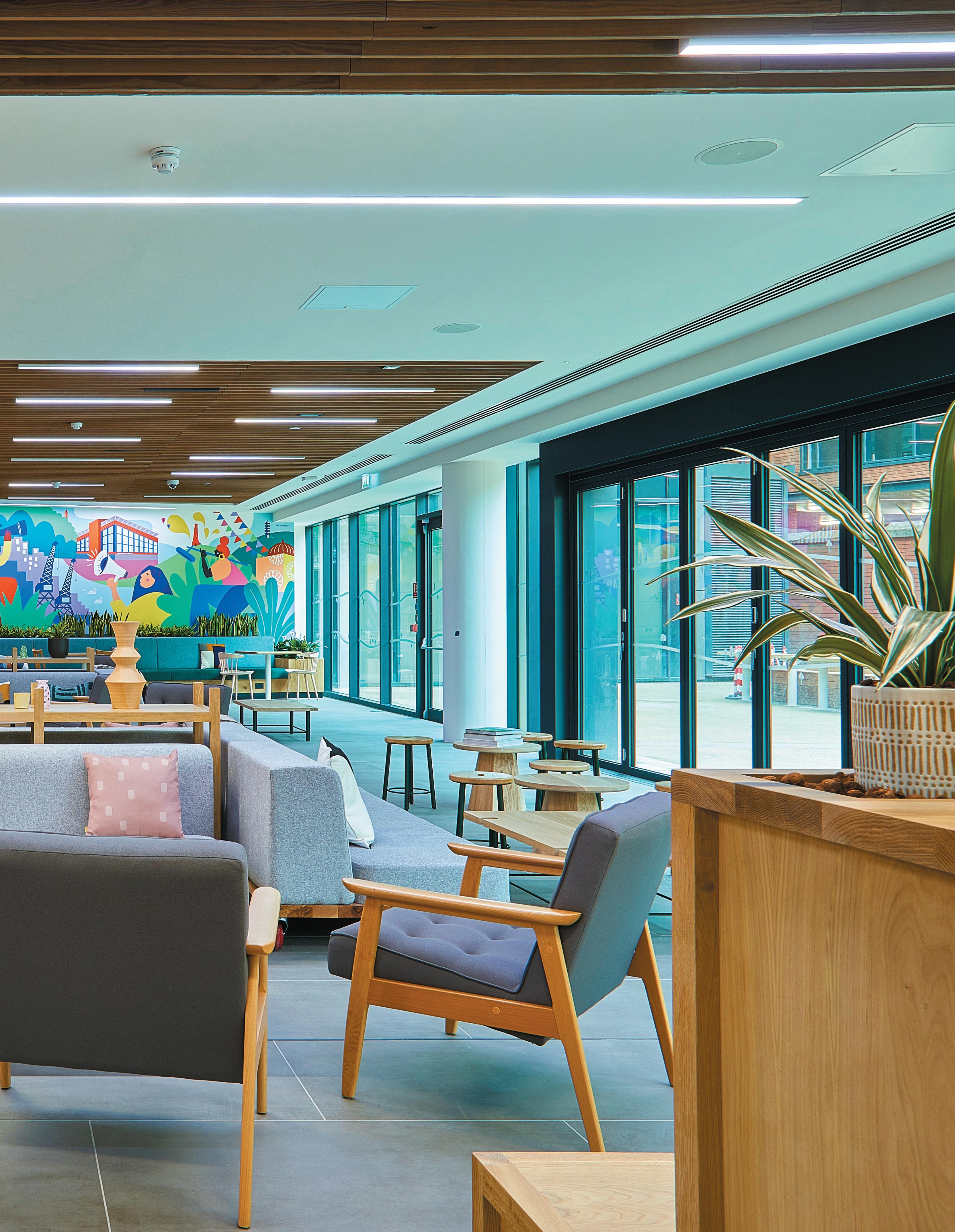
Image on prevIous page:
Multipurpose and flexible workspace on the ground floor
Bristol is a city designed around its significant (and often controversial) history, which spans centuries – once an important port town and trade hub that has resulted in a rich and diverse community, sitting at the heart of the fastest-growing region outside London.
The city was the first in the UK to be awarded European Green capital, was the UK’s second Gold Sustainable Food City, its first Cycling City and is also a Fairtrade City, something which sees it trading fairly with nearly five million workers in 58 developing countries. No surprise then, that when BBC Studios approached HOK and its partners to design its new workplace (the largest outside of London), that sustainability and inclusivity were top of the menu for its South West HQ.
The 60,000 sq ft. workplace spans the lower three floors of the six-storey Bridgewater House in the city centre, a stone’s throw from Temple Meads railway station and the river Avon. Moving from its historical home in Clifton, the new BBC Studios workplace is home to the Natural History Unit (NHU) and Factual Entertainment,
aBove Image:
Pops of colour are found in soft furnishings and banquettes
producer of programmes such as Top Gear, Antiques Roadshow, Gardeners’ World, Countryfile and DIY SOS.
According to Timothy Hatton, a senior interior designer at HOK, BBC Studios identified four goals for the project: creativity, to create a space that motivates people to do their best work and makes them feel valued; inclusivity, an environment that enables everyone to work to the best of their ability in an environment they find comfortable; sustainability, to consider the environmental and financial impact of the production process; and identity, to create a space that reflects and represents the quality of BBC work and which promotes pride from staff and confidence from customers. “The pillars were defined early in the design process, and only when all these elements come together does the design work as a single cohesive solution,” he notes.
HOK conducted user group meetings to understand what people found important for their workplace. These sessions highlighted that office adjacencies revolved around their production teams, who rely heavily on
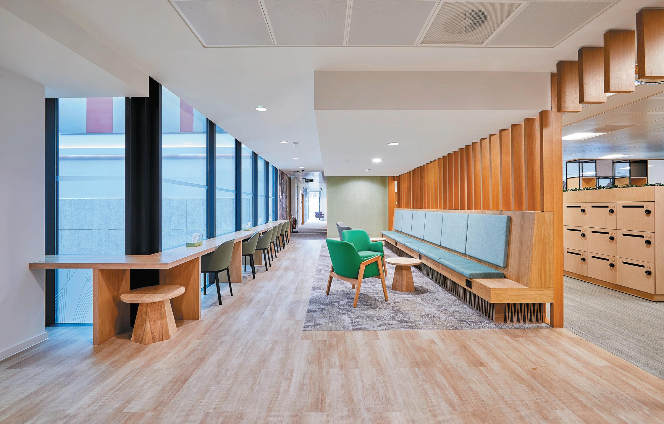
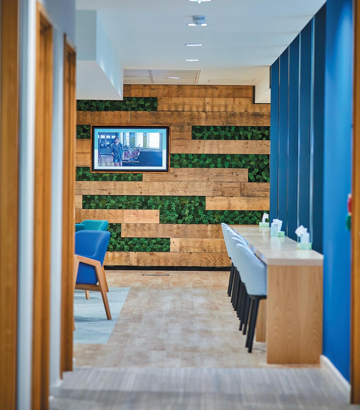
left Image: Reclaimed timber and biophilic wall feature
Bottom Image: A spacious reception area features recycled wood terrazzo surfaces

collaboration – which at times can be loud. With users preferring to work in active ‘noisy’ environments, providing quiet spaces for concentration was also factored into the space.
The BBC was also keen to emphasise that there should be a sense of fun at work, says Hatton. “We’re not corporate, we are adventurous, creative and innovative explorers – that should be expressed across the design.” As such, the new workplace has been devised to showcase BBC Studio’s content pioneers, inventors and reinventors. Application of carefully chosen materials along with branding across the floors further helped to reinforce what it is that BBC Studios Bristol and its biggest export (the Natural History Unit) stands for.
“The design needed to support the BBC’s commitment to sustainability and the Natural History Unit’s reputation as the world’s leading producer of content about the natural world,” says Hatton. “Where possible finishes were chosen for their sustainable credentials, with an emphasis on timber, cork, clay and water-based paints.”
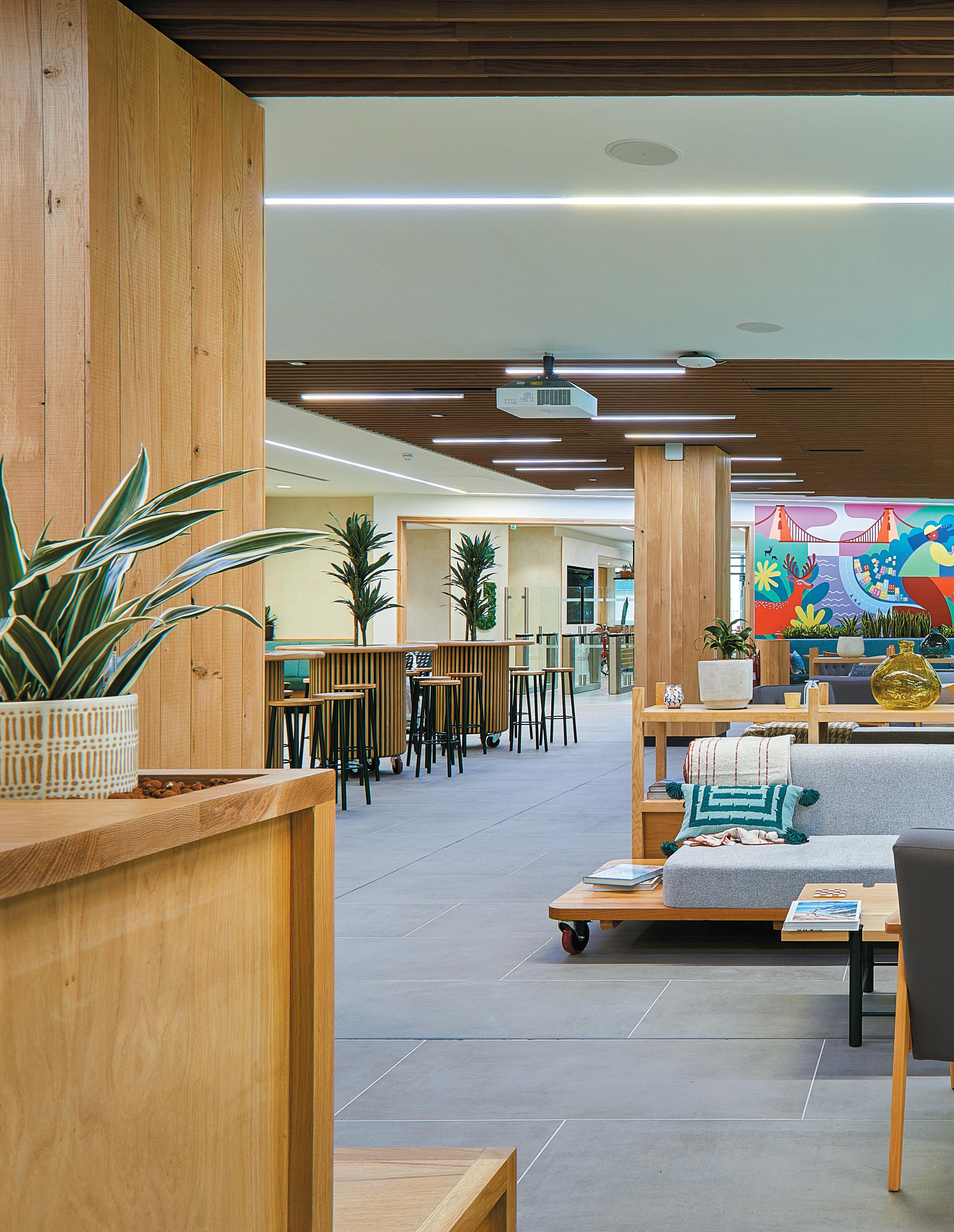
There is a welcoming, particularly ‘Bristolian’ design language throughout this outpost, in part due to a large colourful wall mural that contrasts with the warm reclaimed timber detailing and neutral furniture. Much of the furniture across the project was reused, along with loose furniture items being specified as ‘pre-loved’ or refurbished. A large reception desk features recycled wooden terrazzo from Foresso, echoed in the tea point around the corner – bathed in natural light from fullheight windows, next to pops of colour from banquettes and bench seating.
HOK worked together with local Bristol-based design company Studio B, which was responsible for providing the design direction for some of the ground floor spaces. Together, they ensured that the design language was consistent across each BBC floor plane, extending to local companies that helped provide joinery and furniture. The space has been awarded SKA Gold certification.
clIent
BBC Studios Bristol
InterIor DesIgners
HOK & Studio B
floorIng Interface, Forbo, Johnson Tiles
furnIture supplIer Lintex, Spacestore, Open Desk, Storewall
Granorte, Buxkin, Kvadrat, Clayworks, Earthborn, Baux, Alusid, Mutina, Whitney Saw Mill, Foressco, Pluck Kitchen, Osbourne & Little, Southgate Timber
lIghtIng Muuto other Cath Leach
As well as being environmentally sustainable, the space needed to provide an inclusive and inspiring workplace to motivate its people to do their best work and, ultimately, make them feel valued. “Instilling a sense of belonging to the BBC and pride in their physical space, and exploring what they meant for the user, was key to the success of the design and working environment,” explains Hatton, “and to help all staff feel included the workplace accommodates both hypersensitive and hyposensitive individuals.”
Employees can choose work settings that best suit their tasks and preferred surroundings, and non-hierarchical office space on the top two levels features team neighbourhoods wrapped around the perimeter of the building. This broken-plan layout uses shelving, plants and dividers to form collaboration space and focus areas.
“Like many of our clients now, [the BBC are] trying to figure out what the purpose of the office needs to be in a hybrid and post-pandemic workplace landscape,” Hatton expands. “We have a chance to rethink work and redefine the true purpose of what those spaces could and
should be. Attracting and retaining talent now hinges on an employer’s ability to meet the diverse needs of their employees, while enabling their teams to do their best work, regardless of location. To be successful going forward, organisations must reposition the workplace as a destination that enhances how people work.”
In a future that will demand more responsible use of materials and understanding of a diverse workforce, HOK has managed to create a contemporary and functional space – all without losing that unique Bristolian cool.
Below Image:
In Mayfair, a new k I tesgrove -designed collection of office spaces is inspired by residential interiors.
WordS: clare DowDyBack in Georgian times, Mayfair’s Chesterfield Street was residential; three blue plaques celebrate the past presence of writer W Somerset Maugham, post-war prime minister Anthony Eden and Regency dandy Beau Brummell.
On the corner of Chesterfield and Curzon Street, a 1750s townhouse had been a bank for much of the 20th century, but has more recently stood semi-derelict. The 6,500 sq ft building has now been turned into a suite of eight office spaces and five meeting rooms. But in keeping with the street’s original purpose, much of its design aesthetic has more in common with classy homes than corporate workplaces.
The interior design work has been carried out by Kitesgrove, whose seven staff now occupy the lower ground floor. Kitesgrove’s Chesterfield Street client is
also the design firm’s owner – an investment company with a number of businesses, which have relocated here from offices they had outgrown on King’s Road.
The show-stopping floors are the ground floor and the top (third) floor. These house meeting rooms for internal gatherings and with visitors, and the private office of the client, boss and landlord respectively. On these two floors, the mix of textures is rich, the colour palette is warm and the furniture is full of personality. Floors one and two, meanwhile, are self-contained and more conventional – intentionally so, in order to appeal to other tenants in the future. The basement has been done up as a gym and is rented out commercially.
Architects MSMR reinstated the historical detail that had been stripped out of this Grade II Listed building – from the cornices and architraves to the new-but-
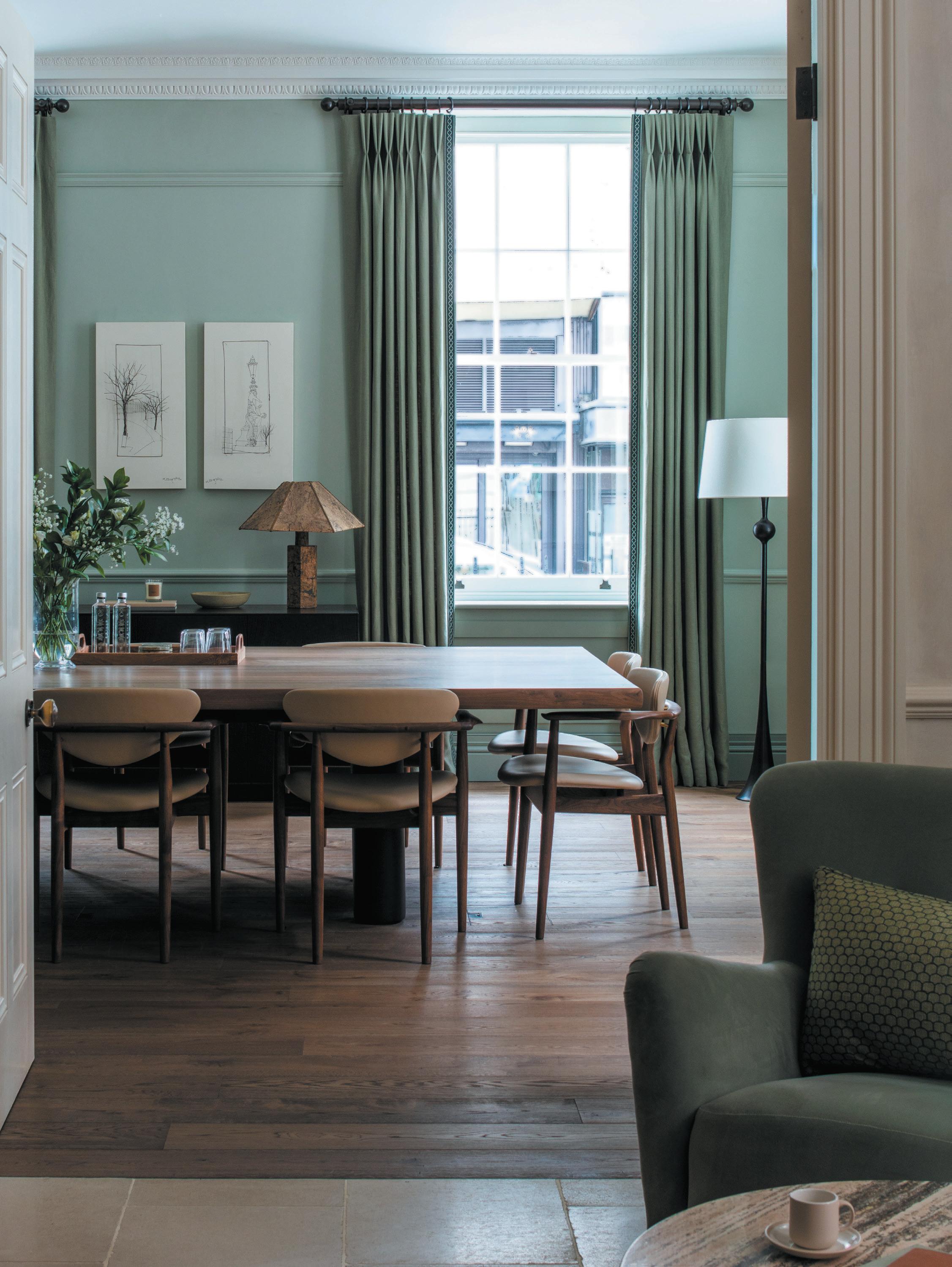
Image on prevIous page: A dining room-inspired meeting space
left Image: Furnishings and lighting fixtures create a residential feel
original-looking stone staircase – and put back the original room proportions.
Kitesgrove, whose track record is in residential design, was briefed to make the entrance welcoming. “The grandeur of the building could have felt formal, but our client wanted people to feel comfortable,” says head of design, Clare Ewart. She interpreted that with natural materials, a mix of bespoke, antique and off-the-shelf furniture, and a colour palette that would not look out of place in a glossy luxury living magazine: ochres, blues, greens, burgundy and plaster. “The client loves green and blue, and mid-century design,” Ewart says. The entrance introduces Havwoods’ character-grade wood on the floor, and Bauwerk limewash on the walls
in ‘bone’ colour (to give the effect of polished plaster). There’s a custom-coloured sideboard from Julian Chichester, an antique map of London from a local shop, armchairs in velvet, and a round marble coffee table and taller one in walnut veneer from Skandium. The antique reception desk came from Burford Antiques.
Ewart says that before January 2022, Kitesgrove would source half its products from the UK and half from continental Europe. But as the problems with delays in supply chains have worsened, they have switched to sourcing 80% from the UK. For this project, they have used Howe London, Monologue London, Invisible Collection and Dagmar for the first time.
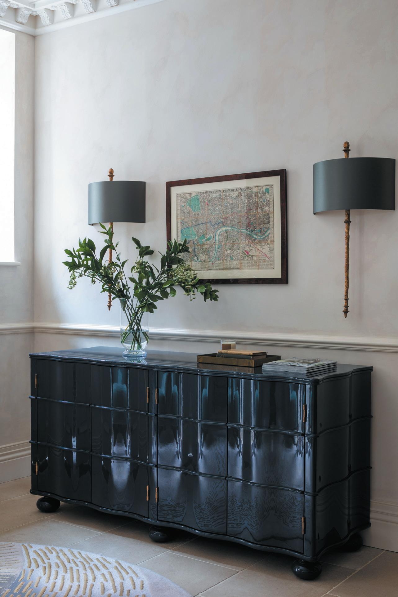
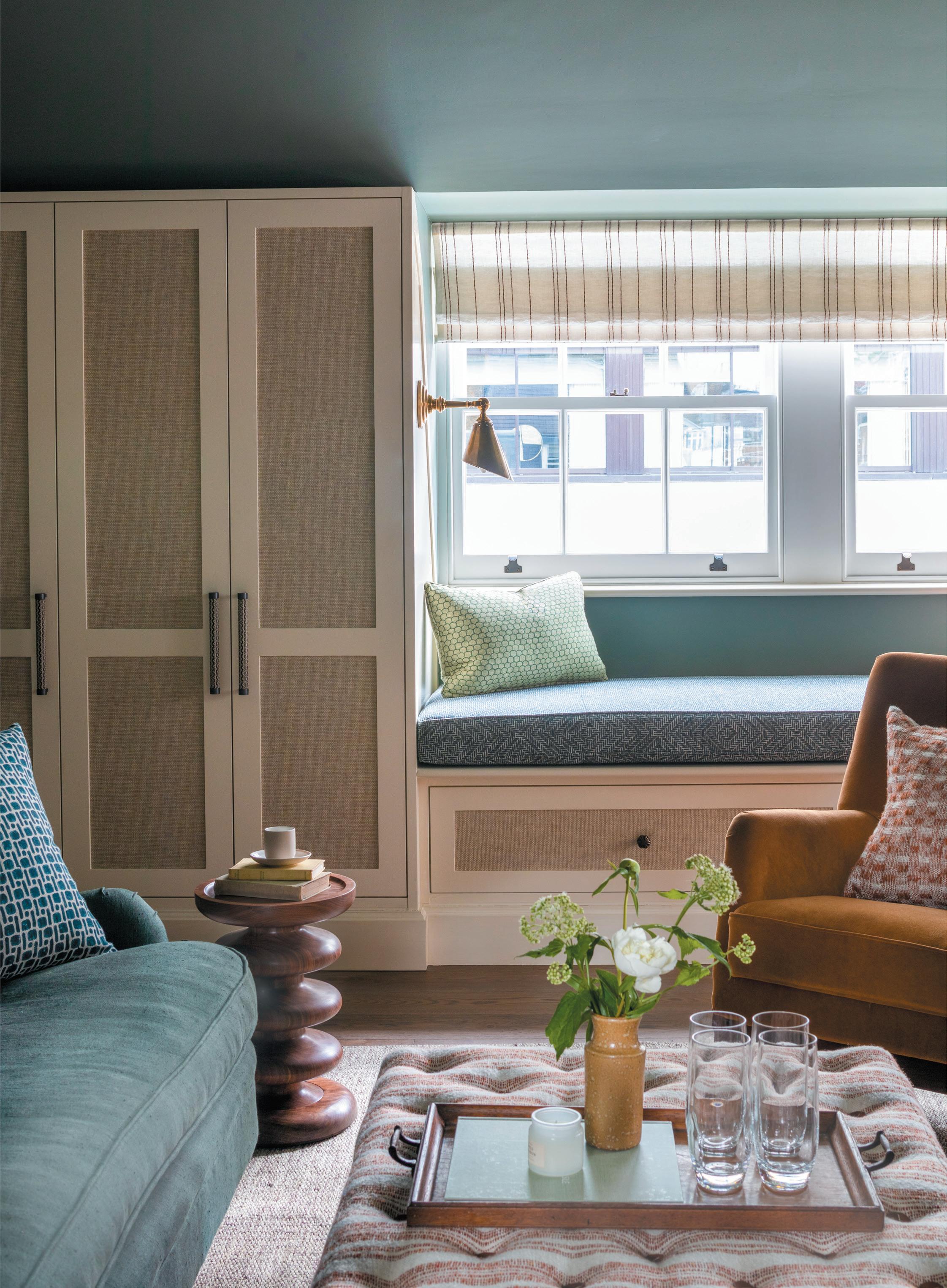
Image on opposIte page:
An informal collaboration and meeting space is reminiscent of a sitting room
top Image:
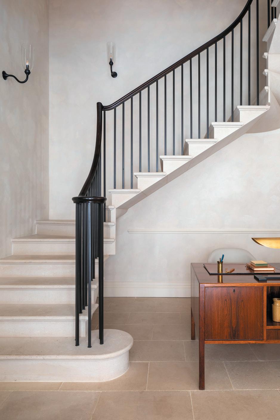
A new stone staircase blends into its historical surroundings
Bottom Image:
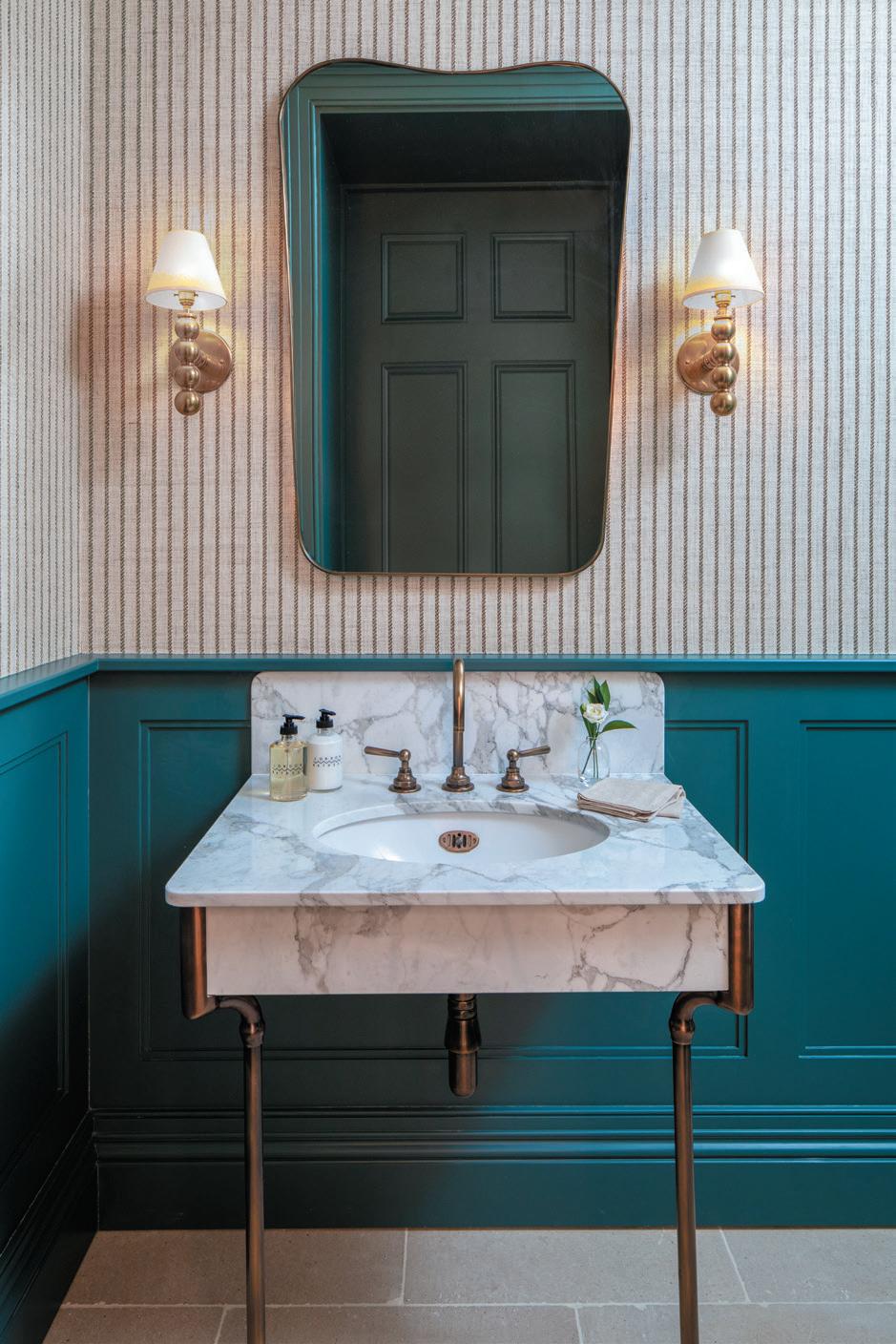
Bathrooms feature marble and panelled walls
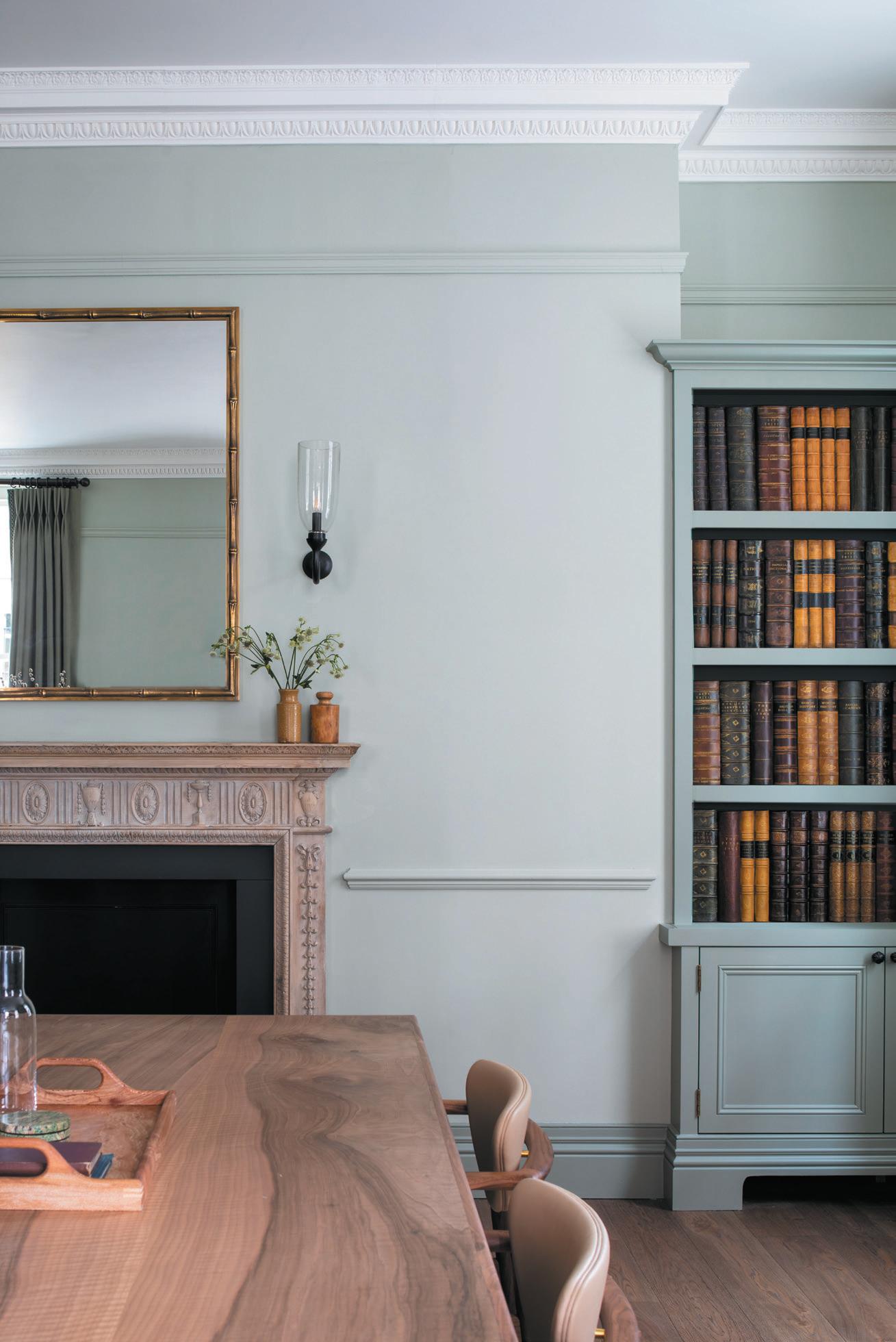
The main meeting room to the right of the entrance hall is intended to feel like a dining room. Hence the faux book spines from Original Bookworks’s Architectural Range on the shallow shelves; Farrow & Ball’s green mizzle walls and pigeon woodwork; and thick, floorlength curtains in Rose Uniacke linen with a Samuel and Sons trim. The reclaimed Georgian fireplace is from Corner Hill Galleries in New Malden on the outskirts of South West London. The walnut tabletop was commissioned from joiner RHMB and paired with newly-made Finn Juhl FJ1090 chairs by Holloways of Ludlow. The antique cork lamp base and shade are part of Ewart’s effort to “choose things that look like they’ve always been there”.
The secondary meeting room to the left of the entrance hall is meant to have the feel of a library. The character oak-topped table is a Tom Faulkner, and these windows sport dark blue blinds with a brown trim – both from Holland & Sherry.
The first and second floors are neutral, lighter and have more of a typical office feel, with their white meshing Wellworking task chairs. But these sit under Chelsea Textiles’ bespoke dark blue desks, with slender tapered legs and brass feet.
Kitesgrove’s big challenge was to get the OCHRE stairwell pendant hanging correctly. The nine ‘celestial pebbles’ each containing an LED are attached by hooks to the sloping ceiling. The lighting design for the whole building was handled by There’s Light.
The client’s third floor suite has a pitched ceiling and exposed beams, which have been stained, filled and waxed. The walls and ceiling are in F&B’s smoke green. To add texture, Ewart has inset Phillip Jeffries wallpaper into the doors of the built-in cupboard. There’s a big Monologue lozenge-shaped table with chairs upholstered in three different fabrics “to create tonal mix”, she adds. She is also very pleased to have been able to bring in handwoven leather around bronze handles from The New Craftsmen, and a pretty Vermissen spindle bench is up against one wall. The washroom here sports a curvy Julian Chichester curvy mirror and Soane wall lights – both in antique brass.
While this is Kitesgrove’s first full renovation and delivery of a workplace, it won’t be their last. They’re now working on converting a farm building into offices on a country estate.
Below:
Classic residential architectural details are incorporated
MSMR
Kitesgrove
Julian Chichester, Collier Webb, Bauwerk, Vitra, Burfrord Antiques, Dagmar, Poltrana Frau, Finn Juhl, Tom Faulkner, Howe London, Fiona McDonald, Chelsea Textiles, Skandium, George Smith, Dorian Caffot de Fawes, Stuart Scott, Ethincraft, Pintor London, Chair Company, Monologue London, Allied Maker, Adan Williams, Alfred Newall, Soho Home surfaces
Philip Jeffies, Altfield, The Invisible Collection, Farrow & Ball, Monologue London, Bauwerk, Sinclair Till
Porta Romana, Original BTC, Vaughan, Collier Webb, Rose Uniacke, Visual Comfort, Breton Brut, Urban Electric, Allied Maker, The New Craftsmen, Soane, Besselink & Jones, Dorian Caffot de Fawes, Monologue London, Holly Hunt other
Collier Webb, Water Monopoly, The New Craftsmen
With its brave interiors, the natalIa mIyar-designed twenty two aims to ensnare the capital’s well-heeled creatives.
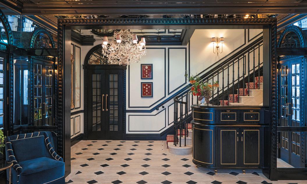
WordS: harry
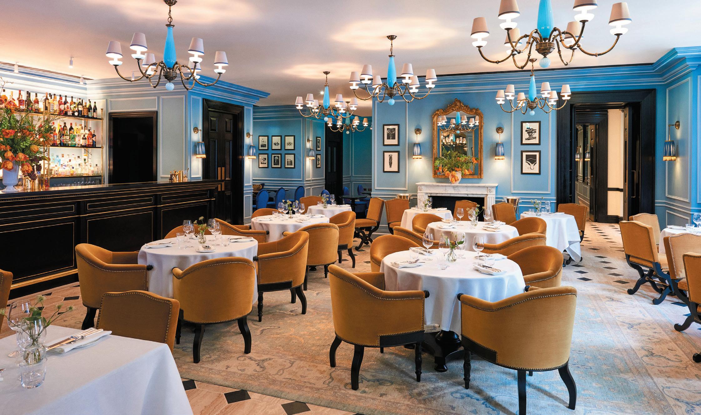
There’s been much talk of the ‘Paris inspired’ Twenty Two; the description nodding to a velveted, tasselfestooned, rampantly patterned interior that is a little more festive than one might typically find in otherwise starched Mayfair. The new boutique hotel and members’ club on Grosvenor Square was once an imposing manor, a listed Edwardian building rich with playful architectural flourishes. Its current guise sees 31 guestrooms stacked atop a destination restaurant and the private club; the type where the cocktails are beautiful to behold but where photography is not only passe, it’s forbidden.
The project is the vision of former Blakes owner Navid Mirtorabi, and his business partner Jamie Reuben, a property scion whose family owns much of the neighbourhood – including Burlington Arcade. In a rare
interview with The Times in 2020, Reuben described Mayfair as getting a bit ‘stale’ and espoused his mission to attract a younger, more creative crowd. The Twenty Two then is part of that pursuit, not only a swish place to stay and socialise but an orchestrated shift in the character of this pricey pocket of the capital.
For the design, Mirtorabi tapped Natalia Miyar, a name more traditionally associated with residential interiors than commercial ones. In fact, the Twenty Two is Miyar’s first hotel, but having worked with Mirtorabi five years ago on another project, he trusted in her ability to deliver.
“I’ve actually never worked with a client that has such a deep knowledge and appreciation for decoration and design,” she explains. “So to be able to harness this
Image on prevIous page: Deep red and a soft blue are dominant throughout the project
Below Image: The destination restaurant, helmed by executive chef, Alan Christie


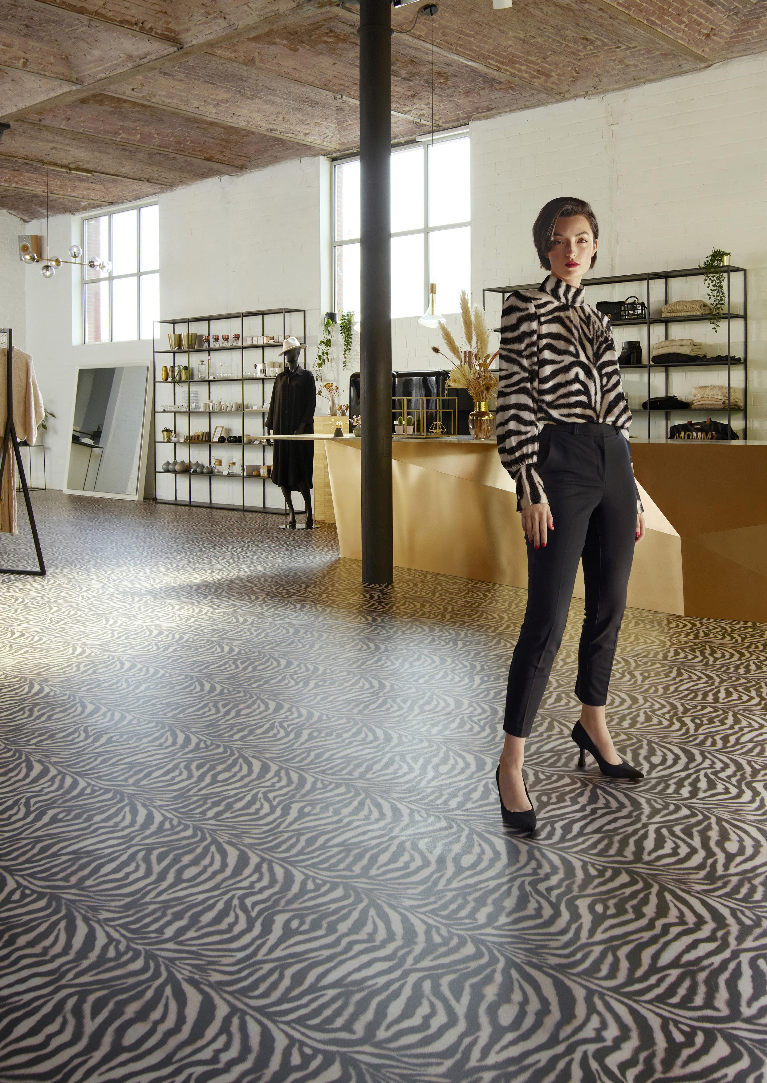
Beauflor Create, available in Crea and Studio, is Beauflor’s answer to the growing need of architects and designers to create a truly bespoke design in any shape and colour for their project! They are both available from just a single roll of high-quality vinyl flooring. Scan the QR code to learn more about Beauflor Create.

creative vision, and to help make the most beautiful expression of what Navid first imagined, was a real pleasure. It’s his vision that is very much at the centre of this project, but I feel that I was able to let my creativity run wild. We create beautiful homes for our clients that are often never published or seen, so I’m very happy to have the opportunity to design interiors that will be used and enjoyed by many people. Rather than being a home for a lifetime, these spaces will be inhabited for moments, not years, so we had the opportunity to be more provocative.”
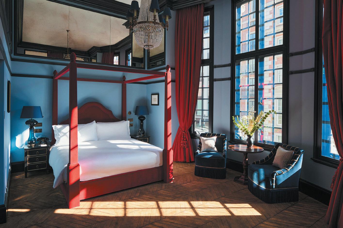
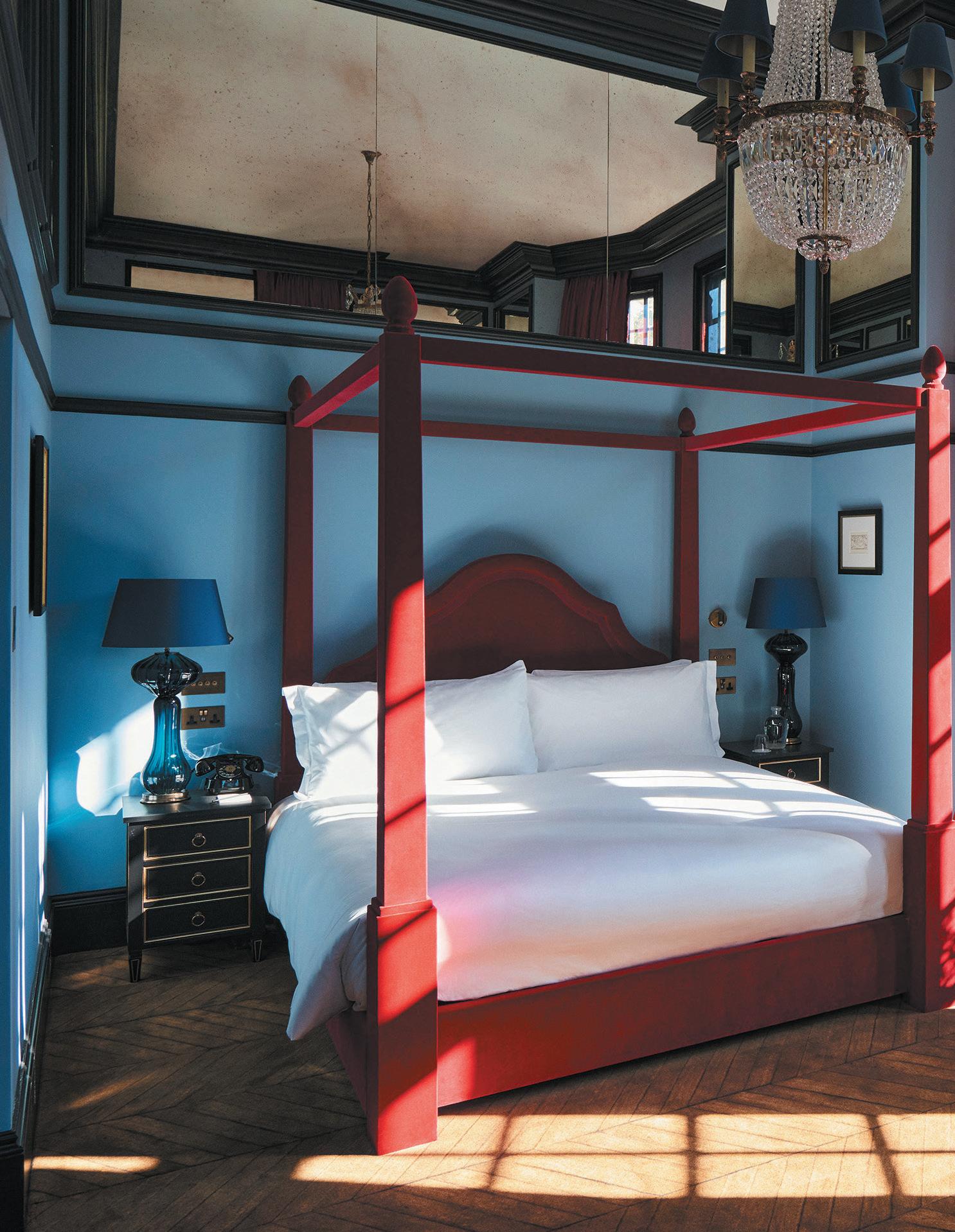
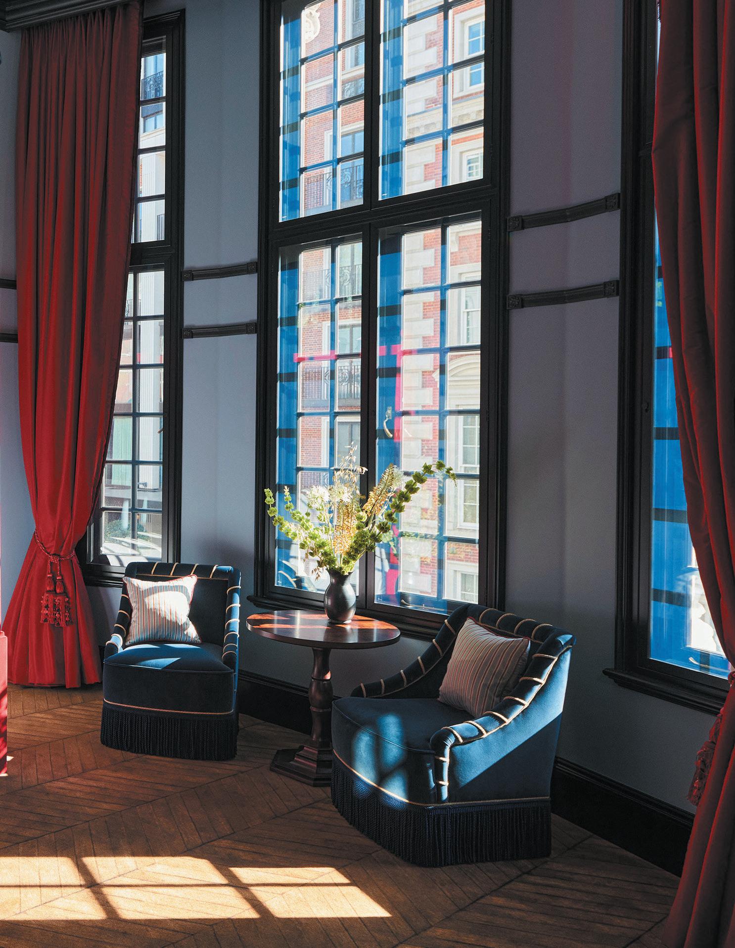
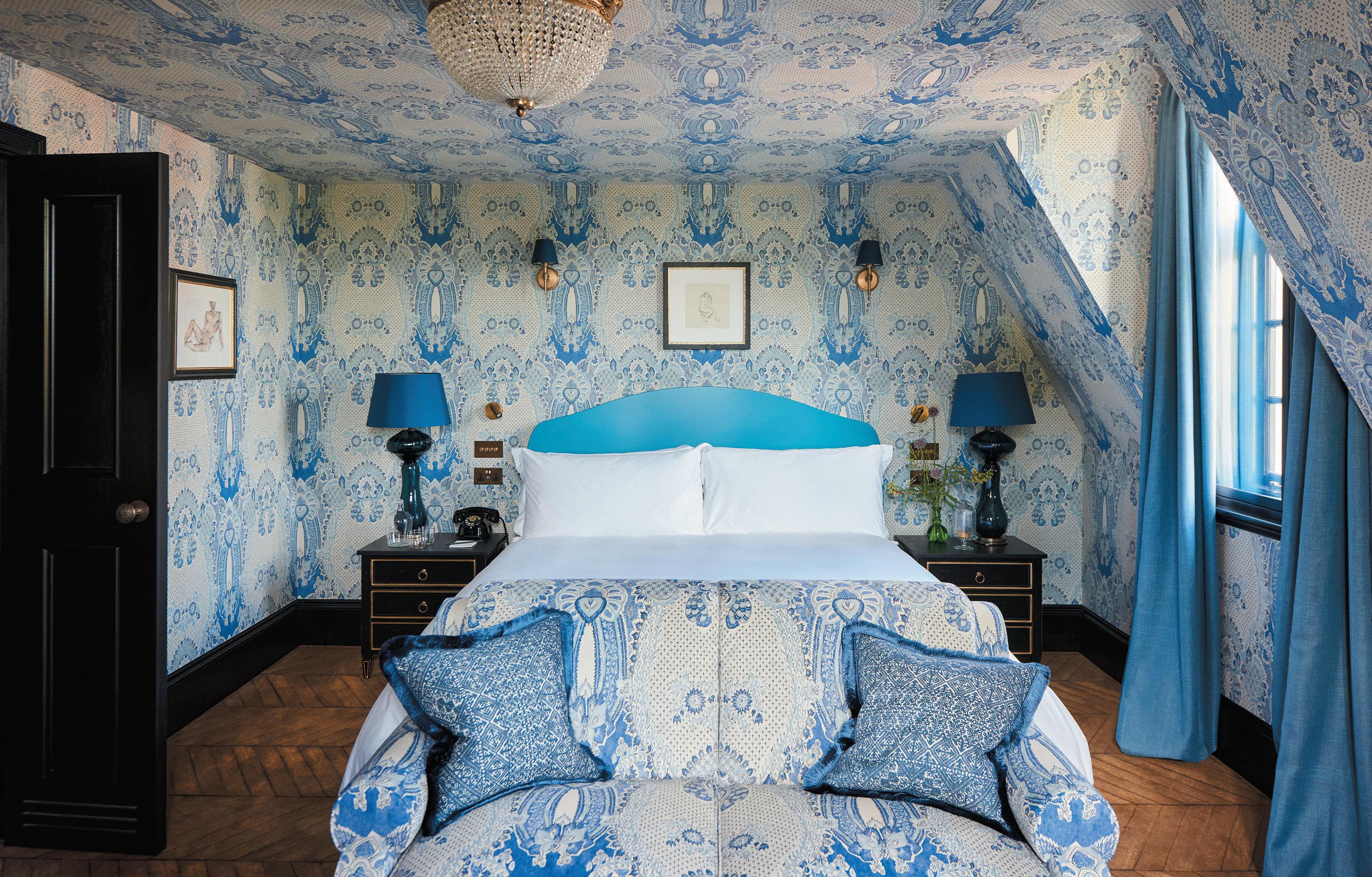
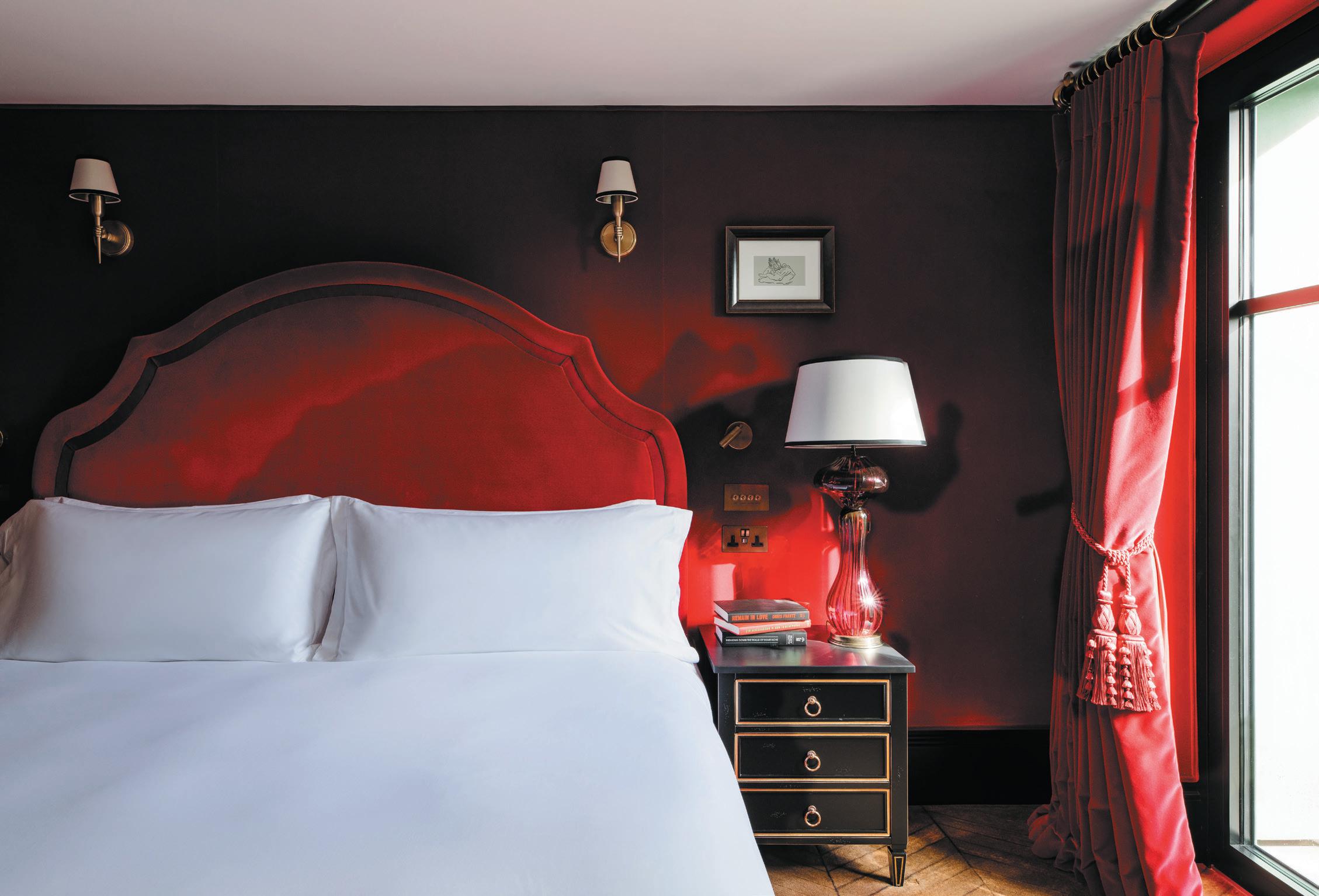
Indeed at a time when ‘homely’ is becoming something of a dirty word in some hotel design circles (if only for its ubiquity), there’s something deliciously maximalist in Miyar’s approach. Guestrooms are unashamedly extrovert, with some featuring colourful, ultra-ornate patterns that extend up walls and across ceilings –repeated on sofas and cushions in Pierre Frey fabrics for the ultimate aesthetic wallop. Even in rooms where print isn’t the design driver, the air of whimsy and confidence is no less forceful, with velvet four-posters, theatrical chandeliers and scarlet curtains that tumble from double-height ceilings in palatial fashion.
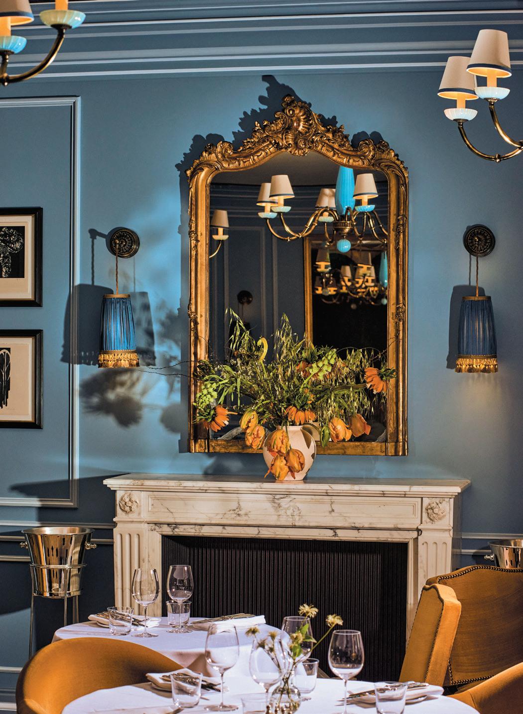
“We wanted a sense of luxurious informality and did this largely with the material choices and textures, which then set the tone for the hotel’s mood. With the hotel carrying 19th century and Napoleonic influences throughout, materials were an essential part of showcasing the characteristics of classic French décor, with a modern Mayfair twist,” Miyar explains. “Then there’s the 19th century panelling – a classic detail that we chose to use widely to help reflect the grand nature of the hotel’s exterior. Design signatures, such as pouffes and club chairs, reappear in different spaces and help to continue that sense of cohesion between the private and public areas.”
And the private and public do speak to each other in one well-defined language: the appealingly polite blue seen on guestroom walls echoed in the restaurant; the glossy monochrome tiles from guest bathrooms nodded to in the elegant lobby. The members club meanwhile, spread over several rooms and an outdoor terrace, carries the
clockwIse from top, opposIte page:
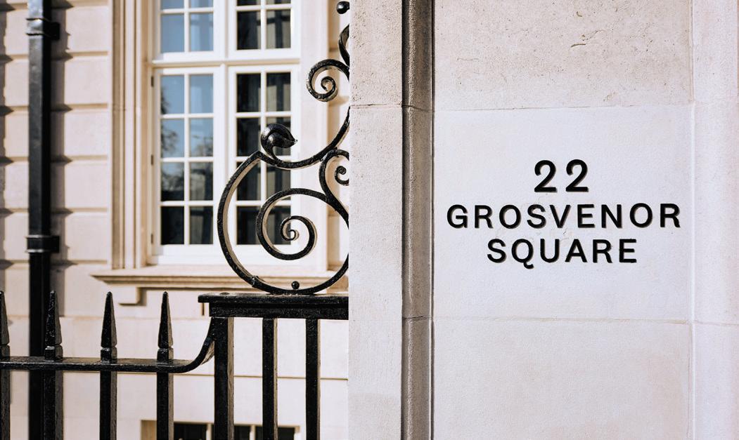
The property sits on affluent Grosvenor Square
The lobby with marble flooring and sweeping staircase
The restaurant features ornate flourishes
same sumptuousness, but here eccentricity is allowed to run riot – with turtle light fixtures by Marie Christoff, handpainted wallpaper by Fromental and a leopard print carpet leading down to the Music Room, an ambiently lit space intended for wee-hours shenanigans.
“We viewed the project as a whole experience rather than separate pieces. Some areas of the members’ club are designed for nighttime only, so while they serve a different purpose, it didn’t make sense to change the style or material palette. We wanted the experience at The Twenty Two to be universal for guests and members, and to allow everyone to benefit from the same level of bespoke detailing, quality and style,” Miyar says. “Ultimately we felt strongly that we wanted to create something fresh that would add to the Mayfair club scene, rather than replacing something else. The iconic Mayfair clubs have a place in history of course, and their own audience, but we are aiming to draw a new creative audience to the area.”
Below: A scarlet guestroom with dramatic window dressing

At vIlla le Blanc, Menorca’s carbon neutral Gran Melia hotel, style and sustainability meet – paving the way for a new vision of conscientious design.
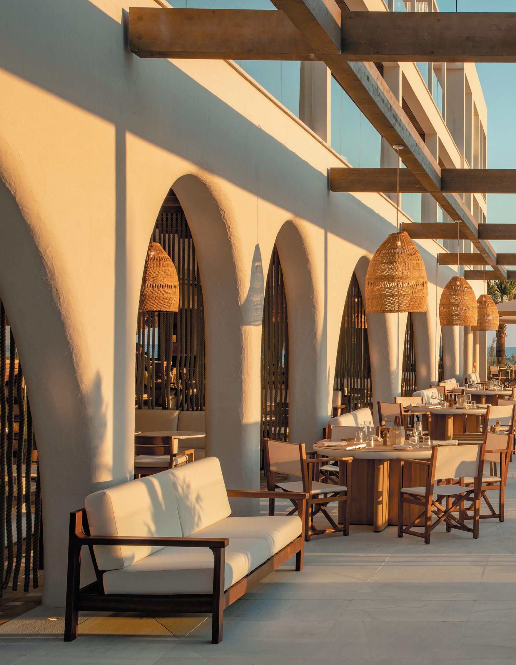
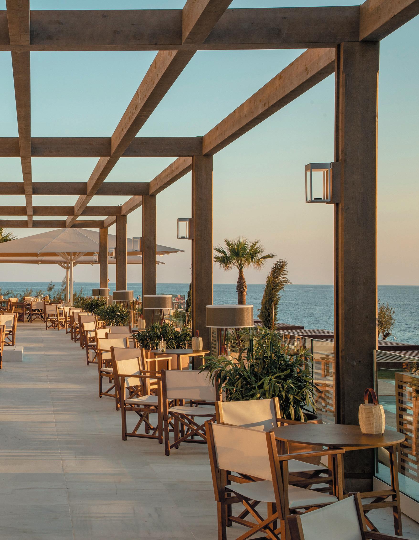
Villa Le Blanc, a Gran Melia Hotel, is rather special. Stepping beyond its bountiful good looks, clever detailing and splendid coastal location, the property is the hotel group’s first carbon neutral prototype. On the south of Menorca – itself a UNESCO biosphere reserve – Villa Le Blanc is both a test case and a demonstration of how luxury and comfort can walk hand-in-hand with the highest standards of sustainability.
Designed by Spanish architect Alvaro Sans, Villa Le Blanc’s intelligent integration of interior and exterior spaces not only creates a deeper connection to the surrounding landscape for guests, but is a core component of its eco-ethos.
“Mediterranean architecture for me has five design premises: white, patios, arches, native natural materials and porches. They’re present in all spaces, both exterior and interior,” Sans explains. “This concept converts many of the interior spaces into covered exteriors and adapts them to the Mediterranean climate – playing with the sun, light and wind. This favours sustainability because it reduces air conditioning in common areas - thanks to cross ventilation and protection from the sun - but it also maximises natural light through arches and large windows. The entire interior design of the hotel has taken these criteria into account.”
With 159 guestrooms, Villa Le Blanc is by no means a bijou resort and – while Melia Hotels International has been ranked second most sustainable hotel group in the world and the leader in Europe – it’s the scale of ambition and intent within this property in particular, that could provide a blueprint for others to follow.
Though unlikely to stir the emotions of the average traveller (there’s plenty for that elsewhere), Villa Le Blanc’s benchmark-setting energy efficiency is owed to five pillars. There’s the improvement of the building’s envelope, with thermal insulation systems; use of biomass as a source of energy in boilers; photovoltaic, or solar, panels for energy production; deploying geothermal energy to power the AC; and the recovery of water for alternative uses, as well as the control of its consumption through smart technologies. Together, these actions reduce emissions by 87% and are, for the most part, invisible to guests – both figuratively and metaphorically.
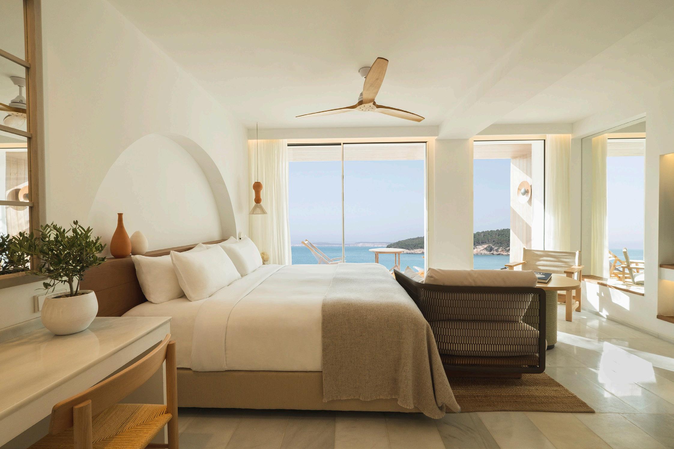
Other design notes are both beautiful and purposeful, such as the abundance of restful white that informs the hotel’s name – reflecting heat and keeping the building cool. It’s an example of what Sans describes as the influence of vernacular Mediterranean architecture, the bedrock of his approach.
Image on prevIous page: Villa Le Blanc’s design blurs the boundaries between interior and exterior spaces
top Image on opposIte page: A guestroom in the property’s neutral colour palette
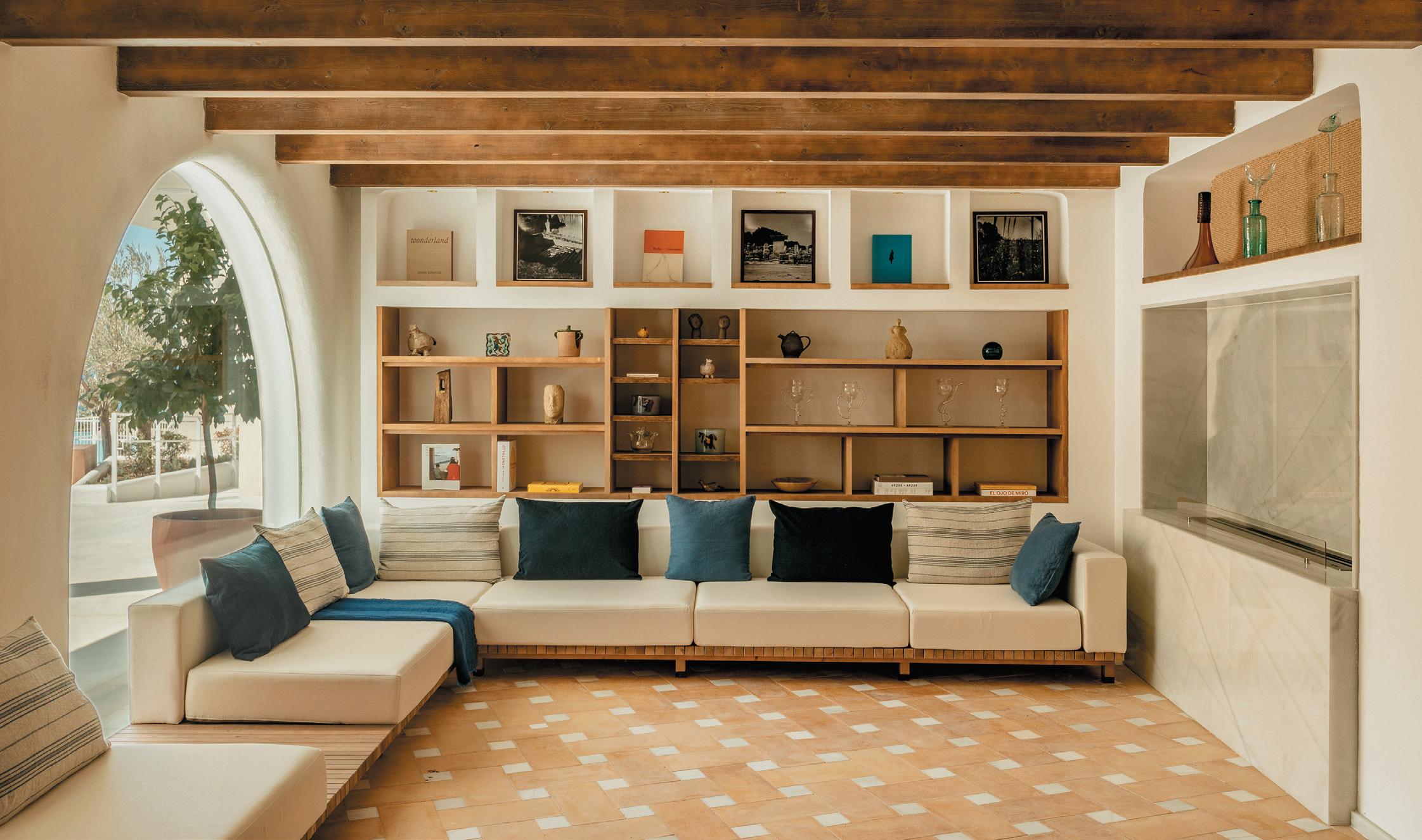
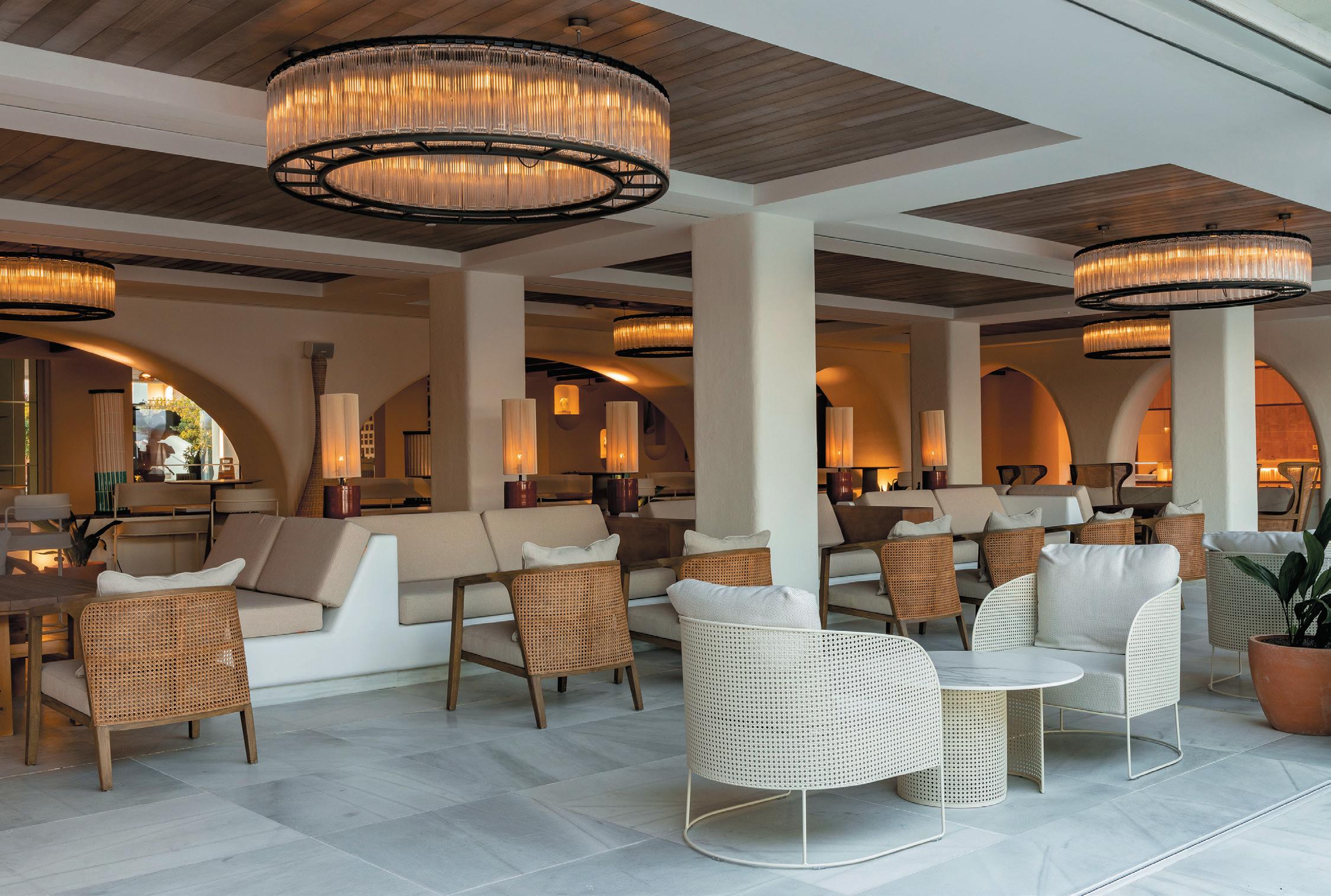
Bottom Image on opposIte page: Public spaces feature arches, a key motif in Mediterranean architecture
opposIte page, top:
The lobby areacum-bar
Bottom: A guest suite with freestanding bath
“Houses have always been painted white and the patios are reminiscent of the ancient Greek’s agoras,” he says. “Porches, also, are the most important spaces in Mediterranean architecture, as a transition between inside and outside, and in fact the hotel is one large porch, open to the sea.”
Since the Roman age, arches have equally been symbols of the region, and are used at Villa Le Blanc liberally, including within the design of the main swimming pool; one grand arch made of white stone. Local, natural materials are celebrated, with the hotel’s design based on three: white marble, old northern wood and Mediterranean clay.
As for how the property speaks to Menorca more specifically, Sans drew both from its contemporary culture and its rampant nature.
“Menorca is an island where art is found in vernacular architecture, in the way of understanding and working with the climate and its relationship with the landscape – as well as in town planning,” he notes. “The population has
intervened with the environment primarily with its culture, which is also a very important element on the island – from the Talayotic history and opera, to the new initiatives of art galleries such Hauser & Wirth.
It’s for this reason that the entire hotel is inspired by this wonderful and, for me, authentic island. The gardens have been designed with local trees and plants (olive, cypress, lemon and pomegranate trees) and the sculptures and decoration come from Mediterranean artists. Because, ultimately, I believe there are three words that define a good design: location, ecology and harmony.”
For Melia’s vice president and CEO, Gabriel Escarrer, Villa Le Blanc represents a deeply meaningful progression for the group. “It’s actually a dream come true for our company,” he explains. “Because a project like this allows us to move forward towards decarbonization. It’s also in a very special place, the biosphere reserve of Menorca of course, making it one of the most tangible results of our commitment to a hotel model based not just on excellence, but responsibility and sustainability.”
Design, discusses the practice’s pioneering approach to sustainability and its vision for the future.
foster + partners has Been a vocal aDvocate for meanIngful sustaInaBIlIty actIon. why Is It Important for the stuDIo to leaD the charge on thIs anD what are the sIngle greatest challenges wIthIn sustaInaBle archItecture anD DesIgn?
Foster + Partners’ Industrial Design team produces furniture, lighting, building products and transportation, for clients across the globe. We work closely with our architectural studios, clients and manufacturers, to develop design solutions that are optimised for their performance and the planet.
Addressing crucial concerns about climate change and learning from the COVID-19 pandemic, we are focussing on creating products that are inherently flexible and have longevity. Our approach addresses sustainability holistically, from the efficient use of natural resources to circular economy strategies.
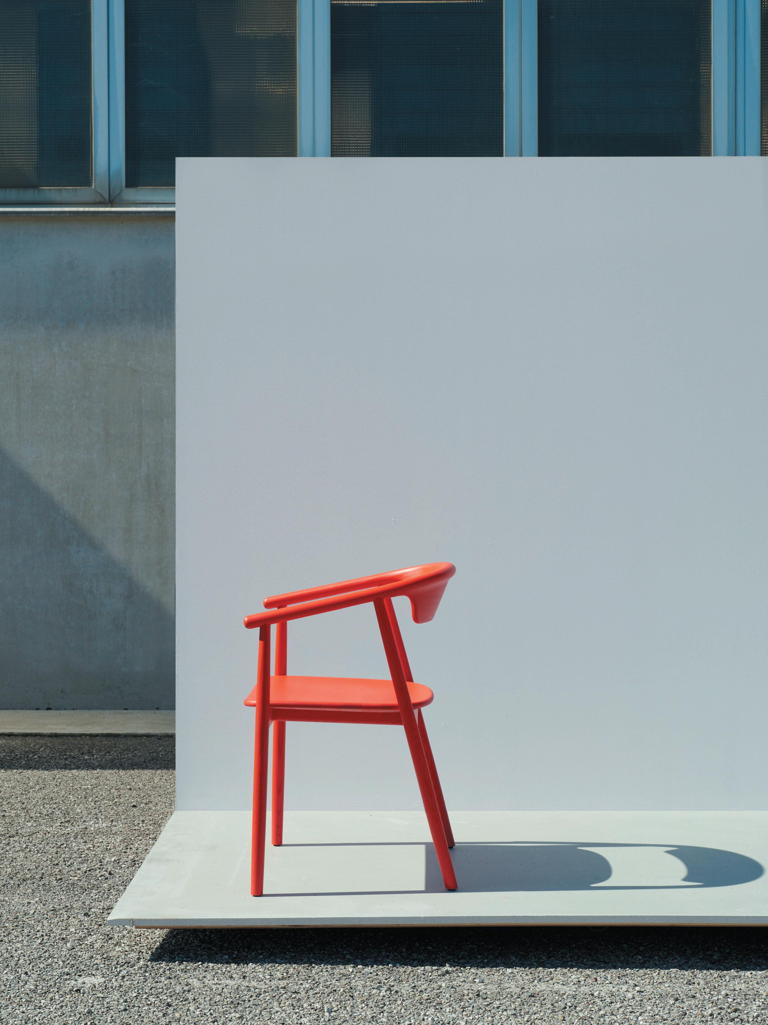
We have a responsibility to be transparent about our products’ sustainable credentials, to make choices clearer for manufacturers and consumers. In 2021, we completed our first Environmental Product Declaration (EPD) for the LEVA chair designed by Mattiazzi - an industry leader in sustainable manufacturing. Mattiazzi were extremely open and supportive of the EPD process allowing access to their supplier networks, energy use and manufacturing techniques. Since then, we have been pushing for all of our new products to have an EPD by the manufacturer.

As a practice, one of the greatest sustainable design challenges is accurately quantifying and measuring the carbon content of any project. The EPD process has given us the opportunity to take a forensic view of where materials come from, how they are processed and everything that contributes to their carbon content. It is an extremely comprehensive and detailed overview that allows us to understand how our design decisions impact the sustainability of our products. With this knowledge we can challenge, encourage and guide our clients and product manufacturers on the journey towards more sustainable products.
sustaInaBIlIty encompasses much more than envIronmental Impact, of course. can you tell us more aBout foster + partners’ work
In emphasIsIng anD supportIng wellBeIng anD communIty Impact?
Sustainability is a wide-ranging subject with many definitions. Addressing crucial concerns about climate change, we believe our projects must also encompass the health and wellbeing of our communities.
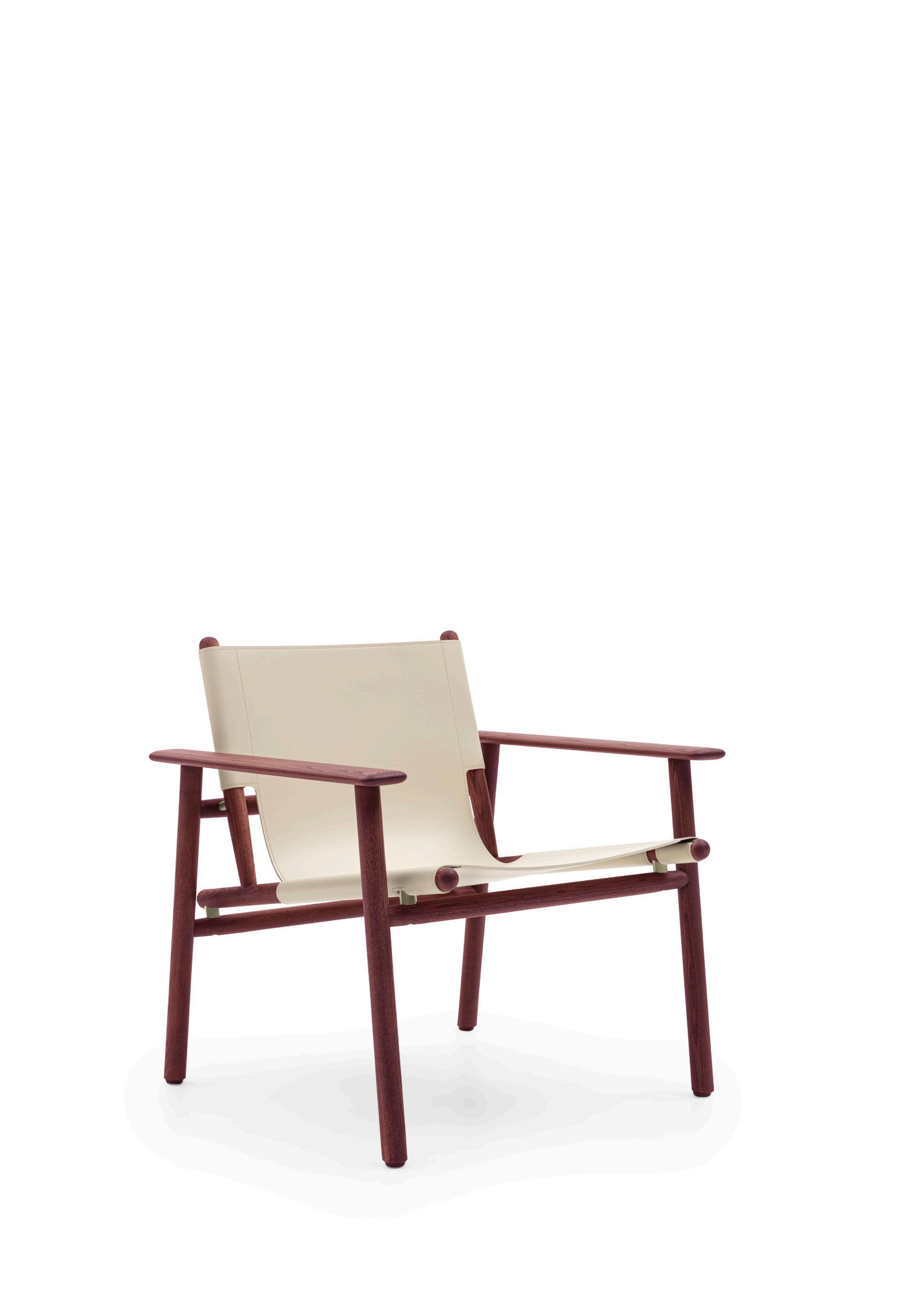
Products such as the Cordoba Chair, produced in collaboration with B&B Italia, have been designed to enhance relaxation and improve wellbeing in the home or office. This is a chair for lounging in - whether you are reading a book or enjoying a balcony view. There is an honest, tactile quality to Cordoba, with carries through all our industrial design work at the practice.
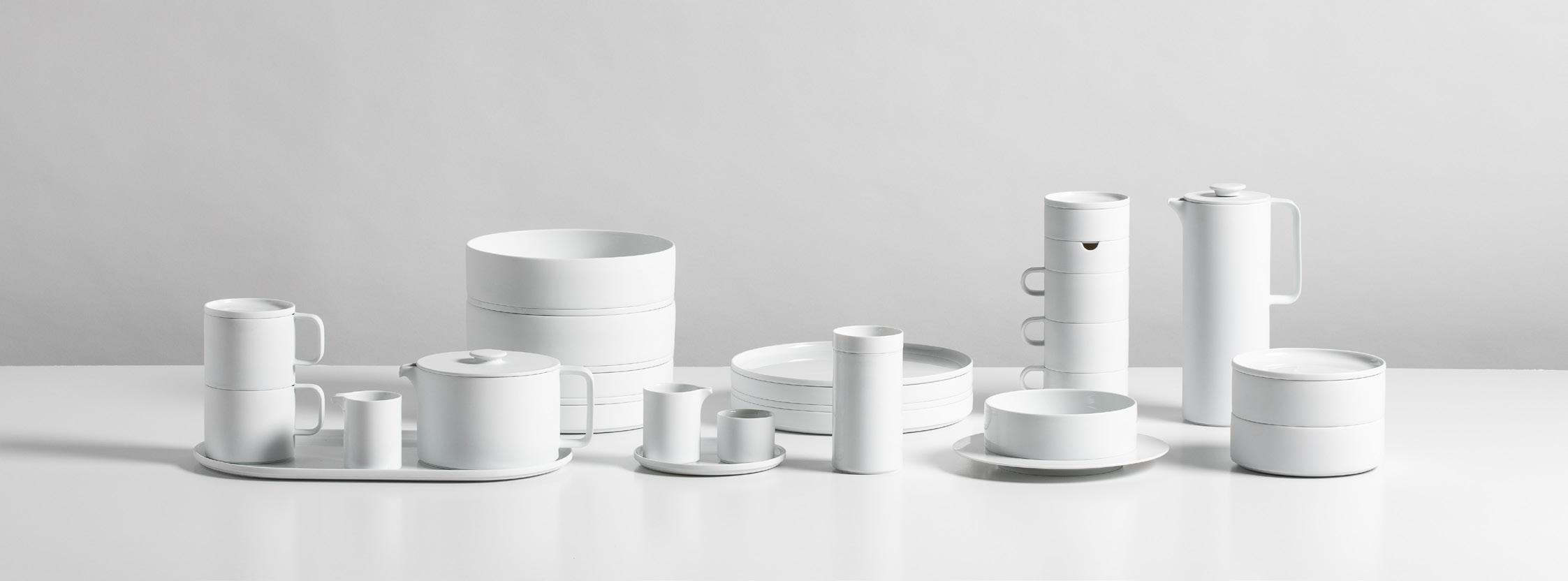
We also enjoy creating furniture that celebrates the age-old tradition of craftsmanship in everyday objects. Earlier this year we revealed our new DATUM
tableware range with FÜRSTENBERG, a series of plates, cups, mugs and bowls that provide exceptional functionality and flexibility. FÜRSTENBERG’s rich history in the production of fine porcelain and commitment to craft made them ideal collaborators.
We have always believed that good, responsible design is only possible with significant contributions from different disciplines. This approach has allowed us to rapidly explore a wide range of solutions from many points of view.
what responsIBIlIty Does DesIgn have to Improve our lIves?
We believe that industrial designers and architects should be advocates for sustainable design. It is our duty to help clients and manufacturers realise their vision, in the most environmentally conscious way possible. Through processes such as EPDs, we are attempting to make sustainable choices clearer, at every stage of a project. We want to encourage and challenge the manufacturers to embrace more sustainable ways of working and create pieces that gather memories and meaning through successive generations.
retrofIttIng Is a hIgh prIorIty for the practIce. how Does foster + partners approach thIs specIfIcally anD where Is the Balance to Be struck Between creatIng new structures anD reImagInIng exIstIng ones?
Retrofitting existing buildings is crucial to meeting our netzero carbon targets. By sympathetically adapting existing structures, we can enhance building performance and functionality, while reducing embodied carbon content.
For many of the same reasons, our Industrial Design team is always striving to design adaptable products which contribute to a circular economy of repair and reuse. The Cordoba Chair has been designed to last – beyond the typical lifespan of a fabric seating component. Material is elegantly pulled and tensioned around the frame of the chair to create an extremely supportive seat. The two parts of the wooden frame, which the seat is attached to, can be taken apart and put back together again by B&B Italia. This gives customers the option to replace the seat material - significantly extending the chair’s life.
Similarly, the fabric panels which are an integral part of our Soft Cells wall and ceiling system can be easily replaced at the end of their lifespan. First developed for use in the Swiss Re headquarters in London, the tensioned material panels combine the aesthetic benefits of high-quality design fabrics with highly effective acoustic performance.
the practIce has Been unafraID to take puBlIc posItIons. what metrIcs or InsIght Does the practIce use to shape these posItIons anD can you tell us more aBout the Internal sustaInaBIlIty group, anD Its role In steerIng the practIces of the organIsatIon?
We have specialist in-house teams for carbon impact assessments, environmental analysis, materials research, landscape and workplace design, and environmental and structural engineering. Together with the design teams, they develop sustainable frameworks and identify environmental targets for a healthier world.
Our Sustainability Group employs the Foster + Partners Responsibility Framework (FRF) across all projects. The framework measures sustainability performance and captures and shares key data as evidence. This ensures that progress across all projects can be tracked, audited and reported.
The practice’s philosophy of working alongside manufacturers, carefully crafting products, exploring, refining and optimising each element, and experimenting with innovative materials and technology finds reflection and resolution in every piece.
what Does a sustaInaBle future look lIke for foster + partners?
We believe an appetite for enquiry and discovery is essential for a sustainable future. By maintaining a commitment to research we are not only up to date with new developments and techniques but are also able to thoroughly evaluate their relevance for environmental and functional performance on individual projects. At the heart of our investigations is an examination into how we optimise a product or building’s potential for progressive change.
A sustainable future will also require meaningful commitment from designers, manufactures and suppliers – who must work together to create inherently flexible products and spaces, which can be easily adapted or reconfigured, to last for generations. The focus needs to shift towards recycling and repair, in order to reduce waste and create a closed-loop system.
The debate between hope and fear for the metaverse is rattling on while the big players invest and build at pace. As one of my teachers from long ago used to say: it will not all be beer and skittles.
I t ’ s not a game
Due to cloud computing, artificial intelligence and fast connectivity, designers can do things only dreamt of a decade ago, like virtual tours, 3D models, and photorealistic visualisation. But this is not the metaverse, which will be different things depending on who you ask. There is some agreement that it will be a constellation of virtual worlds built for fun, research, commerce and communication, and it will need the next generation of the internet to be possible. So what could possibly go wrong? Here are some reasons why the metaverse might not be your best friend.
Simply by asking a few people what they thought about the subject, I got responses that were reticent, even fearful, from a wide range of witnesses – tech-savvy twenty-somethings, artists, development engineers and techno-luddites. I was expecting more excitement about a field that is credited with so much potential.
t he f ace B ook effect
A common millennial opinion was mistrust of the commercial oligarchy that people thought would dominate the sector. This sentiment was coloured by the use and abuse of our personal data in the past, which did not bode well for the future. The fear is that subscribers to any commercial model would have their intimate details and interests ruthlessly exploited, but with more precision and effect. It does not help that Mark Zuckerberg has positioned himself as a highly visible ambassador.
creatIve thInkIng wIth steve gale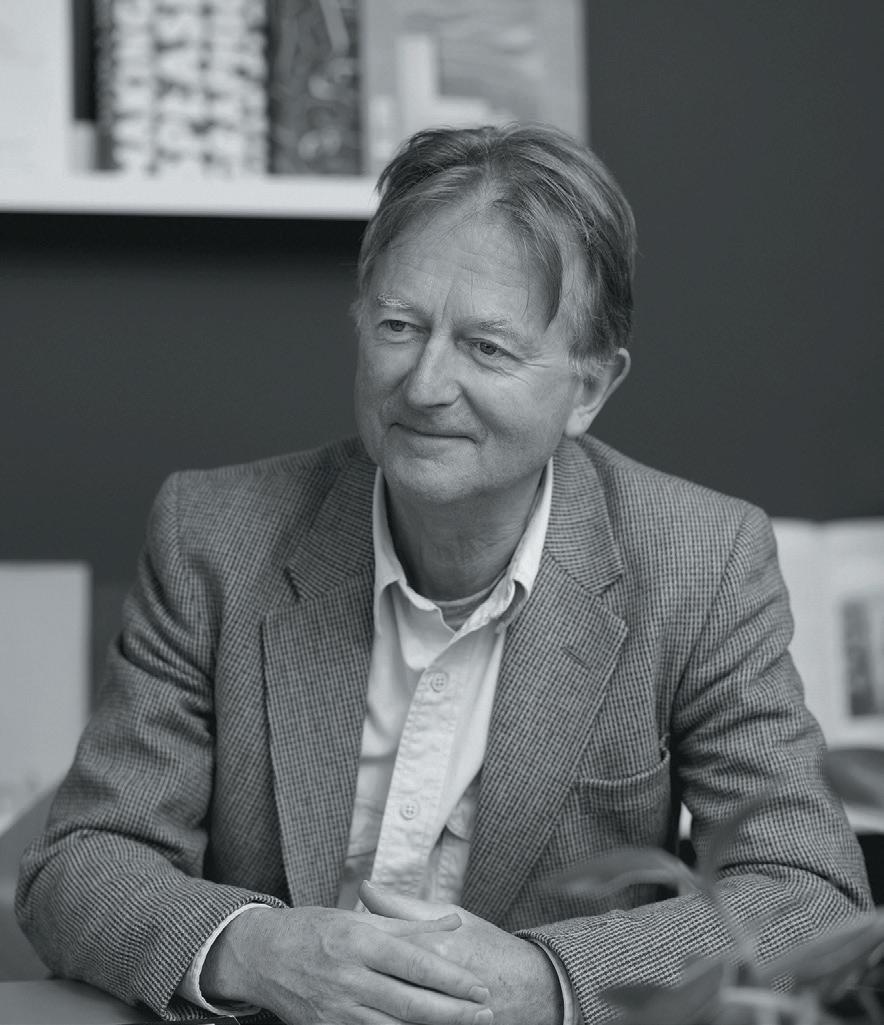
k eep I ng I t real
A second more surprising concern from the youth camp was the danger of reduced contact with reality. This from fairly committed gamers who take part in regular online sessions. To them it seemed inhumane and unhealthy to spend too long in the “safety” of a virtual world. Recently an academic study was reviewed in the British Journal of Sociology which cited a “generation sensible” of 11 to 25 year olds who suffered anxiety, low self-confidence and all sorts of relationship issues through a lack of real life experiences like dating or even going to a pub.
h ot an D th I rsty
Add to these concerns the wider issue of the energy needed to power the giga-processors, and the residual heat that must be absorbed by our already warming oceans. Analysts at Intel have estimated that to support a workable metaverse the global computing infrastructure must be 1,000 times more powerful than it is today, with all the additional energy demands that would require.
l ook on the B r I ght s ID e That thirst for energy could possibly be mitigated by less commuting and leisure travel, and optimists claim that an open-source platform could protect us from commercial monopoly and hidden agendas.
Let’s see if moderation and regulation can take care of our real planet and the people on it as much as their virtual replicas floating in the metaverse. The power of intelligent data use is within our grasp.
s teve g ale is head of business intelligence at m moser assocIates


Creative branding and design agency D nco discusses navigating an evolved time.
The way we use offices, shops, museums, and other buildings has changed enormously in recent years. Some changes, like signs indicating one-way systems during the pandemic, have been temporary but others will permanently affect our experience of spaces. Wayfinding – signage and navigation – therefore needs to adapt to consider our changing use of space. A building can be impeccably designed, but bad wayfinding can completely ruin your experience, whether it’s the confusion felt on not being able to find a toilet or the genuine dangers posed if people can’t find emergency care in a hospital.
One of the most significant changes in how we use spaces has been the increasing demand for flexibility. This has been most obvious in workspaces – where traditional cubicles are being ripped out left right and centre to make way for moveable desks and collaboration spaces.
As companies grapple with hybrid working, many are undertaking office redesigns or even downsizing altogether and implementing hot desk policies. At DNCO, we have been approached by numerous organisations wanting a refreshed wayfinding system following a post-pandemic refurbishment.
The war for talent is also having its effect, with some employers looking to make their offices more appealing; for example, by having meeting rooms that can be flipped to host yoga classes at short notice. Signage is therefore having to become much nimbler to cater to a world of work in flux.
However temporary signs, which are chucked away after use, are at odds with another key ambition we see influencing the property industry: the desire to create and operate spaces more sustainably.
Some have proposed digital signage – information displayed on electronic screens – as an alternative. These wayfinding alternatives are an expensive solution: the kit is costly but so is the management of it on an on-going basis, people often don’t consider this.
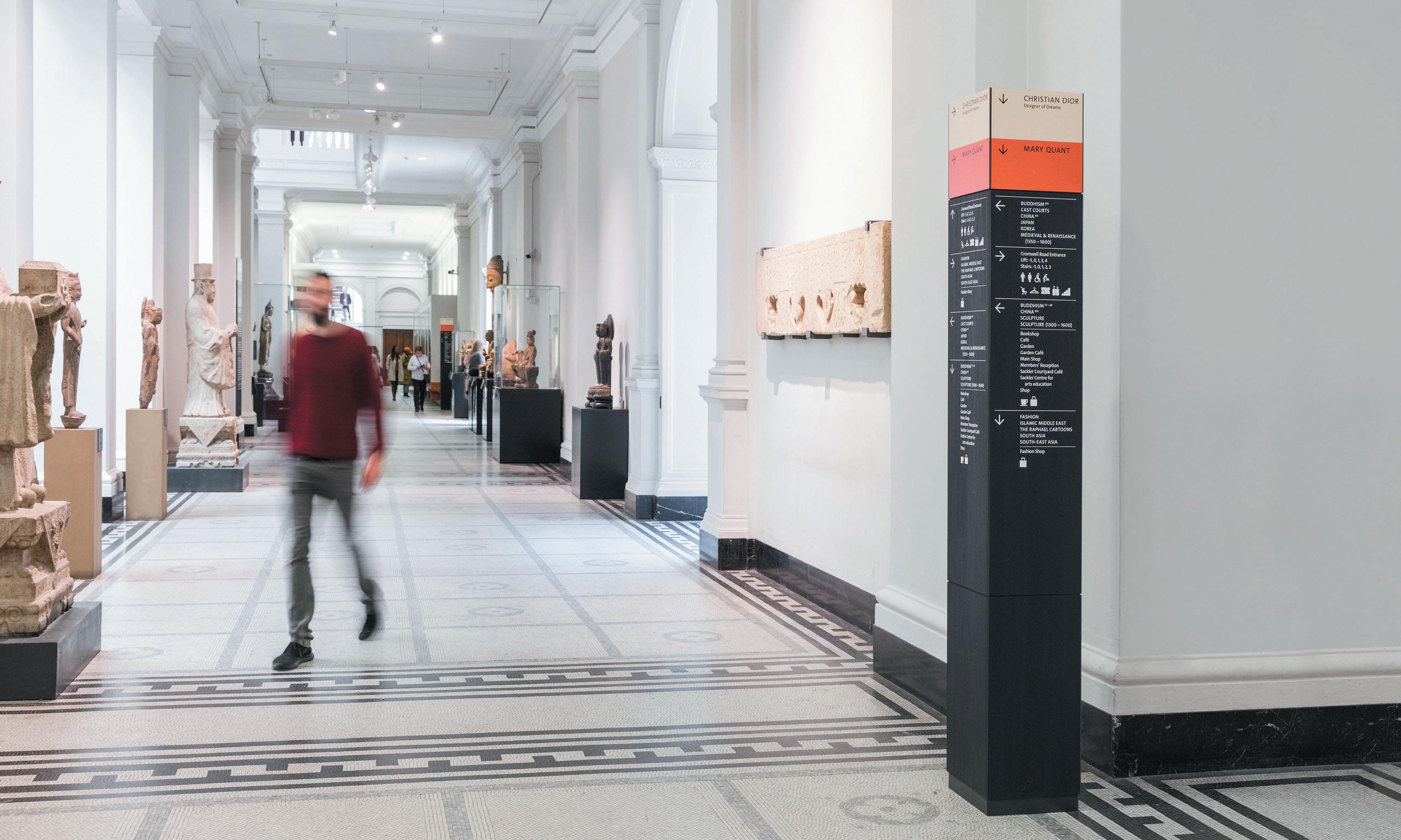
Another solution we at DNCO are exploring is projected lighting – which can be adapted to illuminate different text or icons onto a buildings’ walls. IKEA uses projected arrows very successfully in their Marketplaces mazes, while we are implementing it in the rather more elevated environment of an upcoming office scheme with flexible workspace in Central London.
The office’s signage can be updated at any time without the need for new materials. This is particularly important for a scheme that incorporates a significant amount of flexible workspace – meaning company names can be changed at short notice.
These changes in how we are thinking about signage tie back to the fundamental principle that should underpin all wayfinding: human behaviour.
When undertaking a project, the first thing we do is try to understand how people use the space – when and where they will be making decisions about where to go. If the building is already complete, we’ll undertake rigorous interviews with people who use it, finding out where the ‘pain points’ are; where confusion and wrong turns take place.
At the V&A, where we did the wayfinding for its seven miles of galleries, the biggest problem was how overwhelming the space felt. For a day visitor, six floors felt like too much and the top ones were often overlooked. We couldn’t change the building, but we could make it feel more digestible, so we renumbered the floors (-1, 0, 1, 2, 3, 4) and redrew the map. Anecdotally, the top levels now get much better footfall. For a refurbishment or a newly completed scheme, speaking to existing users isn’t possible. So instead we engage closely with the end user or developer to find out how they want the space to be used.
prevIous page:
Here East wayfinding system
Below: Signage at the V&A, London
When designing the signage for Schroders’ new office, we learned from the company that it wanted to differentiate the upper floors, which are for quiet meetings with private clients, and the lower floors for team collaboration.So we created a unified, consistent language which could vary in tone across the two areas. On the client-facing floors, we selected an elegant hotel-style treatment in keeping with tp bennett’s interiors. Anodised waterjet-cut aluminium letters with hidden fixings were chosen to complement the refined material palette. On the lower floors, we could be a lot more expressive and playful. We installed fluted panels – riffing off the architecture – with icons on top and flashes of colour that picked up on the interior design.
When designing wayfinding, it’s critical not to overlook the natural cues humans perceive when deciding which way to turn: light, sound, smell and so on. Rather than working against them, we work with these to make our systems even clearer and even omit signage when we believe the natural cues need no enhancement.
aBove Image: Internal wayfinding at Here East
For commercial buildings, it’s also important to reflect the character of the company and space. At Here East, a tech and innovation campus in the Olympic Park, we borrowed from the language of electronic circuitry familiar to the campus’ digitally innovative community to create a wayfinding system that would be both inspiring and intuitive to this specialist audience.
Directional arrows show the flow of energy (here: movement). Reception desks are gateways to the next area, or transistors. Motors signify lifts. As in a circuit, the symbols are joined by lines to form a giant floor graphic connecting the whole campus.
Working collaboratively with architects to ensure signage complements rather than detracting from or overpowering the building itself is key to successful wayfinding – and our close relationships with Hawkins\ Brown, MAKE Architects and tp bennett were pivotal in shaping our work at Here East and with Schroders.
Another way our use of space is changing is the increasingly digital nature of our experience, whether it’s navigating a city via Google Maps or being able to book meeting rooms at the touch of an app.
We are starting a project with a university where they use mapping software across the campus, so we are looking at ways to make the wayfinding work in harmony with this to strengthen both at once.
Hardly anyone has yet capitalised on the digital potential of wayfinding. If we navigate external spaces via our phones, why not interiors? Clearly there are drawbacks. We cannot expect all people to carry a smart phone – having one’s head buried in a screen detracts from the experience of being in a building and interior digital wayfinding relies on signal strength which doesn’t always work within structures because of thick walls.
App-based wayfinding may not be the future, but either way, exploring it is important and reflects the role that we as wayfinding consultants have to constantly examine and re-examine how humans navigate space.
It’s here. The first LVT Versailles panel. Single format glue-down panel / TrueGrain embossing / Four trending colours Waterproof / Easy maintenance / Suitable for commercial and residential use
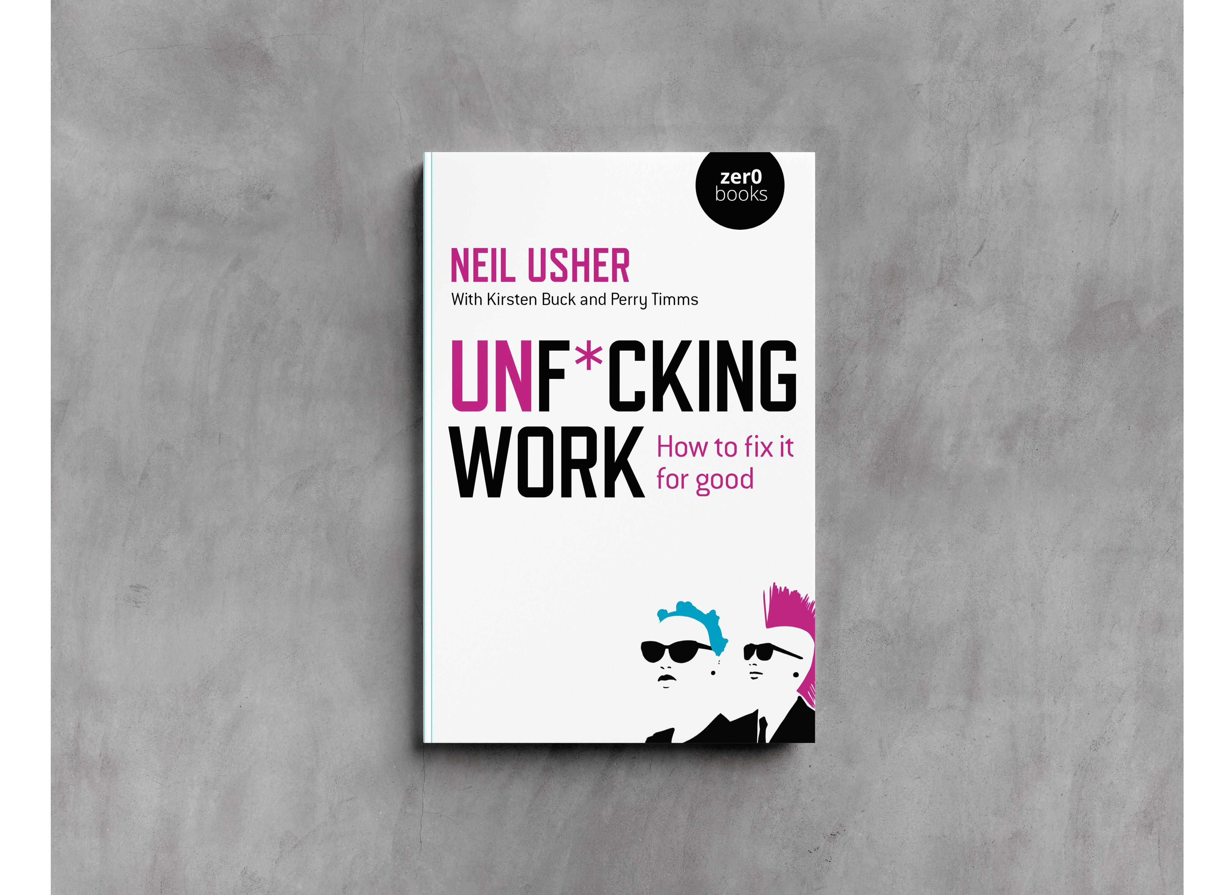
As a workplace designer, I love that I am regularly invited to stroll through the inner sanctums of corporate culture to observe, analyse and ultimately positively influence (via the strategy and design of an incredible new workplace) the corporate cultures of our clients.
With this privileged position comes an eye-popping range of situational experiences – including the exceptional, the good, the bad, the laughable and, occasionally, the very, very ugly. The author of Un-F*ucking Work, Neil Usher shares this spectrum of experience – and it is to his credit that this book has emerged from his psyche, less as a cry for help and more a deservingly profane call to action.
Throughout, he simultaneously skewers the impenetrable fog of corporate culture, linguistics, myth and ritual, while stripping away the opaque cynicism used in what I call ‘corporate babble’. He paints a brutally truthful, yet optimistic picture – that the culture and language of ‘work’, as it exists for most corporate office workers, is, to paraphrase the author, universally f*cked.
That this book is a child of the pandemic lockdowns doesn’t really matter.
The questioning and case for change are coming from all directions – from property owners worried about the value of their bricks and mortar assets to leaders desperately looking for ways to make people come back to the office (Hint: Taco Tuesdays might not quite be enough to cut the mustard). The future of work and the relevance of workplace has never been such a hot topic.
The hapless recipients of the author’s ire in this case are 12 corporate one-liners and clichés, which we all know with absolute certainty are used every single day in workplaces around the world. Deservingly, each statement and its underlying meaning is surgically dismantled, deconstructed and reassembled.
For each chapter and cliché, the author proposes an alternative statement, one that rebuilds these 12 significant and valid concepts, but this time with piercing clarity, meaning and purpose. As he notes in the foreword, this is neither a business book nor a repair
manual. It’s not a pathway to self-enlightenment, nor (thankfully) does it seek to contribute to somewhat absurd workplace theatrics and rituals.
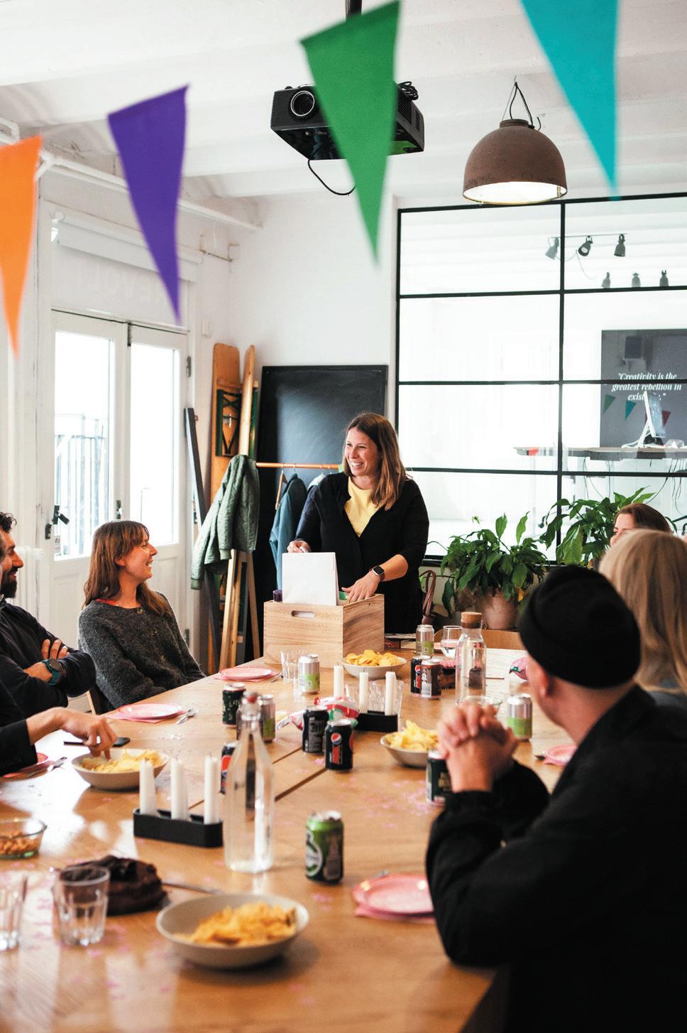
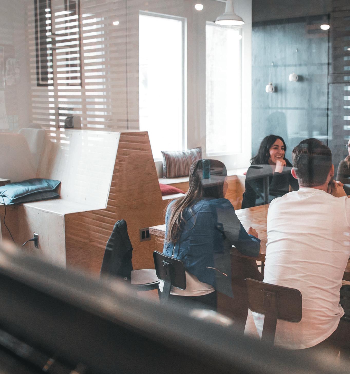
Given my own job description, I particularly enjoyed Chapter 2’s cliché: “Work is something we do, not a place we go”. Taking on one of the giants of businessculture lore – Peter Drucker with his ubiquitous ‘Knowledge Worker’ from 1959 – this chapter is a crash course in the history of how and why knowledge work gets done, from pre-historic tilling fields to the Roman Empire to the early laptop warriors of Silicon Valley. Calling out the irony of ‘big tech’ falling back on analogue, 9-5, M-F Taylorist management policies, the chapter concludes with a statement about the difference between ‘space‘ and ‘place’ that I couldn’t agree with more:
“…rather than dismissing it (a space to work) as no longer relevant we must value “place” in its broadest sense as both a physical and collective experience, the energy of community, a vital counter to our historic struggle with alienation. The mistake we’ve always made with the idea is to consider it in purely tangible terms – the production line, the laboratory, the rows of white desks…”
The word ‘community’ has the strange ability to polarise. For my mother, a stateless child of 1940s war torn Europe, it conjured life-draining images of sickles and scythes. For others, it is their life-force and raison d’être. The author correctly defines community in this highly topical work-context as being:
“…the ever-shifting human landscape in which we operate, broad and deep, irrespective of physical place or mode of communication. It gives us the entire rich experience, complete with room for the surprising and unexpected. When we work, acting and creating, we enter this sphere as we might through a physical door…perhaps because it is the presence of people that transforms space into place…”
As a creator of places, particularly the sub-set of workplaces, I could not agree more. And the thread of this chapter rightly sews together the duality that many conversations about the future of work and workplaces are avoiding: that it must be a place of allure – a magnetic place – both in its physical properties and it’s metaphysical to transform the existing experience of going to work into being one that people willingly, happily engage with. The harsh reality is that without both a great physical and culturally engaging experience (as a bare minimum) working in harmony, un-f*cking work is un-likely.
Chapter 7 and its cliché is also music to my ears: “Culture eats strategy for breakfast”, another Druckerism. The author skilfully raises the curtain on corporate cultures, sub-cultures, siloes, tribes, diversity programmes and the death trap of mandated ‘fun at work’ – think ping pong tables and dress up days. Anyone looking to peer deeper into the well of this topic may also like to read the work of Frederic Laloux and his excellent 2014 book, Reinventing Organisations.
One of the shockingly revelatory statements in this chapter, that really shouldn’t be shocking at all, is this one:
“…Organisational norms and behaviours all too often reflect a simple factor – the path to success. If being honest, decent and caring is seen to be the way we got on in an organisation, we’ll ensure it’s how we’re known and seen. If being a completely amoral soul-stripped shit is how we advance at the expense of all others and their limpid feelings, then we’ll crack on with a whip in both fists…”
Preposterously compelling, this book is an uninhibited romp through the Elysian Fields of modern work life and was refreshingly joyful to read. It’s essential reading for anyone interested in understanding how to fix ‘work’ and create better, more engaging and
memorable experiences for everyone – from leaders and everyday people who work with other people in organisations, to workplace designers, architects and developers of commercial buildings.


It reinforces what many of us in the workplace industry know to be self-evident: that COVID has forever democratised hybrid working, or whatever label is used; that a 9-5, M-F Taylorist paradigm is what is dead, not the office per se; that individual contribution, or the value of a workplace, should not, and indeed cannot, be measured in quanta of physical presence; and that there is a growing urgency for a workplace revolution, to un-f*ck work which goes well beyond adjusting bricks and mortar.
Echoing findings from our own research team at Hassell, this book is a manifesto that makes clear the essential role of a modern workplace is to magnetically bring people, place, culture and technology together to nurture the energy of a community, to help generate ideas and bonds - strong and weak - and to allow us to look after each other, excellently.
Now in their 14th year, the m I xology n orth a war D s are one of the most anticipated commercial interiors events of the year, recognising the very best in projects, products and people across the North of the UK. Entries are now closed, with the finalists announced early November and winners revealed at the Mixology North22 Awards, taking place on 1 st D ecem B er at m anchester c entral .
This year’s impressive judging panel are all experts in their fields and key players in the world of commercial interior design - comprising designers, consultants, developers and end-users.
are you In the room yet?
To book tickets or to find out more about Mixology North22 Awards, visit mIxInterIors.com or contact us at Info@mIxInterIors.com.
roger stephenson oBe chaIr of JuDges
Managing Partner stephenson hamilton risley STUDIO
Roger Stephenson OBE founded his practice in 1979, which has been deeply involved in the urban regeneration of Manchester. Stephenson has completed many of Manchester’s significant buildings: the new building for Chetham’s School of Music was shortlisted for the Sterling Prize. In 2001 he received an OBE in the Queen’s Birthday Honours List for services to architecture and is also a visiting professor at Liverpool University School of Architecture.
Muriel Altunaga is a Cuban-born architect with two master’s degrees: one in building heritage and the other in smart buildings and environmental architecture. At the start of the dot-com boom she worked with hi-tec, cutting-edge technology companies that were focused on creating exceptional places to work. She now works for global architecture and design firm HLW, where she is the Strategy Lead for EMEA. Altunaga is part of HLW’s Strategy and Research team, ARK, who provide workplace strategy for clients, reflecting unique, core business objectives whilst supporting the functional demands of the workforce.
 sax arshaD Founder + Creative Director Zanna Hospitality Group
Arshad and his team operate and consult across an area covering the North West, Midlands, Yorkshire and Wales, working with brands such as Evelyns, Gooey, Mughli and Bacino. Zanna are a diverse and dynamic team that are passionate about all things hospitality.
Director for BBC Workplace, which has over 150 locations across the UK, Bainbridge has over 30 years’ experience in construction, property and facilities management. His involvement in flagship schemes from PFI, retail, commercial and media has given him a breadth of understanding across the market, from owner to occupier, and across the supply chain. He led the delivery of the award winning MediaCityUK in Salford for the BBC and Central Square, Cardiff, the new HQ of BBC Wales. He is committed to using the best in British manufacturing and fabrication, and is also on the committee for the BSI PAS6463 inclusivity in workplace design.


Duffy has worked in finance and operational roles across a variety of industries, including manufacturing, travel and digital marketing, before landing at Cubic Motion 6 years ago. Since moving into the computer games industry, she has overseen several construction projects including the building of a world-leading motion capture stage and a significant office expansion. When Cubic Motion was bought by Epic Games three years ago, she progressed into a senior operational role and has been leading projects to double the Manchester office space, as well as multiple fit-out projects, to implement emerging scan technology across the UK, US and Europe.
Ryan Crown is the founder of Crown Creative - a creative agency for the hospitality industry. Through concept development, brand strategy, visual identity and interior design, Crown’s team creates work that is both beautiful and meaningful for their clients across the US and the UK. Crown’s experience extends from Michelin Star restaurants to global hoteliers, including Marriott, Waldorf Astoria and Hilton, and everything in between. Additionally, Crown has developed and operated concepts of his own - Neighbourhood Cafe, Hill Street Hatch and the award-winning Toast Office.
Morten has been a building surveyor at Bruntwood for 11 years, spending the majority of this time project managing and developing commercial office building refurbishments in Leeds, Liverpool, Manchester and Birmingham. His most successful projects to date include Neo (Manchester), Cornerblock (Birmingham) and the ongoing West Village Leeds redevelopment.



Faithful+Gould
Jackson leads F+G’s Property operation in the North West, charged with growing the company’s client base within the commercial, mixed-use and leisure markets. With over 25 years of development and construction experience, he has led the successful delivery of numerous high profile projects and programmes for clients including Aviva, HRMC, Royal London and MTV.
With 20 years’ experience working across professional services, media and technology businesses such as Oracle, NBCUniversal, Experian and most recently Channel 4, where he is Head of Workspace. Oxley brings a large portfolio of creating workspaces both in the UK and internationally, having worked overseas in the US and South East Asia, building up an extensive level of experience in real estate. He is proponent within businesses to better understand and value how workspaces are a key component for every business – in particular delivering exciting and vibrant spaces with integrated technology, to improve how people interact with them.

Highly experienced within the consulting and construction industry, Sahni’s knowledge comes from exposure to a variety of sectors including finance, FMCG, real estate and engineering. He’s a dynamic leader and thinker, with the ability to build business, develop client bases and take accountability for complex projects. He has also authored a number of organisational white papers and presented at industry conferences.
eD snaIth Director AlliedSnaith forms part of the Allied London development team, with a remit to deliver the development and fit-out of the group’s expanding flex workspace (Department) offer alongside other core business projects. With a background in project managing commercial office fit-out and the refurbishment of existing building stock, he has worked with numerous serviced/flex workspace operators including FORA, TOG and British Land.
Jonathan stIrzaker phIlIps Associate Director JLL

Stirzaker Philips is a chartered building surveyor specialising in project management. He has experience in delivering a diverse range of projects through the full project life cycle, including commercial office and luxury health care fit-outs and high-end residential and commercial new build – representing clients including Bupa, Richmond Villages and Roku.
A member of the BCO, Zaman’s experience predominantly lies in residential, commercial and mixeduse projects. She completed the commercial aspect of the Circle Square development in Manchester in 2021 - made up of two speculative offices and subterranean pavilions below a landscaped public realm, and a net zero carbon, CLT timber commercial mixed-use building on Old Paradise Street, Lambeth, which has won the NLA award for Unbuilt Workplace 2020 and the WAFX Climate, Energy & Carbon Award 2021. Zaman is also a Part 3 Examiner at the University of Westminster and a Mentor at You Make It and the Architecture Race Forum.
In this Mix Roundtable with Ivc commercIal, we explore the seismic changes forcing a rethink of the traditional office and ask, in the rush to create spaces people want to be in, are we still creating spaces fit to work in?

 moDerateD anD wrItten By: Harry McKinley
alIstaIr shove
Manager
colIn owen Creative Director

 Interiors
DomInIc Dugan Creative Director Oktra
 katrIna larkIn Co-founder and Chief Creative Officer Fora
In partnership with
Clerkenwell: with its myriad showrooms and design studios, arguably the home of commercial interior design in the UK. There’s been a softening of its window displays of late – more cushions, more colour, more texture; the steely edges of traditional workplace fare replaced with something gentler.
“For us, there’s been a renewed focus on warmer designs, on wellbeing and on comfort,” says ivc coMMerciAl’s alIstaIr shove. “We’re seeing a different kind of commercial specifying that’s a bit broader; more of a residential sensibility coming through on the commercial side.”
It’s this pivot in design and cultural ethos that we’ve assembled at IVC’s Clerkenwell showroom to discuss, asking if the homeification of the office is a positive or a problem.
For oktrA’s DomInIc Dugan, context is king: “An office represents everything a company stands for. It isn’t just a functional interface, it can embody all of the sorts of aspirational qualities that we strive for in business, which create comfort, culture, performance
and productivity. Those are the things that excite me and it’s certainly a positive that the workplace has become such a dynamic talking point.”
“I completely agree,” emphasizes AiS’s erIk mueller alI. “Before we talk about specifics, it’s worth touching upon what makes a good workplace, and that’s a place that supports the people working there and expresses the values of the business.”
Cornerstones defined, there’s little doubt that their shape has been the subject of intense debate post-COVID. If our table of industry experts is agreed that a successful workplace is one that supports its people, there’s less consensus on what that support looks like. Of course, one line of thought that proliferates across the design sector is that homefication simply means the introduction of greater levels of comfort; that shoulders-down feeling that comes when sinking into a familiar armchair. But can too much comfort be a bad thing?
“I don’t believe so,” explains forA’s katrIna larkIn “I’m just back from a holiday and had more ideas for my business lying on the beach than I did at my desk. So, for
me, it’s a case of trying to bring some of that energy to the workplace, which is what we’re trying to do at Fora; to create spaces where people can have that moment to brainstorm, daydream and just think about stuff.”
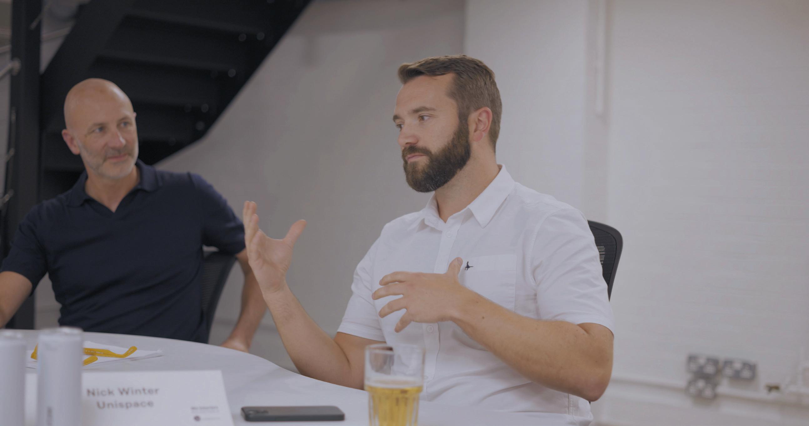
“But can ultra-comfort breed lethargy,” questions Dugan, “when the workplace isn’t ultimately a home or a place to relax, it’s a place to work?”
Jasper sanDers believes so, going on to challenge the impact more ‘homely’ offices may have on the next generation of the workforce.
“We’re treating younger people too softly,” he explains. “It’s important for everyone in an organization to feel that they have a responsibility to turn up and deliver the role they’re employed to do, and environment is a part of that. When a workplace is too comfortable or too much like the home, it’s harder for employers to set meaningful boundaries with a generation that is still finding the ropes. If everyone can do as they please and offices are
designed solely around how people feel, and not what they’re there to do, then in my opinion it’s chaos.” bluebottle’s frans Burrows disagrees: “A majority of my studio is younger and I give them total flexibility. But they do know they have work to do and we give them spaces fit for different occasions, be that standing room or a sofa to sit on. Thinking about how to make an office more like a home isn’t about diminishing the amount of work that gets done, it’s actually about helping people to perform more fully.”
“And that’s about good leadership in a business,” continues larkIn. “That’s something that we really pride ourselves on; that we are about the people. We try to take them on a journey, we explain the business plan, we explain we’re very project led, we believe in rewarding them and we believe in socialising together. When that combination is in place, they do turn up to work.”
Of course, how we work is changing rapidly and so, while we often think of the home as a comfortable
space and the office as a productive space, could the blurring of design lines actually be less about relaxation and more about function?
“A home is simply a particular series of ingredients,” says colIn owen, MAriS interiorS. “A kitchen is for cooking and socializing; a bedroom for sleeping; a TV room for chilling and so on. The old recipe for the office had different ingredients: rows of desks and a meeting room usually, because that was seen as fit for purpose for what the office was for. That isn’t the same anymore. Now the office is more about collaboration, about flexibility in how spaces are used and about having interactive spaces and places to retreat. In that sense it’s getting more like the home in terms of utility, so the design is following on from that.”
“Because whether it’s a couch or cushions or whatever,” follows mueller alI, “the elements are relatively agnostic, it’s about the choice a home offers in comparison to the traditional office.”
Indeed the decorative scatter cushion has become lighthearted, even pejorative shorthand for how some define homefication – the supplanting of the practical in favour of the froufrou. But, as our speakers opine, it’s much more foundational.
“Yes, there’s lots about culture and identity, but actually designing and building flexible spaces that can be more easily adapted and changed year after year would be, and is, a hugely constructive shift,” says uniSpAce’s nIck wInter. “Versatile, nimble interiors have huge benefits and yet there’s still so much opportunity
to create personality. Take artwork for example, we all have it in our homes but in the workplace it’s an afterthought. These are the types of details that are billed as homefication, but they can be a powerful expression of freedom and ideas. That being said, I’m probably in the minority as I hate working from home. I find it an incredibly unproductive environment, full of distractions. So I’m all for comfortable, personable spaces that allow people to bring their full selves to work and actually save their homes as a retreat.”
For shove, it’s this diffusing of the frontiers between one and the other that is the greatest problem: “I like working from home and always have done, but have you ever had a meeting in someone else’s house? Well, it’s deeply awkward. So the office has a huge role to play; one that isn’t that of the home. Is it a place I can show and discuss product? Is it a place I can bring clients for meetings? These are the things that are important to me. The home allows agility and flexibility; it allows me to spend more time with family and avoid a long commute. There are lessons to be learnt there but there
are also important boundaries and, unfortunately, we’ve turned our homes into offices more than we think, not necessarily the other way around.”
Much of the conversation about ways of working and the environments in which they happen has centred on freedom – to work from home, to work flexibly throughout the day and to make use of workplaces themselves more fluidly. The homefication of the office didn’t start with the pandemic, but it has blossomed more swiftly because of it. The risk, then, that in seeking to create more comfortable, more productive and more homely workplaces, this shift bleeds unhelpfully in the opposite direction – taking our homes from places of sanctuary to spaces of labour. As sanDers concludes: “It’s crucial to recognise distinctions. If you’re looking after people and care for them, it’s about motivation. So if a space can be comfortable and appropriate; fun, efficient and enjoyable; a great place to work, that happens to have some of the aspects of home, then great. But it isn’t about plants and cushions. In the end, my work life is about how I want to live when I’m at work, not at home.


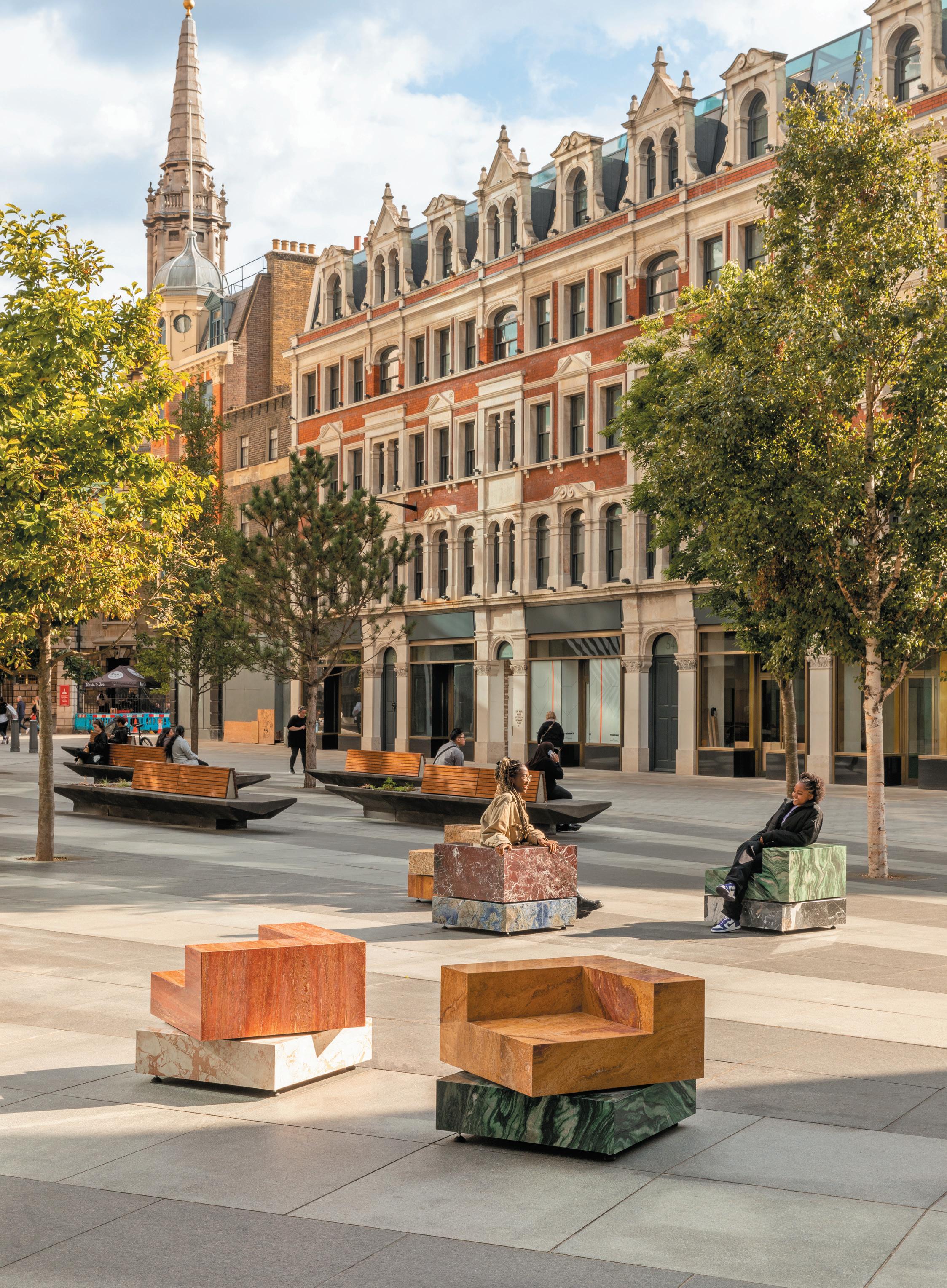
Despite last year’s cautious return, 2022 felt like a homecoming for lonDon DesIgn festIval, with an optimistic buzz around the week-long event - and an obvious international presence that has been missed.
Celebrating 20 years, the festival returned to the capital on 17-25 September 2022, with an exciting line up of events, installations and thought leadership. Typical for this huge festival, those of us with a few hours to explore had to cherry pick, finding plenty of inspiration across this year’s record 12 design districts. As usual, the festival had a strong sustainability focus, with major landmark projects, talks and events focusing on climate change, new ways of recycling and reusing materials, as well as social sustainability and wellbeing.
Expanding further across the capital in 2021, Greenwich now plays host to its very own District, featuring Design London at Magazine and dazzling creative hub, London Design District. The latter celebrated its first birthday this September, with an action-packed week-long programme during LDF, opening the doors to its dynamic community. Conceived and developed by knight drAgon and designed by eight leading architects, Design
District’s 16 unique buildings beautifully come together to create a permanent home for a diverse range of studios and creatives, as well as co-working space bureAu
Design District was also the site of the impressive Henge installation, created by StAnton WilliAMS ArchitectS and lSi Stone. Formed from 150-millionyear-old Jurassic limestone, the project created a space separate from the outside world and welcomed users to gather together to pause, connect and relax.
Design London returned to MAgAzine for a second year, bringing together a myriad of brands and designers at the festival’s largest fair. Featuring the usual mix of brands from ton to ArteMide, a wide range of topics were covered at the Design Discussions talks programme, including an audience with colour expert juStine fox and the team from office S&M, considering the role colours play when designing exciting and inclusive spaces.
Westward, perhaps the most talked about (and most photographed) project was SAbine MArceliS’ ‘Swivel’ installation at St Giles Square: very solid chunks of SolidNature marble shaped into chairs that fit in neatly against the Brutalist tower in the background, providing us with a moment of joy as we realised the chairs could, in fact, swivel.
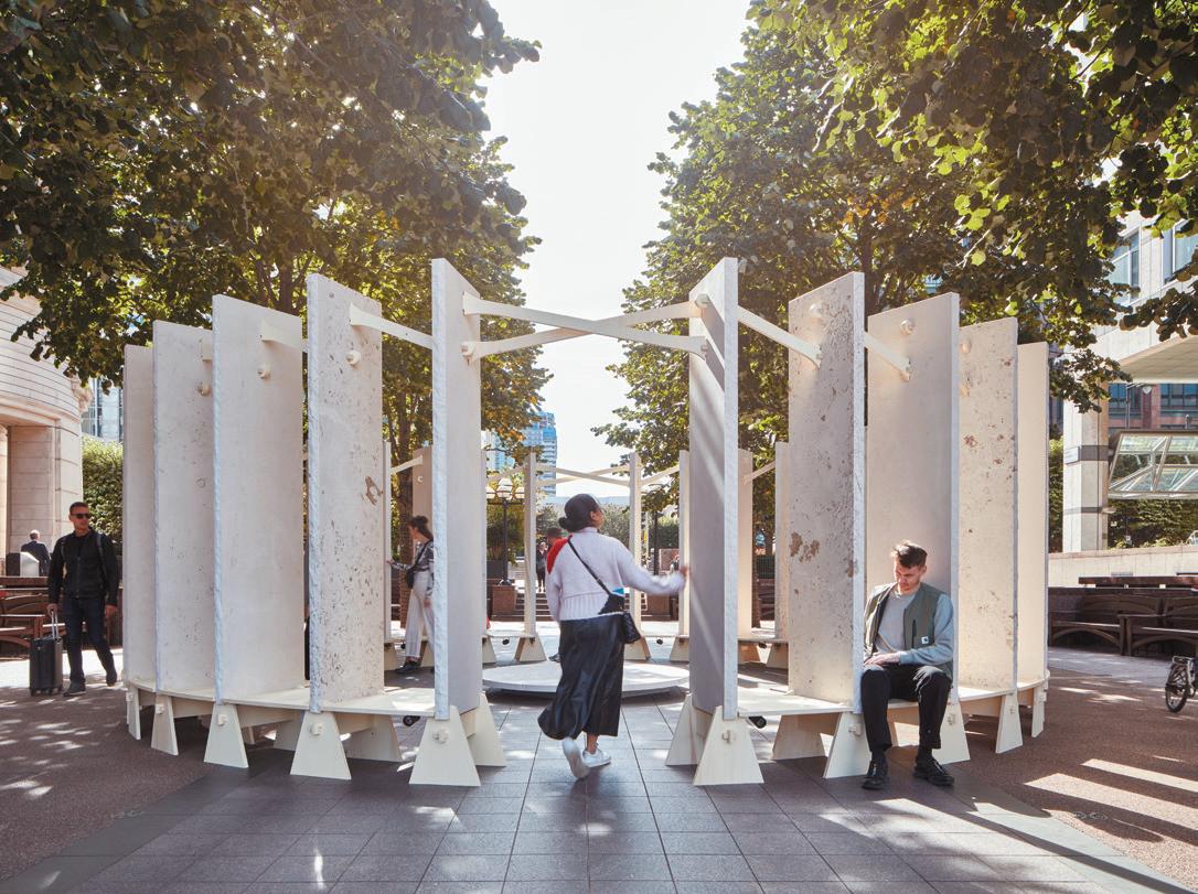
New fixture MAteriAl MAtterS found its home at the Bargehouse at Oxo Tower Wharf. The former factory setting remains unchanged after all these years and acted as a perfect backdrop for a range of brands and exciting newcomers from the world of surface and furniture design. Themes obvious throughout the exhibition included sustainability, circularity and - of course - craft, as well as a distinctive focus on Nordic design, including new designs from Norwegian favourites Fora Form.
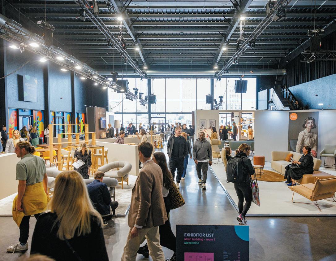
“One of the joys of launching Material Matters has been the fact that we can throw the spotlight on a huge variety of designers and makers determined to re-examine our perceptions of waste and question the system that produces it. It gives you a glimmer of hope for the future,” says Material Matters co-founder grAnt gibSon
Material highlights included SolidWool – a material that combines wool and bio resin to create a beautiful, smooth material the manufacturer compares to fiberglass. The wool comes from Herdwick sheep found primarily in the Lake District, which is wiry and dark and too coarse to use for clothing. Nature Squared is an ethical design brand with a mission to create innovative sustainable surfaces using natural materials, including seeds, bark and feathers. For the fair, the company focused on eggshells, investigating how a material that often ends up in landfill can be applied from traditional inlay to moulding techniques, as well as its range of tiles, CArrele.
Image on prevIous page: Sabine Marcelis, Swivel
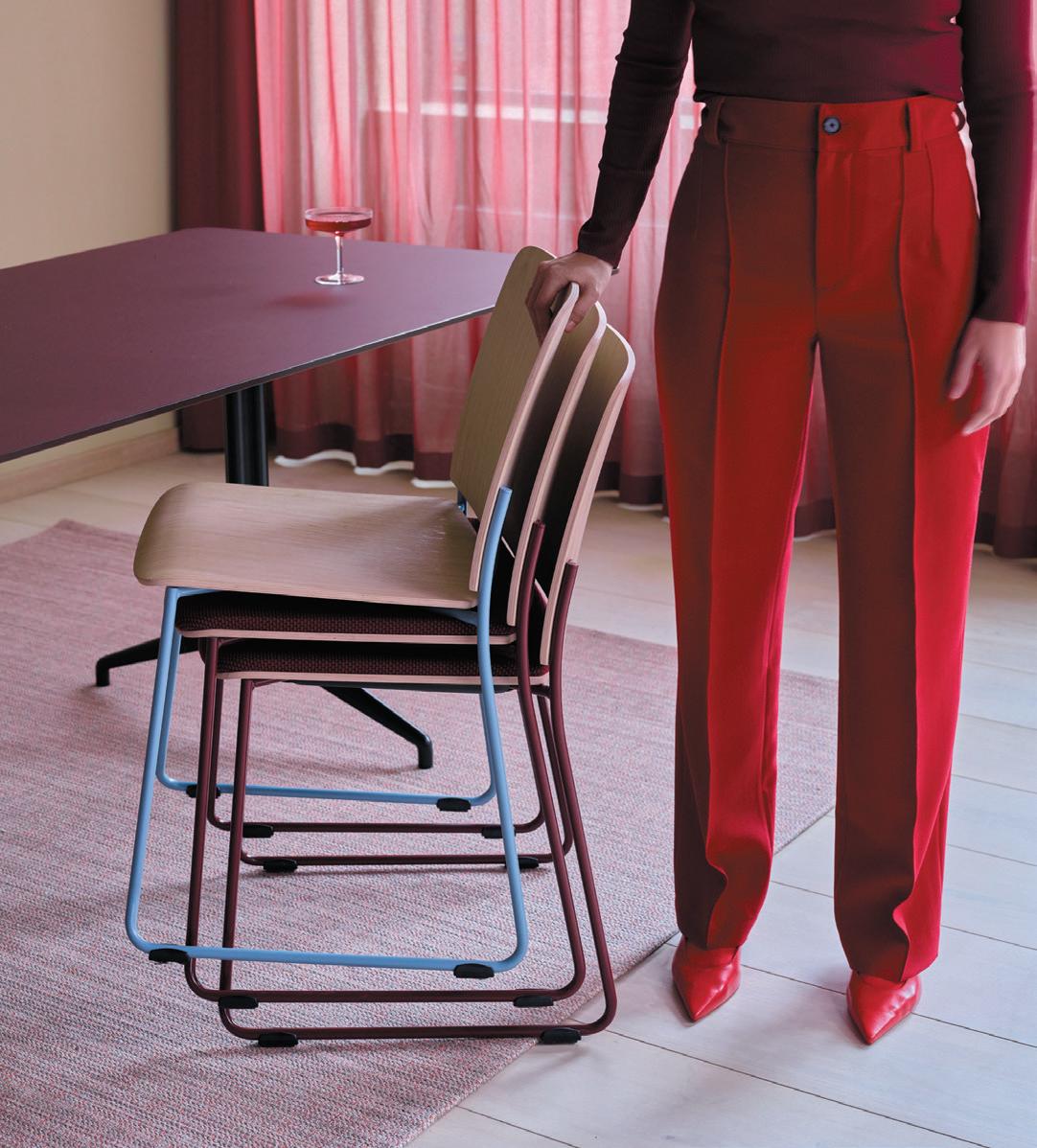
thIs page, from top: Fora Form at Material Matters
Design London Henge by Stanton Williams Architects with LSI Stone
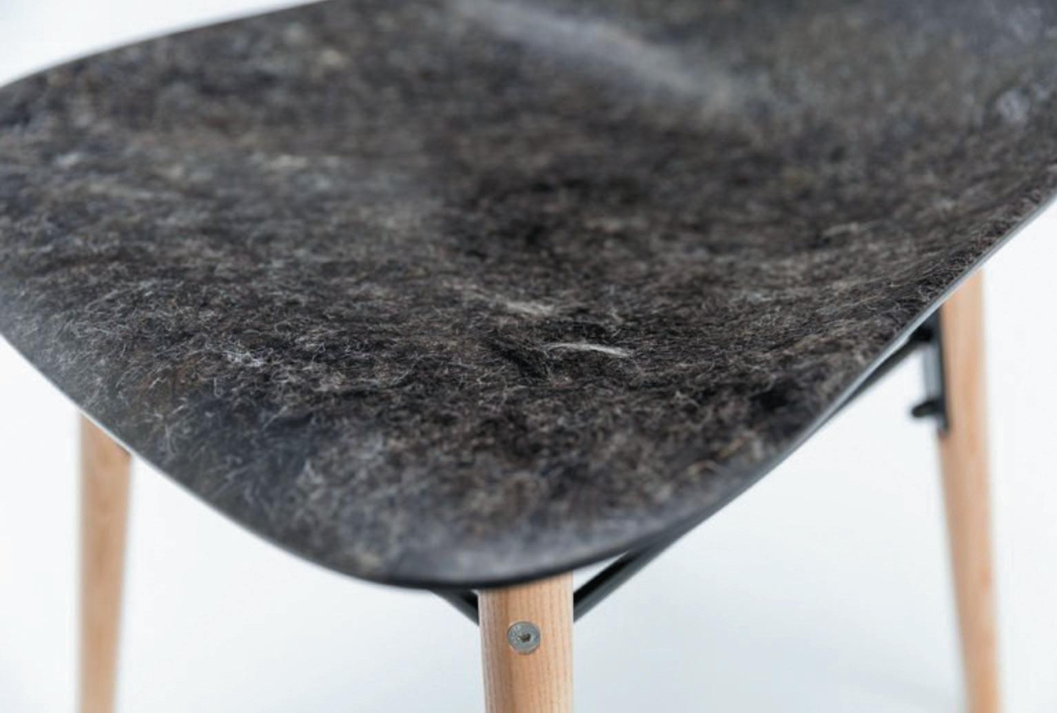
Back in our usual stomping ground, Mix Managing Editor hArry Mckinley hosted håkAn nordin, bolon’s Head of Sustainability and Co-Founder of greenpeAce SWeden, to talk all things sustainability at the flooring brand’s Clerkenwell showroom. They delved into Bolon’s sustainability journey to date, its vision for the future and explored the broader topic of the climate emergency and how architects and designers can each make a change – even the smallest steps making a difference, Nordin noting.
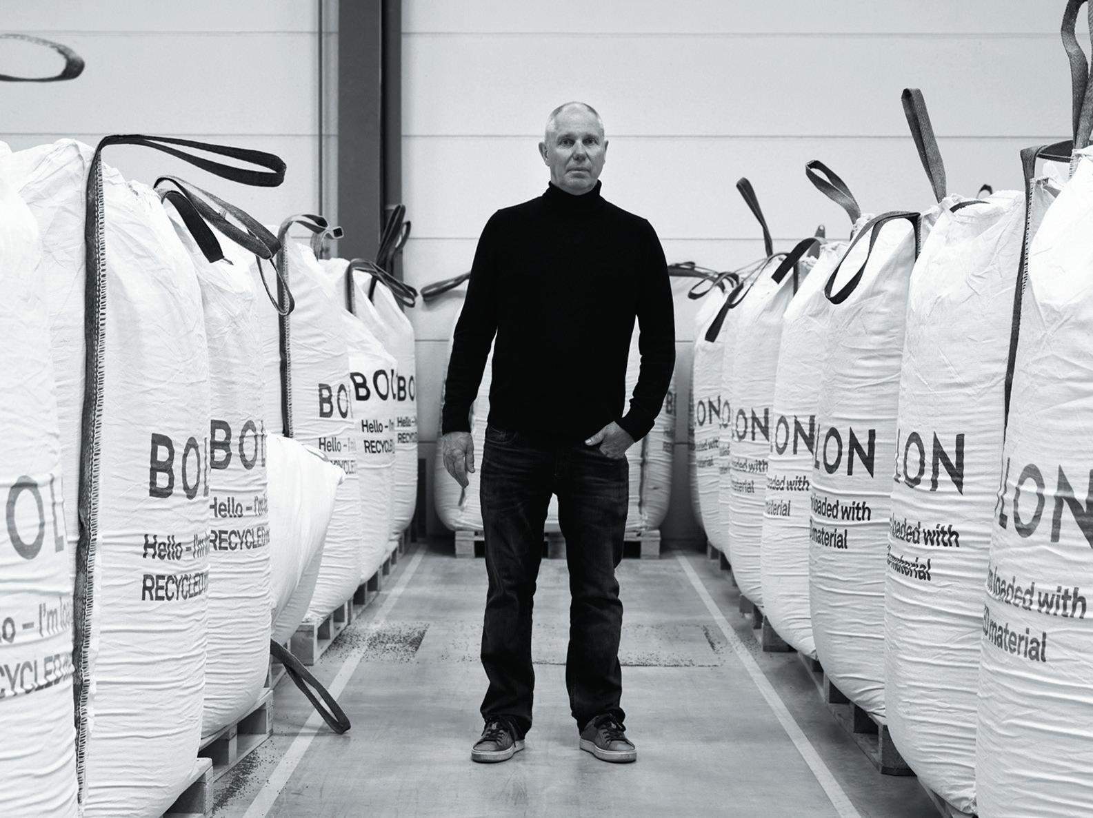
Having worked in sustainability for four decades, Håkan is a pioneer in his field. He told the audience that he thinks of sustainability as a journey rather than a destination, and that if they can do one thing to make their projects more sustainable, designers should still be proud of this incremental change – while still working towards wider and more comprehensive impact. He espoused the importance of creating a ‘movement’, explaining that meaningful shifts will only be possible through collective action. Whilst there is still much work to be done, Håkan remains optimistic for the future.
After a shaky return post-pandemic, this year’s festival arrived with important messages and a chance to reengage with the full spectrum of creative design. And what is LDF, if not a chance to interact, play and discover what London’s iconic design scene has to offer.
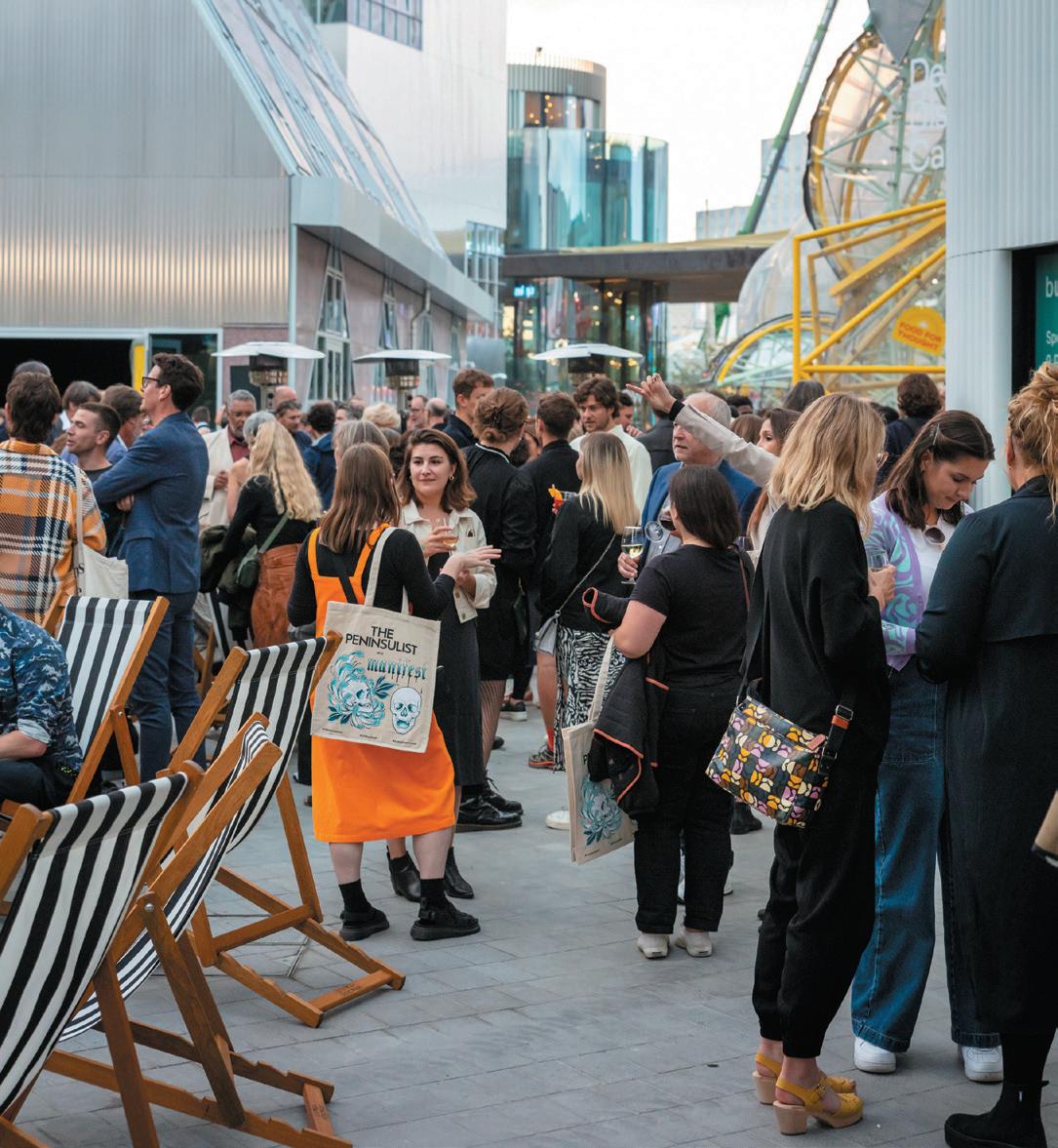


holloway lI for uma
Renowned design studio holloWAy li will reveal their debut furniture series in collaboration with uMA, a furniture brand producing objects that push the boundaries of fabrication. On display at The Market Building in Clerkenwell, Uma and Holloway Li presented T4, a first of its kind modular furniture collection. The playful design of the lightweight T4 composite modular sofa invited us to take a step back to the future and retrace the brash optimism of Cool Britannia and 90s television iconography. umaobjects.com
new collectIons from offecct offecct launched three new designs by a host of international designers – including teruhiro yAnAgihArA, ronjA reuber and pAuline deltour. Brought to the UK for the first time, the new pieces will be on display – along with other latest collections – in a specially commissioned exhibition by one of Offecct’s long-standing collaborators, British designer MichAel SodeAu. A highlight included the Pauline sofa, designed by the late French designer, Pauline Deltour. Available as a two- or three-seater, the sofa has been introduced to complement her existing tailored armchair, upholstered and made from plywood and solid wood. offecct.com
BarBer osgerBy for freDerIcIa
Scandinavian brand fredericiA has launched the multifunctional Plan Collection in collaboration with design duo edWArd bArber and jAy oSgerby. This flexible and welcoming series of chairs and tables is suitable for modern working, dining, and living, combining industrial design with materiality, tactility, and crafted details. Each component of the collection is prepared for end-of-use disassembly and ease of possible future reparations, available in the newly launched kvAdrAt Really Textile Tabletops. fredericia.com
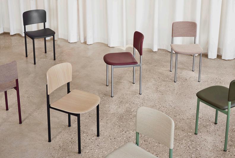
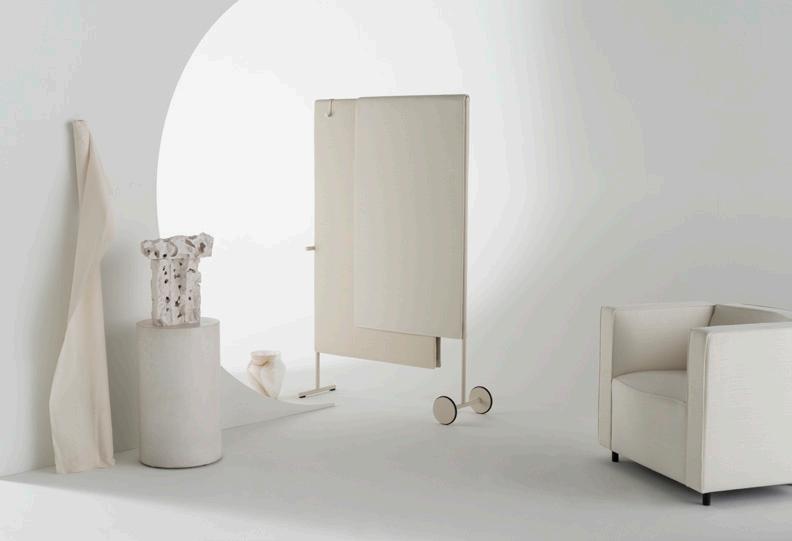
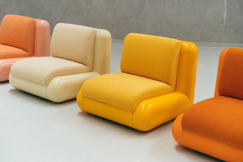
waste to wonDer
SpAred by voluMe creAtive showcased new furniture and lighting made from waste at Material Matters. The start-up has been busy during its first year, with commissions from virgin voyAgeS, doddS & Shute and a number of UK interior and architectural practices. For the bespoke and commissionable ‘Disc’ tabletops (pictured), pattern and colour are shown through unexpected waste materials; masonry, plastic bottle tops, plastic shampoo bottles, seafood shells and coffee grinds. volumecreative.co.uk
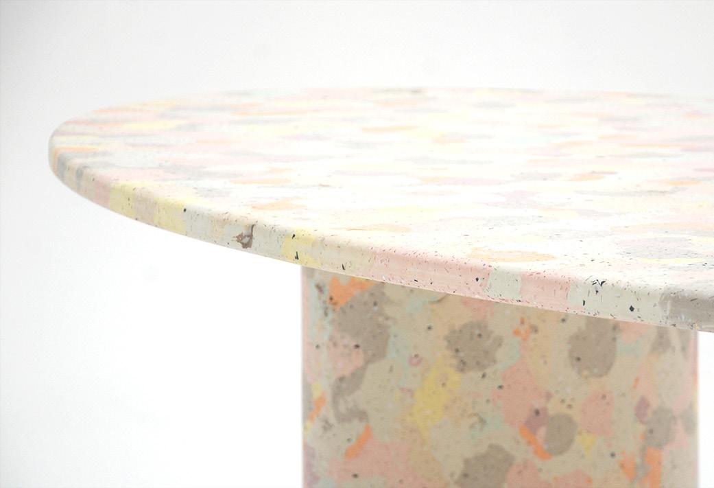
Visitors to the arper showroom had the
opportunity to discover the Italian brand’s latest collections designed by doShi levien, peter Kunz, Altherr Désile PArK, JeAn-MArie
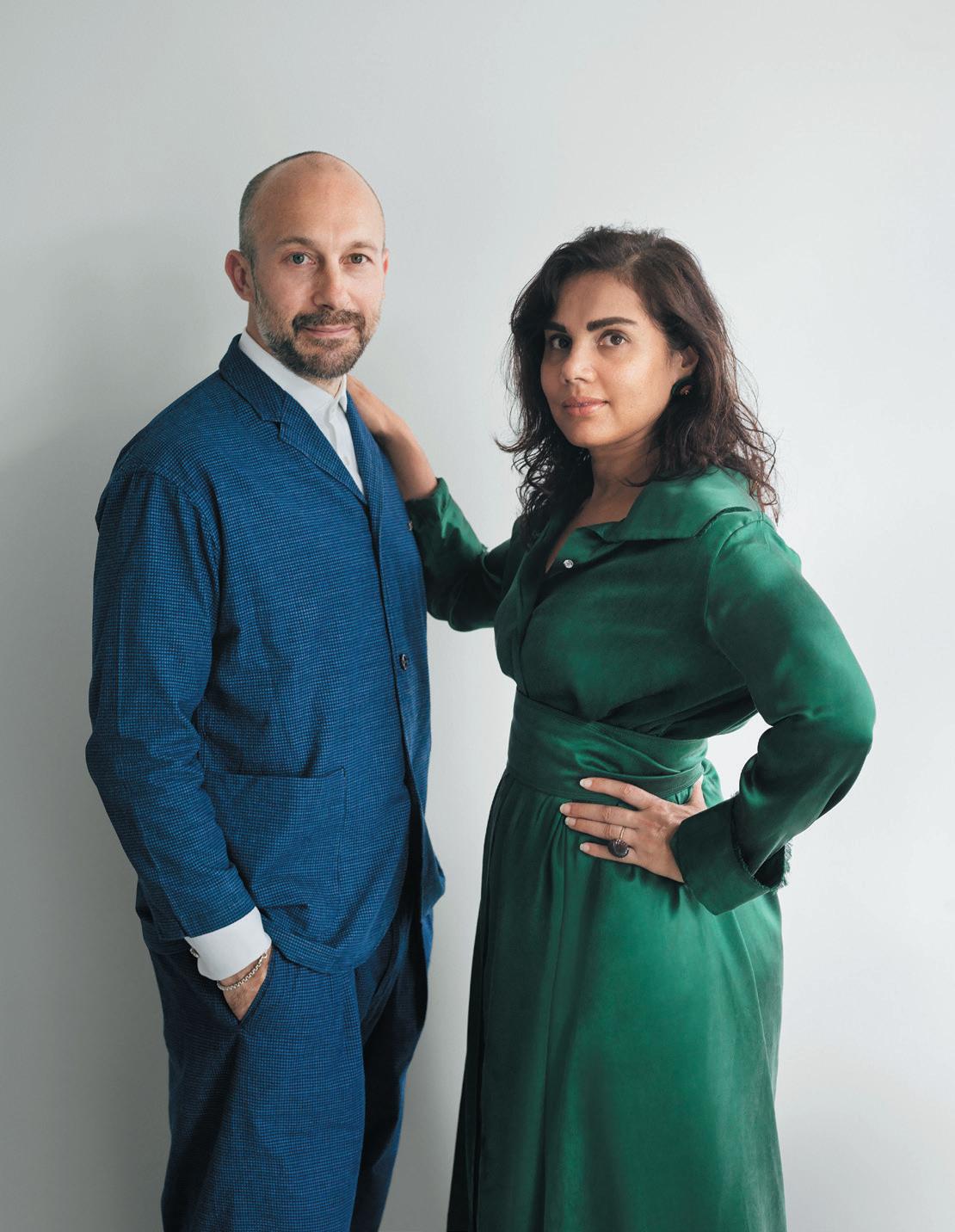
MASSAud and jAMeS irvine
Designed by Doshi Levien, Shaal expands Arper’s sofa offering, marrying comfort and flexible modular configuration. Shaal brings together the heightened comfort of residential furnishings with the adaptability of modular construction, comprising six core modules which can be combined to create angular or linear 2 or 3-seater configurations. We sat down with one half of Doshi Levien, Jonathan Levien, to find out more.
how DID your collaBoratIon wIth arper BegIn?
Nipa (Doshi) and I were invited as Guest of Honour for the Stockholm Furniture Fair in 2020. Our initial contact with Arper came through this, and what followed shortly after was a very detailed brief from the company to create a sofa that bridges the worlds of residential and work spaces and that has a sustainable approach to production and material use.
can you explaIn the InItIal InspIratIon for thIs proDuct? There is a transition taking place in our expectations of the workplace, and this has been accelerated with the pandemic. The transition is towards work environments that offer a diverse range of collaborative spaces and the influence of domestic warmth; people have become used to and enjoyed working in the comfort of their homes. As a design studio that relishes any opportunity to explore the fusion of different worlds, this project brief was really inspiring.
how Do you envIsage shaal fIttIng Into the commercIal furnIture lanDscape? Shaal has a layered personality that allows it to fit into residential and workspaces. The precise and defined exterior wrap-around surface makes a smart, elegant and formal impression. This is important because in large open areas the sofa is viewed from all around and it needs to define space through multiple layouts. So, the wraparound panel links the sofa to the architecture, while the soft interior upholstery offers uncompromising comfort. For us it’s all about the beauty of this contrast. arper.com
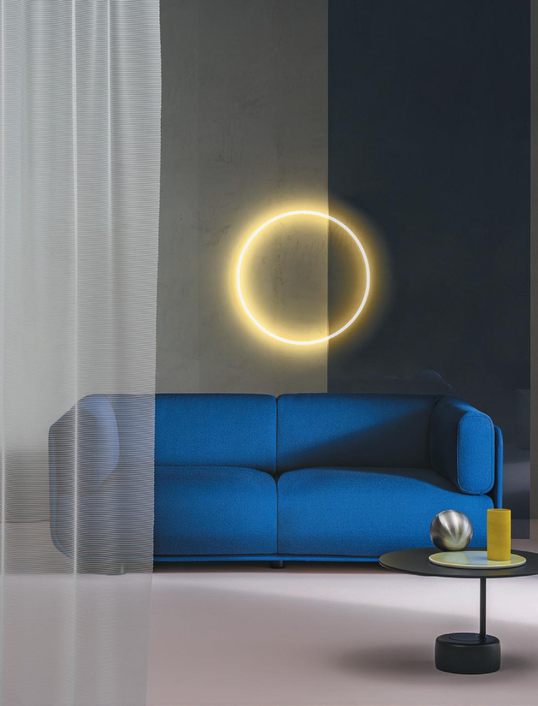
After four long years, workplace furniture fair orgatec will make its return to Cologne on 2529th October, with 20,000 sq m of exhibition space and the theme ‘New Visions of Work’ focusing on hybrid and flexible workspaces and smart technology.
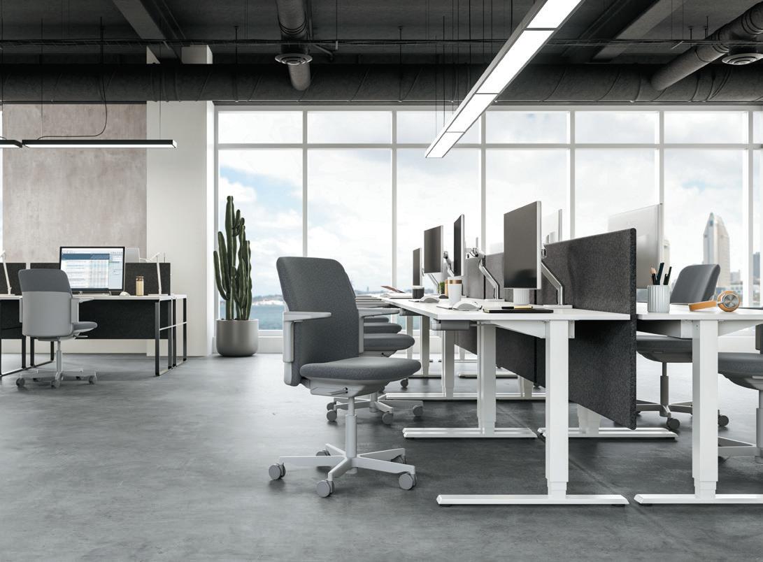
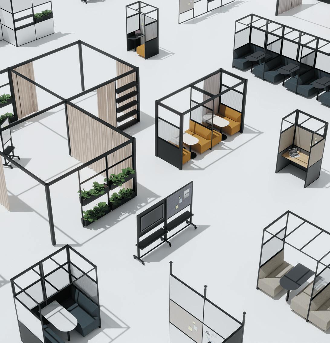
In Hall 8, a special ‘Inspired Hybrid Office’ event will explore what is now possible in terms of technology and workplace planning and hybrid workplace concepts, and will feature a series of dynamic floor plans and demonstrations. Sustainability and the circular economy will also play an integral role in this year’s fair, with the Materials4Future exhibition featuring various solutions to reducing the carbon footprint of office and contract products.
Humanscale will present a range of product launches that expand its seating and sit/stand solutions, with a strong focus on sustainability and wellbeing. Designed by Todd Barcher and Humanscale, the manufacturer will introduce Path, the world’s most sustainable task chair. Composed of nearly ten kilograms of recycled materials, including fishing nets, used plastic bottles and post-industrial materials, Path is the third in a series of ‘Ocean’ chairs and is the latest product addition to Humanscale’s commitment to making a net positive impact on the Earth.
Elsewhere, Icons of Denmark will team up with Copenhagen designers Studio David Thulstrop for a stand concept using the reconfigurable 4T System. “By using the 4T System as a basis, repeating it, and interpreting it in a different context, we aim to create a surprisingly intimate space at Orgatec which evokes a sense of curiosity and exploration,” comments Thulstrop.
Camira will be exploring the ways in which we can fashion a more sustainable future through textiles made from natural resources and recycled material - with its Hall 6 stand set to be filled with new fabrics, new colour palettes and exciting product previews.
Mix will be out in force at this year’s fair - get in touch to arrange a coffee and chat with the team.
The second annual Clerkenwell OPEN took place 7-8 September 2022 – a series of seminars and workshops across EC1 organised by Women in Office Design (WOD) and British Contract Furnishing Association (BCFA).

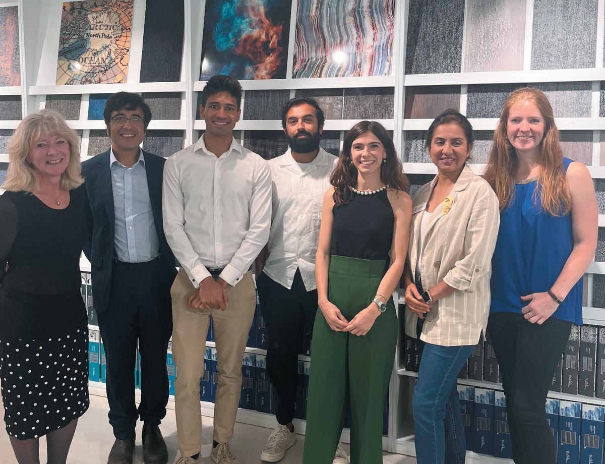
The event began with a seminar hosted at Milliken’s Clerkenwell showroom, ‘Embracing Decarbonisation in the Workplace Sector.’ Members of the Sustainable Design Collective – an initiative by WOD, shared findings from their meetings and discussions on this topic and, approaching a year since COP26, asked the question: does the industry really have an appetite for change?
Guests including Deepak Parmar (MCM) Asif Din (Perkins&Will) Verel Rodrigues (Element Four) and Ana Rita Martins (Woodalls Design) joined the discussion, highlighting the importance of technology to allow people to make quick decisions and act. On the hotly debated topic of certifications and building standards, tp bennett’s Lucy Bagshaw commented, “Certifications are helpful, useful guides and tools. We just need the right brief and budget to execute it. It’s far better to be committed to change and go on a journey, than cover it up with greenwash.” clerkenwell-open.co.uk
panel as pIctureD from left to rIght:
Joanna Knight (WOD),
Asif Din (perkinS&Will),
Verel Rodrigues (eleMent four),
Deepak Parmar (MCM), Ana Rita Martis (WoodAllS deSign), WOD founder Harsha Kotak, Lucy Bagshaw (tp bennett)
The dance between strange and familiar is intrinsic to the human condition. But how does this tension pan out in the current economic times?
It’s commonly held – and measurably true – that we find comfort in the familiar. We are attracted to what we know because we deem it safer, even when this is not the case. Familiarity informs who we marry, where we live, our preferred commutes and so on.
Many commercial interiors tap into this ‘home from home’ feeling, from coffee houses to co-working spaces, adding a sprinkle of aspiration to otherwise familiar designs. Retail, too, factors in ease and intuition when planning the store layout, as well as its look and feel.
However, it is also true that familiarity can breed boredom, if not contempt. Exposure to novelty makes us happy and is even linked to longevity. Brands and businesses often leverage this need, from concept stores and pop up restaurants to limited editions, refurbs and revamps. Success often lies in the balance, blending the yin and yang of strange and familiar. Offices rely on rotating artwork to stimulate but not overwhelm, and stores re-arrange their merchandise to entice shoppers down new routes, without alienating them.
So far, so familiar, perhaps. But what about now? How do strange and familiar manifest in turbulent times? As a difficult winter approaches, we are all reviewing and curbing our spending. This means switching not only energy providers, but also retailers, office spaces
and gyms, in search for cheaper options. Goodbye retail therapy, hello bargain hunting. When the price is low, our openness to the new is high. Remote workers may flock back to the office, and freelancers may rent co-working spaces, as they weigh commuting or membership costs against steep energy bills.
At the same time, when are faced with huge anxiety and uncertainty, we crave the warmth and fuzz of the familiar. Especially with regards to non-essential items, the tendency is to stick to the devil we know. We may go out less and pick safer bets, to spend wisely, and truly unwind.
Meanwhile, Gen Z is coming of age. This cohort will bring their own agenda of purpose, pragmatism and planet to the places they chose to spend time in. As they enter the workplace, they will seek employers who walk the walk. They will want offices that truly embody the company’s mission.
Their nostalgia culture will continue to shape many industries, with vintage shops and retro joints gaining ground. These concepts manage to be both strange and familiar: new to this young demographic yet doused in the bliss of yesteryears.
Circular commerce will hopefully graduate from strange to familiar. Selfridges certainly believes so, and has pledged to have 45% of its transactions come from circular products or services by 2030.
Now, that’s a Gen Z trend we can all get behind, be it familiar, or strange.
c h I ara is an anthropologist working in consumer insights and branding, and is part of h ologram , a design and research collective
I used to live in Dubai. As a fair skinned redhead who enjoys the outdoors, you may wonder how I survived the experience. And yet the challenge for me was less the climate and more the culture; not that it doesn’t have one (a naïve criticism often levelled at the city), but that it was buried under a layer of glossy international homogeneity. There was a prevailing attitude at that time that ‘good’ mostly meant foreign – or at least a specific type of big brand foreignness. All hail Starbucks, Groucho and the Armani Hotel.
Of course, depending on your tastes, there’s nothing wrong with these joints or their design, it’s just that they have nothing to do with the Emirates. Recent years have, thankfully, seen a greater embracing of local design culture and the development of a distinctive vernacular; one that is fundamentally regional in its accent.
This sprung to mind when, in past weeks, I was asked to helm a talk on Mexican design. Ostensibly it was about how terrific it is, but the subtext was really that Mexicans themselves are finally realising how terrific it is. What was once seen natively as a bit parochial and, dare I say naff, is being reframed as part of an important cultural legacy; design rooted in a sense of place, in artisanship and in narrative.
This complicated journey of embrace is one seen all over the world. My Portuguese partner once described the wares of Bordallo Pinheiro as items ‘someone’s
the gloBal perspectIve wIth harry mckInley
grandmother would have had’. Not because they’re kitsch (they are) but because for locals they, and other classic pieces of Portuguese design, became associated with a provincial caricature of the nation – from a time of insular dictatorship, not the modern, outward looking place it has become. These totems of the past – of overt localness – were, in interior design, something to be embarrassed by, not creatively celebrated.
All that has changed. Today Bordallo Pinheiro is hot property, lettuce bowls and melon jugs objects of deep desire. There isn’t a design hotel in Lisbon or Porto that isn’t filled to the brim with the stuff. A Vida Portuguesa, the group of lifestyle stores found throughout Portugal, has made a killing selling cabbage plates and cat pitchers to hipsters – along with ‘retro’ items like Couto toothpaste and ornately packaged bars of Claus Porto soap.
So where am I going with this convoluted jaunt from the Middle East to Western Europe, via Latin America? Well, simply to point out that the most compelling global perspective on design isn’t very global at all – and that’s a wonderful thing. Because as architects, interior designers, developers and operators you often forget the power you yield. In choosing to ‘design local’ you’re not only telling important stories, you’re helping cultures flourish; ripening pride in communities for what is uniquely theirs; and helping societies to view their own design traditions through new lenses. After all, though Starbucks is fine, a souk is far more inspiring.
As the risk of recession deepens, developers and landlords are re-thinking their spending priorities. What design solutions are getting cut, and what getting green-lit, as the mathematics get tighter?
WordS: DavID thame
Do we have to spend this money now? The odds are somebody has asked you this question in the last few weeks, or will ask it in the weeks ahead. And it’s a good question, for developers and landlords, and for their design teams. If you can cut back – and in the process preserve capital or reduce debt – that’s probably the sensible thing to do. After all, what’s not to like about reducing your risks?
The risks in question are all too clear. UK economic growth is stalling – or has stalled – and inflation is rocketing. By spring 2023 it could be 18% or 22% or almost any number you like, depending which analyst you prefer to believe. Where it won’t be is lower than it is today – 9.9% in August, we won’t learn the September figures until later in the winter.
In a sense the inflation figure doesn’t matter because the pain is already apparent in some sectors of the property market. There are acres of empty floorspace in London,
perhaps more than 31 million sq ft according to recent research by CoStar, an upward trend confirmed by some of the larger brokerages. Of this total an alarming 20 million sq ft has become vacant since December 2019.
Before the pandemic the obvious solution for many landlords would have been to order a refurbishment. But with the working-from-home culture still dominant, and the upfront costs high, many are asking that question: do we have to spend this money now?
Unfortunately answering the question is not easy, as Spacemade co-founder Dan Silverman explains. Spacemade is at the sharp-end of the dilemma landlords face. The business acts as an operational partner for landlords looking to provide a bespoke flexible workspace directly to their customers. For landlords with a dilemma, inserting some good, modern flexible workspace can be an attractive, cost-effective option.
“We see both sides of this market. We listen to the
landlords and the end-users of the flexible office space and neither want to risk capital spending at the moment. Yet at the same time both realise they probably have to if they want to get people back to the office,” Silverman says.
“For landlords this is the perfect storm. There are more empty offices than ever before, and offices need to be better than ever before, plus they can see a cliff edge coming – which is the cost of doing this. Because it’s a very expensive time to own an office building. The big pension and life funds can afford to ride this out, and the low-leveraged private landlords can do it too. But for everyone else, well, they probably never thought they would be confronted with an empty building to refurbish and possibly they aren’t in a financial position to do it.”
The landlords Silverman speaks to are weighing up the cost of up-front fit-outs to attract new occupiers versus the risk that even with an upfront fit-out they don’t appeal to any (or many) tenants. Sharing the risk with a flex space operator is one solution, but even that doesn’t cut it for everyone.
The difficulty is that a corner-cutting office fit out isn’t –in the current market – a wise idea. “So, if you were fitting out a build-to-rent apartment block you could probably do it at lower cost, because in that sector you will still find tenants at a price-point that works for you. But in the London office market, if you don’t get it right there may be nobody out there for you,” Silverman explains.
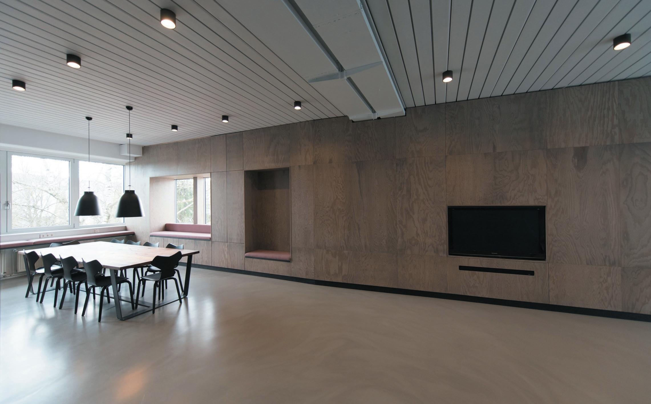
“And yes, we do find people question things like the quality of the soft furnishings – they do not want to pay any price – and yes you don’t need the highest quality designer fittings everywhere. But a substandard job could mean an empty building.”
The contrast with the build-to-rent market is instructive, as a few moments in the company of Russell Pedley shows. Pedley is co-founder and director of Assael Architecture, the practice currently helping to design John Lewis Partnership’s BTR offering. He has a decade’s experience in designing UK rented accommodation – and what he sees now is an interesting change. He sees an increase in tension between the short-term needs of a building and the demands of long-term value and sustainability.
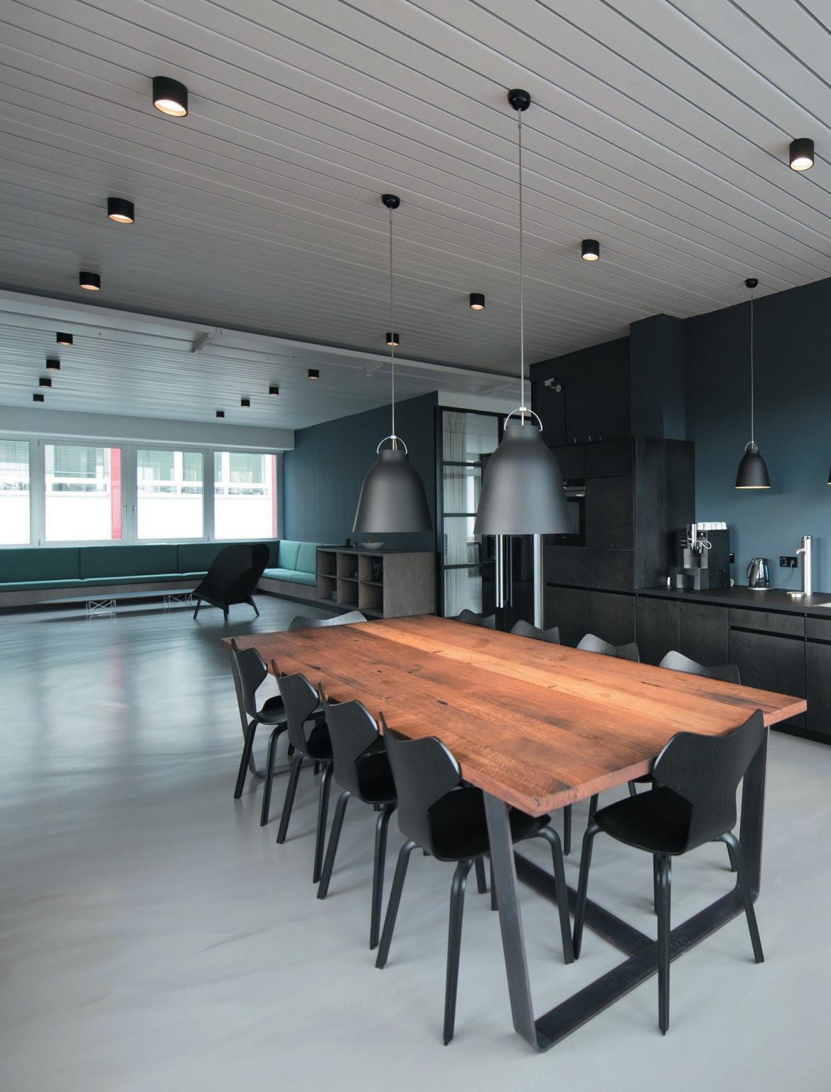
“There are some obvious issues about inflation today. But BTR investors are looking at a 40-50 year hold for their investment. They have to think longer term and make sure their design will be resilient,” Pedley says.
Northwood Investors, the $19 billion U.S. business now growing its UK BTR portfolio, is one of Pedley’s clients. He says that in specifying developments in Cardiff, Glasgow, Edinburgh and Bracknell, they need to see a 5-8 year life on amenities that get day-to-day use and four or more decades of life in the structure itself. When asking ‘do we need to spend this money now?’ the answer depends which category – long or short-term –the money falls into.
“The fixtures and fittings get a severe hammering, and they will need a refit or a tweak in five or so years, and developers and investors know they have to do this to keep up their game and appeal to residents,” Pedley says. That said, Pedley agrees that investors are more willing to compromise on cost for something that will end up in a skip in five years’ time than they are on the fundamentals of a scheme that has to endure. Also note, Northwood is targeting the mid-market – so the budget is geared accordingly.
The outcome is a fairly open mind on spending for the long-term and that in turn has an impact on short-term decisions. Pedley gives an example: “Investors don’t want their portfolio to degrade in value. They want them to be around for 40 years generating a predictable income and they need to know how much it is going to cost to run that building for forty years. So the kind of thing they will not do is reduce the number of lift cores to cut costs today.”
“However, there are always pressures on budgets and so take an issue like amenity space. We had the option to create a party room or cinema room and we ended up with a multipurpose room, but with a furniture store next to it so you could move all the fixtures out if you wanted to, to open up the space.”
On the face of it this is an expensive move for landlords –another room reduces net lettable residential floorspace and that is not something they want to encourage. Yet in this context it represented a cost-conscious solution. Pedley explains: “Having the furniture store meant that room could be totally flexible – for parties or a film night or whatever, and you didn’t need to go to town with a big expensive fit-out before you knew how people wanted to use that space. So we launched the scheme with that space as a sports or gaming room, with a table tennis table, but knew we could push that out into the store if it didn’t work. At this stage all we needed to do was provide a basic low-cost room.”
For many designers in the last five or six years ‘value engineering’ has been a vaguely dirty pair of words, suggesting ruthless corner-cutting and flimsy heretoday-gone-tomorrow values. But Pedley says it has been reborn with a new emphasis on the ‘value’ rather than the ‘engineering’.
“Value engineering isn’t so much about money as about sustainability. Can you optimise this building? That’s the question. It is not just about cost-cutting but about doing things that ensure the long-term value of the building,” he says.
None of which is to claim that some investors, landlords and developers are asking, “do we have to spend this money now?” and answering the question themselves with a hard-edged “no.”
“Budgets are getting squeezed,” says Silverman, and Pedley agrees.
But a bonfire of good design is not likely. Investors have long-term interests which go beyond the ups and downs of today’s inflation rate. If the question “do we have to spend this money now?” gets asked, the answer “yes we do” will not surprise them.”
BD g arch I tecture + D es I gn is an award-winning team of architects, designers and creative thinkers, working globally with clients including Tate & Lyle, Dojo, WPP and Sony. Here, senior associate o l I w I a s tewart offers up four go-to materials.
01 BuxkIn
The list of favourite materials is long, but it’s hard to find a more sophisticated looking product than recycled leather. Buxkin comes in ribbed sheets that are made from reconstituted offcuts from the Italian shoe industry. It looks great, has unique textures and colours, plus it’s environmentally friendly. buxkin.com
03 organoID
These guys take any natural raw materials (typically organic and regionally produced) and press them into tiles which has a diverse application possibility. Apart from a beautiful natural feel and colours it also keeps its fragrance – wow! organoids.com

Plasticiet is a Netherlands based company that produces 100% recycled solid surface panels. My favourite is ‘Chocolate Factory’ – scratch resistant, colourful and made from old chocolate factory moulds. plasticiet.com

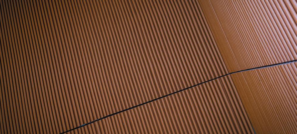
This is more of an ‘invisible’ material. It replaces timber or aluminium support in substructure of a wall: it’s a sustainable, lightweight stud made of a wood fibre that is chemically and mechanically reduced to pulp. woodtube.se
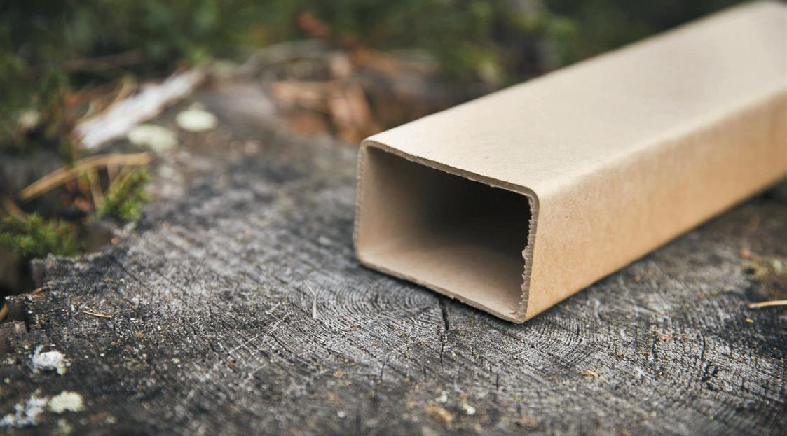
s tu DI o g D B is g I lles D e B rock and J aap g I esen , two ex-graphic designers on a mission to push boundaries in production techniques to create custom glazed ceramic tiles.
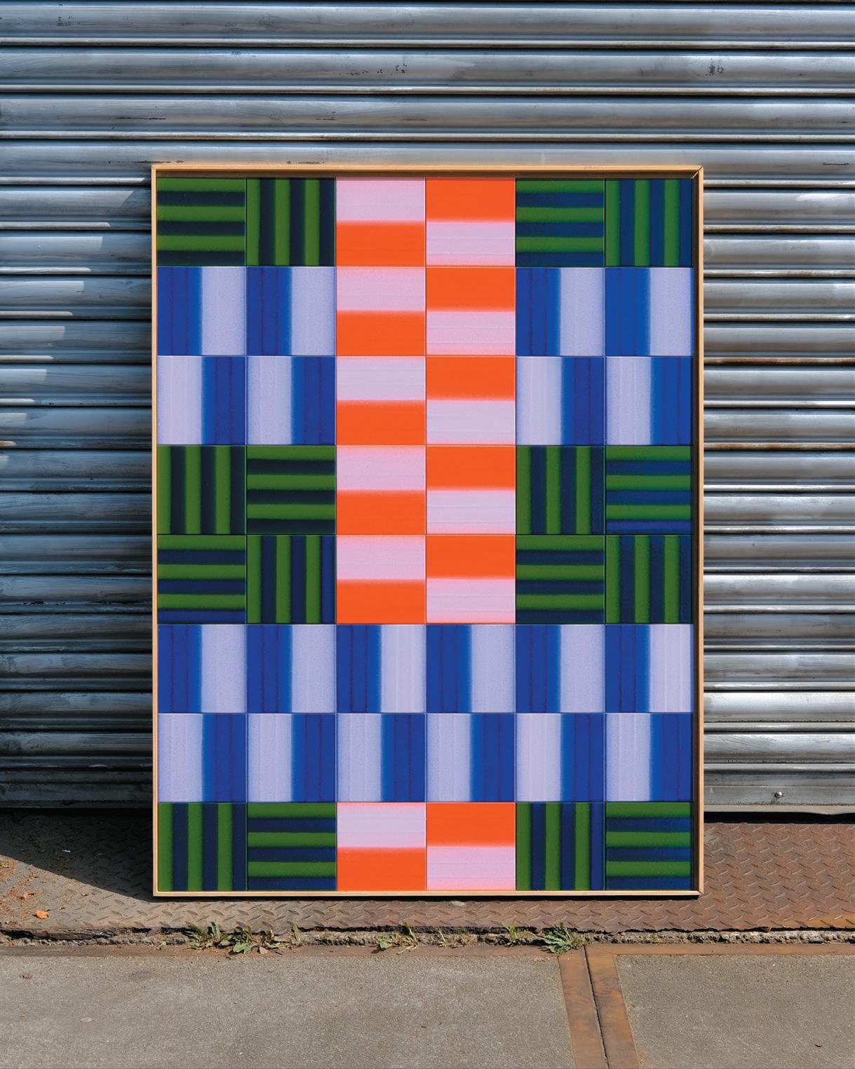
After three years of experimentation, de Brock and Giesen created a purpose-built printer that allows for the controlled application of liquid glaze directly onto ceramic tiles, using unique software that translates psychedelic patterns to instructions that the machine can follow. With clients across retail, hospitality and beyond, we catch up with the duo to find out about their journey from graphic design to a Netherlands tile factory.
Both of us were graphic designers that had slowly grown tired of the profession until we discovered we both loved tiles and decided it was time to start a ceramic tile factory. We were convinced we could add something to the world of ceramic tiles. Knowing nothing about how to make them whatsoever, our gamble paid off because knowing nothing meant that we reinvented the process for ourselves and created something that didn't exist before.
can you explaIn the proDuctIon process BehInD your tIles?
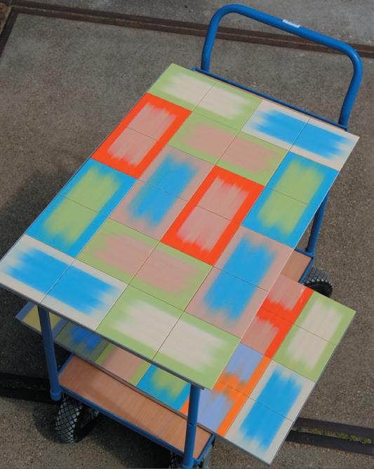
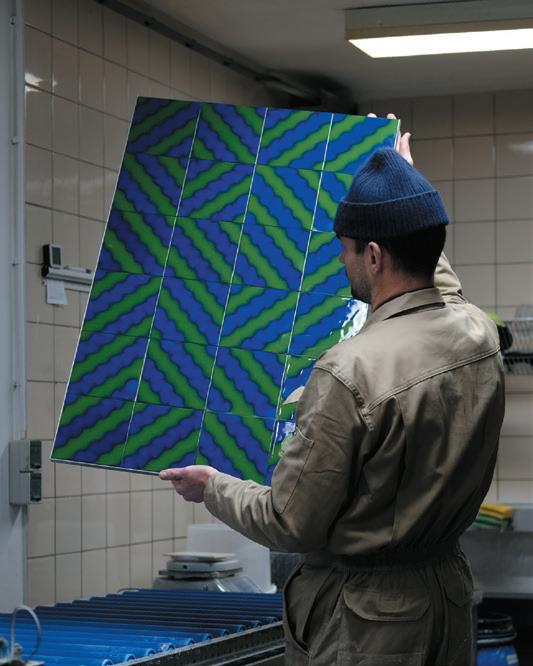
When we started, we only knew two things: the effects we wanted could not be made with conventional techniques that we could find, and we knew we wanted to produce on a large scale. The first meant we could essentially only hand glaze our tiles, but we quickly found we had more interest in building a machine to replace our hands than learning how to use them. The second meant that we needed to be efficient, and even though that came from a passion to make what we wanted to make, it essentially meant we became affordable.
A shared dream to tile a metro station and a hotel lobby is what fuelled the building of our little factory. First, we’re focusing on perfecting our current production method. After that, we’ll build other production methods that will allow us to produce a more varied product line and have the joy of reinventing the wheel all over again and again. studiogdb.biz
In the new world of hybrid working, and even in those companies that mandate a minimum attendance, going into the office is a much bigger deal than it used to be.
You’ll get up earlier and probably dress up a bit more than usual. You’ll pack your bag for the day, remembering chargers and cables. Then you’ll go and join the “Big Commute”, no doubt forking out a significant sum of money for the privilege. If you are lucky, you may get a day when its quiet and, a journey that you would normally have to stand for, can be seated.
The point I am making is that it has become much more of an event to go to the office. So, if when you get there the coffee machine is broken, then it’s a much bigger issue than it used to be.
“I have come all the way into the office, and I can’t even get a coffee!”, they will cry.
Look at it this way, when we used to go to the office every day, we would spend around 40 hours per week onsite, so if the coffee machine failed once for 30 mins it would not be such a big deal. If, on the other hand, you went in only once per week and that was the day the coffee machine failed, well now it’s a big deal. It is important to remember that every day of the week is somebody’s ‘one day in the office’, and so the demands
on a service delivery team have suddenly become much higher. Everything must work all the time or it becomes the low point in somebody’s week.
The flexibility the workforce now enjoys, has created an environment far less tolerant of service outages than ever before. Service delivery teams will need to move faster to fix issues and I foresee the need to have equipment backups in a way that has not been common in the past. I know I sound a little fixated on coffee machines, but they can be seen as a metaphor for almost any service that we use in the office. Everything is critical now: printers, video conferencing systems, desk monitors, laptops, cold water taps, Wi-Fi and, yes, coffee machines.
The other impact is on staffing. We may have reduced the size of the office and not be supporting a full complement every day, but that doesn’t mean we can reduce the headcount of our service teams. We will be working harder than ever to provide the service levels that every colleague expects.
We now realise that whilst there are savings to be made with reduced real estate footprints, these do not automatically translate across multiple service lines and some budgets may even need to increase. It is a little counter intuitive I agree, but as a workplace now is part of the competitive edge in recruitment, the coffee machine is more important than ever.
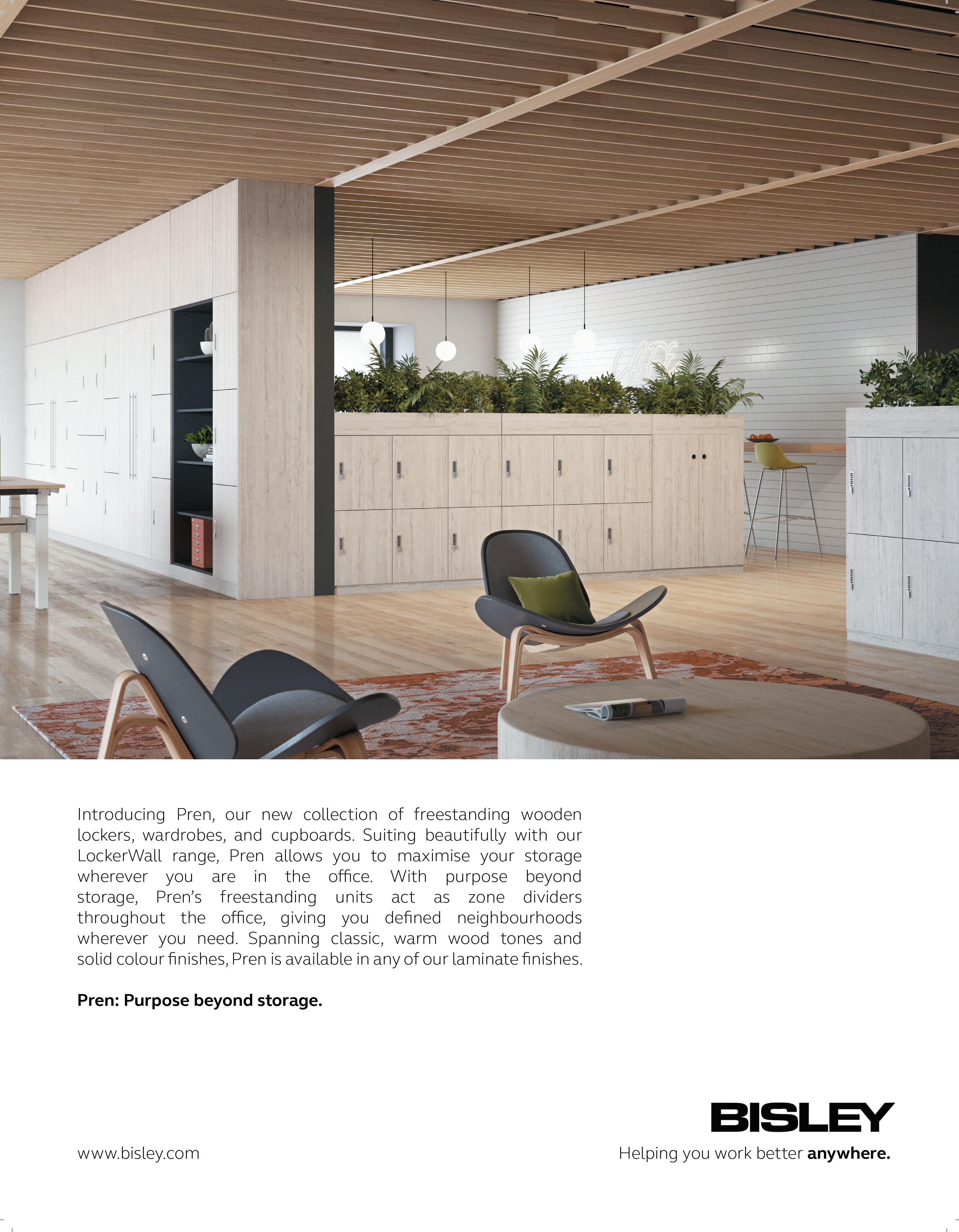

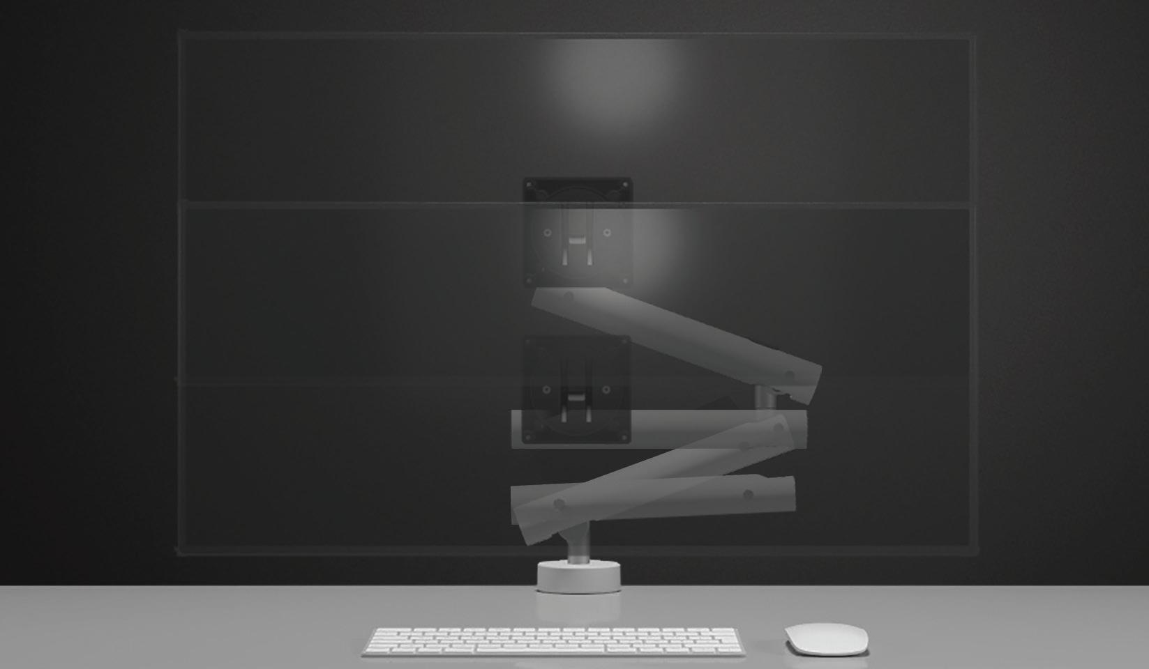
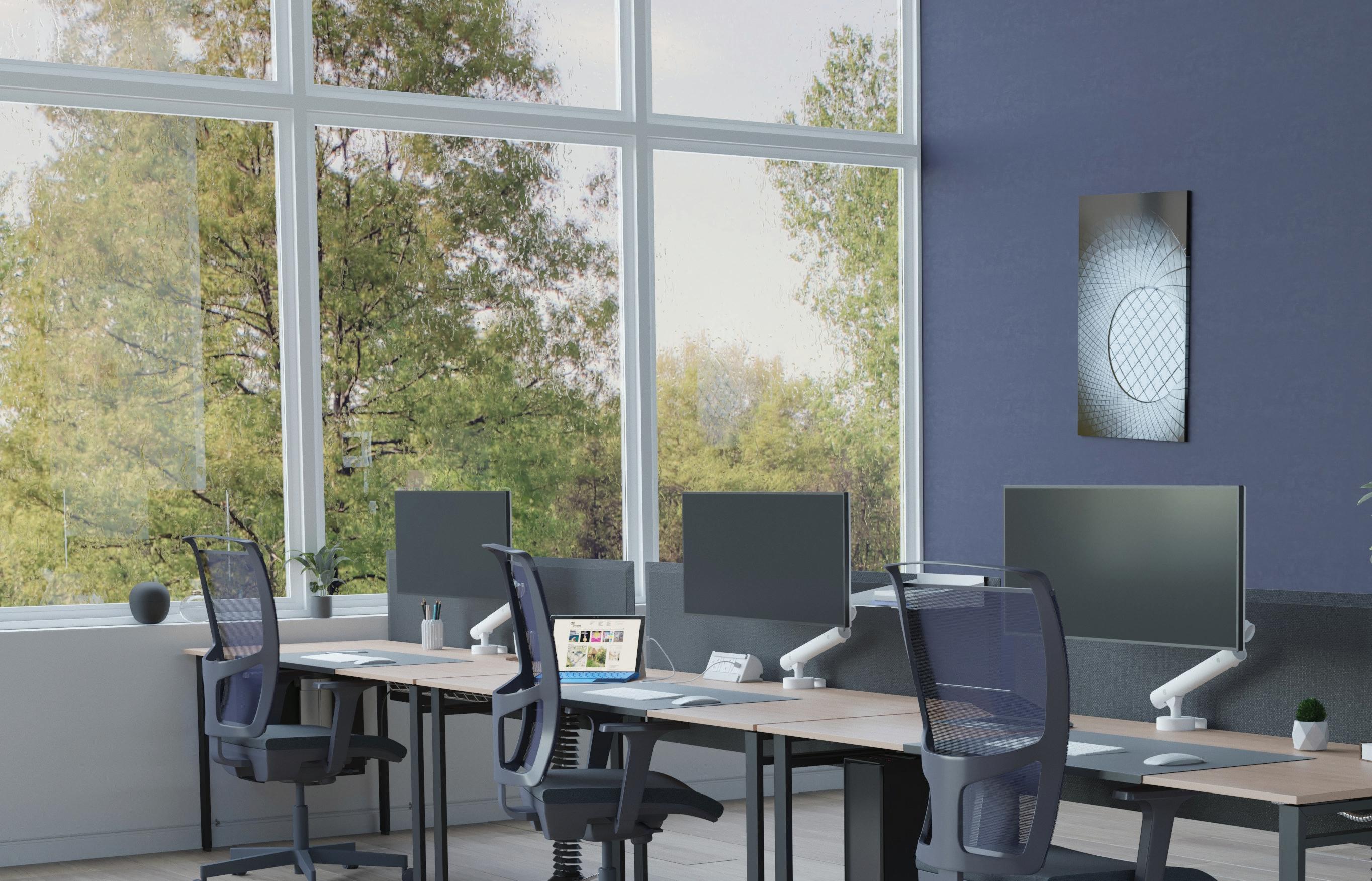
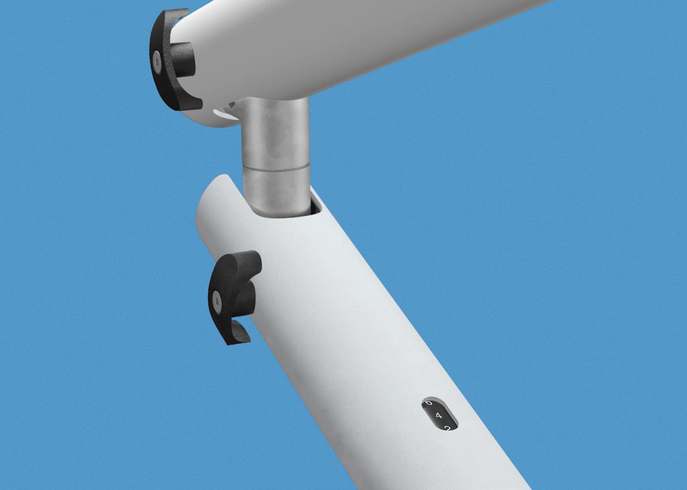
Uniquely designed and responsibly sourced, Miro monitor arm empowers you to interact with your technology seamlessly.