








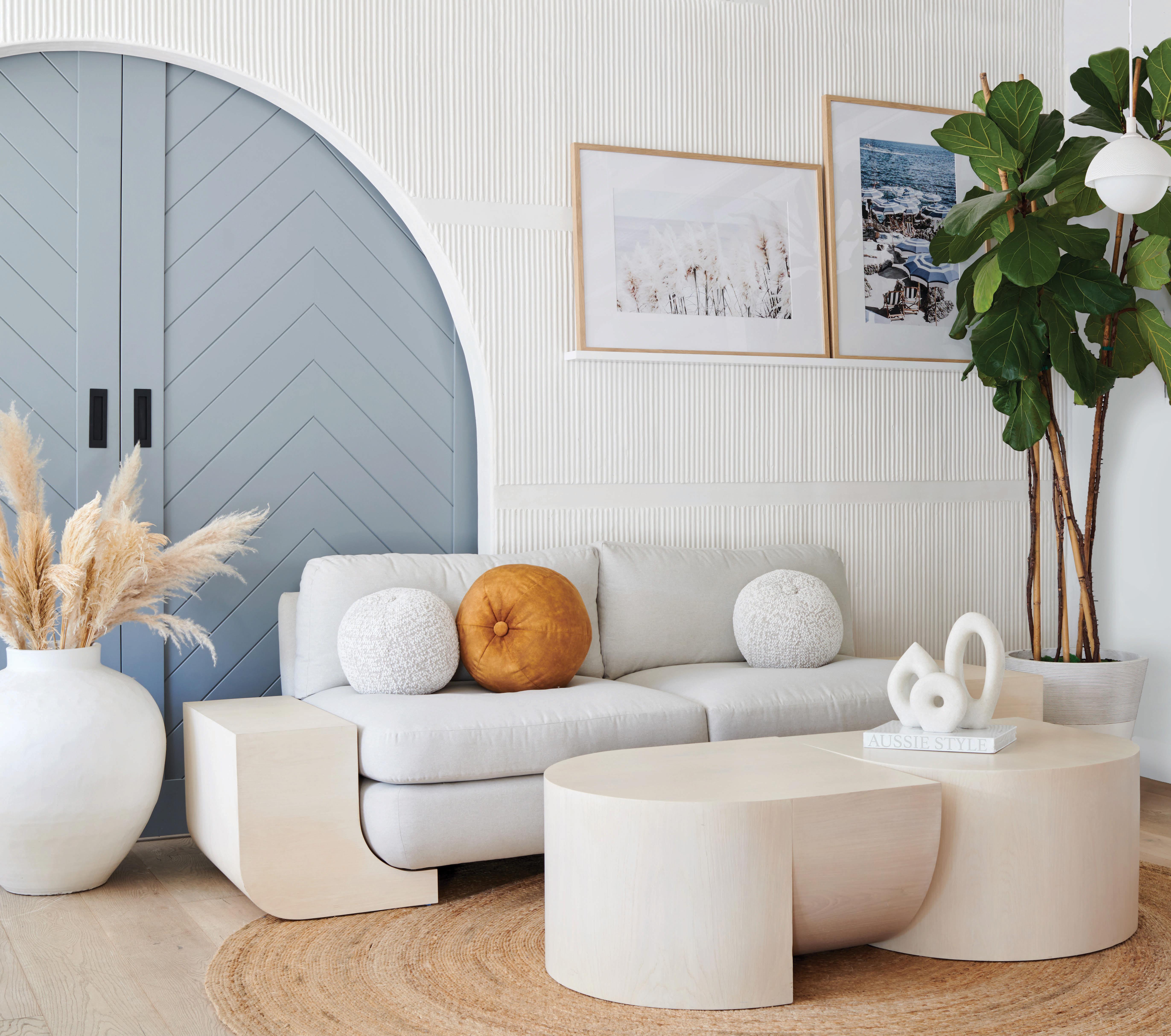

Bring everything you love about summer into your home - all year round! Introducing The Signature Collection from Noelle Isbell.

“Laid back Australian summers were the inspiration for my new collection,” says Isbell. “My love affair with Australia began when I married an Aussie and we began regularly making the trek down under. We can’t get enough of the clean, casual, relaxed designs and the breezy, fresh, open spaces. The playfulness of fringe-top umbrellas, the chic boutiques and the carefree days spent working less, playing more and loving the outdoors.”
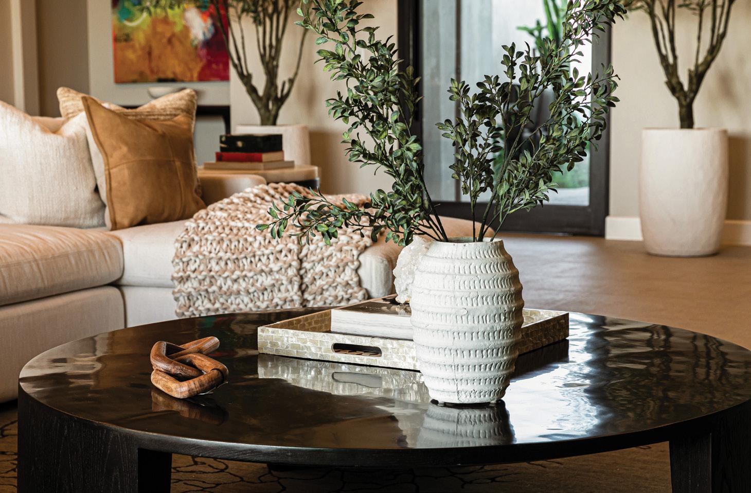
Uncontrived. Crisp. Simplistic. This new collection inspires a timeless oasis using custom, handcrafted artisan pieces designed in clean, modern forms with a fusion of natural elements. Whether you’re designing your new construction build or refreshing your home, these versatile pieces anchor any room and play well with your treasured collectibles.
Created with intention and handcrafted for durable functionality, this new collection reflects luxury that’s approachable, interchangeable and customizable.
Australian inspired and locally made. Eliminate the delays, but deliver on luxury. Items ship within weeks.
Focusing on the whole body, we offer specialized treatments to promote strong recovery and maintain optimal health.


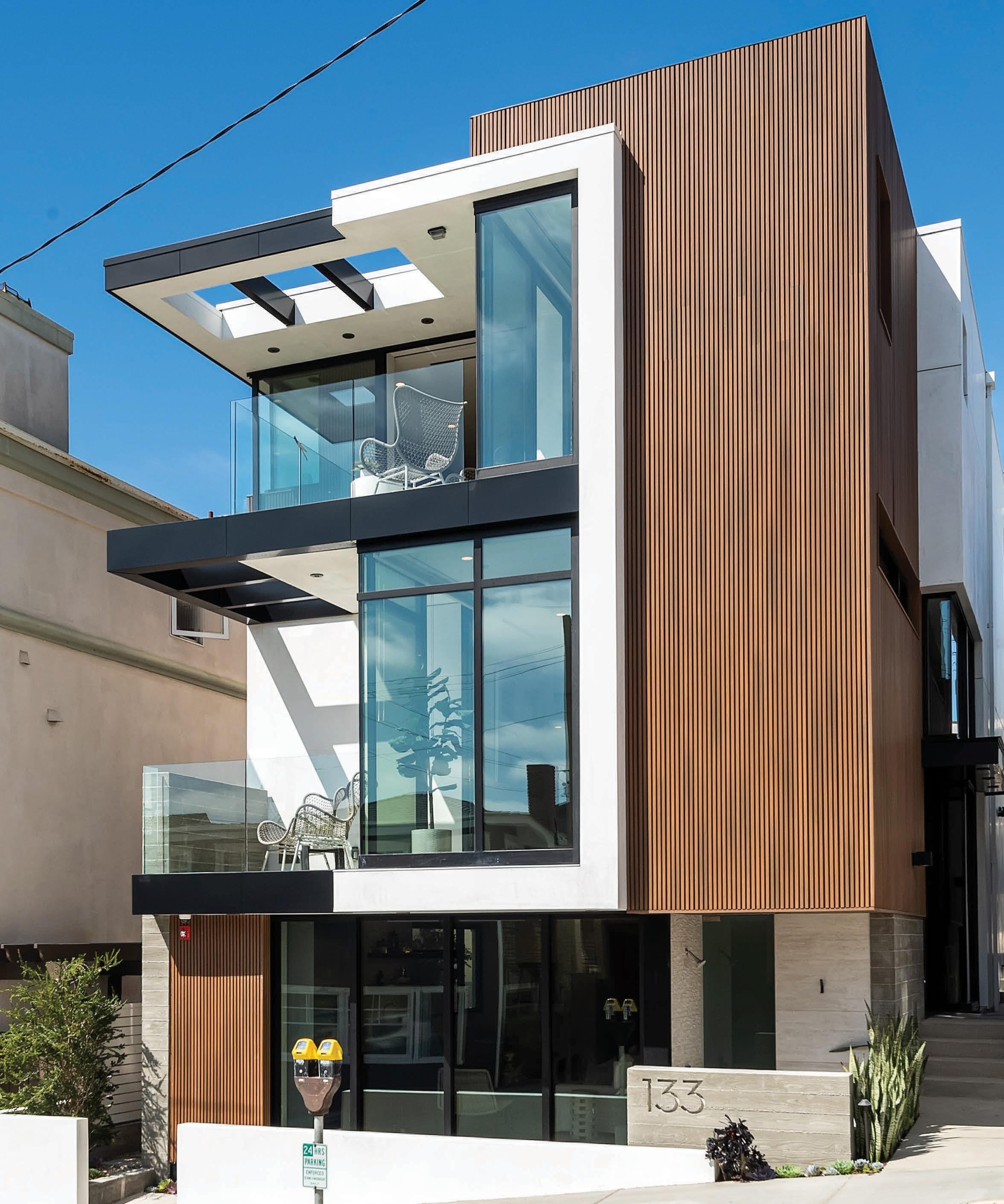
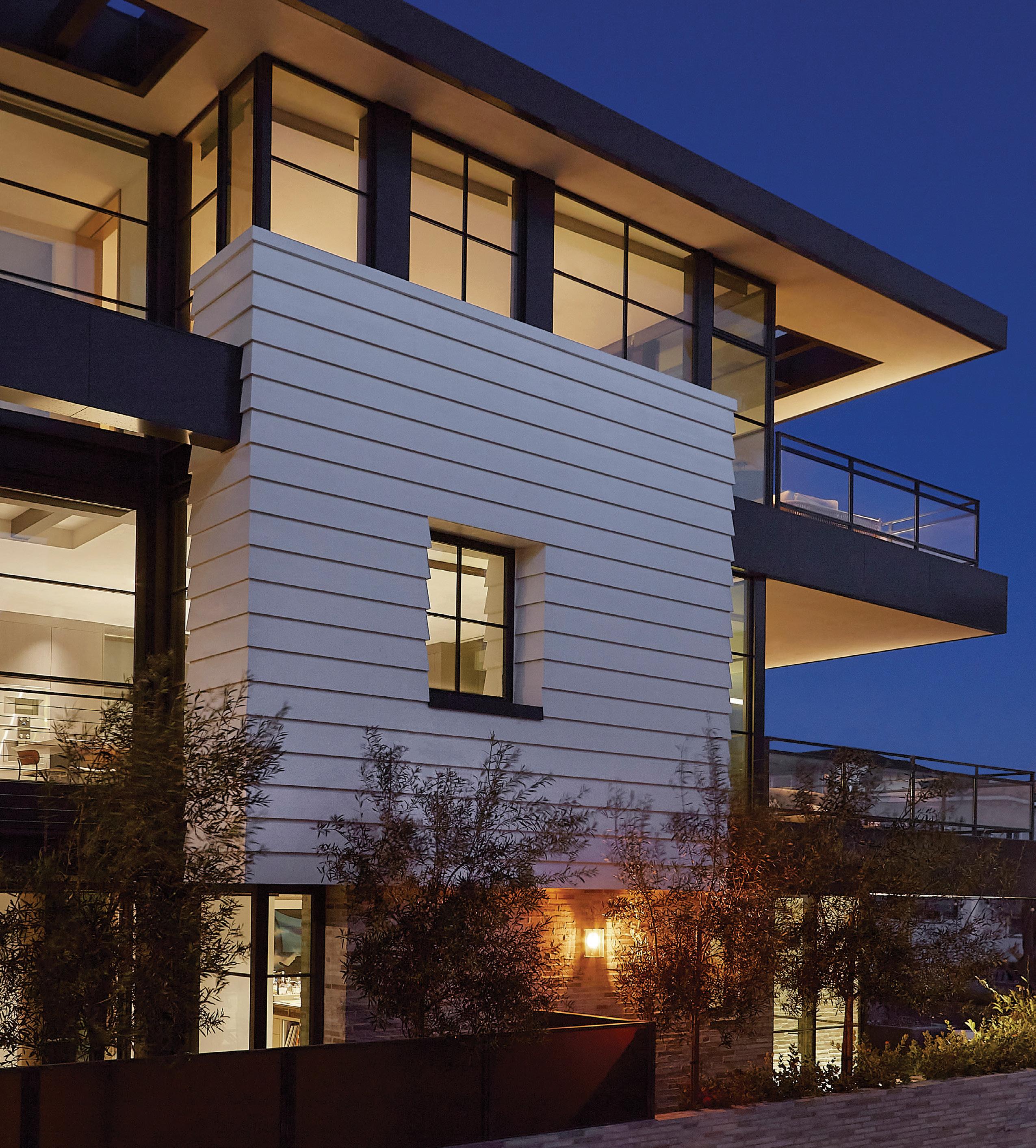
A modern, ocean-view abode, infused with the beachgoing sensibility of the beloved South Bay builder behind it, brings quintessential California indoor/outdoor appeal to the market.

Kim Komick’s final work was her most personal.
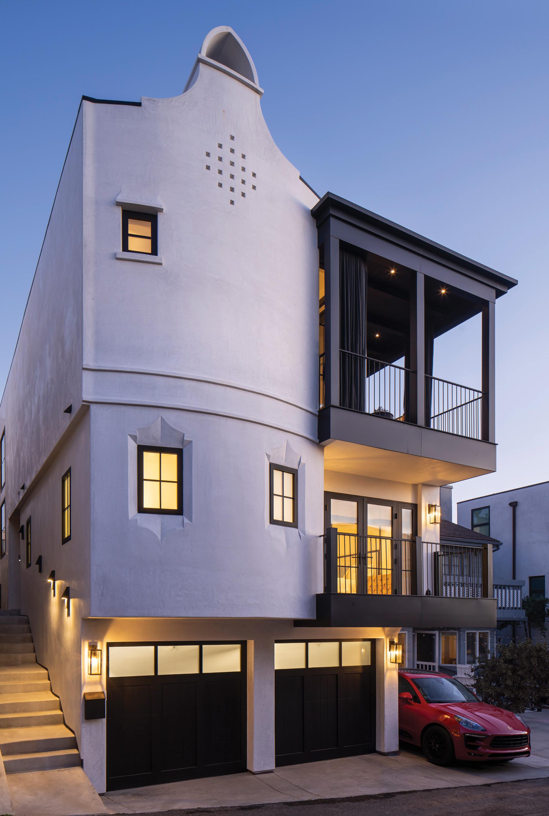
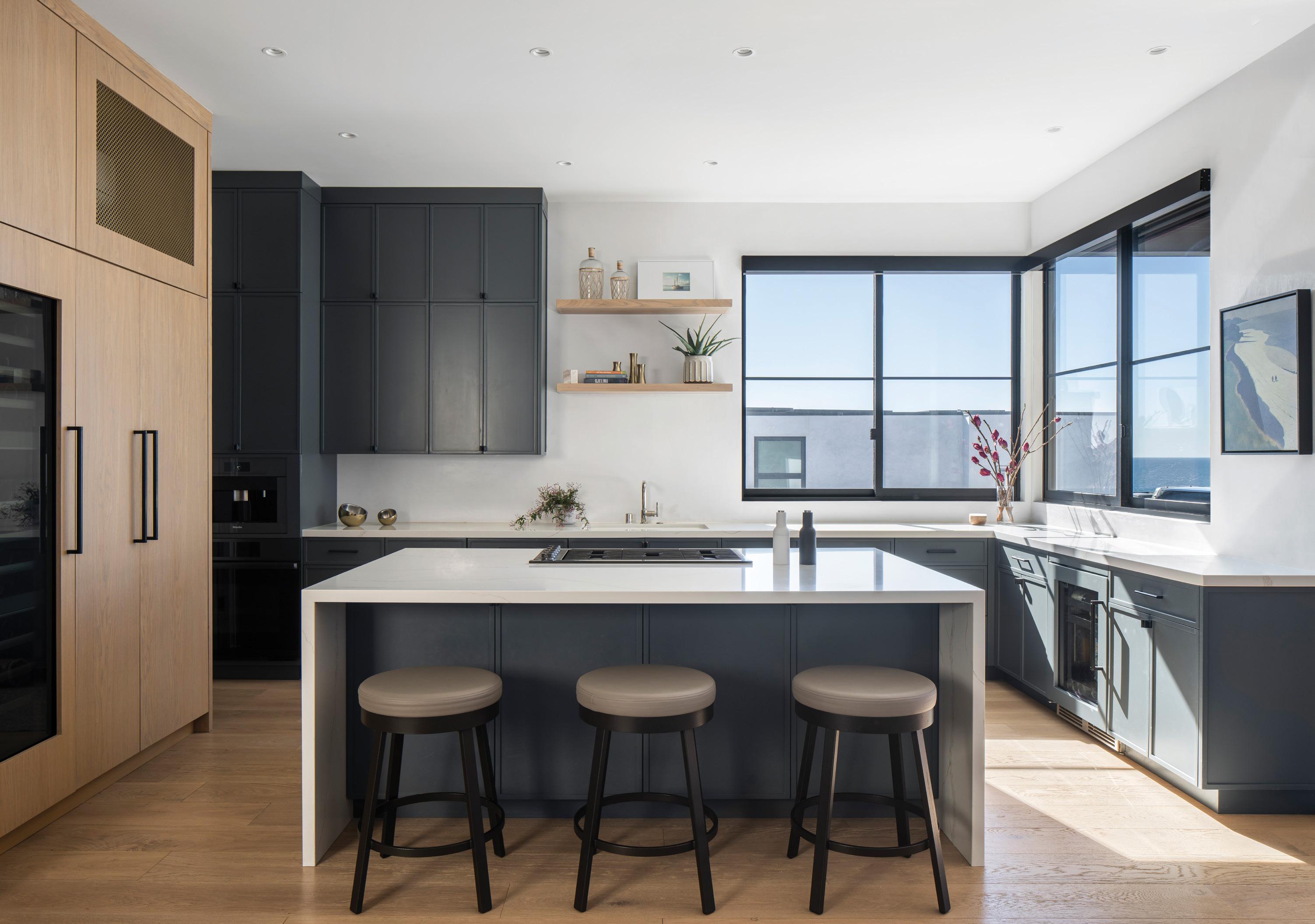
Although the founder of KKC Development sadly passed away last spring, Kim’s legacy is what remains - in the over 200 homes she designed and built in the South Bay, including this stunning three-story home she custom-designed for herself. Listed for $6.3 million by Jen Caskey of the Jen Caskey Group, this residence embodies both the distinct eye for detail she had as well as her focus on a laid-back, beach lifestyle. “Kim’s vision for the house was straightforward: to create an airy, open plan to serve as a gathering space for her friends and family while embracing the spirit of the beach and South Bay”, Pablo Escutia, the President of KKC Development states. A California Contemporary, with a warm palette and natural textures, 133 31 st Street in Hermosa Beach features panoramic views of the ocean, sand, and sky. The house makes a striking vertical statement and reflects Kim’s desire for a neutral palette and durability. “We chose materials carefully for their performance characteristics,” Pablo says. “It was important to Kim that the house be constructed of beautiful yet resilient materials that would stand the test of time in the coastal climate.” One enters the house and immediately gravitates to the second floor, where, along with a laundry room, you’ll find the ocean-view primary suite, complete with a kitchenette, a
bedroom with a full EMF shield (one of Kim’s less visible but impactful choices), and a private deck from which to lose yourself to the shifting views of the horizon. For added sanctuary, the primary bath offers all the indulgences of a spa, including a freestanding tub and tile shower with integrated steam system. Life at the top level of this house is truly sublime. At one end is the sunlit living area with a recessed projector mounted from the ceiling and corner sliding doors, which open to merge the space with the breezy west-facing deck, creating the quintessential California indoor/outdoor living arrangement. The fully customized showpiece kitchen boasts European style walnut cabinetry, Neolith porcelain countertops and professional- grade Fisher & Paykel appliances. The opposite end features a sunlit office with its own private deck. A three-stop elevator adds luxurious convenience, and a huge ground-floor beach room with Murphy bed and wet bar welcomes guests day or night. Thoughtful amenities including a security system, a flexible floor plan, two-car garage and a solar-ready structure are offered as well. “The house is a collection of Kim’s favorite ideas that she amassed over the span of her career and lifetime.”, states Pablo, ensuring Kim’s vision will live on in this striking home by the sea.
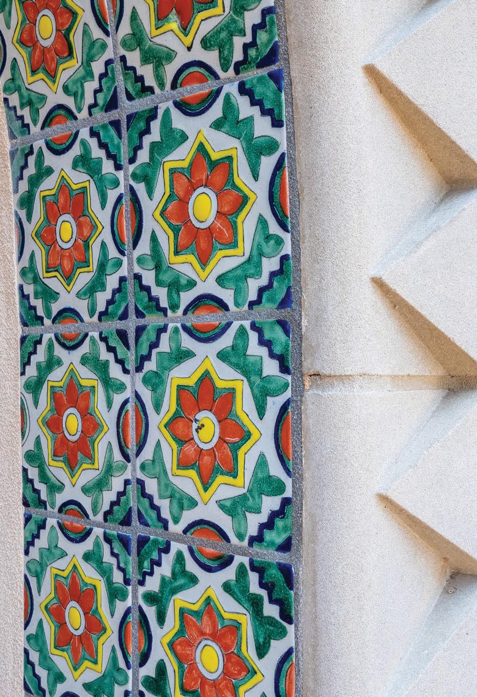
Come home to The Villas and Casitas at Terranea, an exclusive collection of whole-ownership vacation homes* on the Palos Verdes Peninsula.

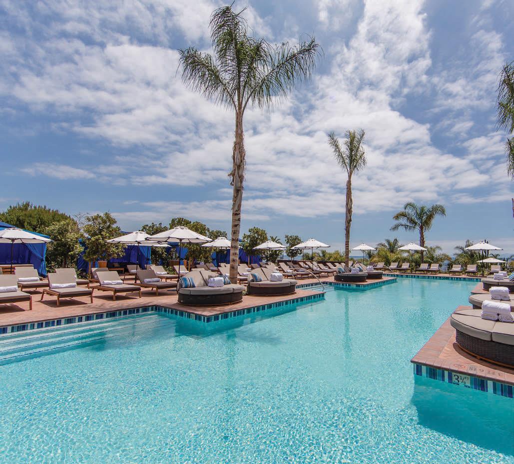
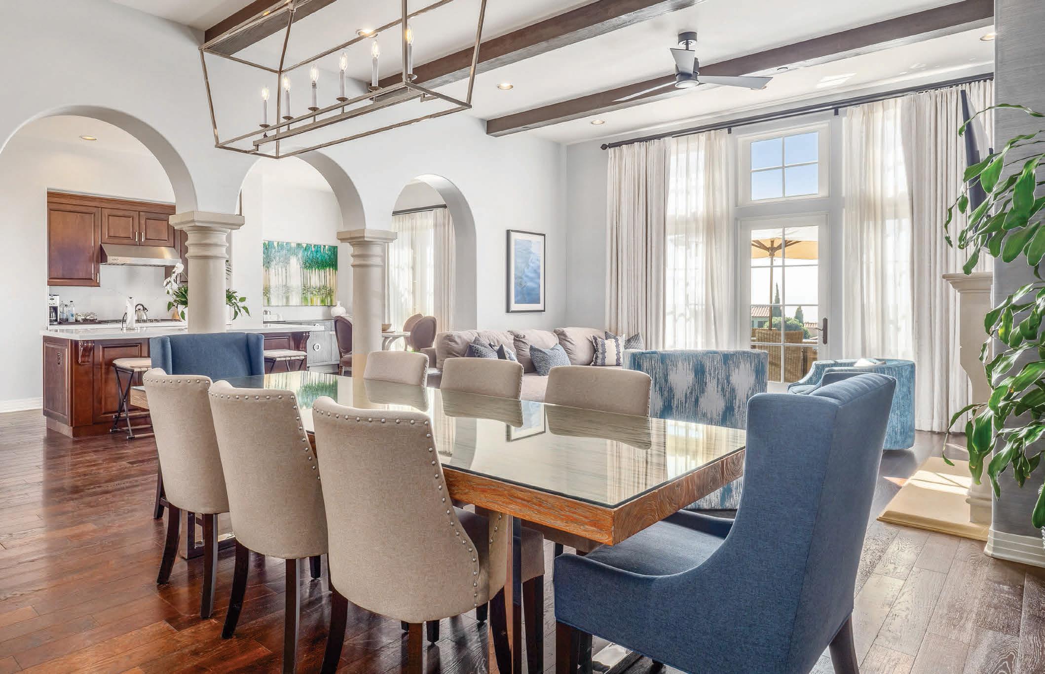
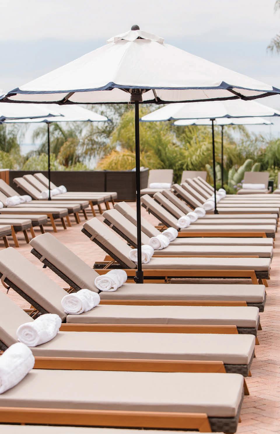
Discover an ocean-view coastal getaway that’s as carefree as a vacation should be. The Villas and Casitas at Terranea afford privileged access to the best of the award-winning resort — including its world-class dining venues, championship golf course, indulgent spa and serene pool environments — while ownership comes with VIP status, preferred pricing on dining, spa treatments, shopping and golf, a personal Owners Concierge and around-the-clock upkeep. Be among the fortunate few to call Terranea your very own seaside sanctuary, every season of the year.


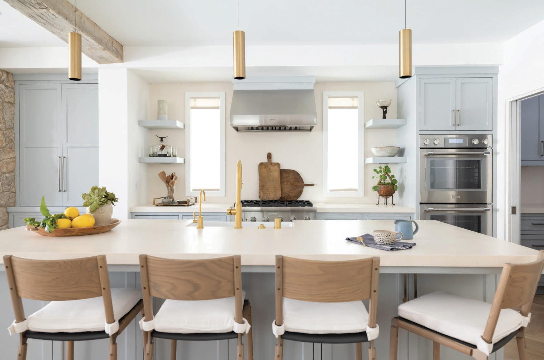
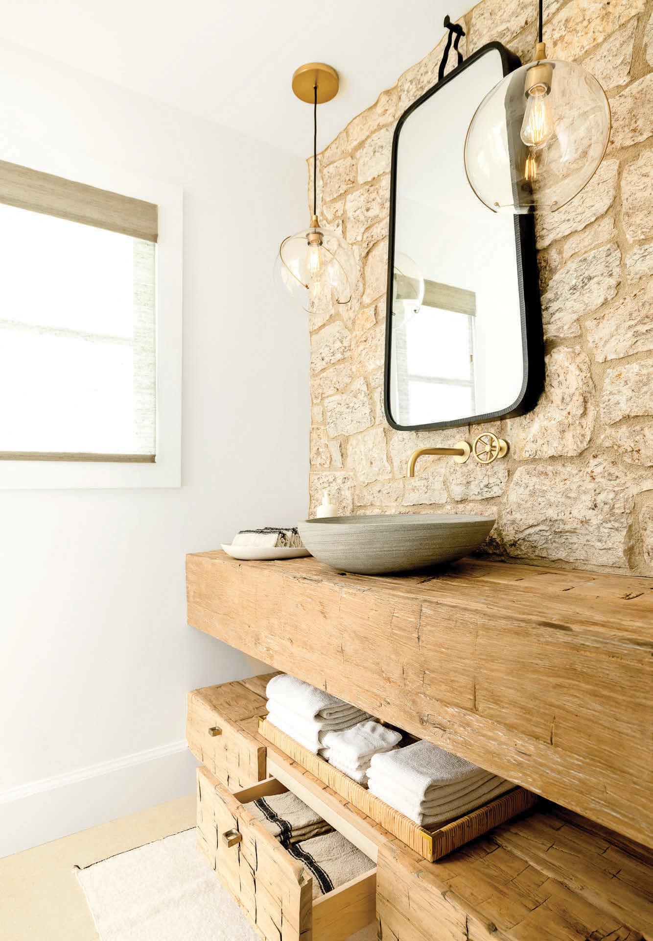
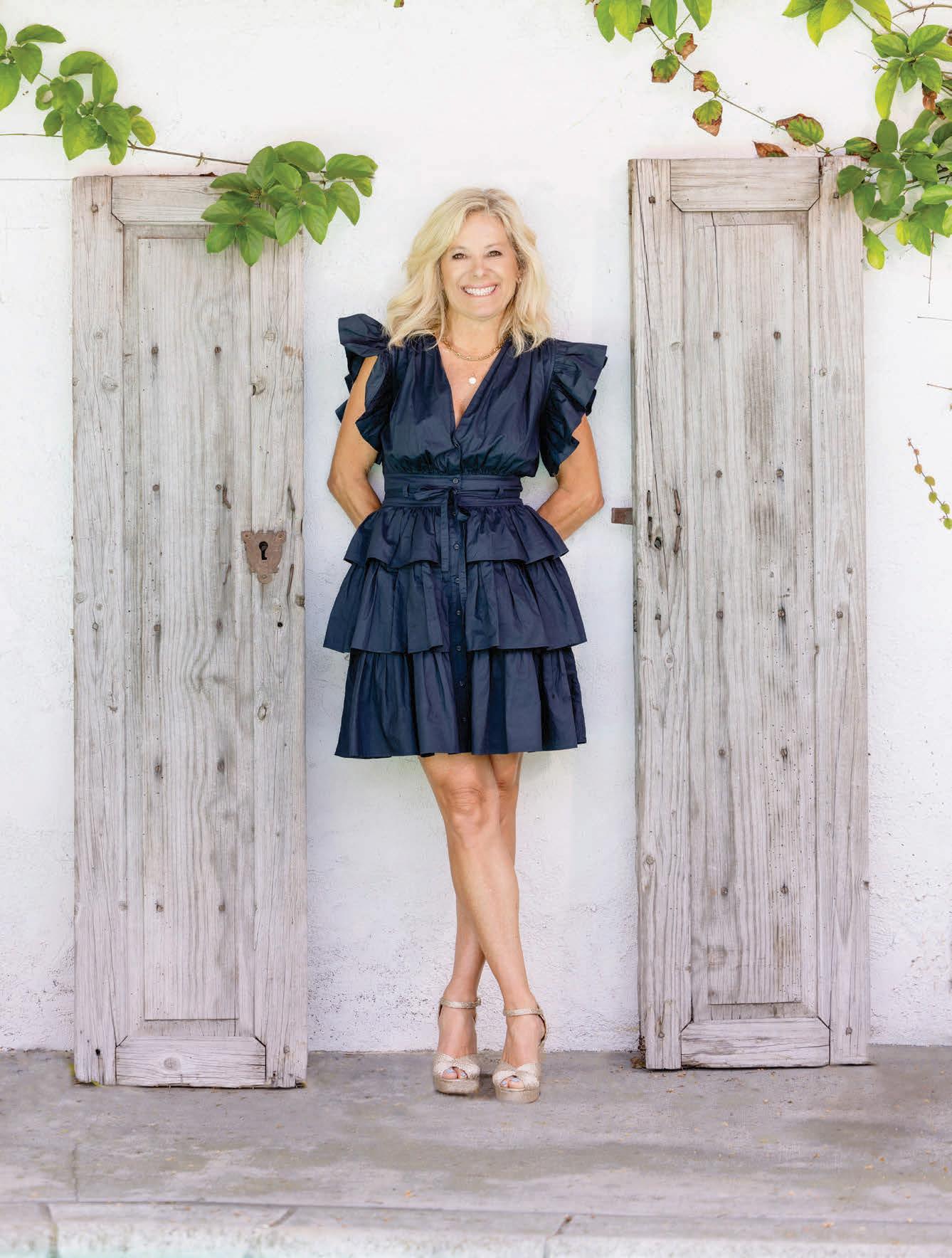
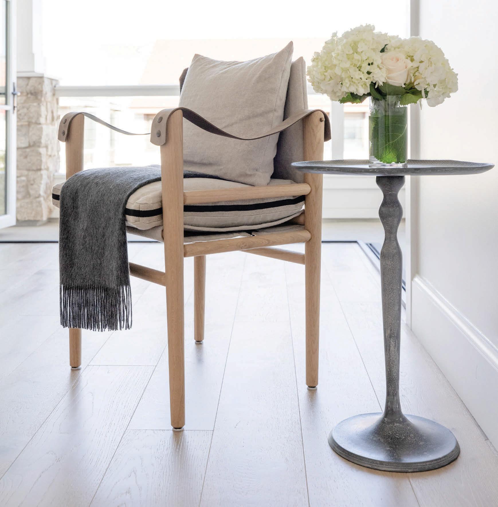 Get in touch with Valerie Sartini @treasuresinteriordesign




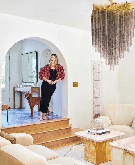
Inspired by fashion, travel and hints of her favorite color, a Palos Verdes Estates–based interior designer doesn’t hold back a bit on the showstopping design of her own family home.
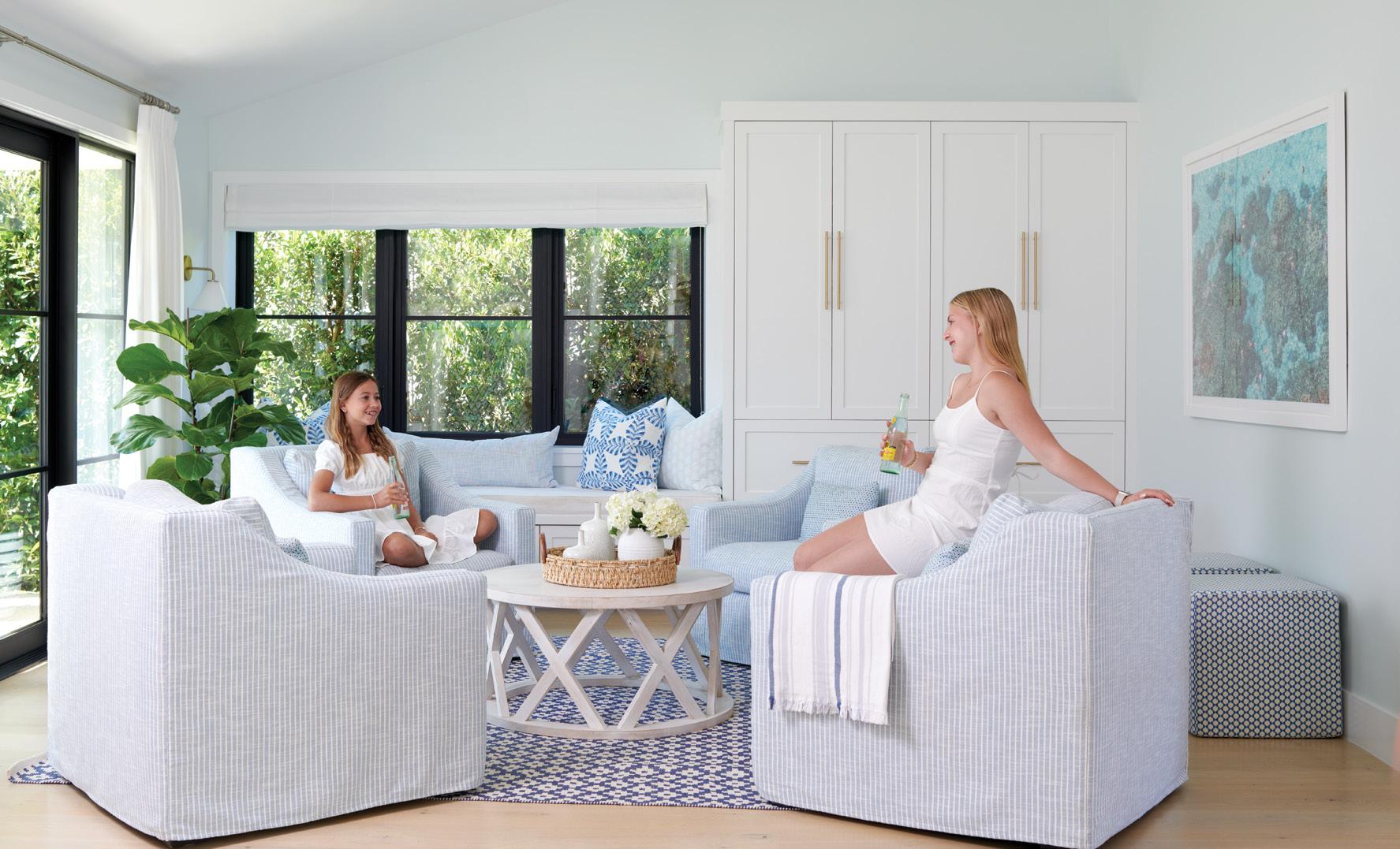
The pursuit of a spacious lot for a Manhattan Beach family results in a tranquil and functional retreat with a designer’s touch for all their needs.
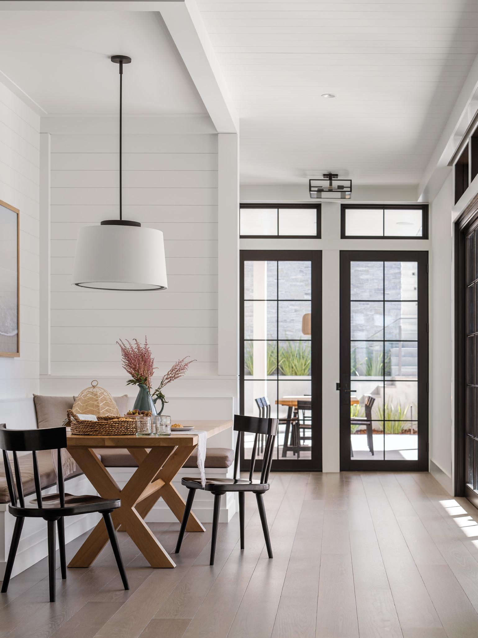
A Manhattan Beach couple with East Coast roots reinvents their once-dated residence with a fresh take on Cape Cod style.
The feeling you have when you’re on vacation—that was the inspiration behind this Manhattan Beach home.


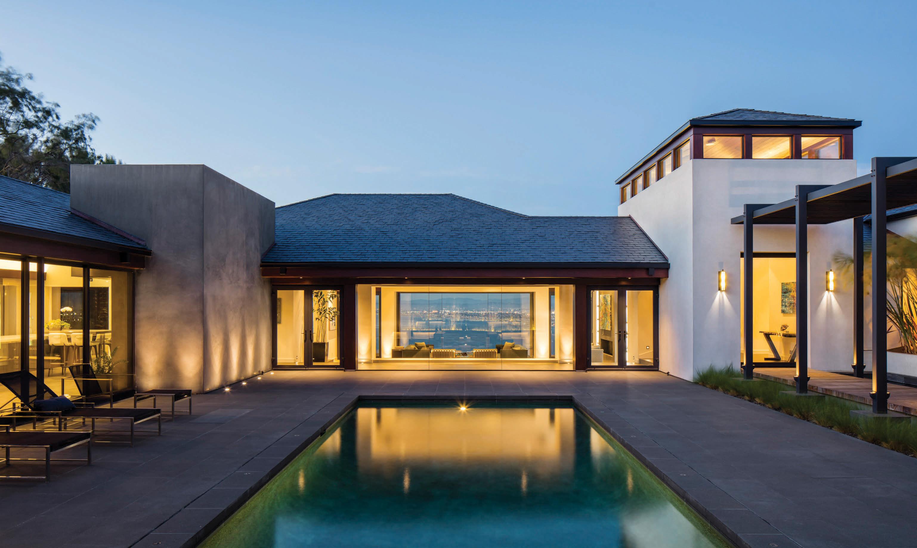
Panoramic
from this KAA
With
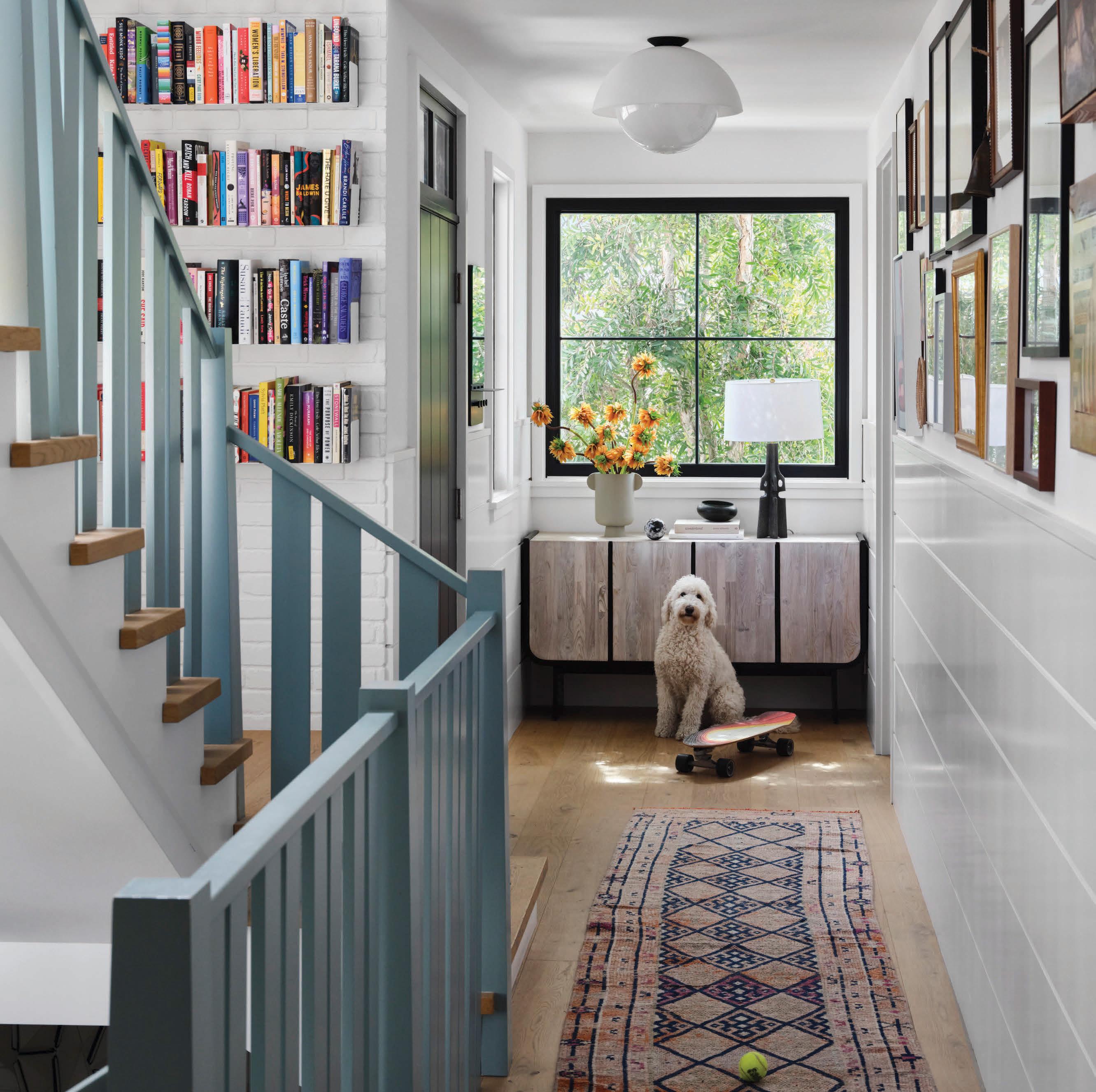

When I was a little girl, my mom would take my siblings and me to open houses and model homes just for fun. We’d pile into the station wagon and drive from house to house in Palos Verdes and beyond to explore the different styles of architec ture and interior design. Now, I still find myself touring homes on a whim and venturing into new spaces any chance I get.
As a magazine editor covering lifestyle and design for nearly two decades, I love hearing the individual stories and the path to creating a dream home. That’s why putting together this fall issue filled with such diverse design takeaways has been such an honor. From a Cape Cod-style abode in Manhattan Beach with subtleties of the homeowner’s East Coast roots to a mod ern glam residence with layers of pink, owned and designed by Palos Verdes native Kim Lapin, we hope you get inspired.
You may have noticed we have a new look on the cover. Like our homes over time, it’s never a bad idea to freshen things up.


Darren Elms
CREATIVE DIRECTOR
Michelle Villas
COPY EDITOR
Laura Watts
GRAPHIC DESIGNERS
Ajay Peckham, Yuiko Sugino
Amber Klinck, Kara Mickelson, Jennie Nunn, Sajid Veera
PHOTOGRAPHERS
Siri Berting, Manolo Langis, Shane O’Donnell, Lauren Taylor, Sara Tramp
PUBLISHER Amy Tetherow 424-220-6338 amy@thegoldenstatecompany.com
Director of Brand Partnerships | Marcie Gutierrez 424-220-6337 marcie@thegoldenstatecompany.com
Director of Brand Partnerships | Erika Carrion 310-897-2424 erika@thegoldenstatecompany.com
Director of Brand Partnerships | Jen Turquand 424-220-6335 jen.turquand@thegoldenstatecompany.com
SOUTHBAY IS A DIVISION OF THE GOLDEN STATE COMPANY
Charlie Koones Todd Klawin
Partner/Brand Publisher | Emily Stewart
Partner/Managing Director, Media & Analytics | Warren Schaffer Director of Digital | Charles Simmons Digital Marketing | Paul Fisher Operations Director | Allison Jeackjuntra Accounting | Janet De La Cruz, Tanisha Holcomb
To learn more about us, visit thegoldenstatecompany.com.
No part of this periodical may be reproduced in any form or by any means without prior written consent from The Golden State Company, LLC. Any and all submissions to this or any of The Golden State Company, LLC publications become the property of The Golden State Company, LLC and may be used in any media. We reserve the right to edit.
TO OUR READERS Southbay HOME welcomes your feedback. Please send letters to: Reader Response Department, Southbay HOME Please include your name, address and email. Edited letters may be published.
SUBSCRIPTIONS Email: info@goldenstate.is or phone: 310-376-7800. Subscriptions are $29 per year.
200 N. Pacific Coast Highway., Suite 110, El Segundo, CA 90245 Tel 310-376-7800 | Fax 310-376-0200 | goldenstate.is | southbay.goldenstate.is





 WRITTEN BY DARREN ELMS PHOTOGRAPHED BY MANOLO LANGIS
“It was sort of in the works for years,” shares Greg Bonanni of the recent renovation of the Manhattan Beach home he shares with his wife, Pearl, and their kids. “We had a leak on our deck on the third floor that was a continuous problem for a year whenever it would rain, so we had been thinking about just fixing the deck. But when we priced out what it would’ve cost, with what that
would’ve entailed, it would have just been a waste of money. So we decided to entertain the idea of doing a full remodel.”
They collaborated with Luis Murillo of LMD Architecture Studio to create a “modern Montecito” from the existing look. “We wanted it to be comfortable and warm, and that was the objective,” says Greg. “And also to make it really practical, clean and simple.” The couple worked closely with the team, which included contractor KCC Design + Build, Niver Engineering and interior designer Tara Negus.
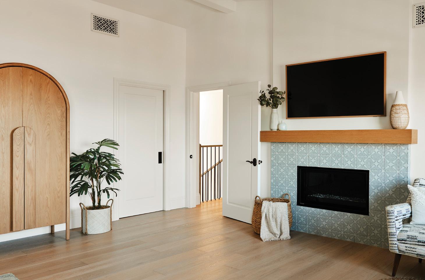
Some of the biggest changes occurred in the thirdfloor indoor-outdoor space. A spa feature was added off a bedroom, with a small “surf” area, an outdoor shower and a hot tub. They also covered the patio and added a large sliding door to bridge the two areas.
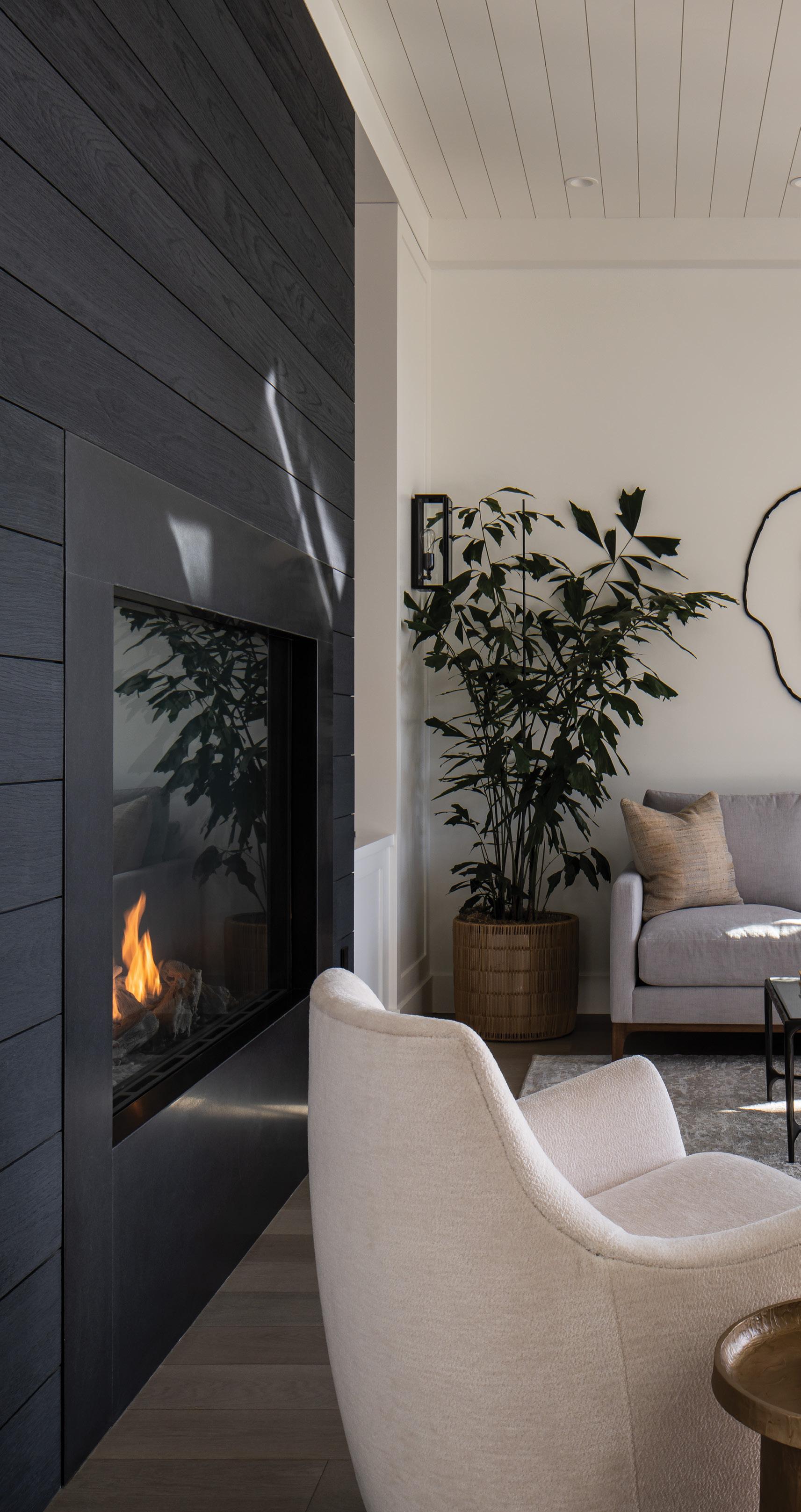
A new fireplace offers a cozy spot for the family to gather during cooler months. Adds Greg, “It’s a com fortable spot, and it makes the house feel much bigger. It keeps the house cooler too.” ¢


INSPIRED BY FASHION, TRAVEL AND HINTS OF HER FAVORITE COLOR, A PALOS VERDES ESTATES–BASED INTERIOR DESIGNER DOESN’T HOLD BACK A BIT ON THE SHOWSTOPPING DESIGN OF HER OWN FAMILY HOME.
WRITTEN BY JENNIE NUNN | PHOTOGRAPHED BY LAUREN TAYLOR
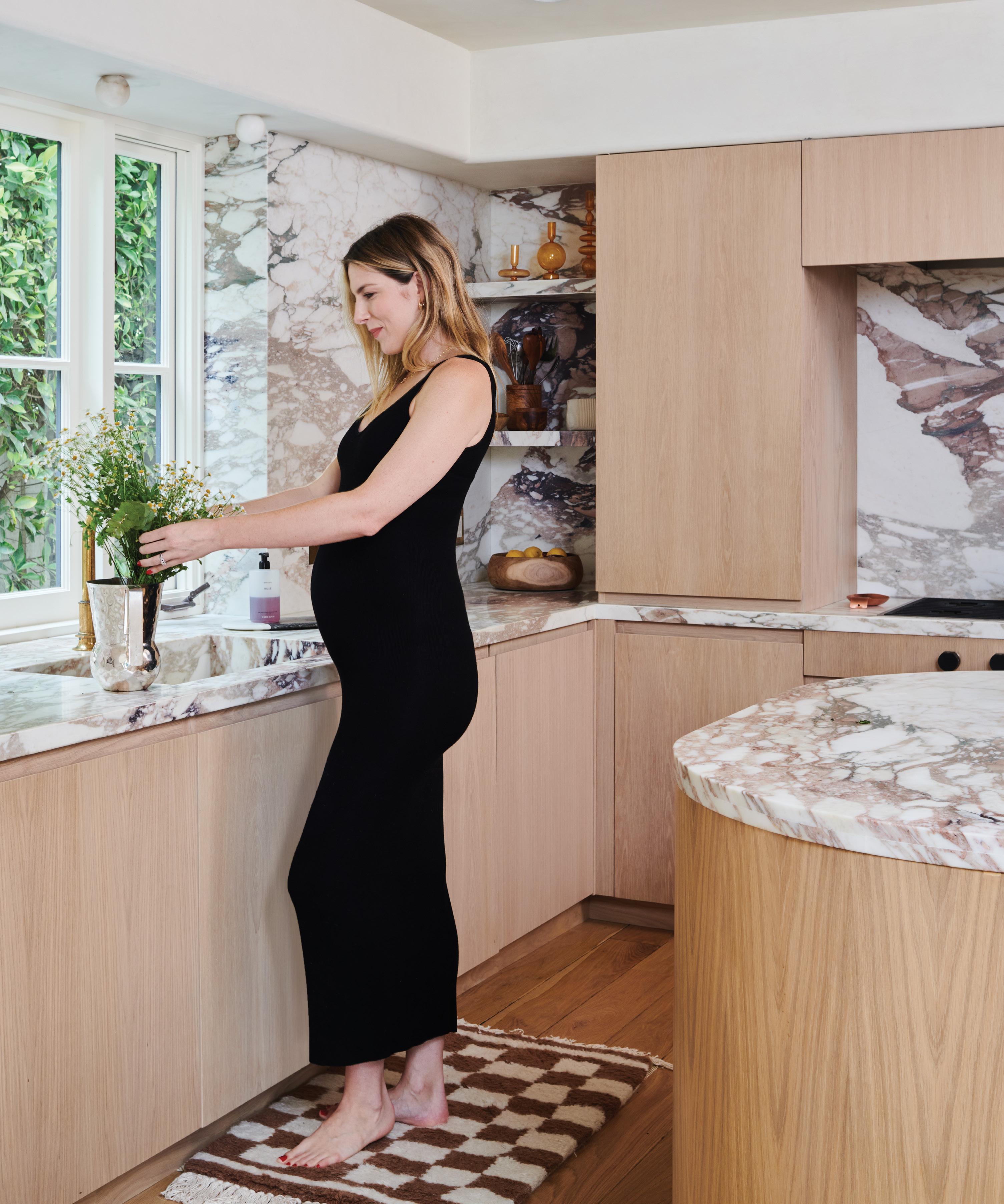
When interior designer Kim Lapin and her husband, Chay, decided to move beyond their city life in Los Angeles to a family home on an idyllic street in Palos Verdes Estates, they knew this was the one. “I didn’t want to move from L.A., but I loved the family vibe of the street that I have always loved,” says Kim, a former model who grew up in Palos Verdes. “It has a magical feel to it. The home had an amaz ing cozy and warming energy to it when I walked in. It felt like home.”
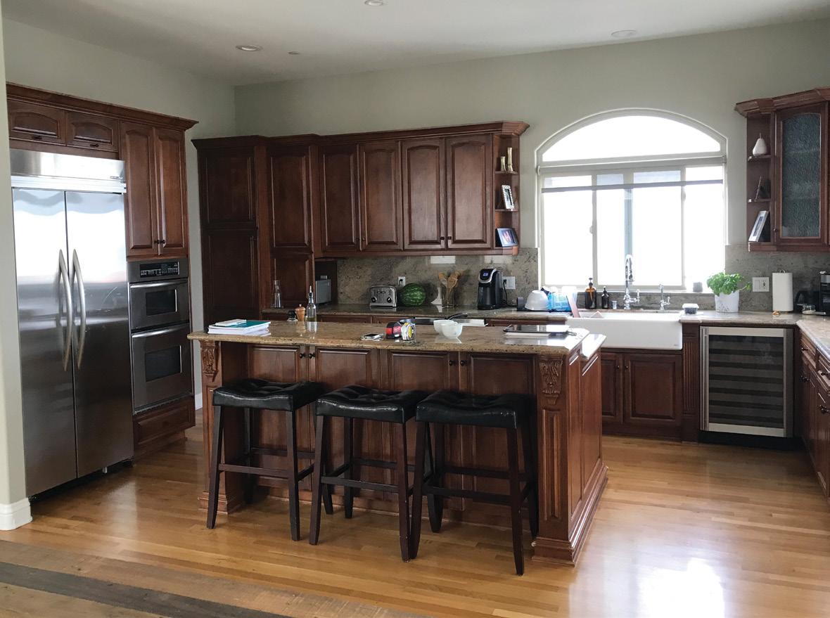
Although the couple—who have a 2½-year-old daughter and twins on the way—had moved six times in seven years and remodeled several of their own homes, the idea of another major project they could put their stamp was also part of the decision factor. “We love the spontaneity and having another project, and we wanted the house to feel like a creative retreat,” explains Kim. “The original home was Spanish-style on the outside, but the interior felt very heavy with dark paint colors. It had dark, chunky, ornate oak; red-and-cream granite through out; and heavy wrought iron light fixtures. It felt kind
of medieval because of the materials used. Still, I knew I could work with it.”
But Kim, a UCLA graduate and self-taught interior designer, and Chay, who works in commercial real estate, wanted the interiors to reflect their personal ity and individual style. “I am obsessed with fashion, jewelry and accessories,” says Kim, whose clients once included Target, Speedo and Shape magazine. “I modeled for 10 years and flew all around and shot campaigns in the most beautiful spaces. It chips away and refines your style. You see the best of the best, so you really take time to find the perfect piece. I’m very much into curating and collecting and putting in the effort. It’s worth the hunt, and it doesn’t always need to be expensive.”
To create her vision—with design tenets influ enced by one of her favorite designers, Kelly Wearstler—she asked her father, Jack Nelson of Nelson Development, for help with general con tracting work. “We didn’t touch the architecture of the exterior, but we changed the buttercream paint color to a warm white and added a muted charcoal trim,” says Kim. “We also removed an unnecessary
“Pink is my favorite color, and I have always wanted to use this stone in a major way since I laid eyes on it a few years ago. I love a veiny, dramatic marble and knew I would want something with more of a statement for a main room like the kitchen. Once I decided on it, it was easy for me to choose pink plaster for the dining room.”
fountain in the courtyard. We wanted it to feel authentic but modernized.”
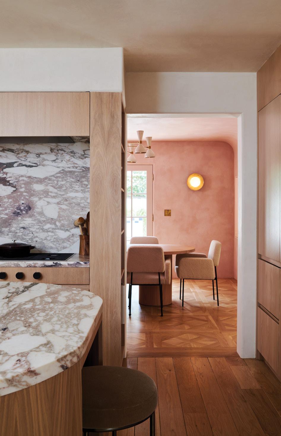
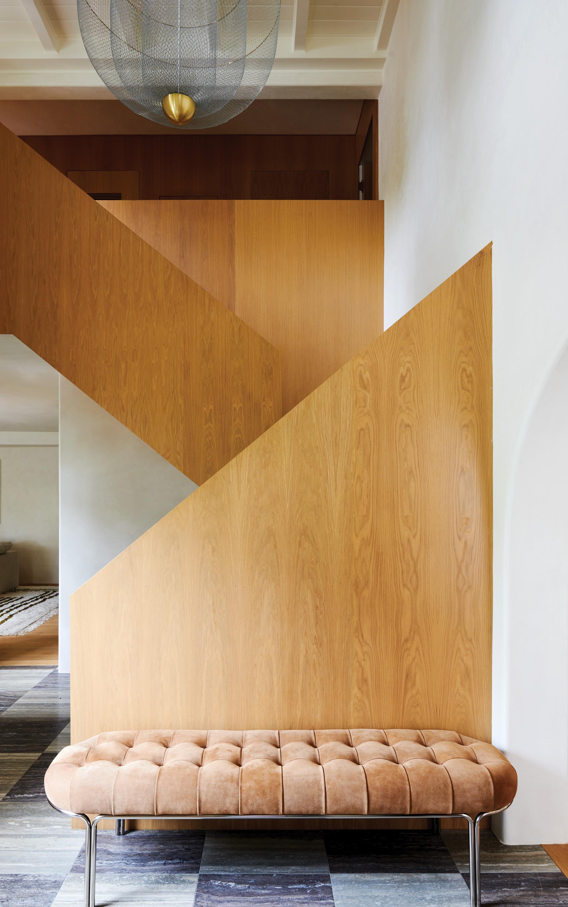
For the major interior overhaul, she chose white oak for a custom staircase and had specific plans for two rooms using her favorite color: pink. In the kitchen, she chose custom white oak cabinets, a pair of Scoop Perforated sconces by Lawson-Fenning, and countertops and stone in Calacatta Vagli Rosato (a type of pink marble quarried in Italy.)
“Pink is my favorite color, and I have always wanted to use this stone in a major way since I laid eyes on it a few years ago,” explains Kim. “I love a veiny, dramatic marble and knew I would want something with more of a statement for a main room like the kitchen. Once I decided on it, it was easy for me to choose pink plaster for the dining room.”
The dining room—appointed with Terra cement plaster by Texston, a Stilnovo chandelier by MM Design, a custom dining table from 1stDibs and chairs by Nathan Lindberg—is undoubtedly one of Kim’s favorite spaces in the house.
“I took it as my opportunity to show how gor geous and timeless a pink room can be,” says Kim. “I knew it would always make me happy. The kitchen and dining room feel inviting but also fun, and that is always the goal for me. We knew we wanted to use plaster throughout the rest of the house to calm it down. I didn’t want my husband to feel like he’s
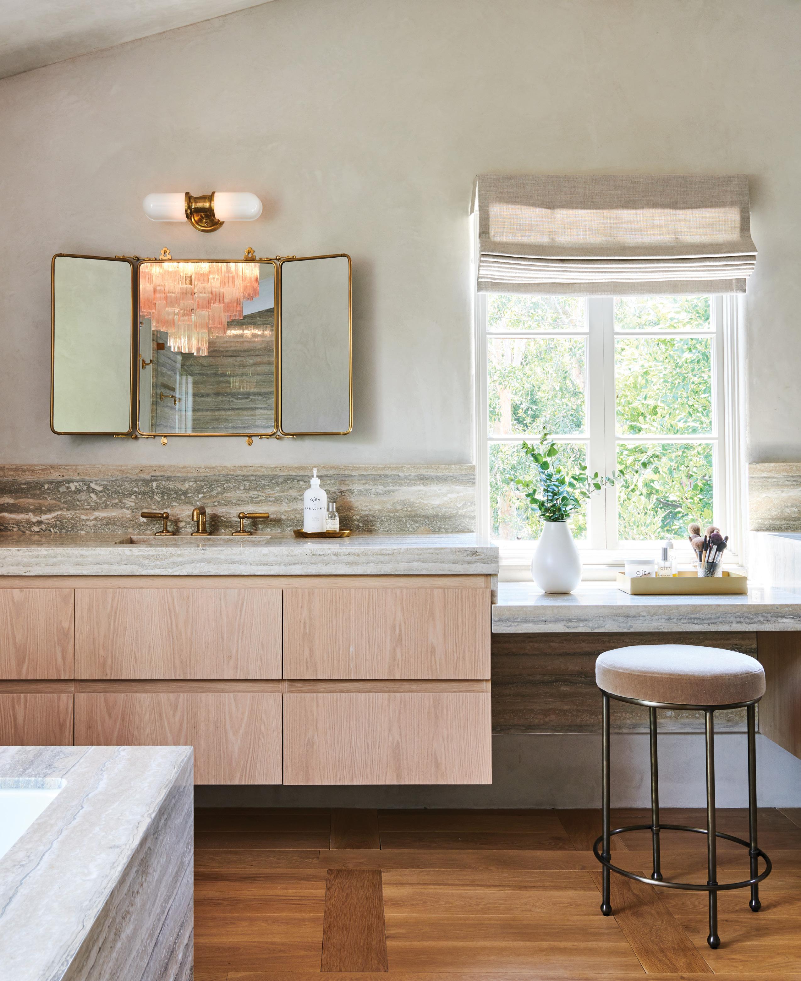
living in Barbie’s Dreamhouse.”
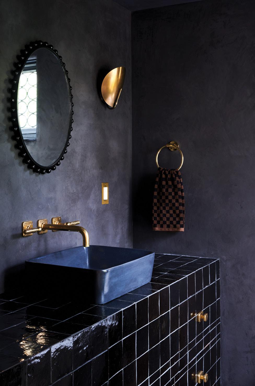
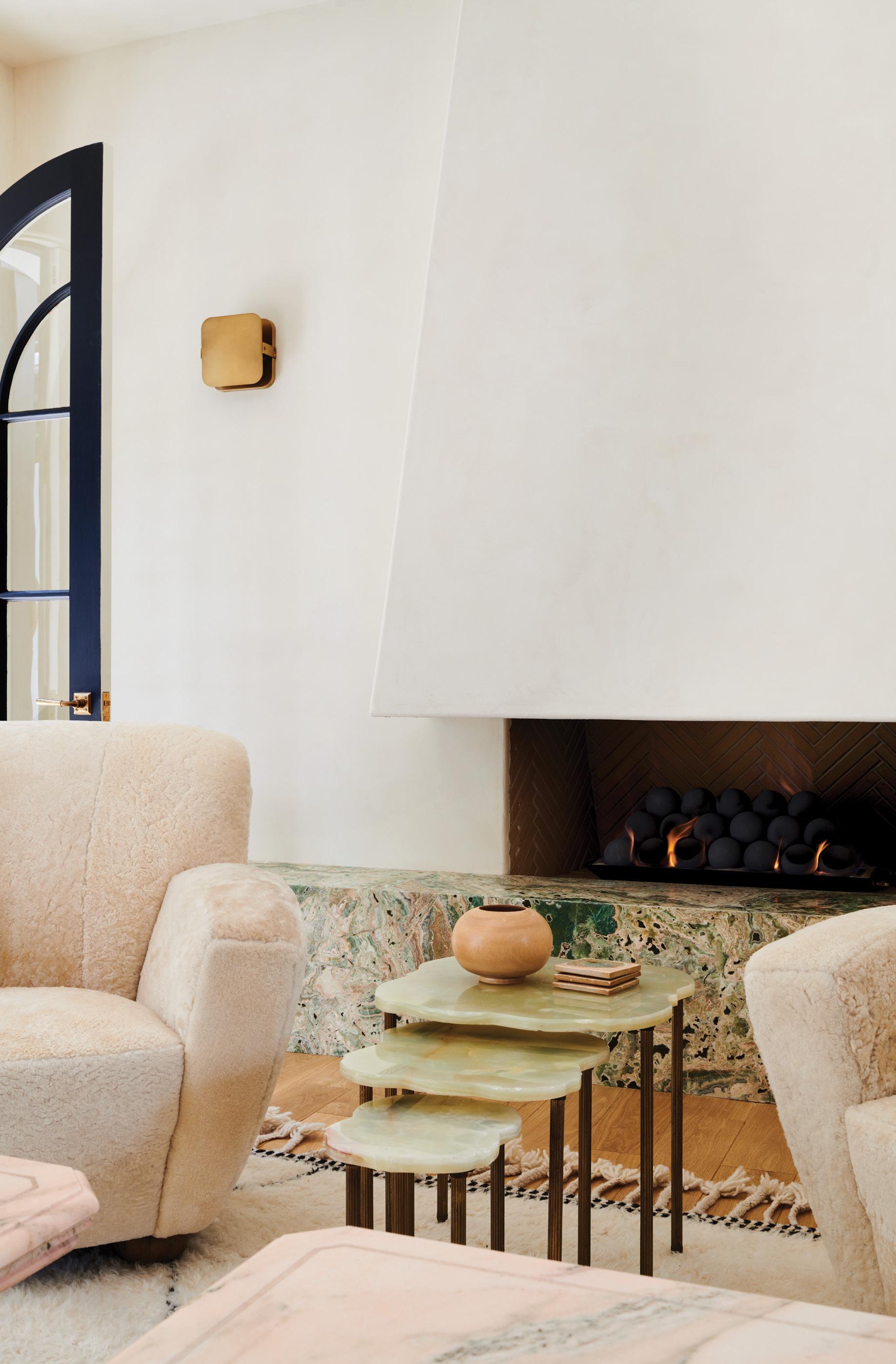
In choosing plaster versus other materials, she was able to incorporate an imperfect-like effect throughout. “I like to make choices that feel calming, and with plaster I like that it’s not perfect and pris tine,” she says. “Everything that I choose, from the wall finishes to the stone and the lighting, that’s my ‘trifecta.’ I want there to be moments of in-your-face design—like the onyx bench in the sitting room. It’s about showing restraint and making each room have its moment.”
A proponent of vintage lighting, she also strate gically sprinkled statement fixtures and focal pieces throughout the home. “One thing I try to do as much as possible is use vintage lighting,” says Kim, who regularly scours Chairish and 1stDibs. “Lighting is my secret weapon because it makes such a huge impact if done well.”
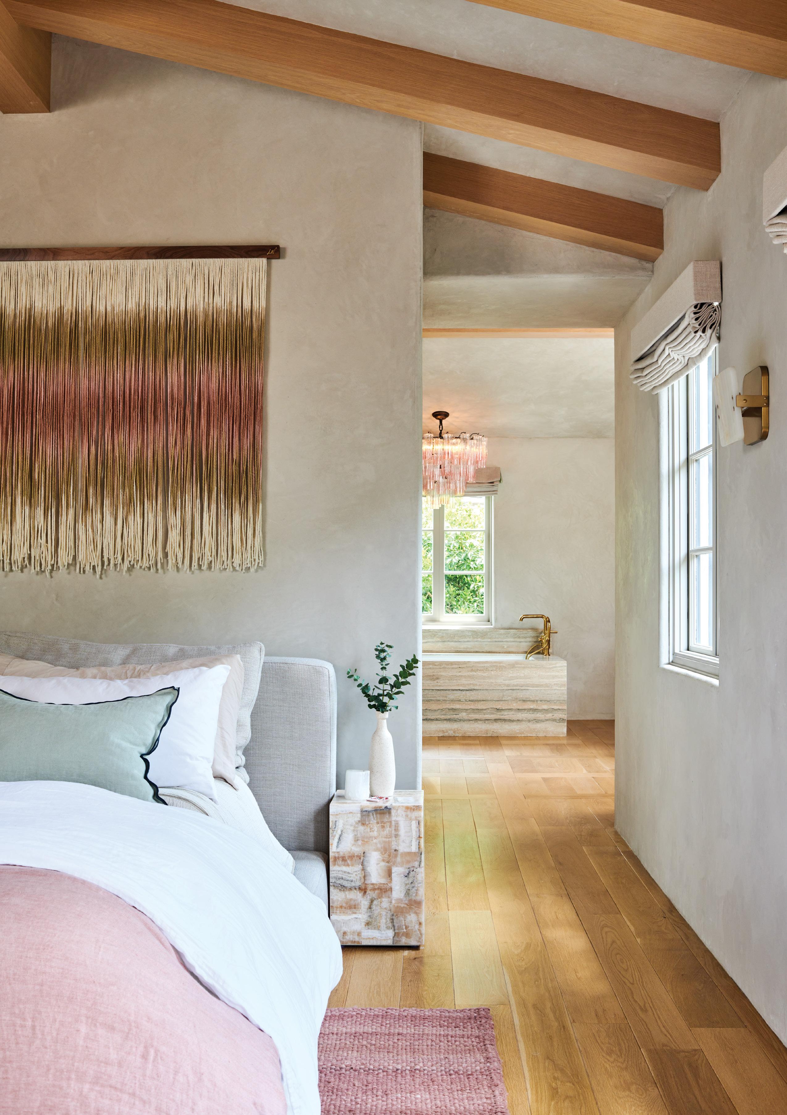
Other jaw-dropping spaces include the hotelinspired primary bedroom with a Cloud bed by RH and Mercury sconces in white onyx by Arteriors, and the sitting room with a fireplace bench wrapped in Esmeralda onyx, a pair of vintage pink marble tables, a modular sofa by Sarah Ellison and a Kelly chandelier by Gabriel Scott from Twentieth.
“I love to host parties and girls’ nights and wanted a comfy room that also looked chic—like a jewelry box almost—to entertain in with no TV or kid stuff and pretty things to look at when drinking margar itas,” explains Kim. “I imagined a space that was serene but also elevated with interesting shapes, materials and lighting. I had my eye on this Gabriel Scott fixture for a while and knew this was the perfect place to use it. It’s dramatic, gorgeous and interesting. I love how it all turned out because it feels special and a little fancy, but is also cozy.”
Given the time to assess the final result, Kim believes her hard work has paid off. “Every time I come home, I feel like ‘Ooh, I’m home,’ and it makes me happy. It feels like a respite, and it’s the truest representation of what I can do.” ¢

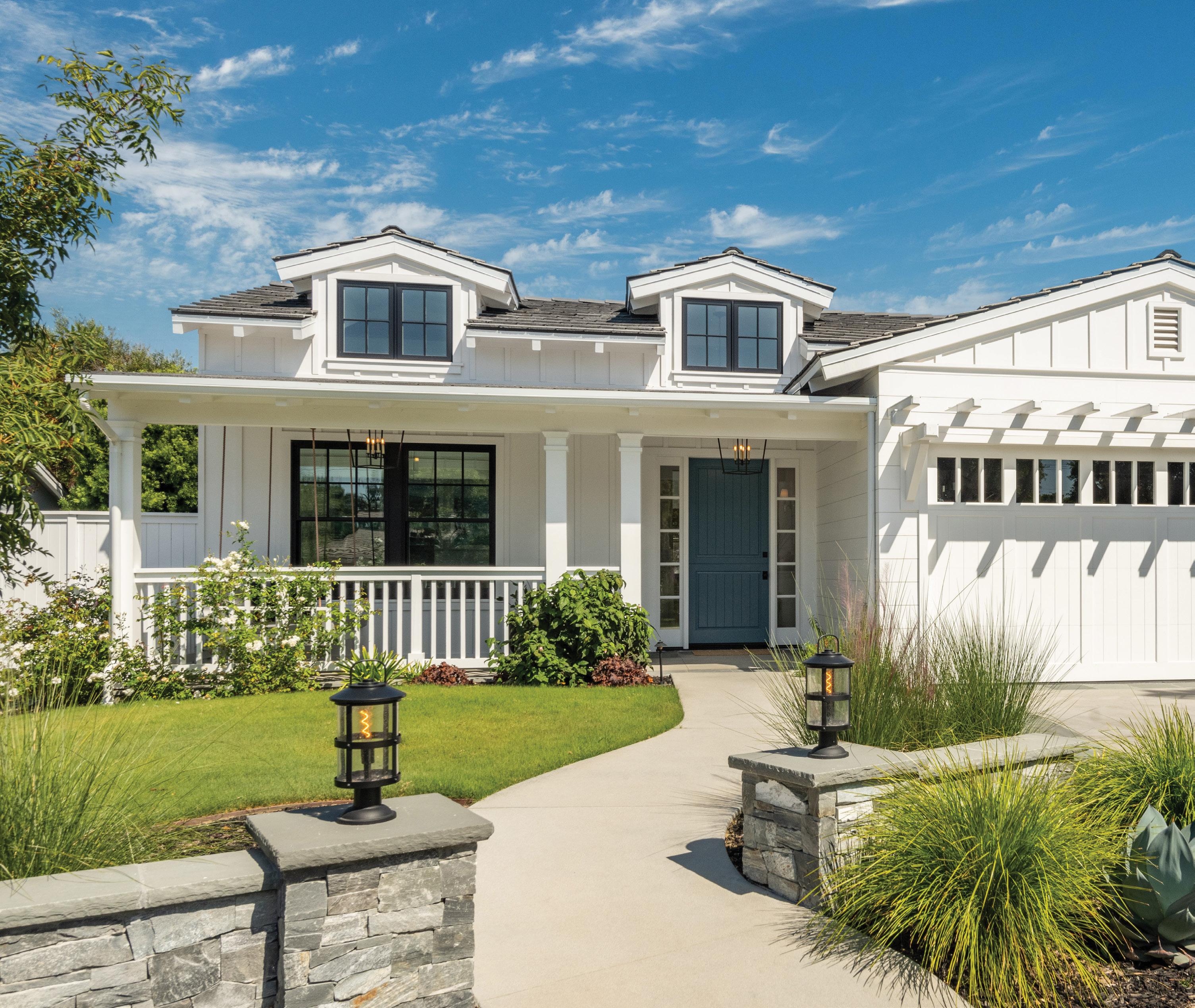
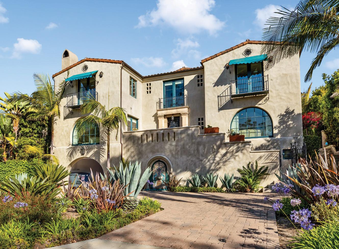
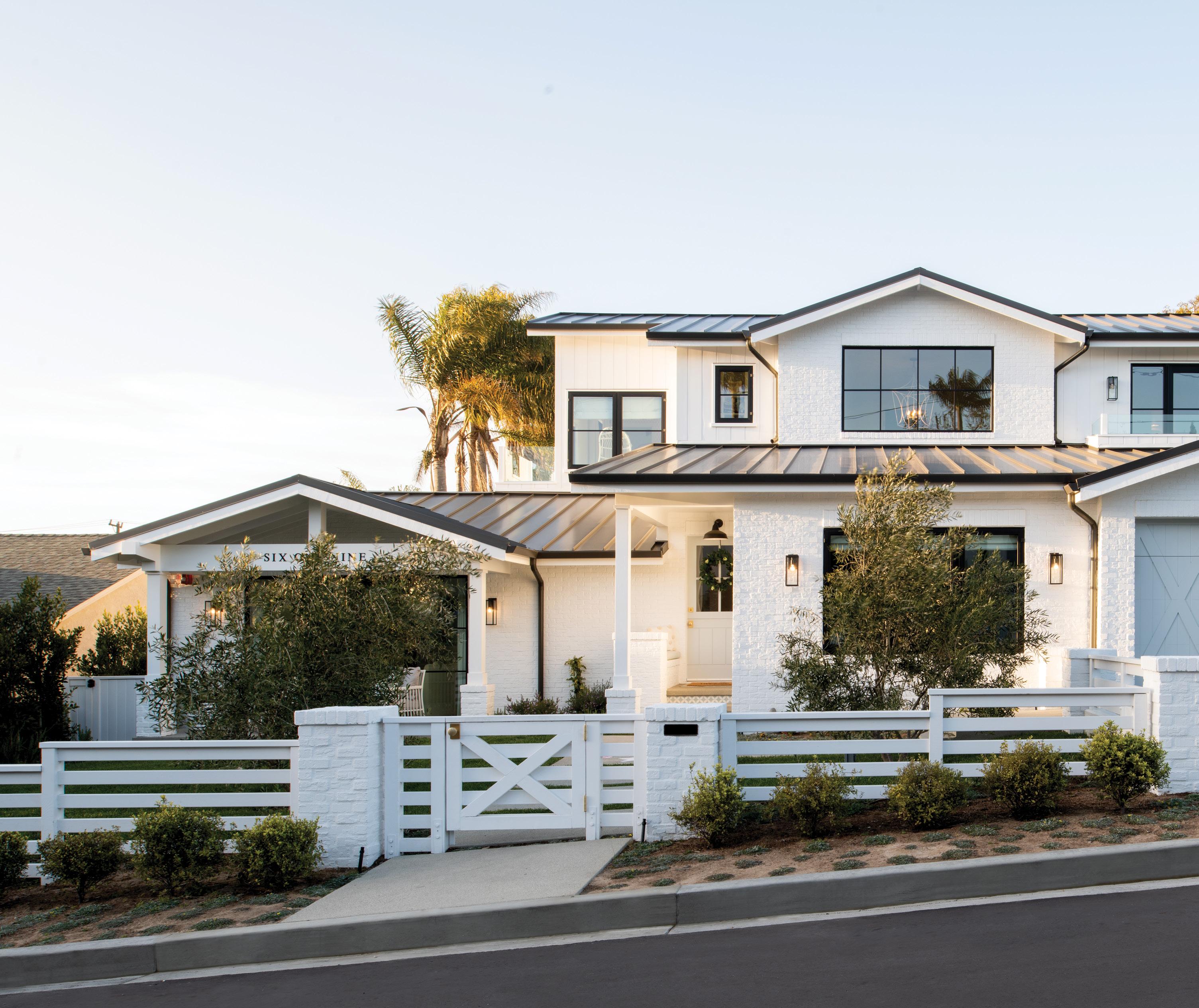
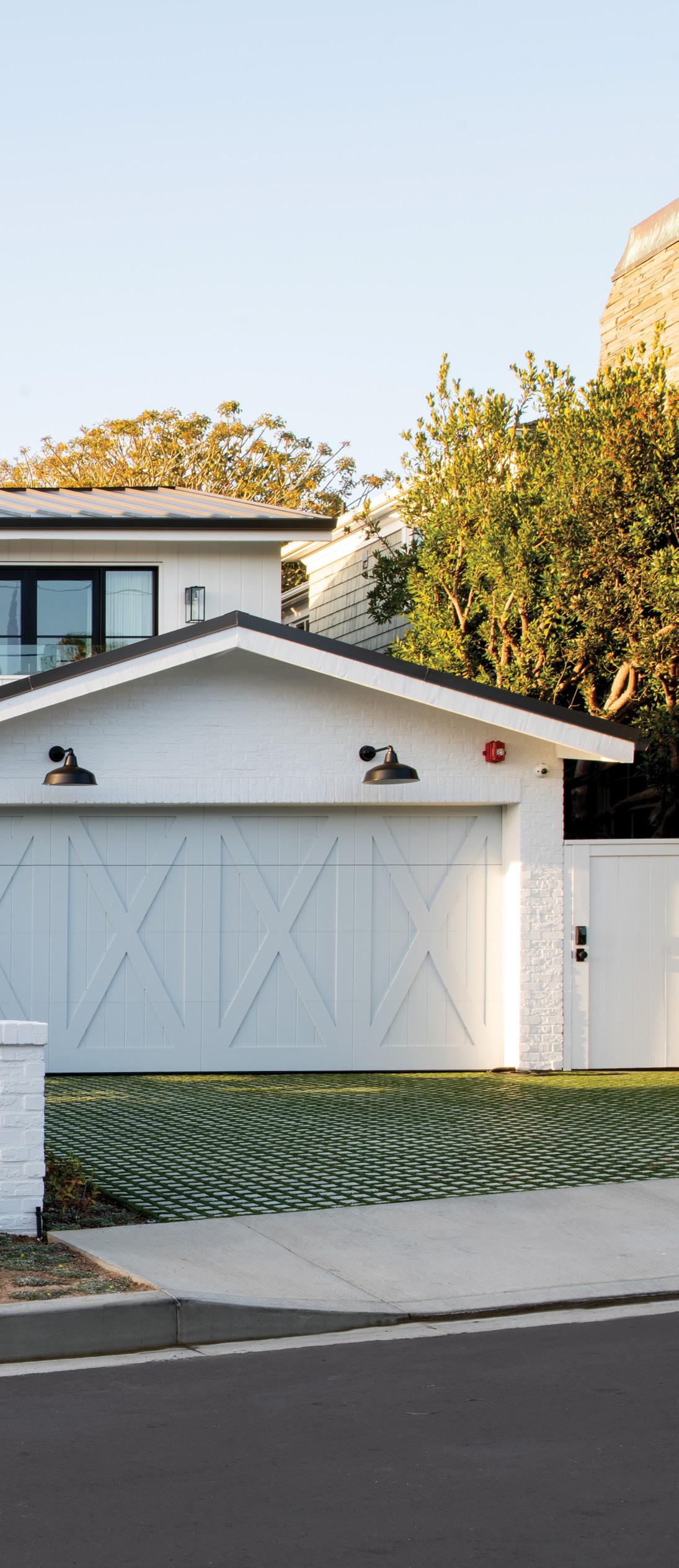
High windows add character and natural light into rooms in this timeless California Cottage design. The deep porch says “welcome” while providing shade and space for a porch swing. The garage eyebrow trellis adds street-view eye appeal.
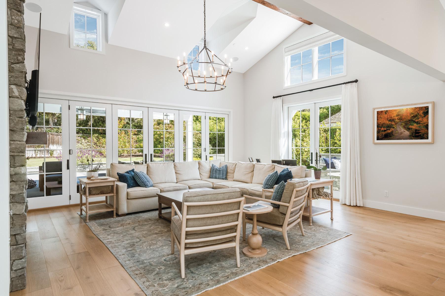
Vaulted ceilings enhance space and openness; high windows add light and visual interest. Stacking doors dissolve the wall to bring the outdoors in. Interior designer Caroline Burke completes the design with finishes, fixtures and furniture. It takes a team!

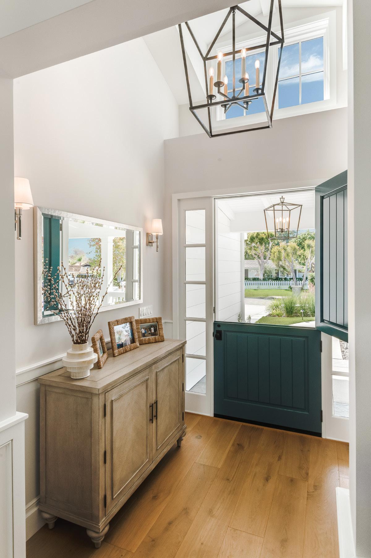
The classic Dutch door reinforces the neighborly vibe, bringing outdoor space, light and air inside. High ceilings, a symmetrical dormer window and a dramatic hanging fixture say, “You have arrived!”

Finishes and furnishings establish the theme for the entire house.

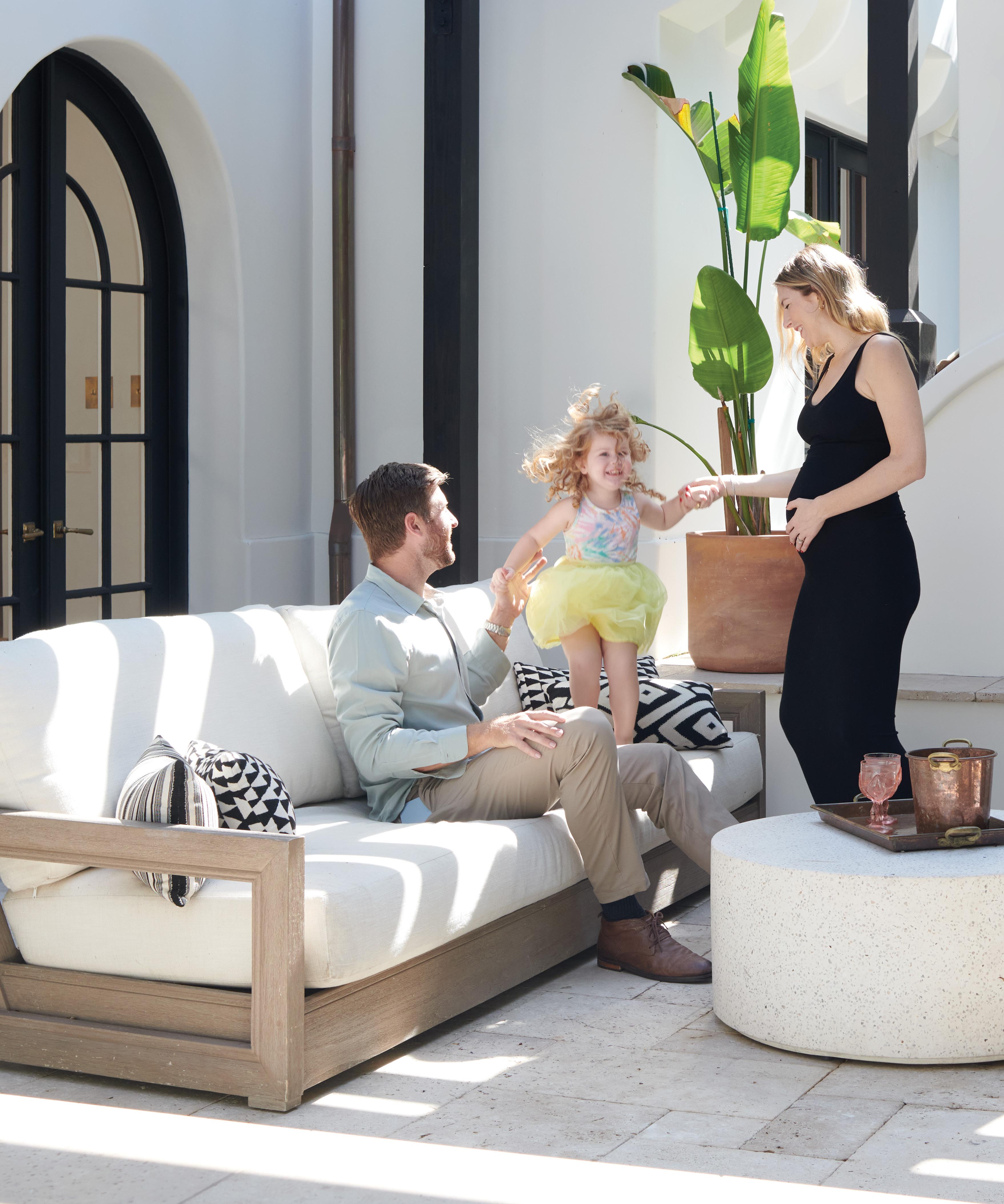
Indoor-outdoor living in Southern California is a must! A deep porch with fireplaces, TVs, fans, heaters and furnishings create a wonderful outdoor room useable in most weather conditions. Stacking doors allow for blending of both spaces as needed.

Vista Del Mar, Suite A,
Beach





allow
open fully to allow your
room and master bedroom to spill outdoors onto
west-facing
The open concept top
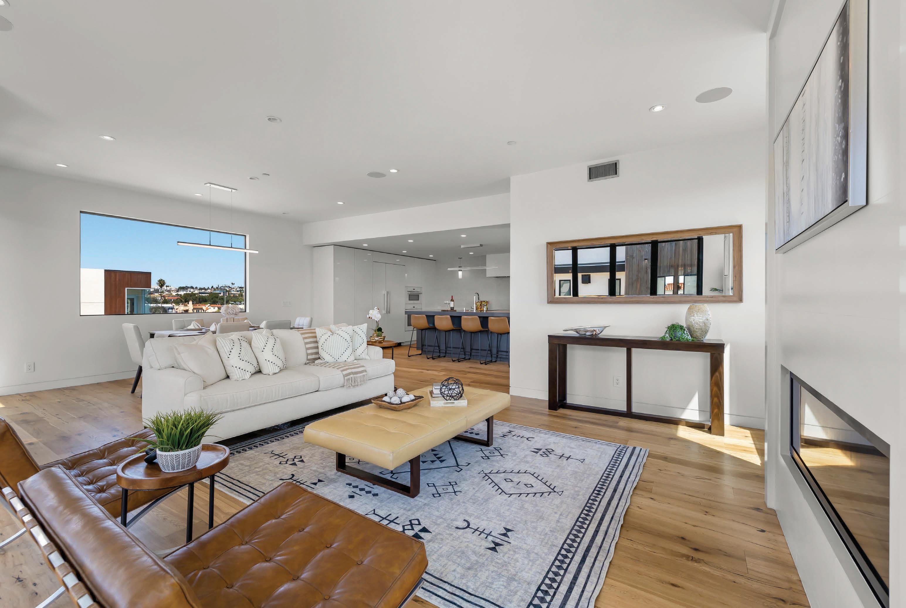
has kitchen, dining room and living room areas with


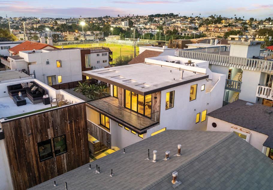
SoCal sunsets and
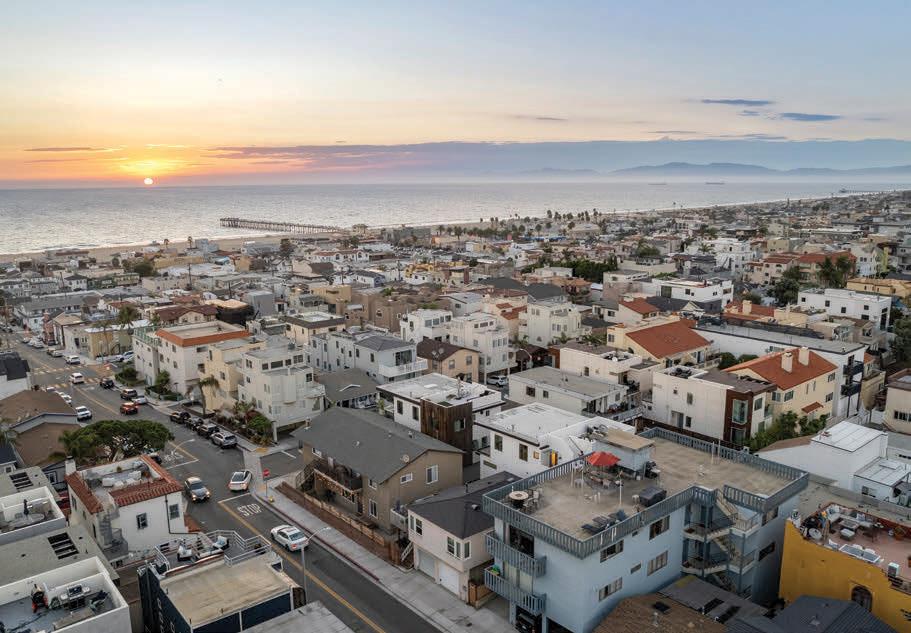
await you on the rooftop deck.
In Southern California, fall doesn’t mean digging out the bulky sweaters and mittens. As the weather cools and the mood shifts, we gravitate toward comforting foods and beverages. And while that might not mean a pumpkin latte, the traditional warm spices and notes of citrus associated with the season are perfect in a holiday drink, even if that drink is tequila.
We’re not talking about a viral take on a margarita with pumpkin and sweet-and-salty cinnamon rims, although that might be worth a try. Instead we think the holidays are a time to keep it simple. Start with a good brand of tequila, like South Bay-based Celaya, and add a spiced-up honey simple syrup to sweeten the edge a bit. It’s perfect for sipping, and the simple syrup can be made two weeks in advance—giving you more time to wind down or hang out with family and friends.
CART A
SPIN.

1-by-2-inch peel of 1 orange or 2 small tangerines per drink juice from orange or tangerine fresh bay leaf, optional cinnamon stick, optional
2 tablespoons Spiced Honey Simple Syrup (recipe below)
4 ounces Celaya, or your favorite brand of sipping tequila
To make the citrus twist, use a sharp paring knife or vegetable peeler to remove the peel into 1-inch-wide strips. Remove any white pith from the peel. To flame the citrus, use tongs to hold the peel over an open flame, or use a match and burn the edges slightly.
To make the cocktail, rub the flamed citrus twist in the glass before adding it to the drink. Add a splash of citrus juice, bay leaf, cinnamon stick, simple syrup and tequila. Stir and serve as is or on the rocks.
1 cup mild raw honey
3/4 cup water, or more as desired pinch ground nutmeg
2-inch cinnamon stick
1 whole allspice berry 1 whole clove
1 star anise
1 dried bay leaf
Combine honey and water in a small saucepan. Bring to a boil over medium high heat, constantly stirring until honey dissolves (it will froth and bubble).
Remove from heat, add spices, cover and steep for 15 minutes. Uncover and cool to room temperature. Strain and store in an airtight container in refrigera tor for up to two weeks. Use extra syrup to spice and sweeten coffee or tea.
Coastal living doesn t necessarily have to be blue and white. Experiment with imbuing your home with your own unique tastes and palettes while still being beach-friendly, like this walk street home in Hermosa.
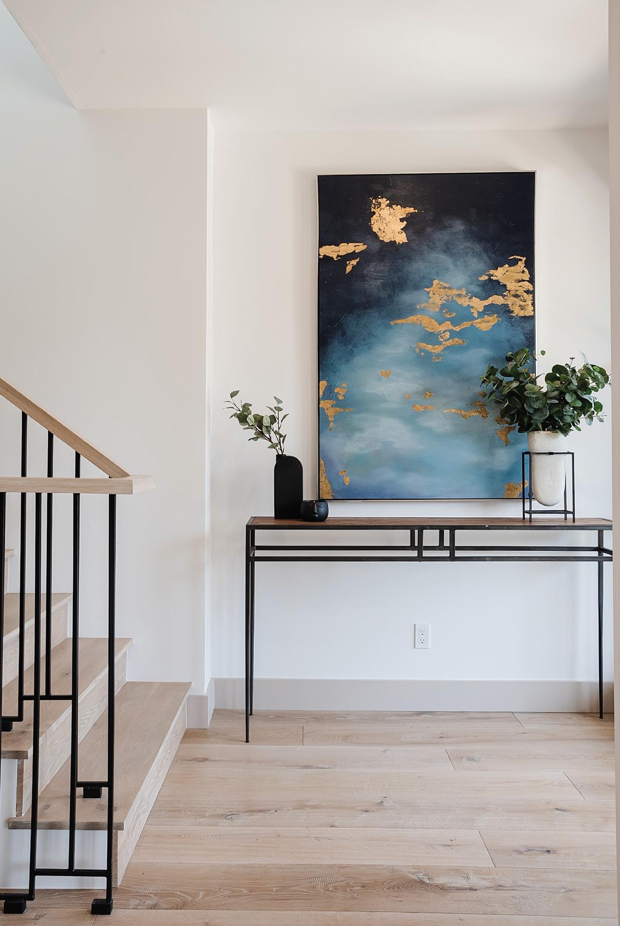
Make a splash with the entryway because you never get a second chance to make a first impression. Custom art and fresh foliage are two surefires.
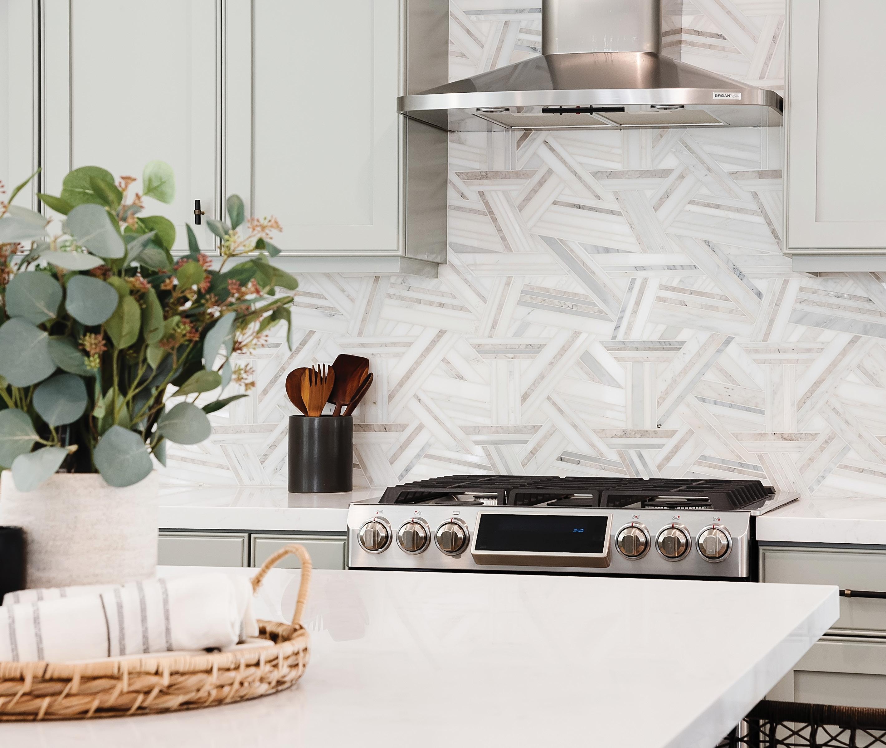

If you live in the beautiful South Bay, an absolute must is ABRE: Always Be Ready to Entertain.
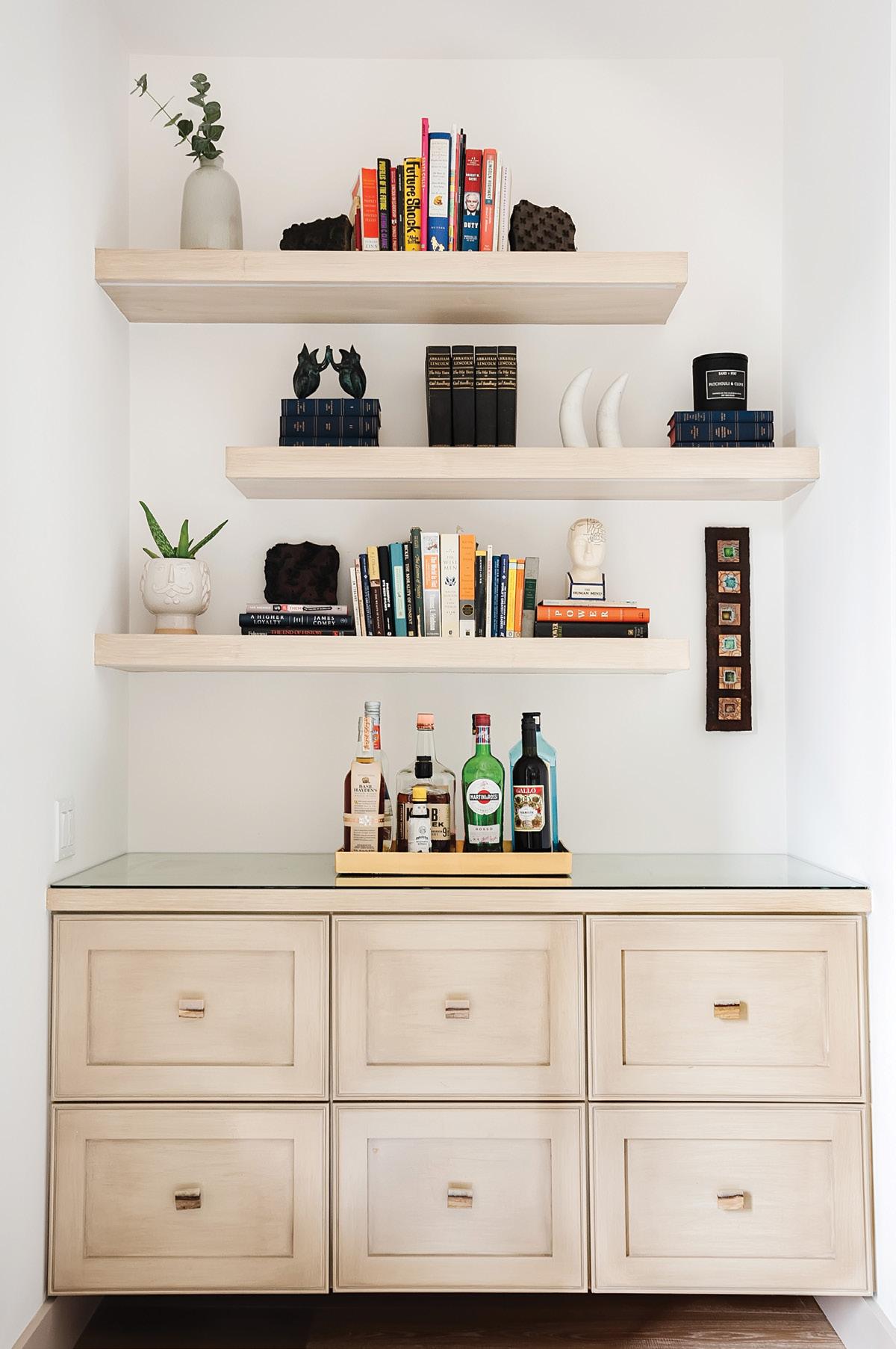
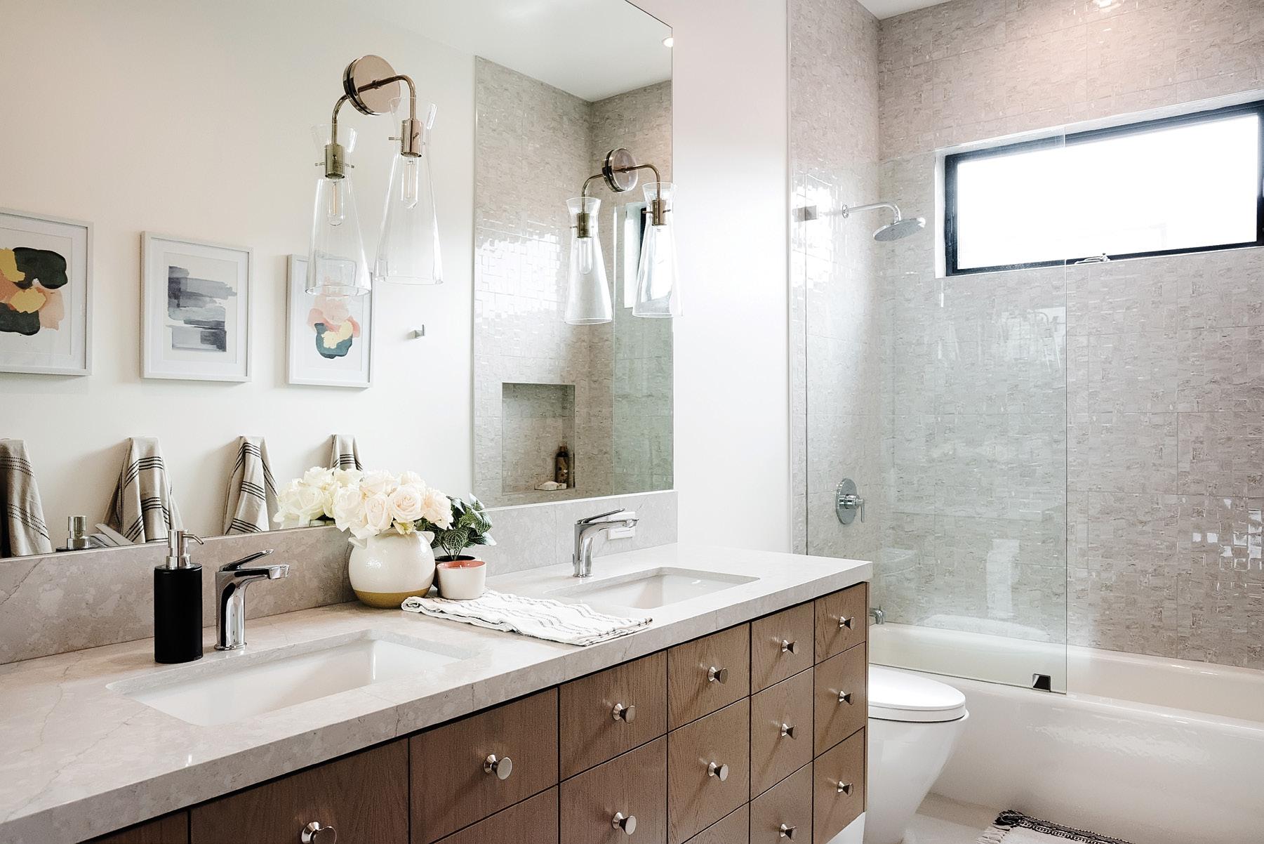
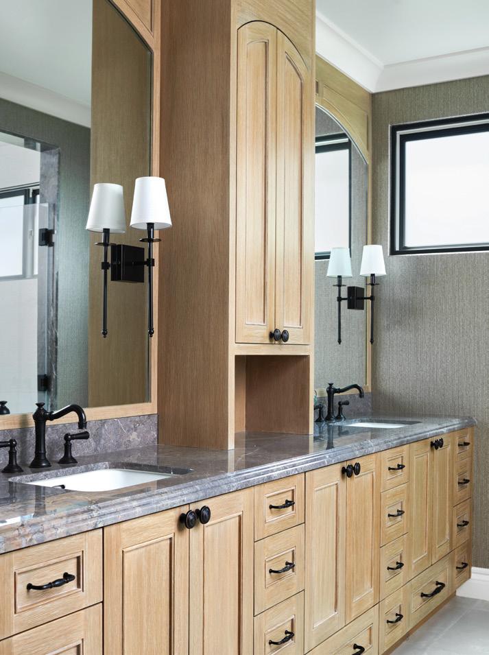
Custom cabinet details aren’ t just for the primary suite. The guest baths deserve to be well designed too for a cohesively lovely home.

Manhattan Ave., Manhattan Beach
THE PURSUIT OF A SPACIOUS LOT FOR A MANHATTAN BEACH FAMILY RESULTS IN A TRANQUIL AND FUNCTIONAL RETREAT WITH A DESIGNER’S TOUCH FOR ALL THEIR NEEDS.
 WRITTEN BY JENNIE NUNN PHOTOGRAPHED BY MANOLO LANGIS
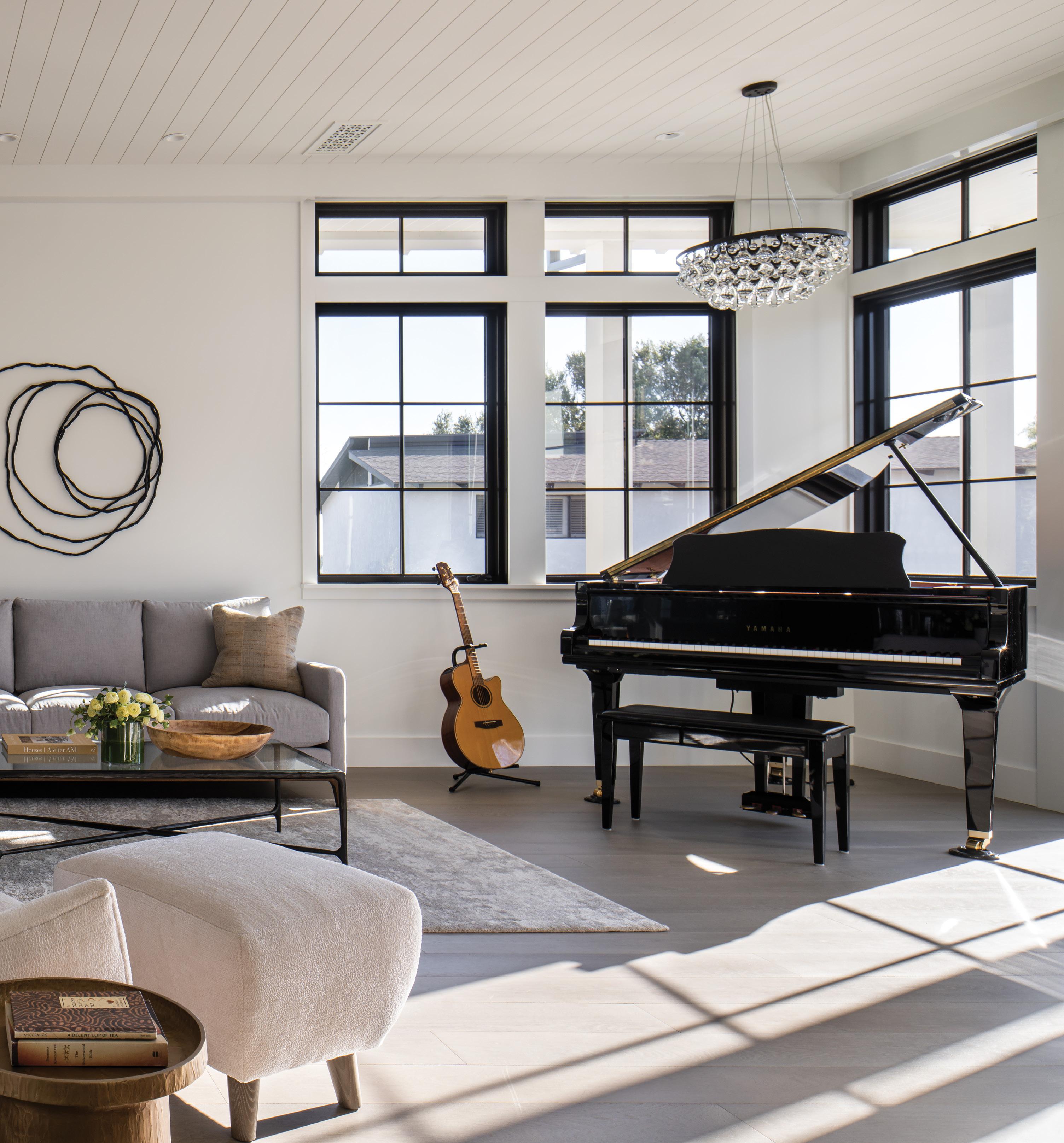
For a Manhattan Beach couple and their two children, the unwavering search for the site for their ultimate home stretched for three years. “We looked for a lot in the Hill Section with ocean views and no telephone wires until we found this one,” says the owner. “We wanted a large lot to maximize the outdoor space. We love that it is a corner lot. It feels even more spacious and provides great light.”
The couple, who purchased the property for the 11,500-square-foot lot, knew they wanted a new build to make it their own. For design expertise they turned to Jon Starr of Starr Design Group, Inc., Jeff Wilson of Wilson Construction and interior designer Alana Homesley of Alana Homesley Design in Woodland Hills.
“Our initial vision was a modern home, but I have always felt that traditional-structure homes age
better. So we married the best of both worlds and decided to build a modern farmhouse,” says the owner. “Alana came highly recommended. It was clear from meeting her and reviewing her portfolio that she was talented and her aesthetic is beautiful, clean and simple, which I love. We spent a lot of time together, and we became friends through the design process.”
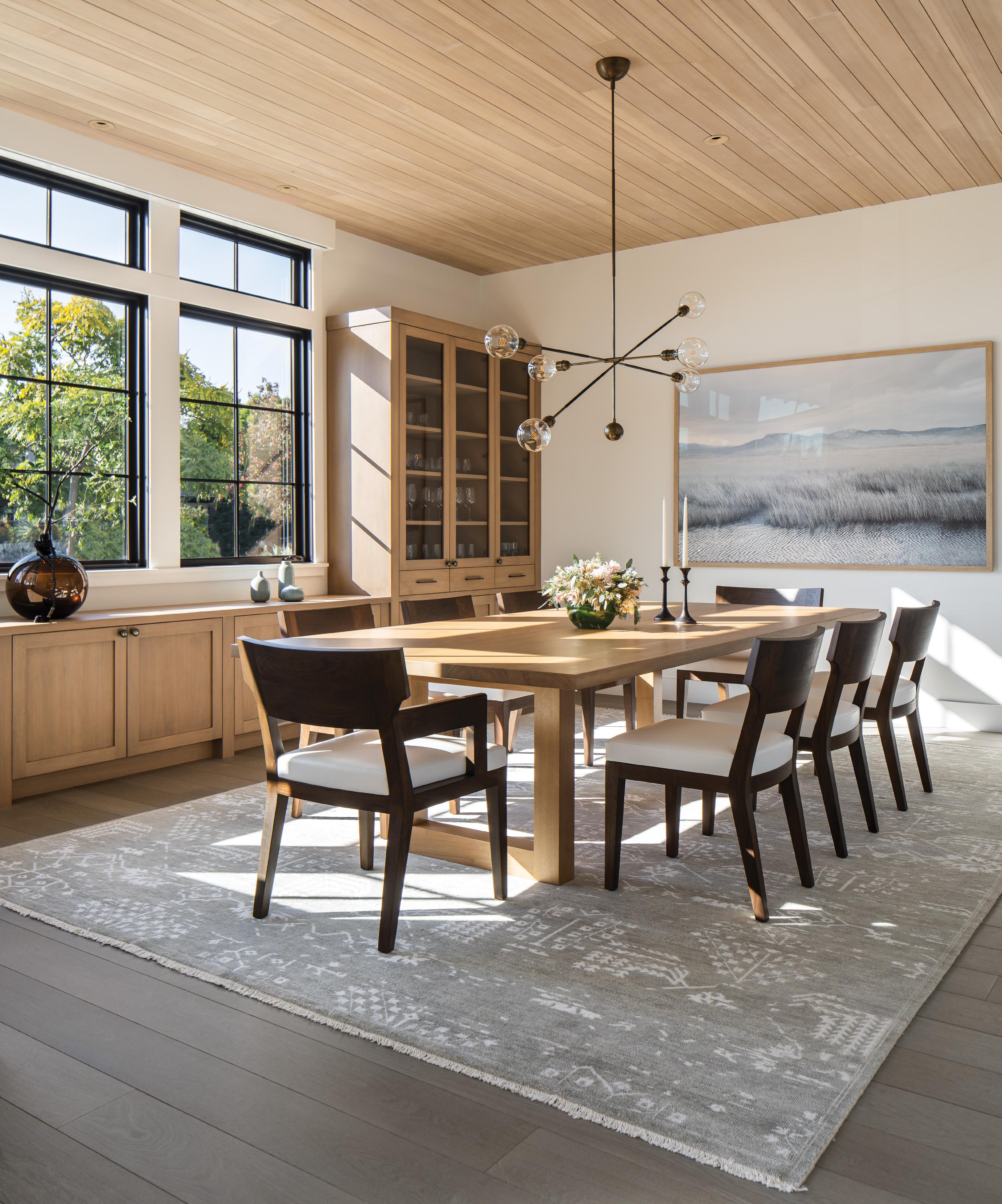
To customize the four-bedroom residence to suit the family’s needs, elements including a pool, sport court, detached guest suite above the garage and home movie theatre were neatly folded into the overall design plan along with a palette comprised of clean and simple neutral hues in shades of grey, black and sand, with bleached walnut and oak wood.
“I’m really into rooms having focal points and some sort of symmetry and alignment. When a
house is organized and well laid out, it provides a tremendous amount of calm and tranquility,” explains Alana. “Because this family is very active, we needed the spaces to be open. Everything I worked on was to give them a private little sanctuary so once they come in the door, it is like they’ve arrived.”
Mindful of creating a cohesive flow and individual moments in each space, Alana made thoughtful and intentional choices in every aspect of the design. “I made sure that in each space there was something lovely to look at. It’s very pretty, and it just flows.

I am always appreciative of how spacious it feels. When I walk in, it has a sense of calm. I like seeing the character in each of the rooms. For me, it is such a labor of love.”
One of the initial purchases was an Infinity Cluster chandelier by John Pomp that hangs in the entryway. “It reminds me of jewelry or pretty dangly earrings,” says the wife. “My kids love the Anton club chair by Studio Van den Akker in our piano room. Alana had it upholstered in a fuzzy, soft fabric, and the kids love to curl up in it.”
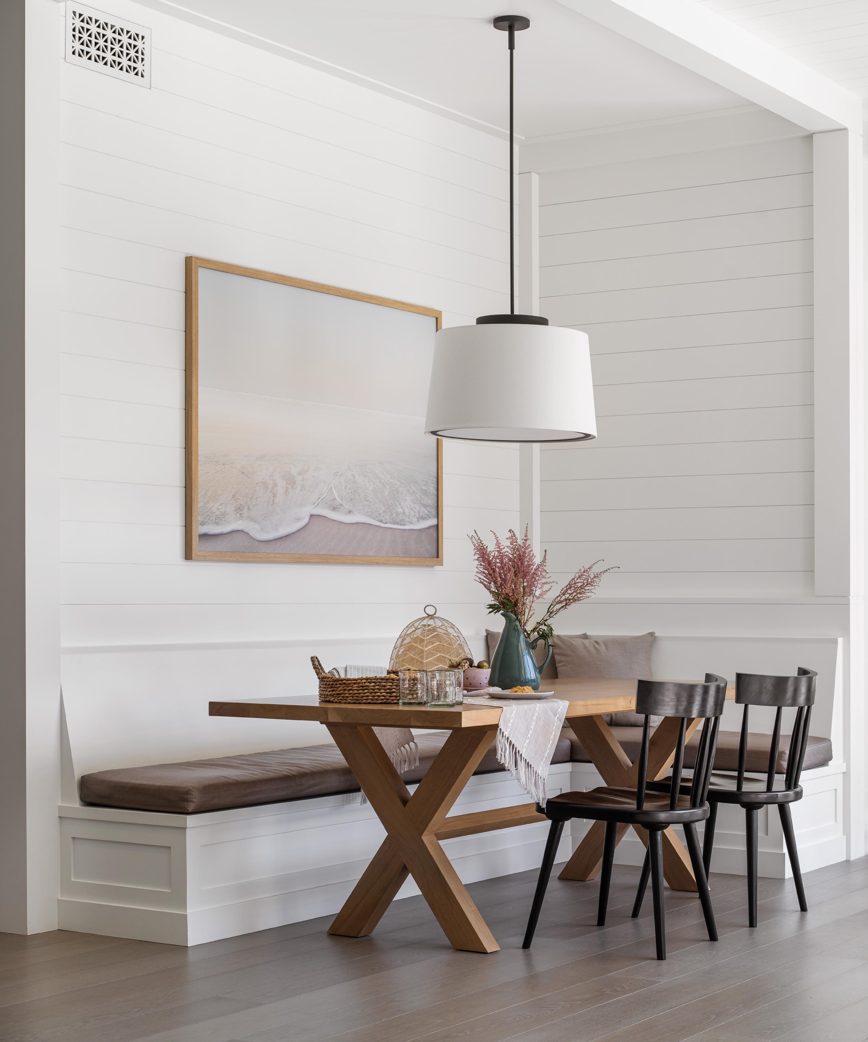
For added character and interest, they incorpo rated three vintage, reclaimed wood beams from Vintage Timberworks in Temecula—serving as the mantle in the living room, a column located near the stairwell into the dining room and a horizon tal beam when entering through the front door. They designed a dining nook to accommodate the family’s individual schedules when a meal together
“Our initial vision was a modern home, but I have always felt that traditional-structure homes age better. So we married the best of both worlds and decided to build a modern farmhouse.”
isn’t possible.
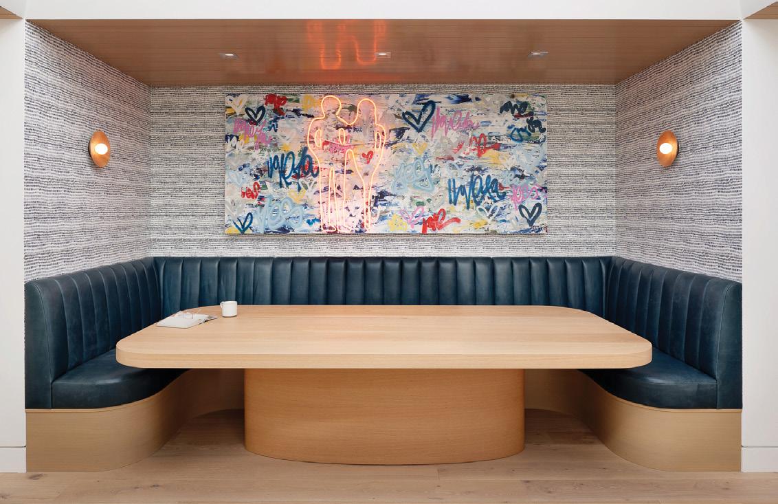
The space is layered with a custom bleached walnut wood table by Alana Homesley Interior Design, a banquette upholstered in a stain-resistant vinyl fabric by Holly Hunt, and a photograph entitled Seagreen by New York–based photographer Petros Koublis framed in oak to bring in a sandy element.
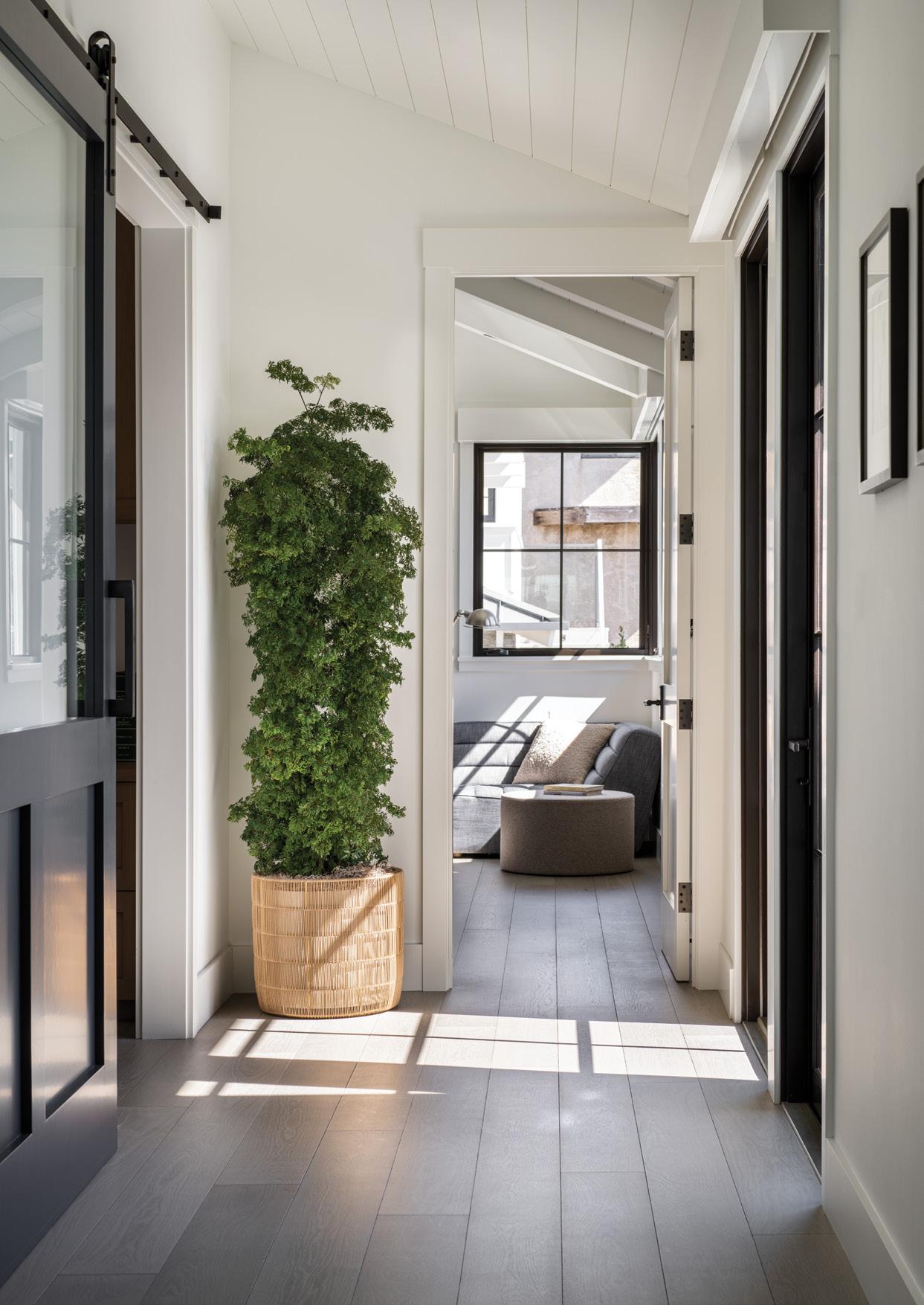
“This was an area that I really got into and developed. We wanted it to be practical and pretty and enclosed,” adds Alana. “I introduced the artist to the client, and she loved his work so much that she bought four pieces. His landscapes are incredibly ethereal and appear both boundless yet somehow contained.”
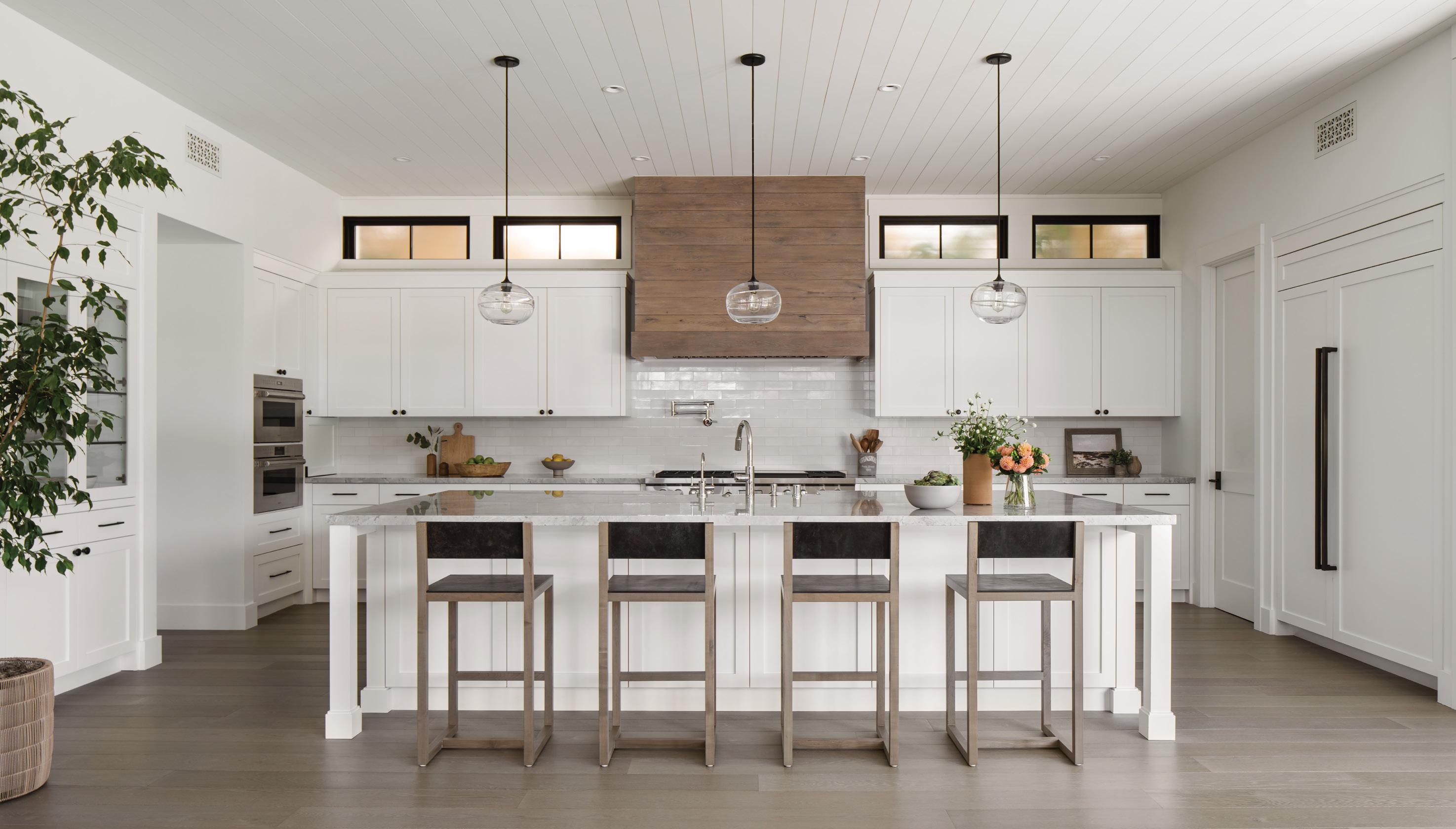
To connect the space to the kitchen, Alana chose a Classic Field tile in antique white by Heath Ceramics for the backsplash, a dolomite countertop in super white and clear band pendant lamps by John Pomp. The hood is clad in rustic solid oak plank.
“It’s very spacious, so we wanted to make it as clean and open as possible,” explains Alana. “We talked about painting the island a color, but we chose a dolomite countertop with some greys and blues and movement so it provides visual texture. Up close, it has a handmade quality and organic nature. For lighting, I chose handblown glass fix tures. They are there, but your eye goes past them and through them.”
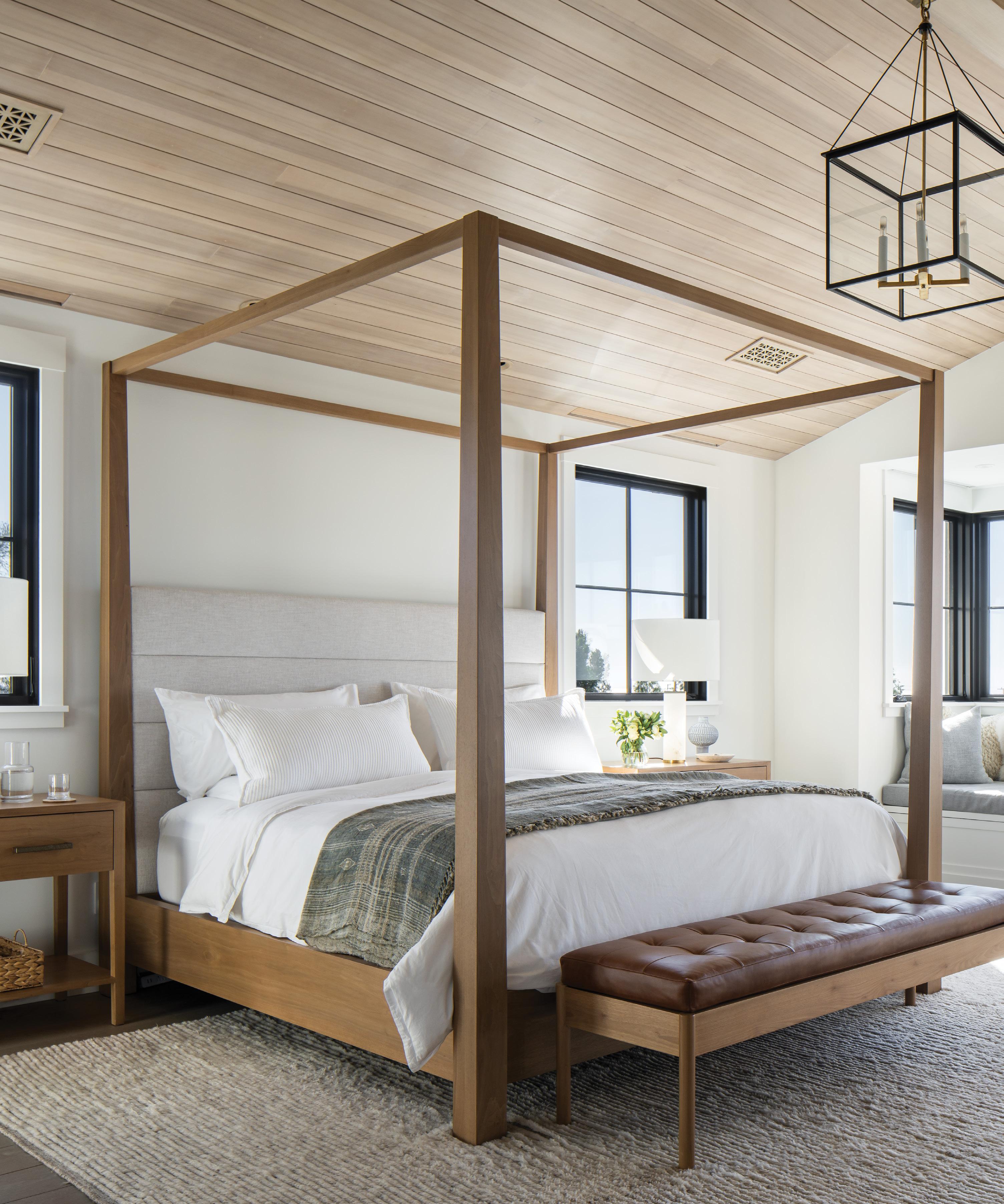
In the primary bedroom, a pitched ceiling is com prised of bleached hemlock. Alana designed a cus tom canopy bed in a bleached walnut and layered the space with a Koublis photograph, Berenices, and a Moroccan hand-knotted wool rug by Marc Phillips.
“It’s a very voluminous bedroom, and I needed to widen the bed and nightstands to have the win dows line up with the nightstands,” adds Alana. “The window seat has one of the best views in the house. It’s nothing but ocean out that window.”
The warm and inviting great room—one of the
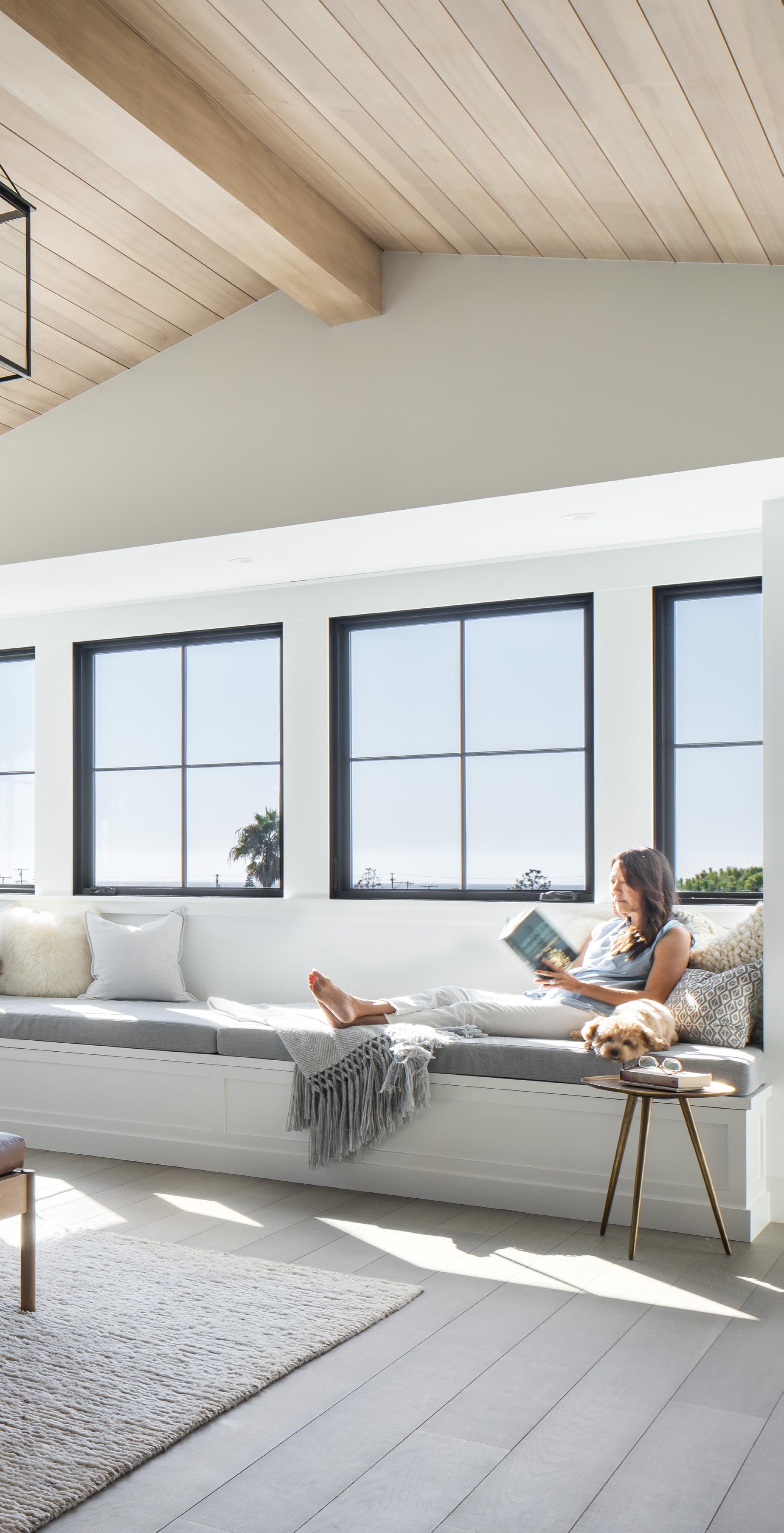
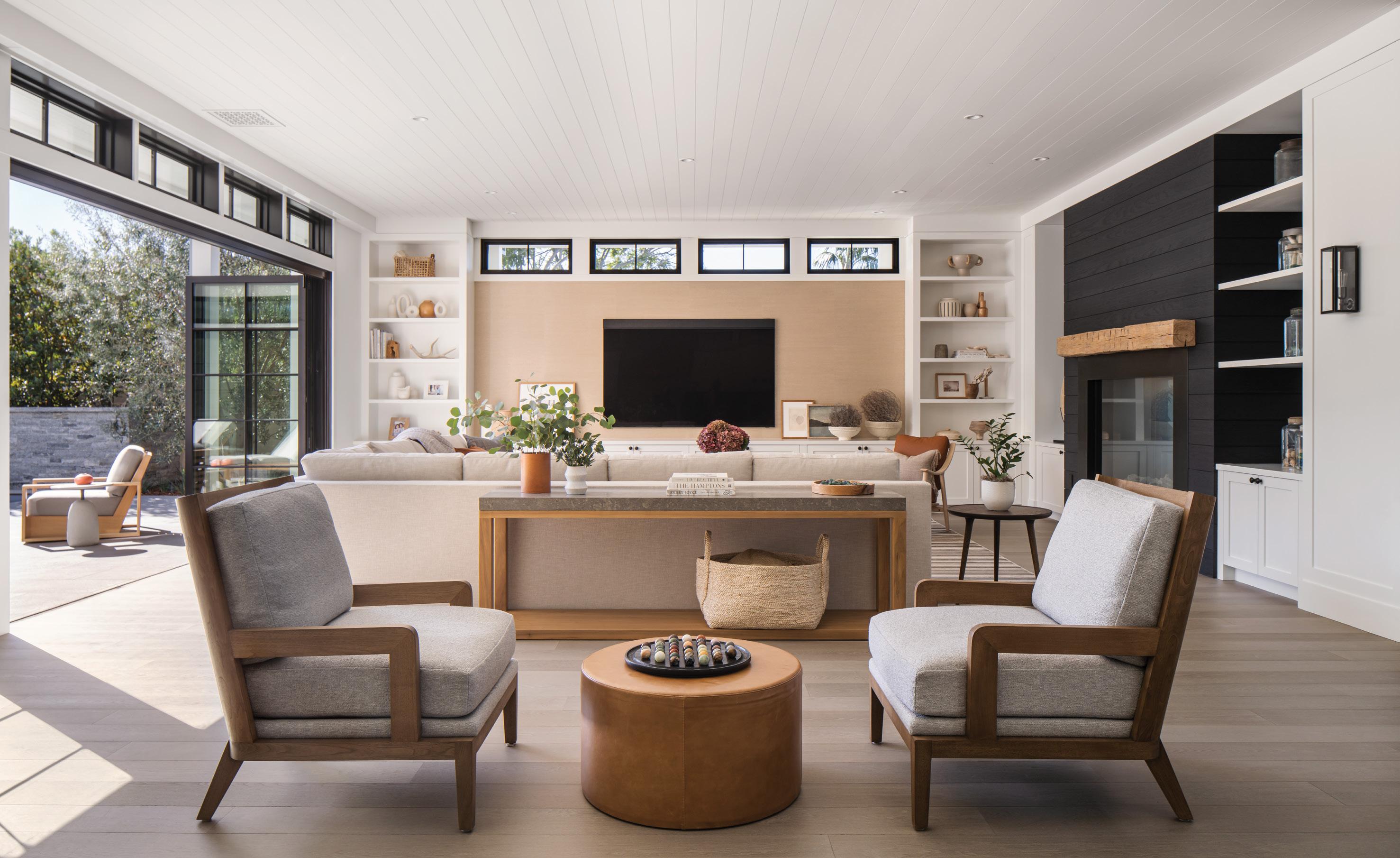
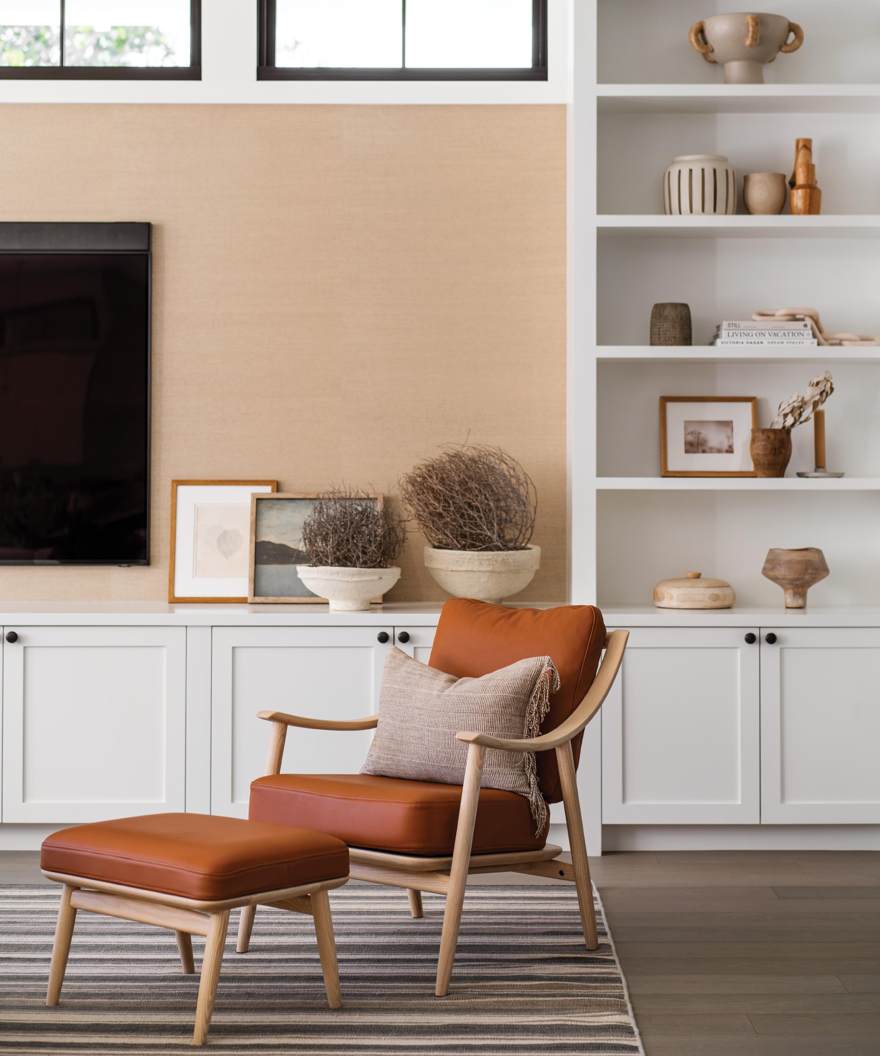
family’s favorite spaces—is fashioned with Manila Hemp grasscloth wallpaper in putty by Phillip Jeffries, a No. 2881 sectional sofa by A. Rudin upholstered in Soft Touch fabric in white sands by Perennials, and a striped flatweave rug from Mansour. “We love our living room because it is a generous size,” says the owner. “We can all spread out and be together.”
The house, now completely finished, has fulfilled all of their expectations. “Whenever we travel and come back home, we love that feeling when we first walk in the door. It feels peaceful. And I love the smell. The kids call it a ‘new smell.’” ¢
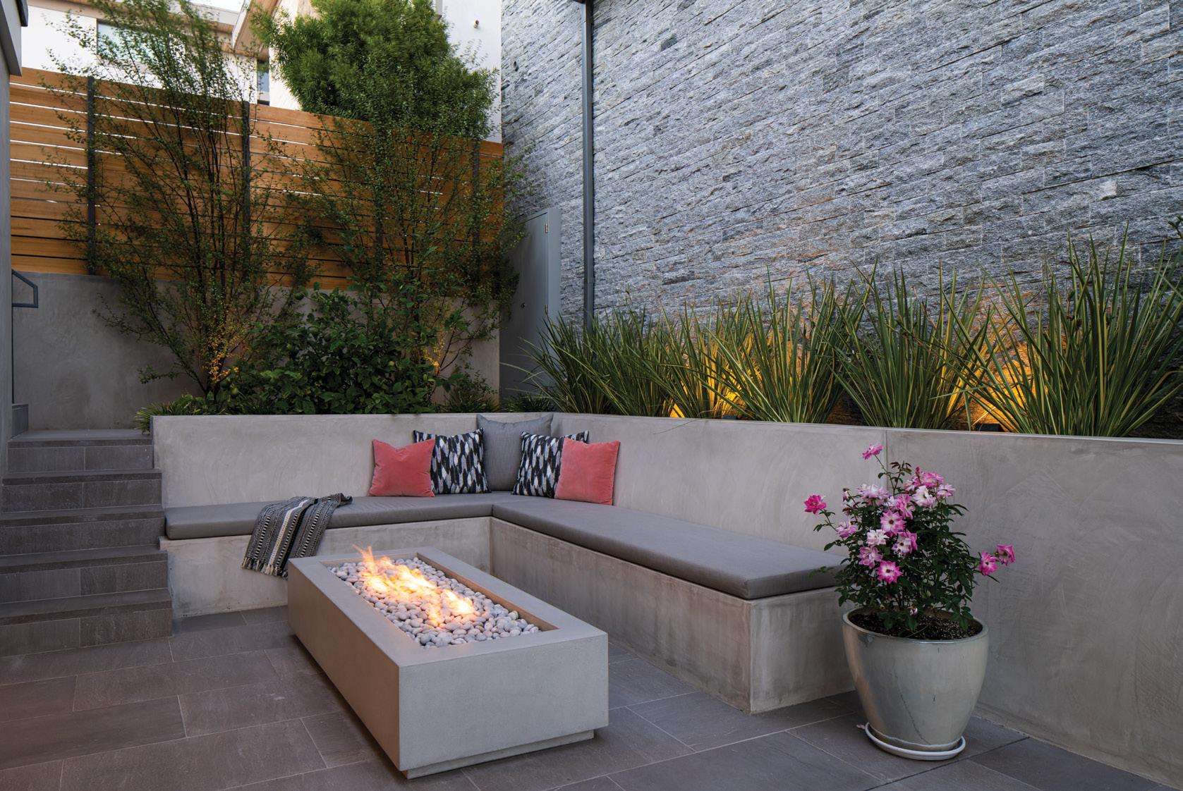
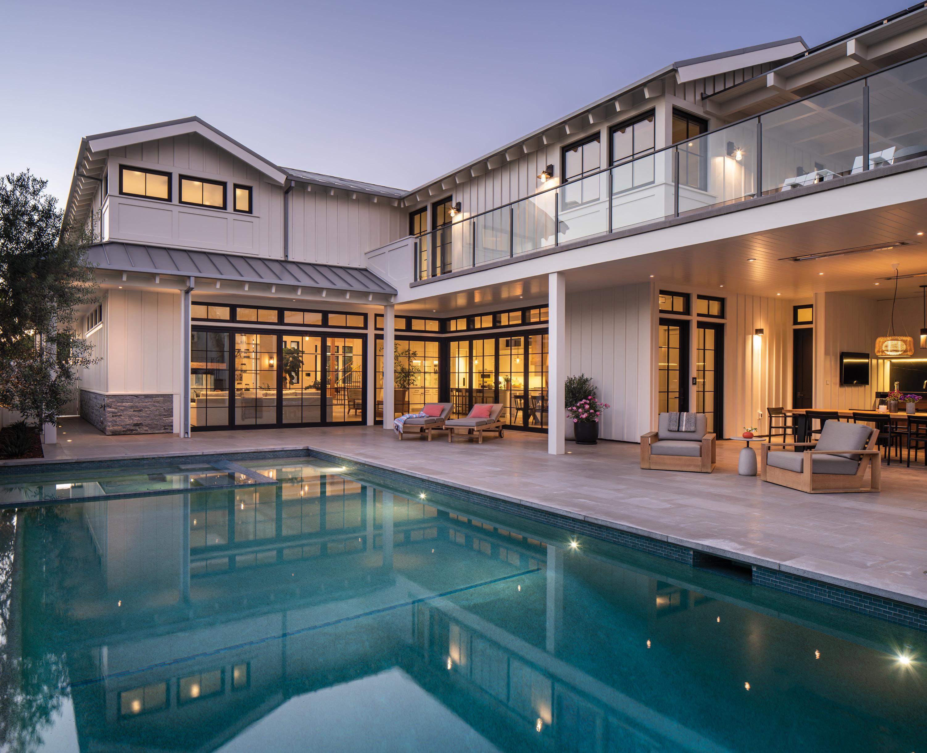
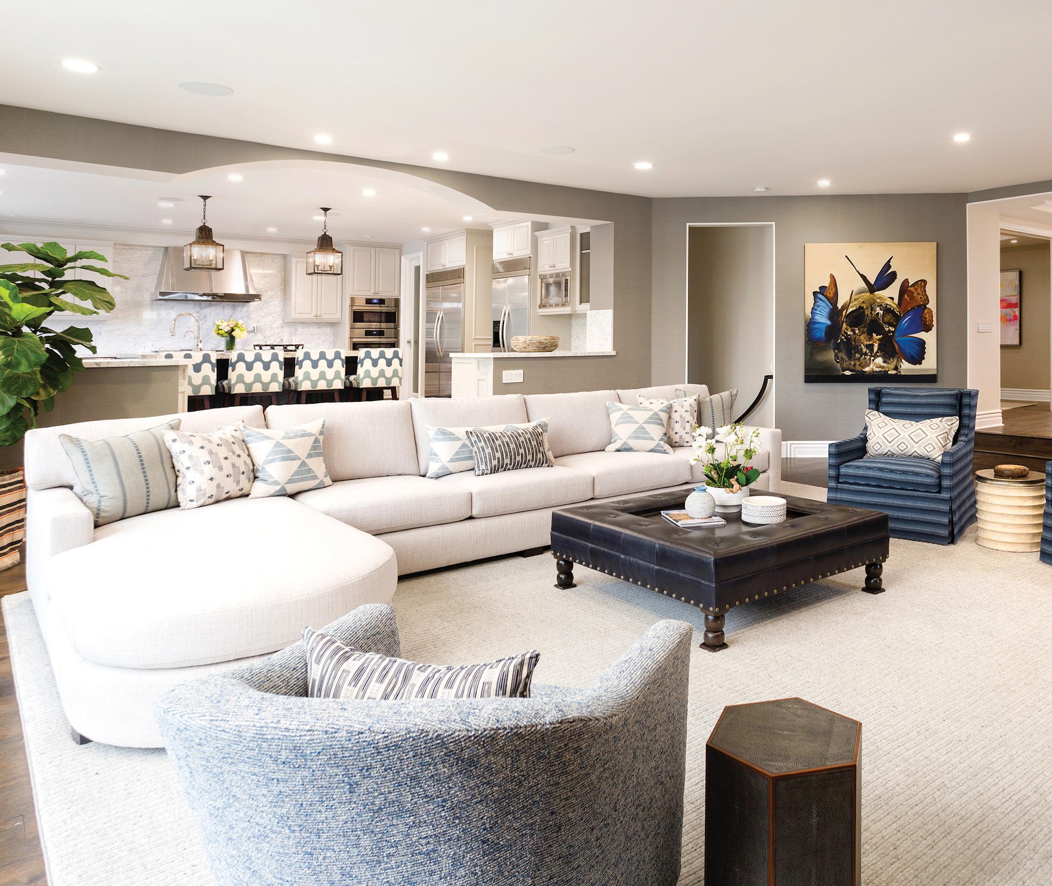
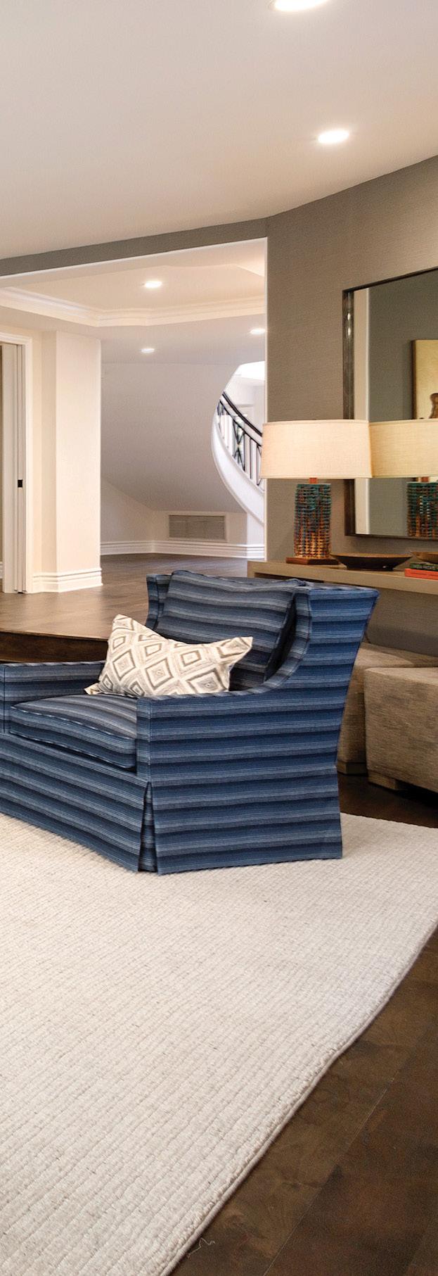
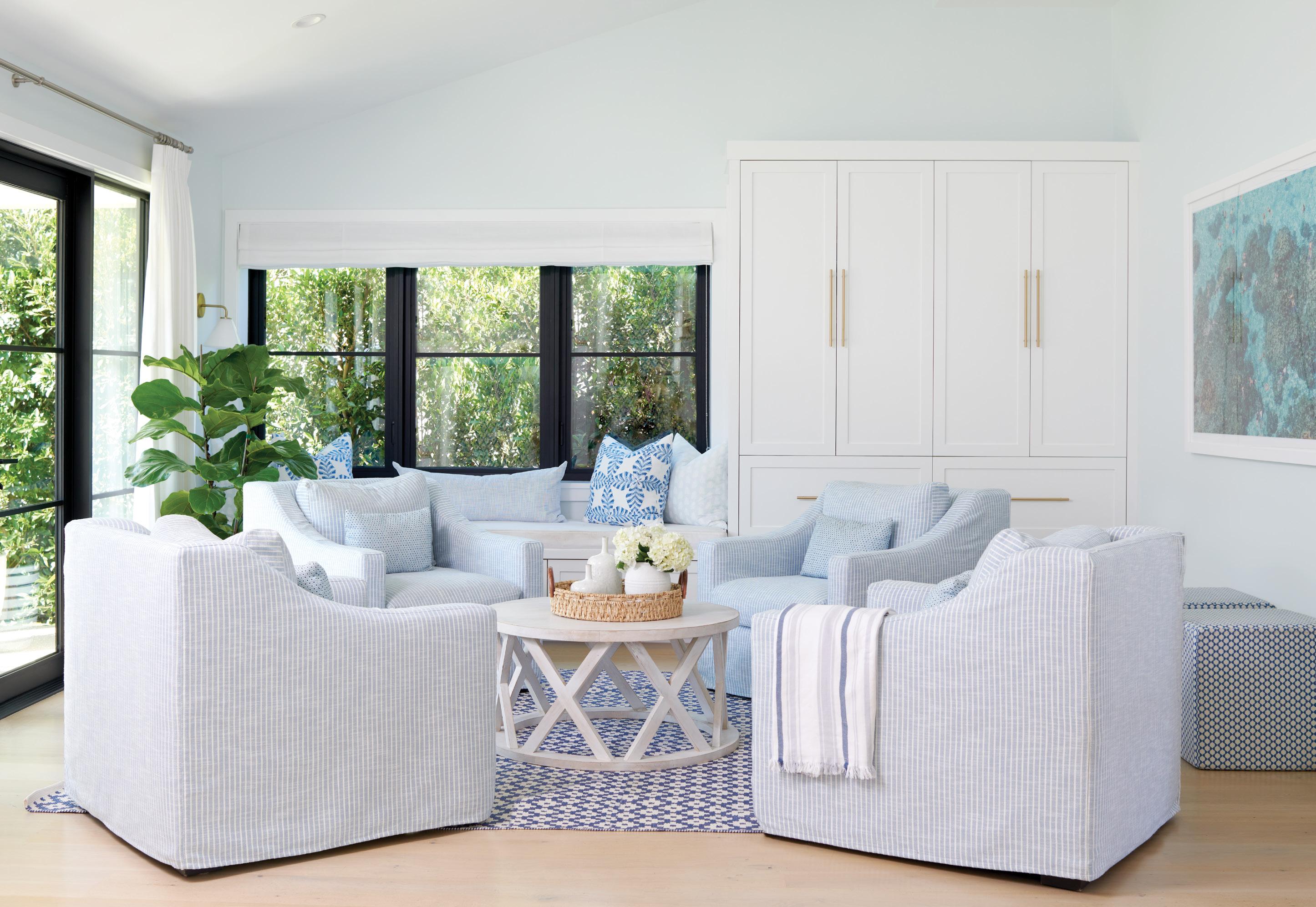
Showcase the palette in the heart of the home. The patterns and textures of blue hues and soft neutrals warm the great room of this contemporary, 10,000-square-foot residence and set the tone for the rest of the home.

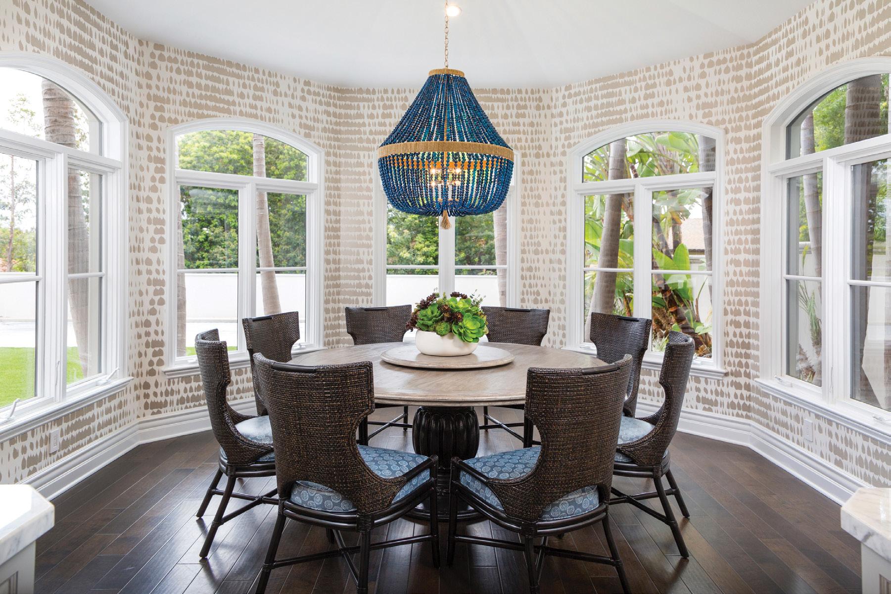
An energetic wall covering and a statement fixture was all it took for this breakfast room. An eye-catching chandelier in our familiar blue paired with Schumacher’s Queen of Spain paper accentuated the design and brought life back into this space.
Keep it clean and timeless. Trends come and go; save the statements for lighting and art throughout your home. Our intention with this secondary powder was to keep it smart and sophisticated so it can be enjoyed for many years to come.

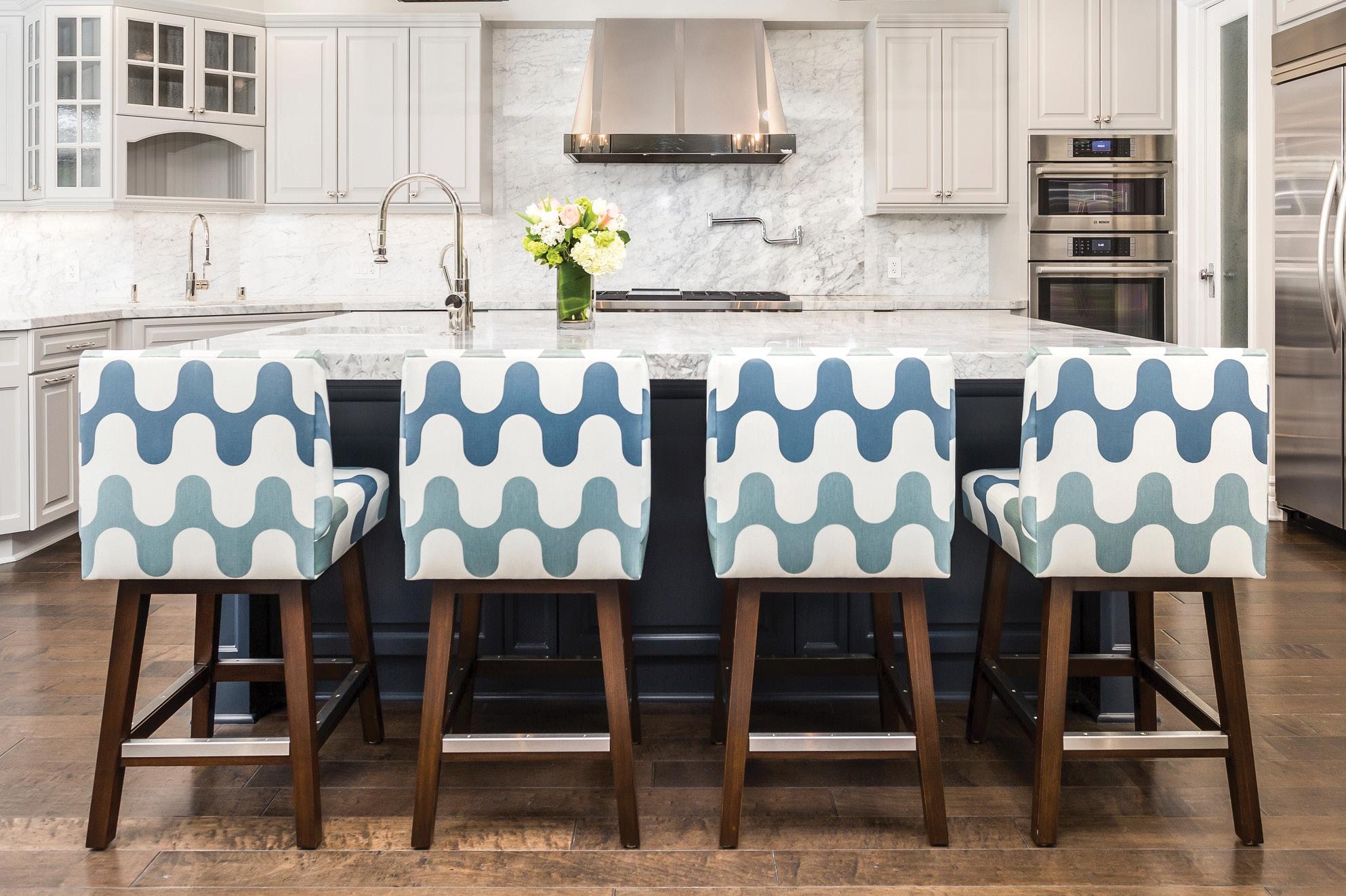
Put the fun in functional. Kids don’t have to stop you from upholstering your counter stools in a fun fabric. We added some funk and flair to this elegant kitchen with custom, laminated stools for everyone to enjoy— stain-free AND worry-free.
Bina Bildman Manhattan Beach 424-206-1532 bina.murphy@gmail.com binainteriors.com @binainteriors


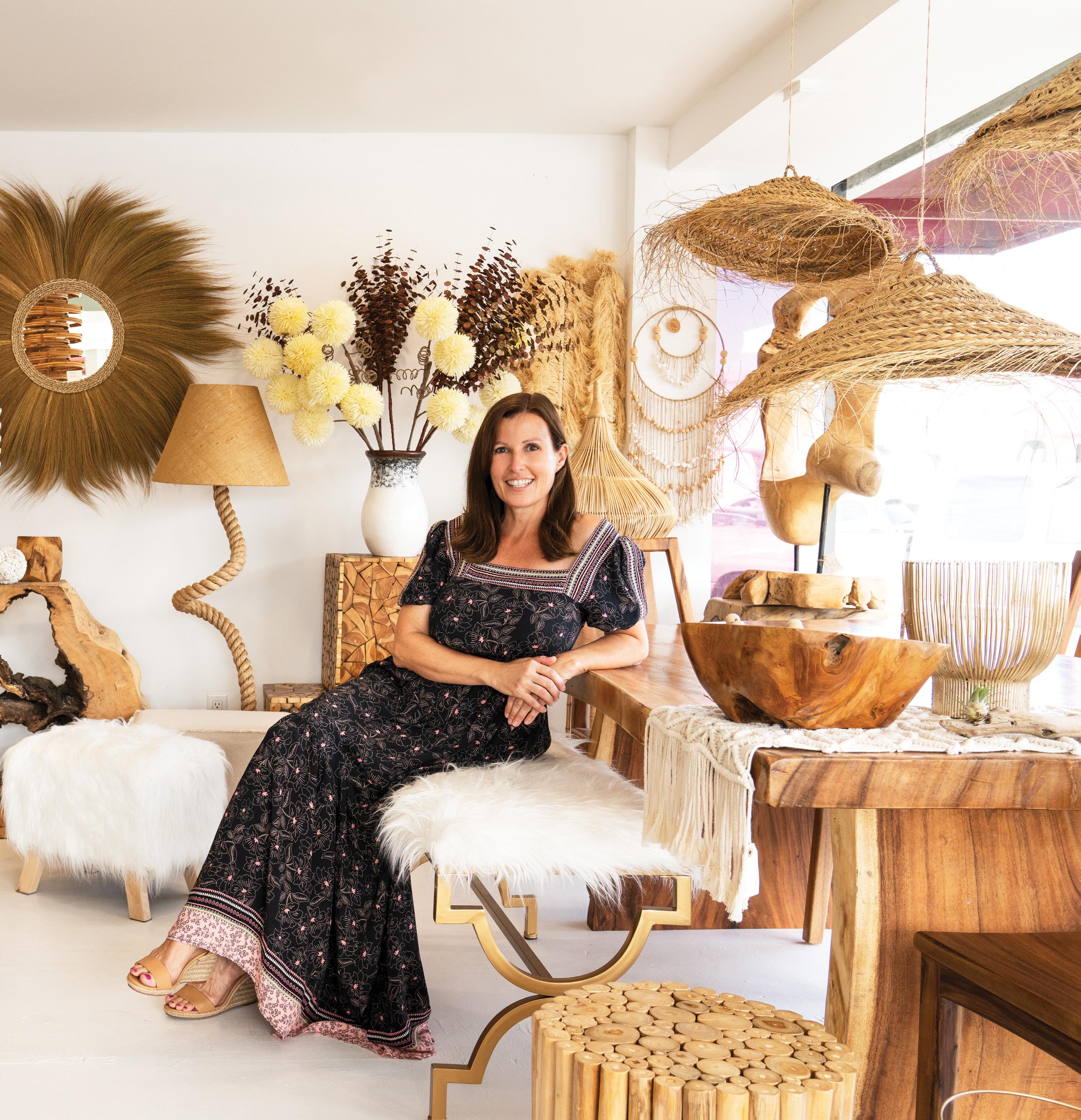
Despite its urban location, a boutique furniture store on Pacific Coast Highway and 5th Street radiates nature. Owner Alexandra Osborn defines her design aesthetic as closely aligned with the outdoors, emphasizing wood and earthy elements. She named the store Gaia Living Art after the Greek goddess and mother of all life.

Born and raised in the quaint town of Senlis, France, just outside Paris, Alexandra grew up surrounded by historical monuments, museums, ancient architecture and France’s rich culture. “It becomes a part of you,” she says. Even her mother’s ability to craft a beautiful, delicious meal transports her back to France as she still remem bers the flavors in vivid detail.
She spent most summers as a young girl with her grandfather in the South of France living off the land. Her desire to create designs developed during this formative time. He taught her wood working and how to produce something original from what they found. It’s also where she culti vated an appreciation for natural art, or “making something from nothing,” as she says.
Alexandra strives for unique signature pieces that both make a statement and complete the feel of the space. Her philosophy is “less is more.”
Ultimately, she believes furniture should be func tional or purposeful, thus positively contributing to the room.
The Hermosa Beach store, her first business, debuted in 2019. She admits finding the balance between marketing, creating and family life is challenging—although she jokingly suggests the store offers “some relief” from the family demands of being a mother and a wife.
While not a South Bay native, Alexandra had a connection through her husband, Michael, whom she met in 1996 in the French Alps. Michael has cousins and nephews, the Johnsons, who are multigenerational “South Bay souls.” They have been extremely generous showing what she calls “true South Bay love” in helping them plant roots in the community—a magical place they call home.
Most people find the store by word-of-mouth. Often customers will say, “I have driven by so many times and have always wanted to stop in.”
Obsessed with furniture, décor and design, Alexandra has a gift for finding creative, original pieces. She is also confident in bringing a cus tomer’s vision to life regardless of style. Her goal is to cultivate happy customers who find joy in a beautiful design. Alexandra believes good
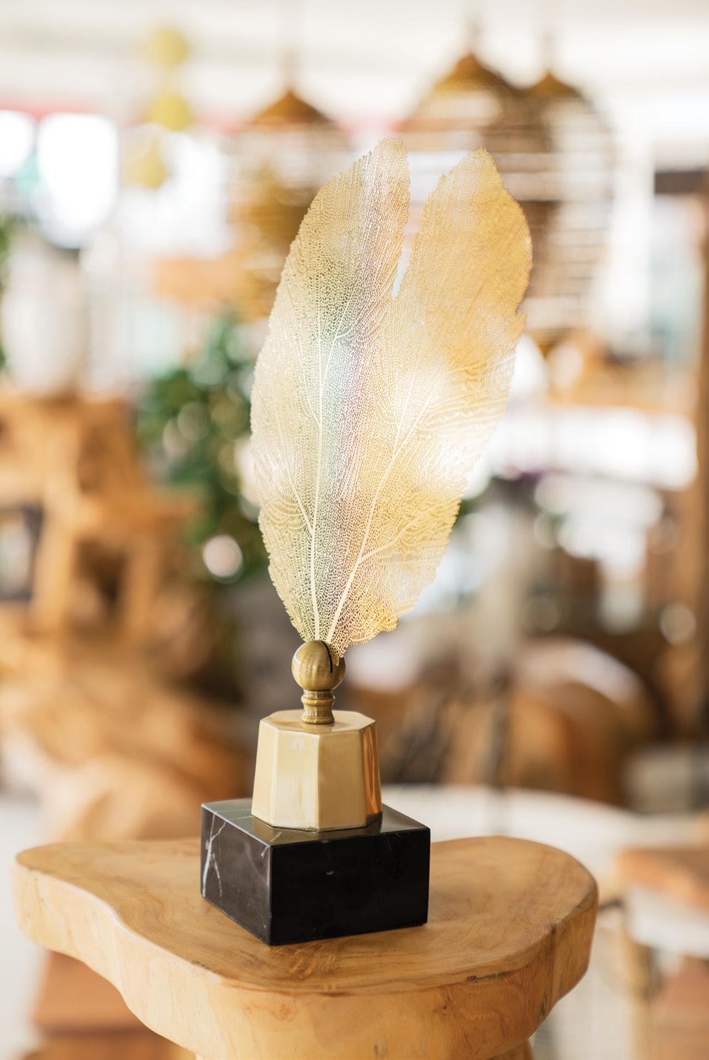
design depends on how everything feels in the space. It’s how the pieces fit in a home and the energy created.
While she started working with driftwood collected on the beaches of Malibu to create unique designs, Michael now handles most of the woodworking. Alexandra sets the design, and she knows by the look on her husband’s face whether it is a hit or miss. The beauty of working with wood, she says, is that if you make a mistake, you can take a step back and rethink what else the piece could become.
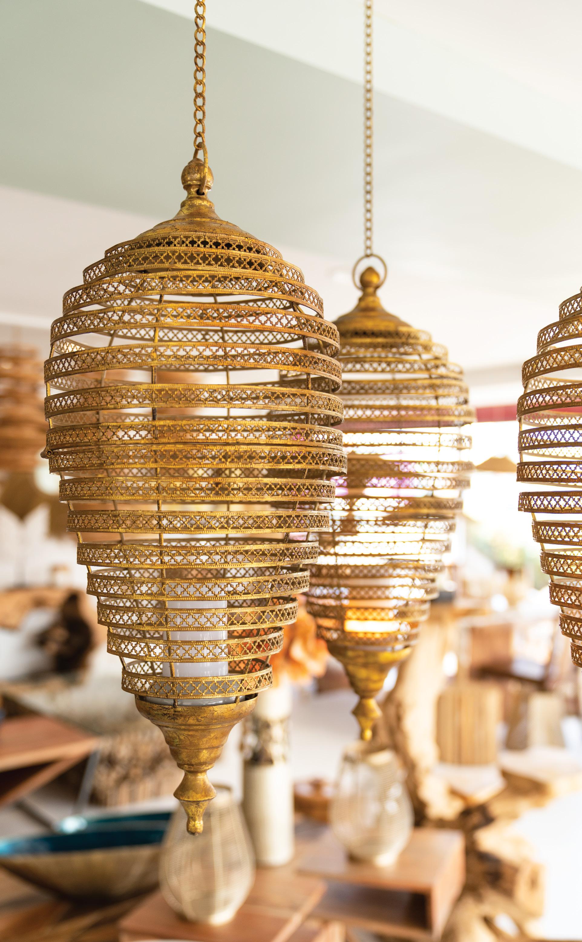
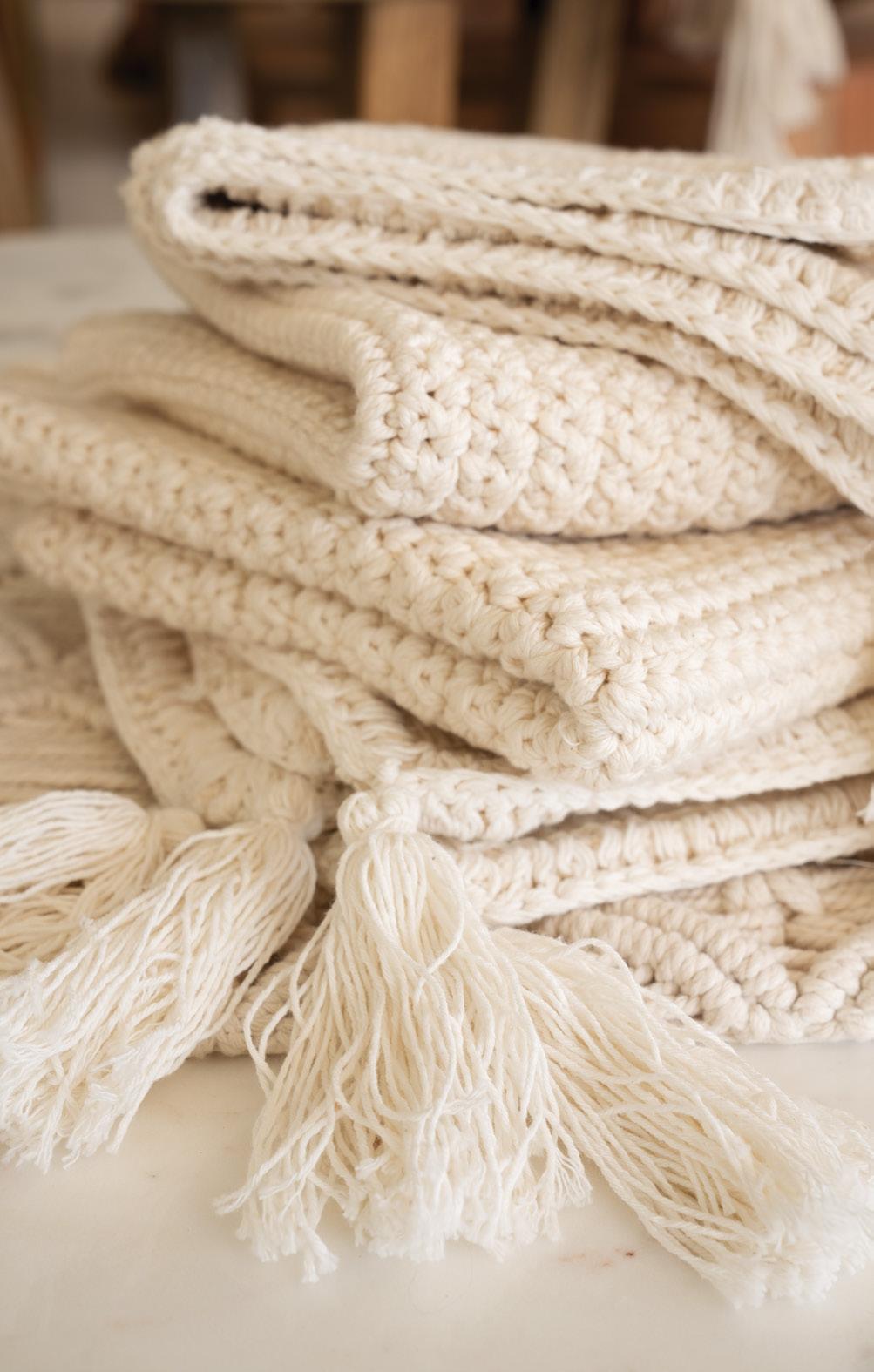
The small store is a treasure trove of specially curated items that Alexandra has designed or sourced, including lighting, wall decor, tabletop designs, one-of-a-kind gifts and furniture made with natural elements. There is something for anybody looking for a particular signature piece, large or small.
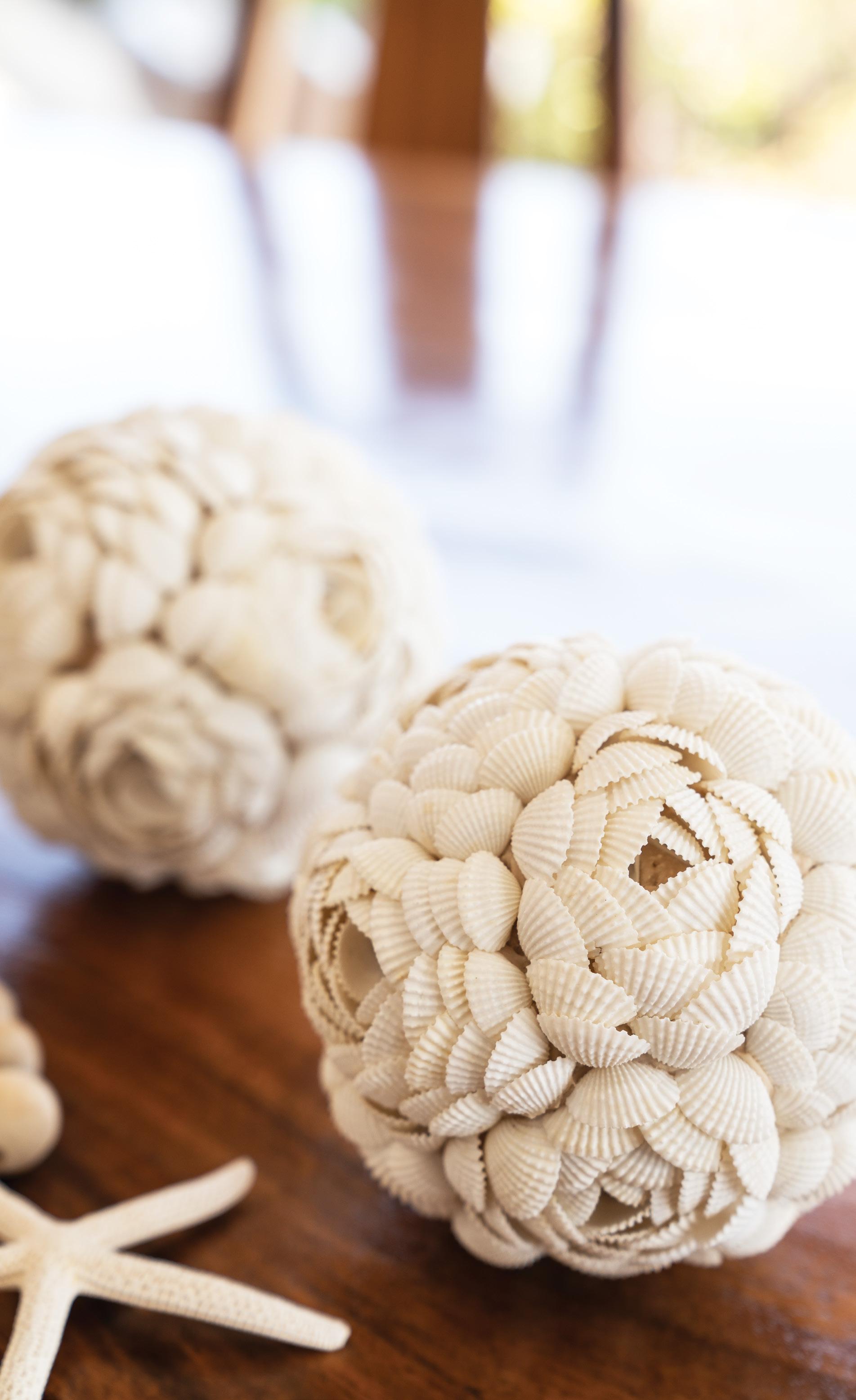
One of Alexandra’s favorite designs was a large tree naturally twisted like a snake. She placed several pieces of round glass on top, creating four individual two-tops that seat eight people.
Next, Alexandra wants to incorporate more contemporary items and a beach-chic level into the store. Always searching for new artist work in addition to her creations, she keeps every thing diverse. On her last vacation to Tulum, she spent most of the trip on narrow back alleys finding great new items to share. Her philosophy is that each item must be unique and spark a conversation or put a smile on a customer’s face.
While she doesn’t have as many opportunities to visit France these days, she is grateful to be in the South Bay with extended family and share her passion for design. It’s also a way to show her daughter, Chloe, now in college, how to fol low her dreams. ¢
 BY GRANT ELLIS
Founded in 1960 by surfer, artist and filmmaker John Severson, Surfer was the longest continuously published surf magazine, referred to as “the bible of the sport.” Featuring a mix of travel articles, contest reporting, surf spot profiles, big wave pictorials and surfer interviews, Surfer worked with the world’s best photographers, writers and graphic designers. This voluminous anthology features the most timeless, inspirational, and historically significant covers and interior pages from the magazine’s exten sive archive. It depicts the chronological progression of the sport, the gear, the style and the world’s top surfers throughout the decades, from Miki Dora to Kelly Slater and Laird Hamilton. $55 at {pages} a bookstore, pagesabookstore.com
SURF TRIBE BY STEPHAN VANFLETEREN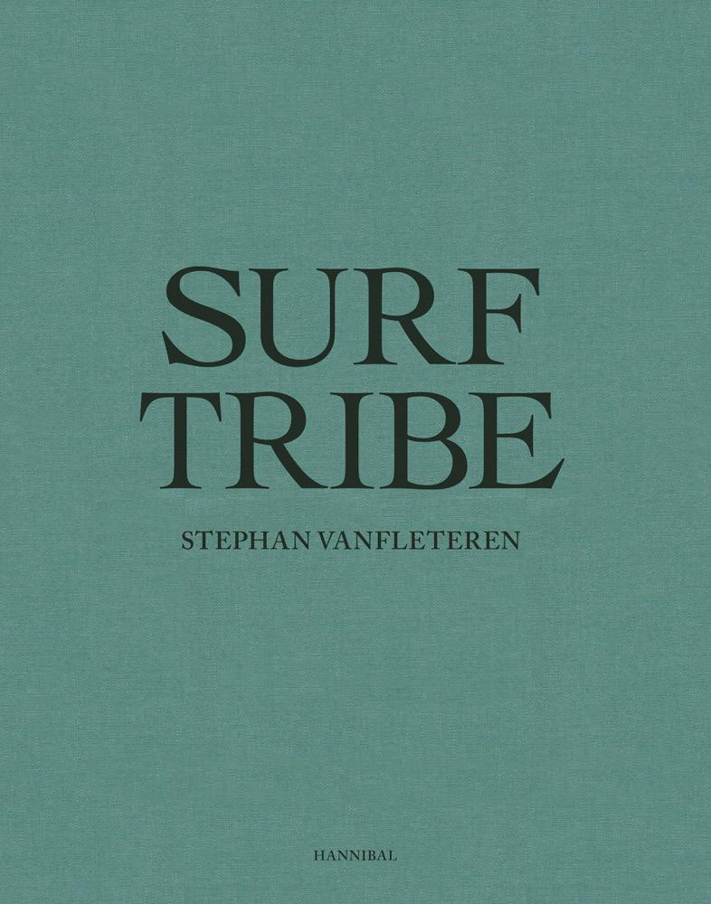
With Surf Tribe, photographer Stephan Vanfleteren shows that there is far more to surf culture than just sport and competition. Surfing is also about a deep admiration and respect for the ocean, as well as the feeling of insignificance when confronted with the forces of nature. Surfers use the waves for fun but also to forget and to bat tle—both with others and with themselves.
Vanfleteren looks beyond the traditional borders of the United States and Australia and searches the globe for people who live in places where sea and land meet. He doc uments a fluid community with nature as its sole leader. He has sought out young talent, living icons and old legends—both compet itive and free surfers. $75 at Maison Luxe in Hermosa Beach, maisonluxehome.com
The New Outsiders celebrates outdoor creativity and inspires a new outdoor generation to live a life less ordinary under the open sky. There is something about the great outdoors that makes us want to go back each time we return home from a field trip. We crave the crisp, fresh air. We desire the raw experience that only nature can grant us. Driven by the will to unplug from our daily routines, we seek to reconnect with something that feels more authentic. This handsome tome introduces some of the most outstanding of these free-spirited adventurers and entrepreneurs and presents in-depth features on niche activities and must-visit locations. $60 at Maison Luxe in Hermosa Beach, maisonluxehome.com

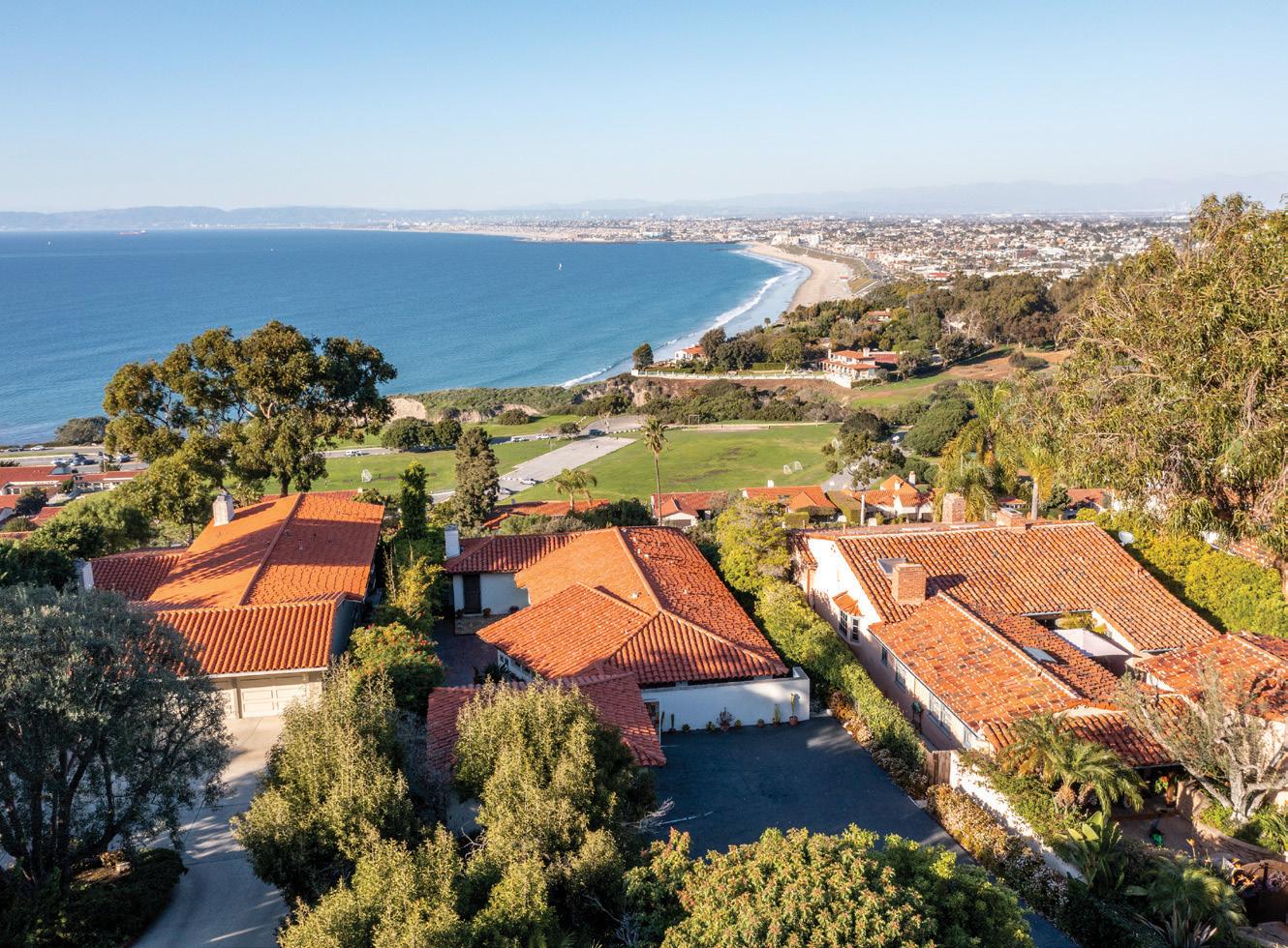
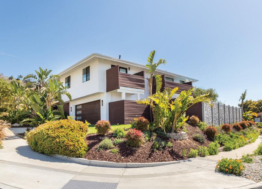
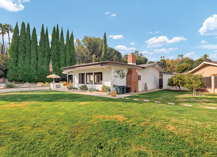
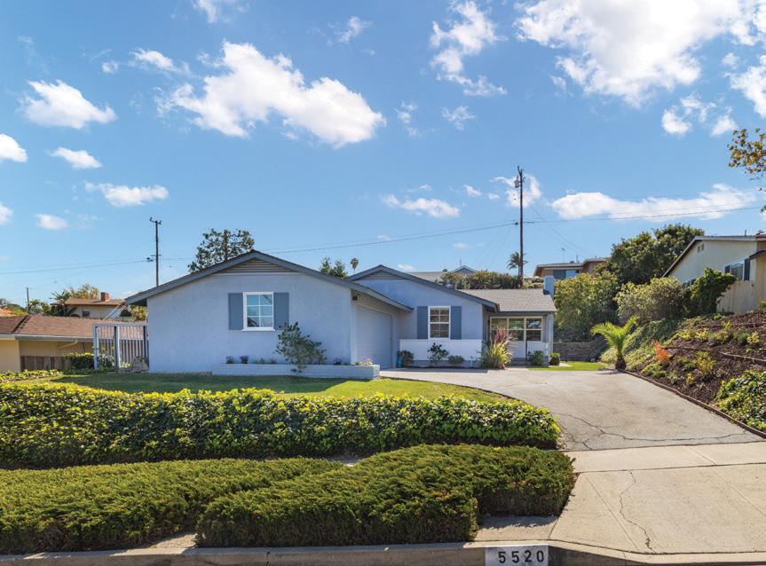
Hills
with unobstructed, panoramic city and Queen’s Necklace views is located in the most desired gated community of Palos Verdes. The home features a sprawling layout, incredible great-room, and high ceilings. Enjoy abundant fresh food with your personal vegetable garden and fruit trees, while
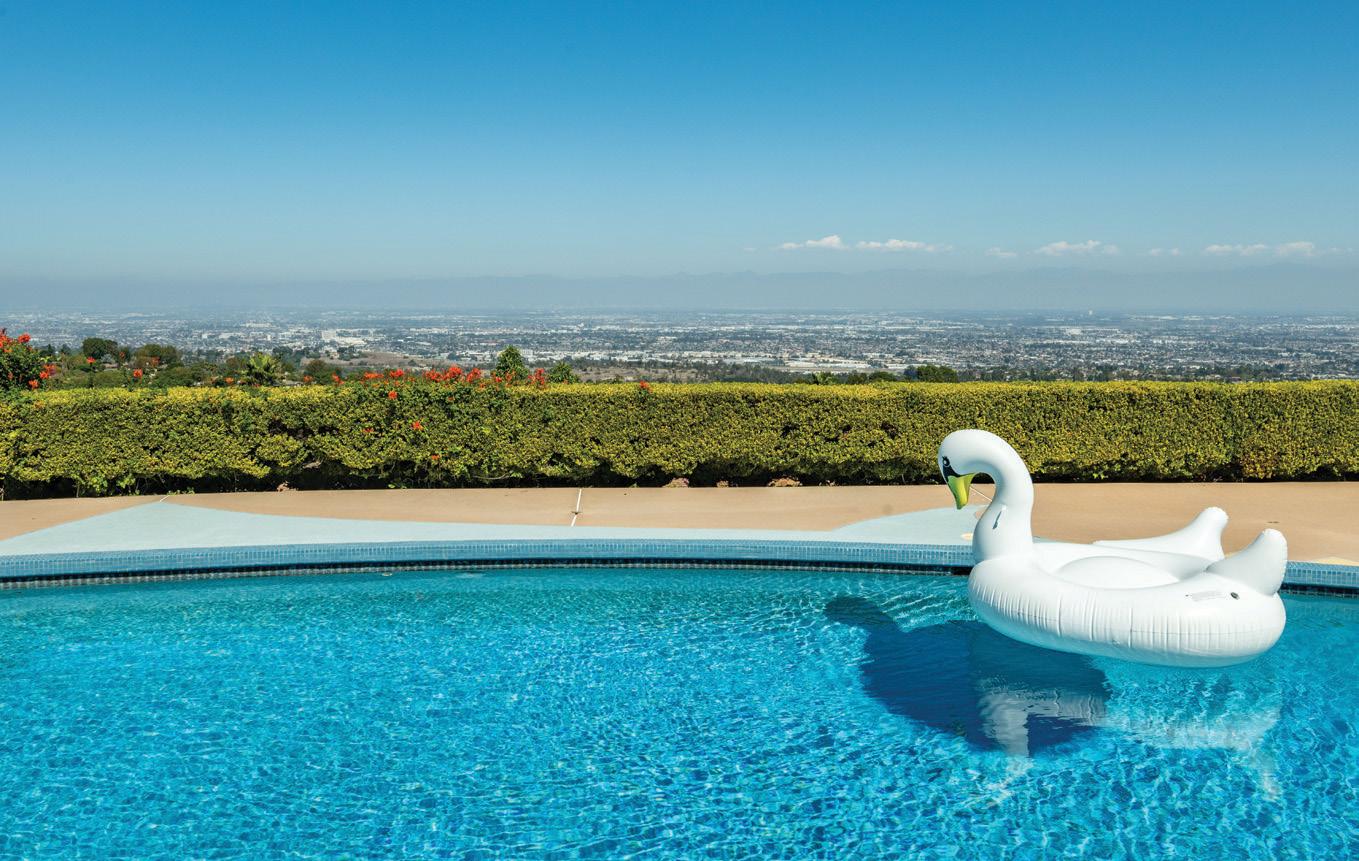
the beautiful rose garden. The surrounding land offers plenty of potential for a barn, guest house, and other useful amenities. With the additional amenities below,
house is ready to be made into your Dream Home!


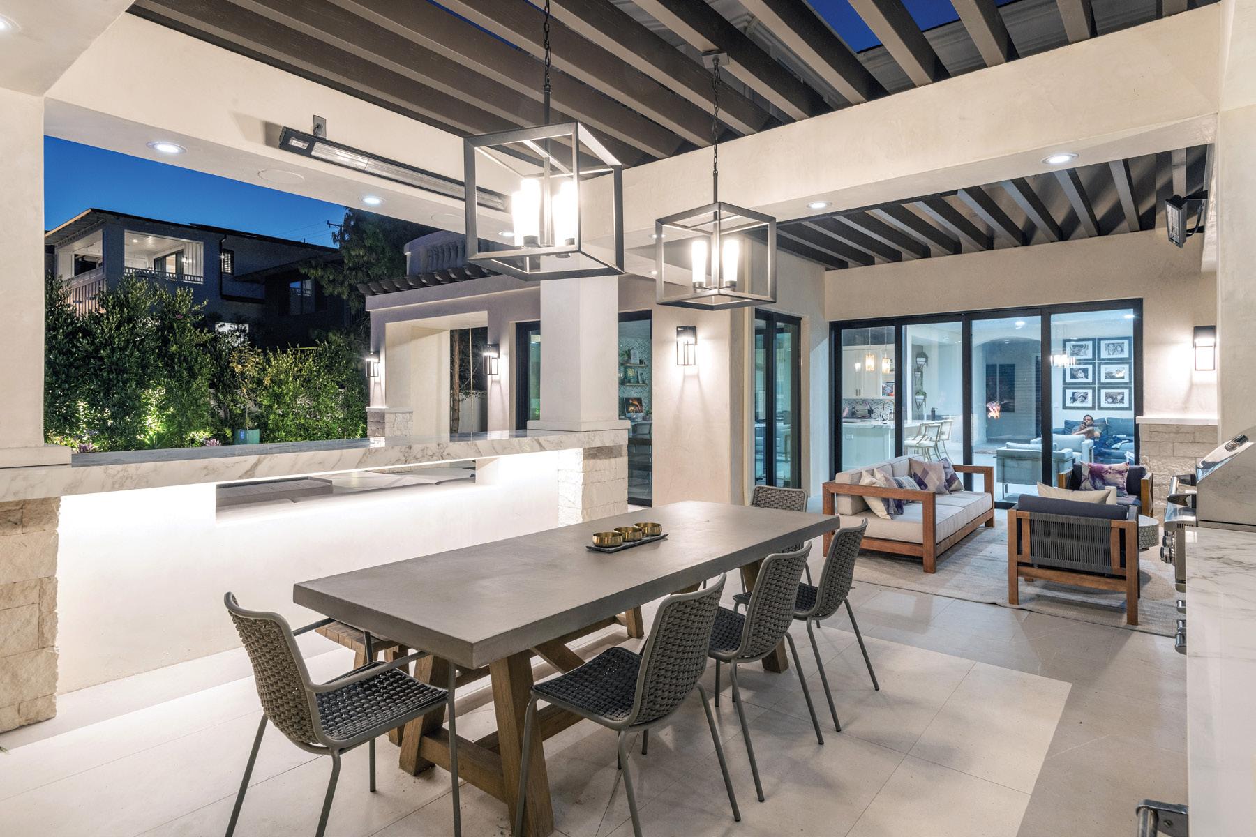
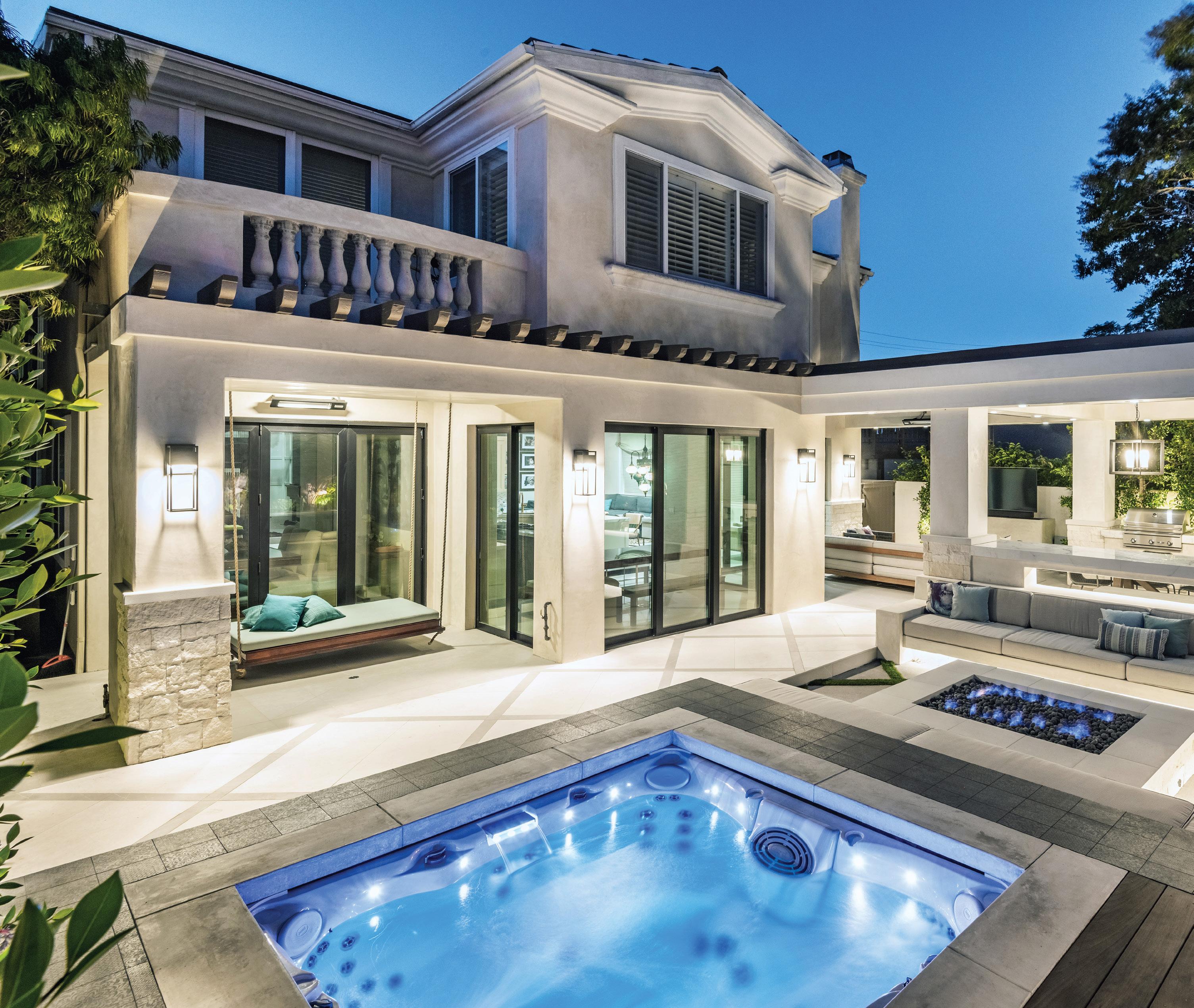
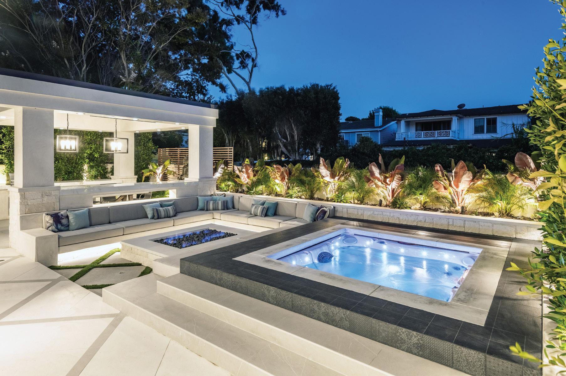
Maximizing small backyards packed with functional architec tural elements is key to making a JDS backyard makeover work. Creating levels makes the yard look bigger and more visually pleasing, plus helps solidify and delineate each usable zone.

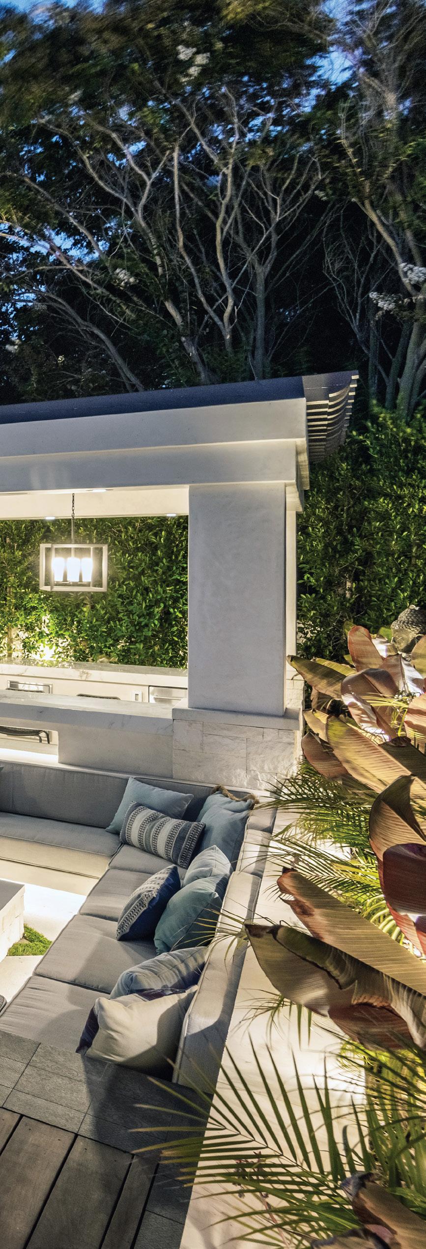
Most backyards should have an overhead canopy to house the kitchen, bar, dining area and lounge. Pergolas like this one are the ideal choice. They create the ultimate indoor-outdoor effect while allowing LED overhead lighting, outdoor heaters and outdoor sound systems.
cost-effective way to cover
unsightly stucco wall: a
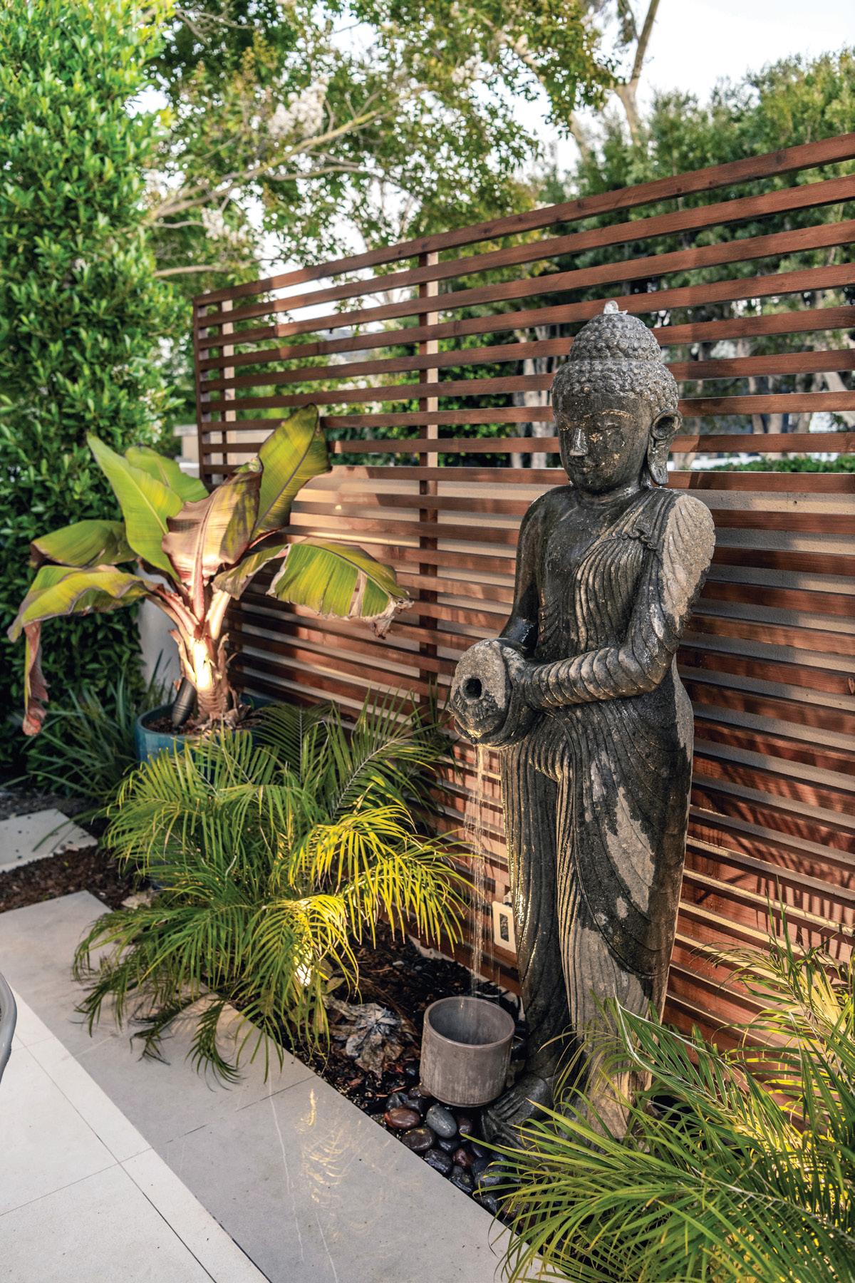


that serves as a
wall trellis, using 2x2
spaced out by
for a
There’s a misconception that a prefab jacuzzi makes a yard look cheap and not well-thought-out. We’ve created a system that drops the prefab into the ground, then we design-build architectural elements around it. Huge savings compared to a built-in jacuzzi.
A MANHATTAN BEACH COUPLE WITH EAST COAST ROOTS REINVENTS THEIR ONCE-DATED RESIDENCE WITH A FRESH TAKE ON CAPE COD STYLE.
For most, the pandemic has served as a life-altering catalyst for inner reflection—an opportunity for restructuring priorities and a time for major change and transition. In the case of Manhattan Beach homeowners Judd and Susie Gilefsky, it meant rethinking their own living space and creating a sanctuary for them selves and their two children, but with a precise and nostalgic design vision: a nod to Judd’s East Coast roots in Massachusetts.
The couple, referred to South Bay interior designer Christine Vroom by a good friend who had previously worked with her on another project in Palos Verdes, knew they needed design expertise to remodel their dated, cabin-like 1950s home they’d lived in for 14 years.

“The prior owners had remodeled and repainted. When we moved in it was fine, but after a decade
we decided to make it our own,” recounts Susie of the 2,300-square-foot residence. “And it was partially due to COVID-19 because we were home more and notic ing everything we didn’t like about the house. We had a dishwasher leak and needed to replace the floors. We asked Christine to lighten and brighten it up.”
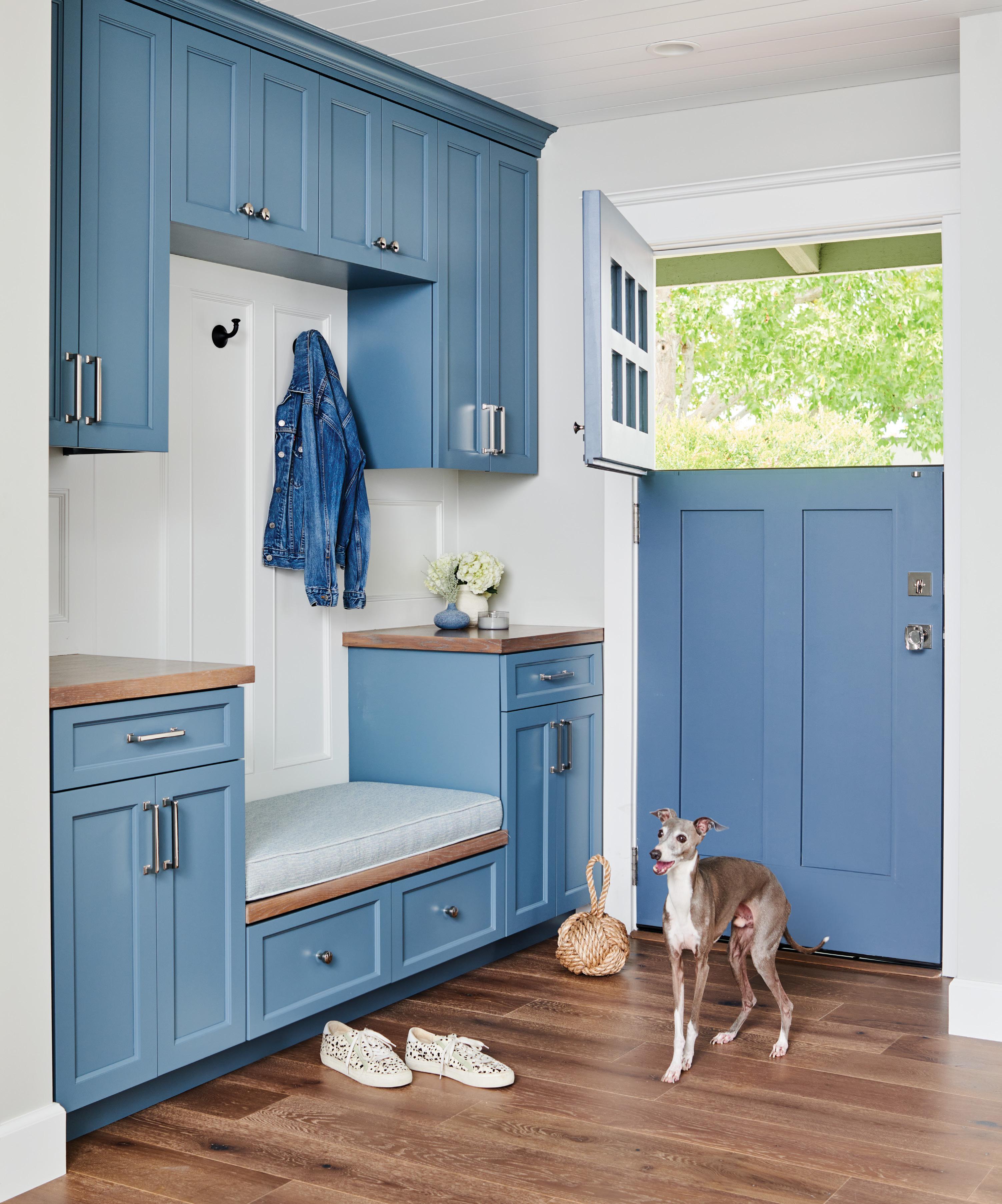
In addition to the couple’s desire for more space for family gatherings and Susie’s regular book club discussions (the existing galley kitchen was tight and cramped) and a mudroom or drop zone for the kids’ backpacks, sporting goods and extra storage, the couple wanted a Cape Cod aesthetic for the partial remodel of the lower level of the home including the kitchen and dining areas. To make it feel fresh and different, Christine—originally from Boston—tapped Lawndale–based company Williamson Homes for gen eral contracting needs and created an interpretation of the look with fresh blues, whites and grey tones.
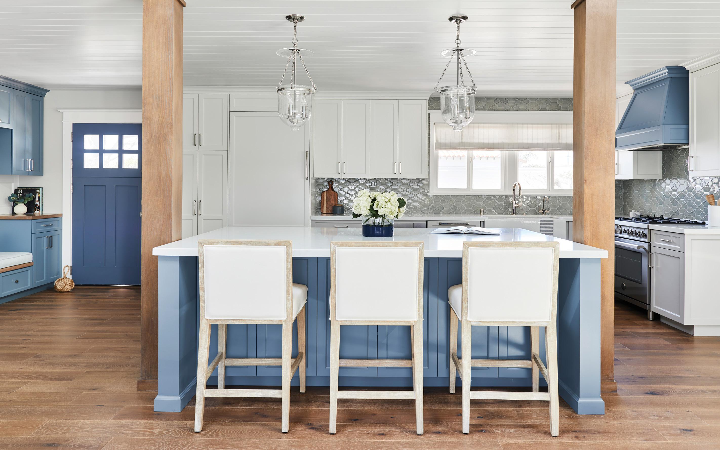
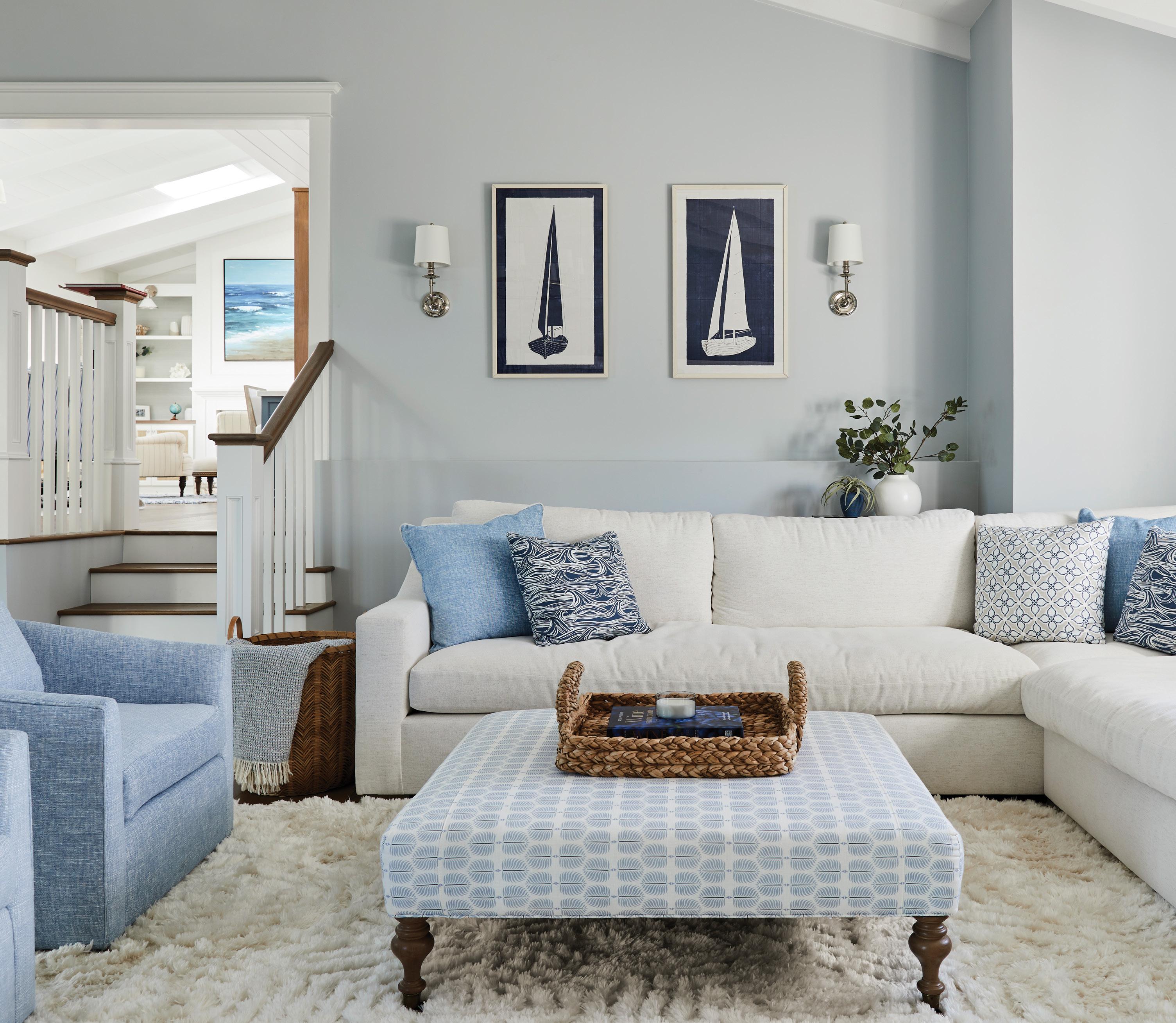
“I think Cape Cod can sometimes go seagull objects and lighthouse tchotchkes. They were very trusting of me, and I got my inspiration from an East
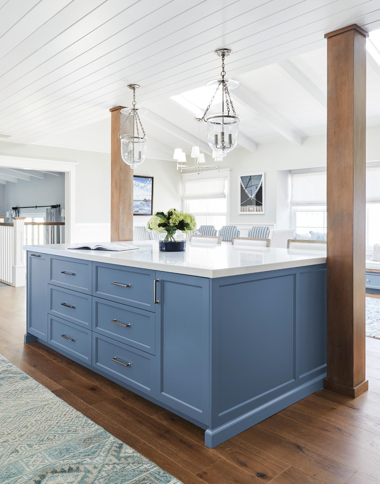
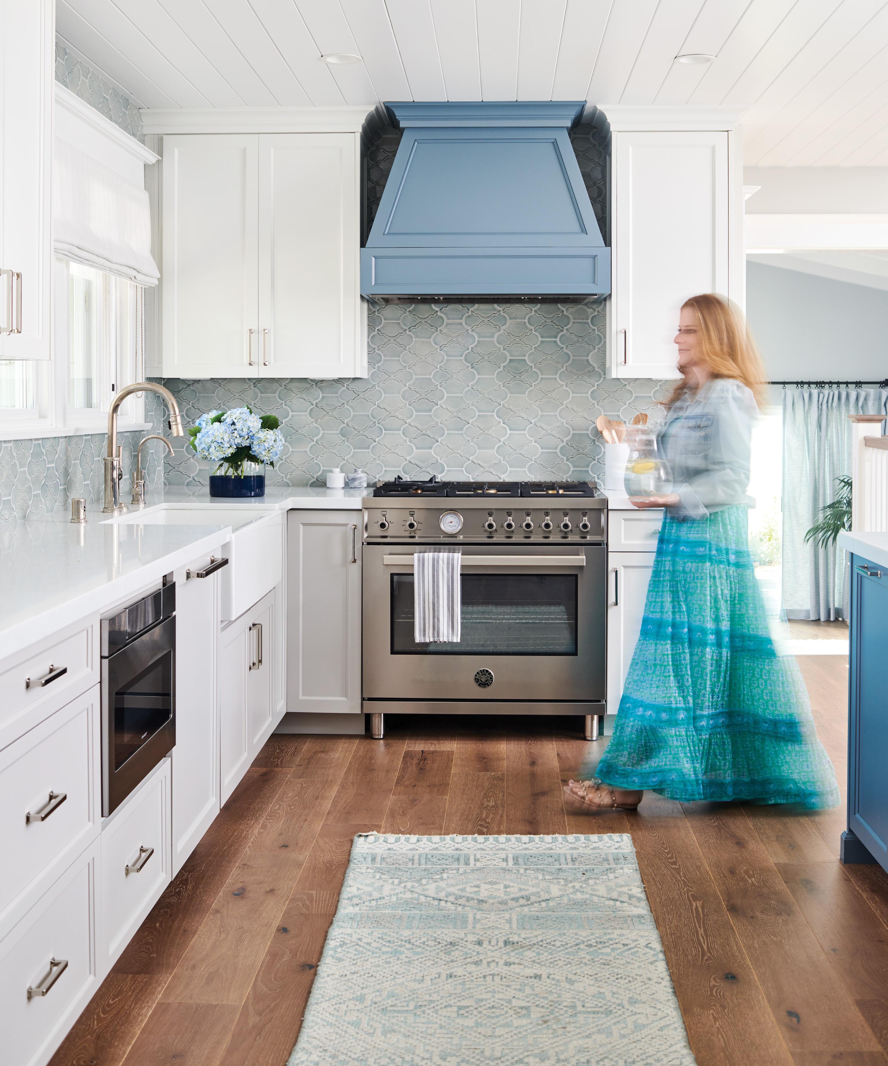

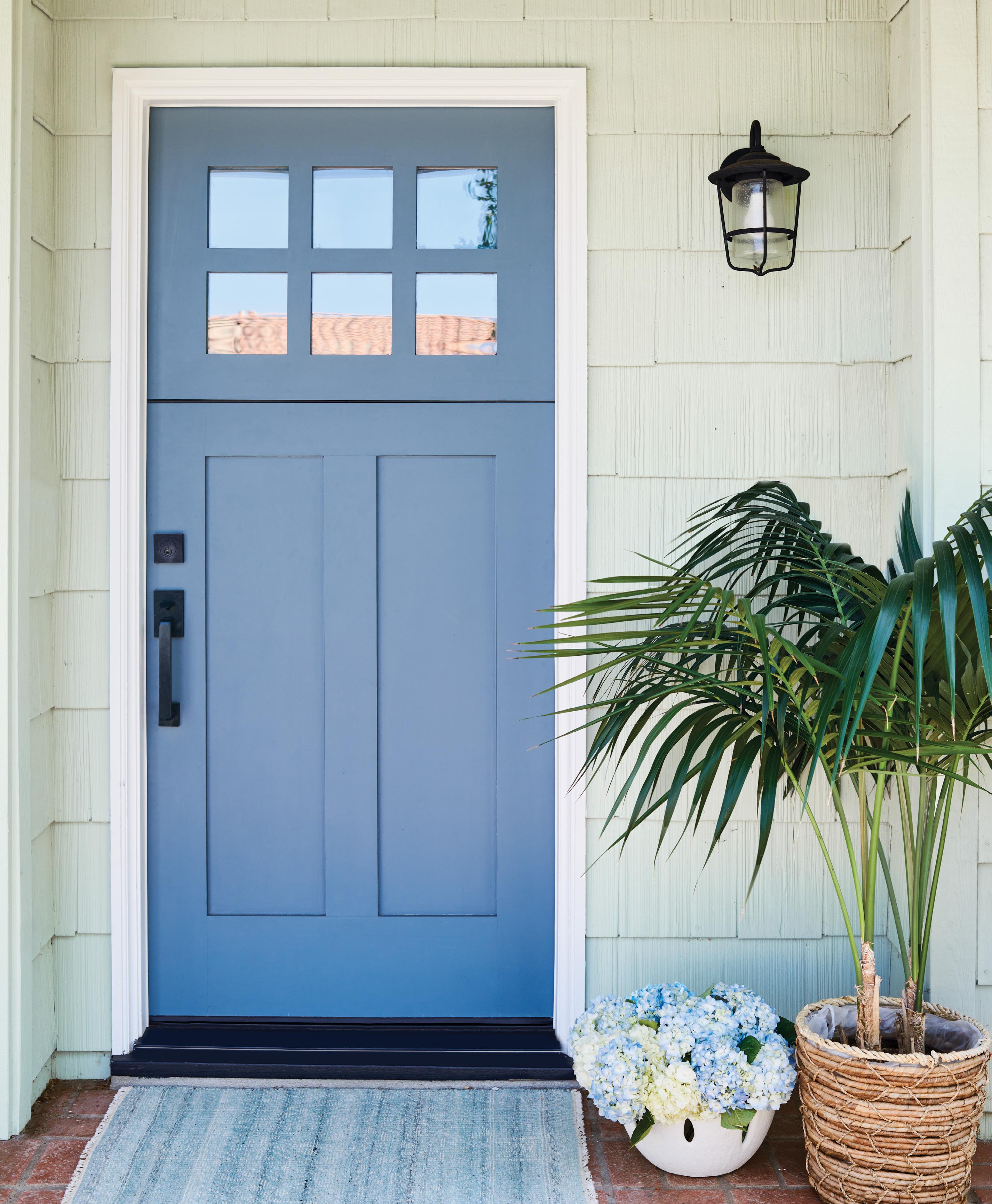
Coast coastal home versus going traditional Cape Cod,” explains Christine, owner of Christine Vroom Interiors in Palos Verdes Estates. “I wanted it to feel current and like a contemporary Cape Cod home in Manhattan Beach by using more of that Nantucket blue and not staying so traditional with the white and blue. So we added grey/blue tones with wood tones to mix up the elements. On the East Coast, they tend to like richer wood tones and different wintery types of blues. We captured the essence of the East Coast.”

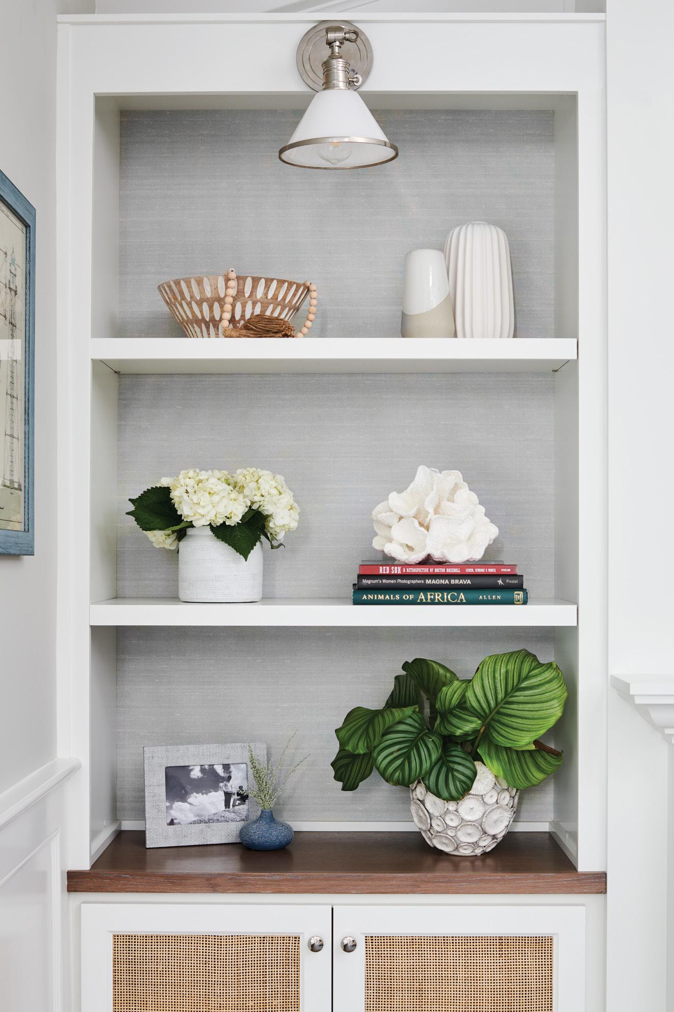
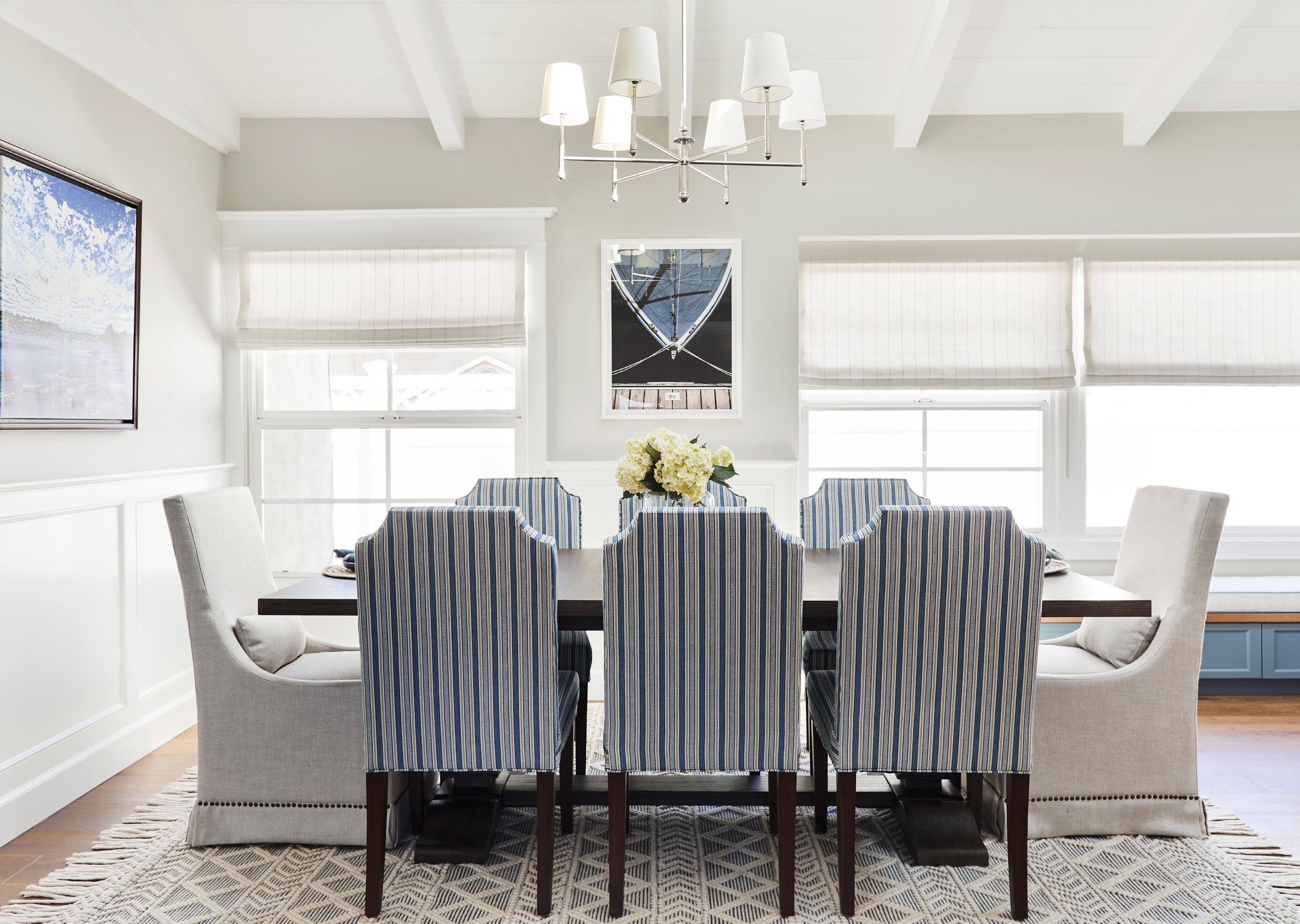
To open up the kitchen and create a more cohesive flow, Christine and her team removed a wall separating the living room and dining room, changed the layout of the kitchen for more space and functionality, created a long upholstered ban quette to tie the dining room and kitchen together along with extra seating, and added a library-like area with built-ins and a fireplace. In the kitchen, Christine selected Benjamin Moore’s Normandy 2129-40 for the island and hood; a pair of Hampton
pendant lamps by Hudson Valley; custom alderstained wood beams; and Martin counter stools by Essentials for Living.
“She had such a great understanding of what we wanted, and she made the whole process fun,” adds Susie. “For the kitchen ceiling, it was just going to be drywall. One day she casually said, ‘We should do tongue and groove.’ Now people comment all the time on how great it looks.”
Susie and Judd also trusted Christine with all of the artwork, decorative objects and finishing touches—down to the salt and pepper shakers. “If she would have only done the furniture, it wouldn’t have looked as good,” explains Susie. “We still have our old photos, and she helped with the frames.”
Christine was also instrumental in incorporating details from their life story, including cities where they have lived such as Palos Verdes (Susie’s hometown), Manhattan Beach and other significant locations with personal meaning. “I threw out, ‘Hey, it would be nice to have a photo of the town where
I grew up in Massachusetts [Marblehead], and she found an artist,” adds Judd of a painting by artist Amy Roberts that Christine found online. “She was so responsive, and she’s a fun person to work with. What I’ve told some people is that I feel like I’m in a vacation home down at the beach or at a little beach cottage on Nantucket or Cape Cod.”
For Christine, one of the most gratifying aspects of the job was creating a timeless home for the cou ple and their children to grow into, filled with pieces of sentimental value. “It’s not trying too hard,” says
Christine. “It’s very easy breezy, clean and classic.”
Judd, Susie and the kids are still pinching themselves with the redesign. “I love the way everything looks. It’s casual enough that it doesn’t feel too formal or stuffy,” says Susie. “One of the neighbors walked in [she hadn’t seen the house at all during the design process] and was dropping F-bombs left and right at the finished design. It’s funny to see people’s reactions. Every little detail is just incredible.” ¢
“I wanted it to feel current and like a contemporary Cape Cod home in Manhattan Beach by using more of that Nantucket blue and not staying so traditional with the white and blue. So we added grey/blue tones with wood tones to mix up the elements. On the East Coast, they tend to like richer wood tones and different wintery types of blues. We captured the essence of the East Coast.”

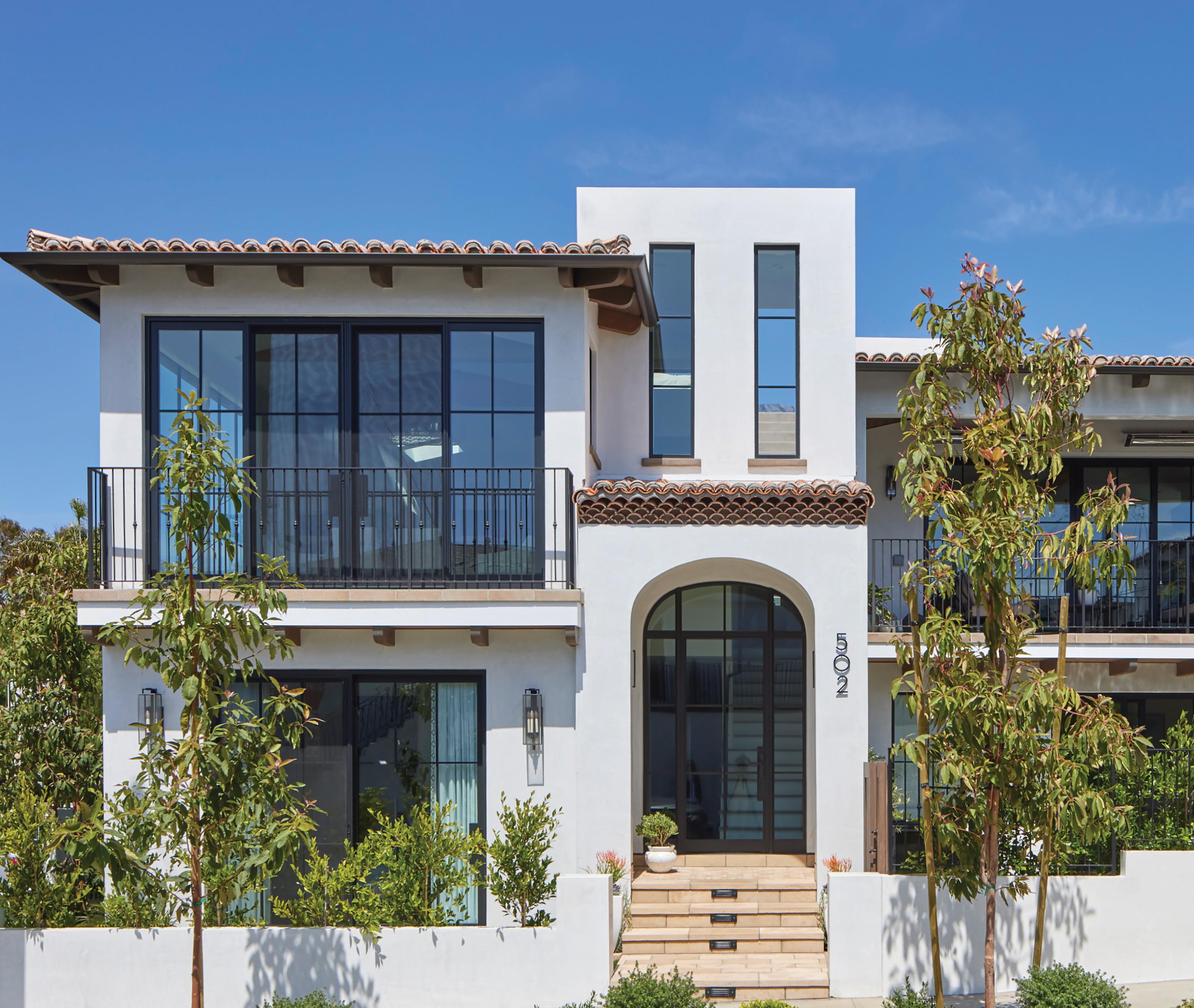
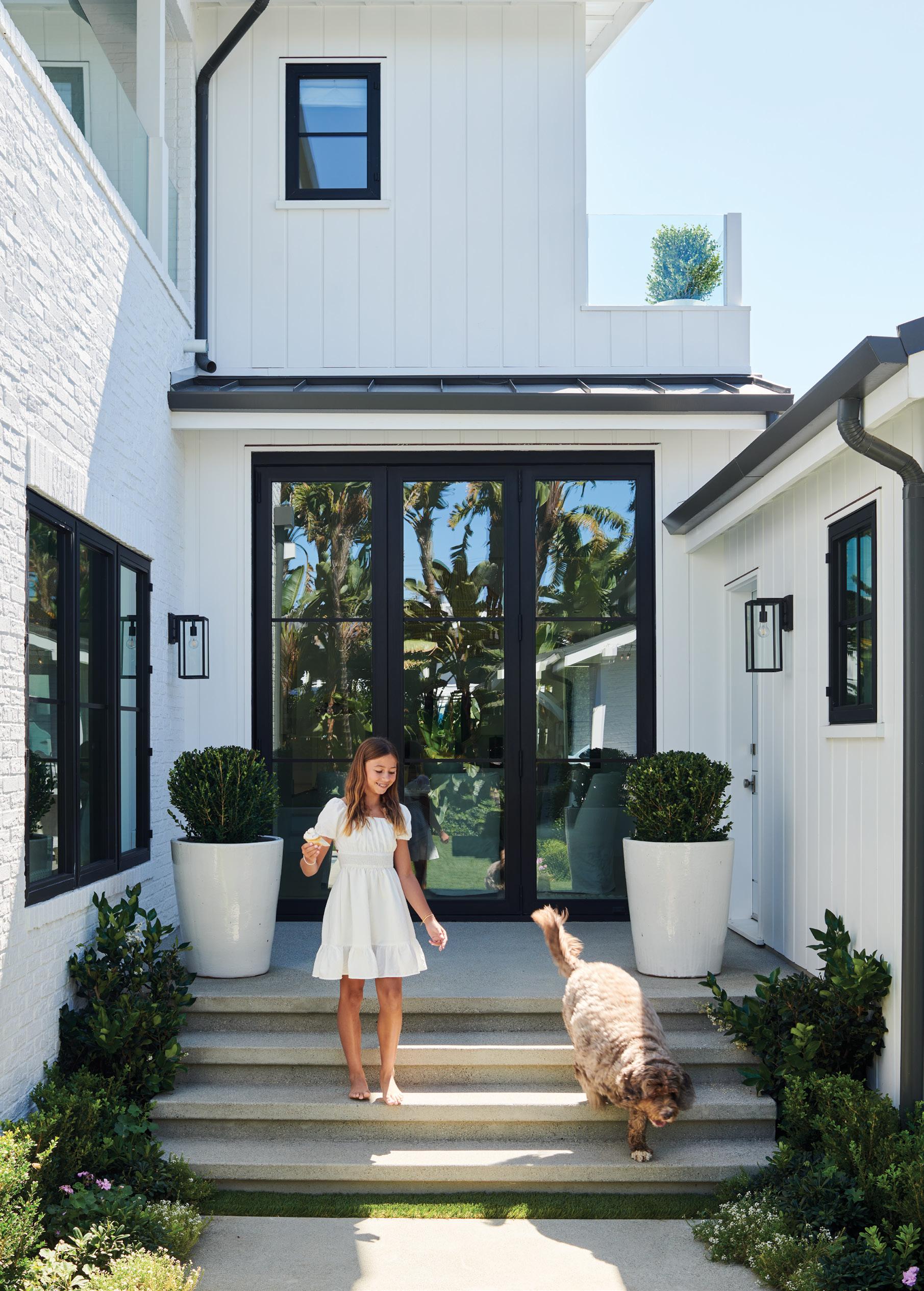
Black recessed “storefront” windows are a way to bring a modern, updated aesthetic to traditional home styles. Pair with a light-colored exterior like stucco or white wood siding to create a dramatic contrast that will make your windows pop!
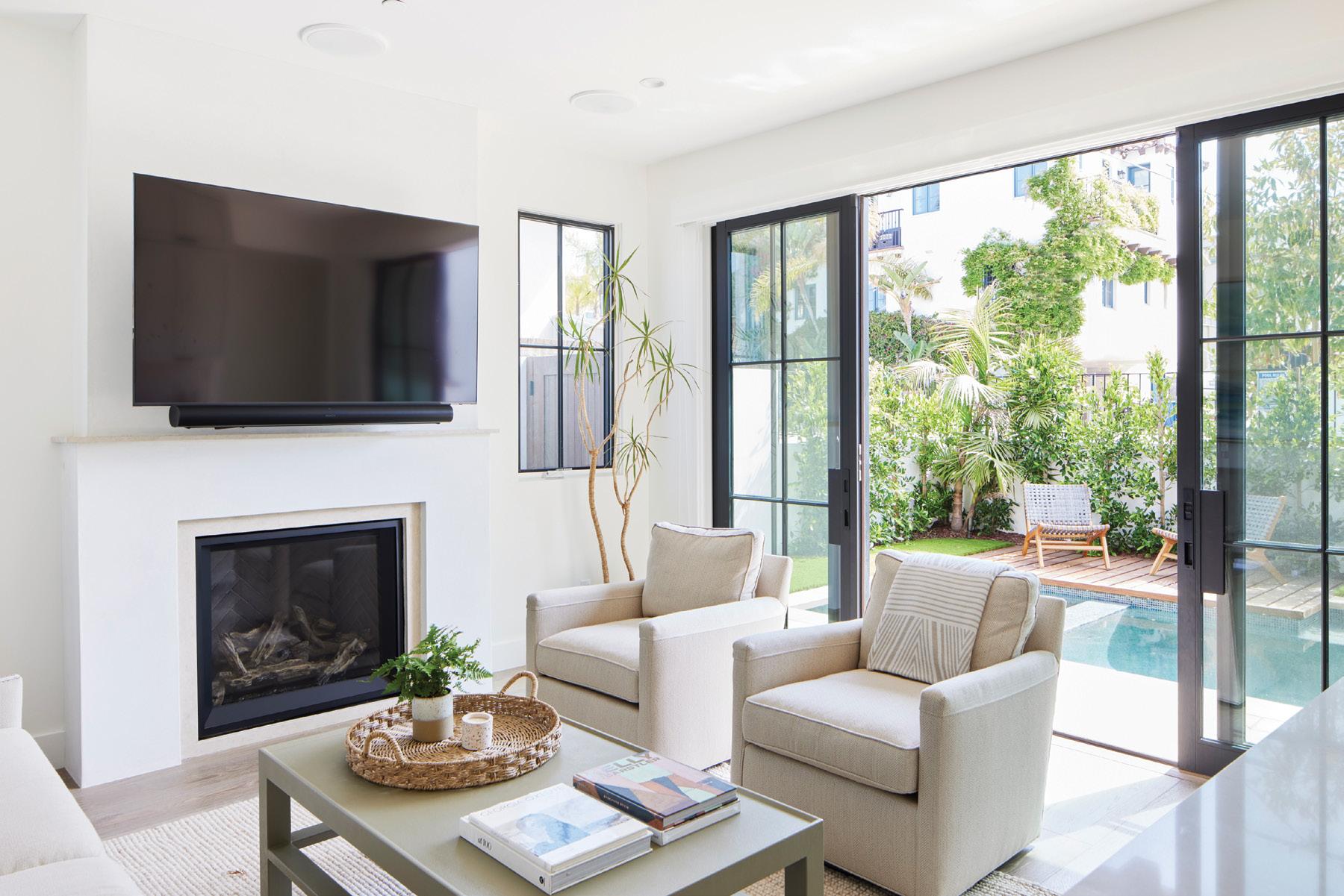
To maximize the outdoor space on a small lot, hide the pool equipment in an accessible vault underneath a wooden deck. Glass panel doors are a must for creating that indooroutdoor SoCal experience.

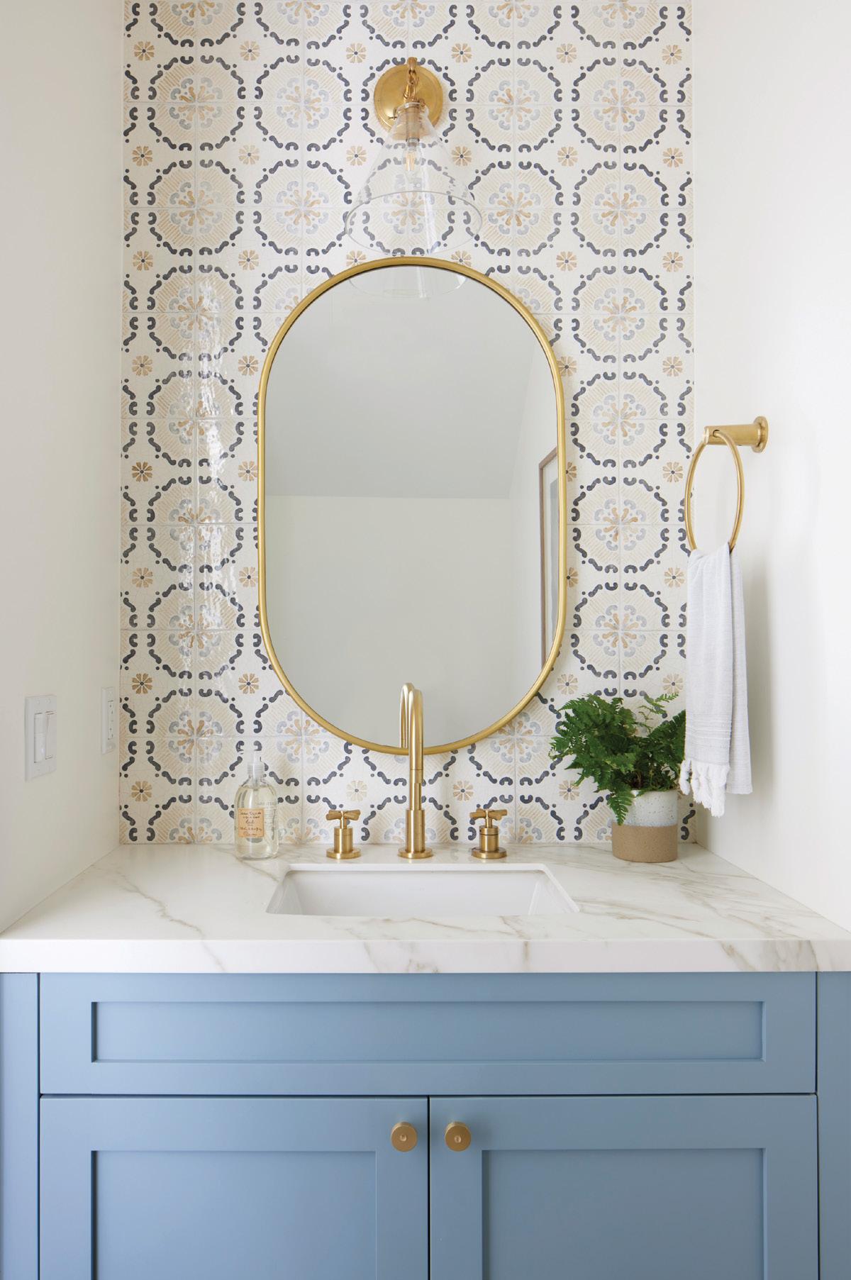
The powder room is the perfect place to be colorful and creative. Choose one dominant element such as mosaic wall tile and build the rest of the room around it. Add luxe elements like a brass mirror to elevate the look.
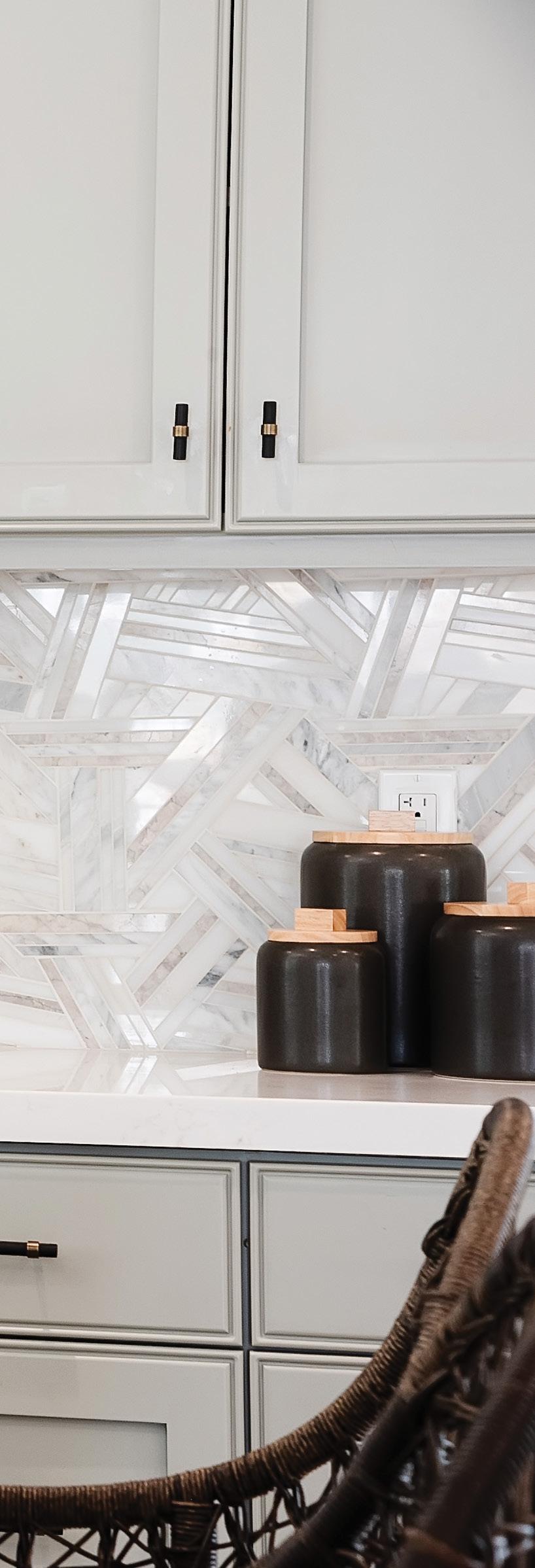
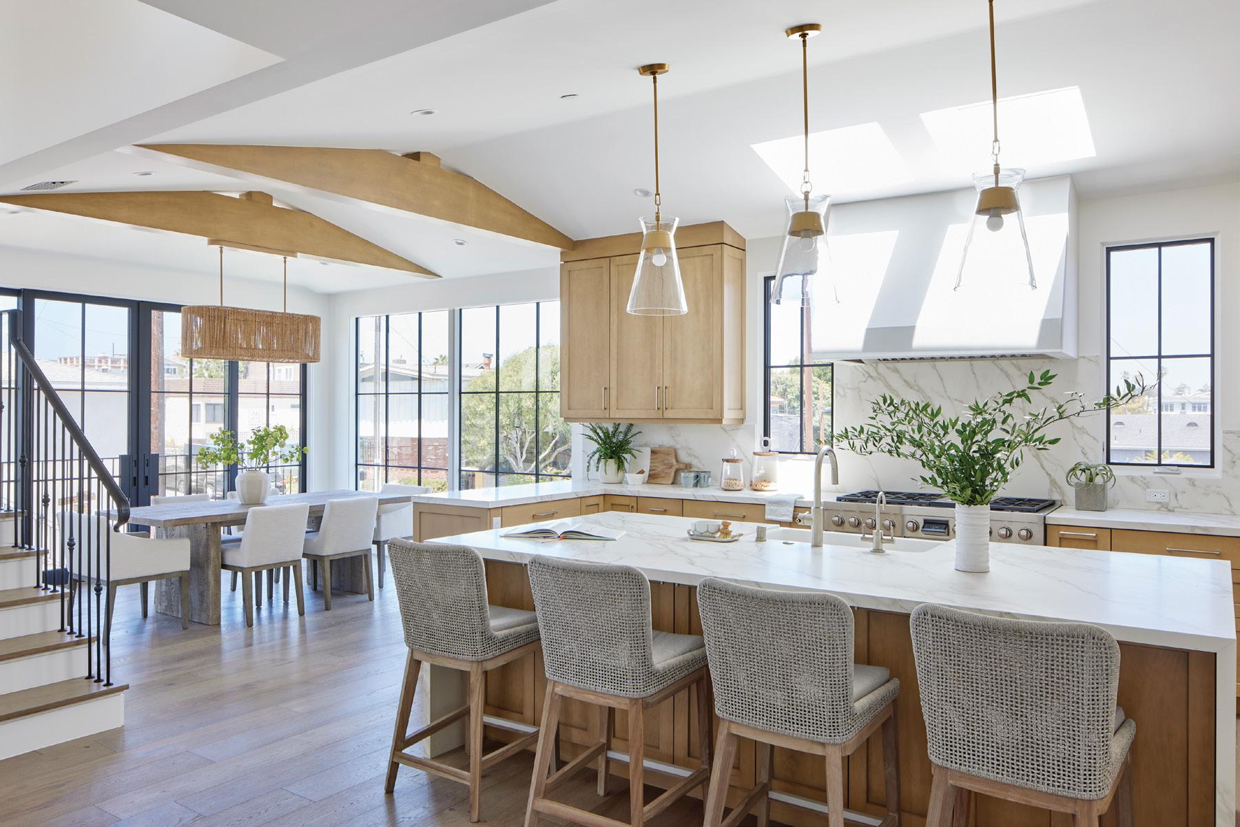
Don’t be afraid to mix metals and other architectural elements in a kitchen for interest and balance. The warmth of stained wood cabinets and brass pendant lighting can be contrasted by using nickel and iron in fixtures, pulls and rails.


Pacific Coast Hwy., Hermosa Beach

 CURATED BY JENNIE NUNN
quill floor mat in mulberry, from $215. Pottery Barn at Manhattan Village in Manhattan Beach, potterybarn.com

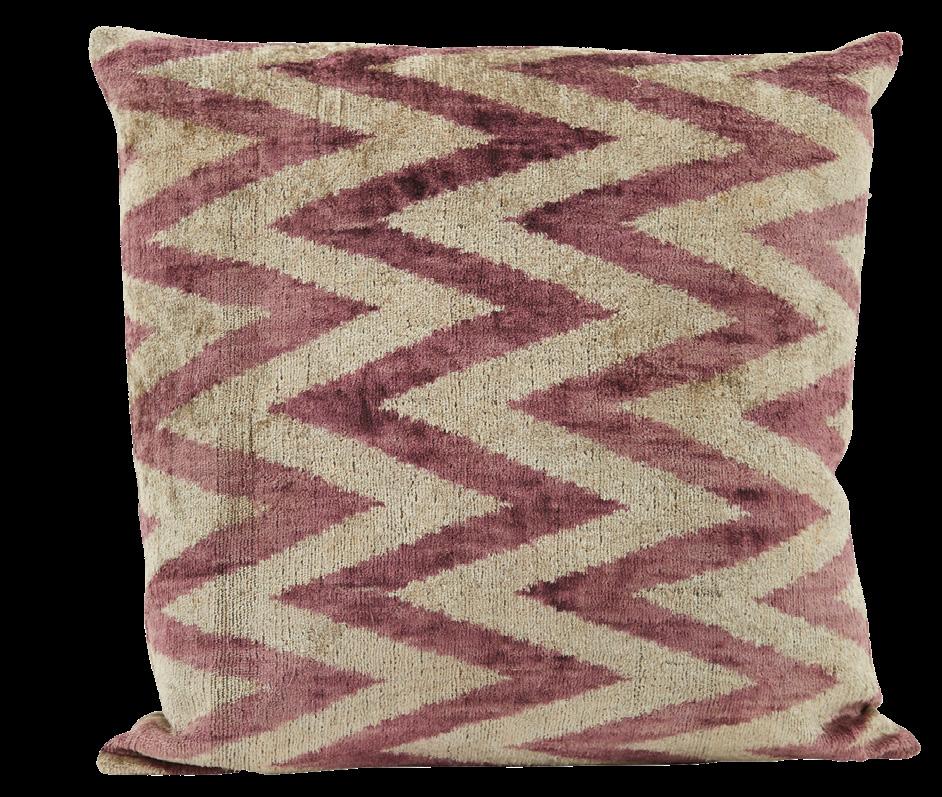
pillow, $225. Jayson Home, jaysonhome.com
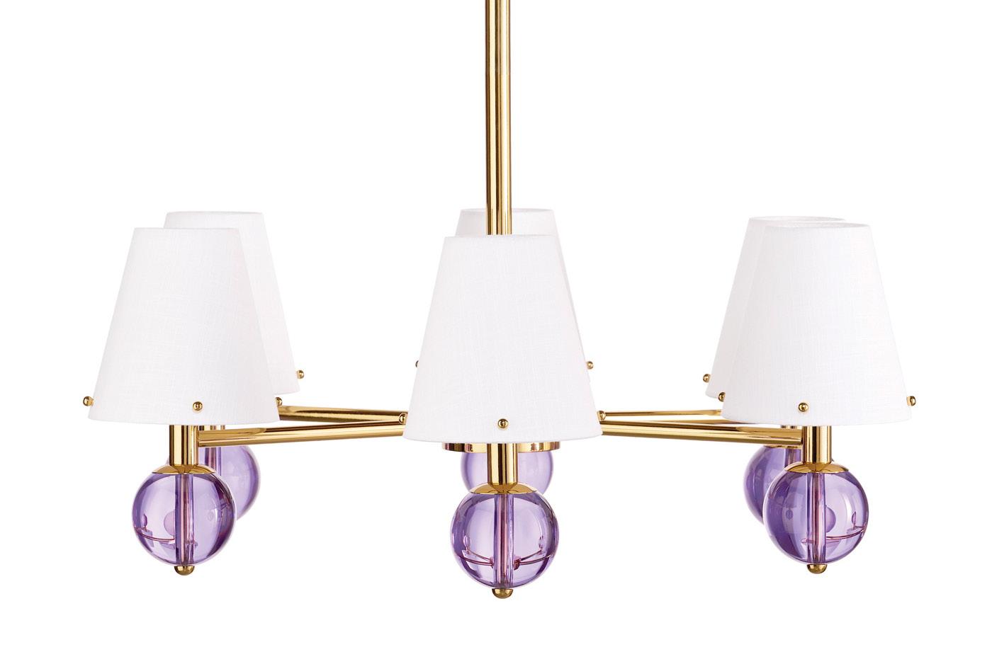
Jonathan Adler Belvedere six-light chandelier, $2,250. jonathanadler.com
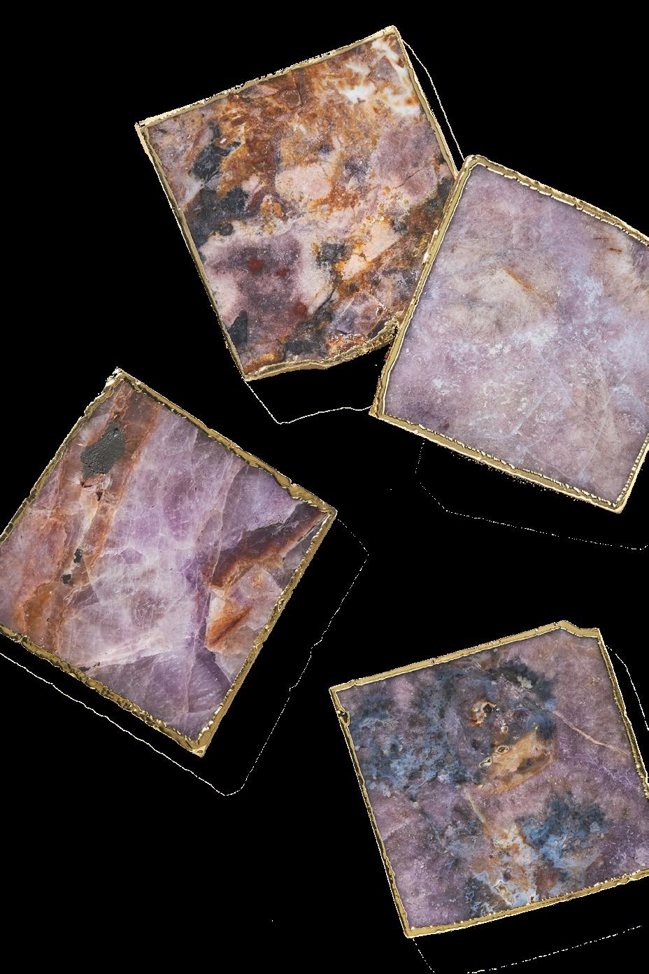
Gilded amethyst agate coaster, $16. Anthropologie at Manhattan Village in Manhattan Beach, anthropologie.com
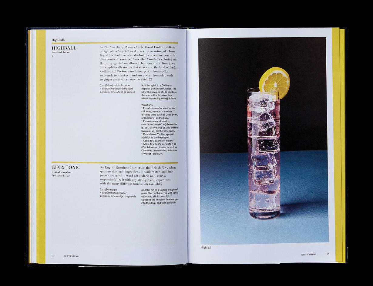
Cocktails from Around the World $49.95. Gum Tree in Manhattan Beach and Hermosa Beach, gumtreela.com
Savon Liquide Marseille in Fique, $29.95. Gum Tree in Manhattan Beach and Hermosa Beach, gumtreela.com
Amethyst crystal cluster, $16. Urban Outfitters at Del Amo Fashion Center in Torrance and Manhattan Village in Manhattan Beach, urbanoutfitters.com

Don’t forget labels in your pantry—the icing on the cake! They make your space look NEAT and are the secret ingredient to everything getting put away where it is supposed to go.

Nicole Longo, Owner 310-402-6447 neatmethod.com @lasouthbayneat nicole.longo@neatmethod.com


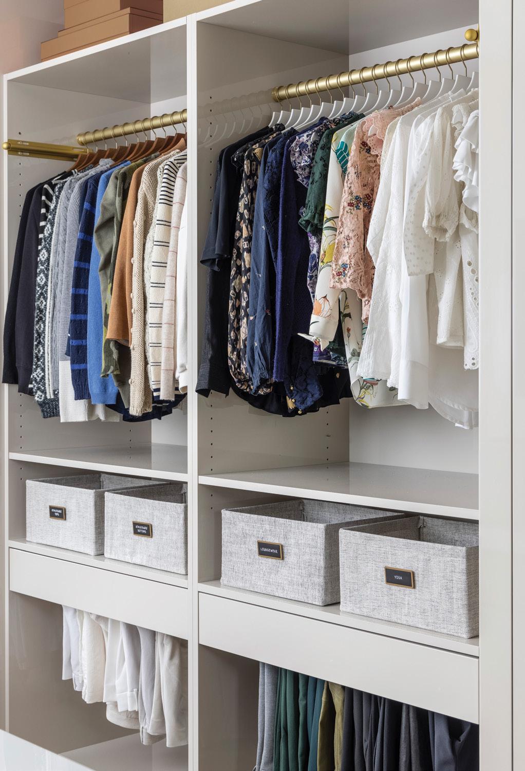
Streamline your closet and maximize space with matching slimline hangers—giving your wardrobe an automatic face-lift. Feeling a little extra? Colorcode hanging items to eliminate visual clutter and ensure that choosing the perfect outfit is a seamless task.
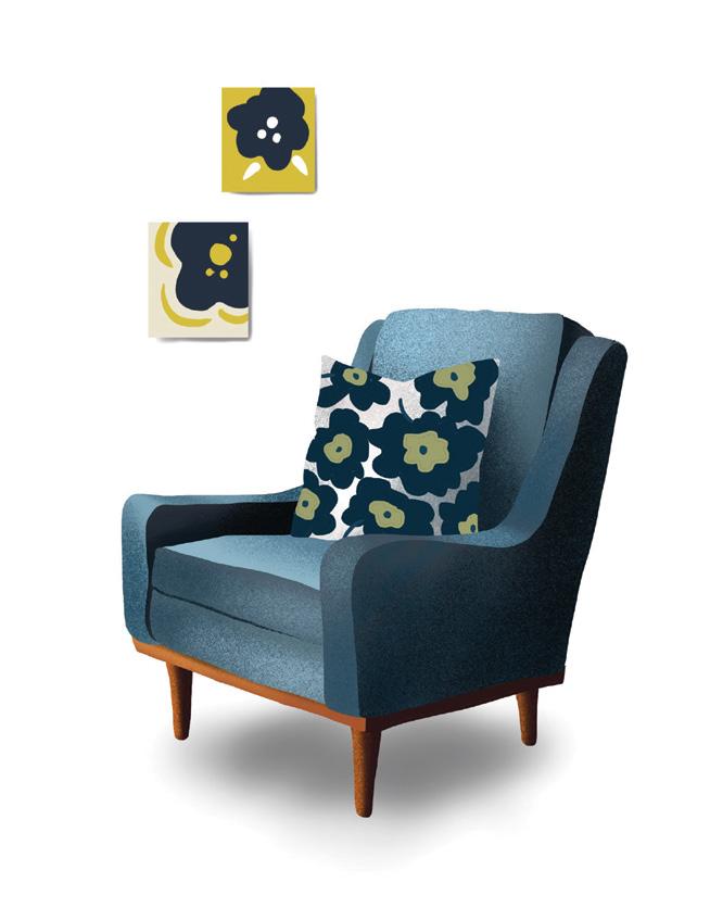
For upholstery, put your vacuum’s hose attach ments to work. They make it easy to get into nooks and crannies where dirt and dust accumu late, according to Sajid. “It’s amazing what can be done with a vacuum,” he says.
And while cleaning couches, remember to rotate the cushions for even wear. If someone has a favorite spot on the couch, it can show in the cushions. Changing the arrangement of the cushions regularly will extend the life of the whole couch.
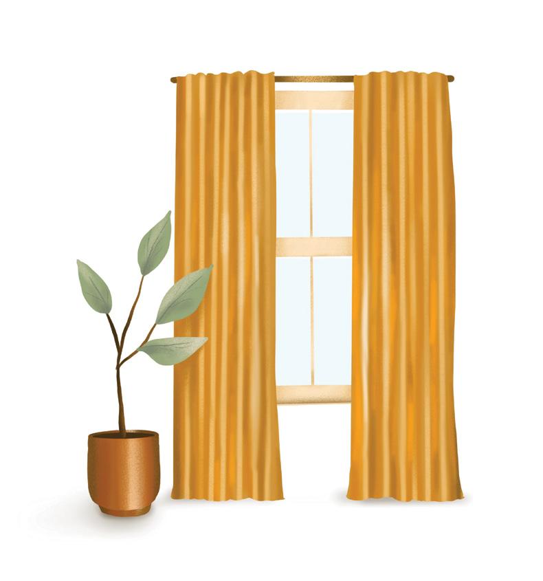
Window treatments, from blinds to curtains and ornate draperies, rarely get the routine care they need. Often, when Sajid Veera and his team at Door to Door Valet Cleaners are called in to clean window treatments, it’s because the windows are being replaced or the room is being painted. The cleaners arrive to find window treatments that have been neglected, possibly for years.
“If a person lives on the coast, they may have windows open all the time, so the curtains need to be cleaned and properly maintained,” Sajid says. “If curtains are drawn and the air condi tioning is on, the air is being pulled in and the curtains act like a giant air filter. So they need to be cleaned correctly because they gather a lot of dust. Routine vacuuming on these types of items as preventive maintenance is something that’s often overlooked. Basic maintenance steps will improve your quality of life in the home—espe cially for those of us who suffer from allergies— and extend the life of the asset.”
Sajid recommends vacuuming both the window-facing side and the room-facing side of drapes, and he emphasizes that it’s important to use a HEPA vacuum. Without a HEPA filter, dirt, pollen, dander and spores will just go right back into the air of the home. While working on the curtains, remember to clean the window screens as well.
As an additional preventive measure, always have new furnishings coated with a nanotechnol ogy-based coating. This type of treatment forms an invisible barrier that doesn’t allow beverage and food spills to penetrate the fibers of the upholstery.
Whenever you do have a mishap, always blot and gently wipe. Never rub the area. Rubbing causes abrasion of the fibers and is oftentimes irreversible.
textiles (i.e., fine cashmere and silk), and they go after soiled areas first. And stains that are not visible initially can change color and cause further damage if left unattended.
“Certain sugary-type stains—white wine, Champagne, even ginger ale—will caramelize over a period of time,” he notes. If the soiled clothes sit in the closet all season, the stains will oxidize and turn brown. Oil stains become more visible as they oxidize and can leave little marks following the pattern of the clothing’s fibers. Moisturizers and the natural oils on the skin come in contact with collars and cuffs of outer jackets, and those areas should be addressed before putting the coat away.

Many articles of clothing that are typically brought to be dry-cleaned don’t have to be pro fessionally laundered. Sajid says home washing machines can often achieve good results. What it comes down to, when choosing between a profes sional service or at-home cleaning, is how much time someone has to spare. “In my opinion, my time is my greatest asset,” he says.
When it comes to the wardrobe, Sajid has a rule: Never put away clothes dirty. Even clothes that look clean when they are put away may not look clean when they come out of the closet at the end of the season. “You’re doing yourself a disser vice to the investment you make in your wardrobe if you don’t put them away clean,” he advises.
The biggest reason? Moths. They love soft
And never store clothes in a basement or attic. “Store clothes where they’re not exposed to extreme changes in temperature and humidity,” Sajid says. “If you wouldn’t want to live there, don’t keep your clothes there.” Avoid storing clothes in closets that share walls with a shower, as these spaces tend to have a higher ambient moisture content that ultimately leads to mold and mildew forming—especially on leathers and suedes. ¢
SAJID VEERA OF DOOR TO DOOR VALET CLEANERS IN THE SOUTH BAY OFFERS SAGE TIPS FOR A THOROUGH FALL CLEANING.

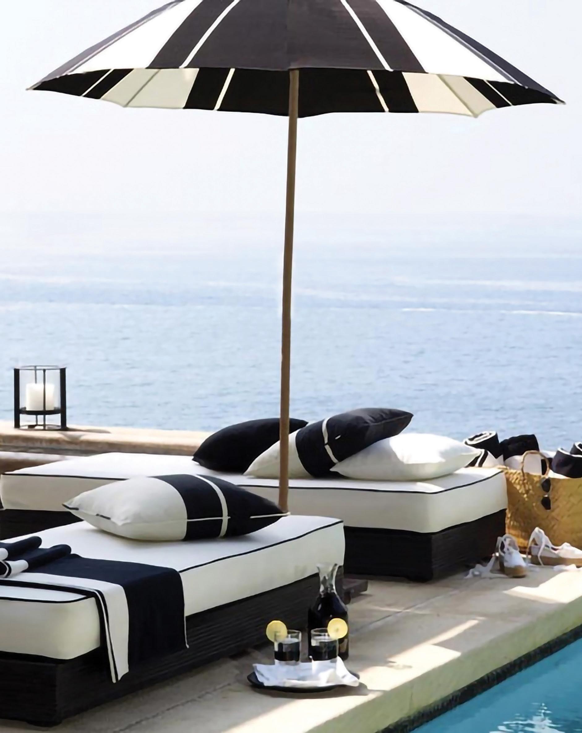

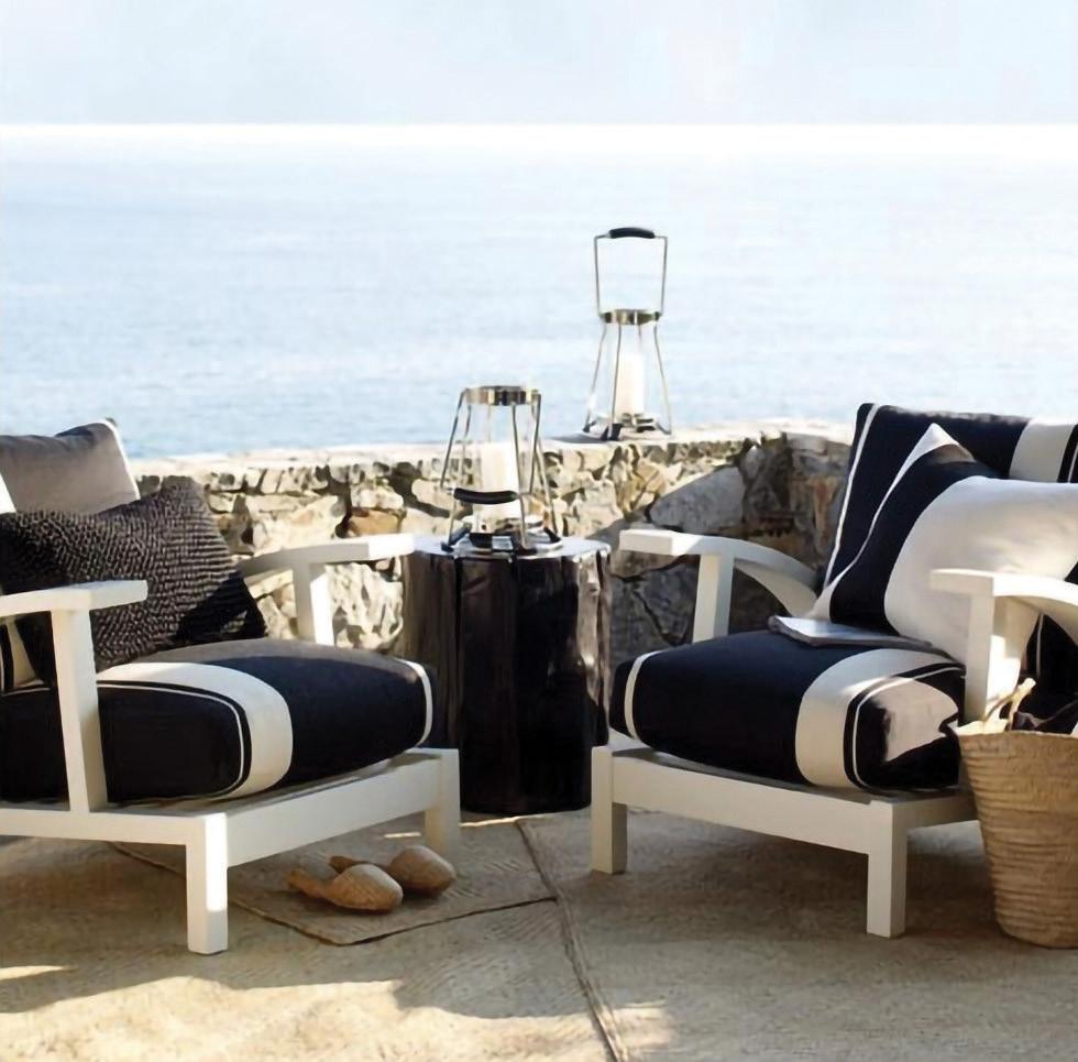
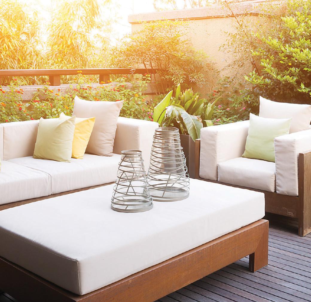


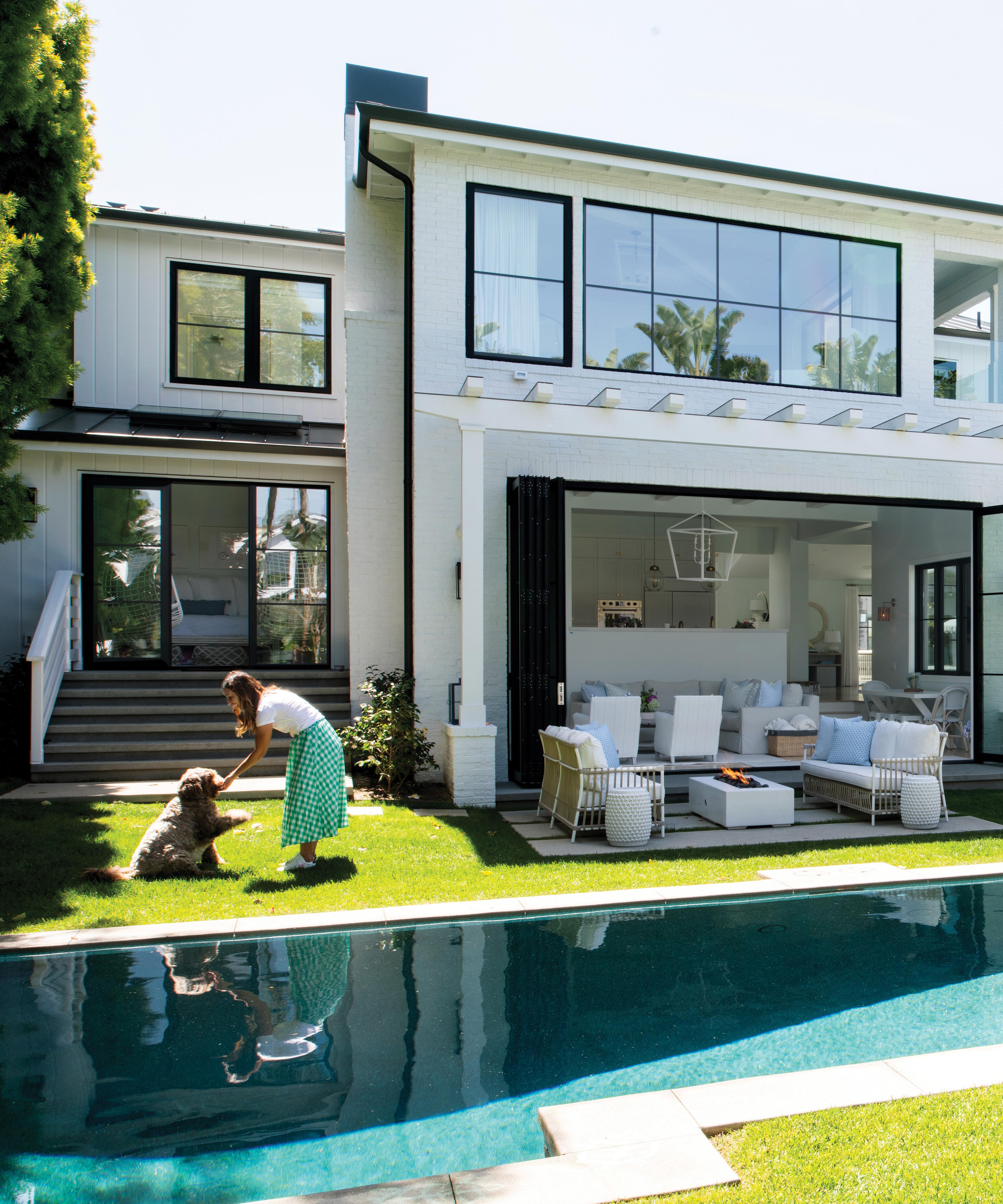
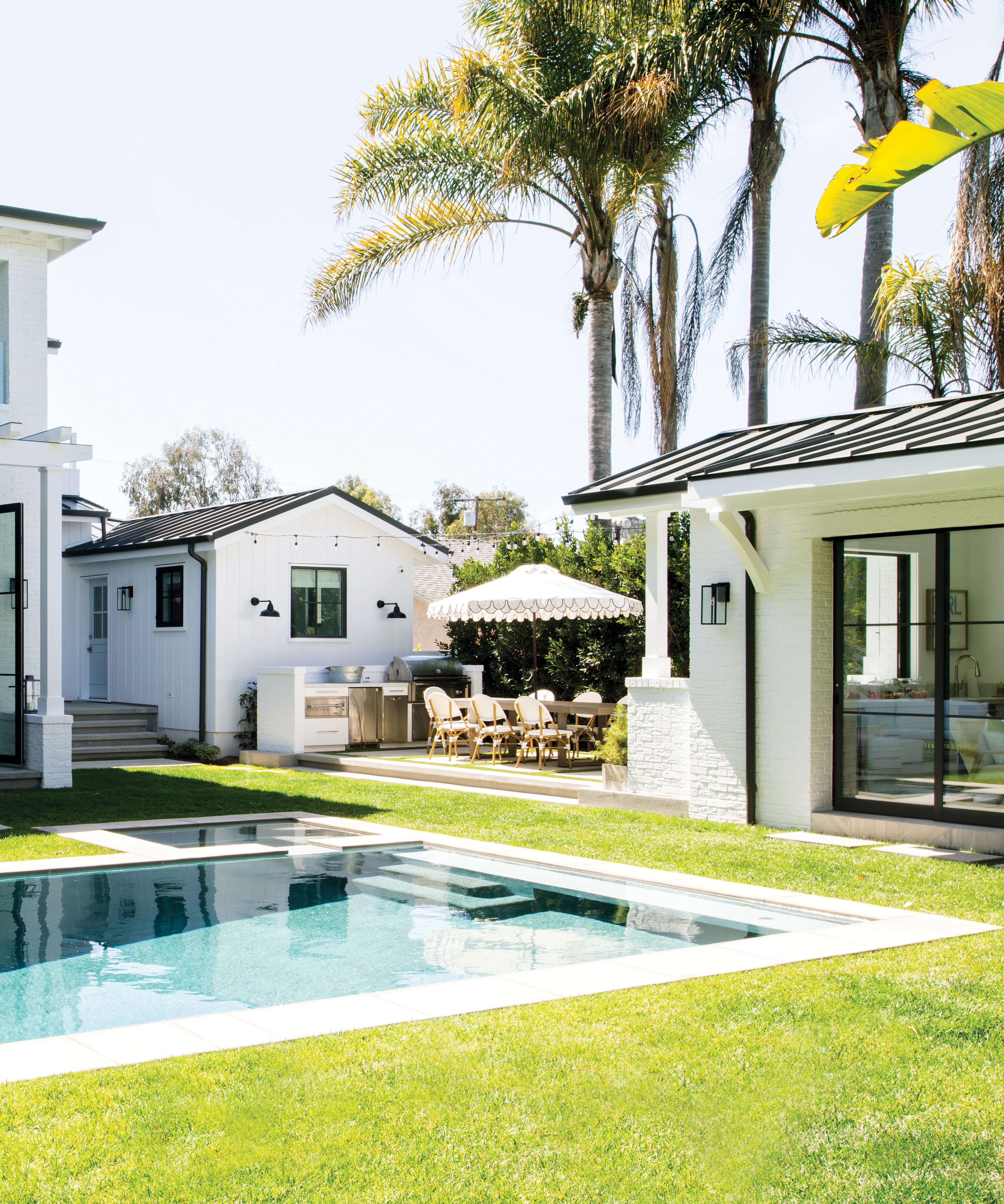
THE FEELING YOU HAVE WHEN YOU’RE ON VACATION—THAT WAS THE INSPIRATION BEHIND THIS MANHATTAN BEACH HOME. WRITTEN BY AMBER KLINCK | PHOTOGRAPHED BY LAUREN TAYLOR
Cassidy and Ryan McCarthy lived in their home for roughly four years before they decided to remodel. “We were going to tear it down; we had plans for both,” Cassidy notes. “But that would have taken a lot longer, and we just wanted to be back in because our kids are getting older.”
The project was extensive—taken down to the studs. But Cassidy and Ryan had a good grasp of what they wanted to achieve and what they wanted to avoid. “I had interviewed a few designers, and I didn’t want to get pressured into things I didn’t want,” Cassidy explains. “I wanted to have my hand in it too. So when I met with Anne, it just seemed like we were a good match.”
Walking through her home, Cassidy uses words like cheerful, relaxed and casual to describe the space. “When we first met Ryan and Cassidy, both said they wanted a coastal farmhouse with a little New York lofty feel to it,” notes Anne Collard of Anne Collard Designs.
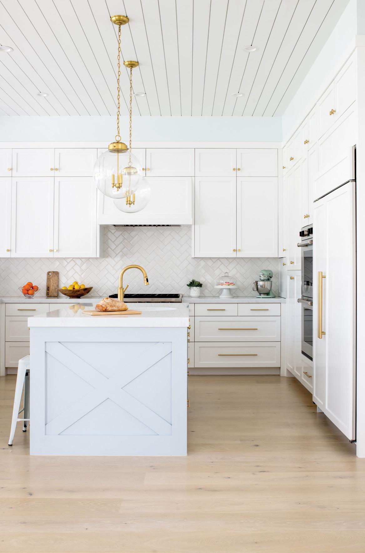
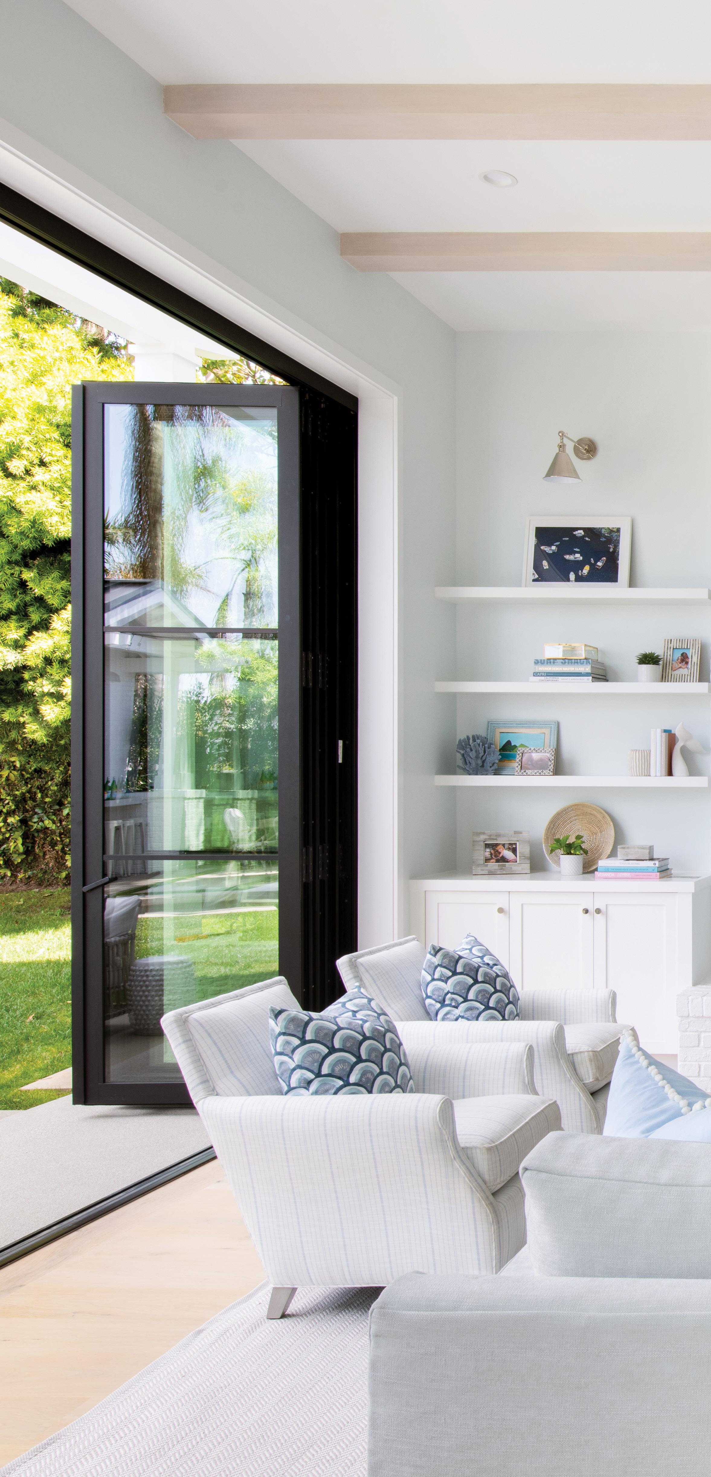
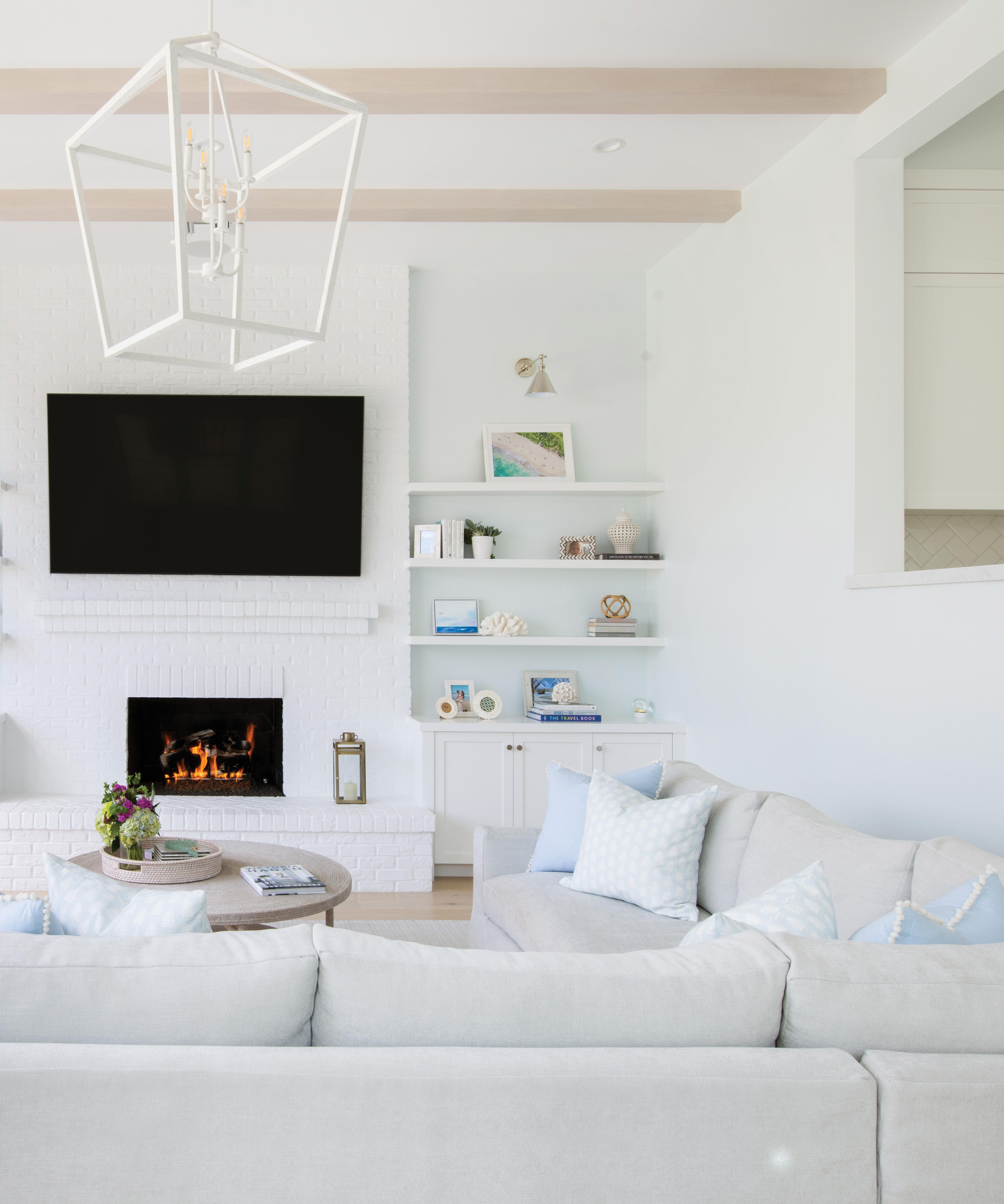
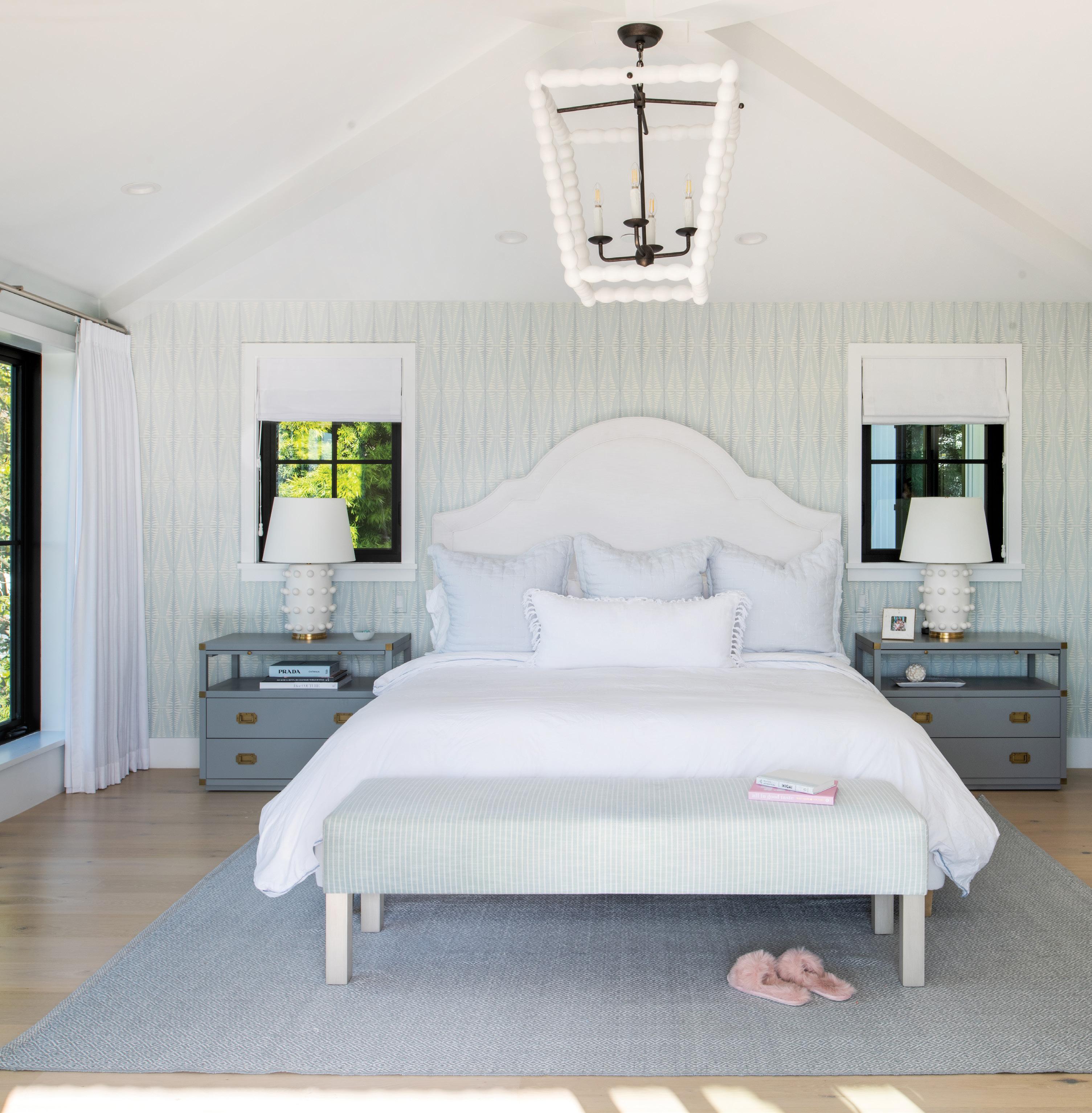

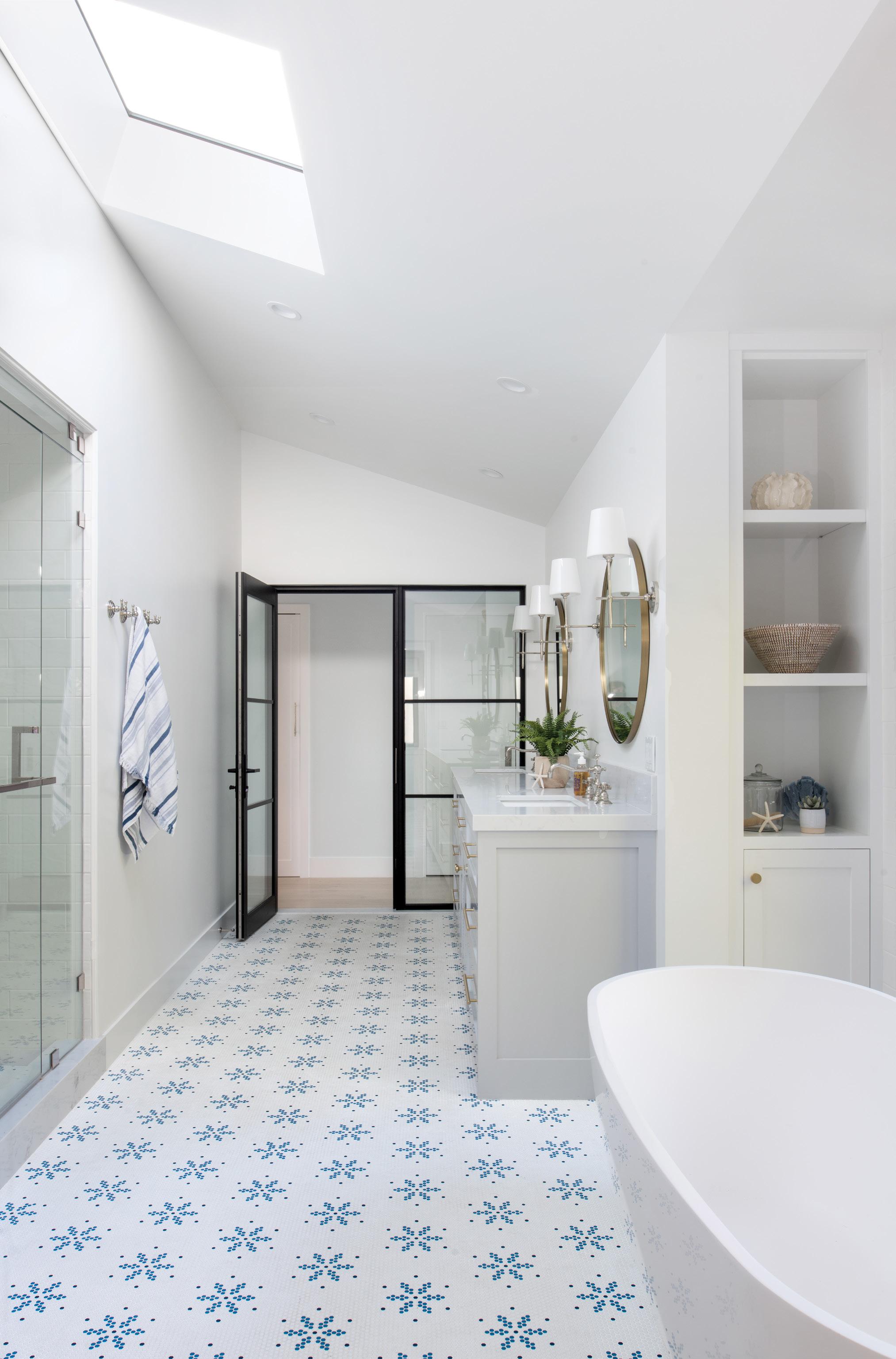
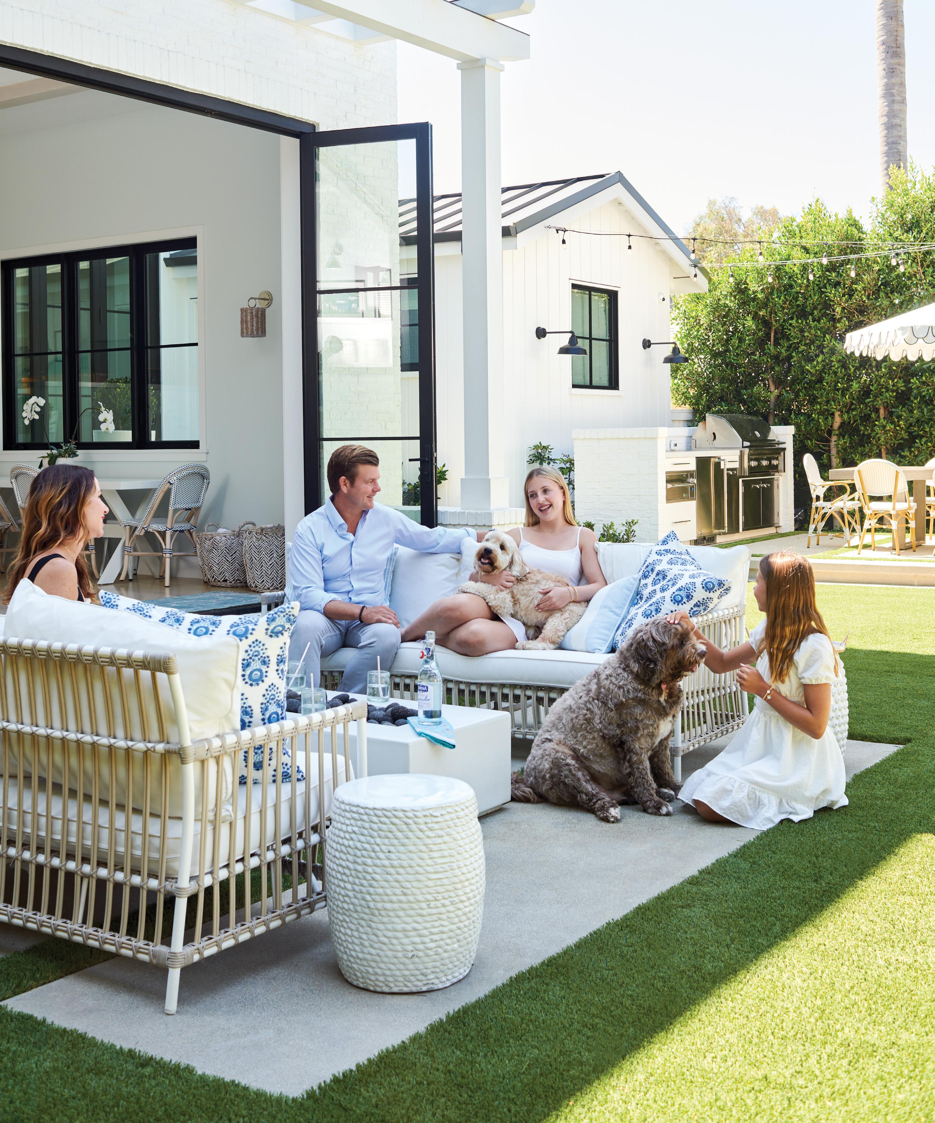
“We also wanted it to feel how you feel on vacation—to be relaxed,” Cassidy adds. “We wanted open living spaces. We wanted to be able to see the kids. Nothing stuffy and no formal dining room. Just open and casual.”
Walking into the home, your focus is immediately drawn to a large communal space with sky-high ceilings and bifold doors that open to the yard. “My husband—he’s not a visual person usually,” Cassidy notes. “But when [he initially] walked through the space, he was like, ‘I feel like we can make [the doors] taller.’ So we did another walkthrough with the architect, and they were able to raise them. We wanted maximum light.”

It was also important to the family that there be direct visibility from the front to the back of the house. Helping them design an open, airy living space was architect Michael Eserts of Eserts Studio. Lombardi Construction brought the vision to life, and Details Tile & Stone Studio contributed to the project.
Outside the nearly 10,000-square-foot lot are a pool, a pool house perfect for entertaining and a
lush green landscape that only adds to the home’s vacation vibe. The Jones Landscapes team worked their magic to create the oasis.
The inside of the home seamlessly blends hints of color, custom tile patterns and rooms adorned with a playful curation of wallpaper—all while keeping a cohesive feel throughout. “I think it is very important to keep some continuity in a house like this, espe cially because there is an open floor plan,” Anne says. “All the rooms need to speak to each other, and all the spaces need to flow into each other effortlessly. Tile and wallpaper are two parts of the
“All the rooms need to speak to each other, and all the spaces need to flow into each other effortlessly.”
process that I embrace and love to have fun with.”
From the beginning, Cassidy and Anne collab orated on the design. “Anne and I chose all the colors together,” Cassidy notes.
“Cassidy was wonderful to work with,” Anne adds. “Keeping in mind that we went into lock down shortly after the project got going, things were intense and a little scary. Cassidy was incredi bly thoughtful to me and all the workers. Together, Cassidy and I took our time making most deci sions, in the hopes we would not need to make any edits after the project was complete.”
Even Cassidy and Ryan’s daughters played an important role during the design phase. “We let the girls decide what they wanted for their rooms, what colors they liked,” Cassidy says. “We showed them a lot of stuff, and they were specific [with what they wanted]. It’s funny how they gravitated to different colors and patterns.”
Initially the project was scheduled to take 12 months, though no one could have anticipated the delays or the amount of uncertainty that would follow the 2020 COVID-19 shutdown. Supplies were limited, fewer contractors were allowed
on-site, and in the end, the project took almost two years.
With a few final touch-ups still needed and nowhere near all their furniture placed in the house due to shipping delays, the McCarthy family made it a point to spend Christmas in their new home— even though that meant sleeping on mattresses laid out on the floor.
Cassidy smiles as she shares this story. It will, no doubt, be a Christmas the family will never forget. And just another reminder that there’s no place like home. ¢


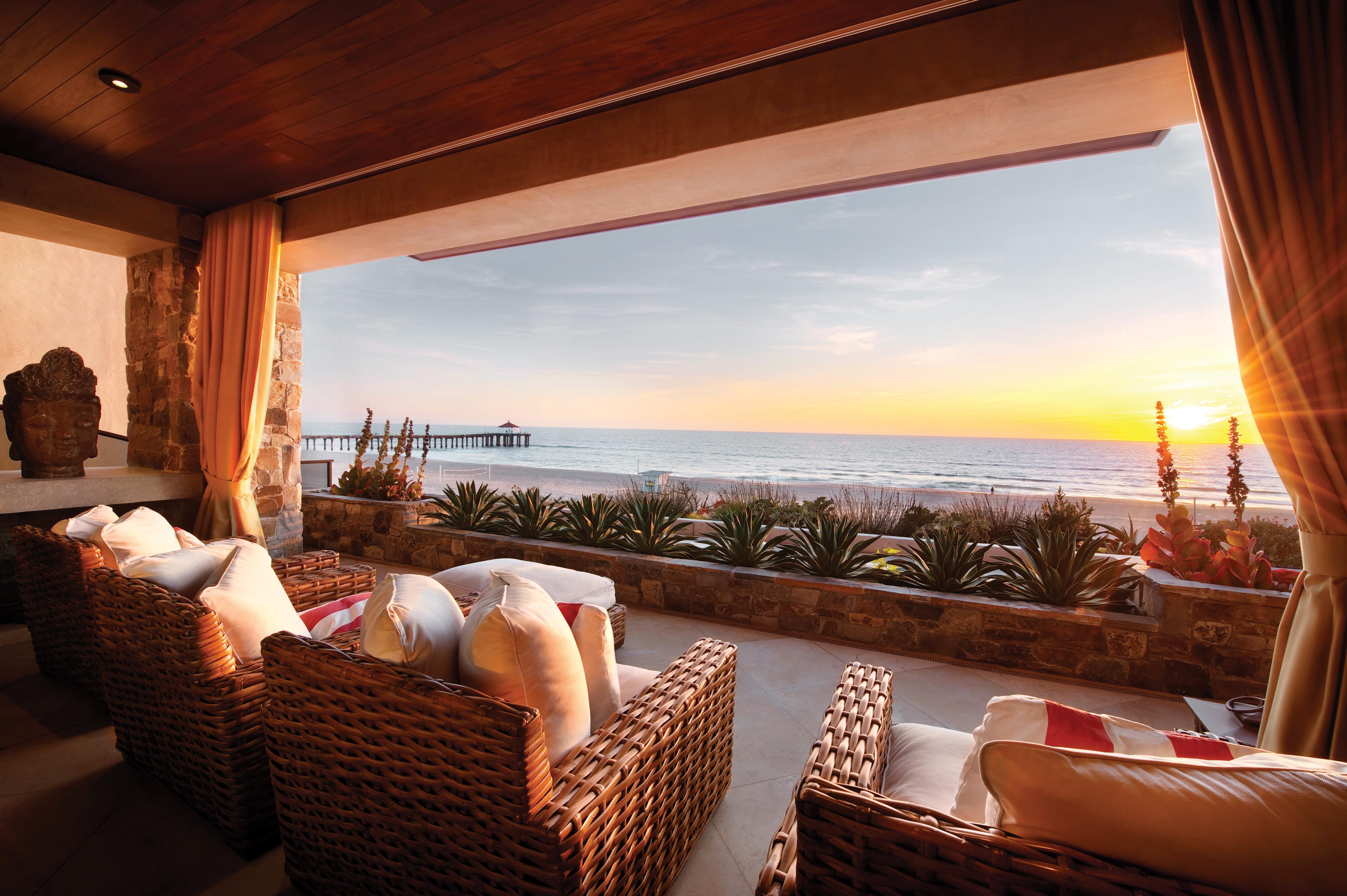
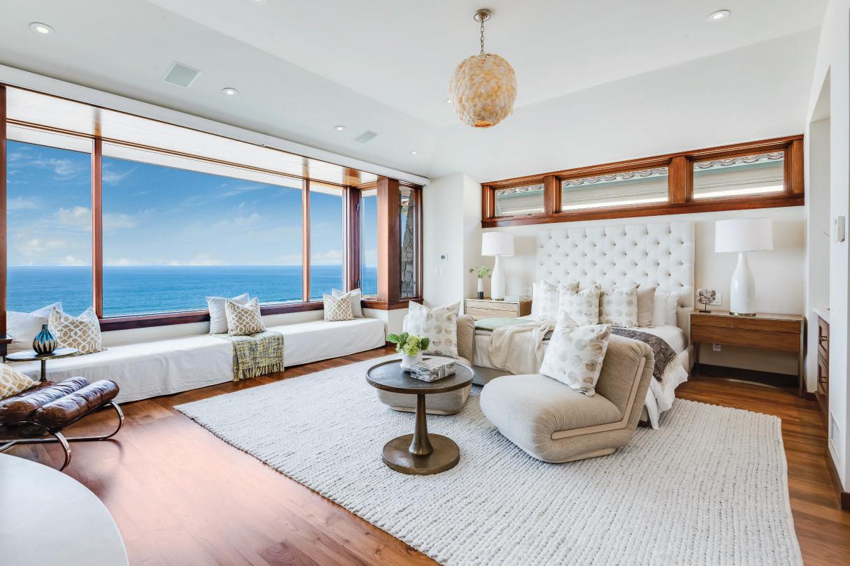
Fabulous family home in perfect condition located in a highly desirable walk-to-town location. Situated on an elevated lot just 3 blocks north of the Manhattan Beach Pier and the shops, restaurants and nightlife in Downtown Manhattan Beach. Finished in a warm modern style with natural stone, copper and mahogany woodwork on the exterior. The home has 4 bedrooms plus an ocean-view office. Indoor and outdoor living seamlessly blended with two large covered patios and every great feature you’d expect - including gym, theater, in ground jacuzzi in a private courtyard, 3-stop elevator, 5 fireplaces, 3-car garage, mature tropical landscape and much more.




 WRITTEN BY DARREN ELMS
DESIGNED FOR ZEN, THE NOBU RYOKAN MALIBU TAKES JAPANESE SOPHISTICATION TO THE NEXT LEVEL.
Driving south on PCH, we nearly missed our destination. With just a number attached to a large wooden driveway gate, the address could easily be mistaken for a private beachfront home. But no sooner had we pulled up to the entrance than the gate gave way, and we pulled into a small parking lot attended by three of our hosts.
As the car was whisked away, the general manager gave us a warm welcome, while another staff member offered us each a cool towel to refresh. If there were other guests at the Nobu Ryokan Malibu, it sure didn’t matter. From those early moments, it felt like we arrived at our own personal piece of paradise.
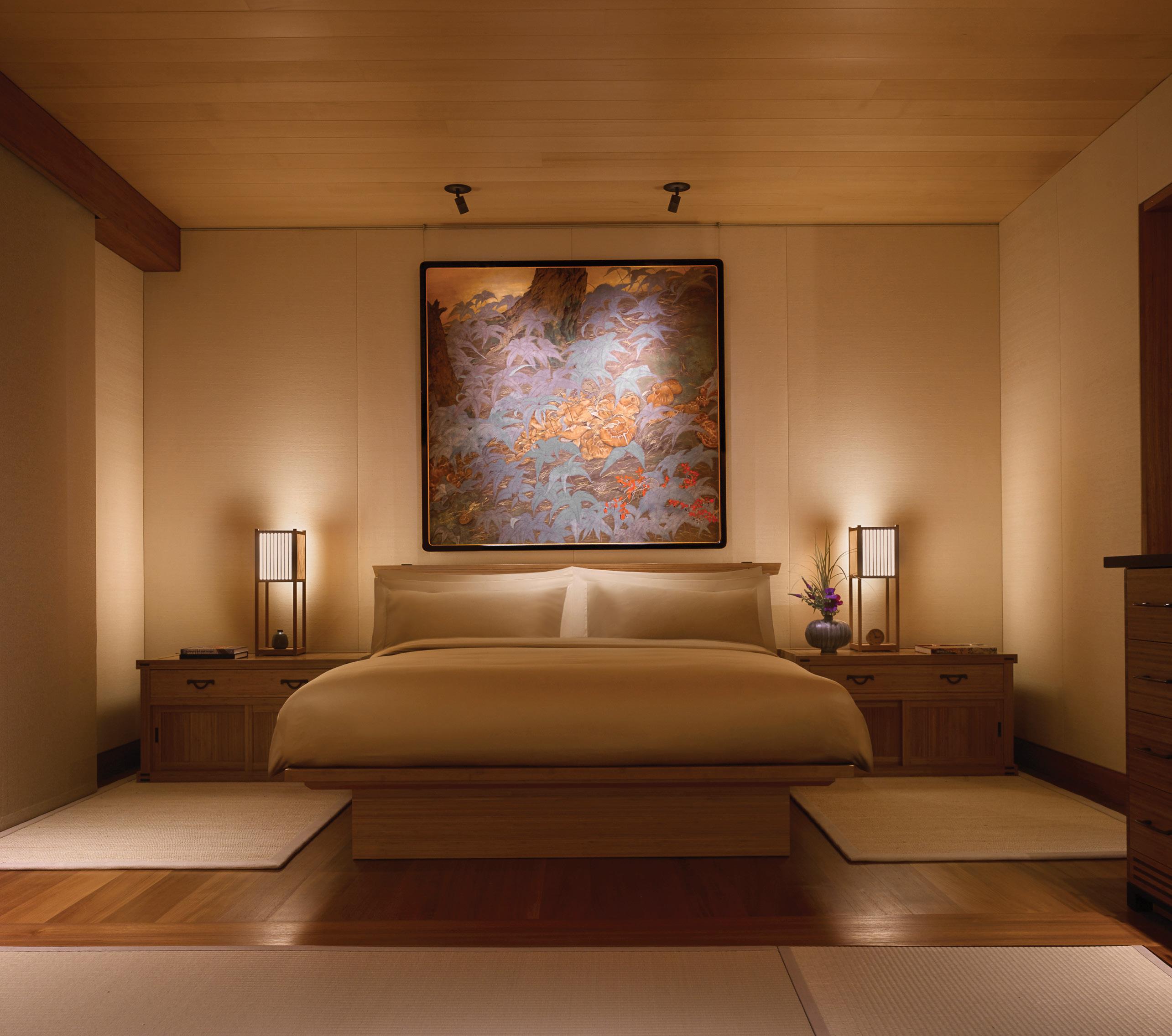
Part of world-renowned Chef Nobu Matsuhisa’s global hospitality network, the Nobu Ryokan is an intimate, 16-room retreat just steps from his famed restaurant. Inspired by traditional Japanese inns, the hotel offers a subdued experience overlooking the Pacific.
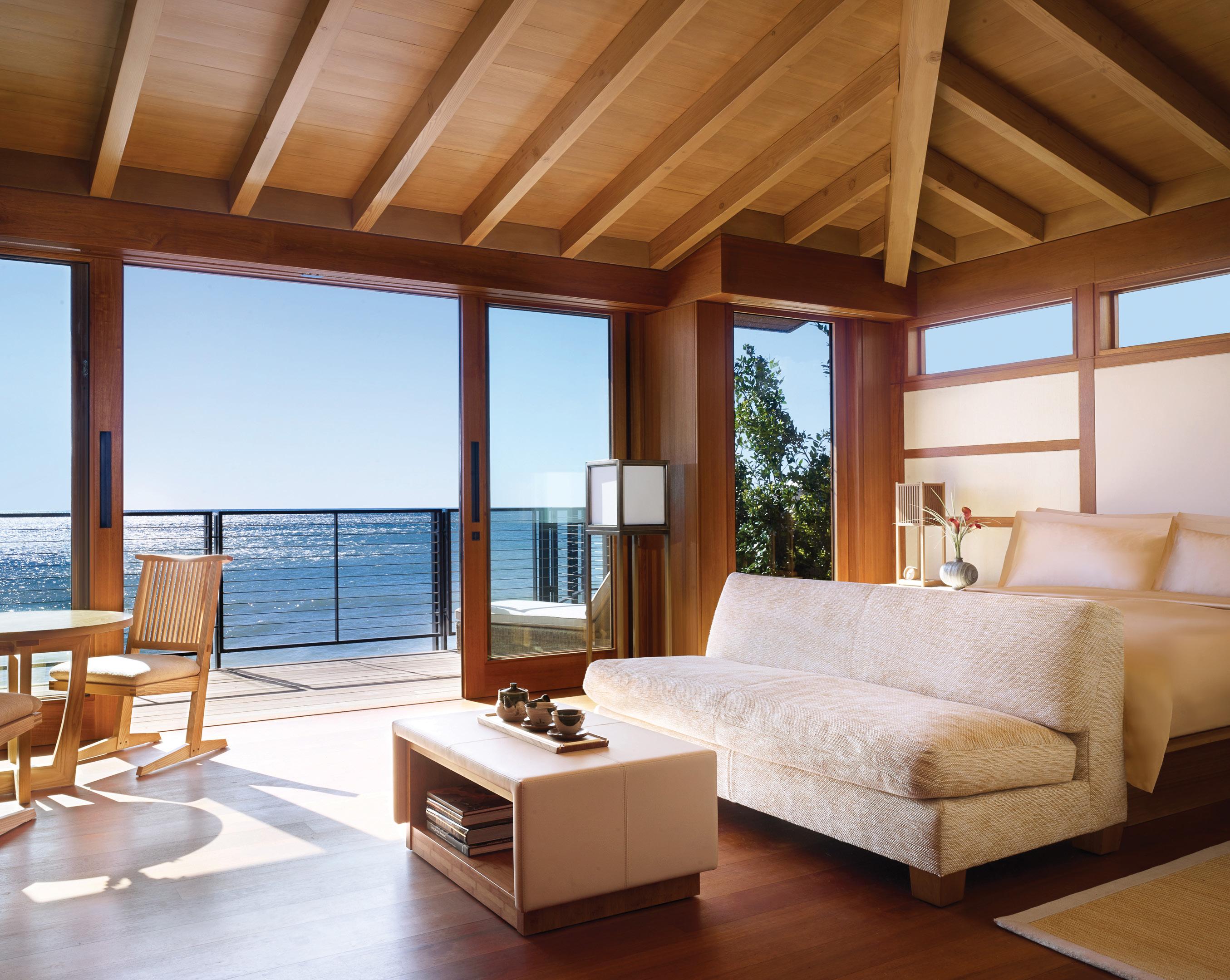
Architecturally, it’s stunning to behold—a gor geous medley of warm woods surrounding a lush garden and tranquil water features. Inside, our spacious suite opened to a small beach and waves crashing below. We could have sat on the deck for hours … and we did. How did it take so long to discover this gem?
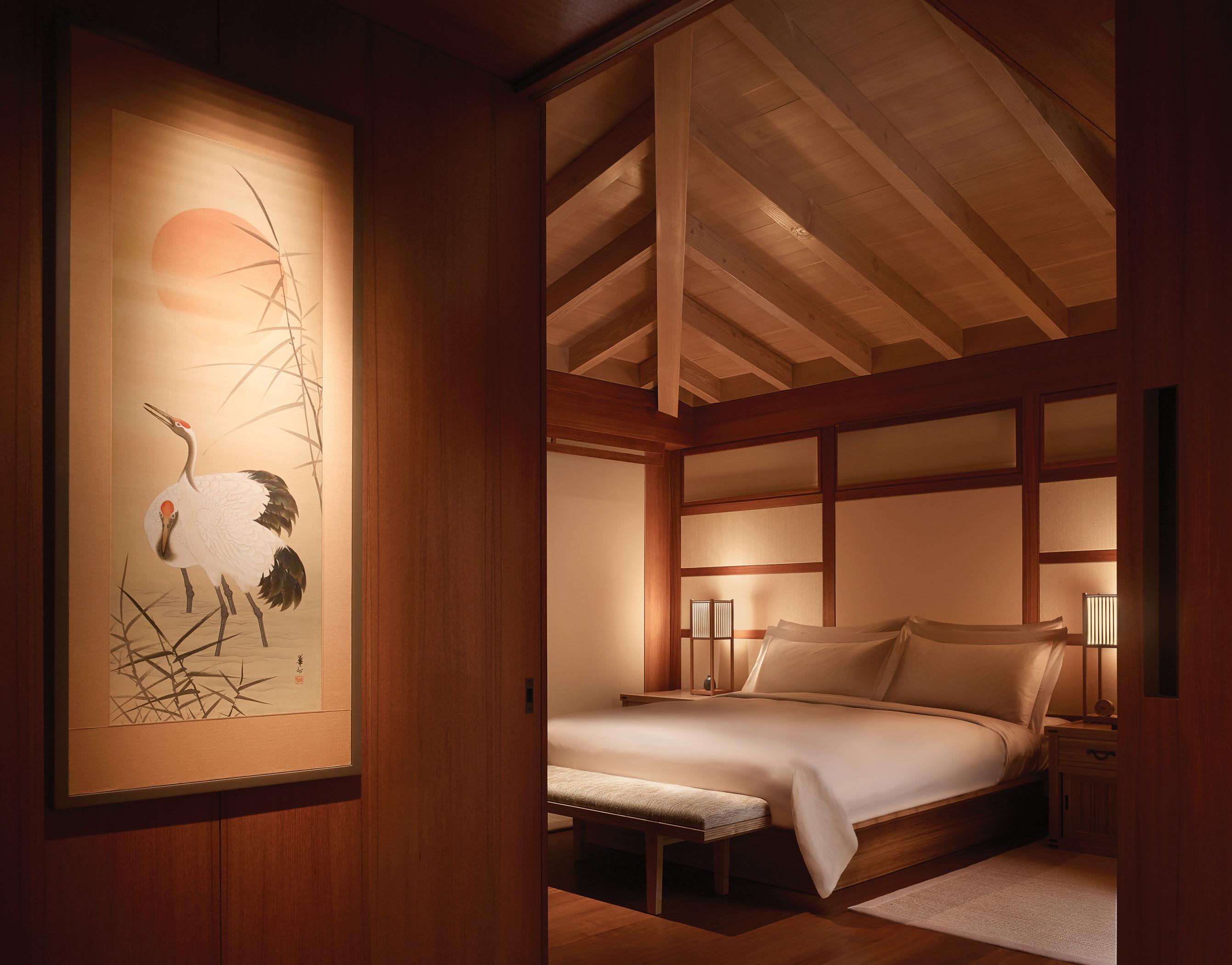
The interiors feature the pristine minimalism of traditional Japanese design, including elements such as tatami mats and covetable teak soaking tubs. The aesthetic of each suite also pays tribute to the cool and refined spirit of California, with expansive sandy-colored limestone walls and sleek finishes, designed in collaboration with Tal Design, Studio PCH, Montalba Architects and C.W. Eisner. As is common with Nobu properties, the rooms
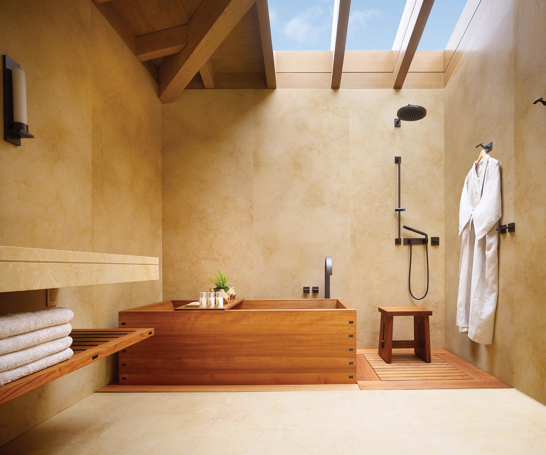
boast high-tech capabilities, from the toilet to the guest tablet.
Though it may be hard to peel yourself away from your suite, there are options for guests outside the hotel. CURE spa is available to guests either for in-room treatments or at their facility across the street via the house car. If tennis is your game, head over to the Malibu Racquet Club—a private, members-only club featuring eight fully lighted outdoor hard courts, locker rooms with
saunas and steam showers, and a fitness facility.
And let’s not forget the sushi. As guests of the Nobu Ryokan, you enjoy priority reservations when you book through the property. That means bold cocktails and unbeatable Japanese-fusion specialties just a few minutes from your front door. Book your table at the coveted sunset hour or take a bottle of wine back to your private patio and soak in the splendor solo. There are no bad choices here, only delight. ¢
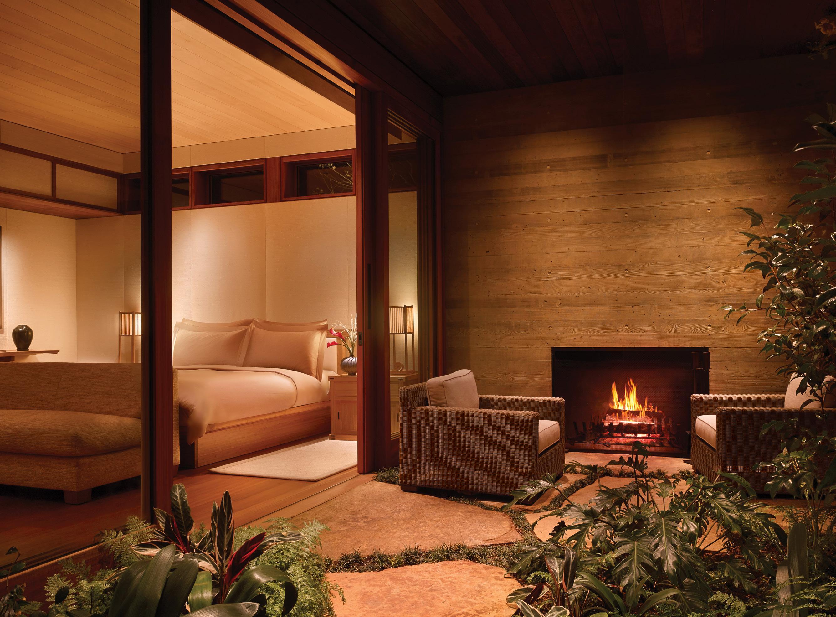
OUR SPACIOUS SUITE OPENED TO A SMALL BEACH AND WAVES CRASHING BELOW. WE COULD HAVE SAT ON THE DECK FOR HOURS … AND WE DID. HOW DID IT TAKE SO LONG TO DISCOVER THIS GEM?



837 Pacific Coast Hwy., Hermosa Beach 310-372-0504 info@katelesterinteriors.com katelesterinteriors.com IG: @klinteriors | @katelesterhome
This is a gorgeous and completely custom Kate Lester Interiors-designed home in Hermosa Beach. This will always be a favorite project. It was a spec build that was purchased early on by the most amazing family relocating from the East Coast. As the house was being built, they said, “Kate, we walked the house, and we love your vision so far. Let’s just keep going!” They are the kind of clients every designer dreams of. Their main requests were that the home feel warm, comfortable and interesting—that was so refreshing. When you enter this home, it immedi ately feels so personal and welcoming.
We made some daring choices all over this house. I think each interior we design should be unique. A lot of times clients say, “I love what you did at this house or that house,” and that’s great. We want to do something different every time. The personality of the clients must always shine through in the design, and we nailed it here. These clients are bold, unassuming and unique, and each room in their home reflects that in an interesting way.
We always like to add “one weird thing.” It may be a light fixture, an object, a bold pattern mix or a uniquely scaled piece of art. I want there
to be something in the space that pushes the boundaries just a little and gets people talking. I would rather we design a space that people say something about (good or bad) than it be so generic that they fail to comment on it at all. Life is too short to be boring.
I think it’s all about not getting complacent. Be ing by the coast, it’s so easy to pop a shell in a bookcase and fall back on a mainstream coastal template of a style. As a design firm, we can do better than that! My goal is to create spaces that exude coastal vibes without being overly literal. We constantly ask ourselves how we can elevate a coastal aesthetic and what that looks like to our clients and their lifestyles. It’s all about leveling up.

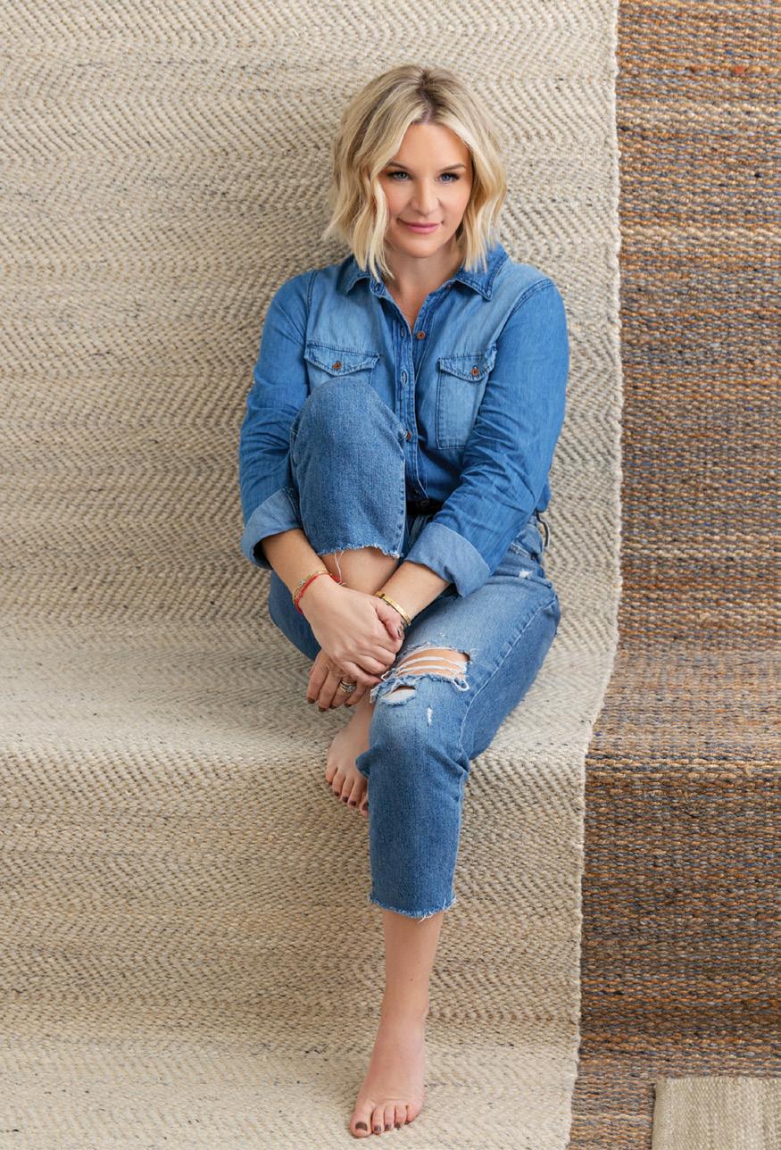
2022 was a whirlwind year! We launched our own line of reproduction vintage rugs with Jaipur Living, and this year our work was featured in Ar chitectural Digest, The Wall Street Journal, House & Home, Real Simple, Rue magazine and more! Our retail brand expanded, and we now have two Kate Lester HOME stores—one in Manhattan Beach and one in Hermosa Beach! Being from the South Bay, it makes me so happy to infuse our elevated and curated aesthetic into the com munity I’ve always called home!
BY DOUGLAS FRIEDMAN; HEADSHOT BY ROBERT PETERSON
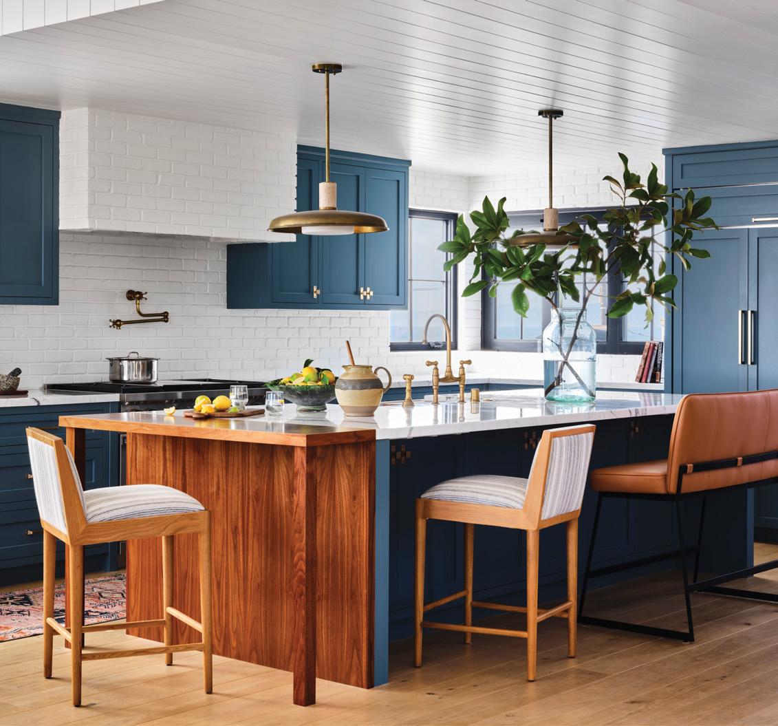
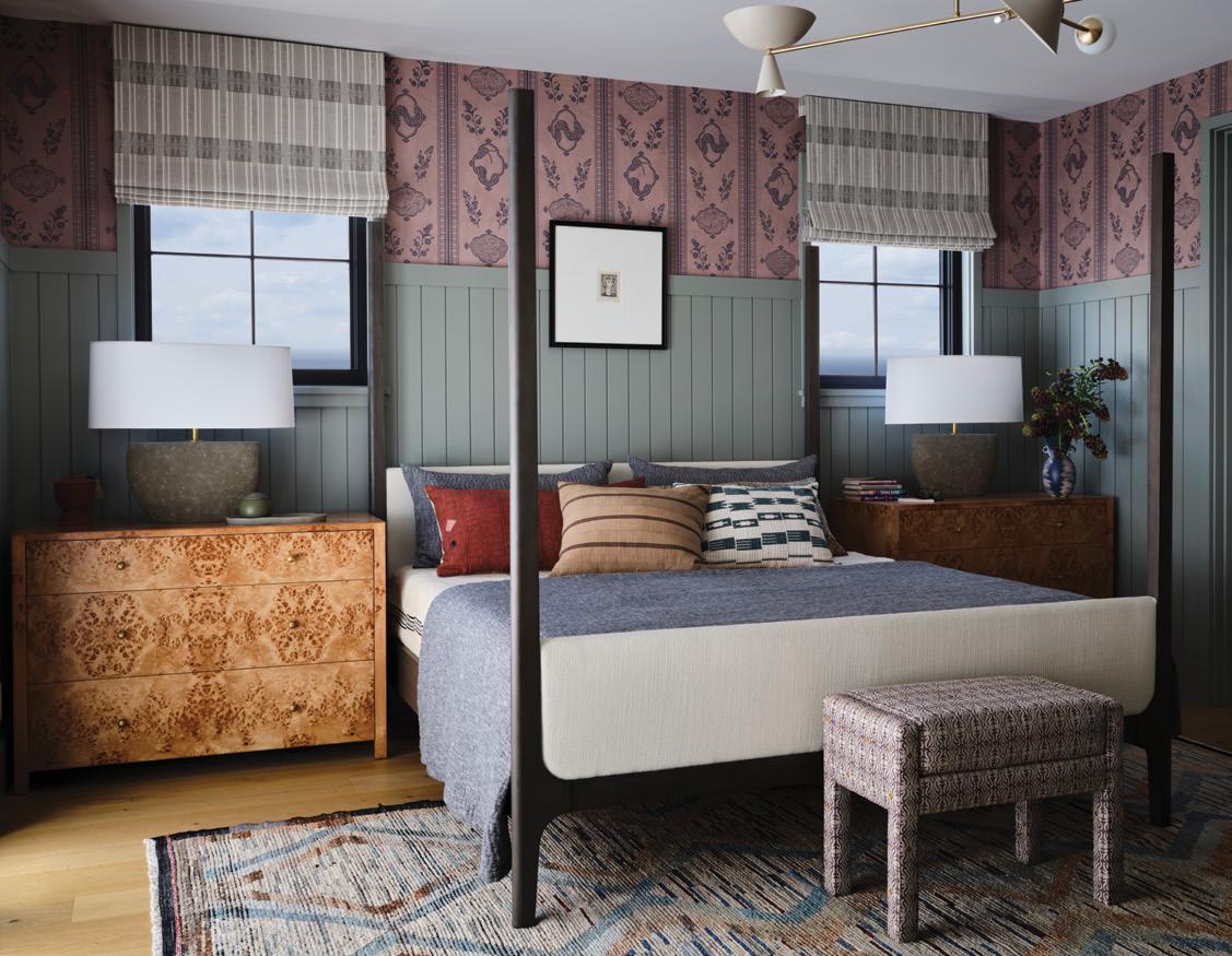
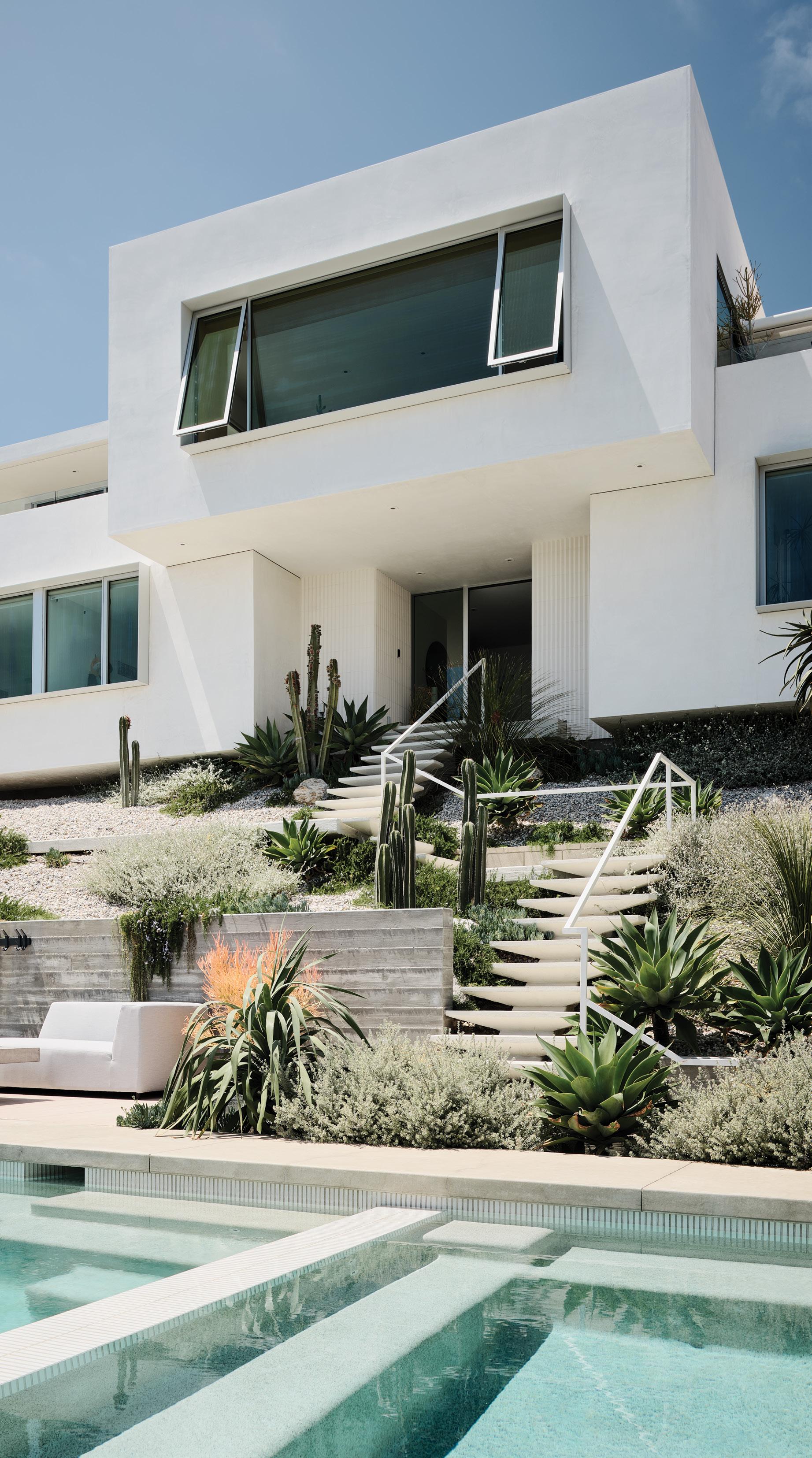
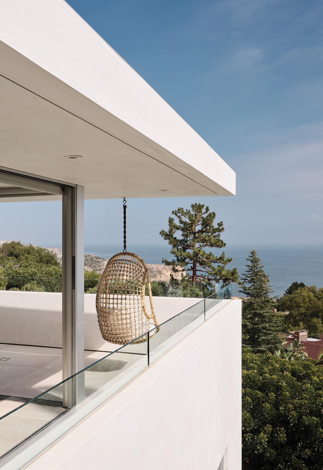
Nestled in a hillside overlooking Abalone Cove in Rancho Palos Verdes is the Parker residence, originally built in 1964 by architect Foster Rhodes Jackson—a protégé of Frank Lloyd Wright. The project brief was to give the home a sensitive update while preserving the original architectural language and showcasing the home’s incredible hillside perch overlooking the Pacific Ocean.
Its original cubist form provides the framework for the project, which consists of strategic interior and exterior interventions. Through a series of cut and fill moves, additional square footage was discretely added without changing the scale of the home. The kitchen was expanded and a dining area added by filling in an underutilized rear patio. An existing crawl space was dug out and converted into a new study. The previously compartmentalized upper level was opened up, maximizing the views of the Pacific.
Constrained by zoning height limitations, the existing roof plate is punctured with a series of oversized skylight wells, which add volume and natural light throughout and act as quasi thermal chimneys, assisting in passively cooling the home.
A new pool and outdoor spaces are built
into the front hillside, situated to integrate with the original entry sequence. Landscaping with native and regionally appropriate plants ties the home together with the surrounding natural context.

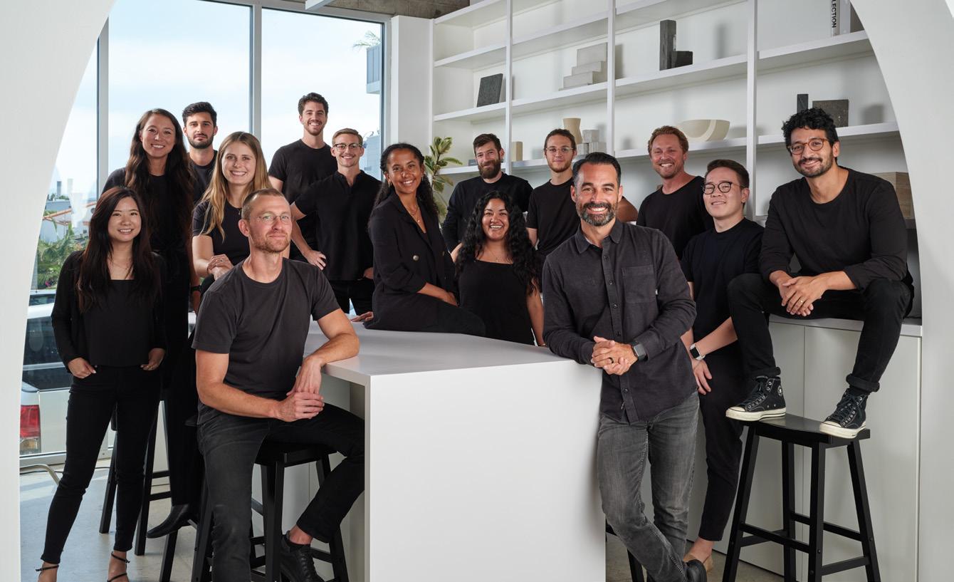
We are a boutique design-build studio that believes in good design and getting our hands dirty. With a multidisciplinary team of architects, designers and contractors, we provide complete services—taking a project from conception through construction.
At a small architecture firm in Beverly Hills 20 years ago. Wanting to be closer to the beach, I then went on to work at Dean Nota Architect in Hermosa for about seven years before eventually branching out on my own.
We look at every project as a problem to solve and come up with a specific solution to that problem. The end product is a holistic result deriving from the site (physical constraints, existing structures, zoning, sunlight, etc.), the client’s program, budget and the context or locale of the project.
PHOTOGRAPHED BY JOE FLETCHER; TEAM SHOT BY SIRI BERTING
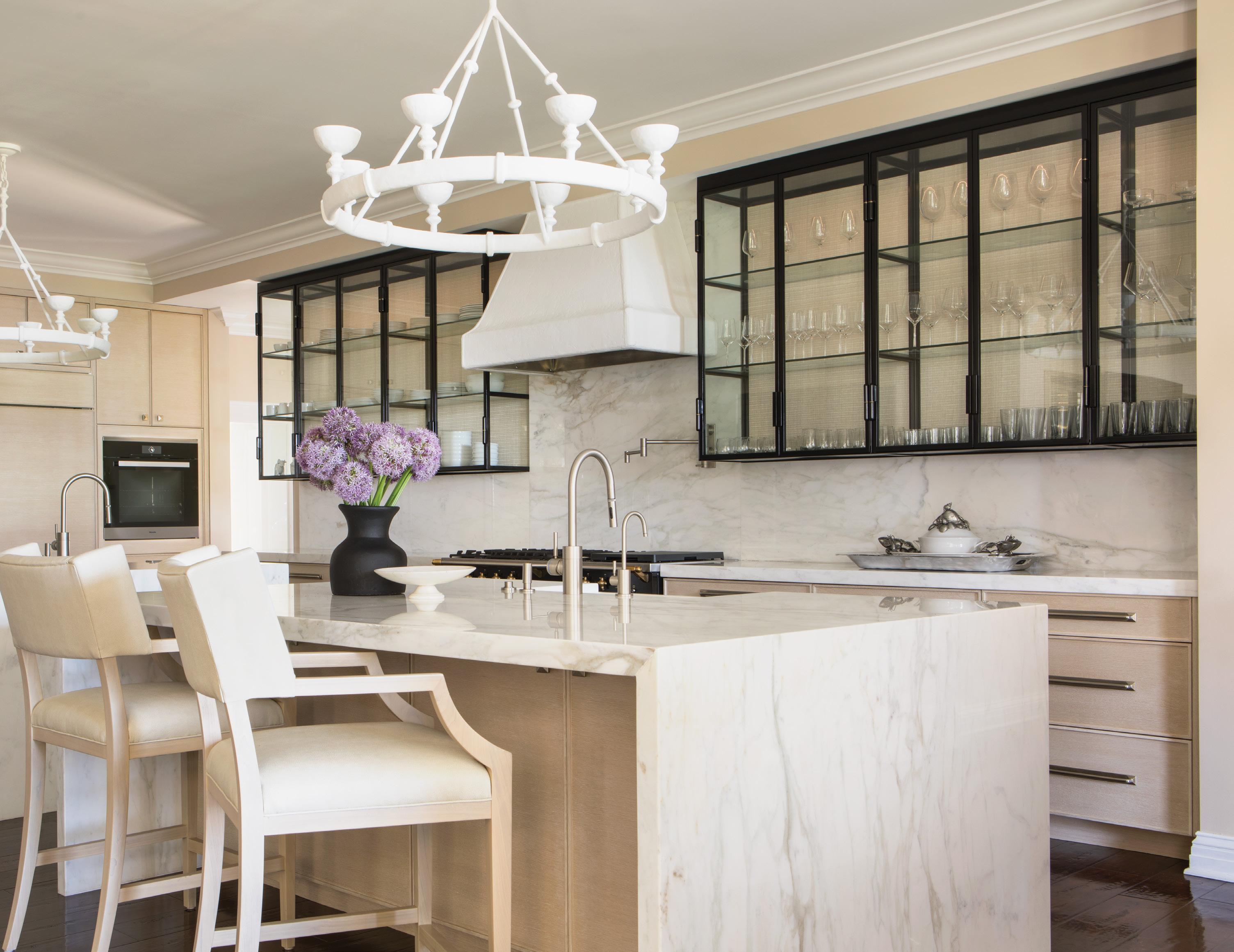
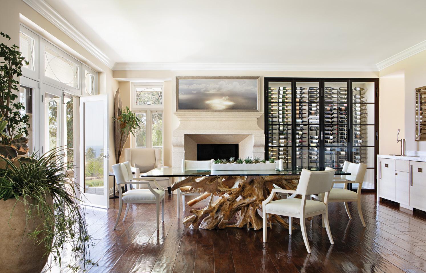
Our clients asked us to design a dream space that transported them to a resort-like atmo sphere while being in the comfort of their home. We developed a serene and calm color palette and mixed interesting materials such as iron, oak and marble. While designing, we envisioned how this entertainment space would accommodate large gatherings for holi days, Monday night football games and festive dinners. We created multiple complementary spaces throughout the home that flowed from one room to the next, all allowing the ocean views to be the relaxing focal point.
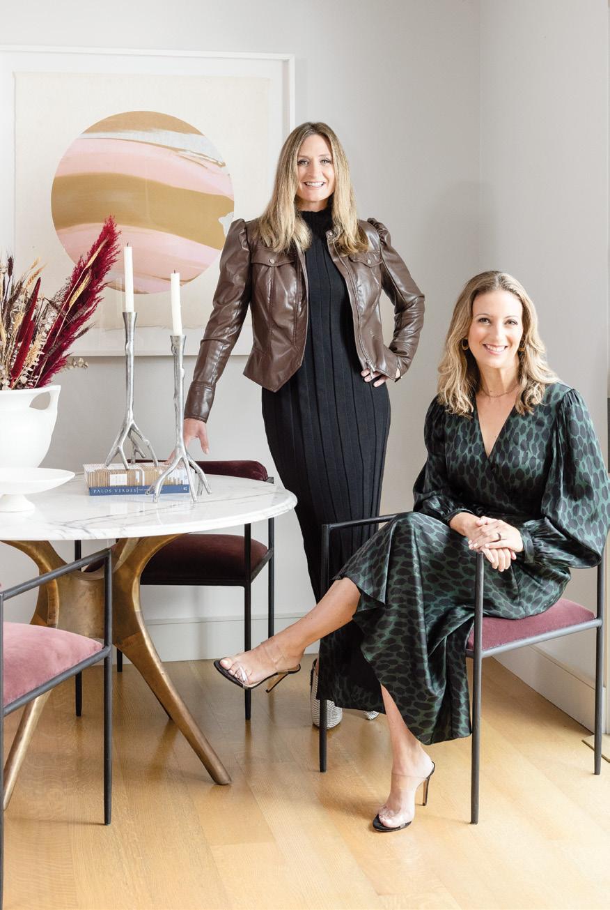
Brende Marshall is a Southern California-based design team combining refined intuition with decades of shared construction and residential design experience. With projects ranging from South Bay jewel boxes to sprawling Malibu compounds, our foundation is always the same: It’s about our client. Whether reinventing an existing home or building from the ground up, we keep our goals aligned with our clients’ to ensure the best outcome.
2325 Palos Verdes Dr. W., #216 Palos Verdes Estates 424-206-9650 hello@brendemarshall.com brendemarshall.com IG: @brendemarshalldesign
We are always looking for “wow factor” op portunities, whether it be a two-tone kitchen, a bold color combination or a special accessory that steals the room. Each project deserves something personalized to the space and homeowner. When clients trust our artistic vi sion, the outcome is stunning.

Although we love a good DIY hobby project, hiring a professional designer will always pay off. Our profession is highly technical, pre cise and calculated, which doesn’t always get properly communicated. People only see the end result, but it’s the process that actually separates us. We have a multitude of resourc es, experience and professionalism that cannot be matched by a DIY mentality.
Whether it’s hiking our Palos Verdes trails, camping in Catalina or skiing in the mountains, we are continually pulling inspiration from our beautiful California landscape. Nature has all the ingredients for great design: balance, color, texture and sense of adventure!
PHOTOGRAPHED BY KARYN MILLET; TEAM SHOT BY SIRI BERTING
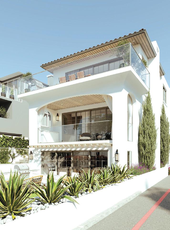
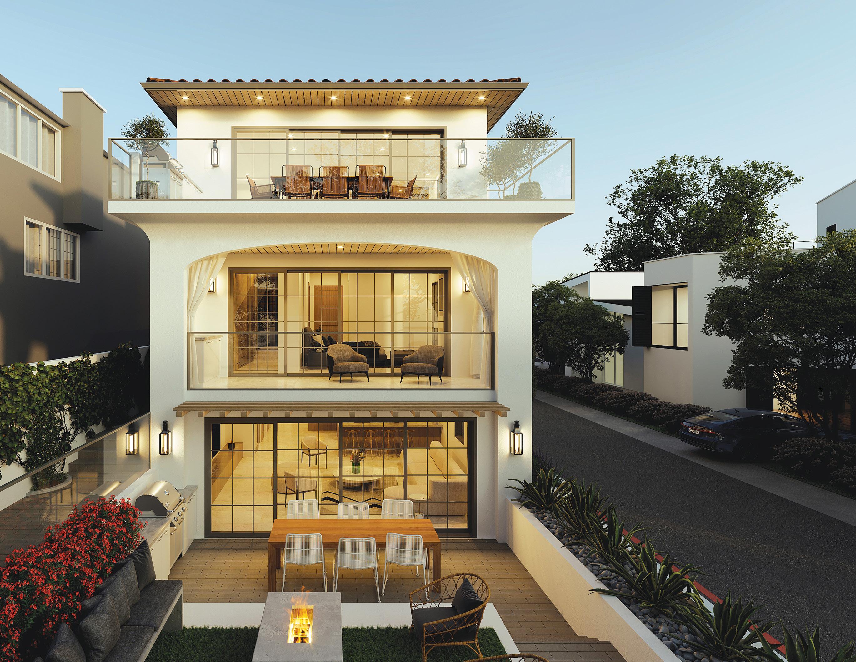
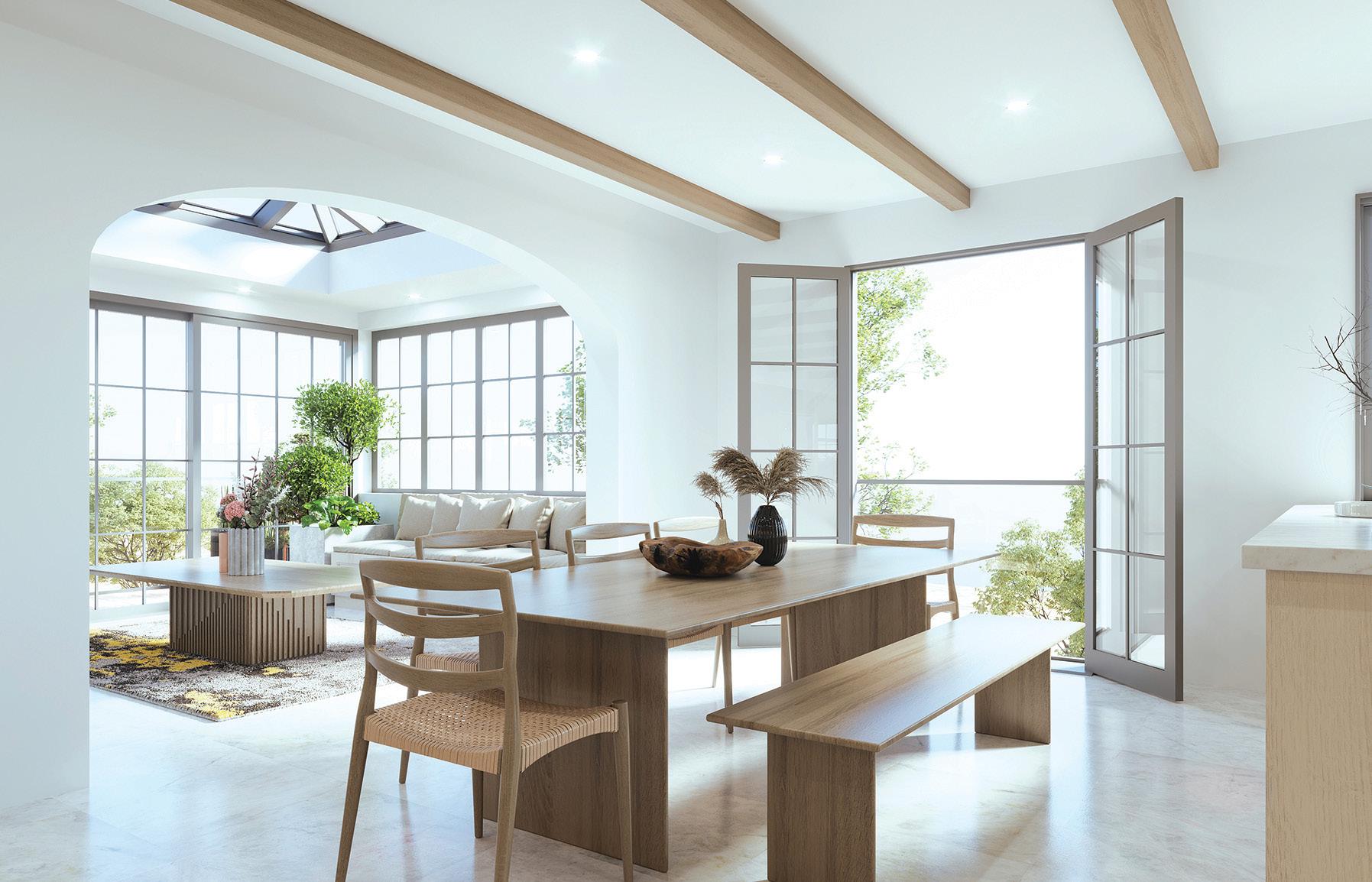
Located on a walk street along the coast in Man hattan Beach, this home incorporates modern European features inspired by the architecture of Alys Beach. The staple of the house is the expansive top floor with views from end to end, designed with sliders that open onto a large bal cony overlooking the Pacific Ocean. On the other end is a sunny morning room with a skylight and corner windows facing the Peninsula. At the ground-floor level, the front courtyard is nestled in planters to provide privacy within the busy beach area. The home’s exterior is composed of white stucco and clean, sculptural details. Glass balconies paired with hints of iron and oak intro duce a variety of earthy textures.
View sites are common in the Beach Cities, so we used drone photography to ensure they are captured in the main spaces, and solar studies help us analyze how natural light affects our designs. Using all of these pieces of information, we are able to create a home that responds well to its surroundings while meeting our client’s individualized goals.

Defining your needs is a great place to start. Are you looking for a highly customized design? Do you need assistance in determining a specific style for the project that truly represents you?
Communication and responsiveness differ great ly among architects. An experienced architect can help you clarify your goals and address any
707 Torrance Blvd., Suite 100, Redondo Beach 310-876-8761
info@calarchitect.com calarchitect.com

IG: @joseph.spierer.architects
FB:@JosephSpiererArchitects
necessary questions.
It is also important to note the architect’s expertise, design ability and versatility. A key factor is the architect’s understanding of local rules and ordinances of the city, as well as being able to design in a way that translates a client’s vision into architecture. An architectural firm with state-of-the-art design tools helps visualize the client’s unique ideas. At Joseph Spierer Architects, we construct all our designs in three dimensions on the computer. Between this, virtual reality and printed 3D models, our clients can experience their new home fully prior to ever putting a shovel in the ground.
We begin by conducting a thorough analysis to understand the existing conditions of the site. We then ask our clients an extensive scope of questions. Beyond the typical “How many bed rooms?” we ask, “What is your morning routine like?” or “When you entertain, what does that look like?” We try to have the first meeting in the client’s home to give us a glimpse into their ev eryday life and observe how they move through their home.
Next, we aim to draw out the client’s sense of style from magazine clippings and photographs of homes that appeal to them. We provide imag es as well, and together we discuss the particular elements the client likes about each photo. After we incorporate this information, we can create a space that will enrich their everyday lives.
VISUALIZATION BY NEGAR ZAHIRI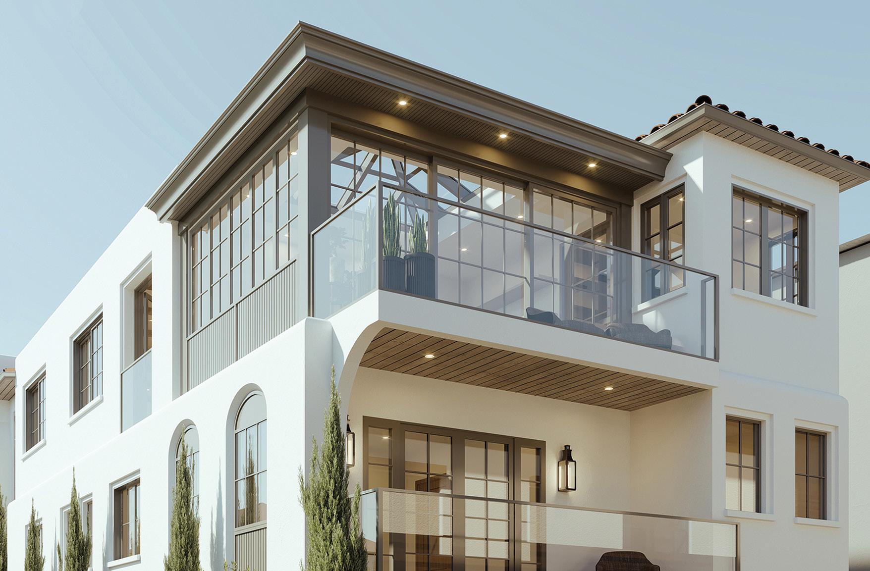
14705 Hawthorne Blvd., Lawndale 310-570-7278
brianw@williamson-homes.com williamson-homes.com | IG: @williamson_homes
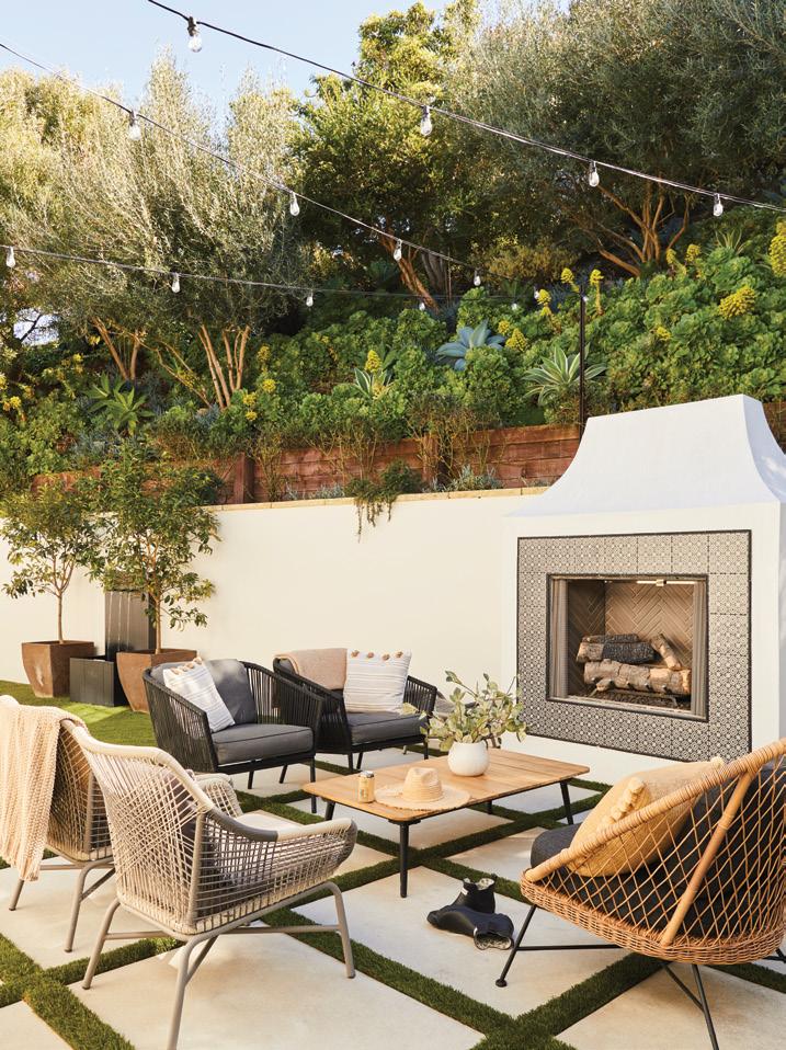
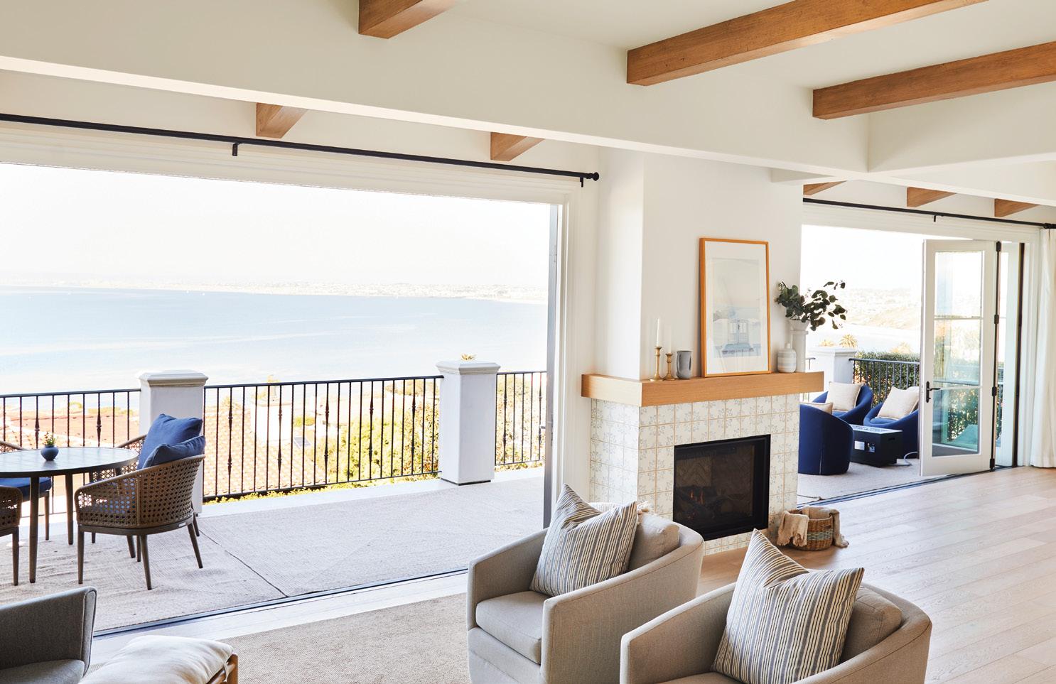
This modern coastal project was for clients, now dear friends, who were fresh transplants from the Southeast. They selected this lovely house in Palos Verdes Estates that needed to improve its amazing view of the South Bay and its flow for entertaining. They wanted to bring this al most 50-year-old house into the modern age.
We are a South Bay family-owned business with a legacy of construction experience dat ing back to the 1950s. On the commercial side of our business, we intentionally specialize in medical and educational facilities—spaces that teach and heal our community. This type of work has considerable budget and time pres sures, forcing us to continually refine our con struction processes. Over the years, we’ve no ticed a need for professionalism and a refined process in the residential construction space, so we expanded our reach into improving and beautifying the homes of our neighborhoods.

What we offer is a “white glove” residential construction service. Keeping a site safe and clean is the most effective way to bring a proj ect in on time and on budget. We learned that from working with our grandpa when we were young, sweeping the floors at the end of the day. This keeps the focus on the progress, not
on the mess. Sure, you have to crack a couple of eggs to make an omelet, but we can be pro fessional about it. We carry that attitude from the early days of demo through the entire con struction process, all the way to move-in day.
Our business is a family business. After seeing our grandfather and uncles own and operate successful construction companies, we carry the torch they have handed to us. We have young families and live in the South Bay and want this community to be a better place than when we found it. Our goal is to be able to drive our kids around in many years and show them how we made a positive difference in our neighborhoods, by taking care of people’s homes and creating spaces that bring joy to them and those they share life with.

Remodeling or building a new home can be a multimonth or multiyear endeavor, and you must have a relationship you can trust for that experience to go well throughout the dura tion of the project. Listen to that voice inside you when picking someone. If something isn’t sitting right, don’t move forward until that’s resolved. Our hope is that we can establish a level of trust with our clients so when chal lenges happen, they know our one goal is their success.

725 Cypress Ave., Hermosa Beach 310-870-7175 | yes@laney.la laney.la | IG: @LaneyLAinc
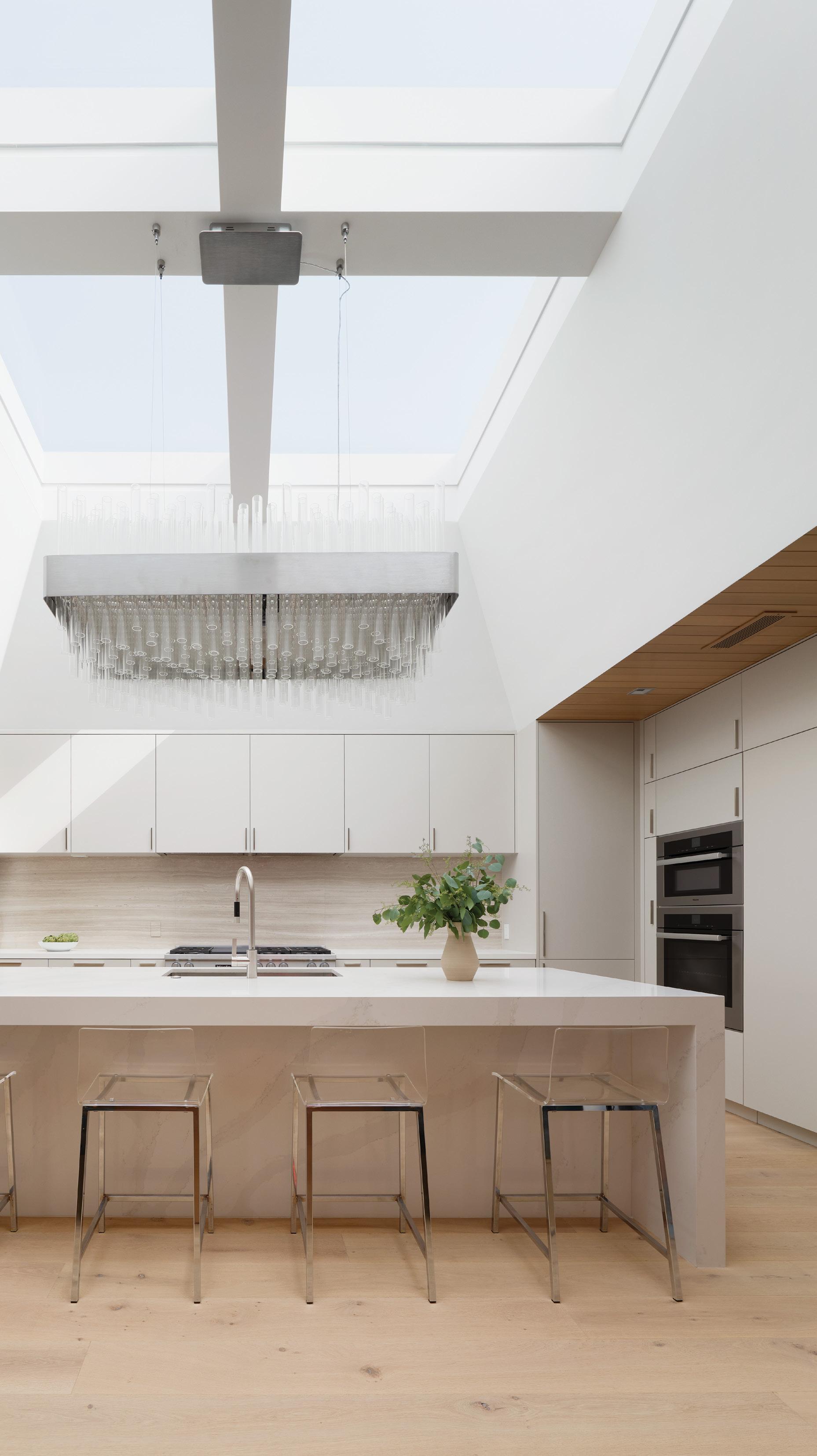
Every renovation relies on diagnosing the ele ments worth preserving and transforming in a home. This four-story renovation began with a premise to reuse all the structural elements of the home in order to avoid unnecessary demolition.
Despite keeping the structural integrity, the ar chitectural team took a heavy-handed approach to almost every interior cosmetic wall, fixture and finish. The architectural strategy was to bring light and air into the home at every level. The massive kitchen skylight is perhaps one of the most impactful examples of this strategy in action. The result is a residence that has transformed from a dark, dated space into an oasis for relaxation and entertainment.

Laney LA is an award-winning architecture and design studio driven by the conviction that great architecture can inspire the best in humanity— moving those who experience it, shaping neigh borhoods and impacting the way we steward our environment. We specialize in residential, commercial and interior design projects along the western coast and mountain ranges of the United States. Our projects have been recognized by the 2022 AIA Los Angeles Residential Architecture awards and the 2022 Dezeen Longlist.
The challenge of an urban context is that often nature can feel far away. We look around and
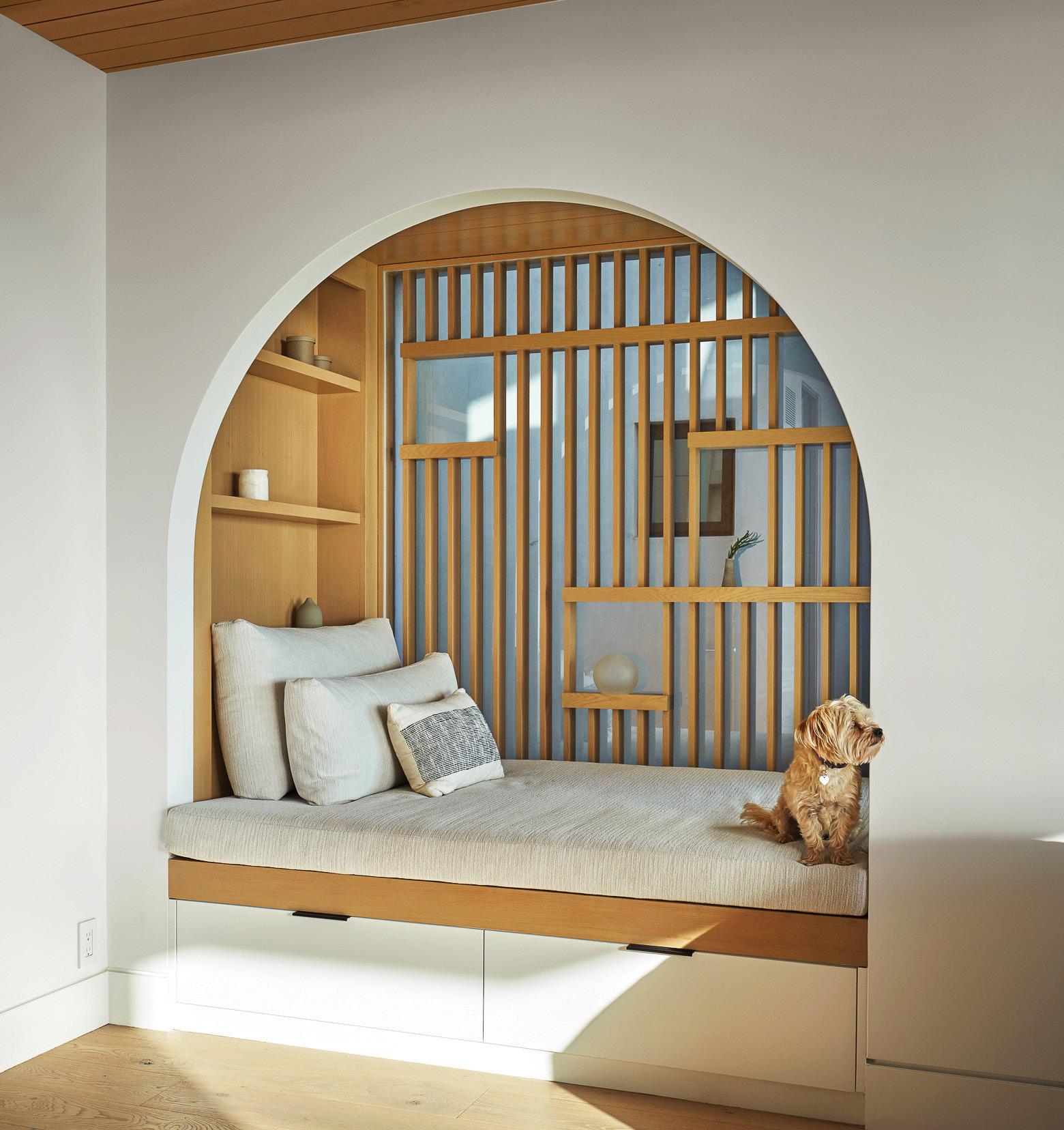
see only structure, stone and pavement. This is especially true in the tall, narrow lots of the Beach Cities. As a result, our projects orient themselves both inward and upward through the use of strategic skylights, rooftop courtyards and interior gardens. Moreover, our projects seek to create a heightened sensitivity to the interconnectedness of both nature and craft. For example, our projects will carve out spaces in which nature can be expe rienced from new perspectives, such as a reading nook positioned just for glimpsing the sunset. We believe every property has hidden and obvious opportunities to change the way we think about and interact with nature, and our team is passion ate about uncovering those moments.
As architects, we have the privilege of playing an important role to propel sustainability efforts for ward. Our strategies are varied and include every thing from recycling greywater to reducing waste during construction or specifying local, durable, materials free of toxins on our projects. Our favor ite strategies are the ones that not only improve the environment but elevate our clients’ lifestyles. We always look for ways to leverage natural light to decrease energy consumption, such as in this project’s enormous skylight, which transforms an entire floor of a home. During our most recent heat wave, we heard from one of our clients that their home stayed wonderfully temperate without any air conditioning due to the passive heating and cooling systems we installed.
BY ERIC STAUDENMAIER; TEAM SHOT BY ROGER DAVIES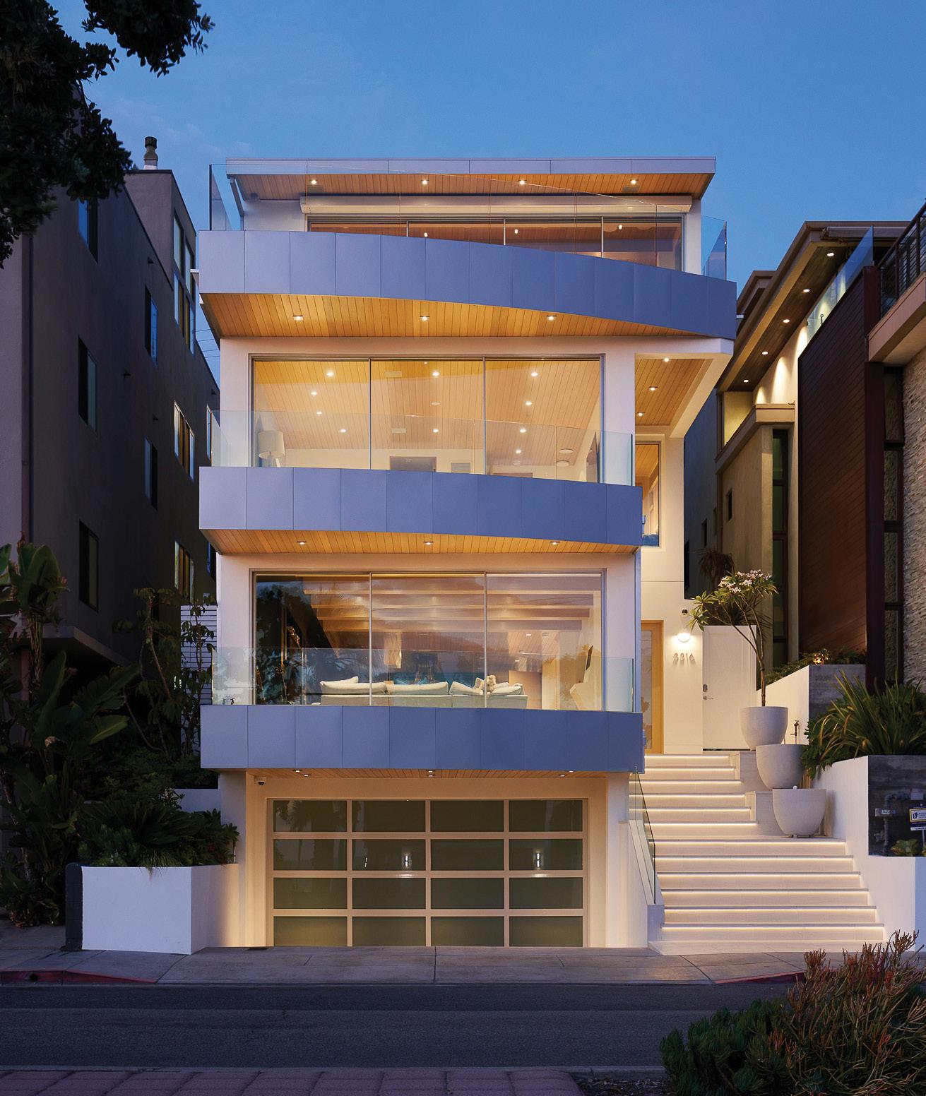
This traditional Tuscan home is a brand-new design-build project in the Torrance Hill Section just north of Palos Verdes. Our clients lived in the original house for decades, raised their family there and dreamed of one day building their home from scratch on the same plot of land.
We met with them before they began the design process and went through their “must have” list, which included both an upstairs and downstairs master suite, entertainer’s kitchen, two living rooms and an indoor-outdoor bar—all steeped in an old-world aesthetic with modern touches. Our clients’ son drew the original vision, and we brought on an expert team to fine-tune and finalize the plans.
The home is classic. It has stacked stone, arch es galore, dark wood floors, soaring ceilings, and rustic beams made from reclaimed barn wood. Little touches were key for this build. The custom cabinets and moldings allowed us to modernize the home and still maintain its classic charm.
My favorite room in the house is the upstairs family room. Our clients are huge USC sports fans. They wanted a second living space where they could watch a game, make a cocktail at their built-in bar, stack the windows completely open, and enjoy their ocean and city lights view from the patio. We even installed a couple of reclaimed stadium seats from the USC Coliseum.
It matters a lot! When our clients involve us in the project before they start the design process, we
707 Torrance Blvd. #100, Redondo Beach 310-602-1492 info@archerbuilding.com archerbuilding.com IG: @archerbuilding
can make a huge impact on price, schedule and overall design. Design-build usually means that our clients hire us to handle everything related to the home from start to finish. This saves money because we can design to the budget instead of designing first and getting a bid second, after the design is largely finished.

We can also help both the design team and the clients understand the practicality of building certain aspects of a home. For example, if we can see the topography of the land before you start designing your basement or outdoor living space, we can give recommendations so you’re not making the design unnecessarily difficult to build. When people wait to get a builder on board until after the design process, it will cost more because they did not value-engineer the project while in the design phase.
We experienced many of the same changes that affected everyone in the industry: rising costs, supply chain constraints and increased demand for home building. One change we embraced was that remote meetings with clients became commonplace. During the build of this home, for example, our clients stayed with their kids and grandkids on the other side of the country throughout construction. We had weekly Zoom meetings and kept them updated daily through our project management app. We were already a tech-savvy company, but COVID-19 accelerated it and made the transition seamless.
BY LAUREN TAYLOR; HEADSHOT BY SIRI BERTING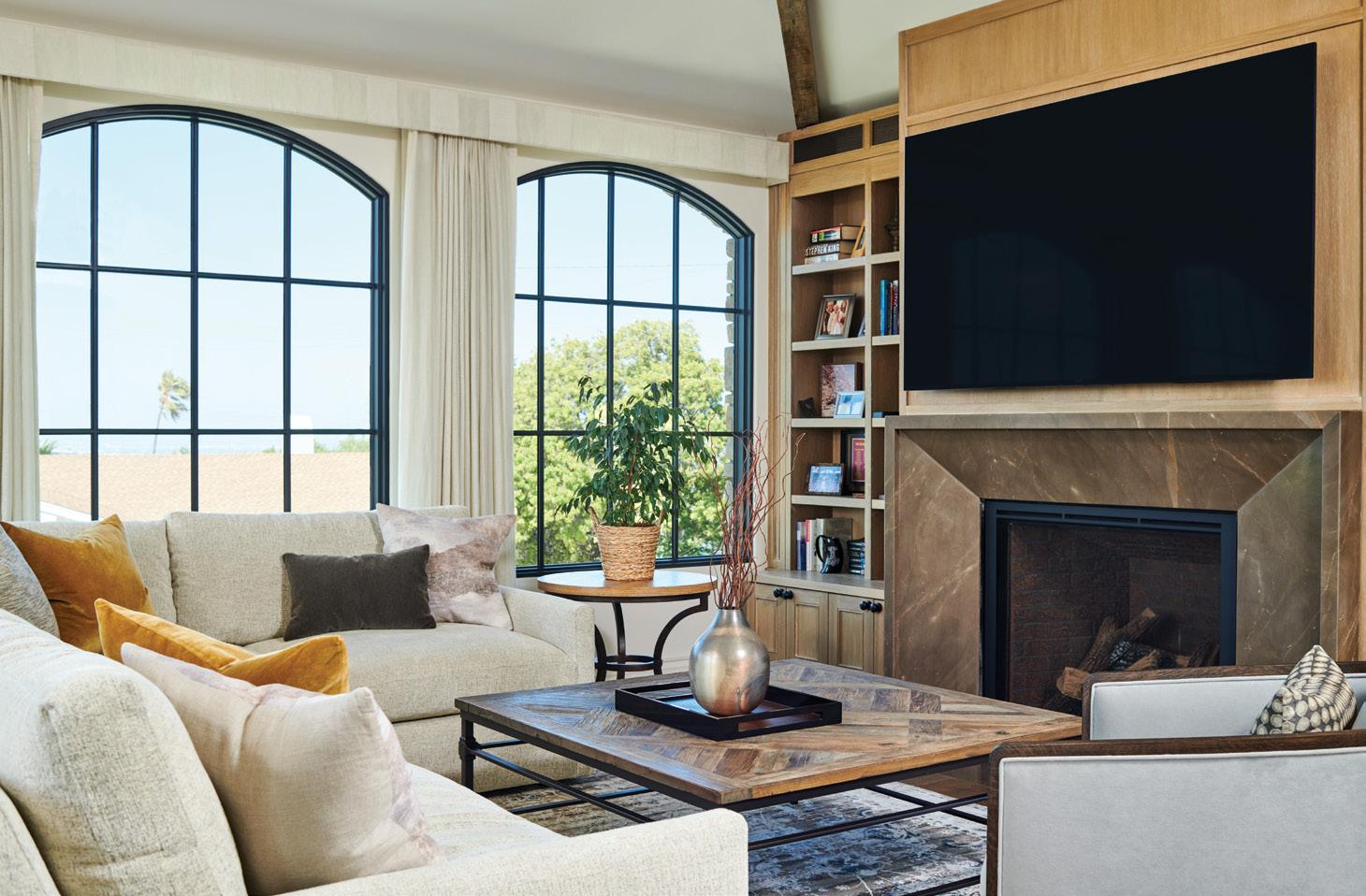
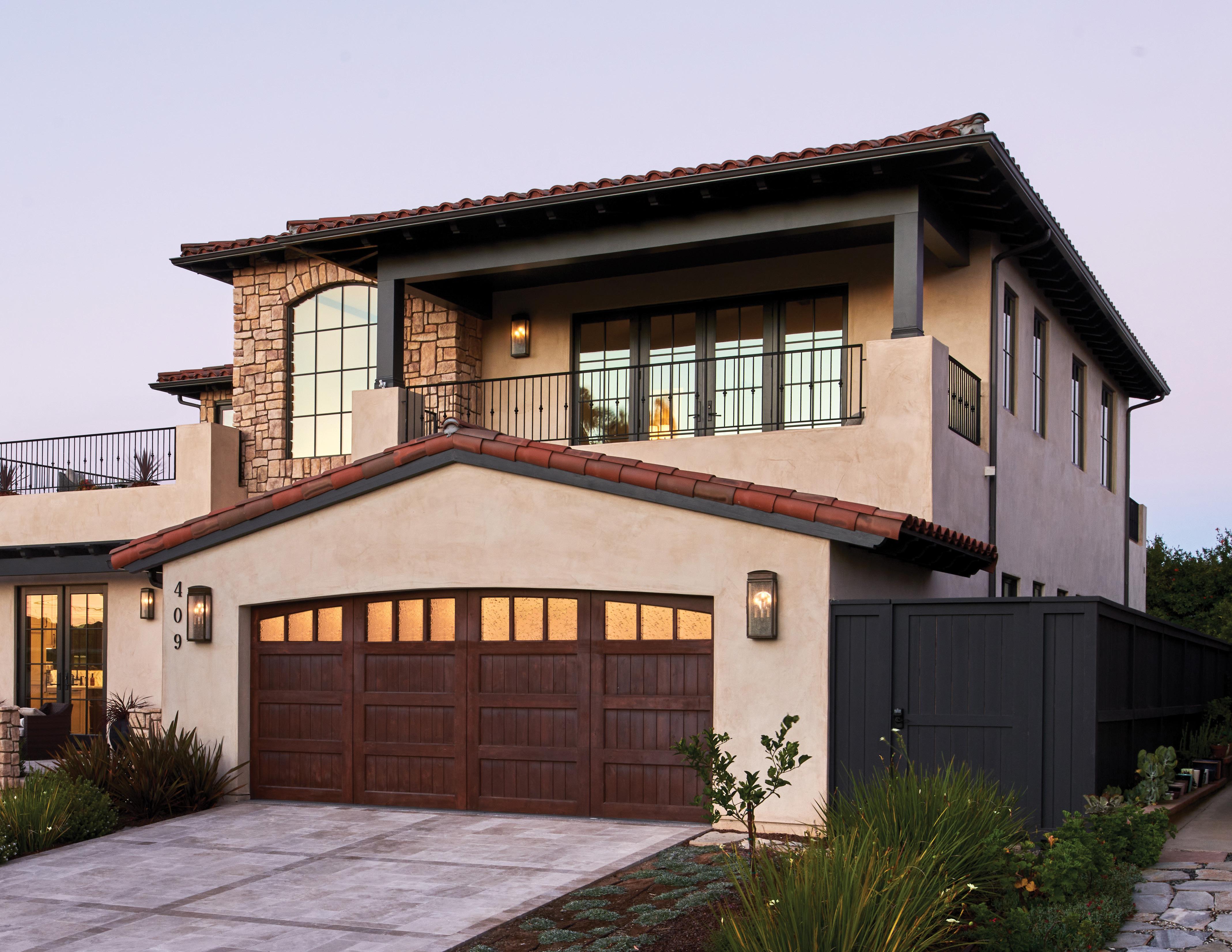
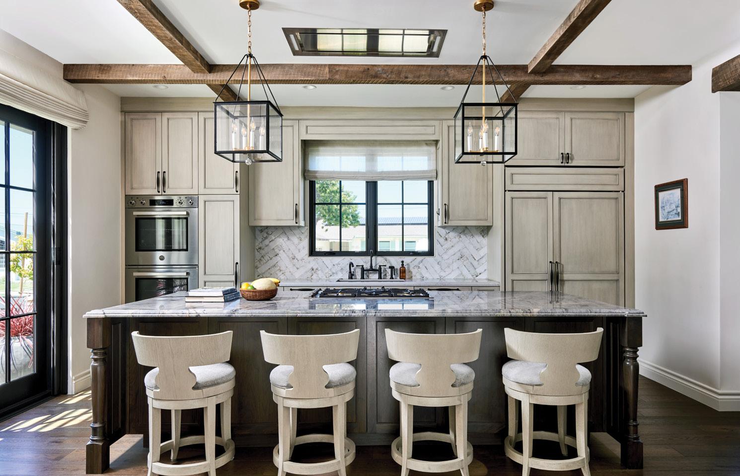
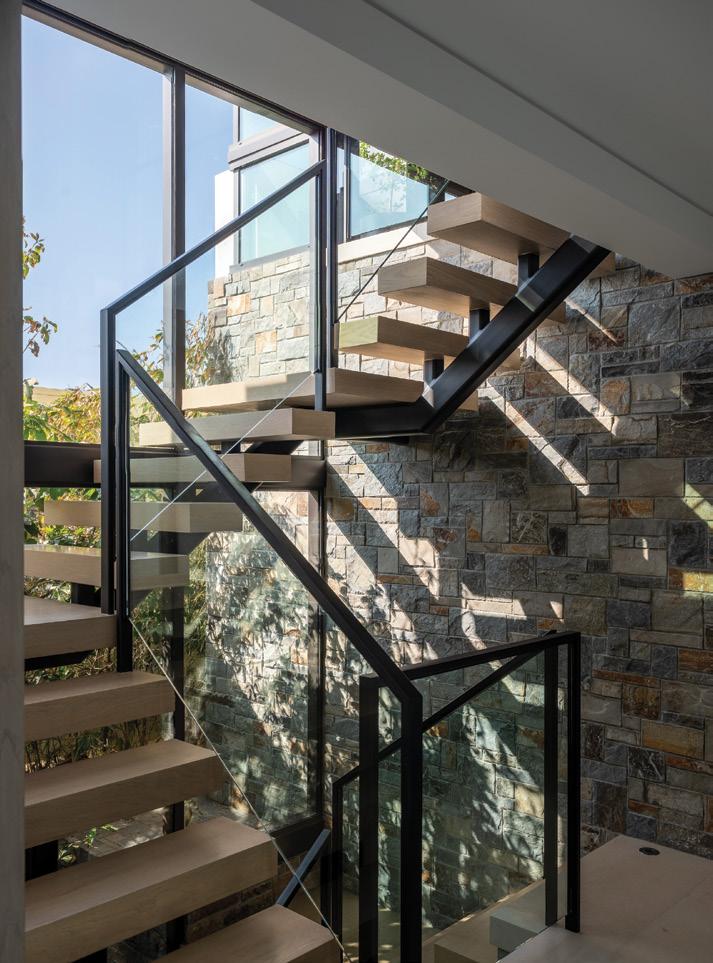
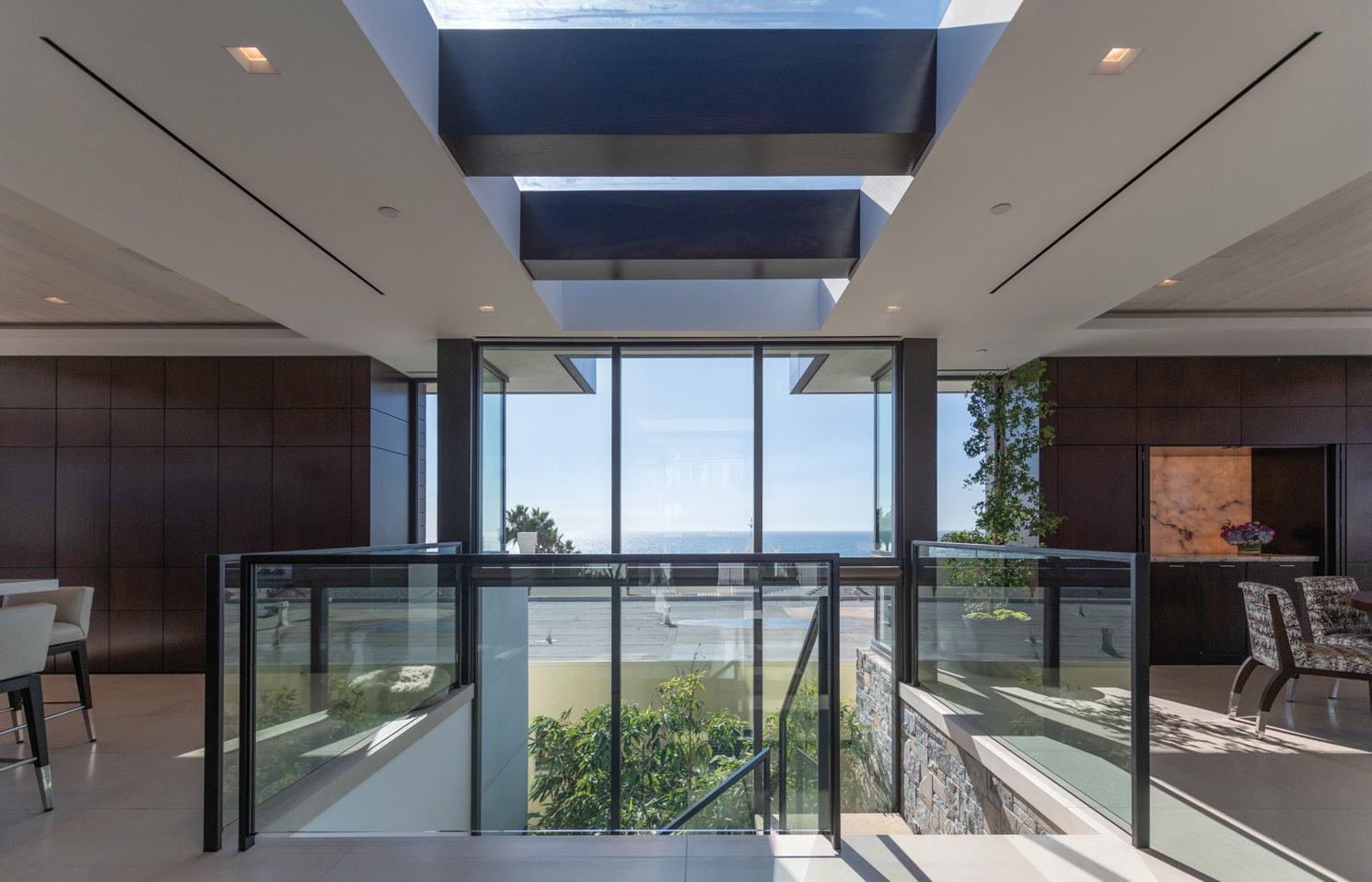
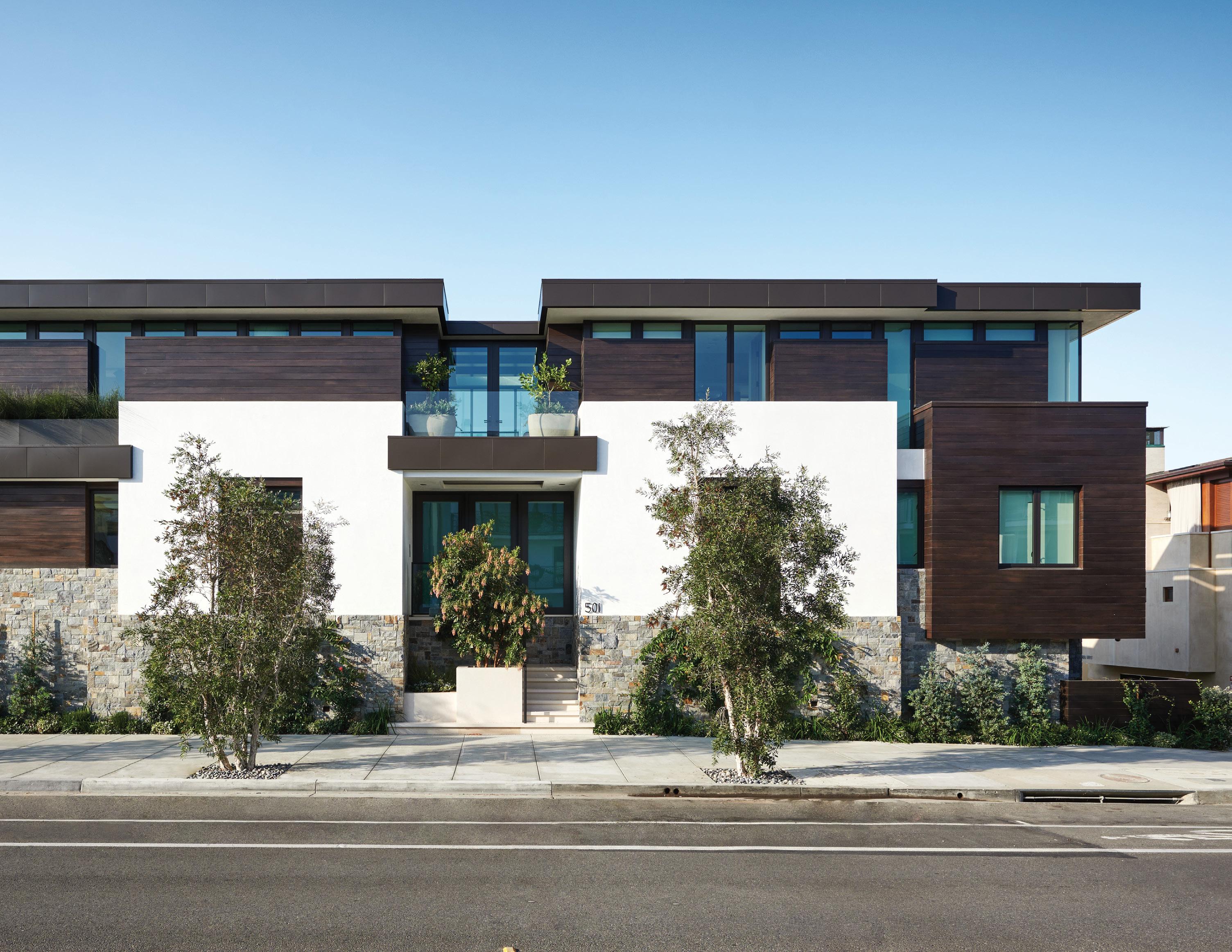
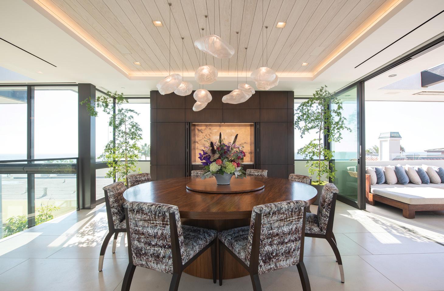
With sweeping ocean views, this home was designed as a reverse floor plan with the kitchen and main living spaces on the top floor. There are no partition walls dividing up the third floor, which allows the eye to travel across the entire level and out to the views. The three-story floating staircase cuts through the center glass spine of the home, incorporating full-height glass that turns into a large skylight on the top floor—flooding the home with natural light. At grade level, the experience of indoor-outdoor liv ing is maximized with a large glass door system that opens to the covered seating space with an outdoor built-in kitchen, bar, fireplace and TV. On the backside of the fireplace is a pool with a hydraulic system that allows the floor of the pool to raise and be flush with the surrounding walk ing area when the need for more patio is desired. The calming color palette used throughout the home by C.C. and Company creates a tranquil living experience and blends seamlessly with the architecture and exterior material palette.

We have been based in the South Bay for over 30 years with hundreds of homes designed and built. Each project is unique in terms of client needs, views and location. We enjoy a col laborative design process with the client and ensure each project is unique, functional and captures our clients’ desires and dreams. We
use sophisticated computer-aided software that allows clients to visualize their project in its entirety prior to the start of construction. This has greatly reduced changes in the field, has helped save time and money, and allows clients to fully understand the project during the design phase. We are able to show the fine details of the project down to the types of plants, furniture and finishes.
Sustainable design has always been very important to our firm. Many of the staff are LEED-accredited, and we have completed sev eral projects that are LEED-certified. Regard less if projects are certified or not, we strive to use the latest technologies and design prac tices to create sustainable buildings, as part of our firm’s design philosophy.
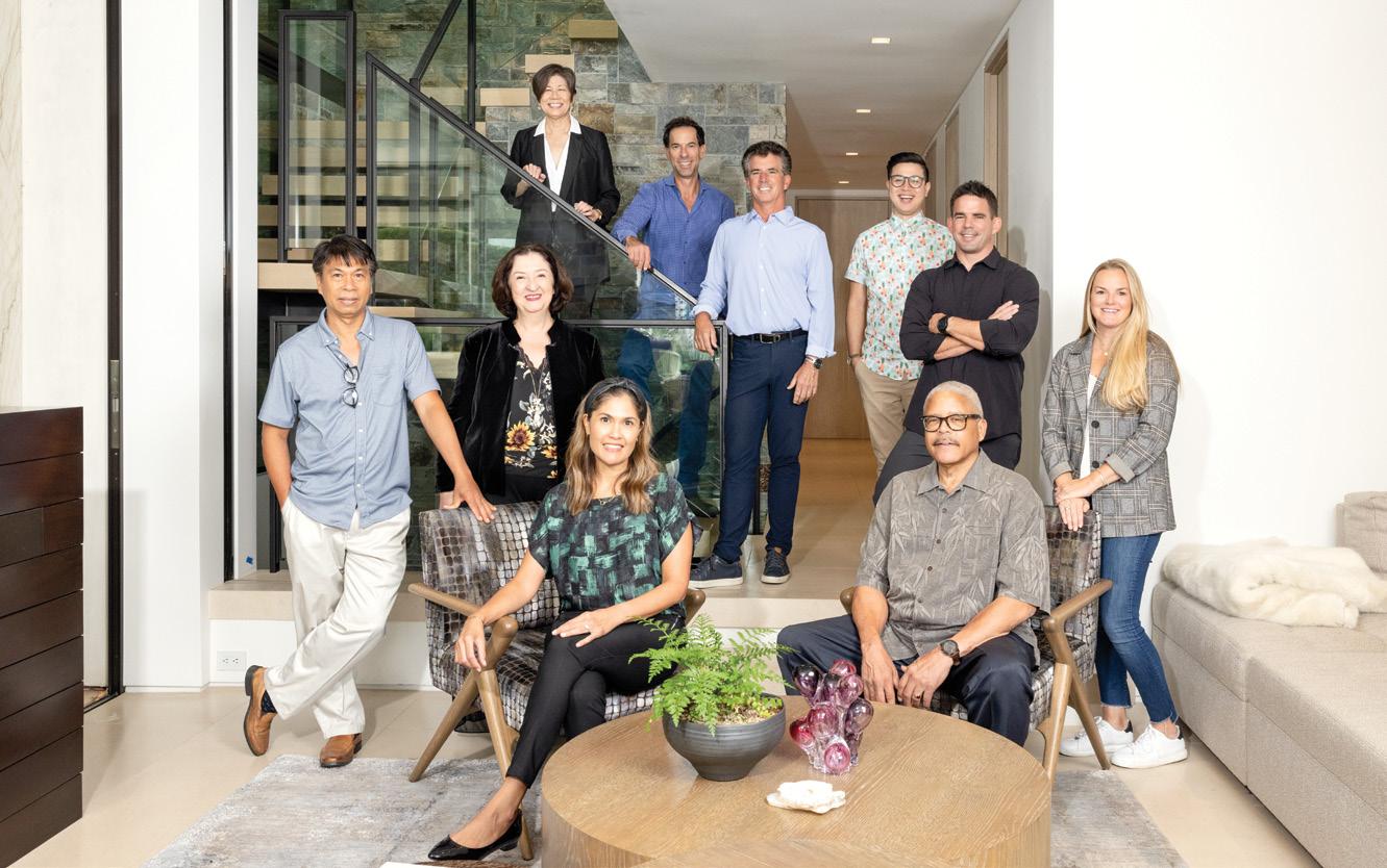
Even though we are based in the South Bay, we have employees and projects across the coun try, including current projects in Arizona, Kauai, Colorado, Montana, Tennessee, Utah, Texas and throughout California. Being licensed in many states in the U.S. has allowed us to branch out and design some very exciting and innovative projects. We enjoy the process of designing homes in different climates, terrains, locations and varying architectural styles.
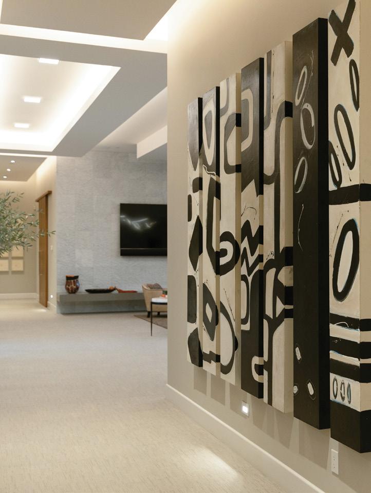
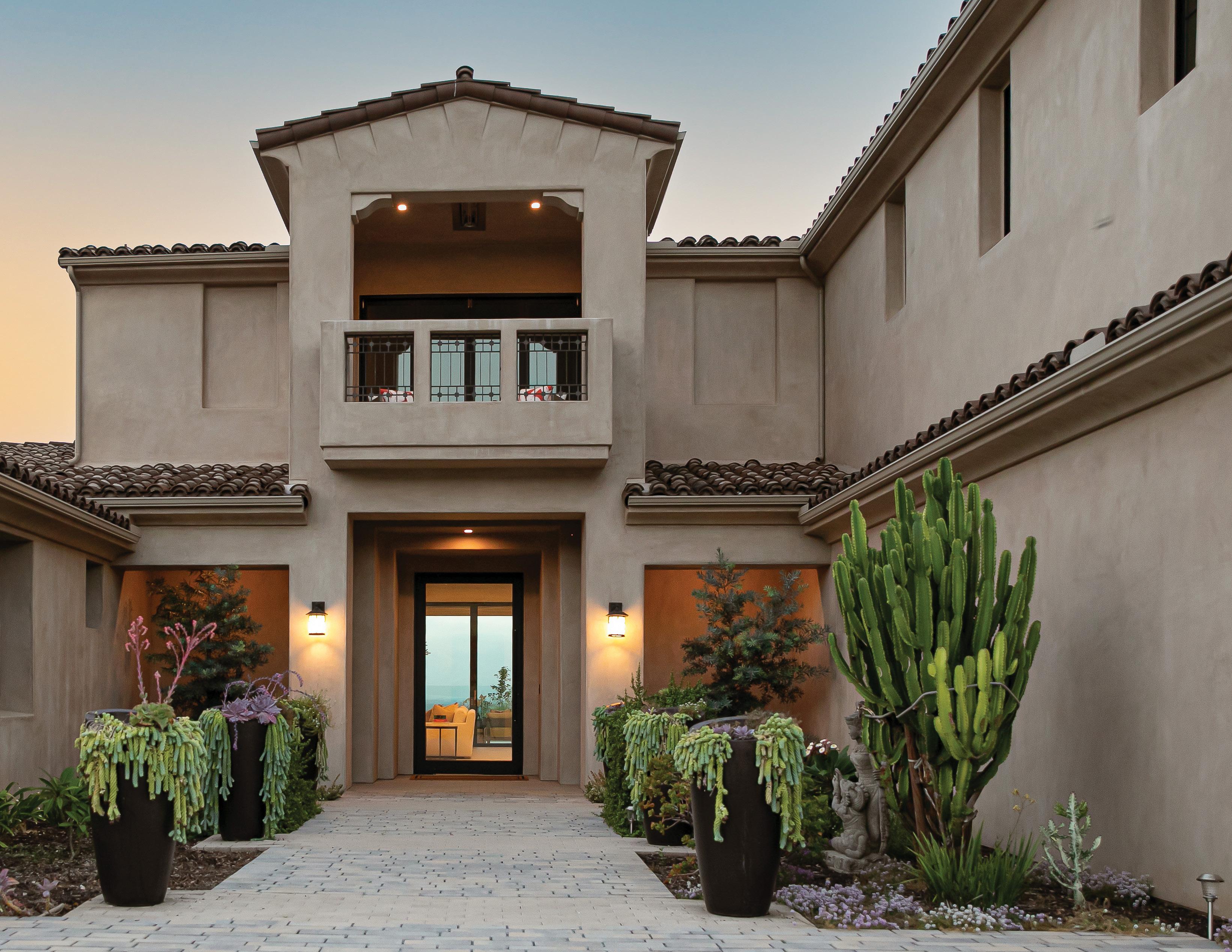
This Tuscan-style home was designed to merge the interiors and the outdoors to be experienced as one. This 7,000-square-foot home is situ ated in the community of Santaluz, San Diego, surrounded by hundreds of acres of protective preserve. The client’s requirements were chal lenging, as they requested a serene and whimsi cal space. Odoya Design translated that into the design concept by creating a playfully intimate contemporary villa in which luxury is achieved through simplicity with earthy tones and a sense of wellness. To become whimsical and genuinely connect to the client’s soul, the art pieces are bold and bright. Experiencing this home became a play between calm, earthy tones and sparks of vibrant coral colors, as seen in the statement design objects and art.
Odoya is a residential interior and outdoor de sign and contracting firm. We focus on all levels of design and build from a single room to new construction. Our approach to design is rooted in minimalist, modern and natural aesthetics. We believe in making design affordable and attain able for all. We are champions in fighting the culture of disposability and strive for reclaimed materials whenever possible. Most fervently, Odoya believes that even the humblest dwellings host beauty within.
My clients appreciate my enthusiasm for design and my work ethic and kindness. I believe in thor ough and consistent communication with clients so their vision is reflected in my final output.
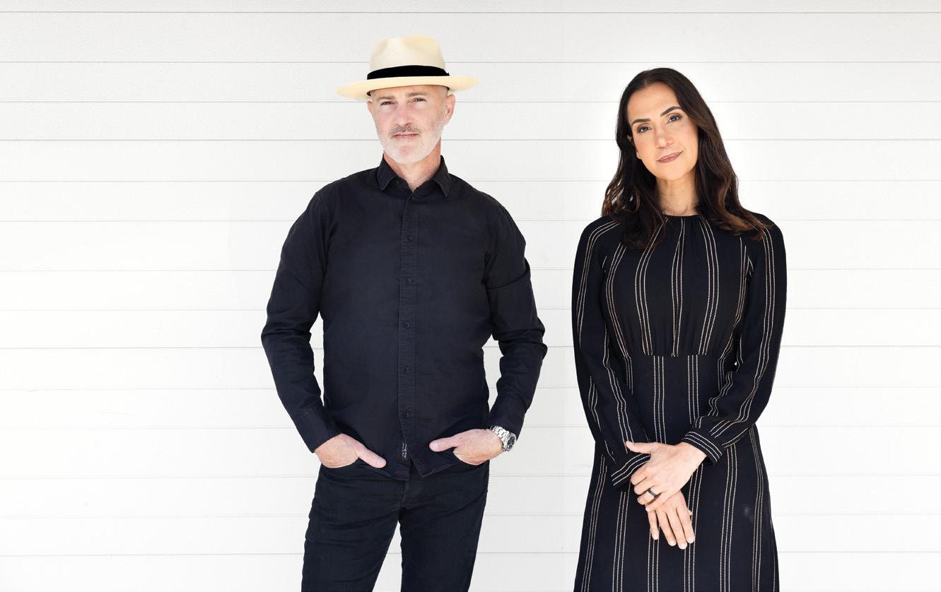
Design is my life’s passion, and it ’s evident in my relationship with clients, contractors, vendors and the project’s end result.
After graduating from architecture school, Universidade Santa Úrsula in Rio de Janeiro, I worked for a Rio-based interior design compa ny. Subsequently, after traveling and studying at incredible design schools in Paris and London, I was employed at other architecture firms in Rio and Paris. I established myself stateside when I partnered with a Hermosa Beach company, JDS Outdoor Designs, where I worked for seven years before branching out on my own and launching Odoya.

I see the home and its outdoor space as one cohesive unit. Interiors and exteriors are spaces that should be connected and therefore de signed by the same team. Presently, there is a shift in lifestyle wherein clients seek to experi ence serenity and integration with their indoor and outdoor spaces and their natural elements.
BY LIVIA PHOTOS; TEAM SHOT BY SIRI BERTING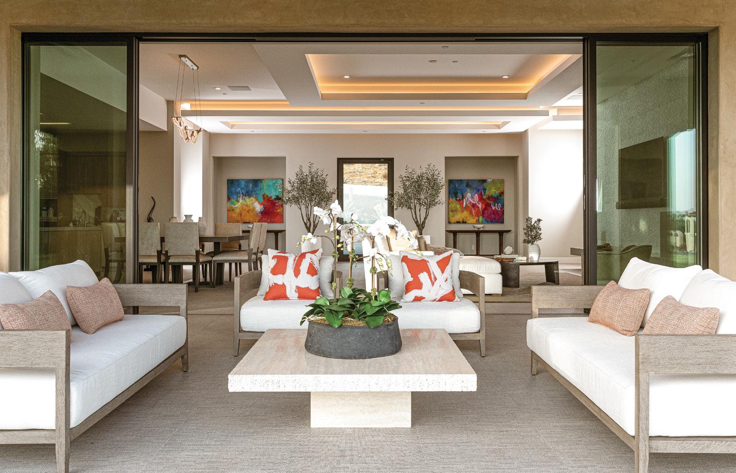
This home was part of a fourplex on the sand in Hermosa Beach. It was last remodeled in the 1980s and was due for a complete renovation. The owner was a busy TV execu tive who resides in New York but wanted a West Coast residence as well. It was up to us to make this all come together with the client 3,000 miles away.
The architect and designer on the project were both very demanding, and our company did not disappoint. We stripped the building down to the studs. All new plumbing, electrical, HVAC and low-voltage wiring were installed. The plans called for two slider doors looking out over the ocean. We were able to engineer and open the space up and install 20 feet of multi-sliding doors to bring the outside in.
After closing up the walls, the home had de tails specified everywhere. Glossy white cabi nets, board-and-batten walls and hidden doors in the hallway were just a few. We also installed hardwood floors everywhere including up one wall in the master bedroom
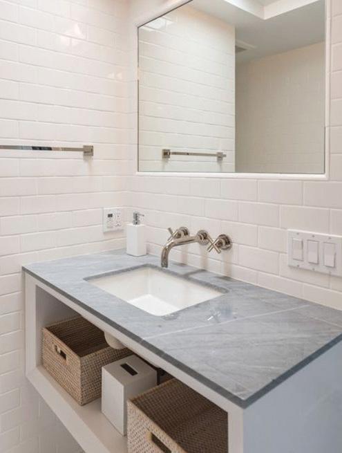
The space was furnished by the designer, and it was truly breathtaking—so much so that the home was featured on the cover and inside Coastal Living magazine.

2550-A Via Tejon Palos Verdes Estates 310-375-3626 timzigrang@gmail.com zigrangconstruction.com
help clients create a team by recommending architects or designers who will fit well with the owners’ desires. With a team approach, we can better manage costs, schedule and desires for our clients. We also have many of the needed trades in-house.
We are very multidimensional. We are working on a large, traditional coastal home in Manhattan Beach; a Spanish home near Torrance Beach; a Tuscan house overlooking Trump Golf Course; and a modern home in Palos Verdes Estates. We have experience in all types of architecture.
I started my company in 1981 while a busi ness student at USC. After school I worked in the private sector for a few years, but I always yearned to be working for myself doing something creative. In 1988 I started Zigrang Construction; over the years as we grew, we took on more and more employees. Some have been with us for more than 30 years.
We are proud that we have created an environment where our employees care about how projects are run and completed as much as I do. We believe each project is special, and these buildings are going to be around for a long time with my name attached.

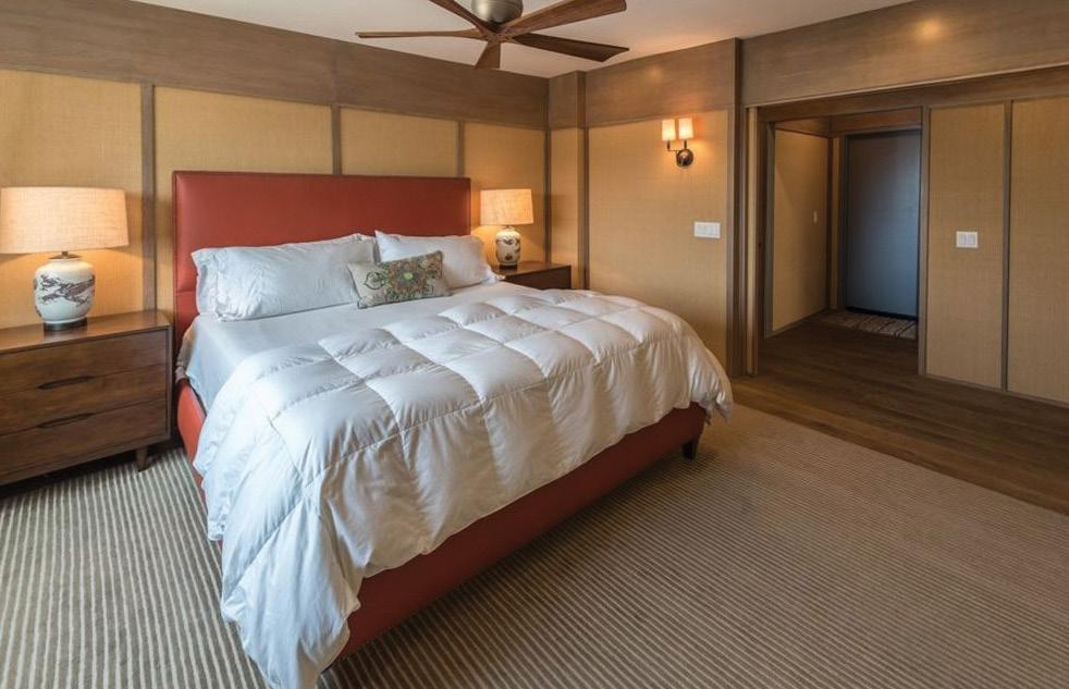
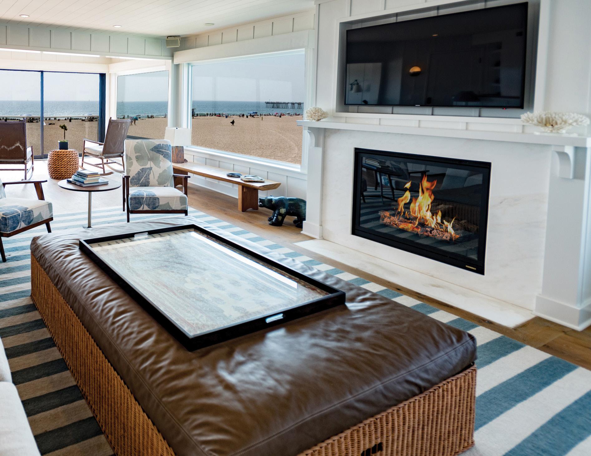
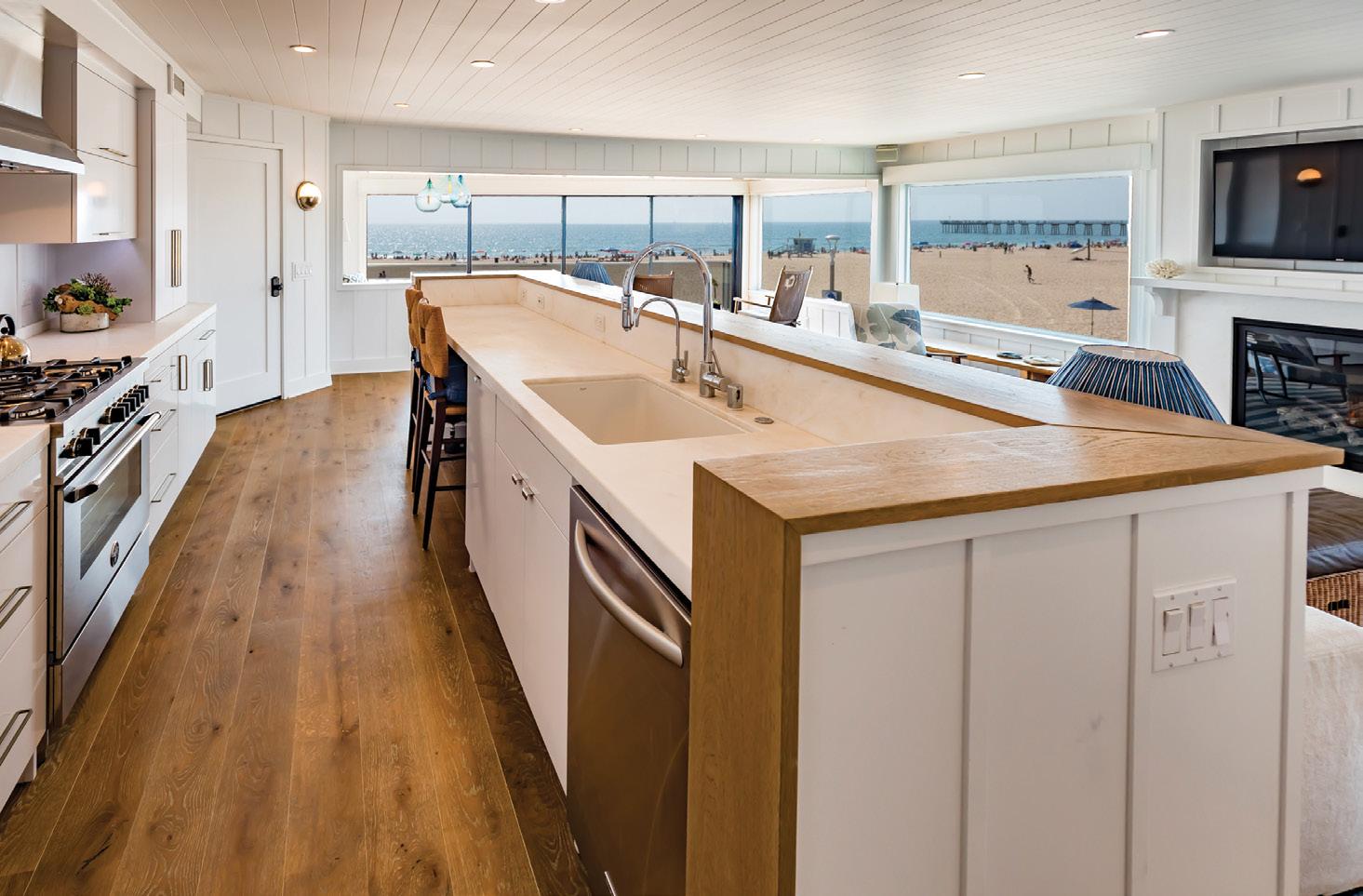
We had the pleasure of completing another custom home in collaboration with local archi tect Doug Leach. C&C Partners constructed this 4,800-square-foot Coastal Transitional home, conceived around the idea of relaxed entertain ing for the whole family. The clients wanted an open feeling with lots of space, including four bedrooms, five baths and a billiard room large enough for entertaining while showcasing their extensive sports memorabilia collection. The color palette is simple, with most of the rooms framed in light-colored walls with coffered ceil ings, while dark wood floors throughout add warmth and contrast.

The kitchen features leathered granite counter tops with a backsplash of narrow, white subway tile, and a natural quartzite island sitting below a pair of industrial pendant lights. White wood cabinets with glass doors and stainless steel appliances keep the room light and bright, set off by the dark wood breakfast nook dinette and leather bar stools. A spot of whimsy was created in the powder room, where patterned marble and glass bathroom tiles cover the back wall.
Creating a large backyard was central to this project, as it needed to support adult entertain ing and child and pet playtime while maintain ing a sense of peace and relaxation. Fortunately, the natural upsloping of the lot accommodated the option of doing an oversized, tuck-under

508 N. Pacific Coast Hwy., Redondo Beach 310-322-0803 info@candcpartners.com candcpartners.com
FB: C&C Partners Design Build Firm IG: @candcpartners
garage, allowing the architect to pull the whole house forward to produce the desired outdoor space. The yard includes a fully covered seat ing area with overhead heaters and a fireplace across from a water feature with hidden speak ers, as well as a full-sized BBQ, pizza oven, smoker, ice maker, beer cooler and lots of stor age. Paradise found!
Space is often a premium in the South Bay, where lots in the Beach Cities average around 3,400 square feet. Multiuse spaces within a home are key to maximizing comfort and functionality. The easiest way to add optional function is through furniture. Side tables that double as seating or hideaway beds in an office or playroom give homeowners more space for guests. Placing bunk beds in a children’s room is a classic solution for insufficient space, and many now feature built-in desks, bookshelves and drawers for additional storage. Play areas or a reading and conversation space can be created by constructing a loft within an existing room. A tub can be tucked into a bedroom corner, and pullout wardrobes for clothes can be installed, which could also work as toy storage or for bed ding. If you have a stairway, consider building a storage closet underneath. There are many op tions for better use of space, and creativity is key.
BY SHANE O’DONNELL
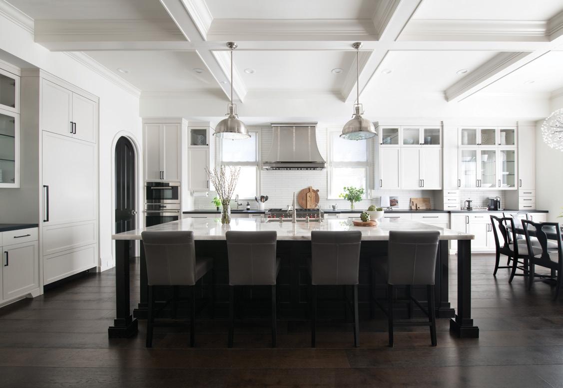



“A HOUSE IS MADE WITH WALLS AND BEAMS; A HOME IS BUILT WITH LOVE AND DREAMS.”

