7 minute read
Eclectic ensemble
The Gabrielle et Guillaume collectible design gallery makes its West Coast debut with a model penthouse in San Francisco’s coveted SOM-designed residential building
WORDS BY AIDAN IMANOVA
Located on the 40th floor of the recently opened Fifteen Fifty residential building in San Francisco that was designed by Skidmore, Owings & Merrill (SOM) is a model penthouse exhibiting an eclectic selection of collectible design curated by Galerie Gabriel et Guillaume – the travelling collectible design gallery’s latest showcase and its first venture in the West Coast.
Run by Lebanese and French duo Nancy Gabriel and Guillaume Excoffier – who founded the gallery in 2013 – Galerie Gabriel et Guillaume has hosted several exhibitions between Beirut and Paris, as well as a show last year in New York at 111 W 57. Utilising a different landmark location each time, these temporary spaces act as ephemeral design galleries, showcasing the duo’s diverse selection of rare, museum-quality furnishings that range from vintage pieces to contemporary designs.
“Our choice of location is always coherent with our content – it carries the same values. So, it’s always a form of storytelling,” says Gabriel.
The 158-square metre three-bedroom penthouse chosen for the latest exhibition in San Francisco features original mid-century modern furniture from the 1940s, ‘50s and ‘60s from Brazil, Italy and France, juxtaposed with contemporary furnishings and artworks from France, Italy and Lebanon – including pieces by David/Nicolas and Namika Atelier. This eclectic manner of mixing eras and modern forms with contemporary pieces in daring, bold colours has become a feature one looks forward to with Galerie Gabriel et Guillaume; a style that is a signature of the way the duo curates its content to convey a living space of an imaginary modern-day collector. “While we share the same taste, we also always trust each other’s taste,” Excoffier says. “We also share a passion for mixing pieces in an eclectic way; pieces that you would rarely see together.”
And while the majority of these pieces find their roots in Europe and Brazil, it is equally important for the gallery to shed light on the talent hailing from Lebanon.
“When we went to New York for the exhibition we thought it made sense to ‘export’ the work of some Lebanese designers. Besides the fact that Lebanese designers are very talented, they also have very strong craftsmanship skills, and we are very much interested in this craftsmanship.”

Photography by Douglas Friedman

Showcasing in San Francisco was a novel experience for the duo because it was unlike any location they had exhibited in before. “We are very excited to be showcasing in the West Coast because it is an entirely different atmosphere from Lebanon, and even from New York,” Excoffier explains. “New York, in a way, is very European and there is something also very formal about it. And Beirut is also a formal city with the way the buildings are designed – there is a sense of old-school glamour. San Francisco is totally the opposite. Still, the architecture is gorgeous, and the people are very wealthy and sophisticated. It was super interesting because we could show very cutting-edge furniture from the likes of Martin Szekely, who is very popular among contemporary art collectors – but not famous in the way Phillipe Starck is, for example – he is quite niche. In San Francisco, we could show these pieces because people are always looking something fresh – so we could do something totally different here that is much younger in its approach.”
“[Also] because the building in San Francisco is very new, we needed to give a theme and a concept to the exhibition, and the guiding line was that you enter the home of a young and laid-back collector. The pieces are all high-end, but they are put together quite casually,” Gabriel adds.
Upon entry, visitors step into an inviting foyer with clay-orange walls that quickly leads into a contrasting deep blue open kitchen, featuring custom grey oak cabinetry, polished white Caesarstone countertops with Italian Calacatta Caldia marble backsplashes, and Miele stainless steel appliances with Home Connect technology and integrated panelling. The interiors were designed by American practice Marmol Radziner.
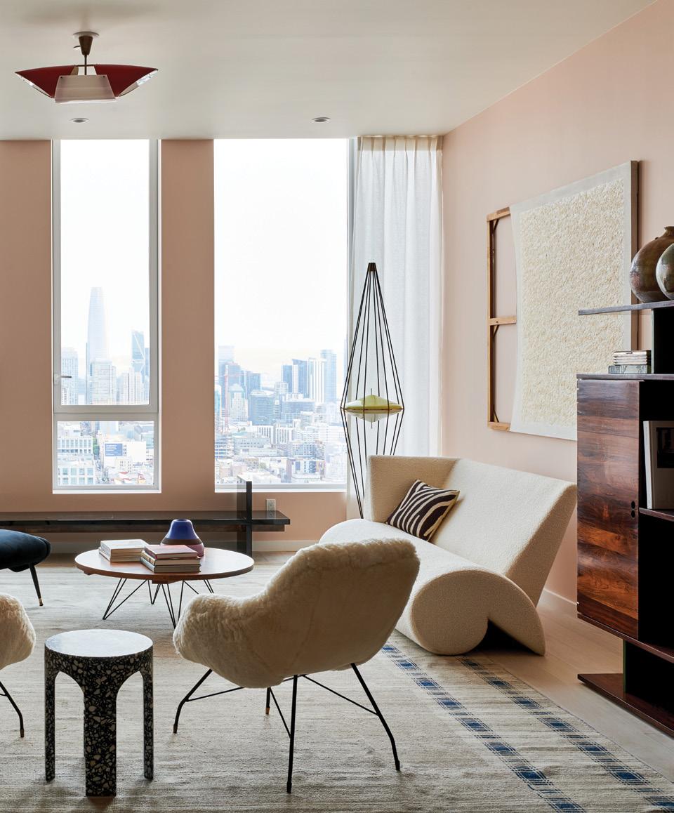
The kitchen overlooks a spacious room that features a dynamic dining area with a Sergio Rodrigues dining table made of Jacaranda wood and marble, and lacquered wood dining chairs by Martin Szekely from the late 1980s (edited by Galerie Neotu) – all tied together by a wool rug from Beirut-based Iwan Maktabi. The dining space seamlessly flows into the living area, which boasts floor-to-ceiling windows overlooking the city. Here the furniture includes: a 1950s sideboard in wood, originally from Copacabana, Rio, by Joaquim Tenreiro – a pioneer of modernist Brazilian furniture; a white fabric sofa by Martin Szekely from the late 1980s (edited by Galerie Neotu); and a large 1950s architectural Jacaranda bookshelf by Jorge with bold green accents. Other designs include a pair of shell armchairs by Carlo Hauner and Martin Eisler; a sleek, low, black lacquered wood bench from Italy by Ranya Sarakbi and Niko Koronis; lighting from the 1950s by the famed Angelo Lelli; as well as a selection of contemporary ceramics by Namika Atelier. The eclectic composition is complemented by soft pink palette on the walls – Modern Love by Backdrop.
Photography by Douglas Friedman

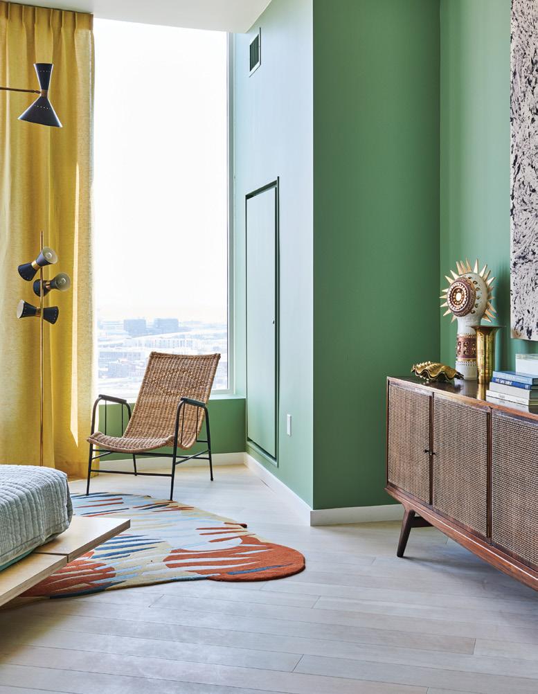
The master bedroom is an exercise in balance, with light almond green walls bringing a soft, soothing atmosphere to the space, contrasting with dynamic designs such as the Liceu de Arte bench, ornate ceramic Georges Pelletier table lamp, 1950s vintage chandelier, a contemporary brass stool by Mauro Mori from Italy, L’Atelier side tables and a colourful hand-knotted wool and silk rug by Marguerite le Maire with orange and blue tones, while sprawling city views can be accessed from every corner of the rounded room. Other features in the master bedroom include an extra-spacious windowed walk-in closet and a grand five-piece master bathroom featuring marble surround double vanities, a bathtub and a glass-enclosed walk-in shower.
The standalone office features 1980s-style graphic green wallpaper, giving it a playful and modern yet sophisticated feel. It was designed to evoke a salon – an idyllic space for intimate conversations or moments savouring coffee or an evening beverage while overlooking the city. The space has ample seating, including a Brazilian midcentury Carlo Hauner and Martin Eisler velvet sofa and a pair of velvet burnt orange Leon Rosen swivel armchairs with pedestal bases. Also included are a 1950s Brazilian Geraldo de Barros desk, a black marble side table, and a round David/Nicolas rug from Iwan Maktabi.
The second bedroom brings forth a calming grey-blue tone on the walls – The Early Stuff by Backdrop – with distinct yet functional furniture such as the eye-catching vintage black camel-style sofa, terrazzo Portego side table, a bold brass Sergio Mazza Delta sconce from Italy, as well as a set of metal Gino Sarfatti floor lamps. The bed lays low and simple, adding to the tranquil, cool atmosphere, while the closet acts as a phone booth.
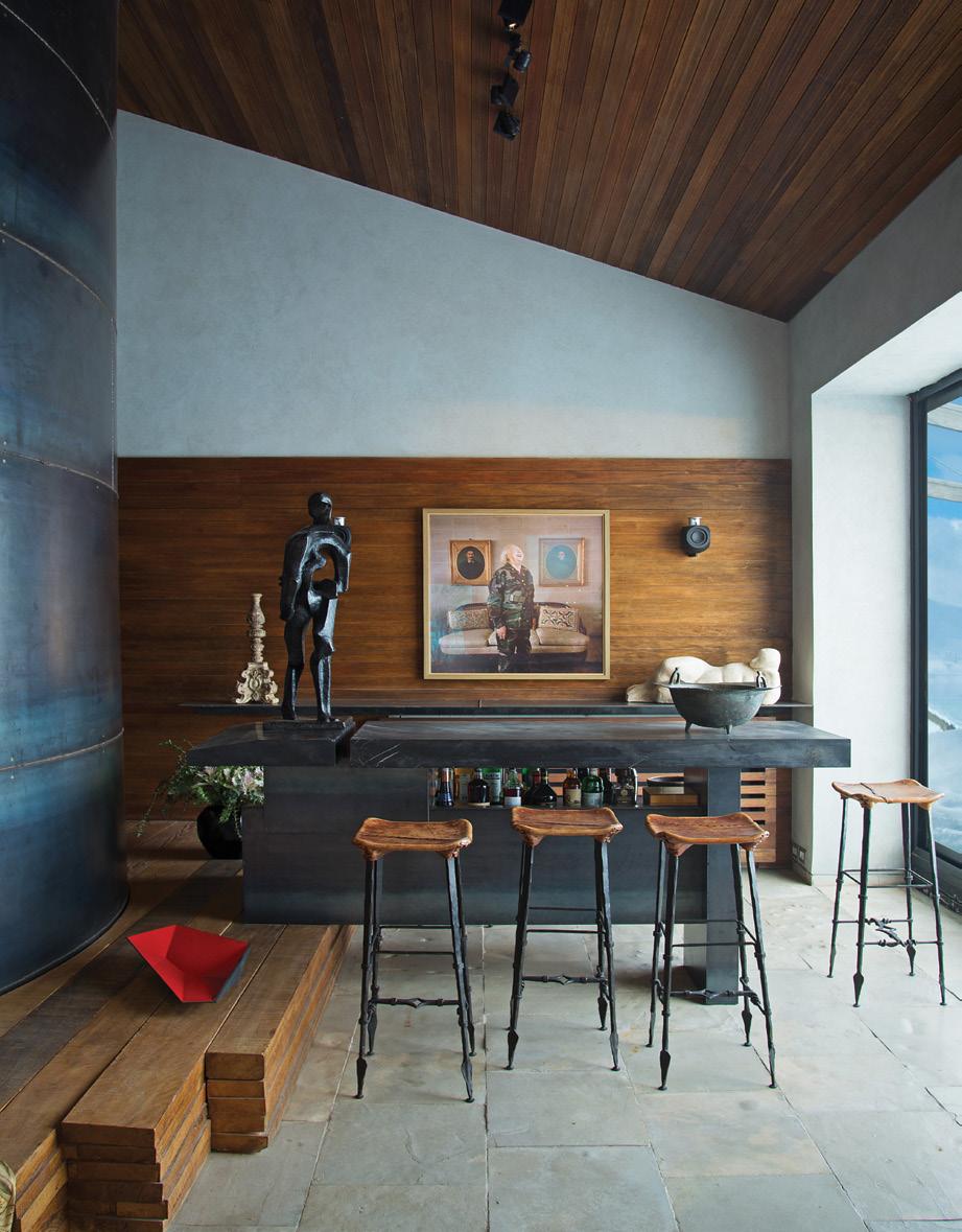
As for the art, Jessica Silverman – who curated the dynamic art collection throughout the building – selected the thought-provoking contemporary works featured in the penthouse in close collaboration with Galerie Gabriel et Guillaume. Just as with the furnishings, it includes an eclectic mix of paintings, photographs and sculptures from renowned and emerging artists.
While Galerie Gabriel et Guillaume has become a well-known and loved gallery, it has never held a physical space – being the first gallery without a physical space that has been accepted to show at important art and design fairs, such as Salon Art + Design in New York and PAD in London and Paris.
“There is a sense of intimidation when you are looking at design in a gallery, and we wanted to take away that intimidating feeling, even if you are looking at museum-quality pieces,” Gabriel explains. “It is a matter of attitude. You can have beautiful, extremely important pieces in your home and live with them and have a laid-back attitude about it. So, it was also about making people feel that they can actually live with these museum-quality pieces. They are there to be used and they are functional. We wanted to make the pieces livelier.” id


