14 minute read
Newswire
Rustic romance
Set against the backdrop of Matera’s picturesque landscape, it is most fitting that Brunello Cucinelli uses the southern Italian city as the backdrop of his Spring-Summer 2021 Lifestyle Collection. Cucinelli is revered for setting craftsmanship at the soul of his work and, with strong ties to heritage and heirlooms, the cave city’s artisanal culture sets the scene for a lifestyle collection that pays homage to the ways in which humans interact with nature. The theme sweeps across the rustic yet elegant objects and textiles, offering simple and refined items for use at home, from kitchenware and décor pieces to soft furnishings and linens. The dining table, which plays a central role in every home, is naturally at the heart of the collection, which blends handcrafted techniques with a contemporary aesthetic across its dining table and kitchen accessories, as well as in its skilful ceramic creations. The items intentionally embrace their rustic quality and uneven colours, adding an authentic touch and a warmth that often contributes so much to the comfort of a home. The dining and kitchenware range from Murano glasses and pitchers to distinct accessories and flatware rendered in refined materials, resulting in the sophisticated simplicity that’s often associated with the Cucinelli brand. Authentic, simple values is another key inspiration for the collection, which now includes a gardening section, conceived to foster harmony with ourselves and with nature. The selection of objects expresses the importance of well-being and the understanding that by taking care of nature and the land we also take care of ourselves. Plant care accessories, for example, combine the warmth of Italian walnut wood with leather and steel. This natural palette is also found in the home décor items, where contrasting colours and fringed inserts add a touch of sophistication to the lightweight shapes of the throws and blankets, while the pillows combine soothing colours and natural patterns. Inspired by the yarns of knitwear, the throws and blankets of the Lifestyle line enhance the sensations of natural cashmere and silk fibres, adding refinement to the overall collection.
The Studio line follows suit, combining skilful manufacturing with precision techniques that are similar to those used in jewellery-making. From the natural walnut wood used for detailing to the delicate marble-effect steel and Krion used as decorative elements, the Studio line aims to add style to any living space.
And with many people still working from home, the accessories for the office and the desk enrich the Lifestyle collection while taking into consideration the living habits of today.


Left page: Dining set including ceramic vases. Vetro bottle and glass pitcher. Clockwise from top: Maxi scented candle in Ecru. The Studio line including accessories for the office and desk. Walnut wood and Krion® cutting board. Walnut wood, Krion® and steel Backgammon set. Double cashmere plaid throw in light grey.
Coffee club
Minimalism is taking over the city – and Roar’s pared-back design for Drop Coffee’s second Dubai location is the latest addition. The city’s coffee culture, which has also become an important part of the urban lifestyle, has in turn established the importance of creating spaces that prioritise good design and customer experience.
For homegrown Emirati brand Drop Coffee, the idea is that each branch of the local coffeehouse becomes associated with its own specific colour – in this particular case, burnt orange. The warm hue can be seen on the La Cividina sofa as one enters the space, as well as on the clamp-style coffee tables which were created for customers who prefer to enjoy a quick espresso shot while standing up.
The overall colour palette, however, was inspired by the roasting process of the coffee beans; terrazzo-effect tiles include mixed tones of rusted brown and dark terracotta, while dominant hues consist of light oak wood coupled with a concrete paint finish.
The café includes two entrances – one connected to the outdoors while the other connects to Dar Wasl Mall. To accommodate the flow of customers from both access points, the design studio, run by Pallavi Dean, set the grab-and-go bar at the centre of the space. “We used very simple framing to form a structure around the bar, which anchors it within the space and highlights its prominent location,” says Dean.
The bar gives the illusion of floating, the result of lighted skirting created out of glass blocks that are supported by a wooden structure running across the base.
A wall ornament has also been created in the banquette area, where an assortment of broken white tiles have been playfully arranged.
“We wanted the interior concept to be consistent throughout and for all the different elements to be streamlined and respond to one another,” Dean explains. “That’s why the idea of the wall piece [stems] directly from the terrazzo floor, as though the leftovers from the tiles had been imprinted on the wall before being chipped away”

PHOTOGRAPHY BY OCULIS PROJECT

identity.ae

Reviving the past
The Volkshaus Basel has played an important role in the city’s urban fabric since the 14th century. Initially, it hosted a brewery and restaurant as well as a concert and beer hall. In 1925, a new version of the Volkshaus was unveiled. Designed by architect Henri Baur, it integrated the existing concert hall and others of various sizes, as well as offices, conference rooms, a shop, a restaurant and accommodation for personnel. The 1970s saw the building wholly renovated, erasing the character of the original architecture as well as the diversity of uses, reducing it mostly to office space.
In 2011, Swiss architecture firm Herzog & de Meuron began rebuilding the Volkshaus in several stages. The latest addition is a 45-room boutique hotel that has been completely integrated into the Volkshaus, replacing the offices previously located in the head building.
“We hope that our modifications and the renewed diversity of uses will not only revitalise this extremely special location in Basel, but also revive the architectural identity of the Volkshaus,” the firm states.
With the brasserie, bar and small event halls completed in 2012, the architects began dismantling the renovation of the 1970s, only to find that none of the original substance has survived except for the windows. Adamant to create a design that references the original design of the building, Herzog & de Meuron looked to the original floorplans for inspiration, discovering details such as the bedrooms in the attic with only a bed, closet and washbasin – no different from the rooms found across many historical hotels in the country. The new layout for the hotel borrows elements from these old attic bedrooms and also the office floors, where a wall of storage between the bedrooms and corridors creates generous space for bathrooms and closets.
The material palette, which echoes the details in the bar and brasserie renovation, includes stained black oak and dark terrazzo for the flooring. The decorative wallpaper in the rooms features pale etchings, while muted green curtains contrast with the rest of the space. The bathroom is completed with green and black ceramic tiles and windows of black glass that mirror those of the building. The furniture in the rooms includes several of Herzog & de Meuron’s own designs, as well as a bespoke chair designed for the bar and brasserie.
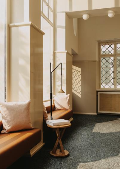
The Volkshaus hotel lobby inverts the colour concept of the bar, adding brightness. It comprises a black and green mosaic floor, leather banquette seating and light-painted wainscoting. It also doubles as an exhibition space curated by Von Bartha Gallery, with the inaugural display including a steel sculpture by French artist Bernar Venet.
© Robert Rieger


Monochrome moments
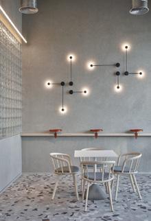
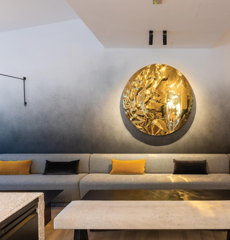
Following the international success of Toplum Café in Dubai, design studio XO Atelier has introduced its latest café-lounge concept, The Grey – a stylish destination with a distinct visual identity, designed for the city’s tastemakers, and taking into consideration cultural cues for socialising in a refined setting.
The latest project by MAD Hospitality (and its third collaboration with XO Atelier), The Grey is set on the ground floor of the ARM Holdings Headquarters, comfortably integrating into its surroundings, and serves not just the executives of the regional investment company but also an exclusive roster of local clientele. For this reason, the café and lounge needed to not only be reflective of its urban context, but to also become an establishment for informal social exchange.
“It was a highly specific brief that we responded to with a lightness of touch, cultural sensitivity and an understanding of placemaking, to give it real roots in the city,” says XO Atelier founder and creative director, Vera Dieckmann.
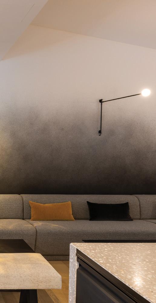
The monochromatic palette sets the tone for the space, expressed through a range of contrasting materials, bespoke lighting and furnishings featuring various tones and textures that create an interplay of light and shadow.
At the centre is a long and sleek terrazzo bar that is complemented by grey oak flooring by KAHRS, while chairs and sofas are upholstered with Kvadrat fabrics in varying light and dark shades of grey.
It was also important for the design to capture a spirit of creativity within the overall functionality of the space. As a result, art pieces double as seating, such as with the NIDO armchair by Imperfetto LAB, and sculptural modular furniture dots the space, while handcrafted pieces have been commissioned from artisanal workshops in the UAE and Hong Kong. The concept of ‘reflection’ is an overarching motif across the space, beginning with ‘The Dune’ – an artwork featuring a rippling metal orb set on the main wall of the café, designed by XO Atelier – and continuing on in the reflective metal used in the ceiling of the corridor.
The selection of lighting further enhances the space; the design team worked in close collaboration with global lighting brand NEMO, utilising its production and design expertise across all areas, from architectural to decorative lighting. The linear pendant lamps contribute to the overall flow of the space, anchoring the bar, while its Tubes 3 pendant lights illuminate the restaurant. Additional delicate wall lights designed by Charlotte Perriand also grace the space.
And while the design definitely makes a statement, it is pared back just enough to allow guests to set their focus on the contemporary pan-Asian cuisine and on the vibrant social atmosphere.
Elemental illumination

WireLine is Formafantasma's second lamp for lighting brand Flos, following the launch of WireRing in 2017. The latest iteration sees a continuation of the original concept to design a lamp that uses the electric cable as its star element. WireLine takes this notion even further, forming a ceiling lamp that comprises a light source, a power cable and nothing else. A rubber strap is flattened and hung from the ceiling, supporting a sophisticated extrusion of grooved glass, which contains and diffuses the LED light source. In this way, the lamp accomplishes its mission: reducing itself to its essential components and creating a shape and presence within a space that solely stems from the light source and the power conductor.
“What we love about light is that it is intangible, but also technical and emotional. And it is one of the few fields of design that has been transformed recently by an important technological innovation; LEDs have changed the rules of the game in terms of design, use and human experience,” say Andrea Trimarchi and Simone Farresin, the Italian duo behind the Netherlands-based studio.
While being industrial in nature, the shapes and contrast of materials lend a poetic and sensual quality to the lamp, which can be installed as a single piece or in a string of modules to create elaborate visual compositions. It is available in pink and forest green and is suitable for a variety of settings, from high ceilings to hotel lobbies – as well as home environments, for those who wish to create a statement with light.
First previewed two years ago at Salone del Mobile and miart (the international fair for modern and contemporary art in Milan), where it lit up the VIP Lounge, WireLine is now available for the global market.

Photography by Olya Oleinic
Finding utopia
Lebanese-French artist Flavie Audi’s first solo show at Italian gallery Nilufar is Terra (In)firma, which imagines a post-human topography where interplays of real and virtual, natural and synthetic and fluid and solid combine to pose questions surrounding the Earth’s resources, human interventions and technology. identity speaks to Audi to learn more.
PHOTOGRAPHY BY MATTIA IOTTI
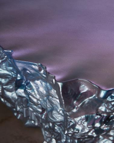
How did the ideas behind this exhibition develop? The show at Nilufar reveals the delicate, vulnerable and unstable state of our territory due to the over-abusive exploration of the planet, and questions our position within the Anthropocene. Terra (In)firma seeks to destabilise our encounter with the terrestrial and imagines a post-human topography. Rocks, symbols of solidity, become disorientating with the fluctuation of light due to their iridescent and reflecting surfaces. In navigating this uncanny plain, we encounter fragments of hyper-liths dispersed through space, rupturing our sense of stability. Rocks become fluid, tilting on their axes, conglomerating. Forms caress and nudge each other in tender relations. Digital aesthetics warp our sense of material nature, hybridising the organic and synthetic. Ultimately, Terra (In)firma confronts us with the Promethean dilemma; should the Earth be treated as a resource whose utility is determined primarily by human needs? Can human technology overcome our environmental problems? Terra (In)firma not only evokes the vulnerable and unstable state of the planet, but also the contradictions of our dual dependency on nature and technology, with its ongoing battle between the physical and digital worlds.
How are the pieces produced? What materials do you
predominantly work with? All the works are fabricated in various workshops across the UK. Technically, it starts with digital modelling, then CNC and 3D printing of shapes and tools, and going through the manual process of moulding and casting. Depending on the type of cast material, the surface will be polished, or spray-painted and then lacquered. The spray work is done by hand. I experiment with pigments and surface effects to echo a certain digital aesthetic. Often, happy accidents and experimental discoveries reshuffle the choreography of the process.
My interest lies in the combinations and alliances of digital techniques with craftsmanship. What fascinates me the most is not the traditions, technologies and conceptual concerns themselves – but how these different influences are linked together.
For Nilufar’s solo show, I have Iayered several surfacing processes. The bridging of diverse digital techniques with traditional craftsmanship reveals a certain ambiguity. The man-made and the industrial robotic manufacturing processes are blurred. The work looks earthy, naturally aquatic and digitally rendered – all at the same time. I strive to keep a certain mystery behind the works. In the show at Nilufar, there was no predominant material. Pieces are in bronze, resin, steel, silver, fibreglass, glass, paint.
Can you talk about the significant choice of colour in
the pieces? The significant choice was the use of iridescent colours. Throughout the show, there is the recurring use of iridescence on surfaces. We live in an era of iridescence, in constant oscillation between physical and virtual, never fully in the physical and never fully in the virtual. We are shifting between the realms, in the same way colours are shifting on an iridescent surface. I manipulate colours so they appear formless and in a continuous state of flux, suggesting indeterminacy and limitlessness. Iridescent pigments are shapeshifters and never static, as they transform with each changing position of the viewer’s body. What inspires your work? I am often guided by an adoration for a sense of wonder with the world, and inspired by the spiritual significance of landscape fragments such as gongshi, suseiki and Japanese rock gardens. At the moment I am particularly inspired by Hydrofeminism theories, solidarity between watery bodies. My inspiration comes from an accumulation of material experiments and explorations of digital modelling and fabrication techniques. The digital tools we have today are so powerful in shaping our reality, and I think about their potential to create new forms and attribute new behaviours to future geologies and landscapes. How can these tools be a catalyst for new contemporary aesthetics?


