This manual is a formal guide for those in charge of Happy Jane´s Design and Marketing department, where they can find the correct way to apply any graphic element that the brand requires. We have created this manual in order to generate graphic homogeneity. By applying the standards of this manual, it will be possible to effectively communicate the company’s values, as well as its visual identity.
BRAND STRATEGY 01
DESIGN PERSPECTIVE
BRAND MANIFESTO
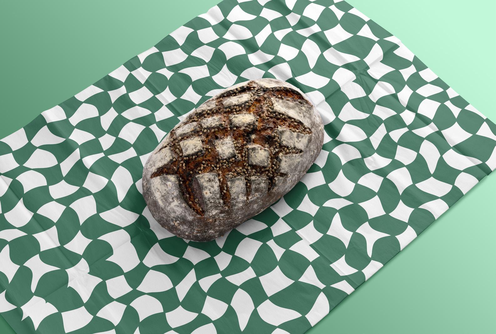
At Happy Jane, we believe in more than just serving great coffee—we’re dedicated to creating a space that feels peaceful and offers a retreat from the hustle of daily life. This is a space that nurtures your body, mind, and soul. Happy Jane is a place where good vibes meet high-quality food and exceptional service. We’re proud to offer a range of locally sourced, sustainable Australian products, infused with a relaxed atmosphere and a holistic approach to cannabis and wellness.
Happy Vibes Only
BRAND ARCHETYPE
PRINCIPAL ARCHETYPE
JESTER
Happy Jane embodies the Jester archetype by creating an atmosphere of fun, joy, and playfulness. As a cannabisthemed cafe, it encourages customers to relax and enjoy themselves. This is a space designed to make everyone feel at ease, joyful, and free. We bring happiness to our customers with our cozy, nature-filled setting and laidback vibe. It’s a place where good food and good vibes come together to create an unforgettable experience. This coffee shop invites everyone to embrace happiness and lightness.
SECONDARY ARCHETYPE
CREATOR
We offer an innovative approach to the coffee shop experience. As a cannabis-themed cafe, Happy Jane is pioneering a new kind of space that blends wellness, sustainability, and creativity. With a focus on highquality, locally sourced products and a holistic approach to cannabis, we’re redefining what a cafe can be.
BRAND PERSONALITY
Personalidad: ACTIVIST
ENFP-A
Happy Jane reflects a vibrant, energetic, and peopleoriented brand that thrives on connection, creativity, and inspiration. We are passionate about promoting wellness, sustainability, and creating a space where everyone feels welcome. The coffee shop has a relaxed yet dynamic environment, offering a place to break free from routine and embrace the spontaneity and beauty of the present moment.
We aim to inspire our community by encouraging customers to explore new ideas, make meaningful connections, and live authentically. The coffee shop atmosphere is filled with greenery and a natural aesthetic which reflects the Activist’s love for freedom, creativity, and self-expression.
BRAND PERSONALITY
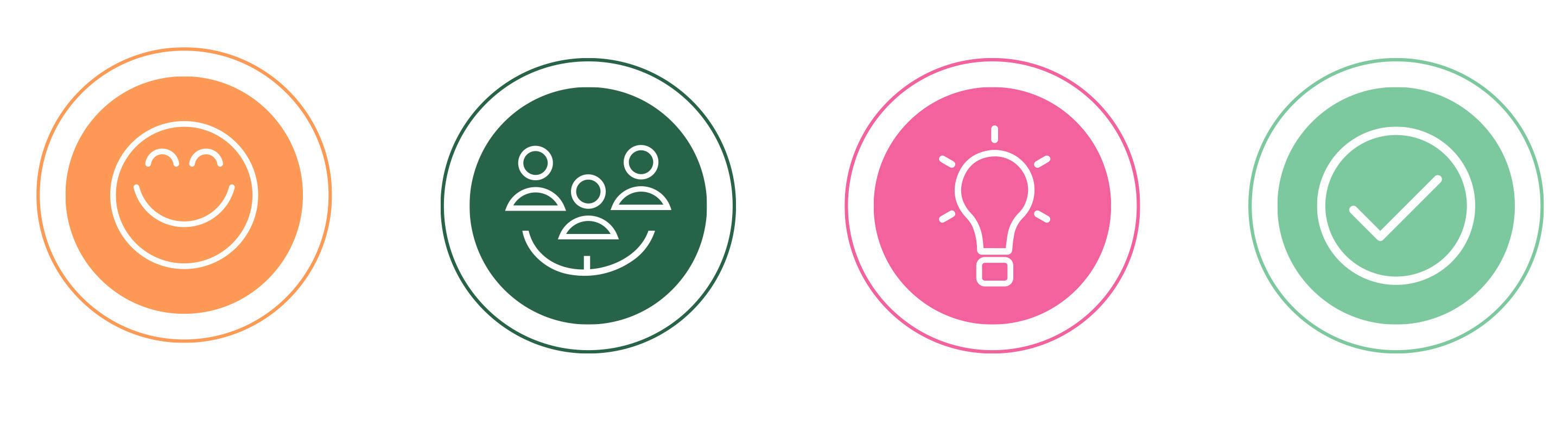
BRAND VALUES
JOY
Creating a space that brings happiness and good vibes to everyone who visits.
COMMUNITY
Building a welcoming, inclusive environment where everyone feels they belong.
AUTHENTICITY
Staying true to the brand’s mission of providing genuine, high-quality experiences.
CREATIVITY
Offering unique, thoughtfully curated food and ambiance that inspire self-expression.
TONE OF VOICE
Playful and Lighthearted: Infusing joy and fun into every interaction, reflecting the coffee shop relaxed vibe.
Relaxed and Casual: Communicating in an easy-going, conversational manner that matches the laid-back atmosphere.
Warm: Friendly and inviting, creating a welcoming vibe.
Playful: Lighthearted with a touch of humor to reflect the fun atmosphere.
Creative: Unique and imaginative, embodying the innovative spirit of the cafe.
LOGOTYPE 02
LOGOTYPE
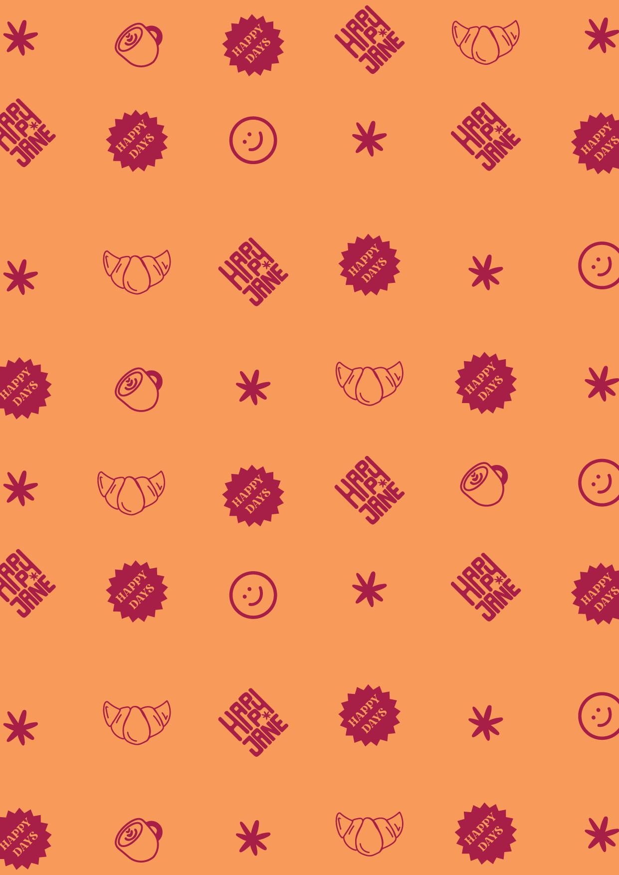
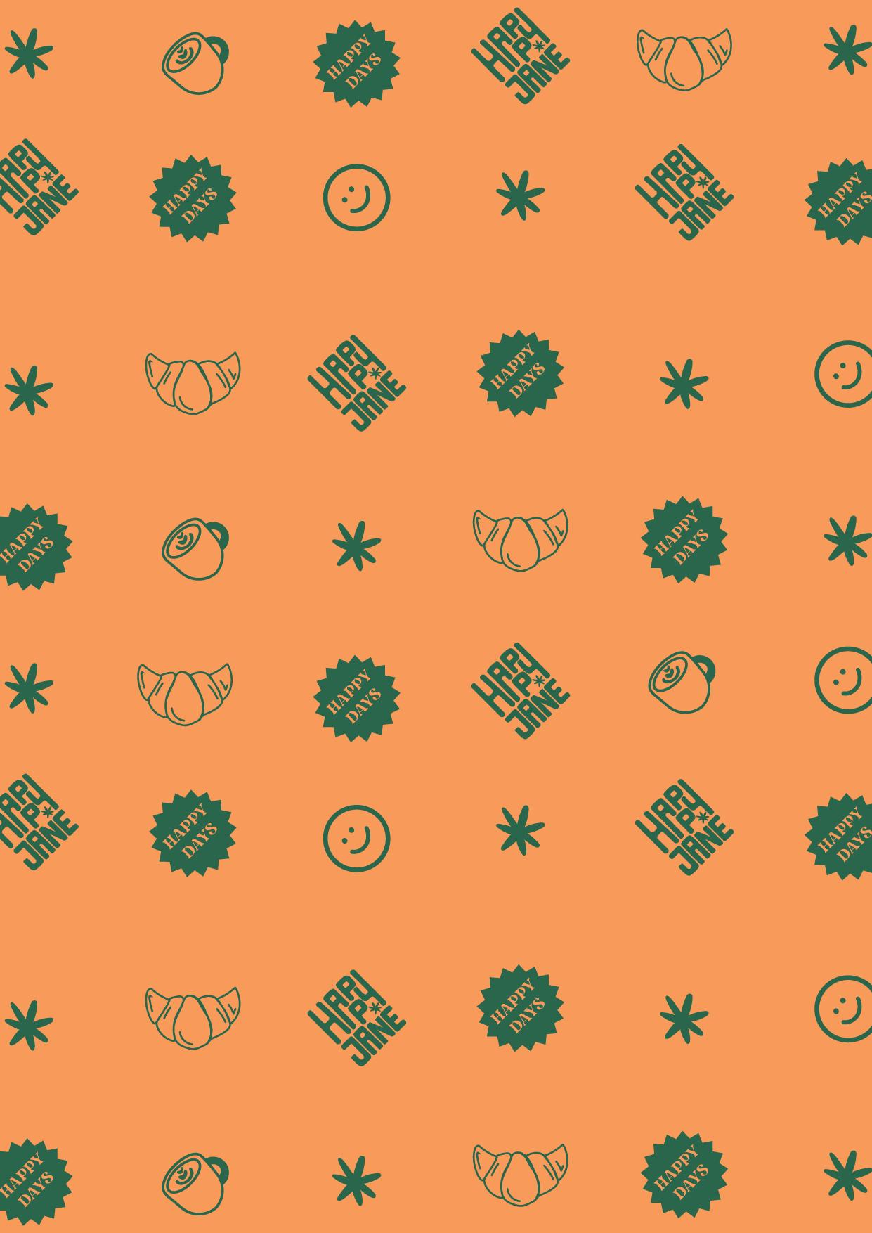
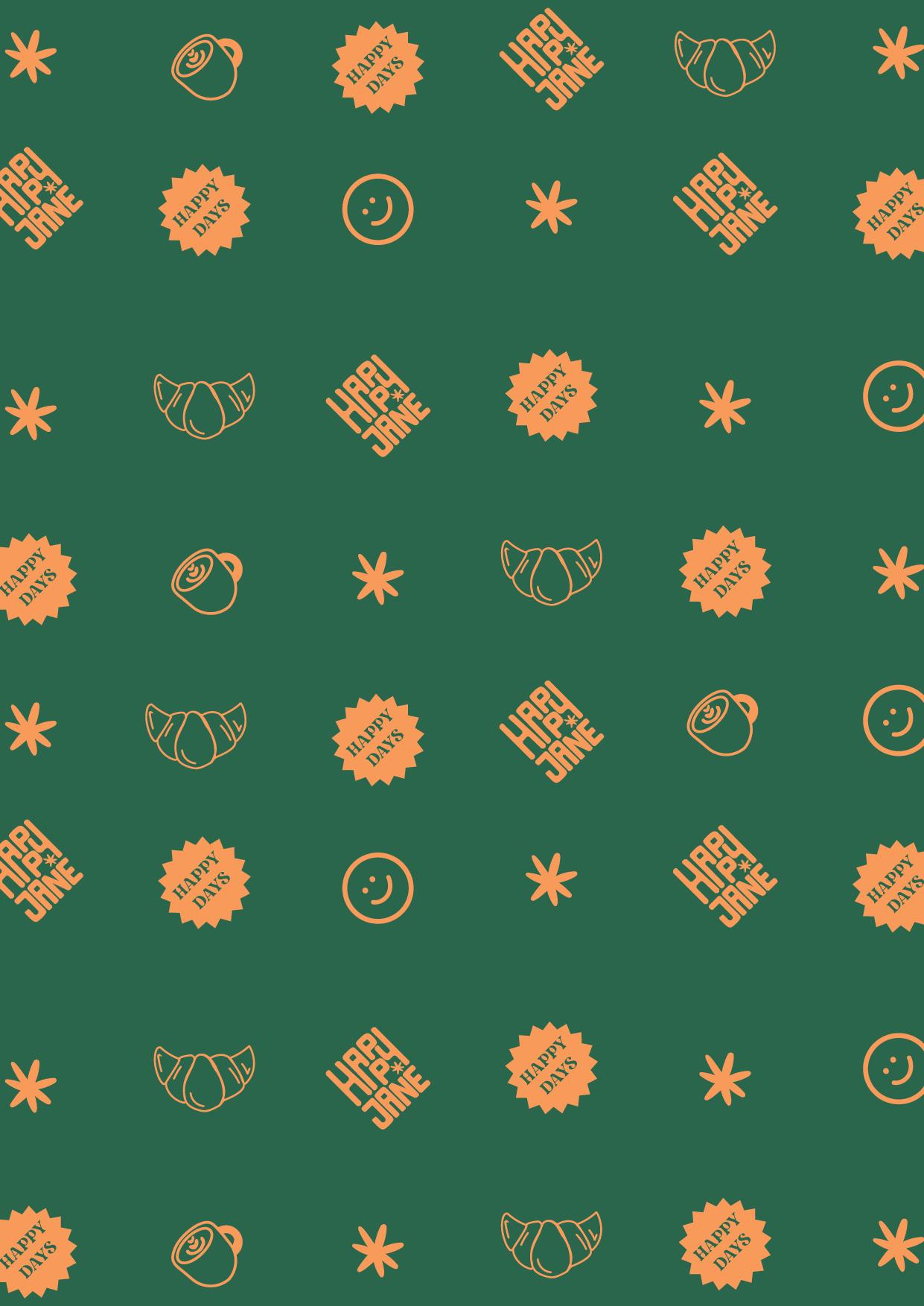
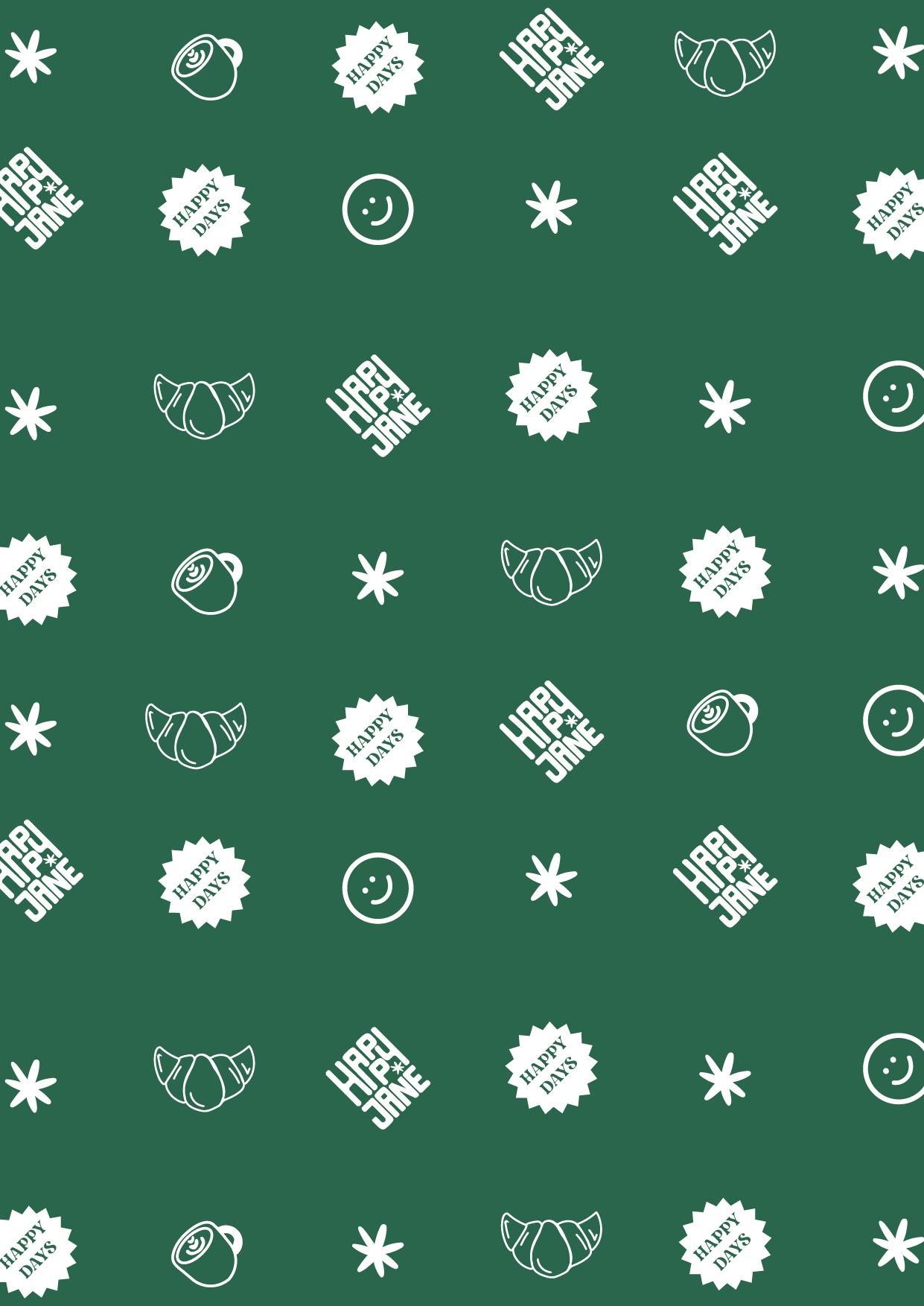
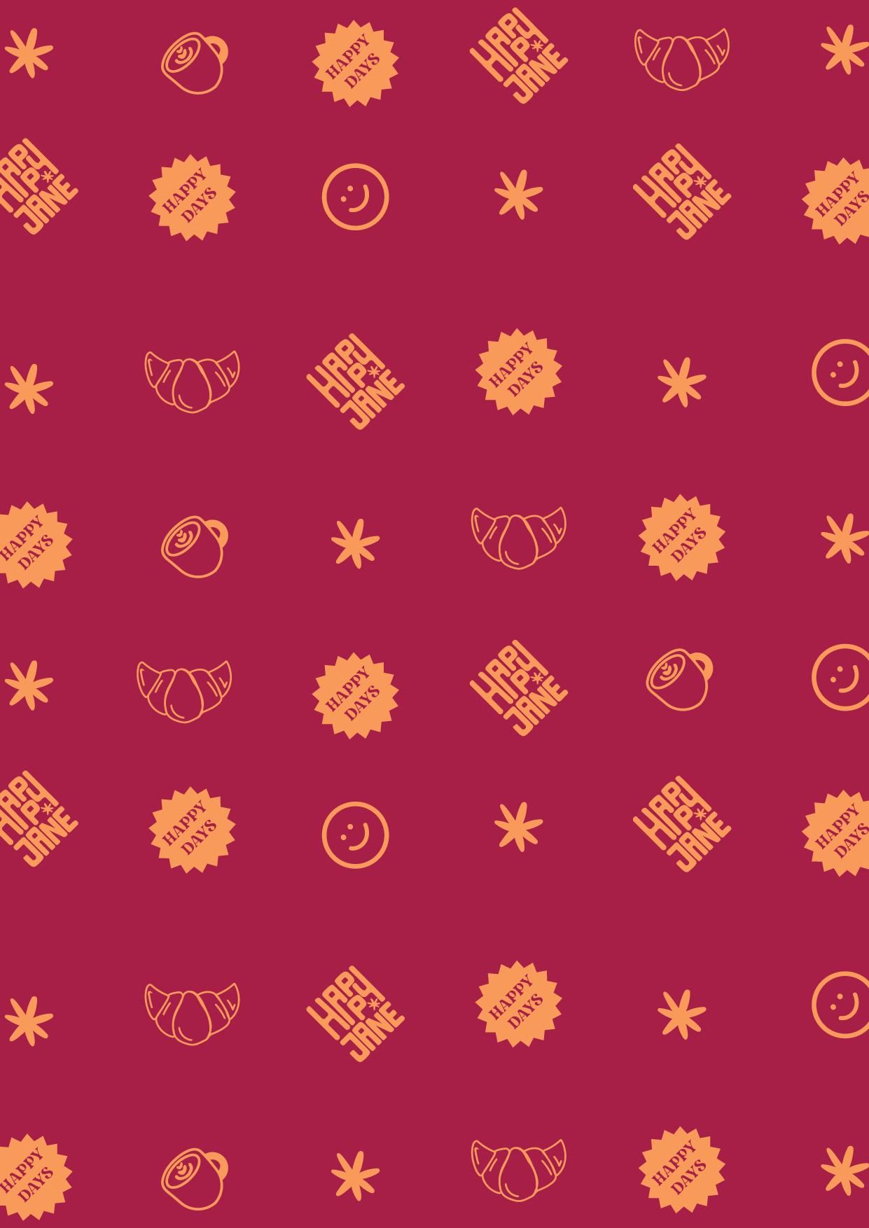
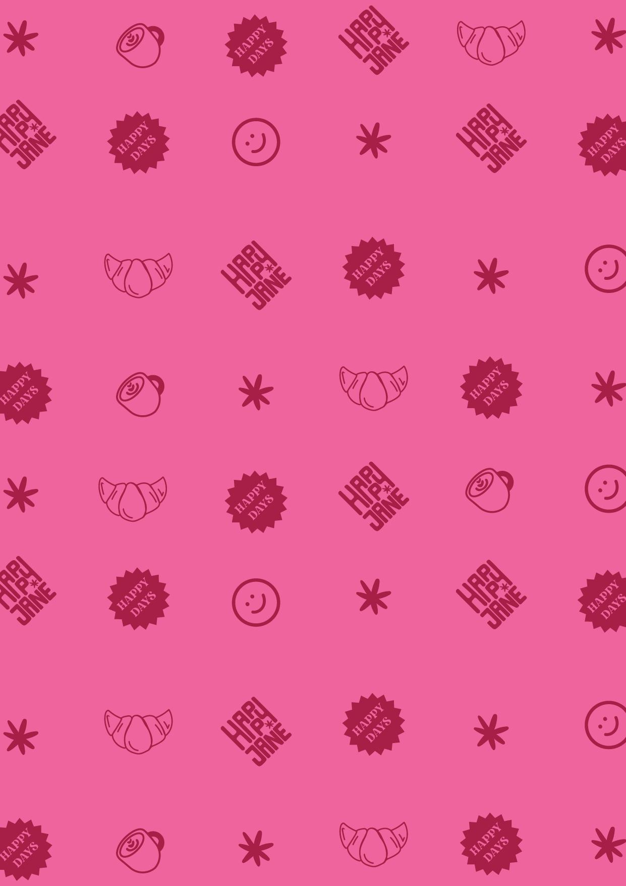
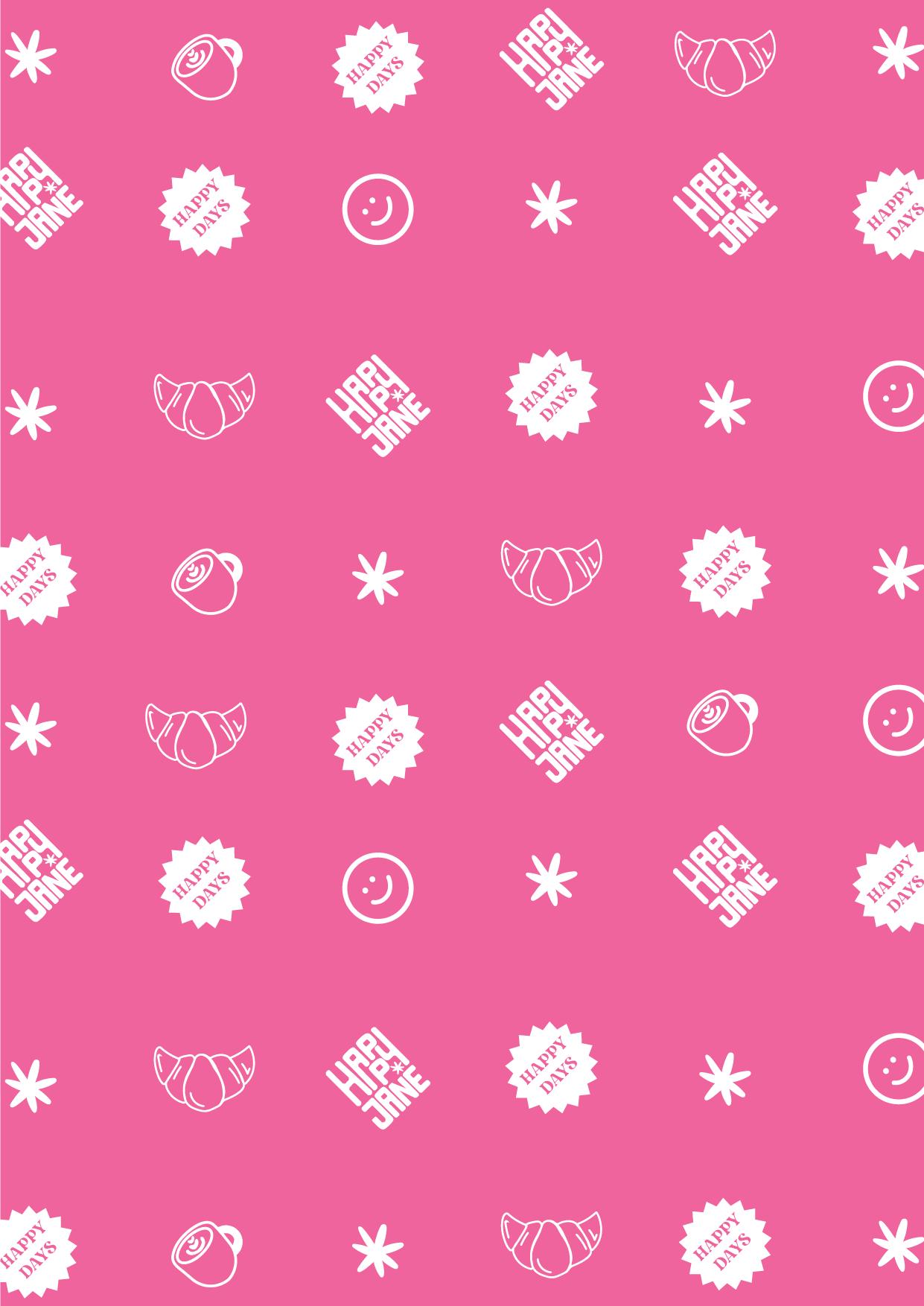
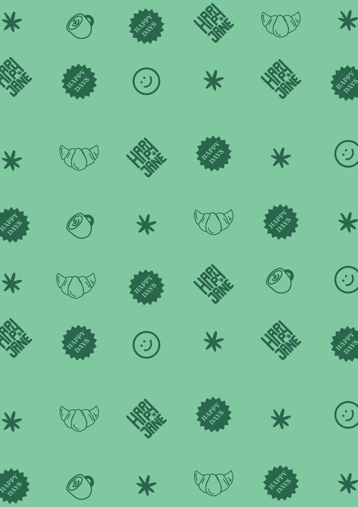
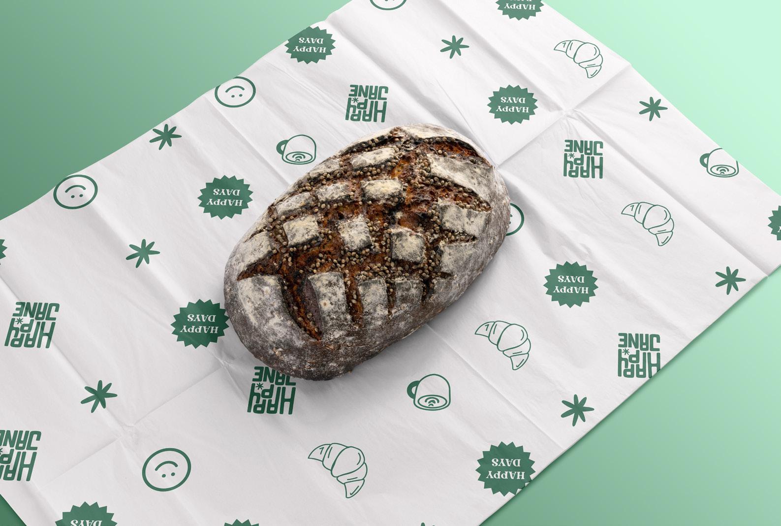
The "Happy Jane" logo radiates joy, movement, and happiness—perfect for a coffee shop that aims to offer a welcoming, relaxing experience. Its compact, blocky letters create a sense of unity and liveliness, as if each letter is in harmony with the next. The small flower detail subtly nods to the natural origin of CBD, linking the brand to its botanical roots and evoking the sense of calm and wellness found in this brand. This cheerful design, with its warm color contrast, visually captures the essence of positivity and relaxation, making "Happy Jane" a symbol of vibrant energy and hospitality.
ISOLOGOTYPE
CONCEPT
Happy Jane was conceived as a space where the natural calm of CBD meets the pleasure of a unique dining experience. Inspired by the solid structure of its blocky design and the relaxing essence of CBD, this coffee shop becomes an urban retreat inviting customers to unwind and recharge. The square, structured style reflects a trustworthy and approachable environment, where every dish and drink is crafted to offer a sense of balance and well-being.
LOGO VARIATIONS
We specify the different versions of the logo that can be used depending on the needs of the client or the different graphic and printed supports that are going to be used.
GRAPHIC CONSTRUCTION
A grid has been designed for each version of the logo, this in order to maintain the same proportions.
The measurement used for the grid is the measure x that ensures the proportions of the mark.
RESTRICTED AREA
A safety area has been established around the logo.
This area must be free from any graphic elements that may interfere with the perception and readability of the brand. The construction of the clear space is determined by the flower of the logo, which represents the "x" measurement.
Whenever possible, it is preferable to maximize this space, keeping the logo separate from other elements on the page.
MINIMUM SIZE
A minimum size has been established for each of the versions of the Logo, both for printed and digital material, so that the logo is always legible.
TYPEFACE 03
TITLE TYPEFACE
MOGENA
MOGENA is a modern and sophisticated typeface, ideal for headlines and titles. Its geometric and elegant design conveys confidence and style, effectively capturing attention without losing sophistication. Perfect for brands seeking to stand out with a contemporary touch.
SECONDARTY TITLE
TYPEFACE
GOTHAM ULTRA
GOTHAM ULTRA is a bold and robust typeface that perfectly complements primary headlines. Its strong, solid structure ensures that secondary headlines are just as impactful, providing clarity and presence to secondary text without overshadowing the main content.
SUBTITLE
TYPEFACE
ACHERUS GROTESQUE is a versatile and clean typeface, perfect for subtitles. Its balanced and clear design offers legibility without sacrificing style, creating an appropriate visual hierarchy and highlighting key elements within the content.
ACHERUS GROTESQUE
BODYTEXT
TYPEFACE
GALVJI
GALVJI is an elegant and highly readable typeface, especially designed for body text. Its well-balanced structure makes reading long passages comfortable, allowing the content to flow naturally and providing a pleasant visual experience, ideal for maintaining interest in extensive text.
TYPOGRAPHIC HIERARCHY
This is a guide to maintaining a homogeneous brand regarding how texts should look together.
THIS IS THE FONT FOR TITLES
This is the font for subtitles.
Lorem ipsum dolor sit amet, consectetur adipiscing elit, sed do eiusmod tempor incididunt ut labore et dolore magna aliqua.
THIS IS THE FONT FOR TITLES
This is the font for subtitles.
Lorem ipsum dolor sit amet, consectetur adipiscing elit, sed do eiusmod tempor incididunt ut labore et dolore magna aliqua.