This manual is a formal guide for those in charge of SANGA SANGA MR. SANGA Marketing department, where they can find the correct way to apply any graphic element that the brand requires. We have created this manual in order to generate graphic homogeneity. By applying the standards of this manual, it will be possible to effectively communicate the company’s values, as well as its visual identity.
Brand Strategy
DESIGN PERSPECTIVE
BRAND MANIFESTO
A WHOLE WORLD OF FLAVOR
At Sanga Sanga Mr. Sanga, we believe a sandwich isn’t just food—it’s an adventure between two slices of bread! Here, we’re all about cranking up creativity, delivering bold, off-the-wall flavors, and keeping things fresh and fun. We’re the spot where you can find everything from the classics to the wildly unexpected, made with top-notch ingredients because quality is the foundation of all our wild ideas.
PRINCIPAL ARCHETYPE: JESTER
At Sanga Sanga Mr. Sanga, we’re the wild cards, the rule breakers, and the kings of unpredictability. We embody The Jester archetype because, for us, life and food should be fun, fresh, and a little quirky. We’re not here to serve you the same old sandwich; we’re here to create bites of adventure, laughter, and surprise, all packed between two slices. Every ingredient and flavor twist is designed to bring joy and break away from the ordinary. We thrive on the “wow” factor, delivering smiles and shaking up the everyday lunch routine. In our world, there are no limits only fresh ideas and endless creativity.
ARCHETYPE
SECONDARY ARCHETYPE: MAGICIAN
At Sanga Sanga Mr. Sanga, we’re culinary magicians, crafting bites that transport you to new worlds of flavor with every meal. We embody The Magician archetype because, for us, every sandwich is an experience that transforms the ordinary into the extraordinary.
With each recipe, we blend high-quality ingredients in unexpected ways to spark delight. We’re here to bring magic to your taste buds, creating moments of wonder through vibrant, unforgettable flavors.
BRAND PERSONALITY
Personality: PROTAGONIST
ENFJ-A
We create a world full of joy within the sandwich universe. This is a place where every bite is crafted with purpose, passion, and an unwavering belief in bringing people together. We’re all about building connections—not just between flavors, but also within our community.
Charming and welcoming, we thrive on creating a space where everyone feels at home. We’re future-focused, constantly innovating with ingredients and recipes to craft experiences that leave a lasting impact. Guided by a vision of what food can be and driven by quality, we lead with empathy, taking every detail to heart—because it’s the small touches that make the biggest difference.
BRAND VALUES
CREATIVITY & INNOVATION
We believe in keeping things fresh and exciting by constantly experimenting with new flavors and ideas.
QUALITY
High-quality ingredients are at the heart of our sandwiches. We’re committed to sourcing the finest ingredients to ensure every bite is bursting with flavor and freshness.
JOY COMMUNITY
We provide a space to connect, have fun, and share in the joy of good food. Our mission is to bring people together and create a friendly, welcoming environment.
While we take our food seriously, we don’t take ourselves too seriously. With a fun, energetic vibe, we strive to bring joy to every customer.
BRAND LANGUAGE
TONE OF VOICE LANGUAGE
Playful : We bring humor and charm to keep things lighthearted and fun.
Bold: Confident - with a flair that stands out in every message.
Fast-Paced: Direct - reflecting an “always in a rush” energy.
Creative : Inventiveimaginative, surprising and delighting at every turn.
Inclusive: Welcoming - creating a community vibe where everyone feels at home.
PERSONALITY
Joyful
Creative
Adventurous
Charming
Energetic: Lively - capturing the excitement of exploring new and delicious experiences.
Fun: Playful - using humor to create joyful, memorable interactions.
Welcoming: Warm - fostering a sense of belonging and community.
Confident : Self-assuredshowcasing the brand’s unique identity and flair.
LOGOTYPE
ISOTYPE
LOGOTYPE
LOGOTYPE
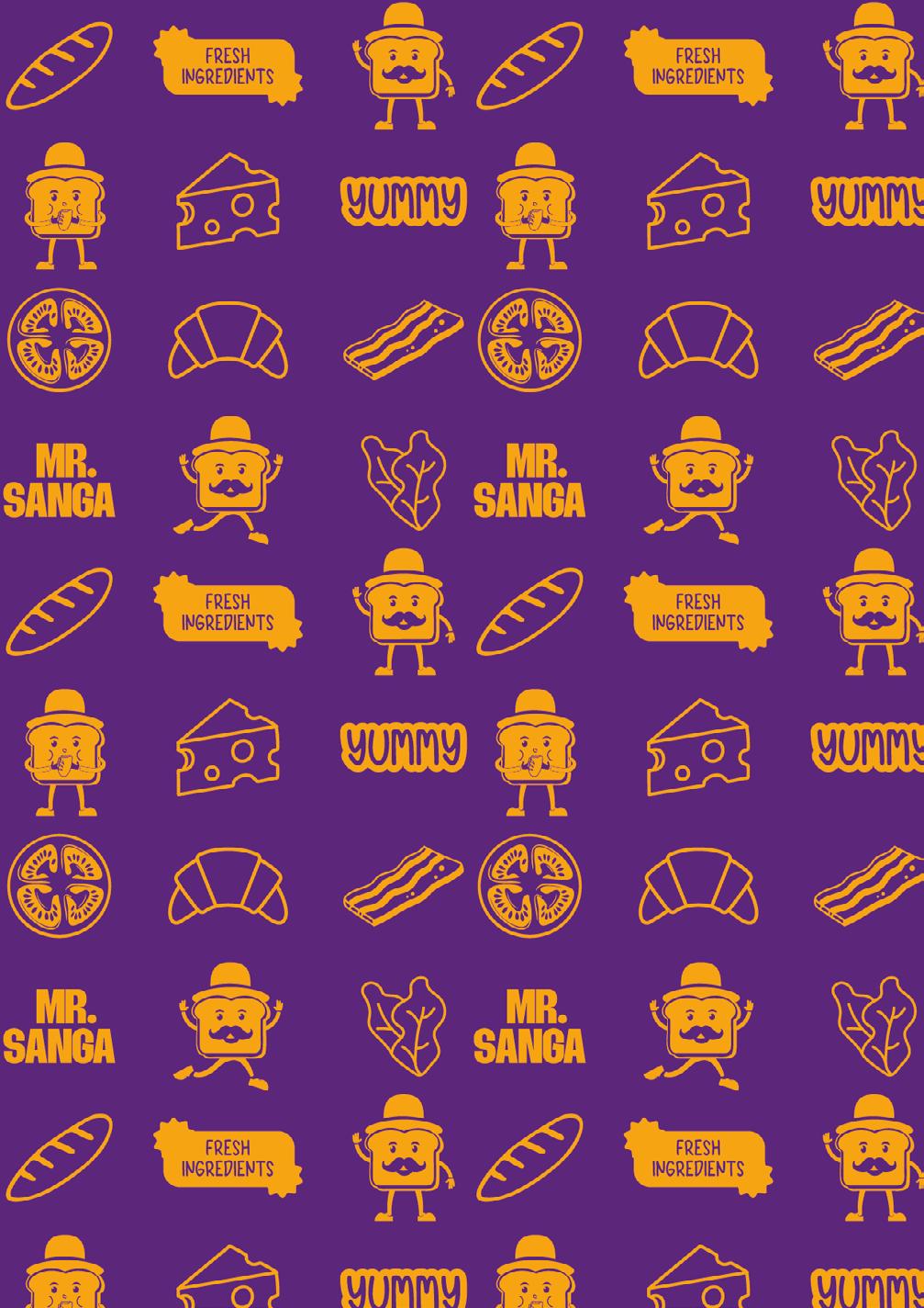
The logo for Sanga Sanga Mr. Sanga features a playful character shaped like a sandwich, adorned with a distinguished mustache and hat that reference the “Mr.” in the brand name. This charming isotype not only adds personality but also conveys a sense of fun and adventure, reflecting the vibrant spirit of the brand. The character’s expression and movement invite customers to indulge in bold, exciting flavors.
The vibrant color palette, filled with bright and cheerful tones, mirrors the energetic atmosphere of the brand. The bold, modern font beneath the character adds strength and confidence, grounding the logo with a contemporary touch. Together, these elements create a visually striking logo full of personality that radiates joy—an irresistible invitation to enjoy the fun and flavorful experience of Sanga Sanga.
CONCEPT
Sanga Sanga Mr. Sanga was conceived as an innovative space where culinary creativity meets the joy of flavor exploration. Embodying the spirit of a charming and approachable character, Mr. Sanga represents a friendly, slightly quirky persona that connects with people on a deeper level. The concept celebrates the playful and inventive nature of its sandwich shaped logo, revolving around transforming ordinary meals into extraordinary experiences. Constantly innovating, Sanga Sanga creates a vibrant environment where joy, connection, and a dash of delightful madness come together to redefine dining.
VERSIONS
We specify the different versions of the logo that can be used depending on the needs of the client or the different graphic and printed supports that are going to be used.
GRAPHIC CONSTRUCTION
A grid has been designed for each version of the logo, this in order to maintain the same proportions. The measurement used for the grid is the measure x that ensures the proportions of the mark.
RESTRICTED AREA
A safety area has been established around the logo. This area must be free from any graphic elements that may interfere with the perception and readability of the brand.
The construction of the clear space is determined by the letter “S” of the word Mr. Sanga and the Mustache, which represents the “x” measurement. Whenever possible, it is preferable to maximize this space, keeping the logo separate from other elements on the page.
AREA
MINIMUM SIZE
A minimum size has been established for each of the versions of the logo, both for printed and digital material, so that the logo is always legible.
MINIMUN SIZE
MINIMUM SIZE
TYPEFACE 03
FREDOKA
CAPITAL LETTERS
TITLE TYPEFACE
Fredoka is a friendly, rounded sans-serif typeface designed for bold and engaging titles. Its playful yet professional look adds a touch of warmth and approachability, making it ideal for grabbing attention in a modern, creative way.
LOWERCASE
NUMBERS SPECIAL CHARACTERS
BEBAS NEUE
CAPITAL LETTERS
SUBTITLE TYPEFACE
Bebas Neue is a clean, condensed typeface perfect for subtitles. Its simple and impactful design ensures clarity and readability while maintaining a contemporary, sophisticated edge.
LOWERCASE
NUMBERS SPECIAL CHARACTERS
SUBTITLE TYPEFACE
QUESTRIAL
CAPITAL LETTERS
BODYTEXT TYPEFACE
Questrial is a modern, sans-serif typeface ideal for body text. Its smooth curves and balanced proportions provide excellent readability, combining elegance and simplicity for a professional and accessible feel.
LOWERCASE
NUMBERS SPECIAL CHARACTERS
BODYTEXT TYPEFACE
TYPOGRAPHIC HIERARCHY
This is a guide to maintaining a homogeneous brand regarding how texts should look together.
THIS IS THE FONT FOR TITLES
This is the font for subtitles.
Lorem ipsum dolor sit amet, consectetur adipiscing elit, sed do eiusmod tempor incididunt ut labore et dolore magna aliqua.
CHROMATIC VERSIONS
RGB: Due to the vibrant color palette, colors may vary depending on the application. Printed materials require CMYK colors, while digital applications need RGB colors.
RGB: Due to the vibrant color palette, colors may vary depending on the application. Printed materials require CMYK colors, while digital applications need RGB colors.
RGB: Due to the vibrant color palette, colors may vary depending on the application. Printed materials require CMYK colors, while digital applications need RGB colors.
CMYK: Due to the vibrant color palette, colors may vary depending on the application. Printed materials require CMYK colors, while digital applications need RGB colors.
CMYK: Due to the vibrant color palette, colors may vary depending on the application. Printed materials require CMYK colors, while digital applications need RGB colors.
CMYK: Due to the vibrant color palette, colors may vary depending on the application. Printed materials require CMYK colors, while digital applications need RGB colors.
CHROMATIC APPLICATIONS
RGB: ORANGE PEEL AND PURPUREUS
RGB: LIME AND PURPUREUS
RGB: ELECTRIC BLUE AND PURPUREUS
RGB: ORANGE PEEL AND BLUE CRAYOLA
RGB: LIME AND BLUE CRAYOLA
RGB: ELECTRIC BLUE AND BLUE CRAYOLA
CRAYOLA AND ORANGE PEEL
RGB: BLUE
RGB: PURPUREUS AND ORANGE PEEL
RGB: BLUE CRAYOLA AND LIME
RGB: BLUE CRAYOLA AND WHITE
RGB: PURPUREUS AND WHITE
RGB: ORANGE PEEL AND WHITE
RGB: ELECTRIC BLUE AND WHITE
CMYK: ORANGE PEEL AND PURPUREUS
CMYK: APPLE GRREN AND PURPUREUS
CMYK: SERENE BLUE AND PURPUREUS
CMYK: ORANGE PEEL AND DENIM BLUE
CMYK: APPLE GREEN AND DENIM BLUE
CMYK: SERENE BLUE AND DENIM BLUE
DENIM BLUE AND ORANGE PEEL
CMYK:
CMYK: PURPUREUS AND ORANGE PEEL
BLUE AND APPLE GREEN
CMYK: DENIM
CMYK: DENIM
BLUE AND WHITE
PURPUREUS AND WHITE
CMYK:
CMYK: ORANGE PEEL AND WHITE
CMYK: SERENE BLUE AND WHITE
POSITIVE
BLACK AND WHITE
BLACK AND WHITE NEGATIVE
GRAPHIC RESOURCES
APPLICATIONS 07
INCORRECT USAGE
INCORRECT USAGE
1) Do not change the spacing or rotation between the elements of the logo.
2) Do not distort the logo.
3) Do not place the logo over backgrounds or photos that make it unreadable.
4) Do not modify or change the color of the logo.
5) Do not use other fonts for the logo.
6) Do not change the proportions of the logo elements.