

Reflection

The intension of this application is to add colour to the symbol adding meaning and interpretation to the place, Tahune Adventures.
Colours from original images taken at Tahune Adventures over a period of approximately 10 years, were reviewed to symbolise the greens and blues people can experience at Tahune. The colours chosen are all Pantone colours either coated(C) or uncoated(U) stock. One of the problems with implementing the natural colours in the symbol, then overlaying onto a background image, the symbol blends into the background, which is not the idea behind this logo.
The symbols were placed in front of a light and dark background to make sure the chosen colour fitted to any application. The chosen colour for the symbol is Pantone Solid Uncoated 021U, a bright orange with Black text. The bright orange allows for image overlays of the logo whilst still keeping its clarity to the eye.
Animated Graphic Development- Sketch




Final Mark- 3 Colours
Final Mark- Full Colour
Logo Applications




Reflection
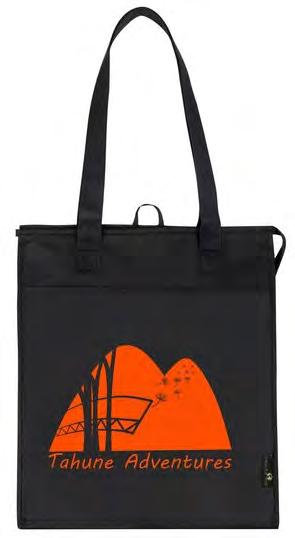
Applications where the logo may be found has been included to show it at different scales and different arrangements. Throughout these application the colours may change for the type or logo to accommodate with different coloured backgrounds. If the logo is being placed on an image the black symbol on an orange square may be used to represent the place whilst still being highly visible.
For some applications the colours available could vary for tourists and visitors purchasing products to expand product the range and appeal to different users.
The applications include:
- T-shirt
- Loyalty Card
- Mug
- Travel Mug
- Car Magnet
- Stubby Holder
- USB
- Drink Bottle
- Business Card
- Cooler Bag
- Back Pack
- Note Pad
- Tote Bag
More applications could include:
-Menus
- Fliers
- Banners

- Emails
- Documents
- Tickets
- Clothing
Reflection
The final logo is shown at different scales of: 15, 30, 100 and 200mm. The text is legible at all scales small to large with all elements being visible.
The chosen colour is the PMS swatch (Pantone Solid Uncoated) ‘Pantone Orange 021U’. The colour was applied to the mountains to create a background colour and make the cantilever, wishes and trees pop. The text will be black for most applications however can be changed to the same orange or white on dark backgrounds to remain legible.
An animation for a website landing page was created using the aspects of the symbol. The animation shows ‘wishes’ being blown off the edge of the cantilever and floating off into the distance, very much alike how people throw coins off the boardwalk onto the tree below.
Tahune Adventures, located in Geeveston Tasmania. The symbol successfully used positive and negative forms along with the place name to communicate its aspects and ideas to its audience. The final mark communicates the activities and feel of Tahune Adventures whilst also referring to the 2019 fires through the orange colour, therefore being successful and adhering to the communication statement, through the aspects of the cantilever, environment and wishing tree.

ALL IMAGES ARE ARE THE DESIGNER NICOLE FARNELL'S OWN


Anon 2020, Vistaprint: Business Cards, Marketing Materials, Signage & More, viewed 7 May, 2020, <https://www.vistaprint.com.au/?GP=05%2f07%2f2020+06%3a42%3a06&GPS=5674673257&GNF=1>. Bfit n.d., Dandelions Aren’t Weeds! Top-9 Health benefits of all Dandelion, viewed 7 May, 2020, <https://medium.com/@bfit74476/dandelions-arent-weeds-top-9-health-benefits-of-all-dandelion-c37f141c663c>.

Project 3: Form-at


Background Summary
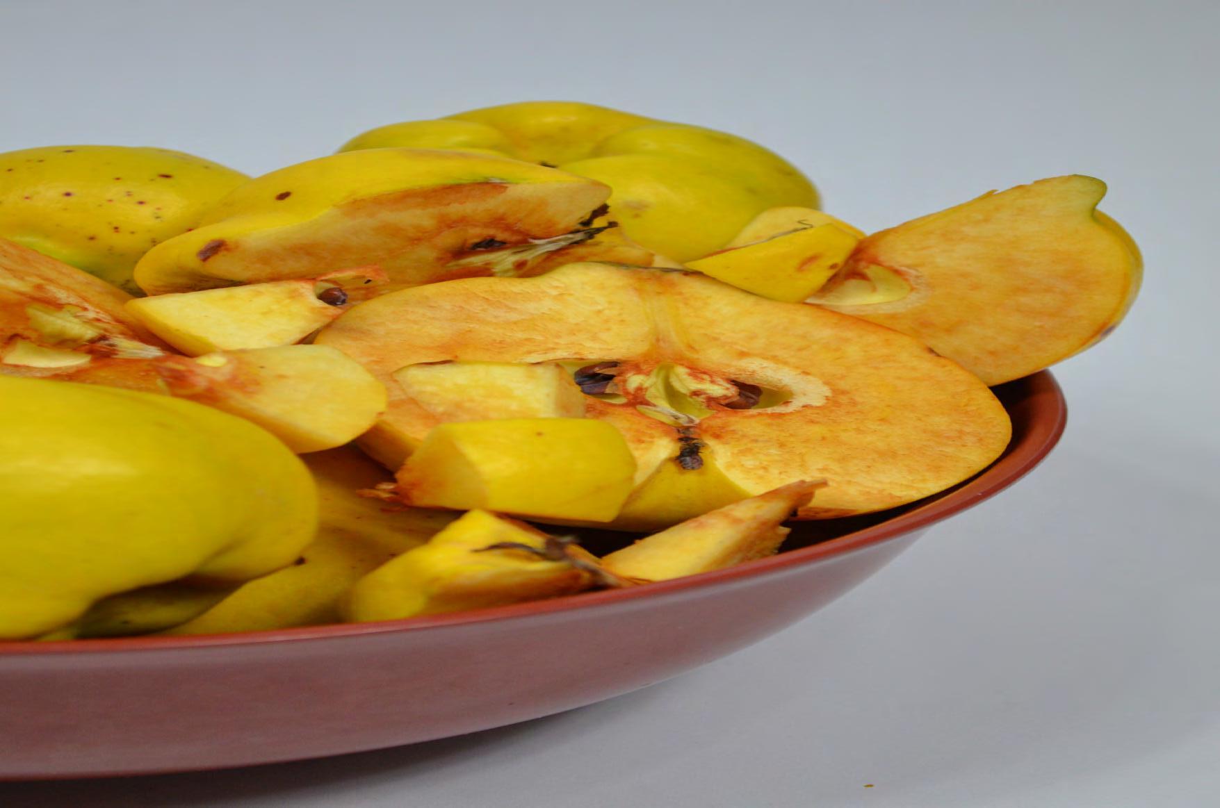
The chosen fruit for this task is a quince. These Quinces are home grown so do have minor imperfections and come in a variety of shapes and sizes. Quinces are a rare fruit only found in high end fruit shops or at farmers markets. They are a global treasure with vibrant golden colours and a exotic fragrance of sweet and tangy.
The colour is bold both exterior and interior and develops into a bright red when oxidized and cooked. The raw fruit is crisp however is more than often cooked to bring out the flavour and perfume of the quince.
Internally the quince is alike a pear or apple in features with a central core with small seeds.
Communication Statement

“The aim of the design is to communicate the vibrant colours and unique nature of a quince.”
Visual Research


Abstract Organic Geometric
The abstract examples of quinces are slightly unrecognizable especially to those whom do not know what quinces are. As quinces are not a widely known fruit some people may think these images are a pears or apples, with a yellow colour and mis-formed shape.

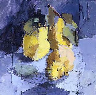


The first image depicts the colour and basic outline of the form of a collection of quinces. The second image has some aspects of colour however the quinces are difficult to recognize within the green background as the colours blend together like autumn leaves on a tree.
These images evoke a sense of confusion and imperfection which links directly to what people think when they see a quince. This is an aspect that could be used within my designs.
These examples show a quince in a geometric vector form. The colours are similar to yellow quinces when recently sliced open. The use of section in this image creates a sense of the form of a quince with all its curves and different elements such as the stalk, leaves and seeds. Due to being a vector image there is not much texture depicting the fluffy protective layer before the smooth outer skin.

Geometric forms are simplistic using basic lines and colour however lack texture and personality. The geometric images also evoke a sense of perfection people would like to see when they buy fruits such as quinces.
These forms could influence my designs through the use of the technique of vector shapes.
As a life-like painting of quinces the first image shows the form, colour and texture of the quinces in their natural state. The shadows help with understanding the strange forms that quinces grow into as well as depicting the fluffy protective layer when they are fresh off the tree. The second image is a graphic illustration showing texture, colour and shape of the quince. The highlights and shadows create a three-dimensional illustration on the twodimensional plane.
Both images use soft lines and a vivid colour representing quinces to a great detail. The organic nature is inconsistent in shape, colour and size, just like quinces coming off a tree, evoking a naturalistic and comforting emotion.
These images could influence my designs by the use of shadows to create the texture of the quince.
(Rozenke n.d.) (Connoll n.d.) (mushakesa n.d.) (svetlanarib79 n.d.) (Barthorpe n.d.) (Kazimierczuk 2017)The visual research looks at three different styles; abstract, geometric and organic. The 3 styles are vastly different however have one thing in common; the colour of the quinces. This will persuade my designs to use similar colours to the fruit as it makes it recognisable and different to other fruits such as a pear or apple.
Personally I prefer the organic style compared to the abstract or geometric as it does loose touch of what the fruit is. As quinces are rare and uncommon, the form makes a large impact to what the viewers perceive. For future designing and image-making this is the style I would like to focus on.

Photography


The photographs explore the form, shape and colour of a quince as a whole and when sliced in different directions. The oxidized state once the quince is open adds yet another colour element combining greens, yellows and reds together. The vivid colours of yellow and oranges will be the main factor used in designing a symbol for the quince.


The dark background creates a distinctive contrast of the yellow against the black whereas the white softens it whist accenting the gloss and shine on the outer skin. The use of a bowl enables the quince to be seen from many angles both as a whole and in sliced and diced forms. Overall the photography describes a quince with all its small details portraying the unique fruit to its viewers.


Image Making Techniques


Watercolour Fine liner Marker


The most successful image making technique was dye. The dye after being blotted a few times was able to show the slightly feathered and rough interior of the quince. The blended colours are bright and make a memorable impact of the viewers.
The watercolour accurately describes the colour and shape of the quince with an abstract feel, leaving the viewers wondering and wanting to know more about this abstract and rare fruit.
The paper cutting technique shows the shape but does not accurately explore form by itself. The multicoloured approach as seen in the slices of fruit and the half-half are the most powerful.


The marker enables more abstract ideas for the shape as they were based on memory. The play on colours within the analogous colour pallet helps differentiate between different elements and separate pieces. The marker has also been used to show texture through small strokes repeated.
Digital variations are the easiest and most simplified technique used. The colours are taken from the photography, creating a replica of the same colours that are seen in a quince. The digital technique is more geometric and abstract then some of the previous techniques however some of these symbols are really sophisticated and identifiable.
Fine liner has been used to show texture and a basic form of the quinces. These trials could be placed on a coloured background such as watercolour or paint to create an amazing symbol to represent the quince.
Acrylic paint creates vivid backdrops and a textural element to the image making techniques. Some colours are more abstract and bold not matching the direct colour of the quince.
Overall the most successful image making techniques are digital and dye. This enables the shape and texture is explored whilst also using similar colours to the real fruit.
Analogous Colour Palette


The main colour of quinces is shown by the arrow. The black lines mark the end scope for the analogous colour pallet that should be used in this project. These colours also represent the quince from the ‘green’ in its unripe stage, to ‘red’ the colour when cooked and when the fruit oxidizes. The main colours are green, yellow, orange and red.

These are the 6 final colours to be used in designs. These colour directly relate to the quince and the photographs taken from the outer skin to the fresh and oxidized flesh and seeds. The colours have also been used in the digital designs to represent the quinces.
Type Exploration


Compositions




Vibrant Vibrant Vibrant Vibrant
Vibrant Vibrant Vibrant Vibrant
These 5 chosen types work well with different image techniques. The type ‘Spumante’ works incredibly well and is fluently within the circular images but does not work with the others. The bolder text such as ‘Trajan’ is a bit harsh on most designs but fits perfectly with the sliced fruit of similar style and cut. This is seen through all these designs as each image has its own features that match the font chosen.
Vibrant Vibrant Vibrant Vibrant
Overall the chosen design and type will be the circular image with the font ‘Spumante’ as it has the look and feel of vibrant quinces sitting at a farmer market stall. The decorative font has a sense of rarity and posh-ness to it which clearly describes the quince, its availability and audience.


Vibrant Vibrant Vibrant Vibrant
Vibrant (Cambria)
Vibrant (Trajan Pro 3)
Vibrant (Tangier)
Vibrant (Acuta)


Vibrant Vibrant Vibrant
Vibrant (Spumante)
The final composition could be created using many colours representing the quince. The greens and yellows show the raw quince which may be used at a farmers market on product package. The red however could be a recipe card showing the colour change of a cooked quince.


Vibrant Vibrant
Vibrant
Vibrant
Vibrant


The banner can appear both vertical or horizontal. Due to its size a couple designs feature small images as a different colour in the background to fill up the white space. The backgrounds have been left white to convey the vibrant colours and create a stand out piece for the audience viewing. The horizontal banner is more successful in filling up space and enables it to be hung on tables or gazebos at markets, the ideal place for selling quinces.


Overall the greatest concept design is the second horizontal banner. It is very professional in appearance with a great balance and hierarchy of order from image to type.


Vibrant
Vibrant


Overall the most persuasive idea is the first horizontal card. The white space is a great balance and the overlap ties the design together really well without being overpowered.

Vibrant Vibrant Vibrant
Vibrant Vibrant Vibrant


Vibrant
The small square area for the image in this format allows the image to take up the full space leaving minimal white space but producing a large impact of the viewers. The offset of most of these concepts balance the image and the type whilst maintaining different hierarchy of order. The overlapping elements can be lost slightly as seen in the first idea, where a white border of the text is needing to be used to convey the message clearly.


Overall the preferred concept it the central one but the text may be blown up slightly to overlap the image bringing them both together and flowing as one.


Final Outcomes


Banner 1:3 Scale


Vibrant
The final outcomes relate to each other with similar layouts and hierarchy. The final designs correctly describe a quince and relate back to the communication statement with both the vibrance and unique nature being the main points of interest. (“The aim of the design is to communicate the vibrant colours and unique nature of a quince.”)


The colour on the text was used to further complete the ‘vibrant’ element in this design. The black outline allows for the text to be seen and read clearly even when placed over the image.
To conclude, if I was faced with a banner, recipe card or social media post such as this at a local market or shop I would be there buying products they were selling, due to the intriguing nature of the fruit.
Bibliography


Barthorpe, J n.d., Jill Barthorpe - Quince, viewed 17 May, 2020, <https://www.jill-
Connoll, A n.d., Quince Series No 12 Anthony Connolly RP - The Whisper Gallery, viewed 17 May, 2020, <https://thewhispergallery.com/product/quince-series-no-12-

Kazimierczuk 2017, Kazimierczuk - Quinces For Sale at 1stdibs, viewed 17 May, 2020, <https://www.1stdibs.com/art/more-art/kazimierczuk-quinces/ida_3584882/?utm_source=pinterest&utm_medium=cpc>.

mushakesa n.d., Raw fresh quince vector image on VectorStock, viewed 17 May, 2020, <https://www.vectorstock.com/royalty-free-vector/raw-fresh-quince-vec-
Rozenke, A n.d., Three Quinces Painting by Anatoli Avetyan Rozenke, viewed 17 May, 2020, <https://www.saatchiart.com/art/Painting-Three-Quinc-
svetlanarib79 n.d., Set of ripe quinces vector image on VectorStock, viewed 17 May, 2020, <https://www.vectorstock.com/royalty-free-vector/set-of-ripe-quinces-


