7 minute read
Wayfinding & Internal Circulation
by Noah
Abstract
Wayfinding is knowing where you are physically, and how to get where you want to be in a space. Clear wayfinding design is intuitive and nonverbal. It helps users to access the various spaces within a building, reducing stress and increasing efficiency.
Advertisement
Architects should provide a robust building design that includes wayfinding “baked in” as part of the architectural experience, which then other disciplines can enhance. Even without graphic or interior designers, the architectural design of a building should communicate to end-users how to move through it, where to go and not go, where to collect, or where to rest.
Research by Nourhan Mohamed Mahmoud Ahmed
14
The principles of Wayfinding:
- Create an identity at each location, different from all others. - Use landmarks to provide orientation cues and memorable locations. - Create well-structured paths. - Create regions of differing visual character. - Don’t give the user too many choices in navigation. - Use survey views (give navigators a vista or map). - Provide signs at decision points to help wayfinding decisions. - Use sight lines to show what’s ahead.
There is a lot of types of wayfinding signage:
- Wayfinding for patient and visitors - Important notifications
Send students and faculty relevant updates
- Connect the campus
Guide people indoors and outdoors
Visual Identity
Wayfinding does not have to be sign upon sign upon sign. Changes in color, large scale graphics, or interior landmarks orient users without the visual clutter.
How to choose suitable Signage
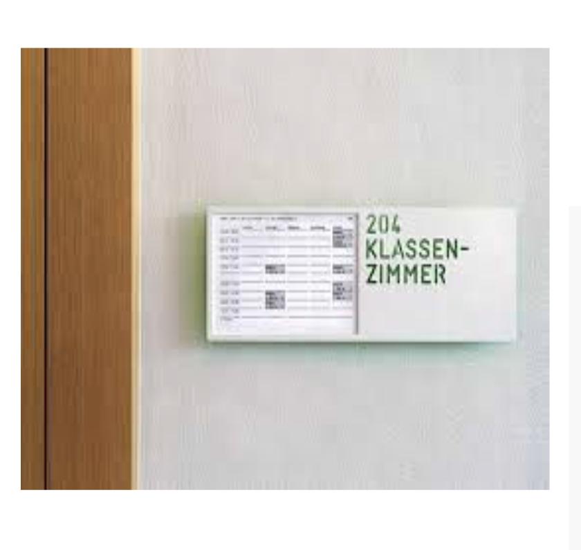
- Simple signage – signage must be highly legible, using bold text, but without overpowering exhibits to maximise readability.
- Colour matching – assigning colours for each gallery or floor is a great way to help visitors find their bearings and follow the natural flow of exhibits.
- Pretty as a picture – simple pictograms or symbols, clear photography, symbols or numbers can be easily understood by lots of different audiences, including non-English speaking and young visitors.
- Keeping it fresh – building in some flexibility in the wayfinding scheme means you can easily refresh signage as exhibitions change. Environmentally friendly and sustainable signage materials are a good option to reduce wastage and cost.
- Magic materials – wayfinding must be functional, but if it’s also fun and educational you can really bring the brand personality to life with signage materials that reflect your museum’s theme.
- In the zone – large spaces can benefit from being split into themes, zones or wings to make them distinct from each other and provide pointers to treasures within.
- Styling it – visitors tend to have two main navigation styles; museum wanderers who prefer the freedom to discover themselves, and structured explorers who want more of a guided explanation. It’s important to take both these audiences into account. - Stay grounded – signage doesn’t always have to be positioned up high; vinyl graphic maps and directional signage on the floor is a cost-effective wayfinding solution. For larger museums, active digital floor plans are also an option.
- Handle with care – the fabric of your building may be delicate, so the use of innovative fixing solutions will be needed to protect the building as well as adhere to regulations and public health and safety. Installation is often completed in stages or throughout the night to avoid disruption.
- Test and flex – if you’re working with a wayfinding consultant, they’ll use their observations and mapping to test visitor behaviours so you can adapt recommendations to ensure the journey is simple for all audiences.
Building directory
It solves issues of people when they enters any place and asks a lot whats here? whats of interested to me? where do I go? Jury Comments:
“A perfect example of graphics activating the environment. Stencil type works perfectly and coloring provides stimuli and identity strength. Good information speed.” “Powerful signage for a powerful space. Great use of pylons and bold typography to define the program. Nice, clear solution using oversized type and color to define various levels.”

Avoiding energy waste in way finding


Wayfinding is very useful in every building and it solves a big issue that makes every one walks and knows were he is going and can find the place that he wants to go ,but also whie making the signs we have to respect the nature and to reduce using the electricity ,its unrespectful even for us ,we can use the nature light instead of the electricity ex:blinking lights,and at night we can use the lights that is comfortable for our sight.

Internal Circulation
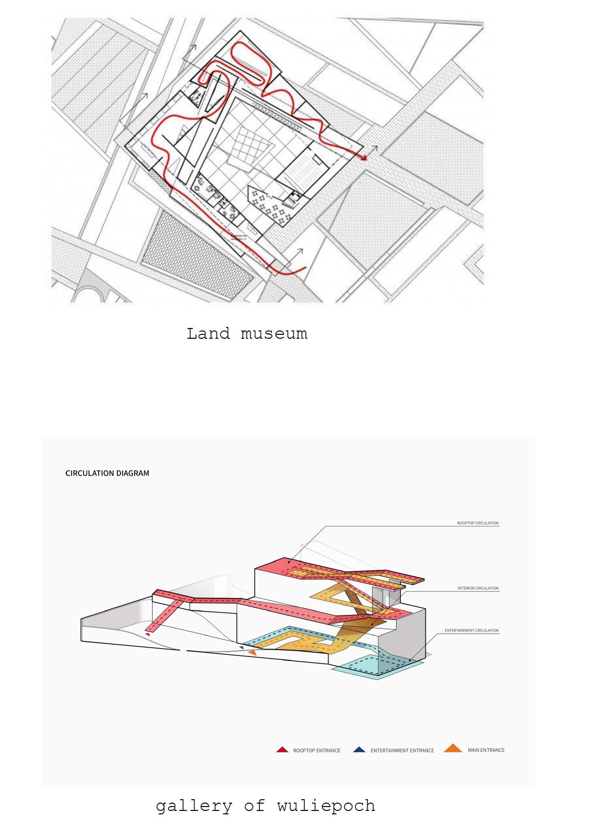
Circulation within Interiors refers to the way in which people move through and around a building throughout time. It can be broken down into direction, the type of use, the frequency of use and the time of use.
The speed of the movement of circulation can be fast or slow. The speed of the movement will depend on the visibility and how crowded/scarcely populated the location is.
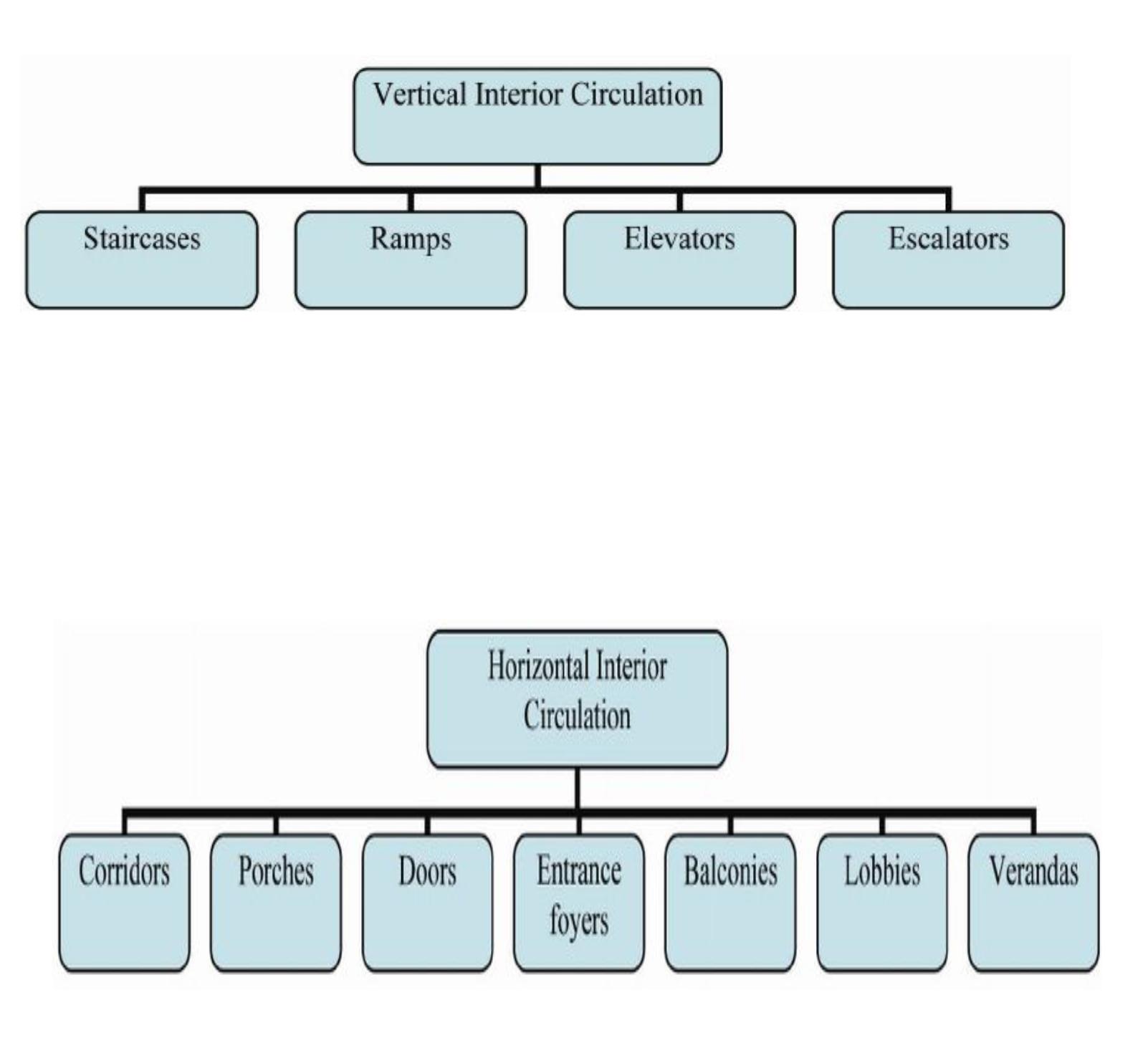
The direction of circulation can be either horizontal or vertical. If circulation is described as being horizontal, it refers to how people move in and around on a particular floor or level, but, if it being described as vertical circulation then it refers to relationship between the levels; looking at how people move between the various floors. Methods of horizontal circulation methods include moving walkways and corridors, whereas examples of vertical circulation can include a lift, stairs, escalators, and ramps.
As well as Visitors’ satisfaction in museums is a very difficult mission to achieve. Yalowitz (2002b) in his study highlights that visitors today have different expectations than those before 100 years. He states that an increased focus on entertainment requires interior design that is dynamic and draws visitors’ attention. As a result, if visitors’ attention and time are directed in ways that meet or exceed their expectations, they should leave feeling of satisfaction.
Interior Circulation Design from point of view of some architects
Hsu (2004) recommends in his research that, in order to design museums properly interior circulation design must be considered, in addition to the solutions for interior movement in space/time in a sustainable plan. Although Hsu highlights a very important issue that the museums’ visitors may not be conscious of how their bodies and movement are in a conversation and contact with the building and interior environment itself. Therefore the interior circulation design in the building is how we experience the three dimensionality of a building through the movement of our bodies with full consideration of time, sequence and space .

Stephen (2009) defines clearly the interior circulation in the buildings as: “A term describes how visitors make their way through the facility. What pathways do they take? Do visitors circulate the way the designers intended? Do visitors miss key exhibits because of the architectural design of the facility? Which direction do visitors turn when they reach choice points? Do visitors have a circulation strategy (e.g., “Turn right and follow the perimeter”) or do they simply wander more or less aimlessly?”. It becomes a fact that museums can be more successful if designers apply and implement the principles of circulation to the design process, and visitors will be more satisfied when the building is properly designed and when visitors are oriented properly to an exhibition area. Therefore, visitors tend to be more satisfied when the exhibition is designed with full consideration of the factors that determine circulation actions. Thinking about circulation and interior environment should be started during the museums design process rather than added after the design is finished. In addition to that, the circulations factors and considerations should be an important part of the museum design and be an important part of the plan, launching with the planning stage and continuing through design. Therefore, circulation devices and elements should be defined by visitors and adjusted according to the visitors’ input and not exclusively by designers who may not be able to predict the impact of these elements on visitors (Griggs, 1983). It becomes a fact that the efficiency of interior circulation system in the museums determined by the basic shape and form of building itself. So buildings of the same internal floor area and same function differ in the proportion of space absorbed by the elements of interior circulation and in the design style of circulation elements such as lifts, corridors and other mechanical equipment. Researchers stated that the time needed by a visitor to move from one area within the building to another area and the enjoyment of doing this by visitors are affected by the building form and circulation style that is designed.


