INTERIOR DESIGN . ART . ARCHITECTURE . CUISINE

EDITION 2 • SPRING 2024


CONTENTS TABLE OF
PAGE 12
THE GROVE REMODEL | MCNEAL & FRIENDS
Nestled along the riverfront in a mature South Fargo neighborhood is a project fondly referred to as “The Grove,” a beautiful family home undergoing a major transformation. In this first phase of renovation, lead interior designer Lexi Jordheim of McNeal & Friends overhauled the main-floor primary suite and upper bath, infusing new life into the 25-year-old home’s good bones.
PAGE 26
WELL-CRAFTED COMFORT | CRAFTWELL ARCHITECTURE + CONSTRUCTION
Tour this Scandinavian-style home by Craftwell Architecture + Construction – a family home that invites exploration around every well-crafted corner. From the front yard’s native prairie grasses to the backyard pool, indoor climbing wall, and sauna, this smaller home is living large.
PAGE 38
COLFAX MEADOWS | WHITE WOLF CUSTOM HOMES & A+A HOME DESIGNS
We’re headed straight south of Fargo and into the countryside of Colfax Meadows to take a tour of a stunning family home by White Wolf Custom Homes and A+A Home Designs. Get to know the hometown developer, Realtor, and designer bringing big-time value to small-town living.
THE COVER CAPTURING
SHE OVERCOMES
PAGE 48
RUDD
Here is your formal invite to the She Overcomes Haute Revolution Masquerade, where Melanie Iverson Rudd took the stage to shatter the glass ceiling and empower female founders. In one night of celebration, local artistry, performances, and storytelling, we danced to our own beat and invited everyone to unmask stories of triumph and transformation. See how She Overcomes is shaking up the boardroom to remove the barriers that stand in the way of beautiful breakthroughs.
PAGE 56
LOST RIVER LUXE | DESIGNER HOMES
On the search for small-town luxury living? We found your Designer Homes inspiration in Horace, ND’s Lost River development. Let’s go on a 5,408-square-foot tour with Design Specialist Brook Skjerseth and Construction Manager Luther Zeltinger.
PAGE 66
INSPIRED SPACES
This is your chance to see inside one of the Red River Valley Home & Garden Show’s brightest highlights – the Inspired Spaces Showcase by NDSU’s third-year Interior Design students. With six teams competing and 3,400 votes cast, we share the students’ vignettes and reveal the winning design!

JUNGLE NURSERY
HAWTHORNE HOME BY EMILY JOHNSON
After completing her master’s at the University of Bristol in Bristol, UK, then living in Minneapolis and Manhattan, local designer Emily Johnson has happily returned home to Fargo’s historic Hawthorne neighborhood. In this issue, Emily invites readers inside her design firm and the renovation of her family’s 107-year-old home. On the cover is a glimpse inside her son Wilder’s “Jungle Nursery,” where she successfully balances her five-yearold’s wild and playful side with a restful renovation.
read the full story on page 18
Edition #2 APRIL.MAY.JUNE 2024
| MELANIE IVERSON
| NDSU INTERIOR DESIGN + BIA
4 | SPRING 2024
Cover Photography By Jill Ockhardt Blaufuss

Growing
season
With spring here and summer on its way, I've been enjoying a much busier season of life – because apparently, two jobs suit me better than one. With shoots, stories, masquerades, junk markets, and home shows, sure, I've had less time for laundry and history's mysteries on Netflix, but my family is adapting to this new season beautifully – they just don't know it yet.
Against my 14-year-old daughter's better judgment, she has stepped up to the plate, learned to manage a home show booth like a pro, cook amazing dinners, and do her own laundry (because I dry everything). My husband learned that grocery stores aren't his enemy, and that building a live moss wall for the home show isn't as easy as it looks. My ten-year-old... well, he finished up hockey, took up ping pong and vintage P90X workouts, and then mastered the fine art of microwaving mug cakes. It's been a messy but magical start to spring.
Spurring the mess and the magic was the January launch of North & Nest's very first issue. I don't think there are adequate words to express how grateful I am to this community, my family, and the talented photographers and graphic designers who made it all possible. Thanks to amazing family members and the very best circulation manager, Hal Ecker, 10,000 magazines made it into homes and businesses across FMWF, Grand Forks, Wahpeton, and several tiny regional towns. A few mags even traveled to spring break without me. I'm not mad. Special thanks go to the talented Pete Christopher, who built my life-size magazine for the home show, despite my questionable artistic guidance.
To those who so graciously shared their stories and welcomed us into their homes, art studios, events, showrooms, and classrooms – you are the magic I've been missing. This year marks a decade in publishing, and despite the detours, it's been a joy-filled journey I'd take all over again. Thank you to the many businesses who put their faith in me and the small but mighty entrepreneurs who helped me keep that faith. It's a season of growth. I hope you enjoy spring, embrace the mess, and plant seeds in the places that make you happy.
With gratitude,
 Tracy Nicholson
Editor | Publisher


SAVE THE DATE!
April 12-13: Fargo Junkin’ Market Days | RRV Fairgrounds
April 14: Pines Weddings & Events Expo | The Pines Black & The Pines White
April 19: Celebration of Nations | MSUM School of Performing Arts
April 20: Exhibition Opens: Full Disclosure: Thomas-Suwall Collection | Plains Art Museum
April 20: Red River Market Moorhead Day | MSUM School of Performing Arts
April 22: YMCA Women of the Year | Delta Hotels by Marriot, Fargo
May 4: Spring Gala 2024: Sci-Fi Artistry | Plains Art Museum
May 4-6 & 11-13: 2024 BIA Spring Parade of Homes | paradefm.com
May 11: Unglued Spring Retreat | Crooked Lane Fargo, Colfax
May 12: 6th Annual Fargo Vintage Market | Wild Terra Cider, Fargo
May 24: Asian Night Market | Plains Art Museum
May 28: Fargo Marathon | Fargodome
June 8: Happy Harry’s Ribfest | Fargodome
June 14: Midwest Kid Fest | Island Park, Downtown Fargo
June 15: West Fargo Street Fair | POW/MIA Plaza
June 21-22: Scandinavian Festival | Hjemkomst Center, Moorhead
June 29-30: Red River Valley Fair | Red River Valley Fairgrounds
EDITOR FROM THE
6 | SPRING 2024

MEET THE
CONTRIBUTORS
DAN FRANCIS
cr. cpp

Dan is the lead architectural photographer for North & Nest Magazine and owner of Dan Francis Photography in Fargo, ND. Dan brings 20 years of experience to North & Nest, a Masters and Craftsman degree in Photography, and nearly eight years of experience as a Photography and Photoshop instructor for M-State College. His architecture photography seamlessly blends precision and artistry to elevate his clients’ brand impact. Dan’s work can be found at DanFrancisPhotography.com or on Instagram @danfrancisphoto.

By day, Tracy is an architectural writer at JLG Architects in Fargo, ND, specializing in the communication of architecture, landscape, sustainable construction, and interior design. After hours, she is the owner and editor of North & Nest Magazine based in West Fargo, ND. Tracy's work has been published in over 100 magazine editions, earning over 40 local and national journalism awards from the North Dakota Professional Communicators Association and the National Federation of Press Women, in addition to several publishing awards from the Minnesota Magazine & Publishers Association and the ND Chapter of the American Advertising Federation. Tracy earned a BS in Mass Communications - Public Relations/Advertising at Minnesota State University Moorhead.
MORGAN ALLORA

Morgan is the owner of Studio Freshly, a queer-woman-owned photography company based in the F-M area. Specializing in small business branding, she enjoys documenting products, process, experience, portraits, and events. Morgan is a firm believer in elevating a business’ special sauce by translating exceptional product or service into visuals that share with the public what she refers to as "badassery." She earned a degree in Graphic Design and Public Relations from Concordia College, later discovering the art of photography in serving her passion for connection, community, and storytelling through imagery. To find her work, connect with her on Facebook or Instagram @studiofreshly, or view her full portfolio at studiofreshly.com

Sarah is North & Nest's layout graphic designer, web designer, and owner of a freelance design studio in Fargo, ND. She provides a variety of creative services, including brand identity, logo design, icon and infographic development and social and advertising materials. Sarah also brings over six years of magazine design, having been the lead designer and art director for several local publications.
Sarah attended Minnesota State University Moorhead, where she earned a Bachelor of Fine Arts in Graphic Design. Find her work on Instagram @imsarahgeiger.

As the owner of Amdak Productions, LLC, a creative services company based in Fargo, Micah brings 25 years of experience specializing in photography, videography, drone, and Matterport services for clients across the nation. Amdak is highly regarded for its exceptional work, spanning from Minnesota's northern lakes to New Mexico deserts, Rocky Mountains peaks, and Mexican beaches. Amdak goes wherever the work is, partnering with companies big and small, near and far, to help them #ownthelook. Follow him on Instagram @zhotography & @ amdak_productions.
JILL OCKHARDT BLAUFUSS

Jill is a contributing photographer with 22 years of photography experience. Her award-winning work engages natural light and professionally curated lighting techniques to produce highquality organic and expressive imagery, primarily focused on home interiors, commercial business, and architectural photography. Jill has a BA in Mass Communications from Minnesota State University Moorhead with an emphasis in photojournalism and broadcast journalism and a Post-Bachelor Independent Study in commercial video production. Jill's work can be found at ockhardtphoto.com or on Instagram @jillockhardtblaufuss.

Dennis is a Midwest-based photographer, graphic designer, illustrator, encaustic/fine artist, and owner of 5foot20 Design Lounge in Moorhead, MN. He received his BFA in Graphic Design from Minnesota State University Moorhead and has spent the past 30 years working on a wide range of creative services for local and national clients. When Dennis is not designing or working in photography, he can be found at Gallery 4 artist co-op in downtown Fargo. View his work at Gallery 4, 5foot20.com, or follow him on Instagram @5foot20design
HAL ECKER

As North & Nest's Circulation Manager, Hal ensures magazines get premium placement at hundreds of local retail locations, grocery stores, events, and outlying markets. Hal, originally from Grandin, ND, is a graduate of NDSU and a super fan of Bison Football. He contributes a background in sales from AmeriPride Services and Sanford Health, along with over 20 years of circulation management experience for The Forum and several other local publications.
m.photog,
MICAH J. ZIMMERMAN
SARAH GEIGER
TRACY NICHOLSON
DENNIS KRULL
8 | SPRING 2024
TIFFANY OLSEN

A graduate of Concordia College, Tiffany is a high school English language arts and creative writing teacher and photographer. While the subjects of her photography work are predominantly children, high school seniors, and families, she also occasionally photographs business professionals and content for social media and websites. She thrives in and is energized by all things creative and has an abundant appreciation for the little details. You can follow her on Facebook and Instagram @tiffanyolsenphotography or her website tiffanyolsenphotography. com.
CHASE EVERT

Chase Evert is an FM-based photographer. Commercially, he specializes in architecture, interior design, accessory fashion, and real estate photography. As a creative outlet, he found a passion for documenting life around him. His nostalgic, candid style has brought him from downtown Fargo into elusive artist's studios, onto saddles on horse ranches out West, and documenting state and national parks across Minnesota and North Dakota. His fine art prints of rolling hills, sentinel skyscrapers, and vibrant friend groups are all snapshots of where these lifestyles take place. You can find his work on Instagram @ ChaseEvert or through his website www.chasechapters.com
North & Nest Magazine is a free, local publication distributed quarterly in print and online, with new issues arriving each January, April, July, and October. North & Nest invites readers on an exclusive tour of the Midwest’s most extraordinary homes, businesses, galleries, outdoor environments, and day-trip destinations. Welcome home to the warmth of the north!
PUBLISHER | EDITOR
Tracy Nicholson
GRAPHIC DESIGN | LAYOUT
Sarah Geiger
GRAPHIC DESIGN | ADVERTISING
Dennis Krull, Alison Monke
SOCIAL MEDIA
Tracy Nicholson
CIRCULATION
Hal Ecker
WEBSITE DESIGN
Sarah Geiger
ADVERTISING SALES
Tracy Nicholson
PRINT
Forum Communications Printing
PHOTOGRAPHY
Dan Francis Photography
Micah J. Zimmerman, Amdak Productions
Jill Ockhardt Blaufuss
Chase Evert
Jacob Siiro
Scott Amundson
Tiffany Olsen
Sadie Alter Photography
Krista Mund
Rose Marcellus
Elisabeth Eden
Olivia Alnes
CONTRIBUTORS
Melanie Iverson Rudd
Emily Johnson
Lexi Jordheim
Chris Hawley
Nancy Kelly
Janna Koble
Aletha M. Lippay
Susan Ray-Degges
NORTH & NEST, LLC
2008 Ann Street | West Fargo, ND 58078
North & Nest is distributed in all major grocery stores and hundreds of retail locations across Fargo-Moorhead-West Fargo, Grand Forks, and select lakes area locations throughout the summer. Read North & Nest each quarter online at northnestmagazine.com and issuu.com
ADVERTISING INQUIRIES | QUESTIONS
tracy@northnestmagazine.com
North & Nest Magazine (North & Nest, LLC) is published by Tracy Nicholson in West Fargo, ND. All rights reserved. Copyright 2024 North & Nest, northnestmagazine.com No part of North & Nest may be distributed or reproduced without the written permission of Tracy Nicholson/North & Nest, LLC. North & Nest, LLC is not liable for damages of any kind related to published advertising, reference of or reliance on information, featured professionals, photography, or any general content. North & Nest, LLC accepts no liability for advertising claims, statements, or promotional offerings.
701.640.3284 MAGAZINE
NORTH & NEST MAGAZINE | 9



McNeal & Friends THE GROVE REMODEL Part One

NNestled along the riverfront in a mature South Fargo neighborhood is a project fondly referred to as “The Grove,” a beautiful family home undergoing a major transformation. In this first phase of renovation, lead interior designer Lexi Jordheim of McNeal & Friends overhauled the main-floor primary suite, infusing new life into the 25-year-old home’s more traditional aesthetic. Embracing the original intricate woodwork and ornate moldings, Jordheim said no to the typical demo – instead preserving its good bones and authentic, artisanal character. With a thoughtful remodel of the primary bedroom, fireplace, closet, and bathroom, these homeowners are sitting pretty and resting easy – retiring to a spainspired retreat that artfully frames beautiful views inside and out. BY Lexi Jordheim
& Tracy Nicholson | PHOTOGRAPHY BY Dan Francis Photography
12 | SPRING 2024
Lexie Jordheim McNeal & Friends

Reno Reveal
PHASE 1
To go behind the design, McNeal & Friends’ Lexi Jordheim takes us on a tour, revealing the home’s first phase of renovations that she led to reimagine the primary suite’s bedroom, bathroom, and spacious walk-in closet.
TOURING BED, BATH & BEYOND
In The Grove's primary suite renovation, my goal was to preserve the design authenticity of the original home, yet also breathe new life and character into these spaces. This home, although it was built 25 years ago, boasts so much charm and traditional character. I also love that it showcases the timeless work of so many local artisans – and that's exactly what I want to shine through this time around, too.
TRADITIONAL MYTHS
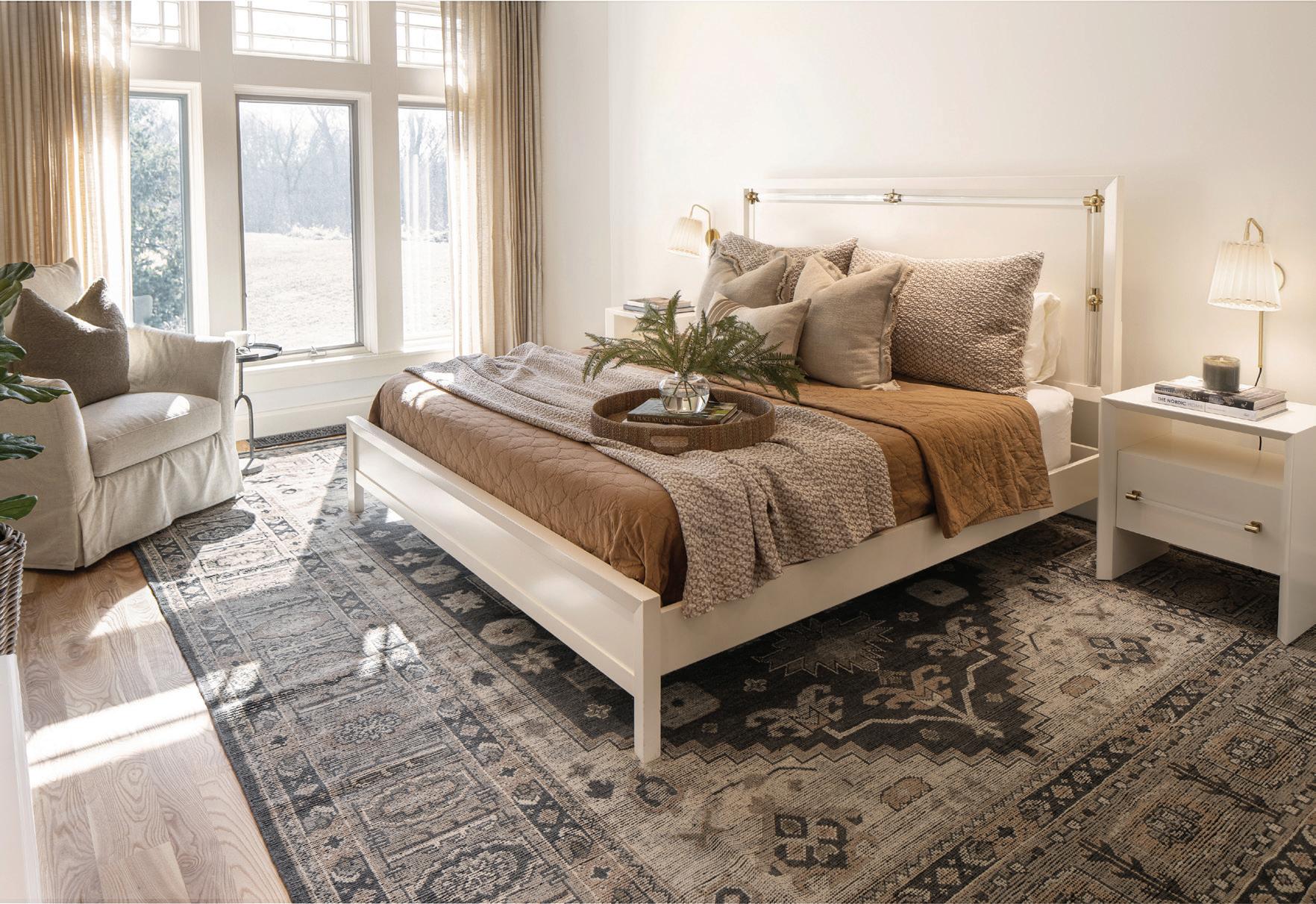
A dated, traditional style doesn’t necessarily mean stagnation. In fact, this style can often serve as a canvas for innovation. When I took on this project, I knew The Grove would need an extensive renovation, but I also knew it was an opportunity to extend its original character while bringing in many new functions better suited to the current homeowners.
Although the primary suite felt outdated, it embodied the essence of traditional architecture, including well-crafted woodwork,
moldings, and natural materials that speak to timeless design. These classic elements contributed to a remarkable transformation, including an elegant facelift for the fireplace, new paint, updated fixtures, cozy fabrics, and bespoke furnishings from McNeal & Friends.
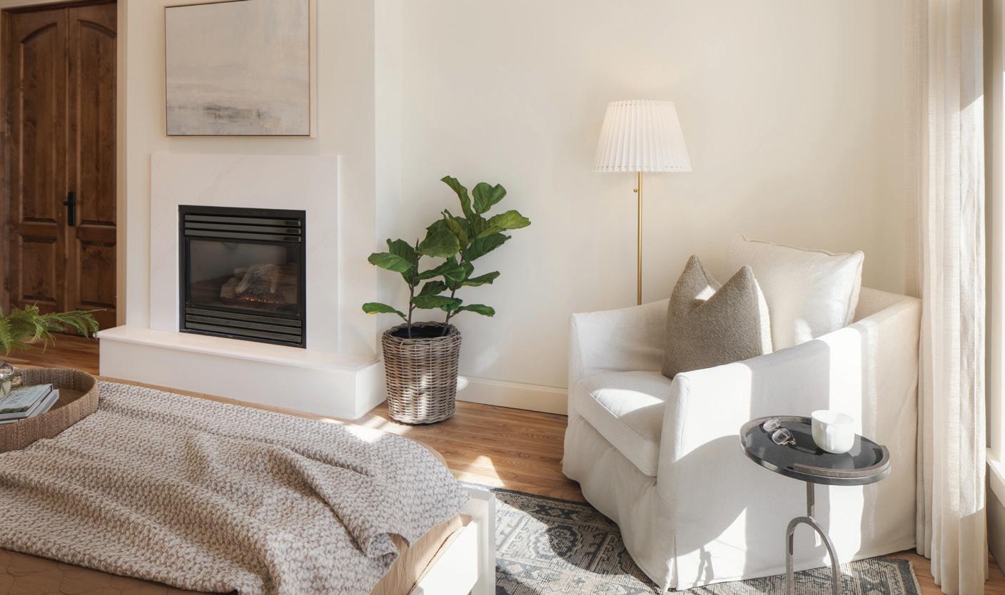
Here, we framed out the fireplace to give it a more modern shape, and on the hearth, we brought in the same quartz stone and stoneedge profile that we used in the bathroom and closet. I really wanted these spaces to be brought together intentionally and tastefully,

so I carried this quartz stone and edge profile throughout the primary suite.
In preparation, while design dreaming, scheming, and ordering product, I felt it was important to reflect the architectural language in both the furnishings and materials. Our furnishings brought a whole new level of character to the space, including a cozy reading corner, art that spoke to my clients, and refreshed bedding that chimed in on the rich wood tones throughout the suite.
Before After
NORTH & NEST MAGAZINE | 13

AfterBATHING BLISS
The bedroom was just the beginning of the suite’s transition to a dream retreat, which also included renovation of the bathroom’s separate toilet room, a small seating lounge, shower, tub area, and sink vanities.
The prior built-in jacuzzi was used often by my clients and their young children, but I wanted to update the tub area and make a statement with the incredible Memoirs freestanding tub from Kohler – a true, modern-traditional dream bath.

Before

14 | SPRING 2024


What was once a traditional makeup vanity, is now a cozy sitting area for the kids to enjoy when their parents are getting ready. As a vanity, this was not a fulfilled space for the current homeowners, so it made sense to incorporate a set of lovely slipcover chairs that are durable, washable, and comfortable for everyone in the family.

NORTH & NEST MAGAZINE | 15
Before
In both the toilet room and walk-in closet, classic maple cabinetry combines with the fresh modern twist of reeded glass. Floor-toceiling cabinetry can feel visually heavy, but this combination of materials helps the eye flow weightlessly through the rooms.


CURATED CLOSET
Through the doorway from the bathroom, my next task was to re-imagine the his-and-hers walk-in closet, leveraging storage space, display areas, window positioning, and natural daylight. The addition of custom cabinetry and a spacious island creates a harmony of form and function for the clients. The priority of storage for our clients was overhead, hidden

storage for large items such as suitcases, backpacks, yoga mats, and other household items. The display space features reeded glass that protects items from dust and sun damage. There are also RFID lockable cabinets and drawers to keep items safe and out of reach from children.
Throughout all the suite’s renovated spaces, I married classic character with modern materials, playing to an atmosphere that was designed to evoke timeless elegance.
Every detail was designed with intention, from the paint color paired with the existing trim color to the traditional stone-edge profile on the countertops and fireplace. I also carefully chose hardware finish and classic art pieces that would reflect both modern and traditional elements.
As the dust settled and the final touches were put in place, this suite felt rejuvenated and joyfully reborn, yet still steeped in tradition.
16 | SPRING 2024

Reno Reveal PHASE 2
ONWARD & UPSTAIRS
After tours of the pristine primary suite, we headed onward and upstairs to share a glimpse inside another beautiful bathroom overhaul, this time for the client’s young daughter.

The inspiration for the upstairs bathroom started with this amazing Jeffery Court marble floor. I knew the play on gold and brass tones throughout the floor would be the launching point for the rest of the details. This tile is so special, just like the little girl who gets to enjoy it.
For the cabinetry, I kept it visually light and fresh, choosing Sherwin-Williams Accessible Beige to match the adjacent desk in the bedroom. While the outcome achieved the goals of the client, I wanted to make sure this was a fun and whimsical space their daughter would love at any age.
With the primary suite and upstairs bath complete, we’re already in preparation with the client to launch a third phase of renovations, this time focused on transforming the home’s main living areas and kitchen.


In the world of interior design, where trends may come and go, projects like The Grove serve as a reminder of the enduring beauty of traditional craftsmanship and the limitless possibilities of new innovation. If you’re lucky enough to have the opportunity to marry the two together, you won’t be disappointed!
DESIGN DETAILS:
Interior Designer: McNeal & Friends (Lexi Jordheim, Lead Interior Designer)
Cabinetry: Bitz Custom Cabinetry
Paint and Drywall: Traill Painting - Benjamin Moore (Swiss Coffee)
Plumbing: TallonTed Plumbing
Tub & Plumbing Fixtures: Kohler
Hardware: Restoration Hardware

Lighting: Visual Comfort
Electrical: King Electric
HVAC: Agassiz Mechanical
Demolition: Midwest Handyman LLC
Flooring: Anderson
Hardwood Floors Tile: Imperial Tile and Flooring
the Designer: Lexi Jordheim | McNeal & Friends 3265 45th St. S, Suite 128, Fargo ljordheim@mcnealfriends.com 701.235.0031 | mcnealfriends.com
Contact
Before
Wallpaper: Gene’s Paint and Decorating
After
NORTH & NEST MAGAZINE | 17

HAWTHORNE HOME
After completing her master’s at the University of Bristol in Bristol, UK, then living in Minneapolis and Manhattan, this local designer has happily returned home to Fargo’s historic Hawthorne neighborhood. Emily Johnson, an alumna of Concordia who was raised in Moorhead, grew her passion for residential architecture cross-country and overseas, finding inspiration in classic English kitchens, Art Deco cityscapes, and well-crafted British tradition. In this issue, Emily invites readers inside her design firm, Hawthorne Home by Emily Johnson, and the renovation of her family’s 107-year-old home.
BY Tracy Nicholson & Emily Johnson
PHOTOGRAPHY BY Jill Ockhardt Blaufuss

MEET THE DESIGNER
Hawthorne Home by Emily Johnson
This time, I asked Emily to take the reins and tell her story because frankly, she's more qualified for my editorial role than I am. To give you a little background, Emily earned a communications degree with a minor in English from Concordia in Moorhead. After moving to the UK to attend the University of Bristol, she earned her master's in English Lit, which led to a career in digital content marketing. As a hint foreshadowing her future, Emily chose the work of author Thomas Hardy for her master’s thesis, which explored his awareness of Impressionistic uses of light and color, fragmentation, and point of view – all defining the importance of "place."
Designer Emily Johnson with her two Scotties, Pip and Ollie
18 | SPRING 2024

In 2017, Emily and her husband, Brady, had been living in Manhattan for two years when they packed up and moved home to downtown Fargo, allowing Brady to further his career as a software executive. Emily continued her work as a marketing manager at an ad agency, having been invited to telecommute. Shortly after, expecting their first child, the Johnsons bought their historic home and started the extensive remodel. One year later, they moved in and began what Emily refers to as “Slow Design,” a process of taking time to experience and live in the space before adapting it to their life, now expanded to two sons (2, 5) and two cherished Scotties.
In 2021, Emily went back to school, this time for a career with Concordia’s International Admissions Team. She loved her work with international students but, at the end of 2022, Emily stepped off-campus and into her longheld passion to pursue interior design full-time. Her vision is to preserve and reimagine classic interiors and create warm, layered spaces that embrace the craftsmanship of a bygone era for modern living – hoping to bring elements of English estates and cozy ‘snugs’ home to the Midwest. BEFORE


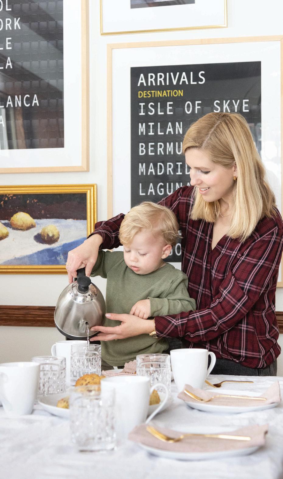
Grab a spot of tea and settle into the settee as Emily takes you on the full tour of her renovation, with a glimpse inside her recent interior design projects!

POWDER ROOM SUNROOM MAIN FLOOR LIVING ROOM
NORTH & NEST MAGAZINE | 19
AT HOME WITH EMILY
From our very first walk-through, we knew the gorgeous sight lines would dictate design decisions on the main level. The leather sofas anchor the room with approachability (hello, children and dogs!) and complement the varied color scheme. At first or even third glance, it’s easy to miss the palette of pinks, blues, and greens but, look again, and there they are, adding life and a bit of whimsy.
Above all, we chose things that felt durable and affordable. Nothing is too precious or offlimits except that extraordinary bouquet from Prairie Petals.
FUN FACT
We fondly call our home
The Dylan after learning Bob Dylan himself lived in our attic in the summer of 1959! In 2021, The Forum did a story on Dylan’s time in Fargo and included our home.


Sunroom
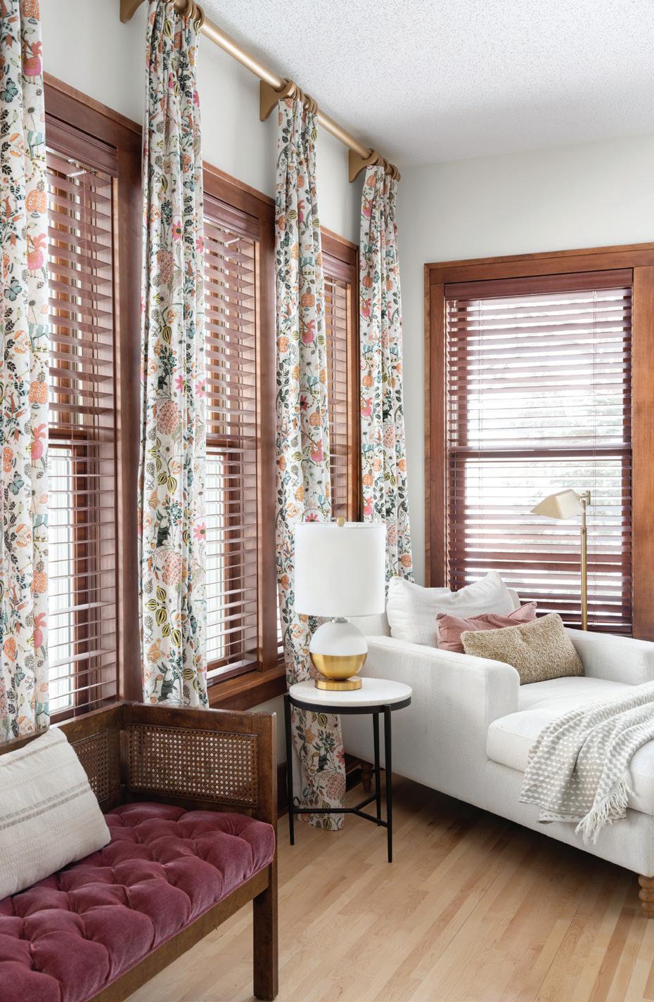
I feel so lucky to live in a home with a sunroom. This sun-drenched room has always been my favorite but went underused for the first couple of years. Designing slowly, however, allowed me to really feel out how to use the space.
Like many families in the past few years, a second home office had become essential, along with more storage. An open and underused wall in the sunroom had the potential to achieve both. Kaeli Bernier from Wendt Custom Cabinets understood our vision from the get-go and did one better by maximizing every inch of available space in the floor-to-ceiling built-ins. I still can’t get over the flawless corners and moldings.
The pinch-pleat curtains make the room feel taller and add a cheerful textural layer. Prior to these, I’ve always made do with off-the-rack drapes, but this whimsical fabric was too special to overlook.
Replacing the cracking hexagon tile with thin maple-board planks made the room feel larger and more in keeping with the rest of the home. Painting the built-ins in rich color (Benjamin Moore Backwoods - the same color as our basement), simply felt right. The overall effect feels serene and inviting, and after years of living with my books packed away in boxes, I thrill every time I see them.
20 | SPRING 2024

Powder Room
We’re fortunate that a powder room had already been added to the main level, but the design felt out of place with the character and history of The Dylan.
We laid the groundwork for a timeless aesthetic with a maple board and batten and this moody, multicolored William Morris wallpaper - Blackthorn - which restates the living room color palette.
Layering in thoughtful textures and shapes, like the shapely brass mirror, slim porcelain pedestal sink, and simple milk glass pendant further elevate the allure of this little space.


Jungle Nursery
This room was such fun to create! Our now five-year-old son, Wilder, is wild indeed, so a jungle theme was an easy decision. I had the idea for a large-scale mural only because Brady didn’t want me painting yet another room.
I specifically opted for a neutral palette to give the mural staying power and appreciate how it feels both playful and restful. The Jenny Lind bed feels like it could’ve been here a hundred years ago but finding an equally beautiful dresser online proved futile.
We needed a good mix of practical options for storage and display, and I think the maple dresser we designed in partnership with JSM Woodworks achieves both. I think of it as a future heirloom. Going custom with the dresser also ensured we had ample room for a vertical acrylic shelf that holds an array of storybooks.

NORTH & NEST MAGAZINE | 21
Woodland Nursery
Initially, I was concerned the navy walls would make this small room feel smaller, but I couldn’t be more pleased. They read clean and crisp and complement the variety of textures and tones. From the antique rocking chair to the brass figurines, oatmeal-colored curtains, and timeless furnishings, this room feels comfortable and inviting. The raccoon print melts me every time.


Primary Bedroom
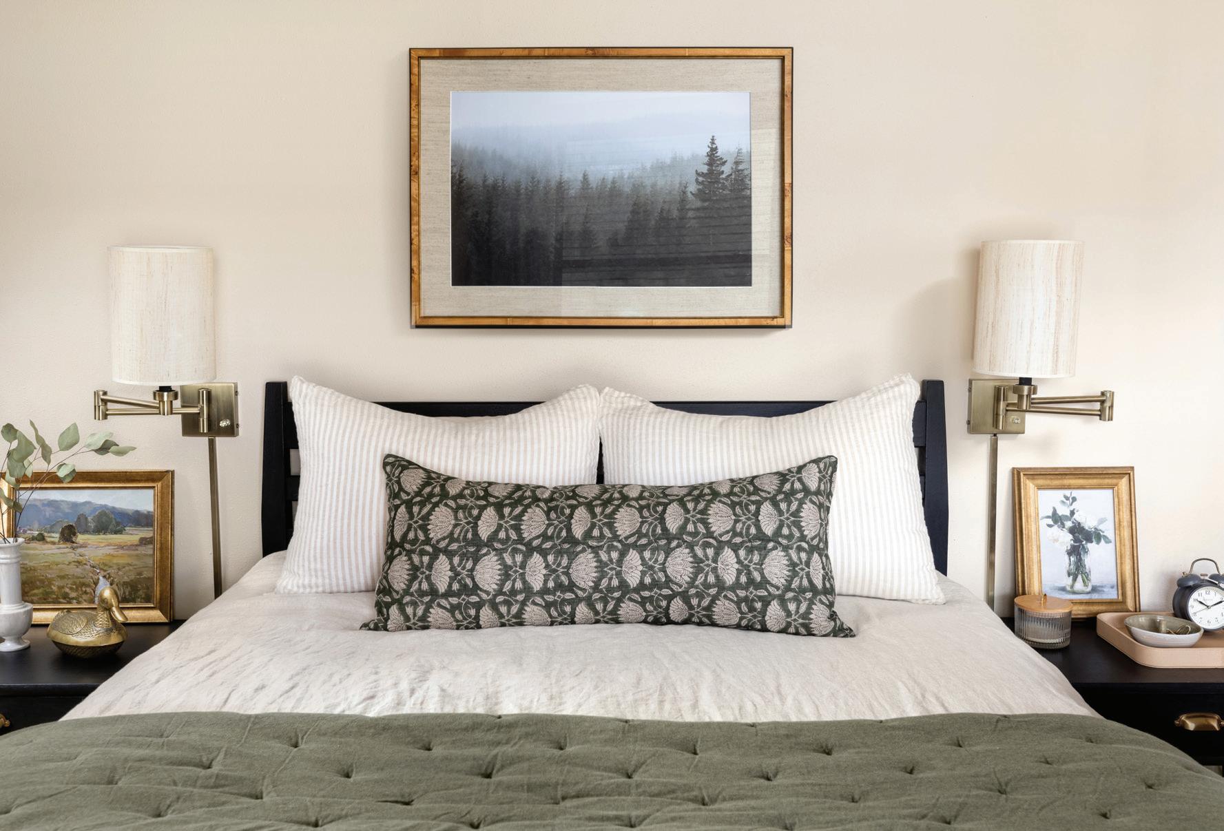
It’s best not to ask how many paint pots I went through to find this pale beige-y pink, but it casts our room in such a cheerful glow. With so many wood tones, painting our existing bed frame and nightstands matte black pared things back and grounded the palette.
22 | SPRING 2024


Basement Family Room & Bar
Finishing the cold and empty basement had always been on The List but, in August of 2021, with a two-year-old and another baby on the way, more space became the priority.
Creating a dedicated playroom for the boys was certainly a consideration, but ultimately, we wanted a room we’d enjoy now and well into the future. One that could host social nights at home, serve as a cozy, relaxed movie room, and provide a little more storage.
Inspired by our spectacular trip to the Northwest Scottish Highlands and our stay at The Torridon, a boutique resort in Wester Ross, we envisioned Scottish Pub meets English Snug – both a gathering place and private retreat.
Encasing the whole of the room in board and batten evoked the coziness of classic British interiors and informed every subsequent design decision. We chose the brass and glass bar shelves for their visually light and airy feel and appreciated the creamy tones of the woodsy wallpaper. Both elements are rich without feeling heavy. Funnily enough, we get the most compliments on the carpet! The pattern reminded us of Scottish tartan and allowed us to forgo an area rug.
Old homes are notoriously short on storage, and The Dylan was no exception. With not a single closet on the main level, creating a beautiful and generous home for outerwear was a top priority.

We found the space at the bottom of the stairs and made use of every last inch with eight cupboards and a deep drawer perfect for stashing hats and mittens. Because Fargo.
NORTH & NEST MAGAZINE | 23
BEHIND THE DESIGN
Basement Family Room & Bar
Wallpaper: Cole & Son Woods in Stone & White, Decorator’s Best
Window Treatment: The Little Blind Shop (Hunter Douglas Blinds)
Custom Cabinetry & Wardrobe: Braaten Cabinets
Carpet: Carpet World Fargo
Electric Fireplace: Hebron Brick
Countertop & Hearth: Calcutta Gold Quartz, Northern Stone Fargo
Construction, Painting & Millwork: Dawson Contracting
Brass & Glass Wall-Mounted Shelving: Iron Abode
Leather Sectional: West Elm
Coffee Table: Antique/family heirloom
Ottomans: Studio McGee for Target
Formal Living Room
Leather Sofas: Hom Furniture
Coffee Table: West Elm
Black Marble Side Table: OROA Trade
Blue Armchairs: West Elm
Area Rug: Rugs USA
Art Trio: Artist Susan Hable, McNeal & Friends
Original Oil Paintings: Artist Kali Benson
Mid-century Modern Cabinet: Facebook Marketplace
Antique Secretary’s Desk: Family Heirloom
Brass Art Lights: Amazon
Sunroom & Home Office
Built-in Shelving & Desk: Wendt Custom Cabinets
Maple Floors: Kadoun Hardwood Flooring
Original Painting: Artist Susan Boyd
Chaise Lounge Chair: Interior Define
Patterned Drapes: Custom - Calico
Side Table: Target
Tufted Bench: Facebook Marketplace
Table Lamp: HomeGoods
Floor Lamp: Lamps Plus
Powder Room
William Morris Wallpaper: Spoonflower
Oval Mirror: West Elm
Slim Pendant: Home Depot
Pedestal Sink: Kohler
Maple Board & Batten: Hawthorne Home
Primary Bedroom
Bed Frame/Nightstands: Ethan Allen
Wall-Mounted Lamps: Lamps Plus
Bedding: Etsy & West Elm
Art: One Kings Lane
Accents: Vintage & thrifted
Faux Leather Tray: Gathre
Wilder’s Room
Jungle Mural: Munks and Me
Elephant Print: Sharon Montrose
Maple Dresser: Hawthorne Home / JSM Woodworks
Dresser Accents: Vintage & thrifted
Jenny Lind Bed Frame: Crate & Kids
Bedding: Pillowfort & Handpicked Goods
Nightstand/Table lamp: HomeGoods
Huck’s Room
Dresser & Crib: Pottery Barn Kids
Rocking Chair: Family heirloom
Nightstand: HomeGoods
Art: Minted
Abstract Wall Hanging: Jungalow by Justina Blakeney

Client Projects
The Palm Beach Eat-in Kitchen
Good friends of ours recently moved into a newly built Spanish-style house in sunny Palm Beach, and I’m so grateful to help make it a home. It’s spacious and gorgeous but, in its newness, lacked a bit of warmth and originality.
Creating livability and character became the cornerstone of the project, beginning with the eat-in kitchen. The only space for a dining table fell between the kitchen island and the back door and so, along with being on the smaller side, it serves as a pass-through.
With these challenges in mind, we capitalized on vertical space and selected furnishings with a slim but impactful footprint. Tiling a bare wall in a floor-to-ceiling marble mosaic felt true to the home’s Spanish design and delivered immediate definition. A richly toned wood credenza created a bit of rusticity and paired nicely with custom brass shelving. Layering in a woven pendant and a pair of rugs brings further warmth and comfort. Altogether, this little area feels special and is an ideal spot to linger over a cup of coffee or chilled martini.
The adjoining family room will be revealed on my Instagram. Get ready for board and batten and more gorgeous textures and materials.

24 | SPRING 2024

The Victorian Family Room
From the enviable natural light to its generous proportions, there are so many things I love about this circa 1900 living room. Its stunning original features inspired much of the design and the rich, lost-in-the-forest green brought it to life.
The custom wall paneling feels like it was always here and enhances the new details — from the window seat reupholstered in William Morris’ “Blackthorn” to the pillowy linen curtains.
This room may be grand, but it’s also practical for a young family. The vintage Ethan Allen shelf has ample display for books and trinkets, the deep window seat drawers tuck away toys, and the minimalist children’s table (selected in lieu of another side table) provides dedicated space for the littles. Taken together, the room is comfortable and inviting and, best yet, awash with life.


Feeling Thrifty?
Emily’s favorite places to find thrifted and vintage pieces include The Arc in North Fargo, Sulaine’s Antique Mall in Detroit Lakes, and FM Antiques, which recently relocated to 3218 HWY 10 East, Moorhead.
Follow Emily’s Inspiration
To fuel timeless design inspiration, Emily follows Michigan-based interior designer Jean Stoffer. Find Stoffer’s work on “The Established Home,” featured on Chip and Joanna Gaines’ Magnolia Network. You can also read Stoffer’s 2022 book, “Establishing Home, Creating space for a beautiful life with family, faith, and friends.”
Contact the Designer:
Hawthorne Home by Emily Johnson
emily@hawthornehomeinteriors.com
hawthornehomeinteriors.com
Instagram: @hawthornehomebyemily
NORTH & NEST MAGAZINE | 25
Comfort

Nestled into north Fargo’s Edgewood neighborhood is an unexpected offspring borne from thoughtful, small-scale innovation. One could even say it’s a new lifestyle blueprint designed by Craftwell Architecture + Construction and the home’s evolving family of four. Intriguing yet unassuming from the streetside, this Scandinavianstyle home invites exploration around every well-crafted corner. The home eliminates unnecessary square footage while reimagining the concept of comfort with minimalist materials, sleek lines, inspired art, and surprising twists. From the front yard’s native prairie grasses to the backyard pool, indoor climbing wall, and sauna, this smaller home is living large.


 BY Tracy Nicholson PHOTOGRAPHY BY Scott Amundson & Dan Francis Photography
HYGGE HOME
Designed for the modern family, Craftwell balanced the demands of working parents with the power of play and highperformance design that’s environmentally agreeable. At the homeowner’s request, the Craftwell team, including Principal Architect Chris Hawley, with project managers Grant Simonson and Johan Joubert, leaned into sleek Scandinavian minimalism, weaving in condo-style comforts to suit the family dynamic today and into retirement.
“The owners love Scandinavian and contemporary design, so they brought a fun style that’s really well done,” said Hawley.
“When we started the project, we talked about life with kids; the owners had kids later in life, so they didn’t want to completely abandon their more sophisticated taste. The whole main floor is similar to a condo – the kids have their space below, and the adults have theirs above, with comfortable space on both levels for family. There aren’t a lot of overly sized spaces; it’s just a really comfortable home, with a design centered around the pool and outdoor features they love.”
Chris Hawley Johan Joubert Grant Simonson
CRAFTWELL ARCHITECTURE + CONSTRUCTION
26 | SPRING 2024
SMALL-SCALE SOPHISTICATION
The family’s home is just over 3,600 square feet, and every inch of its design was intentional. “They didn’t want a big house; it’s just a really comfortable house. When you see it from the street, it has a cool aesthetic, but it doesn’t seem that big,” said Hawley. “Moving throughout the home, there are 10-foot ceilings on both levels, white oak doors and flooring, and a lot of little pockets of space you wouldn’t expect to see.”
“The homeowners came from an urban place, where they had lived in several smaller, yet really nice condos and houses – they had a lot of life experience from their travels and understood how they truly use a space,” said Hawley. “The kitchen and pool area were big priorities, and the window quality was really important to them. Aesthetically, everything else was pretty minimalistic; they wanted to really use and designate a purpose for every space in their home.”

CORNERING INDOOR/OUTDOOR CONNECTIONS
Stepping inside, the right-sized foyer opens to the main living space and an inviting stairwell that leads down to the kid’s lower-level quarters. A few feet further is the home’s centerpiece, a stunning kitchen that neighbors a family seating lounge and entrance to the primary suite, 3/4 bath, and sauna. Tucked around the corner is a pantry, mudroom, lounge, and cocktail bar – all showcasing an appreciation for highquality craftsmanship and simple Scandinavian forms.
NORTH & NEST MAGAZINE | 27


“This was such a great project, mostly because the clients were incredibly fun to work with; they had a fantastic sense of style,” said Bayer. “They took great care in making selections and understood the value of every detail. Our Leicht cabinetry fit so well into what they were trying to accomplish; sleek but not overstated, and super functional. We integrated this design throughout the bathrooms, mudroom, closets, bar, and even the laundry. Projects like this only come together with a carefully curated group of people involved. Craftwell, along with everyone else on the job site, made it happen.”
The architectural kitchen was designed to live seamlessly at the heart of the home, showcasing impeccable Germanmade cabinetry design by Minneapolis-based Belle Kitchen, with lead designer Tricia Bayer. The perimeter counter, backsplash, and kitchen island, with Galley workstation sink components, are all designed with Dekton slabs, a compressed quartz, porcelain, and glass material highly resistant to scratches, stains, and heat.
The Belle Kitchen design features Germanengineered Gaggenau appliances and premium Leicht cabinetry. “Tricia was amazing to work with – we absolutely love these cabinets, and the installer was a perfectionist,” said the homeowner. “The cabinets don’t have any pulls, so with just a touch, they open automatically, and we love that every one of the drawers is lit from within.”

28 | SPRING 2024


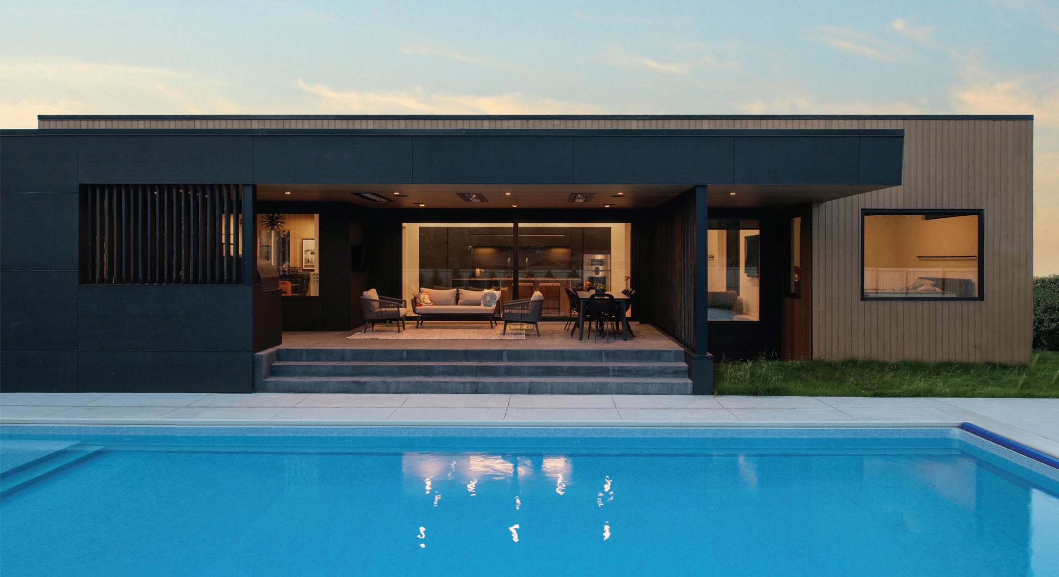
The kitchen and main living wrap around an outdoor kitchen, dining, and pool area, with a separate entrance leading from the pool to the indoor 3/4 bath and sauna. The outdoor space directly connects and opens to the kitchen through an 18-foot, soft-close patio door and window installation from Innotech.
“This patio door and windows are triple-paned, so when we were working on the home in the middle of winter, we only used the basement’s floor heat and the temperature was perfect,” said Hawley. The whole house is super energy efficient, and the windows are highperformance – they don’t get condensation, even in the middle of January.”
Using stained cedar and steel dowels, along with a steel plate and knife detail, the home’s screen walls and stair railings were collaboratively designed and installed by Straightline Design, Craftwell, and Eric Berg Construction.
NORTH & NEST MAGAZINE | 29
ELEVATE THE ORDINARY
Throughout the home, Craftwell worked with Eric Berg Construction to elevate the eye with a refined pattern of white oak plywood ceiling panels, black joint reveals, and an oil and wax finish, adding a more contemporary, squared recessed lighting.

Overlooking the pool and outdoor kitchen with a wood-fired pizza oven, three heaters in the deck’s ceiling lend comfort to outdoor dining throughout the cooler months. Here, screen walls are used for privacy from neighboring views to the outdoor kitchen and pool area. The backyard patio was designed by Bryan Leininger of AGL Landscape Architects, with pool installation by Troy Derheim of My Aquatic Services.

WELL-CRAFTED COMFORT
Keep traveling around the kitchen’s fluid corners to another cozy seating lounge outfitted with Mid-century modern and Scandinavian furnishings, accented by a collection of regional, nostalgic, and pop culture art installations. Here, 60s-style furnishings, like the vintage B&B Italia bubble chair, play to the European influence of the ceramic woodburning stove from Wittus. Designed by Adriano Design Studio, the stove is handcrafted in Italy by La Castellamonte, using ancient clay working techniques and a ceramic baffle for optimal combustion.
30 | SPRING 2024
Within this more sophisticated lounge is a 70s-inspired cocktail bar with a custom banquette and leathered black Dekton countertops, once again including cabinetry design by Belle Kitchen. Based on Belle Kitchen’s design, the banquette was custombuilt by Randy’s Booth Co. and then assembled in the home by Belle Kitchen. The banquette’s abstract sputnik chandelier is one of the home’s few decorative lighting pieces chosen by the owners, with most rooms focused on maintaining a recessed-lit, gallery-style space.
In the more public spaces of the home, the owners worked with Fargo’s Scan Design and the Minneapolisbased ROAM and MartinPatrick3 Studio to add some of the finishing design touches, including a largescale Prince installation. The home also features hand-selected photographs from American lens legend Slim Aarons, renowned for capturing the essence of socialites, jet-setters, and celebrities.


On the far wall of the lounge is a trio of paintings the owners discovered while visiting Seattle – noticing the artist’s “701” area code and discovering it was a Devils Lake artist, Leslie LaFleur, who was pursuing her doctorate in Art Psychology at NDSU. The paintings were created with pinecones and newspaper, all modeled after her personal interpretation of her clients’ emotions.
NORTH & NEST MAGAZINE | 31

PRIMARY PERFECTION
Just around the corner from the main living area is the home’s primary suite, including a minimalistic bedroom design and bath with heated tile, double sinks, and a walk-in rain shower. Further into the suite, the owners’ expansive closet system and laundry utilize another Belle Kitchen design, hidden behind sleek Leicht cabinet panels.

CRAFTY CLIMBING
Just beyond the bar is an unexpected view, offering guests a glimpse through tempered glass into the two-story climbing wall that ascends from the family’s lowerlevel gym. The climbing wall was a perfect narrow-space solution, embracing the homeowner’s love of the mountains.
“It’s pretty cool that they can be entertaining upstairs while the kids are having a blast climbing from downstairs –all with a clear visual of the wall,” added Hawley. “It’s a super fun layout; this is just one of many little moments that open up as you move through the house.”
“This home is perfect for entertaining indoors and outdoors—the entire back side of the house focuses on entertaining, outdoor living, and pool space—which really drove the project,” said Hawley. “It’s not a very big house, but it lives big; its connection to the backyard doubles the entertainment space.”
“We don’t have a lake cabin and we have close family on the lake that we can visit, so our backyard is our version of a cabin,” said the homeowner.

32 | SPRING 2024
LOWER-LEVEL LIVING
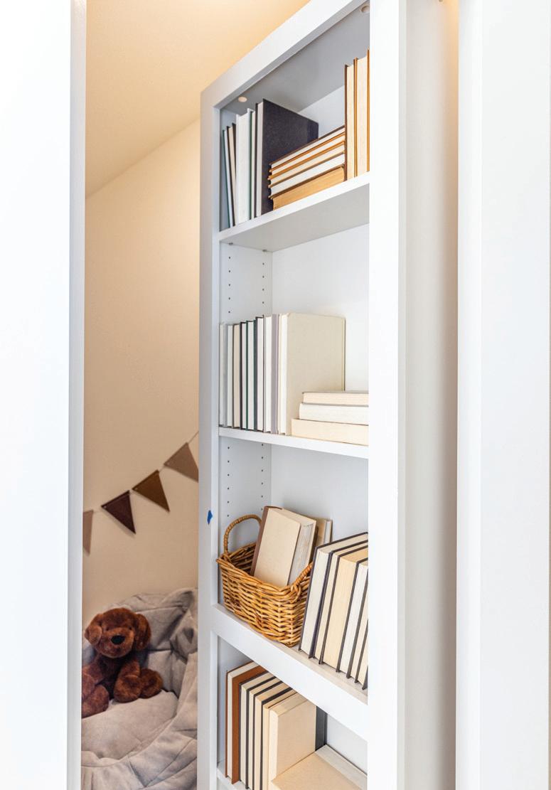
Since the lower level caters to the couple’s two kids (6 & 10)—including a casual living room, glassed-off workout space, and a two-story climbing wall—Craftwell kept it simple with polished concrete over a heated floor that warms the entire house. The basement also designates space for a home office, Gaggenau wine fridge, under-stair laundry room, hideaway playroom, and a large, shared bathroom, complete with double sinks and a custom tiled shower.
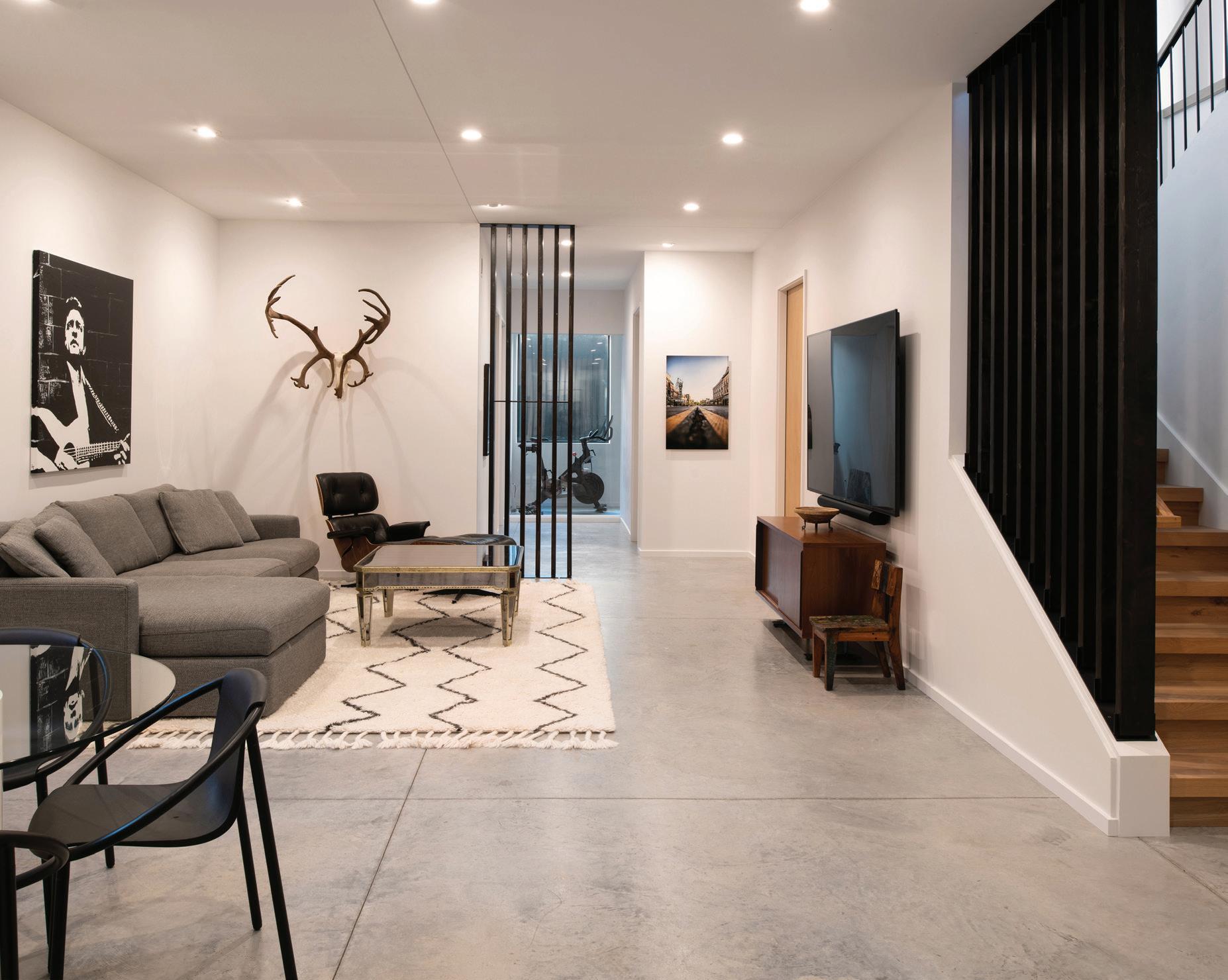


The lower level’s 23-foot climbing wall was an added element of fun, ensuring unused space found its purpose. To complete the custom climb, the owner sought out local expertise from the past owners of Nature of the North, and Craftwell worked alongside Eric Berg Construction to finish the design, including safety mat features and TruBlue iQ autobelay catch-and-hold technology.
NORTH & NEST MAGAZINE | 33
WHAT I LOVED MOST ABOUT THIS HOME WAS THE UNORTHODOX APPLICATION OF MATERIALS, THE SIMPLE FORMS, AND THE REALLY UNIQUE LAYOUT. IT’S DIFFERENT THAN ANY OTHER HOME I’VE EXPERIENCED, AND THE WORKMANSHIP IS INCREDIBLE.”
CHRIS HAWLEY PRINCIPAL ARCHITECT

LOW-MAINTENANCE LIFESTYLE
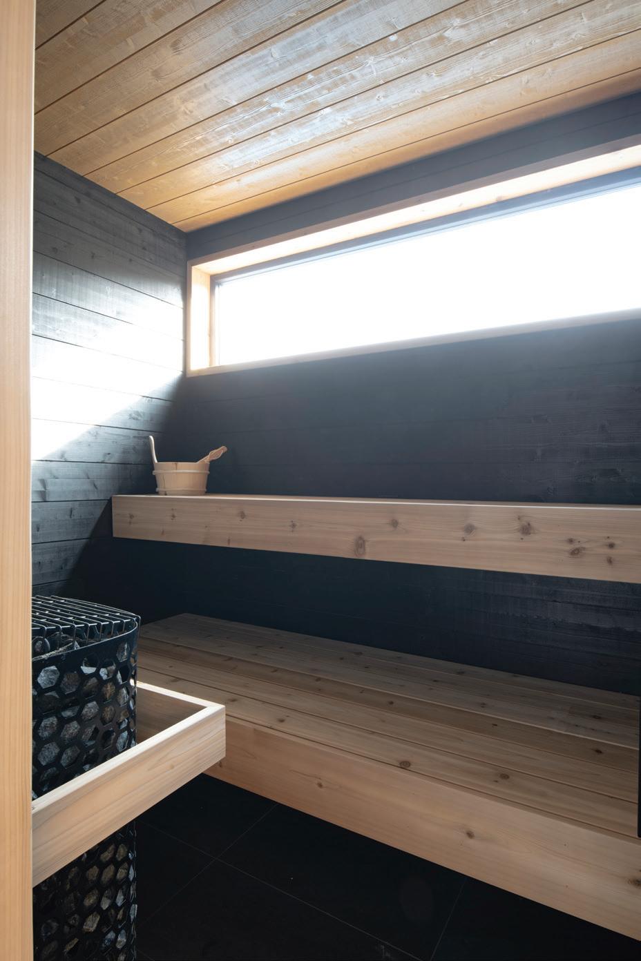
The exterior cladding of the house was designed using Siparila, a pressure-treated pine Craftwell additionally used to create the home’s indoor sauna. The exterior’s black panels are designed with Skatelite, an extremely strong paper composite material that carries its black coloring all the way through. “It’s weather-resistant and fire-resistant,” said Hawley. “Most people have seen it used in outdoor furniture, but it was originally designed for building skateboard ramps.” Skinner
Roofing also worked with Craftwell to complete the home’s contemporary curb appeal with a flat roof design that was carefully insulated, sized, and tapered to withstand the region’s snow load.
Putting the project on hold for a year during COVID, Craftwell was later challenged with navigating widespread material cost increases. “One of the ways we overcame this was finding new ways to use inexpensive materials like plywood and concrete,” said Hawley. “You’ll also notice we didn’t use any stone, not on the exterior or on the countertops. We
really tried to strike a balance between natural, low-maintenance, and cost-efficient materials while keeping with a high-quality aesthetic. We’re getting ordinary materials to go as far as they can.”
The pandemic also created challenges in securing the right craftsmen for the job. “We were really careful about selecting certain people, like Belle Kitchen, Jason Studt, and Eric Berg Construction,” added Hawley. “The kitchen, bar, and closets are beautifully designed by Belle, the stairs were hand-crafted by Jason Studt, and all the plywood details and ultra-narrow trim work are Eric’s – you can really see the meticulous quality of work in every room,” said Hawley.
"As the project and construction manager on our team, Johan (Joubert) played a big role in ensuring everything was completed as designed," said Hawley. "Also from Craftwell, Grant (Simonson) excelled as the home's project manager on the design side."
The home’s sustainable features include
its smaller footprint, lower ceilings, highperformance windows, heated concrete and tile flooring, and 100% spray foam and rigid insulation – creating one of the tightest envelops in home architecture.
“Chris and his team were awesome to work with, and we actually stayed on budget,” said the homeowner. “Eric Berg’s craftsmanship was also amazing – he was really our first choice for this project, and to see how much he cared and how immaculate he would leave the house was really impressive.”
“The homeowners were planning ahead with every detail, building a home for family now, but also using low-maintenance finishes and thinking 15 to 20 years down the road, considering how they want to live once the next phase of their lives begins,” explained Hawley. “The homeowners appreciate smaller spaces that are well done, so it was really smart to invest their money in the places where they were investing their time. It’s a great house for their life now and later, it’s easy to maintain, and it’s a perfect place for entertaining.”
34 | SPRING 2024
DESIGN DETAILS:
Architecture: Craftwell Architecture + Construction
Contractor: Craftwell Architecture + Construction
Finish Carpentry/Trim: Eric Berg Construction
Cabinetry/Design: Leicht Cabinets - Tricia Bayer - Belle Kitchen, Minneapolis
Appliances: Gaggenau from Belle Kitchen
Kitchen Sink & Inserts: The Galley from Belle Kitchen
Windows: Innotech
Basement Concrete Floor: Masterpiece Concrete
Main Level Flooring & hand-crafted stairs: White Oak by WD Flooring - Installed by Jason Studt, Materia
Hardwood Floors
Electrician: Enterprise Electric
Plumbing: Superior Plumbing
Lighting: Visual Comfort & Co. - Minneapolis
Smart System TV/Audio & Shades: Arctic Audio
Prince Art: Sourced by MartinPatrick3 - Minneapolis
Original Retro Framed Photography: Slim Aarons
Bar Banquette: Randy's Booth Co. - Crystal, MN
Pink Banquette Chairs: Scan Design - Fargo
Blue Leather Sofa: Scan Design - Fargo
B&B Italia Bubble Chair & Coffee Tables: ROAMMinneapolis
Nature Scene Photography: David K. Beavis Fine Art Photography
Colorful Painting: Rando
Mixed-Media Trio/Lounge: Paintings by Leslie LaFleur
Island Stools: Denver Modern
Square Recessed Lighting: Halo
Stair Railings/Slat Wall Install: Straightline Design
Tile Material & Install: Porcelanosa, install by CR
Custom Homes
Pool Design/Install: Troy Derheim - My Aquatic Services
Landscaping: Bryan Leininger, PLA - AGL Landscape
Architects, PC
Roofing Install: Skinner Roofing
Siding Materials: Siparila & Skatelite by Richlite, Install by Dew-it Construction
Wood-Burning Ceramic Stove: Round Stack
Scambiatore - Wittus
For more information, contact:
Craftwell Architecture + Construction
2534 S. University Drive #3 | Fargo, ND
701.478.4600 | info@wecraftwell.com
CHAarch.com


Meet with Christina and Shantel to view the area’s widest selection of tile and stone!
Shantel
Fagerholt Sales Specialist
Visit Our Showroom!
Christina Lindstrom Showroom Sales

FARGO’S PREMIUM SHOPPING DESTINATION


Colfax MEADOWS
White Wolf Custom Homes | A+A Home Designs
Get your one-finger wave ready (pointer finger, please) because we’re headed straight out of Fargo and into the country, roughly 25 minutes south of the city. Maybe Colfax, pop. 270 hasn’t been programmed into your navigation yet, but it definitely should be. This small town is home to Colfax Meadows, a growing rural neighborhood that offers a whole lot more than meets the eye. If the countryside views, beautiful homes, and two-year $150,000 tax exemption don’t lure you in, its 3/4-1 acre lots, great K-12 school, community pool, and $10,000 college grants might just seal the deal. This is a road trip that introduces you to a trio of lead characters, including the hometown developer Nathan Berseth, homebuilder and designer Amanda Fisher, and Realtor Nancy Kelly.
 BY Tracy Nicholson |
PHOTOGRAPHY BY Jill Ockhardt Blaufuss, Micah Zimmerman, Tiffany Olsen
38 | SPRING 2024
Photo by Amdak Productions


SMALL-WORLD, SMALL-TOWN STORIES
Welcome to a story within a story, inspired by the kind of small-town connections that make big things happen. Fargo Realtor Nancy Kelly was the first to tell me about the new development in Colfax, ND, and I immediately understood the excitement. What she saw in Colfax Meadows is what I valued about my own small-town upbringing, plus quite a few unexpected amenities.
I was familiar with Colfax, as nearly all small towns are with each other. So, it wasn’t surprising that I happened to know one of the hometown developers, Nathan Berseth, who grew up attending Colfax’s Richland #44 School. Long ago, I knew Nathan had a ‘go big or go home’ drive, so it seems fitting that he’s managed to achieve both. In fact, since he started developing his hometown, the population has nearly tripled.
In Colfax for the first time in over 20 years, I was surprised to see a community pool, ice rink, and beautiful park setting. Next, I toured the new development and a beautifully
designed home I could have happily moved into yesterday. When I met the homebuilder and designer, Amanda Fisher – the story went full circle. Growing up, I didn’t know Amanda, but soon found out she was raised in the same region and currently lives less than a mile from my family’s farm in Fairmount, ND. And as I suspected, she’s also known Nathan for years. This is the kind of small-world, small-town story that has a beautiful ending.
COUNTRY COUTURE
Amanda Fisher and her sister, Alicia Holubock, with White Wolf Custom Homes and A+A Home Designs, recently completed this captivating model home, a beautiful slab-on-grade twostory, with a storm room, four bedrooms, and two-and-a-half baths in the countryside of Colfax Meadows. With nearly 3,300 square feet of finished space, Fisher took the lead, crafting an elegant introduction to the home’s chef’s kitchen, cozy living room, and spa-like primary suite. Fisher’s design concept focused on elevating finite details and finishes for an unforgettable first and lasting impression.
 From Left: Nathan Berseth, Amanda Fisher & Nancy Kelly
NORTH & NEST MAGAZINE | 39
Photo by Tiffany Olsen

To bring this vision to life, Fisher met with Berseth as he was developing Colfax Meadows, ultimately, discussing a 3/4-acre lot while anticipating plans for her first model home as lead designer and general contractor. With aligned goals, Berseth and Fisher joined forces, ensuring an outstanding community asset. “Amanda’s vision and design strengths were quite obvious,” said Berseth. “She may have had a bit of trepidation jumping into her first model build, so I simply encouraged her. For me, the experience was great; bringing a beautiful home to add to our community. I hope Amanda and Alicia continue to share their unbelievable talents with this community.”
Although their first model home, A+A Home Designs and White Wolf Custom Homes have been working towards this endeavor for several years, gaining valuable home design and remodeling experience from around the region. Being a homebuilder and designer wasn’t always part of Fisher’s plan; she had earned an Ag Economics degree from NDSU, while her younger sister Alicia earned hers in Interior Design.
In the years after college, marriage, and kids, both sisters made the decision to work for the family farm alongside their dad and husbands. In the family business, the two sisters were tasked with leading the design and construction of buildings for a new branch of the family farm south of Wahpeton. This complex project was the catalyst for Alicia’s return to interior design, and Amanda’s discovery, delving deeper into a longtime interest in architecture and design. With friends and family taking note of their work on the farm, the seed was planted and the duo’s portfolio quickly grew, this time out of the field and into client’s homes.
“I’d always had a love of residential architecture, so I started by looking into drawing house plans and eventually went back to school to take drafting classes at NDSCS in Wahpeton,” explained Fisher. “I was lucky to have a great mentor, Phil Stahl, who is an architect out of Fargo. We met a few times, and when I had doubts, he was someone who kept encouraging me.”


40 | SPRING 2024

CHEF’S KITCHEN
Inside the design of the home’s stunning chef’s kitchen, Fisher leveraged full control of cabinetry design and layout, enjoying the ability to move walls as needed and create the symmetry and space her design required. “When we first started A+A, we felt it was really important to be able to manage the cabinetry design, including understanding all the components and brand features,” said Fisher. “This need to educate ourselves in the quality of cabinetry and kitchen design is what eventually led us to Crystal Cabinets, a line manufactured in central Minnesota.”
In the model, Fisher chose a premium alder Crystal cabinet, offset by white quartz from Northern Stone, a CopperSmith range hood, Samsung Smart appliances, and vintage lighting accents from Crate & Barrel. Here, the beauty is in the details, some you can see, and some cleverly camouflaged. Fisher’s custom design includes a a nine-foot island with two-sided storage and cabinet counter hideaways, so daily appliances can be easily accessed but kept out of sight.
The picture-perfect butler’s pantry is Fisher’s favorite space, brought to life with a whimsical Mid-century mod wallcovering from

Spoonflower. The pantry was designed to have a place for everything, incorporating an array of organizational cabinetry features, including hidden appliance storage, open shelving, pullouts, and produce baskets.
“This house is so well-curated – down to the smallest detail in every room,” said Realtor Nancy Kelly. “You can tell a house that’s been worked on from the ground up by the same person. She didn’t just come up with a floor plan and hand it off to someone else. Amanda made sure every detail was cohesive, and you can really feel how well it flows from room to room.”

NORTH & NEST MAGAZINE | 41
COLFAX COUTURE
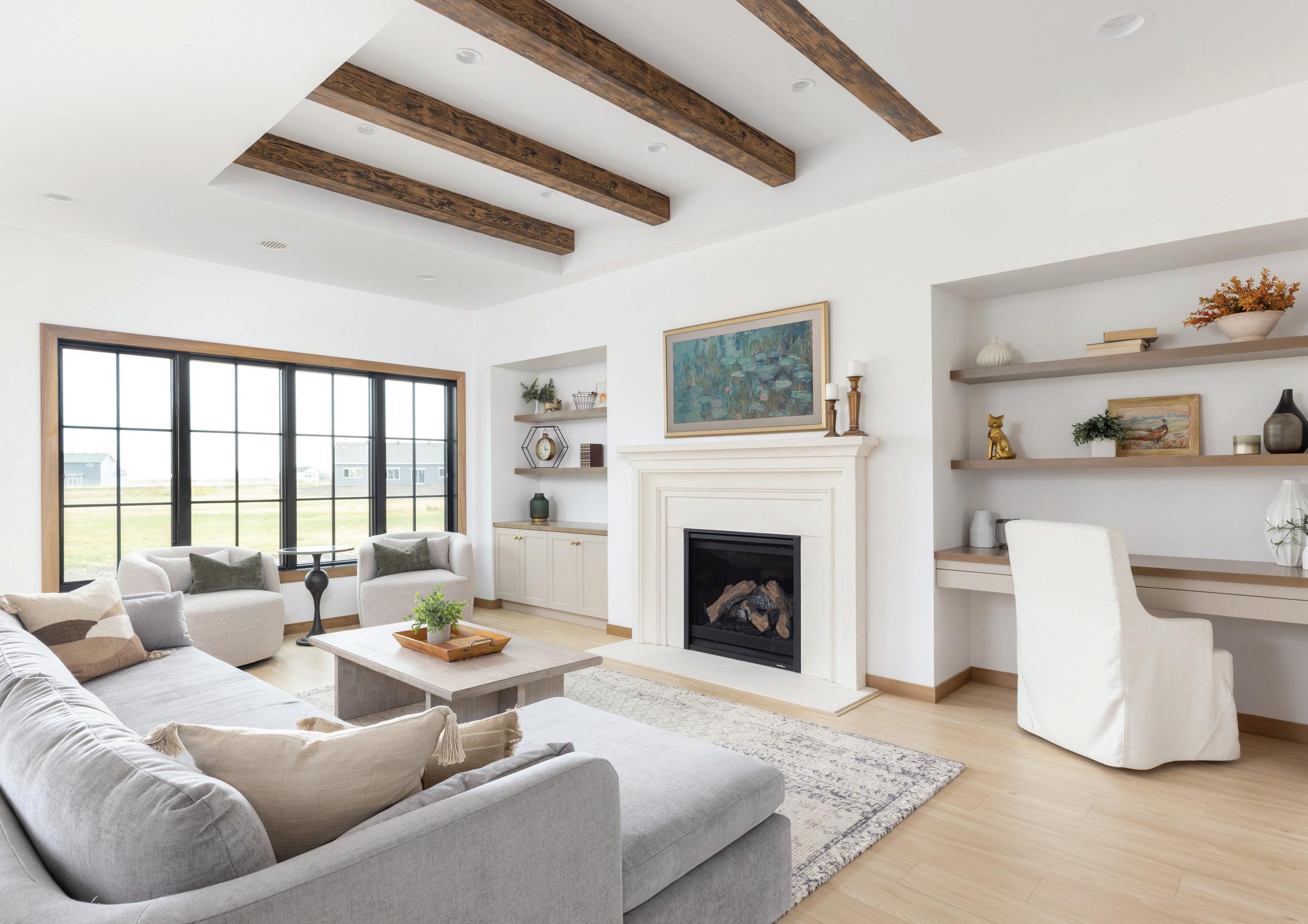
With an open view to the kitchen and dining area, the home’s spacious living room creates a finale for Fisher’s transitional fusion, inviting the eye to a tray ceiling and wood-look beams. The elegant cast stone fireplace features functional book-end built-ins that carve out a stylish space for artwork, heirlooms, and media storage. The transitional style of the main living area is anchored by heated floors and a beautiful Shaw laminate from Carpet World.
The home’s expansive Andersen 400 Series windows were considered a prominent feature in Fisher’s overall design, offering two neighboring walls of wow factor set off with black mullions for a contemporary take on traditional.
“What I’m most proud of with this home is how well it came together, becoming that bright, airy, and open space that I had envisioned from the start,” said Fisher. “With a more transitional design, it feels like it strikes a really good balance, not too modern or too traditional.”
“What I’m most proud of with this home is how well it came together, becoming that bright, airy, and open space...”
AMANDA
FISHER A+A HOME DESIGNS WHITE WOLF CUSTOM HOMES
42 | SPRING 2024

PRIMARY SUITE
In the main floor’s primary suite, Fisher designed a custom window seat with calming tones, traditional elements, and modern touches, like the black-framed and mirrored barn door, which captures and reflects outdoor views. “This was originally a metal pantry door I found from Rustica,” said Fisher. “It was intended to have a mirror only on the bathroom side, but I really liked the effect of having it mirrored on both sides, extending into the bedroom space.”
In the primary bath, Fisher chose knotty alder Crystal cabinetry in its natural tone, along with quartzite countertops in Mont Blanc, transitional sconces, LVT heated flooring, and glass shower doors from Red River Glazing. “To bring more elegance to this bathroom, I decided to do the tile around the vintage soaker tub,” explained Fisher. “I also worked with Northern Stone to fabricate a quartzite ledge that extends from the tub to the shower.”

DESIGNING THE DETAILS
“I think what’s different about this house and its design is the depth of detail. I am a very detailoriented person, sometimes to a fault,” laughed Fisher. “I love diving into every part of design and thinking outside the box. Even on the most basic projects, we’re always looking at ways to make simple design elements unique and different.”
Fisher also designed the primary’s wellorganized closet system, a service she provides through A+A Home Designs.

NORTH & NEST MAGAZINE | 43

With the laundry room’s proximity near the front foyer, Fisher opted for stylized function with painted cabinetry in Neutral Beige, elegant York wallcovering, a utility sink, plenty of fold and hang storage, and a laundry chute extending from the second floor – a feature she includes in nearly all two-story home projects.

ONWARD & UPWARD
Stepping up to the second story, Fisher accented the path with an alder and metal railing that leads to three upstairs bedrooms and a spacious bonus room with a wet bar and walk-in closet storage.


To maximize shared space, Fisher designed an extra-large bathroom with a “universal” design concept. This layout creates privacy and separation between the toilet room, shower, and sink area, allowing simultaneous function for more than one person. The upstairs laundry chute is cleverly hidden within Fisher’s cabinetry design.

44 | SPRING 2024
RURAL RETREAT + BIG CITY REACH
On the search for a slowdown from the fast pace of the city, many families are looking outward, considering the 25 or 30-minute drive to small towns like Colfax a less-crowded commute that’s looking better all the time.
“Having grown up in Colfax, moving away, and then moving back, I realized the phenomenal childhood we had growing up here,” said Berseth. “We knew our neighbors and the multi-generational relationships that were created continue to this day.” Berseth really gets why families want more – in fact, he has been actively involved in economic development throughout the state of North Dakota, where he witnessed communities that were struggling and those that were thriving. Berseth also serves as a county commissioner and is currently on the Richland #44 School District school board. Living only 25 minutes
from Wahpeton and Fargo is convenient for his position at Bell Bank.
In 2006, Berseth teamed up to create a plan for Colfax Meadows with Bill Davis and a childhood friend, Scott Gauslow. “We envisioned an extension of our town where kids could have the opportunity to be raised in a safe environment,” explained Berseth. “We wanted them to enjoy all the wonderful opportunities we had growing up; from backyard wiffle ball to all-day swims in our community pool.”
“Colfax is really fortunate to have a forwardthinking city council,” said Berseth. “They recognize the opportunities that lie ahead and are planning for the future while maintaining the unique sense Colfax brings to its residents.”


SMALL TOWN, BIG SAVINGS
In Colfax Meadows, buyers who want to save big have come to the right place. “Right now, homebuyers can take advantage of a 4% seller credit, which can be used for an interest rate buy down or towards closing costs on select homes in the development,” explained Realtor Nancy Kelly. “For example, on a new home purchase of $470,000, buyers would get $18,800 to apply at closing. Paired with the two-year $150,000 tax abatement, I think buying in Colfax Meadows is a smart move.”
Approximately 25 minutes down I-29 from Fargo or Wahpeton, Colfax Meadows’ Third Addition offers both 3/4-acre and one-acre lots with city water and sewer, as well as Highspeed fiber-optic internet for the demands of remote workers. Homebuyers may also be surprised to find out that each lot allows a 1,000-square-foot outbuilding.


GIFTED GRADUATES
Families in Colfax can breathe easy knowing that all graduates of Richland #44 School, are given the extraordinary gift of a $10,000 college/post-secondary education grant. The school district, including the communities of Colfax, Abercrombie, Christine, and Galchutt, was gifted nearly $5 million from the foundation of Darrel Hendrickson.
Coupled with the foundation, the school district has an active Dollars for Scholars program that additionally gifts hundreds of thousands of dollars to graduating seniors. “The school district is fantastic,” said Kelly. “Last year, scholar graduate gifts averaged around $28,000 per student, with some students exceeding that after Dollars for Scholars and the $10,000 grant. Colfax is really focused on building the next generation. Class sizes are small, there’s a 14:1 student/teacher ratio, and room for every student to play sports and join activities. This is like a private school without the private school price.”
Nathan Berseth, Developer
Photo by Tiffany Olsen
NORTH & NEST MAGAZINE | 45
Nancy Kelly, Realtor
"Today, our families are the greatest ambassadors for our community. Just ask any Colfax resident about the benefits of living here – make sure you have a few minutes!"
NATHAN BERSETH COLFAX MEADOWS DEVELOPER

COMING HOME TO STAY
In asking Berseth what surprises people most about Colfax, he responded, “That there is a Colfax! It’s a hidden gem, and once people explore it, they fall in love with the small-town feel. When they move here, they enjoy the larger lots but really appreciate the deeper connection to their neighbors and community.”
These days, Berseth lives just outside of Colfax on his family’s farm with his wife Janelle and daughter Bianca. He gives most of the credit to them for their “confidence and patience” as he navigates the adventures of reimagining his hometown.
“I was very fortunate to have Scott Gauslow and Bill Davis start this venture with me,” said Berseth. “Today, our families are the greatest ambassadors for our community. Just ask any Colfax resident about the benefits of living here – make sure you have a few minutes!”
For more information, contact:
Design Sources:
Home Builder: White Wolf Custom Homes
Interior Designer/Staging: A+A Home Designs
Kitchen Lighting: Crate & Barrel
Sink Lighting: West Elm
Flooring: Shaw laminate, Carpet World Fargo
Tile & Install: Tile Bar, Install by Northern Stone
Cabinetry: Premium alder, Crystal Cabinets
Countertops: White quartz, Northern Stone
Pantry Wallcovering: Spoonflower
Laundry Wallcovering: York
Wallcoverings: Install by A+A Home Designs
Tables & Sofa: West Elm
Dining Chairs: Pottery Barn
Club Chairs: Wayfair
Fireplace Insert: Home & Hearth
Fireplace Mantel: Cast stone, Mantelsdirect.com
Ceiling Beams: AZ Faux
Appliances: Samsung Smart, Nielsen Electric Home
Appliance - Wahpeton
Range Hood: CopperSmith
Plumbing: Iverson Plumbing - Wahpeton
Plumbing Fixtures: Waterfront Kitchen & Bath
Windows: Andersen 400 Series, Crane Johnson
Lumber Co.
Millwork: Builders First Source - Wahpeton
Glass Shower Doors: Red River Glazing
Soaker Tub: Vintage Tub & Bath (online)
Electrical & Heating: Aurora Plumbing, HVAC, & Electrical - Hankinson
Siding: Score Brothers Construction & Siding
Paint Colors: Neutral Beige
A+A Home Designs
9098 State Hwy 127 | Fairmount, ND
701.640.8014
amanda@aahomedesigns.com
aahomedesigns.com
Colfax Meadows
Nathan Berseth
701.388.3549
nathan@blbinvestments.com
colfaxmeadowsnd.com
Take a Tour!
Nancy Kelly Realty
1404 33rd St SW #B | Fargo, ND 701.306.0486
Nancy@nancykellyrealty.com
nancykellyrealty.com
Sadie Alter Photography
46 | SPRING 2024


She Overcomes SHE OVERCOMES
Haute Revolution Masquerade
She Overcomes was founded in 2020 to empower female founders in our community, and well, sometimes it takes hosting a masquerade to shatter the glass ceiling. In one night of celebration, local artistry, performances, and storytelling, we danced to our own beat and invited everyone to unmask in support of women’s personal and professional progression. Fueled by raw and heartfelt stories of triumph and transformation, this event was all about helping local women from all backgrounds build and grow their businesses. She Overcomes is giving area women the tools to overcome the barriers that stand in the way of our biggest, boldest breakthroughs.
BY Melanie Iverson Rudd
EVENT PHOTOGRAPHY B y Olivia Alnes
48 | SPRING 2024
THE MASQUERADE BALL: HAUTE REVOLUTION + WOMEN’S HISTORY MONTH
We all wear masks, probably far more than we’d like to. I wanted to create a space where it was safe to remove those masks and build an authentic community that supports each other, instead of competing for fear of lack of resources, connections, and business.
Growing in courage and confidence is about doing something out of our comfort zone, noticing how it feels and celebrating the win.
After growing my own business, as founder of Mosaic District, Fargo’s first female-focused coworking space, I celebrated by completing a 6,000-square-foot renovation to give other women a supportive space to succeed. Now, I’m getting back to my “why” behind the original launch of She Overcomes, to see women’s lives transformed.


STYLED FOR CHANGED
This year, our event was MET Gala-themed to inspire our community to expect the unexpected – with their wardrobe, their masks, and our night in downtown Fargo. It only made sense to celebrate Women’s History Month and our relaunch together. It allowed us to acknowledge how far women’s rights have come while also casting a vision for the future.
Each artist was given loose photo inspiration, the vision for the night, and a blank mask to style for the live runway fashion show. This year, we partnered with Josef’s School of Hair, Skin, and Body to style the female models alongside Halberstadt’s on Broadway to style the men. Each artist had three models designated for each look, but only the artist’s mask was bid on by the audience. Proceeds from the event are invested right back into our community for our scholarship fund that serves local women.
NORTH & NEST MAGAZINE | 49

Behind THE MASKS

MASK #1 RYAN FRITZ
Bold, vibrant typography dominates Mask #1 by Ryan Fritz, commanding attention with its striking contrast of red, black, and white hues. In its intricate design, each letter stands tall, conveying a message of strength and resilience. The red typography, like flames of determination, ignites against the stark backdrop of black and white, symbolizing the intensity of emotions and the clarity of purpose. Through carefully chosen lettering, the mask becomes a conduit for communication, amplifying the wearer’s voice without uttering a sound. It speaks volumes about identity, passion, and the unwavering spirit within. This mask isn’t a protective covering; it’s a statement—a manifesto written large upon the face—a testament to the power of language to inspire, to empower, and to unite.


MASK #2 ALICIA HAUFF
Though her multimedia work is publicly based at the intersections of art, science, natural history, and folklore, Alicia Hauff’s creativity reaches into subterranean and ethereal realms. This piece is inspired by her reconnection with Northern European ancestral roots and animist worldviews. In exploring, tending, and healing these roots, an archetypal feminine presence is felt as a guide and protector. This guide is Freya, the ancient Norse goddess of love, war, fertility, death, and divination. She wore a cloak made of falcon feathers, and anyone who wore it had the power of flight. She invites us to stand in our sovereign power, grounded in authentic self, embracing duality. We can be soft and fierce, compassionate and boundaried, playfully free with wise vision. Just as she loaned her falcon cloak to others, may we loan our cloaks to help others take flight.


MASK #3 EMILY BROOKS
The creation of this mask began with the artist stitching out machine embroidery onto a material that is washed away, leaving only the thread behind. The mask was then adorned with billowy fabric reminiscent of a bustle during the Renaissance era. Outstretched feathers reach towards the sky, representing a Phoenix’s rebirth. Handcrafted fabric flowers further tie in the satin fibers, and jewels create a flash of sparkle as the wearer captures the light. The large piece on the left side of the mask is created out of satin fabric and feathers.

MASK #4 ASHLEY RIECK

Facing her fear of masks, Ashley embarked on the journey of crafting one that spoke to her artistically. In the midst of what seems like a prolonged COVID hangover and ongoing battle with various illnesses, she opted for a plague mask. Her intention was to fashion a mask that exudes beauty on the surface while subtly revealing the imperfections emerging beneath the chin. She believes that if one consistently wears a mask without addressing underlying illnesses, whether mental or physical, those struggling will inevitably surface over time.
50 | SPRING 2024


MASK #5 KATE BALDOCK
Reflections: The meaning behind Kate’s mask is quite simple. She really loved the floral and mirror pieces together, and as she was creating it, she was thinking about how what we reflect onto the world and other people matters. Are you reflecting joy, love, and forgiveness in your life? When we reflect beautiful things, it makes ourselves and others better.


MASK # 7 STEPH ASTRUP
The inspiration for this mask comes from The Black Swan. The color signifies the evil of the spell that was cast on the princess, with butterflies showing transformation of hope, crystals bringing strength and purity, and lace protecting the heart. All are surrounded by the gracefulness of feathers.

MASK #6 TREVER HILL
When designing this mask, the materials and meaning reflect Trever’s process of designing a home. The small pebbles were handpicked from a wallcovering and then hand-applied one at a time. The disco ball mirrors are representative of celebration and an element of surprise Trever enjoys using in decor. On the forehead of the mask is upholstery fabric, and the medallions on each side (along with the cross) are family heirlooms. The two circular medallions are connected directly to the straps to hold the mask to the face; unattached to the mask itself. The long nose represents the additional disguise of facial features, and ultimately, emotions we’d rather remain unseen. The fringe transforms that disguise into visually protruding joy, provoking pride and unbridled acceptance of our unique individuality.


MASK #8 AMANDA RYDELL
With the resurgence of 70’s pop culture in fashion and design, everything old is new again, including the timeless, shimmering influence of the disco ball. Just like its creator at Handpicked Goods, this mask is a symbolic and literal reflection of past and present, vintage and new. With 32,000 mirrors handpicked, then hand-applied, this one-of-a-kind mask finds full appreciation with even the slightest touch of light - translating color and movement that speaks to the soul. The unending sphere gives its wearer permission to dance, casting its glow and silently encouraging our existing connection to light and each other.


MASK #9 HATTIE MANDAN
Starting with a leather base from another purchased mask, Hattie wanted her mask to feel like it was organic, growing, and moving. She used artificial plants, wire, and velvet for construction. Hattie spent several hours researching shape and forms in head pieces and masks used on runways. She came up with this piece using several black velvet leaves she shaped and placed so there could be a working, textured background for leaves and plants showcased in many different angles. Ultimately, she wanted the wearer of the mask to feel beautiful and wild.


MASK #10 MELANIE SIMMONS
Offering a nod to our present balmy winter, as well as the middle American’s quintessential love of a good rain, Melanie’s piece foregoes the ethereal and precious to favor a more expansive and hyperbolic look. To achieve this without being too heavy, the lion’s share of the body is made from expanding spray insulation and found ribbon. The scaffolding is constructed from lightweight wire frames and small trellises. Other materials include Reindeer moss, faux floral, manzanita branches, and sparkles.
NORTH & NEST MAGAZINE | 51

SHE OVERCOMES
CONNECTING THE DOTS
Unmasking
This journey to unmask didn’t start on a whim. I have struggled my entire life with overcoming the fear of failure or paralysis by perfectionism that keeps ideas in iterations instead of executing with confidence. As a child who was raised by a teen mom, I know the complex struggles women face. I speak from experience when I say there are so many barriers to our success.
Ten years ago, a man broke into my apartment and assaulted me, breaking my nose and shattering the last shred of self-confidence that I had left. At 32-years-old, I felt like I deserved it. I’d made so many stupid mistakes and continued patterns that were damaging to my confidence and self-worth. I thought I put myself in that position to be hurt.
GIVING MYSELF GRACE
After a year of wearing a mask and pretending to be ok, I made a decision to overcome generational trauma so my children could see what a strong woman looked like. Without a formal program or formula to follow, I embarked on a journey to become the woman I wanted to be, personally and professionally.
I took a deep breath and a break from my consulting company to work for an organization whose goal was to help women and children who’d been recovered from human trafficking. My personal journey to overcome my fears and change history began in the heart of Fargo but brought me to the Middle East twice in one year to work with refugee women who’d suffered far more than I had. While practicing gratitude, I began growing in confidence and celebrating small wins.
LAUNCHING SHE OVERCOMES
This season of my life gave me a new perspective and freedom to try new things, fail, and try again until I found my voice again. If I was to make a difference, I needed to practice overcoming my paralyzing fear of public speaking. So, I put my name in the hat for Mrs. North Dakota International 2020 and won –forcing myself to overcome my fears, take the stage, and start She Overcomes with the help of my friend Jennifer Schillinger.
We launched our cohort-based program to help local women build and grow their businesses and leadership capabilities. After a successful pilot program anchored with community support and enthusiasm, I paused our programming after our first Masquerade Gala in 2021. I spent that year raising funds to scholarship all eight women through the program and awarded our top three winners with grants to grow and scale their companies. Additionally, for each dollar raised for those local women, She Overcomes invested in helping four women who had been recovered from human trafficking with micro-grants to launch their businesses.


52 | SPRING 2024
THE BREAKTHROUGH
With She Overcomes, I allow my story of overcoming to be a catalyst for other women’s lives. Today, I’ve taken a decade’s worth of life lessons and research and put it into an eight-module program to help other women overcome the mindsets that keep them small. Most women who take this course aren’t stuck the way I was; the majority are simply a mindset away from their next breakthrough. They simply want to be a part of something much bigger than themselves.
This program and years of research explain why women must grow in confidence, increase calculated risk-taking, and build authentic communities. Forbes reports on a broken system that impacts 75% of female executives in the name of the Imposter Syndrome. While women can only work so much on themselves, we must be the catalyst for changing the institutions and biases that keep many of us silent, unseen, and unheard in and outside the boardroom. We need both men and women to close the gap on these systematic behaviors, not only during Women’s History Month.
As disappointing as it is to look back and see the ways I should have advocated for myself or negotiated better for myself and other women, I’m still learning ways to speak up. I’ve seen myself in many of those statistics, but I’m not a statistic. I’m a mom. A daughter. A founder. A Fargo-proud business owner. I love that these statistics fuel my motivation to keep passionately pursuing the mission of She Overcomes; to see women’s lives transformed.
Learn More About She Overcomes: sheovercomes.co.
Find Your Shine:
To join the summer and fall cohorts, head to the website and apply. We will be hosting sessions in two separate formats – one that is eight weeks and one that is a weekend retreat experience for an intense deep dive into shining the way you are meant to. All women are encouraged to apply!
 MELANIE IVERSON RUDD She Overcomes Founder Mosaic District Owner
NORTH & NEST MAGAZINE | 53
Photo by Elisabeth Eden


Just 16 miles southwest of downtown Fargo, we found small-town luxury living in Horace, ND’s Lost River development. This striking six-bed, five-bath home by Designer Homes captures every beautiful inch of the half-acre wooded view (sans backyard neighbors). Scouting out inspiration, we took a 5,408-squarefoot tour with the home’s Design Specialist Brook Skjerseth, and Construction Manager Luther Zeltinger. From its dreamy kitchen and butler’s pantry to its glassed wine wall, secret kid’s nook, and primary suite with private hot tub – this home (and neighborhood) is the epitome of detail we don’t want to live without.


THE LEGACY OF LOST RIVER
In Horace, ND, much of the Lost River land had been built on a family legacy that runs 130 years deep, all centered around the Sheyenne River and an abandoned river channel that now flows through the development’s forests, meadows, and prairies. This land, located inside the Sheyenne Diversion, had been truly loved by the Samuelson family, so much so that six generations had lived at the property’s 1889 farmhouse.
Brook Skjerseth, Design Specialist Luther Zeltinger, Construction Manager Designer Homes
Robert Leslie, Owner/Agent Designer Homes | RE/MAX Legacy Realty
BY Tracy Nicholson
INTERIOR PHOTOGRAPHY BY Chase Evert
PORTRAITS BY Dan Francis Photography
56 | SPRING 2024
EXTERIOR PHOTOS BY Jacob Siiro


Today, that family’s vision to share the future is a pristine reality, giving other growing families a beautiful place to call home. The Lost River neighborhood merges unfiltered beauty with a well-manicured 5.89-acre park, including walking paths, a hockey rink and skating pad, soccer and baseball fields, and courts for basketball, tennis, and pickleball. Beyond sports and family fun, Designer Homes owner, Robert Leslie, saw Lost River as an ideal backdrop for anyone who appreciates the tranquil nature of North Dakota at its finest.
DESIGNER HOMESTEAD
Newly built and ready for move-in, this Designer Homes beauty has made its home in the 7th Addition of Lost River’s development. The home’s main floor features 2,022 square feet, including a large office, entertainer’s dream kitchen, spectacular living room, and spacious primary suite – all perfectly positioned to capture wooded backyard views.
Designer Homes’ Design Specialist Brook Skjerseth leaned into a transitional style, fusing elements of Mid-century modern, craftsman, and contemporary finishes, which are introduced with the foyer’s board and batten detailing.
NORTH & NEST MAGAZINE | 57


THE ART OF COOKING
At the heart of the home is where Designer Homes’ precision meets passion, creating a true entertainer’s dream kitchen, complete with a dry bar, a glass wine wall, a 10-foot quartz island, and Décor White Rift Oak cabinets in custom stain and Sherwin-Williams Black Fox. Beyond the matte black and champagne gold hardware accenting elegant cabinetry
from Floor to Ceiling Carpet One, Skjerseth elevated the space with layered lighting and ceiling beams from Distress City Millwork, a supplier in Pequot Lakes, MN. Skjerseth completed the chef’s kitchen with paneled Signature Kitchen Suite by LG appliances, lighting, and plumbing from Ferguson Bath, Kitchen, & Lighting Gallery.
58 | SPRING 2024


CHEERS!
The Designer Homes’ dream kitchen extends to the butler’s pantry through a sliding barn door, offering access to a second refrigeratorfreezer, two walls of built-in cabinetry, open shelving, Décor White Rift Oak cabinetry, and quartz Woven Wool countertops. “The kitchen is my favorite part of the house – I love the color of the stain, but I also love the features in the pantry,” said Skjerseth. “It’s just as beautiful as it is functional.”
Creating a transparent focal point between the great room and the kitchen is a glassed-in wine wall, illuminated from within, accessed on the kitchen side, and collaboratively designed by Frontier Glass and Designer Homes.
“It’s pretty typical to see people adding one or two of these interesting features in their home, but it’s not very often we see all of them together like we do in this house,” said Zeltinger.

NORTH & NEST MAGAZINE | 59

FLOOR-TO-CEILING DESIGN
“In the great room, Rob’s priority was capturing the view and connecting indoors to outdoors,” said Skjerseth. “The vaulted ceiling, along with the height of the windows gives the main floor a wide-open luxury feel.”
The great room also features a tongue and groove poplar ceiling in the main living area, accented by elements of stone, glass, and steel. The exquisite feature wall and linear fireplace showcase a Hebron stone and custom steel sheeting design by Mahan Metalwerks, with masonry by Ottertail Stucco and Stone. Surrounding this feature, Designer Homes included art lighting and custom built-ins in stained Décor White Rift Oak with champagne gold hardware.
“With fantastic craftsmanship from several longstanding subs, these details came together beautifully, making it a unique and well-built home.”
BROOK SKJERSETH DESIGN SPECIALIST DESIGNER HOMES

60 | SPRING 2024


PRIMARY SUITE
This Designer Homes’ primary suite is a full-on retreat, featuring a herringbone patterned poplar ceiling and a built-in, private hot tub with glass-paneled railings to immerse oneself in the view. “We wanted the whole house to feel really open, including those extra details that make it a luxury home, like the private hot tub, with direct access from the primary suite,” said Skjerseth. “Every room has an exceptional detail that’s designed to stand out.”
The primary suite also features a luxury bathroom with a floating double vanity, heated floors, heated bidet toilet room, a spa-style shower surrounded by elegant glass and continuous tile, and a closet full of customizable shelving from Lamperts. The bathroom’s cabinets are a Décor White Rift Oak in a custom stain and SherwinWilliams Black Fox, with Carrara Breve quartz countertops and undercabinet lighting.
NORTH & NEST MAGAZINE | 61


ELEVATED UPSTAIRS
Just past the main floor’s powder room and office near the foyer, we followed the custom waterfall railing for a fresh take on family-style design.
The home’s second level features three bedrooms and a loft flex space, with a unique Jack & Jill bathroom shared by two bedrooms, and a private bath for the third.
In the Jack & Jill, Skjerseth chose Koch Classic Birch cabinetry in SherwinWilliams Foxhall Green, with pocket doors separating the toilet room, shared shower, and walk-in closets, which feature customizable shelving systems based on storage needs.


62 | SPRING 2024


LOWER-LEVEL LUXURY
The home’s fully-finished lower level has far more than meets the eye. In fact, if you walk by the library wall, you might miss the secret play nook hidden behind the books!

More fun surprises include two bedrooms and a beautiful bath, a well-equipped workout room, a flex lounge area for dining or rec, lower-level laundry, and a spacious family room with a home theater system by Custom Cinema & Sound.
NORTH & NEST MAGAZINE | 63

Skjerseth set the tone in the wet bar with stained Classic Birch Cabinets (Koch) from Floor to Ceiling, moody quartz Manhattan Gray countertops, glass subway tile, and premium amenities for entertaining with ease. To illuminate this space, Skjerseth layered lighting within cabinetry, pendants, and recessed fixtures.

"I love that it's so private out here. Horace has a small-town feel, yet it's still conveniently close to Fargo."


BROOK SKJERSETH DESIGN SPECIALIST DESIGNER HOMES
64 | SPRING 2024


Design Details:
Home Builder: Designer Homes
Interior Design: Brook Skjerseth, Designer Homes
Construction Manager: Luther Zeltinger
Home Staging: Designer Homes, The Ellis Edit
Cabinetry, Countertops & Flooring: Floor to Ceiling Carpet One
Plumbing & Fixtures: Ferguson Bath, Kitchen, & Lighting Gallery, Precision
Plumbing
Lighting: Ferguson Bath, Kitchen, & Lighting Gallery, K&D Electric
Ceiling Beams: Distress City Millwork, Install by Prime Carpentry
Ceiling Wood: Poplar, Prime Carpentry, Stained by Professional Interiors
Shower Glass & Wine Wall: Frontier Glass
Paint Whole Home: Sherwin-Williams, Toque White – Corso and North Country
Paint Office: Sherwin-Williams Urbane Bronze – Corso and North Country
Main-Level Flooring: Anthology Parchment LVP, Floor to Ceiling Carpet
One
Closet Systems: Lampert Lumber
Murphy Door: Professional Interiors
Millwork & Railing: D&M, Professional Interiors, Distress City Millwork, Prime Carpentry
EXPLORE MORE!
Take a tour, meet the Designer Homes team, and admire this home at your own pace. Don't forget to ask about Designer Homes' $50,000 promotion for buyers to use towards landscaping, deck, window blinds, audiovisual, interest rate buy-down, or a discount to the price!
Take a Tour!
9273 Didrick Drive Horace, ND
MLS# 23-2841
For more information, contact:
Designer Homes
3250 47th St S, Fargo 701.492.5057
designerhomes.com
Home Automation: Barstad Automation
Home Theater System: Custom Cinema & Sound
Hot Tub: Highlife Collection Grandee, HotSpring Spas & Pool Tables 2
Deck: Composite Linage Biscane – Lamperts, TLC Construction
Deck Railing: Black Aluminum, Glass Panels – Lamperts, TLC Construction
Fireplace & Stone: Callaway 50, Niveo Easy Fit, Hebron Brick Supply
Stone Installation: Ottertail Stucco & Stone
Artwork: SCHEELS Home & Hardware
Custom Steel Design: Mahan Metalwerks
Windows: Pella Windows & Doors
Doors: D&M Industries
Electrical: K&D Electric
HVAC: Air By Design
Seamless Steel Siding: TruCedar from Beacon, Ironstone, Install by Knoke Seamless
Exterior Stone: Cottonwood Dimensional Stone – Hebron, Ottertail Stucco & Stone
Roofing: Shingles by Beacon, Install by Randall & Sons Roofing
Garage Doors: Doors by Fargo Garage, Epoxy by Attention to Detail
Concrete Coating
Landscape: JT Lawn Services & Landscaping

Inspired
SPACES
by NDSU Interior Design
If you missed the 2024 Red River Valley Home & Garden Show, now is your chance to tour one of its brightest highlights – the Inspired Spaces Showcase by NDSU’s third-year Interior Design students. With six teams competing, six professional mentors, big scholarship prizes, and 3,400 votes cast, we’re thrilled to share the students’ vignettes and reveal the winning design!
BY Tracy
Nicholson
PHOTOGRAPHY BY Krista Mund, Rose Marcellus, and Micah J. Zimmerman
66 | SPRING 2024
TEAM PORTRAITS BY Dan Francis Photography

RRV HOME & GARDEN SHOW + NDSU INTERIOR DESIGN
Hosted by the Building Industry Association (BIA) of the RRV, formerly HBA of F-M, this year’s Home & Garden Show was a must-see, including live entertainment, local makers, shopping, food carts, and stage demonstrations.
On the south end of the Fargodome lived six picture-perfect vignettes, carefully curated by BIA’s partnership with third-year students in NDSU’s Interior Design program. These 8’x10’ spaces were vying for votes and a generous scholarship prize, demonstrating “flex room” design concepts for home offices, playrooms, libraries, and more!
SHOWCASE COORDINATORS
Janna Koble, the BIA’s Events & Marketing Manager, created the Inspired Spaces Showcase with the help of NDSU Professor and Interior Design Program Coordinator, Susan Ray-Degges and Aletha M. Lippay, Assistant Professor of Practice in Interior Design for the School of Design, Architecture + Art.
Koble has been working alongside the Home & Garden Show Committee to elevate the event with exciting new and immersive experiences. She expressed a desire for attendees to not only admire exhibitors’ displays and photos of their work but also to experience creativity firsthand. “The concept of Inspired Spaces originated from a vision to emulate the atmosphere of browsing through showrooms or exploring stores like IKEA, where visitors can experience various styled setups for inspiration,” Koble explained.


THEME: MULTI-FUNCTIONAL FLEX SPACES
To kick off the showcase, third-year interior design students teamed up with experienced lead designers to create a theme for a flex or ancillary space for a residential environment. “Their space needed to showcase options to homeowners on how best to utilize multifunctional or extra spaces in their homes,” explained Lippay.” After completing design concept documents reflecting their chosen theme, the teams met with vendors in the F-M-WF area. Students then selected and specified products for their space, including flooring, wallcovering, furniture, and accessories.”
“The amazing BIA vendors who sponsored the spaces covered it all, including lighting, flooring, painters, structural materials, interior decor, and furniture,” said Koble. “With the help of Minnesota State Community & Technical College’s Construction Management program, our Home Builders Care President Trevor Odden, and some incredible students and volunteers, it all came together. When our Home Builders Care Foundation offered to give the winning team a scholarship, it really pushed me to see it through. Everyone involved worked so hard, and the outcome was better than we could have ever expected.”
With local design leaders, contractors, and subcontractors at their side, the students’ Inspired Spaces stole the show.
Janna Koble BIA Events & Marketing Manager
Susan Ray-Degges NDSU Professor & Interior Design Program Coordinator
NORTH & NEST MAGAZINE | 67
Aletha M. Lippay Assistant Professor of Practice in Interior Design for the School of Design, Architecture + Art
+ SEE THE SPACES Meet the Teams
TEAM #1

TEAM #2


STUDENT TEAM:
Emma Buysse | Erin Tschetter | Anna Robinette
LEAD DESIGNER: Jessica Holen – Accent Kitchen & Bath
DESCRIPTION:
This home library mixes industrial and modern design with a touch of minimalism and a natural feel.
Decor: Eco Chic Home | InterOffice | The Mix Picks
Décor, Prairie Rose Modern Art
Flooring: Accent Kitchen & Bath
Lighting: Valley Lights
Paint: Fargo Glass & Paint Co.
Paint Details: Benjamin Moore Trout Gray
Materials, Construction, & Trades: Forest Products
Direct | Minnesota State Community & Technical
College | Red River Drywall & Decorating Services | Stone Ridge Builders, Inc.

STUDENT TEAM:
Sara Laliberte | Olivia Elfman | Emma Dahl
LEAD DESIGNER: Libby Martin – Remix Design
Studio
DESCRIPTION:
This moody, modern boho home office emanates peace, personality, and productivity.
Decor: Eco Chic Home | InterOffice | Remix Design
Studio | The Mix Picks Décor
Flooring: Floor to Ceiling Carpet One
Lighting: Valley Lights
Paint: Fargo Glass & Paint Co.
Paint Details: Benjamin Moore Sea Reflections
Materials, Construction, & Trades: Forest Products
Direct | Minnesota State Community & Technical
College | Red River Drywall & Decorating Services | Stone Ridge Builders, Inc.
68 | SPRING 2024

moody-chic home office/living room space features a harmonious color palette that is a mixture of warm and cool tones.


STUDENT
Autumn
DESCRIPTION:
Decor:
Flooring:
Lighting:
Paint: Fargo Glass & Paint Co. Paint Details: Benjamin Moore Polo Blue Materials, Construction, & Trades: Forest Products Direct | Minnesota State Community & Technical College | Red River Drywall & Decorating Services | Stone Ridge Builders, Inc. TEAM #3 STUDENT
Kristen
Decor:
Picks Décor Flooring:
Ceiling Carpet One Lighting: Valley Lights Paint: Fargo Glass & Paint Co. Paint Details: Benjamin Moore Misted Fern Materials, Construction, & Trades: Forest Products Direct | Minnesota State Community & Technical College | Red River Drywall & Decorating Services | Stone Ridge Builders, Inc. TEAM #4 NORTH & NEST MAGAZINE | 69
TEAM:
Lord | Maran Ahneman | Ella Kneeland LEAD DESIGNER: Aubree Leiser – InterOffice
This
InterOffice
Floor to Ceiling Carpet One
InterOffice
TEAM:
Brotherson | Madeline Smith | Madeline Nelsen LEAD DESIGNER: Kristen Carlson – Studio Rogue Interior Design DESCRIPTION: This whimsical children’s playroom offers a unique combination of Scandinavian and Bohemian design trends.
Eco Chic Home | InterOffice | The Mix
Floor to
TEAM #5


STUDENT TEAM:
Kendra Ovsak | Makayla Thiel | Tiffany Holder | Ainsley Vinaja
LEAD DESIGNER: Jessica Sholl – Floor to Ceiling Carpet One
DESCRIPTION:
This at-home office and play space is the ultimate flex space that allows families to grow closer together while getting work done.
Decor: InterOffice | The Mix Picks Décor
Flooring: Floor to Ceiling Carpet One
Lighting: InterOffice and Valley Lights
Paint: Fargo Glass & Paint Co.
Paint Details: Sherwin Williams Evergreen Fog
Materials, Construction, & Trades: Forest Products
Direct | Minnesota State Community & Technical College | Red River Drywall & Decorating Services | Stone Ridge Builders, Inc.

STUDENT TEAM:
Joslyn Swenson | Olivia Peterson | Kenna Smith | Kylie Dew
LEAD DESIGNER: Monica Hart – Monica Hart
Interior Design
DESCRIPTION:
This space can be described as multi-functional, equipped for relaxation and all the essentials for a serene space to get ready for the day. With a warm and feminine color palette and a bohemianinspired aesthetic, this space will leave you feeling refreshed and ready to take on the day.
Decor: Eco Chic Home | InterOffice | The Mix Picks
Décor
Flooring: Floor to Ceiling Carpet One
Lighting: Valley Lights
Paint: Fargo Glass & Paint Co.
Paint Details: Sherwin Williams Quaint Peche
Materials, Construction, & Trades: Forest Products
Direct | Minnesota State Community & Technical
College | Red River Drywall & Decorating Services | Stone Ridge Builders, Inc.
70 | SPRING 2024
TEAM #6
And the Winner is...
The 2024 Inspired Spaces Showcase Winner is Team #3, with lead designer Aubree Leiser of InterOffice. The winning team, including NDSU students, from left, Autumn Lord, Maran Ahneman and Ella Kneeland, was announced on March 20 at the BIA awards event, led by BIA Chief Executive Officer Bryce Johnson.
Home Builders Care Foundation President Trevor Odden, of Stone Ridge Builders, Inc., presented the winning student team with a grand prize scholarship of $2,025. As the charitable arm of the Building Industry Association, the Foundation has continually supported students with $387,900 in scholarships, additionally gifting over $551,500 to community projects and nonprofit organizations.


NORTH & NEST MAGAZINE | 71

REAL-WORLD INSPIRATION
The BIA's Inspired Spaces Showcase unites all facets of the industry, providing students with real-world experience inside the process of building or remodeling a home.
"The hardest part was fitting a lot of things into a smaller space, but also making it come together in a cohesive way. It was really fun working with Monica Hart," said Olivia Peterson of Team #6. "She kind of gave us the inspiration of the Pantone color of the year, which was Peach Fuzz. So, we took off from there, developing the concept, color board, and floorplan. Then, we were able to go to each vendor and work on networking, which was an amazing opportunity to work with other people and designers, and then see this space come to life."
art, color, carpentry, framing, electrical, floor covering and installation. Inspired Spaces brought a different dynamic of fun, color, and imagination to the Show, but also introduced the public to the world of opportunities available to our children, not only through fouryear degrees but also two-year degrees."
"Experiential learning opportunities allow interior design students to apply their knowledge and insight within real-world contexts outside the interior design studio, letting each student share their unique skills and talents," added NDSU Professor and Interior Design Program Coordinator Susan Ray-Degges. "The collaboration with local vendors and interior designers in the F-M community was an outstanding experience for each interior design student."

Looking for More Inspiration?
Don’t miss the BIA’s Spring Parade of Homes 2024!
Take an in-depth tour of the region’s best new builds and a whole-home remodel!
May 4-6 & 11-13 paradefm.com
For more information, contact:
Building Industry Association of the RRV
BIA-RRV, formerly HBA of F-M, is a volunteer-driven nonprofit trade organization established in 1956. It consists of over 700 Builder, Associate, and Affiliate members who advocate for attainable housing and a strong building industry.
1802 32nd Ave. S., Fargo 701.232.5846 info@hbafm.com
Join the BIA: buildrrv.org

"It was wonderful to see professionals giving their time and expertise to students and helping raise awareness of the lucrative careers available in the building and remodeling industry," said BIA CEO Bryce Johnson, who also serves as Home Builders Care Foundation Administrator. "The professionals and students contributed all different areas of skills – design,
"I enjoyed watching the students put their skills and talents to the test in designing, specifying, and staging their own real-time industry-based project," said NDSU Assistant Professor of Practice, Aletha Lippay. "The Inspired Spaces event truly was a team effort spearheaded by the third-year interior design students in the NDSU Interior Design program – a project that would not have been possible without the support of the BIA and local interior designers, vendors, contractors, and subcontractors. I'm so proud of the students for what they've accomplished!"
RRV Home & Garden Show: homeandgardenshowfm.com
Support Home Builders Care of F-M Foundation: hbcfm.com
North Dakota State University
NDSU Interior Design School of Design, Architecture + Art
Susan Ray-Degges, Interior Design Program Coordinator 701.231.7218
Learn More: ndsu.edu/sodaa/interior_design/
Bryce Johnson
72 | SPRING 2024
NDSU Interior Design: Third-Year Students


TOUR OUR MODEL HOME! urbanprairiehomes.com - Locally Owned/Operated with 30+Years' Experience! - In-House Draftsman & Dedicated Subcontractors - Wide Range of Affordable Styles & Customizations - Free, No-Obligation Estimates! Jenny Schuster, REALTOR® 701.729.5851 | jennyschuster.com Joe Richards, Owner & Builder 701.866.7419 | urbanprairiehomes@gmail.com 4170 41st Ave. S. Ste. 102, Fargo, ND 58104 Open for Tours: Mon-Thurs 10am-3pm or By Apt. NEW ROCKING HORSE FARM MODEL


 Tracy Nicholson
Editor | Publisher


 BY Tracy Nicholson PHOTOGRAPHY BY Scott Amundson & Dan Francis Photography


 BY Tracy Nicholson |
PHOTOGRAPHY BY Jill Ockhardt Blaufuss, Micah Zimmerman, Tiffany Olsen


 From Left: Nathan Berseth, Amanda Fisher & Nancy Kelly


 MELANIE IVERSON RUDD She Overcomes Founder Mosaic District Owner


