ELEMENTAL SYSTEMS


Beyond the historic cityscapes shaped by individual edifices, buildings today have more roles to play than being symbolic for our cities in an age of climate crisis. In seeking sustainable solutions, new paradigms break from architectural tradition with emerging technologies, which allows new geometries to be constructed with lighter construction materials. The use of robotics and codified assembly processes to explore different outcomes in structure and infill, has moved from research experiments to the AI robotics construction industry. Patrick Schumacher believes that parametricism has brought a paradigm shift from Euclidean geometry as leitmotif of our age. But can these processes be applied in ways which will not obliterate cultural uniqueness in architecture? How do we build for the future without losing our complex identities?
Kenneth Frampton’s “Studies in Tectonic Culture” argues that the conscious cultivation of the tectonic tradition in architecture is essential to the future development of architectural form. Frampton provided a perspective on modernity and the avant-garde where structural innovation and tectonic imagination in constructional form and material character were integral to architecture as trajectories from the past. This intertwined histories of architecture and people is about humanistic and tangible aspects specific to civilisations and their geopolitical influences. Amos Rapoport’s “Culture Architecture and Design” explains why socio-cultural considerations are important in distinguishing the designer’s personal subjectivities from real user needs. But if we see solutions only as technical systems transferable from one context to the next, oblivious to climate and culture, then we would have no capacity for subjectivity in our design thinking. We will only have ubiquity. Thus the ability to understand interrelationships is essential before we can develop new ways of seeing and thinking in a range of studio design processes. Design 6 explores how architecture is a system and a means to social ends where design thinking and value judgements balance key considerations in an integrated response to all the needs of a project in a comprehensive manner.
Joseph Lim Associate Professor, Dr. NUS ArchitectureThis programme aims to develop a high level of competence in comprehensive and integrated building design, where the architectural whole is approached as a complex of systems (of production, technology,infrastructure and so on), in turn embedded within larger systems (of ecology, economy and so on). Under the guidance of their tutors, students will research and refine a conceptual system of concerns to be fully explored and developed in their architectural proposals. This involves a critical and nuanced understanding of architecture as a synthesis between constituent parts and their whole, and the creation of a whole that is greater than the sum of its parts.
Students will sharpen their competence in research, design thinking, operational skills and communication. This semester is intended as a summation, demanding that students take informed design positions incorporating all 18 studio themes they have covered. As the conclusion of this foundational sequence, students are expected to show advanced architectural thinking that will form the basis for embarking on the masters programme at DOA. They should deploy advanced and mature representational techniques to communicate architectural ideas. Design projects at
Ar. Chaw Chih Wen (Unit 3 Leader)
M Arch, BA Arch (National University of Singapore); MSA, Registered Architect, Singapore
Darlene Smyth
M Arch, BA Env Design (Dalhousie University), BA Music and Communications (University of Ottawa)
Ar. Jacqueline Yeo
AA Dip, BA Arch Studies (National University of Singapore); ARB, Registered Architect, UK
Ar. Pan Yi Cheng
AA Diploma Honours, Architectural Association; MSIA, Registered Architect, Singapore
“ Architecture is a language and I think you have to have a grammar in order to have a language. If you are good at that, you speak a wonderful prose, if you are really good, you can be a poet”. -
Ludwig Mies Van Der RoheThe Architect’s quest to become a poet often starts with a coarse-grained composition of building elements in various permutations; a bid to arrive at a novel grammar to form an architecture language. It is not until the later stages of design development that these individual elements are given due attention and articulation. This lack of interrogation of each building elements in the early stages of conceptualization suggests an implicit admission to their limits and impotency, rendering them as mere “words”; a lowest denomination. Adopting such a lens may be simplistic and hasty as there may be productive outcomes if we re-examine the rich alternative realities specific to individual building elements as unveiled in the 2014 Venice Biennale of Architecture. When surveyed in isolation, the Being of each element emerges as a potentially complex “grammar” rather than a “word”, capable of becoming an organizing principle for an Architecture. This latent potential embedded within a single building element is what forms the launching point of Unit 3. The chosen context for inquiry this Unit’s is a Food Market and Centre. Despite its continued social/ cultural significance and the evolution of our food culture (e.g. food delivery, food waste management, food security awareness),recent food market structures remain ubiquitous and banal due to overriding functional and economic consideration. The Unit challenges such banality and ubiquity by rethinking the elements of the Food and Market Center. Here the optimism in the “grammar” of individual building element is tested in each studio. Students will select up to 2 building element(s) from a list provided and through a series of probes, investigate their tectonic and performative qualities. The objective is to excavate the potential of each element beyond its narrow instrumentality. Coupling the outcomes of these probes with site responses and innovative programmatic organization, students may explicitly position their selected building elements as a system, capable of orchestrating a heterotopic food culture/experience within a single edifice.
The choice of site is the existing Mei Ling Market and Food Center first built in 1969 and renovated in 2009. Perched on top of a slope, it is flanked by old HDB slab blocks and connected directly to a Multi Storey Carpark (MSCP).
Taking cues from precedent studies (not restricted to the discipline of Architecture), students will research and develop minimum 6 micro designs (not bigger than 8m x 8m) for their chosen element(s). Micro Designs should focus on the study of tectonic and / or performative qualities through a thorough investigation of the element(s). Students should demonstrate a systematic deployment of these building elements as the core to achieving these spaces.
Studio Chaw Chih Wen
Borderless Market & Food Centre
by Bu Yi FanThe Eurhythm by
Calista LimDistillation
by Ching Mei Qi‘Humanless’ Hawker
by Elene KohA Space For All
by Felicia TanMaintenance Freak by
Michelle KustaFit Flavour
by Ng Jia SuenCrossroads by Owen Gan
Hen Mei Ling Food Center
by Tan Jian HaoAgeless Appetite
by Yang JingyiGive Us Just A Minute
by Amelia QuekCrickeats
by Choo Yi JunBranching Out: Growing Connectivity on Foot and Cycle by Clarice
LimRaumplan Market by Erin
KekLightway
by Hoi Kai LingExperiential Odyssey by James
TimotiusNo Man’s Land by Kaung Htet
Farm Dance by Phoebe Tan Kit
by Tan Yue RenChance Encounter by Thinzar
Hlaing Zhou Yang To-gatherGranularity
by Crystalyn SimThe New Market
by Darren TeoHive Hub
by Lai JingyiChanneling Village
by Lee Yim FungVentus Food Court And Market
by Summer WaltersCore Flavours
by Teoh Zi YingVolumetrique
by Tharshana SubramaniamThe Sacred Act Of Eating
by Yang YujieFood Forum by Zhang
Yuan Studio Jacqueline YeoHawker Village: Life Cycle of a Contemporary Hawker Centre
by Ashley KhooBack To The Streets
by Garcia Miguel NartatesCommunity Hall @ Mei Ling by Joyann Ong
Order & Disorder by Nicholas Tay
The Hawker’s Culture by Ryan Chua
The Junction by Tan Wen Xuan
Connections by Vernice Chung
Studio Pan Yi Cheng 69-70 71-72 73-74 75-76 77-78 79-80 81-82 83-84

 by BuYifan
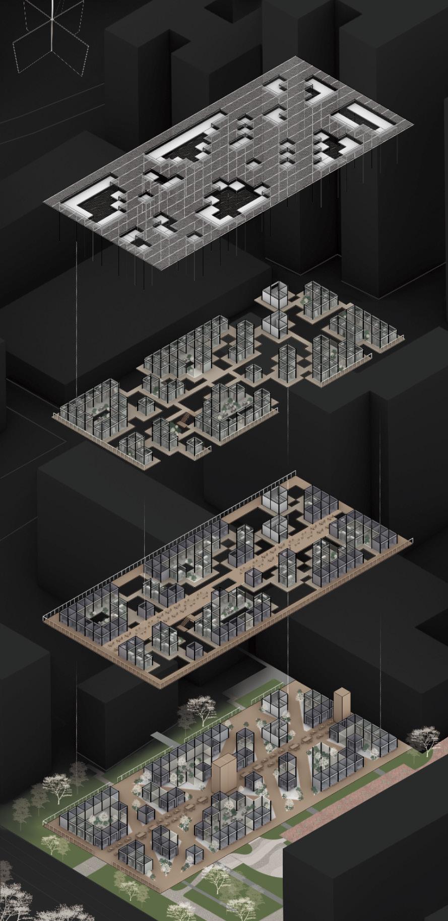
This project aims to address the question of why hawker centers are typically situated in a single block with a distinct boundary, isolated from surrounding facilities. The goal is to cater to the diverse needs of various groups by implementing different pathways and arranging shops according to different demands. The objective is to blur the boundaries between the hawker center and its surroundings, integrating it fully into the cityscape.
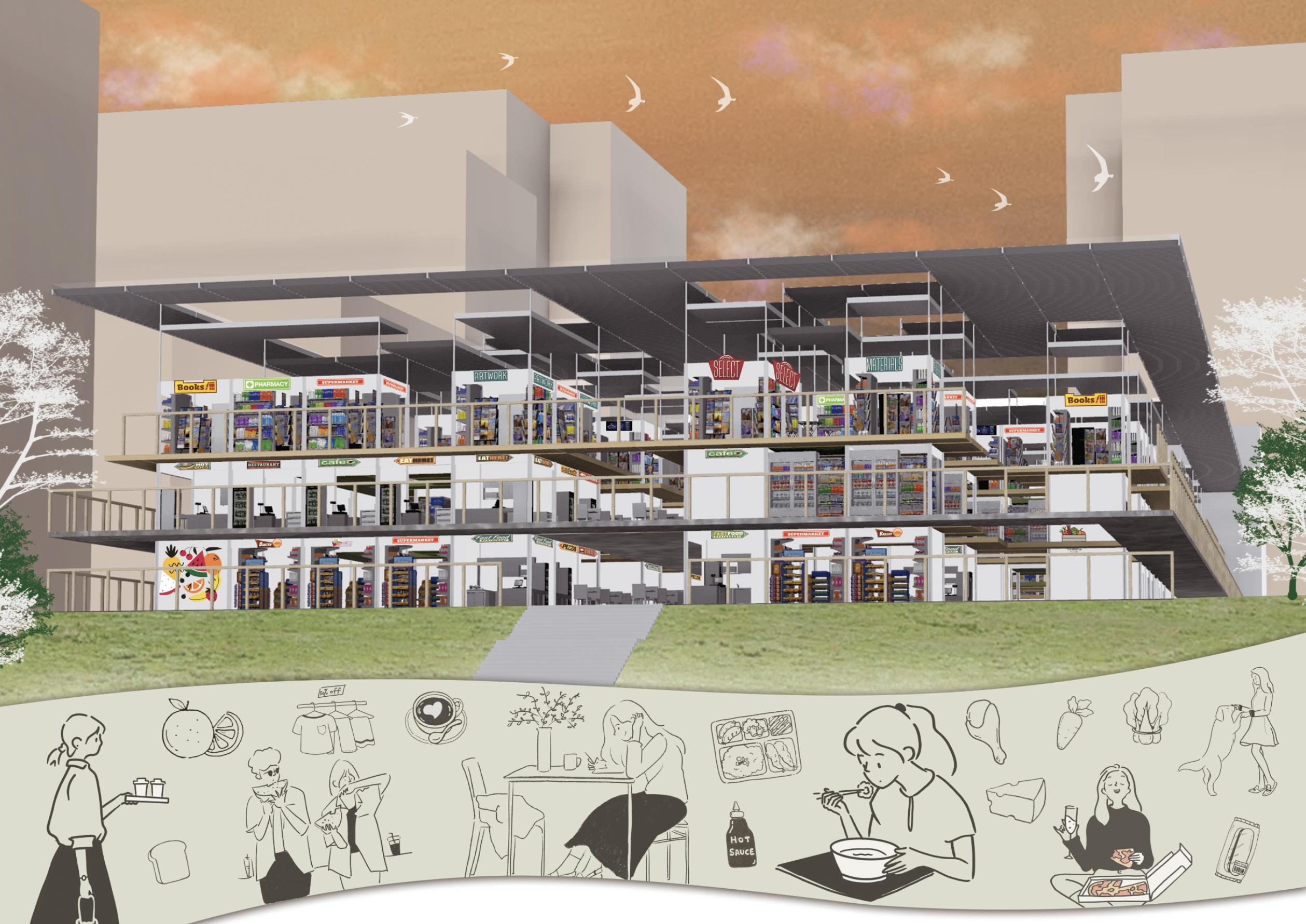

With the name of the development stemming from the adjective “Eurhythmic”, the building showcases a harmonious balance between the existence of all activities in the Mei Ling estate.
Programmed to promote active aging to majority of the site’s growing elderly population, as well as drawing the attention of youths with the introduction of sport activities that cater to all ages.
The study of market & hawker stalls’ 4 walls enabled the design to carry out a flexible and versatile spatial experience. The movement of the walls, seen as an exploded module, helped to highlight boundaries and create new enclosures at the same time.
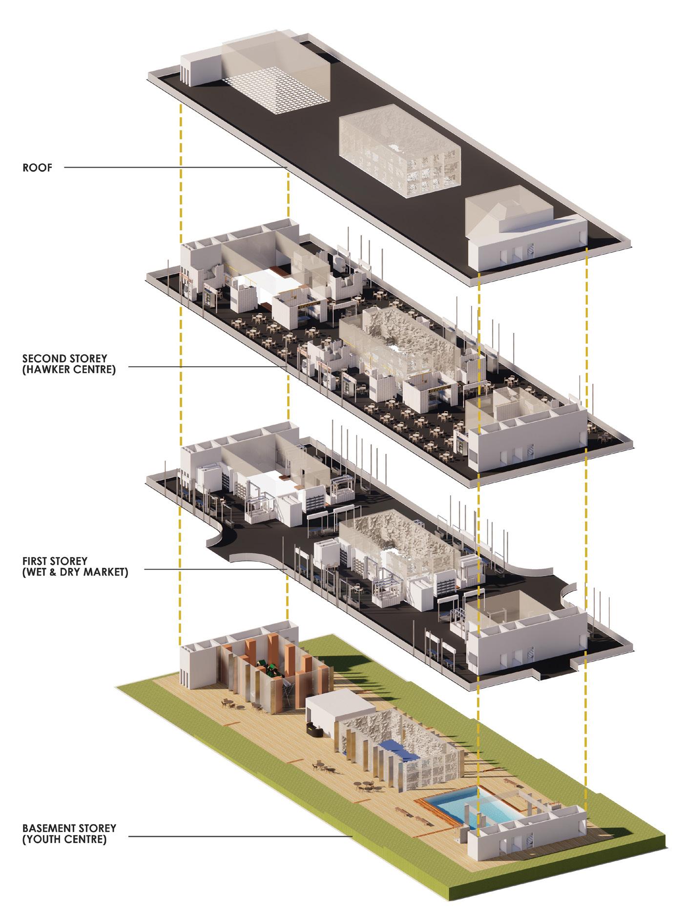


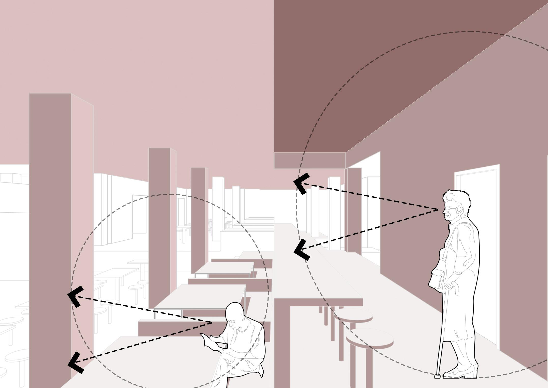
With the elderly demographic of Queenstown in mind, the project was designed with the intentions to improve the lives and conditions of dementia patients through the manipulation of corridors. ‘Corridor’ in the case of this project presents itself as more than just a pathway for circulation, rather, it also works as a functional volume where the stimulation of the brain is acheived. Upon research on Snoezelen Therapy, studies has shown that multi-sensory stimulation is able to improve the conditions and prevent the worsening of dementia conditions. The design of the building ultilizes the conditions of the hawker stalls and wet market stalls, by selectively filtering the senses through the corridors. This curates the spaces in the building to suit the precise needs of a multi-sensory environment. The projects seeks to marry a hawker centre and a dementia care centre, so as to present the dementia patients a brain-stimulating journey with the manipulation of multi-sensory elements; smell, sound and hearing.

 byEleneKoh
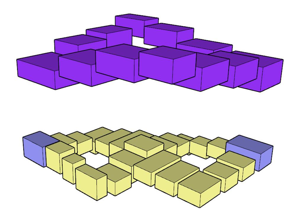
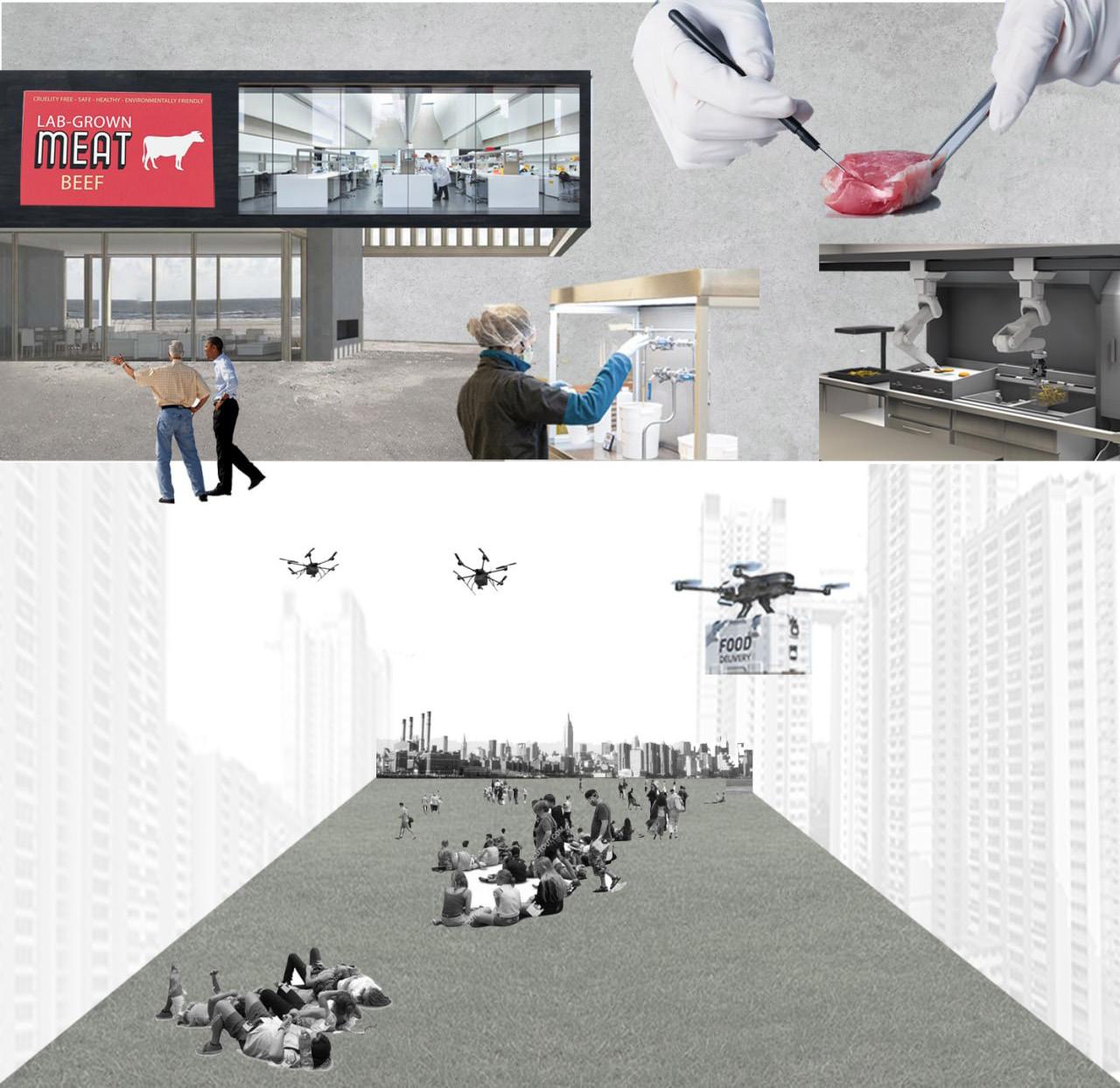
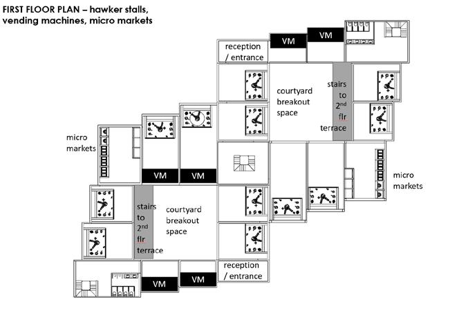
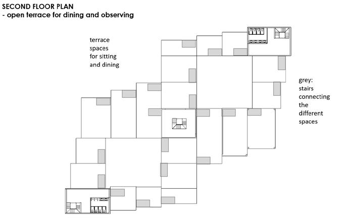
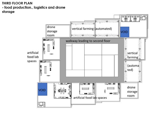
Exploring the elements of both courtyard and staircase, spaces are created to experiment with the performative and tectonic functionalities of both elements. The final outcome intends to be a newly innovative take on the traditional hawker and food centre, taking on a more futuristic food laboratory concept. “What if hawker centres and food centres were humanless?”, in order to function as a fully operating machine, to govern real national issues, such as food security and lack of manpower in the future. The central courtyard is used to create a public observatory walkthrough, for the public to observe the process and systems of the ‘humanless food hawker & market’, while the building functioning to serve the society with minimal humans possible.
Hawker Centres in Singapore are commonly perceived as a community space, a space that is designed for families and friends. But surprisingly, there were more lone individuals than families present, particularly at the site, Meiling Market and Food Centre. With that being said, the project was designed with the intention to create spaces for individuals, while maintaining adequate privacy and openness. Upon research on the behaviour of individuals, in particular while eating, studies have shown that there is a routine of distracting onself with their phone, as this is deemed as supposedly more efficient, not wasting time. But imagine what one could have enjoyed if only they decide to look up instead. This fascination led me to study activites such as bird-singing and terrapin watching as past-times for many Singaporeans in the past and eventually, utilized nature and animals to bring people together to commune by placing this nature in Courtyards. These Courtyards are seen as the locus for offsets. There are 2 distintive offset spaces which then offsets into the Hawker or Market: a social space and an individual space. To maintain a level of privacy and openness, Windows as an element is used. All in all, this project is one aiming to design a space for all, a space for families and friends, a space for individuals, and a space for nature and animals.

This project is built at first from my fascination of the maintenance aspect of my two elements, mechanical shafts and plants/planters. Despite maintenance being what keeps a building going, it is often hidden from sight because of the “dirty” nature of maintenance work, which leads M&E space to be the placed in lefotver spaces. This project attempts to rethink the relationship between served and service space in the context of Mei Ling market and hawker-fresh food market/center in general. The dsign journey starts from acknowledging and considering how maintenance movement causes different scale of functional displacement. This leads to an exploraiton of intervention of different scales ( point, path and form).
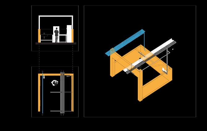
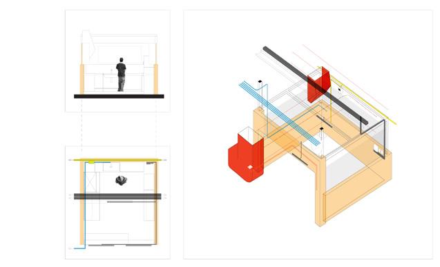
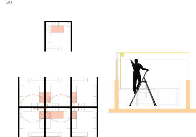
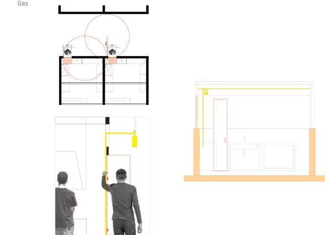
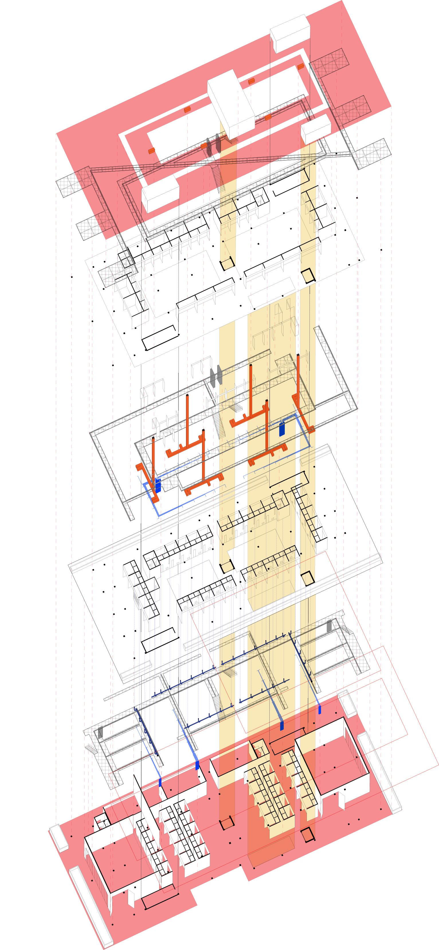

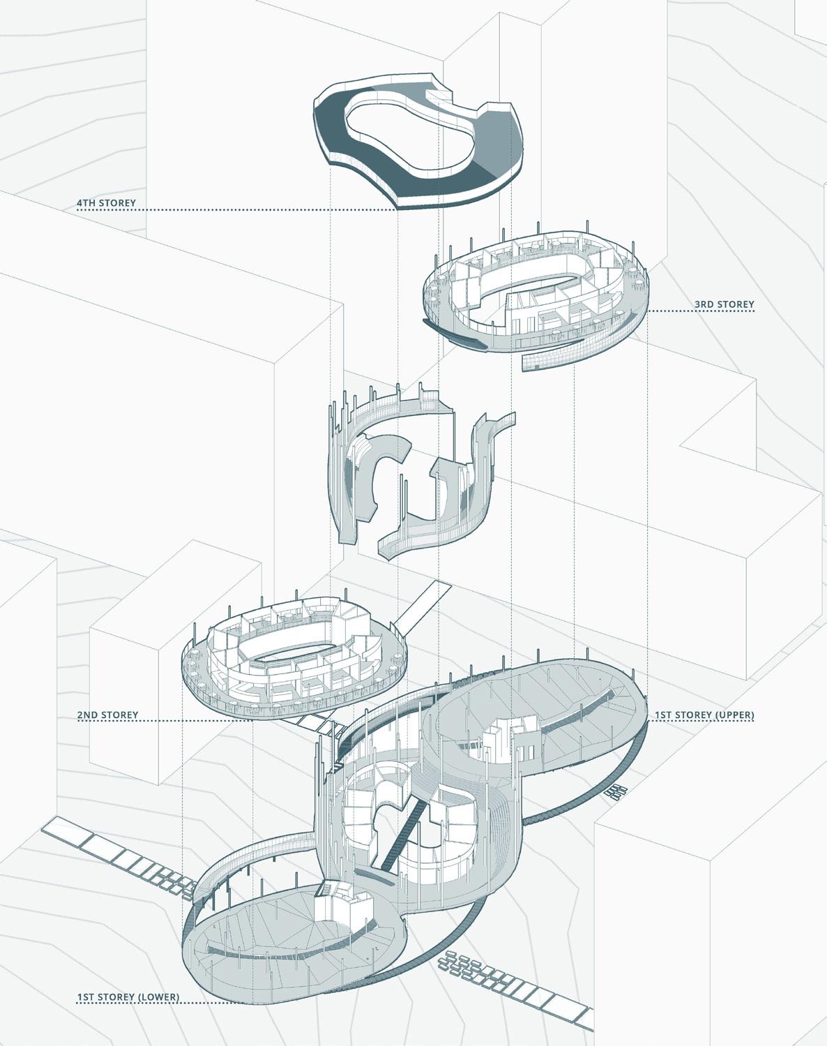
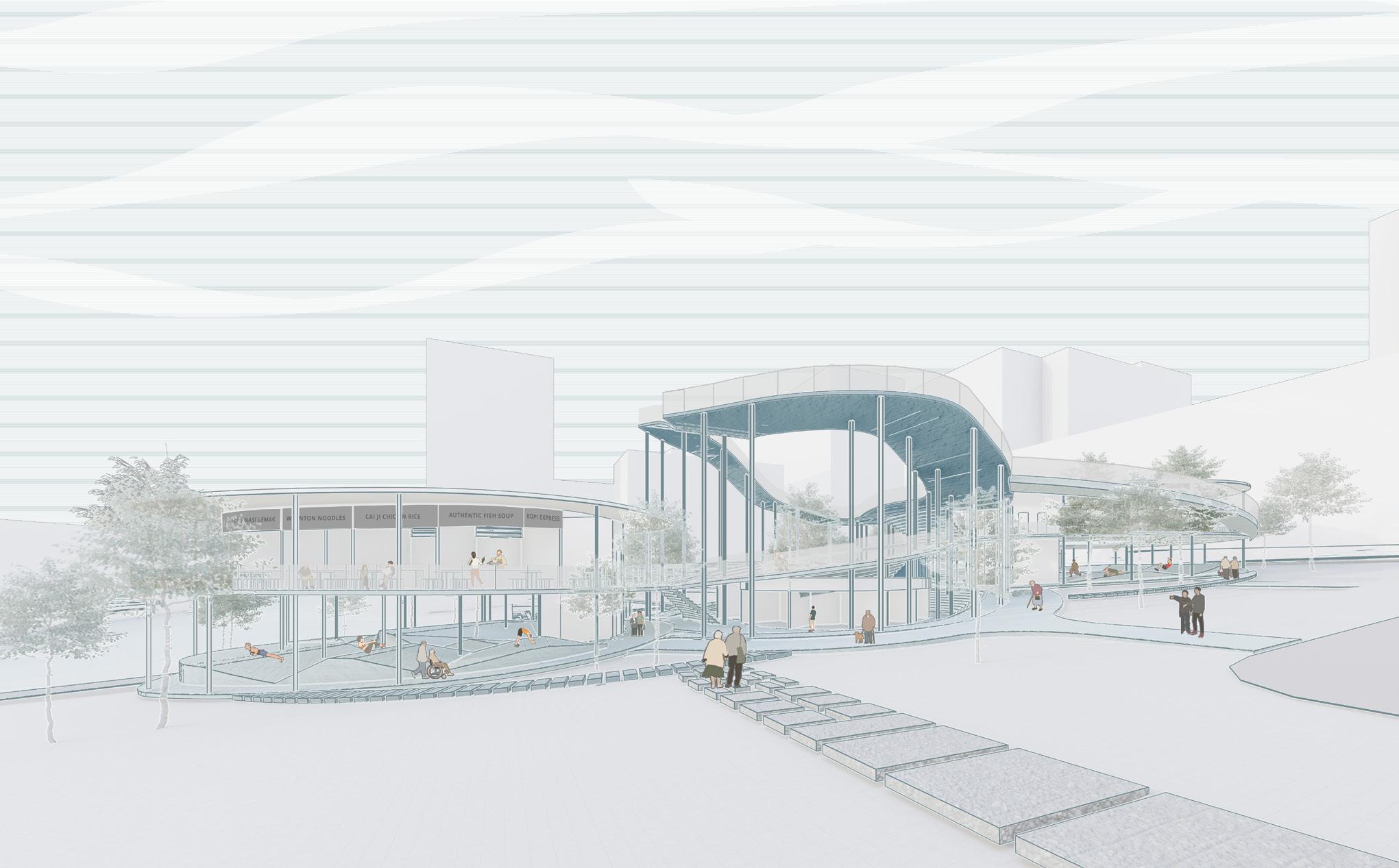
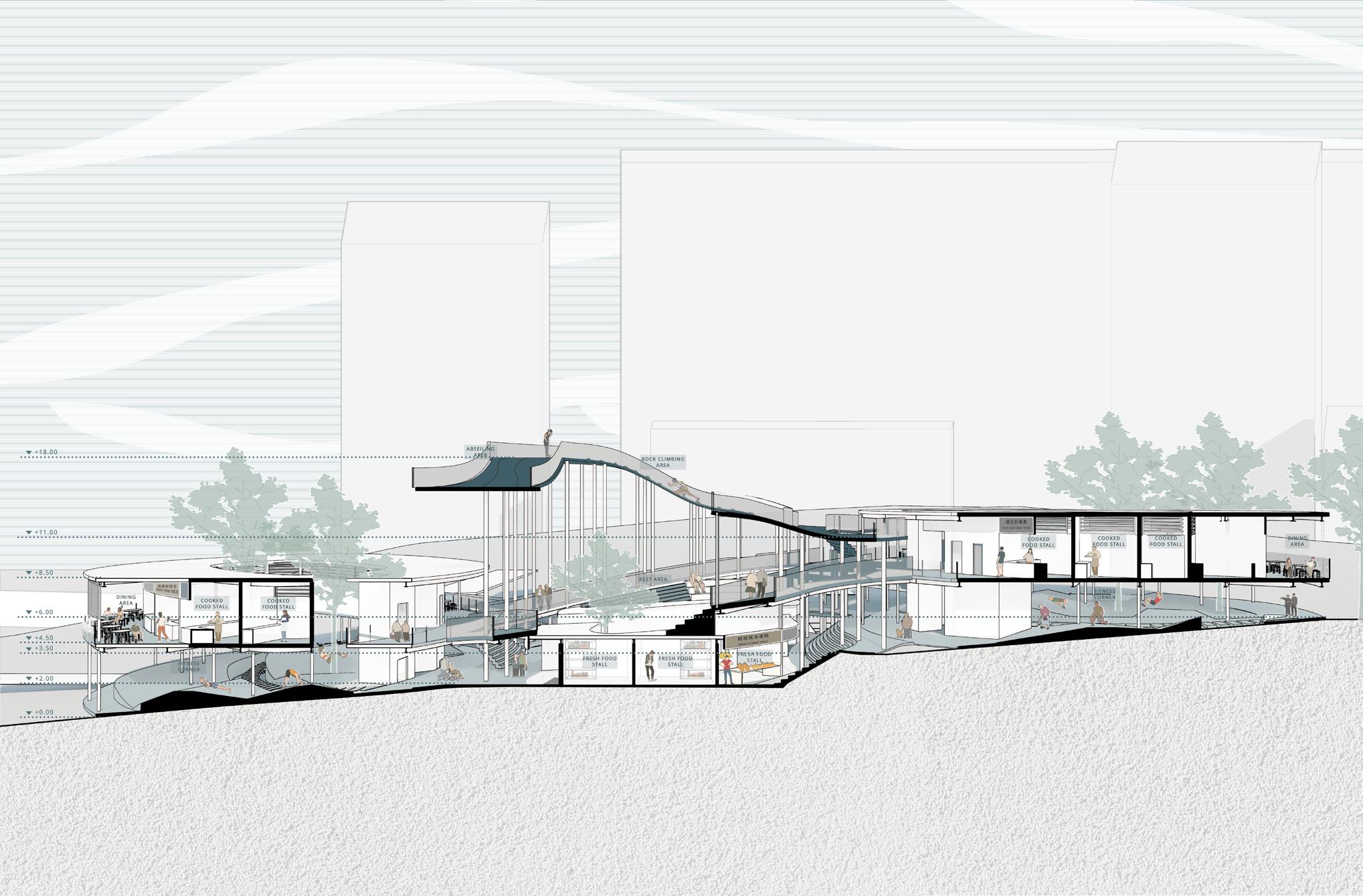
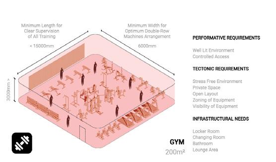
Fit Flavour is a project that focuses on creating age-friendly fitness spaces in a market and food center, with the floor as the tectonic element and the courtyard as the performative element. The project aims to improve the physical health of the elderly, who form the largest demographic of the site. The site analysis reveals that the site has a sloping profile, which makes it less accessible to users due to differences in the first storey height compared to adjacent buildings. Additionally, it is noted that the elderly form the largest demographic of the site, and there is a need to address the needs of this aging population. Mobility is particularly important for the elderly to prevent accidental falls, so the project aims to improve their physical health by leveraging the various height differences on the site. Research was conducted to narrow down the specific types of muscles that are important for mobility, including the quadriceps, hamstring, glutes, and calves. Based on the properties of the floor, the design aims to allow people to carry out fitness activities such as push-ups, sit-ups, stationary cycling, and rock climbing. Different types of floor surfaces, such as walking on flat platforms, up and down risers, and slopes, are considered for circulation at various difficulty levels.
The first storey comprises a fitness corner and fresh food stalls, while the second and third storeys consist of cooked food stalls and dining areas. The fourth storey includes high element activities like the rock climbing area, which is the last challenge before users reach the top. Users have a choice of two paths to get to a space, with at least one easy pathway available.
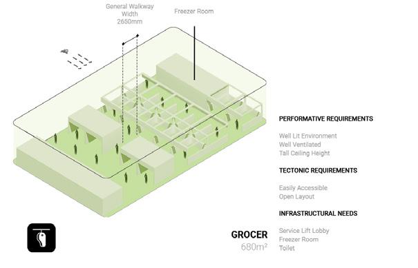
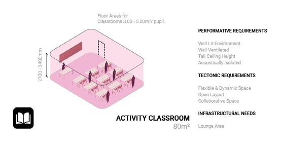
Hawker centres are often touch-and-go places that solely function as communal dining halls with high footfall. People that visit these hawker centres would often have their meal and leave immediately after without having much opportunity for other interactions. On the other hand, Neighborhood Community Centers are often overlooked by most other than existing club members that frequent these centres.
As such, the proposed design envisions a unification of a hawker and community centre that establishes a mutually beneficial relationship where the community centre would experience a higher footfall as a result of the hawker patrons. This influx of patrons would populate the once desolate community centre, bringing about new interactions between people, and enlivening the space.

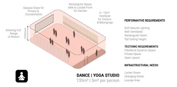
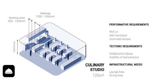
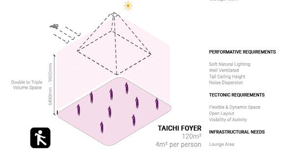
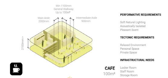
Using corridor as a permutable element, spaces within the hybrid development are carefully carved and developed following a set of parameters established from earlier probe studies. The selection of parameters is extracted and developed in varying degrees of intimacy that allows for a more precise prescription of spaces that reflects the need of the program to encourage more social interaction between users later in the project.
 byTanJianHao
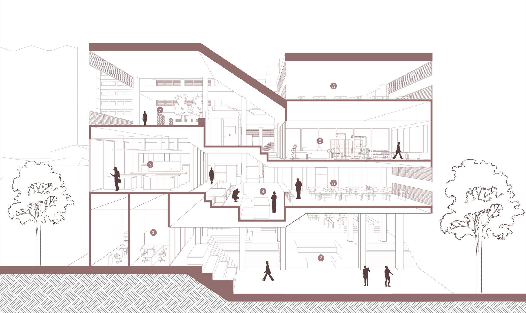
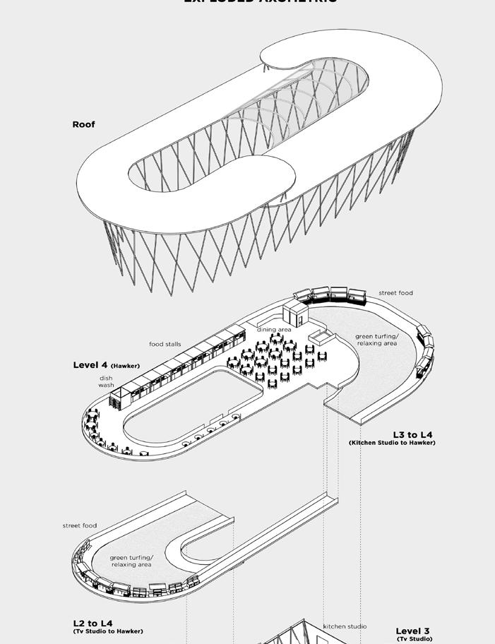
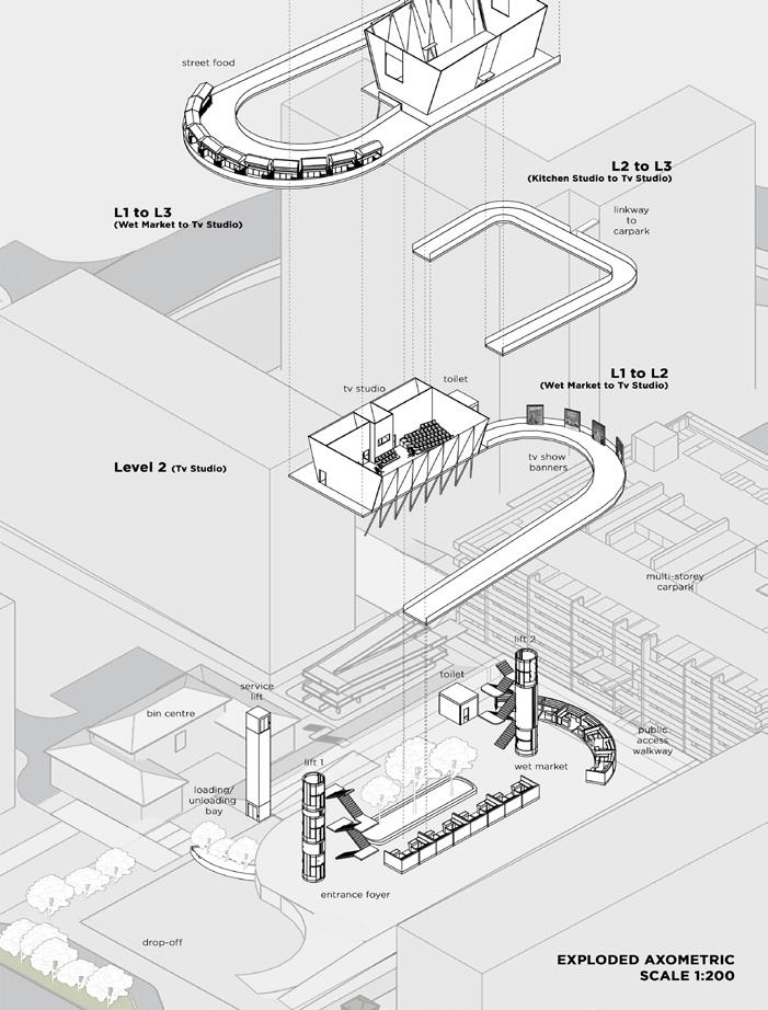
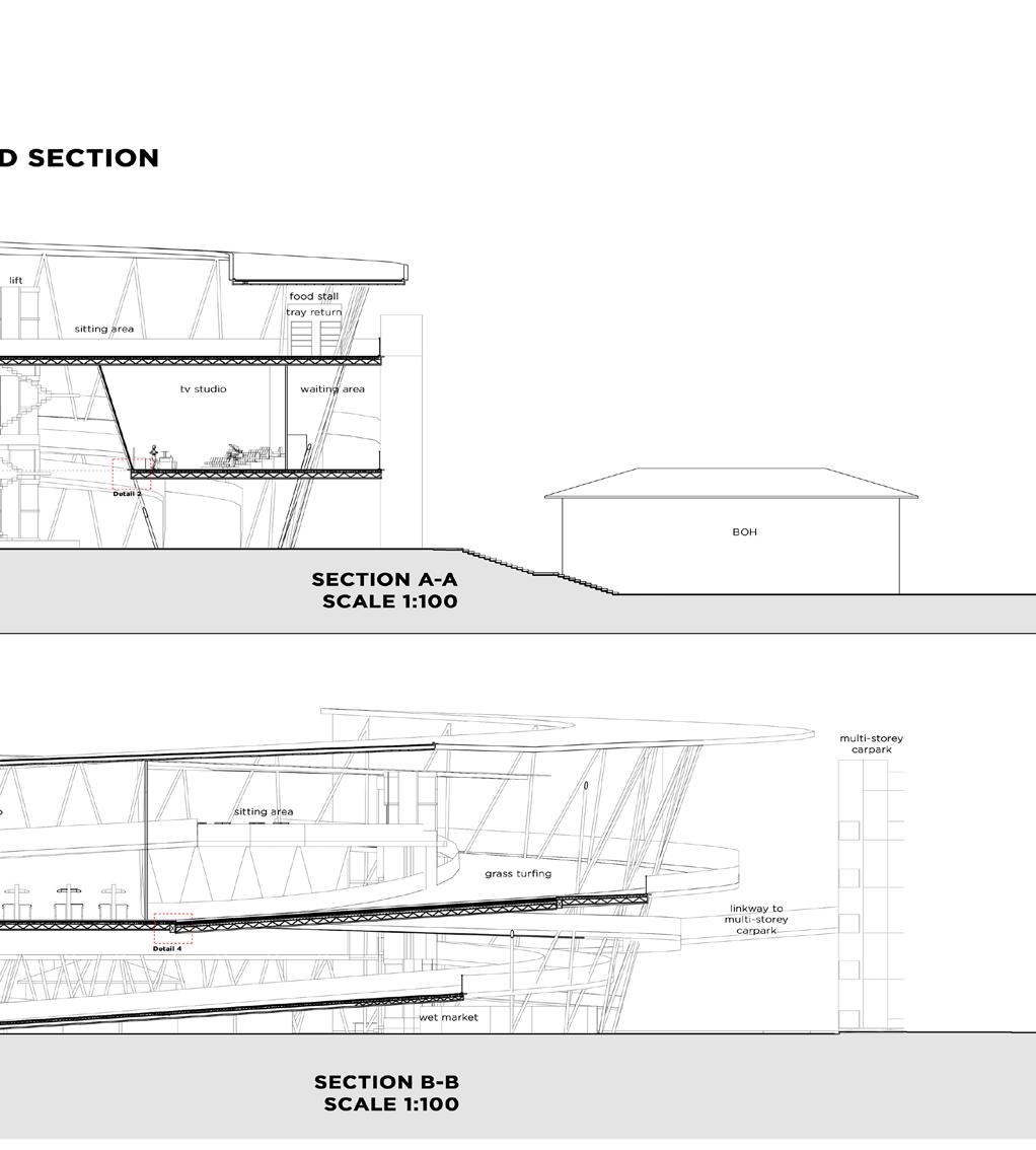
“Hen Mei Ling” is a culinary space that aims to unify diverse food practices and concepts within a singular establishment. It endeavors to foster an exchange of ideas among various members of the culinary world, affording visitors a firsthand experience of these interactions. We believe that this represents the next evolution of food centers, building on the foundation laid by street vendors and hawker/food centers, and paving the way for the future.
“Hen Mei Ling” also seeks to promote food culture and understanding by encouraging visitor participation and initiative. Our establishment features two highly sought-after programs - the TV studio and Kitchen studio - which have been in high demand since the onset of the Covid-19 pandemic. The building is also surrounded by “pasar malams” (night markets) located along the ramps, encouraging visitors to explore the space and experience the culinary exchanges taking place around them. These markets are a popular attraction among locals in Singapore, drawing large crowds every year. With the various programs offered, “Hen Mei Ling” is poised to attract a growing number of visitors seeking to explore and participate in the dynamic culinary community.


Ageless appetite is an investigation on the floor plate as an instrument in defining boundaries and movement, using a pre-defined human ergonomic datum. With an arrangement of these horizontal plates, the project seeks after a hawker centre of an assemblage of various programmes that can interchangeably occupy spaces across time periods, yet moments of specificity brings together yet blurs these boundaries.
Using an appropriate datum, a matrix of standard and hybrid modules of various programmes are derived from an extensive ergonomic study of the existing Mei Ling Market & Food Centre. Multiple iterations of aggregations into a building form are done to find the best system - in terms of maximising the continuation of datums, programmatic realities, and a time factor that ensures an always active and bustling centre.
The result is a bustling, round the clock, elderly-centric hawker centre, the next “happening” spot for our senior communities of Queenstown.




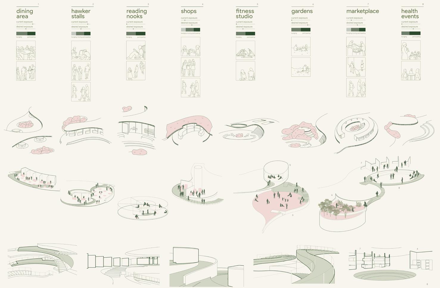
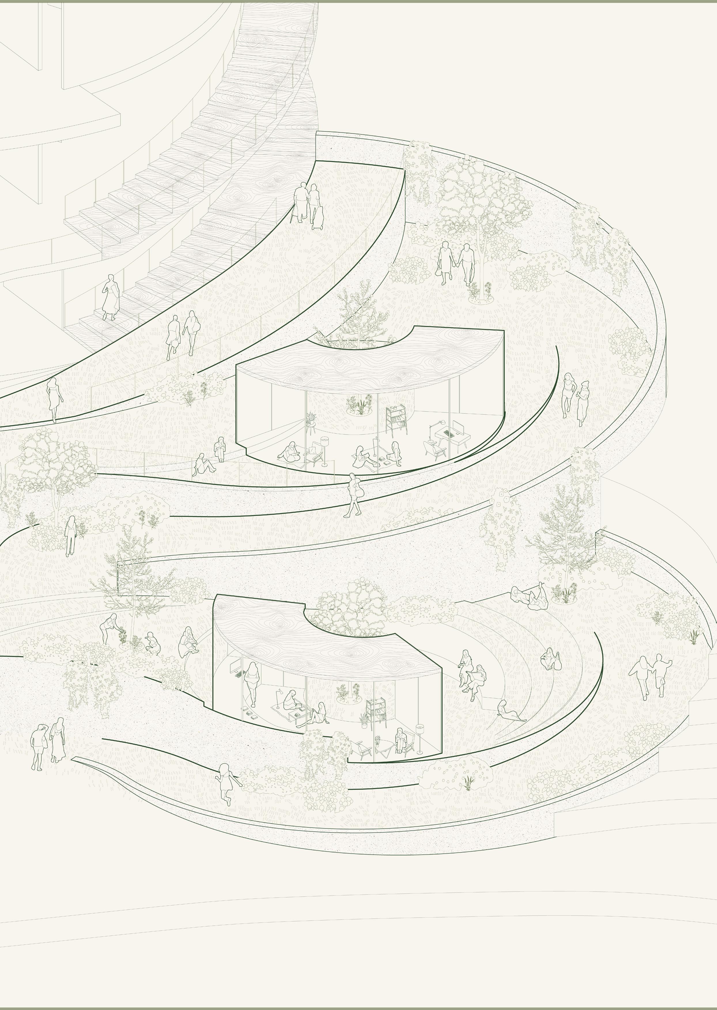
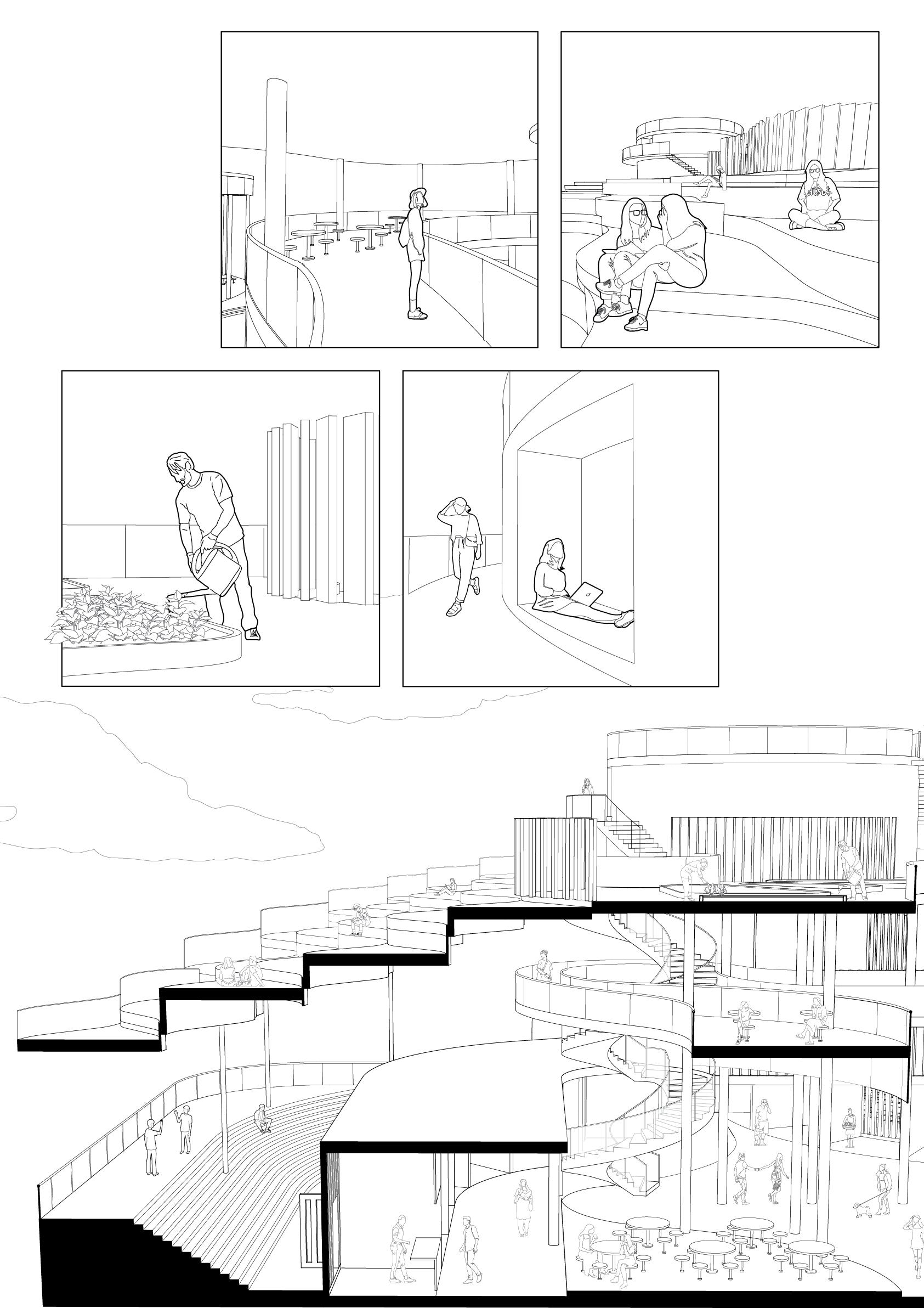
The site is situated in the mature estate of Queenstown, between one of the earliest HDB blocks to be built, and an upcoming BTO estate. As a response to the expeditious establishment of the new, this project is the point of balance connecting to the old. The food centre stands as the genius loci of the island-like Mei Ling Heights estate and its surrounding neighbours, serving the vast majority of elderly residents. From the words of the elderly stall owners, the people who have died have already died, and the people who would have moved have already moved. Time passes slowly and quietly in this community - a reality residents and visitors have accepted as the norm. In a similar expression, the heart of the project forms around embracing the languid days and the people that are left. Queenstown was a valley where two hills once stood; one named Hong Lim, and the other Hong Yin. The latter was home to orchard and rubber plantations. As a reminder of our roots the project calls for a return to nature, enveloping each program with, as well as around, gardens of various themes. The sloping terrain that still exists in the present lends itself to a fluid transition of views and movement throughout and around the site. The steepness and brevity of the original slopes are drawn out in deliberate measures, giving rise to a habitable cascade, both in the micro and macro scales of the structure. In line with the quest for architectural grammar, the parameters of overlapping and overlooking between programs, and moving, lounging and participating within individual programs, have been established. Along with the degrees of current and desired exposure of the programs, the parameters direct as well as stimulate the flow, form and mapping of programs. Three cores arise from the categorisation of programs and their relation to the objective: reading nooks in the respite garden, a fitness studio above the recreational lawn, and the dining area around the growing garden. Courtyards which have been preliminarily explored through physical traits corresponding to the themes of introspection and extrospection, are expressed in less traditional forms around the site, allowing for a generally open and expansive area. The hierarchy of spaces and interaction between their boundaries are set by the inherent qualities of the second chosen element, stairs, which roll out a path onto the terracing terrain for visitors to traverse, finding fresh views visit upon visit to rewrite an otherwise monotonous routine.
My project looks towards increasing exposure to a novel form of foodinsects. Touted as a future food source, insects are still widely unaccepted by the masses due to our innate human fears and biases. By situating an edible cricket farm-to-factory-to-table concept in a heartland hawker centre and wet market, my proposal aims to facilitate the gradual exposure to and familiarisation of the unknown, by allowing glimpses into the production processes of edible crickets. Horizontal and vertical planes serve as the primary spatial organiser of this new architecture; expanding, compressing and mediating between programmes, affording circulatory routes and views that encourage the habituation of an alternative food.

Singapore’s Rail Corridor is a unique and historic stretch of land that spans over 24 kilometers from the north to the south of the island. Once a bustling railway line, the corridor is now a green spine that connects several parks, nature reserves, and communities across the island. However, despite its rich history and recreational potential, certain parts of the Rail Corridor remain underutilized and disconnected from adjacent neighborhoods.
This architectural project seeks to address this issue by connecting the Queen’s Close Rail Corridor Access to the Mei Ling Food Center, creating a communal pitstop that will attract higher footfall and enhance the social and cultural vibrancy of the surrounding areas. By designing a seamless and inviting pathway that integrates the natural beauty of the Rail Corridor with the urban vitality of the Mei Ling neighborhood, this project aims to improve connectivity, accessibility, and sustainability for residents and visitors alike.
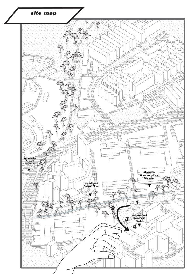
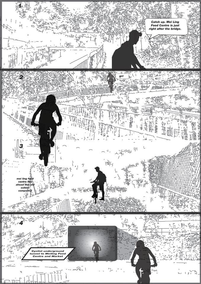
In particular, this project will focus on creating a dynamic and multifunctional public space that can serve as a hub for social, cultural, and economic activities. By incorporating amenities such as seating areas, food kiosks, activity rooms and restrooms, this pitstop will provide a welcoming and comfortable environment for people of all ages and backgrounds. Moreover, by promoting active modes of transportation such as walking, cycling, and jogging, this project will encourage healthier and more sustainable lifestyles while reducing traffic congestion and carbon emissions.
Ultimately, this project represents a unique opportunity to transform an overlooked and disconnected part of Singapore’s urban fabric into a vibrant and inclusive community asset that celebrates the rich heritage and diversity of the Rail Corridor and the Mei Ling neighborhood.
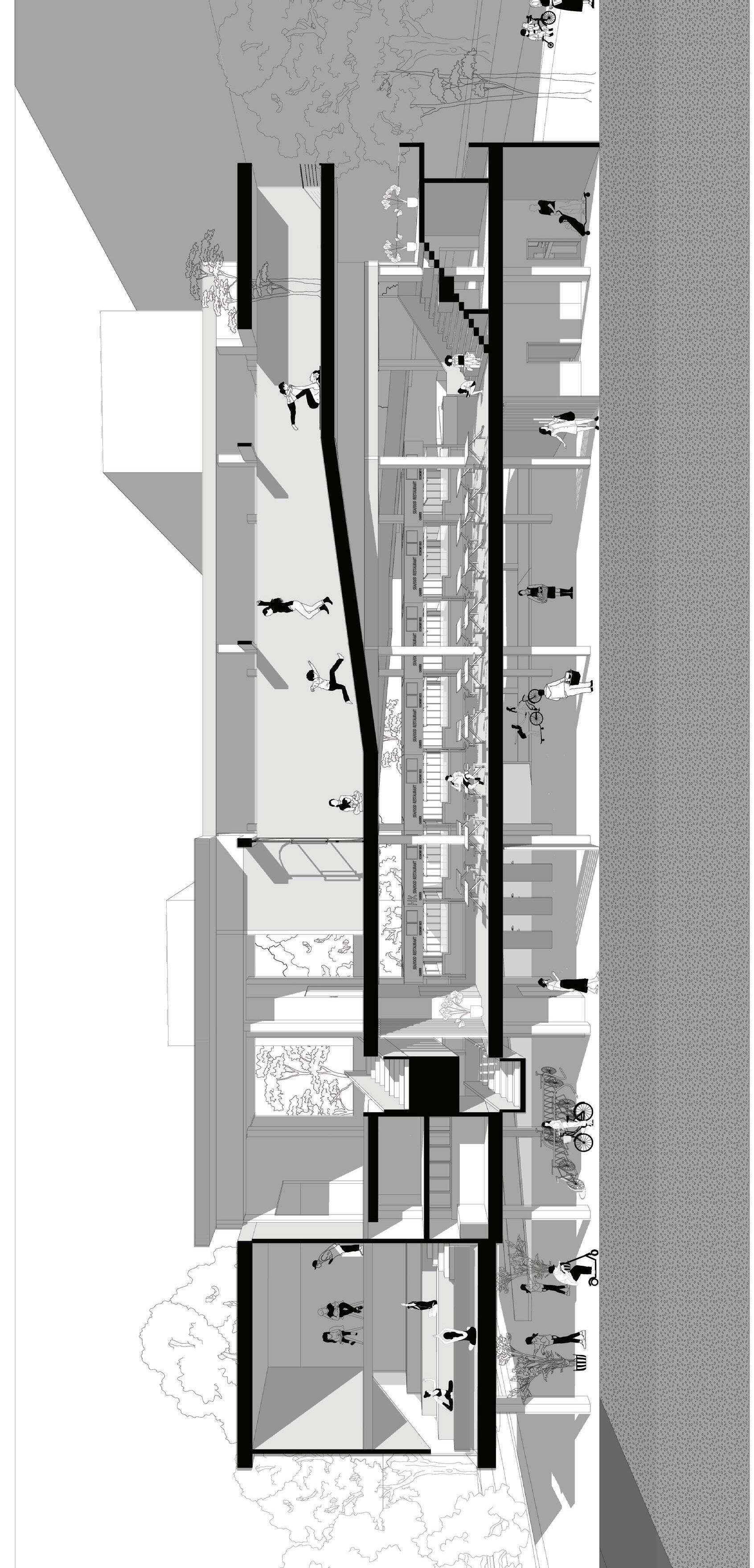
The Raumplan Market is a place where everybody gets together while having pockets of individual space. It tackles the loneliness the aging population will inevitably feel, through the use of double volume spaces that is commonly found in courtyards, arranged through a helicodial movement to create diagonal connections while the apertures of the walls serve the horizontal and vertical connections. The diagonal connections and apertures are used to foster different interactions between the stakeholders.
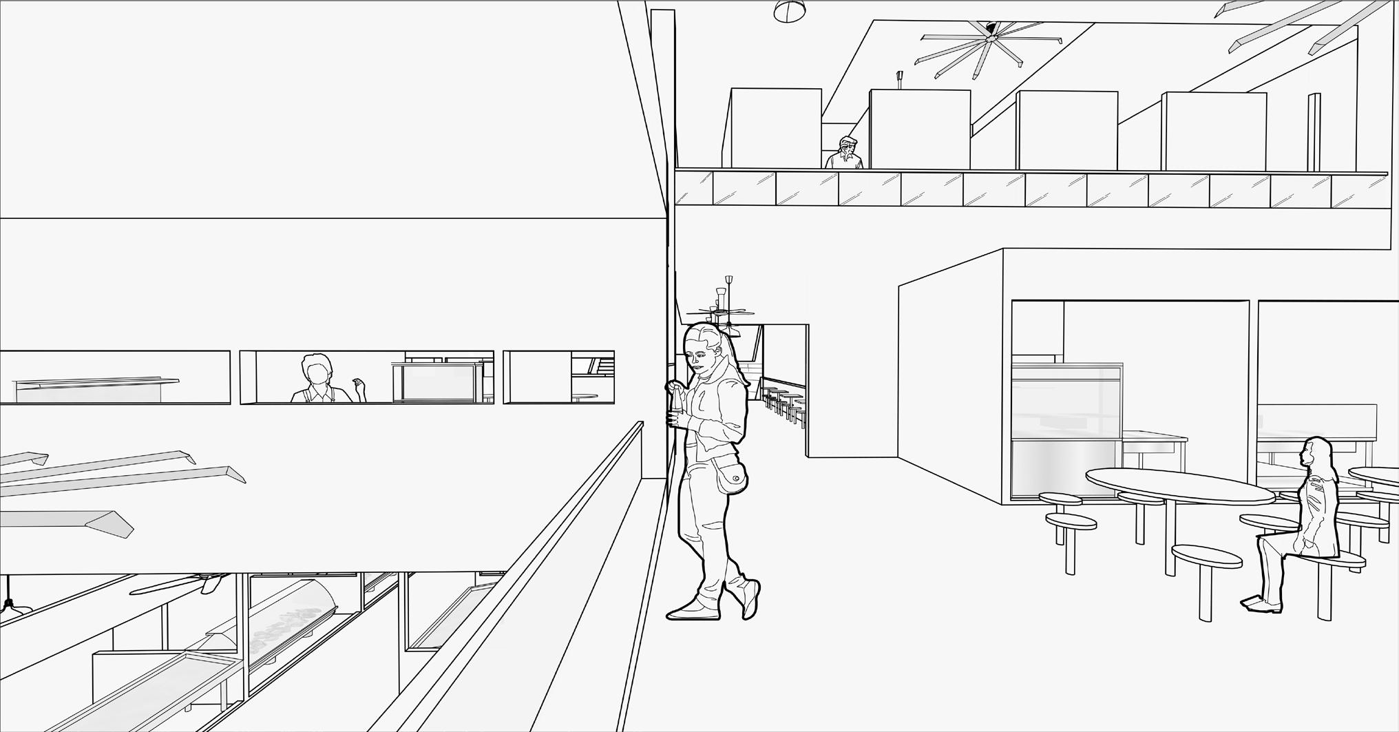
The intention of creating interactions between stakeholders begun from the site analysis. Visits to Mei Ling Market and the neighbourhood prove the area to be very quiet and peaceful. The residents there liked that it was quiet but reminisces the old Queenstown neighbourhood where is was bustling with entertainment and life.
The explorations of different architectural elements include the wall and courtyards. The exploration of walls play with different levels of visibility where one can see certain views when viewed through a specific angle and how different typologies of the wall can create different interactions. The explorations of courtyards started as an inquiry of what makes a courtyard a courtyard and the how different types of courtyard can create different atmospheres. A courtyard is generally definied by an unroofed area that is completely or partially closed by walls or buildings. The explorations test the different effects created by how enclosed a courtyard is and subsequently the level of visibility and intimacy of the space.
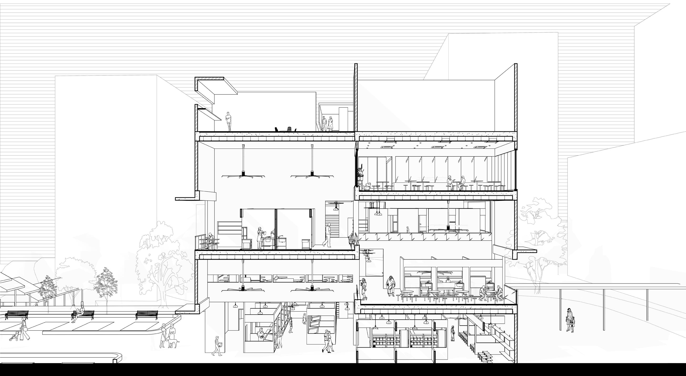
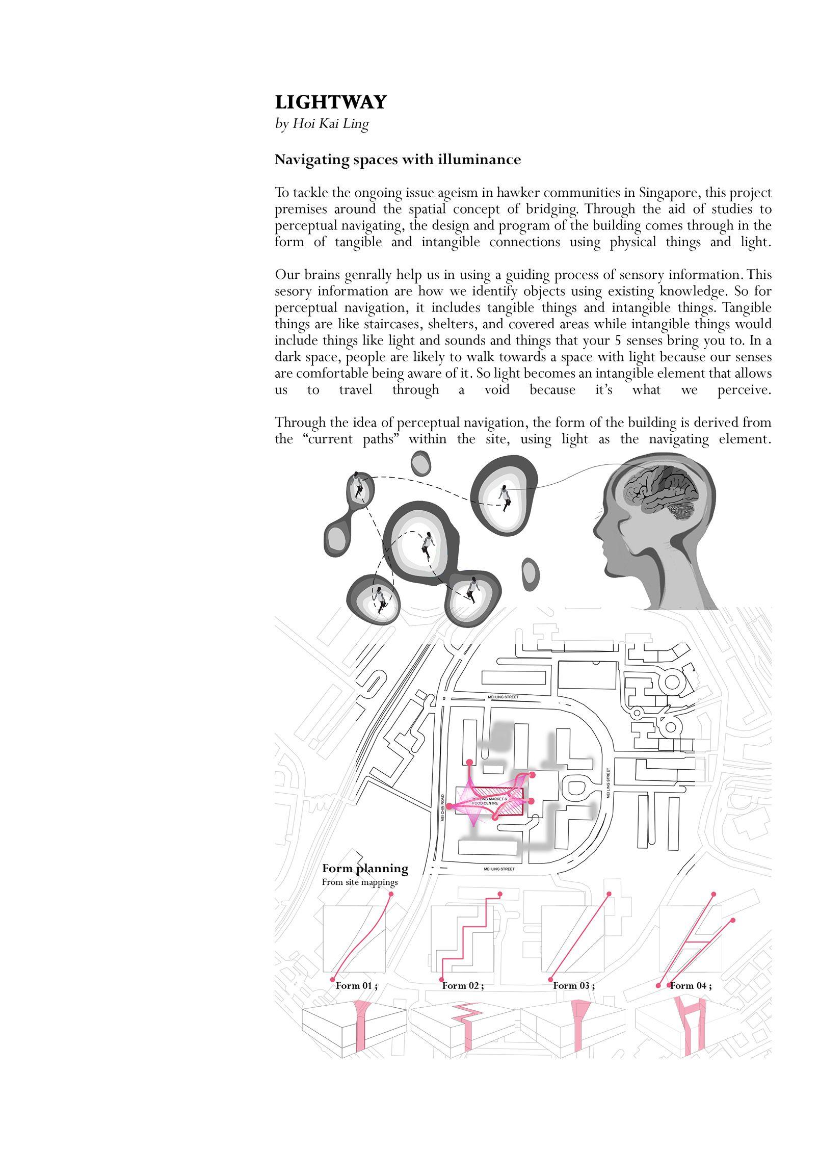
Navigating spaces with illuminance. To tackle the ongoing issue ageism in hawker communities in Singapore, this project premises around the spatial concept of bridging. Through the aid of studies to perceptual navigating, the design and program of the building comes through in the form of tangible and intangible connections using physical things and light. Our brains generally help us in using a guiding process of sensory information. This sensory information are how we identify objects using existing knowledge. So far perceptual navigation, it includes tangible things and intangible things. Tangible things are like staircases, shelters, and covered areas while intangible things would include things like light and sounds and things that your 5 senses bring you to. In a dark space, people are likely to walk towards a space with light because our senses are comfortable being aware of it. So light becomes an intangible element that allows us to travel through a void because it’s what we perceive. Through the idea of perceptual navigation, the form of the building is derived from the “current path“ within the site, using light as the navigating element.
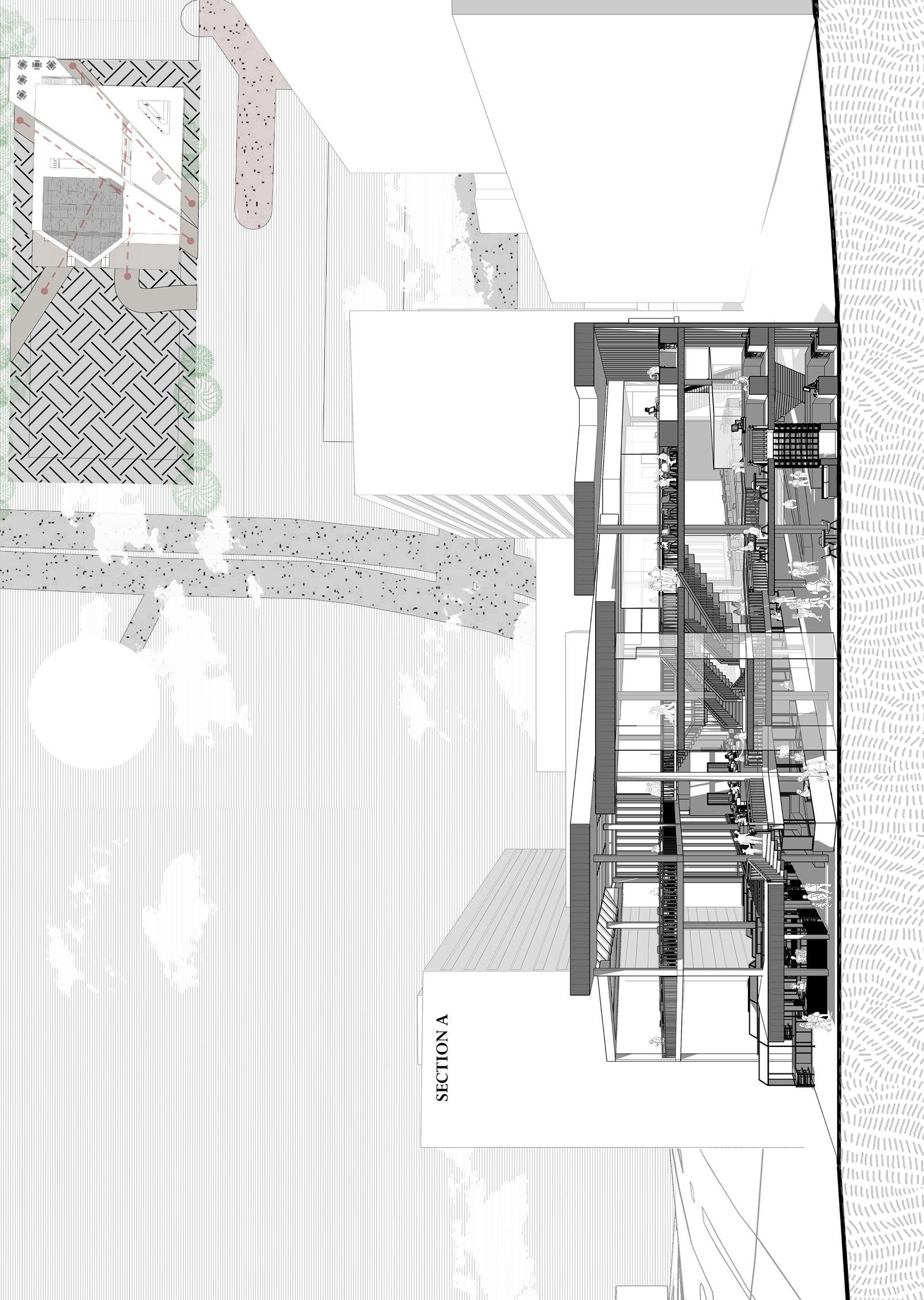
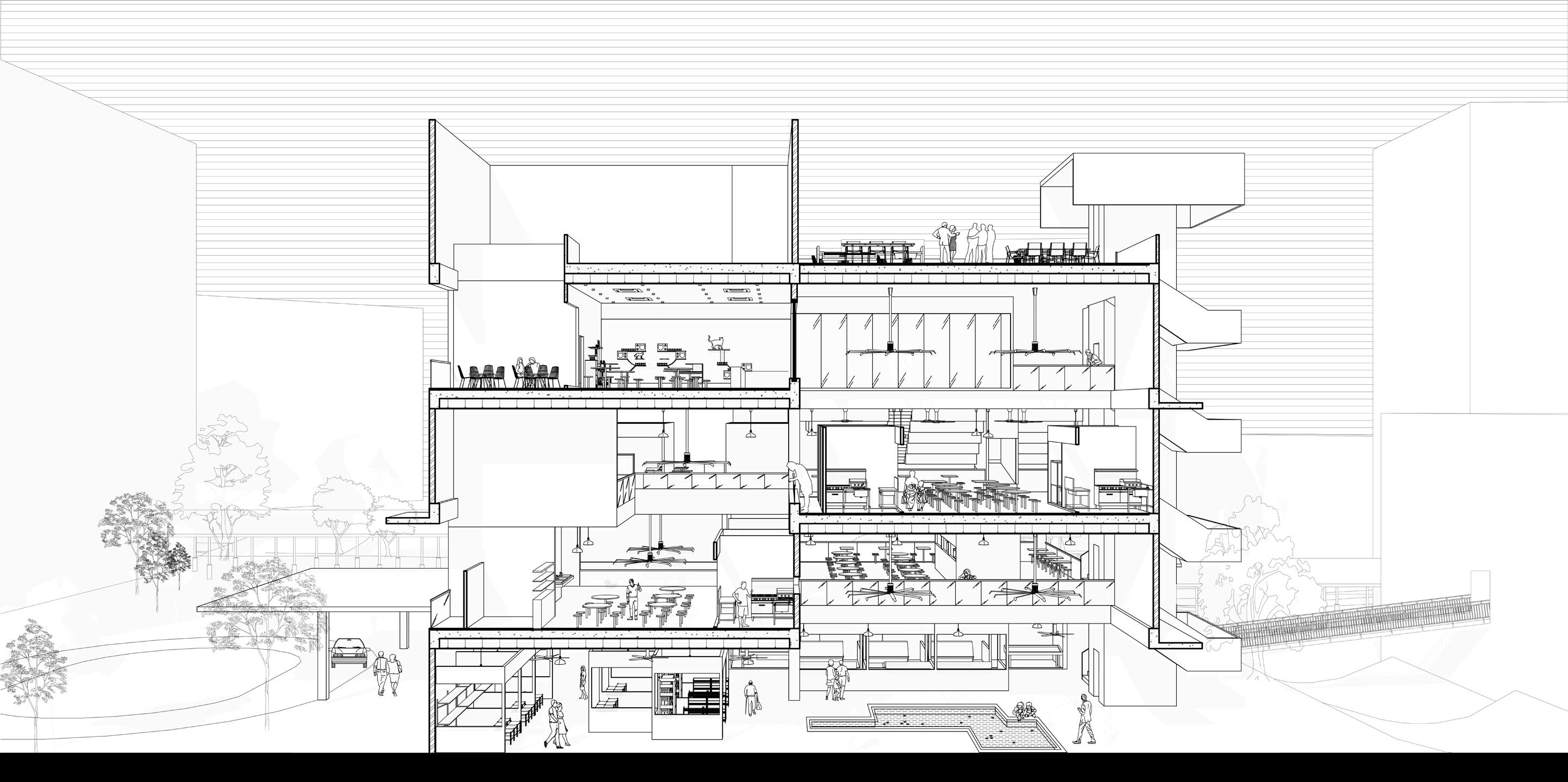
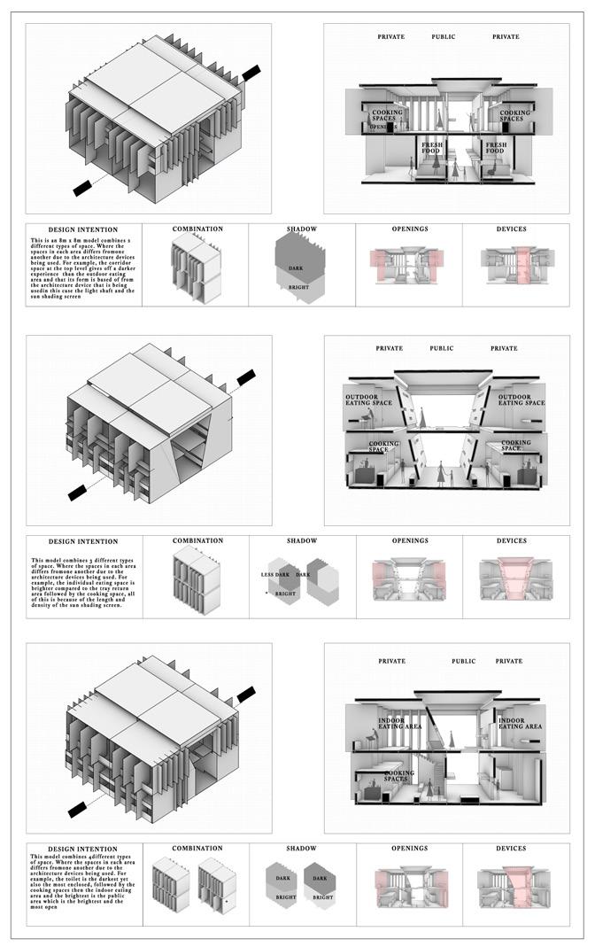
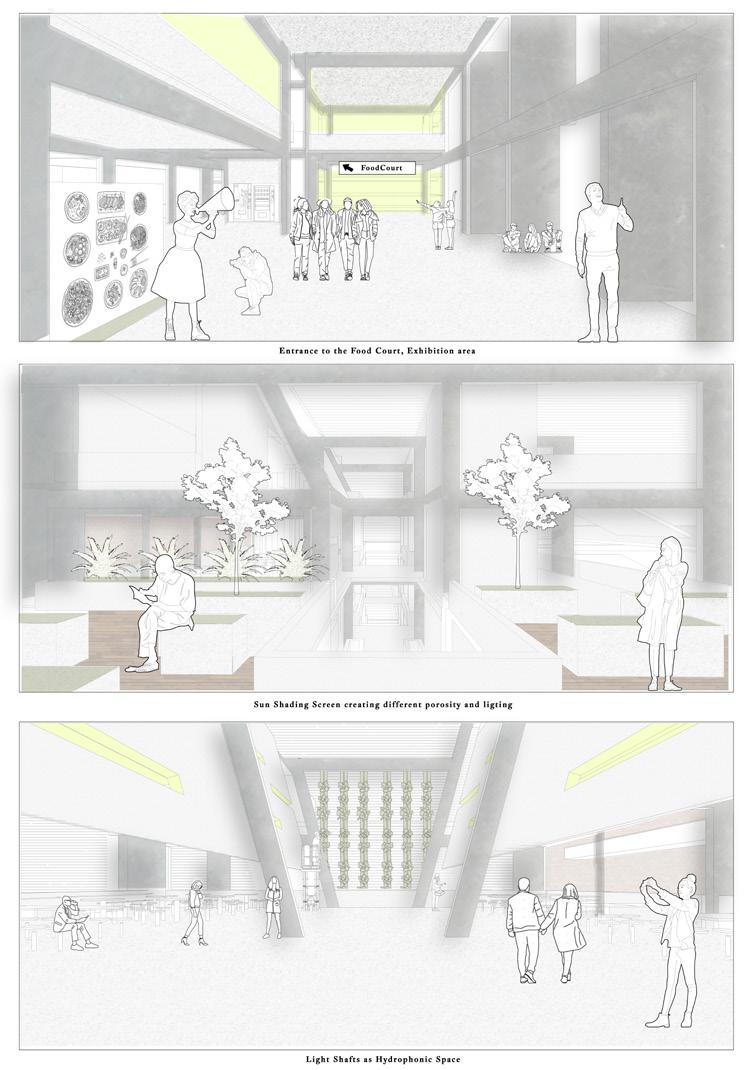
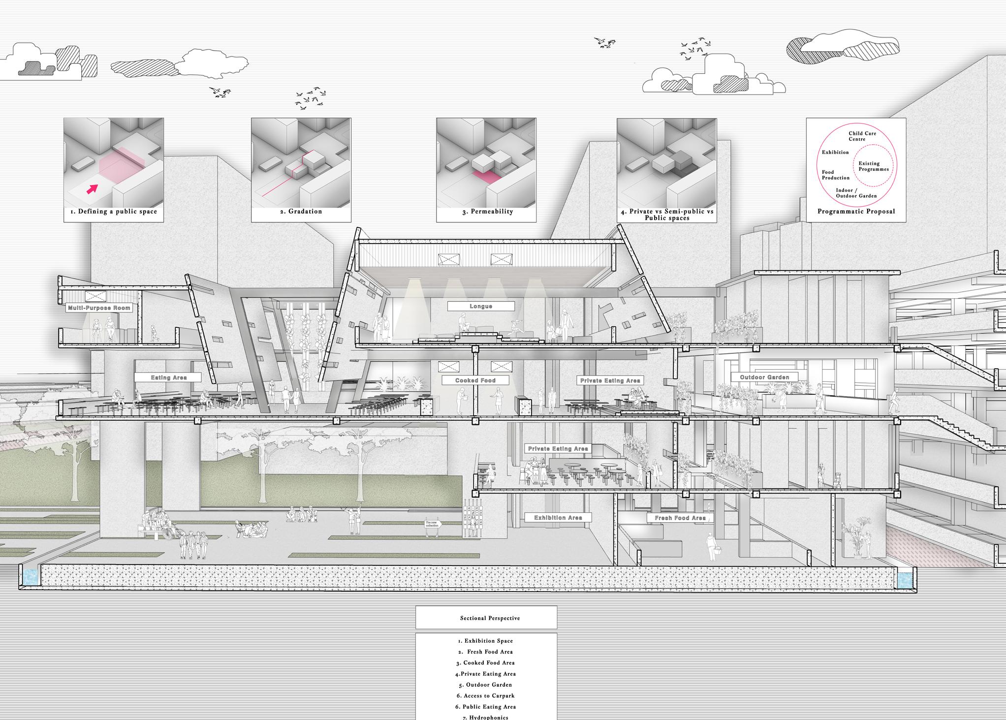
Experential Odyssey is a food court that rises out from the site analysis that hopes to funnel people from the end of the public car park into the facility to draw the public and the younger urbanites. Architectural devices such as the light shafts and sun shading screen interject between each transitionary space that acts as a buffer between those spaces creating a difference as one transition from a carpark to a service space than to a semipublic space and finally a public space. The use of light shafts and shading screens creates a difference in the experience in terms of porosity and lighting conditions, which creates a difference in user experience as one travels each space. The shading of the light shafts and screens provide a difference in experience. That resulted in a difference in people’s activity under the shade and out in the open. During noon , where temperature is at its highest People’s movements revolve within the shadow. Making them chase for shadows The use of architecture devices affect people’s comfort level accross a day. For intance, the position of people sitting at differs in the morning and across in the afternoon.Hence the program in the building will consist of programs that are already found on the moribund site like a cooked food area, White Spaces, Circulatory spaces, and a Fresh Food area. And In line with the idea of Singapore 30 by 30, where the idea is to be able to produce 30 % of our food source by 2030 we will introduce Food Production like hydroponics, a Childcare facility, and an Exhibition area to educate the public on growing their own crops.Hence the interventions made to this building rise from the observations and critiques of the site. Firstly. Some of the interventions made on-site include understanding that the site has an urban discontinuity where the public square in this case the food market gives discontinuity to the surrounding neighborhoods. Also, the lack of amenities and the public spaces not being integrated gives the opportunity to reclaim existing smaller patches of public spaces seen in-between HDB units into one centralized public space, where residents can make use of that public space to engage in social activities, interact and creating an urban symbiosis.

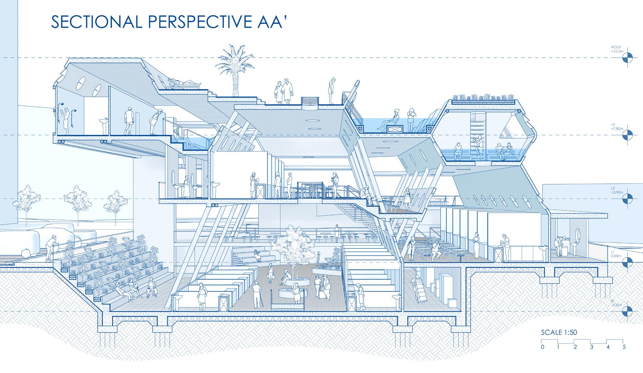
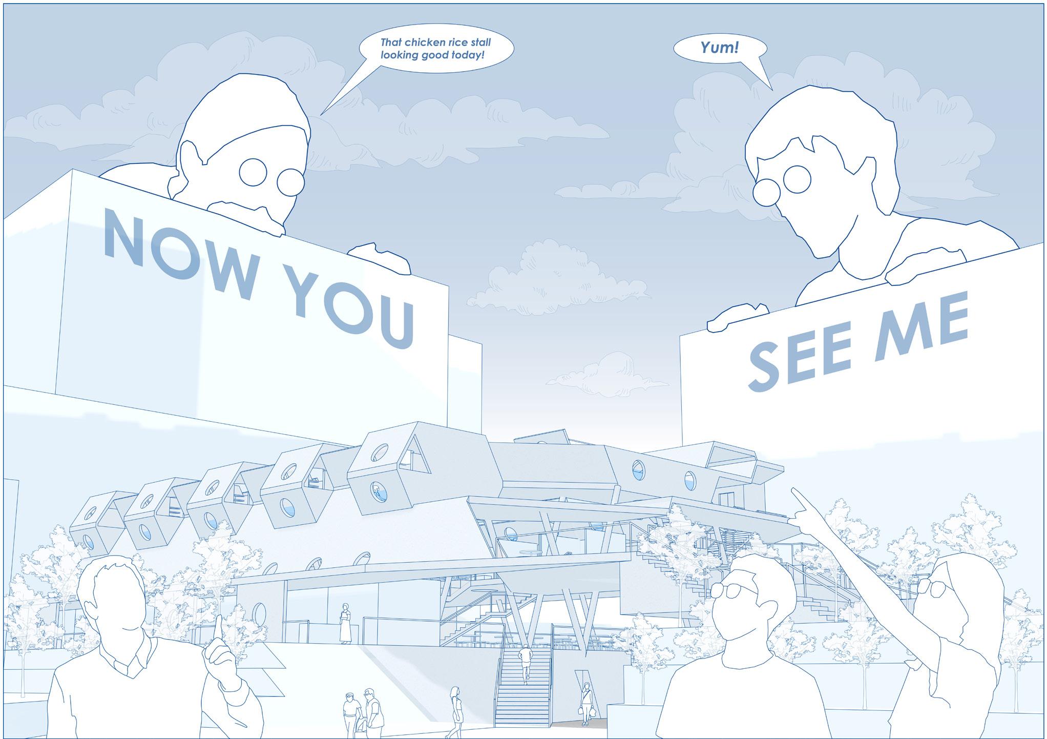
Now You See Mee (?) aims to increase the marketability of hawkers by terracing the hawker levels such that customers are able to view all hawkers from a vantage point. Viewing galleries and portholes are created to highlight the performance aspect of cooking such that the public can gain a better appreciation of these hawkers.
Other programmatic spaces include the bathhouse and community atrium, which are catered to the elderly. This arises from my site analysis, where there is a lack of activity for the elderly and demand for it.
The form of the building arises from the architectural elements I focused on, which are the wall and window. I studied how changing the sizes and angles of these elements can form connections of sight, smell, and sound, or disconnect altogether. This results in spaces of varying levels of publicness or privateness.
The manipulation of these architectural elements ties all the spaces of the building together, through connections of different senses across all levels and programmatic spaces in section. While in plan, circulations and connections to the surrounding site are the key drivers of spatial organisation.

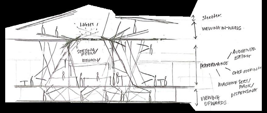
Farm Dance is a triple-story hawker that showcases the farm-to-table aspects of dining and food processing. The project draws inspiration from the art of food preparation and its connection to technology literacy and social hierarchy. The 21st-century building incorporates five hybrid systems that promote closed-loop production, enabling sustainable energy consumption.
While Farm Dance fulfills the practical needs of its visitors, it also functions as an educational space. The project introduces visitors to innovative farming methods that promote environmental sustainability. The hawker’s design is inspired by the intersection of subconscious human perception and theoretical concepts such as Suprematism and Deconstructivism.

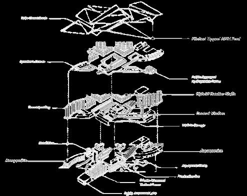
Additionally, Farm Dance aims to challenge conventional design concepts and reinvent the meaning and perception of a courtyard. The project achieves this by curating micro courtyards within macro courtyards, creating a consistent and cohesive design language that permeates throughout the site. The building also embodies the concept of “never aging” by incorporating peeks of spaces that reflect movement and displaying it as a ‘performance’.
Farm Dance is a project that pushes the boundaries of traditional design and challenges visitors to engage with their surroundings in new and exciting ways as if looking at daily mundane rituals through an artistic lens.
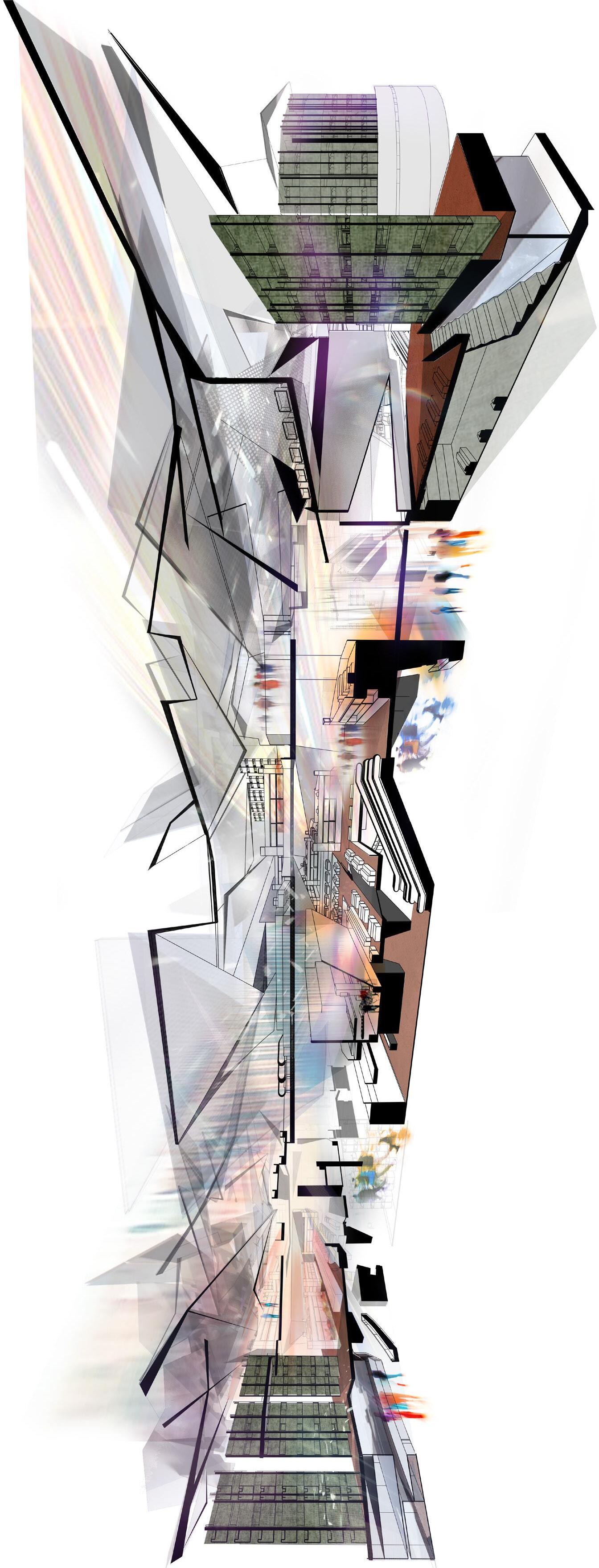
The site is Mei Ling Market & Food Centre situated in Queenstown. Surrounded by HDB blocks, the site becomes an ideal location for community to bond over a shared interest of food. With the Rail Corridor South, Alexandra Queensway Park Connector and the Alexandra Canal Linear Park within close distance to the site, the possibility of attrracting non-residents to the site as a rest stop to bond over food is high.
Hence, to-gather aims to bring different groups of users together through subtle sensory interactions using 3 main senses: sight, sound and smell. Spaces were created using ‘Walls’ and ‘Stairs’ as the selected architectural devices. Walls as a separator and connector of spaces that enhances different senses. Stairs as a connection between different programmes while allowing visual connection to happen across all levels.

Two main walls are placed to separate the main circulation space and the programme spaces, where vertically overlapped programmes are placed at the sides with the circulation in the middle. Programmes then spill into the central area to increase sensory interactions; sound that travels upwards, food smell from hawker stalls to circulate and visually connected on different levels. Additional programmes such as cooking workshop, barbecue pits, community kitchen and edible garden align with attracting different groups of users to bond over food.
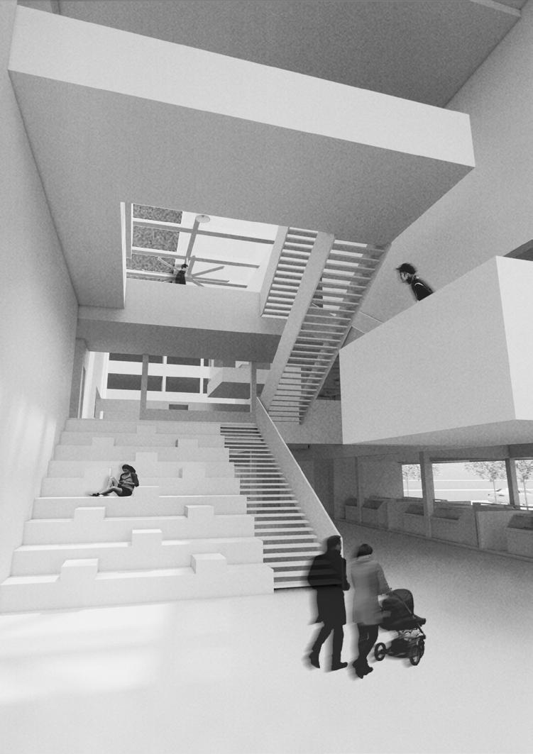
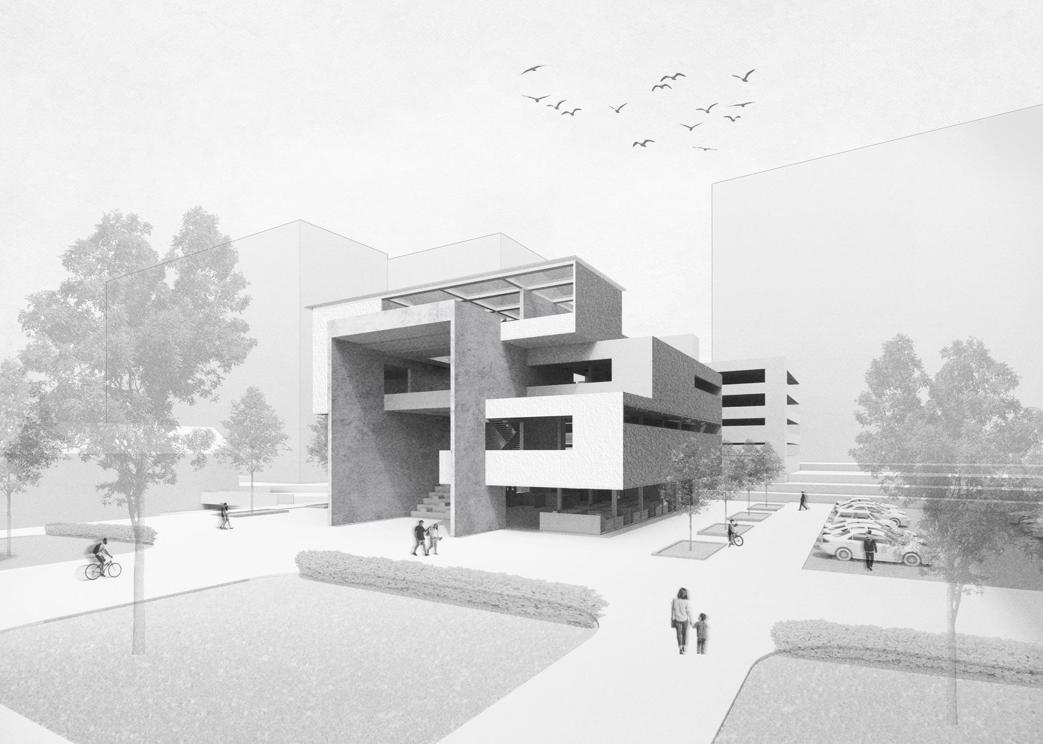
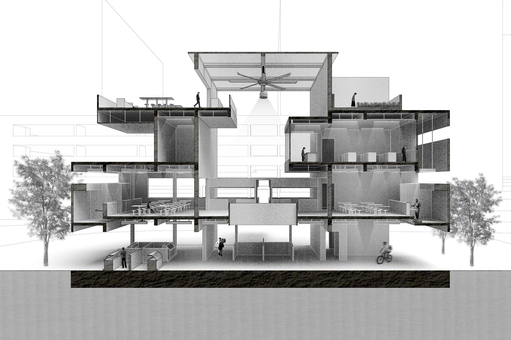
Chance Encounters is an intimately-scaled community food center that aims to reflect the community spirit and connectivity that exists in the area and enliven the lives of the elderly while inviting people from all walks of life to participate in the activities, by acting as a space that invites new opportunities for chance encounters among the community, ultimately creating an elevated human experience.The intention arose from an observation that for an area with an elderly majority in the population, the entire social space(the existing Mei Ling Market and Food Center) is elevated from the surrounding area, resulting in many stairs that a large percentage of the elderly in the population may find to be physically challenging to climb. Yet, they make their way there to interact with their friends and family at the shops and hawker center, which is a testament to the importance of the social space for them. For the architectural device exploration, the two elements chosen are the wall and the ramp, with the wall being the main organiser of space while the ramp is the connective tissue between spaces. Exploration of different ways the wall can affect chance encounters included explorations on visual connectivity, flexibility of circulation paths, soft-edges between spaces and regulation of boundaries. The programmes in the center consists of programmes that allow for the crafting chance encounters among the elderly as well as programmes like the kindergarten and playground to bring children from surrounding parts of Singapore to the center to interact with the elderly as the area was lacking in facilities catered to children.
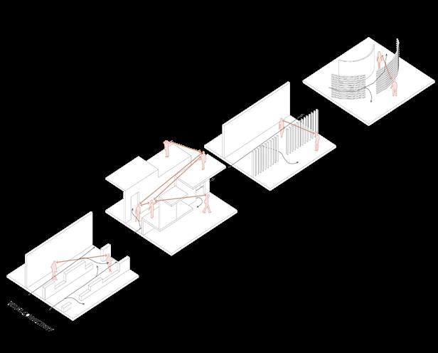
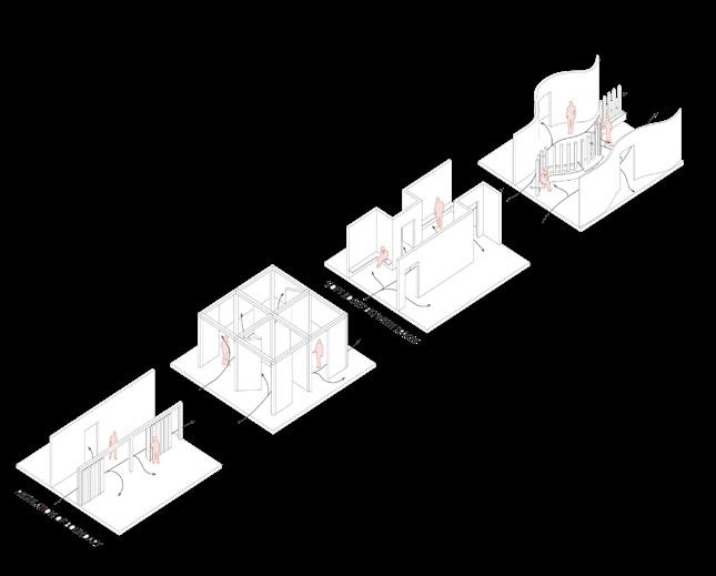
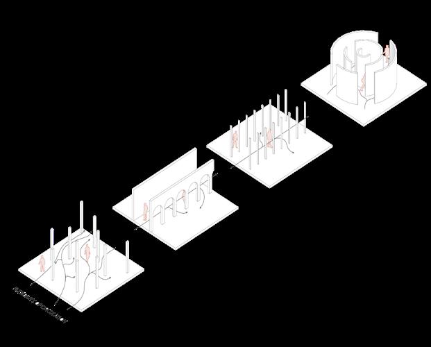
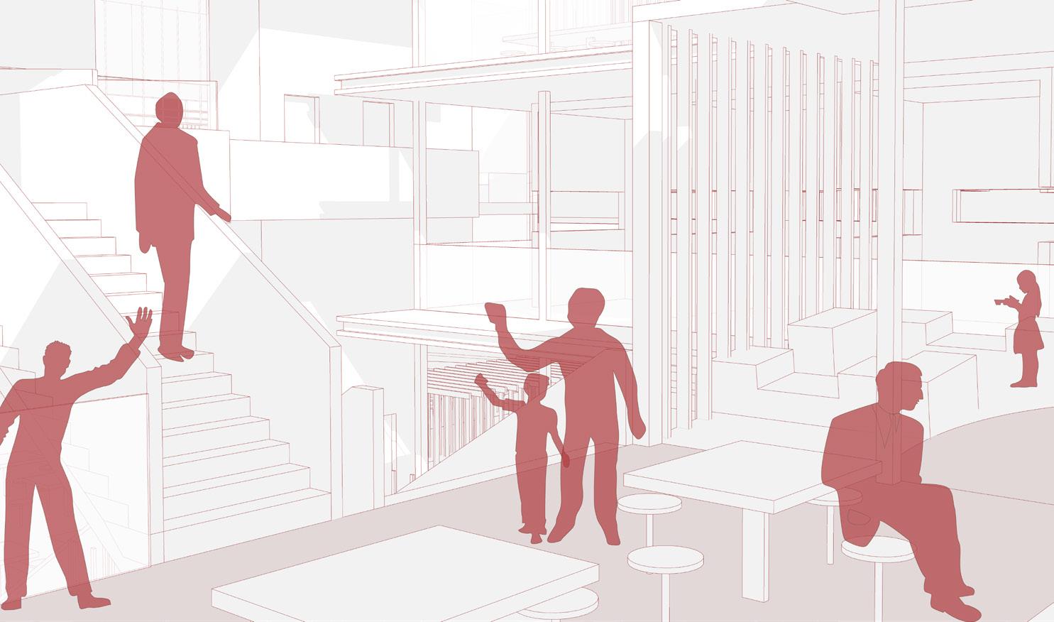
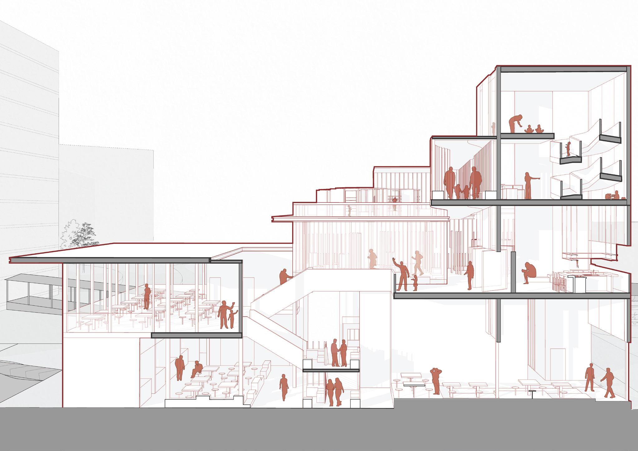
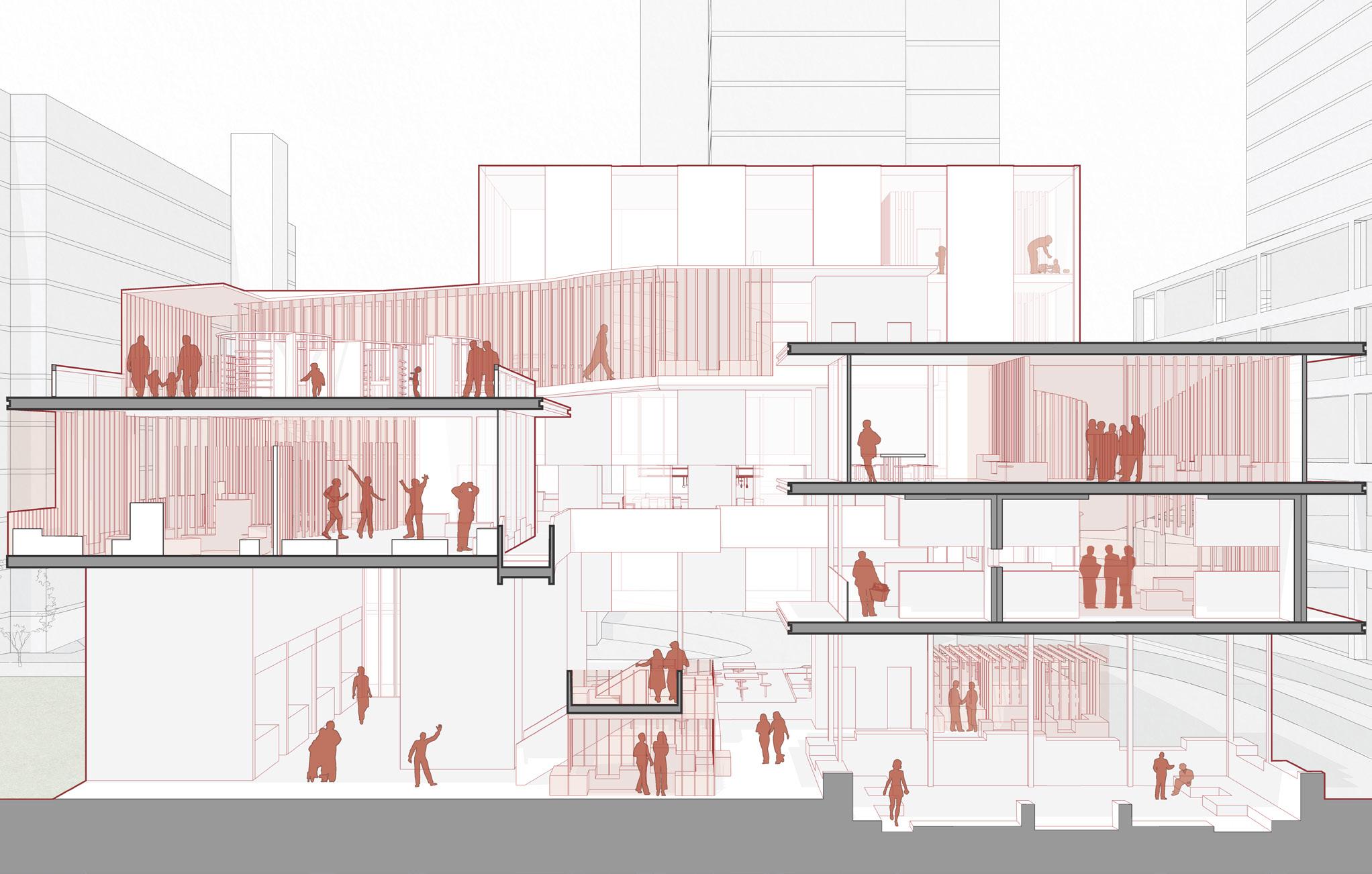

Going to the hawker centre is an integral part of the Singaporean experience - whether one is going there to sit down and dine or to dabao food, it serves as a familiar and cosy space that warmly welcomes everyone from all walks of life. With such a space serving as a necessary place of respite for many, this project aims to exemplify this sense of comfort of a hawker centre for its three main groups of users - the residents of the neighbourhood, the stall owners, and the general public.
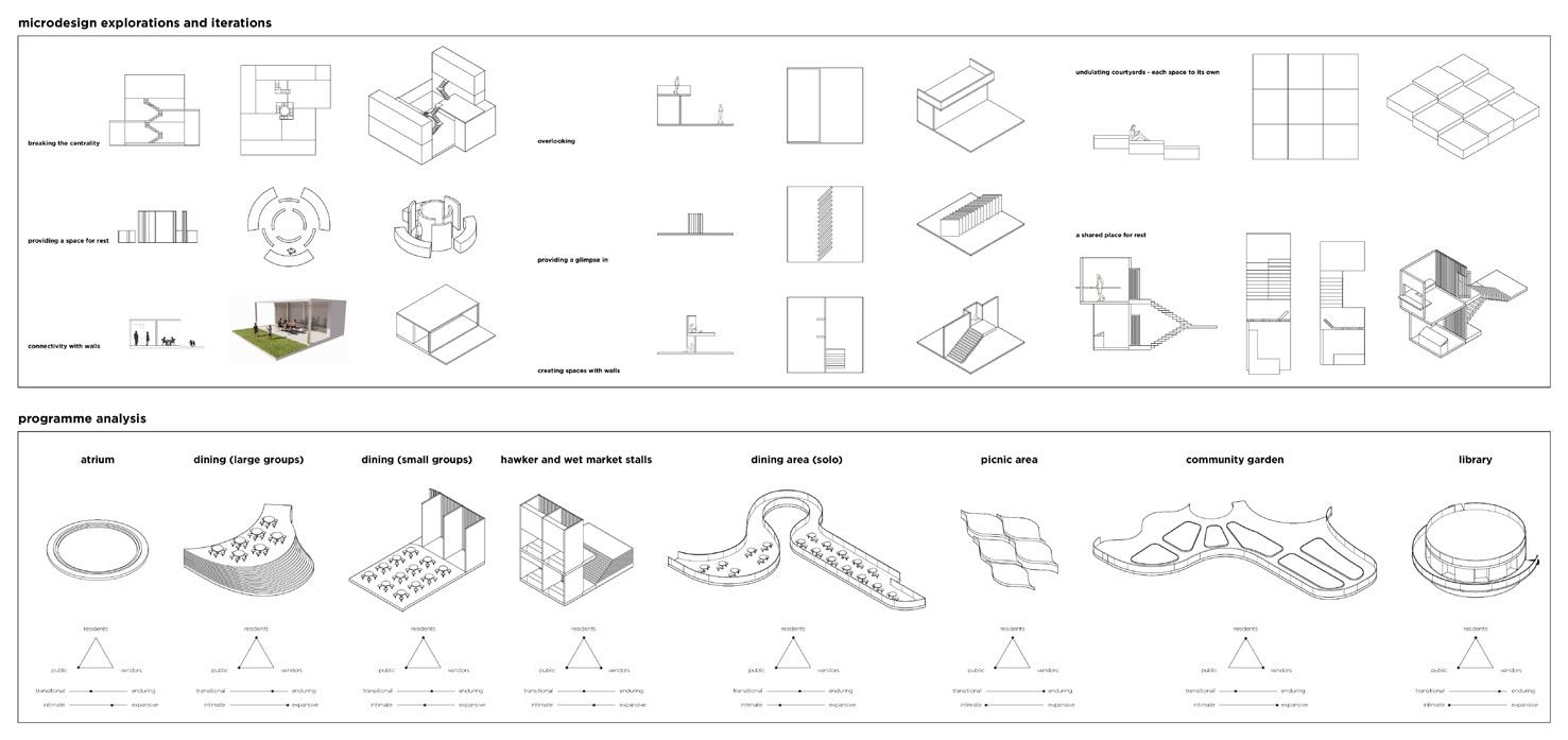
The design plays with the scales of intimacy of the space through the exploration of architectural devices, and creates spaces of comfort for its users whether they may want a more intimate space to just exist in their own capacity in, or an expansive space that facilitates interactions. The design also aims to invoke a sense of curiosity for its users, encouraging them to traverse the building and discover these different spaces for themselves and giving them a sense of wonder - as if one is hiking along the main path of a hill and spots a beaten-down trail that leads to a clearing, and it eventually becomes their favourite spot.
The two architectural devices chosen are the courtyard and the wall. Microdesigns of the courtyard explored how its parameters and characteristics, such as the idea of overlooking, or threshold spaces that define its periphery as compared to its centre, could be used to provide a sense of intimacy and expansiveness for different spaces. Microdesigns of the wall explored how this sense of intimacy as well as curiosity could be evoked through using the wall to obstruct vision or to provide a greater degree of privacy between different spaces.
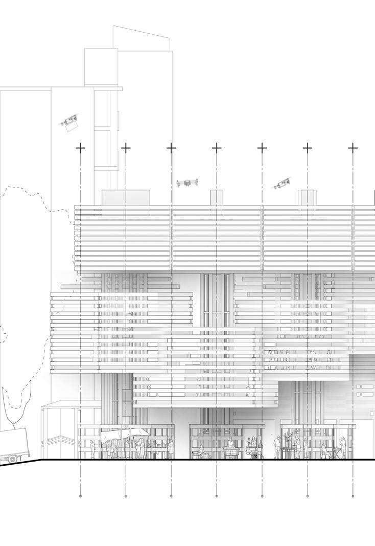
The project initally began with the creation of volumeteric spaces with performative qualities such as light, sound and ventilation expressed in probe models. These models were constructed using elements of beam, ramp, staircase and roof through operations of mainly grading and staggering. In these probe models, commonality where grading of different scale or grains are observed, enabling visual engagement for various programs. For example, grading in small-grain can create display possibilities for market goods, mid-grain for seating possibilities, and large-grains for platforms of differing floors. At the Meiling Market and Food Centre, the original site is situated in the middle of two urban block of HDBs on its North and South, greenery towards its West, and a carpark towards its East. There are three main observations that served as the basis for the project. Firstly, there is a lack of traction to the market. The two main programs - hawker centre (first floor) and market (second floor) - are completely isolated from eachother, which could be hypothesized as the lack of visual engagement and relationships. Secondly, there is a lack of relationship between the other key spaces in the area. Lastly, in the urban macro scale, it was observable that there is also an expression of grains in the size and density of buildings surrounding the site, tying back to the above mentioned commonality of the probe models. Granularity aims to rejuvenate the market scene through systems that promote a distribution-consumption-combination. The systems in question aim to integrate the purchasing of food produce from the market with other key spaces in the building, mainly the cooking classes, seating or waiting areas, and food stalls. Lastly, grains observed from the probe models are to be used as a continuation of the urban grain as the architectural language, where grains are expressed in differing scales from ‘large’ in programs spaces, to ‘mid’ in façade to ‘small’ in furniture. Taking influences from relevant site observations and programmatic relationships, operations of staggering and grading were used to create the basic massing that was later enhanced to create a commercial building where different consumption spaces and people are to come together in ‘celebration’ of food, increasing the need for and traction to the market.

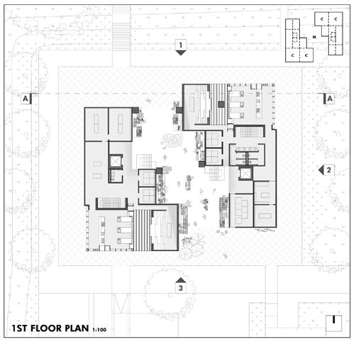
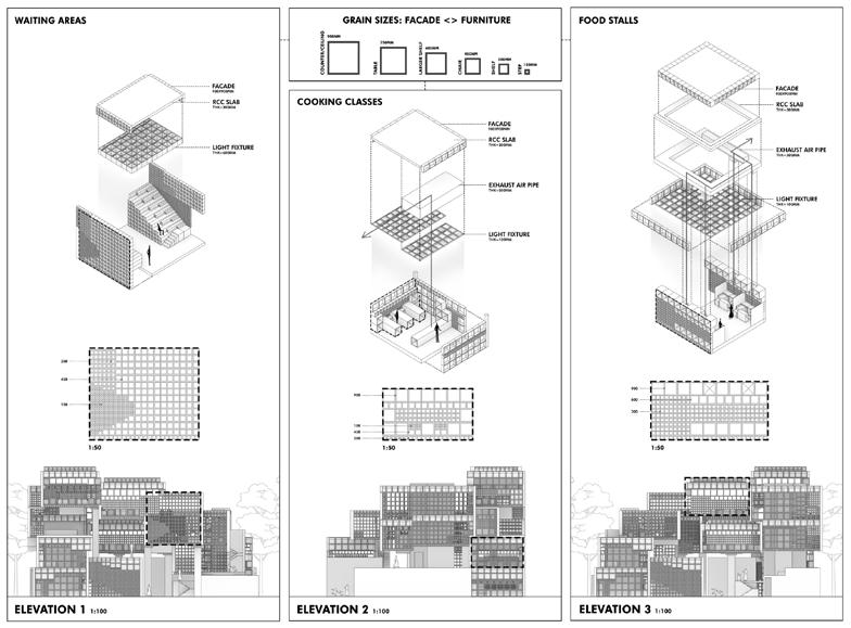
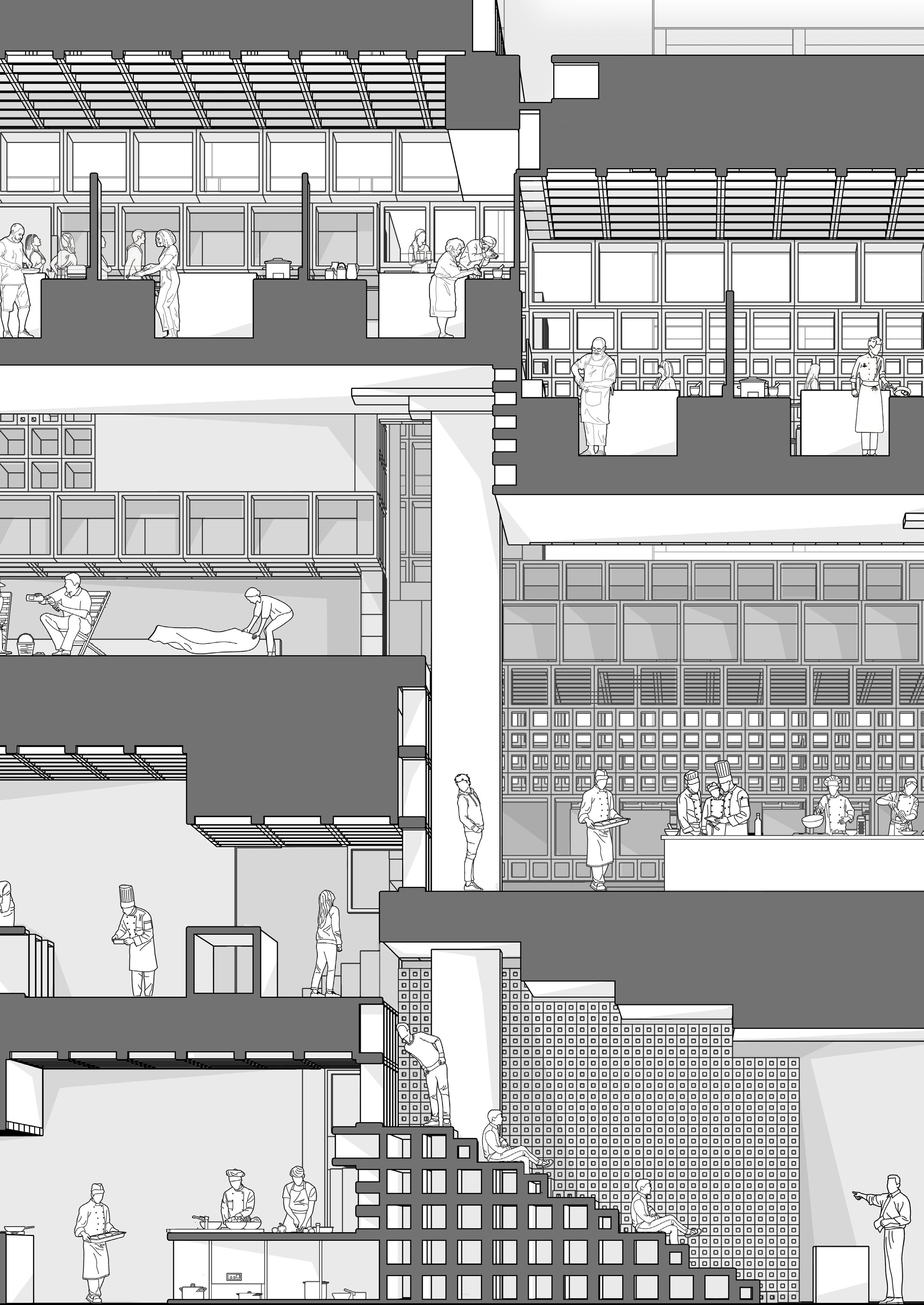
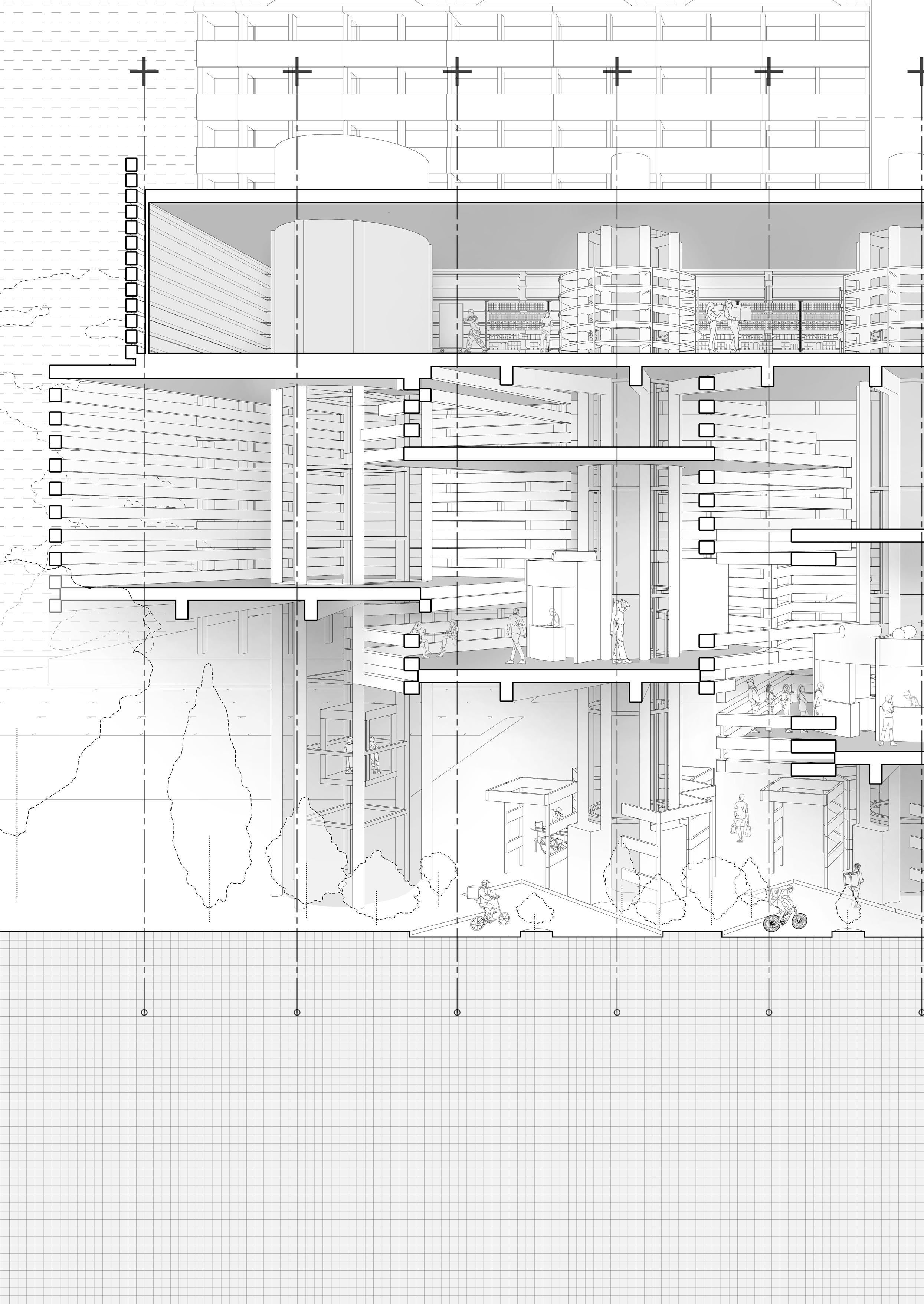
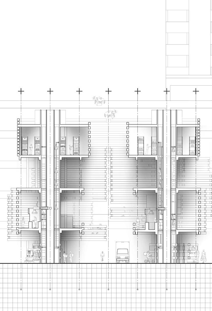
Initial market model and probe studies allowed for the discovery of several design principles: from rotating forms, one is able to create terrace spaces, as well as increase visual and audio engagement across levels. The probe and market studies also allowed for explorations in the atrium space as an architectural device.The aim of project was hence derived from site analysis: visual audio engagment across levels through a central architectural device, making better use of the entrances on site, and addressing the dying wet market by introducing a system of food movement across the market, with the 3 programmatic spaces of a dark store, hawker centre and dispatch food street.There were considerations as to how these 3 places would be linked. After produce enters the dark store, it can be bought by the hawkers which prepare the food for patronising customers. The groceries from the dark store is also primarily ordered online by customers. Both groceries in the dark store and food prepared by the hawkers can also be sent to the first floor where the dark store riders, food delivery riders or self collection facilitates the leaving of food out of the building. The proposal intends to incorporate a form of atrium or central space to tie the spaces together across levels. All the programmes ending at a central space in the center. Movement of the food across the levels will also be facilitated through the usage of the architectural core.Discoveries of forms made in the market models and probes are then attempted to reconcile with the programme. As a result of further exploration in the relevance/irrelevance in form in accordance with the programme, an idea of varying levels of disruption in grid, organisation, and facade was discovered. These ideas were then put into play when attempting to design the forms for each level through a series of operations that were discovered in the initial probe phase.

As the prevalence of workaholic lifestyles continues to rise, there is growing concern about the blurring of lines between work and family time. In response, future markets may shift their focus from solely providing food to also catering to the needs of society’s evolving lifestyles.
This proposed architectural design for a food centre and market aims to address this issue by serving as a hub for both work and family bonding activities in the same location, while promoting a clear delineation between the two.
The building is divided into three distinct segments: a workspace, a food collection area, and a family dining area. The design allows for a clear separation of the programs while also allowing for fluid movement between the different areas. The workspace segment is intended to provide a dedicated area for work-related activities, while the food collection area is meant to facilitate easy access to food. The family dining area is designed to be a comfortable and inviting space for families to spend quality time together, with a focus on promoting bonding and social interaction.


What is a hawker without its stalls? This project aims to scrutinise the purpose of stalls in a hawker setting, be it food stalls or vendor stalls, and examine whether the cur rent stall model is sufficient in its job. By reshaping what a stall can be, the space within and directly adjacent can be redefined to form a new intricate system. A reprogramming of spaces people think are transitory and directly accessing these liminal spaces between each stall can help to not only direct both people and wind to their destinations, but also bring the activity to them. Engaging the visual and olfactory senses, this project hopes to be able to synthesis a bold new way of eating, socialising and cooking.

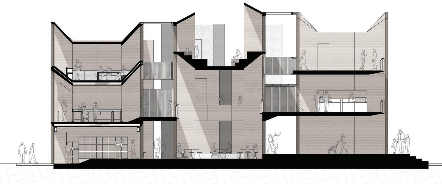
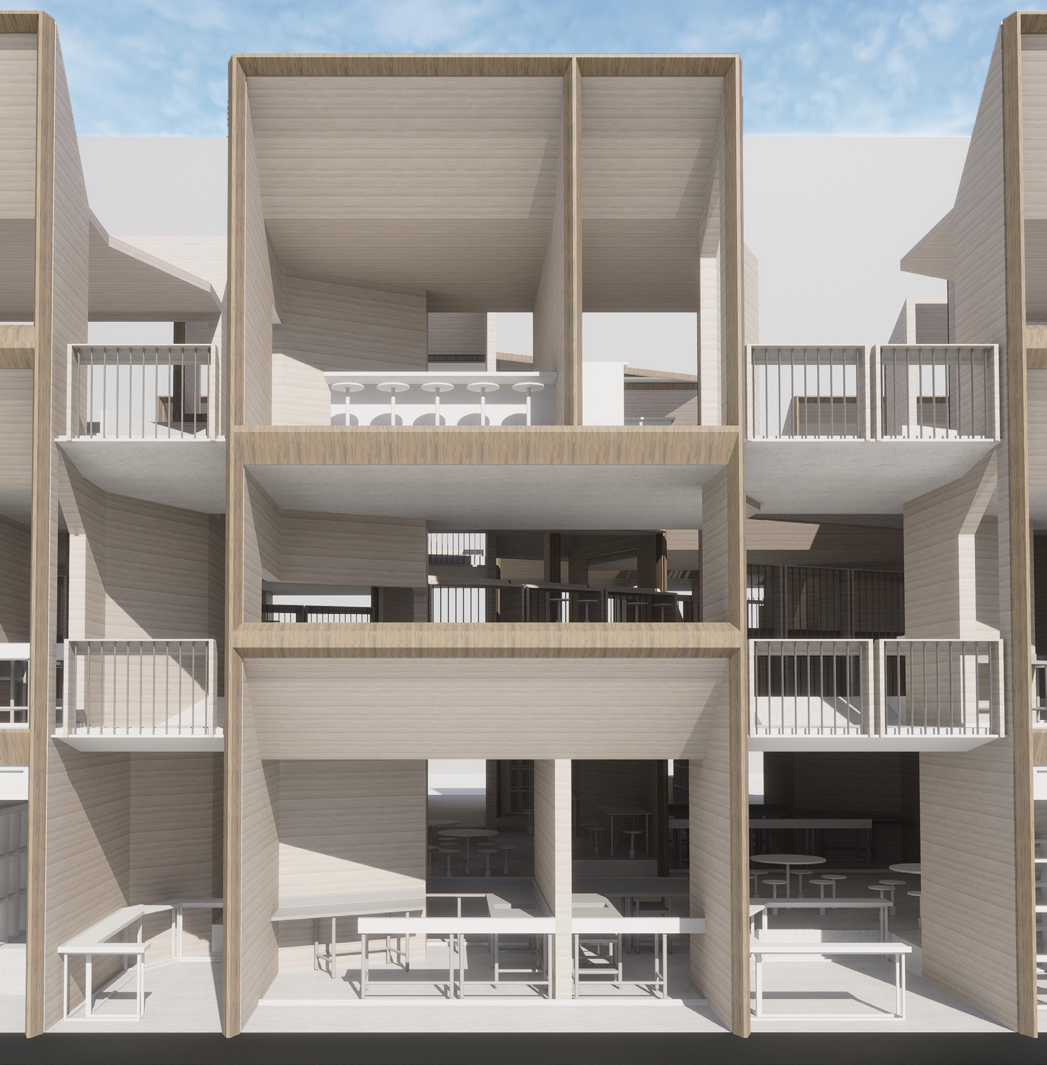

Situated on a hilly, public housing area, Ventus Food Court and Market embraces the windy nature of the site, facilitating natural ventilation throughout the building. Sensitive to different programmes and ventilation needs within the building, the design decisions moderate wind where it is needed.
Through design probes, I explored how walls and doors, as well as screens and columns can be manipulated and changed to create interesting spatial qualities. From my site analysis, I identified wind as the main environmental factor I want to respond to. I chamfer, stretch and manipulate these building elements to create windless caves, wind scoops and shaped wind tunnels to change the speed of wind where it is needed.
Combined with detailed site analysis, I apply the design techniques to my design. Two complimentary building blocks are offset from one another on site, creating a central valley in the centre that directs wind and users through the site. With one building designed at two storeys high, and the other 3 storeys high, the chamfered facade directs wind through and to each other.
The shaped walls and openings also direct and influence circulation of users through and within the building. Wind is not only shaped within the building, but around the building as well with the horizontal glass louvres, which maintains a level of porosity while still being able to shape wind.
The Ventus maintains the food court and market programme, and has an additional bar to accomodate night life. There are 2 courtyards with garden spaces as well as a rooftop garden that facilitates wind flow and creates rest spaces for weary hawkers and residents of the area.
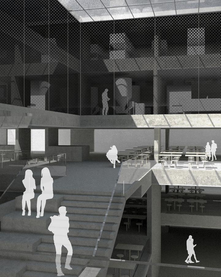
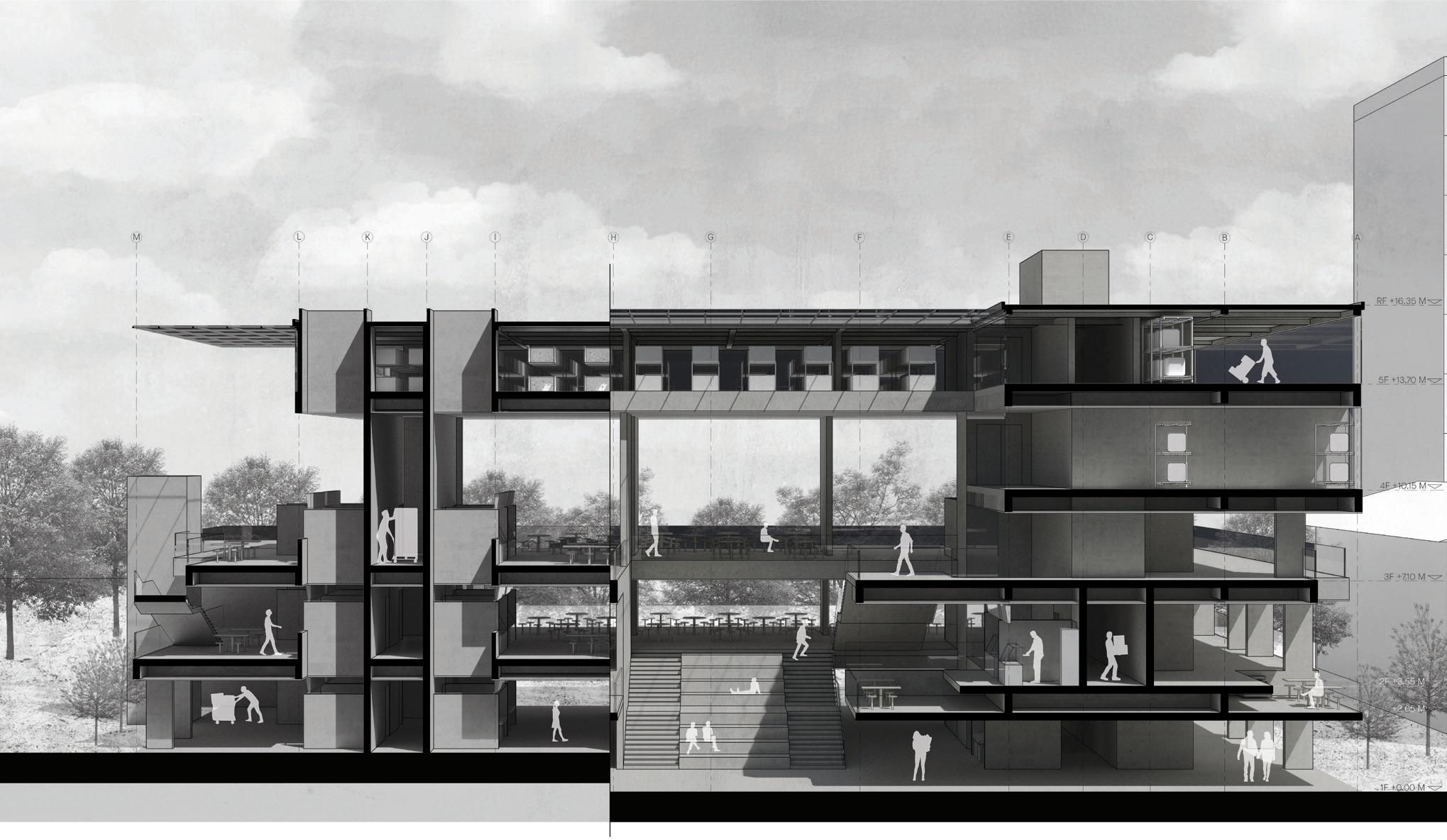
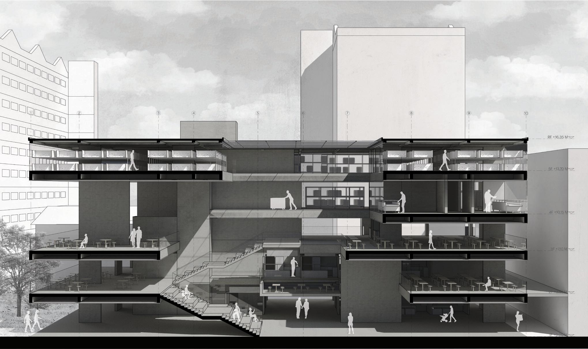
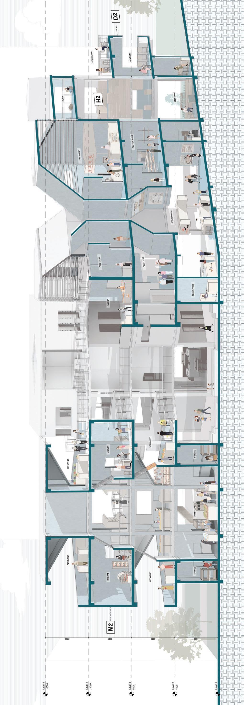
The primary objective of this project is to construct a food center that integrates columns and balconies to form a cohesive system. The primary drivers for the creation of these spaces are environmental qualities such as lighting, ventilation, acoustics, and views. By combining these features with columns and balconies, a variation of volumetric spaces are formed.
The food center’s main architectural design features a central core that is formed by the regular grids of columns and rotated floor plates. This design is tailored to each tower’s unique spatial requirement, forming a small vertical community within each tower that is interconnected to other towers to create the food center.
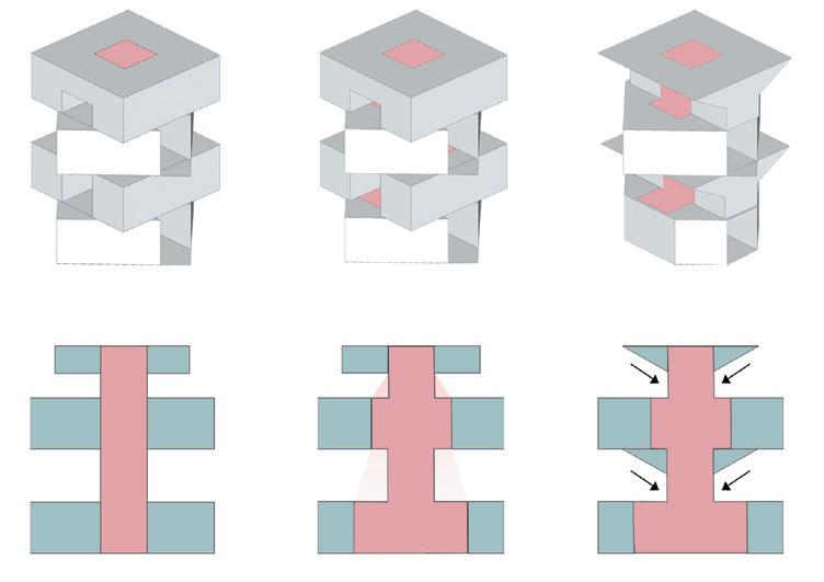
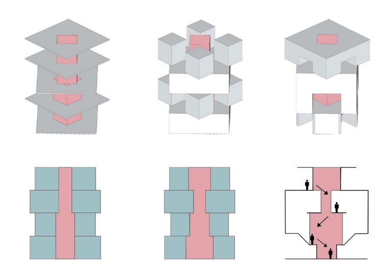
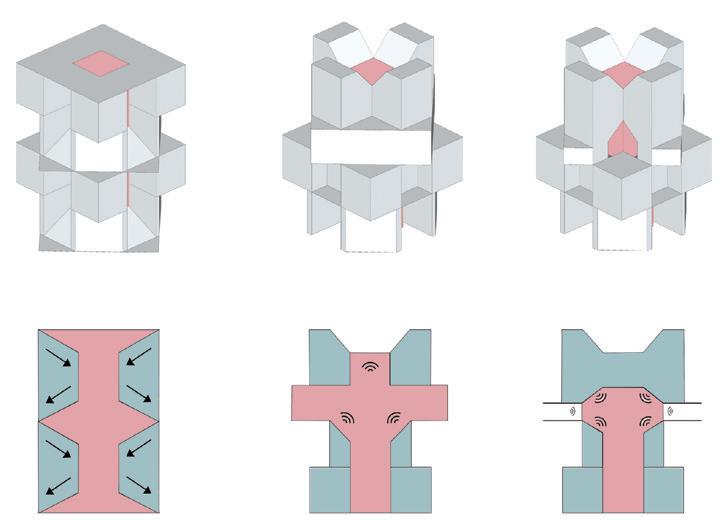
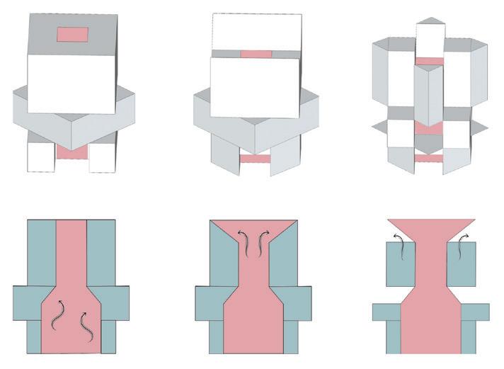
To provide a comfortable environment for the cooks, a ventilation chamber is incorporated into the hawker tower to release hot air and circulate air within the tower. The dining tower features an acoustic chamber that creates two distinctive dining environments for diners: a quiet atmosphere where noise is buffered and a more public area sound is reflected. The market tower includes a light shaft that utilizes natural daylight to illuminate the spaces.
Finally, the incubator tower’s design emphasizes visual connectivity, providing opportunities for apprentices to learn culinary skills from one another by overlooking each other’s work.



 by TharshanaSubramaniam
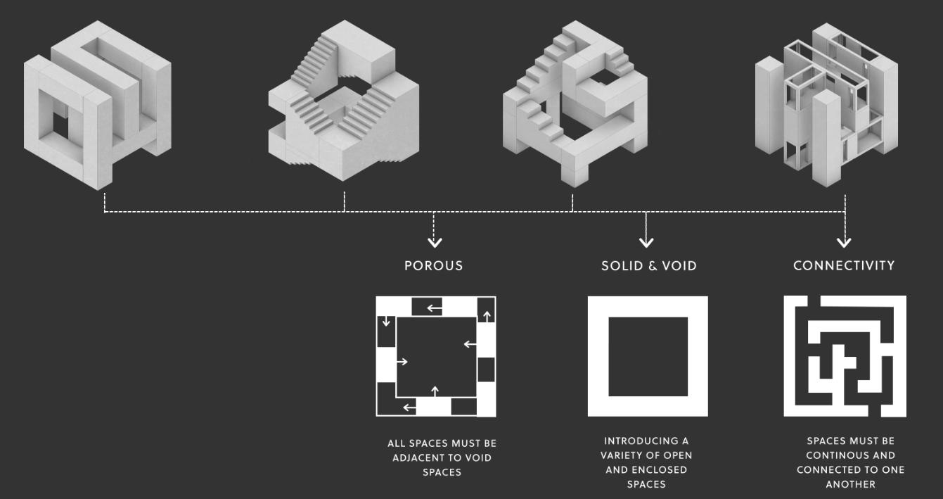
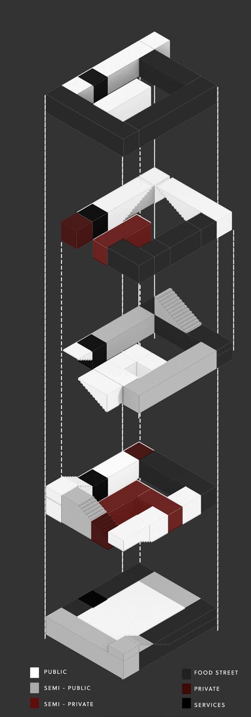
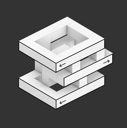
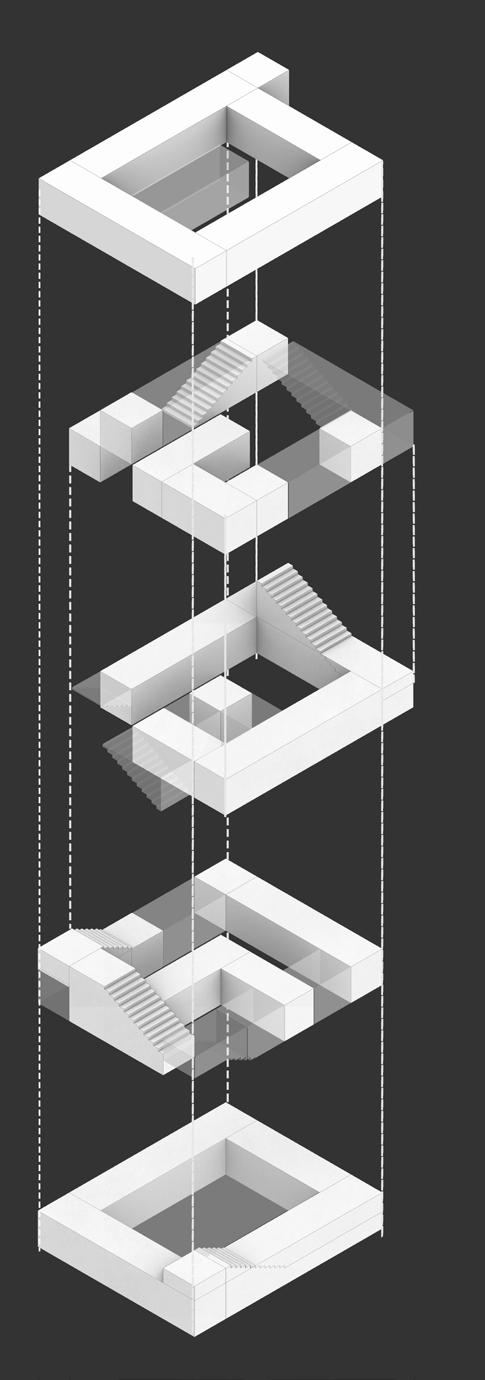
This project intends to reshape and revitalise hawker centres through the adoption of a ‘third space’ concept that allows the younger and older generation to coexist simultaneously in a comfortable and familiar environment. The concept of a third space is rooted in the idea of another form of transformative social space that is separate from the usual two environments which is your home or workplace, where people can meet and socialise with others. This project focuses on having a porous design where it emphasises creating open and interconnected spaces within the building that encourages social interaction and collaboration by creating spaces that can be used for a variety of activities, such as gathering, working, or studying by all generations. This approach can create a more flexible and adaptable environment that can be easily reconfigured to suit changing needs and uses.
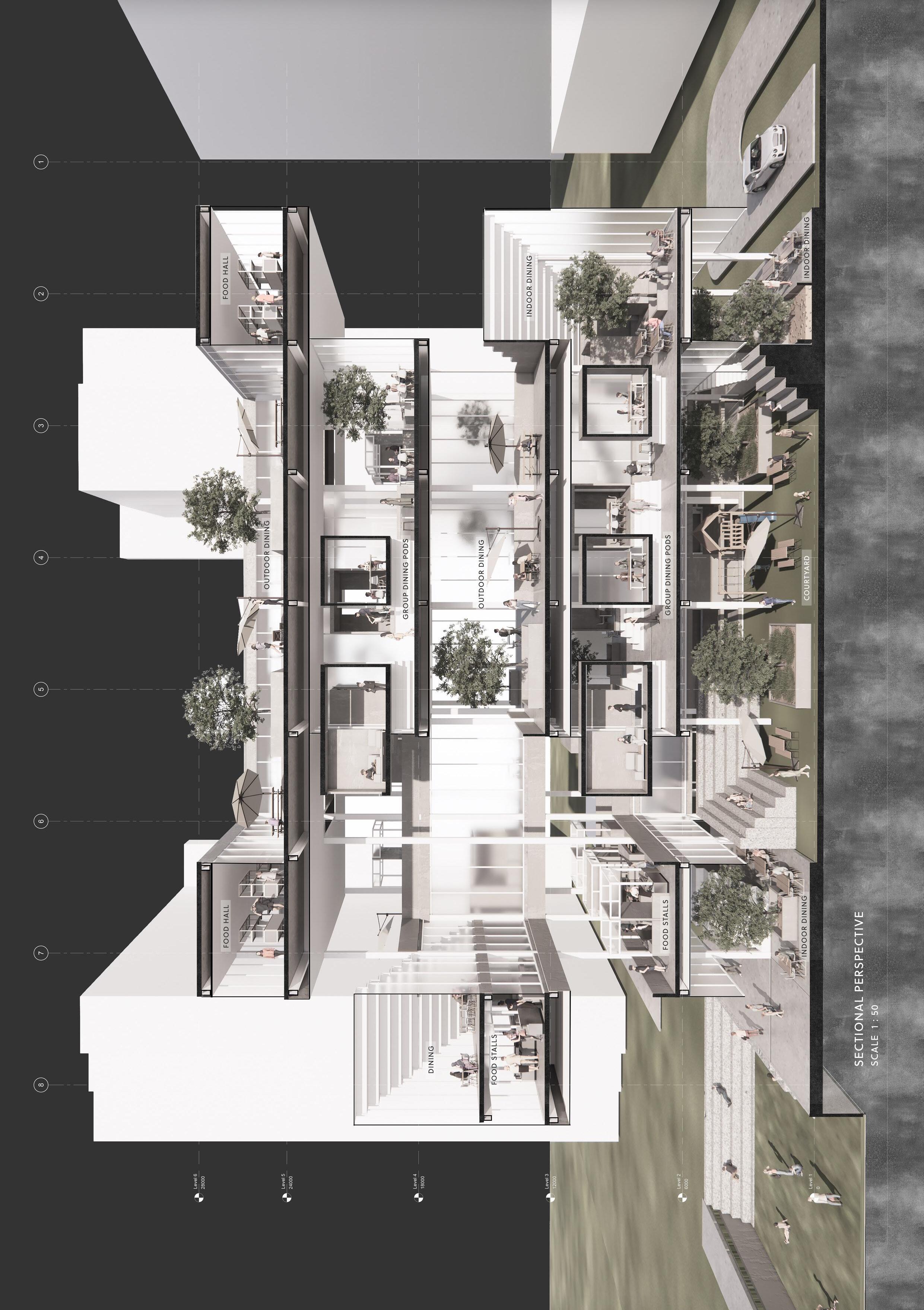
Located at the existing Mei Ling Food Market, the site is in close proximity to a series of HDB flats and surrounded with inter-connected circulation networks and community spaces. A prayer nook is tuckd away at the rear of the existing food centre, where it created an extended social space beyond the everyday act of eating and shopping. With the increasing possibility for prayer and market to coexist due to less priority in land allocation for sacred facilities, the proposal reimagines an alternative hawker centre with prayer as the heart of shopping and dining.
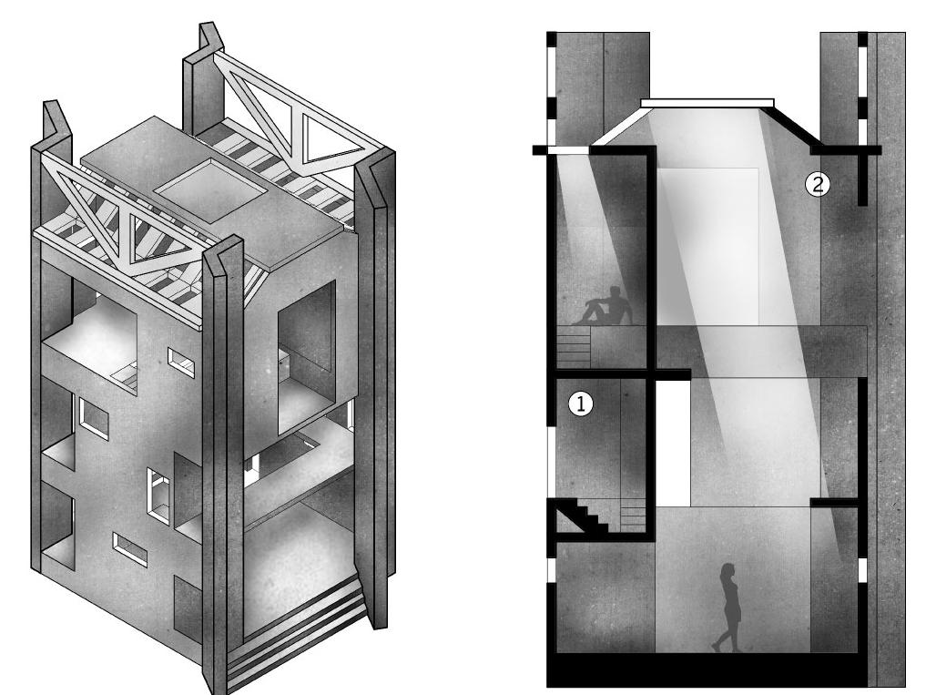
Originating from a series of spatial probes explorin evocative qualities of light, ventilation and sound, the design culminates to a core tower for prayer flanked by two smaller towers to capture natural ventilation for comfort while serving as main circulation. In-between areas within the towers are then transformed into market and food stalls with pockets of interstitial spaces for relaxation. Serving as the carrier of light, shopping, dining and recreational spaces are illuminated by natural light filtered in through the tower’s openings, allowing visitors and workers to bask in the monumental presence of the sacred core.
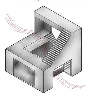
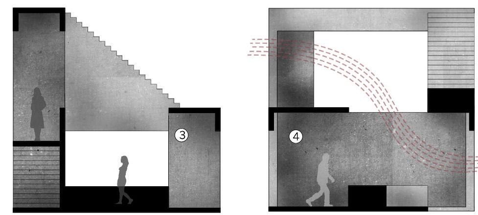

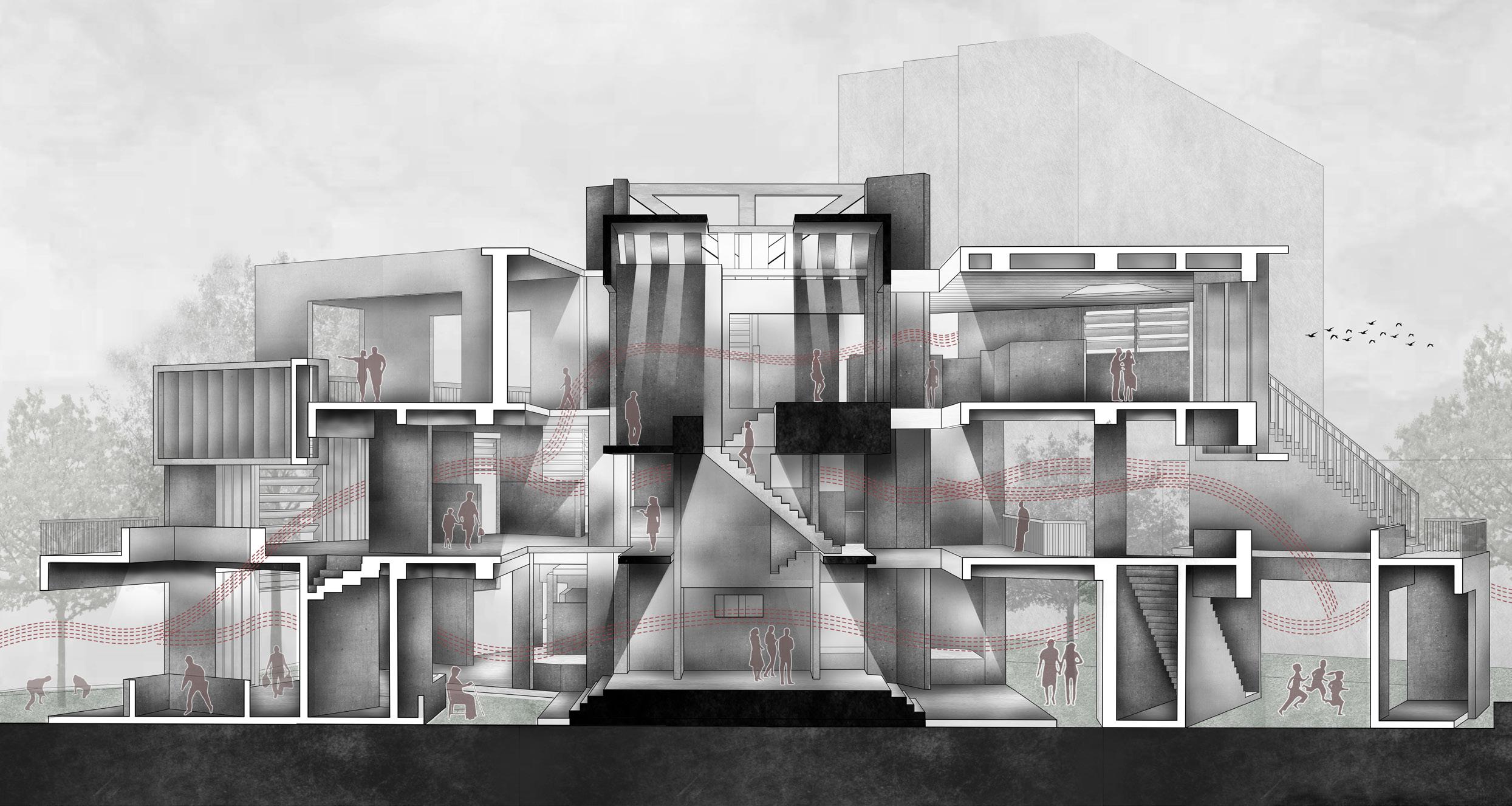
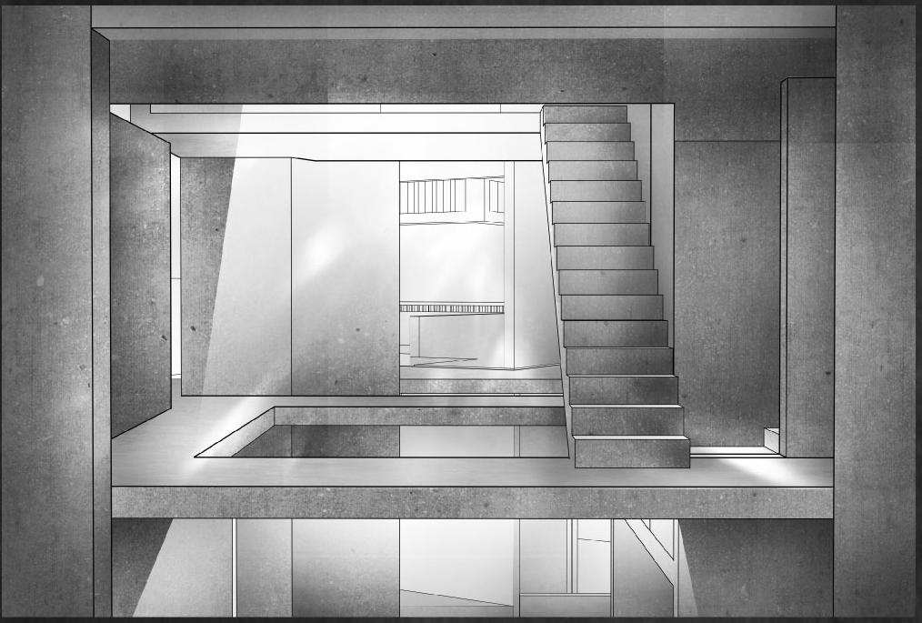
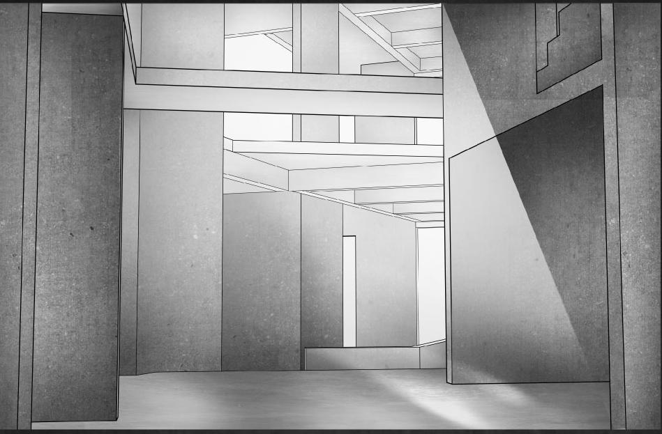
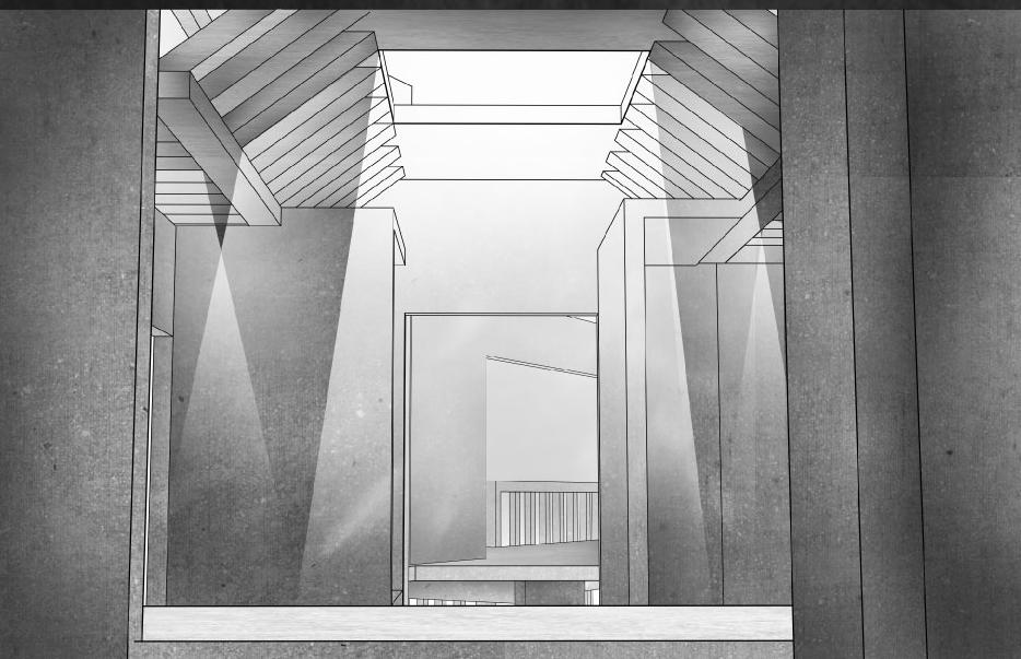
The theme of this semester’s project is to explore the nature of architectural elements in form and space. In the context of the Singapore Food and Hawker Centre, we sought to create a different food culture and experience for the Mei Ling Market in Queenstown by exploring and using the inherent design grammar of selected architectural elements. The architectural elements I have chosen are “roof” and “balcony”. First, through the analysis of the characteristics of different architectural elements, I designed different probe models for the two spatial qualities of ventilation and acoustics. Then, by combining the different experimental models, I got a third “market model”.
Moving on to the site analysis. The site we focus on, which is Meiling Market, is surrounded by residential area. The problem of population aging in this region is serious. In particular, the population aged 50 and over, accounts for the majority. This is exactly what I observed on the site: Except the rush hours, most of the residents I can see are mainly middle-aged and elderly people.
Thus, I hope that through my design, the interaction between users of each age group on the site can be improved, especially to bring young people and old people together. So I planned the three key spaces, they are: Event Space, shared kitchen and communal dining area. I hope that more opportunities for human interaction can be triggered through collective cooking and dining among community families and users of all ages. Especially when a new residential area on the west side of Meiling is built, it is possible that more young people will move to Mei Chin district in the future. Therefore, designing Mei Ling Market as a more popular community space became my goal.
In this regard, I have replanned the spatial organization. I want the first floor of the building to become a more open space and attract more residents to the site. The middle level serves as a semi-open space with the potential to connect the upper and lower floors. I will plan this area as a shared space for residents by integrating shared kitchen and communal dining area. Finally, the top floor of the building will continue to be used as a hawker centre. Through the proper spatial arrangement and transformation, the selected probe and market models can well meet the expected design requirements and spatial quality.
 by AshleyKhoo
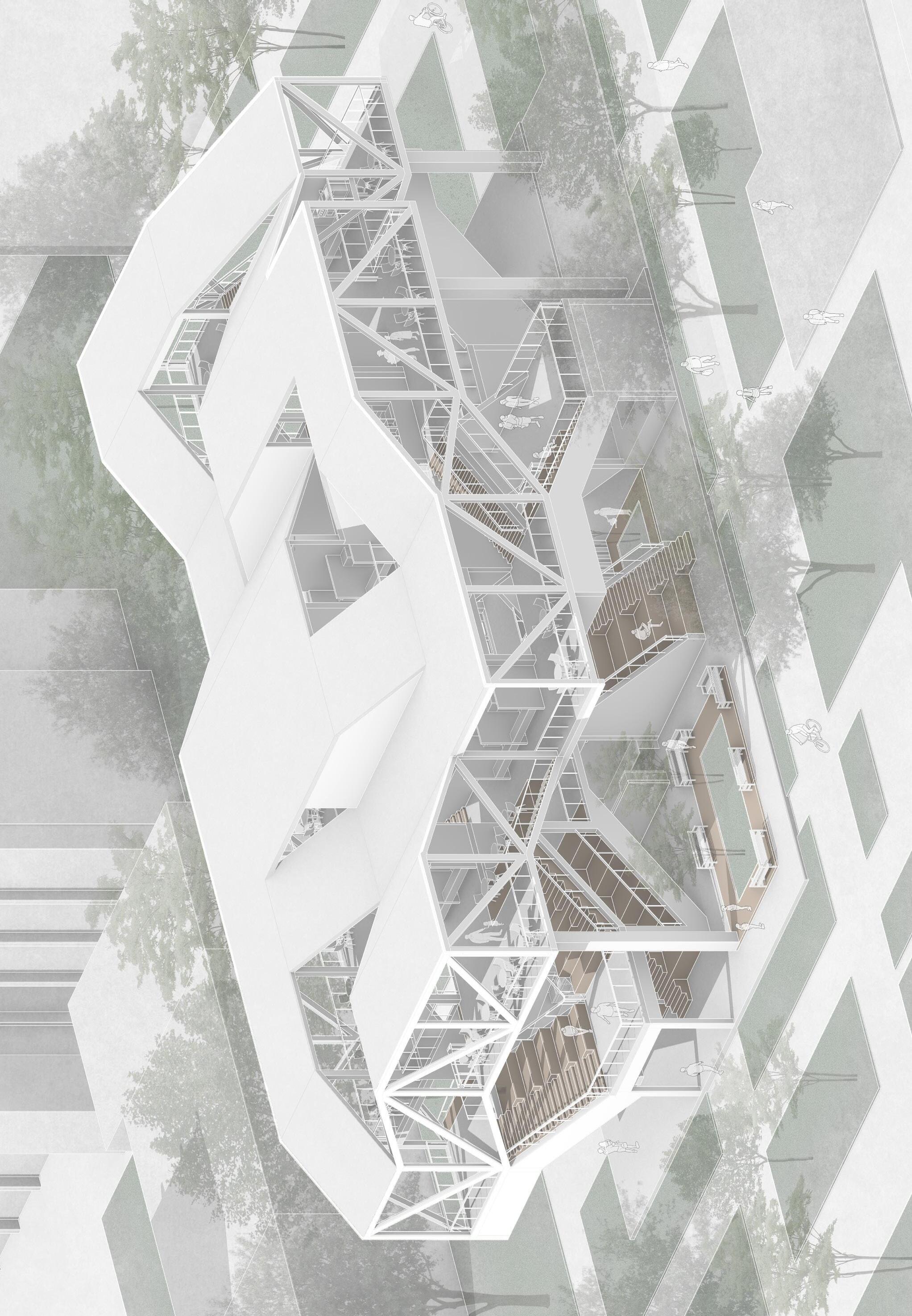
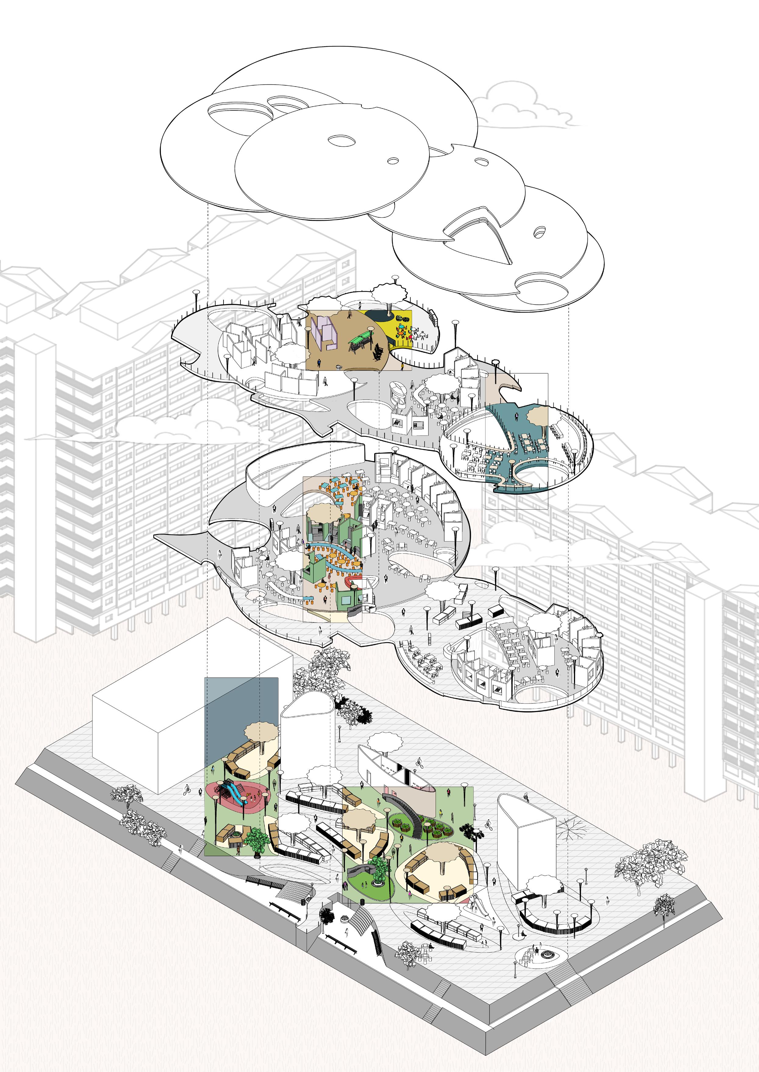
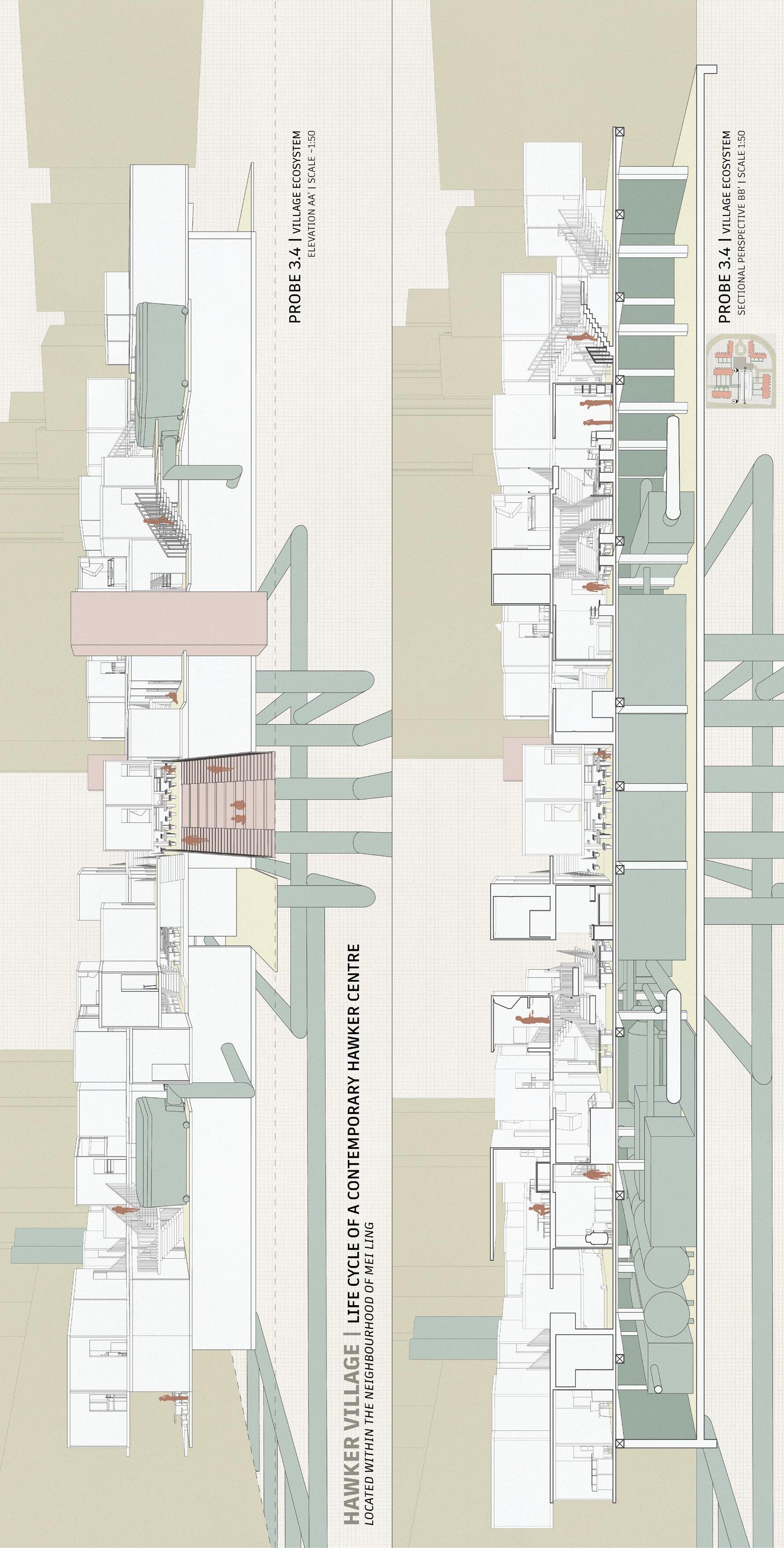
Self-sufficiency in itself is an ideal scenario for a community to achieve, consuming to produce, and producing to consume, while minimising waste generated and energy consumed. As a depiction of my idea of a hawker centre as town centre, I looked into the idea of creating a hawker “island”, which, isolated from the rest of the city, functioned as a self-sufficient entity, in and of itself.
On the other extreme, pushing a community into a factory-like living structure transforms it into a vehicle of output-centric, rather than user-centric, production. This dehumanises an inherently human process of eating, living, and interacting.
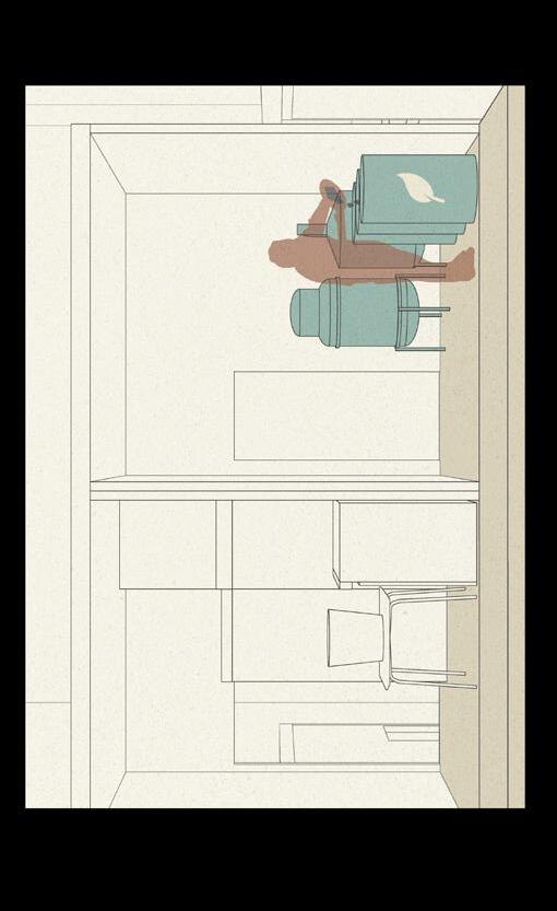
In “Hawker Village”, I attempt to strike the balance between both social and economic efficiencies. By allowing the flexibility of programme between hawker-market-retail, products from one stakeholder can be repurposed as raw materials for another, creating a circular ecosystem which minimises waste and maximises output. These units form modules which interact to form a cluster system. Across clusters, a centralised waste management system is implemented to convert organic food waste into biofuel which contributes to the power grid of the hawker, creating an intangible circular hawker ecosystem.
The hawker entity moves towards self-sufficiency by repurposing its organic waste, while individual stakeholders move towards personal resiliency by taking greater ownership of their business versatility and waste management processes — an envisage of the contemporary hawker village.

 by GarciaMiguelNartates

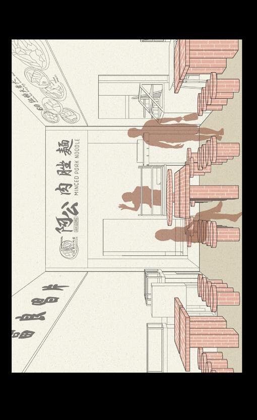
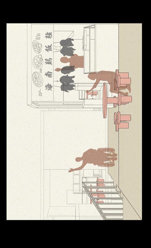
This project, we focus on Hawker Centre and Wet Markets in Singapore. Our professor allocated my group to Tekka Centre and we were tasked to do a market study of the space and decide on a deep structure that we found in market for our market design in Mei Ling Market, our site.

After weeks of research and studies on the market, I have learned the market used to be along the streets in rhe early days of Singapore and now shfted to a singular building to create a community space. Despite being able to maintian the market proper, the market itself was hard to navigate due to its many network of walkways, and there’s lack of open space for leisure and activities besides eating and shopping.
Knowing how markets used to be along the streets, I decided to focus on using Arcades as my deep structure for this project. It is a way to create less network and a simple way of walking through the market. By doing so, it creates a more open space for visitors to have more visuals of the market and possible activities.
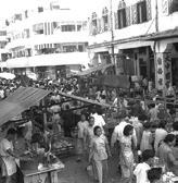
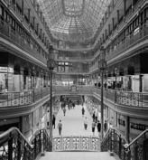
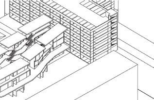
Studies, experimentaion and considerations were made as I try to merge different activities and stalls together, and how I can make a smooth transitions inbetween them, instead of creating a consitient level. Worked around with platforms, levels, visuals, corridors and walkways to see what suits these stalls.


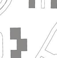
After studying the main site, I decided to make the project of arcade market into a way that it will connect two main roads or key landmarks together. Instead of a road or pathway that connect these two, it will be the market. making it convinient for people to come dwon halfway to meet, eat, shop and play.


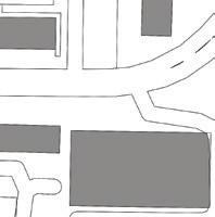
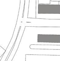


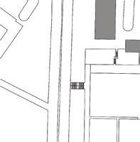

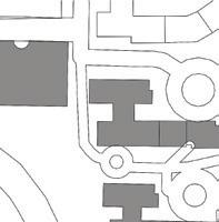

 by JoyannOng

Community Hall @ Mei Ling is a hawker centre with a mix of a town hall and a community centre. It was designed to provide the community with a common space where they can meet and interact with each other regardless of race and religion and share their thoughts openly to enhance the community spirit. Prompted by the case study of Tekka Centre, this community hall focuses a lot on the visual connection between the hawker center/market and the surrounding HDBs. Different scale of voids was utilized to serve different functions. Through the precedent study of Tekka Centre, the market felt detached away from the site as many apertures had louvers or high walls which created a sense of separation as views were cut off. This makes the market less appealing to new visitors as they would lose their sense of direction when traveling in the area. However, it was interesting that there were unique void spaces within and around the market which could be explored further. From there, towers were designed with the exploration of different floor heights and shifting floor plates, and found that sheared floor plates can provide an optimum view. Then, a core system is created to determine the angle of the slant and how the programs can be affected due to the core movement. Aside from core movement, floor plates could also be rotated to create interesting engagement between floors. Clusters were then formed using 4 connecting towers and the size and angle of the void were explored through the rotation and shifting of the towers.
Tekka Market was established in 1915 and it was originally an outdoor market known for its wide-variety of goods.

Vendors would bring their stalls to the doorsteps of villagers and engage in communication. Due to convenience, road safety and hygiene, hawker stalls and shopping mall were placed under one roof. This created space where people from different ethnicity gather, creating a multi-cultural space. Located right next to Little India MRT station and it is built in the center of 4 HDB flats. Tekka Market is known as the people’s market however the market felt isolated.

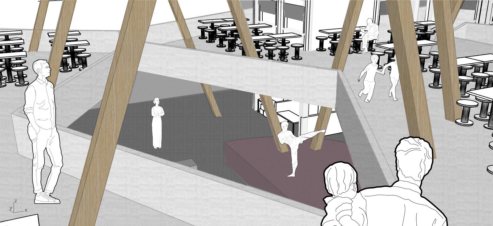
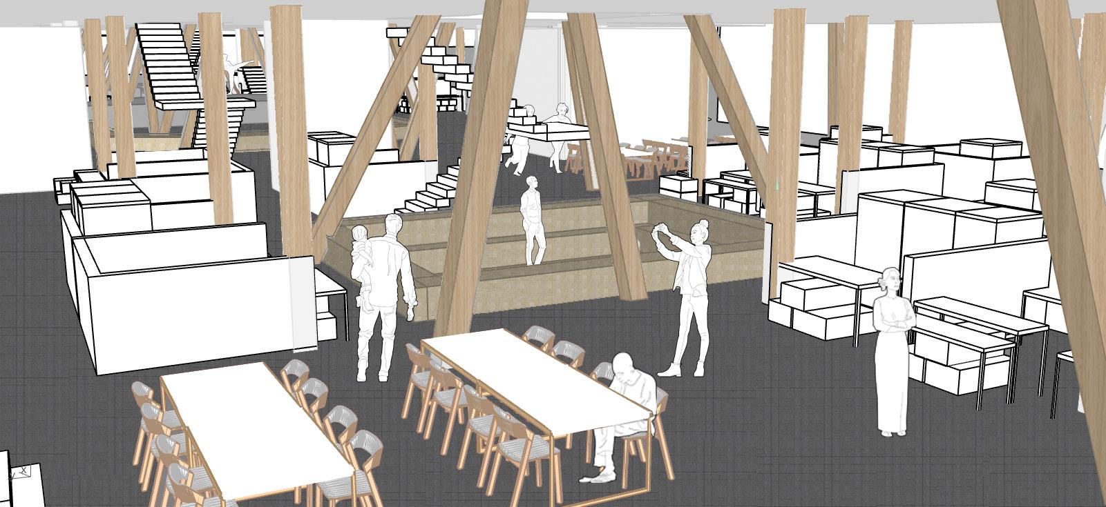
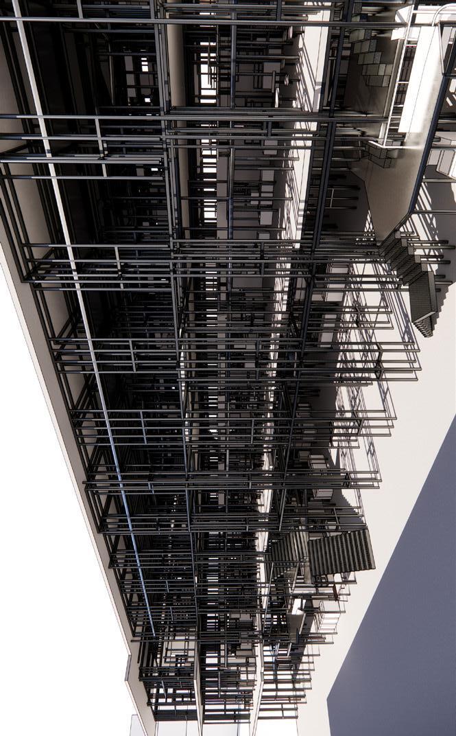
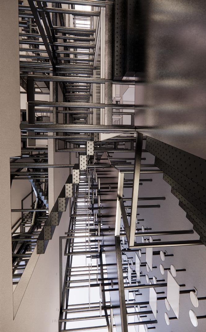
The banality of our current markets and hawker centres comes as a result of an over-emphasis on efficiency. Still, the costs saved are insignificant compared to the economies of scale of the supermarket. This project draws lessons from one of Singapore’s iconic markets, Chinatown Complex, and its chaotic column grid that comes as a result of the superimposition of columns from its mixed uses. By manipulating columns and beams, the fundamental elements of the grid, I attempt to strike a balance between order and disorder.
Overarching hierarchies are imposed onto the system to establish order and alignment of the grid allows connections to be found across floors. The hierarchies emerge through a methodical step-by-step approach. Columns are arranged according to the 500 mm grid based on both structural requirements and furniture requirements. The imposed grid is created to accommodate the structural requirements of the system whilst the implicit grid comes about from the expansion of stall perimeters beyond designation. Beams are derived based on the distribution of columns, formed only within specific proximities, directions and number of connections. Floors are then derived directly from the beams based on specific cantilever distances, creating the main floorplates and mezzanine levels. These rules and methodical approach are what govern the hawker centre, establishing order and hierarchy.
Distortions to the grid are then introduced to provide for functional spaces, circulation, and re-programmable communal spaces. These distortions create gathering spaces for different demographics to interact, creating vibrant and “chaotic” spaces and allowing for both visual and physical connections, thus introducing disorder to the design.
Beam Derivation Floor Derivation Floorplates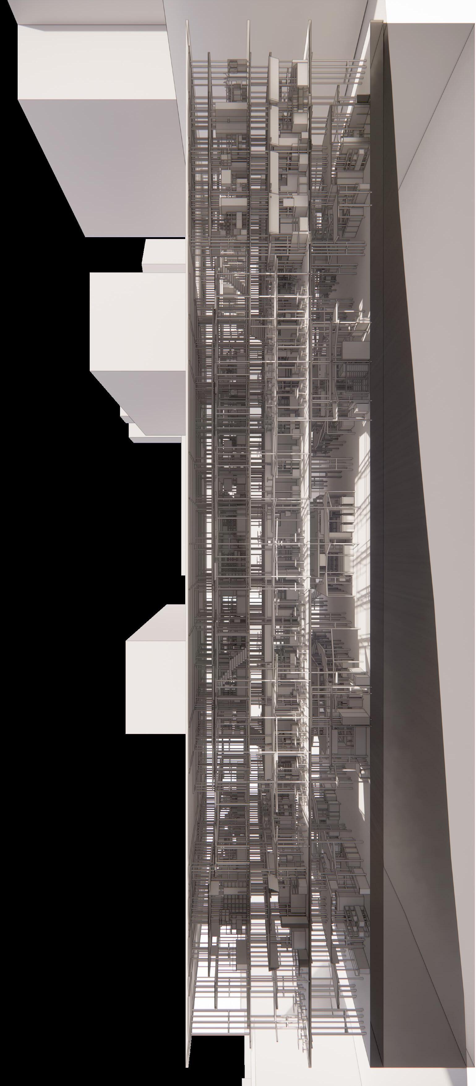


 by RyanChua
With various studies & analysis carried out on Tiong Bahru market, the project has identified potential opportunities in the Service Corridor as a vital element prolonging the longevity of Singapore’s dying hawker culture. Firstly, there was a need to recognise the ability of the service corridors to form junctions and promoting interfacing opportunities between public (commuters) & stall vendors at a given particular point. Thereafter, there are similarities in Singapore’s hawker market having vast existing extended network of corridors, where could potentially be tapped on to create an uprising of new programs supporting the functions of the Hawker market.
As service corridors formed a large extensive network in our hawker markets today, the concept seeks to encapsulate various site analysis drawn from case studies of markets. As such it there was a feasibility of proposing a culinary school situated at the heart of Meiling HDB. The design development saw various techniques explored in spatial language and bifurcation of service corridors, which saw transformation in the latter to support functions of the school. These functions could be created internally within service corridor as well as exposed to public externally in a form of working studio, retail mock-up stalls, exhibitions & conference rooms. These proposed spaces are situated along nearby junctions serving as venue for activities & services to happen at point of contact (where private personnel - vendors & public meets). Thus by intertwining the school within a hawker market, it encourages intermingling and social interaction contributing to the economical output & longevity of the market for years to come.

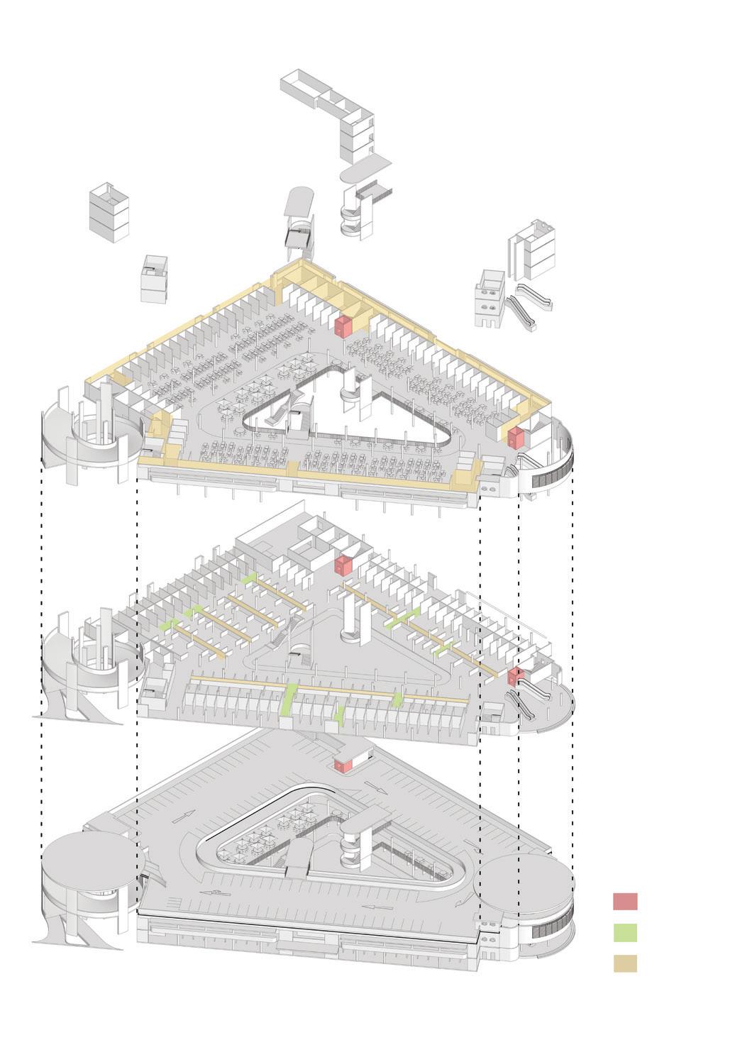
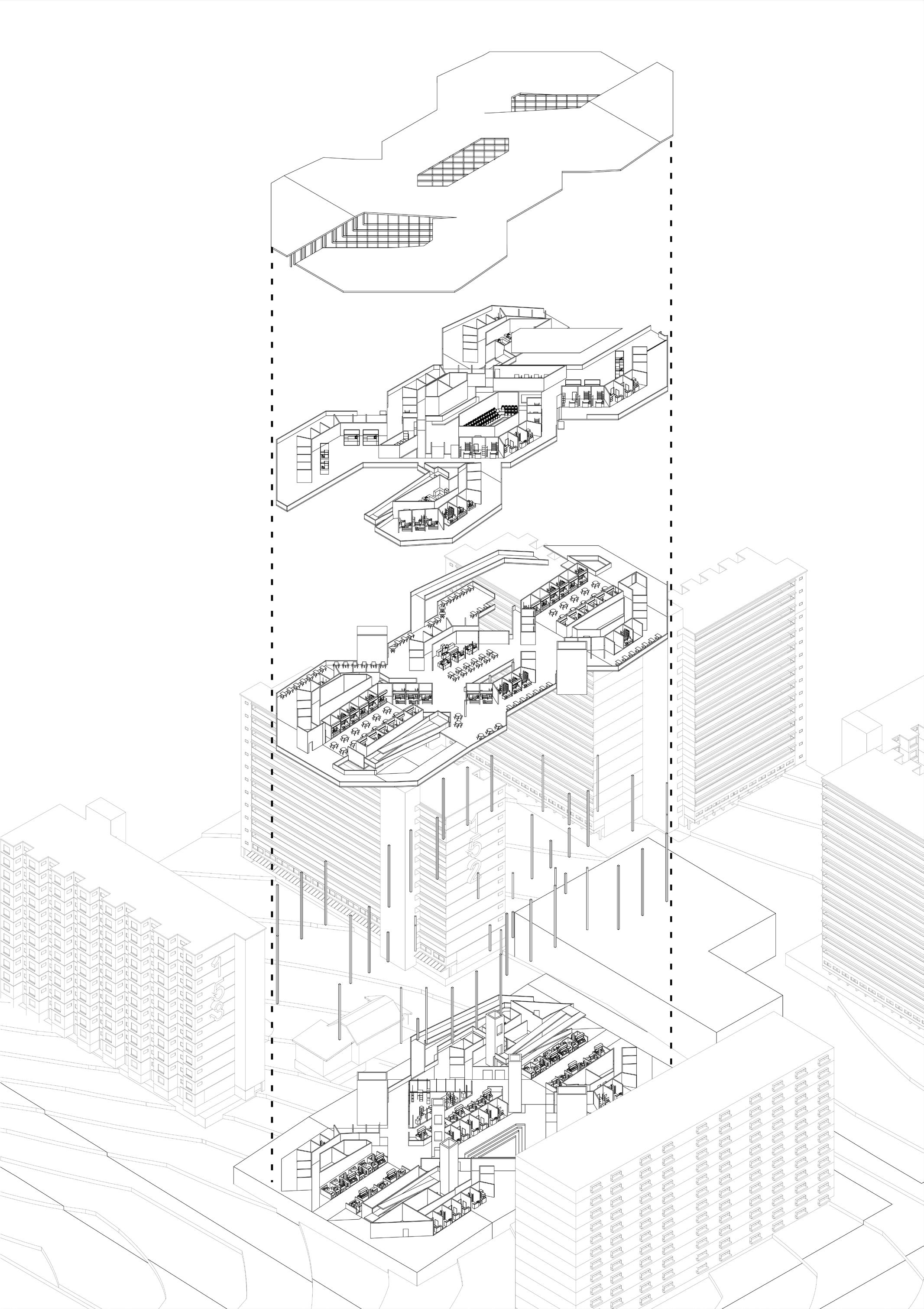
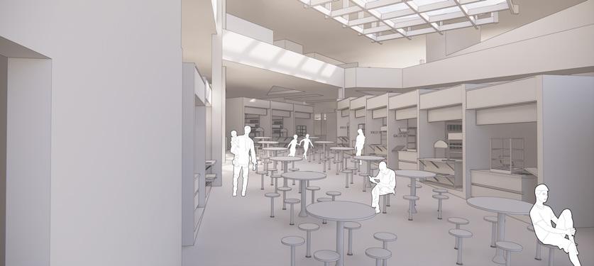
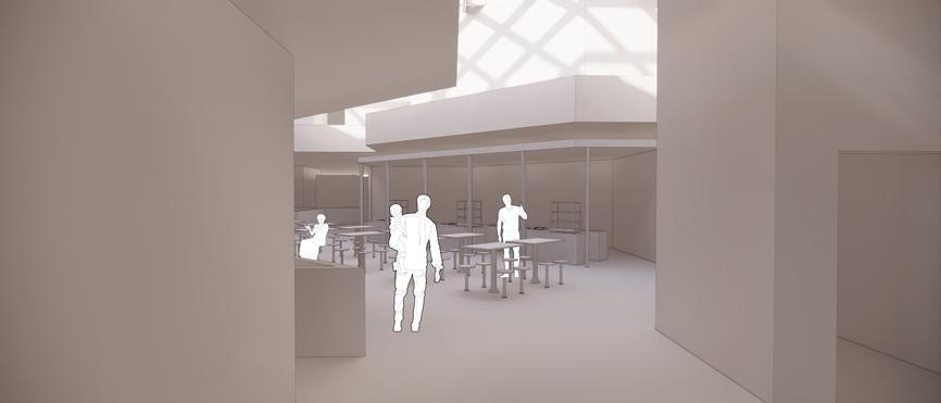
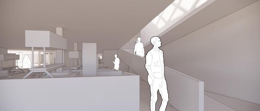
Hawker and Wet Market culture has always been one of the important aspect of Singapore’s culture. It served as a communal area that brings together different groups of people and connect each other through food. There are still some people who visit the wet market because the produce that they are able to get are more fresh. Many of those who still visit reminisce the times when the wet market is filled with people, being able to make friendships that last over decades. However, as the supermarkets become more and more prevelant in today’s neighbourhoods, people are more exposed to the cleanliness and the wellventilated, less smelly supermarkets over the more traditional wet markets. This gave the people less of a reason to visit the wet market.
As such, I aimed to design a food market that brings people together by weaving different uses targetting different age groups within the main usage of the building, to encourage more patronage and interactions within the neighbourhood as a whole.
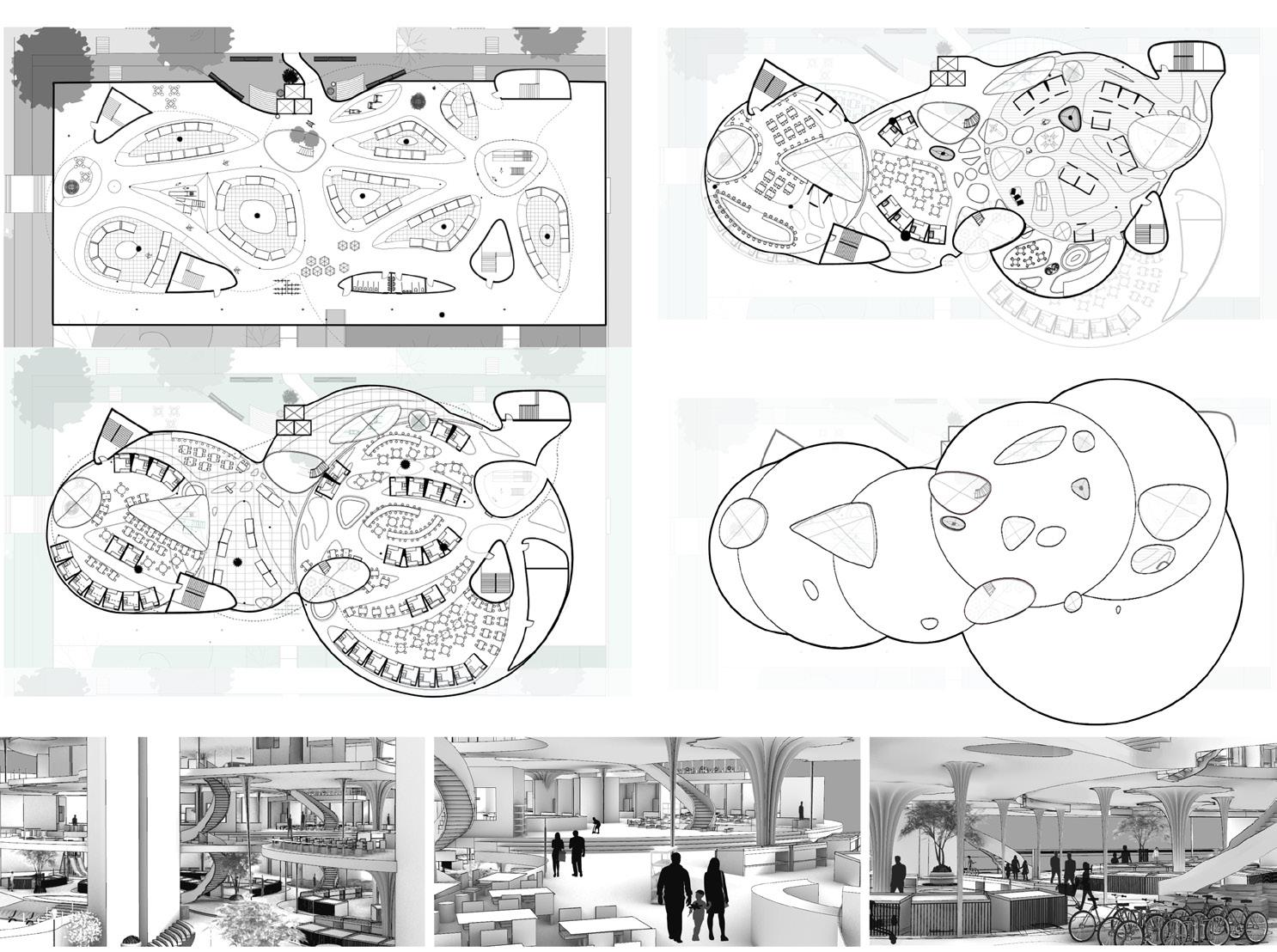
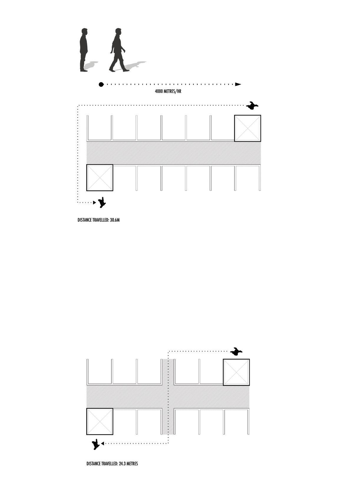
By studying the Tampines Round Market, I found potential areas of interactions within the intersections of the corridors. By adjusting the number of connections, the angle of entry towards the intersection and the width, the areas - where circulation meet - are able to hold a plethora of uses. This help to enhance the spaces of the food market, livening the place.
One such use of the areas include vertical circulation. The areas of the lower floors are projected upwards to include vertical connectivity. Different spaces on other floors can then be weaved into the main programme spaces entirely.
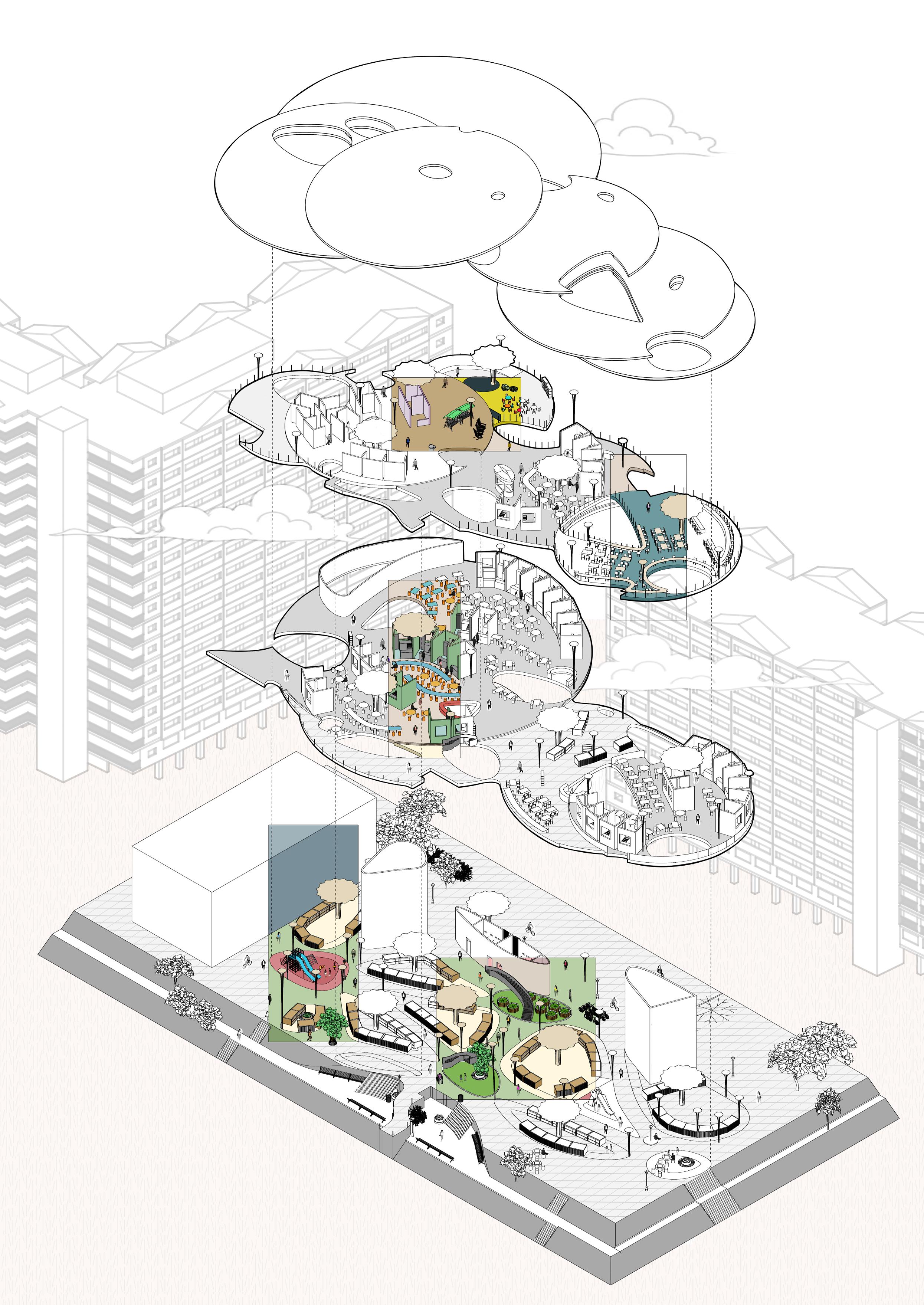
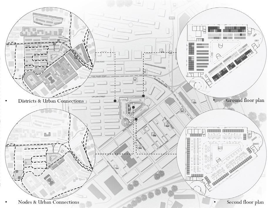
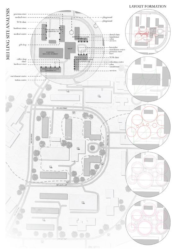
Through my project I hope to create inward driven circulation for the estate that guides residents into the site to patronize the stalls by bringing in the streets. By first analyzing how Tiong Bahru (TB) Market works, its success is attained through taking advantage of certain urban connections found in adjacent residential estates. E.g., transport, commercial, and green connections. It serves not only purely as a market and food centre but also as a town centre, where residents in various districts are highly dependent on the programmes of the market. TB Market and its 3 distinct sides create different characters to its respective streets, with programmatic distribution implemented having its stalls facing the streets on the ground, while on the second floor having its service corridors facing the streets. With the clear layering of conditions in the market plan, I extracted frontage or more specifically stall fronts as my spatial type. Going through the process of iterations using different methods of stacking, shifting as well as flipping, before clustering them together to come up with characters of corridors ultimately deciding on the usage of cyclic / curved corridors due to its more seamless connections giving users a more cohesive experience. Then, circulation diagrams are drawn to connect transport stops and goes along commercial lines, forming a network of circulation routes simplified to various circular zones informing stall front lines. First arranging the stalls from the start points or the edges, followed by charting users’ paths keeping it as “front” as possible, so that when users walk through the site their paths would be fronted by either stall fronts or courtyards. Comprising 3 different programmes: retail, hawker, and market. Arranged in such a way that all 3 are distributed throughout instead of congregating on specific floors to drive in the different types of programmatic circulations varying the users’ journey. Voids created by the circles of stall fronts are then catered to community activities making the market a “town centre” of the estate. E.g., the open plaza allows for community initiatives, fitness corners tucked away for privacy, and spaces set aside for stall owners in areas like their rest area and indoor lounge.

 by VictoriaLiew
The Hawker Centre has been a core bridge between Singaporeans throughout Singapore’s development, being a key nostalgic place of memory for those who have grown up with it - the pioneer generation. The hawker has been a irradicable part of their lifestyle, be it through means of business, socialization, or daily meals. These centres eventually served as community dining rooms and living spaces for those. As the hawker culture continues to diminish, Singapore necessitates innovative ways of preserving the hawker culture.
Taking inspiration from Tampines Round Market, the courtyard space is a public yet exclusive space specially for the residents to gather, interact and feel at home outside of their homes. The HDB shops also are strongly catered to the elderly residents, making it a strong self-sufficient and holistic town centre for the Tampines residents. Bringing this forward to Mei Ling Market and Food Centre with a similar growing silver zone demographic, I aim to focus on courtyard spaces as means of providing private yet comfortable spaces for the residents to interact with one another in small groups. Hence, my project proposes the integration of the Hawker Centre and Markets with Eldercare, as means of resolving current issues of Singapore’s ageing population, including (self-)isolation of elderly into their homes, depression, loneliness, and increasing rates of dementia. Leveraging on the elderly’s close-knit connection with their neighbourhood’s hawker centre and its community, I aim to encourage the elderly to interact with programme spaces that can tackle their needs together with their peers. As such, included in the Hawker Centre and Market are holistic and beneficial programmes such as community gardens, fitness corners, rehabilitation centres, and learning centres integrated with smaller self-organized eldercare homes. Looking forward, this project can be expanded to revamp and ameliorate hawker centres in other neighbourhoods with large elderly populations.