2020 AWARDS OF DISTINCTION

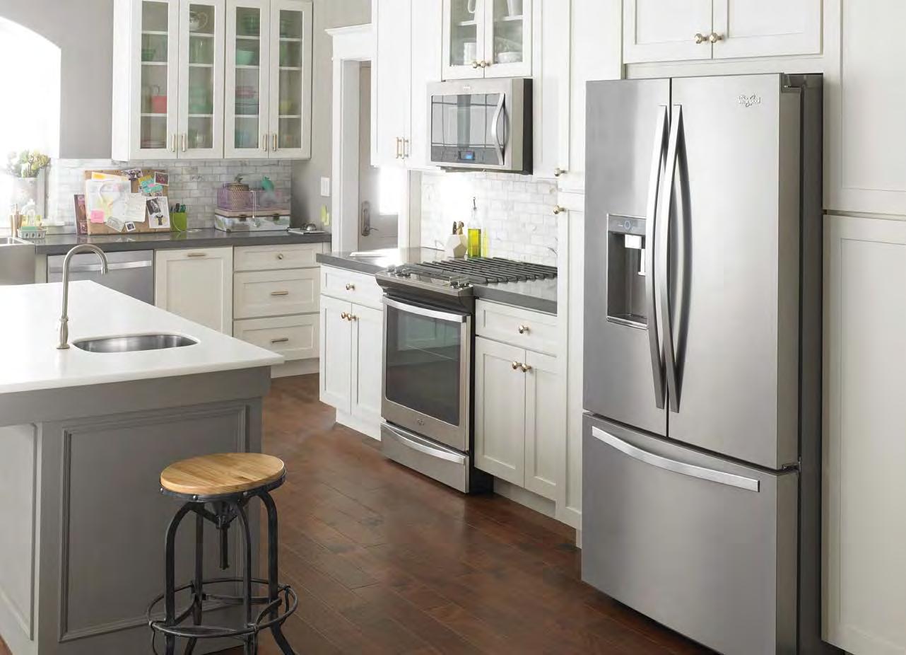
DESIGNED FOR COOKING
ITALIAN flare with absolute attention to quality performance, and state-of-the-art design.


ITALIAN flare with absolute attention to quality performance, and state-of-the-art design.


EDITOR
Ted McIntyre ted@laureloak.ca
ART DIRECTOR

Erik Mohr
ASSISTANT ART DIRECTOR
Ian Sullivan Cant
GRAPHIC DESIGNER
Marikha Saira
COPY EDITOR
Barbara Chambers
CONTRIBUTORS
Joe Vaccaro
ADVERTISING
Cindy Kaye, ext. 232 cindy@laureloak.ca
PUBLISHER Sheryl Humphreys, ext. 245 sheryl@laureloak.ca
PRESIDENT
Wayne Narciso
PUBLISHED BY Laurel Oak Publishing laureloak.ca ohba.ca
Ontario Home Builder is published six times per year (Winter, Early Spring, Late Spring, Summer, Fall, Awards).

All rights reserved. No part of this magazine may be reproduced without the written consent of the publisher © 2020.
For address corrections please email info@laureloak.ca or phone: (905) 333-9432.
Single copy price is $5.00. Subscription Rates: Canada $12.95 + HST per year, USA $29.95 USD. Order online at https://www.laureloak.ca/subscribe
CANADIAN PUBLICATION MAIL AGREEMENT NO. 42011539 ISSN No. 1182-1345


SaunacoreTM over the years has become one of the world’s most extensive manufacture of sauna and steam bath products. SaunacoreTM manufactures traditional sauna stoves, steam bath generators, do-it-yourself custom sauna kits, custom traditional modular sauna rooms, custom infrared radiant sauna rooms, infrared components, accessories, and much more. We also repair and service most other manufactures equipment besides our own.


SaunacoreTM over the years has become one ofthe world’s most extensive manufacture of sauna and steam bath products. SaunacoreTM manufactures traditional sauna stoves, steam bath generators, do-it-yourself custom sauna kits, custom traditional modular sauna rooms, custom infrared radiant sauna rooms, infrared components, accessories, and much more. We also repair and service most other manufactures equipment besides our own.
Steamcore™ SSB system features the latest generation of control panel to provide fingertip control to the shower’s steam production, audio system, lighting etc.


With Bluetooth streaming built in, you can play music from your smartphone (Android, Galaxy, iPhone, iPad, etc.) and listen to it as you shower, while your device stays dry in another room.

9
ONE VOICE
In this unprecedented year, there are more OHBA members than ever worth celebrating
11
INTRODUCTION
There’s nothing quite like a pandemic to help us appreciate home design and renovation excellence
12
ARCHITECTURAL DESIGN
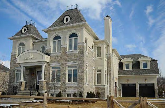
Great architecture appeals to all the senses, providing residents within a more inspired way to live
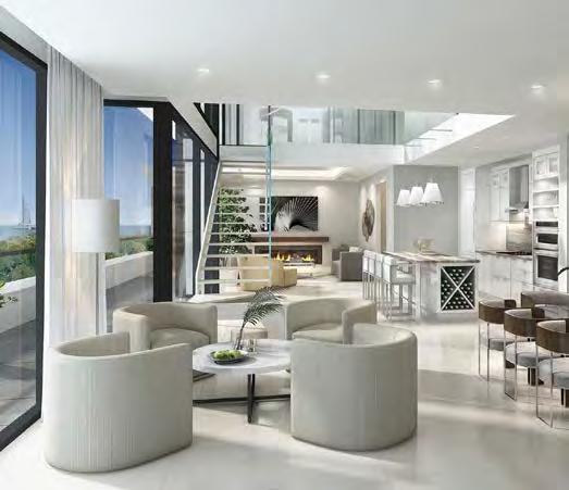
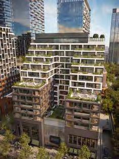
40
HOME RENOVATION
Changing layouts and changing lives, these stunning renos overcame hurdles to make dreams come true
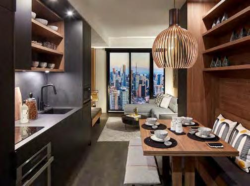
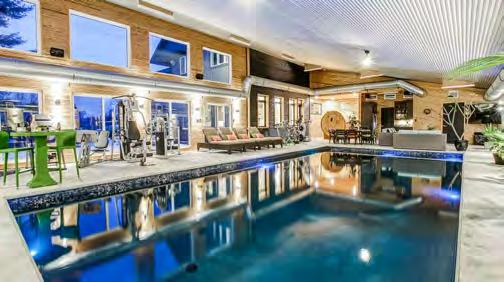
54
ROOM DESIGN
There is functional, and there is dazzling. Here’s what happens when the two combine!
68
PROJECT IMAGE AND ADVERTISING

Inspiring words and visuals deftly conveyed to the target market makes for impactful messaging
74
ON-SITE SALES PRESENTATION
From brochures to sales offices to model homes, here’s how to impress a visiting potential homebuyer
82
INNOVATION AWARD
Service and design excellence will earn acclaim, but it takes next-level thinking to claim this noted honour
84
PRESTIGE AWARDS
This year’s AoD is once again packed with outstanding work, but here’s the cream of the crop for 2020


CO-PRESENTED BY EVENT PARTNER
 RED CARPET EVENT SPONSOR
SOMETIMES YOU JUST need to catch a breath and take inventory of the situation.
This, after all, has been a challenging year —one th at has required OHBA members and the industry to respond quickly to the ever-changing impact of COVID.
Keeping projects open by making improvements to sanitation and instituting jobsite safety protocols to keep workers and suppliers safe on site became the priority for most members.
Under modified provincial restrictions, members worked to ensure that decor, presentation and sales centres complied with the rules so that homeowners continued to feel safe during their home-buying visits.
When members found themselves working from home, new protocols, new technology and improved communication with the homeowner became the key to fulfilling warranty

service calls and renovation work.
Efforts like this build trust and loyalty—both with homeowners and future clients, as well as your own staff. They show the levels to which OHBA members will go to care for this industry’s present and its future.
And those efforts are bearing fruit. Based on the early data, it looks like 2020 will end with strong new-homes sales, matched by equally strong housing starts.
It may also be a record-breaking year in the renovations sector, as the pandemic cancelled traditional travel plans, leaving homeowners to focus on improving their principle residences to capture some of that ‘getaway’ magic. Adding to that sentiment is the concern that restrictions will continue into next year, encouraging many to make that big reno decision now, since they will be home more than ever.
In spite of the pandemic, members continued to deliver for #homebelievers across Ontario. Keys to new homes are being delivered to families, and new rooms and spaces are being fashioned to create new memories.
Celebrating the best of the best from the past year’s work—its ingenuity and expertise, and the passion behind it—is always the focus of the OHBA Awards of Distinction. And while we love the energy that comes with enjoying this annual celebration in person, the temporary move to a virtual format has not dulled the enthusiasm of honouring our own. It’s merely a prudent response to the challenge of the times—one that brings us all safely together, while still promising all the suspense of a live event.
This Awards edition of Ontario Home Builder magazine once again showcases the finest in residential construction from the previous year— from architecture and renovation to design and marketing.
I continue to marvel at the creativity and outside-the-box thinking of our members. It’s one thing to design and build beautiful places to live, but quite another to do while making these homes fit the ever-changing needs and desires of homeowners, all while overcoming countless hurdles.
Let’s catch our breath before we dive into the next year, and come together to celebrate excellence—even if it is in a virtual world. OHB
JOE VACCARO IS THE CEO OF THE ONTARIO HOME BUILDERS’ ASSOCIATION
How ironic that in a year we can’t be there in person, more industry members than ever deserve applause
“I CONTINUE TO MARVEL AT THE CREATIVITY AND OUTSIDE-THE-BOX THINKING OF OUR MEMBERS.”
Congratulations to the 2020 OHBA Awards of Distinction winners.
Enbridge Gas would like to recognize the builders, developers, renovators and building industry professionals who received honours for their important work.

Your commitment to best practices, innovation and sustainability sets the bar for leadership in the Ontario building and development industry.
Thank you for your commitment to building more sustainable communities.
The very nature of awards means that most entrants are not going to be thrilled with the results. There’s only one winner—per category, anyway. So why bother with the time and expense to participate?

This annual issue celebrates, as the expression goes, “the best of the best.” A cavalcade of expertise, ingenuity and general excellence follows, celebrating the finest in residential construction from the previous year—from architecture and renovation to design and marketing.
But there are reasons aplenty to merely enter the awards, as well as to attend the physical event, once prudence and the laws of the land once again permit the latter.
“We enter for a number of reasons: to support OHBA; to promote our company; to compete and challenge ourselves against our peers; and to honour and celebrate the hard work of our team,” says Steve Barkhouse, owner of Amsted Design-Build in Ottawa. “We wouldn’t keep doing it if it wasn’t worthwhile.”
Barkhouse and company, admittedly, have a well-earned mantel-full of Awards of Distinction—“Just shy of a dozen,” he figures. But even if his company goes without in a given awards year, Barkhouse recognizes the marketing advantages inherent in the process. “It is really the only third-party recognition our perspective clients have when choosing,” he explains. “When they know that you were a finalist at the Ontario level, that is big.”
There is also the motivational element that comes with past victories, Barkhouse explains, “both for our current and future team.”
“We take enormous pride in what we do,
and awards like these provide recognition for our team by the industry,” echoes Brent Strachan, Ottawa Division President for Minto Communities Canada. “They also offer great marketing exposure and brand recognition for Minto Communities, helping us compare what we’re doing against builders in other markets.”
It’s also a reminder to all staff of the standards that must be continually achieved and exceeded, as well as validation for that level of accomplishment, Strachan says. “Everyone wants to work on a winning team. While the ultimate measure is what our customers say, this is another measure validated by peers in our industry. We're always up against some great competition, so it motivates our team to push themselves to be even better.”
In non-pandemic years, the Awards of Distinction also present a unique opportunity to network with other industry members, as well as to “showcase the calibre of the work you’re undertaking” to your best clients, notes B2BMarketing.net. “Being shortlisted (or winning) will improve client retention, and assuredly send your clients home chatting to their friends about how great you are. And, as we all know, word of mouth and personal recommendation is still the most influential factor in the B2B buying process.”
A regular appearance among award candidates can also help recruit new talent, as well as build the morale of existing staff.
So let’s acknowledge this year’s Awards of Distinction winners. And even if you missed out this year, start planning your categories now for the 2021 Awards.
There is much to win, regardless of how you finish.
for: Courts of Canterbury “The Cavendish” – Port Perry
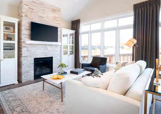
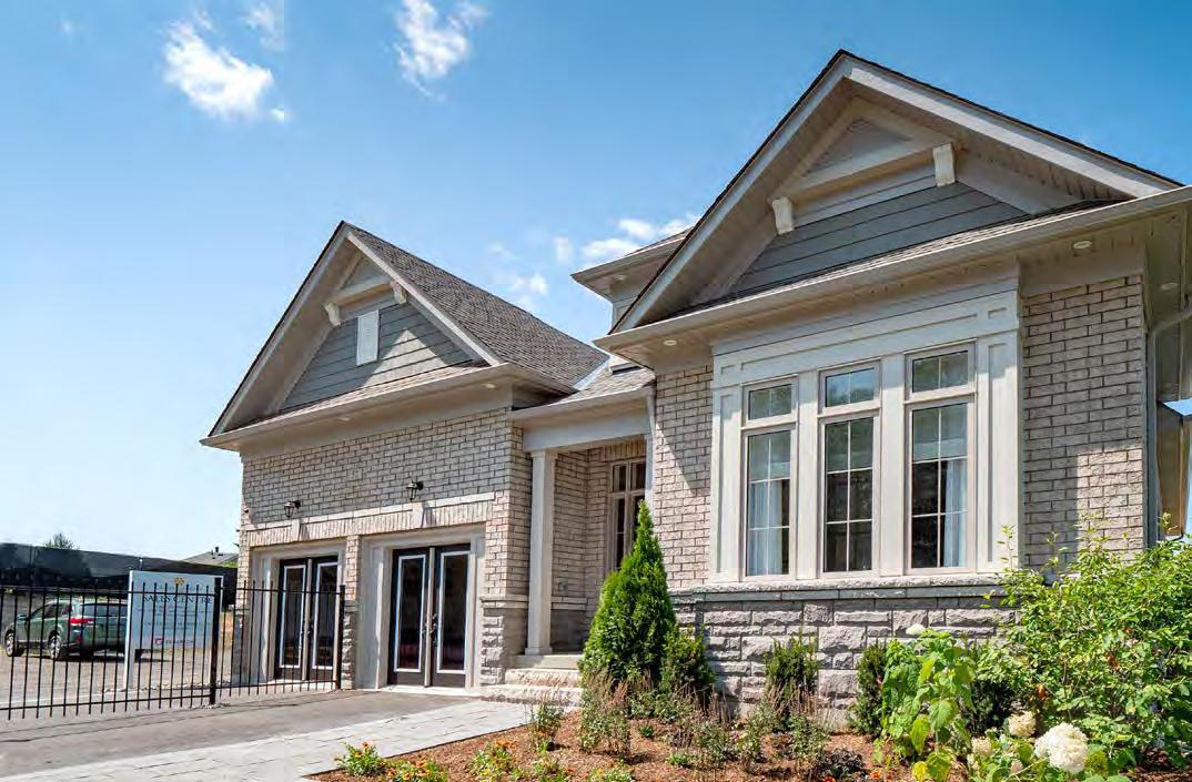
Geranium hit the mark on multiple fronts with the Cavendish, a 2-bedroom plus den, 2-bathroom bungalow on a 50’ lot within an adult-lifestyle community. Redeveloped from a former golf course meant taking advantage of mature trees and greenery, but also overcoming the challenge of lot matrix and fabric, with varying setbacks requiring uniquely shaped lots and different model types. Great care was taken to avoid too many risers in catering to the empty-nester target demographic, as well as to blend the Courts of Canterbury development with the existing 30-year-old community, located just steps from Lake Scugog. Clay brick, low-maintenance vinyl siding, trimmed peaked gables, stone skirting and a welcoming covered porch with sidelights surrounding the front door combine to create harmonious and striking streetscapes. Indoors, nine-foot ceilings catch the eye, while natural light from tall windows and large sliding doors bathes the open-concept layout. The main-floor master bedroom, meanwhile, features a walk-in closet and spa-inspired ensuite with a double vanity, soaker tub and separate glass-enclosed shower with a stone seat.
for: South Coast Village “The Oceanridge” – Crystal Beach
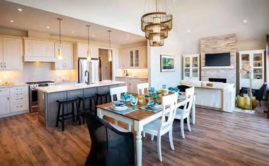
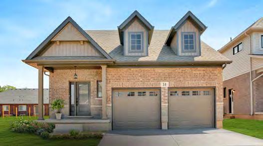
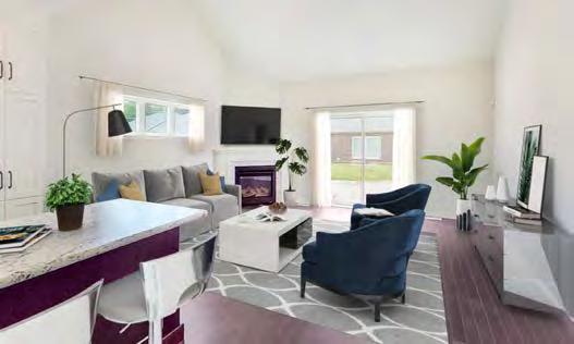
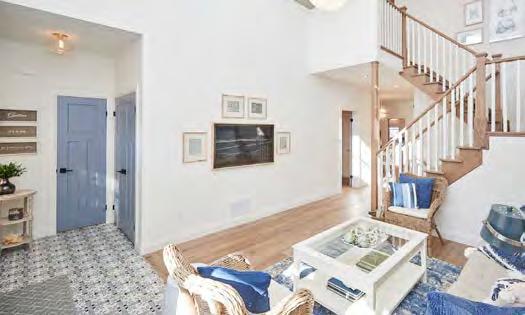
As with all the models in South Coast Village, the Oceanridge is a lot-specific home designed to maximize an efficiently sized property. With those aged 55+ making up more than 75% of the community, this bunga-loft plan focuses on main-floor living. The garage was detached and moved to the rear of the home, providing privacy from adjoining neighbours as well as from older cottages behind that were in a neglected state. Inside, a vaulted ceiling gives the home a spacious feel, with plenty of windows playing into a coastal-inspired vibe enhanced by striking blues and accents of black and gold contrasting with the white shiplap and light wood tones.
RUNNER-UP
for: Saffron Estates “Monroe” – Fonthill
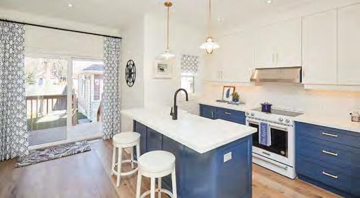
The amenities are packed into this 1,670 sq. ft. bungalow loft. Easily accessed from the sizeable formal dining room, the lightflooded kitchen features a full suite of appliances and modern white cabinetry. The island, with a flush bar, adds a pop of warmth with its maple tone tying the interior colours together. A vaulted ceiling expands to the second floor. The second-floor loft offers flex living space with a media room/playroom, a large second bedroom and ensuite bath. Outside, soaring roof pitches give presence to this home and its large front porch. Warm brick tones follow you inside, where you’re greeted with red oak-toned engineered hardwood flooring.
for: Union Village “Aspen Corner - Elevation F” –Markham
(Credit: Montana Steele Advertising, Nak Design Strategies Inc., RN Design Ltd.)
In an effort to create a unique yet unified community, the homes at Union Village are available in a number of architectural styles that provide design exclusivity for homeowners, while maintaining a cohesive urban fabric for the neighbourhood. This model makes great use of a corner lot to offer abundant greenspace and windows on three sides. Homeowners enter through a covered porch, stepping into a breathtaking double-height foyer. To the right, a cozy den with an additional covered porch offers an intimate place to relax. North American feng shui expert Paul Ng worked with the product development team to ensure all of the spaces at Union Village conform to principles that optimize energy and life force. Large multi-paned picture windows with precast/stucco surrounds lend warmth from the glow of light within, 9’ ceilings on the main and second level give growing families room to breathe and decorative railings provide visual continuity, with mansard roofs lending a certain je ne sais quoi. The refined interiors include stained oak hardwood flooring and quartz countertops, while an Enercare Smarter Home Essential Package ensures efficiency.
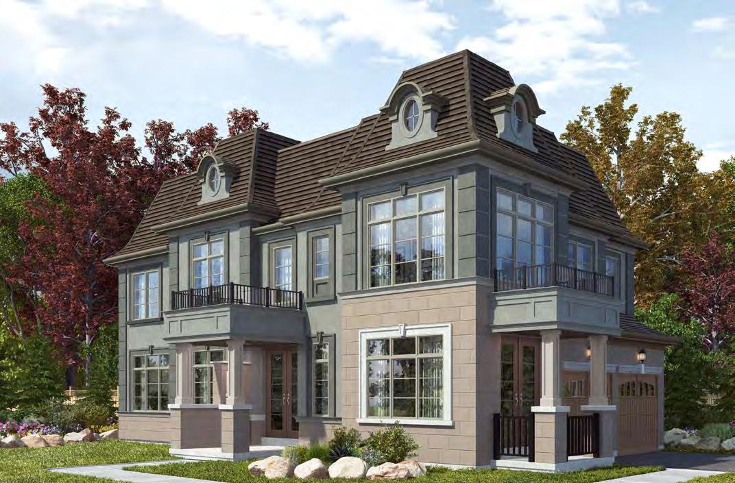
RUNNER-UP
for: The Sandridge: A Minimalist Home for Maximum Style – Kitchener
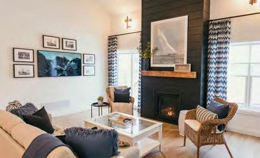
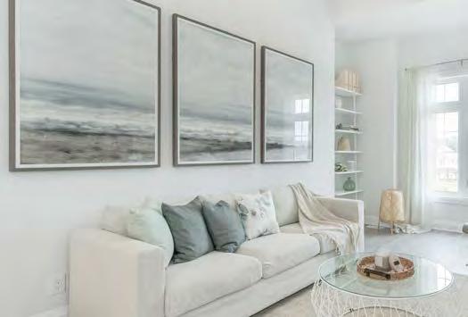
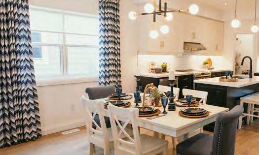
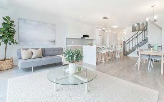
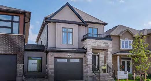
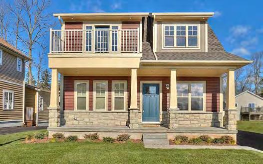
Targeting first-home buyers, the Sandridge makes the most of its 1,910 square feet, with an open concept and 9’ ceilings adding a spacious feel. Multiple layout options allow homeowners to personalize their abode, from an upstairs laundry and a spa-like master ensuite to office space and the addition of a loft. The balcony off the main floor adds to the living space, while Energy Star triple-pane windows let sunlight in. The upper-level family room is secluded and cozy. Up a few more steps are the bedrooms and bathrooms. The exterior entryway, meanwhile, is framed by two stone pillars, enclosing the porch for a grand entrance.
RUNNER-UP
for: South Coast Village “Cape May” – Crystal Beach
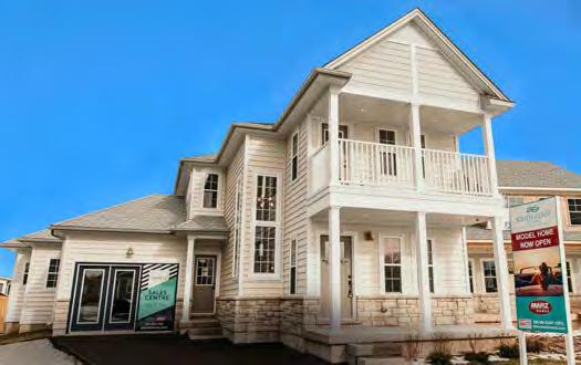
Designed to fit on a pie-shaped lot, which can be seen by its unique elevation and garage placement, the Cape May front elevation, with its two-storey porch and balcony, give the home an eye-catching grandeur. Inside, the layout appeals to its 55+ demographic, with the kitchen, master bedroom, second bedroom/den and laundry all located on the main floor. Upscale interiors include natural woods and shiplap along with waterproof vinyl plank flooring and graphic floor tiles. The exterior embraces the Cape Cod style associated with coastal living, with stone and siding facade in a variety of coastal colours and windows galore.
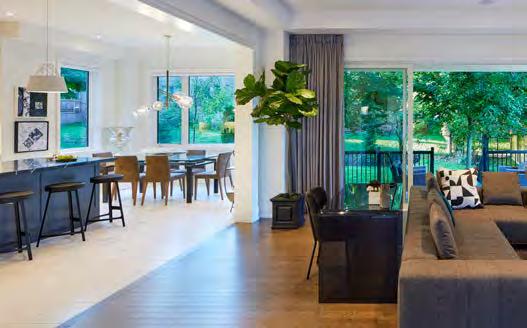
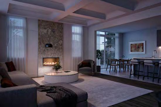
The unique topography of this former golf course property in downtown Aurora creates enticing streetscapes, quiet cul-de-sacs and safe, single-loaded roads. Within this luxury community, the 3,763 sq. ft. Forte offers exceptional quality and craftsmanship in a four-bedroom layout. Ten-foot main floor ceilings allow for large windows across the rear, with views to the back garden. A 22’ x 10’ covered loggia extends the living area through an oversized door system, while the servery, with its own sink and cabinetry, connects to the dining room. Details include coffered ceilings—raised or vaulted—trimmed archways, an oak staircase, gas linear fireplace and pre-finished oak hardwood flooring. Every bedroom has either an ensuite or shared access to a bathroom, with the master bathroom featuring a marble countertop, oversized shower with stone seat and separate water closet with a frosted glass enclosure. Even the basement caters to the changing course of modern living, with large cold cellars. A covered front entry to one side of the garage adds a stately presence to The Forte, whose three elevations create diverse architecture in multiple colour packages.
for: Edgewood “The Elmwood” – Pickering
(Credit to: Builder Insight Group Inc., Colours & Concepts Inc., RN Design Ltd.)
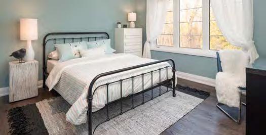
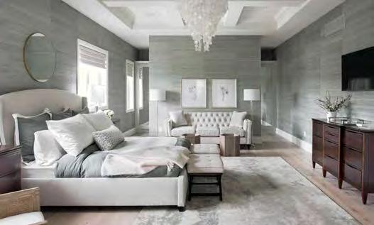
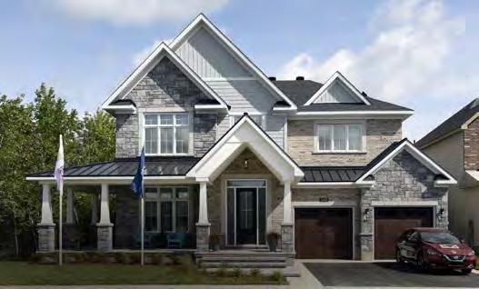
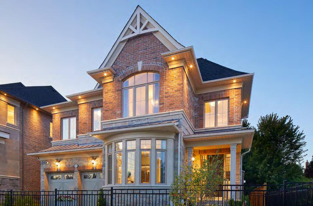
Set on a 40’ lot in an enclave of just 21 homes in Pickering, this 3,362 sq. ft. executive home offers three finished levels of family living space constructed through slab-on-grade construction, with a garage offering parking for three cars. The upper level contains four bedrooms, each with private or shared ensuite, and convenient laundry room. A wood deck off the kitchen overlooks the back garden, with views to protected greenspace beyond. Edgewood homes are participants in the energy-efficient Savings by Design program, while a unique greywater recycling system helps reduce water consumption by up to 20%.
RUNNER-UP
for: Potter’s Key “The Hampton” – Stittsville
(Credit to: Tanya Collins Design Inc.)
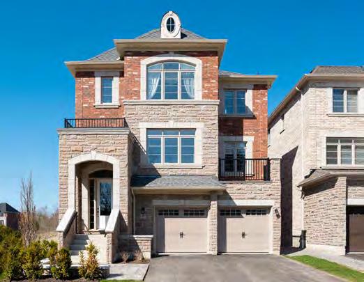
Built on an oversized corner lot, siding onto a conservation area southwest of Ottawa, The Hampton offers 4,025 square feet of living space plus a 1,616 sq. ft. finished basement that includes a home theatre and gym. This classical design is paired with state-ofthe-art technology to offer Net Zero energy. The exterior features an elegant wraparound porch, with an exposed-beam cathedral ceiling above the front entrance. The kitchen is the focal point at the rear of the home, with walk-in pantry and servery, and bathed in natural light from expansive glazing overlooking the conservation area.
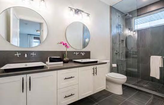
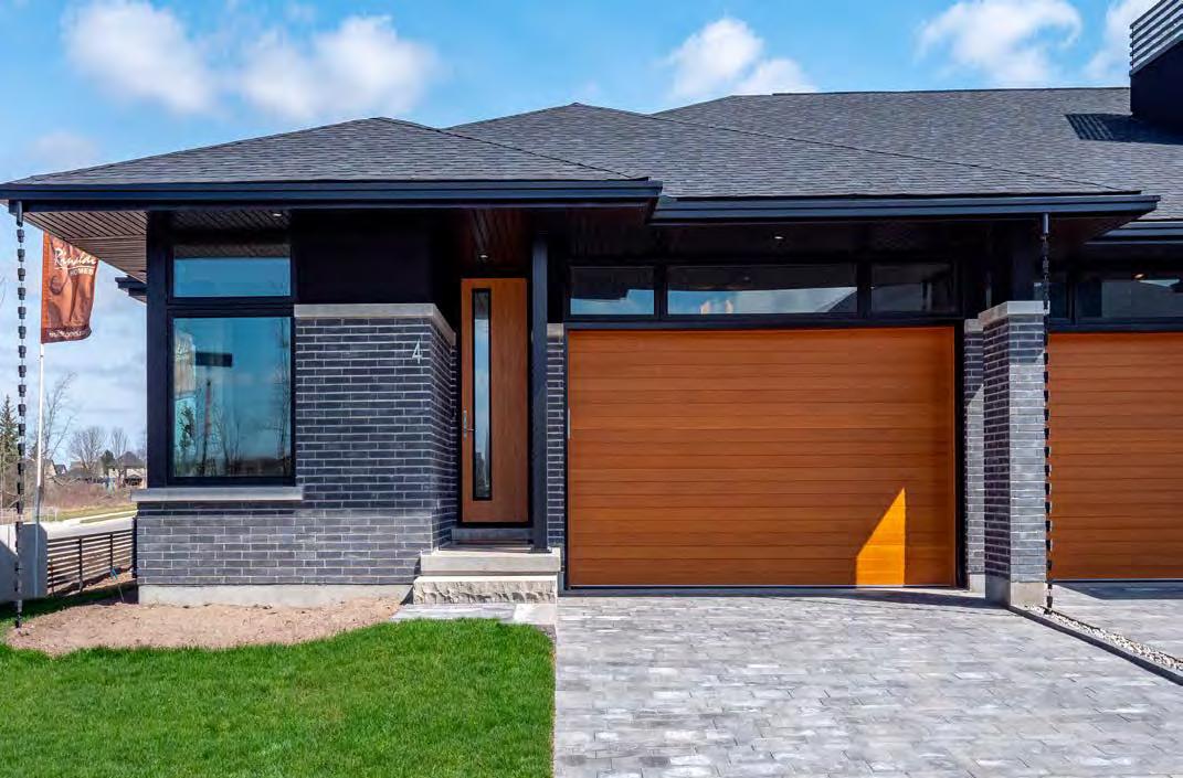
for: Unit 1 @ Drapers Creek “Type A” – Welland
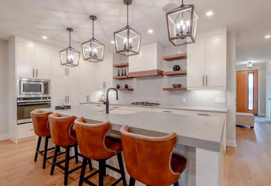
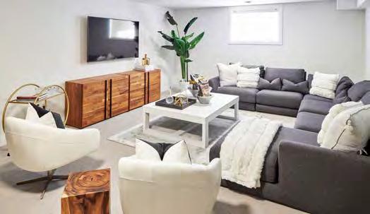
Drapers Creek enables homebuyers to downsize to luxury in a 1,486 sq. ft. low-maintenance condo with main-floor living and ample storage. Inside, the simplicity of minimalism allows one to appreciate the walnut accents, shiplap detailing and a 10’+ kitchen island. Living space extends to the rear 332 sq. ft. covered deck, while an expansive basement is designed to cater to entertaining and guests, including a large pool table and cozy space in front of the fireplace. The basement includes two finished guestrooms (or a potential workout room) and bathroom with tub and shower. The smart-home system, ideal for those with a busy schedule or snowbirds, includes an Ecobee smart thermostat, smart light switches, indoor camera with two-way audio, alarm system, a Liftmaster wifi-enabled garage opener, digital door lock, Sonos in-ceiling speaker system, Amazon Alexa throughout and a sump pump monitoring system. Outside, sleek lines of the alluring dark exterior are highlighted with woodgrain attributes, including a cherry-grain front door and a douglas fir-planked garage door, which accent the forested surrounding area. Energy efficiency and comfort are highlighted by 6” poured concrete party walls, tripleglazed windows, ERV and a flow-through humidifier.
RUNNER-UP
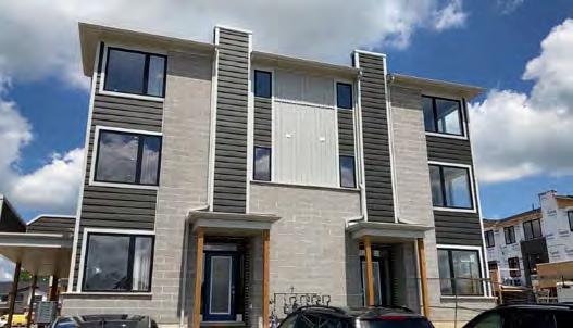
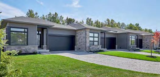
for: Legends on the Green “Hazelton 57” – Chippawa
(Credit to: Aristocrat Floors of the World, Artcraft Kitchens)
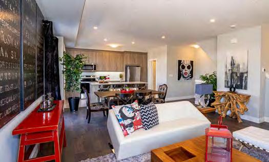
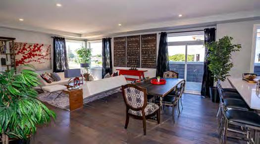
Designed for a comfortable yet clutter-free lifestyle, Hazelton 57 offers the bonus of a fully finished entertainment-ready lower level. The exteriors are strong in shape and colour, with a separate exterior for each unit—alternating charcoal and grey siding with dark and light linear brick. House numbers, instead of being placed onto the house, are secured to a Hardie Board landscape feature at the end of the driveway, while the full satin glass front door invites light into the hall. But the highlight of the design may be the rear covered porch, complete with pot lights, glass railing, pressure-treated decking and a privacy wall.
RUNNER-UP
for: Pure “Azul” – London
The Azul features a three-storey floor plan where each floor has with a unique vision and function. The ground floor focuses on the mechanics and core needs of the homeowner, with access to a double-car garage, as well as a foyer and flex room. The main floor features a versatile open-concept living space, while three bedrooms occupy the top floor. A spacious private second-floor deck enables homeowners to dine or relax in comfort. And while a challenge with back-to-back townhomes is to balance the ‘two fronts’ of the house with an aesthetic design that highlights both entrances, the contrast in the brick finish on the ground floor and columns at each entrance make the layout clear to all.
for: View Point: Stoney Lake Island Cottage Build –North Kawartha
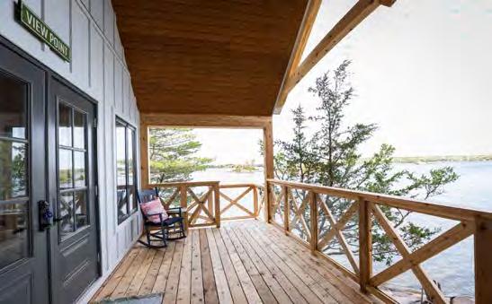
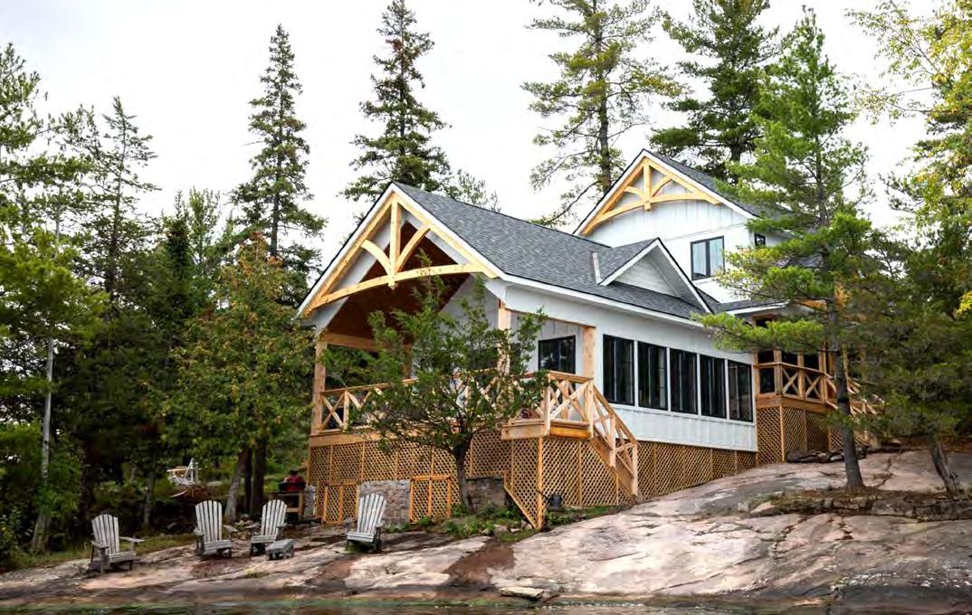
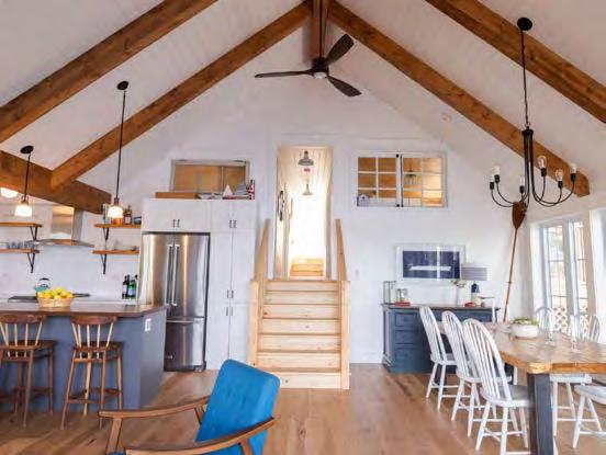
After purchasing an island in the Kawarthas, the clients assumed they’d need to have their island cottage set back from the water where the larger of two pre-existing structures was situated. But Kawartha Lakes Construction explored the concept of having the new cottage much closer to the water, where a previous guesthouse stood. This meant working within a smaller footprint that would be limited in expanding left or right due to zoning restrictions. But the allowable setbacks created another opportunity and drove the decision to incorporate a second storey, set further back up the hill. To overcome dramatically sloping bedrock, the builder installed a steel pile foundation to raise the cottage to natural level elevation while retaining remnants of the existing stone foundation. The final result is a functional and gorgeous space that emulates the classic Stoney Lake cottage style of decades gone by, with tons of wood and clean white finishes, crank-out windows and a wide screen porch looking west to capture the amazing Stoney Lake sunsets. The compact 1,990 sq. ft. cottage perches beautifully on the water’s edge, bringing a bright and fresh presence to the shoreline, while keeping with the charm and integrity of the lake’s ambience.
RUNNER-UP OAKWOOD
for: Let the Light in – Ottawa
Must-haves for the homeowner were a walk-out basement, a home set back from the road and a half soccer pitch in the rear for their son. OakWood managed, despite the reverse sloped lot, to place the home at an appropriate depth in the ground to cut out a basementlevel walk-out, yet still have all groundwater drain away from the home and towards the ditch at the road. A sizable lawn area outside the basement level permits larger triple-pane basement windows and a patio door to the covered hot tub. OakWood worked hard to incorporate a client floor plan that included angled hallways, an open office area overlooking a two-storey+ sunken livingroom and U-shaped staircase.
RUNNER-UP
for: Deerfield Estate – Grand Bend
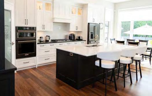
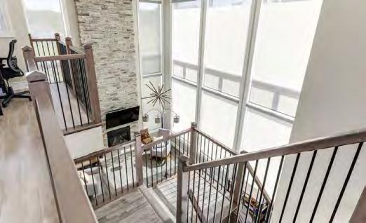
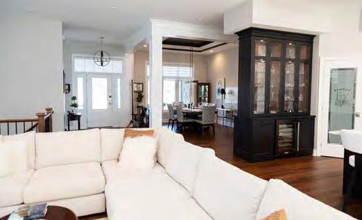
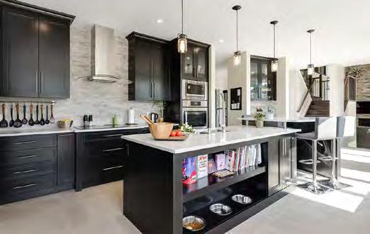
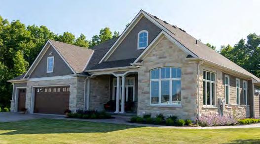
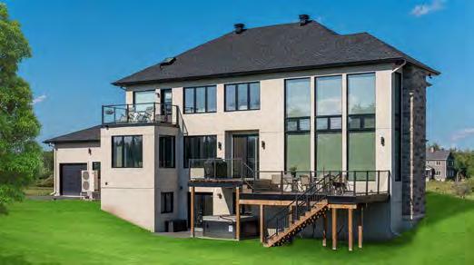
This home was designed to showcase the property’s natural features, including a woodland area to the rear. The pie shape of the property allowed for a sprawling design that included a landscaped pool area with accompanying pool house with bar and lounge. A formal dining area and large-scale living area are other key features for homeowners who love entertaining, while a stunning kitchen overlooks the great room and pool, separated from the formal dining space by a grand bank of showcase cabinets. Architectural features include columns, raised tray ceilings, repetitive window patterns and clean trim lines, while an ICF foundation provides a comfy basement living level.
for: The Mayfair Maison – Burlington
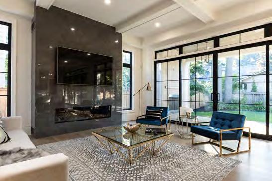
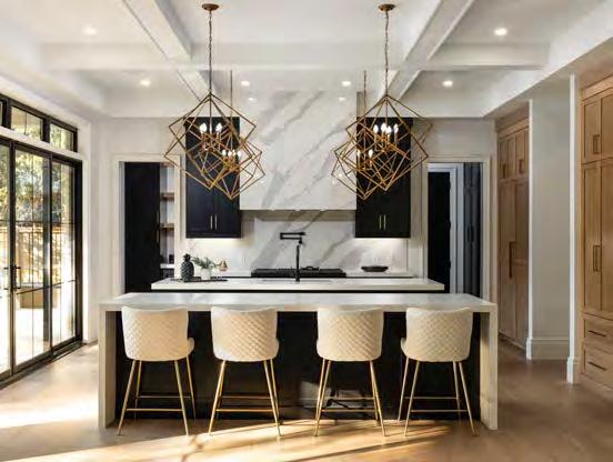
Situated on a private cul-de-sac and boasting 4,242 square feet with a finished basement, this French chateau-inspired Burlington stunner is an entertainer’s delight. It features 11’ ceilings with detailed mouldings throughout and a grand dining room that looks onto a 300-bottle temperature-controlled wine cellar. Double 16’-wide, 9’-tall sliding doors lead to a luxurious covered patio with built-in BBQ, integrated speakers and a natural gas fireplace. The professionally designed kitchen offers an abundance of cupboard space, top-of-the-line Dacor appliances and double quartz islands, complemented by a full walk-in pantry and servery. Added details include foam ceiling mouldings, a completely spray-foamed under-pad basement floor and an elaborate exterior soak-away drainage system. Upstairs, four large bedrooms are capped by a luxurious master bedroom with a 10’ tray ceiling, five-piece ensuite bathroom with double sinks, tub, oversized curbless shower and walk-in closet. Downstairs, the fully finished basement features a threepiece washroom, rec-room with wet-bar, as well as a gym/games room. Fully insulated garage doors are balanced with oversized insulated interior doors. Smart everything—including stove, fridge with cameras, thermostat, lights, sound system and garage opener—help complete the package.
RUNNER-UP
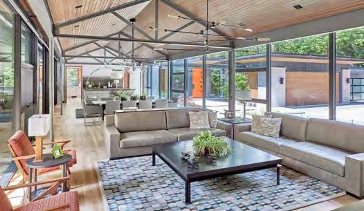
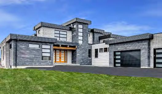
for: The Last House – Mississauga
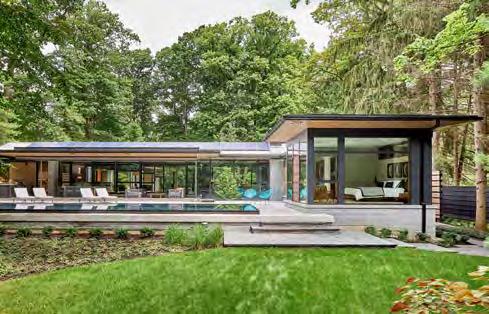
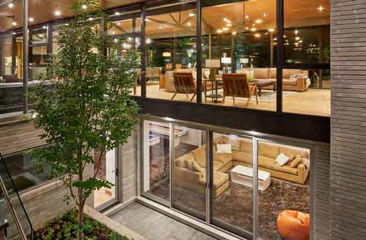
Designed to be the homeowners’ last house, the client wanted to experience the serenity of the heavily wooded, 1.4-acre lot from each corner of their living space, as well as a barrier-free environment— figuratively in terms of indoor-outdoor connection, and literally in terms of aging in place. This 3,775 sq. ft. bungalow layout splits its main floor into two buildings connected by a ‘glass bridge’—an open-concept space where the homeowners do the majority of their living. The master suite was designed to be a nest floating in the backyard, its walls of glass capturing the lush green exterior.
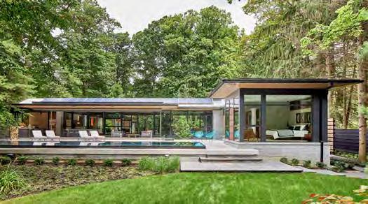
RUNNER-UP
for: Country Gem – Oshawa
Although located on a 25-acre property in a natural heritage area, there were limited locations to situate the home. Fortunately, the highest area of the property, overlooking a forest and stream, minimized the impact to natural features. Modern ‘boxes’ throughout the design ensure separation and soundproofing, an example being the home theatre’s location under the kitchen and far away from any bedroom. Interior finishes complement the materials found in nature, with natural hardwood floors, stone finishes, and walnut and teak cabinets. The multi-level roofline and expansive black windows are offset with white/grey stone, highlighting the geometrical boxes that comprise the home.
for: The Harbour Club – Port Dalhousie
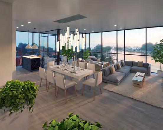
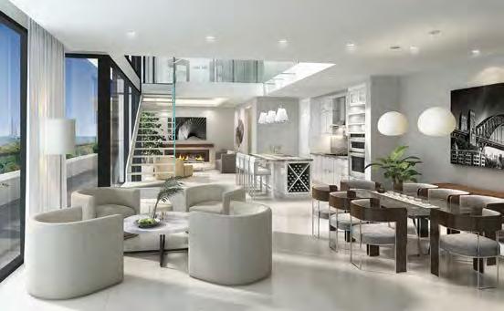
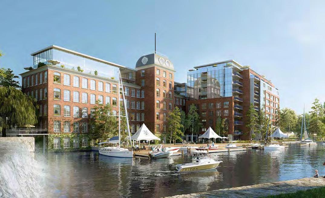
Although an isthmus, this dazzling nine-storey Port Dalhousie development visually reads as an island, with water views from all sides. Each suite takes advantage of that fact, with balconies overlooking the lake, ponds and harbour. There are heated recessed terraces in the Heritage wing, which serve as indoor/outdoor living spaces year-round. As for the history of the site, The Heritage wing was once an operating mill that manufactured Kevlar for a worldwide market. The final project will also follow an ambitious restoration of a century-old mill. A remarkable revitalization of the main level will incorporate both the main entry into the upper residential floors and the creation of terraces, shops and restaurants with live/work units. Glass enclosed two-storey penthouses, meanwhile, have been added atop the Century wing—well set back with surrounding landscaped terraces offering magnificent water views, while a new outdoor terrace overlooking a year-round adjacent waterfall is only a few feet away. The greatest challenges included soil conditions that required 20-metre piles, penetrating a shale covering over granite bedrock. As well, bathtubbing the parking garage was needed to keep Lake Ontario from entering the underground parking levels.


RUNNER-UP
for: The Randall Residences – Oakville
(Credit to: Ferris Rafauli - Architectural Design Build Group, Richard Wengle Architect Inc.)
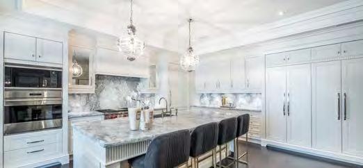
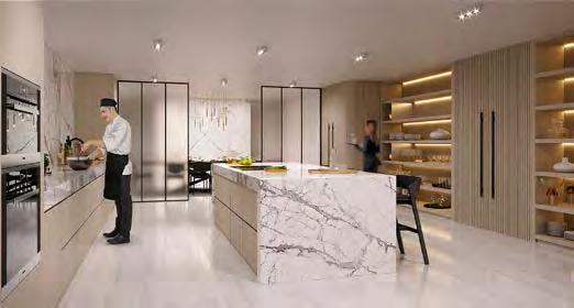
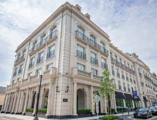
The all-star tandem of architect Richard Wengle and interior designer Ferris Rafauli re-envision a five-star European hotel in this four-storey, 36-residence project. Features include rotunda foyers, wide gallery hallways, spectacular rooftop terraces and rich craftsmanship. With 12’6” ceilings and a combination of fine marble and granite flooring, the lobby includes a concierge and door attendant service. Exquisite woodwork and built-in cabinetry is complemented with glamorous walk-in dressing room closets, custom bathroom vanities and wine bars.
for: 321 Davenport – Toronto
(Credit to: The Brand Factory)
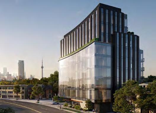
Matching the sweeping curve of adjoining Davenport Rd., this nine-storey project’s taller ‘tower’ is stepped back on the 7th level to ensure intimate scale with its neighbourhood, with the rear elevation terraced on every level after the 7th floor to preserve sky views for its neighbours. Dense tree canopies and lavish landscaping knit the aesthetic of the neighbouring gardens. Layering unexpected materials and classic organic form, its private outdoor greenspaces continue throughout the building, creating a secluded oasis. The amenity programming is highlighted by a professional-grade catering kitchen.
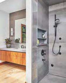
Advanced smart home technology and 60 years of steam shower engineering combine to create a home spa experience that synchronizes with your life and daily rituals.

for: 123 Portland – Toronto
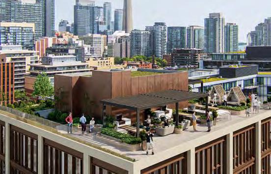
(Credit to: Blackjet Inc., Nak Design Strategies Inc., Sweeny&Co Architects, U31)
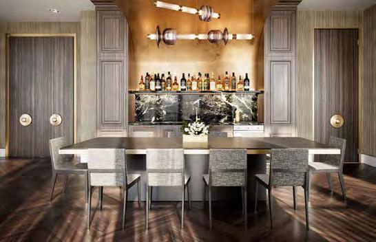
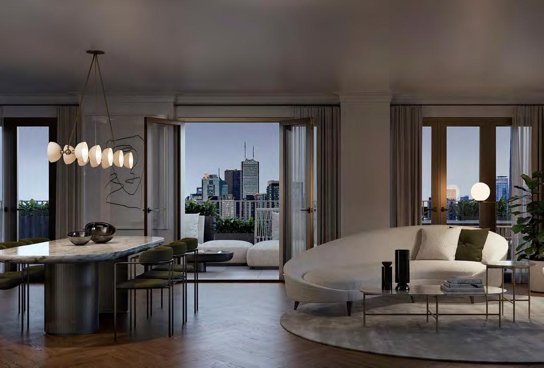
If a luxury boutique condo can be 14 storeys with 116 suites, it’s 123 Portland. Open-concept floor plans go a step further, allowing residents their choice on how they’d like their space to function. Wide windows and Juliette baloneys let natural light flood each suite, where quality interiors include integrated Miele appliances, Caesarstone countertops, fully integrated undercounter waste stations and variable refrigerant flow systems—all part of a building targeting LEED and WELL certification. A highlight is Minto Intelligence (MI), designed specifically for 123 Portland—a feature-rich smart home package that allows residents to control every element of their environment. Amenities are also plentiful, including a plush lounge, kitchen, bar and dining room that serves double duty as a co-working space or entertainment venue for guests. The rooftop amenity offers a 360-degree view of the city, where your options range from enjoying a glass of Champagne to quiet contemplation. The exterior, meanwhile, with its off-white textured stone framed with rustic steel details, suggests the level of opulence inside and out.
RUNNER-UP
for: Upper West Side Condos – Oakville
(Credit to: II By IV Design, Kirkor Architects & Planners)
A reverse L-shaped floorplate is organized around a central landscaped courtyard (a future building will mirror the L, with the courtyard joining the two buildings). The internal courtyard and main pedestrian front elevation presents a series of stunning stepped terrace blocks over two wings that culminate at the 14th-storey penthouse level. An arresting 11th-floor rooftop terrace and outdoor amenity space is the perfect intersection of both wings. High-tech features include energy-efficient systems such as geothermal heating and cooling, building recycling and Branthaven’s in-suite Smart Connect Home Technology.
RUNNER-UP
for: Tridel at The Well – Toronto
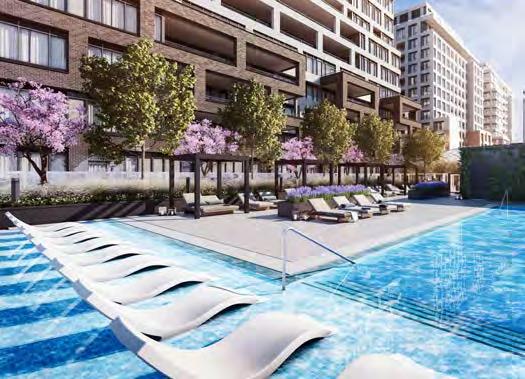
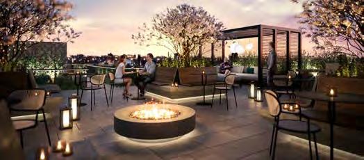
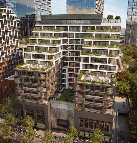
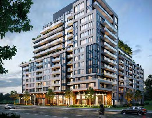
(Credit to: II By IV Design, The Brand Factory, The MBTW Group / W Architect Inc., Wallman Architects)
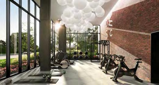
Situated amid a development of 3 million square feet of culture, entertainment and community, the 14-storey Tridel Signature Series design at The Well is characterized by a stepped-terrace profile overlooking the new Wellington Street promenade. Its U-shape maximizes the frontage for residential suites. Interior amenities include a grand dining room, state-of-the-art fitness centre and stunning lobby lounge. Outside, amenity terraces are home to a spectacular swimming pool and loungers, contemporary cabanas and a fireplace lounge.
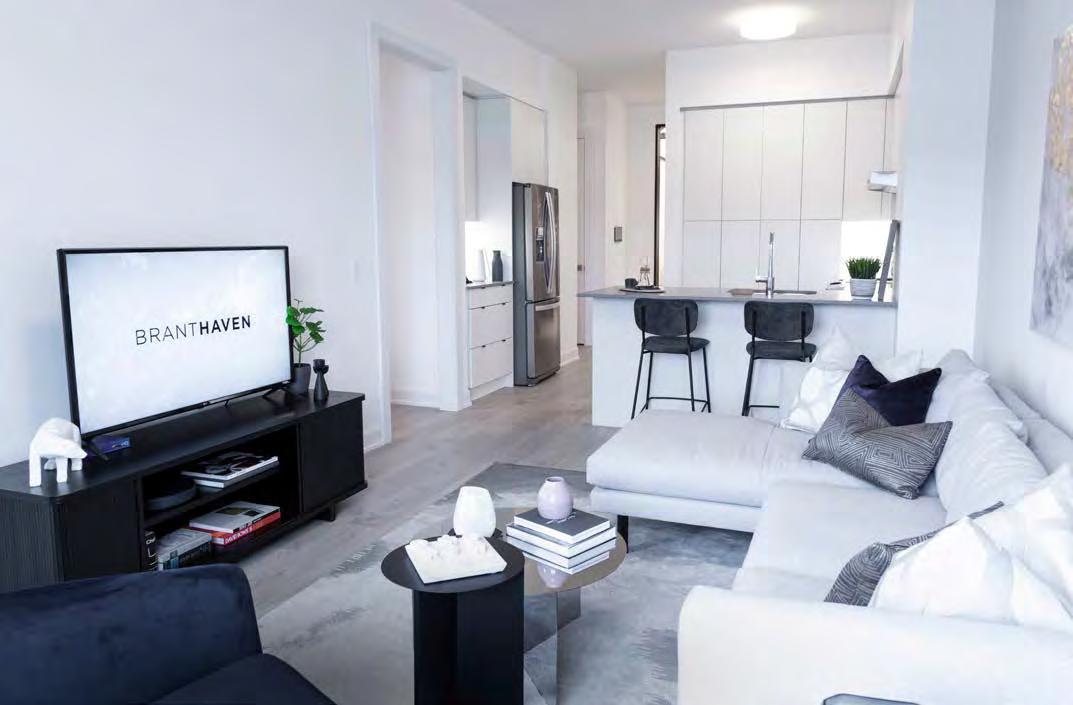
for: Upper West Side Condos – Oakville

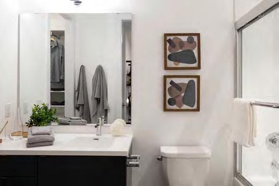
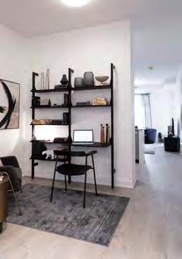
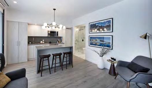
At 695 square feet, Branthaven’s 1-BR+den El Dorado suite with balcony is a model of efficiency and high standards. Boasting an efficient and flexible plan, its open-concept sightlines from the front door extend the space visually and experientially. The den is a flex space—home office, quiet study, Murphy bed-ready— while a handy closet and washer/dryer are ideally placed next to the bathroom’s tiled areas. The kitchen has an extraordinary amount of counter space and built-in storage for a suite this size. The bathroom, for its part, is spa-worthy, with vanity storage and dual door access. Fixtures and features include wide-plank, wear-resistant laminate flooring, integrated USB charging ports, Branthaven’s Smart Connect Home Technology, gourmet kitchens with Caesarstone quartz countertops, a 3”x6” subway tile backsplash in coordinated palettes and 39” extended height upper cabinets. The breakfast bar is ideal for casual fare, with full-sized appliances and the coffee/cocktail station a bonus for entertaining. Adding ambience, the living room’s 9’ ceiling, big window, deep ledges and glass balcony door pave the way for extra natural light. And with three designer-selected colour palettes or three upgraded mix or match palettes, homeowners can personalize their domain.

for: Nørdic Condos – Toronto
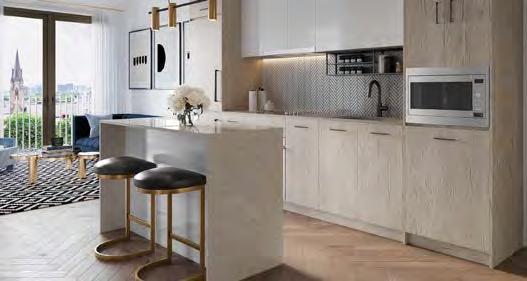
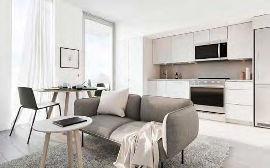
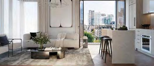
(Credit to: ADhoc Studio, gh3*, Milborne Group, Montana Steele Advertising)
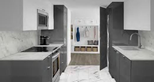
Despite its humble footprint, this 601 sq. ft. suite packs a punch, with two bedrooms and two full baths. The master bedroom has its own private ensuite with a frameless glass shower, with the second bathroom including a tub. A sleek galley-style kitchen offers a choice of designer cabinetry and countertops, as it seamlessly connects to the living area. Finishes like quartz and woodgrain laminate imbue a sense of materiality. Residents will have total control of the heating and cooling in their suite, with predictable low maintenance costs year-round thanks to the building’s geothermal system.
RUNNER-UP
for: 123 Portland – Toronto
(Credit to: Nak Design Strategies Inc., Sweeny&Co Architects, U31)
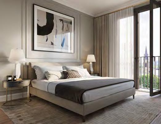
There’s an “efficiency expert” theme in this 639 sq. ft. suite— designed to offer a ton of storage space, with a laundry room neatly fitted inside an enclosure and a den across from the kitchen for optimal flexibility. But high-end extras abound, including a spacious bedroom and ensuite with stone countertops, recessed and sconce lighting, a bevelled vanity mirror, glass shower and 60” tub. The unit can accommodate a full dining table and chairs, while not creating pinch points for people walking by. Kitchen countertops feature integrated Energy Star appliances, while an undercounter waste station makes for easy cleaning.
Servicing
Contact: Adam Zaretsky 905-761-2471
azaretszky@appliancecanada.com

www.appliancecanada.com/builders/

for: The Harbour Club – Port Dalhousie
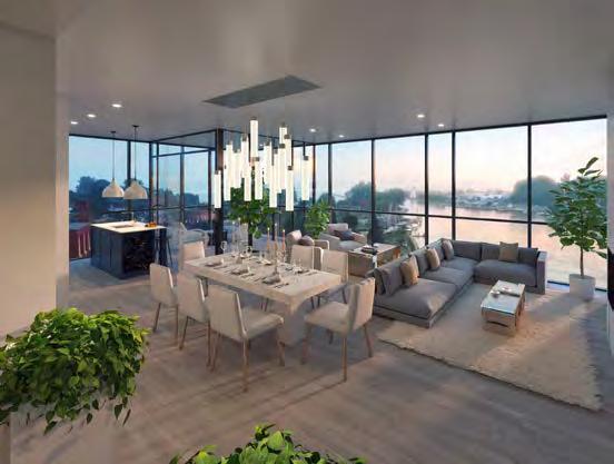
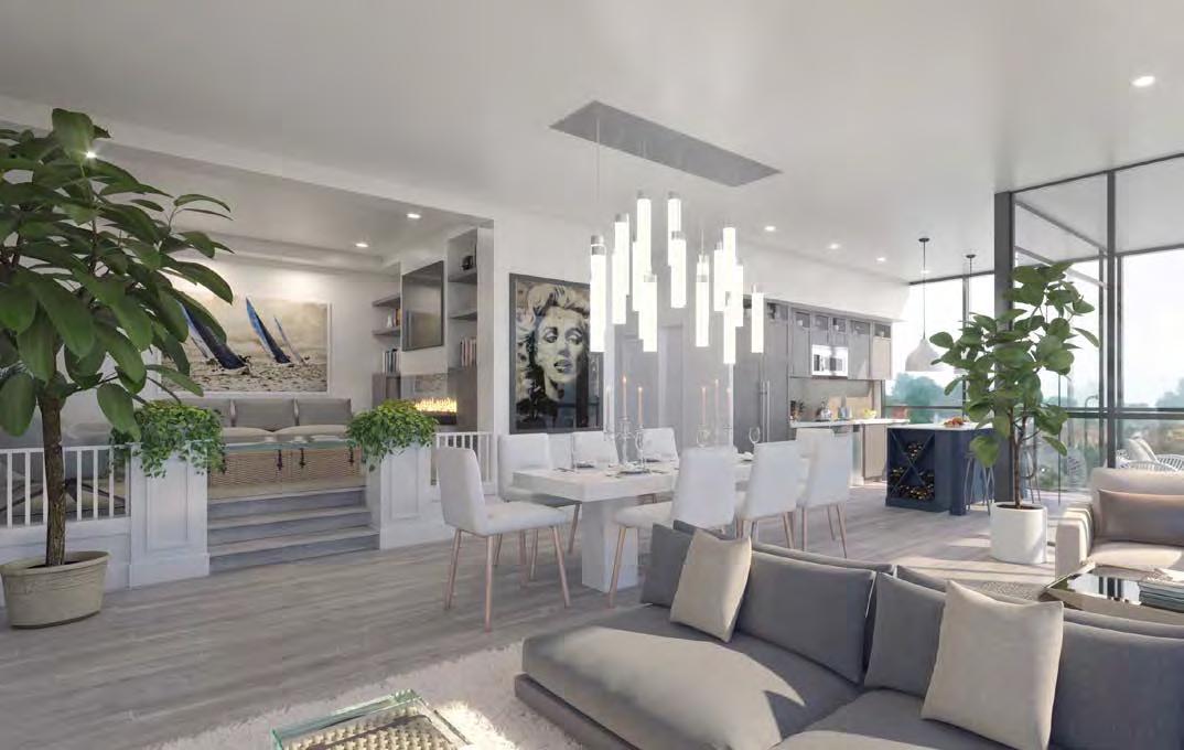
(Credit to: Ryan Design International)
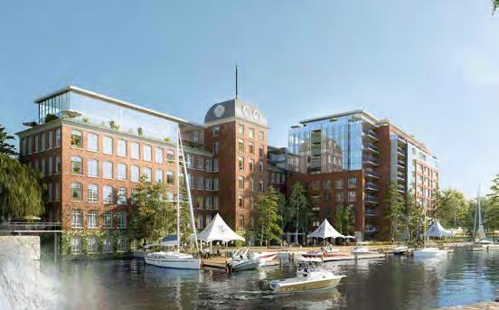
A captivating harbour view greets you the moment the front door is swung open, and those Lake Ontario vistas keep coming thanks to the Harbourmaster suite’s strategic positioning in the northeast corner of the new Harbour Club wing. Raising the den by almost 1.5 feet provides an enhanced look upon the marina below. The expansive open kitchen is perfect for entertaining dinner parties and includes a corner recessed terrace that fully functions as a solarium, with the balcony equipped with permanent storm doors and temperature control features for year-round enjoyment. It’s a wonderfully deceptive in space, as the actual floor area of only 1,576 sq. ft. feels more like 2,000 due to the open-concept plan. Varying floor levels help define the den area, allowing it to stand out among the other rooms, while the square format of the great room accommodates a wide range of furniture placements. Elegance and fine taste, including the available spa-like bathroom with freestanding soaker tub, pervade the layout. It’s all part of an elegant design that caters to those leaving a large home who want the lifestyle, security and convenience of resort-style living, without having to dramatically downsize.
RUNNER-UP
for: Mountain House at Windfall – Town of Blue Mountains
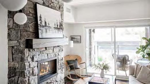
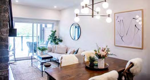
This 864 sq. ft. two-bedroom, two-bathroom suite is located on each floor of Georgian’s Mountain House buildings. The open layout is ideal for entertaining after a day on the ski hill. Gas lanterns welcome you home, where exterior stone accents and heavy timber frames reflect the surrounding forest and mountains. The theme continues inside with the optional stone fireplace and heavy timber mantel, while the sparkling modern Euro-kitchen design complements the new-age chalet feel. Top it off with a private 80 sq. ft. covered terrace with glass railings and large sliders for unobstructed escarpment views.
RUNNER-UP
for: 123 Portland “1441” – Toronto
(Credit to: Nak Design Strategies Inc., Sweeney&Co Architects, U31)
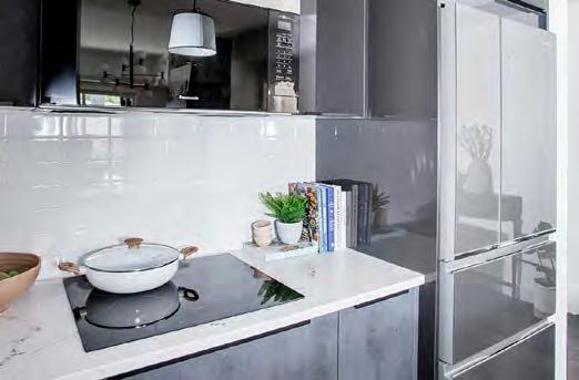
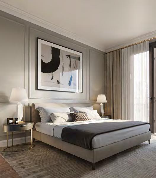
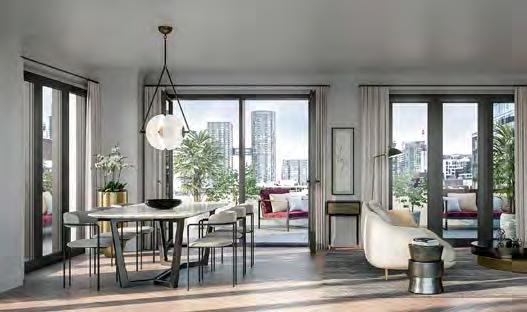
This terrace suite, entitled 1441 for its square footage, boasts three bedrooms, each with convenient access to the jaw-dropping wraparound terrace and its accompanying views of downtown Toronto. The bedrooms’ positioning at the edges of the layout maximizes the central living space while keeping the rooms private. Although designed as an oasis in the city, the terrace creates even more opportunities for social events. Natural light floods through expansive windows to further merge the indoor and outdoor spaces, as it gleams off the soft tones of marble countertops and stainless steel Miele appliances.
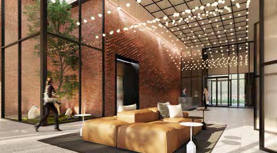
for: Upper West Side Condos – Oakville
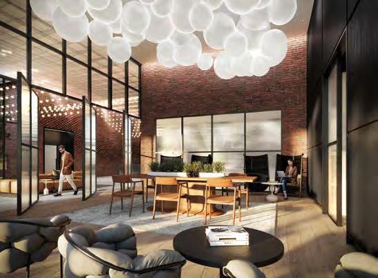
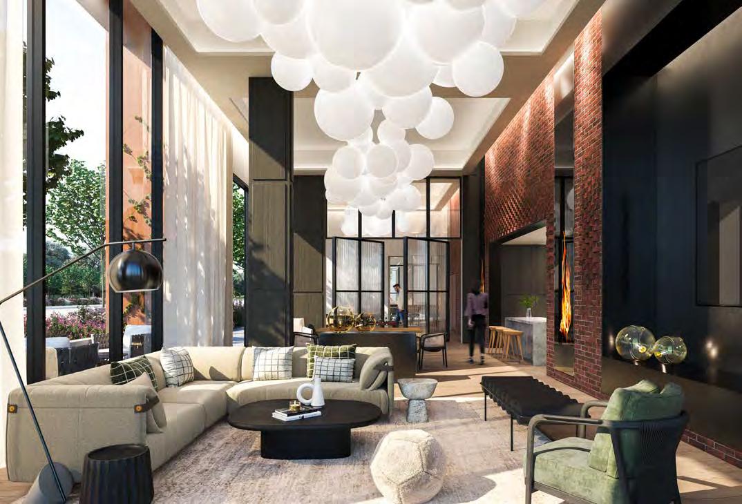
Measuring 1,800 square feet, this lobby acts as a dual entrance, effectively cutting through the ground level to seamlessly connect the main courtyard to the Trafalgar Road side. Soaring double-height windows buttress each end, as glass vestibules provide protection from the elements. Custom double-height ribbed-glass pivoting doors further extend this natural light to the adjoining amenity spaces. Inspired by leading designers and boutique condos and hotels, as well as the iconic Brownstones of New York City, its aesthetic is distinctive. Bespoke finishings include a custom brickwork wall specifically chosen to reflect the quality of craftsmanship, a massive granite-faceted concierge pod that anchors the front entrance reception and a show-stopping suspended ceiling light fixture above. An atrium-encased, skylit sculptural tree is a focal point day or night and introduces a natural element to the interior. Modern linear natural stone flooring grounds the materiality, while a rich leather modular lounge seating area is located at the crossroads of the lobby lounge. Branthaven’s integrated Smart Connect system lets residents communicate with visitors to this dazzling space via live one-way video.




RUNNER-UP
for: Nørdic Condos – Toronto
(Credit to: esQape Design, gh3*, Montana Steele Advertising)
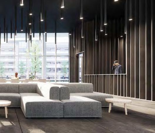
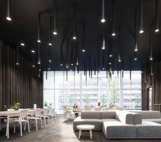
Nørdic’s sleek and inviting lobby is a study in organic textures, restrained furniture placement and minimalist colour palette. Simple elements make for a striking space, the limited furnishings leaving plenty of room for people to move freely. Soaring ceiling heights add to the invitation of ample space to lounge in and meet guests in comfortable soft seating areas. Residents also enjoy a 24-hour concierge and a parcel room at the building entrance, while a digital lobby display shows current transit commute times to keep residents notified of the many forms of transit right outside the door.
RUNNER-UP
for: The Randall Residences – Oakville
(Credit to: Ferris Rafauli - Architectural Design Build Group, Richard Wengle Architect Inc.)
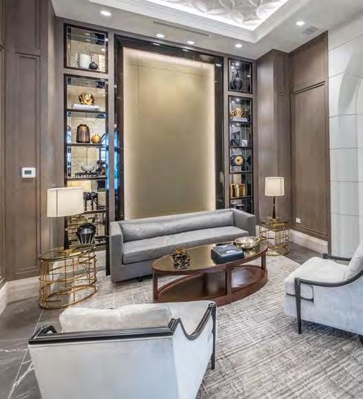
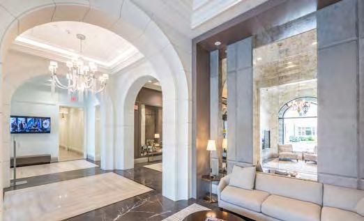
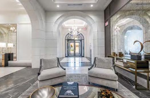
A stunning entrance of sculpted limestone and graceful arches conjures up visions of Paris, Madrid and Rome, and the lobby reinforces the level of elegance and sophistication at The Randall Residences in Oakville. Architect Richard Wengle’s design is inspired by classical French Beaux Arts architecture, while interior designer Ferris Rafauli follows suit, with refined luxury, from engineered hardwood, slab marble flooring and elegant ceiling design to cornice moulding, horizontal wall fenestration and an eye-popping central chandelier—all with a sumptuous reception area centred by a glowing fireplace and library.

for: Clean Slate – Guelph
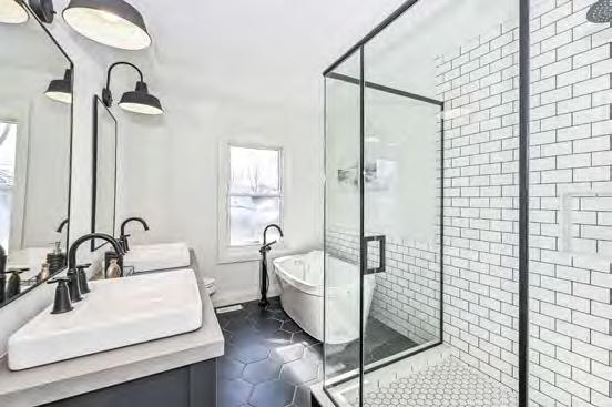
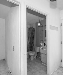
(Credit: Barber Glass, Ceramic Decor Centre, Core Electric, Patene Building Supplies)
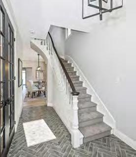
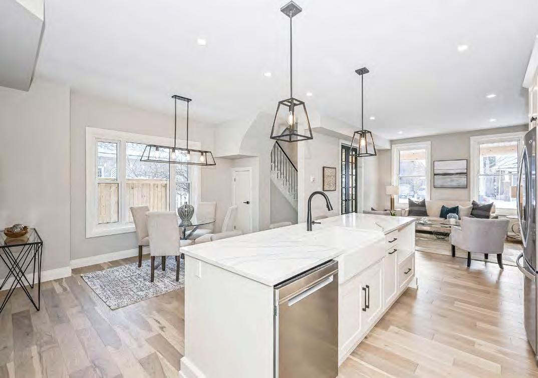
As a cultural heritage building, the outer layer of this 150-year-old Guelph home could not be destroyed. So the formidable journey of modernizing it while maintaining its charm commenced with a complete interior gutting. Working with existing floor joists and levelling out the floor where some of the joists were almost double the span of today’s code meant every floor and wall received new finishes, bracing, drywall or paint. Opening up the main floor and moving the kitchen—highlighted by a Kohler farm sink with matte black faucets— to a central location was the biggest benefit. The existing staircase was refinished, new plumbing, HVAC and electrical installed, and spray foam insulation added to improve comfort (savings from the updated equipment were noticed immediately). But modern luxury is evidenced throughout, including custom black-framed tempered glass shower walls and doors, white oak hardwood flooring and new appliances. Outside, the vintage exterior brick received an off-white paint, while tall black French front doors, new wood beams, updated soffits and new cedar posts on the porch help to rejuvenate this classic structure.
for: Heritage Refresh – Ottawa
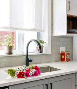
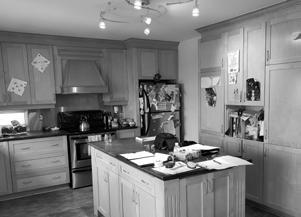
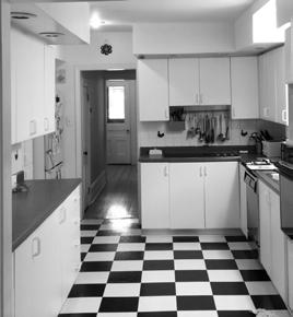
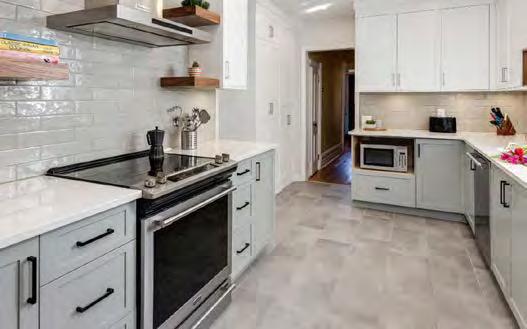
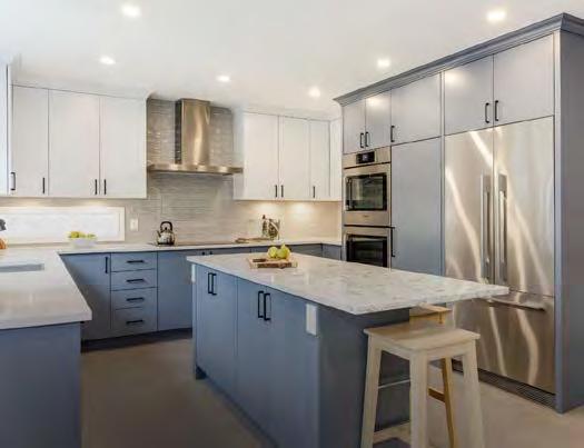
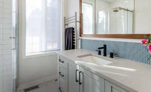
These homeowners loved their older home but desperately wanted an update that didn’t detract from the charm. Appliances were moved around in the kitchen to maximize the counter space and storage and improve flow, while a touch of colour and natural wood elements were added to both the kitchen and ensuite to add warmth. Maintaining the footprint for budgetary purposes, a compact angled door system was used for the corner shower. Further improving efficiency, the washer and dryer are housed in tall cabinets. Kitchen mouldings help hide a bulkhead. But when opened, along with the ceiling, serious structural and plumbing issues were uncovered that required immediate repair.
RUNNER-UP
for: Modern Luxury – Ottawa
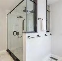
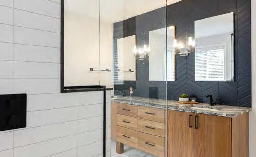
Despite a tight five-week window from start to finish, OakWood hit the mark in this kitchen/bathroom makeover. Removing some of the interior walls allowed for better integration of the spaces, including the kitchen, where the fridge was relocated to improve countertop area and pantry storage. A completely new plumbing layout in the ensuite similarly helps to maximize the size of the custom 90” solid walnut vanity and vast 6’x4’ ensuite shower, the wall of which is framed to let sunlight in while still accommodating multiple showerheads. The indigo-grey colour of the custom cabinets was paint-matched and used at the fireplace wall to unite the two spaces.
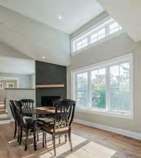
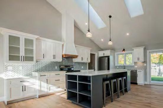
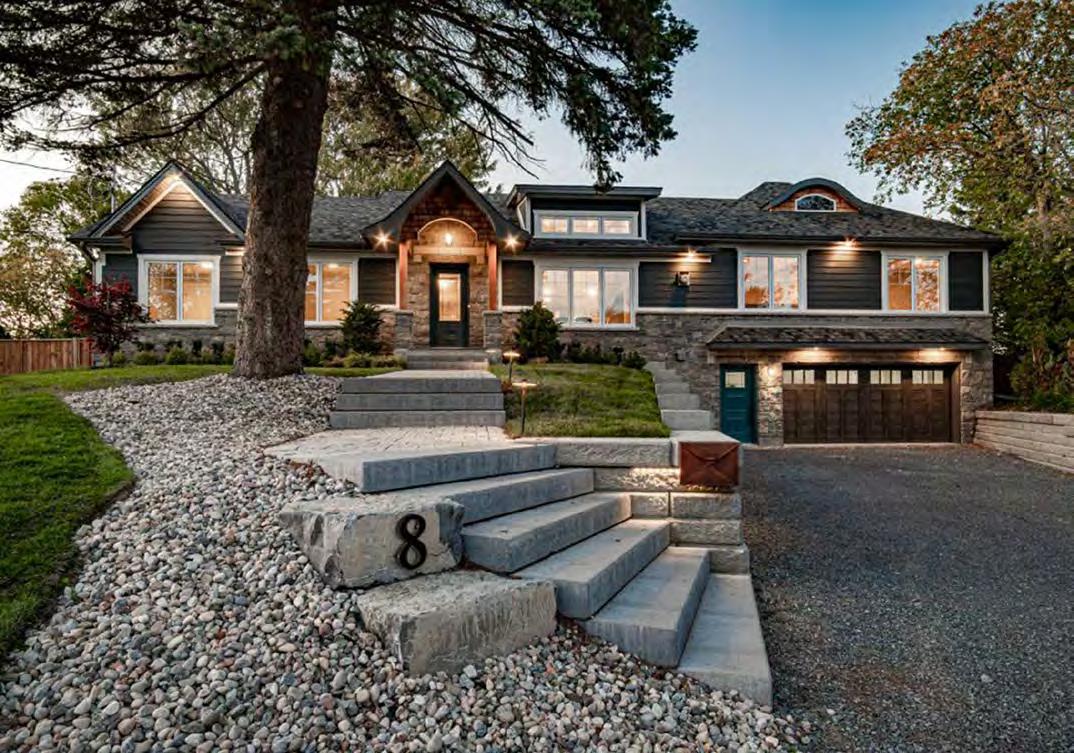
With priority given to maintaining the home’s original footprint to avoid a costly minor variance process, the pre-existing 900 sq. ft. garage was reconstructed to add another 900 sq. ft. of living space above, allowing for the addition of a proper master bedroom suite, living room and office. The existing house was gutted, allowing for new wall insulation and new windows and doors for energy efficiency and comfort. A new roof design, including a vaulted ceiling with skylights in the kitchen/dining area, adds an abundance of natural light and creates a sense of grandeur. Moving the existing staircase from the centre of the home created an open floor plan, highlighting those new ceiling details. A finished basement now features a large rec room, secondary laundry, full bathroom and separate entrance for a future in-law suite. The large backyard was also updated with a patio area off the kitchen and new deck off the master. The new garage, meanwhile, built with ICF walls and infloor heating in the new slab, now provides plenty of space for two large vehicles, storage for bikes, etc. and a large workbench. And accent lighting on the front of the house along with landscape lighting for the driveway and walkways highlight the curb appeal of this once nondescript home.

RUNNER-UP
for: Condo in the Sky – Toronto
GLASS HALF FULL
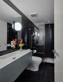
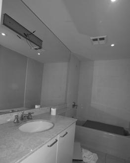
Reimagining this 20+ year-old luxury penthouse involved some North American firsts, including Italian recessed light fixtures (integrated into the drywall in a way that eliminated the need for trim kits) and interior doors (appearing frameless, they were also mudded into the drywall). Removing a number of interior walls established a natural flow and more functional spaces, while flipping the direction of the staircase made moving between floors more welcoming. Glass was used throughout, as opposed to solid walls, to separate spaces but to continue to allow for the desired sightlines, including a massive living room light fixture that can be seen from every room.
RUNNER-UP
for: Modern Farmhouse Oasis – Bowmanville
WATER WORLD
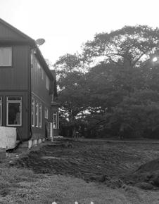
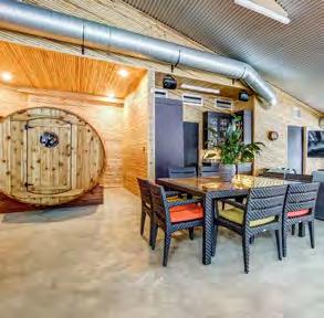
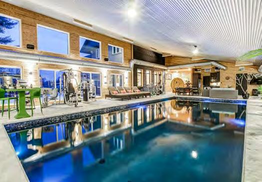
Connecting to an existing two-storey home, this 2,500 sq. ft. addition features a 20’ x 40’ pool—built with multiple extra footings and an abundance of metal rebar in order to withstand the weight of 115,000 litres of water. The space also showcases a gym, seating and dining area, three-piece bathroom, mechanical room and a custom winebarrel-shaped sauna with seating for 10! The exterior was wrapped in Permacon stone, varying in size, shapes and tones of grey. Outside views of the countryside are maximized by 15 sliding doors, while multiple walkouts lead to a concrete patio and large cedar deck. The industrialinspired interior features exposed ductwork and a steel-clad ceiling.
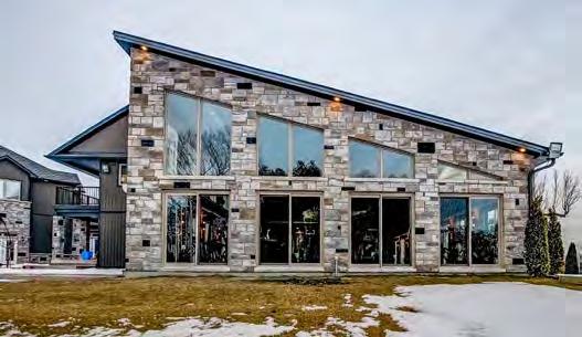
for: Ridgewood in the Glen – St. Catharines
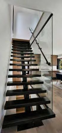
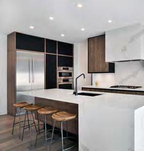
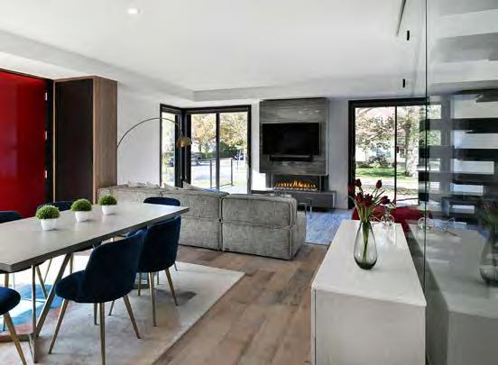
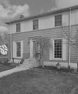
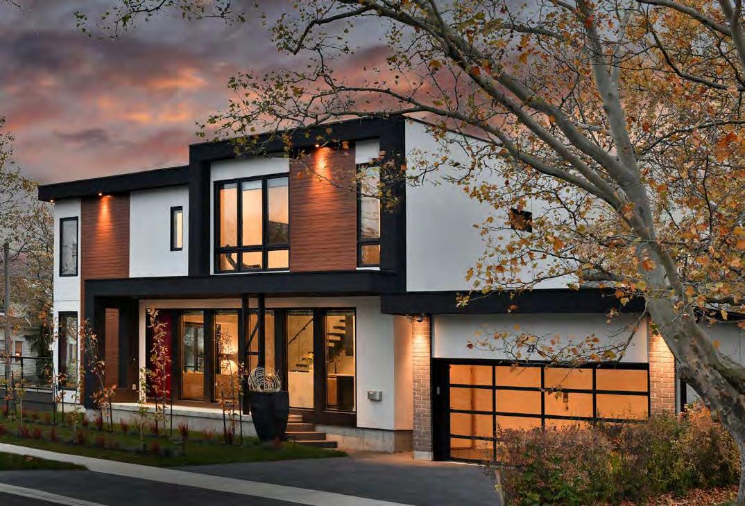
The young family wanted to achieve a unique design in the neighbourhood, ultimately creating this urban chic family home. The century home, though, was essentially taken down to the foundation to address structural issues once the demolition phase began. Although unforeseen, it ultimately gave Windrush Hill the ability to build a home that is more structurally sound, while upgrading all wall systems to achieve current energy efficiency standards. A two-storey addition was added to the right side along with a detached garage. Inside, an open, high-ceilinged entertaining space, behind which all the brand new mechanical elements are hidden, connects to the upstairs bedroom retreat via a custom engineered steel staircase with oak treads with large glass safety panels. A rooftop solar array (hidden from streetview), new insulation and large-format windows all add to the energy-efficient package. To the rear, the patio doors frame a custom fireplace surround that was designed to achieve a floating appearance. Outside, modern stucco and high-quality aluminum siding in an “olive wood” finish softens the design to help this corner lot meld with the neighbourhood.







RUNNER-UP
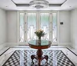
for: 2020 Art Deco – Ottawa
(Credit to: Christopher Simmonds Architect Inc.)
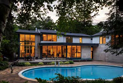
Seeking a stronger indoor-outdoor connection, this reno re-invented the floor plan. The kitchen, breakfast and sitting areas were relocated to the rear of the home and provided with floor-to-ceiling glass. The main bedroom and ensuite were relocated above the garage, overlooking the lush backyard. Separated from the rest of the second floor by a change in level, this private suite is accessible by both stairs and a new elevator, catering to the clients’ request for accessibility. A chef’s kitchen with Wolf appliances has also been added. But perhaps most impressive, the home’s energy consumption has been reduced by a whopping 74%!
RUNNER-UP
for: Stoney Lake Cottage Remodel – Douro-Dummer
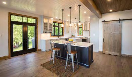
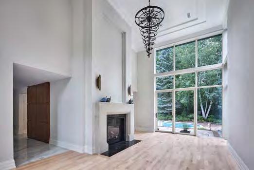
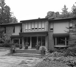
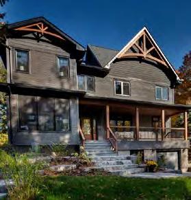
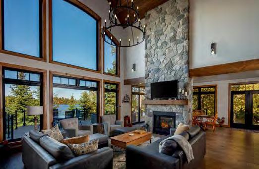
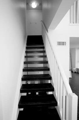
The client’s newly acquired Stoney Lake cottage was dated and closed off, with an odd flow and lack of atmosphere. This dramatic renovation delivered an entirely new space, with a stunning window wall overlooking the lake and such details as an interior staircase with posts at the bottom to match those of the covered front porch. The design used a framing system that allowed the new space to be extremely airtight and energy efficient. Challenges included finding materials to accommodate the client’s request for black windows inside and out and aligning the client’s wish list and budget, which required multiple rounds of conceptual design and budgetary evolutions.


for: Condo in the Sky – Toronto
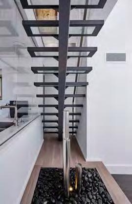
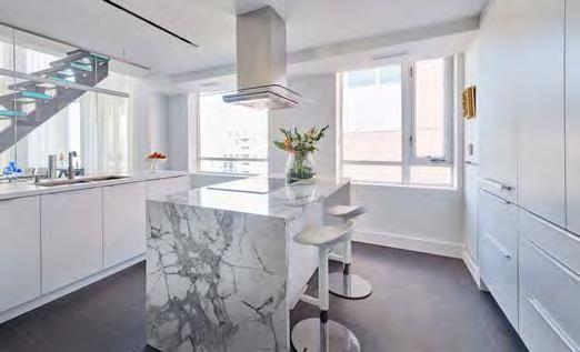
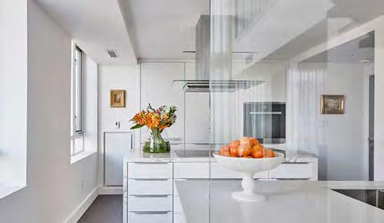
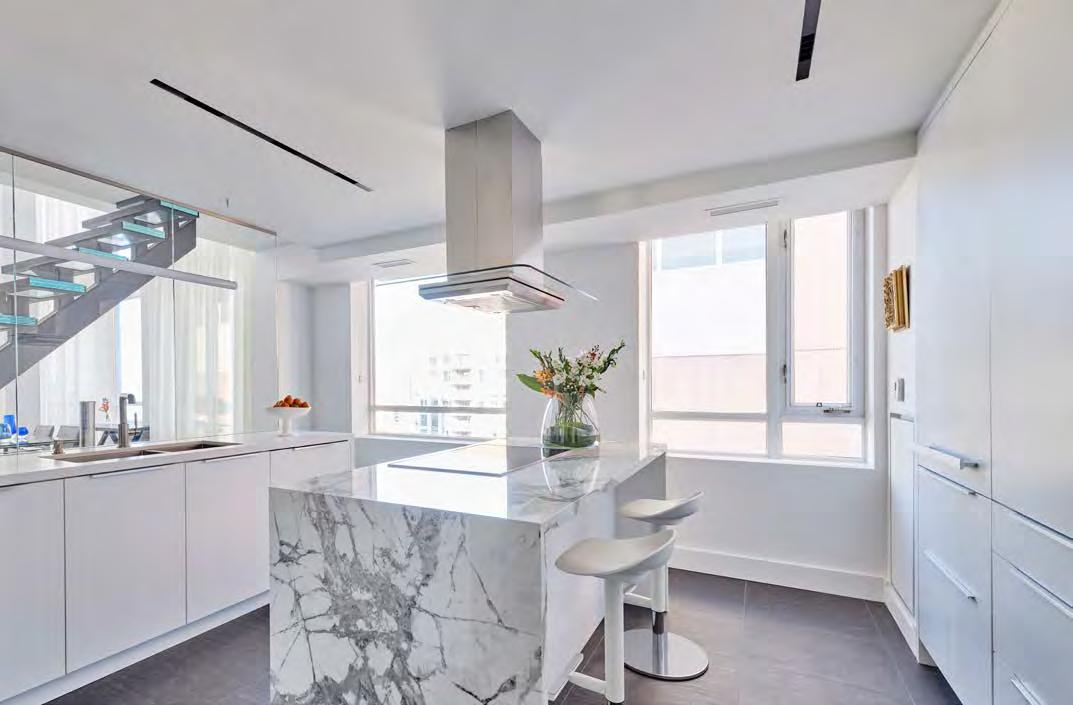
The evolution of this 20+ year-old luxury penthouse condo from dated to decadent began with completely rethinking the kitchen space and not letting high-rise construction techniques from the original build stand in the way. A modern and luxurious space for entertaining was the dream. To that end, an interior wall between the old galley-style kitchen and an adjacent bedroom were removed to combine the spaces, while a drop ceiling was built to maintain ceiling height consistency. Channelling of the concrete floor plate was undertaken to run electrical services to the new island. The amazing glass wall that separates the kitchen space doubles as a backsplash for the work area, while bringing the steel and glass staircase, the water feature, the massive dining room light fixture and the city views right into the kitchen. All the custom cabinetry was designed to be fabricated without filler pieces, requiring Keystone to frame out and board the walls and ceiling with a margin of error less then 1/16”. Helping to illuminate this dazzling space were recessed Italian light fixtures, integrated into the drywall, which were used for the first time in North America, requiring field-testing for certification. And this being a condo, the builder needed to ensure that all materials were sized to fit in the elevators.
Beauty Set in Stone.


RUNNER-UP
for: The Century Home Perfected – Waterloo
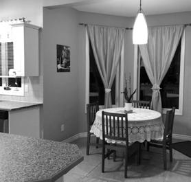
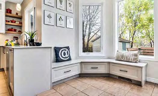
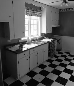
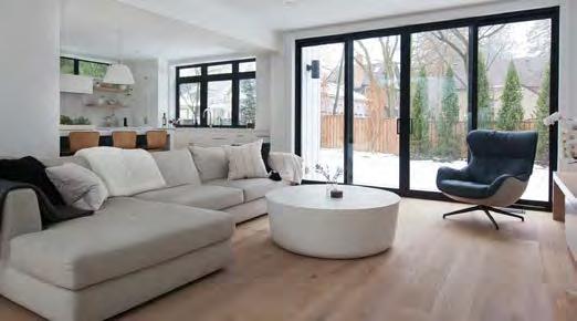
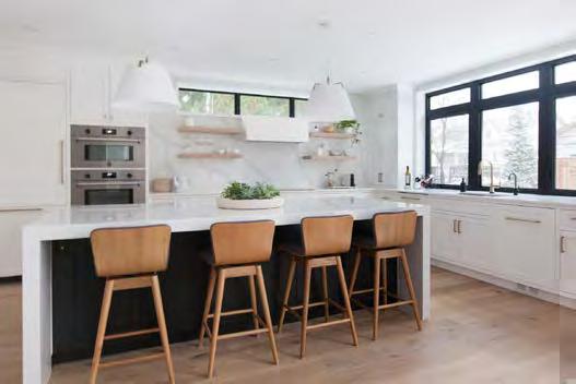
By adding a rear addition on this century home, Eagleview was able to transform a dark space into an open-concept kitchen, living and dining room area that fulfills the client’s desire to entertain. Every aspect has been customized, right down to the interior of the drawers and cabinets. The backsplash is an attention-getter, a single slab of quartz extending up the entire wall, its veining drawing your eyes to floating shelves and transom windows above. The stunning island features 3” waterfall edges and comfortably seats four. Gold accents, from the faucet to the pendant lights, ties the design together, while blonde white oak flooring throughout the house gives the space a modern, airy feel.
for: Purely Polished – Orleans
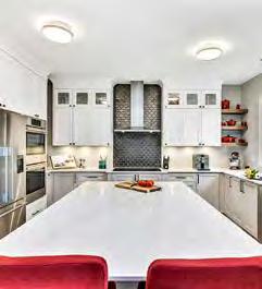
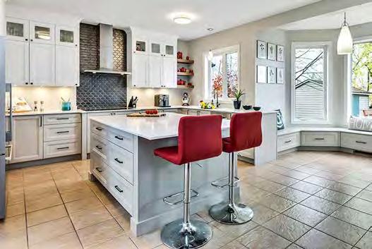
In meeting a tight 31-day timeline, OakWood’s design team ingeniously solved the issue of an awkward island. It began with removing the existing walk-in pantry, making way for more integrated full-height cabinetry layout. The gleaming new island— with two velvet red chairs popping in colour—is flanked on both sides with large drawers, adding further storage. Glass-insert doors along the top showcase special pieces, while open faux woodgrain shelves in each corner add a contrast and provide space to display gorgeous red cookware. Neutral tones in darker shades create warmth, with the almost-black accents making a bold statement behind the hood fan backsplash.
• Cost effective accessories (washer s/molding)
• Uniform washers save time on installations

• Heaviest sheet in the market, resists pulldowns
• P roudly Made in Canada
for: The Century Home Perfected – Waterloo
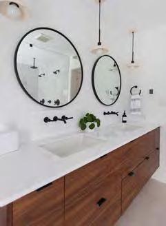
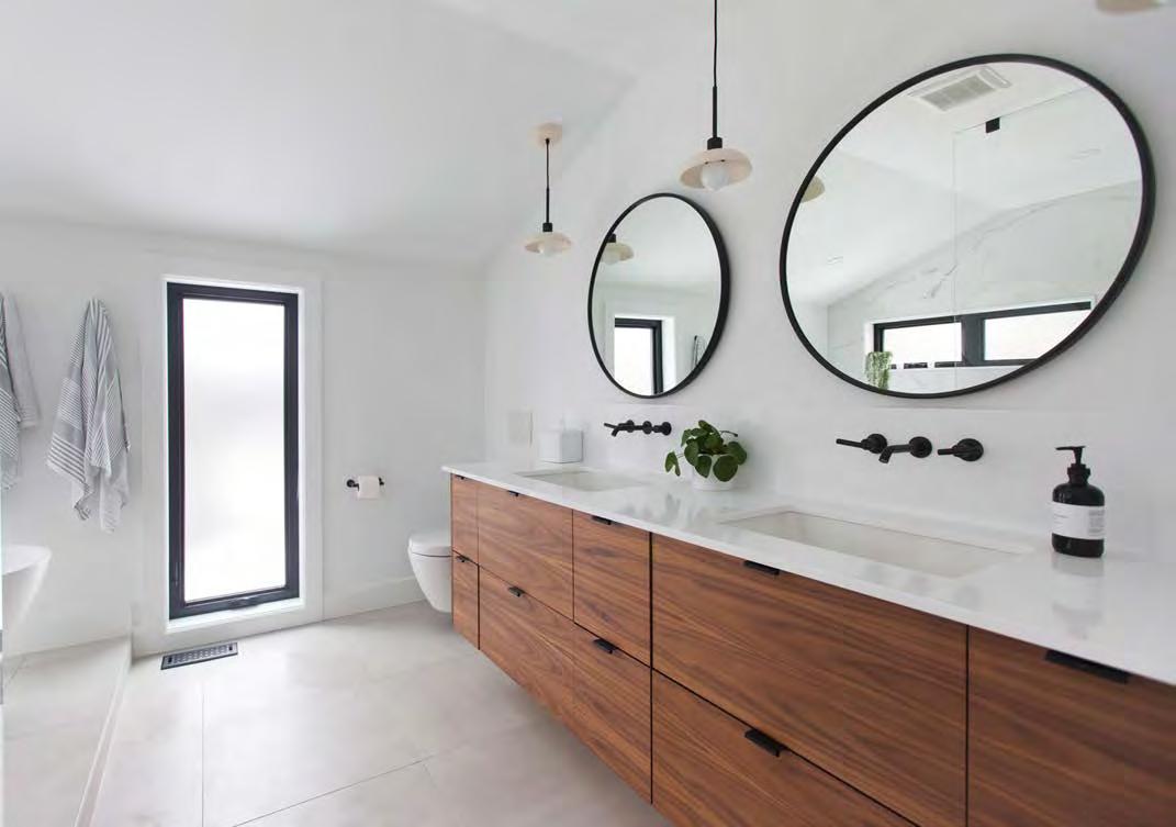
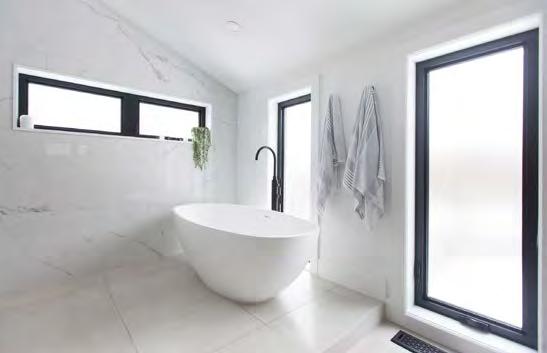
As with most renovations of century homes, Eagleview encountered structural, electrical and plumbing issues when they opened up the walls. Those issues solved, they went about administering to the client request for a bright, spacious ensuite with clean, modern lines, a contrast between materials and top-grade finishes. The winning experience begins with in-floor heating beneath beautiful 24” x 24” tiling. A custom 82” double vanity along one wall features walnut drawer fronts. The simple white quartz countertop and backsplash create a perfect backdrop for the matte black wall-mounted faucets, which ties together with the round mirrors and pendant lights. Floor-to-ceiling windows allow the natural light to pour into the room, while their black frames add a beautiful contrast. A cathedral ceiling carries through from the master bedroom and is accentuated by floor-to-ceiling wall tiles. But the most luxurious feature is the stunning freestanding tub. Seemingly perfectly balanced on the floor tile, one can imagine water streaming down from the elegant 4’ faucet. But the curbless shower is impressive too, featuring two showerheads, including one spectacular rain showerhead.
for: Modern Luxury – Ottawa
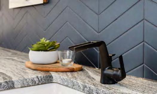
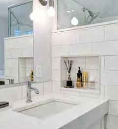
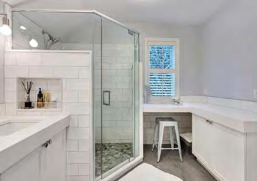
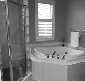
This main bathroom received a spa treatment all its own. Maintaining the existing footprint, as well as the positioning of the plumbing, provided budget for material selections and designing rich pieces in neutral tones. The unused corner tub was replaced by a custom makeup area, positioned in front of the large window for ample natural light. The corner shower update features a custom design that allows for better light and built-in storage niches, with floor pebbling to add texture and break up the visual of all-white tiles. A more functional vanity includes muchneeded hidden spaces for overflow items, while its substantial countertop thickness was chosen for a bigger impact.
RUNNER-UP
for: Spa Retreat – Ottawa
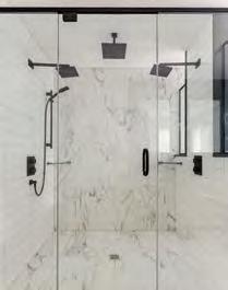
The clients, who travel a great deal for work, wanted their ensuite to feel like a luxury hotel suite, replete with high-end finishes. A completely new plumbing layout was employed to maximize the size of the vanity and shower, the latter of which, at an expansive 24 square feet, was designed to let sunlight in, with room for multiple showerheads. Cambria quartz was used throughout the project to ensure durability and stain resistance—ideal for the young family. Three large custom vanity mirrors pop in front of black tile, while the striking black/white contrast is complemented by natural walnut cabinetry and elegant light fixtures.
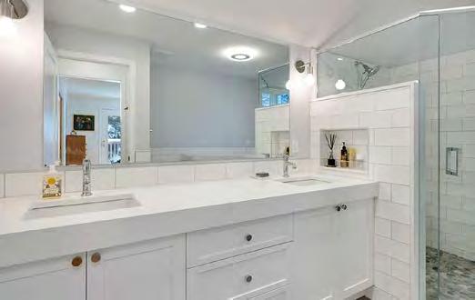
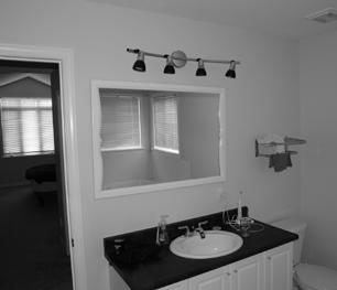
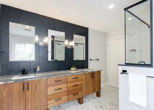
for: Braestone Estates “The Carolina” – Oro-Medonte
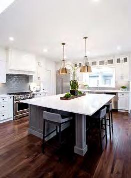
Georgian calls it “continuation architecture”—the art of seamlessly connecting varying spaces and design. The approach succeeds on all fronts with The Carolina at Braestone Estates, the kitchen of which truly acts as the heart of the home as it effortlessly extends into the dining room and great room, with unobstructed sightlines to the exterior landscape. A connecting butler’s pantry offers even more space than already provided with full cabinetry throughout the kitchen. A fullsize breakfast nook is surrounded by oversized windows, allowing for an abundance of natural light to start your day or capture the golden hour colours as the day comes to a close. The oversized quartz island, with two sides of recessed seating, is an entertainer’s dream, with plenty of room to prepare dinner while entertaining guests or helping with the kids’ homework. The interior finishes blend country charm with modern elegance. The ceiling-height cabinets are perfectly balanced by the 18’ stone fireplace in the great room, while wide-plank hardwood flooring throughout ties the package together as it pays tribute to the farmhouse style the Carolina is known for.


RUNNER-UP
for: The Sandridge: A Minimalist Home for Maximum Style – Kitchener
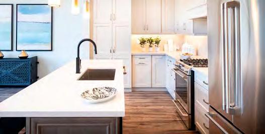
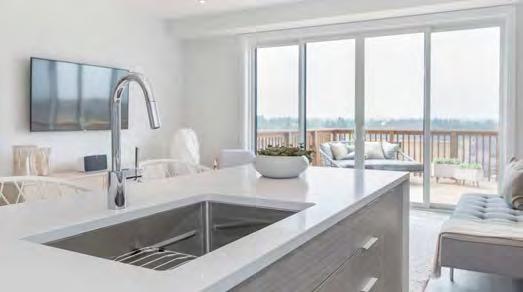
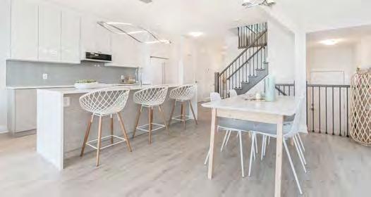
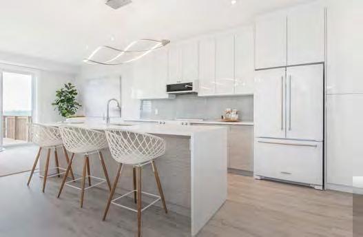
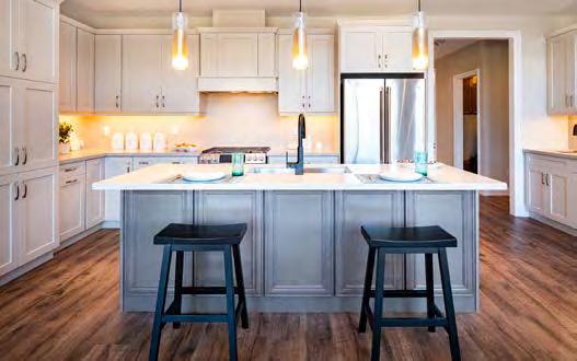
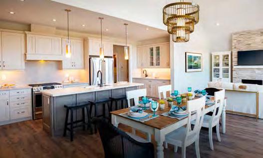
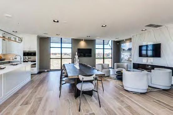
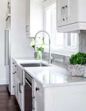
Targeting first-time homebuyers or those upsizing from a smaller attached product, the Sandridge showcases an ultra-modern kitchen with high-end finishes and storage galore. Sleek white, Energy Star-certified appliances with brushed metal accents are integrated into the light-flooded design. A pantry beside the fridge leads to lots of counter space on either side of the oven. The dishwasher and double sink with chrome gooseneck faucet are built into the island, above which an intriguing chrome light fixture draws the eye, while white crosshatched bar stools with wood legs make an artistic statement.
for: Courts of Canterbury “The Cavendish” – Port Perry (Credit to: Builder Insight Group Inc., Colours & Concepts Inc., RN Design Ltd.)
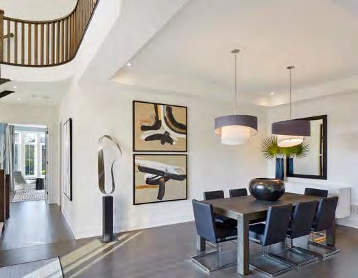
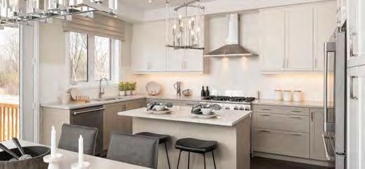
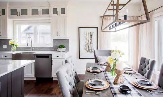
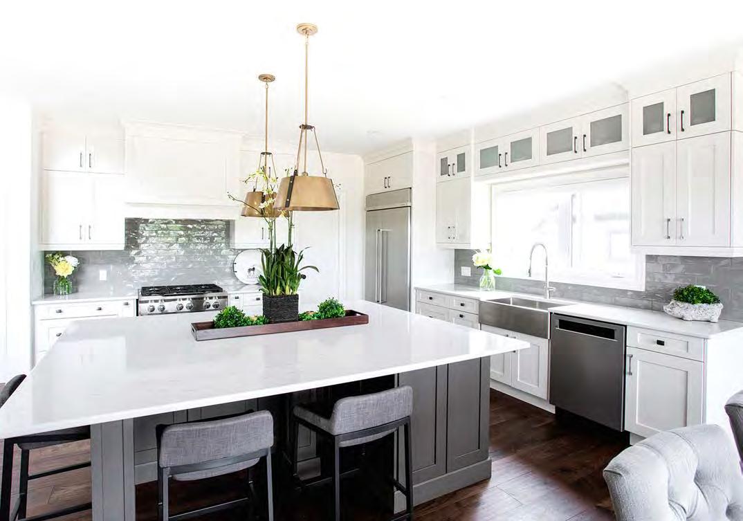
Situated to take advantage of natural light and views on to the back garden through a wall of windows in the adjoining dining/great room, this 21’ x 8.5’ kitchen is anchored by a large pantry. The island contains a sink and dishwasher for easy clean-up with an extended multi-purpose countertop. A wet bar with additional storage and glass display doors adds to the appeal. Torlys laminate flooring is laid throughout, while ambience is added via undercabinet task lighting and an airy palette of warm neutral colours accented with blues and greens, drawing inspiration from the mature-treed neighbourhood and nearby lake.


Evaluated by a panel of independent judges, the Ontario Home Builder of the Year award is presented annually to a new home building company that demonstrates outstanding professionalism, innovation and integrity within their business, industry and community.
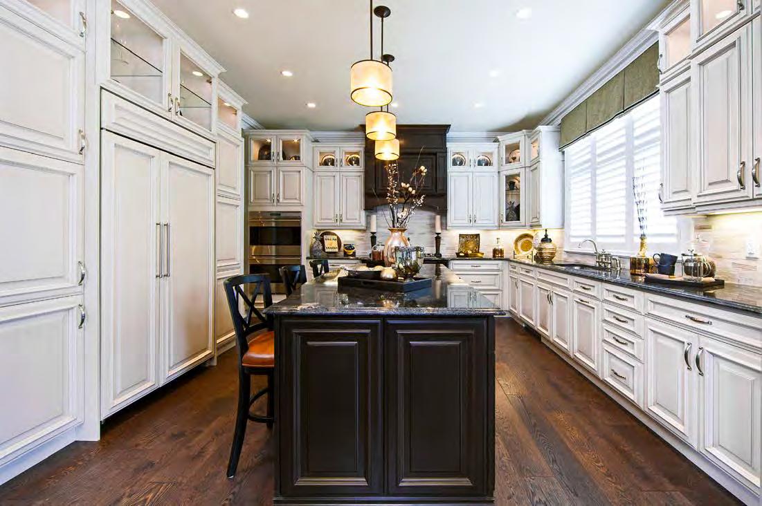
for: Limerick Point “The Winslow House” – Richmond Hill
(Credit to: GCB Interior Architecture Inc.)
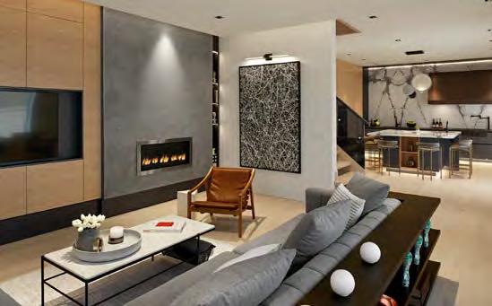
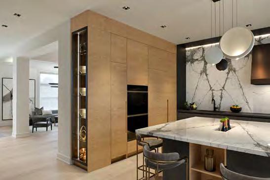
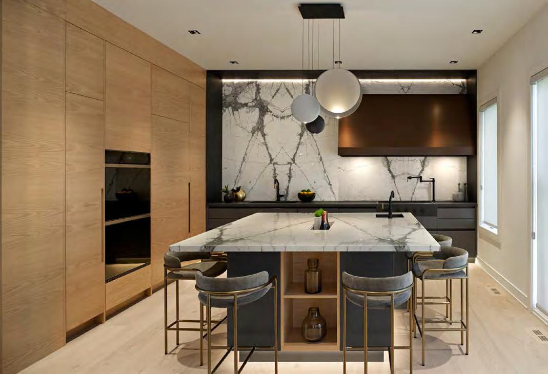
A traditionally high-rise interior design firm, Graziani Corazza Biase Interior Architecture Inc., was commissioned to provide the ultimate aesthetic and functional experiences to this kitchen. Striking the balance of being open and separate from other areas on the main floor, this design demonstrates a skillful use of the materials, such as natural white oak, stone slabs, bronze glass and metallic finishes. The cabinetry is fitted with concealed doors and drawer pulls, integrated appliances and lighting. Framed elements create an elegant interplay of balances. Apart from the stunning island itself, chief focal points are an oversized, custom vent, the stone wall treatment with bookmatched marble slab and an impressive Kuzco pendant above the island that plays on light and shadow combinations. Woodgrain on the cabinets has been rotated 90 degrees to add an eye-catching detail against dark countertops that contrast with the central island. That large square-shaped island, with its seating recess and immense storage, is lit from below, making it look like it is floating. Underfoot, 7.75”-wide red oak, Cape Codstyle hardwood unites the spaces.
RUNNER-UP
for: Brawley – Whitby
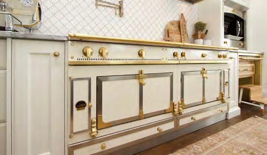
With clients in the restaurant business, accommodating a variety of specialty appliances and features was key. The oversized island features natural quartzite counters, two dishwashers and a white apron sink. A separate eating space with custom bench seating overlooks the beautiful 10-acre property, with a formal dining room across the hall. Even the walk-in pantry is breathtaking, with its Laura Ashley Heritage Collection tile and Kensington Blue cabinetry. Custom cabinets in Normandy blue match the front door. A custommade La Cornue 87” range with double oven takes centre stage and features a matching La Cornue hood unit, while gold hardware and lighting unites the design.
RUNNER-UP
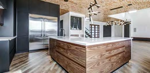
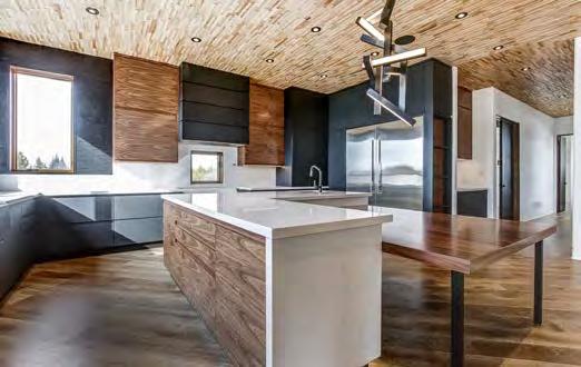
for: Country Gem – Oshawa
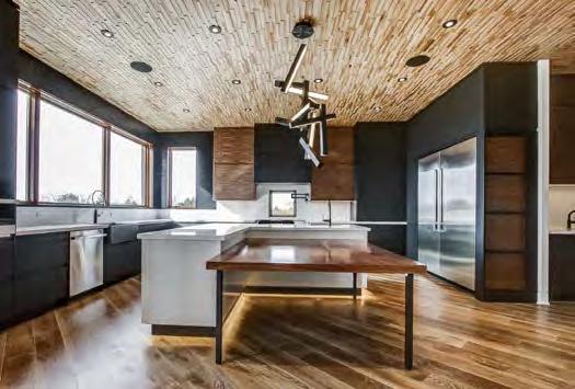
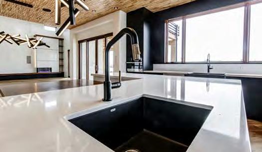
The goal was to maximize the natural light through large windows on the west side of the house. As a result, no upper cabinets were used on that wall and a massive picture window was installed. Instead of a kitchen table, to save space, the client opted for a built-in table connected to an island that is dramatized at night with unique strip lighting at the bottom. The high-end commercial appliances, including a stunning six-burner gas stove with cast iron grill and BBQ sections, are offset by matte black fingerprintresistant walnut cabinetry. The unexpected wood ceiling accents the black pot lights, while two modern black chandeliers are the cherries on top of this modern creation.
for: 55C “Suite 01B” – Toronto
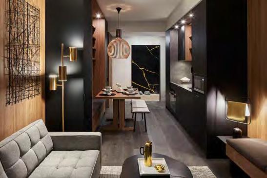
(Credit to: Cecconi Simone Inc.)
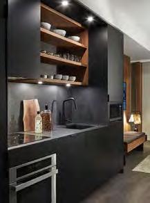
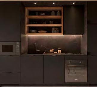
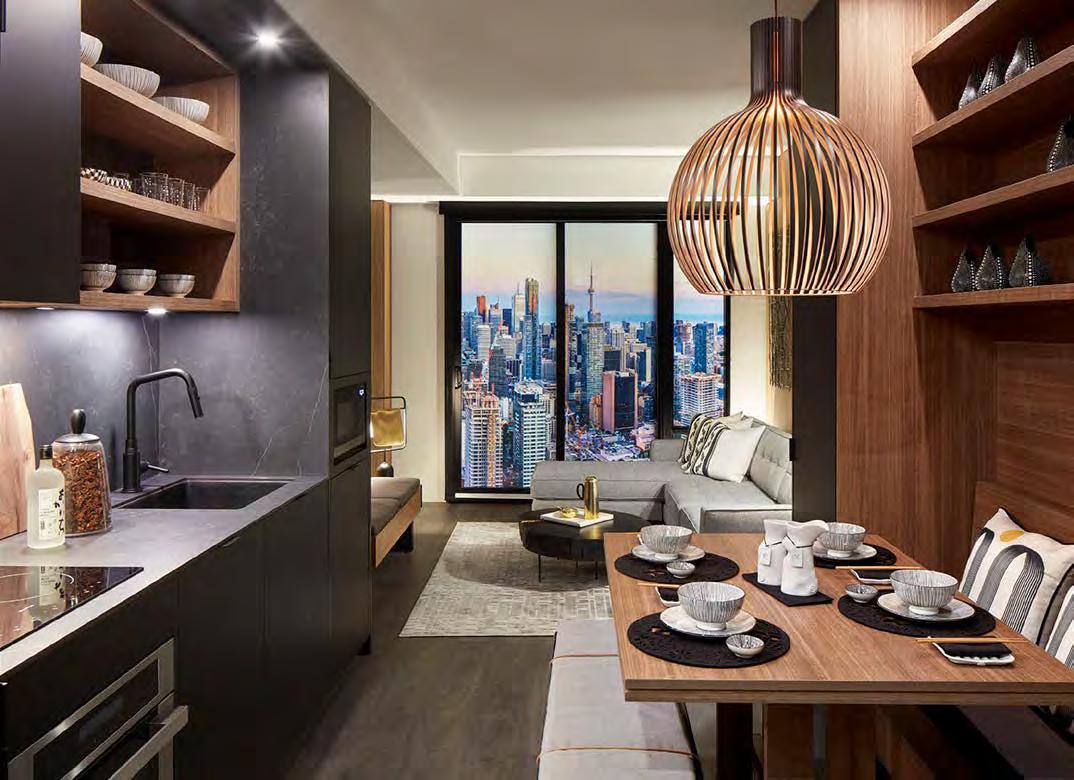
The contemporary kitchen design at 55C allows it to become a discreet extension of the living room space. All cabinetry was custom-designed and available in a combination of matte and textured finishes. Built-in custom kitchen and dining storage complement a moveable table and integrated dining bench that give the space a cohesive feel, while minimizing wasted area. All appliances are integrated into the beautifully crafted millwork, creating a seamless contemporary look, while a combination of open and closed storage adds areas for display. The entry closet, integrated into the millwork as well, also provides space for everyday accessories. Design-wise, large-format Dekton slabs on the kitchen backsplash, countertop and side gables create a clean, modern look. In order to maximize counter space, the cooktop was moved next to the side gable. Kitchen gables close to the cooktop, however, need to be fire-rated. The use of Dekton as a fire-rated material provided a solution to this challenge.


RUNNER-UP

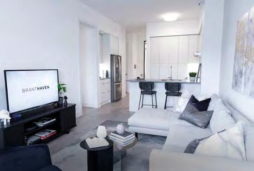
for: Upper West Side Condos “El Dorado” – Oakville
The El Dorado’s compact kitchen packs a lot of smart space and style into a smaller footprint. Its practical U-shape design provides optimal work zones and no wasted space, while a floor-to-ceiling pantry offers plenty of storage—a theme echoed throughout this cabinet-rich layout. Full-size appliances are a rare feature for condos under 700 square feet. While it appears simple, this design boasts Branthaven’s “Fresh Thinking” features, including Caesarstone contemporary quartz solid-surface countertops, a 3”x6” subway tile backsplash, a Moen Align single-lever high-arc kitchen faucet and a USB port.
RUNNER-UP
for: Bridgewater Residences on the Lake “1594” –Burlington
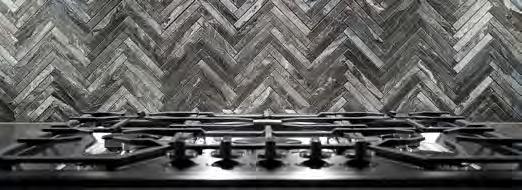
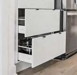
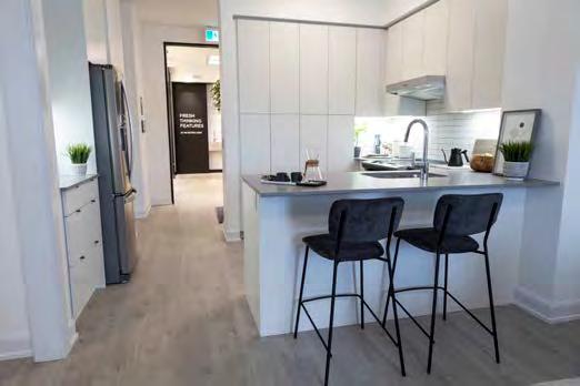
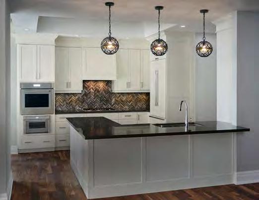
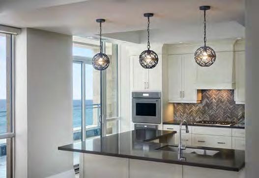
A previously closed-off space, this design brings the client’s custom home kitchen feel into a condo building. Taking advantage of dazzling Lake Ontario views, the efficient double-L design is rigged with top-shelf items such as a double-panelled fridge with freezer drawer, gas cooktop, microwave, wall oven, dishwasher, bar fridge and double sink. The herringbone tile backsplash and unique black iron light fixtures add drama. A large pantry offers lots of storage, while deep drawers beneath the cooktop are home to the client’s collection of soup pots.
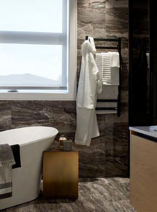
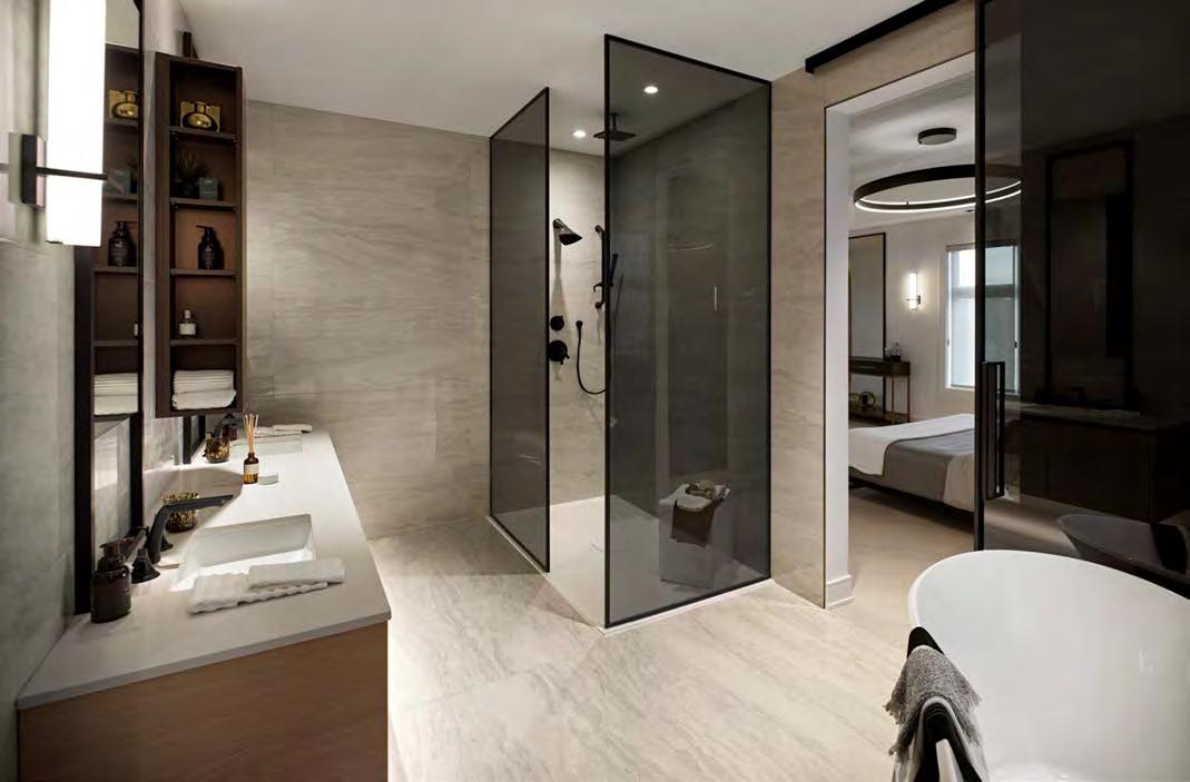
for: Limerick Point “The Winslow House” –Richmond Hill
(Credit to: GCB Interior Architecture Inc.)
Mississauga interior design firm Graziani Corazza Biase used its experience in urban high-rise design to make the best possible use of space in this luxurious master bathroom retreat. A large soaker tub offers ample space for immersive relaxation, while the spa-inspired frameless glass shower captivates with its matte black fixtures and marvellous marble backsplash. Featuring dual sinks and a private water closet with smoky glass, the interior design is defined by signature lighting and mirrors, warm earth tones and stunning marble surrounds. With a rectangular and square-shaped space within one room, functions were delineated using materials of light and dark. A challenge for Acorn, however, was that the theme of transparent open spaces was central to the home design. This expression of transparency, however, is obviously most delicate in private spaces such as a washroom. By utilizing glass partitions and the thoughtful placement for the water closet, though, Acorn was able to create a space that met its prospective buyers’ privacy needs while also maintaining essential design continuity with the rest of the home.
RUNNER-UP
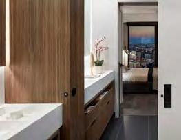
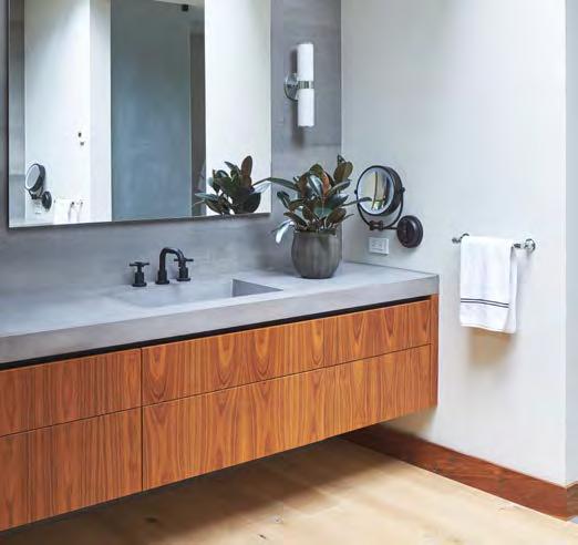
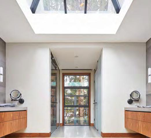
for: The Last House – Mississauga
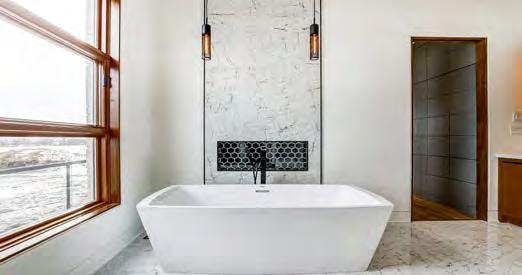
Mirrored floating walnut vanities with concrete countertops flank the entry, allowing for separate, personalized spaces, with a huge, prismatic skylight falling in between, flooding the space with natural light. With limited exterior wall space, bringing natural light into the master ensuite was a must. The oversized skylight fills this requirement, but also creates an interesting architectural detail, visible from the outdoor living space.
RUNNER-UP
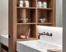
for: 55C “Suite 01B” – Toronto
(Credit to: Cecconi Simone Inc.)
The shower area of this suite opens to the master bedroom through a pocket door in the wall between the bathroom and closet, while the powder room opens to the entry corridor of the unit through a sliding door. Both areas are connected through a sliding door, allowing for privacy between the spaces. Optimized for storage and accessibility, large vanity mirrors give depth to the space. Textured porcelain tiles wrap up the walls in the tub/shower and water closet to provide fluidity, while black matte plumbing fixtures add a touch of elegance.
for: Azure “Sky Lounge and Terrace” – London
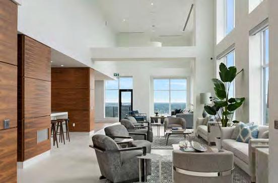
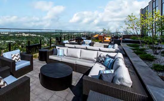
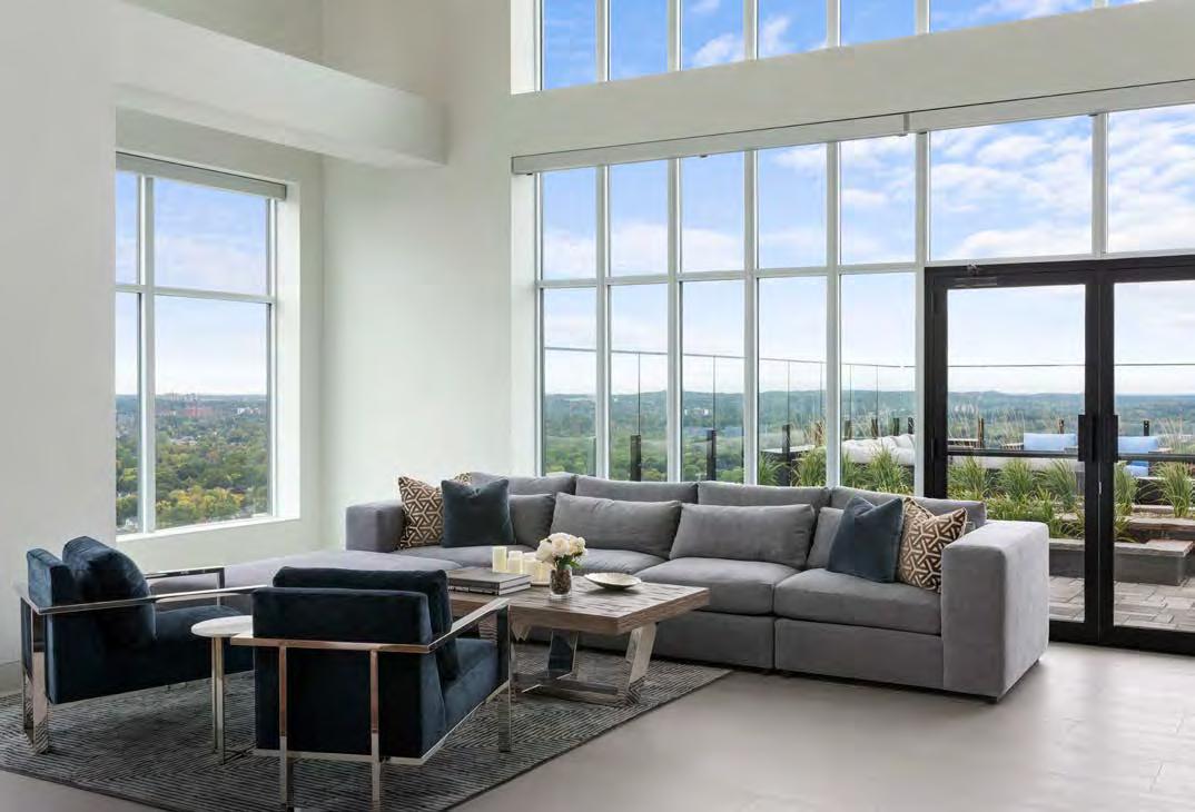
Soaring well above the treetops in the Forest City, Azure is London’s tallest residential tower and only LEED-certified residential building. Its luxury soars right to the 29th floor, where the 6,036 sq. ft. amenity space extends the building height, reducing the need to expand the overall footprint. An intimate yet expansive residents’ lounge with billiards table features a wet bar with high-quality furnishings. The fitness centre takes in the dazzling views over the eco-friendly green roof, as residents exercise in privacy, separated from the outdoor activity. Openconcept with floor-to-ceiling windows, the social lounge spills out of multiple glass doors onto a lushly landscaped 3,910 sq. ft. rooftop terrace with dining and lounge areas and the most incredible views of the entire city. Boasting a striking feature wall designed with bright blue mosaic tiles, elegant fireplace and comfortable chairs, the terrace is surrounded by 66”-high frameless tempered glass balcony rails to minimize the wind. Outdoor lighting allows you to enjoy the fresh air into the evening, with wall sconces and uplighting carried throughout the top of the building that can be admired from afar.
RUNNER-UP
for: M2M – Toronto
(Credit to: Ferris + Associates Inc., kg&a, Wallman Architects)
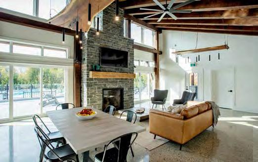
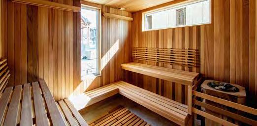
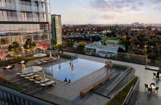
Club M2M, located on the ninth-floor podium roof, is designed for diverse year-round use, with 16,110 square feet of indoor/outdoor amenity spaces. It allows residents a sense of vacation away from their routine activities. Apart from indoor party lounges, Club M2M includes a prep-kitchen that opens out to a semi-private patio and outdoor BBQ area on the north and south wings. The crowning jewel is the elevated pool in the middle, with an infinity edge facing west for picturesque sunset views, creating a waterfall feature down to the lower deck level.
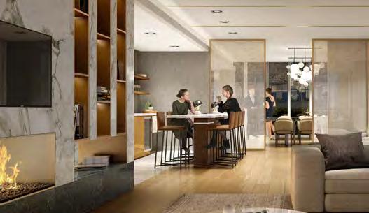
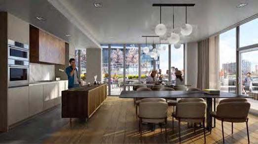
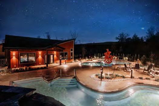
for: Mountain House at Windfall “Zephyr Springs” – Town of Blue Mountains
The Mountain House enclave surrounds an exclusive amenity area that extends outdoors with impressive views over naturalized areas and the Blue Mountains. Its two pools are the centrepiece, boarded by a black rod-iron fence and the two buildings that make up the amenity area. With a sauna, relaxation and fitness room, hot and cold pools and large landscaped lounge area, residents can enjoy the numerous benefits of a ‘Nordic bath circuit,’ while the intimate Apres Lodge has a full kitchen, floor-to-ceiling stone fireplace and flat-screen TV for socializing.

for: Allegro – Aurora
(Credit to: Builder Insight Group Inc., Hunt Design Associates, Patton Design Studio, Sennova Canada) Youtu.be/6LHdf_s9aYs
This 2.35-minute visual and audio introduction, one of four video stories depicting a warm and convenient lifestyle at Allegro, stresses the convenient, smalltown feel of Aurora, the new community’s lush former golf course setting and the exquisite design/appointments of its homes. Using only original content, the video pairs drone footage with interviews of existing residents representing the target market, as well as with Geranium’s senior development team who brought this new master plan to fruition, to add authenticity to the message.

for: Union Village – Markham
(Credit to: Montana Steele Advertising) Vimeo.com/387732712/1f7d6747ab
RUNNER-UP
for: Nature’s Grand – Brantford Youtu.be/YAHKqqk_hdo
The T10 Pro Smart Thermostat with RedLINK™ Room Sensor extends the thermostat’s reach into the rooms that matter –like bedrooms and living spaces. Homeowners can prioritize different rooms at different times of day, or, they can allow each sensor’s motion-detection technology to shift priority automatically as they move around the house. It’s a smart, simple way to help your customers feel right at home.
Visit ForwardThinking.HoneywellHome.com/TSeries to learn more.

for: Tridel at the Well: “Two Series. Three Condos. Infinite Ways to Live.” –Toronto

(Credit to: The Brand Factory) Vimeo.com/user47583636/ review/311676051/80add71dcf
Well-paced to impart the energy of this King West neighbourhood, this 60-second video of The Well—a dramatic 7.8 acre master planned development at Front and Spadina—delights viewers with an immersive 3D renderings experience. The opening shot establishes its envied location, as mesmerizing violin music plays to nighttime outlines of the community’s buildings rising from the ground to transform the skyline. Adding a human dimension to the community, 3D motion renderings of people walking about, meeting for lunch, shopping and going to work targets an audience seeking a world of high-end amenities.
for: Y&S Condominiums – Toronto

(Credit to: Ten Block Developments) Youtube.com/watch?v=b4Iw3z6kifY
for: Tridel At The Well Community.” – Toronto
(Credit to: The Brand Factory) Vimeo.com/user47583636/ review/334906786/0f6564c792
WINNER
for: Ottawa Brand Campaign – Ottawa Instagram.com/mintocommunitiesottawa/?hl=en Facebook.com/MintoCommunitiesOttawa/ Twitter.com/MintoCommOttawaempirephoe nix/?hl=en
When the pandemic closed its sales centres and model homes, Minto quickly reassessed the situation and hit potential customers where they lived—literally. Being sensitive to the Covid-19 situation, Minto’s “Home is Everything” campaign covered the gamut of social media. Stressing elements of empathy, authenticity, commitment and point of view related to why they were still doing business, the campaign was designed with fluid messaging that could be utilized or paused as needed as the Covid-19 situation evolved.


for: Nørdic Condos – Toronto (Credit to: Montana Steele Advertising) Instagram.com/collecdev/ Facebook.com/collecdev/ Twitter.com/collecdevto
RUNNER-UP
for: Georgian Communities – Barrie Instagram.com/mountainhousewindfall/ instagram.com/braestone/ Facebook.com/MountainHouseAtWindfall

for: Y&S Condominiums – Toronto

(Credit to: Guidelines Advertising Inc., Ten Block) Yongesoudan.ca/
Leading with a logo that plays on the word “yes,” the simple concept behind the Y&S website was to demonstrate the value of this classy location using high-impact, attentiongrabbing headings, powerful imagery and an easy-to-use intuitive web format. The result was the single most powerful sales and marketing tool in Tribute’s arsenal, as it noted the project’s core themes: luxury, design and lifestyle. Bold typefaces and sharp lines create a crisp contemporary sensibility, as lifestyle imagery, striking interior/exterior renderings and captivating copy announce that midtown’s premier luxury residence has arrived—all developed for a budget of under $10,000!
for: Crosstown – Toronto
(Credit to: The Brand Factory) Crosstowncommunity.ca/
RUNNER-UP
for: Kokomo Beach Club – Port Stanley
(Credit to: The Brand Factory) Kokomobeachclub.com
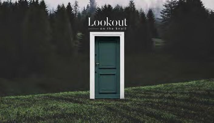
for: Lookout on the Knoll –Richmond Hill
(Credit to: Gladstone Media) Vimeo.com/385045831/96390c82e2
Highlighting its advantageous location, Acorn’s first series of teaser ads for Lookout featured its main campaign image: a forestgreen door perched amid fresh grassy hills overlooking pine trees and foliage. The image of a door leading not to a home but into a beautiful landscape invited exploration. It was accompanied by a hand-drawn map highlighting the site’s proximity to transit, shopping, dining, schools, parks, etc. Acorn next went to market with ads that showcased the project’s primary exterior renderings. Messaging throughout invited you to “Register Now for Priority Access at LookoutontheKnoll. com.”

for: 123 Portland – Toronto
(Credit to: Blackjet Inc.) Youtube.com/watch?v=MqEDxSXsgWQ
Although situated in a well-known neighbourhood, 123 Portland and its mosaic of European influences adds a new tone to the area. This drove Minto’s main message, “The other side of King West,” to situate the project within this prominent Toronto district, while also introducing something new, exclusive and exciting. The video concept imagines the other side of King West by casting mirrored effects of various actions. The campaign, which ranged from bus shelter ads in strategic areas to two brand videos and print media, reached an average of 4,307,380 people a month. Within the first three months, more than 75% of the building was sold.
RUNNER-UP
for: Hearthstone Circle – Guelph
(Credit to: Ryan Design International) Vimeo.com/ryandesign/ review/421244429/6e1484d125
RUNNER-UP
for: Union Village – Markham
(Credit to: Montana Steele Advertising) Vimeo.com/387732712/1f7d6747ab
RUNNER-UP
RUNNER-UP
COMMUNITIES
for: The Saint – Toronto
for: Nørdic Condos – Toronto
(Credit to: Montana Steele Advertising) Vimeo.com/360875562/7afc545368
(Credit to: The Brand Factory) Youtube.com/watch?v=b4Iw3z6kifY
for: Lookout on the Knoll –Richmond Hill
(Credit to: Gladstone Media)
While many of its competitors in the region focused on selling an urban brand, Acorn approached its Lookout on the Knoll brand as one truly rooted in nature, overlooking a 75-acre preserved greenspace, providing future residents with the ability to retreat into nature and look out onto seemingly endless greenery. The logo speaks directly to the site, with a stencil-style serif font for the primary word (Lookout) allowing the imagery to bleed through, and lowercased “on the knoll,” in a light sans serif with simple, clean lines. Sunbeams through trees and fog cast over a hillside represent how the end user would see the world through that iconic green door when living at Lookout.
for: 123 Portland – Toronto
(Credit to: Blackjet Inc.)
RUNNER-UP
SORBARA GROUP OF COMPANIES

(Credit to: Apt. Agency)
RUNNER-UP
METROPIA & MINTO COMMUNITIES
PROJECT IMAGE AND ADVERTISING Low-Rise Project Logo Branding PROJECT IMAGE AND ADVERTISING High-Rise Project Logo Branding
RUNNER-UP
CANADA
(Credit to: The Brand Factory)
RUNNER-UP
FREED DEVELOPMENT CORPORATION
(Credit to: The Brand Factory)
for: Bistro 6 Condominiums – Barrie
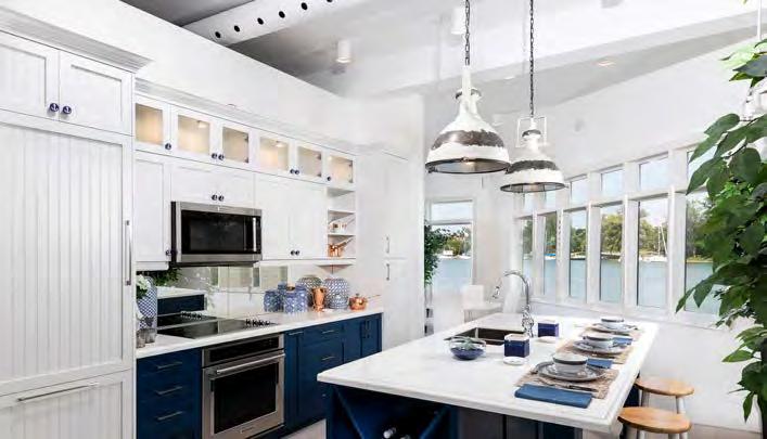
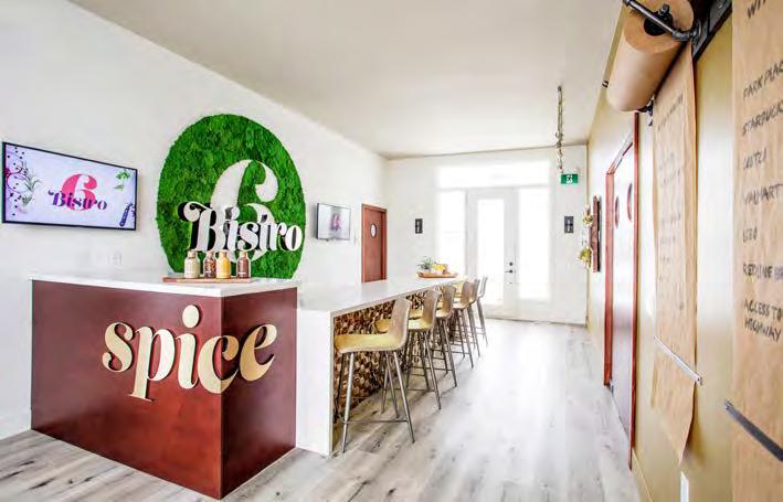
The Bistro 6 sales office for this culinary inspired condo community was designed by City TV celebrity chef Randy Feltis to function as a restaurant/bar. Customers are taken on an interactive sales tour where they are first greeted by a sales member in a Bistro 6 chef jacket, before being offered a spice-infused juice and pastry. After perusing spice-inspired exterior colours, visitors then enter a dining room where they are presented with a menu that entails the full sales brochure complete with pricing for the varying kitchen-centric floor plans. Customers can also explore firsthand a few of the innovative amenities onsite, including the community kitchen, spice library, kitchen appliance library and wine room.
for: The Harbour Club – Port Dalhousie
(Credit to: Ryan Design International)
The concept behind the Sails Pavilion is to mirror the types of spaces and finishes that would be found in the completed Harbour Club, including a nautically influenced interior design theme. Targeting prospective buyers already interested in a boating lifestyle, this customer experience is enhanced with innovative touchscreen technology that even showcases aerial views from each floor of the condo. Situated waterside, the marina is always front and centre at the pavilion, where purchasers have the opportunity to view large dining areas, gourmet kitchens, spa-type bathrooms and dressing areas, as well as welcoming front foyers and guest powder rooms.
RUNNER-UP
for: Elements Urban Condominiums – St. Catharines
(Credit to: PS Media House)
RUNNER-UP
for: Kokomo Beach Club – Port Stanley
(Credit to: The Brand Factory)
RUNNER-UP
for: 55C – Toronto
(Credit to: Cecconi Simone Inc.)
RUNNER-UP
for: Empire Livingston – Hagersville
(Credit to: Figure3)
for: National Corporate – Concord

(Credit to: McOuat Partnership)
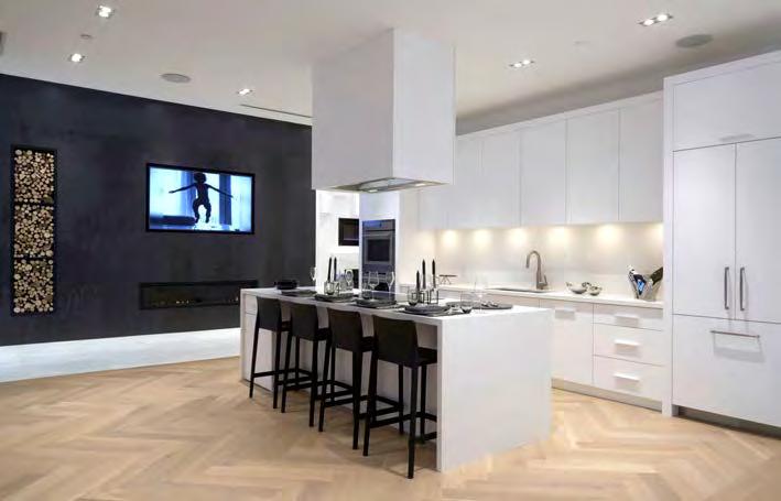
National Homes’ Design Centre optimizes form and function with a clean, uncluttered layout. Ample integrated storage throughout at the point of display eliminates the back and forth to the back-of-house storage for staff, while finishes are tucked away in modern millwork when not in use. Apart from finished rooms throughout, the latest products and finishes are accompanied by videos to enhance the experience. National’s “You are the Blueprint” vision, meanwhile, comes to life in the Virtual Design space, which marries technology and real-life tactile design, the program of which is accessible through iPads and large touchscreens.
RUNNER-UP
for: OPUS Homes Decor Studio –Mississauga
(Credit to: Ryan Design International)
RUNNER-UP
for: The Lobby – Toronto
(Credit to: II By IV Design, The Brand Factory)
Some of the best builders choose Pollard Windows & Doors, a Canadian manufacturer of quality products for over 70 years. Their longevity comes from the ability to design and build innovative products to the highest standards in their state-of-the-art facility. Awarded the ENERGY STAR Most Efficient mark in 2020 for their Advantage Plus All-vinyl Windows for both dual and triple glazed products. Backed by an industry leading warranty and a commitment to exceptional value and service. You can trust that Pollard is the right choice for new home construction including multi-level, high density developments.
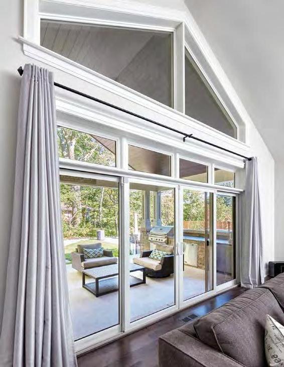
I’m known for making smart investments which is why I choose Pollard for my projects.

Scott McGillivray, HGTV Real Estate Expert
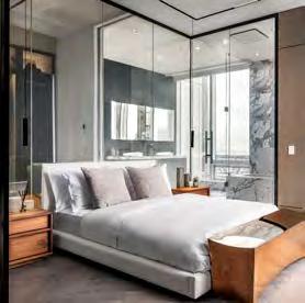
for: Ten York “Innovation Suite” – Toronto
(Credit to: The Brand Factory)
A perfect urban retreat for affluent professionals and expertly designed to elevate the everyday, Tridel’s Innovation Suite at Ten York is a seamless integration of technology and design. Envisioned as a design laboratory for the future of condo living, features include air-purifying herringbone hardwood flooring; sleek JennAir Noir appliances; electric mist fireplace; VibrAcoustic undermount tub; frameless, zero-threshold marble shower with oversized showerhead; open-concept, floor-to-ceiling closet organizers with built-in lighting and clothes steamer; heated flooring in the master ensuite; a wine bottle showcase wall; and a full array of smart-home elements from lighting to motorized blinds, with embedded speakers enabling the centralized control system to receive voice commands. The luxurious, bold and elegant interior design sets matte black marble and metal finishes against soft, airy neutrals, creating a strong, contrasting colour palette. The stylish and modern design elements introduce a collection of both masculine and feminine pieces, a perfect push and pull to create flawless design. Biophilic elements are also incorporated to bring the outside indoors, with wraparound views of the lake maximized in this 69-storey tower.
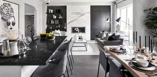
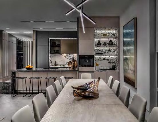
With the Mayfair at Richlands, DECO demonstrated the full potential of what it can offer homebuyers. Accented with bold, oversized art pieces, essentials such as a spectacular ensuite, walk-in master closet, double car garage, convenient upstairs laundry, open-concept main floor and abundant closet space tick buyers’ most important boxes. Dark grey hardwood floors and grey wall colours are counterbalanced by white cabinetry in the kitchen, a white soaker tub in the ensuite and numerous white accents throughout. This backdrop allowed for DECO’s signature art deco-inspired furniture choices to really pop.
RUNNER-UP
for: Eden Park – Newtonville
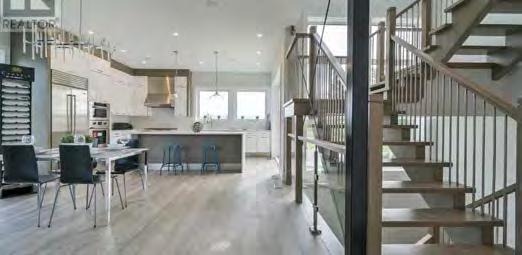
(Credit to: Bone Structure, Cassidy & Co. Architectural Technologists)
A flat roof and clean lines contribute to the contemporary feel of this model home. The 5’x5’ grid of its Bone Structure steel frame construction eliminated posts and bulkheads, while also helping to create a Net Zero Ready product. Spray foam insulation, triple-glazed windows and other efficient products reduced the heating and cooling costs of the home, the high ceilings of which allow for larger windows. The focal point is the beautiful kitchen, which is tied together with Calcutta Nuvo countertops and Caesarstone backsplash. Sub-Zero and Wolf appliances add a clean industrial touch to this extravagant space.
for: Estates at Sunset Ridge “The Sapphire” – Goodwood
(Credit to: Builder Insight Group Inc., Cassidy & Co. Architectural Technologists, Colours & Concepts Inc.)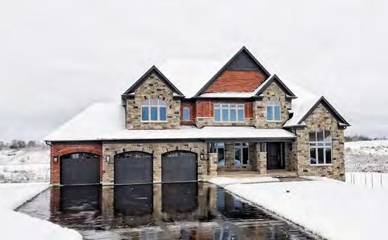
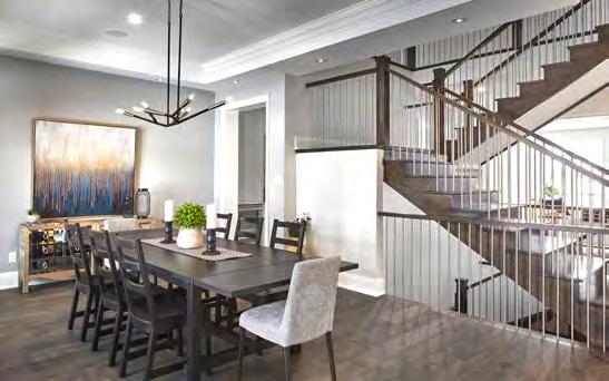
A modern farmhouse influence evokes warmth and charm despite the grandeur of the 4,669 sq. ft. Sapphire at FarSight’s Sunset Ridge community in Goodwood. But sophisticated details abound, from the herringbone tiled floor in the foyer inset, to the handsome three-sided fireplace in the great room with its waffle ceiling details. Full-height Dekton slab, which adorns the fireplace, is repeated on the kitchen island for balance. It’s part of a clever mix of stone, metals and textures curated to cultivate a look that is both chic and welcoming. And as welcoming goes, the master bedroom is highlighted by a spa-inspired ensuite replete with soothing blue/grey porcelain tile, a large 48” x 64” glass-enclosed shower, a relaxing stand-alone soaker tub and a private water closet. The laundry room was outfitted with white shiplap walls and staged with crisp white shirts on stainless hooks to further the Modern Farmhouse theme. Even the pantry draws the eye, with a navy exterior and the white interior of the cabinets.
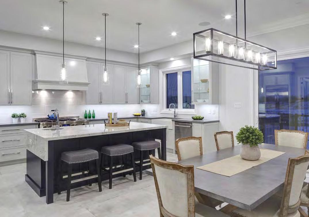
for: Allegro “The Forte” – Aurora
(Credit to: Builder Insight Group Inc., Hunt Design Associates, Patton Design Studio)
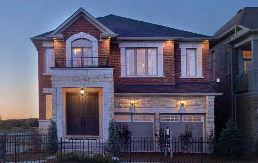
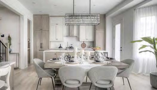
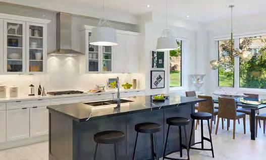
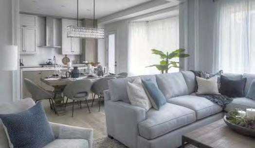
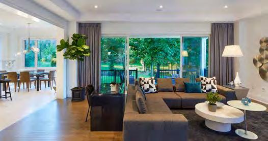
At 3,763 square feet, The Forte impresses on so many fronts. This model home showcases four bedrooms (each with a private or shared ensuite), a striking library/home office, a spacious dining room with bold artwork and geometric light fixtures, a private side courtyard, a servery and a gourmet kitchen with stainless-steel SubZero/ Wolf appliances. Outside, the architecture upon this 42’ x52’ lot offers a stately combination of stone and clay brick with decorative embellishments and an attractive roofscape, while a backyard covered loggia can be accessed through oversized, two-panel glass patio sliders.
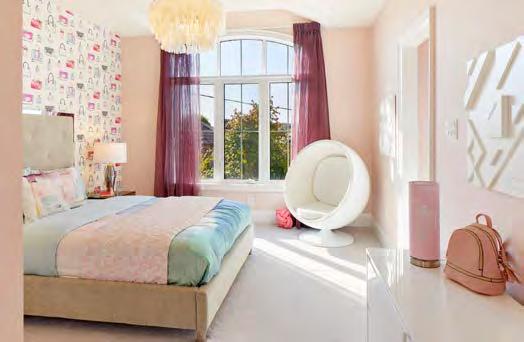
for: The Forest “The Kensington” – Bradford
(Credit to: McOuat Partnership)
National’s ‘Bright Ideas’ features make life easier in this model home. Pottery Barn styling offers comfy, stylish furniture, while premium finishes include engineered hardwood, granite counters and elegant ceiling treatments. Features galore include a spainspired bathroom, a servery off the kitchen, a second-floor laundry room with a built-in drying rack that pulls down from the ceiling, a rotating shoe rack in the master bedroom, an Amazon drop box beside the front door, allowing parcels to land inside the home, multiple smart features and even a third-floor bonus space large enough to be divided into zones.
16783 orndale Rd. orndale, Ontario, N0M 2P0

Tel: 519-461-1180
Toll free: 1-800-265-7086

With over 40 years in the industry, 7 Oaks Tree Care & Urban Forestry Consultants Inc. offers experienced Arboricultural Consulting services for land development clients to address municipal environmental requirements. We use CAD software to work efficiently with your team.
Tree Care & Urban Forestry Consultants Inc. offers experienced Arboricultural Consulting services for land development clients to address municipal environmental requirements. We use CAD software to work efficiently with your team.
With over 40 years in the industry, 7 Oaks Tree Care & Urban Forestry Consultants Inc. offers experienced Arboricultural Consulting services for land development clients to address municipal environmental requirements. We use CAD software to work efficiently with your team.
Tree Preservation Plans
Arborist Reports and Tree Inventories
Tree Preservation Plans
Fax: 519-461-0903
Reports and Tree Inventories
Reports and
Monetary Valuations of Trees
www.trscomponents.ca

Expert Witness Testimony
Monetary Valuations of Trees
Tree Risk Assessments and Hazard Evaluations
We specialize in Land Development Applications.
We specialize in Land Development Applications.
7oakstreecare.ca
of
Since 1974, TRS has o ered builders a single source supply network of wall panels, roof trusses, oor panels. Our supply and install expertise will make your next job faster, easier and more e cient.


We specialize in Land Development Applications.
(905) 773-1733 info@7oakstreecare.ca
7oakstreecare.ca
(905) 773-1733 info@7oakstreecare.ca
7oakstreecare.ca
(905) 773-1733 info@7oakstreecare.ca
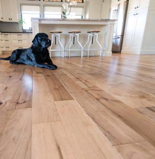
for: Union Village – Markham
(Credit to: Montana Steele Advertising)
Given hundreds of new homes sprawled across a 416-acre property, the vision of this master-planned community was told through not one, but five separate brochures—four pieces divided by product type (from single-family homes to back-toback towns), plus a community brochure that complemented the product-specific material and told the story of the overall Union Village lifestyle. This ensured the content was easy to digest while allowing the buyer to choose their product preference. Printing techniques included a classy blind embossed logo on the front covers of the product books.
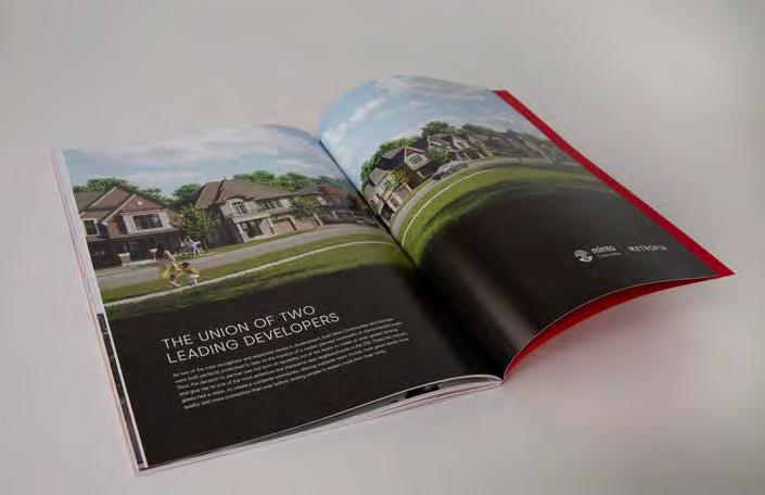
RUNNER-UP
for: Lookout on the Knoll –Richmond Hill
(Credit to: Gladstone Media)
RUNNER-UP MARSHALL HOMES
for: HERE – Pickering
(Credit to: MadHouse Advertising Inc.)
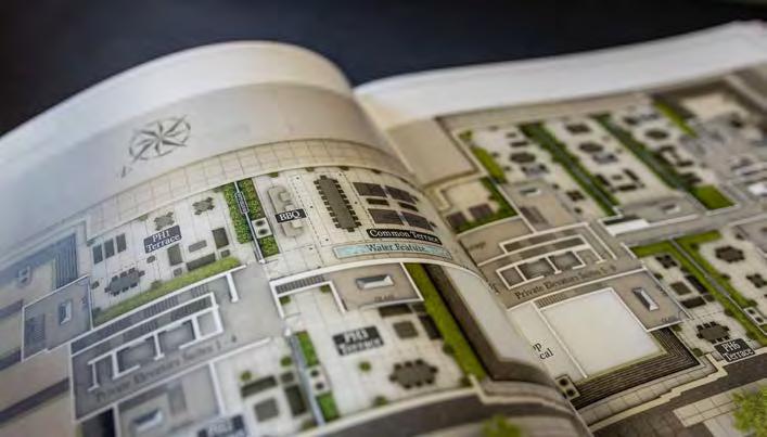
for: The Randall Residences – Oakville
(Credit to: McOuat Partnership)
As much a keepsake as a source of information, this brochure is a stunning coffee table piece that is true to the brand image. A large portion of the content was devoted to the high-end upmarket appeal of Oakville and the surrounding amenities. Given the Randall Residences’ classic Beaux Arts architecture and picture-perfect setting, the production values, glossy look and feel, sleek design and inspired copy needed to match that sense of sophistication. Filled with beautiful renderings of the architecture, amenities and suites, the brochure and floor plan feature two separate pieces designed to fit into a high-end box set with the logo embossed on the front.
RUNNER-UP
for: Nørdic Condos – Toronto
(Credit to: Montana Steele Advertising)
RUNNER-UP PORT DALHOUSIE HARBOUR CLUB LTD.
for: The Harbour Club – Port Dalhousie
(Credit to: Ryan Design International)
With over 50 years of experience, strong client advocacy and enduring insurer relationships, Masters Residential Home Builders Program is a model of consistency, providing stability, unparalleled benefits and competitive terms.
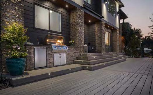
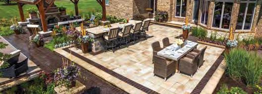
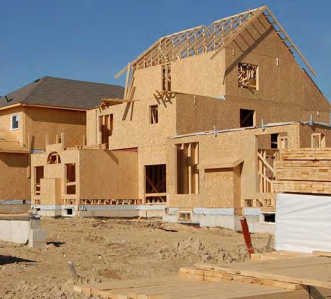


for: Rent.Save.Own Program – London
It can be a daunting and financially dissuading proposition to make the jump from apartment tenant to homeowner, but an inspired partnership between Drewlo Holdings and The Ironstone Building Company in London is helping to ease the transition for many residents.
The primary concept behind the tandem’s “Rent. Save. Own.” program is to address housing affordability in the London area and to find a way to make new homes more affordable for longtime standout tenants of Drewlo’s rental properties. The program is simple: For each month that a resident has rented with Drewlo, they receive $350 towards the purchase of an Ironstone Building Company home, up to a maximum of $10,000. This credit can be applied to any of Ironstone’s available townhomes or single-family homes.
Residents of Drewlo, which offers rental housing in Burlington, Kitchener, Woodstock, Sarnia and London, are automatically enrolled as soon as they move in, and the discount amount is the same for everyone regardless of monthly rent. Notices and advertising are directed at tenants to educate them about both the program and Ironstone’s condo and single-family offerings in the region.

The central message of “Rent. Save. Own.” is that anyone who is

a responsible tenant should be given an opportunity to be a homeowner. By offering credits to loyal Drewlo tenants, Ironstone is aiming to offer hardworking people more housing choices and supply within their price ranges; a message that both parties believe can help combat both the rental housing shortage in Ontario and the increasing lack of affordability for those looking to become homeowners.
The program developed almost organically for Allan Drewlo, president of Drewlo Holdings and co-owner of The Ironstone Building Company, explains Leia Smoudianis, who oversees the shared marketing department for both companies.

“We had a lot of tenants who were purchasing Ironstone townhomes—we just noticed it in their move-out notice. So we thought there might be an opportunity to provide our loyal tenants with some savings to that end,” says Smoudianis. “It really took off! It’s been a really great initiative for us, as well as for our tenants.”
The program’s success can be measured in the huge volume of inquiries received and the subsequent conversions achieved between the August 2019 launch and October 2020, with 20 tenants transitioning to Ironstone new-home sales over that period, with an average savings of just under $8,000 each.


The program not only provides prospective homeowners with the knowledge and assurance that Ironstone is building affordable homes in the London area, it also enables Drewlo tenants to approach Ironstone, knowing they are eligible for a potentially substantial discount on their first home. Ironstone staff, in turn, are well-prepared to walk these first-time buyers through the purchase process.
“Both owners of Ironstone are huge believers in homeownership and the housing continuum and in giving people a helping hand to take that next step,” Smoudianis notes. “And we very much build products in the price range for first-time homebuyers.
Wh ile “Rent. Save. Own.” has been good for business, the emotional element has been immensely satisfying, Smoudianis observes.

“We’ve had some really long-term tenants at Drewlo and it’s been wonderful to see them continue on their journey. Some get married and buy a home, or have kids and then buy a home. Normally you just see the rent notice that they’re moving on, so to see them continue on their journey, and to be involved in that, is so great.”

We are proud to partner and work alongside those who are passionate and deliver the highest quality product and service possible.The H2Air kit is an add-on accessory for the Navien NPE-A Series tankless water heater that creates a high efficiency space heating and endless domestic hot water system. The H2Air Kit comes with the highest rated performance using CSA P9.11 test standard.
Low-Rise Project of the Year
for: Union Village – Markham
(Credit to: Montana Steele Advertising, Nak Design Strategies Inc., RN Design Ltd.)
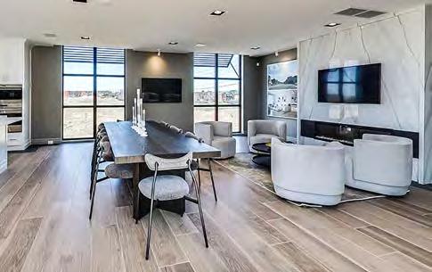
If the word union implies something formed by uniting two or more things, the tandem of Metropia and Minto has struck paydirt at Union Village.
An Architectural Award winner in the “Production Built Home of Two Storeys Up to 2,500 SF” category, and a finalist for both its lowrise ad campaign and low-rise project video, Union Village offers new homebuyers the small-town charm of Unionville, which sits just to its south, with easy access to the big city.
“Residents will join one of the fastest growing municipalities in
Ontario and the most ethnically diverse community in Canada,” Minto notes. “This is one of the only places where historic fairs and thriving business centres overlap.”
The overall plan is simple, the builder suggests: “Take distinctive homes and modern amenities, add abundant greenspace, sustainable building practices and a location that offers urban access with smalltown appeal.”
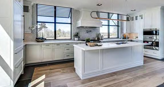
From a master plan standpoint, Metropia and Minto have done well to create a community that looks and feels like an established
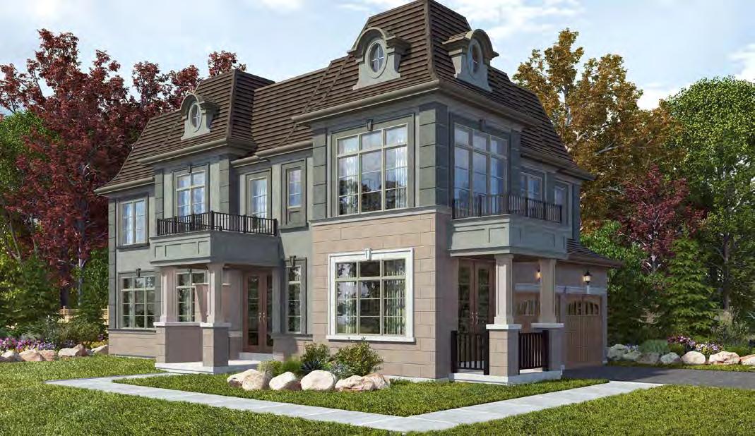
neighbourhood. Nature takes a bow here, with preserved wetlands, parks, greenspace and new pedestrian and cycling trails front and centre.
That sense of tranquility outdoors carries right through the front doors at Union Village, where interior layouts have been finetuned by international feng shui master Paul Ng. These curated spaces, which will “help residents enjoy more harmony, happiness and, overall, a better quality of life,” include “options for separated stoves and sinks (to avoid a clash between the energetic elements of fire and water), staircases and entrances that are kept a respectful distance apart (so that the main floor remains nourished by good energy) and front doors and back doors that are offset (so as not to disturb the flow of chi , the vital life force).”
The healthy approach to living also encompasses “innovative building features like cabinet-integrated waste sorting and a way to make it easier to add solar panels in the future,” Minto notes, as well as “a pledge to consume fewer natural resources, minimize waste and reduce greenhouse gas emissions.”
Indoor air quality is optimized “through the use of healthier materials and finishes, as well as mechanical systems that will introduce fresh air throughout the home.”
Designs also boast water-efficient features that comprise 20% superior energy efficiency than the Ontario Building Code, with sophisticated mechanical systems promising heightened in-home comfort.

To get the message across to potential buyers, the project video reinforces the “union” brand concept through a “The Union of …….. & ……..” headline format. Dissolving from one pair of words to another, it repeatedly links two different key benefits of the community’s lifestyle, from the exciting plans at Union Village and its attractive amenities to beautiful landscapes, intriguing architecture and the overall connected feeling of the neighbourhood.
With a variety of home types that range from spacious single-family homes on 50’ lots to a variety of townhomes, Union Village offers products tailored to a wide demographic of buyers; thus, the target market is quite broad. But the common attraction is this masterplanned community that offers distinctive homes and modern amenities, abundant greenspace and an exceptional location. The video content reflects these key attributes, and a strategic media buy on CP24 ensured that the film would reach a wide audience, further reinforced through screenings in the sales centre and on the website.
Peace of mind – it’s built into all our building insulation products and everything we do. We make installation easier and more efficient for our contractors and installers, so you can help keep her and her family safe, comfortable and healthy.
Our building system is a product of Amvic responsive design that is driving the evolution of insulation.

• Greenguard certified • less job site waste
• R30 walls • superior continuous insulation

• 30% more energy savings

High-Rise Project of the Year
for: Nørdic Condos – Toronto
(Credit to: ADhoc Studio, gh3*, Milborne Group, Montana Steele Advertising)
While it failed to triumph in any of the 36 preliminary categories of this year’s Awards of Distinction, the overall excellence of Nørdic Condos was exemplified by its top-three placement in a whopping five flights: High- or Mid-Rise Condo Suite (4+ Storeys up to 800 SF), Lobby Entrance, Social Media Campaign, High- or Mid-Rise Ad Campaign
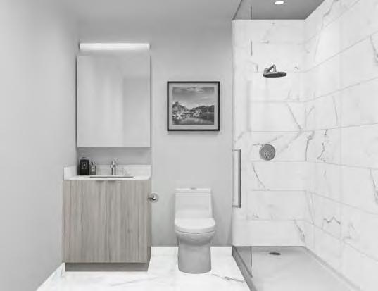
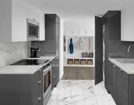
and High- or Mid-Rise Sales Brochure.
Situated next to Wilson subway station, Allen Road and Highway 401, Nørdic ushers in a novel lifestyle in the evolving Tippett Regeneration Area, a neighbourhood with such valued community amenities as Yorkdale Shopping Centre, Downsview Park and York University—all undergoing a transformation supported by all three levels of government and progressive planning principles.
The 12-storey project embraces the Scandinavian philosophy of Friluftsliv, which recognizes the relationship between human wellbeing and the rejuvenative forces of nature. The architecture employs a crisp white facade emphasized by spacious balconies, terraces and double-glazed windows—all accentuating the building’s ingrained connection to the outdoors. On the north side of the structure, a stepped design creates a cascading series of outdoor spaces where residents can
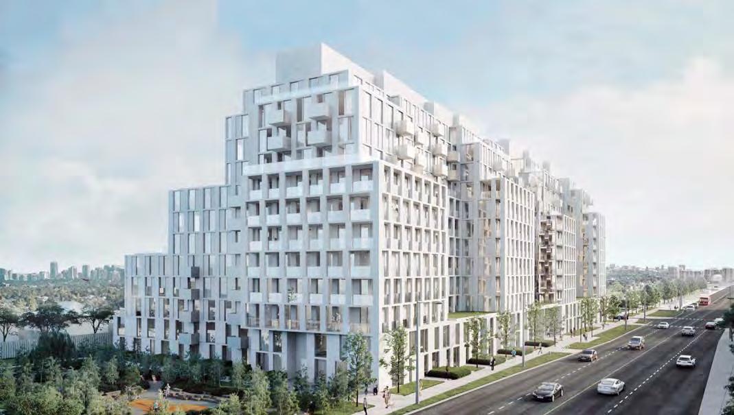
enjoy the sights and sounds of nature. Acting as an extension of the home, three communal courtyards offer additional spaces to socialize and enjoy the outdoors.
Its green-friendly attributes include a geothermal heating and cooling system that reduces the building’s carbon footprint, lowers greenhouse gas emissions, reduces annual energy costs and saves more than five million litres of water annually. Designed and built to conserve more energy and resources than standard code-compliant buildings, Nørdic includes sustainable green roof areas that help reduce the heat island effect and manage stormwater retention. Bird-friendly glazing, meanwhile, reduces danger to migratory birds. Exterior lighting is directed downward to reduce urban light pollution, motion sensorcontrolled lighting in common areas reduces electricity costs and tri-sorter disposal and recycling system divert landfill waste.
To help residents get around, there’s an electric car charging station located on level P1, with provisions for additional future stations. P1 also features a car sharing program and bicycle parking spaces.
The mature neighbourhood, meanwhile, is serviced by a number of key routes. Recent and upcoming transit expansions, including the completed Toronto-York Spadina Subway Extension and the future Finch West LRT and Eglinton Crosstown, will provide key links to the rest of Toronto and beyond.
And with a nod to housing inclusivity and accessibility, a number of the 429 condominiums have been allocated to Collecdev H.O.M.E., an affordability initiative that includes interest-free down payment assistance loans to first-time homebuyers.
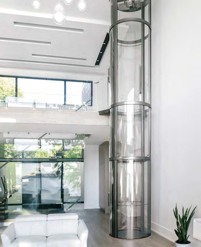

From an aesthetics front, Nørdic makes an immediate impact as you enter the lobby, a sleek and inviting space with a soaring ceiling and exquisite features. Residents also enjoy the dedicated service of a 24-hour concierge, a parcel room at the building entrance and an on-site property management office. And a digital lobby display shows current transit commute times to help keep residents connected and notified of the many forms of transit right outside their front door.
Marketing this dynamic project included a soft-sell social media approach featuring clean lines and lots of white space to clearly highlight the pivotal Scandinavian terminology promoted throughout the marketing of Nørdic that emphasized its dedicated approach to health and wellness.

In the competitive world of the Ontario renovation industry, it’s hard to separate yourself from the competition, but Amsted Design-Build is becoming accustomed to the distinction. The Ottawa-based firm made it back-to-back Ontario Renovator of the Year awards at this year’s OHBA Awards of

in the category.
Part of the honour owes to the Amsted’s business success despite trying circumstances. Amid the early throes of COVID-19, Amsted saw its business leads dwindle to between one and three a week. Six weeks later, they were averaging more than 30—an all-time high for the company.
Amsted credits that remarkable turnaround to significant investment of time and money in all social media, as well as catching people at home. Its messaging did not consist of sales pitches but rather empathetic discussions, offers of assistance, information, project profiles and staff updates. The entire company got involved in posting, from fun handwashing videos to ‘COVID-hair’ photos and home projects.
In the year prior to the pandemic, Amsted maintained its record pace of leads, with over 700 connections in 2019. Its most effective marketing tool? Word of mouth—by far—with 86% of projects coming from referrals or past clients.
But the company’s greatest success stories came without financial profit. With the onset of the pandemic, Amsted began to supply PPE to needy hospitals in the community from its own stock. It also emailed its past clients, offering support while they were housebound. “As an essential service, we helped many people with small repairs that

made staying home more comfortable,” notes Amsted President Steve Barkhouse, who also worked with City officials and the mayor to identify safe working practices and ensure permit releases.


“We also supported local businesses, buying locally wherever possible, including handwash supplies, gift certificates for future use, etc.,” Barkhouse says. “We kept in constant contact with our trades, suppliers and partners, offering support and information with mental health issues and government programs, and spent hours in conversation with government, OHBA, CHBA and GOHBA, strategizing, planning and developing government positions and information.”
From the neighbourhood level to internationally, Am sted participated in weekly zoom calls, sharing best practices and support for the renovation industry.
Within their own offices, Barkhouse and company creatively adjusted budgets to keep staff employed and supported, while maintaining its marketing investment.


“At a time when everything was falling apart, our company was strong; for its community, industry and team,” relates Barkhouse. “We tried to lead in safe site conditions for all; supporting, as an essential worker, those in need, lifting those in our network and beyond with our positive and honest messaging and working tirelessly to support our family— work/home—making sure they were financially, mentally and physically safe.”
Caring for those who live and work in the Ottawa region is old hat for Amsted. Its community outreach includes a budget of more than $40,000 annually to sponsor and support more than 35 local initiatives, including Hospice Care Ottawa, The Ottawa Hospital, the Youth Services Bureau and community neighbourhood groups. For the past 15 years, its staff and families have volunteered a weekend, providing maintenance and upgrades to Camp Smitty Boys and Girls Club of Ottawa. Barkhouse also provides paid vacation days upon volunteering one of his own, and his company continues to recognize employees with 5- to 30-year milestone anniversaries—their names engraved on paver stones lining its walkway.
As for personal contributions to the industry, Barkhouse has been an active member of the Greater Ottawa Home Builders’ Association for the past 30 years, twice serving as GOHBA president, while his company boasts 50 cumulative years of team members on the GOHBA board of directors.


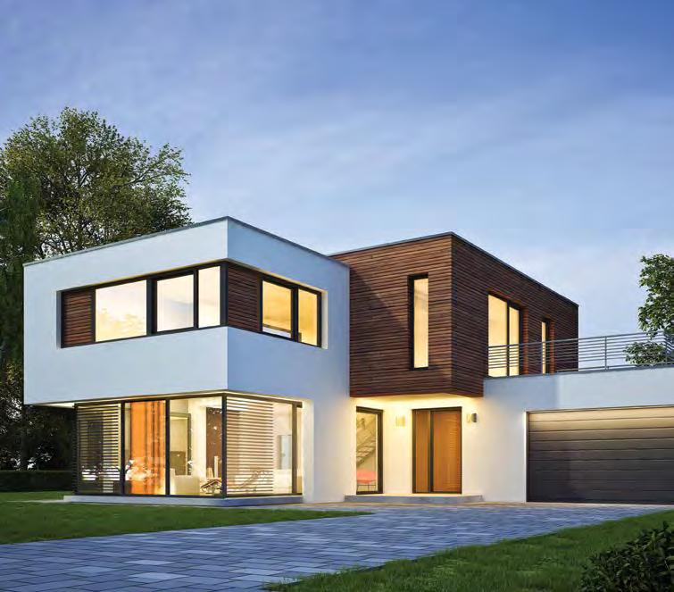
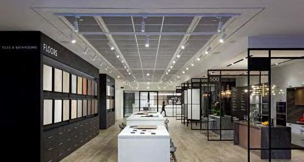
It’s a lovely motto: “Built Green Built for Life.” But Tridel continues to live by those words—a key reason the Toronto-based developer has earned back-to-back Builder of the Year titles at the OHBA’s annual Awards of Distinction.

The architecture and design is there for all to see, including Tridel at The Well, a Best High-Rise nominee this year, as well as the company’s winning effort for Best Model Home Up to 2,500 SF for its Ten York condo. But its level of service, right through to its post-occupancy warranty, also continues to impress, with an astonishing 99.7% of customers reporting they’d refer friends/family.
Innovation remains a core value for Tridel, where smart-home technology extends right down to licence plate recognition and automated parcel delivery systems. Its Innovation Showcase Suite monitors circuit consumption and the state of each circuit breaker, with plumbing fixtures that conserve water, energy-efficient appliances and hardwood that helps purify air within the suite—all controlled by voice or a smartphone app. Tridel’s NetZED suite, meanwhile, is designed to produce as much energy as it consumes.
Further innovation is featured with the Deep Lake Water Cooling cistern at The Well, which harnesses cold water from Lake Ontario to be used for air conditioning, while the heating loop uses waste heat from an existing heating plant to deliver more efficient and lower carbon heating. This system uses up to 90% less electricity, eliminates ozone-depleting emissions and primarily uses renewable lake water, resulting in lower building maintenance costs.
Further, with Carbon Cure Technology, post-industrial carbon is injected back into concrete, making the building a permanent depository for carbon that otherwise would have been released into the atmosphere.
Tridel says quality is at the forefront, and the stats back it up: 91% of its homes are delivered with no deficiencies, and they have never had a chargeable Tarion conciliation. And as pioneers of green building, Tridel leads Canada’s sustainable condominium development, with most of its communities complying with Toronto Green Standard Tier 2, voluntarily exceeding the mandated Tier 1.
Tridel may shine most, however, when it comes to supporting its communities and industry, examples being: recent support of the Toronto Community Housing Corp’s ‘Investing in Our Diversity’ scholarship program; supporting the Angelo DelZotto School of Construction Management at George Brown (Ontario’s only four-year degree program in construction management), its WISE Corporate Social Responsibility vision (Workforce, Industry, Society, Environment); and its charitable foundation, Building Opportunities for Life Today (BOLT), which connects under-resourced youth to education and careers in construction through training and financial awards.

Take Action, an employee-driven team, exemplifies Tridel’s passion, values and social impact, recycling hundreds of pounds of e-waste and donating thousands of food cans to the Daily Bread Food Bank. But Tridel stepped it up to another level during COVID-19, raising funds for Feed the Frontlines TO, feeding frontline workers while supporting local restaurants.
With active representation on a number of committees, boards and associations, Tridel continues to evolve the industry, hosting government officials, engineers and other developers in sharing knowledge and experience of smart-home automation, design excellence and energy-efficient dwellings to help GTA condo buyers get the best, most sustainable product, no matter where they call home.


