the
Flip this over to enjoy
May/June issue of Orange Appeal!
SPRING | SUMMER 2023
FEATURES
36 CALIFORNIA COMFORT
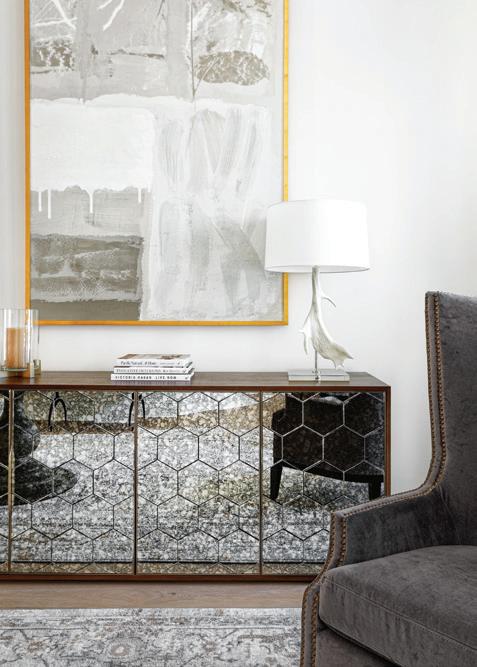
A mixture of woods, metals and textures created a well-collected California vibe in this Windermere renovation project that included new furnishings, finishes, layout, architectural details and artwork. Liv Mead Tiblier, chief creative officer of Mead Design Co., previously worked with the clients on a few other projects, including a Florida beach condo.
40 REMODEL REDUX
Designer Audrey Morrone, Morrone Interiors, was brought back to a home she had previously updated to elegantly enhance more spaces including the family room, primary bedroom and bathroom, office, theater and guest room. The primary goal was to lighten the Mediterranean mood — think lots of mustards and dark colors with reddish-toned wood floors — and introduce a softertoned palette.
44 RENO DREAM TEAM
Finding your dream home on a lake is one thing. But discovering it requires extensive work to turn the 1990s design, built by an architect, into a modern fairytale means finding partners who can visualize what it can be — and accomplishing it. Fortunately, these homeowners knew just who to call — Greg Hardwick, Hardwick General Contracting, and Faith and Seth Freytag, Concrete:Cotton.
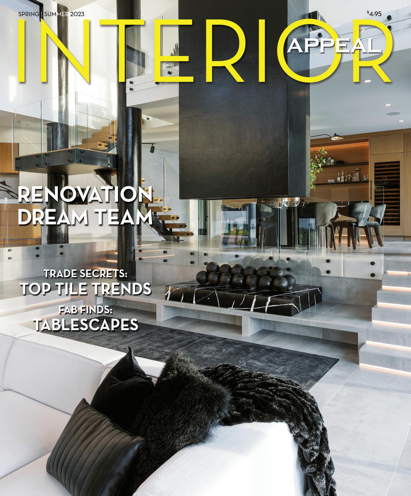
cover: The stunning main living area of a dream renovation project photographed by Chris Glenn. Article on page 44.
44 40
KRISTEN ELIZABETH STUDIO
ROBERTO GONZALEZ PHOTOGRAPHY
CHRIIS GLENN
CONTENTS
36 SPRING | SUMMER 2023 1
6
FIRST LOOK
Design Debut: The Atelier by Tina Marie Interior Design, a full-service design firm and retail showroom, on Designer’s Row (Orange Avenue) in Winter Park, features a curated collection of décor, furnishings and gift items as well as showcases designer Christina Marie Kairis’ livable luxury aesthetic.
8
DESIGNING MINDS
Tempting Tablescapes: The 2023 Art in Bloom event at the Orlando Museum of Art featured over-the top table settings with dreamy designs highlighting entertaining possibilities from Meredith Gardner and Amanda Warren, Clementine, and Shaun O’Dwyer Flowers & Event Design; Lise Davis, The Hunt, and Tessa McAuliff, Tessa’s Table; and Laurie Stephens and Lisa Spears, Bamboo & Foo.
14
TRENDS
The tile trend forecast for 2023, from the 2023 Coverings show, an international tile and stone show recently held in Orlando, calls for imperfectly-perfect, organic and handcrafted looks
that ground living spaces. Tile style also steps off the floor into other areas of the home, surfacing in creative applications from accent walls to art installations.
20 ARCHITECTURE ARCHIVES
Modernist architecture enthusiasts can get their local fix of residential design during the annual New Smyrna Beach South Beach Home Tour on May 20. The Orlando Foundation for Architecture is partnering with Central Florida Modern to host the walking and driving tour that features notable works by Central Florida modernist architects.
24 IN THE KITCHEN
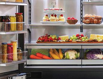
Signature Kitchen Suite’s 48-inch French door refrigerator offers convertible drawer flexibility with a functional and sleek design combining innovative preservation features with user conveniences.
26 ROOM BY ROOM
Five designers showcase their work and discuss the details and inspirations behind these stunning spaces.
Interior Appeal and Orange Appeal make great gifts! Subscribe at orangeappeal.com. Get all the event info by signing up for the e-newsletter or visiting our interactive website. For changes of address, please e-mail subscriptions@orangeappeal.com.
20 8 14
26 INSIDE SPRING | SUMMER 2023 30 2 INTERIOR APPEAL | ORANGEAPPEAL.COM
EDITOR & PUBLISHER
Christi Ashby
christi@orangeappeal.com

ASSOCIATE EDITOR & PUBLISHER
Kate Slentz
kate@orangeappeal.com
CIRCULATION CONSULTANT
Molly O’Shea
BUSINESS MANAGER
Robert Ashby
ADVERTISING SALES advertising@orangeappeal.com
CONTRIBUTERS
Karen LeBlanc
PHOTOGRAPHERS
Chris Glenn
Roberto Gonzalez Photography
Kristen Elizabeth Studio

PRODUCTION DIRECTOR
Rita Tyrrell
FOR ADVERTISING: advertising@orangeappeal.com
FOR SUBSCRIPTIONS: subscriptions@orangeappeal.com orangeappeal.com
Copyright 2023. No materials may be reproduced without permission. Please do not send unsolicited articles or photographs. Publisher not responsible for individual opinions contained herein.
Orange Appeal (Permit #201) is published bi-monthly by Appeal Media & Events Group, 1903 Michael Tiago Circle, Maitland, FL 32751. Printed in USA. Standard postage paid at Harrisburg, PA and additional mailing offices. POSTMASTER: Send address changes to Orange Appeal, 1903 Michael Tiago Circle, Maitland, FL 32751
4 INTERIOR APPEAL | ORANGEAPPEAL.COM
f IRST L oo K
d
6 INTERIOR APPEAL | ORANGEAPPEAL.COM
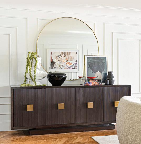
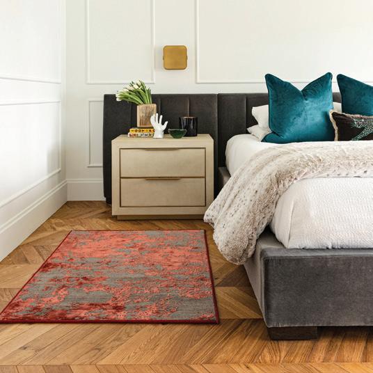
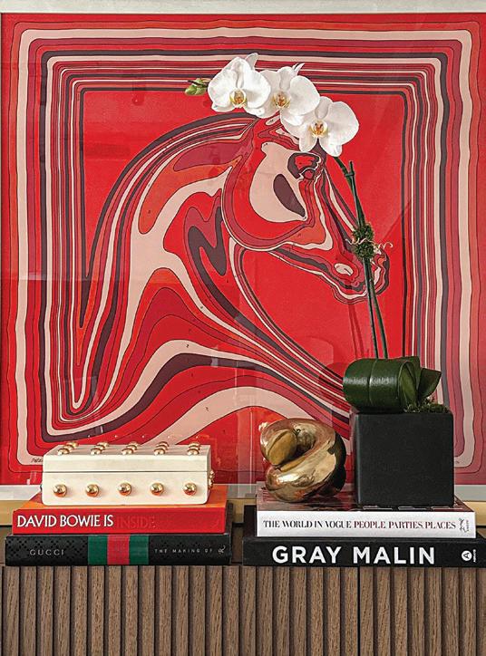
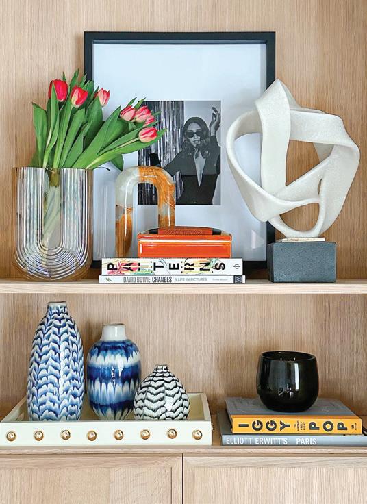
The Atelier by Tina Marie Interior Design, a full-service design firm and retail showroom, on Designer’s Row (Orange Avenue) in Winter Park features a curated collection of décor, furnishings and gift items as well as showcases designer Christina Marie Kairis’ livable luxury aesthetic through well thought-out vignettes and spaces. Items are also available for sale at theatelierwp.com.
esign debut

tempting tablescapes

The 2023 Art in Bloom event at the Orlando Museum of Art featured over-the top-table settings with dreamy designs highlighting entertaining possibilities.


HERITAGE DESIGN by CLEMENTINE and SHAUN O’DWYER
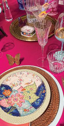
Heritage design ages like fine wine: using traditional patterns in a contemporary way, it is the inspiration for this elegant display in rich colors and patterns with subtle textures and sparkling glassware and accents. The table setting features items from Clementine in Winter Park including Vietri flatware, Kim Seybert linen napkins, Nicolette Mayer wine glasses, Baccarat Crystal glasses and Mottahedeh china. Florals are by Shaun O’Dwyer.
CABANA LIFESTYLE by LISE
DAVIS, THE HUNT, and TESSA
MCAULIFF, TESSA’S TABLE
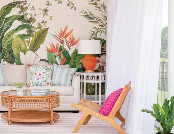
Breezy palms, woven rattan, and a colorful island palette make this the perfect spot for cocktails under the cabana. “We used Amanda Lindroth items (since she was the speaker) accented with mint green and pale blue. We painted a lattice wall the prettiest shade of pale blue. The flowers from Poppy Flower Co. added to the overall feel with gorgeous blooms, palms, and an addition of the most beautiful purple hue. We used a cabana stripe umbrella to create an island feel and filled the bar cart with our favorite cocktails. Our inspiration came from a gorgeous tablecloth from The Hunt that mixed all these colors and florals,” Lise says.
designing
8 INTERIOR APPEAL | ORANGEAPPEAL.COM
MINDS

SHISHI BAR by LAURIE STEPHENS and LISA SPEARS, BAMBOO & FOO
This ShiShi Bar, a mix of items from Bamboo & Foo, featured a variety of signature foo dogs (also referred to as ShiShi dogs), along with vintage cocktail glasses arranged on a Chippendale pagoda etagere as the centerpiece of the table. “Our vignette was colorful, exuberant, and layered with vintage pieces which always add originality and warmth. A rattan bar cart, bamboo chair and mid-century lamp table made for a comfortable and inviting space. Spring is a lovely time to entertain in Florida, and we hope our ShiShi Bar inspires you to sip a cocktail — from a vintage glass, of course!” Laurie explains.


10 INTERIOR APPEAL | ORANGEAPPEAL.COM
designing MINDS


Tiles Style Steps Off the Floor to Other Surfaces: INDUSTRY EXPERTS FORECAST TILE in ALL SHAPES, SIZES and AREAS of the HOME
by Karen LeBlanc
The tile trend forecast for 2023 calls for imperfectly-perfect, organic and handcrafted looks that ground living spaces. Tile style also steps off the floor into other areas of the home, surfacing in creative applications from accent walls to art installations. These trend predictions come from the 2023 Coverings show, an international tile and stone show recently held in Orlando.
“Ceramic tile offers a limitless palette of textures, colors, shapes, styles and sizes that blend perfectly to create spectacular custom expressions for any design project these days,” notes Alena Capra, CMKBD, industry ambassador and spokesperson for Coverings. “Tile is also incredibly well-suited for more than just floors and showers; it’s an elegant and practical design material used for walls, backsplashes, countertops, pools, patios, facades, and more, offering a design option that promotes quality like no other.”
Alena is one of the trend forecasters with Coverings who identified 10 tile styles setting the direction of decor and design. Here are the top takeaways.

IMPERFECTLY-PERFECT LOOKS:
The aim for authenticity in living spaces makes imperfectly-perfect ceramic and porcelain tiles popular choices in 2023. Tile experts explain, “There is a trending desire for goods made for a human, by a human, and this holds true for ceramic tile.”

Manufacturers are using multi-glazing techniques to create complex glazed surfaces by putting a single piece of the tile through the kiln three to four times. These glaze layers produce uneven and undulating surfaces that convey timeworn patinas and artisanal looks of brick, terrazzo, concrete and cobblestone styles.

TR
14 INTERIOR APPEAL | ORANGEAPPEAL.COM
eNDS

STATEMENT-MAKING TILES:
Tile commands attention in 2023 with metallic finishes, glitter accents, pop art and ’70s design motifs. Expect to see edgier tile designs that play with geometric shapes or amp up the glamour with opulent overlays. Tile style also nods to the 1970s with florals, stripes, wavy and vintage patterns to draw the eye and add interest.

TILES IN ALL SHAPES AND SIZES:


There is not a one-size-fits all approach when it comes to top tile choices for the home. New production methods and technologies are turning out tiles in all sizes, from large-format slabs to small-scale mosaics in diverse shapes and patterns. “For flooring, we are seeing a trend toward large-format tile in both square and rectangle shapes; even wood plank widths have gotten wider, and their lengths a bit longer,” Alena says.

Small-scale tiles such as mosaics and smaller bricks and squares are concurrently trending as popular choices for backsplashes, accent walls, and smaller bathrooms and shower floors. “Combining larger- and smaller-scale tiles in a design is also a great way to incorporate the best of both formats,” Alena suggests.

TReNDS 16 INTERIOR APPEAL | ORANGEAPPEAL.COM

DOWN-TO-EARTH STYLE:
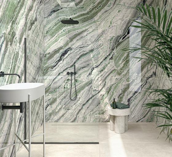
Mother Nature remains a trendsetter and biophilic design, a buzzword in tile style. Manufacturers continue to improve the realistic rendering of natural wood and stone looks by infusing texture, graining, gradients and striations in the tile. “The trending lifestyle connection between beautiful indoor and outdoor design spaces is deeply rooted in our Mother NatureInspired Indoor-Outdoor Tile Trend. The connection of the two areas as one has become something to which homeowners have been receptive,” Alena says.
Green is a popular tile color choice in 2023 working in concert with natural design elements. “We are seeing a lot of beautiful green hues of tile from sage to mint and emerald that flawlessly align with biophilic design to bring the greenery of nature into the home with tile,” Alena adds.
The 2023 tile style forecast came from three international tile associations and sponsors of Coverings 2023 — Ceramics of Italy, Tile Council of North America, and Tile of Spain, in advance of the spring Coverings 2023 show.


Karen LeBlanc is host of The Design Tourist series. She travels the globe attending some of the world’s premiere design events in search of the latest trends, tastemakers and unique finds. Learn more at thedesigntourist.com

TReNDS
18 INTERIOR APPEAL | ORANGEAPPEAL.COM

NEW SMYRNA BEACH SOUTH BEACH HOME TOUR OPENS DOORS AND MINDS TO MODERNIST DESIGN
by Karen LeBlanc
Modernist architecture enthusiasts can get their local fix of residential design during the annual New Smyrna South Beach Home Tour on May 20. The Orlando Foundation for Architecture is partnering with Central Florida Modern to host the walking and driving tour that features notable works by Central Florida modernist architects. Central Florida Modern, also known as the Nils M. Schweizer Fellows, is a fan club of individuals who appreciate mid-century modern architecture. “We meet once a month in a modernist-style building or home to foster an awareness and appreciation of modernist architecture and identify, preserve and protect significant architectural works,” says John Kaiser, who co-founded the organization with
Nils’ son, Garth Schweizer. John owns the Goldman Home in Maitland, designed by influential 20th-century architect Nils Schweizer and listed on the National Register of Historic Places.
Orlando Foundation for Architecture (OFA) is a non-profit organization dedicated to public education that inspires people to discover why design matters. “Our purpose is to promote public awareness and appreciation of the built environment, advocate for the preservation of historic architecture, and demonstrate sustainable practices,” explains Jacki Hale, vice chair for the Orlando Foundation for Architecture and chair of the tours committee. OFA also offers scholarships for architectural education and promotes diversity in the architectural community.
The New Smyrna Beach South Beach Home Tour is one of several public outreach events planned in 2023. The tour features eight modernist homes in a combination of drive-by and walk-through experiences and includes the personal residences of three distinguished architects.


Architect Kevin Schweizer, son of Nils, is opening up his “River House,” a 32-yearold modernist and multigenerational home with a distinctive 10/12 pitched aluminum roof topped with a working cupola. Kevin says his floor plan balances private spaces and common areas with a passive design welcoming breezes and natural light. The home overlooks an estuary and resides one block from the ocean. Kevin’s architecture captures the organic rhythms and patterns of the landscape, an ethos he learned from his dad. “My work responds to a site’s organic influences with building designs that embrace sunlight, breezes, vegetation and views,” Kevin says.
Founding Director of the University of Central Florida architecture program John Jeronimo is also offering his home to tour. The retired architect is one of the founding members of the Orlando Architecture Foundation and the immediate past president of the Florida Foundation for Architecture. “As architects, we have to speak to a broader public about what entails quality design. By opening up an architect’s home, people can see good design, ask questions, and learn what’s possible,” John says. His
aRCHITECTURE aRCHIVES
Kevin Schweizer's River House
20 INTERIOR APPEAL | ORANGEAPPEAL.COM
Mallen residence

aRCHITECTURE aRCHIVES
modernist home resides on a corner lot on Sheepshead Avenue in Bethune Beach with ocean and lagoon views. John designed the 1800-square-foot “empty-nester” home with a narrow footprint and an open ground floor. “The first floor is a breakaway level according to building code along the beach so that high water doesn’t sweep the house away,” John explains. Bedrooms reside on the second level, and the third level serves as the main living area with built-in cabinets and furnishings of stained plywood. Orange shutters punctuate the exterior metal and artisan board facade and help mitigate sunlight entering all four sides of the home.
Architect Will Miller welcomes visitors to experience his six-level residence on Saxon Drive in New Smyrna Beach that wraps around large oak trees on a wooded site

overlooking a saltwater estuary. The home’s distinguishing cedar shingles seamlessly clad both the exterior and the interior. “I designed my home as an interplay of contrasts with solids and voids, rugged and soft surfaces, curves, and hexagonal angles. I didn’t want to have any right angles, stucco nor drywall as part of the structure,” Will says. Inside, a three-story atrium with skylights disperses natural light.
Will’s architectural works contribute to
the character and culture of New Smyrna, including the Atlantic Center for the Arts visitor center and gallery. Will designed the structure with exposed sandblasted concrete, cedar beams, polished concrete flooring, large sheets of butt-joined glass, and wood pole infrastructure. “Architecture is an honest expression of the landscape and the owner. The client says what to build, and the site tells you how. The architect listens and designs a building

22 INTERIOR APPEAL | ORANGEAPPEAL.COM
Miller residence
that enhances the site’s character and enriches people’s lives,” Will explains.
A modernist home tour in a beach community begs the question — why does New Smyrna have a significant concentration of this architectural style? The answer traces back to the work of Nils Schweizer, one of several Central Florida architectural trailblazers in the 20th century that include Frank Sheehy and Gene Leedy. Nils moved to Orlando in 1957 with his wife Beverly and began building homes that embraced the organic design ideals of famed architect Frank Lloyd Wright. Nils worked for Wright, supervising the construction of Florida Southern College, which contains the world’s most extensive single-site collection of structures designed by Frank Lloyd Wright.
Nils built homes throughout Central Florida that embodied Wright’s vision of organic architecture by merging struc-
tures with the landscape and opening up living spaces. “Some admirers of Nils’ work didn’t want to live in open floor plans as their primary residence; however, they were willing to experiment with the modernist architectural style as a beach house, second residence or weekend home,” John Jeronimo explains.
Nils died in 1988 at age 62, leaving an architectural legacy that shaped Central Florida’s landscape and skyline. His notable works include the Orlando International Airport, Epcot Center’s Mexico Pavilion, Loch Haven Park, St. Luke Episcopal Cathedral, and an addition to the Orlando Public Library.
“My dad’s influence on Central Florida architects, including myself and Will, has produced a lot of great work in this area,” explains Kevin, who grew up in Maitland with his brothers Garth and David and his sisters Tamara and Kyra, in a house

designed by Nils. “After graduate school, Garth (landscape architect) and Tamara (interior designer) and Dad and myself opened an office in the back of the house. Just growing up in that house had a profound influence on all of us kids, with music and dance and drama and design.”
The New Smyrna Beach South Beach Home Tour takes place from 10am to 6pm on Saturday, May 20. Ticket prices are $35 for members and $50 for non-members, including snacks and water. OFA is planning future tours, including the Historic Sanford Trolley Tour on September 30 and a tour of the Atlantic Center of the Arts in New Smyrna Beach on October 7. Individual membership to OFA is $50 a year and includes discounts for tours and events. For more information and to purchase tickets, go to orlandoarchitecture.org, and for more details on the Nils M. Schweizer Fellows, check out centralfloridamodern.com
SPRING | SUMMER 2023 23
VERSATILE FRENCH DOOR REFRIGERATOR
Signature Kitchen Suite’s 48-inch French door refrigerator offers convertible drawer flexibility with a functional and sleek design combining innovative preservation features with user conveniences.
• Functional and innovative convertible drawer offers five preset temperatures ranging from 41° F to -6° F for precise food preservation with settings for: chilled wine, fridge/ deli, meats and seafood, beverage, or you can drop the temperature all the way down to make it a freezer.
• Dual compressors and a metal interior help minimize temperature fluctuations in the refrigerator while individual freezer drawers allow for more space to keep your frozen foods perfectly chilled.

• One of the largest-width interiors available, this model features Lift and Go drawers, fully adjustable door bins, and LED lighting that is hidden away.

• Other features include: a spherical craft ice option; Wi-Fi connectivity; ENERGY STAR certification; the ability for either proud or flush installation; an internal filtered water dispenser; easy-to-read digital controls; adaptive defrost; and special modes including Ice Plus and Sabbath Mode.
Signature Kitchen Suite, offering a full range of kitchen appliances, is the luxury brand from global home appliance leader LG Electronics. signaturekitchensuite.com
iN THE kITCHEN 24 INTERIOR APPEAL | ORANGEAPPEAL.COM

ROOM by ROOM
Area designers share details about some of their favorite rooms.
PRIMARY BEDROOM
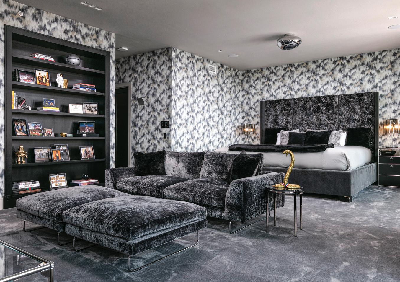
This sexy bachelor pad is bold but calming. Floating high in the sky, this primary bedroom is full of energy but informed by plush comfort. The USM Modular Furniture nightstands and media console are complemented by graphic Romo wallpaper and bold black velvet fabric on the custom bed and 4Mariani sofa and ottomans. Accents of gold Seletti accessories warm the space and add personality, while the European Slam lighting illuminates with warm hues of light.
TED MAINES INTERIORS
26 INTERIOR APPEAL | ORANGEAPPEAL.COM
Photo by Uneek
ROOM by ROOM
CASUAL DINING NOOK
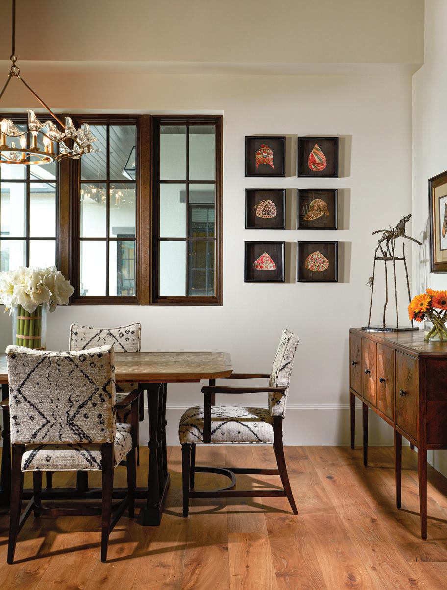
Timeless and classic best describe this breakfast nook. Appointed with European white oak floors, wood casement windows, comfortable, custom upholstered arm chairs, and rich wood buffet, it is a space that invites casual family gatherings. The chandelier brings an element of whimsy with a ring of blown glass doves, and the art pieces speak to the homeowner’s passion for horses and travel.
NANCY SHORT, ANSANA INTERIOR DESIGN
Photo by Daniel Newcomb
28 INTERIOR APPEAL | ORANGEAPPEAL.COM

ROOM by ROOM
POOL HOUSE | GUEST SUITE
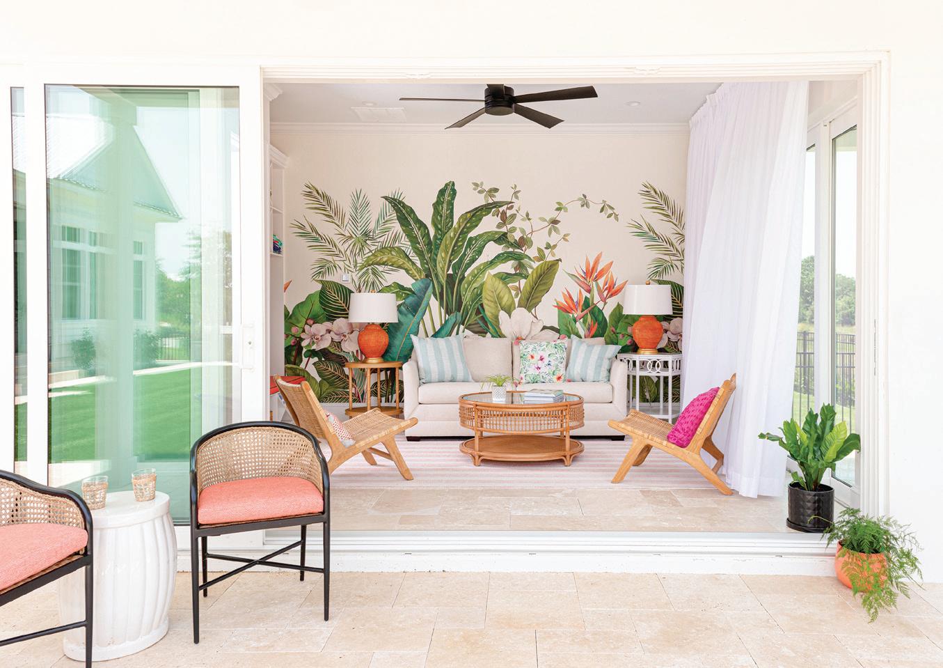
When you live in Florida, expect visitors! This pool house is ready for afternoon swim parties or overnight guests. The mural sets a fun, tropical color scheme. An indoor-outdoor fabric on the sofa makes it impervious to wet bathing suits. When night falls, the sofa converts to a queen bed and the gauzy curtains enclose the space to create privacy. The adjacent bath and wet bar offer guests everything they could want to enjoy living poolside.
GAIL BARLEY, GAIL BARLEY INTERIORS
30 INTERIOR APPEAL | ORANGEAPPEAL.COM
Photo by Abby Liga
ROOM by ROOM
PRIMARY BATHROOM
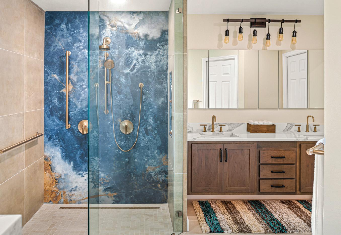
This was a couple in their late 70s wanting to do a contemporary industrial look. At selections they told me they were thinking of maybe doing full slab on all walls so when I pulled the ocean slab from Infinity, they immediately fell in love with it. I suggested to do only one wall as a focal point and complement the slab with some neutral straight lay tile like this 24"x 24" Notorious from Crossville. Same for the plumbing fixtures that ended up being the bronze finish from Kohler (Purist line), one of my favorites, and perfect for the look. The countertop was Pompeii Vena Oro and the cabinets a partial overlay door style.
MAYERLIN FERREIRA, S&W KITCHENS
32 INTERIOR APPEAL | ORANGEAPPEAL.COM
Photo by Rickie Agapito

ROOM by ROOM
LIVING AREA
Casual, comfortable and modern was the direction for this complete home remodel. Clean-lined sectional in a performance fabric with swivel chairs to watch TV or to turn and talk with your family in the kitchen is offset by the organic coffee table. Artwork by Jamieson Thomas.
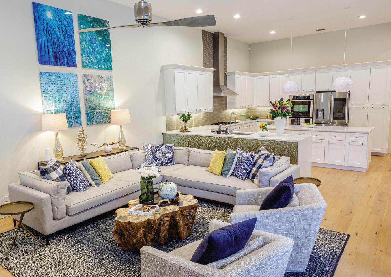
CATHY SANDS, BLUE DAZE DESIGNS
by Steven Miller
34 INTERIOR APPEAL | ORANGEAPPEAL.COM
Photo
CALIFORNIA COMFORT
INTERIOR DESIGN: LIV MEAD TIBLIER, MEAD DESIGN CO.
PHOTOHRAPHY: KRISTEN ELIZABETH STUDIO

36
INTERIOR APPEAL | ORANGEAPPEAL.COM
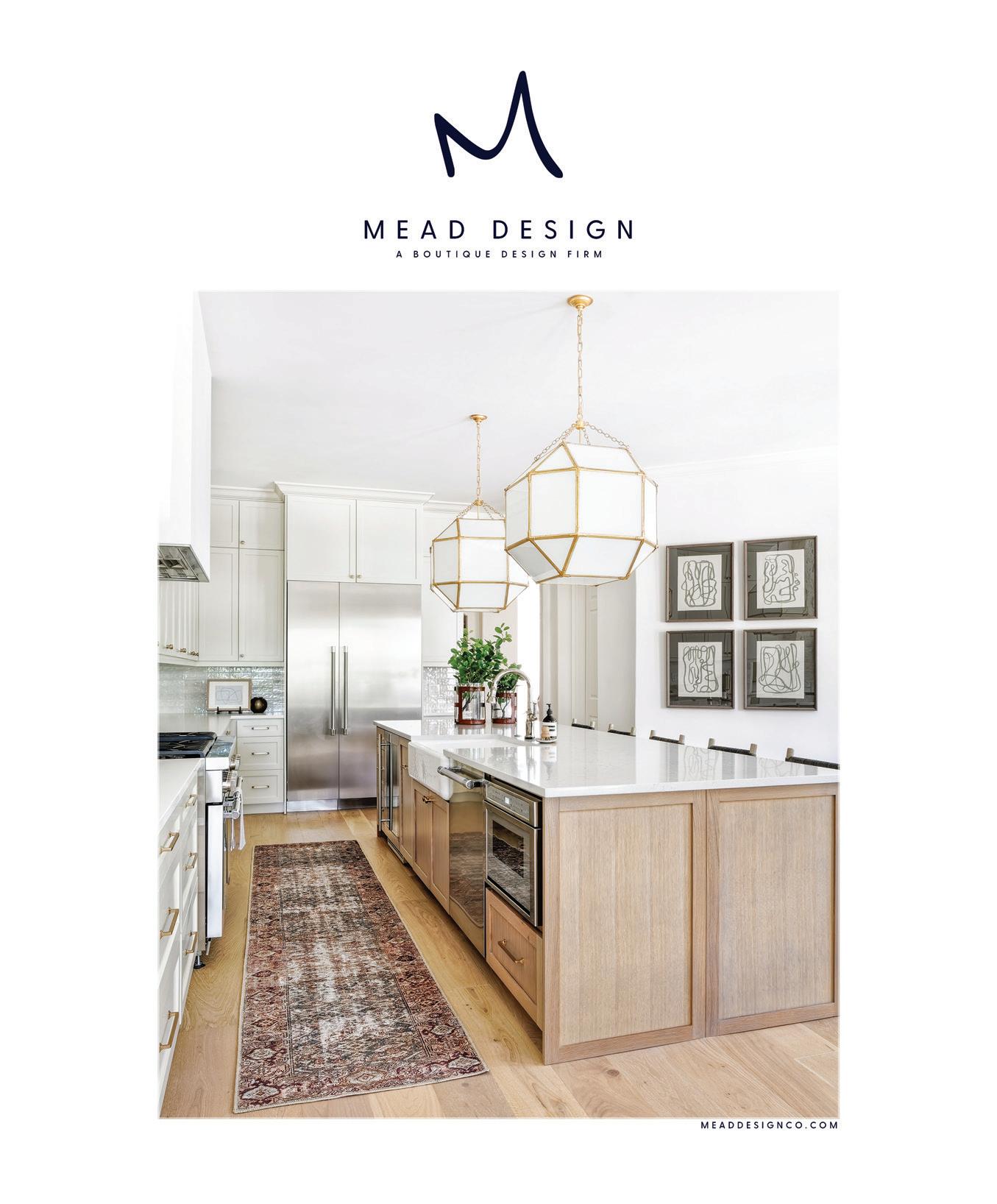
Amixture of woods, metals and textures created a well-collected California vibe in this Windermere renovation project that included new furnishings, finishes, layout, architectural details and artwork. Liv Mead Tiblier, chief creative officer of Mead Design Co., previously worked with the clients on a few other projects, including a Florida beach condo.
“Our clients spend a quarter of the year in California. They love to surf and the whole California lifestyle. They have children in high school, so we wanted to bring back that approachable aesthetic from their travels. We were really inspired by Santa Barbara living. It’s casual but still tailored,” she explains.
The living room and kitchen underwent the most major renovations. A corner fireplace in the living area created an unfavorable layout, so Liv added a linear stone fireplace on the back focal wall with surrounding shiplap. “I love how the kitchen opens up to the family room and features the oversized pendants. It can seat a lot of people at the island and it’s a great family kitchen,” Liv says.
Opposite: THE ORIGINAL FIREPLACE WAS REDONE AND CENTERED ON THE BACK WALL TO CREATE A MORE COMFORTABLE SEATING ARRANGEMENT. THE SHIPLAP, STONE SURROUND, LINEN ARTWORK, AND LIGHTING FIXTURE FROM ARTERIORS GIVE IT THAT COASTAL FEEL.
IN THE ADJACENT KITCHEN, LIGHTING IS ANOTHER STANDOUT WITH TWO LARGER GEOMETRIC LIGHTING FIXTURES FROM VISUAL COMFORT HANGING OVER THE CUSTOM STAINED WHITE OAK ISLAND WITH PLENTY OF SEATING. “WE LOVE AN ALL-WHITE KITCHEN, BUT WE WENT WITH A BENJAMIN MOORE NATURAL CREAM COLOR ON THE CABINETRY INSTEAD OF WHITE BECAUSE WE WANTED TO DO SOMETHING A LITTLE MORE TONAL,” LIV EXPLAINS. A BEDROSIANS CLOE TILE BACKSPLASH ADDS A LITTLE SPARKLE TO THE SPACE.
Top: THE GRAND FOYER MAKES A STATEMENT WITH A WELL-STYLED LEXINGTON TABLE. THE FRONT DOORS ARE ORIGINAL TO THE HOME.

Bottom: ANOTHER GRAND LIGHTING FIXTURE FROM VISUAL COMFORT PUNCTUATES THE DINING ROOM THAT ALSO FEATURES A FOUR HANDS RECLAIMED WOOD TABLE AND SUCCULENT CENTERPIECE FROM LOCAL WINTER PARK CUSTOM FAUX FLORAL COMPANY, STACKED AND CO.

SPRING | SUMMER 2023 37
“One of the things you’ll notice about the house is we really mixed the wood tones. Good design can do that — people get very stuck on everything has to be white oak, but it really doesn’t,” she adds. The breakfast nook and dining room feature darker reclaimed wood tables along with the foyer table, while the bathrooms have lighter wood vanities.
The grand foyer was actually part of a former formal living room that got broken up to add more square footage to the kitchen and breakfast nook. The front door is one of the only original elements kept in the home. “That was the one thing that we loved,” Liv says.

The entire renovation project took around nine months. “The goal of this project was to create a look for a well-traveled family who enjoy their time in California. When we design a space and clients give us free creative direction — and we know so much about the clients — it’s easy to tell the story through them,” Liv says.
Opposite, clockwise from top left: THE MAIN BATHROOM FEATURES A CUSTOM WHITE OAK VANITY, GEOMETRIC TILE, AND FUN WALL SCONCES FROM VISUAL COMFORT.
LIGHTING MAKES A STATEMENT, ONCE AGAIN, IN THE MAIN BEDROOM WITH A CHANDELIER FROM CURREY & CO. A BLACK LEATHER BENCH ADDS A POP AGAINST THE NEUTRAL FURNISHINGS AND BEDDING.
ANOTHER BATHROOM FEATURES THE SAME CLOE TILE THAT WAS USED IN THE KITCHEN AND CONTINUES TO MIX WOODS AND TEXTURES TO CREATE A NATURAL, SERENE SPACE.
AN UNEXPECTED POP OF COLOR CAN BE FOUND IN THE OFFICE WITH THE BLUE LINEN SWIVEL CHAIRS.
38 INTERIOR APPEAL | ORANGEAPPEAL.COM


SPRING | SUMMER 2023 39
We kept the existing beams in the family room and just gave it a facelift. With window treatments, the math has to be spot on and it can be expensive, so a lot of people don’t do them anymore. It really is a wow factor and something we like to do with all our clients.
REMODEL Redux
Interior Design: Audrey Morrone, Morrone Interiors

Photography: Roberto Gonzalez Photography
Designer Audrey Morrone, Morrone Interiors, was brought back to a home she had previously updated to elegantly enhance more spaces including the family room, primary bedroom and bathroom, office, theater and guest room. The primary goal was to lighten the Mediterranean mood — think lots of mustards and dark colors with reddish-toned wood floors — and introduce a softer-toned palette.
40 INTERIOR APPEAL | ORANGEAPPEAL.COM
This was a full remodel and we had done the first part in 2019. We were building on what we had already started. The client and I work extremely well together — we went in with our ideas, but it was pretty much a collaboration,” Audrey shares. Although there was not a lot of structural work to be done — the footprint of the house remained the same — the main bath was gutted and new flooring, wainscoting, paint, lighting fixtures and window treatments were added. Some of the existing features — beams, columns and arches — were retained, but the overall tone is more transitional with a grand dose of glamour.


The office built-ins were existing, but the doors were added. There was a very dated ceiling we took down and added the coffered ceiling to lighten it up.
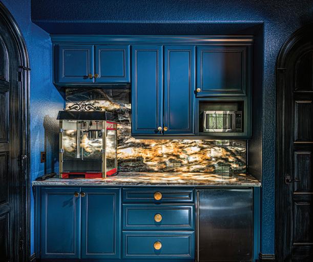
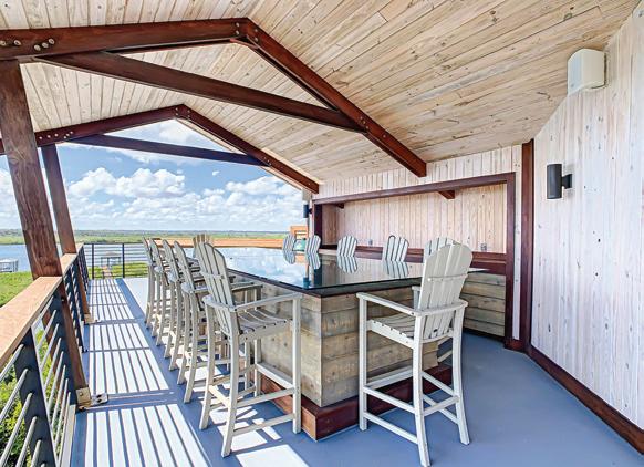
 The back bar has a door out to the pool, so we made an unused space a new entertainment area.
“ SPRING | SUMMER 2023 41
That’s something of a signature of Audrey’s aesthetic. “I really like the tone-on-tone effect going with the whites and creams, making it come alive with different textures. There’s also a little bit of gray and taupe. There are lots of velvets and chenilles for a rich, luxurious look. And we went all out with the lighting fixtures,” she says. Fortunately, the client liked all the choices Audrey selected and they are statement moments in each room.
A rarely used space — a sitting room off the guest bedroom with a door to the pool — became a new entertainment area. “We wanted to make it something that could be fun. The door opens all the way up and out to the pool, so it is great for entertaining. We did the bar in marble with three stools on each side so six people can be in there. They are hugely into sports so there is also a TV. Now the room gets a ton of use,” Audrey explains.
The carefully conceived design flow follows through in the main bedroom and the guest room, where muted hues allow the furnishings and ceiling details to shine. The main bath was completely redone, turning a dark, heavy area into a soothing, spa-like space with custom cabinetry and a large soaking tub.

 The deep blue reupholstered seats in the theater set the tone for the entire room.
42 INTERIOR APPEAL | ORANGEAPPEAL.COM
In the guest bedroom, the ceiling was a lot darker before a faux artist toned it down with a wash.
There is one departure from the lightness as drama reigns in the theater room. “I like dark and moody theaters because it creates a cozy effect. Normally we don’t do this type of theater seating, but the husband loved the existing seats that had originally come with the house. But they were in brown leather, so we had them reupholstered in the blue. That set the tone for everything else,” she adds.
Audrey and her team will be doing more work this summer when the clients are in Maine, but for now everyone is pleased with the elegant outcome.

The bathroom is amazing. We installed the heated marble floor. This past winter when we had more cold days, they loved it.
 Wainscoting was added to the wall behind the custom acrylic bed for a traditional touch in the main bedroom.
SPRING | SUMMER 2023 43
REnO dream team
interior designer: Faith and Seth Freytag, Concrete:Cotton

builder: Greg Hardwick, Hardwick General Contracting
photography: Chris Glenn
finding your dream home on a lake is one thing. But discovering it requires extensive work to turn the 1990s house into a modern fairytale means finding partners who can visualize what it can be — and accomplishing it. Fortunately, these homeowners knew just who to call — Greg Hardwick of Hardwick General Contracting, and Faith and Seth Freytag of Concrete:Cotton.
“We were obsessed with the house even though it was really outdated. We knew it was overpriced considering the crazy floor plan and we decided to wait it out. It was really very odd inside and even had a pond and a waterfall,” the wife explains. Waiting a while proved to be a successful strategy as the price went down and an offer was made.
The owners, a busy Orlando power couple, connected with people they knew and trusted, and the process began. It was a total gut project inside, but ironically the owners decided to stick with the unique floor plan, with multiple levels, and take advantage of the extensive lake frontage. “We could see it could be magical with all the windows facing the water,” she continues.
Everyone involved thought it was a wonderful waterfront setting. “It was a very unique home on Lake Gatlin — it was custom built very specifically for the original owner. It had a really cool boathouse with a living area grandfathered in, as well as a boat garage. They initially said they wanted to do a few little things,” explains builder Greg Hardwick. But when the interior design plans were introduced, it morphed into a major renovation with everything removed down to the studs. The exterior was less involved and more cosmetic with the stucco being smoothed out for a more modern feel.
The owners of Concrete:Cotton agree it was a major overhaul. “We were working on the clients’ condo at the time — kitchen, living room, dining room, bathroom — and in the process they told us they had bought a house. When we got into it, we took out literally

44 INTERIOR APPEAL | ORANGEAPPEAL.COM
From the moment you step through the oversized pivoting front door you notice something interesting around every corner. In the open living room, lake views are maximized via a wall of windows and 12' high retractable sliders, custom fabricated by Euro-Wall Systems. The massive two-story fireplace commands attention in black stained concrete, with a skim coat and floating hearth fabricated by Metro Finishes. LED lighting accentuates the multitude of steps throughout. And the extensive use of glass ensures the spaces are separated yet open.

SPRING | SUMMER 2023 45
everything — floors, walls, and even the wall framing — it was a shell,” adds designer Faith Freytag.


The demolition happened fairly quickly, but then it took some time to figure out the design and construction plans. There were a lot of challenges due to the way the home was built, and the process ended up being a little more complex due to the intricate plans and supply chain issues. “We had to design around some concrete structural elements. In the kitchen, for instance, we concealed a cabinet around a structural block wall. It was our only way to create some symmetry and deal with the crazy structural discoveries,” Faith says.
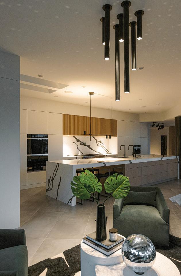
The dining room features large built-ins with plenty of storage crafted from white oak by National Woodworks and wine columns that can hold 300 bottles. A custom table can seat 12. In the kitchen, the extra-long island utilized several Quartz slabs and includes an extended table piece with stools on each side. Counter heights were brought up to suit the tall couple. It’s an entertainer’s kitchen with double oven, integrated refrigeration, warming tray, espresso machine, 48" cooktop and 45" sink with double faucets. Hidden doors lead to the new powder room, walk-in pantry and laundry area.

46 INTERIOR APPEAL | ORANGEAPPEAL.COM
And as Seth Freytag further explains: “The original owner, an architect, built half of it like it was a commercial building. In our initial floor plan, we had proposed moving some walls but when we opened it up and realized the skeleton of the home was in cast concrete, we had to rethink the plans.”
As for the total transformation, Greg says: “It is probably one of the best before and after comparisons we have done in a while. The original fireplace looked like the onefrom Linda’s La Cantina [the iconic steakhouse on Colonial Drive]. It was massive and decked out for the ’70s. The home still retains some elements of that era that the owners wanted to keep.”
The primary bath includes a large wet room with a soaking tub, multiple shower heads and automated shades for privacy. Skylights were a happy accident. In the main bedroom sitting area the fireplace serves as a functional work of art. In keeping with the downstairs aesthetic, the second floor design is simple and monochromatic yet warmed by all of the white oak accents. A custom headboard and sculptural lighting add dimension and texture.


SPRING | SUMMER 2023 47
After about a year of construction, the clients moved in just before the new year and everyone credits each other with making this project come together in such a beautiful way. “I don’t really have the design gene, so I let [Concrete:Cotton] run with it. [They] knew our style and what we liked from our condo [they] had done in Star Tower. It had that modern vibe to it. I only said no to two of 20,000 things,” the wife says.
“They were dream clients. They said ‘we like what you like so just do what you want.’ That never happens,” Seth comments. And Faith adds, “They joke that it’s our house and they are just living in it. We were able to be creative and think outside the box. They told us they wanted super modern, which we rarely get to do, and for it to look like an art gallery. They didn’t want it to be too precious, but they wanted it to be super cool and to see something different around every corner.”
“We really enjoyed working with the owners and Concrete: Cotton. Everyone was committed to getting it done the way it should be,” Greg adds.

The upstairs was originally a maze of spaces, but the office was kept pretty much the same with the addition of a custom desk. The intricate origami-ceiling was existing but painted black, which makes for another artistic detail. In the guest bath, black, white and wood make an interesting mix. Nate Maners, of Maners Concrete Collection, created the concrete countertop with a front that resembles chiseled stone. There is some pattern play in the guest room with bold wallpaper and more furnishings, including a chandelier, will be added. The dramatic powder bath is lit with a single pendant and LED lighting around the perimeter of the dropped ceiling to highlight the texture on the walls done by Metro Finishes.


48 INTERIOR APPEAL | ORANGEAPPEAL.COM


 The back bar has a door out to the pool, so we made an unused space a new entertainment area.

 The deep blue reupholstered seats in the theater set the tone for the entire room.

 Wainscoting was added to the wall behind the custom acrylic bed for a traditional touch in the main bedroom.


