
67 minute read
Chapter 4 An unequal world
An unequal world In 2019, Time Magazine called South Africa the ‘World’s Most Unequal Country’. Like many places around the world today, there are huge differences between the way people in some parts of the country live compared with others. The access they have to food and fresh water, the types of houses in which they live, their levels of education, access to health care and levels of employment vary enormously across the country. Geographers are interested in measuring these variations and exploring the reasons why they exist. Studying the links between these factors gives geographers an idea of the level of wellbeing in different populations. Human wellbeing is an overall measure of the ability of human beings to access the things they need to live happy and healthy lives. CHAPTER 4 DRAFT ONLY - NOT FOR SALE
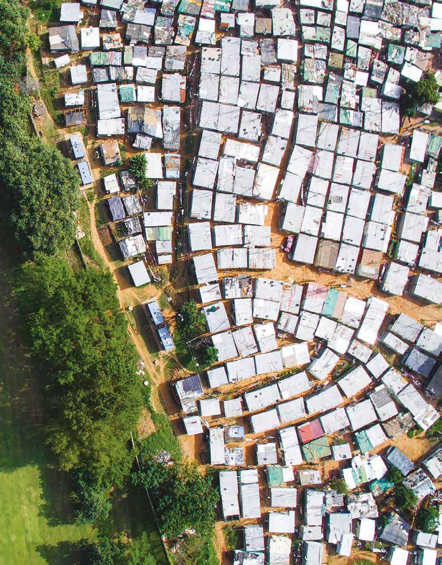
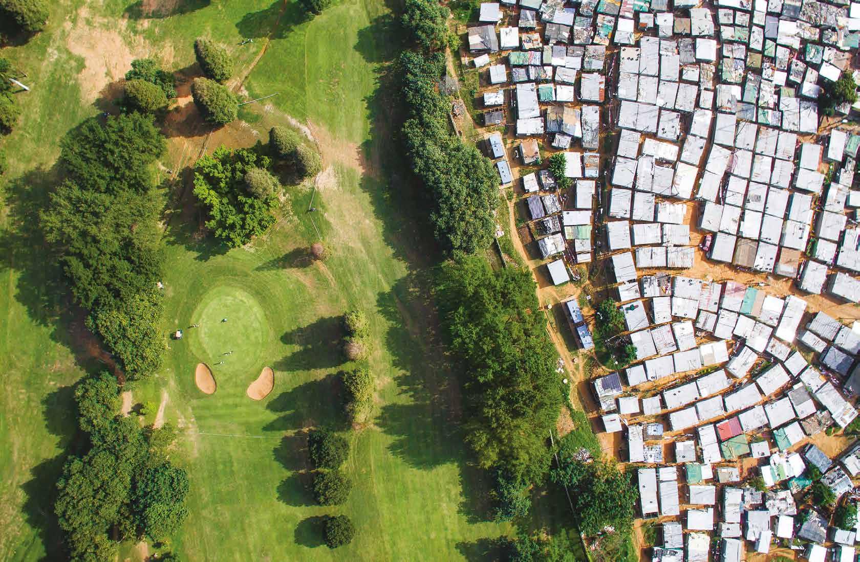
Source 1 American photographer Johnny Miller uses a drone to show the inequalities in wealth that exist in different places. In this image of a golf course in the South African city of Durban, an informal slum can be seen across the fence from the sixth tee.
4A How does wellbeing vary around the world? 4B DRAFT ONLY - NOT FOR SALE How does wellbeing vary within countries?
4.1
Defining wellbeing
In this topic, you will: » define the factors that contribute to wellbeing.
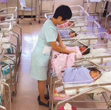
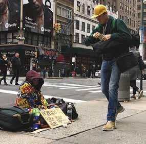
Geographers define human wellbeing as the ability of people to access the things they need to live happy, healthy and contented lives. Whether a person is born in a refugee camp in Tanzania, a megacity in China, a rural town in France or a coastal city in Australia, their primary requirements for life are the same. These requirements include fresh water, a secure food supply, shelter, clothing and safety. Once these primary needs have been met, secondary needs – such as the ability to make a decent living, good health and access to education – become important in determining an individual’s level of wellbeing. Wealth Our access to the basic necessities of life are determined largely by our degree of wealth and our ability to earn a living. Wealth is generated by producing and selling things, earning wages from work, making investments or owning assets. If we have enough wealth, we can use it to access a wide variety of goods and services. If we do not, we may struggle to buy things such as food, medicine and tools that we could use to generate more wealth (see Source 1). There are huge variations in wealth across the globe. It is estimated, for example, that the wealthiest 1 per cent of adults own 44 per cent of the world’s assets, and that the 26 richest people in the world have a greater combined wealth than the world’s 3.5 billion poorest people combined. wellbeing the ability of human beings to access the things they need in order to live happy and healthy lives (e.g. food, water, education, safety and security) Source 1 The United States is home to more billionaires than any other country. However, as in all countries, wealth is unevenly distributed. Source 2 People in Singapore enjoy one of the world’s best Health Human health is affected by a wide range of factors. Clean air, clean water and a secure supply of nutritious food are all vital, but other factors are also important. These include the ability of a community to treat and control the spread of diseases, provide health care when individuals are sick or injured, care for the vulnerable such as babies and the aged, and provide emergency services in times of crisis. Access to health care is vital during natural disasters such as a drought or human-made disasters such as war, which can limit supplies of food and water. People living in war-torn countries often struggle to find the basic requirements needed for a healthy life. DRAFT ONLY - NOT FOR SALE health-care systems. A baby born in Singapore is 50 times more likely to survive their first year of life than a baby born in Pakistan.
Education
Access to a formal education is viewed by many people as the key to improving wellbeing. Being able to read and write gives people access to a greater number of services, and provides a range of options that can lead to better jobs, higher wages and improved standards of living. Education also increases people’s self-esteem and allows them to have more control over their future.
In many countries, poverty and conflict are the two major reasons why children do not attend school. Further, education can be especially difficult for girls to obtain, because in a great number of cultures, educating boys is seen as more worthwhile. While parents may work hard to send their sons to school, they may prefer to have their daughters helping out at home.
Despite these obstacles, rates of schooling and literacy (the ability to read and write) are increasing around the world. For example, in the countries of Africa that lie south of the Sahara Desert (a region known as Sub-Saharan Africa), the enrolment rates of children in primary school rose from 54 per cent in 1970 to 98 per cent in 2020. In wealthy countries, such as Australia, New Zealand and the United States, primary education is seen as so valuable that it is made compulsory, free and universal. 4.1 CHECK YOUR LEARNING
Review and understand 1 Define ‘human wellbeing’ in your own words. 2 Explain why access to education is seen by many as the key to improving wellbeing.
Apply and analyse 3 Distinguish between primary requirements and secondary requirements for wellbeing. 4 Describe the contrasts in wealth shown in Source 1.
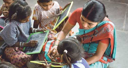
5 Suggest possible reasons why survival rates of babies born in Singapore are so much better than those in Pakistan. Evaluate and create 6 Conduct some research to discuss wellbeing in Australia. Use the headings Source 3 In 2021, about 74 per cent of Indian adults could read and write. This compares with a rate of just 12 per cent in 1947. Despite this dramatic improvement, India is home to the world’s largest number of illiterate people. Quiz me! A quick quiz on defining wellbeing DRAFT ONLY - NOT FOR SALE ‘wealth’, ‘health’ and ‘education’ to guide your discussions. 7 Which photograph in this topic best shows what wellbeing means to you? Justify (give reasons for) your answer.
4.2
In this topic, you will: » compare indicators and concepts of human wellbeing.
The way in which we define wellbeing is dependent on many factors. These include our values, beliefs, history, environment, level of education and culture. People from different environments and cultures often view wellbeing in vastly different ways. culture Common indicators of wellbeing a term used to describe the shared characteristics Geographers often rely on a range of quantitative data to measure and compare levels of (e.g. language, food, wellbeing around the world. Two of the most common measures used today are Gross religion, beliefs, etc.) of Domestic Product (GDP) and literacy rates. These measures are referred to as universal a population or group of people indicators because, while they are not perfect, the data they provide is easily obtained and Gross Domestic Product allows geographers to make basic international comparisons. (GDP) GDP provides a measure of the total market value (i.e. the monetary value) of all the the total monetary value of goods and services produced in a country in a given year. By dividing the GDP of a country all the goods and services by the total number of people living there, the GDP per capita can be calculated. This gives produced by a country over a specific time period an approximation of the value of goods and services produced per person in the country (usually a year) each year. This data is then used to assess the average productivity and wealth of individuals. literacy rates Literacy rates give an indication of the number of people in a population who are able to statistical measures of the read and write. Data relating to literacy is often used as a measure of educational results in percentage of adults (over the age of 15) in an area or different countries. In general, low levels of literacy and education can impede the economic population that can read development of a country and negatively affect wellbeing. and write Wellbeing for Aboriginal and Torres Strait Islander Australians Many Aboriginal and Torres Strait Islander peoples have a view of wellbeing based on traditional beliefs of interrelationships between individuals, their community and the land. Wellbeing is achieved when the relationships between these factors work together in harmony. This is often described as a holistic view of wellbeing. Importantly, ill-health will arise and persist when the harmony of these relationships is disrupted. It can therefore be difficult to measure the wellbeing of Aboriginal and Torres Strait Islander Australians using only the common universal indicators. The Australian Bureau of Statistics has attempted to develop a model that takes into account Aboriginal and Torres Strait Islander values when considering wellbeing levels. As well as using measures of health, literacy and wealth, this model includes wellbeing measures related to an individual’s connection to their community, ancestry, cultural traditions and identity, land and spirituality.
Different views of wellbeing
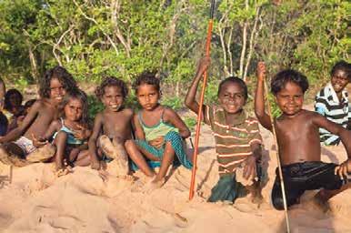
DRAFT ONLY - NOT FOR SALE Source 4 For Aboriginal and Torres Strait Islander peoples, wellbeing is partly determined by connection to the land.
Bhutan and Gross National Happiness (GNH)
Source 5 CASE STUDY
It’s easy to mine the land and fish the seas and get rich. Yet we believe you cannot have a prosperous nation in the long run that does not conserve its natural environment or take care of the wellbeing of its people, which is being borne out by what is happening to the outside world. Thakur Singh Powdyel, Bhutan’s Minister of Education
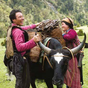
Since 1971, the tiny Himalayan country of Bhutan has rejected GDP as the way to measure the wellbeing of its people and instead adopted a measure known as Gross National Happiness (GNH). While this might seem like nothing more than a good idea, in Bhutan it is taken very seriously. A GNH measure is taken every year, as the country’s government attempts to move its citizens towards a happier state.
The four guiding principles of GNH are equitable social development, cultural preservation, conservation of the environment and promotion of good governance. Children are taught these principles at school, along with better environmental practices and basic agriculture. At school, bells have been replaced with soothing music and there are daily meditation sessions.
In a study that measured happiness in 178 countries, the Bhutanese ranked as the eighth happiest people on the planet. Bhutan was the only country in the top 20 with a low GDP. 4.2 CHECK YOUR LEARNING Review and understand 1 Outline what GDP measures. 2 Explain how GDP is used as an indicator of wellbeing. Apply and analyse 3 Apply the geographical concept of place to explain why wellbeing is closely linked to the land for many Aboriginal and Torres
Strait Islander Australians. 4 Australia has not adopted GNH as a measure of wellbeing. Suggest one reason why this might be the case.
5 Compare GDP with GNH. What are their similarities? What are their differences? Evaluate and create 6 What are some important aspects of your own wellbeing? Compare the ways they are similar to or different from the measures of wellbeing in this topic. 7 The New Zealand Government recently Source 6 Since 1971, GNH has replaced GDP as the measure of wellbeing in Bhutan. Map it! World: Happy planet index DRAFT ONLY - NOT FOR SALE began to measure wellbeing using a measure called the Living Standards Framework (LSF). Research the LSF and list two strengths and two weaknesses in how it measures wellbeing.
4.3
Mapping wellbeing
In this topic, you will: » describe the range of maps geographers use to explore the spatial patterns of wellbeing.
Geographers use a range of maps to explore the spatial patterns in wellbeing within and between countries. Maps can be used to show variations in wellbeing around the world using specific indicators, such as the Human Development Index (HDI), or levels of poverty. By using a range of different mapping techniques, geographers can easily identify if countries with a high proportion of people living in poverty are clustered together or spread across the globe. They can then use this information to make comparisons and draw conclusions about the level of wellbeing in these places. Choropleth maps Human Development Choropleth maps give a quick impression of a spatial pattern by using dark and light shades Index (HDI) of the same or similar colours. Darker shades usually show ‘the most’ and lighter shades show a tool developed by the United Nations to grade ‘the least’. In Source 7, for example, countries are shaded according to their HDI rating. This and rank the social and measure, developed by the United Nations, combines several indicators into a single measure. economic development The world’s countries are ranked using indicators of health (life expectancy), education of the world’s countries in (literacy) and income (GDP). This ranking is then used to place the world’s countries into order from most to least developed four categories, ranging from ‘very high’ HDI to ‘low’ HDI. The United Nations uses the same choropleth maps measure each year in its annual Human Development Report, so that a country’s scores, rankings maps that display data or and categories are regularly updated. characteristics (e.g. HDI rankings) across an area by using colour or shade to represent the value of the data (e.g. dark green for high rankings and light green for low rankings) life expectancy a statistical measure of the average number of years a person in an area of population can expect to live from the year in which they were born worlD: HDI rATInGS EUROPE ASIA AFRICA AUSTRALIA
ARCTIC OCEAN
NORTH AMERICA
PACIFIC OCEAN
SOUTH AMERICA
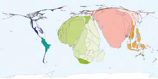
ATLANTIC OCEAN INDIAN OCEAN ATLANTIC OCEAN 0 2500 5000 km Very high High Medium Low No data available Human Development Index rating LEGEN D Source 7 Mapping wellbeing using a choropleth map Source: Oxford University Press Cartograms A cartogram is a type of map that displays countries in roughly their correct geographic locations, but the size of countries is determined by the variable being mapped. For example, in Source 8, the size of each country is determined by the proportion of the population that is living in poverty within that country. The larger the country is shown on this map, the greater cartogram a type of map that is distorted to show a representation of statistical data, rather than land area Key skill worksheet Analysing maps: Mapping wellbeingDRAFT ONLY - NOT FOR SALE the proportion of people living in poverty in that country. The colours are added to the map to divide the world into geographic regions so that different cartograms can be easily compared.
worlD: ProPorTIon oF PoPulATIon lIVInG In PoVerTY
Statistics database World Statistics Data
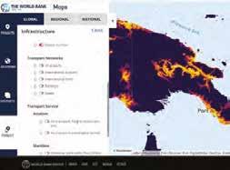
LEGEND Africa Asia Europe Oceania North America South America Source 8 Mapping wellbeing using a cartogram Source: World Mapper GIS maps Geographic information system (GIS) maps Oxford University Press www.oup.com Search display data as a series of layers of digital information. Each layer of the map focuses on a different aspect of the environment, such as poverty, population, roads, settlements or land relief. When using a GIS program, geographers can switch layers on and off, allowing them to compare different aspects of the environment and look for interconnections between them. International organisations such as the World Bank are increasingly using GIS technology to map their activities and projects.
iPad 09:14 AM 83%
Source 9 A screenshot of a World Bank GIS map exploring the link between topography and accessibility in Papua New Guinea
4.3 CHECK YOUR LEARNING Review and understand 1 Identify what the HDI is and what is it used for. 2 Explain what a cartogram is and why a geographer might use one. Apply and analyse 3 Do you think cartograms or choropleth maps are more useful for investigating variations in patterns of wellbeing?
Explain your answer. 4 Imagine that you are creating a GIS map to explore the links between wellbeing and natural resources.
Determine (decide) which map layers would be useful to you when creating this map. Explain your answer. Evaluate and create 5 Use the ‘World statistics’ section in your obook pro to complete this task. a Form groups of three. Have each person conduct some research on a different indicator of wellbeing in South America: GDP, literacy rates or life expectancy. b With your data, each create a choropleth map for the countries of South America. Use the same colours or shades for all the maps. c Place the maps on the classroom wall beside each other so that you can easily compare them. What similarities do you notice? What are some of the key differences?

2 DRAFT ONLY - NOT FOR SALE
4.4
In this topic, you will: » explore links between wellbeing using scatterplots » practise constructing a scatterplot using
Microsoft excel.
Aspects of wellbeing such as health, wealth and education are usually closely related. A change in one aspect of a person’s wellbeing usually affects other aspects of their wellbeing. For example, children who attend school tend to have better health than those who do not. Links such as these can be seen at the national scale as well as at the local scale. One of the most useful tools when exploring these links is a special type of graph known as a scatterplot. Scatterplots scatterplot Scatterplots are similar to line graphs in that they are used to display data plotted against two a type of graph that uses two sets of data by plotting variables. Scatterplots are used by geographers to show the degree to which one of the variables points along two axes, the shown on the graph is related to the other. This relationship is known as the correlation. pattern of which shows Commonly, scatterplots show data for a number of countries, each of which is represented by their correlation; also a dot on the graph. called a scattergraph or scattergram • When the dots come close to forming a straight line, they are closely related and therefore correlation are said to have a ‘high correlation’. a statistical measure • When the dots do not come close to forming a straight line, they are not closely related and that indicates the extent to which two or more therefore are said to have a ‘low correlation’. variables are related • When the trend is increasing, the correlation is positive. or linked • When the trend is decreasing, the correlation is negative. A trend line is often added to a scatterplot to demonstrate the strength of the relationship between the two variables. Source 11 shows a selection of the most common trends that can are seen on a scatterplot. With the introduction of digital graphing tools, it has been possible to add more data to make scatterplots even more useful. Three variables can now be graphed to create a 3D scatterplot. In Source 10, for example, the size of each dot is determined by the size of the population of the country. By animating graphs, it is also possible to show changes in variables and their correlation over time.
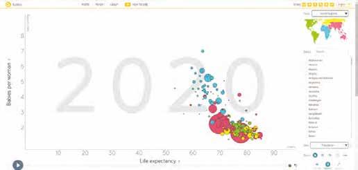
Exploring links between wellbeing Worksheet Links between wealth and wellbeingDRAFT ONLY - NOT FOR SALE
High positive correlation
Low positive correlation
No correlation
Low negative correlation
High negative correlation
Variable 2
Variable 2 Variable 2 Variable 2 Variable 2 Variable 1 Variable 1 Variable 1 Variable 1 Variable 1 Source 11 Simple scatterplots showing different types of correlation
Constructing scatterplots using Microsoft Excel
You can use a computer program such as
Microsoft Excel to construct a scatterplot and show the correlation between two variables. (Note: These instructions may need to be varied a little, depending on the version of the program you are using.)
Step 1 Enter the data into an Excel spreadsheet. The first indicator goes into column A and the second into column B. The data for each country must go into a separate cell (box) on the spreadsheet.
Step 2 Highlight all of the cells containing data.
Step 3 Using the menu at the top of the spreadsheet, select ‘insert’ → ‘scatter’ → ‘the first scatterplot’. This will convert your data into a scatterplot.
Step 4 The vertical axis usually defaults to begin at zero, but the correlation is often easier to see if it begins slightly less than the lowest value being graphed. Look at your graph and decide what you would like as the lowest value on the vertical axis. Use ‘format’ → ‘chart elements’ → ‘vertical (value) axis’ → ‘format selection’, and enter the value you have decided on in the ‘minimum bounds’ box. You can use this menu to make other changes to the axes as required. Close the menu. Step 5 Right click on one of the dots on the graph and select ‘add trend line’. Step 6 Use the chart design dropdown ‘add chart element’ menus to turn off the gridlines and the legend. Add a title and label the axes. Practise the skill 1 Use the ‘World statistics’ section in your obook pro to find the life expectancy and GDP rates for all the countries of Oceania. With this data, construct a scatterplot exploring the links between life expectancy and GDP per person for the countries of Oceania. For more information on this key skill, refer to page 26 of ‘The geography toolkit’.
KEY SKILL
Collecting & representing data 4.4 CHECK YOUR LEARNING
Review and understand 1 Explain the purpose of scatterplots. 2 Define the word ‘correlation’.
Apply and analyse Evaluate and create
Statistics database World Statistics Data Weblink Gapminder DRAFT ONLY - NOT FOR SALE 3 In your own words, describe the relationship between life expectancy and fertility, as shown in Source 10. 4 Scatterplots often contain one or two countries that do not conform to the general pattern and sit apart from most other countries on the graph. These are called outliers. a Identify the number of outliers in Source 10. b Suggest two reasons why these countries might not conform to the general pattern.
5 Visit the Gapminder website and scroll down to ‘Animating data’. Click the ‘play’ button to see how countries have changed over time. Explore the graphs on this website by selecting different indicators for each axis and observing the ways in which their correlation changes.
4.5
Contrasts in wealth
In this topic, you will: » examine issues affecting the development of the
Democratic republic of the Congo.
By any measure, the world’s wealth is unevenly distributed and has been since European nations explored the world 500 years ago, colonising nations in the search for resources that would improve their wellbeing. As we saw in topic 4.2, a country’s wealth is usually measured by evaluating its GDP. This is done by determining the size of its economy – by adding the total value of all goods and services produced during a year. To make meaningful comparisons between countries with different size populations, the total GDP is divided by the size of the population to produce a measure known as ‘GDP per capita’. Source 12 shows the GDP per capita of countries worldwide, together with the location of the world’s 10 richest countries and the world’s 10 poorest countries. worlD: GDP Per CAPITA EUROPE
ASIA AFRICA
AUSTRALIA
ARCTIC OCEAN
NORTH AMERICA
PACIFIC OCEAN ATLANTIC OCEAN
SOUTH AMERICA
INDIAN OCEAN
0 2500 5000 km
LEGEN D Gross Domestic Product per capita (US$) Over 40 000 20 000 to 40 000 12 000 to 20 000 6000 to 12 000 Niger 3000 to 6000 Chad Under 3000
Central African Republic Liberia Mozambique Somalia Malawi Madagascar Burundi Niger Qatar No data available Richest countries Poorest countries
DR Congo United Arab Emirates Qatar Singapore
Brunei Norway Switzerland Lichtenstein Luxembourg Ireland Monaco Source 12 Source: Oxford University Press DRAFT ONLY - NOT FOR SALE
Levels of wealth in the Democratic Republic of the Congo
In Sub-Saharan Africa, about 40 per cent of the population lives below the poverty line. The poverty line is the estimated minimum level of income needed to secure the necessities of life, such as food, water and shelter, and is currently estimated at US$1.90 a day.
While this proportion has decreased over the past few decades, it still leaves 430 million people living in absolute poverty. Over 66 million of these live in the largest Sub-Saharan country, the Democratic Republic of the Congo (DRC), which is one of the world’s poorest nations.
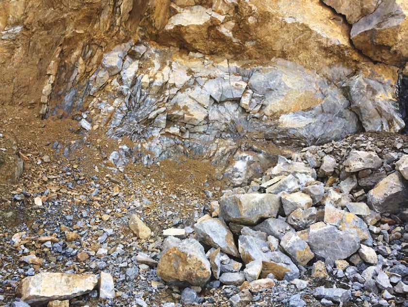
The DRC has vast natural resource wealth, including fertile soil, vast hydroelectric power potential, and some of the world’s largest deposits of precious minerals and metals – including those necessary to produce new technologies, such as lithium and cobalt. It has been estimated that the DRC contains US$24 trillion of untapped mineral wealth. The mining industry, however, is riven by corruption, where individual DRC labourers work in appalling conditions for very low rates of pay. For many people in rural areas, however, it provides one of the only opportunities for ongoing work. Minerals such as gold are seen by many as a road to wealth and worth fighting for. This has resulted in armed conflict in some districts. It is also taking workers away from farming, leaving the country without enough food to feed its people. Some people living in poverty in rural areas have fled to large cities – such as the capital, Kinshasa – in the hope of improving their wellbeing.
CASE STUDY
Map it!
The Democratic
Republic of the
Kananga Mbuji-Mayi Lubumbashi
CAMEROON
Kisangani
Tshikapa Kolwezi Likasi
CENTRAL AFRICAN REPUBLIC SOUTH SUDAN UGANDA
CONGO DEMOCRATIC REPUBLIC GABON OF THE CONGO RWANDA BURUNDI Bas Congo TANZANIA ANGOLA ZAMBIA
Bandundu Kinshasa West Kasai East Maniema Kasai Katanga
Area of map
Orientale
Equateur North
Kivu South Kivu
0 200 400 km Over 70 60 to 70
40 to 60 Under 40 Coal Lead Coltan Copper Oil Diamonds Tin Gold Uranium
Manganese LEGEN D Towns with more than 250 000 peoplePercentage of population living in poverty 7 000 000 1 000 000 500 000 250 000 Kinshasa Country border DRAFT ONLY - NOT FOR SALE Province border
Source 13
Source: Oxford University Press
4.5 CHECK YOUR LEARNING Review and understand 1 Define the term ‘poverty line’. 2 Using Source 12: a List the world's 10 poorest countries. b Identify the region of these 10 countries. c List the world’s 10 richest countries. Apply and analyse 3 Examine Source 13. a Describe the relationship in the DRC between: i mineral deposits and poverty ii city living and poverty. b Summarise the issues affecting the development of the DRC. c Describe the pattern of poverty within the DRC using the PQE method. Use the names of specific places in your description. 4 Many people in the DRC are moving to
Kinshasa.
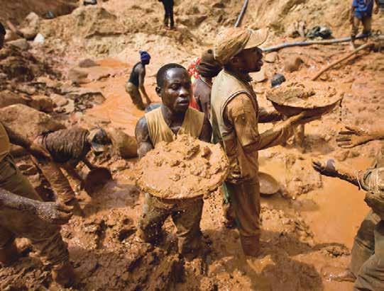
a Use Source 13 to explain why this may be the case. b Predict three problems a big influx of migrants might cause for the city and its people. c Propose (put forward) one possible solution that the city of Kashana could use to help overcome one of the problems you listed in part b. Evaluate and create 5 Using the internet, research additional information to complete the following task: • Brainstorm the factors that might help to explain why global wealth is so unevenly distributed, especially between countries labelled green and red in Source 12. • Try to think of as many reasons as you Source 14 Gold mining in the DRC is back-breaking dangerous work. DRAFT ONLY - NOT FOR SALE can and then classify them into groups of factors. Decide on headings for these groups.
4.6
Contrasts in health
In some countries, people struggle to obtain the most basic health-care services, and doctors work in hospitals that are old and poorly equipped. In other countries, hospitals have state-of-the-art facilities and access to the newest treatments and drugs. While it is easy to see how unevenly distributed health services are across the world, the level of health and its contribution to the wellbeing of a infant mortality rates community or country is a complex concept. There statistical measures of the proportion of children in an are many other variables that can affect the health area or population under of people, including diet and other lifestyle factors. the age of 12 months who For these reasons, geographers rely on die; expressed as number of deaths per 1000 live indicators of health – such as life expectancy and infant mortality rates – to measure and births compare the health of individuals within countries. Other indicators – such as the number of doctors per 1000 people and access to reliable water – can also be used to examine the reasons why health differs between countries. Life expectancy Life expectancy is the average number of years that a person can expect to live. For people in developing countries, life expectancy is generally shorter than for people in developed countries. A child born in Sub-Saharan Africa in 2018, for example, can expect to live for 61 years, while a child born on the same day in Singapore can expect to live for 86 years – 25 years longer. The lower life expectancy in Sub-Saharan Africa is due to a wide range of factors, including the presence of diseases such as malaria and HIV/AIDS, poor water and food security, and poor access to health care. worlD: lIFe eXPeCTAnCY 5 San Marino 7 Iceland 83.68 83.45 1 Monaco 6 Canada 89.40 83.62 9 Andorra 83.23 10 Israel 4 Japan 84.65 83.15 8 Hong Kong 83.41 3 Macau 84.81 2 Singapore 86.19 218 Sierra Leone 60.19 219 Niger 59.70 222 Chad 58.75 220 Eswatini 59.13 221 Lesotho 58.90

225 Somalia 55.32 223 South Sudan 58.60 224 Mozambique 56.49
226 Central African Republic 55.07
227 Afghanistan 53.25 0 2000 4000 km
Life expectancy (years) Over 80 75 to 80 65 to 74 60 to 64 Under 60 LEGEN D developed countries industrialised countries with well developed economies and a relatively high standard of living that are able to support the needs of their citizens developing countries non-industrialised countries with relatively fragile economies and a low standard of living that are not always able to support the needs of their citizensDRAFT ONLY - NOT FOR SALE No data Japan Top 10 countries Niger Bottom 10 countries
CASE STUDY
Levels of health in the DRC
The DRC has one of the lowest life expectancies in the world, with a baby born today expected to live to the age of 61. For children born in developing countries, the first year of life is often the most difficult. The proportion of children who die in their first year – known as the infant mortality rate – is 62 per 1000 births, whereas in Australia it is 3 per 1000 births, meaning that a Congolese child is 20 times more likely to die in their first year than a child born in Australia.
Studies of infant mortality in developing countries have discovered some specific factors that put children at higher levels of risk. Children and their mothers are much more vulnerable in rural areas than in cities. Women in cities tend to give birth in hospitals and health clinics, while women in rural areas often
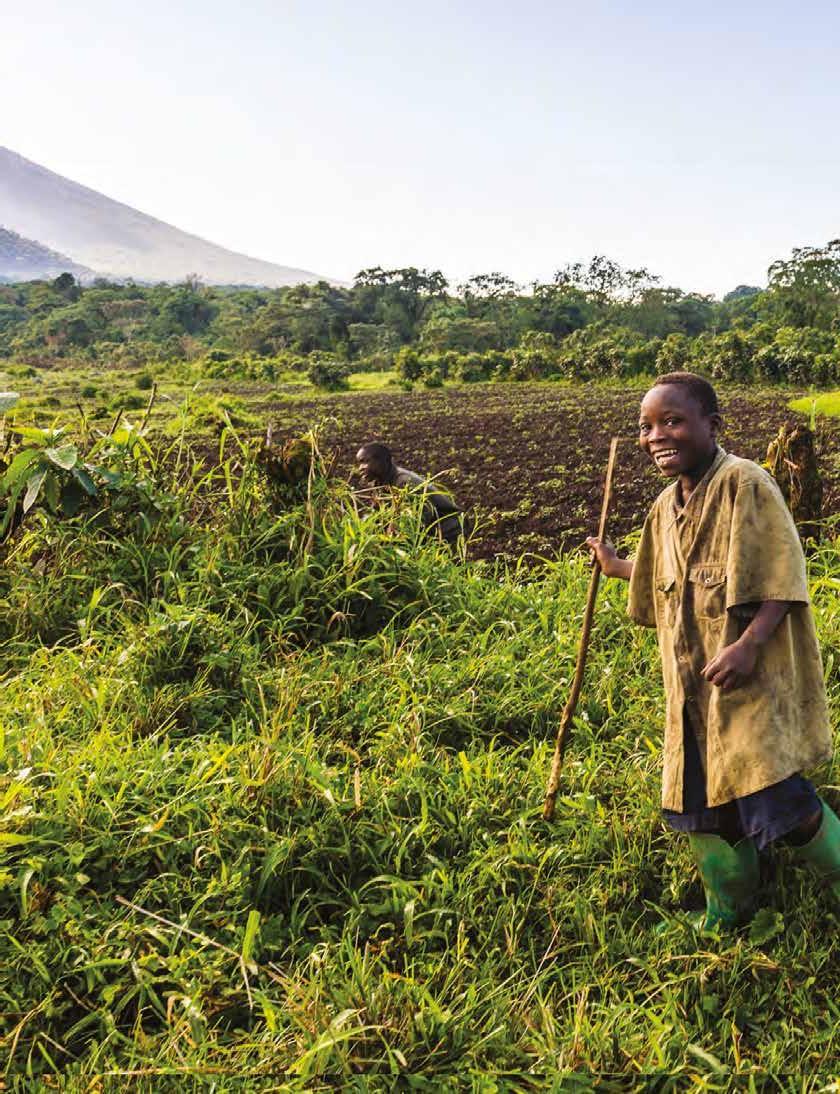
give birth at home without a nurse or doctor present. Children born to educated mothers, even those with only a primary school level of education, also have a higher survival rate. In some regions, survival rates can be up to three times greater than for children of uneducated mothers. Mariam (see Source 16) is five months’ pregnant with her sixth child. She lives in the village of Lukweti, in the east of the DRC. There are no health clinics in the village, so she must walk to a mobile clinic delivered by doctors and nurses from the charity group Doctors Without Borders (Médecins Sans Frontières) for her monthly check-up. The area in which she lives has seen ongoing conflict and violence for several years, and soldiers often loot any medical facilities for medicines and supplies. DRAFT ONLY - NOT FOR SALE
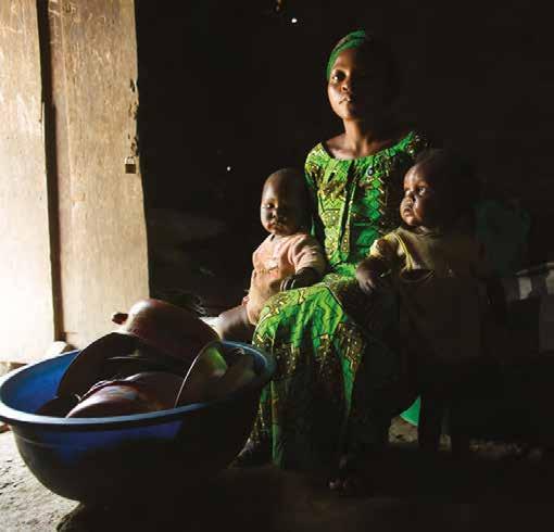
Source 16 Mariam, with two of her five children
Health indicator
Life expectancy at birth DRC
61 years Australia
83 years
Worksheet Indicators of wellbeing
Infant mortality rate (children who die in their first year) 62 per 1000 births 3 per 1000 births
Maternal mortality rate (mothers who die as a result of pregnancy or childbirth) 473 per 100 000 births 6 per 100 000 births
Population who drink from an unsafe water source 44.8% (Urban: 15.7% Rural: 67.6%)
0% Number of doctors for every 1000 people 0.07 3.68 Population without improved sanitation 59.3% (Urban: 44.5% Rural: 70.2%) 0% Children under 5 who are underweight 23.4% 0.2% Data from CIA Factbook 4.6 CHECK YOUR LEARNING Review and understand 1 List two variables that affect the health of people. 2 In your own words, explain the links between poverty and indicators of health such as life expectancy and infant mortality. 3 Define the term ‘infant mortality rate’. Apply and analyse 4 Using Source 15, describe the distribution of countries with life expectancies below 65. 5 Compare Source 15 with the map showing
GDP per capita in Source 12 of topic 4.5 (page 140). Describe the relationships you see between these two indicators, using evidence from the maps to support your description. 6 a Explain the health risk factors Mariam faces during pregnancy and childbirth.
b Suggest how these risk factors might be different to a woman in Melbourne experiencing pregnancy. Evaluate and create 7 Use the data in Source 17 to complete the following tasks: a Write a paragraph comparing levels of health in the DRC and Australia. b To support your paragraph, create a simple bar graph using data about one health indicator. 8 One well-known organisation addressing inequalities in health is Doctors Without Borders, known more commonly by its French name, Médecins Sans Frontières (MSF). Using the internet, research this organisation to find out where it works and how it improves the health of people in developing countries. DRAFT ONLY - NOT FOR SALE
4.7
Contrasts in education
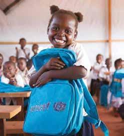
Education provides much more than the opportunity to read, write and count. It is seen by many international aid agencies and experts in the field as the key to helping people, communities and nations lift themselves out of poverty. Education provides individuals with opportunities to: • become more engaged with society • have a range of skills and tools to better care for themselves and their children • participate in the workforce and improve their country’s economy • live healthier lives • combat poverty • reduce inequalities in wellbeing. Literacy rates Literacy rates measure the percentage of adults who can read and write, and are often used as an indicator of education levels within countries. Literacy rates can be difficult to calculate, however, as many countries do not keep accurate data. It is also important to be aware of potential variations in literacy within countries. For example, in many countries people in rural areas have lower literacy levels than citydwellers. In some countries, girls are not given the same educational opportunities as boys. Source 18 The United Nations agency UNICEF is working to increase the proportion of children who attend school in the DRC. It estimates that 7 million children are out of school and, in rural areas, less than half of school-aged girls attend school. worlD: lITerACY rATeS ARCTIC OCEAN PACIFIC OCEAN ATLANTIC OCEAN INDIAN
ATLANTIC OCEAN
OCEAN EUROPE ASIA AFRICA AUSTRALIA NORTH AMERICA SOUTH AMERICA 0 2000 4000 km
Literacy rate (percentage of adult population) LEGEN D Over 99.0 97.0 to 99.0 95.0 to 96.9 90.0 to 94.9 DRAFT ONLY - NOT FOR SALE 70.0 to 89.9 Under 70.0 No data available
Barriers to successful education
Access to education varies widely across the globe. In developed countries such as Australia, Britain, Germany and France, about 99 per cent of all school-aged children are enrolled in schools. In developing countries such as the DRC, however, most children attend primary school, but few (43 per cent) attend secondary school and only 6 out of every 100 school leavers continue their study at university.
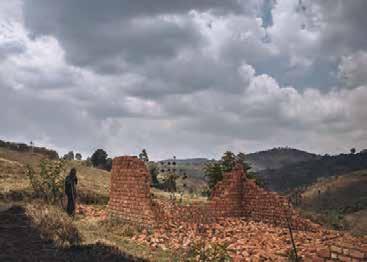
There are many factors that determine whether or not a child will attend school. These include: • system barriers – such as a lack of trained teachers, classrooms and educational materials, including books • attendance barriers – such as school fees, distance to school, poor transport networks and the concern of many parents about the safety of their children; many children also work to help support their families • social barriers – such as variations in language, religion and conflict within countries. Barriers in the DRC In the DRC, a series of ongoing conflicts and civil wars are an example of a social barrier. These conflicts have disrupted the education of many children. In 2016–17 a conflict erupted in the centralsouth of the country between a local tribal chief and the government. During the brutal conflict, government institutions – including schools – were deliberately targeted. As many as 5000 people were killed and 1.4 million fled the violence. This included more than 600 000 children, who could not then attend school. Some of the rebel fighters recruited children as soldiers, and in many cases sexual violence against girls was used as a terrorist weapon. Source 20 Christophe Bienfait Tshombe, a school teacher, stands next to a school destroyed by militia in the eastern region of the DRC. 4.7 CHECK YOUR LEARNING
Review and understand 1 Explain what literacy rates are, and why they can be difficult to calculate. 2 Identify three social barriers that may determine whether or not a child attends school.
Apply and analyse 3 Compare Source 19 (showing literacy rates) with the map in Source 12 on page 140 (showing GDP per capita). Describe the relationships you see between these two indicators, using evidence from the maps to support your description. 4 Use Source 19 and the World Statistics database on your obook pro to compare the literacy rates for Australia
Key skill worksheet and the DRC. Propose three reasons why differences in literacy rates occur between these two countries. 5 Suggest the likely future in education for children in the DRC who were affected by the conflict in 2016–17. Evaluate and create 6 Evaluate the three barriers to education to decide which one would be the most difficult to overcome. Give some reasons for your answer. 7 In small teams, create some strategies to help Statistics database World Statistics Data Identifying patterns & relationships: Comparing choropleth maps DRAFT ONLY - NOT FOR SALE communities overcome one or more of the barriers to education. Share your strategies with the class.
4A Global obesity epidemic
RICH TASK
Chronic food shortages and hunger are among the greatest threats to wellbeing in many developing countries. However, one of the fastestgrowing public health crises in a great number of countries is obesity. Once only a problem in developed countries, obesity has now spread to developing nations, such as Mexico, China, India and Brazil. It is estimated that more than half of the adults in the world are overweight or obese.
Excessive body weight and obesity are linked to health problems such as heart disease, strokes, arthritis, diabetes and some cancers. Obesity is a leading cause of premature death in many countries and a huge burden on public health resources. It has become such a serious issue that many experts now describe it as the global obesity epidemic.
Developing questions from media reports
Much of our understanding about events and trends happening around the world comes to us through media reports. These reports can take the form of printed media such as newspapers and magazines, electronic media such as television and radio reports, or new media such as the internet and mobile phones. By learning a few simple techniques, you can use the news to generate geographical questions to guide your inquiries. Follow these steps:
Step 1 Check the source of the news article for reliability and possible bias. Find out who wrote the article and which news organisation published it. Mainstream media organisations are generally more reliable than smaller ones, but this may not always be the case. If possible, use the news company website to investigate possible bias.
Step 2 Work out what type of report you are watching, reading or hearing. Is the

information presented being reported as fact or is it an opinion piece? Both are valuable, but it is important to know the difference. Step 3 What is the reporter’s main contention or key point? State in your own words. Step 4 What information and arguments are used to support the reporter’s contention? Step 5 What evidence does the reporter use to support these arguments? What is the source of this evidence? Step 6 Look closely at any images or graphics that are included in the report. How do they help to support the reporter’s contention and arguments? Step 7 What further questions does this article raise for you? Good geographical questions open up new lines of inquiry for you to explore. Try using question starters such as ‘How many’, ‘Where does’, ‘Why does’, KEY SKILL Asking questions & conducting research Revise the key terms you have learnt so far.DRAFT ONLY - NOT FOR SALE ‘Who is affected’, ‘What changes does’ and ‘How should people’. For more information on this key skill, refer to page 13 of ‘The geography toolkit’.

Practise the skill
1 Use the steps provided to analyse and develop questions about the article in Source 21. 2 Share your geographical questions with your classmates and build up a class list of questions.
Source 21
What’s driving the worldwide obesity epidemic? The rise of obesity around the globe has led the World Health Organization (WHO) to urge countries to impose a tax on sugary drinks, which are blamed for the spread of the epidemic. Countries with such different food cultures as, say, Mexico and Palau are facing the same nutritional risks and following the same obesity trends. Our research aims to understand why, and we have examined the link between various facets of globalisation (trade, for instance, or the spread of technologies, and cultural exchanges) and the worldwide changes in health and dietary patterns. … The WHO identifies unhealthy nutrition patterns, along with increasing physical inactivity, as the main drivers of rising body weight around the world. Diets rich in sugar, animal products and fats constitute important risk factors for noncommunicable diseases, such as cardiovascular diseases, diabetes, and different types of cancer. The meat factor … [G]lobalisation has led people to consume more meat products. Interestingly, the social dimensions of globalisation (such as the spread of ideas, information, images and people) are responsible for this effect, rather than trade or other economic aspects of globalisation. …
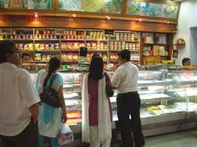
The processed-food impact … [I]ncreasing consumption of processed foods is often associated with rising weight levels. Haldirams, one of India’s favourite snack chain outlets, offers a wide variety of local processed food. … After saturating Western markets, supermarkets began to spread to developing countries, which had greater growth prospects. Latin America, central Europe and South Africa saw their grocery stores boom in the 1990s. Retailers later opened in Asia and are now entering markets in African countries. An interesting, yet little explored, aspect in the discussion of processed foods is the role of multinational companies in offering unhealthy ‘Western diet’, such as fast food and soft drinks. Multinationals are one of the two market leaders in many emerging countries, including Brazil, India, Mexico, and Russia and they are known for substantial food and beverage advertising. An extract from The Conversation, 14 December 2016 … DRAFT ONLY - NOT FOR SALE Extend your understanding

1 Examine the image in Source 21 showing the Indian snack chain outlet Haldirams. Why did the journalist who wrote the article choose to include this image? 2 Select one of the geographic questions from the class analysis of the article in Source 21. Use this as your key inquiry question to begin an investigation into the global obesity epidemic. Report back to the class on what you find during your research.
4.8
In this topic, you will: » identify regions of
India with different levels of wellbeing » explain reasons for these different levels of wellbeing.
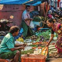
Variations in wellbeing within India India is a vast, complex and dynamic nation. Its population currently stands at more than 1.3 billion and is growing by about 14 million people a year. It is estimated that India will overtake China as the world’s most populous nation by 2030 – a position it is unlikely to lose for centuries. As with all nations, there are tremendous variations in wellbeing within India. At one end of society, there are hundreds of millions of poor, subsistence farmers, who are growing just enough food to feed their families. At the other end, there are around 759 000 Indian millionaires. India also has one of the world’s largest middle classes, estimated to be about 400 million people. India is divided up into many different states and union territories. Source 2 shows the range of HDI rankings for these states and territories. By looking at two states in particular – Kerala and Bihar, which have India’s highest and lowest rankings in human development respectively – we can see the great contrasts in wellbeing that exist within India. InDIA: HDI For DIFFerenT STATeS, 2018 Wellbeing in Kerala The south-west state of Kerala is ranked as the having the highest HDI in India. It has the lowest level of poverty, the highest literacy Punjab rates, the lowest population growth rates and the fastest economic growth in the country. In many ways, the state compares favourably Sikkim Assam with wellbeing in many developed countries. There are several factors responsible for this comparatively high level of wellbeing. About 2 million people from Kerala live and work in the countries of the Persian Gulf, such as Qatar, and each year they send home a combined income of about US$14 billion. This means their families can afford education and health services. The Goa state was also one of the first to change its laws so that individual farmers can own land, increasing their incentives to make a profit. In addition, fertile soils and a favourable climate help to boost Kerala agricultural production (see Source 1). Tourism is one of Kerala’s biggest industries. The COVID-19 pandemic had a devastating effect on tourism in Kerala, but the state’s economy fared better than most in India.
Jammu and Kashmir Bihar
Gujarat
Maharashtra Telangana Andhra Pradesh Andaman & Nicobar Is
Haryana Jharkhand West Bengal
Karnataka Tamil Nadu
Himachal Pradesh Uttaranchal
Delhi Uttar Pradesh Meghalaya Tripura Madhya Pradesh
Rajasthan Nagaland Mizoram Chhattisgarh Odisha
AFGHANISTAN
PAKISTAN Arunachal Pradesh
NEPAL
BANGLADESHManipur
SRI
MALDIVES LANKA CHINA BHUTAN MYANMAR
Bay of Bengal
Arabian
Sea
Human Development Index rating High (>0.7) Medium (high 0.62>.07)
LEGEN D 0 400 800 km Source 1 A busy market in Kerala; markets such as this allow people in the city to get fresh food from rural areas quickly and easily. DRAFT ONLY - NOT FOR SALE Medium (low 0.55>.062)
Source 2
Source: Oxford University Press
Wellbeing in Bihar
Source 3 Wellbeing indicators for the states of Kerala and Bihar, and India (total)
Indicator Kerala Bihar India
People living in poverty 7% 34% 22%
Under 5 mortality rate 7 per 1000 56 per 1000 50 per 1000
Underweight children 18.7% 38.7% 33.4%
Literacy rate 96.2% 63.8% 74.4%
Houses with no toilet
The north-east state of Bihar is ranked as having the lowest HDI in India. The state is 90 per cent rural, with most of the population living in villages and small towns. The people of Bihar farm the fertile land on either side of the Ganges River, which splits the state in two. One-third of the state’s population – some 42 million people – live below the poverty line, but this figure is as high as 70 per cent in some parts of the state.
The reasons for the low levels of wellbeing in Bihar are complex, and studies have failed to agree on the main causes. Some commentators blame India’s political situation, and point to low levels of investment by the federal government in health and education infrastructure in Bihar, such as hospitals and schools. Furthermore, most rural families do not own their own land, or they own an area so small that it cannot supply the family’s needs.
Often, children and young adults from these families move to the cities in other states seeking a better life. It is estimated that 5 million Biharis are working in other states. During the coronavirus pandemic, however, many lost their jobs and defied lockdown rules to return home. This, in turn, led to a human tragedy, as they walked hundreds of kilometres over a period of weeks. Many did not survive the journey. 2.6% 70% 28%
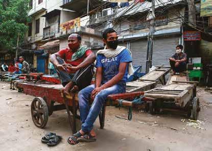
infrastructure the facilities and services necessary for any community, city or country to function (e.g. buildings, electricity, roads, airports and water supply) Source 4 Migrant daily wage workers sit on a cart in front of closed shops during lockdown in India. 4.8 CHECK YOUR LEARNING
Review and understand 1 Identify two factors affecting the relatively high level of wellbeing in Kerala. 2 Outline why levels of wellbeing are low in Bihar.
Apply and analyse 3 Using Source 2, describe the pattern of wellbeing in India according to the HDI. Use the names of specific states, as well as compass directions in your description.
4 Explain why there are large variations in wellbeing within India. Use the examples of Kerala and Bihar in your response. Evaluate and create 5 Using Source 3: DRAFT ONLY - NOT FOR SALE a Construct a multiple bar graph contrasting wellbeing in Kerala, Bihar and India (total). b Describe the pattern in your completed graph.
4.9
India’s rural–urban divide
In this topic, you will: » examine wellbeing on a national scale in India.
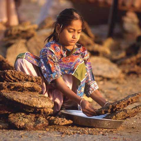
About 280 million people in India are living below the poverty line. Hundreds of millions of others live just above it. This poverty, however, is unevenly spread across the country, with significant inequalities in wellbeing between rural and urban areas. People in rural areas are almost twice as likely to be living below the poverty line than people in urban areas. As India embarks on a path of economic and social change, the gap between rural and urban India is narrowing, but there is still some way to go before equality is achieved. Source 5 shows some of the key indicators of the rural–urban divide, or what some researchers have called ‘A Tale of Two Indias’. Source 5 Differences in wellbeing between urban and rural India Key wellbeing indicator Urban India Rural India Students who complete secondary school 65.6% 48% Average annual income (AU$) 1745 725 Improved drinking water access 96% 91% Improved sanitation access 93% 61% Underweight children under 5 29% 38% Living below poverty line 13.7% 25.7% Wellbeing in rural India India is largely a nation of farmers and rural villagers; well over half of the population lives in settlements of no more than 5000 people. For many of these people, life is hard and standards of living are low when compared to people living in urban areas. Indian rural poverty is the result of a range of factors that differ from place to place. These include low food production levels leading to malnutrition; poor infrastructure such as roads, electricity and communication networks; ineffective safety-net programs such as job schemes; and poor access to financial resources such as bank loans and credit. Farmers are also at the mercy of nature. Droughts, floods and widespread landscape degradation have all contributed to rural poverty. Poverty is greatest among minority ethnic groups (particularly in degraded forest areas) and marginalised classes of people, such as Dalits (also Source 6 A young girl collects dried cow dung to be used as cooking fuel in a rural village in the state of Uttar Pradesh. Watch it! A short video and quiz on architecture in DharaviDRAFT ONLY - NOT FOR SALE known as ‘untouchables’) who make up the lowest class in Indian society according to the Hindu caste system. In communities where coastal fishing is the main source of food, poverty is increasing because overfishing and marine degradation have greatly reduced fish stocks.
India’s urban slums
KEY CONCEPT
Place
Many people in India respond to the inequalities in wellbeing between rural and urban areas by moving from the countryside to the city. Millions of Indians from rural areas have poured into the country’s booming caste system cities, hoping to leave poverty behind as they a social system in which seek a better life in the city. The reality for people are born into a many, however, is that they exchange rural social group (called a poverty for urban poverty (see page 152). caste); the caste system is generally associated with
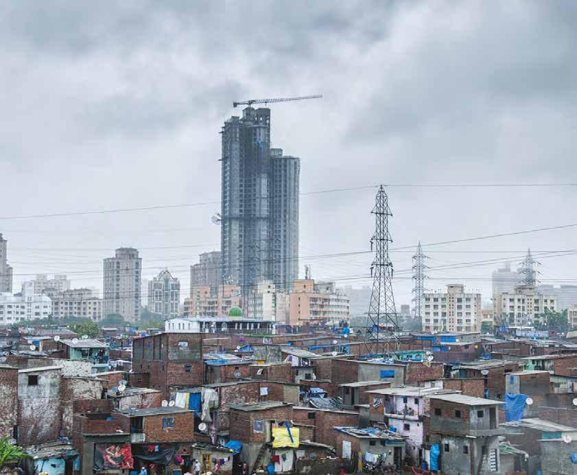
For geographers, this relates to the the Hindu religion in India concept of place, as these people establish and is still used today new homes in new areas. The new arrivals from the countryside tend to take up residence in slum areas on land that is considered unsuitable for ordinary housing, often because it is swampy or prone to landslides. Indian cities now contain some of the world’s largest slums. Residents build their own homes out of discarded materials and live with the constant fear of eviction as they have no legal right to be there. Source 8 New apartments rise above an urban slum in Mumbai, one of India’s largest cities.
Many Indian cities are struggling to provide their citizens with the infrastructure needed for wellbeing, such as fresh water, sanitation, reliable access to electricity, schools, roads and hospitals. But it is not all bad news. Packed with people determined to improve their lives and their communities, many slums have become so well established that their infrastructure is often close to the standard in other parts of the city, and usually better than in rural areas. The biggest struggle for many slum areas, however, is the provision of adequate sanitation. Many homes in the slums do not have a toilet, and the toilets that do exist are often open pits shared by hundreds of people. While many amenities are often organised and run by the slum-dwellers themselves, they rely on city authorities to provide proper sewage disposal. Because the slums are considered to be illegal settlements, however, authorities are reluctant to invest in sanitation for them. For more information on this key concept, refer to page 6 of ‘The geography toolkit’. Source 7 Access to amenities in slum and non-slum urban households across a selection of Indian cities (percentage of households)
City Tap water Toilet Electricity Mobile phone Slum Nonslum Slum Nonslum Slum Nonslum Slum Nonslum
Ahmedabad 86.2 86.6 61.3 94.6 91.5 98.9 48.8 63.1 Bangalore 84.3 80.2 86.8 97.8 96.6 98.4 71.0 66.5 Chennai 78.2 83.7 91.0 97.4 98.4 99.3 70.0 59.2 Delhi 86.7 89.9 50.6 95.8 97.8 99.6 66.1 63.4 Kolkata 90.8 87.0 92.0 96.2 95.5 96.5 70.1 63.5 Greater Mumbai 96.1 97.3 32.8 75.1 95.6 98.3 76.6 53.5 Pune 98.8 98.4 35.8 90.6 96.2 98.9 73.4 62.0 Source: censusindia.gov.in DRAFT ONLY - NOT FOR SALE
4.9 CHECK YOUR LEARNING Review and understand 1 Describe the differences in wellbeing between urban and rural areas in India. Apply and analyse 2 Examine Source 7. Do the levels of access to amenities available in the slum and non-slum areas of these Indian cities surprise you? What health or safety issues might be a concern for residents with limited access to some of these amenities? 3 Propose which Indian city in Source 7 has residents of slums with the lowest level of wellbeing. Use data from the source to support your answer.
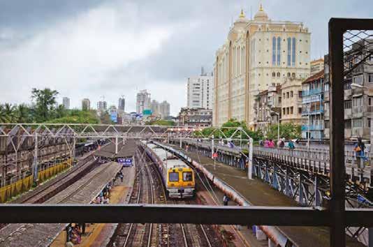
Evaluate and create 4 Examine Source 5. a Which key wellbeing indicator do you think best shows the rural–urban divide in India? Justify your answer. b Using the wellbeing indicator you chose in question 4a, create a simple bar graph representing this data. 5 Conduct further research on the internet and use the data Source 9 Residents of Mumbai are supported by public transport infrastructure. This train station is located right outside Saifee Hospital (right). Transport and health care are two factors that contribute to wellbeing in urban India. Wellbeing in urban India India is home to some of the world’s largest and fastest-growing cities. The country has 41 cities of more than 1 million people, and two of the world’s megacities (Mumbai and Delhi). These cities are home to much of the nation’s wealth, as new opportunities in service industries such as banking and information technology have emerged. These opportunities have led to a growing middle class which has in turn led to improved infrastructure in the cities. Those living in urban areas have greater access to health care, which has meant fewer infant deaths and better health in early childhood. On average, children in urban areas also spend more time at school and achieve a higher level of education. megacities cities with a population of more than 10 million people DRAFT ONLY - NOT FOR SALE on these pages to compare the inequalities in wellbeing between urban non-slum India, urban slum India and rural India. Write a short report on your findings, using images where appropriate. 6 Create an annotated sketch of Source 8. On your sketch, label any inequalities in wellbeing that you can identify.
4.10
Wellbeing in Australia
In this topic, you will: » explain the spatial pattern of human wellbeing in
Australia.
Each year, the United Nations releases the HDI (see topic 4.3 on page 136), which ranks countries around the world in terms of their development. In 2019, Australia was ranked eighth out of 189 countries on the HDI. However, despite the high levels of wealth and wellbeing in Australia nationally, there are still many variations between specific regions, cities, towns and suburbs across our country. Some places may have excellent access to hospitals, schools and recreation facilities, together with low levels of crime and poverty. Other places may have poor access to these services, as well as higher levels of crime and poverty. Variations in these types of things can be difficult to measure at a local or regional scale because indicators such as life expectancy and literacy rates are almost always measured at the national scale. There are other sources of information, however, that can help geographers measure wellbeing at the regional and local scale. One of these sources is the census. In Australia, a census is carried out every five years. Each Australian citizen is asked to provide answers to a census a ‘head count’ or audit of series of questions on a whole range of topics. The census gives us a great deal of information the number of people living about life across Australia, such as the areas of advantage and disadvantage. The Australian in a particular place at a Bureau of Statistics (ABS) collects the census data and combines a number of indicators to give particular time; information collected during a census each region a score. This is based on each region’s relative advantage or disadvantage ‘in terms often includes age, of people’s access to material and social resources, and their ability to participate in society’ occupation, income, etc. (see Source 10). AuSTrAlIA: InDeX oF relATIVe ADVAnTAGe AnD DISADVAnTAGe For loCAl GoVernMenT AreAS Darwin LEGEN D Advantaged and disadvantaged 5 – Most advantaged 4 3 2 1 – Most disadvantaged Brisbane No data Perth Adelaide Sydney Canberra Melbourne 0 500 1000 km Hobart Notes: A quintile is one-fifth of the population. At the time of writing the latest data available was from the 2016 census. New census data will be made available for Australia during 2022.
Source 10
Source: ABS, 2018 DRAFT ONLY - NOT FOR SALE
Poverty in Australia
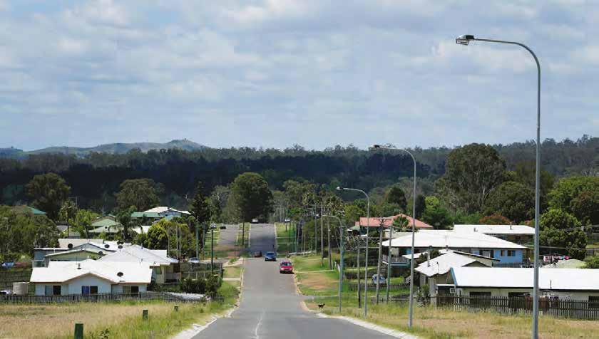
Source 11 The 2016 census found that remote communities in the Northern Territory and Queensland, such as Cherbourg, had the highest levels of disadvantage in Australia.
In 2020, the Australian Council of Social Service (ACOSS) published a study in partnership with the University of New South Wales. Titled Poverty in Australia 2020, the study used census data and other research to examine levels of poverty across Australia. In this study, individuals and households that receive less than half the average Australian yearly income are deemed to be living in poverty. It is worth noting that this definition is very different from measurements used in other countries. Using this definition, the researchers found that 13.6 per cent of Australians – around 3.2 million people – are living in poverty. Spatial variations in wellbeing The 2016 census data revealed that inner-city suburbs, particularly in Sydney and Perth, have the lowest levels of disadvantage, while rural and remote communities in Queensland and the Northern Territory are most disadvantaged. The most advantaged community in Australia was Ku-ringgai, in northern Sydney (see Source 12). The average weekly income for each household in this region was $2642, and almost half of all adults had a university degree. About two-thirds of Ku-ring-gai residents had at least one of their parents born overseas, and the most common jobs were as managers and professionals. The most disadvantaged community was Cherbourg, which is located inland from Gympie in south-east Queensland (see Source 11). Households in this region earned an average of $755 a week, and less than 1 per cent had a university degree. Over 90 per cent of Cherbourg residents were Aboriginal or Torres Strait Islanders people, and the most common jobs were community and personal service workers. The rural–urban divide Studies of the spatial distribution of wellbeing in Australia have found that people living in rural areas in Australia have lower levels of wellbeing than people living in urban areas. This pattern is repeated in other developed countries around the world. Studies of health statistics in Australia show that the further away from a major city you live, the less healthy you are likely to be. For example, in rural areas: • rates of hospitalisation for serious injury or illness are higher • there are fewer doctors for every 1000 people • smoking rates and alcohol consumption are higher • rates of death and serious injury from workplace and road accidents are higher. DRAFT ONLY - NOT FOR SALE
4.10 CHECK YOUR LEARNING Review and understand 1 Explain why it is more difficult to measure, rank and map variations in wellbeing at the local and regional level. 2 Identify three health concerns that are more serious for Australians living in rural areas than for those living in urban areas. Apply and analyse 3 Examine Source 10. a Identify which regions of Australia are most advantaged. b Identify which regions of Australia are least advantaged. c In a carefully worded paragraph, describe the distribution of regions in Australia according to their quality of life rankings, using the PQE method (see page 24 of ‘The geography toolkit’). Refer to specific towns, cities, regions and states in your description. 4 What barriers do you think exist that make it difficult to improve wellbeing in rural and regional areas of Australia? Propose one solution to improve wellbeing in these areas. Evaluate and create 5 Access the GIS map showing the areas of advantage and disadvantage at the website shown in your obook pro. a Use the search tool to search for your postcode. Identify your suburb’s level of disadvantage. What patterns of disadvantage do you notice in your local area? b Change the map layer to ‘state suburbs’ and use this to compare two of Australia’s capital cities. Describe the similarities and differences you notice between the patterns of advantage and disadvantage in these two cities.

Weblink GIS map: areas of advantage and disadvantage Source 12 The 2016 census found that the inner suburbs of Sydney, such as Ku-ring-gai, had the lowest levels of disadvantage in Australia.DRAFT ONLY - NOT FOR SALE
4.11
In this topic, you will: » investigate factors that influence wellbeing in
Aboriginal and
Torres Strait Islander communities.
By most measures there are significant differences in wellbeing between Aboriginal and Torres Strait Islander communities and non-Indigenous communities around Australia. Aboriginal and Torres Strait Islander children are twice as likely to be born underweight and twice as likely to die before their fifth birthday than non-Indigenous children. They are also less likely to attend pre-school, and much less likely to reach minimum standards in literacy and numeracy while at school. Although almost nine out of every 10 non-Indigenous young adults complete Year 12, it is closer to seven out of 10 for Aboriginal and Torres Strait Islander young adults. The pattern is similar with employment. Only 49 per cent of Aboriginal and Torres Strait Islander adults are in employment, compared to 75 per cent of their non-Indigenous counterparts.
Perhaps the most alarming statistic is that an Aboriginal and Torres Strait Islander boy born in 2021 can expect to live 8.6 years less than a non-Indigenous boy. For girls, the figure is 7.8 years. Closing the gap In 2008, the Australian Prime Minister, Kevin Rudd, apologised to Aboriginal and Torres Strait Islander people affected by the official government policies that separated children from their families, a group known as the Stolen Generations. As part of this apology, Rudd gave a promise ‘to close the gap between Indigenous and non-Indigenous Australians on life expectancy, educational achievement and employment opportunities’.
Each year the prime minister must report on the progress that has been made in closing the gap. The 2020 report revealed the following: Source 13 Progress on ‘closing the gap’ targets, 2020
Target Progress as of 2020
Halve the gap in death rates for Aboriginal and Torres Strait
Islander children under five within a decade (i.e. by 2018) Not on track: the gap is widening 95 per cent of all Aboriginal and Torres Strait Islander four-yearolds enrolled in early childhood education (by 2025) On track
Close the gap between Aboriginal and Torres Strait Islander and non-Indigenous school attendance within five years (by 2018) Target not met, no improvement
Halve the gap for Aboriginal and Torres Strait Islander children in reading, writing and numeracy within a decade (by 2018) Target not met, but progress made
Halve the gap for Aboriginal and Torres Strait Islander Australians aged 20–24 in Year 12 attainment or equivalent (by 2020) On track
Halve the gap in employment outcomes between Indigenous and non-Indigenous Australians within a decade (by 2018)
Wellbeing in Aboriginal communities Not met, no real change Close the life expectancy gap within a generation (by 2031) Not on track DRAFT ONLY - NOT FOR SALE Measuring happiness
Although statistical indicators such as life expectancy and literacy suggest low levels of wellbeing among Aboriginal and Torres Strait Islander Australians, other measures tell a different story. The ABS has begun to ask Aboriginal and Torres Strait Islander Australians to
assess their own wellbeing by asking questions about their levels of happiness and satisfaction with life in the National Aboriginal and Torres Strait Islander Social Survey (NATSISS). The data collected reveals some important trends. Torres Strait Islanders, for example, are much more likely to report feeling happy, full of life, calm and peaceful, and having lots of energy than individuals in the broader Australian community.
The NATSISS results also showed that Aboriginal and Torres Strait Islander adults living in remote areas were generally more satisfied with their life than those living in non-remote areas, such as towns and cities. However, in virtually all other measures – such as school attendance, literacy, health, disease and employment – the most disadvantaged Aboriginal and Torres Strait Islander communities were those in remote areas. Access to health care, education and employment opportunities are often more limited in remote areas than they are in regional centres and major cities.
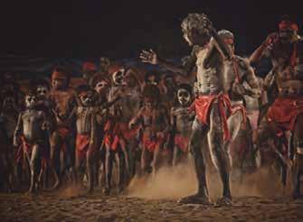
Source 14 Ntaria School is in Hermannsburg, outside Alice Springs in the Northern Territory. Increased government funding has allowed remote schools such as Ntaria to offer longer pre-school programs. This has resulted in improved literacy and numeracy as well as improved health, as the children are also given healthy lunches. Worksheet Indigenous wellbeing framework
Source 15 Happiness among Aboriginal and Torres Strait Islander Australians in remote areas is higher for those involved in cultural activities than for those who rarely or never attend cultural events. 4.11 CHECK YOUR LEARNING Review and understand 1 Identify the difference in life expectancy rates between
Aboriginal and Torres Strait Islander Australians and non-Indigenous Australians. Apply and analyse 2 The ‘closing the gap’ targets rely on quantitative measures to measure their progress. Explain why these measures are used rather than qualitative measures (such as levels of happiness and satisfaction). Evaluate and create 3 Examine Source 15, including the caption. Conduct some further reading on the internet and complete these tasks.
a Write a reflection on why people are happier if they engage in cultural and community activities. b Create a survey that questions people about their level of happiness and the factors that affect their happiness. Include questions about their involvement in cultural and community activities. Conduct the survey and write a report on your results, outlining what makes people happy. 4 ‘Efforts to close the wellbeing gap between Aboriginal and Torres Strait Islander Australians and non-Indigenous
Australians have been largely successful.’ To what extent do you agree with this? A lot (strongly), a little bit (somewhat) or not at all? Write a short paragraph explaining your position, using evidence from Source 13 to support your answer.
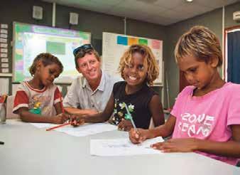
Key skill worksheet Identifying patterns & relationships: Distinguishing between qualitative and quantitative data DRAFT ONLY - NOT FOR SALE
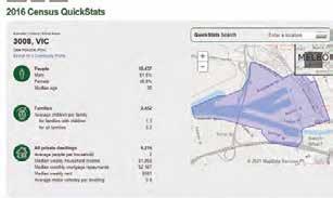
4B Investigating wellbeing RICH at the local scale TASK Most studies of wellbeing focus on differences and variations between nations. But there are also variations at the local scale. In this rich task you will learn how to use census data to collect and map information about wellbeing in your local area. Based on your completed research and maps, you will then explore some possible reasons for the variations in wellbeing at the local scale. Collecting and mapping data A census is held in Australia every five years and the results are processed and published by the ABS. Geographers often use this information to map data and trends across an area. You can collect data about your local area and map it by following these steps: Step 1 Access the ABS website. Click on the ‘Census’ tab in the menu. Then select ‘Find Census data’, and then ‘QuickStats’. Step 2 This page allows you to access the census data at a wide range of scales, including at the local level. A useful way of working at the local scale for this study is by using postcodes. To access the data for your suburb, enter your four-digit postcode in the ‘Search QuickStats’ tool. If more than one option is displayed, choose ‘POA’ (postal area). Click ‘Go’. Step 3 This should open a map of your postcode and provide you with a range of statistics for it, as collected in the most recent census.
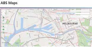
Step 4 Scroll down the page to see the data that is available and select a category you would like to map. Step 5 In a research table, record the data for your postcode for your selected indicator. Access the same data for your neighbouring postcodes by using the QuickStats search tool. You can find out what your neighbouring postcodes are by using the interactive map on the ABS Maps website. Choose a postal area in the drop-down menu and zoom into your postcode (see Source 18). Click on the neighbouring postal areas to find their postcodes, list them in your research table, and then use the QuickStats to access and record data for these postcodes. Step 6 Once you have collected the data you can map it by constructing a choropleth map. Print out a map of your area. You can use one you already have, or print the one from the KEY SKILL Collecting & representing data Weblink Australian Bureau of Statistics Weblink Interactive map (ABS) Source 16 The 2016 census revealed that residents in Melbourne’s Revise the key terms you have learnt so far.DRAFT ONLY - NOT FOR SALE inner-city suburb ABS website. Trace a copy showing of Docklands had a only the postcode boundaries. median income well above the state and national average.

Step 7 Use the data collected from the census to construct a choropleth legend for your map. Divide your data into four or five categories. Use darker shades of a colour for higher values and lighter shades for lower values. For example, your suburb might have fewer people per household (if that was what you chose to map) than the neighbouring suburb. So, you would colour your suburb a lighter shade and your neighbouring suburb a darker shade. Step 8 Shade your map according to the legend you created in Step 7. Step 9 Complete your map with BOLTSS. For more information on this key skill, refer to page 26 of ‘The geography toolkit’.
Source 17 A screen shot from the ABS ‘QuickStats’ Source 18 A screenshot from the ABS Maps interactive map census page Practise the skill 1 Construct a choropleth map of variations in median household income in your local area (include at least six suburbs) by collecting information from the ABS website. Follow the steps to gather your data and map the information. 2 Describe the pattern shown on your completed map. Extend your understanding 1 List possible reasons for the variations shown on your map. These will vary from place to place, but here are some possibilities: • distance from the centre of a large city • presence of employment opportunities, such as factories and shopping centres • presence of higher educational opportunities, such as universities • presence of transport networks, such as railway stations and major roads • presence of large, shared accommodation areas, such as aged-care facilities or school hostels • presence of geographic features, such as a coastline or large park. Use your knowledge of the local area, together with street directory maps, to evaluate these possible reasons.
2 Collect information from the ABS site and analyse variations in another indicator of wellbeing. Do this for the same suburbs you investigated earlier. You could, for example, choose to analyse the number of motor vehicles per dwelling, highest year of schooling completed or percentage of people unemployed. 3 You can also use the census data to explore levels of wellbeing in communities that are not located close to each other. a Follow the steps in the key skill to compare wellbeing in Cherbourg, Ku-ring-gai (see page 156) and the area in which you live. b Summarise what you have learnt about variations in wellbeing within Australia. 4 Evaluate the use of census data to describe and compare wellbeing by following these steps: a What are the strengths of census data for this purpose? b What are the weaknesses of census data for this purpose? c What is your overall opinion about how useful census data is for this purpose? DRAFT ONLY - NOT FOR SALE

4CHAPTER REVIEW
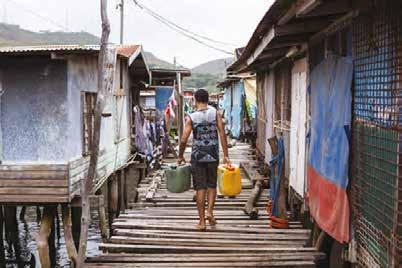
Review questions 4A How does wellbeing vary around the world? 1 Define wellbeing. (1 mark) 2 Explain the difference between quantitative measures of wellbeing and qualitative measures. In your answer, give an example of each. (3 marks) 3 Describe the level of wellbeing in the Democratic Republic of Congo. Use one example from each of these factors to support your answer: • wealth • health • education. (6 marks) (Total: 10 marks) 4B How does wellbeing vary within countries? 1 Summarise the overall level of wellbeing in Australia. (2 marks) 2 Explain the difference in wellbeing between rural India and urban India. (3 marks) 3 Compare the variations in wellbeing within India with the variations in wellbeing within Australia. What are some of the similarities and what are some of the differences? (5 marks) (Total: 10 marks) DRAFT ONLY - NOT FOR SALE Source 19 Papua New Guinea is Australia’s closest neighbour, but its HDI ranking is the lowest in the Asia–Pacific region.
Review activity
Infant mortality in Papua New Guinea Papua New Guinea (PNG) is Australia’s closest neighbour, but is worlds apart with regard to levels of wellbeing. Whereas Australia is ranked in the top 10 countries in terms of our HDI, PNG is ranked 155th – the lowest ranking in the Asia–Pacific Region. There are also many variations in wellbeing on a regional scale in PNG.
Analyse the map in Source 20 to explore aspects of wellbeing further, then answer the questions.
Manus Enga Madang Hela Southern Highlands Western Highlands Jiwaka Eastern Highlands West New Britain Morobe Gulf Northern (Oro) Central Milne Bay

Sandaun New Ireland East Sepik East New Britain Simbu Bougainville Western National Capital District
0 100 200 km 1 Using your knowledge, list three indicators of wellbeing. (3 marks) Over 90 75 to 90 60 to 75 45 to 60 Under 45 Infant mortality rate (deaths per 1000 births) LEGEND Bismark Sea Solomon Sea Gulf of Papua Source 20 Source: Oxford University Press 2 Identify two locations with low infant mortality rates, and two locations with high infant mortality rates. (4 marks) 3 Use the PQE method to describe the distribution of infant mortality rates in PNG. (6 marks) a Summarise the difference between the infant mortality rates in Sanduan and in the National Capital District. (2 marks) b Why do differences occur in wellbeing between rural and urban areas? Explain your answer using knowledge from this chapter. (3 marks) 4 Outline one way to improve infant mortality rates in Papua New Guinea. (2 marks) (Total: 20 marks) DRAFT ONLY - NOT FOR SALE
Check your Student obook pro for these digital resources and more:
Student book questions Chapter 4 Key skill worksheet Communicating & reflecting: Chapter 4 Play a game of Quizlet on An unequal world. Chapter review quiz Chapter 4


