JANUARY 2023 THE ZEITGEIST VOL. 88


• Suitable for multi-sport areas, playgrounds, landscaping and public parks.
• Ultra-durable, flexible and impact resistant surfacing.
• Low maintenance & sustainable.
• Available in 15 colours or multiple blends.
• Excellent shock absorption with high elasticity.
• Suitable for indoor or outdoor areas.
• Smooth and soft playground flooring allows children to play without risk of injury.

• Wet pour rubber can be applied at any thickness to conform to legal requirements.
• Licensed installers throughout Sub-Saharan Africa.
MAKING PLAYGROUNDS SAFER SPECTRAPLAY ® 0861 782 789
info@playsafe.africa • www.playsafe.africa
•
Welcome to The Zeitgeist
Defining the ‘spirit of the times’ is no small task. That being said, this issue endeavours to track trends and forecast our year ahead in the trade. Looking to capture our era, we’ve called on some of the trade’s most inspired creators to help us pinpoint the highlights of the 2020s thus far and look into our crystal ball to see what is to come.
‘Zeitgeist’ refers to the cultural, intellectual, and social climate of a particular era, and in reference to architecture and design, it looks to address the dominant aesthetic and functional trends that define the buildings, products, and materials of a specific time.
We thought it a fitting theme for our opening issue of 2023, where we seek to explore upcoming trends and identify
the spirit of the 2020s. Pandemics, artificial intelligence, political movements, art, fashion, building materials, shapes, and favoured forms are all elements that help us identify the current mood of design, so that, years from now, others will look to this time and understand the zeitgeist.
We’ve tracked many unique movements for 2023, but the burgeoning mood (we feel) is captured in adaptability, sustainability, and ultimately well-being, which persists as the hallmark of the NOW.
We are embarking on a rather trailblazing 2023 year ahead with a focus on our reader, so buckle up, it's about to get interesting. Speaking of the journey ahead... We'll see you next in February, where we take you on The Expedition.
Ed’s Note. Chanel

5 / LEADER /
Media Sales Basheerah de Villiers
Design
Key Account Manager
Cover image: 'Bridging Teahouse' Photographed by Iwan Baan, Courtesy of FR-EE www.fr-ee.org @free_fernando_romero
Editor-in-Chief Chanel Besson
Commissioning Editor Amy Aries Content Manager Liesl Lamprecht
Sarah Ternent
Justine Coleman
Complete coating system. Complete professional service.
Reliability is at the heart of our industry, and our Professional range is no different. Product innovation coupled with our value added services gives you a distinct advantage.
Our complete coating system, spanning preparation, trim, wall and textured coatings, is designed to ensure guaranteed product performance and value from start to finish.


All Plascon Professional products with the Ecokind logo have VOC levels within the GBCSA standards for Green building ratings.


Designed for professionals.
@PlasconSA @PlasconSA @PlasconSA
FOR MORE INFORMATION CONTACT: PLASCON ADVISORY SERVICE ON 0860 20 40 60 Project Guarantee Terms and Conditions apply. © Kansai Plascon (Pty) Ltd. 2022. All rights reserved. Plascon is the registered trademark of Kansai Plascon (Pty) Ltd.
7 10
11
34 AN ARCHITECTURE OF HOPE The Future of Architecture and Sustainability in South Africa 16 A SHADE FOR EVERY CURATOR Colour Palettes and Hues for Every Season 41
ENTERTAIN. EDUCATE. ENLIGHTEN. Powerful Podcasts and Insightful Documentaries to Fan Your Professional Flame
WELCOME TO THE MAGENTAVERSE A Dose of Dopamine Dressing - Exploring Magenta Colourways Through Design
19 THE YEAR OF SUSTAINABLE WELLNESS Interior Design Trends and Forecasts 63
An LA-style
47
ADAPTABILITY
52 SPACE
SANSA Space Weather Centre / CONTENTS / Navigate 27 REWRITING THE DESIGN RULEBOOK One Firm’s Quest for True Value in Design
Anji Connell, ACID + | Anlo Neethling, ONE Design + Development | Leonard Miller and Catherine Moronell, MiMo Architects | Marc Sherratt, Marc Sherratt Sustainability Architects | Anton Wessels, GAPP Architects and Urban Designers | Renato Graça, GSQUARED Architecture & Interiors | AVNA Architects | Silvio Rech + Lesley Carstens Adventure Architecture and Interiors PORTFOLIOS
WHAT’S DOWN THE ROAD IN 2023? Retaining the Core of Our City Centres
GOOGIE IT
Bungalow on Johannesburg’s Westcliff Ridge
AGE OF
Defining the Architectural Milieu of the 2020s
ODYSSEY
The Zeitgeist Collaborators
HYBRID WORKING STRATEGY
Hybrid working provides a once-in-a-generation opportunity to give employees a better work-life balance, enhance productivity, improve creativity and optimise business expenditure. It could even benefit society.
However, as we’ve seen, there are many factors that should guide decision-making around adopting new working models – and IT is chief among them. Specifically, many businesses encounter issues around management of documents and information, and these challenges need to be tackled head-on.
Of course, they can be overcome; organisations shouldn’t feel that they are held back. The hybrid working landscape has evolved apace since early 2020, yes – but technology has kept up.
At Canon, we can deliver the technology, services and support organisations need to achieve their hybrid working goals. We advise businesses of all sizes and levels of digital maturity on keeping pace with rapid change, boosting productivity, fostering seamless collaboration, maximising security and enabling experiences that exceed customers’ expectations. Our Digital Transformation Services ecosystem covers the document lifecycle from end to end – capture, process, communicate and managed print – enabling us to tackle just about any information-based challenge a modern business might face.
Embrace the opportunities of the new world of work.
Discover how we can help your business thrive in the new world of work, here.
For inquiries and more information contact CZA-Marketing@canon.co.za

An unexpected experiment
The onset of the pandemic forced organisations into an unexpected experiment in remote working. Ultimately at the heart of this success was technology. If national lockdowns had happened just five years ago, businesses would likely have faced much more severe disruption. This shaped business leaders’ strategy for the future, providing the perfect case study on why work does not necessarily have to be tied to one location. But hybrid working represents just one part of a wider conversation about adaptability. It wasn’t just that companies with the right tools were able to adjust to remote working more easily. Rather, it showed that they were able to adapt to any change because their business model was more resilient to the unexpected.
Adaptability is the new insurance
The reality is that change is becoming the new ‘business as usual’. Societal trends and technological innovations are moving faster than ever, bringing more opportunities with them. What your organisation needs is to be more future-proof, making your business more agile and resilient both now and in the long run.
How to improve your agility
Keeping up with a rapidly evolving landscape and taking advantage of new technologies and capabilities involves a new approach. Instead of creating five-year plans, consultants advise an approach of ‘continual evolution’ where change isn’t viewed as ‘an event’ but as a constant state, with organisations introducing ongoing digital transformation.
To support a more agile business model, leaders should identify what limits their adaptability and replace it with newer, more efficient processes that accurately reflect the times:

1. From rigid processes to digital workflows
Back-office processes that depend on the processing of physical paperwork and the on-site presence of workers (e.g., Accounts Payable and HR onboarding) can be optimised for greater efficiency. Digital workflow technologies free up your workers to focus on more valuable tasks and ensure they can oversee the work from any location.
2. From physical infrastructure to the cloud
Hybrid working presents the final incentive to overhaul on-premise infrastructure, allowing teams to implement and scale relevant new cloudbased innovations as they become available on the market, instead of having to worry about complex (and time-consuming) legacy integration.
Implementing processes and infrastructure that have as few physical and geographical dependencies as possible helps to ensure business continuity wherever staff are, even in a crisis.
The agility for success
The organisations that thrived in the immediate aftermath of the pandemic were those with sufficient digital tools, enabling them to rapidly pivot to online sales, remote working, and even entirely new revenue streams and business models.
9 / FEATURE /
DOES YOUR ORGANISATION HAVE THE AGILITY FOR SUCCESS IN THE HYBRID
Canon’s solutions: ☀ Therefore™ Choose Therefore, a document management solution designed to transform the way you manage and share business documents. ☀ Digital Transformation We help organisations drive digital transformations and adopt digital technologies to succeed in the modern world. ☀ uniFLOW Online Discover Canon's suite of business software for print and scan workflows. Want to streamline your success? Learn how to get started at www.canon.co.za/business/solutions/hybrid-working
WORKING ERA?
Entertain. Educate. Enlighten
Netflix
1 / Kiss the Ground

A powerful and informative documentary that shines a light on the potential of regenerative agriculture as a solution for reversing climate change. The film features a diverse array of experts and farmers, and is a must-watch for anyone interested in understanding the critical role of soil health in our planet's future.
Powerful podcasts and insightful documentaries to fan your professional flame.
Podcasts
1 / 99% Invisible

A fascinating podcast that explores the unseen and overlooked facets of design and architecture. The research, narration, and production are top-notch, and every episode is both informative and entertaining. You won’t regret adding this one to your playlist.
2 / About Buildings + Cities

Perfect for architecture enthusiasts, this podcast takes listeners on a design journey through time, from the distant past to the present day. The host delves deeply into an exploration of architectural history and culture, with detours into film, fiction, comics, and the dimly imagined future.
3 / Material Matters
Material Matters features in-depth conversations with a variety of designers, makers, and artists about their relationship with a particular material or technique. Prompted by Grant Gibson’s masterful interview skills, you’ll keep finding yourself drawn to learning about new materials after each episode.

4 / Clever
Candid, contemplative, and creative, Clever is a window into the humanity behind design. In each podcast episode, designer Amy Devers has revealing conversations with visionaries, culturemakers, and creative forces to unearth the gritty, authentic, and sometimes surprising details of their creative paths.

10 / FEATURE /
WELCOME TO THE MAGENTA VERSE
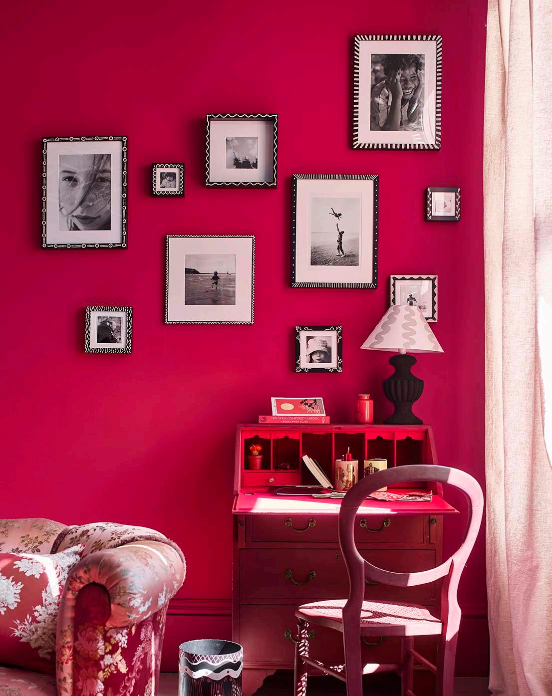 Annie Sloan Home Office. Capri Pink Wall Paint, Emperor's Silk Chalk Paint, Capri Pink, Burgundy, and Antoinette Lifestyle Portrait
Greige has had a hold over us for far too long. We all love a pop of colour, and now it seems we want more... Say hello to ‘colour drenching’ and, if you dare, full-on maximalism. Move Over, 50 Shades of Beige, Viva Magenta 18-1750 is named Pantone Colour of the Year 2023.

Powerful and empowering, Viva Magenta is an animated red that encourages experimentation and self-expression without restraint, says the team at Pantone. Brave and fearless, Viva Magenta pulsates optimism and joy, which is just what we need after the past couple of years. Something to bring brightness, positivity, and energy into our homes and interior spaces as we move away from neutral colour palettes. This nuanced crimson tone descends from the red family, and is inspired by the carmine dye derived from the cochineal beetle — one of the brightest, strongest, and most precious natural dyes. At once warm and cool, the rich and layered tone adds an energising, feel-good, moodboosting shot of visual impact. Aptly dubbed ‘an unconventional shade for an unconventional time’, the Pantone Colour of the Year captures the strength, resilience, and boundless horizons of nature and the digital world.
In vogue
The trickle-down effect from fashion to design means that magenta pinks are already popular within the runway and beauty community, and as always happens, the interior world follows suit. Italian fashion house Valentino embraced magenta pink for their Autumn/Winter 2022-23 collection, with the models wearing similar shades on their eyelids and lashes. The colour brightens up Gucci’s double-breasted blazers, while at Loewe the sumptuous shade has been used for head-turning ballgowns. It also works brilliantly in accessories, adding a zingy pop of colour to an otherwise more neutral outfit — both Bottega Veneta and Valentino recently revealed bags in the striking hue. Viva Magenta even has the royal seal of approval, with the Princess of Wales stepping out in an Emilia Wickstead coat dress and matching hat to receive South Africa’s President Ramaphosa the other day.
‘Dopamine dressing’ is the term commonly used for the movement towards vibrant colour in fashion. Likewise, ‘dopamine décor' has unmistakably been bursting forth in furniture, interior design, and accessories throughout recent Milan and New York Design Week presentations.
New experiences
Pantone has partnered with several companies including Motorola, NASA, and Lenovo to form the basis of a new immersive exhibition at Miami’s technology and experiential art studio ARTECHOUSE to introduce visitors to the Magentaverse.
On the other side of the Atlantic, a vivid visual extravaganza of magenta is being shown at the Saatchi Gallery in London. Serpenti Metamorphosis by Refik Anadol presented by Bulgari is the world's first multi-sensory immersive data sculpture — a reimagining of the signature Bulgari Serpenti icon unlike any before.
Bold and beautiful
Current interior design trends show two polarising movements emerging: paired-back minimalism and full-on maximalism. Of course, the vibrant Viva Magenta may not be to everyone's initial liking. It's a scary move using a bright colour like this in our homes; however, this hue is the perfect melding of a rich red with pinkish undertones that can cater to all interior tastes. The stunning shade looks playful in a bright area and more sophisticated in a smaller, cosier space. For the more fearless, there's the option to go wild and drench the room in colour and richness, adding it everywhere — on the walls and wood trims, ceilings, and the furnishings.
DOPAMINE DRESSING
12
/ FEATURE /

DOPAMINE DRESSING
"VIVA MAGENTA IS AN ANIMATED RED THAT ENCOURAGES EXPERIMENTATION AND SELFEXPRESSION WITHOUT RESTRAINT."
'Bridging Teahouse', JinHua Architecture Park in Jinhua, China, by FR-EE. Photo courtesy of Iwan Baan
ANJI CONNELL
Interior Architect, Travel and Design Writer www.anjiconnellinteriordesign.com @anjiconnell_acidplus


Perfect pair
The beauty of Pantone’s fiery Viva Magenta is that it pairs perfectly with nearly all colours. Use it as a warm accent to enhance neutrals, greys, and pastels. The shade also works brilliantly with darker inky blues, greens, and teal, especially when combined with vivid crimson red, making it the ideal accent colour for any scheme. It's a very strong and saturated colour — sophisticated, stylish and vibrant. It doesn't need contrast to make a presence. So, I would also pair it with its neighbours on the colour wheel: red, purple, or periwinkle blue.
14 / FEATURE /
Viva Magenta Gallery Wall by Desenio
The Skinny and The Shorty lockers by Mustard Made in Blush, Berry, and Poppy
Hand-knotted pure wool and Chinese silk Red Landscape Rug by Sonya Winner Rug Studio
Artistic flair
You only need a small dose to make a big statement:
1. 2. 3. 4.
Be wise, accessorise
Take a safer route by adding flashes of colour using accessories. Window treatments and textiles like pillows, bedding, and rugs, are great ways to incorporate this bold and exhilarating colour.
Grand entrance
Bright paint instantly perks up any space, and it's up to you whether you apply it across an entire room or only as a hint of colour on an accent wall. Repainting your front door can go a long way in making a good first impression — the impression being that you're ahead of the curve with your on-trend Pantone-inspired entrance (something you can always paint over when you want to try something new in the future).
Home is where the art is Another way to add and update a room is with bold artwork.
Patio power
The same principles apply to our outdoor spaces as indoors. Incorporate Viva Magenta through sculptures, chairs, or even pots and planters for an all-out colour drench.
Viva Magenta will undoubtedly elevate the feel of design this year, bringing positive, powerful and passionate energy. Here’s to a fabulously colourful 2023!

15 / FEATURE /
Cliff Dèco collection designed by Ludovica+Roberto Palomba for Talenti Outdoor Living
A SHADE FOR EVERY CURATOR
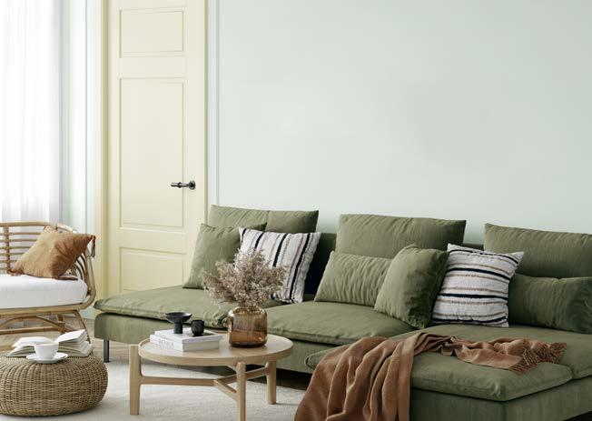
Amidst global and local uncertainties one thing is for sure: African landscapes, art, and design are shining through to bring warmth, hope, and a celebration of nature to interior design trends. Bringing you the 2023 Colour Forecast for architects and interior designers, Plascon has identified a variety of rich yet subtle hues that look to natural lighting, landscapes, and indigenous plants for inspiration.
Grab your pinafore and Pinterest mood boards and let's curate with colour!
HOMEGROWN
Uniquely African hues inspired by traditional prints and weaves are going to bring a touch of drama to interiors this year. The rich pigments of Coffee Shop (O2-D1-2), Baked Earth (O4-B1-1), and River God (B2-D1-2) are great for adding depth to lighter, neutral backdrops and work well with rattan furniture and woven textiles. Bring a contemporary note to the poolside with the natural purple of Berry Light (P6-D1-3) and the uplifting blue of Granada Bay (B1-A1-3). Of course, what is summer without the fresh yet subtle Lime Juice (Y6-B1-2) and Yellow Mystery (Y4-B2-1)?


DRIFT
In addition to natural inspiration, 2023 will explore colours that are relevant to a post-pandemic world, where increased awareness of health and wellness are key. Here, the importance of sleep, rest, and calm is translated into a circadian collection of soothing pastel hues such as Downy Comfort (O2-B2-2), Miami Pink (R5-B1-3), and Windstar (B4-B2-3).

16 / FEATURE /
GRAPHIC

Meanwhile, for those drawn to the bold, a combination of sharp and nuanced monochromes such as Phantom Ship (60) and Lagoon Mirror (3) deliver fresh, graphic notes.

SAVANNAH
Light and sun, and their effect on the appearance of colours, have inspired a collection of radiant yellow hues seen in Sunkissed (Y3-A1-2), Fun in the Sun (Y1-A2-1), and Safari Sun (O7-C1-1). Soft neutrals like Rain Slicker (Y5-A2-2) provide gentle backdrops to more pigmented, nature-inspired colours while shades like Green Glass (81), Garden Scent (G3-B2-3), and Coming My Way (G2-C2-2) give a nod to plant-based tones.

17 / FEATURE /
www.plascon.co.za @plasconsa


THE YEAR OF SUSTAINABLE WELLNESS
THE YEAR OF SUSTAINABLE WELLNESS

www.onedd.co.za @one_design_and_development
ANLO
NEETHLING Interior Architect and Director
Interior architecture and design is a constantly evolving field, influenced by changing tastes, advances in technology, popular culture, and shifts in social and economic conditions. Seeking to make sense of the constant flux of decorative aesthetics while pinpointing the unknown, join leading interior architect Anlo Neethling as he takes a closer look at the key trends shaping design in 2023.
Focus on wellness
In recent years, wellness has become a hot top in design (especially after the pandemic), creating a space for us to slow down, reflect, and function at our utmost. Unsurprisingly, the chaos and uncertainty of the stressful lockdown years prompted many to find refuge in calming textures, which became increasingly popular in residences the globe over. People want their home to feel like a tranquil haven, a sanctuary, particularly in the bedroom and living room — both designated for relaxing and filled with plush, soft furnishings. And why not? We’re all in need of some nurturing this year!
In application, this trend translates to plenty of warm neutrals. Warm hues like clay, terracotta, stone, sunlit yellow, and rust will likely dominate, which means lovers of gold accents, honeyed wood tones, and cream sofas will rejoice. We may see the return of minimalism in wellness-focussed interiors, but in a more sophisticated and homelier manner than we've seen previously. Warm wood tones and natural textures will become a feature in and of themselves, without compromising the simplicity and cleanliness of minimalist styles. There also seems to be a growing sculptural design trend in interior design, with a return to the soft curve and using more organic materials.
Colour of the year
Viva Magenta, Pantone’s Colour of the Year 2023, can be woven into a variety of palettes — whether it's the primary bright colour in a sea of muted hues or a fitting addition to a jewel toned collection of colours. You can incorporate this crimson red using patterned wallpaper and throw pillows, a striking feature wall, or even a bold furniture piece.
That’s so 70s
The 70s are back! Interior design trends, just like fashion, are proving to be cyclical, and the 1970s is projected to be a key influence in 2023 interior design. You can tap into this aesthetic by using warm brown, gold, and red tones such as clay, honey, or paprika as the base for your interior and layer with fun colours and shapes to add interest. Soft shapes and relaxed-style seating designs not only tap into the 1970s aesthetic but are comfortable and have a cocooning effect, creating a happy and enjoyable interior with soft edges and dramatic accents. Try selecting sofas with deeper seats and plumped-up cushions for a real ‘sink-in’ experience.

Curves are here to stay
Over the past years, rounded and curved shapes have increasingly found their way into interior design, from crescent-shaped sofas and egg and tulip chairs to circular rugs. This year we’ll see a parallel pivot within this trend as designers shift towards more oblong and angled curves. Say hello to ovaloid mirrors and mushroom-shaped lighting fixtures, as well as much more rounded cabinets, credenzas, and nightstands.
Arches and alcoves
Rounded door frames, thresholds, and ceilings are going to be big in 2023. The use of alcoves and niches in architecture has been popular since the Renaissance period as a way to display artwork, particularly sculptures. Today, these distinct architectural elements are experiencing a resurgence in popularity thanks to their versatility. Not only do they provide a space for showcasing decorative items, they can also serve a functional purpose by saving space, adding visual interest, or creating a peaceful retreat. Regardless of their size, alcoves and niches are an effective way to accentuate the décor and furnishings within a room.

20
/ FEATURE /
"WARM HUES LIKE CLAY, TERRACOTTA, STONE, SUNLIT YELLOW, AND RUST WILL LIKELY DOMINATE, WHICH MEANS LOVERS OF GOLD ACCENTS, HONEYED WOOD TONES, AND CREAM SOFAS WILL REJOICE."

 Annie Sloan Living Room. Chalk Paint Cupboard by Maude Smith, Wall Paint in Carnaby Yellow, Satin Paint in Carnaby Yellow
Circle: Esse Skincare Headquarters by Koop Design using Kalki Ceramics. Photo courtesy of Roger Jardine
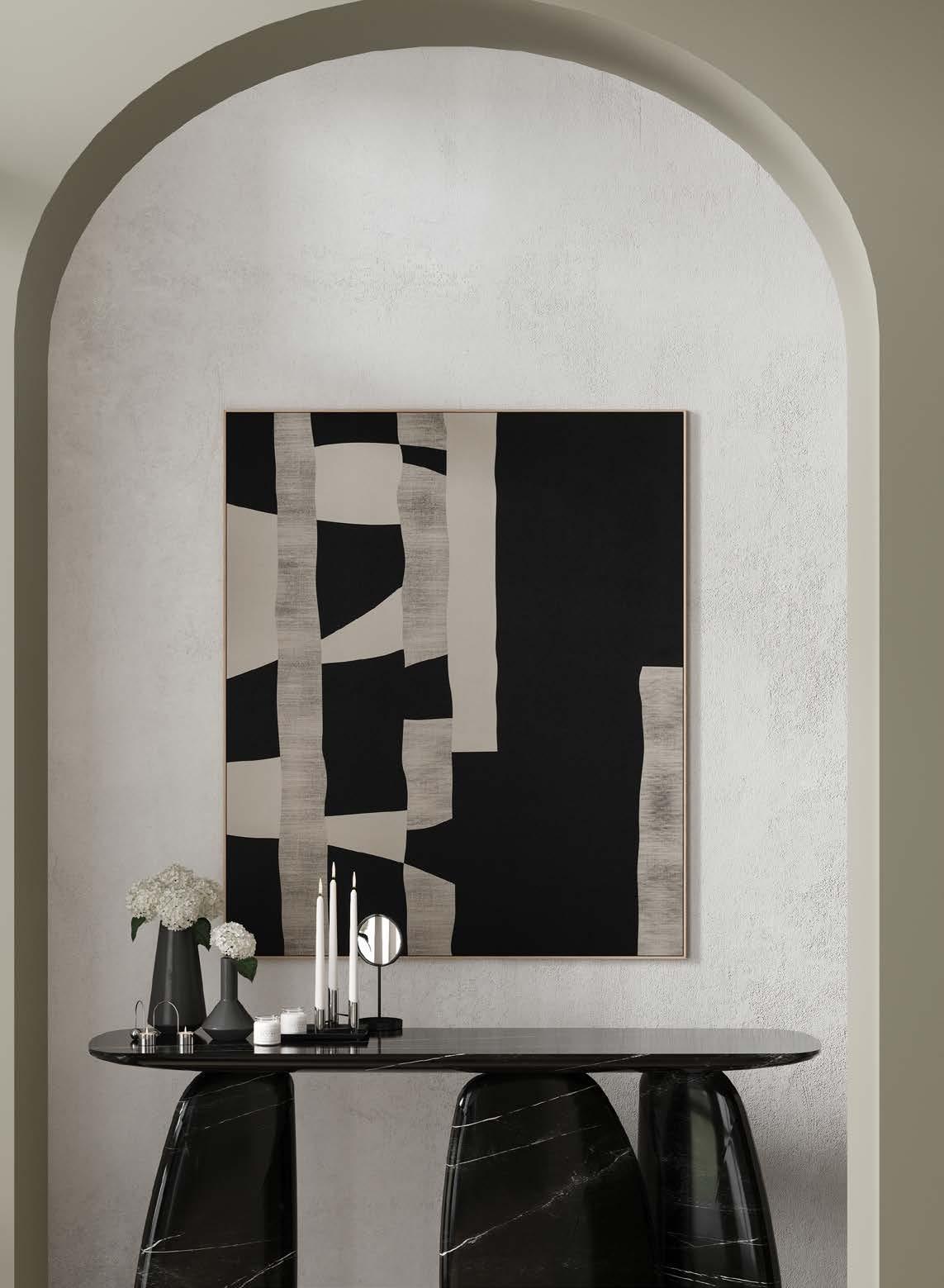 Dolmen-inspired ARDARA Console Table with a Sahara Noir Faux Marble Finish by Cafe Latte
Perfectly imperfect
2023 is leaning towards items that are organic, handmade, and locally sourced. This shift towards authenticity and individualism in design aesthetics will result in more one-of-a-kind and distinctive pieces. The future of décor is characterised by a fusion of raw natural elements and refined design, creating a unique aesthetic that showcases expert craftsmanship and an artistic vision. Such pieces are sure to be highly desirable and trendy.
Sustainable selections
Sustainability, ethics, and recyclability are becoming increasingly important in all areas of life, and this is reflected in the home décor trends of 2023. As more and more people become aware of the impact of their choices on the planet, there is a growing emphasis on environmentallyfriendly practices in both home and business settings. As a result, we can expect to see a greater use of green materials and organic surfaces in interior design, both in residential and commercial settings. Furthermore, with continued education, we can anticipate conscious choices of materials, the repurposing of furniture, and a reduction of plastics and waste.
Colourful kitchens
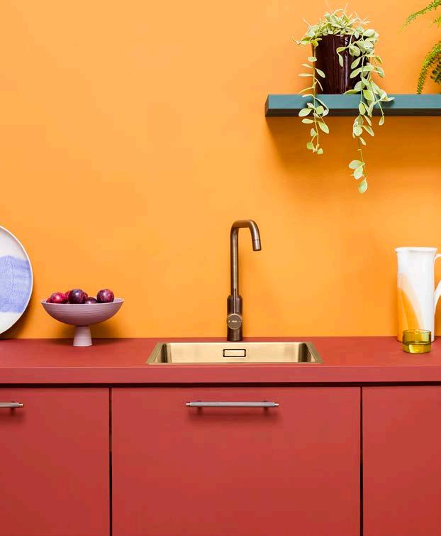
I think people are finally embracing colour and will choose to redesign their kitchens in a wash of exciting hues. The use of soft yet bold tones will be used in kitchens, with palettes inspired by 70s: think soft greens, blues, and soft, warm yellows.

Personality-driven design
Many of my clients are shifting away from neutral, Pinterest-perfect rooms and opting instead for cosier spaces that feature personal collections, layered textiles, heirlooms, unique art, and a mix of old and new furnishings. We have seen so much minimalism over the last few years; our clients are now craving warmth, depth, and character in their personal spaces. Conjuring a sense of nostalgia, expect pastoral patterns, restored antiques, and bucolic artwork in homes resembling the Granny-chic country farmhouse aesthetic. Cue the everyday curator!
23 / FEATURE /
'Six on N' by ONE Design + Development and BLOK Living, Seapoint,
South
Cape Town,
Africa
ARMSTONG Kitchen Tap in Antique Brass by Plank Hardware
Art Deco encore
With the continued rise of layered Art Deco-inspired styles, 2023 will see more intentional curation expressed through custom upholstered furniture silhouettes, ornate pieces, traditional yet polished Parisian-Chic apartment elements, geometric patterns, wall stencilling and molding, and decorative passementerie.

2023 TRENDS OUR TEAM HAS BEEN TRACKING
Penchant for pendants
Perfectly segueing into the steady advance of maximalism, oversized lighting design will most likely scale to new heights this year. Elaborate lamp shades and statement lighting fixtures will create a unique, artistic flair.

Multi-function focus
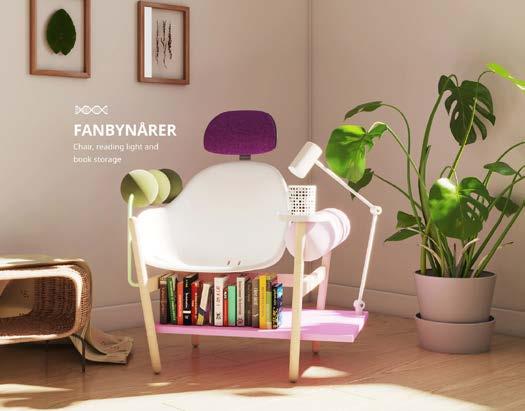
Commercial and residential interiors alike are seeing a heightened focus on designing for everyday well-being and convenience. Homes will be overhauled to become more multi-functional, utilising space until no room is left untouched, while offices will continue their effort to create break-out pockets and think tanks for promoting creativity. This prioritisation of everyday activities will most clearly be seen in the home office, mudrooms and laundry rooms, exercise spaces, and entertainment and game rooms. In the image above, IKEA's research and design lab Space10 and creative studio Oio have created an Every Experiments Updatables concept furniture series, which would use artificial intelligence to tell owners how it can be updated to suit their evolving needs.
24
/ FEATURE /
Queen's Quarter Wallpaper by Cole & Son available from Lime Lace
Annie Sloan Wall Paint in Old White and Chalk Paint in Antoinette, Barcelona Orange, Athenian Black, and English Yellow
Gothic revival
The internet’s preoccupation with shows like Wednesday may see the return of noir and Dark Academia. The rise of highly personalised, character-rich interiors has left the door wide open for a Gothic revival. Dramatic, layered, and fascinating, this trend goes beyond its signature dark hues to include elements like sweeping curtains, arched mirrors, sculptures, and lavish chandeliers.
 'Fine Modern Spaces' living room concept designed by Han´s Interiors in partnership with Caffe Latte and Covet House. Cassia Modular Sofa by Caffe Latte; Navarra Centre Table and Monochrome Sideboard from Boca do Lobo; Ancud Armchair from Covet Collection´s Patagonia Capsule; Couple Rug by Rug'Society; Naicca Suspension Lamp and Vellum Wall Lamp from Brabbu
Closed kitchens
It seems as if 2023 may play an Uno reverse card with a return to enclosed kitchens. That said, the design of the kitchen itself will tend to be more open plan with less conventional wall shelving and cabinetry. Tying into the focus on well-being and sustainability, we'll also see more wood panelling on walls and built-in features alike.

Technicolour dream
After swinging hard to the spectrum of minimal whites and neutrals, the interior design world has gone drastically over to the bold side. Jewel tones have been trending for a while now, and we are seeing entire walls and ceilings, upholstery, rugs, tiles, curtains, and cabinetry fully immersed in bright colours. One thing is for certain: no one is playing it safe anymore — and we are here for it! This year, we will likely see more tonal pastels mixed into the technicolour palette. Think lavender, jade, pistachio, ocean blue, gentle gold, yellow, and baby pink paired with teal green (a projected favourite).

26 / FEATURE /
'Alliances' by Géraldine Prieur for Toulemonde Bochart in Paris, France
'House Dreyer' by ONE Design + Development in Cape Town, South Africa
REWRITING THE DESIGN RULEBOOK
ONE FIRM’S QUEST FOR TRUE VALUE IN DESIGN

Johannesburg-based MiMo Architects is a firm deeply committed to exploring the fundamental elements that make good architecture last. The co-founding architects, Leonard Miller and Catherine Moronell, have identified three design cornerstones that guide their work: economy, appropriateness, and beauty. They believe that by carefully considering these elements and intentionally designing and building within their local context, they can create architecture that is not only aesthetically pleasing but also efficient and appropriate for its surroundings.
Economy
Economy, to us, means extracting maximum experience using minimum means. Essentially doing more with less. For example, when designing our Smiling Cabin nature retreat pod, we prescribed a timber framed roof on a solid foundation as the materiality for this conceptual project. We recognised that we had the opportunity to connect with both the natural ground at a low level and experience the swaying trees and starry sky at a higher level, so we arranged the walls at eye level to allow for views of the landscape while cooking and showering. The sleeping space was then designed to focus on looking upwards and outwards. By contrasting these basic components of earth elements, sky, roof, and walls, we were able to create an architecture that was rich in experience and contrast, all while using minimal means.

We often work with tight budgets, which means that we need to be mindful of the size and materiality of the project from the outset. To create value within these constraints, we focus on key elements such as spatial planning, scale, orientation, and the balance between solid and open areas. We like to design simple structures using load-bearing walls and arrange the rooms to create a specific atmosphere. Sometimes, the key to unlocking the composition of a floor plan is a passage that extends some rooms and at other times becomes a room.
By thoughtfully crafting raw structures using basic materials that are either left unfinished or coated to play with texture, we can create a sense of beauty with economy. This means placing the right walls in the right orientation and being mindful of the cost per square metre, creating comfortable spaces and reducing a building’s long-term operating costs.
Appropriateness
In every project, we aim to understand what lasts and why — finding appropriateness. Our approach to material selection is somewhat on-trend in its ‘anti-trendiness’. Meaning, while we are definitely influenced by global design currents, we marry this with a view that designing with local materials and local construction skillsets is prioritised. When specifying, we view our material choices as having a wider social and economic impact beyond the project budget.
Given the current economy is in a relatively consistent state of depression, architects should be realistic about the tool palette available to their clients. That being said, we believe that clay brick is a highly versatile, aesthetically pleasing, thermally efficient, low-maintenance, easily constructed, and cost-effective material. We are also committed to using timber as much as possible, as it is a renewable resource, and we prefer to use local plantation timbers over imported options whenever possible. We strive to bring ‘boring’ materials to life in an interesting and creative way, and we take care to curate a simple collection of materials that we know and understand.
Beauty
Beauty can be hard to define, but you know it when you experience it. We have a suspicion that beauty often emerges from the combination of many small layered details that come together to form a cohesive whole.
28
What do you find when you scrape away the superficial layers of something beautiful?
/ FEATURE /
LOO PODS FOR EMMARENTIA
Bare necessities
The loo pods sit gently in the park landscape and are made for popular walking, jogging, or cycling routes. Designed in collaboration with our friends at Medium Architecture.


29


For example, a small room opening onto a tall room can enhance the feeling of height, and a series of rooms without a view can make a subsequent large window feel even more striking. Contrast also plays a role in creating legibility and cohesiveness in architecture. By maintaining a consistent treatment of wall finishes in interstitial spaces throughout a building, for example, the sense of unity and wholeness is enhanced.

Uncovering beauty is ultimately about the overall experience of moving through a space and enjoying it at a human scale, rather than just looking at it. To create mood, we strive to use elements such as volume, light and shadow, texture, and openings to create composition and contrast. At the end of the day, as architects, our goal is to create spaces that people enjoy being in. When carbon mitigation, sustainable materials, efficiency, economy, and appropriateness come together to create something beautiful that elicits an emotional response and a connection to place, buildings become more human. They hold meaning for us and we are more likely to care for and adapt the things we love and value. By designing in this way, we can create buildings that are not only environmentally responsible and cost-effective, but also meaningful and beloved.
MiMo is seeking more enriching experiences and less energy expenditure, challenging the status quo of the mindless sprawl encroaching upon us. Will you join them on their quest for creating true value in design?
TWO SIDES TO A HOUSE
Attractive, affordable, appropriate Designed around a multi-generational family's lifestyle, this home is attractive, affordable, and appropriate. The space is compact in footprint yet generous in terms of flow and indoor-outdoor living. By taking a reductionist approach to house design, architects can carefully consider the cost and environmental impact of every square metre of space and every material used. Materials used in the design include clay brick, local white mohagany timber, and pine ceilings.

31 / FEATURE /
SMILING CABIN A nest for stargazing

LEONARD MILLER AND CATHERINE MORONELL Co-Founding Director and Principal Architect www.mimoarchitects.co.za


32
@_mimo_architects
"TO CREATE MOOD , WE SHOULD STRIVE TO USE ELEMENTS SUCH AS VOLUME, LIGHT AND SHADOW, TEXTURE, AND OPENINGS TO CREATE COMPOSITION AND CONTRAST."
C M Y CM MY CY CMY K
NO POWER NO PROBLEM! LEDVANCE PERFORMANCE LED RECHARGEABLE LAMPS

STEP INTO THE FUTURE WITH LED LIGHTING SOLUTIONS
The Performance Class Rechargeable bulb has a 3 step dimming function and serves as a normal bulb in your household. No re-wiring or smart devices needed. With a Classic A shape in E27 and B22D base. Use the hanger with switch and your rechargeable bulb becomes a portable light. Light when you need it when all else fails!


LEDVANCE.COM
AN ARCHITECTURE OF HOPE
The Future of Architecture and Sustainability in South Africa
 By Marc Sherratt
www.marcsherratt.com @marc_sherratt


We are all well-aware that Covid-19 lockdowns have caused widespread destruction in an already struggling South African construction industry over the past two years. As a result, much of our vision for the future of the industry has come from looking to positive influences outside of the country, as it tries to reimagine and reinvent itself.


Yet, even under the shadow of the pandemic, there remained a palpable, tangible excitement about architectural design in Africa. This was highlighted last year by Diébédo Francis Kéré becoming the first African architect to win the coveted Pritzker Architecture Prize 2022, considered the Nobel prize for architects. A bit closer to home, we can be proud that Sumayya Vally of Counterspace Studio became the first South African and the youngest architect to design the temporary Serpentine Pavilion in London in 2021 — considered by many as a stepping stone to the Pritzker. These awards signal that a certain level of quality has been reached by African architects and, more importantly, that their work is starting to be taken seriously by the developed world.

36 / FEATURE /
Diébédo Francis Kéré
"HIGHLIGHTED LAST YEAR BY DIÉBÉDO FRANCIS KÉRÉ BECOMING THE FIRST AFRICAN ARCHITECT TO WIN THE COVETED PRITZKER ARCHITECTURE PRIZE 2022, CONSIDERED THE NOBEL PRIZE FOR ARCHITECTS"
Photo courtesy of Lars Borge
Léo Doctors’ Housing, 2019, Léo, Burkina Faso. Photo courtesy of Francis Kéré
Xylem, 2019, Montana, United States. Photo courtesy of Iwan Baan
 Xylem, 2019, Montana, United States.
Photo courtesy of Iwan Baan
Another instance where this is evident is with the appointment of Ghanian-Scottish architect, academic, and novelist Lesley Lokko to be the Curator of the 18th International Architecture Exhibition, which will be held in Venice, Italy, from May to November. With her at the helm, there will be an intensified focus on the developing world, including Africa. Upon her appointment as the Biennale Architettura 2023 Curator, Professor Lokko said:


‘A new world order is emerging, with new centres of knowledge production and control. New audiences are also emerging, hungry for different narratives, different tools and different languages of space, form, and place. After two of the most difficult and divisive years in living memory, architects have a unique opportunity to show the world what we do best: put forward ambitious and creative ideas that help us imagine a more equitable and optimistic future in common. Speaking to you from the world’s youngest continent, I would like to thank President Cicutto and the entire team of La Biennale di Venezia for this bold, brave choice.’
These achievements encourage African designers to stay honest and true to their design convictions. Important conservations of what post-colonialist, African design looks and feels like are shaping much of the output of both African tertiary institutions as well as the leading architects on the continent. The general trend I see is a developing pride and confidence amongst African architects in using locally based materials, spatial approaches, and building skillsets.
In South Africa, this subjective enthusiasm will be funneled through some notable technical developments, specifically the finalisation of the Green Building Council of South Africa’s (GBCSA) new version of their popular Green Star rating tool. This tool, which has become the best practice standard for green buildings in Africa over the last decade, has been rewritten from the ground up to include a significant focus on embodied carbon, good urban design, human health, and ecological regeneration.
Embodied carbon, which covers the carbon emissions related to the extraction, manufacture, construction, and transportation of building materials and equipment, will have a significant influence on the South African construction industry. Over the last decade, the Green Star rating tool has wholly transformed technical specifications, low VOC paints for example, due to its creation of a demand for more sustainable products. Having been involved in the writing of the new version of this tool, I see the most dramatic change happening in the materials and landscaping industry.
"WITH HER AT THE HELM, THERE WILL BE AN INTENSIFIED FOCUS ON THE DEVELOPING WORLD, INCLUDING AFRICA."
/ FEATURE /
Lesley Lokko
The Arsenale at the Venice Architecture Biennale. Photo by Andrea Avezzù, courtesy of La Biennale di Venezia
Most of the focus on carbon emission reduction has been on reducing emissions in the operations of a building. The gazetted Energy Performance Certificates now required for certain large-scale building types will continue to drive this trend. However, the focus shift to embodied carbon will pressure architects and structural engineers to now join the sustainability movement, which has largely left innovation to mechanical and electrical engineers. This is why certified green buildings seem to look very similar to conventional buildings, since much of their innovation has been hidden in efficiency, monitoring, and technology. Architects and structural engineers will need to upskill themselves in new materials such as hempcrete, biomass-insulated concrete, and cross-laminated timber — materials that become carbon sinks instead of carbon emitters.


The tool also recognises the starting point of ecological regeneration being the landscaping around a building. For too long landscaping has been a marginalised element of green buildings. The tool places the focus of landscape design on biodiversity increase rather than on aesthetics. Working with partners such as the South African National Biodiversity Institute (SANBI), the tool guides designers in sourcing plants that are locally indigenous to the project area. By using this approach, urban areas that have certified green buildings will become havens for indigenous wildlife.
In summary, the year looks promising indeed. South Africa remains a world leader in the application of sustainability in buildings. Noting the increased interest in African design, the industry has a leadership role to play on the continent. This is an opportunity to showcase innovation — a role we should not squander. If public infrastructural investment can be scaled as promised, the industry could see itself revitalised with a new sense of vigour to solve our country’s daunting social and environmental challenges. I for one remain positive that an architecture of hope remains possible.

39
/ FEATURE /
Sumayya Vally
Serpentine Pavilion, 2021, London. Photo courtesy of Iwan Baan
BRIGHT LIGHTS, BIG CITY
ILLUMINATING OUR URBAN SPACES
Whether coming in for the landing on an evening flight or admiring a skyline from across the bay, there’s something quite magical about city lights. They can influence our feelings, our perceptions, and even our behaviour — often without us noticing. Most importantly, they can help us feel safe and secure, make a city marketable, and accentuate architecture. But which takes priority?
One city steering itself to such energy savings is Glasgow. In 2015, it received a green-loan to start replacing 70,000 streetlights along main arterial routes with LEDs. This change is projected to see a 50% drop in energy consumption while also saving more than 18,000 tons of greenhouse gas emissions over the next 18 years.
Drawn to the light
These days, cities need to be marketable and appeal to companies, tourists, and existing residents on a global stage. The more highgrade and safer the lighting looks, the longer people will stroll through the streets or sit outside cafes in the evening.
City highlights
Each city possesses one or many architectural showpieces they are eager to accentuate. As darkness falls and the city comes alive, only those with exceptional lighting designs will continue to dazzle against the black skies.
Empire State of Mind, Jay-Z feat. Alicia Keys
Safe yet sustainable
Michael Stats, a city lighting specialist and Vertical Application Manager Transportation and Outdoor at LEDVANCE, compares city lighting to a pyramid: functionality and safety at the base, and aesthetic and additional functionality at the top.

When it comes to safety, there are two types within a city. First, cities need to be adequately lit to ensure accident-free ambulation via steps, crossings, streets, etc. This means well-directed, bright lights near main pedestrian thoroughfares. Second, is the subjective feeling of personal security. Good lighting in a city makes people feel comfortable and safe. This is achieved through the quality of the product —not just brightness but colour rendering index too.
However, cities also have to consider energy efficiency, legal requirements, and durability and maintenance when selecting their lighting of choice. As a result, more and more cities around the world are retrofitting or upgrading their street lighting to efficient and lowmaintenance LEDs.

Whether it’s the tallest skyscraper, a bridge, plaza, or station, Traxon Technologies (an OSRAM subsidiary specialised in building façade lighting) works closely with the architect to show how lighting can be integrated into both the design and the building materials. Their work on the 632-metres-tall Shanghai Tower, the world’s second tallest building and China’s first, elevates the landmark even further by the light show it performs each night thanks to the 22,000 sets of LEDs on its façade and 6500 downlights on the atrium.
The Shanghai Tower perfectly marries architecture and lighting. ‘We can control lighting to match themes or times of year. We can set winter lighting, summer lighting, or lighting for Chinese New Year. Lights give buildings character, which in turn gives a city its character,’ says Alvis Fong of Traxon Technologies.
Light years ahead
So, what lies ahead for city lighting? Mr Stats predicts there will be a focus on making city lighting even more efficient and easier to manage: ‘This would include automated error reports to a control centre which can perform maintenance remotely.’ Yet, perhaps the biggest change is likely to come when the much-hyped smart cities become a reality. Returning to his pyramid analogy with the ‘additional functionality’ on top: ‘Lighting is the perfect base for the Smart Mega City topic.’
40 / FEATURE /
‘These streets will make you feel brand new, big lights will inspire you.’

WHAT’S DOWN THE ROAD IN 2023? RETAINING THE CORE OF OUR CITY CENTRES
In today's fast-paced and technology-driven world, the importance of the high street and public common spaces in city centres cannot be overstated.
From providing a gathering place for community and social interaction to boosting the local economy, these spaces are essential for creating vibrant and liveable cities, promoting the well-being of all inhabitants. Yet, in recent years these areas have become increasingly under threat, highlighting the need to protect and nurture community spirit and vital social hubs in urban areas. Delving into the cultural, social, economic, and psychological benefits of preserving access to quality public spaces, Anton Wessels of GAPP Architects and Urban Designers reflects on some necessary interventions for retaining the core of our city centres.
Urban public spaces and high streets provide a concentrated variety of activities where the lives of many people play out. They should include a night-time economy, be safe, well lit, and comfortable for all people to navigate, whilst connecting us to the outdoors and responding well to changing behavioural patterns. Beautification happens naturally, as a by-product of successfully combining the right elements.
However, there is an ongoing trend of investments outside of city centres, in private suburban office parks and along metropolitan development corridors. The decentralisation of city-functions results in functional separation, which greatly impacts our public spaces. If cities lose their civic anchors to a sprawling hinterland where essential services are spread far and wide, people lose access and are thereby excluded.
When private car ownership became an ideal in the 1950s, taking precedence over more efficient forms of shared transport, communities were evicted from cities, high streets, and public spaces to make way for roadways incapable of supporting pedestrian life. As Robert Moses demolished massive parts of New York City, communities with vibrant streets were displaced to housing ‘projects’ that were inconsiderate of the full spectrum of urban elements.

42
We shouldn’t give up on our inner cities, though. Perhaps the best place to start reviving our cities are the very arteries that flow through them: roads. But what do we do when they’re in the way?
/ FEATURE /
"THERE IS AN ONGOING TREND OF INVESTMENTS OUTSIDE OF CITY CENTRES, IN PRIVATE SUBURBAN OFFICE PARKS AND ALONG METROPOLITAN DEVELOPMENT CORRIDORS."
The same argument decided highways locally — in District Six. Cape Town's so-called ‘unfinished’ highways remind us of this destruction to community and public space. Even today, only an estimated 30% of South African households own a private car, yet public realm design is dominated by the presence of these dangerously-fast moving, exclusive objects.

Road design is still governed by inflexible, largely unchanged, and archaic requirements from around 70 years ago. But their obtrusive design hasn't exactly been proven to make cities work better. In fact, there’s a global movement to dismantle them and restore healthy public spaces. Two examples from North America and Asia inspire us to rethink how we approach and value roads over public and pedestrian spaces.

43 / FEATURE /
"ONLY AN ESTIMATED 30% OF SOUTH AFRICAN HOUSEHOLDS OWN A PRIVATE CAR, YET PUBLIC REALM DESIGN IS DOMINATED BY THE PRESENCE OF THESE DANGEROUSLY-FAST MOVING, EXCLUSIVE OBJECTS."
Cape Town Foreshore
Embarcadero Freeway, San Francisco, USA
The 1950s saw an obsession with monstrous highways soaring through cities. One case study that resembles Cape Town’s Foreshore quite uncannily, is the double-decker Embarcadero Freeway built to connect San Francisco’s Bay Bridge to the renowned Golden Gate Bridge.


SUCCESS STORIES
BEFORE
AFTER
For 32 years, the eyesore barricaded locals from the bay waters and shrouded the Ferry Building in smog. It took an earthquake to alter San Francisco’s public community belt. In 1989, the Loma Prieta earthquake destroyed the raised highway, reconnecting the city’s downtown with its historic port. Traffic had no choice but to disperse back into the street grid – it was never re-built. Today, the almost unrecognisable coastline has been transformed into a four-kilometre promenade, offering residents recreational access to the bay area.
44 / FEATURE /
AFTER BEFORE
Cheonggye Overpass, Seoul, South Korea
In 1968, an elevated highway covered up Seoul’s Cheonggye Creek. However, after the area’s congestion and noise pollution reached the highest levels in the city, it was decided that the only way to improve the situation would be to remove the highway entirely. The major highway dismantling was completed in 2005, successfully reopening a concrete-covered natural river and re-instituting a linear greenbelt which rapidly became a major social and economic asset.
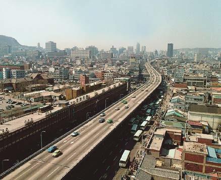
Today, the liberated creek flows through the city, creating a nine-kilometre swath of green corridors along the rediscovered waterway. Researchers found that the natural pocket provided additional benefits beyond community interaction and recreational well-being. The waterway handles flooding rains better than buried sewers, has transformed the nearby streets, boosted the economy through tourism, and brought a 3.3-degree Celsius drop in average summer temperatures in the area adjacent to Cheonggye Creek.

45
Our high streets and public spaces are important conduits where massive infrastructure investments have already been made — which is why we shouldn’t abandon them. Their zoning rights permit a wide and flexible mixture of use along a transformable public domain that can support density and various scales of the economy — including street trade. Ultimately, to ensure the greatest number of people have access to essential services, it is vital that town centres retain government facilities, educational and health institutions, and economic opportunities.

Think of the city as your own body — if blood flow is restricted and filled with excess junk you have a problem. To optimise health, you increase flexibility and reduce the frictions causing the deterioration. The most important trend we can possibly set in 2023 is to understand — from a very young age — that we share a delicate body for a short period of time before leaving it to another generation.


/ FEATURE /
ANTON WESSELS
Urban Designer and Architect GAPP Architects and Urban Designers
www.gapp.net @gapp_
Kliptown Freedom Square Park
Age of Adaptability
DEFINING THE ARCHITECTURAL MILIEU OF THE 2020 s

As we move deeper into the decade, it is becoming increasingly clear that the architecture of the 2020s is characterised by a commitment to sustainability, a push for innovation, and a renewed emphasis on the relationship between buildings and the people who use them. Whether through the incorporation of cutting-edge technology, renewable energy sources, or a growing focus on inclusive, community-centric design, the era is shaping up to be a defining moment in the history of our built environment.
Exploring the balance between the form, function, and footprint that mark this decade of design, Renato Graça of GSQUARED considers the stand-out typologies of the times.
In my opinion, the architectural era of the 2020s will be defined as a time of transition and experimentation. Architects are seeking to find new ways of designing buildings that are more independent and sustainable (out of political necessity), resilient (essential for climate change), and economically sensitive (due to global inflation).
Living in a country that lacks a definitive architectural language and style, we are fortunate to have freedom in design — something I think other countries experience more restriction with.

48
/ FEATURE /
VG 5 by GSQUARED Architecture & Interiors in Somerset West, Cape Town
Architecture is primarily moving away from a singular, onesize-fits-all design approach towards a more context-sensitive, holistic approach that considers the unique characteristics of each site, building, and community. This shift is driven by a growing awareness of the need to create sustainable, resilient, and liveable environments, as well as the desire to create buildings that are responsive to the needs of the people who will use them.


49 / FEATURE /
ANNA Stay by Caspar Schols in Schaijk, Netherlands. Photo courtesy of Jorrit 't Hoen
Escaleras y Mirador Vela by External Reference. Photo courtesy of Adrià Goula
D 13 by GSQUARED Architecture & Interiors in Melkbosstrand, Cape Town
Architects are becoming more conscious of several issues as we move into the next decade. Some of these include:
1. Wellness
The pandemic’s impact was obvious: humans need less closed spaces and more light and ventilation. Fortunately, South Africans can harness this simply with our desirable climate.
2. Resilience and adaptability
Architects are more committed to designing buildings that are resilient to extreme weather conditions, as well as being adaptable to changes in how spaces are used over time. A fight against static architecture, buildings should also adapt to their environment (i.e. lighting conditions, wind, rain, and sound) to create the most optimal user experience. Think of buildings becoming less of a snail shell and more of a sunflower.
3. Smart and independent buildings
With the increasing need to become independent and the growing use of technology in architecture, professionals are more aware of having to couple our designs with these technologies — ideally to create something that looks as if it was planned that way.

In the years ahead, we will be looking at ways to optimise the use of renewable energy sources and reduce the carbon footprint of building materials, including the use of digital fabrication techniques and the use of circular economy principles. I don’t think we are too far off having custom components for buildings fabricated on a building site (e.g. using 3D printers for a concrete component).
The globe’s digital interconnectedness has allowed many architects to obtain and complete work outside the confines of their office and design projects across the world. This places a greater need on preserving vernacular where possible: a modern building these days can look equally comfortable in North America as it can in Australia. The call to action for architects is to be familiar with a wide range of design traditions, building materials, and construction methods, as well as local building codes and regulations to drive context-sensitive design.
RENATO GRAÇA
Principal Architect and Founding Director, GSQUARED Architecture & Interiors www.gsquared.co.za @gsquared_architects


50 / FEATURE /
The Shed by Diller Scofidio + Renfro in collaboration with Rockwell Group, New York City, United States of America


 SANSA SPACE WEATHER CENTRE

Size: 820 m²
Cost of Space Weather Centre: R18 million
Cost of Entire Space Precinct: R27 million
Completed: November 2022
Location: 1 Hospital Road, Hermanus, Western Cape, South Africa
Lifting off from the fynbos landscape of the Overberg, the new SANSA Space Weather Centre is shooting for the stars, boasting a design typology worthy of its occupants’ academic subject matter. Designed by AVNA Architects and taking its shape from the curvaceous magnetic fields scientists observe when tracking space weather patterns, the precinct hints at something distinctly otherworldly.
Coastal setting
The South African National Space Agency (SANSA) is situated in the picturesque coastal town of Hermanus. Established in 1941 as the country’s first magnetic observatory, Hermanus was specifically chosen for the site’s location due to its magnetically clean environment — something that can only be achieved away from magnetic disturbances found in cities and large magnetic rock formations. Hermanus does not have a rail infrastructure, which is a common disturbance affecting the measuring instruments.
SANSA has been providing space weather data from the Southern Hemisphere for many years. This data is shared with other space agencies worldwide to monitor and track solar flares and storms. The need arose for a new 24-hour Space Weather Centre for space weather forecasters to provide data around the clock. And so, this new and exciting project began.
Space science
A solar storm is an eruption of the sun’s energy that shoots charged particles into space. These particles flow towards earth as a solar wind to form the northern lights (aurora borealis) and southern lights (aurora australis). Bigger solar flares can cause temporary dark patches on the sun, affecting the earth’s magnetic field. Solar flares can impact electrical appliances, electricity grids, and all communication and navigation satellites that orbit the earth. Therefore, space weather can have damaging effects on electronic technology such as GPS and navigational equipment, which people heavily rely on.
Space weather scientists are at the forefront of research into solar storms, and high-tech computer modeling software helps them to forecast these events. Instruments and probes are placed in key locations across Southern Africa and Antarctica to monitor the sun’s energy and its effect on the earth’s magnetic field. The site chosen for the Space Weather Centre is located directly opposite the SANSA office and administration block. A visual approach line links these two buildings within the precinct. The Space Precinct includes a new guest accommodation building to host visiting scientists, an extension of the existing student residence, and a generator and transformer building.
Design concept
The design for the Space Weather Centre, the control hub for the Southern Hemisphere, was inspired by the beautiful magnetic fields that are observed by its scientists. These evocative elliptical curves and solar flares informed a unique building typology. Curved shapes and vertical planes break the building’s façade into portions, with key areas being celebrated with sculptural volumes and spaces that can be seen in the main entrance, lecture hall, and boardrooms. The original brief suggested a simple rectangular building with a basic roof, but the architects sought a different type of design to celebrate the revolutionary work done on the property. This was met with great enthusiasm from the clients and resulted in a beautiful building emerging from the fynbos landscape.
Experiential learning
The Space Weather Centre would need to accommodate SANSA scientists and staff members, and also cater to visits by the public. SANSA hosts many school children of all ages every year to teach and educate them about science and space. SANSA also provides tours for the public and hosts monthly lectures for a wide audience. Therefore, the design needed to incorporate these requirements.
Building typology
The building is divided into a public area with a lecture hall and a large foyer for events. The private office area is access controlled and comprises offices and boardroom facilities. These areas are distinguished through different colours. The public areas have bursts of bright colours to create a stimulating space to visit. The office wing has a toned-down colour scheme of blues and greys with soft timber joinery to create a calming environment in which to work.
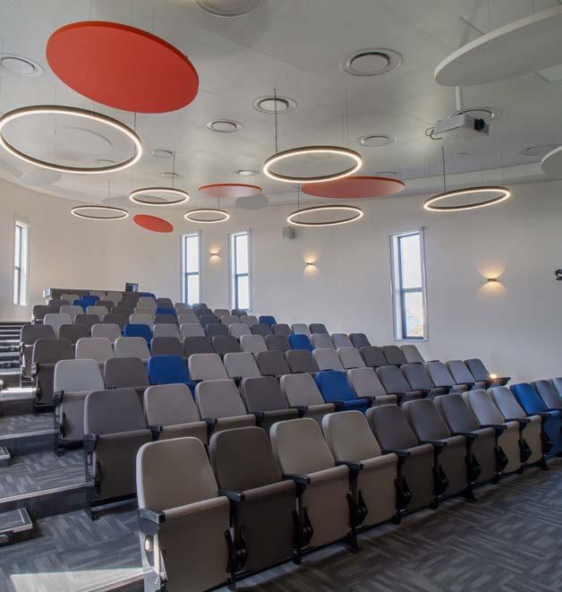
The approach to the building is along a gradual polished concrete ramp made from black and white aggregate and crushed abalone shells that glisten in the sunlight. This ramp leads the visitor into a dark lobby with a circular glowing orb overhead — a moment in space. One is then welcomed into a generous foyer with an expressive ceiling, comprising suspended circular orange acoustic panels and feature lights. The main control centre is visible through a glass wall, where scientists can be observed monitoring space weather data on a large curved screen.
54 / PORTFOLIO /
"The new SANSA Space Weather Centre building is just one of five of its kind in the world, marking an impressive milestone in South Africa’s space-scape."

The architects wanted to create something unique and true to what the scientists in Hermanus observe through their equipment every day. Inspired by the beautiful magnetic fields, elliptical curves, vertical planes, solar flares, and fiery colours detected in space weather science, they set out to develop a purpose-built design typology.


56
THEThe SANSA Super Dual Auroral Radar Network (SuperDARN) at the SANAE IV base, Antarctica
INSPIRATION


57 / PORTFOLIO /
The office wing comprises cellular and open plan offices, two boardrooms, a staff kitchenette, a large server room, staff ablutions, and sleeping pods. All joinery was designed by the architects, with soft timber contrasting a selection of greys to create a corporate atmosphere. Feature wallpaper and canvas panels were custom printed to add colour to the passages and the offices, all chosen with a space theme. Blue walls were added to certain areas to create a calming place for scientists to work in. All furniture, artwork, and décor were selected to complete a holistic interior space.

The large 100-seater lecture hall is accessed from the foyer. Its sculptural curved shape improves acoustics and creates an interesting space for visitors. Circular orange and white acoustic panels and lights hang from the ceiling, creating a lively environment for learning. Narrow slot windows have been placed in key locations to capture views of the fynbos gardens and the ocean in the distance.


58 / PORTFOLIO /
Materiality
Smooth plasterwork was contrasted with rough painted bagged brickwork, creating visual interest and accentuating the architectural detail, thereby softening the façade. Blue feature walls and elements were added to highlight key areas such as the main entrance. The construction of all buildings within the observatory needed to be non-magnetic. Therefore, the use of metal and steel products was kept to a minimum. Fibre cement roof sheeting was used to replace standard metal roof sheeting. All roof trusses were carefully designed using timber. This was especially challenging with the larger spans inside the foyer and lecture hall.
Guest accommodation
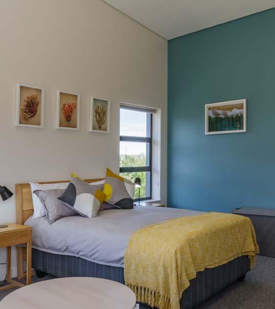
There was a need for an on-site guest accommodation building for visiting scientists, researchers, and lecturers. Some of these visitors stay at the SANSA campus for many months on end, so the need for comfortable accommodation was essential. The concept for the building follows the same curved shapes found at the new Space Weather Centre, albeit on a smaller scale. The two new buildings speak to each other through similar design and materials, and are separated by a dense fynbos landscape.
The building has four guest bedrooms and bathrooms, two of which are for long-stay visitors. A shared communal kitchen, dining and living area, as well as two outside seating areas were created. A small laundry room was included for the housekeeping services, totalling the building at an overall size of 180 m².
"THE CONSTRUCTION OF ALL BUILDINGS WITHIN THE OBSERVATORY NEEDED TO BE NONMAGNETIC. THEREFORE, THE USE OF METAL AND STEEL PRODUCTS WAS KEPT TO A MINIMUM."
AVNA was appointed to curate all the décor, soft furnishings, and artwork. Each bedroom and bathroom has a unique theme, either a mountain theme with green rooms or a coastal theme with blue rooms. The bedroom colour schemes were selected to enhance tranquillity, while the lounge and living areas have flares of bright colour to stimulate the mind and encourage social mingling.
Student residence
As the space science research department expanded to accommodate growing postgraduate and undergraduate course enrolment, the existing student facilities also needed to evolve. A new wing, housing twelve additional beds, was added onto the existing student accommodation building. The existing kitchen and dining area were also renovated and upgraded.
Colour was added in key areas such as on feature walls in the passages and bathrooms. Contemporary furniture and carpet selection helped to create a pleasant, lighter atmosphere. All finishes needed to be highly durable and robust for the busy student environment. Additional bathrooms, showers, and a new laundry room were part of the scope of work. The original kitchen and dining area were spatially divided and a few internal walls were removed to create one large open space. Various seating and working options were provided, with colour being added through the joinery and key feature walls to create a fun environment for young adults to cook and mingle after a busy day on campus.
Generator and transformer building
Since SANSA operates 24-hours a day, a generator upgrade was necessary to meet the energy demands of the entire SANSA campus during loadshedding. A simple building that sits comfortably with the other new surrounding structures was designed.
Success story
The overall success of this project has been a result of teamwork between the client and the project team. Minister Blade Nzimande, who heads up the Department of Higher Education and Training, Science, and Innovation and officially opened the new facility in November, was thrilled that after turning the sod two years prior, he could return to SANSA Hermanus to find a brand-new building, completed on time and within budget. This was achieved by careful selection of finishings and management of the budget.
It is also worthy to note that SANSA is promoting women in science, and that the new facility will be run by a team of female scientists and forecasters. The main drivers for launching the project were all women and leaders in their fields, including the young architect Heidi McAllister who designed the building and saw it through to its completion. This project is both a success in the field of science and equality in the work environment. The new SANSA Space Weather Centre building is just one of five in the world, marking an impressive milestone in South Africa’s space-scape.
59
/ PORTFOLIO /
MEET THE TEAM
Architects: AVNA Architects

Design and project architect: Heidi McAllister, AVNA Architects


Technical: Jaco Voges and Justine Alexander, AVNA Architects

Project manager and principal agent: Schoonraad Architects
Quantity surveyor: Farrow Laing Quantity Surveyors
Engineering consultant: NWE Consulting Engineers
Contractor: Edge to Edge
Health and safety consultant: Q Safety Consultants
Landscape designer: Revive Landscaping
Photographer: Dawid Theron Photography
www.avna.co.za @AVNA
Top left and right: On-site guest accommodation. Bottom left and right: Student residence.
SUPPLIERS
Aluminium Aluplan Architectural Aluminium 021 701 2002

Tiles
Tile House 021 506 3020
Sanitaryware
CP&B Cape Plumbing & Bathroom Supplies 028 313 2326
Joinery
From the Barn 073 731 1347
Kitchen counters Caesarstone 083 608 5810
Kitchen cupboards PG Bison 011 897 5200
Ceilings
Saint-Gobain Ecophon 012 657 2800
Lecture hall seating Rodlin Design 011 444 2061
Lighting supplier
LED Light Consult SA 021 879 6312
Carpets
Belgotex 082 415 3415
Wallpaper and artwork
ORMS Print Room and Framing 021 469 1987
Loose furniture
Cecil Nurse 086 163 3423
Décor and soft furnishings
Woolworths 021 407 9111 Knus 021 825 9908
Skinny Laminx 021 424 6290
61 / PORTFOLIO /


Googie It


South African architect couple Silvio Rech and Lesley Carstens reimagined an LA-style, Mid-Century bungalow on Johannesburg’s Westcliff Ridge as a contemporary Googie-inspired fantasy, complemented by the city’s most extravagant views.

From the twin verandas that run across the front of architects Silvio Rech and Lesley Carstens’s house, there’s a 270-degree view over the canopy of Johannesburg’s massive manmade forest. In spring, when the Jacarandas bloom, the urban forest is tinged with purple flowers. This breathtaking panorama presents a timeline that sweeps through the history of the city's architecture. Immediately on the right, the story begins with turn-of-the-century English Arts and Crafts mansions built by the Randlords, Johannesburg’s first mining magnates. As you follow the view, a century unfolds in a progression of Art Deco, Modernist, and Neo-Brutalist buildings, culminating in the glassy façades and towers of the city’s new CBD.

As partners in work and life, together the duo run Silvio Rech + Lesley Carstens Architecture and Interiors (SRLC), an award-winning practice perhaps best known for its visionary safari lodge and island resort architecture, but not averse to the more daring and bespoke end of the residential market – they lived and worked just up the road for many years.
The couple was aware that the property at the end of the street had been on the market for several years and had proved almost impossible to sell. It was so overgrown with invasive wattles that no one realised what a spectacular view lay beyond the screen they had created. It even took these seasoned architects more than one visit before the penny dropped, but when it did, they nabbed it.
While the view that was revealed when the vegetation was cleared undoubtedly remains the hero of their new home (they removed 40 alien trees), the shabby little bungalow on the site ended up exerting a considerable influence too.
In the grand narrative of Johannesburg's architectural history, there’s a footnote for California-inspired Modernism. The bungalow on the site, with its zig-zag roof, multiple volumes, and white-washed distemper walls, was clearly influenced by Los Angeles’ post-war Googie architecture — a daring, flamboyant, futuristic style with its roots in the golden age of automobiles and the era’s infatuation with space travel.
Coincidentally, Silvio and Lesley had recently completed two projects that had fuelled their interest in the era. The first, Keurbooms Cottage in Plettenberg Bay, looked like something out of the film 2001: A Space Odyssey, and the second, on Nettleton Road in Cape Town, involved the interior design for a John Lautner-inspired, Iron Man-style holiday house. ‘It did awaken a little monster within us,’ says Silvio. They begun collecting Mid-Century furniture and studied Lautner’s masterpieces, repeatedly flattered by the world of cinema from James Bond to Tom Ford’s A Single Man.
‘The first part of this project was restoring the original house,’ says Silvio. It wasn’t an outstanding example of the style — not quite heritage material and a bit cheaply and clumsily done in parts. ‘But we thought it had a serious charm to it, and we wanted to protect this style of house,’ he says. ‘Some of the internal planning was very cluttered, so we knocked out some of the internal walls and opened it up. Those are the levels of the existing house, so we thought we’d work with them.’
He and Lesley preserved period details and restored the finishes, from the idiosyncratic distemper on the walls to the quarry-tile floor and steel window frames, as well as an Aga stove in the kitchen and some surviving timber work, internal screens, and a little breakfast nook. ‘It’s a bit rickety, but it adds to the layering and richness,’ says Silvio.
64 / PORTFOLIO /


The roof collapsed during construction, but they rebuilt it according to its original shape, refining some of the details and replacing the yellow pine with beautiful blonde oak, which they also used on the floors. From the base of this restoration, a new form arose like a spirit released, enveloping the original and liberating a contemporary take on Googie architecture above it — like a thought bubble imagining what the little bungalow always believed it could be.
The two ribbons of concrete running along the front of the house create a colonnade that draws in those cinematic views. Silvio points out that the house is in essence a deconstructed Highveld veranda house, referring to the corrugated iron-roofed houses with wrap-around verandas that became a sort of local vernacular in the early 20th century. ‘It’s a fantastic way of living in this climate,’ says Silvio. ‘A veranda house is very hard to beat. Except that we wanted to do it in the way a modern Googie architect would.’
Those ‘ribbons’ not only create an upper and a lower veranda, but they also link the house with the couple’s studio on the other side of the property like ‘conveyor belts’. As Silvio explains, ‘It left a valley in between for all sorts of opportunities like the pool and the spiral staircase linking the bottom and the top.’ The slim, cigarette-like concrete pilotis are edged with a water channel rather than a balustrade, which joins the wedge-shaped rim-flow pool. The view from the lower veranda is without a visual barrier, which has a powerful effect. The lower level provides shelter from the sun in hot weather, while the top-level catches direct sun when the weather is cold.
A wedge-shaped cut-out in the concrete of the top veranda reveals the swimming pool below. Le Corbusierinspired handrails in raw galvanised iron and a spiral staircase floating above the swimming pool and connecting the upper and lower verandas hint at an almost nautical dimension of the machine aesthetic that inspired elements of the design. The rails and staircase have been deliberately left in their raw state. ‘That’s the way it should be,’ says Silvio. ‘Why put paint on a perfectly good material?’
The covered outdoor lounge area features poolside furniture designs by SRLC, such as the Scissor Chairs, which they designed for Time + Tide Miavana, a resort in Madagascar. Downstairs, a pair of Panton chairs by Verner Panton dating back to the early 60s rub shoulders with contemporary Paola Lenti Float Pool Loungers and a circular lounger by SRLC. The marble coffee table is by SRLC, also part of the island collection for Miavana, Madagascar, as is the pair of wooden loungers with yellow cushions on the upper level.
The interior architecture is a masterclass in detailing and materiality. The master bedroom on the top level ‘takes the Googie spirit and keeps going’, exploring the language of the zig-zag roof into an angular, prismatic sculpture ‘hat’ — something like a cross between a stealth bomber (orange on the inside like a bomber jacket) and ‘an early Lamborghini’s dashboard’, as Silvio puts it, with a faceted conical skylight. The changes in level, a signature of the era, adds ‘some richness in the volumes’.
The junction between the original roof and the concrete slab of the veranda is subtly articulated with black metal brackets, offsetting the historical and new aspects of the architecture. The parts are all ‘tied together’ through the uniformity of the honest materials. The cast concrete verandas and pilotis and the polished concrete of the floor are softened and warmed by the oak floors and ceilings throughout the house.
The kitchen, in its original position, has been extended, and once again the junction between new and old has been articulated in the ceiling details and the black strip on the beam where a wall has been removed. The alterations opened the kitchen up to the view to the front of the house and to the garden at the back, as well as to the living and dining areas so that the family can cook eat and interact. ‘It’s a very cool way of living,’ says Silvio. The kitchen island, designed by Silvio and Lesley using flamed Rustenburg granite, contrasts its monolithic form and raw materiality with the slim Neolith countertops articulated with a delicate shadow line above the timber cabinets. The bar stools at the kitchen counter are by Houtlander. The two cylindrical extractor fans are by Falco. The refrigerator is by Smeg.
MEET THE TEAM
Architect: Silvio Rech + Lesley Carstens Adventure Architecture and Interiors
Horticulturist and landscape designer: Dawid Klopper
Writer: Graham Wood
Photographer: Elsa Young Stylist: Sven Alberding
67 / PORTFOLIO /
In the bathroom, the machine aesthetic is expressed through industrial-agricultural-inspired taps and shower fittings, once again toying with the idea of a building as a machine for living. The theme is carried through in the rest of the house’s furnishings, which have been sensitively inserted into this architectural envelope in an ongoing dialogue.
In the main sitting room area, Mid-Century and 60s design pieces are set in dialogue with the LA-style architecture of the house. Silvio and Lesley’s collection of Modernist pieces includes the likes of Joe Columbo’s Elda Chair, a bold break with tradition using new materials to find novel forms, Jean Prouve’s Grande Repos, an early mechanical masterpiece, and Verner Panton’s era-defining cantilevered S-shaped chairs, all pushing the boundaries of technology and aesthetics in one way or another.
Mixed in are several of Silvio and Lesley’s own early furniture designs, plus some more recent prototypes for clients, including the travertine outdoor dining table, the pool loungers, and their take on Pierre Jeanneret’s Chandigarh chair. Jeanneret, a cousin of Le Corbusier, poses an excellent example of Modernist design outside of Europe; in this instance in India. He created the furniture as part of his overall design for Indian prime minister Jawaharlal Nehru’s new capital city, fusing simplicity and a Modernist sensibility with affordable and abundant local materials.

On the outside, after stripping out the invasive vegetation, including about 40 wattle trees blocking the view, Silvio and Lesley worked with horticulturalist and landscaper Dawid Klopper, who steam washed the newly exposed natural, orange-tinged ferrous rocks to reveal the true character of the landscape.
‘We planted 60 indigenous trees, including olive trees and Buddleias,’ says Lesley. They added four or five different types of veld grass and other indigenous plants on the perimeter. Dawid used a Japanese technique to hand-manoeuvre the rocks around the site and into position around the concrete entrance ramps to bring out the contrast between the futuristic yet primal architecture and rocky, wild vegetation of the landscape. A pair of towering Washingtonia robusta palms were brought in, at once paying homage to Californian landscaping and referencing the palms common throughout Johannesburg’s manmade forest — hinting at the historical influence of Californian design on the urban context.
Looking out over the vista, though, you realise that as much as this remarkable house is an essay on architecture, and an exuberant contemporary expression of a tributary of Joburg architectural history, it has never lost touch with its primary reasons for being – to connect with its setting, to drink in the view, and to articulate its rocky base through inspired contrast.
68

"FROM ACROSS THE VALLEY, THE CLEAN-LINED CONCRETE SLAB AND SLIM PILOTIS SEEM TO FLOAT ABOVE THE ROCKY RIDGE, CANTILEVERING OUT IMPOSSIBLY FAR INTO THE VOID."
Harnessing the Nuances of Nature
Composites to Curate 2023’s Best Build
There is no doubt that the transformative nature of colour has an impact on every facet of our lives… Eva-Last’s advanced colour ranges of composite decking, interior flooring, and cladding, as an alternative to timber, journey through the familiar hues one might find in natural timbers to harness a state of well-being and serenity.
The overarching feeling evoked by a wood finish is one of comfort, warmth, and an affinity with the environment. Eva-Last’s composite bamboo-polymer products are enticing in the sense that they offer all the emotional benefits of a natural wood finish, minus the bugbears of high-maintenance and deterioration.
‘Across our three ranges of decking, we look for colours that match those of different timber species, and to a certain extent, other elements in our natural environment,’ explains Shelley Galliver, Eva-Last Marketing Director.
Eva-Last also produces trending colours, which currently are various shades of nature-inspired greys — the natural effect of allowing timber to weather and turn from brown to grey.
‘Appealing to a discerning architect and designer, we’ve made sure we have a grey etched colour that looks much more appealing than natural weathered wood. We’ve accommodated this to sit alongside our range that follows the lines of natural wood from dark browns to tans and every nuance of nature.’
‘What’s interesting is that colours and textural preferences differ from region to region. If we look at Europe and America, the natural Cedar and Western Red Cedar looks are on-trend, which might differ from the South African trends,’ explains Galliver.
Since there are more than 100 different varieties of timber used across the globe and the process involves recreating a product that is, for all intents and purposes, indistinguishable from wood, it is important that the wood colour replicates something that is familiar to the end-user, so that it blends into its environment and feels familiar to its regional context.
When it comes to the countless possibilities within a palette of wood hues, architects and designers are constantly exploring new avenues of expression. One of these is the process of wood charring or
creating carbonised wood — a technology discovered over 300 years ago, commonly referred to as Shou Sugi Ban or Yakisugi.
Carbonised wood was developed in a small fishing village in Japan, on the island of Naoshima. The fishermen discovered that by lightly burning the surface of wood, timber was much more resilient to the damage caused by the sea and other elements, as it limited water absorption.
Today, this ‘charred appearance’ has become extremely sought-after as an architectural theme denoting solidity, and holds a powerful blend of hi-tech and ancient appeal. This is why Eva-Last recently launched a colour called Carbonised Osage or Carbonised Cedar: an avant-garde option that mimics charred wood.
Colour is intricately associated with mood and prevailing fashion trends, and when it comes to selecting building materials, decisions around colour are influenced by the design and context of the structure and synergies with the environment where the product will be located.
‘Composite building materials represent a long-term investment. Our Apex range, for example, has a 30-year warranty, and on Infinity there is a 25-year warranty. So, it’s not something that you update according to mood or prevailing trends, as you would do with other décor aspects of a building,’ notes Galliver.
When it comes to building materials, it’s clear that colour preference is very much a regional phenomenon, which is why Eva-Last tailors its colour ranges to suit local preferences. By and large, this is dictated by the types of natural timber traditionally used in timber construction around the world, and the popular colours available in Eva-Last collections correspond to those preferred timbers. After all, the key-note behind all Eva-Last’s product ranges is to blend into the natural environment.
www.eva-last.co.za @evalastdecking


70
/ FEATURE /
C M Y CM MY CY CMY K


 Annie Sloan Home Office. Capri Pink Wall Paint, Emperor's Silk Chalk Paint, Capri Pink, Burgundy, and Antoinette Lifestyle Portrait


 Annie Sloan Living Room. Chalk Paint Cupboard by Maude Smith, Wall Paint in Carnaby Yellow, Satin Paint in Carnaby Yellow
Circle: Esse Skincare Headquarters by Koop Design using Kalki Ceramics. Photo courtesy of Roger Jardine
 Dolmen-inspired ARDARA Console Table with a Sahara Noir Faux Marble Finish by Cafe Latte


 'Fine Modern Spaces' living room concept designed by Han´s Interiors in partnership with Caffe Latte and Covet House. Cassia Modular Sofa by Caffe Latte; Navarra Centre Table and Monochrome Sideboard from Boca do Lobo; Ancud Armchair from Covet Collection´s Patagonia Capsule; Couple Rug by Rug'Society; Naicca Suspension Lamp and Vellum Wall Lamp from Brabbu


 By Marc Sherratt


 Xylem, 2019, Montana, United States.
Photo courtesy of Iwan Baan


 SANSA SPACE WEATHER CENTRE


