


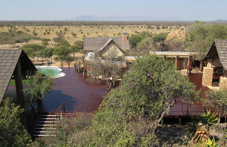
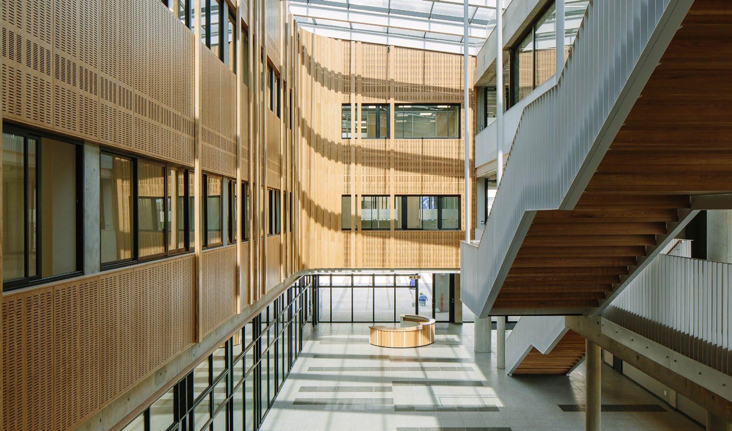
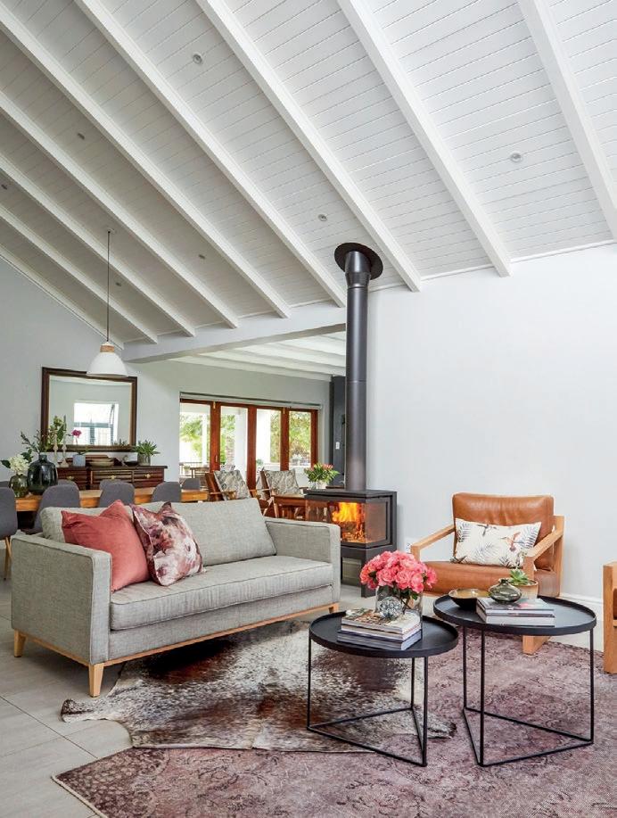
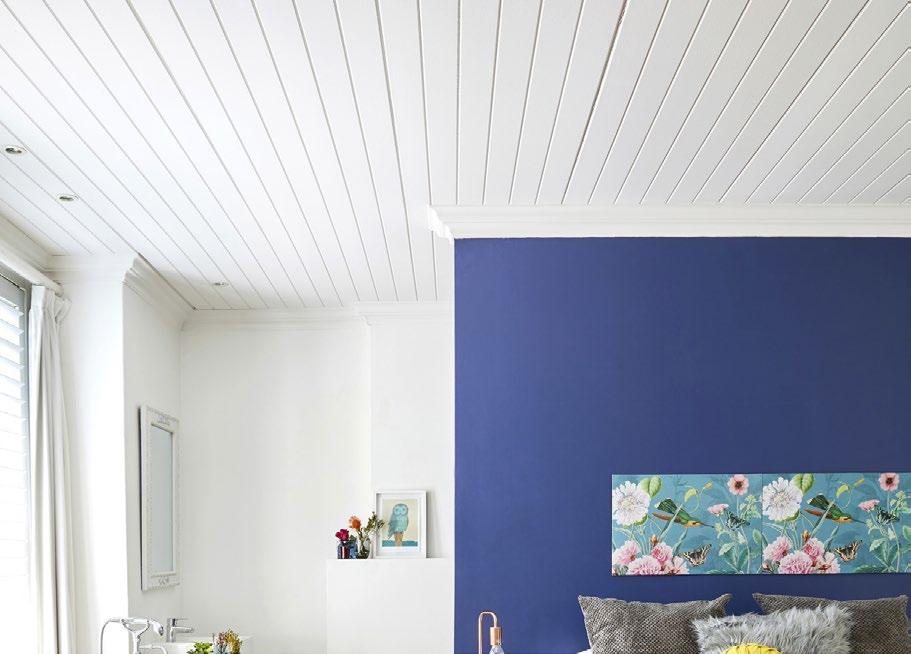
Designing with timber can be daunting, but there’s a toolkit of insights that can make the process less intimidating. As a passionate wood scientist, Dr Philip Crafford has been instrumental in creating The Wood App, a leading educational platform for the design and use of wood products in the built environment. He is currently working as a postdoctoral fellow at Stellenbosch University alongside Prof. Brand Wessels, as they develop online timber building courses, CLT prototypes, and CNC projects. From his expertise and understanding of this excellent material, Dr Crafford has curated nine simple tips to get you started with confidence.
General use
Select or specify kiln-dried timber, except if you know how to design with and use green timber.
Exterior use
Specify treated, SANS-certified timber for exterior use. As an alternative you can use naturally durable and FSC® certified timber.
Structural use
Structural use calls for SANS-graded timber, chosen according to structural requirements. Alternatively, you will need to proof load the timber. Avoid using wet off-saw timber for structural use — this has not been graded and quality could be compromised.
When storing timber, cover kiln-dried wood with plastic wrap, keeping it above ground at level surface and protected from the elements. Always allow freshly treated timbers to dry and equalise at site before use.
Installation
Install wood above ground and avoid water traps (except if using H4/H5 treated wood for ground contact is required). It is recommended to cover laminated beams and not use exposed ones where possible.
Cover wood with waterproof systems, moisture barriers, or coatings before executing external cladding or roofing.
Timber connections
Specify proper bracing and connections in timber structural design. Remember to elevate from ground contact.
Ensuring the durability of timber requires several essential steps. Make sure water flow is designed to flow away from the structure. Use end-caps, slanted top profiles, profiled edges, or flashing, along with treated or durable timbers. Finally, always follow SANS 10082 design code.
In large residential or multi-storey buildings, larger timber dimensions are beneficial to avoiding fire hazards. The best practice also includes applying fireproofing, consulting experts, and (as always essential) following SANS codes.
Ready to get started with timber? The Wood App — a collaboration between Sawmilling South Africa and Stellenbosch University — is the professional platform you can’t afford not to pursue.

P L A Y S a F E

Smooth and soft playground surfacing.
• Ultra-durable, flexible and impact resistant.
• Low maintenance & sustainable.
Excellent shock absorption with high elasticity.
• Suitable for indoor or outdoor multi-sport areas, playgrounds, landscaping and public parks.
Allows children to play without risk of injury.
• South Africa’s only internationally compliant wet pour playground surfacing system. (SANS and SABS compliant and accredited).
• International HIC (Head Injury Criteria) standard certified.
• Licensed installers throughout Sub-Saharan Africa.
• Available in 15 colours or multiple blends.
Welcome to the Educational Builds issue of SCAPE Magazine, a special edition aligned with South Africa's Youth Month. This issue is a testament to the power of innovation and education in shaping the future of our built environments. From schools and universities to crèches and student residences, June is a time to document and reflect on how educational builds annually shift towards a collaborative process filled to the brim with potential.
As we celebrate Youth Month, we reflect on the significant role young minds play in transforming our architectural and design landscapes. It becomes increasingly evident (and fascinating) how the learner acts as teacher when it comes to the design process — a factor so very pertinent in this sector. We’ve brought you exciting new projects that highlight the creative flair of the next generation of designers and architects with a keen focus on the process. Beyond individual projects, our pages are also packed with insights from some of the most dynamic and forwardthinking professionals in the industry, so you're in luck!
The Educational issue underscores the importance of thoughtful, inclusive, and sustainable design in creating environments that empower and uplift — from new nodes on tertiary institutions and community projects, to interviews with renowned architectural firms and student residences. Join us as we delve into these transformative projects and celebrate the boundless promise of South Africa's youth. We hope this issue inspires you to think differently about the spaces we create and the impact they have on our future generations.
Speaking of impact, we hope you're as revved up and excited as we are about the inaugural SCAPE Awards of Excellence, in partnership with Infinity Surfaces. The response has been outstanding and a sure sign of the incredible event to come. Register, enter, get your crew involved, and get in touch with any questions. This is history in the making…
Ed’s Note.
x
66
Under the Dome
NMU Science Centre by SVA International
11
Architectural Alum
A conversation with Jo Noero
38 From Concrete to Curriculum
St Mary’s School by Rebel Base Collective
72 From Showgrounds to Showpiece
WITS Faculty of Commerce, Law and Management Administration Building by MMA Design Studio
19 A Playground of Possibilities
The New Rest Valley Crèche
45
The Future is Female
The Anele Tembe Library by Hesse Kleinloog Studio
80
Chromatic Curve
A contemporary retrofit for Stellenbosch University
24 A Community in Colour
‘Present Shapes’: A vibrant intervention in Bonteheuwel
51 A Tale of Two
Hubo Studio’s architectural adventures at King David School
87
Resident Living Peak Studios by GASS Architecture Studios
30 Modern Metamorphosis
The new Cape Town Station by Boogertman + Partners
CONTRIBUTORS
59 Green Dreams for Eco Education
Green School South Africa’s latest addition
Jo Noero, Noero Architects | Max Melvill & Ashleigh Killa, The MAAK | Lorenzo Nassimbeni | Boogertman + Partners Rebel Base Collective | Hesse Kleinloog Studio | Hubo Studio | GASS Architecture Studios | SVA International | MMA Design Studio | JAKUPA Architects and Urban Designers Pty Ltd
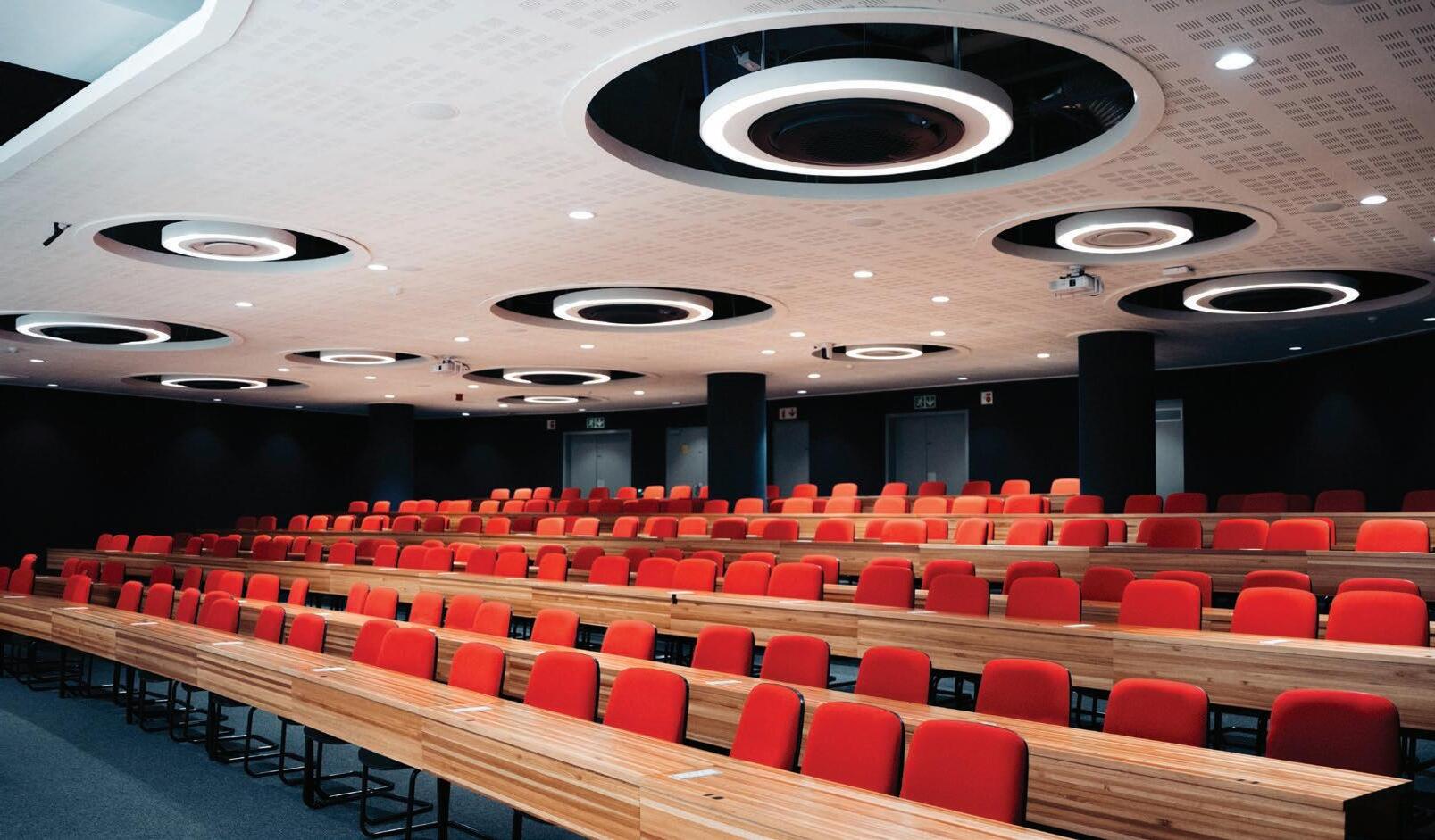
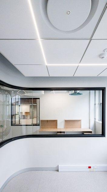
Samsung’s innovative 360 Cassette air conditioner takes cassette technology to the next level. It provides good comfort and has a neat, tidy look with an aesthetic flair that virtually blends with any ambience.
The bladeless design minimises interference to improve airflow while the circular design directs air more evenly to every corner of the room. It features a stylish panel and an intuitive LED display that allow users to change the airflow direction depending on preference. This advanced design allows for even heating or cooling with no loss in airflow.
The 360 Cassette is lauded industry-wide for combining style, energy efficiency and reliability to deliver outstanding performance in a space-saving design.

• Efficient cooling and heating

Circular LED displays airflow direction setting of horizontal and vertical airflow operation.
Digital inverter technology provides fast cooling/heating with minimal power consumption, saving cost and reducing energy waste.
• Maximum power saving
After reaching the set temperature, the inverter air conditioner will operate in half-load mode to prevent the compressor from working at an inefficient frequency or turning off.
• Wide operating temperature range
Operates in extremely harsh environments; where ambient temperatures are between -15°C and 50°C.
• Fits into any interior space
Choose from a variety of colours and panels to match the ceiling space.
• R32 Gas Refrigerant
It uses the next-generation R32 refrigerant, which has an Ozone Depletion Potential (ODP) of zero and a lower Global Warming Potential (GWP) than conventional refrigerants, so it’s more environmentally friendly and has a lower impact on global warming.
Fourways Group are the national distributors of all Samsung air conditioners and HVAC experts. Contact us to discover the entire line-up and how you can incorporate the 360 Cassette into your next sustainable cooling and heating project.


Building spaces for the minds of tomorrow.
Within the illustrious portfolio of Noero Architects, one finds a notable presence of projects centred around Wynberg Girls’ High School—a testament to an ongoing collaboration that has significantly shaped the institution's enduring legacy. As custodians of architectural innovation, Noero Architects has woven a narrative of transformation throughout the school's campus, elevating its stature. For SCAPE's Educational Builds issue, we are privileged to invite Noero Architects to unveil the story behind their impactful collection of work at Wynberg Girls’ High School (WGHS). Let’s delve into the architectural journey that has left an indelible mark on this esteemed institution with Jo Noero, renowned architect, teacher, and Director at Noero Architects.
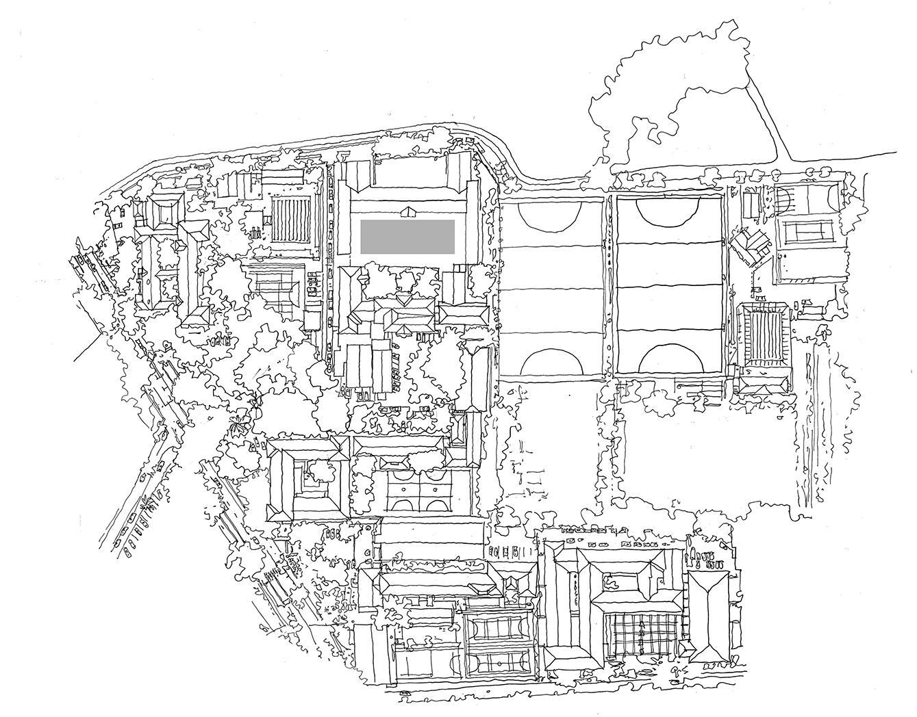
How did your journey with WGHS begin, and what projects have you completed with the school since then?
We started working at WGHS in 2006, and we have completed the three projects illustrated here, as well as the upgrading of five science labs, a small pavilion for the netball courts, and a refurbishment of the art school. We are also working on a new hall for the school, as the existing hall is too small for the increased student numbers.

What part of designing for the school is most fulfilling?
All the work. The school has a wonderful democratic culture in which staff, students, and the school leadership, together with the School Governing Board, all participated in all decisions regarding the space and its use. This, in turn, generates wonderful ideas which then form the basis for the architectural work.
What are your primary considerations when designing for an educational institution?
It’s always the same, whether one is working for a school, a family, or whatever. Architecture is a practical art and is brought into being to satisfy purpose. Without purpose, one does not have architecture. Ethics, according to Wittgenstein, means that whatever one does, it should always aim to make the world a better place. In this sense, one cannot go wrong when working with schools because everyone involved is committed to positive change through architecture, and the outcome is always easily measured by looking at the enjoyment and pleasure that the students get in using the spaces.
Is there a part of the campus that you find most beautiful?
For me, the remodeled courtyard is very beautiful.
How did the school transform the courtyard while still accommodating expansion and new classrooms?
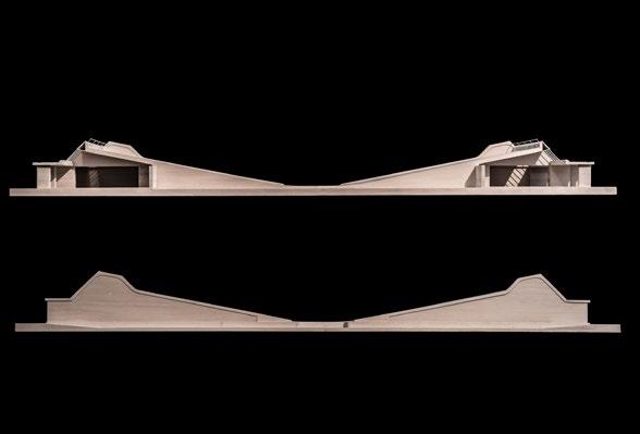
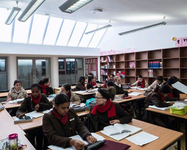
The school needed to add eight new classrooms to accommodate expansion over the last ten years or so. The campus is crowded and the only space left for expansion was around the main courtyard. Initially the school wanted to add a second floor to each of the two side wings of the courtyard to accommodate the new classrooms. However, this strategy would obliterate the view of the Table Mountain range from the courtyard which is a treasured asset of the school. In addition, the extension would put out of use another eight classrooms underneath the new classes whilst under construction. To resolve these issues we added two wings of four classrooms to each side of the courtyard at the level of the court and made two streets between the existing classrooms and the new classrooms on either side of the courtyard.
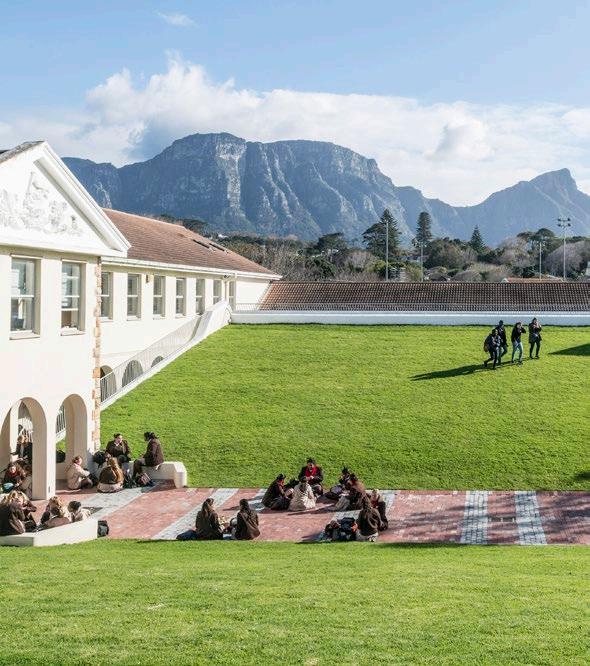
It was decided to wrap the surface of the new courtyard over the classrooms and to grass this surface for both spatial and environmental reasons. The result is a new shape for the courtyard which is elliptical in section and which offers better views of the mountain range. The shape offers itself up to a new range of uses, including concerts,
performances of all kinds, and a communal space which can be used by a number of different groups of learners of varying sizes and ages. In addition, the grassed surface provides good insulation for the classrooms below in both winter and summer. The new streets that have been formed are in line with the new school policy to reconfigure all circulation spaces where possible as new communal spaces and to furnish these spaces in such a way that they not only offer themselves up as social spaces but also as digital learning spaces.
'It was decided to wrap the surface of the new courtyard over the classrooms and to grass this surface for both spatial and environmental reasons.'

Can you tell us about the Eco Lab at Wynberg Girls' High School?
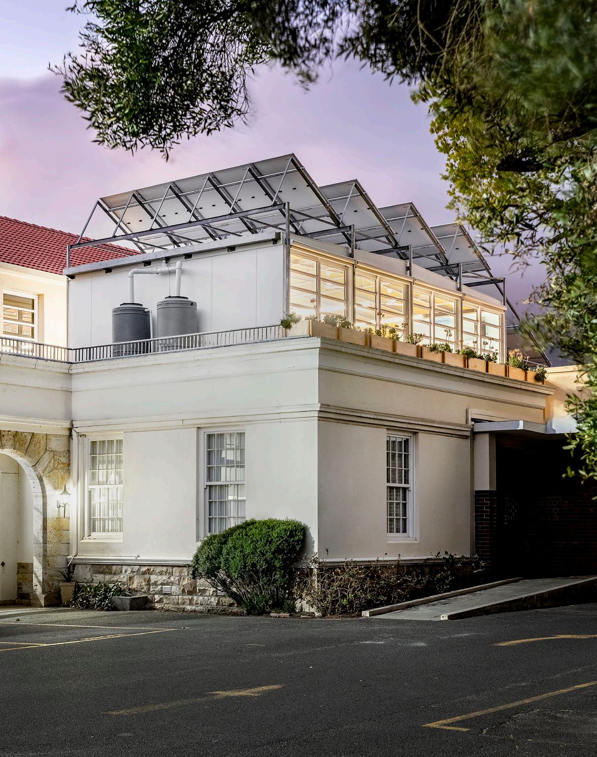
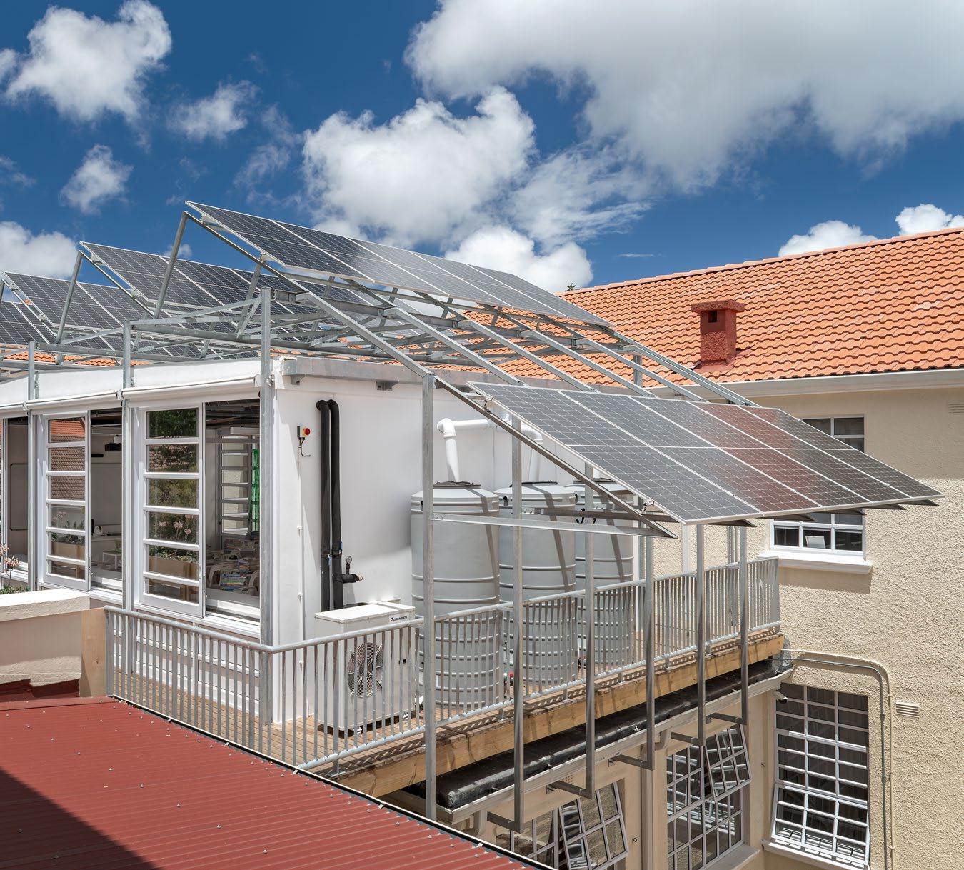
The school undertook a significant renovation of its science laboratories in 2022, revamping five existing labs and introducing a new eco lab on an unused roof slab adjacent to the corridor linking the top-floor labs. This innovative addition aimed to inspire young learners interested in science careers while raising awareness about global warming and climate change challenges.
Due to site constraints, traditional heavy masonry construction was unfeasible. Inspired by lightweight structures advocated by Buckminster Fuller and Norman Foster, the eco lab employed a cross-laminated timber floor panel system supported by brick piers and a lightweight steel structure clad with fiber cement boarding. The roof utilised recycled cork for both insulation and ceiling, with waterproof fiber cement sheets. Solar panels, integral to the lab's energy autonomy, were mounted on an independent steel structure outside the building envelope.
Energy-efficient features include a solar-powered heating and cooling system, utilising water pumped through plastic coils along walls and floor ducts. External blinds manage heat gain, while an integrated digital system displays energy consumption and solar panel performance on a large screen. Despite challenges, the eco lab has successfully operated during hot months, with winter testing anticipated. The eco lab demonstrates proactive engagement with environmental issues, providing students with practical lessons on responsible living and the impacts of global warming.
Your work with WGHS isn’t over, so what can we expect to see next?
Hopefully, we will be there for a long time. The next project is a big one, and we have completed the preliminary design to make a multipurpose hall for the school on a beautiful and well-treed part of the school site. We can’t wait to get going on the project.
And now for the music room... How did the architectural team balance preserving the existing structure while ensuring optimal acoustic performance in the transformed music room?
A relatively new project for us, in February 2024, we concluded our third project at WGHS, marking a significant milestone in the school's architectural evolution.
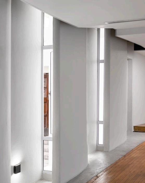
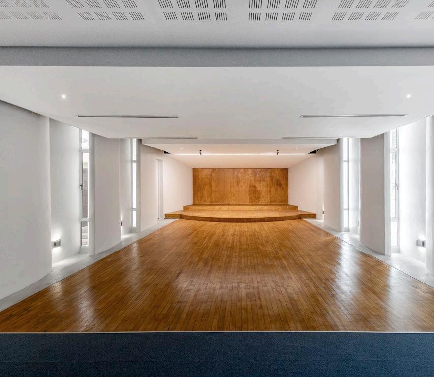
The project entailed the metamorphosis of a conventional art classroom into a multifunctional music room, poised to serve as a dynamic venue for music performances, dramatic showcases, and spirited debates. Meticulous attention was paid to acoustics, prompting substantial modifications to the long side walls and the ceiling. The resulting space embodies acoustic excellence, and it also caters to a diverse range of musical genres.
Through this project, we discovered the transformative power of minimal intervention, showcasing the profound impact achievable through specialised skills and strategic adjustments. Moreover, the repurposing of an existing space underscores a fundamental tenet of thoughtful design: preservation over demolition. Through great design from a formidable acoustic engineer, Andrew Wade, who we worked closely with, the music room came to life. It shows how the design of the acoustics lead to the design of the space.
The New Rest Valley Crèche
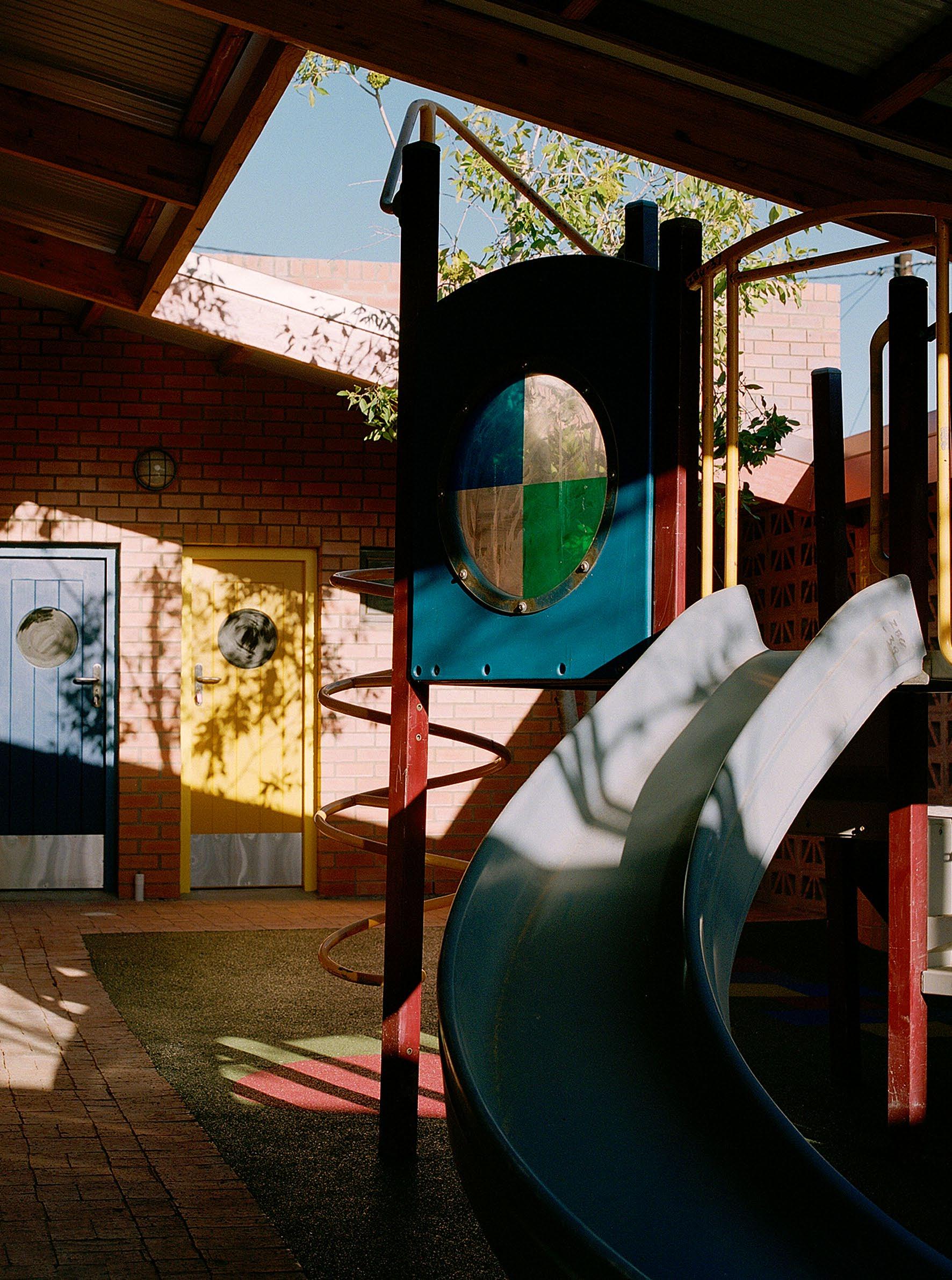
In a project passionate about uplifting the youth of Riebeek-Kasteel, The MAAK’s vision found them in the area of New Rest Valley. As an addition to their outputs, which range from full-scale public buildings to experimental spatial enquiries, this endeavour to design a crèche redefined the idea of collaboration in architecture. Just in time for Youth Month, The MAAK takes us through the journey of building a valuable social corridor for this young community in the form of the New Rest Valley Crèche.
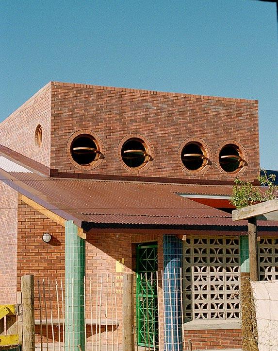
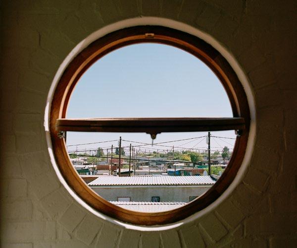
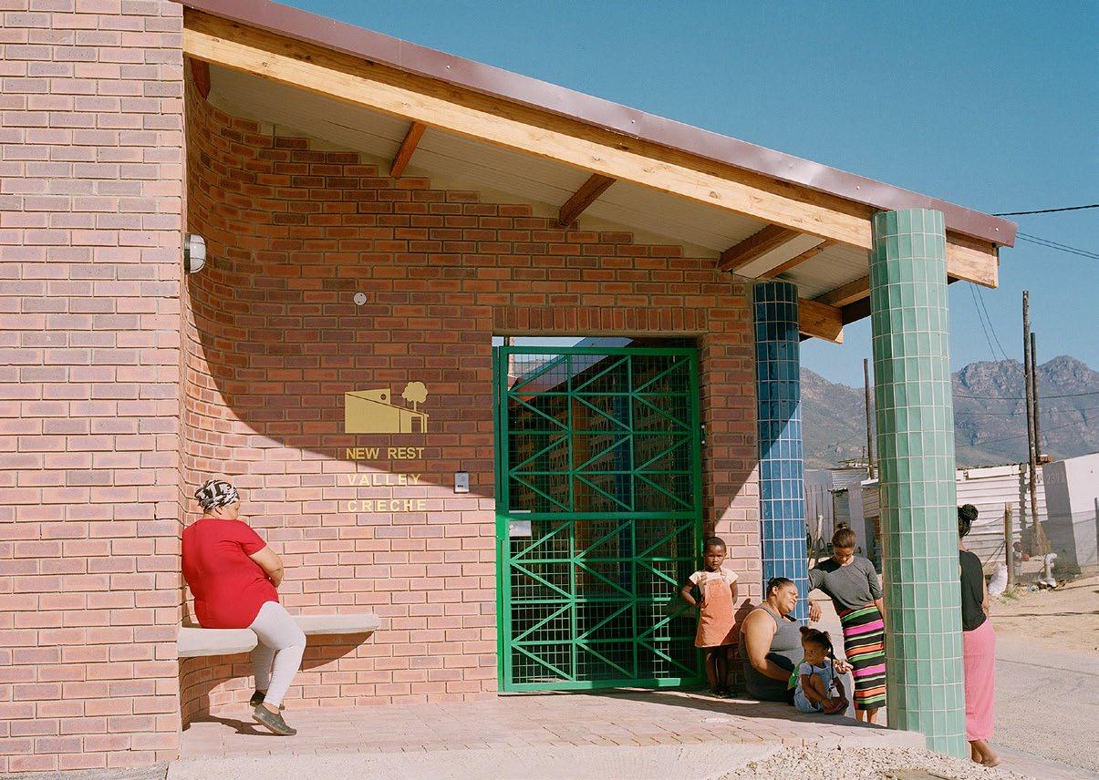
Constructed in 2023, the New Rest Valley Crèche is the first completed formal public infrastructure in New Rest Valley. A proud new educational facility, the crèche stands alongside a public park, well-located as it forms an important part of what is set to become a valuable space for this young community. The initiative was launched by Vuya Foundation and Rotary Club of Newlands, and when handed to The MAAK, was taken on a unique and carefully considered journey.
‘The New Rest Valley Crèche was one of our most collaborative design processes yet. Not so much in a multi-disciplinary sense (like a lot of other work in our portfolio), but more in terms of finding new ways to collaborate within the scope of the typical architectural streams and stakeholders. This included working very closely with the contractor, material suppliers, and members of the community to design and build something really special. It is a process we have been calling “design in dialogue”.
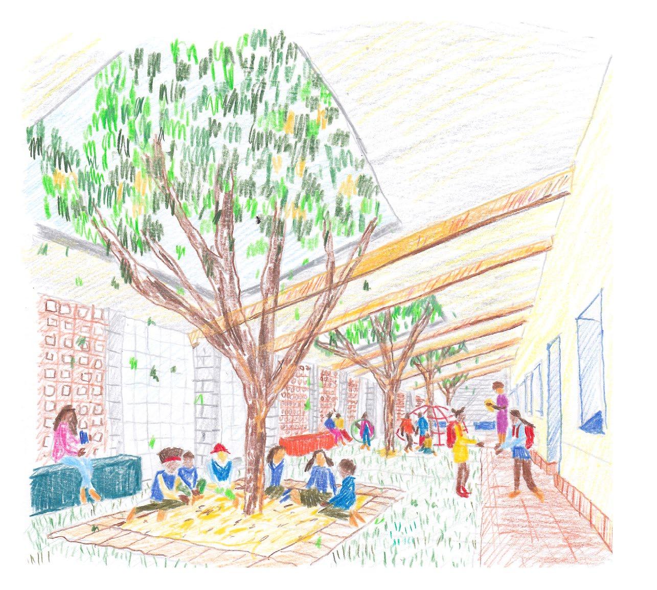
Architects are typically obsessed with total control. We see this as a problematic part of our industry. Giving up or sharing agency with the rest of the project team (community members included) is an important part of how we work and a big reason for some of our biggest project successes. One of the more notable examples of this in the New Rest Valley Crèche scheme was a full-scale play day with children in the neighbourhood. With the help of leaders in the community, we facilitated a games workshop with around 30-40 kids, where they taught us their favourite games and ways to have fun. These games were drawn into the street adjacent to the building during construction and are now detailed into the rubber play surface of the crèche’s courtyard play area.
Without this collaborative insight from the kids, the project would have been less meaningful or suited to the eventual users of the space. When thinking back on this project, this is one of the design moments that make us smile.’ - Max Melvill
Beyond the creative collaboration that makes this project so special, the architecture is critical in achieving its goals. The completed project includes three fitted classrooms (catering for ±90 children), a covered playground area, kitchen, reception area, admin office, ablutions, suitable storage, and a caretaker’s flat. Standing tall above a setting of one-storey self-built homes, the facility is a landmark feature in the area and offers valuable civic pride for the community.
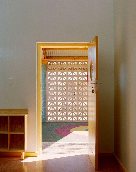
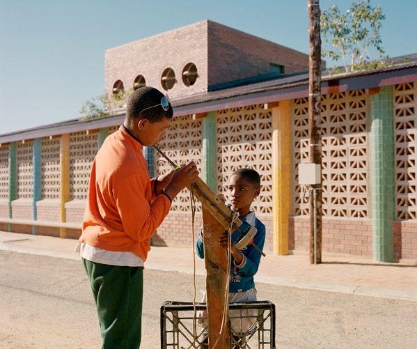
The design is easily defined by its over-sailing saw-tooth roof. The dynamic roof element rises towards the South, creating a brightness in the atmosphere by allowing soft light to fill the classrooms. As a playful integration of nature, tall Wild Pear trees grow through punctures in a roof above the outdoor area, which help to keep the covered playground shaded and cool. An intricate breeze block wall then lines the North edge of the building and neatly separates the scheme’s playground from a parallel street. To the East, the space opens to the neighbourhood with a comfortably covered entrance patio and wraparound public bench.
With the building’s footprint maximised, the architectural envelope becomes more than just a skin or wall; it is the project’s security boundary, its front door, and the means through which the architecture is integrated into its neighbouring context. Colour is carefully used throughout the scheme to further foster a fun and child-friendly atmosphere that helps breathe life into the surroundings.
As an expectation-exceeding contribution to the upliftment of communities, the New Valley Rest Crèche is an inspiration to the local industry. The space is more than a structure. It is a realm of hope and opportunity offered in service to one of many communities in need.




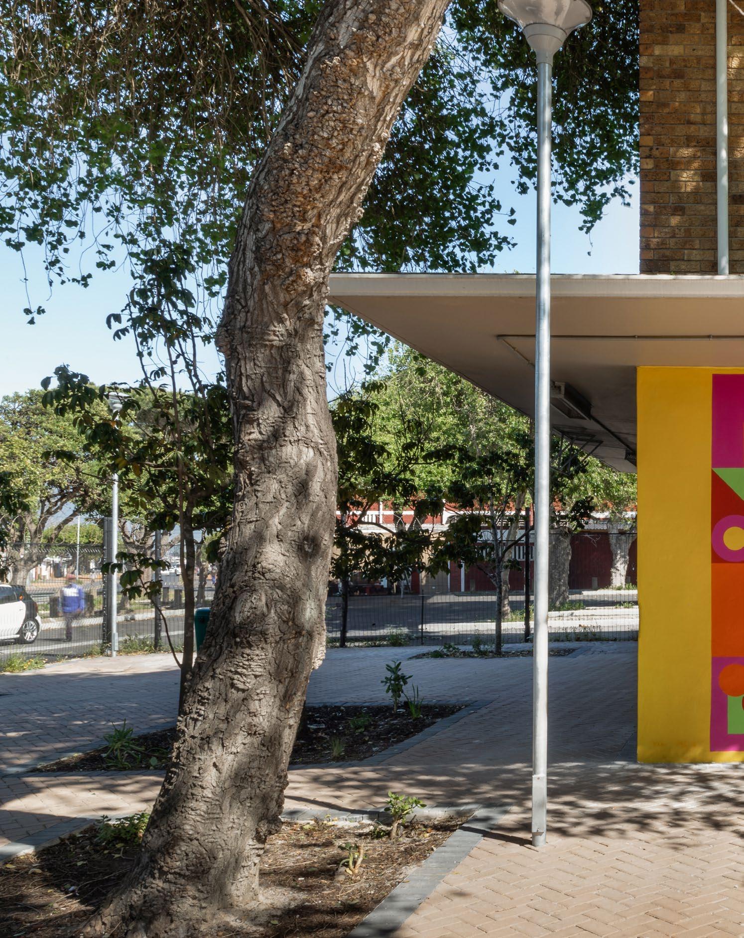
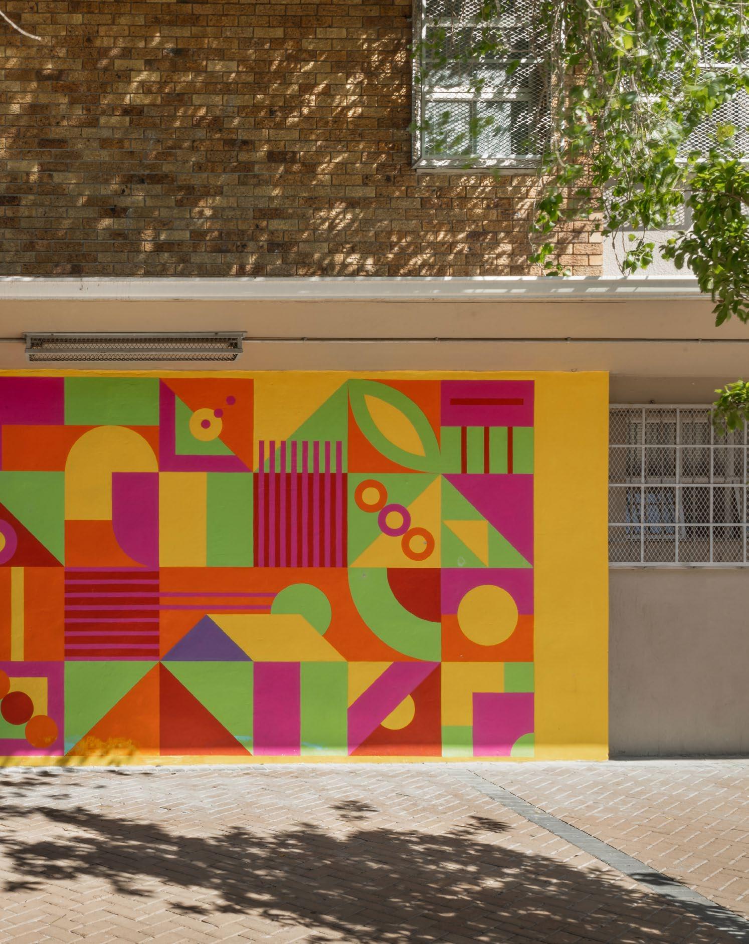
'Present Shapes': A vibrant intervention in Bonteheuwel
In the heart of Cape Town lies Bonteheuwel, a community steeped in both history and resilience. Established in the 1940s as a ‘coloured’ township under apartheid, Bonteheuwel became a symbol of resistance and community solidarity. Despite facing forced removals and repression, residents engaged in activism, shaping its history. With apartheid's end in 1994, Bonteheuwel embarked on a journey of renewal, seeking to address past injustices and improve living conditions. Today, it stands as a testament to resilience, though challenges persist. The township's history reflects the broader struggle for equality in South Africa, epitomising the enduring spirit of its people in the face of adversity.
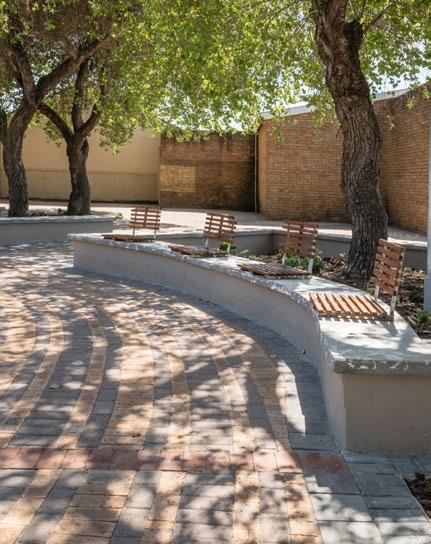

Here, amidst the intricate fabric of its streets, lies Freedom Square, a vibrant civic centre pulsating with life. Recently, this historic space welcomed a new addition — 'Present Shapes', a public artwork that seamlessly weaves together art, community, and this rich history.
This urban enclave of Freedom Square, occupies a pivotal position along concentric roads that converge towards a central node, embodying the interconnectedness of its residents and their shared experience of its present urban condition.
The 'Present Shapes' project conceived by architect and conceptual artist Lorenzo Nassimbeni, seeks to celebrate, and highlight the rich cultural heritage of Bonteheuwel. Anchored in the ethos of community engagement and collaboration, the project endeavours to harness the collective creativity and wisdom of Bonteheuwel's residents, empowering them to shape the narrative of their shared space.
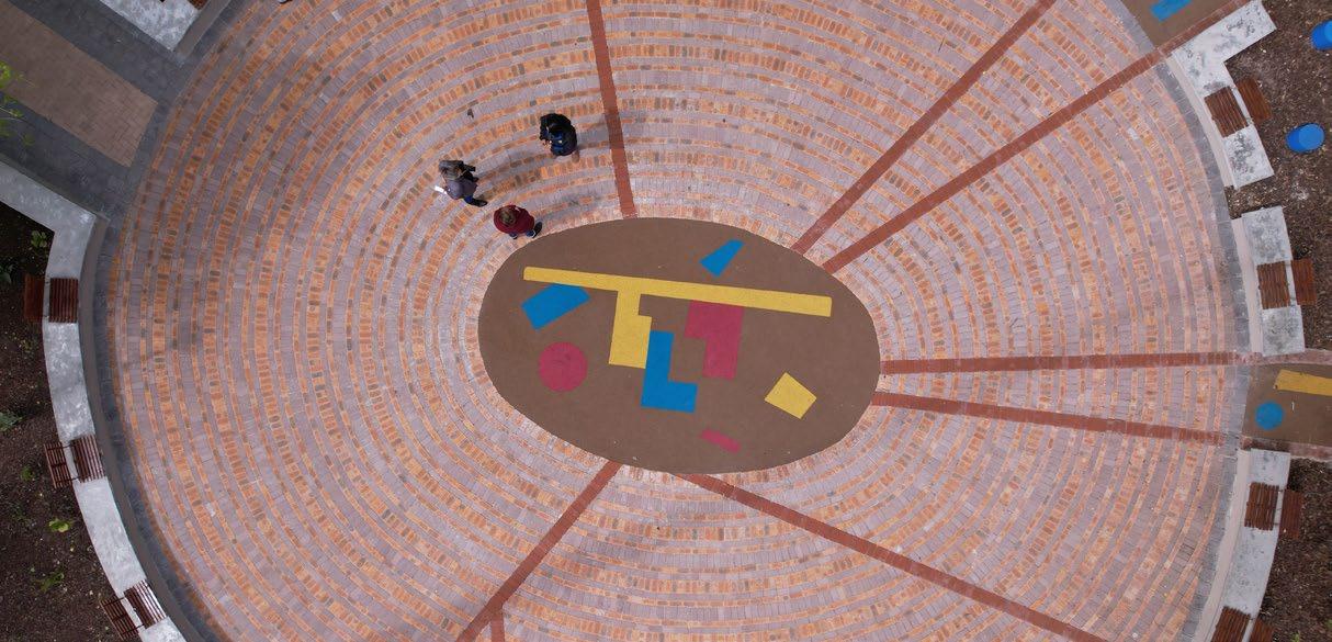
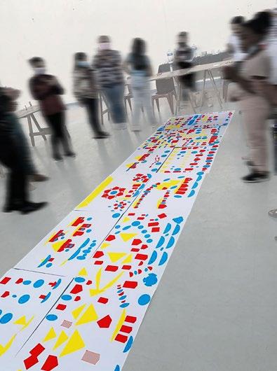
The artist's inspiration arose from an art workshop for junior school students in Bonteheuwel, conceived as a form of public artwork in itself. This creative collaboration resulted in a library screen installation, floor artworks, and murals, emerging as organic expressions of the students' perspectives. Through a series of drawing exercises, students explored the essence of Bonteheuwel, metaphorically linking its elements to vibrant shapes for a dynamic collage. The artist then translated these imaginative drawings into the design of the library screen installation and floor artworks, encapsulating the workshop's essence.

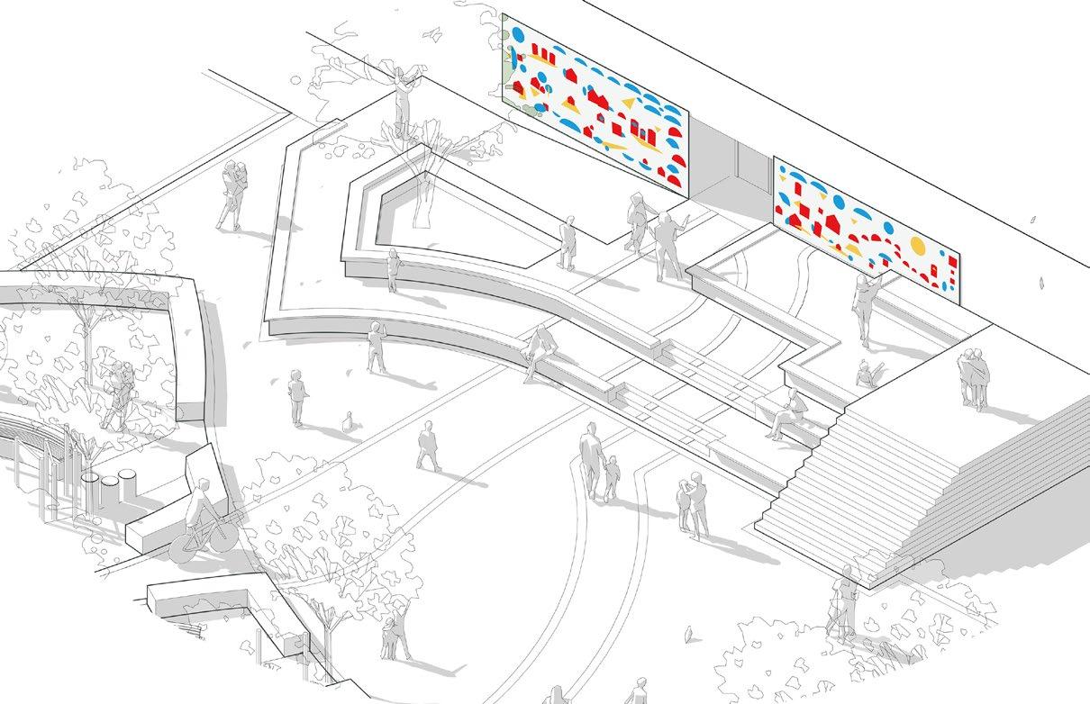
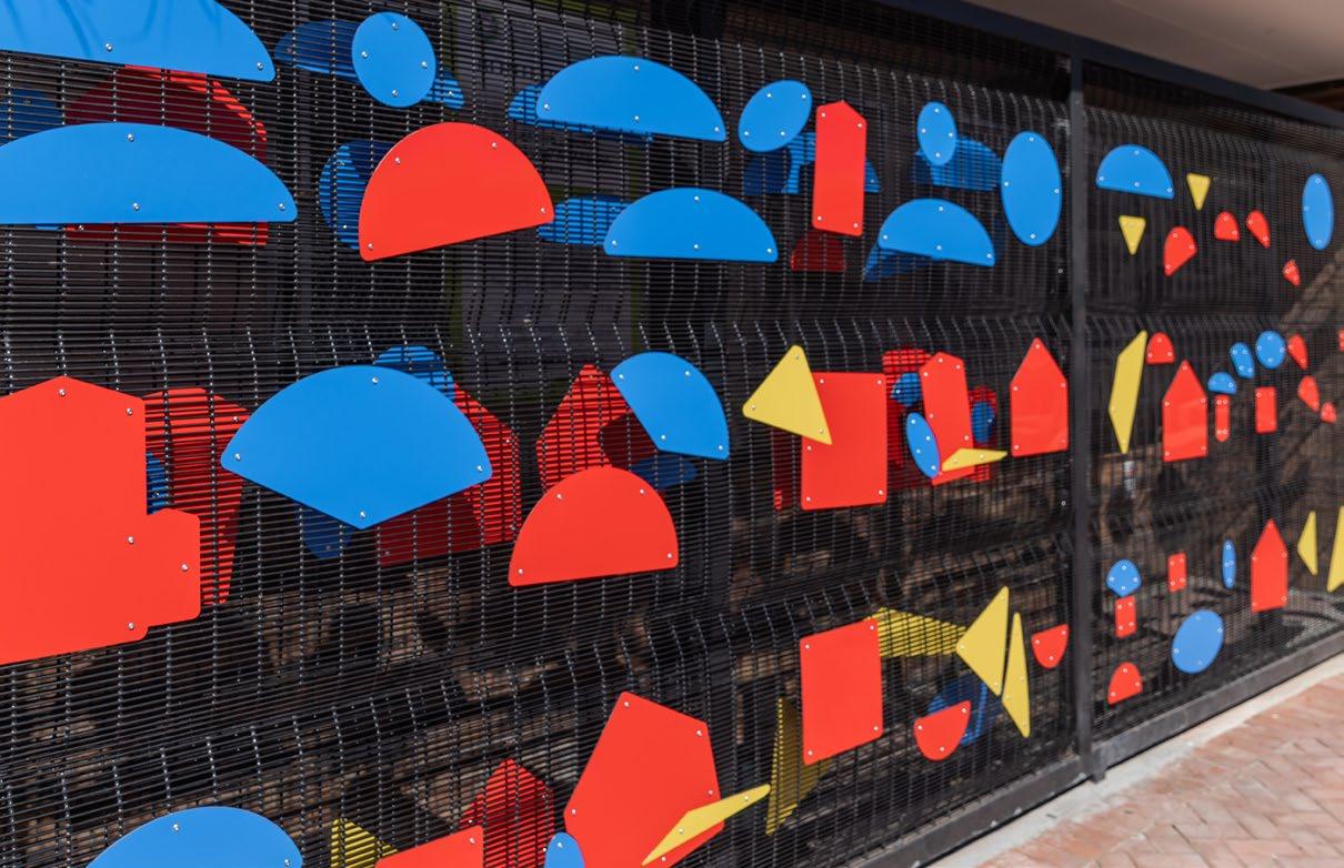
Positioned prominently in front of the library, the screen artwork not only complements the educational environment but also serves as a visual anchor. Its seamless integration with the floor artworks extended the vibrant narrative into the square, enriching its interactive nature. The realisation of the project's concept involved collaborative efforts with TERRA+ Landscape Architects and the City of Cape Town, guided by community input. Despite navigating the complexities of the socio-political landscape, the project successfully fostered a sense of pride and belonging among the school students, contributing to the vibrant cultural tapestry of Bonteheuwel.
Material selection, guided by considerations of durability and aesthetic appeal, reflects a commitment to creating a vibrant and inclusive cultural precinct. The choice of materials for the project was meticulously curated, with a focus on both functionality and aesthetic appeal. Rigid three-millimetre aluminium composite panels were selected for the library screen installation, providing a durable and visually striking backdrop for the artworks. Stainless steel nuts and bolts were employed to affix the laser-cut aluminium shapes to the ClearVu mesh of the library screen, ensuring a secure and long-lasting installation. ClearVu fencing served as the infill of the frame of the security screen, allowing light to permeate through to the library interior while maintaining a sense of security.
Additionally, the floor artworks were crafted from styrene-butadiene rubber, chosen for its suitability for play areas and its playful colour palette. This material not only provides a safe and hardy surface for children to play but also enhances the visual impact of the artworks, contributing to the dynamic atmosphere of Freedom Square. In addition to working with the younger generation of the Bonteheuwel community, Lorenzo approached the gifted local artist Shaunez Benting to produce two murals for the square. Shaunez brought this wealth of experience and knowledge of the urban context of Bonteheuwel to the project. It was a requirement of the project to work with a mural artist from Bonteheuwel, and the inclusion of Shaunez's work proved a vital and successful part of the project. His design sensibility and insight into the younger generation of Bonteheuwel resulted in a set of murals which speak sensitively and profoundly to the library screen artwork and floor artworks.
'Present Shapes' stands as a testament to the power of public art in preserving community heritage and fostering social cohesion. By engaging with the lived experiences and aspirations of Bonteheuwel's residents, Nassimbeni has created a positive spatial layer to Freedom Square which speaks of the potential of present and future generations of Bonteheuwel.


LORENZO NASSIMBENI
Architect & Conceptual Artist @lorenzo_nassimbeni www.lorenzonassimbeni.com
Client: City of Cape Town | Artist: Lorenzo Nassimbeni | Design Assistants: Kamal Ranchod, Riyadh Latiff, & Uriah Cloete || Landscape Architect: Tarna Klitzner Landscape Architects, TERRA+ Landscape Architects | Mural Artist: Shaunez Benting | Project Manager & Chief Engineers: HHO Consulting Engineers | Main Contractor: Diges Group | Education Specialist: Priscilla Green (Kids On The Move Educare) | Photographer: Bruce Sutherland & Southland Photography

The new Cape Town Station by
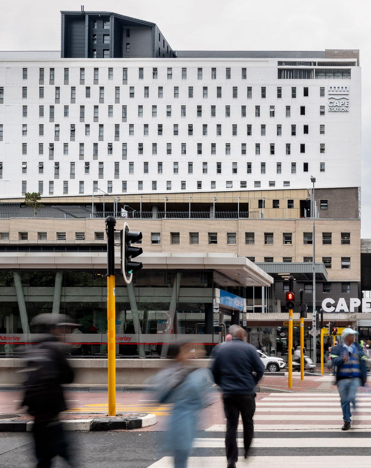
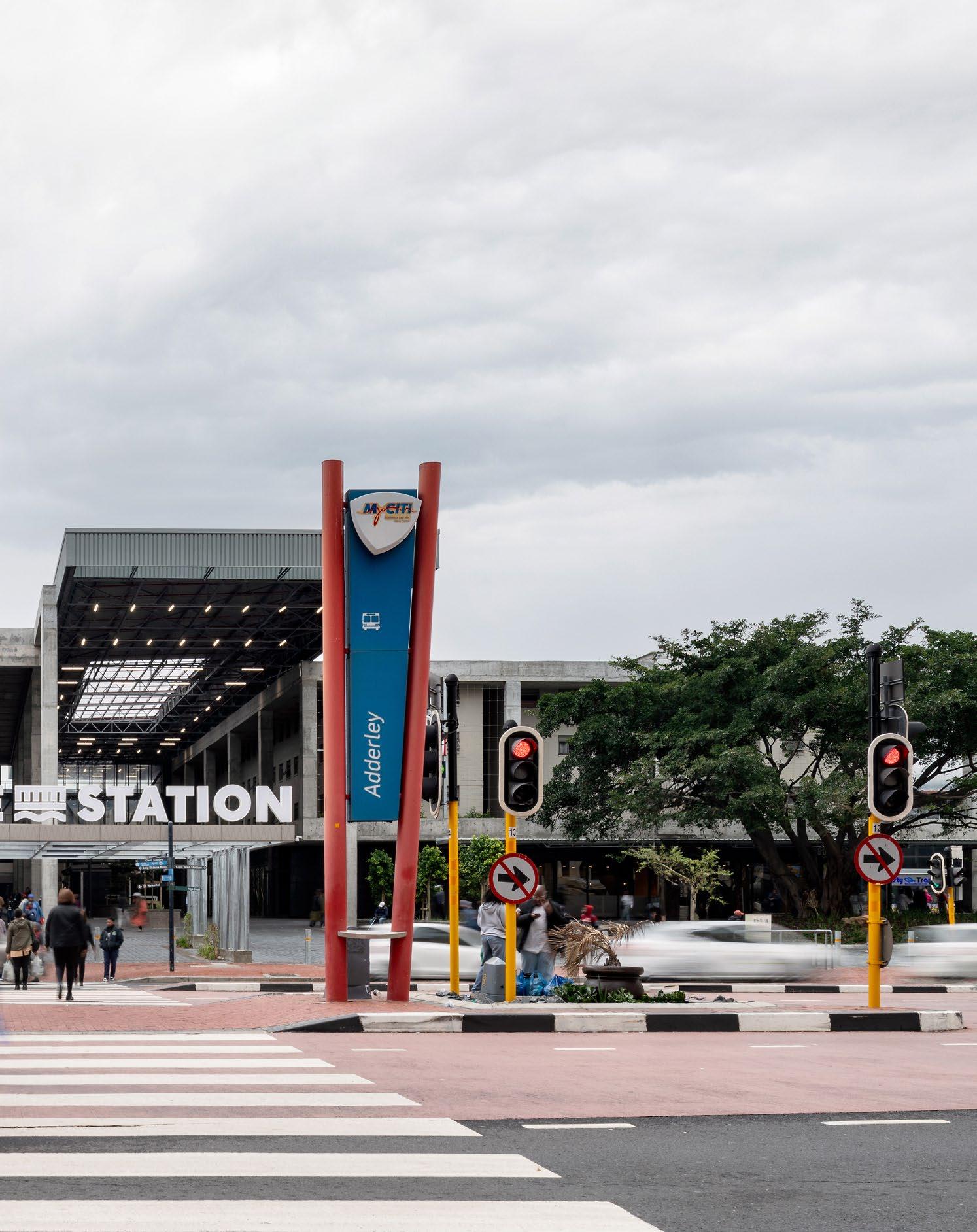
Boogertman + PartnersTransported more than a century back while looking ahead for the benefit of the city, the legacy of the Cape Town Station carries a significant perspective of growth and transformation. The Cape Station has been moulded once more into something new and full of potential, located in the very centre of this urban hub. Led by Boogertman + Partners, this space has been placed on a new track one that leads to the next stop in student living.
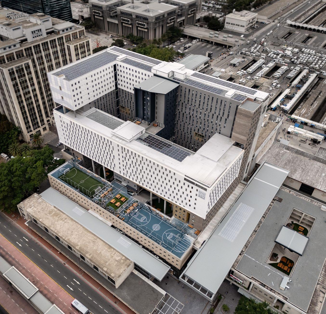
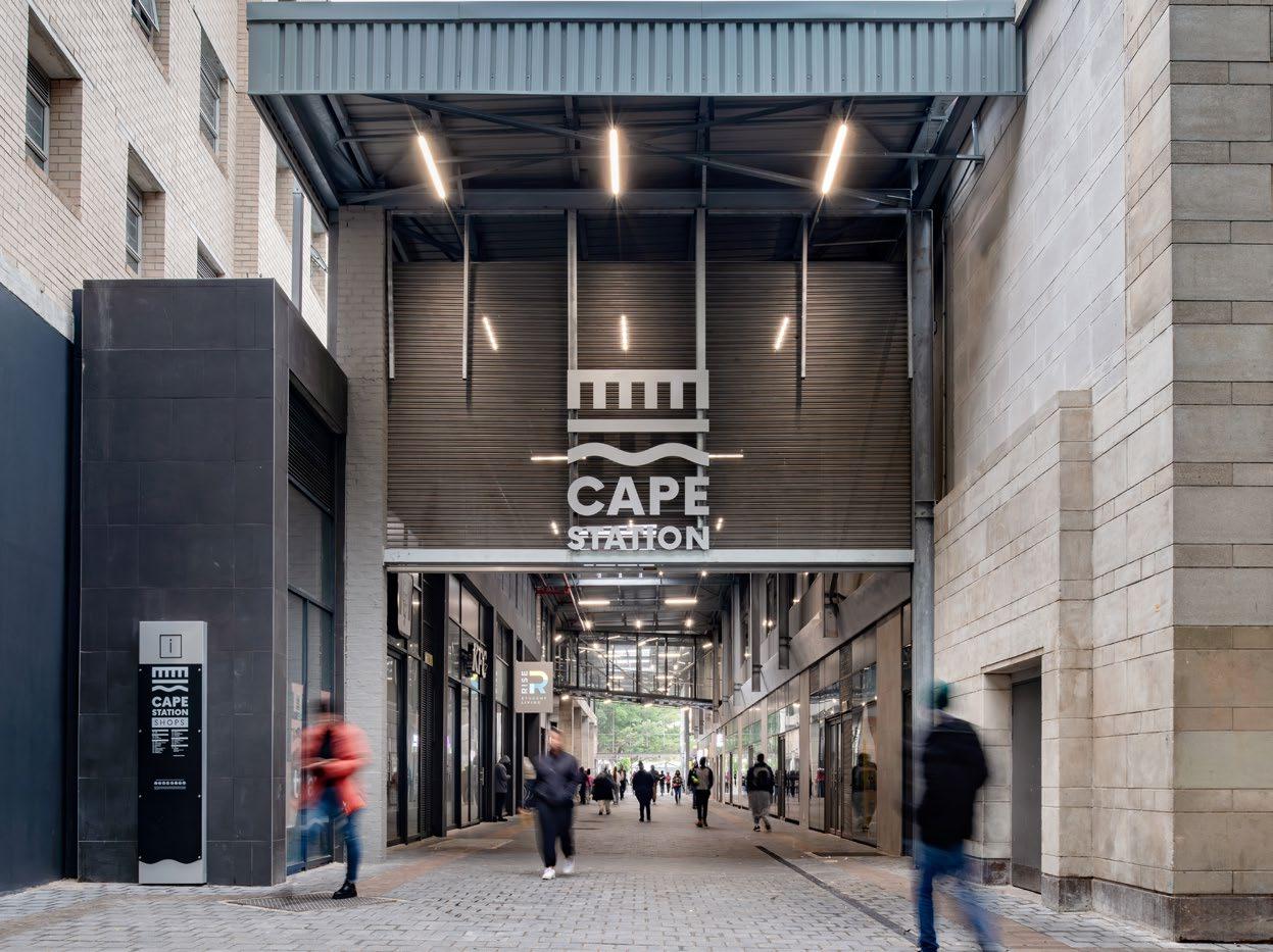
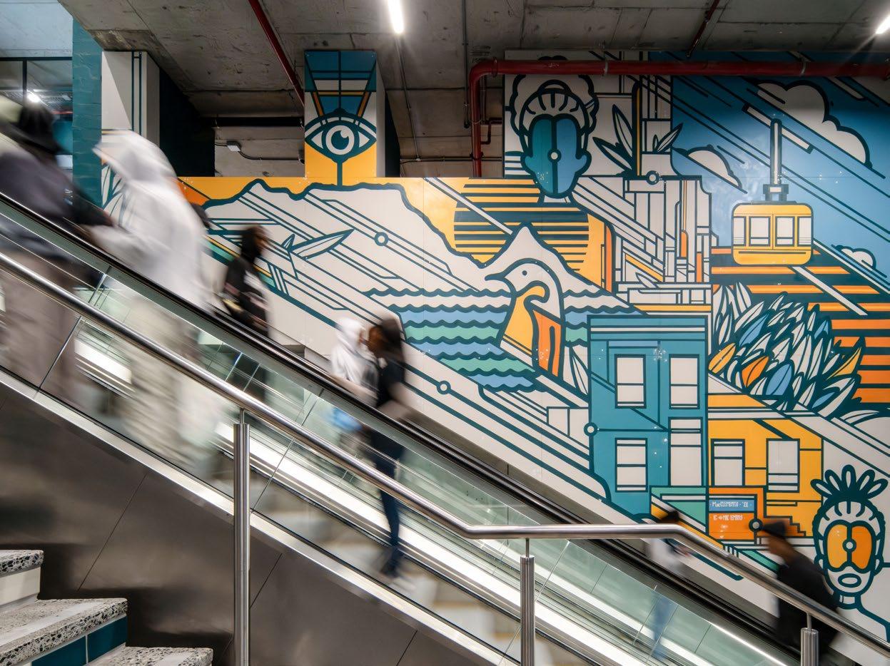
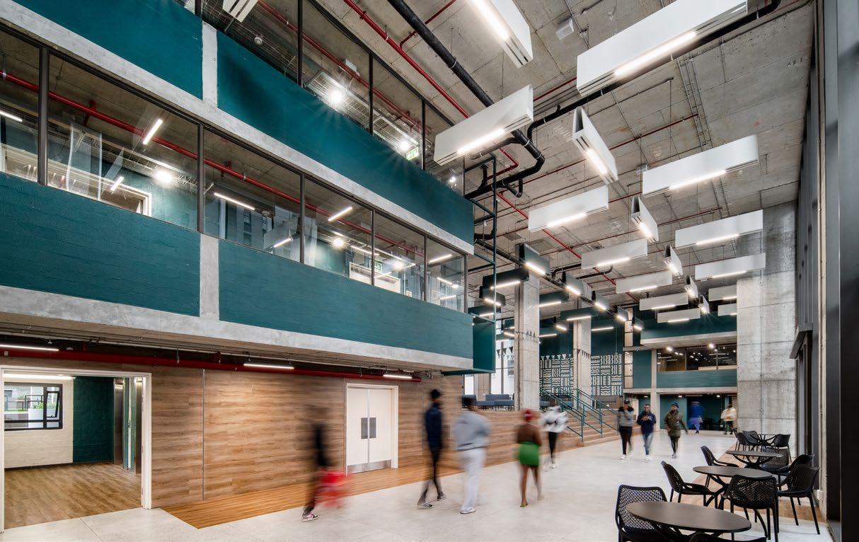
The forecourt of Cape Station, a landmark in the Cape Town CBD, has been reimagined by Boogertman + Partners for the Eris Property Group as a vibrant new mixed-use centre that includes 6700 m2 of modern retail space, Units on Cape Station (accommodating up to 3085 students), and a world-class public square. The new development was conceptualised to serve students attending the nearby Cape Peninsula University of Technology (CPUT), but is open to students from any of the many surrounding institutions, providing quality affordable accommodation in the city as part of the Rise Student Living group.
The site for this project is unusual for its place in the city, as it stands alone in the surrounding urban landscape rather than abutting buildings on all three sides. Great care and sensitivity to the urban context became imperative in the design process, but the site still offered multiple opportunities to celebrate aspects of the city’s heritage. What’s more, it was a chance to enhance its urban design while managing an important transition in the evolution of the city.
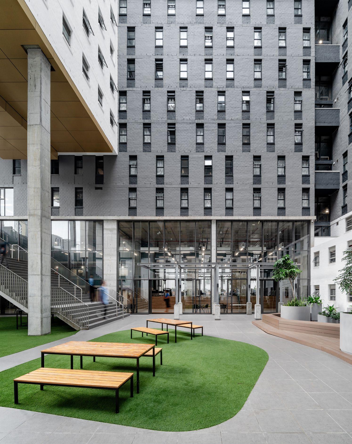
The space is presented in the form of two L-shaped blocks that are tied together to form a large courtyard. In the base level is the retail space, while the 20-storey student housing block stands tall above it. The ‘massing’ of the student block was carved out in response to the complex heritage of urban and contextual drivers, which include the permissible heights related to the scale of the nearby buildings. Careful consideration was taken of the key views up and down the surrounding streets and vistas of Table Mountain, so each elevation responds individually to its own specific parameters, while the whole is resolved into a cohesive, flowing, unified design.
Along the main urban artery of Adderley Street, the building echoes the horizontal nature of the station concourse and reflects the scale of the buildings opposite. The northern façade relates to the height of the Paul Sauer building (at 60 m tall) and views of Table Mountain, while the southern façade steps down to relate to the buildings on Adderley Street. The eastern elevation is scaled according to the city blocks on the skyline, but also in relation to the large, flat expanse of the station platform and to the rhythm and proportions of the existing concourse building’s sandstone façade panels. From the ground to the fourth storey, the building creates a frame for the square.
Sanware: Lecico, Lixil, Plumblink | Roof covering & cladding: Safintra | Bedroom furniture: Entrawood | Planters: Classic Stone
‘Cape Station represents one wonderful stop en route to a brilliant future, for both city and students.’
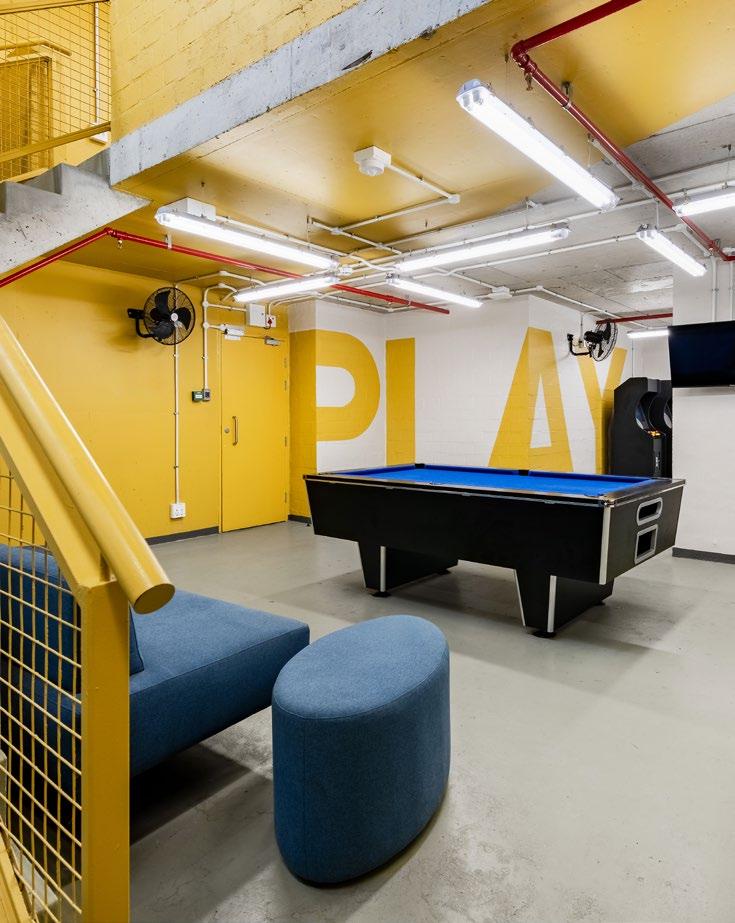
Cape Station involves a contemporary reinterpretation of the predominantly modernist face of the built environment in this area of the city, responding to the light material fabric of the surrounding buildings. Its scale is sensitively broken down into smaller portions on the façade, with variations in pattern and colour articulated with seamlines. Parts of the building even appear to be floating as a result of cuts in the mass, which allow natural light into the courtyards. Inside, the various-sized accommodations are bright and bold, designed with simplicity to cater to students across the board with perfect equilibrium.
The updated Cape Station precinct introduces a new civic icon and an important transitional architectural intervention into the evolution of the Cape Town CBD – densifying, diversifying, and breathing new life into this part of the city. It sensitively navigates the relationship between heritage and contextual factors, while strengthening, re-establishing, and restoring others. A proud feat by Boogertman + Partners, the Cape Station represents one wonderful stop en route to a brilliant future, for both city and students.

@boogertmanandpartners www.boogertmanandpartners.co.za




by Dave Southwood
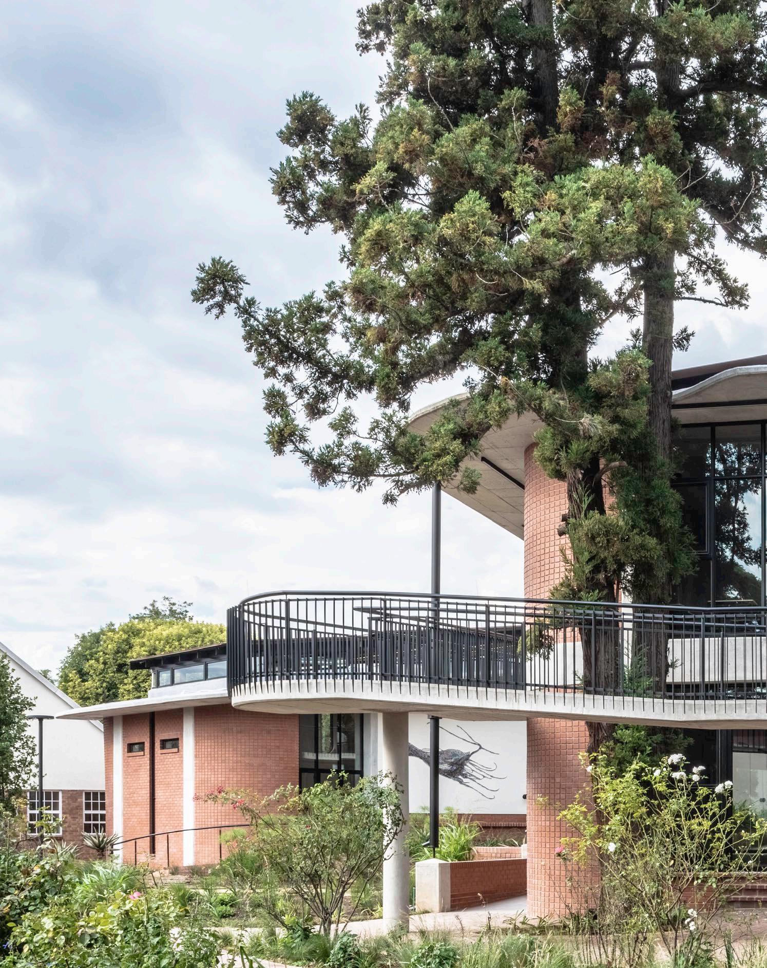
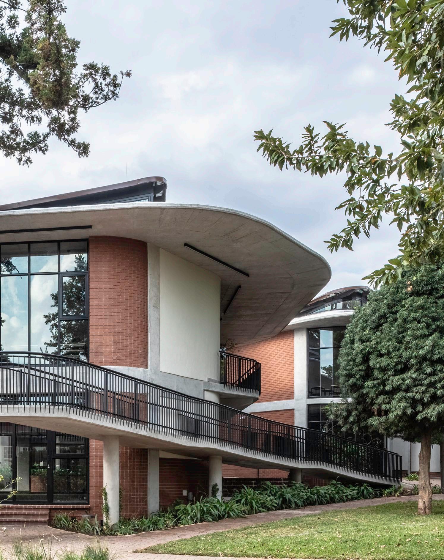
PhotographyAs an addition to St Mary’s School campus in Waverley, Rebel Base Collective has reimagined the future of education, from concrete to curriculum. Their approach to this responsibility was to deviate from traditional forms and formats of schools to expand into a new way of creating educational spaces. Interpreting different architectural languages and striving for sustainable education, their extension on the campus is nothing short of a holistic marvel of design for the future of academic institutions.

Location: Waverley, Johannesburg

Located between the senior and junior schools, the Pitt Block formed part of St Mary’s campus a collage of different local architectural styles that were fashionable over the last century. This space handed to Rebel Base with the brief of being reinvented is surrounded by mid-century, neo-classical, and Art Deco styles. On top of that, the campus reveals designs reminiscent of Edwardian and Victorian styles of the 1900s. The existing Pitt Block was of a 1980s-styled addition that attempted to combine the mid-centuryesque styles of the Junior School Science Block and the scale of the admin block into a more cost-effective and robust building. But it was time for that to change.
The team’s idea behind the overall design was to use the lines of the paths which travelled between the Junior School and Senior School to their advantage, merging the axis of each school to create a permeable building. The building is to be used as a tool for growing and learning, with service elements designed to expose how they work so that the pupils can learn peripherally from their surroundings. Each space is designed for children to meander through, sit on, climb on, and engage with as a place for learning, gathering, or solitude. Each classroom opens to the outside in different ways to give teachers different options for engaging with their classes, making the building a giant treehouse of sorts. With open views into and around the trees, Rebel Base paid special attention to working around the trees and tectonics to create a building that was moulded to its environment.
To create a nexus and entry point to the school, the Pitt Block had to be demolished. (Since the building had been named in commemoration of a past headmistress, to maintain this gesture, an inspired artwork by Hannelie Coetzee was commissioned — a mural of a dodo, after Dorothea Pitt’s nickname for herself.) An intersection was made to split the building into four parts, creating intimate in-between spaces for breakaways from classes and for students to inhabit during breaks and after school. A sustainable approach was essential, so Rebel Base turned the building into a tool for sustainable education. Self-shaded façades are oriented to trap heat in the winter and be shaded and cool in the summer. The rainwater, instead of being stored in tanks, fills a naturally planted wetland that both treats the water and forms the main indigenous garden in the internal courtyard.
Head Architect: Vedhant Maharaj | Project Architect: Maseeha Buckus | Structural Engineers: ADA Consulting Engineers | Mechanical, Electrical & Wet Services Engineers: CKR Consulting Engineers | Quantity Surveyor: EthiQS | Contractor: LV Projects | Electrical Contractor: D & R Electrical | Plumbing Contractor: Oaktree Plumbing

There were several challenges that arose during the course of the project. Changes were made as a cost engineering exercise early on where the green roof on the main hall was flipped around. The team spent a lot of time adapting their detailing as the project progressed, which is a common case in projects and is always crucial. Another example is their having to build on a working site, which is never easy. But the contractors were incredibly respectful of this and the project ran relatively smoothly, considering being so centrally located on the property. The complexity of the curves and the tapered cantilevering slabs also created the need for a significant amount of re-detailing shutter layouts and adjusting time and costs.
A palette of integrity
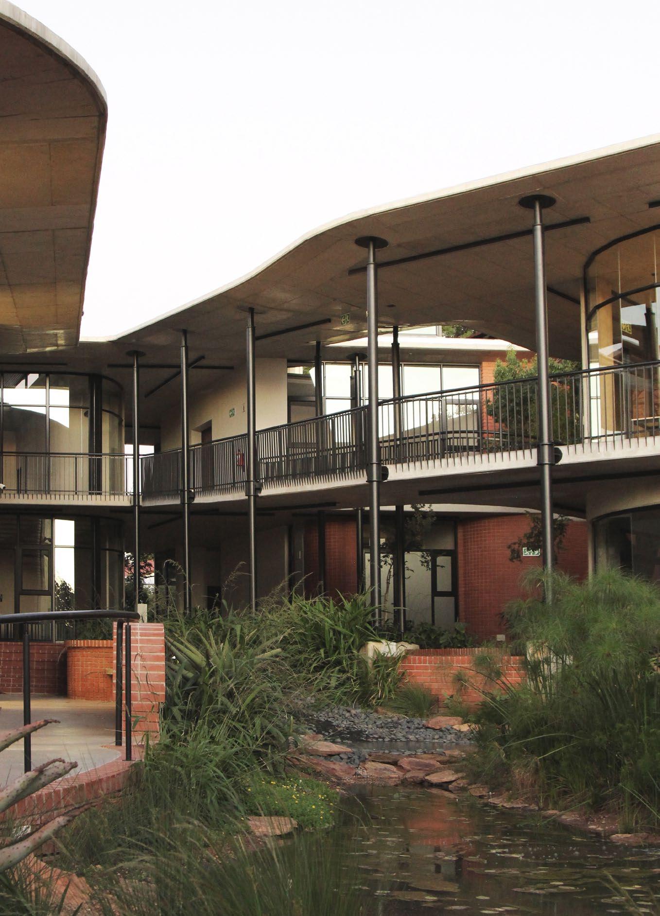
To produce a structure that proves robust and honest, the team remained true to their choice of beautifully crafted raw materials. The building is made predominantly of concrete, brick, and steel. Large insulated cavities in the walls enhance thermal performance. The choice of materials was used to blend into the school with the red face brick, echoing the existing campus. The large concrete overhangs soften the scale of the building and black steel balustrades and columns give depth and life to the swooping edges of the walkways and ramps.
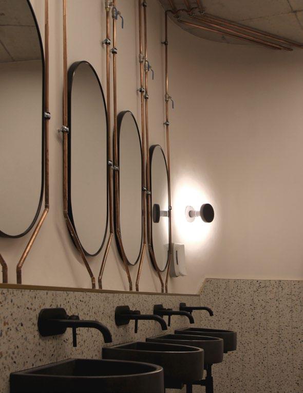
Copper pipes from the plumbing are exposed in some areas, making a conventional choice of material more unique. Material palettes blend the shapes, and the curves of the building differ from the traditional architecture of the school with accentuated scallops of face brick which trap heat in winter and are self-shading in summer. To connect the steel columns to the concrete soffits, steel hats have been used which also act as rainwater down pipes. Finally, the trees around the building contribute to the feeling of the spaces, and a wetland garden in the centre creates evaporative cooling through the courtyard, allowing the south-westerly breeze to brush over the water.
A highlight of the project for Rebel Base Collective was their above-and-beyond experience with the client. Generous in their approach, they offered the architectural team the space to deal with challenges and support throughout. By trusting the team, both the architects and contractors, the project was handled with minimal intervention and sufficient opportunity to perfect each aspect of the process — a rare and appreciated contribution that encouraged the undoubted success of St Mary's.
In their extension of this visionary campus, Rebel Base Collective has crafted a building that is a fresh take on what educational environments can be. By incorporating history, culture, and sustainability, the project strengthens the school space and those who inhabit it.
 VEDHANT MAHARAJ Founder & Architect
@rebelbase_clctv www.rebelbase.camp
Sanware: Geberit, Meir, Lux Crete | Bricks & paving: Corobrik | Fenestration & glass: Advanced Fenestration Structural steelwork: A & D, Anchor ENGinuity | Railings: TMW Fabrication | Lighting: Regent Lighting Solutions | Vinyl flooring: Polyflor | Polished concrete floor: JCE Construction | Joinery: Benade Kabinetmakers | CCTV: Sigma | AV: iMagica Services
‘Rebel Base Collective has reimagined the future of education, from concrete to curriculum.’
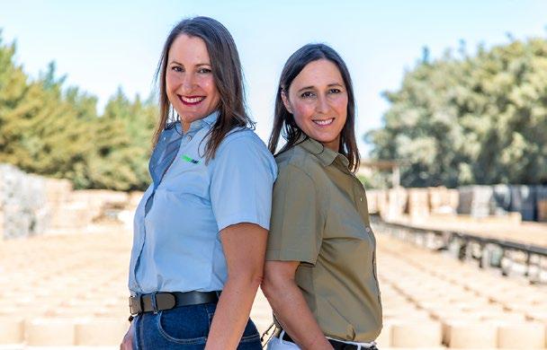
With a legacy that began in 1979, Terraforce has forged a path of innovation in retaining wall technology. As a testament to the family drive and commitment, sister duo Elgin Rust and Karin Johns (née Rust) are the next generation of this iconic local retaining wall company. In the footsteps of the company founder and their father, Holger Rust, they are not only pushing forward towards success but also representing the importance of women’s contribution to construction and the retaining wall industry.

Rust’s innovative answer
Holger Rust’s business began with inspired entrepreneurship as he started integrating gabions into the South African construction practice. He soon saw that there was a great need for a new direction that was cost-effective, practical, and visually appealing. And so, he discovered his own innovative answer: earth-retaining solutions that would cater specially to the unique demands of the South African landscape.
Overcoming barriers
Elgin and Karin grew up surrounded by two key factors that brought them to this point: entrepreneurial excellence and construction industry exposure, both of which were thanks to their brilliant father. Naturally, the sisters found their passion to be side-by-side, inheriting from their father everything necessary for success. Although the industry remains largely influenced by men, the sisters won’t be deterred by the challenges that have been and are still to come. With resilience and a firm dedication to quality, Karin and Elgin have already overcome barriers and earned respect within the construction community. It’s no wonder that their story is an example of the triumph that can be brought to the built environment by women (as much as it can by men).
Authentic in every way
It’s no secret that the market gets saturated with cheaper, less durable versions of these products an issue of great concern to Karin and Elgin. Lucky for their clients, Terraforce proves itself in every way, immediately revealing its authenticity. To add to that, the products are recycled, don’t contain mortar, prevent soil erosion, and are produced on the foundation of technical support, research, testing, and engineering excellence essential traits that are not about to change for this heritage company.
Powered and grounded by a dedication to honouring their father’s legacy, Terraforce’s leading ladies are charting a new course for the company’s future. Their story is nothing short of aspirational to female and male entrepreneurs and professionals alike. Just like their father, Elgin and Karin prove that anything is possible with vision, discipline, and determination even turning a father’s legacy into a lifetime of success for two women who are a force to be reckoned with.

The Anele Tembe Library by Hesse Kleinloog Studio
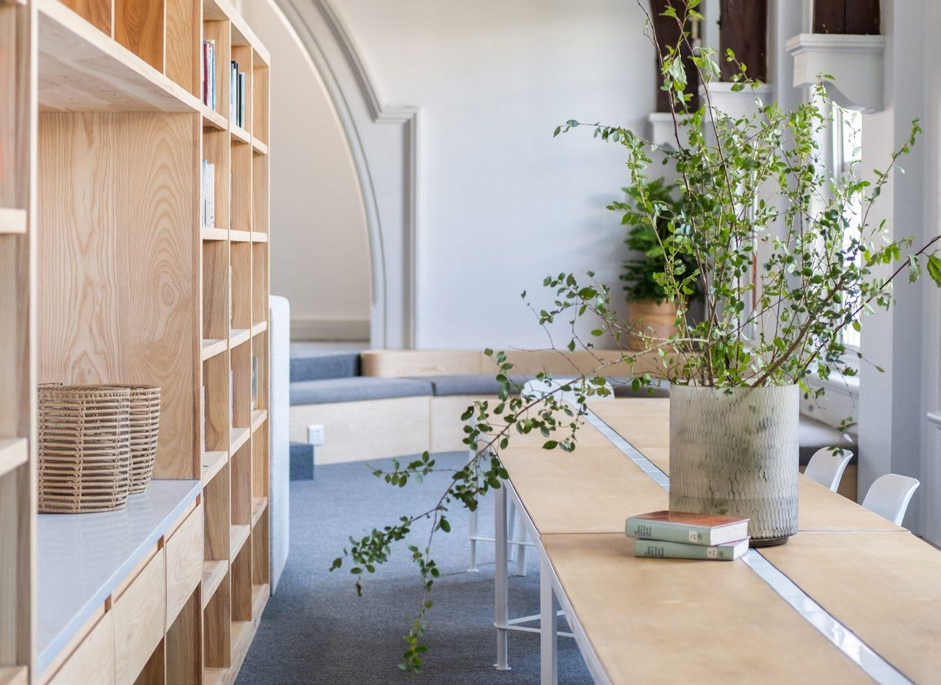
Inspired by the concept of the future of libraries, Durban Girls’ College sought to reinvent the school’s literary space and turn it into a sanctuary. Guided by Hesse Kleinloog Studio, and in memory of past pupil Anele Tembe, the new library carefully marries classical aesthetics with contemporary vision to present a renewed environment to the community of girls who will be the women of tomorrow.

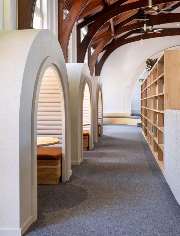
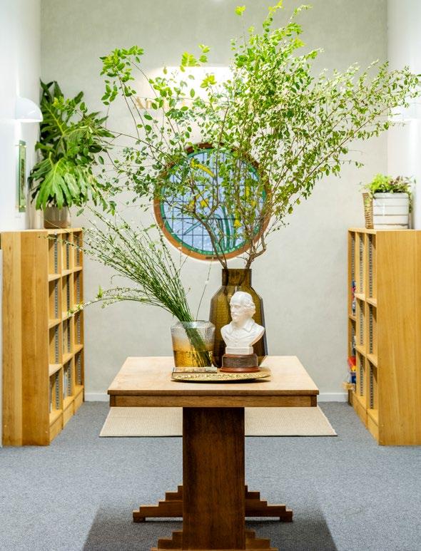
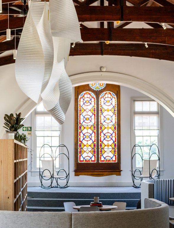
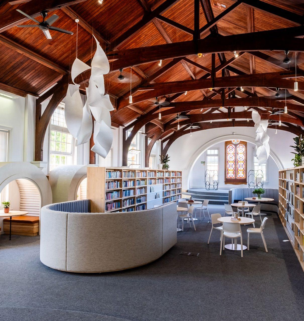
The Durban Girls’ College senior library was first launched in the old school hall building in 1977, when the new Centenary Hall was built. The original character of the building was iconic, with its wooden roof trusses and historic 15th-century 'peppercorn' stained-glass window. However, as cherished as it was, Durban Girls’ College began to notice that traditional libraries have evolved, and a new motto guides contemporary design: Libraries should be about more than books.
From past to present
Being a past pupil of DGC herself, co-founder of Hesse Kleinloog Studio Andrea Kleinloog had a close connection to the project. Her approach was to question and address the 21st-century functions of a library, especially as a space that is designed for the education and wellness of young women. The library project and renovation, generously contributed by the Tembe Family and Anele Tembe Foundation following their daughter’s passing in 2021, marked the beginning of an ambitious initiative for a library and an innovation centre aiming to be more than a physical space. It aspires to be a platform for the education of young women beyond the classroom, transcending socio-economic boundaries and setting a benchmark for school library experiences nationwide. The design centres around curiosity — the encouragement and nurturing of it to embrace discovery. The new library was designed to be a sanctuary, a museum, and a workshop for the pupils of DGC. It is a space curated for modern-day exploration; each carefully designed space is sensory and inspires perspective and investigation.
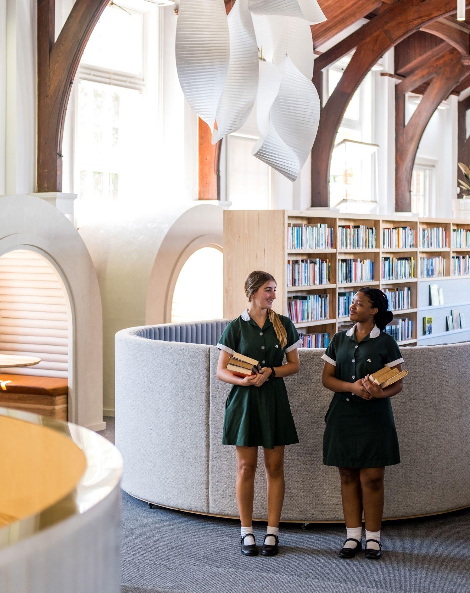
‘Durban Girls’ College began to notice that traditional libraries have evolved, and a new motto guides contemporary design: Libraries should be about more than books.’
Paying homage to the classics
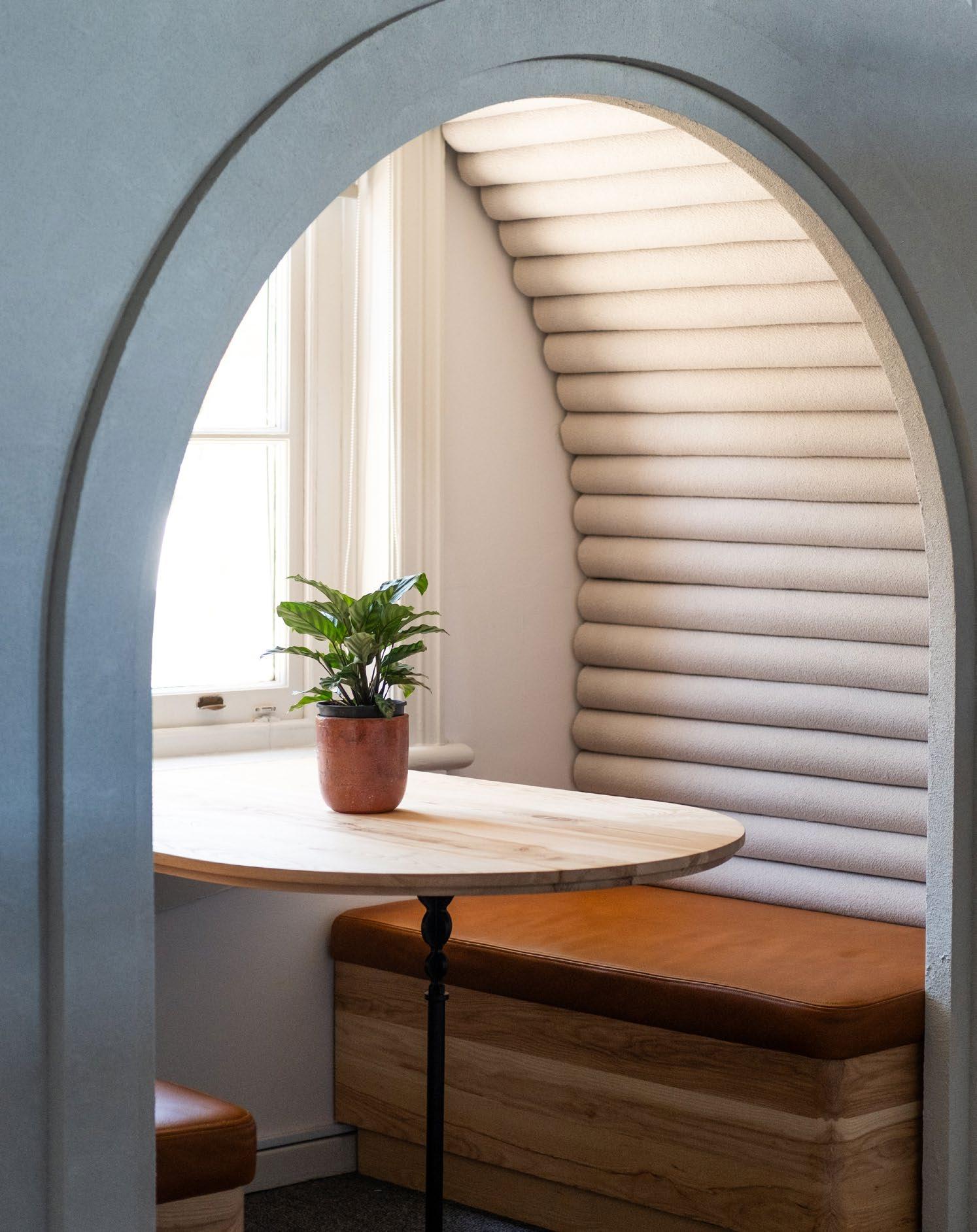
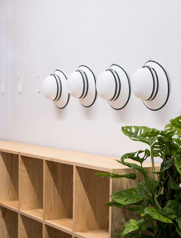
Despite its futuristic design, the library pays homage to the original character and architectural style of the building, celebrating its rich history. Classical aesthetic lines and a bright, open environment turn the space into one most welcoming. Arched reading, studying, and activity booths create a sense of security, the ultimate goal of a sanctuary. Similarly, the suspended paper scroll sculptures by Elonah O’Neil-Reid make for a calming atmosphere, while nostalgic stained-glass windows bring a vivid warmth to the space. As with all their projects, Hesse Kleinloog Studio focussed on the contextual relevance of the space, working with local suppliers, artisans, and makers. To be able to work in such a beautiful historic setting was a triumph in itself. Delivering a project that introduces out-ofthe-box thinking to a traditionally conservative setting was another significant project win.
Although the biggest challenges were fitting all the required contents (books are still books!) and working around the school holidays and functioning school days, this project is a successful demonstration in two things for sure: The Anele Tembe Library will forever be a platform for innovating education beyond the classroom, and Hesse Kleinloog Studio the team that made this dream come to life.


@_hkstudio_ www.hkstudio.co.za
ARE YOU INTERESTED IN MODERN AND ENERGY-EFFICIENT LED LIGHTING?
LEDVANCE offers smart lighting products that you can control via smartphone or voice, stylish and functional LED luminaires, our trendy Vintage Edition 1906 and state-of-the-art LED lamps. Exciting and sustainable LED lighting individually for your home.
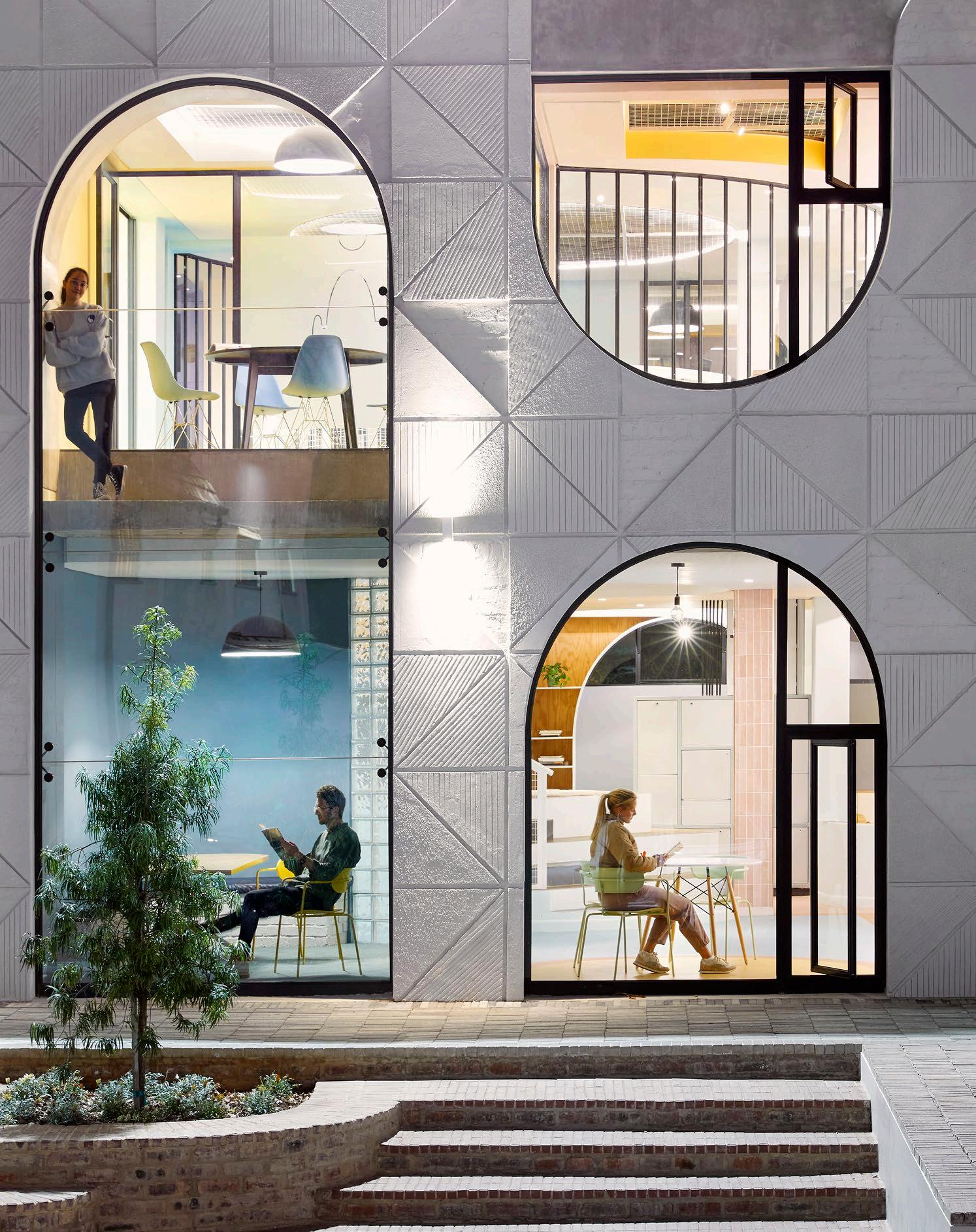
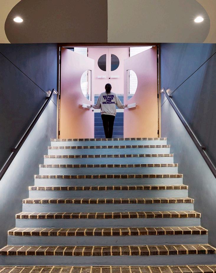
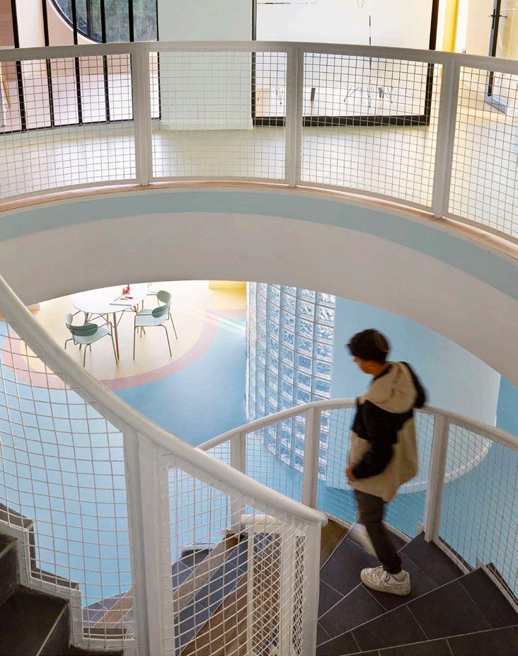
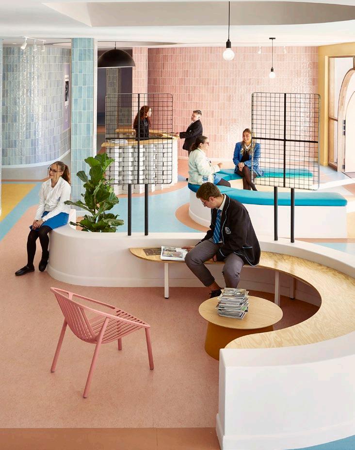
King David School in Johannesburg recently saw two distinct spaces undergo remarkable transformations, each reflecting a unique vision, yet remaining seamlessly interconnected. Introducing The Studios and The Yards: two inspired spaces that breathe life into the school's ethos of excellence. Created by the team at Hubo Studio, these environments represent innovative educational design.
Size: 843 m²
Cost: R15 000 000
Completed: 2023
Location: Linksfield, Johannesburg

This story begins in the wake of the COVID-19 pandemic. What began as a grand vision for a single structure with a very healthy budget, evolved into a tale of pragmatic adaptation, birthing two distinct projects: The Yards and The Studios. Originally intended as a combined endeavour, the constraints imposed by the pandemic led to a significant scaling back, prompting workshops to split the project into two.
The Yards, affectionately named by Hubo, emerged as a vibrant village nestled on the school's periphery, fostering a sense of community for art and drama students. Meanwhile, The Studios, also christened by Asher Marcus and the Hubo Studio team, breathed new life into old spaces, transforming them into a dynamic hub for STEM, design, and collaboration.
These spaces were envisioned as extensions of the traditional classroom and boast dynamic features like boardrooms, CAT labs, and 3D printing facilities. They serve as canvases for innovation, constantly evolving to meet the needs of students and educators alike. Of course, with a unique project like this, architectural finesse was crucial in these transformations, as rigid structures were reshaped into fluid, adaptable spaces. This is a story of strategic interventions, which ensured the effective utilisation of resources, allowing for phased development and efficient construction.
The Studios epitomises modern urban design principles merged with educational philosophy. It's a testament to the belief that architecture isn't just a backdrop but an active participant in the learning journey.
The Studios skilfully converted a highly structured (beam-filled) edifice into a fluid environment. Emphasis on the significance of thorough and precise alterations was taken into account, which demanded considerable expertise, effective interventions, and a deep comprehension of both structure and material properties of the space.
Flooring: Forbo Marmoleum, Tarkett Linoleum | Joinery: Innovation Factory | Lighting: Sarita Sharman Lighting Paint: Plascon, Versus Paint


ASHER MARCUS
Founder & Lead Designer @hubostudio www.hubostudio.com
 Photography by Elsa Young
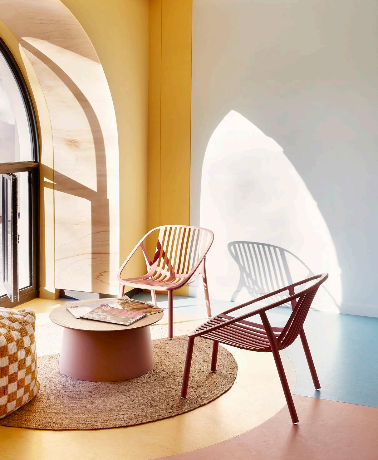
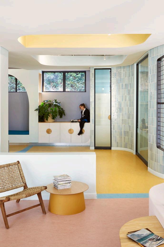
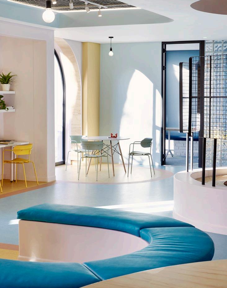
The result... A striking transformation. While at first glance you are taken with this contemporary aesthetic, the materials utilised speak to simplicity and resilience. Linoleum flooring, chosen from Tarkett's Linoleum collection and crafted for sustainability and durability including Linoleum Originale Essenza, Linoleum Style Emme, and Linoleum Veneto, plays a pivotal role in shaping the aesthetic and functionality of the space. Vibrant pops of sherbet colours further infuse the space with energy, striking a balance between invigorating and calming, thereby enhancing concentration.
The arches adorning the façade of The Studios are artistically manifested as horizontal curves and swirls. According to Asher, these architectural elements serve as a means of connecting and interweaving various aspects of the environment. This deliberate design choice fosters a sense of continuity and fluidity within the space, encouraging movement and exploration.
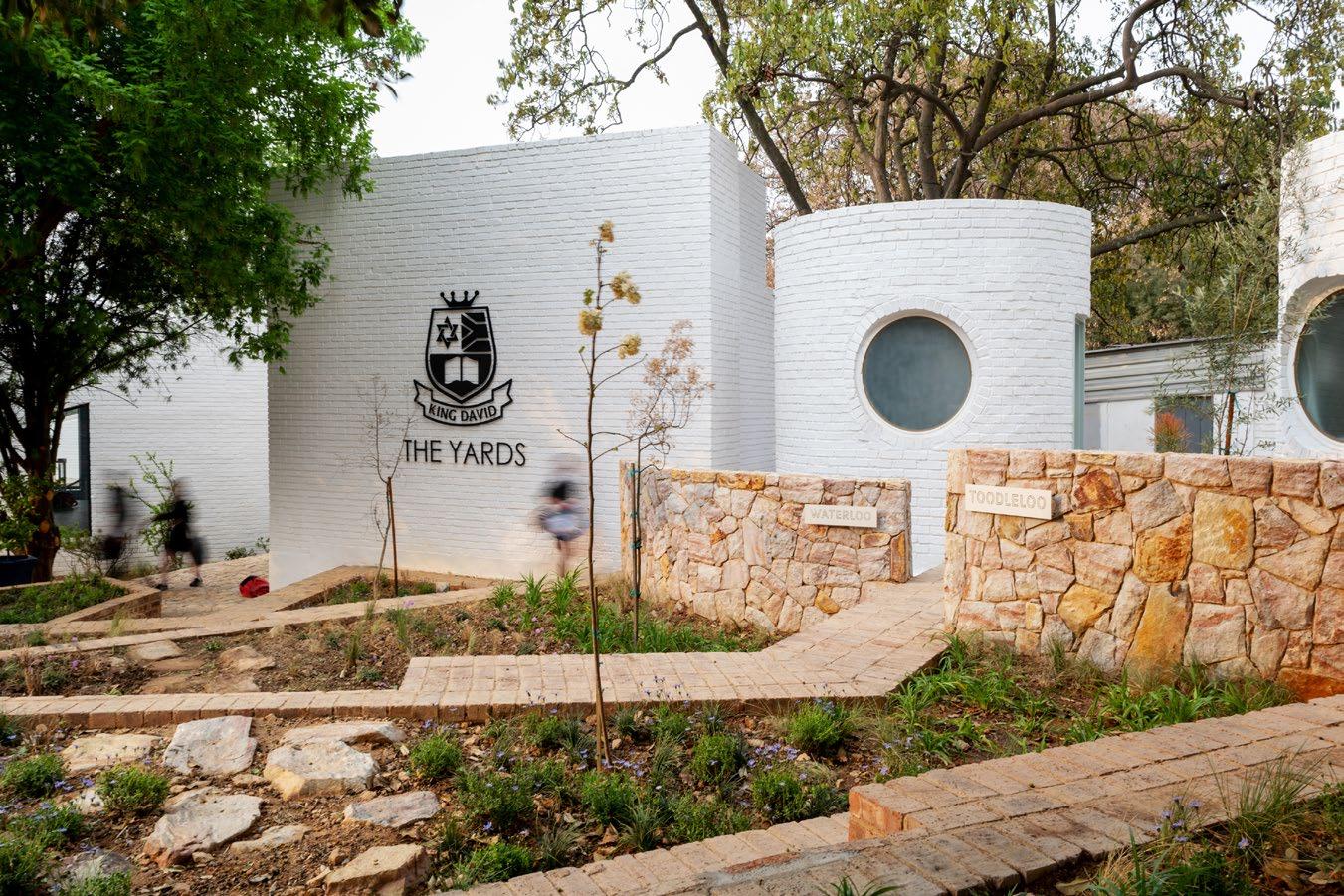
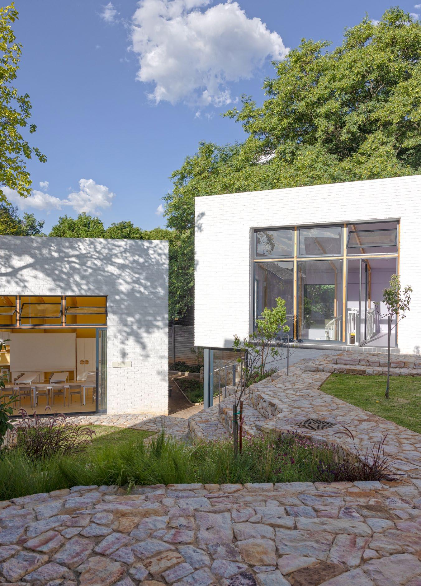
If The Studios embodies an urban aesthetic, The Yards, serving as an art and drama centre, exudes a more pastoral charm. Settled within sloping terrain, The Yards is a versatile architectural node, hosting a central auditorium and adjoining spaces across two levels. From events to performances, it's a dynamic hub. The Sun Room serves as a vibrant stage, while the Yellow Room flexes between stage and classroom, with the sense of multipurpose and ‘childcentric’ at its core. Shared courtyards foster collaboration between classes, enriching learning experiences with diverse perspectives and interdisciplinary interactions. The Yards transforms education spaces, prioritising functionality and creative exchange.
Architects: Hubo Studio (Asher Marcus, Michelle Smith & Magriet Steynberg) | Main Contractors: Bantry Construction, Chargeprop
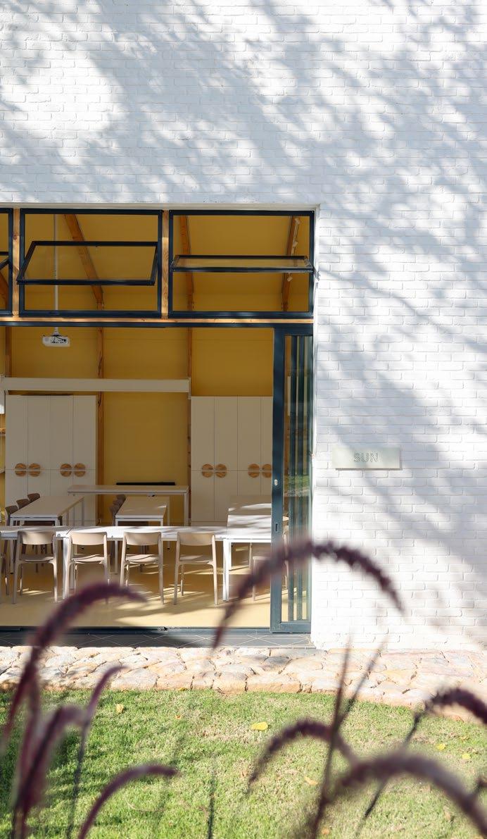
The undulating terrain was terraced, resulting in an array of structures with fragmented appearances, strategically arranged at varying angles. These architectural elements converge upon a central amphitheatre, seamlessly merging with the natural topography. The studio classrooms, characterised by their double-volume spaces, appear harmoniously embedded within the landscape, interconnected by wheelchair friendly pathways, reminiscent of a submerged Rubik's Cube. Every facet of the design, from sliding doors melding seamlessly into walls to classrooms effortlessly metamorphosing into auditoriums, embodies a commitment to adaptability and utility. The landscaping, featuring an array of naturalistic elements such as rocky formations and verdant foliage, serves as a seamless extension of the encompassing ridge, imparting a sense of serenity and equilibrium.
Both spaces share a common thread in their design philosophy: the emphasis on interactive learning environments. Whether it's the fluidity of space in The Studios or the interconnectedness of courtyards in The Yards, each element is meticulously crafted to foster creativity and community. The transformation of The Studios and The Yards at King David School represents more than just architectural innovation; it's a testament to the school's commitment to redefining the learning experience, and a studentcentric approach to space making.

‘Both spaces share a common thread in their design philosophy: the emphasis on interactive learning environments.’
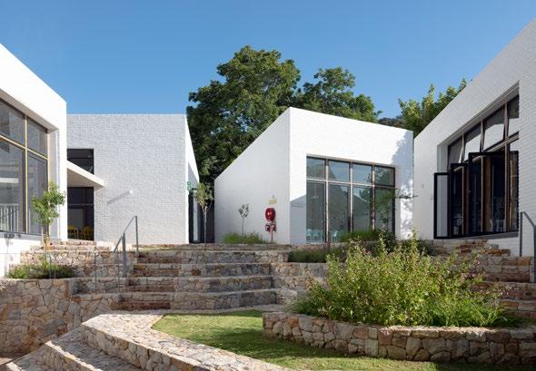
‘The undulating terrain was terraced, resulting in an array of structures with fragmented appearances, strategically arranged at varying angles.’
by
Photography Gabrielle Aquadro
With stylish, timeless appeal and impressive sustainability credentials - the enduring hues and textures of clay brick are low maintenance and look beautiful for a lifetime.
CBASA represents clay brick & paver manufacturers across Southern Africa and drives inclusive, sustainable practices in the industry. We inspire energy-efficient, contemporary architecture and paving that supports our local producers, landscapers and architects.
Free technical and construction guides for clay bricks & pavers at www.claybrick.org
Green School South Africa’s latest addition
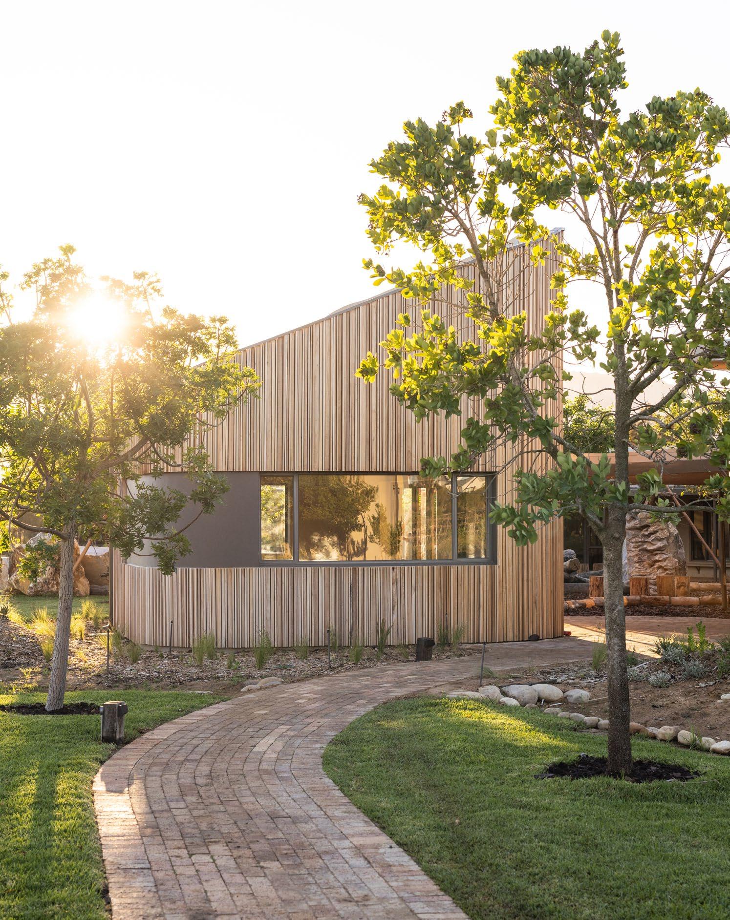
Catching up with our local eco-educational champions, we find Green School South Africa emerging once more as a testament to sustainable education and architectural innovation. Surrounded by the grandeur of the Paarl Berg and Drakenstein Mountains, this eight-hectare campus embodies a harmonious blend of nature-inspired design and regenerative principles. The campus might have been launched in 2021, but the school’s growth is nowhere near over. This year’s launch opens the fields to a new generation: Middle School.
Completed: 2024
Location: Paarl, Western Cape
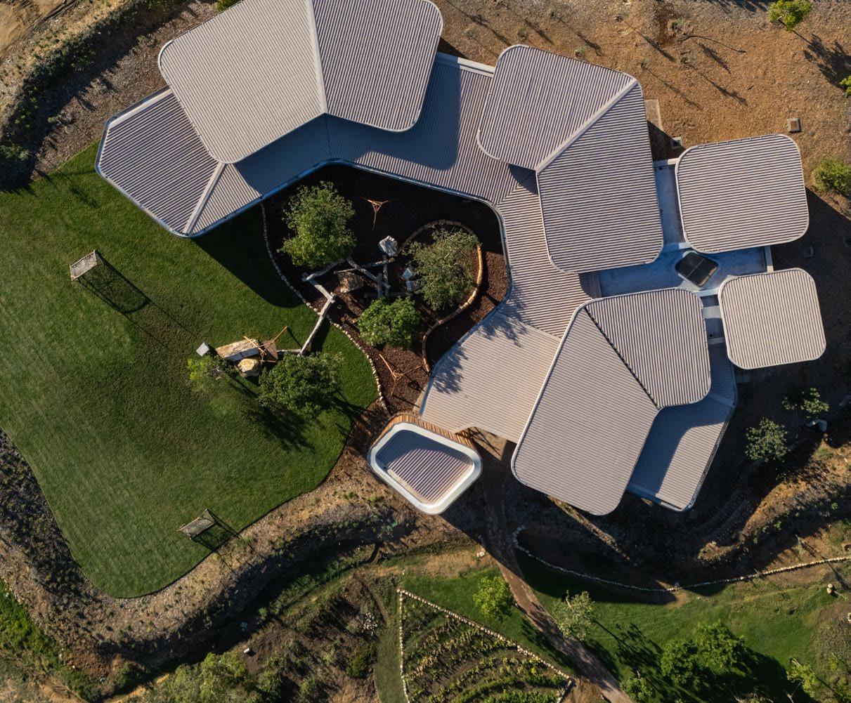
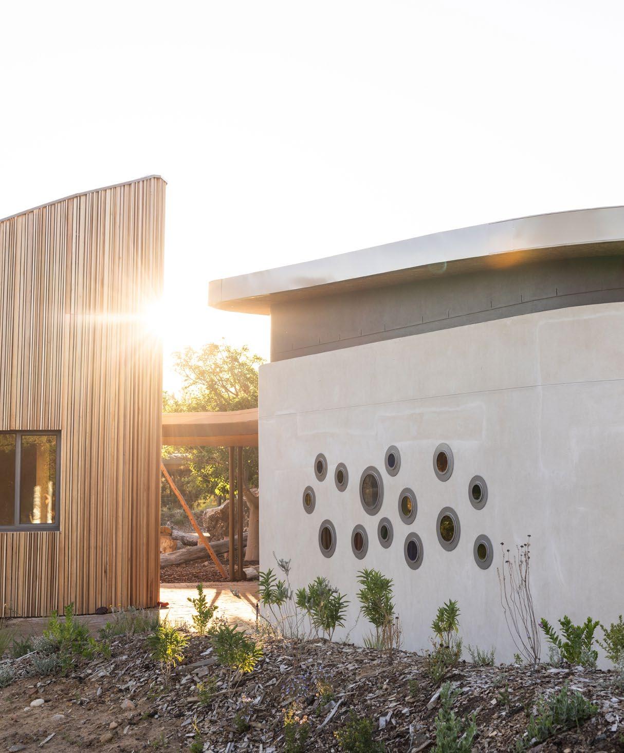
The architecture of Green School South Africa (GSSA) draws inspiration from the natural landscape, echoing the organic shapes of the Paarl Berg and local boulders. Completed in February 2021, the campus's first phase features clusters of buildings interconnected by landscaped walkways and verdant courtyards. These clusters house various facilities, including 16 classrooms spanning kindergarten to Grade 8, the versatile Sangkep multipurpose space, an administrative building, and the central ‘Heart of the School’.
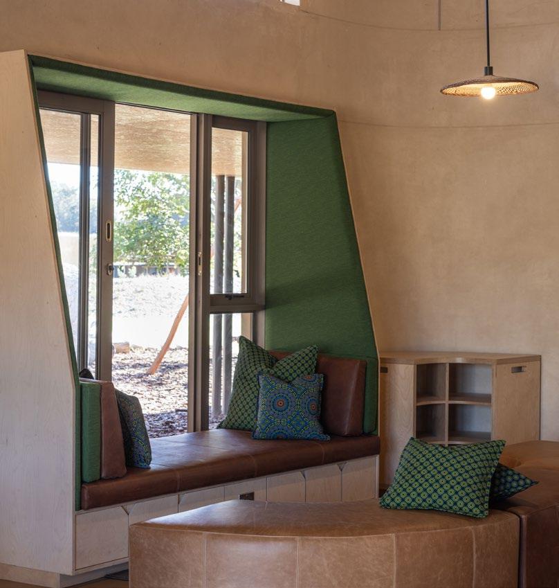
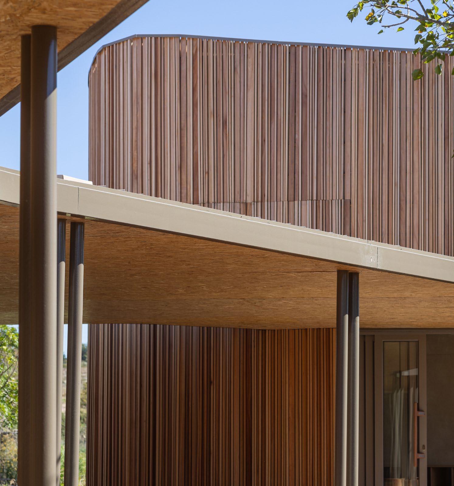
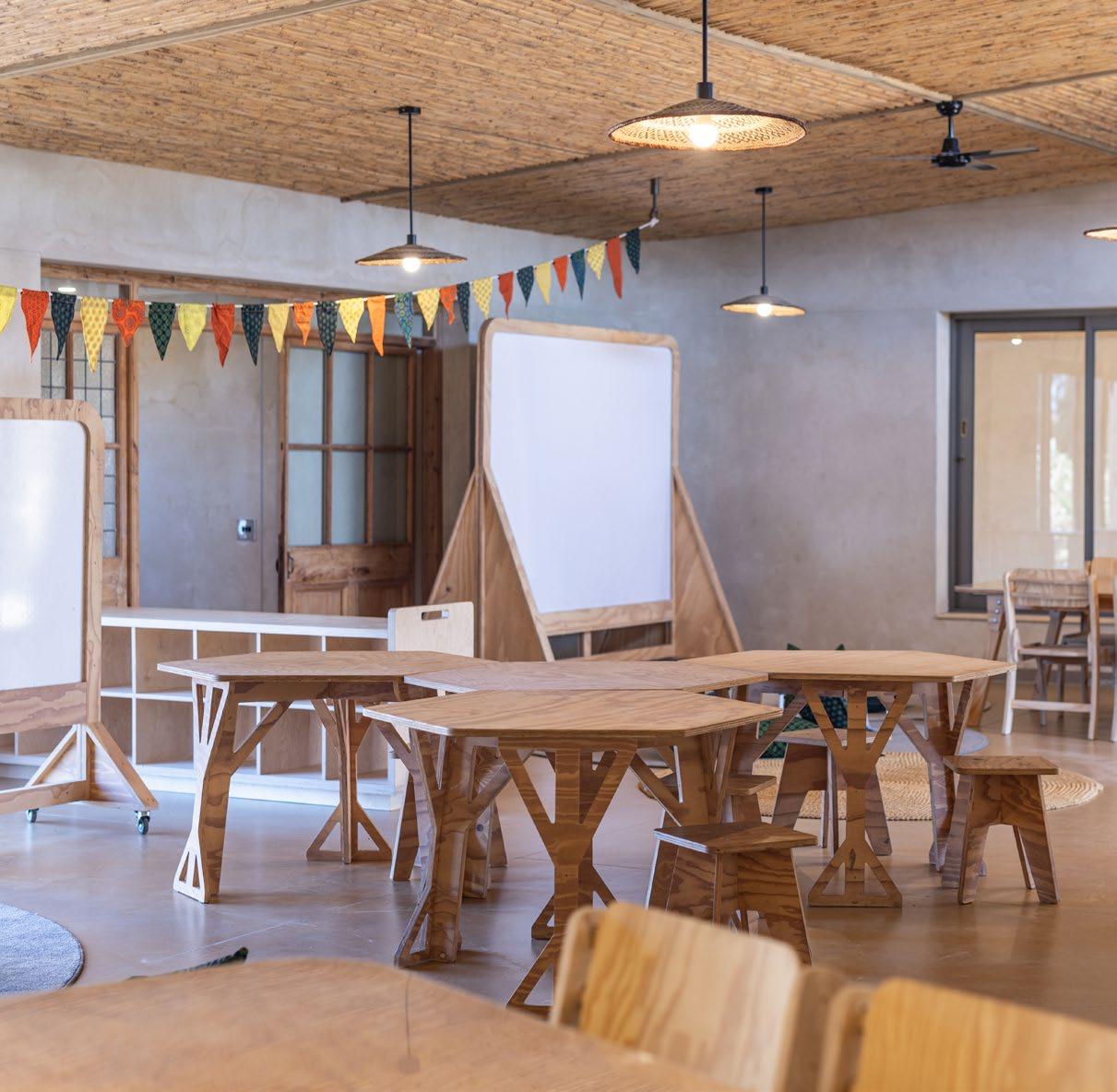
GSSA prioritises sustainability at every turn, incorporating passive design principles, feng shui, and the Living Building Challenge's seven petals into its layout, and the Middle School extension is no different. Expansive openings blur the boundaries between indoor and outdoor spaces, fostering a seamless connection with nature. Locally sourced materials such as dekriet ceilings, clay, rammed earth walls, and reclaimed timber celebrate the region's craftsmanship and heritage. It is thus that the ethos of both the school and its committed designers is continued through every stage of education.
The energy systems that GSSA relies on are a testament to its commitment to sustainability. The campus is powered by a hybrid solar system, comprising rooftop solar panels. This initiative enables the school to exceed the Living Building Challenge's stringent requirements, generating 105% of its electricity needs annually while minimising its carbon footprint.

 CHRIS BAKKER & THEUNA STOLTZ @gass_architecture_studios
www.gass.co.za
Water management on campus follows a comprehensive, closed-loop system designed to minimise waste and environmental impact. The process begins with rainwater harvesting, where rooftop catchment systems collect rainwater for storage in underground tanks. This harvested rainwater is then filtered and treated on-site, ensuring its quality for various uses within the campus, including irrigation, toilet flushing, and cooling systems. Any excess water is safely discharged into the ground, replenishing local aquifers and contributing to the surrounding ecosystem's health. By embracing these innovative water management practices, the school demonstrates its dedication to preserving precious water resources and promoting environmental sustainability.
Rigorous efforts to eliminate red-list materials underscore GSSA's commitment to ecological responsibility. These materials, known for their harmful environmental and health impacts, present significant challenges in sourcing alternatives that meet the school's high standards for sustainability and safety. By meticulously vetting every material used in construction, they ensure that their buildings are free from substances such as lead, asbestos, and formaldehyde. This dedication to eliminating red-list materials not only reduces environmental harm but also promotes healthier learning environments for students and staff alike.
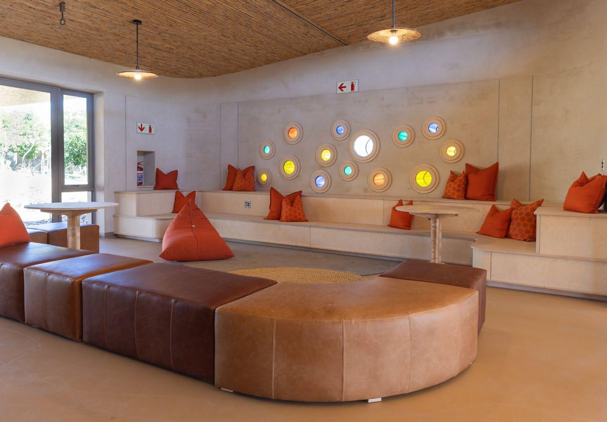
‘Green School South Africa stands as a beacon of hope and inspiration in the journey towards a greener, more sustainable future.’
MEET THE TEAM
Architects: GASS Architecture Studios | Interior Designer: Andrea Hofmeyr | Landscape Architect: DDS Projects | Main Contractor: Energy Master Builders | Quantity Surveyor: AECOM | Land Surveyor: Bruwer Surveyors | Civil & Electrical Engineers: Frame Consulting Engineers | Photographer: Daniela Zondagh Photography
Biophilic design and human well-being
Biophilic design principles permeate every aspect of the architecture on campus, promoting human well-being and an improved relationship with nature. From abundant natural light to immersive outdoor spaces, the campus nurtures a sense of harmony and tranquillity. Biophilic elements such as indoor gardens further blur the boundaries between indoor and outdoor environments, fostering the link between the students and the surrounding landscape. By prioritising biophilic design, the school creates environments that inspire creativity, encourage learning, and enhance the overall quality of life for students, staff, and visitors alike.
Green School South Africa stands as a beacon of hope and inspiration in the journey towards a greener, more sustainable future. From its architecture to its energy solutions, water management practices, and commitment to eliminating red-list materials, the school embodies a holistic approach to sustainability and regenerative living. As a pioneer in sustainable education, GSSA sets a precedent for schools worldwide, demonstrating that sustainability and innovation can co-exist harmoniously for the betterment of both people and the planet.

100% South African manufactured auditorium seating
• Johannesburg: 44 Galaxy Avenue, Ext 14 Frankenwald, Linbro Park, Sandton. 2090.
• Telephone: +27 (0) 11 444 2061
• Fax: + 27 (0) 444 8416
• Email: rod-lin@iafrica.com
• Cape Town: 11 Bremen Close, Airport Industria, Matroosfontein. 7490.
• Telephone: +27 (0)21 534 9873
• Cell: +27 (0)74 804 0040
• Email: info@rodlindesign.co.za www.rodlindesign.co.za
NMU Science Centre by SVA International
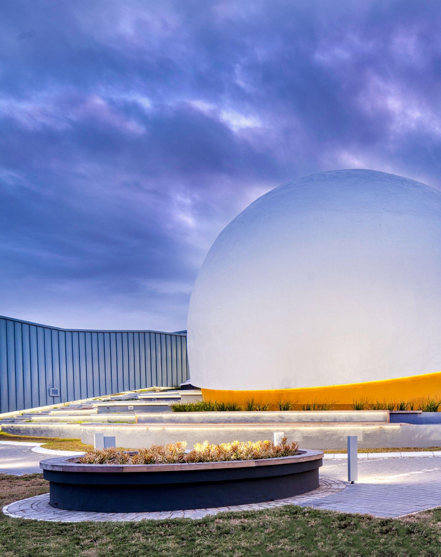
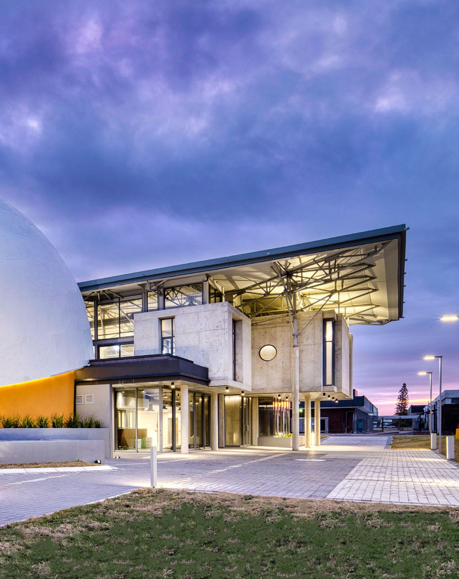
From the digital planetarium to exhibition spaces and offices, the Nelson Mandela University Science Centre is a new sphere of possibilities. Designed to precision by SVA International, this integral part of the university campus is an exceptional step towards championing open science in educational environments.

Size: 2900 m²
Completed: 2023
Location: Nelson Mandela University, Port Elizabeth
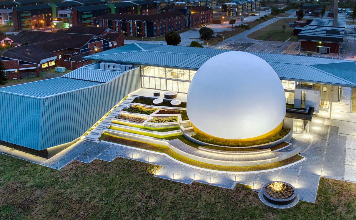
In designing the NMU Science Centre, the space had to be transformed to accommodate a new 140-seater digital planetarium installation. From the onset, the decision was to use the opportunity to broaden not only the educational setting but also the social one. The team at SVA International found the solution in setting the building back from the main arterial movement route on the eastern edge, in doing so creating a public plaza and open gathering space fit for the student community. The building’s eastern edge along the plaza was further extended as a part of the landscape onto the public realm, creating a ‘living edge’ which welcomes visitors to circulate both vertically and horizontally within a multi-levelled terrace.
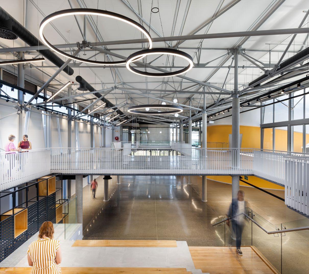
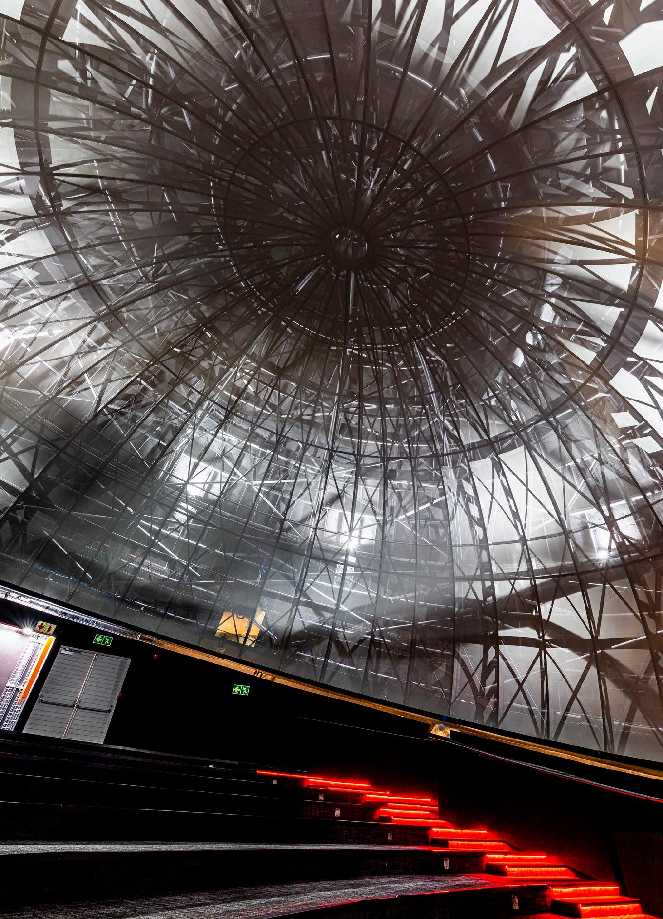
That is the crux of the building concept — a multi-layered pavillion that facilitates maximum spatial flexibility while capturing the notion of science in academia. The key spatial components include the planetarium dome which stands as the main focal and formal element within the composition. The dome is placed off-axis on plan as a datum within the double-volume foyer, which in turn invites students, staff, and visitors alike on a journey before entering the dome, further allowing them to experience the building in a three-dimensional manner. To bring it all together, the lecture venue and auxiliary spaces are designed to complement the main exhibition area.
The dome structure itself is a composite layer of steel and concrete with a specialised digital installation within. Choice of materiality was dictated by both a contemporary aesthetic and consideration for maintenance (due to proximity to the ocean), as well as general public use. Careful consideration for landscaping also forms an integral part of the eastern ‘living’ edge. It creates the soft, layered environment that invites users and visitors to engage with the building and the adjacent public space.
 MEET THE TEAM
Lead Architects: Tony Danev, Stephanie Janse van Vuuren, Judy Du Preez | Photographers: Ray Truter Photography, Jamie Thom, SVA International
The perfect position
The main challenge was around the conceptualising, detailing, and erection of the dome, which is positioned both at an angle (14 degrees) and off-axis to the main building. Furthermore, careful coordination was required with the specialist system installers of the digital planetarium installation, all done by international sub-contractors. Tolerances were minimal and an intricate understanding of the system operations was essential to ensure all provisions were catered for within the dome structure and auxiliary spaces.
The luminous new building claims its space with pride on a campus that offers infinite opportunities. As it channels a modern academic and research environment, the NMU Science Centre showcases the University’s aspiration and evolution towards the advancement of open accessibility to science for the youth of today and tomorrow.

 TONY DANEV Associate & Architect @sva.international www.svarchitects.com
SUPPLIERS
Paint: Dulux Paints | Sanware: Geberit, Hansgrohe | Lighting: Regent Lighting Solutions | HVAC: Samsung | Ceilings: OWA Ceiling Systems Lifts: Schindler | Carpets: Belgotex | Roofing: Safintra | Vinyl flooring: Polyflor | Paving: Bosun | Access control systems: SALTO | Auditorium seating: Rodlin Design
‘This integral part of the university campus is an exceptional step towards championing open science in educational environments.’
WITS Faculty of Commerce, Law and Management Administration Building by MMA Design Studio
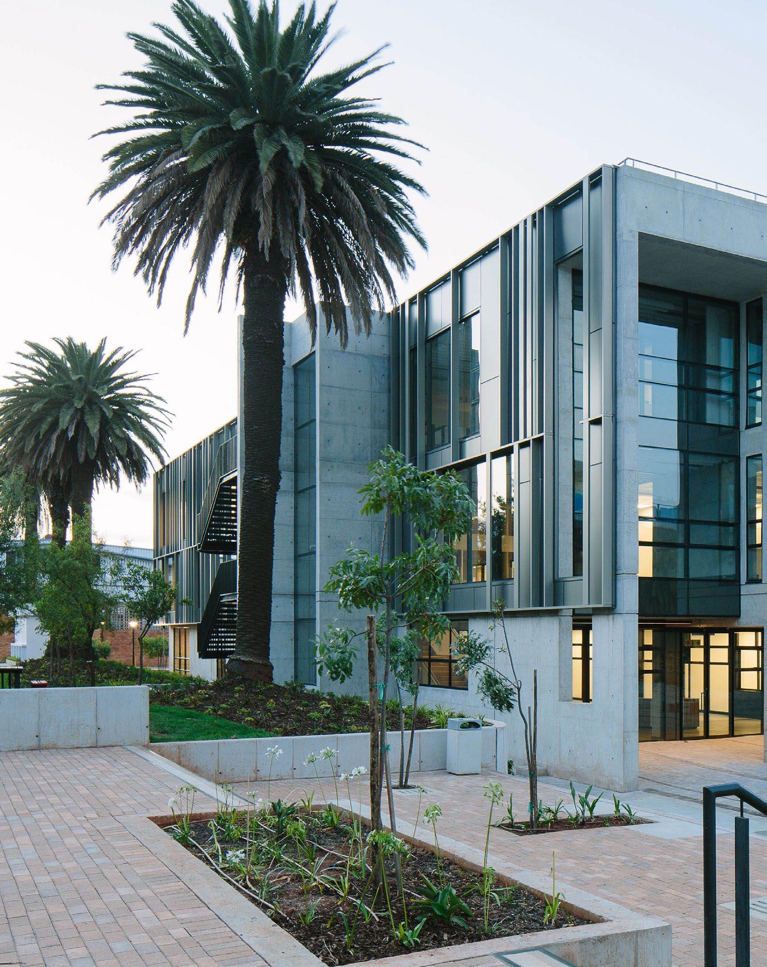
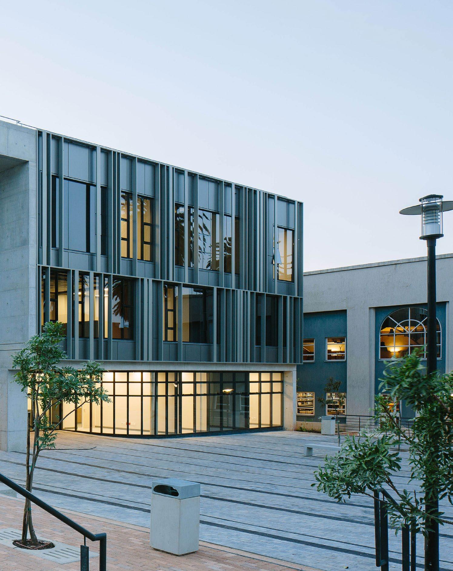
The elegant new Commerce, Law and Management Faculty Administration Building serves its purpose well as a beacon of development. Located on the West Campus of the University of the Witwatersrand, it stands tall on the city’s historical showground precinct, which dates back to 1907. More than 100 years since its inception, the showgrounds have been transformed into the present-day university campus, a space that sports new architectural signatures spanning different eras. Today, thanks to MMA Design Studio, one of the latest faculty buildings adds to the collection of stylistic assortments that the campus celebrates.
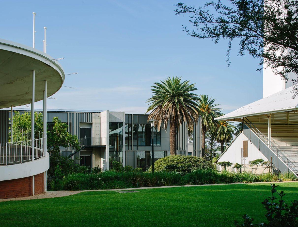
‘The design is imagined as a forwardlooking trajectory of the site's history, from the filigree architecture of the Victorian bandstand to the modernist concrete awe of the adjacent Tower of Light.’
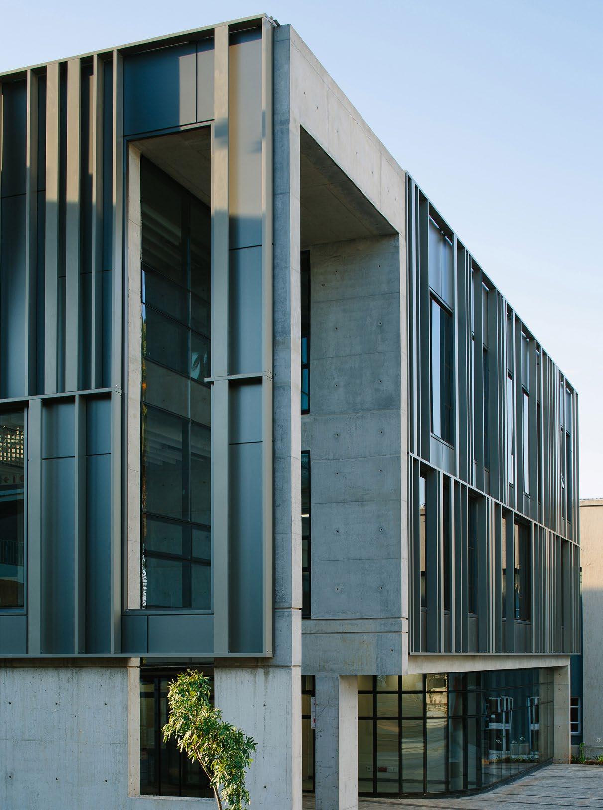
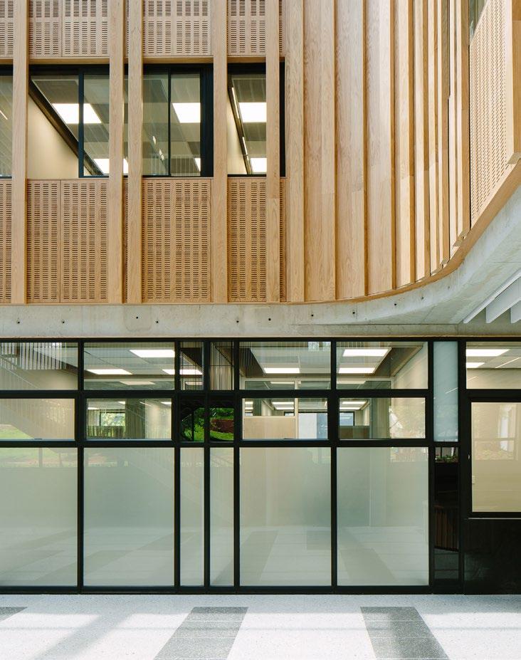
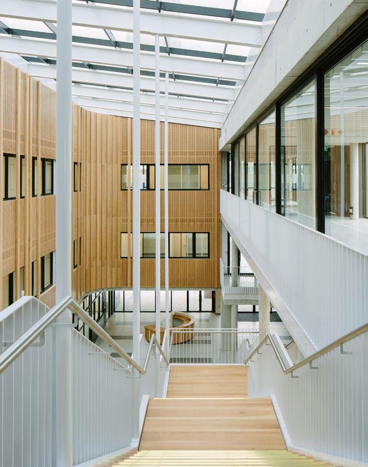
The Commerce, Law and Management Faculty Administration Building (the recent winner of the GIFA Award of Excellence and Presidential Award) presents itself as a delicate interlocking of two L-shaped functional zones. The zones house private office wings on one side and a bank of public social amenities on the other, the two sides connected on all four storeys by a habitable bridge, forming a skylit atrium with a hanging staircase. The building accommodates nine departments and splits its square metres in two, offering shared collaborative and social areas interconnected through a central atrium to promote a unified faculty community.
Illuminating the interior, connecting the exterior
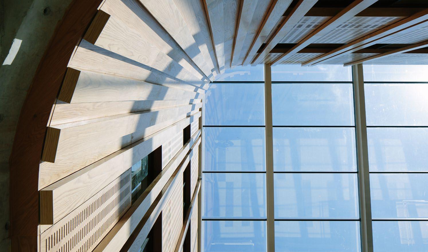
The bridge link offers staff and visitors a view of the heritage precinct, while the atrium is considered a spatial continuation of the historical stadium. The atrium skylight is a refreshing source of natural light, illuminating the interior of the building and creating a striking visual impact that spotlights the iconic Tower of Light structure. This design element effectively connects the interior space with the surrounding exterior of the campus, inciting a sense of the cohesion and connectivity that tertiary education is all about.
Size: 3100 m²
Completed: 2022
Location: University of the Witwatersrand, Johannesburg
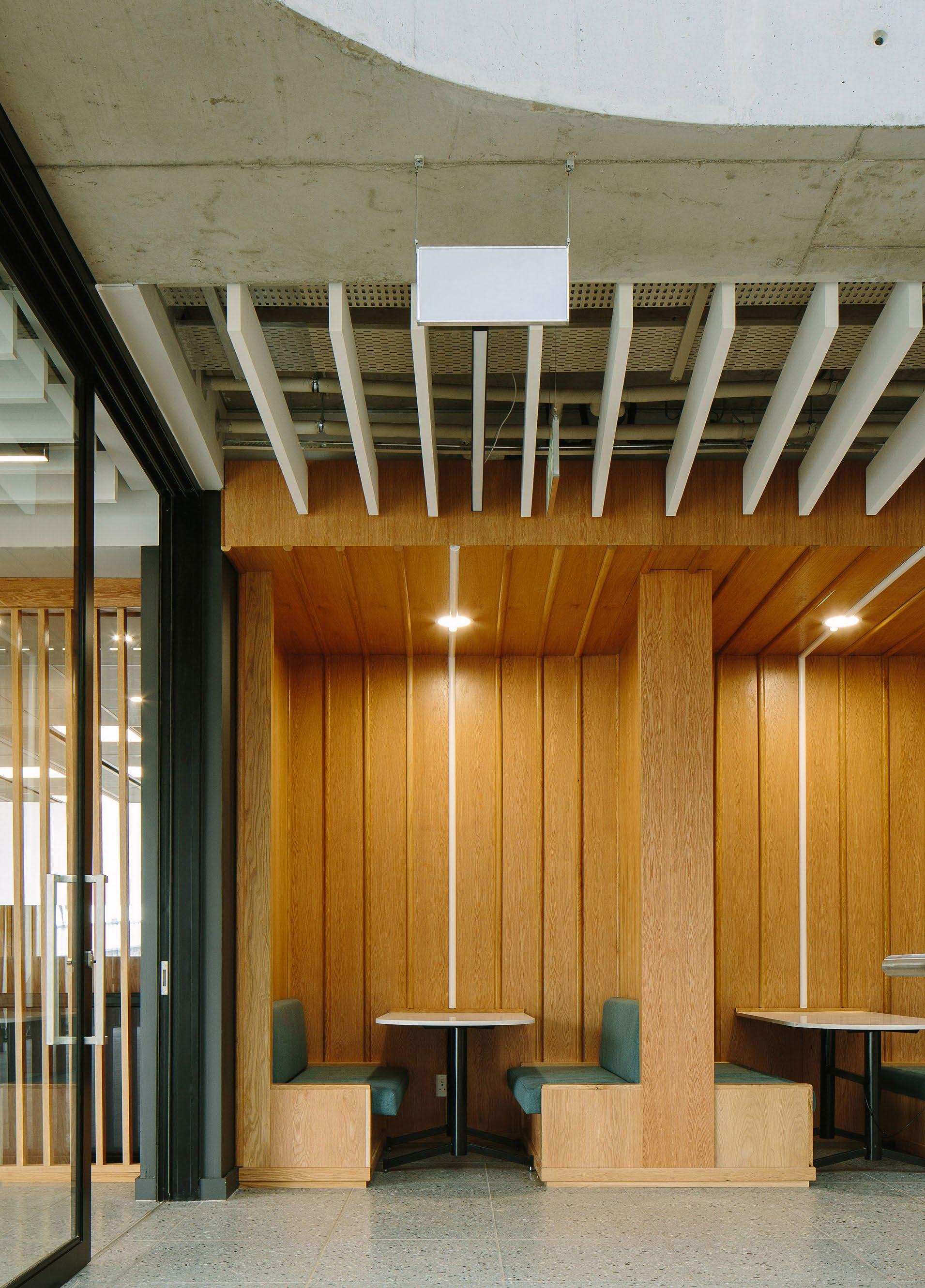
The tectonics of the building were chosen based on the careful study of the existing buildings and spaces. The design is imagined as a forward-looking trajectory of the site's history, from the filigree architecture of the Victorian bandstand to the modernist concrete awe of the adjacent Tower of Light. Internally, this filigree architecture is carried through in the detailing of the timber acoustic cladding, balustrading, and ceiling acoustics.
The building system is undoubtedly energy-efficient and thermally applied, utilising pipe work integrated into the concrete structure to enable heating and cooling through water circulation, resulting in reduced energy consumption. Additionally, the roof is entirely covered with solar panels, effectively offsetting electricity consumption from the grid. To further minimise its environmental impact, the design incorporates several passive strategies, such as natural ventilation, high insulation, and optimised natural light. These measures significantly reduce the building's environmental footprint, particularly during its operational life cycle.
MMA Design Studio’s contribution to WITS’s West Campus has brought new opportunity for development among the local students and the future of business, economics, and commerce. With its bright open spaces and welcoming appeal, the spirit of success is a tangible experience for students, staff, and visitors alike.
Architects & Interior Designers: MMA Design Studio
(Eugene Marais, Nobethu Jolobe & Lemmaseya Khama) Project Managers: BVi Consulting Engineers | Quantity Surveyors: Enumerate Consulting | Structural Engineers: Structural Solutions, Bosch | Civil Engineers: Bosch | Electrical & Wet Services Engineers: Delta | Mechanical Engineers: Maninga Engineering | Contractor: Tri-Star Construction Urban Designers: Ludwig Hansen Architects + Urban Designers Photographer: Tristan McLaren

 MPHETHI MOROJELE Founder & Architect
@mmadesignstudio www.mmastudio.co.za
SUPPLIERS
Acoustic ceilings: OWA | Tiles: Union Tiles, Belgotex | Vinyl sheet flooring: Gerflor | Paint: Plascon, Versus Paint | Glass: PG SmartGlass
Sanware: Grohe, Geberit | Insulation: IsoBoard

A contemporary retrofit for Stellenbosch University
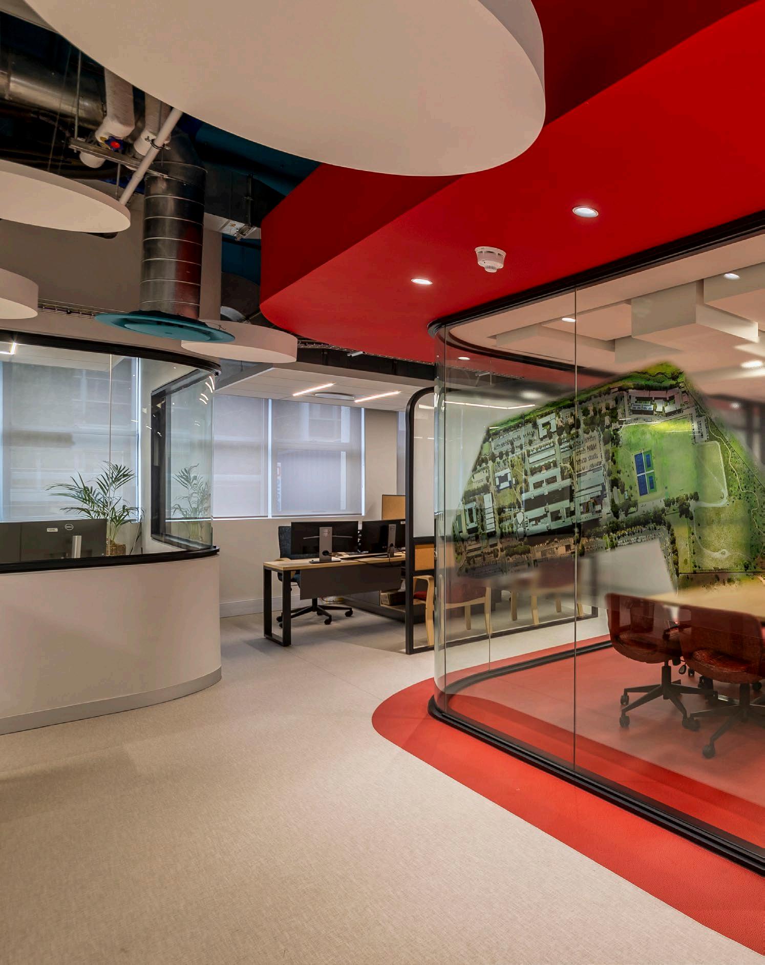
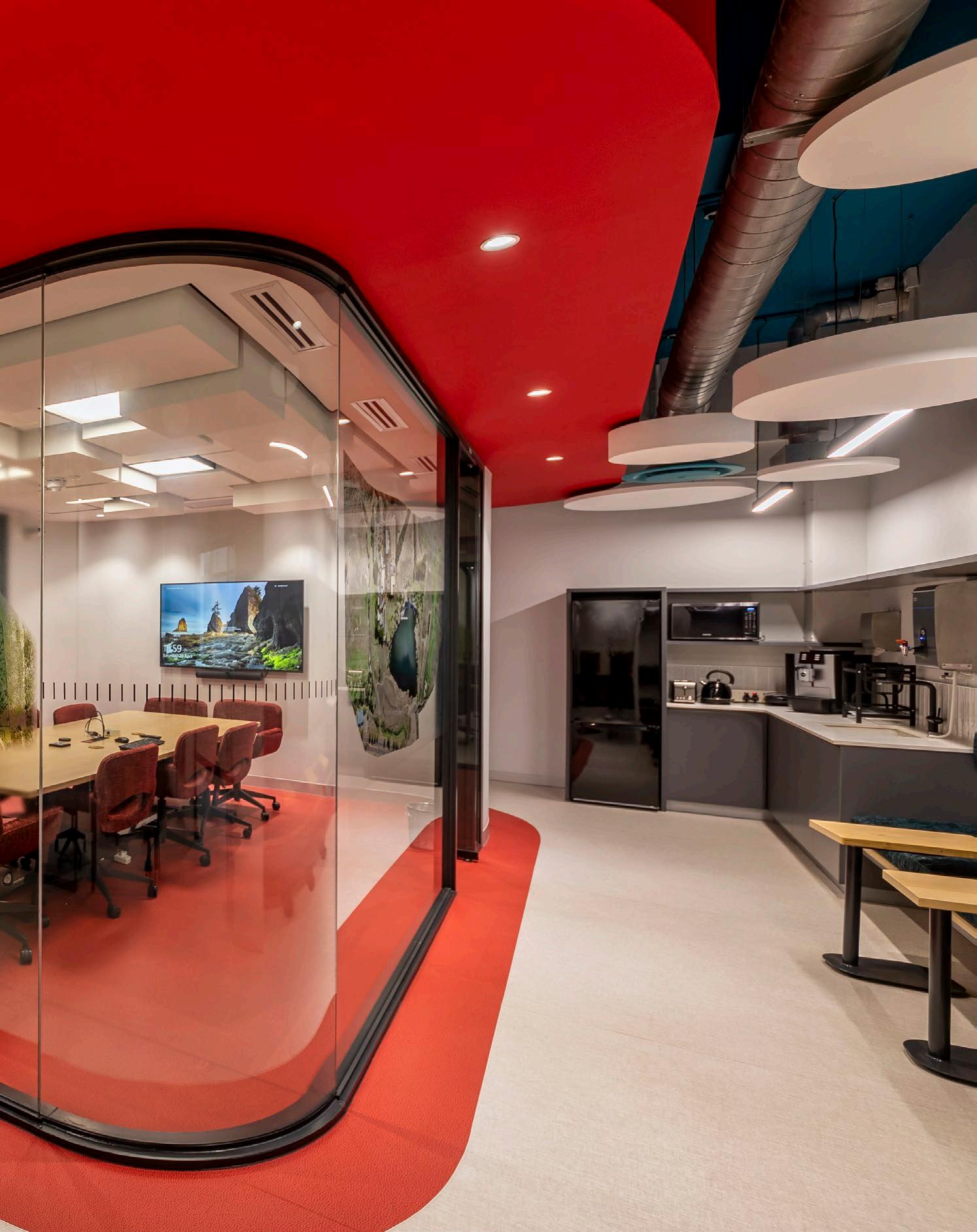
Nestled within Stellenbosch University's Tygerberg campus, a transformative architectural project is blending tradition with innovation, function with form, highlighting a shift in office design. Tasked with reimagining the interiors of existing institutional offices, JAKUPA Architects and Urban Designers Pty Ltd embarked on a journey driven to re-conceptualise and refurbish Stellenbosch University’s Facilities Management Office.

‘The palette itself evoked a kaleidoscope of sentiments. Warm hues of red imbued spaces with vitality, while cool tones of teal imbued tranquillity — a delicate interplay of colours orchestrating a symphony of ambience.’
Size: 480 m²
Completed: 2024
Location: Stellenbosch University Tygerberg Campus
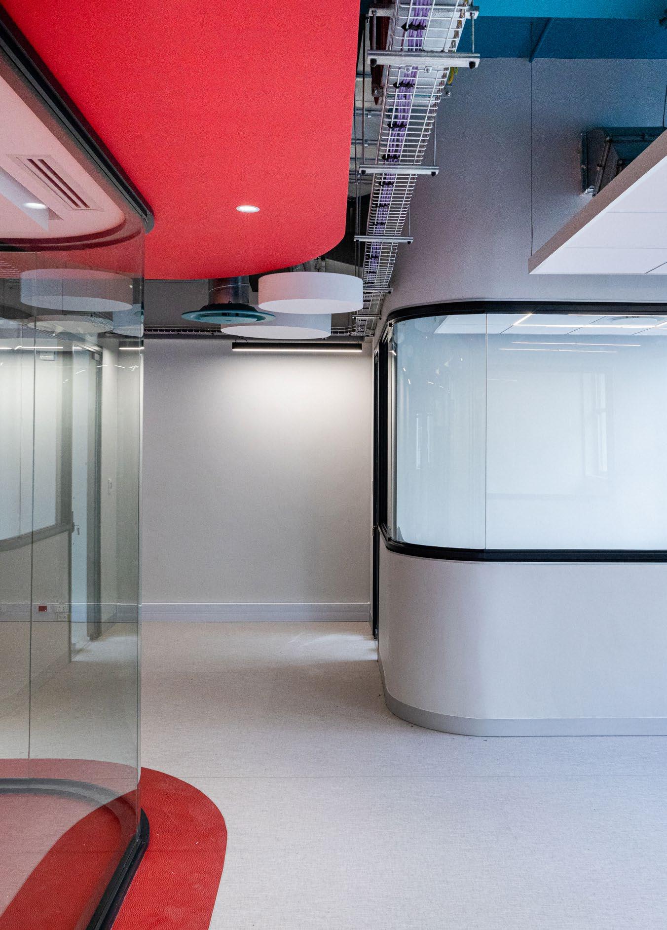
This architectural interior project centres around the client's vision in redefining traditional office spaces. The goal was to design a spacious workspace that fosters collaboration and creativity where members can thrive. Bold colours are integrated to establish a vibrant workplace. Transparency and curvilinear forms are strategically used to guide movement and encourage constant visual interaction. Softening threshold spaces adds fluidity and motion to the environment. These design principles result in an interactive and dynamic architectural outcome that enhances collaborative productivity. The facilities are crafted to accommodate contemporary needs and enhance the overall user experience within the space. This includes joint workspaces, meeting rooms, relaxation areas, and ergonomic workstations designed to maximise productivity and userfriendliness. Flexibility is prioritised to accommodate future interventions seamlessly.
The concept unfolded through several phases and three iterations to reach the final design. Through a combination of sketches and workshops spanning a few weeks, the team and the client engaged in a dialogue of creation, refining the blueprint of the space and ultimately delivering a superb environment for its users.
Navigating the delicate balance between construction and continuity of campus life, JAKUPA Architects and Urban Designers Pty Ltd worked within an existing building while ensuring that operations continued during construction. The preservation of accessibility amidst ongoing upgrades posed to be a challenge, necessitating a swift upgrade to meet access requirements. Material selection played a vital role in shaping the
 MEET THE TEAM
Client: Stellenbosch University | Architect: JAKUPA Architects and Urban Designers Pty Ltd | Photographer: Terry February
visual and tactile qualities of space. Timber, aluminium, glass, stone, and fabric were therefore carefully curated. Whether rugged stone or sleek aluminium, each material was chosen for its durability, functionality, and aesthetic appeal with a focus on longevity and sustainability. The colour palette considered the rooms’ purpose, desired atmosphere, and personal preference. The palette itself evoked a kaleidoscope of sentiments. Warm hues of red imbued spaces with vitality, while cool tones of teal imbued tranquillity — a delicate interplay of colours orchestrating a symphony of ambience.
In the realm of architectural innovation, this project serves as a testament to the profound impact of design transformation. It marks a new era for Stellenbosch University, characterised by the limitless potential of spatial rejuvenation.
SUPPLIERS
Paint: Plascon | Flooring: Gerflor
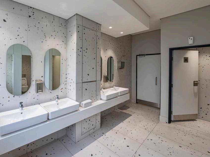
Tiling: Mazista | Ironmongery: CISA Ceiling acoustics: OWA | Toilet partitions & lockers: Cubicle Solutions Windows, shopfronts & internal glazed partitions: Table Bay Glass & Aluminium | HVAC: Costal Air Conditioning Services | Sanware: Geberit

 GABS PATHER Director & Principal Architect @jakupa_architects
www.jakupa.co.za

Nothing says optimal security for educational facilities like the range of Burglar ProtektTM products from CISA and DPS. Our mission is to redefine what it means to have secure and optimal openings in educational institutions. Our unique architectural design approach to each window and door opening is to seamlessly blend all requirements, from aesthetics, function, and energy efficiency to ease of operation, safety, and longevity. With added convenience, comfort, privacy, and security, this approach ensures that we provide best-in-class, holistic solutions that are designed with the staff and students in mind, reaffirming our commitment to innovation, peace of mind, and investment value.
Our value proposition to building managers and decision makers in the education sector:
Comprehensive standards compliance
We strictly adhere to the European Bureau of Standards (EN European Norms). This allows us to offer specific long-term guarantees of up to 20 years, providing our clients with peace of mind and a promise of enduring quality.
Customisation and engineering excellence
Leveraging our robust assembly and engineering operations, we can customise most products to meet the unique requirements specified by architects.
Wide range of solutions
Not only do we offer a complete range of architectural ironmongery, but we also boast the widest range of cylinder solutions in the market. This enables us to provide almost any master keying requirement or configuration across all levels of key security.
Cost engineering and high performance
Our DPS range allows us to cost-engineer our CISA specifications to align with varying budget requirements while maintaining strong product performance and reliability, ensuring our clients do not have to sacrifice quality for cost efficiency.
Unwavering support
What truly sets us apart is our ‘never walk away’ commitment. This ethos has distinguished us from our competitors, showcasing our dedication to supporting and backing our products in the field. Our long-standing track record of reliability and client support underscores our dedication to delivering not just the best solutions, but true peace of mind.
Investment value
Our offerings are designed to go beyond meeting immediate needs and, through our long-term guarantees of up to 20 years, provide long-term investment value.
D. Purdue & Sons stands as a beacon of innovation, commitment, and unrivaled expertise. Our unique value proposition is built on providing solutions that instill peace of mind, underscored by a relentless commitment to service and the promise of significant investment value. This is what makes us a trusted partner for Class-A safety and security ironmongery in every educational facility.
Our Team of GAI (Guild of Architectural Ironmongery) qualified Specifiers are ready to assist you with a free specification service for your next project:
Natasha Smith (DipGAI, MGAI, RegAI)
National Specifications Manager natasha@cisa.co.za | 082 802 0163

@CISA Architectural SA www.cisa.co.za

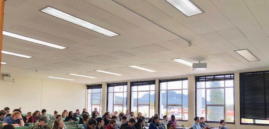
OrbitX LED lights are locally designed, assembled and tested to provide excellent light at the lowest life cycle cost in the market. This has been confirmed from research by Stellenbosch University.
8-year guarantees provide peace of mind for zero maintenance during the long lifetime of OrbitX lights. High efficiency ensures minimal energy cost while maximising light output.
• Orbit LED Lights on average last 4 times longer than other LED lights and reduce landfill waste by as much as 75%
•
Are energy efficient with a near-unity power factor. This radically reduces your carbon footprint and energy usage by 50 to 67%
• Are recyclable and a void costl y disposable costs
• Are ideal t o use in conjunction wit h PV Plants (Solar Generation)
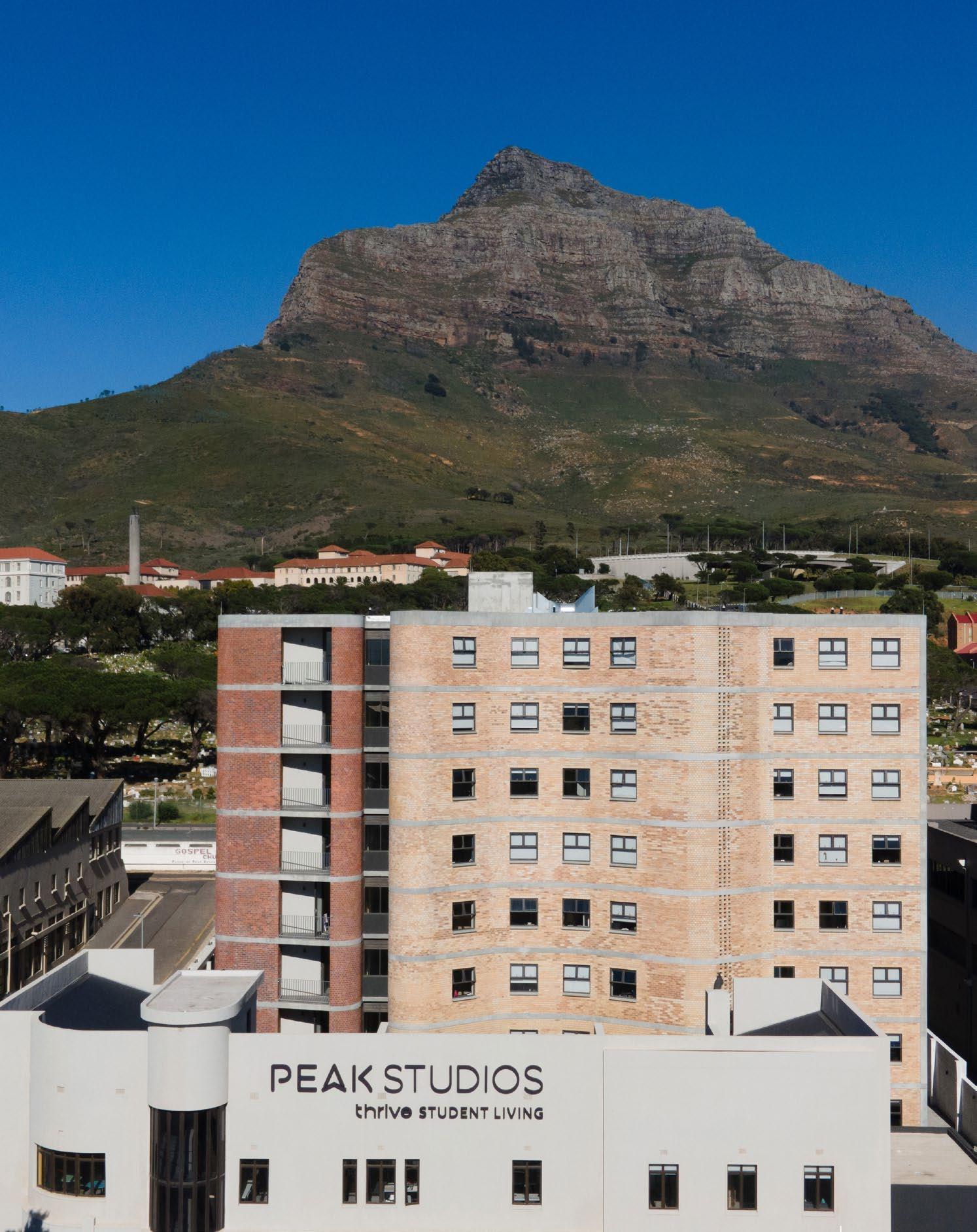
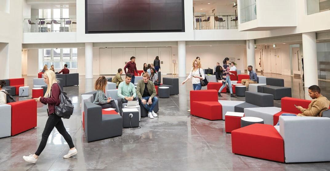
The creation of a dialogue between individuals and their context, both physically and metaphysically, is key to the establishment of an identity and is paramount to a student’s developing years. In turn, location and design solutions are critical in unlocking opportunities through access to transport, safe gathering spaces, and an environment that inspires and nurtures. To realise this goal for the students of UCT and CPUT, Growthpoint Student Accommodation Holdings sought out the expertise of GASS Architecture Studios, and the result was the vibrant Peak Studios Student Accommodation.
Size:
Cost: R150 million
Completed: 2022
Location: Observatory, Cape Town
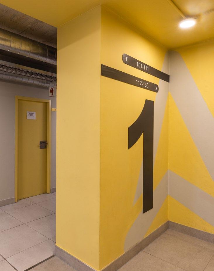
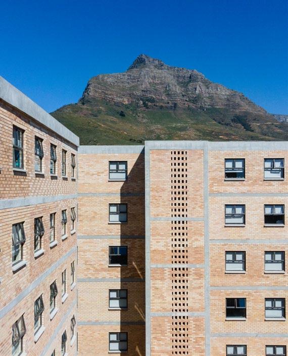
A repurposed heritage building and additional building in Observatory, Peak Studios consists of nine storeys that house 563 students from UCT and CPUT. When GASS was handed the brief for the project, they were asked to provide a unique brand and student accommodation which allows for an efficient, optimal, and economic design of living units.
The design approach was informed by four principles that guided architectural solutions: community, sustainability, urban reactivation, and heritage. Situated on the main route of the Jammie Shuttle (the official transport of UCT), the location offers prime access from within the larger context of the Observatory and Salt River areas. Communal green space provides safe and inspiring areas for gathering and exchange a pivotal aspect of a learning environment, encouraging collaboration and innovation through interaction. Rooted in the city context, activation of the street edge re-establishes the building as a contributing presence. The development feeds directly into the great need for these spaces, serving surrounding private educational institutions. Repurpose, densification, and redevelopment of a previously single-function and closed-off site, this approach adds value to the developing Salt River and Observatory neighbourhoods.
Architects: GASS Architecture Studios | Developers: Growthpoint Student Accommodation Holdings | Project Managers: Atvantage Project Managers | Structural & Civil Engineers: AECOM Consulting Engineers | Electrical Engineers: Claassen Auret | Fire, Mechanical & Wet Services Engineers: Solution Station | Quantity Surveyors: MMQSMace | Contractor: Isipani Construction | Heritage Consultant: Pentz & Berman Photographer: Daniela Zondagh Photography

SUPPLIERS
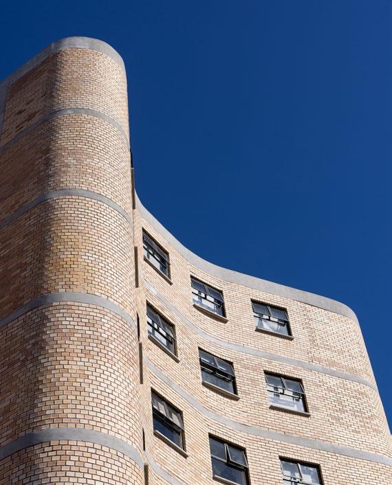
By utilising the existing building on the site, the stylistic and architectural presence of the building regenerates the space. The original building was designed to have a face brick plinth with a plastered half-circle staircase and first story. This mixture of face brick and the contrasting lighter textures was influential to the design of the façade. Texture complements the form of the building, creating a sophisticated yet playful architectural language. The stylistic qualities of the past Art Deco style are interpreted through a contemporary lens, creating a clear distinction between the old and new, while being based on the same point of departure. This becomes the link to the past and creates a continuation of the architectural dialogue of place, establishing the unique identity of the building.
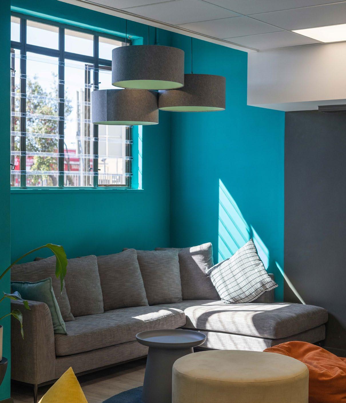
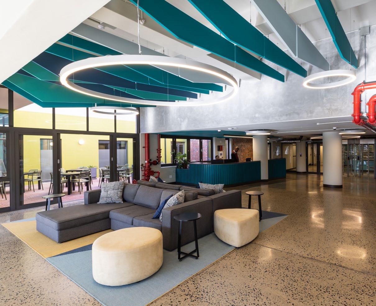
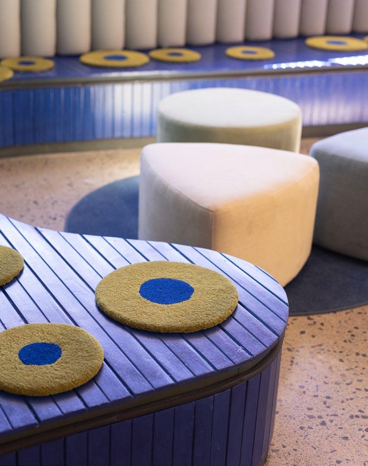
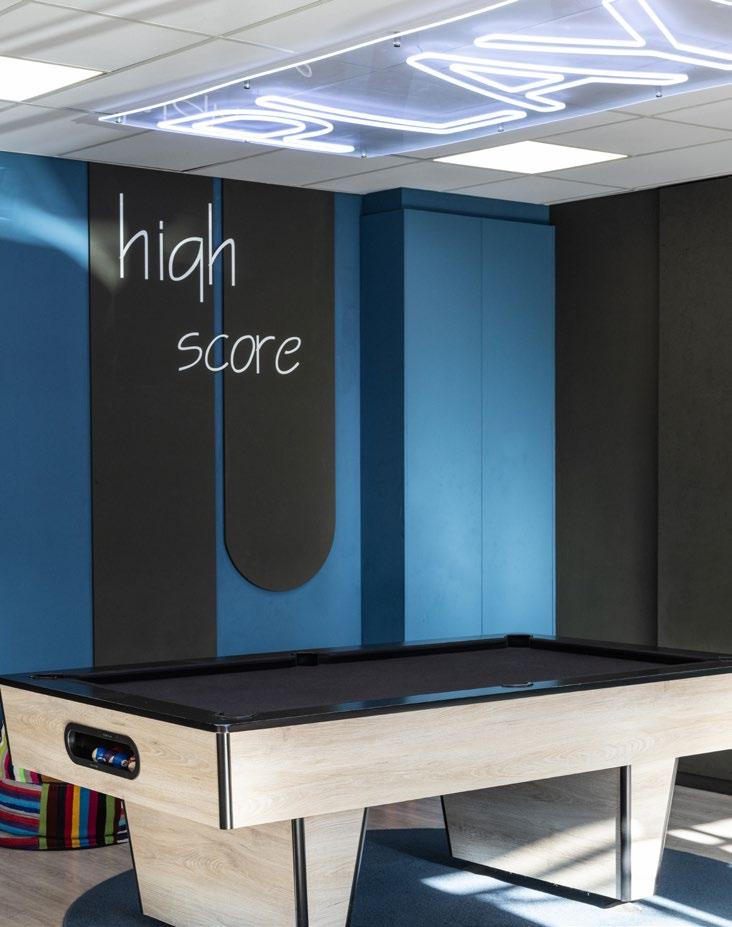
A critical element when designing student housing is the ‘product’. What is the offering to the student? What is the best product to get into the market to provide a living experience in which students can thrive? Apart from the minimum requirements, how is the product optimised, generous, robust, and unique? To create flexibility of use, loose furniture in communal spaces can be moved and rearranged to allow larger gatherings of up to 200 people inside the building, spilling out to the new open courtyard as well. The existing chapel was opened to create an open-air internal courtyard, transforming it into a space of light and greenery. The various common and shared spaces are contrasted with the privacy of single bedrooms, meeting the different needs of students who live, study, and gather in a variety of social and spatial settings.
Peak Studios achieved Green Building Council of SA (GBCSA) EDGE Certification for both preliminary and completed buildings for environmentally conscious design, achieving the goal of making sustainability part of the driving elements. Specific design decisions that contribute to the sustainable nature and status of the building include domestic hot water being provided through heat pump systems, all landscaped areas being designed with water-wise planting and a cap on irrigation, and smart metering of electricity enables control and management by residents.
Peak Studios is not merely a student residence. It is an example of the dynamic student life necessary for the future. By employing practices of repurposing, sustainability, flexibility, community, and contribution to the surrounding society, GASS proves what is possible when purpose and consideration are at the forefront of architectural design.


Lead Architects @gass_architecture_studios www.gass.co.za
Face brick: Corobrik, Claytile | Plumbing fixtures: Italtile | Flooring: Belgotex | Sanware: Hansgrohe | Furniture: Ergoform, The Teepee People, All Office, Cecil Nurse | Carpets & rugs: Hertex, Voke, Yudu | Steel frame beds, steel & timber desks, & study chairs: Entrawood | Ironmongery: CISA
