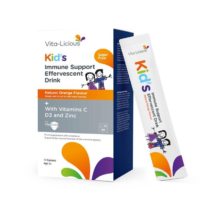
Revitalising vitamin branding By Amber Barrow, Account Director, Free The Birds
Design agency Free The Birds has created a new elevated look for Europe’s number one vitamin brand. upradyn is the number one VMS (vitamins, minerals and supplements) brand in Europe and one of the biggest names in the Bayer Consumer Health portfolio. Established in 1959, the packaging design had become dated over time and was no longer communicating the efficacy consumers had come to expect. The brand’s current architecture was particularly hard for consumers to navigate. Tasked with revitalising the design, Free The Birds created a simplified architecture and navigable creative system that united the design across all markets. While we needed a global design approach, within the healthcare sector it is always important to consider the individual regulatory challenges that each market faces. We wanted to enable the brand to flex per market as needed, while retaining a strong and consistent overarching global design framework. The biggest challenge was how to modernise and really move the brand forward, whilst retaining the existing brandmark. It was important that the logo was still easily recognisable on shelf.
The new design was brought to life through a refreshed brand logo and engaging ownable brand assets that come to life off-pack. The new logo retains the circular cues; however, the graphic communicates a stronger sense of energy and movement, and the wordmark is hero-ed and proud, breaking through the circular holding shape. Whilst we ultimately reduced the amount of yellow on pack, we were able to create a stronger brand presence with the efficacious power button, positioning the brand yellow at the top of each pack to create a consistent brand block. This also allowed more real estate space for the background colour, enabling us to make the most of the pillar navigation on pack and to introduce graphic patterns to further support differentiation between the core adult and kids ranges. There was also the perfect opportunity to further elevate the kids products through the creation of our new playful superhero characters, enabling the brand to utilise these assets to engage with kids on pack and digitally, through the brands website, and future campaigns. What has launched is a bright and confident rebrand that has a clearly defined brand design system that can be flexed as Supradyn continues on its future growth journey.
There were particular brand elements that were not to be touched. First and foremost, the Supradyn Yellow as the key brand identifier had to remain, as it was important that this primary colour association was not lost by consumers. Core to the Supradyn proposition are the three benefit pillars – our task was to better differentiate between these pillars to aid consumer selection.
8.
packagingbirmingham.com | packaging-london.com