


In America alone, over 7 million people have some form of visual Impairment*, and the number is growing.
* Prevent Blindness. “Prevalence of Visual Acuity Loss or Blindness in the US.” Prevent Blindness, https://preventblindness.org/prevalence-visual-acuity-loss-blindness-us/.
The first web page, designed by Tom Berners-Lee in 1993, consisted entirely of text*.
* Edwards, Benj. “The First Website: How the Web Looked 30 Years Ago.” How-To Geek, 2021, https://www.howtogeek.com/744795/the-first-website-how-the-web-looked-30-years-ago/.

But after three decades, the internet and social media platforms have become predominantly image-based.
We are living in the post-text era.

How do blind and visually impaired (BLV) users read digital images? First, turn on the screen reader on your device to enable audio feedback.

Then glide your finger across the screen, then the screen reader will read the element that you are on.
What happens when you tap an image? If you tap the image, the screen reader will announce the alt text added to the image.

Alternative text, commonly referred to as alt text, is a brief text description that explains what the image depicts and why it is relevant to the surrounding content*. When you upload an image on the web, you are expected to add an alt text to the image for screen reader users.
* Microsoft. “Everything You Need to Know to Write Effective Alt Text.” Microsoft Support, 2021, https://support.microsoft.com/en-us/office/everything-you-need-to-know-to-write-effective-alt-textdf98f884-ca3d-456c-807b-1a1fa82f5dc2.

Carnegie Mellon research showed that 99.9 percent of tweets with images do not include alt text*. What if there is no alt text added to an image? This problem is what BLV users will confront. Screen readers can detect that the image is there, but they have no idea what’s in it.
* Bigham, Jeffrey P., et al. “Twitter’s Image-Cropping Algorithm Does Not Crop Out Bias.” Proceedings of the 2021 CHI Conference on Human Factors in Computing Systems, Association for Computing Machinery, 2021, https://www.cs.cmu.edu/~jbigham/pubs/pdfs/2019/twitter-alt-text.pdf.


To guide my thesis, I consulted three groups: end-users of assistive technology, creators of the technology, and educators who facilitate communication between BLV and sighted communities.

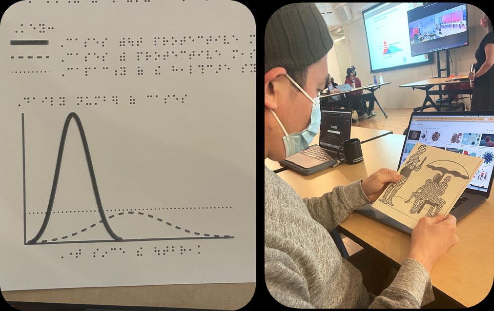
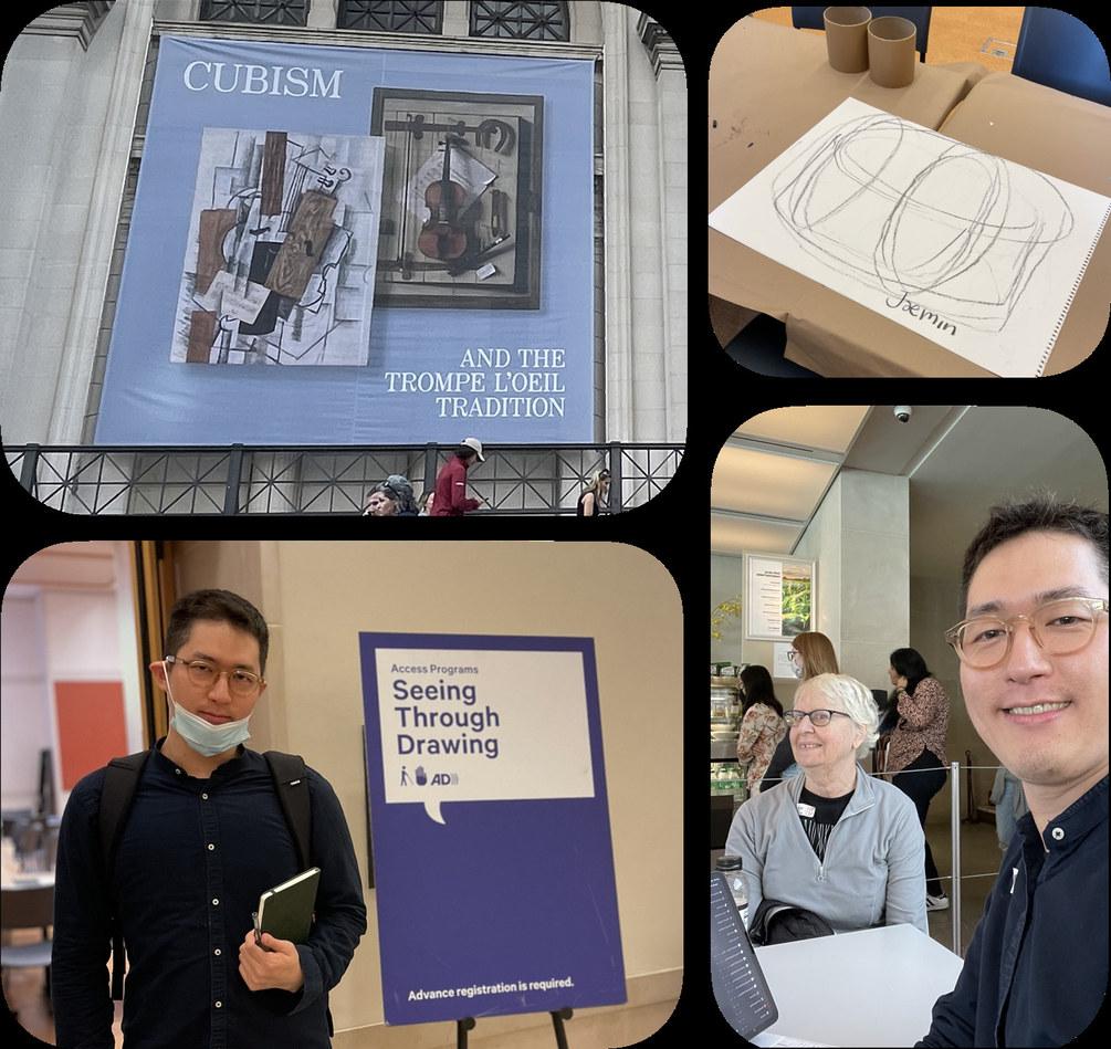
Through immersive research, I gained a better understanding of the current state of assistive technology and identified areas for improvement.
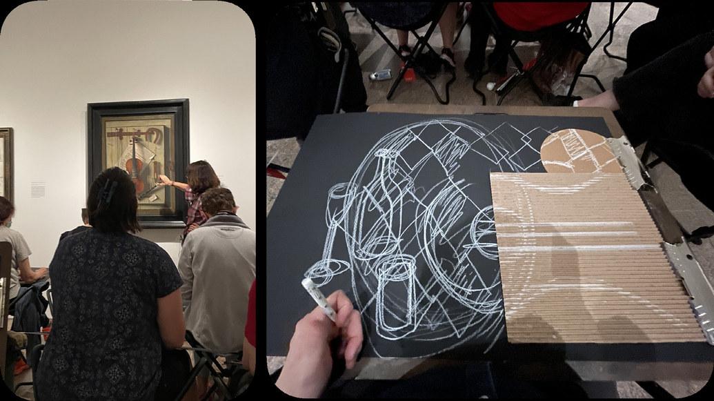
On March 2023, OpenAI announced GPT-4, the next-generation AI language model that can read photos and explain what’s in them*.

Through my interview with subject matter experts, I discovered why we need to include humans in the loop for alt-text writing. Alt text requires knowledge of the context that only the author would have, as well as an understanding of the emotions of the image.


GhostAltWriter is an Alt text authoring alt tool that combines AI and human collaboration. By following a few simple steps, content creators can easily add rich and highly contextual alt text.
The process involves human authors providing essential information about the photo, such as the tone and the names of individuals in the photo.

Then add the “secret sauce,” why the photo is significant to the author. Then, the AI generates additional descriptive details.

The technological advances in smartphone cameras have significantly impacted the digital images we see every day. This year, more than 93% of all photos taken annually will be captured on smartphone cameras. However, despite this big leap, how we utilize image descriptions for image accessibility has remained stagnant since alt text was introduced in 1995.
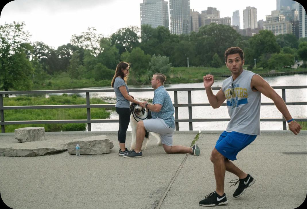
This image is rich in detail, with multiple subjects on multiple layers. How can we tell the story of the image to BLV users without leaving out important details?
How might we give more control to users — make it interactive and let them navigate and dig deeper depending on their personal interest?
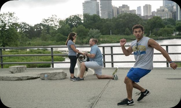

The introduction of relative depth map in image analysis has the potential to change the way we understand and interact with digital images. It effectively separates different layers and elements in the image. With the depth map calculation, we can easily isolate each dimensional layer. The jogger, the couple with the dog, and the park.
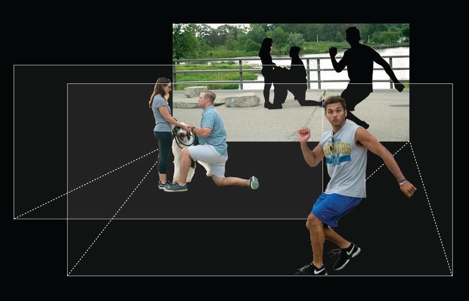

Dimensional alt text enables users to navigate image descriptions through three-dimensional layers: the foreground, middle ground, and background.
Before you move on to the next page, read the alt text on the right. Try to visualize the image.

Here is the image. Is this the image that you had in your mind?


I collaborated with Heejae Kim to design a web-based prototype, and participants for the user testing accessed the website using Safari on iPhone, with VoiceOver. I recruited participants from the assistive technology community on Facebook.

A total of five individuals with varying vision conditions were selected to participate in the user test session. This sampling strategy aimed to ensure a diverse range of perspectives and experiences to be represented in the evaluation of the prototype.
Here are the key findings from our user testing: mainly participants loved Dimensional Alt Text because it provides more context about the background of images. Other participants expressed that the number of imensional thumbnails shown below the image can make users understand the structure and the angle of the photo at a glance, especially for images that do not have a middle or a background.
I wrote a small paper* out of the project with my co-author Heejae, and it was accepted to CHI 23 UX conference. We had an opportunity to present our work in Hamburg last week and received valuable feedback and insights from researchers and designers.


Thanks to their feedback, I am planning to write a full paper on dimensional alt text.
* Jaemin Cho and Hee Jae Kim. 2023. Dimensional alt text: Enhancing Spatial Understanding through Dimensional Layering of Image Descriptions for Screen Reader Users. In Extended Abstracts of the 2023 CHI Conference on Human Factors in Computing Systems (CHI EA ‘23). Association for Computing Machinery, New York, NY, USA, Article 86, 1–6. https://doi. org/10.1145/3544549.3585706


Now I want to shift our focus from on-screen accessibility to accessibility in physical spaces, and the spaces are restaurants.

Small restaurants, with the exception of chain stores, typically do not offer braille menus. Low-vision users may not be able to read braille. QR code menus can provide greater accessibility flexibility in these situations. But there is a problem in the scenario.

60 %
According to a survey, 60% of customers with visual impairments found it challenging to use QR codes independently, mainly due to difficulty in finding them*. A consistent standard for the location is needed.
* VocalEyes. “Digital Accessibility: QR Codes and Short Number SMS.” VocalEyes, 2021. https://vocaleyes.co.uk/research/digital-accessibility-qr-codes-and-short-number-sms/.


Beacon is a table mood light with QR code sign for BLV customers at restaurants.
Combination of a mood light and QR code sign to fit on already crowded restaurant tables
Easy QR scanning in all lighting conditions, including dimly lit environments.
A simple and minimal structure to reduce costs for bundled purchases

The Beacon’s unique design features a two-way lighting system that creates a beautiful reflection on the table. Meanwhile the top light functions as a backlight for the QR code.


Through prototyping, I discovered that a backlit QR code is much easier to scan without having to use the flash on your phone.

I minimized the number of parts needed, including diffusers, a main body, and chargeable lighting parts, to keep the cost per unit down.
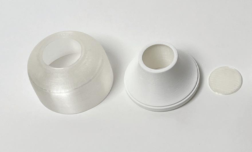


The form study focuses on both visual and tactile aspects. I ensured that the Beacon was easy on the eyes but also on the hands. The concave surface on top invites touch. I also added a braille indicator to help BLV users locate the exact scanning point.


During FGI interviews, I identified another key pain point related to the interaction between customers and servers, which often relies on eye contact. To address this pain point, I incorporated a subtle signaling feature into the design. By flipping over the light, customers can signal servers when they need assistance. This feature was partially inspired by the bat signal.


From the server’s perspective, the direction of the light also makes it easy to distinguish between two different modes.
Special thanks to
My family
Co-author, Heejae Kim
PoD Faculty
PoD Class of 2023
Chancey Fleet
Elyse Voegeli
Carrie Morales
Sam Seavy
Juan Alcazar
Raghav Chhabra
Carly Ayres
Thomas Smith
Pamela Lawton
Shannon Finnegan


