Brand Style Guide
LOGO PRESENTATION
summary
Concepts 03
Logo versions and use 04
Logo clearance and minimum sizes 07
Colours 08
Typography 09
Incorrect use 10
Patterns 12
Branded material 13
Photography 14
complement
symbol typeface
CONCEPTS
PLUS61J MEDIA is a news and opinion website covering Australia, Israel and the Jewish world. Based on Jewish, humanitarian, and democratic values, the organisation was established in 2015 with the mission to broaden the conversation.
As a part of its commitment to a socially just world, PLUS61J leads and contributes to a number of initiatives and special projects each year (for example, a Social Justice Summit, fundraising campaigns and education activities, sponsoring events).
THE NAME
To reinforce the organisation’s brand, the name should be written (in the first mention on a page/document) as PLUS61J MEDIA. Uppercase letters should be used, not the plus symbol (+). All references thereafter are simplified to PLUS61J.
THIS GUIDE
This brand style guide should be used to guide use of and ongoing development of the PLUS61J brand.
CONCEPTS
The words (illustrated right) have been used in the development of PLUS61J’s brand. They should guide the future use and development of the brand.
03
Conversation Contact Groups Heads Minds Influence Voice Communication Thinking Information Dreams Bridge Meetings Circle Broad Connection Community Perspective Link Deepness Ideals Justice Point of view People Amplify Principles Speech Shades Influence Impact Sink in Talk Reverberation Write Listen Network Watch
LOGO VERSIONS AND USE
PLUS61J logo can be presented in a variety of ways.
The preferred presentation is the complete landscape 1 and 2. Version 2 should only be used when required due to the background or application size. The simplified landscape version can be used when the application is limited by space or legibility.
When space is limited, the simplified portrait versions should be used as an alternative to landscapes 1, 2 and simplified.
The use of the symbol alone is also possible, however, consideration it should only be used within a PLUS61J context and environment (eg on PLUS61J’s website, social media).
COMPLETE LANDSCAPE 1
SIMPLIFIED PORTRAIT 1
COMPLETE LANDSCAPE 2
SIMPLIFIED PORTRAIT 2
SIMPLIFIED LANDSCAPE
SYMBOL
04
LOGO VERSIONS AND USE
The logo can also be presented with the website address, however, consideration should be given to ensure legibility of the information.
When used in online applications, it must ALWAYS include an embedded the link to the website.
The minimum size follows its respective original version.
05
Institutional Blue 50%
LOGO VERSIONS AND USE
The inverted versions should be used when applying to a dark background or the background colour conflicts with Institutional Blue.
The preferred use of the inverted versions is with the Institutional Blue background. When it is not possible, the symbol should follow the colour on the background.
Additionally, the simplified portrait version and the single symbol can also be presented with a border, as shows options 2 and 4.
06
1 2 3 4
LOGO CLEARANCE AND MINIMUM SIZES
The following images present the correct proportion uses and the clearance area.
The clearance area is important to ensure the logo will not visually conflicting with other elements.
The minimum sizes allowed are indicated for each version of the logo, also with the aim of preserving its legibility and intended communication.
minimum size
minimum size
mm / 17 px
07
22
14
mm / 54 px minimum size 45 mm / 118 px minimum size 45 mm / 117 px minimum size
mm / 40 px
minimum size 10 mm / 28 px
6.5
INSTITUTIONAL COLOURS
Primary colours reinforce the sense of unity and identity and are used exclusively for PLUS61J generated content (eg website, social graphics,e-news).
In addition, a secondary set of colours has been created for PLUS61J community engagement activities. These can be used to distinguish them from the regular and more institutional initiatives (the e-news), the secondary colours palette was created for this approach. However, the secondary palette should be always used along with the primary one, and never alone.
The objective is to create a more dynamic and enhanced communication with the broader public.
INSTITUTIONAL BLUE #2272B9
C85 M52 Y0 K0
R34 G114 B185
C68 M42 Y0 K0
R88 G133 B196
INSTITUTIONAL BLUE 50% #76AAD3
C42 M26 Y0 K0
R145 G170
R239 G170 B57
08
PRIMARY COLOURS PALETTE - PLUS 61J PRODUCTS
SECONDARY COLOURS PALETTE - ENGAGEMENT ACTIVITIES
INSTITUTIONAL BLUE 80% #488EC6
B216 #0D4066 C100 M77 Y36 K23
R13 G64 B104 #808284 C0 M0 Y0 K60 R128 G130 B132 #EFAA39
C5 M36 Y89 K0
TYPOGRAPHY
FRANKLIN GOTHIC is is the institutional family font for all PLUS61J communications and graphic material.
The Franklin family can be found in most online platforms for documents production and sharing, like Canva and Google Docs, and must be used for creation of presentations, supporting screens for events, and overall online ads.
For online and in-house documents, such as letters, contracts and reports or when the use of main institutional type is limited by shared systems, the standard family font is CALIBRI.
MAIN INSTITUTIONAL FONT
Franklin Gothic Book
abcdefghijklmnopqrstuvwxyz
ABCDEFGHIJKLMNOPQRSTUVWXYZ
1234567890 !@#$%¨&*()
Franklin Gothic Demi
abcdefghijklmnopqrstuvwxyz
ABCDEFGHIJKLMNOPQRSTUVWXYZ
1234567890 !@#$%¨&*()
Franklin Gothic Heavy
abcdefghijklmnopqrstuvwxyz
ABCDEFGHIJKLMNOPQRSTUVWXYZ
1234567890 !@#$%¨&*()
Franklin Gothic Book Italic
abcdefghijklmnopqrstuvwxyz
ABCDEFGHIJKLMNOPQRSTUVWXYZ
1234567890 !@#$%¨&*()
Franklin Gothic Demi Italic
abcdefghijklmnopqrstuvwxyz
ABCDEFGHIJKLMNOPQRSTUVWXYZ
1234567890 !@#$%¨&*()
Franklin Gothic Heavy Italic
abcdefghijklmnopqrstuvwxyz
ABCDEFGHIJKLMNOPQRSTUVWXYZ
1234567890 !@#$%¨&*()
DIGITAL ENVIRONMENT INSTITUTIONAL FONT
Calibri regular
abcdefghijklmnopqrstuvwxyz
ABCDEFGHIJKLMNOPQRSTUVWXYZ
1234567890
Calibri italic
abcdefghijklmnopqrstuvwxyz
ABCDEFGHIJKLMNOPQRSTUVWXYZ
1234567890
Calibri regular
abcdefghijklmnopqrstuvwxyz
ABCDEFGHIJKLMNOPQRSTUVWXYZ
1234567890
Calibri italic
abcdefghijklmnopqrstuvwxyz
ABCDEFGHIJKLMNOPQRSTUVWXYZ
1234567890
09
INCORRECT USE
It is important the logo is used in a consistent fashion, creating homogeneity and reinforcing the brand. Distortion, proportion changes, effects, and creative manipulations to the logo are not allowed.
DO NOT CHANGE THE PROPORTIONS
DO NOT REPLACE TYPOGRAPHY PLUS 61J
DO NOT APPLY SHADOWS OR OUTLINES
Australia, Israel and the Jewish world

DO NOT REARRANGE, MANIPULATE, EXCLUDE OR ADD ELEMENTS

TEXTURE BACKGROUND
When the background is irregular or textured (as pictured here), a logo with a white outline border is the preferred logo to be used to preserve its integrity. The landscape versions should be used in a box, either white or Institutional Blue.
PATTERNS
The use of patterns is a common strategy to reinforce and mark a brand concept.
Two patterns have been created for potential use by PLUS61J: The first aims to communicate the core concepts of connection, network and influence. The second pattern seeks to reinforce the 61J symbol (the preferred use is in soft shades).
12
.
BRANDED MATERIAL
Branded stationery for institutional communication strengthens PLUS61J’s identity both internally and externally.
Letterhead, business cards, report covers, and badge are all presented here as examples of future applications.


13
BRANDED MATERIAL
Branded stationery for institutional communication strengthens PLUS61J’s identity both internally and externally.
Letterhead, business cards, report covers, and badge are all presented here as examples of future applications.

14
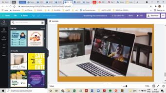
PHOTOGRAPHY
When selecting photos and images to support PLUS61J communication (not including commissioned or curated articles) and to advertise its events and products, consideration should be given to the types of imagery selected.


Images showing people, preferably in groups, should be prioritised. Photos suggesting conversation or engagement –reading an online article, listening to a podcast, watching an online zoom, talking to a group – are preferred.


15
Conversation People Influence Watch Connection Conversation Watching People
People
People
