BRAND GUIDEBOOK
READING PARTNERS


When people first read or see something that comes from Reading Partners, they should receive the same message about who we are and what we do. Having a single, clear identity will help us raise awareness and build a common understanding. This is especially important as we continue to build Reading Partners’ brand recognition.
By using a consistent housestyle , we ensure that all Reading Partners’ materials—national and regional—complement one another and are recognized as coming from the same organization. Our impact on the lives of students and communities in one region reflects on the whole organization.
A consistent brand presents an image of a well-run organization in which volunteers, donors, and the public can have confidence.
Brand reputations aren’t eternal. We all must work together as brand champions to deliver consistent messages about Reading Partners. This guidebook is meant to help you do that.
Whether you are a site coordinator in Baltimore or a program manager in New York, this guidebook contains resources to help you become a brand ambassador for our organization. Anytime you set out to work on a Reading Partners document, open this guide first.
Are you working with an outside designer? Share this with her or him.
Our mission is to help children become lifelong readers by empowering communities to provide individualized reading instruction with measurable results.
The image, identity, and personality an organization conveys to its audience. Bigger than a logo or tagline, it is a promise that must be kept at all points of contact. A strong brand isn’t created casually or overnight. Rather, it is carefully built and reinforced over time. A strong brand has a clear, consistent message and identity at every touchpoint.
The Reading Partners brand must be communicated with equal consistency. The materials we develop should look like they come from the same organization. That is the best and only way for us to create a lasting brand.
We mobilize communities to provide students with the proven, individualized support they need to read at grade level by fourth grade.
Brand scope
• Elementary school students in under-resourced schools reading below grade level
• Focus on reading at grade level by fourth grade
Points of difference
• Evidence-based curriculum
• Individualized reading instruction
• Volunteer tutors (aka reading partners)
• Community-driven parnership, training, and support
Identifying symbols
• Orange and blue colors
• Iconic lanyards worn by volunteer reading partners
• Visuals of students experiencing the joy of reading
Brand personality
Optimistic
• Inclusive • Learning organization • Literacy champion • Service leader
Five key questions for brand alignment:
1. Is it consistent with our brand personality?
2. Are we representing the logo correctly?
3. Are we using the Reading Partners colors and fonts?
4. Are we highlighting students and tutors and/or impact?
5. Does it follow the Reading Partners writing “house style”?
1. Book imagery – Books are at the forefront of our logo to reflect our core work as a leading literacy organization
2. Big book / little book – The big book and little book leaning into each other symbolizes the tutor / student partnership and helps express the joy of reading
3. Star – The star symbolizes academic achievement and data validation, while also adding unique character to make the design uniquely “Reading Partners”
4. Color tones – Our signature orange and blue colors have been updated with more vibrant, saturated tones
5. Color story – The colors of the books correspond with the colors in the text: “Reading” matched with the small book to reflect the student and “Partners” matched with the big book to reflect a tutor
6. Font – Our new logo font is clear, modern, and easy to read
7. Proportion – The proportion of the book images in ratio to the text makes the logo easily scalable to small or large formats 4 2 5 1 6 3 7
Books leaning on each other to represent the interaction/partnership between the volunteer and the student. The small book represents the student and has a star on the cover to symbolize student success.
Minimum Size
To maintain legibility and recognition, the Primary Reading Partners Logo should not be used smaller than 1 inch in height.
Reading Partners’ logo package
Books leaning on each other to represent the interaction/partnership between the volunteer and the student. The small book represents the student and has a star on the cover to symbolize student success.
Minimum Size
To maintain legibility and recognition, the Primary Reading Partners Logo should not be used smaller than 1.25 inches in width.
B&W can be used when the color logo and grayscale logos aren’t accepted or for major cost savings on printed materials and swag.
Grayscale should be the primary alternative to the full-color logo.
It is of utmost importance that the proportions of the logo are never altered in any way. It is also important that there always be a minimum clear space around the logo. This way, things will never seem cluttered, or worse, like an after-thought.
Because the logo will appear at different sizes depending on where it is applied, a general guidline for clear space would be the height of the first letter “R” in Reading Partners. Using this distance helps to unify the space around the logo regardless of the size it is presented.
The Reading Partners logo may be placed in a background field. This isolates the logo from other graphic elements. Always avoid placing the logo on colors or photos that compete with it or cause it to disappear. The logo should never be positioned on a busy part of a photo, illustration, etc. There should be enough contrast so that it is easily recognizable.
The Reading Partners’ logo must never be altered in any way; it is the face of our company. The following rules are just a few examples of what not to do, and they apply to the primary logo as well as the secondary logos.
1. Do not use colors not in brand
2. Do not rearrange logo components
3. Do not stretch logo
4. Do not rotate logo
5. Do not outline
6. Do not change proportions of logo
7. Colors should not be the same intensity, making them vibrant
8. Do not use on a distracting background

When and where to use the different logo file types.
Raster files are built up of small squares called pixels. This means that as you increase the size of your image, it will become blocky, or appear to be blurred. This is why a logo design should be created in vector format for the best results. Raster files are intended for computer use, so are provided in RGB color mode.
Raster file types have a file extension of .jpeg/.jpg, .png, and .tiff
JPEG: Jpeg’s are most commonly seen online. This is because jpeg offers very good compression without overly degrading the image, meaning the image is very small in file size and will load quickly. Jpeg’s do not support transparency.
PNG: PNG images are lossless, which mean they do not lose quality during editing. Most importantly however they allow for transparency. For web use, a PNG logo format is highly recommended over jpeg because of its lossless qualities and ability to maintain a sharp appearance on screens.
TIFF: Raster image file to use for placement in internally printed materials such as Word Docs. Higher res TIFFs can be used for various promotional materials where high res TIFFs are required.
CMYK: This is the file standard for printing. CMYK stands for the 4 color inks: Cyan (C), Magenta (M), Yellow (Y) and Black (K).
RGB: This is the file standard for screen and/or web use. RGB stands for: Red (R), Green (G) and Blue (B). Black is the absence of light on your screen.
Pantone (PMS): Pantone is a universally understood color system used by designers and print companies. The problem with CMYK printing is that there may be slight color differences between print runs because the color is built using four inks. With Pantone however, a single ink is used, meaning the colors will match exactly in all instances.
Black & White (BW): In some applications, a single color version of the logo is needed. For example, this might be for frosted vinyl on glass or single color documents.
White: A white version of the logo is to be used on colored backgrounds, or on dark images where good contrast is needed.
All program delivery partners, community partners, and philanthropic partners with permission to create logo lockups must adhere to the following cobranding guidelines.
Logo lockup guidelines
Use vertical line to separate logos. Ideally in a white or gray color. Both logos the same height.
Use appropriate distance from edges.
Powered by Reading Partners program delivery partners must adhere to the co-branding guidelines above and also use the Powered by Reading Partnersspecific logo.
DOWNLOAD
Powered by RP additional guidance
Powered by Reading Partners logos


Reading Partners’ primary colors are blue and orange, which are used in the logo. The secondary colors are to be used as a family to accent the Reading Partners brand on various applications.
For printed collateral: Pantone & CMYK
For document templates: CMYK
For web: RGB & HEX
PANTONE 660 C
PANTONE 285 U
CMYK: 80, 50, 0, 0
RGB: 55, 119, 187 HEX: 3777BB
PANTONE 7413 C
PANTONE 144 U
CMYK: 0, 60, 100, 0
RGB: 244, 129, 32 HEX: F48120
PANTONE Cool Gray 6 C
PANTONE Cool Gray 6 U
CMYK: 35, 23, 24, 0
RGB: 168, 178, 181
HEX: A8B2B5
Reading Partners’ primary colors are blue and orange, which are used in the logo. The secondary colors are to be used as a family to accent the Reading Partners brand on various applications.
For printed collateral: Pantone & CMYK
For document templates: CMYK
For web: RGB & HEX
PANTONE 654 C
PANTONE 654 U
CMYK: 100, 85, 35, 31
RGB: 22, 50, 91 HEX: 16325B
PANTONE 7709 C
PANTONE 7709 U
CMYK: 53, 0, 15, 7
RGB: 102, 190, 203 HEX: 66BECB
PANTONE 526 C
PANTONE 526 U
CMYK: 77, 85, 0, 0
RGB: 92, 72, 157 HEX: 5C489D
PANTONE 1215 C
PANTONE 1215 U
CMYK: 0, 16, 61, 0
RGB: 255, 214, 123 HEX: FFD67B
PANTONE 277 C
PANTONE 277 U
CMYK: 27, 9, 0, 3
RGB: 175, 203, 230 HEX: AFCBE6
PANTONE 426 C
PANTONE 426 U
CMYK: 0, 0, 0, 73
RGB: 103, 104, 107 HEX: 67686B
PANTONE Cool Gray 6 C
PANTONE Cool Gray 6 U
CMYK: 35, 23, 24, 0
RGB: 168, 178, 181 HEX: A8B2B5
PANTONE 5315 C
PANTONE 5315 U
CMYK: 8, 7, 8, 0
RGB: 232, 229, 226
HEX: E8E5E2
Reading Partners’ primary colors are blue and orange, which are used in the logo. The secondary colors are to be used as a family to accent the Reading Partners brand on various applications.
Typography is a subtle but significant detail that communicates our personality. Consider it as you would a tone of voice, a means of expression that gives added meaning to our words.
Reading Partners’ primary typeface is Open Sans. We chose this font because it’s simple and clear. Use Open Sans for general copy such as letters, reports, and PowerPoint presentations (Tahoma is our alternative when necessary). When sharing files externally, convert to PDF in order to keep the font in tact.
The typeface is used on the Reading Partners website and in some branded collateral. This font should be used sparingly for titles and headings. Permission from the marketing team is required for use.
This typeface can be used sparingly to add a contrasting element in designs as callout text, special notes, or emphasis.
ABCDEFGHIJKLMNOPRSTUVWXYZ
abcdefghijklmnopqrstuvwxyz0123456789
ABCDEFGHIJKLMNOPRSTUVWXYZ
abcdefghijklmnoprstuvwxyz0123456789
ABCDEFGHIJKLMNOPRSTUVWXYZ
abcdefghijklmnoprstuvwxyz0123456789
DOWNLOAD
Open Sans font package
DOWNLOAD
Segoe Print font
NOTE: The typeface used in the Reading Partners logo is Brandon Grotesque. This font should only be used in the logo, and not in any other copy or marketing materials. Any usage outside of the logo requires permission from the marketing and communications team.
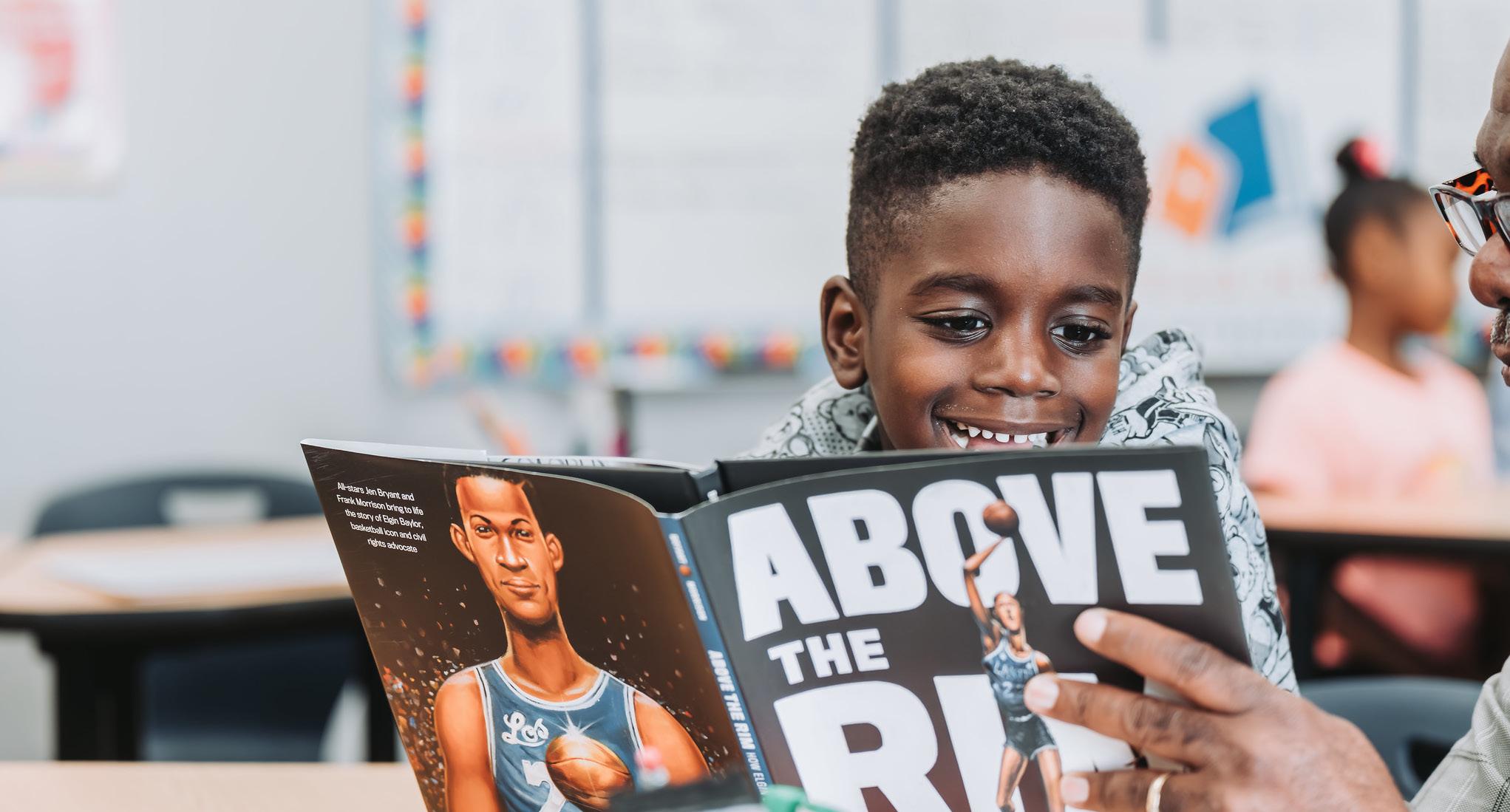
Photography for Reading Partners is about moments of learning and inspiration. We want the world to see and feel for themselves the power of the Reading Partners program to change the lives of our students and tutors.
• Communicate close interaction between the primary subjects in the composition
• Be candid in nature but still feel dramatic
• Keep students and tutors as the focal point
• Use natural light when possible
• Magnify details when relevant
• Feature diverse students and tutors who represent the communities where we work
Photo libraries have been created on Flickr and The Library and will be updated continually as images are collected. Everyone in the organization is invited to submit images to the communications team which may then become a part of our photo libraries, and contribute regularly to our internal photo repository.
NOTE: All photos of students must be FERPA compliant before uploading to any photo library or distributed publicly. In addition, all subjects in any photos must have signed photo releases.
LINK TO Reading Partners’ shot list


LINK TO Reading Partners’ stock photos
Flickr stock photos (www.flickr.com/photos/readingpartners/)
The Library photo repository (https://thelibrary.readingpartners.org/content/10794/photo-repository)
Email signatures should follow the format and color outlined in the style guide. LINK TO the email signature template
At a minimum, include your full name, title, organization, a phone number at which someone can reach you or leave a message, your email address, and the Reading Partners URL.
Here are instructions on how to update your email signature in GMail:
1. Log in to your GMail account
2. Click the Settingsgear in your Gmail toolbar.
3. Select Settingsfrom the drop down menu.
4. Go to General .
5. Make sure the desired account is selected under Signature.
6. Personalize the following information, then paste into the text field Copy and paste this URL into your browser to access the template: https://docs.google.com/document/d/18x8_FWxSC5RUeqW0TFllus3_WS9ktgQ04MBImhfVWWU/
_________________________________________ First Last Job Title Reading Partners [+REGION] first.last@readingpartners.org | C: (555) 555-5555 | T: (555) 555-5555
You can make a difference in the life of a child in a little over an hour a week. Learn how at readingpartners.org and follow us on Twitter, Facebook , and Instagram
7. Check the box for “Insert this signature before quoted text in replies and remove the “--” line that precedes it.” (optional)
8. Save your changes.
PowerPoint should be used to help visualize the content of your presentation. It is important that PowerPoint presentations be consistent. However, each presentation is different and your good judgment is required to create visually striking, informative presentations that communicate your intended message. Text content should be simple, brief, and easy to interpret.
PPT templates: Use CMYK color codes

WIDESCREEN
Formatted for widescreens
DOWNLOAD the widescreen PowerPoint template
STANDARD
Formatted for projectors and email distribution
DOWNLOAD the standard PowerPoint template


Word document templates should be used for all public, formal, or shared documents. There are two versions of the Reading Partners Word document template: one with a cover page for reports and one without a cover page. Word templates: Use CMYK color codes

All word doc templates


Follow our core messaging guidance document (linked to the left) to see our full set of talking points and messaging approach. Our core message and about statement are included here for easy access.
Our core message
Reading Partners mobilizes communities to provide proven, individualized reading support to put students on a path toward reading at grade level by fourth grade.
For 25 years, Reading Partners has supported student growth and confidence in school and beyond by engaging community volunteers to provide proven, one-on-one literacy tutoring. Since its founding, the national nonprofit organization has mobilized over 85,000 community volunteers to provide nearly 3 million individualized literacy tutoring sessions to more than 80,000 elementary school students in 550 under-resourced schools across ten states and the District of Columbia. Visit readingpartners.org to learn how you can get involved.
Our language framework is designed to help guide how you communicate and craft messages (both internally and externally) with intentionality and accountability. This includes how you communicate about: our organization (and roles within our organization); our mission, vision, and values; and the students, families, and communities we serve and partner with. This framework will also help you contextualize information in your approach to communication.
DOWNLOAD
Core messaging guide
DOWNLOAD
The Reading Partners Language Framework
The Reading Partners language framework includes 6 core frames which help guide our approach to communication:
1. Equitable policy, institutions, and systems frame
2. Collective mindset frame
3. Person-centered language frame
4. Asset-based frame
5. Student- and family-centered language frame
6. Ethical storytelling
Our house style is based on the Associated Press (AP) stylebook. For anything not covered below, please refer to the AP stylebook.
Here are examples of our preferred usage for a variety of common terms:
• Reading Partners (never abbreviate to RP on external documents)
• 2012-13, not 2012-2013. FY12, not F12 or FY-12
• 95 percent (in non-technical, essay style writing), 95% (in technical, data-heavy reports)
• Ninety-five percent when it’s written at the beginning of a sentence
• elementary school (vs. primary school)
• free and reduced price meals or free and reduced price lunch (“federal free and reduced price meals program” in data-heavy reports)
• make-up session (not makeup or make up)
• third grade, not 3rd grade (unless used in a header)
• third-grade student or third-grader (hyphenate grade when used as adjective)
• grade-level reading or grade-level equivalency (hyphenate level when used as an adjective)
• kindergarten (not capitalized)
• reading center (not capitalized)
• pre-kindergarten or pre-K (pre-K–12)
• English language learners (not ESLs; can also be capitalized as English Language Learners)
• low-income, economically disadvantaged, and underserved (use person-first language and do not use these terms as labels for students - see page 24)
• capitalize words describing racial and ethnic/heritage groups, like Black, Latinx, and Navajo; white remains lowercase (see page 25)
• use opportunity or access gap rather than achievement gap
• nonprofit (no hyphen)
• on-site
• ‘and’ should always be written out (‘&’ should not be used except in a name or title like AT&T)
• Program names, including, Reading Partners Connects and Reading Partners Traditional are capitalized
These common electronic media terms should be spelled and capitalized as follows:
• download
• email (not E-mail or Email except at the beginning of a sentence)
• e-newsletter (E-newsletter at the beginning of a sentence)
• home page
• Internet (always capitalized)
• intranet
• online (no hyphen)
• URL
• website (not Web site)
General guidelines:
• Ensure that identifying characteristics add important context and don’t exploit, stereotype, or reinforce trauma among subjects.
• Be as specific as possible and inquire about individual preferences when referencing someone’s race.
• Use person-first language by describing what a person has or experiences rather than asserting what a person “is.” For example, rather than “economically disadvantaged student” say “student experiencing economic disadvantages”
• If you have any doubts, refer to the Associated Press Style Book.
African American
Acceptable for an American of African descent. It is not necessarily interchangeable with Black. When possible and relevant, refer to a person’s country of origin or follow the person’s preference.
The author is Senegalese American.
American Indians, Native Americans
Both are acceptable terms in general references for those in the US when referring to two or more people of different tribal affiliations. For individuals, use the name of the tribe; if that information is not immediately available, try to obtain it.
He is a Navajo commissioner.
She is a member of the Nisqually Indian Tribe.
Some tribes and tribal nations use member; others use citizen. If in doubt, use citizen. Avoid words such as wampum, warpath, powwow, teepee, brave, squaw, etc., which can be disparaging and offensive. In Alaska, the Indigenous groups are collectively known as Alaska Natives.
Asian American
Acceptable for an American of Asian descent. When possible and relevant, refer to a person’s country of origin or follow the person’s preference.
The student is Filipino American.
Biracial, multiracial
Acceptable, when clearly relevant, to describe people with more than one racial heritage. Avoid mixed-race, which can carry negative connotations, unless a story subject prefers the term.
Say She has an African American father and a white mother instead of She is biracial.
Black(s), white(s)
Do not use either term as a singular noun. These words are adjectives and, when relevant, should be used to describe a group of people. Our Black students tend to have higher rates of literacy improvement when paired with a Black tutor as opposed to a white tutor.
Black (adj.)
This word should be capitalized when used as an adjective in a racial, ethnic, or cultural sense. Black literature reflects the passions, interests, and stories of our Black students.
Brown (adj.)
Avoid this broad and imprecise term in racial, ethnic, or cultural references unless as part of a direct quotation. Be specific when referencing someone’s race.
Dual heritage
Do not use a hyphen when designating dual heritage. African American, Italian American, Mexican American.
Hispanic
A person from, or whose ancestors were from, a Spanish-speaking land or culture. Follow the person’s preference. Use a more specific identification when possible.
She is a Cuban American author.
Latino, Latina, Latinx
Latino is often the preferred noun or adjective for a person from, or whose ancestors were from, a Spanish-speaking land or culture or from Latin America. Latina is the feminine form. Default to the gender neutral form Latinx and use Latino and Latina only as gendered terms. Hernandez prefers the gender-neutral term Latinx.
People of color
This is a generally acceptable term to describe people of races other than white in the United States. Avoid using the acronym POC or racial minority. When talking about just one group, be specific. Chinese American students enjoy reading books about their heritage.
affect/effect
affect is a verb (e.g.,, this policy affects students.) effect is most commonly a noun (e.g., this policy has an effect on schools.) exception: effect can be used as a verb in the case of effect change complement/compliment to complement is to make complete to compliment is to praise
ensure/insure
ensure is something you do to guarantee an event or a condition insure is reserved for financial liability
inquiry/enquiry both spellings are correct, but ‘inquiry’ is more frequently used
imply/infer imply means to suggest or hint infer means to deduce or conclude
With prepositions and transitive verbs, use me, her, him, them, and us.
less/fewer
less is used with uncountable nouns (less sugar) fewer is used with countable nouns (fewer cakes)
principal/principle principal means first in importance (and is also the head of a school)
principle means a standard of conduct
roll/role
roll is to revolve or turn over role is your proper function on a team
their/they’re their is a third person possessive, showing ownership they’re is a contraction of “they are”
When in doubt, say the sentence as if you were the only person to contact (e.g., Contact me).
Incorrect: Contact Jen, Chelsey, or I. Contact Sarah or myself. Correct:Contact Jen, Chelsey, or me.
When in doubt, say the sentence as if you were the only person with whom the other person met (e.g., Kirby met with me).
Incorrect: Kirby met with she and I. Correct: Kirby met with her and me.
Correctusesofmyselfinclude: I went to Septima Clark by myself. Afterward, I was happy with myself. Youcanusethewordmyselfforemphasis: I will write Stephanie myself. I met with Emily all by myself. However, the word myself isn’t necessary in either of those sentences.
Use commas to separate elements in a series, and put a comma before the conjunction in a simple series. (i.e., The flag is red, white, and blue.)
Use the following guidance when referring to Reading Partners’ offices:
1. Focus on our program and its impact, at a local level and nationwide.
2. Do not use the word ‘branch’ internally or externally.
3. Aim to refer to Reading Partners as a whole, without referring to a geographical location.
4. When speaking about specific areas at the regional level, write Reading Partners [region name] (e.g., Reading Partners Dallas).
5. When speaking about specific regional boards, capitalize ‘regional board’ only when part of a proper title and preceded by region name (e.g., Dallas Regional Board).
If there is ownership involved, use Reading Partners’ (e.g., Reading Partners’ excellent results). Never write Reading Partners’s. If you are talking about Reading Partners staff members, you do not need an apostrophe. In this case, ‘Reading Partners’ is serving as an adjective describing the staff members.
Capitalize ‘Reading Partners’ when used as a proper title representing the organization. When used in a sentence referring to volunteers, ‘reading partners’ should not be capitalized.
Thousands of individuals volunteer with Reading Partners each year. Become a reading partner and tutor a student.
Spell out the full name on first reference, followed by the acronym in parentheses. After that, use the acronym alone, without periods. However, you should avoid using too many acronyms (IEP, RttT, ELL) that are fairly specific to the education community and not as useful with external audiences. Never use the acronym ‘RP’ in place of Reading Partners.
Capitalize only the first word of the headline or header of a blog, story, update, or news feature. Headers/headlines are fragments, so no ending punctuation is needed. Do capitalize proper titles within headlines/headers (e.g., Reading Partners named best place to volunteer in DC).
Capitalize the principal words, including prepositions and conjunctions of four or more letters. Capitalize an article—the, a, an—or words of fewer than four letters if it is the first or last word in a title. Italicize titles of books and periodicals. Put quotation marks around the titles of articles, chapters, and other shorter works.
Susanna’s favorite book is The Cat in the Hat.
“The Problem Is Clear: The Water Is Filthy” describes the poor water quality at Stone Corral Elementary.
Do not capitalize when the title is acting as a description following the name (e.g., Joe Shmo, senior site coordinator, spoke.) Do not capitalize civil titles if it is used instead of the name. Only capitalize formal titles used directly before an individual’s name (e.g., Chief of Staff Jane Doe).
Principal Vincent Gray said yes. The principal said yes. Joe, site coordinator at Bay View, introduced a confident group of young readers.
With bulleted lists consistency is key:
• If the lead-in sentence is a complete sentence, use a colon before starting the vertical/bulleted list. If the lead-in sentence is incomplete, no punctuation is required.
• Bullets should either be full sentences or fragments, never a mixture.
• If the bullet is a full sentence, end with a period.
• If the bullet is a fragment that completes a sentence, no period is required.
• The first word of each bullet should always be capitalized.
Fragment lists
• Should not end with a period
• First word always capitalized
• Bullet is a fragment
In more formal documents, grants, or reports, semicolons may be used at the end of each point, with the last point ending in a period.
Spell out numbers from one to nine. Use figures for 10 and above. Maintain consistency wherever possible. Exceptions: always use figures for ages, years, addresses, dimensions/measurements, or numbers that begin a sentence.
Jared Jenkins, now 17, began the Reading Partners program when he was 7. He has been accepted to four universities and will begin this fall.
5 inches, 5-foot 6-inch
Spell out percent in narrative copy; use the % symbol in charts and tables or headlines and sidebar material when the desired result is easy-to-skim material.
In the last semester, 78 percent of the students improved their reading skills.
Do not start a sentence with a numeral.
Six hundred volunteers attended the event.
Spell out fractions less than one in text, using hyphens between the words. Use numerals for a fraction combined with a whole number, and use numerals in charts and tables.
two-thirds of the student body, four-fifths of every dollar
5 1/2 or 5.5 (but spell out if the figure comes at the beginning of a sentence: Five and one-half...)
Write out first through ninth; use numerals thereafter.
This is Jerry’s fifth year as a Reading Partners tutor. This is Reading Partners’ 11th year in the Bay Area.
Use figures and hyphens when writing ratios. The word ‘to’ should be omitted when the numbers precede the word ratio.
A ratio of 2-to-1, A 2-1 majority
When writing dollar amounts, do not use decimals or zeros for whole dollar amounts.
$45 (not $45.00)
Use a comma where appropriate in numbers larger than 999. Use capitalized abbreviations (K = 1,000, M=1,000,000)
1,509 or 1.5K, 48,964,000 or 49M
Lowercase spring, summer, fall, and winter unless part of a formal name. He leaves in spring 2012.
The Winter Reading Recital sponsored by Reading Partners Dallas was a big success.
Use figures except for noon and midnight. They placed the call at midnight. (not 12 midnight)
Use lowercase letters and do not use periods in am and pm. Put a space between the numeric time and am or pm.
5:30 pm (not 5:30 p.m., 5:30pm, or 5:30 PM)
For time “on the hour,” do not use zeros.
11 am, 2 pm (not 11:00 am, 2:00 pm)
When listing a range of times, use a hyphen in between the times for easy scanning. In narrative form, spell out the word “to” in place of the hyphen.
This year’s Reading Recitals will be on December 11, from 5 to 8 pm (or 5-8 pm).
Use figures, without st, nd, rd or th.
The meeting is scheduled for May 15 (not May 15th).
When listing a range of dates, use a hyphen in between the dates. Do not include a space before or after the hyphen. When referring to a range of dates in narrative form, spelling out the word “to” or “through” in place of the hyphen is acceptable.
Oct. 20-21, 2012-13, May 22-June 1
Quotation marks set off dialogue and unusual phrases. Periods and commas belong inside quotation marks.
“I’m going to see a movie,” she said. She was having what she called “a case of the blahs.”
Other punctuation marks such as question marks, exclamation points and semicolons go inside quotation marks when they apply only to the quoted material, not the entire sentence.
“Oklahoma!” was a Broadway play and a movie. I asked her, “Did you like the play?”
Question marks, exclamation points and semicolons go outside the quotation marks when they apply to the entire sentence. I was astounded when he bragged about having “the right stuff”!
My answer is still “no”; the situation remains unchanged.
For a quote within a quote, use single quotation marks.
“I think ‘My dog ate it’ is a poor excuse for failing to turn in the assignment,” she replied.
Abbreviate United States only when used as an adjective. Do not use periods in the abbreviations. Reading Partners is a US-based nonprofit, operating in twelve regions across the country.
When referring to an entire state, spell out the name. Dominique’s family moved to Baltimore from Iowa when his mother got a new job.
When referring to large, well-known cities, such as New York or Washington, DC, it’s generally not necessary to add state designations. However, if concerns exist about audience confusion, there is no harm in adding the state location.
When using the state as part of a US city location, or as a mailing address, use the Postal Service abbreviations. Colorado CO, California CA, South Carolina SC
e.g. means “for example”; i.e. means “that is.” Both are followed by commas.
Hyphens should be used only to hyphenate words. Em-dashes (—) should be used within sentences to act as parentheses. Reading Partners—launched in California in 1999—is dedicated to giving all students the reading skills they need to reach their full potential.
The command for em-dash on a Mac is Alt+Shift+(-)
For Reading Partners’ website addresses, you may use ReadingPartners.org or readingpartners.org. You may start a web address with ‘www’, but do not use https://. Try to avoid breaking a website or email address across two lines.
Try to avoid breaking a telephone number across two lines. Phone numbers should be formatted with parentheses, spaces, and hyphens in the following way: (510) 830-3035