HIGH-STYLE LOUNGING




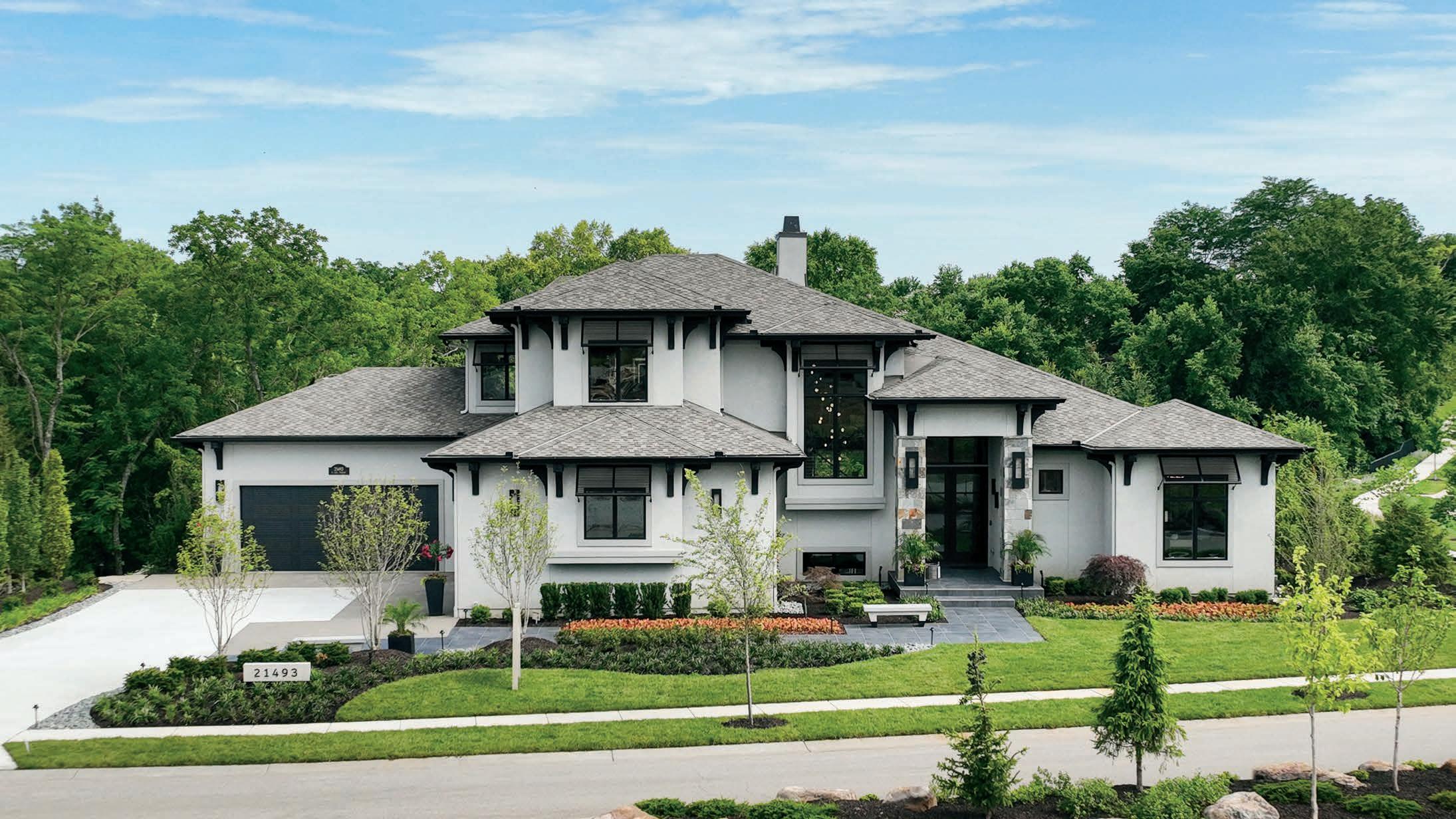


Traditional, transitional and modern designs are all included during our 2023 Luxury Outdoor Savings Event featuring up to 50% OFF from our premiere partners
• Michael Weiss for Vanguard - NEW and a Seville Home retail exclusive in KC


• Tommy Bahama by Lexington - from classic to tropical to contemporary
• Brown Jordan - NEW and another retail exclusive in KC
• Bernhardt Exteriors - a perfectly modern approach
• Summer Classics - a true designer favorite


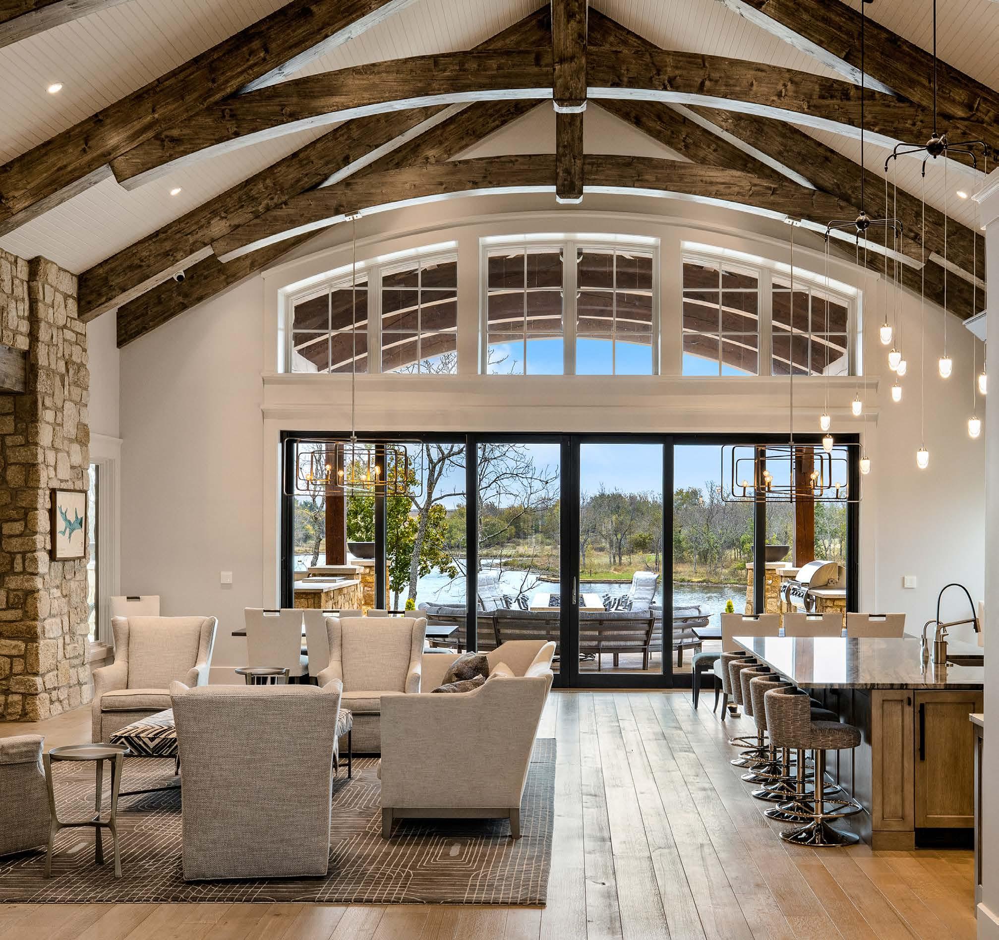
















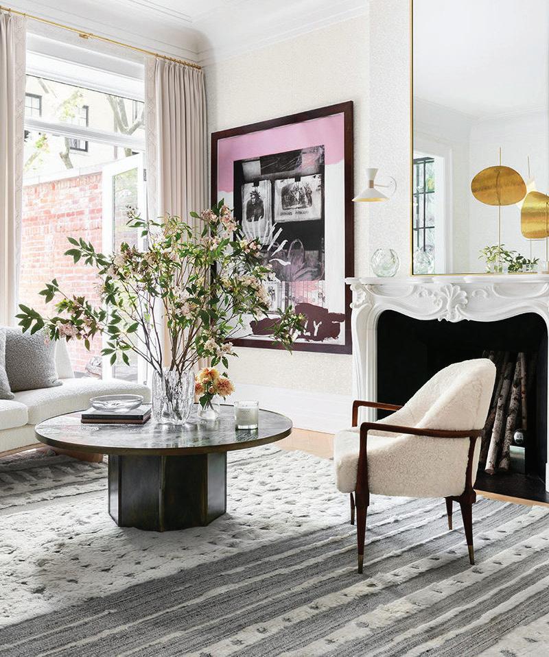

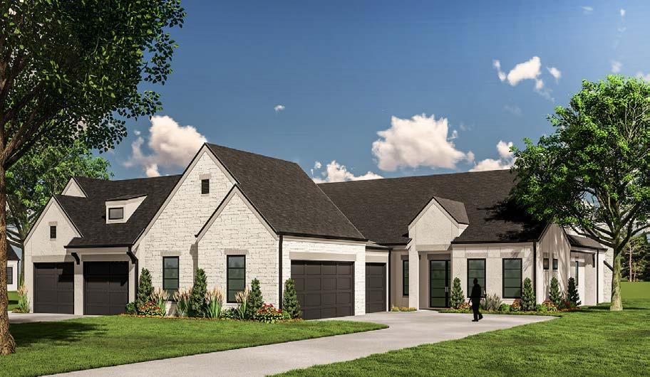


At Noble Designs, our passion is designing homes and spaces for our clients that re ect their needs in a style that lasts. We are a full service interior design rm ready to help with your new build, renovation or just simple updates to make your home beautiful.


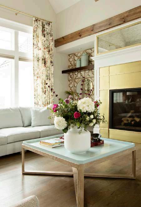



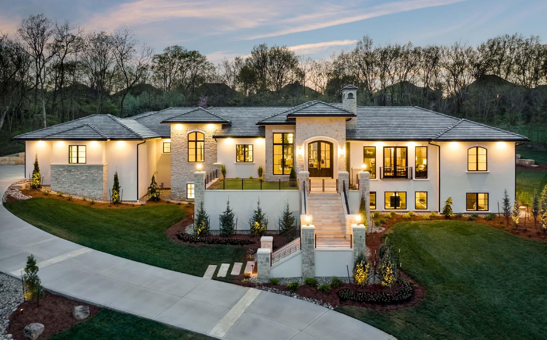































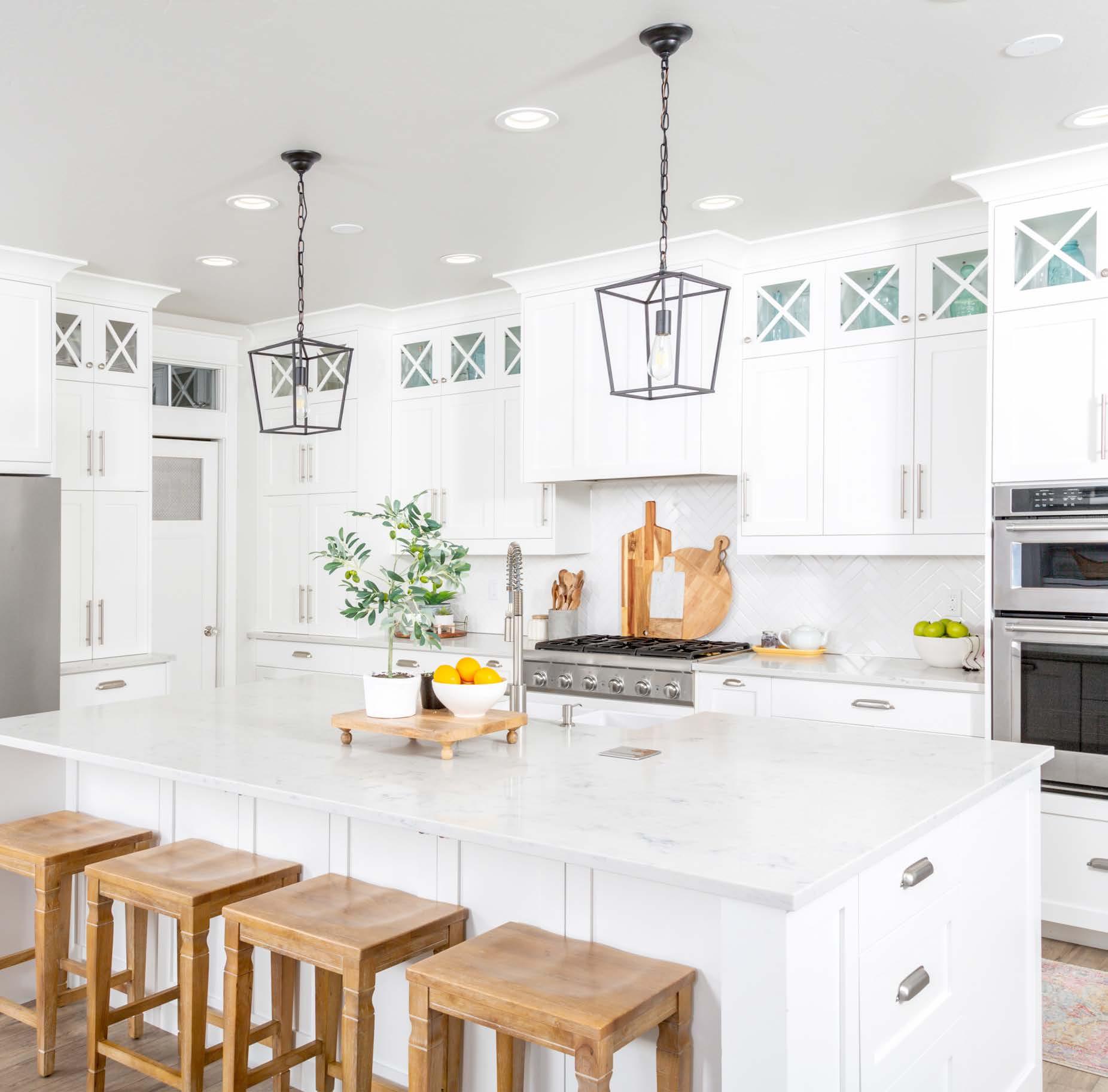
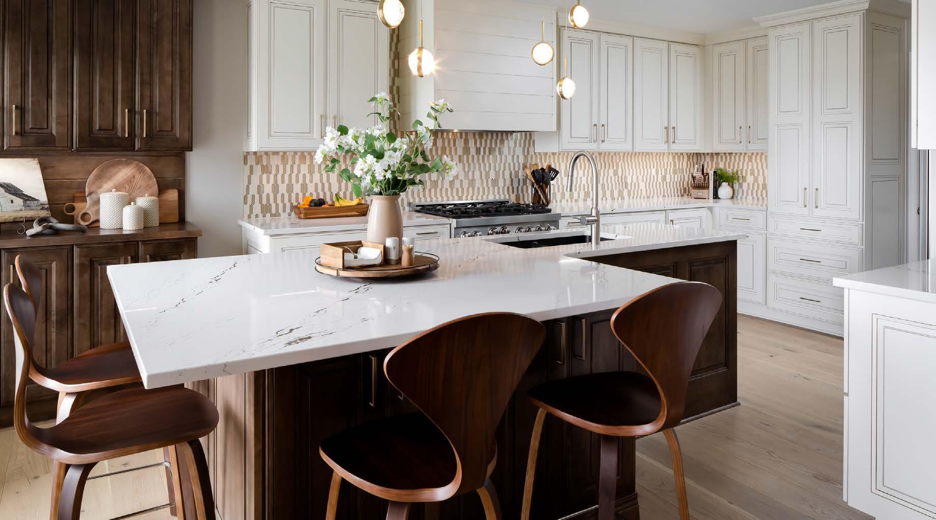
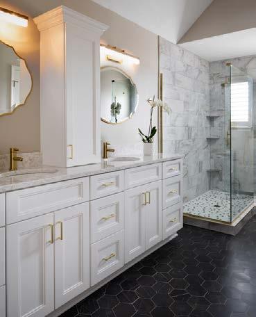
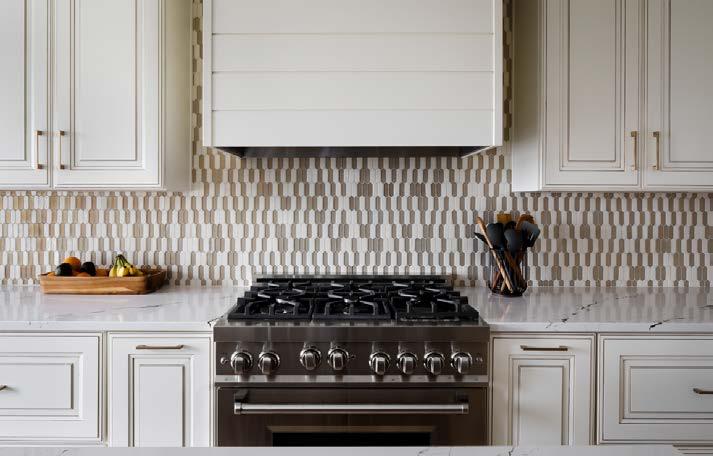
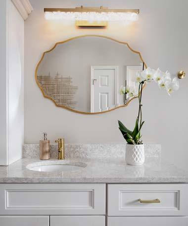
KANSAS CITY’S PREFERRED COUNTERTOP FABRICATOR & INSTALLER

GRANITE | QUARTZ | MARBLE | SOLID SURFACE








64
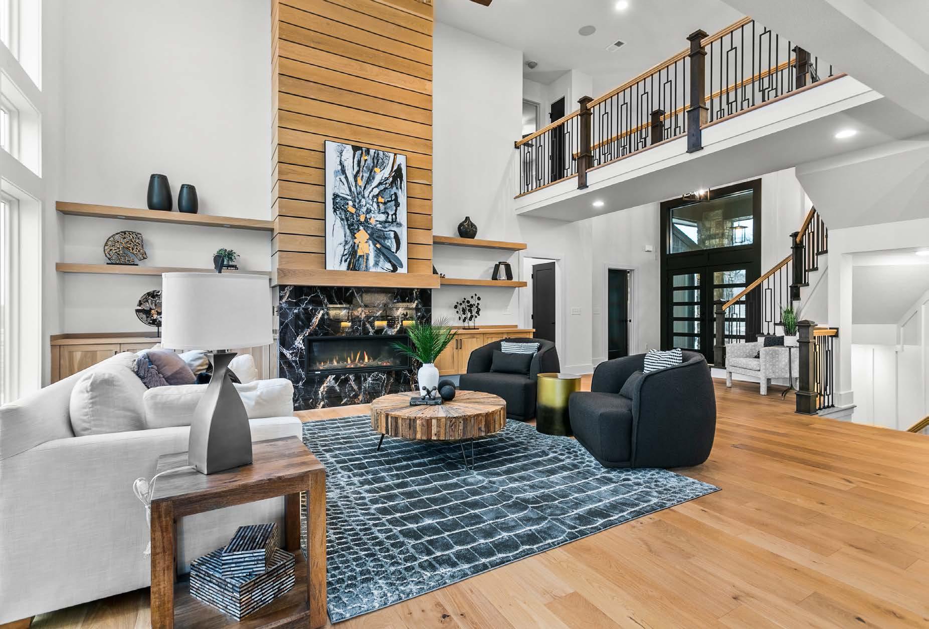
Creative homebuilders perfect resort-style living with their own Midwest twist in Linwood.
74
102 CREATIVE TYPE
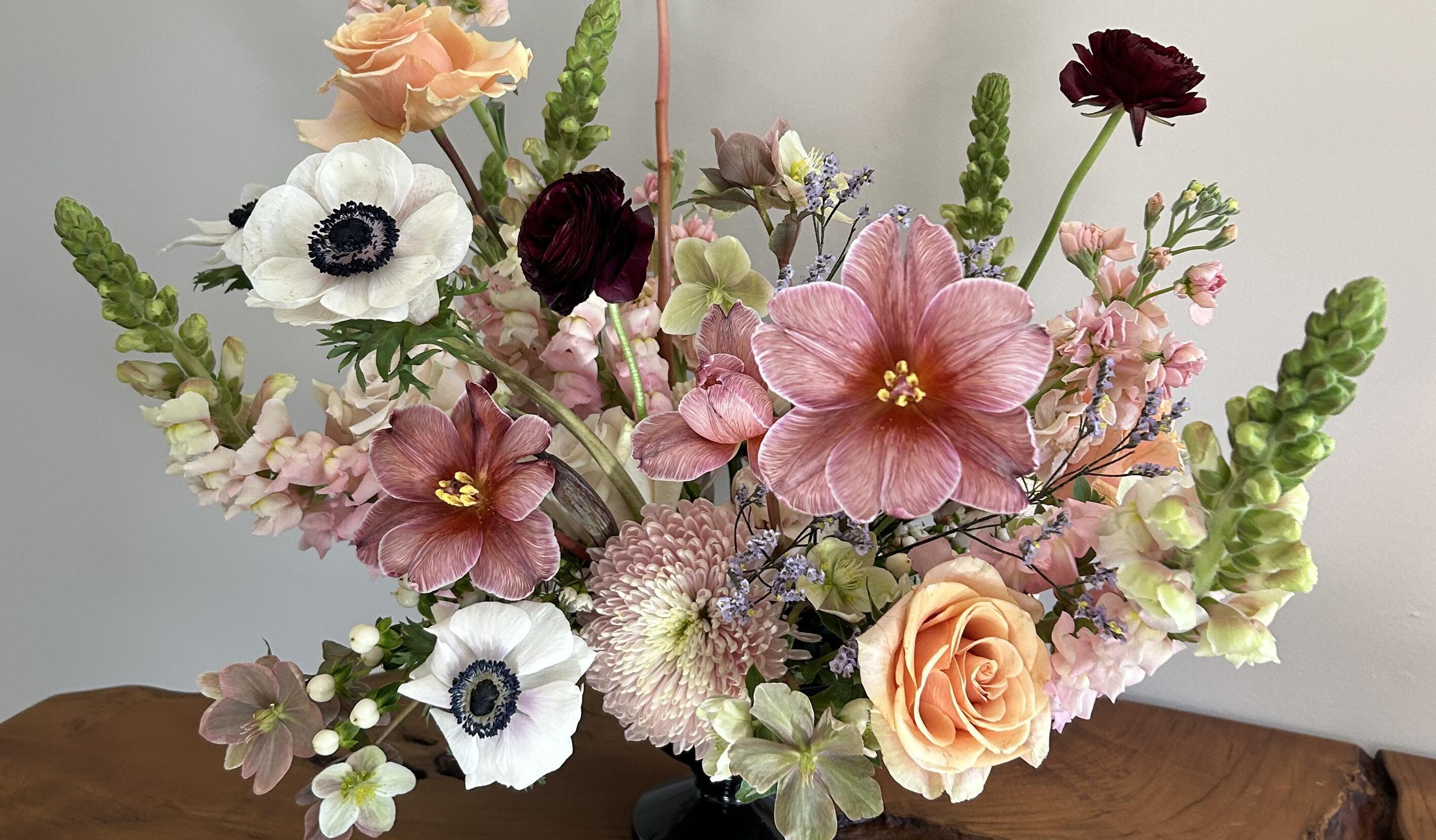
Inspired by the works of Heather L. Lowe, nine local florists imitate art through arrangement.
116 COMMUNITY CULTURE Sundance Ridge: Construction is in full swing at KCʼs newest master-planned community— the largest yet for Rodrock Development. Bonus Online Exclusive: See inside each of the homes on model row at Red Fox Run.
124 THE WELL-LIVED LIFE
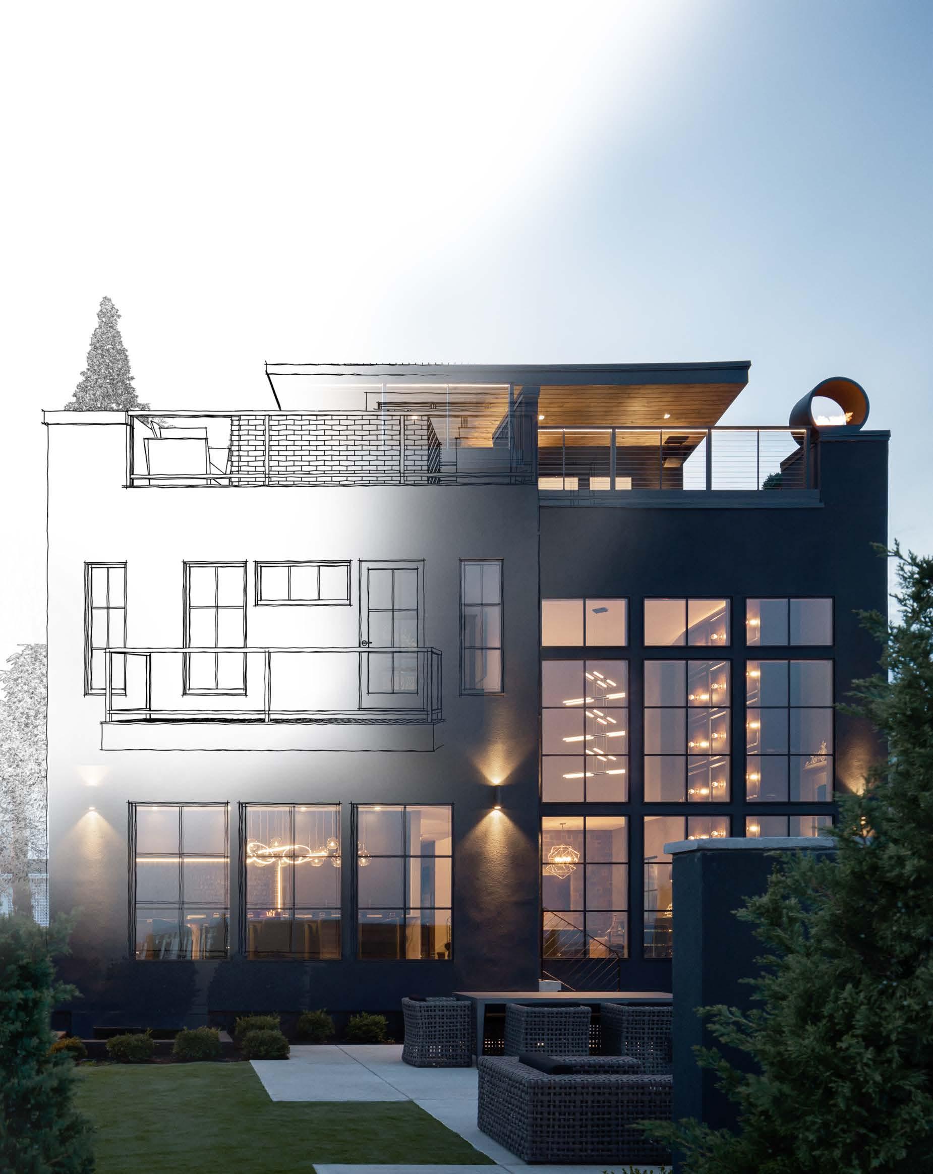
Automated—and stylish—window treatments; plus, modern design and complete home automation dovetail in perfect union at a south Overland Park new build.
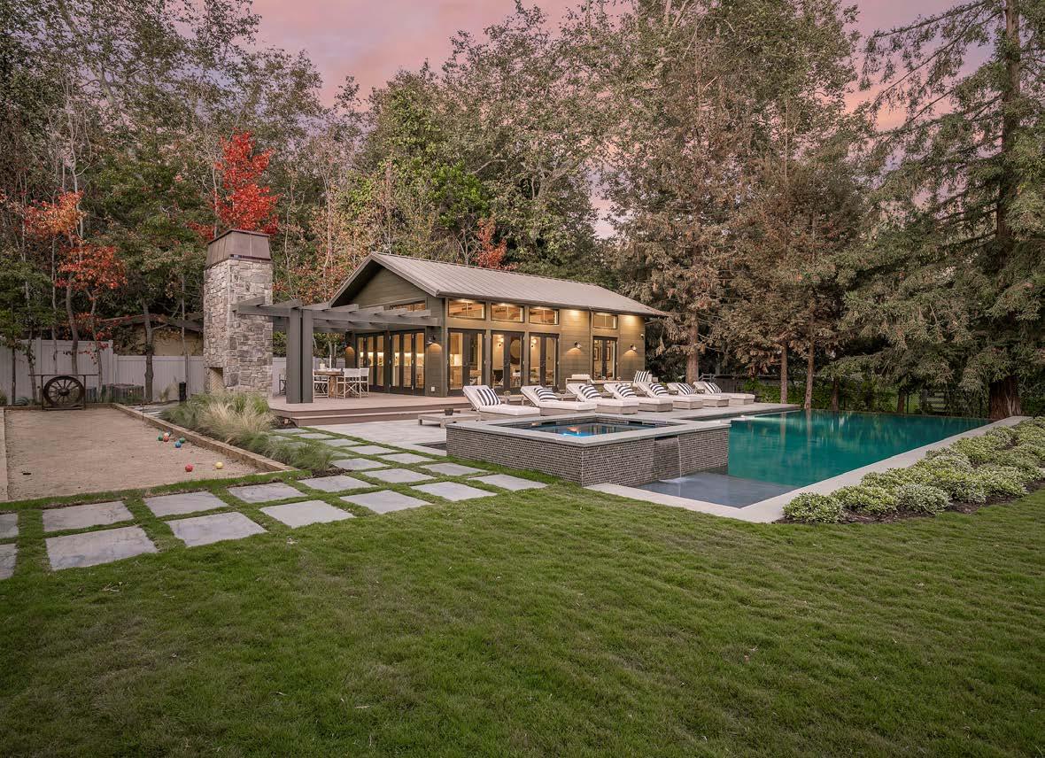
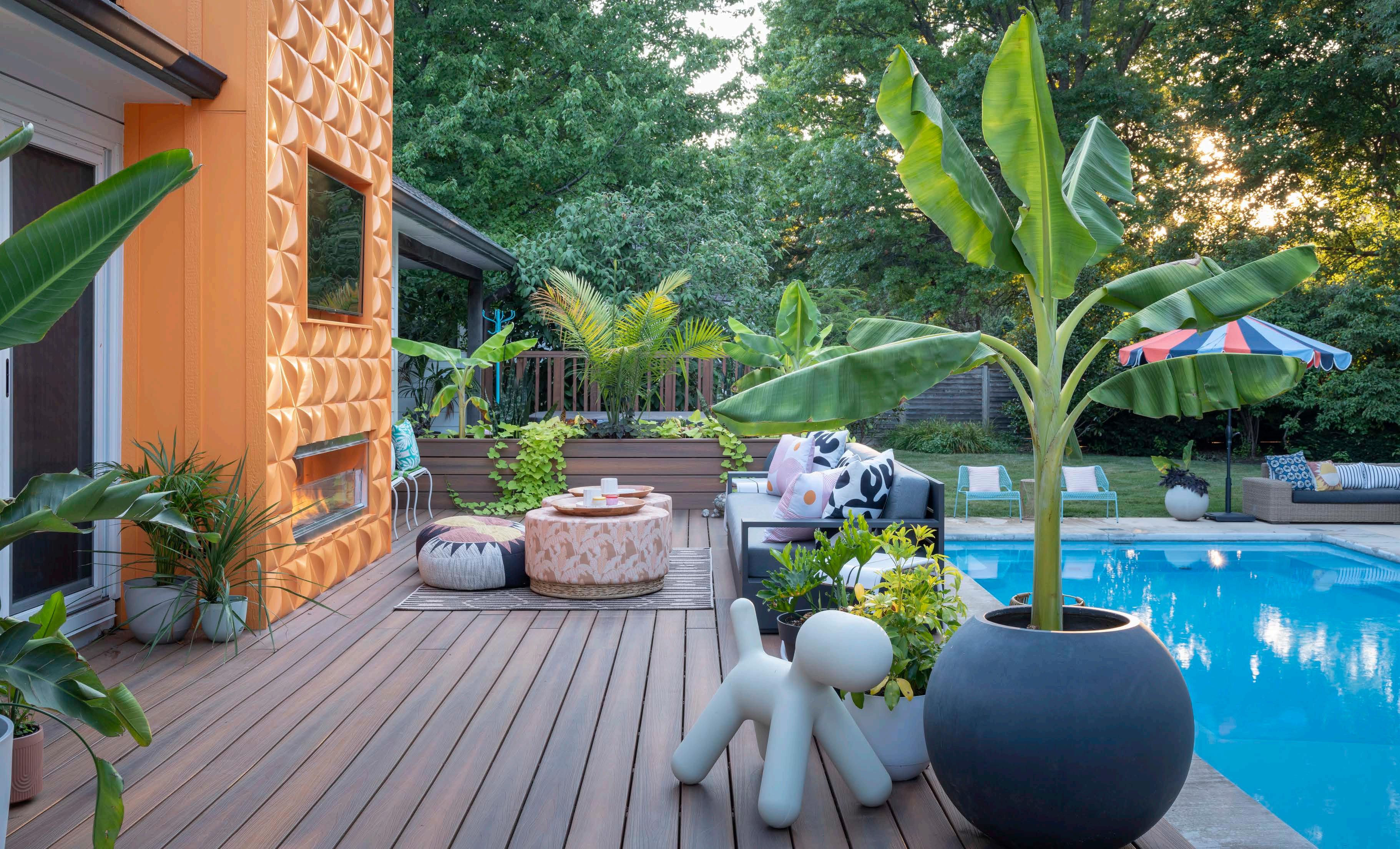
A Prairie Village pool and outdoor living project vibes with mid-century modern and Palm Springs style.
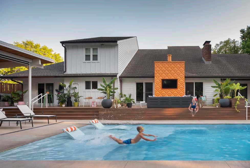
Custom homebuilder Jason Walker crafts a Florida-style home for his family at Lake Winnebago.
Stephanie Abramsonʼs ultra high-end overhaul of a dated Prairie Village home features the best of indoor-outdoor living.
192
A ʻslow and consideredʼ process results in exquisite details and lifestyle upgrades in this Mission Hills home.
148 KITCHEN + BATH
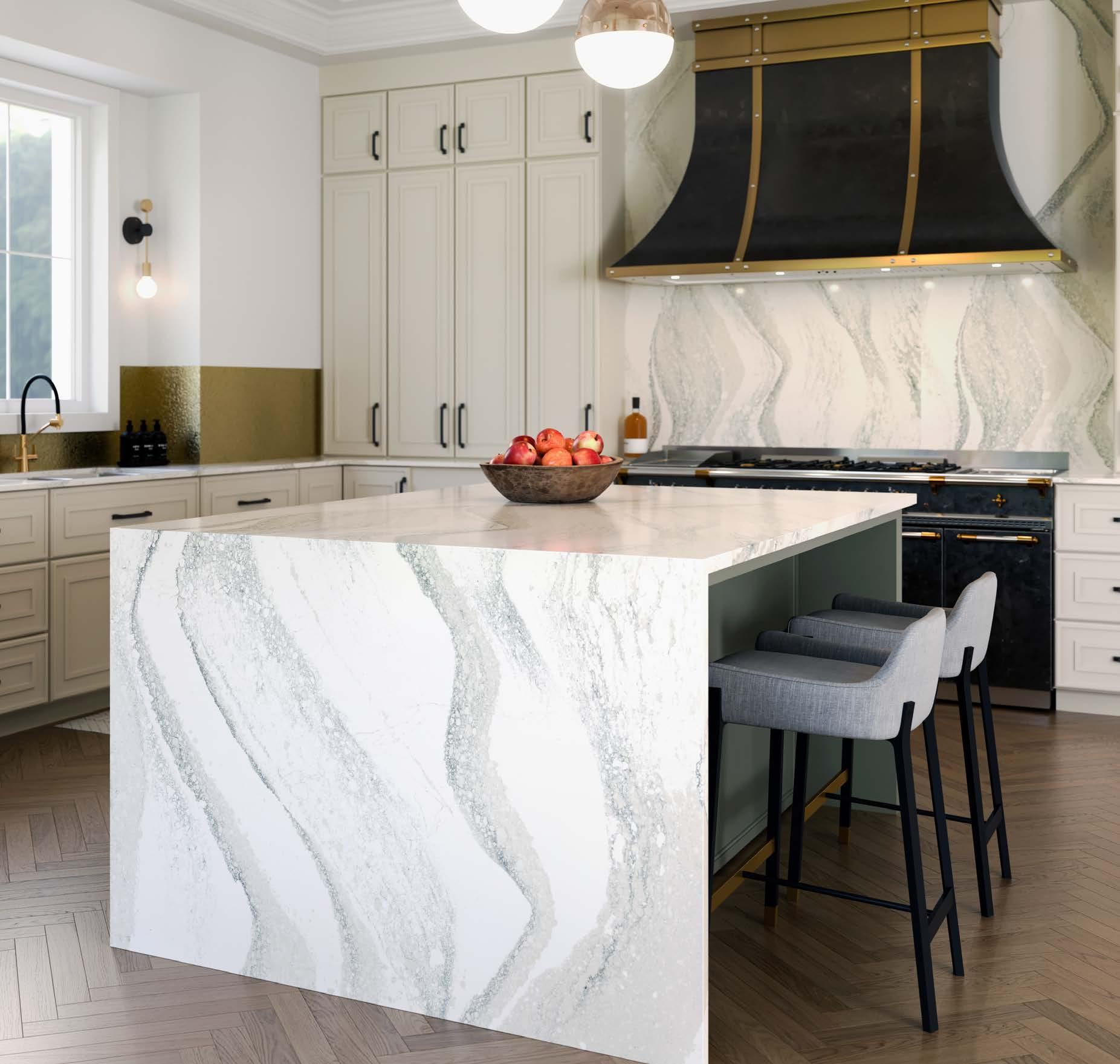
A custom cabinetmakerʼs award-winning personal dream kitchen; and a classically designed kitchen that embraces marble and stainless steel.
166 ROOMS WE LOVE
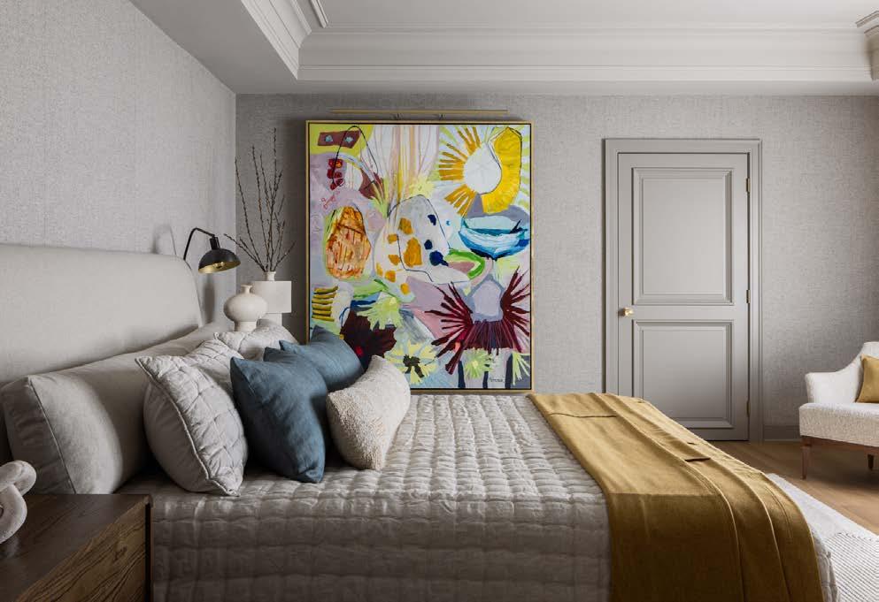
Interior Design Beth Phillips helps a widower reinvent his Lake Quivira home.
178 PAST PERFECT
A Georgian Colonial Revival at Loose Park gets an update thatʼs both modern and timeless.
236 RESOURCES
240 ADVERTISERS
248 SANCTUARY
A woodland retreat brings nature to a busy poolscape in KCMO.

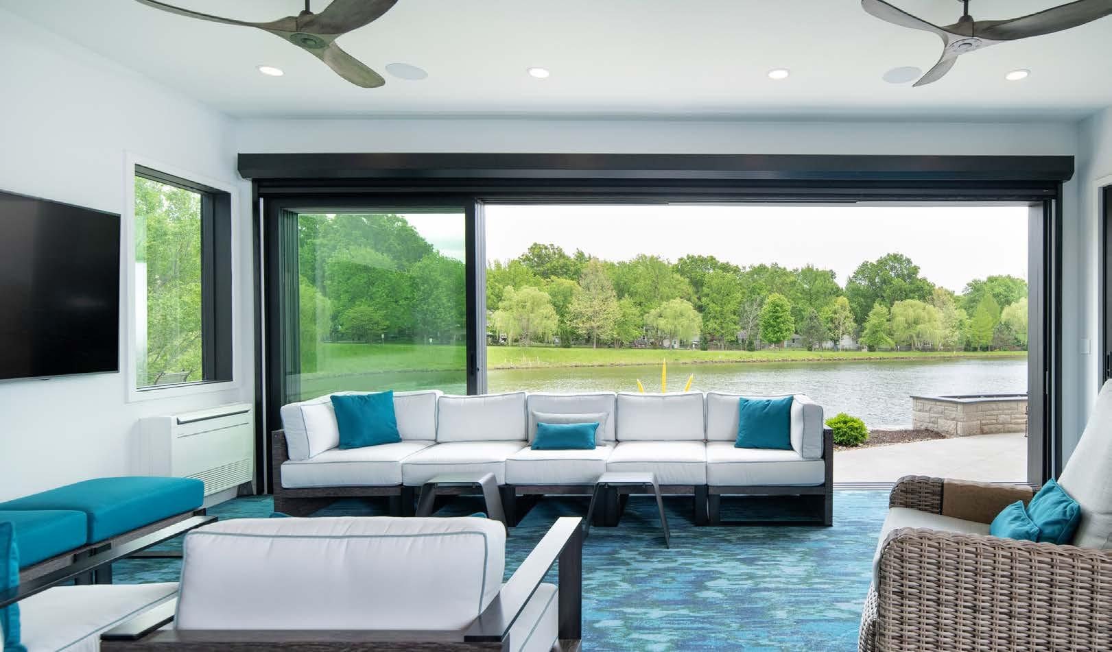
Great: a word implying extraordinary and vast. Outdoors: the space beyond our shelters where we escape to find health, healing, grounding, resetting, calmness, clarity—and pleasure. In this issue, we dive into our desire to connect with nature—admittedly, from a high-design perspective.
For Midwestern brides-to-be, outdoor spaces and barn venues have particular appeal for their big day. Farmstead heritage continues to maintain a strong presence (and big business) if only to capture the rustic texture of a wood barn against a backdrop of a field of flowers in a photo op. A few of these rural venues captured my heart; see them starting on page 78.
The enduring charm of countryside outbuildings aside, weʼve come a long way from a hard-wrought life of working the land out of necessity to slipping out the back door to our favorite pool lounger. What we humans now add to the Great Outdoors is an elevated process of ingenuity and creativity. When scouting projects to feature in this issue, one after the other impressed me with—first—their beauty, but then their problemsolving and plain gutsiness.
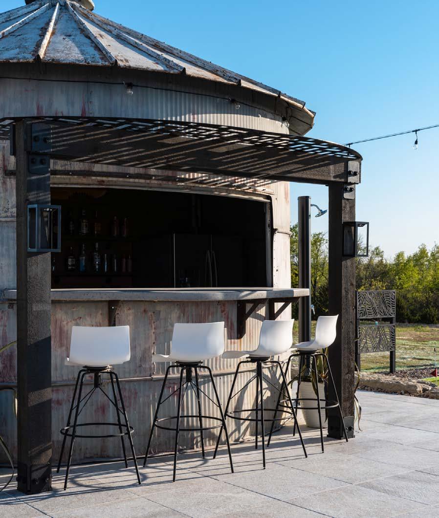
From an eye-popping, orange-painted concrete tile outdoor fireplace surround (page 202) to a poolside grain bin bar (page 208) to entire walls of a house opening up to the elements (page 224), our editorial well features a number of ʻwowʼ moments that made me want to know more.
What I discover in each issueʼs stories is usually helpful and always inspirational. I find it most amazing that nearly every (good) story starts with a problem. The bigger the problem, the better the results!
For instance, on page 248, a KCMO couple was losing a battle against a pine tree disease. They placed their faith in their landscape designer, who leveled up their entire property and enhanced their lifestyle in a way they could not have foreseen before.
And sometimes what we thought we wanted—or didnʼt want—changes, as in the case of the homeowner who said sheʼd never live in a Colonial home but, of course, ended up in one. See her homeʼs incredible, updated interiors on page 178.
Thereʼs also the familiar story of “scope creep,” where the beginning desire for one simple thing snowballs into a whole-house renovation. The owners of a Mission Hills home—who thought they just wanted new furniture— ultimately overhauled the house when COVID came calling. Find out how that project turned out on page 192.
And, finally, there are times when the most-feared moments come true, such as when a spouse dies. After losing his wife, a Lake Quivira man found some closure and claimed the house in his own, personal style. See those new, life-defining spaces on page 166. Sometimes we have to go through challenges like these to find ourselves in a new—and better—place. But before we do, letʼs go out and get grounded in nature first.
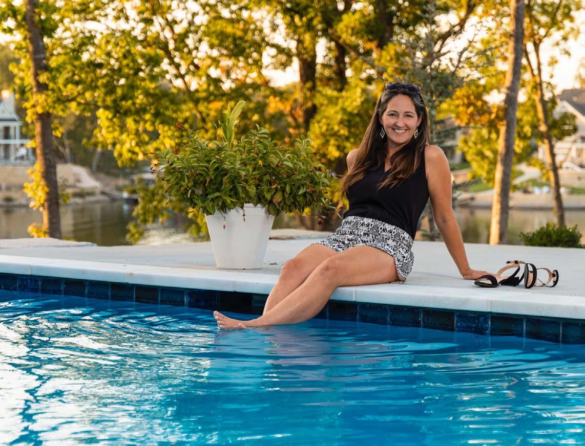
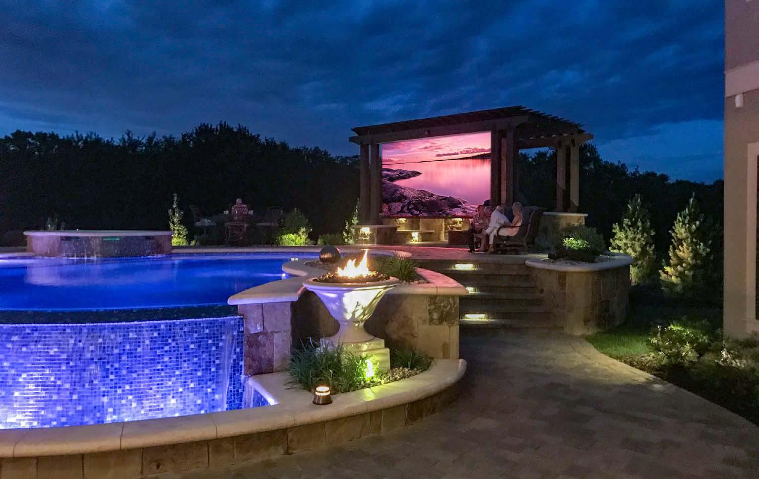
Photo by Matthew Anderson, taken poolside at the Lake Winnebago home of custom homebuilder Jason Walker.





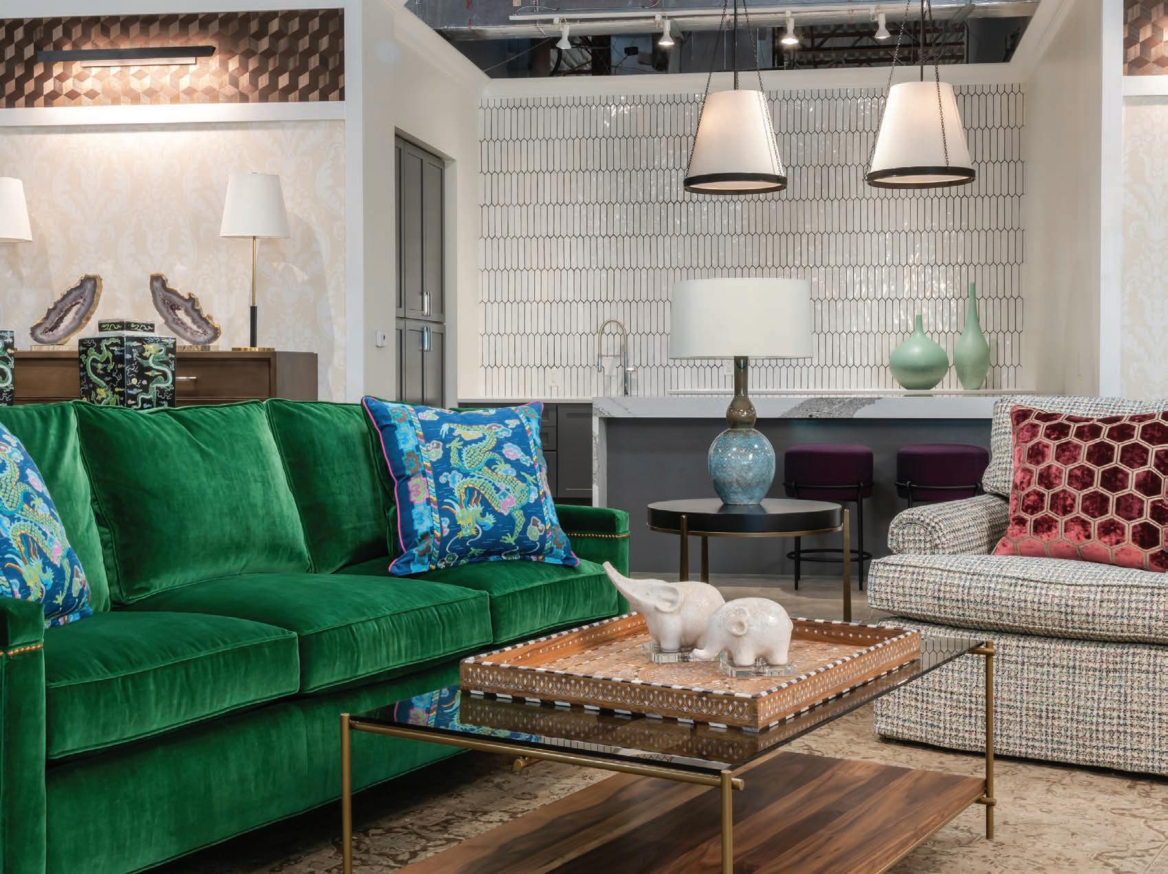

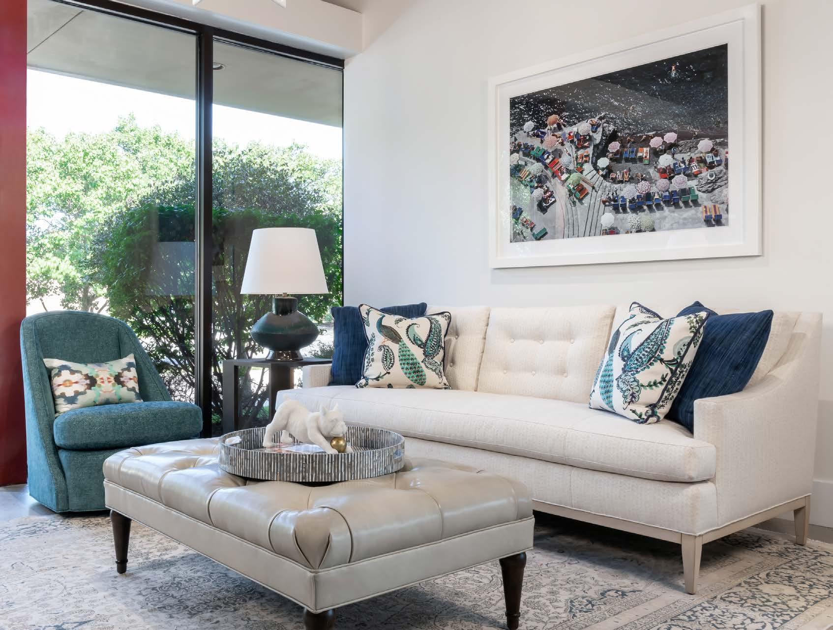
SCAN FOR MORE INFOMATION ON BUILDER


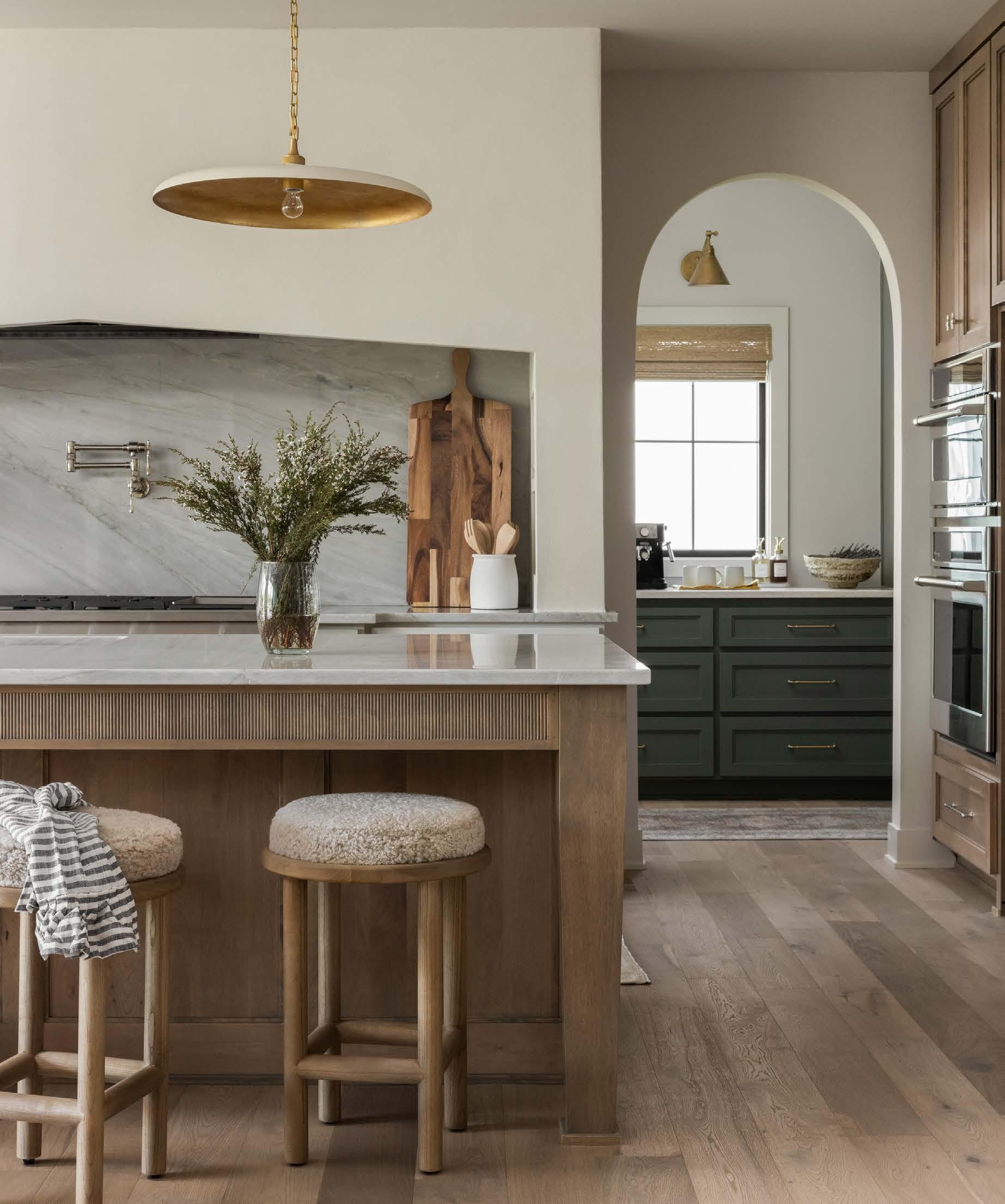
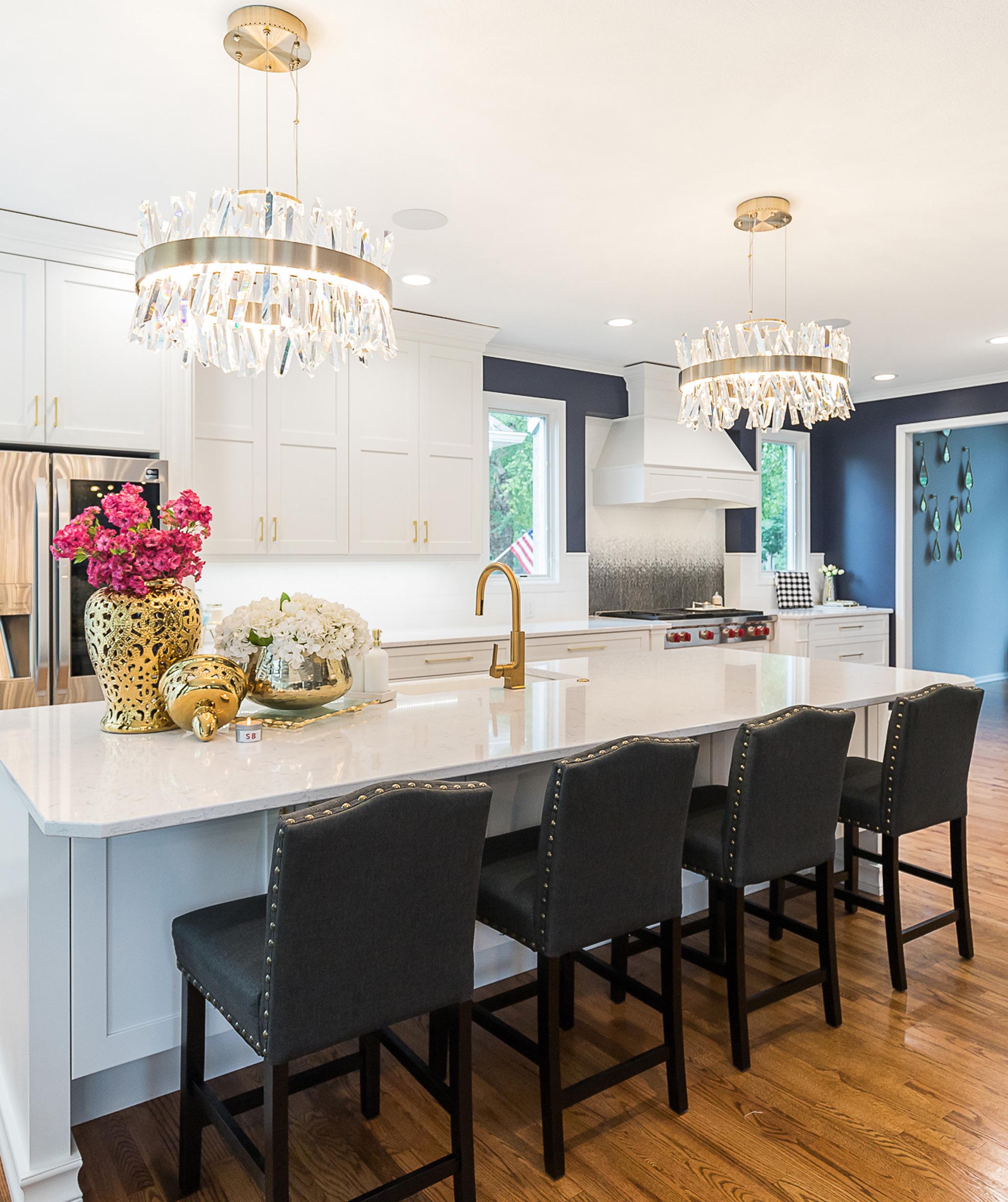
Monica Freebornʼs vision for Amethyst Home, a new boutique and design studio in Grandview, Missouri, is to celebrate artisans while curating natural furnishings that give a home soul. She opened the local boutique last year after watching her first shop in Omaha, Nebraska, grow, since 2017, from a small retail space dealing in custom furniture and luxury rugs into a bustling design business.
Friends, family members and customers were regularly asking her to bring rugs to their homes and opine on whether or not they fit the space and decor. So the boutique organically grew into a design studio as well. And speaking of organic…
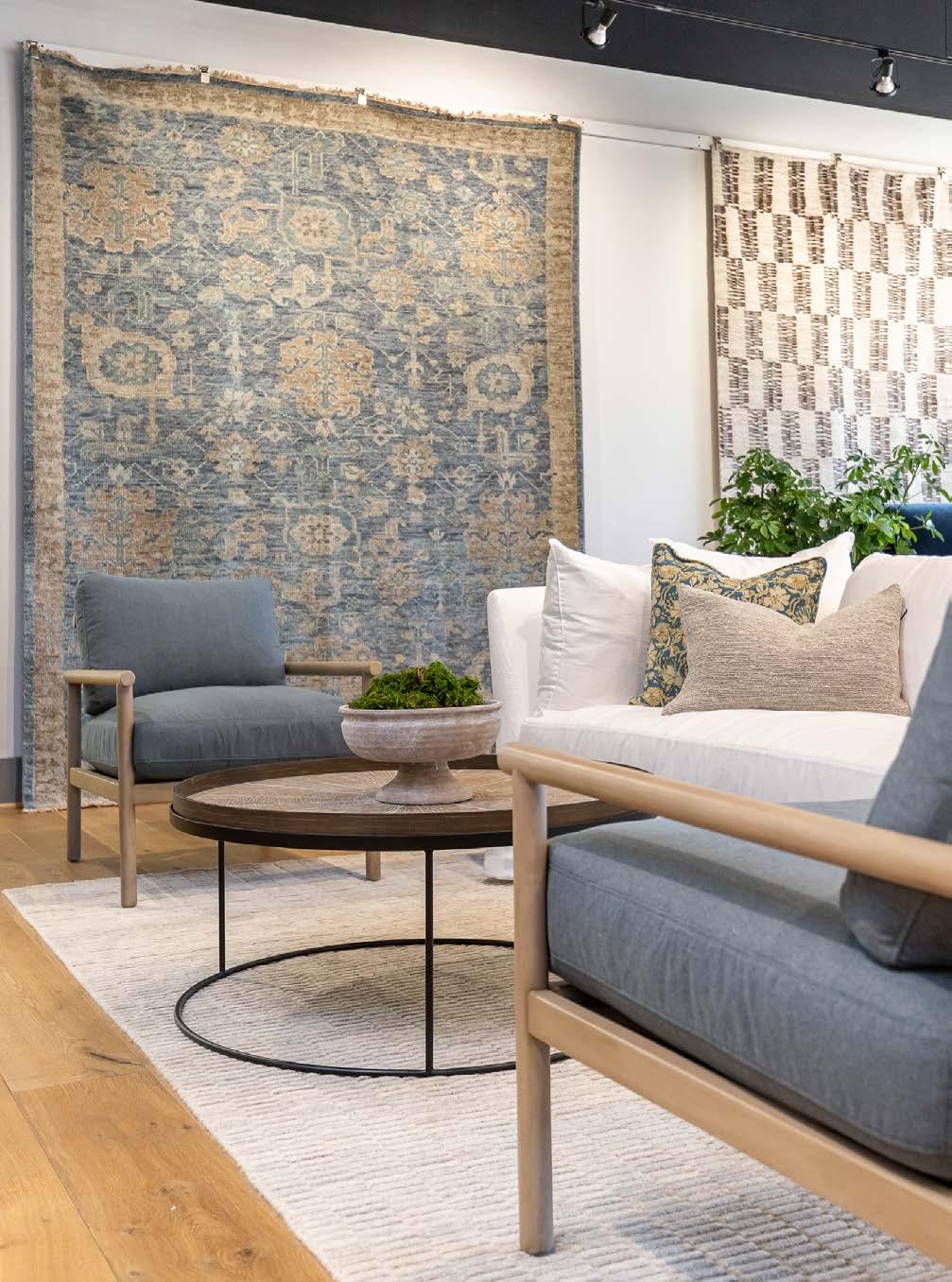
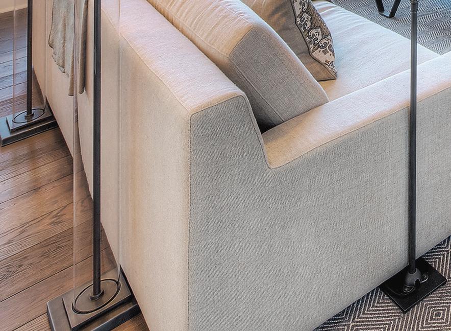
“I knew we were doing something a little bit different at Amethyst because we focus on natural materials,” Monica says. “A big priority for me is linen sofas, wool and jute rugs, solid wood tables and marble accents.”
 Photos by Brynn Burns
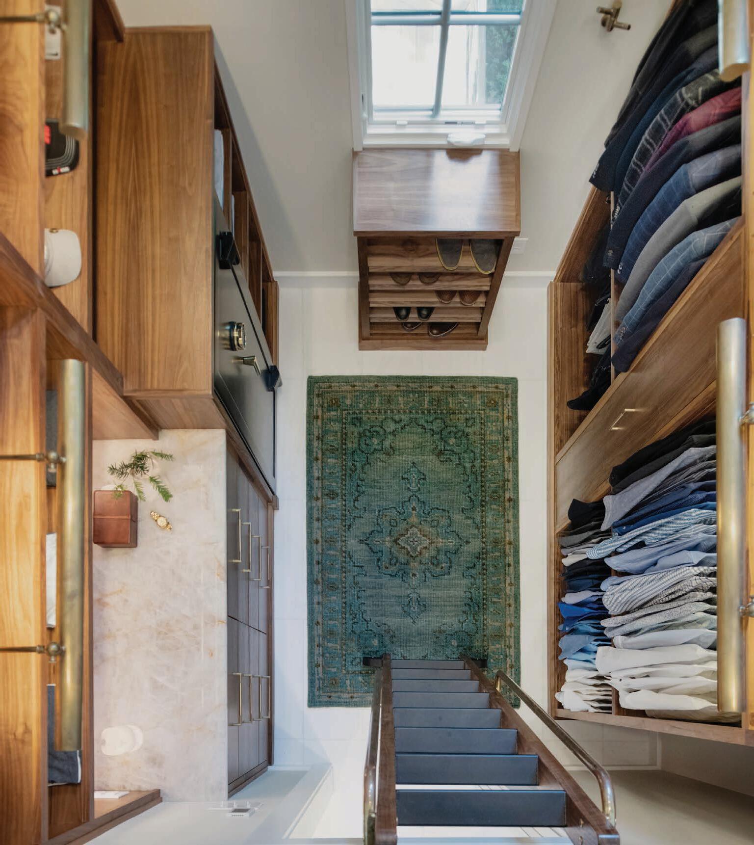
The Grandview boutique also has a rug gallery featuring luxury brands, designs from independent makers, as well as new and vintage rugs of Turkish, Persian and Nepalese provenance.

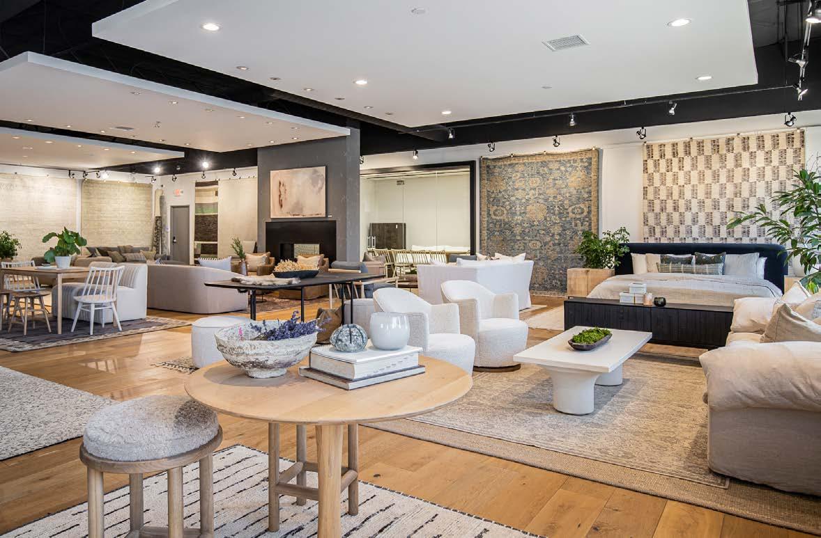
Amethyst Home is a one-stop shop for freshening up a room or redecorating an entire home. It offers complimentary photo mock-ups so you can “try on” furnishings in your space, as well as hourly design services.
According to Monica, Amethyst Homeʼs furnishings are adaptable and have fans across the country. The studio has provided design services for clients from Miami to Phoenix, she says, adding that “we can lean more traditional, we can lean more modern, and we work with clients of all different design aesthetics—but with that common thread of a love for nature.”
4200 Main St. Grandview, Missouri amethysthome.com

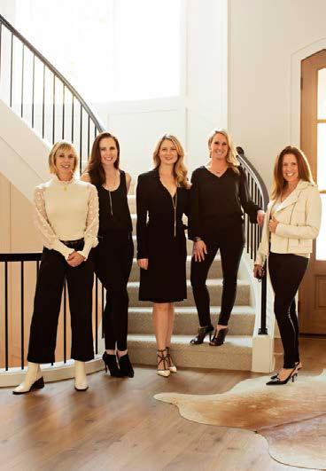





 Words
Words
by Cynthia Billhartz Gregorian | Photos by Brynn Burns
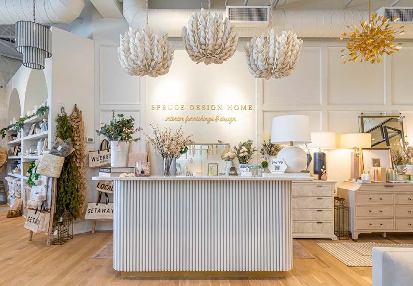
Roxanne Baker grew up in the building business—her father owned a custom homebuilding company, and her husband operates a construction company. She finally joined the industry, too, after 12 years as a labor and delivery nurse. During that time, Roxanne had taken on a few of her husbandʼs clients with interior design services—and found it to be a passion. She decided to hang up her nurseʼs hat and earn her interior design degree. She partnered up with Kimbra Callaghan a couple of years later, and the two organically grew their business, culminating with the opening of their Overland Park shop late last year. The full-service interior design studio and retail boutique is dripping with beautiful lighting, furniture, home decor and gift s.
“We wanted to open a studio where we could house all of our client meetings and have all of our samples in-house—like the build materials, including countertops, flooring and tile, all the way up to furniture and styling accessories,” Roxanne says. “The retail and studio sides dovetail nicely.”
Clients can choose from design packages that range from a 30-minute mini consultation to plans to furnish an entire home.
Roxanne and Kimbra work together to create a low-stress design process for the client.
“These spaces/homes can be a very large investment, and we want the process to be fun, creative and curated for each client,” Roxanne notes.
The pair create design boards, renderings
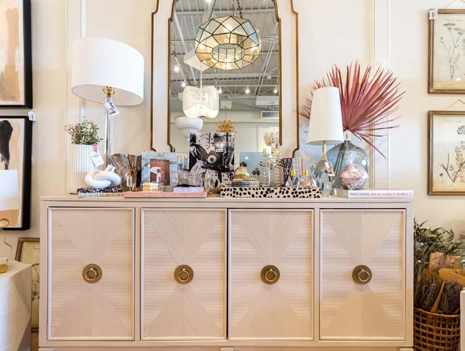
A functional yet stylish console is arranged with pretty table lamps made of crystal, alabaster, marble and glass, and filled in with girlfriend gifts. The shop also carries mirrors with unique silhouettes.
Below: Their favorite transitional sofa is up front and center of the shop, paired with a reclaimed/wood inlay coffee table and whitewashed chandelier.
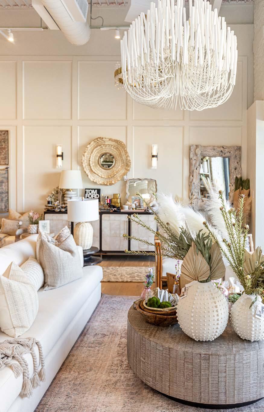
and drawings, present samples, and organize on-site or in-studio meetings. They also procure the orders, along with delivery, installation and styling.
“Having the retail storefront has also been a really fun avenue to connect with our customers that turn into design clients,” Roxanne says. “Someone may just pop in to grab a quick hostess or birthday gift and then they see our furnishing or design services and it snowballs from there. We really love our location and the nice feedback we have received so far.”
Their little bit of West Coast/Coastal vibe is welcome here—fresh, clean lines, and light, airy textures make it a shop worth stopping for.



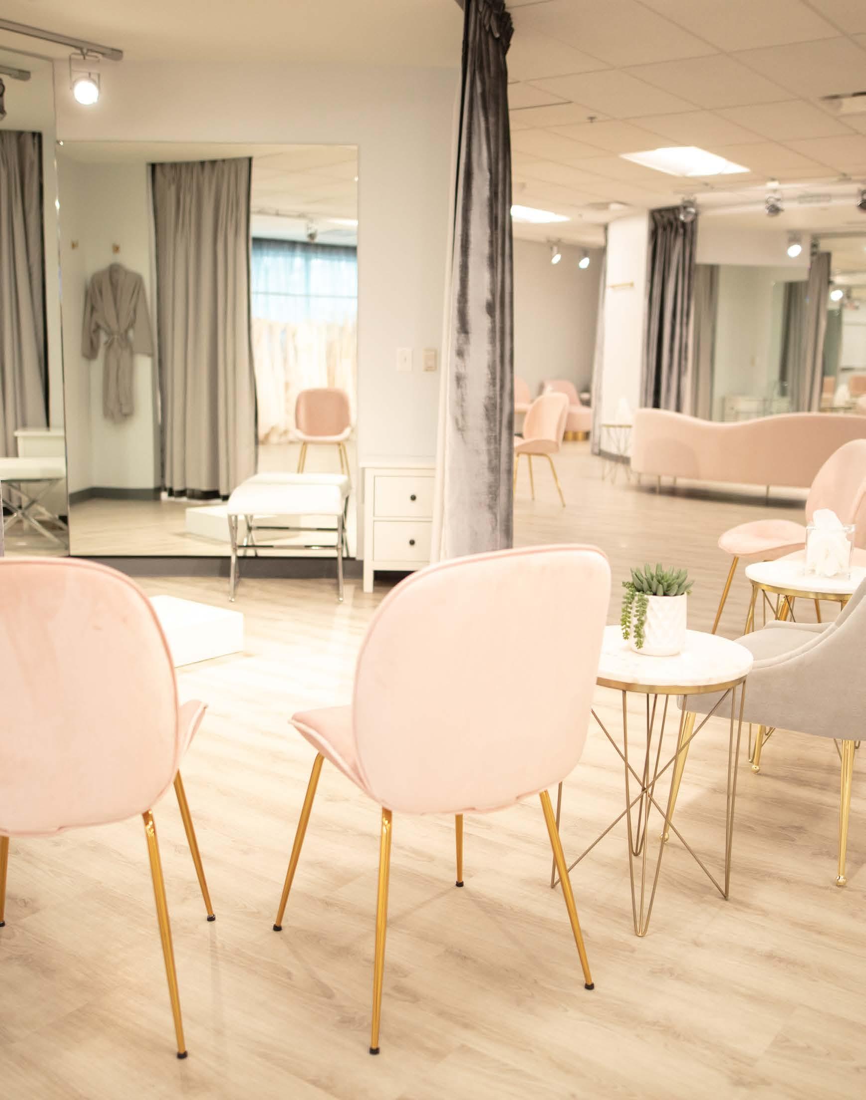
Brides-to-be enjoy intentional, experiential design— with their family and girlfriends in tow—at True Society.
Words by Andrea Darr | Photos courtesy of True Society
Inner Circle
“For the reveal, the mirrored wall oating in the middle of the room and the expansive curved curtain enveloping it is pure theater.”
~ Bride Joann Schwarberg
ASa landscape architect, Joann Schwarberg knows about good design and quality materials. So when she became a bride for the second time later in life, she could distinguish the same characteristics among bridal retailers.
“I went to New York and tried on Vera Wang, Oscar de la Renta and Monique Lhuillier—all famous gown designers—and they were all nice,” Joann says, “but none of them provided the end-to-end experience that True Society did right here at home. It was beautiful, calm and easy. There were two discerning stylists helping me behind the curtain, with clips and pins and accessories at the ready, ensuring that the big reveal was perfect. It was fabulous.”
What Joann appreciated is exactly what CCO Martine Harris has built as a core value of True Societyʼs parent company, Essense of Australia, whose bridal empire HQ is located in Lenexa, Kansas.
The designer wedding dress company has been expanding to markets all across the northern hemisphere—successful in part because Martine has recognized how consumers have evolved. Since she began business as a traditional bridal retailer and gown designer 20 years ago, a movement has taken place. Women of all body shapes, sexual orientations and ages want to get married—and her company has stepped up to serve a broader group.
“There so much around authenticity and being yourself,” Martine says. “Itʼs not just about a bride making her mom or grandma happy; itʼs her own experience, it reflects who she is.”
The desire to serve became the driving component behind the storeʼs unique layout.
“Itʼs not just a pretty space; itʼs a journey,” Martine
says. “Weʼve rethought the whole experience—not just the aesthetics, but the moments.”
At the heart of each location is a centralized circle, with interior dressing rooms whose curtains draw back to reveal the bride to her family and friends waiting comfortably in chairs on the perimeter.
“I love how soft it feels—itʼs not squares or hard lines that feel clinical or factory-like,” Martine says.
True Society has a location in the Crossroads
Arts District and another in Lenexa, at the base of HQ. The Crossroads location can fit 10 at a time; seven simultaneous appointments can be held in Lenexa. Each 90-minute consultation is free, and upgrades—from bottles of champagne to a sweets plate—are available.
“Lots of elements are the same; itʼs a similar experience, but the aesthetics are localized,” Martine says.
Hands-on with the design of each, Martine describes the Lenexa location as more feminine— pink, soft, with gold touches. Downtown, she wanted to keep the urban character of the old brick building.

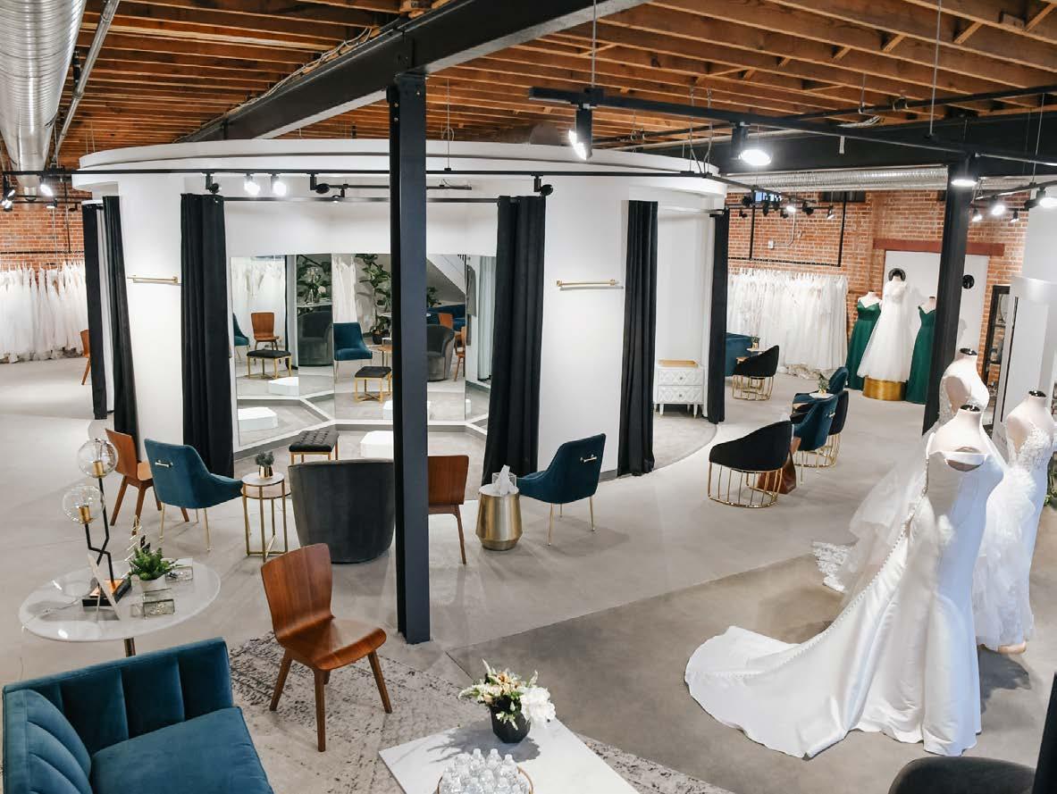
Either way, a bride will get the ultimate treatment that may help ease at least one of the many decisions that need to be made during this lifechanging process.
“I always believed in keeping close to the market, from when we were a staff of 2 to 5 to 10 to 350 worldwide today,” Martine says. “We want our staff to remember who they serve.”







 Words by Savannah Rieke Newson | Photos by Samantha Ward
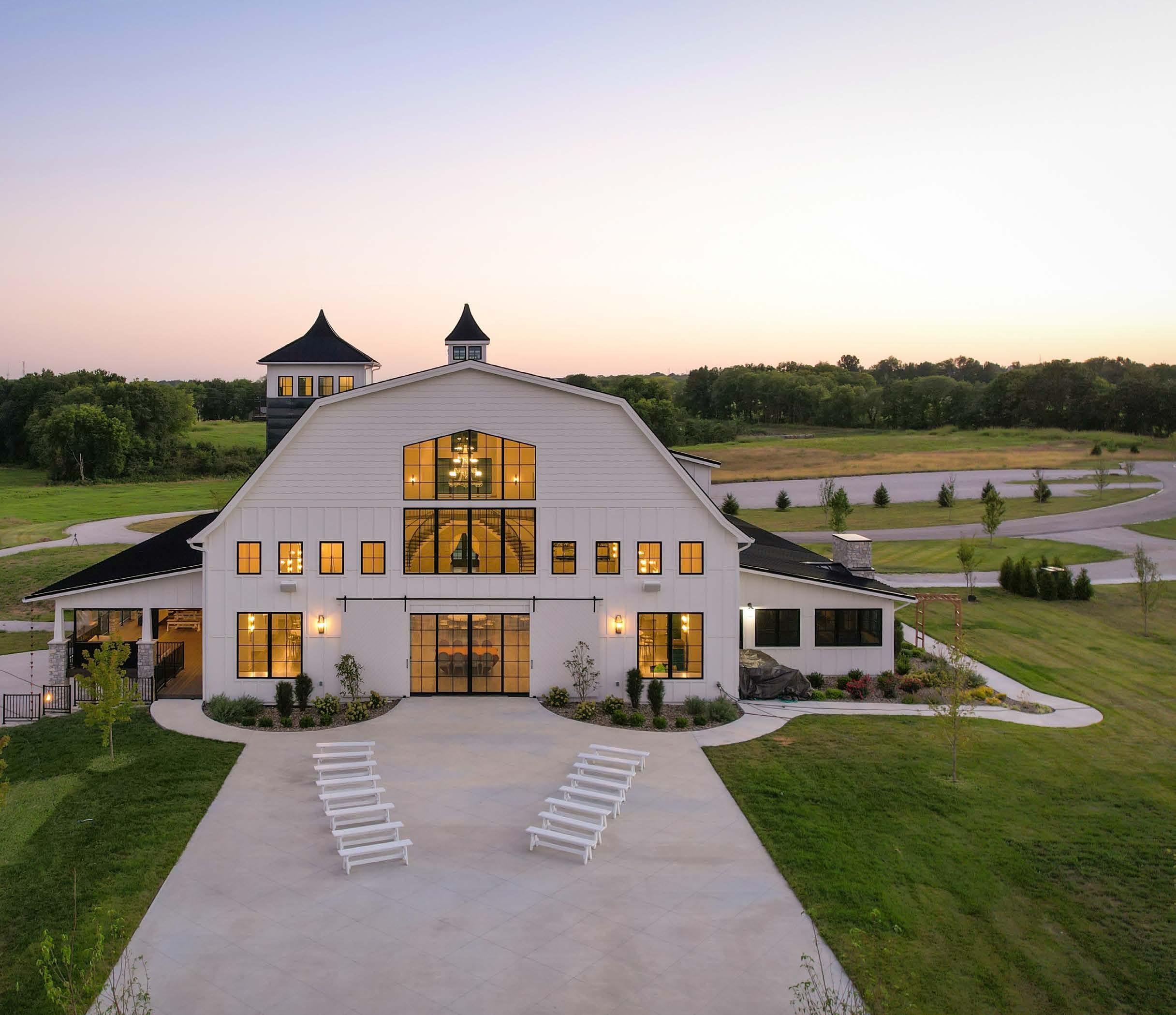
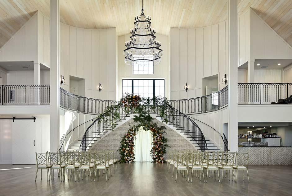
Not all that glitters is gold. Yet, at White Iron Ridge, everything does—in fact—glitter and glow in white, crystal and gold. Its elevated essence of glamour is one of many alluring facets found within the pristine Smithville, Missouri, venue. Built by Homoly Construction— and designed in collaboration with WSKF Architects—this custom, 11,000-square-foot barndominium is awe-inspiring and unforgettable, from the urban architecture to the color selections. Like a painting, its white, monochromatic palette strikes beautifully against the lush 72-acre backdrop of open fields and dense treelines. At night, the warm glow from its black-framed, multi-pane windows further enhances the elegant architecture and ambiance.
The neutral color palette continues inside— an intentional design decision by the owners to maximize the venueʼs versatility.

“Our monochromatic design allows for the adaptation to any style of event regardless of the occasion,” notes the owner on the White Iron Ridgeʼs website.
The barnʼs open floor plan also adds to its range of accommodations, allowing for smaller, intimate affairs, as well as events on a grander scale. Such meticulous attention to detail reflects their dedication to providing a spectacular, once-in-a-lifetime experience for attending couples and guests.

This same consideration went into the amenities and other interior design aspects found throughout the property. The main space of the building—the grand ballroom—delivers on the glitz and glamour with its impressive
40-foot arched ceilings, adorned with locally crafted iron-and-crystal chandeliers and abundant natural lighting. A perfectly framed backdrop for ceremonies and receptions, the space also features loft balconies—including the bridal loft—and a double iron-railed staircase curving around the altar area.
Outside, a spacious covered deck is accented by stone and wood columns and an iron railing. The indoor-outdoor concept gives wedding parties plenty of flexibility to work with and around personal preferences and weather changes.
In addition, the barn offers a plethora of posh amenities, including a parlor lounge, loft parlor and prep kitchen. A bridal suite offers a private bathroom, full-length mirrors and salon stations, while the groomʼs room has a private deck, bar and gaming options. At the end of their magical day, newlyweds can stay overnight in the hidden honeymoon suite, which resides at the top of the tallest tower and grants magnificent views from the balcony and panoramic glass windows.
A multifaceted gem, White Iron Ridge is truly the epitome of white-wedding opulence and is, indeed, as they say: “an experience worth the investment.”






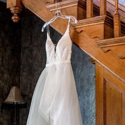
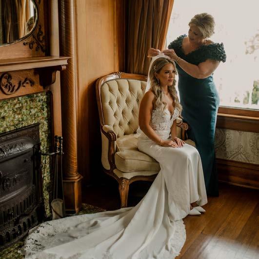 Words by Savannah Rieke Newson
Classic Charm. Historically Elegant,” is the motto of Eighteen Ninety in Platte City, Missouri, a popular spot to tie the knot for local and destination couples. A perfect description, this sophisticated and one-of-a-kind venue delivers picturesque views, upscale event spaces, an enchanting backstory and much more.
The propertyʼs crown jewel is a historic, blackand-white Victorian-style home donning intricate woodwork, romantic windows and a turret. Initially constructed in 1872 in the Federalist style, it has undergone multiple renovations and changing of hands during the past century and a half. Finally, in 2018, the newly restored building was transformed into a wedding venue—the place where current owners Paula and Doug Owens made their vows.
“I got married here,” Paula reminisces, “and then I bought it! That definitely adds to my love of the place.”
Paulaʼs fondness for the location shows throughout—from the refined architecture to the finer details. Since taking ownership, the couple has added landscaping, upgraded the irrigation

systems and diligently preserved the expansive property. They are also renovating the smallest of the four on-site buildings into a classy, indooroutdoor cocktail bar designed to match the new modernizations.
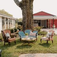
Eighteen Ninetyʼs three main buildings—The Victorian House, The Hall and The Fields—are meticulously maintained as well, giving brides and grooms multiple options for their ceremonies and receptions. The Victorian, for example, can seat up to 50 guests and provides lodging and changing rooms.
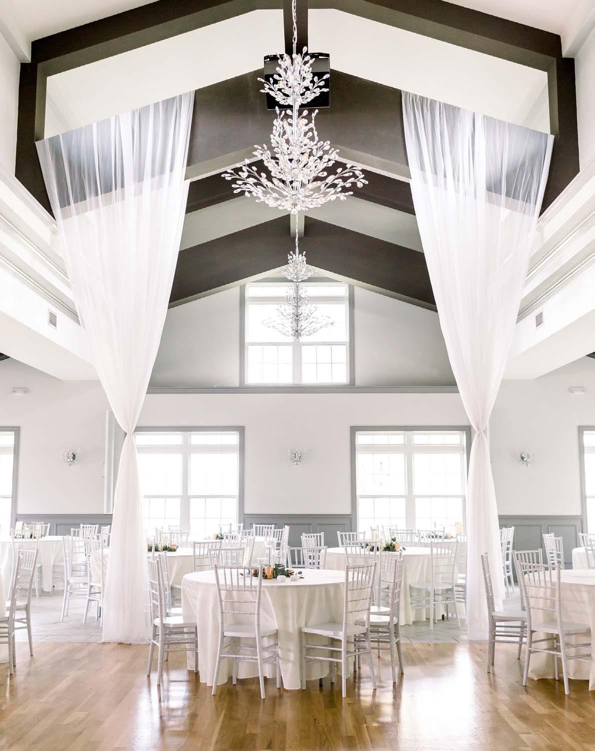
Meanwhile, The Hall is a glamorous, modernrustic option, with room for up to 300 guests. Ideal for any season, this climate-controlled indoor space is comfortable and well-lit by 12 extravagant chandeliers. Other features include three sets of French doors, a catering kitchen, restrooms and more.
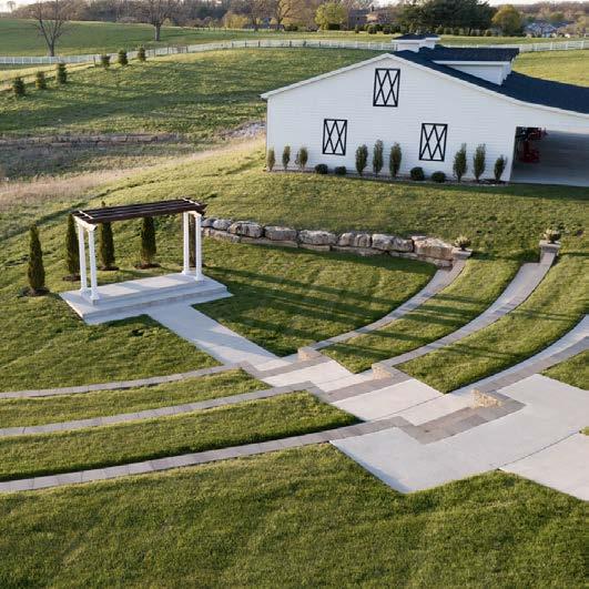
For those who seek an outdoor ceremony, Paula recommends The Fields. Able to seat up to 150 guests, this stone-lined, amphitheater-style venue overlooks rolling hills from a wood arbor. A paved central promenade makes walking down the aisle a seamless and photogenic experience.

The venueʼs additional amenities include (but are not limited to) a bridal suite, groomʼs quarters, and the opportunity to select an all-inclusive wedding package—anything and everything a couple needs to ensure their “big day” is the most beautiful start to the rest of their lives together.


A captivating and elegantly renovated wedding site on a historic Lake Lotawana farm.
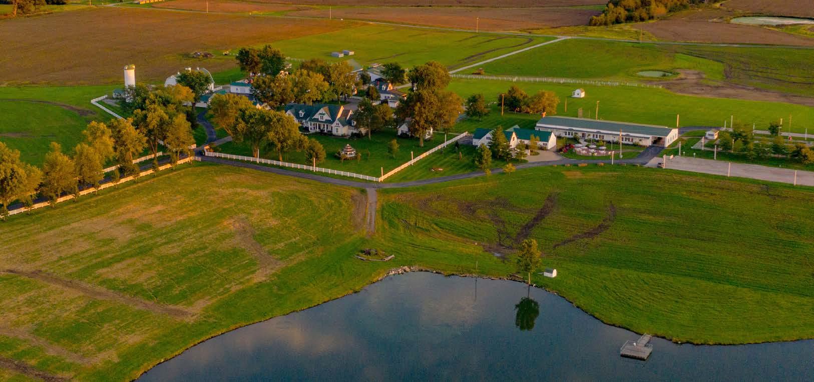
WordsThe storied grounds of Lone Summit Ranch hold a promise of enchantment and treasured memories. This versatile, 128acre venue in Lake Lotawana, Missouri, bestows newlyweds and guests with a vibrant history, timeless settings and a remarkable romantic experience.
“You know [our ranch] is special from the moment you drive through the stone columns and gate down the tree-lined estate drive,” says Linda Sallee, the owner and director of events. “I think what makes it so special is that the property is so rich in history.”
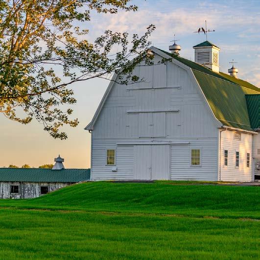
Beyond the venue, The Ranch is a fully functioning 500-acre farm with crops and cattle—an ancestral trait passed down from the farmlandʼs conception in the early 1900s. Since then, many owners have lovingly cared for and cultivated the land, each adding their own fascinating chapter to the story.
 by Savannah Rieke Newson
Photos by Tristin Williams of Rugged Path Productions
One such owner, Dutton Brookfield, a prominent figure in the KC sports scene, christened the farm with its current name. He also brought in prized cattle and renovated the property into a partyready showpiece during the 1970s. The subsequent owners stayed for over 35 years, farming the land and converting its facilities into a reception venue. Finally, in 2015, Linda and her husband, Randy, purchased Lone Summit Ranch—a longtime dream for them both. For the next several years, they worked tirelessly to salvage, renovate and restore the historic estate to glory, slowly bringing their vision of modern elegance, captivating vistas and endearing memoirs of the past to life.

One of their major projects was the main house, which was sadly in disrepair. So, the couple opted to start anew by building their forever home in its place. Today, their picture-perfect modern white farmhouse—designed by architect Byron Sawyer— complements the ranchʼs crisp, modernized look. It even serves as a popular photo spot for couples and guests.

The fully renovated, 9,000-square-foot reception hall contains new bathrooms, flooring, lighting, a kitchen and a bar area, and accommodates up to 350 guests. Designed for elegance—with a touch of chic country flair—the interior features a grand stone fireplace and brightly lit tall ceilings upheld by wood beams and exposed metal trusses.

Attached to the hall sits a white veranda outfitted with a glass garage door and rustic chandeliers. The exterior patio—surrounded by landscaping, fountains and fire bowls—overlooks lushly manicured grounds and a 15-acre lake. Other on-site amenities include pergolas, a pool, a playground, a tennis court, a mini-golf course and three charming cottages.
“Randy and I feel honored to be the caretakers of this farm for a little while until we pass it on to the next lucky person,” Linda says.


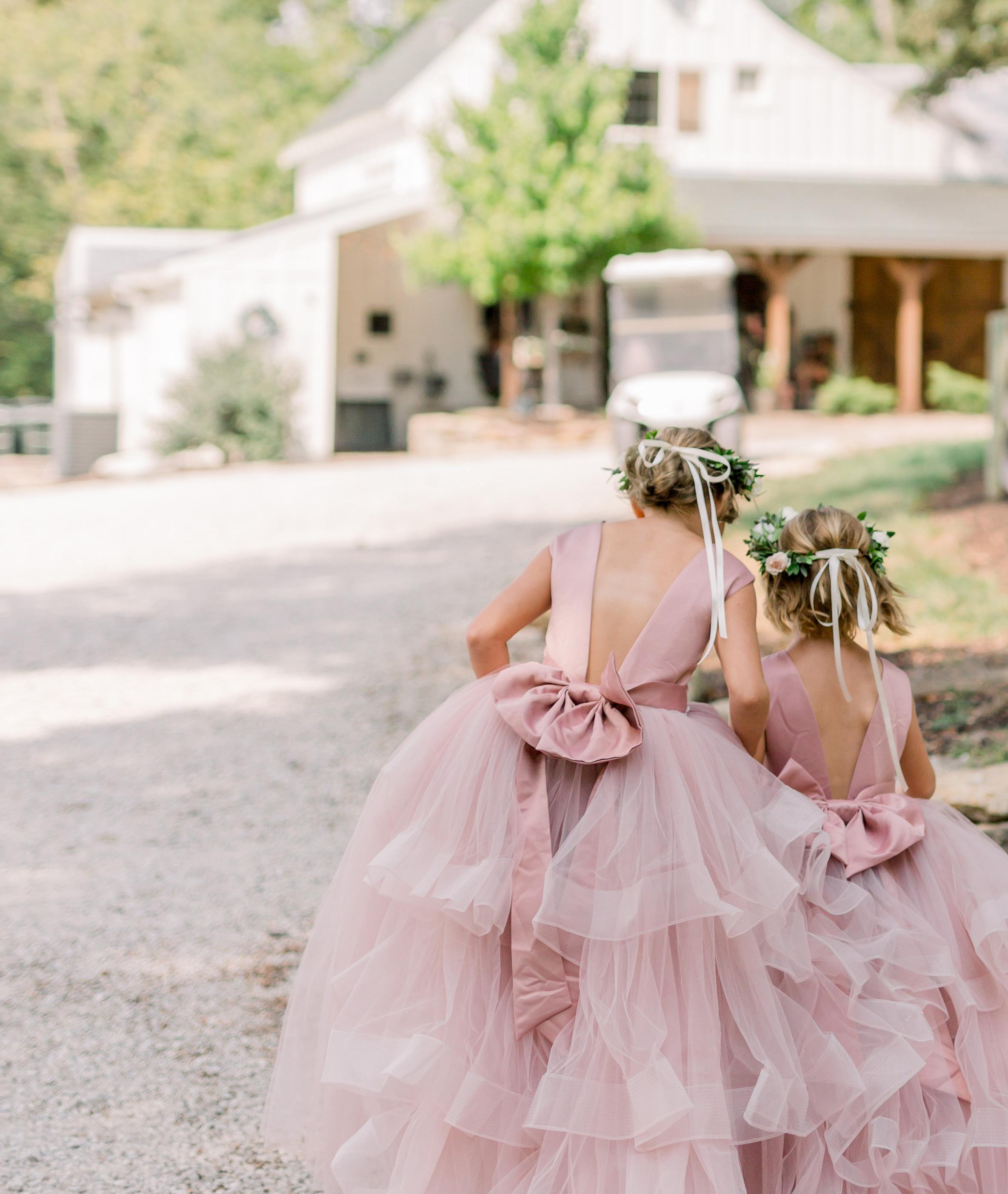

 Words by Savannah Rieke Newson
Serene, fairytale-like settings await at The Barn at Riverbend, a luxurious and winsome wedding retreat. Quietly tucked away on 20 privately owned acres, this modern-rustic beauty in Peculiar, Missouri, strives to create an extraordinary, at-home experience for couples and their guests.
“Our goal is to be the most romantic and authentic venue in KC,” states owner Kris Unruh. “[This place] is an expression of our land that weʼve lived on—and painstakingly cared for—for over 27 years.”
Kris and her husband, Kip, began their humble voyage as backyard venue owners in the summer of 2015. With no master plan in mind, they simply envisioned doubling the size of their barn, adding parking and landscaping and, finally, crafting an outdoor amphitheater surrounded by trees and panoramic views. Since then, the husband-andwife duo has accomplished all this and more, off icially “welcoming home” their first brides and grooms in 2018.
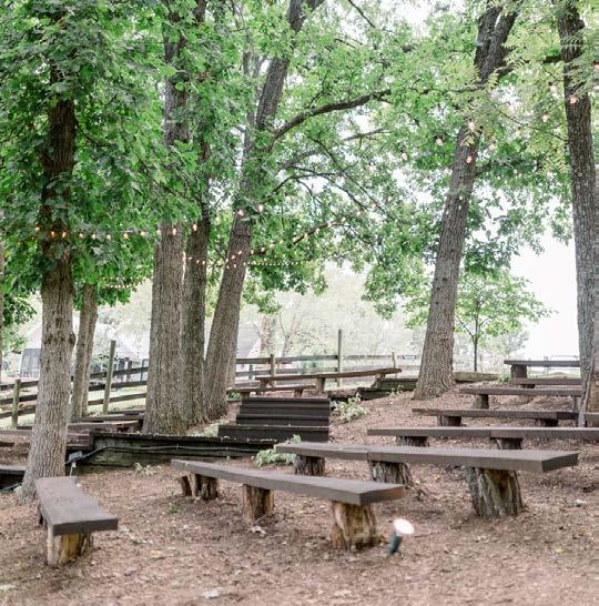
Today, their little slice of heaven hosts 25 wedding ceremonies and receptions yearly. The magical hillside amphitheater seats 200 guests and is adorned with twinkling string lights that crisscross through the tree canopy. Minimalist landscaping weaves between the wooden aisles, featuring carefully placed hosta plants around mature trees. At the base, stacked rock stairs lead to the altar area, which is often decorated with floral arches or other custom centerpieces.
The Barn at Riverbendʼs reception area is equally stunning—a true rustic-chic “white wedding” dream. As its name suggests, the white-painted and wood-trimmed barn sits on the edge of a bend in the Grand River, presenting exquisite views that elevate the enchanting feel of the property.
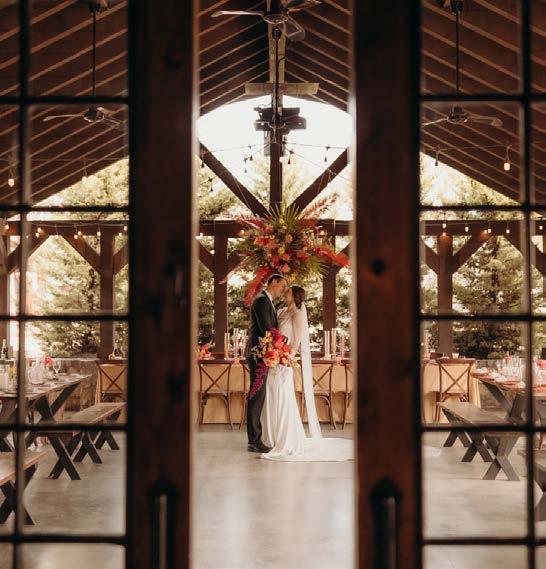
Ideal for year-round use, the 1,250-squarefoot barn is also designed with a perfect balance of indoor and outdoor luxuries. Inside, guests enjoy climate-controlled settings, in addition to an array of handcrafted farm tables, benches and cross-back chairs. Meanwhile, the celebration continues outside in the 2,200-square-foot openair veranda and covered patio area, complete with string lights, fire pit, ceiling fans, radiant heaters and an outdoor bar.
Whatʼs more, the property provides a stylish pair of separate accommodations for the wedding party—a bridal loft and groomʼs cabin—as well as exclusive catering services, bar packages and other amenities. Prime photo spots include a tree- and fence-lined driveway and a quaint wooden deck overlooking the nearby pond.
“It was a labor of love, but it was fun!” Kris says, in fond remembrance of their journey to this point. “The highest, best use of our property is being an amazing venue like this.”
@thebarnatriverbend
Photo by Elizabeth Ladean Photo by Elizabeth Ladean Photo by Sarah Dean

1. To grow roots or a root.
2. To become rmly established or settled.

We are ROOTED in the belief that woodworking can inspire emotion in the process of creation, and in the end product. We believe that happens with exceptional design, craftsmanship, and technology. Through that, we will strive to continue to build a company known for excellence in woodworking of all types, ability to solve problems, and done with integrity.





Words by Andrea Darr | Photos by Taylor Douglas
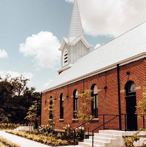
Among KCʼs many wedding venues, youʼll often find changing rooms for bridesmaids and groomsmen to gather and prepare. They vary in size and are typically minimally decorated. Thatʼs not so at Warren Place in Gardner, Kansas, where co-owners Connie and Raelee Wright—grandmother and granddaughter— renovated a 1960s rectory for bridal party use.
Itʼs not every day that you hear about someone going into business with their grandma, but the generational spread helped them strike a fine balance.
“From the beginning, this project was very much a generational melting pot,” Raelee says. “Between my grandma, whoʼs in her 70s, and me in my 20s, we tried to find something that would appeal to all.”
The Cottage is one-third of the grounds of the former Divine Mercy Parish complex, which was founded with the historic Sacred Heart Chapel and later joined by the rectory for the priests in the 1960s and the parish hall in the 1980s. For a decade, no one bought the trio of buildings. But Connie, who grew up in Gardner and owns another business on the same block, disheartenedly watched the property dilapidate.

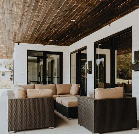


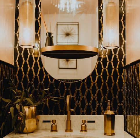

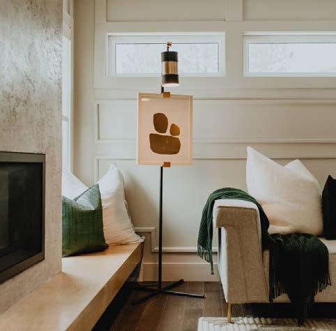

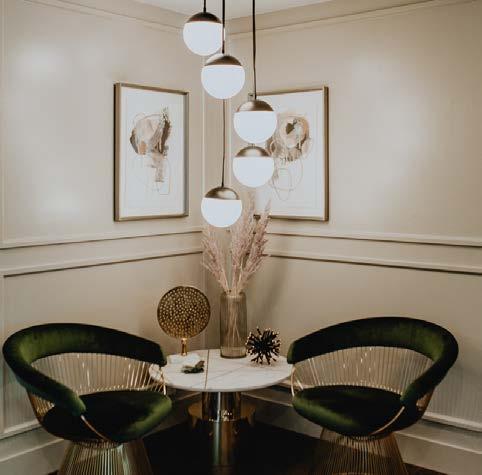
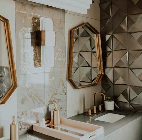

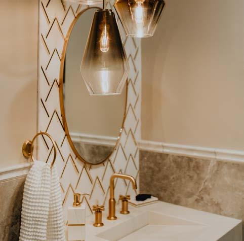
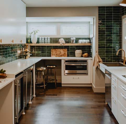
She and Raelee stepped in to save the buildings with true vision.
“My grandma and I were on Pinterest for five years,” Raelee says. “We had time to sit there and envision what it could all be. Style-wise, being in Gardner—being in Kansas—we saw the need that a rustic feel was met—but mixed with a clean, modern, higher-end touch. Grandma is the chandelier queen, with the glitz and glamor of the Old World, and Iʼm the boring modern minimalist. We met somewhere in the middle.”
They brought in DRAW Architecture + Urban Design for the concept design and did the renovation work themselves. Jennifer Boender with Hello Homes (who has since relocated to Florida) was hired for the interiors.
“They wanted the space to feel bridal, but not inyour-face bridal,” Jennifer explains. “The ultimate goal was to look like a luxe, boutique hotel.”
Most of the walls were taken down to the studs
at the cottage, where the floor plan was revamped from five small bedrooms for traveling priests into three glammed up bridal suites.
“When we purchased the property, the cottage had different shag carpet and different wallpaper in every room,” Raelee recalls.
Although, where they landed was not so far off.
“In each bedroom, there is something special— not necessarily a theme, but a vibe,” Jennifer describes.
One bedroom is earthy, one is Art Deco, and the bridal suite is blush-colored with a leather chandelier. Each bedroom has its own bath, and thatʼs where Connieʼs word of the day—jewelry— showed up the most. Lighting and tile selections grab attention in metallics; wall treatments and custom murals make bold statements.

Space rental is an add-on and flexible from one hour to a full weekend, and also available for birthday parties and corporate retreats.
The Wright ladies finished Warren Place in early 2020—just in time for the COVID-19 shutdown. Now, they are booked through 2024 and continue to enhance their vision for this special venue.
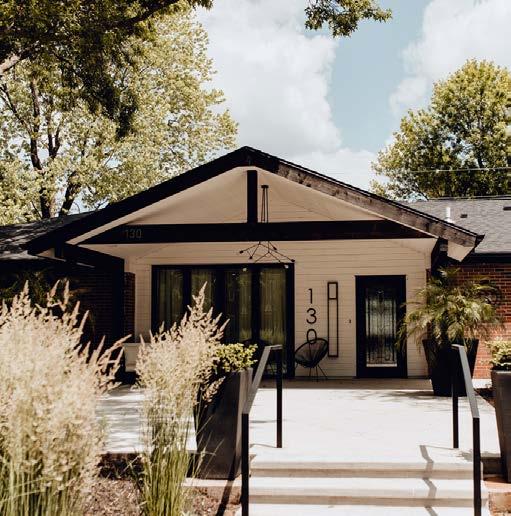
“Itʼs always changing; itʼs a dynamic space,” Raelee says. “We are growing with the space as the space grows with us.”
For instance, the meeting hall for the Knights of Columbus—which was in the rectory basement—is transforming into a groomsmenʼs room. And the Wrights are adding more functional options, such as a steamer.
“I love when people walk in with their mouths wide open,” Raelee says. “Itʼs our Pinterest page come to life.”
@warrenplacevenue
@hello_homes_design @drawarchitecture


Design: Surface to Surface

Countertops: Central Surfaces

Material: Taj Mahal Quartzite
QUARTZ � QUARTZITE � MARBLE � PORCELAIN � GRANITE � SOLID SURFACE
Vertical pigment strokes and an almost watery foreground characterize Ascension of Color, encouraging viewers to consider the work of light and color in this painting. Negative space is challenging, too, as is ascension of any kind. Created by Elle Dillon Flowers, Blooming Through Concrete incorporates a sculptural open palm to symbolize an open mind. To maintain continuity with the painting, she also hand-tinted plumosa fern in nine different tones. A custom metal sculpture anchors the arrangement, which stands amid a pile of rocks, with grapevine woven throughout the piece.
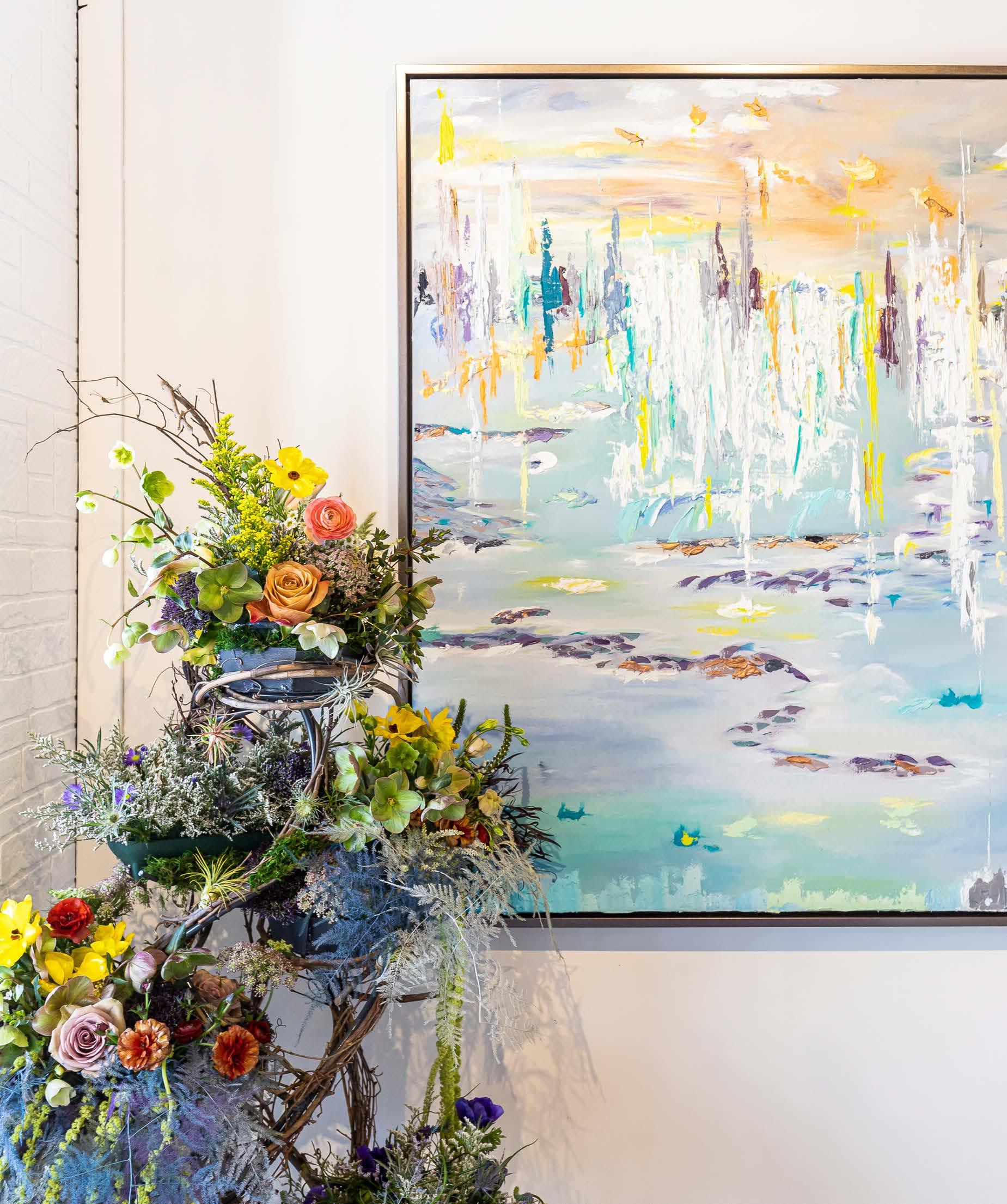
@elledillonflowers
Nine orists interpret the art of Heather L. Lowe in oral arrangement.
Words by Lisa Waterman Gray | Photos by Brynn Burns



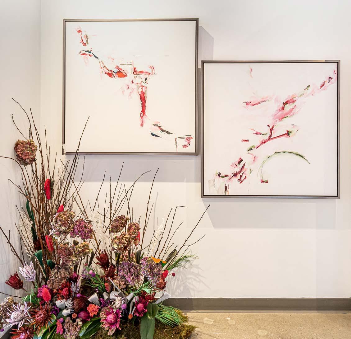
Resplendent in a bright pink jacket, painter Heather L. Lowe greeted guests at “Art of the Arrangement II”—Leawood Fine Artʼs April exhibit that invited visitors to a competition wherein local floral designers created naturally beautiful arrangements to complement Heatherʼs work as an internationally renowned contemporary artist.
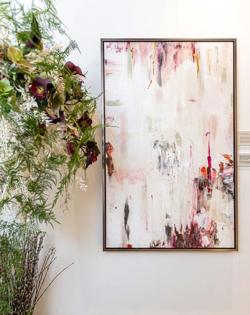
Heatherʼs goal with this competition was to stimulate community collaboration while illuminating Kansas Citiansʼ creativity. A graduate of the Gemological Institute of America in Carlsbad, California, Heatherʼs creative works reflect her longstanding love for and knowledge of minerals and gemstones, and she often infuses her paints with these crystalline materials. Her new art includes pieces from her series, The Secret Life of Colour. The overall collection primarily features contemporary nautical works, mixed media and some prints.
“Each florist had a team to create and design their installations that interpret a piece of artwork assigned to them this year,” Heather says. Gallery visitors submitted votes for their favorite arrangements and an esteemed panel of judges scored each floristʼs use of space, concept and aesthetic value. The winners are noted on the following pages.
Paint is the subject of this enriched oil work. For Parchment, the artist used encaustic wax paint and technique to layer, cover and highlight the paint, allowing for visual fading and dimension within the piece. Floral colors in Almost Like Rain, by Lily Floral Designs, echo colors in this painting, which appear to ascend down the piece, almost like rain.
Magenta Gardens features red and fuchsia tones, with deep green accents across companion oil paintings on corkboards. Itʼs a riff off the idea that a garden can be large, such as Madison Square Garden, with the softness of the foreground allowing the work to be simultaneously loud and silent. Untitled by Village Flower Company incorporated only things that were already in the shop—like recycled or repurposed items— to be more sustainable, including dried materials and repurposed orchid plants.


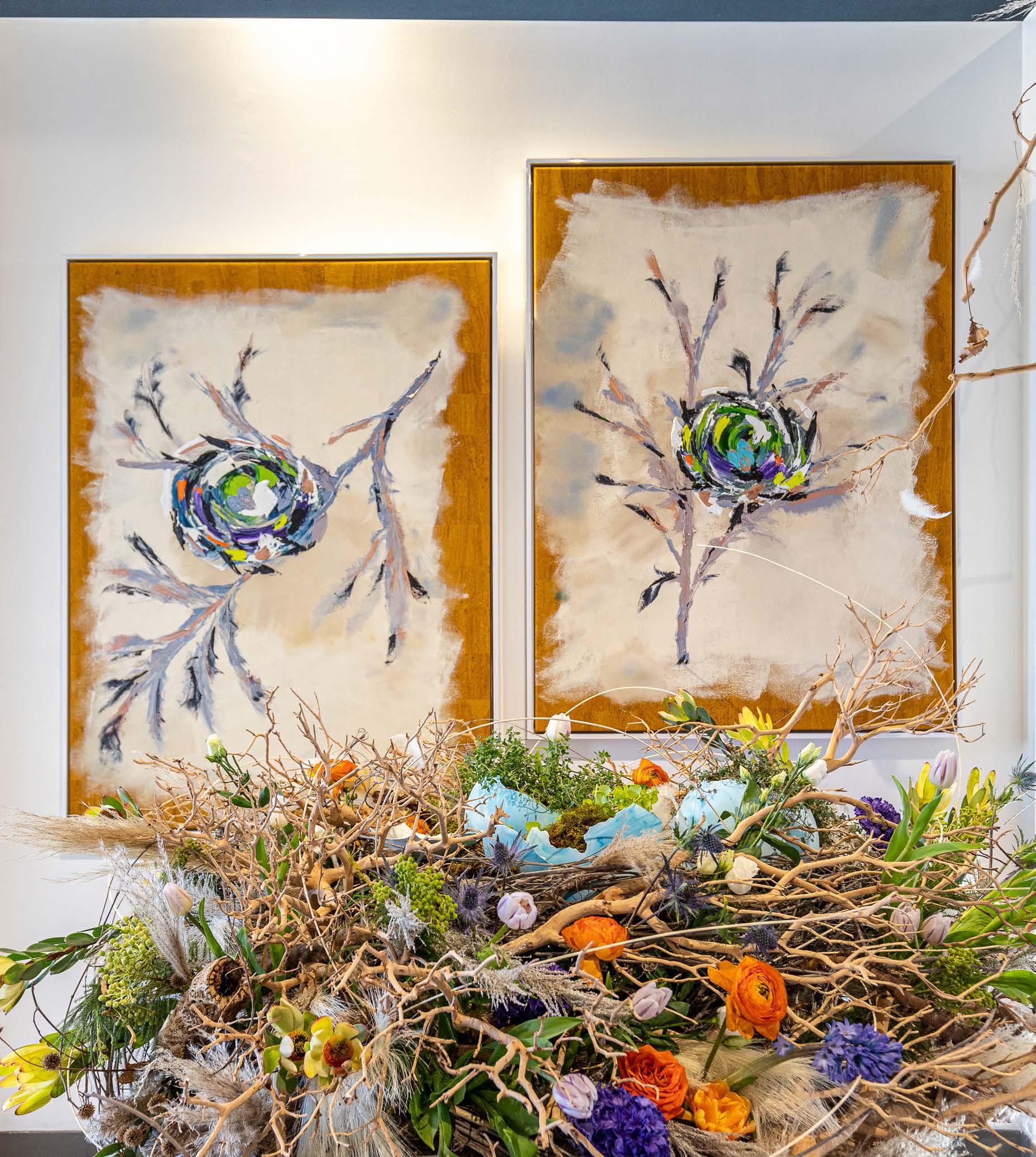
The Blue Nestr duo pays homage to our human habit of building nests for comfort and safety. Displaying an irregular ʻborderʼ of unpainted cork, the paintings depict blue eggs inside a multi-colored nest atop pale gray branches. Full of brilliant-hued flowers, the nest-like Force of Nature arrangement by Branches & Twigs echoes materials that birds utilize. Freshly hatched faux eggs—displaying baby green sprouts—are designed to represent lifeʼs fragility, amid manzanita branches, thistle, tulips, roses, ranunculus, berzilla berries, bleached grasses, hyacinth, protea and fragrant thyme.
@branchesandtwigs
“KRISTYN’S ABILITY TO REMAIN CALM, ORGANIZED, AND PROFESSIONAL UNDER PRESSURE IS INVALUABLE AND MAKES HER AN INTERIOR DESIGNER I TRULY RESPECT.” MATT CASTILLEJA

design-spout.com @designspout

Architecture
hoke-ley.com


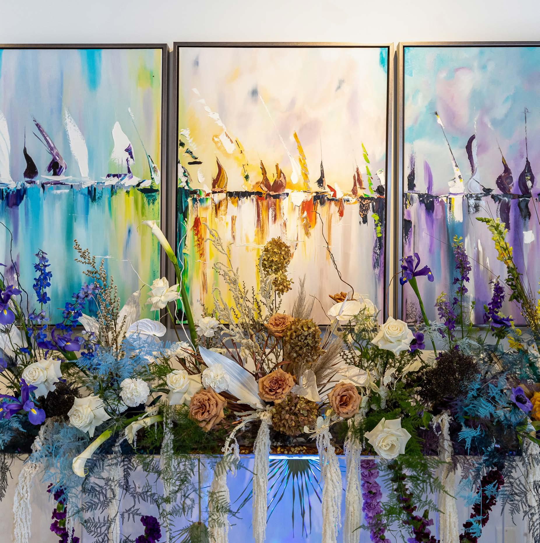
A triptych, The Ballad of the Boats, was painted to create a team of images dancing to some vibration and song from long ago. Eden Floral and Eventsʼ The Ballad of the Boats floral arrangement filled a wall-mounted planter box with riotous color, reflecting the trioʼs vibrant palette and composition. It incorporated white and toffee-colored roses to budding white calla lilies and stems of deep blue irises. Palm fronds, curly willow, reindeer moss and dried palm fronds add height and interest.



Crafted with oil paint on Portuguese cork, Alloy is part of a series about McCreedy Mine in Ontario, Canada. Pink, red, gray, black and pale green tones add interest with translucent color punctuating a white background. Created to complement this piece, Alchemy, by Thorne Floral, represents the magical process of transforming one type of matter into another—and an effort to turn the artistʼs original work into something new, using carnations to dried calla lillies and marigolds, suspended behind clusters of looped bear grass.
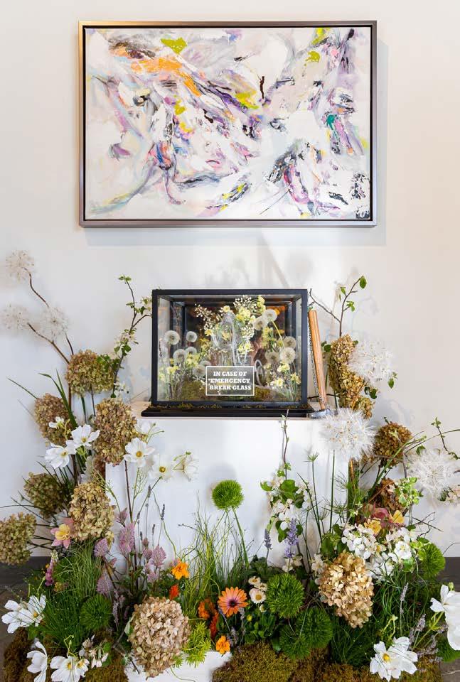
Full of colorful paint strewn across a white and pale gray background, Heatherʼs fun and energetic Pre-Chaos painting was created to demonstrate finding calm amid chaos. With its In Case of Chaos, Break To Breathe arrangement, Floral Frontier used dandelions, various types of grasses, hydrangea, lavender and columbines to demonstrate the harmonic powers of flowers, all while encouraging viewers to stop, breathe and center.
@thefloralfrontier
Heather utilized her palette knife skills to create a work suggestive of the headdress and organic appearance that Native Americans used during sacred ceremonies. Moved by the paintingʼs interesting lines, movement and play on color, Sidelines Custom Floral created Reflection of Pawnee. The floral piece incorporates cymbidium orchids alongside dried hand-painted palm leaves, tall pussy willow branches and hawk feathers. (Pawnee I is in a private collection in Kansas City.)

@heysidelines
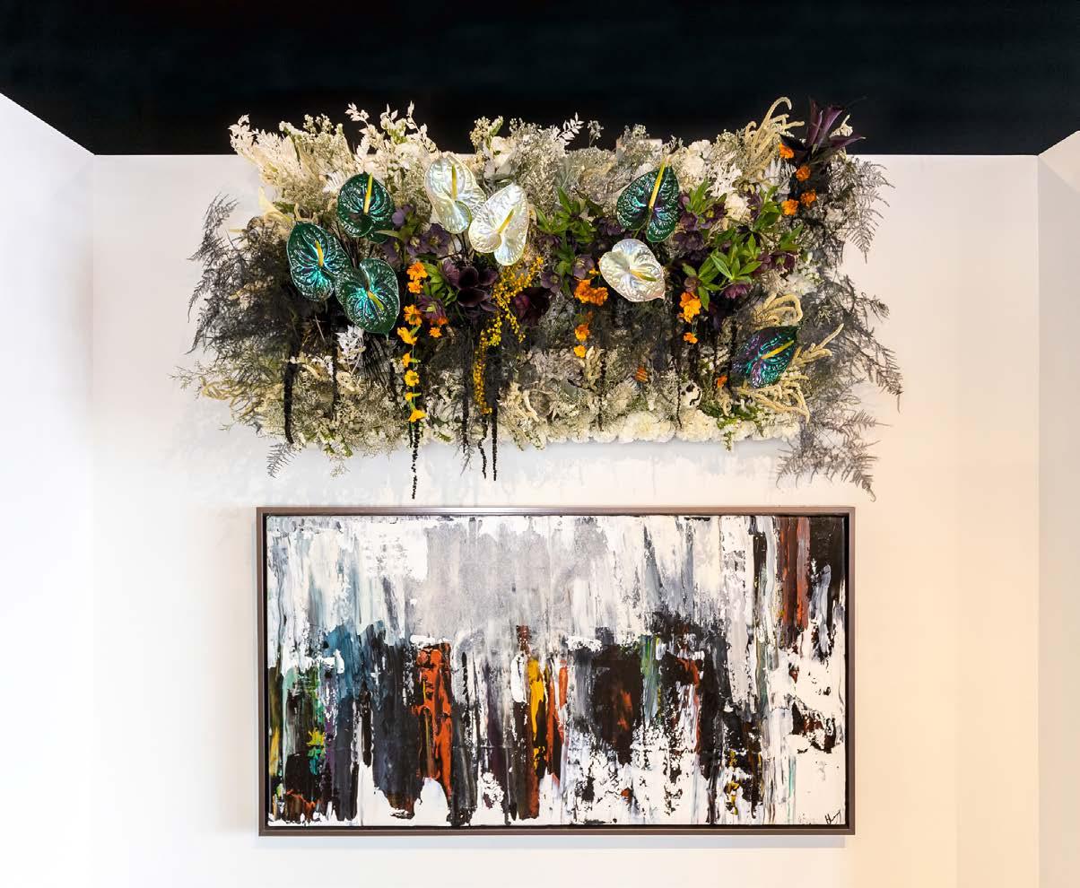



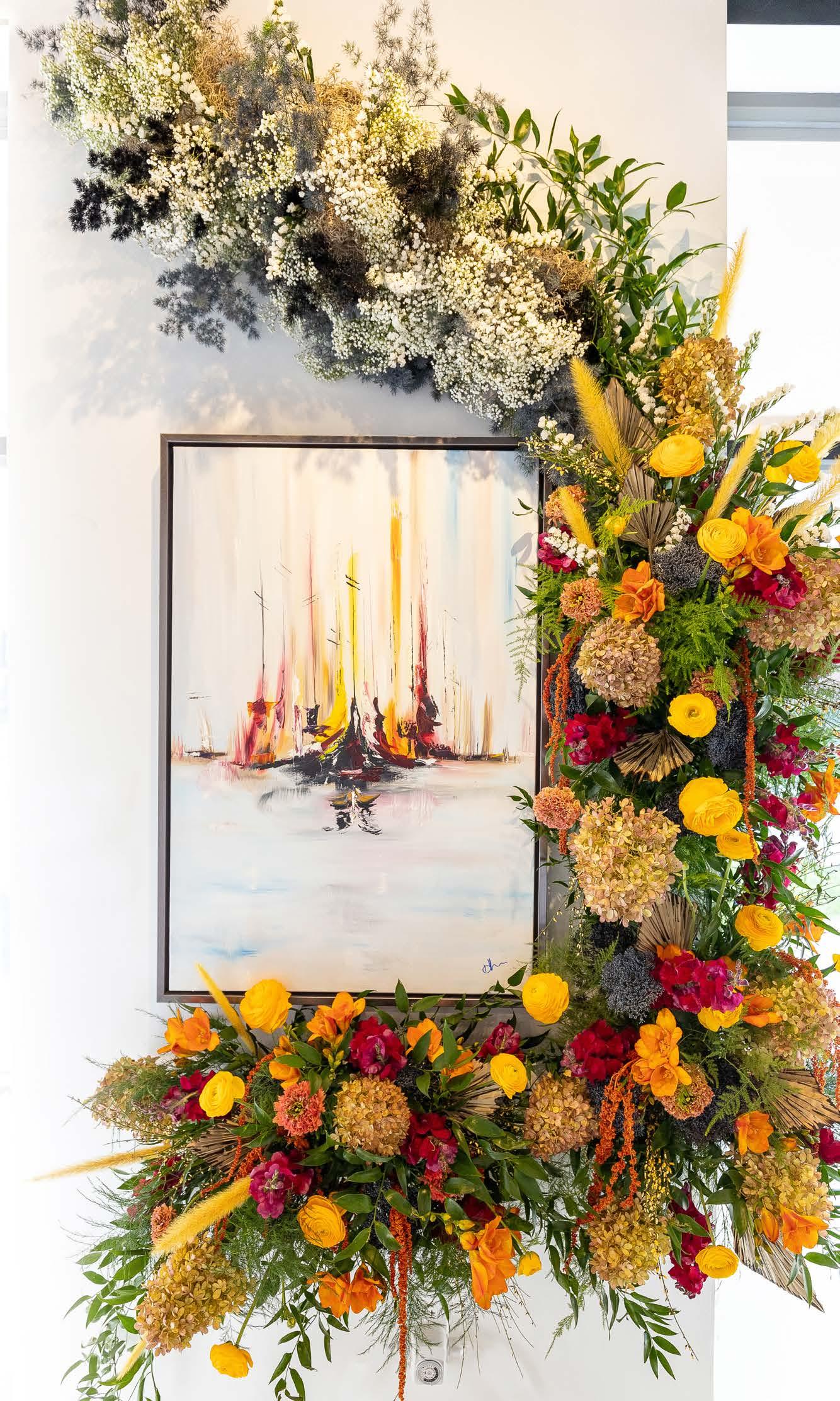
With its immense congestion of color, turn-of-thecentury Englandʼs rough and often corrupt ports inspired Heatherʼs Birmingham Shipyard painting. And color was the biggest inspiration when creating this floral installation. A massive ʻbouquetʼ hugs the bottom and right edges of this painting before curving toward the ceiling and dissolving into a wispy collection of white flowers and greenery. Created by Cole Scott of Flowers by Emily, this companion piece, From a Spark, incorporates red, yellow and orange blooms that mirror the pieceʼs palette while complementing blue and dusky water and sky.
@flowersbyemily
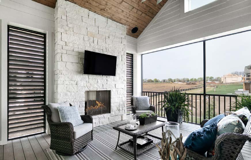

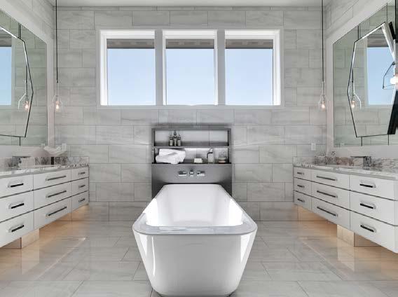
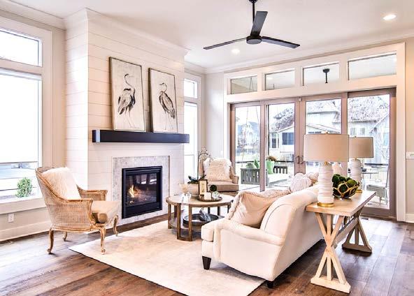


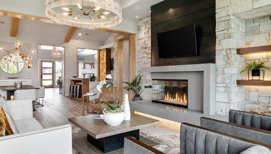


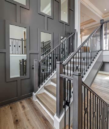

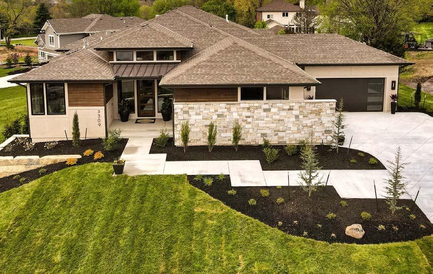
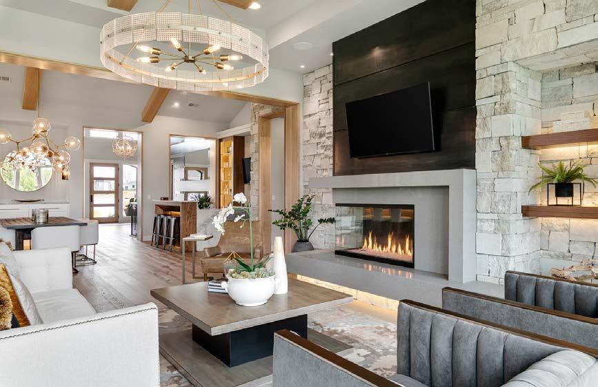


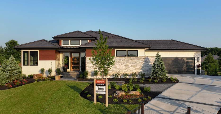




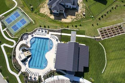


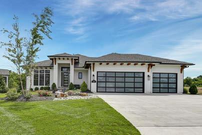
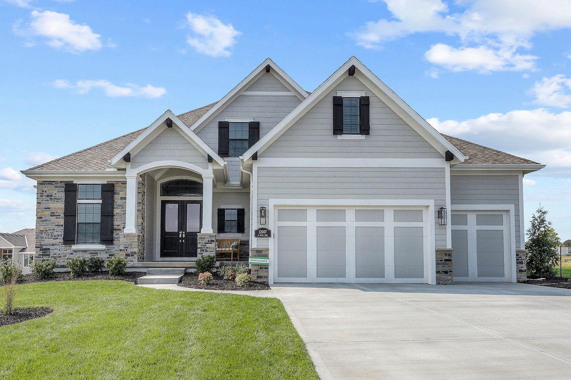


Construction is in full swing at KC’s newest master-planned community—the largest yet for Rodrock Development.
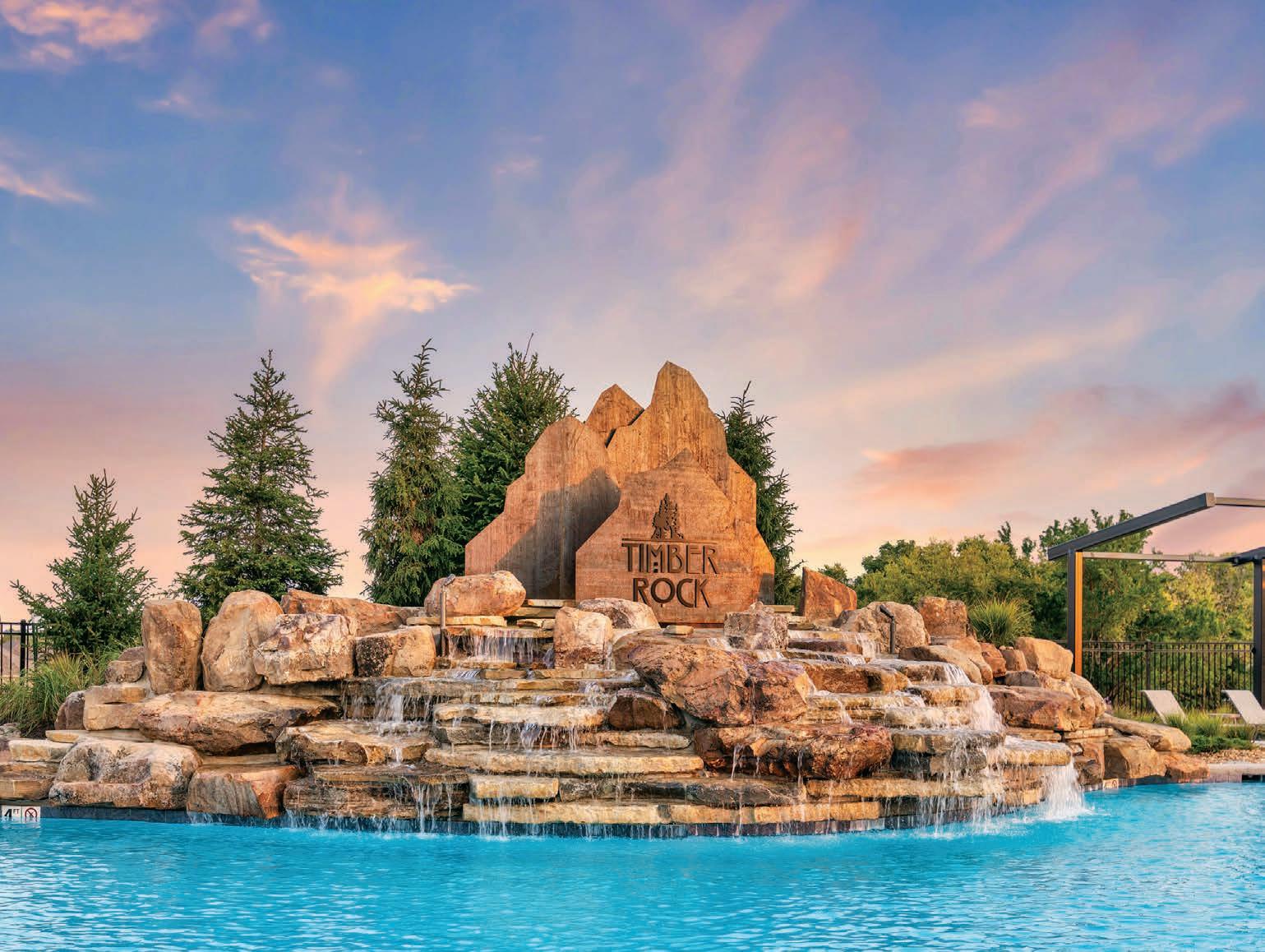
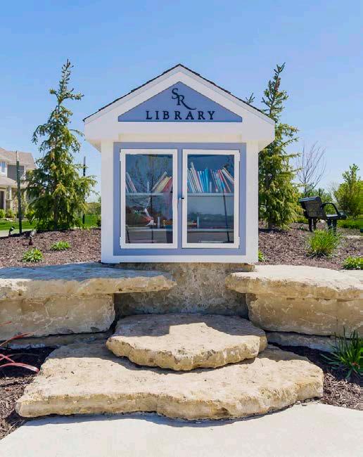
Words by Megan FellingFor nearly 40 years, Rodrock has been one of Kansas Cityʼs leading developers, creating exceptional communities for families to call home. Its largest and most impressive community to date is Sundance Ridge, a premier master-planned community situated on rolling terrain along 175th Street between State Line and Mission Road. Visitors will first notice the mature trees, expansive vistas, and the stone entry monument and water feature.
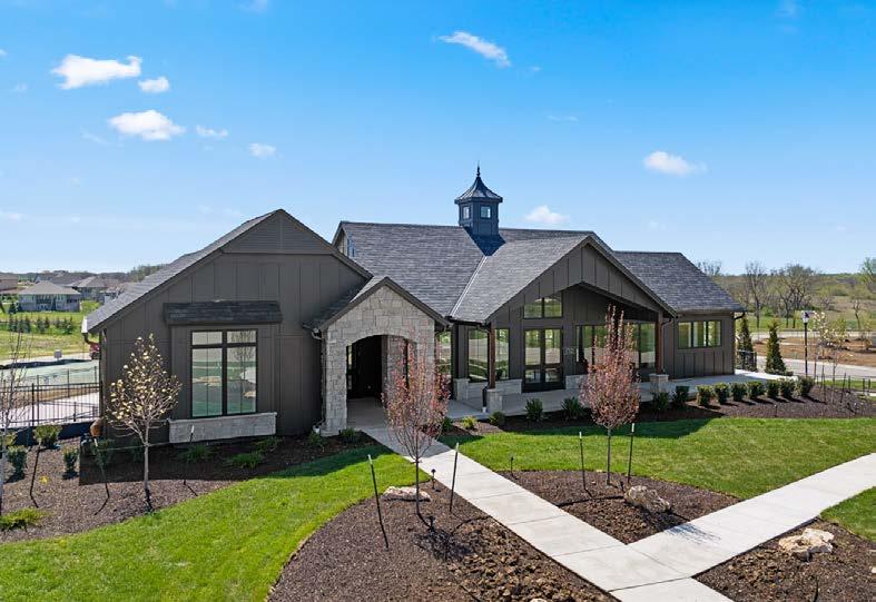
Located in the highly coveted, award-winning Blue Valley School District, Sundance Ridge encompasses three distinct single-family home neighborhoods: Big Sky, Red Fox Run and Archers Landing.
The Big Sky enclave features custom upperbracket homes up to $2.5 million plus. The esteemed builder team consists of trusted names such as Ashner Construction, Don Julian Builders, James Engle Custom Homes, Pyramid Homes, Starr Homes, Walker Custom Homes
and Rodrock Homes. The area is also open to developer-approved builders.
Residences in Red Fox Run are priced from $700,000 to $950,000. Archers Landing homes will surround a future state-of-the-art Blue Valley elementary school.
More than 120 lots are available now to choose from, each suited for a variety of floor plans. Sundance Ridge currently has homes in various stages of construction, with the majority of them able to close this year. Eight furnished models—four in Red Fox Run and four in Archers Landing—are open daily, providing inspiration and showcasing quality construction.

“This truly is a one-of-a-kind neighborhood, offering homes at every price point,” says CEO Brian Rodrock. “We designed this development to be a destination for families to enjoy every day.”
Part of what makes a Rodrock neighborhood so popular is its sense of community and the lifestyle
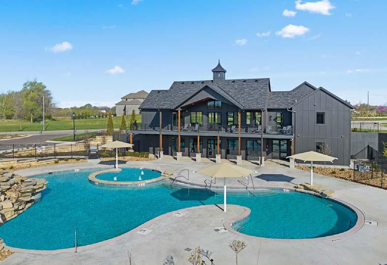
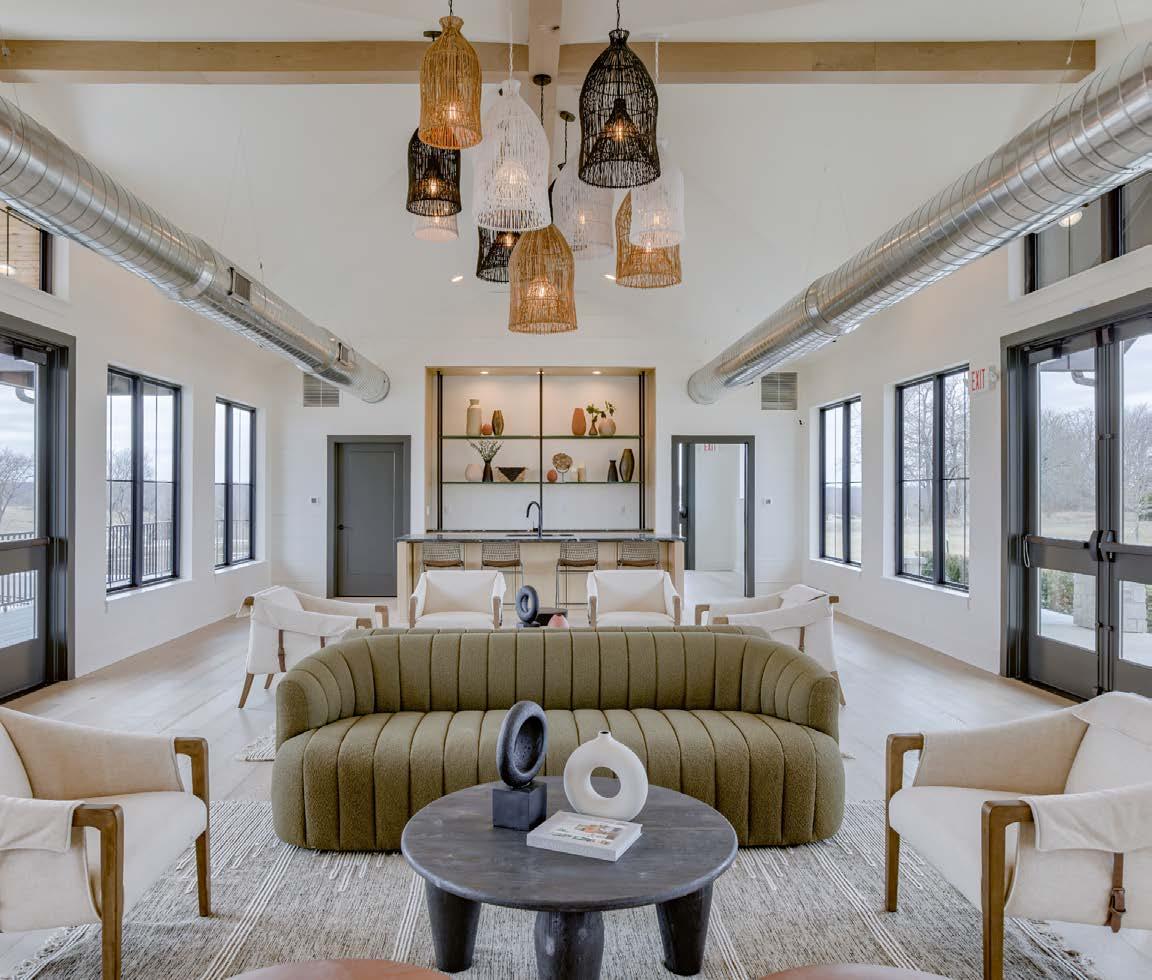
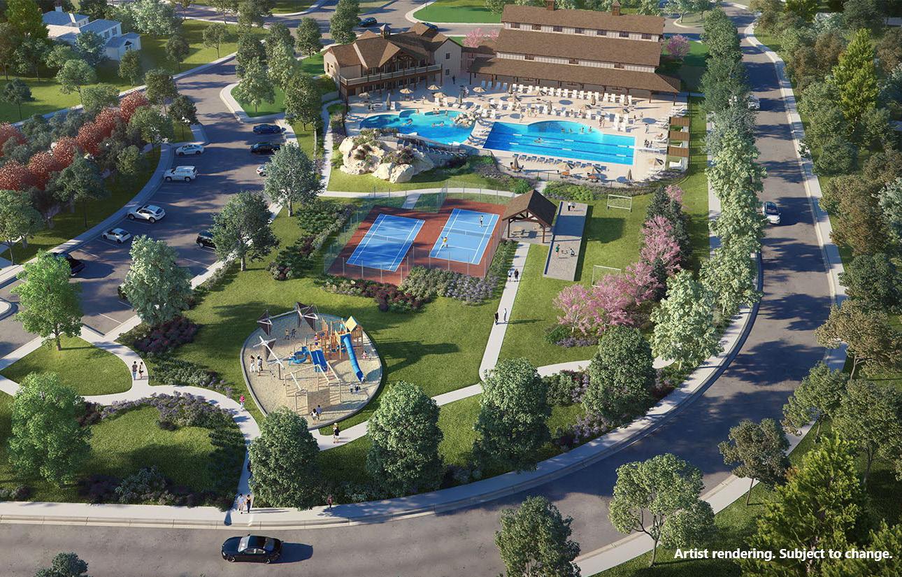
it creates for residents. Plus, thereʼs plenty to do at Sundance Ridge, thanks to the communityʼs many amenities. The new, multimillion dollar amenities center—The Village—has recently been completed. The complex offers a clubhouse and fitness center overlooking two swimming pools, the first of which is complete. Additional planned amenities
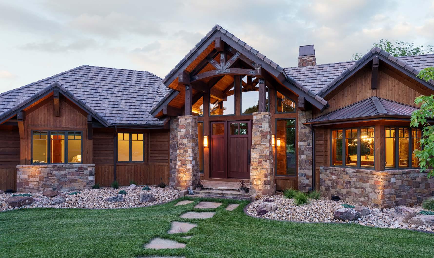
Proudly serving Kansas City homebuilders for over 30 years, we’re dedicated to providing your business with industry expertise, efficient service and exceptional products you can count on—for every home project.
Your customers love our brand and look for Pella® products for their window & door needs needs.
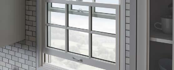
 Pella is rated #1 by Kansas City homeowners as the window brand that can improve the value of your home.*
#1
Pella windows are rated #1 by Kansas City homeowners for highest quality.* #1
Pella® is the most preferred window brand by homeowners in Kansas City.*
will include a pickleball court, bocce ball court, playground and indoor gymnasium.
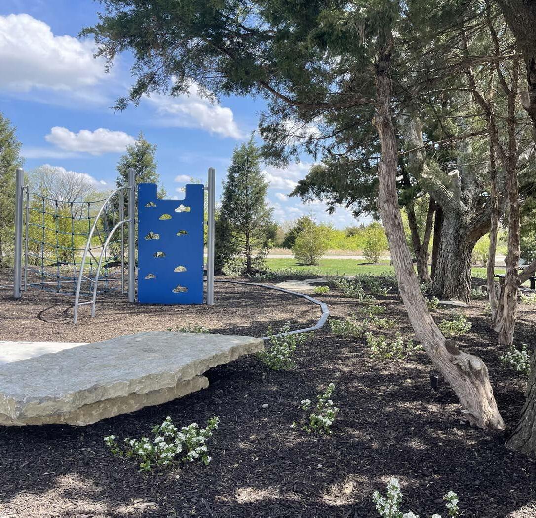
“This is the largest fitness center we have ever done,” notes Brian. “But the unique piece about Sundance Ridge is the pocket parks located in various places throughout the neighborhoods, connected by nature trails. No matter where you live, you are only a few minutesʼ walk or bike ride from fishing in one of the area ponds, taking an evening stroll, or taking the kids to conveniently located parks.”
Realty. “The clubhouse is immense. My client had looked at several other communities but ultimately chose Sundance Ridge for the amenities, and she liked this location the best. I think this is the next major area to explode. There is a good selection of lots, and the schools are great. Itʼs an easy neighborhood to sell, and the Rodrock staff really is above average.”
Visit the Sundance Ridge models and information center Monday through Saturday from 10 a.m. to 5 p.m. and Sunday from noon to 5 p.m.
“Sundance Ridge offers more amenities than the typical community—I call it amenities on steroids,” says Dan OʼDell with Group OʼDell of Keller Williams www.rodrock.com
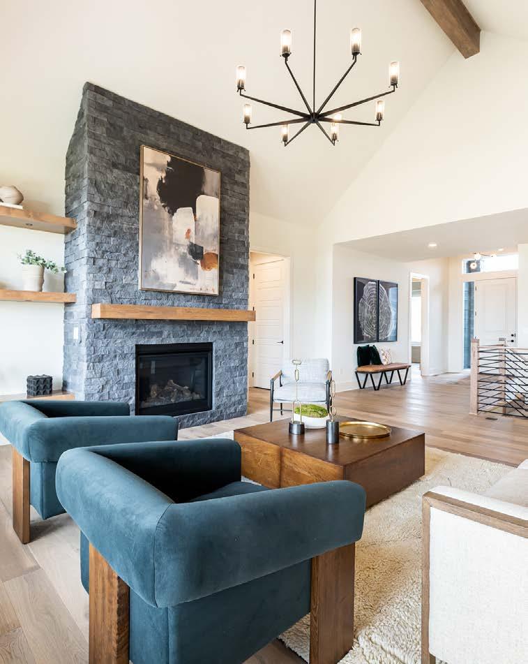
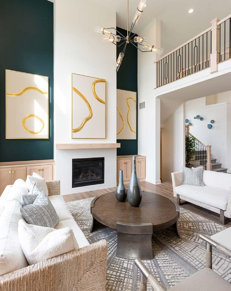
 Design by Megan Gensky Interiors
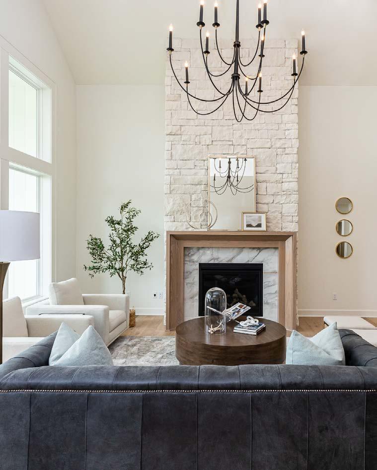
 Classic
The Providence uses contrasting black and white colors, grounded with wood accents and textural elements.
“
An early rendering shows the full vision of the clubhouse amenities. on steroids.”
KNOWS WHEN TO SAY “NO,” BUT STILL HASN’T SAID IT. HAS A SERVANT’S HEART AND A UNRELENTING WILL TO USE IT.
MAY NOT KNOW THE ANSWER BUT DEFINITELY KNOWS SOMEONE WHO DOES.
LAST: NEGOTIATOR
We don’t sell things, we serve people. Our job is to take the ‘un’ out of the word ‘unknown’ so you can be as informed, prepared, and comfortable as possible with the home buying or home selling process. If you need it, we can find it. Especially if what you need is shaped like a house.

ON SPEED DIAL UNDER, “THE ANSWER.”
NEXT: ADVOCATE
RESOURCEFUL CAPABLE KNOWLEDGEABLE DISCREET NETWORKER SAVVY CREATIVE THOUGHTFUL ATTENTIVE SERVICE-ORIENTED
THE GO-TO PERSON THAT EVEN GO-TO PEOPLE GO TO.

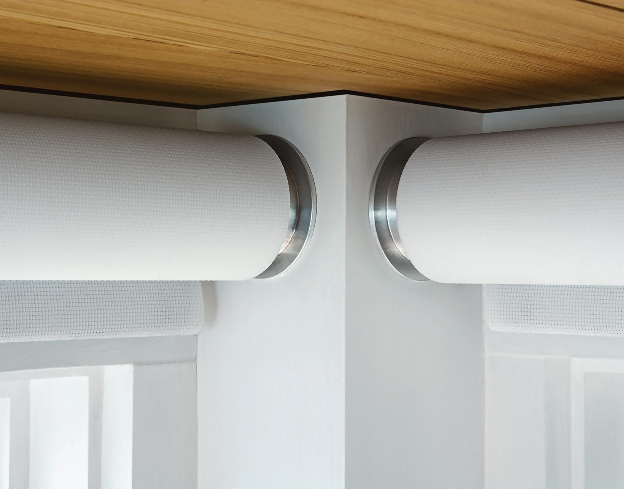
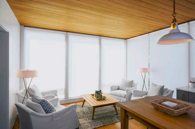
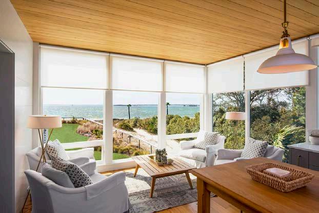
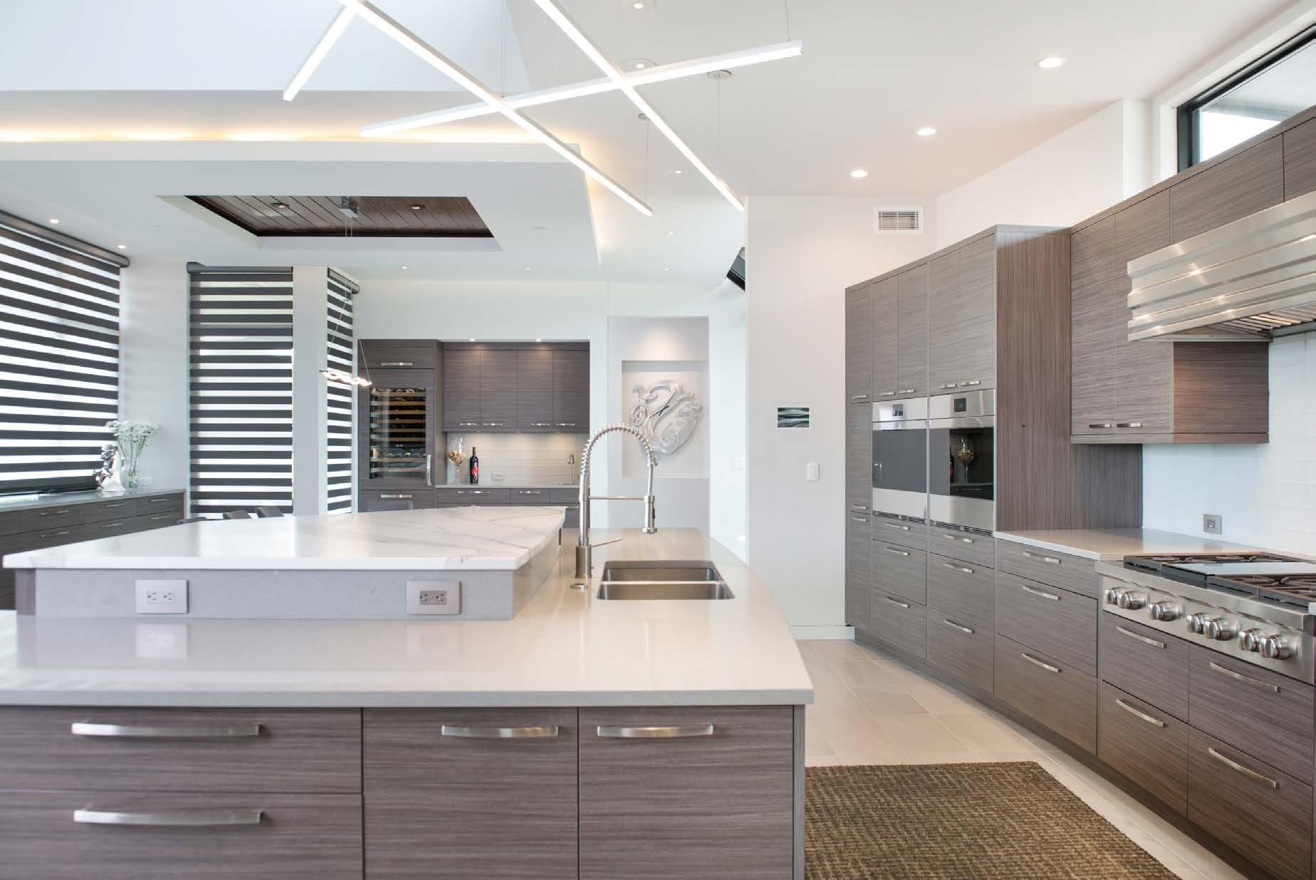
Todayʼs window treatments have become an important design element in homes.
Treatments are client-specific and often multifunctional and layered, using different fabrics and textures that provide visual interest and sound absorption.
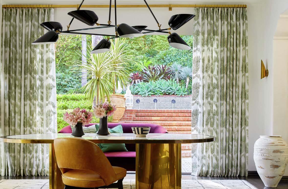
Steve Roellchen, owner of One Stop Decorating, says that his clients appreciate different opacities and patterns—but especially automated options.
As home automation becomes increasingly common in new construction, whole-house communication wiring now often accommodates motorized window coverings. In existing homes, rechargeable options include Wi-Fi bridges or apps with “smart” functionality.
Motorized window treatments operate with a remote or wired-in switch, while automated treatments connect to smart home soft ware.
At One Stop Decorating, nearly 60 percent of projects feature smartphone and smart system automation.
Other local companies are getting the same request for this most functional add-on.
J Geiger window shades integrate with most automated or motorized systems and Weave Gotcha Covered can motorize any window treatment— including shutters. “Most of our clients have at least
one motorized treatment, [especially] behind a freestanding tub, above the kitchen sink or on hardto-reach windows,” says co-founder Kelly Wilson.
Kelly suggests that home designers, clients, builders, automation teams and window-covering dealers communicate early in the build process. “Home builders are frequently surprised they need to plan window treatments at the beginning of their project,” she notes.
Clean, cordless designs—with no visible controls— have increased the popularity of motorized and automated window treatments. “Itʼs great for homes with small children and can help improve energy eff iciency, too,” says Adam Skalman, vice president of sales at The Shade Store.
Another option to increase energy eff iciency is solar shades, which can additionally combat
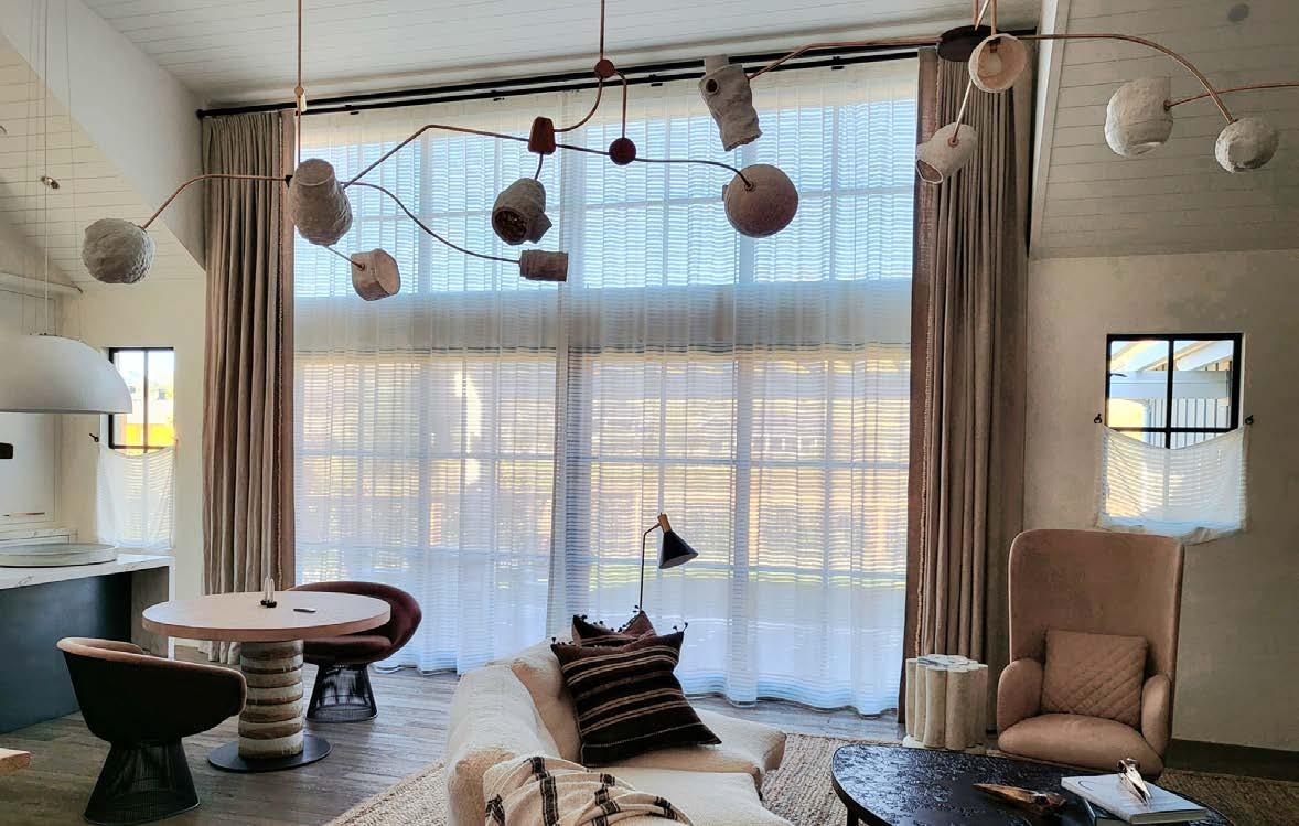
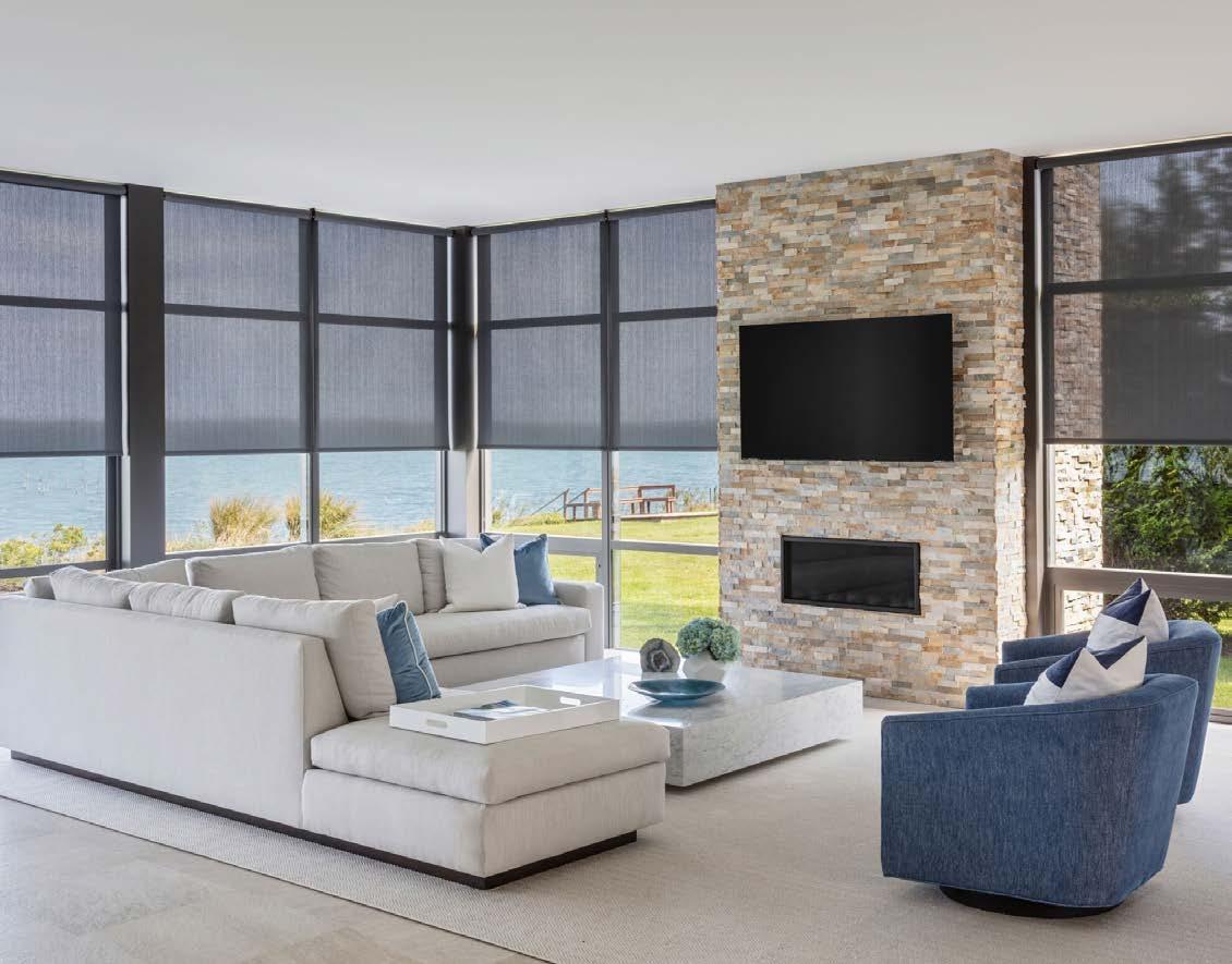
damage to a homeʼs interior from summer sun and heat. They block UV rays, and lighter colors help reduce radiant heat.
“Solar shades are extremely practical for warmer climates and can help protect interior elements like flooring or artwork,” Adam says.
Whether motorized or energy-eff icient—or neither—window coverings have many functions, including, simply, a beautiful way to frame a view.
Sales of Roman shades remain strong, especially in fabric or woven wood. Wood and composite plantation shutters remain popular with some clients, but Weave Gotcha Covered has removed more plantation shutters from homes in recent years versus installing new ones.

Roller shades are getting the most play.
“In new, modern houses, roller shades are the window treatment of choice,” Kelly says. “They are as popular as beautiful fabric treatments and can be layered with fabric or as standalone coverings.”
At The Shade Store, Adam has noticed a resurgence of traditional design aesthetics, and
 Users choose their preferred level of light and privacy with motorized shades. J Geigerʼs “architecturally conscious” shades deliver functionality in a minimalist way. Photo courtesy of View Solutions Group.
Motorized Hunter Douglas shades are a fast-growing component of One Stop Decoratingʼs business. Above: Handheld remotes make it easy to raise and lower shades from anywhere.


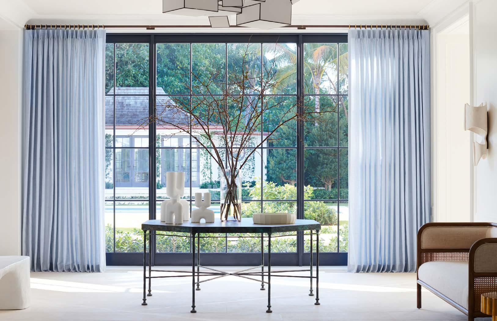
with it, an increased popularity of draperies.
Valerie Johnson, design and sales director with View Solutions Group, an authorized J Geiger Shading Showroom, says favorite picks are neutrals—black, white and gray—in natural linen and sometimes prints.
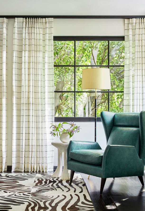
A transplant from Napa Valley herself, Valerie has observed softer, more relaxed vibes in window treatments after coming here, especially for new builds.
“Window coverings are meant to last 10 to 15 years,” she says. “My advice is to stay neutral, adding dimension and texture. Bring color and personality in with art, pillows and accessories.”
Valerie adds that she rarely does draperies that arenʼt to the floor unless itʼs a café curtain for a bathroom or a kitchen. “It gives a little softness and helps with sound,” she explains. “The dining room is the number one location, then the main bedroom and the living room.”
cautions that custom draperies may require custom hardware for adequate support.
One Stop Decorating clients have gravitated to privacy treatments in white or neutral for eight to 10 years, but blues, greens and natural textures are trending, too, Steve says.
And then some homeowners just want to have fun with their design decisions.
“As pattern and color make a comeback, customers are leaning into colorful materials and fun patterns on the window,” Adam says.
His clients love classic stripes and lush velvets from Victoria Hagan, as well as color-rich options from Martyn Lawrence Bullard. Additionally, he says, “Our new Artisan Weaves collection features materials with all-natural fibers; they look beautiful alone or paired with drapery for a more elevated look.”
@one_stop_decorating
@jgeigershading @theshadestore



LOCALLY OWNED

Established in 1989, Central States Tile is a stocking distributor who has been supplying the Kansas City Metro with a wide range of products including porcelain, ceramic, natural stone, metal, glass tiles and more. 8301 West 125th St. Suite 110 Overland Park, KS 66213

Visit
Monday - Friday 8:00-4:30 913-681-6629 csttile.com
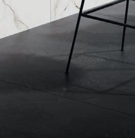
Pictured: Brazilian Slate Porcelain Tile
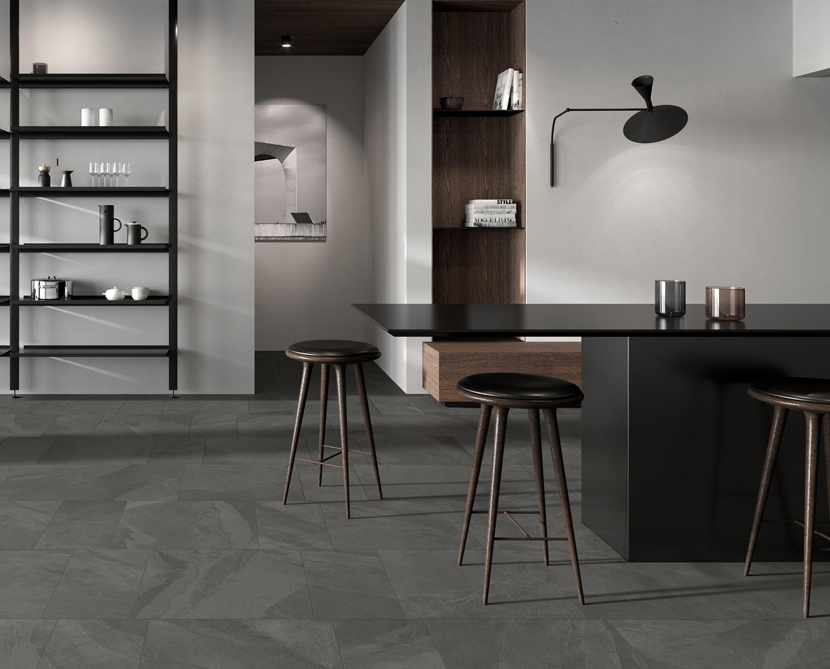
Color: Pencil Grey
Format Size: 24”×24”and 12”×12”
Brazilian Slate also available in Rail Black and Oxford White Colors.


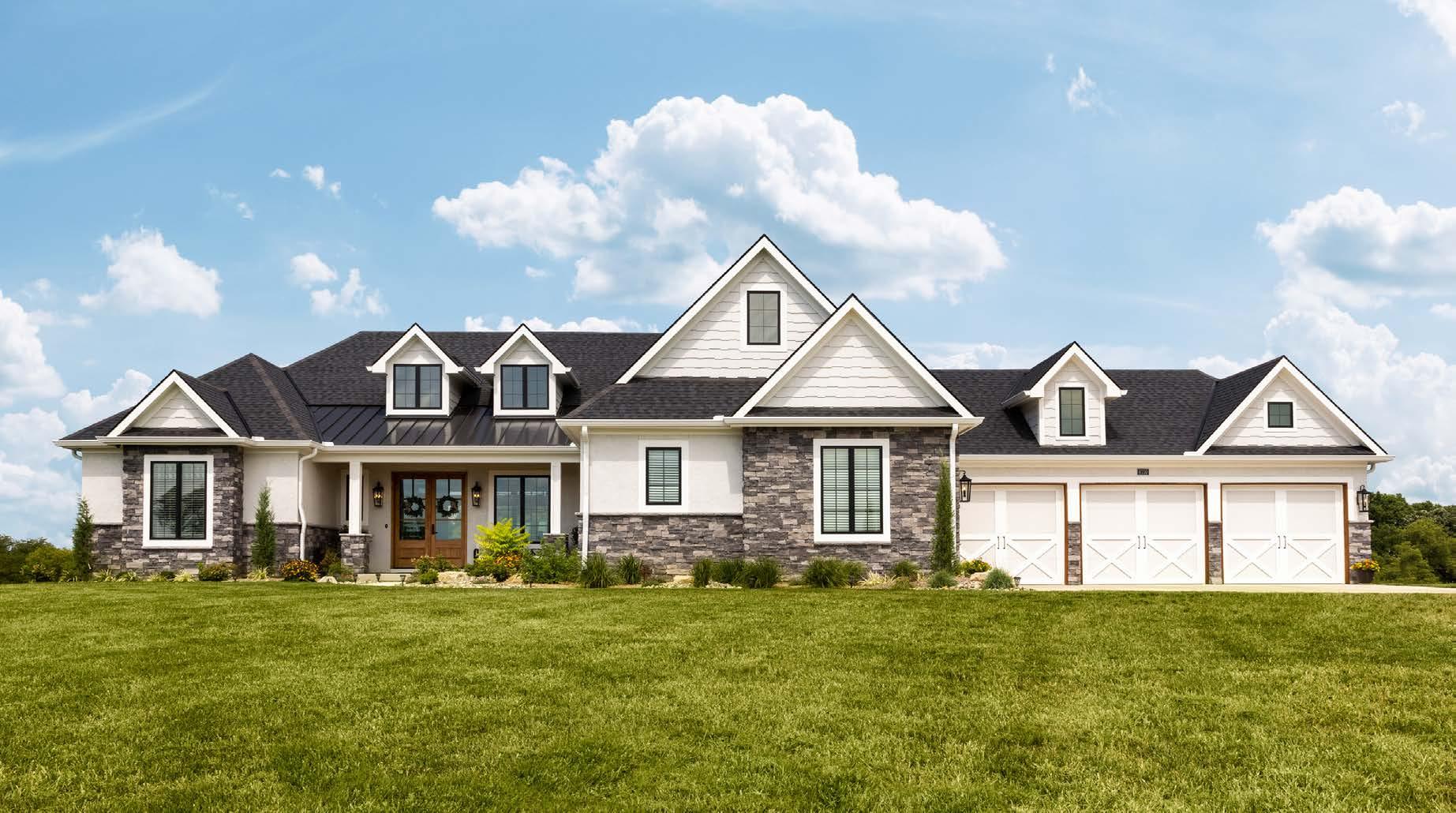
ear the southern edge of rural Overland Park, set within a heavily wooded 10-acre lot, a 9,600-square-foot home presents a sleek, contemporary architecture with its eight-car garage and expansive driveway. After dark, abundant landscape and soffit lighting accentuate the homeʼs façade.
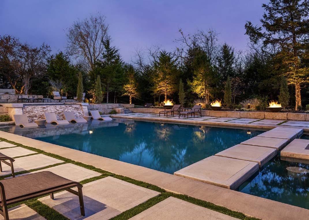
Natural stone and floor-to-ceiling windows cover its multistory back side, which overlooks a putting green, a resort-style pool and a quarter-mile paved walking trail wide enough for go-karts—all with an integrated lighting and sound system.
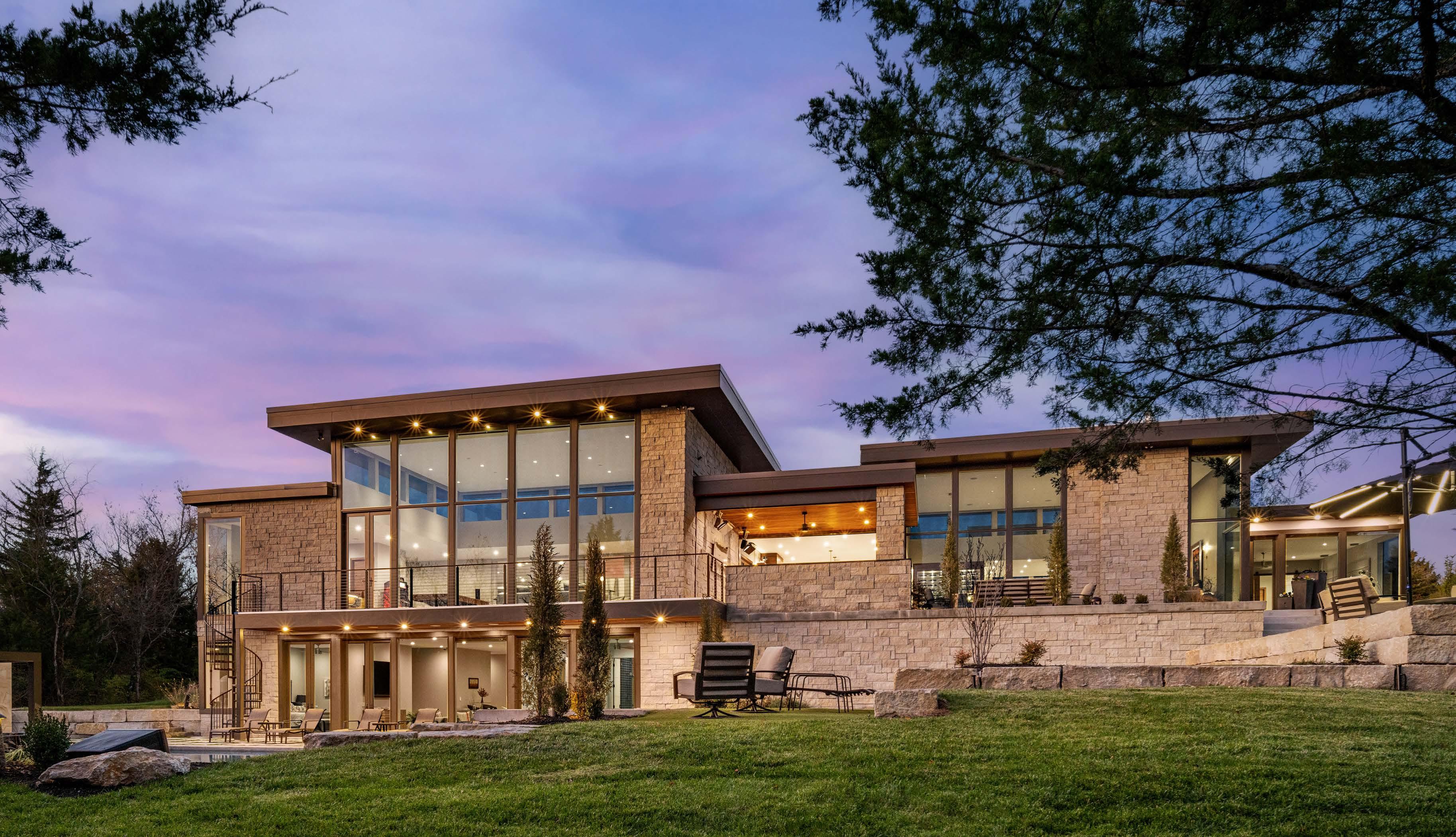
This modern home operates with the touch of a button or the sound of a voice.

Longtime architect John Gaar, AIA, says, “The homeowners did most of the design and layout, while I pulled together all the elements to achieve the unique modern architecture.”
But thereʼs more to this property than looks.
As a member of Crestron Homeʼs design-build program and as a developer himself, the homeowner was already familiar with high-end residential automation. He had used it in several business projects, too.
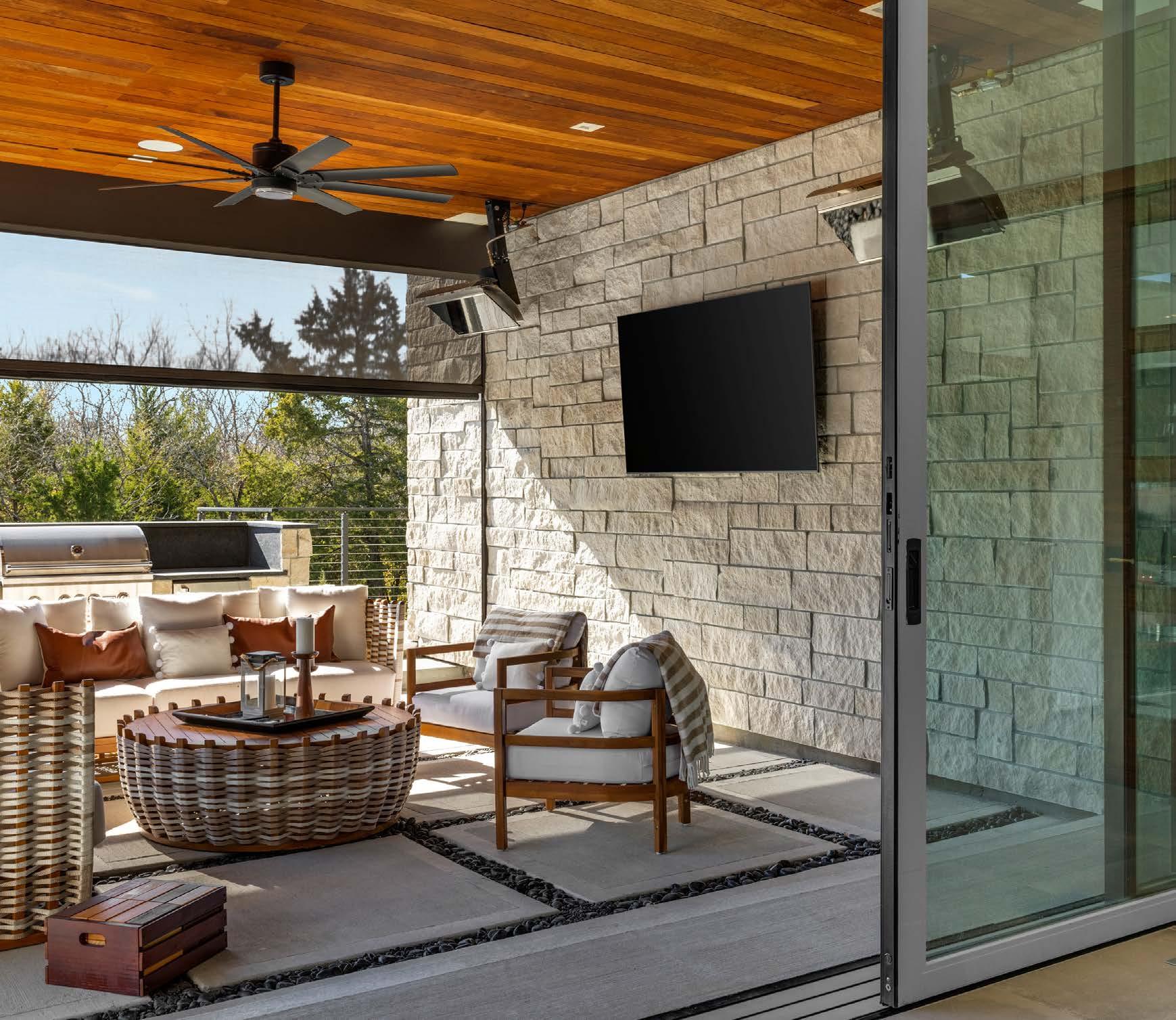
“We have some multi-use developments utilizing Crestron products to automate our common-area amenities, such as lighting and audio-video, but the
scope in our home is much larger than what we did in our developments,” he says.
Originally, Crestron had only designed for large commercial use. “What I like about Crestron Home is that it automates everything in your home,” he says. “They are the only ones who could do everything as a single manufacturer.”
A home the couple toured on the biennial Artisan Home Tour inspired—and connected—them.
“One of the really impressive homes we visited during the tour had an automation system in it,” the homeowner recalls. Thatʼs when he became aware of Simplicity Kansas Cityʼs work. With an engineering
background, owner Joe Acreeʼs firm has been a certified Crestron retailer for many years. So it was a natural match for the coupleʼs new build.
“He came to us,” Joe says. “He already knew he wanted certain things out of the house. Itʼs such an impressive place to walk through.”
The homeowner says that Joeʼs experience and connections with Crestron helped them work together as a team. “We did things the smart way,” he says. “It was a good fit for our family.”
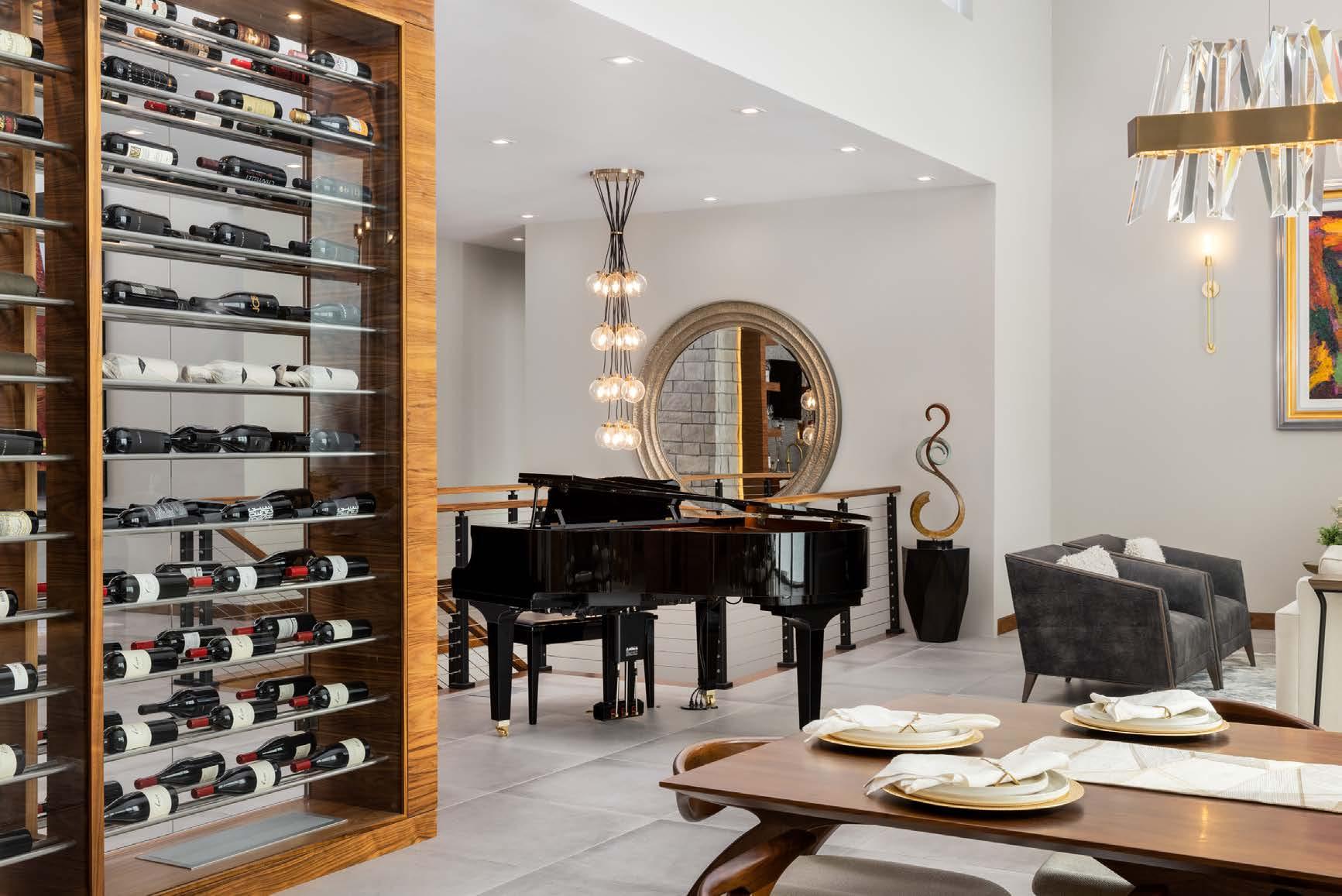
For the homeowners, the goal was to control all
TURN THE PAGE
things simply so that they donʼt need to be in a room to initiate control. Multiple Crestron touch screens—plus a Crestron handheld remote— facilitate this. A key component of the system is Josh A.I., a voice-activated interface, located in certain rooms.
“You just tell Josh what you want,” the homeowner says, and then it activates centralized lighting, turns on the TV and much more. “The only thing it doesnʼt control is appliances. One button or voice command that says ʻentertainʼ sets everything the way we want it when we are having people over.”
Outdoor fire bowls and an indoor fireplace respond to voice commands. Opening a specific door turns on kitchen lights. Additional kitchen automation includes a TV above the stove, which the homeowners and guests can hear over external speakers. Music from a player piano can fill the house, and nearly 10,000 watts of power

orliving
room—theyare seamlessly combined with the kitchen for an open lifestyle. Automated shades cover the clerestory windows near the floor-to-ceiling, voice-controlled fireplace and cozy seating area.

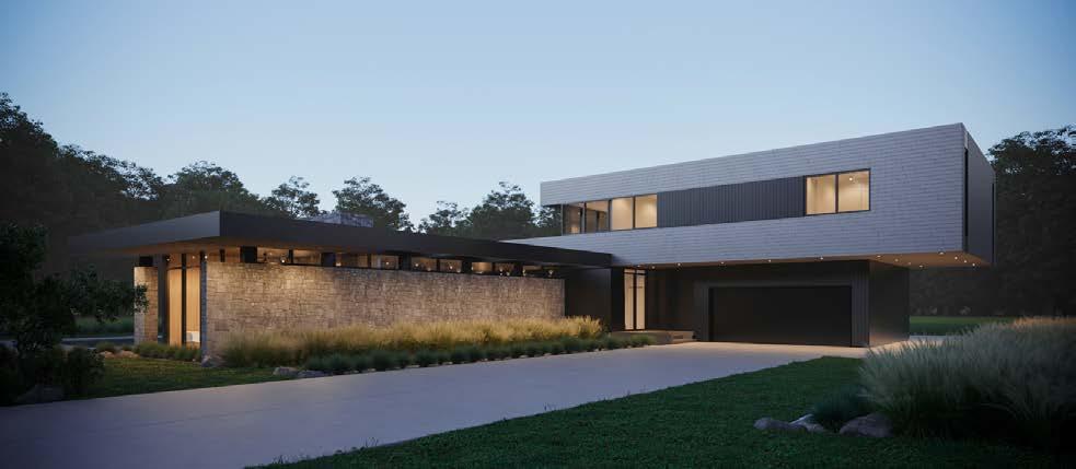


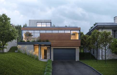
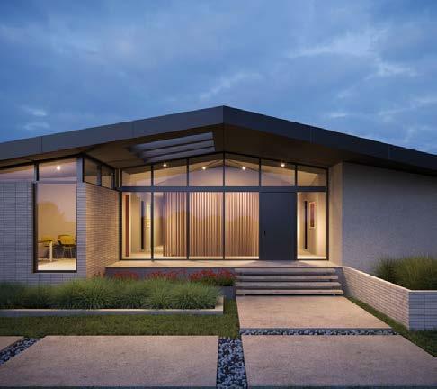
 Full-Service Interior Architectural Design Studio
supply the 13-speaker, seven-seat, 155-inch basement theater.
Floor-to-ceiling automated shades provide privacy—as well as desirable views—from 17foot windows; they control the light levels and heat from outside as well. Automated sliding glass doors and screens also enhance temperature control from outside to inside. In addition, an app monitors temperature throughout the house and even senses when it should turn on fans, without using any visible thermostats or Wi-Fi access points.
Joe encourages potential home-automation clients to be exceptionally honest about what they value in their homes, what they want to do, and how it plays into the house.

“We sit down and start finding out what would be the most amazing experience for their lifestyle,” Joe says. “A lot of people donʼt really
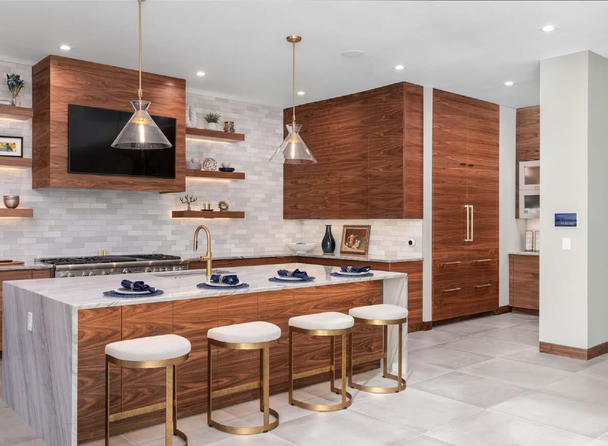






budget for these things before they come in, but you do get what you pay for.”

The homeowner agrees, saying, “I think people should set aside an appropriate budget for automation. Itʼs probably the biggest appliance in your house. Setting aside 5 to 10 percent of your budget will get you a quality system, but it can be expensive. You have to think ahead because you donʼt realize you need it until you need it.”
@simplicity.kc
The defining characteristic of the garage is a glass wall that connects it to the interior recreational room in the ultimate man-cave move. Black porcelain tile flooring gives the room a finished look. The ownerʼs collection of Ferraris, Porsches, racing cars and a Lamborghini get driven on nice days. Daily-use cars and hangout space is also accounted for in this eight-bay design.











After living in the same house for 24 years, Bob and Lisa Gillpatrick were ready for their next chapter. With their four kids grown up, it was time to think about a new lifestyle that would bring everyone back home.
“We wanted to build a house to attract our kids and grandkids,” Bob says.
There was also a secondary motivator. As the owner of Gillpatrick Woodworks, Bob wanted his home to be a showcase of his work—the creative possibilities were endless…and also paralyzing.
“I may have overanalyzed everything,” Bob says.
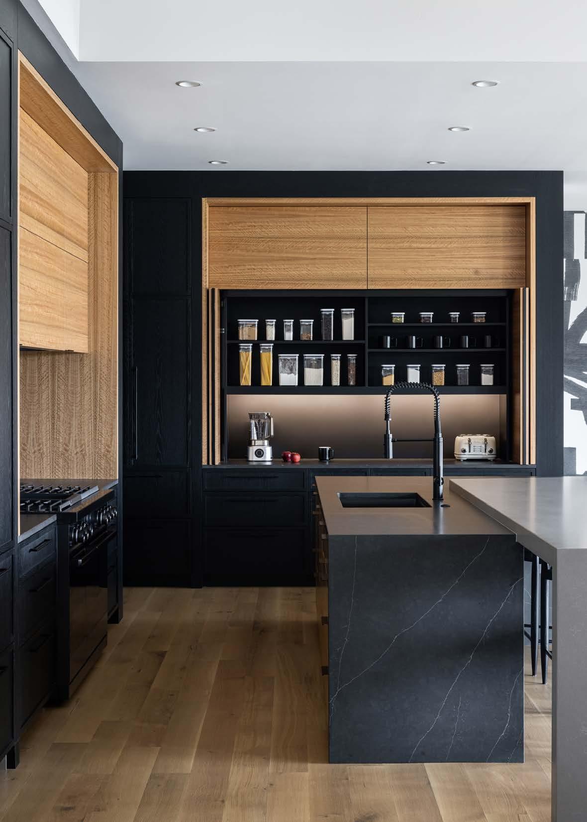
He and Lisa both wanted a sleek, modern and moody kitchen but questioned whether that style would attract or deter potential clients.
“We had to find the balance of creating a showhome and a home that Lisa could live in,” Bob says.
“I hate dusting,” Lisa chimes in. “I am a minimalist and I donʼt feel that modern needs a lot. The fireplace is unique; the cabinets are unique—and thatʼs enough.”
The house couldnʼt have just any old cabinets or wood treatments. Bob was going to build it all in his shop. (Except for the hardwood floors; those he left for Acme Floor Company.) But he came up against another fine line to balance.
“I didnʼt want people to walk in and go, ʻOh, this is a woodworkerʼs houseʼ—in a bad way,” Bob says.
“It was a lot of pressure because itʼs a show home. It had to be really special.”
The project started with the interior doors. One of Bobʼs closest industry contacts, Troy Moore of Madi Mali Homes, showed him a set of 9-foot-tall solid white oak doors that were available from another
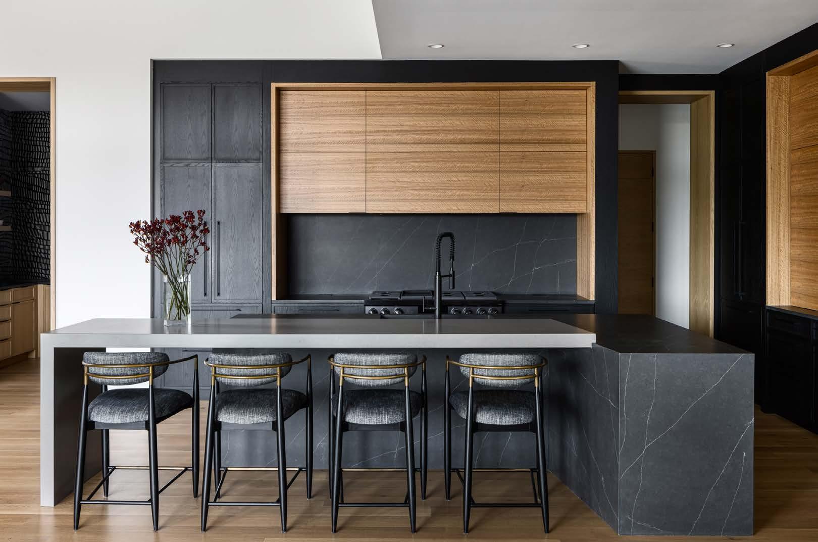
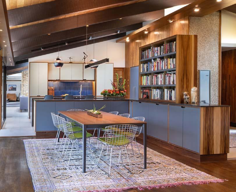
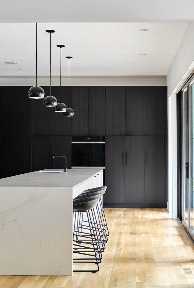
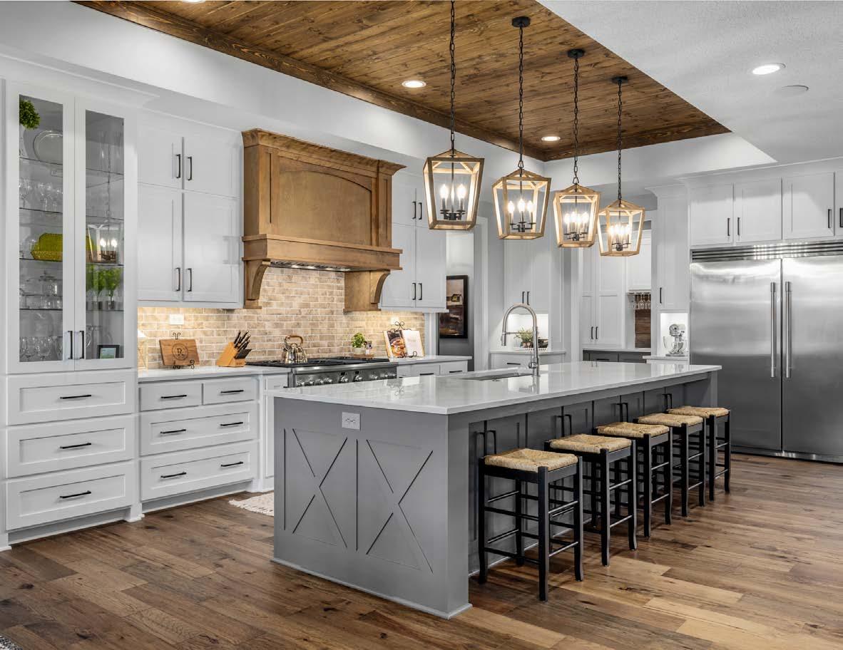
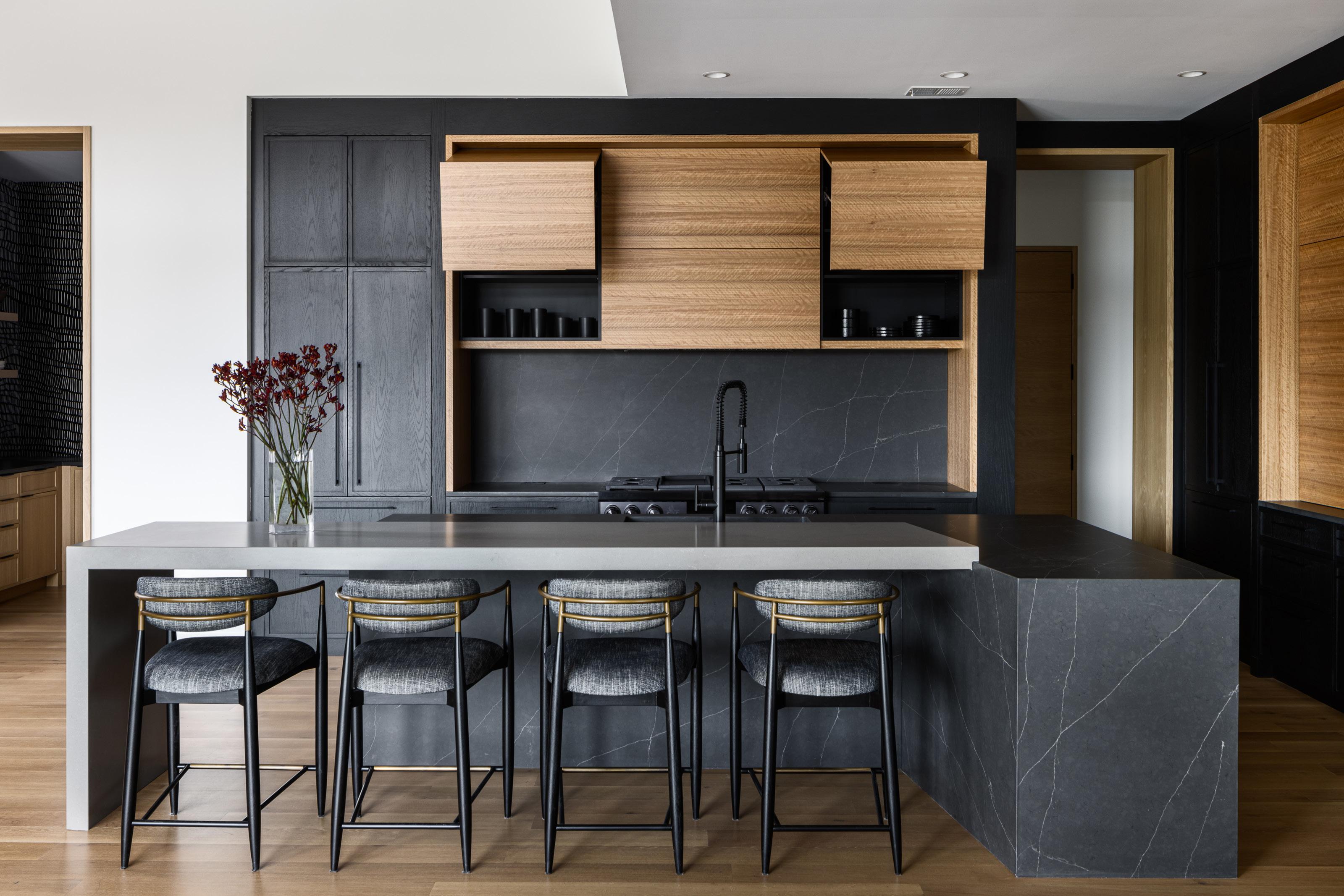
The kitchenʼs layout is loosely based on the coupleʼs old kitchen—but significantly sexier with quartered, figured eucalyptus veneer cabinets. The central islandʼs black quartz countertops tie in with the base black cabinets and black Dacor range. Seating is offered on one side--but not for Lisa. “I never sit and eat, so Bob gave me my own space to stand in on the other side,” Lisa says.
project—and he was inspired. Troy was hired to build the house after plans utilizing those doors were drawn up by architect Wolfgang Trost. Interior designer Kristen Ridler also joined the team to help keep Bobʼs woodworking ambitions in check.


Bob mentally walked through each room and envisioned various creative solutions. Every detail down to the trim was carefully considered.
“Thereʼs not a lot of trim,” he notes. “What is there is clean and simple. People think thatʼs easy, but itʼs really a challenge, design-wise and fabrication-wise.”
He agonized over the veneer selections. Veneer is real wood, sliced thin. Itʼs used especially for rare wood species, which Bob wanted to highlight here. From one tree, the flitch is cut and stacked in order to be consistent throughout. Using this method, you get more square footage out of it.
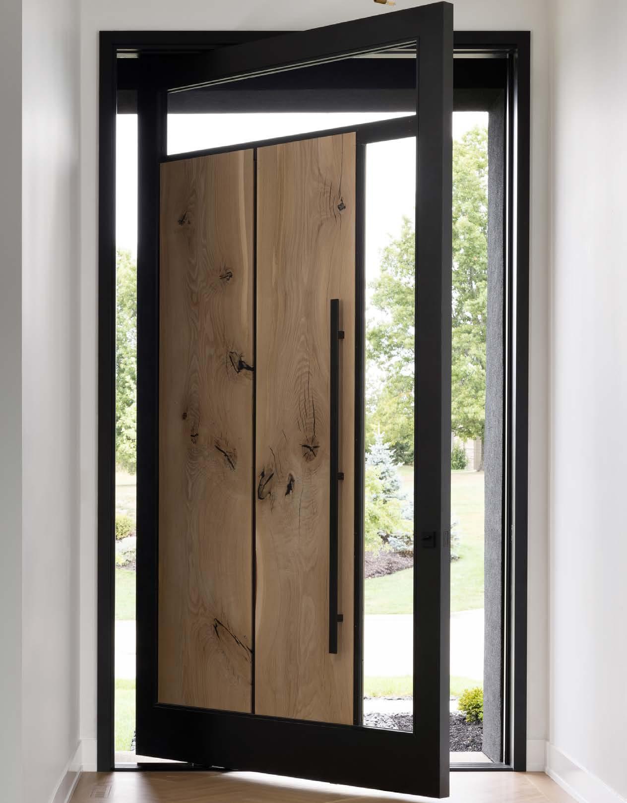
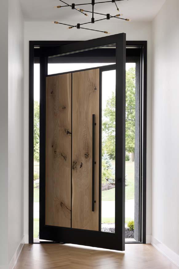
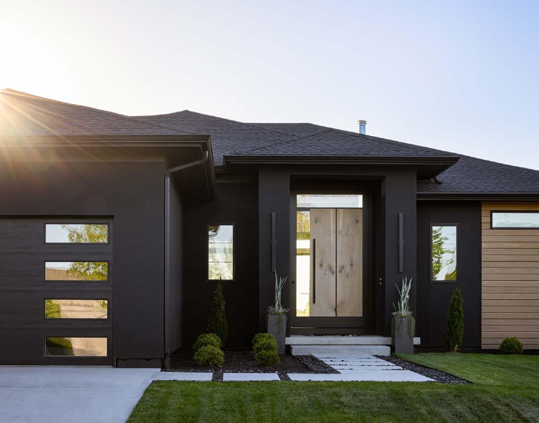
Lisa had one request of her husbandʼs skills—a unique, modern front door. “I can say Bob delivered,” she says. “It forces people to come to the front door. We see them on video admiring it.”
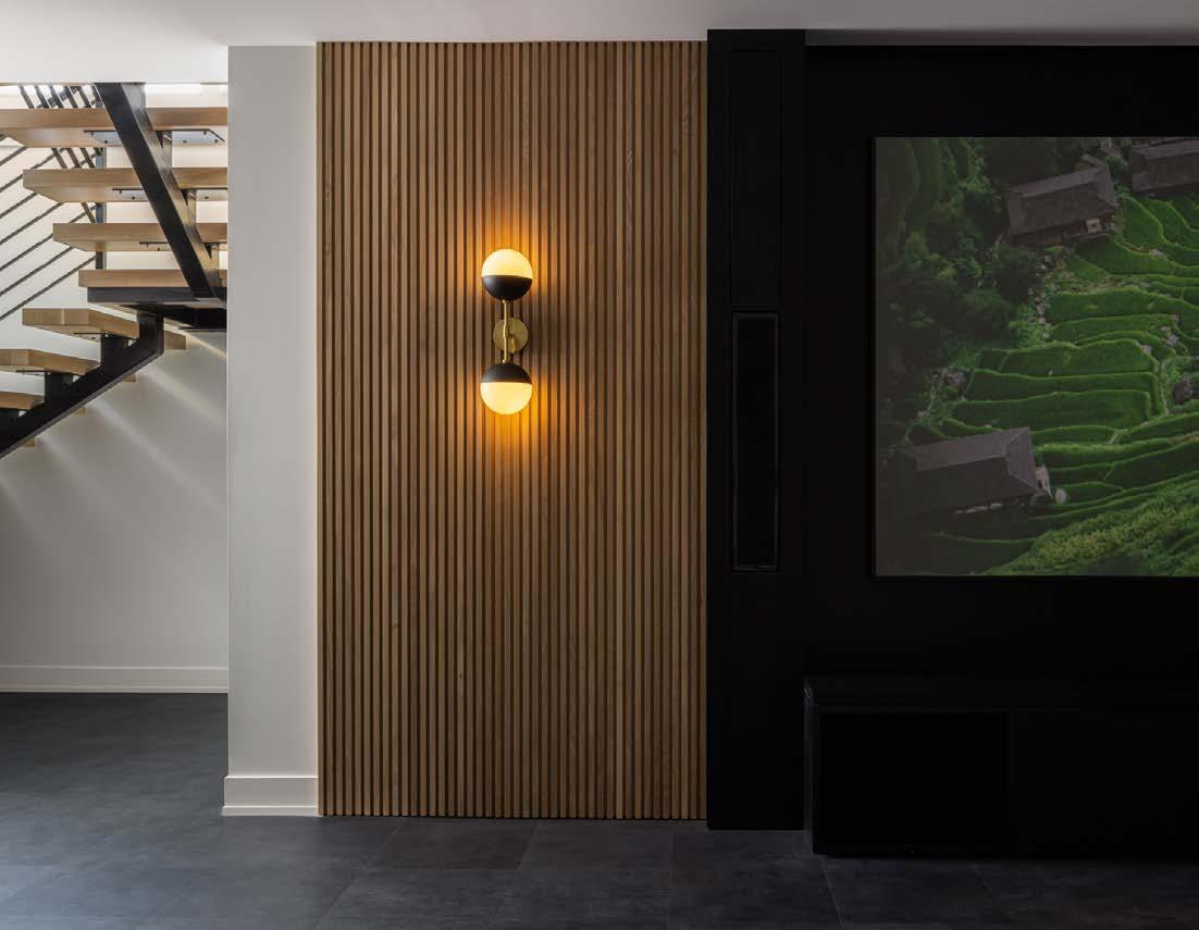
The living room is striking in its two-toned simplicity. Ebonized oak slatwork was Troyʼs design vision. The fireplace, which was fabricated of metal and quartz, is oriented to the side—rather than the center—of the focal wall.


SUBSCRIBE TODAY!
If you want more, subscribe today to take advantage of our special offer
1 YEAR (4 SEASONAL ISSUES + 1 BONUS AWARD ISSUE) enter code designkc1 - $15

2 YEAR (8 SEASONAL ISSUES + 2 BONUS AWARD ISSUES) enter code designkc2 - $20


SUBSCRIBE ONLINE
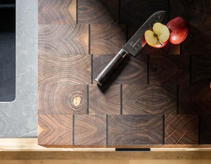
Bob ended up using several types of wood, end grains and stains that, while different from each other, create a cohesive whole that draws attention but isnʼt overpowering.

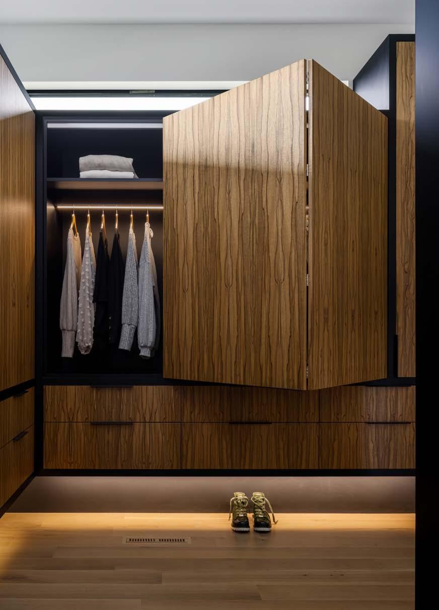
During the height of the COVID-19 pandemic, numerous price hikes, manpower shortages and long furniture lead times were all part of the process.
“I learned a ton from the customer side,” Bob says. “Even normal construction can be frustrating.”
And how have his clients responded to the end result?
“Lots of people have asked if weʼd sell the house to them,” Lisa says.
@gillpatrickwoodworks
@madimalihomes
@kristenridlerdesign
wolfgangtrost.com
See resources on page 236
After reinventing the indoor kitchen, Hestan’s engineers have now redefined outdoor cooking. Hestan Outdoor products deliver award-winning performance, innovative features and the options to build the oasis of your dreams. This beautiful outdoor kitchen includes components accented in Hestan’s Bora Bora Turquoise color (one of eleven color options). Included are a 30” wide Refreshment Center, a 42” Built-In Gas Grill, 12” Dual Side Burners, a 36” Double Drawer/Storage Door Combination, a 24” Refrigerator/Wine Cooler, a 24” double tap Beer Dispenser and a 24” Drop-In Cooler. VISIT

14105 Marshall Dr. Lenexa, KS 66215

We invite you to Experience Maison

Kansas City's destination for inspired home decor and Gifts.


Our curated studio features one of a kind finds and exclusive wares from Worlds Away, Element C Studio, Hill House Naturals, Zafferano, Addison Ross London, and many more.
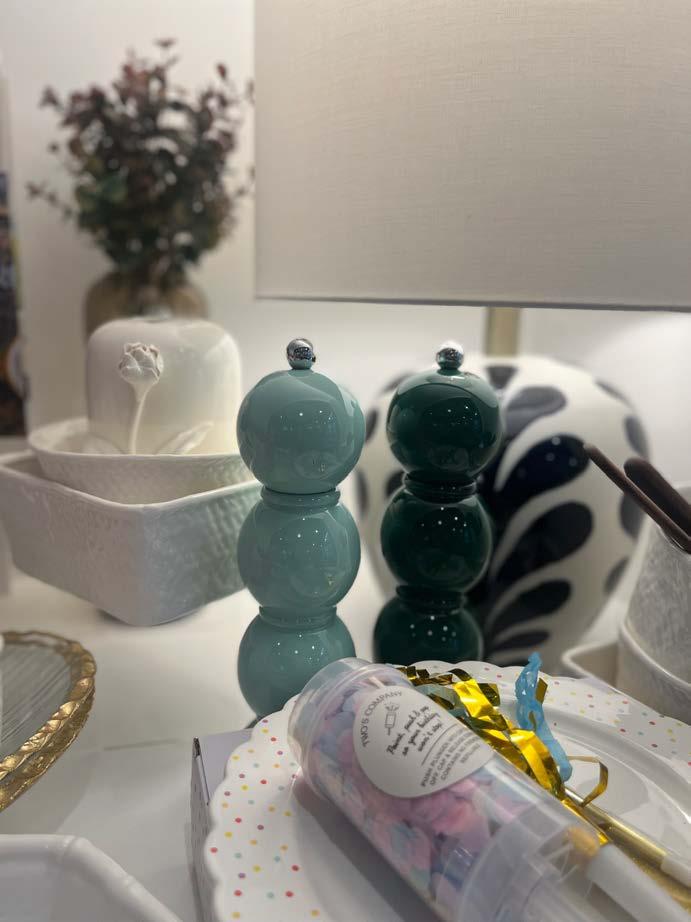
For an elevated home unlike any other, visit our Maison. We know you'll love it.


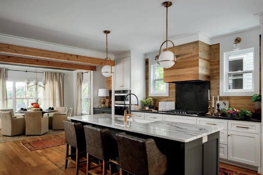
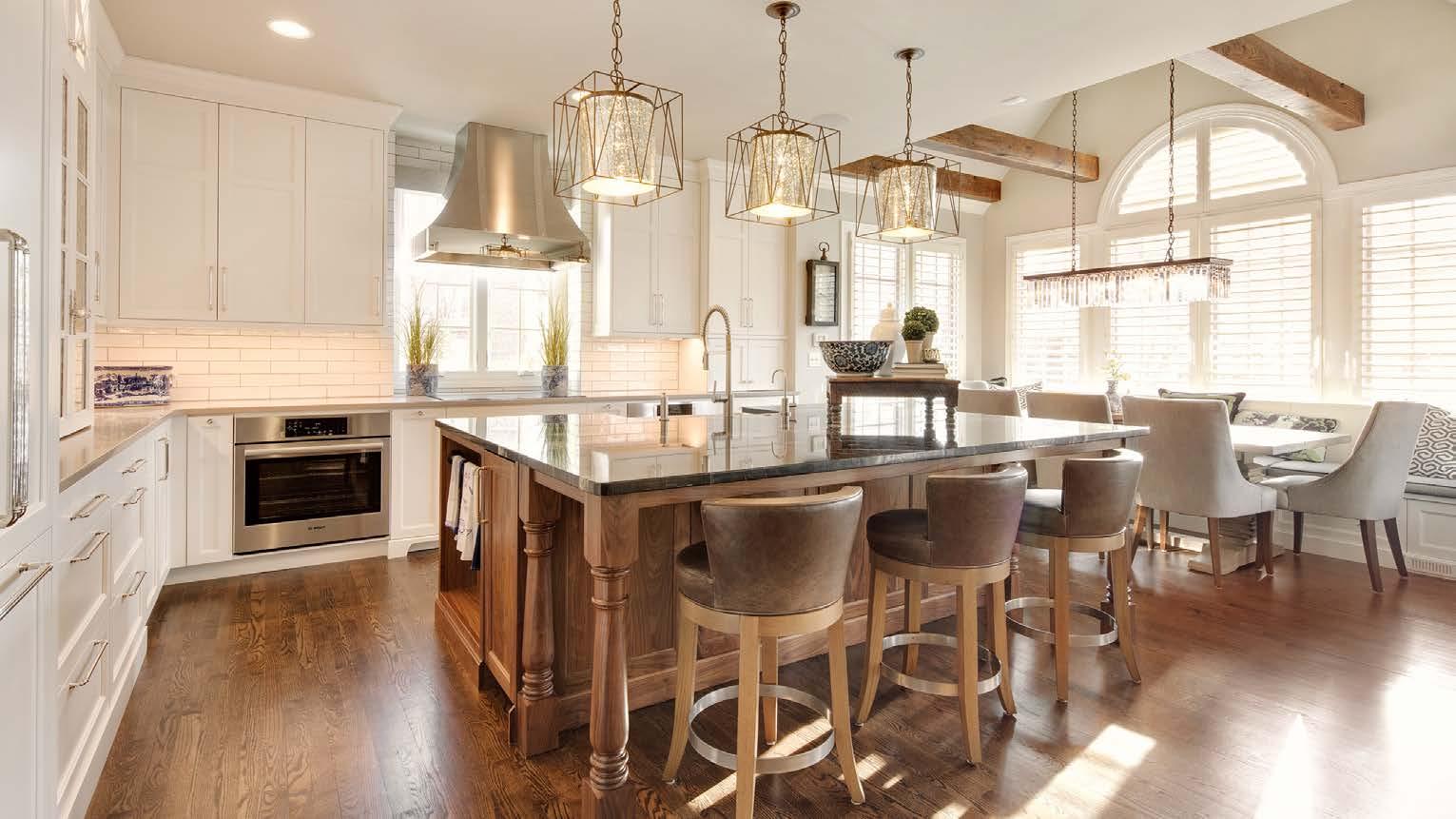
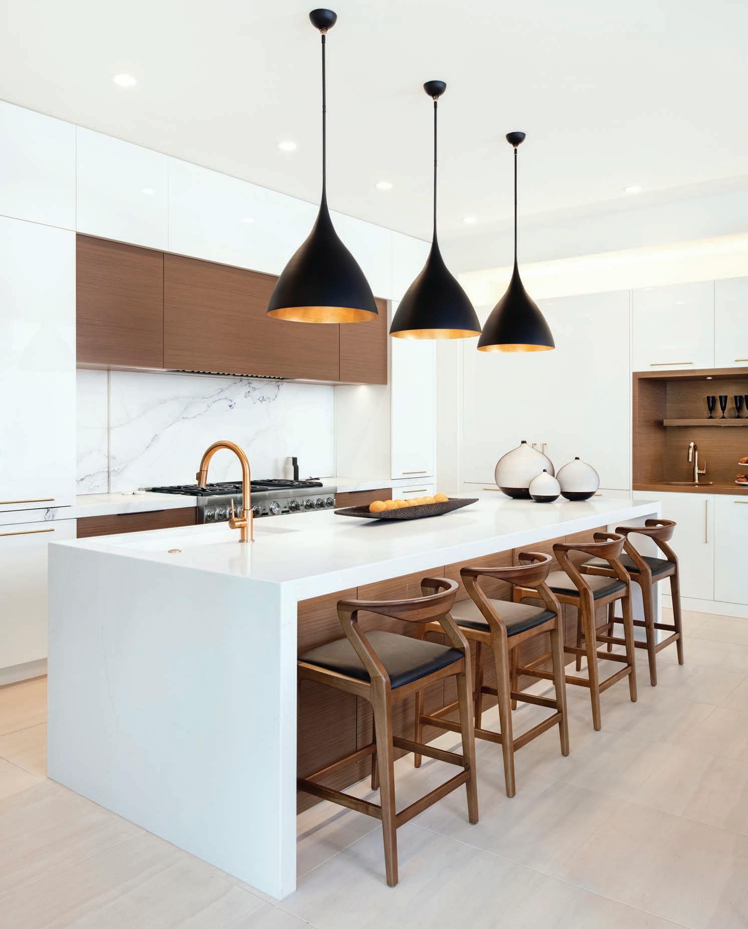
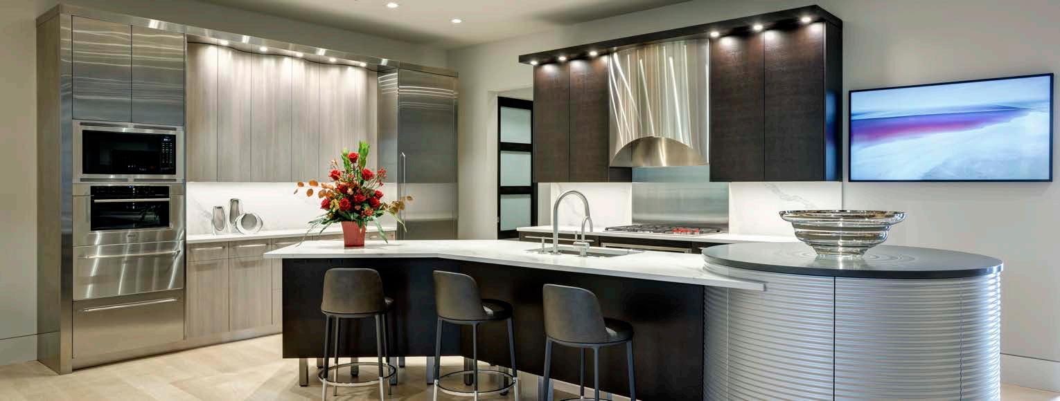
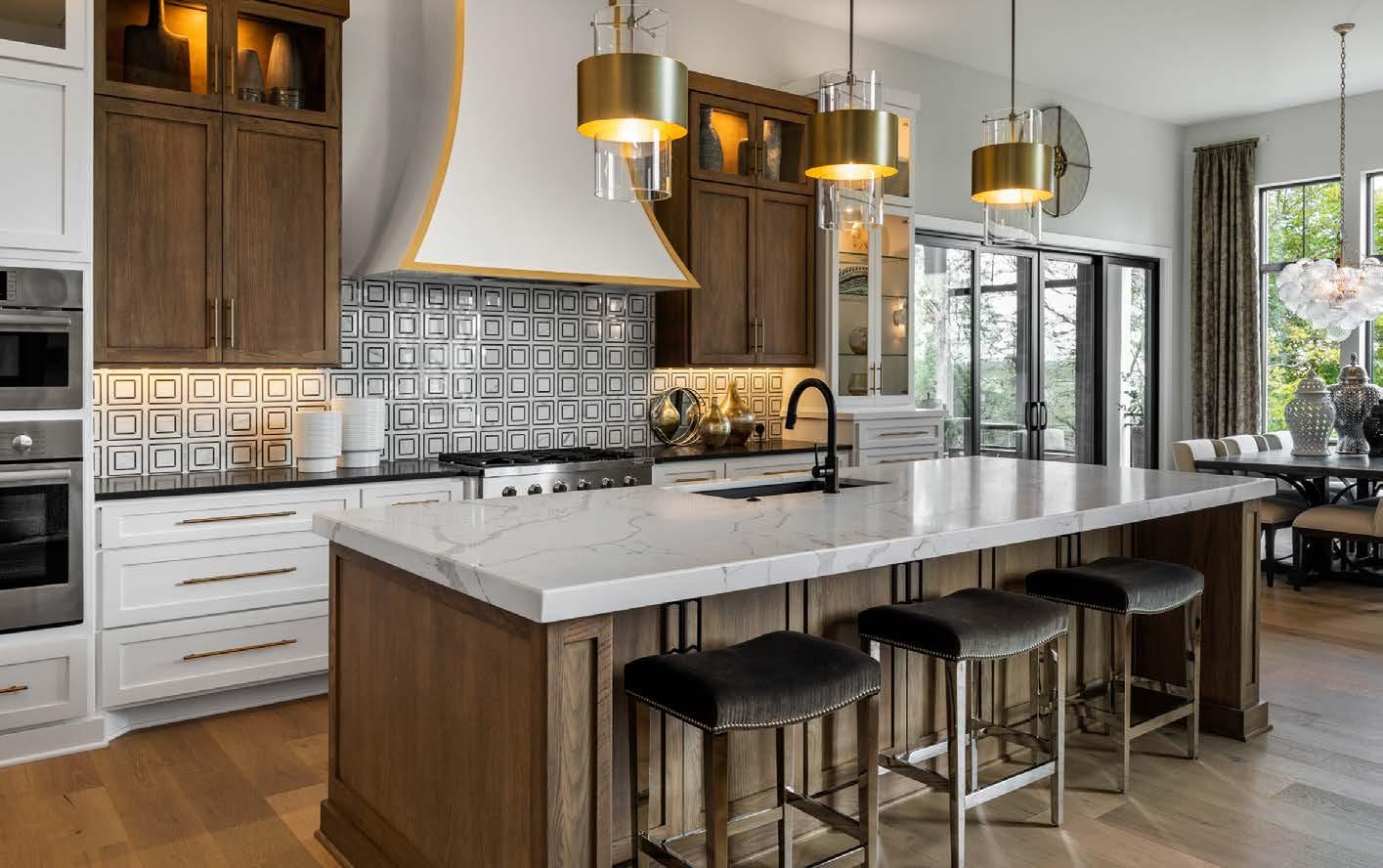
Drama and sheen de ne this classic-with-a-twist kitchen from McCroskey Interiors.
Leann Lynnʼs Sunset Hill clients came to her adamant about three elements they wanted in their kitchen renovation: black cabinets, a stainless steel fridge and a Lacanche range. Leann, a designer with McCroskey Interiors, converted their opinion on a fourth line item.

But first, to get there, the house needed some extra space.
“It wasnʼt quite big enough and somewhat of an odd configuration, as so many homes are in that area,” Leann says.
Working with architect Mark McHenry of McHenry Shaffer Architecture and contractor MSC Enterprises, the couple expanded the house with two additions— one for the kitchen and off ice space and another for an enlarged primary suite.
Words by Andrea Darr | Photos by Nate Sheets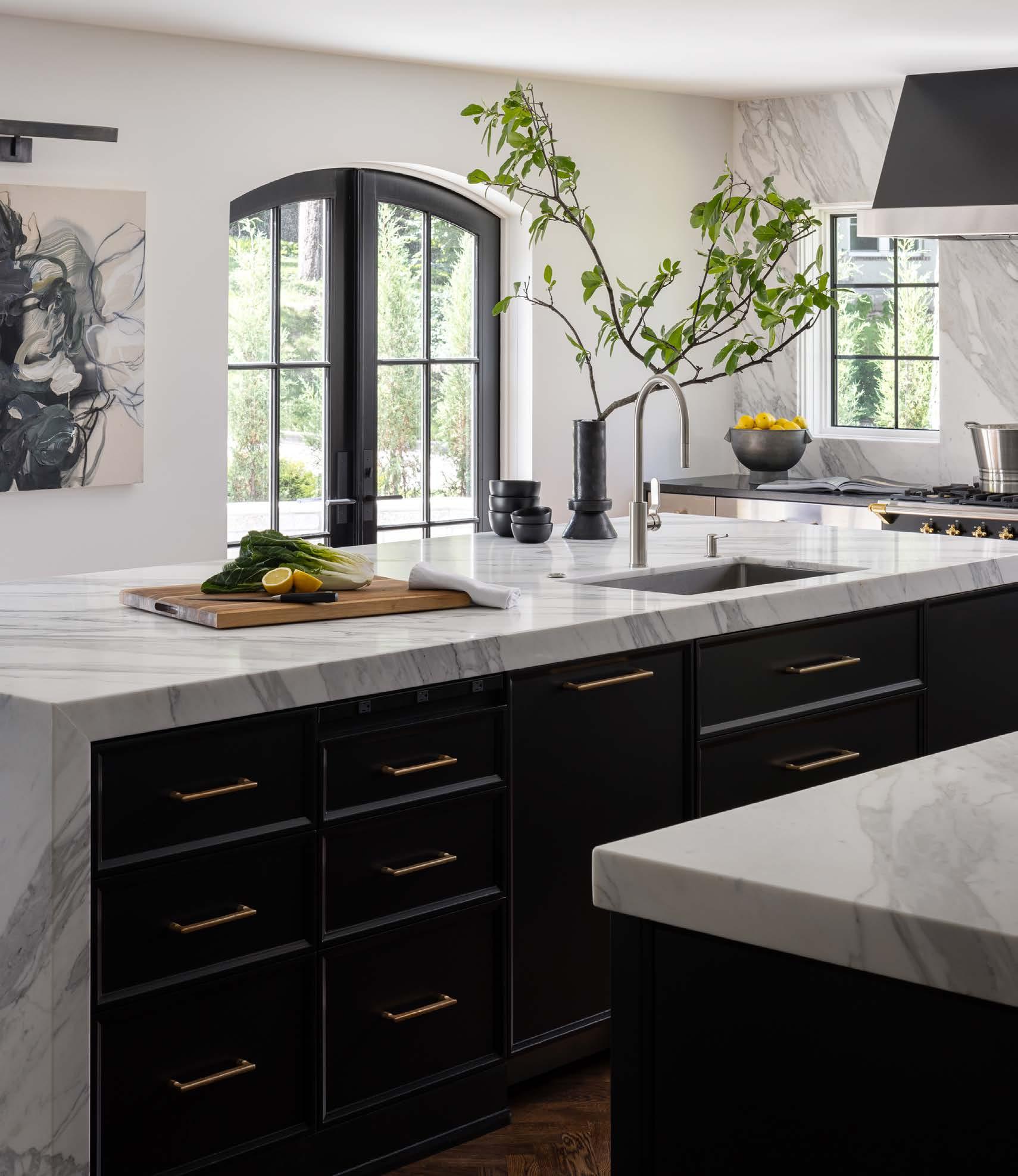
“We used every inch of the lot in a smart way,” Leann adds. “The house looks like it belongs— not like a remodel.”
The extra space allowed the owners to fully embrace their time in the kitchen. Because they both love to cook and entertain, they have found a flow together over the years and knew exactly how they needed the new space to function.
“They had strong opinions about what went where,” Leann says. “It was nice not to have to guess. She does this; he does that. If they turned around, they wanted X there; if they bent down, they wanted Y there.”
The homeowner had already measured her pots and pans, so Leann didnʼt even have to take dimensions of the biggest stockpot or the longest pan.
At the first meeting, the clients stated that they wanted a black kitchen. “Yes, thatʼs my love language,” Leann says.
She is a classicist—but always with a twist.
“The first rendition looked more French; this is the edge of Art Deco,” she describes.
The French-built Lacanche range was practically a done deal in the clientsʼ minds, so Leann ordered it in black—a no-brainer. With traditional gold knobs, a griddle and six burners, it was a dream purchase for the home chefs. Above it, Leann designed a ventilation hood fabricated locally by Gieske Custom Metal.

“We very rarely order prefab because every ceiling height is different,” she explains.
Then there was the fridge. It was the third hard-set requirement—and a tough pill for Leann to swallow.
“The homeowners felt strongly about the commercial look. She said to me, ʻYouʼre not going to like this,ʼ” Leann recalls.
It’s beautiful , of course, but it has over-the-top functionality.”
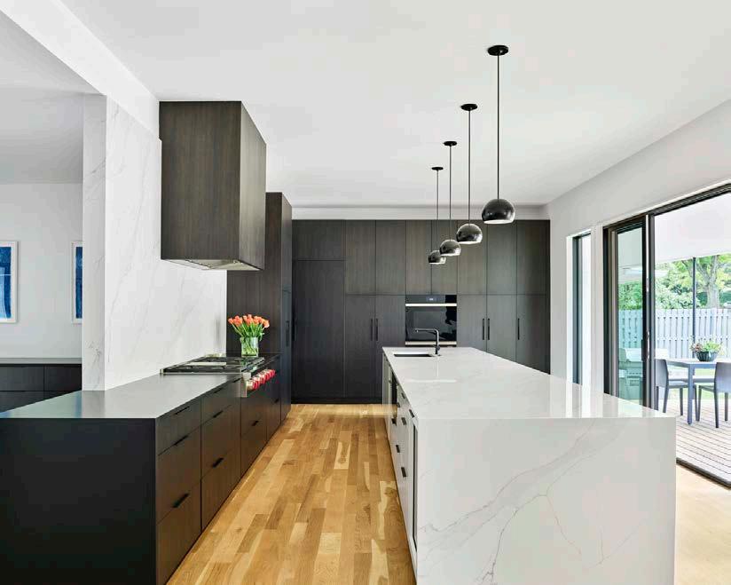
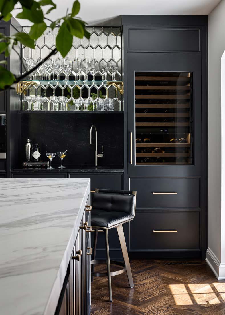
designerComplete with a wine fridge, fridge drawers, Miele coffeemaker and a sink, the bar shines as bright as its antique mirror tiles. Negresco granite forms a “box” below, with the top acting as a shelf for stemware.
So Leann upped the ante and devoted an entire wall to stainless steel cabinets around the doubledoor Sub-Zero fridge. Metal cabinets with glass fronts have hooks inside for hanging the clientsʼ everyday pots and pans, with stainless drawers underneath.
“I decided to lean in and make it go away,” Leann says. “It has a commercial feel, but itʼs still homey.”
While Leann lost the stainless steel battle, she won the countertop war. The homeowners were against marble from the beginning.
“She said ʻabsolutely noʼ to marble,” Leann
says. “There were a lot of discussions and trips to Carthage Stoneworks.”
Leann eventually convinced them of marbleʼs timelessness and design strength.
“No manmade material was going to give her the look she wanted,” Leann says. “I feared she would be disappointed.”
The island features mitered slabs and a waterfall edge. “The veining is so good that it needed the continuous edge,” she adds.
Leann also called for a full-height backsplash of Calacatta Oro on the range wall.
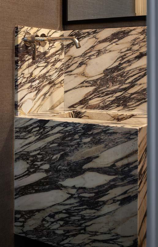
Functionality drove other decisions, such as the change of materials on perimeter counters to Negresco black granite. Granite is harder than marble and better handles grease splatters and heavy-duty use.
Marble was additionally used in the powder bath and primary bath—spaces that also required a new vision and space planning. Even with concessions from both sides—or maybe especially because of concessions made on both sides—the project ended up being a favorite of Leannʼs, and of course, a dream come true for the clients.
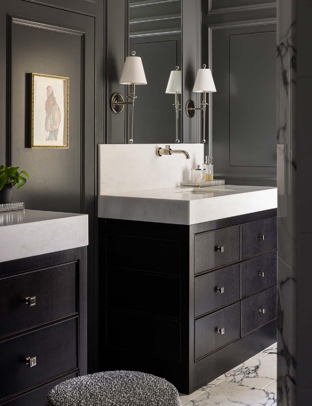
“She let me lead the design process and was open to having her mind changed,” Leann says. “She didnʼt shut me down, and I think she shocked herself in a lot of ways.”
@mccroskeyinteriors
@mchenryshafferarchitecture
@msc_enterprises_kc
318



816.331.2701



…still building today’s modern homes for yesterday’s historic neighborhoods
 Words by Veronica Toney | Photos by Nate Sheets
Remodeling is a new beginning for a home—and oftentimes also for the homeowner. Thatʼs exactly what Mike Gross was looking for when he decided to renovate his Lake Quivira home.
“My wife passed away a little over two years ago, and I wanted to refresh the house and make it mine,” he says.
He hired Kate Ruszczyk and Erin Henkle, designers with Interior Design Beth Phillips (also known as id | bp), to rethink his home and make it work for this new phase of his life. The house was built in the late 1940s and is one of the homes closest to the water. The designers worked with Mike to determine his goals for the remodel, which included optimizing lake views in every room, creating a restorative oasis and maximizing the entertaining space. Together, they reimagined the entry, living room, dining area, den, primary bedroom
“We simplified everything to be minimal and to bring the light deeper into the space. Itʼs sophisticated but not too serious,” says Kate, the lead designer.
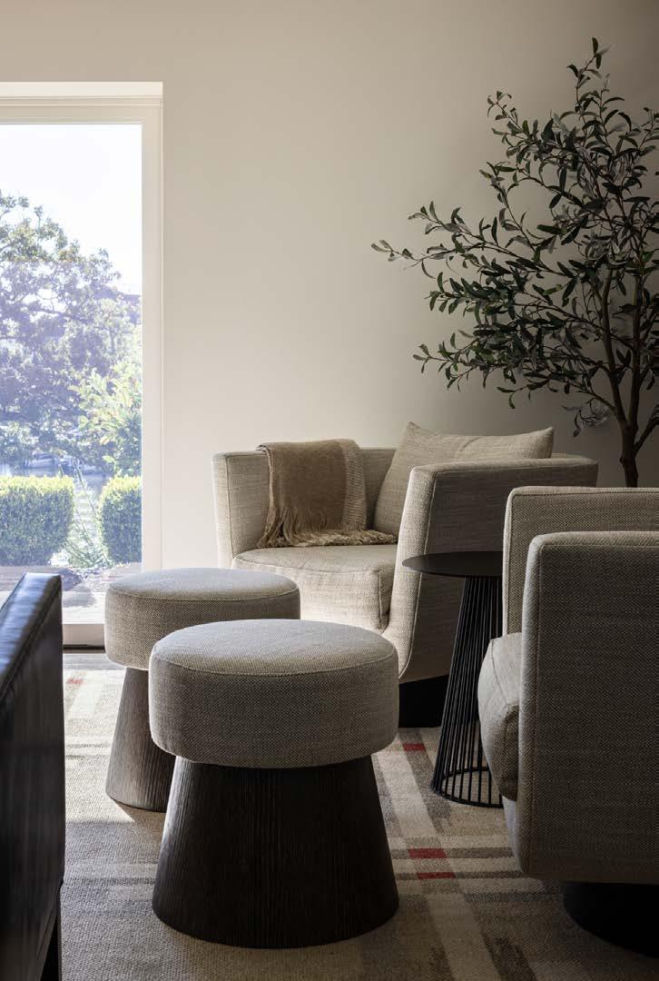
To create a feeling of restoration, they chose a color palette of neutrals with pops of blue in each room. Mike has always found blue to be a calming color, and it establishes a natural connection with the blue waters of the lake.
“Blue was a color that was meaningful to Mike, so youʼll see blue incorporated throughout the design and artwork,” Kate says. “The goal was to create a space that feels positive and uplifting.”
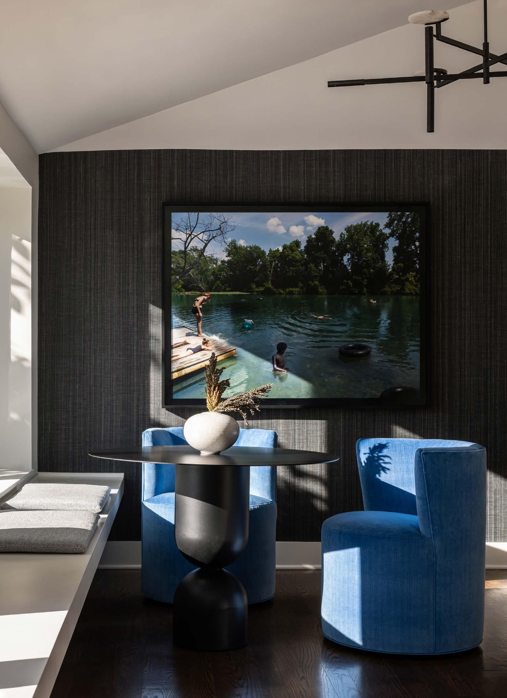
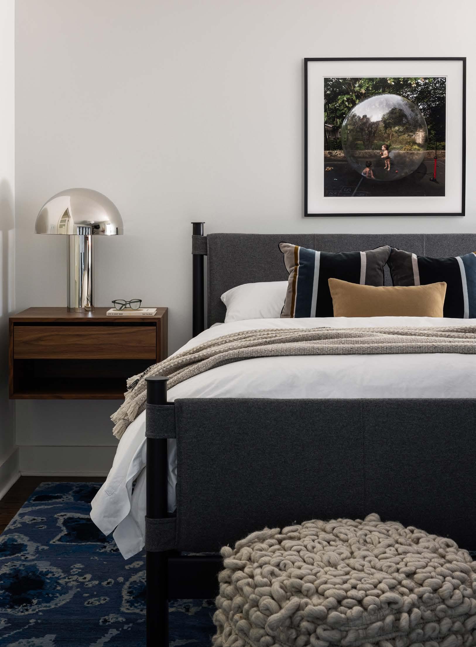
A long floating built-in bench runs along the bank of windows from the entryway to the den. To break up the elongated galley space, they divided it into two sitting areas. The sitting area at the end became the focal point thanks to the dark wall and two bright blue sofa chairs. Lindenlure —a Julie Blackmon photograph—hangs above TURN

the sitting area, drawing the eye to the space.
“The main art [is a photograph] of a dock with a bunch of kids playing off it,” Mike says. “It almost looks like a photograph of the lake.”
This area serves double duty as a place to read and relax or as a gathering spot when entertaining.
“Iʼm not a very formal person, so I didnʼt want a formal dining room table,” Mike adds. Kate and Erin worked with Hinge Woodworks to design a custom counter-height table. Mike and his sons can stand around it or sit on the barstool-height chairs while eating a meal together.
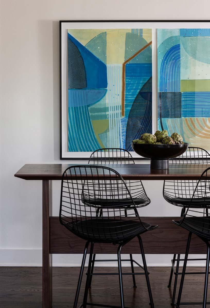
“The high table with stools around it was very appealing,” Mike says. “There are three guys here, so itʼs fun to have more of the informal feel throughout the house.”
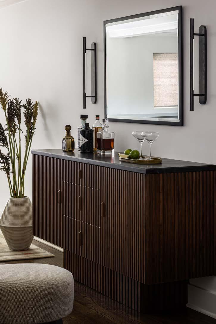
A point of unity between the dining and living spaces, the custom dry bar credenza adds function and a
sense of welcoming to an area that was previously a dead zone in the house. Mike travels a lot for work and enjoys many of the amenities of hotel living.
“This informed our design by incorporating elements like the custom drybar to contribute to the hospitality experience in his own home,” Kate says. To further enhance this experience, Hinge Woodworks crafted the credenza from fluted walnut and integrated lighting into the pull-out drawers. These details add luxury and a bit of fun to the casual space.
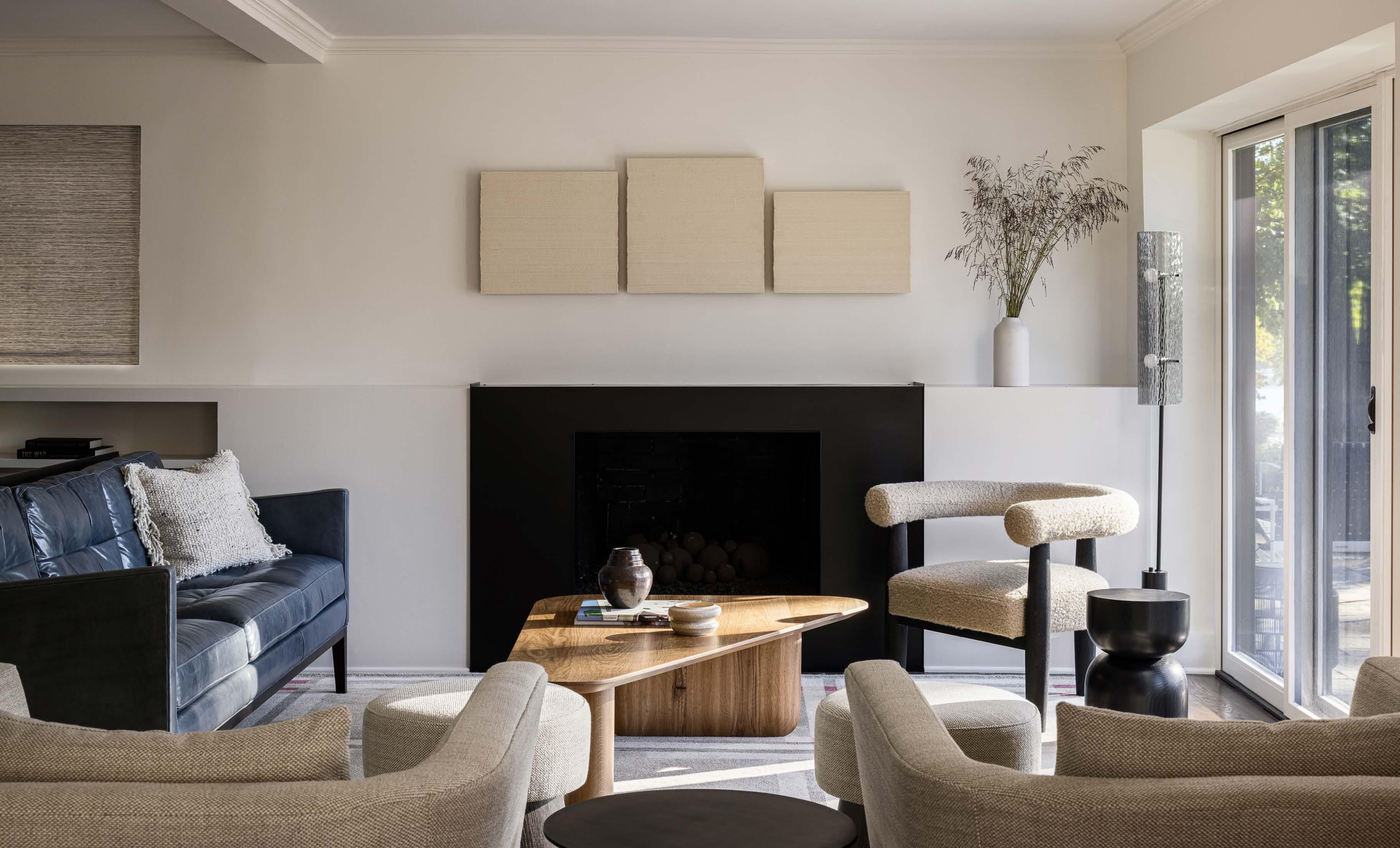
Keeping with the luxury hotel theme, the living room is a quiet and relaxing space that draws in the views of the lake. The original fireplace wall had layers of porcelain tile and limestone masonry—all were stripped down and reimagined into a sleek, modern fireplace mantle. A neutral color palette with different
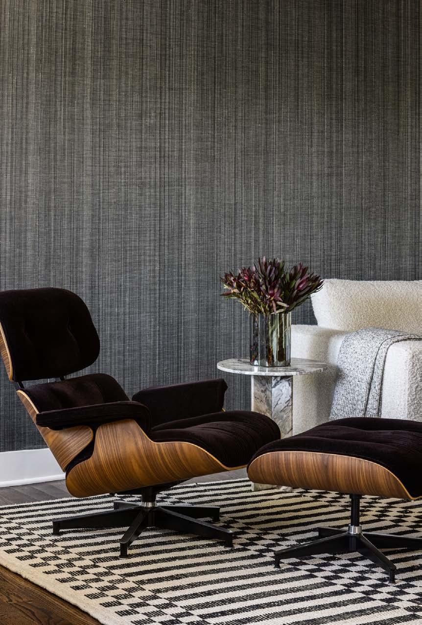




textures and natural materials adds interest and a sense of calm to the home. Finally, Matt Castilleja designed the wood coffee table in a triangular shape to act as a spoke connecting all the corners of the living room.
“Natural materials add depth and texture,” Erin says. “The room has visual interest without adding a ton of color. You can have a very neutral space that still feels dynamic.”
“I never thought Iʼd enjoy this process and everything that we did—except tearing
out the fireplace—but I did,” Mike says. “I enjoyed going to the galleries to pick out the art. Getting custom furniture made in Kansas City was fun for me, and seeing the furniture artisans at work. Itʼs fun when friends come over and see the space and say it has my taste. It fits me.”
@interiordesign_bethphillips
See resources on page 236






New owners become custodians of a 1928 Loose Park Georgian Colonial Revival and spectacularly elevate the home’s interior.

For two years, Christie Geier-Pratt and Donna Kirsopp, CKBR, of Schloegel Design Remodel, huddled at 10 a.m. every Thursday in a 5,400-square-foot Georgian Colonial Revival perched on a coveted in-city acre-plus lot across from Loose Park, one of Kansas Cityʼs most renowned neighborhoods.
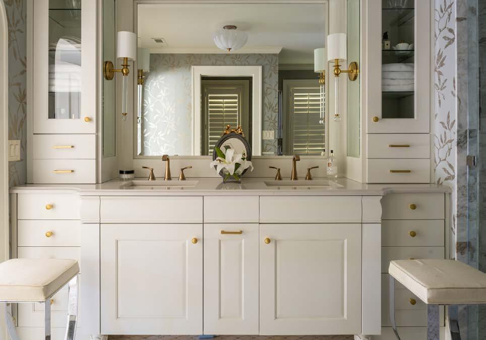
The overarching objective of the weekly collaborative confabs: make the early 20th century home functional for fourth owners Christie and her husband, Tim Pratt. It was a tall order, attaining a balance between classic beauty and an energetic vibe by meticulously modernizing the aesthetic, while maintaining the homeʼs historical integrity, character and architectural details.
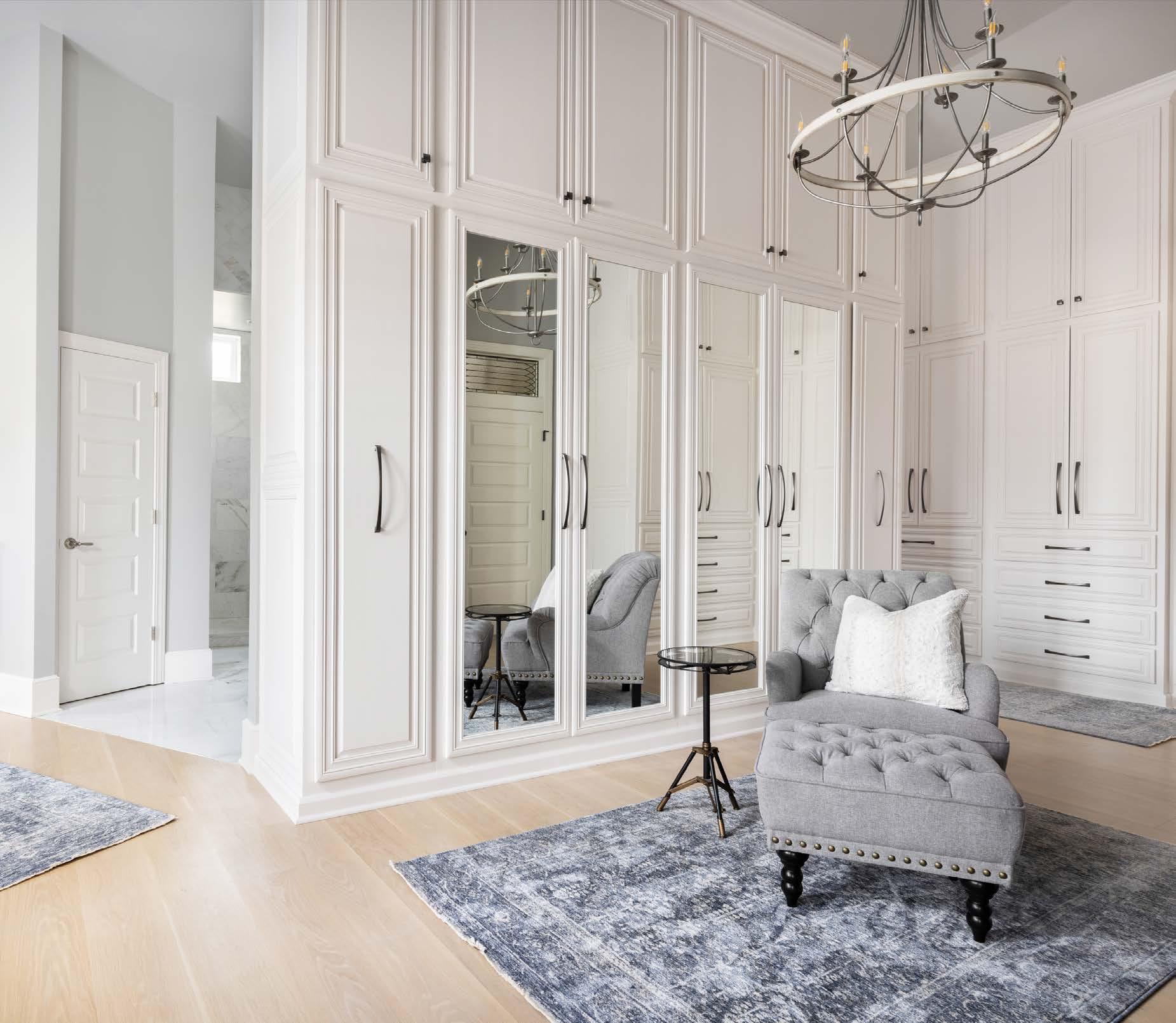
 The primary suite includes a spacious bathroom and stylish boutique-style walk-in closet, lending vitality to Christieʼs and Timʼs end-of-day retreat. French doors lead onto a porch offering a birdʼs-eye view of Loose Park and the homeʼs lush backyard and garden.

Indeed, this was not a balancing act for the fainthearted—or the impatient.
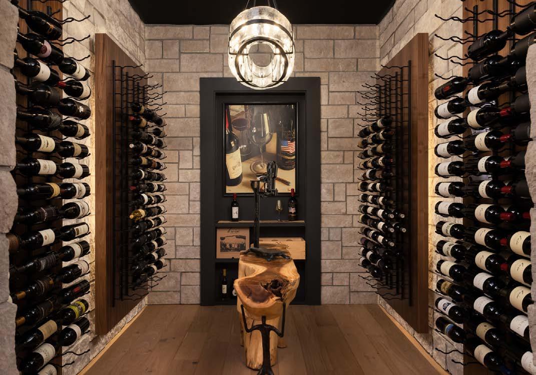
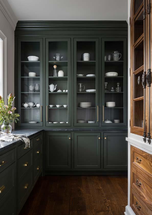
Overall, the project—which touched every square inch of the home—took two years to complete. Donna identified three sub-projects: The first phase included the upstairs suites, entry, living room and dining room; the second phase encompassed the butlerʼs pantry, laundry room, two powder bathrooms, kitchen, hearth room and wine room. The final phase captured the library addition.
In some respects, Christie was surprised to find herself at this juncture. Several years prior, she and Tim completed a painstaking renovation of a Sunset Place villa-style home—an exquisite residence flooded with natural light and mixed design influences. But in the summer of 2019—when the empty nesters spied a coveted Loose Park home for sale—the avowed nonColonial person stood on the columned portico of a stately Georgian Colonial Revival.
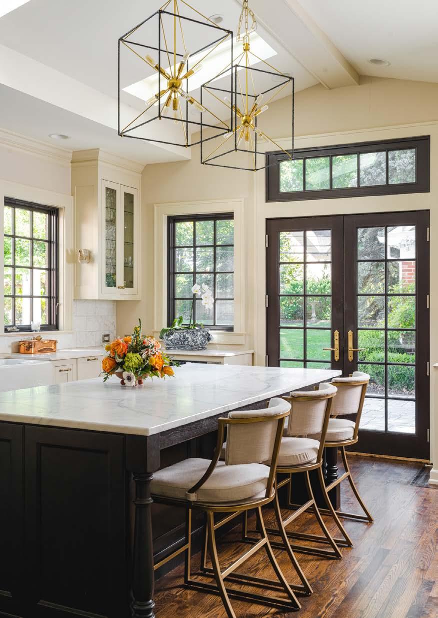
Tentatively opening the door—painted a jolting shade of turquoise—Christie stepped into the foyer and felt her trusted Leo intuition rev into overdrive.
“The house…was warm and embracing and felt like a well-fitting shoe or a go-to dress you cherish,” she says. “I could see our family in it, celebrating Christmases and birthdays and experiencing routine, intimate, everyday life.”
Tim—an enthusiastic lover of Colonials— was smitten, even though the interior needed embellishing, polishing and updating. The couple came away that fortuitous day, agreeing, “This could be our forever home.”
Reversing the downsizing mode they previously were in, Christie and Tim purchased the Loose Park stunner. Though Christie felt the approaching tsunami of a major renovation, the homeʼs charming
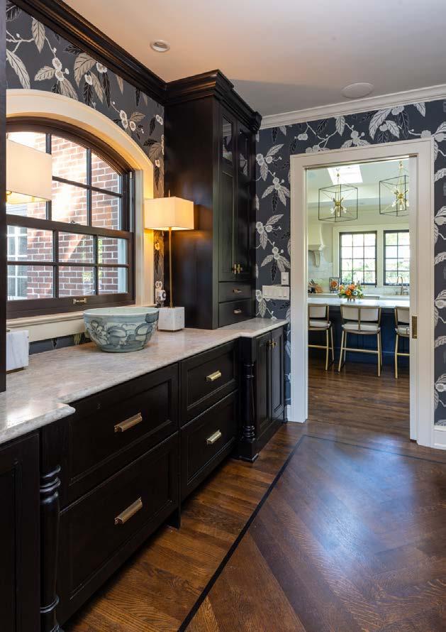
karma alleviated any concerns about a daunting overhaul.
“The pastoral setting across from Loose Park contributes to the homeʼs personality,” she says. “Even in its outdated condition, the home brimmed with its past iterations and spoke to me of its future. Tim and I now endearingly call it the ʻPark House,ʼ honoring the former owners who cared for and treasured this historic residence.”
Eager to launch the homeʼs transformation to accommodate her familyʼs bustling lifestyle— including frequent visits from the coupleʼs two grown children and four grandchildren under eight years old—Christie enlisted the expertise of Donna, her longtime designer.
“I knew this renovation was going to be a complex, challenging and protracted endeavor,”

Christie says. “But I also knew Schloegel was the only company qualified to deliver an exemplary product. Donna and her team, who worked with me on the Sunset project, are always patient, excellent listeners and helpful with ideas and solutions for my ʻvision,ʼ as it became known. Suff ice it to say that Tim and I are thrilled with the results.”
A serial documenter, Christie prepared the renovationʼs archival articulation—an oversized three-ring binder for compiling inspiration, photographs, sketches, resources, contractors, swatches and musings.
“Each of my home renovations has a dedicated scrapbook,” she says. “I consider it essential not just in the actual design process, but also to transfer to the next homeowner as a valuable reference tool. After all, Iʼm just a custodian of this house.”
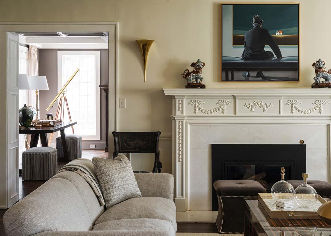
Phase One of the renovation, Donna recounts, was updating the homeʼs archaic heating system,

For more information and to schedule a consultation about your home build or remodel project contact Derek Decker at 913-231-7252
/blackhickoryconstruction
which required the removal of 22 radiators scattered between the main and upper levels and “precisely matching the millwork and hardwoods throughout the home,” she says.

Even as Christieʼs vision evolved and the project scope expanded significantly, Donna masterfully executed design guidelines, navigated edits and revisions, and performed troubleshooting when necessary.
A throwback to yesteryear, the homeʼs secondfloor sleeping porch was combined with a bedroom to create a serene guest room. In addition, the bedroomʼs existing closet and a portion of the room were used to add a full ensuite. Donna, a consummate problem solver, acknowledges that “relocating plumbing supply lines from the second story is challenging in a home this age, but it was accomplished, and the finished rooms beautifully achieve Christieʼs vision.”
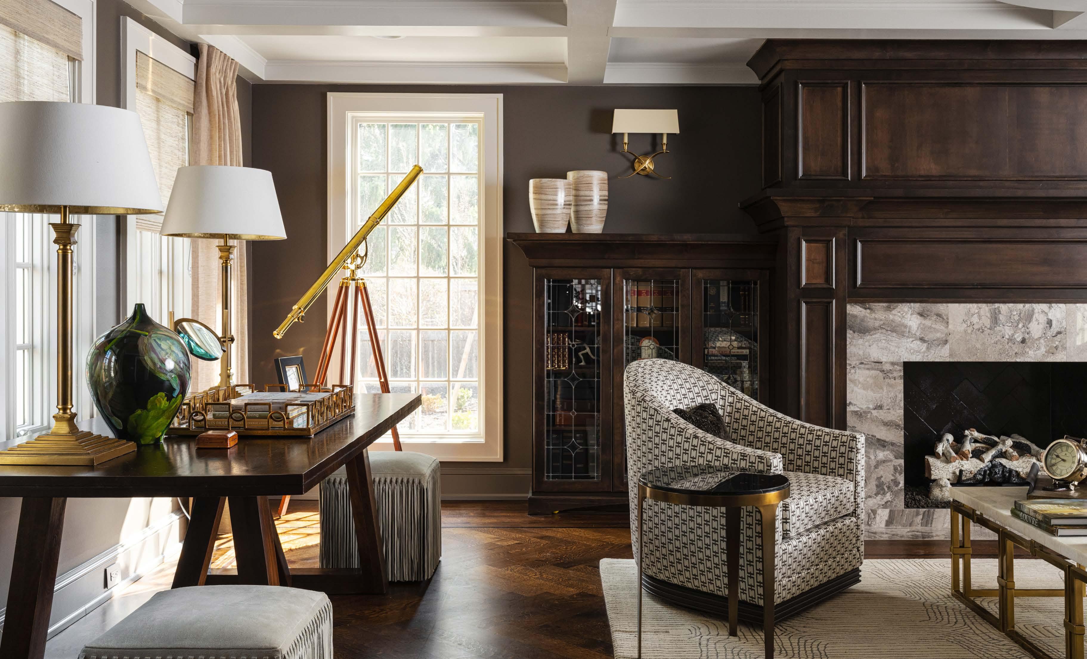
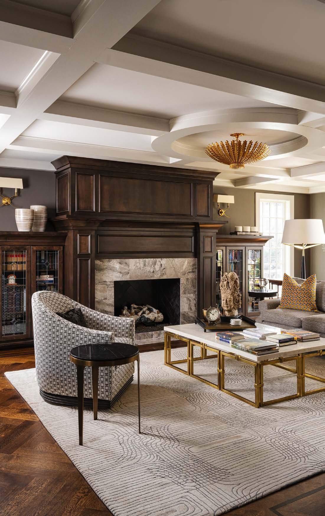
Frequently used for informal gatherings, the library boasts idyllic views of the expansive backyard. Flanking the fireplace are built-in alder wood bookcases with a leaded-glass design, mimicking the custom glass windows on the front staircase landing.Madden-McFarlandʼs Connie Church-Fey, an Allied ASID member, collaborated with Donna, Donnaʼs team and Christie to curate fresh design elements, interior furnishings, custom drapery, wallcoverings and lighting.
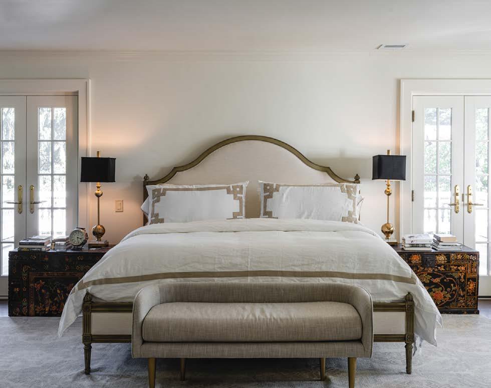
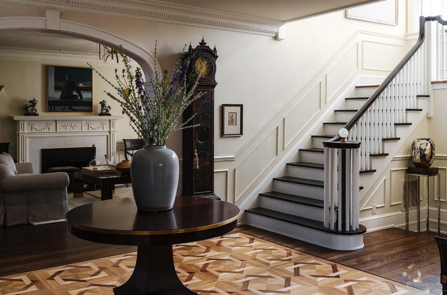
“Christie had many lovely pieces to place alongside new acquisitions,” says Connie, familiar with the homeownerʼs aesthetic from past projects. “Monochromatic tones and gorgeous fabrics, with understated and contrasting textures, were utilized to realize the homeʼs elegance and sophistication.”
In a stroke of divine serendipity, the grandson of Wilbur F. Coen Sr.—the Georgian Colonial Revivalʼs original owner—lives several doors from Christie and Tim. On occasion, the couple hosts their neighbor, who spent his childhood and holidays visiting his grandparents in their well-appointed home.
“Itʼs karma,” Christie insists. “[It] gently reminds me Iʼm just a custodian of this glorious home.”
$350s-$700s

$500s-$1 Million + • Golf & lakefront home sites available Choose from a variety of residences including single family homes and villas

• 18-hole championship golf course

• 108-acre lake with private dock opportunities
• State-of-the-art clubhouse featuring casual dining at Tavern on the Moor
• Fitness Center
• 2 Community pools
• Tennis courts
• Award-winning schools

• Easy accessibility to highways, shopping, dining & conveniences
• Walking and biking paths




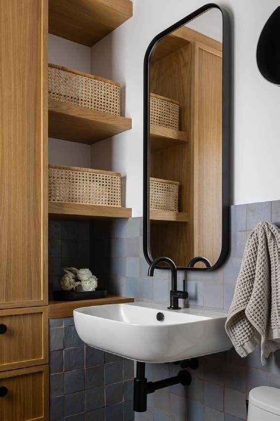
Attention to detail is the hallmark of Lisa Schmitz Interior Design. As a firm, their style is consistently unassuming yet with results that always exude a relaxed elegance.

When the owners of this Mission Hills manor first approached the firm, they originally had a simple request: “They asked us to update a few furnishings in their living room and family room,” says owner Lisa Schmitz. “We got right to work, but then the pandemic hit.”
As the world started to change, so did the clientsʼ needs and wants. An additional request to update the casual dining room led to a refresh of the entryway, and the wish list began to grow organically.
“It became a very long, protracted project that kept expanding from there,” explains Lisa, who brought in Alicia Berg as the project manager and designer.
A ‘slow and considered’ process results in exquisite details and lifestyle upgrades in this Mission Hills home.
 Words by Susan Cannon | Photos by Nate Sheets
“Suddenly, the entire family was living, working and going to school under one roof,” Alicia adds. “They realized there was no privacy—no place for the adults to escape to or relax—so the project needed to grow further.”
With the entire design team, including Schmitz Remodeling, the project became about uncovering hidden potential. They wanted to find ways for the home to take on multiple functions with ease— particularly on the second floor.
“We made transformations that offered a smarter, modern feel and a sophisticated, calming vibe— something airy but grounded, serving unexpected moments of joy,” Lisa says. “We wanted to create a place where each family member could live and work without being in the middle of everyone elseʼs activities.”
The two front rooms took shape in a much more complete manner than originally planned. Staying true to their modern eye, the design team created
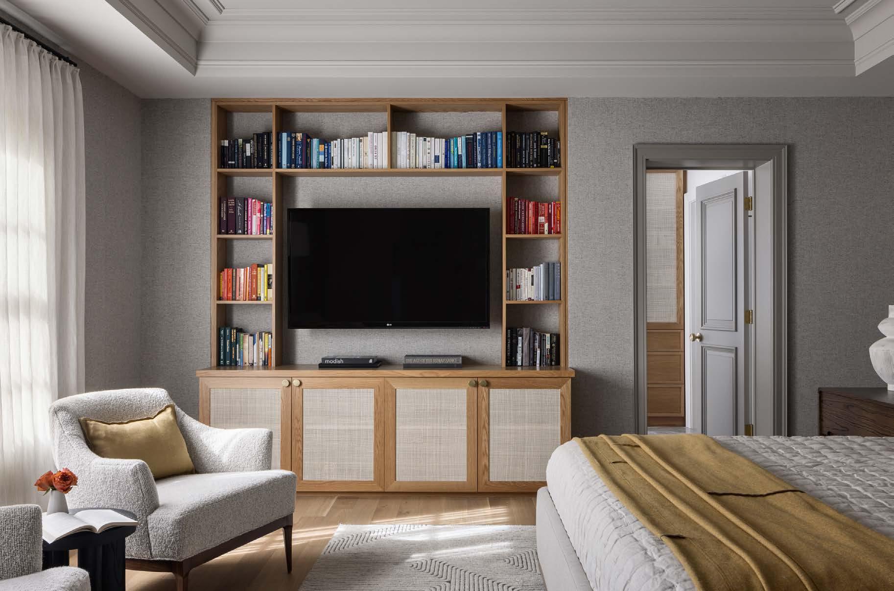
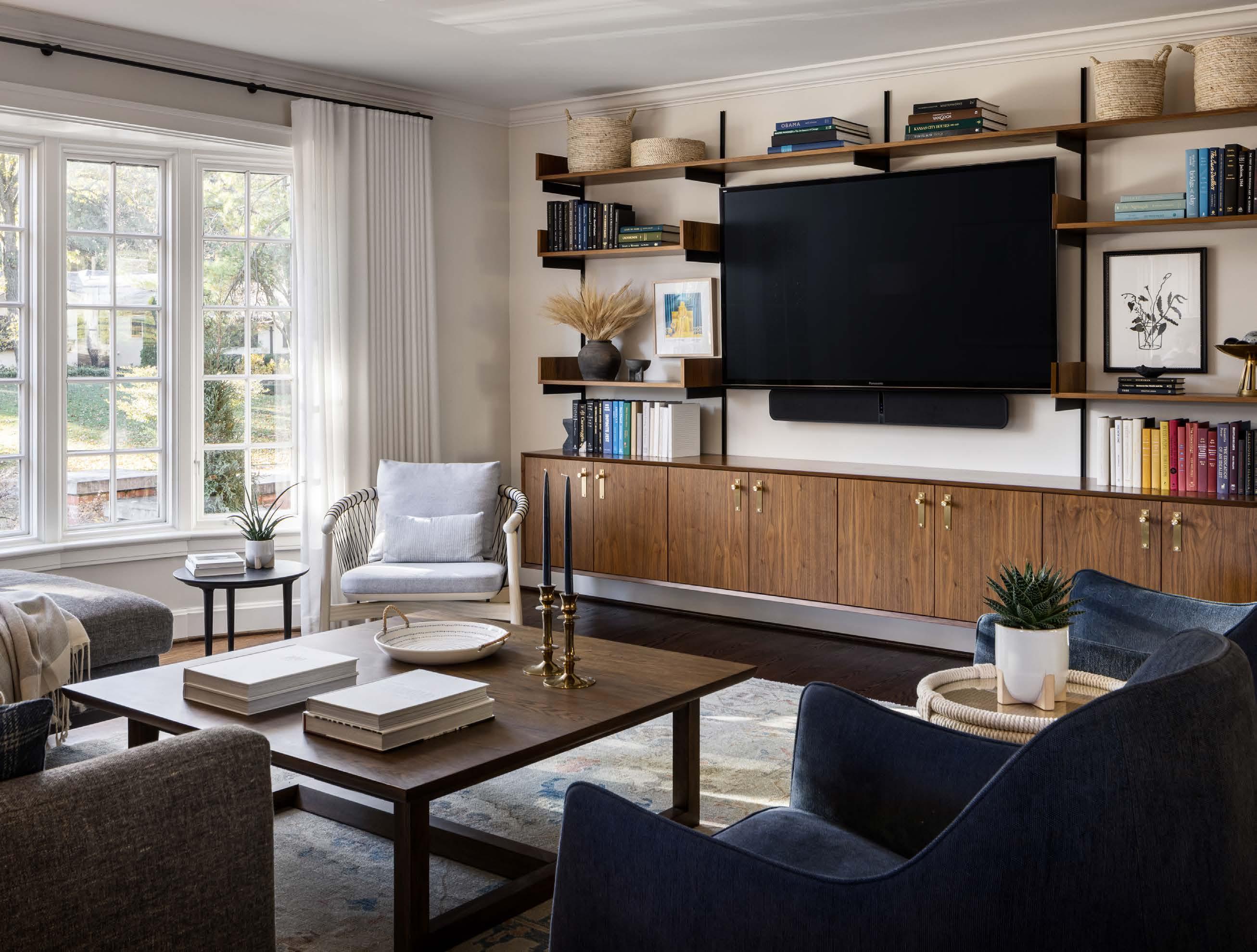
a welcoming family room that incorporated a few vintage finds with new contemporary furnishings while adopting a more sensible scale of furniture within the space. They custom-designed the walnut shelving unit to accommodate the TV and books in an attractive and functional way.
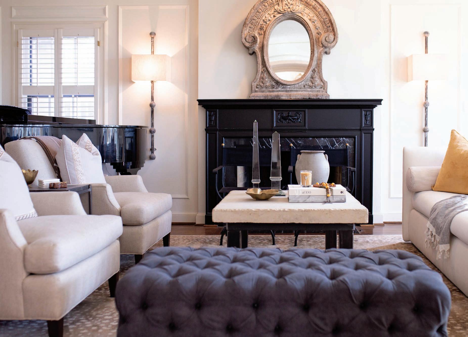
In the living room, they infused a touch of formality with a refresh in white paint and drapes. Scraping buff paint off the fireplace surround, they revealed its original black slate, then accented the room with modern black accessories, naturally. The move to mix the black-and-white contrast with neutral furnishings warmed up the room, bringing in a relaxed ambiance.
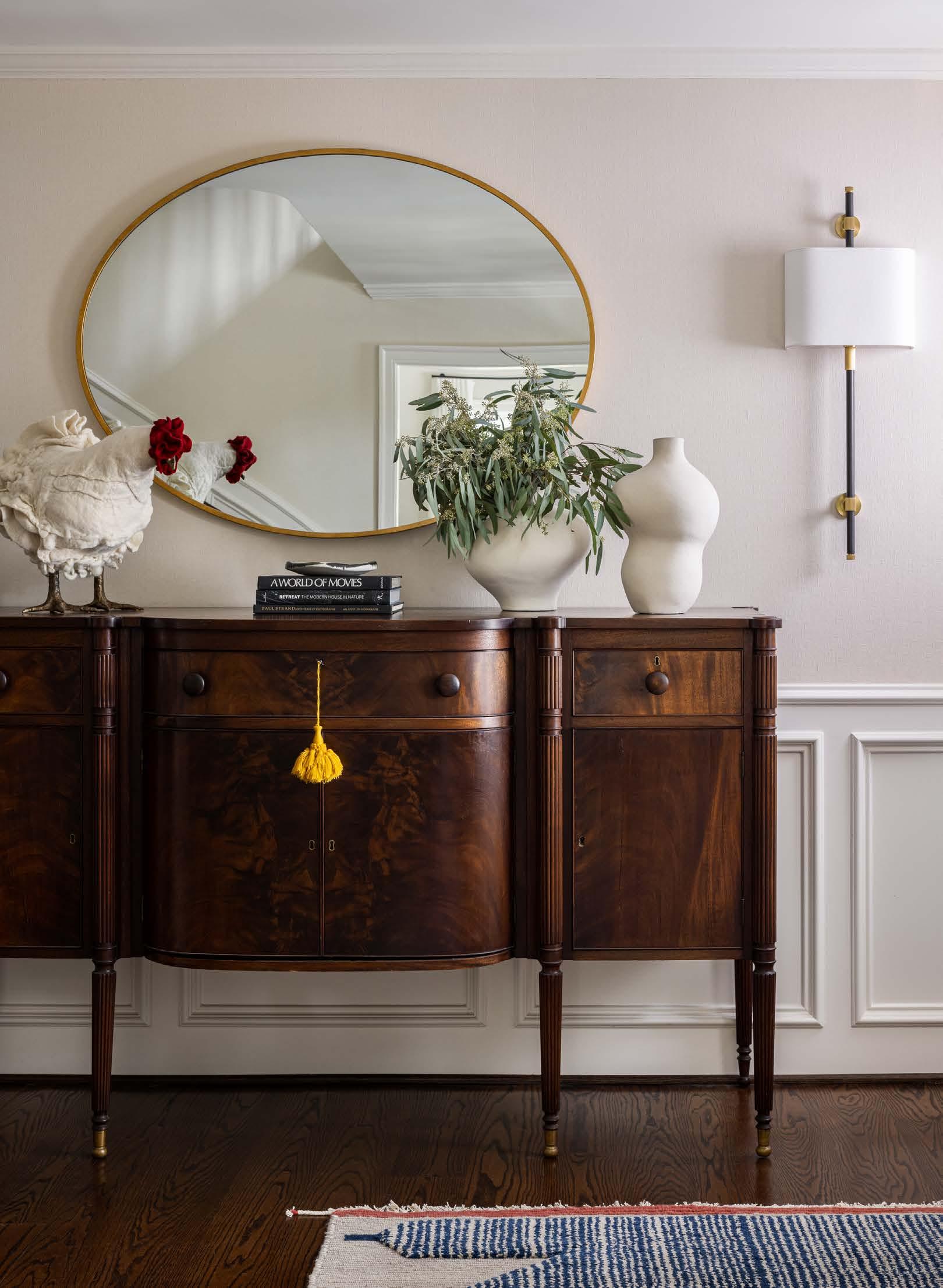
A freshening of the entryway offered a chance to have fun with eclecticism. “I love the fusion of antique pieces and original architecture merging with our modern aesthetic,” Lisa says.
As change was rolling through the first floor, it came to reason that the tiny powder room just off
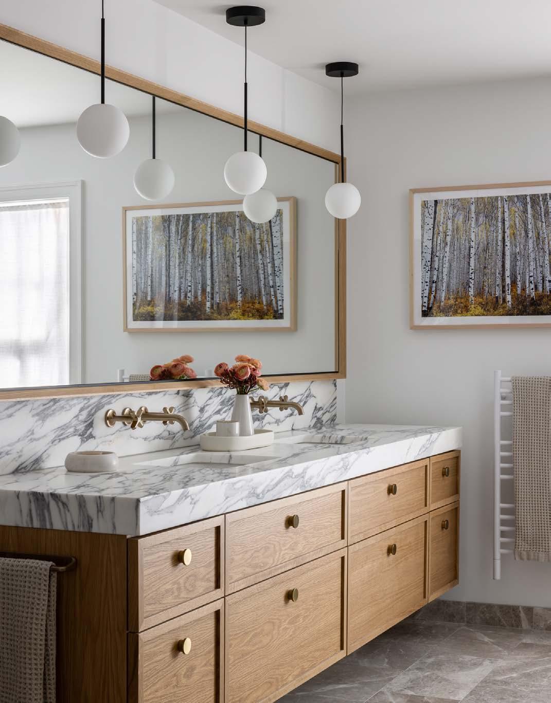
Above: Thereʼs a considered mix at play that looks so natural in the primary bathroom, including brass fixtures and varied marble tones and veining, paired with wood grain and art that tie it all together.
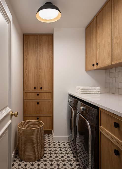
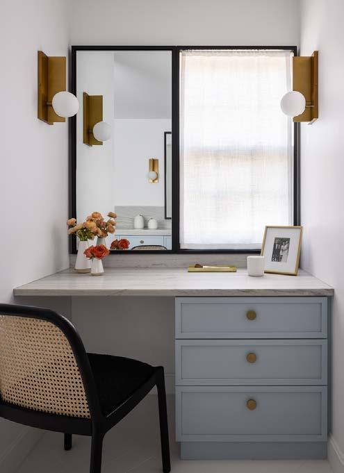
the same cabinet design, reinterpreted in soft blue.

 Top Right: The daughter can focus on homework in style at her floating desk with matching shelves.
Right: A CB2 black chair and Visual Comfort brass sconces are strong tonal accents carried through the home to the daughterʼs bathroom. Note
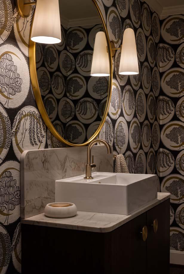
of the entryway—visible from the kitchen—should also be redecorated. They intended to create a little more ʻmoodʼ on the first floor. Reusing the existing modern sink, the team designed a vanity with a stone countertop and backsplash from Carthage Stoneworks. It complements the medallion-print grasscloth and round brass mirror.
The team played with neutrality and texture in the casual dining room. All new furnishings serve as a complementary backdrop to the outdoors, with its new pergola and portico—which was a much-needed respite during lockdown—and still is. The plein air space, designed by McHenry Shaffer Architecture, incorporates an eating and lounging environment equipped with a TV and fireplace.
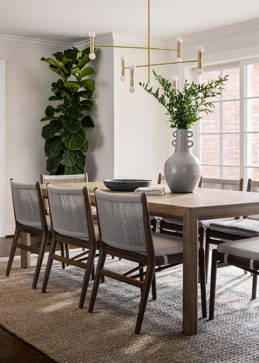
All new furnishings—the original project intent—portray a balance of tonality and texture; formality and informality; traditional and modern. Chandelier by Arteriors Home.

Zeroing in on the objective of a private, multiuse primary suite required borrowing space from a disjointed existing layout. A TV lounge now incorporates a functional workspace integrated within a custom-designed wall unit. The white oak desk and cabinets conceal all off ice accoutrement, and a flush-mount door accesses a tiny half bath.
“You walk in and it gets quiet, both physically, with the wool wall covering, and visually, with the nice rich tones that are calming,” Lisa says.
That aesthetic—the same palette, surface materials and attention to detail—carries through into the primary bedroom, the new laundry room, the daughterʼs room and the bathrooms. A large Kelly Porter painting acquired from Blue Gallery subtly vibrates within the primary bedroom without overwhelming its peacefulness. Again, texture and muted colors feed into the perfect formula for cohesiveness.
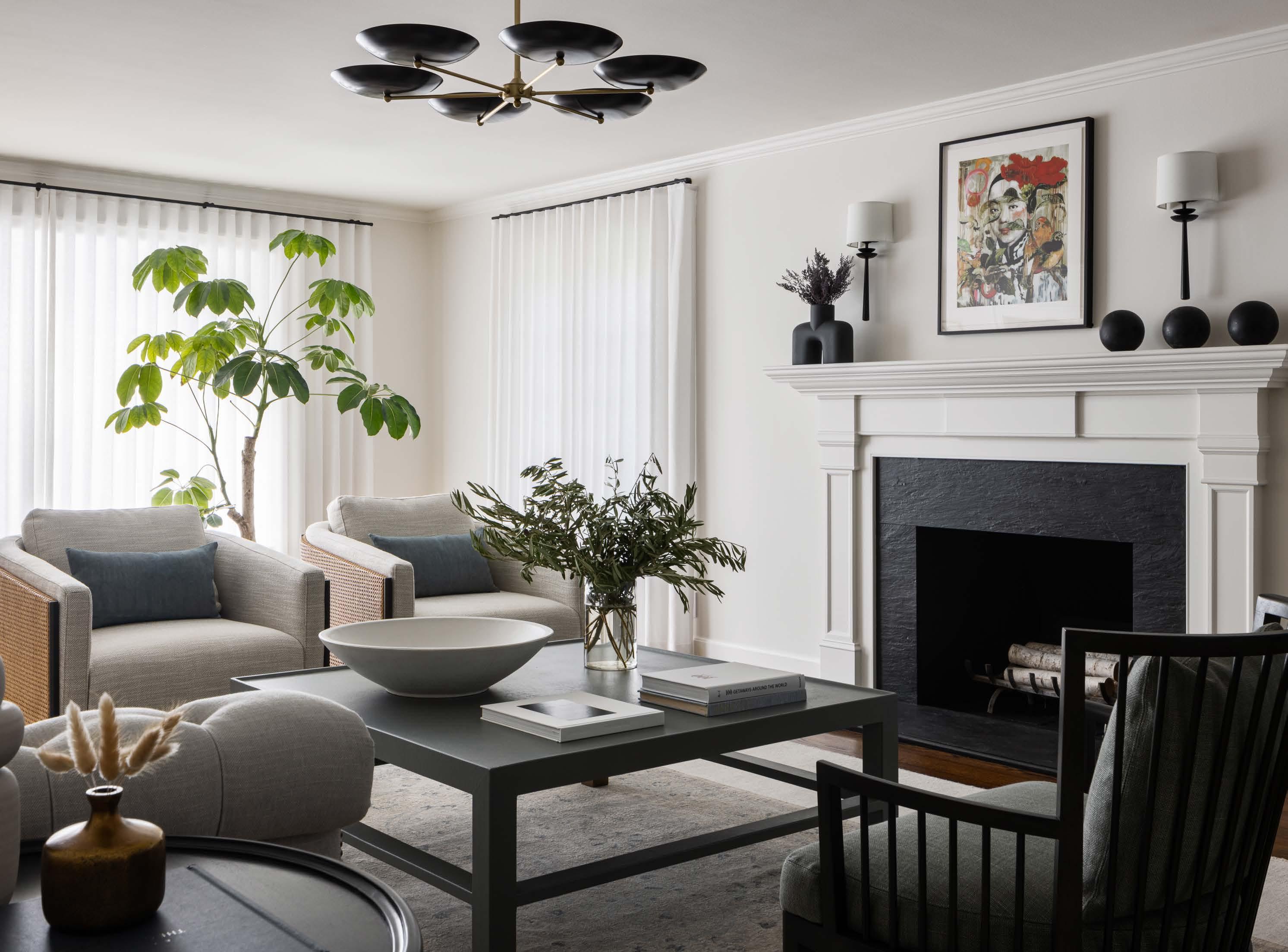

“We also played some tricks with the ceiling by taking away the crown molding and adding it to the existing soff it,” Lisa says.
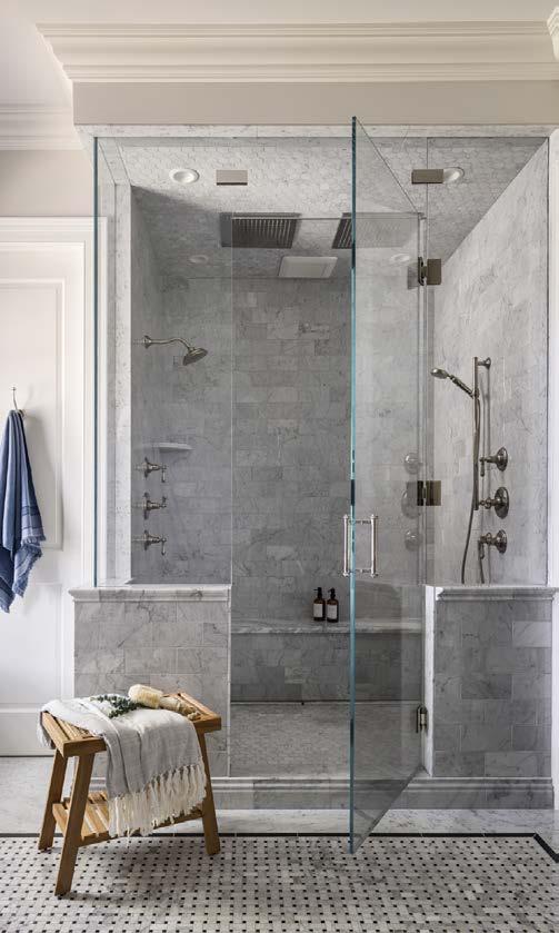
In the master bath, a warmed marble floor combined with a thick, cool gray- and white-veined countertop display a sophisticated mix. As the design team retouched a total of six baths or half baths throughout the house, itʼs hard to determine a favorite. Itʼs equally diff icult to choose a favorite room in the home, as they each tell a story of thoughtful design and luxe comfort—meaning that each space will get a lot of familial love.

schmitzremodeling.com
See resources on page 236
Right: Printed grasscloth wallpaper from Maison Pierre Frey is a statement-maker and is protected by the lavatory backsplash by Carthage Stoneworks.A chicken footstool from The City Girl Farm, along with organic-shaped vases, brings dynamic charm to the clients' buffet in the entry. A handwoven rug adds modern dimension and a pop of color to the welcoming space.
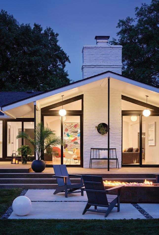
A Prairie Village pool and outdoor living project vibes with mid-century modern and Palm Springs style.
 Words by Megan Felling | Photos by Bob Greenspan

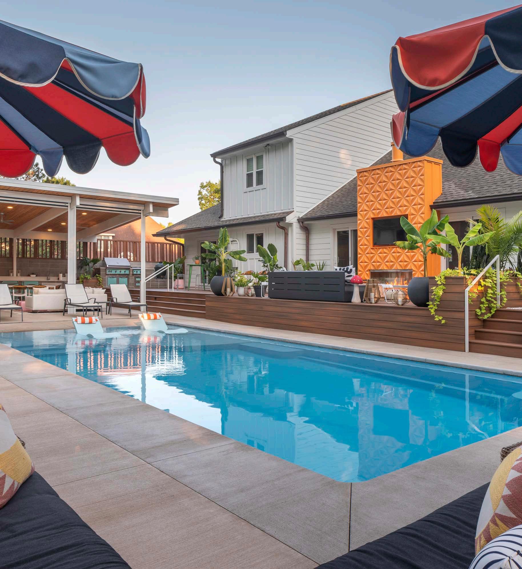
When Kyle and Ashley Walchshauser were looking for a new home, the one requirement they both had was a backyard pool—both of them had grown up with one in their backyards. They found the perfect fit in a Prairie Village ranch with an inground pool and covered patio—and became only the second owners of the 1978 home.

After living in the house for several years, the Walchshausers began planning how to improve the flow of the outdoor area and create a space they could use year-round.
“The original deck was disjointed,” says Ashley, who studied interior design in college and has a background in commercial design. “We wanted to have all the space be usable and to be an extension of the home.”
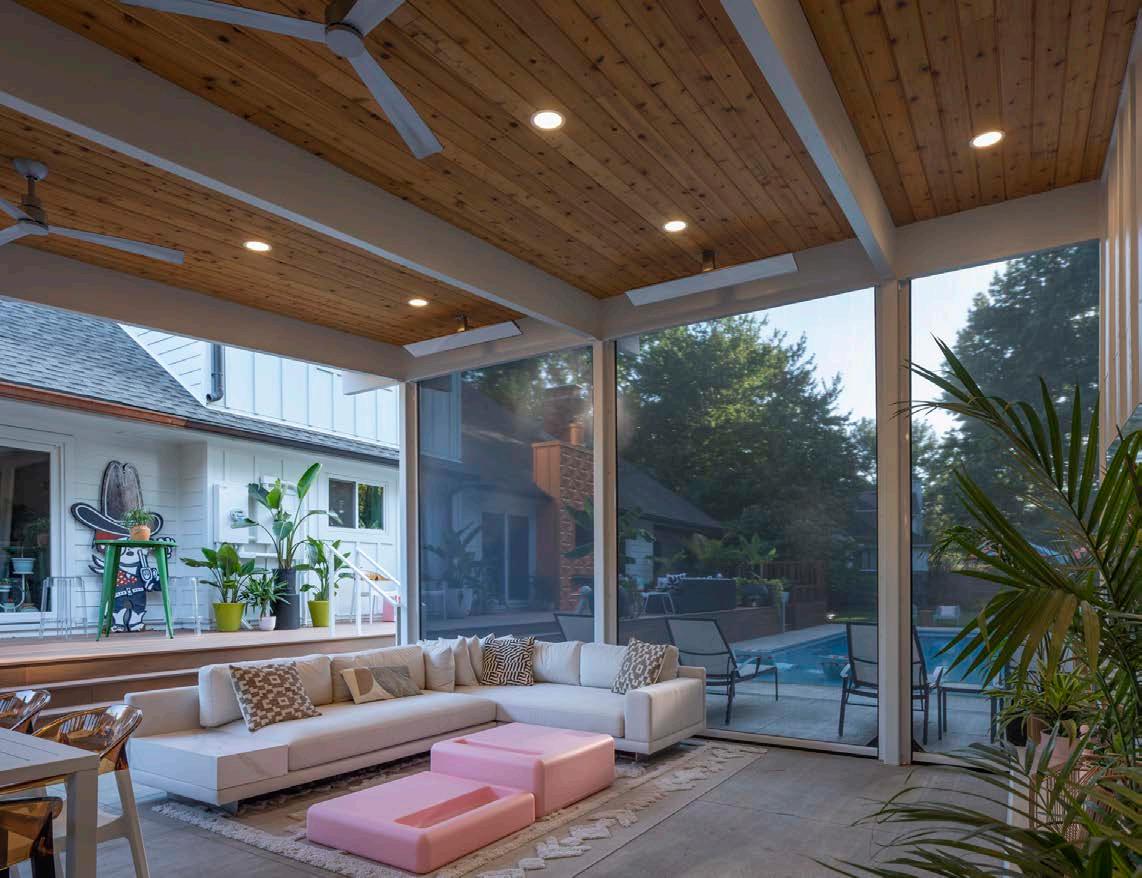
Ashley noticed signs on projects around town for Studio Build and liked the mid-century modern flavor of their work. “It is definitely our style,” she says. “We knew immediately that they were a good fit.”
After hiring the firm, Kyle couldnʼt have been more impressed. “We liked that they are a design-build firm, handling many things in-house. They were very responsive and collaborative, offering us every option,” he says.
The couple loves to entertain, and Kyle loves to grill, so their goals included redoing the pool and deck with three essential parts: a three-season covered room comprising a kitchen, dining space and a living room with a large-screen television; a separate seating area with a fireplace; and a hot tub off the primary suite. For entertaining, incorporating a bathroom outside of the house was essential.
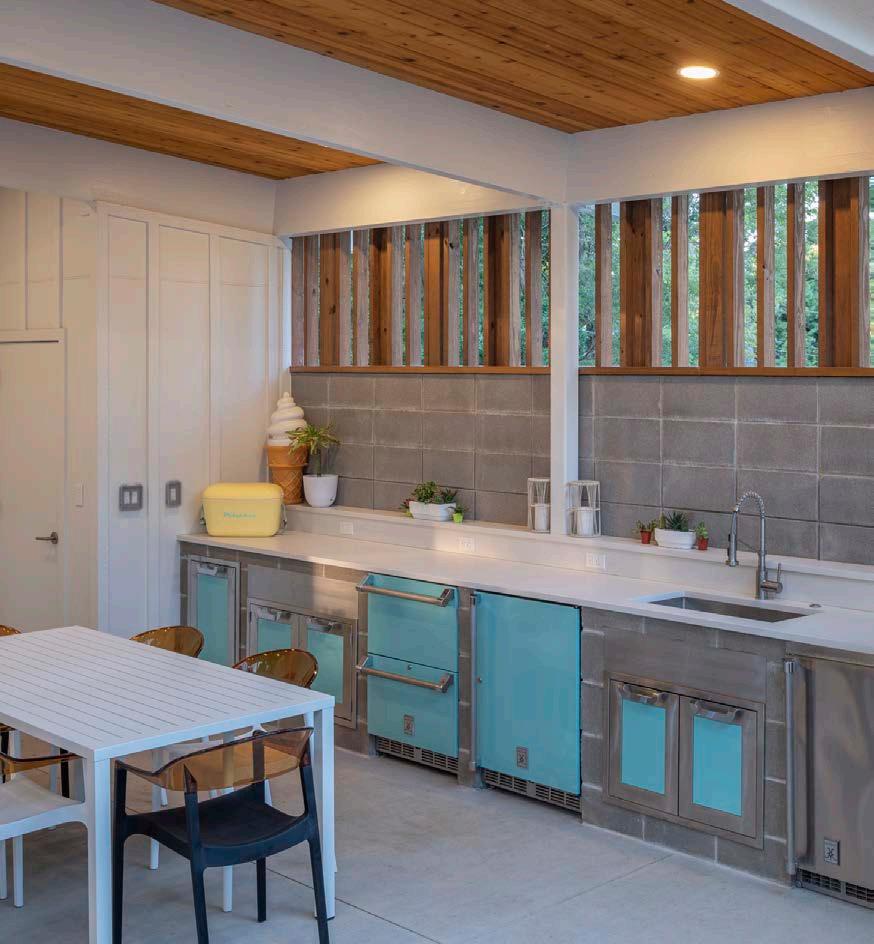
“We started the project in early 2020—right as the pandemic hit—and there were challenges with the supply chain, but Studio Build was great about trying to negate the issues by selecting a different product or making sure that we ordered everything way in advance,” Ashley recalls. “The old pool had been concrete, but it was really diff icult to get concrete, so Jerad Foster (Studio Buildʼs founding partner) encouraged us to look at different types of pools. He went above and beyond doing research. I think we ordered the pool almost a year in advance.”
They chose to install a fiberglass saltwater pool from Aqua Blue Designs, located in Grandview. It has heating and cooling functions so it can be used most of the year.
The covered cabana includes a sink, a refrigerator and an ice maker, as well as a bathroom and storage space.“Their home has some modern features inside, so that was the inspiration for a mid-century modern, Palm Springs-style outdoor living space with multiple defined areas,” says Studio Buildʼs Chris Penland, who served as the project architect. “We designed an open-air threeseason room with roll-down screens for privacy. Fans and electric heaters keep the family room comfortable in all weather.”
For the kitchen, they chose Hestan outdoor appliances, which are manufactured in Europe and available locally through Factory Direct Appliance. Ashley had seen them at the Great Lenexa BBQ Battle several years ago and loved the color. They were worth the delayed delivery time with their matching color and style.
The focal point of the walkout-level deck is the fireplace, made of three-dimensional textured concrete tiles, manufactured by Kaza and painted bright orange. “It was originally planned to be white, but the family had recently painted a bathroom orange and loved the pop of color,” Chris says.
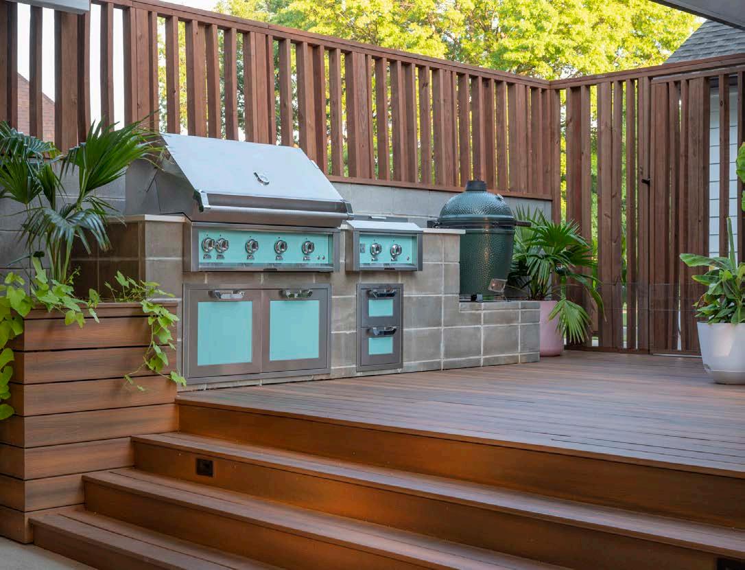
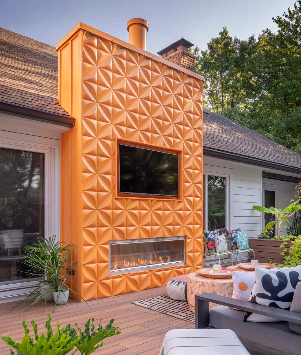
The final piece was a hot tub added just off the primary suite. It needed to be private but also accessible to the pool and seating areas. The couple says it was a great addition and use it several times a week.
Fortunately, the expansive yard already featured several large trees for privacy and beautiful views from the new deck. Unfortunately, new city codes required that gutters be extended to the property line, so part of the yard had to be trenched. The Walchshausers took it in stride.
“We realized it would be worth it to grade the property and avoid any future issues,” Kyle explains. “We also took advantage of the opportunity to upgrade the electrical while the renovation was happening so that weʼd already be prepared for later needs. That was another great recommendation from Jerad.”
The final result? “We love it,” Ashley says. “The kids have really enjoyed the pool, and weʼve hosted a lot of events here. Weʼve actually just contacted Studio Build to start talking about renovating the inside kitchen and living areas, also.”
@studiobuild
See resources on page 236
Hestan outdoor appliances in Bora Bora Blue bring a color with a mid-century vibe to the space. This outdoor kitchen is conveniently accessible outside the homeʼs sliding glass door.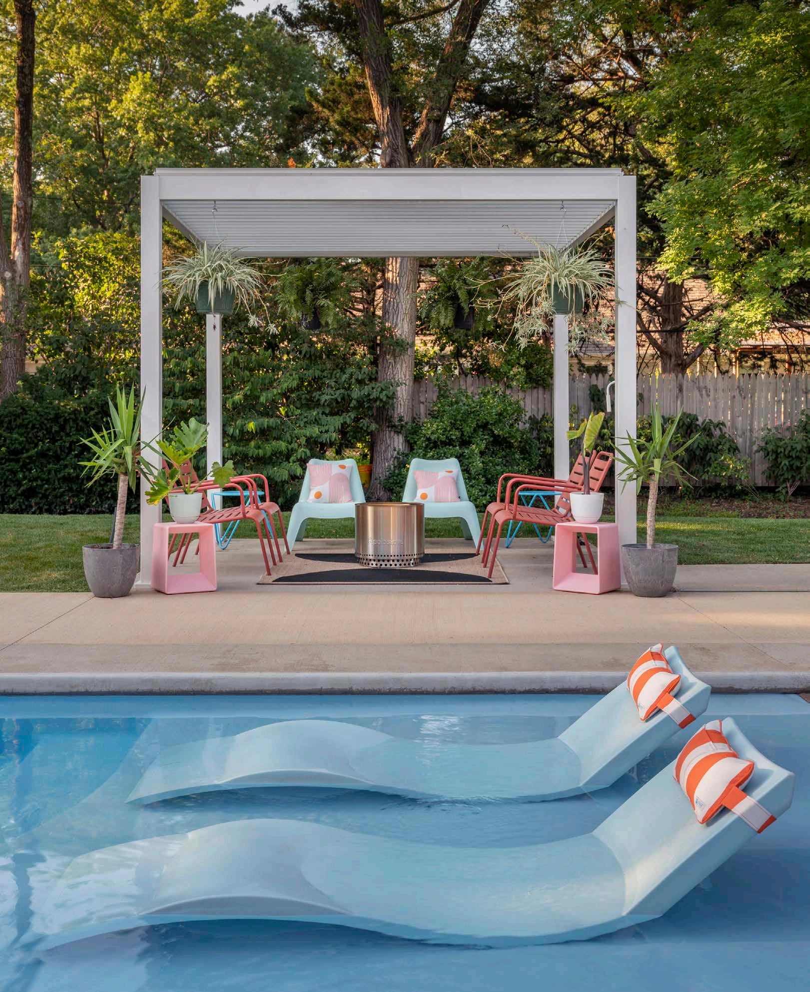

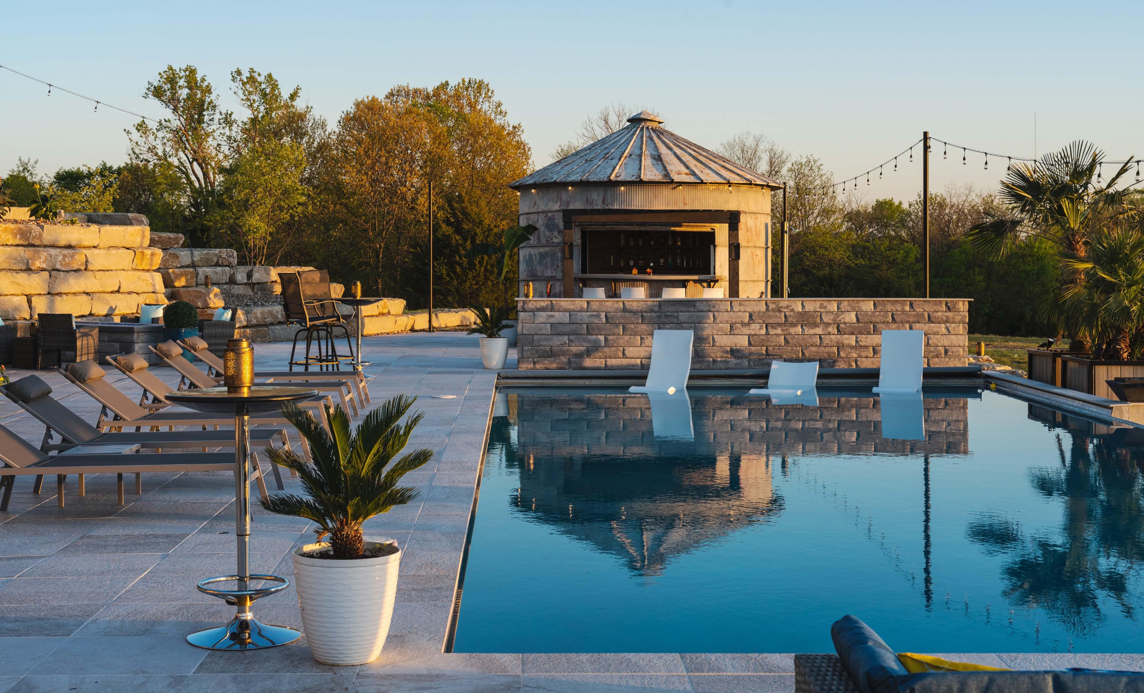
AKansas sunset is something to behold— an ombré gradation of orange, pink and purple—and watching that daily is what inspired Pete and Sarah St. Peter to build their hilltop house on 50 acres of land in Linwood, Kansas.
The 8,000-square-foot Modern Mountain-style house was on the 2022 Artisan Home Tour and is one of the most complete homes in terms of showcasing every possible room type—from a craft room, sauna and tornado/gun safe to a home theater, library, music room and dog-washing station.
But the outside is where the couple prefers to spend the majority of their time. And, again, they went with one of everything—pool, gas fire pit, wood-burning fire pit, hammock station, putting green, giant chess board, sand volleyball court and grain bin bar.
Grain bin? Yes! As owners of PCDI, a custom homebuilding company, the couple was developing a parcel of land for a neighborhood of estatesized lots and removed a metal silo from the old farmstead there. Its unique cultural heritage stirred
 Words by Andrea Darr | Photos by Matthew Anderson
interest from several would-be buyers, but Sarah had a vision for it.
“I need that grain bin,” she told Pete.
Pete listened. He is the doer; she is the idea generator. Together, really, they can create anything.
“If we havenʼt done it before, we consider it fun—a challenge,” Pete says. “We donʼt mind trying until we figure it out.”
So the grain bin was positioned poolside and stocked with a fridge, sink and cedar-backed shelves for bottles. With the help of metalworker Paul Lamb, they cut out a window and installed a motorized hoist for it. Paul also welded doors for easy side access and fashioned an artistic metal pergola above. A similar piece artfully surrounds and conceals the pool equipment. Pete built the bartop base, added color-changing fiber-optic lights and
poured a smooth layer of concrete on top—an effect that looks like a rock ʻnʼ roll starry night show.
Additional bartop seating looks out over the saltwater pool built by Stranger Creek Pools. The rectangle shape looks simple, but like most things that look simple, therein lay another challenge for the couple. They wanted an automatic cover and a waterfall edge.
“Normally, you canʼt do both—itʼs one or the other—but we made it work,” Sarah says.
Iridescent tile on the overflow shimmers in the soft glow of sunset from the back side, where the sand volleyball court spreads out on a second tier. At one end is a hammock station—straight out of a Cozumel stylebook—replete with sail shades, cedar mats and side tables.
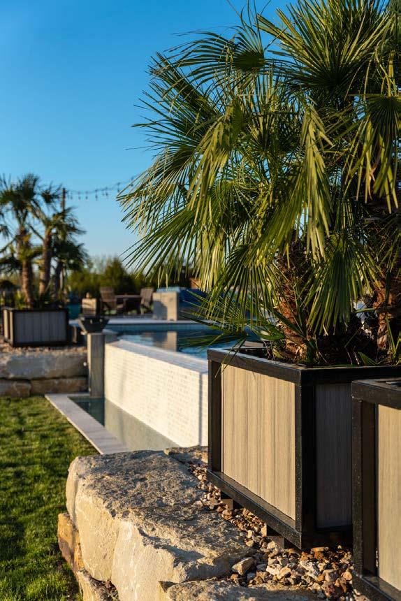

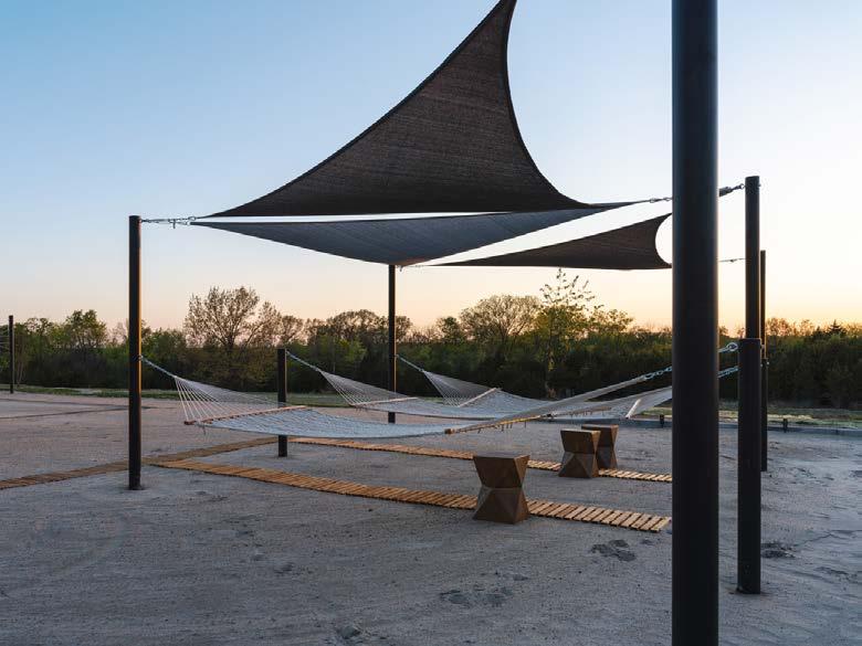 Above: As tropical plants, palms will not survive winter in Kansas, so the St. Peters custom-designed planters that can easily be transported by forklift into the heated conservatory.
Below: Inspired by images of backyard chess boards and putting greens online—but finding how-to information lacking—Sarah and Pete experimented with their own processes to create these amenities.
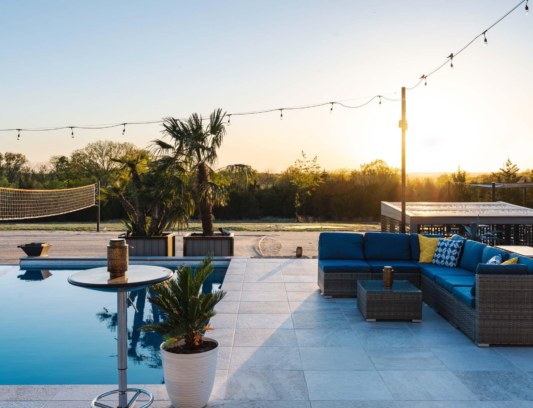
“
“I am inspired by going places and seeing things I like but …and knowing that we have a team that can take those ‘buts’ and turn them into reality.”
~ Sarah St. Peter
“Can you tell weʼve been to a lot of Mexican resorts?” Sarah asks.
The other side features fun and games, with a fourhole putting green and a human-sized chess board.
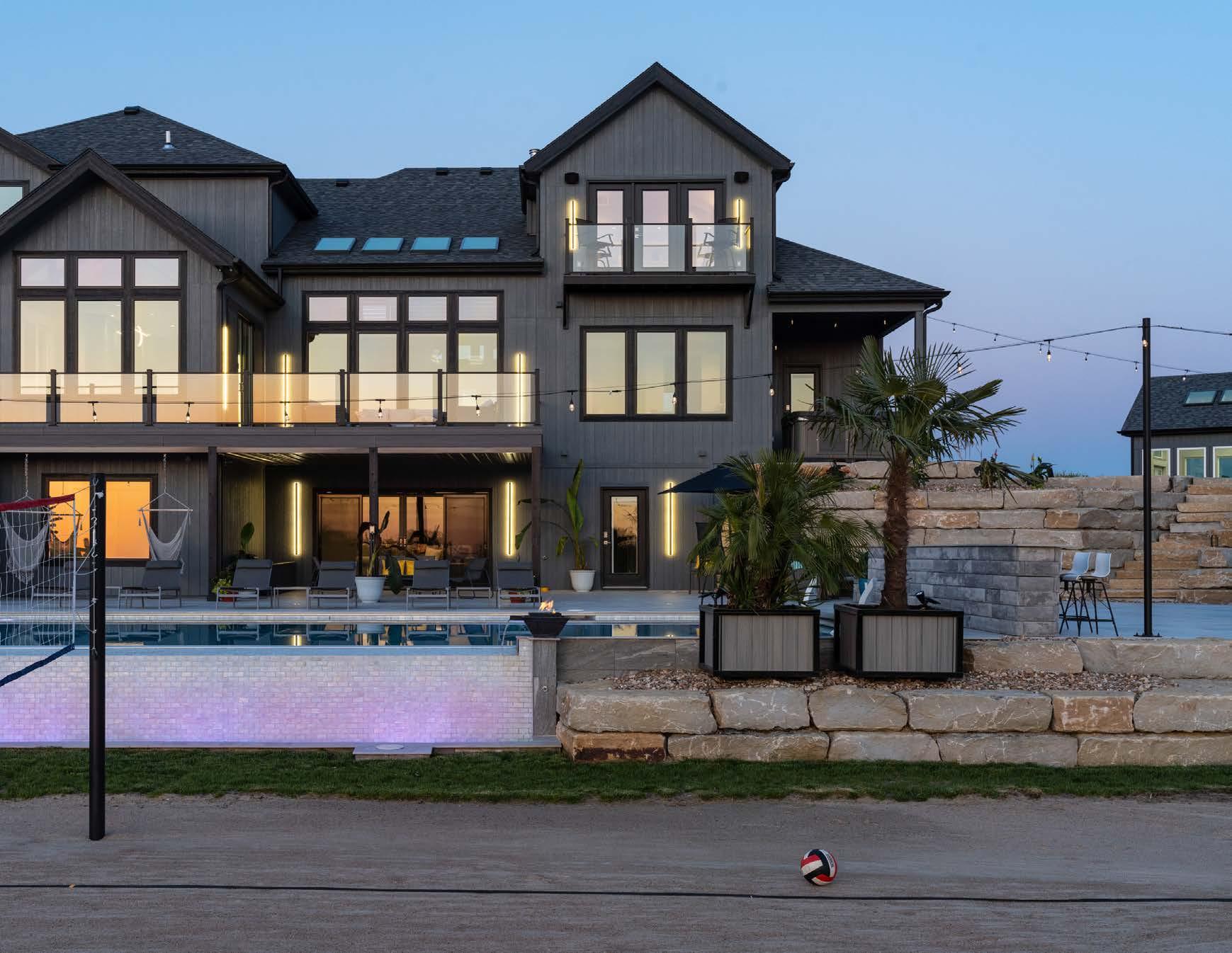
Softening all the hardscaping are tropical plants, including palms, agave and banana, lemon, lime, orange and pineapple trees. The St. Peters drove south with a trailer to acquire the non-natives for potting around the pool deck.
“The trip to Texas was so worth it,” Sarah says.
And, of course, the St. Peters thought ahead about the end of the growing season and fabricated planters with built-in fork pockets on the bottom.
“We will just fork them up and theyʼll live in the conservatory for the winter,” Sarah says.
Positioned on the front side of the house, the heated conservatory and its 24 irrigated raised beds nearby are where Sarah wishes to spend her time, raising fruits, vegetables and herbs. The orchard will be planted soon, and the beehives were installed this spring.
All of the creation, tinkering and execution is satisfying for the couple. But there is one challenge they continually find to be a thorn in their side— the wind.
“Itʼs brutal up here on the hill,” Pete says.
Sand blows all over the patio and has to be swept up; couch cushions must be recovered from the pool; and umbrellas sometimes harboring angry wasps fall over and must be uprighted again.
But the resort feel canʼt be beat, and plans for expansion are on the horizon. The third tier down is a blank slate, and ideas for a pickleball court, horseshoes, a frisbee golf course and a shooting range are in the hopper. When those are installed, the St. Peters will off icially be settled in.
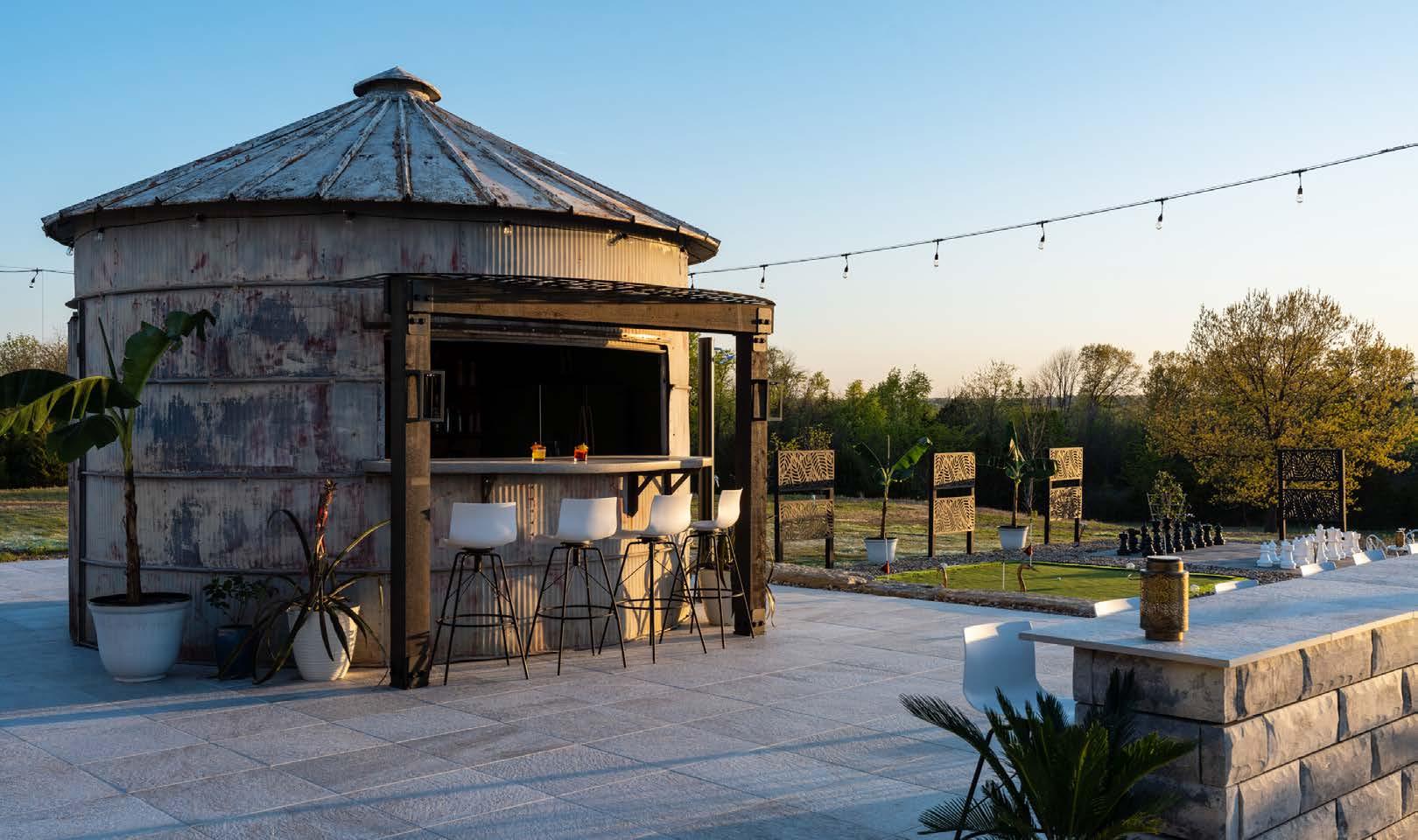
Perhaps Pete would prefer even more of a resort feel in an actual resort town, but Sarah is staunchly a Midwestern gal.
“I really like Kansas,” she says. “I think itʼs absolutely beautiful.”
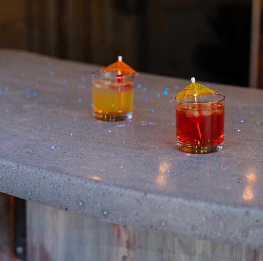
If youʼre curious about how a homebuilder approaches creating their personal residence—and whether it differs from their other work—wonder no more.
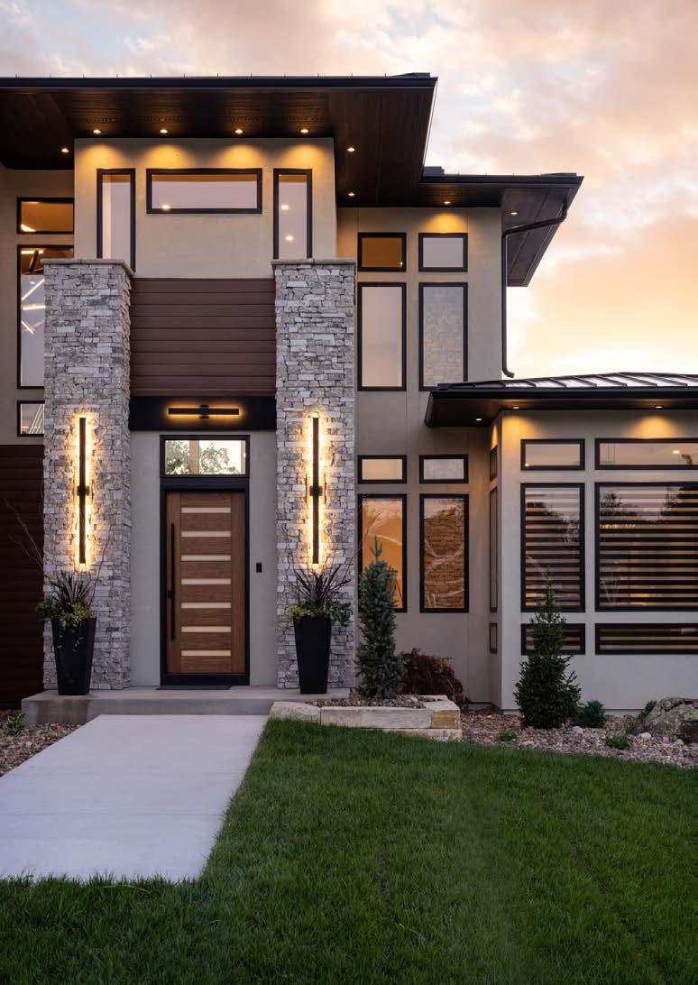
For Jason Walker, owner of Walker Custom Homes, that answer is a resounding ʻyes!ʼ Heʼs built nearly 30 homes on and around Lake Winnebago. And when he invested in a bundle of lakefront homesites that became available as a result of new dam construction, Jason and his wife, Heather, decided it was the perfect spot for their new home. And thatʼs when things got fun!
“We spent a lot of time designing the house and coming up with some really cool ideas,” Jason says. “Because itʼs our personal home, I spent an extreme amount of time researching and also investing in cool stuff all the way through the house.”
Jasonʼs initial inspiration: a classic contemporary home in Florida that immediately caught his eye with its striking exterior and roof lines.
Words by Katy Schamberger | Photos by Matthew AndersonHome features, including numerous windows and a two-story covered porch and deck, help the Walkers take full advantage of their lakefront homesite.
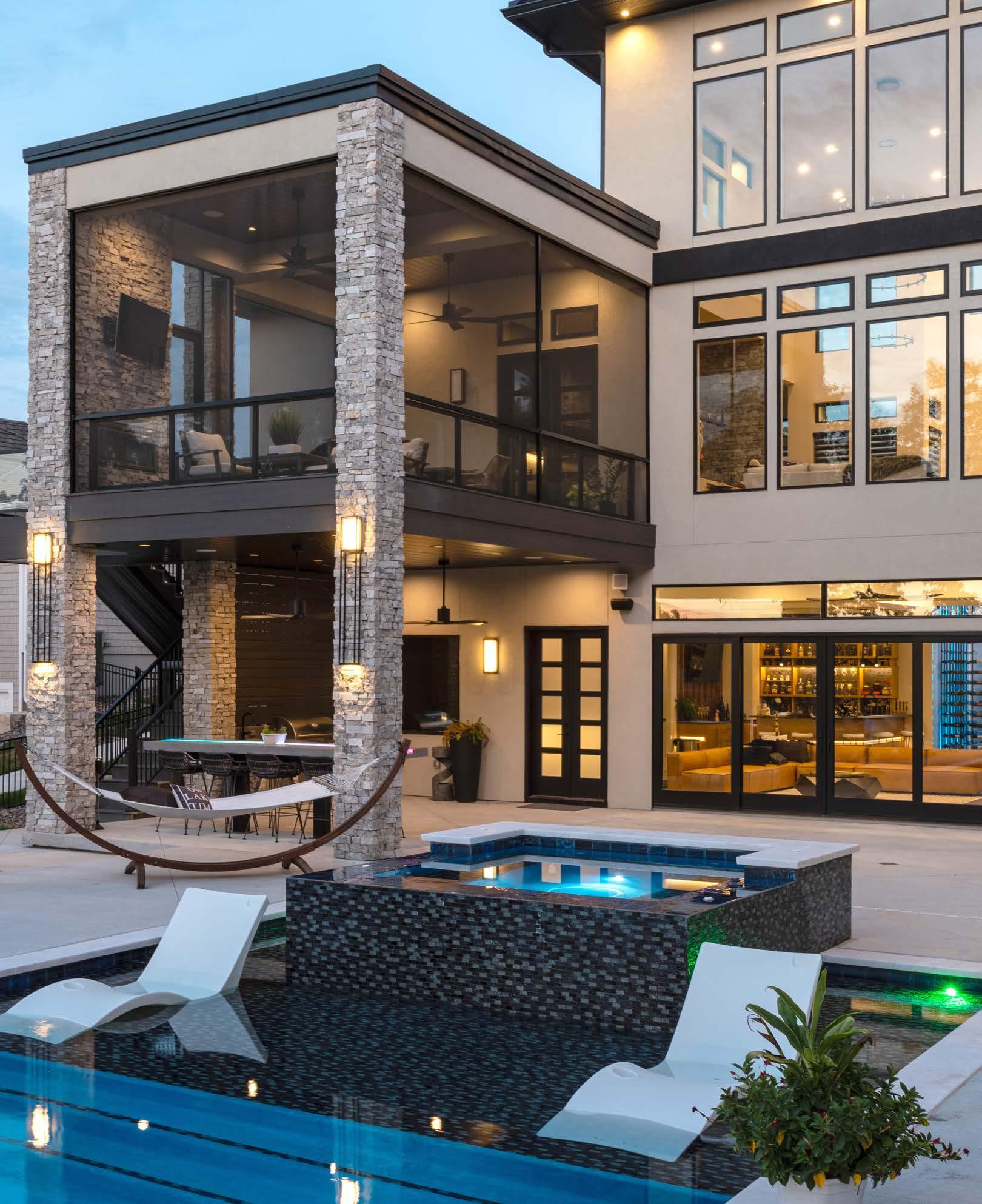
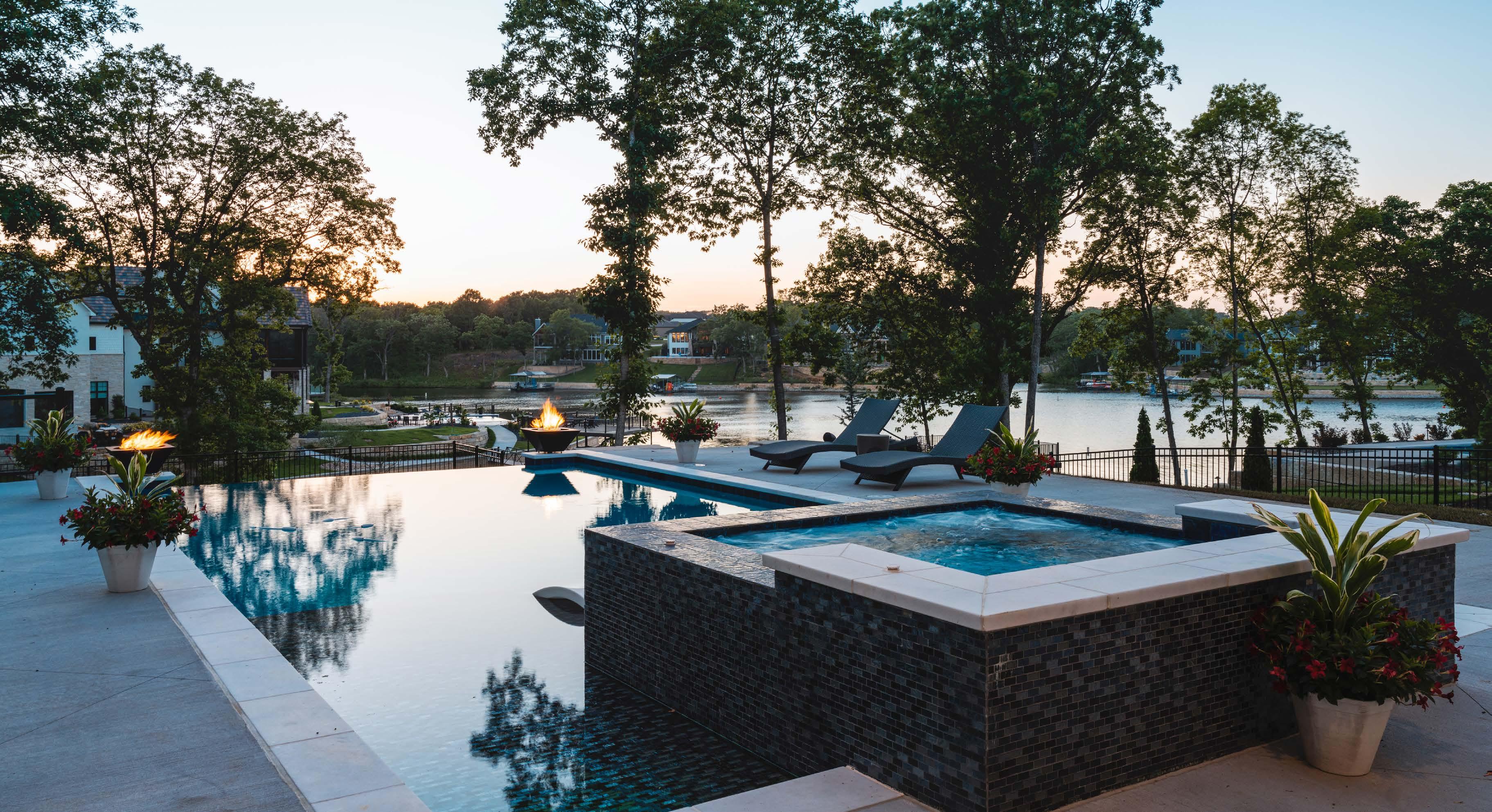

“I love the look of modern roof lines, and I knew I wanted to do a 2-12 or 3-12 metal pitch roof,” he says.
Jason brought that vision to his architect, Jeff Pfiefer of Viewpoint Residential Design, so that they could enlarge the square footage, add a lower level (there are no basements in Florida!) and add features like an expanded five-car garage. The 7,500-square-foot home has four bedrooms, five bathrooms and a favorite feature for guests: a bunk room outfitted with custom metal bunk beds.

Jason collected ideas and details for finishes, scouring sites like Houzz to create vision boards. He also had running notes and documents in his phone, along with folders to stash inspirational images. His mantra quickly became: “Itʼs a crazy photo, but how do I do it?”
One prime example is the ownerʼs bedroom—or, more specifically, the bed itself. At first glance, the platform, lighting and floor-to-ceiling surround create the illusion that the bed is floating.
“Our bed is insane,” Jason says with a laugh. “I found a photo of a similar bed in a house in Europe and just loved it. We built a custom platform bed into the wall, then used a combination of custom-cut luxury vinyl plank, along with stained walnut and white pine, to create the piece that continues up along the ceiling.”
The homeʼs built-in indirect lighting is “a whole other story,” Jason says. He teamed up with Dallas-based American Lighting, which provided so many custom
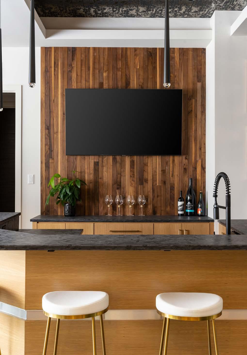 Right: Inventive, unexpected lighting plays a significant role in the wine cellar, where LED light strips change color behind the wine racks.
“With so many colors of lighting, our home is better to look at after dark,” Jason says.
lighting installations throughout the home that Jason says they revamped some of their marketing materials to feature this particular project.
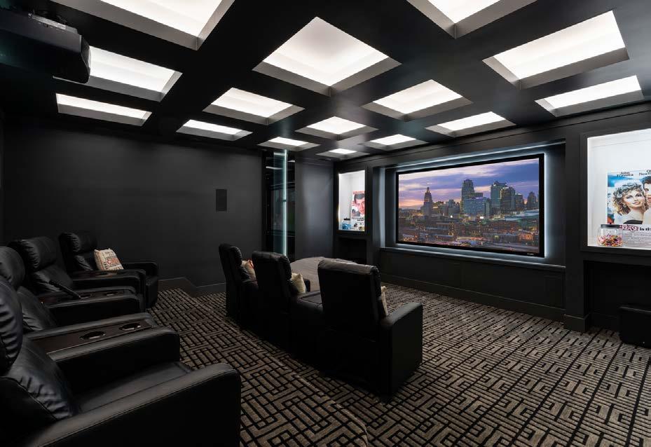
“We did an absolutely extreme amount of unique, indirect lighting, whether along the ceilings, in the wine room, the niches of bars, around the beds,” he says.
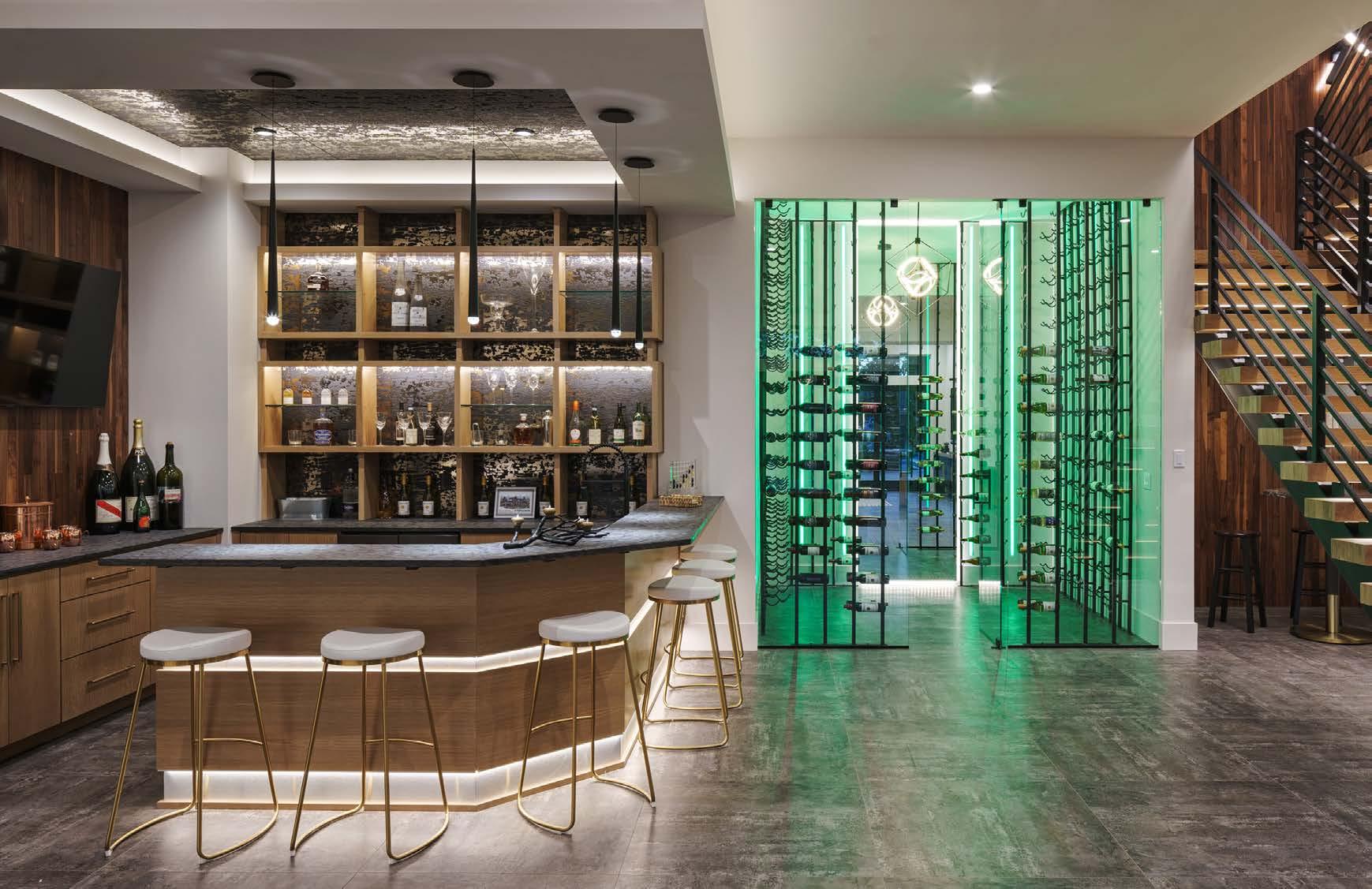
Another inventive lighting example? The feature that Jason calls his “craziest idea:” an over 40-foot staircase that serves as a sculptural focal point of the home.
“I have a metal guy that I work with whoʼs just an artist,” Jason says. “We sat down, created the concept and built it on-site.”
It took a week alone to router the front of each step so that metal tube-encased lighting could be installed along the entire length of the staircase.
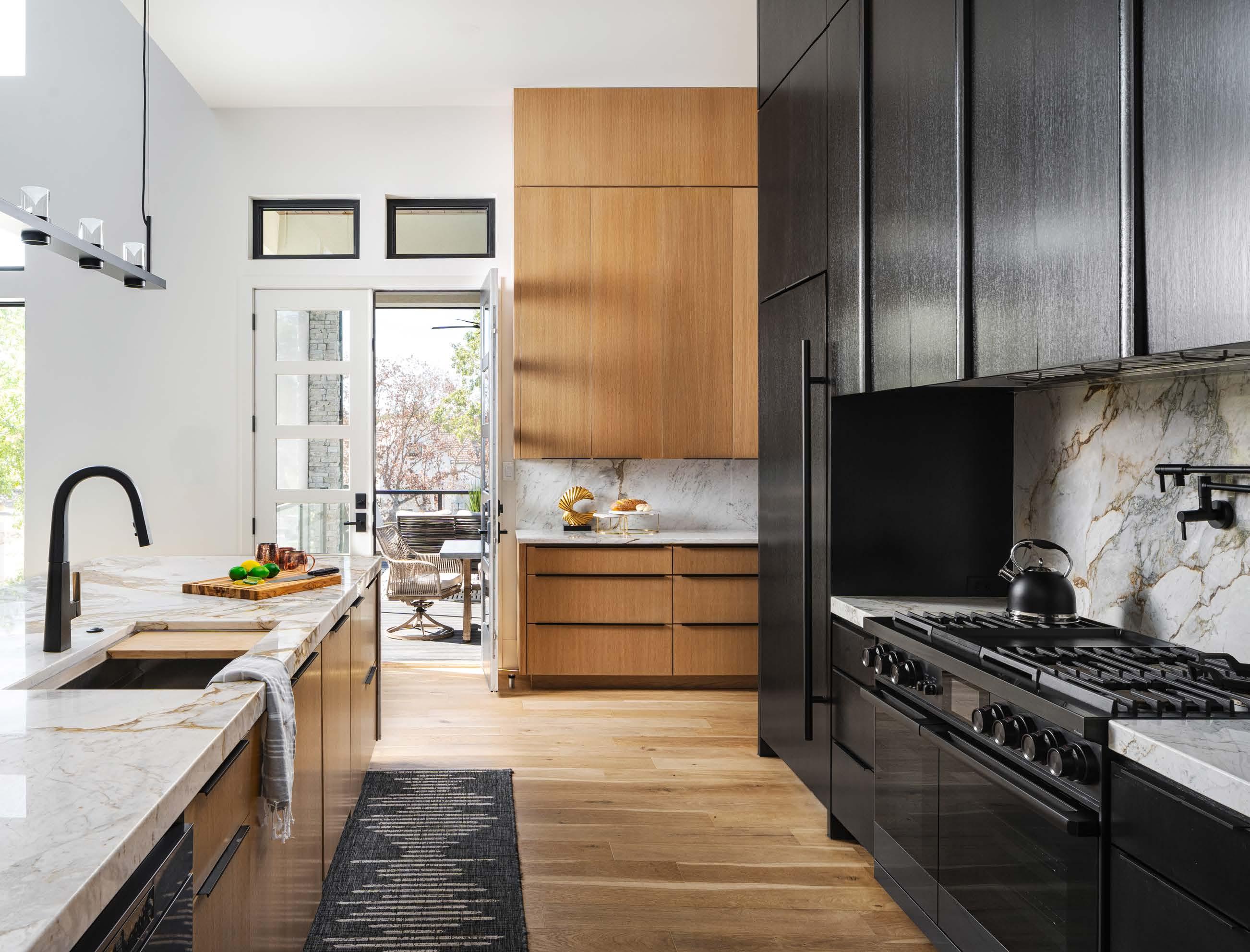
Combined with the open design and an exciting mix of materials, including metal and wood, the end result is nothing short of a showstopper.
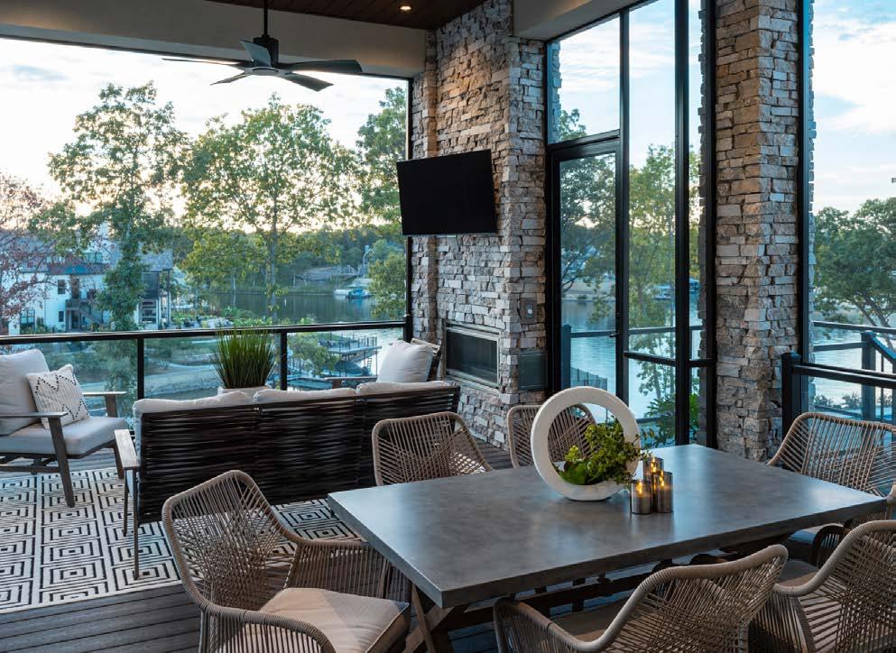

“When you stand under it, it stretches all the way to the top ceiling, and you see all of that indirect lighting shining through the staircase,” Jason says. “Largely because of the lighting, our house is better to see and experience at night.”
Thereʼs no denying that Jason and his team had a chance to truly push the bounds of creativity. But as Jason explains, there was undoubtedly a method behind the madness.
“My wife and I spent a lot of time thinking and talking about how we were going to live in the house,” he says.
Uniting their interior and exterior living spaces was among the priorities. The coupleʼs motivations—and ingenuity—gave rise to the ultimate indoor-outdoor experience, which begins with rolling open the 16-foot doors in the home's lower level. Once agape, they reveal an expansive outdoor area featuring a swimming pool, fireplace, seating (including a dining table) and a screened-in porch outfitted with a television—and, of course, prime views of the lakeʼs rippling waters.
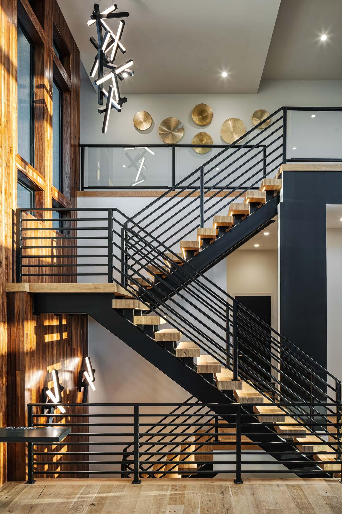
The house is aptly named “The Retreat” to exemplify the experience that Jason and his wife want in their home—for themselves, their family and their guests. At the end of a long day, he makes a beeline to the backyard area.
“Thatʼs our oasis when we have downtime,” he says.
The intentionality and attention to detail are evident throughout The Retreat. These qualities also extend to how the rooms fit together: a harmonious collection of materials, color palettes and finishing details that all create a seamless cohesion and balance with the homeʼs modernity. Here, sleek doesnʼt mean cold, uncomfortable or sparse. Instead, the lakefront location inspired the use of organic materials—like a mixture of wood types and natural stone—to infuse the home with warmth and style.
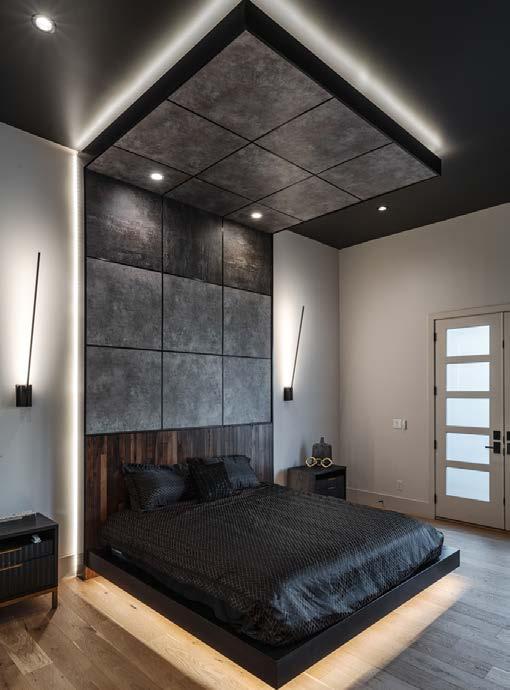
Jason did learn one valuable lesson after construction wrapped.
“We had to be finished last May for the Artisan Home Tour, so we built this home in 13 months,” he says. “I wouldnʼt do that again—build this custom of a home on that short of a timeline. It was stressful,
and there was additional pressure on everyone to do their part.”
It may have been diff icult to get there, but his homeʼs showing on the tour earned Jason more than just acclaim for his creative vision and skill—he also gained some new clients.
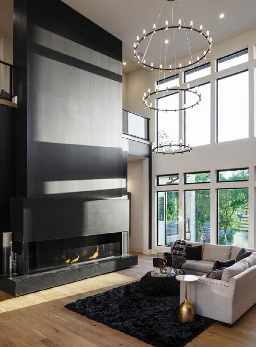
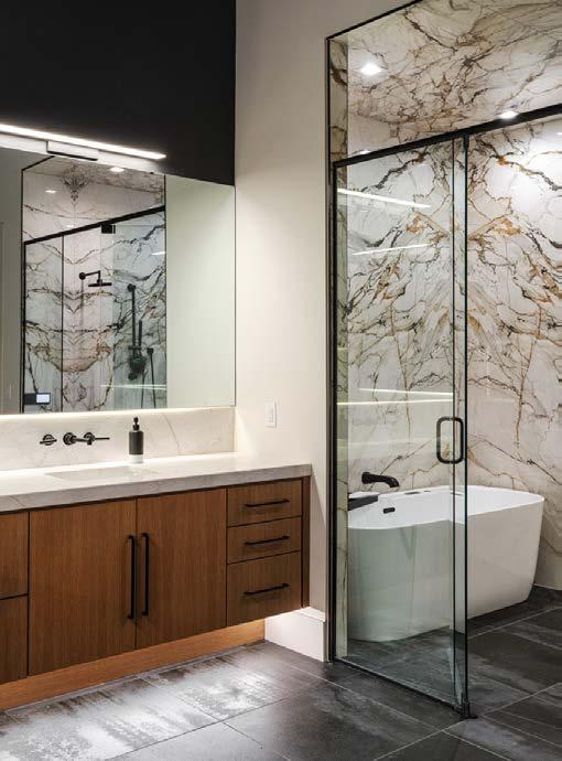
“We had about 1,000 people through the house in a two-week period,” he says. “I got a multi-million dollar build job from it, as well as some other opportunities. And people are really excited about the architecture and also the finishes. The use of natural tones is so popular right now, and people loved the sourcing of different wood materials and also the contrast between light and dark hues. Weʼve been able to scale some of those visions and input them into many of our floor plans.”
And who knows? One day, someone may study photos of Jason and Heatherʼs home and use them as a foundation for their own vision board. To be inspired by and then inspire others—thatʼs the full circle of creativity at work. And every day, the Walkersʼ lives unfold within the dream retreat that they made a reality.
@walkercustomhomeskc
See resources on page 236
The custom platform bed is built into the wall, featuring a combination of luxury vinyl plank and stained wood up the wall and onto the ceiling. “Our bed is insane,” Jason says with a laugh. The same mix of materials seen throughout the house was used in the primary bathroom for cohesion.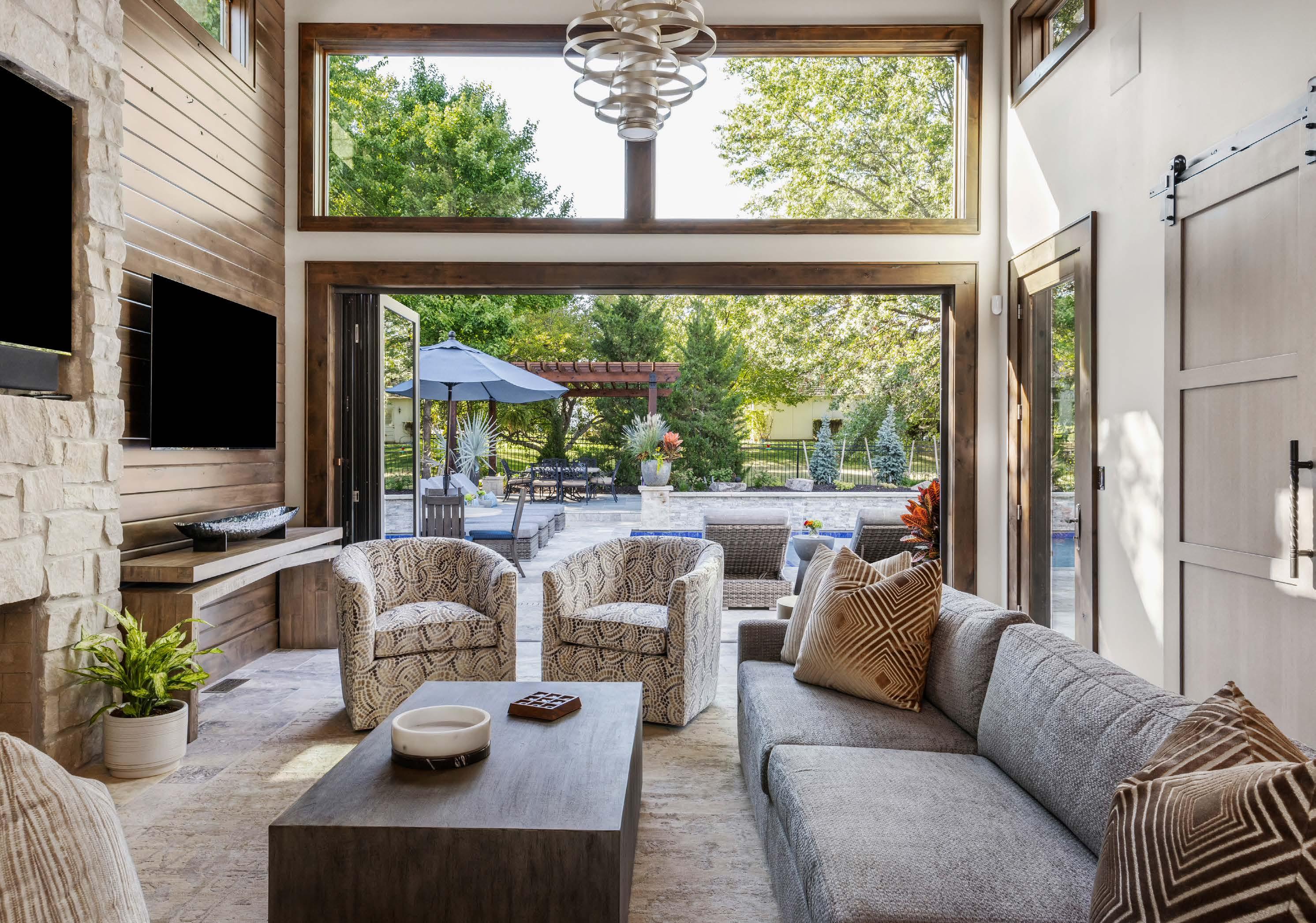
The renovation began three years ago with a simple request—eliminate the step down from the kitchen to a neglected sunken porch so it flows into the rest of the home. Instead, it ended with the entire 1979 Prairie Village Tudor home being taken down to the studs, turning an exposed patio into a covered lanai and relocating the in-ground swimming pool.
Today, the home is unrecognizable. Once a rather run-of-the-mill, traditional Kansas home that hadnʼt been updated in 20 years, itʼs now a showstopping entertainment space that feels like a modern luxury resort.
The homeowners—a pair of physicians—had considered moving but decided first to call designer Stephanie Abramson, owner of SEA Design, to probe her brain. Stephanie had previously designed the husbandʼs medical off ices, so the couple was already familiar with her work.The wife liked that Stephanie attentively listened to her and fulfilled her wishes.

A Prairie Village Tudor receives an empowering facelift—and a seamless indoor-outdoor experience for all seasons.
“Weʼve had a couple of other decorators, and it didnʼt go particularly well,” she says. “They would talk to my husband, and then they would just do stuff. I would say, ʻWell, we should do this,' and they would just ignore me. And I found it incredibly frustrating.”
Once the conversations began, the homeowners realized they wanted a space conducive to entertaining their children, grandchildren, friends and colleagues. They wanted their indoors to flow seamlessly into the outdoors. And they wanted that sunken porch to be transformed into a media center.
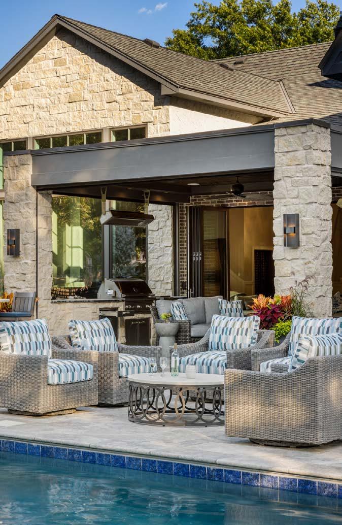
“I have a sickness,” the husband jokes, referring to his desire for a room with multiple TVs to watch his beloved Jayhawks and Chiefs simultaneously, should the need arise.
Seriously, though, he says, “We kind of knew we had to redo the kitchen, and then one thing led to another. We would walk around and say, ʻWell, you know, we donʼt like this about the house; maybe we can open this up.ʼ”
A series of rooms at one end of the home—a great room, the kitchen and the media room—now flow seamlessly into each other and out into the backyard.
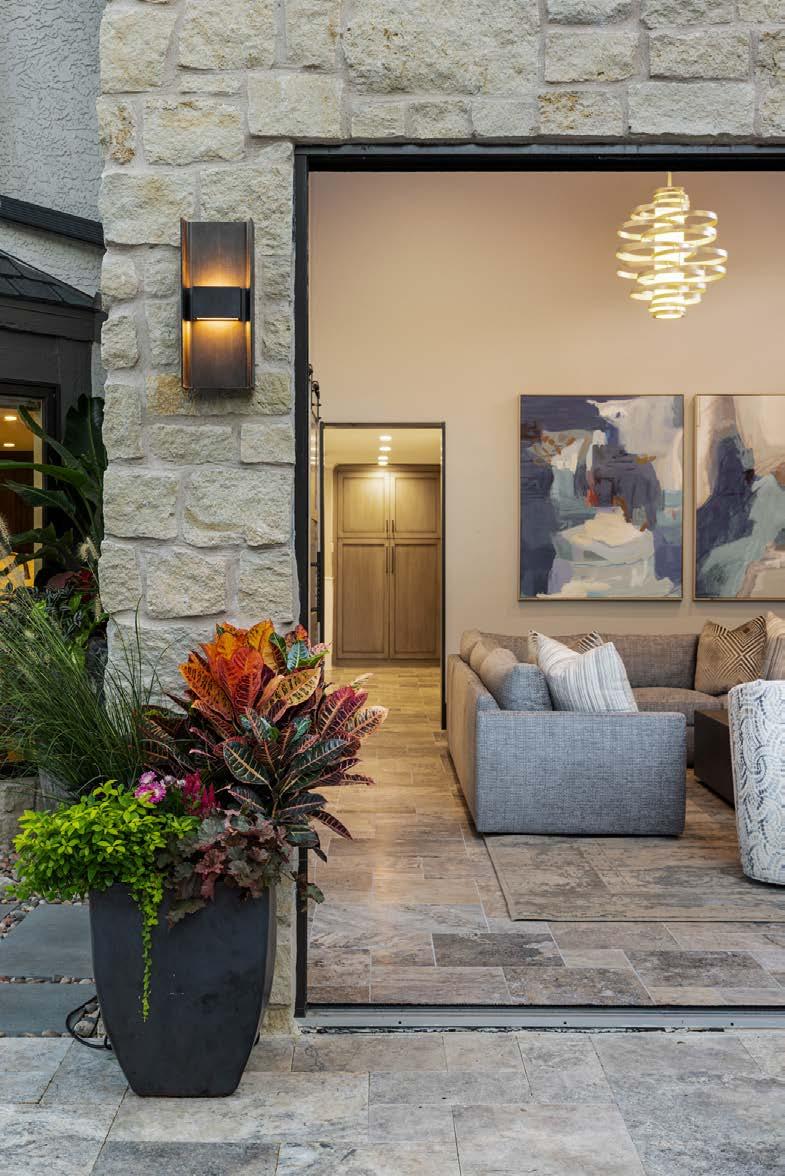
The entry, living room and dining room at the center of the home are a bit more formal.
Upon first entering the home, Stephanieʼs inclination was to eliminate the catwalk between the foyer and formal living room that connected two sides of the upper floor. Getting rid of it opened up the area between the two spaces, raising the ceiling from eight- to 17-feet high, thus making for a grander space for welcoming guests.
The new media room merges with the outdoors through folding patio doors.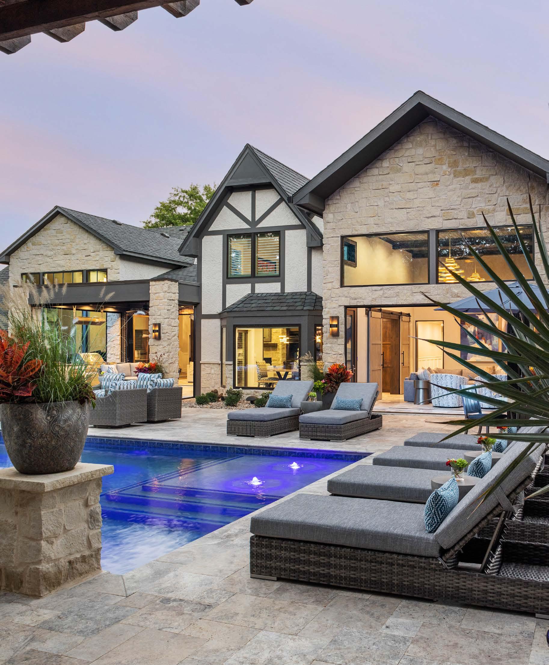
Straight ahead, a series of arched windows in a formal living room was expanded and reshaped into one massive window thatʼs now fronted by a grand piano. A sleek, modernist fireplace is encased in Carrara marble, creating a soaring monolith that touches the 17-foot-high, wood-beamed ceiling. A pair of crystal chandeliers glitz up the space, as do three pairs of contemporary gray velvet and brass swivel chairs.
Artwork on either side of the fireplace adds interest in the form of asymmetry. The husband fell in love
with a pair of blue abstract paintings. But, instead of hanging one painting on each side of the fireplace, Stephanie suggested stacking them on one side and finding another painting for the other.
“I didnʼt want it to match,” she says. “And the use of a bird in art is really sexy, so I showed them that and they loved it.”
She carried the blue into the nearby dining room, using a more vibrant hue of navy. The dark color is balanced by white-lacquered wainscoting, moldings and ceiling texture. A burled wood
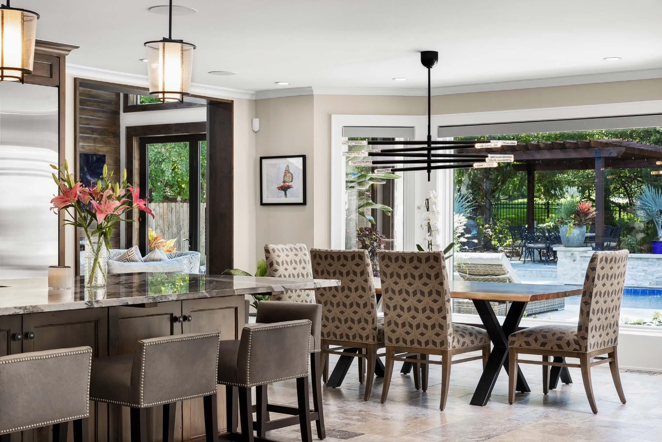

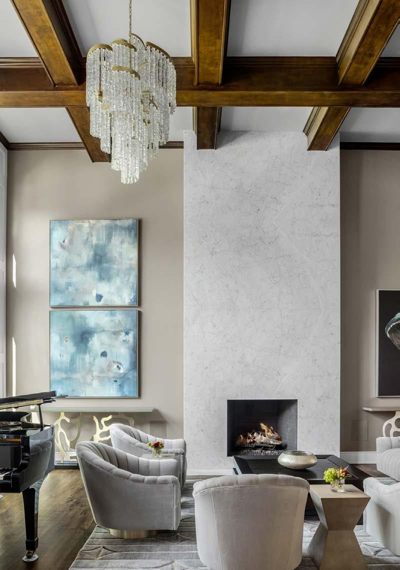

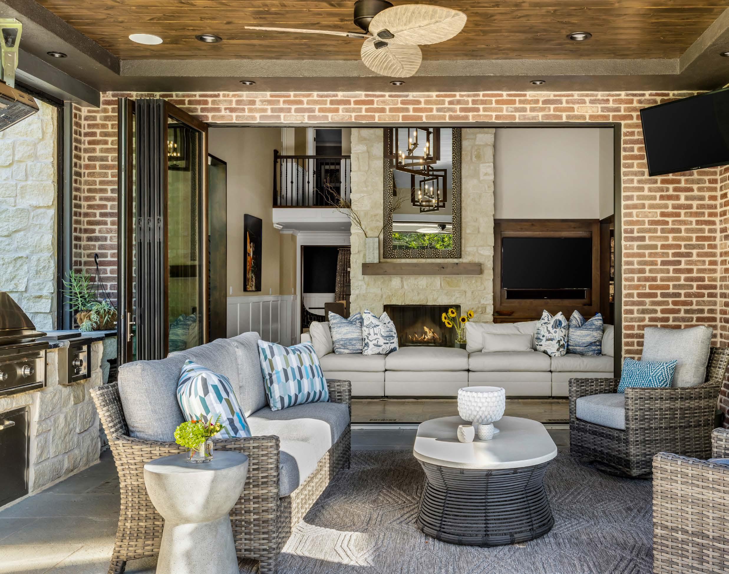
cabinet offers contrast and emphasis to one end of the room, while a five-foot linear crystal chandelier adds bling above the dining table.
Additionally, every room in the home—including the bedrooms—was filled with new furniture and decor. But the most impactful changes occurred at the homeʼs end near the pool.

The hearth room, kitchen and media room have been outfitted with folding glass doors that open onto a lanai that was once an uncovered and unused patio. Enclosing it with a roof allows the homeowners to treat it like another interior room, even when leaving the doors open on warm days. Hanging heaters installed on either side of the lanai also keep the space warm and comfortable during the cooler months.

The roof and fan over the lanai make it a more pleasant place to lounge on summer days. The homeowners rarely used the space before their addition.
Right: Phantom screens are automated to roll down at the touch of a button, keeping the entire house breezy and bug-free.
Just beyond the lanai sits the new 46-foot pool and bordering waterfall wall—both situated to be better seen from the home. Another patio covered by a pergola rounds out the backyard.
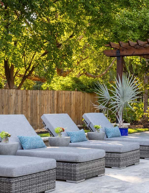

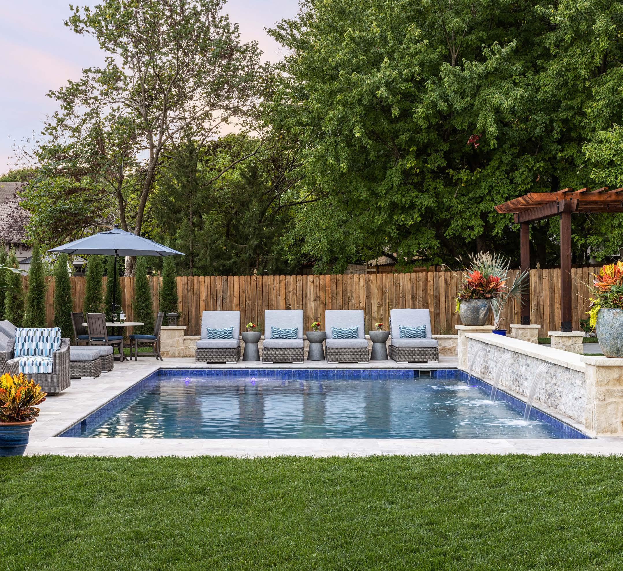
Silver travertine tile flooring in the great room, kitchen and media room continue around the pool, further melding the indoors and outdoors. Finally, the lanai floor is sheathed in blue stone tile for a “break in the action,” as Stephanie describes.
But the biggest bonus for the homeowners is that enclosed media room just off the kitchen that was once the sunken porch—the space that jumpstarted all the redesign ideas. Itʼs now enclosed and equipped with three televisions. (The hearth room and lanai also each have a TV.)
“We spend a lot of time in that room with the TVs, both in winter and summer,” the husband reports.
“And we use our patio thatʼs now covered in the summer. Quite frankly, we just kind of ignored them both before.”
@seadesignkc
See resources on page 236


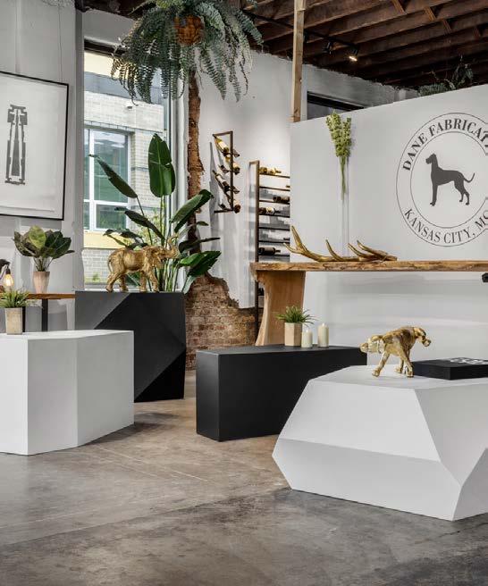
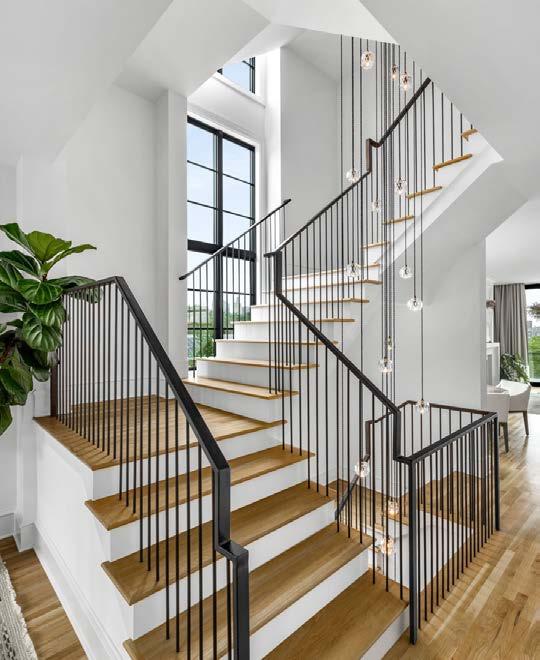


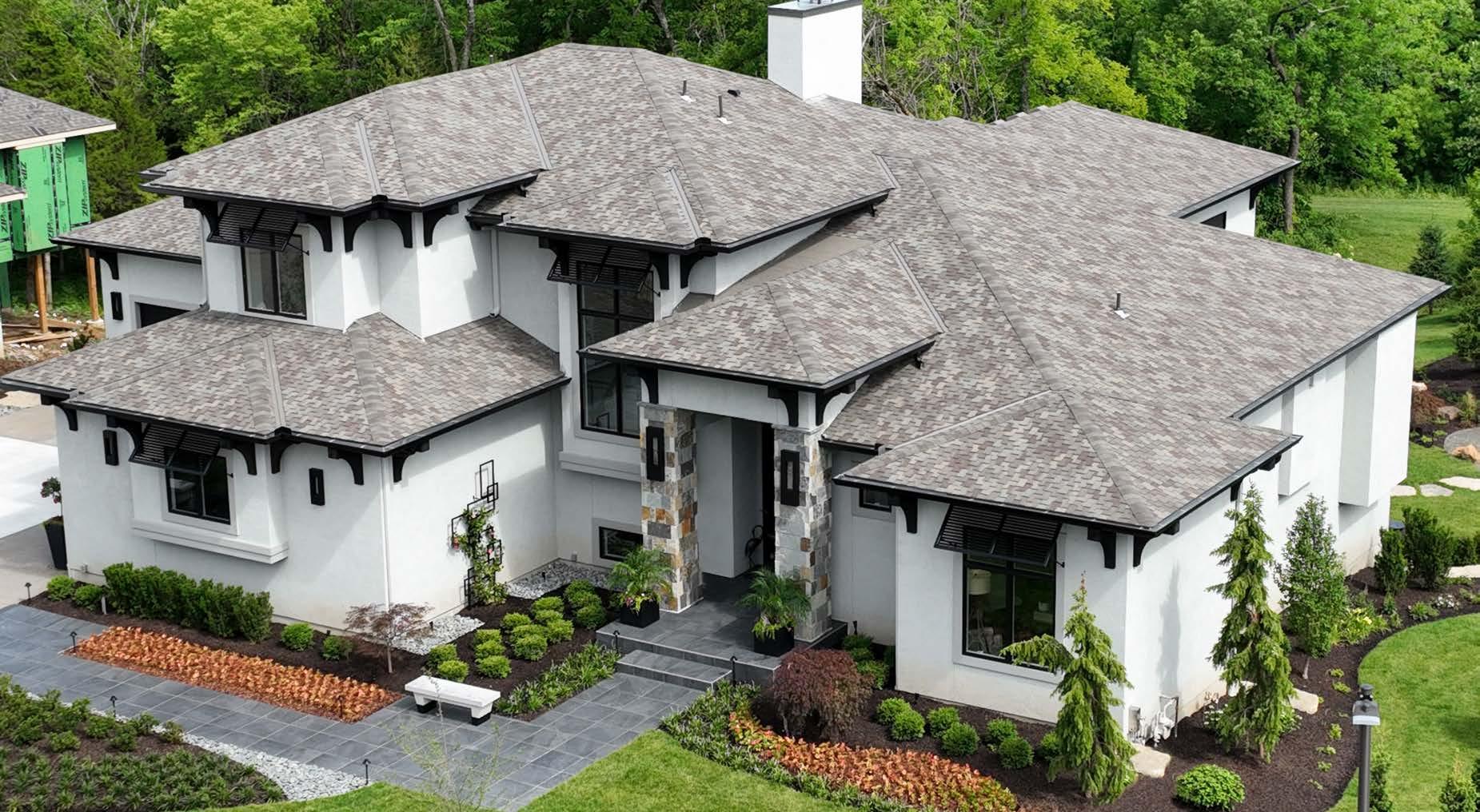


ARCHITECT: John Gaar, Finkle+Williams Architecture EXCAVATION: JAG
Excavating FOUNDATION: Premier Foundations ELECTRICAL: Crown
Electric HOME AUTOMATION: Simplicity WINDOWS: Pella DRYWALL:
Leiker Drywall TILE: Turner Ceramic Tile FLOORING: Kennyʼs Hardwood
Flooring ASPHAST: J&B Asphalt DOORS: Industrial Door Company
HARDWARE: Locks & Pulls PAINTING: Titans Painting POOL: Complete
Pools WOODWORKING: Byrne Custom Woodworking
INTERIOR DESIGNER: Interior Design Beth Phillips CUSTOM FURNITURE: Matt Castilleja; Hinge Woodworks ART: Haw Contemporary LIGHTING: Visual Comfort RUGS: The Rug Studio VENDORS: KDR Designer Showrooms; John A. Marshall; MillerKnoll; Phillip Jeffries
ARCHITECT: Wolfgang Trost Architects INTERIOR DESIGNER: Kristen Ridler
Interior Design CONTRACTOR: Madi Mali Homes NEW HOME COMMUNITY: Southern Lakes REAL ESTATE AGENT: Doug Mitts CABINETS AND CLOSET: Gillpatrick Woodworks COUNTERTOPS: Central Surfaces ELECTRONICS:
Nebraska Furniture Mart FLOORING: Acme Floor Company LIGHTING
FIXTURES: Wilson Lighting
ARCHITECT: Studio Build CONTRACTOR: Fosterʼs Inc. ENGINEER: Stand
Structural Engineering APPLIANCES: Hestan COUNTERTOPS: Carthage
Stoneworks POOL: Aqua Blue Designs
CONTRACTOR: Walker Custom Homes ARCHITECT: Viewpoint Residential Design INTERIOR DESIGNER: June White/Kendra Scott ENGINEER: Dave
Mort LANDSCAPER: Kohler Lawn & Outdoor POOL DESIGNER: Swim Things
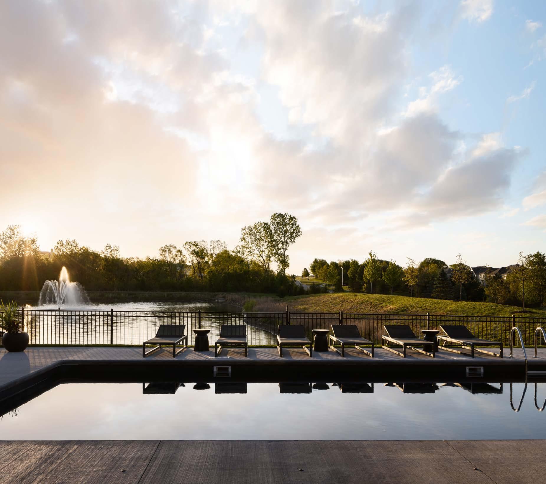
APPLIANCES: Dacor ELECTRONICS: Sonos FABRICATION: Kennyʼs Tile & Floor Covering PLUMBING FIXTURES: Moen LIGHTING FIXTURES: Ferguson
PAINT: LG Custom Painting METAL ROOF: Aspen Roofing WINDOWS: Marvin
CONTRACTOR: Schloegel Design Remodel INTERIOR DESIGNER: Madden
McFarland Interiors ENGINEER: Bob D. Campbell & Company CABINETS: Crown Cabinetry; Crestwood HARDWOOD FLOORING: Kimminau
FABRICATION: Dimensional Stoneworks; CKF PLUMBING SHOWROOM: Neenan Company HARDWARE: Locks & Pulls LIGHTING FIXTURES: Rensen
House of Lights PAINT: R & S Painting ROOFING: Vaught Roofing; Fidler on the Roof KC WINDOWS: Marvin
INTERIOR DESIGNER: Lisa Schmitz Interior Design CONTRACTOR: Schmitz Remodeling ART: Toma Wolff, Byron Cohen Gallery; clientʼs personal collection CABINETS: Royal Fixture Company COUNTERTOPS: Carthage Stoneworks ELECTRONICS: Simplifi Audio Visual FLOORING: Totta Hardwoods RUGS: The Rug Studio; The Beverly Collection; Knotty Rug; Golden & Pine TO THE TRADE SHOWROOMS: KDR; Design & Detail
LIGHTING FIXTURES: Visual Comfort; Allied Maker PLUMBING FIXTURES: Brizo; Kohler WALL COVERINGS: Weitzner; Wood Wallcovering WINDOW
COVERINGS: The Beverly Collection; KDR PORTICO ARCHITECT: McHenry
Shaffer Architecture
ARCHITECT: Patric J. Tierney INTERIOR DESIGNER: Stephanie Abramson
LANDSCAPER: Land Art Inc. POOL DESIGNER: Midwest Custom Pools
APPLIANCES: Factory Direct CABINETS: Built to Fit COUNTERTOPS:
SCI Surface Center; Carthage Stoneworks ELECTRONICS: Applause Custom Sight & Sound FLOORING: Miller Tile & Stone; SVB Wood Floors
RUGS: Designerʼs Library; Knotty Rug FURNISHINGS: Designerʼs Library
ACCESSORIES: Designerʼs Library HARDWARE: Locks & Pulls LIGHTING
FIXTURES: Designerʼs Library PLUMBING FIXTURES: Ferguson PAINT: BW Quinn ROOFING: Fidler on the Roof KC WINDOWS: Pella WINDOW
COVERINGS: RJB LLC EXTERIOR POTS: Family Tree Nursery STONEWORK AND CONCRETE: Goodwin Outdoors STONEWORK/BRICK WORK: KC Stone


Impeccable design is what we do, and it goes well beyond our products. It is the medium through which we bring each of our values—wellbeing, innovation, inclusion, and sustainability— to life. Design infuses each of these values into our products and services, and ultimately into the lives we touch.
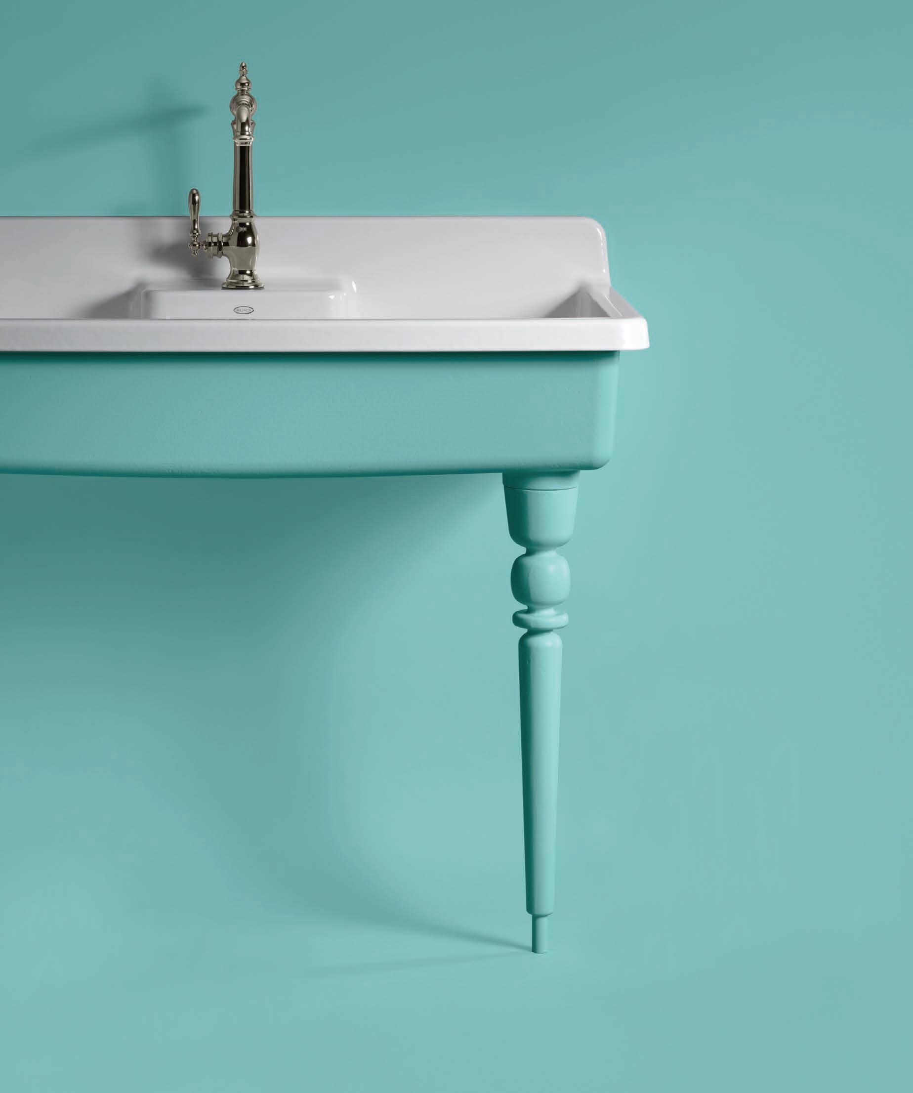
We can’t wait to see you! 5025 W 119th St. Overland Park, KS 66209 Give us a call! (913) 335-6110

New styles are taking shine at KOHLER. The Occasion™ collection is unapologetically luxurious and truly unforgettable. Occasion™ bathroom faucets and accessories draw inspiration from 1960s Hollywood glamour and extravagance. Customize your dream bath at our exclusive KOHLER Signature Store located in Overland Park, Kansas
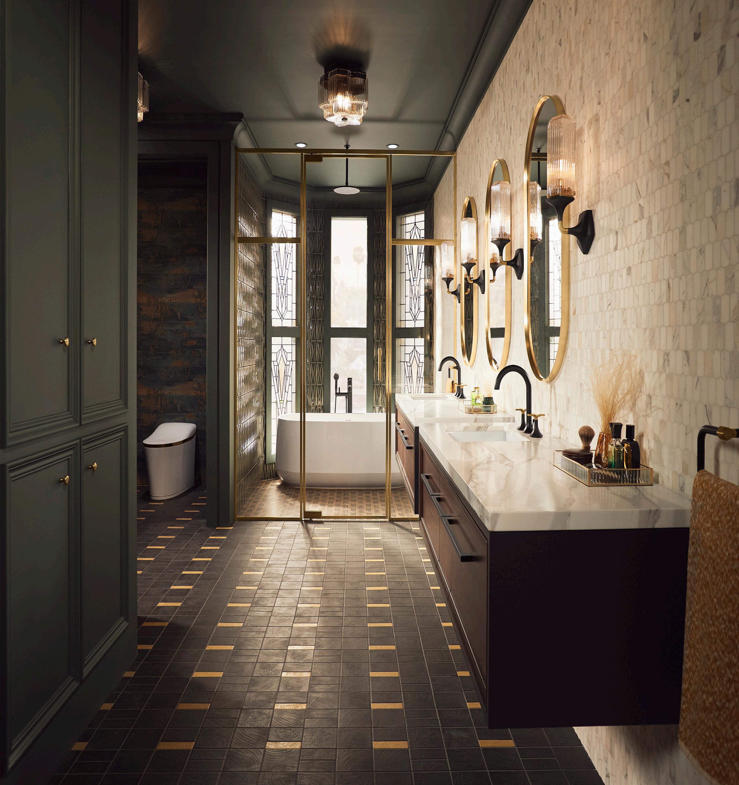


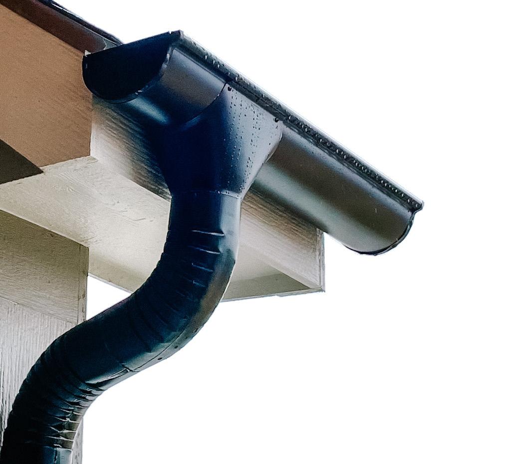

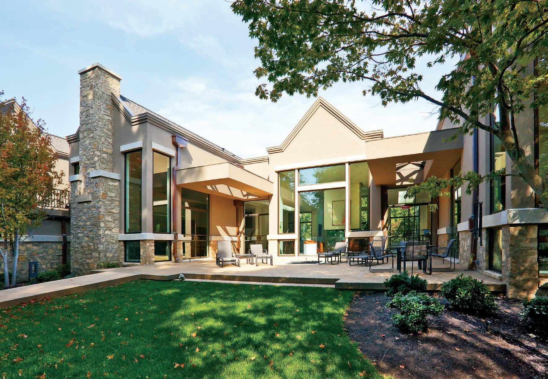
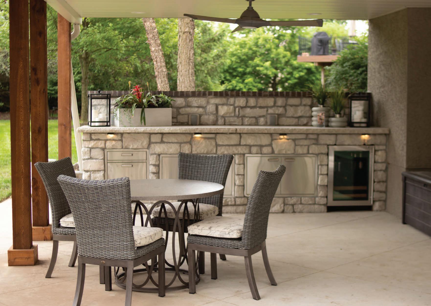


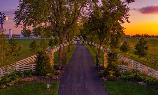
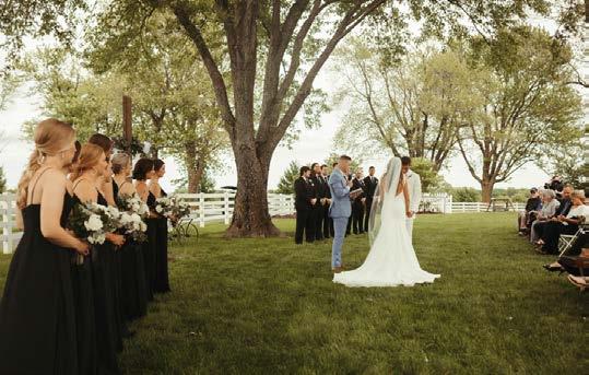




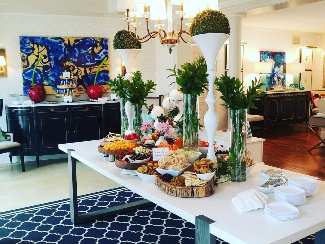
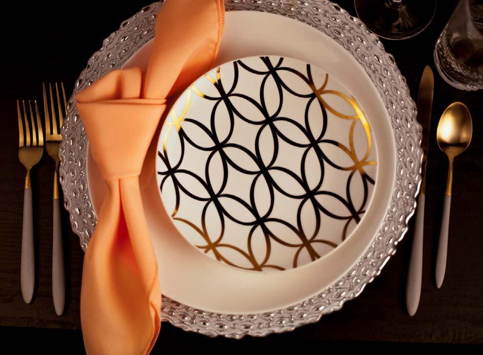





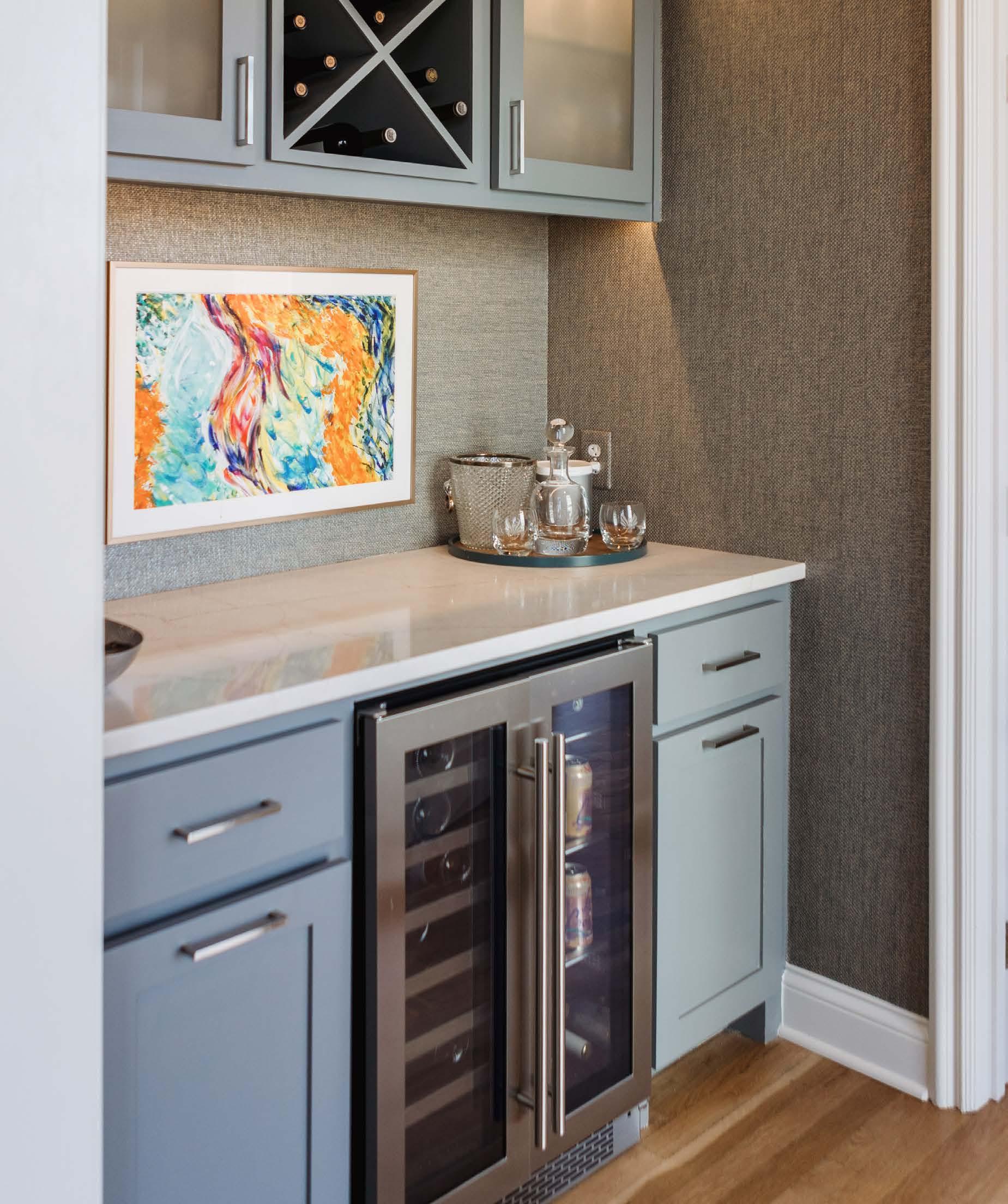


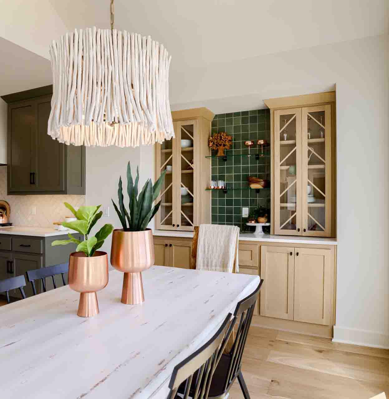
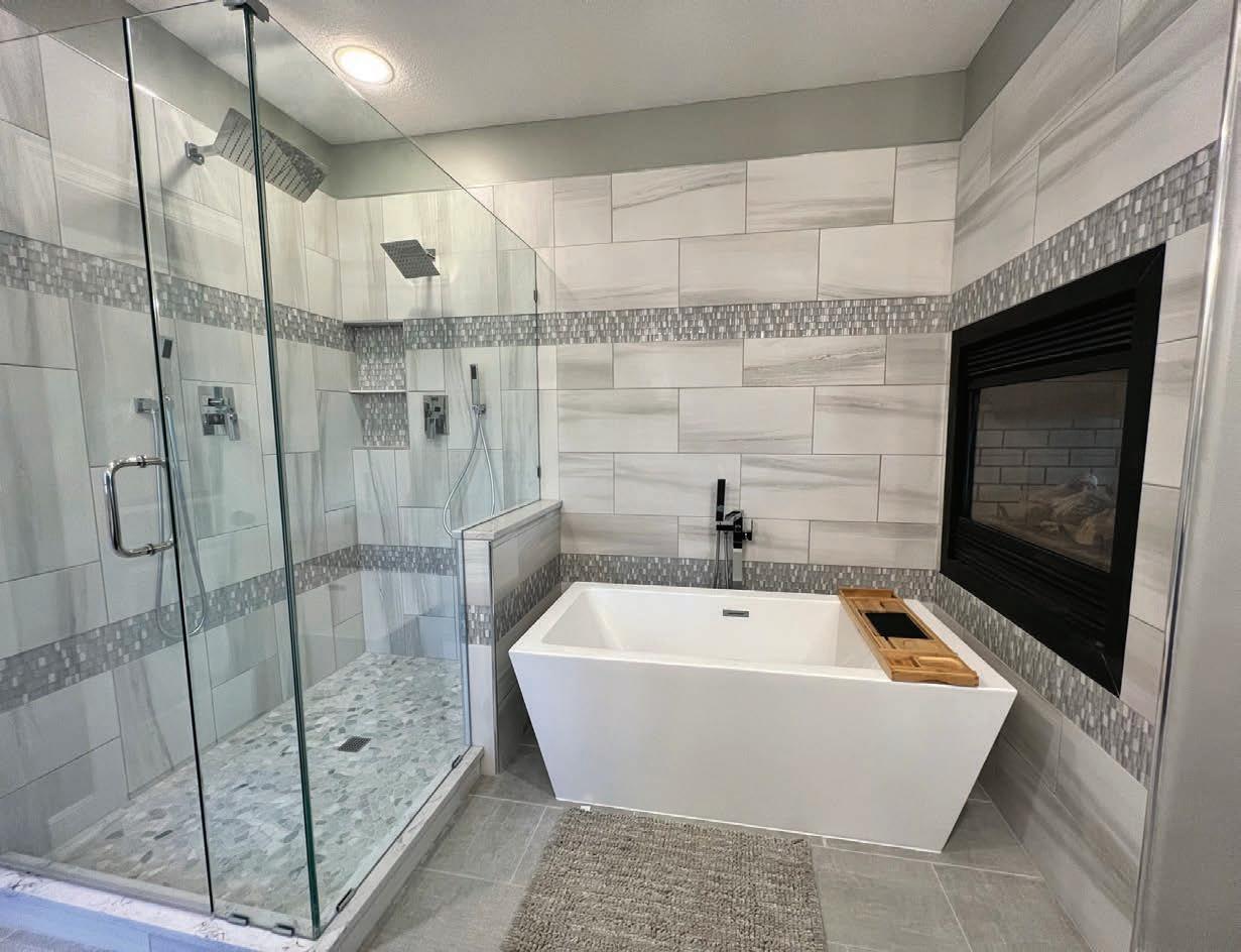


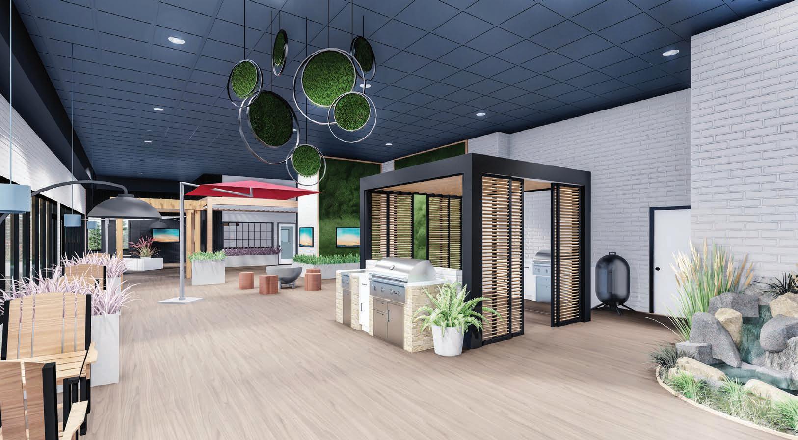


Acasual conversation between strangers on a plane was how landscape designer Laura Stack, owner of Creative Outdoor Spaces, first learned about what would become one of her favorite client projects. The couple she sat next to told her their woes of a hedge row of pines dying in their Kansas City, Missouri, backyard. Their large family often gathered at their home, so they wanted to salvage some privacy for their pool.
Laura had a larger vision for the space than just replacing some trees. Between the pool fence and the line of pines was a 10-footwide patch of grass that presented itself as an opportunity to become an entire setting,
offering an exploration of nature beyond the confines of their fenced yard.
“The whole space is meant to allow kids to run and discover or to saunter and stroll, looking at this and that,” Laura describes, “as well as to expand gardens to enhance views.”
Fortunately, death came slowly to the existing pines, giving Lauraʼs plan of understory growth a few years to fill in. “When one tree gets a disease, they all get it,” Laura says. “Using diversity is part of that and also creates different textures.”
She severely pruned the pines and added evergreens and shrubs under the canopy.
Holly, arborvitae, blue spruce, yew, columnar white pine, juniper and bayberry create a
wonderland of variation, texture and color. Large-scale feather reeds and fountain grasses help with screening, too.
Intermittently placed supreme-sized flagstones were intentionally used only at transitional points, leaving a mulched trail in between landings to emulate a more natural path.
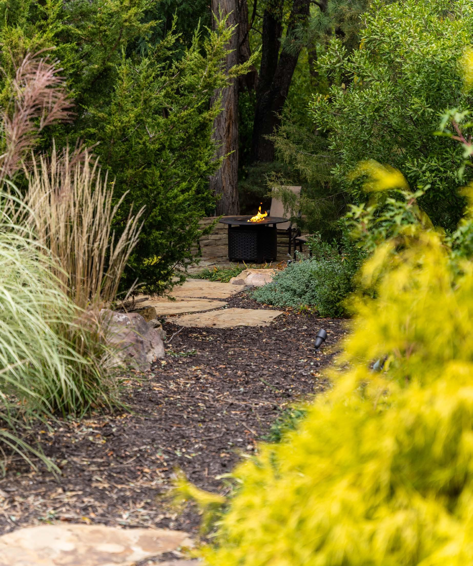
Quiet moments of pause can be found at a sitting wall along the way, while a fire pit area presents an invitation to gather in one corner of the property.
“The pool is not the dominant feature of the yard anymore,” Laura says. “Itʼs there. It was the centerpiece; now itʼs nestled in.”


