

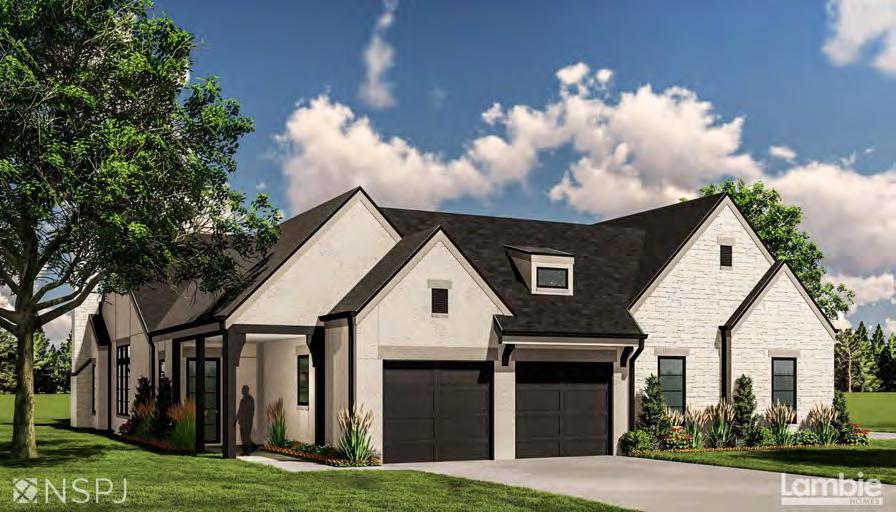
Award-winning architects with a legacy of design excellence since 1961


Award-winning architects with a legacy of design excellence since 1961

Diamonds Watches Jewelry
Repairs
Engagement Rings







PREVENTS DEMENTIA BY 65%

DECREASES MORTALITY BY 40%
FLUSHES TOXINS & HEAVY METALS
FIGHTS CANCER CELLS & ILLNESS
IMPROVES BRAIN & HEART HEALTH
RELIEVES JOINT & MUSCLE PAIN
RELIEVES STRESS & IMPROVES SLEEP
IMPROVES BLOOD CIRCULATION
WEIGHT LOSS & BURNS CALORIES
FIGHTS CHRONIC FATIGUE
HELPS WITH TYPE 2 DIABETES
DOCTOR RECOMMENDED



DRESSING KC’S MOST ENVIED SPACES SINCE 2005




THANK YOU TO THE KANSAS CITY DESIGN COMMUNITY AND CONGRATULATIONS TO ALL THE WELL DESERVED WINNERS!

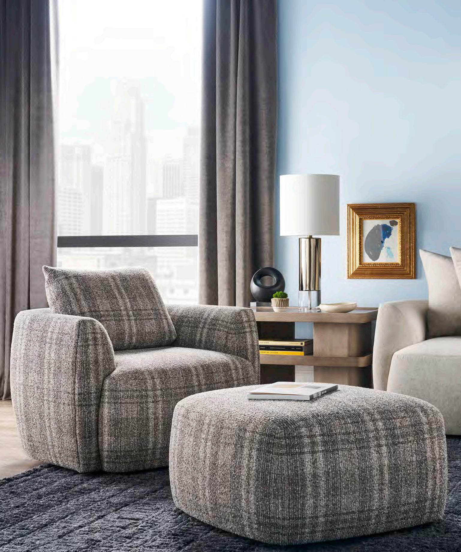









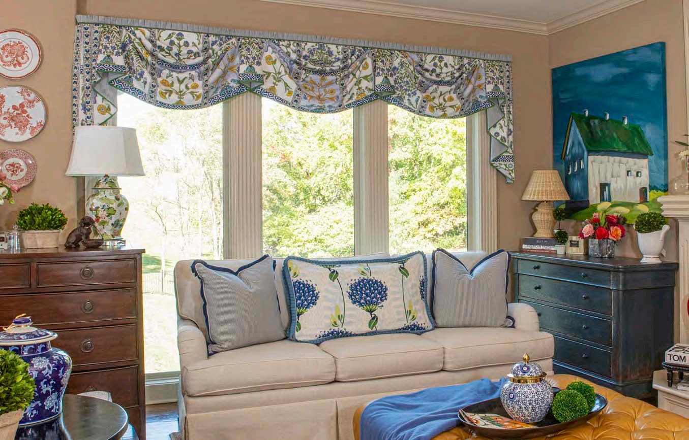
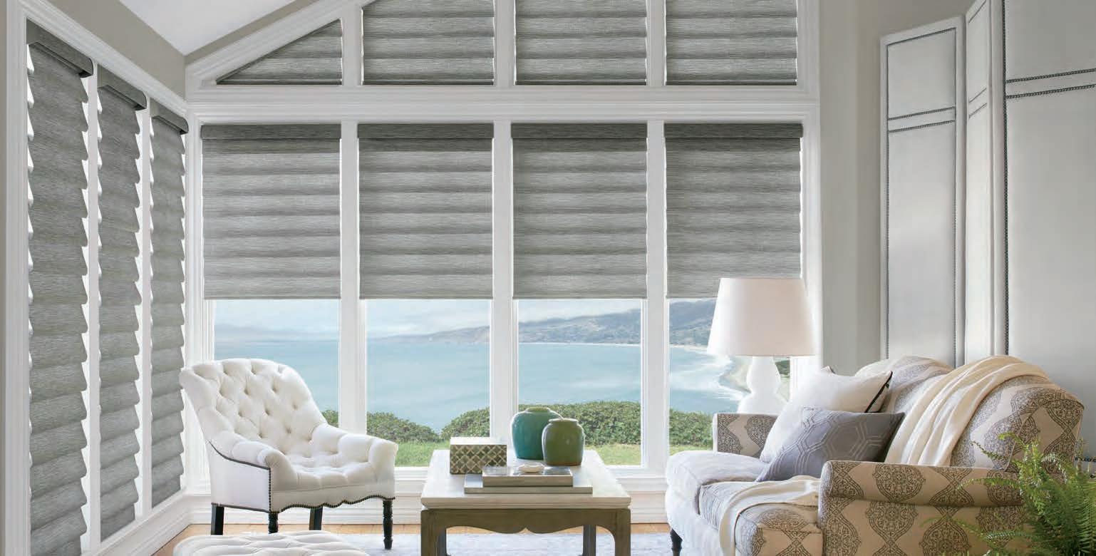
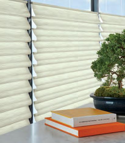
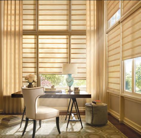
Hunter Douglas Vignette ® Modern Roman Shades are the perfect compliment to any decor. Soft light, beautiful textures and colors, and Hunter Douglas quality make Vignette ® one of our most popular shades.














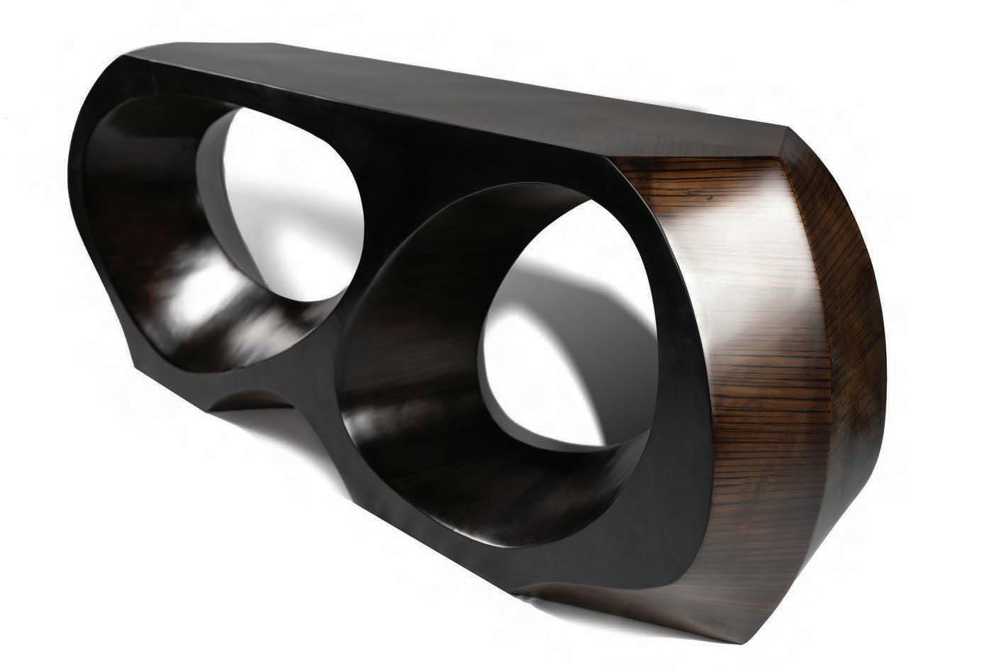






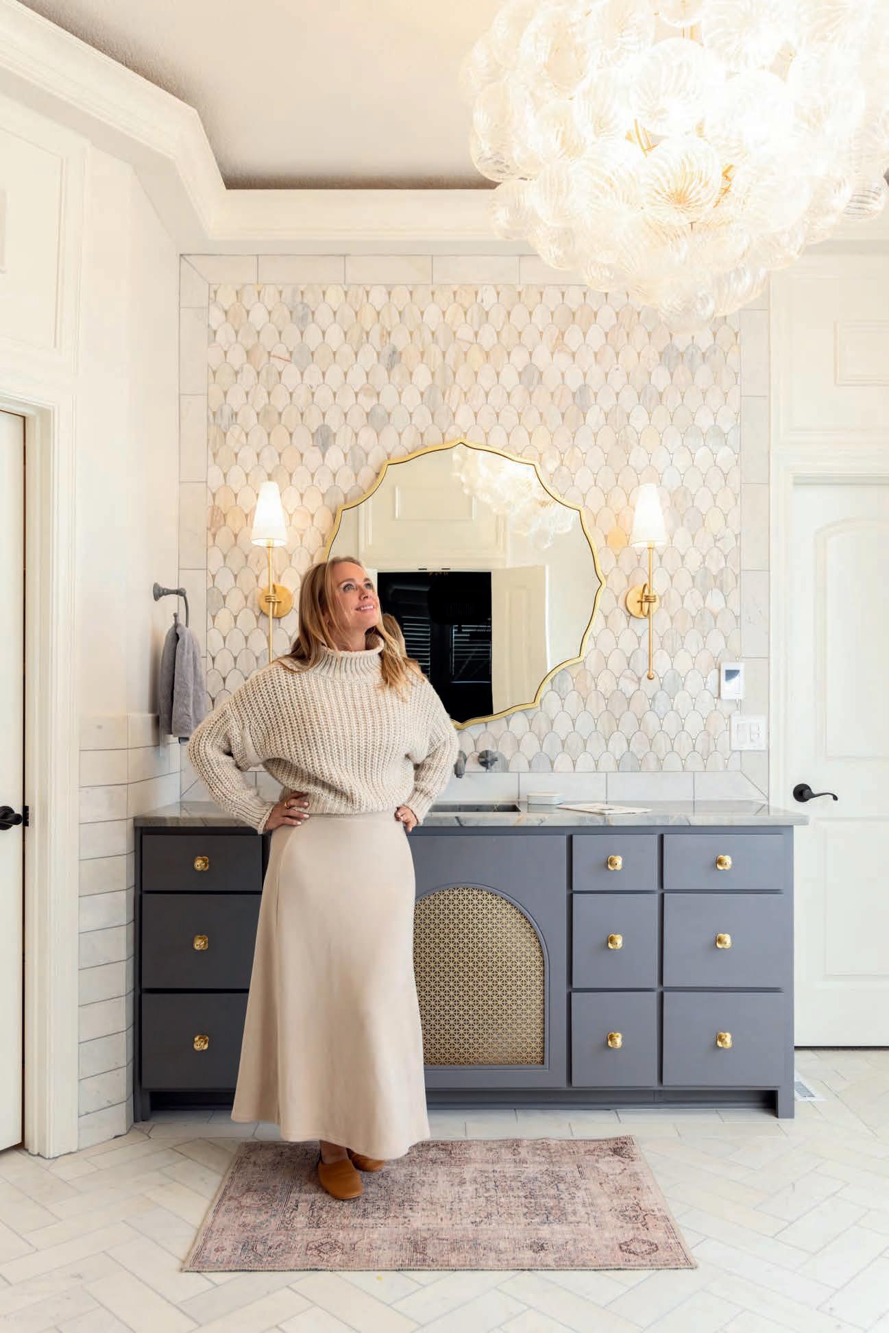

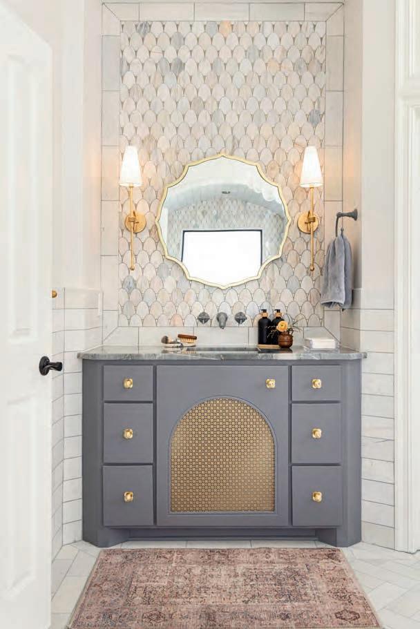

Not Baroque-en - 30" Gold
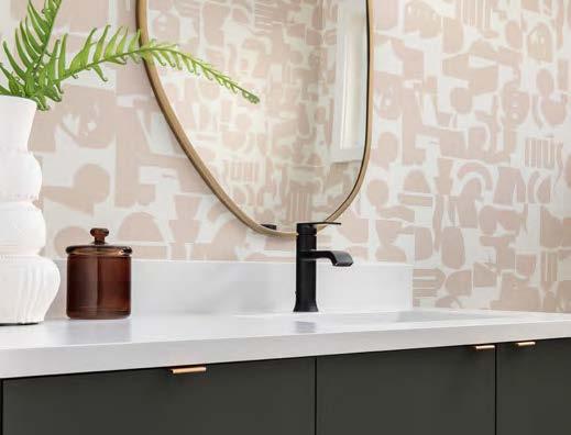
“Every once in awhile, I get to work with an amazing client outside of Bargain Mansions, and we get to have a lot of fun! This bathroom is exceptional, and every detail was thought out and special just for this client in particular! I always say, ‘Invest in the things you touch.’ You engage with these details every single day, so make it feel like luxury and special.”
-Tamara Day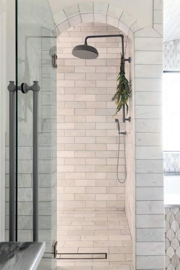



 VISIT OUR SHOWROOM AT 10821
LAKEVIEW AVENUE, LENEXA, KS 66219



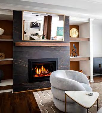

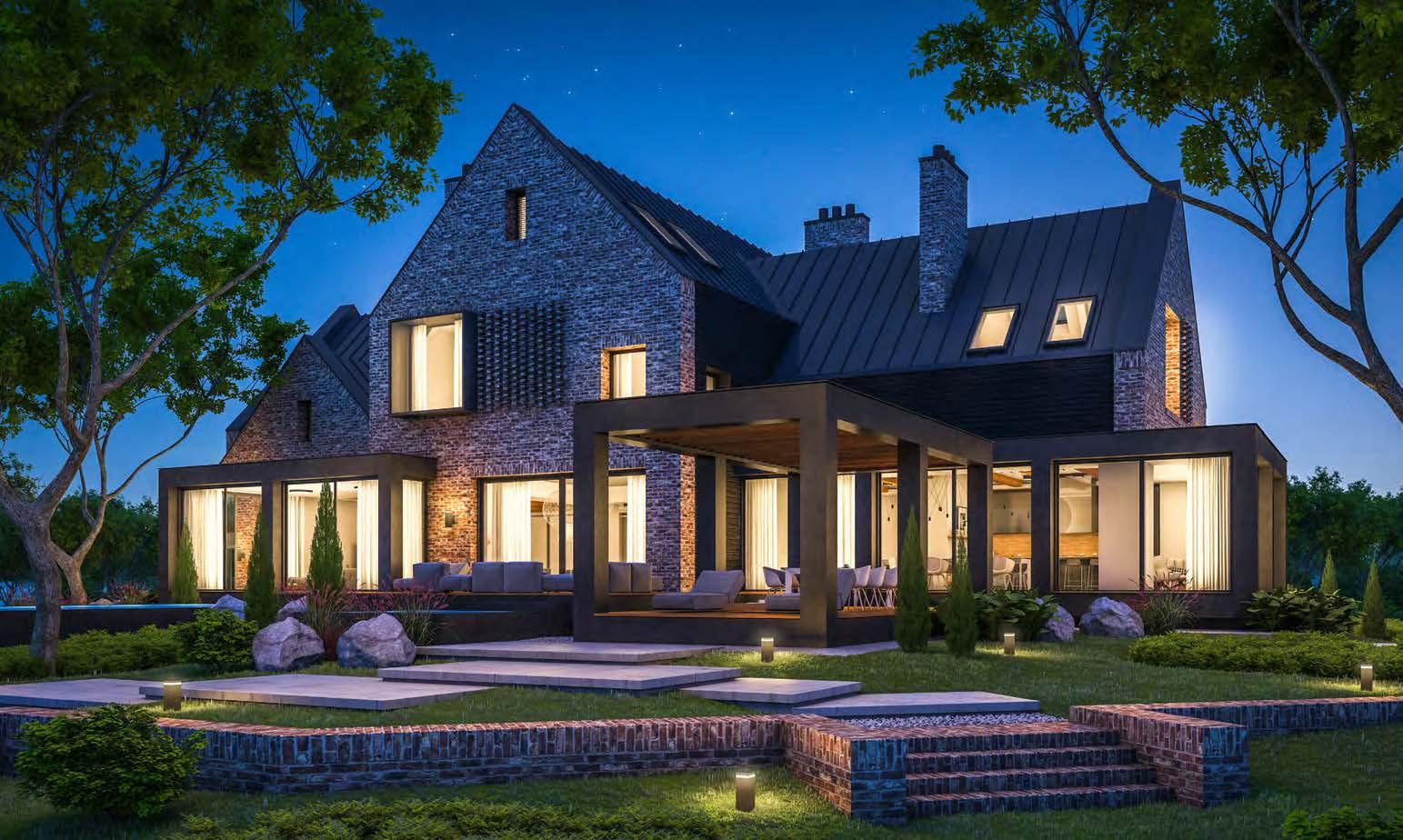
Kansas City celebrates design as an art form, elevating our surroundings and transforming ordinary spaces into exceptional experiences. Our hometown is a more beautiful and vibrant place to live thanks to the talented designers, architects and builders who inspire excellence.
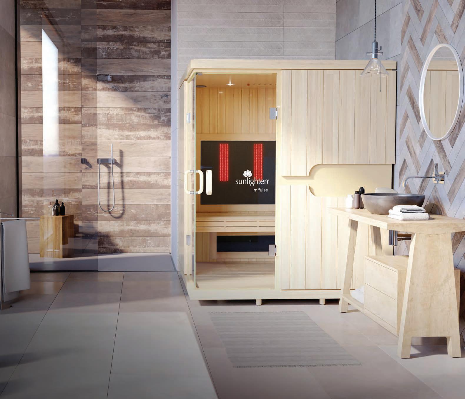
Cong ratulations to the 2023 designKC award winners who set the standard. Visit Sunlighten.com/designKC to learn more about our 25 years of applying elegant modern design and innovation to create the ultimate self-care sanctuary for luxury homes.

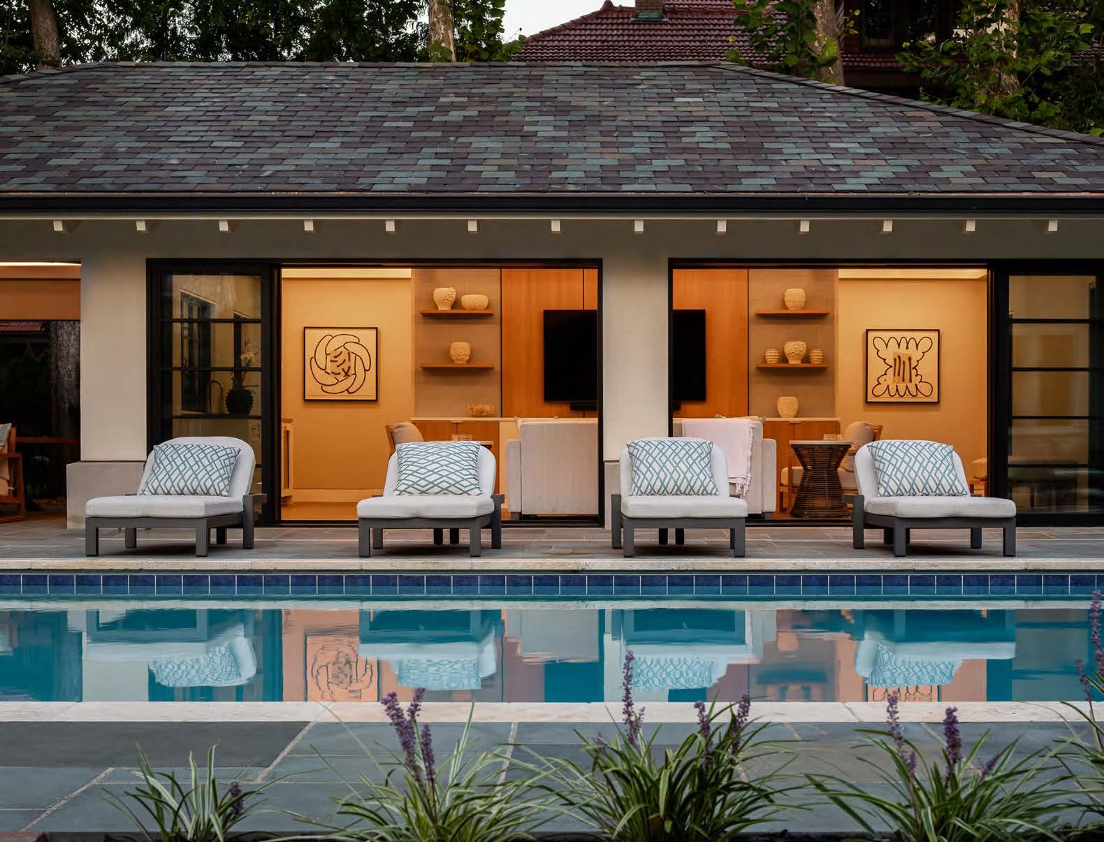


Christine Caso Ward
Samantha Ward
Event Photographers
Ali Fleming
Brian Rice
Videographer
1593 Studios
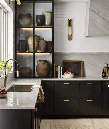
The award-winning Catalina Wine Mixer project by Cicada Co. is one of 65 winners in this special bonus issue. See it on page 128. Photo by Nate Sheets.
Editorial Submissions
Designers, architects, builders and homeowners are invited to submit projects. Email andrea@mydesignkc.com with photos
keith@mydesignkc.com
mydesignkc.com/subscriptions
$35 for 1 year (5 issues)
$55 for 2 years (10 issues)
For subscription questions, lost issues, or to cancel a subscription: circulation@mydesignkc.com
mydesignkc.com/digital-issue


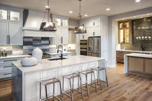


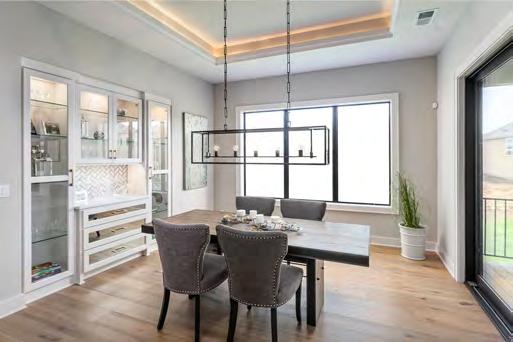


In 2023—the year we launched the first designKC Awards—we made a statement about who we are and what we want to accomplish. A legit third-party-juried competition specifically for the entire Kansas City design community was born. Our community of architects, designers, builders, remodelers and artisans perked up and participated in what became a highly successful program in just one season.
A year later, the program has established itself as a powerful presence throughout the industry. The number of entries grew. The entrants were more diverse. The quality of work was phenomenal. And, oh, the party we threw to celebrate it all!
We learned a few things from the inaugural year and made some tweaks across the board. (We’ve already got a running list for the next round, as well!) Always striving for our best—to help you industry pros bring your best—we updated the portal to help make the entry process as seamless as possible. We also reprised our jury and invited more acclaimed professionals to the panel to account for the increase in entries.



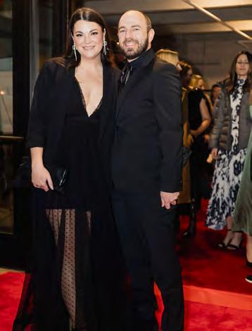
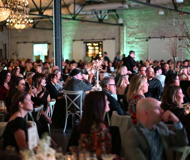
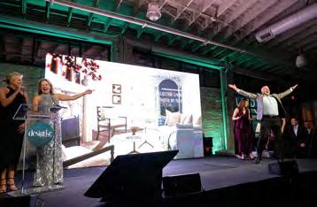
The judging process itself was modified to have judges give numerical values to each entry individually before bringing their top scorers to a Zoom call to hash it out and fight for their faves among the other judges. Many of the judges have entered their own projects into competitions over the years and understand the time and dedication that goes into a competition entry. Sensitive to the entrant perspective, they noted the worthiness of the entries, yet they needed to define what made one project stand out above the rest. In all, they awarded 65 projects. All entrants were invited to our sold-out gala held at The Abbott on January 25, 2024. The winners walked—some strutted, others danced—across the stage after hearing their name called by Emcee Libby Langdon to come up to receive their award. Between the red-carpet experience at the entry and the shoes-off dance party at the end of the night, we wined and dined with 500 of our closest friends and colleagues.
This community we share is special—it is creative, skilled, collaborative and inclusive. What a joy it is to bring people together and elevate the vibrant world of design in Kansas City. Cheers!













Jeff Ashner Owner Ashner Construction @ashnerconstruction
Jeff Ashner, a lifelong Kansas City resident, stalwartly upholds his family’s prestigious legacy of custom home building and residential development around the KC metro area. In 1978, Jeff launched his own construction business, Ashner Construction, specializing in building unique and stylized homes, earning numerous local, regional and national distinctions, including four Professional Builder Best In American Living Awards (BALA).
A strong supporter of local charities and community events, Jeff has built homes benefitting the Fox 4 Love Fund and the Overland Park Arboretum. He is a long-standing board member of the Home Builders Association of Greater Kansas City and continues to be an active influence in the Johnson County real estate community.

JCCC Interior Design Department Assistant Professor
@idsa_jccc
A devotee of learning and teaching, Heather Carlile Carter has a Ph.D. in Human Environmental Sciences with an emphasis in Architectural Studies from the University of Missouri. She is now an esteemed Assistant Professor in the Interior Design Department at Johnson County Community College. Her design practice focuses on residential design; meanwhile, her research interests include the impact of material culture on place meanings, older-person residential care environments, sustainable environments and interior design pedagogy.
Dr. Carlile Carter is a professional member of the Interior Design Educators Council (IDEC), the American Society of Interior Designers (ASID) and the International Interior Design Association (IIDA). She holds a National Interior Design Qualifications (NCIDQ) certification and is a U.S. Green Building Council’s Leadership in Energy and Environmental Design Accredited Professional (LEED AP).

Michael Gekas
2023 President, AIA Kansas City Chapter
Virtual Design & Construction Director
McCownGordon Construction @aiakc
@mccowngordon
Local architect Michael Gekas, AIA, serves as the Past President of the American Institute of Architects’s Kansas City Chapter—AIA Kansas City— and works as the Virtual Design & Construction Director for McCownGordon Construction. In addition to being an architect, he has worked as a trade contractor, designer and general contractor. Michael also utilizes all things Building Information Modeling (BIM) and Reality Capture to reduce risk and enhance quality using the latest construction technology.
As AIA Kansas City’s 2023 President, he helped lead a chapter of 80 member firms and 1,200 architects at the Center for Architecture & Design, advocating for design in the local community. He lives on an 18-acre family farm with endless design projects, including an Airbnb and a treehouse.

Scott Bickford of Bickford and Company proudly heads up a leading architectural firm in Overland Park, Kansas. After graduating from school in 1978 and spending a year networking and collaborating with home builders at a residential firm, he started his own company—and the rest is history.
For more than 40 years, Scott and his firm have offered high-quality work that has earned them much well-deserved recognition. He eagerly serves the people of Kansas City, as well as clients across the country and around the world. All of the firm’s clients result from referrals, which is a testament to his elevated quality of work.

@designanddetailstl @victoriadrestestl
Acclaimed interior designer Vicki Dreste’s work is marked by a masterful understanding of color, pattern and the decorative arts. With a versatile style ranging from traditional to transitional, her residential and commercial design projects are infused with exquisite colors and details that are a true reflection of each client’s unique tastes.
Vicki earned a Bachelor’s in Interior Design from Ringling College of Art and Design and has enjoyed more than 30 years in the design industry. She cofounded Design & Detail with Melinda Klinghammer in 2005 and then left in 2009 to focus on her own design business. Vicki has since rejoined the Design & Detail team to share her expertise with fellow St. Louis designers.

Darla Green
MSEd, AKBD, CAPS, CAPM, CGP, LEED AP
JCCC Interior Design Department Professor & Department Chair
@idsa_jccc
Esteemed educator and design professional
Darla Green is the current Interior Design Department Chair at Johnson County Community College (JCCC). She has worked as a professor at JCCC since 2004 and was promoted to department chair in July 2022. Her research is presently focused on teaching and learning techniques in the design studio, with her teaching motto being “Motivate, Activate, Reflect, Incorporate.”
Prof. Green holds a Master’s in Adult Education (MSEd) with an emphasis in Architecture. She is a Leadership in Energy and Environmental Design Accredited Professional (LEED AP) with the U.S. Green Building Council and a NAHB Certified Aging-in-Place Specialist (CAPS). In addition, she is certified as an Associate Kitchen and Bath Designer (AKBD) through NKBA and as an Associate in Project Management (CAPM) through PMI.
Heather Carlile Carter PhD., NCIDQ, LEED AP, IDEC, IIDA, ASID Scott Bickford Architect Bickford and Company @bickymon Vicki Dreste Design Support Manager, Design & Detail St. Louis Owner & Designer, Victoria Dreste Designs


 Kathryn Grube
ONCIDQ, LEED AP, ASID, IIDA, IACC, IDEC, NARI, NKBA
JCCC Interior Design Department Professor & IDSA Symphony Showhouse Advisor @idsa_jccc

KH Interiors
2024 President, ASID Missouri East Chapter @khinteriorsstl @asidmissourieast
Distinguished and devoted to her craft, Kathryn Grube is an internationally accredited color designer and a tenured college professor with 10 years in the Interior Design Department at Johnson County Community College. She also serves as JCCC’s Interior Design Student Association (IDSA) Symphony Showhouse Advisor. A published and practicing interior designer, Prof. Grube specializes in functional color design strategies that produce space-intended outcomes that ultimately promote positive results in occupant health, behavior and emotion.
She is passionate about international cultures, sustainability and evidence-based design. Further, she strives for excellence in executing details, inspiring continuous learning, positively shaping student lives and designing interior spaces that provide a better quality of life.
Seasoned designer Krista Howard is the owner and founder of KH Interiors, a well-renowned boutique design-build firm in St. Louis. She jumpstarted her career with a Bachelor of Fine Arts from the Savannah College of Art and Design and a Bachelor’s in Marketing from Illinois State.
After working several post-college years in the interior design field in New Mexico, Krista chose to be closer to family and settled in the St. Louis area. The launch of her design company in 2006 was a major success, and she soon expanded with a remodeling division in 2010. Though primarily focused on projects in the St. Louis area, Krista often works on residential projects in Idaho, California and New Mexico. Currently, she serves as the 2024 ASID Missouri East Chapter President and absolutely loves meeting new designers from around the country. She strongly believes professional collaboration is vital to a successful interior design career.
Krista and her husband, Kevin, recently purchased a 100-year-old farmhouse in Illinois and restored the property as their primary residence.

Atlanta-based interior designer Joann Kandrac is one part of the duo that is Kandrac & Kole Interior Design. Their podcast, Inside Design with Kandrac & Kole, was voted one of the “Best Interior Design Podcasts on the Planet” by Feedspot and their accolades include being voted as one of Atlanta’s “Top 20 Residential Interior Designers.” The duo has also been featured on HGTV and in many prestigious publications, such as The New York Times Atlanta Homes & Lifestyles, Better Homes & Gardens and Southern Home
Joann and Kelly Kole have established a wellknown reputation for their approachable and dynamic personalities. As industry experts in residential and commercial design, the lively duo shares upbeat, entertaining and insightful narratives regarding their projects, travels and personal stories on their viral blog, their podcast and via national speaking engagements. Joann and Kelly’s love and commitment to the power of interior design also extend to their charity work throughout the U.S. and Guatemala.

Amy Herman D esigner
Design & Detail St. Louis
Past President, ASID Missouri East Chapter @designanddetailstl @asidmissourieast
 Lauren Iverson Editor-in-Chief
Atlanta Homes & Lifestyles @atlantahomesmag @_laureniverson
Prior to starting her company—Gateway Interior Design (GID)—in 2009, Amy Herman worked as a Project Manager/Senior Designer with a residential and commercial interior design firm. Amy now oversees the Carpet & Window Covering Sales department at Design & Detail’s St. Louis location. She studied Interior Design at the University of Kansas, the Harrington Institute of Interior Design and, finally, at the Illinois Institute of Art, where she graduated in 1994. Since then, Amy has worked with several of the country’s largest home builders—from the Midwest to the East Coast—and has maintained an active involvement in ASID, including serving as the Missouri East Chapter President from 2020 to 2021. Additionally, Amy has more than a decade of commercial and hospitality experience, as well as knowledge of green building methods and codes.
GID was a 2015 ASID Design Excellence Award finalist in four categories and also won “Best of HOUZZ” for Service in 2014 and Design in 2015 and was a St. Louis Magazine Architect & Designer Awards finalist in 2014.
Iowa native and talented storyteller Lauren Iverson is the esteemed Editor-in-Chief of the highly popular Atlanta Homes & Lifestyles ( AH&L) magazine—Atlanta’s only monthly home-andgarden magazine dedicated to showcasing the city’s best in design.
Prior to relocating to Atlanta, Lauren graduated from Iowa State University in 2017 with a Bachelor’s in Public Relations, kick-starting the career path that soon led her to AH&L. Since joining the editing team in 2019, Lauren has enjoyed fielding gracious Southern homes, emceeing company events and managing the magazine’s flow of compelling home and lifestyle-related content across all forms of media.
A lover of great food, coffee and design, she spends most of her free time discovering the best Atlanta eats and exploring the city’s endless selection of beautiful homes.

Courtney Klamm, CKBD, is a skilled senior designer at CKF’s Omaha location, where she has been working for nearly a decade. She was born and raised in central Nebraska and attended college at the University of Nebraska at Kearney (UNK), where she earned her Bachelor’s in Interior Design.
While a student at UNK, Courtney became a member of the NKBA and has remained actively involved with the organization ever since. Following college, she received her Associate Kitchen and Bath Designer (AKBD) accreditation in 2012. She then acquired her Certified Kitchen and Bath Designer (CKBD) accreditation in 2021.
Courtney proudly serves as the Communications Chair on the NKBA Nebraska/Kansas Chapter Board and enjoys learning more about the organization.



Kelly Kole
Designer and Podcaster Kandrac & Kole Interior Design Inside Design with Kandrac & Kole @kandrackole

John LeFevre
Builder Medallion Custom Homes @medallioncustomhomes
Atlanta-based interior designer Kelly Kole is one half of the dynamic duo that is Kandrac & Kole Interior Design. Their renowned accolades include being voted as one of Atlanta’s “Top 20 Residential Interior Designers” by the Atlanta Business Chronicle and participating in the One Room Challenge in Spring 2020. The duo has also been featured on HGTV and in many prestigious publications, such as The New York Times, Atlanta Homes & Lifestyles, Better Homes & Gardens and Southern Home
As industry experts in residential and commercial design, the lively duo shares upbeat, entertaining and insightful narratives regarding their projects, travels and personal stories on their viral blog, their podcast Inside Design with Kandrac & Kole—voted one of the “Best Interior Design Podcasts on the Planet” by Feedspot—and via national speaking engagements. Kelly and Joann’s love and commitment to the power of interior design also extend to their charity work throughout the U.S. and Guatemala.
Builder John LeFevre, co-owner of Medallion Custom Homes, was raised in Las Vegas and was lucky enough to find his way to Nebraska—his current home—in 1997. His ardent love for design and attention to detail started at a young age, inspiring him to pursue a career in the home construction and design industry.
John finds joy in hunting down unique features that will set clients’ homes apart from others on the block. He also finds it extremely rewarding to work hand in hand with his clients through the design process, watching their dreams blossom into reality.

Social media manager and influencer Laurie Laizure is the founder of Interior Design Community (IDC), a vibrant online community of industry professionals working in the home design space. She has amassed over 200,000 members across multiple social media platforms—including over 100,000 followers on Instagram—with her refreshing approach of inclusivity and relatable humor.
A member once told Laurie that being part of the IDC made her feel less alone, and that is precisely why she does what she does every day: cultivating an engaging and all-embracing community of positivity and creativity.

As a well-respected design consultant based in St. Louis, Fifi Lugo has expertly managed everything from small to large residential projects. Her extensive experience includes remodeling a single room, building a new home from the ground up and overseeing major renovations and additions that are conscious of a home’s historical significance.
Fifi’s visual history combines her various travel experiences with the study of art. After receiving a Bachelor’s in Studio Art and Art History from Smith College, she pursued a Master’s in Art History and Painting from the Institute for Art and RestorationPalazzo Spinelli in Florence, Italy. Her early career in St. Louis comprises being the director of a Central West End art gallery and 14 years as an assistant to a local architect.
Since 2007, Fifi has been working independently on design and architectural consulting projects.

Patrick Madden grew up in the interior design industry, quite literally. His father and mentor, Bernie Madden, founded Madden-McFarland Interiors—a staple in the Kansas City community—when Patrick was only nine years old. Through learning all aspects of design and interiors, he soon found his passion for interior design and developed a discerning eye. He worked closely with his three siblings as they continued to build Madden-McFarland’s stellar reputation as the metro’s premier interior design firm. From quality manufacturing and craftsmanship to beautiful textiles and fine art, Patrick’s love for the industry is evident. Today, he travels the Midwest working as an independent manufacturers’ representative for Leftbank Art, Arteriors, Alfonso Marina and Modern History. He truly enjoys building new relationships with the design community throughout the Midwest and utilizing his years of experience to inspire and educate those in his territory.

Showroom Manager Designer’s Library @designerslibrary
Interior design connoisseur Beth McCabe is the longtime Showroom Manager at Designer’s Library, Kansas City’s premier trade destination for luxury home furnishings. Her design style is classic, with a splash of vibrant color and collected pieces. As a designer, Beth’s mission has always been to create warm, inviting spaces that captivate and capture the eye—a philosophy she utilizes while collaborating and creating with her fantastic team and talented customers.
Beth has a Bachelor’s in Merchandising and Interior Design and certifications in redesign and staging. With over 20 years of experience in design and sales, she brings a passion for consultation and service to the local industry.
When Beth isn’t busy assisting the design community, she enjoys spending time at the lake with her family and rooting for the volleyball team at the University of Nebraska.
Beth McCabe Laurie Laizure Founder Interior Design Community @interiordesigncommunity





@tom.price_88
@customwoodproductsks
Industry professional Tom Price has been an illustrious advocate for residential design businesses for over three decades, holding key roles in executive leadership, sales, marketing and product development. Before working in Kansas City, Tom led a successful career helping build the residential design division at Riverhead Building Supply into a preeminent resource in the Hamptons of Long Island, New York.
Today, Tom is tasked with turning Custom Wood Products (CWP) into a nationally recognized resource for furniture and custom cabinetry, helping supply CWP’s curated offerings to luxury home projects nationwide. He advises kitchen and bath designers on their design and selling skills, promoting an interactive sales approach to improve sales performance while increasing revenue at higher gross profit margins.

@medallioncustomhomes
Builder Ted Scott travels the nation, visiting some of America’s finest residences in pursuit of renewed inspiration, fascinating ideas and the latest innovations and trends in home design. He brings these novel concepts back home to Lincoln, Nebraska, to seamlessly and cleverly incorporate them into the custom details of every Medallion home he builds.
With more than 30 years of experience designing, building and remodeling homes in various styles, Ted champions superior craftsmanship and creativity to bring clients’ dream homes to life.

Cheminne
An industry marketing guru, Cheminne Taylor-Smith shines as a creative thinker and savvy idea generator specializing in branding, strategy, licensing, relationship marketing, promotion, social media and content creation. Known for her clever insight and straight talk, she has helped large companies and solopreneurs take their brands to the next level and improve their businesses.
Cheminne has unmatched experience in the home, media, retail and design arenas. Previously, she was the PR Director for Elle Décor and Metropolitan Home magazine and the Vice President of Marketing for the High Point Market. She has also consulted with well-known brands such as Showtime, Christie’s, Condé Nast, Galerie magazine, Bernhardt, International Market Centers and many more.




Libby Langdon is an interior designer, author, product designer and makeover television personality, as well as the creative force behind New York City-based design firm Libby Interiors, Inc. Libby’s residential and commercial projects, which embody her “Easy, Elegant, Everyday Style,” have won industry acclaim. In addition to penning Libby Langdon’s Small Space Solutions and being a long-standing House Beautiful columnist (“Libby’s Makeover” ran for two years), Libby is also a frequent contributor to leading shelter and trade publications.
Libby is fast becoming known for her growing licensed home-furnishings collections. In October 2019, she introduced her collection of Libby
Langdon Upholstery and Casegoods Furniture for Fairfield, featuring sleek, fresh silhouettes for modern lifestyles—available at retailers nationwide. Libby also has her wall-decor collection with Paragon, which is proudly manufactured in Alabama. The Libby Langdon Lighting Collection for Crystorama personifies her passion for beautiful chandeliers and fixtures, showcasing transitional looks with an updated twist.
At High Point Market in April 2022, she launched her first accessories line with A&B Home, which comprises everything from decorative bowls, vases, hurricanes, trays and boxes to sculptures, spheres and bar accessories.
Her interior projects and home products have been featured in leading shelter magazines,

including Architectural Digest, House Beautiful, Traditional Home, Hamptons Cottages & Gardens, Better Homes and Gardens, Domino and Woman’s Day. Libby has been a regular design expert on NBC’s TODAY, HGTV’s Small Space, Big Style, The View, The Rachael Ray Show, The Early Show and NBC’s Open House. Thanks to her work in makeover television, Libby draws inspiration for her home-furnishings collections from countless conversations with consumers across the country about how people really live and what they really want.
Libby led a makeover with the She Builds Women in Real Estate committee in New York City, guiding more than 140 female volunteers and transforming a public housing community center in 12 hours. She reimagined the design for the community center and used her connections with Sherwin-Williams to get more than 340 gallons of paint donated for the oneday redesign. Libby serves on the board of the Bienenstock Furniture Library in High Point, North Carolina, and is working to raise awareness of this valuable resource available to everyone in the home-furnishings industry. She is also a board
member of the Sustainable Furnishings Council and is passionate about promoting eco-friendly manufacturers and practicing the creation of healthy indoor and outdoor environments.
Libby travels the country presenting her design seminars to consumers, designers and retailers about all things design. She also holds book signings and appears on local and
national radio and television to promote her collections and provide design advice. Libby splits her time between New York City and Sag Harbor, New York.
For press queries and bookings, please contact LibbyPR@libbylangdon.com and learn more at www.libbylangdon.com.


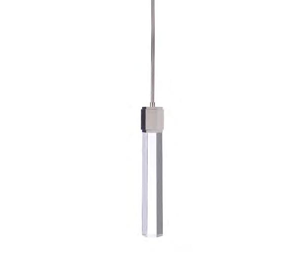

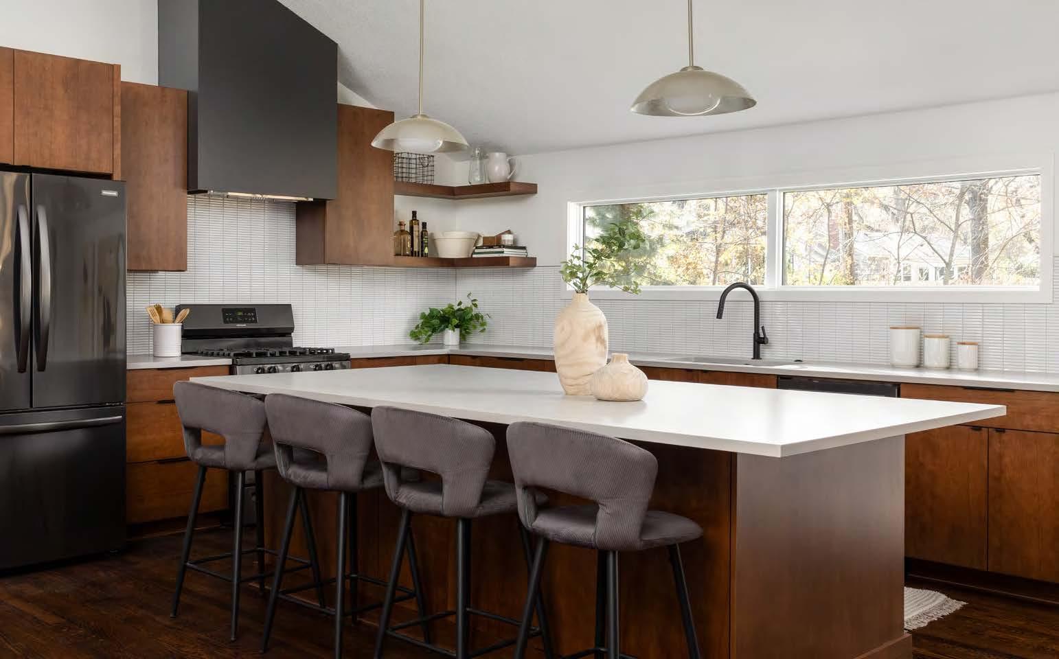
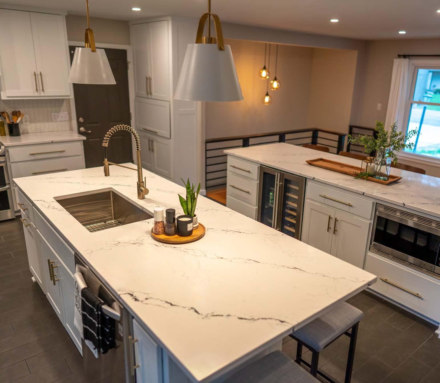
You spent hours selecting the perfect counter, cabinets, and colors. Bring it all together with luminous pendants and wall sconces from the original Wilson Lighting Showroom.
OVERLAND PARK
10530 Marty St. 913.642.1500
Mon-Fri 9 to 6 | Sat 10 to 5












87
89
94
96
98
100
102 One With Nature
103 Platte City Oasis

126 Tudor Treat
128 Catalina Wine Mixer
130 Windows to the Walsh
132 1920s Tudor Revival
133 Leawood Kitchen/Breakfast Room
INTERIOR PROJECT: SINGLE SPACE
138 Loch Lloyd Lower Level
142 Cedar Creek Speakeasy
144 Well-Suited: Primary Suite
146 Designer Dream Closet
147 An Adult Escape
INTERIOR PROJECT: MULTI-SPACE
152 Unbe-LEE-vable
158 Assis
164 Lakefront Modern
166 Chronicles of a Home Addition
167 Tuscan Transformation
172

MODEL HOME 3,001 TO 6,000 SQUARE FEET
174 The Roosevelt
176 The Un-Builder-Grade Model
178 The Barolo
CUSTOM BUILD UP TO 3,000 SQUARE FEET
184 Beacon Hill Passive House
186 Beacon Hill Residence
188 Trolley Trail House
CUSTOM BUILD 3,001 TO 6,000 SQUARE FEET
194 Modern English Manor
196 Elemental
198 Loch Lloyd Custom
199 Custom Home at Meadowbrook Park
CUSTOM BUILD 6,001 TO 10,000 SQUARE FEET
204 Catalina Classic
206 Earthy Modern
208 Leawood Custom Build Residence
210 The Wolf Ridge Project
CUSTOM BUILD OVER 10,000 SQUARE FEET
216 Cape Cod Comes to Kansas
REMODELED RESIDENCE UP TO 3,000 SQUARE FEET
220 Fairway Cape Cod Project
222 Vintage Vibe
224 Leawood Remodel
REMODELED RESIDENCE 3,001 TO 6,000 SQUARE FEET
230 All-American Dream
232 Ozark Waterfront
234 Town & Country Estates
236 Lake Quivira Reimagined
REMODELED RESIDENCE 6,001 TO 10,000 SQUARE FEET
238 Bespoke Living
240 Spanish Modern Revival

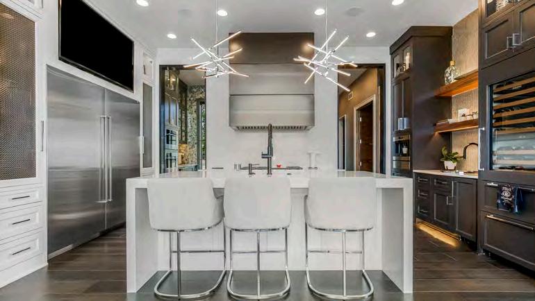


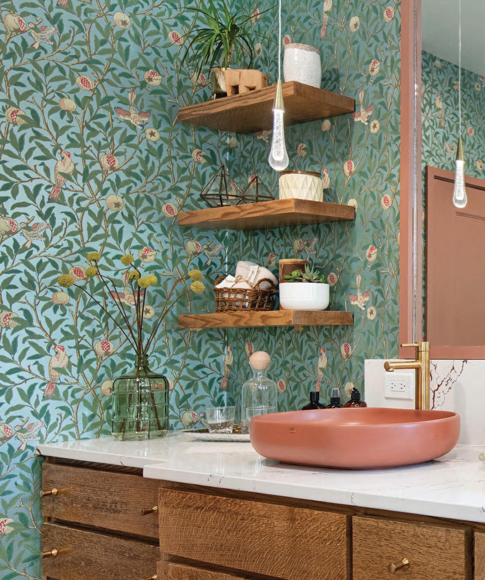


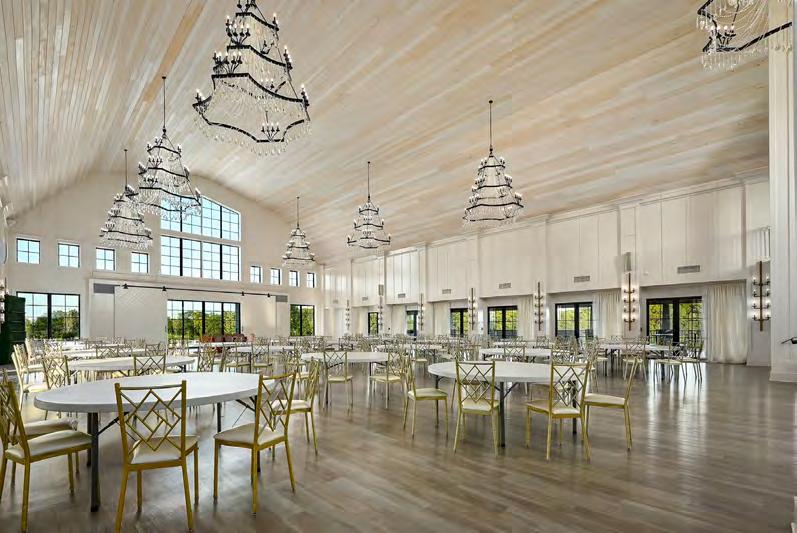
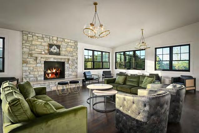
WHAT THE JUDGES LIKED:
Cohesivity inside and out
A fresh, celebratory feel with a large light, bright space
Instead of walking down the aisle, the bride can walk down the stairs
“
It feels like a complete experience, from when you pull up outside to the get-ready room.”
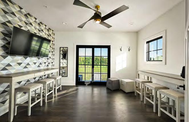



White Iron Ridge is situated in the picturesque lake town of Smithville, Missouri. From the first design meeting, Homoly Design + Build’s clients emphasized their desire for a white barn with a gambrel roof. Their team meticulously crafted the perfect space to fulfill their client’s vision.
The monochromatic design of the interior and exterior allows for endless event styles and types. Each room within the venue possesses its own unique features. The ballroom showcases custom and locally made chandeliers, large windows, gambrel tongue-and-groove ceilings and an elegant grand staircase. With its cozy fireplace, the aux hall is an ideal setting for rehearsal dinners or intimate gatherings. Meanwhile, the secondfloor cocktail lounge doubles as a bridal or groom suite for preparations. The lower level of White Iron Ridge boasts six private guest suites and a lounge area, providing
comfortable accommodations for overnight guests. The honeymoon tower, featuring a private balcony, offers breathtaking panoramic views of the property.
The project faced significant challenges caused by the pandemic. While working closely with their clients, the Homoly team tackled each challenge head-on, overcoming material delays, price increases and labor shortages. They also needed to meet the completion deadline before White Iron Ridge’s first wedding, which was scheduled for New Year’s Eve weekend. The team ensured the building was fully finished, the property was cleared and cleaned and all inspections passed in time for the venue’s debut. The first wedding went fl awlessly, with a perfect experience for everyone. The designbuild team and trade partners worked tirelessly to meet the deadline and are proud to have delivered such an incredible final project.
ARCHITECT:
WSKF Architects wskfarch.com
CONTRACTOR:
Homoly Design + Build
@homolydesignbuild
PHOTOGRAPHER:
Samantha Ward @samanthaward_photography
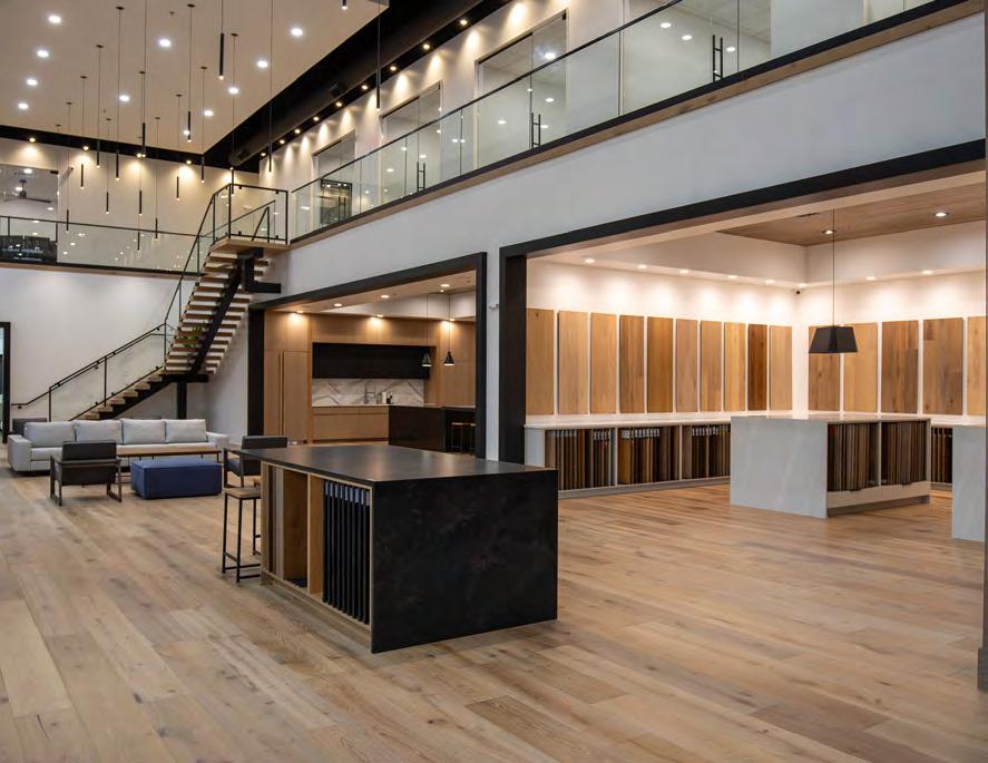


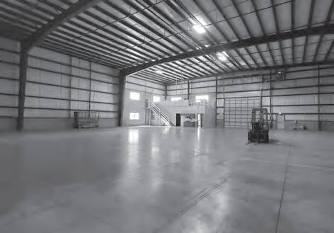
The project’s biggest challenge was planning for the company’s current and future needs. Ultimately, the company needed an office for their team, a warehouse for the crew and a showroom for clientele. The other main challenge was making a large, open warehouse space feel welcoming and inviting.
The designers created a public-facing showroom on the main level, with a second-floor mezzanine that houses the offices. This layout frees up the back half of the building for the warehouse and puts the primary focus on the public-facing portion.
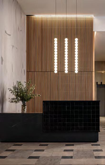
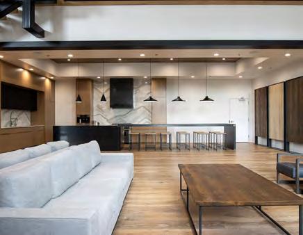
In the finished showroom, clients are greeted with a grand reception desk poised in front of a wood-slat wall, highlighted by numerous decorative pendants dropping down at various heights. Large islands have been incorporated throughout the showroom—spotlit by individual pendants—for extra meeting space. These islands double as space for serving refreshments or presenting materials during events.
A lounge area adjacent to the large kitchen brings in the warmth of home, allowing clients to fully relax in a public setting. The kitchen was a fun opportunity to repurpose the showstopper in the previous showroom—a 22-foot by four-foot-three island designed with a custom wood countertop and a waterfall edge. This massive island serves as a perfectly sized meeting area for the entire team to gather, as well as the ultimate buffet spot for large events.
RESOURCES
ARCHITECT:
Phil Rishel
INTERIOR DESIGNER:
Orion Design
@oriondesigninc
CONTRACTOR:
SVB Wood Floors
@svbwoodfloors
PHOTOGRAPHER:
Tyler Brough View full project details.

Formerly a car wash, this cinder-block structure offered hiding places for illegal activity. The new owner wanted to turn it into a welcoming space for meetings and educational programs.
To improve curb appeal, they constructed new parking lots, an entrance awning and sidelight windows. The new exterior lights provide an understated yet elegant aura of hospitality. A dark gray and black color scheme with orange accents imbues


the exterior with richness and vitality. They preserved one piece of the old car wash: the exterior vacuums. This fun conversation piece is a nostalgic reminder of the building’s history.
The refinished interior wood ceiling creates a dramatic and sonically friendly space for visitors, while the polished concrete floors and deepblue walls promote calmness. An assortment of antique French mansard windows—refurbished as mirrors—work together with the new modern furnishings. Special touches like vintage art and 10-foot-tall, hand-carved 17th-century Spanish stable doors make the space like no other.
Despite acquiring just a single variance and facing multiple challenges, the team achieved their goal of creating a safe, beautiful environment that helped shut down illegal activity on the premises.
DEVELOPER:
1707 LLC
themanheim.com
INTERIOR DESIGNER:
Richard Manes, Better Homes and Gardens Real Estate
CONTRACTOR:
B&L Construction
PHOTOGRAPHER:
Alistair Tutton
@ali_stair_photo
View full project details.

1. To grow roots or a root.
2.







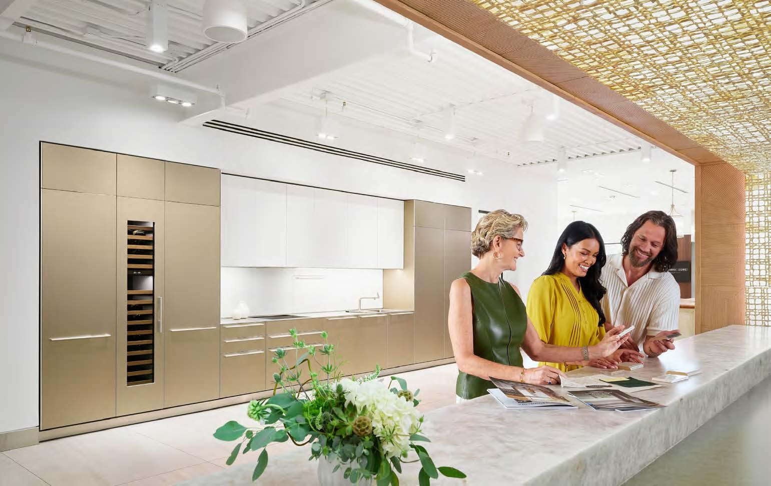
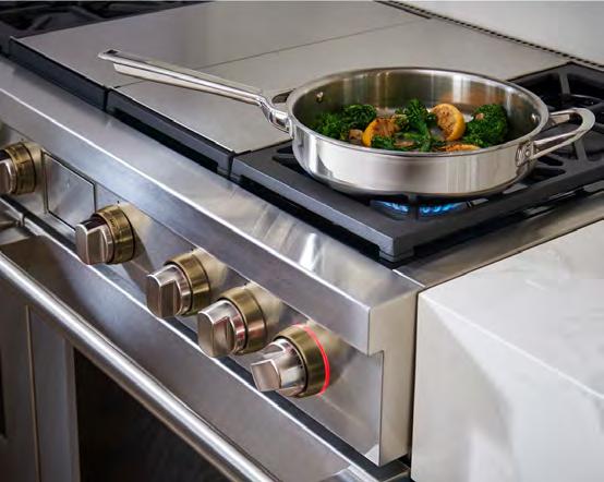
Appliances should work for your lifestyle, which is why our highly trained specialists ask the right questions to nd the perfect match for your needs. And with fair and fast service, our team is ready 7 days a week, catering to your schedule, not the other way around. We hope to become your appliance specialist for life, giving you more time to spend on what truly matters.


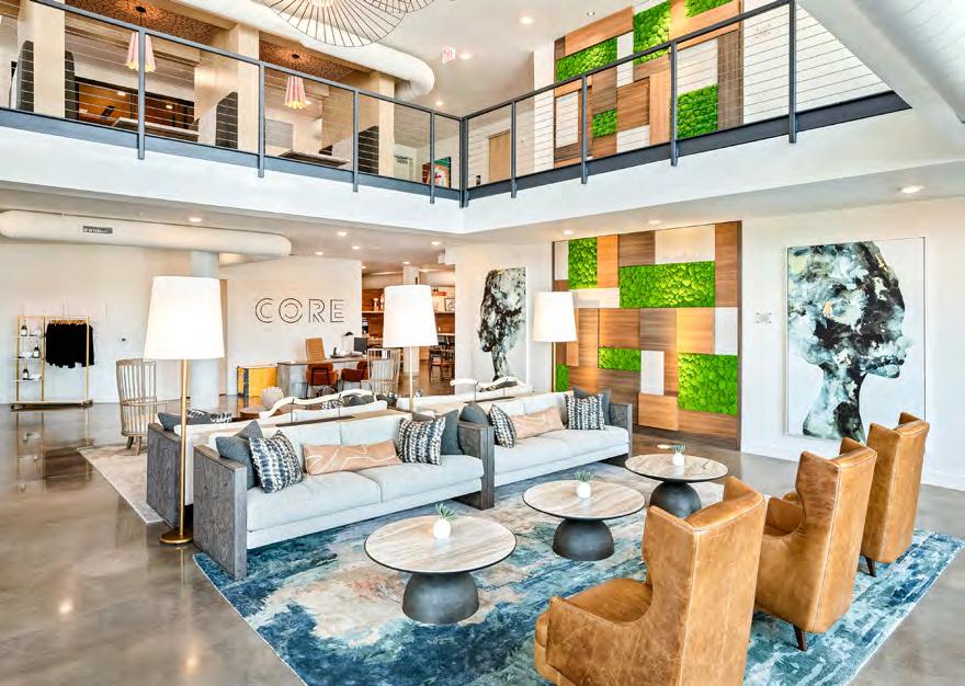
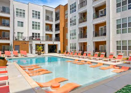


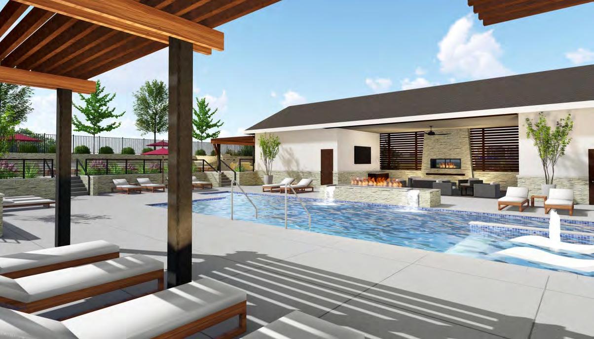
NorthPoint Development’s ultimate goal was to create a luxurious, multifamily housing community along the iconic Berkley Riverfront, reflecting the area’s history and character. In collaboration with NSPJ Architects, Lowery Design Group and Neighbors Construction, NorthPoint designed a four-story, 355-unit development with multiple outdoor living spaces and incredible views of the Missouri River and the Kansas City skyline.
One challenge was distributing the units across three four-story buildings on a dense urban site, all while also providing sufficient parking. The center building—which encircles the pool, its plaza and exterior amenities and the enclosed courtyard—required a carefully designed schedule for construction and staged completion. COVID-19 impacted their timeframe with supply chain issues, wild cost fluctuations and difficulty sourcing adequate labor.
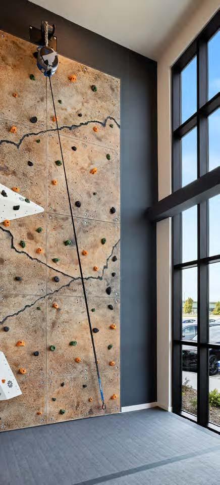
The units were spread across three buildings to take full advantage of the site; “tuck-under” parking was also added to maximize parking capacity. Pandemic workforce changes were reflected in the clubhouse design, which offers meeting rooms, work-from-home spaces and a two-story gathering space. The amenities include a rock climbing wall, club room, 24-hour fitness center, yoga studio and large heated pool. To take advantage of the pedestrian- and cyclist-friendly location, the complex offers bike rentals, storage and repair areas to residents. Pet-friendly amenities include a dog park and an in-house pet spa. In addition, the outdoors boasts cabanas, a pickleball court, bocce ball and grilling centers.
DEVELOPER:
NorthPoint Development
@northpointdev
ARCHITECT/LANDSCAPE ARCHITECT:
NSPJ Architects
@nspjarchitects
INTERIOR DESIGNER:
Lowery Design Group
@lowerydesigngroup
CONTRACTOR:
Neighbors Construction
@neighborsconstruction
PHOTOGRAPHER:
Brian Pierce, Sherpa Media
@sherpa_media View full project details.

INTERIOR DESIGNER:
Lisa Schmitz
Interior Design
@lisaschmitzinteriors
CONTRACTOR:
Rau Construction rauconstruction.com
PHOTOGRAPHER:
Nate Sheets
@natesheetsphoto

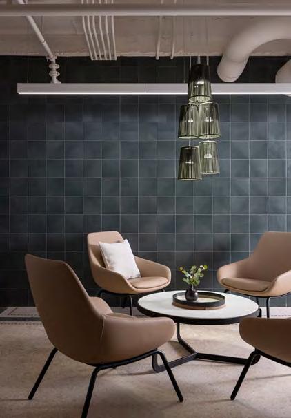
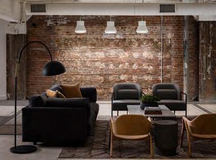
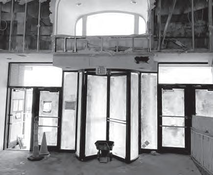
A century-old building is reimagined in this historical renovation project. Together with the architects, Lisa Schmitz Interior Design worked to celebrate this 23-story building while making it ultra-livable. The lobby was challenging. Although two defunct elevator shafts could not be moved, the space needed to feel grand and transition into a residential lobby. Below ground, the building’s massive lower level was in bad shape, and it required modifications to take on multiple functions: working from home, exercising and hosting gatherings—all with no natural light.
RESOURCES
The design team worked to save any original elements and complemented the vintage surfaces with modern finishes. They also designed spaces to connect the community. They maintained 14-foot-high ceilings in the lobbies and paired black-marble quartz countertops with tone-on-tone black Zellige tile at the reception desk. The team encased the large elevator shafts with white-oak slats and repeated the oakslat motif in adjacent rooms, unifying separate spaces.
Downstairs, the original terrazzo floors were repaired to reflect their 1923 craftsmanship. Designing a welcoming space, however, was a massive challenge in the dark lower level. The design team took a “speakeasy” approach—instead celebrating the absence of natural light. The newly renovated seating areas now serve various needs, including space to hang out with friends or watch a Chiefs game, dining areas to host cocktail hours, a large fitness center, a bevy of game tables and small remote work rooms.
Architect: Varenhorst Architects (Penn.) Art: Minted; Etsy Countertops: Cambria Flooring: J+J Flooring; Shaw Contract
Furnishings: Blu Dot; West Elm; 9to5 Seating; Allermuir; Grand Rapids Chair Co.; m.a.d. furniture design




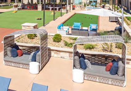
The developer set out to create a high-end outdoor amenity space with carefully curated furnishings to meet the group’s vision and align with the overall building design and aesthetic. The project team redesigned the 43,000-square-foot courtyard into areas of pause where residents can relax and enjoy outdoor activities.
The Residences at Galleria houses 322 apartments, so the team needed diverse and inviting seating options. They faced multiple design challenges along the way. The first challenge was determining varied seating options to accommodate the high-traffic outdoor amenity space. The second was creating a cohesive, complementary flow between the design and furnishings of the clubhouse and the interior courtyard spaces. The final challenge included selecting unique outdoor fabrics and finishes to coordinate with the interior color palette, as well as choosing commercial-grade furnishings that perform well in extreme temperatures.
Now finished, the new outdoor amenity space is perfectly suited to the complex’s luxury aesthetic and for the residents’ needs. The deep seating around the fire pits and gaming areas invites conversation and community. The outdoor kitchens, decked with new barstools and tables, create additional entertainmentready spaces. They promote an instant gathering place and help initiate social interaction. Given that the courtyard gets full sun, installing cantilever umbrellas was also crucial to creating enough shade. Mounted in concrete, these sturdy umbrellas pivot to offer wide shade coverage to the many summer weekend guests.
Overall, more than 350 quality-of-life-enhancing items have been added to this bustling outdoor oasis, all helping sustain this dynamic, sunny space.
DEVELOPER:
Block Real Estate Services
@bres_kc
ARCHITECT:
Hoefer Welker
@hoeferwelker
CONTRACTOR:
Titan Built
@titanbuilt
MULTIFAMILY DESIGNER:
Lifestyles By Design
@lifestylesbydesign
PHOTOGRAPHER:
Arch Photo KC | Jacia Phillips
@archphotokc

The predominant goal for this 1980s townhome remodel was to create a home for the owner’s sister and to transform the lower level for her son by adding a bedroom and a kitchenette.
INTERIOR DESIGNER:
Circa Interior Design
@circainteriordesign
CONTRACTOR:
Open Door Homes
@opendoorhomes
PHOTOGRAPHER:
Matt Kocourek
@mattkocourek47
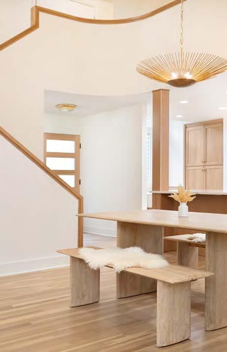
The project team’s solutions included opening the wall between the kitchen and living and dining rooms. The team reconfigured the kitchen by centering the sink on a window, installing a large pantry in an unused nook and adding a banquette. Rift-cut white oak cabinetry was chosen for the lower drawer storage, while the cabinets housing appliances are adorned in matte white with bronze pulls. Cambria quartz tops extend up the walls to stunning effect.
In the living and dining rooms, the project team redesigned and rebuilt the staircase and fireplace mantel in matte-white oak. They then replaced the fireplace surround with caramel-ribboned porcelain and refinished the floors. The baths were updated with cream Zellige tiles, featuring subtle iridescence on the shower walls.
Downstairs, the lower level was updated by adding a new bedroom. The newly installed luxury vinyl plank floors in white-oak herringbone help unify the space, visually connecting with the full kitchenette, donned in black with granite tops and backed by white-oak wall panels.
RESOURCES
Accessories: Seville Home; West Elm Appliances: GE Café Cabinets: Parks Cabinets Countertops: Central Surfaces Flooring: SVB Wood Floors Furnishings: Seville Home
Hardware: Top Knobs Lighting Fixtures: Relative Lighting To-the-Trade Showrooms: Designer’s Library Windows: Advantage Windows
CALL, VISIT A SHOWROOM, OR FIND US
ONLINE TO SCHEDULE YOUR COMPLIMENTARY
DESIGN CONSULTATION 913.888.1199
Locally owned with showrooms in Overland Park and Briarcliff Village





A heartfelt “Thank you!” to designKC Magazine and the judges for this wonderful honor.
We also want to recognize our talented design team. You all made this possible and we appreciate each of you so much!


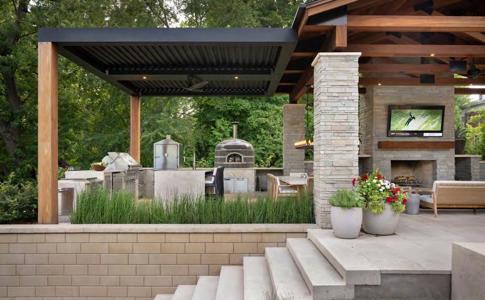


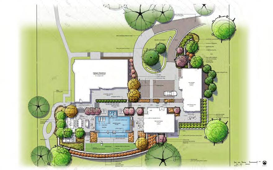
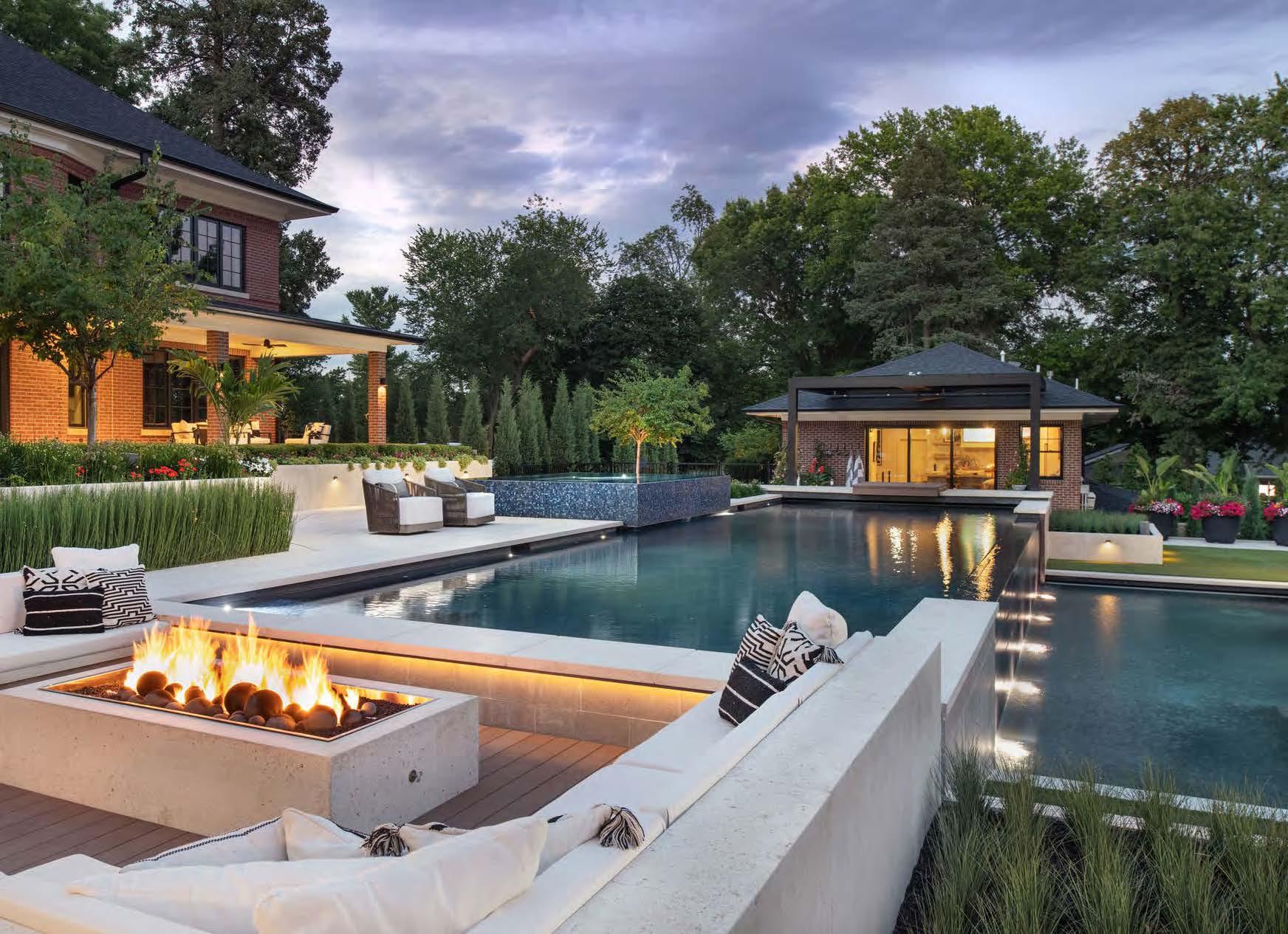

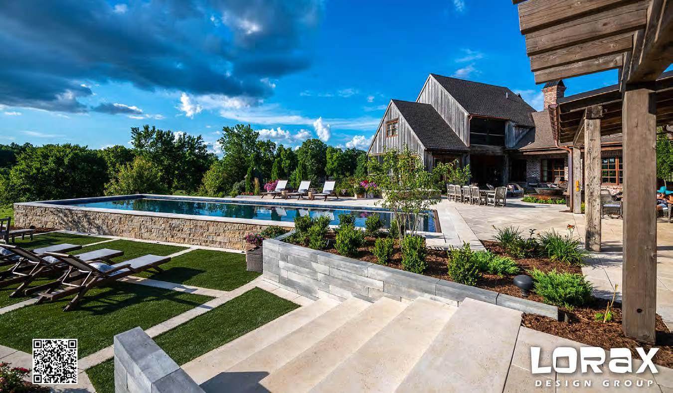
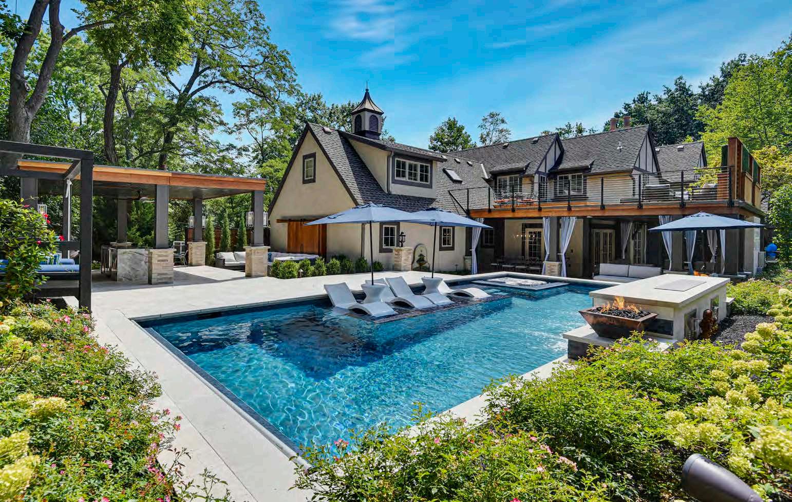
Contemporary details in outdoor living are blended with the historic home as a backdrop in this ultraluxurious, multi-tiered entertainment space. The client requested a full spectrum of program elements, including a covered outdoor living space with a fireplace and a full outdoor kitchen, a guest/pool house, an upper and lower pool, a spa, a swim-up bar ledge, a sunken fire pit and multiple lounging spaces. The backyard’s sloped hill made the terrain unusable for this vision, so the design team’s biggest challenge was to fl atten the earth and create functional yet beautiful spaces. They addressed the dramatic grade changes by using terraces, expanding the usable space and creating various outdoor rooms, which resulted in a dynamic, party-ready space from every angle.
Builder: Scott Gann Construction Contractor: Clearwater Pools
Landscaper: Embassy Landscape Group Flooring: Atelier Vals
LANDSCAPE ARCHITECT AND POOL DESIGNER:
Lorax Design Group
@loraxdesigngroup
DESIGNER:
Amy Thurston Interiors + Creative Direction
@amytkc
PHOTOGRAPHER:
Matt Kocourek
@mattkocourek47
View full project details.
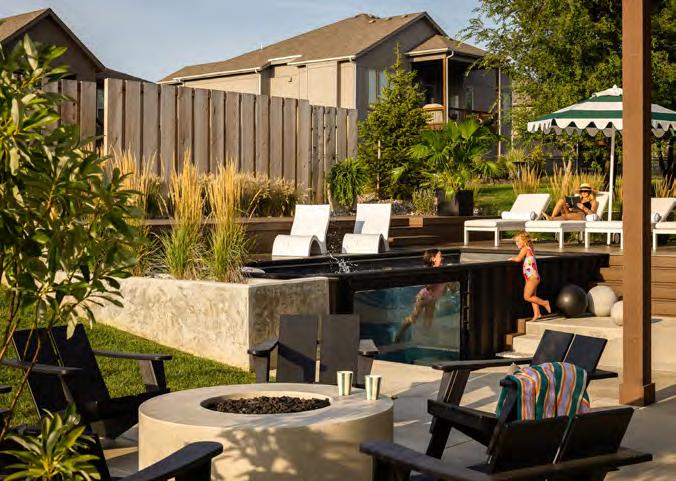
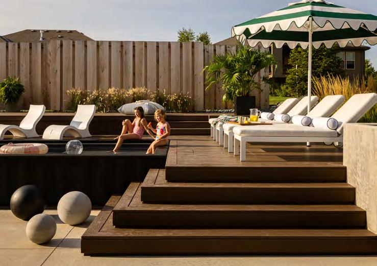
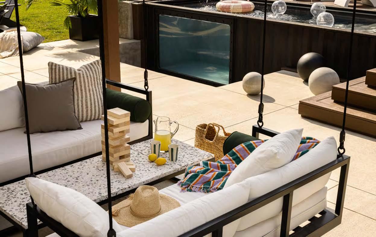
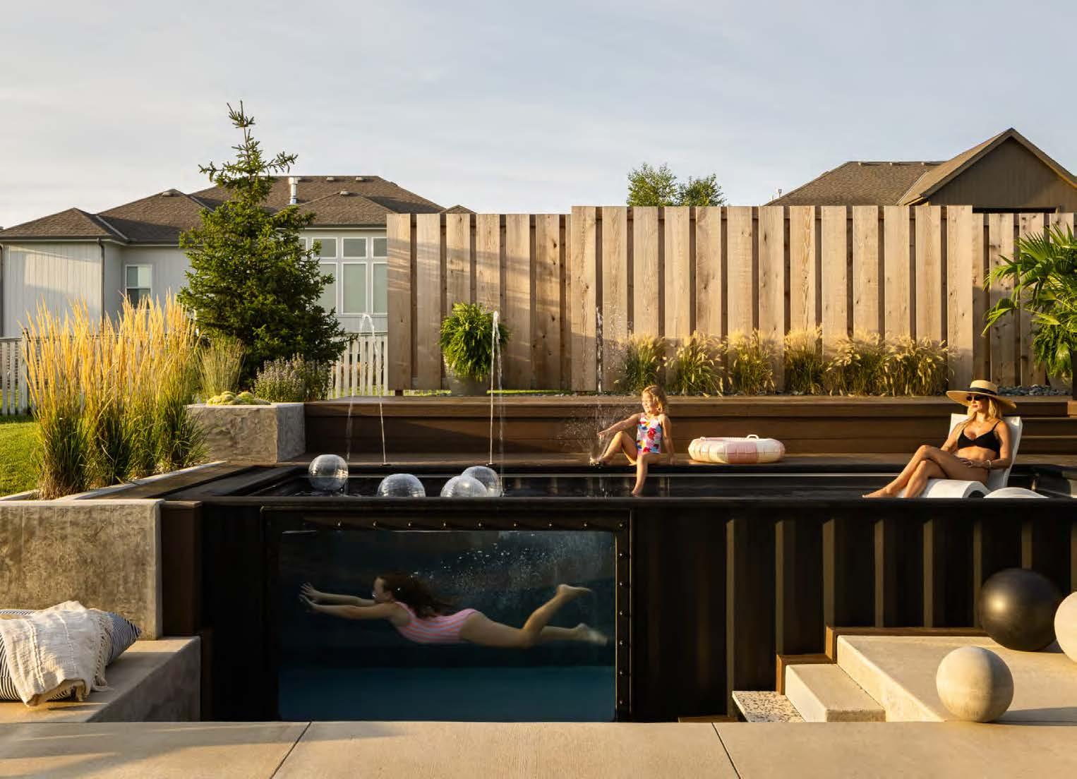

A fresh take on a popular trend, this ambitious renovation project included multiple stages: exterior grading, pool and privacy fence additions, landscaping and hardscaping and, lastly, furnishings and finishes. At the heart of this outdoor oasis is a shipping container pool, along with a fire pit and space for games and lounging.
The shipping container pool—the project’s central feature—presented the greatest challenge. In preparation for its delivery, the design-build team poured a concrete foundation to house the prefabricated pool and extend its longevity. The pool was later crane-lifted over the house and set inside the concrete foundation, thus, the design details were crucial to making this project work.
The partially underground pool functions as a retaining wall, helping create multiple levels of fl at space in the yard. Working with the natural grade and slope of the lot, along with the city easements, the team layered the site with a concrete planter, multi-level decking, landscaping and more. Finishing touches, like the retro-inspired terrazzo and classic striped umbrella, gives the space an industrial, vintage vibe.
ARCHITECT/CONTRACTOR/DESIGNER: Cicada Co. @cicada_co
LANDSCAPE ARCHITECT:
Jeffrey Preuss Landscapes @jeff.preuss.design
PHOTOGRAPHER:
Nate Sheets
@natesheetsphoto


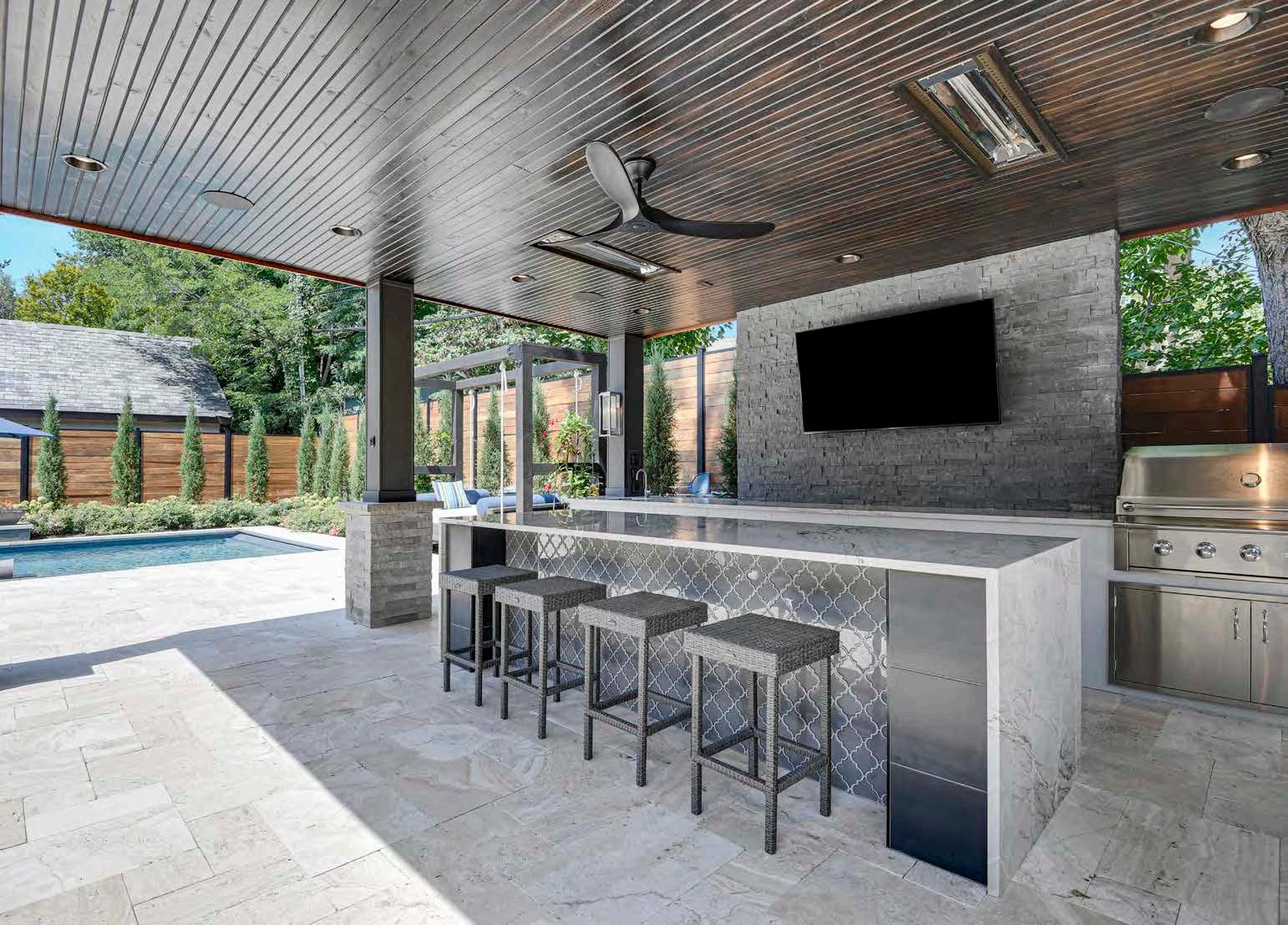
For their new outdoor space, this project’s clients wanted a design that would provide privacy and appear as though it had been there for years. The shallow backyard posed a challenge to this vision, as did working within the city’s codes and watershed requirements. The design team collaborated with a stormwater consultant to create an aesthetically pleasing solution suited to their clients’ wishlist and the backyard’s parameters. Two 1,500-gallon infiltration tanks were buried to handle the water from all the surfaces and to prevent water runoff. Synthetic turf allows rain to flow into the underground tanks, aiding in water filtration. To achieve privacy, the design-build team retrofitted the cabana with a solid back wall that houses the fireplace and TV area on the high side of the property. Custom Ipe-wood louvers on both sides of the fireplace provide seclusion while still allowing air and light to flow through the space. Infrared heaters added to the ceiling extend the sports-watching season. The project team also custom-built a 36-foot-long limestone slab fireplace to screen the pool from neighboring homes. The feature stands almost four feet above the pool level and seven feet above the grade on the underside of the pool. Whether sunlit or firelit, the true showstopper is the champagne spa with shimmering, hand-made glass tile and matching sun ledge.
DESIGNER/CONTRACTOR:
Backyard by Design @backyardbydesignkc
PHOTOGRAPHER:
Christine Caso Ward @imagesbycc View full project details.


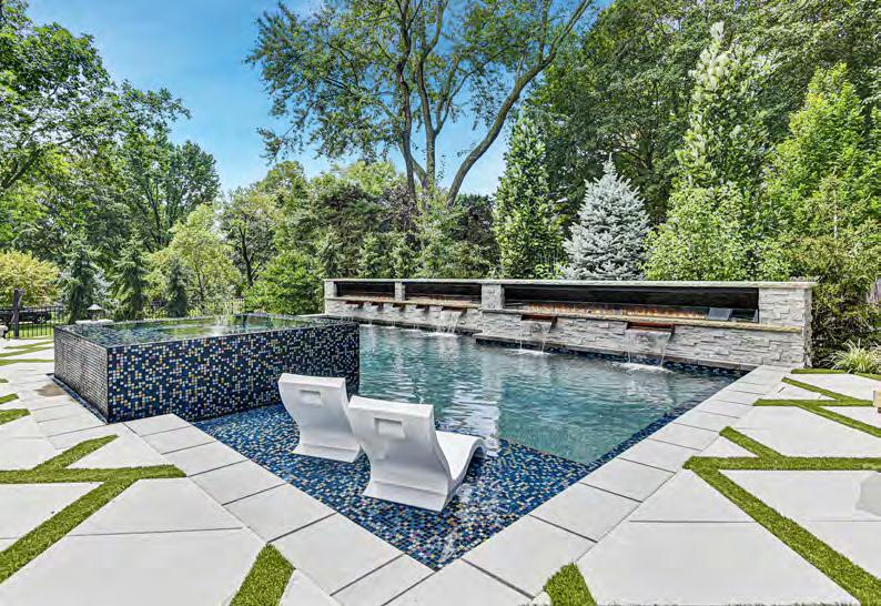
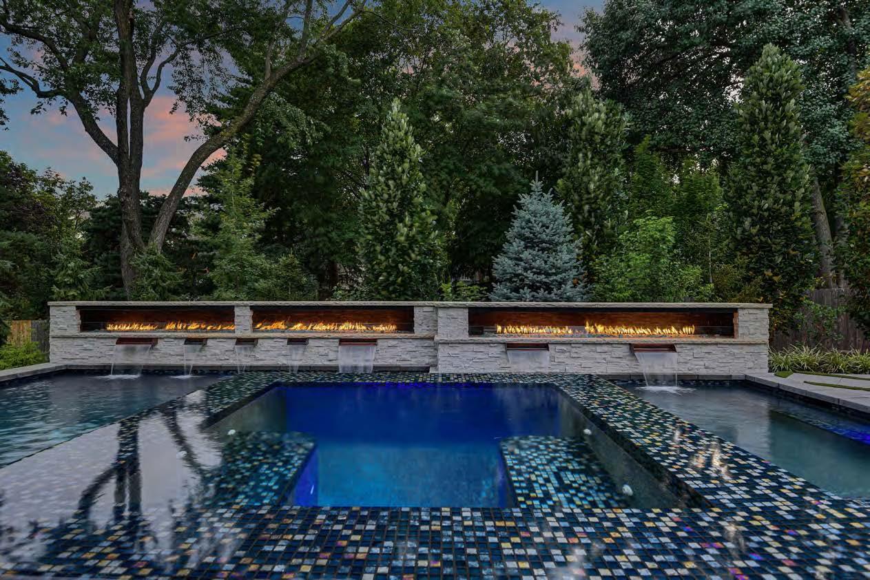
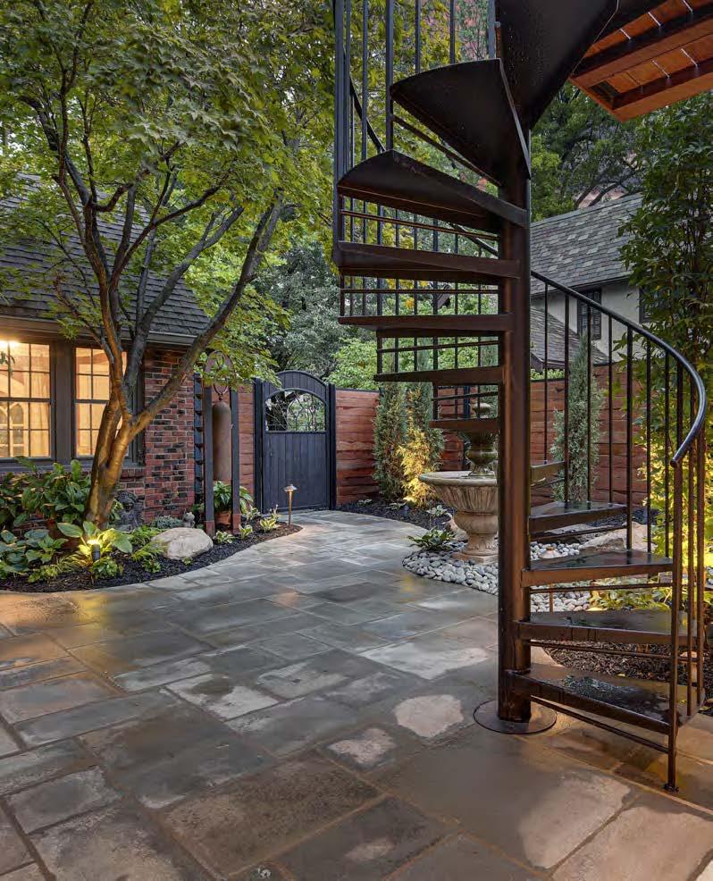

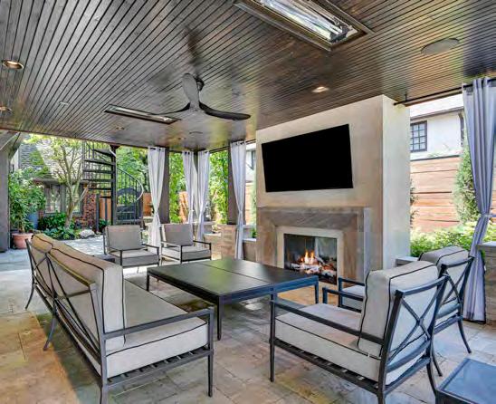
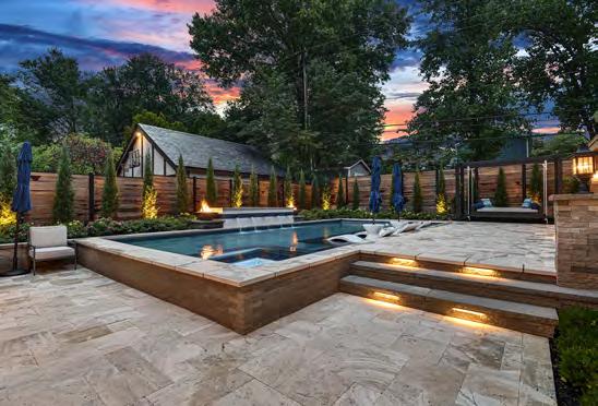

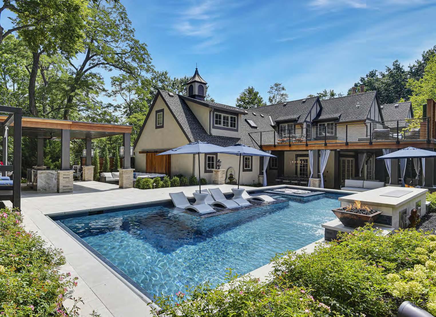

Challenged by a small yard in an urban setting, the design-build team was tasked with creating a unique, one-of-a-kind entertaining space for the entire family. Space to operate and maneuver was difficult, and weather issues required dealing with flooding. But past the issues, the project came together seamlessly, resulting in multiple, well-designed outdoor living spaces.
Mom’s Zen garden is where she can escape to enjoy the outdoors. Dad also has his own unique custom space: a solid-wood rooftop deck that overlooks the entire backyard, accessible by a spiral iron staircase. The main cabana features a TV above the custom limestone fireplace. Another TV is located in the outdoor kitchen pavilion for viewing while cooking or lounging at the granite bar, and a third TV is cleverly hidden in the pool’s waterfall, ascending remotely at the touch of a button.
For sustainability, the design-build team saved parts of the existing patio to reuse in the new construction. Rainwater is collected and reused, and 100-percent of the materials are natural—the fence, the trim around both cabanas and the rooftop deck are made of Brazilian Ipe wood.
DESIGNER/CONTRACTOR:
Backyard by Design @backyardbydesignkc
PHOTOGRAPHER:
Christine Caso Ward @imagesbycc

CONTRACTOR:
B.L. Rieke Custom Homes
@blriekecustomhomes
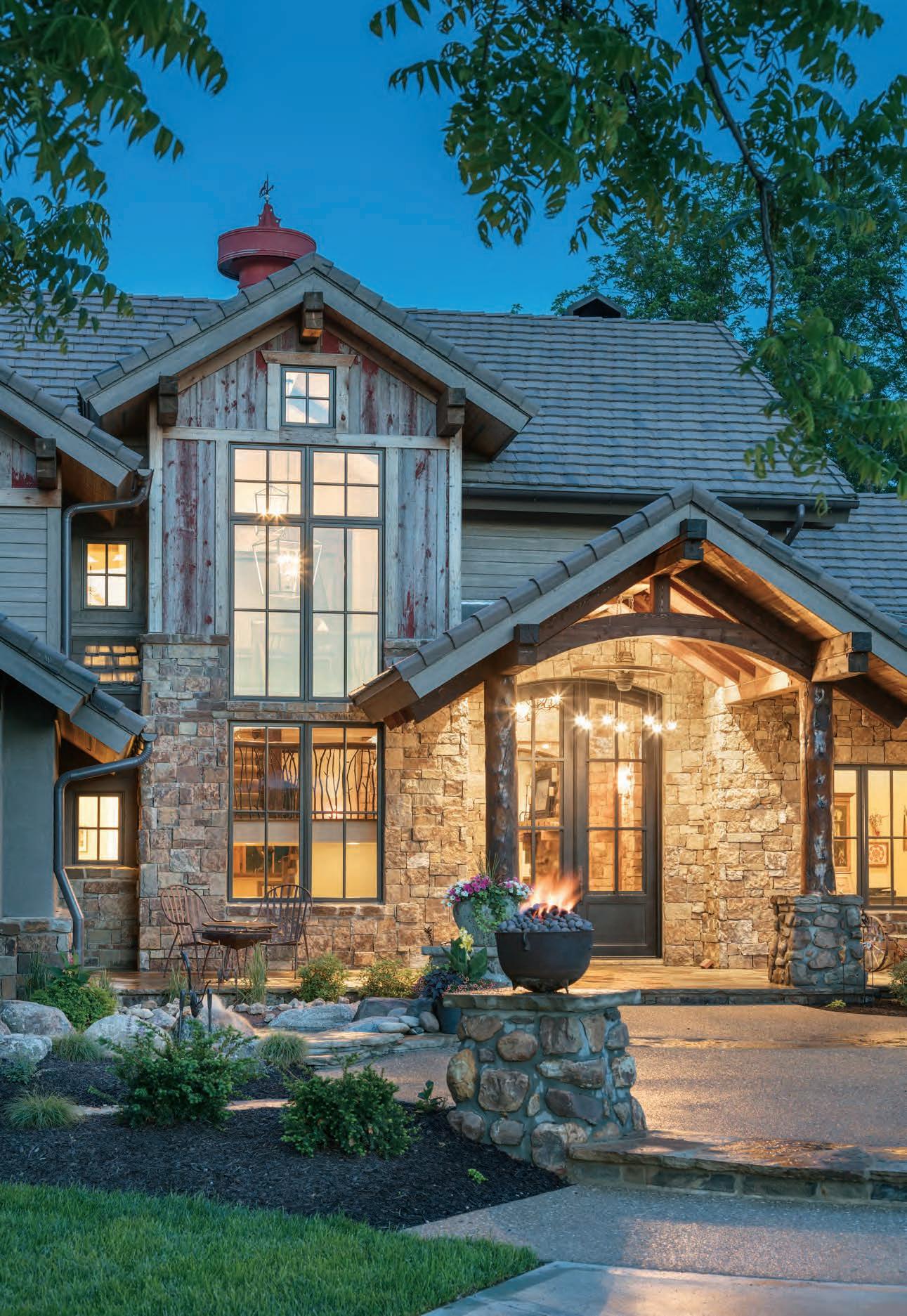
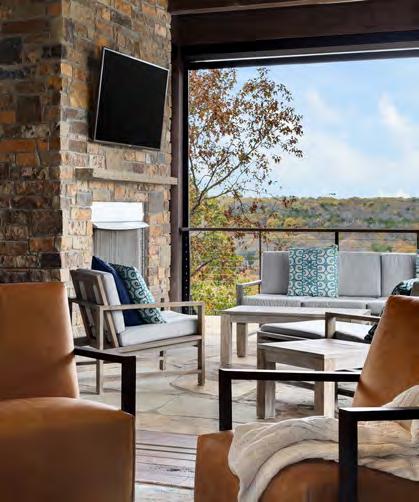
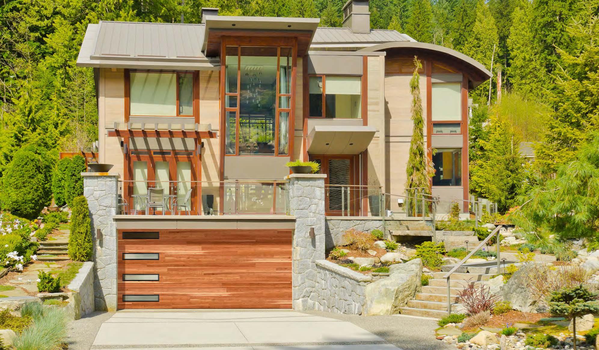
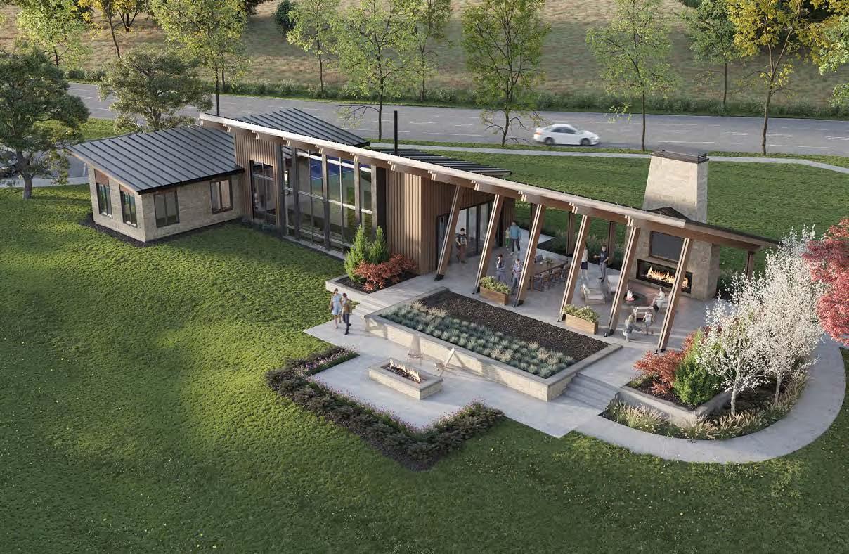
The mountain-esque style of this home’s outdoor spaces and landscaping showcases a mix of organic, contemporary and industrial elements that meld with the magnificent forested landscape that surrounds the property. The rear elevation features a two-story covered lanai designed to capitalize on these panoramic views. As the homeowners’ “happy place,” the lanai was designed to be supremely comfortable and luxurious. It features exposed steel I-beams, a natural stone fireplace and Andersen Liftslide doors that connect the space to the interior great room. When the doors are stowed away, there is an unobstructed view and one open indoor-outdoor room. A cable railing system, power screens, fl agstone flooring and tongue-and-groove cedar ceilings with exposed wood trusses contribute to the alpine resort ambiance.
LANDSCAPE ARCHITECT:
EPIC Landscape Productions
@epiclandscapekc
PHOTOGRAPHER:
Josie Henderson
@josiedell_photo
View full project details.
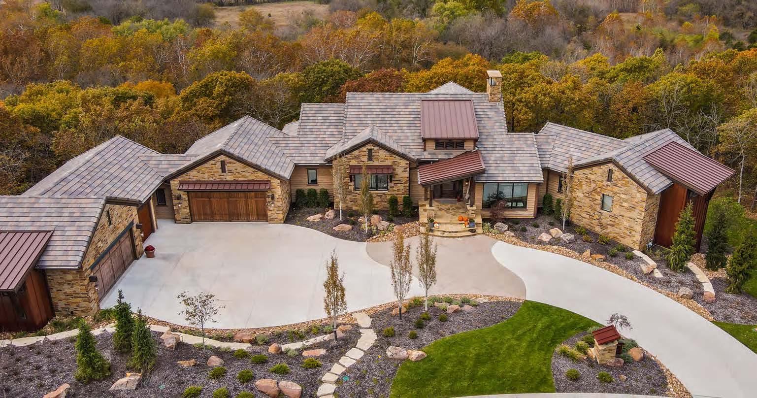
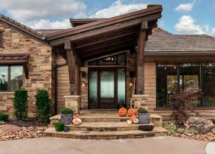
On the front elevation, the driveway sweeps from the far right to the far left to accommodate the slope and oblong shape of the lot. The challenge was to make the unique driveway and landscaping blend seamlessly into the natural terrain while retaining functionality. The landscape designer and builder sensitively approached the existing landscape by preserving and incorporating the prominent trees into the new landscaping, making the home’s layout work with the existing terrain of the lot.
RESOURCES
Community: The Communities of Cedar Creek Appliances and Plumbing Fixtures: Ferguson Bath, Kitchen & Lighting Gallery Cabinets: Miller’s Custom Cabinets
Countertops: SCI – Surface Center Interiors Fireplace: Midwest Fireplace Flooring: ProSource Wholesale; SVB Wood Floors Hardware: Locks & Pulls
Lighting: Rensen House of Lights Painter: Millennium Painting Roofing: Imperial Roofing Siding: COR-TEN® Steel Windows: Andersen Windows & Doors
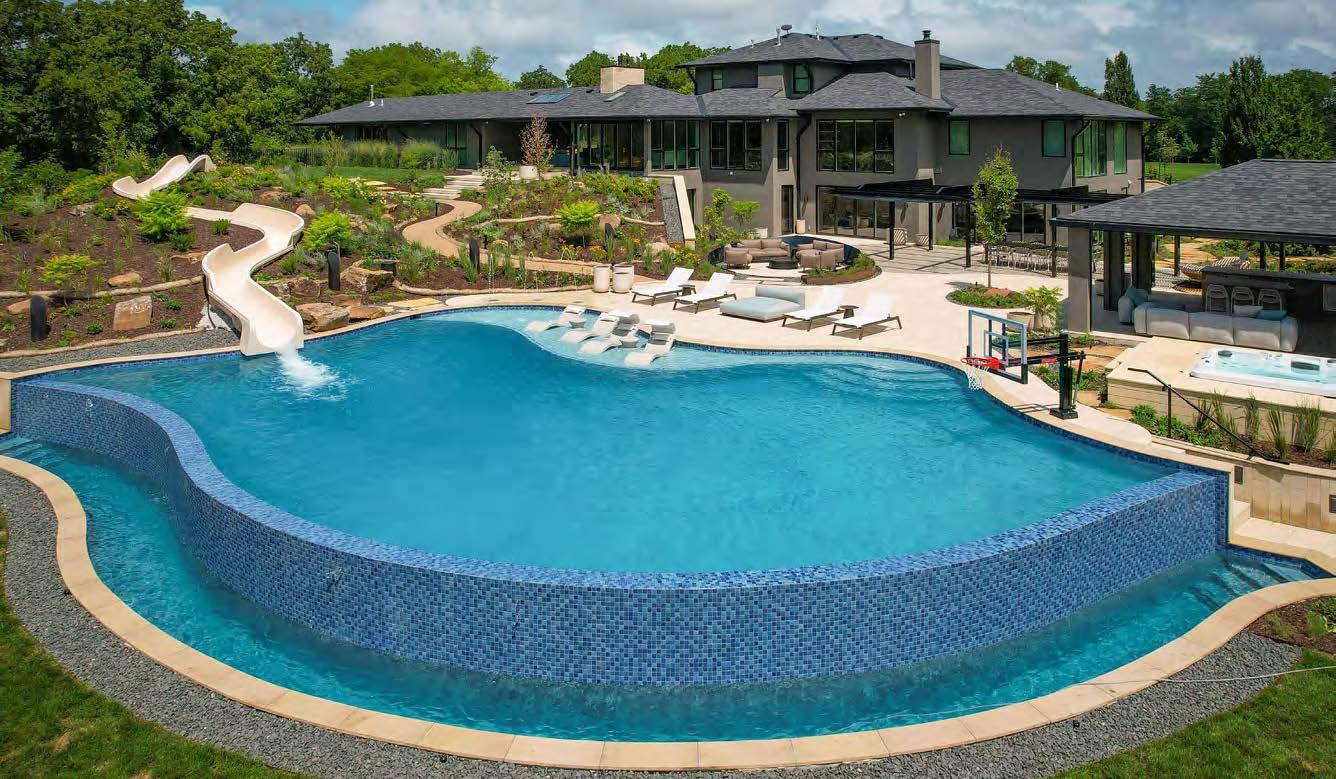
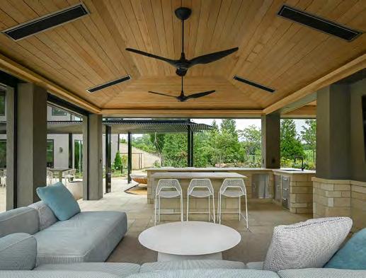
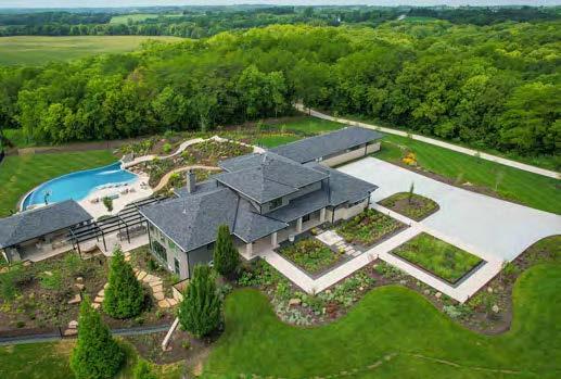

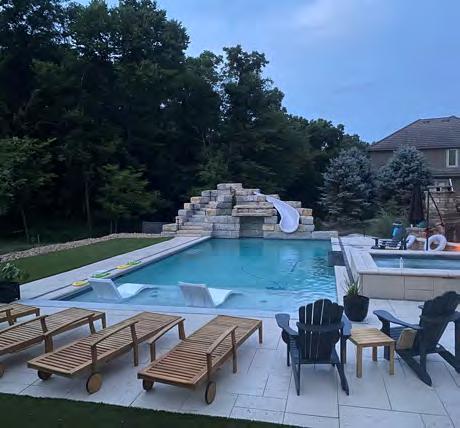
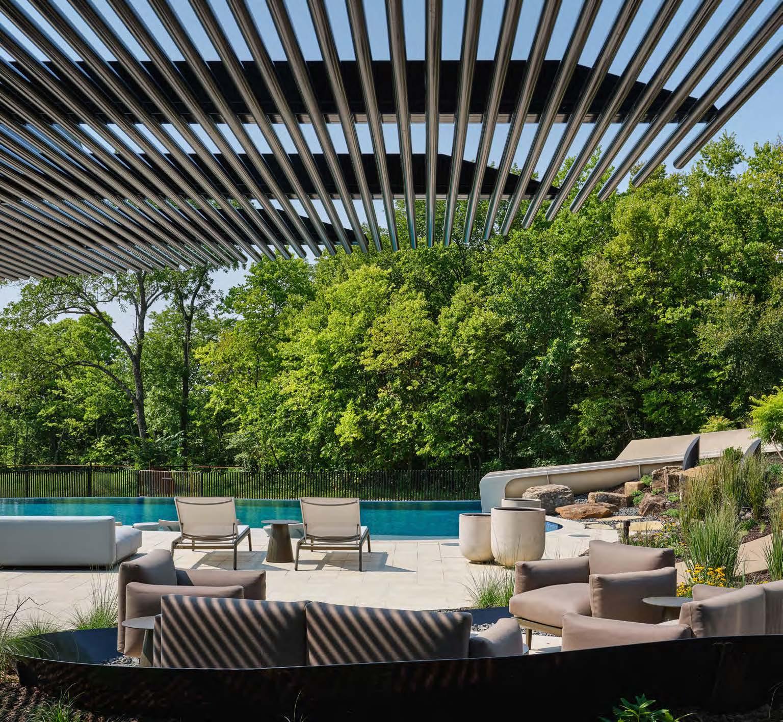
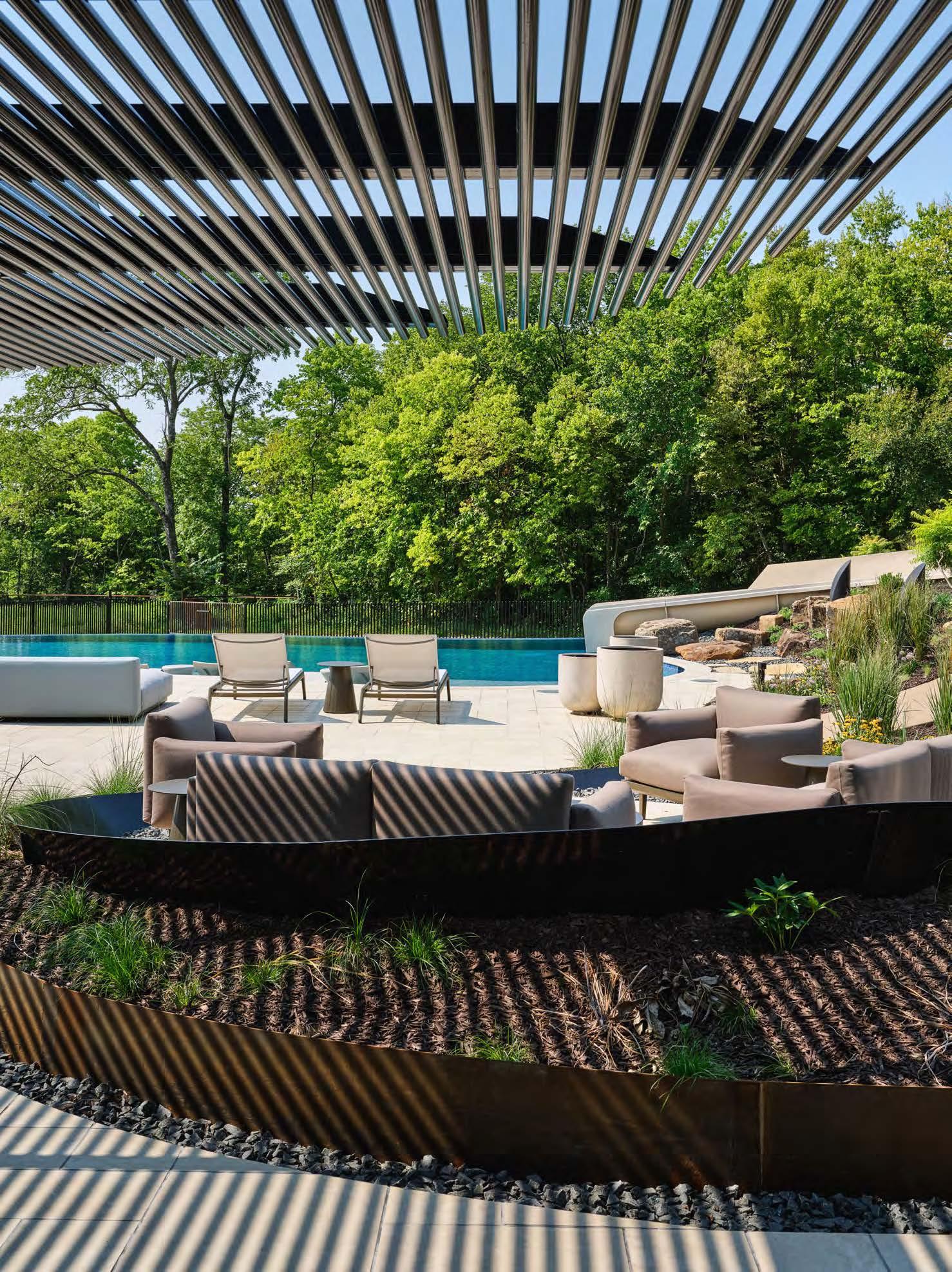
Various entertainment zones create a complete at-home resort experience in this custom outdoor project. The infinity edge of the pool—stretching more than 80 linear feet—is the largest in Kansas City. Splashing into the crystal-blue water is a specially designed, 82-linear-foot waterslide. The pool area also features a sun deck with laminar water jets for sunbathing and a basketball hoop.
A custom-built pergola with more than two miles of metal tubing connects space from the house to the covered outdoor kitchen, providing additional shaded places to dine or relax. Under rooftop protection, the outdoor kitchen offers space for grilling, watching sports or resting. With built-in heaters, the second-tier covered area provides three-season lounge space. The adjacent fire pit is yet another cozy atmosphere for evening time or coolweather enjoyment.
The project’s large-scale undertaking made it susceptible to weather-related delays and seasonal changes; fortunately, the team managed to complete the pool and outdoor living areas just in time for the homeowners to fully enjoy them during the summer.
ARCHITECT:
Hufft
@_hufft
CONTRACTOR:
Homoly Design + Build
@homolydesignbuild
PHOTOGRAPHER:
Samantha Ward
@samanthaward_photography

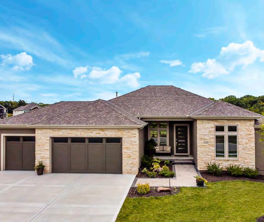
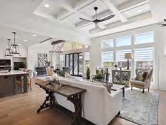
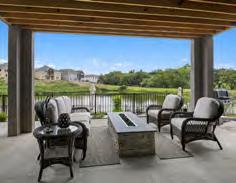

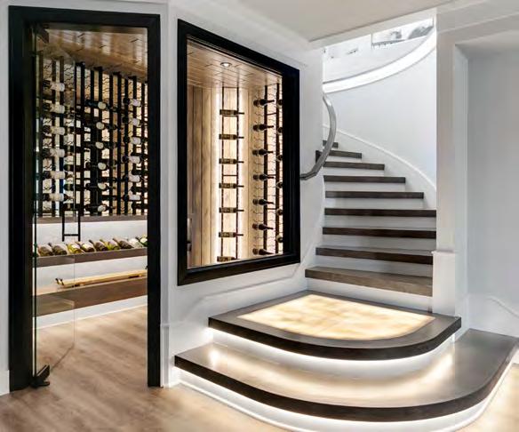
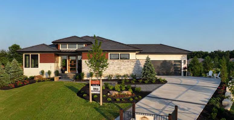









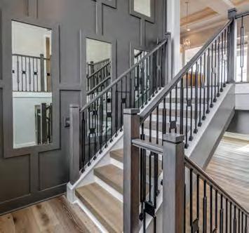


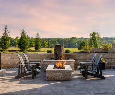


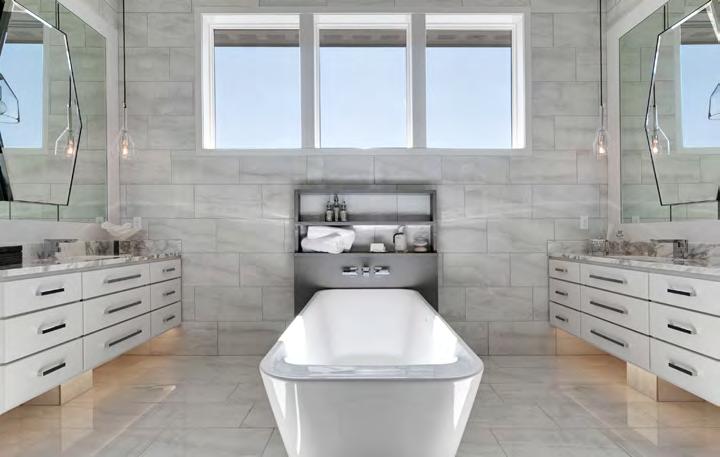
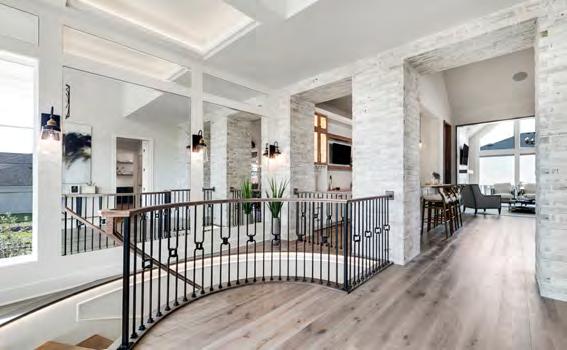


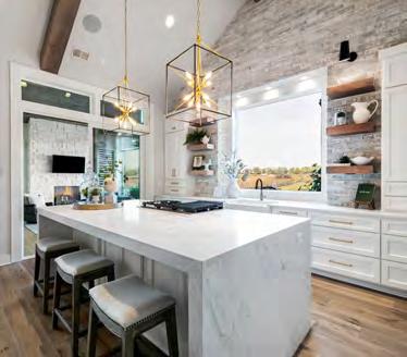


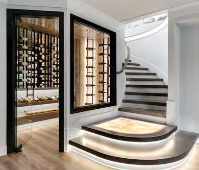


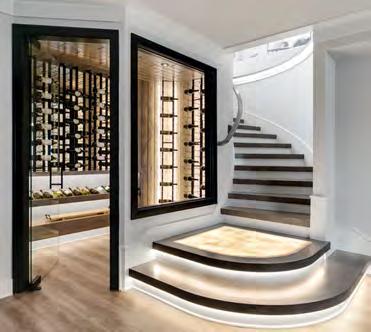
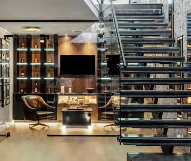


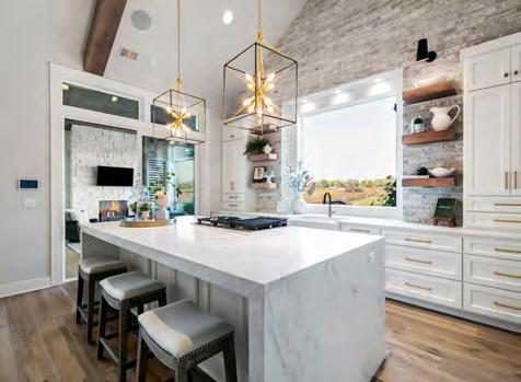

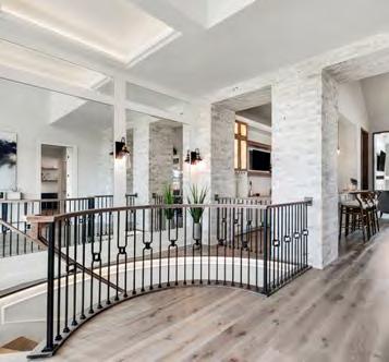





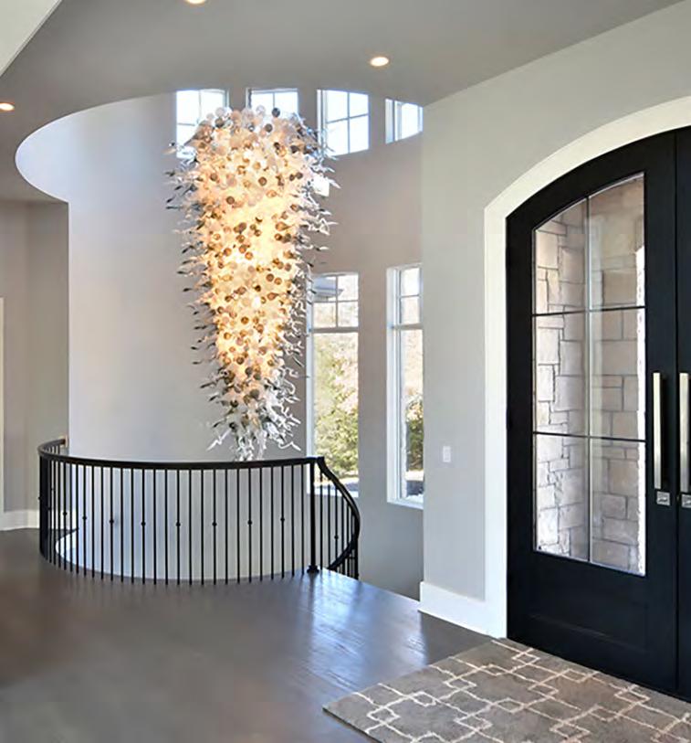
This one-of-a-kind light fixture serves as the focal point of the home. At the outset of its inception, the project’s design, transportation and maintenance challenges provided creative opportunities for the design-build team.
One challenge was adapting the light fixture to the scale of the stairway: the fixture had to be very large in proportion yet easily moved for maintenance. A talented artisan from Boise Art Glass custom-made the light fixture piece by piece. Ashner’s team developed a structure to house the work of art—while concealing the mechanics behind the piece—to ensure its beauty and functionality in the long term. The fixture can move up and down so it can be cleaned and maintained.
The artisan transported the glass pieces from Idaho and arranged each piece individually, resulting in a composition perfectly matched to the space. Each piece can be replaced as needed to ensure the longevity of this work of art.
CONTRACTOR:
Ashner Construction
@ashnerconstruction
PHOTOGRAPHER:
Aaron Bales
View full project details.
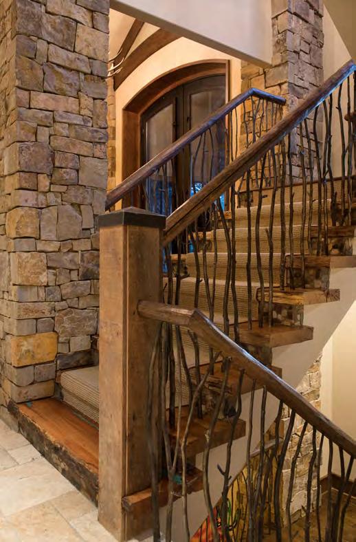

The exquisite details of this staircase are a unifying focal point, matching the home’s use of reclaimed materials, attention to detail and visual storytelling. Whenever a unique design like this is created, the careful curation of out-of-thebox solutions, materials or techniques is needed to bring a vision to life.
The team collected branches from around the property and had them custom-cast to use as the spindles, carefully placing them so they were up to code. They also hand-selected oak slabs from the homesite for stair treads. The homeowner then inlaid turquoise on the last tread of each of the fl ights. A gap between the window and one of the landings allows more natural light to flow through the home.
On the second landing, the homeowner had a replica of the classic Western painting A Dash For the Timber by Frederic Remington laser-cut into reclaimed steel. This steel art piece doubles as the railing between the kitchen overlook and the landing. For a final personalized touch, each newel post features a removable cap that hides the signature of each one of the homeowner’s daughters.
CONTRACTOR:
Ashner Construction
@ashnerconstruction
PHOTOGRAPHER:
Matt Kocourek
@mattkocourek47

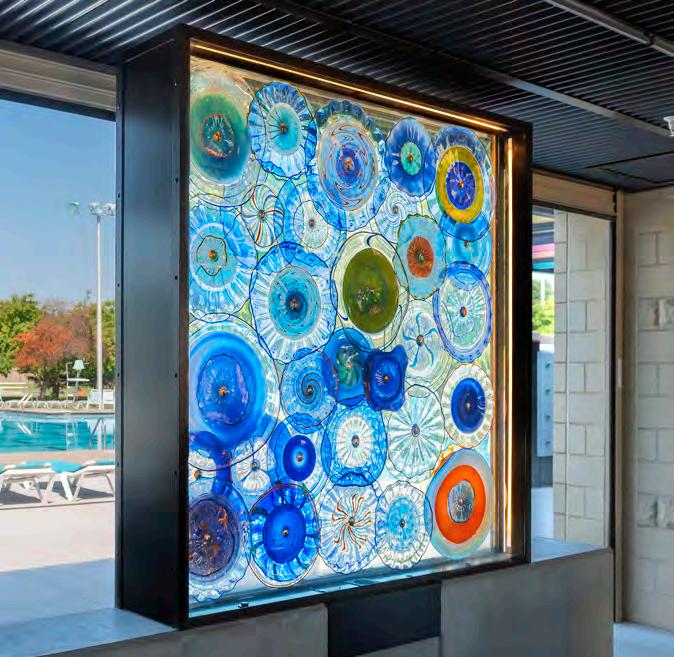
The project team’s vision for the featured artwork at Leawood Aquatic Center was to create blown-glass art that reflects an ethereal underwater experience. The site offered two areas for installation.
ARTIST: Rock Cottage Glassworks
@rockcottageglassworks
PHOTOGRAPHER: Tim Pott
@timpottphotography
First, they designed a six-foot-tall, free-standing glass shadowbox with various hand-blown rondels visible from both sides. The artwork’s radiant color and light shift with the sun and the seasons. The team also added internal lighting for nighttime visibility. Because the free-standing shadow box is exceptionally heavy and subject to direct winds, a team of artists and designers encased the work in tempered glass and bolted it to a concrete base. They also included internal ventilation to circumvent rising temperatures that might stress the artwork.
The second artwork comprises a five-piece series of fl at and fused glass panels for the transom windows of the indoor pool area. The facility’s leadership chose the color palette for both creations, unifying their designs. Now finished, the two-part installation brings a fun, serene aesthetic to the complex.
RESOURCES
View full project details.
Mechanical Design and Shop Drawings: Amie Jacobsen Art and Design Producer and Glass Artist
Conceptualized Design: Dierk Van Keppel CAD Design, Rendering and Presentation Materials for
Jury Process: Alison Wood Gaffer and Glass Artist Conceptualized Design: Josh Dickens
Chief Fabricator and Installer: Bryan Morris Fabrication: Byers Glass & Mirror

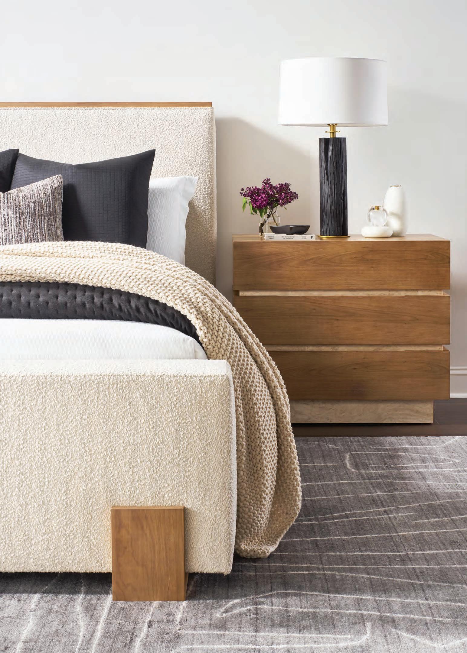
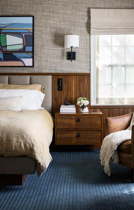
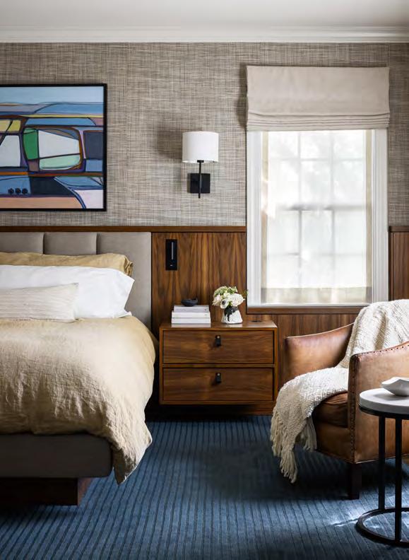
This minimalistic design—both decluttered and streamlined—is the focal point of a bedroom makeover. The project may seem simple, but it required meticulous coordination among four separate trades: the mill shop for woodwork, the upholsterer for the headboard inset, the contractor for lighting and electrical on the nightstands and the trim carpenter to install everything with precision. Finally, they needed their designer to aesthetically bring it all together.
The custom walnut woodwork solves multiple needs. The unit runs wall-to-wall, encasing the upholstered headboard while also incorporating reading lights and nightstands. The design team kept the window frame intact but removed the old apron to integrate it with the headboard paneling more seamlessly. A textured, upholstered inset panel was also custom-fit into the headboard, adding coziness. Integrated book lights are ideal for individual reading and floating nightstands each incorporate built-in electrical with a docking drawer system. Custom leather pulls add contrast and a soft touch to the hand. The custom upholstered bed frame is lifted above the walnut base, giving the whole space a grounded yet airy feeling. View full project details.
RESOURCES
DESIGNER:
Lisa Schmitz
Interior Design
@lisaschmitzinteriors
PHOTOGRAPHER:
Nate Sheets
@natesheetsphoto
Accessories: Erica Iman Art: Karen Matheis Cabinets: Royal Fixture Company Lighting Fixtures:
Astro Lighting; Lightology Rugs: The Rug Studio To-the-Trade Showrooms: KDR Designer Showrooms
Wall Coverings: KDR; Phillip Jeffries; John Wylie Window Coverings: M & M; Pollack; KDR; JAB

The “Cedar Creek Bluff Retreat” blends organic, rustic and contemporary aesthetics, enriched with refined industrial accents to fulfill the homeowners’ desire for exposed steel details. The home also features exposed beams, reclaimed wood, solid wood doors and natural stone. B.L. Rieke was challenged to establish scale, balance materials, make basic elements “feel” unique and conceptualize their clients’ envisioned dream home down to the smallest details.
For example, in the main bedroom, hardwood flooring planks were installed at an angle. The design-build team extended this angular style to the uplit wood-plank recessed ceiling feature and and also at the entry. The team also meticulously sourced—and often customized—products.
The front exterior showcases a dynamic mix of natural stone, reclaimed lumber, steel, wood beams, cedar lap siding, COR-TEN (weathering steel) ribbed siding and mixed material garage doors. These textures create continuity, contrast and unity throughout the house. The result is an eclectic home that marries the rugged charm of rustic elements with the sleek sophistication of contemporary and industrial design.
RESOURCES
CONTRACTOR:
B.L. Rieke Custom Homes
@blriekecustomhomes
PHOTOGRAPHER:
Josie Henderson
@josiedell_photo

Community: The Communities of Cedar Creek Appliances and Plumbing Fixtures: Ferguson Bath, Kitchen & Lighting Gallery Cabinets: Miller’s Custom Cabinets
Countertops: SCI – Surface Center Interiors Fireplace: Midwest Fireplace Flooring: ProSource Wholesale; SVB Wood Floors Hardware: Locks & Pulls
Lighting: Rensen House of Lights Painter: Millennium Painting Roofing: Imperial Roofing Siding: COR-TEN Steel Windows: Andersen Windows & Doors
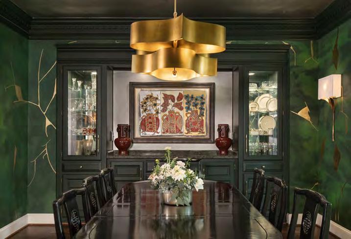
For this unique project, Orion Design and Remodel Moore teamed up to transform an outdated dining room into a more modern space that achieves two goals: encouraging guests to linger and incorporating the homeowner’s heirloom dining table. The space’s primarily traditional elements—including a custom built-in with an English feel and classic dentil molding— challenged the team. They also had to factor in the minimal natural lighting.
RESOURCES

The team, however, embraced the challenges in various—and sometimes unconventional—ways. They painted the built-in and crown moulding in a dramatic green, emphasizing the design. Going further, they leaned into the dark, low-light feel with even darker finishes and moody indirect lighting. Yet, the real showstopper is the custom wall and ceiling finishes. To create them, the team collaborated with a local artist to incorporate a Kintsugiinspired design on the walls. Employing this method allowed them to select the perfect mix of greens for the background that seamlessly infuses dramatic gold leafing and a silver finish into the ceiling design. As designers, they love the mix of metals; they also wanted the metallic ceiling to reflect the glow of the dining room’s newer, brighter lighting. Lastly, they selected a gold chandelier and two sconces with linen shades to blanket the transformed space in a soft, warm light.
Hardware: Top Knobs Lighting Fixtures: Lightology Painter: Robin Case
INTERIOR DESIGNER:
Orion Design
@oriondesigninc
CONTRACTOR:
Remodel Moore
@remodelmoore
PHOTOGRAPHER:
Matt Kocourek
@mattkocourek47
View full project details.


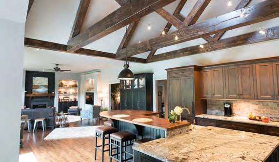


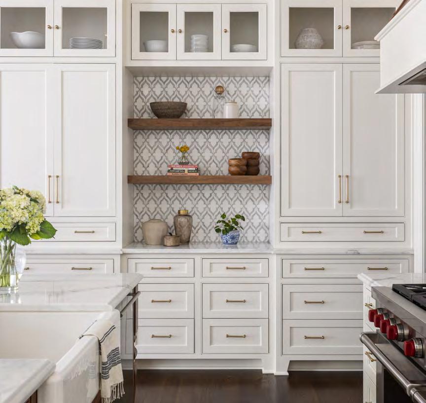
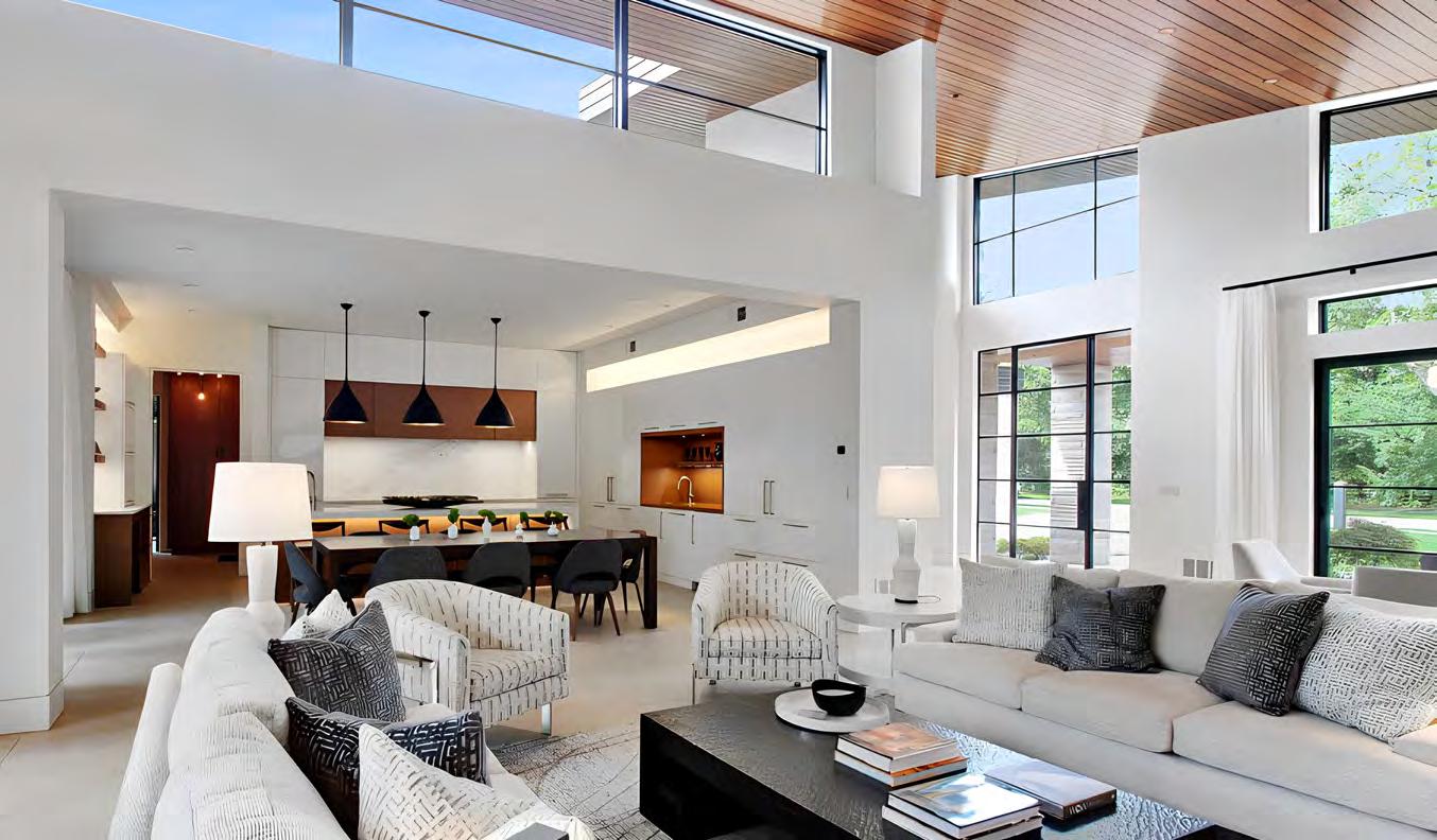


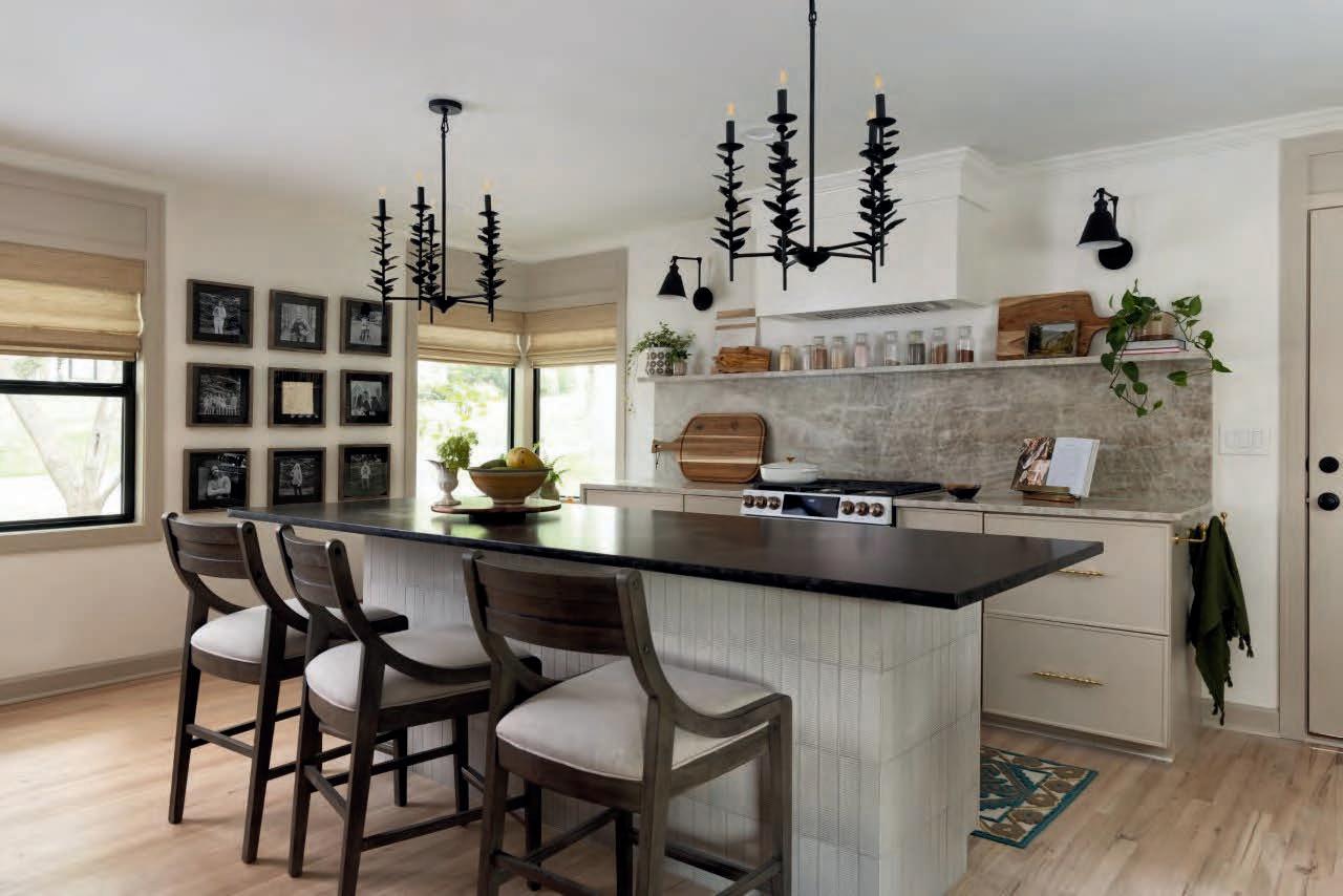









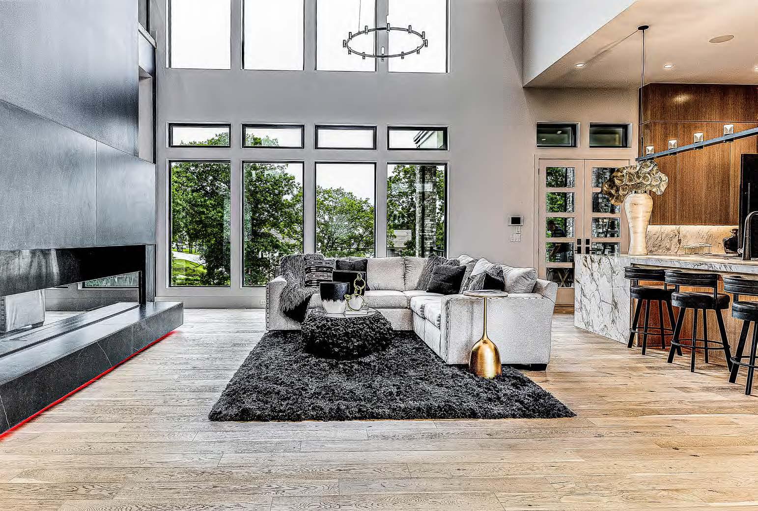

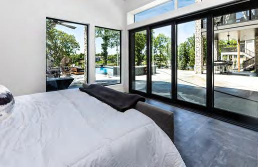

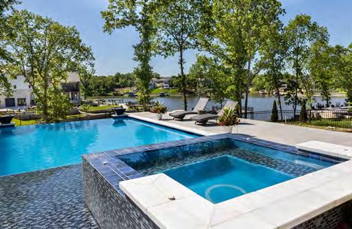
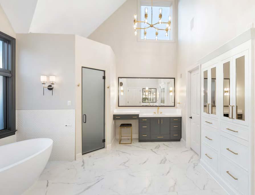

KCBR’s clients envisioned a stunning, elegant sanctuary to unwind in after a long day. Whether it was working with various flooring materials or the location-specific items their clients requested, the team devised clever solutions to create the bathroom of their clients’ dreams.
During construction, KCBR discovered that the existing mortar bed had to be removed, so they needed a solution that provided a uniform floor level. To achieve this, their team framed the bathroom flooring to match the bedroom and closet. Another obstacle was the freestanding, airjetted chromatherapy and aromatherapy bathtub.
Ensuring the tub was powered and running properly relied on finding the right location to house the mechanical components. The original plans placed the tub’s mechanics too far away. Therefore, to avoid needing an extension hose and affecting the tub’s performance, they moved the motor and pump to a more suitable location.
Their clients’ specific storage needs required innovation, too. The linen cabinet’s prominent placement was also a potential focal point. So, to create the storage their clients needed and to maintain the aesthetic of the space, they created a custom built-in look for the cabinet by using creative carpentry and added tinted bronze mirrors to bring moodiness to the space.

DESIGNER/CONTRACTOR:
KCBR Design | Remodel @kcbr_design_remodel
PHOTOGRAPHER:
Ryan Cannon
@ryancannonphoto


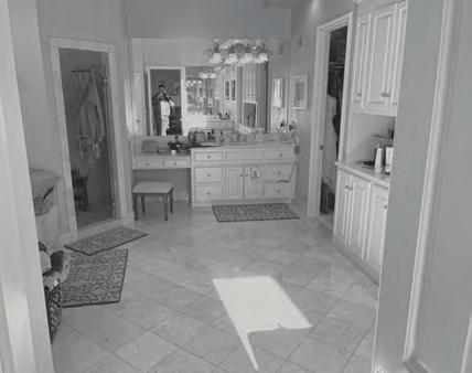
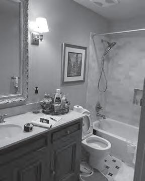
This 1995 bathroom needed some major updating to enhance accessibility and storage and produce the overall aesthetic of a serene spa. The tub took up one entire end of the room, while a small fiberglass pan shower occupied a corner space. The room was amply sized, yet storage space was almost non-existent. The toilet room door took up even more square footage in an already small room.
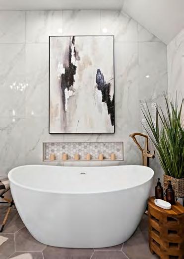
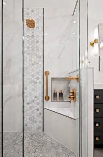
To kick off the remodel, the project team annexed a section of the attic, gaining nine square feet, which provided the room needed for a spacious two-person shower with a lowered subfloor for curbless entry. They installed multiple grab bars, a hidden storage niche and a heated floor in the room, including inside the shower. They also substituted pocket-entry doors and moved the door opening to allow space for the freestanding tub and storage niche. Meanwhile, the toilet room was fitted with grab bars and wall cabinet storage. The lack of storage was resolved with a generous linen cabinet, toilet room storage, multiple drawer stacks in the vanity, recessed medicine cabinets, pull-out trash receptacles at each sink and an interior appliance plug strip.
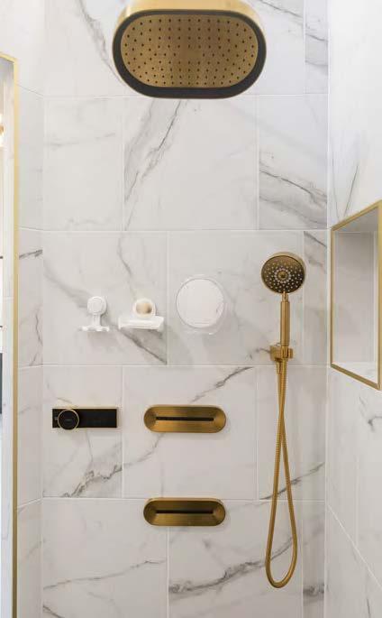
The large marble-esque porcelain tile now wraps the room’s bath and shower end, creating an elegant feel. The champagnebronze plumbing fixtures and lighting—particularly the sculptural chandelier—add an elegant, rich finish. The clean architectural lines and neutral color palette create the spa-like environment the owners envisioned.

DESIGNER:
Deatherage Home Designs deatheragedesign.com
CONTRACTOR: Gartman Remodeling gartmanremodeling.com
PHOTOGRAPHER:
Amber Dawkins @amberdawkinsphotography View full project details.
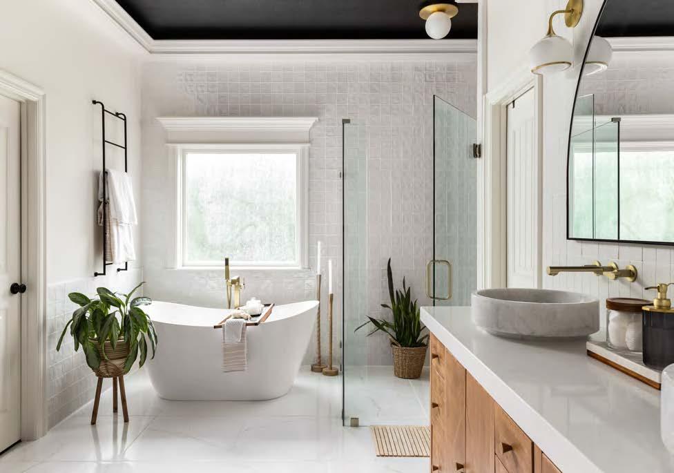

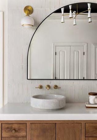
For this bathroom remodel, Little Black Dresser Interiors added monochromatic tile with black-and-white Zellige subway tile. On one wall, the tile lays in a unique striped pattern to create a statement. This same wall houses functional storage with custom floating drawers, towel storage and a full-length mirror. The tile carries to the other vanity wall, which was converted from a single to a double vanity, and includes stone vessel sinks, faucets and an oversized arched mirror. The back wall has a wood-like floor-to-ceiling tile with a brass rainfall shower head. Brass-and-opal-glass light fixtures and the black ceiling accentuate the tile, making a statement on every surface.

One challenge the project team faced was creating a curbless entry shower. The slope had to be perfect for the tile to flow correctly to the drain. The team also had challenges converting from a single to a double vanity with faucets. They chose champagne-brass fixtures, but because they were working with existing plumbing, many extra steps were needed to allow the new fixtures to function in the remodeled space. The design team thus worked with their contractor to lay the tile and install the faucets exactly right to achieve a beautiful, functional design. Ultimately, this required shifting the faucets and took several iterations to finalize, but it was time well spent.

DESIGNER:
Little Black Dresser Interiors
@ littleblackdresserinteriors
CONTRACTOR:
Custom Remodeling
@custom_kc_
PHOTOGRAPHER:
Josie Henderson
@josiedell_photo
View full project details.
DESIGNER:
Amy Krause Design @amykrausedesign
CONTRACTOR:
Damon Rau Construction
PHOTOGRAPHER:
Laurie Kilgore @lauriekilgorephotography
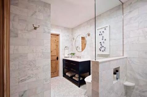

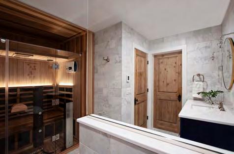
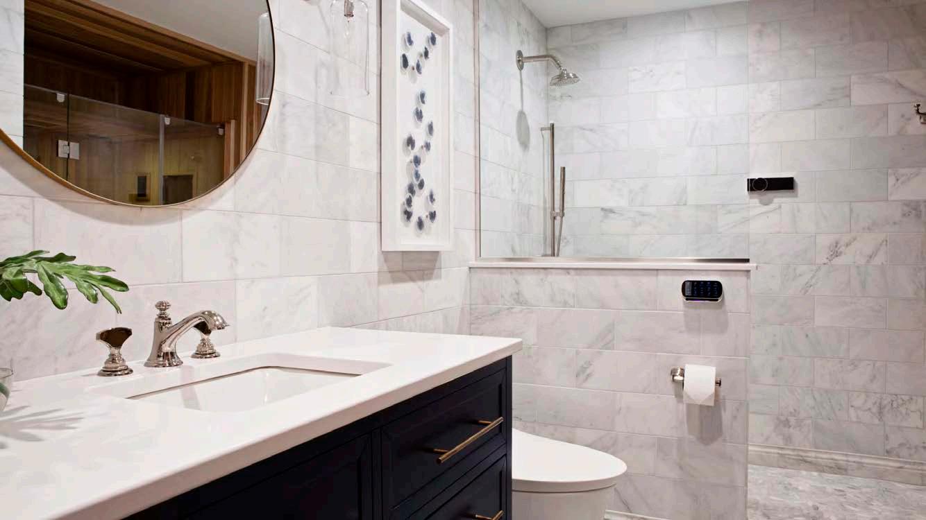
During this remodeling project, the project team was charged with creating a spa-like atmosphere in the homeowners’ guest bathroom, all while maintaining cohesion with the home’s traditional and rustic characteristics.
The project’s main challenge was maximizing the bathroom’s space for a three-person infrared sauna and meeting the clients’ desire for a built-in look. To address this, the team researched and selected a state-of-the-art, full-spectrum sauna with upgraded features. They also expanded the bathroom by utilizing space from the guest bedroom and adjoining closets, enclosing only the sides of the sauna. The interior walls and ceiling of the enclosure were lined with the same wood species as the sauna, creating the illusion of an open and airy space. A narrow walk-in shower with digital controls was then chosen for efficient use of space, with a shower niche to minimize visual clutter.
The designer incorporated themes and colors from the adjoining bedroom, including a navy-blue vanity with a white quartz countertop, classic marble walls and floor and an organic marble mosaic for texture. The existing wood-door finish and sauna tied in themes from the rest of the home. The project’s final result: a relaxing spa-like atmosphere—just like their clients envisioned.
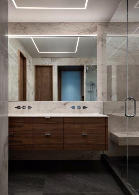


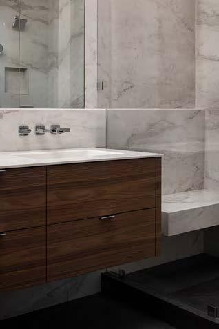
Looking to remodel a suburban-like bathroom, the homeowners hired the project team to transform their condo’s primary bathroom into an elegant, contemporary space commensurate with the rest of the home. With the multi-story condo surrounded by neighboring units, the remodeling team’s work was confined to the space, with little room for moving infrastructure, making dramatic change difficult.
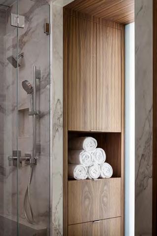
First, the team completely gutted the space to allow for new finishes and slightly reconfigured the plumbing by relocating the shower, creating more leeway for changes. The vanity was replaced with a floating vanity comprising a walnut cabinet topped with Corian and integrated sinks. To increase storage, the project team added a large entry cabinet that also serves as a transition from the primary bedroom to the bathroom.
Every door was also removed and replaced. The door from the primary bedroom was substituted with a frosted glass pocket door, allowing for privacy, intrigue and illumination. The closet and toilet room doors were replaced with walnut-veneered doors and solid
walnut frames. Since lighting is a key component of any bathroom, they integrated low-profile LED lighting into the ceiling and above the vanity mirror. The variation of lighting illuminates the space while also dramatically changing the appearance. Finally, the project team used large-format tiles to help maximize the scale of the space and provide a clean, monolithic appearance.

ARCHITECT/INTERIOR DESIGNER:
herron + partners
@herronandpartners
CONTRACTOR:
Faust Construction
@faust.construction
PHOTOGRAPHER:
Nate Sheets
@natesheetsphoto
View
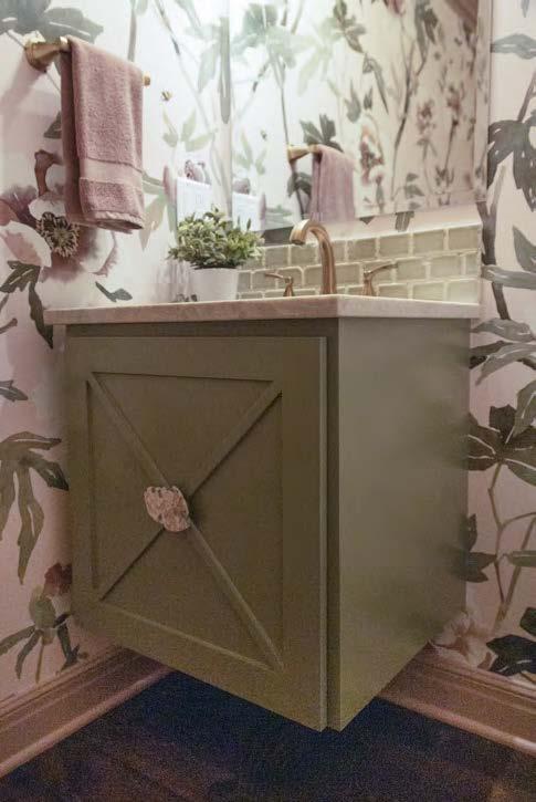

The project team’s clients desired a bright, cozy powder bath. Inspired by the creams and soft sage-green accents throughout the clients’ main floor, the design team selected an overscaled, soft-looking floral wallcovering to match. They carried the soft pink to the ceiling, adding 12 inches of mauve-colored crown molding to create a cozier feel. The Taj Mahal countertop helps bring cream, pink and green tones to the space. An unusual pink-and-green floral agate door pull continues the color scheme.
To help increase light output, they embedded a goldtoned floral vanity light into the mirror, playing off the floral wallcovering. The translucent Kohler undermount sink and square floating vanity also add light. When guests enter, their feet trigger the sink and under-cabinet lighting, automatically brightening the space.
The project’s main challenge was lighting the vanity and concealing the plumbing, wiring and stored items while maintaining color harmony with the sink basin. A collaborative effort with the trades led to the creation of a secret interior box with removable walls.
INTERIOR DESIGNER:
Interior Elements & Design
@interior_elements_and_design
CONTRACTOR:
Superior Renovation and Design
PHOTOGRAPHER:
Brenda Anderson
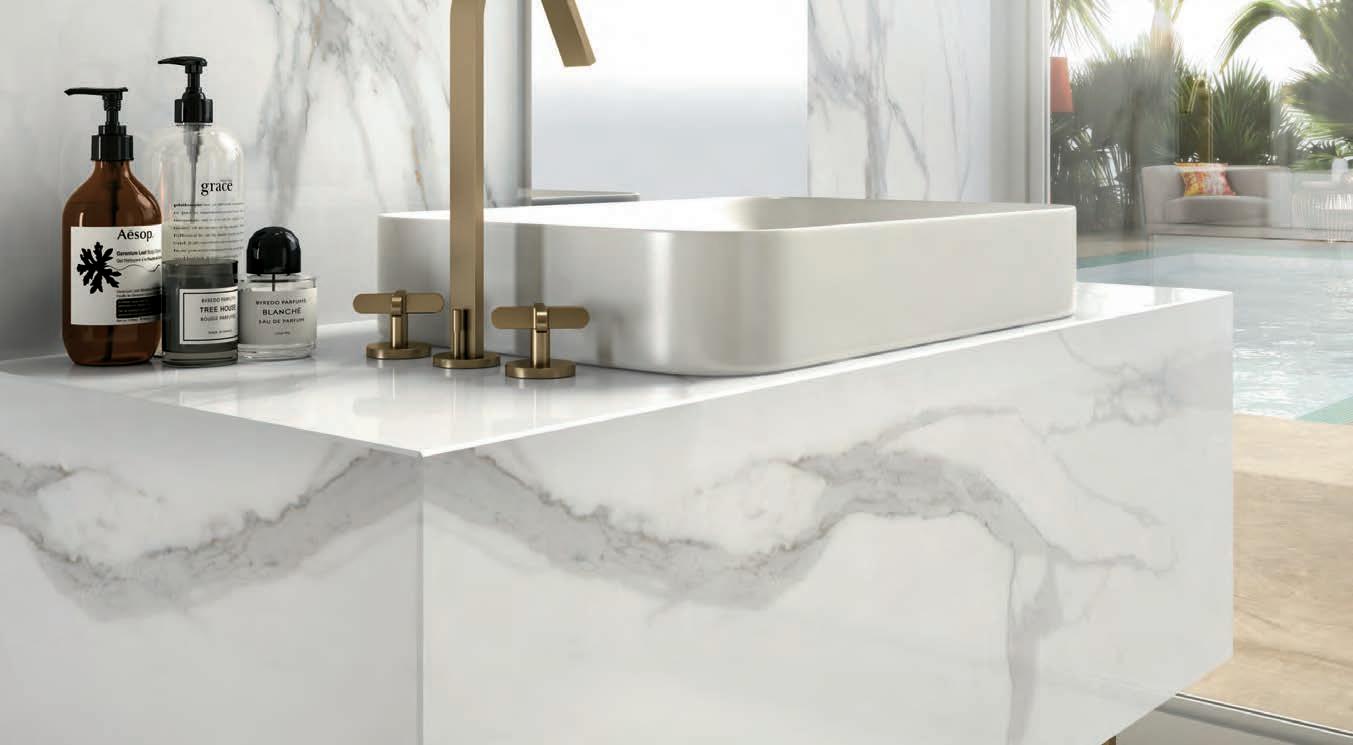


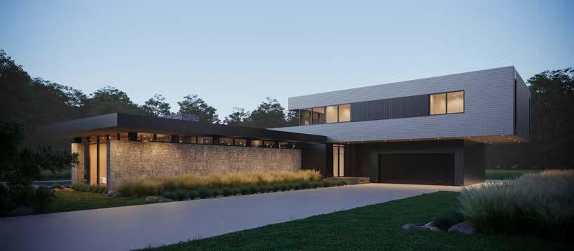
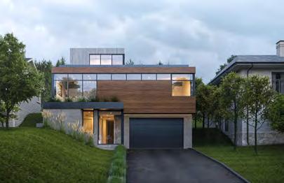
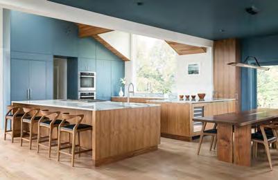
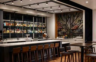
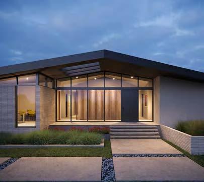







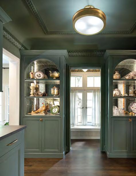
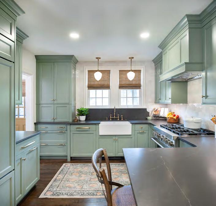
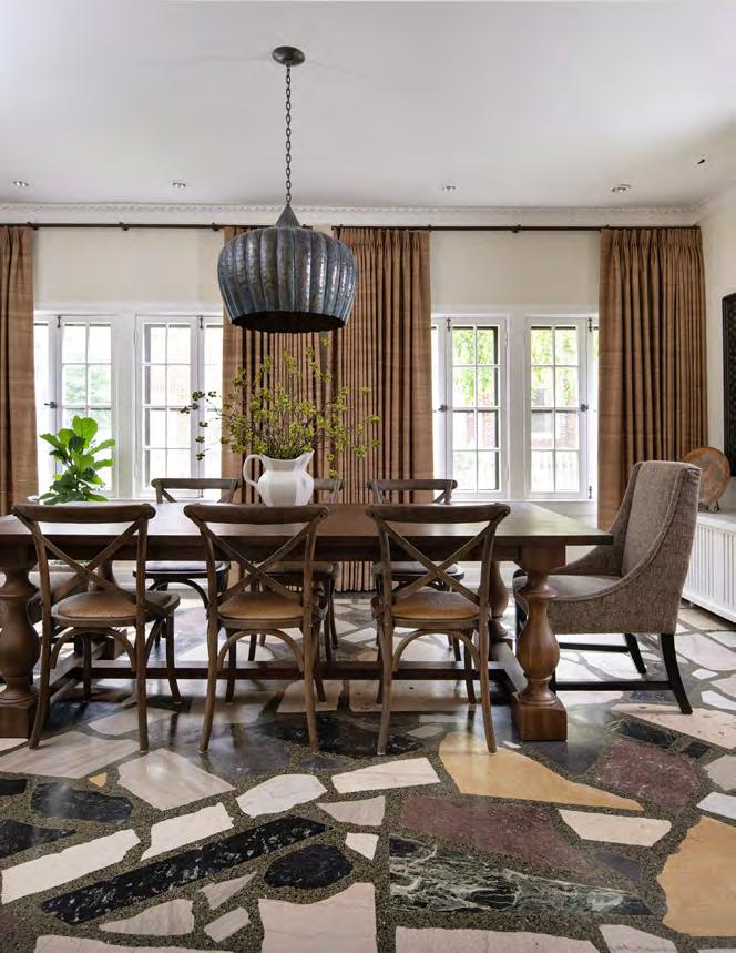
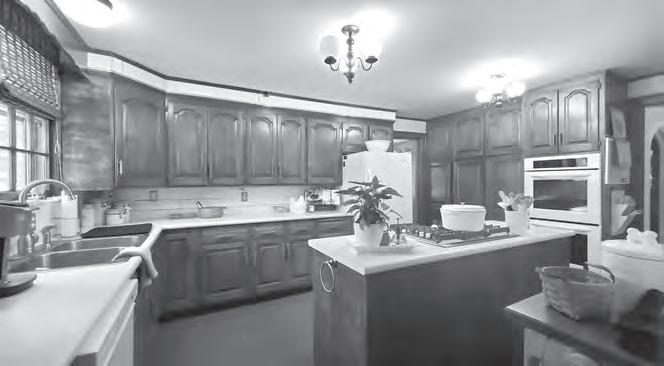
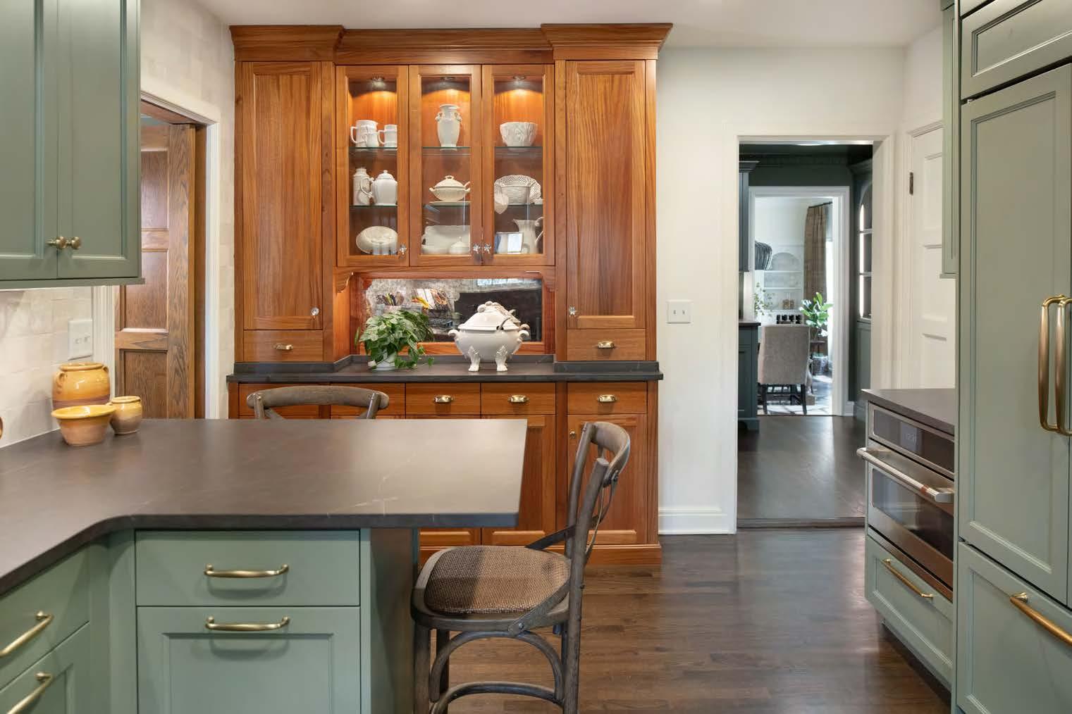

In this Tudor renovation, the clients were open to changes but did not want to eliminate any existing walls on the main level, as they enjoyed the quaint separation of spaces. To fulfill their vision, the project team reimagined the floor plan to find places for enhanced functionality while preserving the home’s original character.
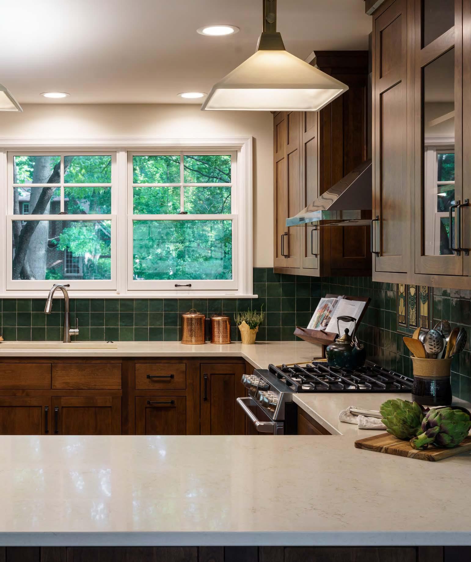
On the wishlist was a full powder bath on the main level, so the design team replaced what was a small breakfast room to add that—plus a butler’s pantry—into the floor plan. The kitchen underwent a total rework, eliminating the bulky island in favor of a space-saving peninsula for seating. Another new yet unexpected addition is the stunning mahogany hutch, designed to store all the homeowner’s serving ware. The remaining cabinetry is painted a bold yet muted green that
complements the creamy, four-by-four-inch backsplash tile and lovely dark-toned quartz countertops. The team incorporated stunning new lighting to complete the kitchen’s fresh look.
Meanwhile, the updated butler’s pantry features a darker shade of green and incorporates arched built-ins with an antique mirror and lighting for a dramatic focal point. The contractor also recreated the cove ceiling detail that had been a part of the old breakfast nook. In the nearby powder bath, an iconic William Morris wallpaper and an adorable pendant light adorn the space.
Additional strategic space swaps improved the second-floor layout, including enhancements to the primary suite and hall bath.
DESIGNER: Orion Design @oriondesigninc
ARCHITECT:
Lo Design @lodesign.us
CONTRACTOR:
Remodel Moore @remodelmoore
PHOTOGRAPHER: Matt Kocourek @mattkocourek47
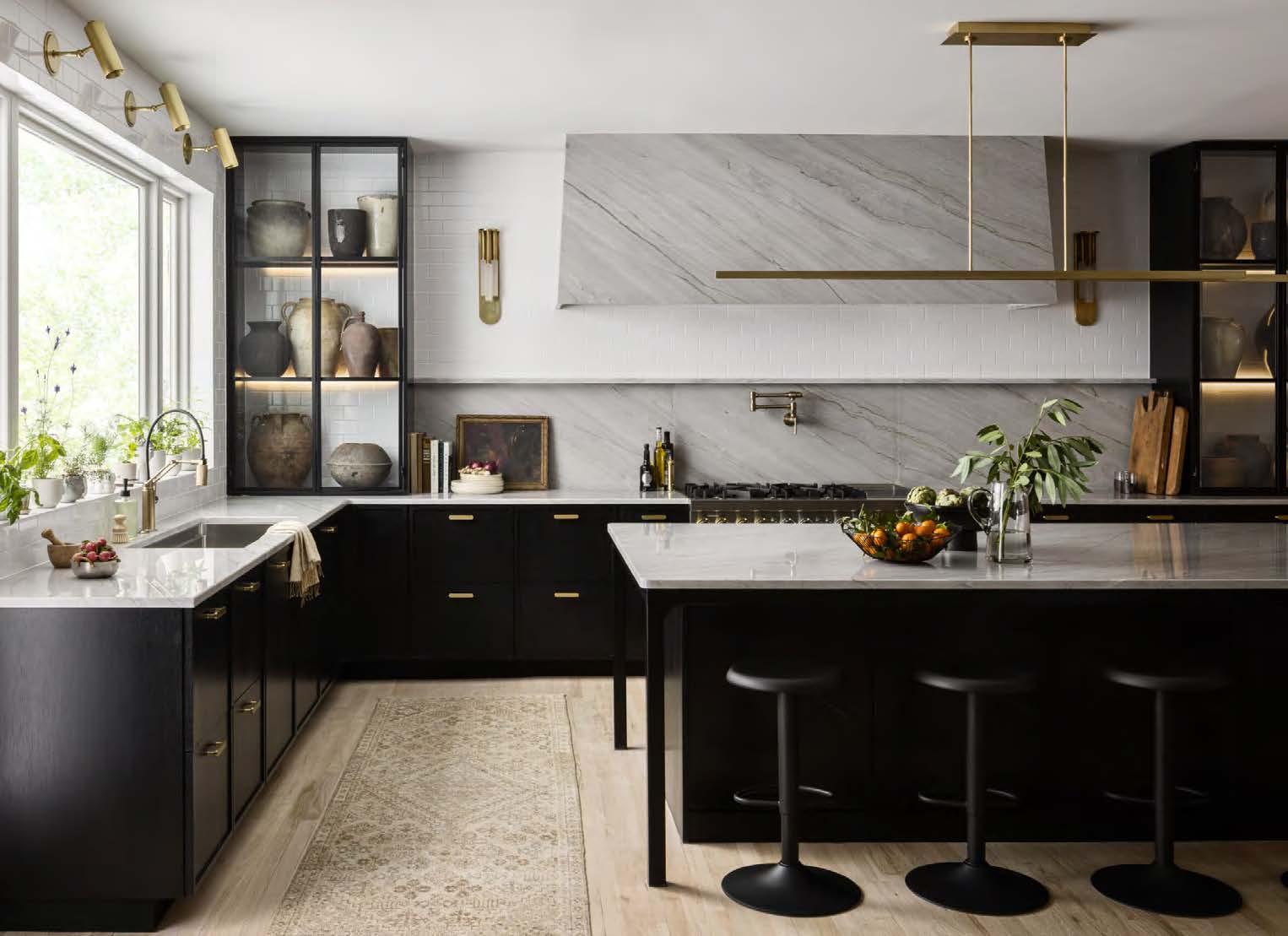

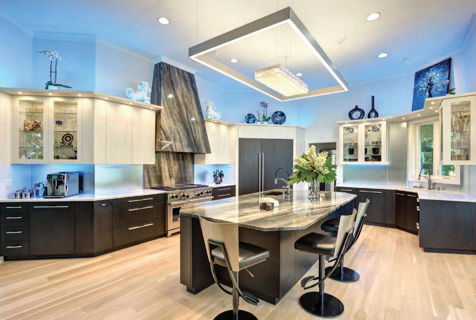
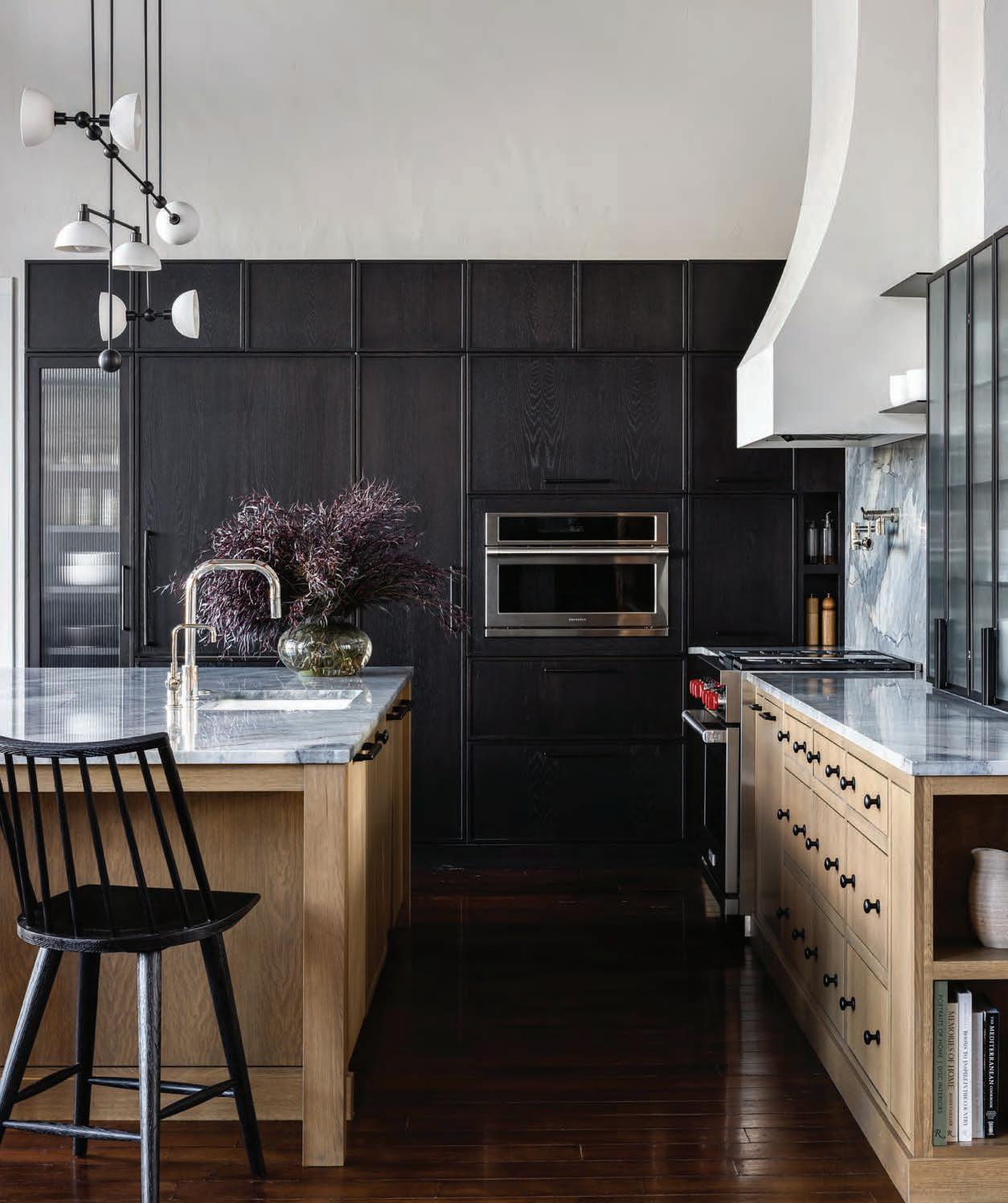
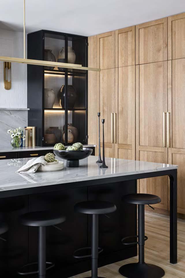
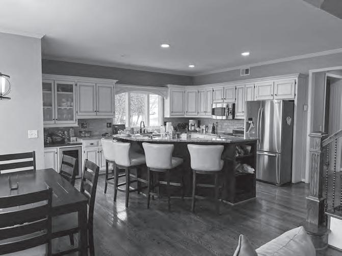
Wanting a space to entertain, the homeowners needed to transform their 1990s-era home. Instead of generic finishes and a closed-off layout, they envisioned a memorable kitchen and hearth room—both with a touch of glam. To achieve their desired kitchen size and layout, the designbuild team created a small addition using some of the deck and eat-in kitchen space. This allowed the team to square the kitchen off and double the usable space. The new layout allows this kitchen to boast an eight-foot quartzite hood surround, two steel-framed display cabinets, a large island with two-sided storage, a new window over the sink, custom cabinetry, an eight-burner stove and integrated appliances. The true star of the project, however, is a former media cabinet reimagined as a custom wine storage space.
Several design details required forward thinking and
careful execution; the layering of pieces took a lot of planning and coordination between subcontractors to ensure execution met design intent. For instance, the countertop had to be installed before the tile, and then the tile needed to be in place before the metal cabinets because the tile would be visible from the back side of the cabinets. The metal cabinets were designed without scribe molding but with integrated lighting, so their installation was intense and precise. The marble backsplash and shelf were installed last to ensure the joints were tight against each cabinet and tile connection. During the final step, the eight-foot quartzite-slab hood surround required meticulous framing and installation strategies to accomplish the seamless panel with mitered edging. This long and arduous process turned out to be highly rewarding for the homeowner.
ARCHITECT/CONTRACTOR/ INTERIOR DESIGNER: Cicada Co.
@cicada_co
PHOTOGRAPHER:
Nate Sheets
@natesheetsphoto

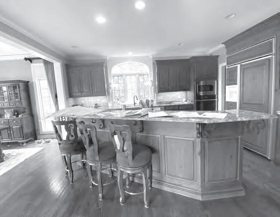
RESOURCES BEFORE
Antiques: Prize Home + Garden Appliances: Ferguson Bath, Kitchen & Lighting Gallery Cabinets: Parks Cabinets
Countertops: CKF Fabrication Company: Wheat and Waves Flooring: Kimminau Floors Hardware: Locks & Pulls
Lighting Fixtures: Relative Lighting Painter: Aldo Painting Rugs: Amethyst Home
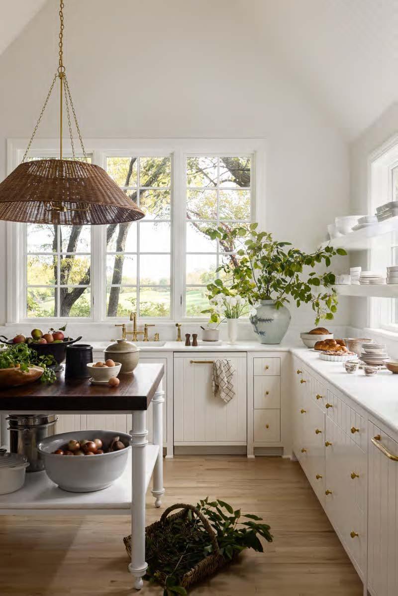


When the owner of this 1990s-constructed home purchased it, she knew it had great bones, a fantastic lot and view of the golf course, plus room for her large family. Unfortunately, it was also outdated, and the small, angled kitchen kept her back to her family while she cooked. By transforming the rarely used breakfast room into a side kitchen, the designers gained valuable storage space with floating shelves—afront new windows that further enhance the view.
The kitchen’s new layout concept was a “wild” idea—a central range situated on the primary island with a custom floating hood facing the updated family room. A secondary island featuring a walnut top, powder-coated legs and a subjacent marble shelf serves as a prep surface. A taupe French range sits in the center of the main island, which showcases a creamy white marble
DESIGNER:
Kobel + Co
@kobelandco
CONTRACTOR:
Built to Fit
@btf.remodels
PHOTOGRAPHER:
Nate Sheets
@natesheetsphoto
View full project details.
countertop and a ceiling-mounted custom hood. The island comfortably seats eight and includes custom cutting boards that slide into each side of the island. The designers also created a new focal wall with a vast new window and a brass sink—both artfully placed between twin Sub-Zero fridge-and-freezer units opposite the range.
All the floors throughout were refinished to a soft, light oak color, imbuing the space with casual, welcoming energy. The adjacent family room has symmetrical doors to the living room and a new low-profile fireplace surround with handmade tiles. The entire space exudes a California Coastal vibe, furnished in warm, tactile fabrics, including two large custom ottomans made from antique Moroccan textiles underneath a burl wood console.
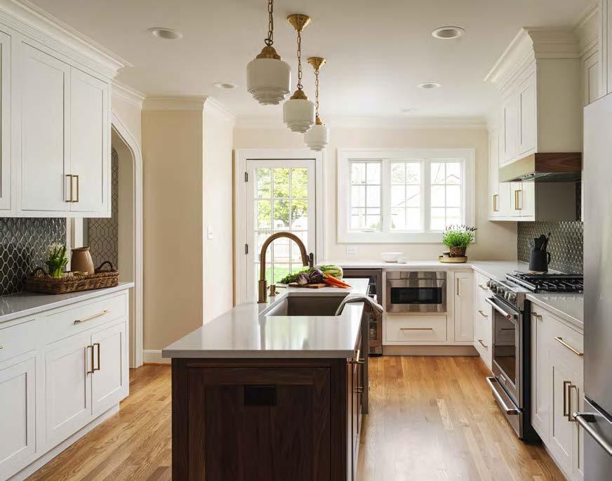

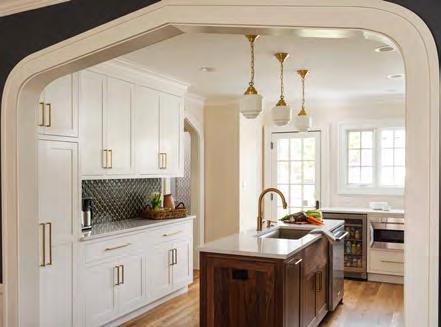
The young clients were enamored by their home’s charming Gothic archways, timeless built-ins, original wood doors and stunning floors. Having cherished this historical gem for a decade, they decided it was time to infuse their personal style and tailor the space to suit their evolving lifestyle. Their foremost desire was a kitchen where they could relish cooking without constantly bumping into each other. They also sought to eliminate the open-faced temporary hallway shelves, making ample storage a crucial aspect of the new design. Preserving the home’s 1926 charm was equally paramount to them, so they aimed for a kitchen that seamlessly blended in with the home’s storied aesthetic.
The design-build team’s challenge was incorporating the client’s wishlist while remaining within the existing footprint. The new kitchen removed the compartmentalized areas, improving the overall flow and function. New windows and an exterior door let in tons of natural light; what’s more, their improved placement made way for the addition of a full powder bathroom, which now sits directly off the kitchen.
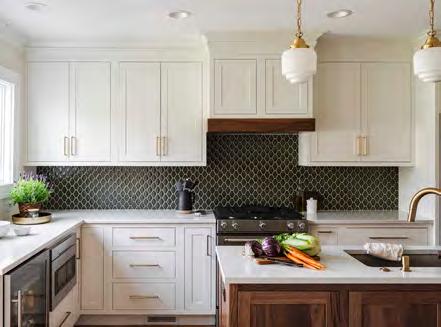
Opening the wall between the dining room and kitchen breathed new life into the home. The selected finishes—such as the Shaker-style white inset cabinets—are consistent with the home’s original design. They chose stained walnut cabinets for the island, paired with creamy white quartz countertops that gracefully warm the space with delicate, golden-hued veining. Gold hardware and plumbing fixtures add a touch of elegance, further enhancing the kitchen’s aesthetic.

BEFORE
DESIGNER/CONTRACTOR:
Schloegel Design Remodel @remodelagain
RESOURCES
Appliances: Factory Direct Appliance Cabinets: Shiloh Cabinetry Countertops: Corian Fabrication Company: SCI –Surface Center Interiors Flooring: Quality Hardwood Flooring Lighting Fixtures: Olde Brick Lighting Painter: Total Pro
Interior Painting Plumbing Fixtures: Delta Roofing: Vaught Roofing Company To-the-Trade Showrooms: ProSource Wholesale; Grandview Winnelson Wall Coverings: Cathy’s Wallpapering Windows: Marvin Windows & Doors
PHOTOGRAPHER: Matthew Anderson @matthewaphoto View full project details.
ARCHITECT:
Wendlandt & Stallbaumer architechnique.com
CONTRACTOR:
E & E Quality Builders eandequalitybuilders.com
PHOTOGRAPHER:
Keith Kreeger
@kreegerphoto

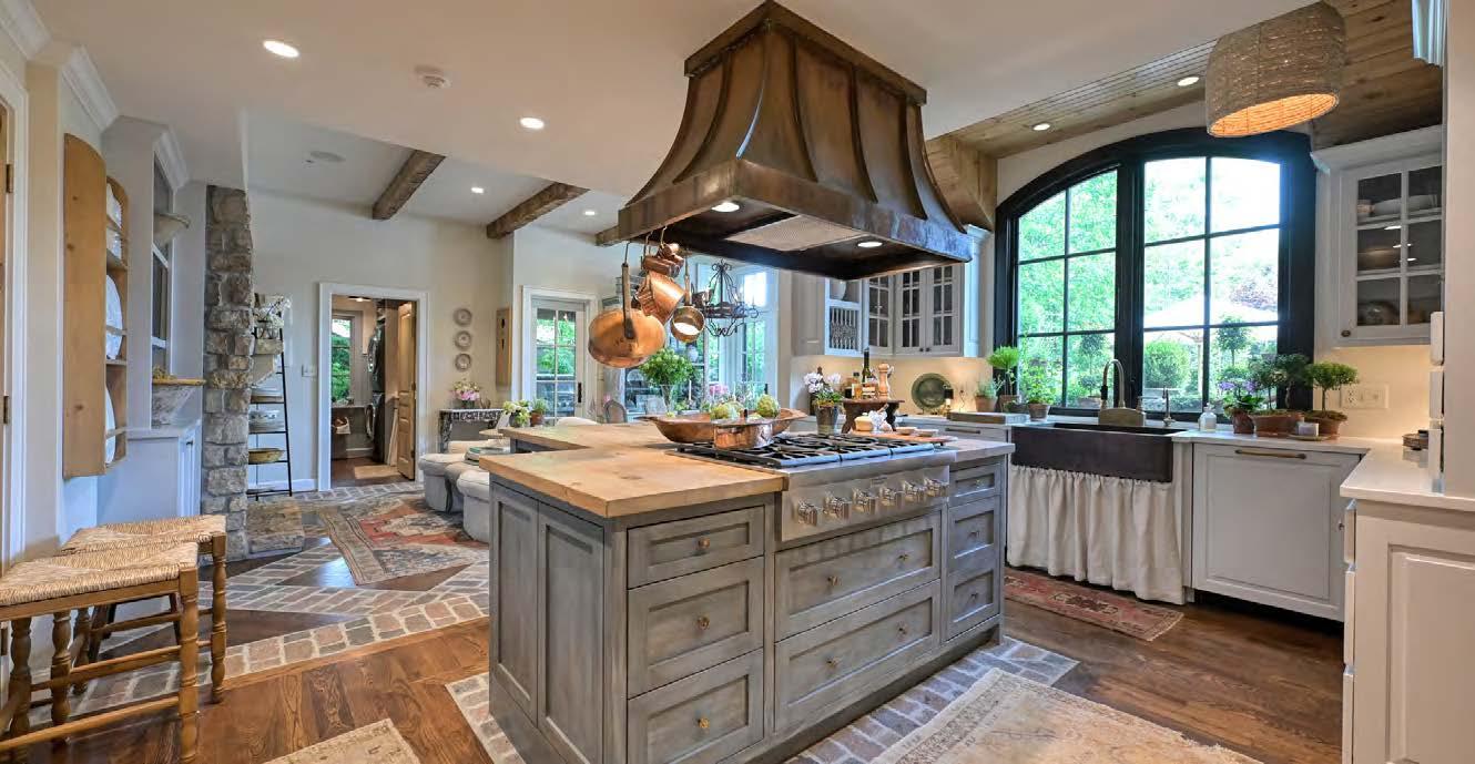
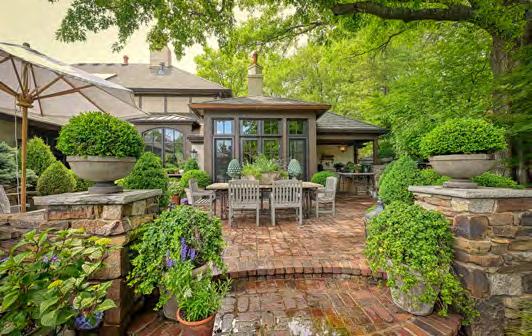
The existing kitchen, breakfast room, laundry/bath and outdoor grill areas were caught in the rut of a previous remodel that no longer provided proper function. The dormer above the sink was an asset, yet the interior felt too dark and lackluster. While the existing dormer and perimeter cabinets stayed, other areas required a major revamp. New paint and countertops immediately freshened the space. The old island was also swapped for one with a new contrasting color and a wood countertop, creating a furniture-esque look that coordinated well with the existing vent hood.
A crucial part of the renovation involved expanding the breakfast area outward—a necessary step to allocate space for new eating and lounging areas. Yet only a small extension could be made when stealing space away from the outdoor patio. The architect ultimately expanded the breakfast room four feet beyond the existing wall, allowing for a proper casual eating area and lounge seating in front of the fireplace. A set of new French doors and windows with transoms bring light into the interior. The natural lighting is further amplified by the brightened color palette.
The laundry/bath’s minor expansion yields big results. With the garage door relocated to the laundry area, the fireplace wall feels more continuous. The architect also added direct access to the outdoor grill (via an outswing door in the breakfast room) and incorporated a portico for year-round use. Though a small remodeling project, the design processes and expertise required to bring it to life were substantial. The final product is a rich, dynamic, light-filled interior with enhanced functionality and dramatic views of the terraces and gardens beyond.
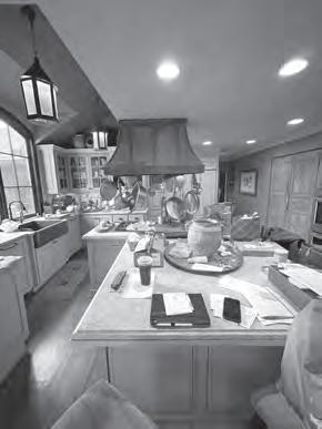






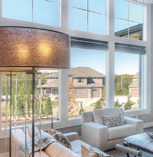







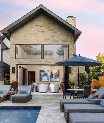


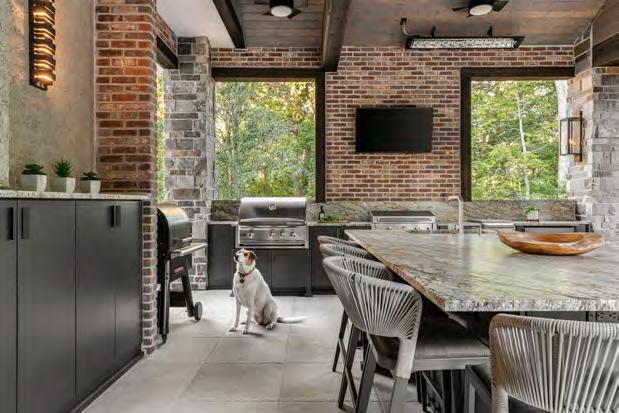
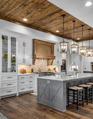
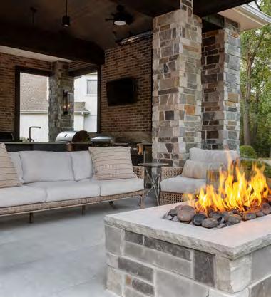


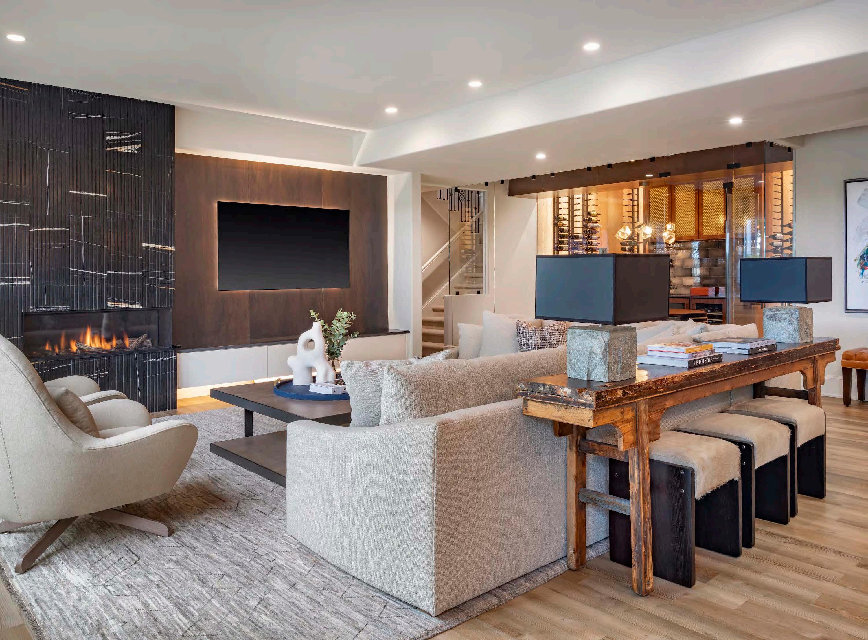


For this lower-level renovation, the clients wanted to create a warm, modern space to comfortably entertain a large group. The project team’s challenges included limiting renovations to the space’s existing footprint and accommodating the sump pump. As a workaround, the team removed square footage from two storage areas and an existing powder room to allocate more space to the updated layout. Then, after removing the staircase balusters, they installed a 36-inch wing wall to extend out the wine room.
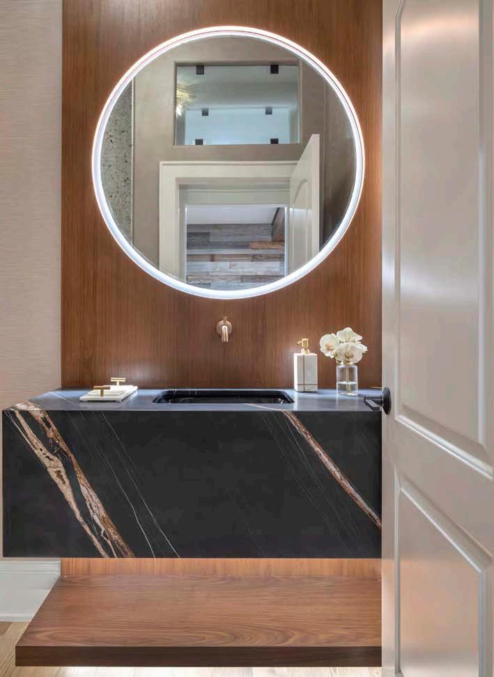
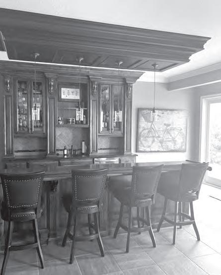

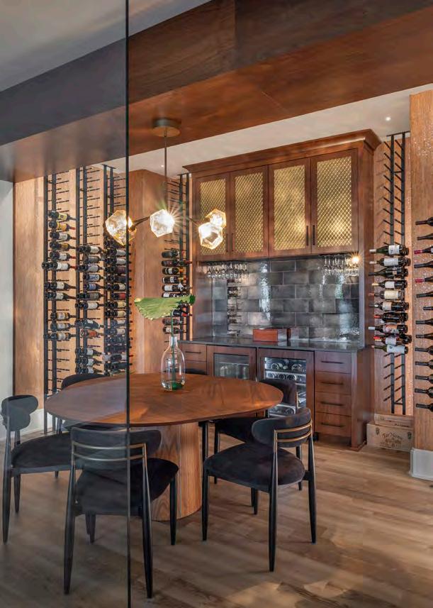
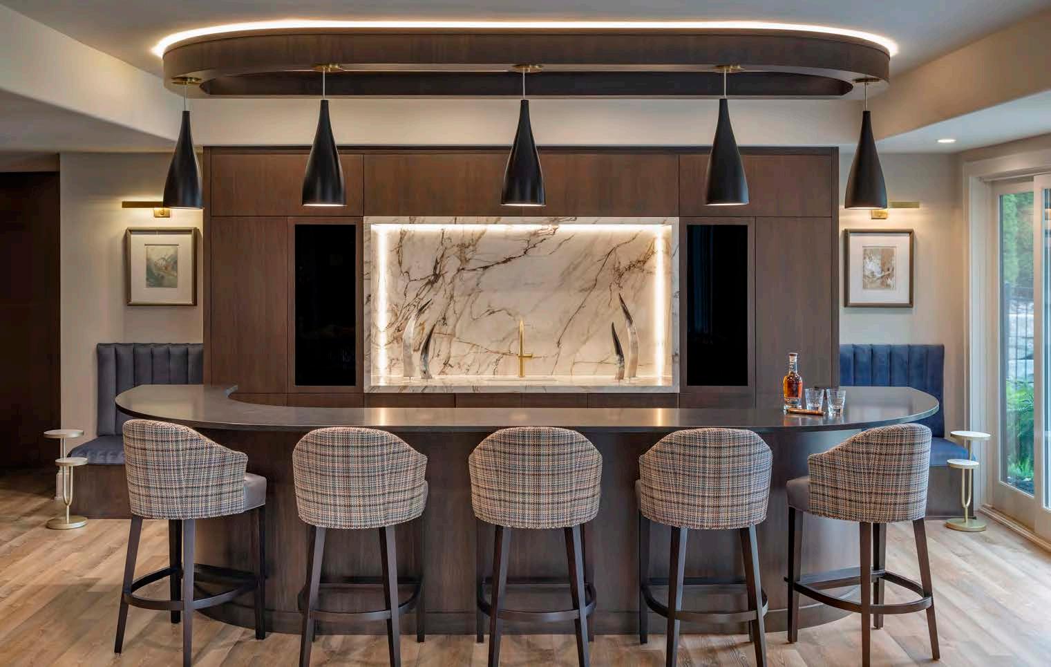
WHAT THE JUDGES LIKED:
The use of materials, including the drapery and lighting
The glass-enclosed wine room
“The bar could be in a hotel— it’s gorgeous.”
To accommodate a large TV, the project team moved the fireplace to the left and added spacious drawers underneath for storage. For added refinement, they enhanced the bar area with modern cabinetry, a stylish back-bar design and a curved ceiling treatment. Matching banquettes were also added on both sides of the bar to conceal the sump pump.
The powder room, now repositioned closer to the pool table, features a floating marble sink, a backlit mirror and a discreetly positioned urinal within a vestibule. This unique vestibule design adds space and enhances the feeling of openness with a glass transom, creating an airier atmosphere.
INTERIOR DESIGNER:
SID & Company
@sidandcompany
CONTRACTOR:
Cecil & Ray Homes
@cecilrayhomes
PHOTOGRAPHER:
Bob Greenspan
@the.architectural.photographer
RESOURCES
Cabinets: Cabinets by King Electronics: Bravas Flooring: SVB Wood

WHAT THE JUDGES
The millwork around the TV
The banquette under the stairs
“
Such glamor and sophistication—it fulfills the word ‘speakeasy.’”LIKED: The timeless feel of the style
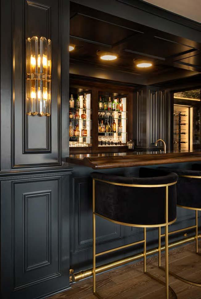


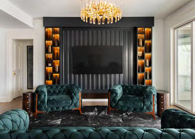

Picturing an opulent space with speakeasy vibes, the design team sought to transform the clients’ lower level into a moody, 1920s-inspired retreat with a dedicated theater, bar and seating areas. The project’s biggest challenges included incorporating existing windows, reusing a beloved beam, integrating tin ceiling tiles and maximizing under-stair space. Every element of the space was carefully curated to give a nod to a time gone by—with velvet drapery, antique back bar mirrors and custom brass foot rails being prime examples. The design team’s solutions involved creating hollow surrounds with sandblasted lens glass to conceal LED strips and adding full-surround illumination on the bar and wine-cellar shelving.
The completed design features green-black paint, stained elements, brass-inlaid marble floors and brass wire-front cabinets. In the theater, dense velvet curtains add drama while an old beam, repurposed as a TV anchor, incorporates warm wood tones. Tin ceiling tiles in the nearby hallway—framed by brass tin and wood-trim molding—enhance the transition from the bar to the theater. The cleverly curved under-stair seating area offers a private nook adjacent to the bar, living area and pool table, further optimizing the space for functionality and aesthetics.
DESIGNER: Trove Homes @trovehomes
CONTRACTOR: Roeser Homes @roeserhomes
PHOTOGRAPHER:
Craig Keene @craigkeenephotography View full project details.
RESOURCES
Cabinets: Cabinets by King Electronics: Bravas Flooring: SVB Wood Floors Lighting Fixtures: Wilson Lighting
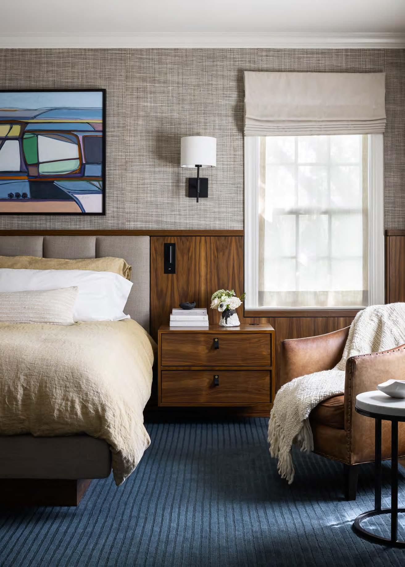
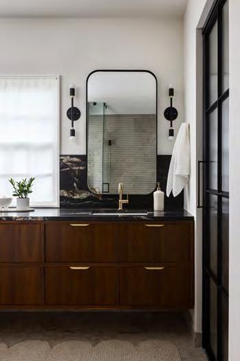


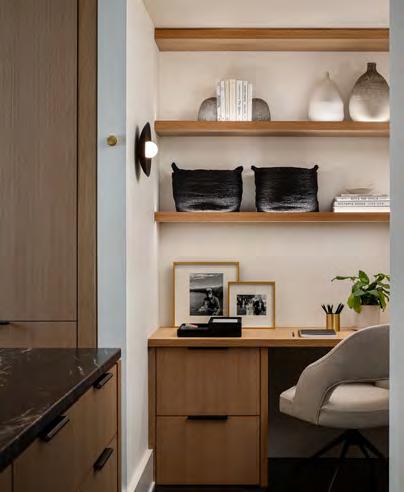
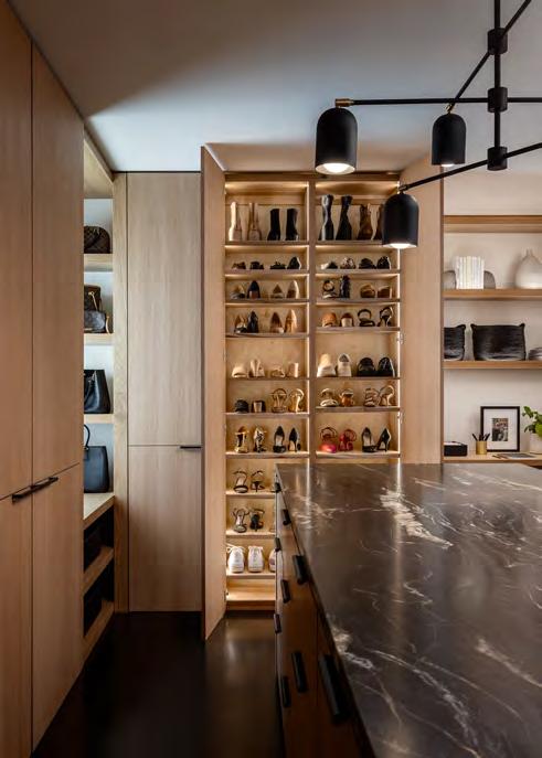
This Mission Hills home was a mix of eras and styles. The homeowners asked for a bedroom suite that emphasized warmth and sophistication, so the design team designed the primary bedroom, adjoining bathroom, vanity and closet areas as a unified retreat. A stunning walnut built-in featuring a soft upholstered headboard, individual reading lights and floating nightstands anchors the room. A wool rug adds texture underfoot and a calming bit of blue, while the clients’ existing chairs provide balance with a warm patina.
In the bath, the team decreased the enormous size of the existing shower to make room for a freestanding soaking tub. Linear LED lighting highlights the dramatic wall tiles. Limestone flooring lends warmth and elegance, complementing the rest of the space. Daylight illuminates the shower through panes of glass on either side of a privacy wall, which holds a niche, contains plumbing and acts as a backdrop for the tub and an overhanging opal-glass sconce. The design team added a custom, full-width floating vanity, carrying over the walnut from the bedroom and pairing it with a leathered, black quartzite to enhance the rich tones.
The primary closet absorbed a small guest bedroom, gaining an open layout with space for full-height garment and accessory storage. Here, the cabinetry shifts to natural white oak to add lightness, contrasting with the existing dark floors, while its black stone countertop repeats the bathroom finishes. A small corner desk with floating shelves adds intimacy and extra lighting. The custom metal-framed glass door is the perfect finishing touch, allowing light between the spaces.
RESOURCES
Cabinets: Park Cabinets Countertops: Carthage Stoneworks Flooring: Artistic Tile Hardware: Lo & Co Interiors; Rejuvenation Lighting Fixtures: Park Studio LA Plumbing Fixtures: Brizo Window Coverings: M & M Draperies, Amanda Long
INTERIOR DESIGNER:
Lisa Schmitz Interior Design @lisaschmitzinteriors
CONTRACTOR:
Erickson Build Co. @ericksonbuildco
PHOTOGRAPHER:
Nate Sheets @natesheetsphoto
View full project details.


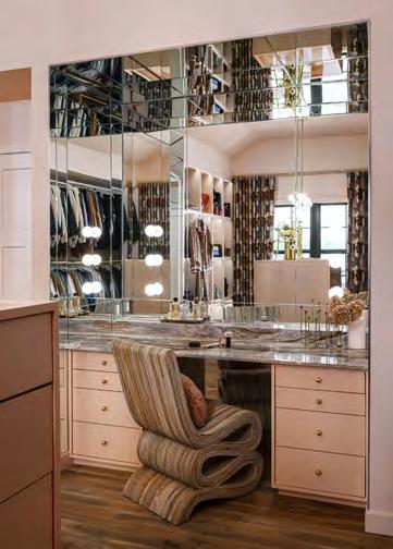
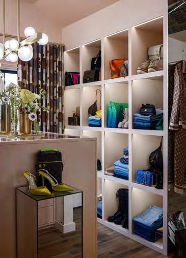
The goal of this remarkable closet project was to turn an existing bedroom and bathroom into a dream closet— one that would give the homeowners a space to proudly display their wardrobes and luxury items, as well as be a welcoming retreat for morning and evening routines. Boutique storefronts and jewel-box projects inspired the clients, who turned the design direction over to the project team to create a unique, colorful and inviting space that excels as both a dressing room and a hangout spot.

Throughout the renovation, the project team had to find clever ways to fit a long list of goals and details into a confined space. Thus, each layer of installation took time and precision. For instance, the mirror comprises more than 50 pieces, creating design, fabrication and installation challenges. Custom cabinetry—featuring a 12-foot span of metal rods with no visible brackets—and a hidden shoe closet required extensive planning, as well. The endeavor was well worth it, resulting in a one-of-a-kind dream closet that truly fits the clients’ personalities.
ARCHITECT/CONTRACTOR/ INTERIOR DESIGNER:
Cicada Co.
@cicada_co
PHOTOGRAPHER:
Nate Sheets
@natesheetsphoto

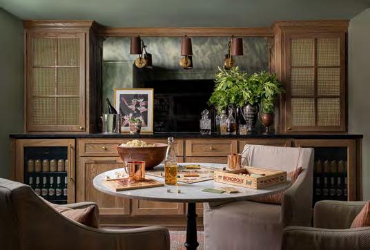
DESIGNER:
Kobel + Co
@kobelandco
CONTRACTOR:
Scovell Remodeling
@scovell_remodeling
PHOTOGRAPHER:
Craig Keene
@craigkeenephotography

As a blended family with five kids, the owners of this home needed more space and wanted to update their dark and dingy basement. Initially, the clients thought the remodel would revolve more around their kids. However, once the design team proposed renderings of how sophisticated the reinvented space could be, the couple switched gears and invested in elements that would draw fellow adults downstairs.
The project team’s challenges included getting the stairs up to code and adding an emergency egress. To address these issues, they rebuilt the lower half of the staircase with railings on each side and constructed two exits that maximize light, symmetry and safety. With some additional engineering, the design team was able to expand the footprint of the finished space, allocating unfinished square footage to a powder bath and a gym without sacrificing storage.
Now finished, the renovated space is an ideal grown-up hideaway. The walls, trim and ceiling are covered in Lichen—a mid-aged green by Farrow & Ball—to create the perception of taller ceilings. Details like Lutron plate covers, Buster + Punch
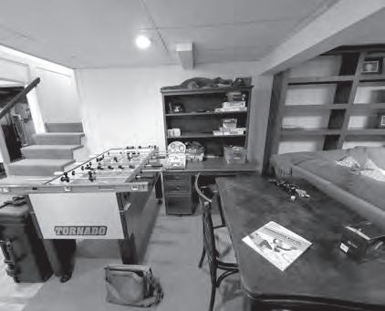
light switches and pop-up power receptacles on the bar help disguise the outlets, while “stadium lighting” in the stairwell provides an elegant yet well-lit entrance. Nearby, a custom-built entertainment center with a gas-burning fireplace and ample seating occupies the main space. The opposite side features an eating area and a dry bar, which showcases custom white-oak cabinetry with brass hardware, two beverage refrigerators and brass-mesh upper cabinets that hint at the owners’ glassware collection. Granite countertops and an antique mirror backdrop—accented by brass-andleather sconces—finish off the space.
RESOURCES


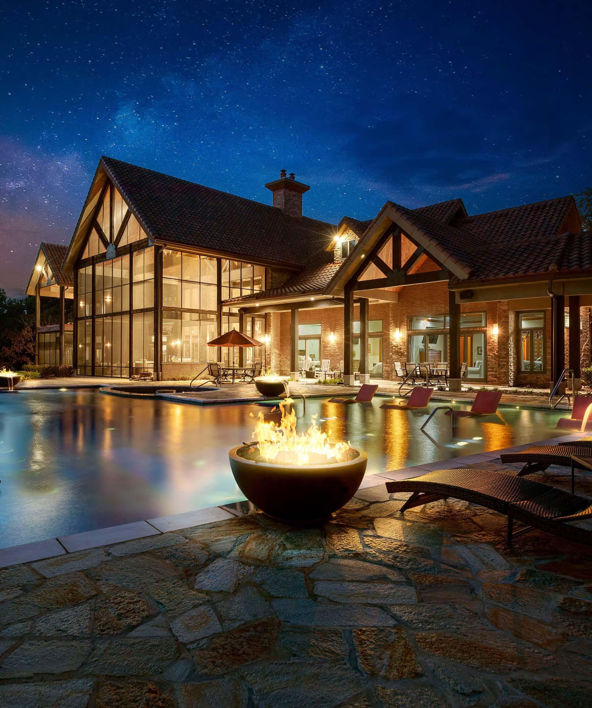
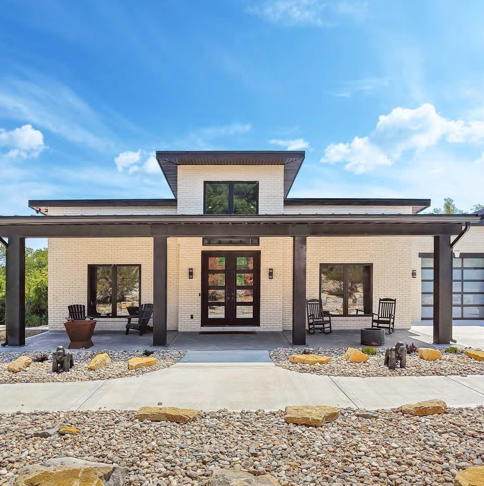


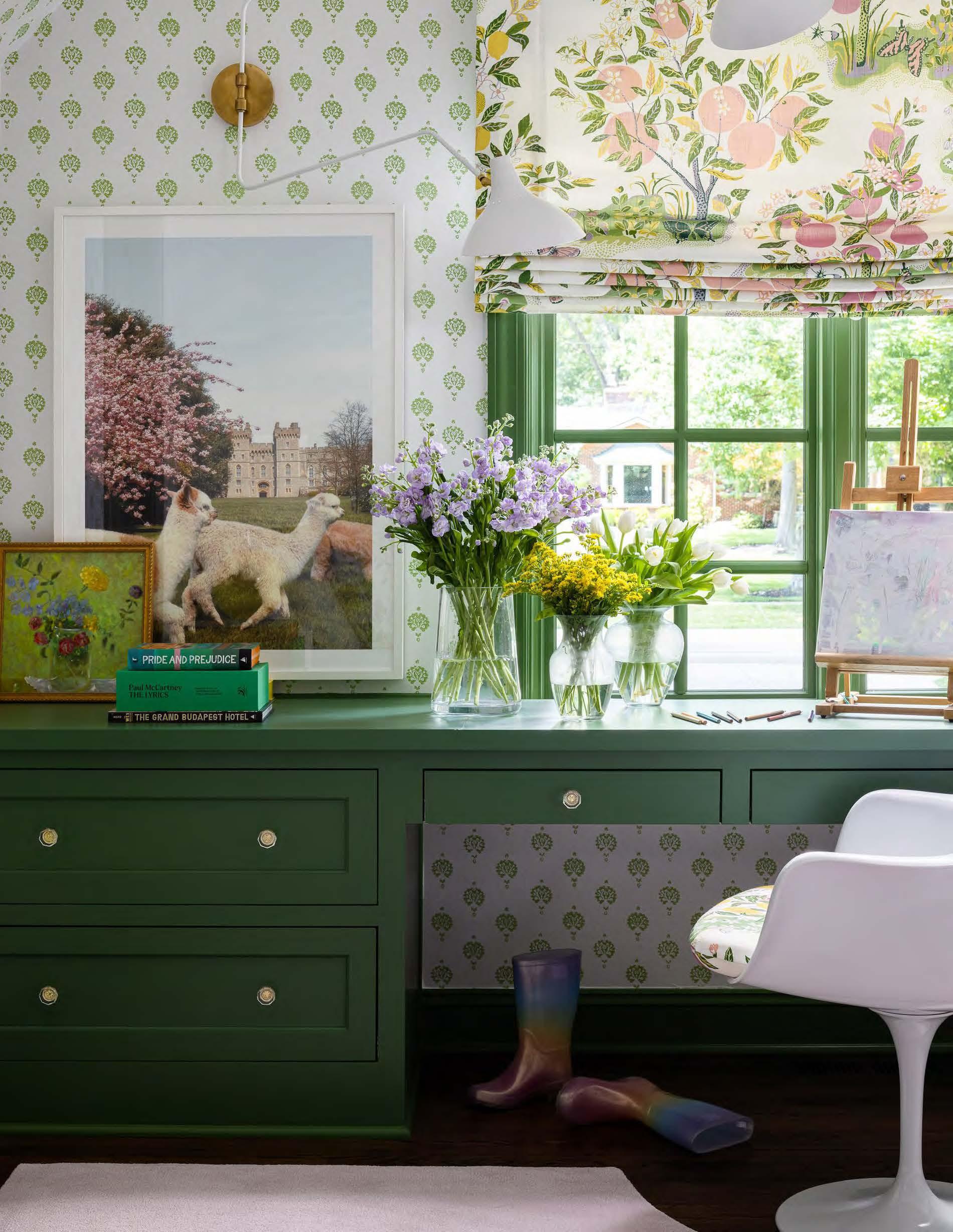


As parents to young kids, the clients of this project wanted their young daughter and two sons to feel at home in their new house as soon as possible— even before they tackled the kitchen, primary suite or main living spaces. This untraditional kick-off to a house renovation started with the goal of infusing each child’s individual style into the design of their respective bedrooms. The clients envisioned an artsy and color-filled aesthetic for their daughter, a traditional and tailored look for their middle son and a spunky MCM vibe for their littlest son.
Each bedroom had its share of difficulties, including high ceilings with asymmetric ceiling clips in one room and a dated bathroom between the boys’ rooms. In addition, the designers worked to find creative ways to deliver a timeless, high-end finish that would age well over time, sparing the clients from overinvesting in spaces their children would inevitably outgrow.


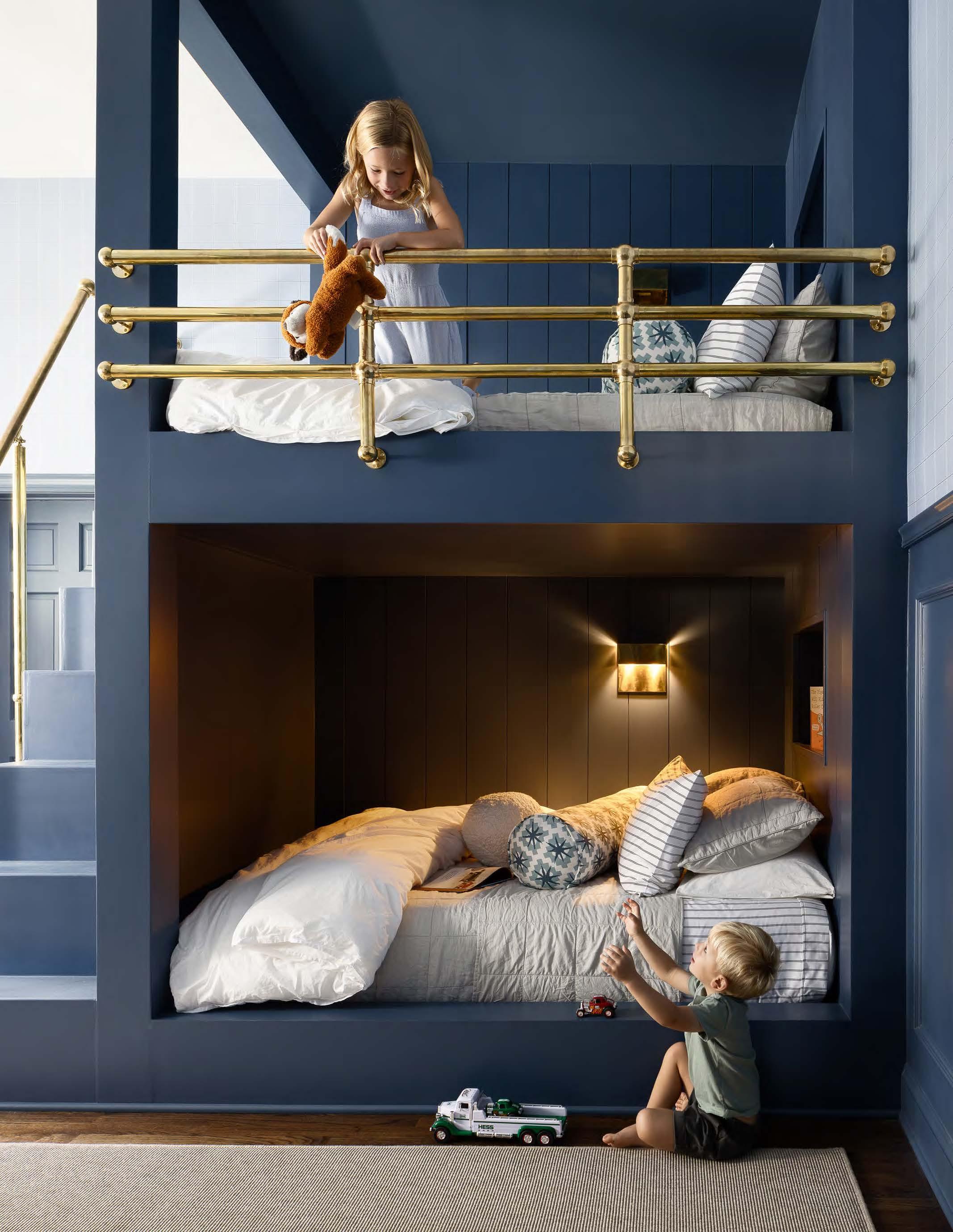
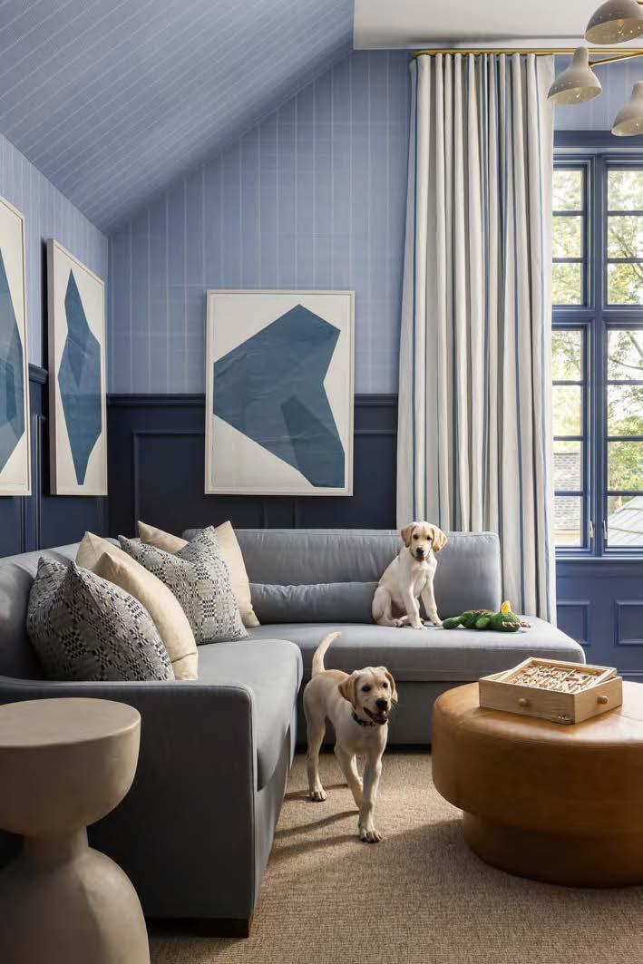
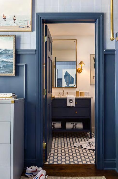
“
It’s a cool space all around and one they’ll still want to hang out in when they’re older.”
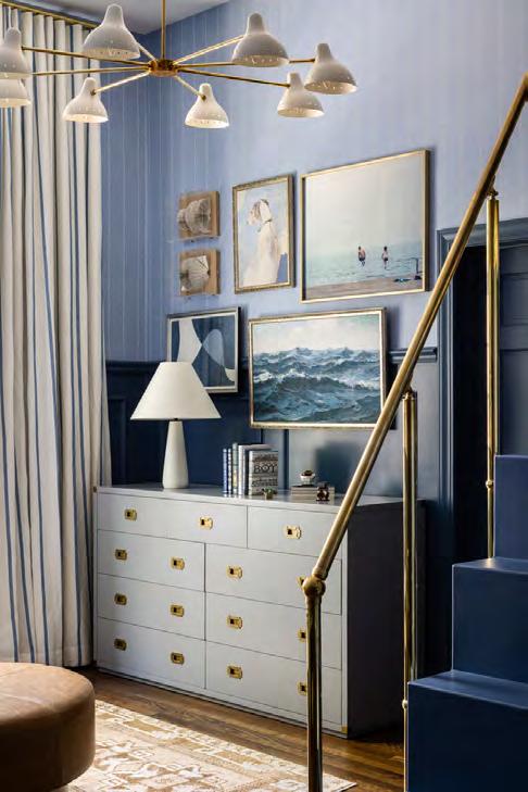 WHAT THE JUDGES LIKED:
The inventive bunk beds
The nautical feel
The sophisticated color combos for kids
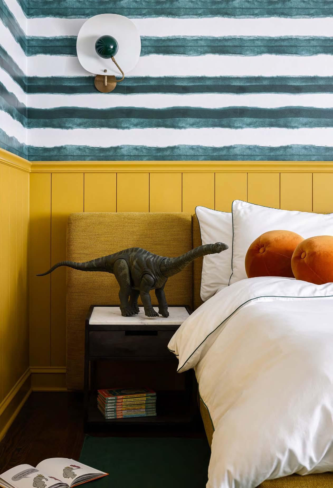
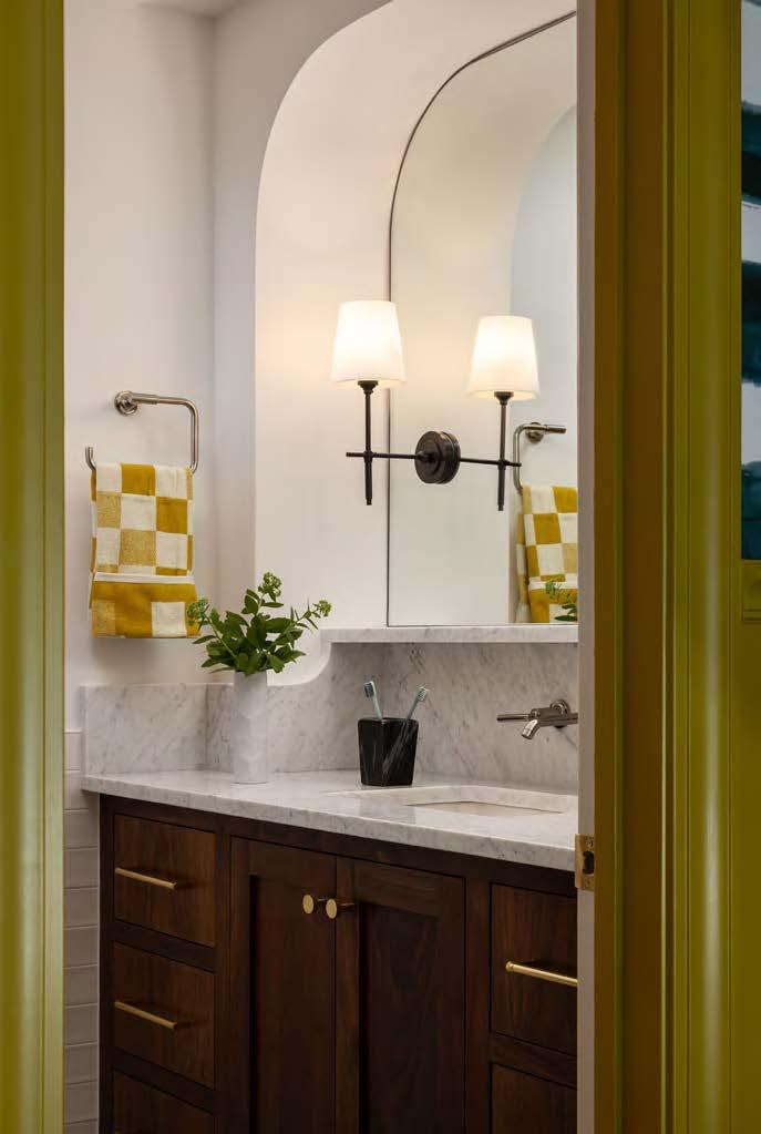
INTERIOR DESIGNER:
Kobel + Co
@kobelandco
CONTRACTOR:
Centric Build
@centric.build
PHOTOGRAPHER:
Nate Sheets
@natesheetsphoto

The project team embraced the asymmetry in the middle son’s room by building a towering bunk wall with brass guardrails and a custom staircase. Each bunk features individual reading sconces and a niche to display books and toys. The designers leaned into the angled ceiling and odd floor plan by creating a seating area. The three siblings love to be together, so the bunks and a reading couch work perfectly within the space. They reconfigured the Jack-and-Jack bathroom to give the brothers more personal space, providing each boy with their own full bath with ample closet space.
In the youngest son’s room, the designers accentuated the bright colors and millwork to create a fun and lively space that will grow with the boy and his energetic personality. A hanging chair and vintage posters finish off the look.
For the daughter’s room, they embraced a spectrum of color without being too “girly,” utilizing the “more is more” mantra with pattern on pattern. The long custom desk under the window allows her plenty of space to craft, paint and draw.
View full project details.
RESOURCES
Countertops: Rocktops


When picturing their new home, the client wanted a Hollywood Glam experience for entertaining friends and relaxing with family. They also wanted to transform the seldom-used outdoor space under an existing porch into a full kitchen with easy access to and from the pool.
The lower level had an unusual layout containing a number of awkward, stepped-back niches and support posts in odd places, which presented a


space-planning challenge. Prior to the remodel, the space was divided into a living area, a game area, a play area and a poorly functioning bar area. The room as a whole was ill-defined and had a dated Tuscan-style feel.
First, the main space needed to specify a function for the steppedback niches and overall odd layout. The design team created a custom banquette, a snack and popcorn station and an espresso bar, giving each niche an intentional purpose without making substantial structural changes.
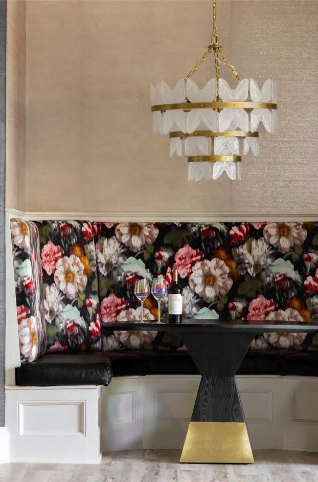
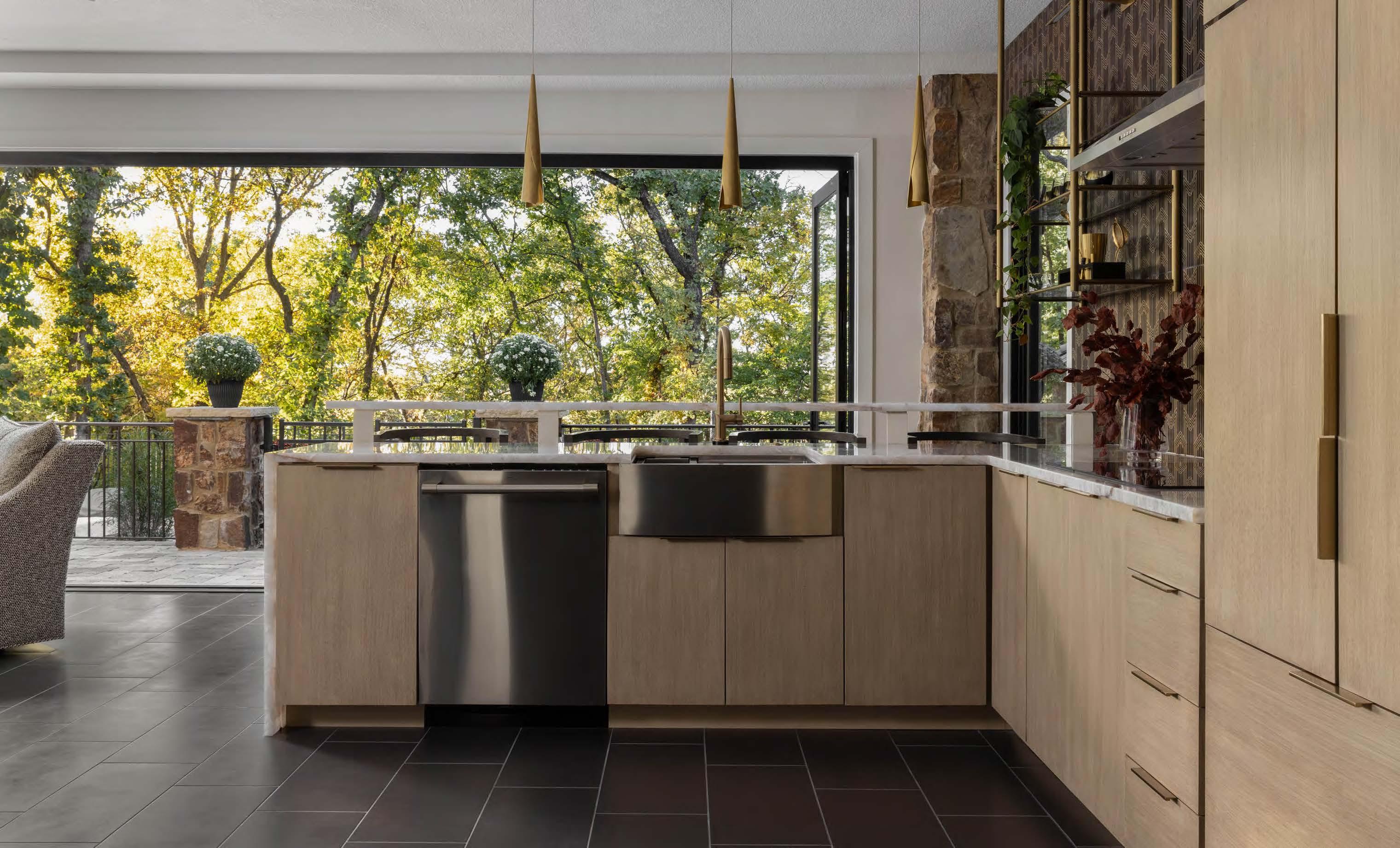

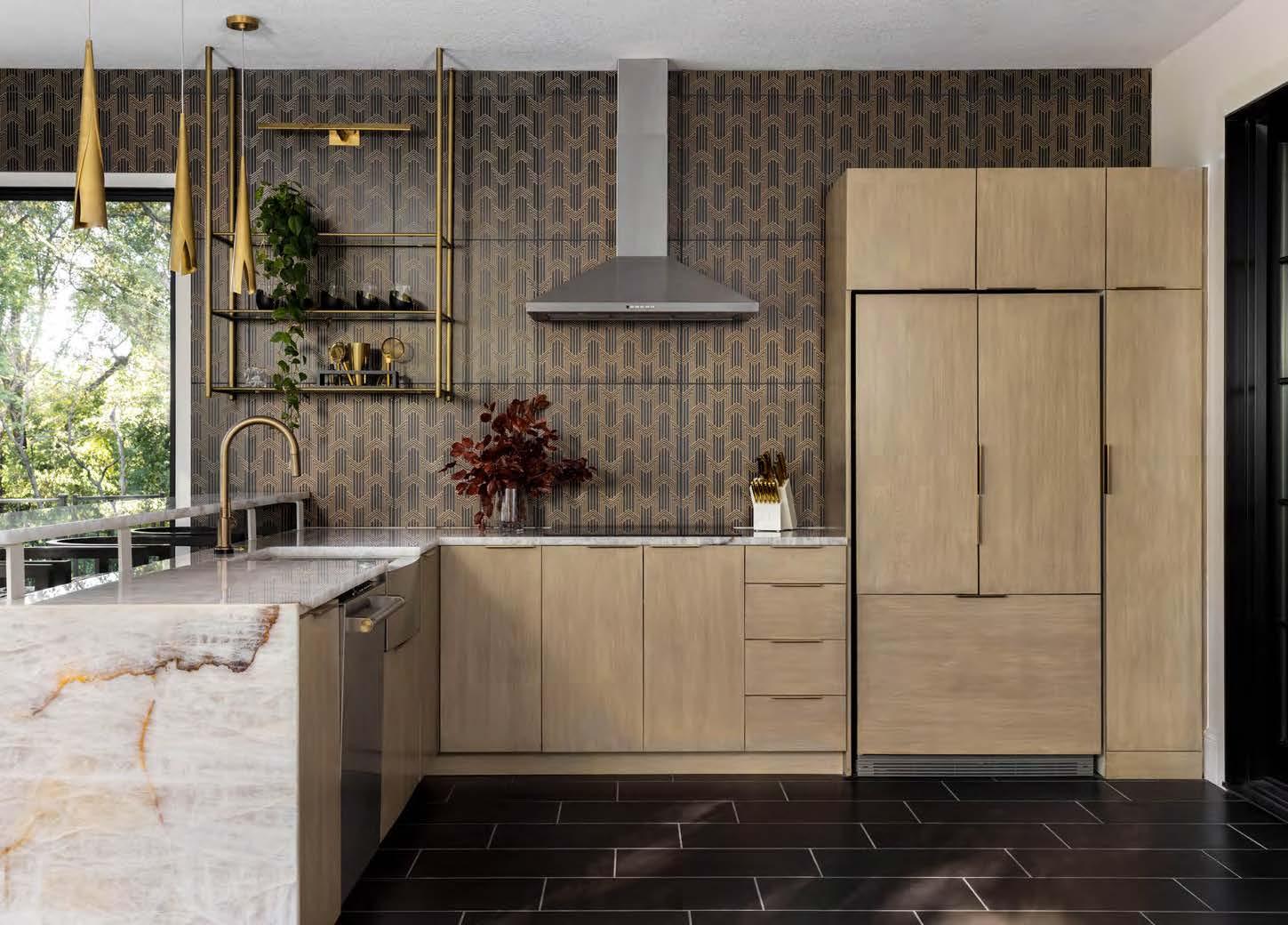
The smart, inventive use of odd spaces and focal points
The glamorous yet inviting feel
A strong color story and mix of styles
“It’s calm and classy.”
 WHAT THE JUDGES LIKED:
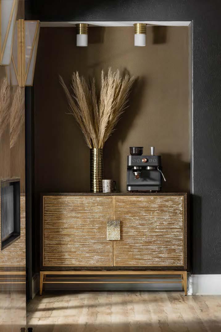
INTERIOR DESIGNER:
Tran + Thomas Design Studio
@tranthomasdesign
CONTRACTOR: Bichelmeyer Renovations @bichelmeyerrenovationskc
PHOTOGRAPHER:
Josie Henderson @josiedell_photo

They replaced the existing bar with a secondary lounging and movie-watching area, as well as turned a small, windowless space into a secret safe room. Next, they dealt with the oddly placed posts. To balance the space, the team moved one post down—widening the expanse between them—and installed a customdesigned and locally made dye-cut metal screen to create visual separation.
Outside, the design team enclosed the open space under the porch, transforming it into a multipurpose four-season room with a fully-equipped kitchen bar and lounge area. This space also features a 23-foot stacking glass door wall that opens to the adjacent pool area. Part of the challenge when creating this space was selecting materials, lighting and furniture that could handle temperature and humidity changes, along with finding doors leading into the main lower-level area that would protect this space from temperature shifts.
Finally, the interior fireplace was changed into a two-sided, see-through fireplace to benefit both indoor and outdoor living areas and allow the fire to be seen from the pool. The client was thrilled with the transformation, as their once least-favorite spaces in the home became their newfound favorites.
Appliances and Plumbing Fixtures: Ferguson Bath, Kitchen & Lighting Gallery Accessories, Art, Furnishings, Rugs and Wall Coverings: Tran + Thomas Design Studio

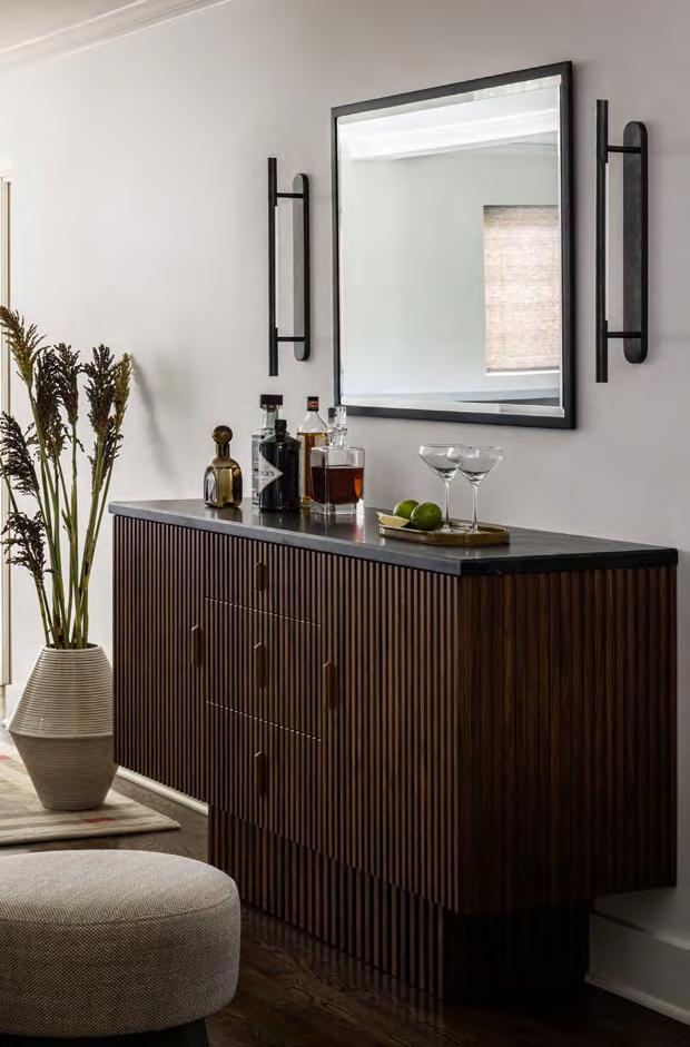
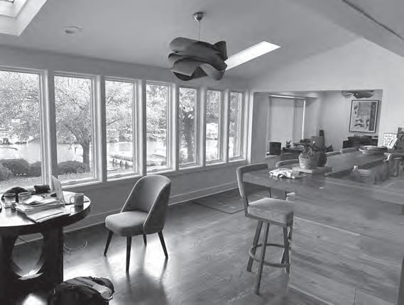
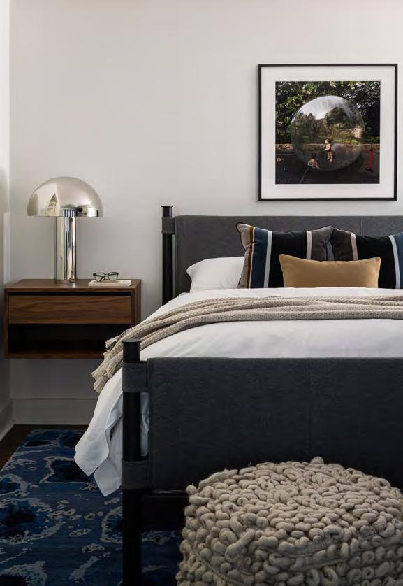
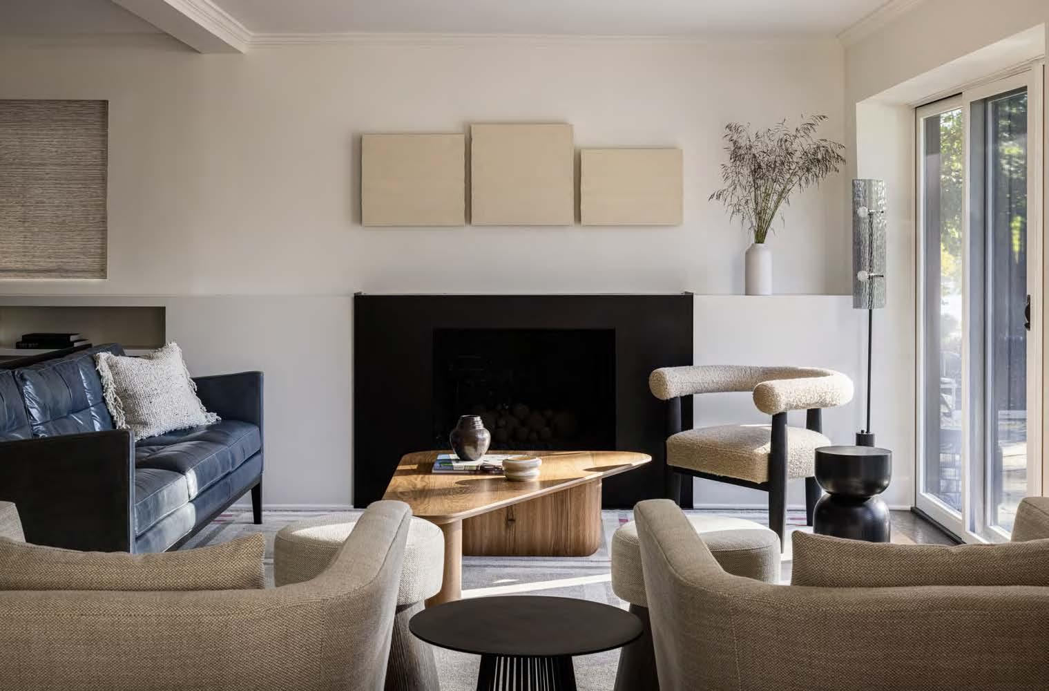

After his wife passed away, the owner of this 1940s Lake Quivira home wanted to update the main floor to make it feel more like his own. The newly renovated home uses a neutral color palette infused with textural elements to create continuity, while pops of calming blue accentuate the home and reflect the water. A custom floating bench—designed to run the length of the windows—capitalizes on expansive waterfront views. The design team incorporated seat pads, under-bench lighting and a palette of refined colors and materials to optimize the bench for daily use.
When peering down the galley, a framed view of blue swivel chairs and Lindenlure—a water-inspired piece by Julie Blackmon—peeks through from the den.
The combination of color and art visually leads into the reimagined den, which serves as a spot to relax or mingle with guests. The design team opted for a custom counter-height table in the informal eating area. A fluted, custom credenza that functions as a dry bar bridges the living and dining spaces. Walnut wood tones, soapstone tops and integrated lighting combine to create a hospitality-centric space. The adjacent living room features a sleek, steel inset fireplace, adjacent shelving and a streamlined mantel. A soothing mix of clean lines, plush textiles and a neutral color palette promotes a sense of comfort that facilitates quiet moments of connection and healing.
INTERIOR DESIGNER: Interior Design Beth Phillips @idbp_interior design
PHOTOGRAPHER:
Nate Sheets
@natesheetsphoto
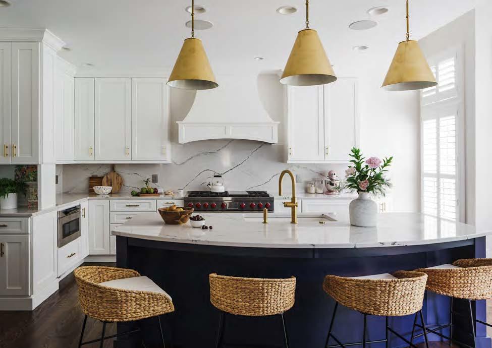

This renovation began with a kitchen update and a third-stall garage addition that eventually grew into an opportunity the owners couldn’t pass up. The expansion created space for the kitchen, a nook for a desk area in the upstairs dormer and—the most exciting of them all—a themed play space for the grandkids based on The Chronicles of Narnia, complete with access through an antique French armoire. This magical space features custom-designed cabinetry, walnut parquet floors and a mural showcasing a specific scene from the movie. The hideaway also includes porthole windows, timber framing and a private loft.
At the outset of the kitchen project, the clients knew they wanted a unique gold edge around navy inset cabinets paired with the famous red knobs on a Wolf range. The design team guided the clients through the process to find the perfect design tailored to their preferences and lifestyle.
The kitchen redesign ultimately overcame its cramped, U-shaped layout with the expansion, allowing for a more open and functional culinary space. The focal point is the 48-inch Wolf gas range and custom hood on one wall, complemented by a large cabinet run. The addition of an oversized island provides balance, flow and ample counter space. Inspired by images presented by the client, the kitchen’s new aesthetic focuses on a crisp yet timeless feel with a classic touch—namely, the gold-edged details, the white perimeter cabinets and the dark-blue accent cabinets and island base.
The blend of traditional and modern elements, accented with bespoke details and thematic designs, reflects a harmonious and personalized approach to the home’s overall aesthetic.

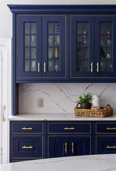
DESIGNER/CONTRACTOR:
Schloegel Design Remodel
@remodelagain
INTERIOR DESIGNER:
Madden-McFarland Interiors
@maddenmcfarlandint
PHOTOGRAPHER:
Matthew Anderson
@matthewaphoto
Engineer: Bob D. Campbell & Co. Appliances: Factory Direct Appliance Cabinets: Crestwood Countertops: Cambria Fabrication: CKF
Flooring: Kimminau Painter: R&S Painting Plumbing Fixtures: Kohler Signature Store by First Supply Roofing: Vaught Roofing
To-the-Trade Showrooms: ProSource Wholesale; Neenan Windows: Marvin via KC Millwork
View full project details.
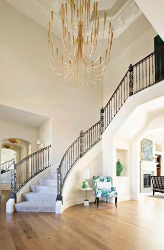

INTERIOR DESIGNER:
ML Designs @mldesignskc
CONTRACTOR:
Holthaus Building holthausbuilding.com
PHOTOGRAPHER:
Laurie Kilgore
@lauriekilgorephotography


This stunning home may have been tastefully decorated in the past, but the heavy woodwork, dark Tuscan-inspired interiors and wrought-iron lighting sorely needed a modern-day makeover. The project team brought this home back into the present using a neutral color palette with pops of blue and green and accents of brass and warm gold.
The first transformation involved skimming and fl attening walls, replacing tile with hardwood flooring and updating lighting fixtures to brass and satin gold. The entire space was freshly painted in a warm white hue and then adorned with delightful, vibrant pops of wallpaper and art. The entryway also features a custom-sized chandelier juxtaposed alongside the original railing.
The designers replaced the iron scroll insets on the dining room buffet with mirrors and installed gold hardware for a modern touch. Though the existing dining table has remained in place, a new set of velvet-upholstered host and side chairs contemporizes the look. The crystal-and-gold chandelier above makes for a stunning focal point and final touch.
Finally, the design team rearranged the kitchen’s floor plan to accommodate a statement hood. A newly added large island provides storage and family seating, concealing the pantry behind faux cabinetry. The powder room also saw a dramatic makeover with custom marble countertops, emerald-colored paint and iconic leopard-print wallpaper, forming a dynamic and intriguing space adjacent to the kitchen. The subtle injection of blush pink in patterned draperies reflects the wife’s favorite color, adding another personal touch to the design.
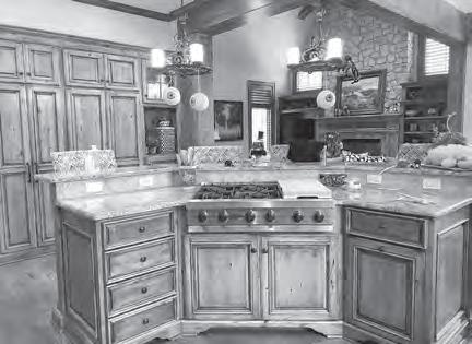
RESOURCES
Cabinets: Built to Fit Countertops: Dimensional Stoneworks Flooring: European Floors Hardware: Locks and Pulls
Lighting Fixtures: Relative Lighting Plumbing Fixtures: Ferguson Bath, Kitchen & Lighting Gallery
To-the-Trade Showrooms: Designer’s Library; KDR Designer Showrooms Window Coverings: One Stop Decorating


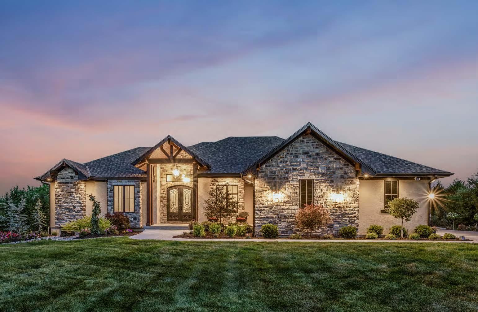

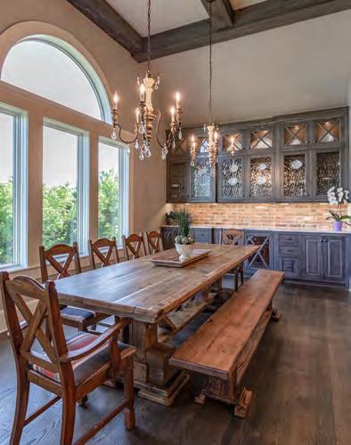
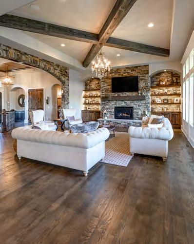


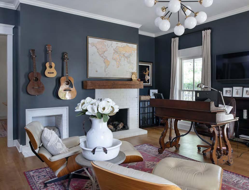


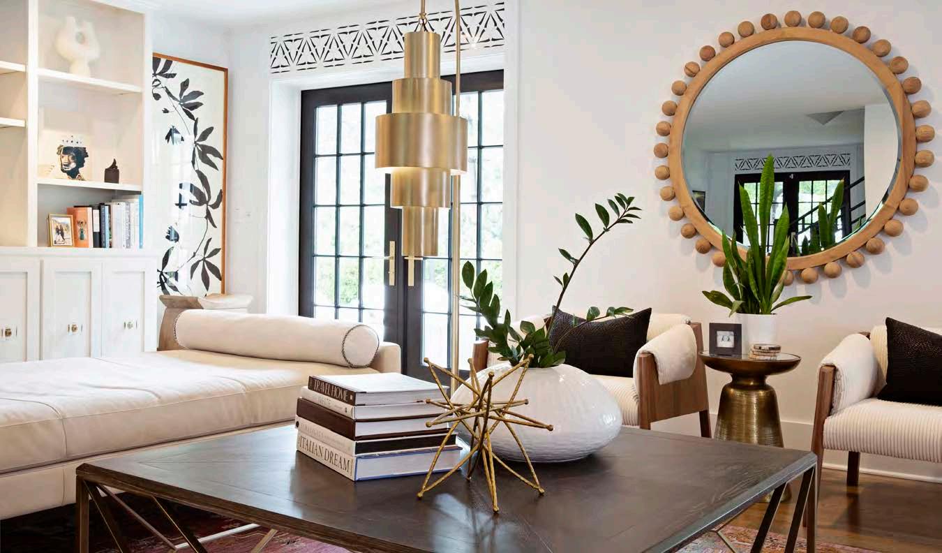


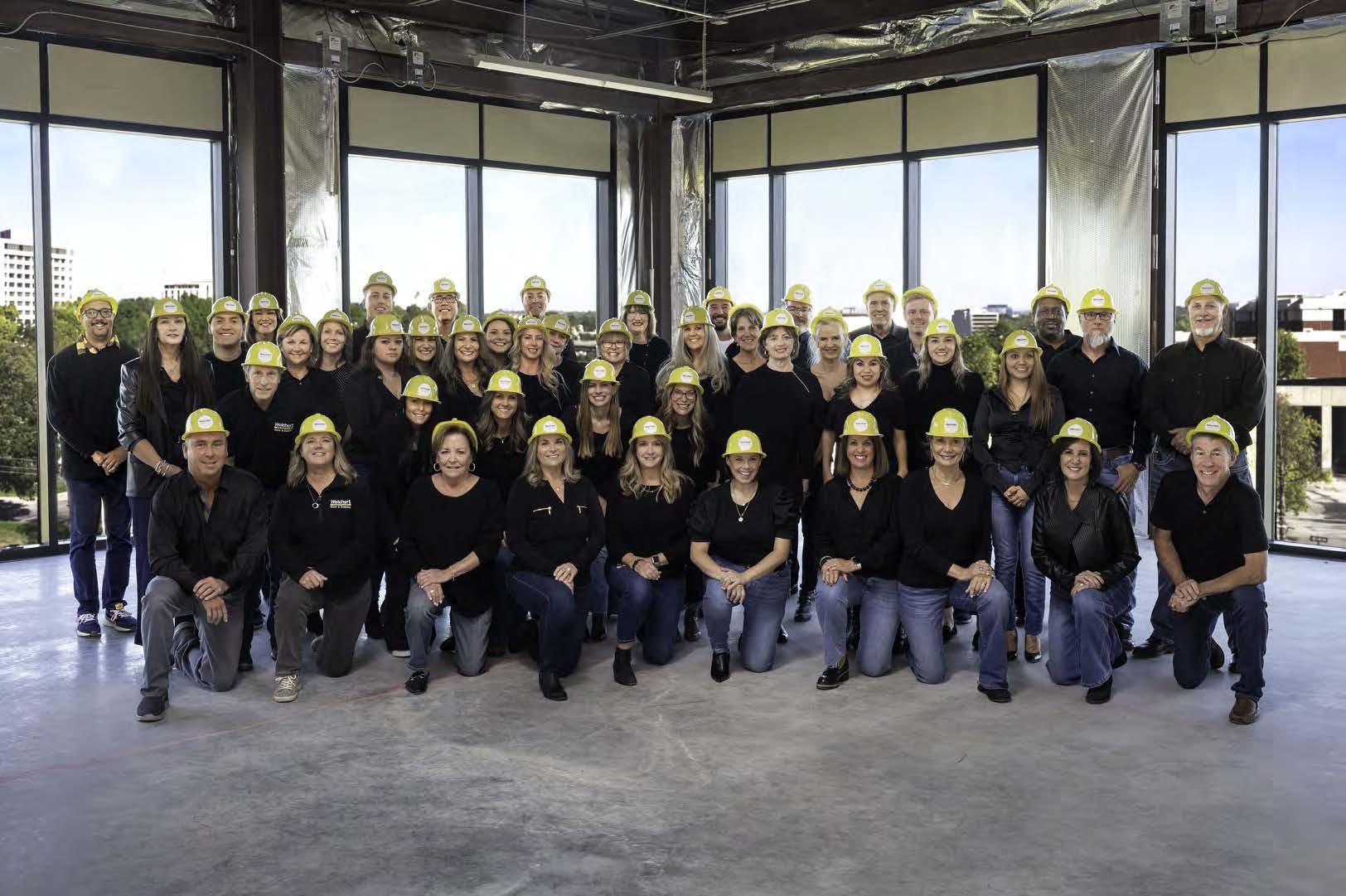

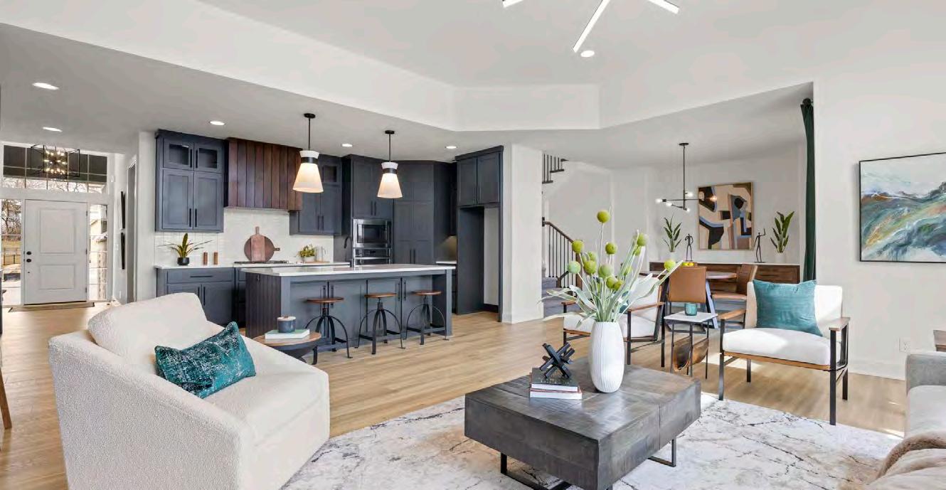

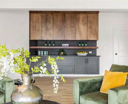
This model home’s simple, modern design is imbued with abundant geometric lines and textures throughout. The clean, white background incorporates high-contrast features, such as dark cabinets and rich wood tones. The overall aesthetic is edgy but still appeals to the masses. Some of the project’s challenges included working around budgetary restrictions, dramatizing a small kitchen and making all three levels of the home feel cohesive. SAB used the same paint colors throughout the house and repeated hardware and flooring materials to unify the spaces. They also extended the kitchen cabinets to the ceiling and built a floating buffet cabinet in the dining space to maximize storage and style. The office is a consistent favorite, drawing guests in with its dramatic, floor-to-ceiling wooden slats that simulate a dramatic, three-dimensional feel. Finally, a flex room near the front of the house grants homebuyers the flexibility to utilize the space as an office or dining room.
RESOURCES
Interior Designer: Katie Bishop Countertops: Granite Direct Lighting Fixtures: Wilson Lighting
Community: Hook Farms Window Coverings: Budget Blinds

BUILDER:
SAB Homes
@sab_homes
PHOTOGRAPHER:
Kelly Miller at Nuvo360 @nuvo360

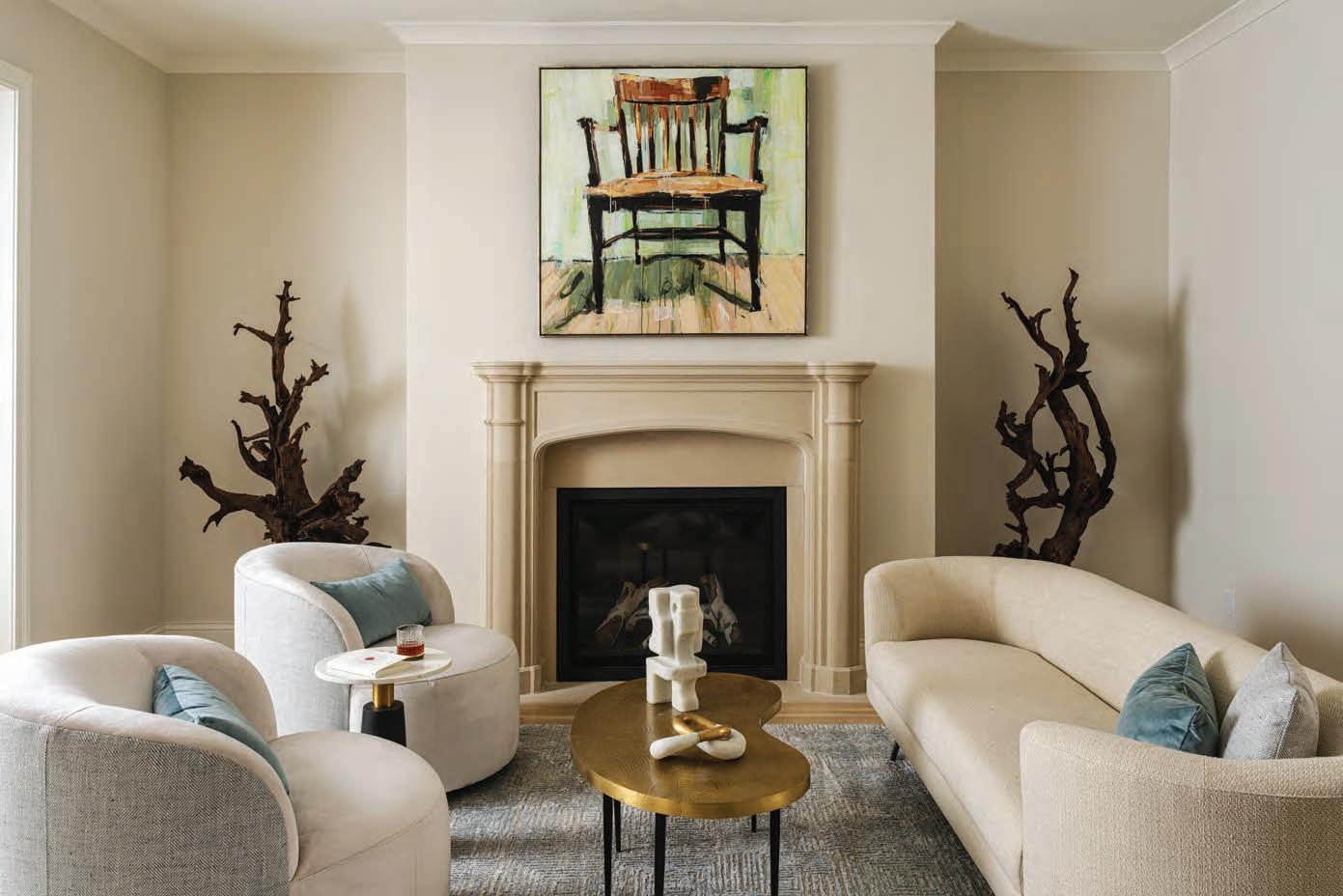



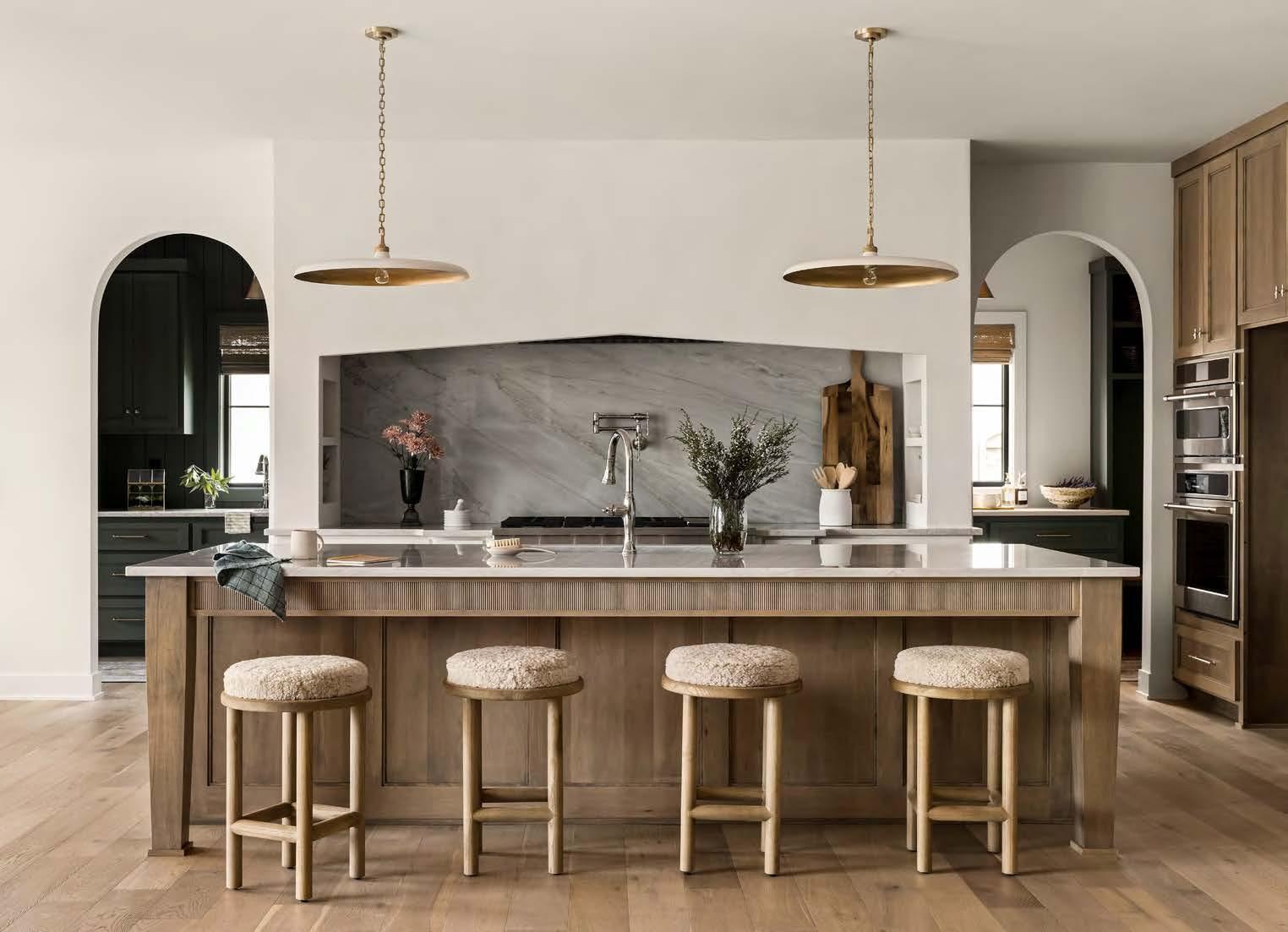

The Roosevelt was purposefully designed to have a different feel than other model homes in the Kansas City market. The design and build teams wanted to give it a sense of timelessness paired with refreshing luxury. To achieve this, they fused modern European-style architectural features with natural, organic finishes, making the home feel warm and inviting yet still modern. They accomplished this cohesion of styles with color, texture and forms—all while emphasizing natural materials as much as possible.
The home’s comprehensive color palette is warm, neutral and monochromatic, with a touch of muted green, grounding it in nature. Meanwhile, its open floor plan
provides an ideal backdrop for the large, black metalframed windows throughout the home, offering generous views of the outdoors. The great room features a two-story vaulted ceiling that highlights the space’s natural wood beams and a custom fireplace with limestone surround. The kitchen boasts a large, Venetian plaster-arched hood with a quartzite backsplash, complementing the organic feel. Here, textural details can be seen both in the customreeded cabinetry on the island and the built-in hutch. The arches—found in door openings and cabinetry—also add a classic Old World-style touch. Overall, the home is traditional in form but distinctively modern in execution.
BUILDER: Bickimer Homes @bickimer_homes
PHOTOGRAPHER: Josie Henderson @josiedell_photo


Though working within a new home’s standard budget, the designers beautifully integrated many unique elements throughout this model home. From the front’s striking exterior, the entry welcomes guests—and makes a memorable first impression—with a fusion of wood cladding, copper awning and lighting and a diamond-checkered floor of terracotta and cream-colored pavers. The same distinctive flooring design extends to the back lanai, which also features a custom fireplace with built-in log storage.
Inside, the designers used wood and earth tones in distinctive ways, especially in the kitchen and great room. Highlights in the great room include a custom stone fireplace surround fl anked by deep-green shelving with a stained wood backer and slatted fireplace trim. In the show-stopping kitchen, wall-to-wall glass cabinets are a clever draw. The primary suite continues the wood theme with beautiful beams, trendy shower tile, wall features and a black-painted ceiling.
The continuous stair railing—spanning from the upper to lower levels—required meticulous planning and collaboration with trim installers to find budget-friendly alternatives while maintaining structural support. The result is a stunning model home that seamlessly blends a variety of textures and materials.
INTERIOR DESIGNER:
Little Black Dresser Interiors
@littleblackdresserinteriors
BUILDER:
Starr Homes
@starrhomes
PHOTOGRAPHER:
Matthew Anderson
@matthewaphoto
RESOURCES
Appliances: Ferguson Bath, Kitchen & Lighting Gallery Cabinets: Cabinets by King Countertops: Cambria Fabrication: Canaan Stone Works (CSW)
Flooring: Legacy Flooring Contractors Furnishings: Charmed House Interiors Lighting Fixtures: Little Black Dresser Interiors
Plumbing: Ferguson Bath, Kitchen & Lighting Gallery Community: Rodrock Development – Terrybrook Farms

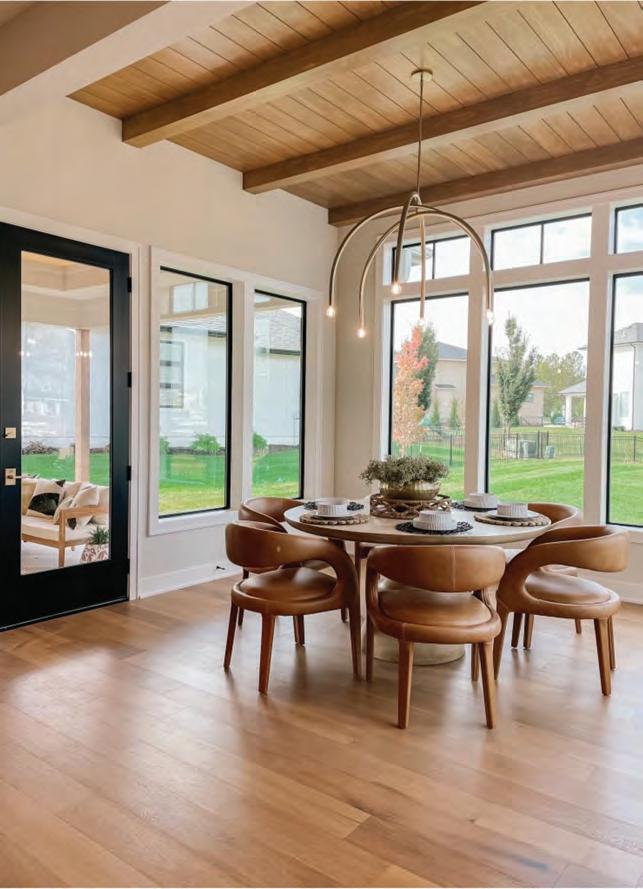
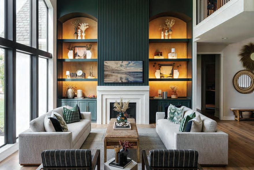
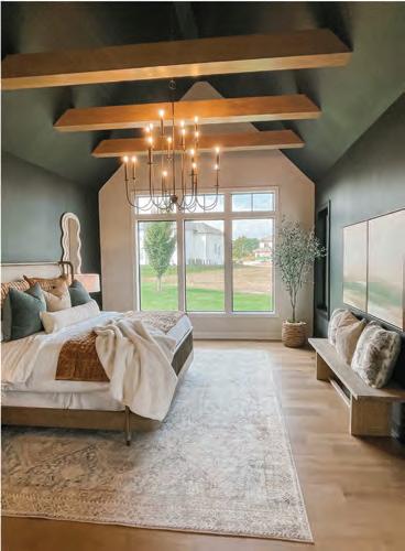
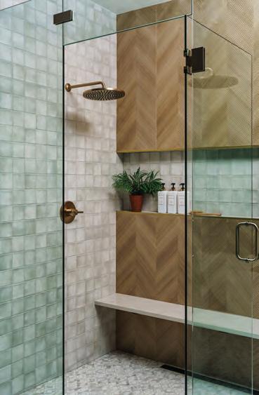
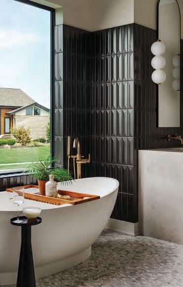
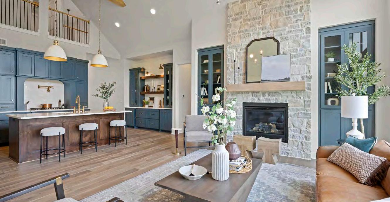
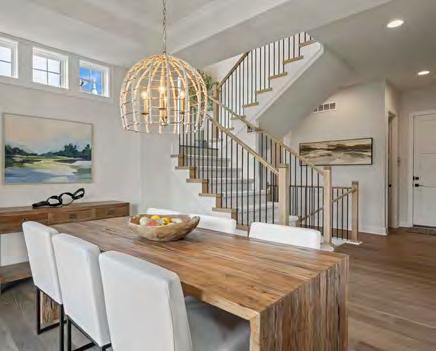
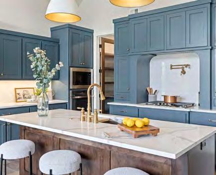
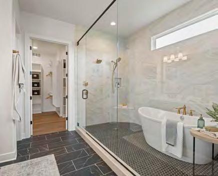
BUILDER:
SAB Homes
@sab_homes
PHOTOGRAPHER:
Kelly Miller at Nuvo360
@nuvo360

As one among four other model homes featured in the community’s model row, this home needed to stand out. Its classic, family-style floor plan was envisioned to be timeless yet fun. The house is spacious and has abundant natural light, so the design team brought in complementary elements that would feel warm and inviting at the same time. The overall aesthetic is one that will age well, even though it still incorporates color that reflects the trending palettes of the moment.
RESOURCES
View full project details.
Selecting a bold pop of color for the kitchen cabinets was a challenge because the perfect shade was difficult to find. So, the designers created their own custom color to ideally suit the space. Similar finishes were then used throughout the home to incorporate the blue-green accent color, further unifying the home’s design and feel.
Appliances: Ferguson Bath, Kitchen & Lighting Gallery Cabinets: Precision Woods Fireplace: Complete Home Concepts
Lighting Fixtures: Wilson Lighting Plumbing Fixtures: Grandview Winnelson

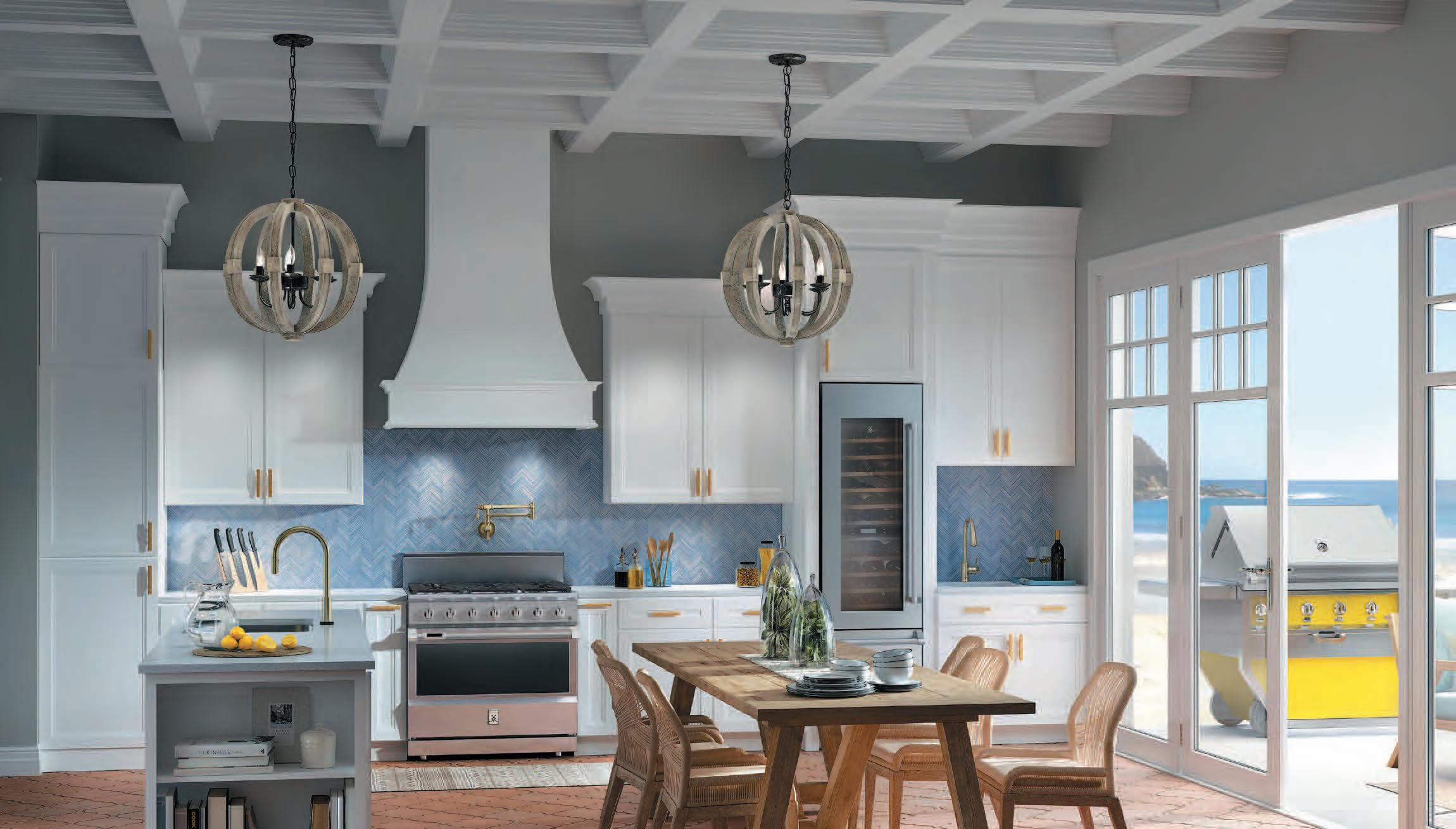
Hestan’s award-winning design and performance are born from years building kitchens for America’s most acclaimed chefs. Performance innovations like Hestan’s Smart Gas technology provide precision control. The Smart Gas burner controls the exact gas burner temperature – not just a Lo to Hi burner power setting. Smart Gas technology
and Gas Rangetops. Premium indoor and outdoor products from ranges to refrigeration to
products, and everything in between, Hestan brings even the dreamiest indoor and outdoor kitchens to life. And all are

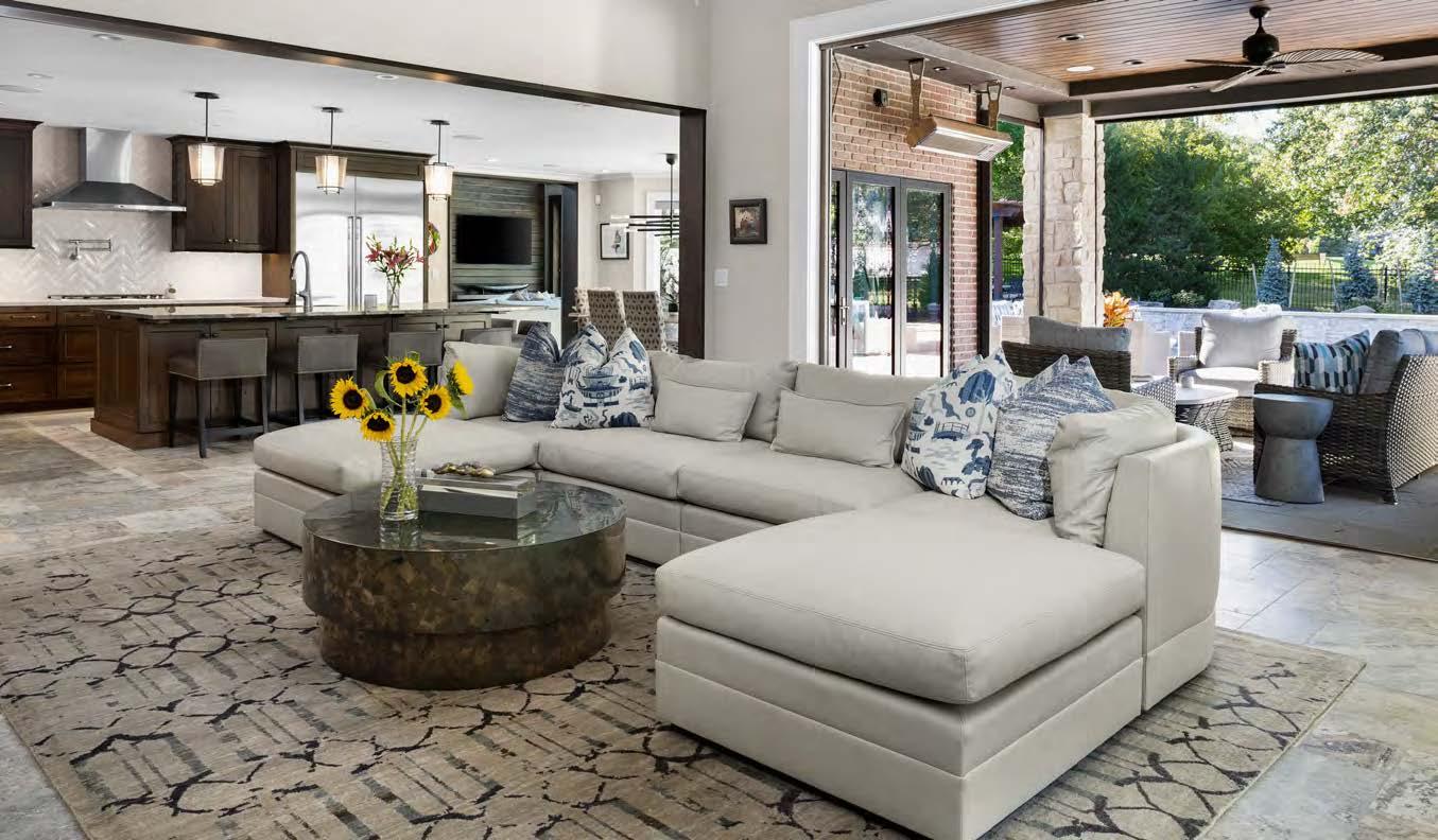

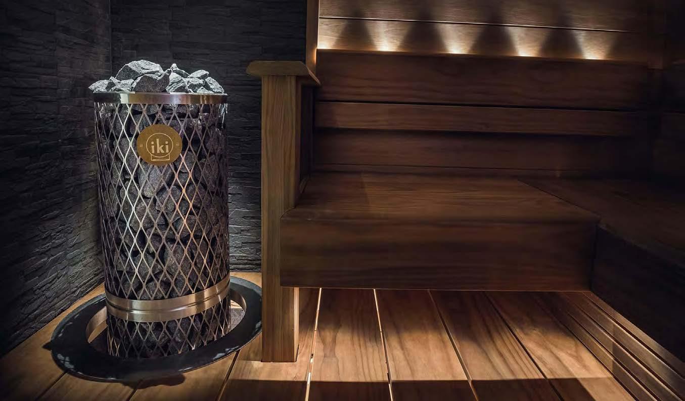
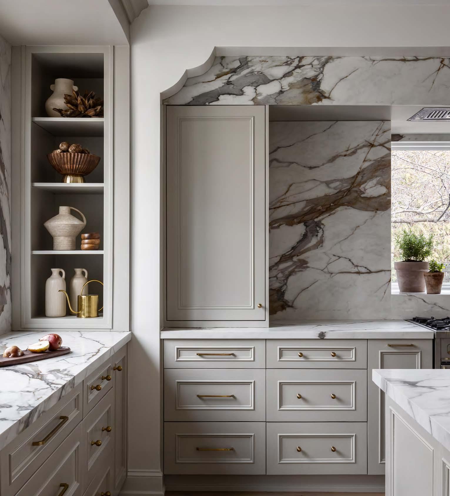 WINNER OF TWO PROJECT OF THE YEAR AWARDS FOR 2024. Our goal is to create a truly bespoke and curated home that will be enjoyed for many years to come. We would love to assist you in making your dreams a reality. TROVEHOMES.COM
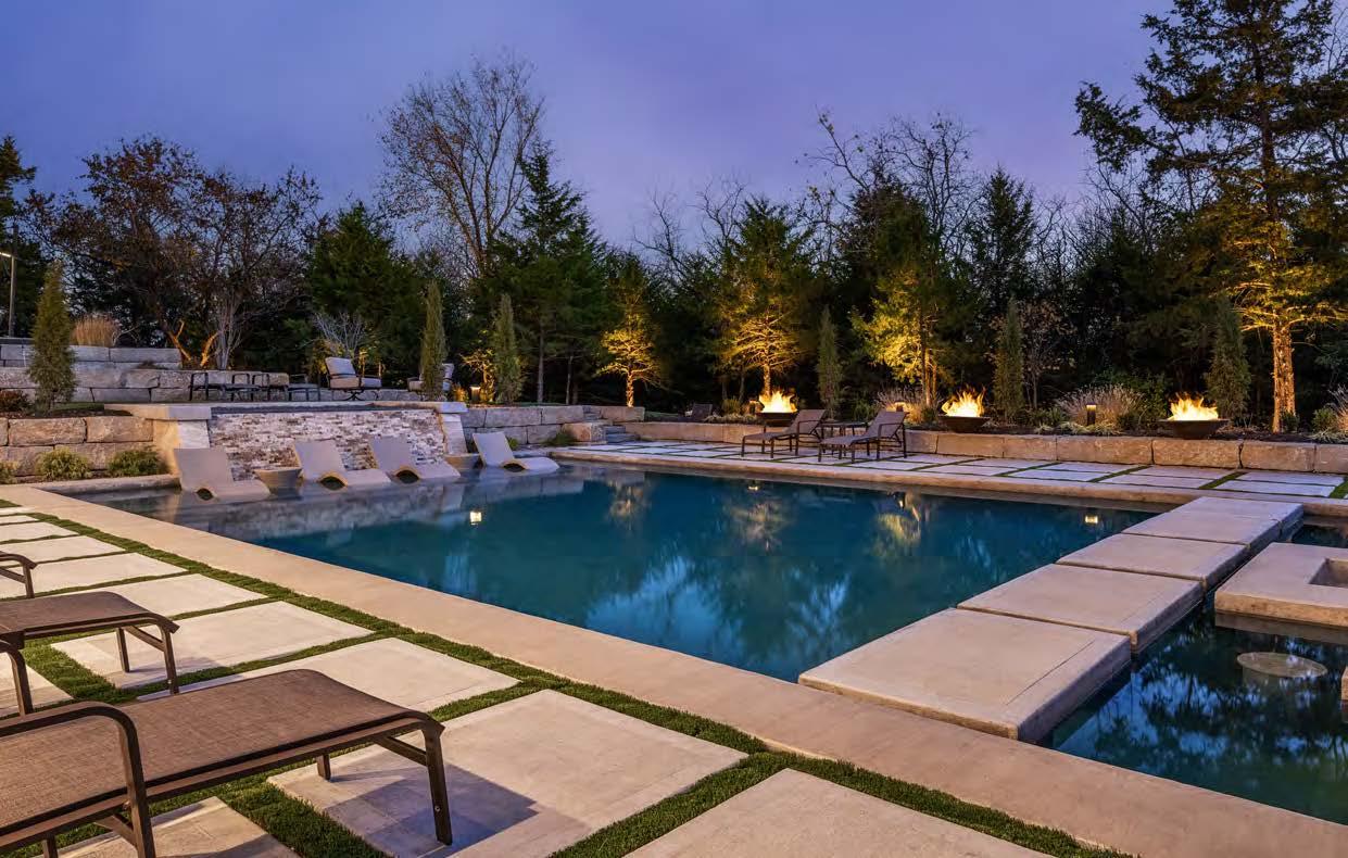


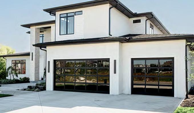

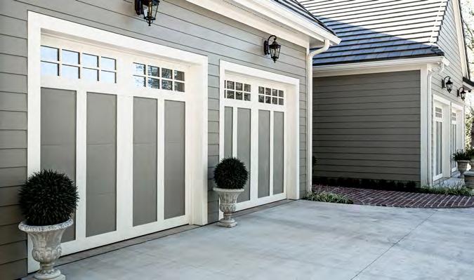


BATHROOMS + KITCHENS + BASEMENTS + WHOLE HOMES
OUR MISSION: KCBR Design l Remodel is dedicated to community involvement, personal development, and professional growth. We accomplish every goal by setting the bar at the highest levels in service to our clients, our vendors, and our teams. We energize the lives we touch with endless positivity, inspiration, and the power to make a lasting impact.
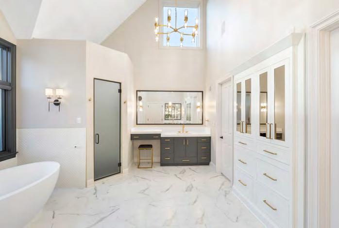
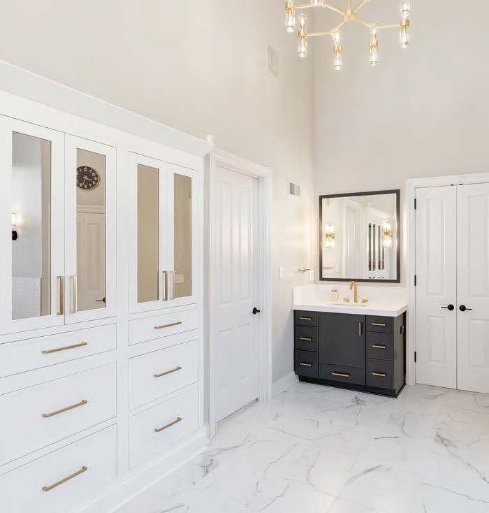

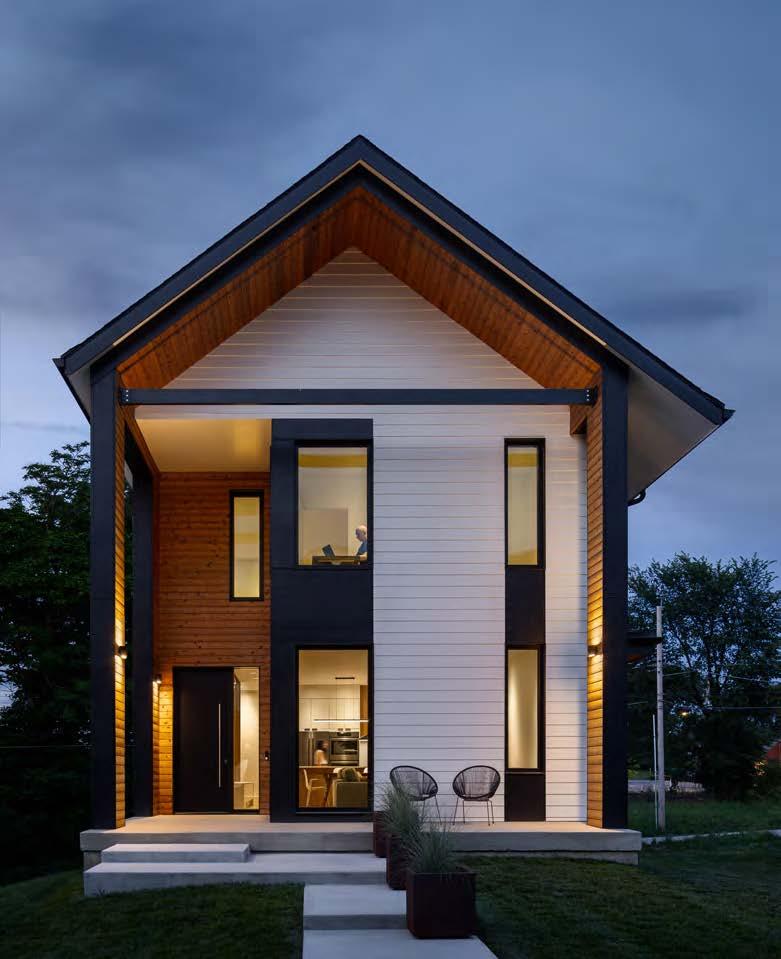


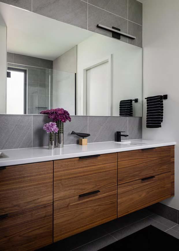
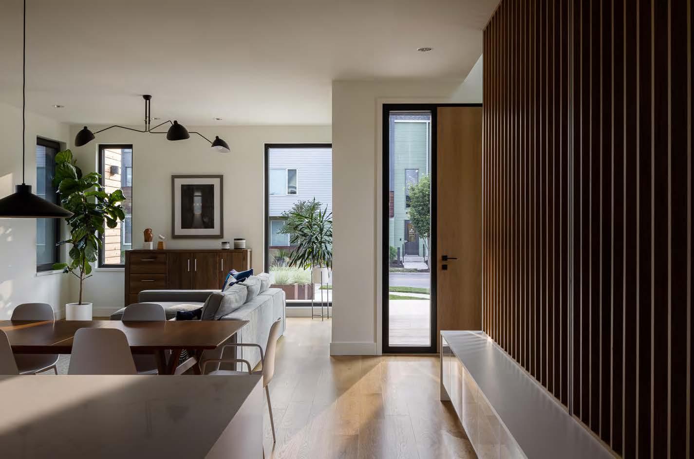

ARCHITECT:
Hoke Ley
@hoke_ley
BUILDER:
Kala Performance Homes
@kalabuilt
PHOTOGRAPHER:
Nate Sheets
@natesheetsphoto
View full project details.
The first PHIUS-certified Passive House in Missouri, located in downtown’s Beacon Hill neighborhood, was designed to provide its owners with a sustainable and comfortable legacy while revitalizing the urban community. Situated at the beginning of a linear park, the ideally positioned house features a two-story protrusion, offering panoramic views of downtown Kansas City. The exterior design blends modern elements with traditional neighborhood forms, creating a warm and inviting atmosphere. Internally, the space is characterized by calmness and comfort, utilizing white oak for cabinetry, floors and stair components.
The high-performance home incorporates superinsulated SIPs walls, trussed roofs and well-sized overhangs for effective solar management—all working to ensure superior indoor air quality and environmental controls. The design addressed challenges posed by the narrow, sloping urban lot, focusing on southern solar exposure, privacy and potential future developments.
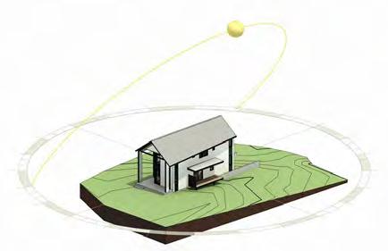
Additionally, accessibility considerations for a family member with mobility issues were incorporated. Meeting the rigorous PHIUS certification involved overcoming technical challenges in wall assemblies, air-barrier systems and ventilation. The project’s success was achieved through collaboration, careful planning of airsealing strategies and innovative solutions, such as a coffered roof truss and negative-pressure application of airborne air sealant during the blower-door test.
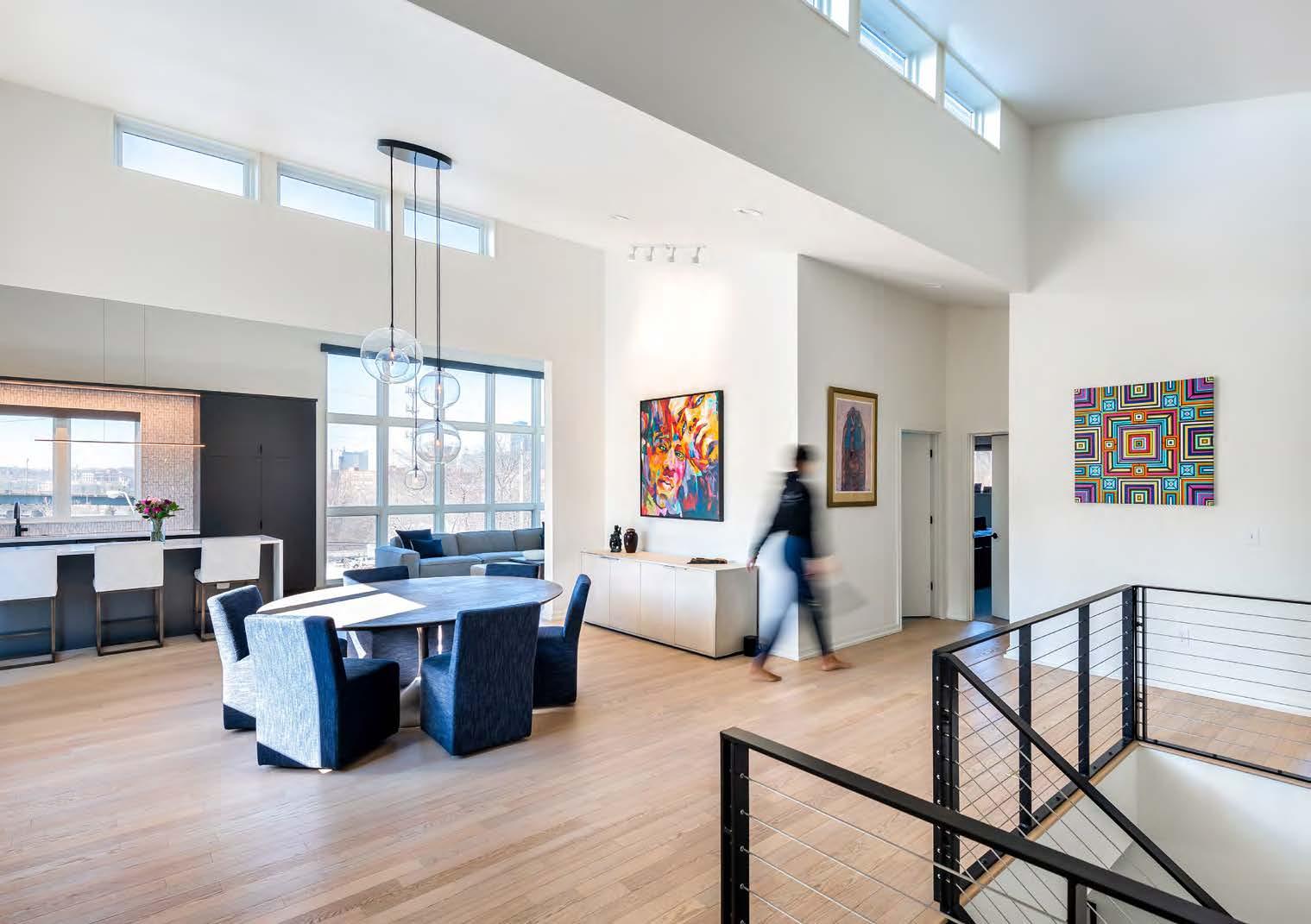

The owners of this modern home were looking for a welcoming, unassuming design with an efficient and contemporary look. The architects designed this fully custom residence with a comfortable, forward-thinking concept and a distinguished style—all neatly packed within a home size suited to the scale of the surrounding neighborhood. Minimalist lines and spaces create a sleek modern ambiance that inspires social interaction and blends with the numerous outdoor spaces. Large windows bathe interior spaces in natural light while providing amazing views of the downtown skyline. This house is a one-of-a-kind retreat in the middle of the city that creates ideal spaces for every social situation, from dining with guests to enjoying outdoor amenities with family. With an emphasis on environmental responsibility, the home features a high-performance envelope, rooftop solar panels, high-efficiency HVAC and deep-set roof overhangs that safeguard southern-facing windows. The strong indoor-outdoor relationship is enhanced by expansive glass windows, sliding glass doors and connections to multiple outdoor spaces. Clerestory windows on the main level bring in abundant natural light and establish a visual connection to the sky. With its thoughtful design, the building’s orientation ensures living spaces have direct views of the downtown skyline, elevating this unique urban-dwelling home’s overall appeal and functionality.
ARCHITECT:
DRAW Architecture + Urban Design
@drawarchitecture
BUILDER:
Hawthorn Projects hawthornproject.com
PHOTOGRAPHER:
Kelly Callewaert
@kellycallewaertphoto
View full project details.
RESOURCES
Engineer: Apex Engineers
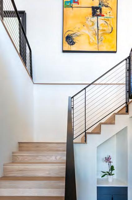

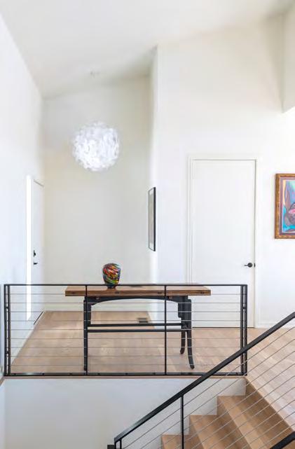
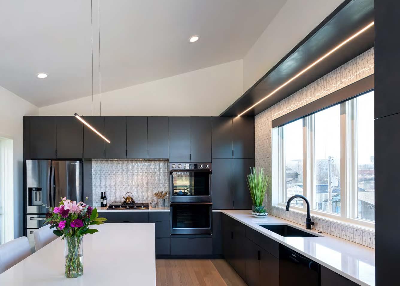
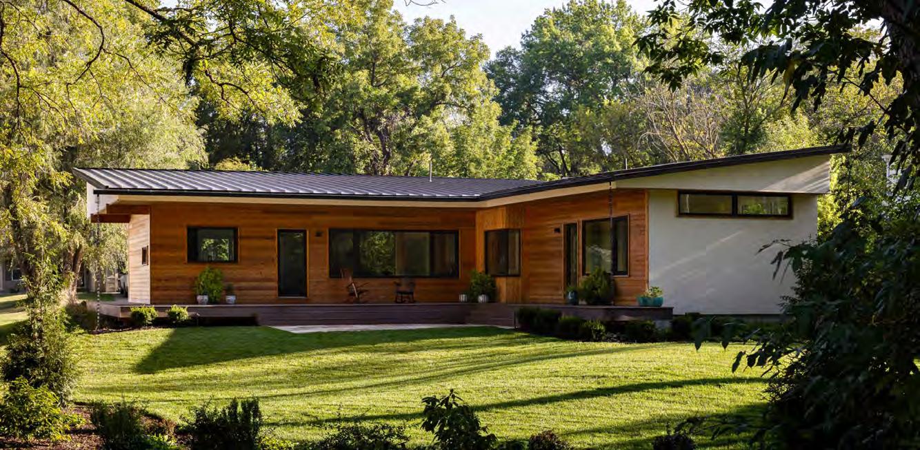

After purchasing an extra-deep lot along the Trolley Trail in Waldo, Missouri, the new property owners envisioned an uncomplicated home that would be tight and efficient, filled with cozy nooks and thoughtful details. They were drawn to the “Pretty Good House” principles: build as small as possible, be simple and durable, invest in a well-insulated exterior and use common-sense passive strategies—such as an appropriate site location and deep overhangs to reduce cooling needs. To create a budget-friendly, hyper-efficient home, the architects onboarded a building-science expert to bring first-rate craftsmanship to the project.
At just 1,800 square feet, the design needed to prioritize right-sized living spaces and a continual connection to the outdoors. The L-shaped floor plan puts the wooded backyard and Trolley Trail at center stage, supplying each room with excellent views of the historic path. The inverted-truss roof structure allows for superior insulation depth and sets up an indirect-lighting strategy with north-facing clerestory windows, providing soft, ambient light throughout the home. Deep overhangs and a wood deck wrap around the house from the front porch to the private yard and stone patio, setting up a serene space for residents and guests to gather around a fire pit.
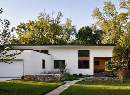
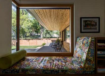
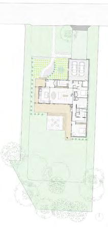
ARCHITECT:
McHenry Shaffer Architecture
@mchenryshafferarchitecture
BUILDER:
Catalyst Construction
@catalystbuilt
PHOTOGRAPHER:
Nate Sheets
@natesheetsphoto
View full project details.
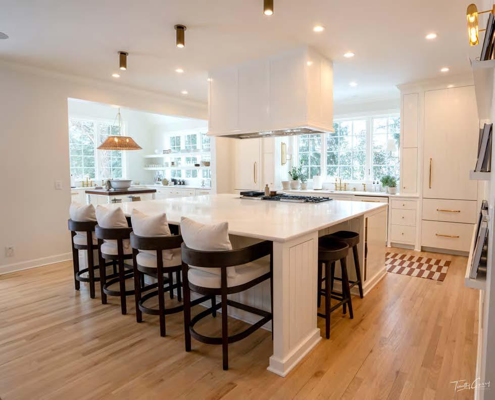
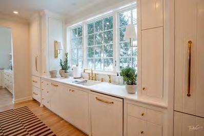
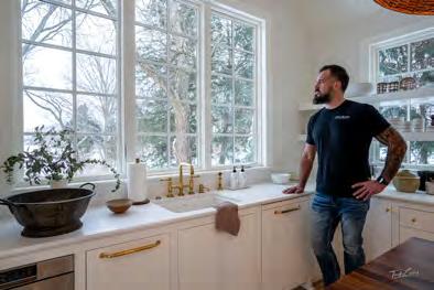


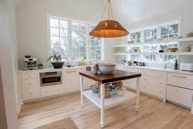
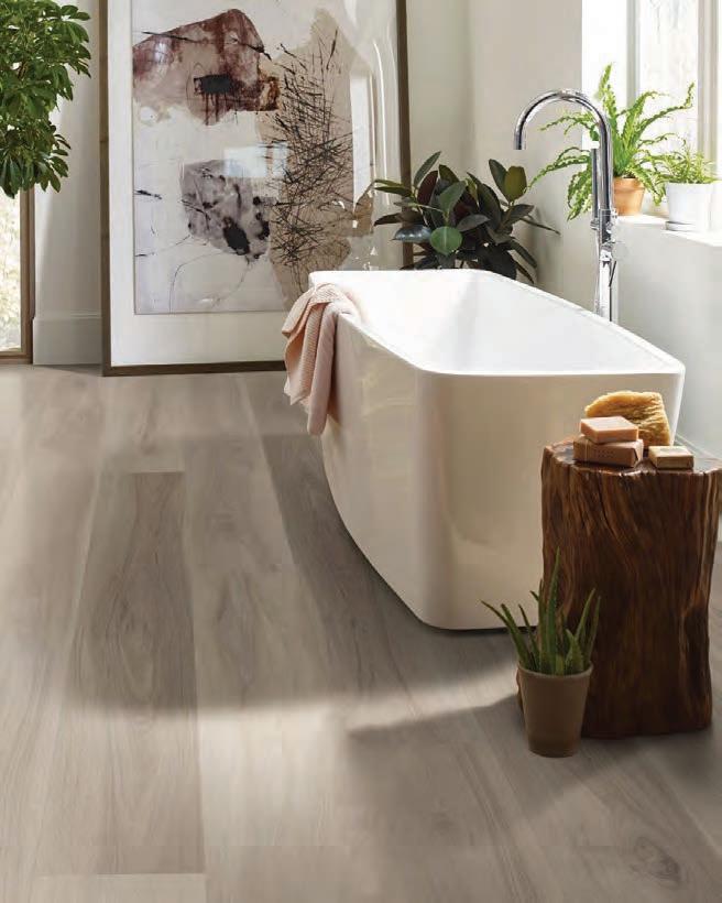


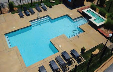

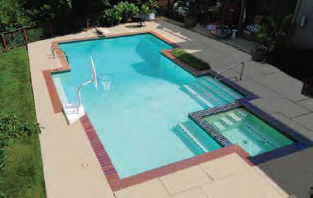
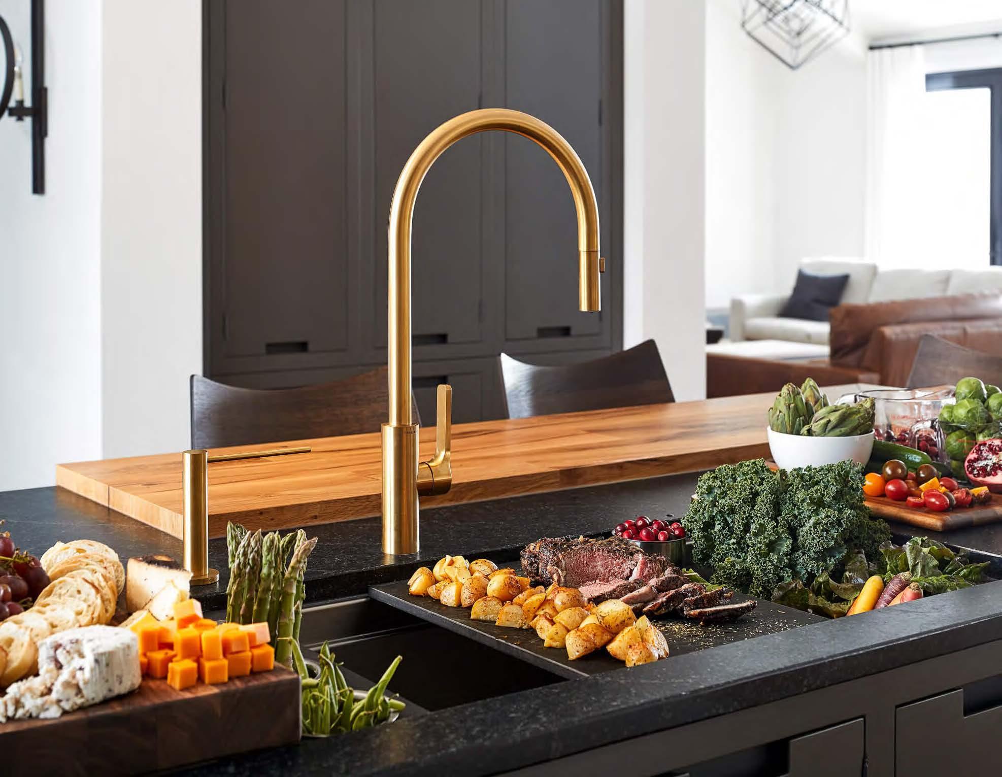
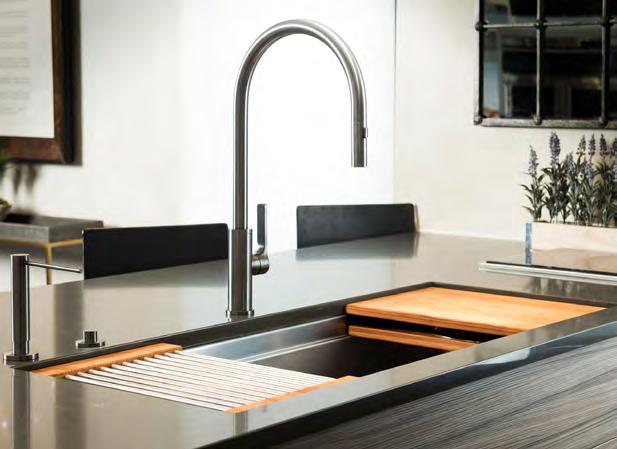


The Galley Workstation has quickly become the most used appliance in the kitchen. All meal preparation, cooking, serving, entertaining, and washing can be done using this fully functional Culinary System. By utilizing three tiers, you are able to layer Culinary Tools that slide above and below each other; positioning them in front of you when you need them and placing them underneath other Culinary Tools when not needed. Every task can be accomplished while working within the Workstation, not around it. All Culinary Tools can be kept in the system so they are ready to use when you are! Your kitchen will be ergonomic, efficient, clean, and so much more enjoyable.

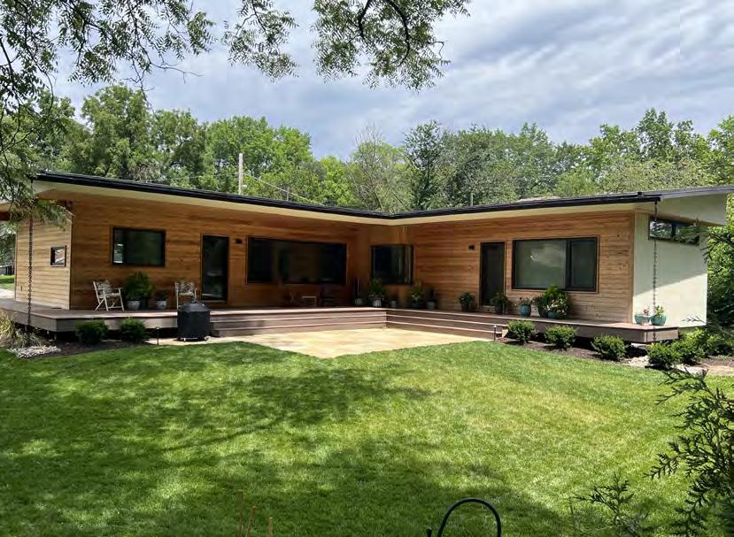

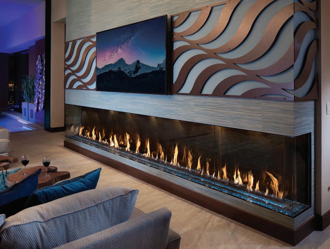


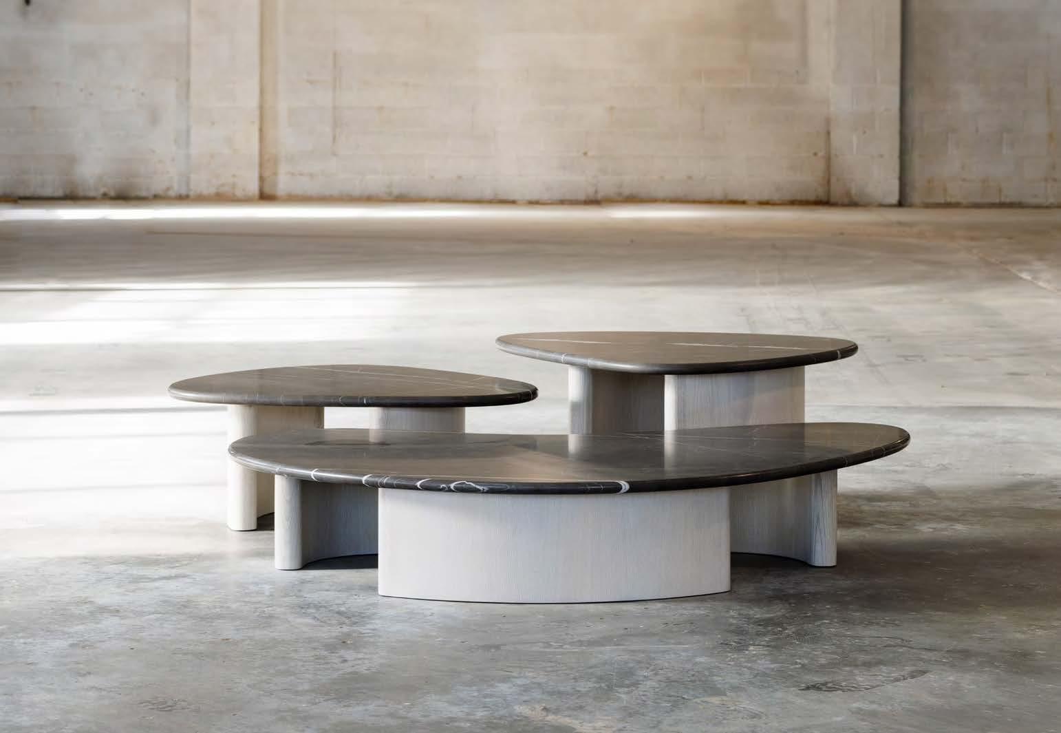
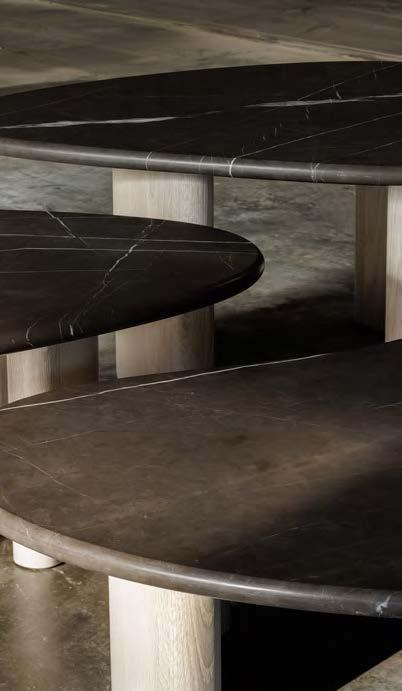


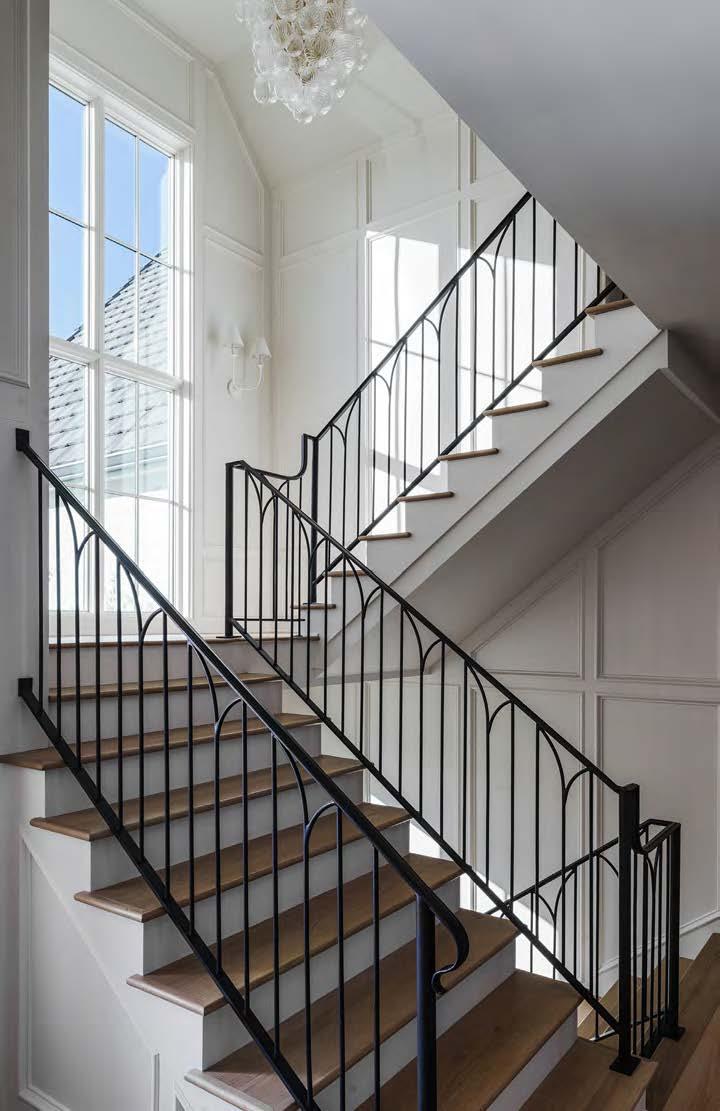
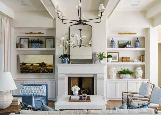
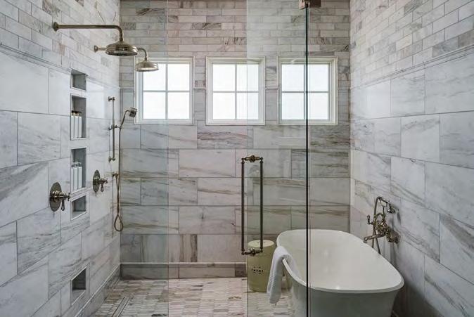
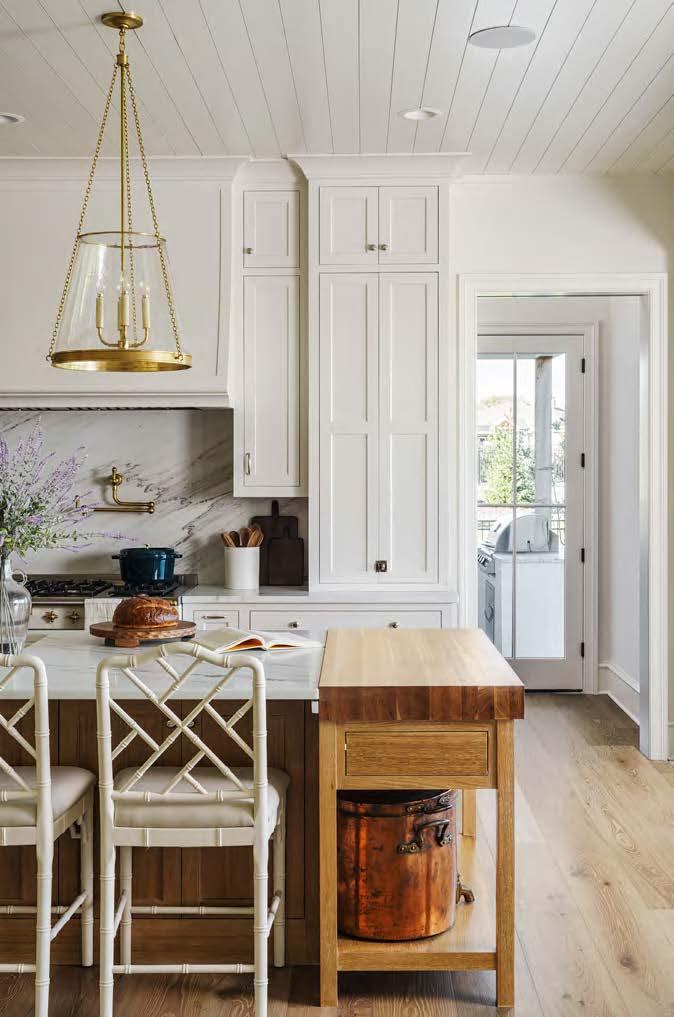
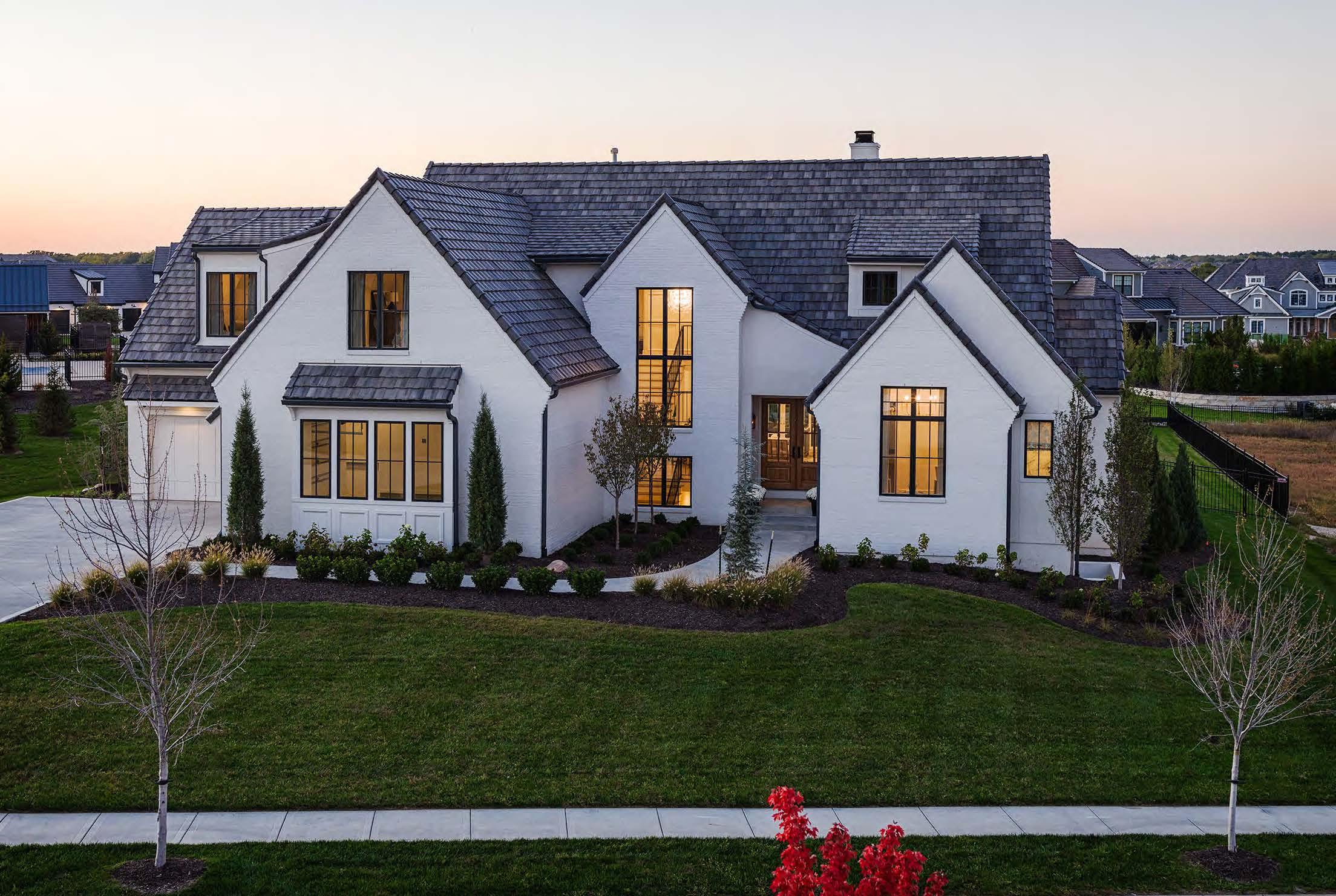

The home-design team had a clear thesis for this new build: to incorporate timeless English-style architecture into a modern design using natural materials and metal finishes reflective of a long-established home.
The exterior’s asymmetrical features are numerous and varied, consisting of soft swoops, large and stately gables, fully-painted brick with smooth acrylic stucco, large windows with an oversized and iron-colored grille pattern, a custom concrete-tile roof and, finally, a solidmahogany double door at the entry. The minimized soffits and complex roof design required great attention to detail to achieve their Old World look and ensure longterm waterproofing.
The English Arts and Crafts motif carries throughout the interior of this six-bedroom home. Its timeless finishes
include Italian marble, painted cabinets, European whiteoak flooring and a mix of metals—namely, custom iron railings and imported handmade fixtures from England in unlacquered brass and polished nickel.
The shared center line between the living room’s fireplace and the kitchen’s sink and range was nonnegotiable in the design. A custom Lacanche range from France anchors the space, balanced by a butcher block at the end of the island. A resort-worthy primary suite showcases applied beams and European whiteoak floors, carried through the ensuite bath featuring a water room, hand-cut marble, a volcanic-resin soaker tub and imported English fixtures. The furnishings fuse the traditional and modern elements with custom textiles, warm whites, soft blues and centuries-old antiques.
ARCHITECT: NSPJ Architects
@nspjarchitects
BUILDER:
Grace & Nell Homes @graceandnell
PHOTOGRAPHER: Matthew Anderson
@matthewaphoto View full project details.
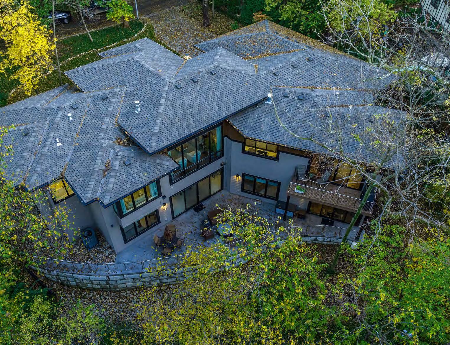

Embodying the spirit of the Modern Prairie architectural style, this home eschews excessive ornamentation in favor of various geometric shapes. It also draws from Earth’s five natural elements, incorporating a balanced warmth of wood, support of the earth, circulation of air, strength of metal and flow of water.
The property’s unique topography—marked by a steep slope abutting a flood zone—created engineering challenges as well as opportunities for living in a oneof-a-kind environment. Massive and numerous concrete piers support the house. The floor plan has also been ingeniously angled to harmonize with the natural wedge shape of the property. Though driven by necessity, this design choice contributed to the home’s individuality by
allowing the interior spaces to visually blend with the exterior landscape.
Proportional harmony with neighboring homes and expansive rear views required thoughtful design choices. The home’s facade, which blends into the surroundings, is defined by its linear configuration, fl at- or low-pitched hipped roof lines, deep overhangs and locally sourced natural stone.
A seamless collaboration between the architectural team, builder and designer resulted in specialized, innovative spatial solutions and aesthetic selections for the home—all focused on maximizing natural light, views and interior flow to create a distinctive and harmonious lifestyle.
ARCHITECT:
Bickford & Company
@bickymon
INTERIOR DESIGNER:
Will Brown Interiors
@willbrowninteriors
BUILDER:
Cobalt Construction
PHOTOGRAPHER:
Matthew Anderson
@matthewaphoto View full project details.

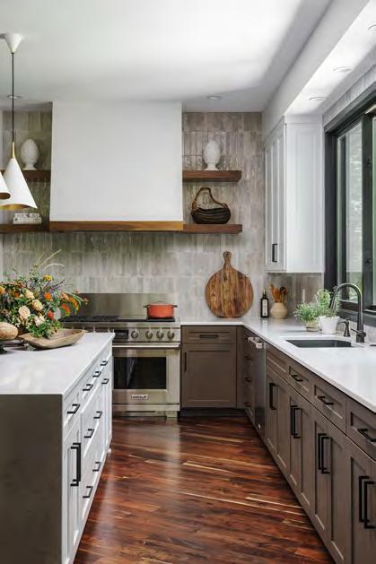
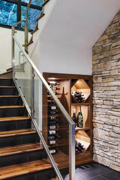
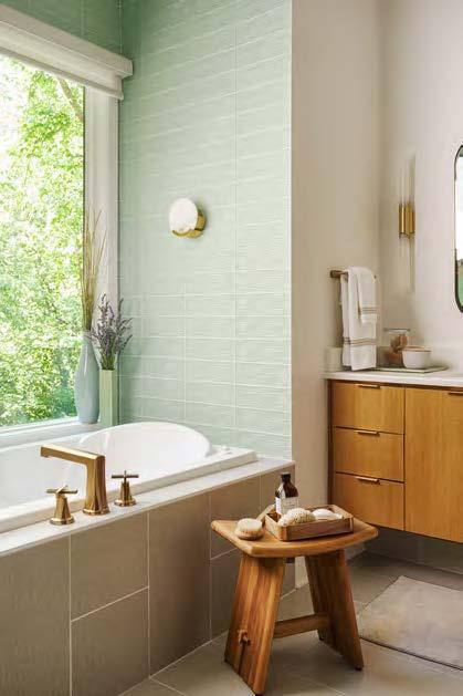
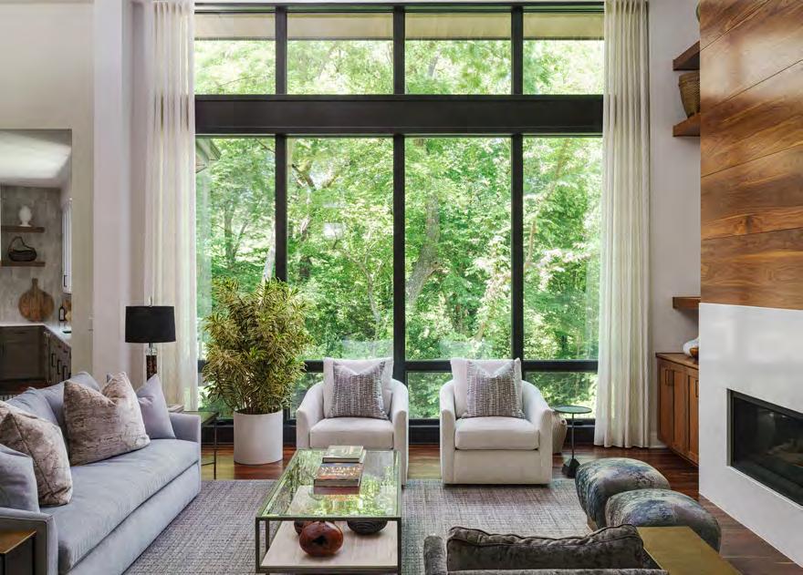
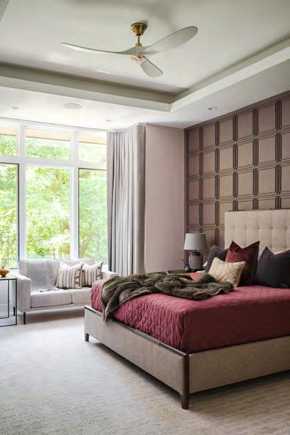
RESOURCES
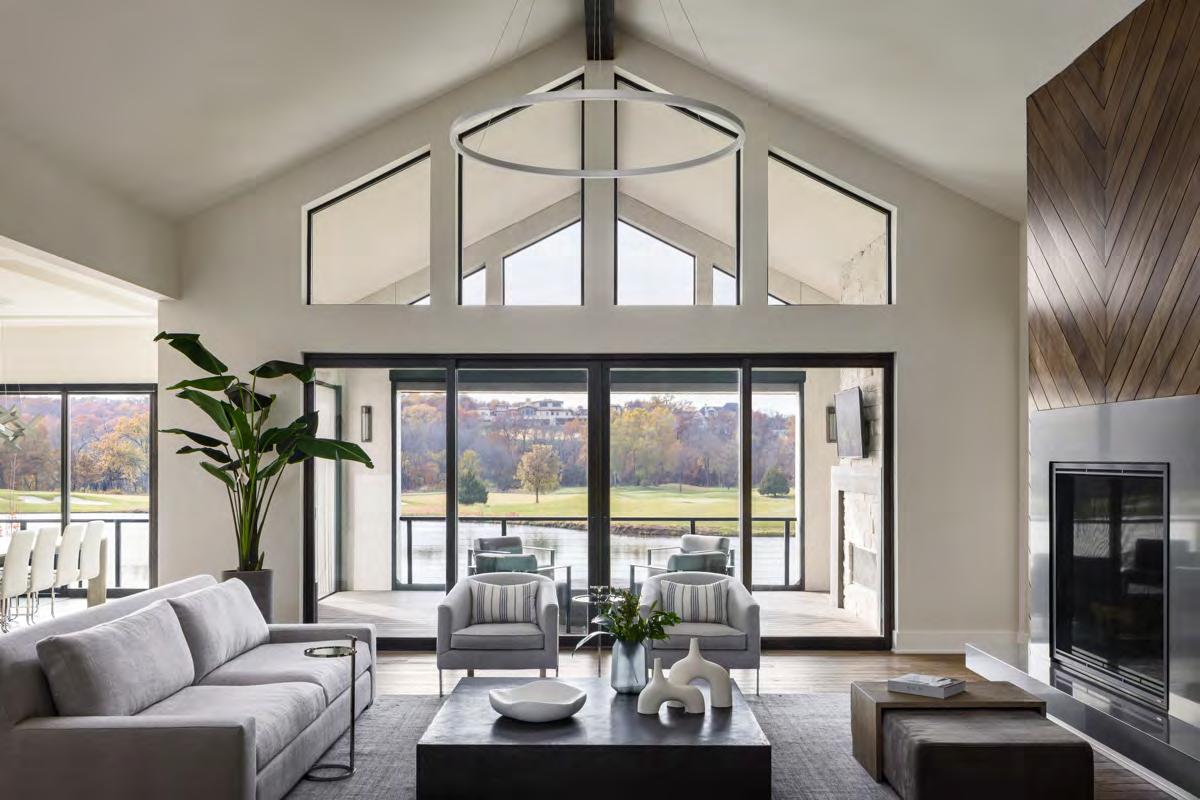

With their children off to college, this new empty-nester couple started the next chapter of their lives by building a custom home at Loch Lloyd. Choosing an expansive lot backing up to a small lake and the stunning golf course beyond, they wanted to capitalize on the views from inside and outside the house.
Beginning with the crisp symmetry of the home’s exterior, the modern coastal-inspired design embraces simple sophistication, clean lines and the feel of breezy, uncluttered elegance. The front of the house maintains the design’s modern lines and symmetry without revealing the four-car garage—split into separate, two-car garages facing one another. A large deck across the back features motorized, retractable screens that allow the couple to enjoy the Midwest’s spring, summer and fall seasons, as well as an unimpeded view of nature during the winter.
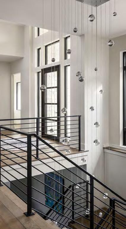
ARCHITECT:
Elswood Smith Carlson Architects
@escarchitects
INTERIOR DESIGNER:
Kristen Ridler Interior Design @kristenridlerdesign
BUILDER: Rodrock Homes
@rodrock_homes
PHOTOGRAPHER:
Nate Sheets
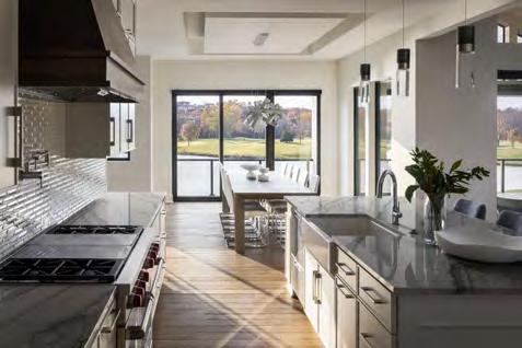
The home’s neutral interior palette of cool gray, white and blue tones ensures a quiet dialogue between its modern vibe and well-chosen antiques. The palette also resonates well with unexpected wood accents, including the curated stain on the rift-oak hardwood floors, a floating staircase fitted with a custom iron railing and numerous statement light pieces installed throughout. Artifacts gathered by the globe-trotting couple are creatively displayed alongside modern leather furnishings that are equally comfortable and aesthetically fitting. A hand-trimmed, chevron-patterned oak fireplace with a stone surround and hearth anchors the living room. Staggered custom oak shelves to the right of the fireplace and an offset floating hearth create asymmetry yet feel balanced. Modern shades in steel soffits protect against sunlight damage to furniture, art and flooring without compromising the view with draperies, blinds or shutters.
@natesheetsphoto View full project details.


ARCHITECT:
Wendlandt & Stallbaumer
@wendlandtstallbaumerarchitects
BUILDER:
Tom French Construction tomfrenchhomes.com
PHOTOGRAPHER: Keith Kreeger
@kreegerphoto
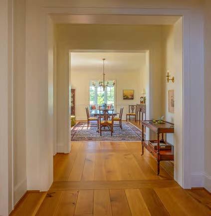
Initiated by a request to design the client’s next traditional home, this project culminated in a custom home rich in architectural details.
Located adjacent to community green space and a walkway, this home needed to balance openness and scenic views with privacy. The garages and a motor court strategically buffer one side while a stone wall and pocket gardens separate the front yard from the green space. The breezeway portico, complete with a cozy fireplace, enjoys southern exposure and is a welcoming entry point.
On the inside, the home’s floor plan is not the usual wide-open design so often seen these days; instead, numerous axial lines run continuously throughout the plan, providing the desired connectivity. These axial lines offer great viewing angles throughout the home, providing a “thrill of the journey” as one circulates through.
The first-floor primary suite serves as an internal focal point, though it is closed off for privacy. The dining room, sunroom, great room, kitchen and breakfast room all benefit from exposure to the green spaces.
The exterior combines traditional elements—like Hardie shingle siding and cedar trim—with warm stone accents. Conversely, the interior boasts a light, airy color palette, wide-plank wood flooring and comfortable millwork, creating an inviting and relaxed atmosphere. Though a new home, the warmth of old-home charm still abounds throughout this richly detailed residence.
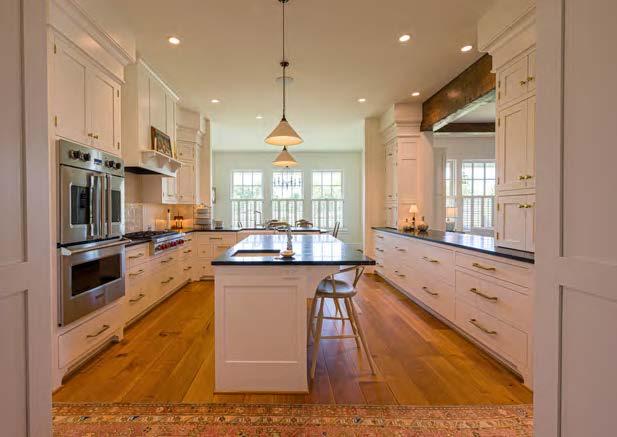

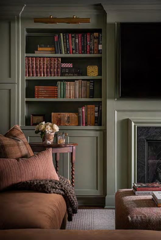

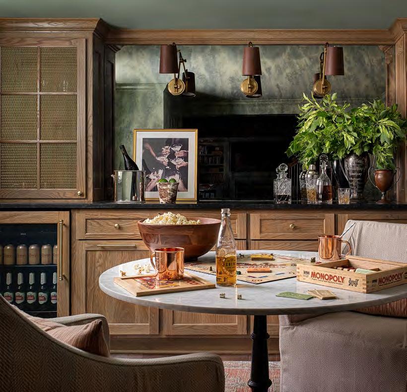

New Arrivals

From Europe
Expected In MarchPlease visit Website for more information
DIRECT IMPORTER OF EUROPEAN ANTIQUES
woodsonantiques.com
816.331.2701
318 West Walnut Street
Raymore, MO 64083
QUEEN VICTORIA ROYAL WARRANT WITH WAX SEAL (FRAMED 36.5 X 34”)
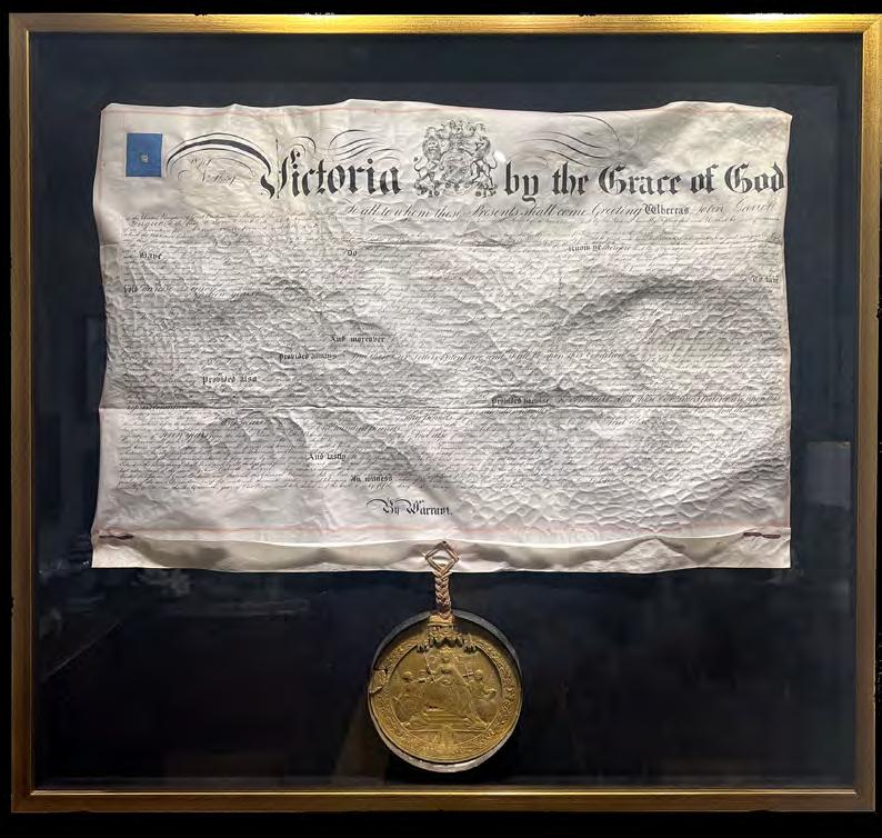


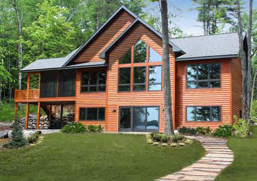

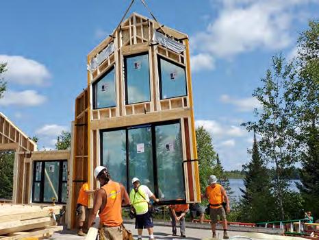


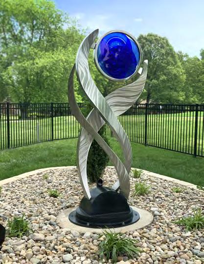





Countertops | Backsplashes | Wet Rooms
The finest selection of Granite, Quartz and Quartzite imported from Brazil and other parts of the world.


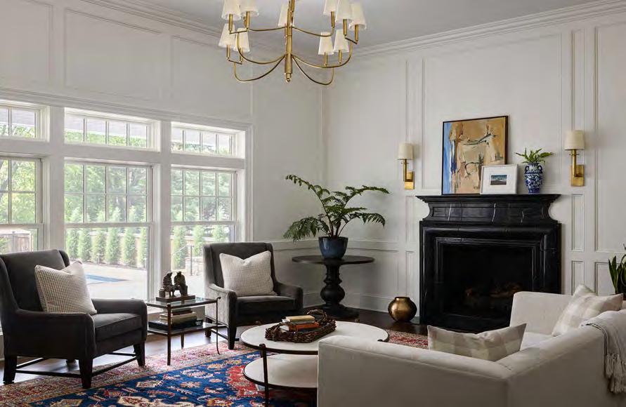
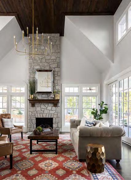
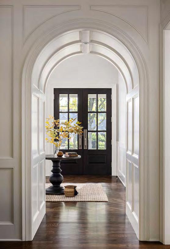
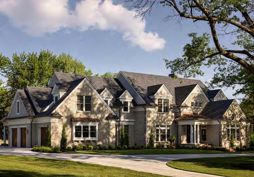
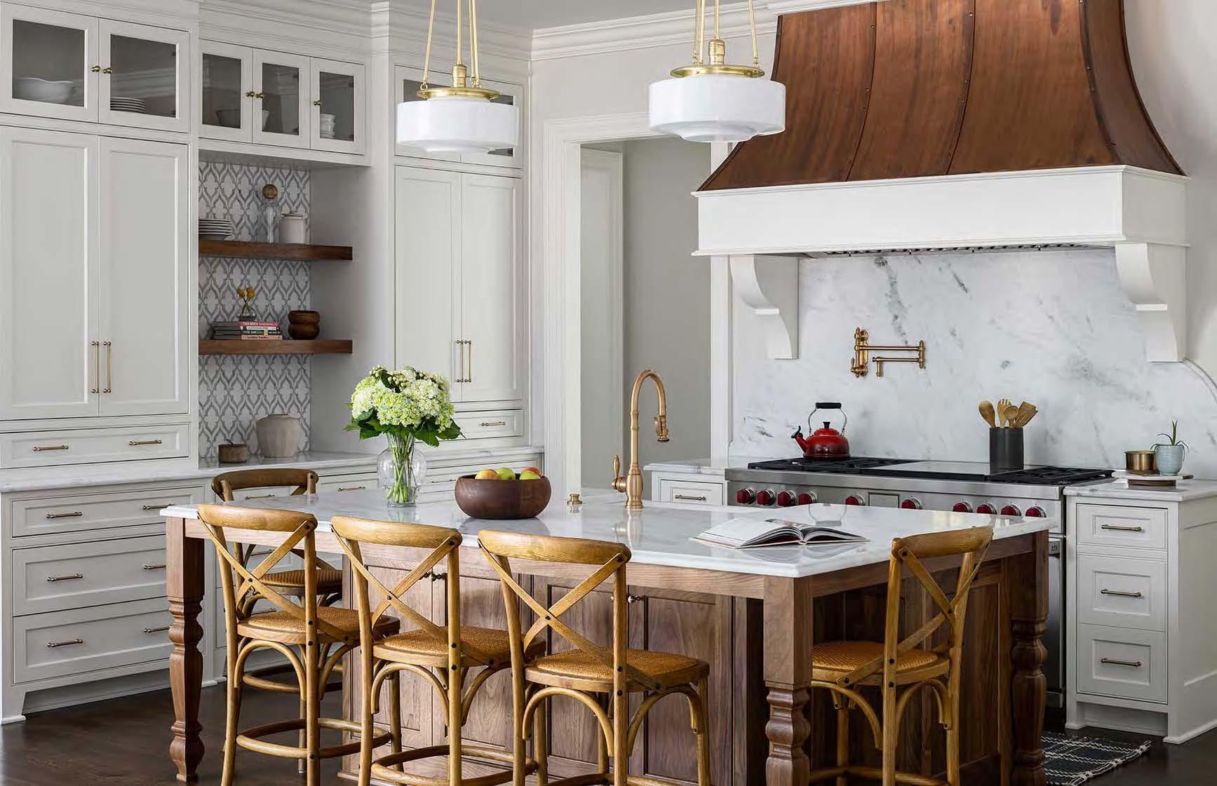

This custom home is meant to grow with a young family of five. Wanting it to feel timeless and classic without being predictable, the project team focused on product durability, functional practicality and a sensible layout. While designing such a large-scale home, the primary goal was to make the residence feel collected, traveled, curated and intentional rather than brand new—as if it came together organically over a long period of time.
Designed with the flexibility to handle all stages of life, the floor plan highlights important gathering spaces built for practical, everyday life, such as the great room that houses the kitchen, breakfast room and family TV room. A lower-level courtyard functions as a transition space from the rear covered patio downstairs to a recreational space with a bar, pool table, movie area and, most importantly, a full bathroom with a classy yet industrial speakeasy vibe and a tiered steam
shower. The sunroom—situated off the primary suite overlooking the pool—is a well-loved space for Mom and Dad.
The home’s color palette incorporates shades with neutral undertones—gray for the library, charcoal navy for the laundry and a muted forest green for the butlery and basement bathroom. These choices help break up the monotony of white and walnut cabinetry throughout and will pair well with future design updates. Varied finishes—crystal knobs on the main level; polished nickel in the primary bathroom; aged brass in the kitchen, bar and laundry; and matte black in the boys’ bathrooms— were used strategically throughout the home to give it a sense of having naturally evolved. Each living space, bedroom and bathroom stands out with its own unique ambiance and style while seamlessly integrating into the whole design.
ARCHITECT: Wendlandt & Stallbaumer @wendlandtstallbaumerarchitects
DESIGNER:
Kara Kersten Design
@karakerstendesign
PHOTOGRAPHER:
Nate Sheets
@natesheetsphoto View full project details.
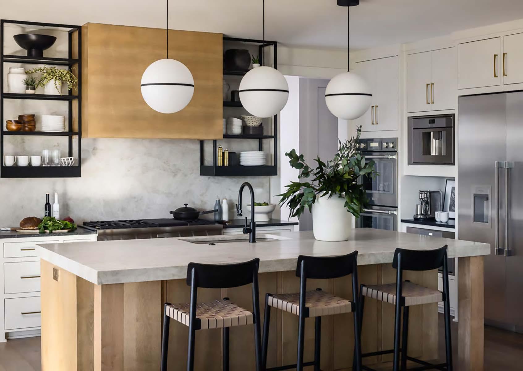

After purchasing this house in mid-construction, the owners pivoted from their original selections and brought in the designer to help choose materials that felt more personalized to their own needs and style. They appreciated modern elements but wanted their home to avoid the “cold” tone that sometimes accompanies a strictly modern house. The earthy, modern aesthetic of their decisions now reflects their warm, inviting personality— accentuated by smart and edgy design choices—while using materials that elevate each room with intention. Customized tweaks to the countertops, tile, cabinet color and lighting resulted in significant differences in style.
Since the homeowner planned to work from home, they converted a pantry into an office. A custom black metal-and-glass wall gives the converted space a sense
of privacy, expansion and openness, helping optimize its small size. The trim goes three-fourths of the way up the wall, with a trim board along the top for a ledge effect. In the two-story great room, the designer faced the challenge of a large space with high ceilings, an extended hearth and a floor-to-ceiling stone fireplace—all contributing to a vast blank space on the wall to the left of the fireplace. To bring balance, texture and scale to the room, she selected grasscloth in a warm-neutral shade that plays nicely with the gray fireplace stone. She then leaned—rather than hung—a sizeable art piece against the wall for an effortless look. The entire home feels comfortable yet still elevated, intentional yet not stuff y, with a variety of small, smartly placed details that help to amplify the intended effect.
INTERIOR DESIGNER:
Claire House Design
@clairehousedesign
BUILDER:
Fieldstone Homes
@fieldstonehomeskc
PHOTOGRAPHER:
Nate Sheets
@natesheetsphoto

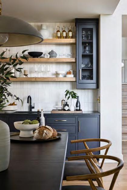
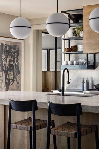

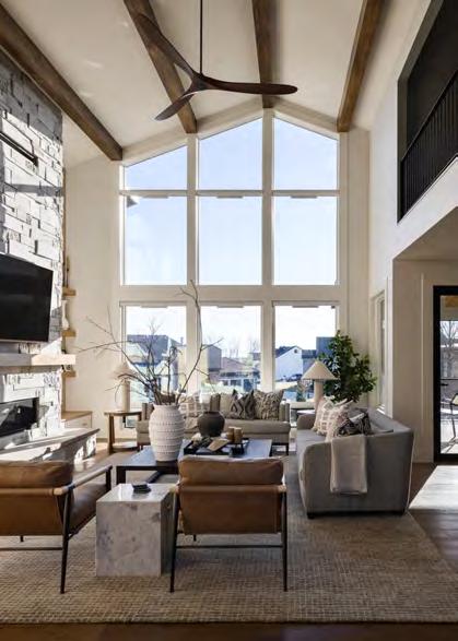
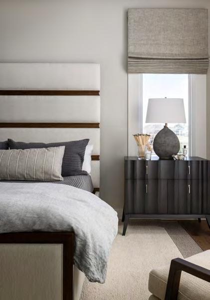
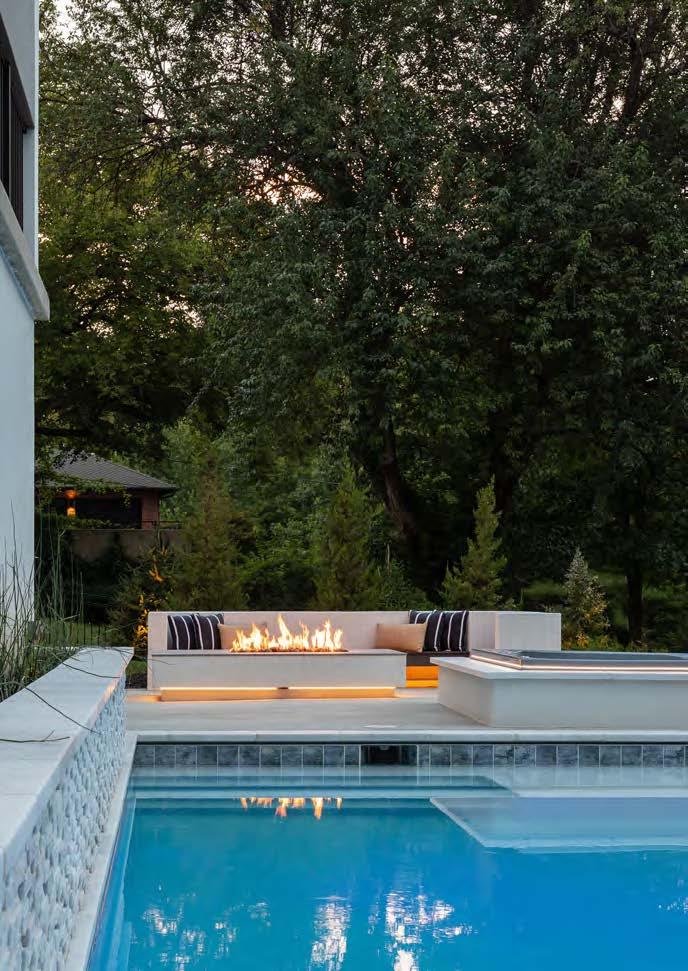
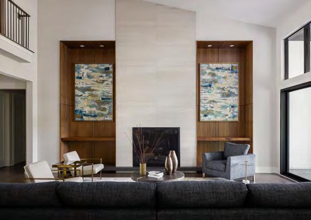
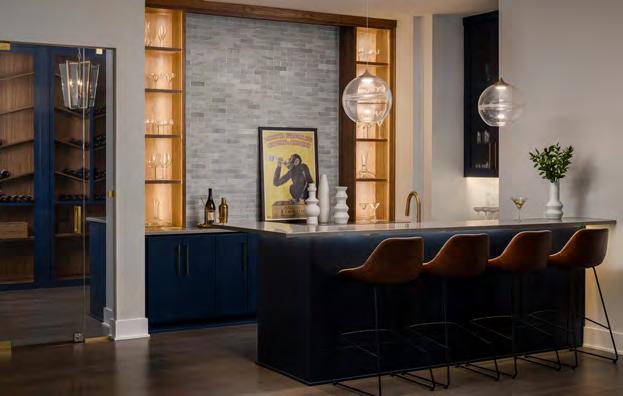
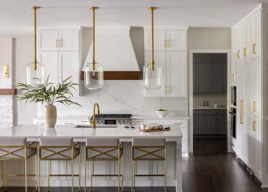

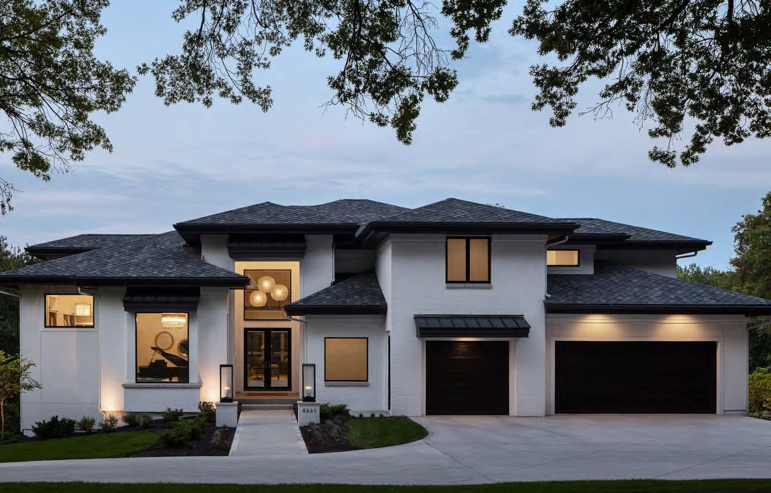

Riffing off a coastal-style home that inspired them, the homeowners sought a well-appointed retreat from life’s hectic pace for their family while still creating a hub for kids to gather and spaces to entertain friends both indoors and out. By marrying classic transitional designs with mid-century charm, this home has evolved into a warm, organized, personalized residence.
The floor plan incorporates everything on the entertainment-friendly wishlist, including a wine cellar, a full-sized sports court and a lush, sheltered outdoor living space with a pool and a fire feature. Additionally, there are quiet places throughout the home for the couple to escape to for relaxation. In addition to embracing a soothing, neutral palette
of creamy whites and various ocean-hued blues on custom cabinets and artwork throughout the home’s interior, the finishes contribute texture to the overall mood. The great room introduces the use of wood accents found across the expansive home, with gorgeous custom shelves fl anking the extralarge gas fireplace. A handsome bar downstairs also repeats the wood-accent motif. Gleaming marble quartz on the kitchen’s countertops and an oversized waterfall island channel the minimalist tone repeated in the house, such as the mosaic marble-tile floor found in the spa-like primary bath and the mainlevel powder room. Juxtaposed against the subdued color scheme are dark-stained rift-oak wood floors, polishing off the design with some chic contrast.
ARCHITECT:
FRK Designs
INTERIOR DESIGNER:
Kristen Ridler Interior Design @kristenridlerdesign
BUILDER:
Rodrock Homes @rodrock_homes
PHOTOGRAPHER:
Nate Sheets @natesheetsphoto
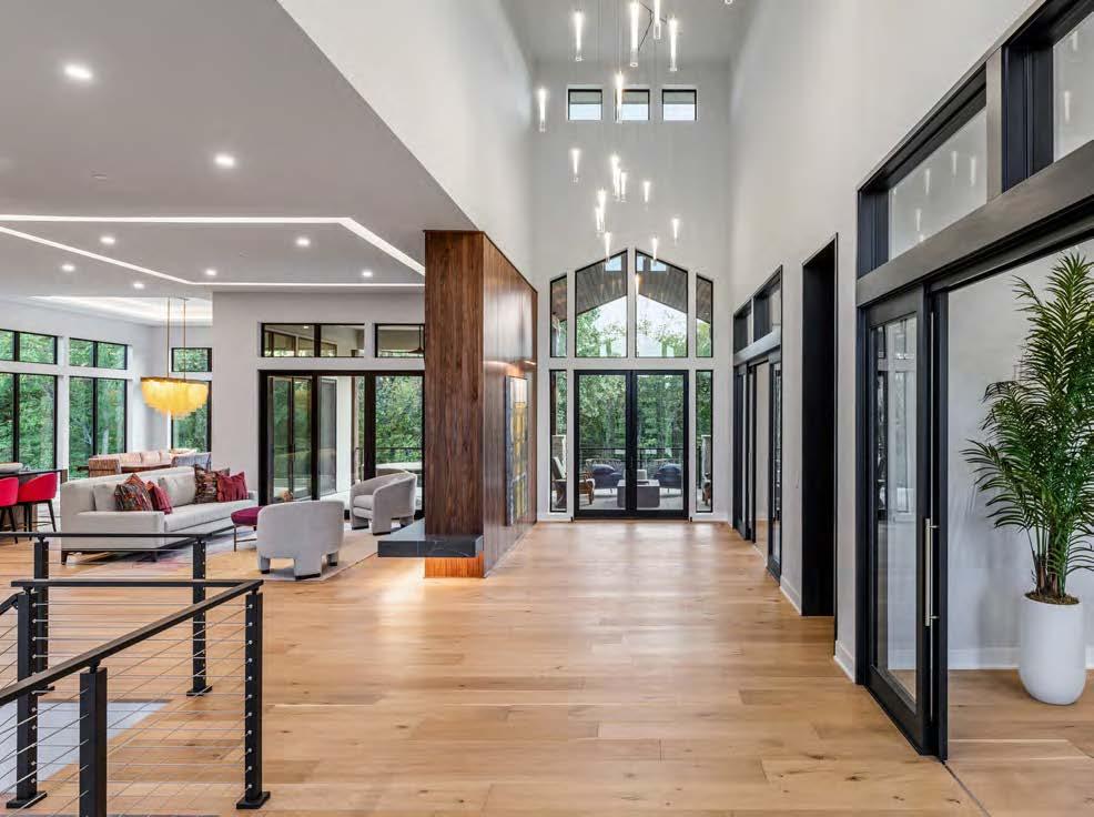
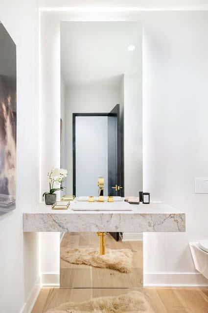

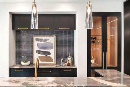
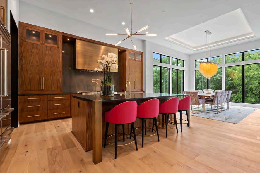
Engineer: HD Engineering & Design Cabinets: Cabinets by King Countertops: Kenny’s Tile Landscaper: Next to Nature Landscape
Lighting Fixtures: Wilson Lighting New Home Community: Wolf Valley Ranch / B.L. Rieke Development Painter: JL Painting LLC
Plumbing Fixtures: Prairie Center Plumbing, Heating & Air Conditioning Siding: Advantage Construction
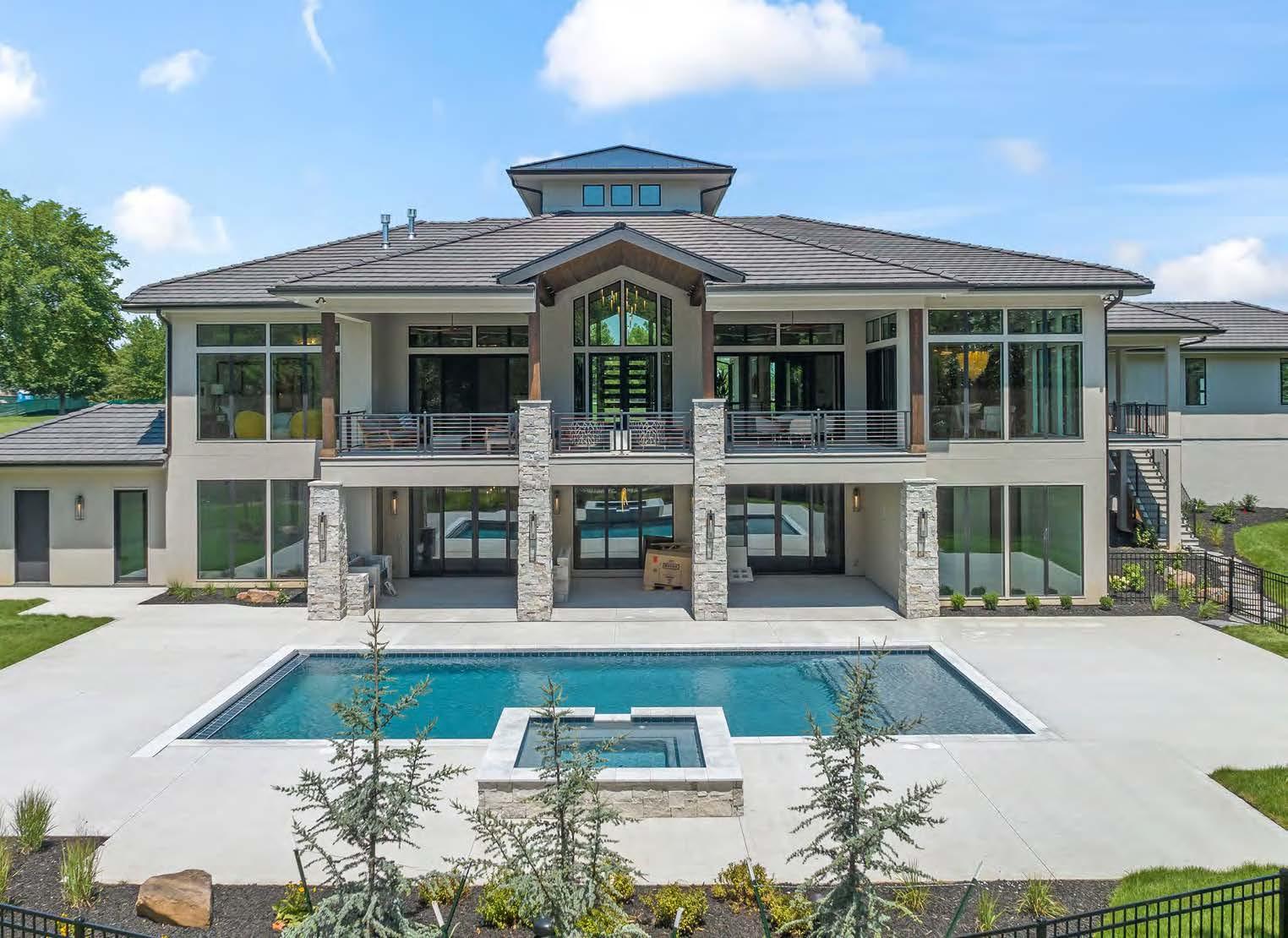

The vision for this custom home revolved around the client’s desire for privacy, warm contemporary design and the ability to take advantage of the property’s incredible views. They visualized a place where their family could easily gather and enjoy the spacious floor plan. The 10-acre lot features an ideal location, so incorporating views of the expansive property into each room was a top priority. Given its purpose as a future entertainment hub, the home was designed to include dedicated space for occasional chef stays and various pet amenities for the dog-friendly family. Overall, this design masterfully combines modern style, family-centric features and a seamless connection to nature. One of the project team’s challenges was balancing the
home’s modern design with the desired family-friendly atmosphere. Additionally, integrating a fully-equipped kitchen on the lower level while maintaining a solid connection to the natural surroundings presented technical challenges. Logistically, the team carefully planned for adequate, well-organized space for all the client’s vehicles, equipment and new built-in car lifts.
The team’s thoughtful design approach allowed more opportunities for large, scenery-facing windows on the back of the house. Their approach also ensured the home’s present and future ability to accommodate accessibility and multi-generational living needs by incorporating an elevator and an additional first-floor bedroom.
INTERIOR DESIGNER:
Groover Interior Design @groover_id
BUILDER:
Starr Homes @starrhomes
PHOTOGRAPHER:
Matthew Anderson @matthewaphoto



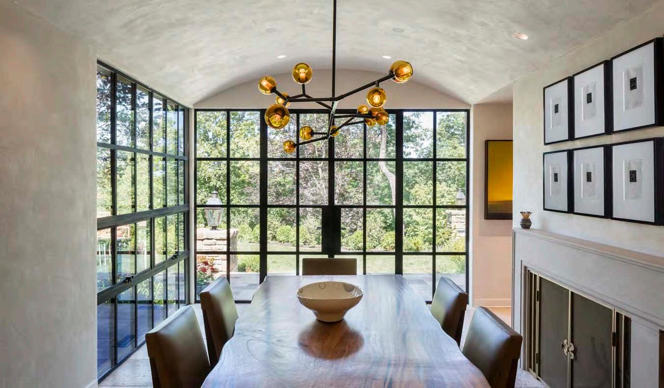


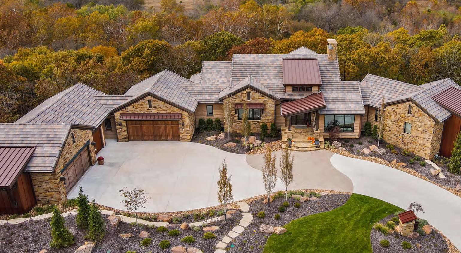
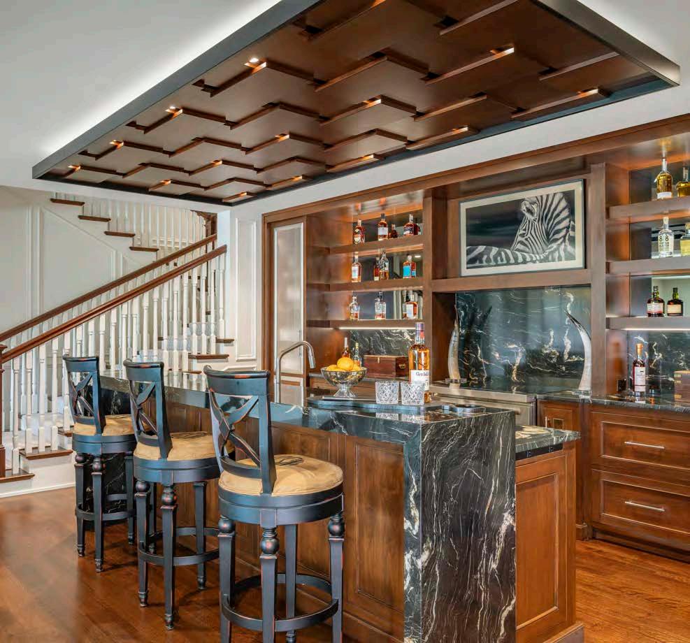
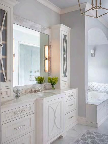
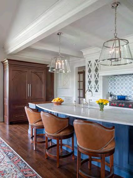
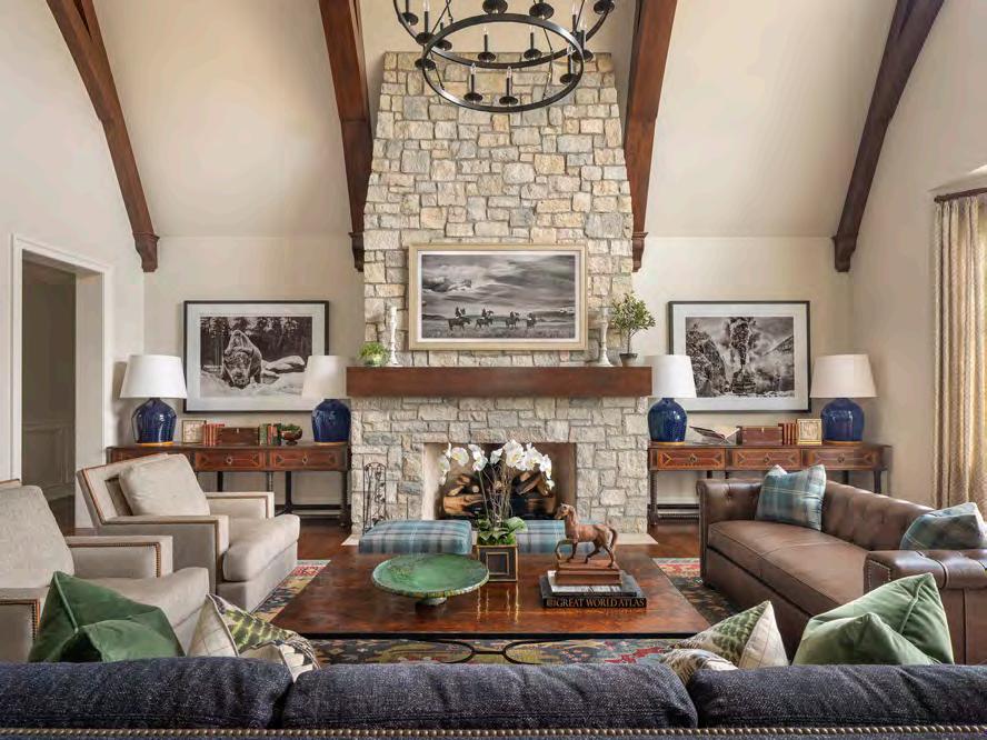
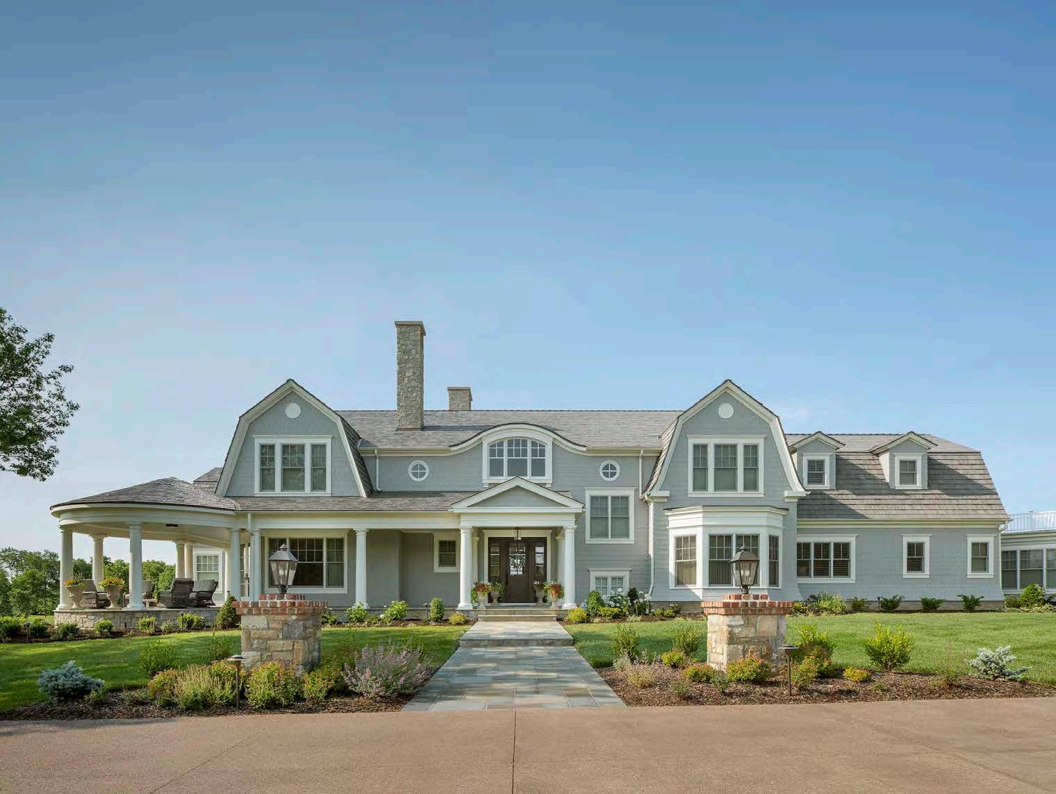

This dream home was inspired by the architecture unique to Cape Cod. In addition to comfortably serving the family and future grandkids, the owners like to entertain and host philanthropic events. Thus, the ill-suited existing house was razed and a new house was reoriented with a new entry and driveway, as well as an eight-car garage. With the driveway now twice as long, the team seized the opportunity to create a well-landscaped serpentine driveway with plenty of room for two cars to pass when coming and going. The breezeways are also impressive, making quite an entrance into the home.
The interior spaces were designed from the floor up with Turkish rugs custom-sized to fit the large rooms. The owners opted for hardwood floors, divided into three sections with a herringbone pattern, in a hallway that spans the entire first
floor. Window casings and frames painted a deep-ocean blue distinguish them from the space, adding contrast.
The lower level required a substantial time to design. The bar ceiling, for example, was developed in collaboration with the cabinet maker to create visual interest and add subtle lighting. The back and sidebar cabinets also boast a metal-edge detail that sets them apart.
In addition, the project team replicated the circular concept of the kitchen’s eating area in the space directly below it, creating a yoga room with a bamboo floor and plenty of windows to bring in the sunshine. The remaining lower-level space incorporates a workout area with a spa and cold-plunge tub that connects to the swimming pool outside.
ARCHITECT:
NSPJ Architects
@nspjarchitects
INTERIOR DESIGNER: SID & Company
@sidandcompany
BUILDER:
Holthaus Building holthausbuilding.com
PHOTOGRAPHER:
Bob Greenspan
@the.architectural.photographer

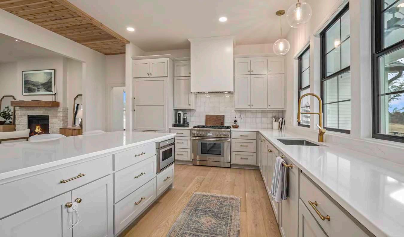
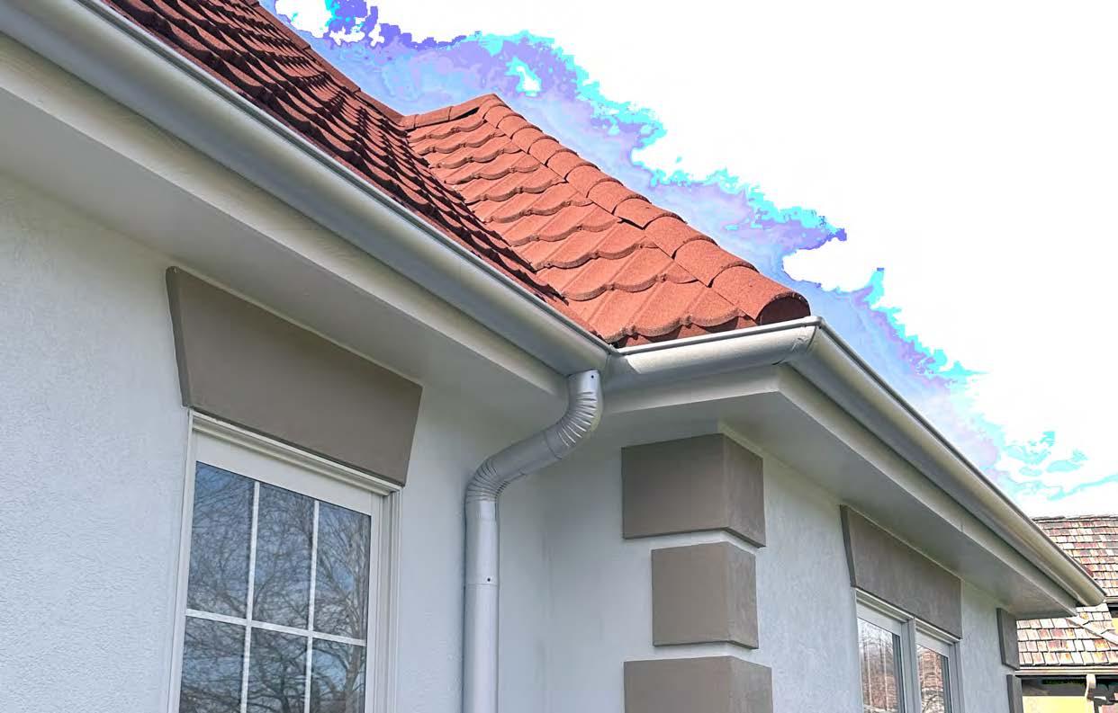


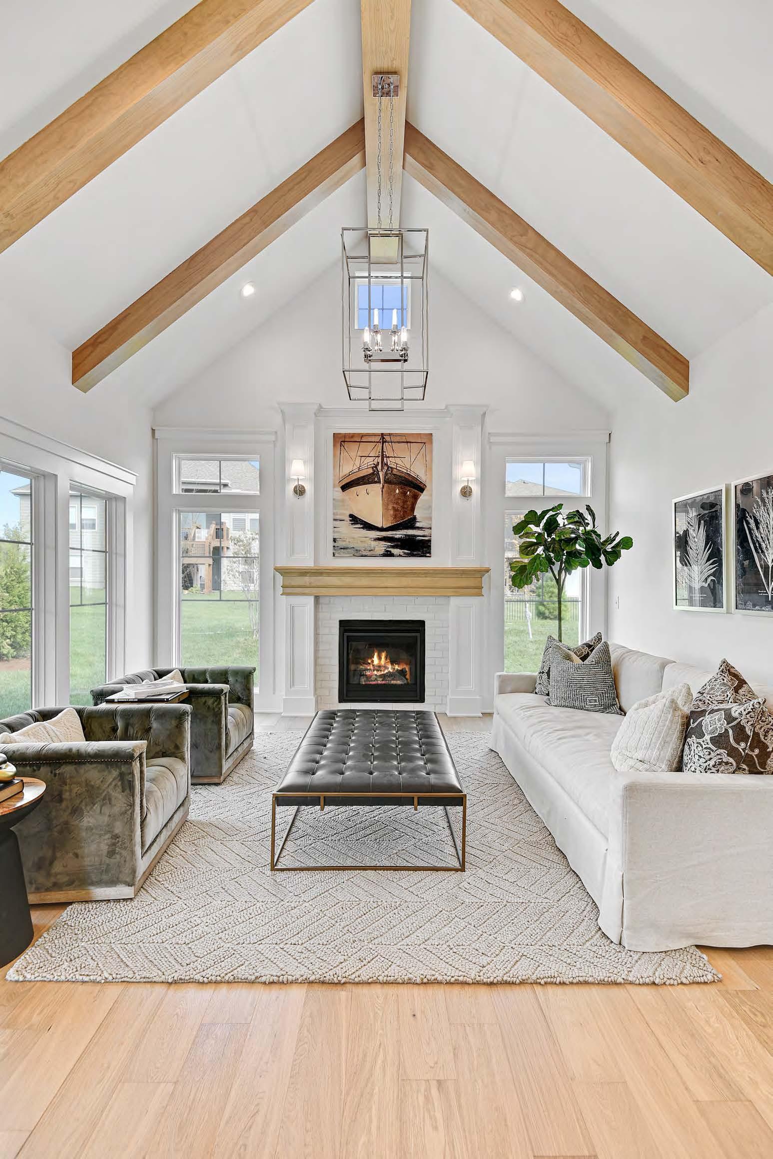

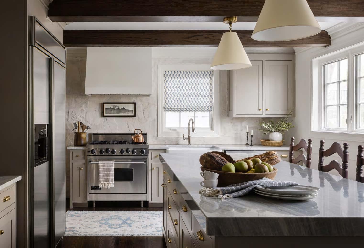

The vision for this project was to restore the home to its Cape Cod roots through material choices and architectural design. The home suffered from a previous DIY remodel, so the design team started by stripping out nearly every piece of gray, weathered barn wood that had been added throughout. They also removed random-designed elements like faux Colonial pillars in the living room and dining room and rusty metal sheets in the vaulted ceiling of the primary bedroom. New millwork with traditional profiles better matches the intended style of the home.
Several working areas like the mudroom and kitchen lacked functionality, and the bathrooms needed characterdefining elements. The house did not have grand, expansive rooms, so the designers thoughtfully considered how the layout and floor plan functioned.
To improve the kitchen, they installed custom-inset cabinetry, relocated some of the appliances and doorways to accommodate more cabinetry, and created functional storage solutions. The team also refinished the hardwoods in a traditional dark walnut color and freshly painted the walls. New furnishings and window treatments complete the look of a traditional Cape Cod home.
RESOURCES
INTERIOR DESIGNER:
Collected Living Design
@collectedlivingdesign
PHOTOGRAPHER:
Nate Sheets
@natesheetsphoto
View


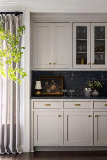
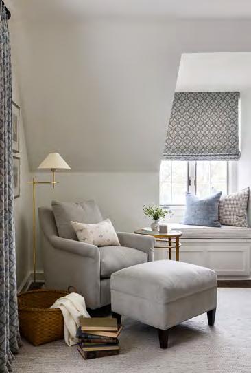
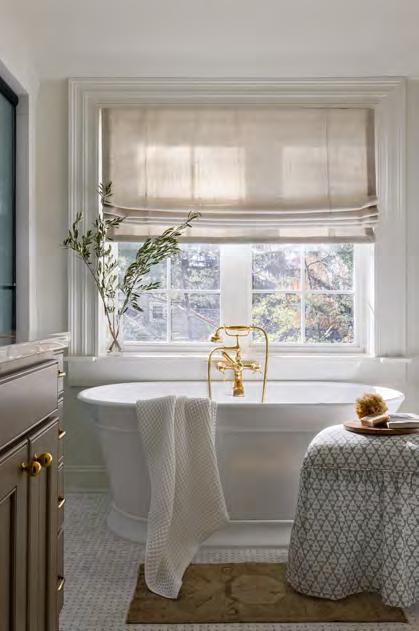

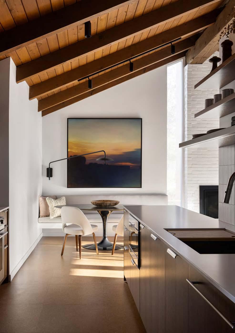
RESOURCES
Accessories: Convivial Production; Happy Habitat; Katherine Moes; Vitra; Urban Mining Vintage
Appliances: Bosch; Sub-Zero; Fisher + Paykel Cabinets: Royal Fixture Company
Countertops: Carthage Stoneworks, Central Surfaces Fabrication: Matt Castilleja; Matt Schmitz Makes
Flooring: Expanko via Greenplanet Sales Furnishings: Pure Workplace Solutions (Knoll); John A. Marshall (Herman Miller); Museo; Hedge House Furniture Rugs: The Rug Studio Window Coverings: Romanzia
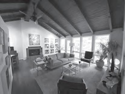
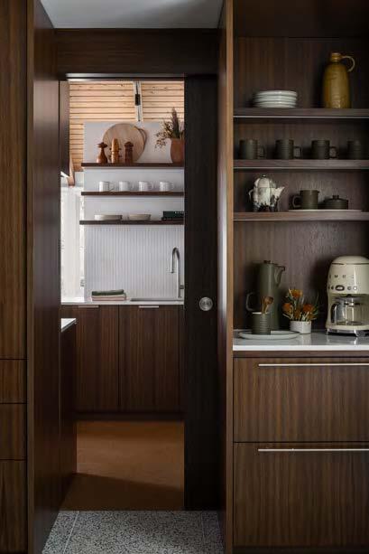

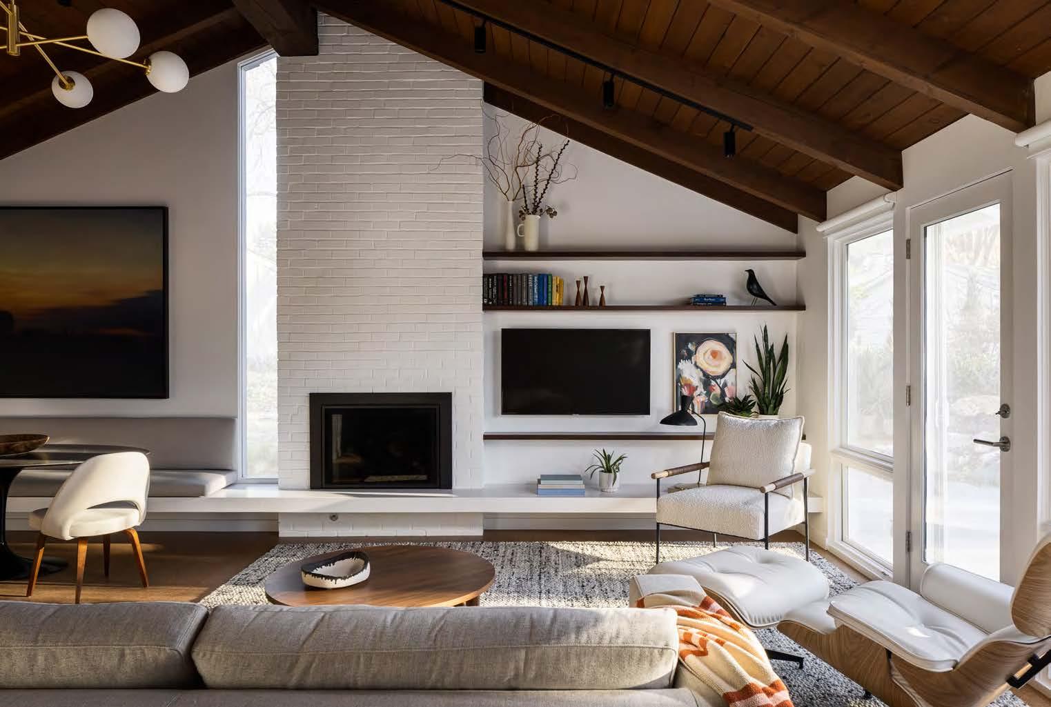

The homeowners’ vision was to update their prized Don Drummond home for modern living while preserving its mid-century style. Like most Drummond-built homes, it lacked a basement or attic for storage, and its dark, enclosed rooms limited outdoor views. The clients—an artist and a musician—wanted to add functionality while elevating the finishes, plus integrate eco-friendly and locally sourced materials, furniture, artwork and accessories as much as possible. Timeless design choices were also essential to the project team, who kept Drummond’s vision in mind as they brought integrity back to the interior.
The design team restored the tongue-and-groove wood ceiling and added a tall window to maximize the amount of natural light and openness. Next, they uncovered the original brick fireplace and updated the hearth to expand across the entire elevation, transitioning into a platform for the dining banquette. The wall between the kitchen and living room was shortened to let in shared daylight.
Thoughtful details, such as a coffee bar, refrigerator drawers and appliance storage, put the conveniences of modern life within reach. New open shelving and pocket doors make the whole space feel grander than before. Custom cabinetry—in period-appropriate walnut, of course—solves storage issues in nearly every room.
INTERIOR DESIGNER:
Lisa Schmitz Interior Design @lisaschmitzinteriors
CONTRACTOR:
Schmitz Remodeling schmitzremodeling.com
PHOTOGRAPHER:
Nate Sheets
@natesheetsphoto
View full project details.
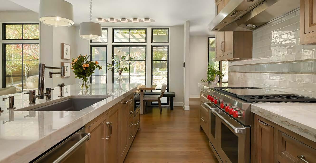
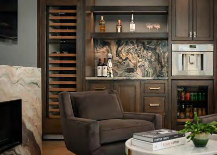

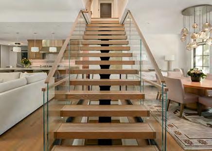

Tasked with revamping an early 2000s-built home with bigger, brighter and more modernized spaces, the project team first installed floor-to-ceiling windows in the living room, dining room and study. This simple change immediately flooded those rooms with light. The owner also wanted automated shades for every window that would disappear when raised, so the team installed shade pockets with hidden boxes in the ceiling.
Updates to the kitchen also significantly improved the style, but the floating glass staircase at the center of the house proved to be the real design star of the whole remodel. It was also the most challenging aspect, requiring extensive engineering to make it happen. The steel-beam tub supports the floating treads while the glass panels are securely attached for a seamless appearance. The addition of this staircase opened up the main living spaces, creating a stunning centerpiece.
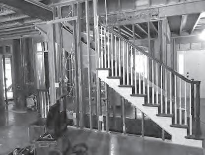
In the study, full quartzite slabs added to the fireplace surround and bar backsplash bring a touch of elegance and continuity. Similarly, the large-scale tiles on the living room fireplace create a dramatic look with minimal grout lines. These and other design choices helped modernize the house, transforming it into a chic and timeless residence.
ARCHITECT:
NSPJ Architects
@nspjarchitects
INTERIOR DESIGNER:
SID & Company
@sidandcompany
CONTRACTOR:
Homoly Design + Build
@homolydesignbuild
PHOTOGRAPHER:
Samantha Ward
@samanthaward_photography
View full project details.


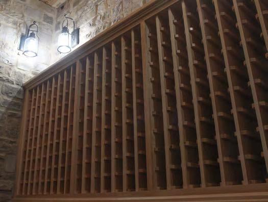
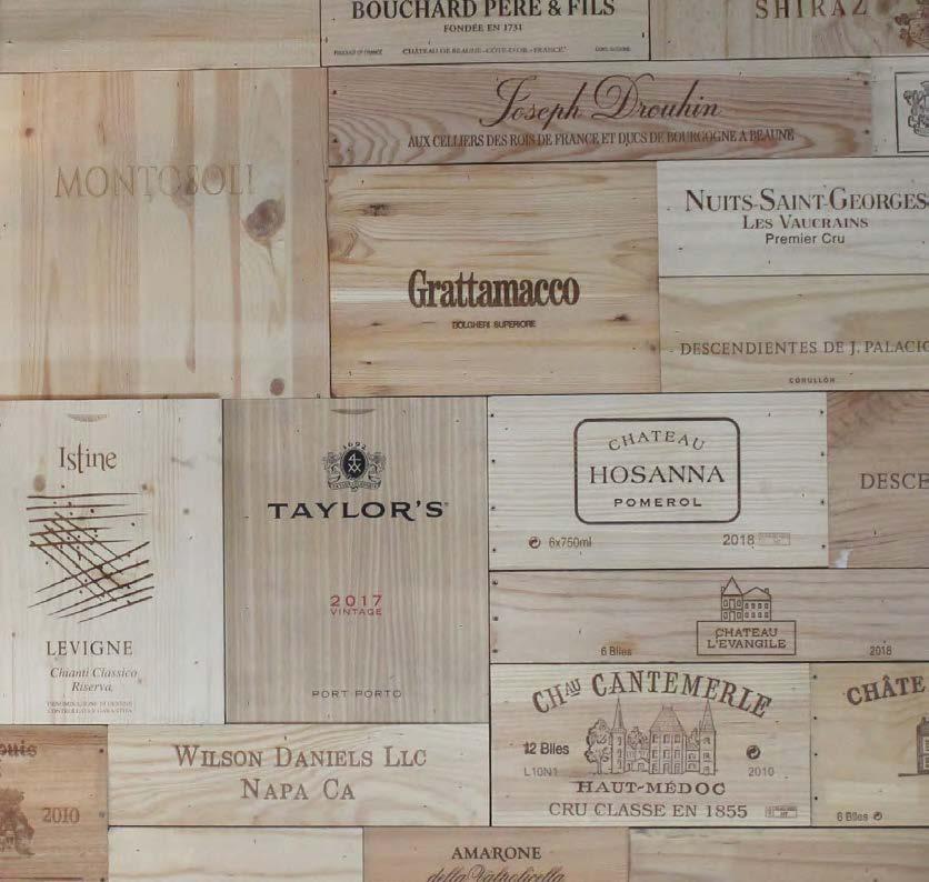


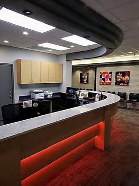


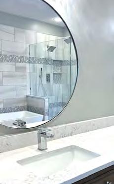

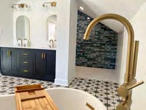

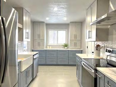


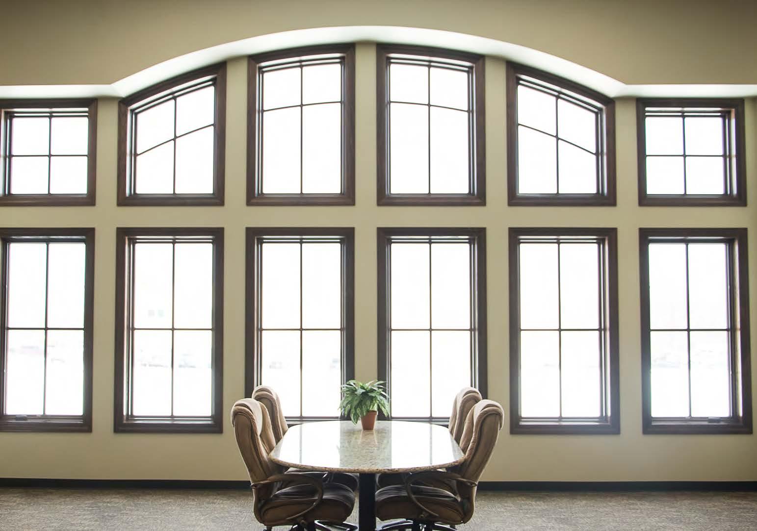


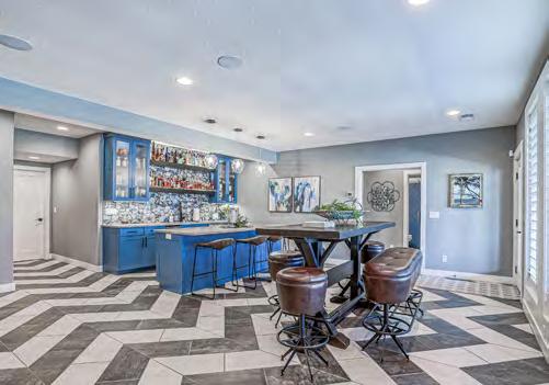

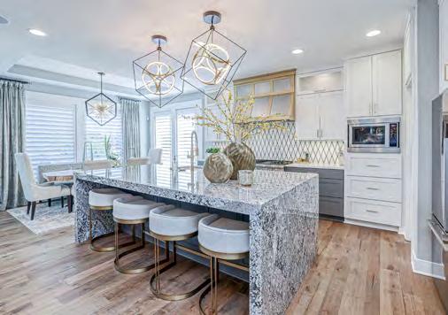
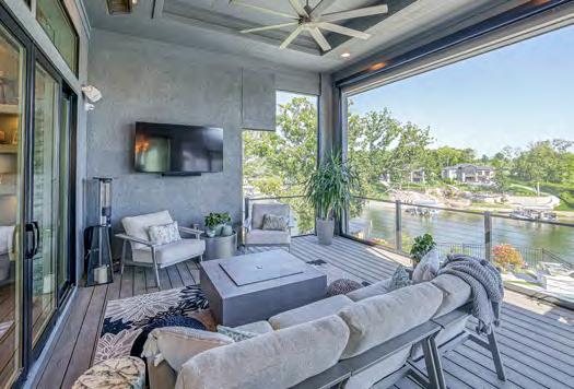
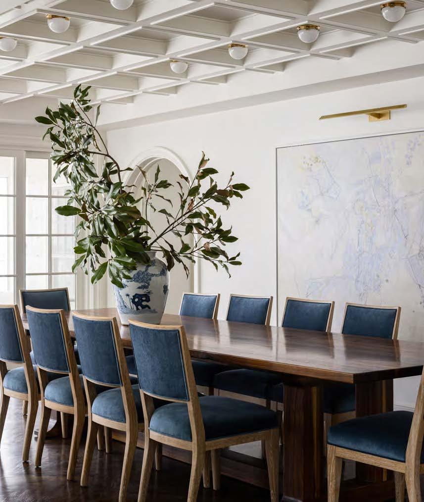

After living in their home for several years in a neighborhood they adored, the owners decided to stay and make their current house perfect for their young family—one that would include a larger kitchen, open family room and updated primary suite. They also wanted the home to reflect the classic architecture of the original design, which was traditional and clean but with touches of color and flair in the furnishings.
The project scope consisted of a generous two-story addition to the back of the house and a complete renovation of all spaces within the original structure. The design team tried to restore any of the original charm torn out in the renovation, including salvaging an original arched doorway in the entryway and precisely replicating it for an additional archway into the new addition. Extensive millwork was added to many spaces to recreate the feel of a traditional home.
One design challenge during the project was making the kitchen feel unique and classic while retaining approachable, family-friendly functionality. Another was working with the floor plan to fulfill the clients’ desire to seat a party of 12 in their dining room. The team tackled these challenges by incorporating a generously sized island that easily adapts to daily life and large gatherings. The design team selected honed quartzite countertops and a warm paint color to highlight this feature. A reeded design also runs from the tall glass cabinets to the millwork panels on the island.
For the clients’ eldest daughter, the designers created a playful color-dip design with peachy-pink paint and finished the room with twin beds, making it perfect for sleepovers. Meanwhile, they added a soft mink color in the primary bedroom to create an enveloping retreat, topped off by a chandelier and four-poster bed. The finished product is clean and light, with a fun yet refined use of color and pops of whimsy.
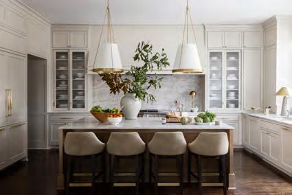
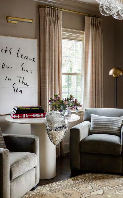
ARCHITECT:
Elswood Smith Carlson Architects @escarchitects
INTERIOR DESIGNER: Kobel + Co @kobelandco
CONTRACTOR:
Noblit Didier
@noblitdidierconstruction
PHOTOGRAPHER:
Nate Sheets
@natesheetsphoto
View
RESOURCES
Countertops: Carthage Stoneworks
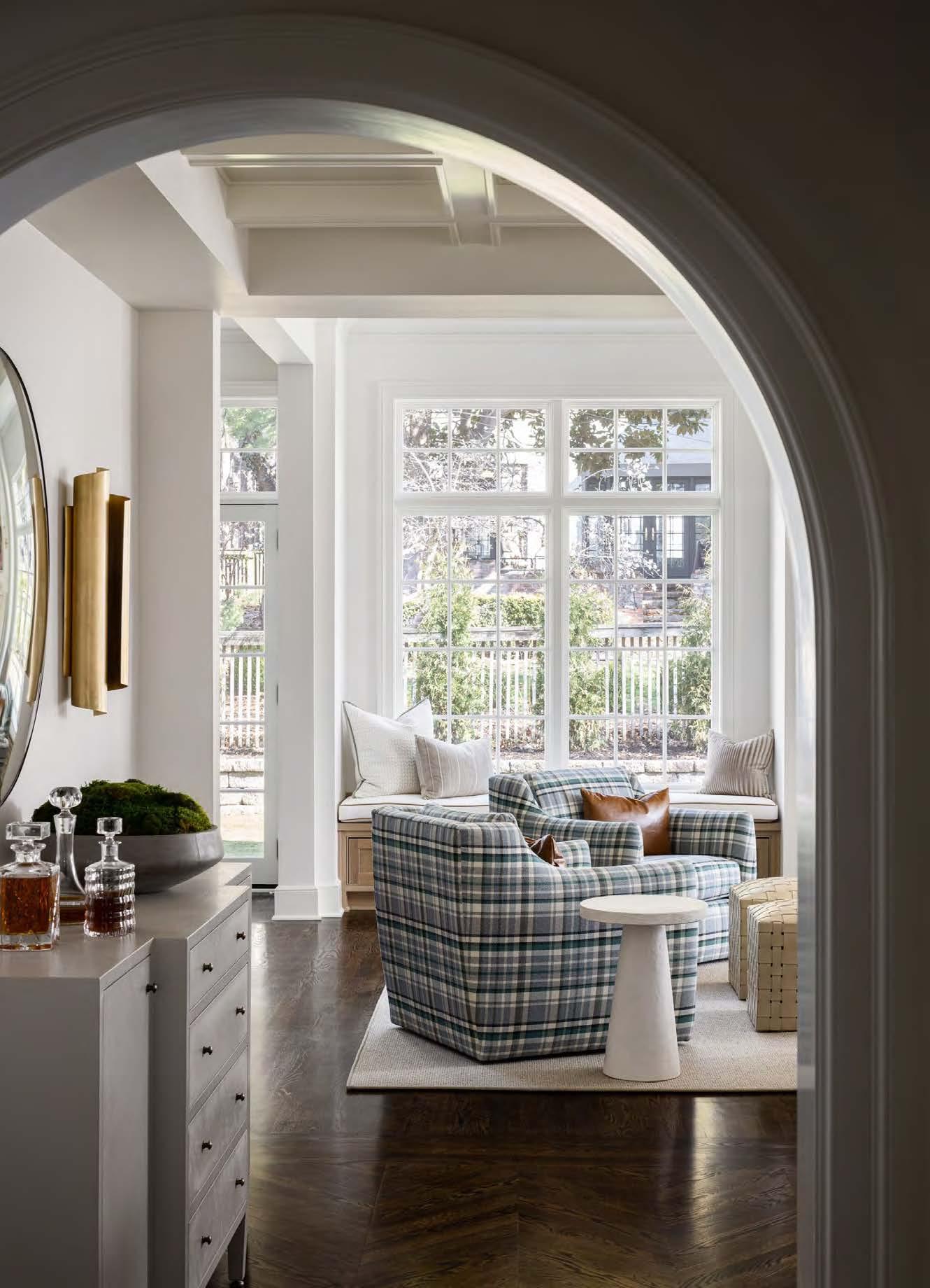
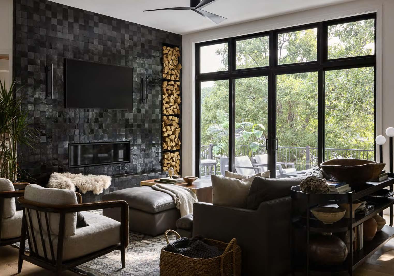

The owners of this early-2000s home at the Lake of the Ozarks came to the table with little direction other than the desire to remove their dated honey-oak cabinets and columns. Taking the house down to the studs, the design-build team completely reinvented the waterfront residence with an industrial, mid-century vibe and pops of funk—displayed through black Clé tile, floor-to-ceiling mirrors, concrete countertops and green accents. Once they determined a few of their clients’ favorite products, materials and colors, the team carried those favorites through the rest of the design.
The updated design features many standout areas. Every space has the perfect balance of light and dark details, sturdy and soft materials and stylish and functional features. This home was created with one
thing in mind: the clients’ lifestyle. Though the lakehouse is their second residence, the clients work remotely and plan to spend much time there. So, it needed to serve equally as a vacation oasis and a functional, comfortable home.
Since the home is located outside of the Kansas City area, the distance to the project provided a unique set of challenges, requiring all parties to shift mindsets and remain flexible with the completion date and material availability. Trusted trade partners completed specialized design details—like the floating quartzite bathroom sink, the floor-to-ceiling shower glass and the custom concrete countertops—to bring the project to a stunning conclusion.
ARCHITECT/INTERIOR DESIGNER/
CONTRACTOR: Cicada Co.
@cicada_co
CONTRACTOR:
Liberty General Contracting
PHOTOGRAPHER:
Nate Sheets
@natesheetsphoto
View full project details.
Countertops: Carthage Stoneworks / Concrete Designs Furnishings: Cicada Co. To-the-Trade Showrooms: Design & Detail; Designer’s Library


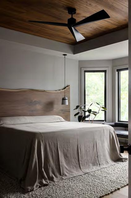
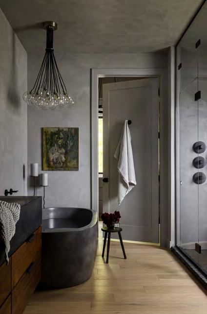

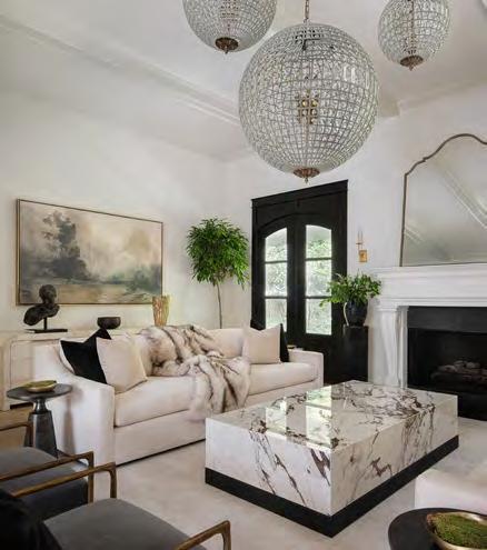
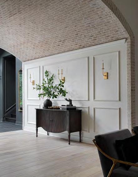
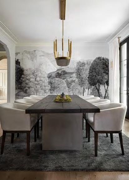
WHAT THE JUDGES LIKED:
The overall creative tour de force
The brick barrel ceiling
The biophilic shower
“
The kitchen’s stone wall and ledge, the sconces and the vegetable bins are next-level.”

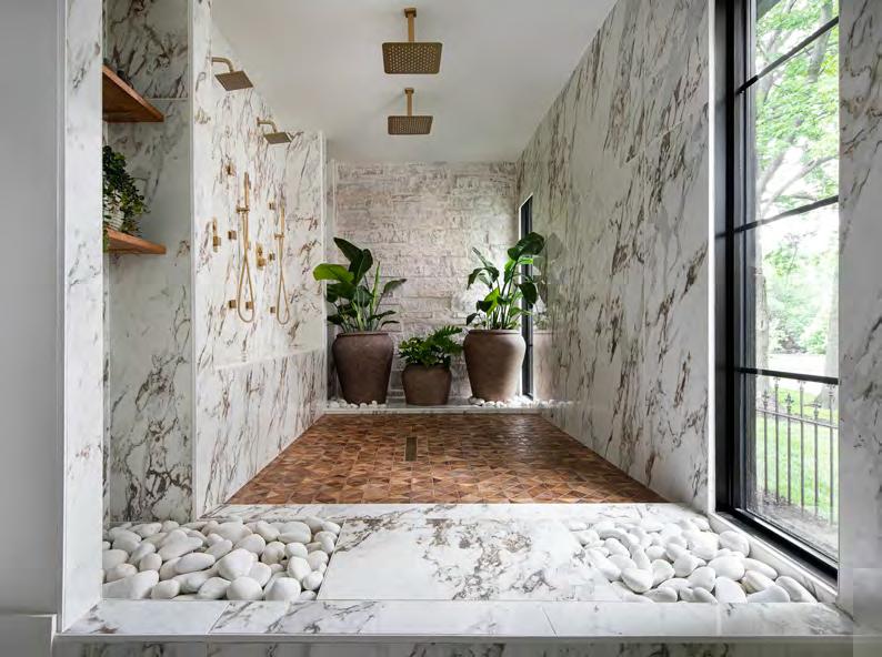
RESOURCES
Cabinets: Cabinets by King Flooring: SVB Wood Floors Lighting Fixtures: Wilson Lighting Real Estate Agent: Nate White – Compass Realty Group
To-the-Trade Showrooms: Leftbank Art Wall Covering: Schumacher – Iksel
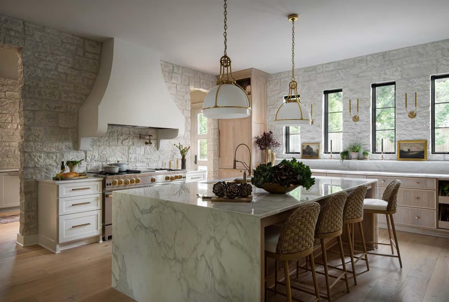


After languishing on the market for quite some time, this home inspired a buyer with its atrium as a place to keep his plants. His overarching vision was to create prized spaces that support his love of horticulture, cooking and entertaining. The design-build team prioritized adding a massive prep kitchen, refining and highlighting the indoor solarium, implementing Old World European-style architectural details and creating plenty of gathering spaces.
The conversion of an inaccessible and awkward library nook into a sizable barrel-vault ceiling hallway with paneled walls is a highlight of the home and segues into the great room. The architecture and simple brick design speak for themselves. However, structural limitations prevented the barrel vault from centering with the line of sight to the living room’s cast stone fireplace. As a workaround, the designers used three spherical chandeliers of various sizes to produce the optical illusion that the vault is perfectly centered.
In the kitchen, the designers played to the client’s culinary obsession by adding more light, a serving station, an island and dedicated space for produce. A room addition using the existing back porch framework accommodates the prep kitchen. Inspired by a previously demoed stone fireplace, the stonework on the kitchen walls enhances the room with texture and visual interest.
DESIGNER/CONTRACTOR:
Trove Homes @trovehomes
PHOTOGRAPHER:
Craig Keene @craigkeenephotography


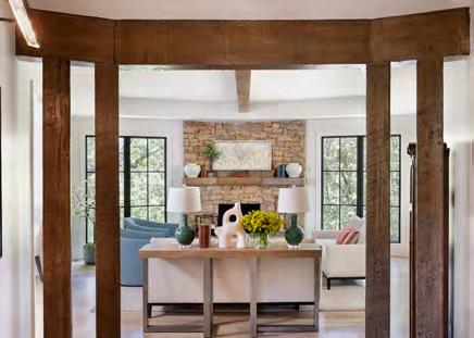

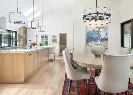
This Lake Quivira property is the owner’s childhood home. The goal was to lighten and brighten everything, eliminating the heavy-handed Tudor style. One of the project’s major challenges was the kitchen and dining area. The client desired a chef’s kitchen with an extensive island and plenty of storage, which required moving walls, making the ceiling height appropriate for the space and adding windows and doors. A row of front-facing kitchen windows provided much-needed light and a modern aesthetic. The new linear design made room for the large, butterfly-matched quartz island in the middle of the kitchen. Optimally configured, the island’s open-ended left side houses five stools and leaves ample room for storage on the opposite side.
RESOURCES
The project team kept the original step down into the family room that transitions from the dining and music rooms while maintaining the open floor plan. The original space where the grand piano sits—once a dim seating area and office space—now feels airy and inviting thanks to added windows and the absence of the hallway wall leading to the primary bedroom. That room was also altered within the existing footprint.
A bright-white paneled wall reinvigorates the curved staircase at the entry. The team also changed the front door, enlarged the turret window, designed a custom awning and added coach lights to the exterior. Painted brick in a German schmear finish and a new front-side porch bring the elevation to life.
Accessories and Furnishings: SID & Company Cabinets: Parks Cabinets
ARCHITECT:
Marshall Home Design marshallhomedesign.com
INTERIOR DESIGNER: SID & Company @sidandcompany
CONTRACTOR:
Renovations by Starr Homes @renobystarr
PHOTOGRAPHER:
Matt Kocourek @mattkocourek47 View full

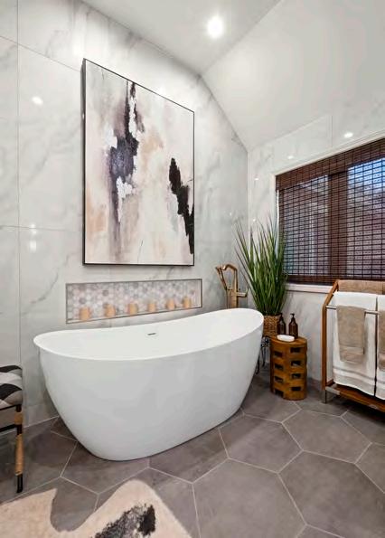
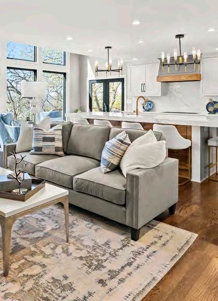

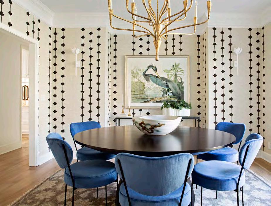
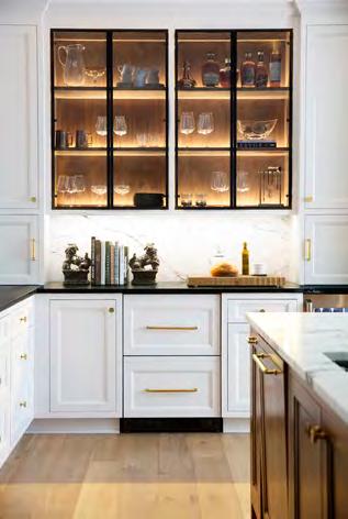
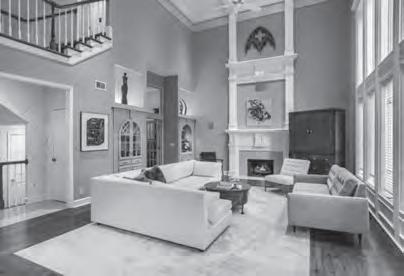
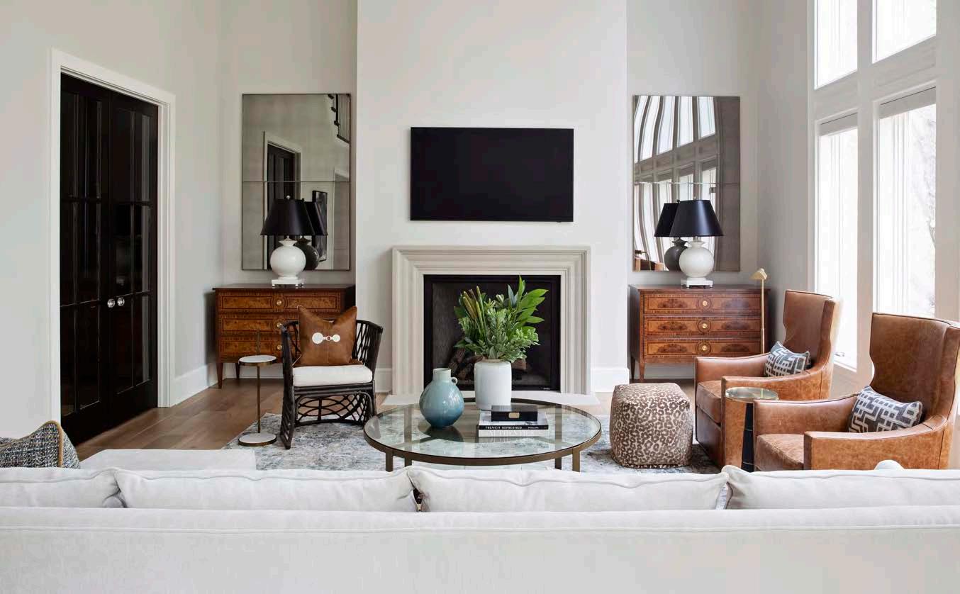
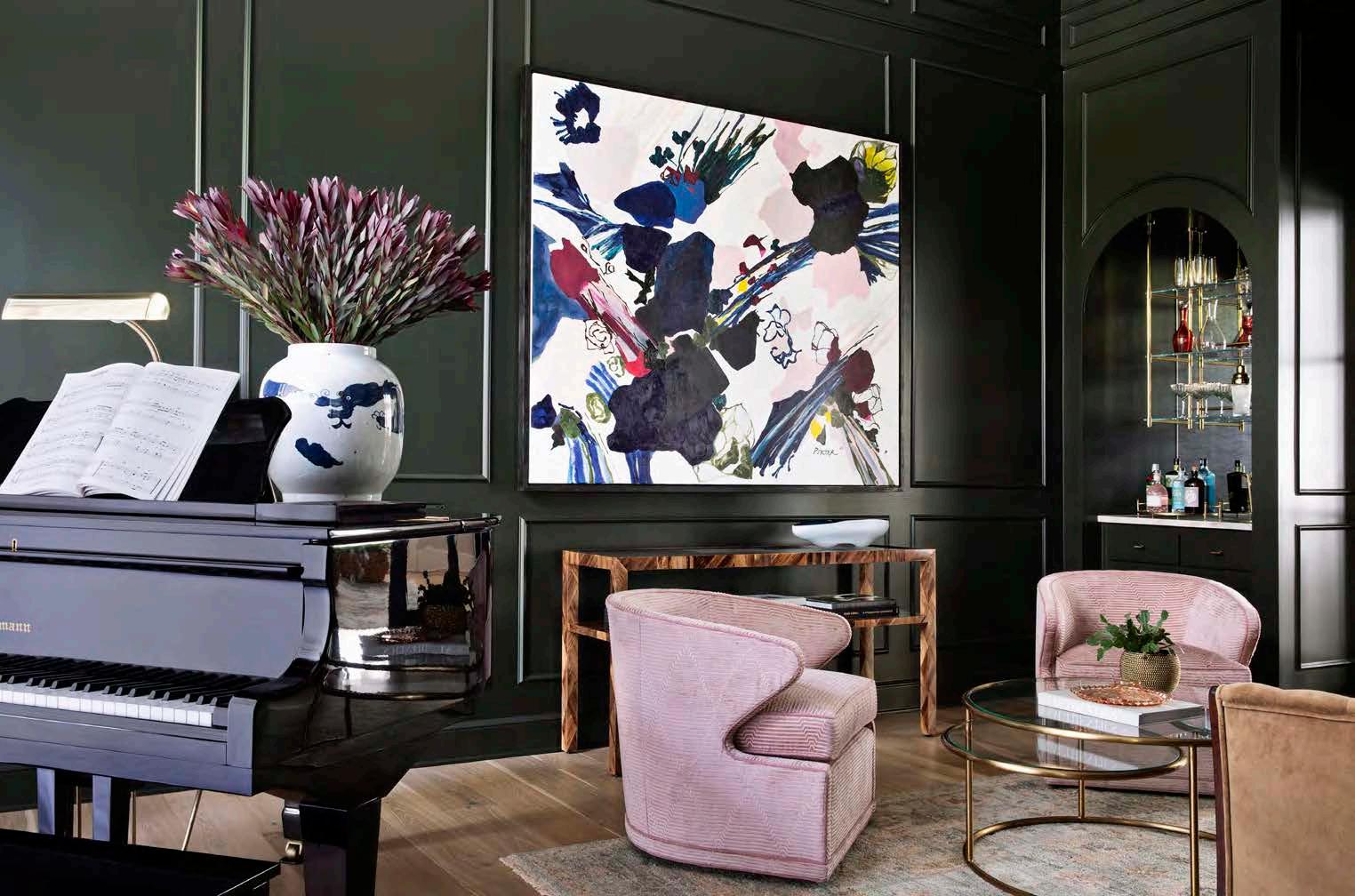

The ultimate goal for this home was to create timeless, sophisticated spaces tailored to the lifestyle of a young family.
Reimagining the home’s 1980s-style decor and finishings, the design team took the house down to the studs. During this initial phase, they dealt with outdated architectural details, such as semi-circle windows, and a church-like scale issue in the living room. Phase Two included a two-story, three-car attached garage addition.
The redesigned floor plan incorporates two home offices—one of which can turn into a guest room when needed—a music conservatory doubling as an adult hangout space, a new upstairs laundry room and a renovated kitchen and primary bath. Tweaks were made to modernize each room, transforming them into more functional and beautiful spaces.
To revive the kitchen, the project team replaced the cabinets and opened the area into the hearth room, showcasing a new, more luxurious fireplace. The team used natural materials like plaster, soapstone, marble and walnut to connect the design with the expansive backyard view.
The “church” was the project’s biggest challenge. Instead of using trim to marry the fireplace to the ceiling, the project team built out the fireplace wall farther into the room before anchoring it with an oversized, pre-cast mantel. They removed all the decorative niches and built-in cabinetry, converting the space into the adjoining music room to create a sophisticated bar and record area. They also increased the size of the double doors, removing the transom. Other bespoke details include classical molding on the music room walls, custom arches that frame the bar and record cabinet and a deep-green hue that sets the mood.
INTERIOR DESIGNER:
Stephanie Stroud Interiors
@stephaniestroudinteriors
CONTRACTOR:
Redstone Homes
PHOTOGRAPHER:
Laurie Kilgore
@lauriekilgorephotography
View full project details.
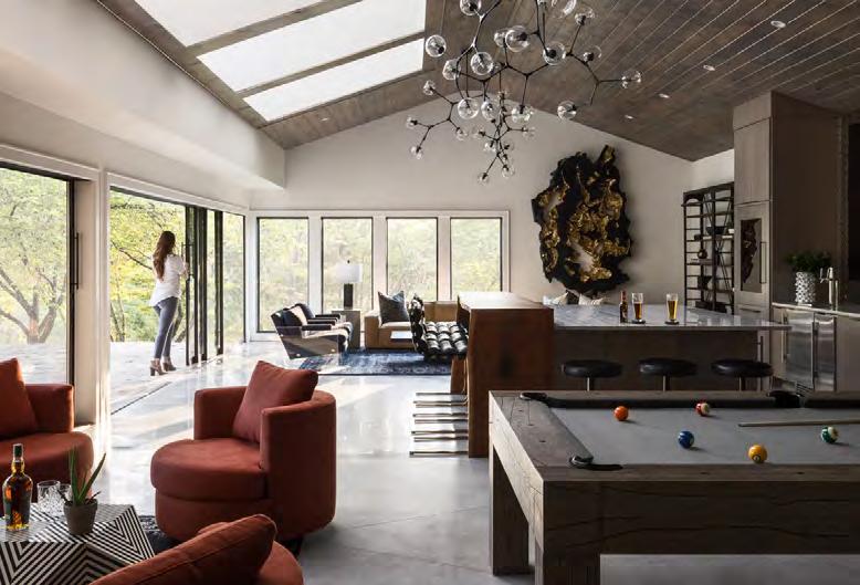
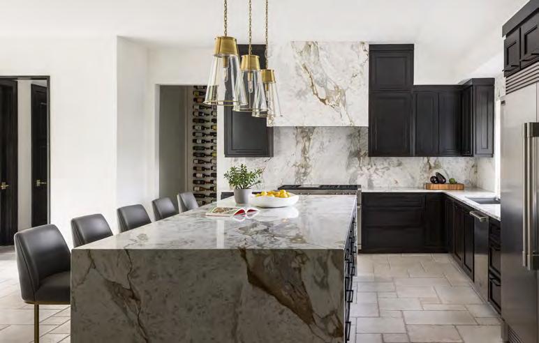

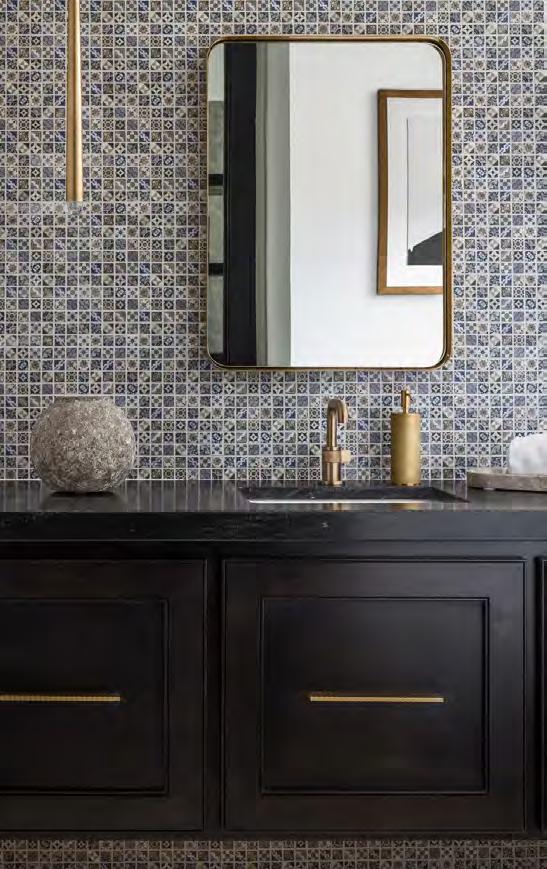
INTERIOR DESIGNER:
Kristen Ridler Interior Design @kristenridlerdesign
The new owners of this residence loved a modern look but still wanted to preserve some of their home’s original Spanish-style details. Ideally set on a private lot with a lake view, the house also needed to be optimized for entertaining and enjoying the surrounding vistas. The unique project required challenging decisions about what to keep and remove throughout the process. There were also varied ceiling heights—some low, some extremely high—as well as aspects like stonework, windows and an indoor pool that all had to be considered.
Hindered by a low-hanging ceiling, the old kitchen was disconnected from the rest of the house. To fix this, the design team raised the ceiling and created a new hearth room off the kitchen for the homeowners to enjoy at their leisure. They replaced the indoor pool with an area that became known as “The Party Barn”—a casual,
loungelike space with different sections, including a bar, pool table and game area.
Looking to incorporate some of the home’s original character, the design team honed in on the amazing, old-looking stone on the exterior and on the main living room fireplace. They knew they wanted to keep the exterior stone, so they freshened up the grout while preserving its natural Tuscan look. In contrast, the interior stone looked overly dated; therefore, the team removed it from the fireplace in favor of wall molding and a custom stone mantle. Finally, they added windows in the great room—while refurbishing original windows throughout— to create more symmetry and bring more natural light into the newly revived home.
CONTRACTOR:
Cecil & Ray Homes @cecilrayhomes
PHOTOGRAPHER:
Nate Sheets @natesheetsphoto
View

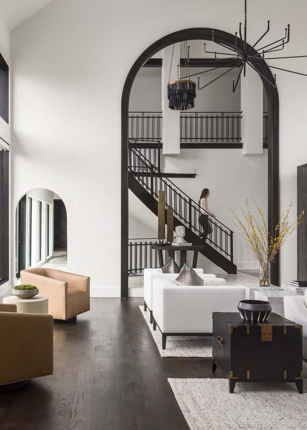


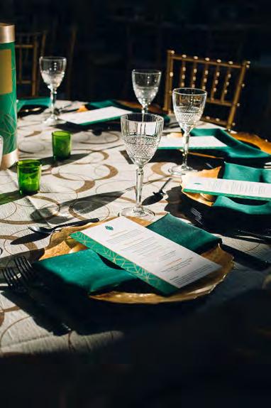




BRANCATOSCATERING.COM
BRANCATOSCATERING.COM BRANCATOSCATERING.COM


BRANCATOSCATERING.COM


